3D pie chart infographic template for PowerPoint & Google Slides

Description
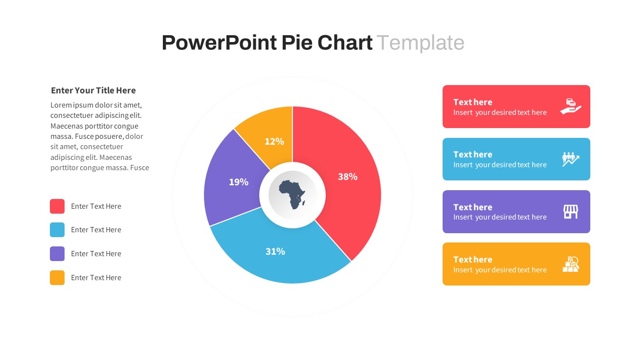
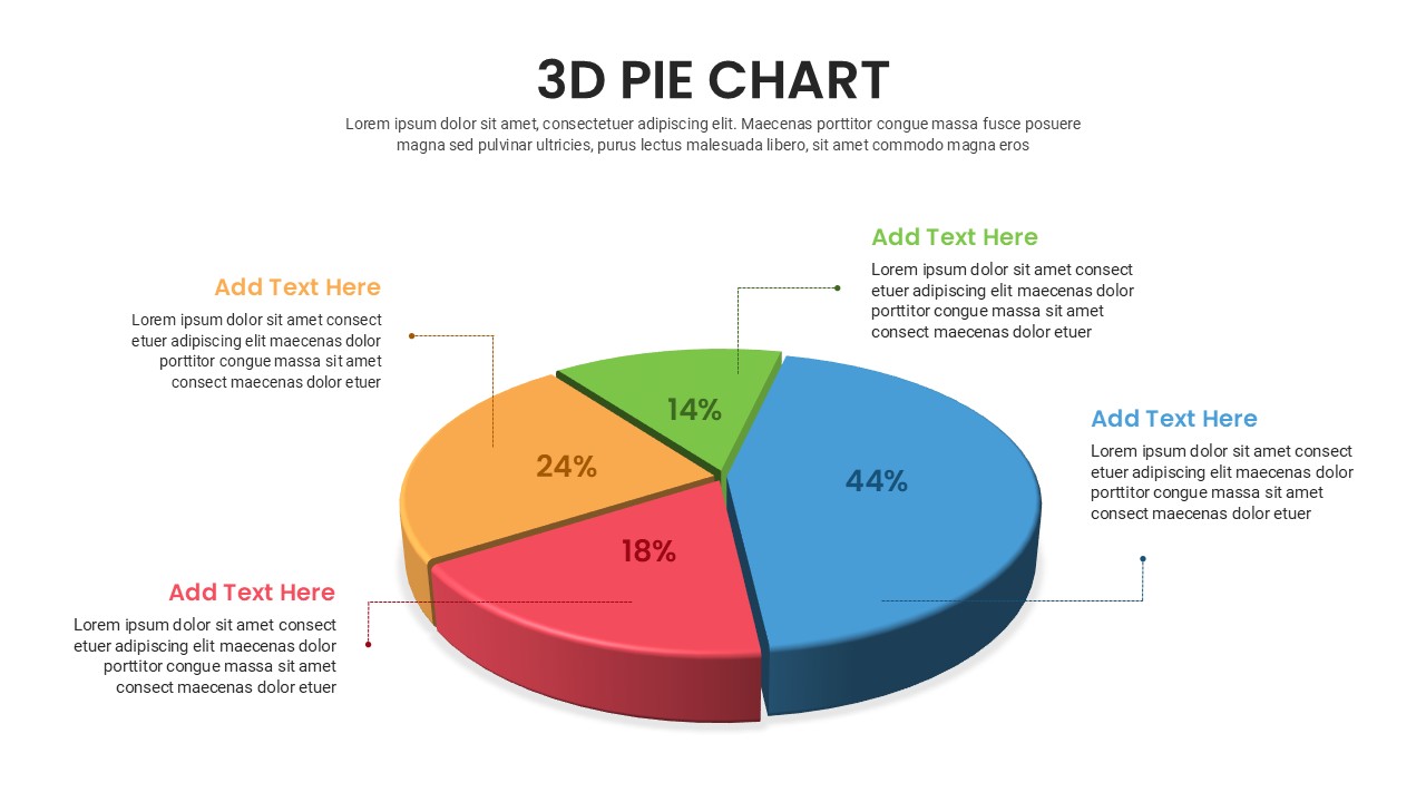
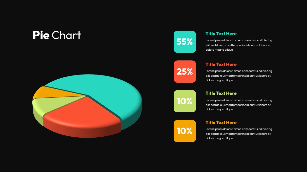
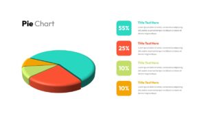
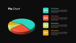
Present data distribution with impact using this 3D pie chart infographic template. The slide features a bold, three-dimensional pie chart on the left, divided into four colorful segments representing 55%, 25%, 10%, and 10%. Each slice is visually matched to a labeled legend on the right, complete with title text and editable descriptions. The vibrant use of cyan, red, lime green, and orange helps differentiate values at a glance, while the clean layout keeps the focus on insights. Ideal for illustrating market share, resource allocation, or survey results, this template combines clarity with a touch of visual flair.
Who is it for
Perfect for business analysts, marketers, educators, financial presenters, and project managers who need to convey percentages, proportions, or category breakdowns during client meetings, internal reviews, or academic sessions.
Other Uses
Repurpose the chart for product usage stats, team contribution analysis, budgeting presentations, or annual reports. Easily adjust the colors, labels, and figures to match your content and brand style.
Login to download this file

Item ID
SB03230
Related Templates

Segmented Pie Chart Infographic with Icons for PowerPoint & Google Slides
Pie/Donut
Free 3D Pie Chart template for PowerPoint & Google Slides
Pie/Donut
Free
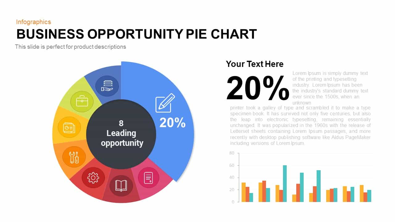
Business Opportunity Pie Chart Template for PowerPoint & Google Slides
Pie/Donut
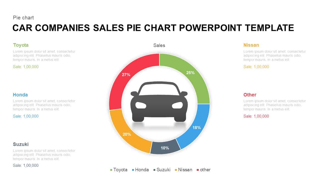
Car Sales Market Share Pie Chart Template for PowerPoint & Google Slides
BCG
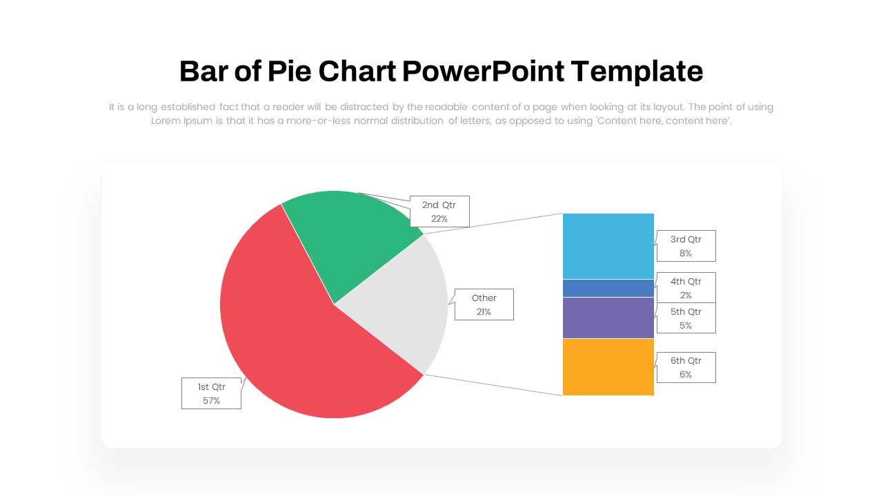
Dynamic Bar-of-Pie Chart Comparison Template for PowerPoint & Google Slides
Pie/Donut
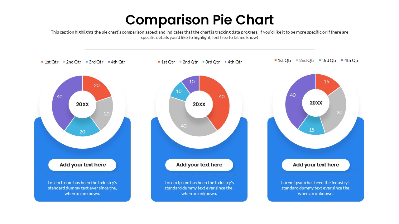
Quarterly Comparison Pie Chart Template for PowerPoint & Google Slides
Pie/Donut

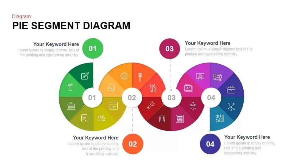
Pie Segment Diagram Four-Step Process Template for PowerPoint & Google Slides
Pie/Donut
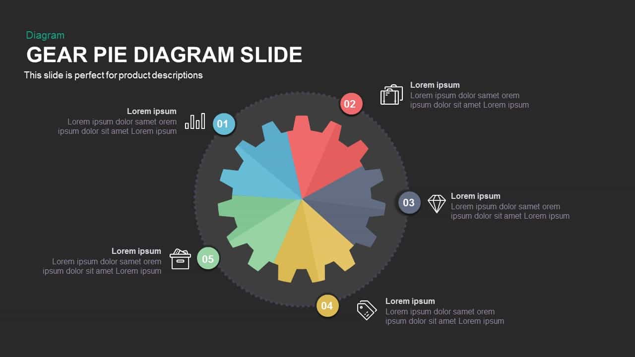
Gear Pie Diagram Data Visualization Template for PowerPoint & Google Slides
Pie/Donut
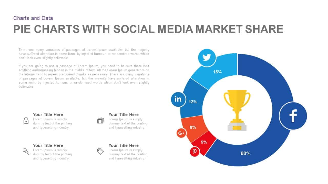
Social Media Market Share Pie Charts Template for PowerPoint & Google Slides
Pie/Donut
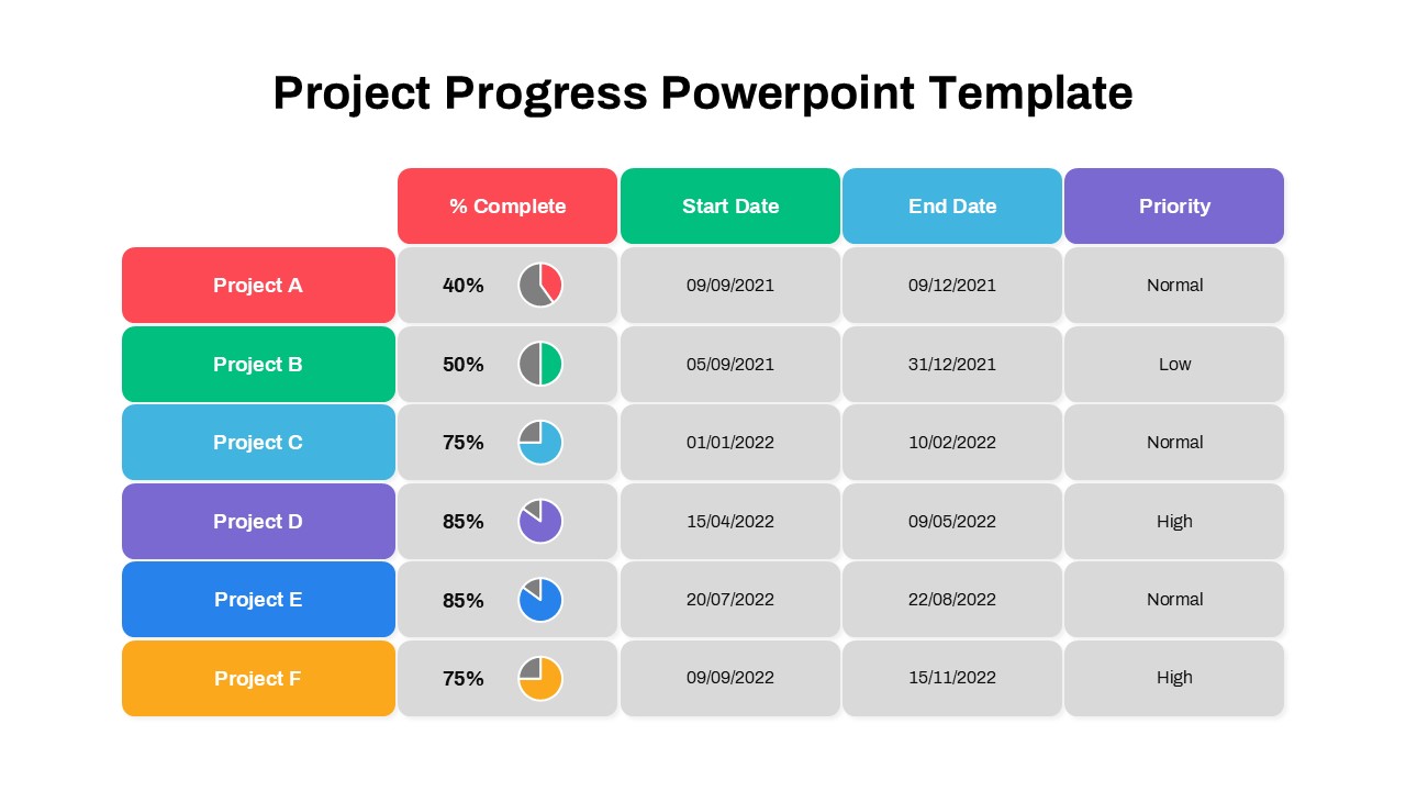
Project Progress Dashboard Pie Charts Template for PowerPoint & Google Slides
Project
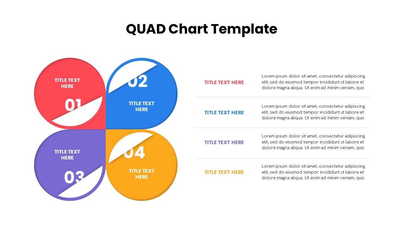
Quad Chart Infographic Pack of 8 Slides Template for PowerPoint & Google Slides
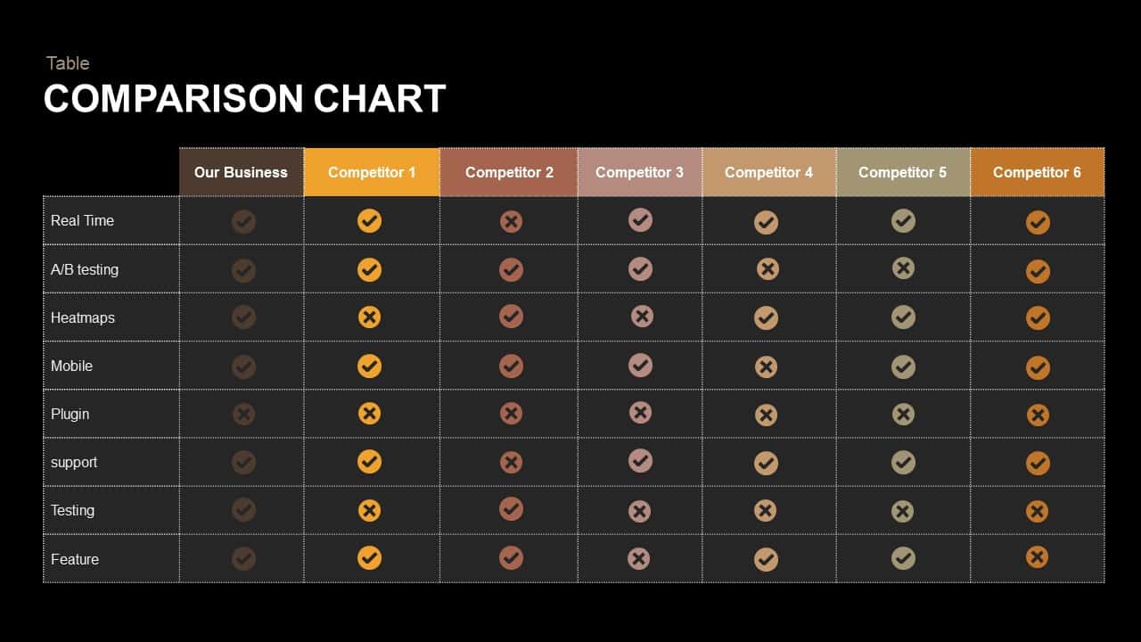
Comparison Chart
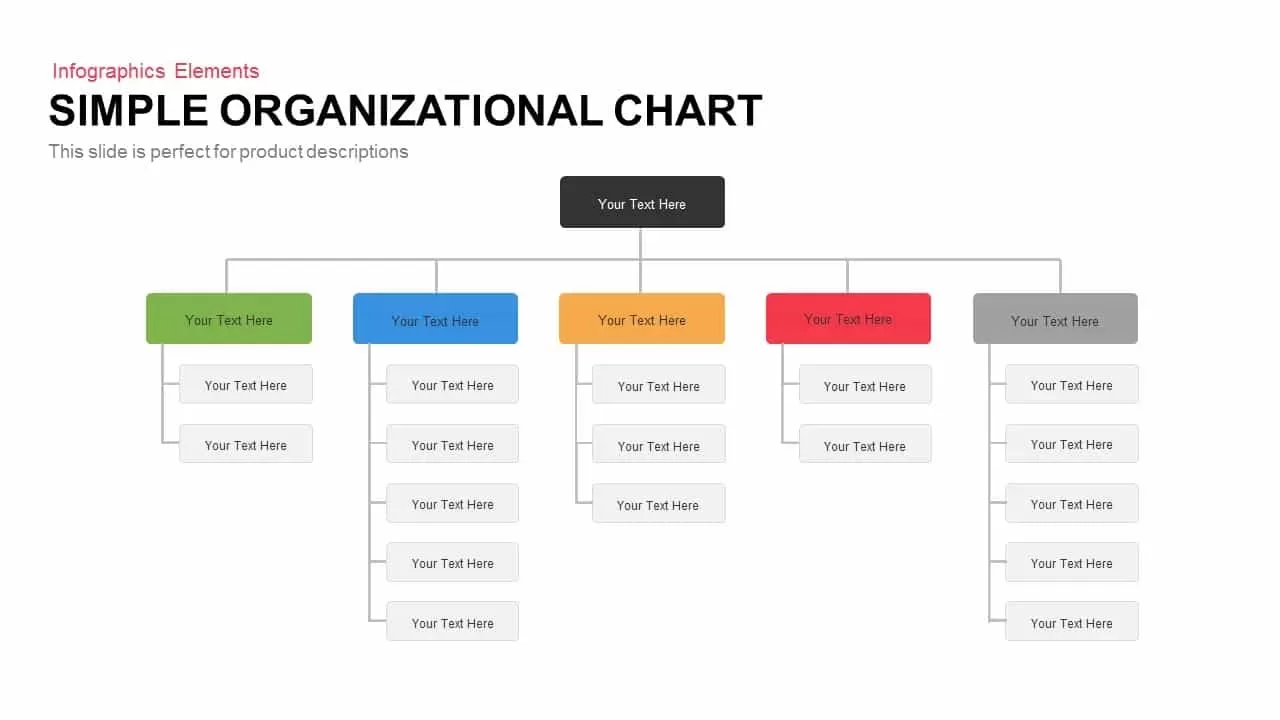
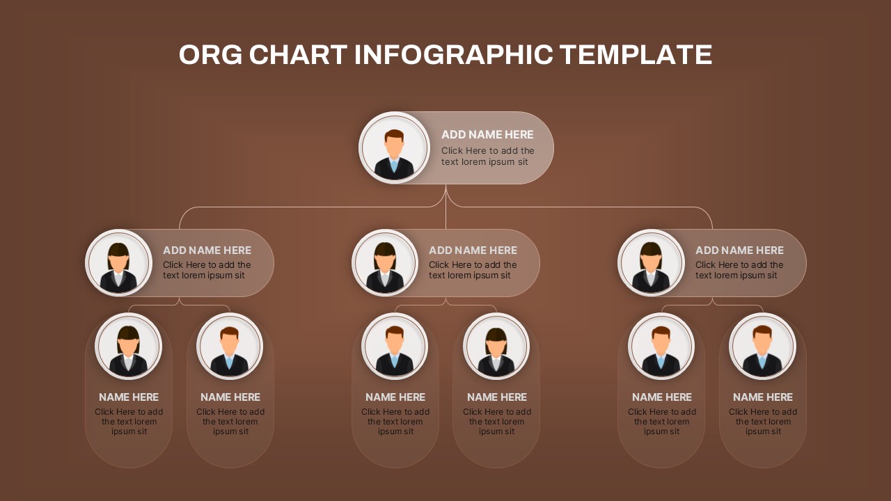
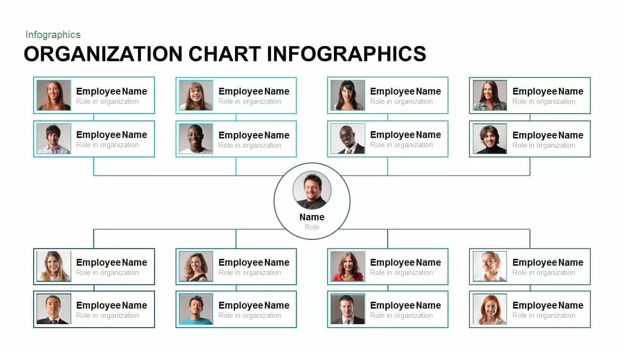
Simple Organizational Chart Infographic Template for PowerPoint & Google Slides
Org Chart
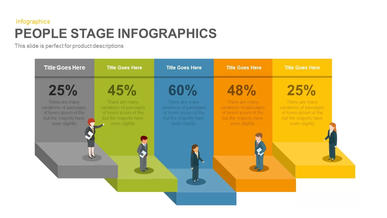
Five-Stage People Infographic Chart template for PowerPoint & Google Slides
Process
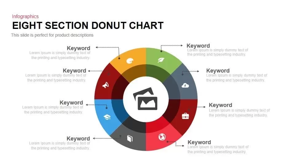
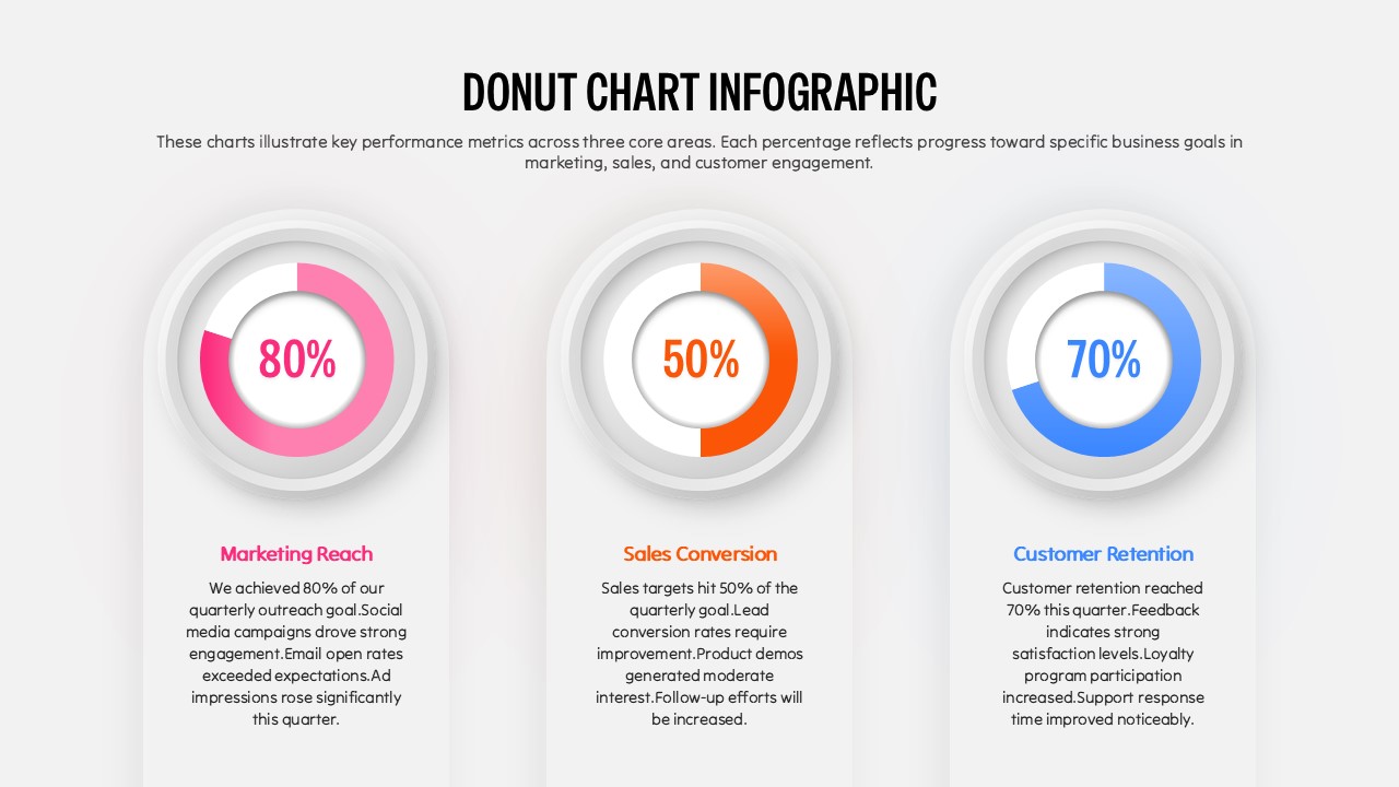
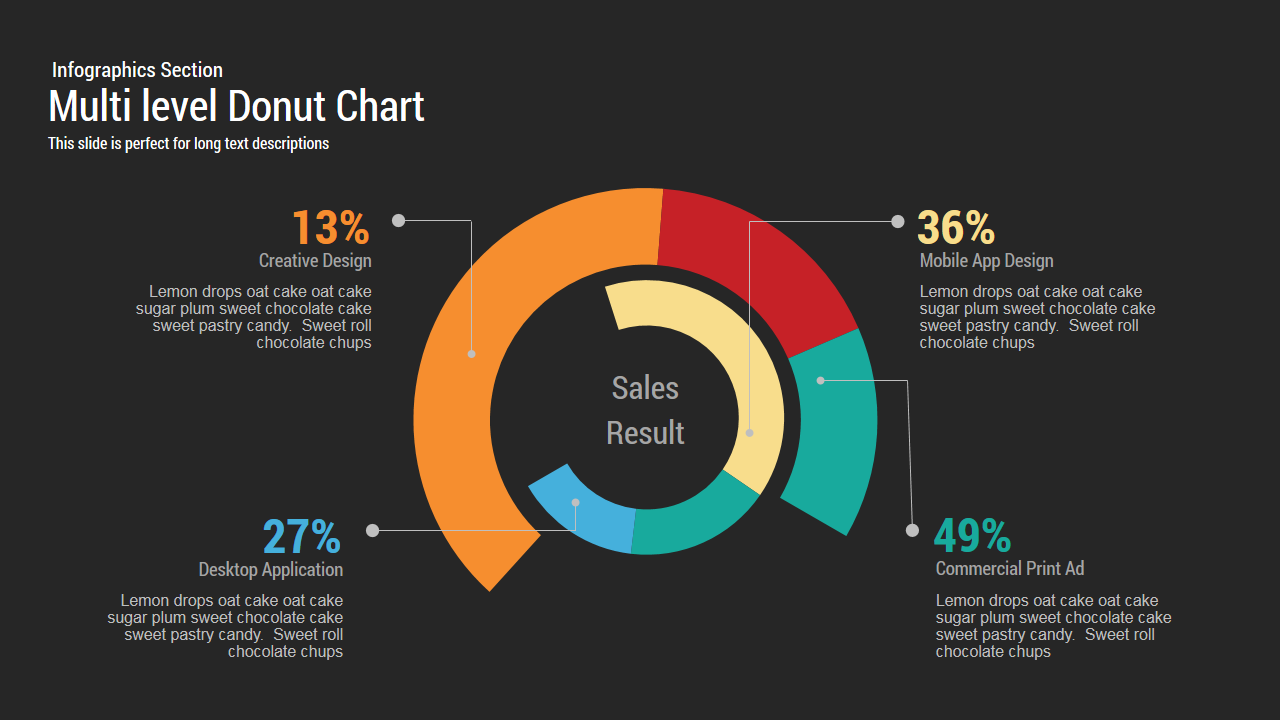
Eight Section Donut Chart Infographic Template for PowerPoint & Google Slides
Pie/Donut
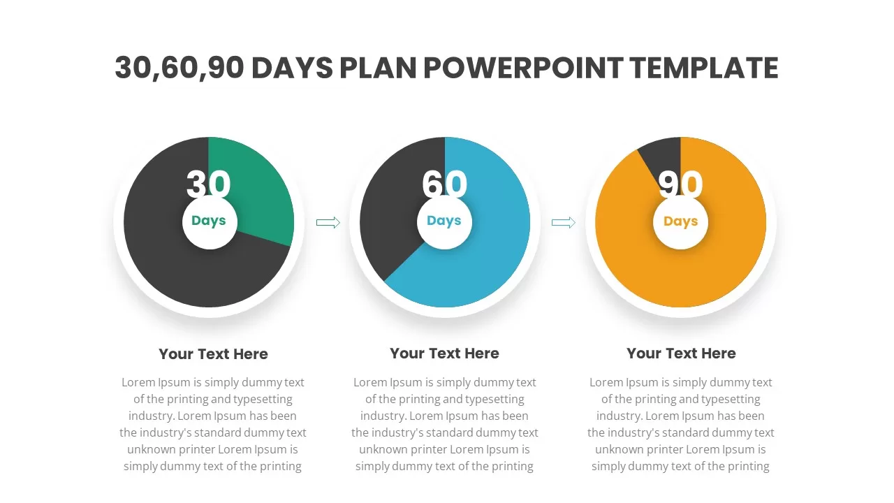
30-60-90 Day Donut Chart Plan Infographic Template for PowerPoint & Google Slides
Timeline
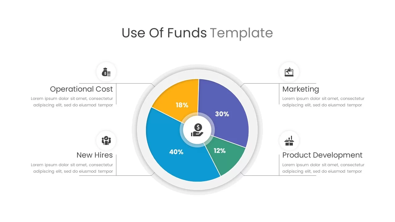
Use of Funds Donut Chart Infographic Template for PowerPoint & Google Slides
Circular
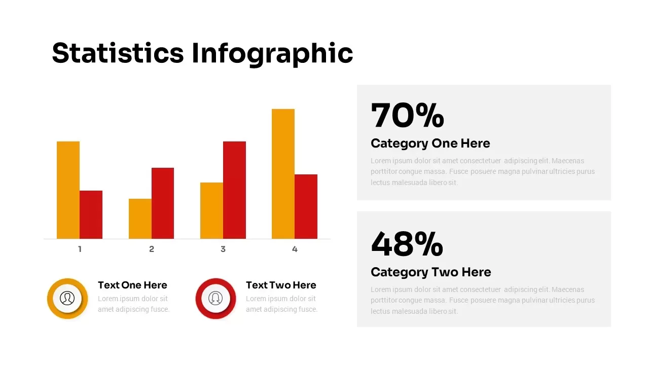
Statistics Infographic & KPI Bar Chart Template for PowerPoint & Google Slides
Bar/Column
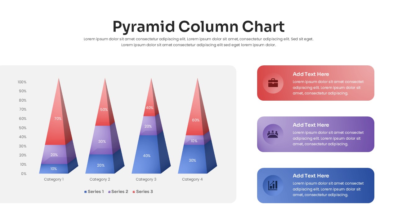
3D Pyramid Column Chart Infographic Template for PowerPoint & Google Slides
Bar/Column
Hierarchical Org Chart Infographic Template for PowerPoint & Google Slides
Org Chart
Three Segment Donut Chart KPI Infographic Template for PowerPoint & Google Slides
Pie/Donut
Free Professional Gantt Chart Pack – 4 Slides Template for PowerPoint & Google Slides
Gantt Chart
Free
Google Ads Optimization & Performance Infographic Template for PowerPoint & Google Slides
Digital Marketing
SQ3R Study Strategy Infographic Slides Template for PowerPoint & Google Slides
Business Strategy
Six Double Diamond Infographic Slides Template for PowerPoint & Google Slides
Process

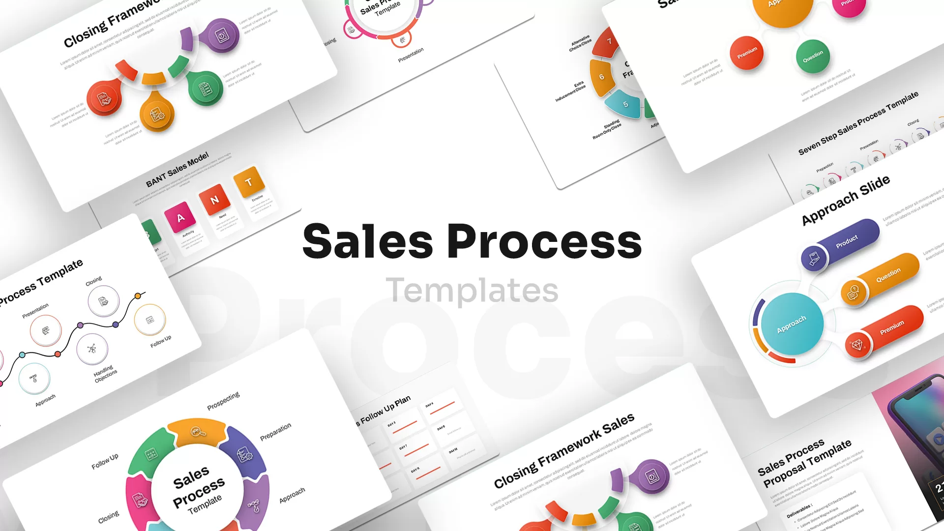
Sales Process Infographic Slides Pack Template for PowerPoint & Google Slides
Process
Casino/Poker Chips Infographic Slides template for PowerPoint & Google Slides
Business Strategy
Agenda Infographic Pack of 2 Slides Template for PowerPoint & Google Slides
Agenda
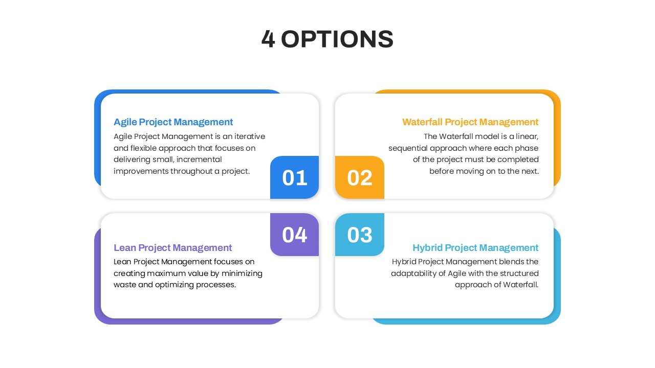
Four Options Infographic Slides Template for PowerPoint & Google Slides
Comparison
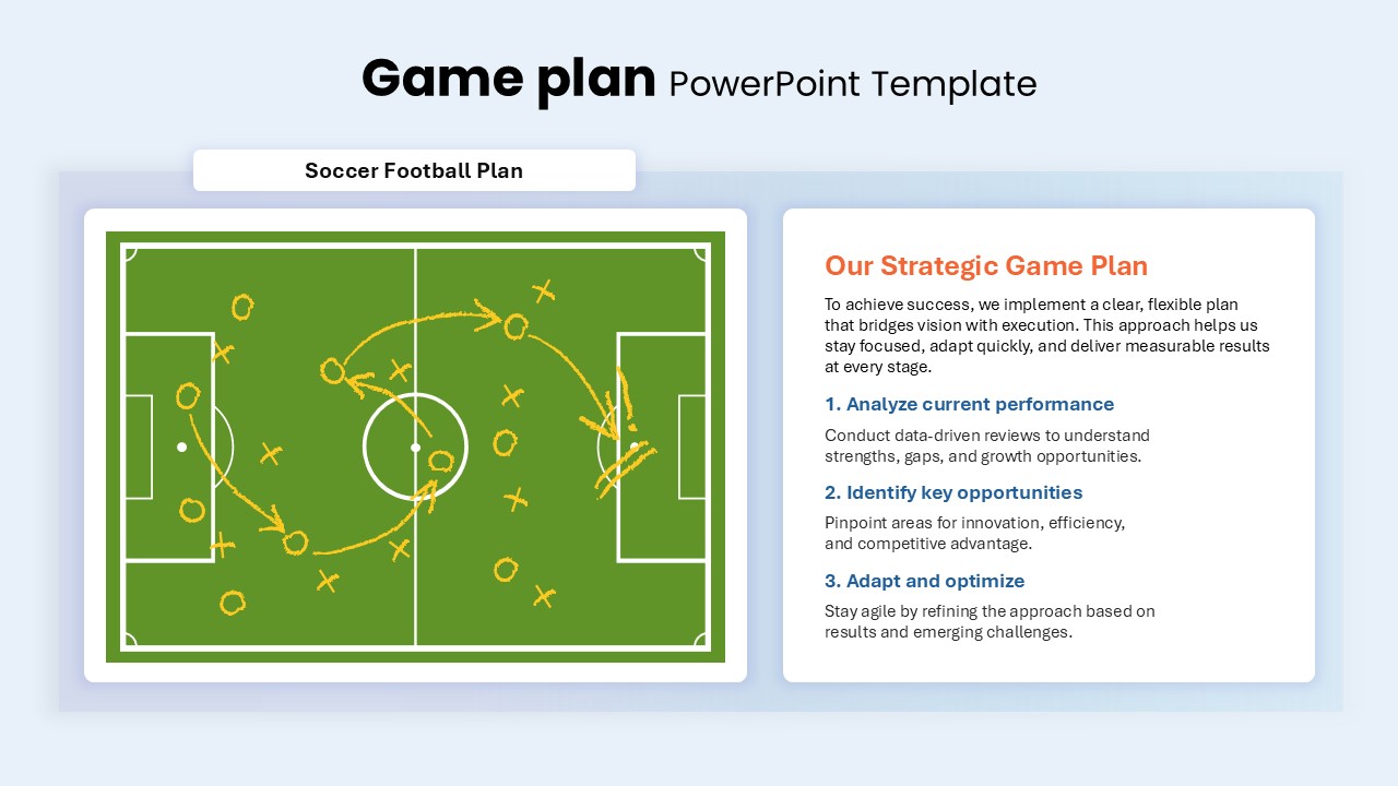
Game Plan Infographic Slides Pack Template for PowerPoint & Google Slides
Infographics
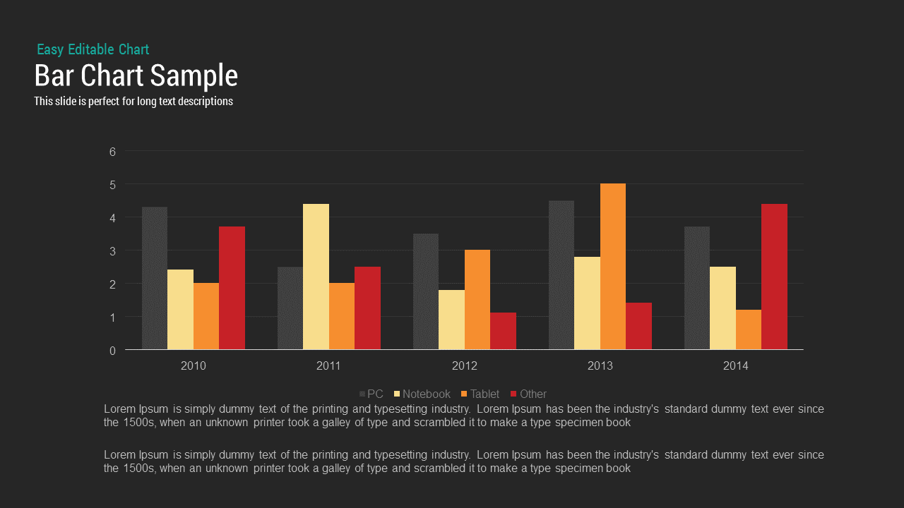
Bar Chart Sample template for PowerPoint & Google Slides
Bar/Column
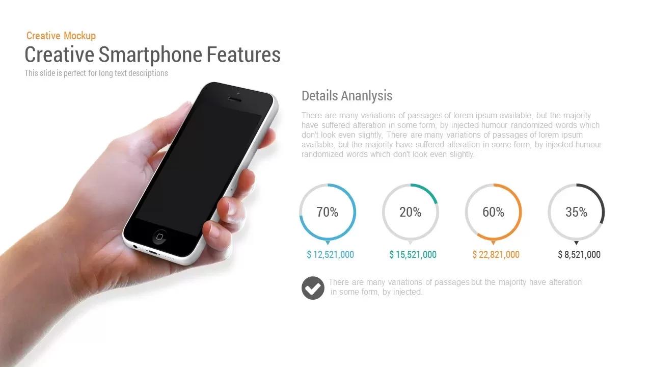
Mobile Data Analysis Chart template for PowerPoint & Google Slides
Charts
Creative Data Analysis Bar Chart template for PowerPoint & Google Slides
Bar/Column
Donut Chart template for PowerPoint & Google Slides
Pie/Donut
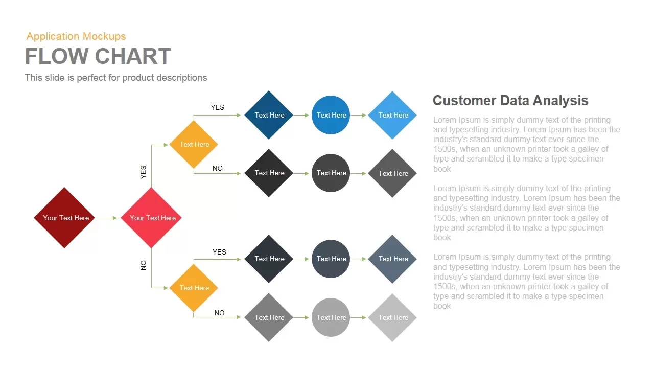
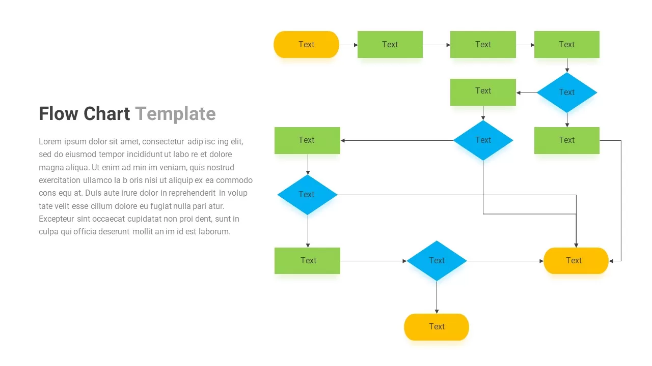
Flow Chart template for PowerPoint & Google Slides
Flow Charts
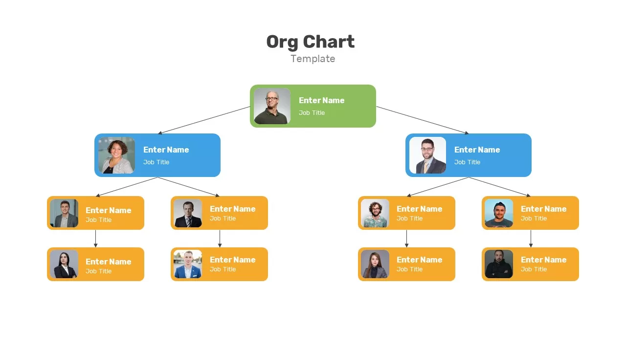
Organization Chart template for PowerPoint & Google Slides
Org Chart
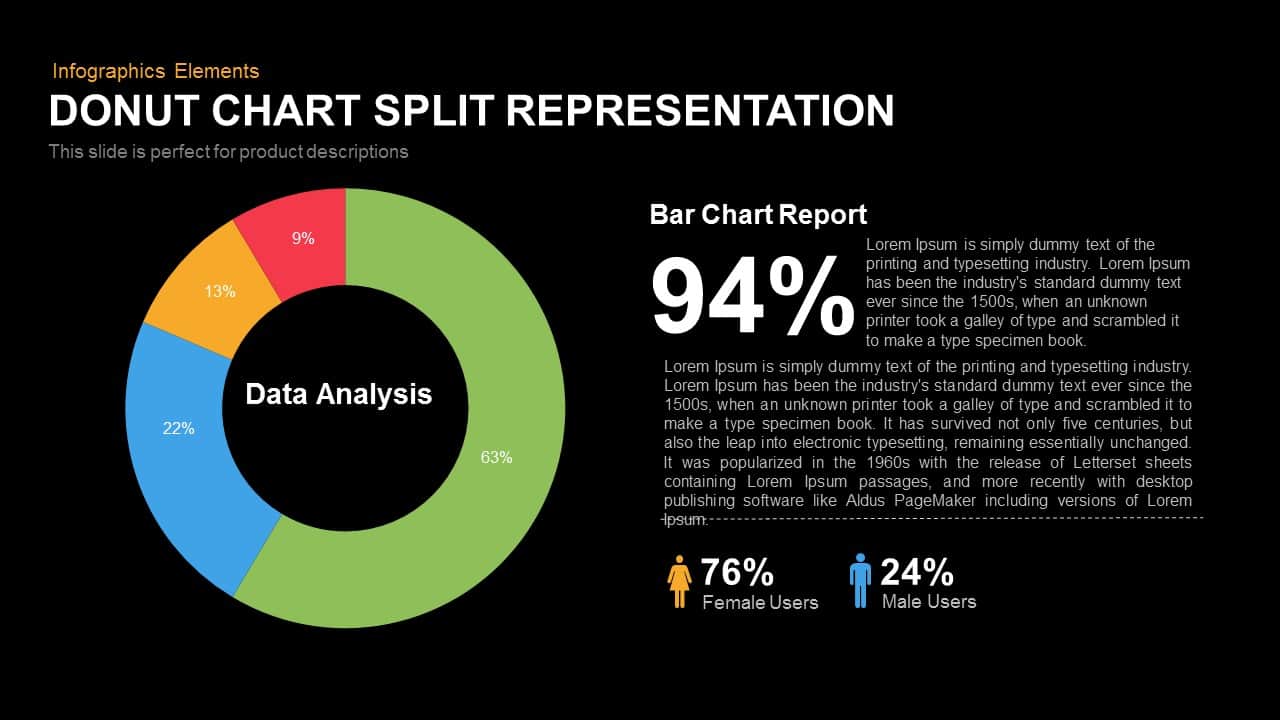
Donut Chart Split Template for PowerPoint & Google Slides
Charts
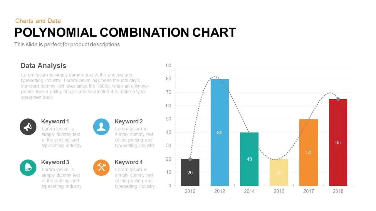
Combination Chart template for PowerPoint & Google Slides
Charts
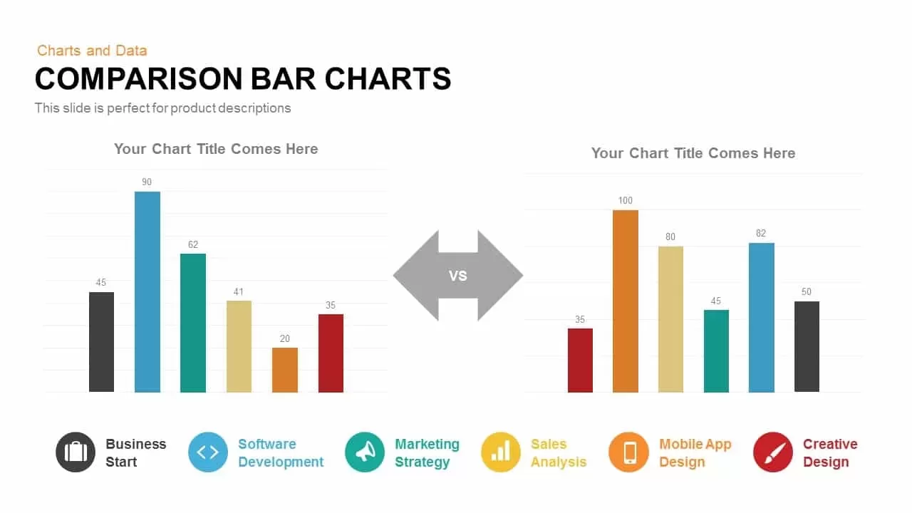
Comparison Bar Chart template for PowerPoint & Google Slides
Comparison Chart
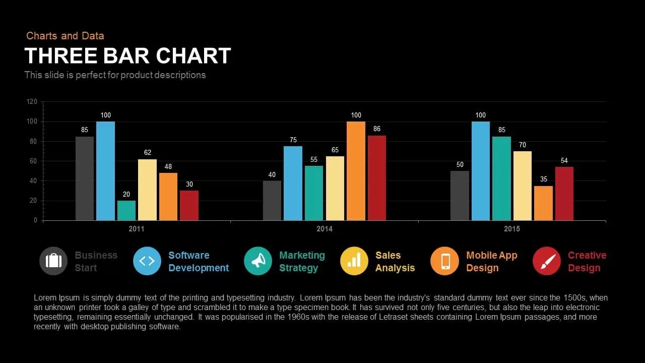
Three-Year Bar Chart template for PowerPoint & Google Slides
Charts
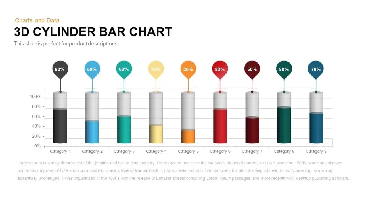
3D Cylinder Bar Chart Template for PowerPoint & Google Slides
Bar/Column
Isometric Organization Chart Diagram Template for PowerPoint & Google Slides
Org Chart
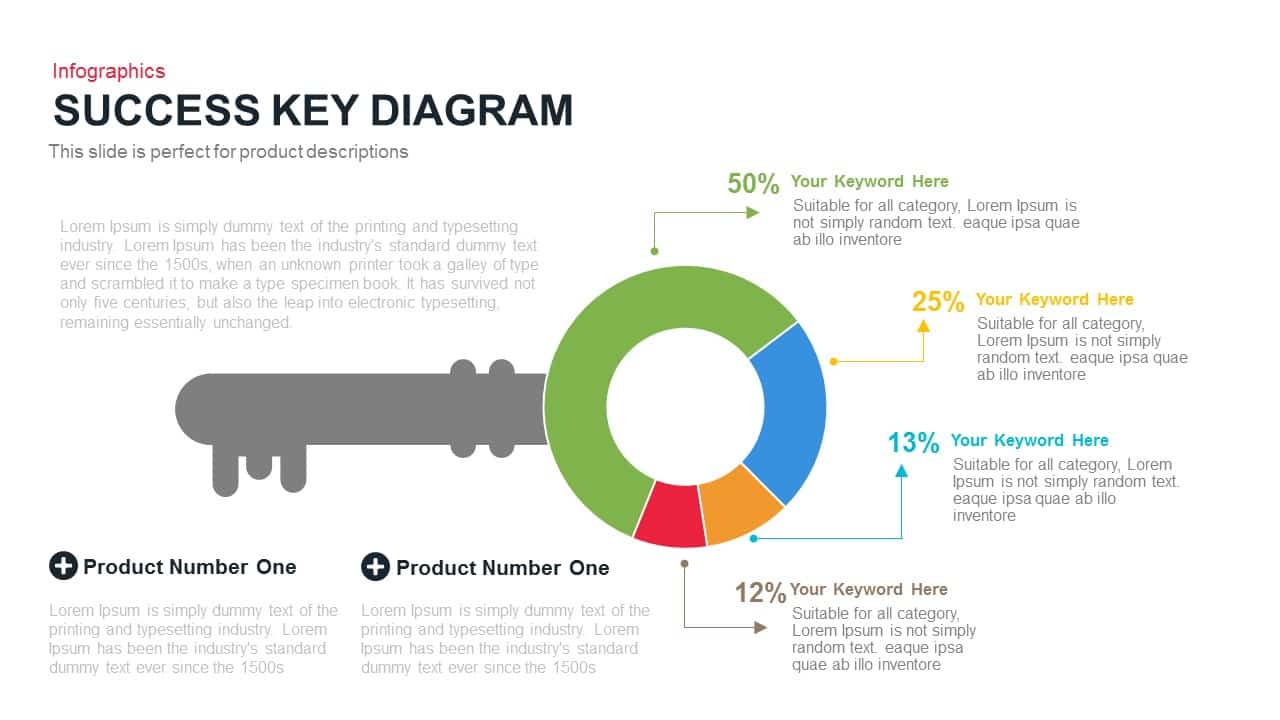
Success Key Diagram with Donut Chart Template for PowerPoint & Google Slides
Pie/Donut
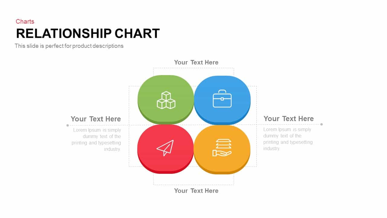
Relationship Chart template for PowerPoint & Google Slides
Flow Charts
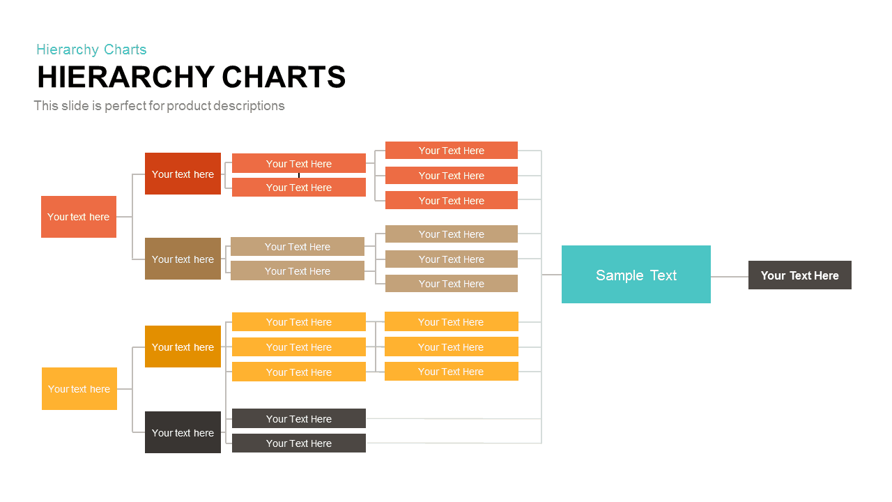
Horizontal Multi-Level Hierarchy Chart template for PowerPoint & Google Slides
Org Chart

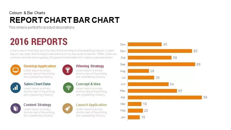
Monthly Reports Bar Chart template for PowerPoint & Google Slides
Bar/Column
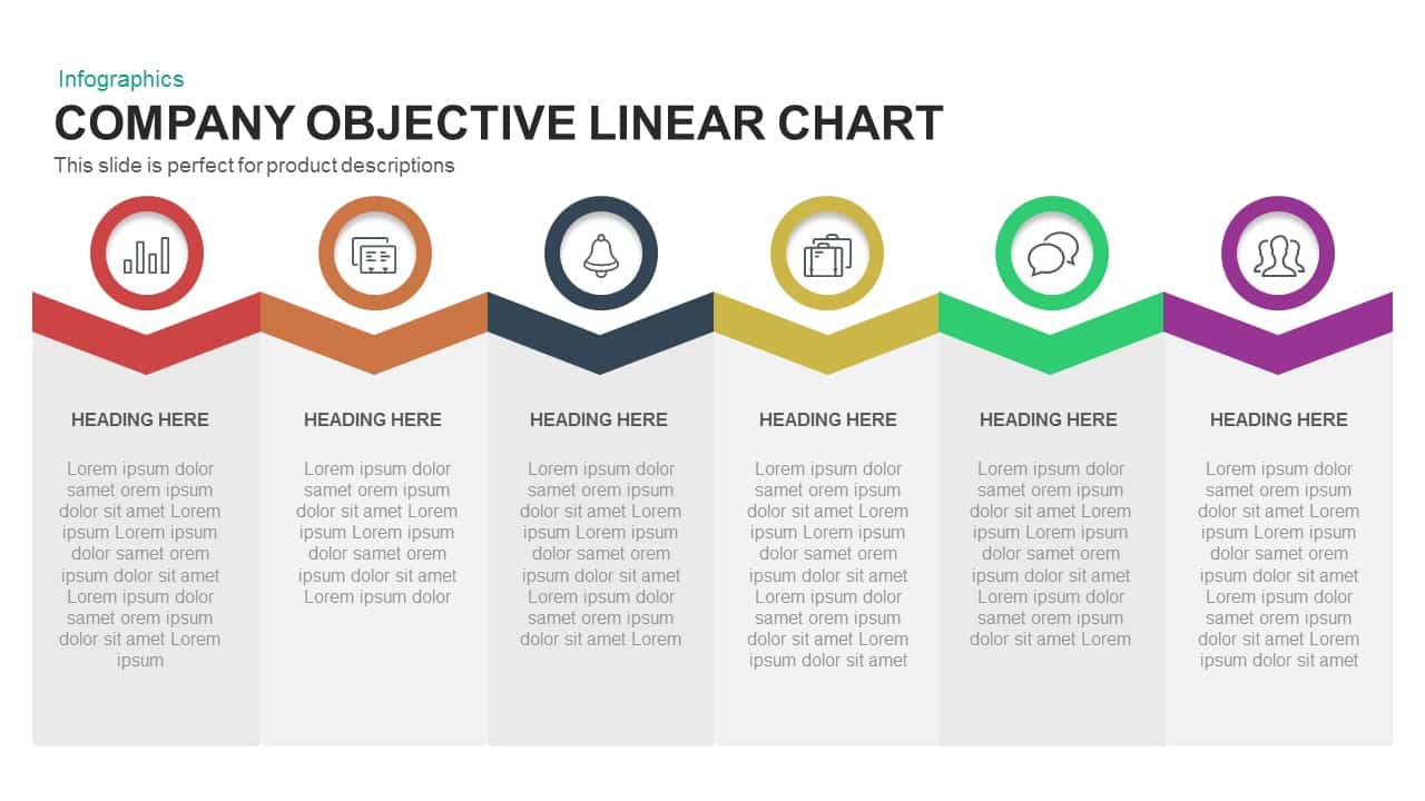
Company Objective Linear Chart Template for PowerPoint & Google Slides
Flow Charts
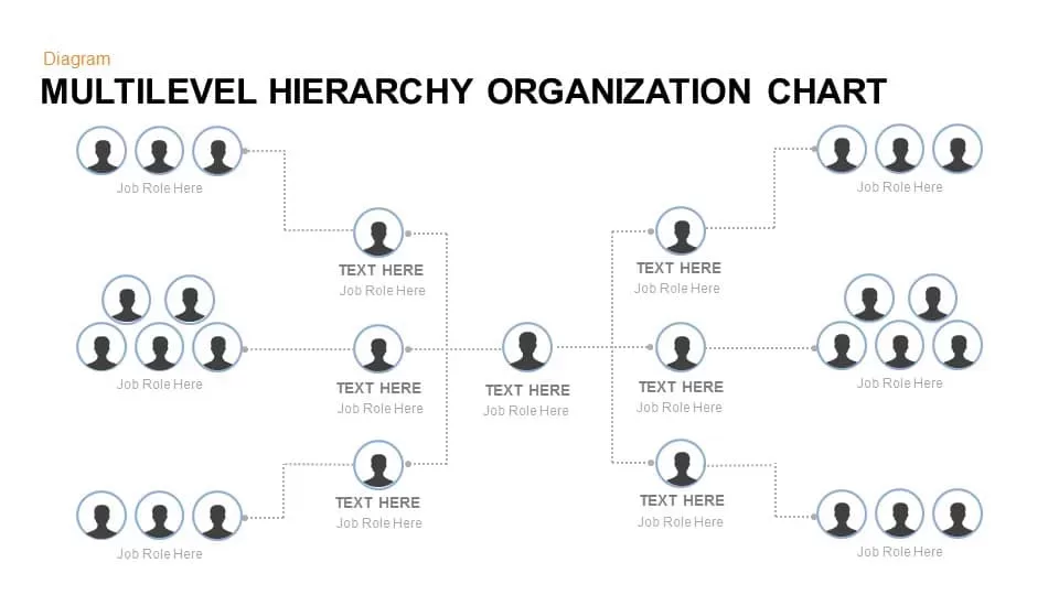
Multilevel Hierarchy Organization Chart template for PowerPoint & Google Slides
Org Chart
Organization Chart Overview template for PowerPoint & Google Slides
Org Chart
Comparison Chart Overview template for PowerPoint & Google Slides
Comparison Chart
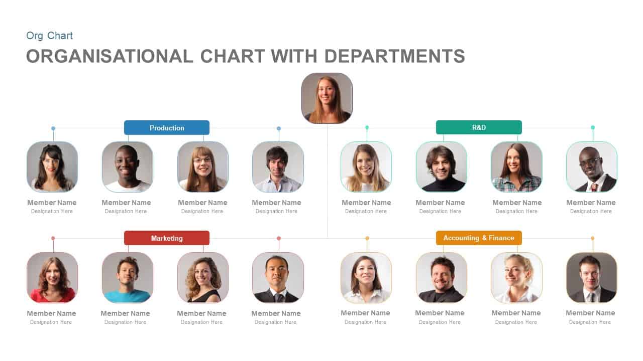
Organisational Chart with Departments Template for PowerPoint & Google Slides
Org Chart
Corporate Organizational Chart Hierarchy Template for PowerPoint & Google Slides
Org Chart
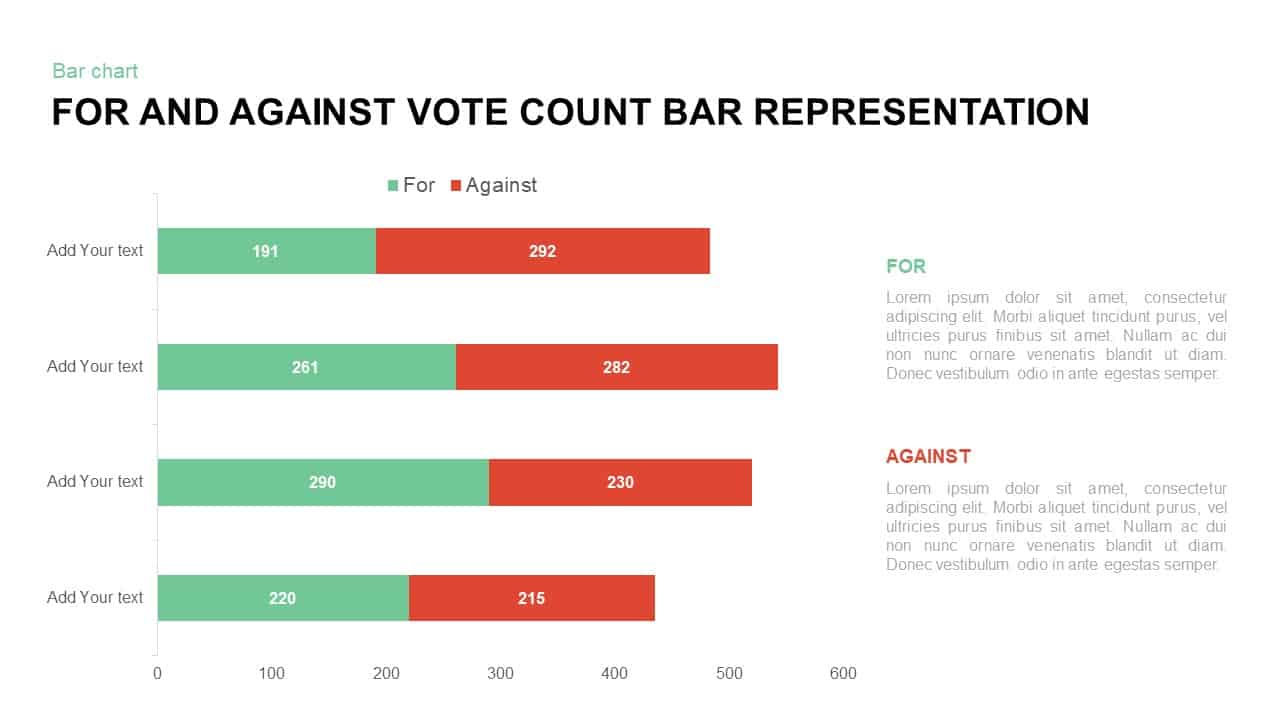
For and Against Vote Count Bar Chart Template for PowerPoint & Google Slides
Bar/Column
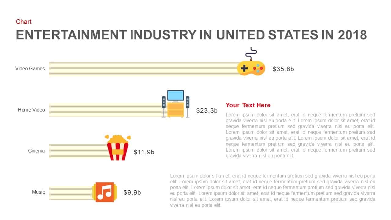
Entertainment Industry Revenue Bar Chart Template for PowerPoint & Google Slides
Bar/Column
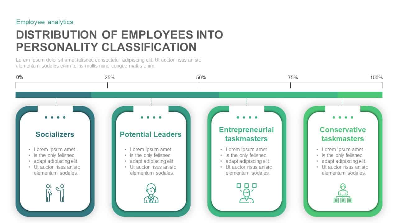
Employee Personality Distribution Chart Template for PowerPoint & Google Slides
Bar/Column
Capital Structure Dynamic Split Chart Template for PowerPoint & Google Slides
Comparison Chart

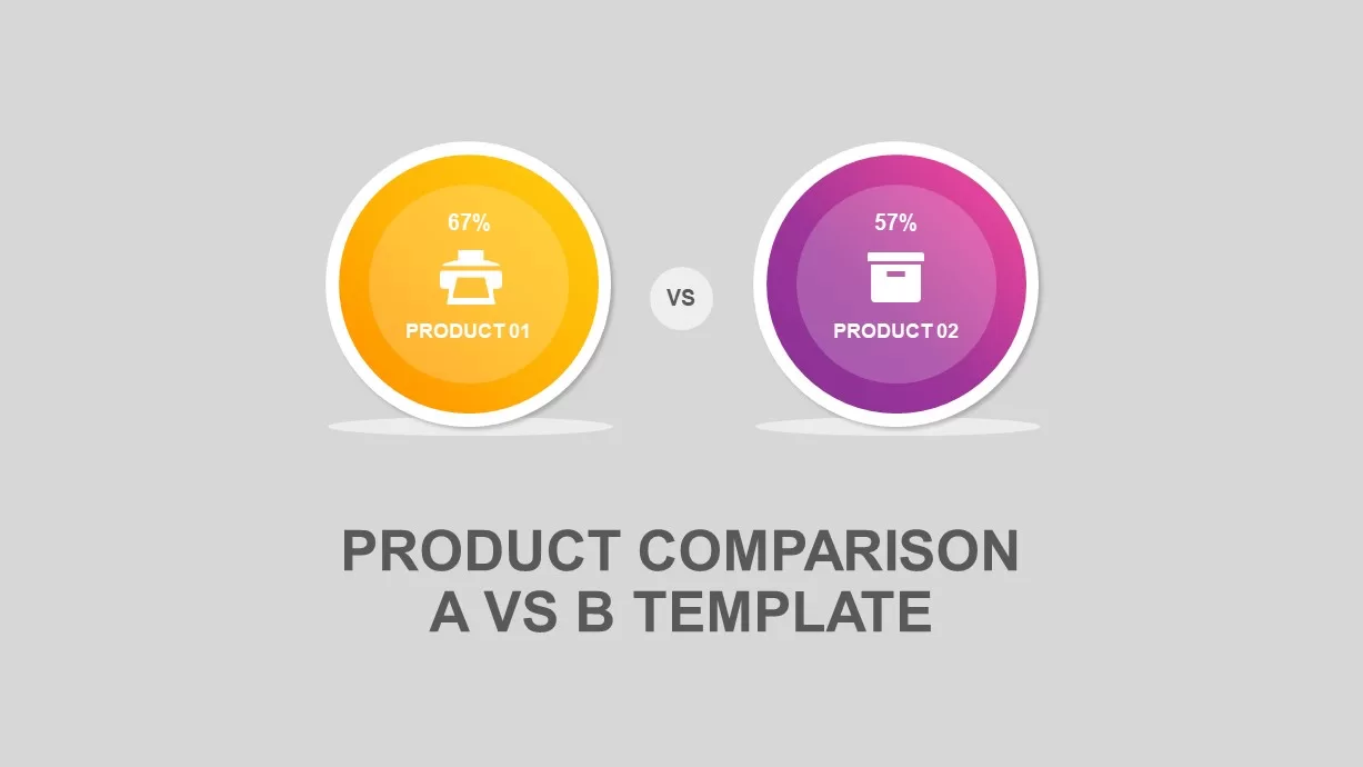
Circular Product Comparison Chart Template for PowerPoint & Google Slides
Comparison Chart
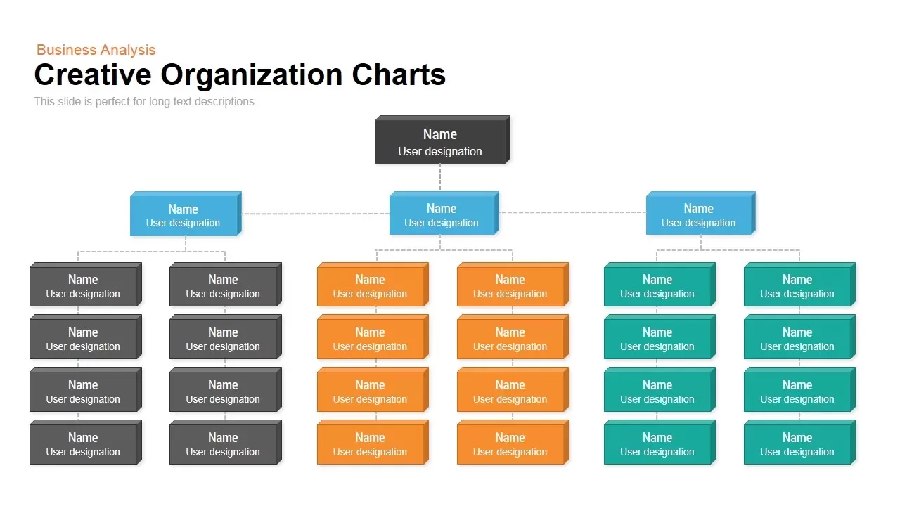
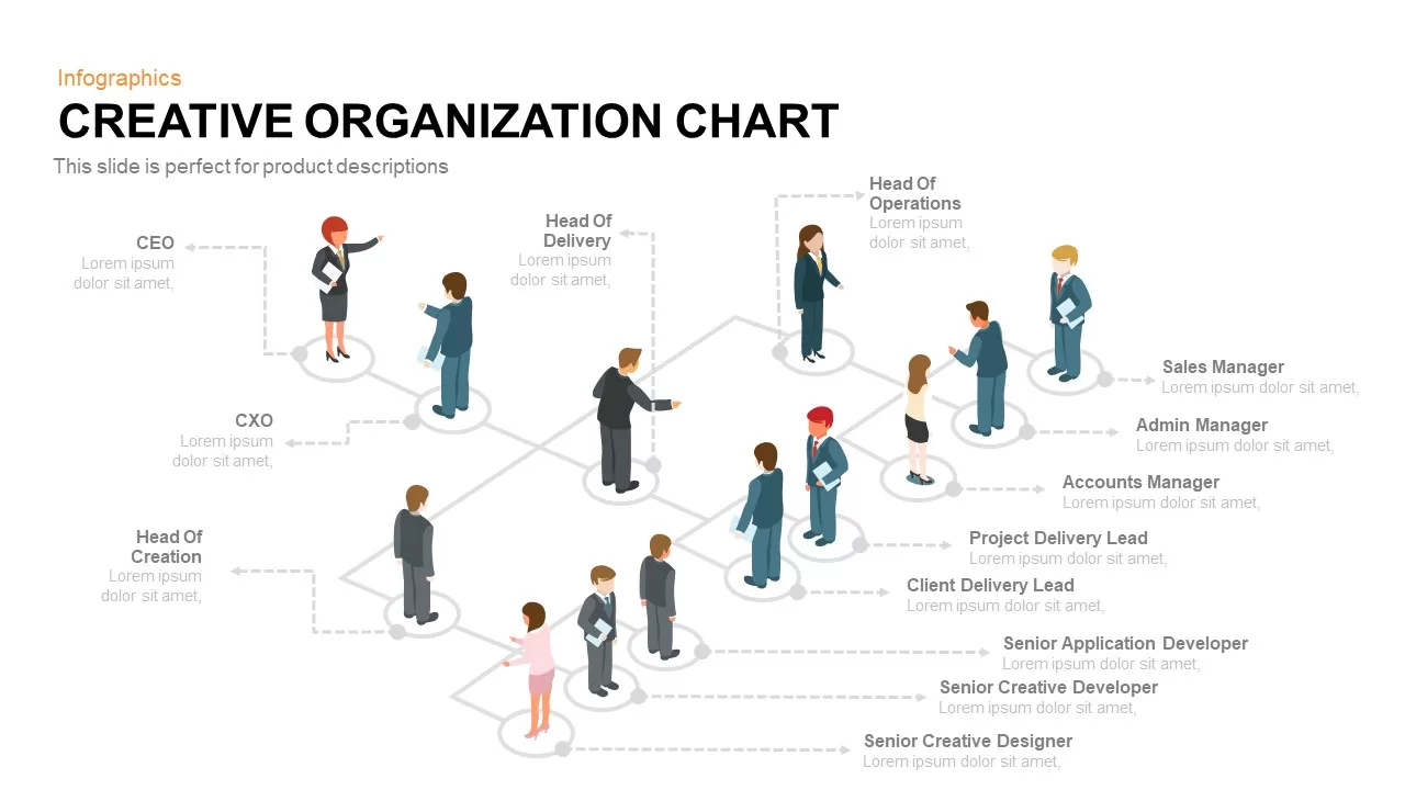
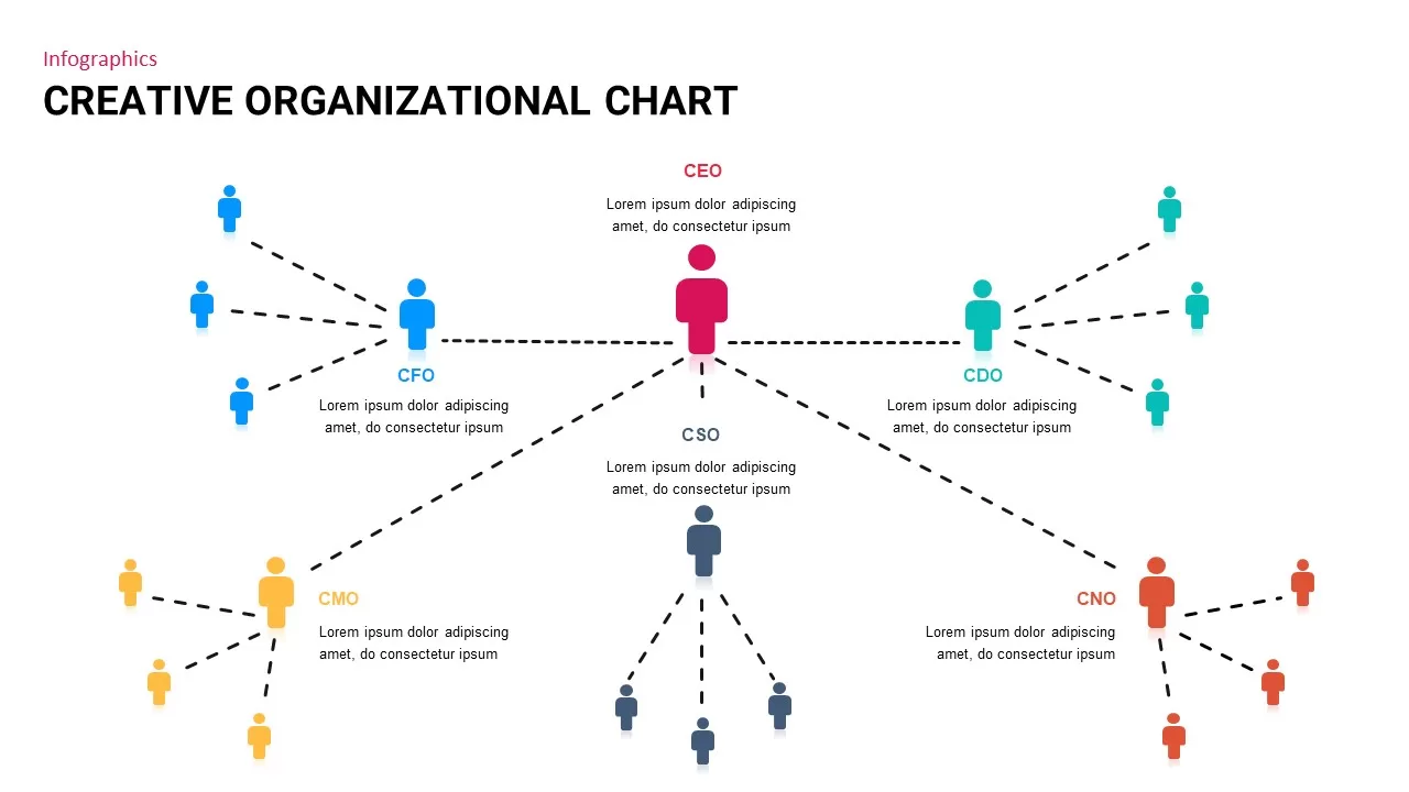
Creative Organizational Chart Template for PowerPoint & Google Slides
Org Chart
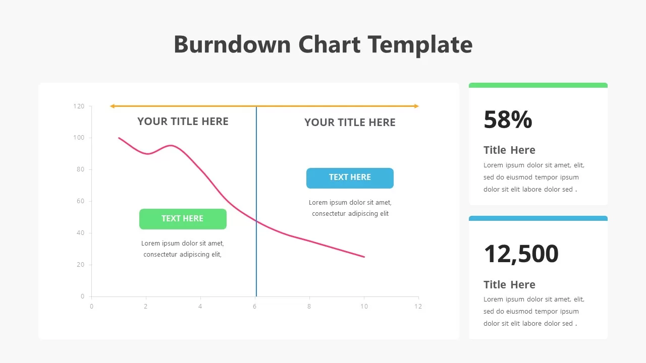
Burndown Chart Template for PowerPoint & Google Slides
Charts
Organizational Chart Structure template for PowerPoint & Google Slides
Business Plan
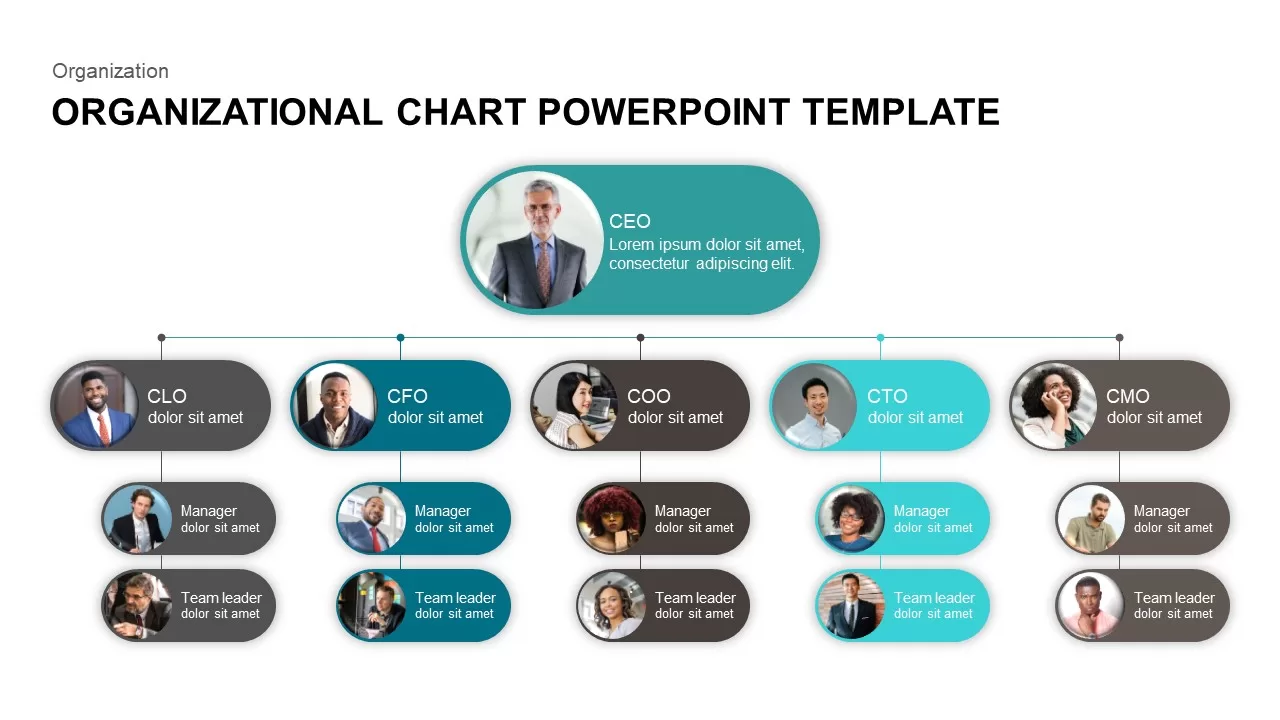
Organizational Chart Template for PowerPoint & Google Slides
Our Team
Organizational Chart template for PowerPoint & Google Slides
Org Chart
Flow Chart template for PowerPoint & Google Slides
Flow Charts
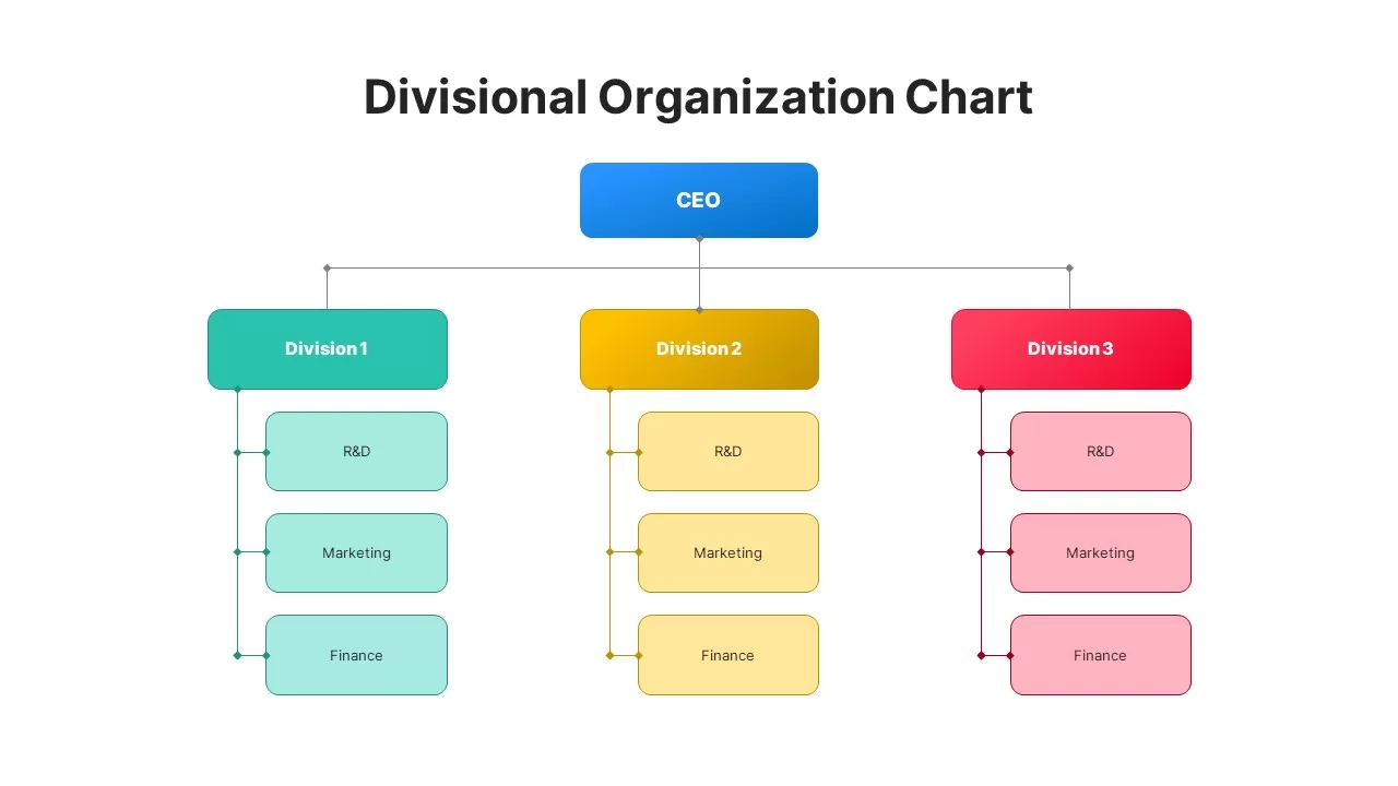
Divisional Organizational Chart Diagram Template for PowerPoint & Google Slides
Org Chart
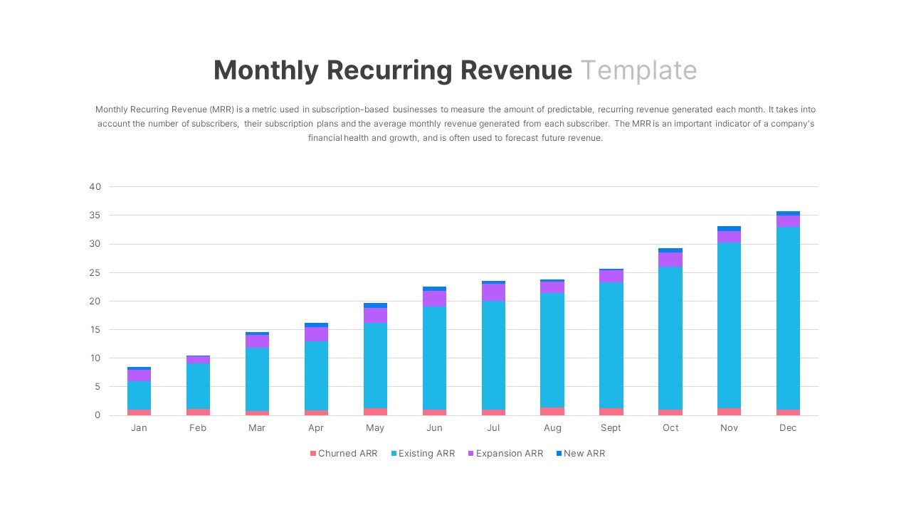
Monthly Recurring Revenue KPI Bar Chart Template for PowerPoint & Google Slides
Bar/Column
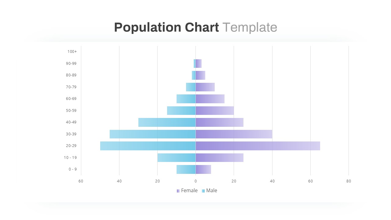
Population Pyramid Chart Analysis Template for PowerPoint & Google Slides
Bar/Column
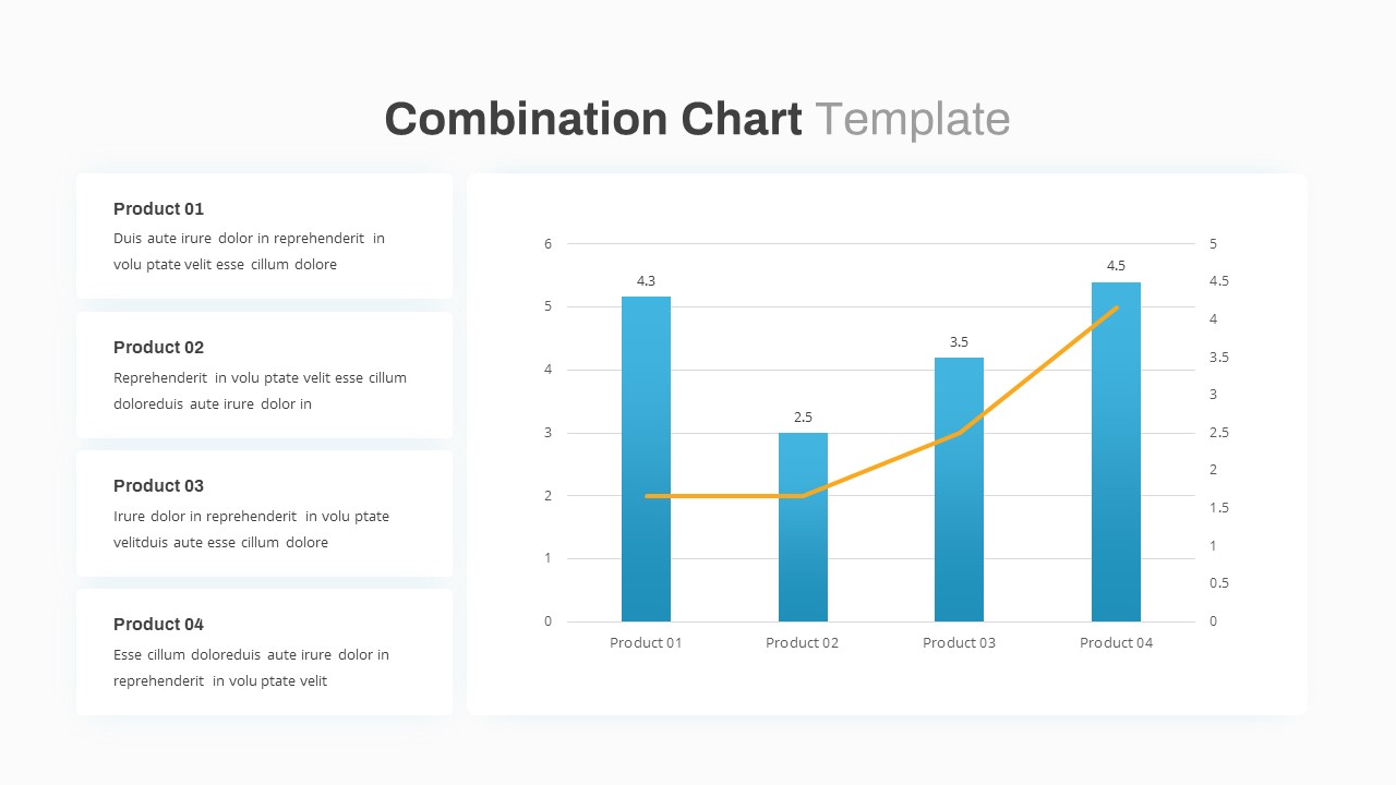
Combination Bar and Line Chart Template for PowerPoint & Google Slides
Bar/Column
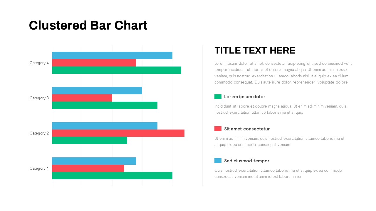
Animated Clustered Bar Chart Template for PowerPoint & Google Slides
Bar/Column
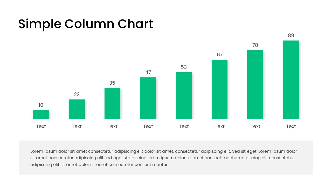
Free Editable Simple Column Chart Slide Template for PowerPoint & Google Slides
Bar/Column
Free
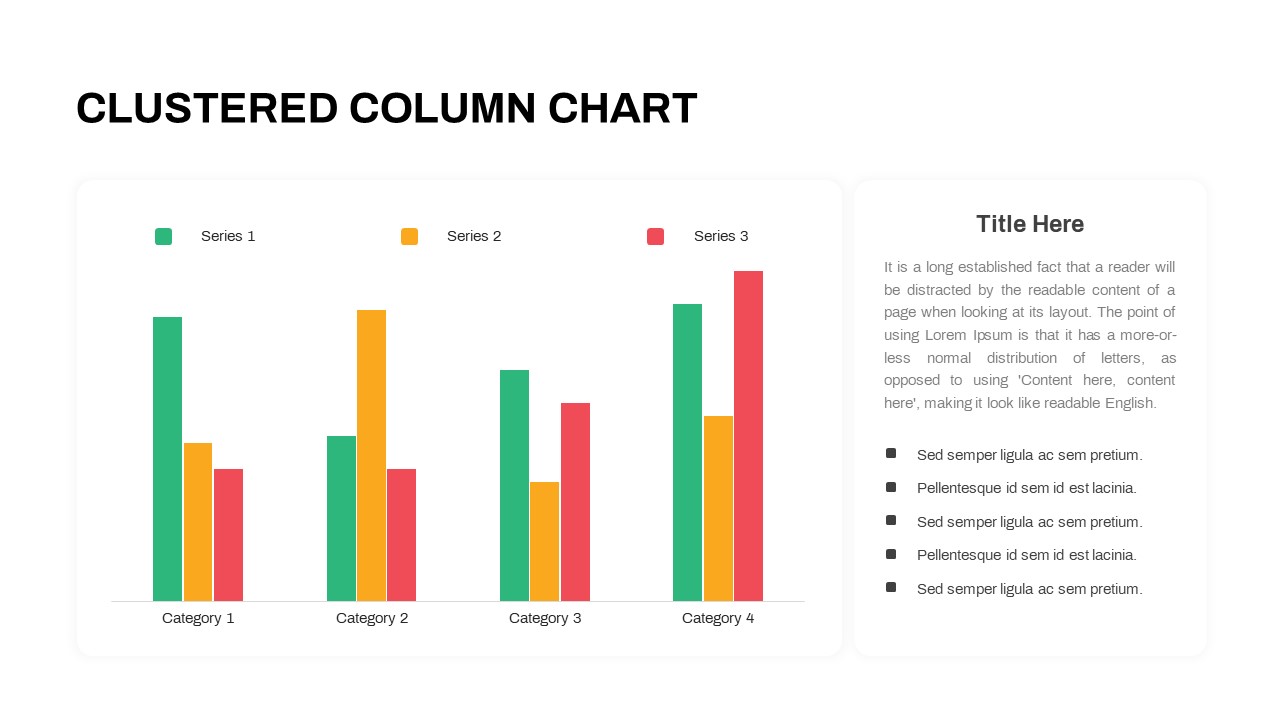
Professional Clustered Column Chart Template for PowerPoint & Google Slides
Bar/Column
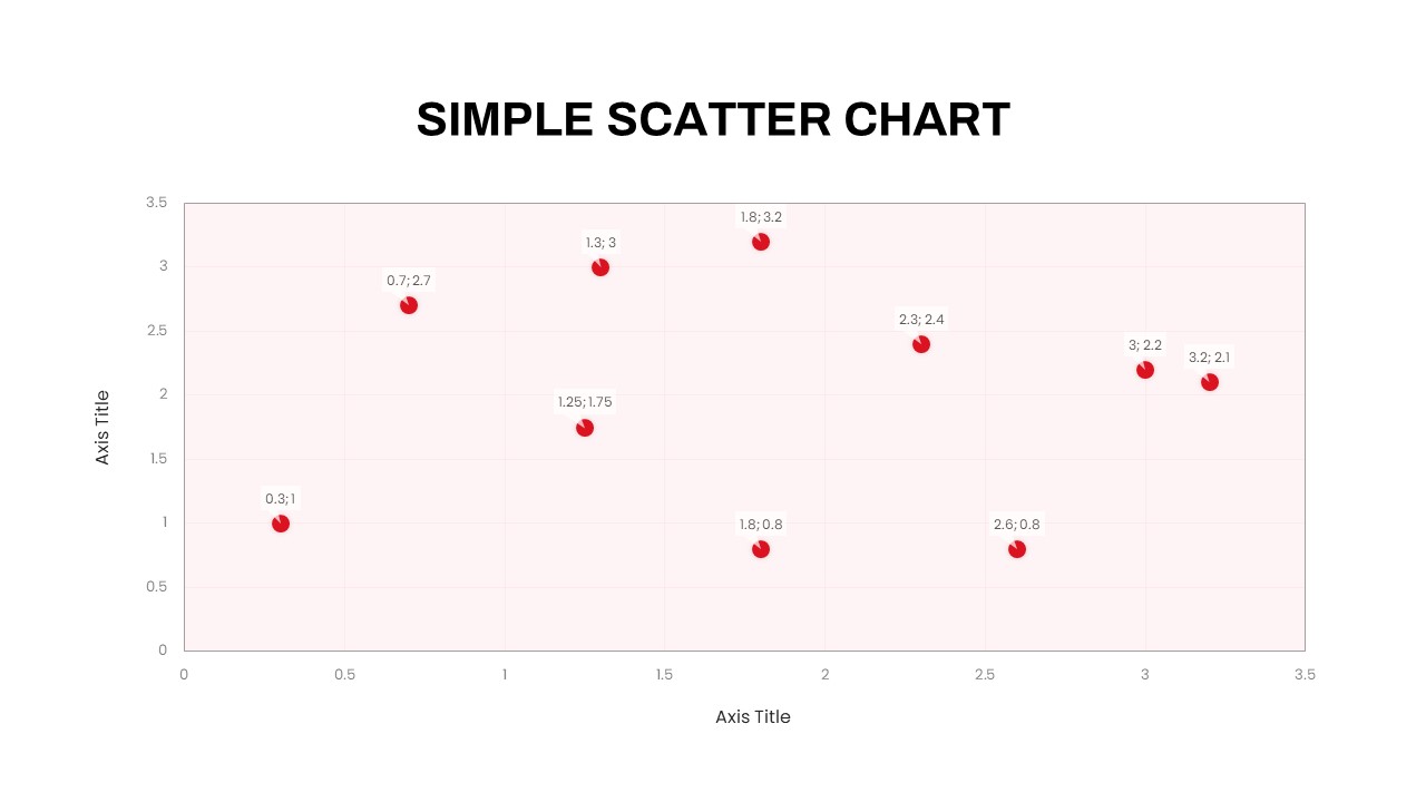
Simple Scatter Chart Analysis Template for PowerPoint & Google Slides
Comparison Chart
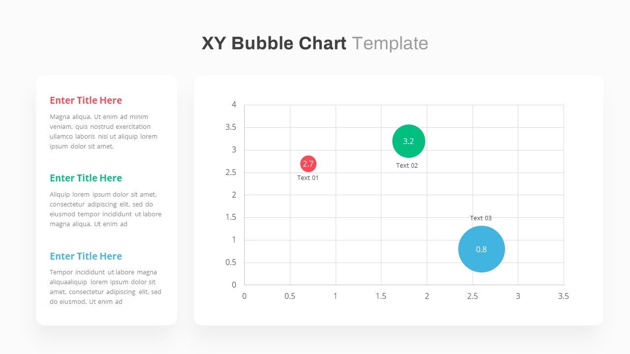
XY Bubble Chart Data Visualization Template for PowerPoint & Google Slides
Comparison Chart
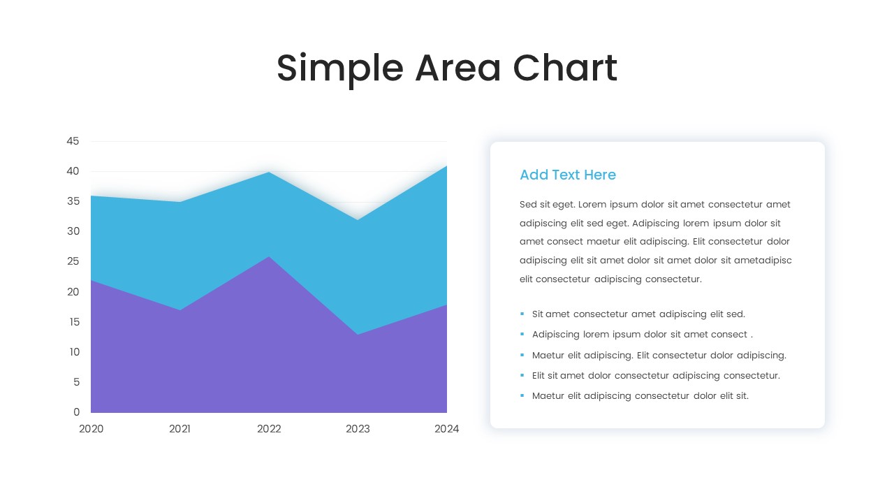
Simple Area Chart Data Trends Analysis Template for PowerPoint & Google Slides
Comparison Chart
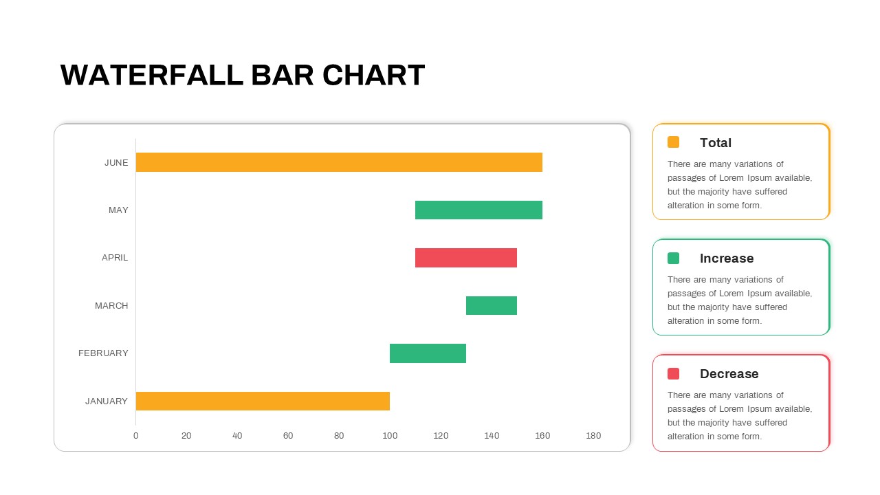
Waterfall Bar Chart Analysis Template for PowerPoint & Google Slides
Bar/Column
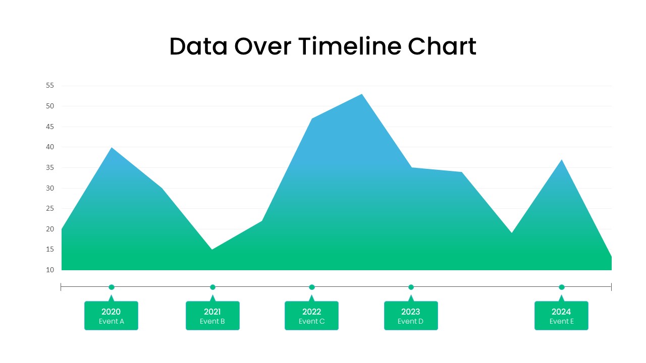
Data Over Time Line Chart template for PowerPoint & Google Slides
Charts
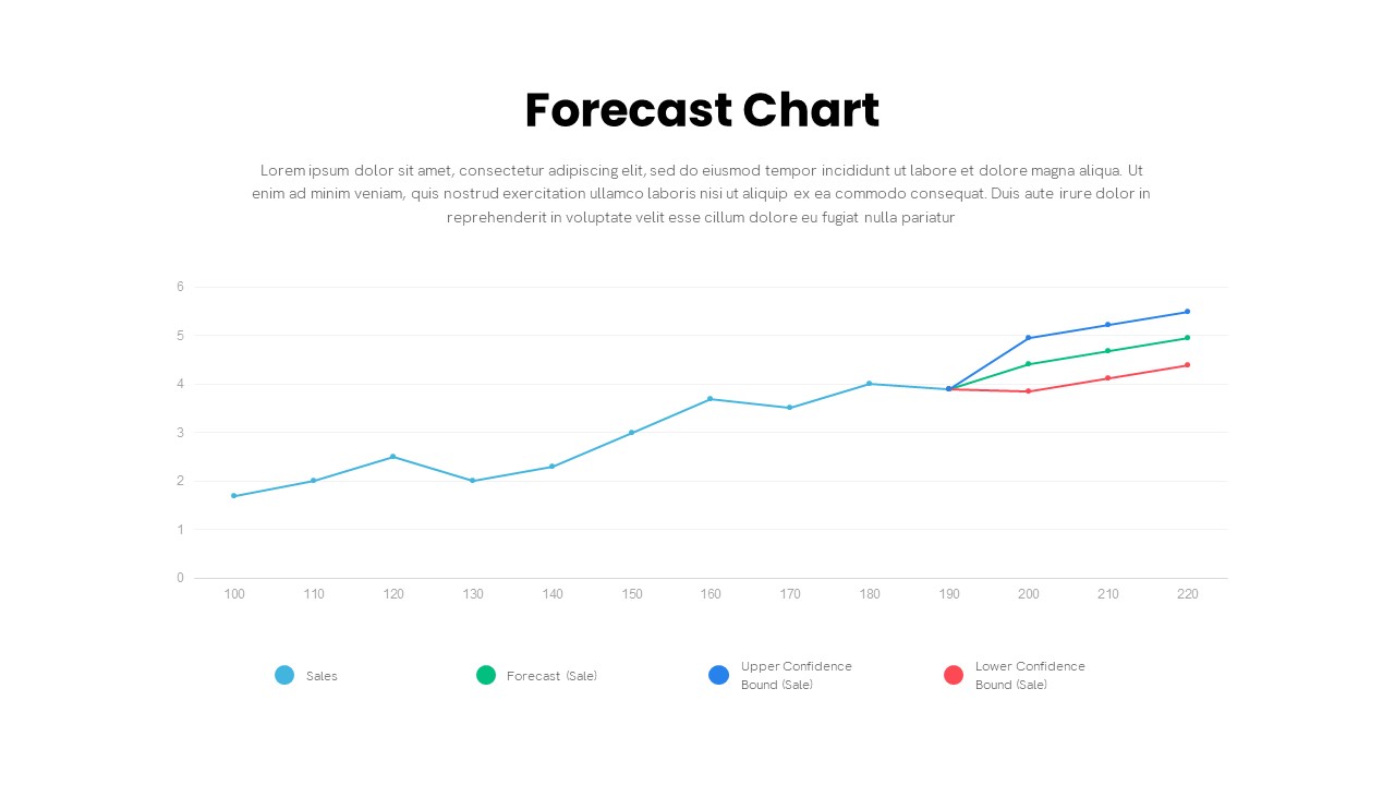
Forecast Chart with Confidence Bounds Template for PowerPoint & Google Slides
Comparison Chart
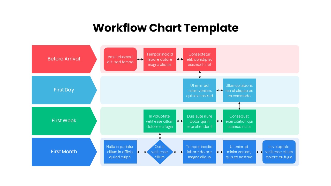
Colorful Multistage Workflow Chart Template for PowerPoint & Google Slides
Flow Charts
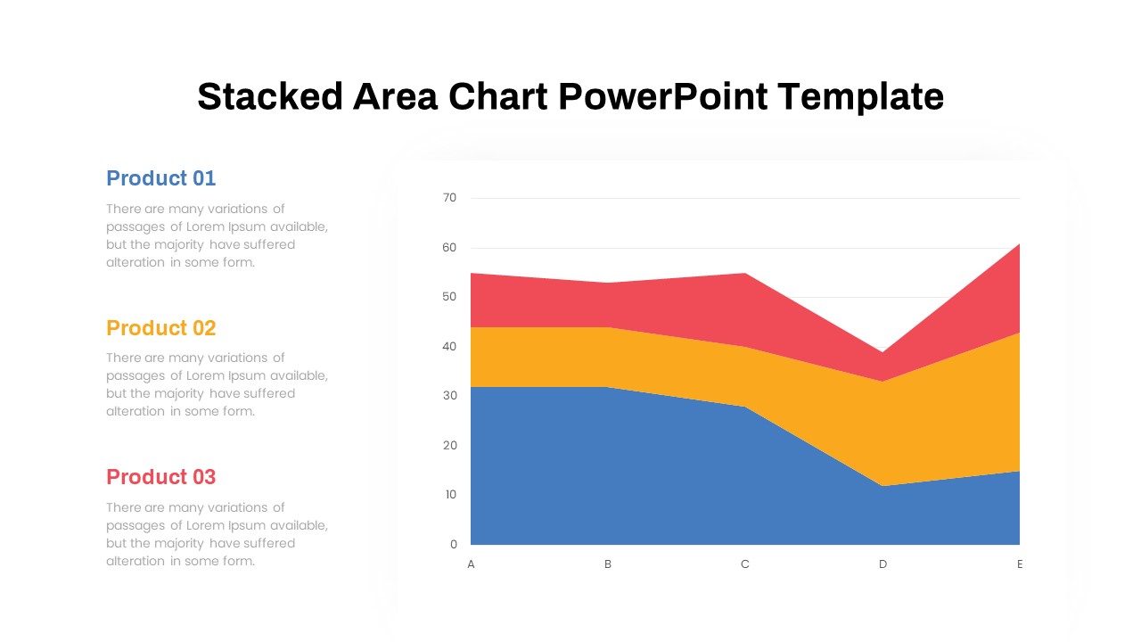
Dynamic Three-Series Stacked Area Chart Template for PowerPoint & Google Slides
Comparison Chart
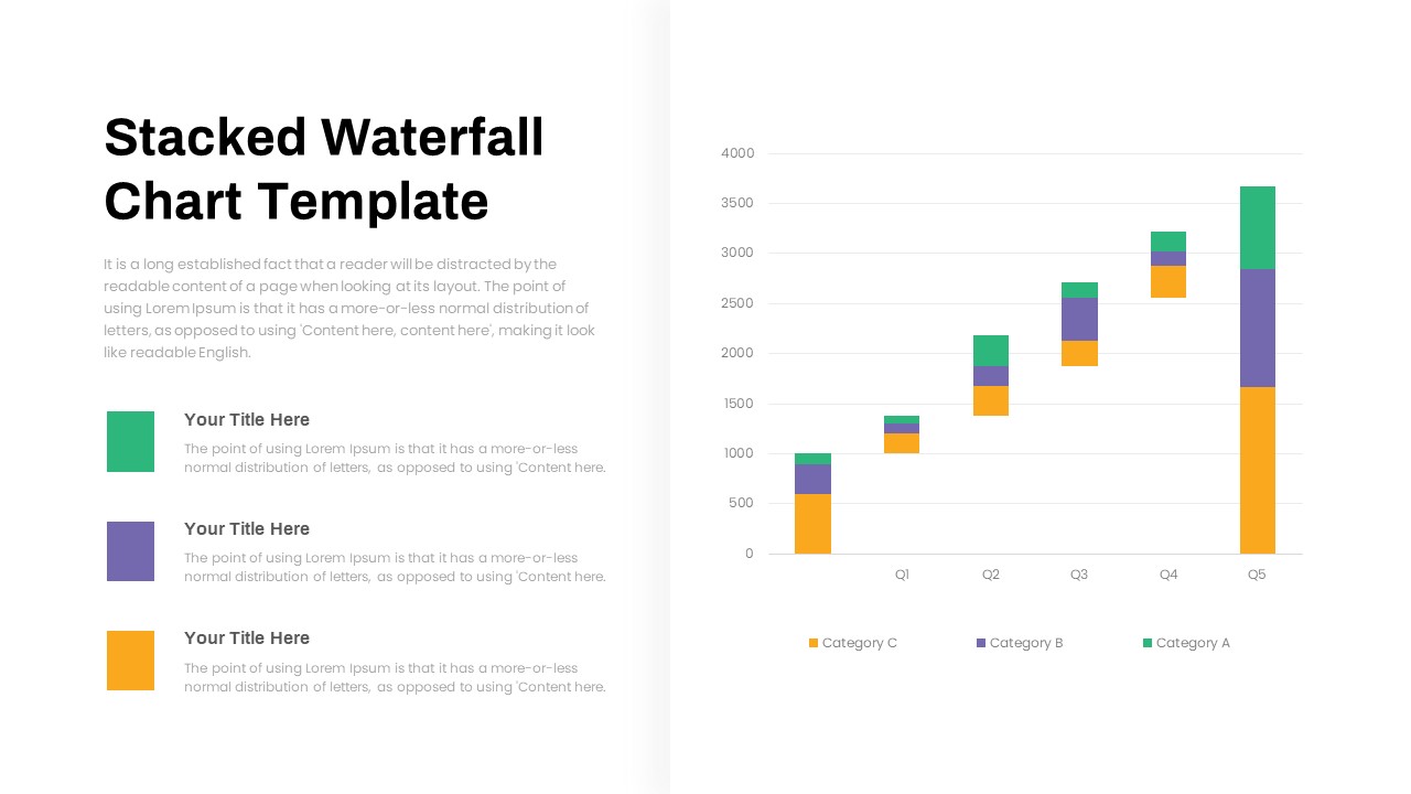
Stacked Waterfall Chart Template for PowerPoint & Google Slides
Bar/Column
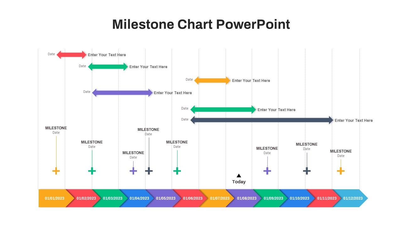
Professional Milestone Timeline Chart Template for PowerPoint & Google Slides
Timeline
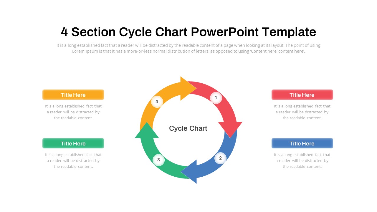
Cycle Chart Template for PowerPoint & Google Slides
Circular
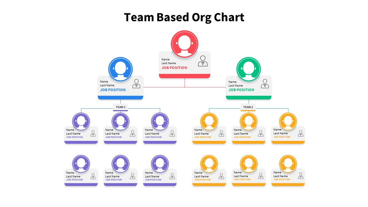
Team-Based Organizational Chart Template for PowerPoint & Google Slides
Org Chart
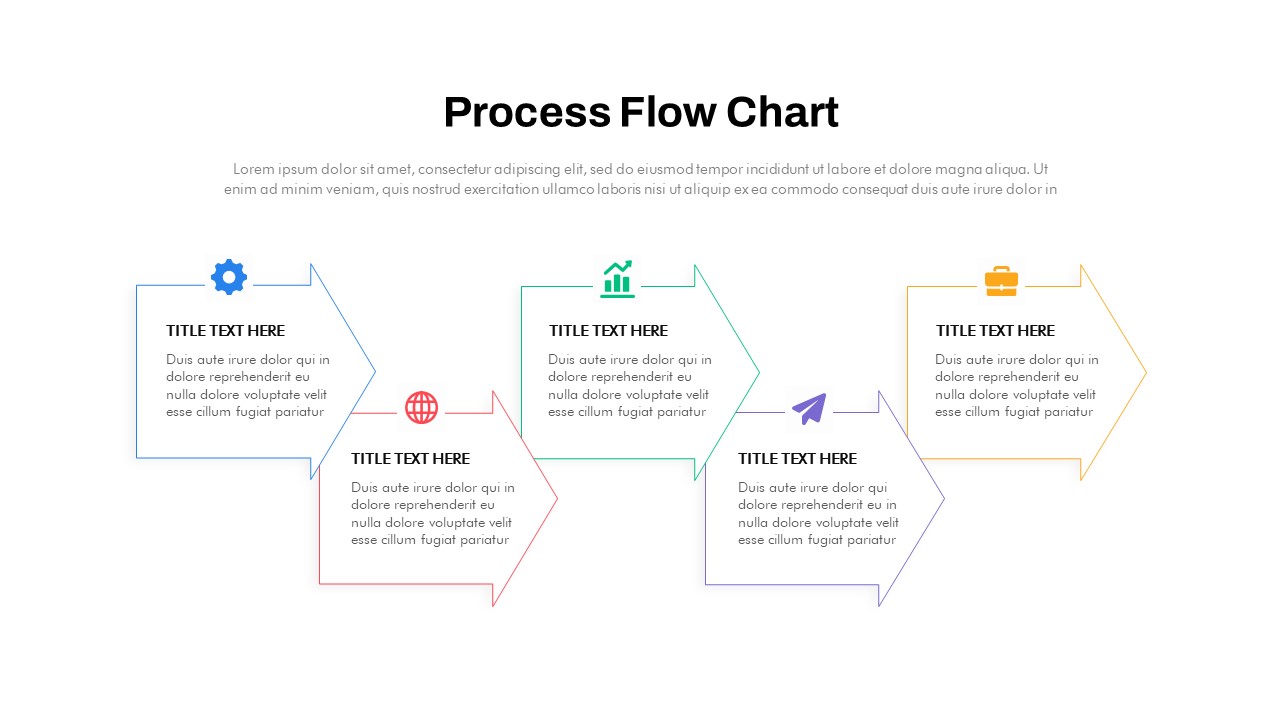
Animated Process Flow Chart Template for PowerPoint & Google Slides
Infographics
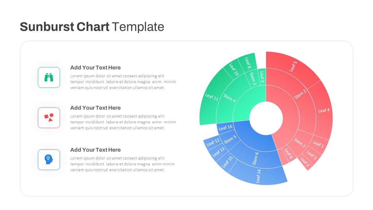
Dynamic Sunburst Chart Visualization Template for PowerPoint & Google Slides
Charts
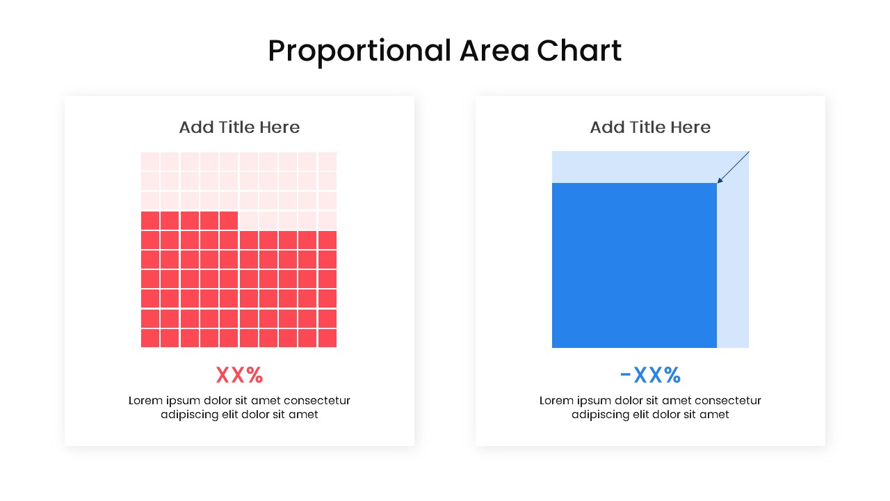
Proportional Area Chart Analysis Template for PowerPoint & Google Slides
Comparison Chart
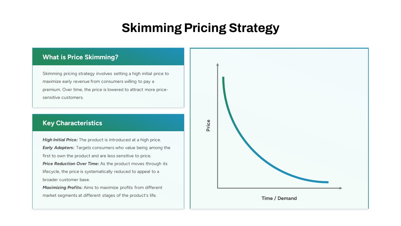
Skimming Pricing Strategy Line Chart Template for PowerPoint & Google Slides
Business Strategy
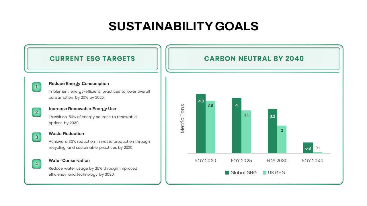
Sustainability Goals and Targets Chart Template for PowerPoint & Google Slides
Goals
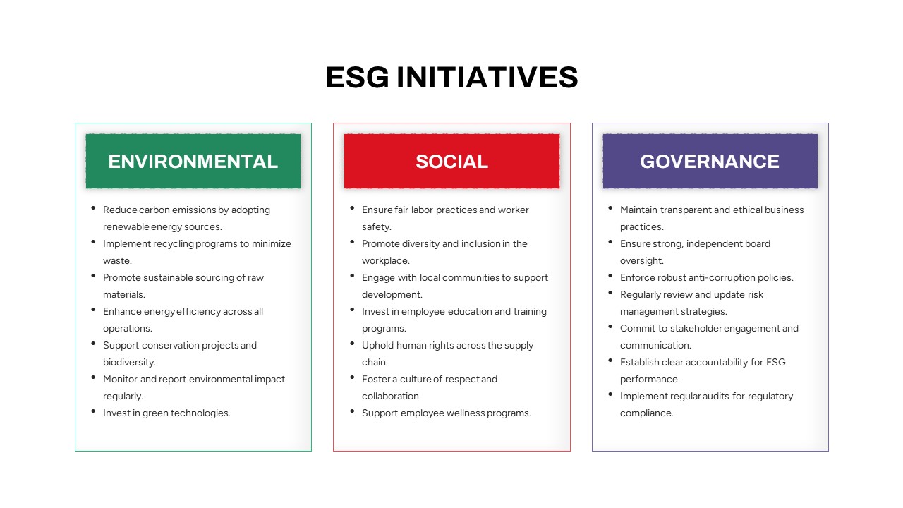
ESG Initiatives Comparison Chart Template for PowerPoint & Google Slides
Business
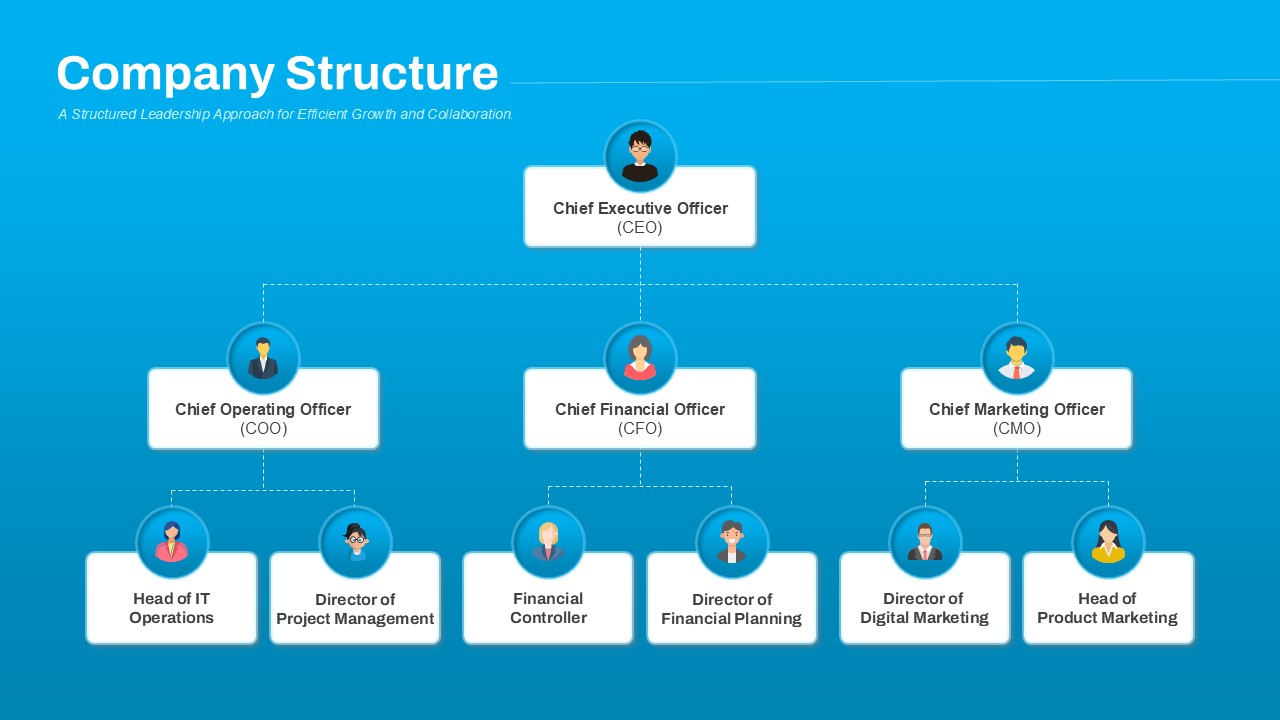
Company Structure Hierarchical Org Chart Template for PowerPoint & Google Slides
Org Chart
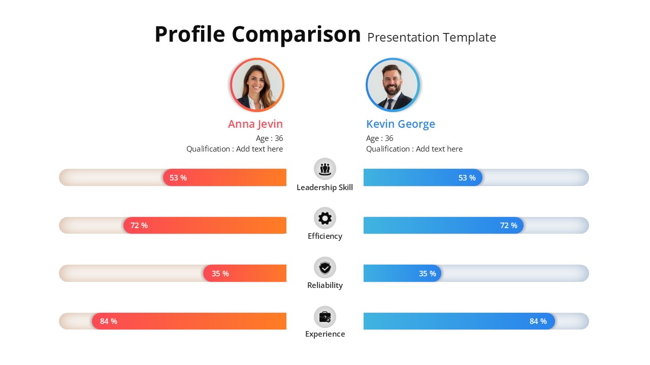
Profile Comparison Chart template for PowerPoint & Google Slides
Comparison Chart
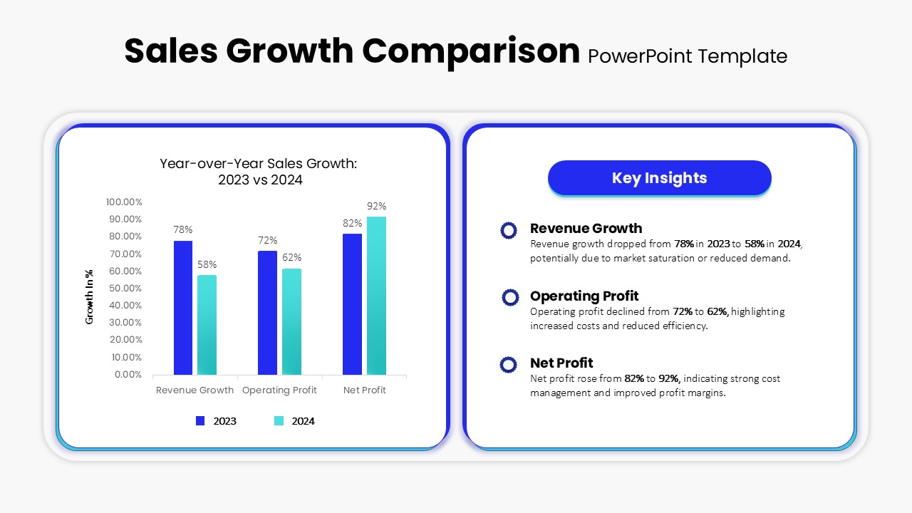
Sales Growth Comparison Chart & Table Template for PowerPoint & Google Slides
Bar/Column
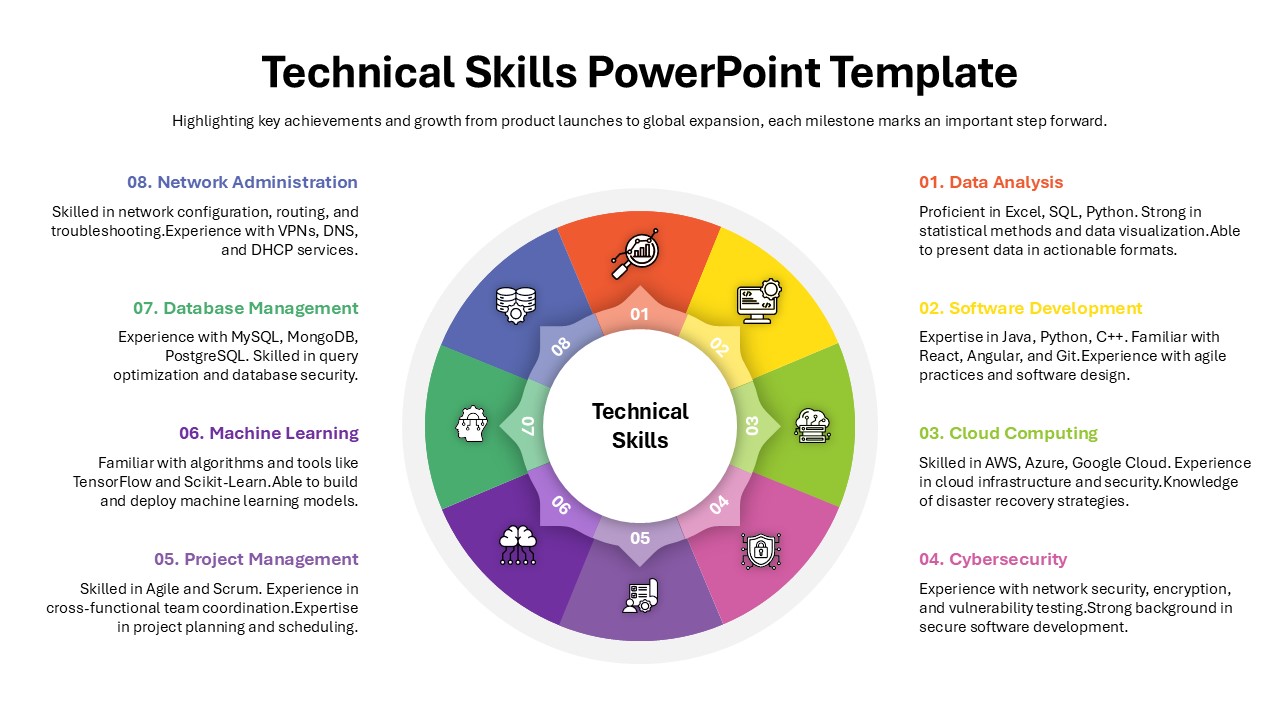
Technical Skills Donut Chart Overview Template for PowerPoint & Google Slides
HR
Skills Gap Analysis Comparison Chart Template for PowerPoint & Google Slides
Gap
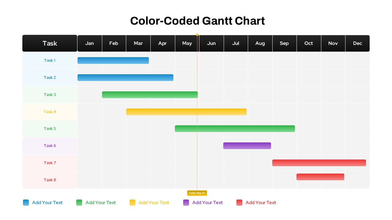
Color-Coded Gantt Chart template for PowerPoint & Google Slides
Business
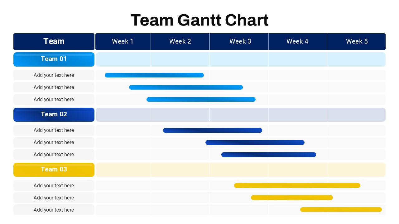
Team Gantt Chart Overview template for PowerPoint & Google Slides
Project Status
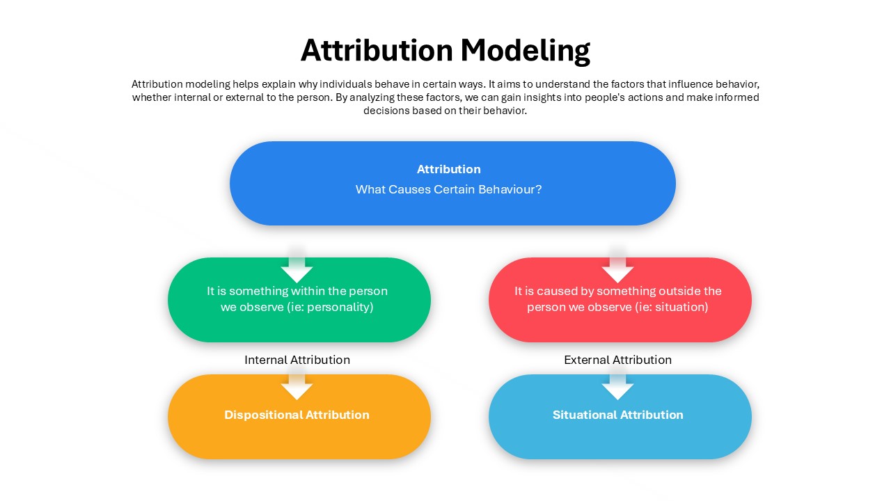
Attribution Modeling Flow Chart Template for PowerPoint & Google Slides
Flow Charts
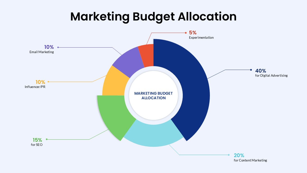
Marketing Budget Allocation Donut Chart Template for PowerPoint & Google Slides
Marketing
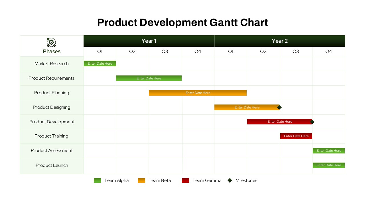
Product Development Gantt Chart template for PowerPoint & Google Slides
Gantt Chart
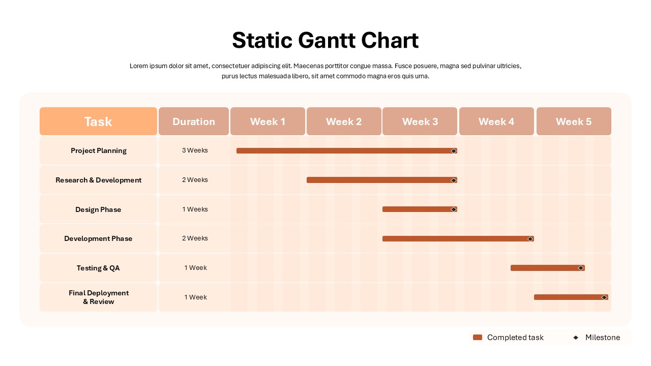
Static Gantt Chart Overview template for PowerPoint & Google Slides
Project Status
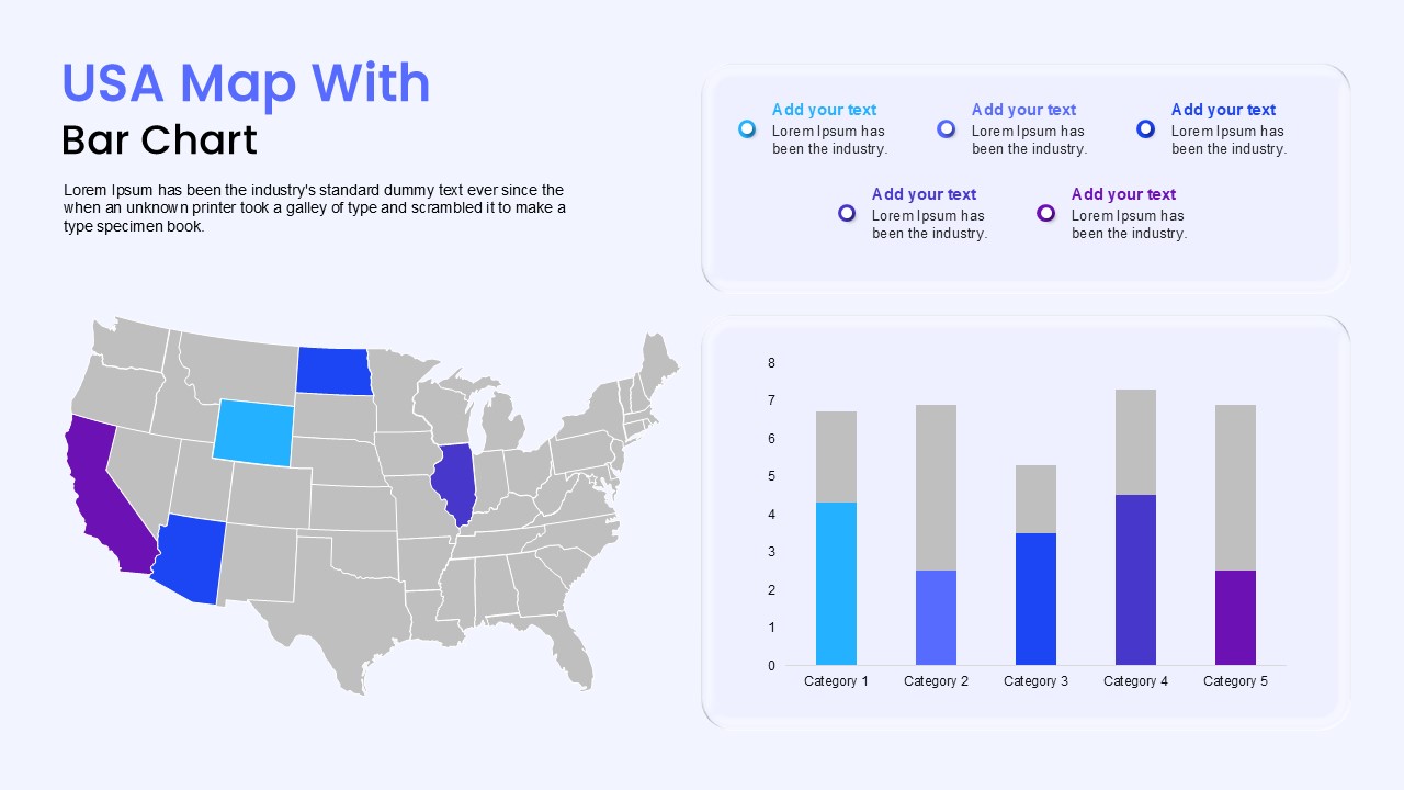
USA Map with Bar Chart Template for PowerPoint & Google Slides
World Maps
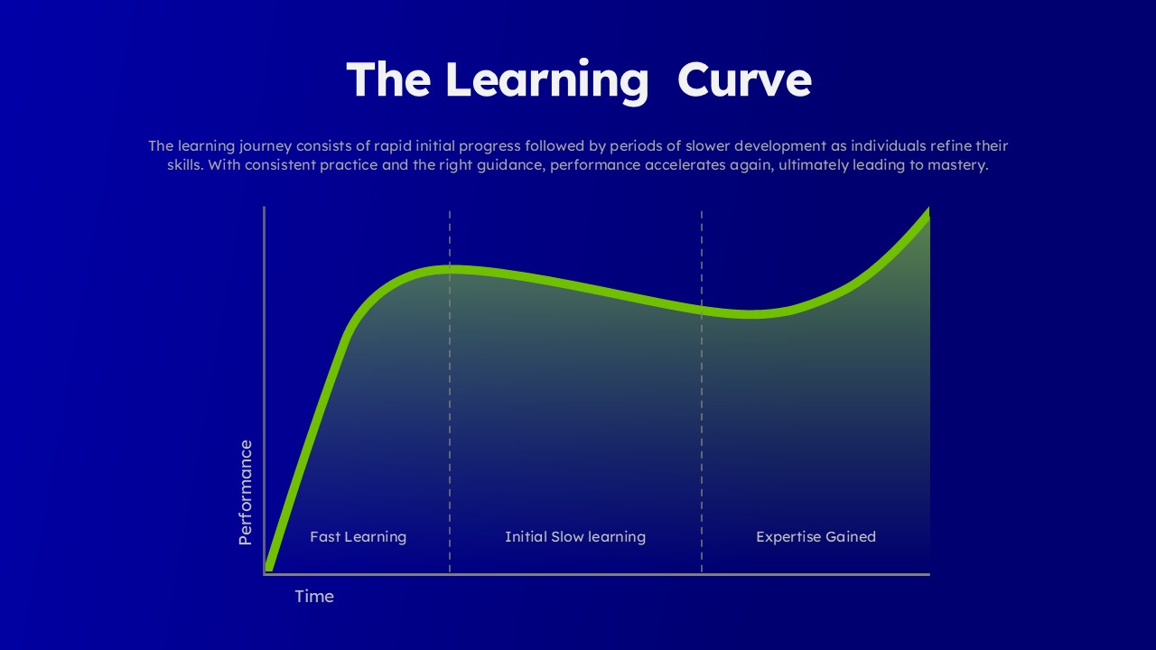
Learning Curve Performance Growth Chart Template for PowerPoint & Google Slides
Employee Performance