Proportional Area Chart Analysis Template for PowerPoint & Google Slides
Proportional Area Chart PowerPoint and Google Slides Template
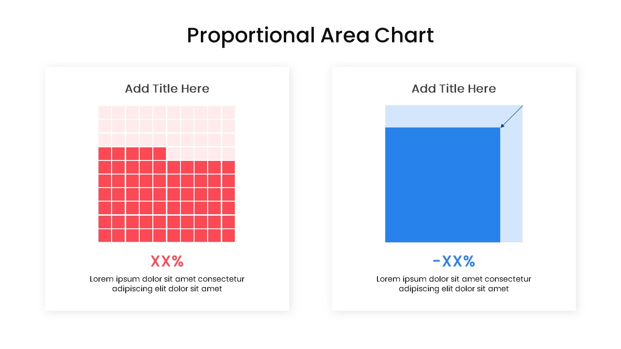
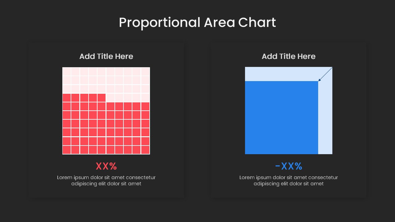
Visualizing market share comparisons, presenting statistical proportions, displaying percentage breakdowns, or comparing data volumes side by side requires an intuitive quantitative graphic. This proportional area chart PowerPoint template equips data analysts, financial planners, market researchers, and business consultants with a clean dual-card data layout. By pairing a 100-unit waffle grid with a scalable proportional square area chart, this slide helps presenters convey relative values, percentage losses, and statistical ratios during executive reviews and business performance presentations.
Key slide components and visual highlights include:
- A side-by-side two-card comparison layout enclosed in modern rounded white container boxes with soft drop shadows.
- A left-side 10×10 waffle grid matrix displaying proportional part-to-whole data in contrasting vibrant red and light pastel pink squares.
- A right-side scalable area square chart featuring a two-tone blue overlay with an inward diagonal indicator arrow to emphasize dimensional change or reduction.
- Bold statistical percentage placeholders highlighted in matching red and blue typography beneath each visual model.
- Dedicated title headers and descriptive paragraph containers positioned above and below each chart for contextual explanations.
- Clean white presentation canvas designed to deliver maximum contrast and sharp legibility across boardroom projectors and virtual conference calls.
- 100% editable vector elements that allow presenters to adjust grid fills, rescale area dimensions, customize color palettes, and update numerical data directly within PowerPoint or Google Slides.
Login to download this file

Item ID
SB04167


Related Templates

Creative Data Analysis Bar Chart template for PowerPoint & Google Slides
Bar/Column

Line Chart Analysis PowerPoint Template and Google Slides
Charts
Simple Scatter Chart Template for PPT Slides
Comparison Chart
Simple Area Chart Data Trends Analysis Template for PowerPoint & Google Slides
Comparison Chart
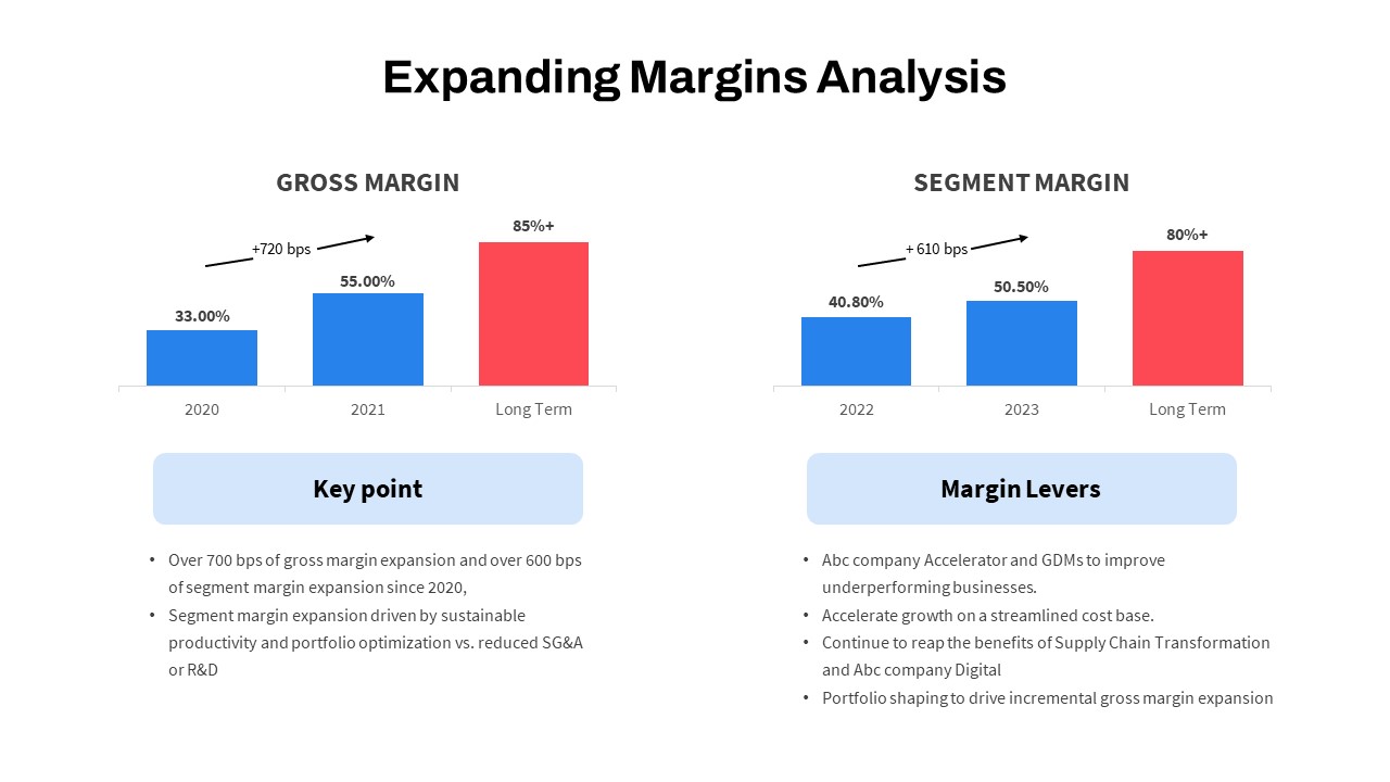
Expanding Margins Analysis Bar Chart Template for PowerPoint & Google Slides
Charts
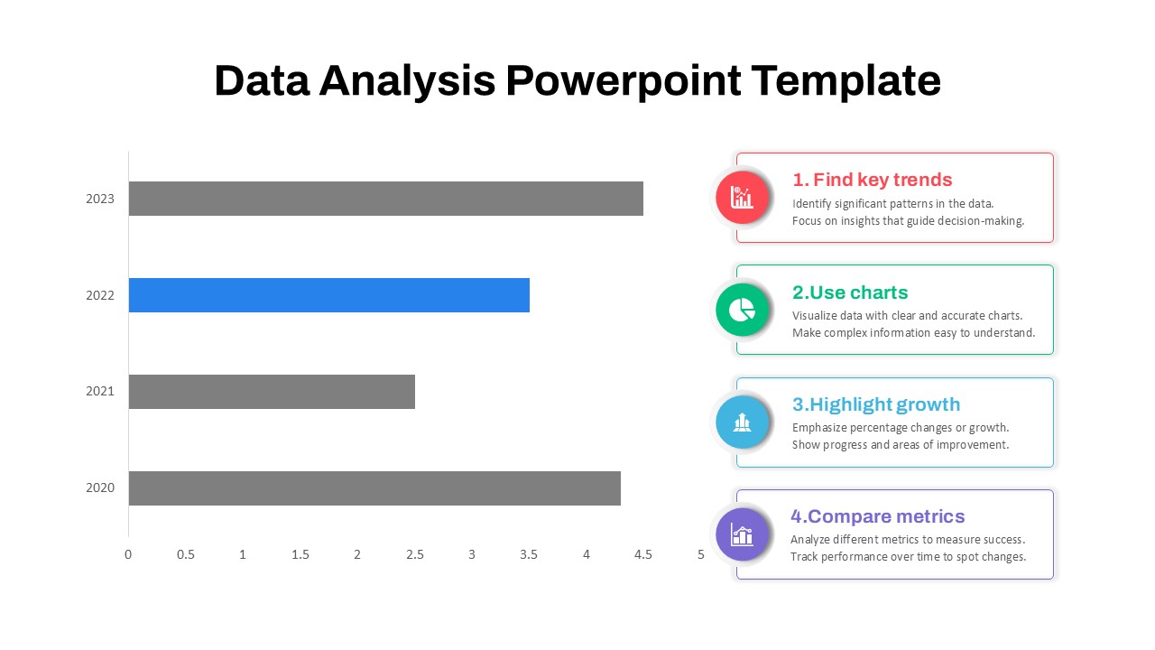
4-Step Data Analysis PowerPoint Template
Bar/Column
Free
Skills Gap Analysis PowerPoint Template
Gap
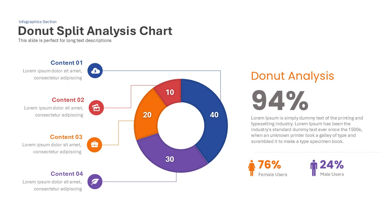
Donut Split Analysis Chart PowerPoint Template
Pie/Donut
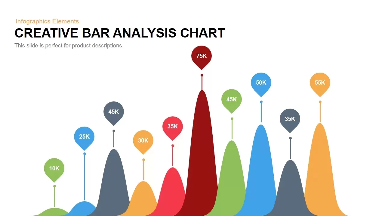
Creative Bar Chart Analysis PowerPoint Template
Charts
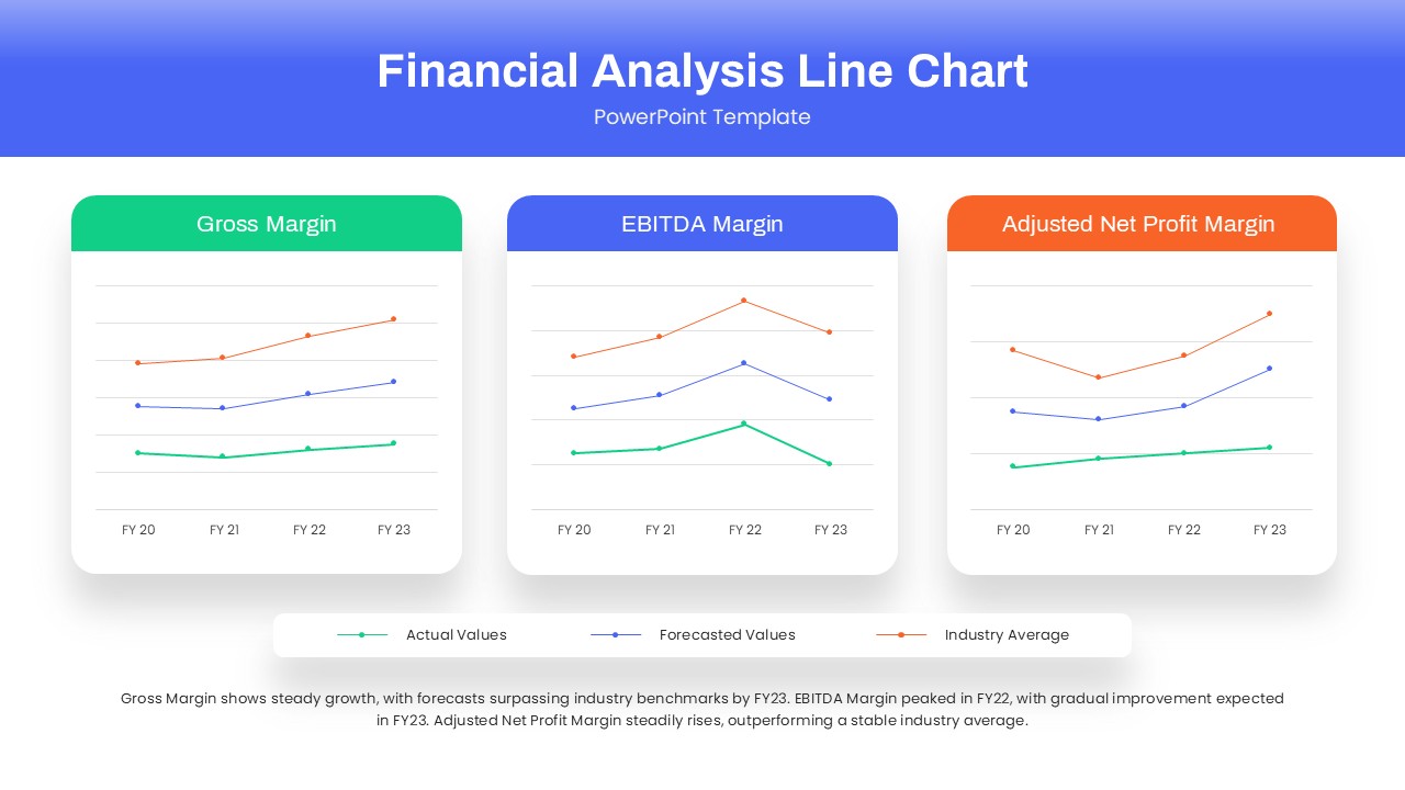
Financial Analysis Line Chart PowerPoint Template
Finance
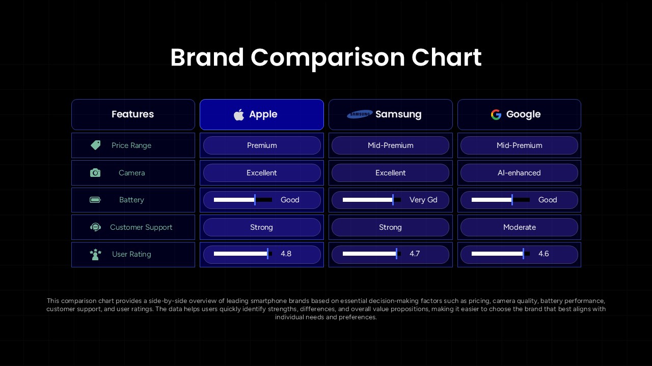
Brand Comparison Chart Template for Product and Competitive Analysis
Comparison Chart
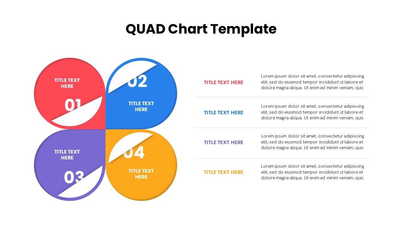
Quad Chart Infographic Pack of 8 Slides Template for PowerPoint & Google Slides
Comparison Chart
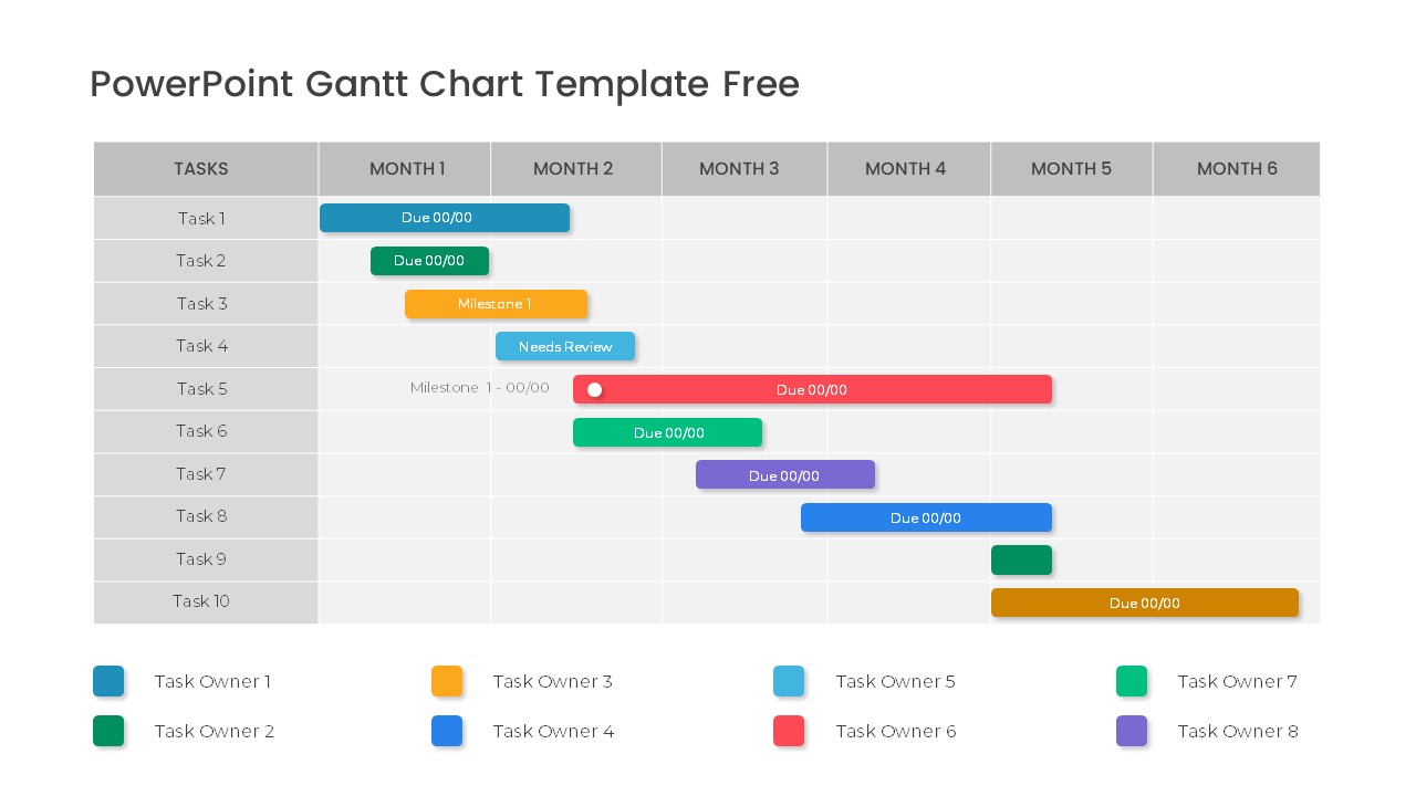
Free Professional Gantt Chart Pack – 4 Slides Template for PowerPoint & Google Slides
Gantt Chart
Free
PESTEL Analysis Tree Diagram PowerPoint Template and Google Slides
Process
EPRG Framework Analysis template for PowerPoint & Google Slides
Business Strategy
SWOT Analysis Framework template for PowerPoint & Google Slides
SWOT
SWOT Analysis Blocks Template for PowerPoint & Google Slides
Business Strategy
3D SWOT Analysis Slide for PowerPoint and Google Slides
SWOT
IT Gap Template for PPT & Google Slides
Information Technology
5W2H Analysis Radial Diagram Template for PowerPoint & Google Slides
Decision Tree