Grouped Column Chart Comparison Template for PowerPoint & Google Slides
Description
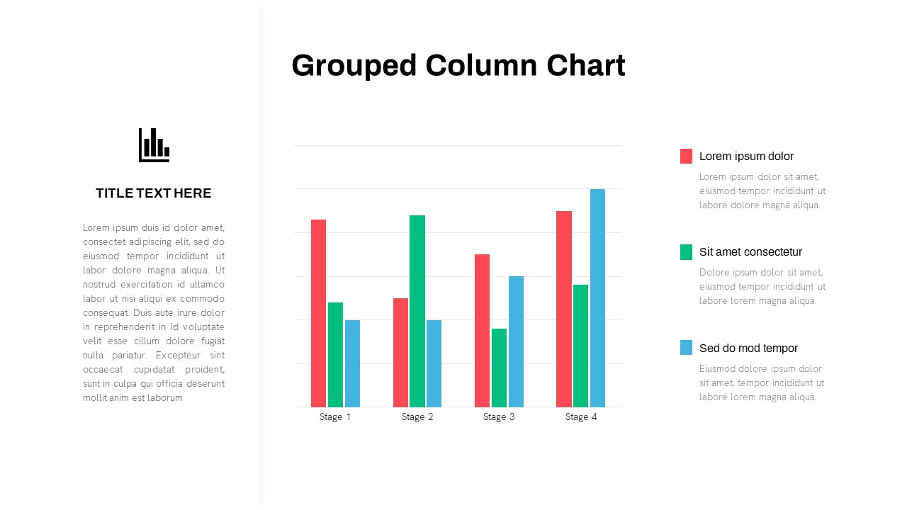
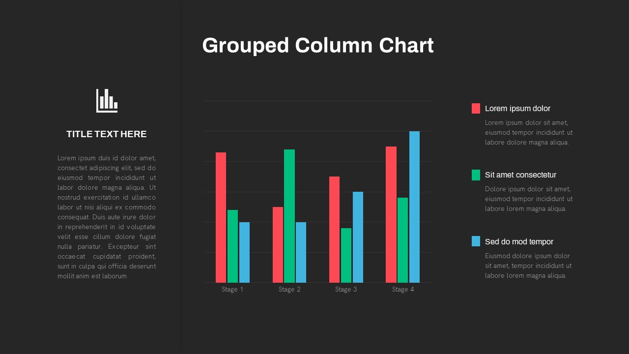
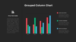
Leverage this intuitive grouped column chart slide to showcase comparative data across multiple stages with precision and visual impact. The balanced three-column layout features an icon and title placeholder aligned vertically on the left panel, a high-resolution chart in the central pane, and a concise legend with narrative callouts on the right. Customize each data series with distinct color coding—red, green, and blue bars—representing key categories or performance metrics at Stage 1 through Stage 4. Subtle gray gridlines and minimalist axis labels ensure the viewer’s focus remains on data trends and comparisons.
This template is built for efficiency and flexibility: all chart components are fully editable vector shapes, with linked data tables in PowerPoint and seamless import into Google Slides. Adjust bar widths, series order, or axis intervals in seconds via master-slide controls. Placeholder text zones let you insert a headline, summary description, and individual annotations for each legend entry. Rounded-corner containers and generous white space deliver a modern, clean aesthetic that supports brand consistency and audience engagement.
Whether you’re analyzing year-over-year growth, stage-gated project metrics, or multi-channel marketing performance, this grouped column chart slide streamlines your workflow. Use built-in animation presets to introduce each series sequentially or highlight critical differences between stages. The slide’s responsive design maintains clarity across large conference displays and remote screen shares.
Advanced customization options allow you to add trendlines, overlay target benchmarks, or annotate pivotal milestones directly on the chart. With full support for light and dark background themes, this asset empowers teams to deliver data-driven insights with confidence and precision.
Who is it for
Business analysts, financial planners, marketing strategists, product managers, and project leads who need to compare metrics across multiple stages and series in a clear, data-centric format.
Other Uses
Use this slide for quarterly performance reviews, product launch comparisons, resource allocation tracking, customer segmentation analysis, budget variance studies, or cross-functional dashboard reports. The grouped layout also lends itself to competitive benchmarking and market share comparisons.
Login to download this file

Item ID
SB03662
Related Templates

3-Column Comparison template for PowerPoint & Google Slides
Comparison
Premium
Two-Column Comparison Infographic Slide Template for PowerPoint & Google Slides
Comparison
Premium
Free Stacked Column Chart Data Visualization Template for PowerPoint & Google Slides
Bar/Column
Free
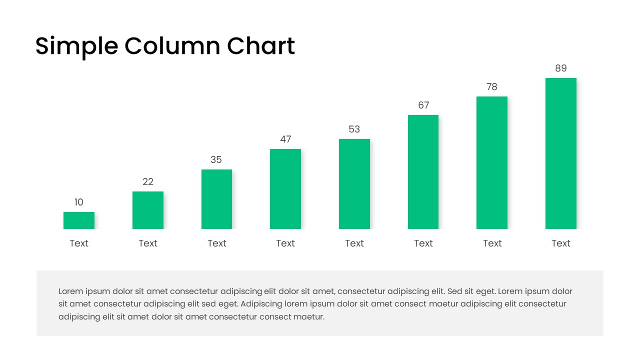
Free Editable Simple Column Chart Slide Template for PowerPoint & Google Slides
Bar/Column
Free
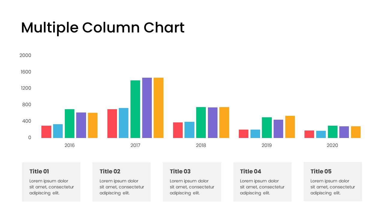
Minimal Multi-Year Column Chart Template for PowerPoint & Google Slides
Bar/Column
Premium
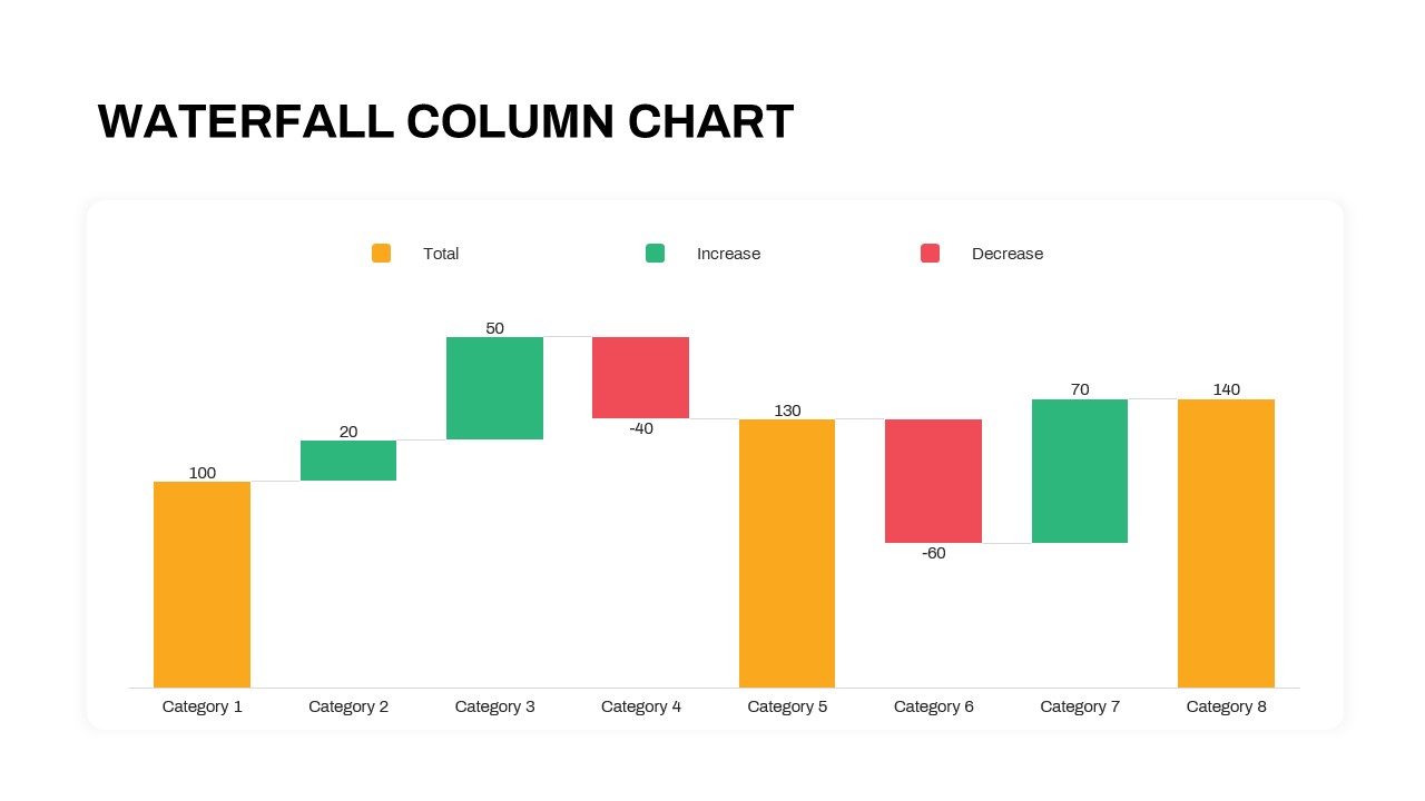
Waterfall Column Chart Analysis Template for PowerPoint & Google Slides
Bar/Column
Premium
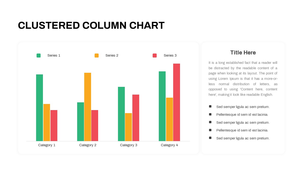
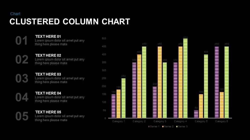
Professional Clustered Column Chart Template for PowerPoint & Google Slides
Bar/Column
Premium
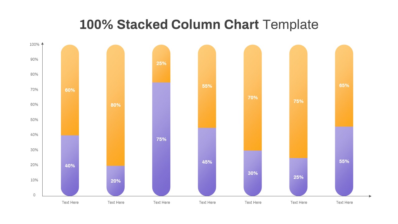
Professional 100% Stacked Column Chart Template for PowerPoint & Google Slides
Bar/Column
Premium
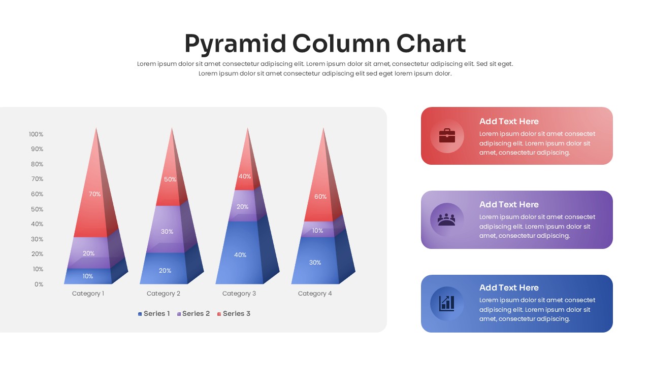
3D Pyramid Column Chart Infographic Template for PowerPoint & Google Slides
Bar/Column
Premium

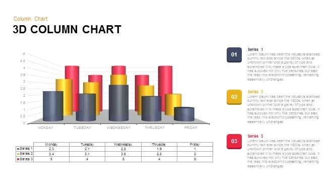
3D Column Chart with Data Table for PowerPoint & Google Slides
Bar/Column
Premium

Clustered Column Chart Data Analysis Template for PowerPoint
Bar/Column
Premium
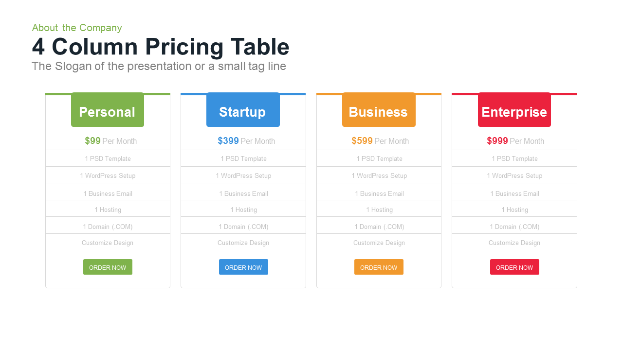
4 Column Pricing template for PowerPoint & Google Slides
Comparison
Premium
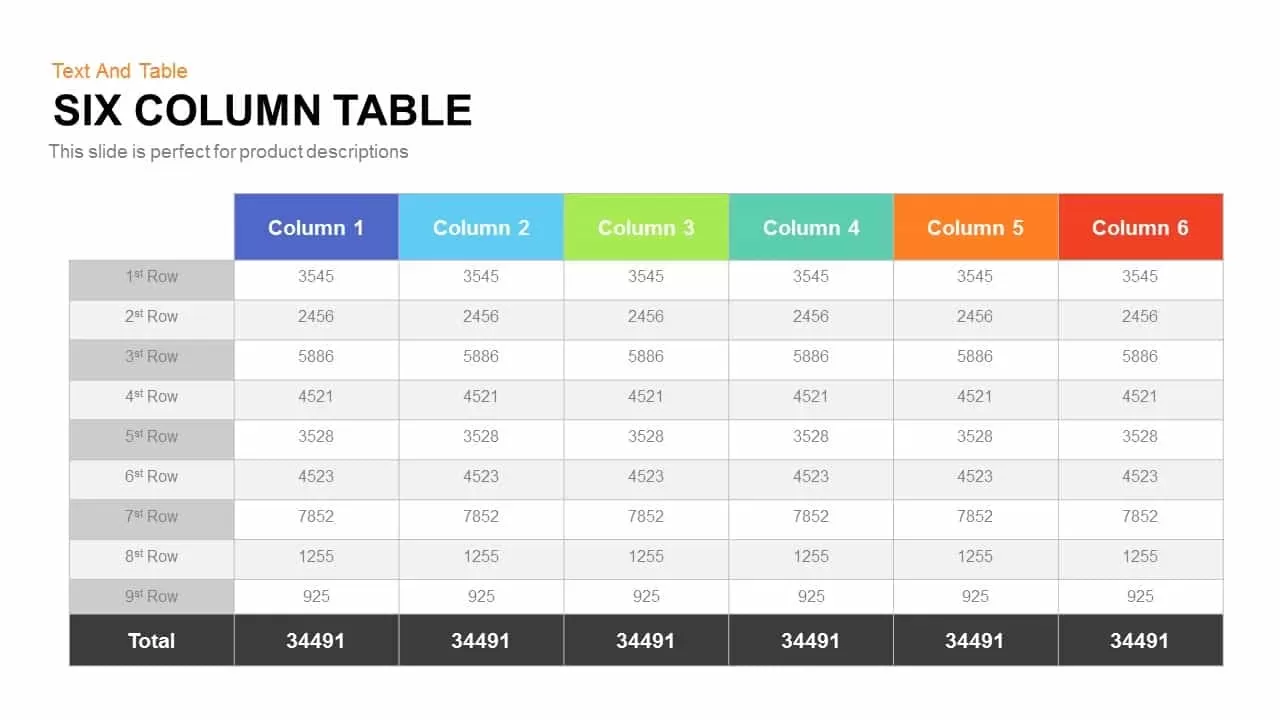
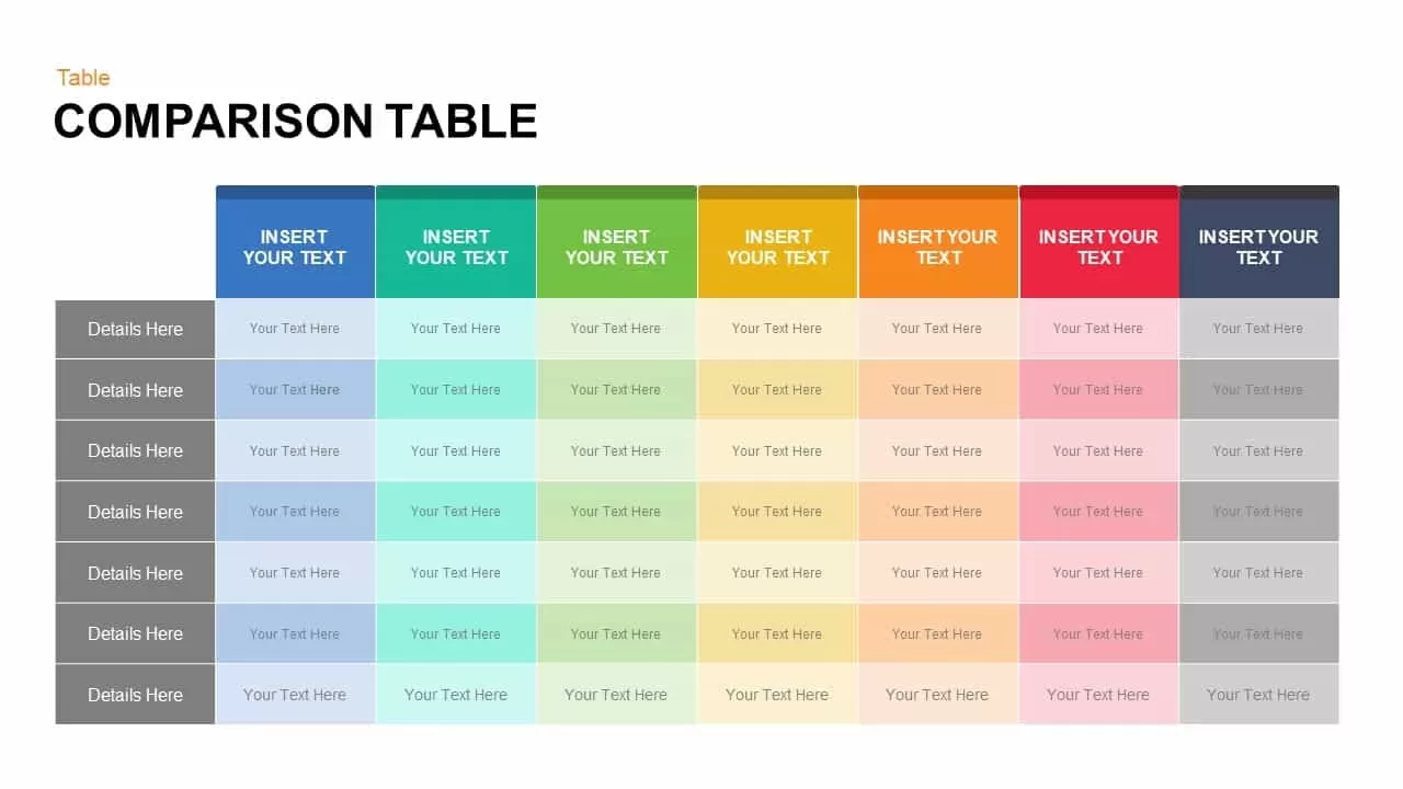
Six Column Table template for PowerPoint & Google Slides
Comparison
Premium
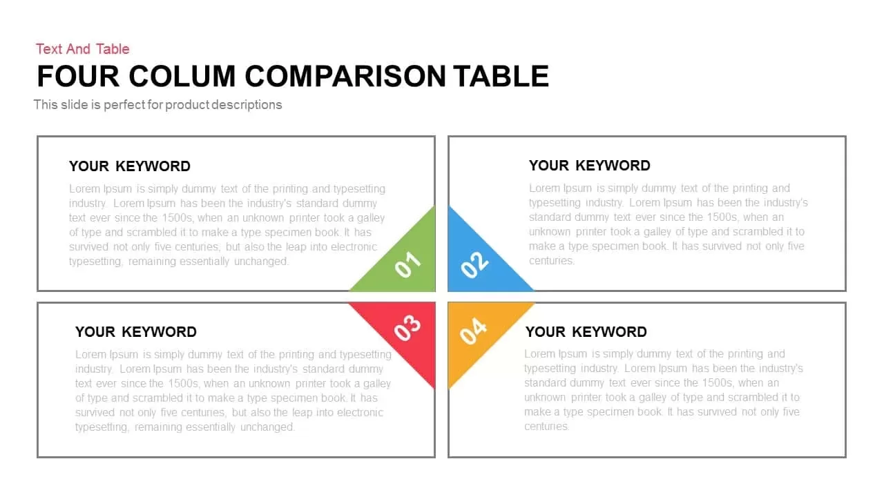
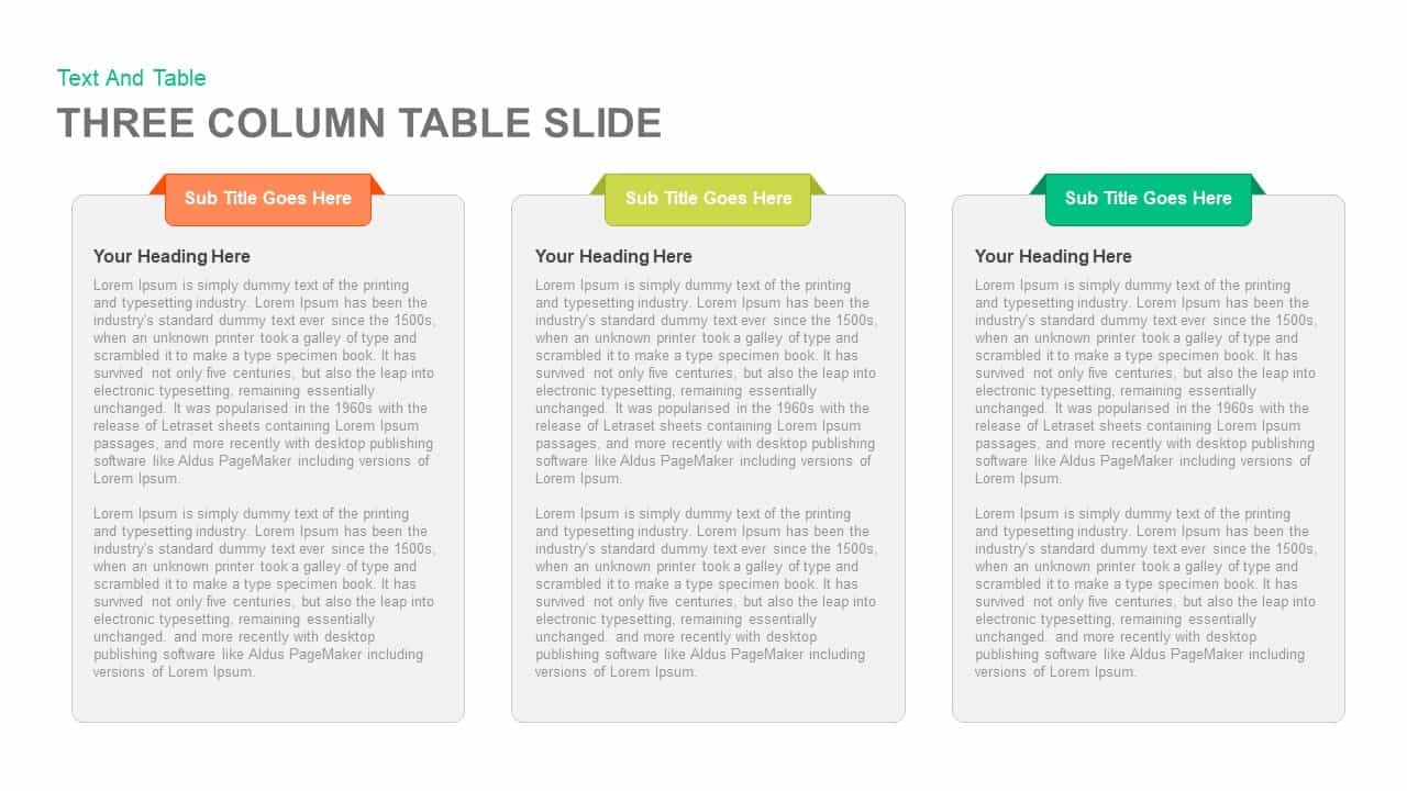
Clean Three-Four Column Table Slide Template for PowerPoint & Google Slides
Business Report
Premium
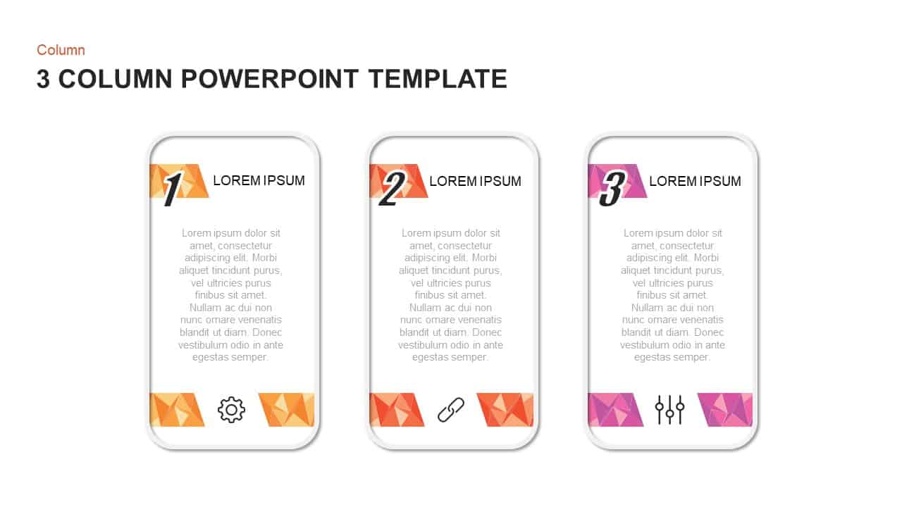
Three and Four-Column Card Layout Template for PowerPoint & Google Slides
Infographics
Premium
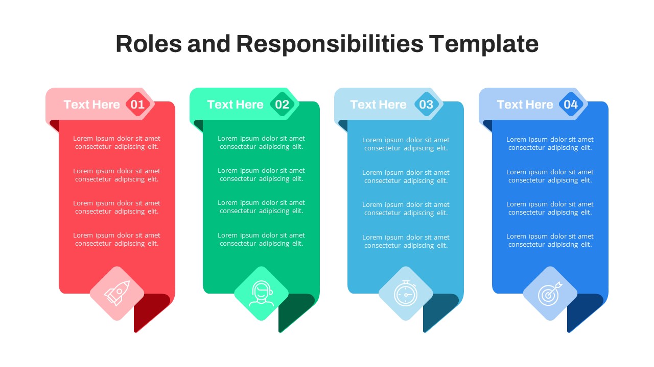
Free Four-Column Roles and Responsibilities Template for PowerPoint & Google Slides
Our Team
Free
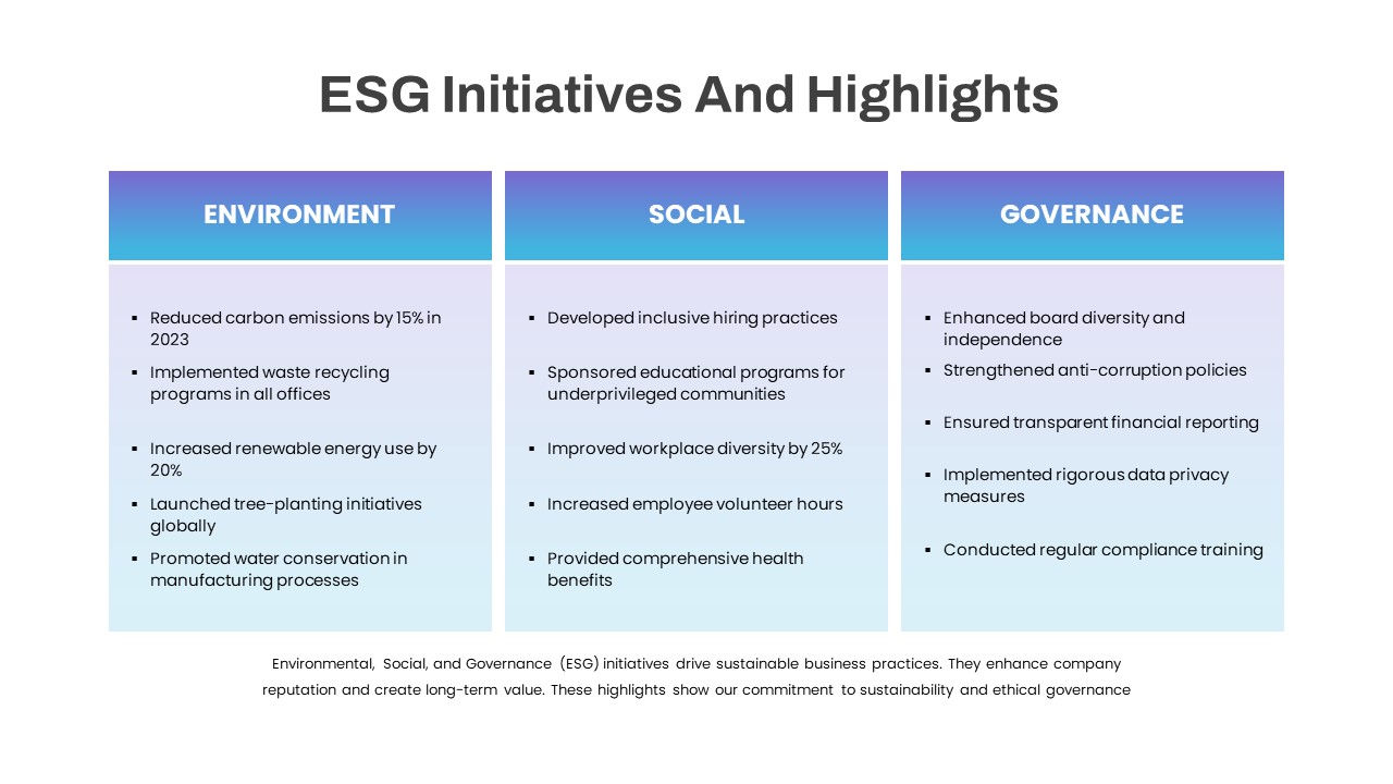
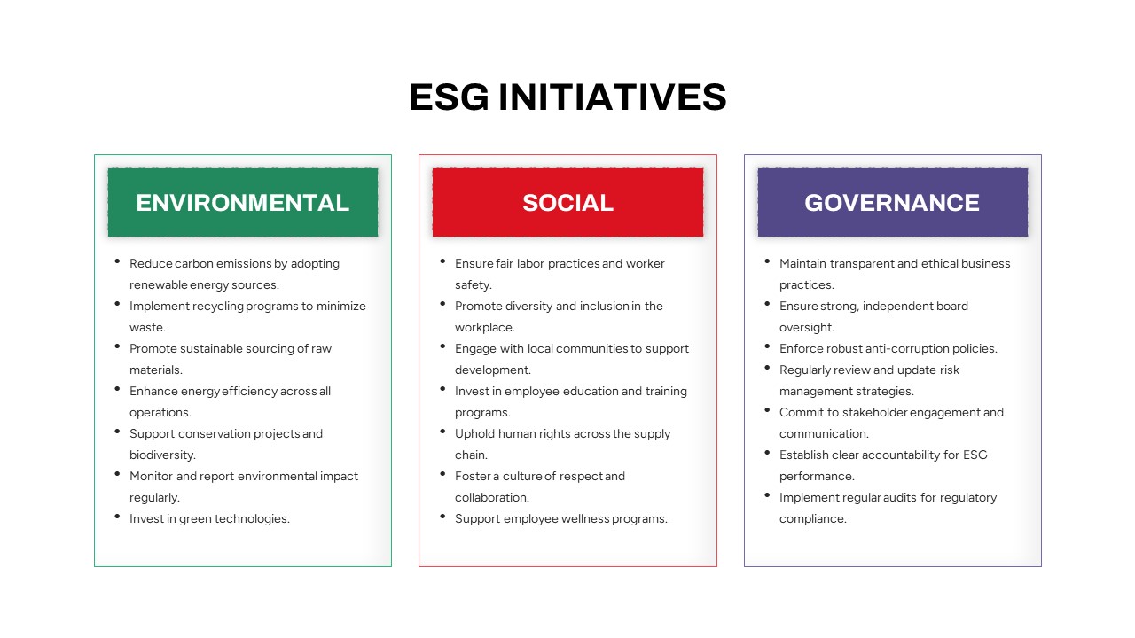
ESG Initiatives Three-Column Template for PowerPoint & Google Slides
Comparison
Premium
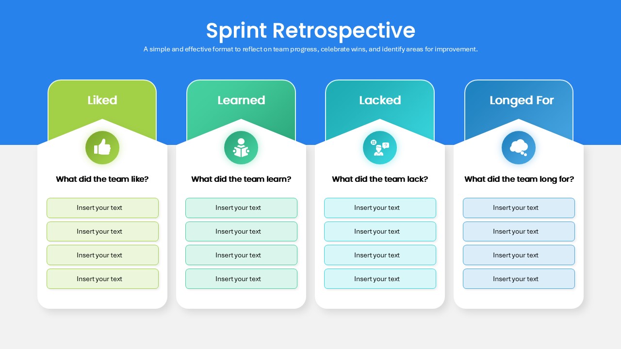
Sprint Retrospective Four-Column Template for PowerPoint & Google Slides
Process
Premium
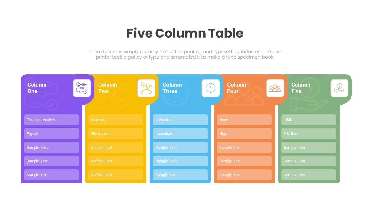
Five Column Table Infographics for PowerPoint & Google Slides
Business
Premium
1 to 5 Column infographic pack for PowerPoint & Google Slides
Business
Premium
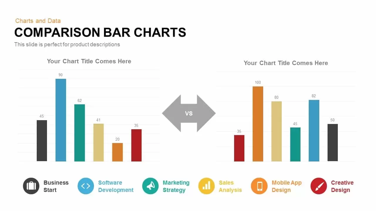
Comparison Bar Chart template for PowerPoint & Google Slides
Comparison Chart
Premium
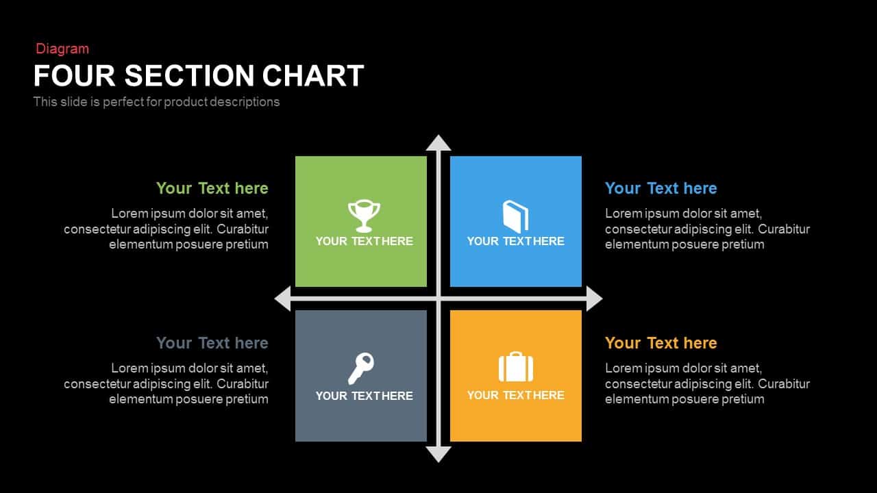
Four Section Comparison Chart Diagram Template for PowerPoint & Google Slides
Infographics
Premium
Interactive Product Comparison Bar Chart Template for PowerPoint & Google Slides
Bar/Column
Premium
Comparison Chart Overview template for PowerPoint & Google Slides
Comparison Chart
Premium
Tornado Chart Data Comparison Slide Template for PowerPoint & Google Slides
Bar/Column
Premium
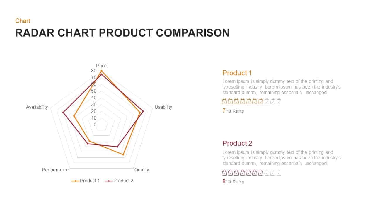
Radar Chart Product Comparison Template for PowerPoint & Google Slides
Comparison Chart
Premium

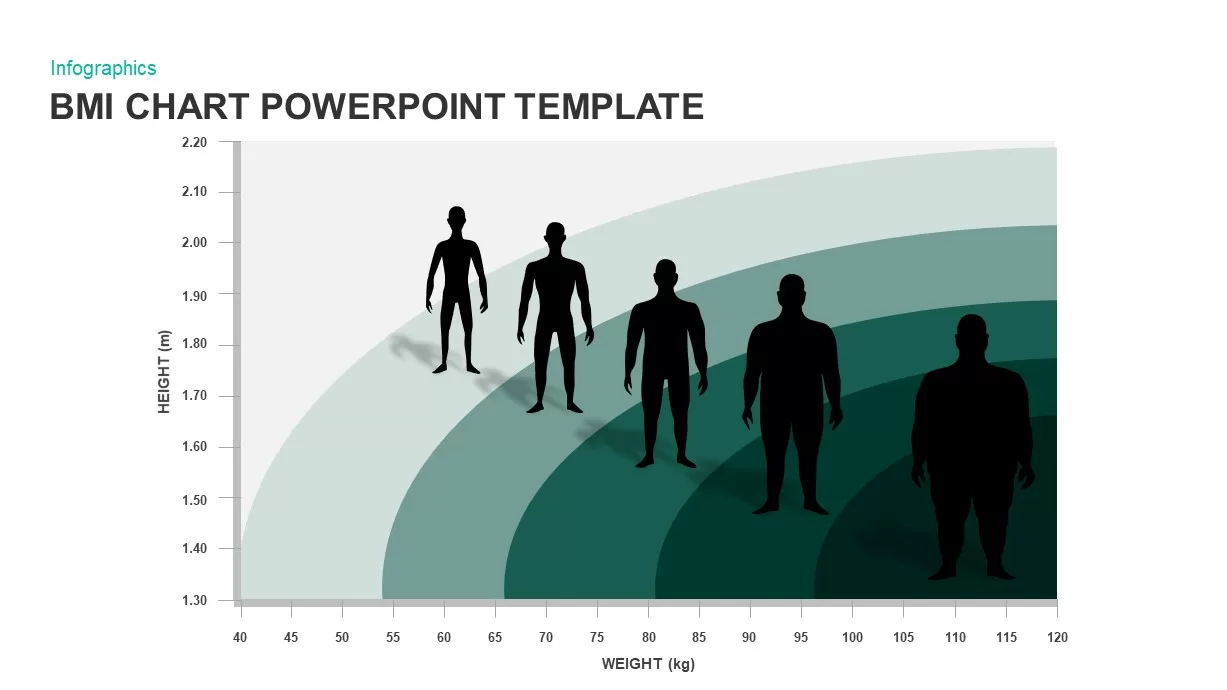
BMI Category Comparison Chart Template for PowerPoint & Google Slides
Comparison
Premium
Circular Product Comparison Chart Template for PowerPoint & Google Slides
Comparison Chart
Premium
Pugh Matrix Decision Comparison Chart Template for PowerPoint & Google Slides
Comparison Chart
Premium
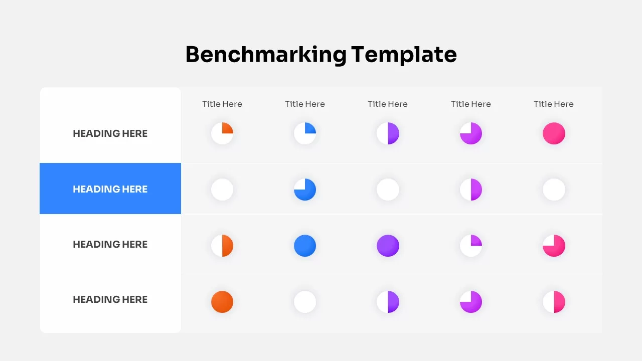
Dynamic Benchmarking Comparison Chart Template for PowerPoint & Google Slides
Comparison Chart
Premium
People Demographic Comparison Chart Template for PowerPoint & Google Slides
Comparison
Premium
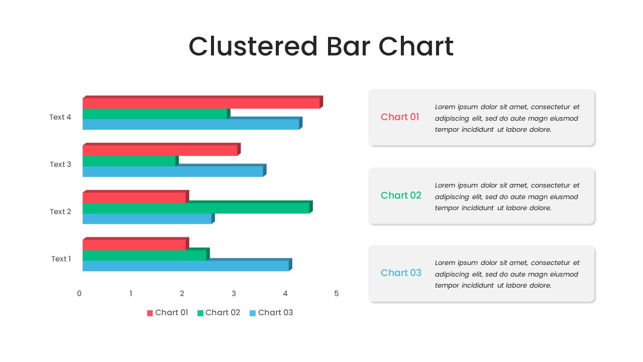
Clustered Bar Chart Comparison Template for PowerPoint & Google Slides
Bar/Column
Premium
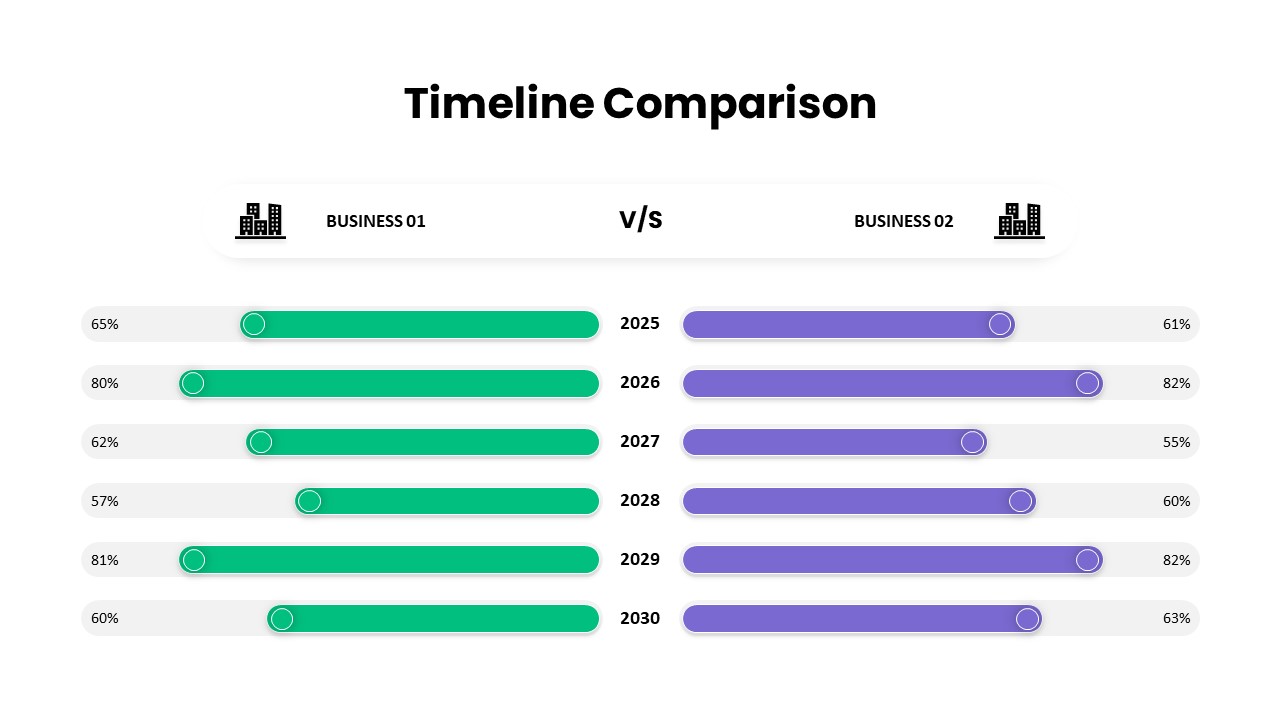
Business Timeline Comparison Bar Chart Template for PowerPoint & Google Slides
Comparison Chart
Premium
Multiple Line Chart Comparison Template for PowerPoint & Google Slides
Comparison Chart
Premium
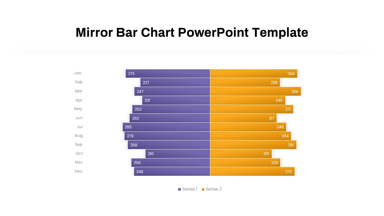
Mirror Bar Chart Comparison Template for PowerPoint & Google Slides
Bar/Column
Premium
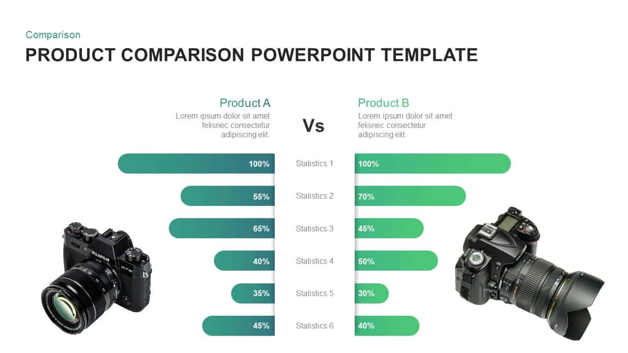
Free Versatile Product Comparison Chart Template for PowerPoint & Google Slides
Comparison Chart
Free
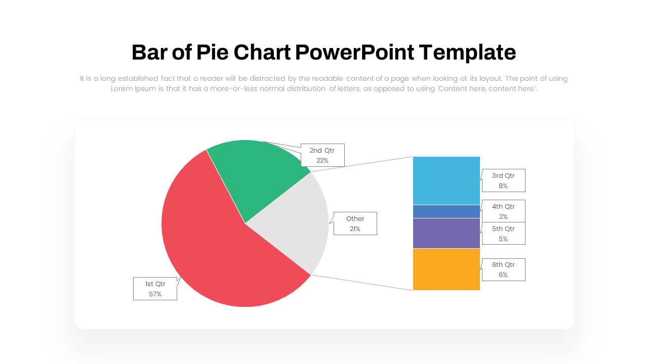
Dynamic Bar-of-Pie Chart Comparison Template for PowerPoint & Google Slides
Pie/Donut
Premium
ESG Initiatives Comparison Chart Template for PowerPoint & Google Slides
Business
Premium
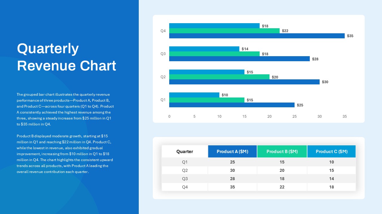
Quarterly Revenue Comparison Bar Chart Template for PowerPoint & Google Slides
Bar/Column
Premium
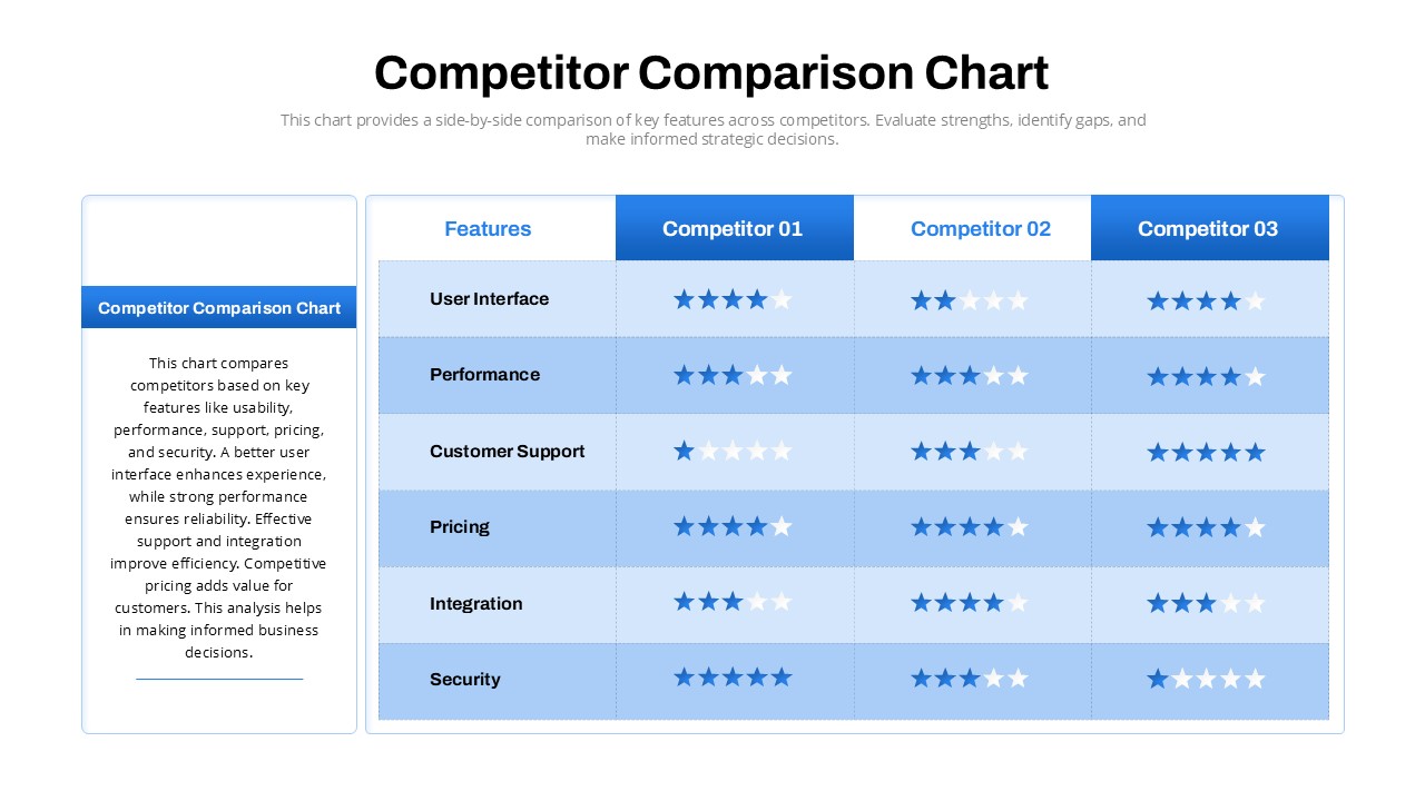
Competitor Comparison Chart Design Template for PowerPoint & Google Slides
Comparison
Premium
Two-Option Bar Chart Comparison Table Template for PowerPoint & Google Slides
Comparison
Premium
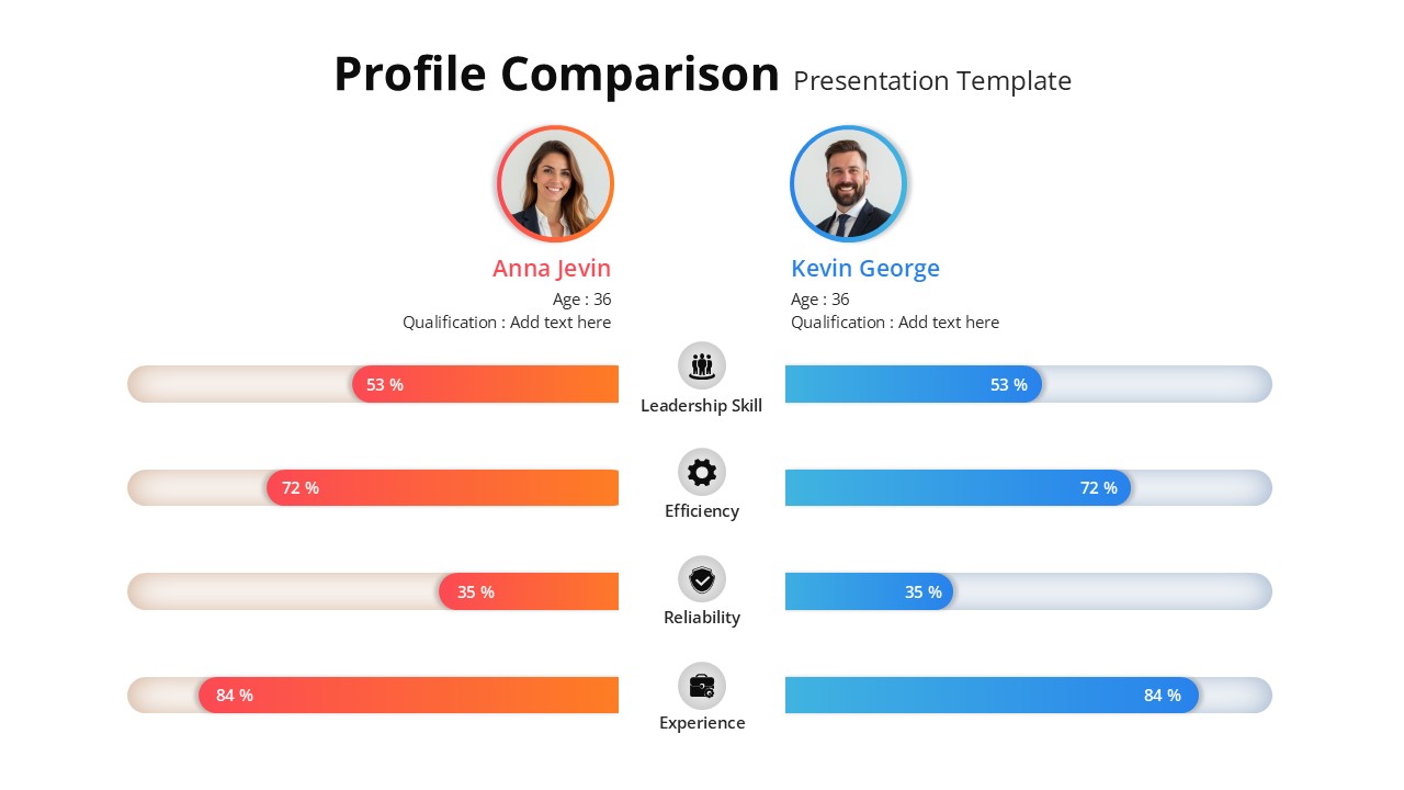
Profile Comparison Chart template for PowerPoint & Google Slides
Comparison Chart
Premium
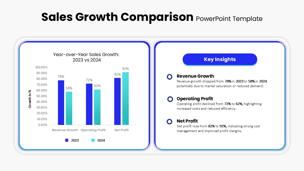
Sales Growth Comparison Chart & Table Template for PowerPoint & Google Slides
Bar/Column
Premium
Skills Gap Analysis Comparison Chart Template for PowerPoint & Google Slides
Comparison
Premium
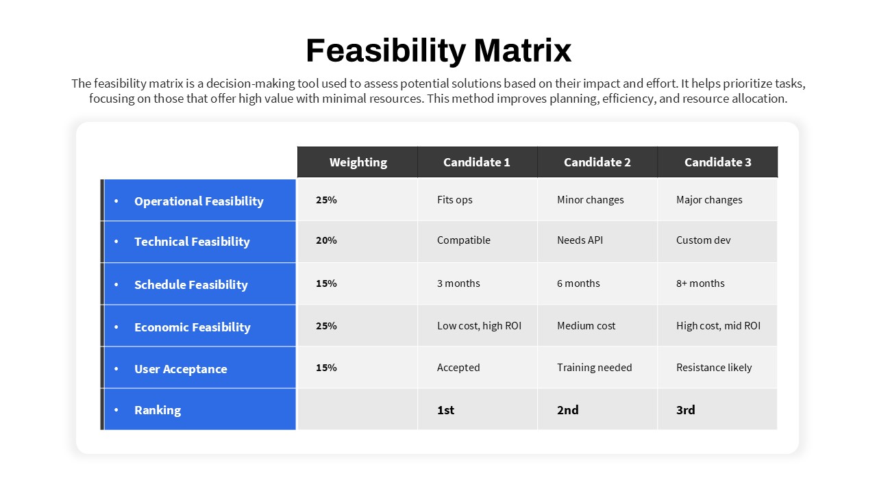
Feasibility Matrix Comparison Chart Template for PowerPoint & Google Slides
Comparison Chart
Premium
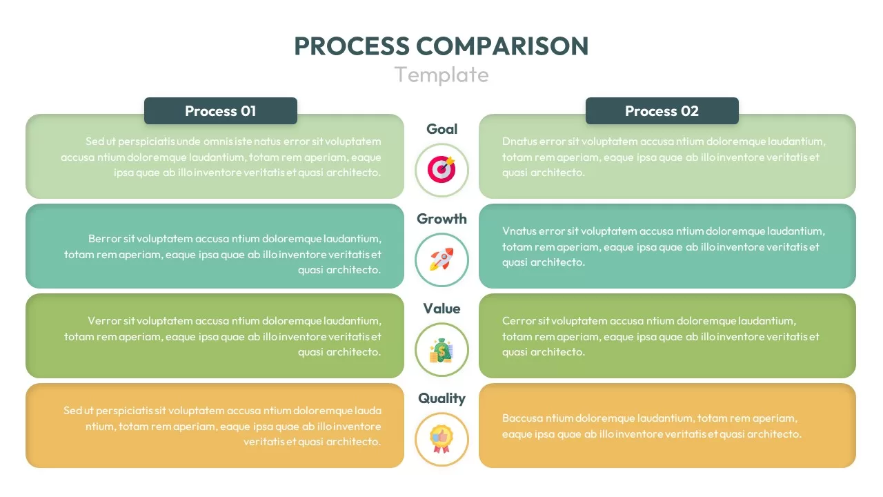
Process Comparison Chart for PowerPoint & Google Slides
Infographics
Premium

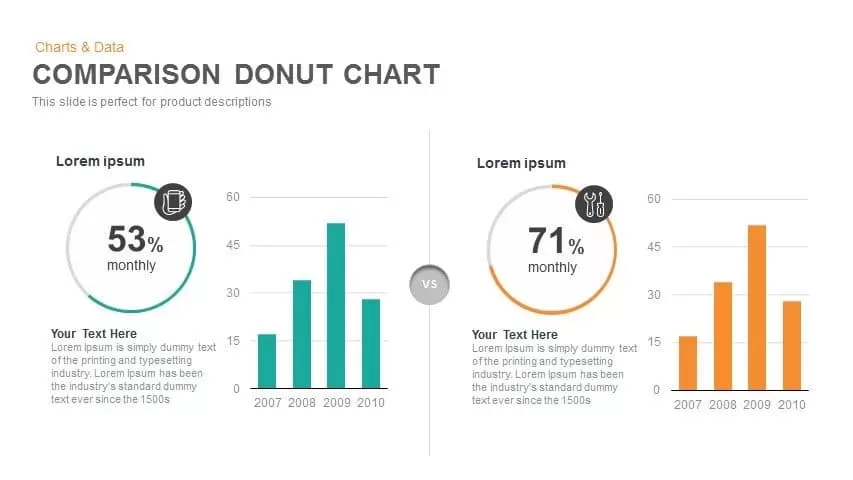
Comparison Donut Chart PowerPoint Template and Keynote
Pie/Donut
Premium
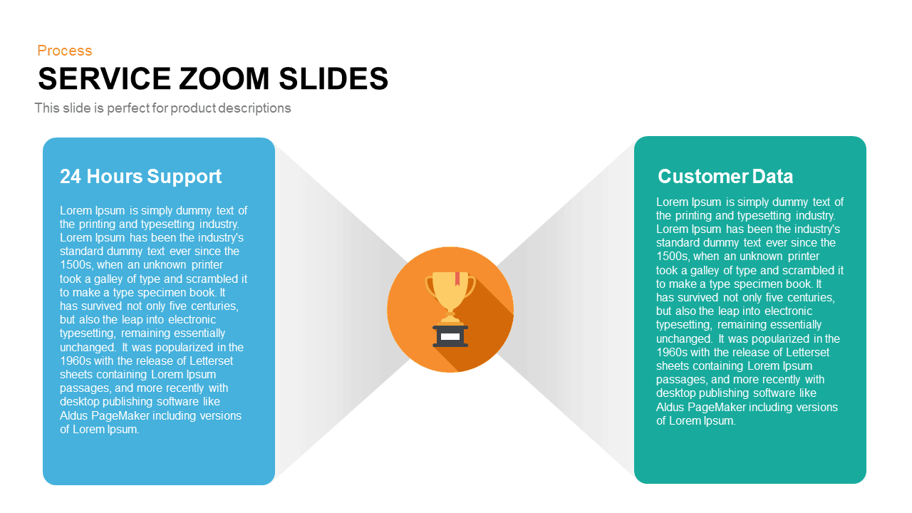
Service Zoom Feature Slides Comparison template for PowerPoint & Google Slides
Process
Premium
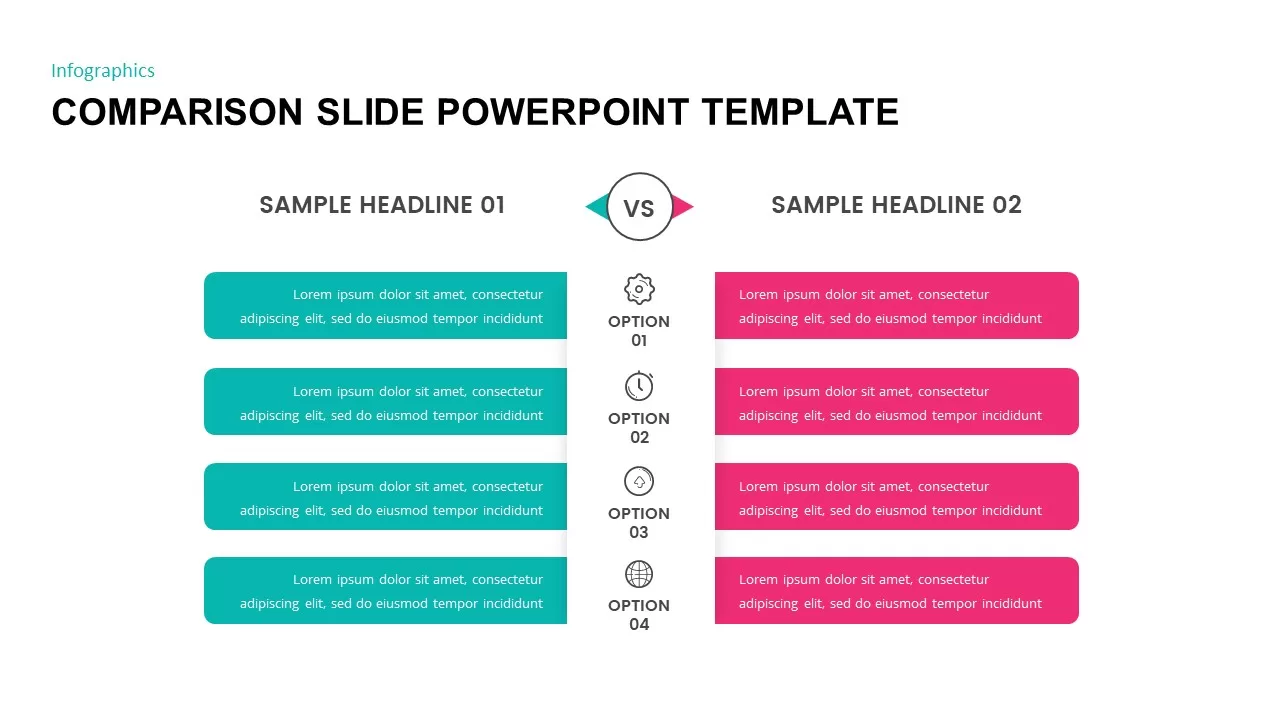
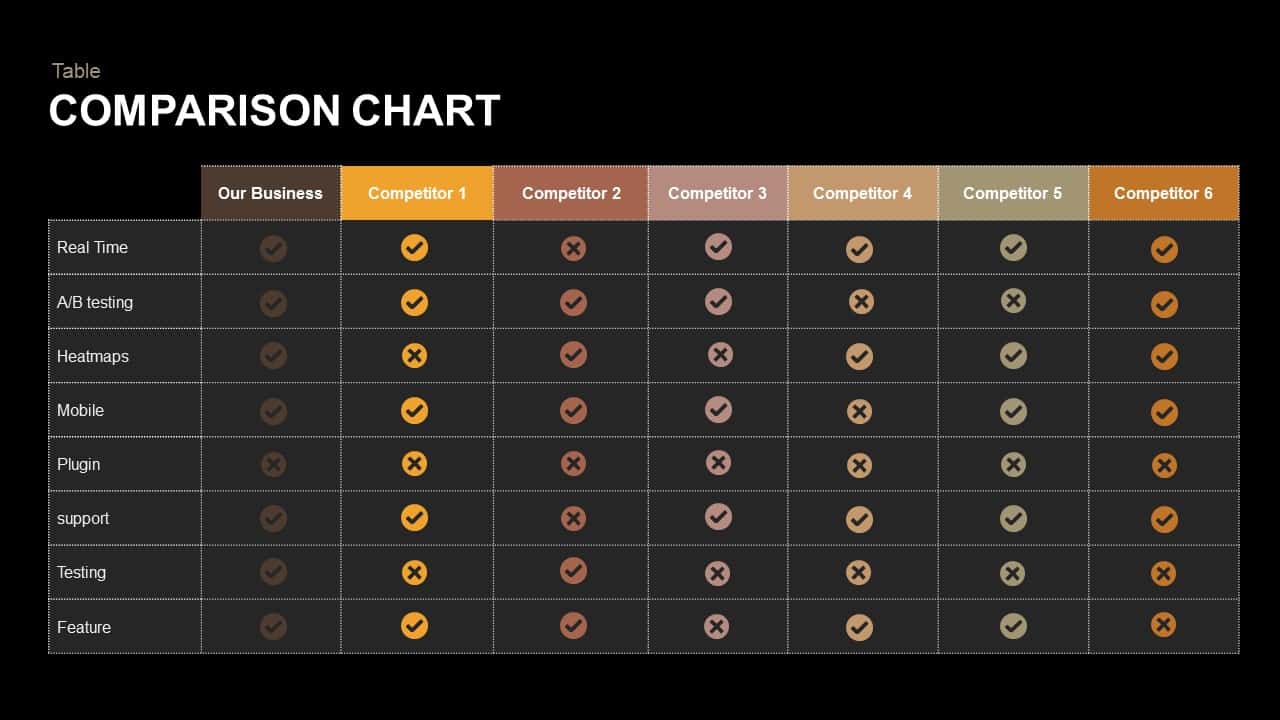
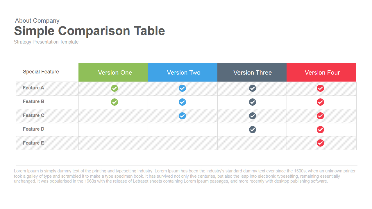
Simple Comparison Table Template for PowerPoint & Google Slides
Comparison
Premium
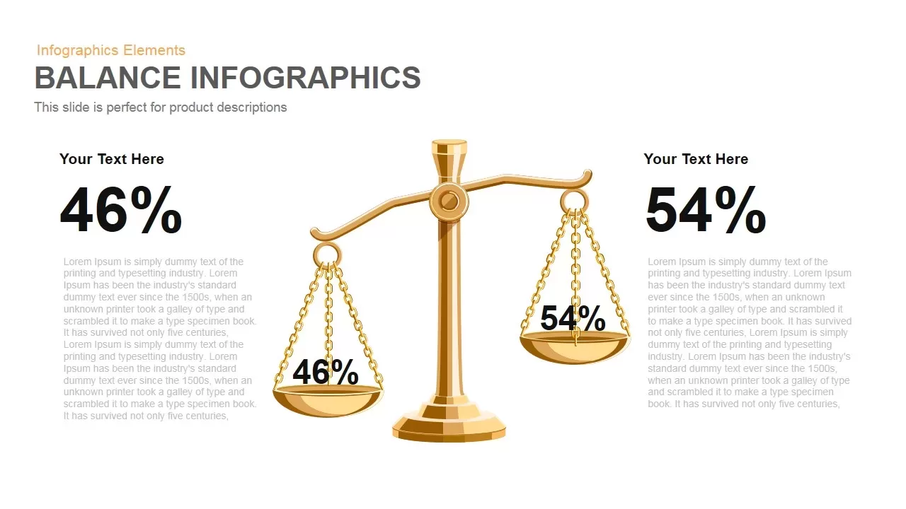
Gold Scales Balance Comparison Template for PowerPoint & Google Slides
Comparison
Premium
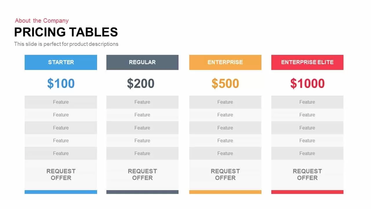
Four-Tier Pricing Comparison Table Template for PowerPoint & Google Slides
Comparison
Premium
Speedometer Infographic Gauge Comparison Template for PowerPoint & Google Slides
Comparison
Premium
A/B Testing Comparison Infographic template for PowerPoint & Google Slides
Comparison
Premium
Clean Mobile Service Comparison Slide Template for PowerPoint & Google Slides
Comparison
Premium
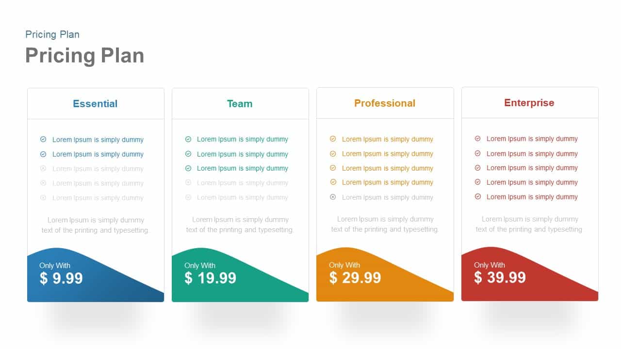
Four-Plan Pricing Table Comparison Template for PowerPoint & Google Slides
Comparison
Premium
Dynamic Multicolor Comparison Table Template for PowerPoint & Google Slides
Comparison
Premium
Interactive Pricing Plan Comparison Template for PowerPoint & Google Slides
Comparison
Premium
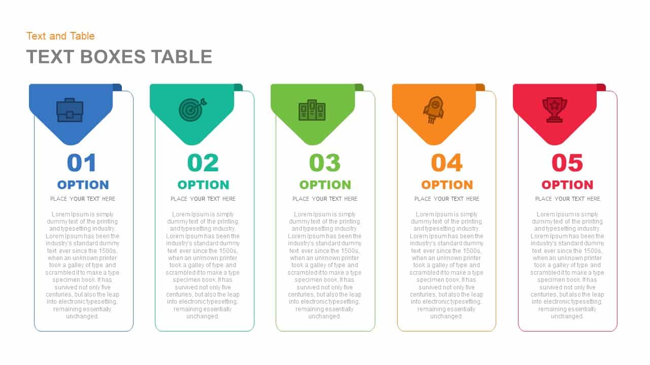
Five-Option Text Boxes Table Comparison Template for PowerPoint & Google Slides
Business Report
Premium
Six-Metric Green Product Comparison Template for PowerPoint & Google Slides
Comparison
Premium
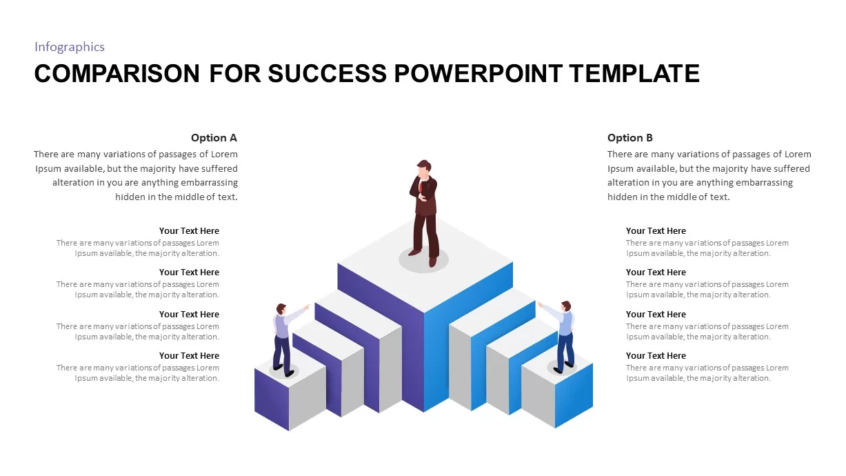
Isometric 3D Block Comparison Diagram Template for PowerPoint & Google Slides
Comparison
Premium
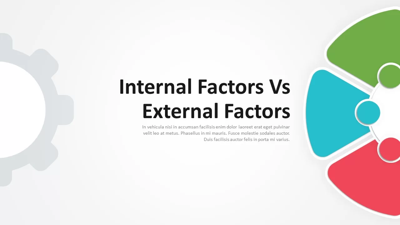
Internal vs External Factors Comparison Template for PowerPoint & Google Slides
Comparison
Premium
Theory X and Theory Y Comparison Template for PowerPoint & Google Slides
Comparison
Premium
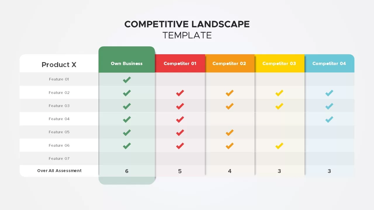
Competitive Landscape Comparison Template Pack for PowerPoint & Google Slides
Comparison
Premium
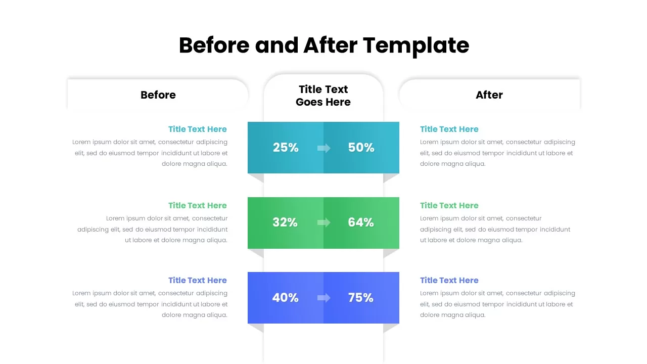
Before and After Comparison Infographics Template for PowerPoint & Google Slides
Comparison
Premium
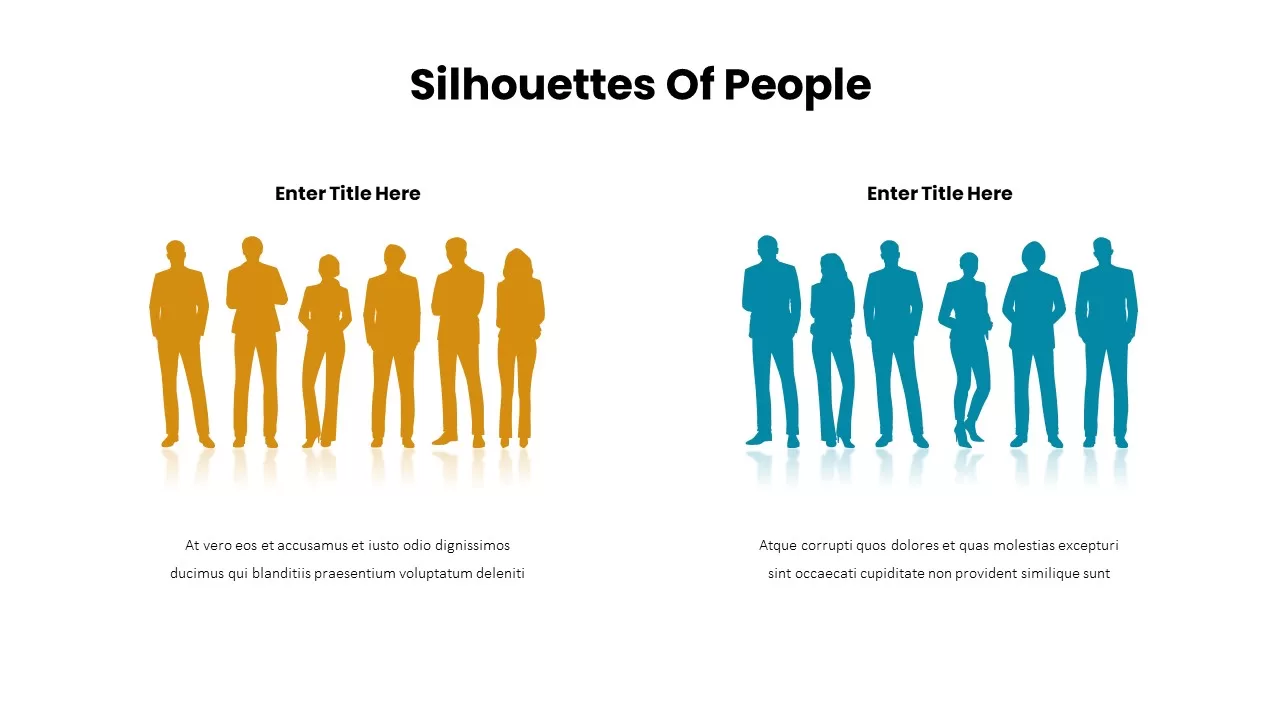
Business Silhouettes Comparison Slide Template for PowerPoint & Google Slides
HR
Premium
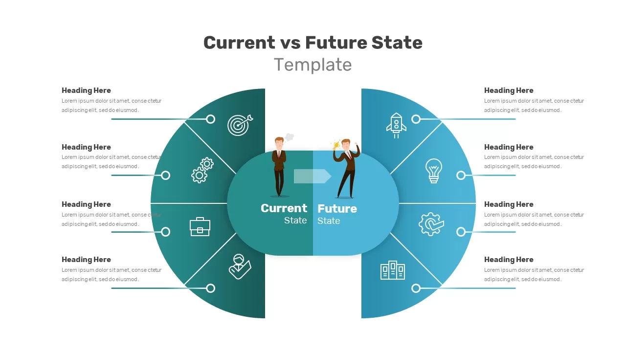
Current vs Future State Comparison Slide Template for PowerPoint & Google Slides
Comparison Chart
Premium
Before and After Comparison Infographic Template for PowerPoint & Google Slides
Comparison
Free
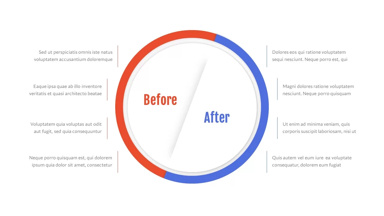
Before and After Comparison Slide Template for PowerPoint & Google Slides
Comparison
Premium
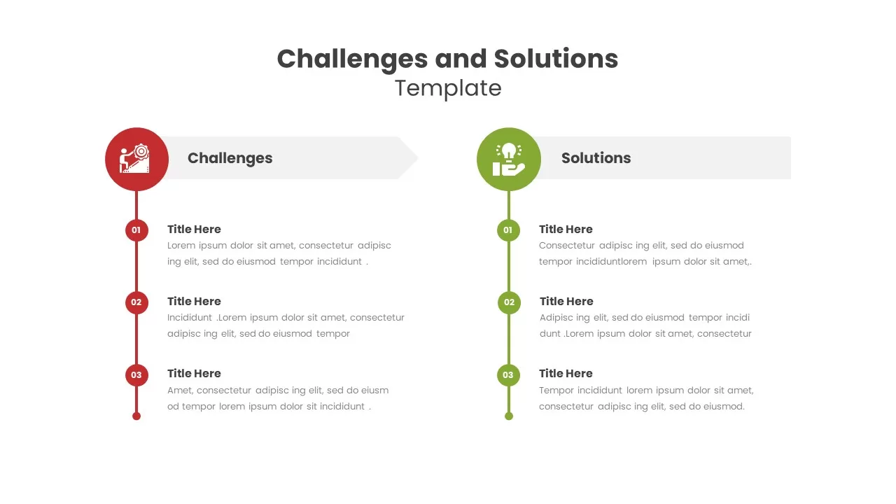
Challenges and Solutions Comparison Template for PowerPoint & Google Slides
Opportunities Challenges
Premium
Benchmarking Metrics Comparison Slide Template for PowerPoint & Google Slides
Pie/Donut
Premium
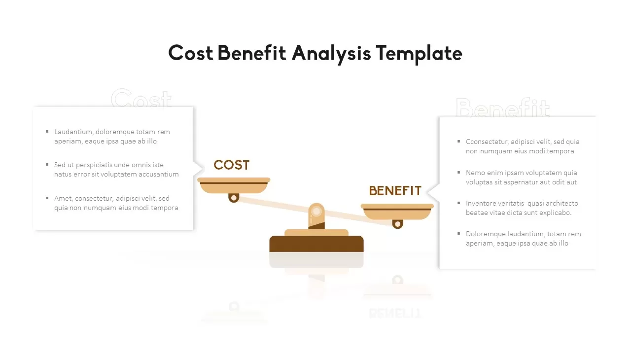
Cost Benefit Analysis Comparison Template for PowerPoint & Google Slides
Comparison
Premium
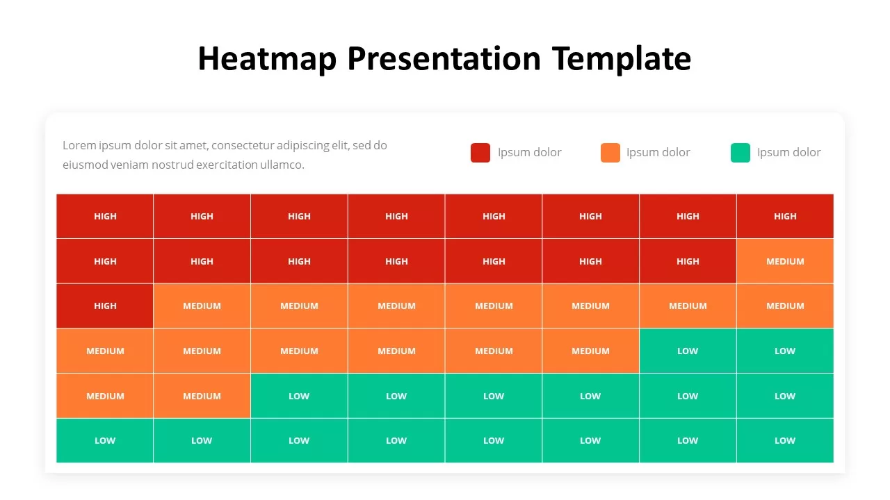
Risk Heatmap Comparison Template for PowerPoint & Google Slides
Maps
Premium
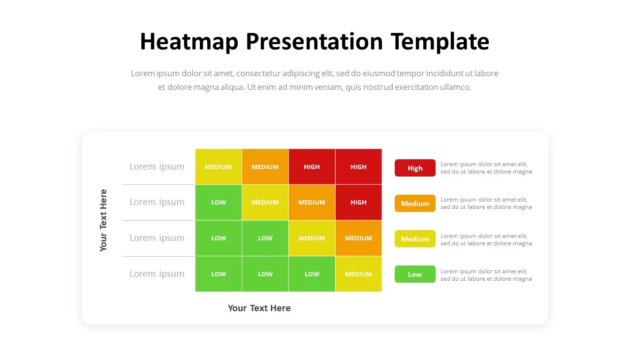
Heatmap Comparison Template for PowerPoint & Google Slides
Maps
Premium
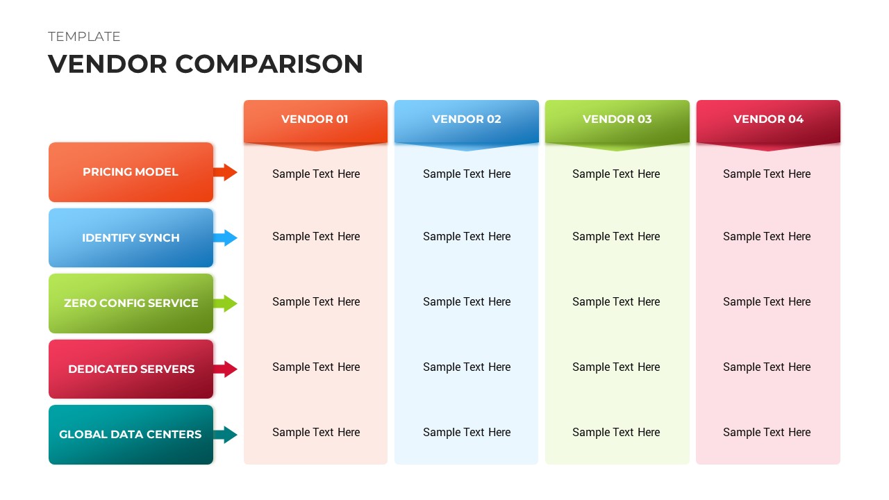
Vendor Comparison Analysis template for PowerPoint & Google Slides
Comparison Chart
Premium
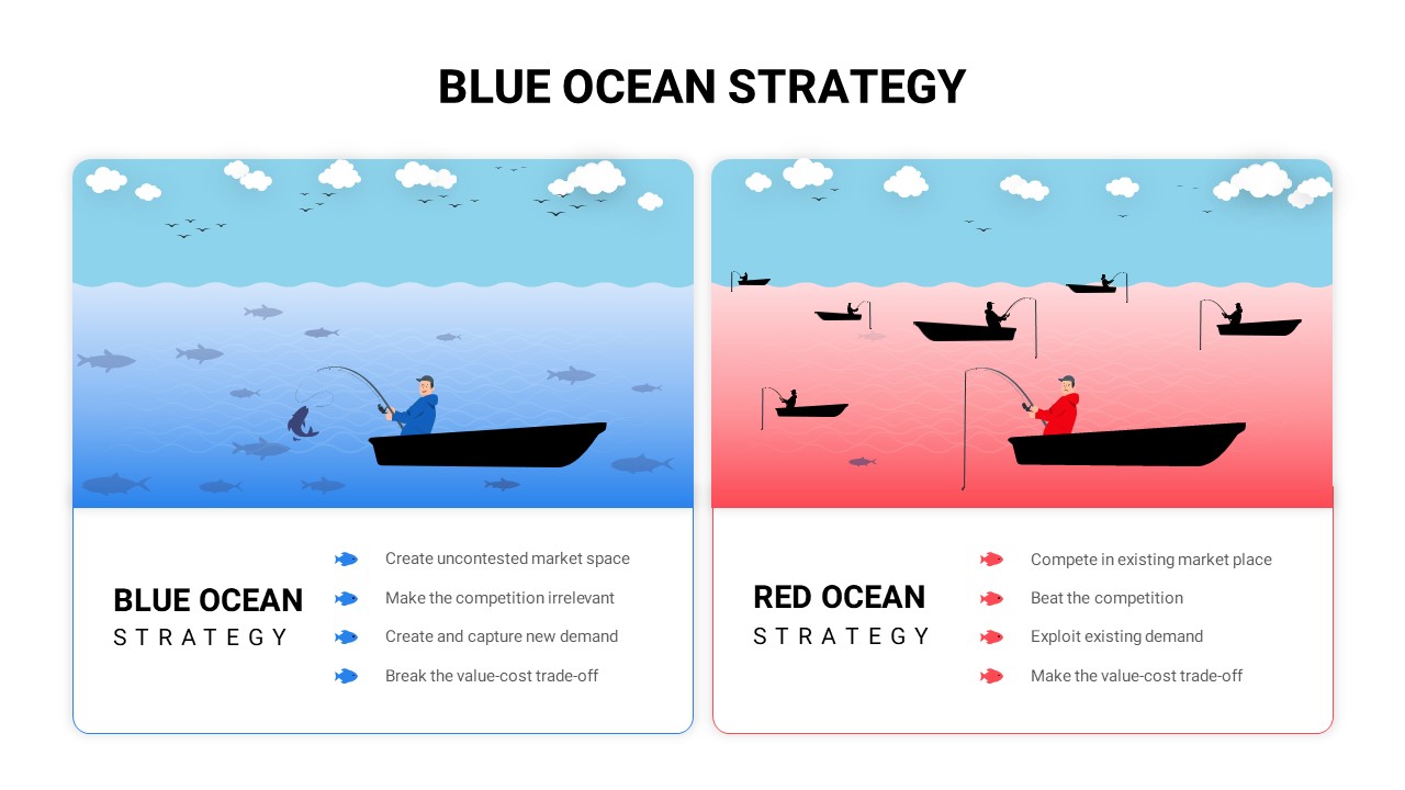
Blue vs Red Ocean Strategy Comparison Template for PowerPoint & Google Slides
Business Strategy
Premium
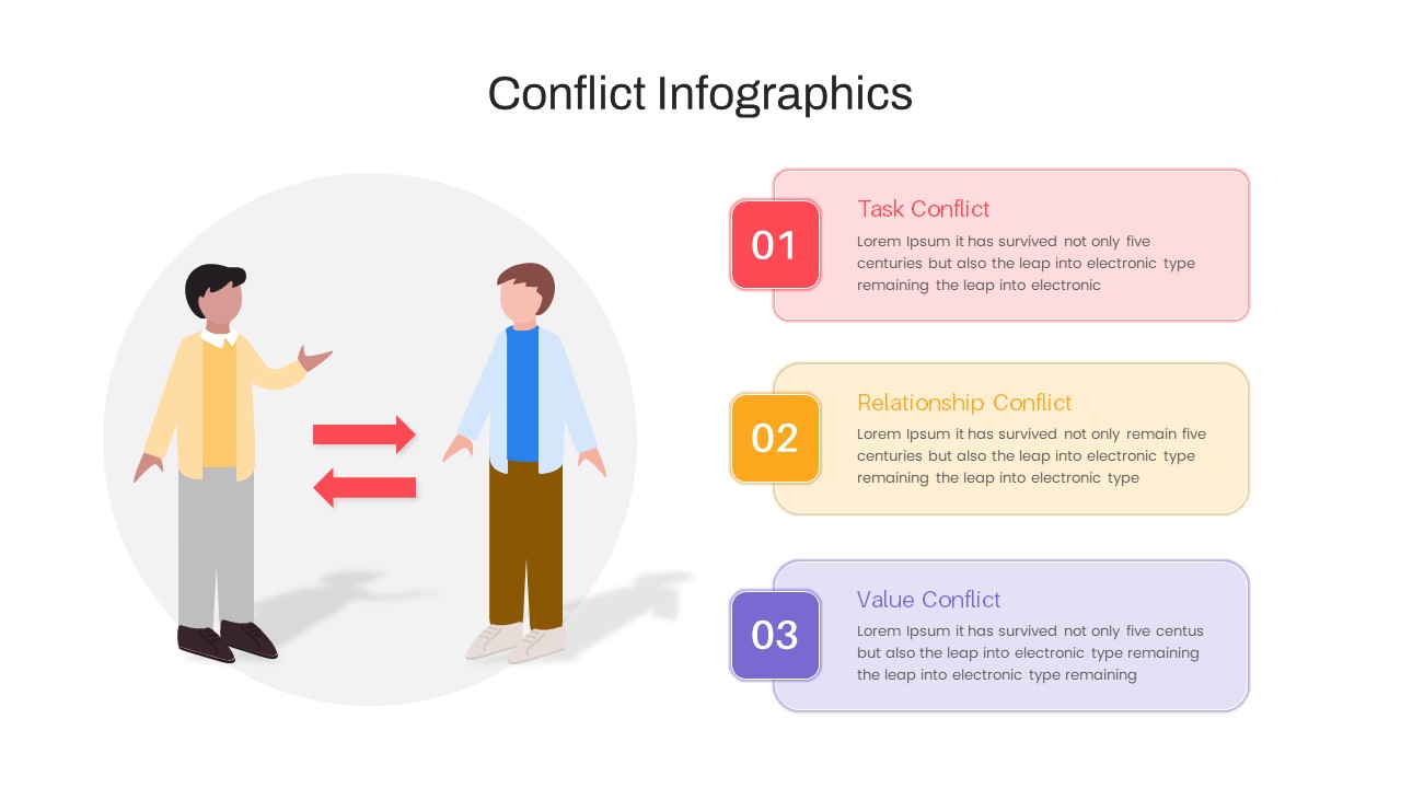
Conflict Infographics Comparison Template for PowerPoint & Google Slides
Infographics
Premium
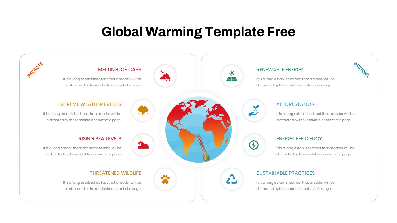
Free Global Warming Infographic Comparison Template for PowerPoint & Google Slides
Comparison Chart
Free
Types of AI Comparison Infographic Template for PowerPoint & Google Slides
AI
Premium
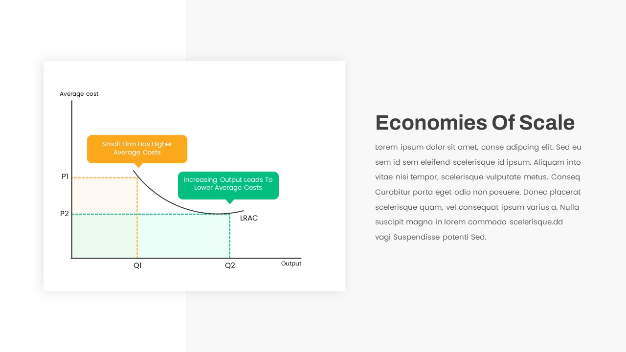
Economies of Scale Cost Curve Comparison Template for PowerPoint & Google Slides
Comparison Chart
Premium
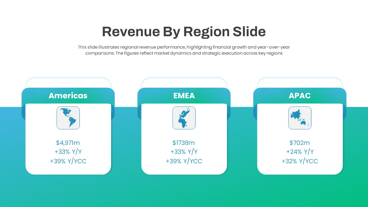
Regional Revenue Comparison Overview Template for PowerPoint & Google Slides
Comparison
Premium
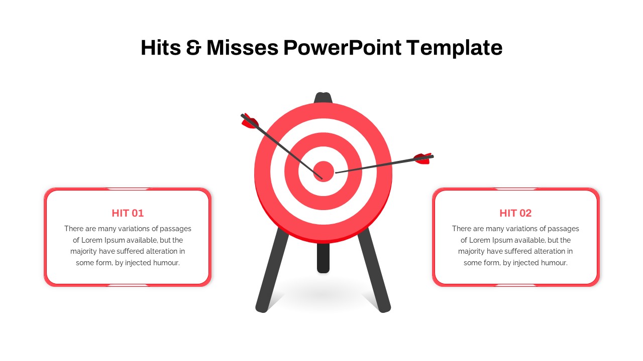
Hits & Misses Comparison Infographic Template for PowerPoint & Google Slides
Pitch Deck
Premium
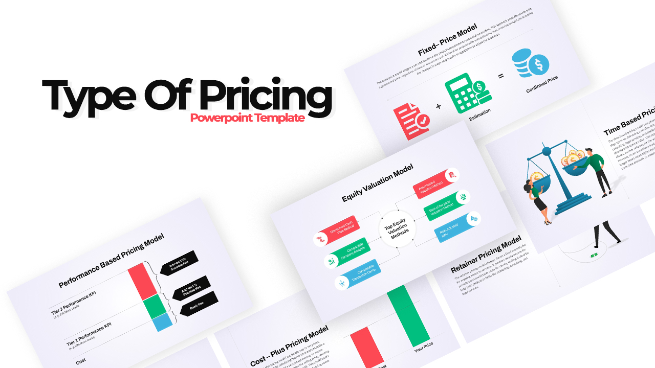
Pricing Model Types Comparison Infographic Template for PowerPoint & Google Slides
Pitch Deck
Premium
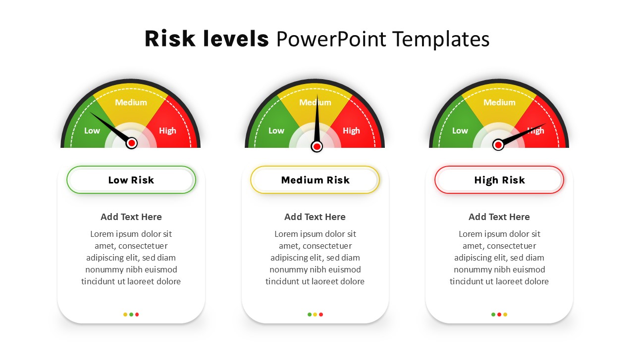
Risk Level Gauge Comparison Dashboard Template for PowerPoint & Google Slides
Comparison
Premium
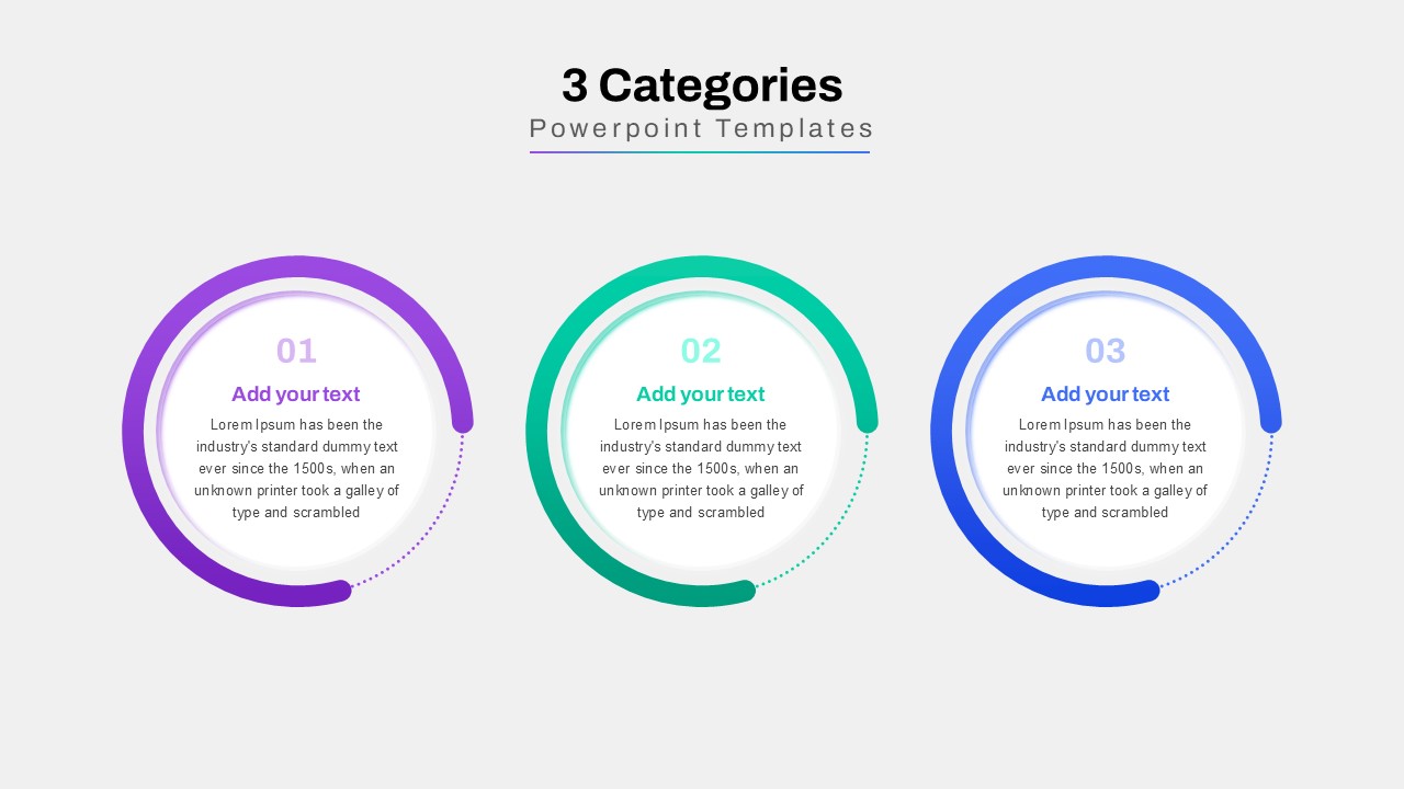
Three-Category Comparison Template for PowerPoint & Google Slides
Comparison
Premium
Cross Sell & Up Sell Strategy Comparison template for PowerPoint & Google Slides
Comparison
Premium
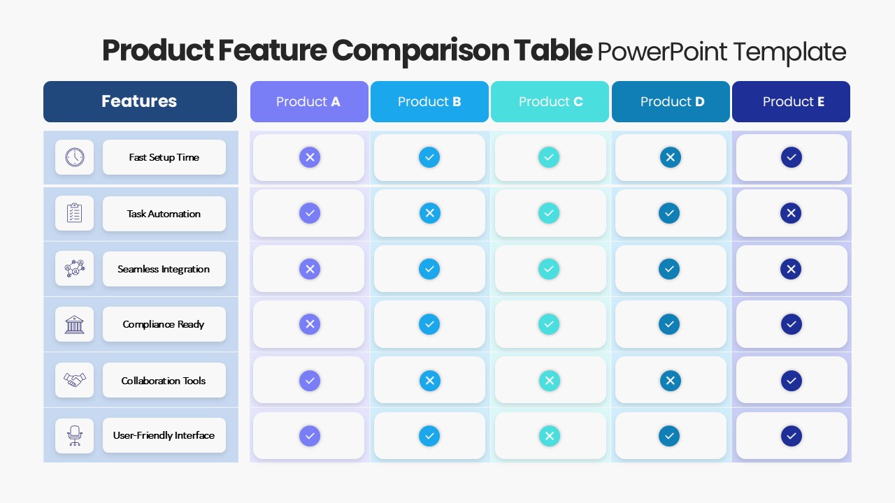
Product Feature Comparison Table Template for PowerPoint & Google Slides
Comparison Chart
Premium
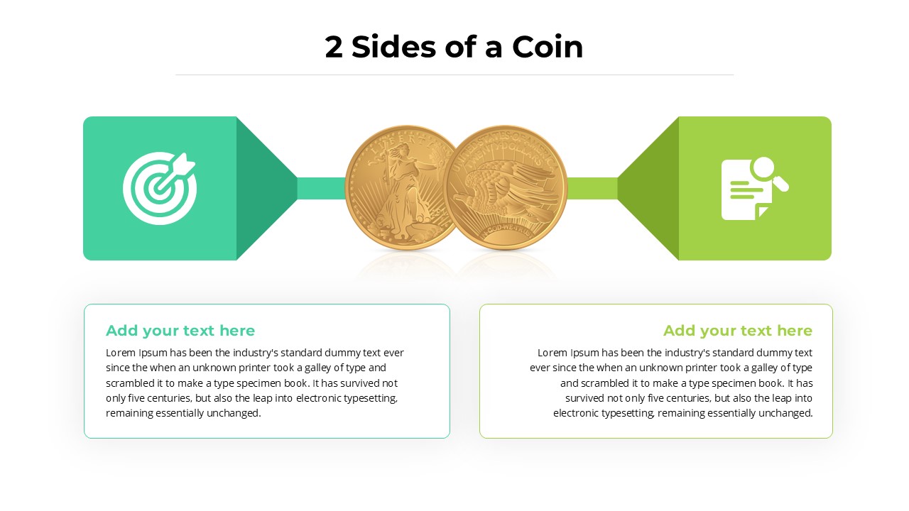
Two-Sided Coin Comparison Diagram Template for PowerPoint & Google Slides
Comparison
Premium
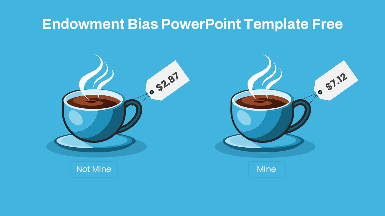
Endowment Bias Coffee Price Comparison Template for PowerPoint & Google Slides
Comparison
Free
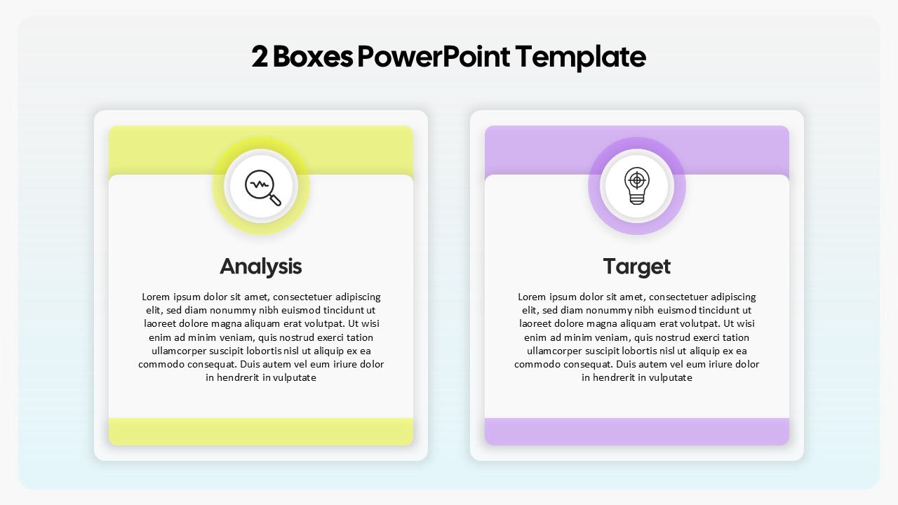
Two-Box Analysis & Target Comparison Template for PowerPoint & Google Slides
Comparison
Premium
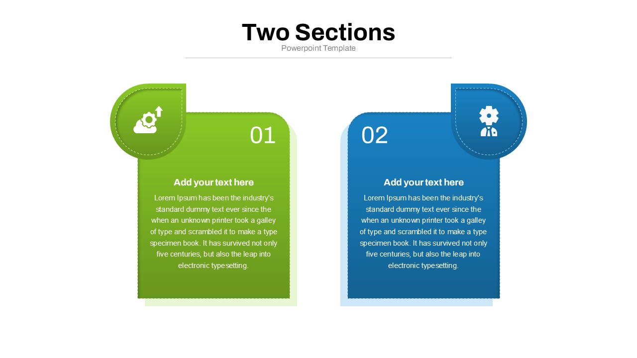
Two Section Comparison template for PowerPoint & Google Slides
Business Proposal
Premium
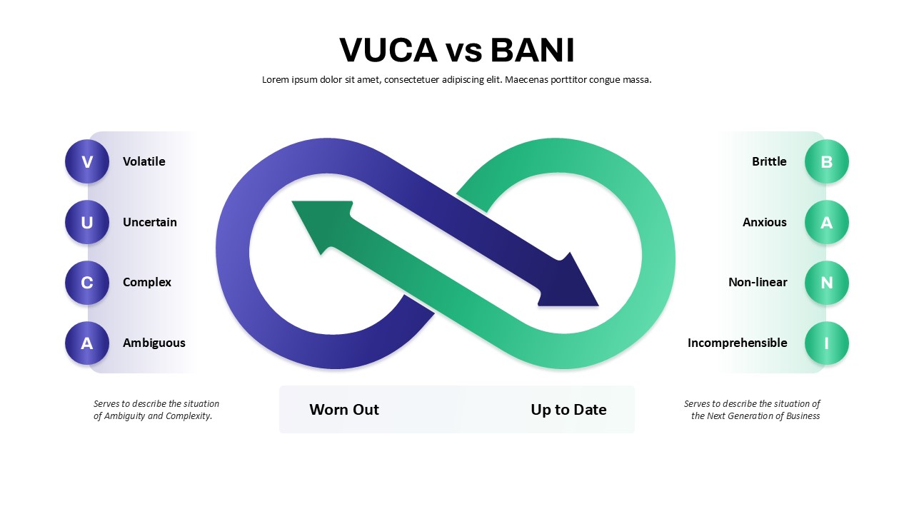
VUCA vs BANI Comparison Infographic Template for PowerPoint & Google Slides
Comparison
Premium
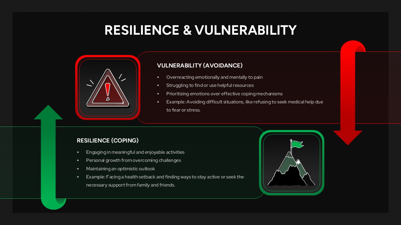
Resilience & Vulnerability Comparison Template for PowerPoint & Google Slides
Comparison
Premium
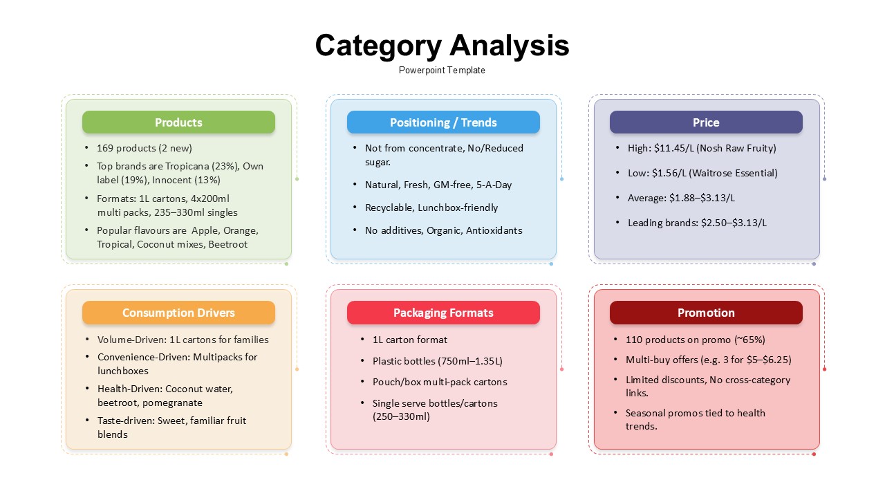
Category Analysis Comparison Infographic Template for PowerPoint & Google Slides
Comparison
Premium
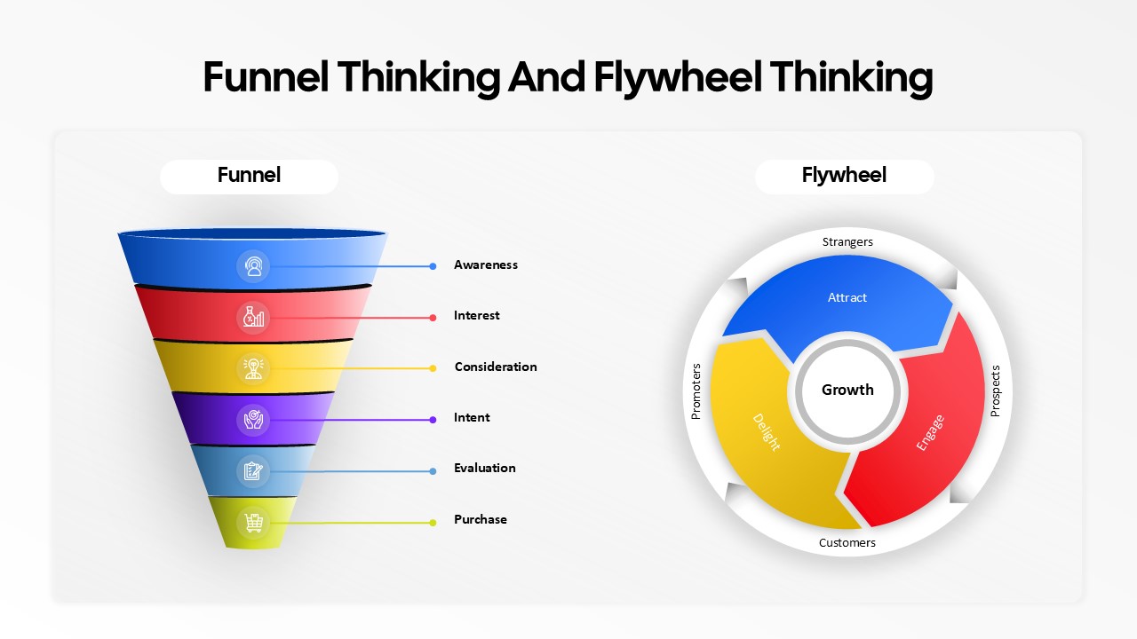
Funnel and Flywheel Thinking Comparison template for PowerPoint & Google Slides
Infographics
Premium
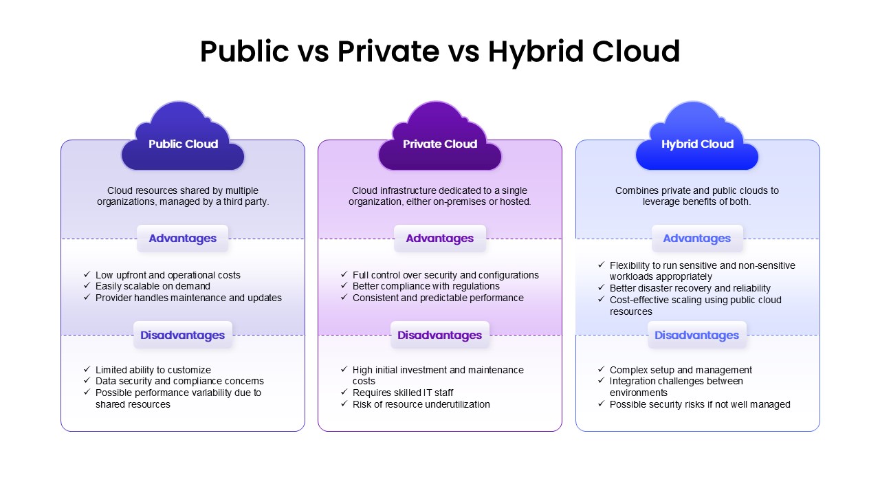
Public, Private & Hybrid Cloud Comparison Template for PowerPoint & Google Slides
Cloud Computing
Premium
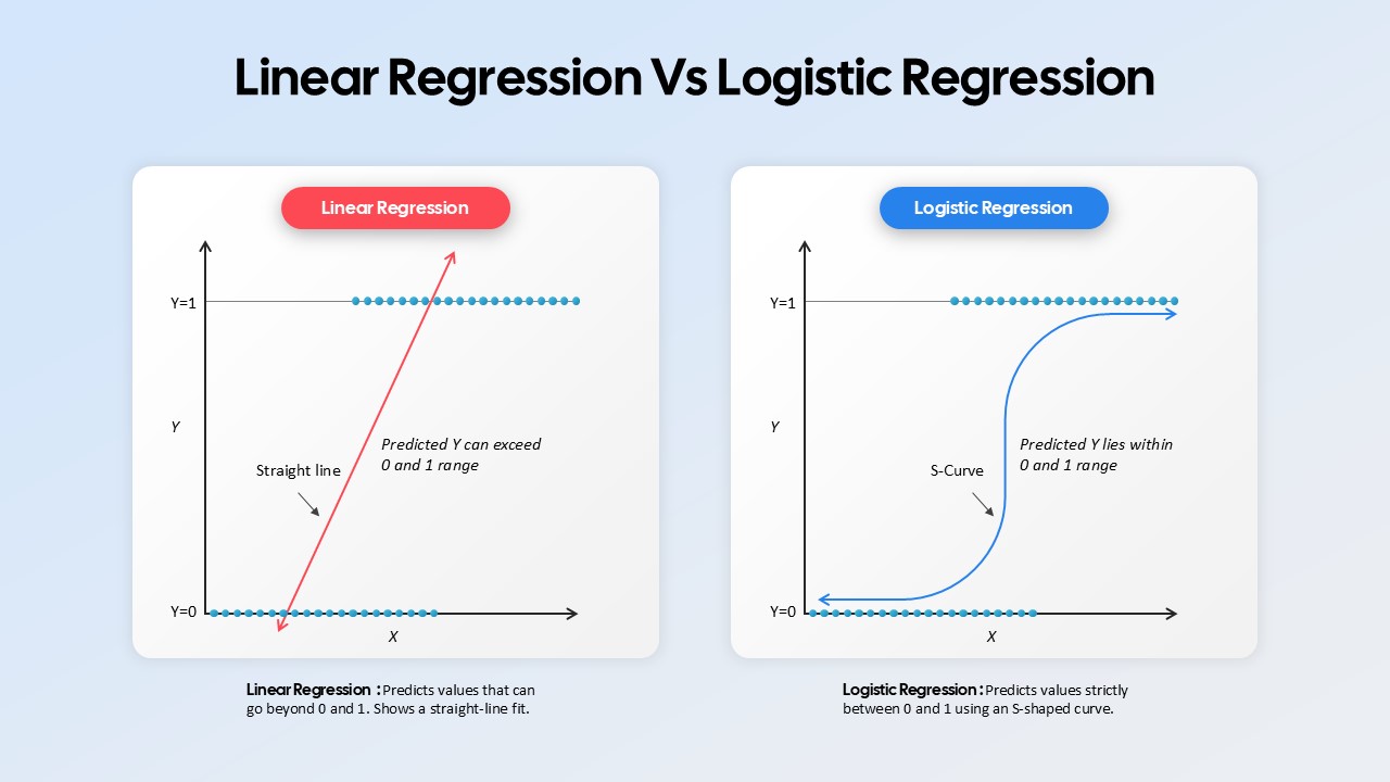
Linear Regression vs Logistic Regression Comparison template for PowerPoint & Google Slides
Comparison
Premium
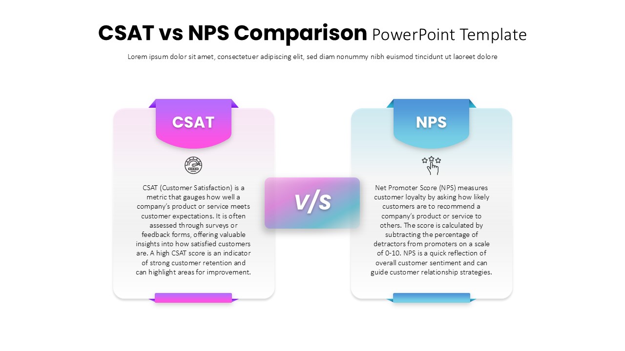
CSAT vs NPS Comparison template for PowerPoint & Google Slides
Business Strategy
Premium
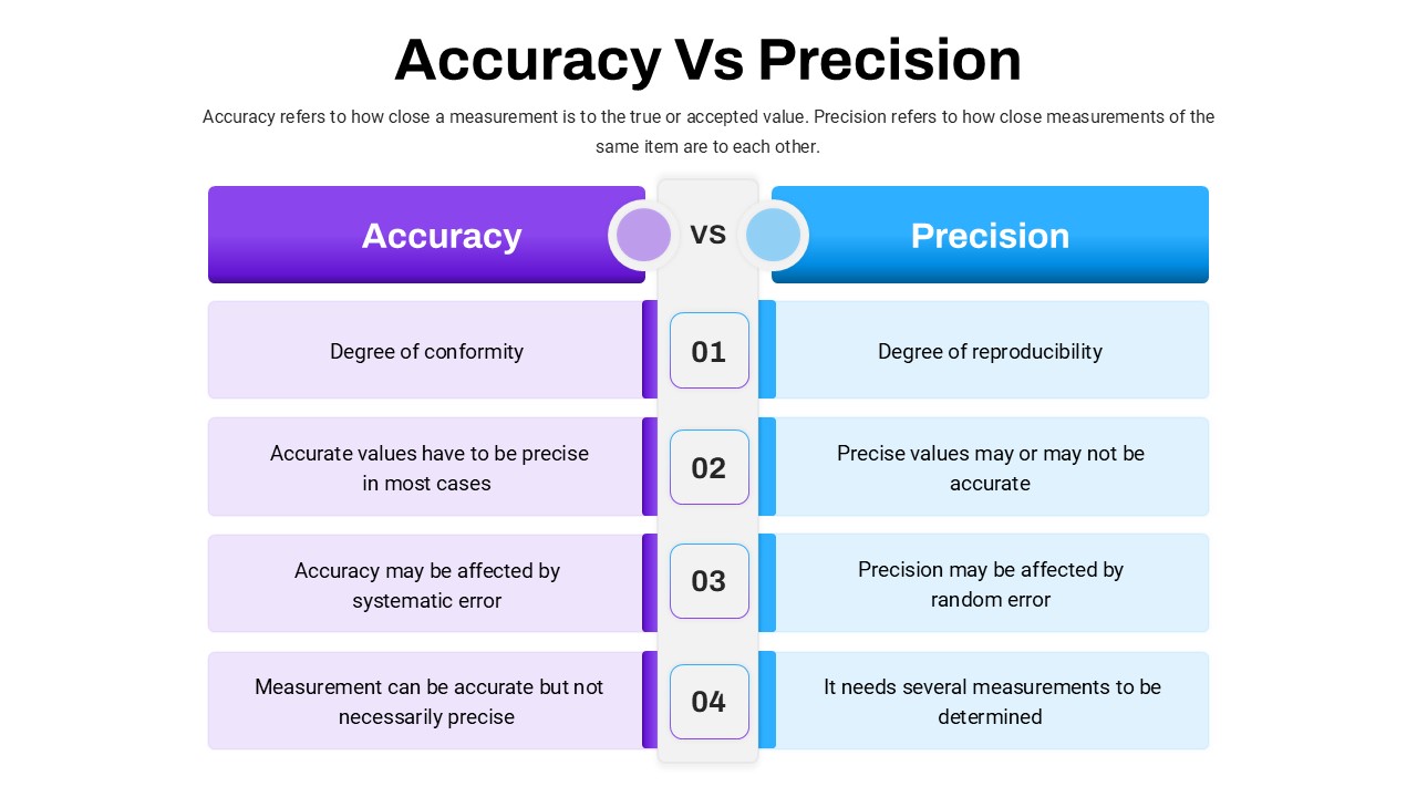
Accuracy Vs Precision Comparison Template for PowerPoint & Google Slides
Comparison Chart
Premium
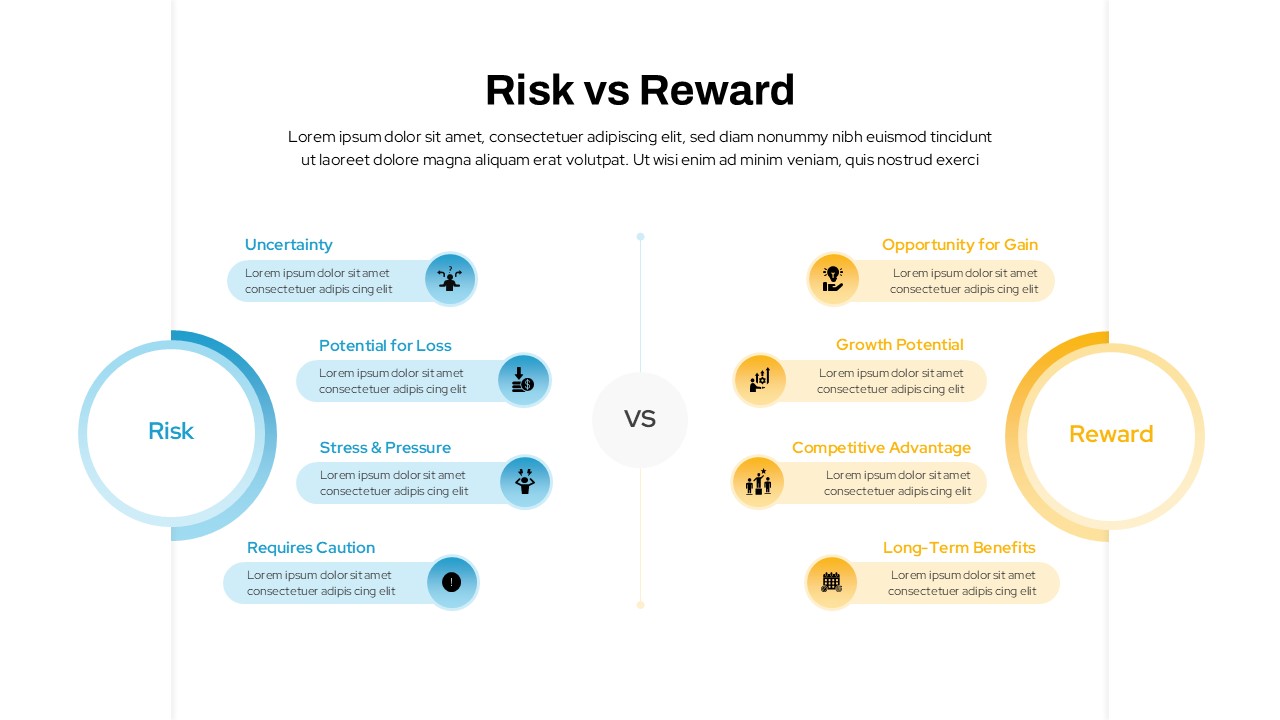
Risk vs Reward Comparison Template for PowerPoint & Google Slides
Opportunities Challenges
Premium
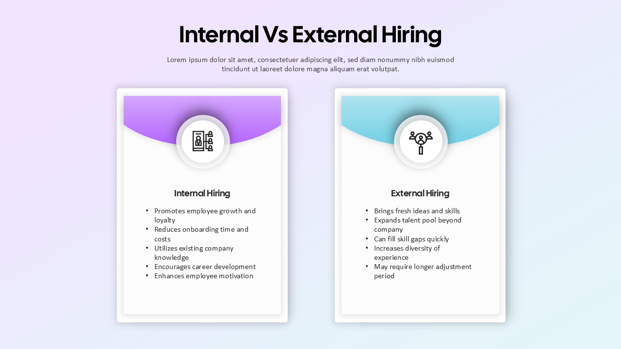
Internal vs External Hiring Comparison Template for PowerPoint & Google Slides
Comparison
Premium