Donut Chart template for PowerPoint & Google Slides


Description
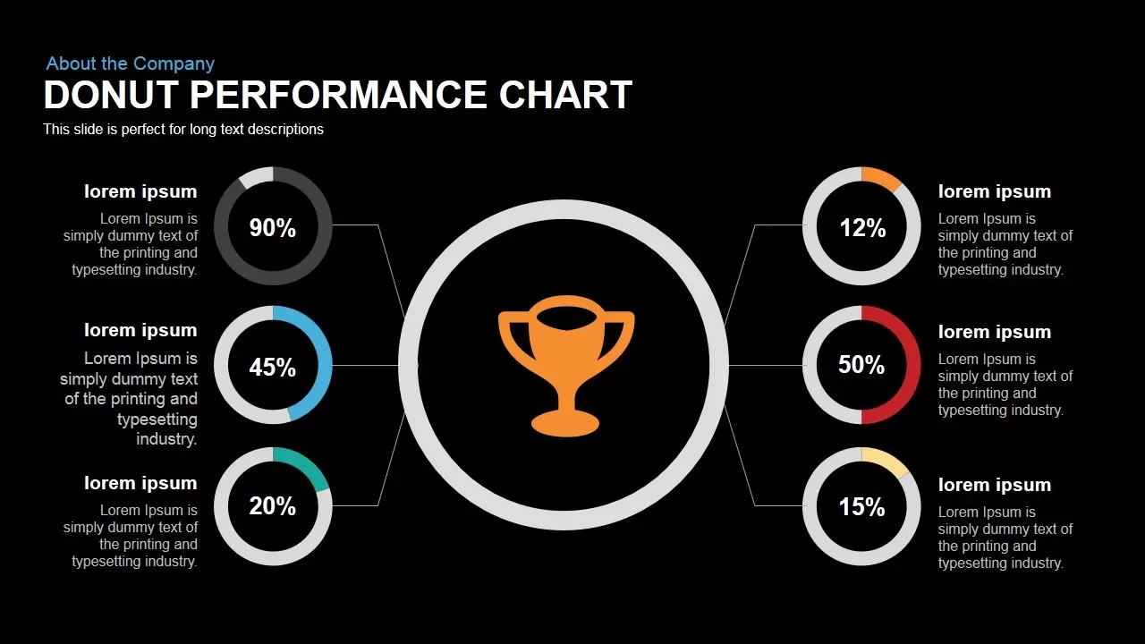
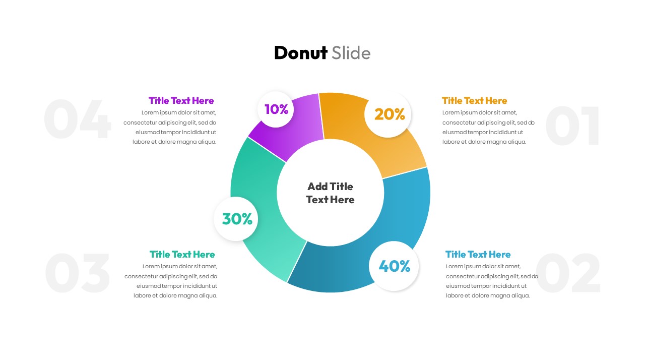
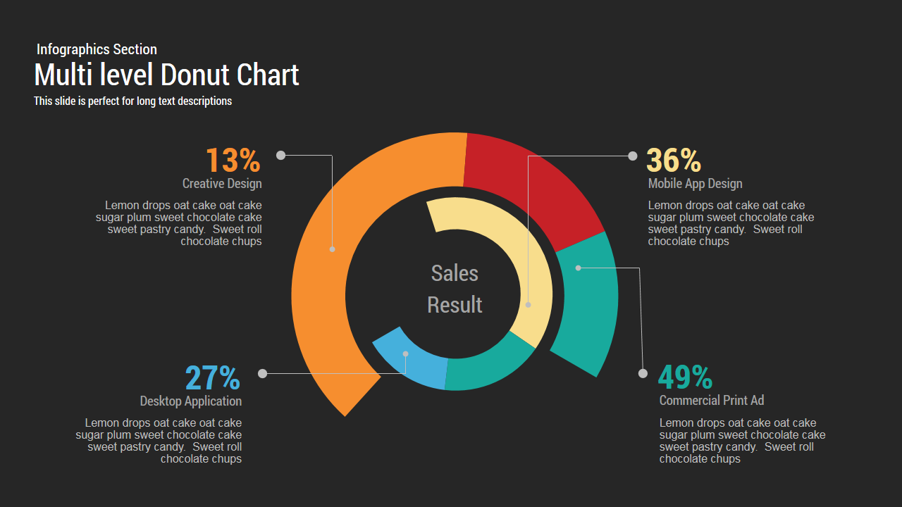
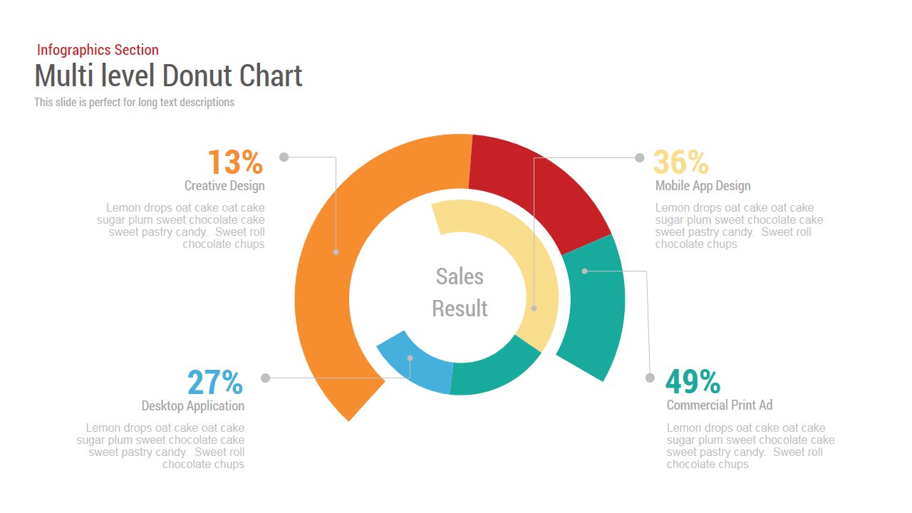
This multi‐level Donut Chart slide features concentric ring layers on a dark background, anchored by a central “Sales Result” label. The outer and inner donuts segment four key metrics—Creative Design (13%), Desktop Application (27%), Mobile App Design (36%), and Commercial Print Ad (49%)—each reinforced by colored callouts. Strategically placed connectors link each segment to percentage callouts and rich text blocks, enabling clear narrative focus on performance drivers. Built on master slides in PowerPoint and Google Slides, every element—from ring shapes to connector lines and text fields—is fully editable. Theme-color controls let you reassign hues across orange, blue, yellow, and green to match brand guidelines, while free Google Fonts ensure typographic consistency. Drag-and-drop placeholders simplify data updates and icon swaps, and vector graphics guarantee pixel-perfect clarity on HD projectors, retina displays, and virtual meeting platforms. The layout supports both 16:9 widescreen and 4:3 aspect ratios without manual realignment. Subtle drop shadows add depth, and a hidden variation slide offers alternate color palettes and segment arrangements for rapid customization. Use the central label as a dynamic KPI summary, customize connector endpoints with circular markers to denote drill-down points, or swap the donut for a gauge graphic to reinforce multi-tiered data storylines on a single slide. Preconfigured light and dark themes and optional six-segment layouts broaden applicability. Leverage built-in entrance animations or morph transitions to guide viewer attention sequentially.
Who is it for
Marketing analysts, sales managers, product owners, and executive leadership teams needing to present performance metrics in a visually engaging format. Data analysts and consultants will appreciate the multi-tiered segmentation for in-depth channel analysis. Agency teams and educators can leverage the slide for training sessions or stakeholder briefings.
Other Uses
Repurpose this chart to illustrate customer satisfaction scores, device usage distributions, budget allocations, or survey responses. Replace the donut with radial bar charts or gauge indicators to adapt the slide for financial forecasting, resource planning, or operational dashboards with minimal effort.
Login to download this file

Item ID
SB00038
Related Templates

Donut Chart template for PowerPoint & Google Slides
Pie/Donut
Donut Chart Split Template for PowerPoint & Google Slides
Charts
Success Key Diagram with Donut Chart Template for PowerPoint & Google Slides
Pie/Donut

Eight Section Donut Chart Infographic Template for PowerPoint & Google Slides
Pie/Donut
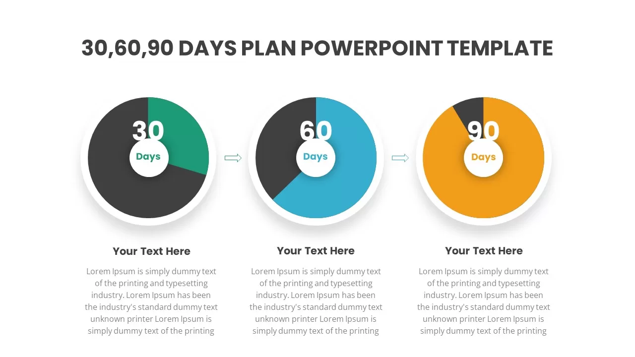
30-60-90 Day Donut Chart Plan Infographic Template for PowerPoint & Google Slides
Timeline
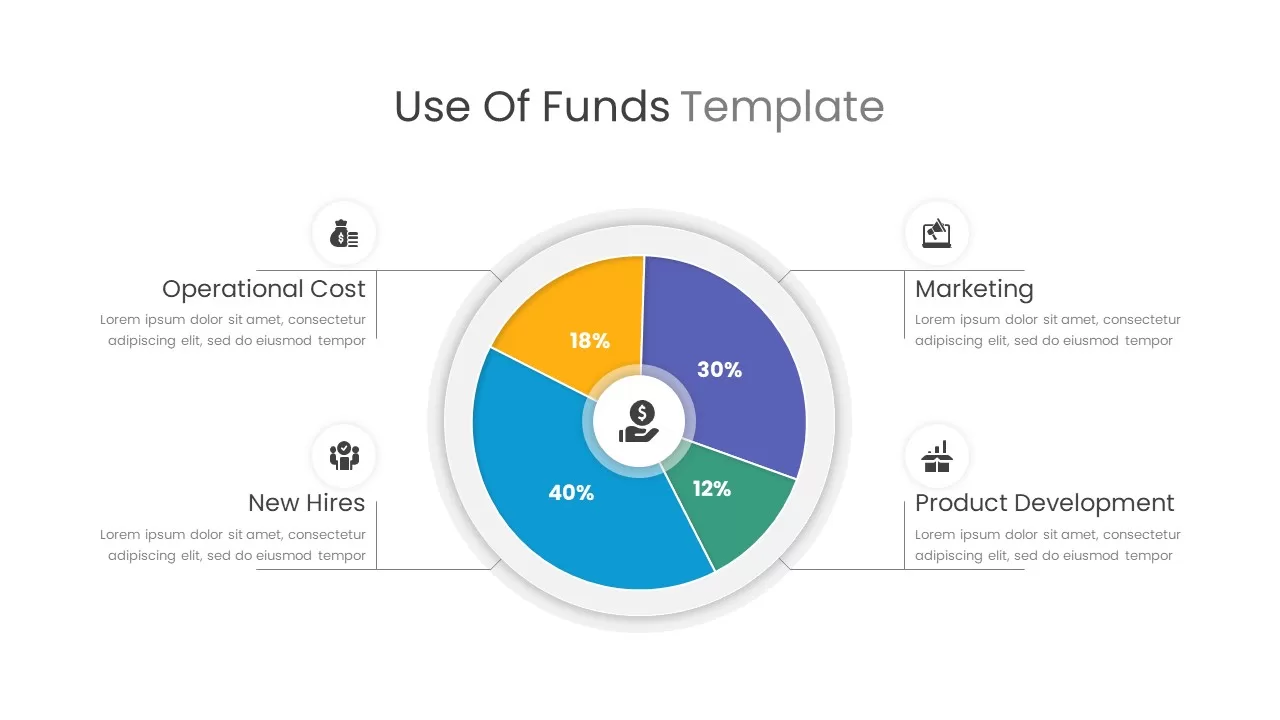
Use of Funds Donut Chart Infographic Template for PowerPoint & Google Slides
Circular
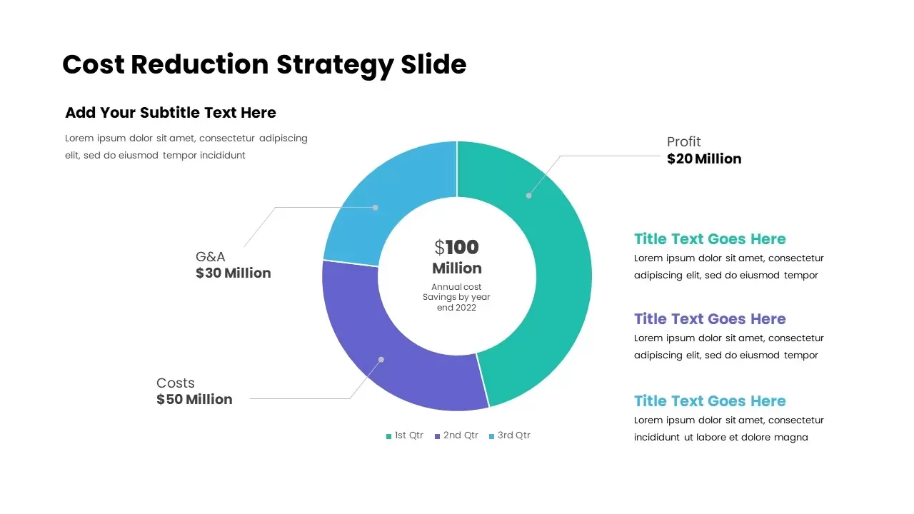
Cost Reduction Strategy Donut Chart Template for PowerPoint & Google Slides
Pie/Donut
Donut Chart Data Breakdown template for PowerPoint & Google Slides
Pie/Donut
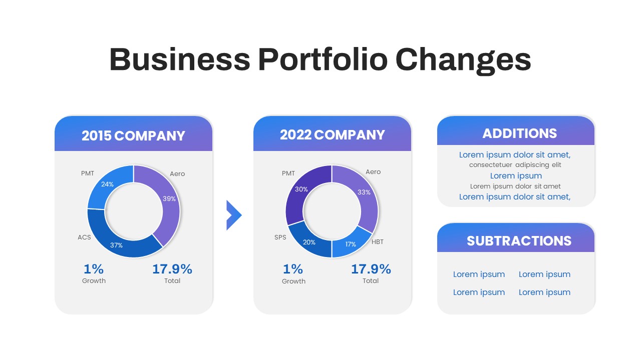
Business Portfolio Changes Donut Chart Template for PowerPoint & Google Slides
Pie/Donut
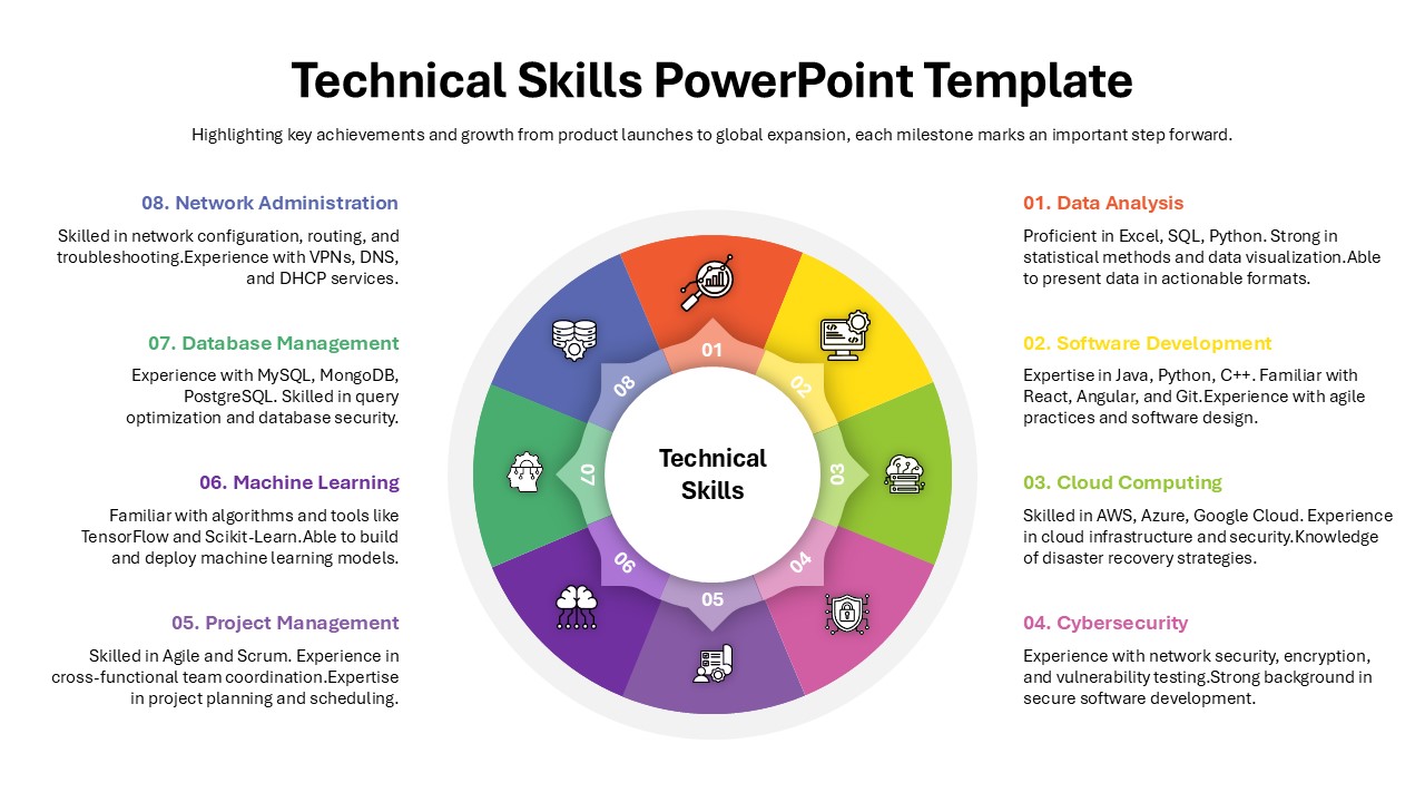
Technical Skills Donut Chart Overview Template for PowerPoint & Google Slides
HR
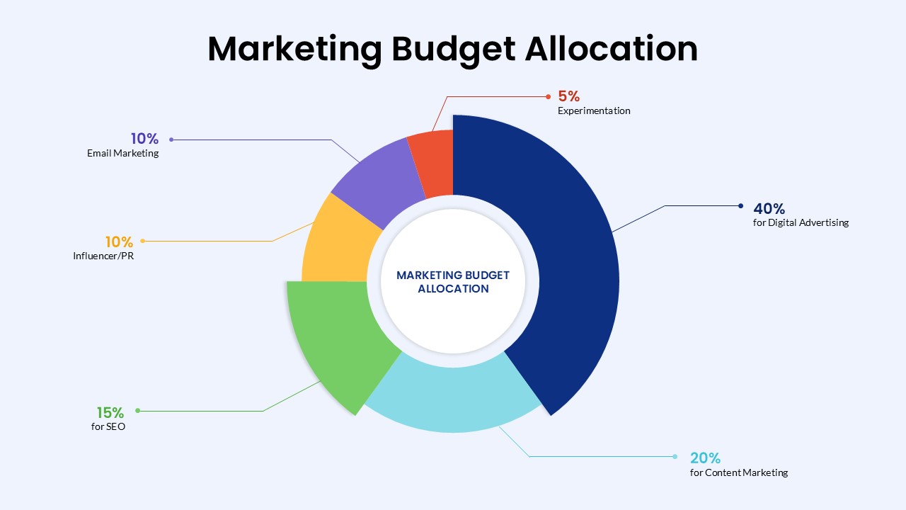
Marketing Budget Allocation Donut Chart Template for PowerPoint & Google Slides
Marketing
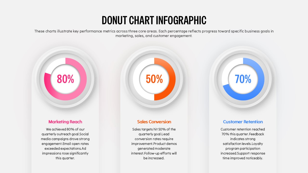
Three Segment Donut Chart KPI Infographic Template for PowerPoint & Google Slides
Pie/Donut
Donut Chart for PowerPoint & Google Slides
Pie/Donut
Donut Chart for PowerPoint & Google Slides
Pie/Donut
Donut Chart for PowerPoint & Google Slides
Pie/Donut
Donut Chart Presentation for PowerPoint & Google Slides
Pie/Donut

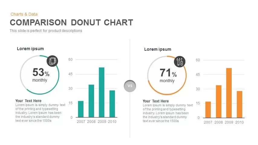
Comparison Donut Chart PowerPoint Template and Keynote
Pie/Donut
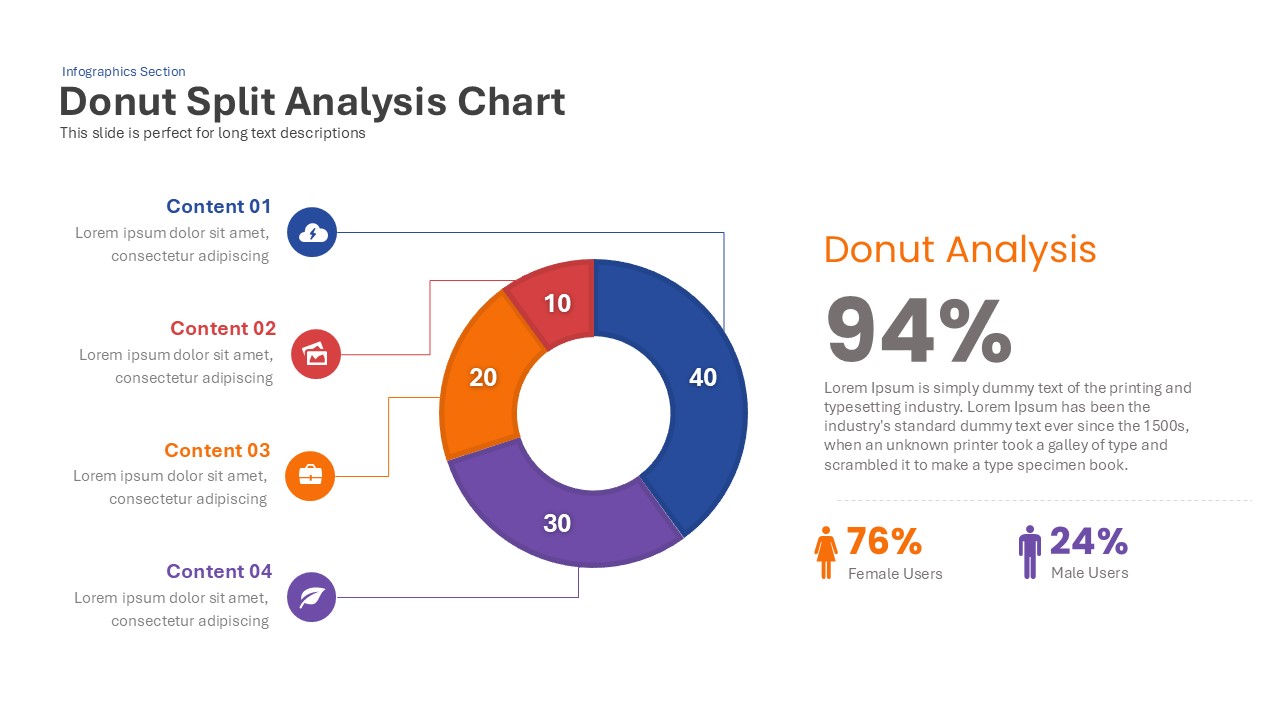
Donut Split Analysis template for PowerPoint & Google Slides
Pie/Donut
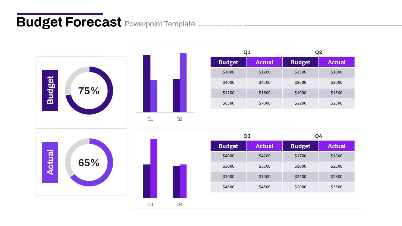
Budget Forecast Dashboard & Donut Charts Template for PowerPoint & Google Slides
Pie/Donut
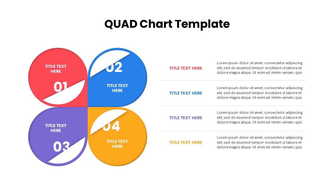
Quad Chart Infographic Pack of 8 Slides Template for PowerPoint & Google Slides
Comparison Chart
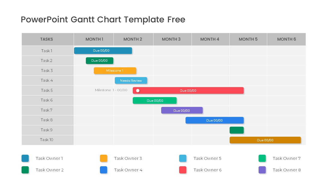
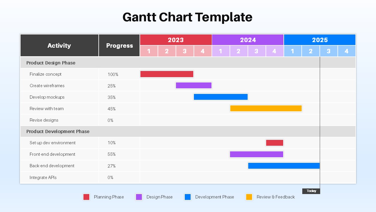
Free Professional Gantt Chart Pack – 4 Slides Template for PowerPoint & Google Slides
Gantt Chart
Free
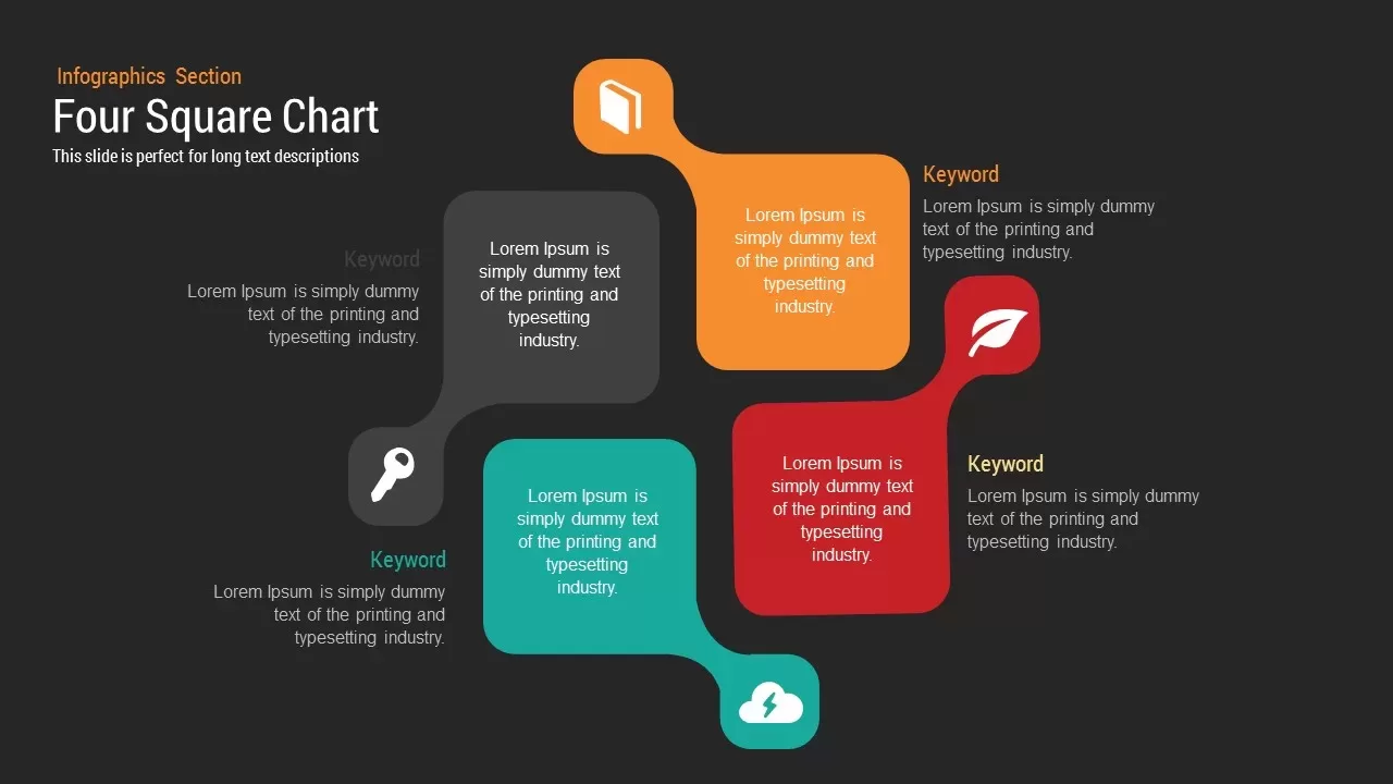
Four Square Chart template for PowerPoint & Google Slides
Charts
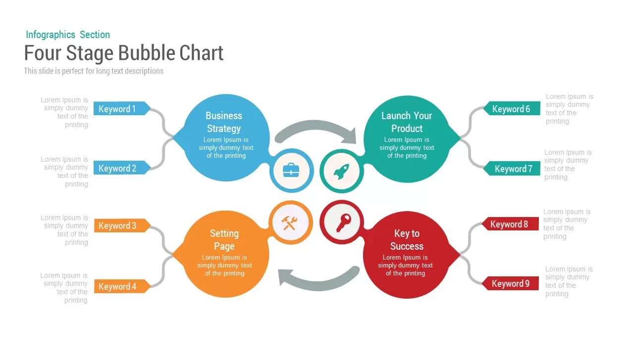
Bubble Chart template for PowerPoint & Google Slides
Charts
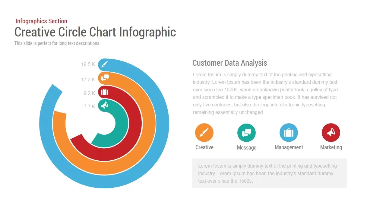
Circle Chart Data template for PowerPoint & Google Slides
Pie/Donut

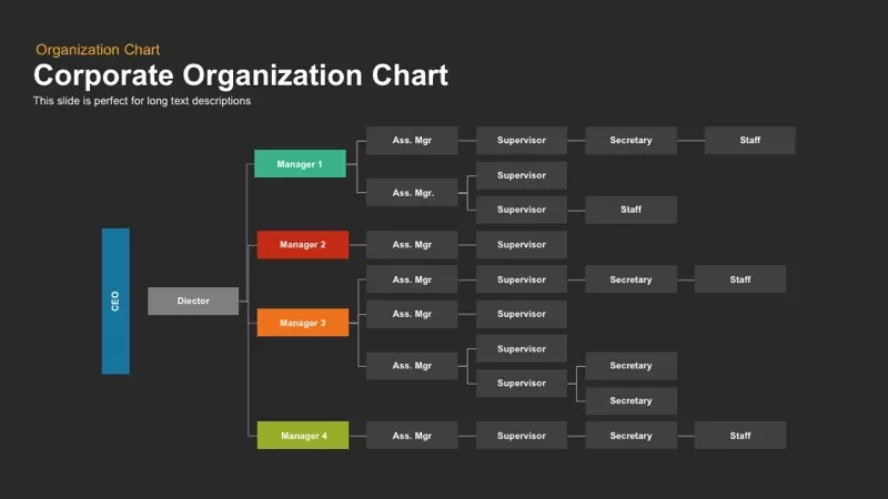
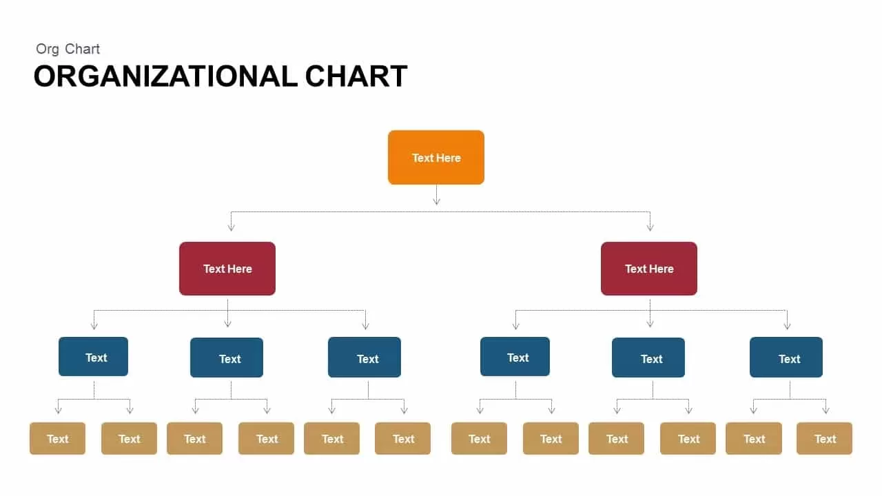
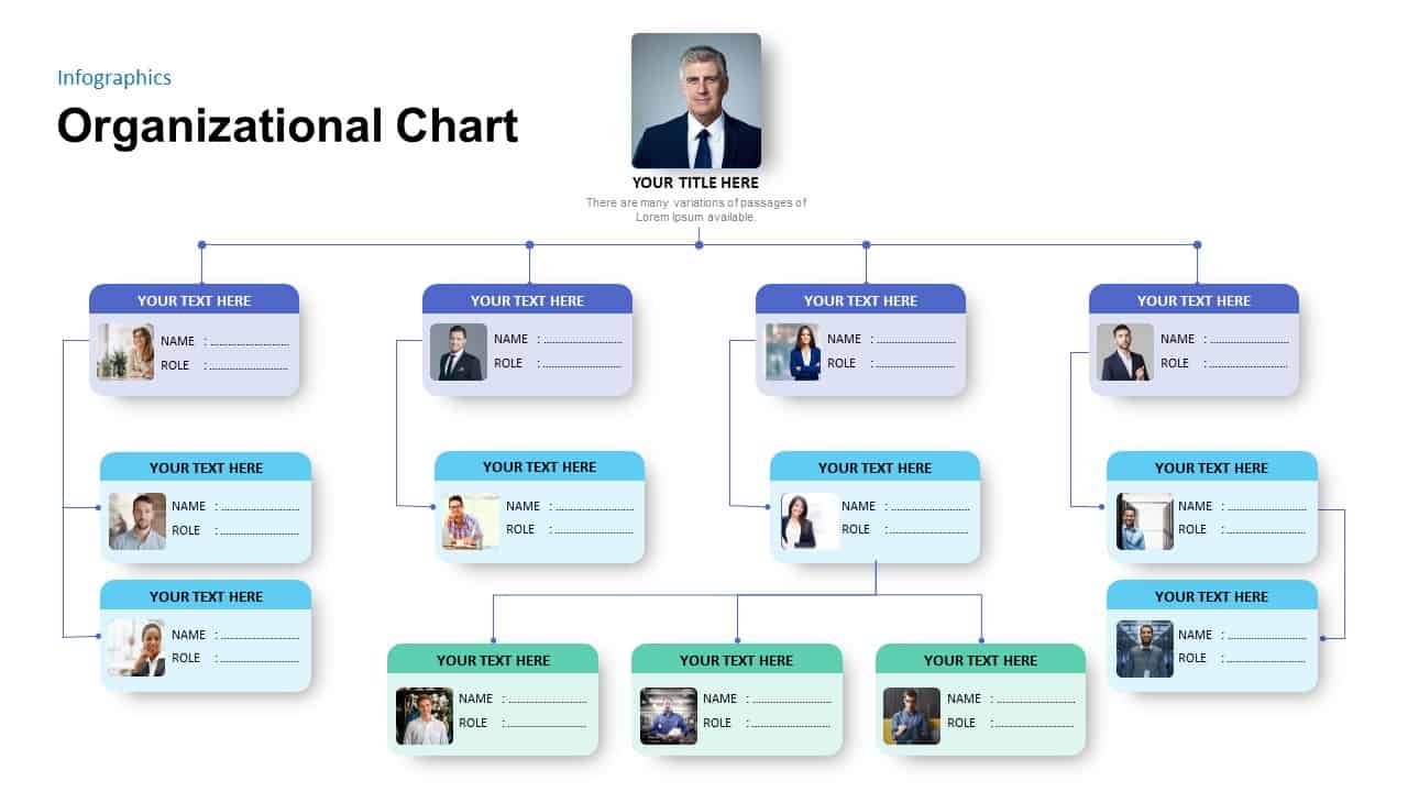
Corporate Organization Chart template for PowerPoint & Google Slides
Org Chart
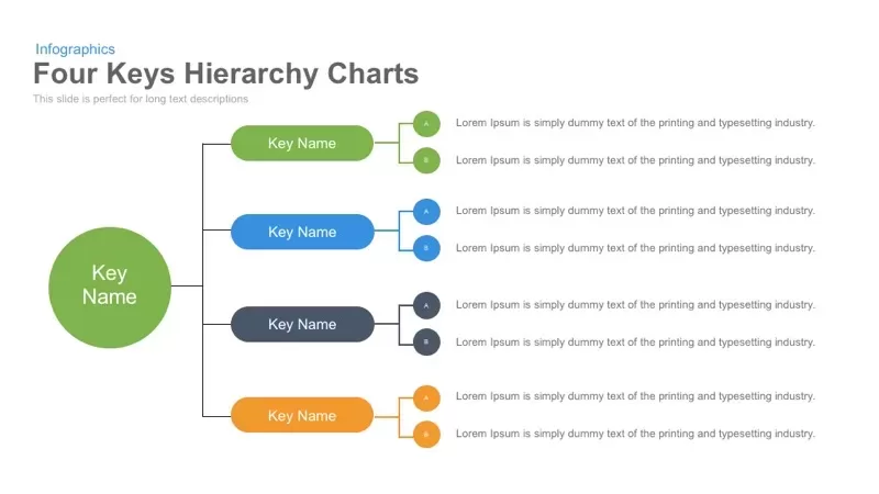
Four Keys Hierarchy Chart template for PowerPoint & Google Slides
Process
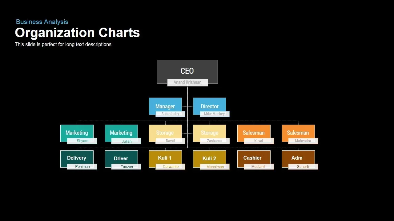
Business Organization Chart Hierarchy Template for PowerPoint & Google Slides
Org Chart
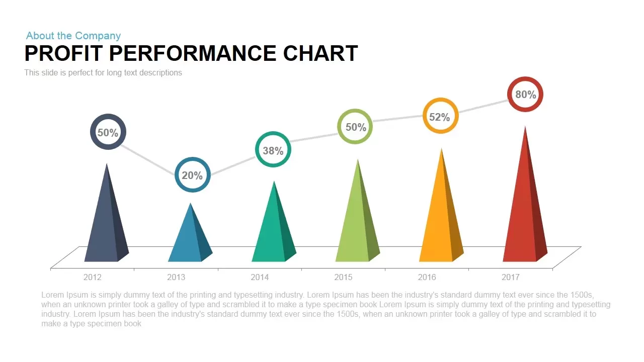
Profit Performance Trend Chart Template for PowerPoint & Google Slides
Finance
3D Bar Chart Data Infographics Template for PowerPoint & Google Slides
Bar/Column
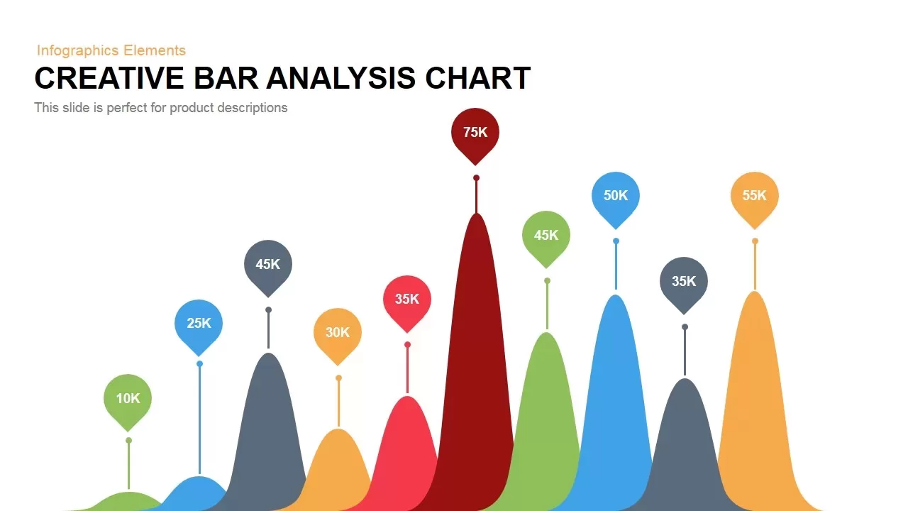
Creative Bar Chart template for PowerPoint & Google Slides
Charts
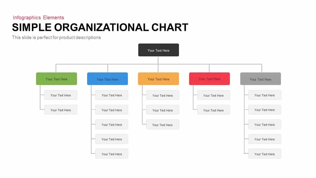
Simple Organizational Chart Infographic Template for PowerPoint & Google Slides
Org Chart
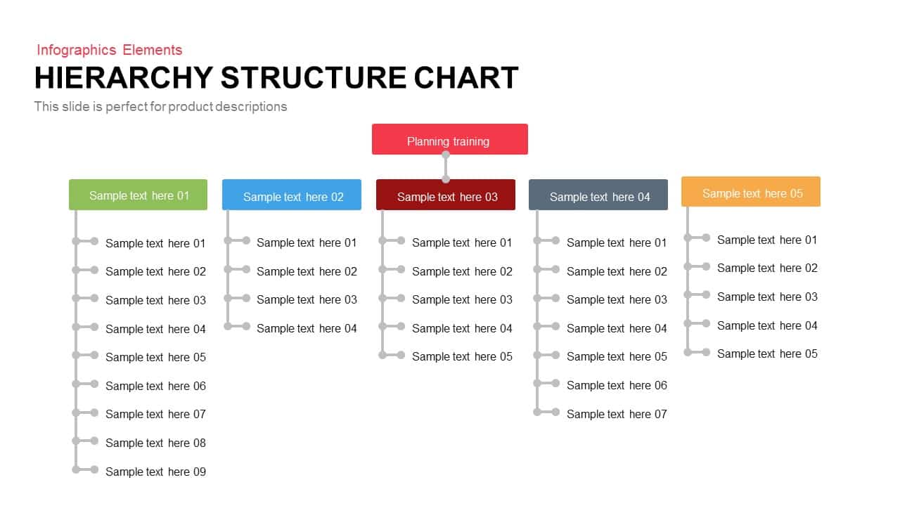
Five-Branch Hierarchy Structure Chart template for PowerPoint & Google Slides
Org Chart
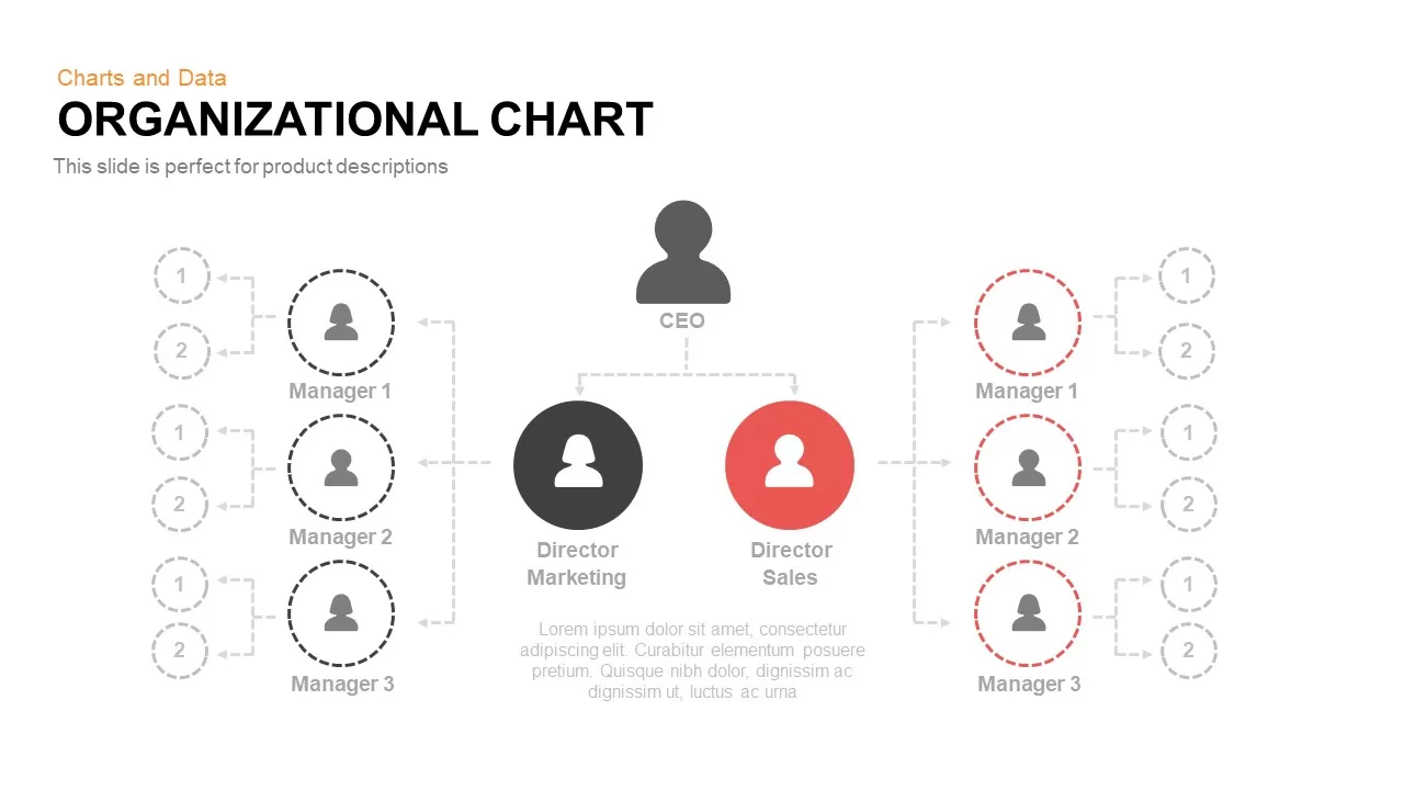
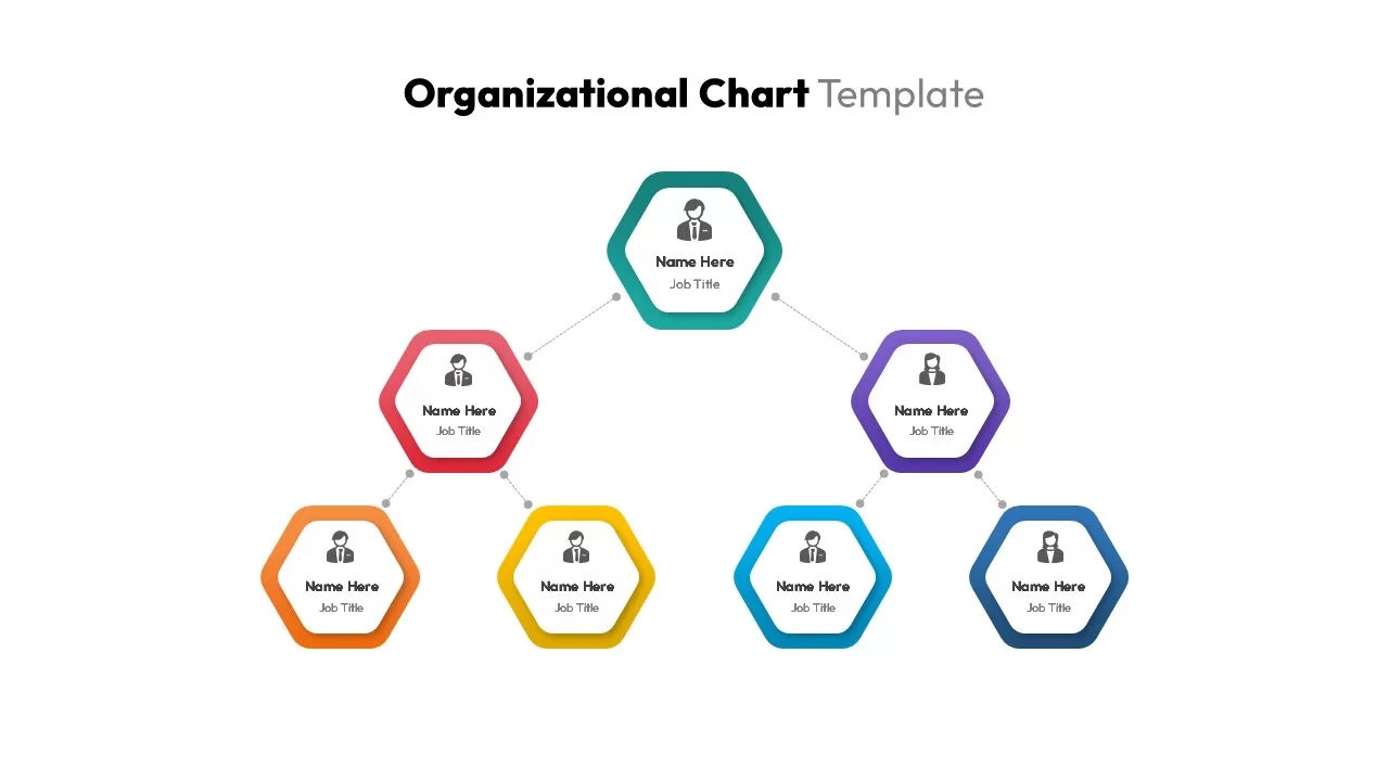
Organizational Chart Template for PowerPoint & Google Slides
Org Chart
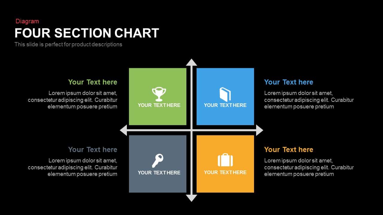
Four Section Comparison Chart Diagram Template for PowerPoint & Google Slides
Infographics

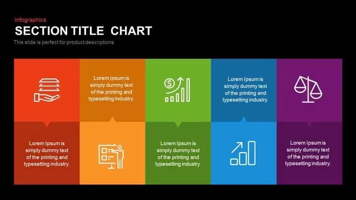
Modern Ten-Block Section Title Chart template for PowerPoint & Google Slides
Comparison
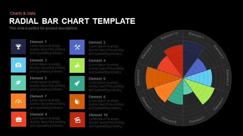
Colorful Radial Bar Chart Template for PowerPoint & Google Slides
Bar/Column
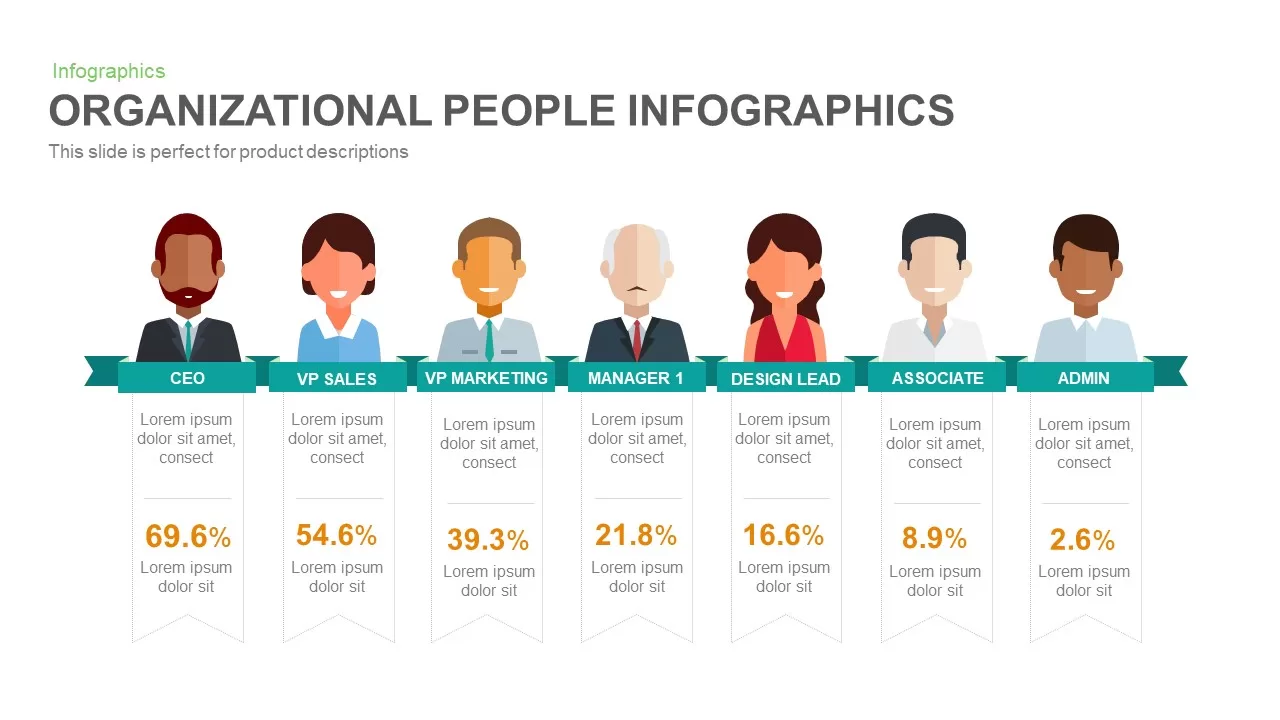
Organizational People Percentage Chart template for PowerPoint & Google Slides
Org Chart
Organizational Structure Org Chart Template for PowerPoint & Google Slides
Org Chart
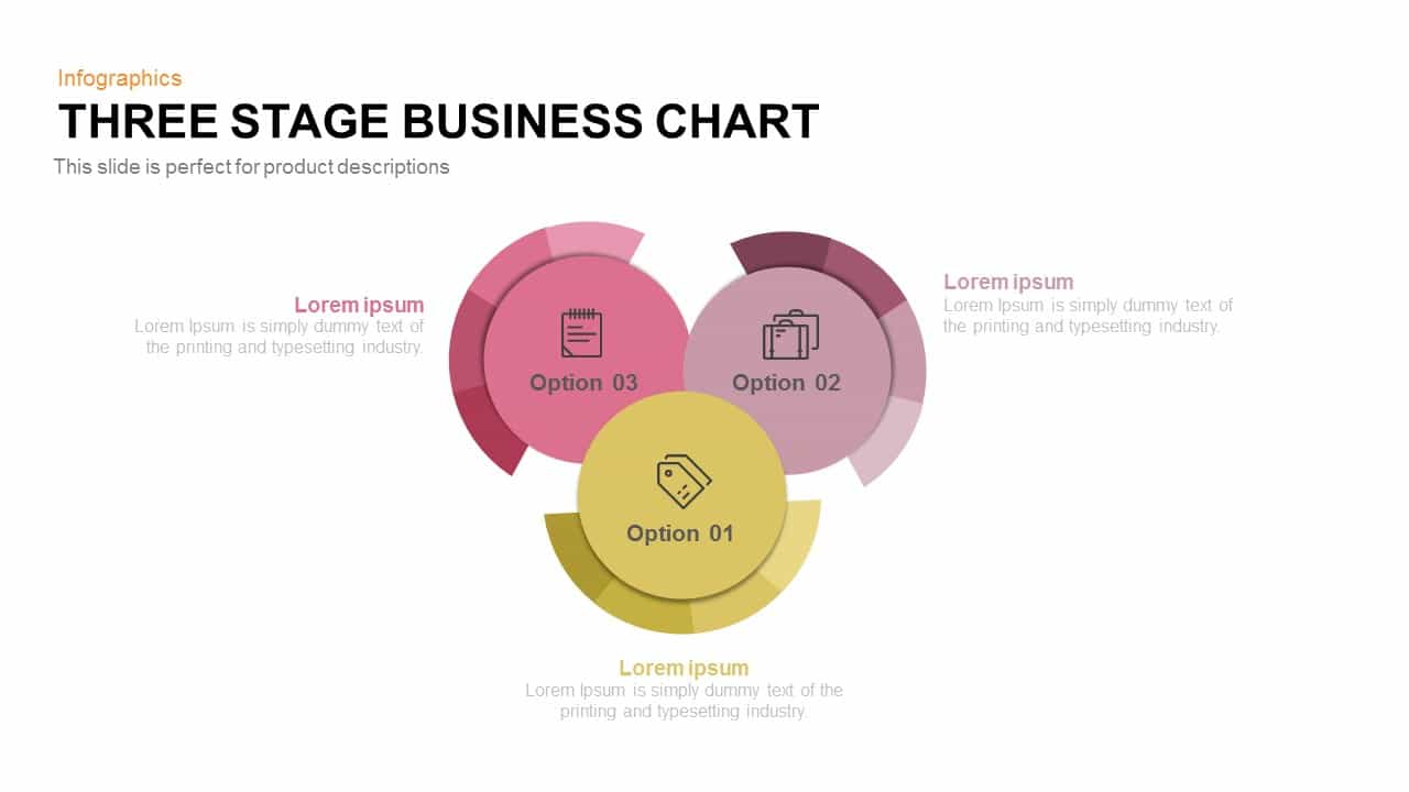
Three-Stage Circular Options Chart Template for PowerPoint & Google Slides
Comparison
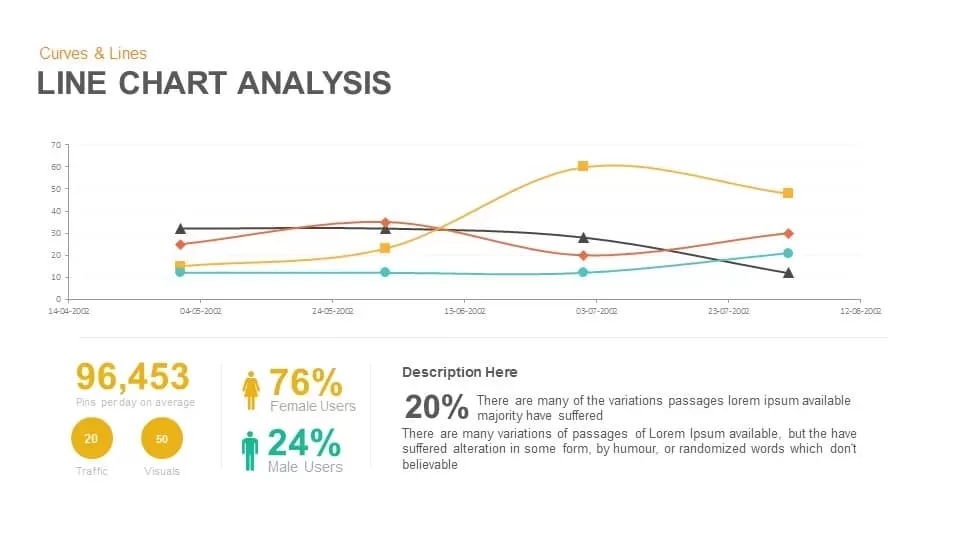
Line Chart Analysis template for PowerPoint & Google Slides
Charts
Organizational Chart Structure template for PowerPoint & Google Slides
Org Chart

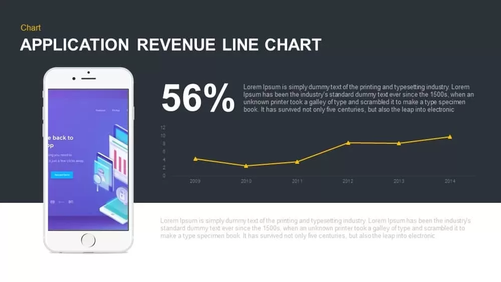
Application Revenue Line Chart KPI Template for PowerPoint & Google Slides
Revenue
Tornado Chart Data Comparison Slide Template for PowerPoint & Google Slides
Bar/Column
Modern Colorful Circular Org Chart Template for PowerPoint & Google Slides
Org Chart
3D Organization Hierarchy Chart Template for PowerPoint & Google Slides
Org Chart
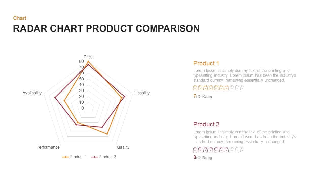
Radar Chart Product Comparison Template for PowerPoint & Google Slides
Comparison Chart
Five-Stage Diamond Timeline Chart Template for PowerPoint & Google Slides
Timeline
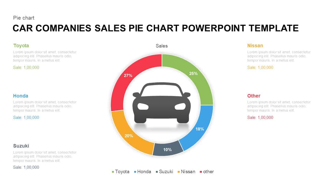
Car Sales Market Share Pie Chart Template for PowerPoint & Google Slides
BCG
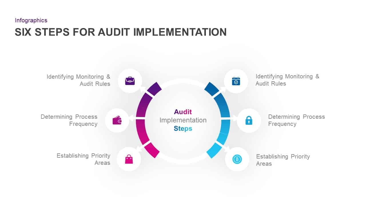
Six-Step Audit Implementation Chart Template for PowerPoint & Google Slides
Circular
Vertical Split Flow Chart Diagram Template for PowerPoint & Google Slides
Flow Charts
Modern Organizational Chart Hierarchy Template for PowerPoint & Google Slides
Org Chart
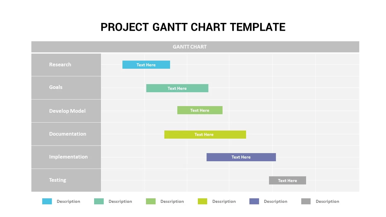
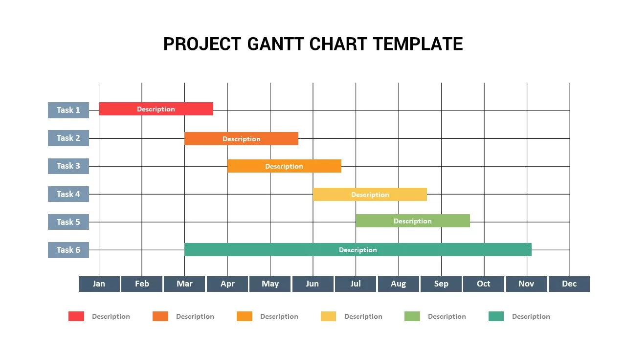
Project Gantt Chart template for PowerPoint & Google Slides
Gantt Chart
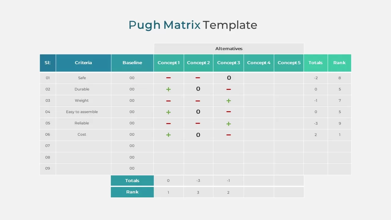
Pugh Matrix Decision Comparison Chart Template for PowerPoint & Google Slides
Comparison Chart
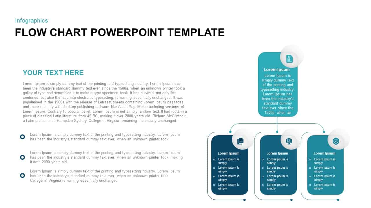
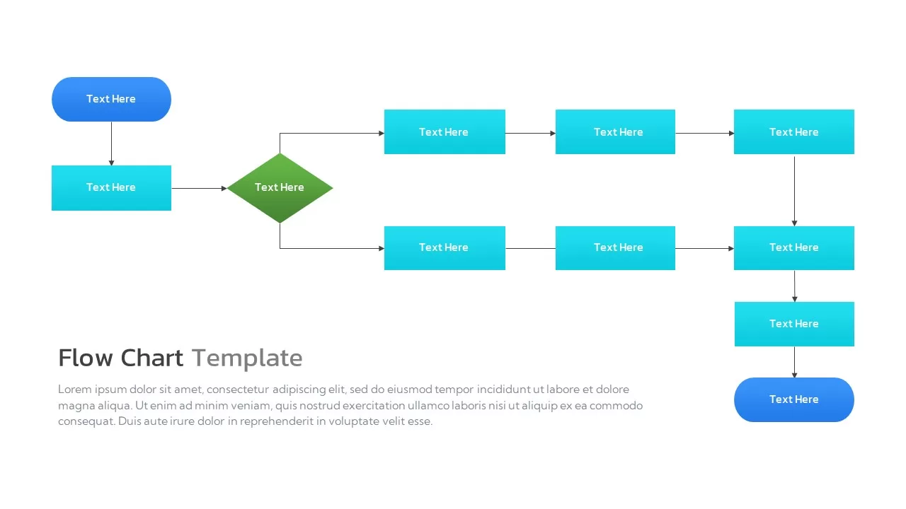
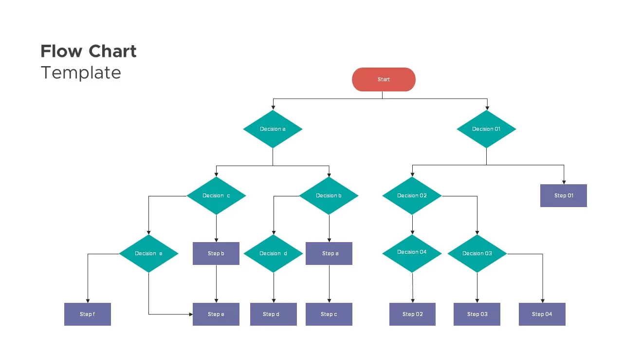
Flow Chart Diagram template for PowerPoint & Google Slides
Flow Charts
Organizational Chart Structure template for PowerPoint & Google Slides
Business Plan
Flow Chart Decision Tree Template for PowerPoint & Google Slides
Flow Charts
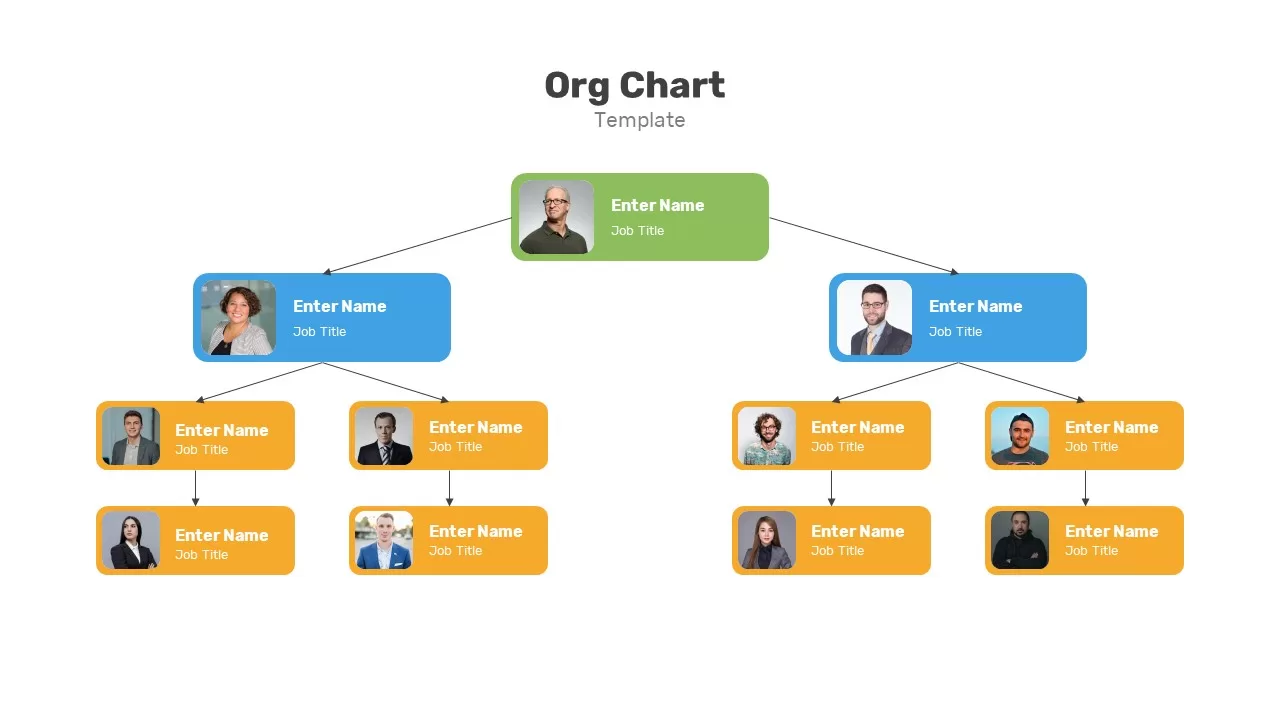
Organizational Chart Template for PowerPoint & Google Slides
Our Team
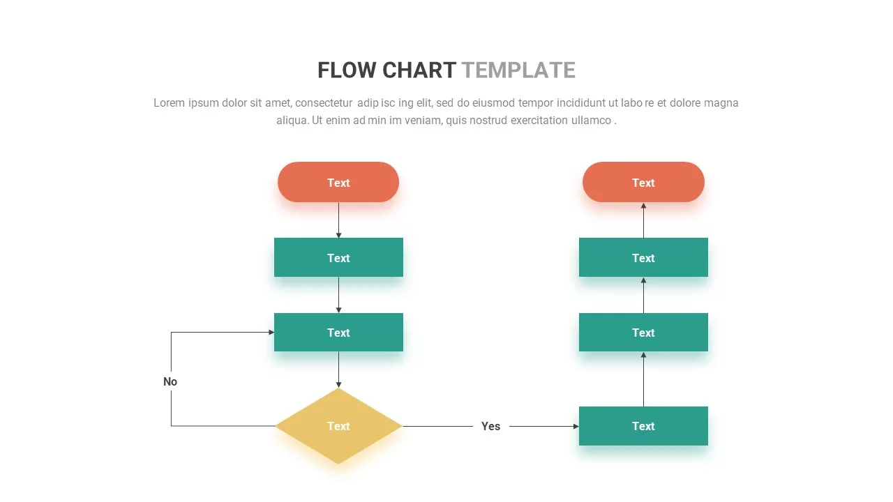
Flow Chart template for PowerPoint & Google Slides
Flow Charts
Organizational Chart template for PowerPoint & Google Slides
Org Chart
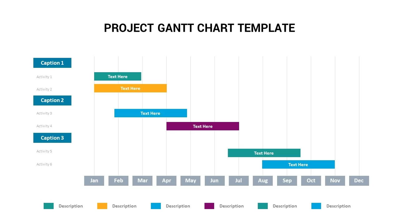
Annual Project Gantt Chart Timeline Template for PowerPoint & Google Slides
Gantt Chart
Project Gantt Chart Template for PowerPoint & Google Slides
Gantt Chart
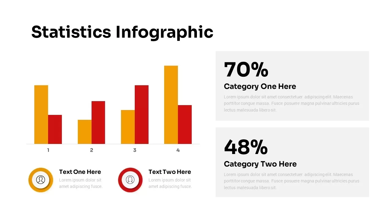
Statistics Infographic & KPI Bar Chart Template for PowerPoint & Google Slides
Bar/Column
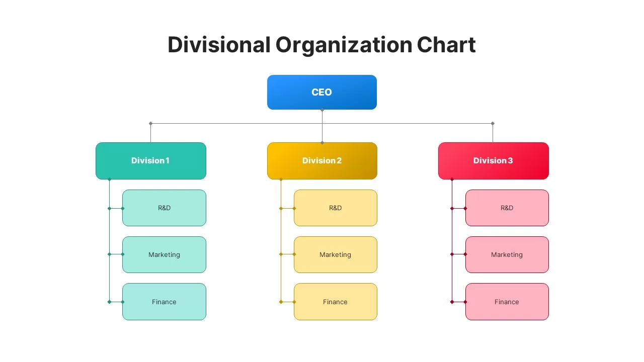
Divisional Organizational Chart Diagram Template for PowerPoint & Google Slides
Org Chart
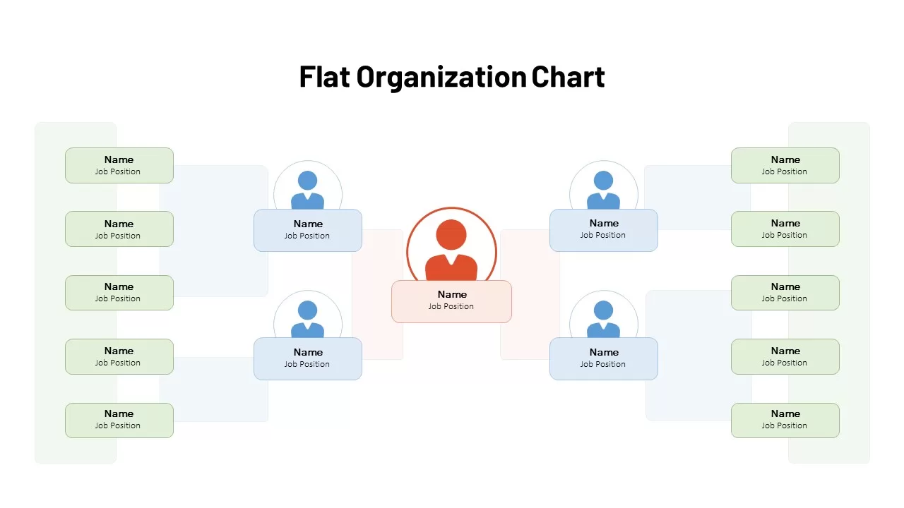
Flat Organization Chart Diagram Template for PowerPoint & Google Slides
Org Chart
Flat Organization Chart Diagram Template for PowerPoint & Google Slides
Org Chart
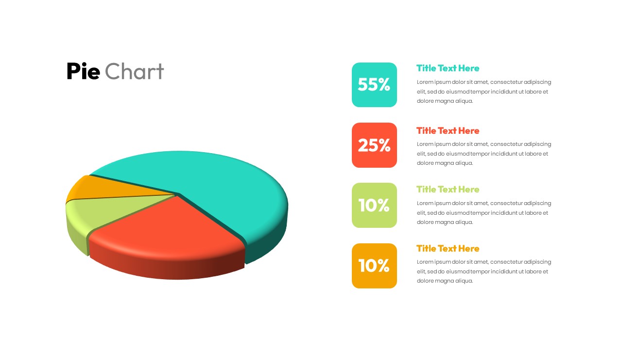
3D pie chart infographic template for PowerPoint & Google Slides
Pie/Donut
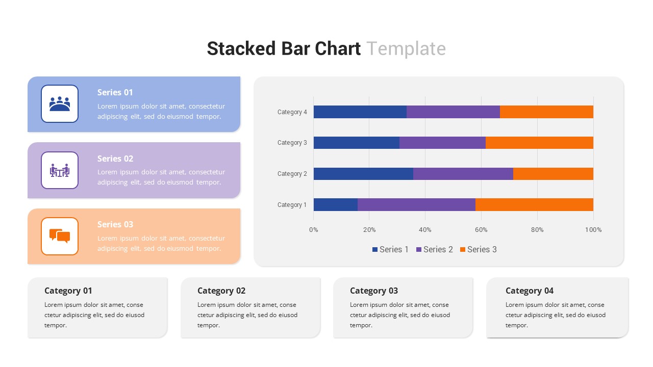
Multi-Series Stacked Bar Chart Template for PowerPoint & Google Slides
Bar/Column
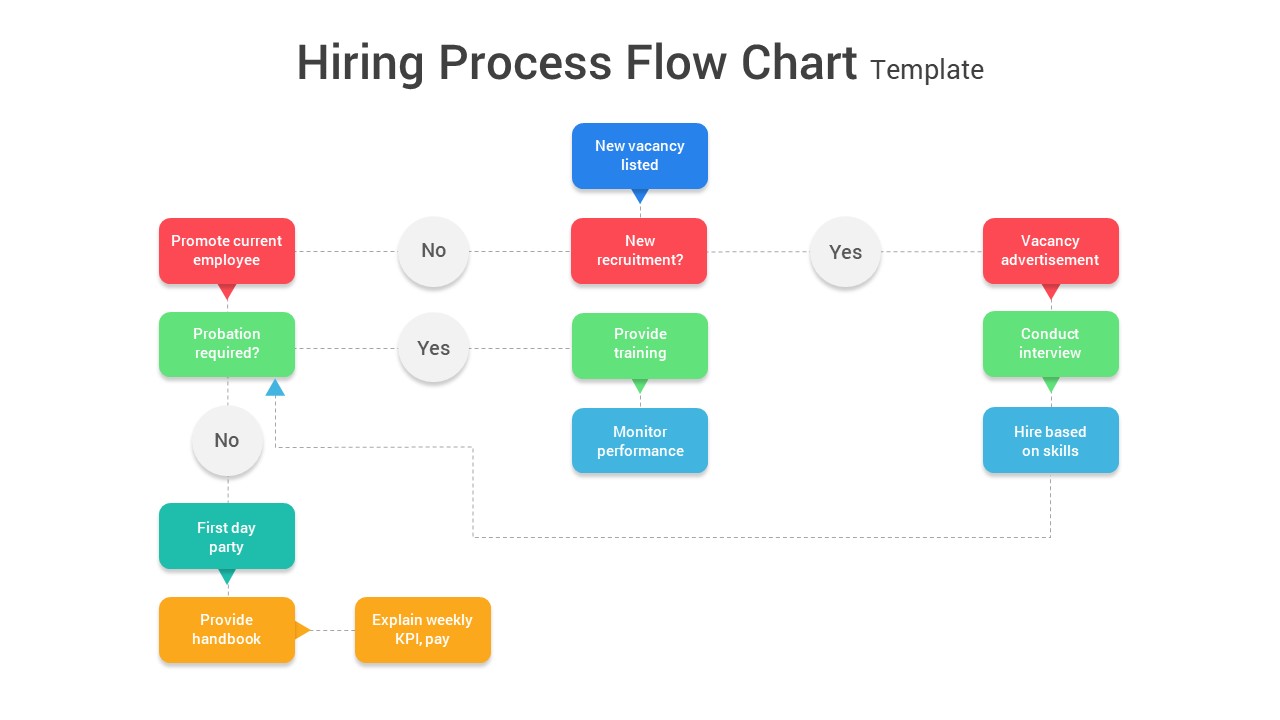
Comprehensive Hiring Process Flow Chart Template for PowerPoint & Google Slides
Flow Charts
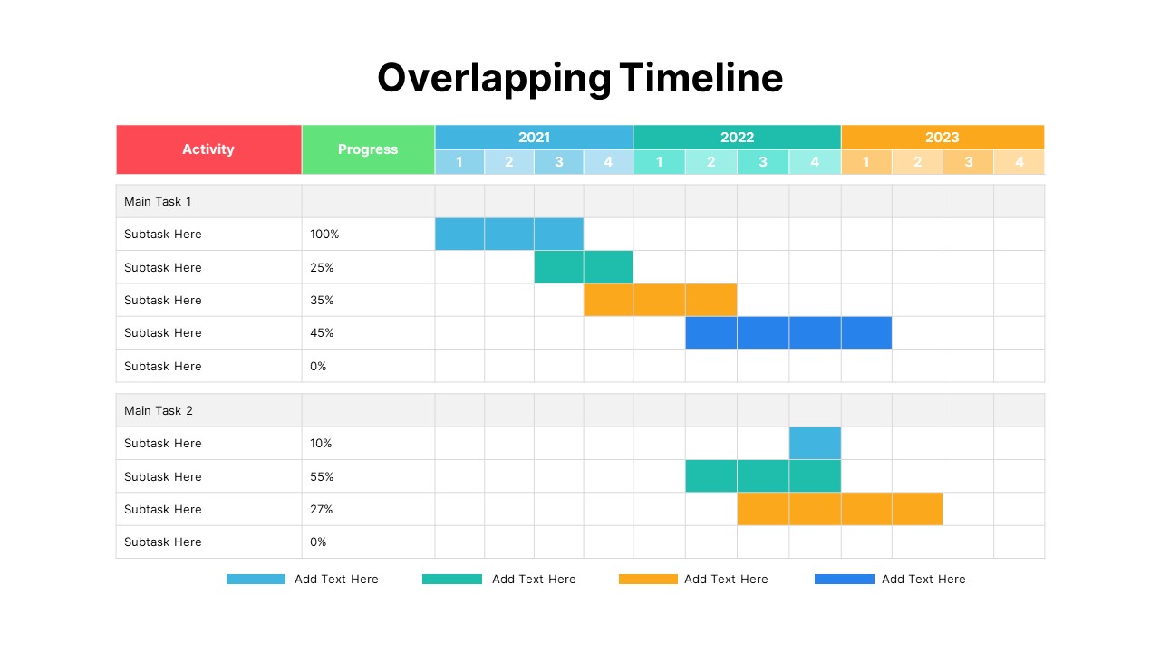
Overlapping Timeline Gantt Chart Diagram Template for PowerPoint & Google Slides
Timeline
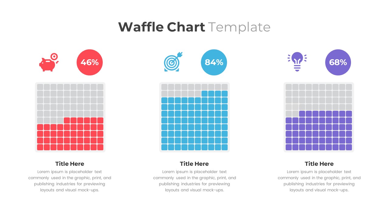
Waffle Chart Data Visualization Template for PowerPoint & Google Slides
Comparison Chart
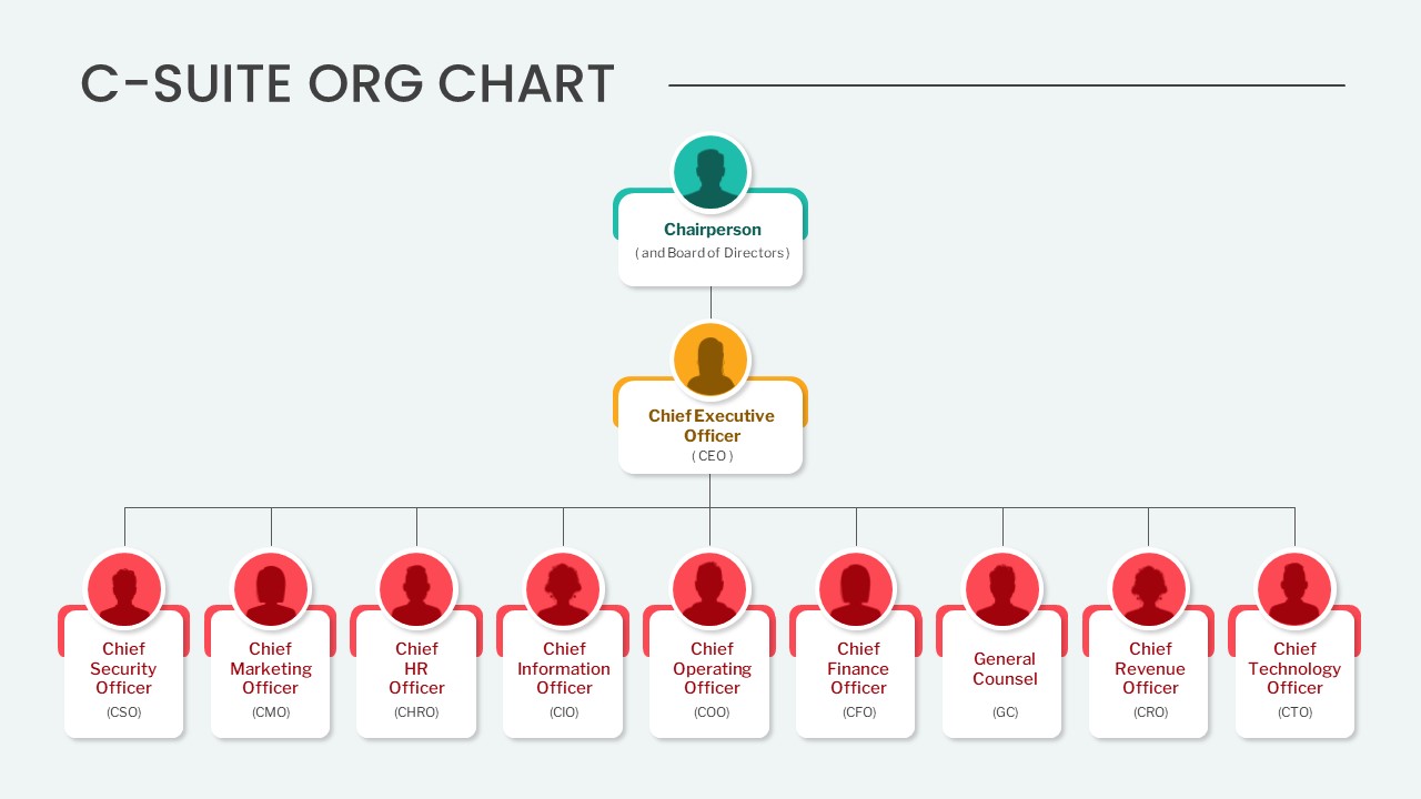
Editable C-Suite Organizational Chart Template for PowerPoint & Google Slides
Org Chart
Simple Bar Chart Data Visualization Template for PowerPoint & Google Slides
Bar/Column
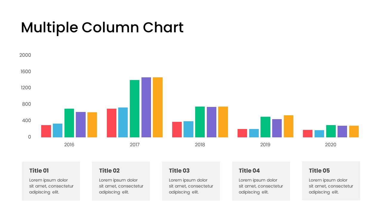
Minimal Multi-Year Column Chart Template for PowerPoint & Google Slides
Bar/Column
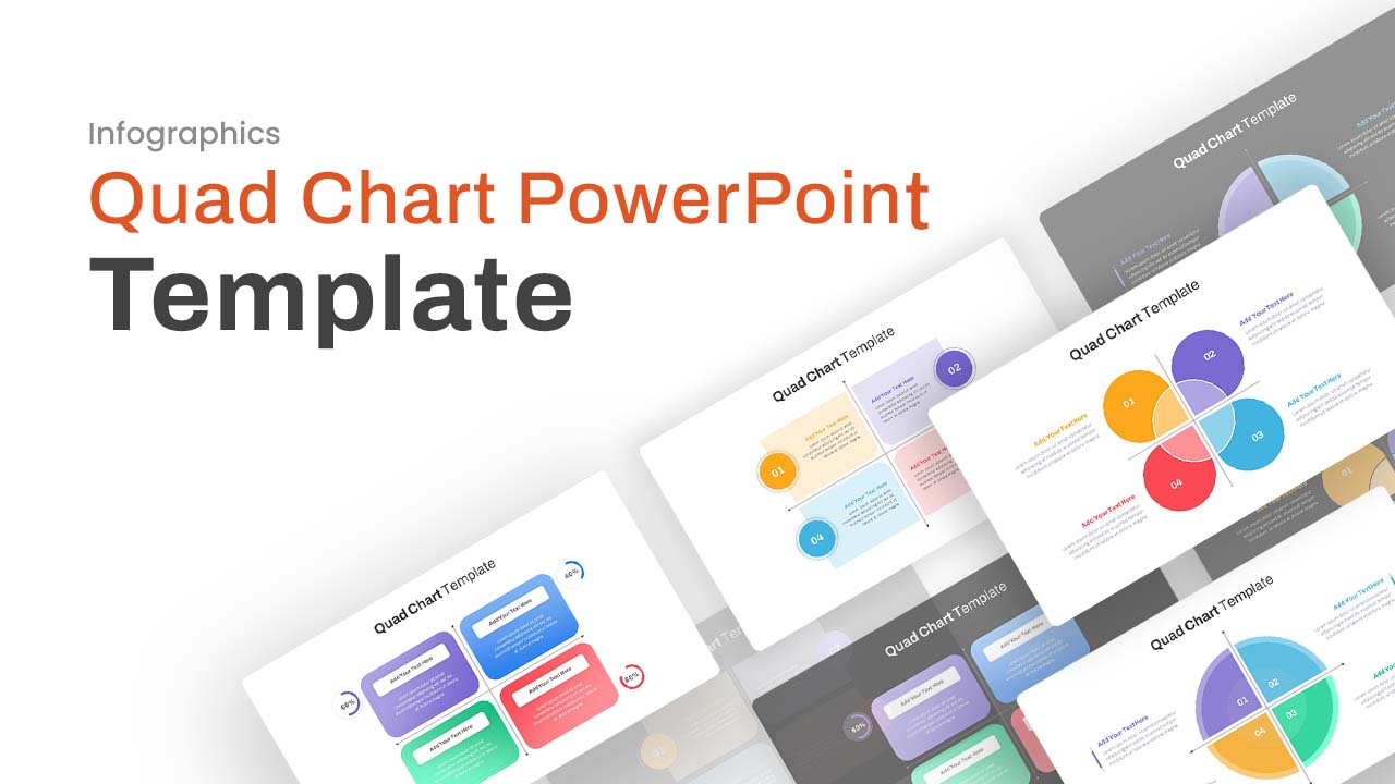
Professional Quad Chart Layout Template for PowerPoint & Google Slides
Pie/Donut
Arrow Line Chart Template for PowerPoint & Google Slides
Comparison Chart
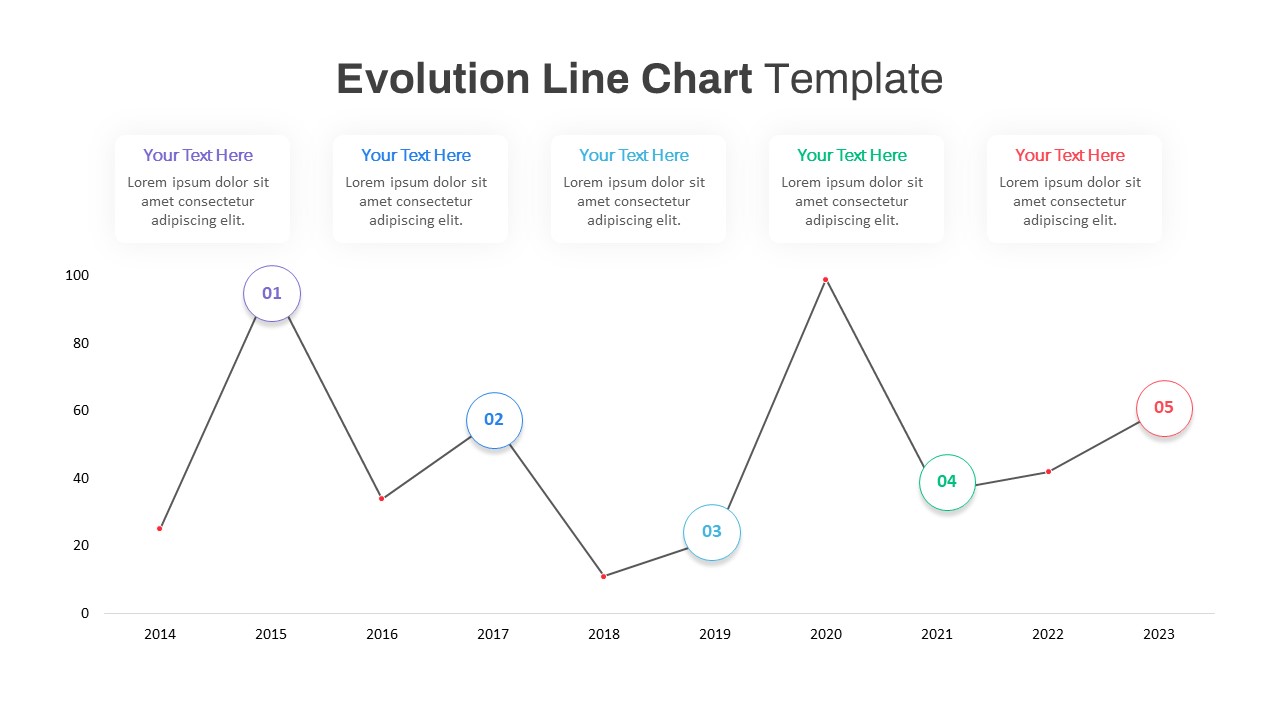
Evolution Line Chart with Milestones Template for PowerPoint & Google Slides
Timeline
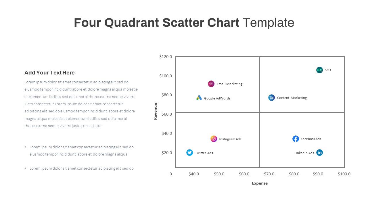
Four Quadrant Scatter Chart Analysis Template for PowerPoint & Google Slides
Comparison Chart
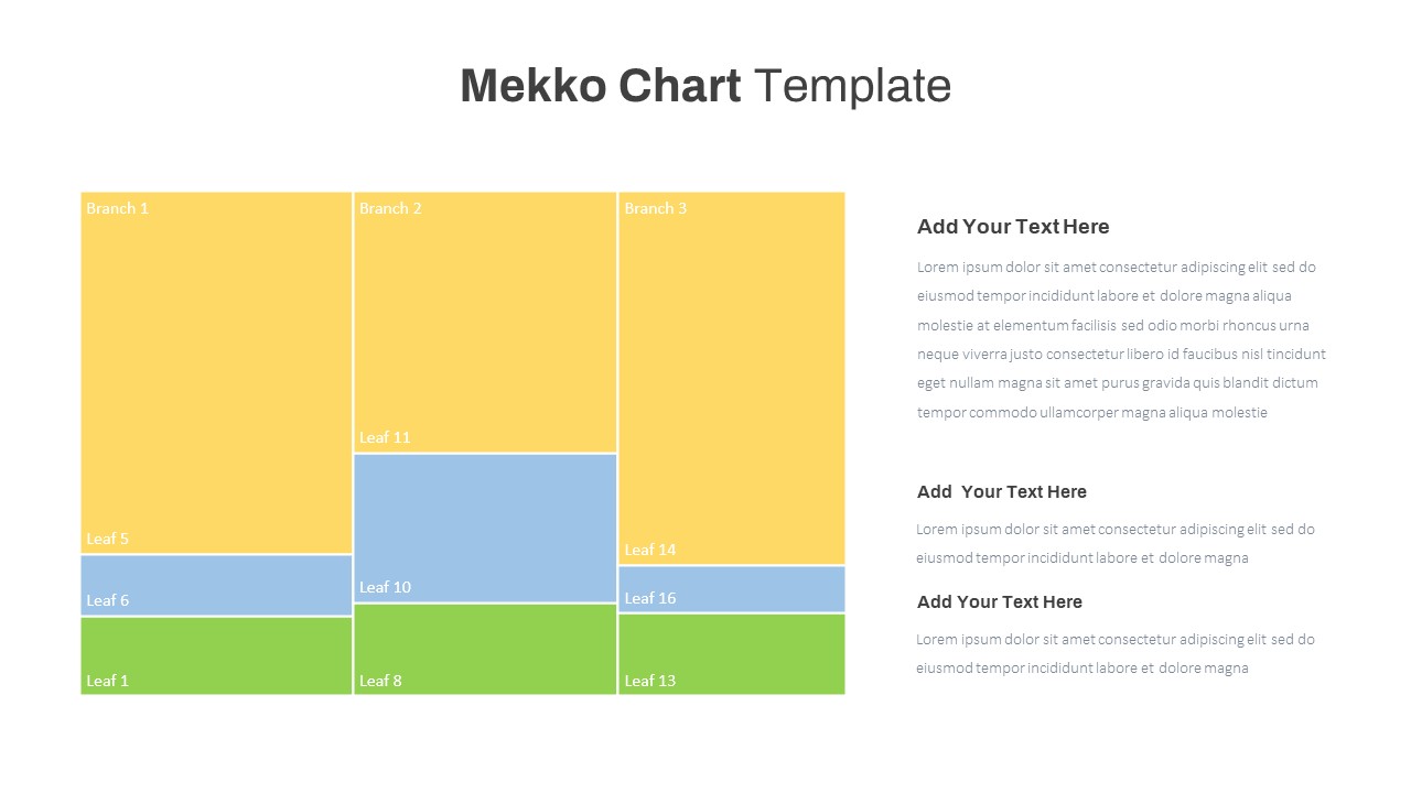
Mekko Chart with Segmented Branches & Leaves Template for PowerPoint & Google Slides
Bar/Column
Multi-Series Vertical Dot Chart Template for PowerPoint & Google Slides
Comparison Chart
Interactive Daily Timeline Schedule Chart Template for PowerPoint & Google Slides
Timeline
Multi-Variation Circular Chart Diagram Template for PowerPoint & Google Slides
Circular
Cross Functional Swimlane Flow Chart Template for PowerPoint & Google Slides
Flow Charts
Horizontal Organizational Chart Template for PowerPoint & Google Slides
Org Chart
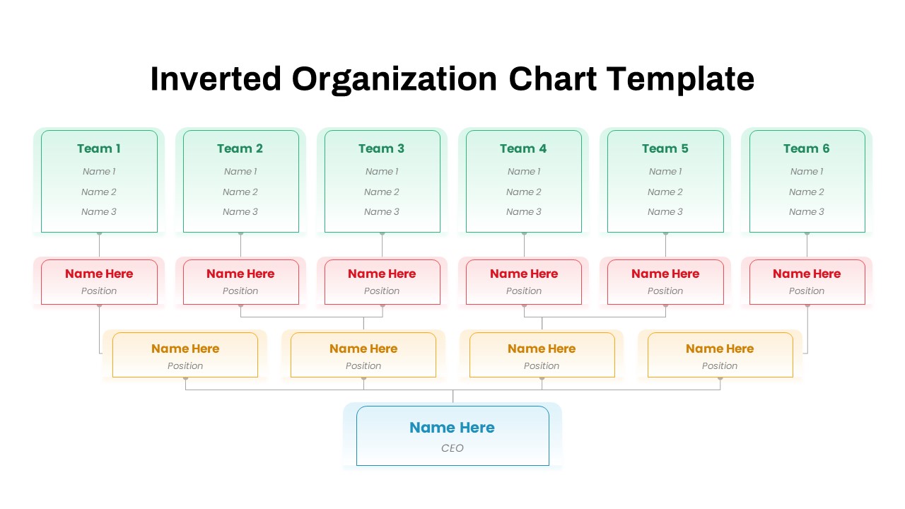
Inverted Organization Chart Diagram Template for PowerPoint & Google Slides
Org Chart
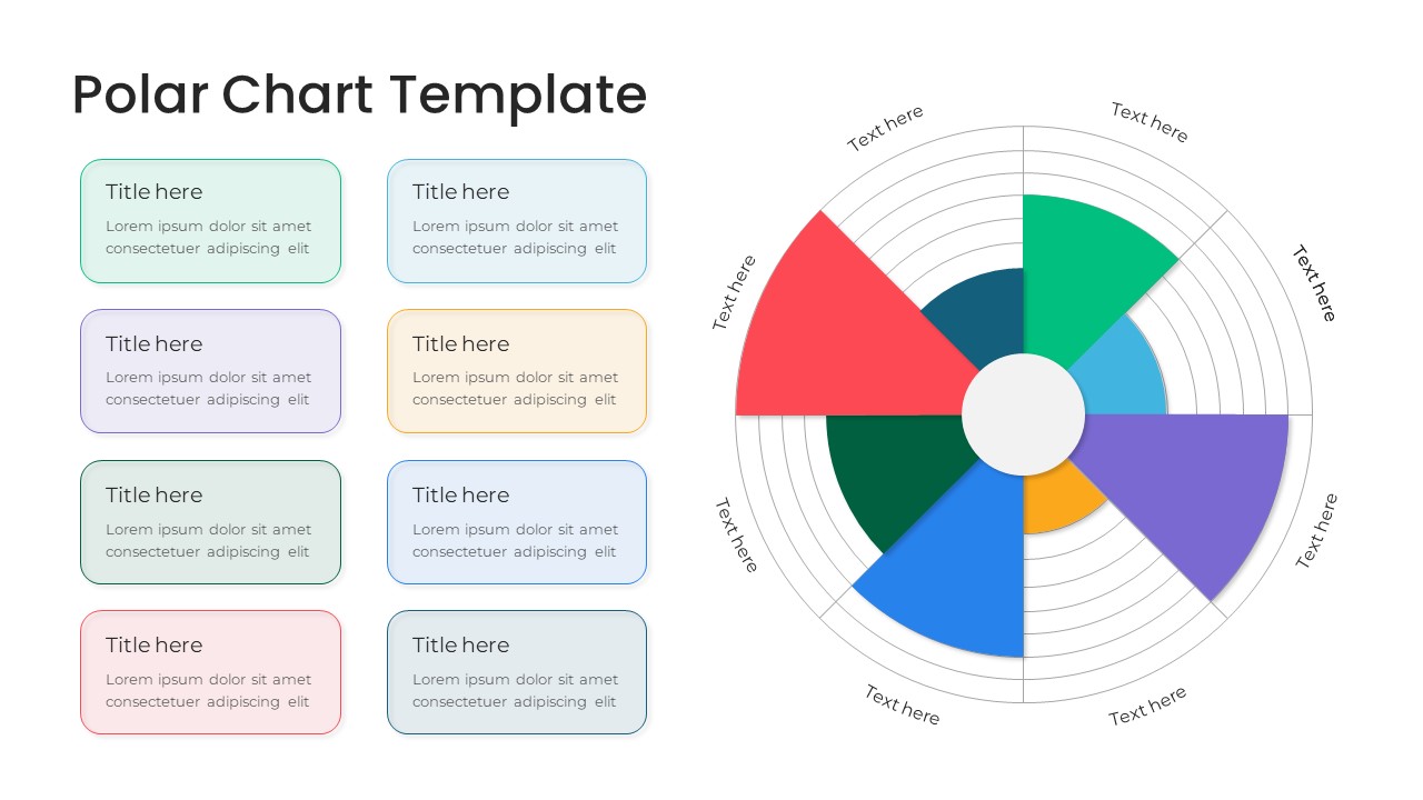
Modern Multi-Color Polar Chart Diagram Template for PowerPoint & Google Slides
Charts
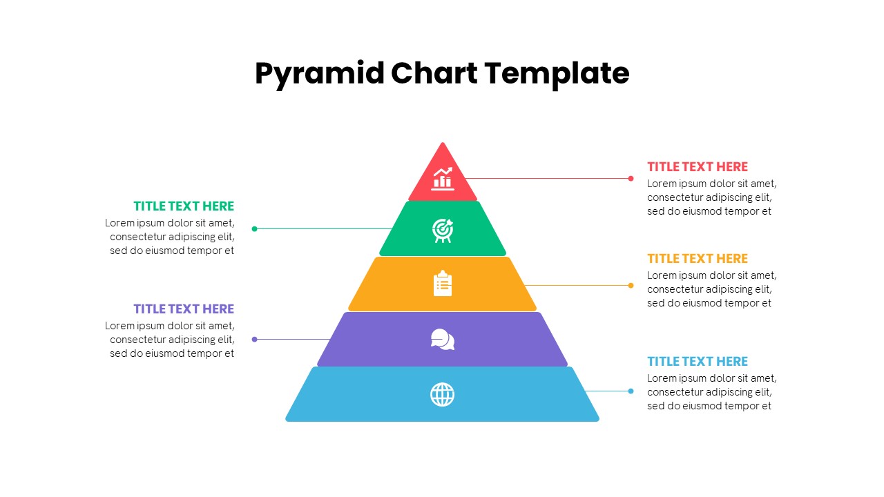
Multi-Level Colorful Pyramid Chart Template for PowerPoint & Google Slides
Pyramid
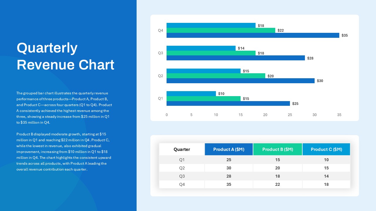
Quarterly Revenue Comparison Bar Chart Template for PowerPoint & Google Slides
Bar/Column
Data Analysis Bar Chart with Insights Template for PowerPoint & Google Slides
Bar/Column
Free
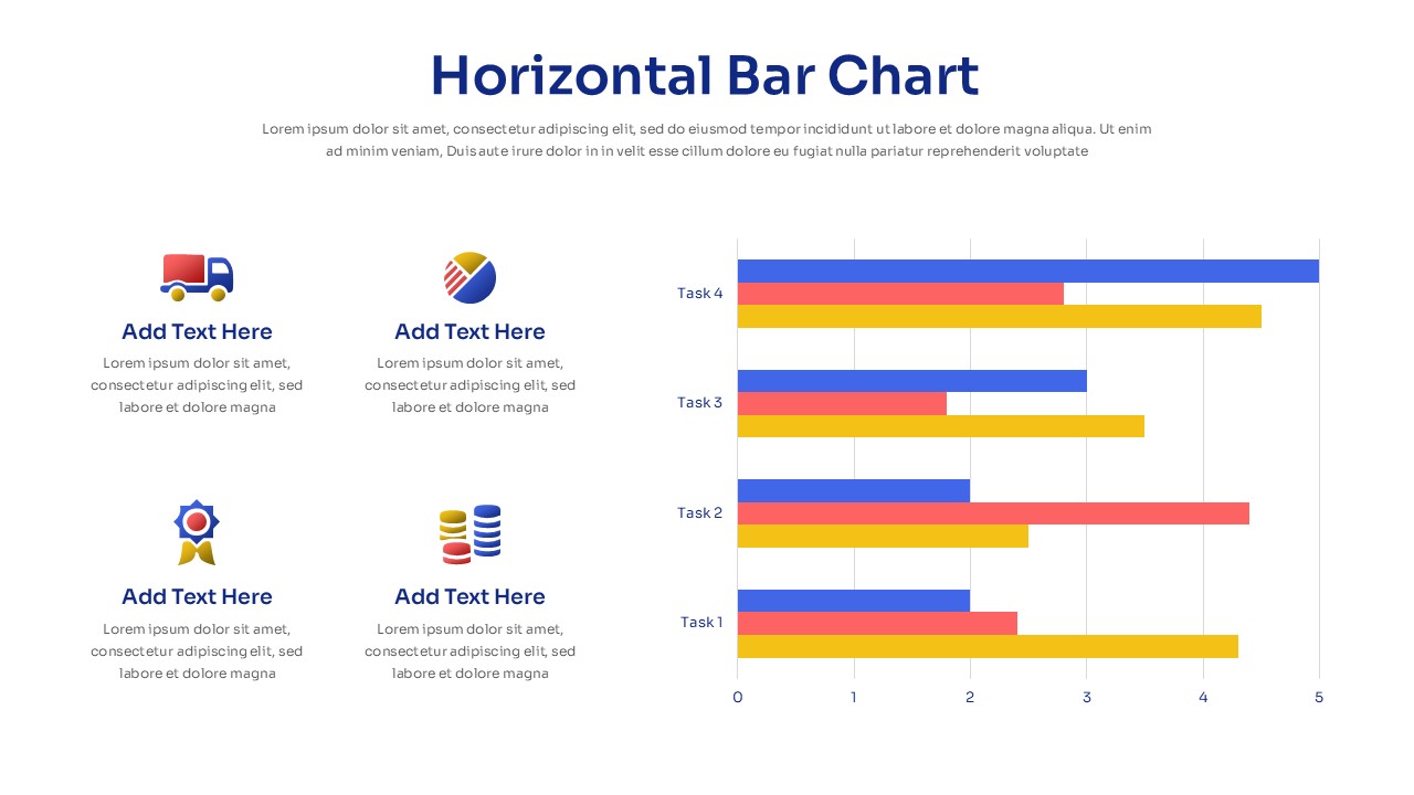
Horizontal Bar Chart Slide with Icons Template for PowerPoint & Google Slides
Bar/Column
Project Tracker Timeline Gantt Chart Template for PowerPoint & Google Slides
Project Status
Two-Option Bar Chart Comparison Table Template for PowerPoint & Google Slides
Comparison
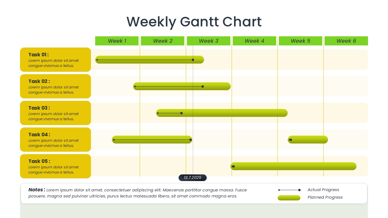
Weekly Gantt Chart Project Timeline Template for PowerPoint & Google Slides
Gantt Chart
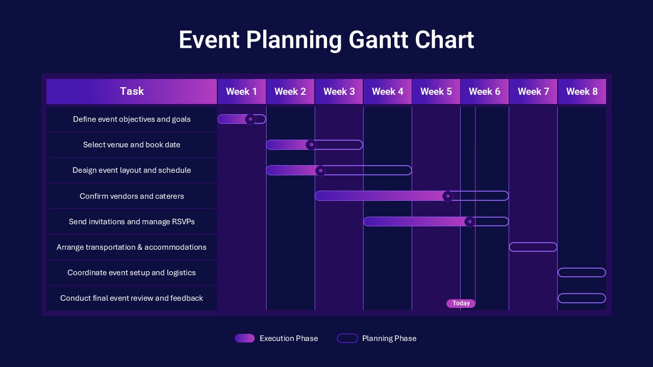
Event Planning Gantt Chart template for PowerPoint & Google Slides
Business
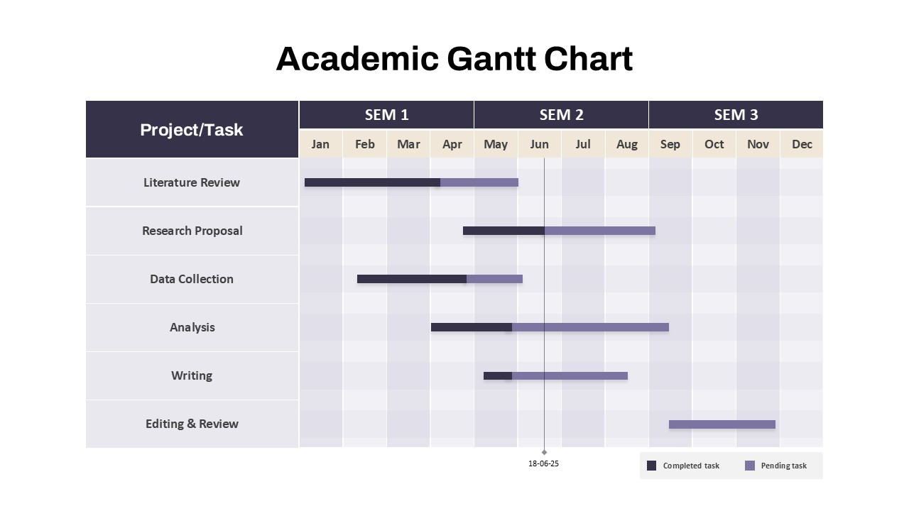
Academic Gantt Chart template for PowerPoint & Google Slides
Business
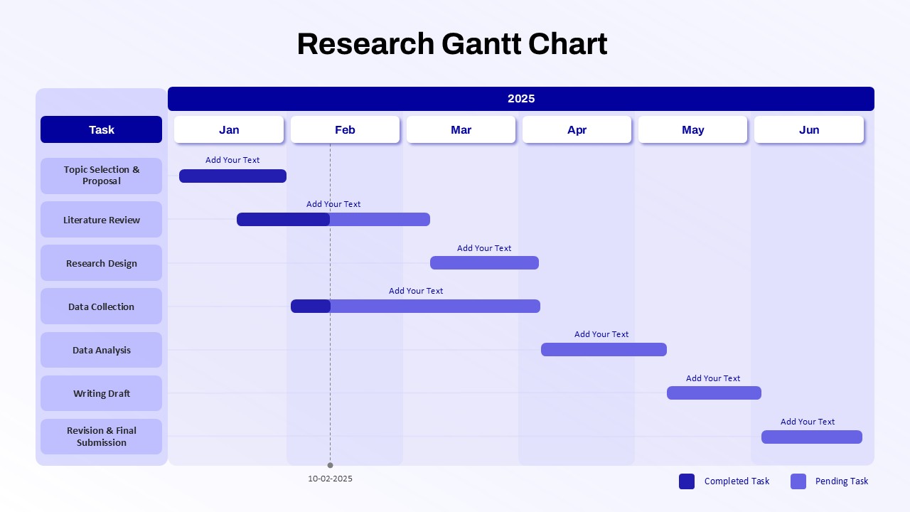
Research Gantt Chart template for PowerPoint & Google Slides
Project
Circular Sample Org Chart Template for PowerPoint & Google Slides
Org Chart
Project Timeline Gantt Chart Template for PowerPoint & Google Slides
Gantt Chart
Horizontal Organizational Chart Template for PowerPoint & Google Slides
Org Chart
Quarterly Gantt Chart with Today Marker Template for PowerPoint & Google Slides
Gantt Chart
Blank Comparison Chart Template for PowerPoint & Google Slides
Comparison Chart