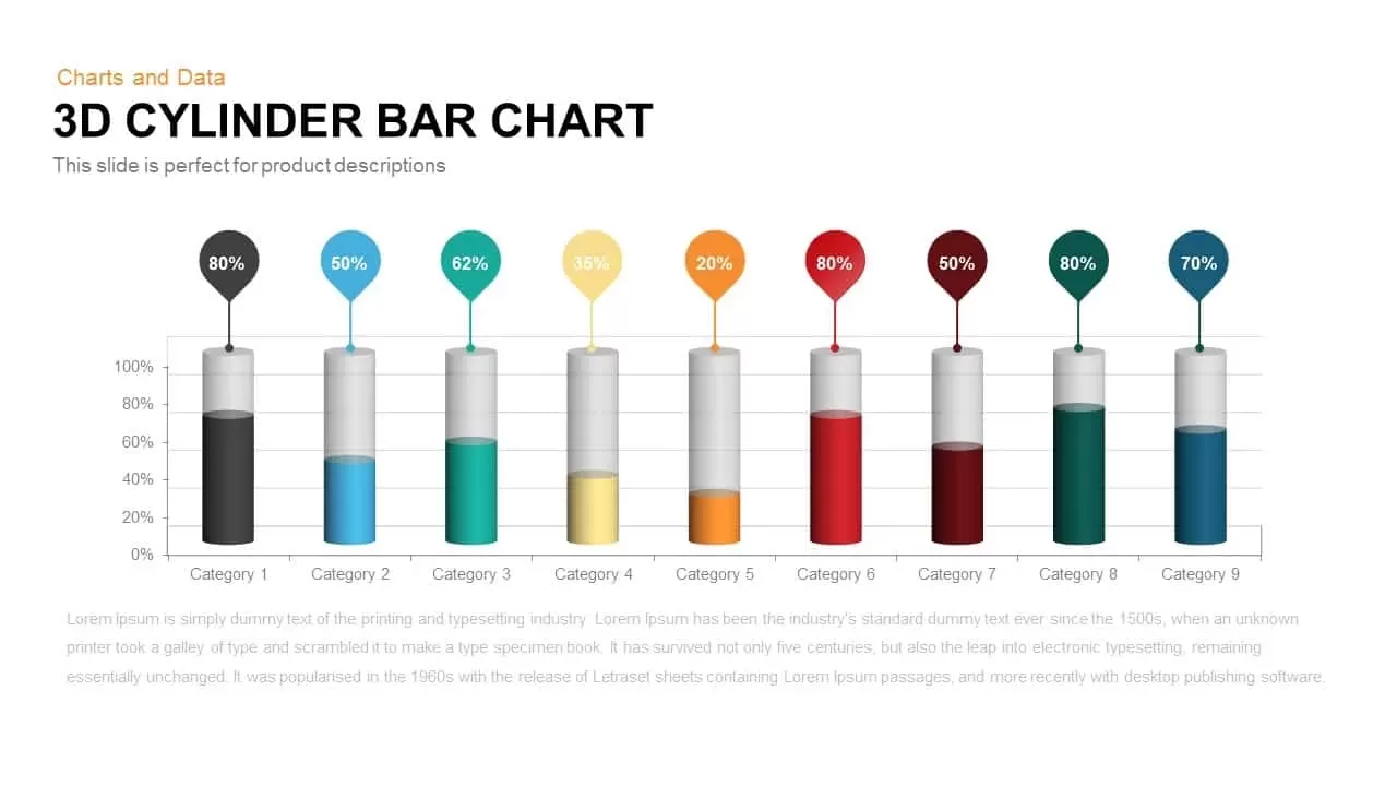
3D Cylinder Bar Chart Visualization Template for PowerPoint

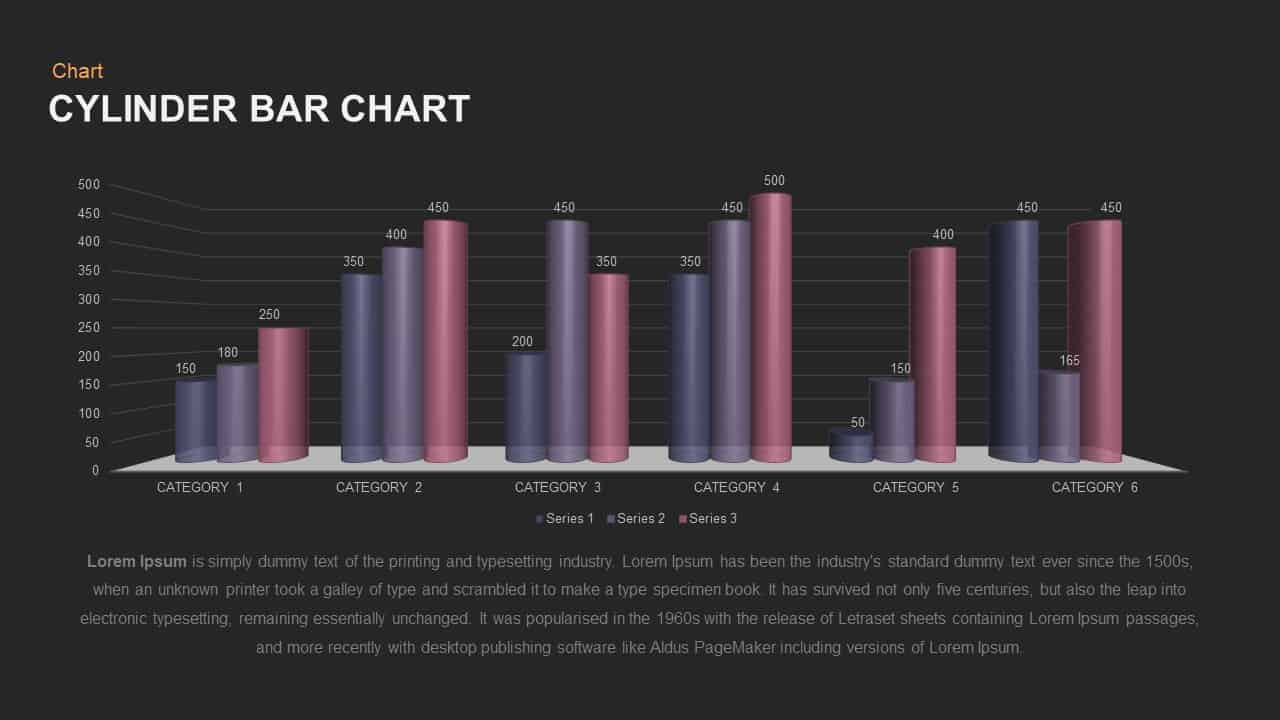
Leverage this 3D cylinder bar chart slide to present multi-series data with depth and clarity. Featuring six categories and three distinct data series, each represented by glossy, gradient-filled cylinders, this fully editable PowerPoint & Google Slides asset lets you adjust values, colors, and labels in seconds. The 3D perspective and subtle drop shadows add visual dimension, while gridlines and axis labels ensure precise data interpretation. Built on master slides with vector shapes and editable fonts, you can swap color themes, resize chart elements, or update category names without losing alignment or resolution.
Ideal for quarterly reports, financial overviews, or competitive analyses, this chart empowers presenters to compare performance metrics across multiple groups. Simply replace placeholder values with your own data, update series names in the legend, and apply your corporate palette to reinforce brand consistency. The spacious layout accommodates clear number callouts atop each cylinder, guiding audiences effortlessly through complex datasets. Compatible with both PowerPoint and Google Slides, this template streamlines collaborative editing and maintains design integrity across devices and operating systems.
Who is it for
Financial analysts, sales leaders, project managers, and business consultants can use this chart to showcase KPI trends, revenue breakdowns, or survey results. Marketing teams and academic researchers will also appreciate its polished appearance for conference presentations and executive summaries.
Other Uses
Beyond sales and finance reports, repurpose this bar chart for product comparisons, capacity planning, resource allocation, or performance dashboards. Use the three-series layout to display monthly metrics, regional sales figures, or A/B test results in any corporate or educational deck.
Login to download this file

Item ID
SB00909
Related Templates

3D Cylinder Bar Chart Template for PowerPoint & Google Slides
Bar/Column
Simple Bar Chart Data Visualization Template for PowerPoint & Google Slides
Bar/Column
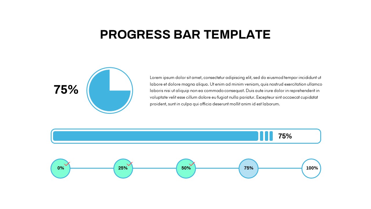
Progress Bar and Milestone Visualization Template for PowerPoint & Google Slides
Timeline
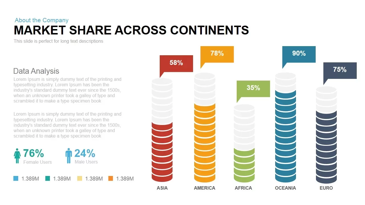
Global Market Share Cylinder Chart Template for PowerPoint & Google Slides
Bar/Column
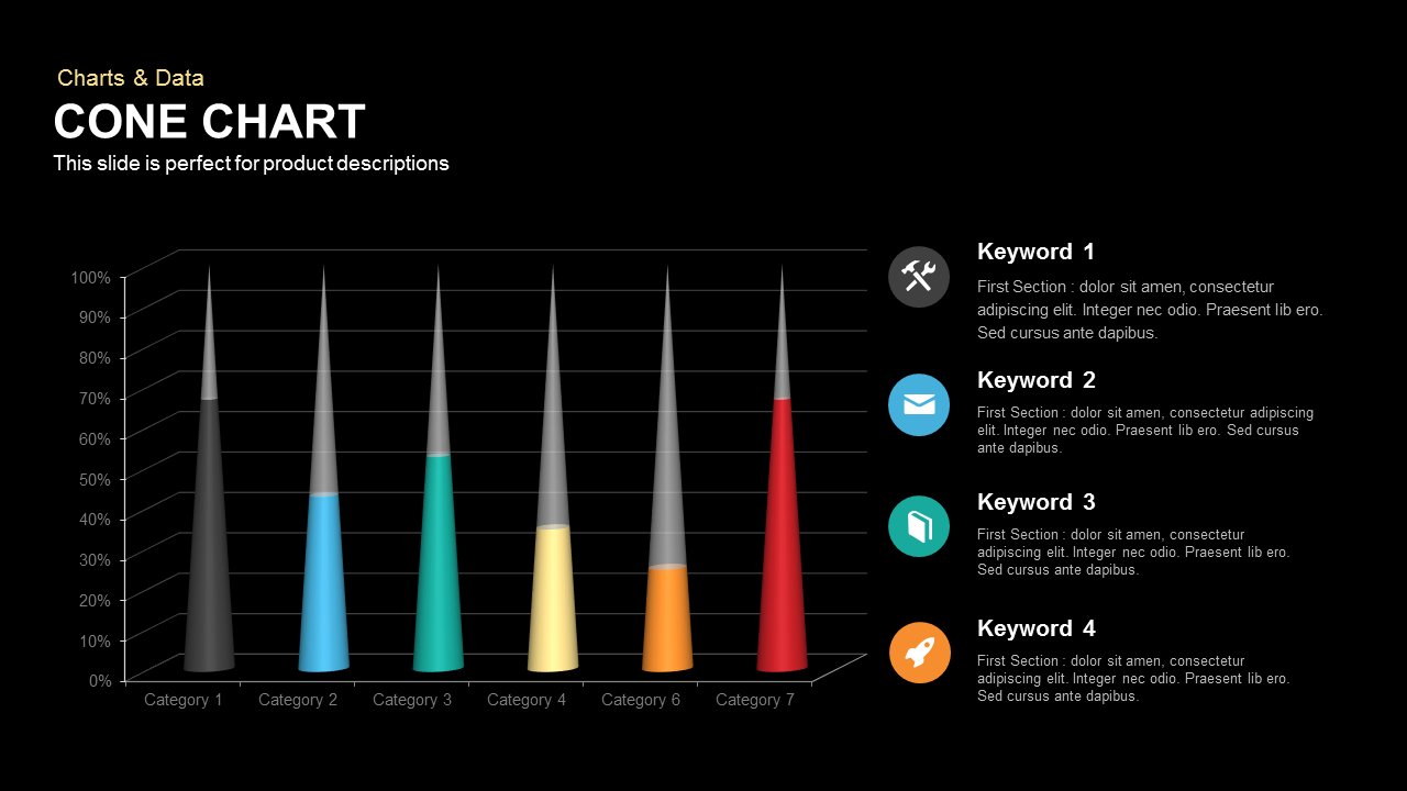
3D Cone Chart Data Visualization template for PowerPoint & Google Slides
Bar/Column
Waffle Chart Data Visualization Template for PowerPoint & Google Slides
Comparison Chart
Free Stacked Column Chart Data Visualization Template for PowerPoint & Google Slides
Bar/Column
Free
XY Bubble Chart Data Visualization Template for PowerPoint & Google Slides
Comparison Chart
Growth Curve Line Chart Visualization Template for PowerPoint & Google Slides
Charts
Waterfall Chart Data Visualization Template for PowerPoint & Google Slides
Comparison Chart
Dynamic Sunburst Chart Visualization Template for PowerPoint & Google Slides
Charts
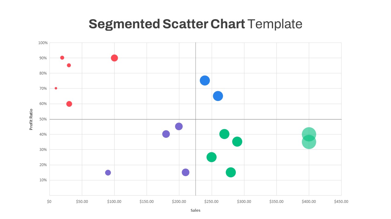
Segmented Scatter Chart Data Visualization Template for PowerPoint & Google Slides
Business Strategy
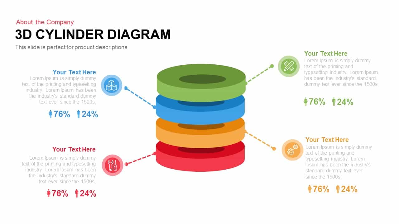
3D Cylinder Diagram Template for PowerPoint & Google Slides
Process
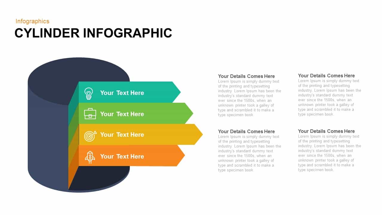
Cylinder Infographic Diagram template for PowerPoint & Google Slides
Process
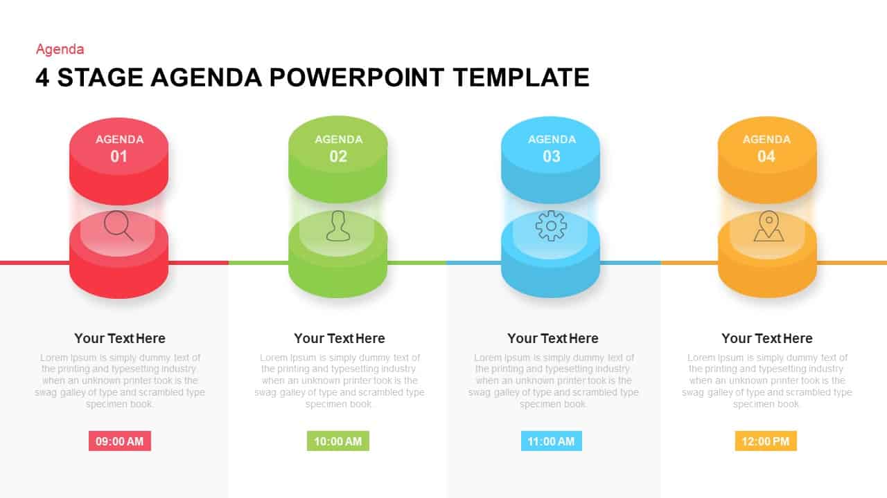
Four-Stage Cylinder Agenda Slide Template for PowerPoint & Google Slides
Agenda
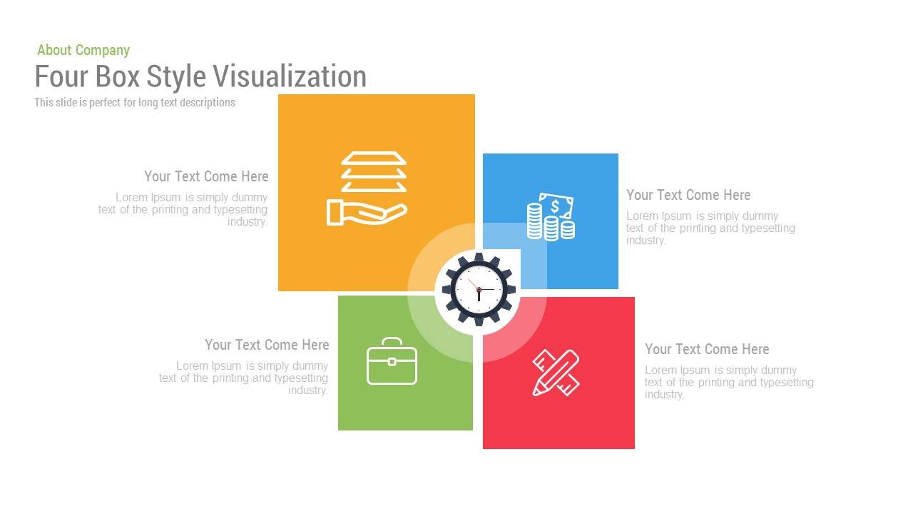
Free Four Box Style Visualization template for PowerPoint & Google Slides
Process
Free
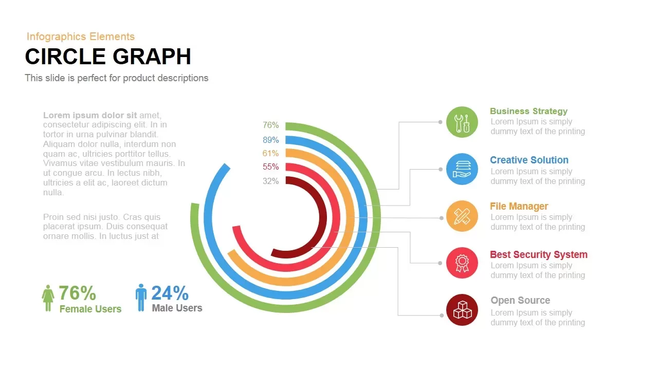
Circle Graph Data Visualization Template for PowerPoint & Google Slides
Circular

Bold Diamond Risk Alert Visualization Template for PowerPoint & Google Slides
Risk Management
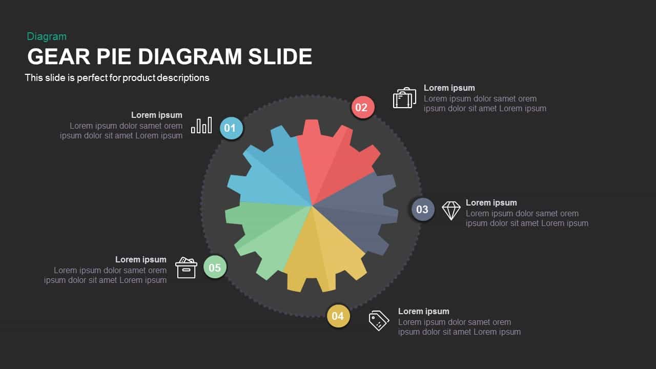
Gear Pie Diagram Data Visualization Template for PowerPoint & Google Slides
Pie/Donut
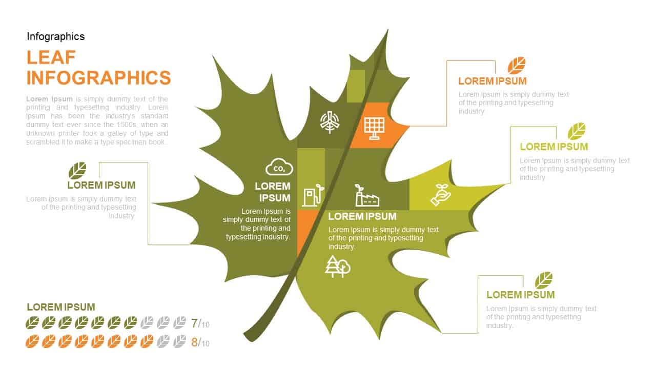
Leaf Infographic Data Visualization Template for PowerPoint & Google Slides
Infographics
Mobile Infographics Data Visualization Template for PowerPoint & Google Slides
Infographics
Balance Scale Visualization Infographic Template for PowerPoint & Google Slides
Comparison
Medical Infographics Data Visualization Template for PowerPoint & Google Slides
Health
3 Level Funnel Design Visualization Template for PowerPoint & Google Slides
Funnel
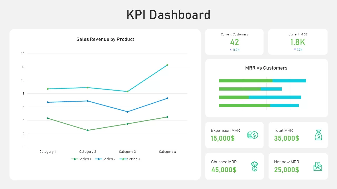
KPI Dashboard Data Visualization Template for PowerPoint & Google Slides
Bar/Column
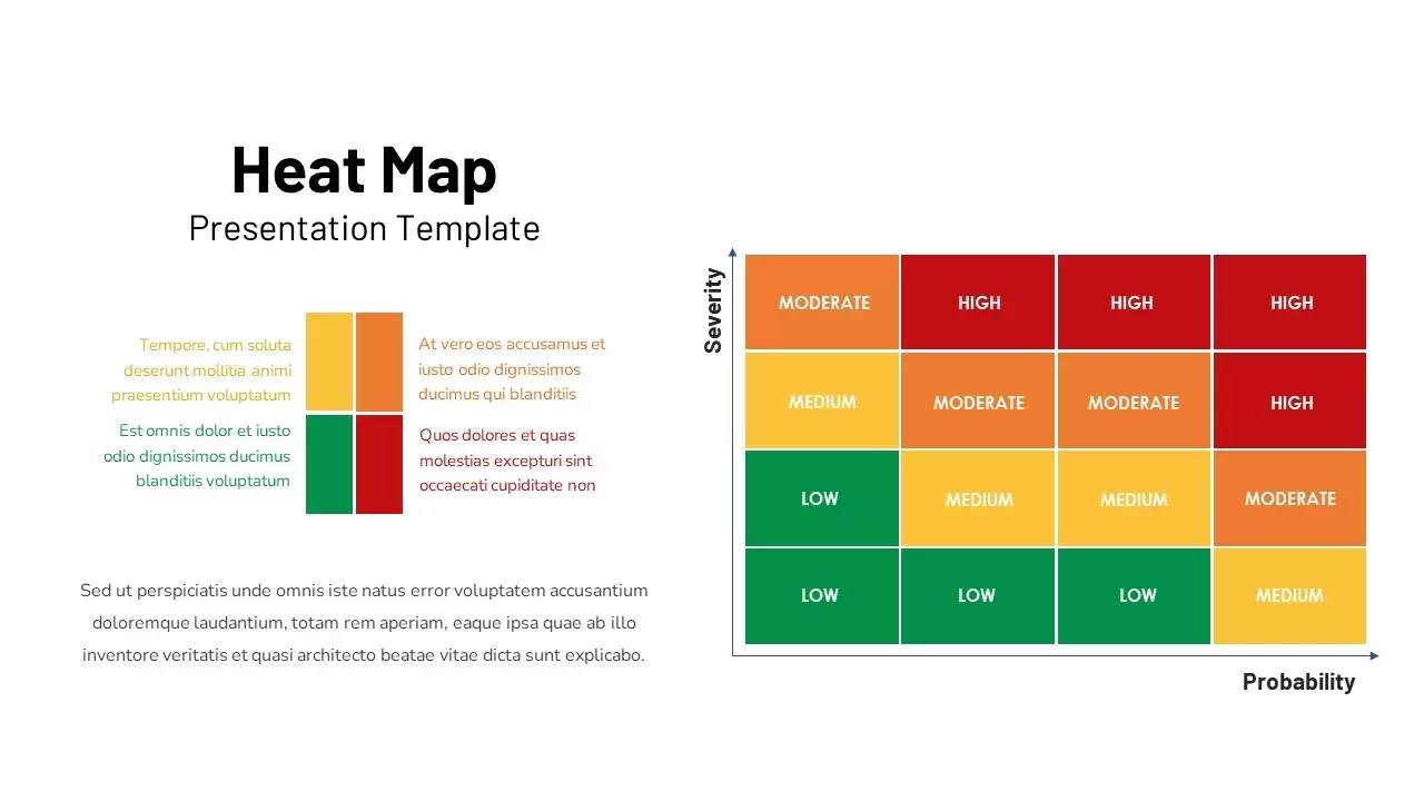
Professional Risk Heat Map Visualization Template for PowerPoint & Google Slides
Risk Management
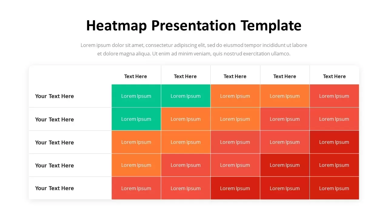
Professional Heatmap Data Visualization Template for PowerPoint & Google Slides
Infographics
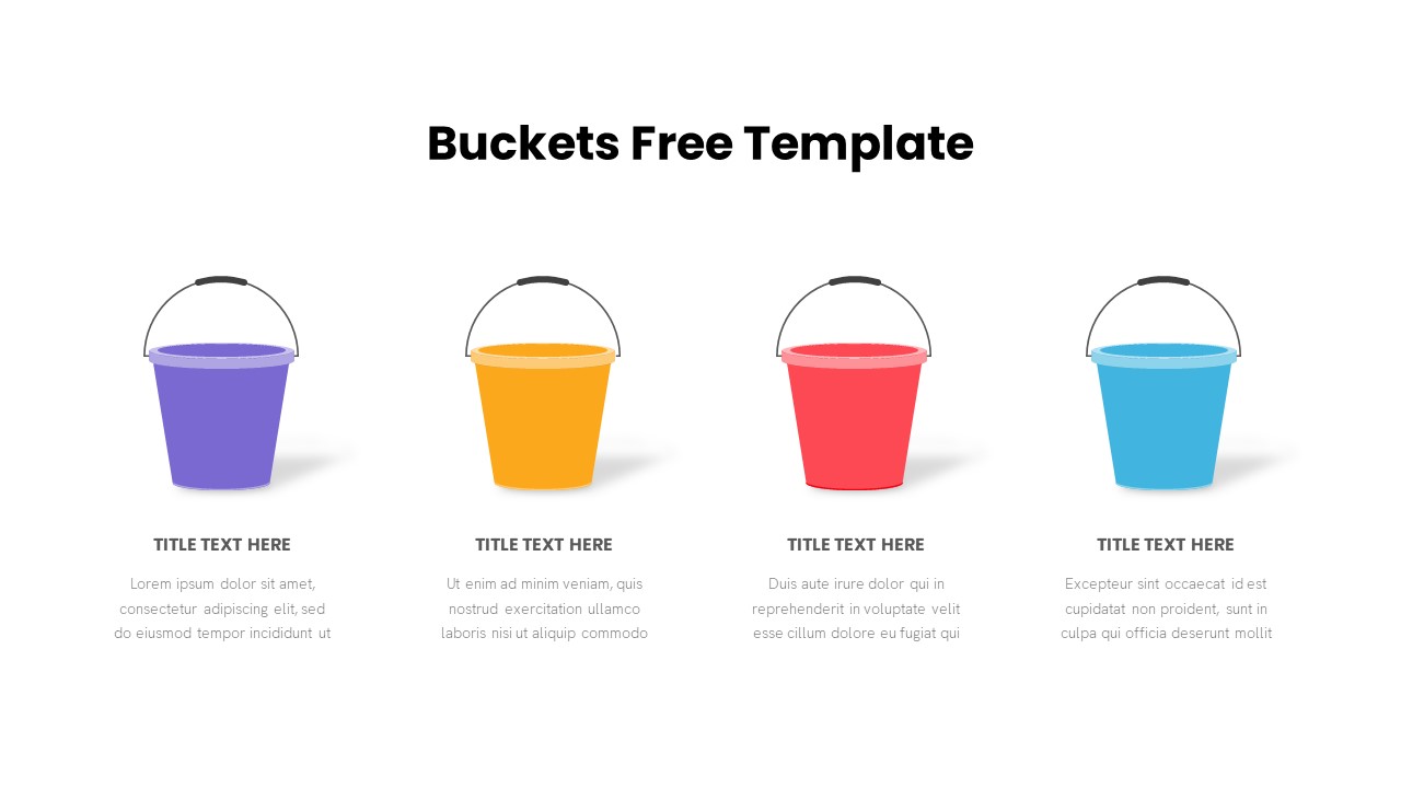
Free Bucket Process Visualization Template for PowerPoint & Google Slides
Process
Free
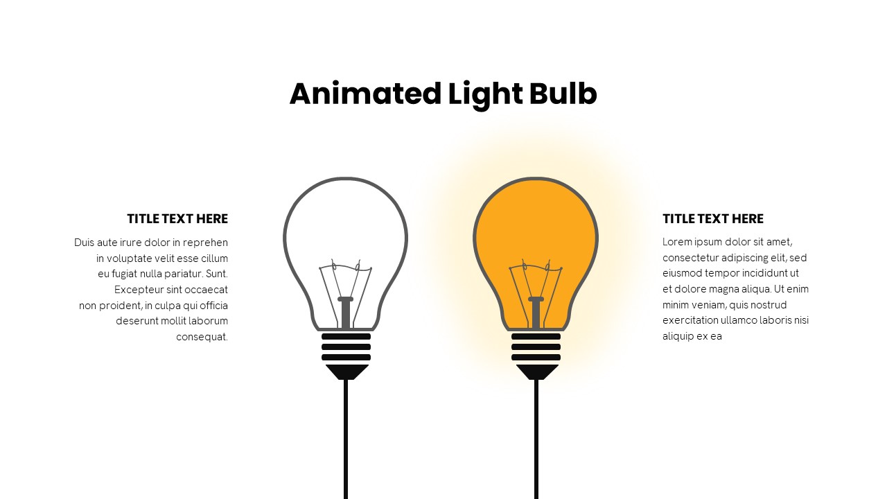
Animated Light Bulb Visualization Template for PowerPoint & Google Slides
Process
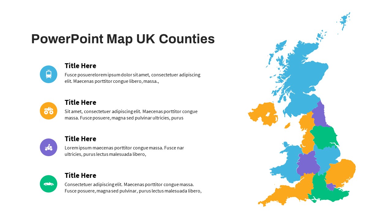
UK Counties Map Data Visualization Template for PowerPoint & Google Slides
World Maps
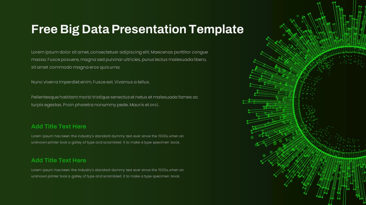
Free Big Data Network Visualization Template for PowerPoint & Google Slides
Circular
Free
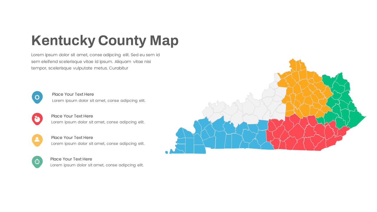
Kentucky County Map Visualization Template for PowerPoint & Google Slides
World Maps
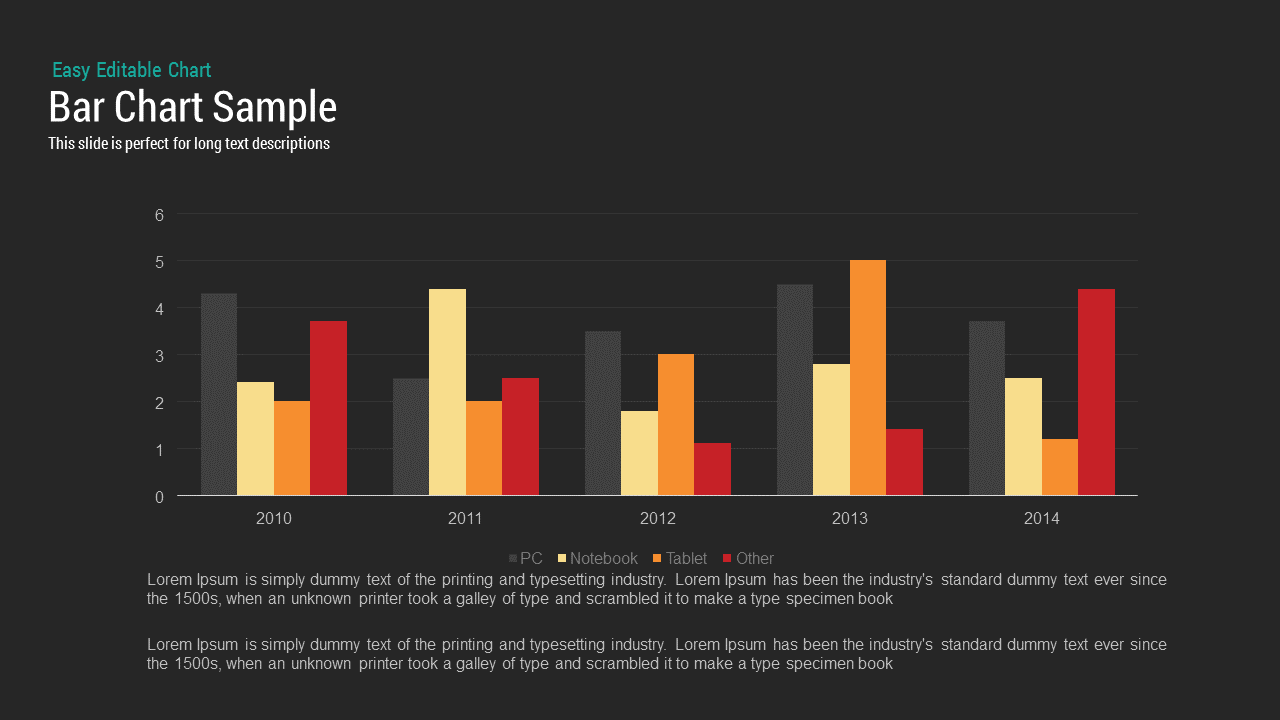
Bar Chart Sample template for PowerPoint & Google Slides
Bar/Column
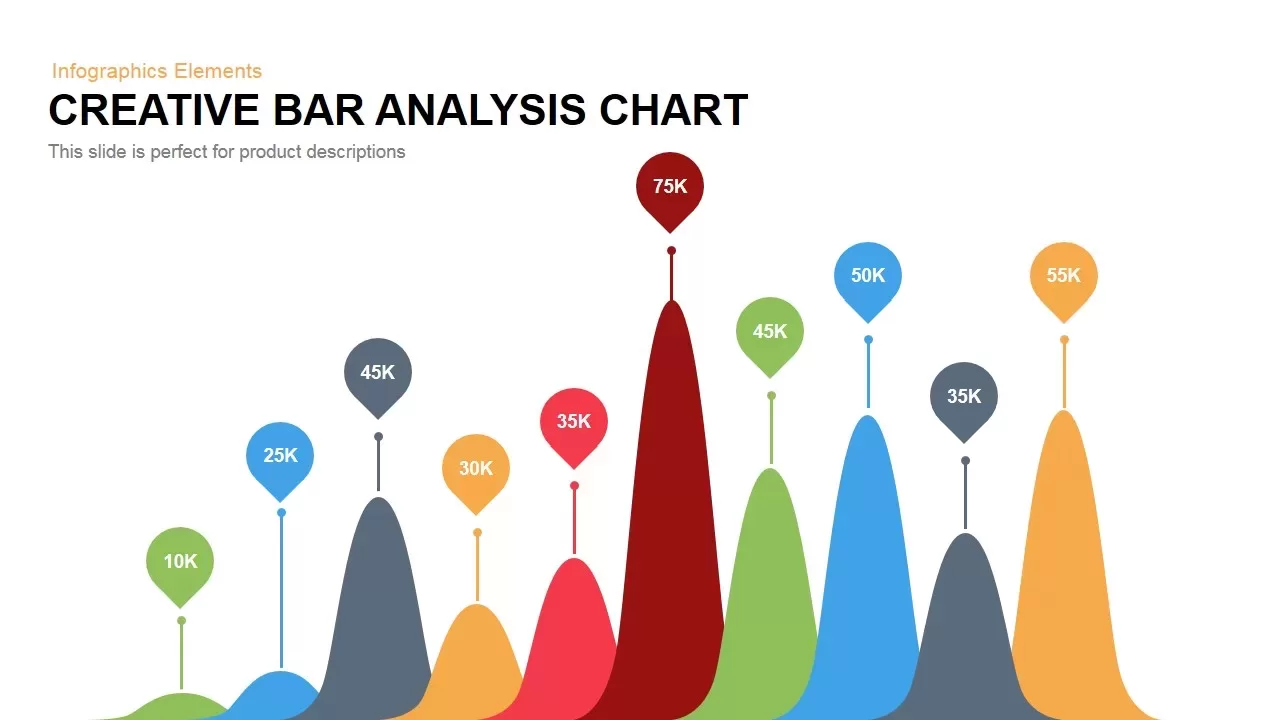
Creative Data Analysis Bar Chart template for PowerPoint & Google Slides
Bar/Column
3D Bar Chart Data Infographics Template for PowerPoint & Google Slides
Bar/Column
Creative Bar Chart template for PowerPoint & Google Slides
Charts
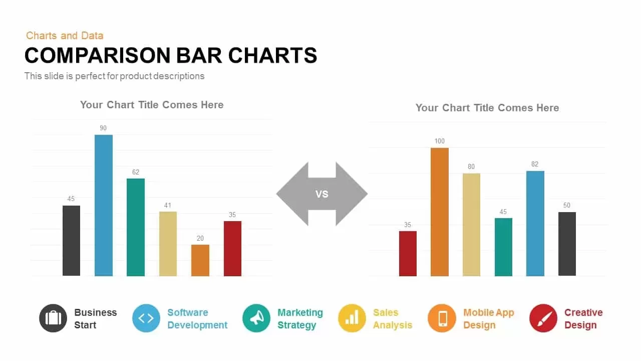
Comparison Bar Chart template for PowerPoint & Google Slides
Comparison Chart
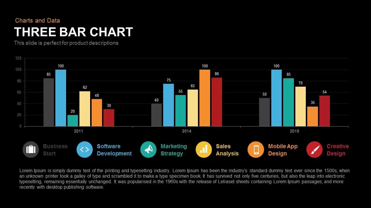
Three-Year Bar Chart template for PowerPoint & Google Slides
Charts
Pencil Bar Chart Data Analysis Template for PowerPoint & Google Slides
Bar/Column

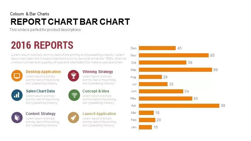
Monthly Reports Bar Chart template for PowerPoint & Google Slides
Bar/Column

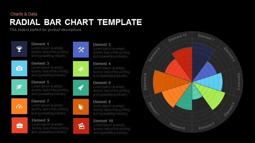
Colorful Radial Bar Chart Template for PowerPoint & Google Slides
Bar/Column
Interactive Product Comparison Bar Chart Template for PowerPoint & Google Slides
Bar/Column
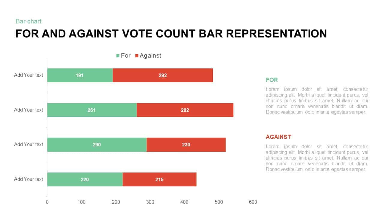
For and Against Vote Count Bar Chart Template for PowerPoint & Google Slides
Bar/Column
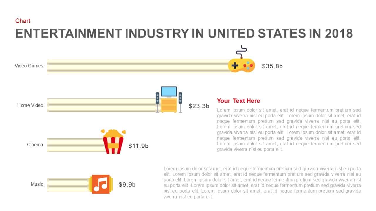
Entertainment Industry Revenue Bar Chart Template for PowerPoint & Google Slides
Bar/Column
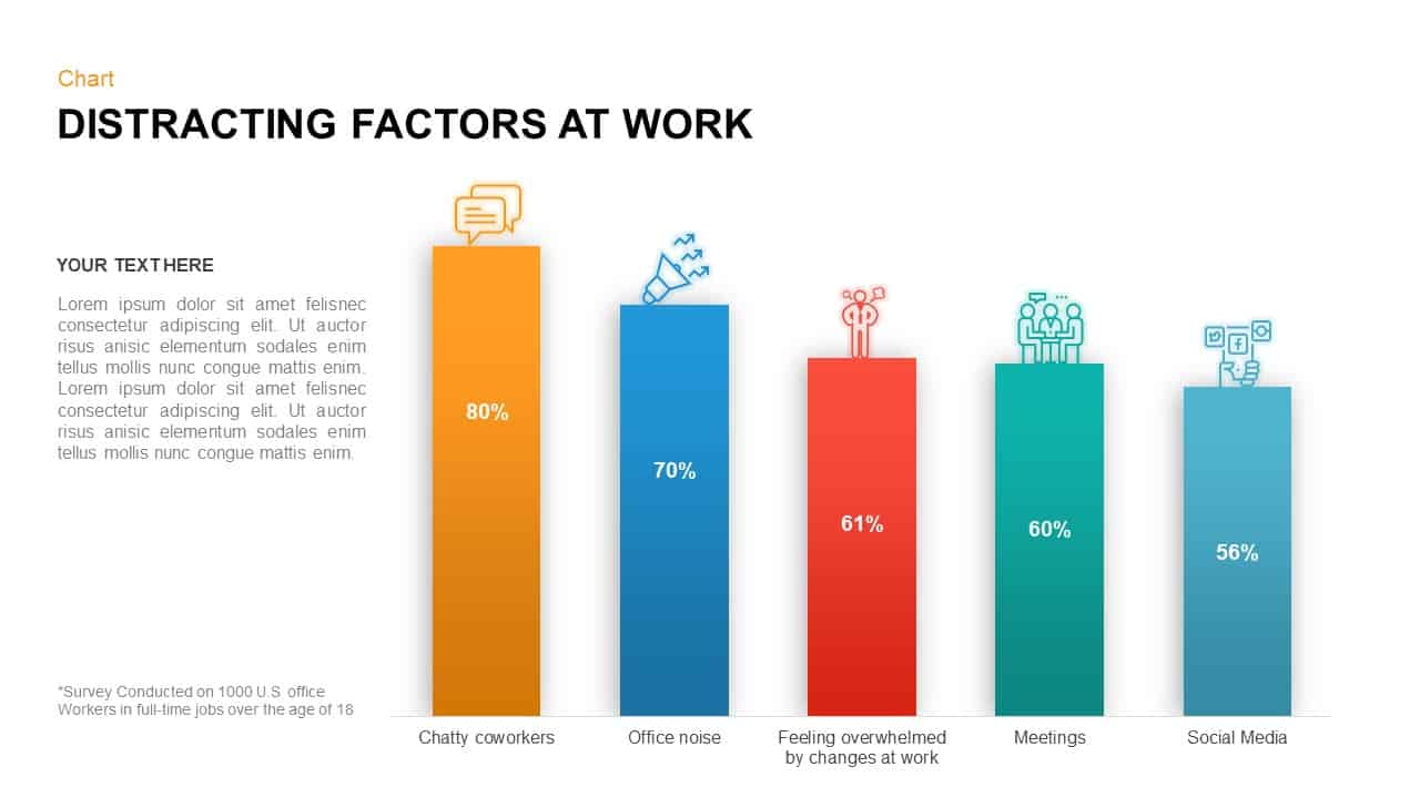
Distracting Factors at Work Bar Chart Template for PowerPoint & Google Slides
Bar/Column
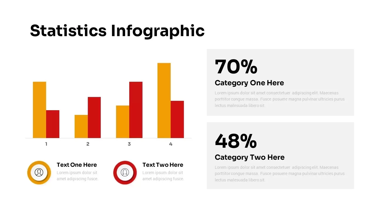
Statistics Infographic & KPI Bar Chart Template for PowerPoint & Google Slides
Bar/Column
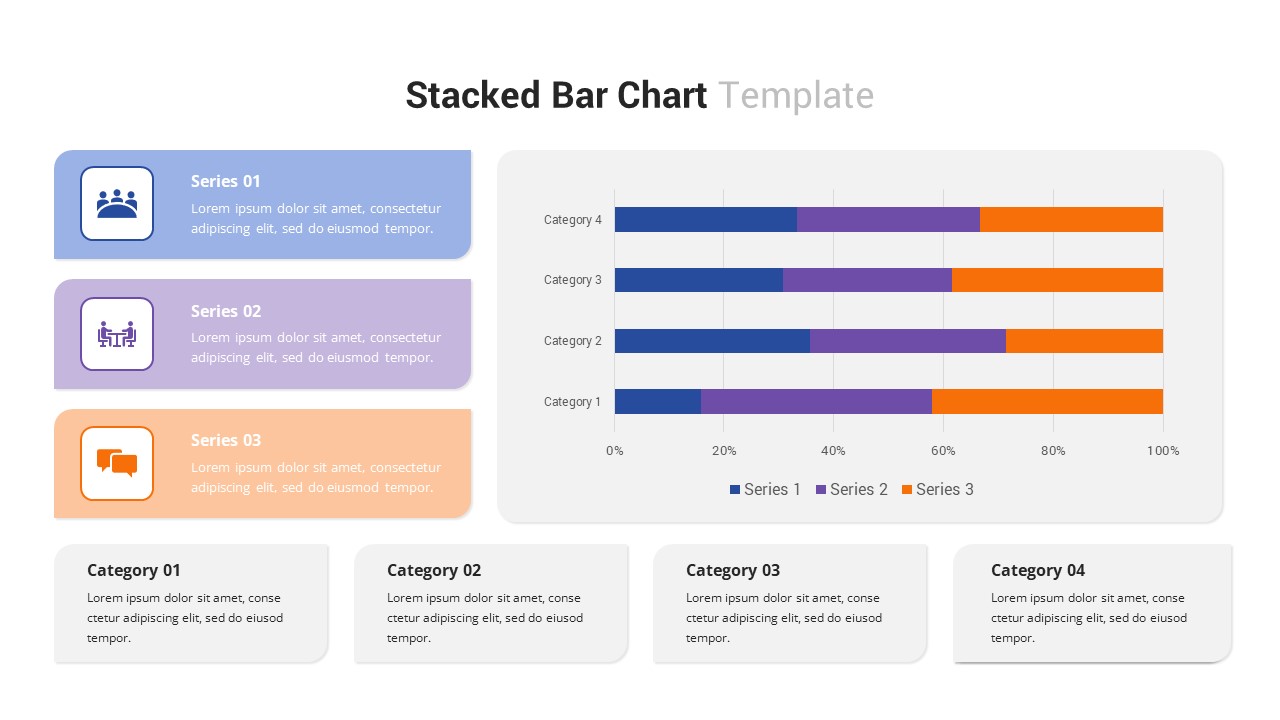
Multi-Series Stacked Bar Chart Template for PowerPoint & Google Slides
Bar/Column
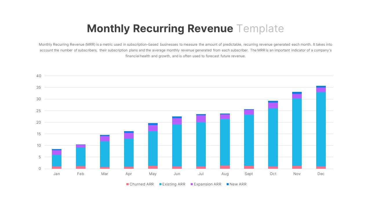
Monthly Recurring Revenue KPI Bar Chart Template for PowerPoint & Google Slides
Bar/Column
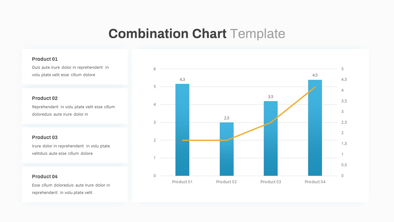
Combination Bar and Line Chart Template for PowerPoint & Google Slides
Bar/Column
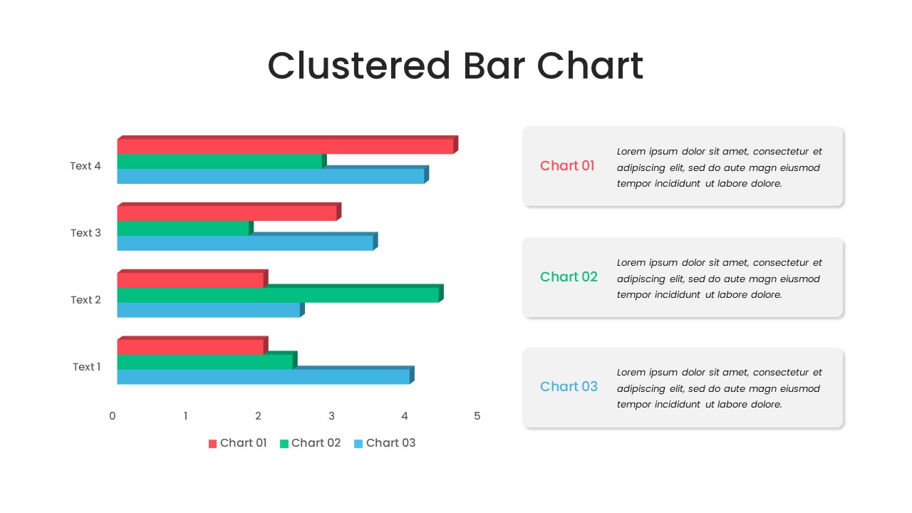
Animated Clustered Bar Chart Template for PowerPoint & Google Slides
Bar/Column
Animated Stacked Bar Chart Template for PowerPoint & Google Slides
Bar/Column
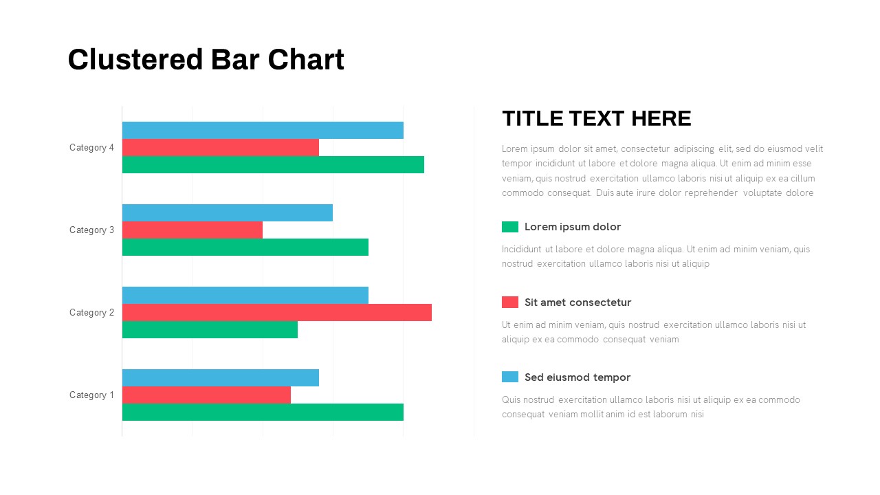
Clustered Bar Chart Comparison Template for PowerPoint & Google Slides
Bar/Column
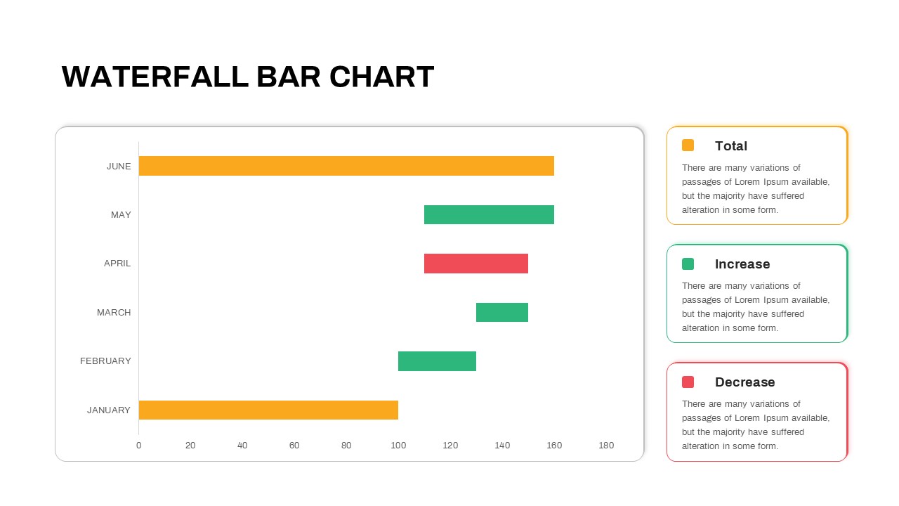
Waterfall Bar Chart Analysis Template for PowerPoint & Google Slides
Bar/Column
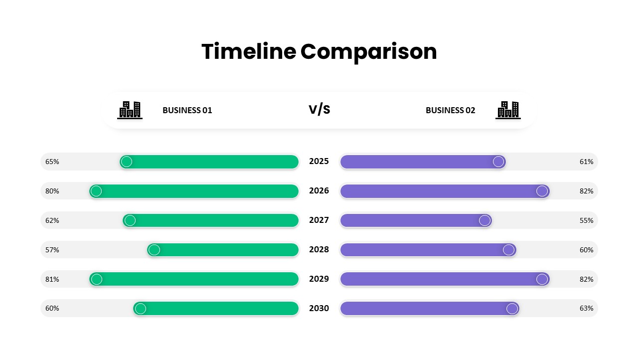
Business Timeline Comparison Bar Chart Template for PowerPoint & Google Slides
Comparison Chart
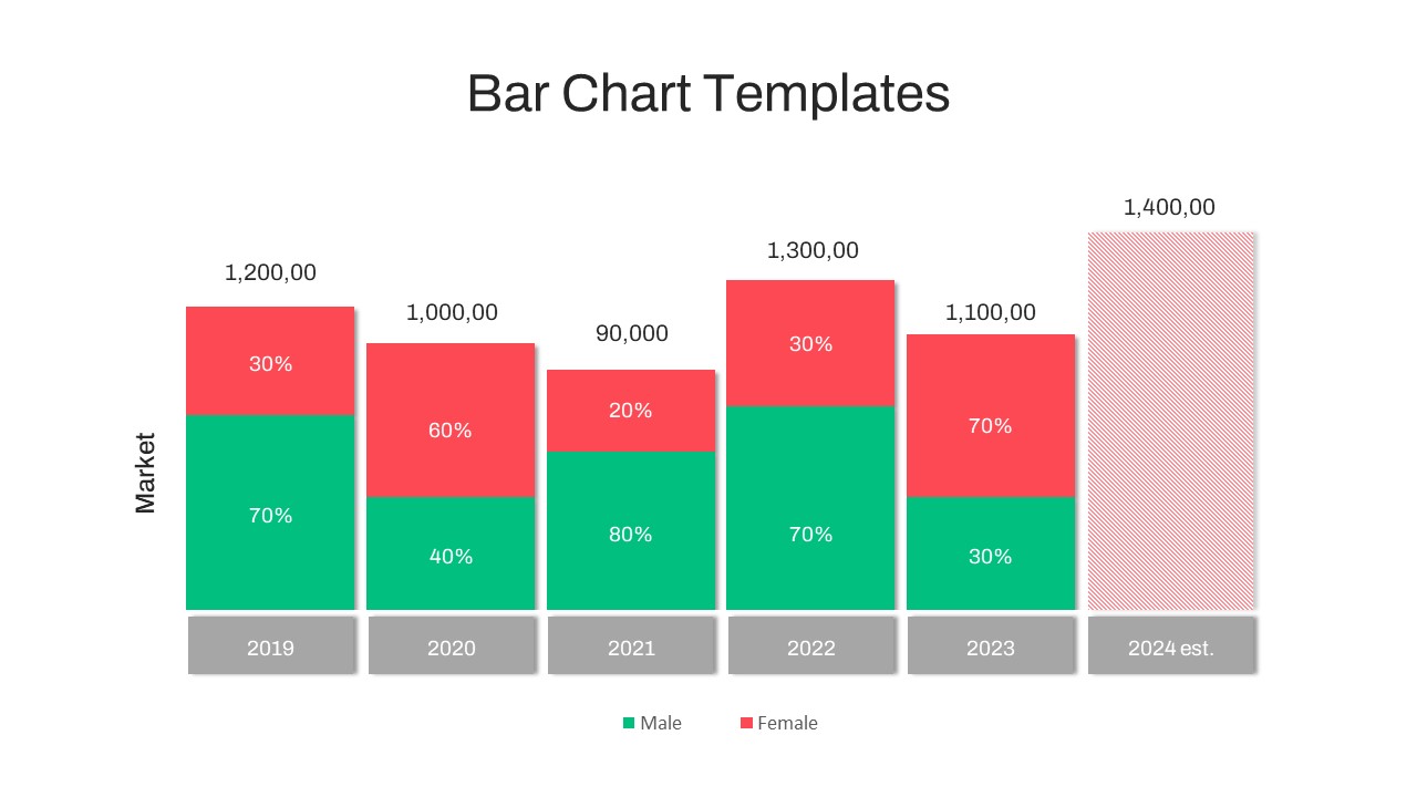
Year-over-Year Stacked Gender Bar Chart Template for PowerPoint & Google Slides
Bar/Column
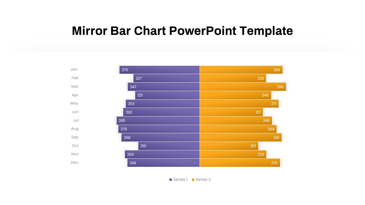
Mirror Bar Chart Comparison Template for PowerPoint & Google Slides
Bar/Column
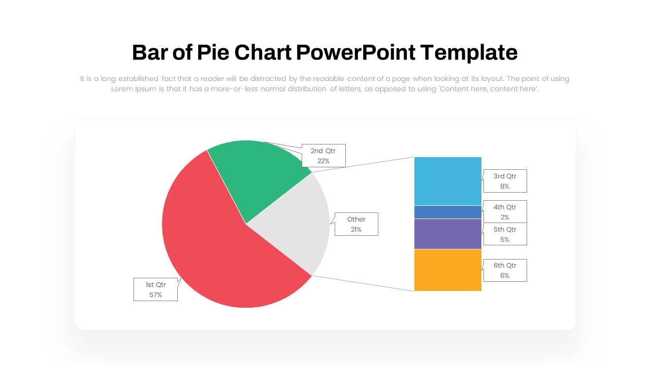
Dynamic Bar-of-Pie Chart Comparison Template for PowerPoint & Google Slides
Pie/Donut
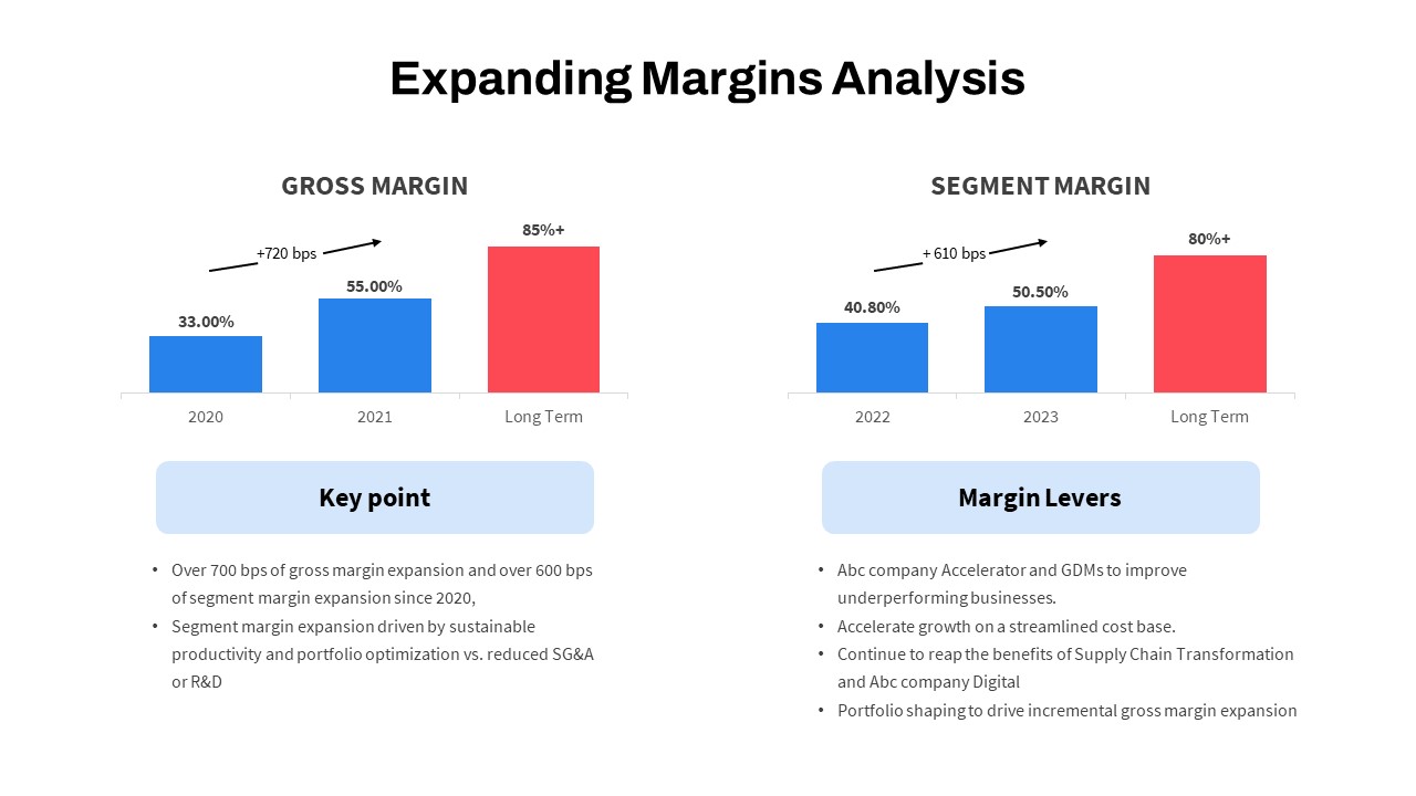
Expanding Margins Analysis Bar Chart Template for PowerPoint & Google Slides
Charts
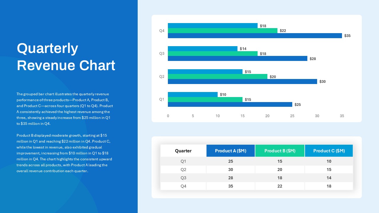
Quarterly Revenue Comparison Bar Chart Template for PowerPoint & Google Slides
Bar/Column
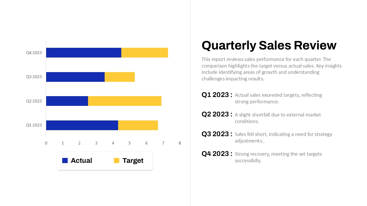
Quarterly Sales Review Bar Chart Template for PowerPoint & Google Slides
Bar/Column
Data Analysis Bar Chart with Insights Template for PowerPoint & Google Slides
Bar/Column
Free
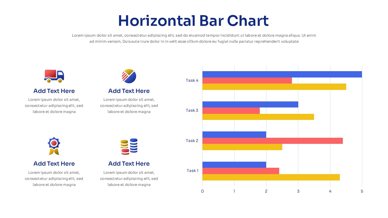
Horizontal Bar Chart Slide with Icons Template for PowerPoint & Google Slides
Bar/Column
Two-Option Bar Chart Comparison Table Template for PowerPoint & Google Slides
Comparison
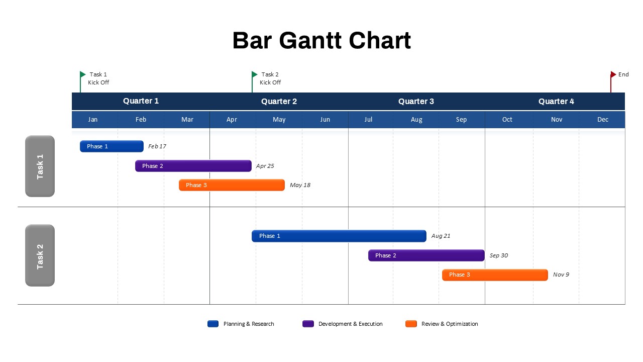
Bar Gantt Chart Template for PowerPoint & Google Slides
Gantt Chart
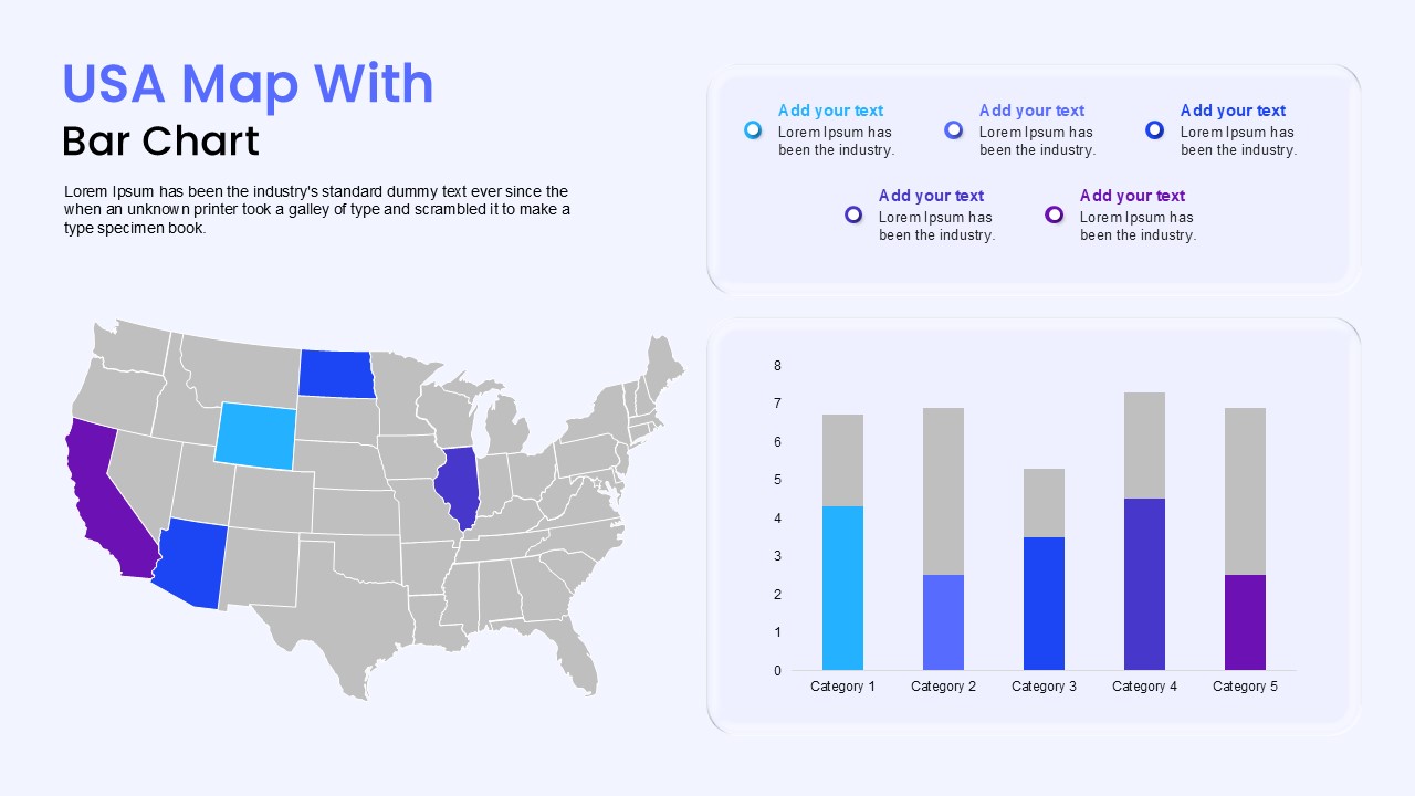
USA Map with Bar Chart Template for PowerPoint & Google Slides
World Maps
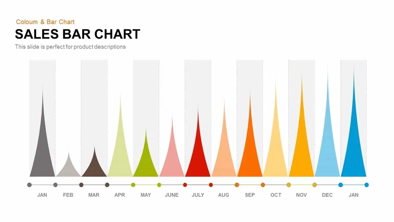
Sales Bar Chart for PowerPoint & Google Slides
Bar/Column
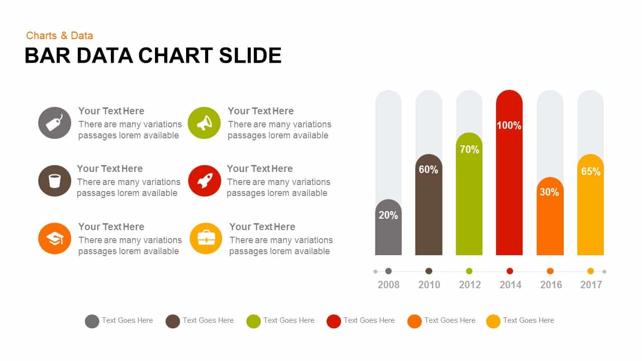
Bar Data Chart Slide for PowerPoint & Google Slides
Bar/Column

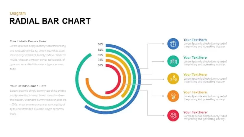
Radial Bar Chart Diagram for PowerPoint & Google Slides
Bar/Column
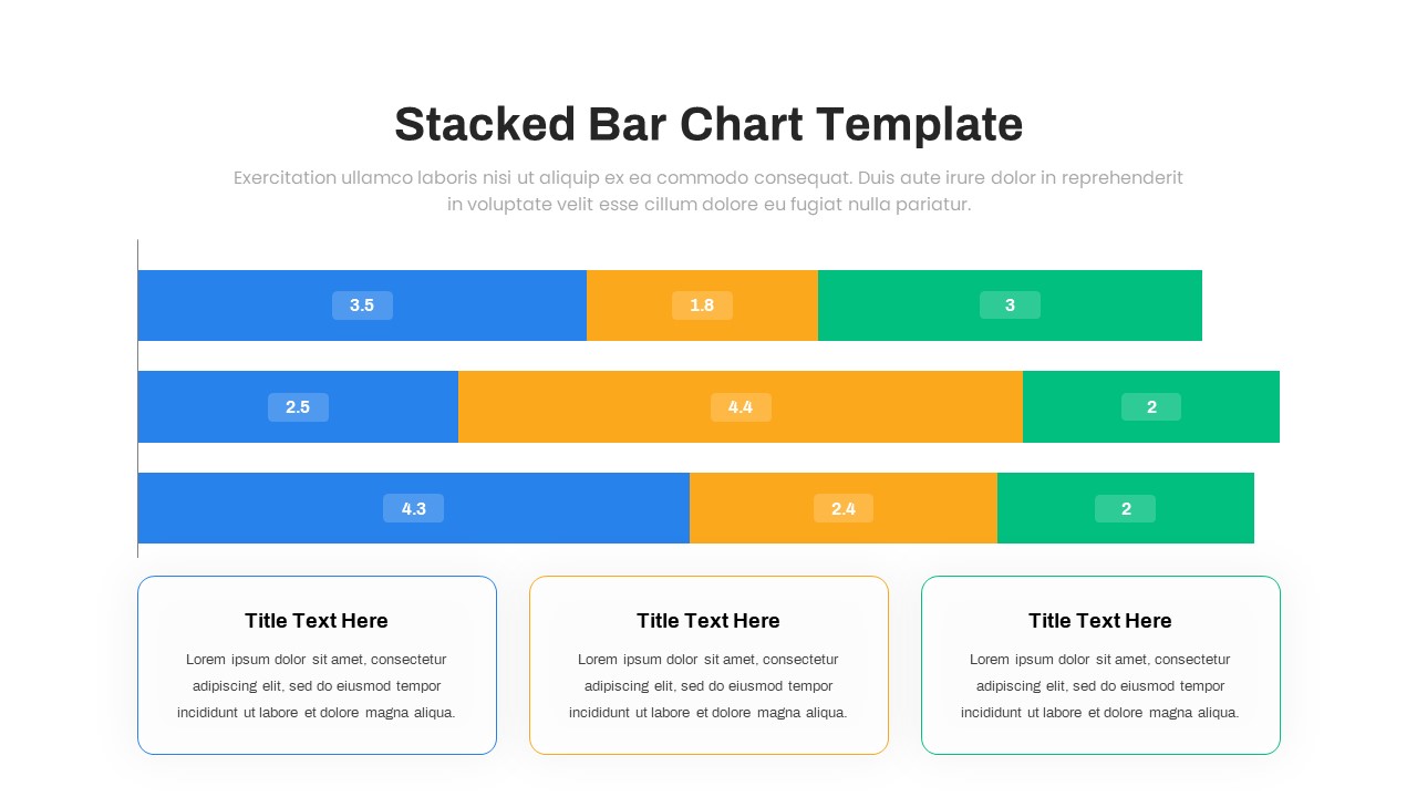
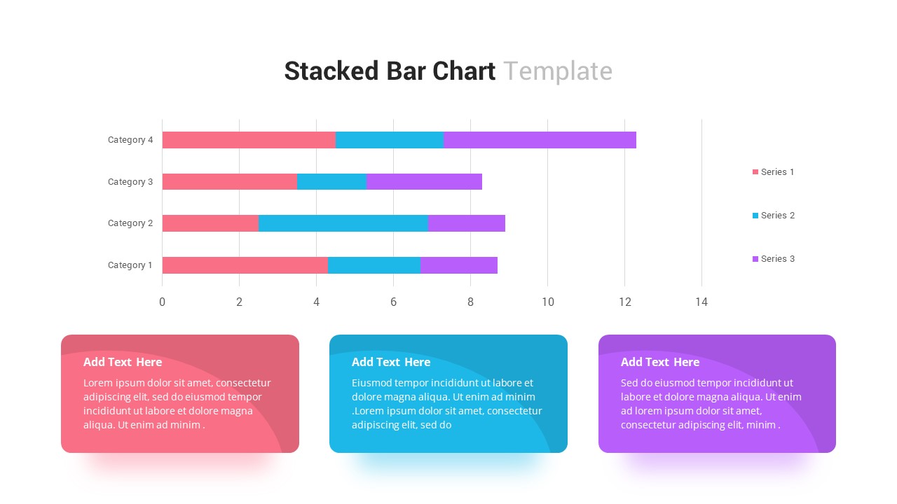
Stacked Bar Chart for PowerPoint & Google Slides
Bar/Column
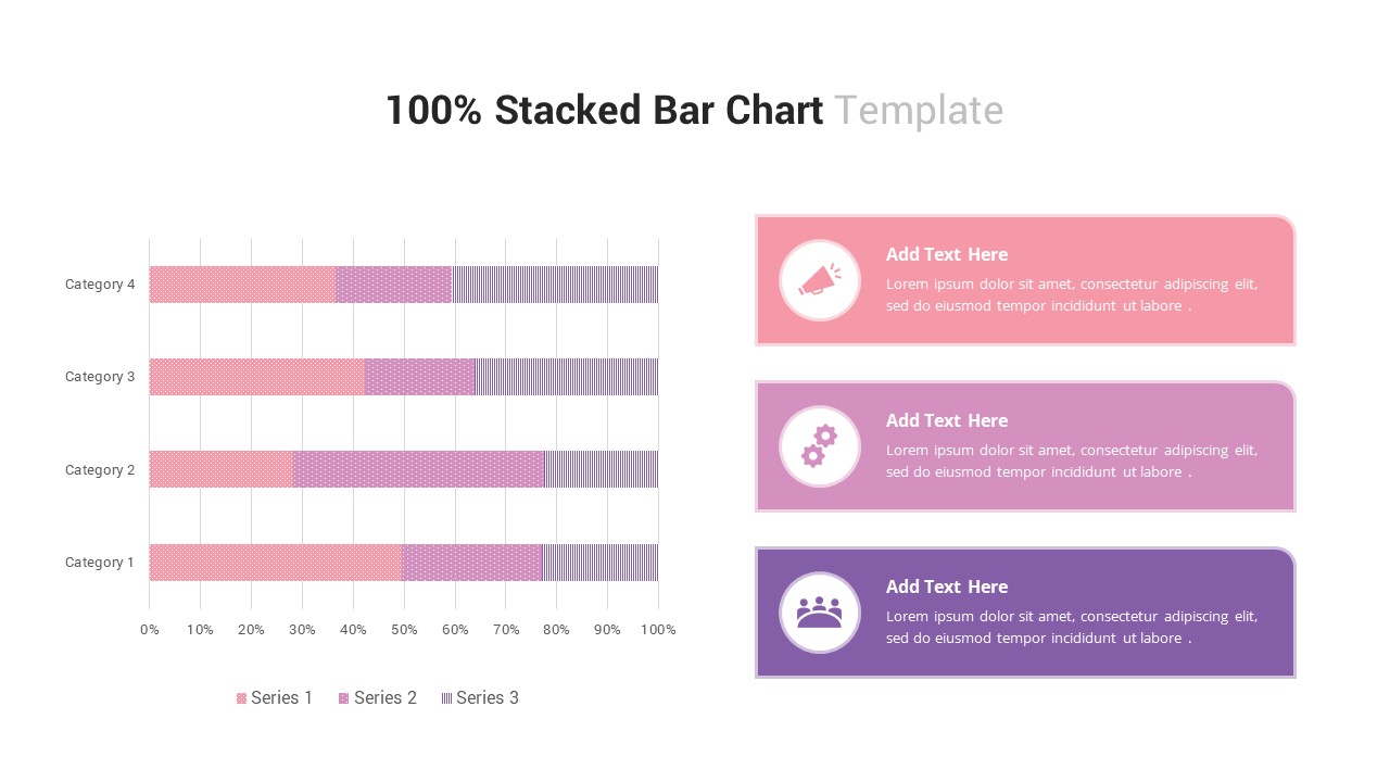
100% Stacked Bar Chart for PowerPoint & Google Slides
Bar/Column
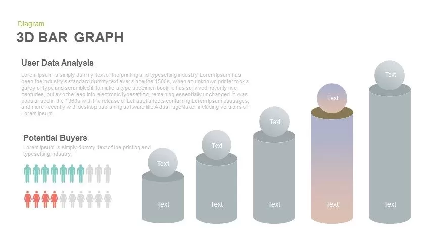
3D Bar Graph Infographic Template for PowerPoint & Google Slides
Bar/Column
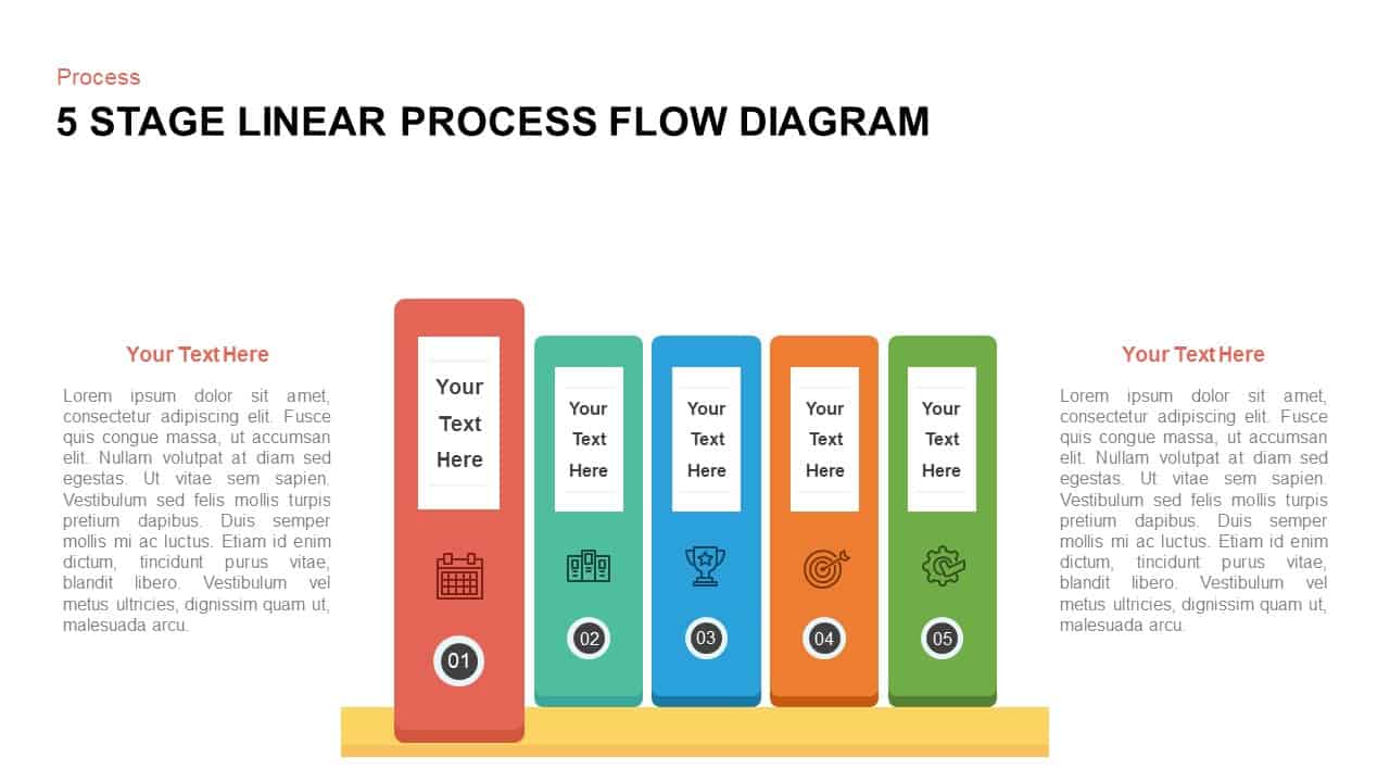
Five-Stage Vertical Bar Process Template for PowerPoint & Google Slides
Process
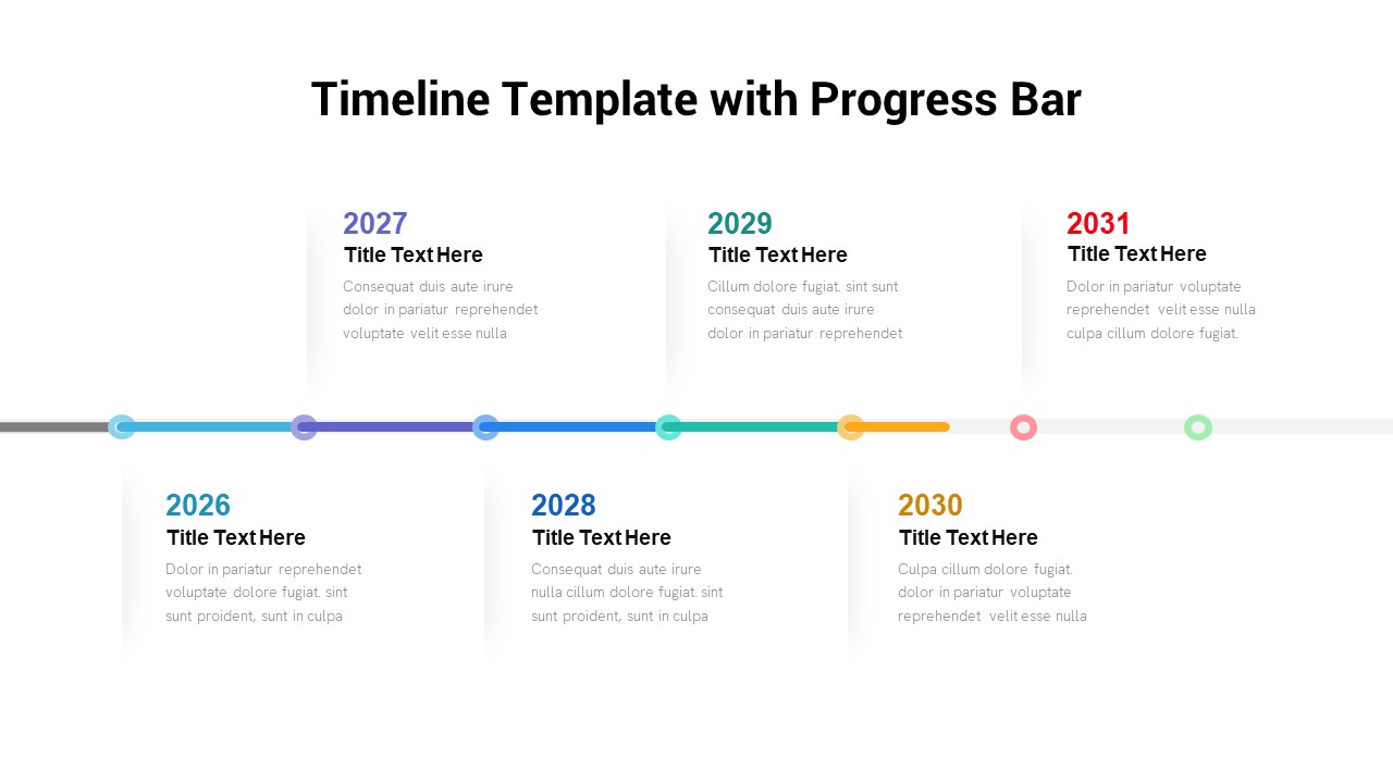
Timeline Roadmap with Progress Bar Template for PowerPoint & Google Slides
Timeline

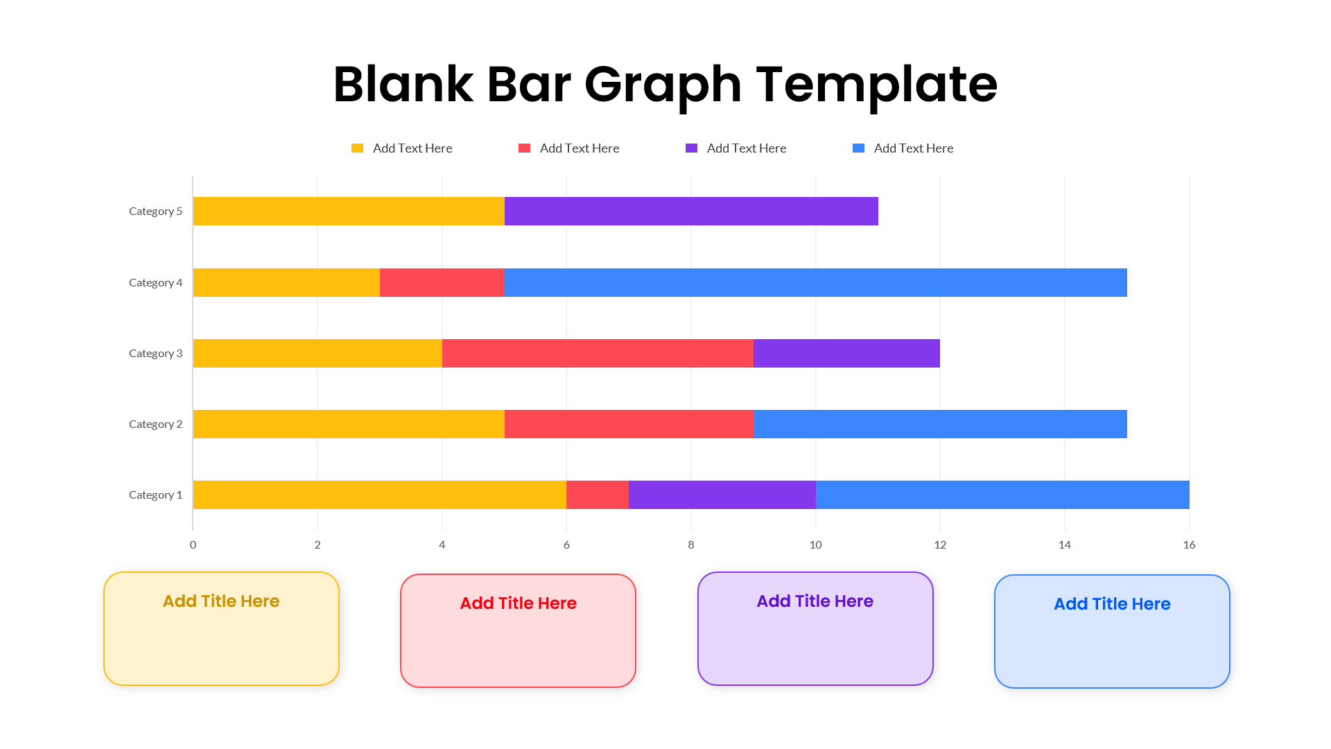
Blank Bar Graph Template for PowerPoint & Google Slides
Bar/Column
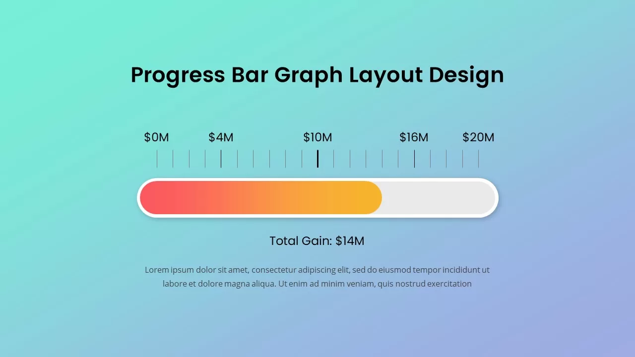
Progress Bar Graph Layout Design for PowerPoint & Google Slides
Charts
Progress Bar Infographic for PowerPoint & Google Slides
Business
Progress Bar infographic pack for PowerPoint & Google Slides
Business
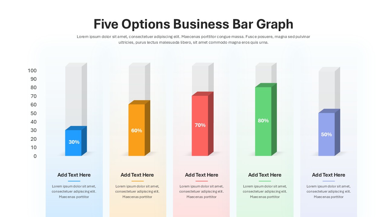
Five Options Business Bar Graph for PowerPoint & Google Slides
Business Report