Butterfly Chart Template for PowerPoint & Google Slides

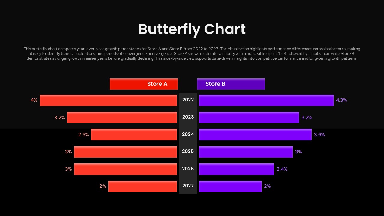
Description
This professional butterfly chart template features a bilateral horizontal bar design that enables clear side-by-side comparison of two datasets across multiple time periods. The template includes two slide variations with white and black backgrounds, displaying comparative performance metrics for Store A and Store B from 2022-2027. Each bar extends from a central axis in opposite directions, creating the distinctive butterfly shape that makes data relationships instantly recognizable. The color-coded legends and percentage labels ensure your audience can quickly interpret the comparative data.
Who is it for
Perfect for business analysts, financial managers, marketing professionals, and executives who need to present comparative data in board meetings, client presentations, or strategic planning sessions. Data visualization specialists and consultants will find this template invaluable for creating compelling reports that highlight performance differences between departments, competitors, or time periods.
Other Uses
Beyond business comparisons, this butterfly chart works excellently for market research presentations, academic studies comparing two variables, demographic analysis, survey results showing opposing viewpoints, budget variance reports, and any scenario requiring clear bilateral data visualization. The dual background options make it suitable for corporate presentations, client pitches, and executive dashboards.
Frequently Asked Questions
How do I customize the data values in the butterfly chart?
Can I change the colors of the Store A and Store B bars?
Login to download this file

Item ID
SB05817Designed By
Naseeba Sithara
Related Templates

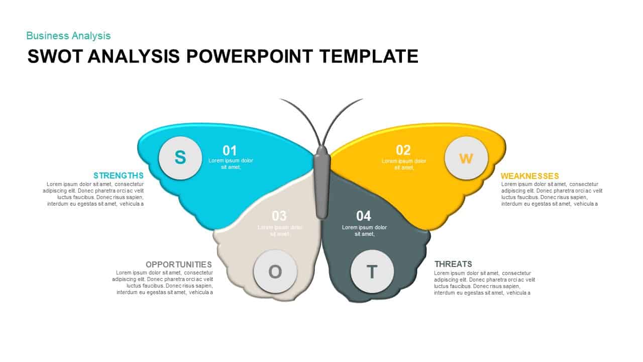
Butterfly SWOT Analysis Diagram Template for PowerPoint & Google Slides
SWOT
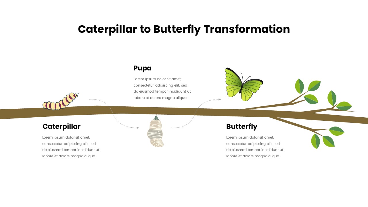
Caterpillar to Butterfly Process Template for PowerPoint & Google Slides
Process
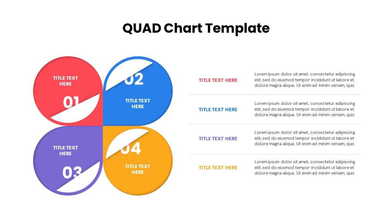
Quad Chart Infographic Pack of 8 Slides Template for PowerPoint & Google Slides
Comparison Chart
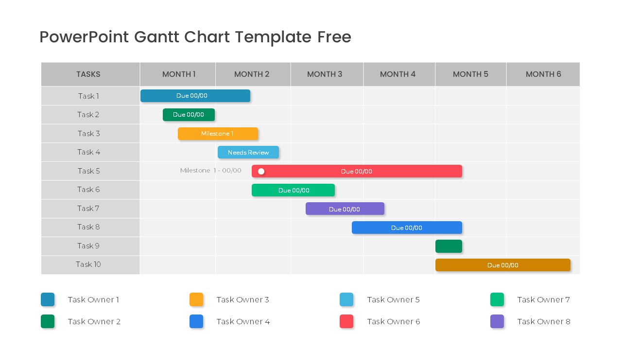
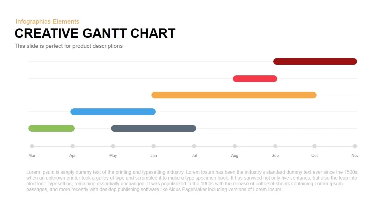
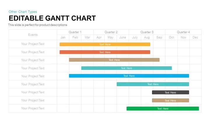
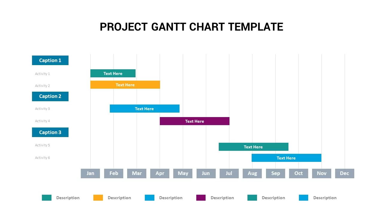
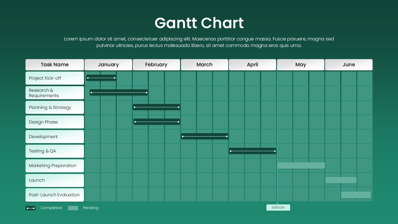
Free Professional Gantt Chart Pack – 4 Slides Template for PowerPoint & Google Slides
Gantt Chart
Free
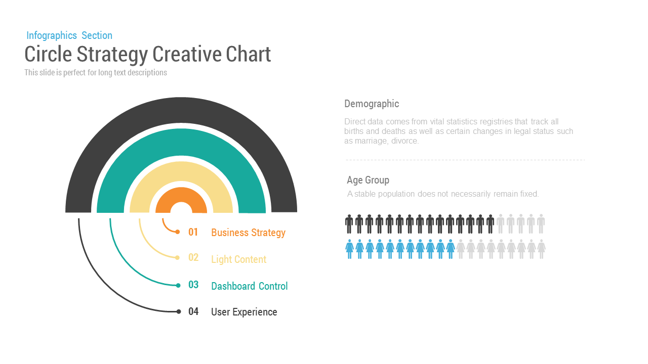
Circle Strategy Creative Chart template for PowerPoint & Google Slides
Business Strategy
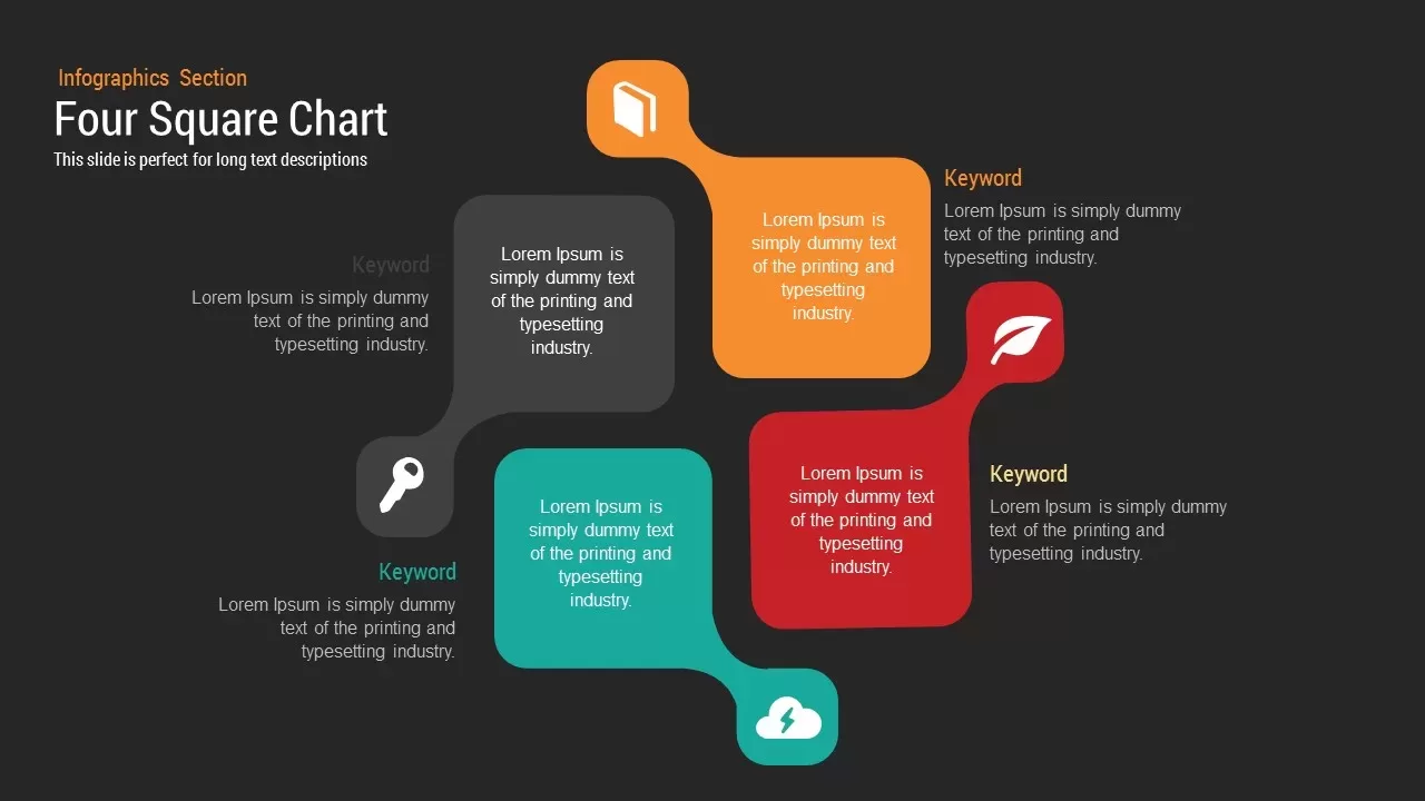
Four Square Chart template for PowerPoint & Google Slides
Charts
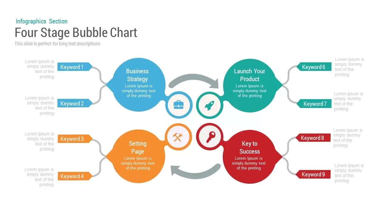
Bubble Chart template for PowerPoint & Google Slides
Charts
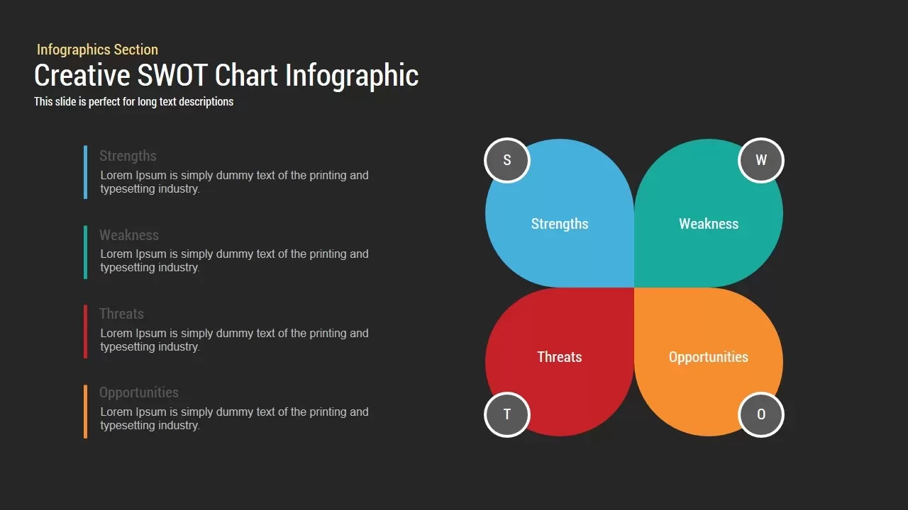
Creative SWOT Chart template for PowerPoint & Google Slides
SWOT

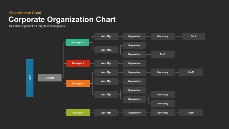
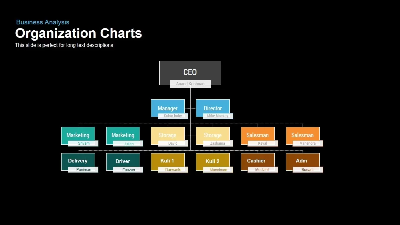
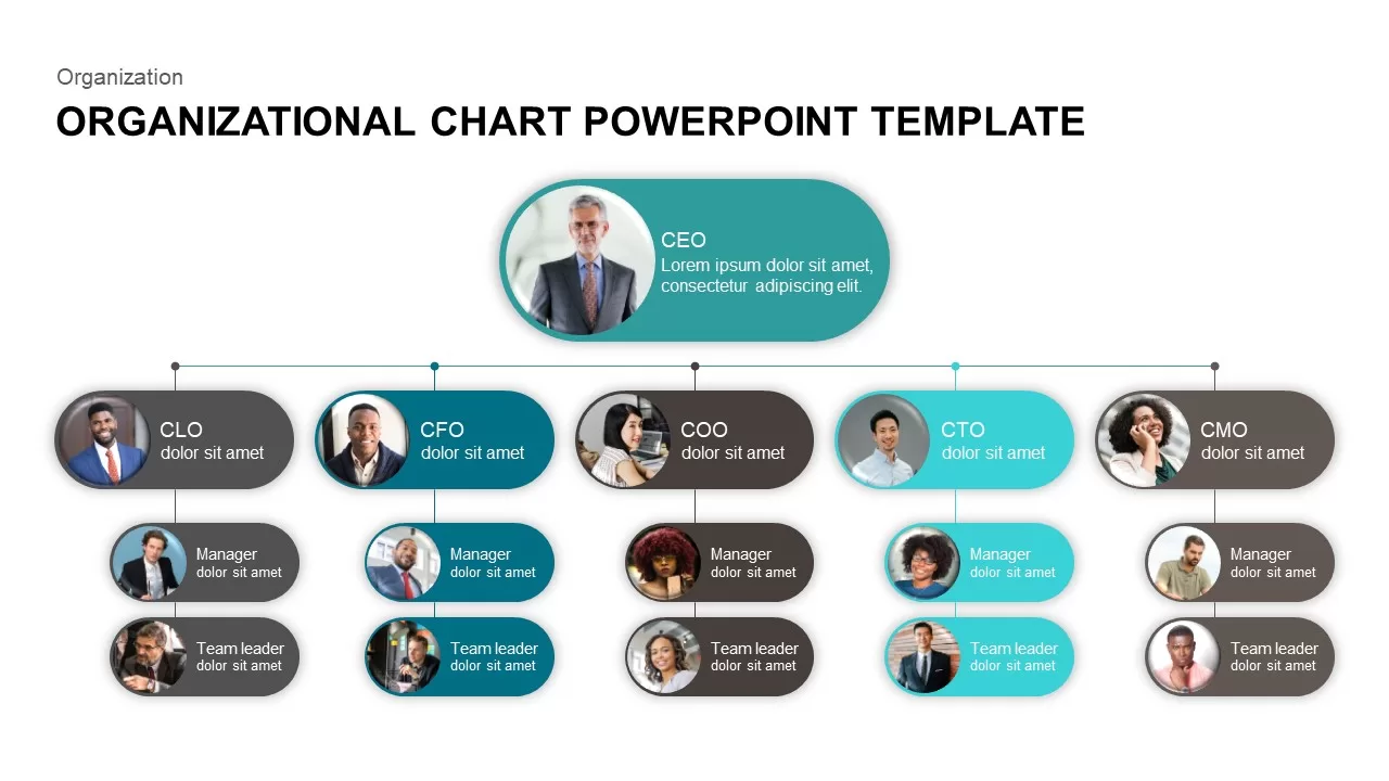
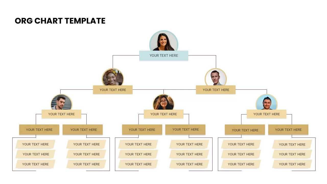
Corporate Organization Chart template for PowerPoint & Google Slides
Org Chart
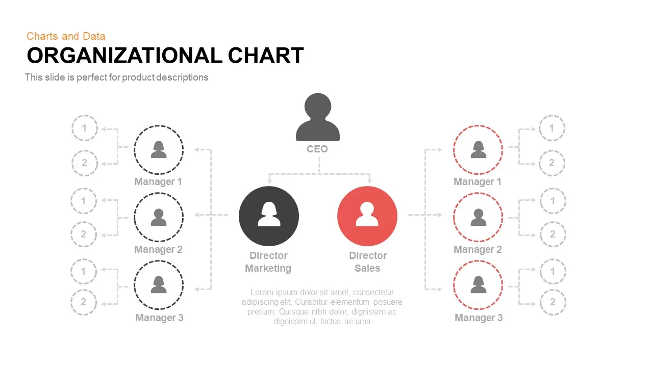
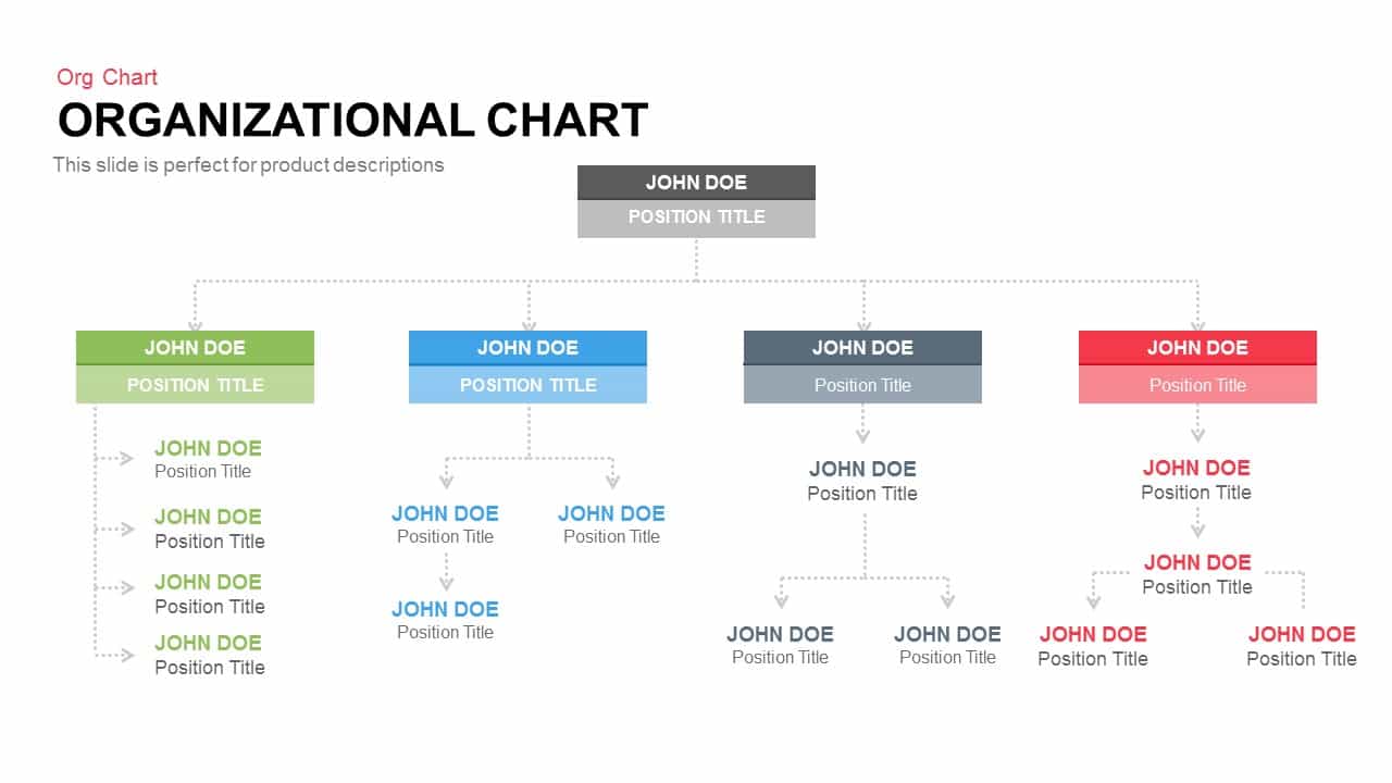
Organization Chart template for PowerPoint & Google Slides
Org Chart
Donut Chart template for PowerPoint & Google Slides
Pie/Donut
Global Market Share Cylinder Chart Template for PowerPoint & Google Slides
Bar/Column
Business Organization Chart Hierarchy Template for PowerPoint & Google Slides
Org Chart
Creative Dynamic Gantt Chart Timeline Template for PowerPoint & Google Slides
Timeline
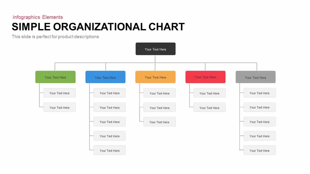
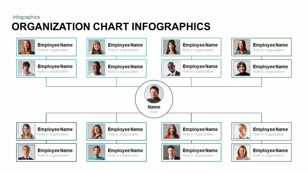
Simple Organizational Chart Infographic Template for PowerPoint & Google Slides
Org Chart
Organizational Chart Template for PowerPoint & Google Slides
Org Chart
Market Development Matrix Chart Template for PowerPoint & Google Slides
Comparison Chart
Pencil Bar Chart Data Analysis Template for PowerPoint & Google Slides
Bar/Column
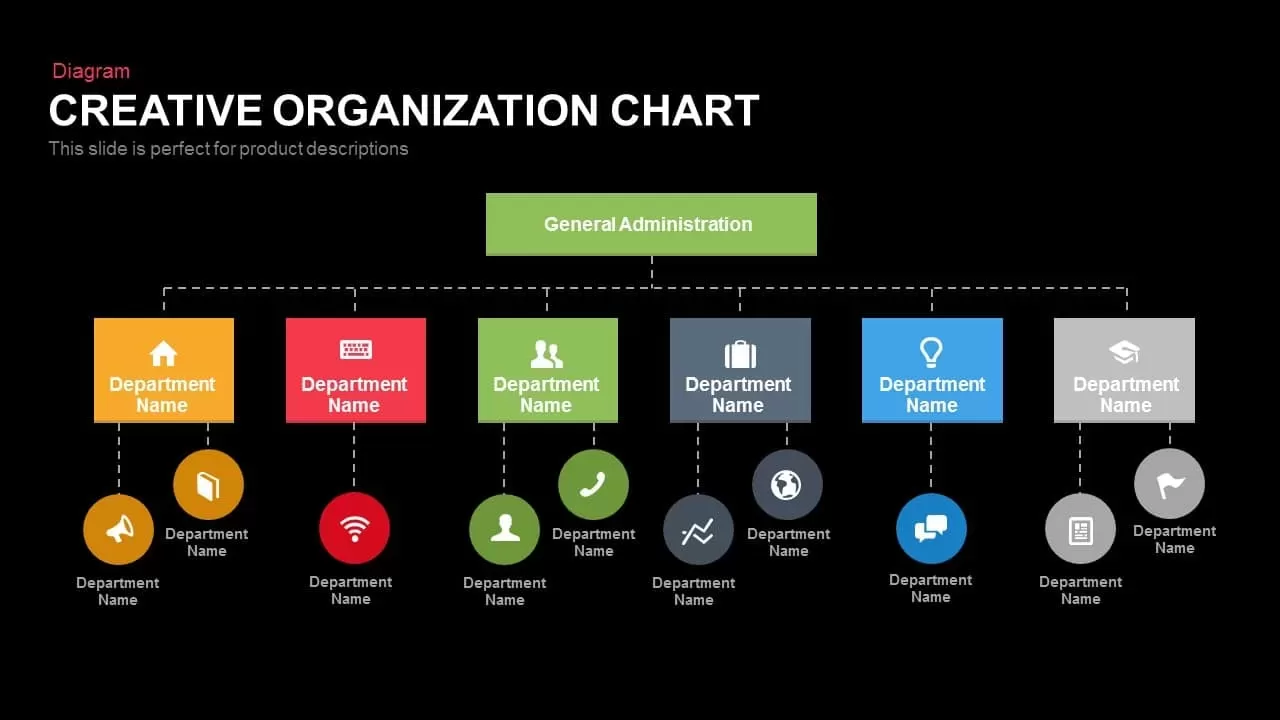
Creative Organization Chart Diagram Template for PowerPoint & Google Slides
Org Chart
Corporate Org Chart template for PowerPoint & Google Slides
Org Chart

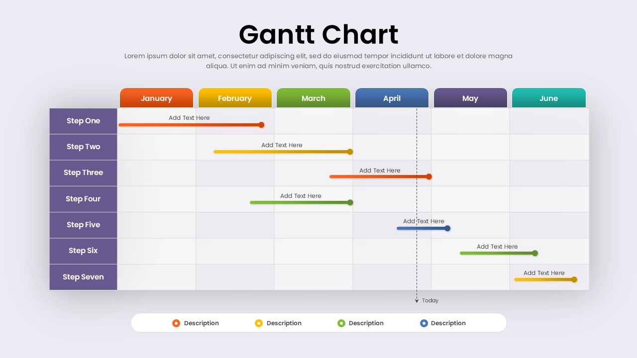
Fully Editable Gantt Chart Timeline template for PowerPoint & Google Slides
Gantt Chart
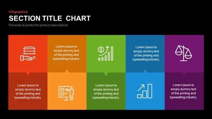
Modern Ten-Block Section Title Chart template for PowerPoint & Google Slides
Comparison

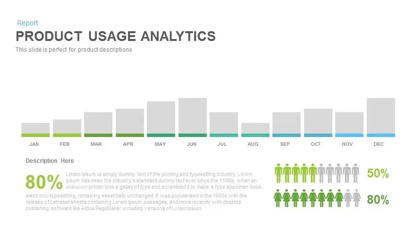
Product Usage Analytics Dashboard Chart Template for PowerPoint & Google Slides
Bar/Column
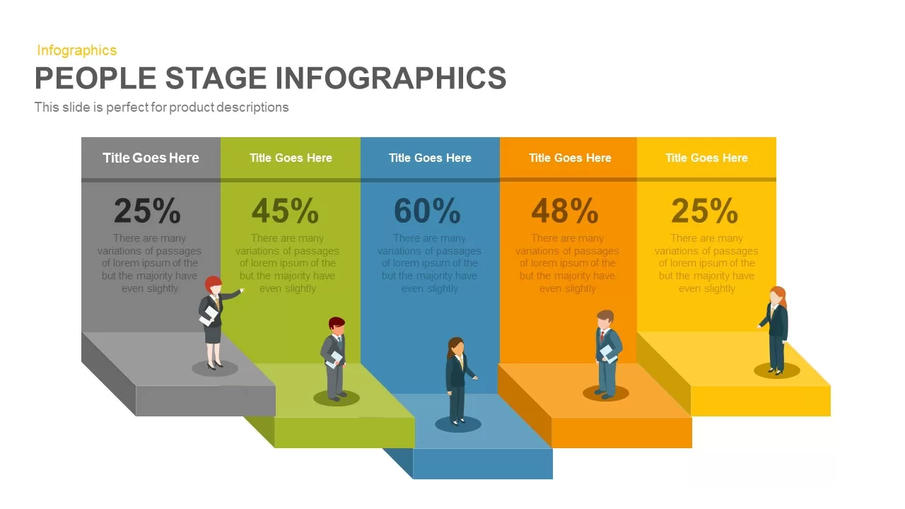
Five-Stage People Infographic Chart template for PowerPoint & Google Slides
Process
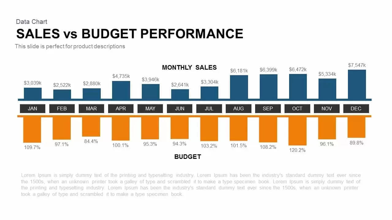
Sales vs Budget Performance Chart Template for PowerPoint & Google Slides
Bar/Column
Interactive Product Comparison Bar Chart Template for PowerPoint & Google Slides
Bar/Column

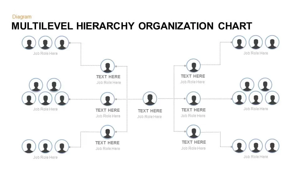
Multilevel Hierarchy Organization Chart template for PowerPoint & Google Slides
Org Chart
Organization Chart Overview template for PowerPoint & Google Slides
Org Chart

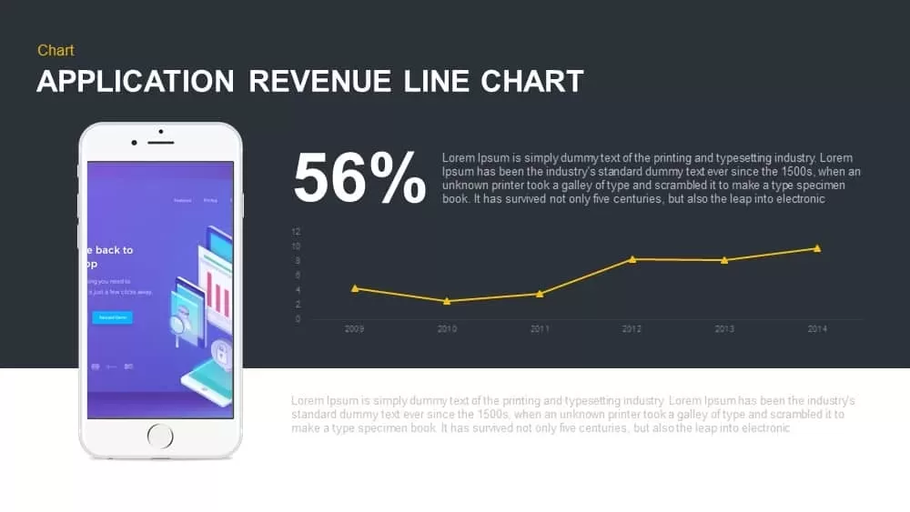
Application Revenue Line Chart KPI Template for PowerPoint & Google Slides
Revenue
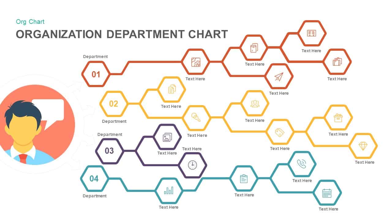
Organization Department Hexagon Chart Template for PowerPoint & Google Slides
Org Chart
Corporate Organizational Chart Hierarchy Template for PowerPoint & Google Slides
Org Chart
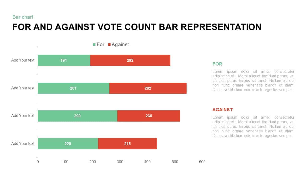
For and Against Vote Count Bar Chart Template for PowerPoint & Google Slides
Bar/Column
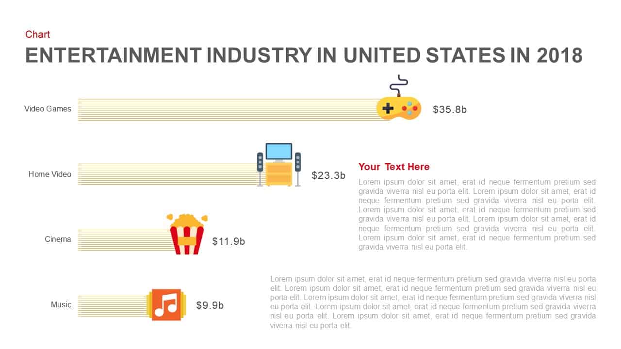
Entertainment Industry Revenue Bar Chart Template for PowerPoint & Google Slides
Bar/Column
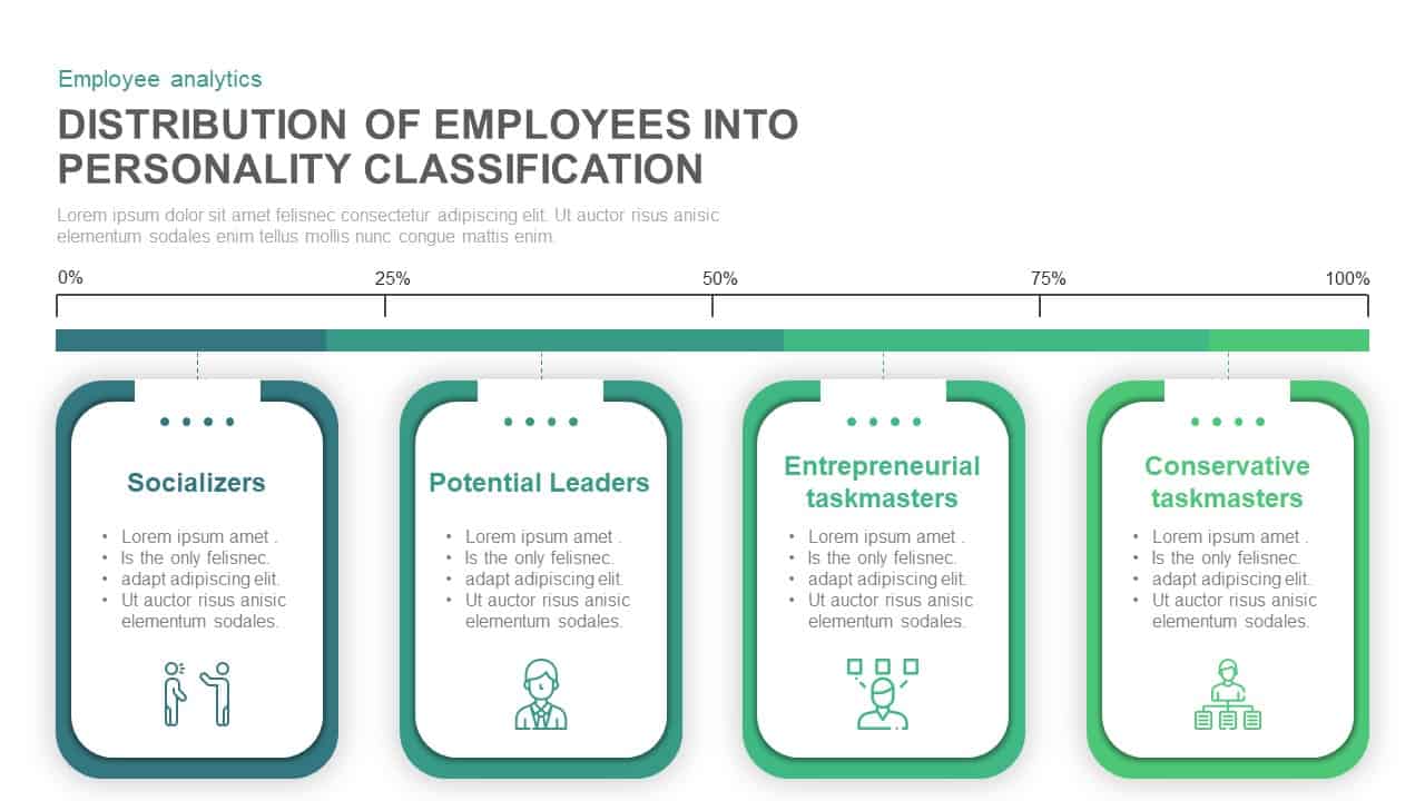
Employee Personality Distribution Chart Template for PowerPoint & Google Slides
Bar/Column
Capital Structure Dynamic Split Chart Template for PowerPoint & Google Slides
Comparison Chart

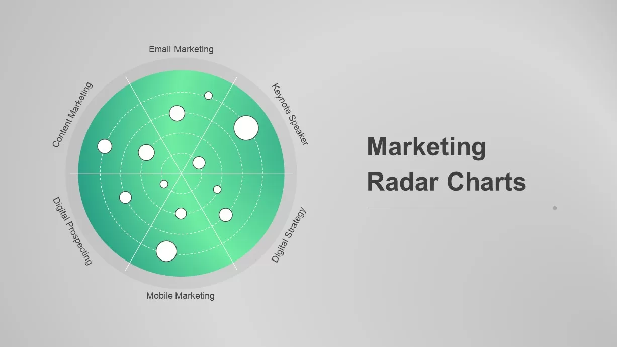
Dynamic Marketing Radar Chart Analytics Template for PowerPoint & Google Slides
Comparison
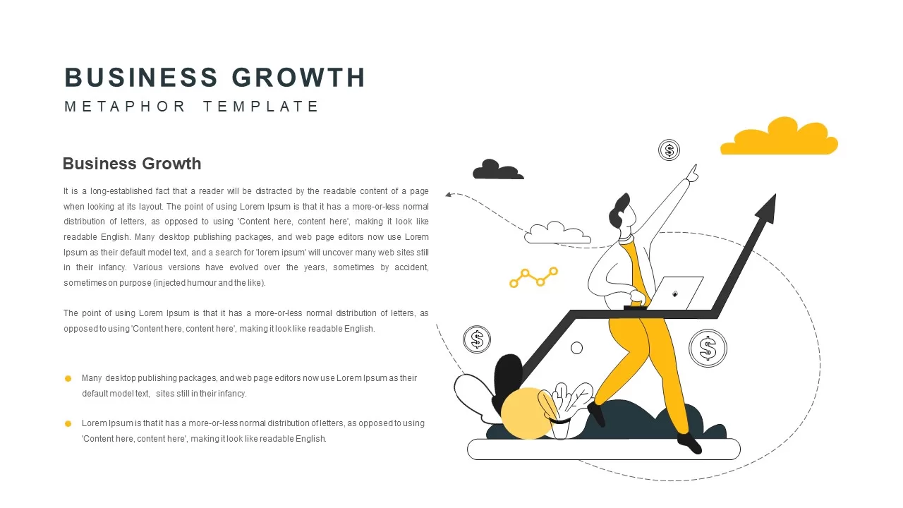
Business Growth Metaphor Chart Template for PowerPoint & Google Slides
Business
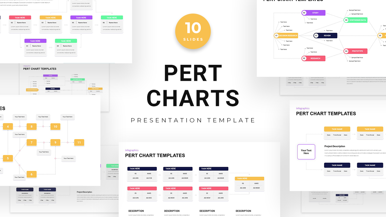
PERT Chart Project Management template for PowerPoint & Google Slides
Project Status
Professional Organizational Chart Diagram Template for PowerPoint & Google Slides
Org Chart
Org Chart Structure template for PowerPoint & Google Slides
Org Chart
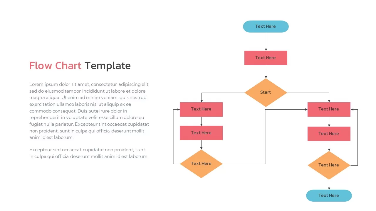
Flow Chart Template for PowerPoint & Google Slides
Flow Charts
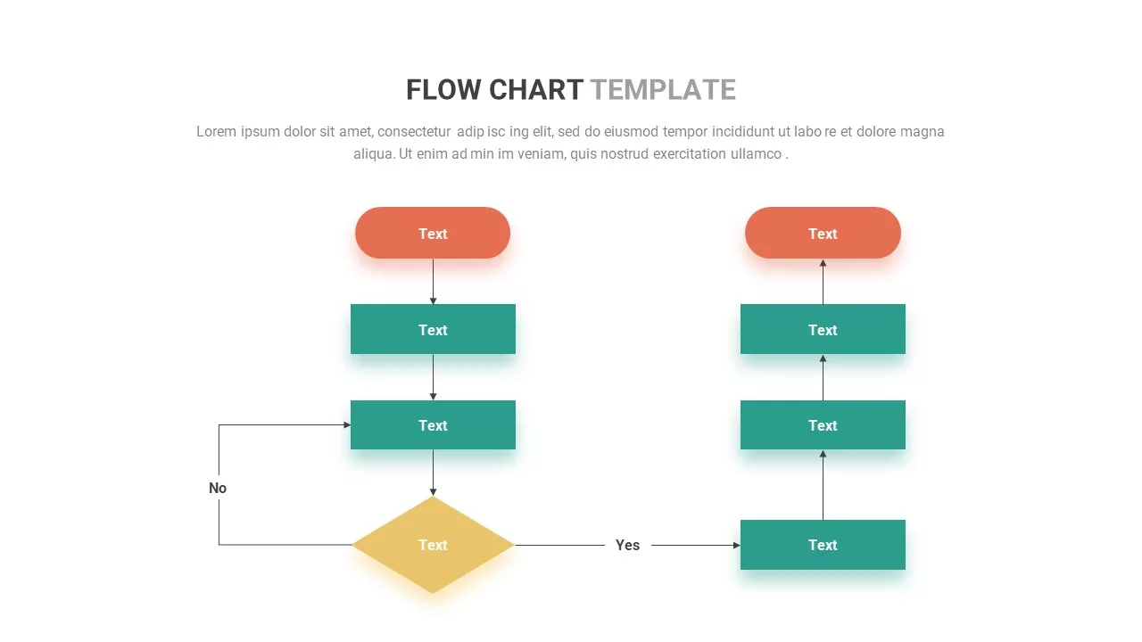
Flow Chart template for PowerPoint & Google Slides
Flow Charts
Interactive Project Gantt Chart Timeline Template for PowerPoint & Google Slides
Gantt Chart
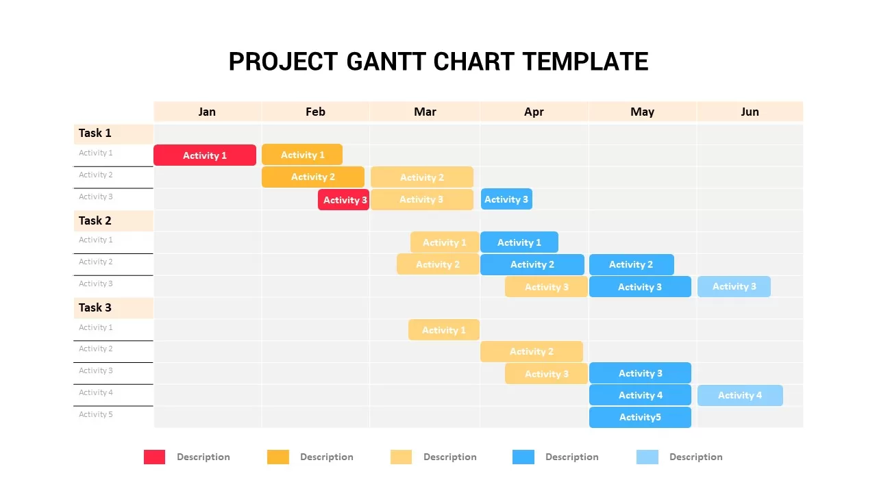
Project Gantt Chart Template for PowerPoint & Google Slides
Gantt Chart
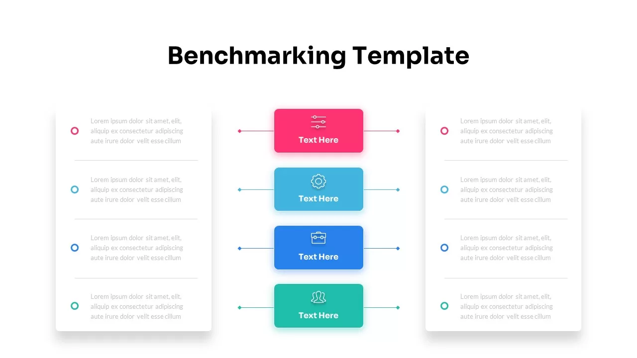
Dynamic Benchmarking Comparison Chart Template for PowerPoint & Google Slides
Comparison Chart
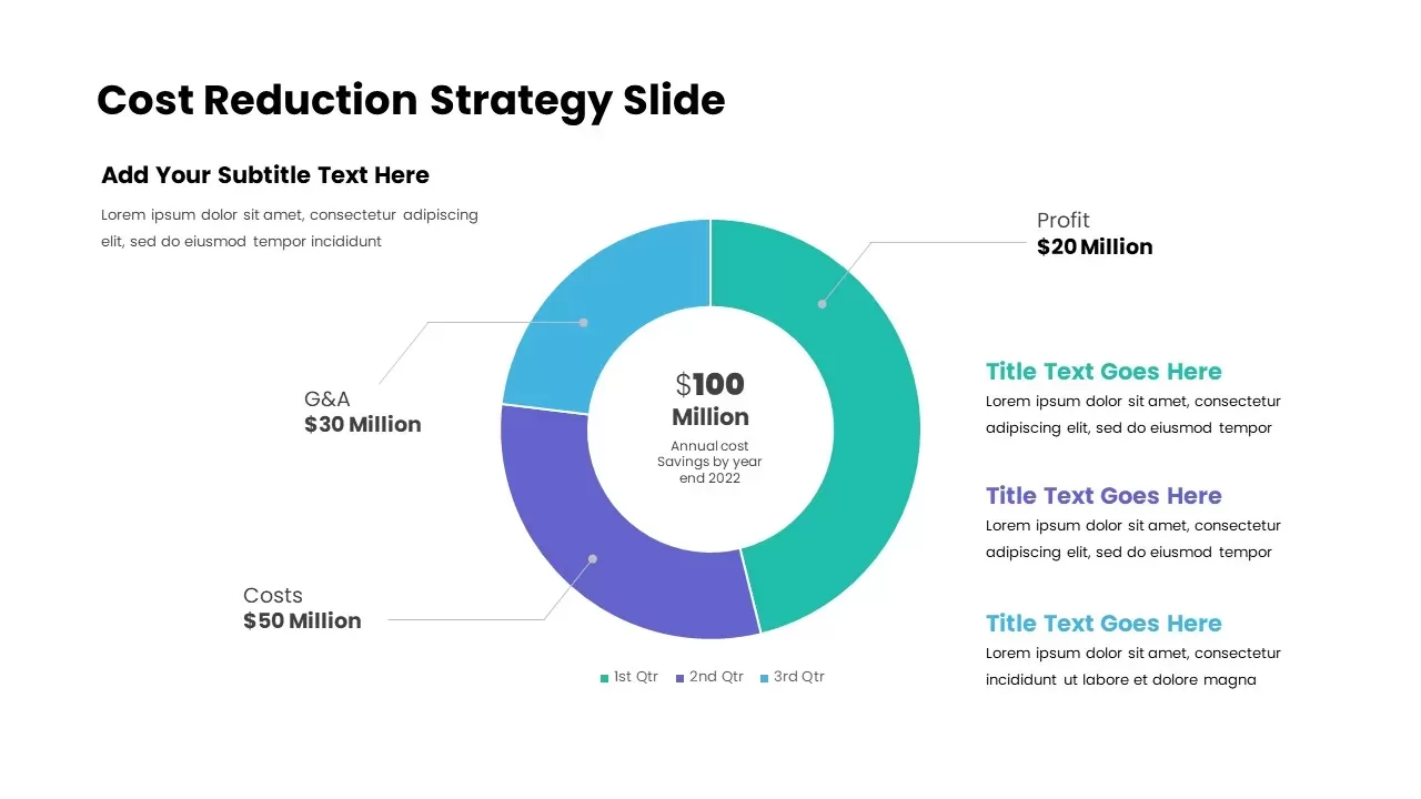
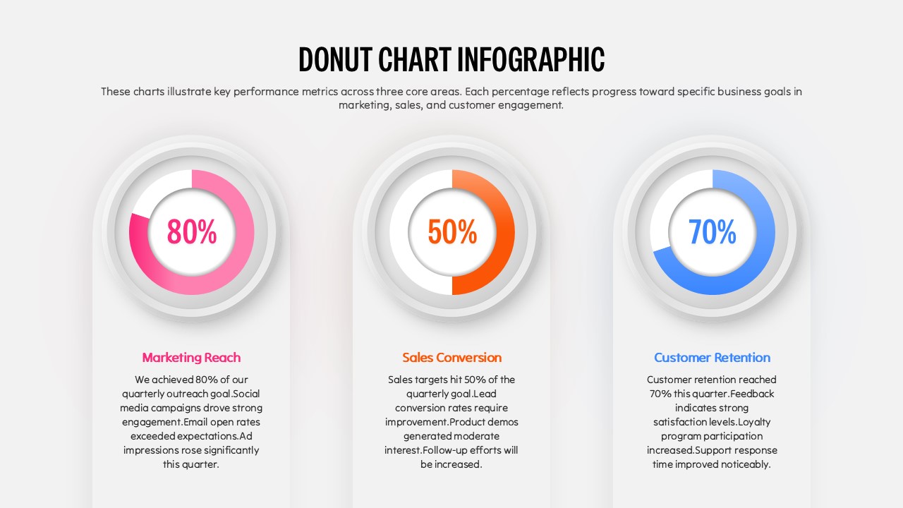
Cost Reduction Strategy Donut Chart Template for PowerPoint & Google Slides
Pie/Donut
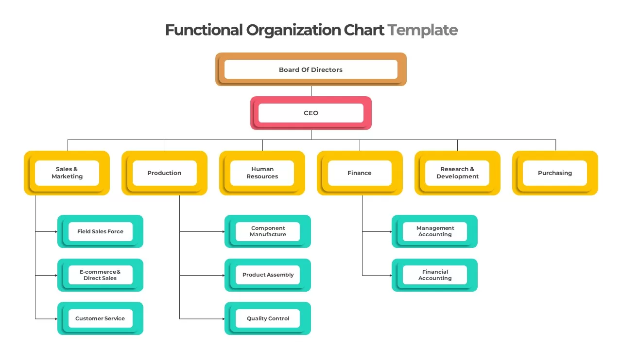
Colorful Functional Organization Chart Template for PowerPoint & Google Slides
Org Chart
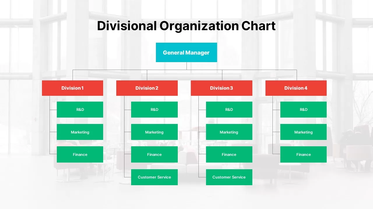
Modern Divisional Organization Chart Template for PowerPoint & Google Slides
Org Chart
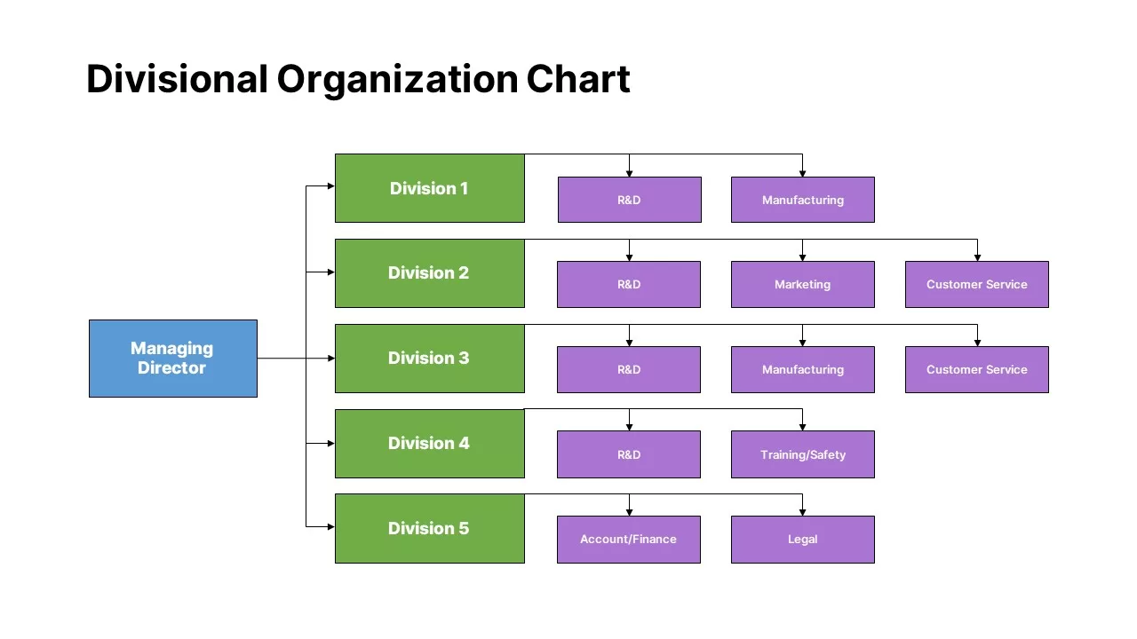
Divisional Organization Chart Template for PowerPoint & Google Slides
Org Chart
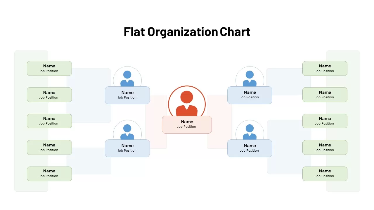
Flat Organization Chart Diagram Template for PowerPoint & Google Slides
Org Chart
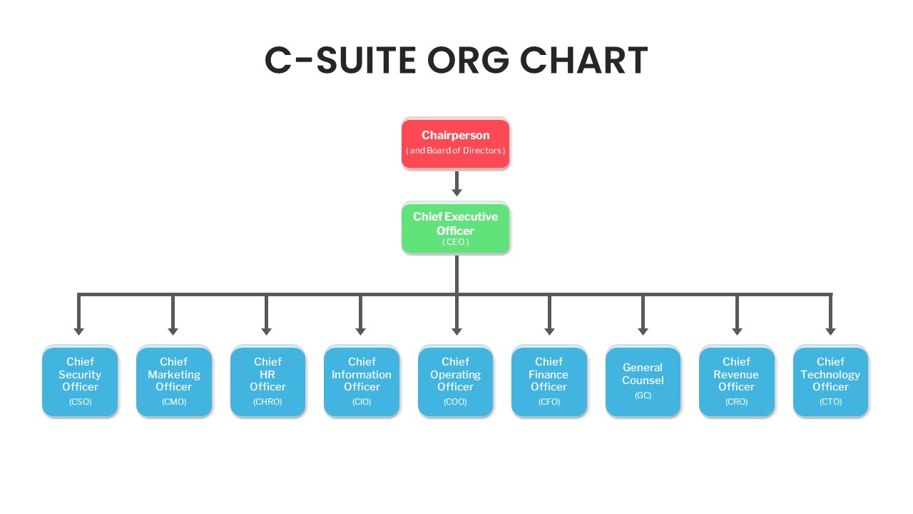
C-Suite Executive Org Chart Diagram Template for PowerPoint & Google Slides
Org Chart
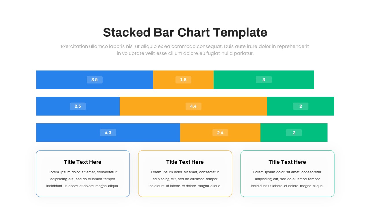
Animated Stacked Bar Chart Template for PowerPoint & Google Slides
Bar/Column
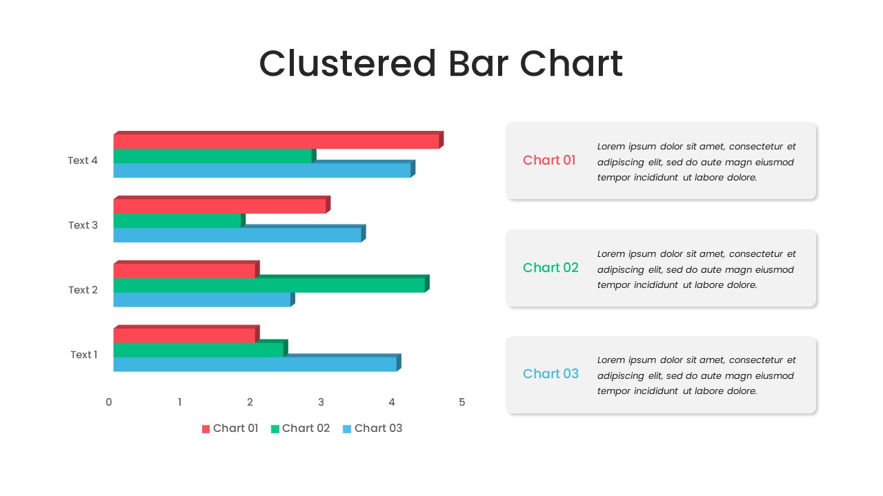
Clustered Bar Chart Comparison Template for PowerPoint & Google Slides
Bar/Column
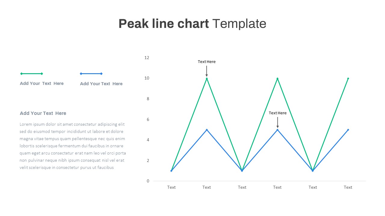
Editable Multi-Series Peak Line Chart Template for PowerPoint & Google Slides
Comparison Chart
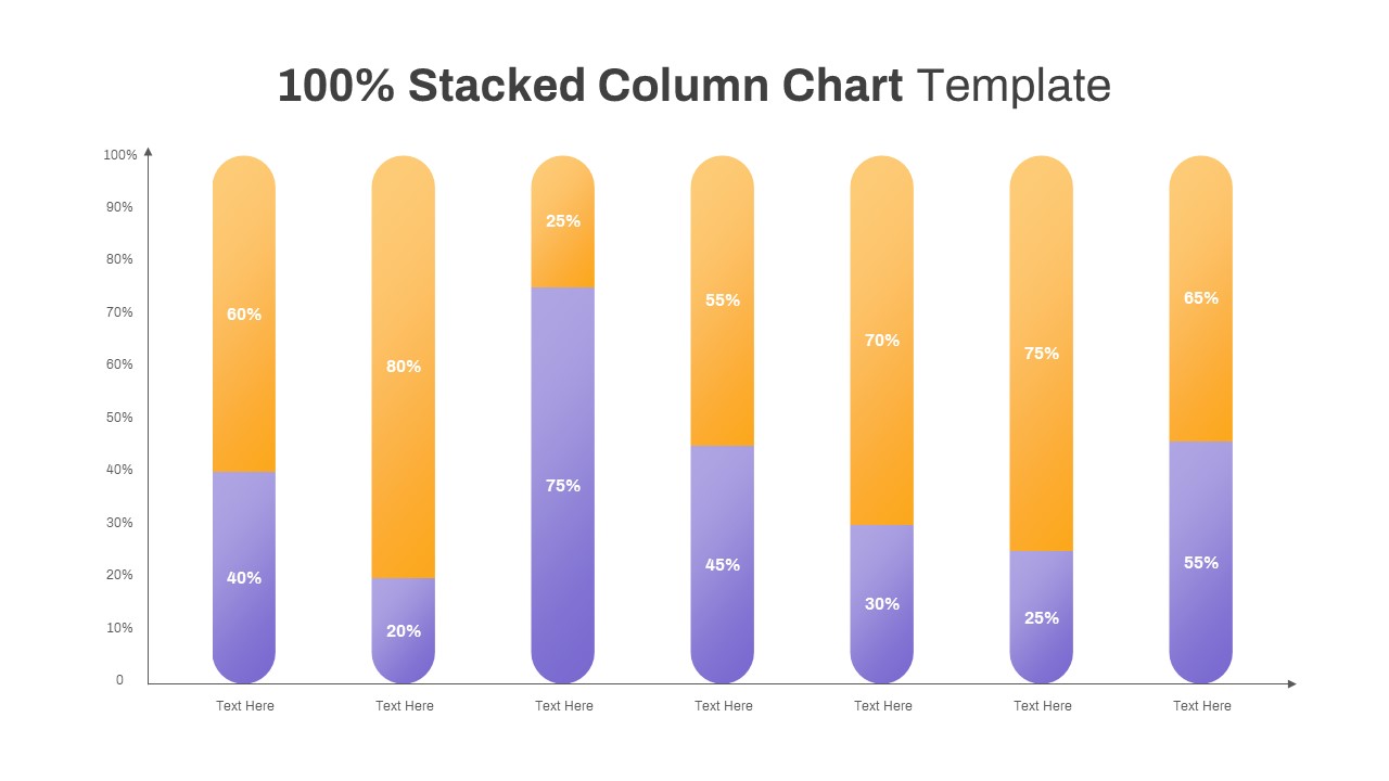
Professional 100% Stacked Column Chart Template for PowerPoint & Google Slides
Bar/Column
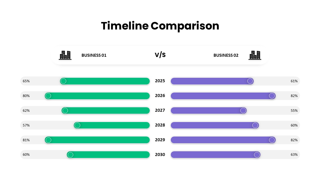
Business Timeline Comparison Bar Chart Template for PowerPoint & Google Slides
Comparison Chart
Growth Curve Line Chart Visualization Template for PowerPoint & Google Slides
Charts
Grouped Column Chart Comparison Template for PowerPoint & Google Slides
Bar/Column
Multiple Line Chart Comparison Template for PowerPoint & Google Slides
Comparison Chart
Five-Phase and Three-Phase Phases Chart Template for PowerPoint & Google Slides
Charts
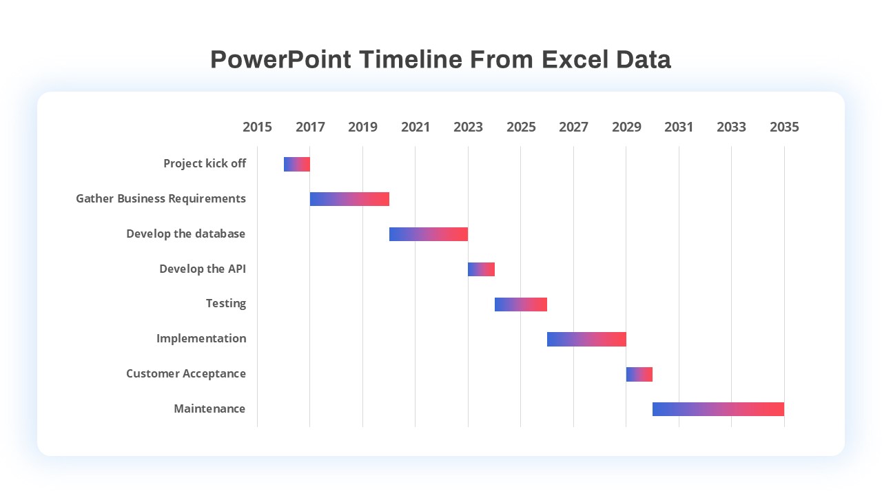
Excel-Driven Gradient Timeline Chart Template for PowerPoint & Google Slides
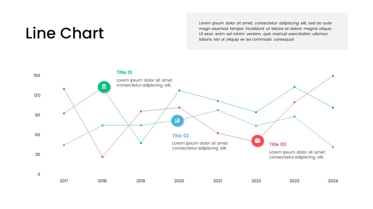
Multi-Series Line Chart with Icons Template for PowerPoint & Google Slides
Comparison Chart
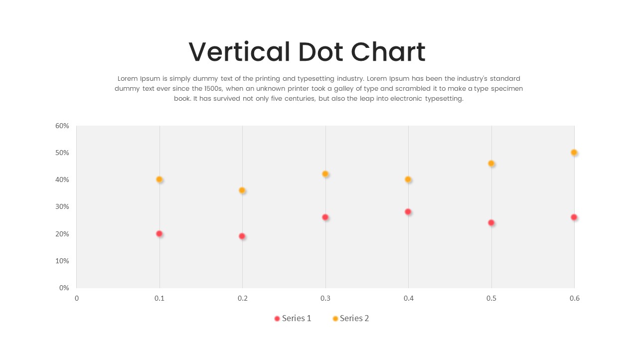
Multi-Series Vertical Dot Chart Template for PowerPoint & Google Slides
Comparison Chart
Waterfall Chart Data Visualization Template for PowerPoint & Google Slides
Comparison Chart
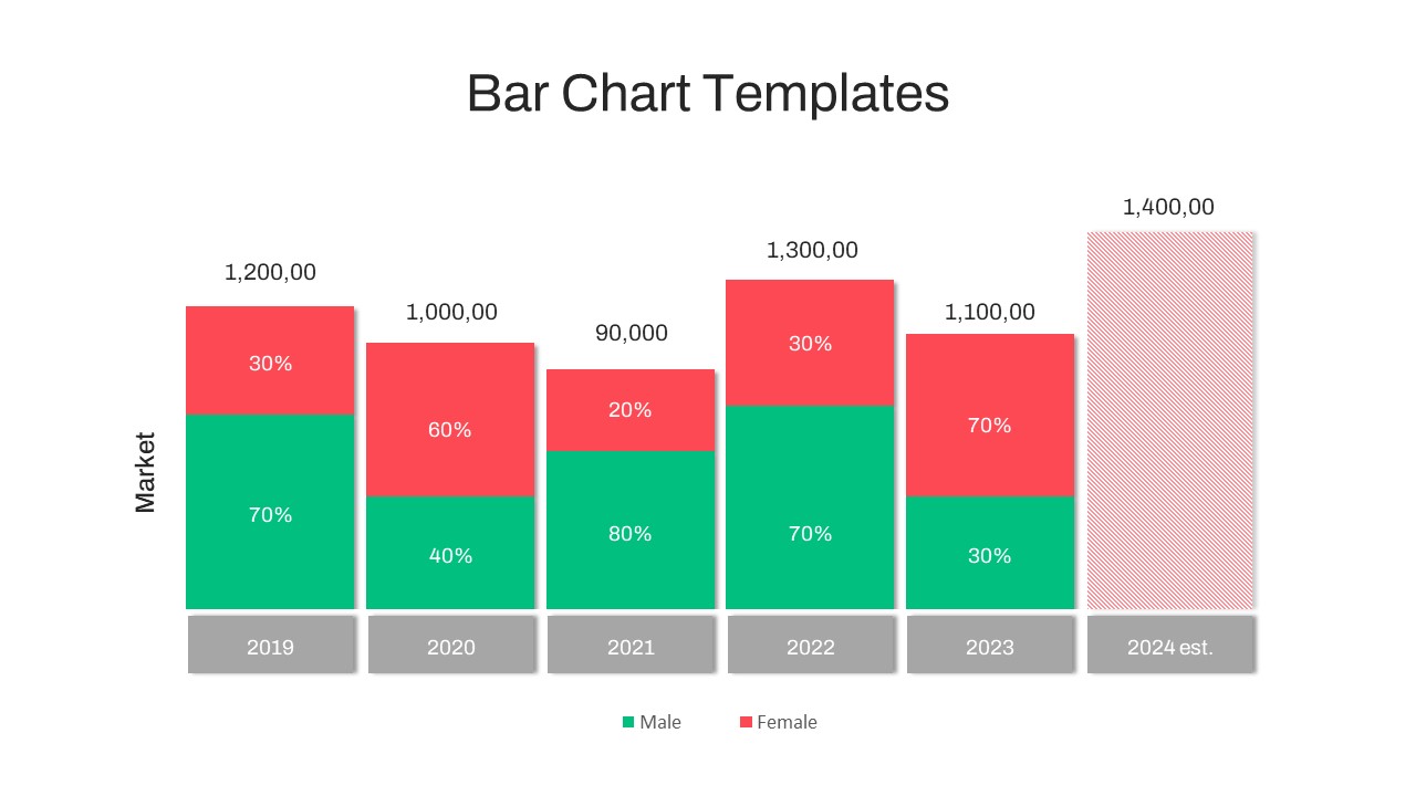
Year-over-Year Stacked Gender Bar Chart Template for PowerPoint & Google Slides
Bar/Column
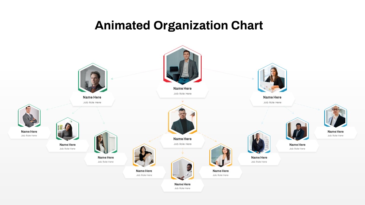
Animated Hexagon Org Chart Diagram Template for PowerPoint & Google Slides
Org Chart
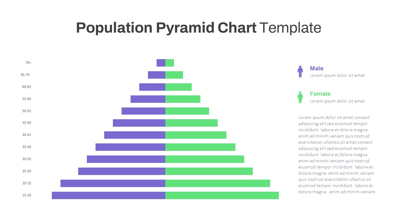
Population Age Distribution Pyramid Chart Template for PowerPoint & Google Slides
Pyramid
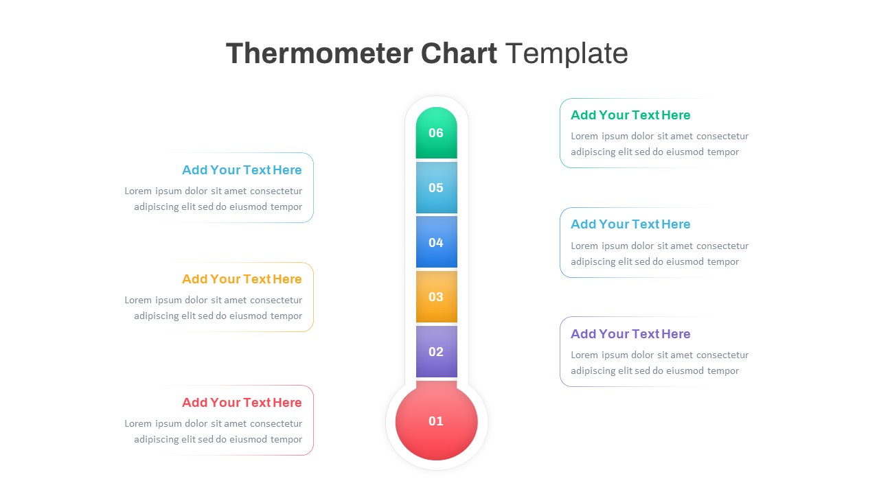
Multi-Variation Thermometer Chart Template for PowerPoint & Google Slides
Bar/Column
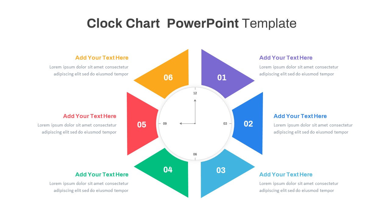
Multi-Style Clock Chart Diagram Template for PowerPoint & Google Slides
Circular
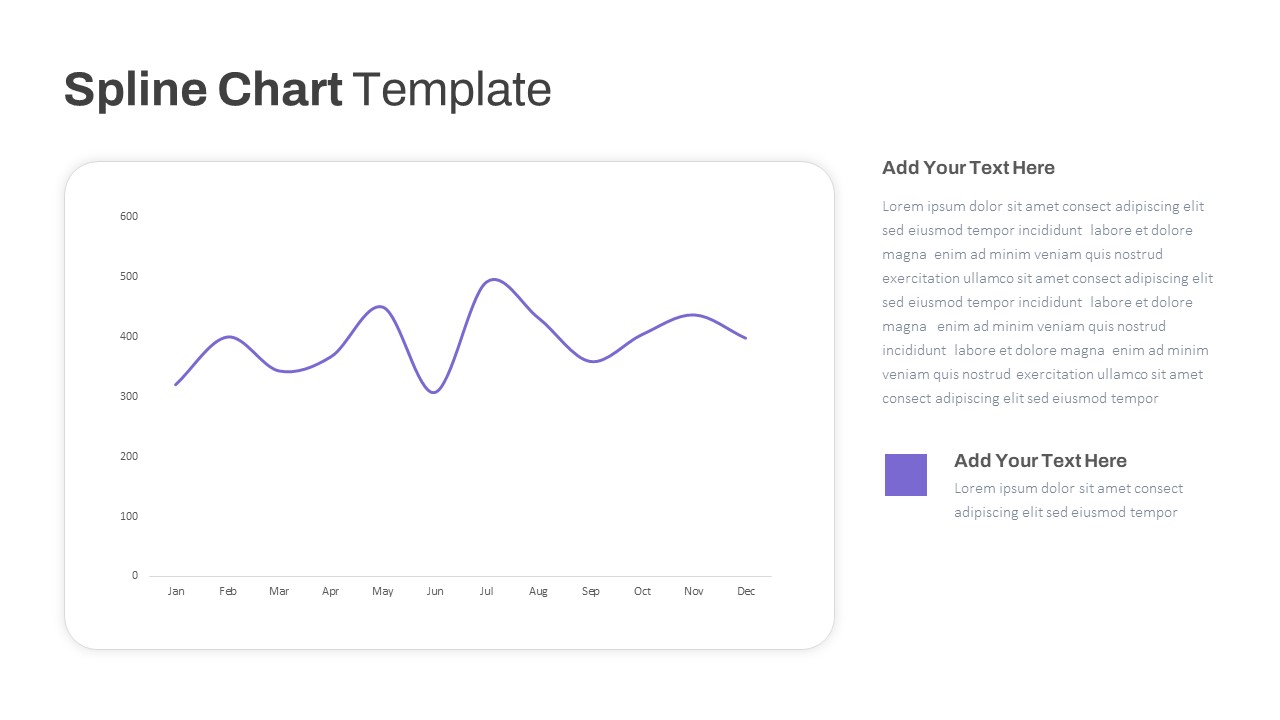
Multipurpose Spline Chart Data Trend Template for PowerPoint & Google Slides
Bar/Column
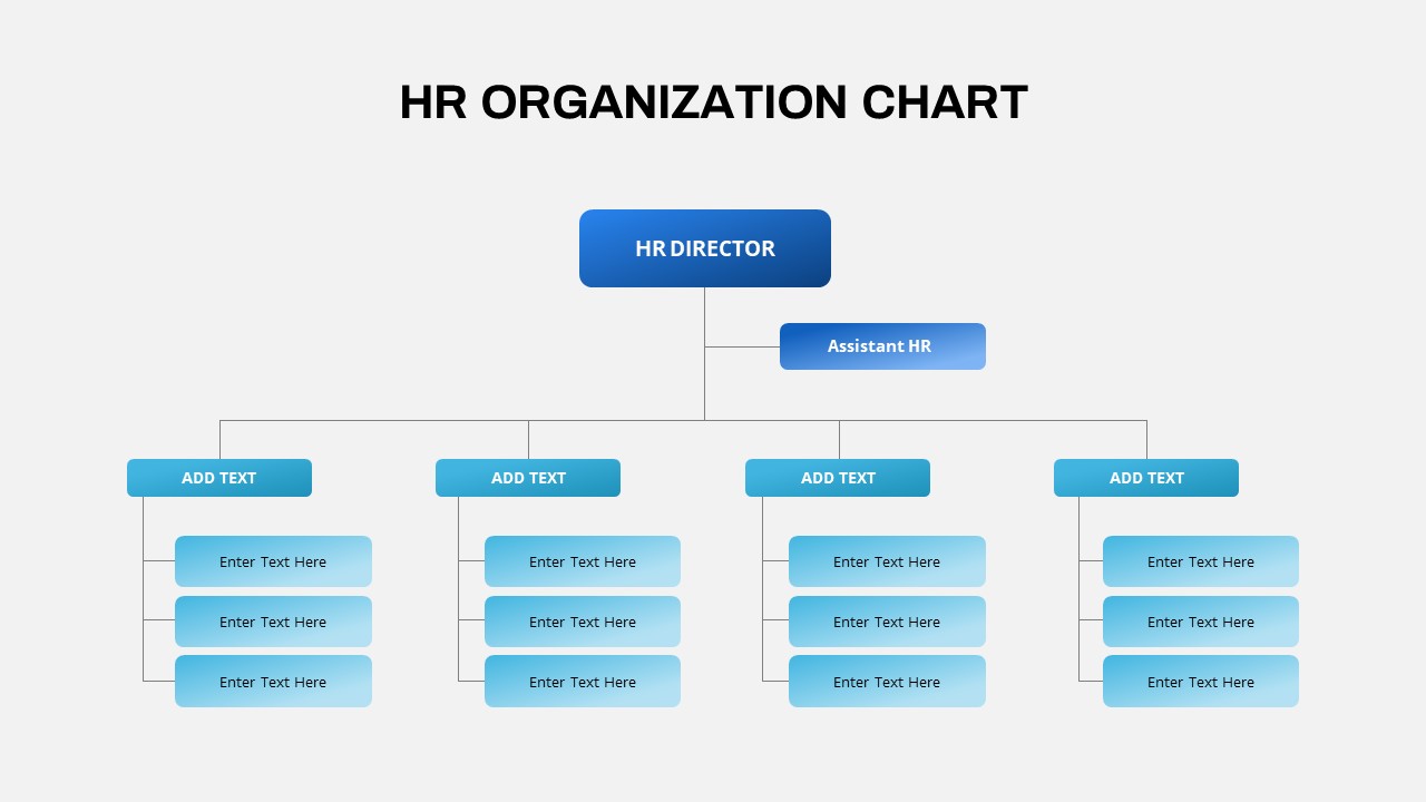
Professional HR Organization Chart Template for PowerPoint & Google Slides
Org Chart
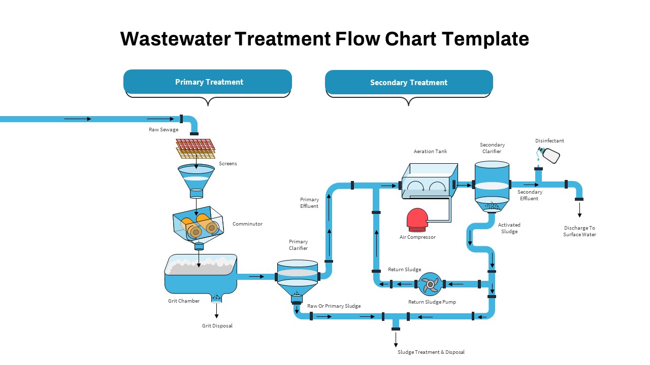
Wastewater Treatment Process Flow Chart Template for PowerPoint & Google Slides
Flow Charts
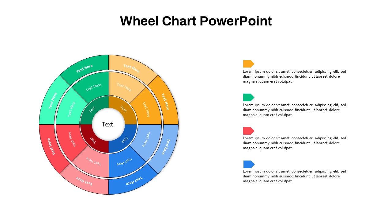
Multi-Level Wheel Chart Diagram template for PowerPoint & Google Slides
Pie/Donut
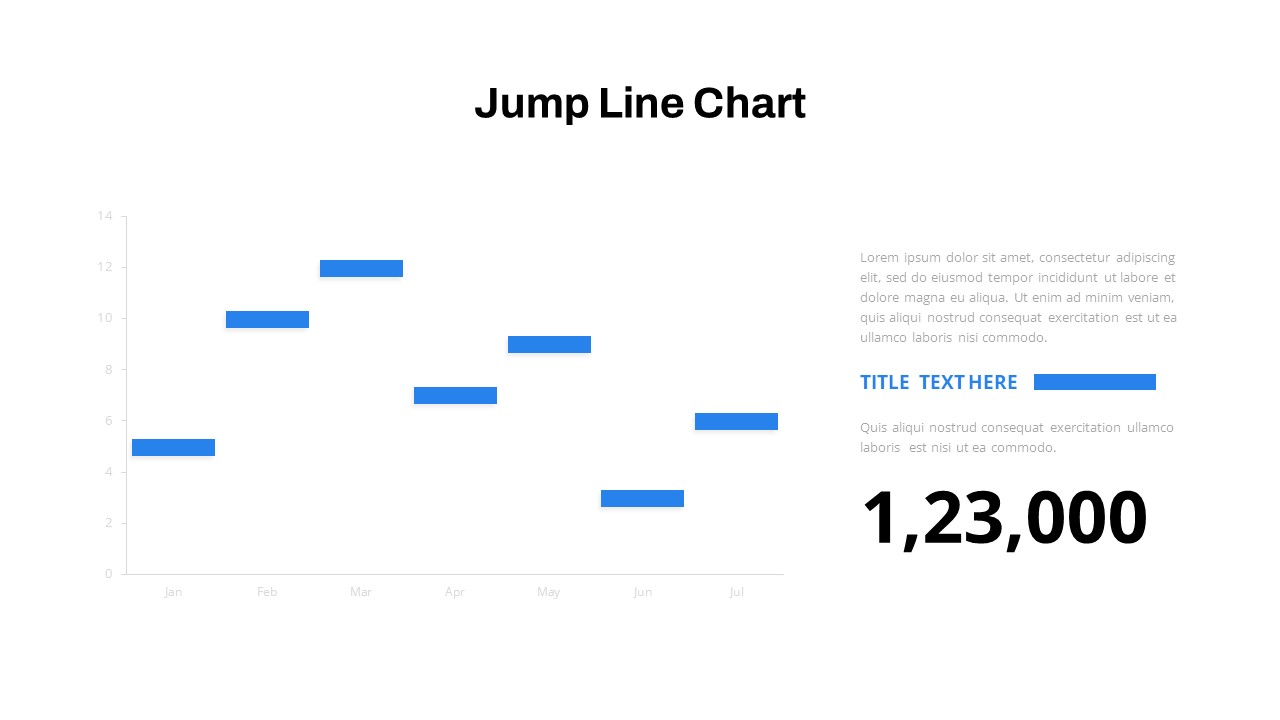
Interactive Jump Line Data Chart Template for PowerPoint & Google Slides
Comparison Chart
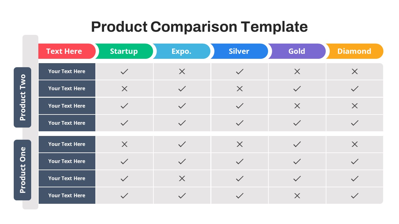
Free Versatile Product Comparison Chart Template for PowerPoint & Google Slides
Charts
Free
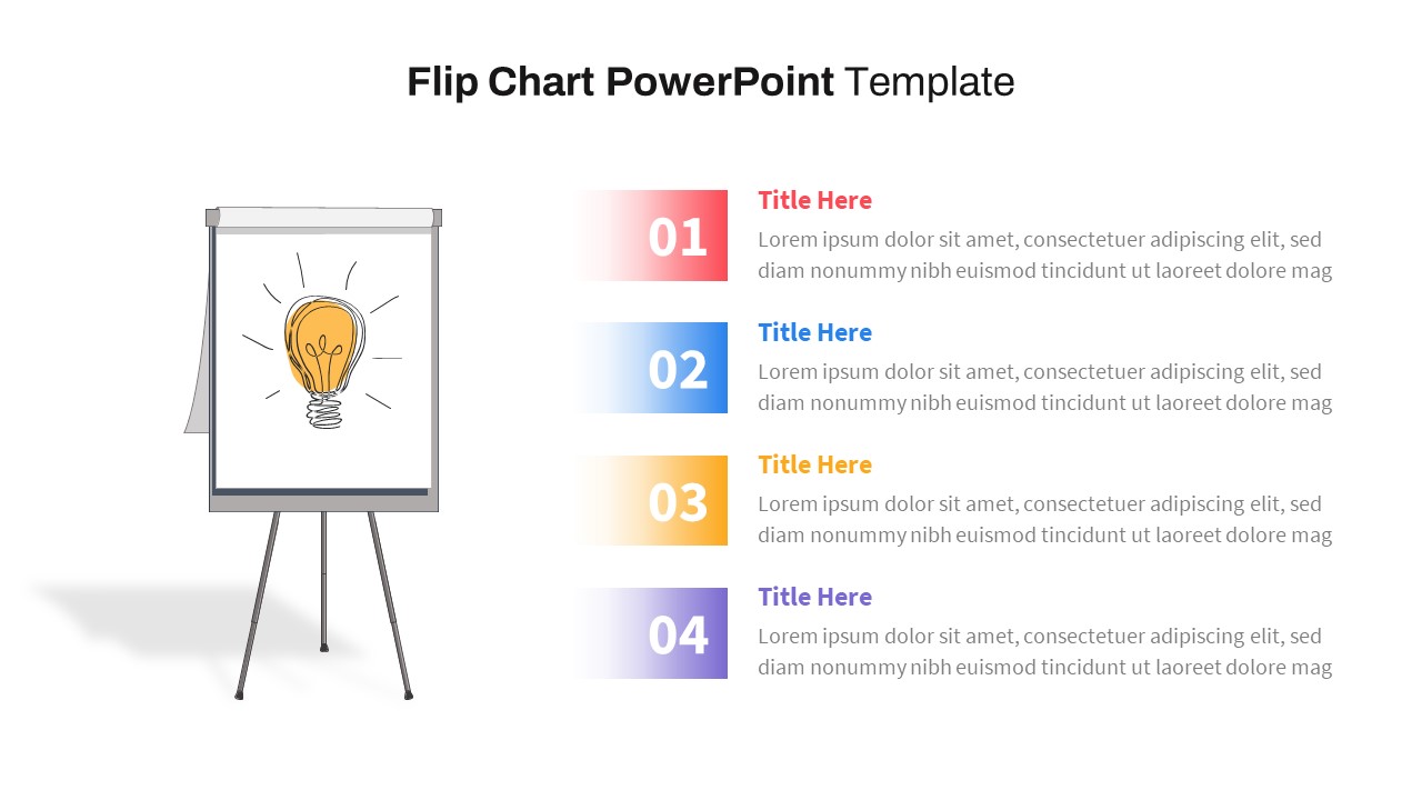
Flip Chart Four-Step List Layout Template for PowerPoint & Google Slides
Process
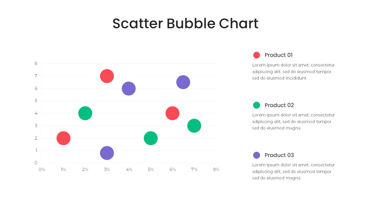
Bubble Chart Scatter, Diagram & Matrix Template for PowerPoint & Google Slides
Comparison Chart
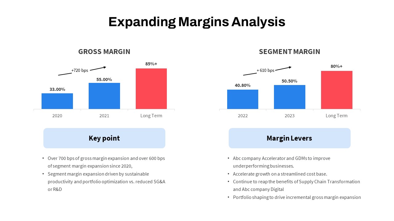
Expanding Margins Analysis Bar Chart Template for PowerPoint & Google Slides
Charts
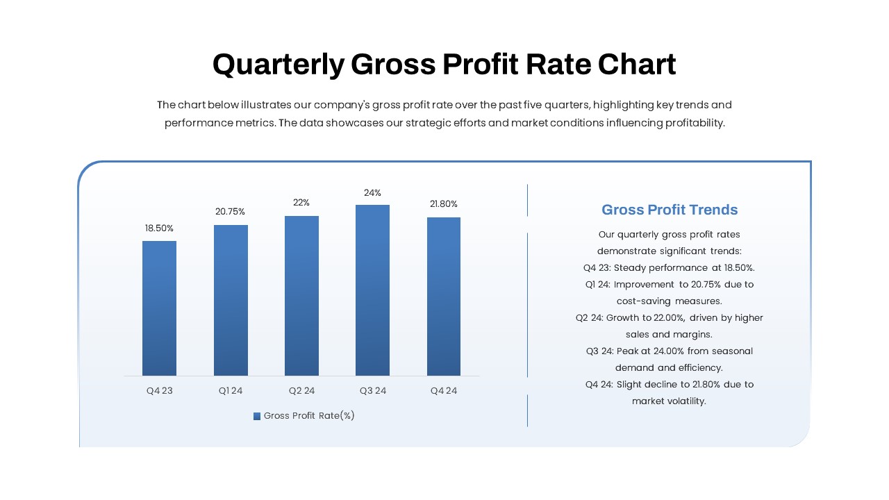
Quarterly Gross Profit Rate Chart Template for PowerPoint & Google Slides
Revenue
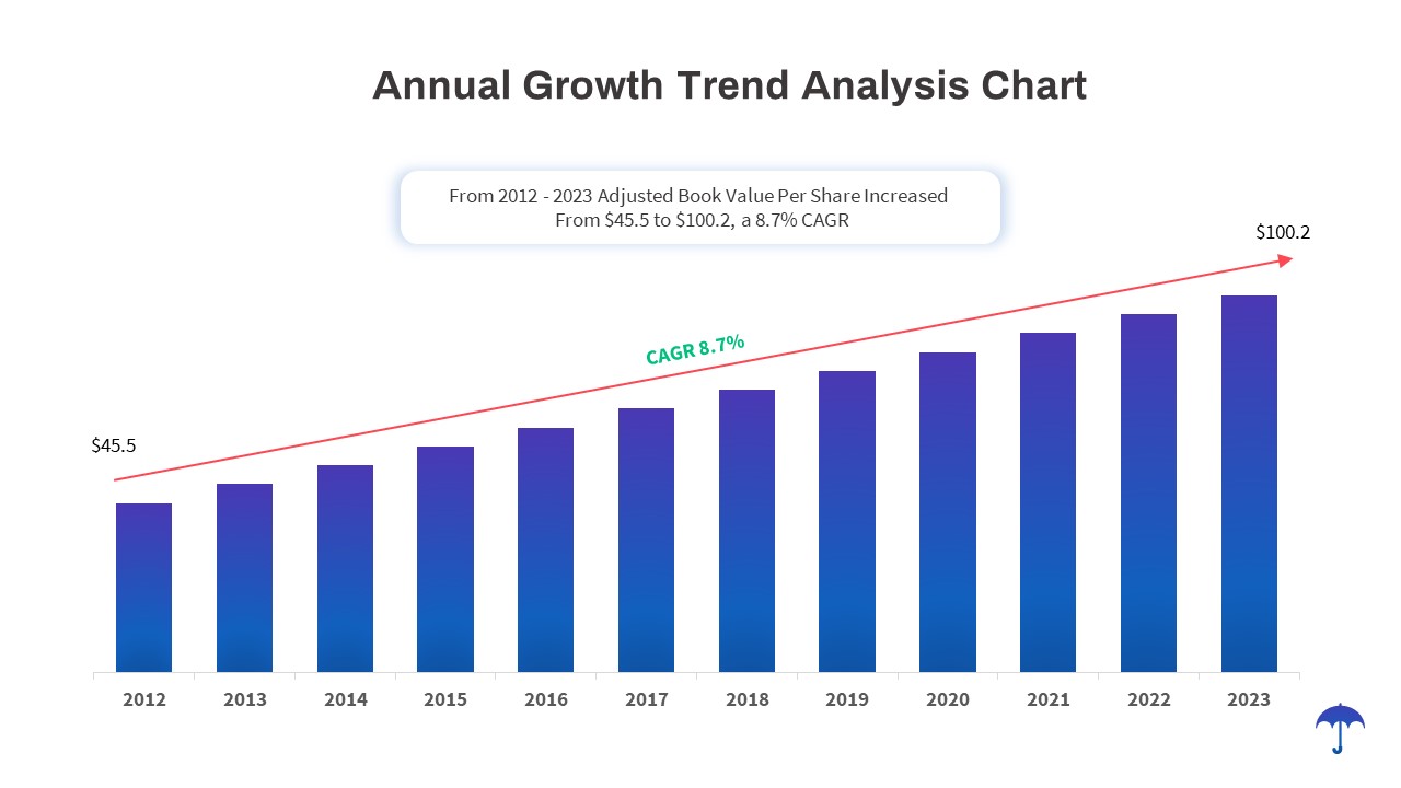
Annual Growth Trend Analysis Chart template for PowerPoint & Google Slides
Business Report
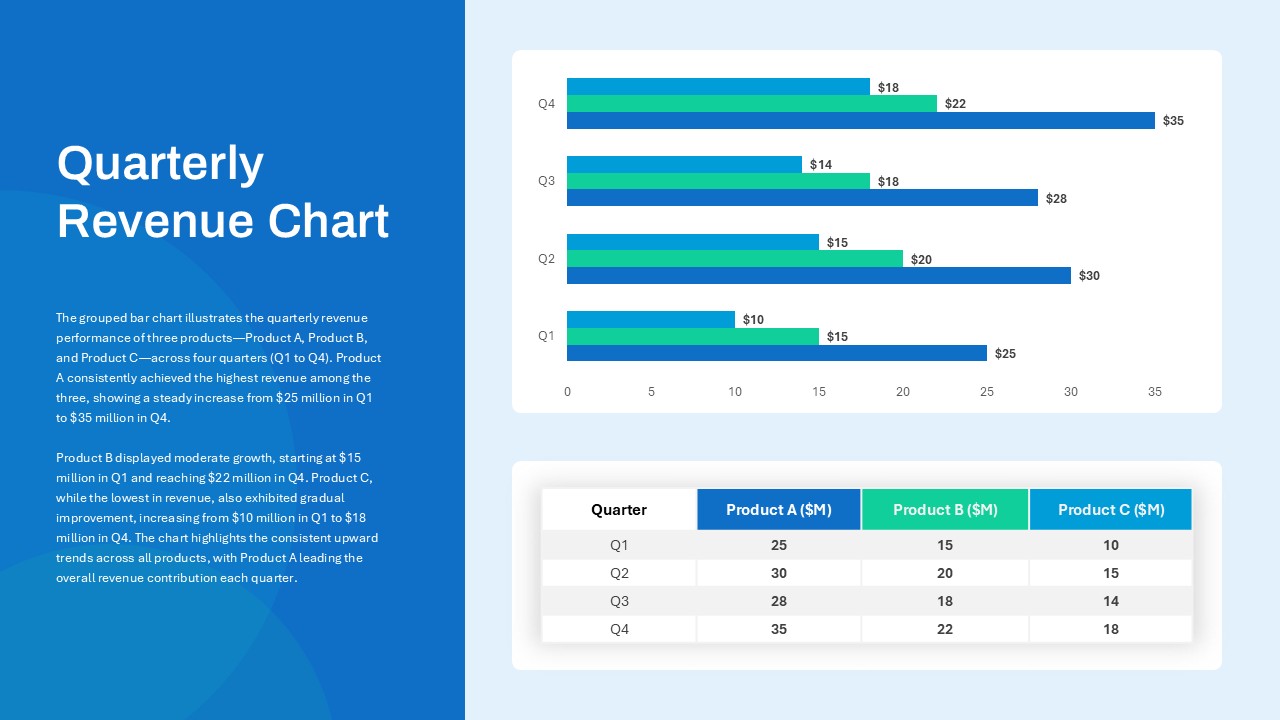
Quarterly Revenue Comparison Bar Chart Template for PowerPoint & Google Slides
Bar/Column
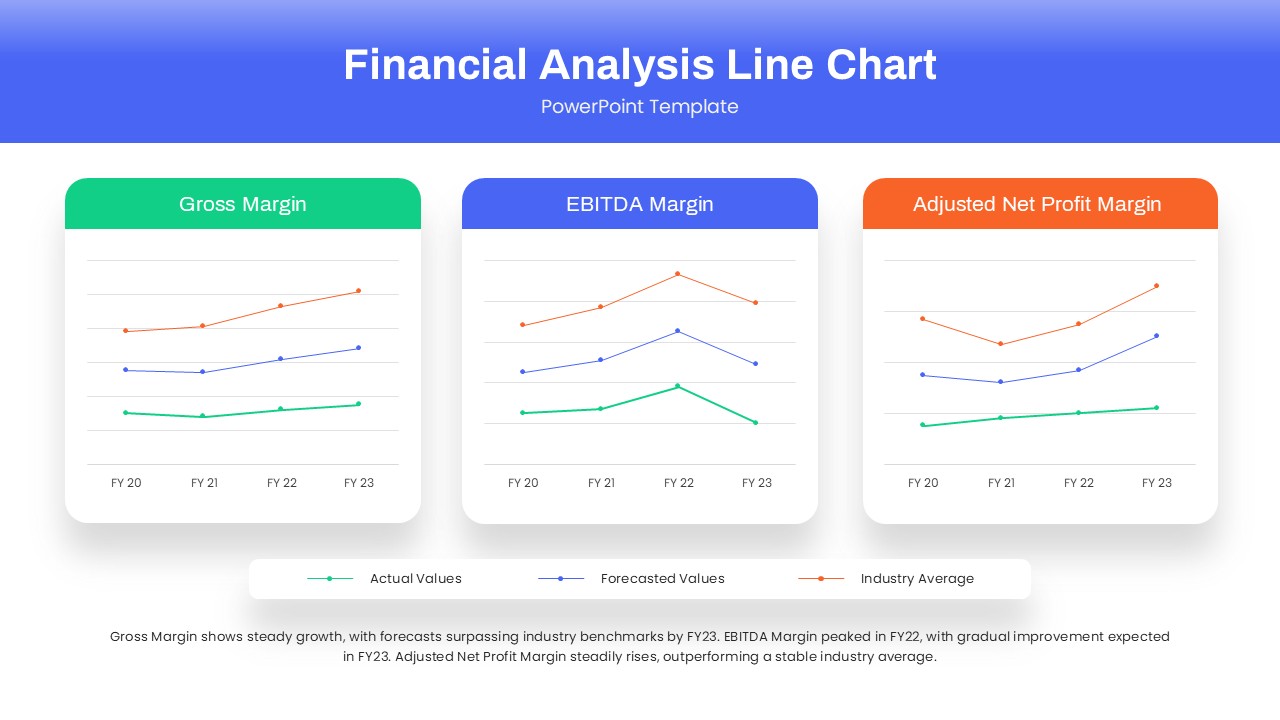
Dynamic Financial Analysis Line Chart Template for PowerPoint & Google Slides
Finance
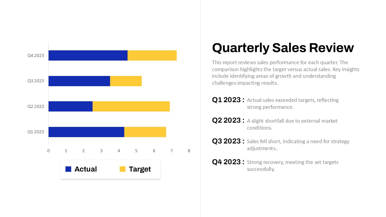
Quarterly Sales Review Bar Chart Template for PowerPoint & Google Slides
Bar/Column
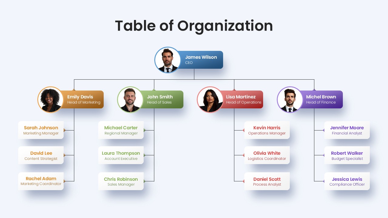
Professional Table of Organization Chart Template for PowerPoint & Google Slides
Org Chart
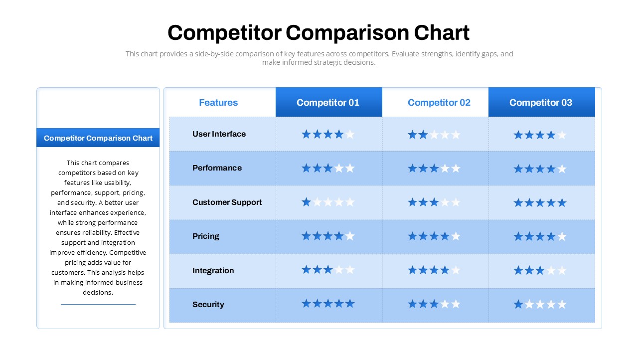
Competitor Comparison Chart Design Template for PowerPoint & Google Slides
Comparison
Two-Option Bar Chart Comparison Table Template for PowerPoint & Google Slides
Comparison
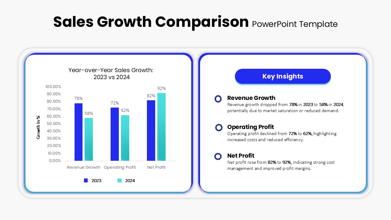
Sales Growth Comparison Chart & Table Template for PowerPoint & Google Slides
Bar/Column
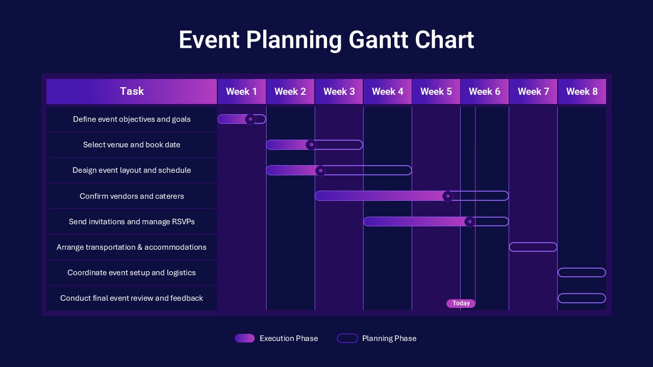
Event Planning Gantt Chart template for PowerPoint & Google Slides
Business
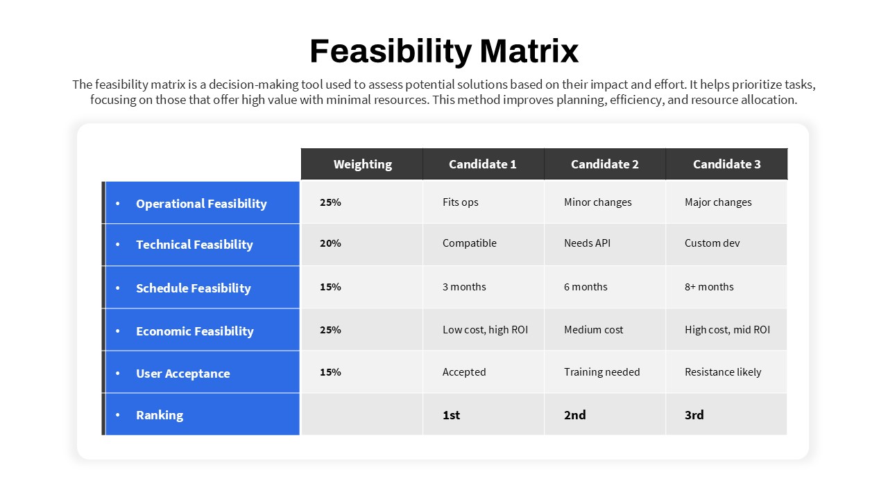
Feasibility Matrix Comparison Chart Template for PowerPoint & Google Slides
Comparison Chart
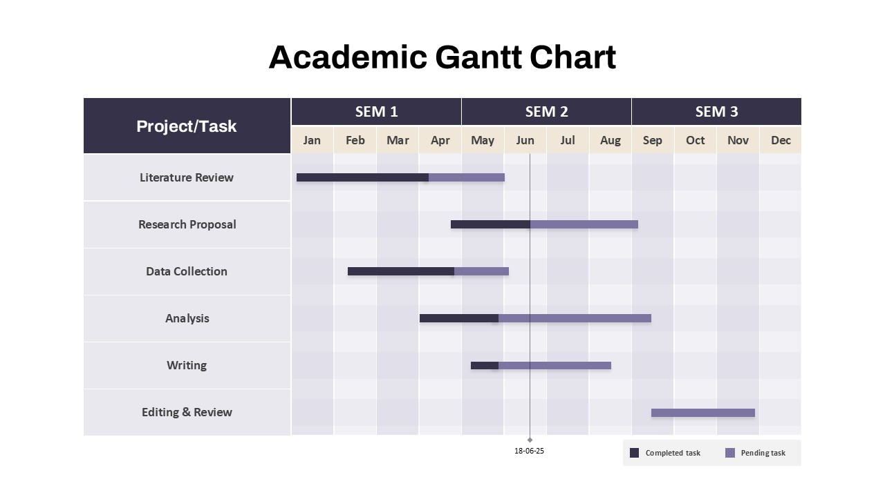
Academic Gantt Chart template for PowerPoint & Google Slides
Business
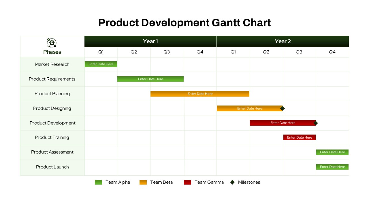
Product Development Gantt Chart template for PowerPoint & Google Slides
Gantt Chart
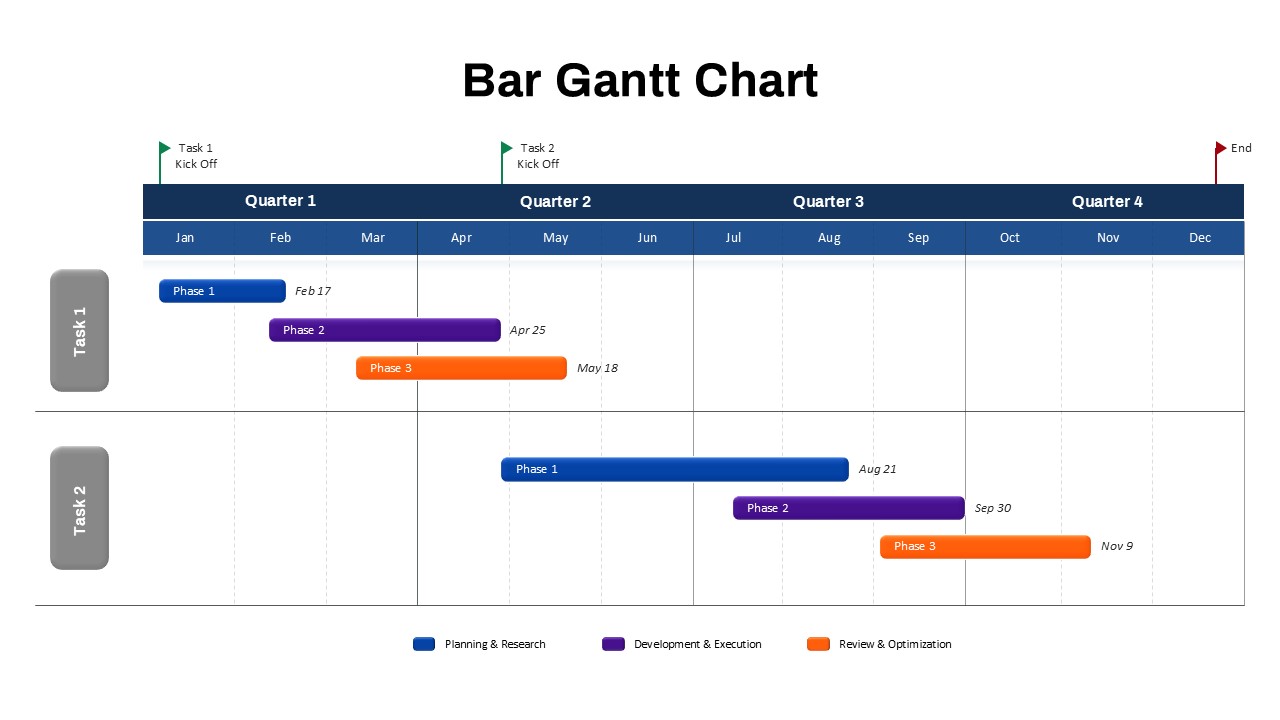
Bar Gantt Chart Template for PowerPoint & Google Slides
Gantt Chart
Hierarchical Org Chart Infographic Template for PowerPoint & Google Slides
Org Chart
Green Gantt Chart Template for PowerPoint & Google Slides
Gantt Chart
Colorful Annual Gantt Chart Project Planner Template for PowerPoint & Google Slides
Gantt Chart
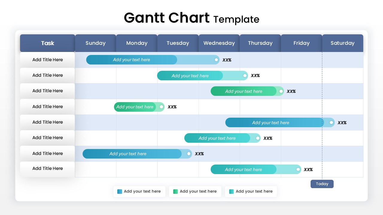
Weekly Gantt Chart with Milestones Template for PowerPoint & Google Slides
Gantt Chart
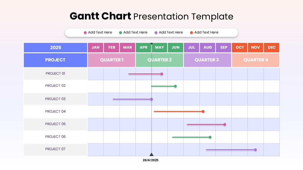
7 Step 6 Month Gantt Chart Timeline Template for PowerPoint & Google Slides
Gantt Chart
Three Segment Donut Chart KPI Infographic Template for PowerPoint & Google Slides
Pie/Donut

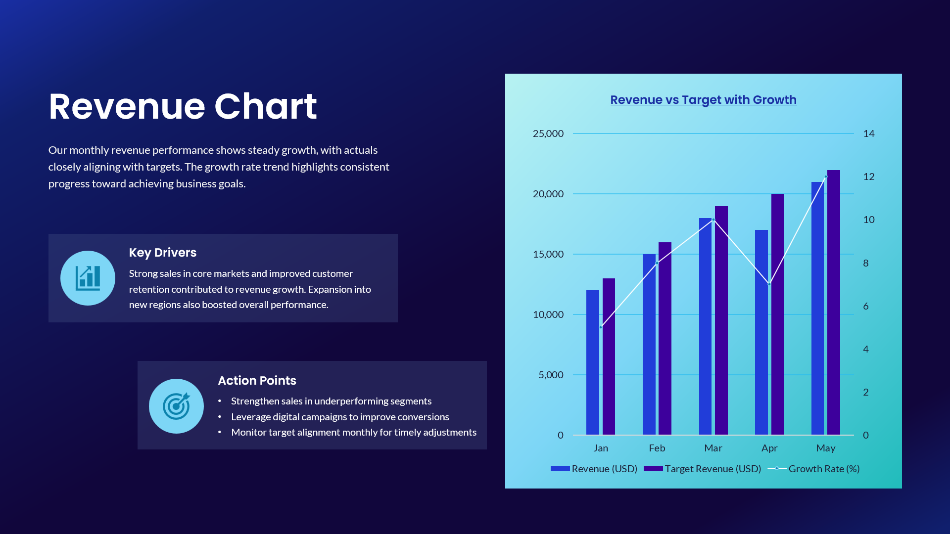
Revenue vs Target Growth Chart Template for PowerPoint & Google Slides
Revenue
Blank Comparison Chart Template for PowerPoint & Google Slides
Comparison Chart