KPI Dashboard Data Visualization Template
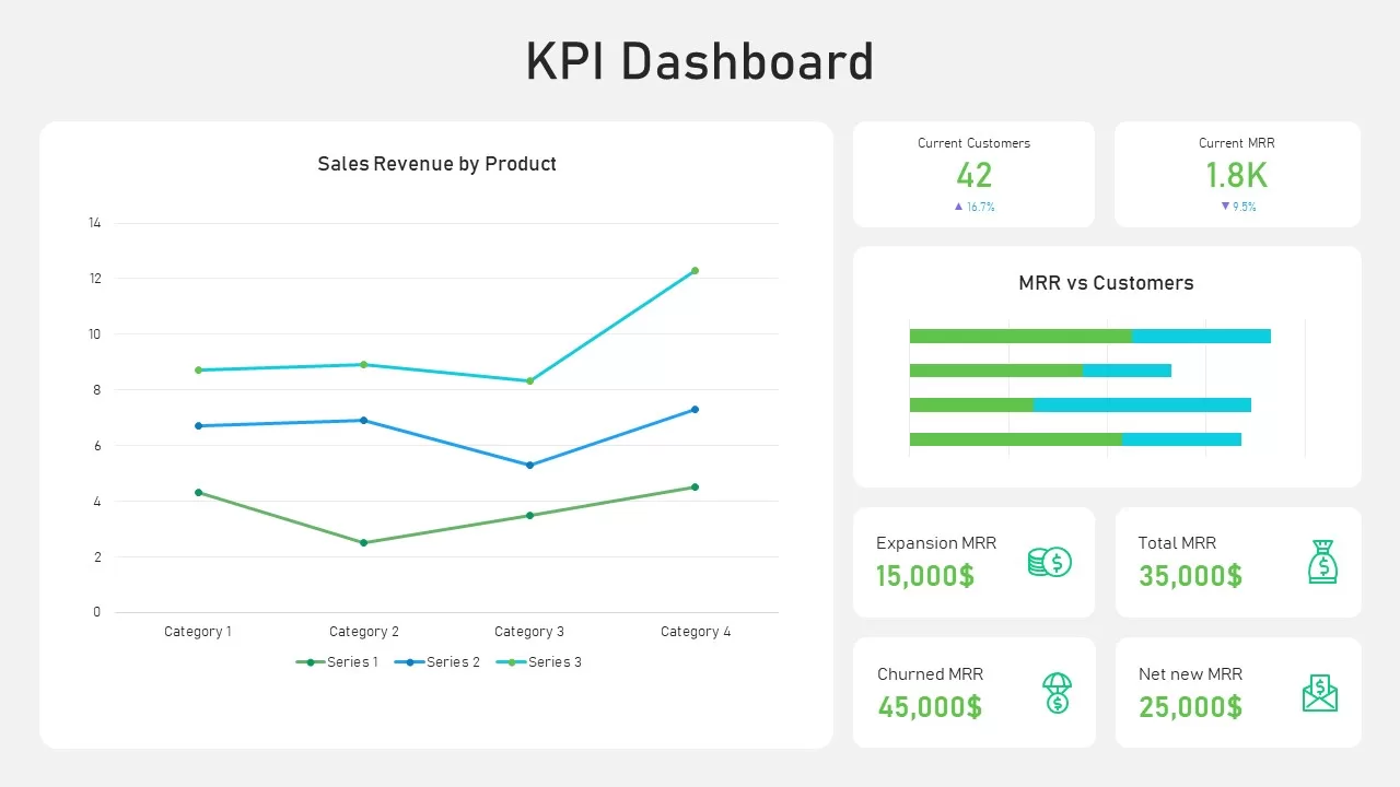
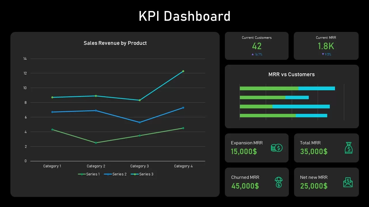
Numbers scattered across a spreadsheet rarely tell a clear story on their own. This KPI dashboard template pulls the most important metrics into one slide, giving a business a single view of performance instead of a dozen disconnected figures.
- A large line chart tracking sales revenue by product category over time
- A horizontal bar comparison weighing MRR against customer counts side by side
- KPI cards for current customers, current MRR, expansion MRR, and total MRR
- Additional cards for churned MRR and net new MRR, each with an up or down indicator
- A neutral background with soft gray panels that keep the focus on the data itself
- Green and cyan accents used specifically to flag growth trends and performance shifts
Every chart and card connects to editable data, so replacing placeholder figures with real numbers updates the visuals automatically instead of requiring manual redesign. The layout keeps consistent spacing and a clear hierarchy throughout, which cuts down on formatting time before a report or a board meeting.
Marketing analysts, product managers, and finance teams use this metrics dashboard slide for monthly reporting on subscription revenue, customer acquisition, and retention. Executives and board members use the same layout to gauge business health quickly without digging through raw data first. Beyond subscription metrics, the same KPI dashboard structure adapts to website analytics, sales targets, operational scorecards, or department-level performance summaries, and it works the same way in both PowerPoint and Google Slides.
Login to download this file

Item ID
SB02755


Related Templates

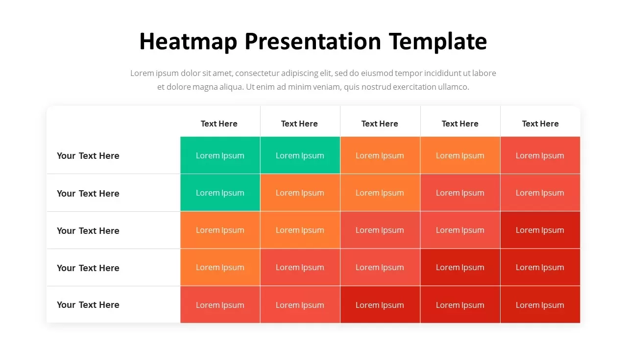
Professional Heatmap Data Visualization Template for PowerPoint & Google Slides
Infographics
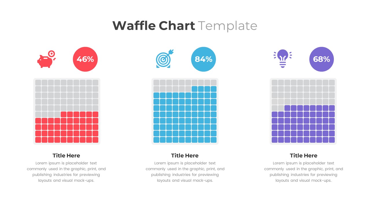
Waffle Chart Data Visualization Template for PowerPoint & Google Slides
Comparison Chart
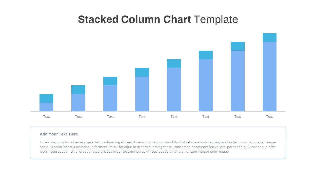
Stacked Column Chart Template
Bar/Column
Free
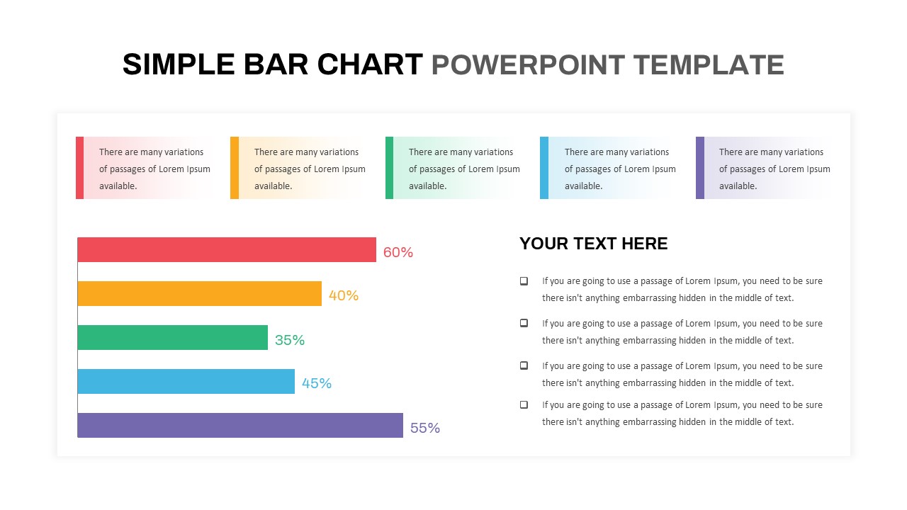
Simple Bar Chart Data Visualization Template for PowerPoint & Google Slides
Bar/Column
Segmented Scatter Chart Data Visualization Template for PowerPoint & Google Slides
Business Strategy
KPI Dashboard template for PowerPoint & Google Slides
Business Report
KPI Dashboard Infographics Template
Finance
KPI Dashboard Presentation Template
Bar/Column
Free KPI Dashboard Template for PowerPoint & Google Slides
Charts
Free
DevOps KPI Dashboard PowerPoint Template
Software Development
Digital Marketing KPI Dashboard Template
Business Report
4DX Scoreboard Dashboard for PowerPoint & Google Slides
Business Strategy
Patient Satisfaction KPI Dashboard
Business
3D Cylinder Bar Chart Visualization Template for PowerPoint
Bar/Column
Balance Scale Metaphor PowerPoint Template
Comparison
Professional Risk Heat Map Visualization Template for PowerPoint & Google Slides
Risk Management
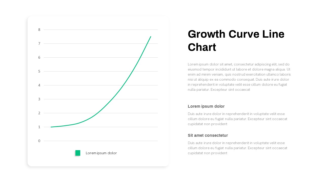
Growth Curve Line Chart Visualization Template for PowerPoint & Google Slides
Charts
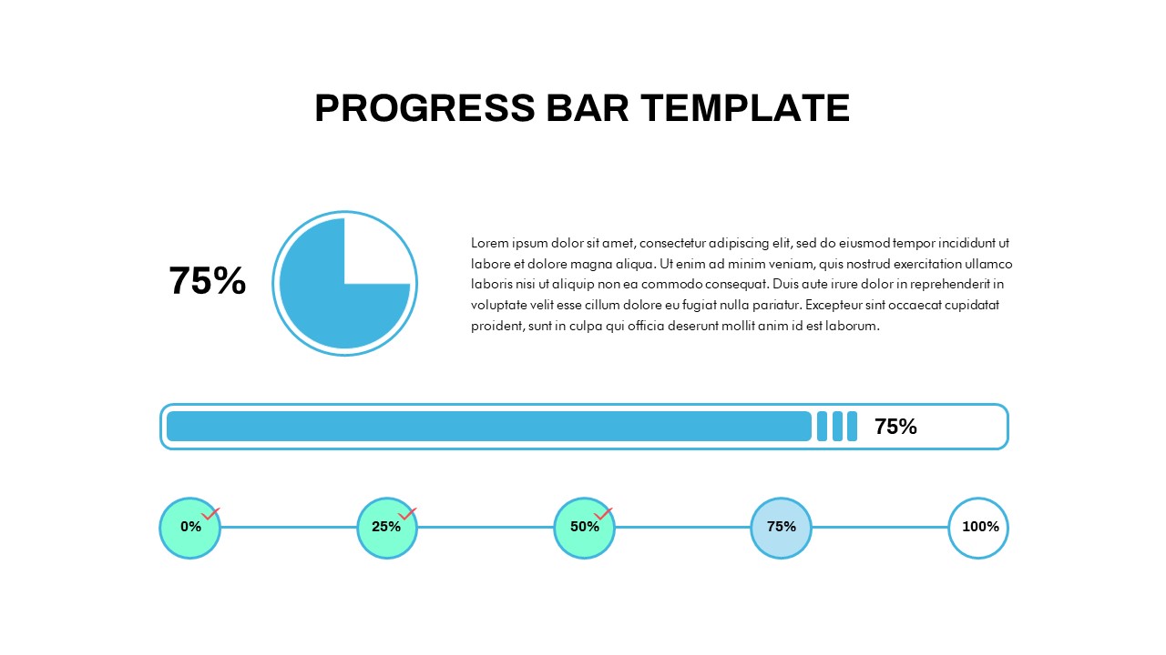
Progress Bar and Milestone Visualization Template for PowerPoint & Google Slides
Timeline
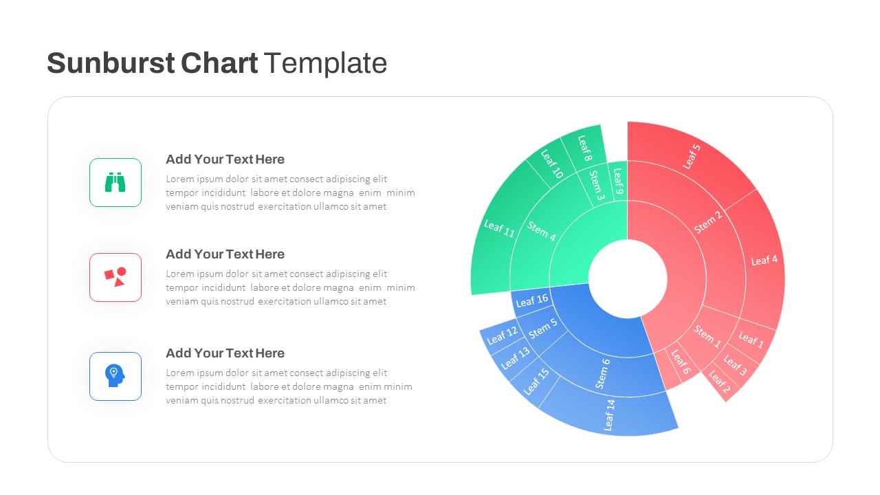
Dynamic Sunburst Chart Visualization Template for PowerPoint & Google Slides
Charts
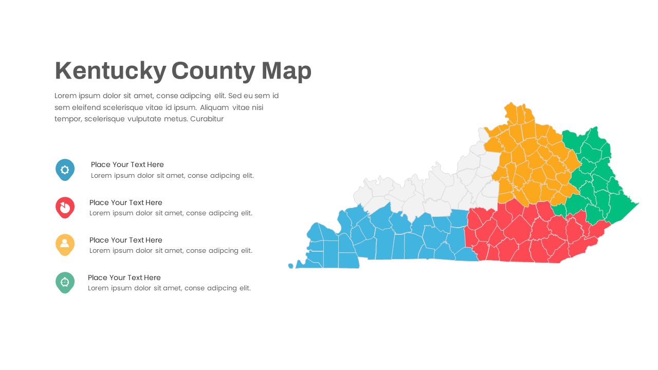
Kentucky County Map Visualization Template for PowerPoint & Google Slides
World Maps