Stacked Area Chart with Financial Highlights for PowerPoint & Google Slides


Description
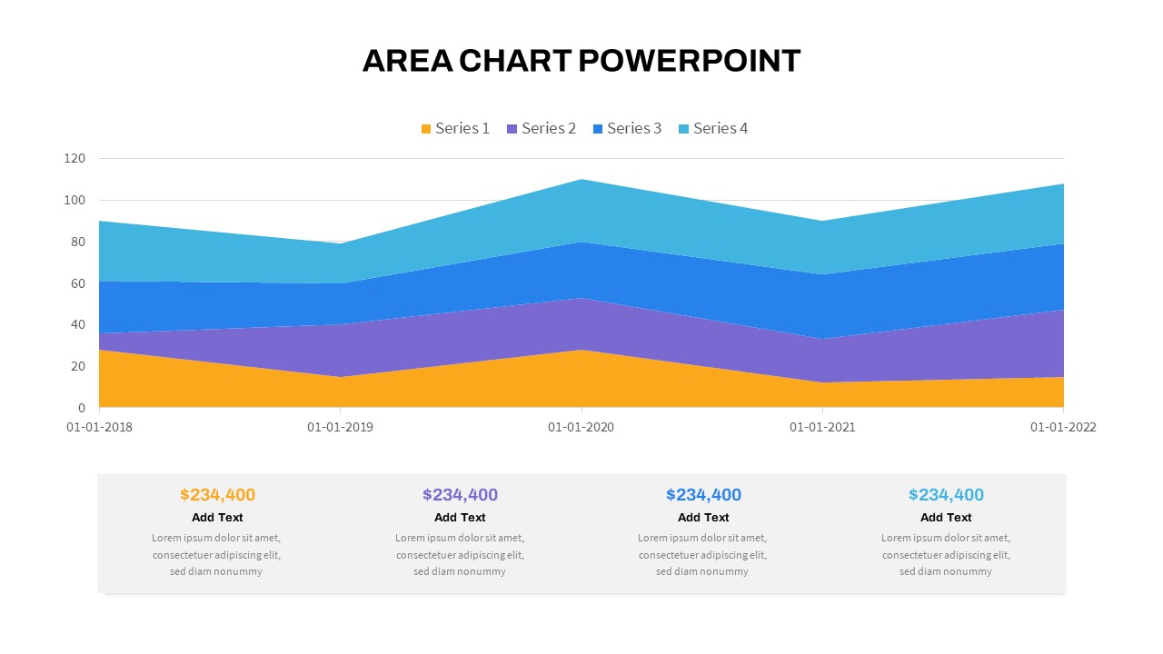
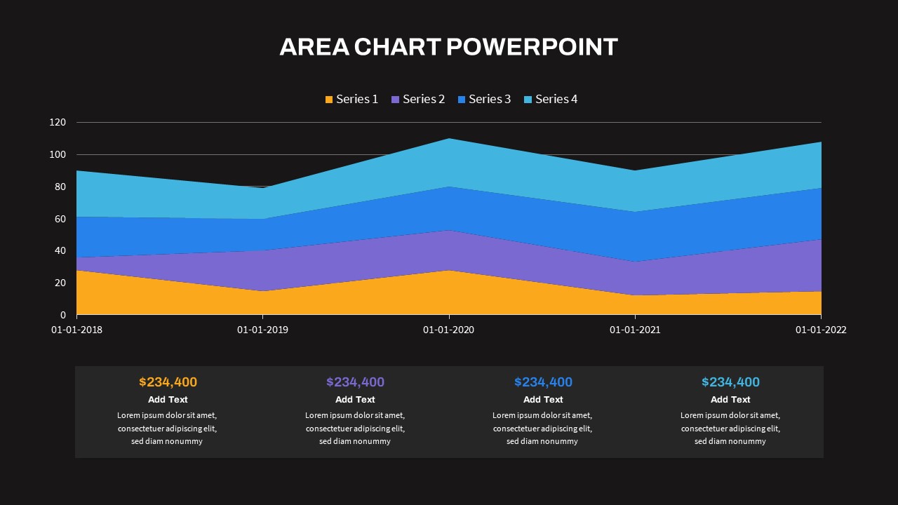
This area chart slide offers a dynamic and visual way to showcase multi-series data trends over time. Ideal for comparing key metrics year-over-year, the design features a stacked layout with four series color-coded in orange, purple, blue, and cyan. The timeline spans from 2018 to 2022, allowing clear insight into progression and variance between categories.
Beneath the graph, a clean grid of callout boxes displays financial summaries or key highlights—perfect for emphasizing revenue, growth, or performance KPIs. Each figure is bolded and paired with placeholder text for supportive commentary.
Whether you’re presenting in finance, sales, or operations, this template simplifies complex data into an accessible and impactful story. Fully customizable in PowerPoint and Google Slides, it enables effortless data replacement, styling, and adaptation to your brand’s color palette.
Who is it for
This slide suits financial analysts, business managers, sales leaders, and marketing teams looking to present multi-year trends with supporting quantitative insights.
Other Uses
Can also be repurposed for budget reviews, investment reports, market share analysis, KPI dashboards, or project performance summaries.
Login to download this file

Item ID
SB04159
Related Templates

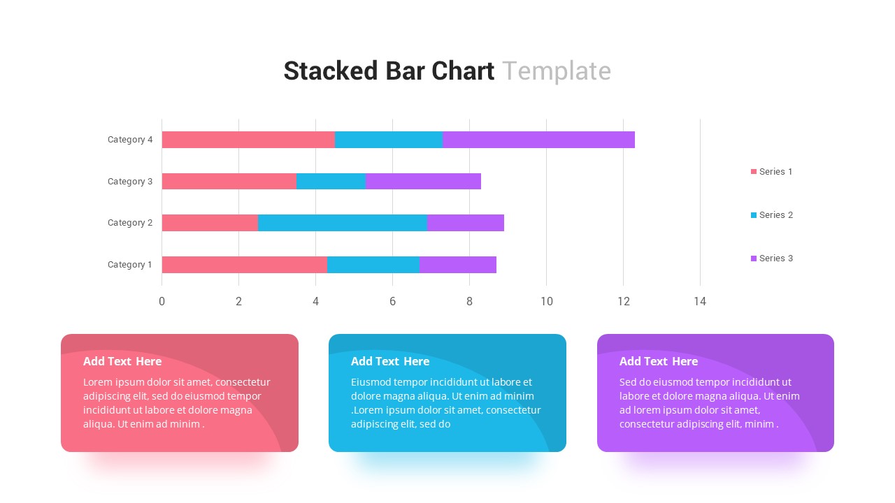
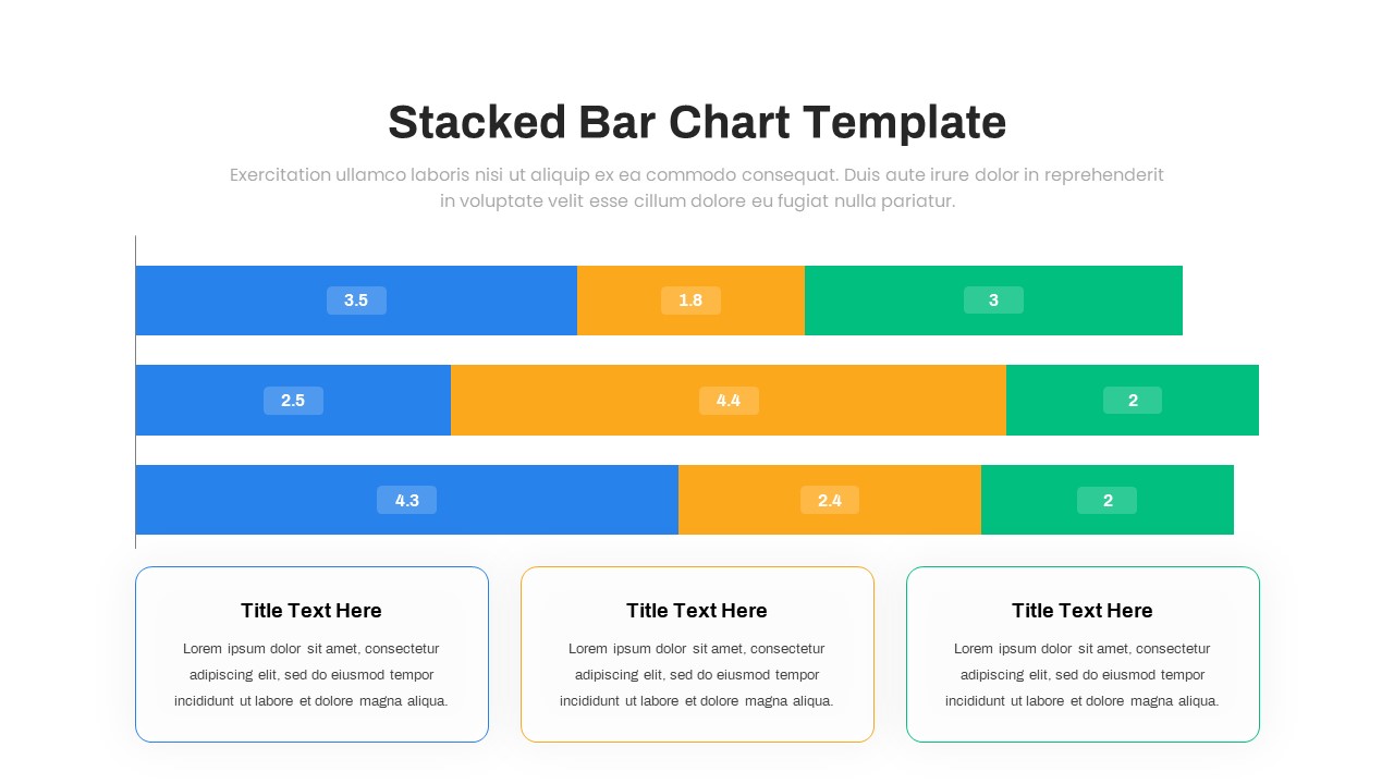
Stacked Bar Chart for PowerPoint & Google Slides
Bar/Column
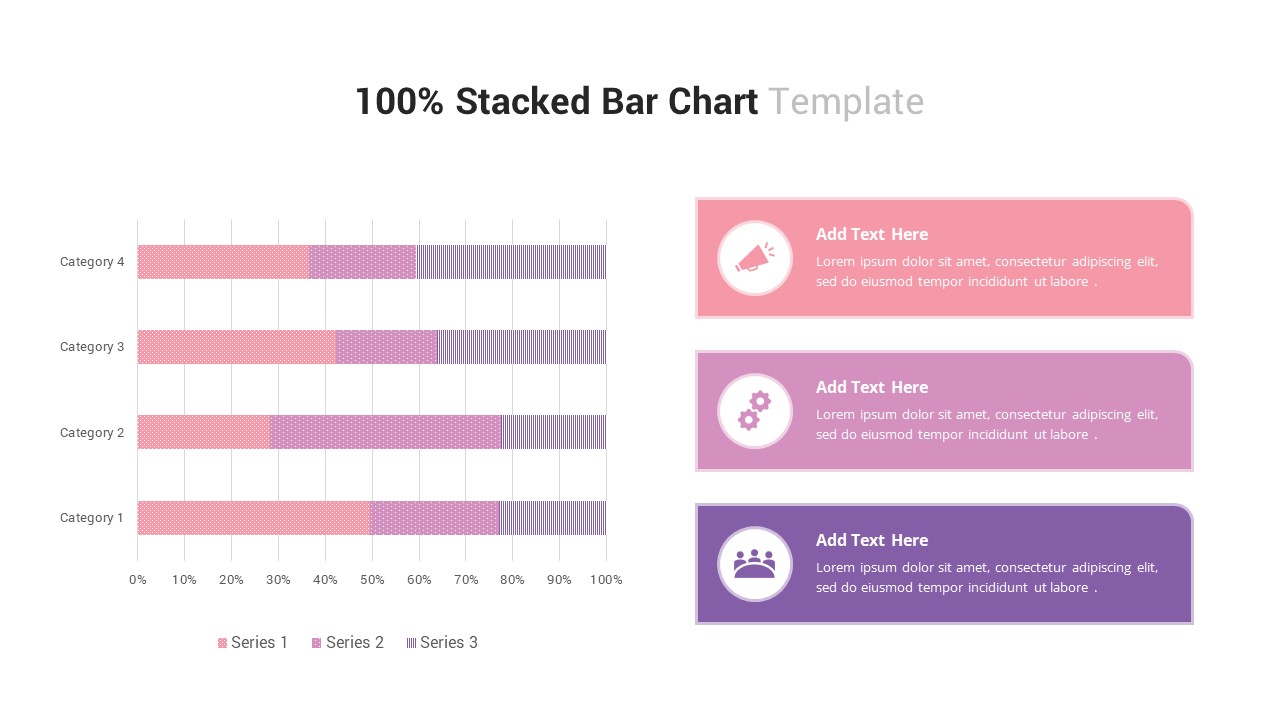
100% Stacked Bar Chart for PowerPoint & Google Slides
Bar/Column
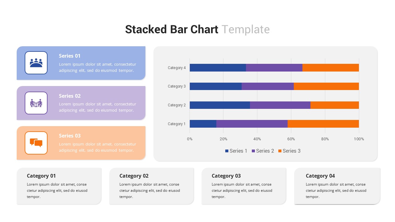
Multi-Series Stacked Bar Chart Template for PowerPoint & Google Slides
Bar/Column
Free Stacked Column Chart Data Visualization Template for PowerPoint & Google Slides
Bar/Column
Free
Animated Stacked Bar Chart Template for PowerPoint & Google Slides
Bar/Column
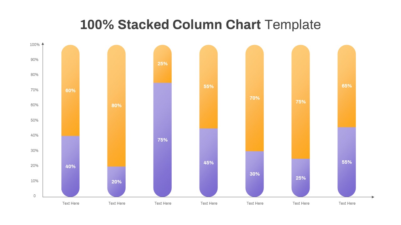
Professional 100% Stacked Column Chart Template for PowerPoint & Google Slides
Bar/Column
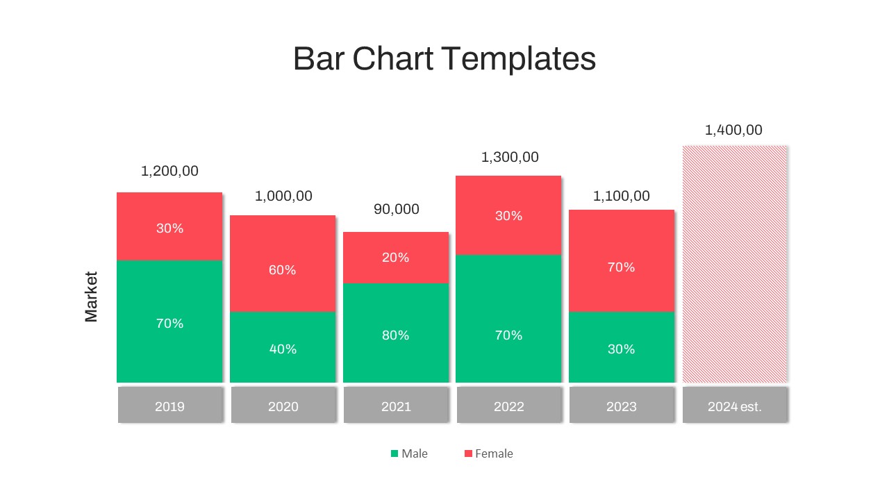
Year-over-Year Stacked Gender Bar Chart Template for PowerPoint & Google Slides
Bar/Column
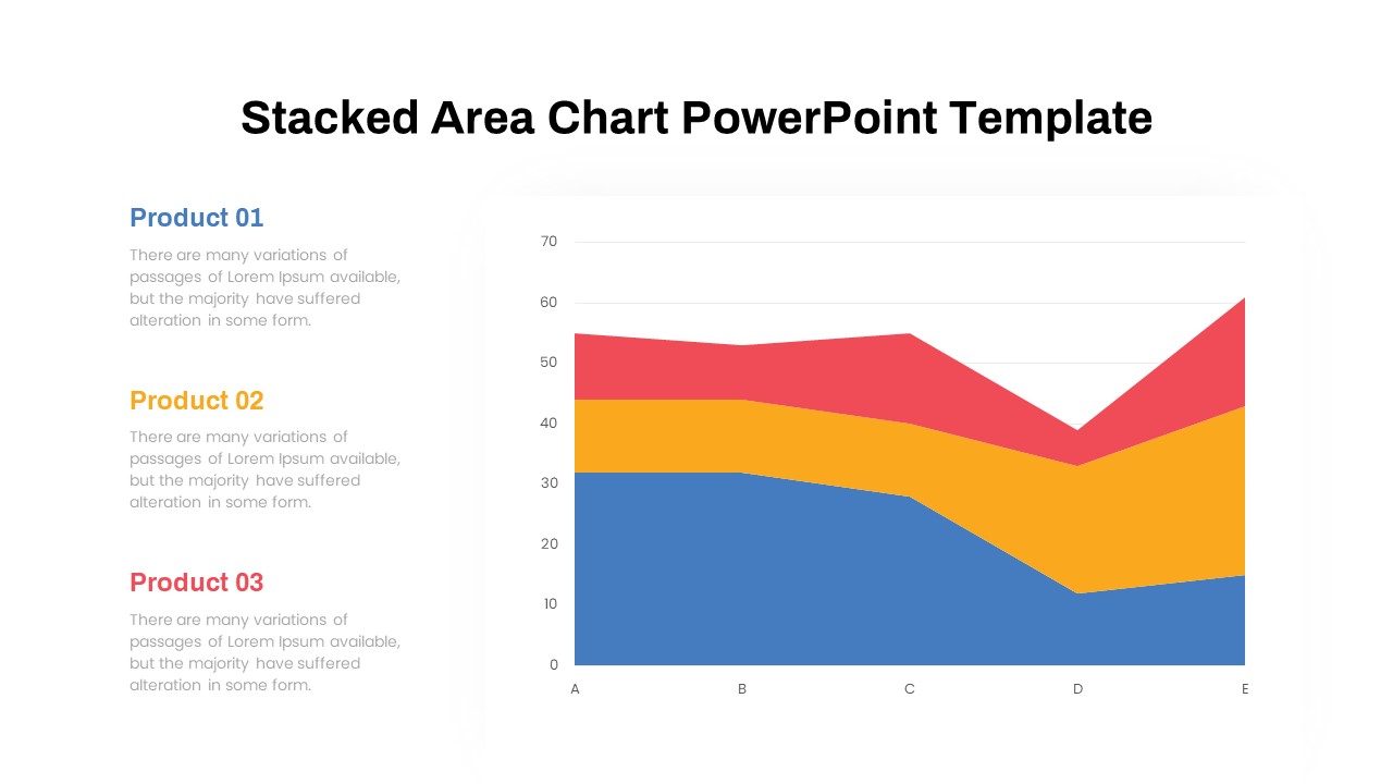
Dynamic Three-Series Stacked Area Chart Template for PowerPoint & Google Slides
Comparison Chart
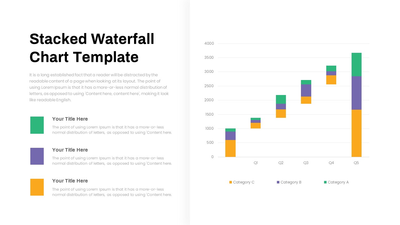
Stacked Waterfall Chart Template for PowerPoint & Google Slides
Bar/Column
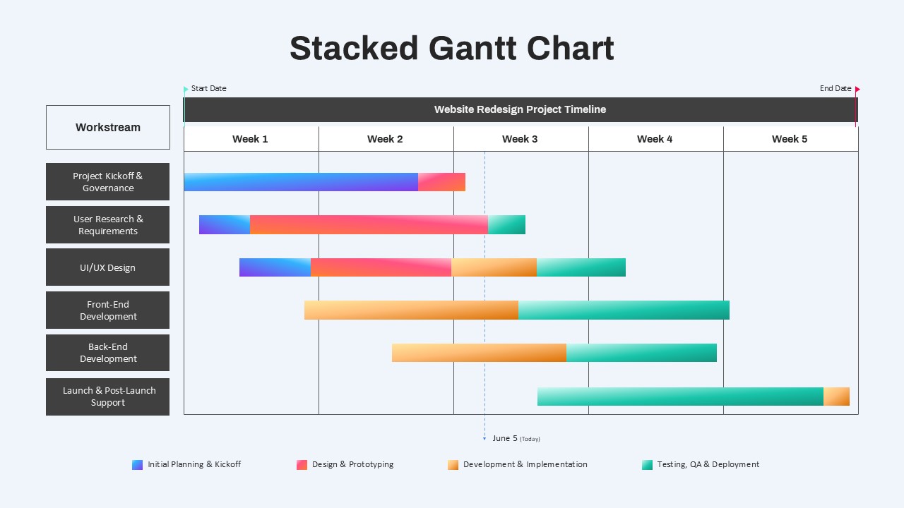
Stacked Gantt Chart Timeline Slide Template for PowerPoint & Google Slides
Gantt Chart

Smartphone Feature Highlights template for PowerPoint & Google Slides
Business
Five-Block Section Feature Highlights Template for PowerPoint & Google Slides
Comparison
About Us Slide with Feature Highlights Template for PowerPoint & Google Slides
Marketing
About Us Slide with Icon Highlights Template for PowerPoint & Google Slides
Business
Horizontal Smartphone Feature Highlights Template for PowerPoint & Google Slides
Graphics
Company Highlights Profile Presentation Template for PowerPoint & Google Slides
Business
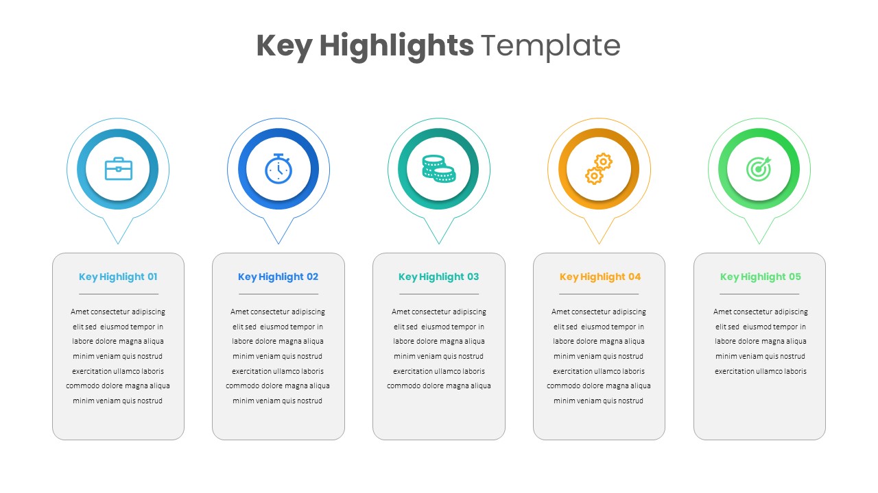
Professional Key Highlights Layout Template for PowerPoint & Google Slides
Business
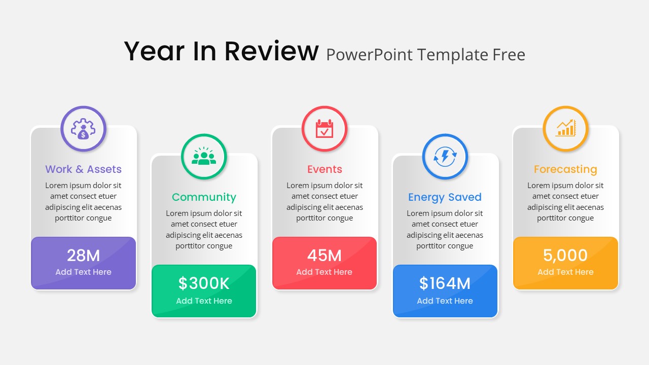
Year in Review KPI Highlights Slide for PowerPoint & Google Slides
Business Report
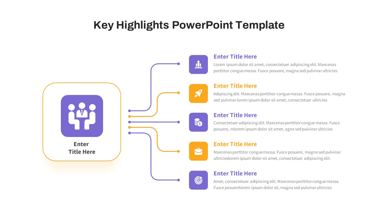
Free Key Highlights Business Summary Slide for PowerPoint & Google Slides
Accomplishment
Free
Wavy Timeline with Image Highlights Template for PowerPoint & Google Slides
Timeline
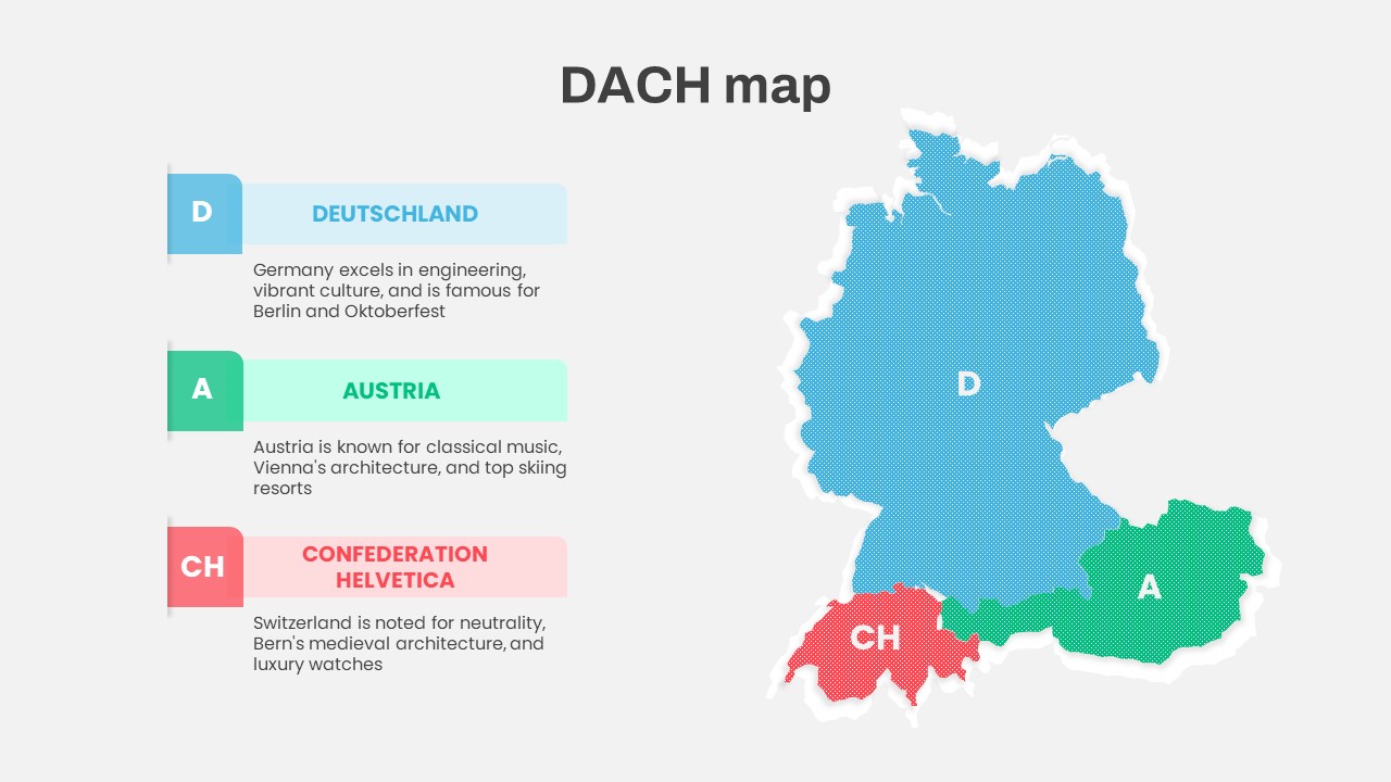
DACH Region Map with Country Highlights Template for PowerPoint & Google Slides
Maps
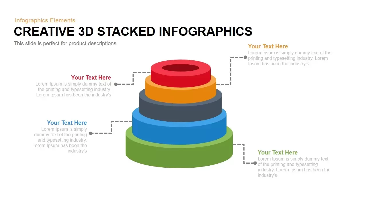
3D Stacked Infographic Layers Data Template for PowerPoint & Google Slides
Pyramid

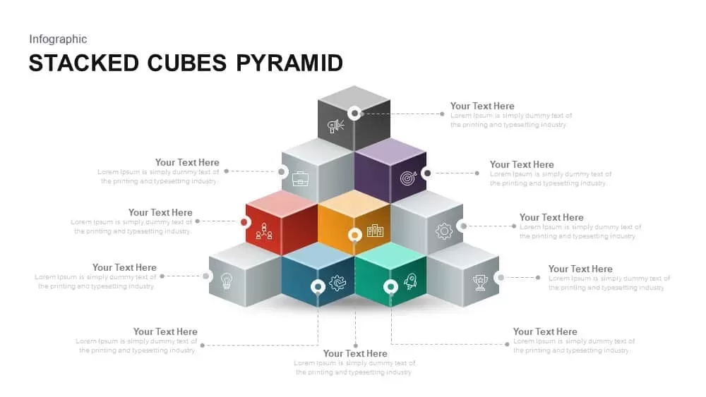
Stacked Cubes Pyramid Infographic Template for PowerPoint & Google Slides
Pyramid
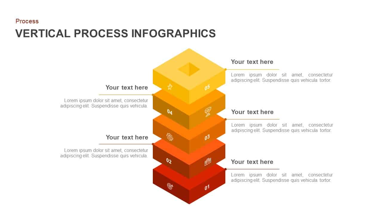
Vertical Stacked Process Infographic Template for PowerPoint & Google Slides
Process
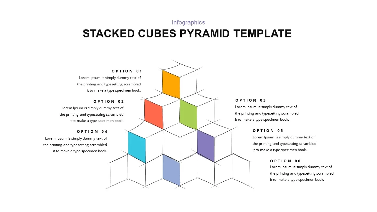
Stacked Cubes Pyramid Six-Option Diagram Template for PowerPoint & Google Slides
Pyramid
Elegant Stacked Photo Collage Layout Template for PowerPoint & Google Slides
Graphics
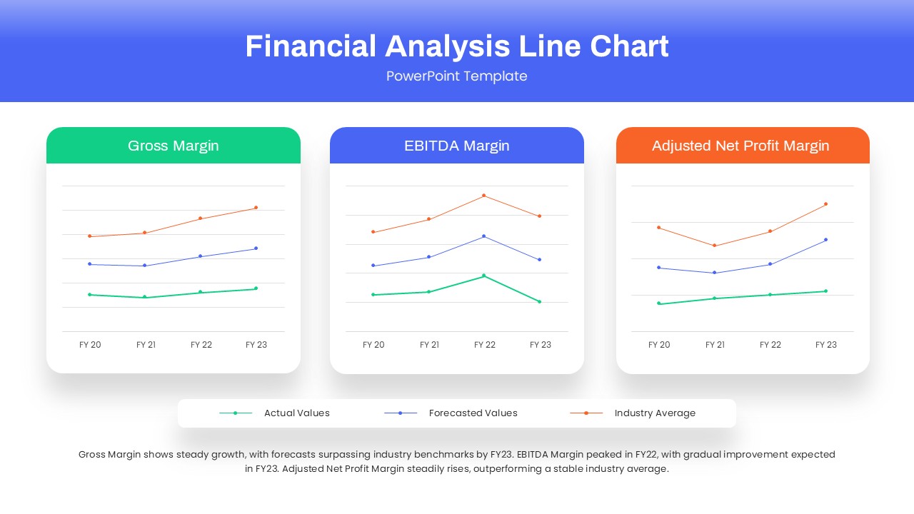
Dynamic Financial Analysis Line Chart Template for PowerPoint & Google Slides
Finance
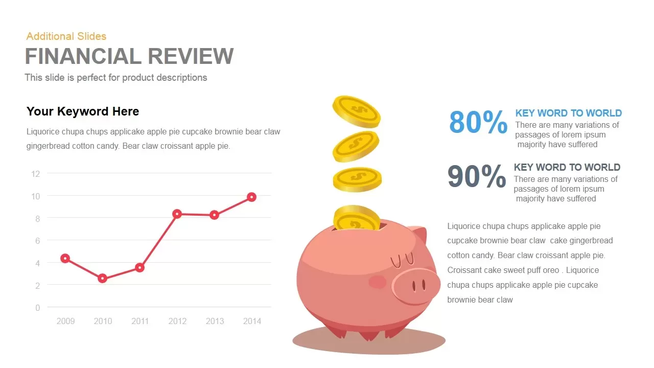
Financial Review template for PowerPoint & Google Slides
Finance

Money Metaphor Financial Overview Template for PowerPoint & Google Slides
Finance
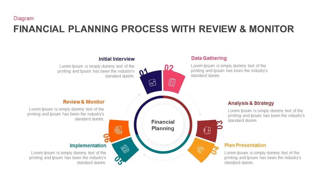
Financial Planning Circular Process Template for PowerPoint & Google Slides
Process
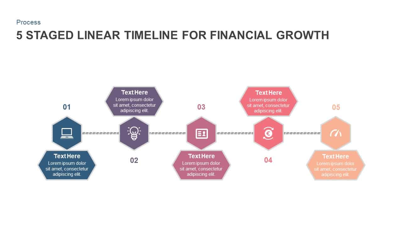
5-Stage Financial Growth Timeline Template for PowerPoint & Google Slides
Timeline
Financial Agreement Signing Flow Diagram Template for PowerPoint & Google Slides
Process
Financial Report Metaphor Illustration Template for PowerPoint & Google Slides
Finance
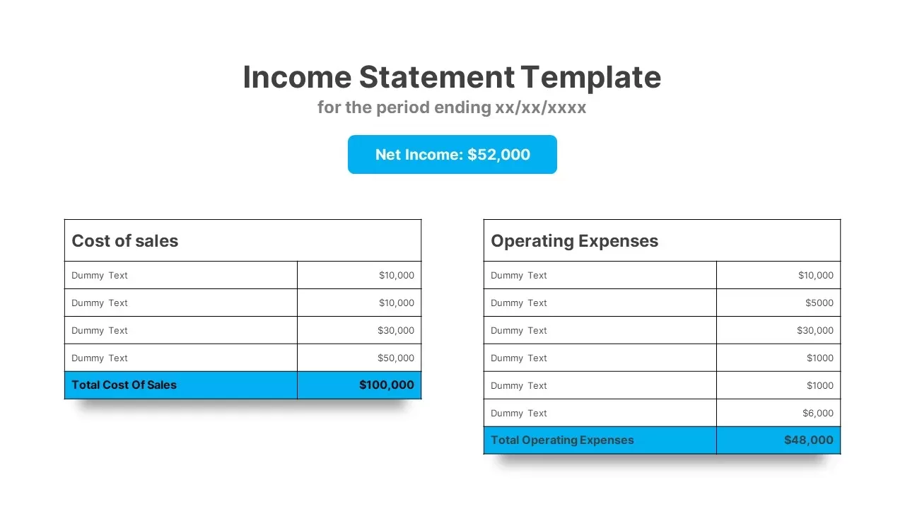
Income Statement Financial Reporting Template for PowerPoint & Google Slides
Finance
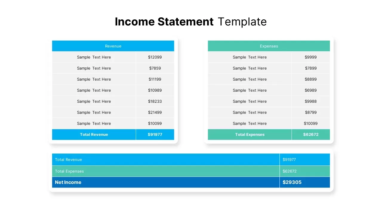
Income Statement Financial Summary Template for PowerPoint & Google Slides
Business Report
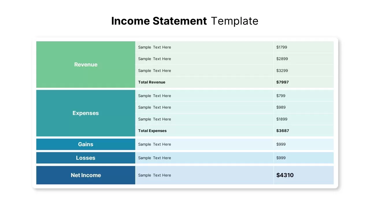
Income Statement Financial Report Template for PowerPoint & Google Slides
Business Report
Corporate Financial Auditing Service Template for PowerPoint & Google Slides
Finance

Financial Advisory Service Pitch Deck Template for PowerPoint & Google Slides
Finance
Financial Institutions Presentation Template for PowerPoint & Google Slides
Company Profile
Financial Consulting Company Profile Template for PowerPoint & Google Slides
Finance

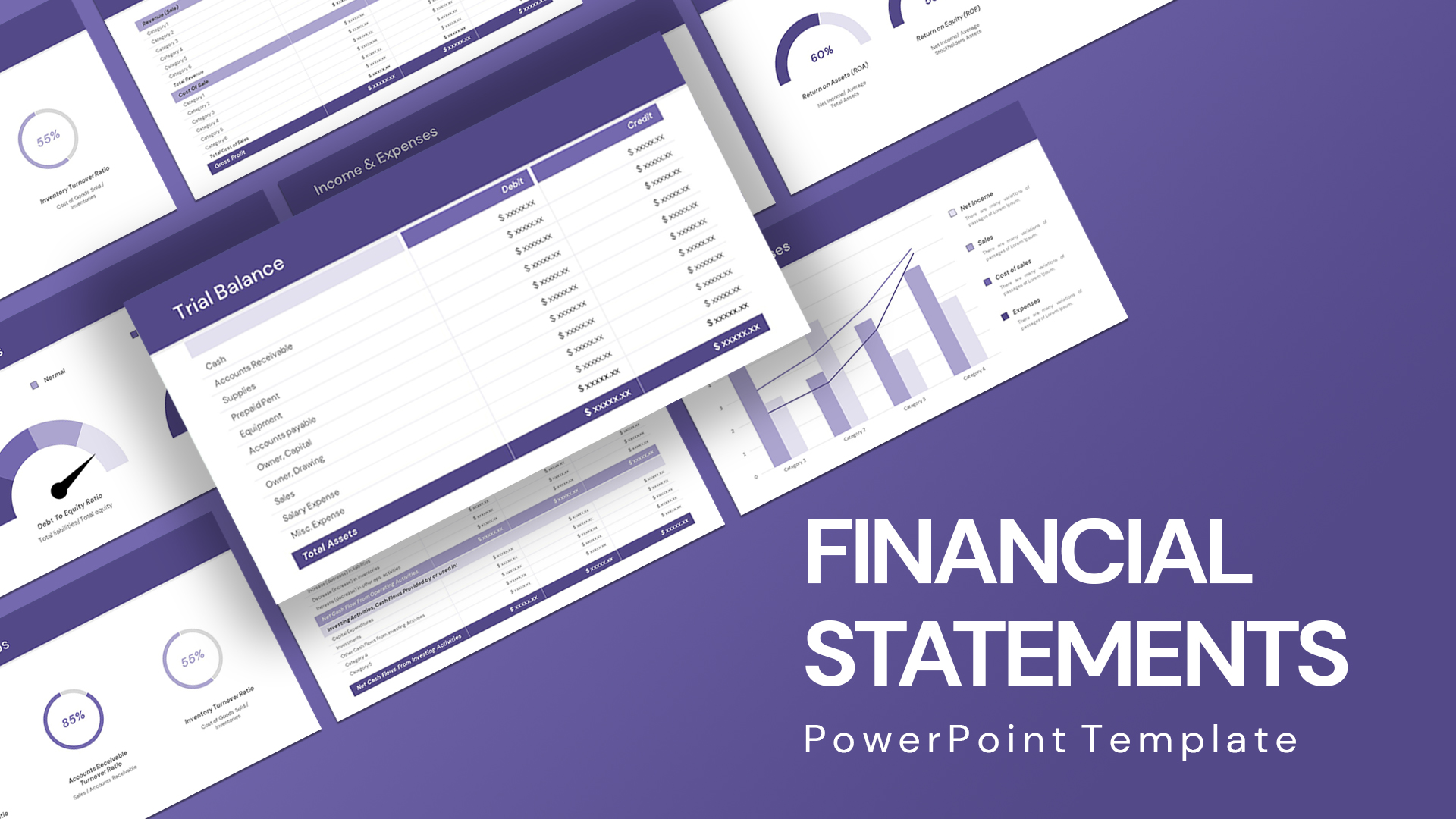
Comprehensive Financial Statements Template for PowerPoint & Google Slides
Finance
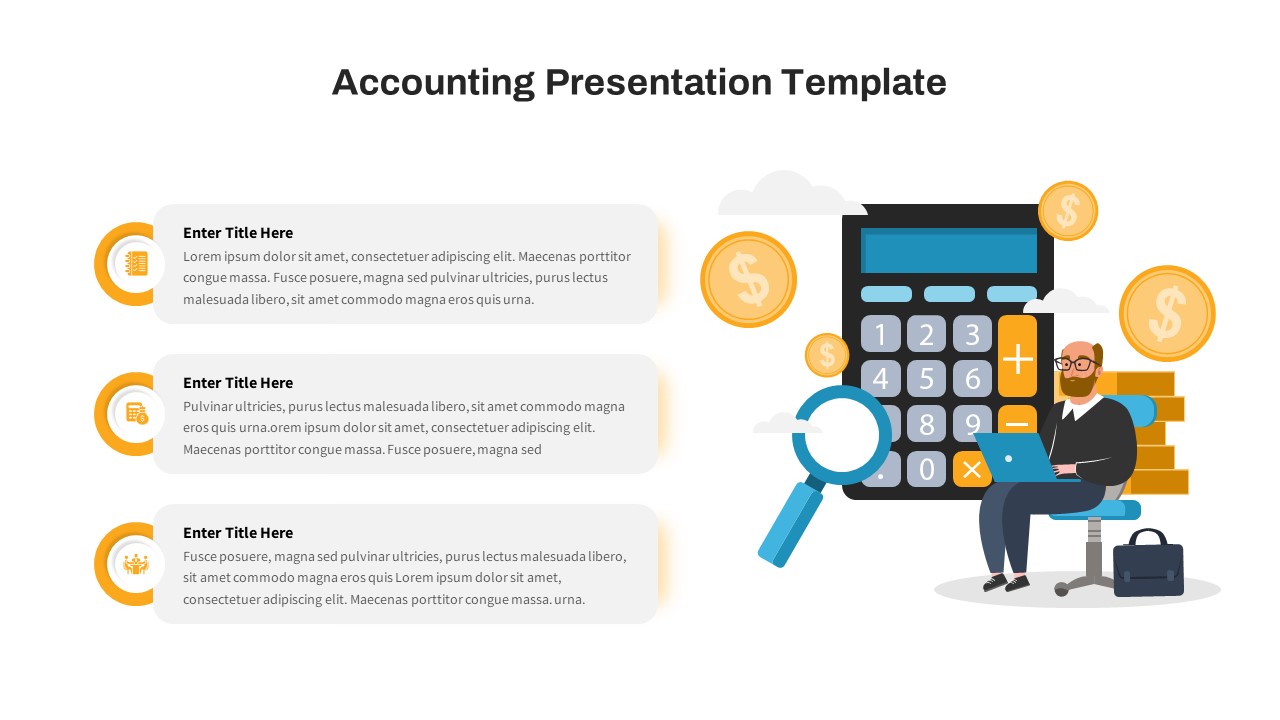
Free Financial Accounting Overview Slide for PowerPoint & Google Slides
Accounting
Free
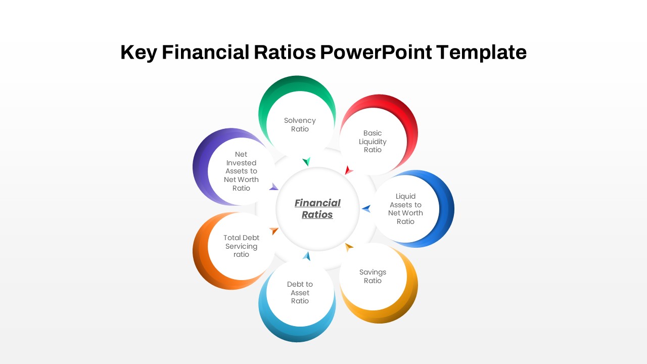
Circular Financial Ratios Infographic Template for PowerPoint & Google Slides
Finance
Free Monthly Report PowerPoint Template for PowerPoint & Google Slides
Business Report
Free
Sunk Costs Financial Concept Diagram Template for PowerPoint & Google Slides
Finance
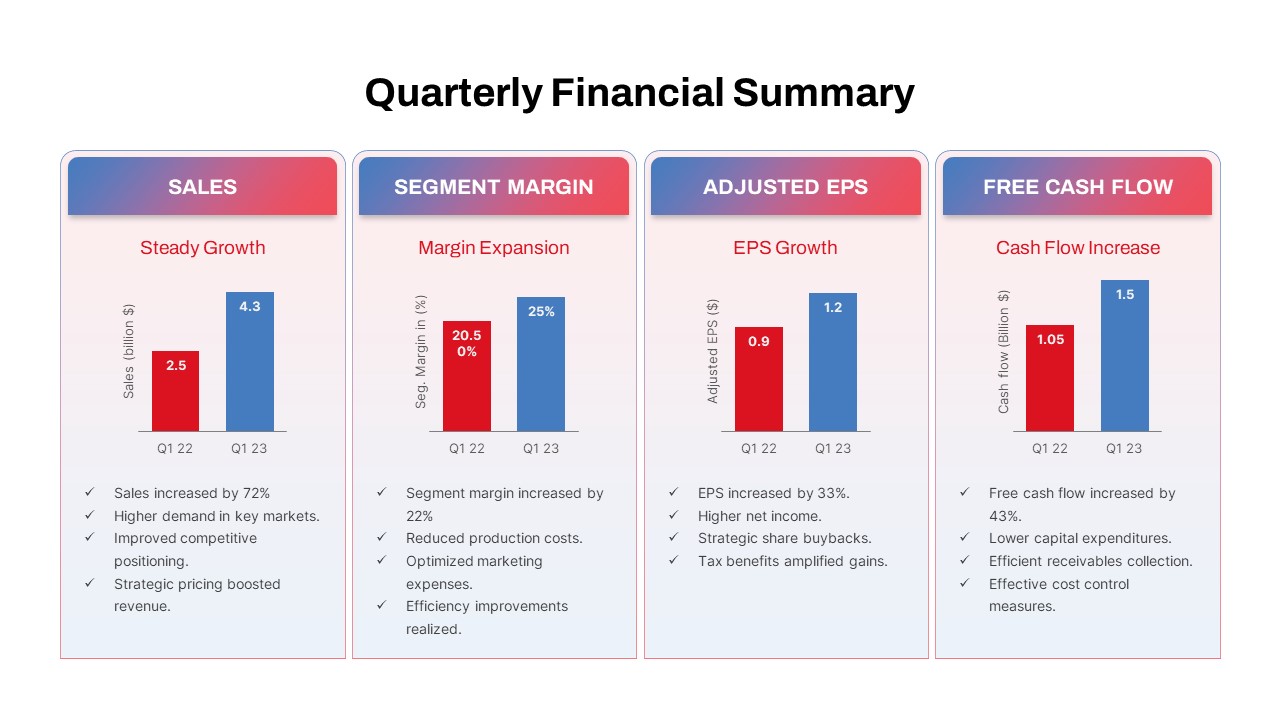
Quarterly Financial Summary Dashboard Template for PowerPoint & Google Slides
Business Report
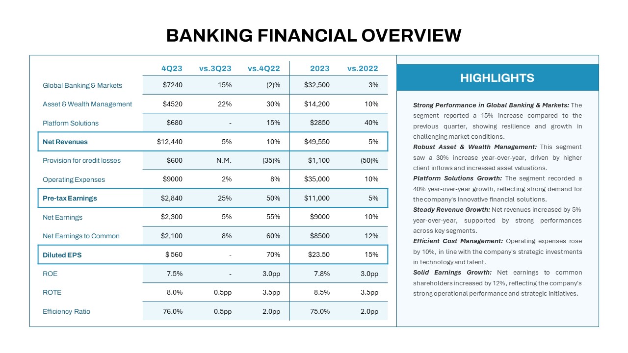
Banking Financial Overview Dashboard Template for PowerPoint & Google Slides
Finance
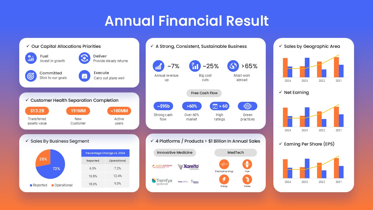
Annual Financial Results Slide Deck Template for PowerPoint & Google Slides
Finance
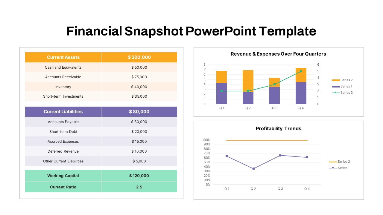
Financial Snapshot & Metrics Overview Template for PowerPoint & Google Slides
Finance
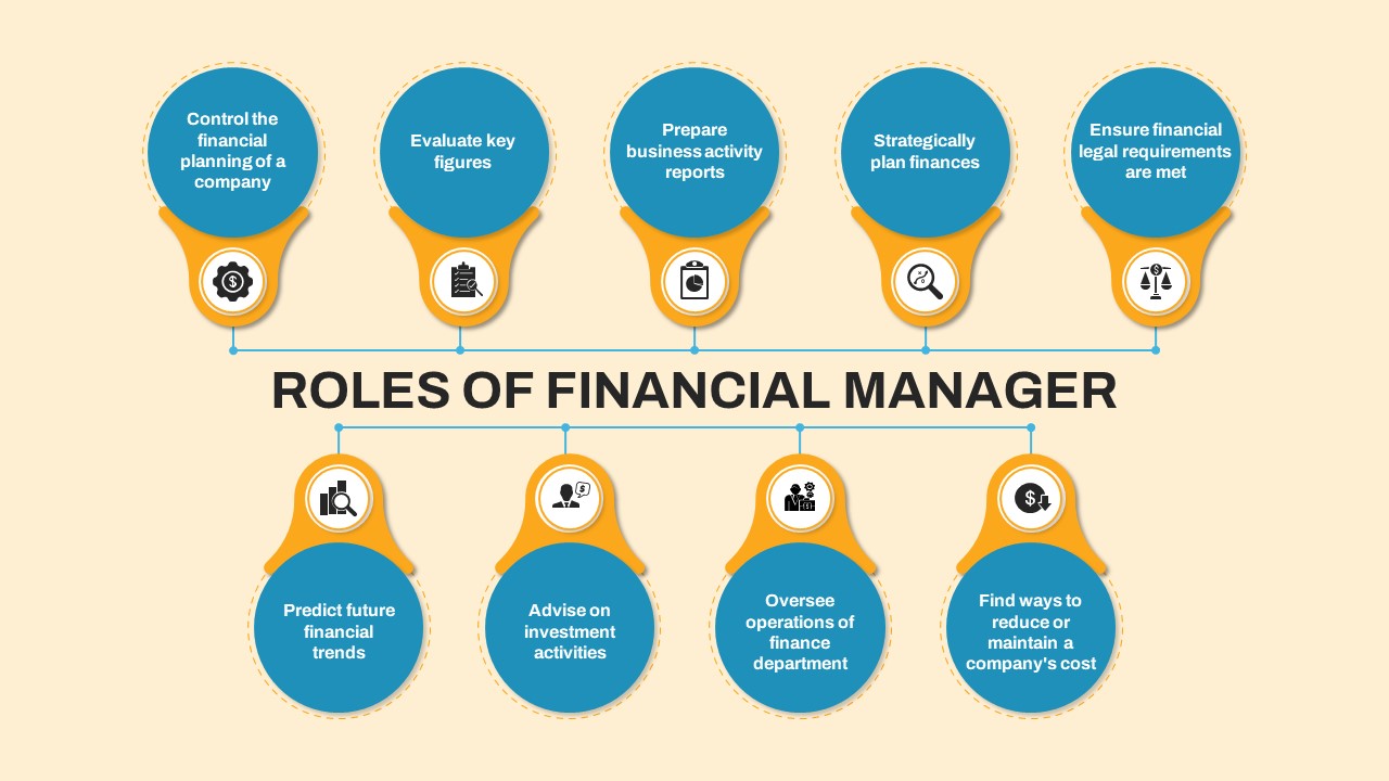
Financial Manager Roles Template for PowerPoint & Google Slides
Process
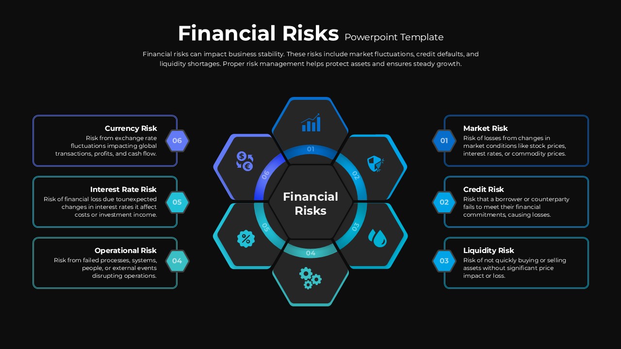
Financial Risks Hexagon Diagram Template for PowerPoint & Google Slides
Risk Management
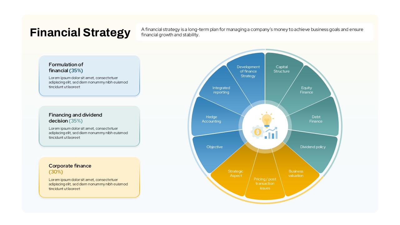
Financial Strategy template for PowerPoint & Google Slides
Business Strategy
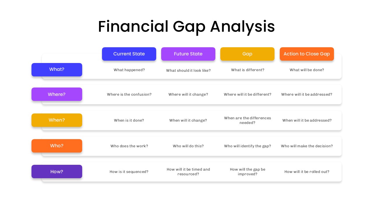
Financial Gap Analysis Framework Template for PowerPoint & Google Slides
Finance
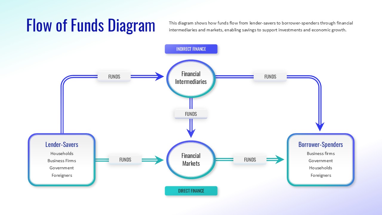
Flow of Funds Financial System Diagram Template for PowerPoint & Google Slides
Finance
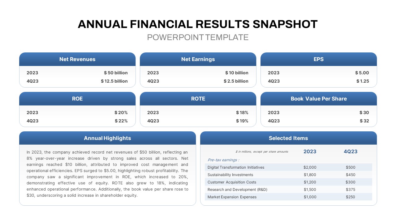
Annual Financial Results Snapshot Template for PowerPoint & Google Slide
Finance
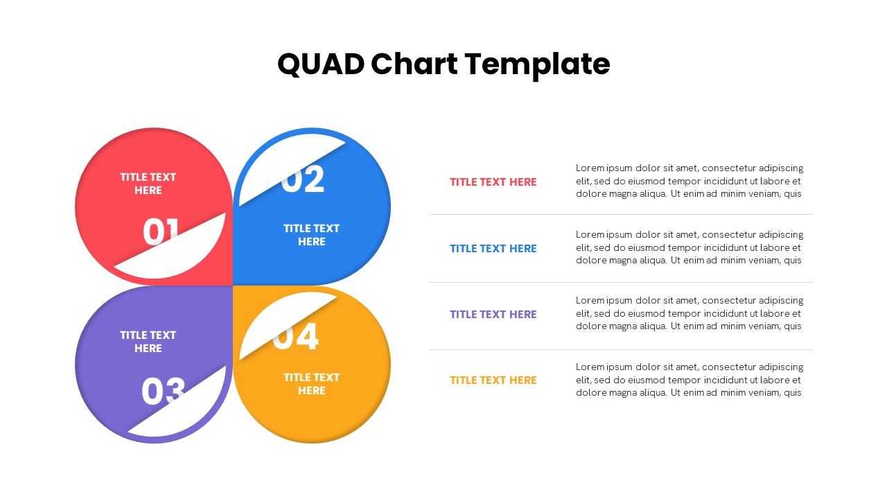
Quad Chart Infographic Pack of 8 Slides Template for PowerPoint & Google Slides
Comparison Chart
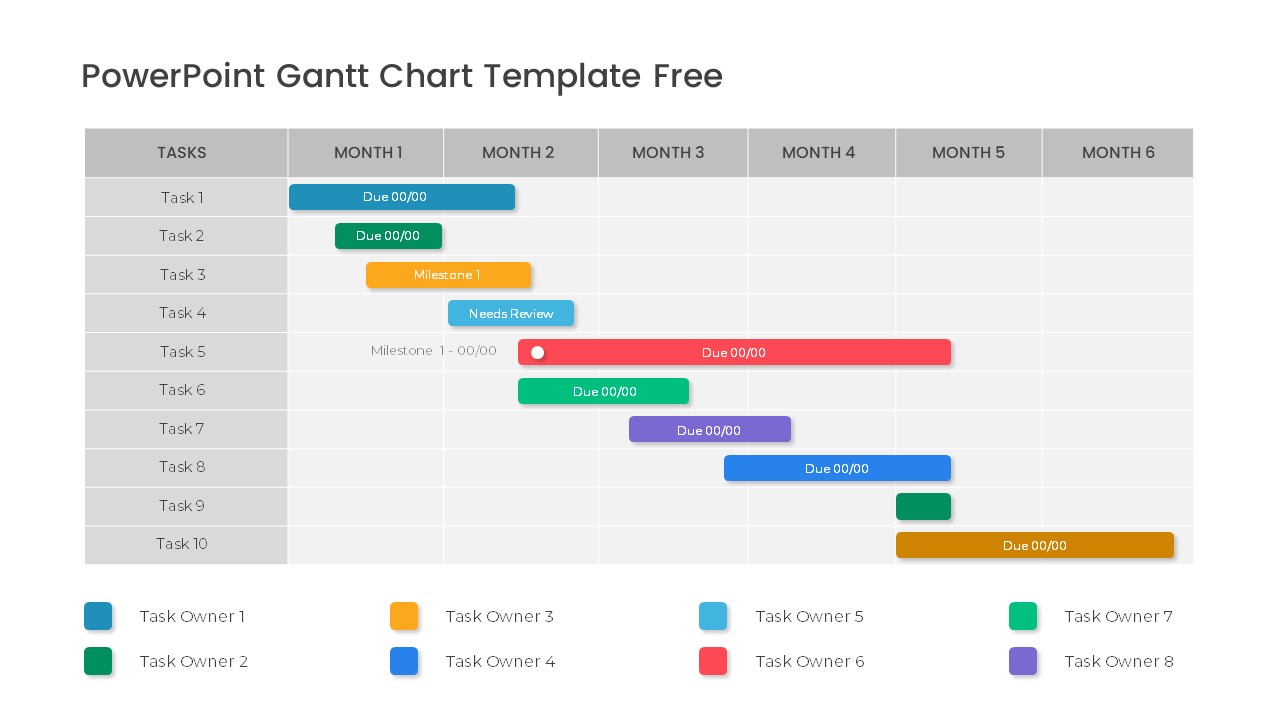
Free Professional Gantt Chart Pack – 4 Slides Template for PowerPoint & Google Slides
Gantt Chart
Free
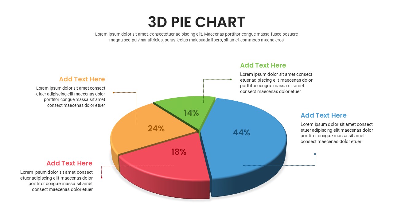
Free 3D Pie Chart template for PowerPoint & Google Slides
Pie/Donut
Free
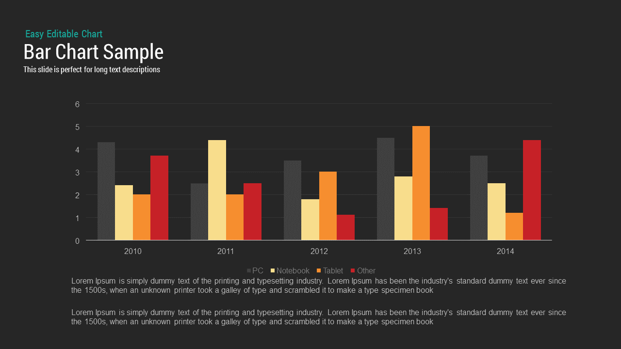
Bar Chart Sample template for PowerPoint & Google Slides
Bar/Column
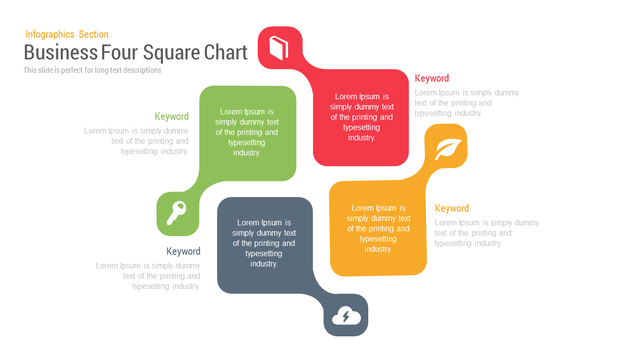
Business Four Square Chart template for PowerPoint & Google Slides
Business
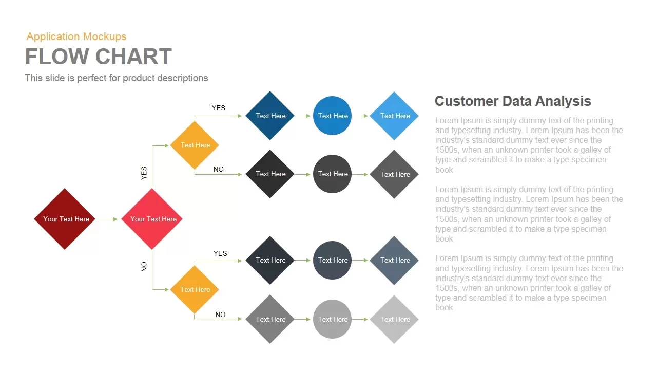
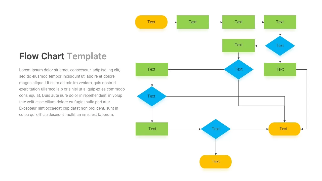
Flow Chart template for PowerPoint & Google Slides
Flow Charts
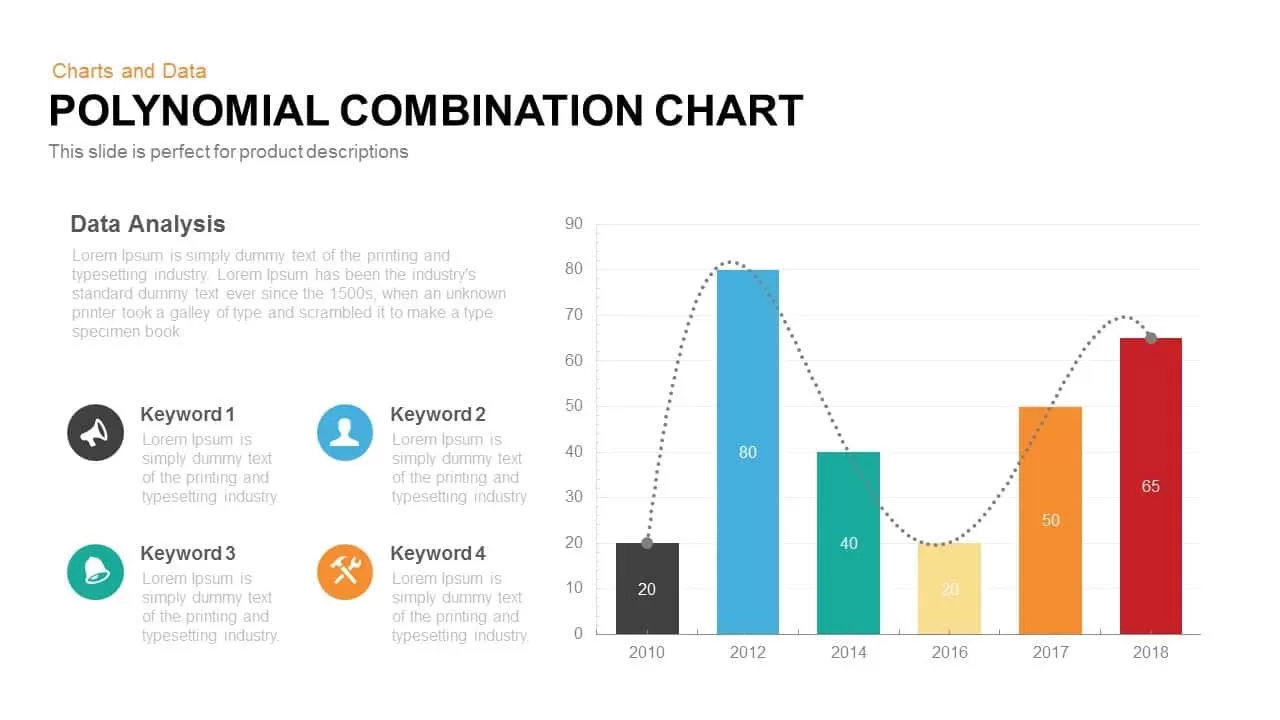
Combination Chart template for PowerPoint & Google Slides
Charts
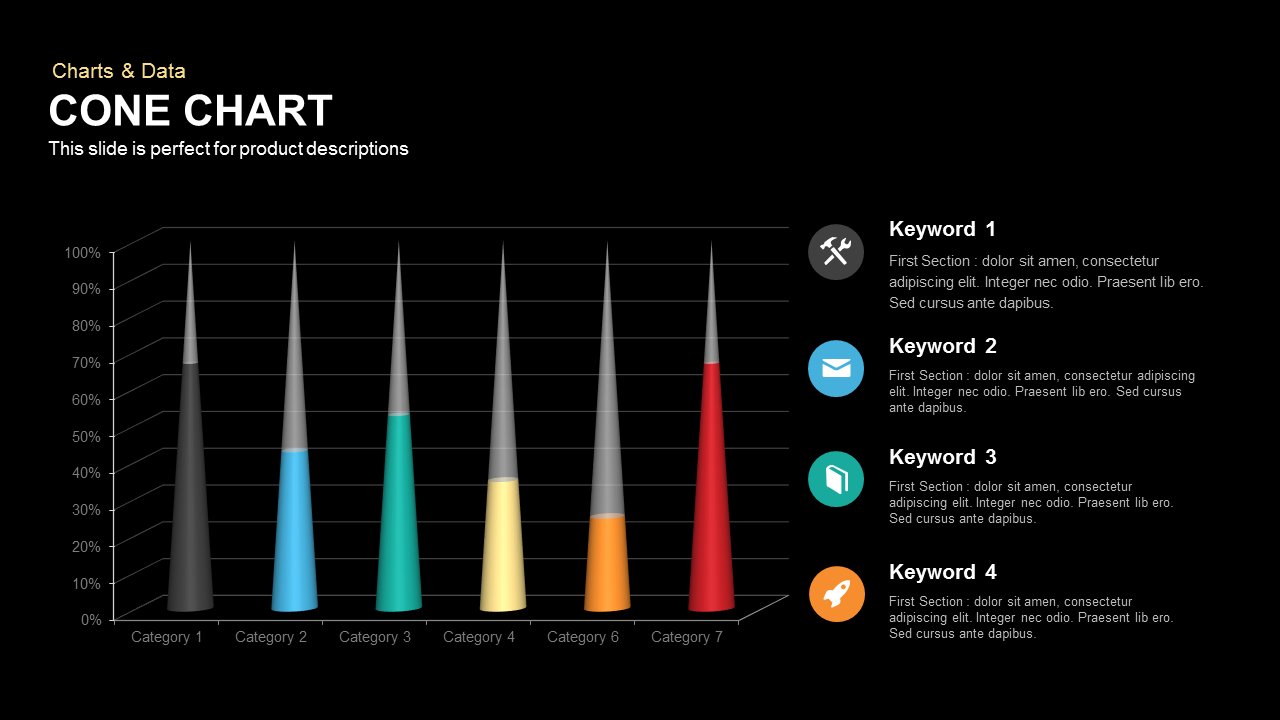
3D Cone Chart Data Visualization template for PowerPoint & Google Slides
Bar/Column
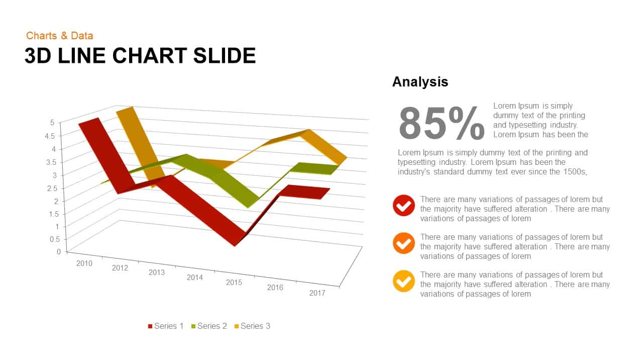
3D Line Chart for PowerPoint & Google Slides
Charts

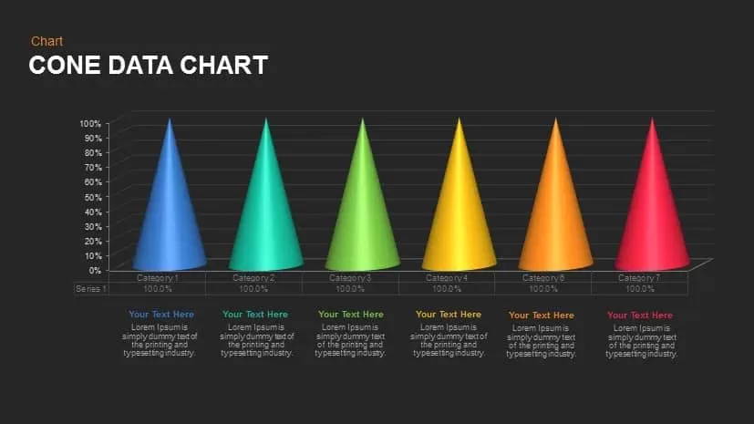
Cone Data Chart for PowerPoint & Google Slides
Charts
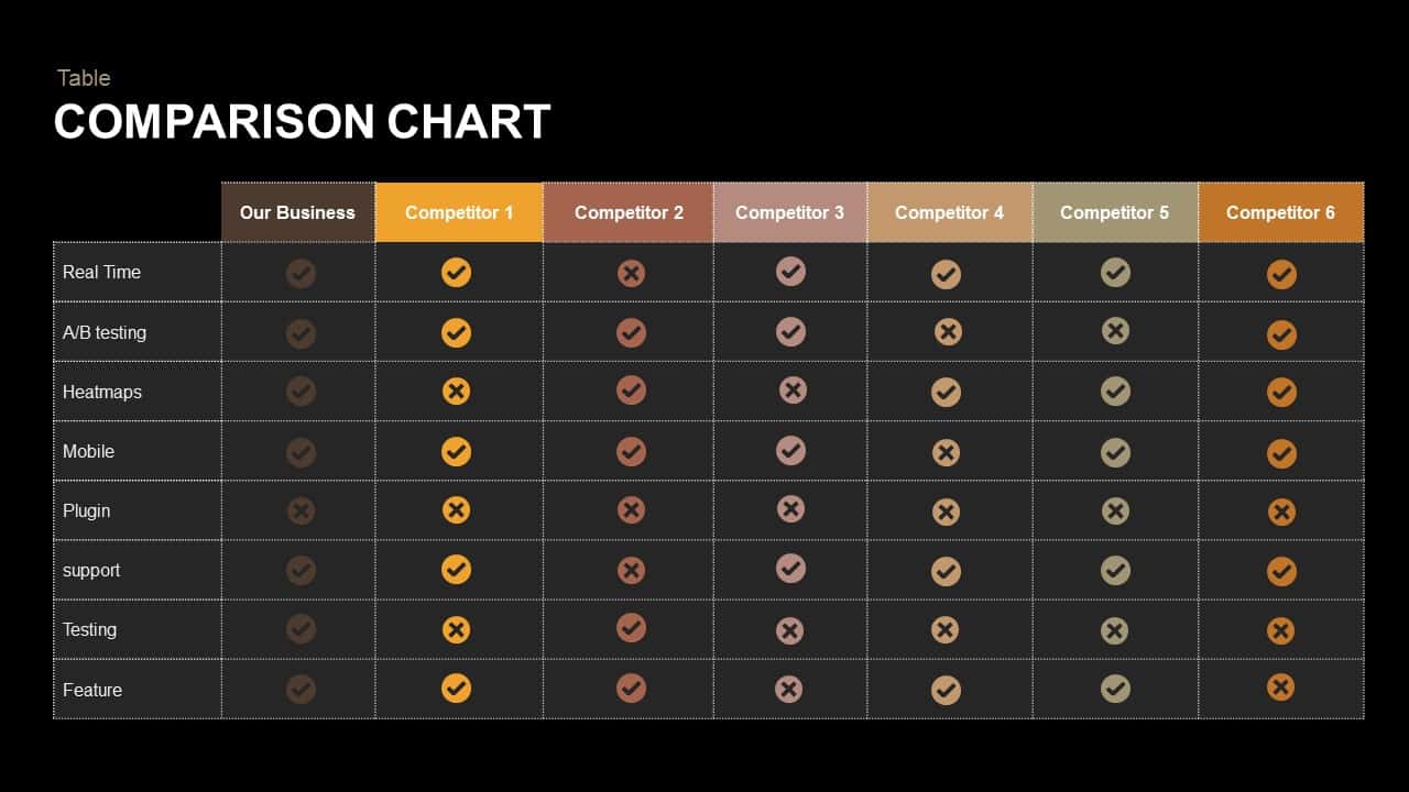
Comparison Chart Overview template for PowerPoint & Google Slides
Comparison Chart
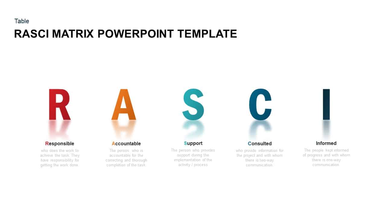
RASCI Responsibility Matrix Chart Template for PowerPoint & Google Slides
Business
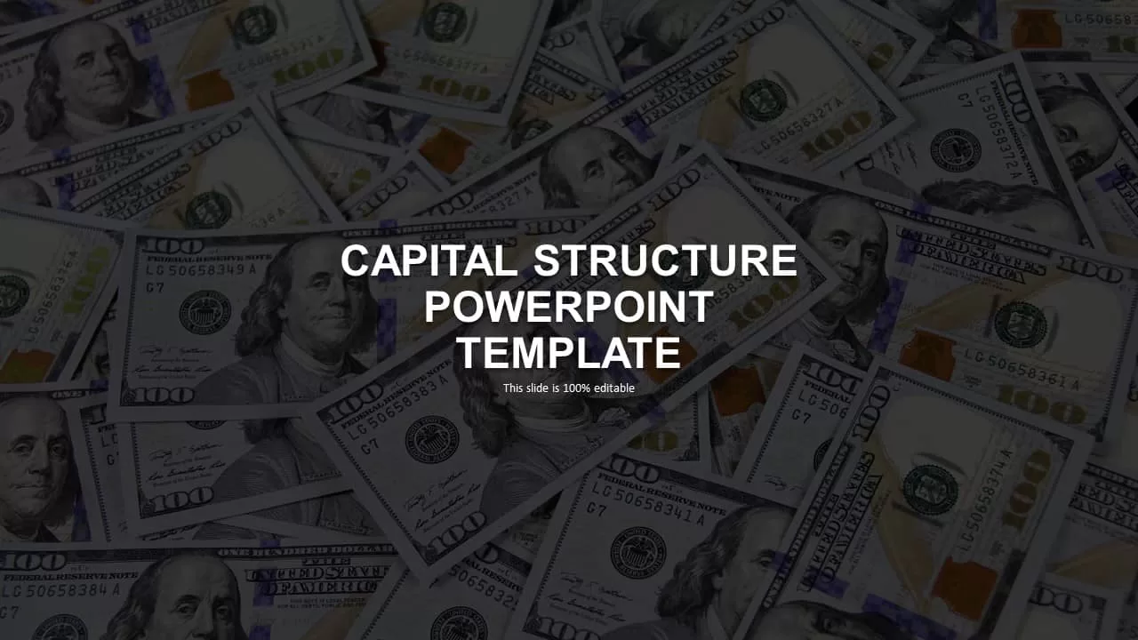
Capital Structure Dynamic Split Chart Template for PowerPoint & Google Slides
Comparison Chart
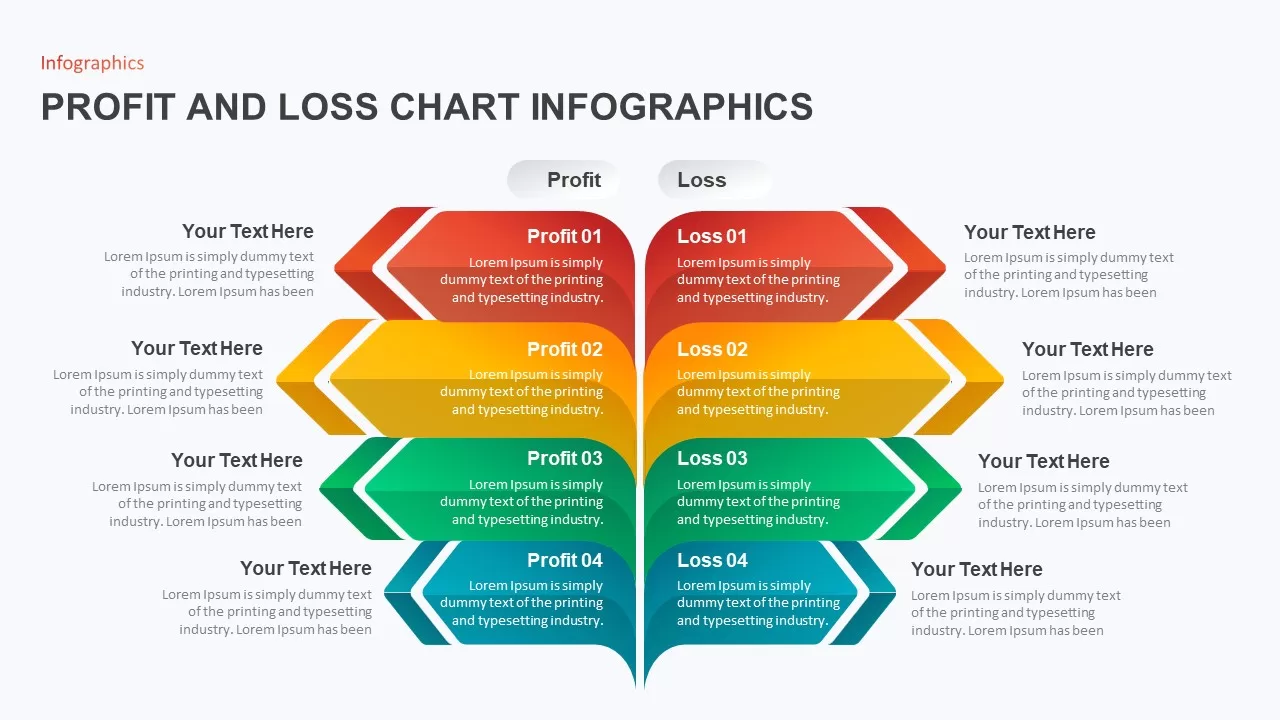
Profit and Loss Chart Infographics for PowerPoint & Google Slides
Business Report
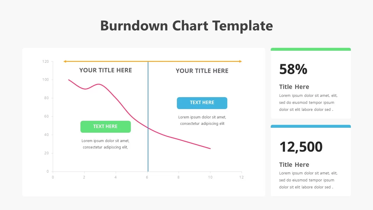
Burndown Chart Template for PowerPoint & Google Slides
Charts
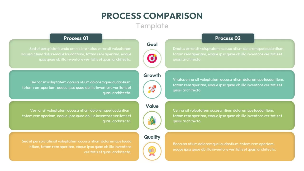
Process Comparison Chart for PowerPoint & Google Slides
Infographics
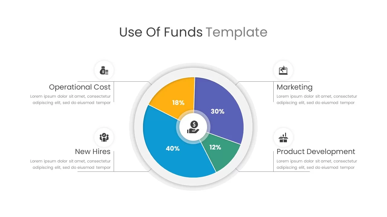
Use of Funds Donut Chart Infographic Template for PowerPoint & Google Slides
Circular
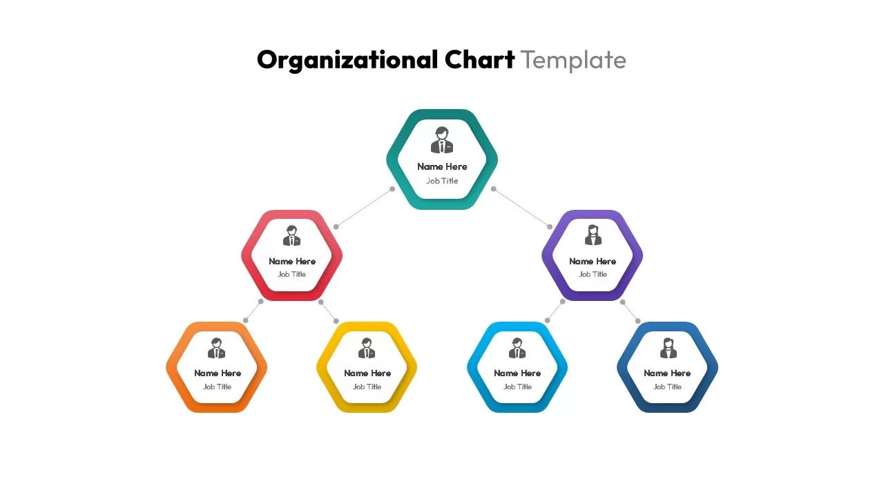
Organizational Chart Structure template for PowerPoint & Google Slides
Business Plan
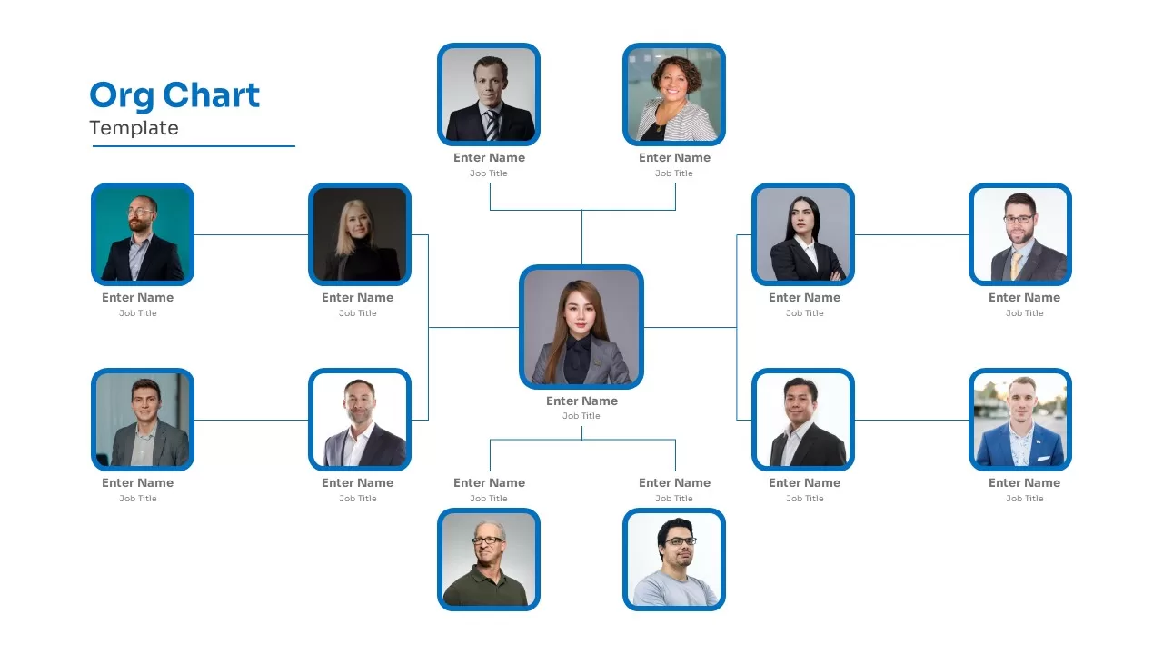
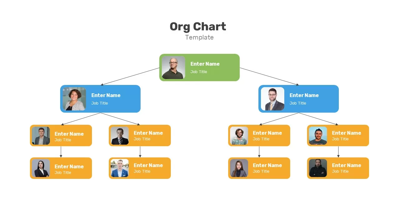
Organizational Chart Template for PowerPoint & Google Slides
Our Team
Organizational Chart template for PowerPoint & Google Slides
Org Chart
Flow Chart template for PowerPoint & Google Slides
Flow Charts
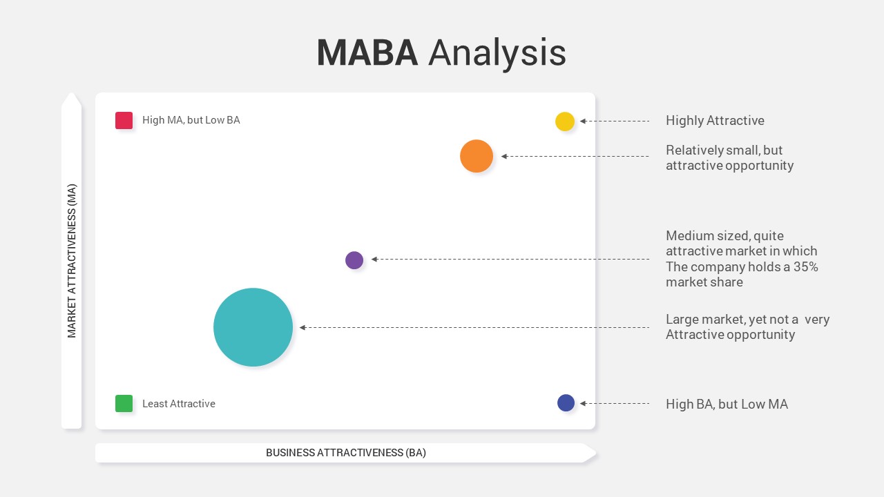
MABA Attractiveness Matrix Chart Template for PowerPoint & Google Slides
Comparison Chart
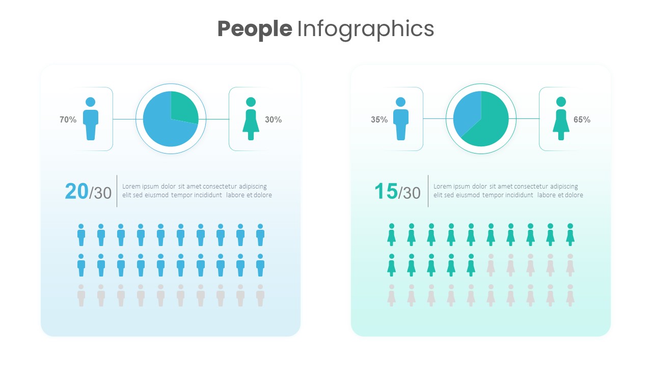
People Demographic Comparison Chart Template for PowerPoint & Google Slides
Comparison
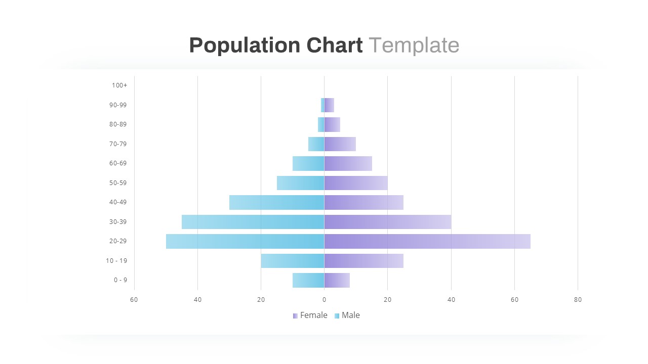
Population Pyramid Chart Analysis Template for PowerPoint & Google Slides
Bar/Column
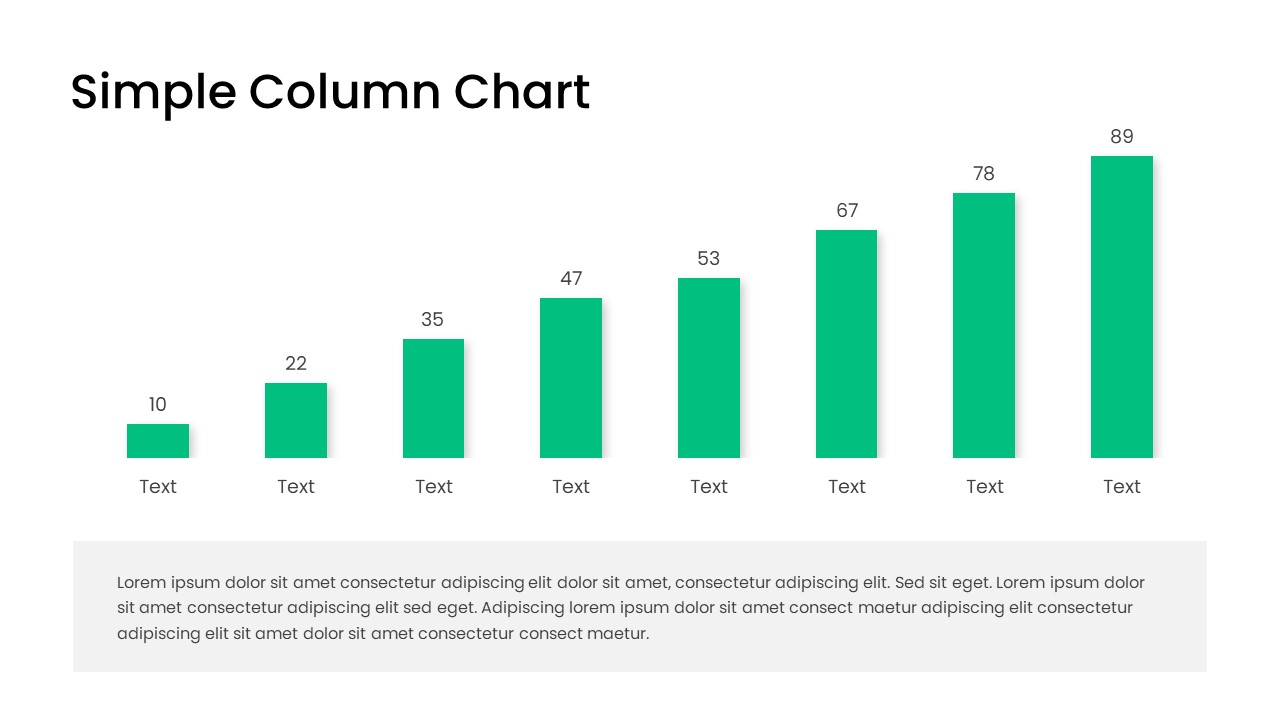
Free Editable Simple Column Chart Slide Template for PowerPoint & Google Slides
Bar/Column
Free
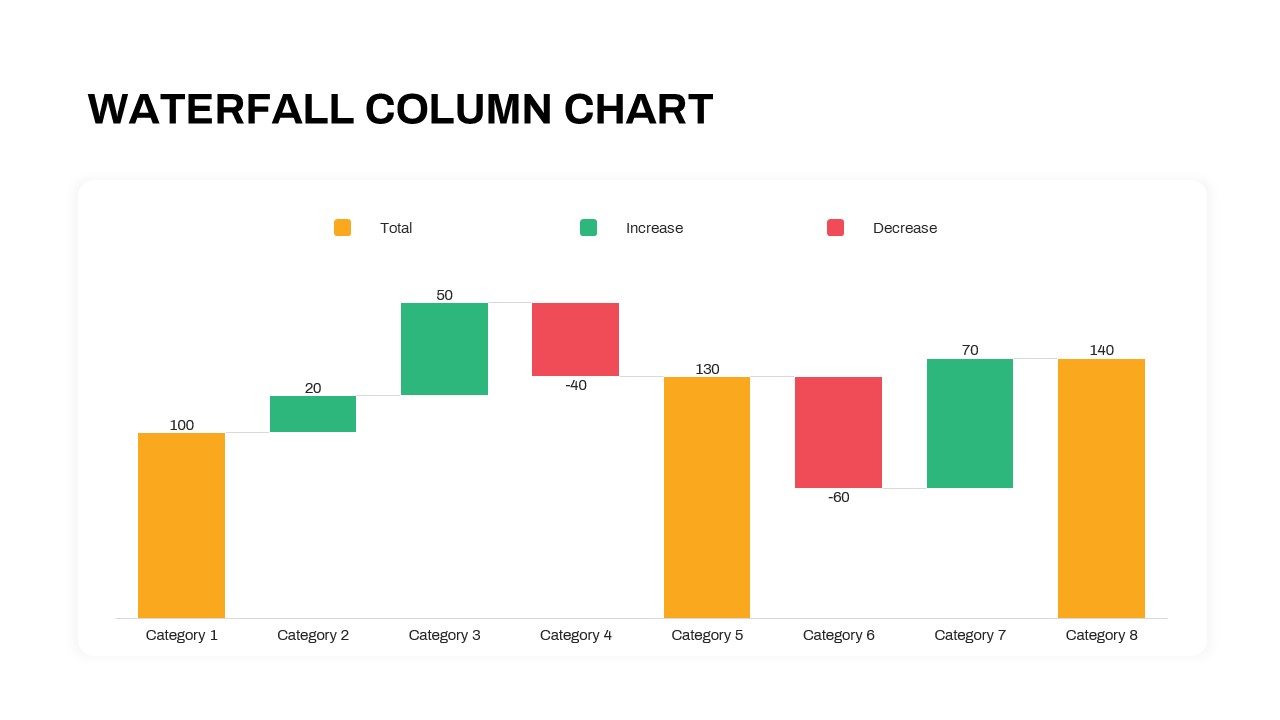
Waterfall Column Chart Analysis Template for PowerPoint & Google Slides
Bar/Column
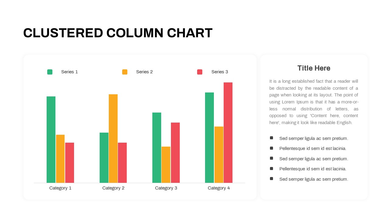
Professional Clustered Column Chart Template for PowerPoint & Google Slides
Bar/Column
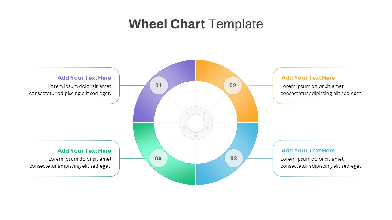
Colorful Four-Segment Wheel Chart Template for PowerPoint & Google Slides
Circular
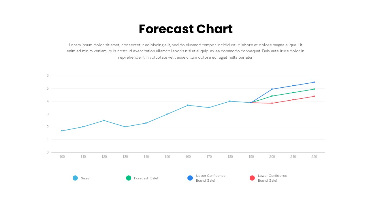
Forecast Chart with Confidence Bounds Template for PowerPoint & Google Slides
Comparison Chart
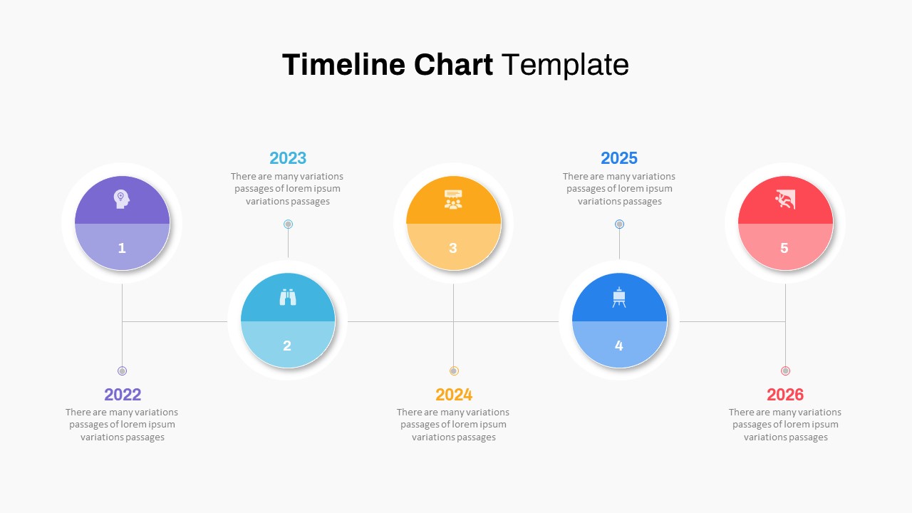
Five-Phase Horizontal Timeline Chart Template for PowerPoint & Google Slides
Timeline
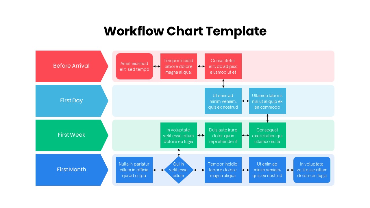
Colorful Multistage Workflow Chart Template for PowerPoint & Google Slides
Flow Charts
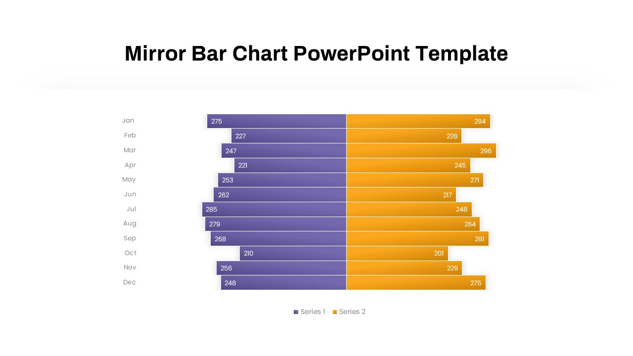
Mirror Bar Chart Comparison Template for PowerPoint & Google Slides
Bar/Column
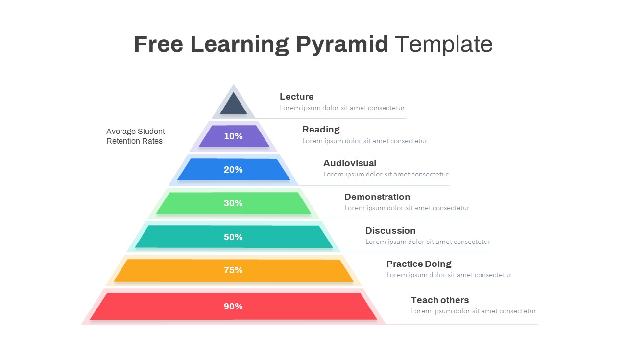
Free Learning Retention Pyramid Chart Template for PowerPoint & Google Slides
Pyramid
Free
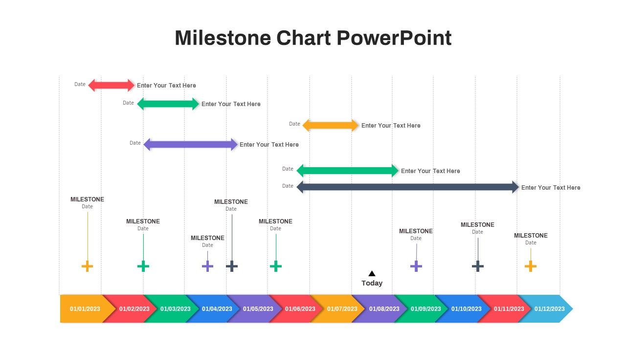
Professional Milestone Timeline Chart Template for PowerPoint & Google Slides
Timeline
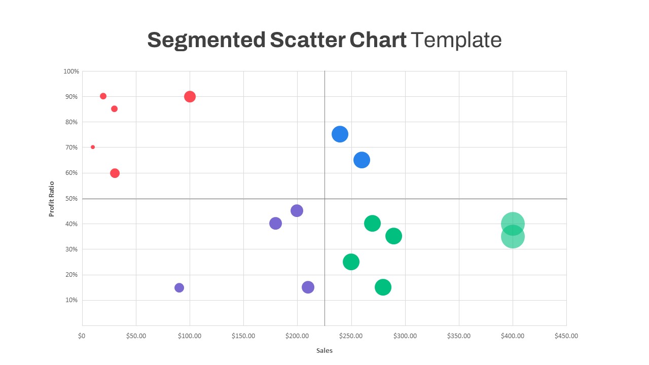
Segmented Scatter Chart Data Visualization Template for PowerPoint & Google Slides
Business Strategy
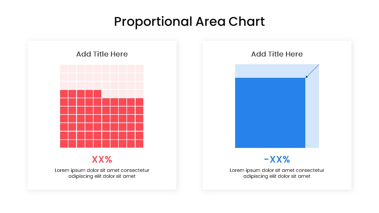
Proportional Area Chart Analysis Template for PowerPoint & Google Slides
Comparison Chart
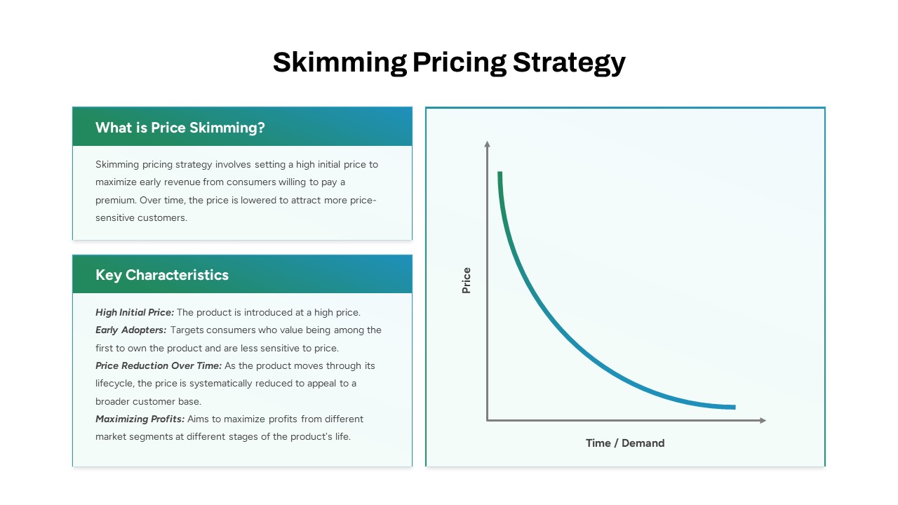
Skimming Pricing Strategy Line Chart Template for PowerPoint & Google Slides
Business Strategy
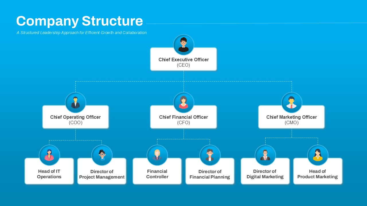
Company Structure Hierarchical Org Chart Template for PowerPoint & Google Slides
Org Chart
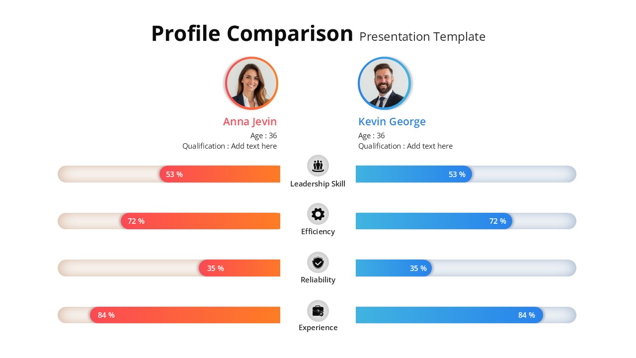
Profile Comparison Chart template for PowerPoint & Google Slides
Comparison Chart
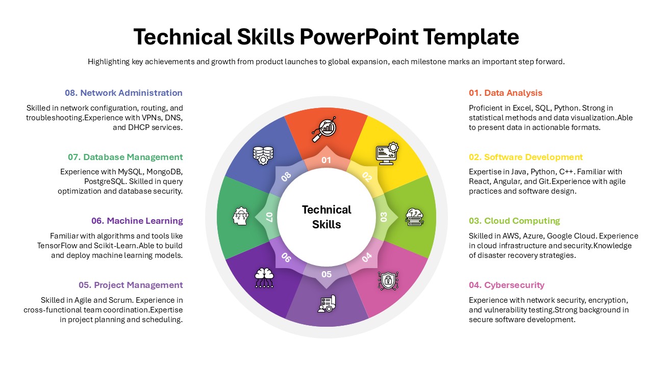
Technical Skills Donut Chart Overview Template for PowerPoint & Google Slides
HR
Skills Gap Analysis Comparison Chart Template for PowerPoint & Google Slides
Gap
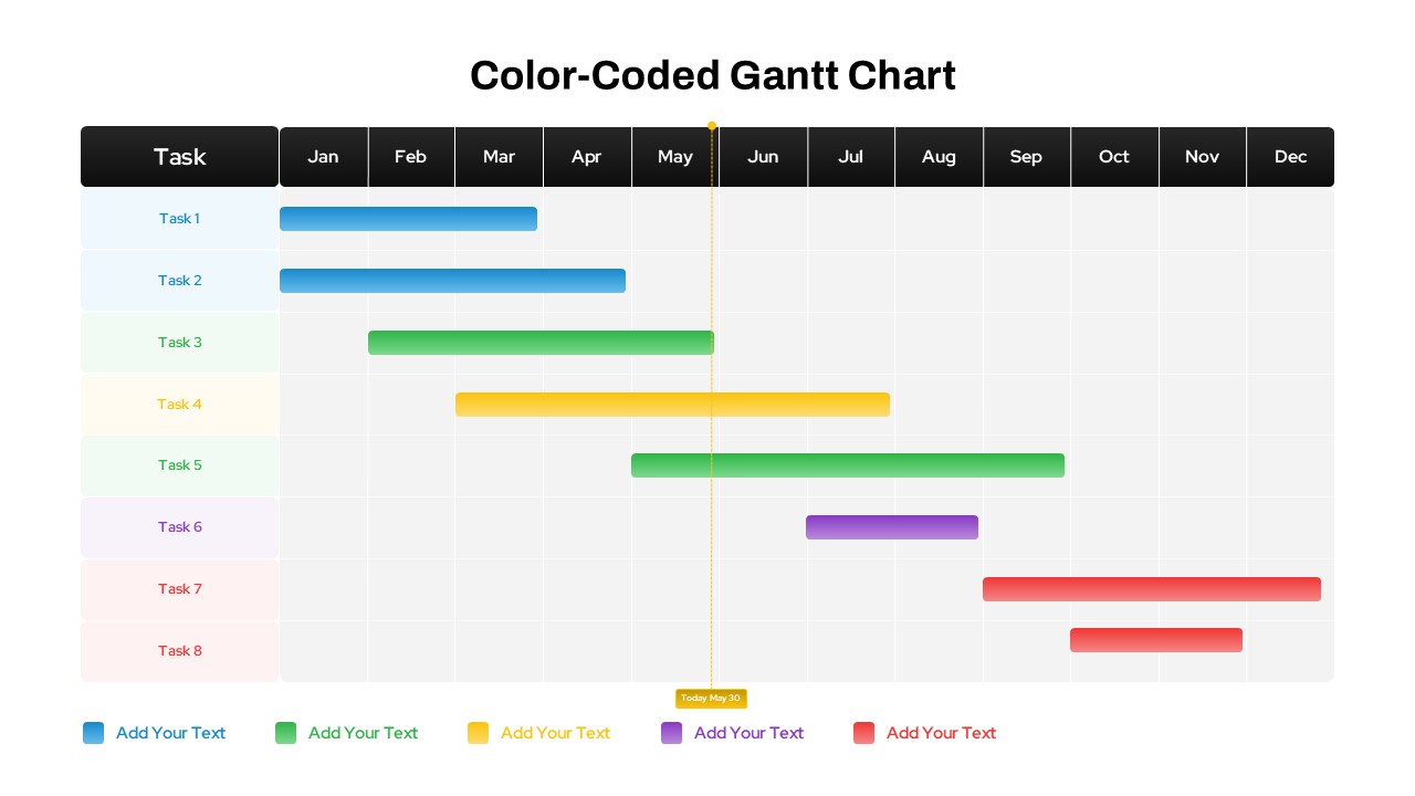
Color-Coded Gantt Chart template for PowerPoint & Google Slides
Business
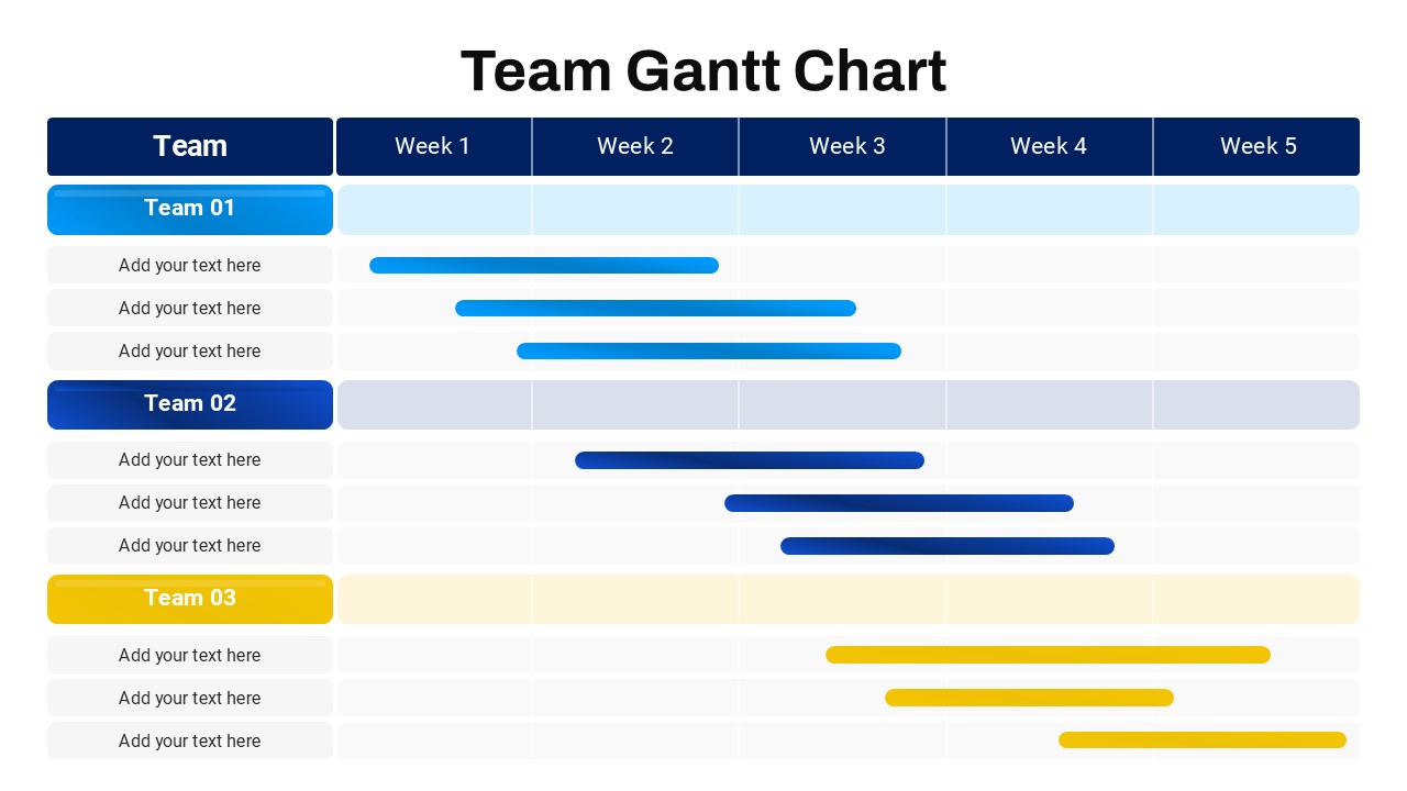
Team Gantt Chart Overview template for PowerPoint & Google Slides
Project Status
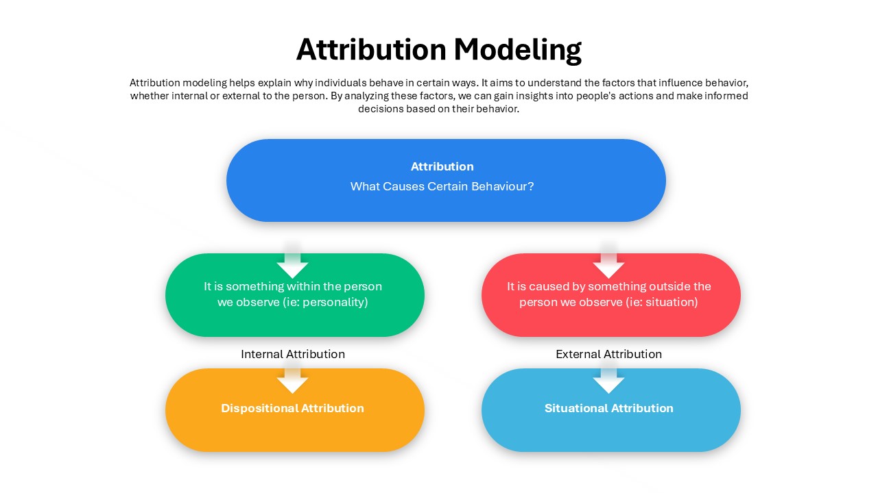
Attribution Modeling Flow Chart Template for PowerPoint & Google Slides
Flow Charts
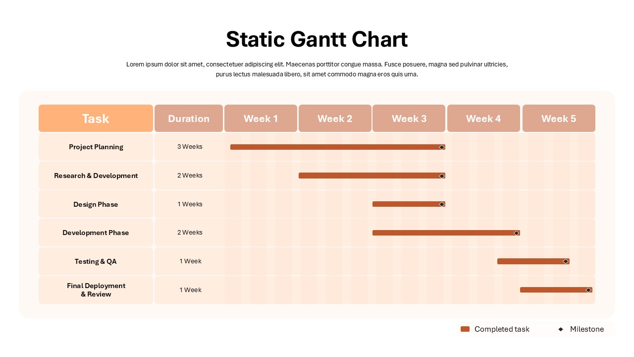
Static Gantt Chart Overview template for PowerPoint & Google Slides
Project Status