Water Flow template for PowerPoint & Google Slides


Description
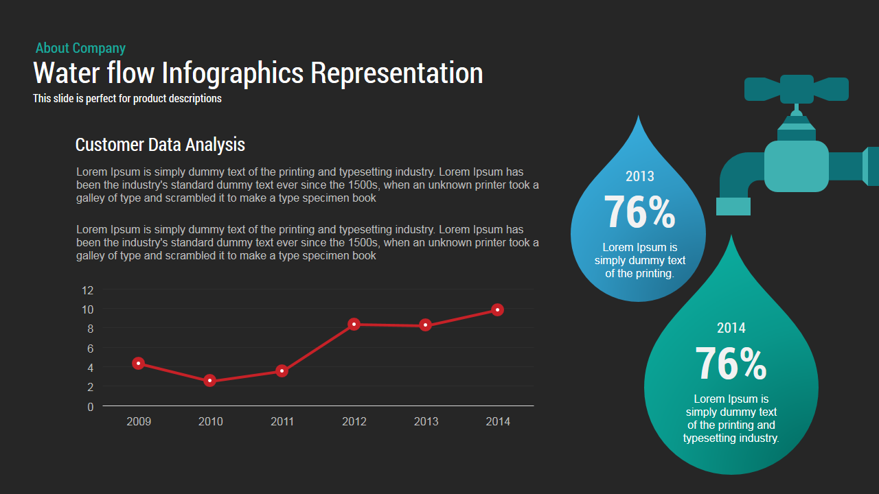
This Water Flow template presents a high-contrast dark background anchored by a large, vector faucet and two droplet infographics on the right. The droplets, in blue and teal, contain prominent year and percentage placeholders (e.g., 2013 – 76%, 2014 – 76%) for showcasing key performance metrics or experimental results. On the left, a data analysis panel includes a headline and multi-paragraph text area designed for contextual commentary. Directly below, a fully editable line chart maps trends over time—from 2009 to 2014—using red data points and connecting lines that maintain clarity against the dark canvas.
Built on master slides, every element—faucet graphic, droplet shapes, chart axes, and text blocks—is fully editable in both PowerPoint and Google Slides. Update color themes via the built-in palette to align with corporate branding, swap the faucet for alternate icons, or replace droplet shapes with custom graphics. Free web fonts ensure typographic consistency across platforms, and vector assets guarantee pixel-perfect scaling on HD projectors, retina displays, and virtual meeting backgrounds. The layout supports both 16:9 widescreen and 4:3 aspect ratios, preserving alignment and visual hierarchy without manual adjustments.
A hidden variation slide offers alternate color schemes and additional droplet positions for extended datasets. Drag-and-drop placeholders simplify chart updates, while preconfigured entrance animations and morph transitions guide audience focus from overarching objectives to specific data points. Subtle drop shadows beneath the faucet and droplets add depth, and precision alignment grids maintain a polished aesthetic. Whether you’re reporting experimental outcomes, process efficiencies, or device usage statistics, this Water Flow template streamlines professional slide creation and ensures high-impact, data-driven storytelling with zero design headaches.
Who is it for
Product managers, data analysts, and research teams looking to present experimental results or time-series metrics in a visually engaging format. Marketing strategists and digital agencies can leverage the design to illustrate funnel stages or campaign touchpoints, while educators and trainers will find it ideal for technical demonstrations and instructional modules.
Other Uses
Repurpose this slide to visualize resource allocation, workflow throughput, or conversion rates. Swap droplets for gauge icons or waterfall charts to adapt the layout for financial reporting, manufacturing KPIs, or supply chain visualizations.
Login to download this file

Item ID
SB00032
Related Templates

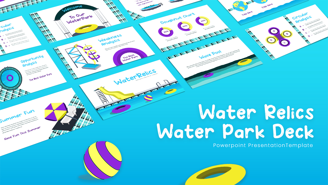
Free Water Relics Water Park Presentation Template for PowerPoint & Google Slides
Pitch Deck
Free
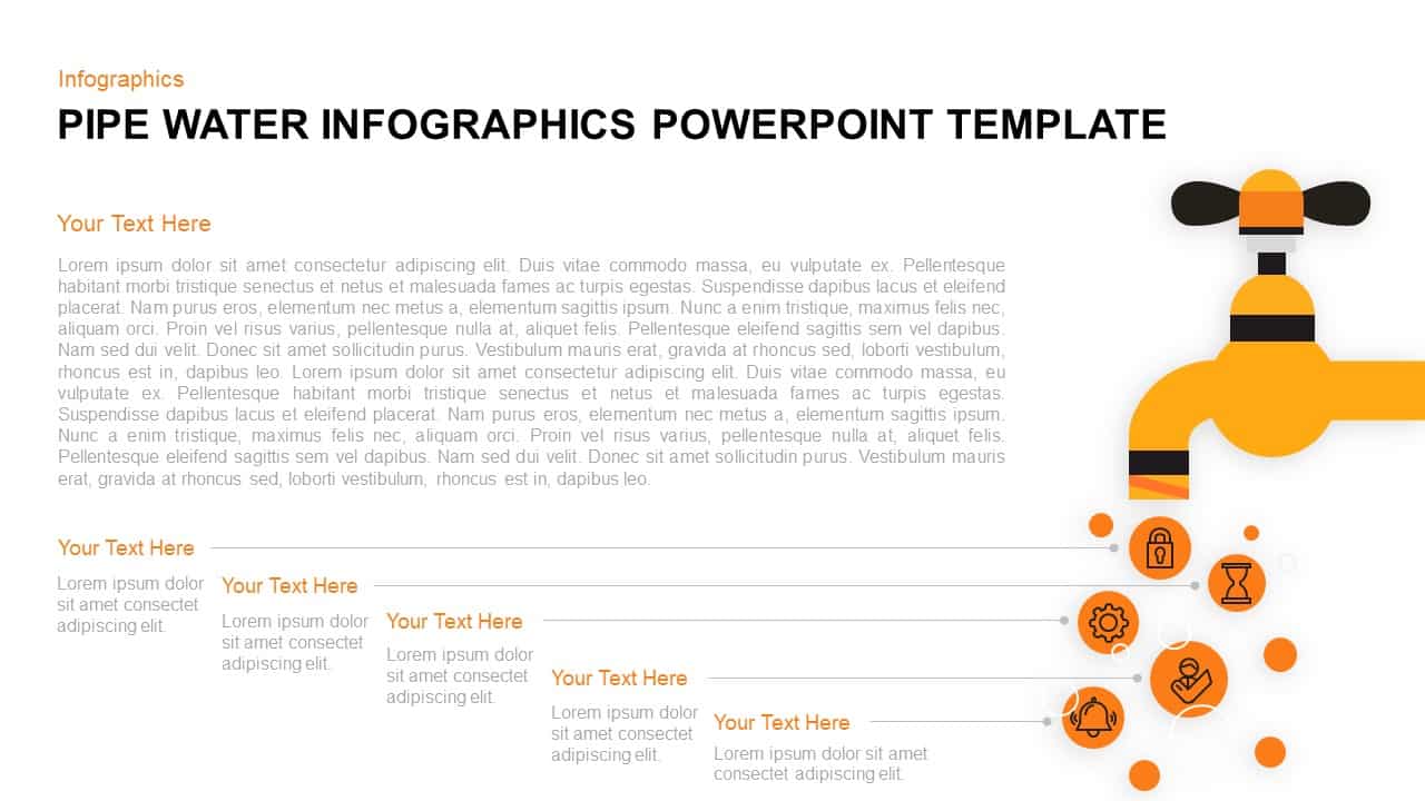
Pipe Water Infographics Flow Diagram Template for PowerPoint & Google Slides
Process
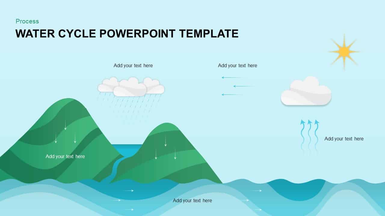
Water Cycle Process Infographic Template for PowerPoint & Google Slides
Process
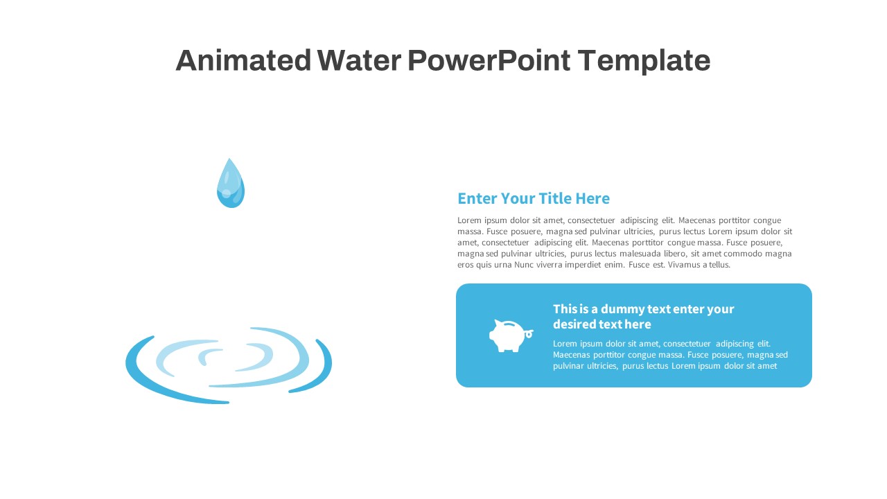
Animated Water Drop Ripple Infographic Template for PowerPoint & Google Slides
Graphics
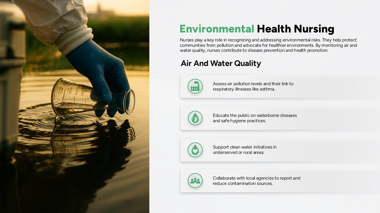
Environmental Nursing Health: Air & Water Template for PowerPoint & Google Slides
Nursing
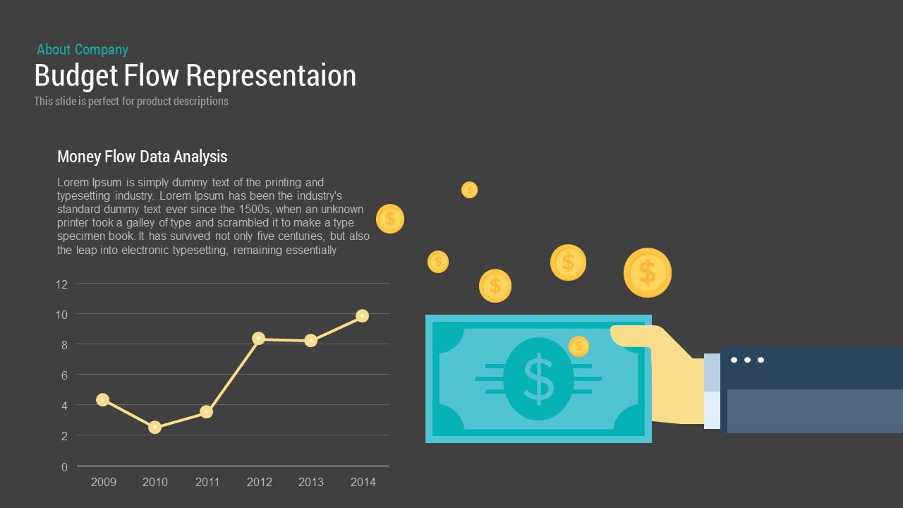
Budget Flow Representation template for PowerPoint & Google Slides
Process
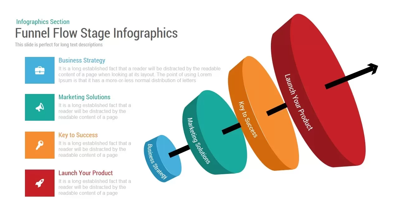
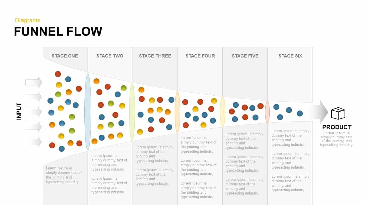
Funnel Flow Stage Infographics template for PowerPoint & Google Slides
Funnel
3D Arrow Infographics Circular Flow Template for PowerPoint & Google Slides
Arrow
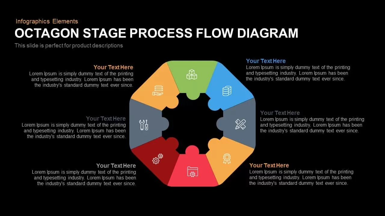
Octagon Process Flow template for PowerPoint & Google Slides
Process
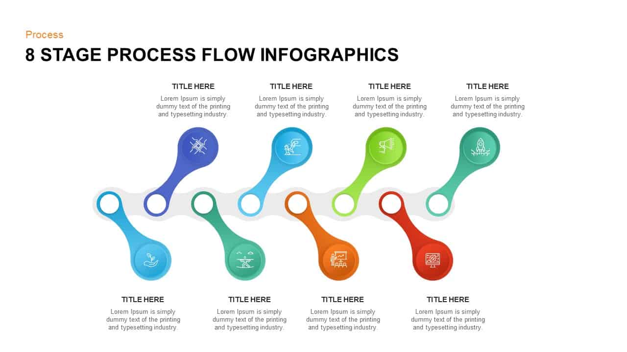
8-Stage Process Flow Flower Diagram Template for PowerPoint & Google Slides
Infographics
Circular Flow Diagram Template for PowerPoint & Google Slides
Infographics
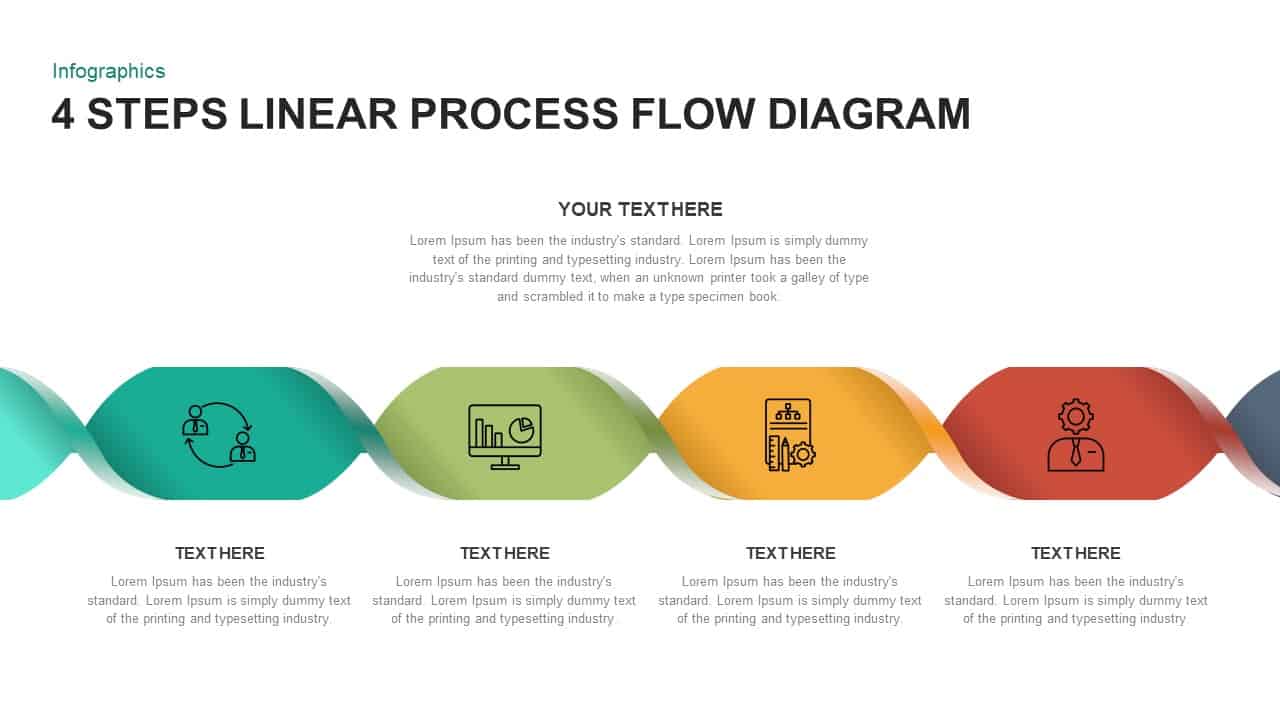
4 Section Pipe Diagram Process Flow Template for PowerPoint & Google Slides
Process
Dynamic Shield Process Flow Diagram template for PowerPoint & Google Slides
Process
Six Hexagon Stages Process Flow Diagram Template for PowerPoint & Google Slides
Process
Ribbon Flow Diagram template for PowerPoint & Google Slides
Process
Ribbon Diagram Flow template for PowerPoint & Google Slides
Process
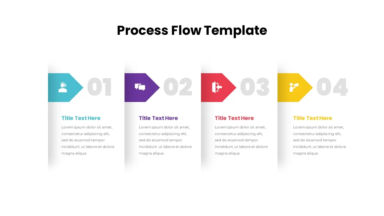
Process Flow Diagram template for PowerPoint & Google Slides
Infographics
Icon Section Flow template for PowerPoint & Google Slides
Process

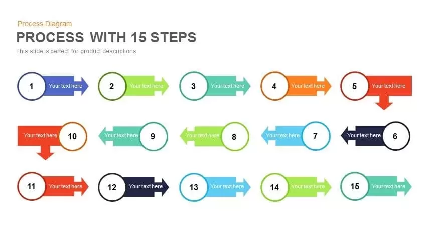
15-Step Process Flow Diagram Template for PowerPoint & Google Slides
Process

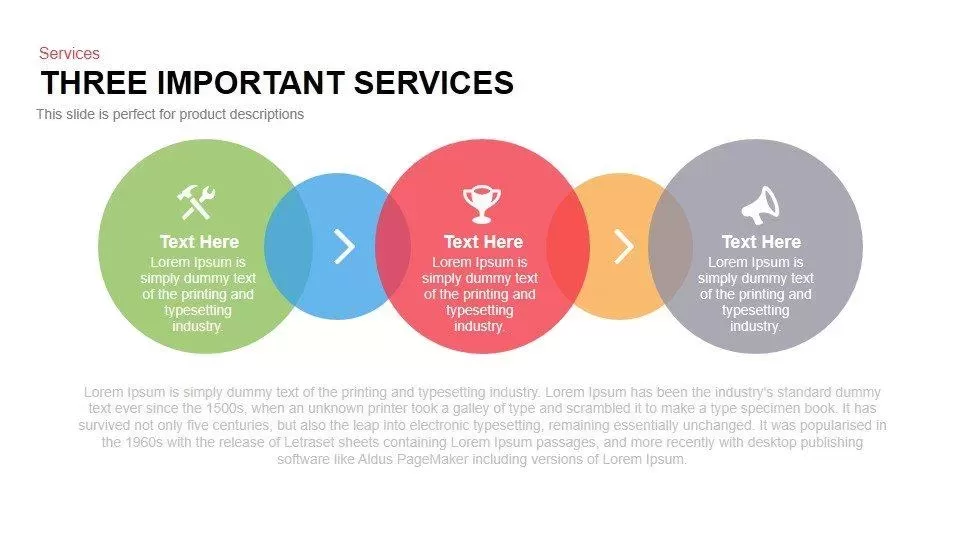
Three Important Services Flow Diagram Template for PowerPoint & Google Slides
Process
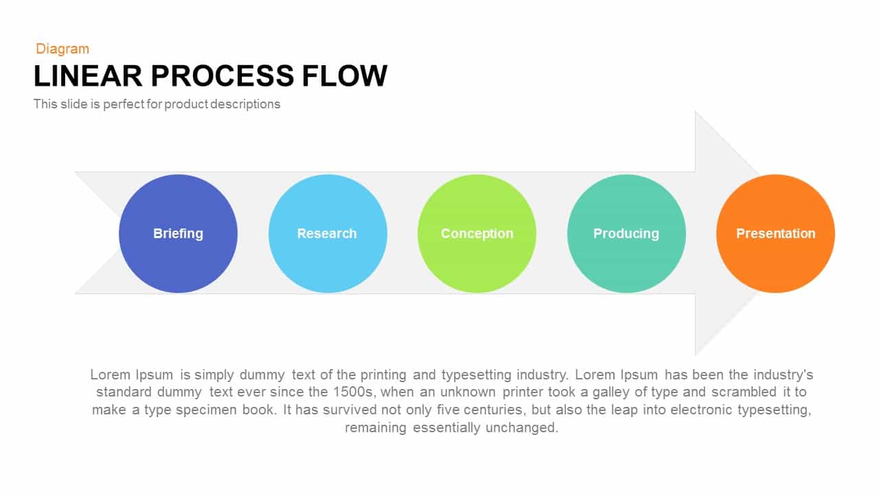
Linear Process Flow Circles Diagram Template for PowerPoint & Google Slides
Process
Five-Stage Direct Flow Arrow Process Template for PowerPoint & Google Slides
Arrow
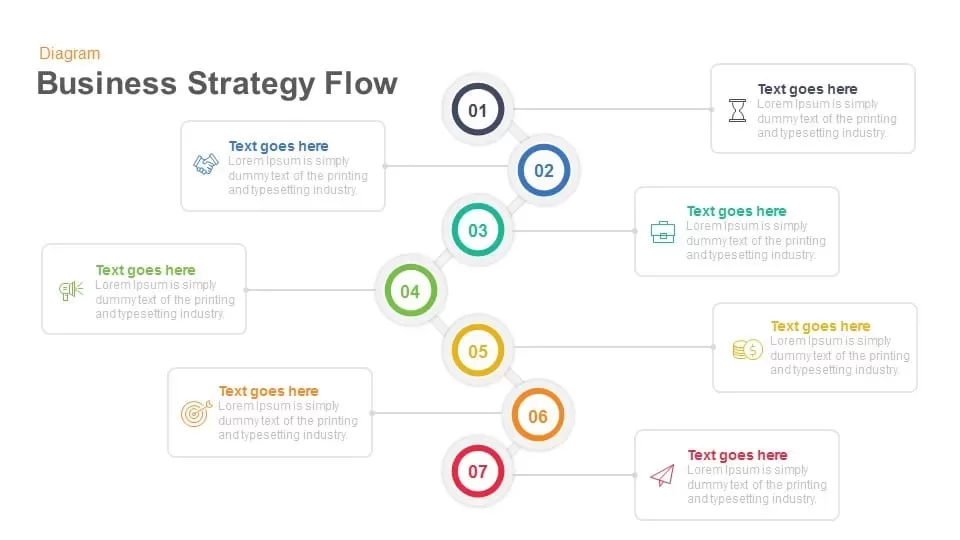
Business Strategy Flow template for PowerPoint & Google Slides
Process
Funnel Flow Diagram template for PowerPoint & Google Slides
Funnel
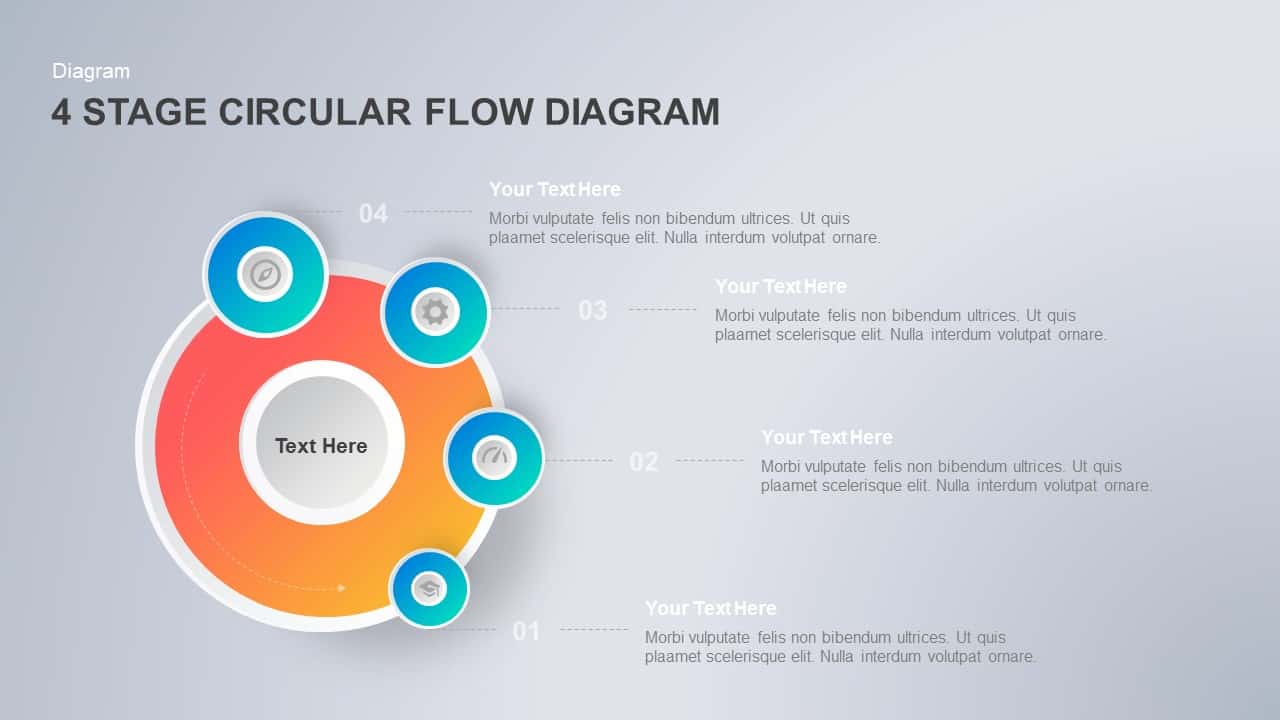
Four-Stage Circular Process Flow Template for PowerPoint & Google Slides
Process
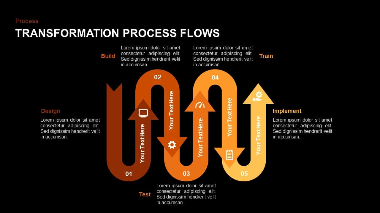
Wavy Five-Stage Transformation Flow Template for PowerPoint & Google Slides
Process
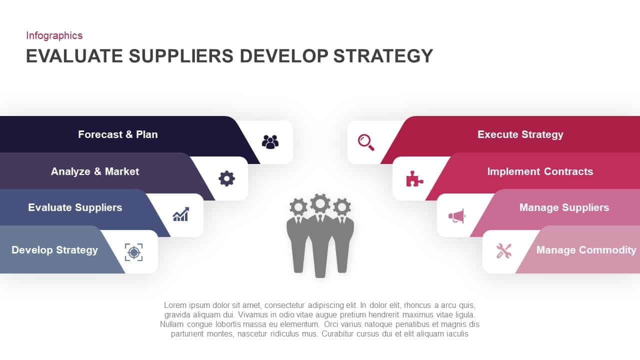
Evaluate Suppliers & Strategy Flow Template for PowerPoint & Google Slides
Process
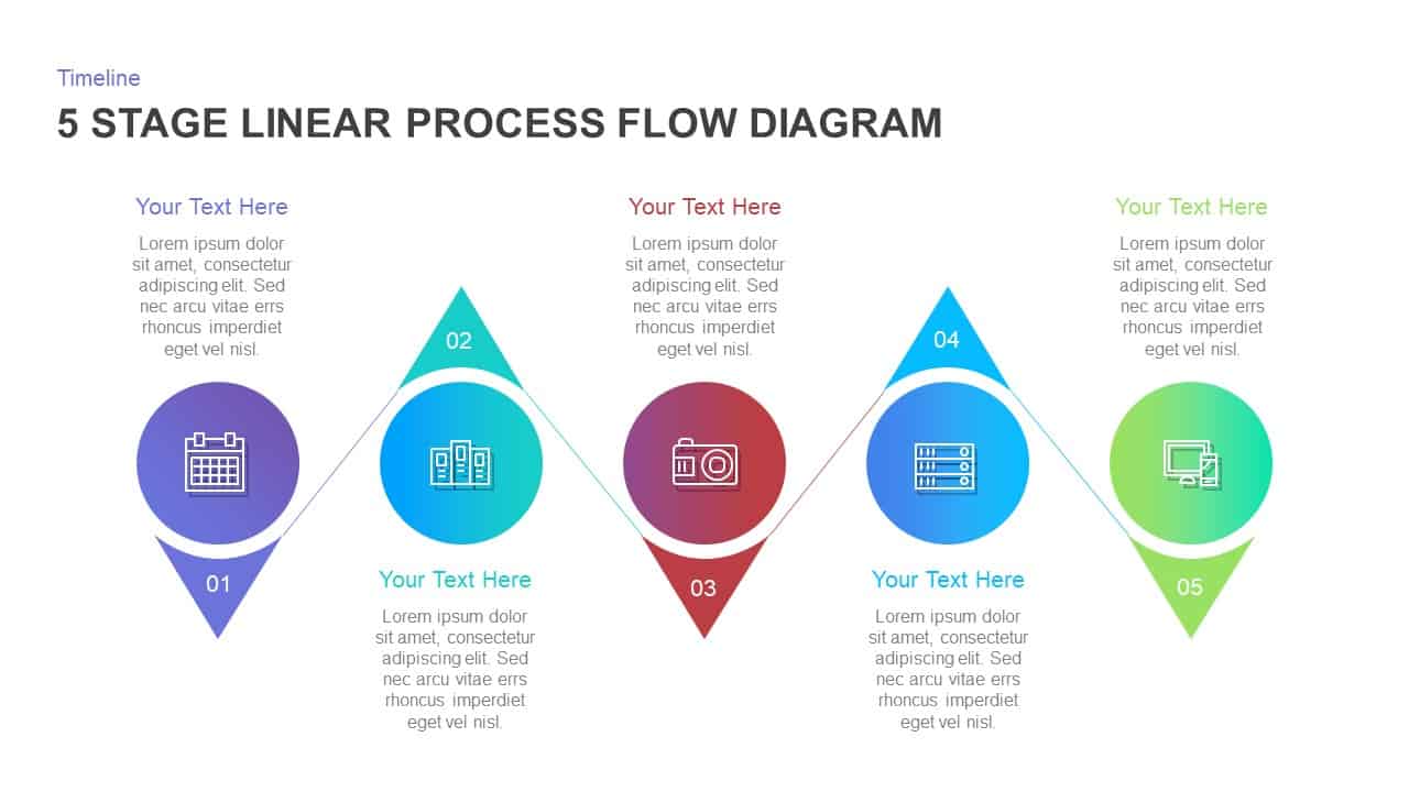
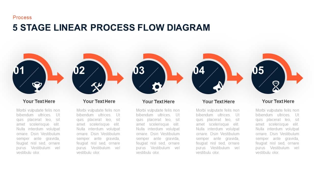
Five Stage Linear Process Flow Diagram Template for PowerPoint & Google Slides
Process
Isometric Five-Stage Process Flow Template for PowerPoint & Google Slides
Process
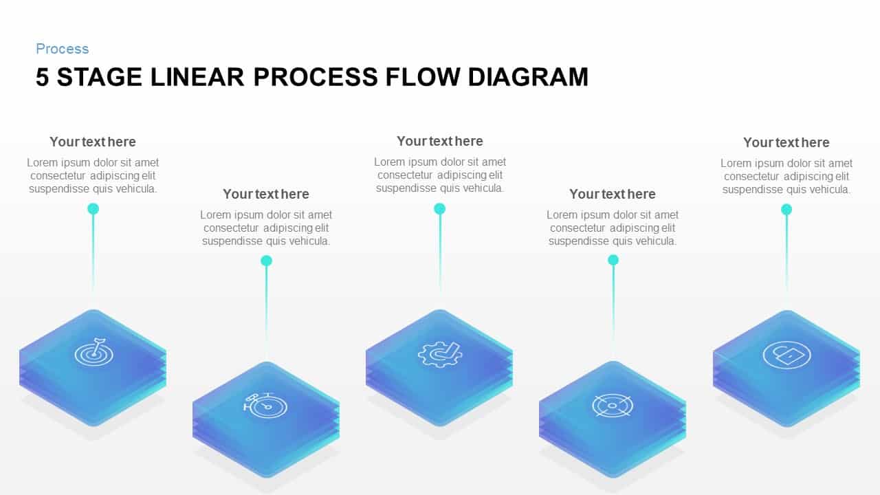
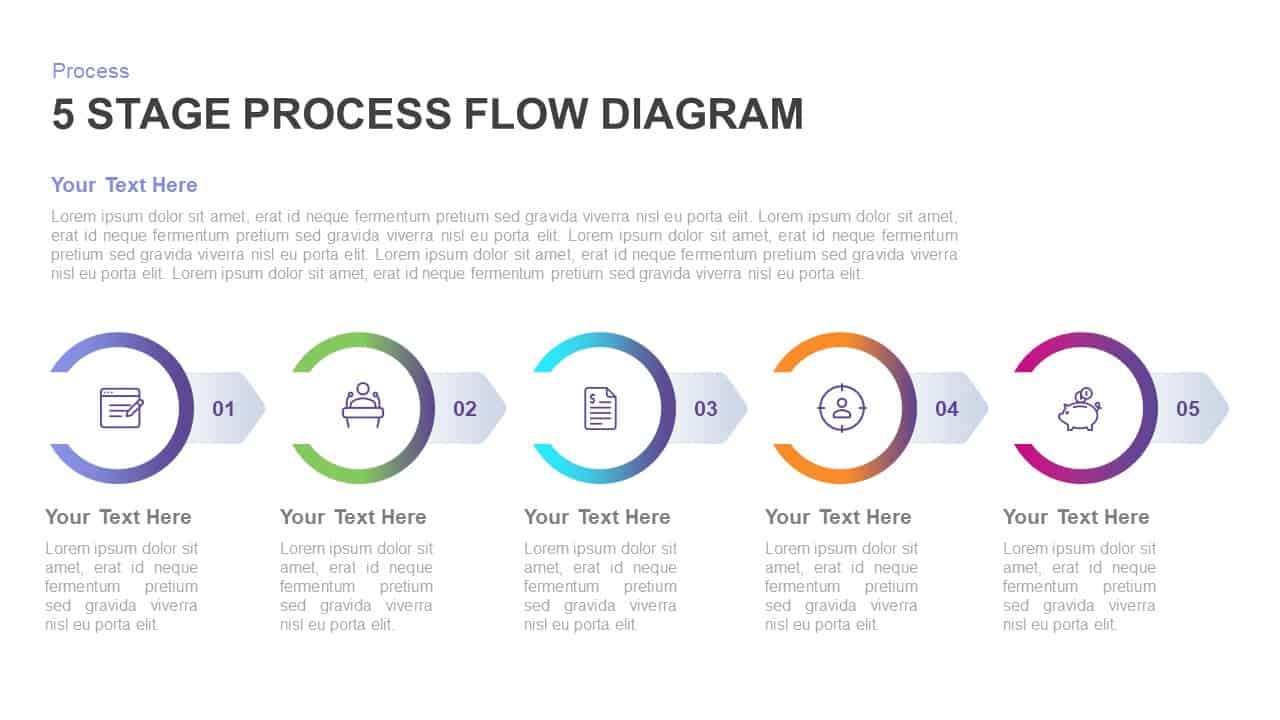
Five-Stage Linear Process Flow Diagram Template for PowerPoint & Google Slides
Process
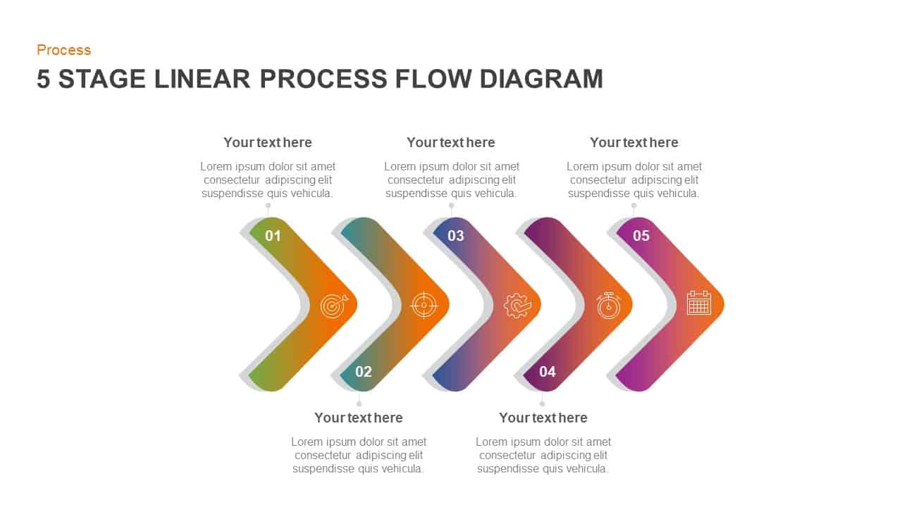
Gradient Chevron Five-Stage Process Flow Template for PowerPoint & Google Slides
Arrow
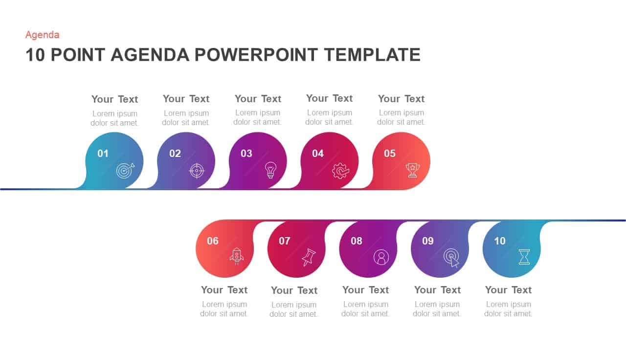
10-Point Gradient Agenda Flow Diagram Template for PowerPoint & Google Slides
Agenda
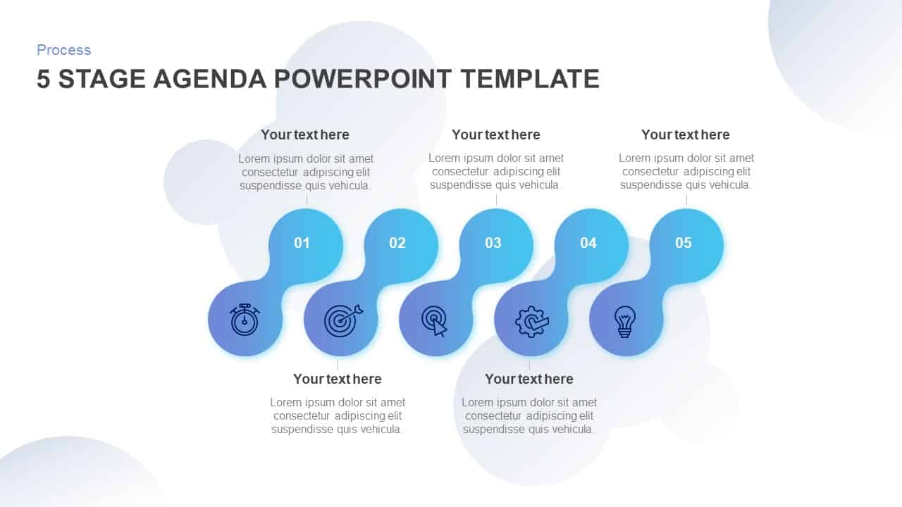
Five-Stage Agenda Flow Diagram Template for PowerPoint & Google Slides
Agenda
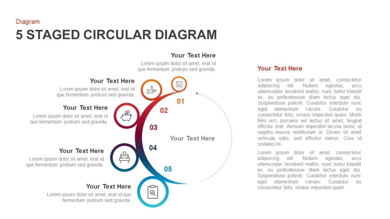
Five-Stage Circular Process Flow Diagram Template for PowerPoint & Google Slides
Circular
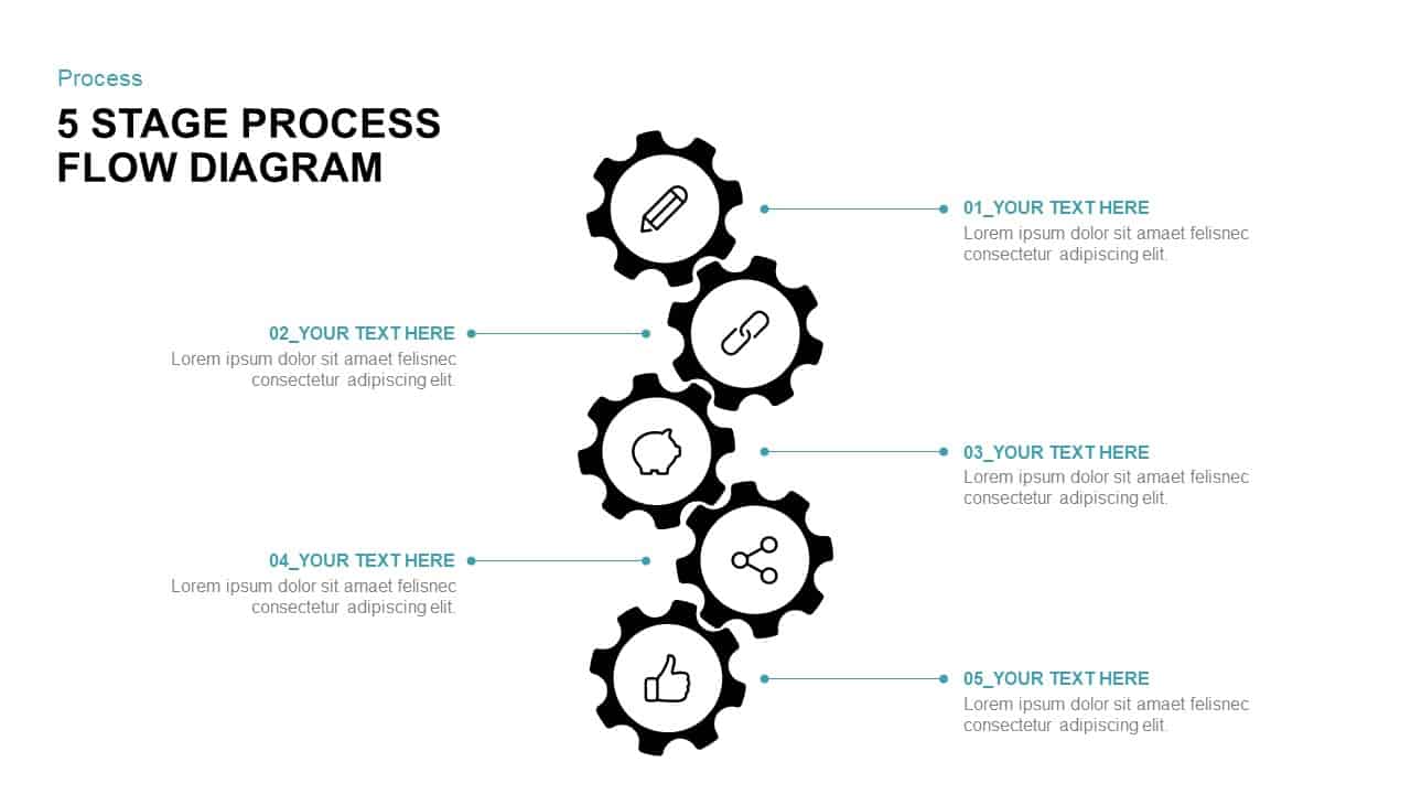
5-Stage Gear Process Flow Diagram Template for PowerPoint & Google Slides
Process
Four-Stage Linear Process Flow Diagram Template for PowerPoint & Google Slides
Process
Four-Stage Circular Flow Diagram Template for PowerPoint & Google Slides
Circular
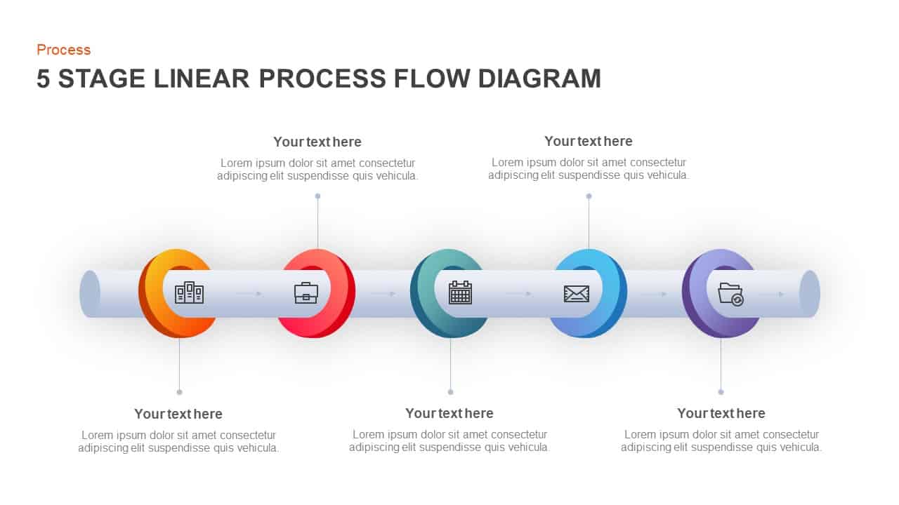
5-Stage Linear Process Flow Diagram Template for PowerPoint & Google Slides
Process
Five-Stage Process Flow Diagram Template for PowerPoint & Google Slides
Process
7 Stage Linear Process Flow Diagram Template for PowerPoint & Google Slides
Process
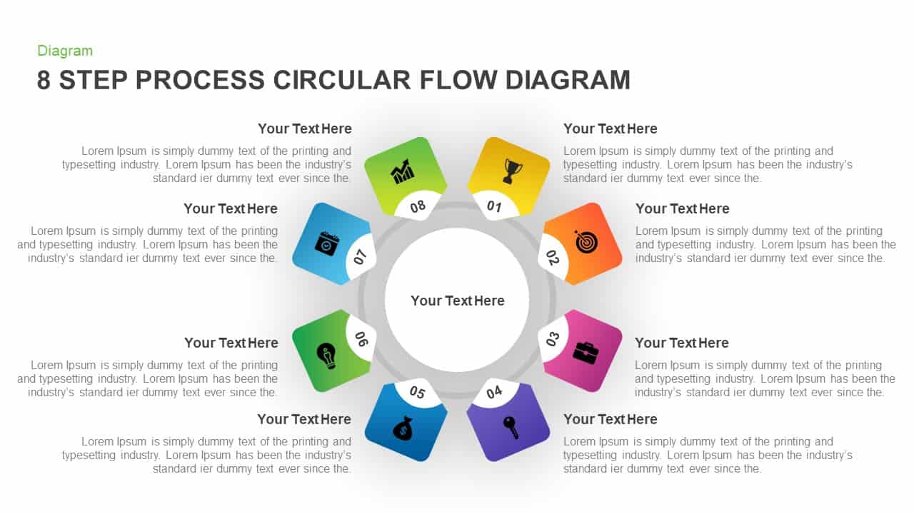
8 Step Circular Process Flow Diagram Template for PowerPoint & Google Slides
Process
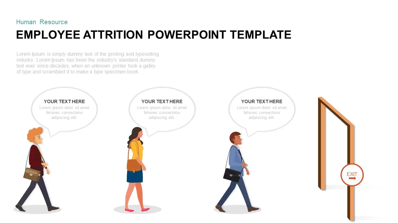
Employee Attrition Flow Template for PowerPoint & Google Slides
Recruitment
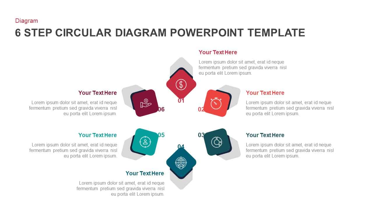
6-Step Circular Process Flow Diagram Template for PowerPoint & Google Slides
Process
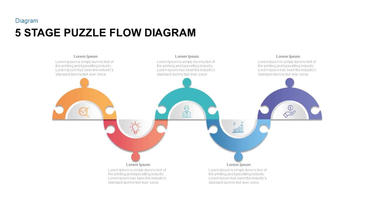
Five Stage Puzzle Flow Diagram Template for PowerPoint & Google Slides
Process
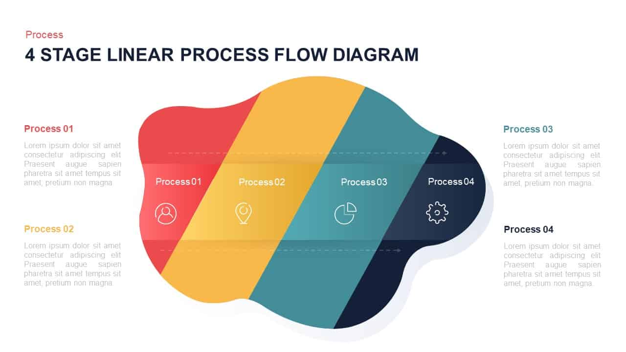
4-Stage Linear Process Flow Diagram Template for PowerPoint & Google Slides
Process
Financial Agreement Signing Flow Diagram Template for PowerPoint & Google Slides
Process
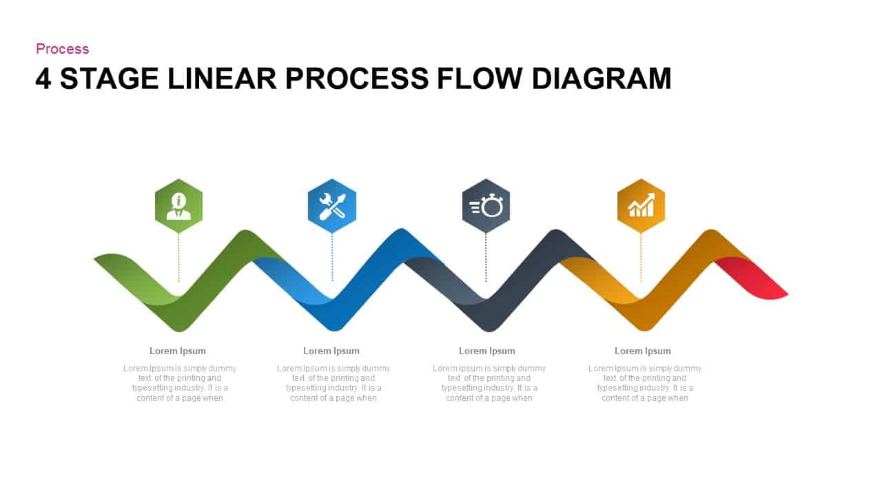
4-Step Linear Process Flow Diagram Template for PowerPoint & Google Slides
Process
Colorful 8-Stage Droplet Process Flow Diagram Template for PowerPoint & Google Slides
Process

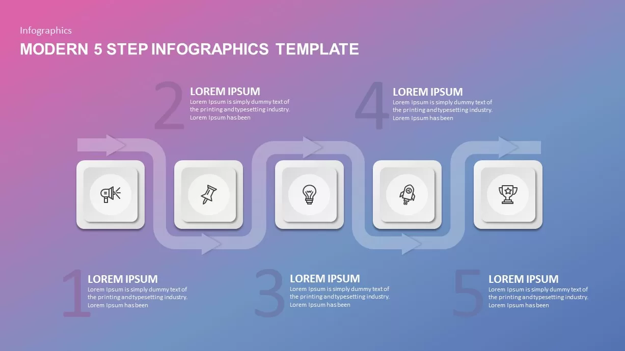
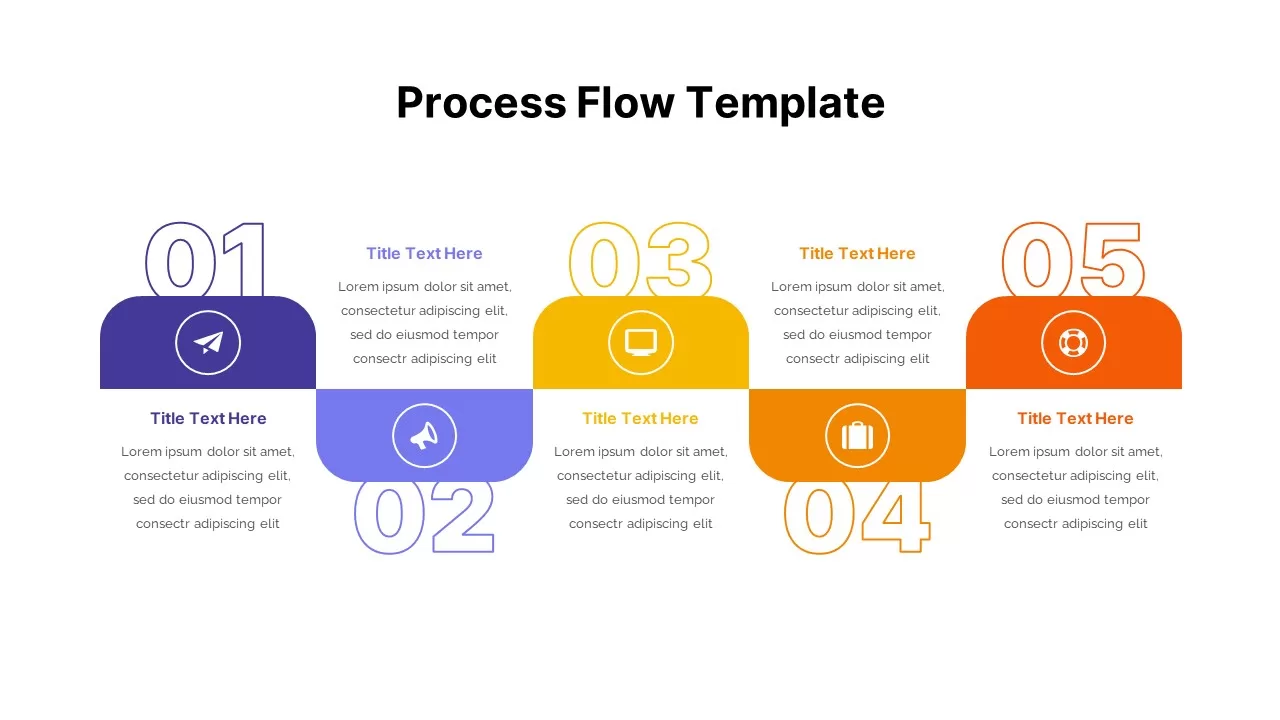
Modern 5-Step Flow Infographics Template for PowerPoint & Google Slides
Process
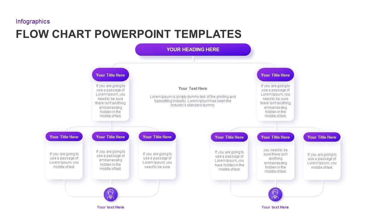
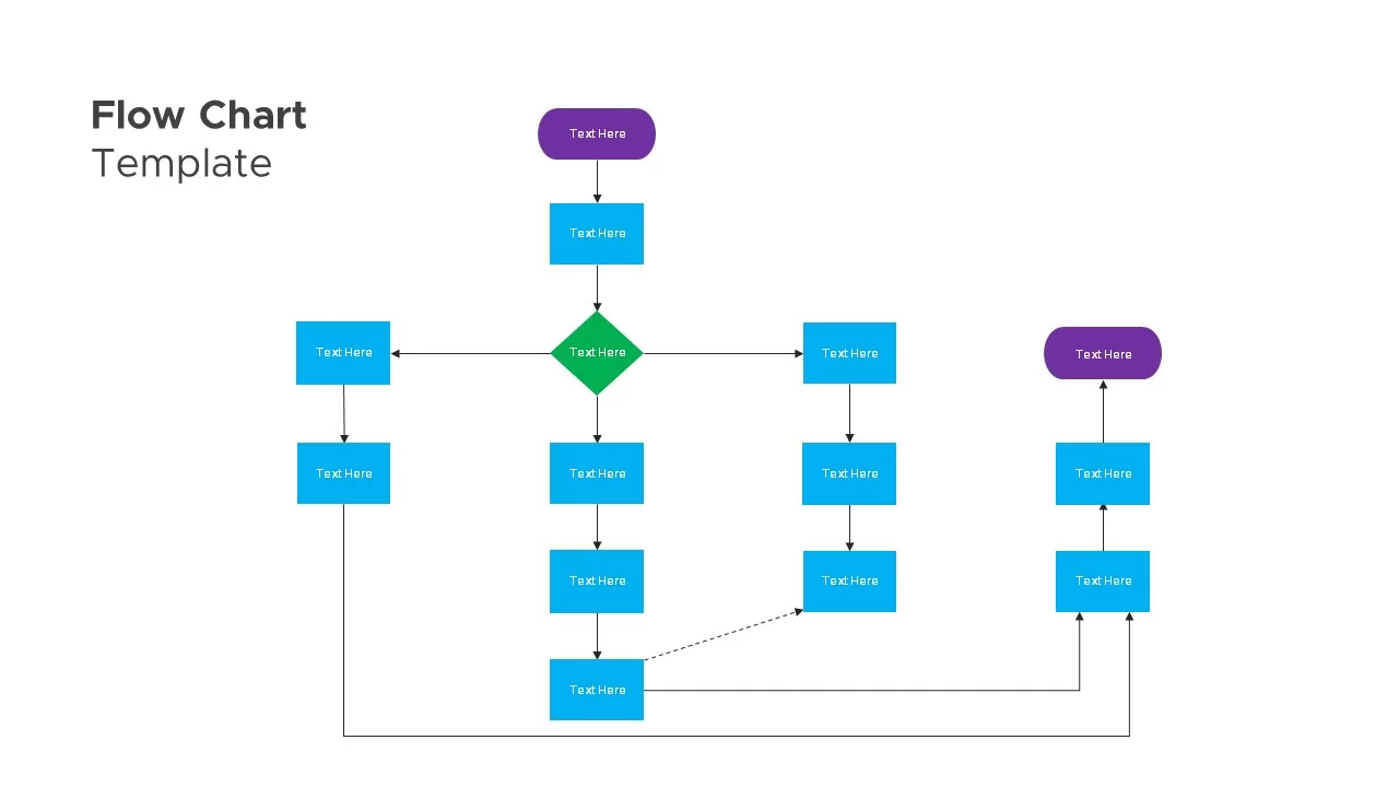
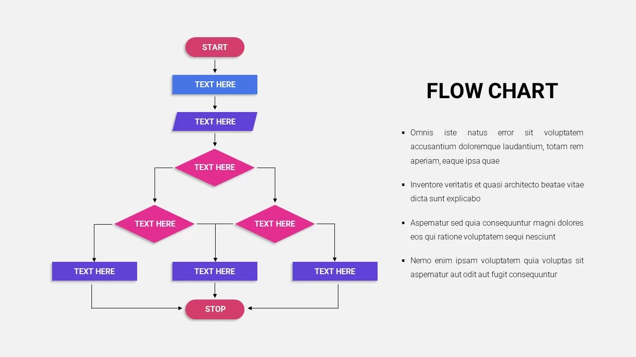
Flow Chart Diagram Template for PowerPoint & Google Slides
Flow Charts
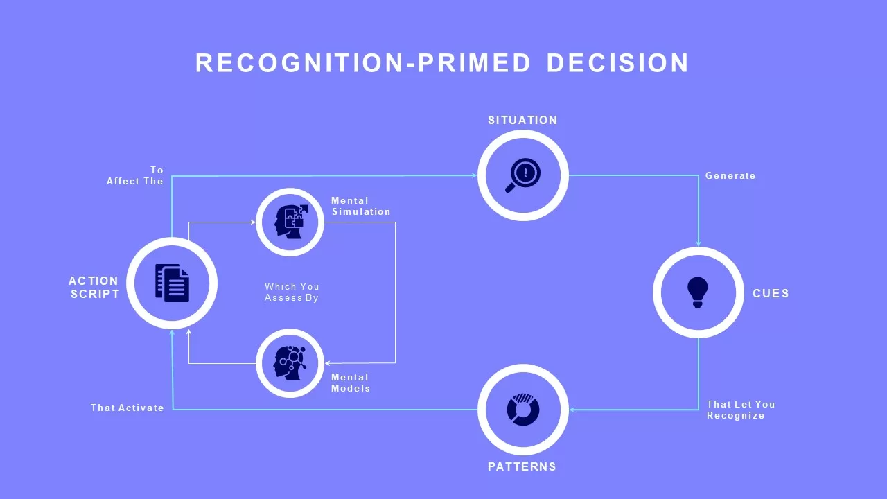
Recognition-Primed Decision Process Flow Template for PowerPoint & Google Slides
Flow Charts
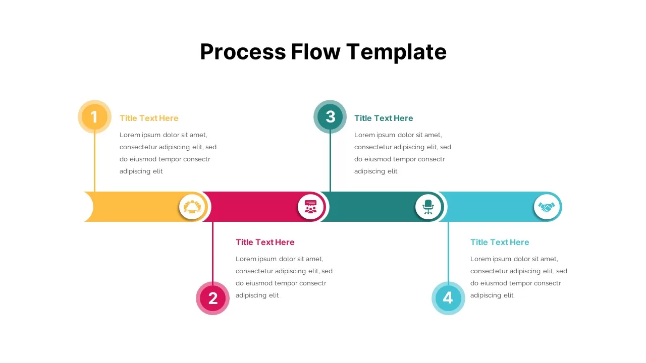
Process Flow Overview template for PowerPoint & Google Slides
Business
Process Flow Steps template for PowerPoint & Google Slides
Business Plan
Process Flow Template for PowerPoint & Google Slides
Process
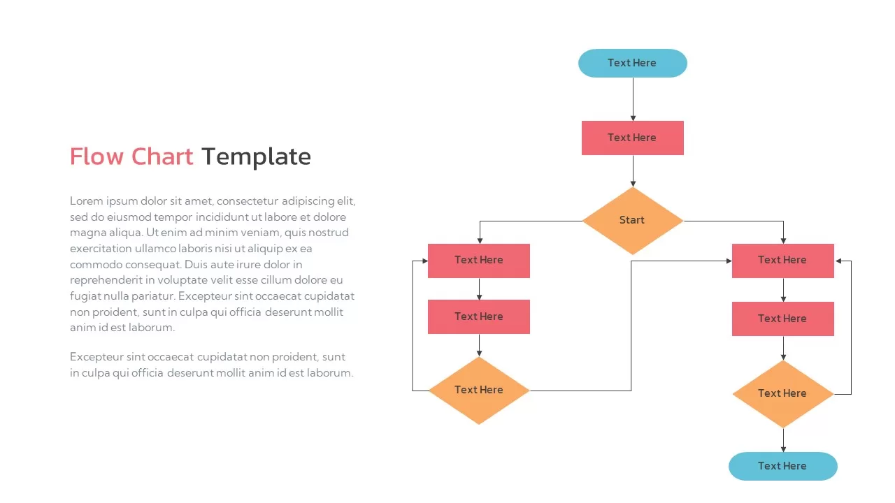
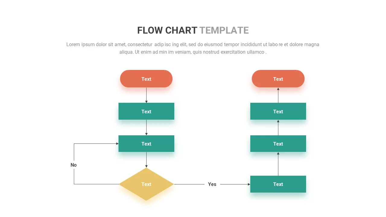
Flow Chart Template for PowerPoint & Google Slides
Flow Charts
Flow Chart Template for PowerPoint & Google Slides
Flow Charts
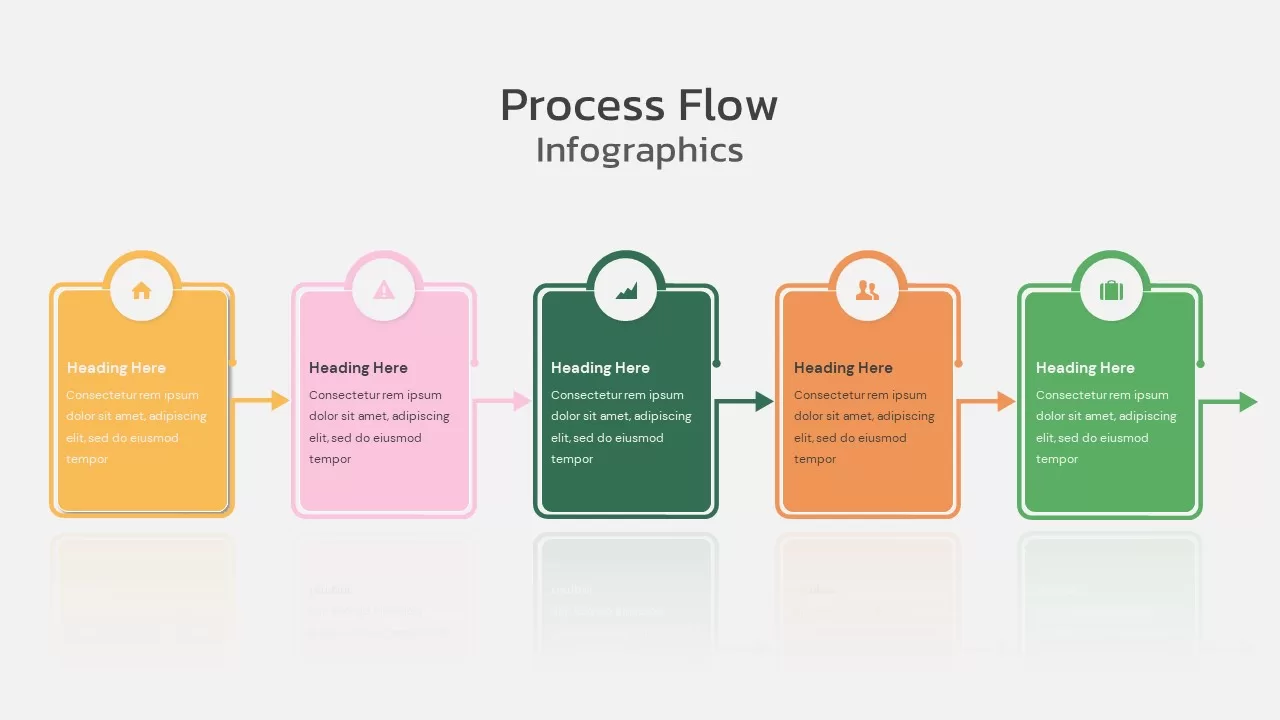
Colorful Process Flow Infographics Template for PowerPoint & Google Slides
Process
Flow Chart Template for PowerPoint & Google Slides
Flow Charts
Flow Chart template for PowerPoint & Google Slides
Flow Charts
4 stage Process Flow template for PowerPoint & Google Slides
Process
5 Stage Process Flow Overview template for PowerPoint & Google Slides
Process
Free Circular Multi-Step Flow Chart Diagram Template for PowerPoint & Google Slides
Flow Charts
Free
Multi-Style Flow Infographic Slide template for PowerPoint & Google Slides
Process
Curved Arrow Process Flow Diagram Template for PowerPoint & Google Slides
Process
Circle Arrows Process Flow template for PowerPoint & Google Slides
Process
Curved Arrow Flow Template for PowerPoint & Google Slides
Process
Three-Step Wavy Arrow Flow Template for PowerPoint & Google Slides
Process
Curved Arrow Process Flow template for PowerPoint & Google Slides
Process
Circular Arrows Process Flow template for PowerPoint & Google Slides
Process
Circular Arrows Process Flow template for PowerPoint & Google Slides
Process
Circle Arrow Process Flow template for PowerPoint & Google Slides
Process
Circle Arrow Process Flow template for PowerPoint & Google Slides
Process
Hexagonal Process Flow Template for PowerPoint & Google Slides
Process
Conveyor Belt Sequential Process Flow Template for PowerPoint & Google Slides
Process
3D Conveyor Belt Process Flow Diagram Template for PowerPoint & Google Slides
Process
E-Waste Management Process Flow Diagram Template for PowerPoint & Google Slides
Process
Current vs Future Process Flow Template for PowerPoint & Google Slides
Comparison
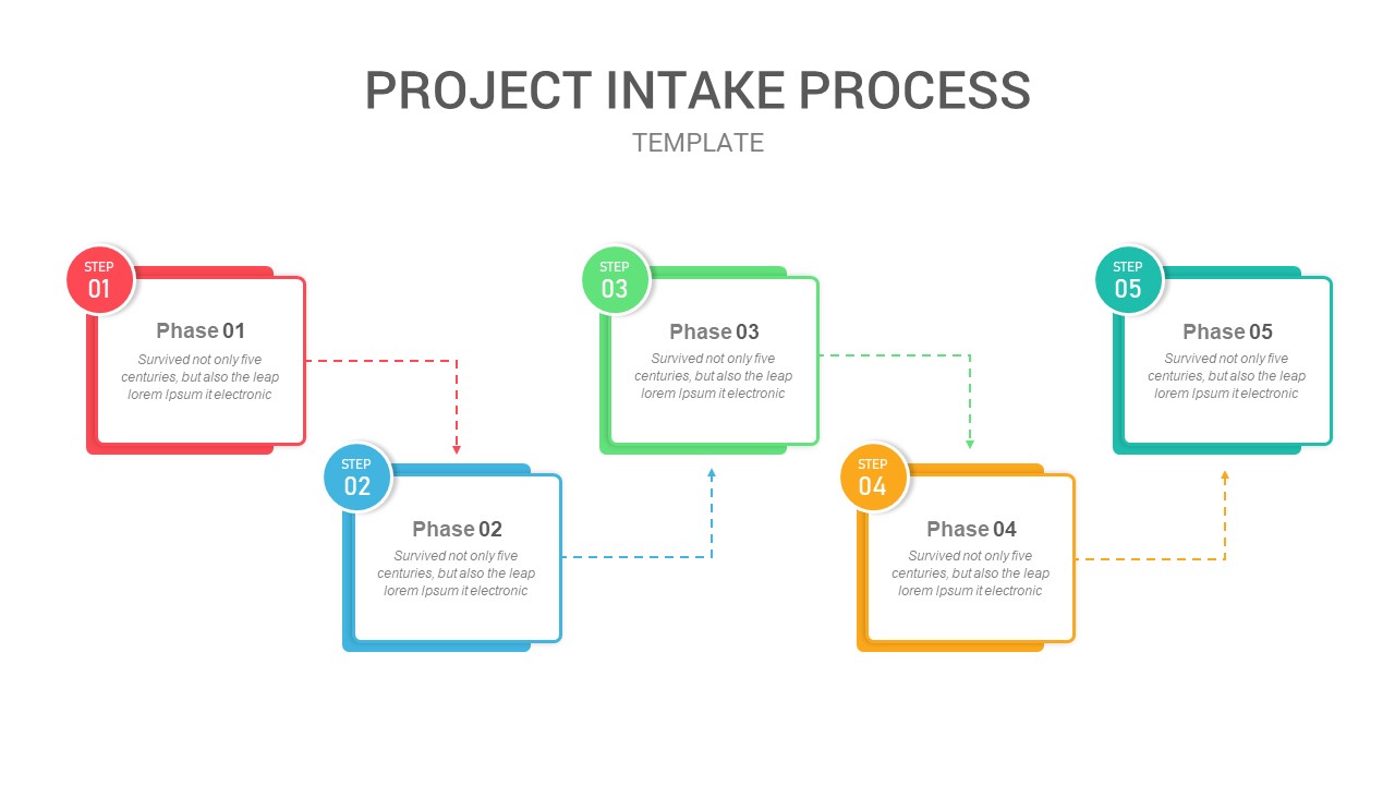
Five-Phase Project Intake Process Flow Template for PowerPoint & Google Slides
Process
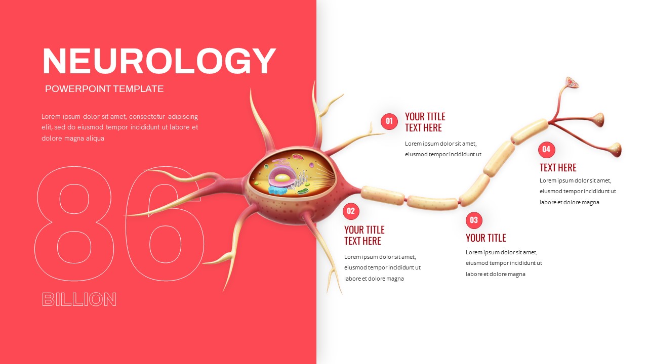
Neurology Neuron Structure Process Flow Template for PowerPoint & Google Slides
Health
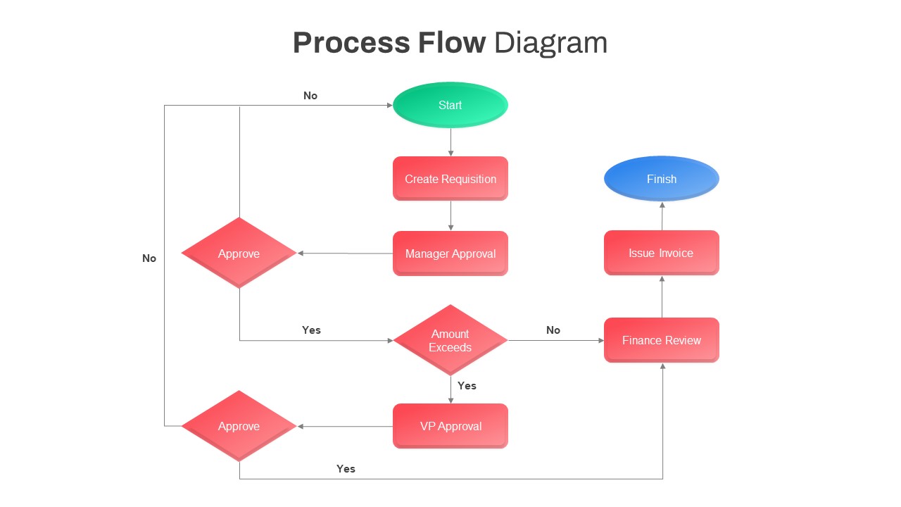
Comprehensive Process Flow Diagram Template for PowerPoint & Google Slides
Process
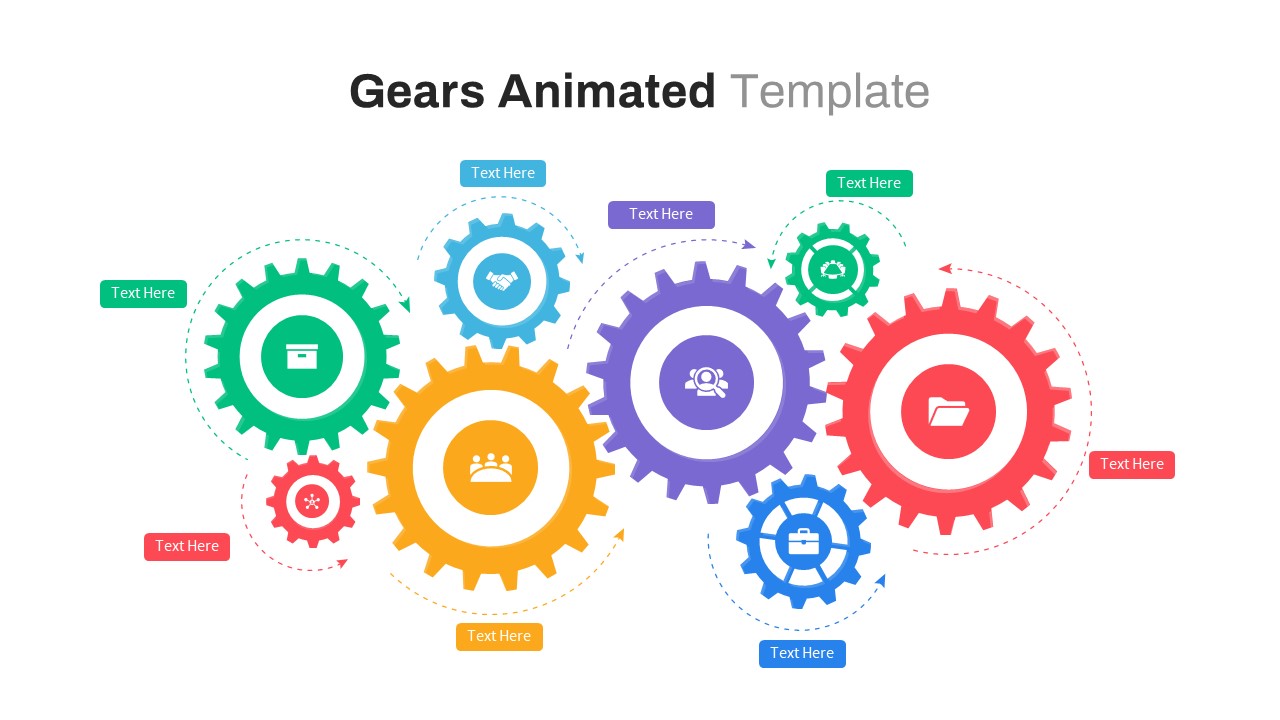
Animated Gears Process Flow Diagram Template for PowerPoint & Google Slides
Process
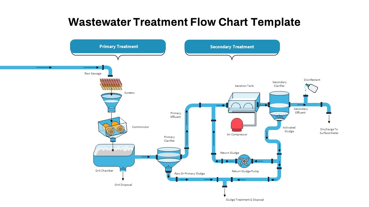
Wastewater Treatment Process Flow Chart Template for PowerPoint & Google Slides
Flow Charts
Animated Process Flow Chart Template for PowerPoint & Google Slides
Infographics
Free Monthly Report PowerPoint Template for PowerPoint & Google Slides
Business Report
Free
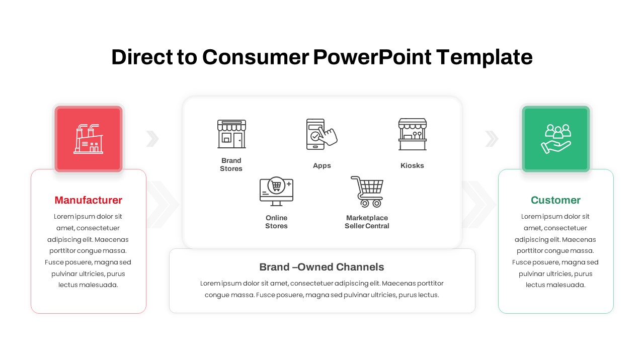
Direct to Consumer Brand Channels Flow Template for PowerPoint & Google Slides
Business Models
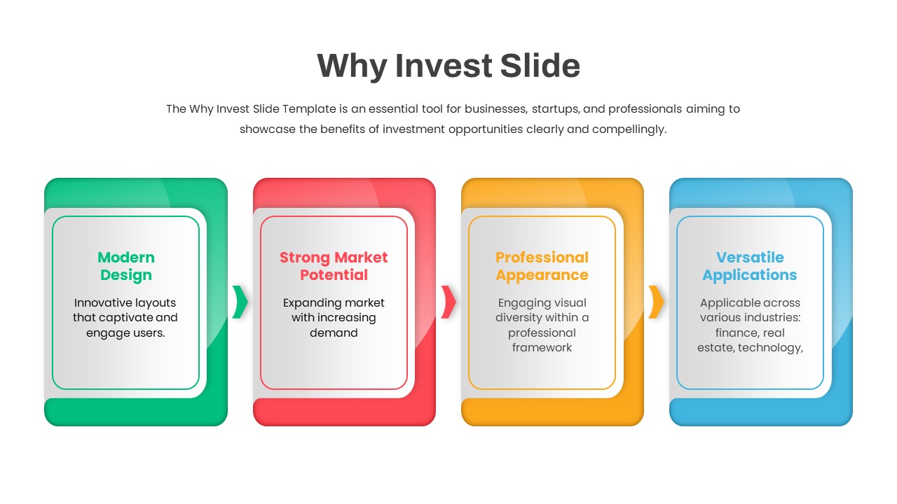
Why Invest Slide Four-Step Benefits Flow Template for PowerPoint & Google Slides
Business Plan
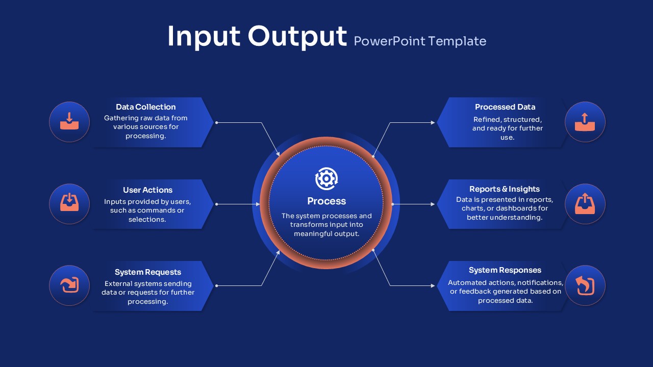
Input-Output Flow Template for PowerPoint & Google Slides
Process
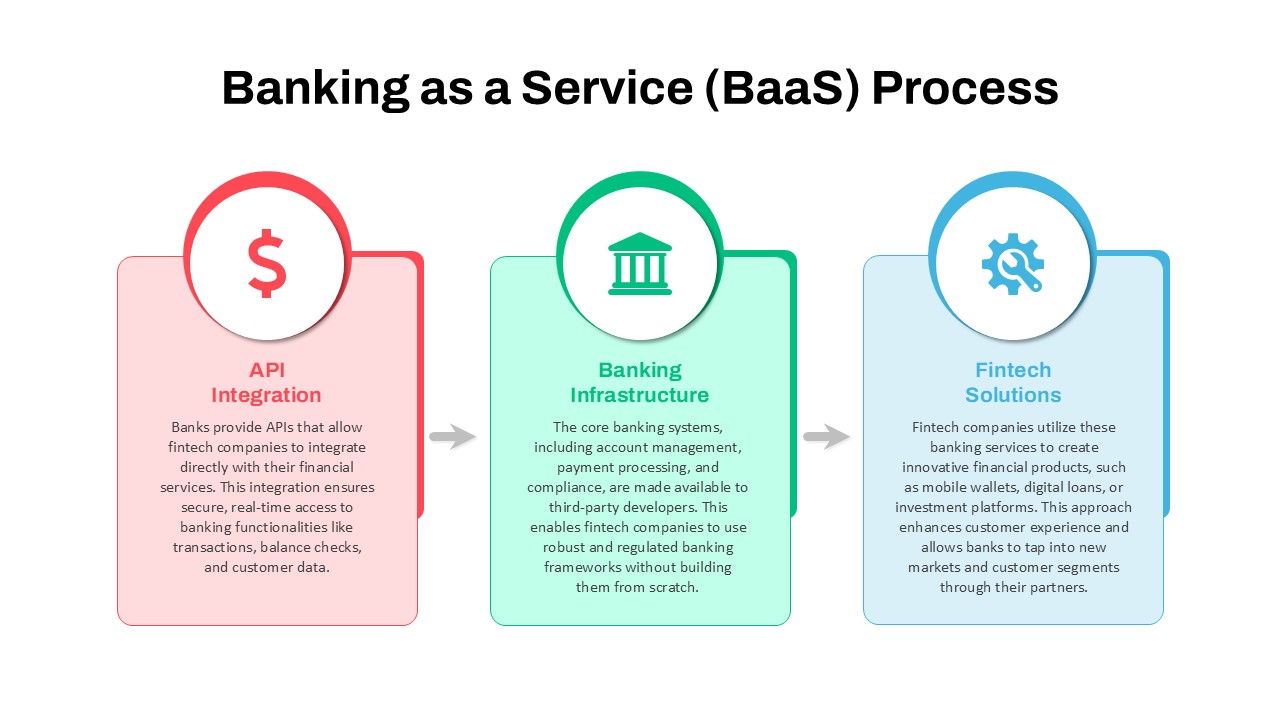
Banking as a Service (BaaS) Process Flow Template for PowerPoint & Google Slides
Process
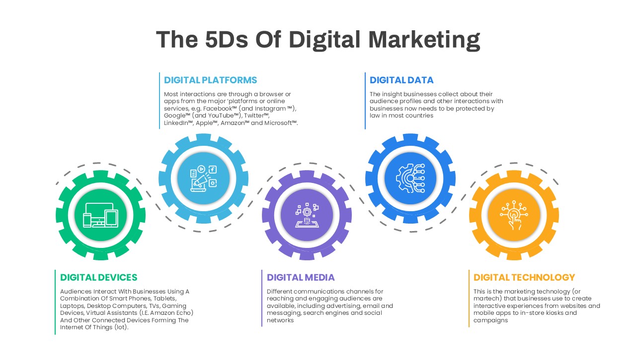
5D Digital Marketing Flow Diagram Template for PowerPoint & Google Slides
Digital Marketing
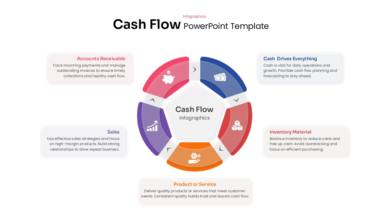
Cash Flow Infographics template for PowerPoint & Google Slides
Business
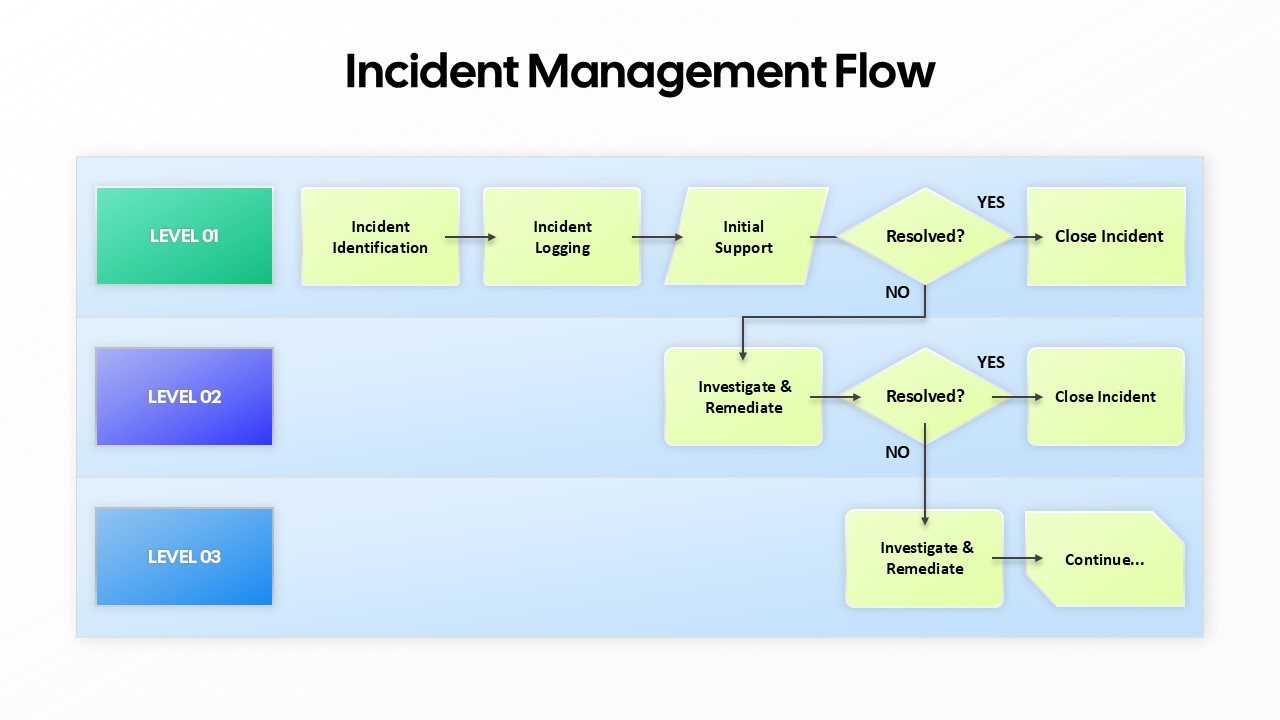
Incident Management Flow Process template for PowerPoint & Google Slides
Flow Charts
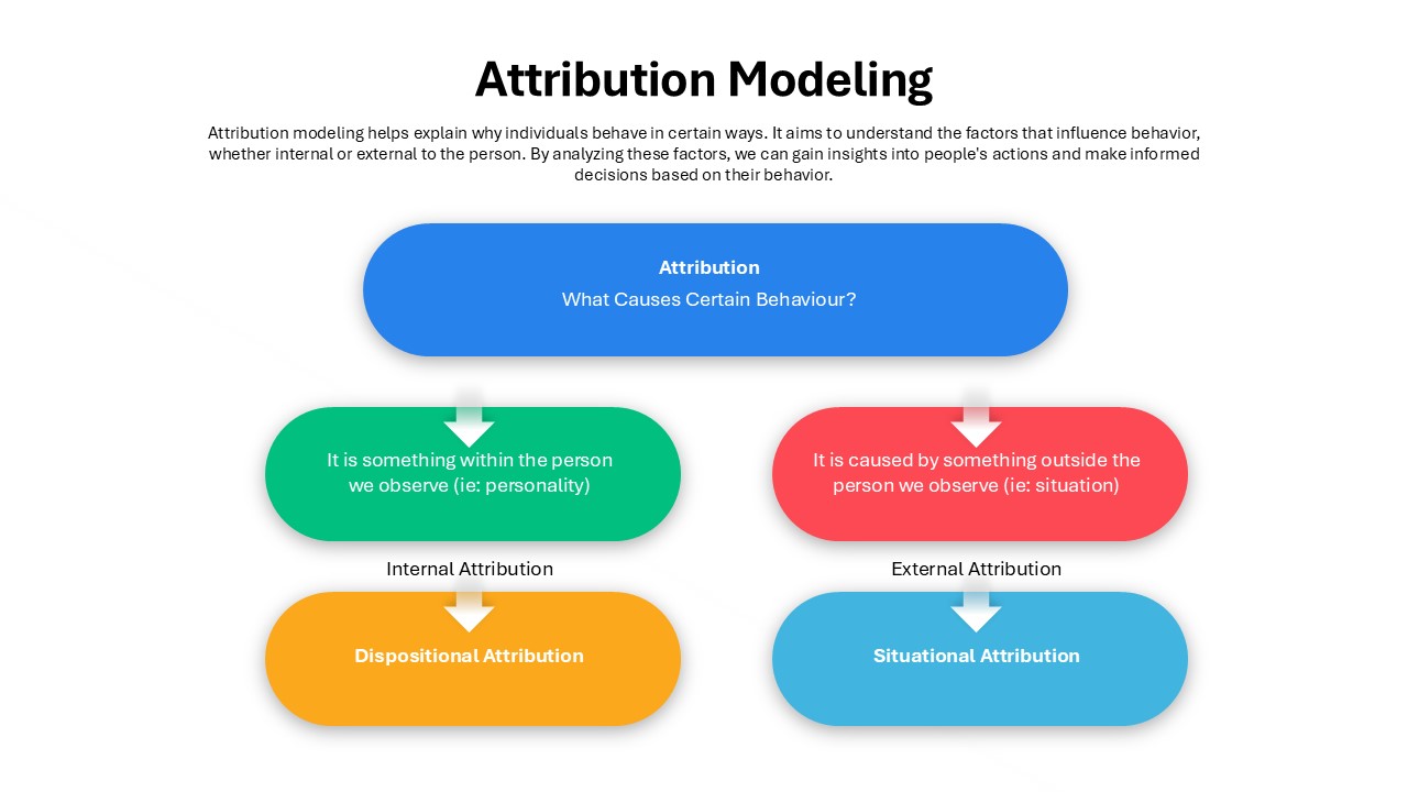
Attribution Modeling Flow Chart Template for PowerPoint & Google Slides
Flow Charts
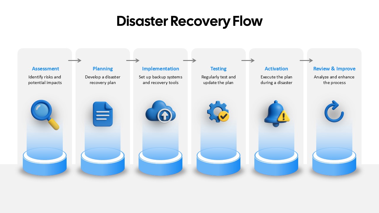
Disaster Recovery Flow Diagram Template for PowerPoint & Google Slides
Process
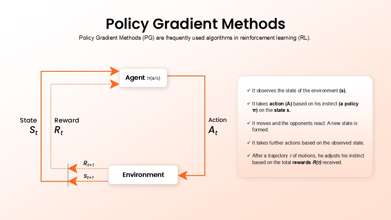
Policy Gradient Methods Flow Diagram Template for PowerPoint & Google Slides
AI
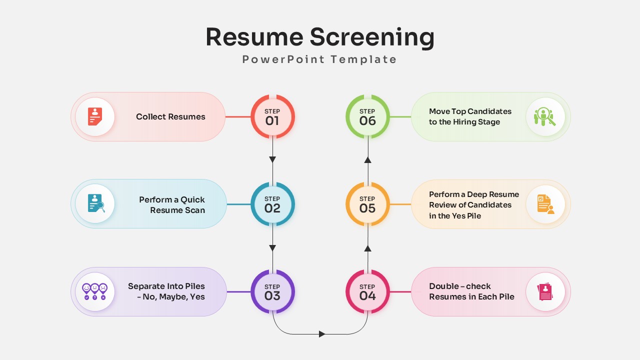
Resume Screening Process Flow Diagram Template for PowerPoint & Google Slides
Process
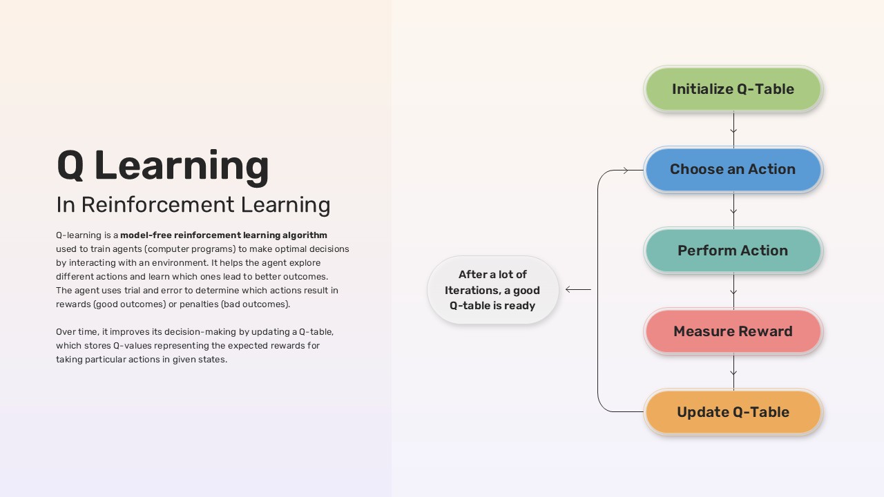
Q-Learning Process Flow Diagram Template for PowerPoint & Google Slides
Process
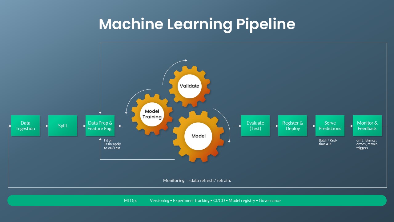
Machine Learning Pipeline & MLOps Flow Template for PowerPoint & Google Slides
Machine Learning
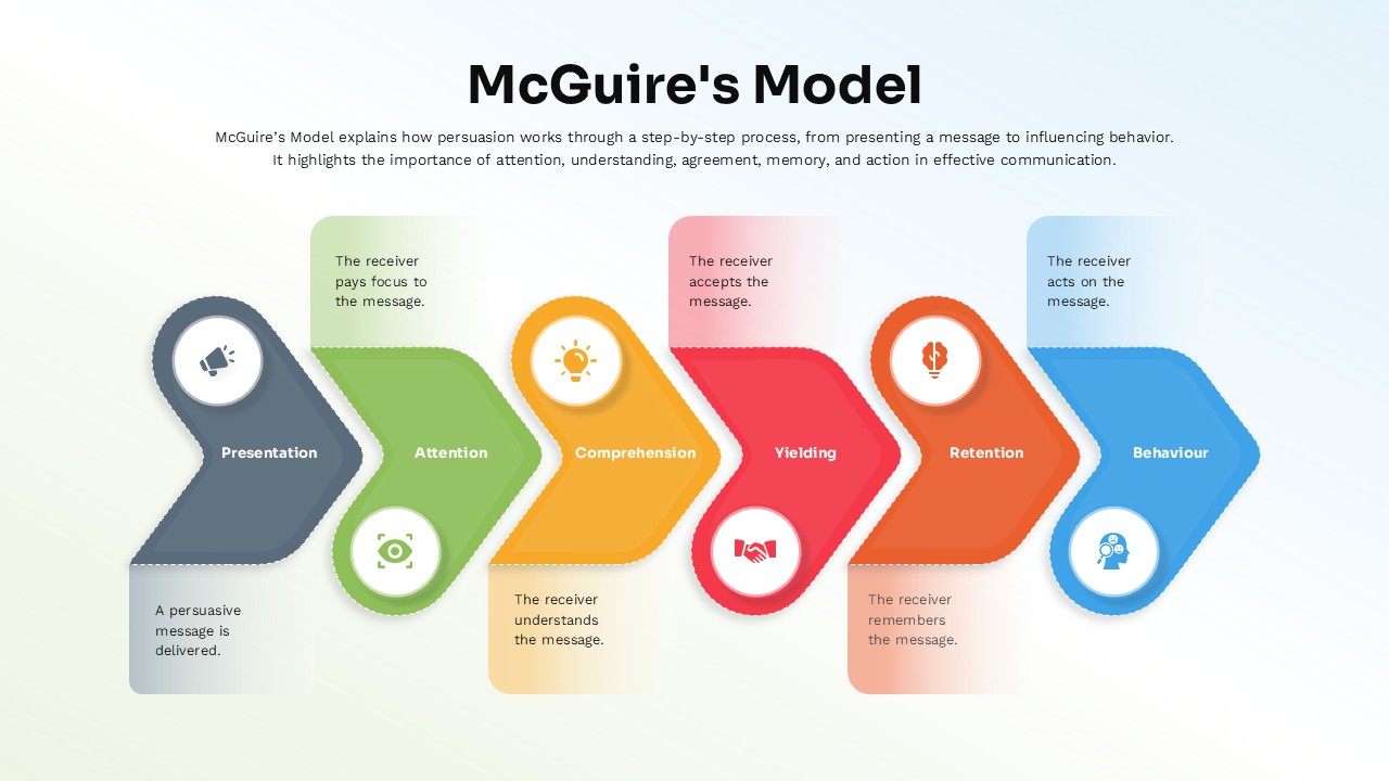
McGuire’s Persuasion Process Flow Diagram Template for PowerPoint & Google Slides
Marketing
Flow of Funds Financial System Diagram Template for PowerPoint & Google Slides
Finance
Product Design Process Flow Diagram Template for PowerPoint & Google Slides
Process