Quarterly Comparison Pie Chart Template for PowerPoint & Google Slides
Description
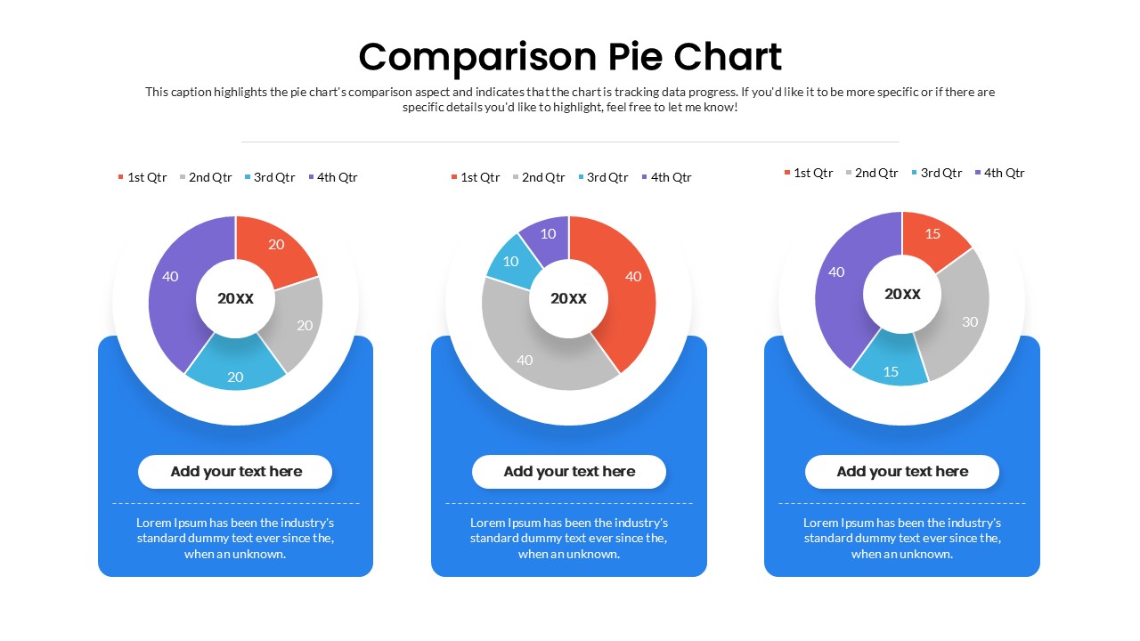
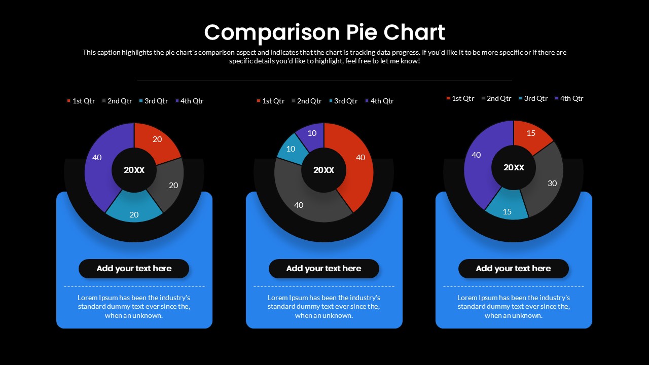
Visualize your quarterly performance with this Quarterly Comparison Pie Chart Layout template for PowerPoint and Google Slides. This design presents three donut-style pie charts side by side, making it ideal for comparing different years, products, or business segments. Each chart is divided into four distinct color-coded sections representing 1st, 2nd, 3rd, and 4th quarters, ensuring data is easy to interpret at a glance. A clear legend at the top provides consistent labeling across all charts, while placeholders beneath each chart allow you to add supporting descriptions or insights.
The template’s clean, modern style uses bright colors against a white background, giving it a professional yet approachable look. Its structured format helps highlight patterns, growth trends, and variances between data sets, making it perfect for corporate presentations, performance reviews, or investor updates. Fully customizable, you can adjust colors, values, and labels to fit your data story. Since the layout is optimized for both PowerPoint and Google Slides, your charts will remain sharp and presentation-ready across all devices and screens.
Who is it for
This slide is designed for business managers, analysts, consultants, and financial professionals who need to showcase quarterly comparisons, performance tracking, or data breakdowns in a visual format.
Other Uses
Beyond quarterly reporting, this layout can be repurposed for comparing customer segments, survey results, regional performance, or market share distribution. It is also suitable for academic projects, research findings, and organizational reviews where data-driven storytelling is essential.
Login to download this file

Item ID
SB05538Designed By
Gopika
Related Templates

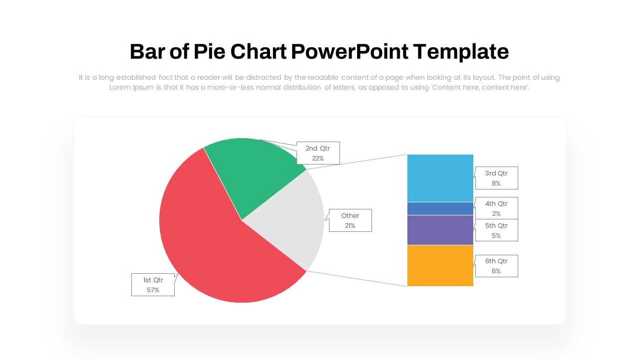
Dynamic Bar-of-Pie Chart Comparison Template for PowerPoint & Google Slides
Pie/Donut
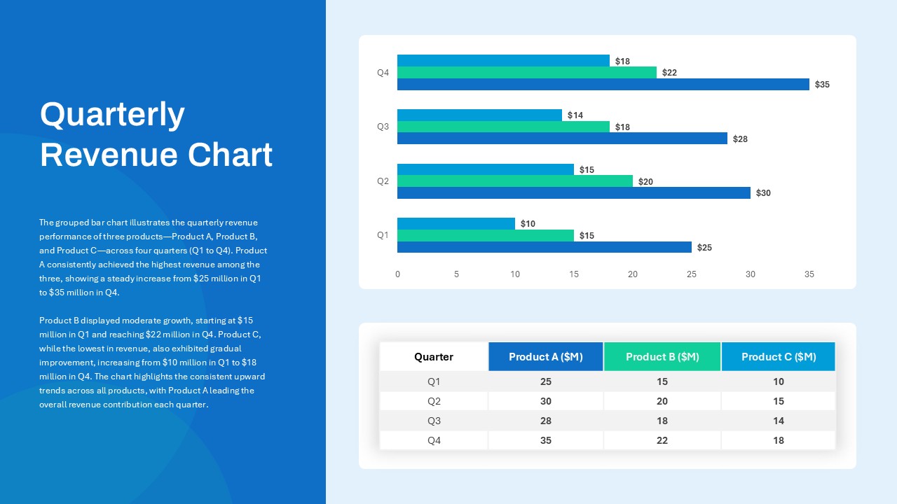
Quarterly Revenue Comparison Bar Chart Template for PowerPoint & Google Slides
Bar/Column
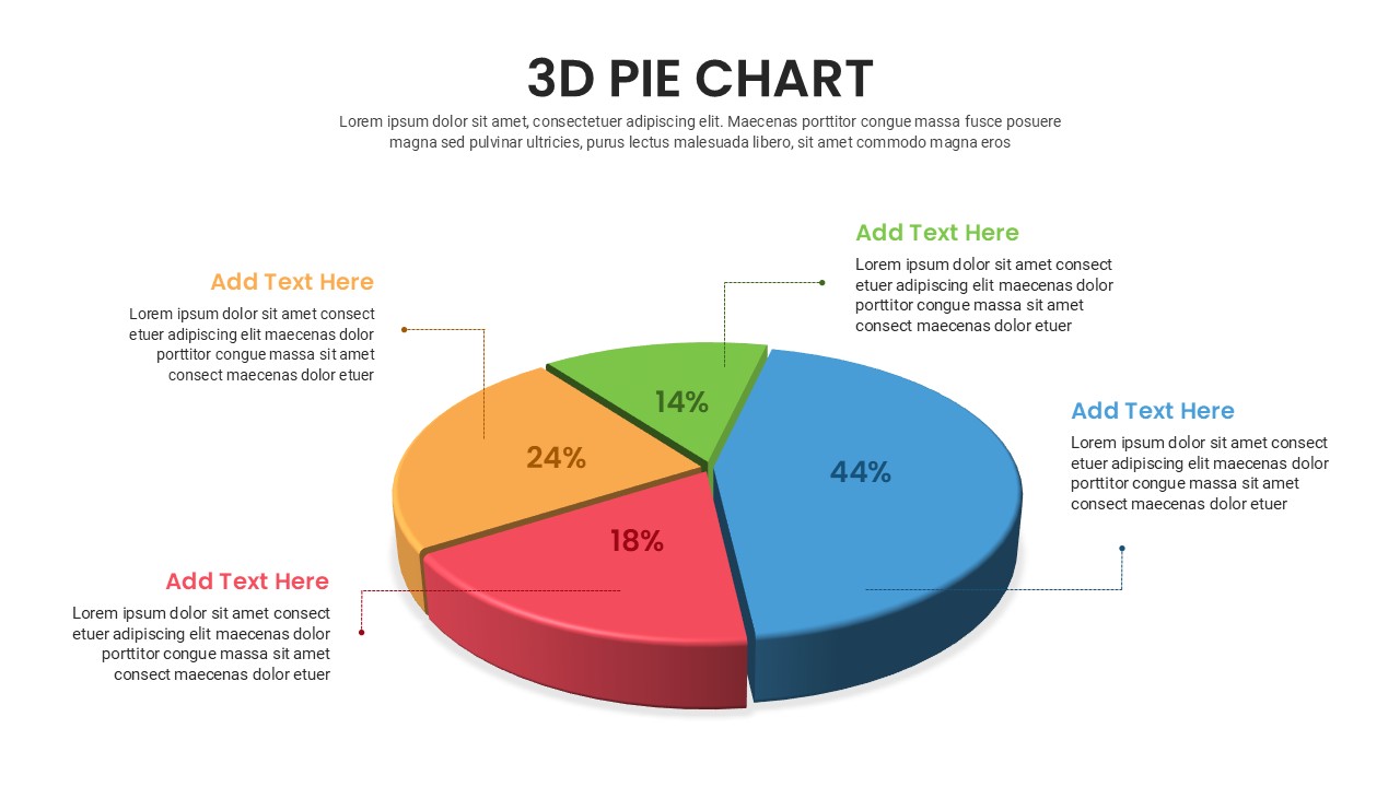
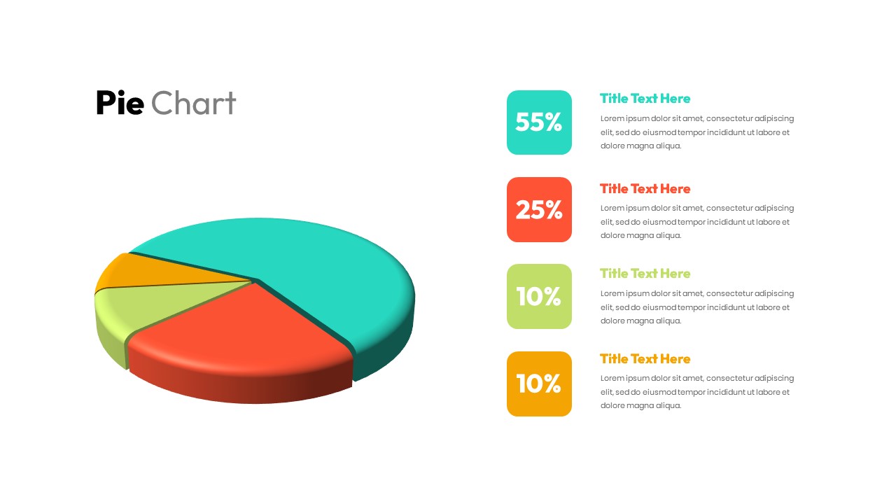
Free 3D Pie Chart template for PowerPoint & Google Slides
Pie/Donut
Free
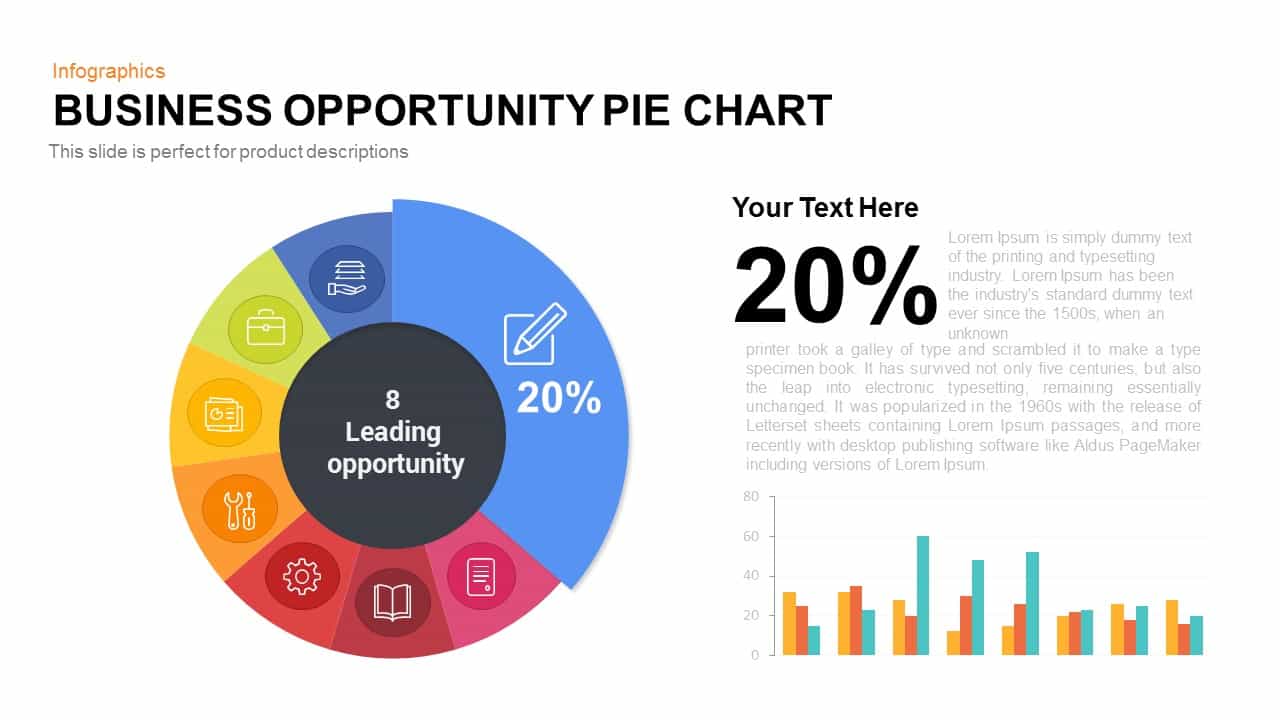
Business Opportunity Pie Chart Template for PowerPoint & Google Slides
Pie/Donut
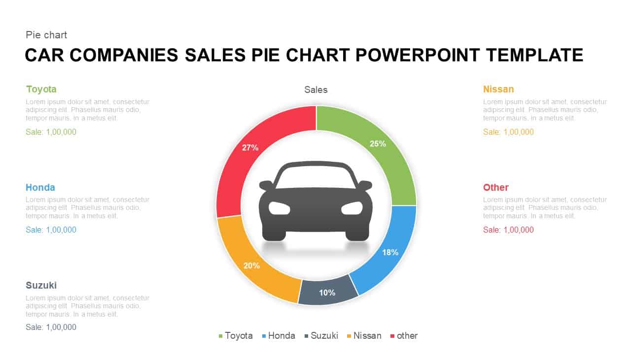
Car Sales Market Share Pie Chart Template for PowerPoint & Google Slides
BCG
3D pie chart infographic template for PowerPoint & Google Slides
Pie/Donut
Segmented Pie Chart Infographic with Icons for PowerPoint & Google Slides
Pie/Donut
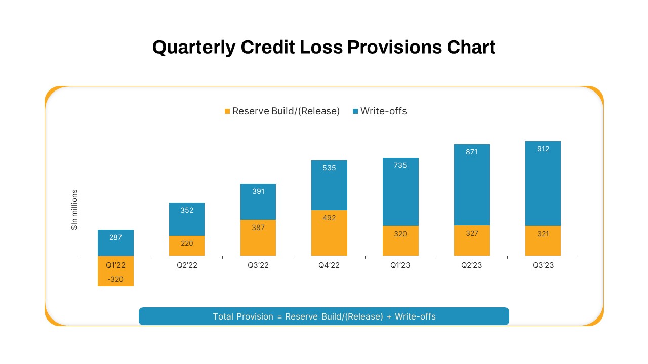
Quarterly Credit Loss Provisions Chart Template for PowerPoint & Google Slides
Bar/Column
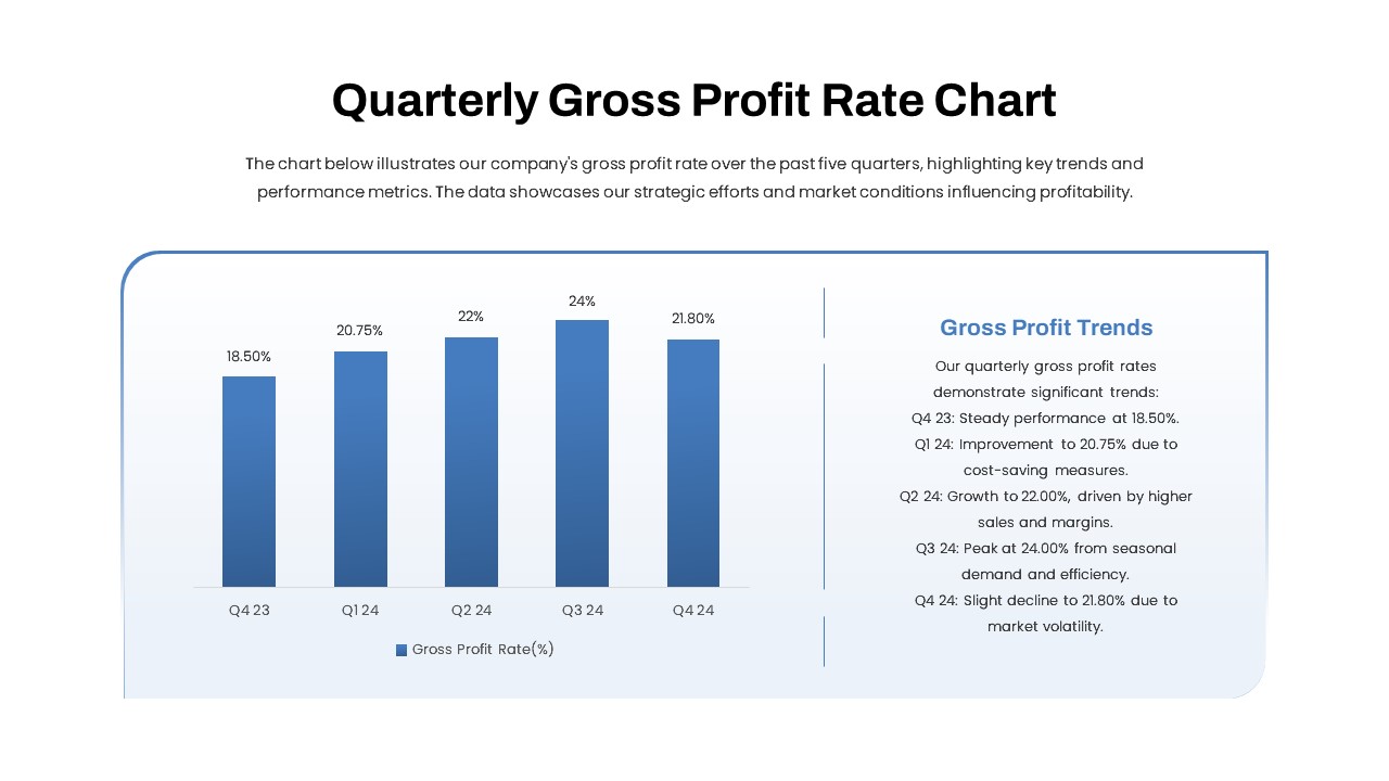
Quarterly Gross Profit Rate Chart Template for PowerPoint & Google Slides
Revenue
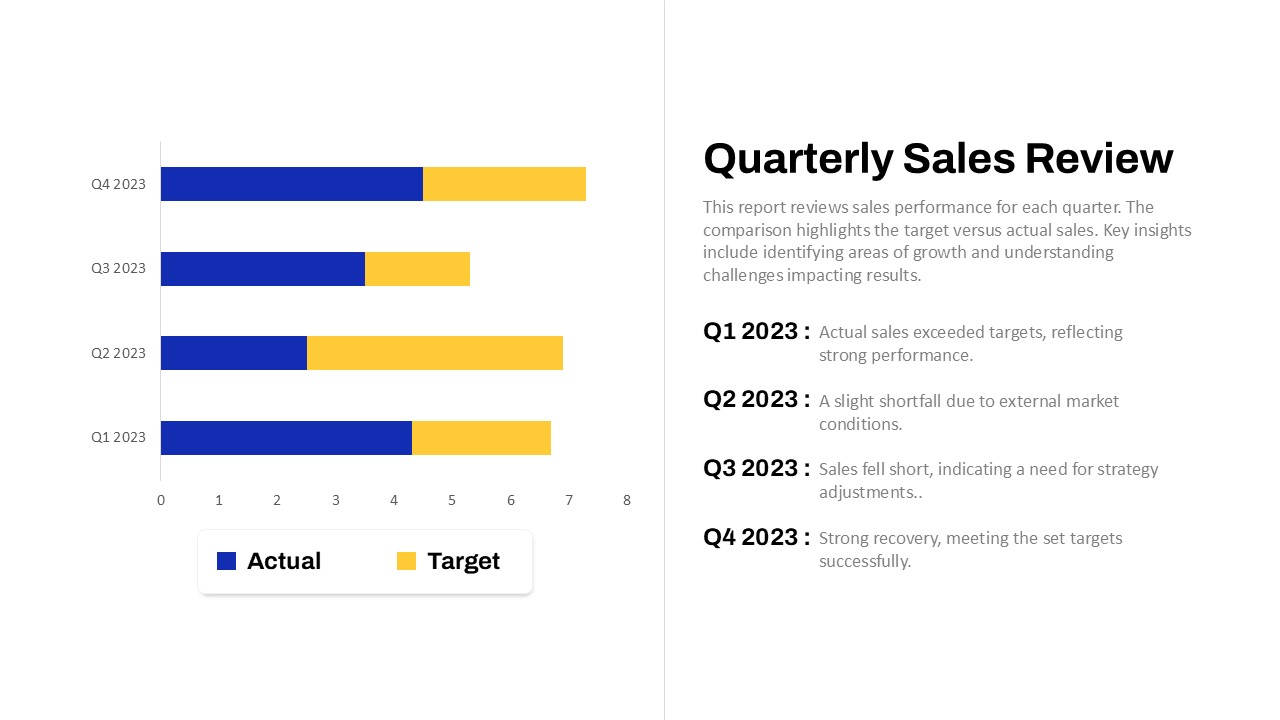
Quarterly Sales Review Bar Chart Template for PowerPoint & Google Slides
Bar/Column
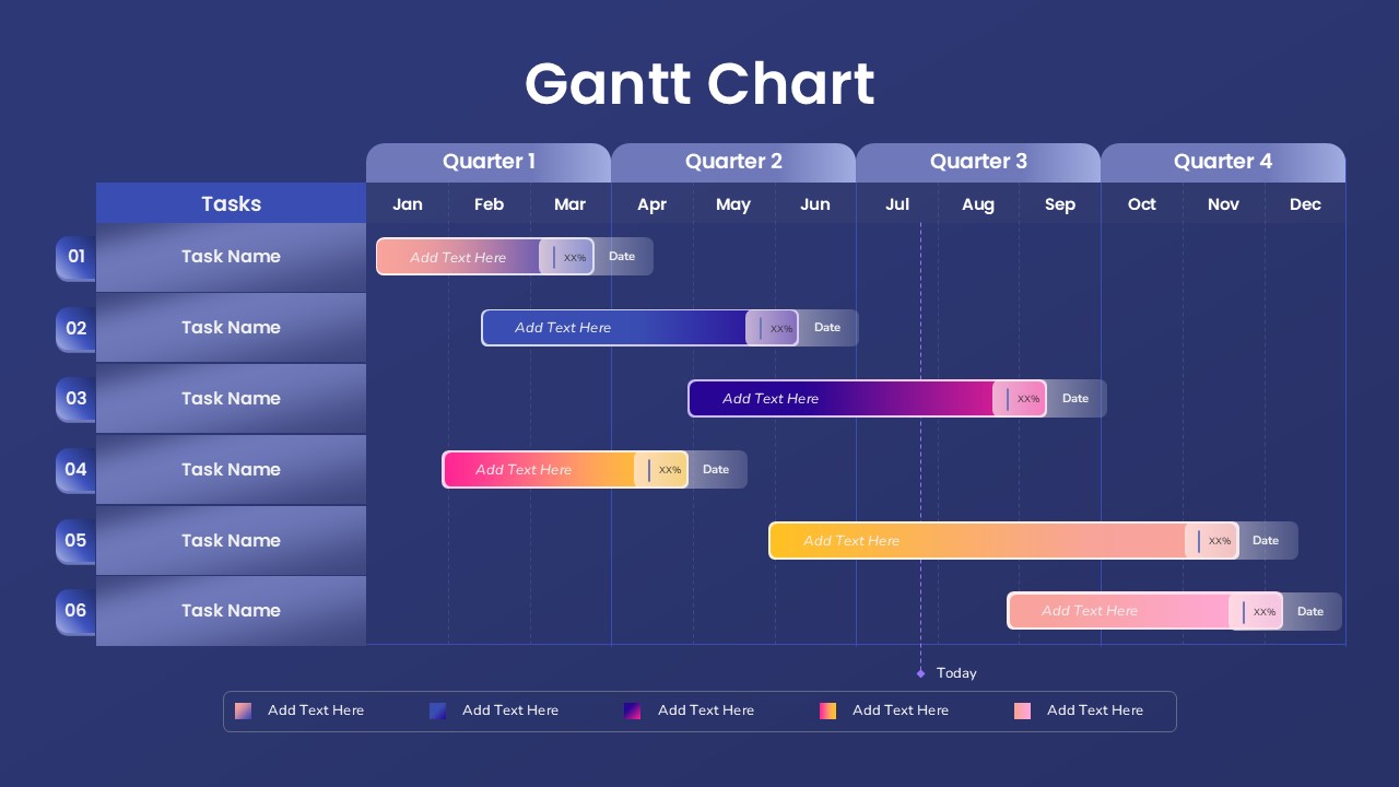
Quarterly Gantt Chart with Today Marker Template for PowerPoint & Google Slides
Gantt Chart

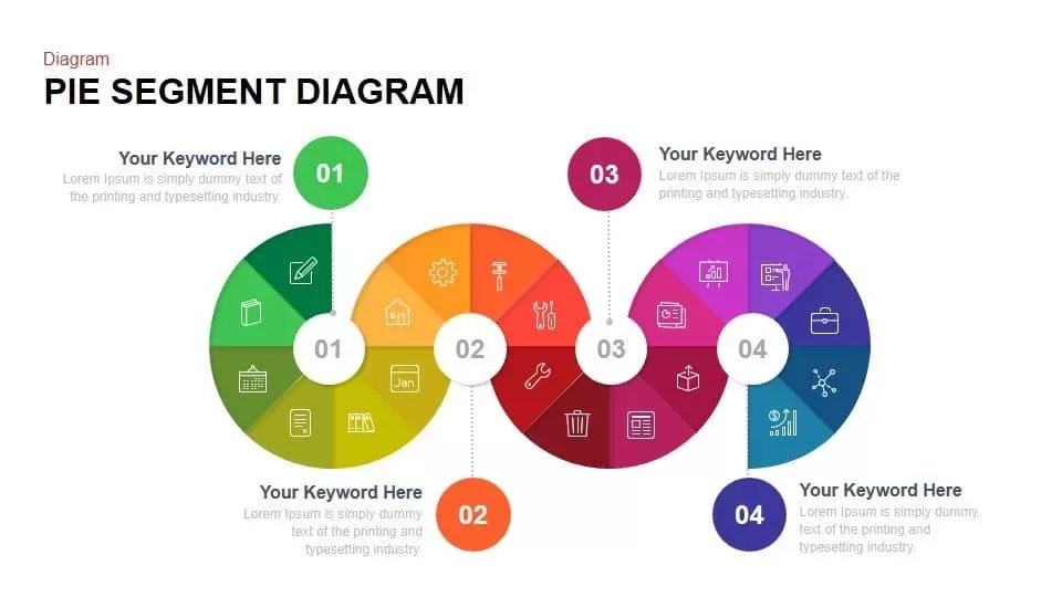
Pie Segment Diagram Four-Step Process Template for PowerPoint & Google Slides
Pie/Donut
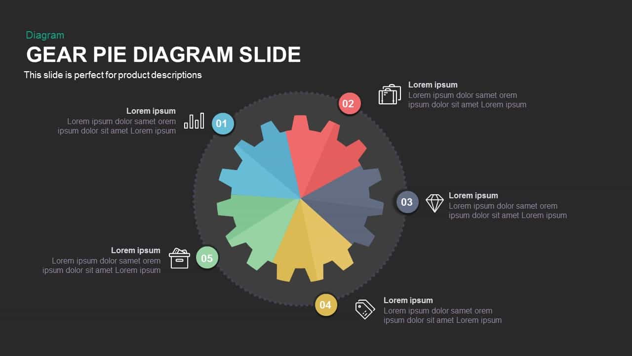
Gear Pie Diagram Data Visualization Template for PowerPoint & Google Slides
Pie/Donut
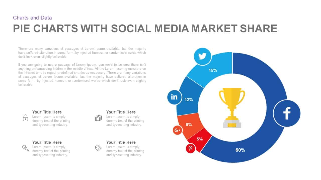
Social Media Market Share Pie Charts Template for PowerPoint & Google Slides
Pie/Donut
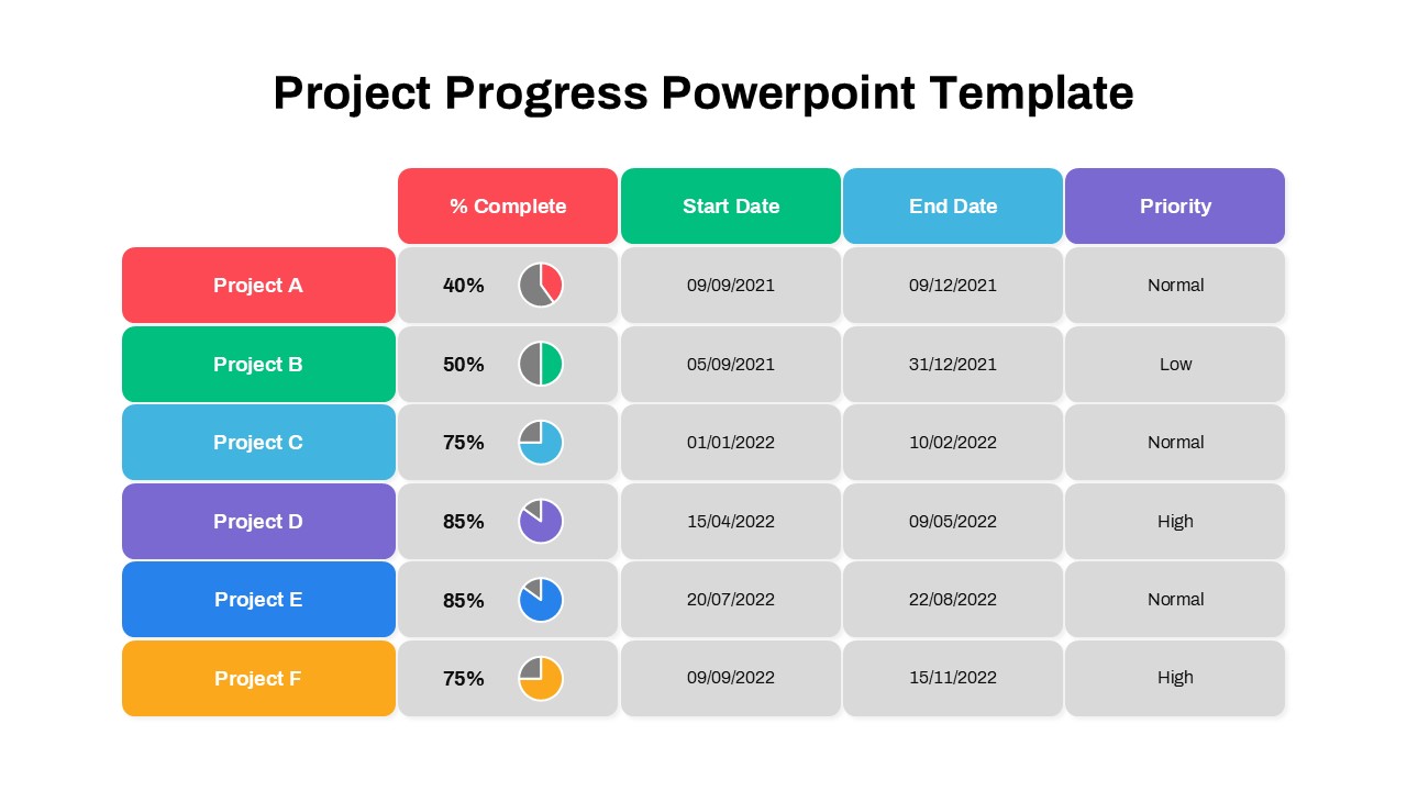
Project Progress Dashboard Pie Charts Template for PowerPoint & Google Slides
Project
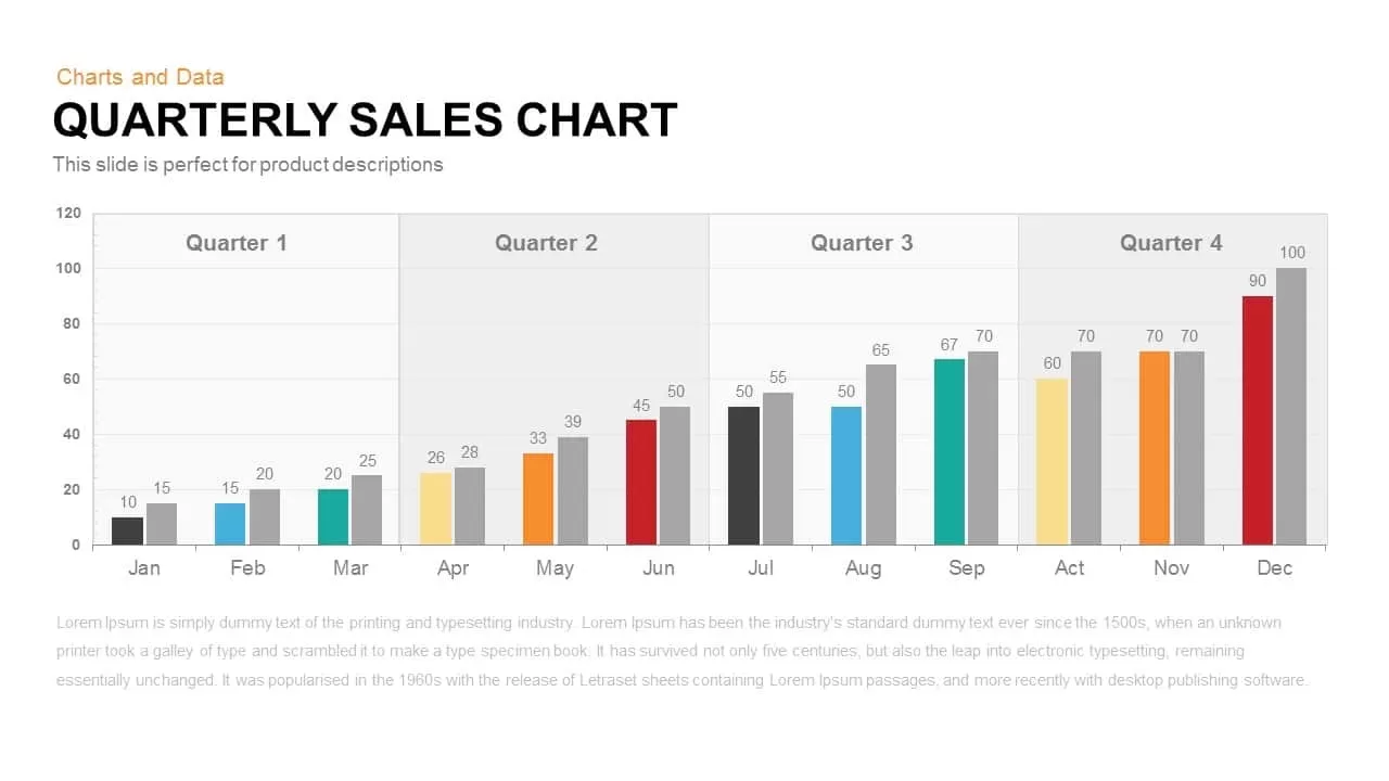
Quarterly Sales template for PowerPoint & Google Slides
Bar/Column
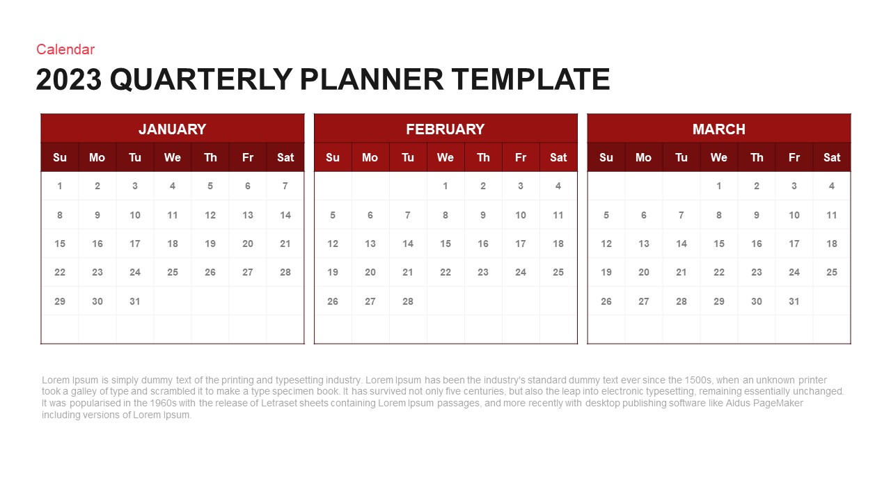
Quarterly Planner Calendar Layout Template for PowerPoint & Google Slides
Project
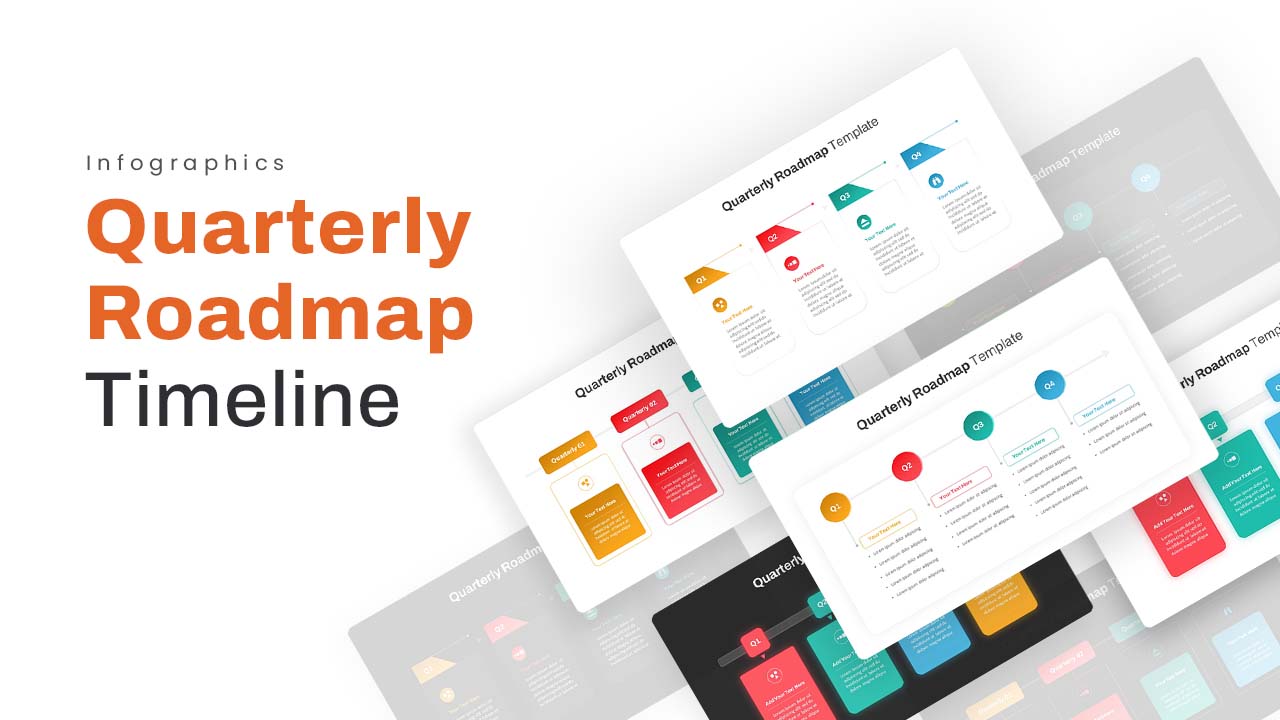
Quarterly Roadmap Timeline Infographic Template for PowerPoint & Google Slides
Timeline
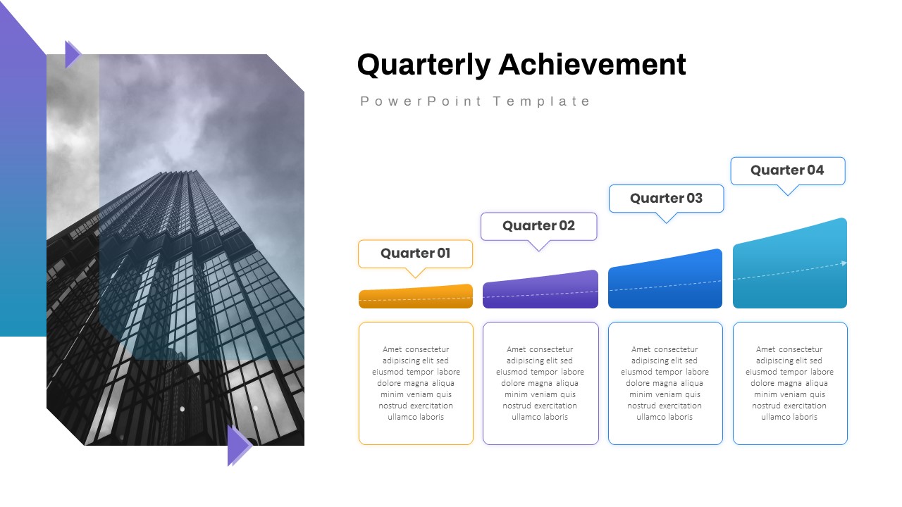
Quarterly Achievement Progress Template for PowerPoint & Google Slides
Accomplishment
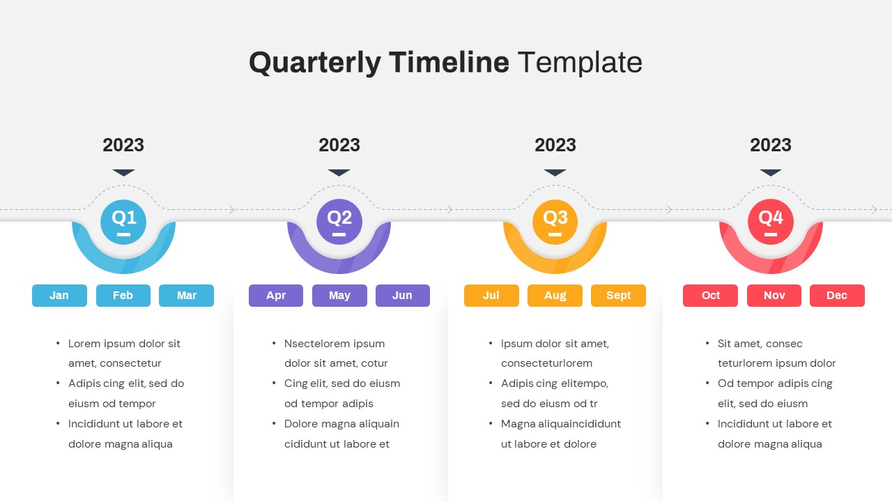
Quarterly Timeline Infographic Template for PowerPoint & Google Slides
Timeline
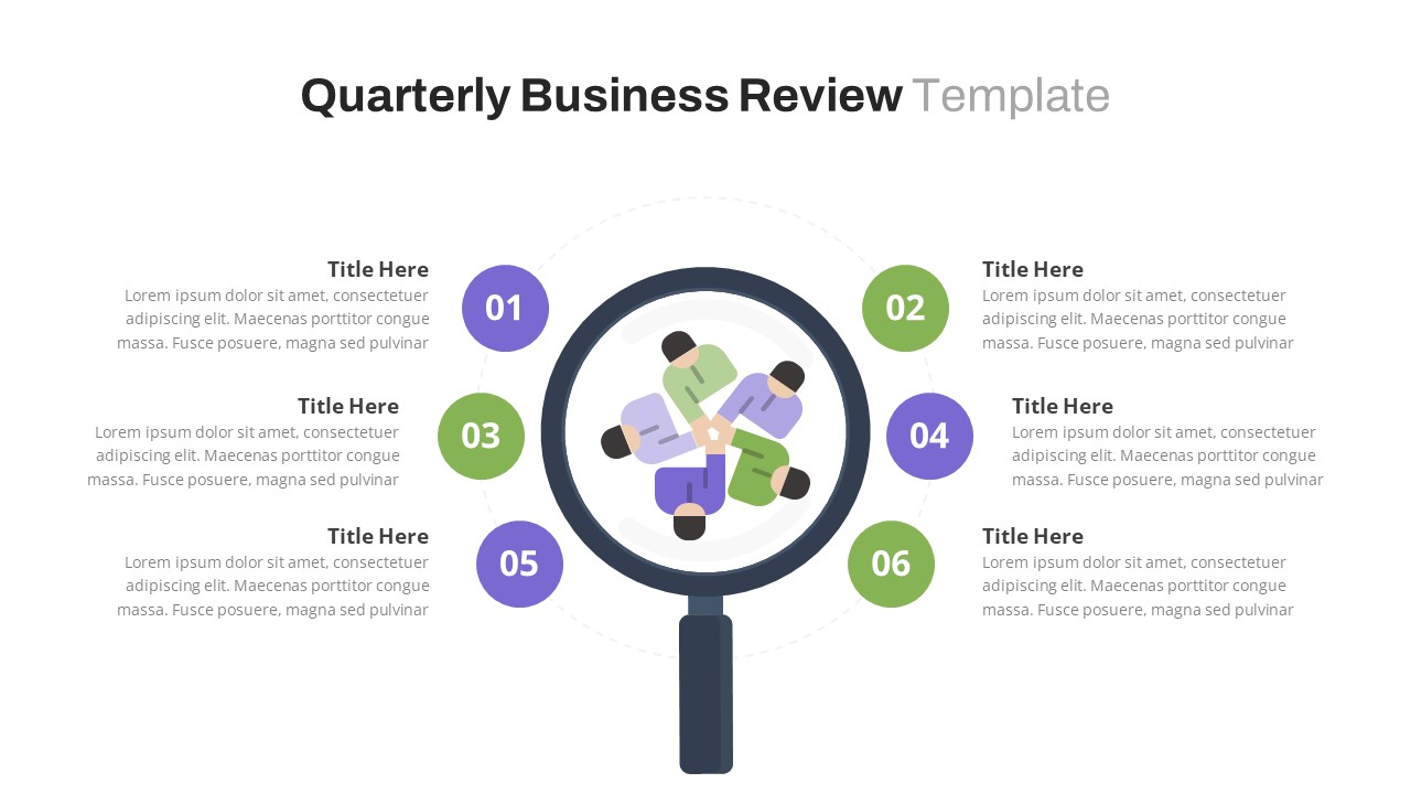
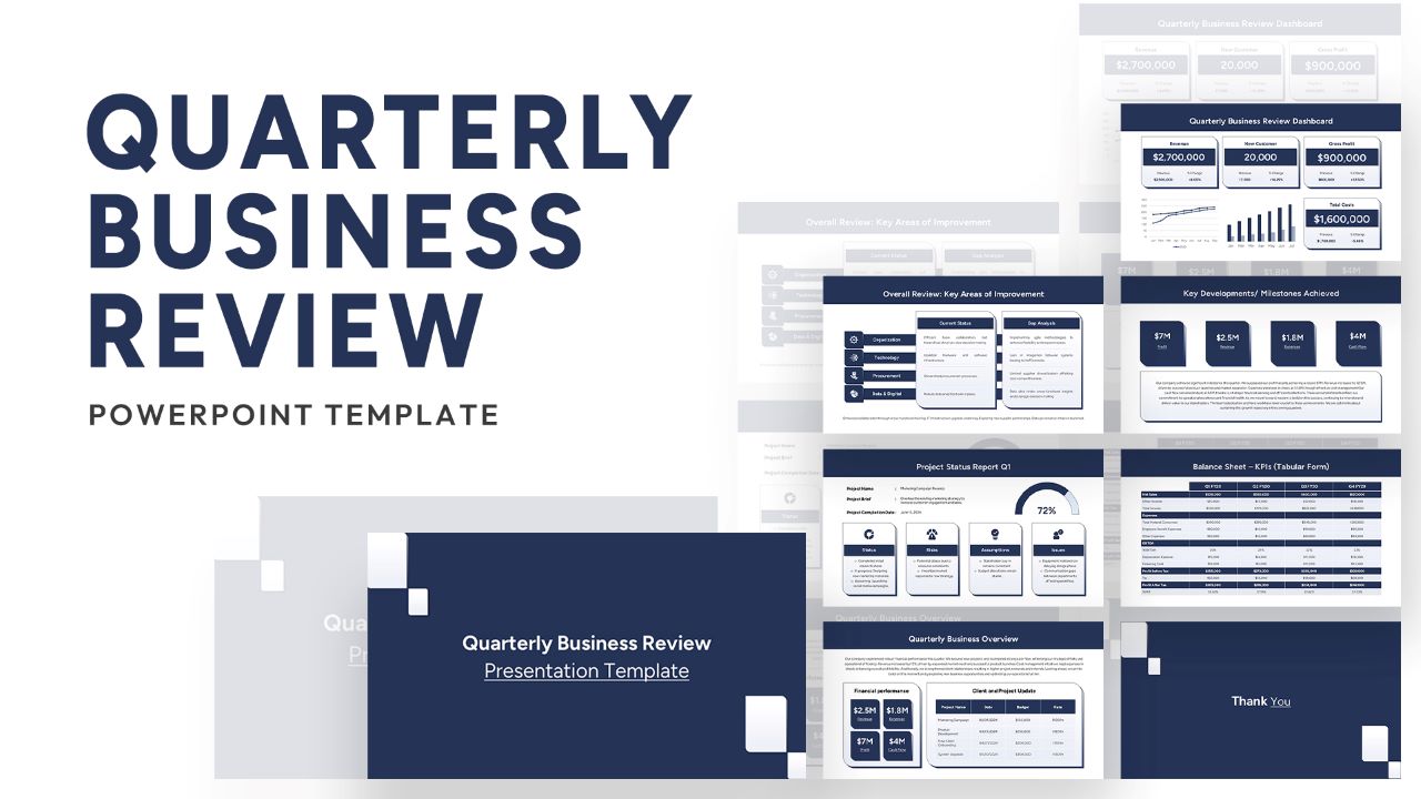
Free Quarterly Business Review Dashboard Template for PowerPoint & Google Slides
Business
Free
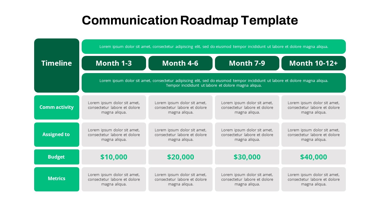
Quarterly Communication Roadmap Grid Template for PowerPoint & Google Slides
Marketing
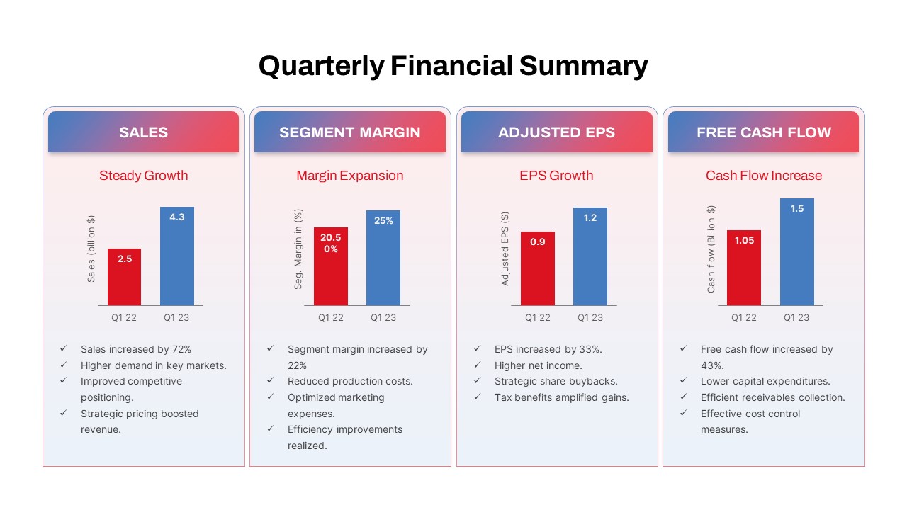
Quarterly Financial Summary Dashboard Template for PowerPoint & Google Slides
Business Report
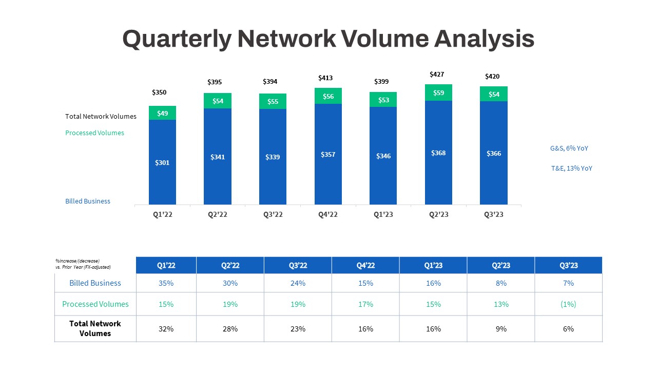
Quarterly Network Volume Analysis Template for PowerPoint & Google Slides
Business Report
Quarterly Business Review Dashboard Template for PowerPoint & Google Slides
Pitch Deck

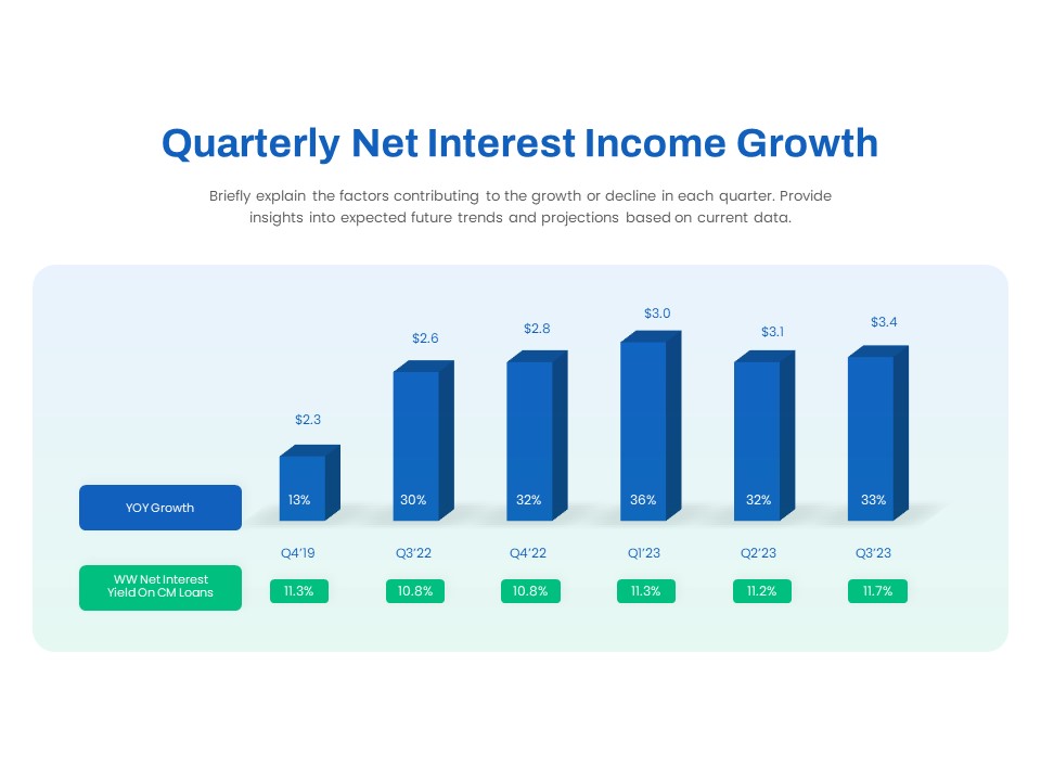
Quarterly Net Interest Income Growth Template for PowerPoint & Google Slides
Bar/Column
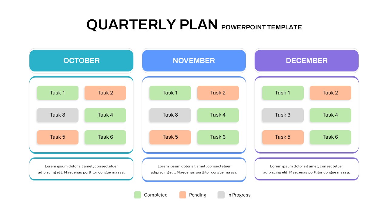
Quarterly Plan Template for PowerPoint & Google Slides
Project Status

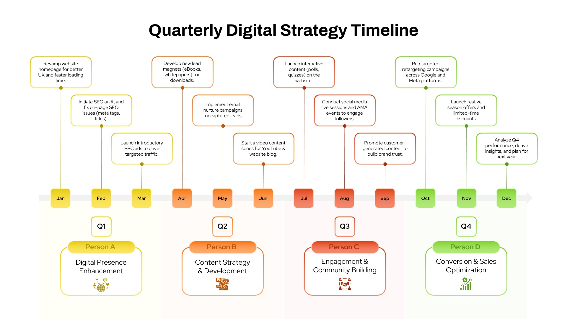
Quarterly Digital Strategy Timeline template for PowerPoint & Google Slides
Digital Marketing
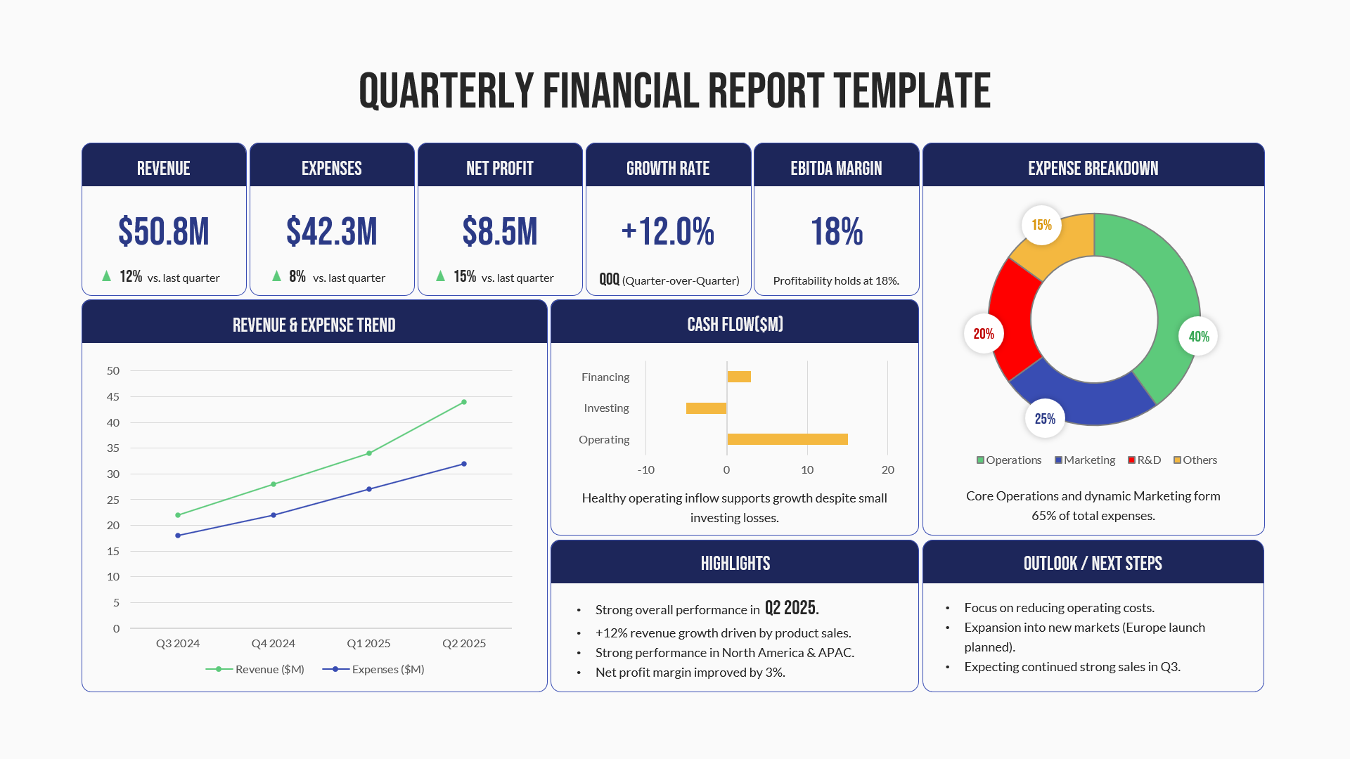
Quarterly Financial Report Dashboard Template for PowerPoint & Google Slides
Finance
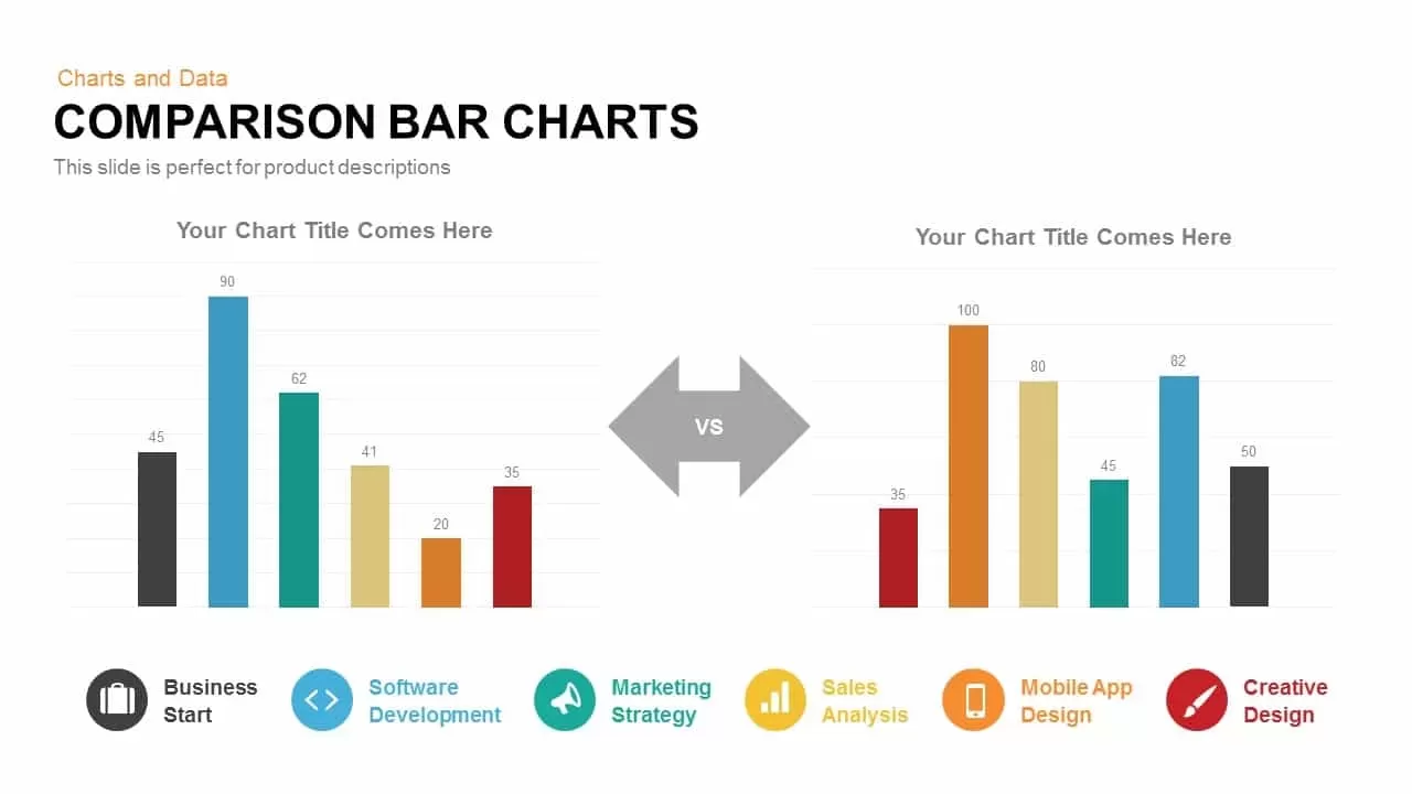
Comparison Bar Chart template for PowerPoint & Google Slides
Comparison Chart
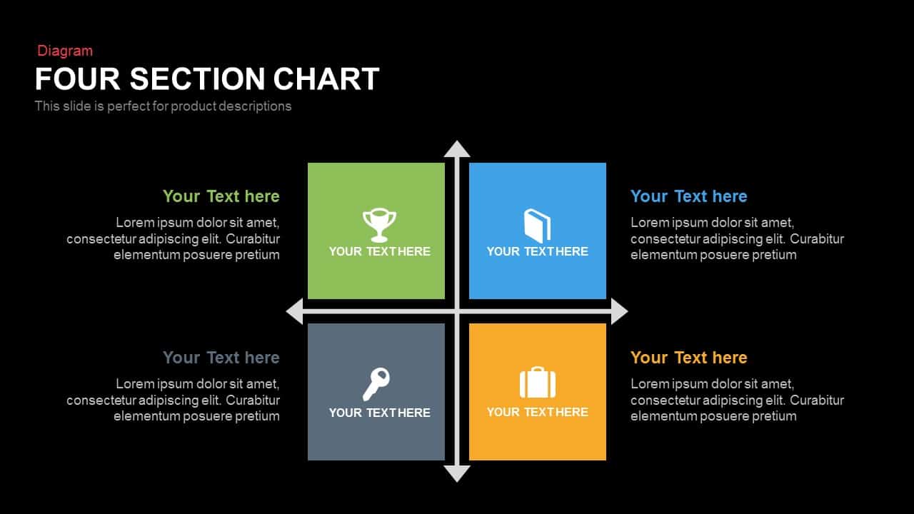
Four Section Comparison Chart Diagram Template for PowerPoint & Google Slides
Infographics
Interactive Product Comparison Bar Chart Template for PowerPoint & Google Slides
Bar/Column
Comparison Chart Overview template for PowerPoint & Google Slides
Comparison Chart
Tornado Chart Data Comparison Slide Template for PowerPoint & Google Slides
Bar/Column
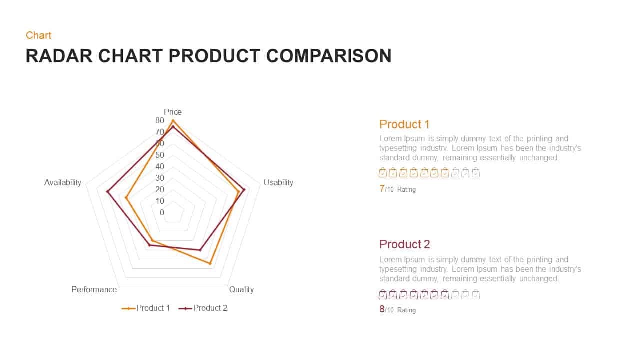
Radar Chart Product Comparison Template for PowerPoint & Google Slides
Comparison Chart

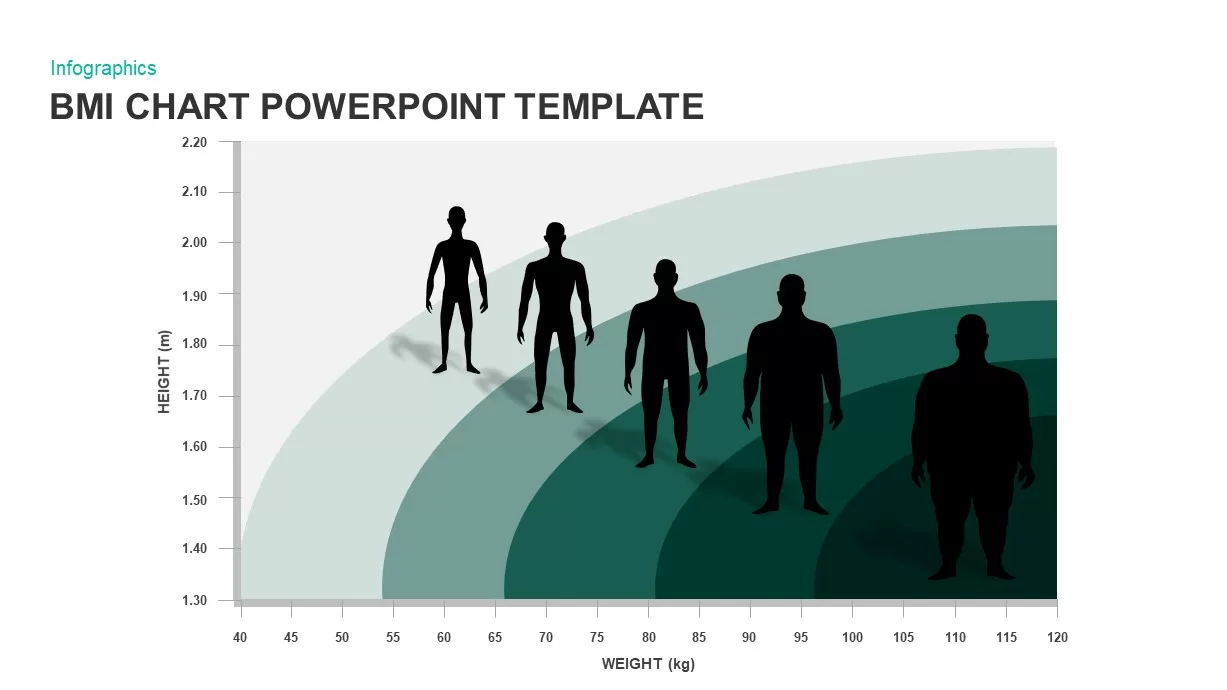
BMI Category Comparison Chart Template for PowerPoint & Google Slides
Comparison
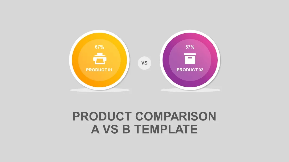
Circular Product Comparison Chart Template for PowerPoint & Google Slides
Comparison Chart
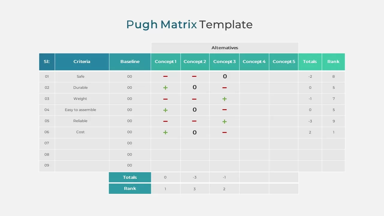
Pugh Matrix Decision Comparison Chart Template for PowerPoint & Google Slides
Comparison Chart
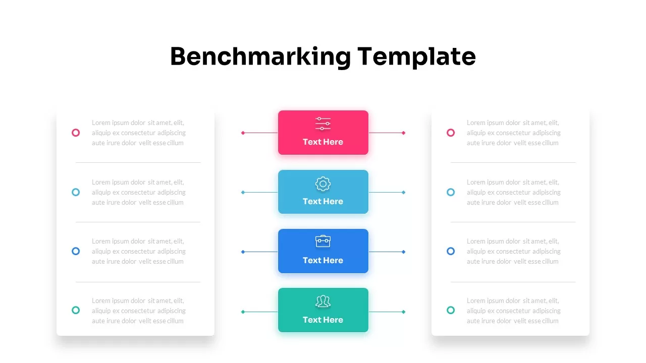
Dynamic Benchmarking Comparison Chart Template for PowerPoint & Google Slides
Comparison Chart
People Demographic Comparison Chart Template for PowerPoint & Google Slides
Comparison
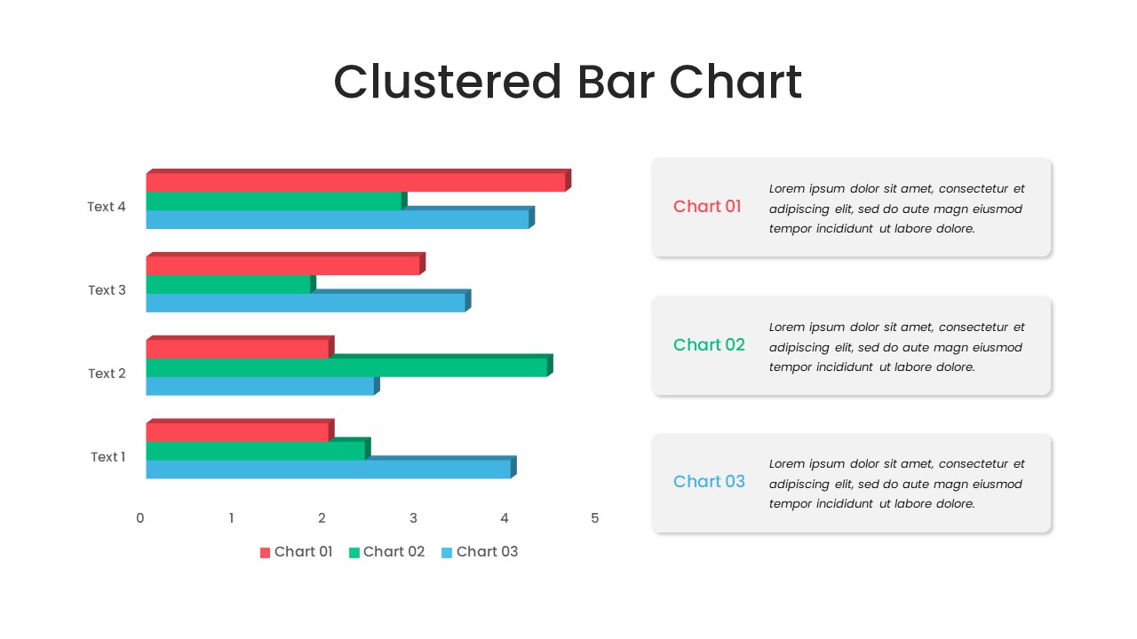
Clustered Bar Chart Comparison Template for PowerPoint & Google Slides
Bar/Column
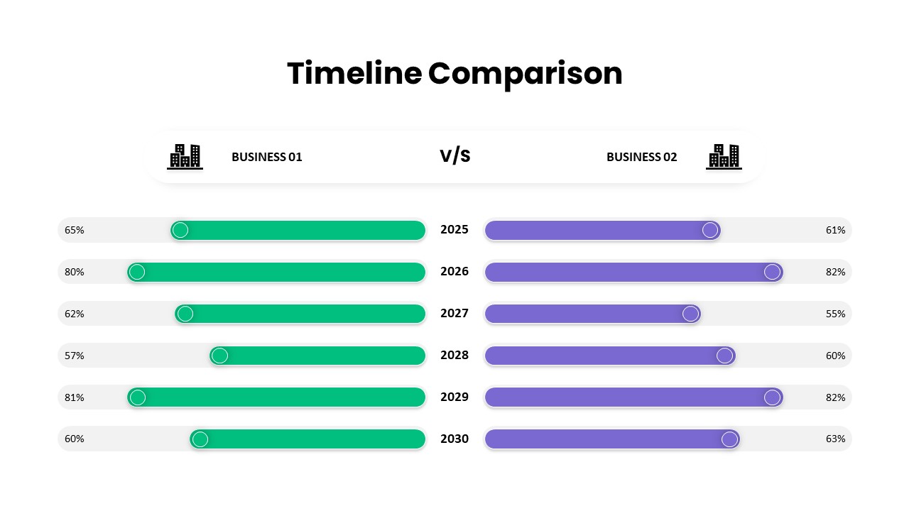
Business Timeline Comparison Bar Chart Template for PowerPoint & Google Slides
Comparison Chart
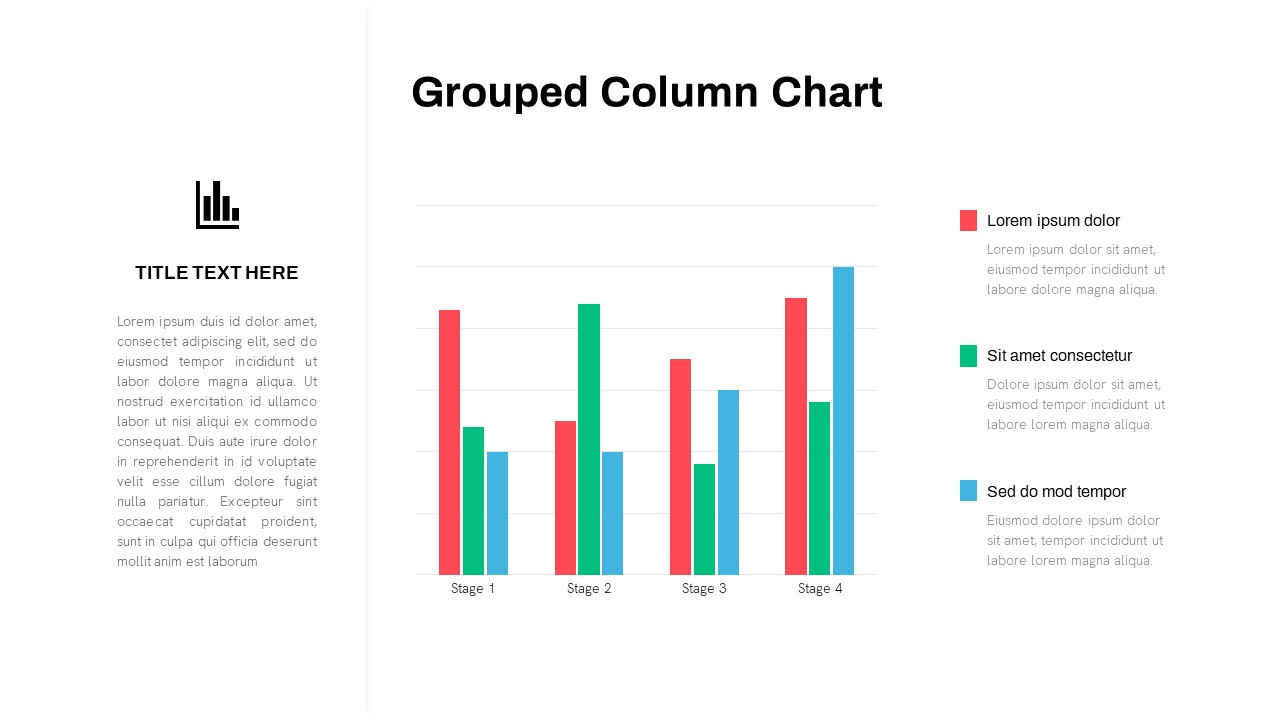
Grouped Column Chart Comparison Template for PowerPoint & Google Slides
Bar/Column
Multiple Line Chart Comparison Template for PowerPoint & Google Slides
Comparison Chart
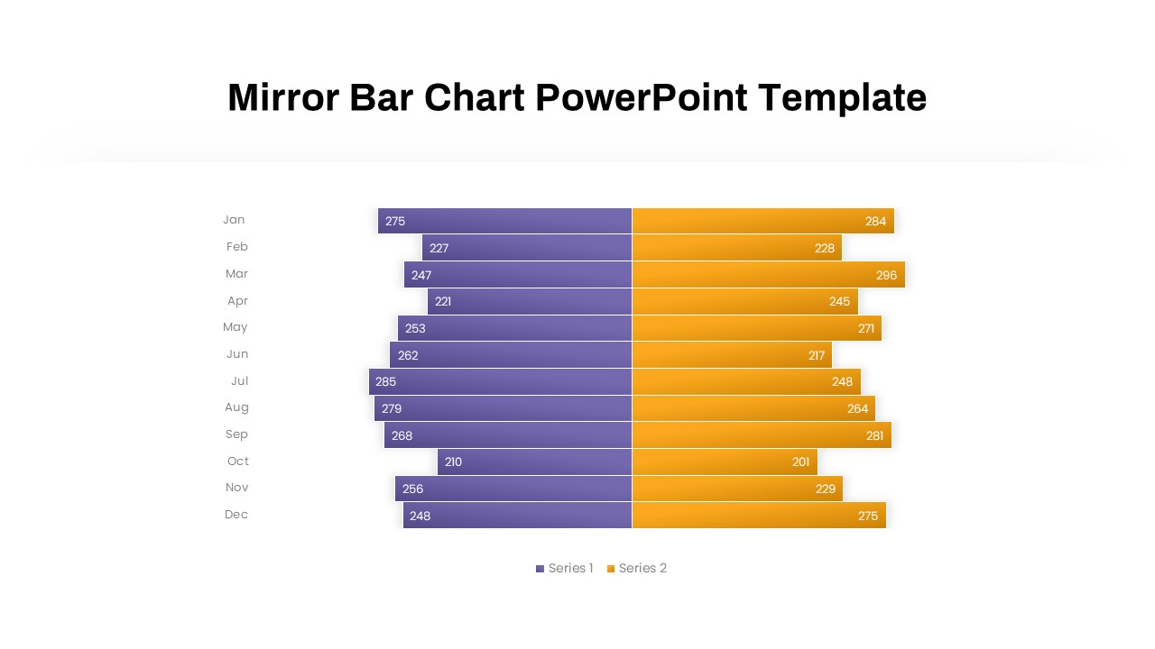
Mirror Bar Chart Comparison Template for PowerPoint & Google Slides
Bar/Column
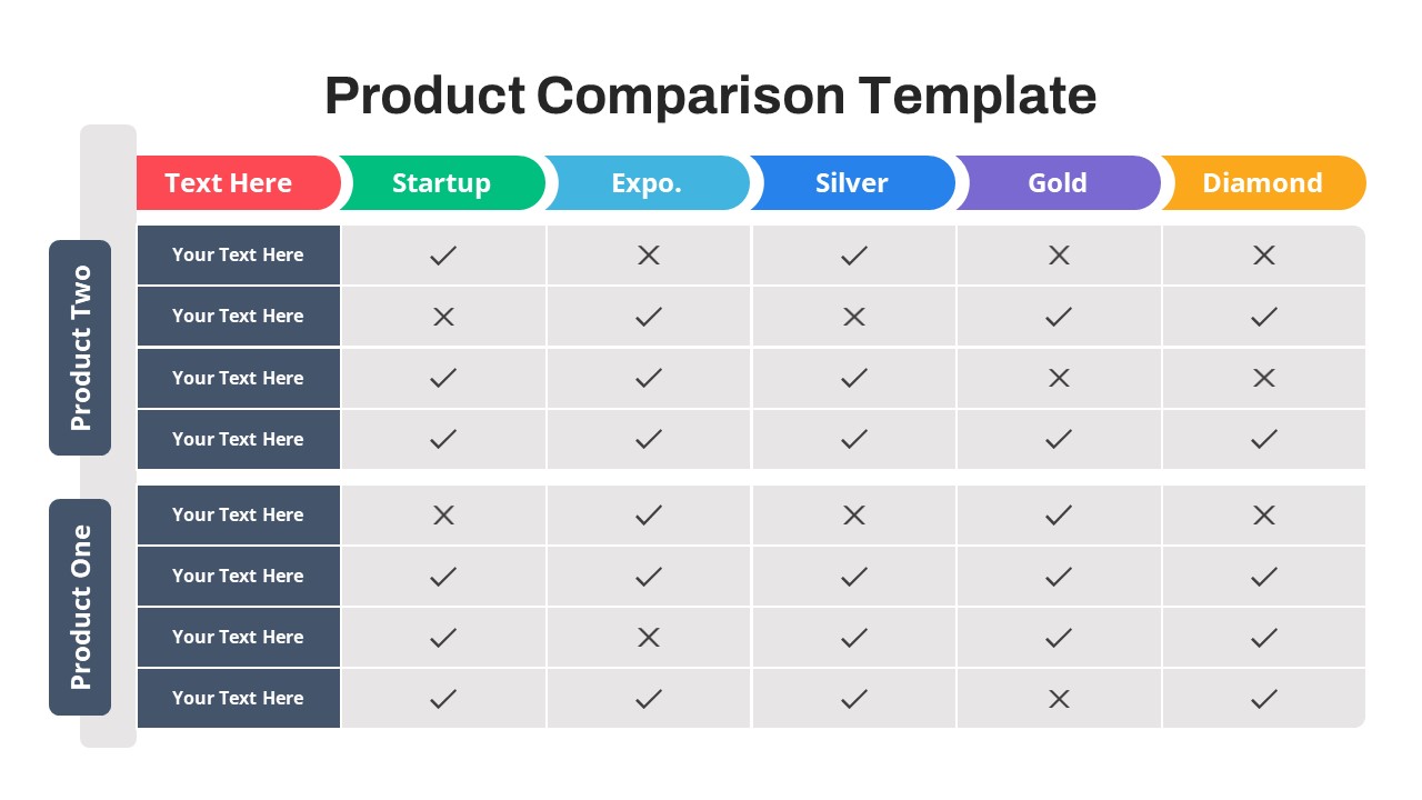
Free Versatile Product Comparison Chart Template for PowerPoint & Google Slides
Charts
Free
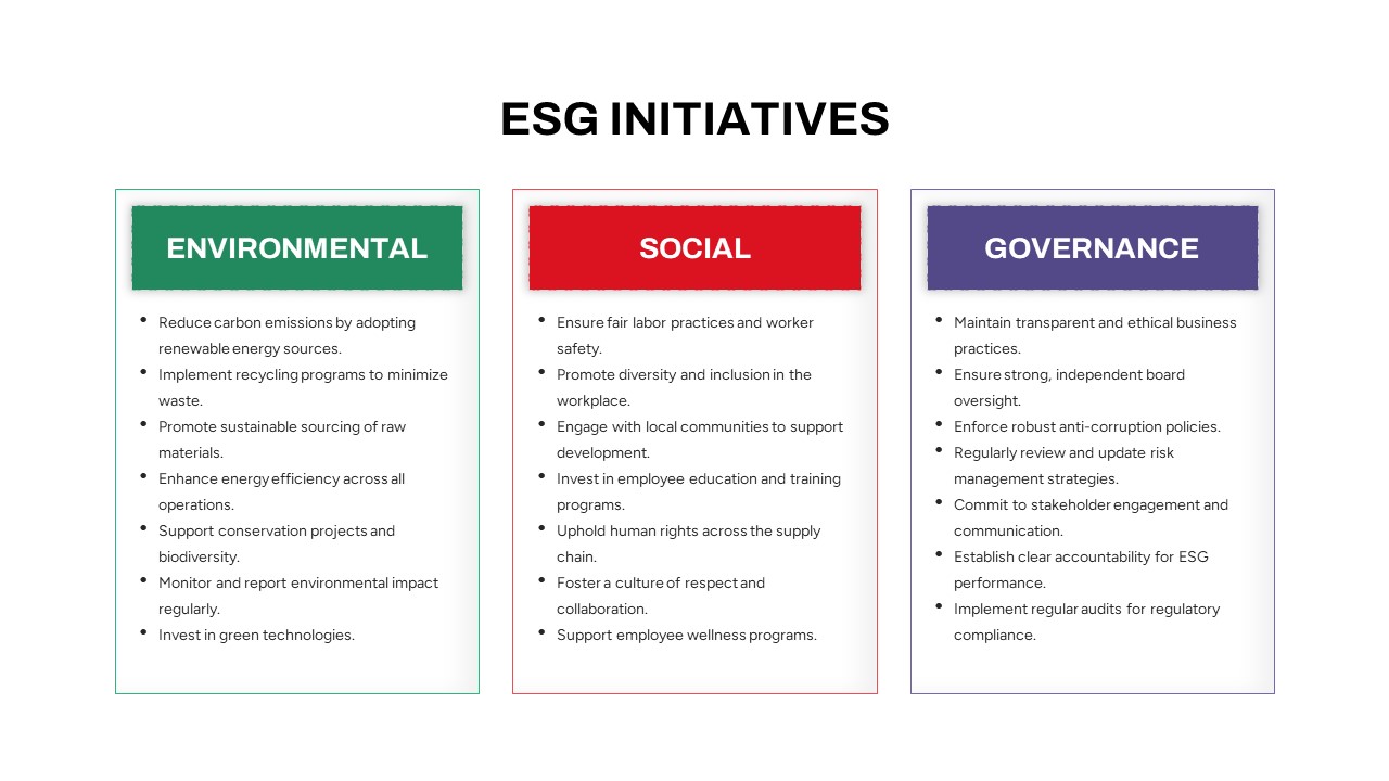
ESG Initiatives Comparison Chart Template for PowerPoint & Google Slides
Business
Competitor Comparison Chart Design Template for PowerPoint & Google Slides
Comparison
Two-Option Bar Chart Comparison Table Template for PowerPoint & Google Slides
Comparison
Profile Comparison Chart template for PowerPoint & Google Slides
Comparison Chart
Sales Growth Comparison Chart & Table Template for PowerPoint & Google Slides
Bar/Column
Skills Gap Analysis Comparison Chart Template for PowerPoint & Google Slides
Gap
Feasibility Matrix Comparison Chart Template for PowerPoint & Google Slides
Comparison Chart
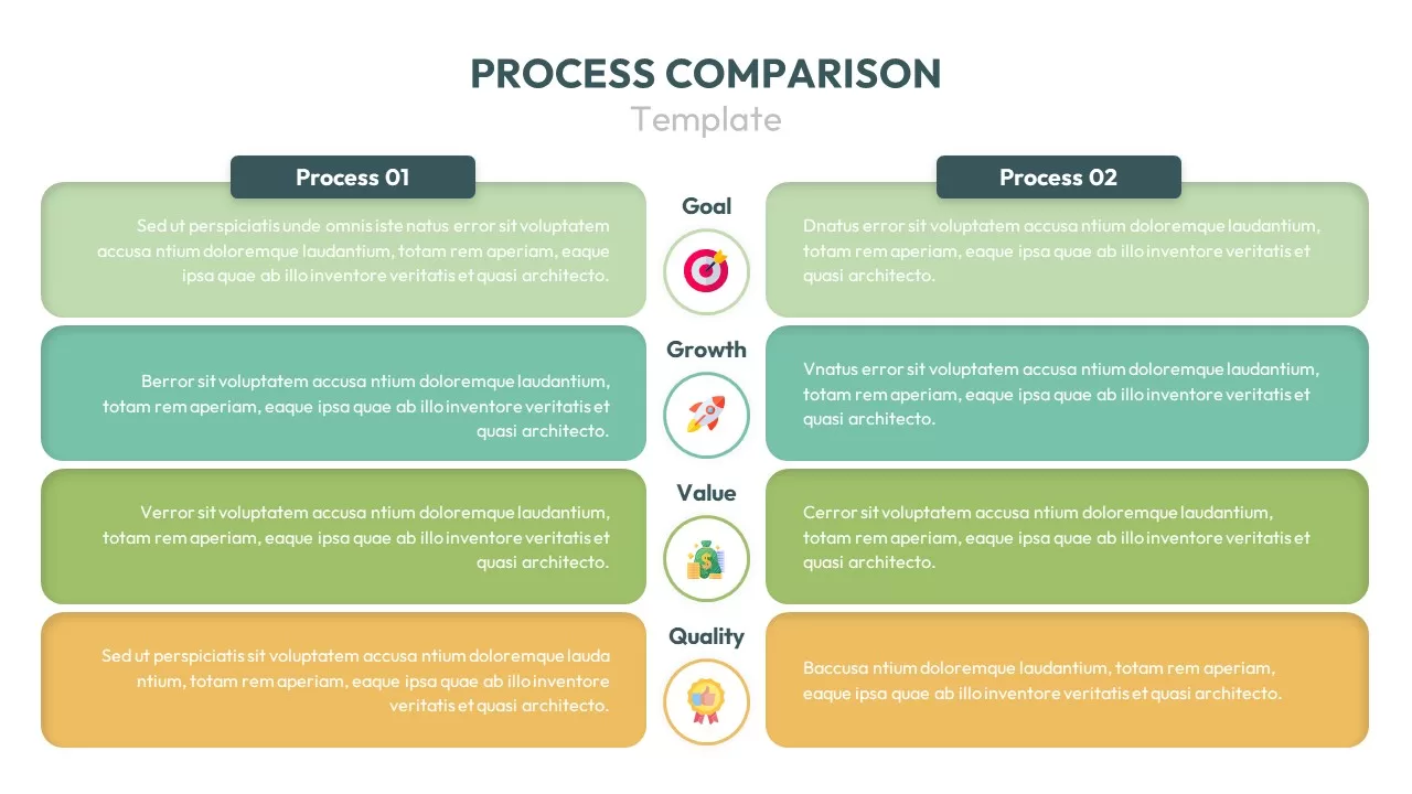
Process Comparison Chart for PowerPoint & Google Slides
Infographics

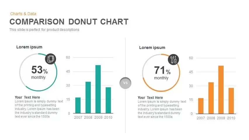
Comparison Donut Chart PowerPoint Template and Keynote
Pie/Donut
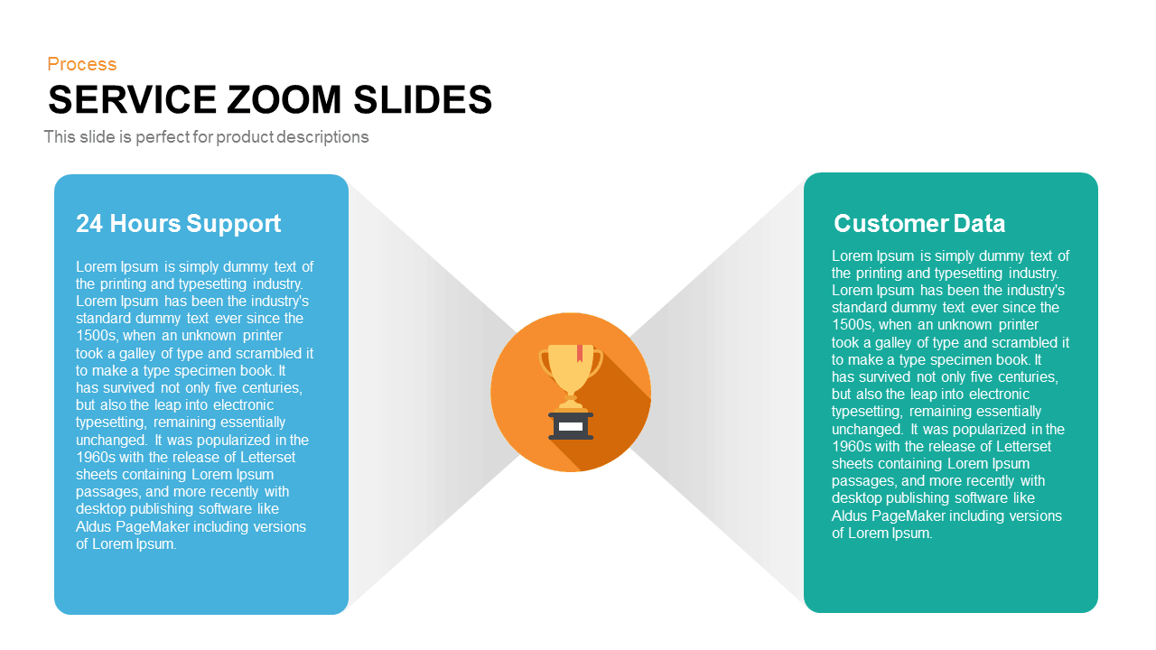
Service Zoom Feature Slides Comparison template for PowerPoint & Google Slides
Process
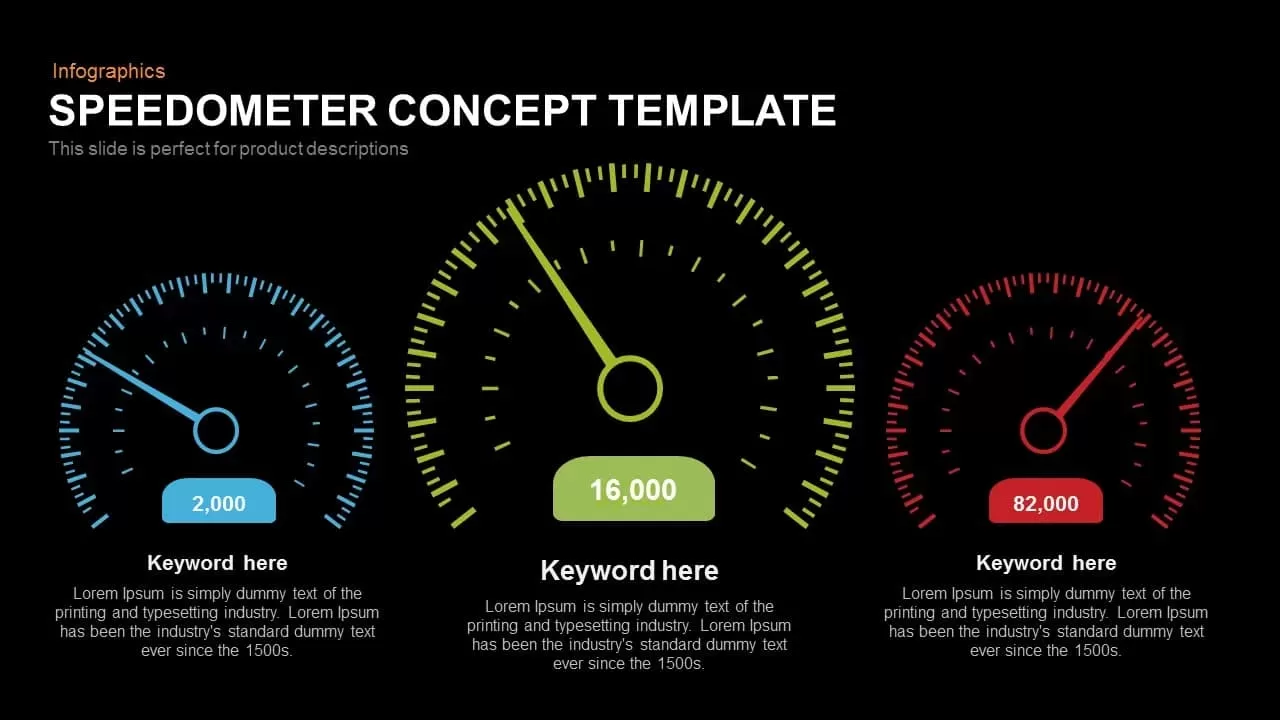
Speedometer Infographic Gauge Comparison Template for PowerPoint & Google Slides
Comparison
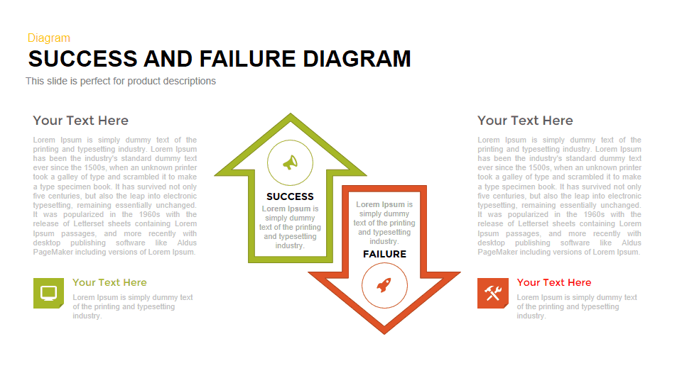
Success vs Failure Comparison Diagram Template for PowerPoint & Google Slides
Comparison
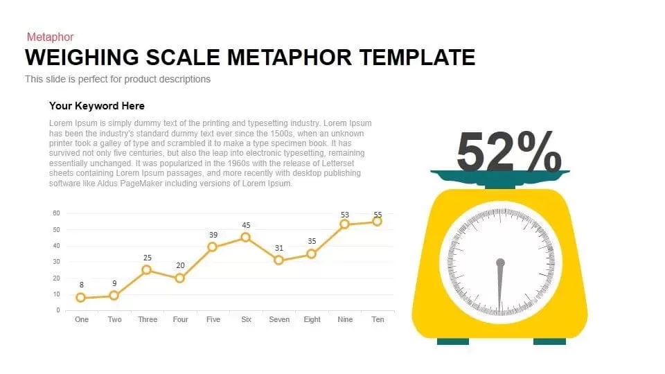
Scale Metaphor Metrics Comparison Template for PowerPoint & Google Slides
Charts
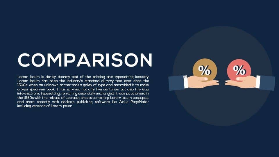
Dual Percentage Comparison Metaphor Template for PowerPoint & Google Slides
Comparison
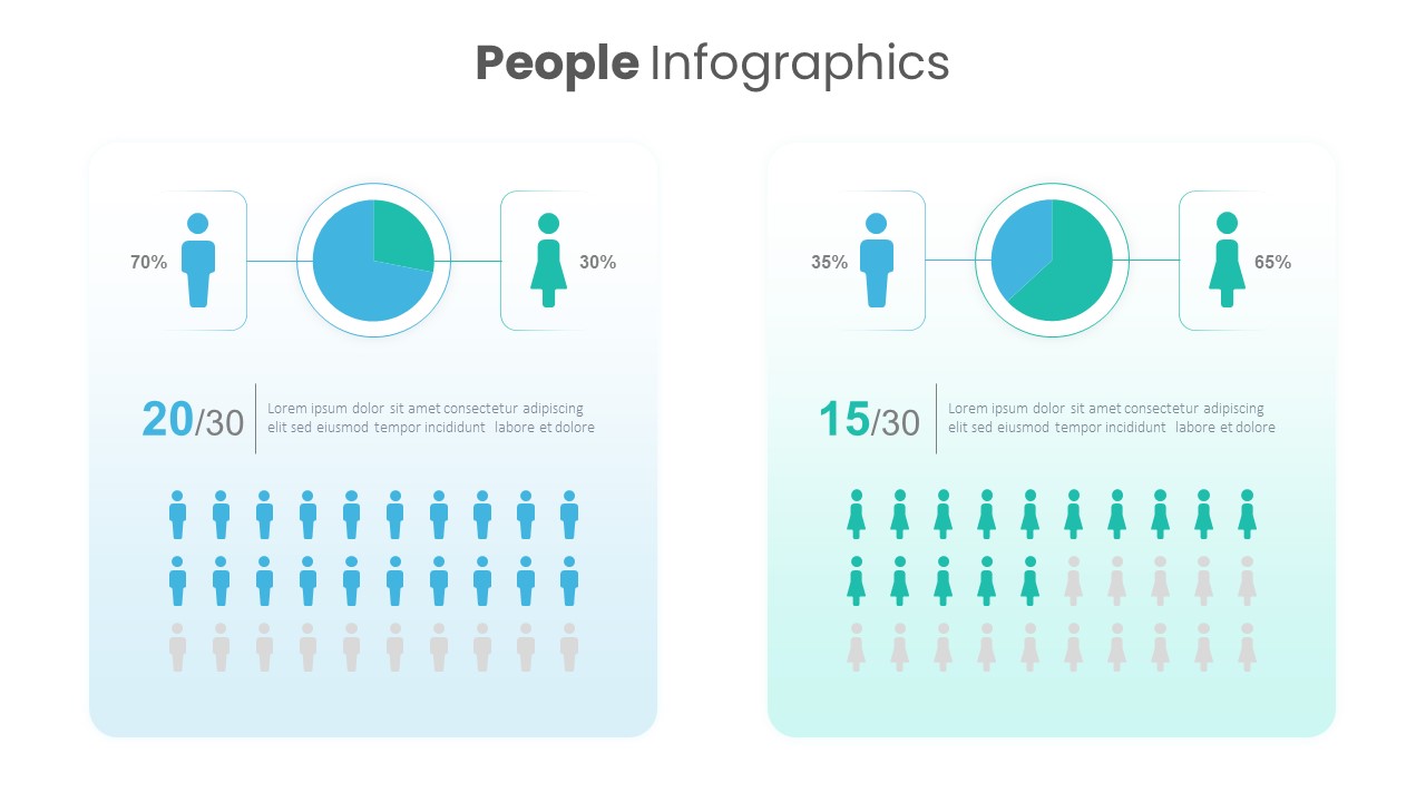
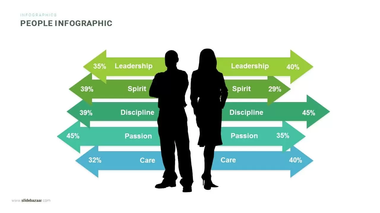
Gender Comparison People Infographic Template for PowerPoint & Google Slides
Comparison
Dynamic Multicolor Comparison Table Template for PowerPoint & Google Slides
Comparison
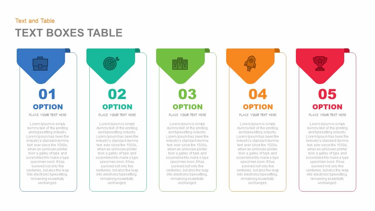
Five-Option Text Boxes Table Comparison Template for PowerPoint & Google Slides
Business Report
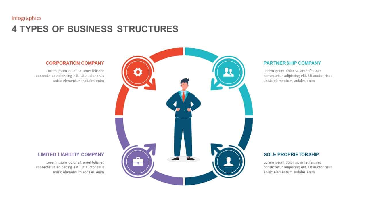
Four Business Structure Types Comparison Diagram Template for PowerPoint & Google Slides
Business Strategy
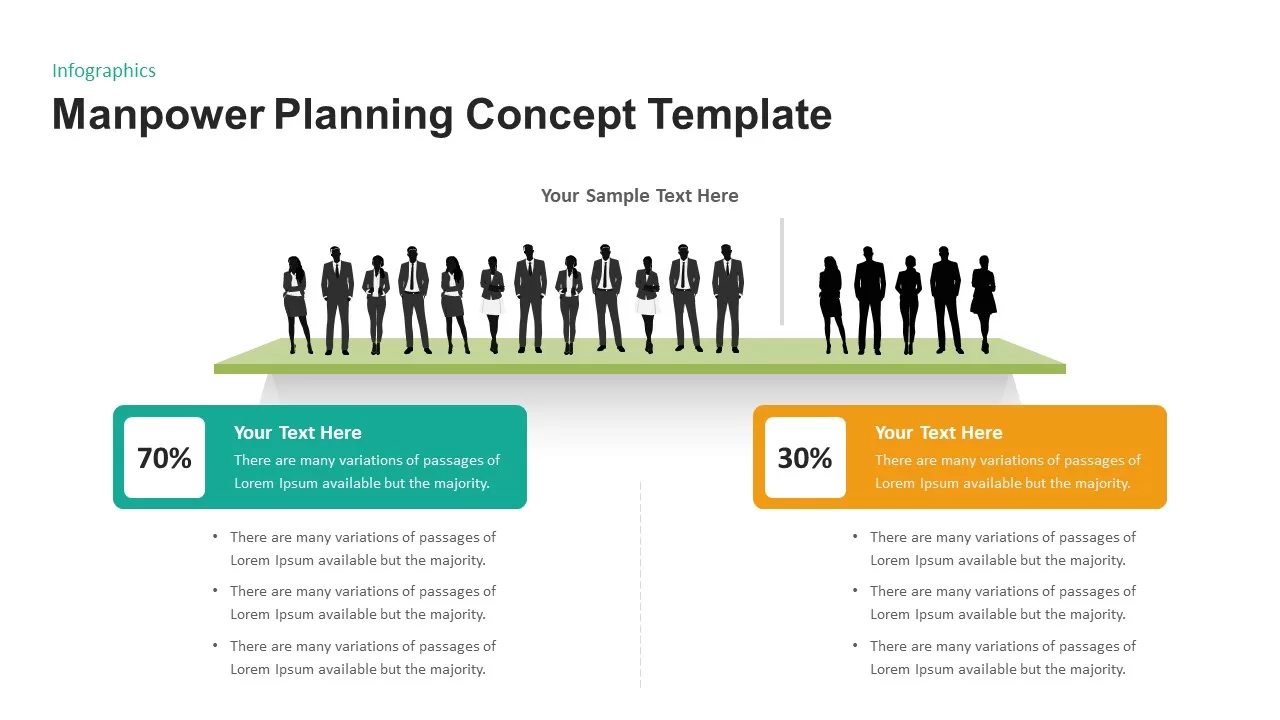
Manpower Planning Concept Comparison Template for PowerPoint & Google Slides
Comparison Chart
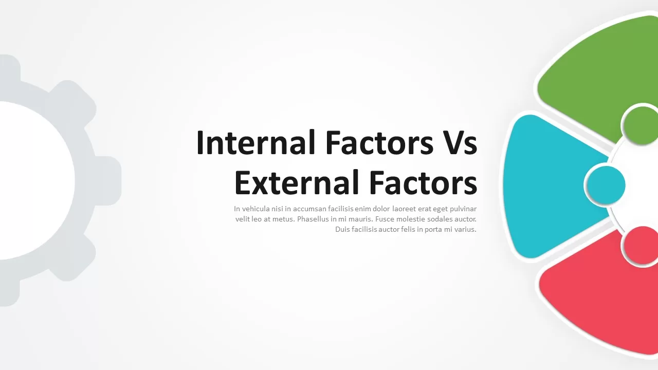
Internal vs External Factors Comparison Template for PowerPoint & Google Slides
Comparison
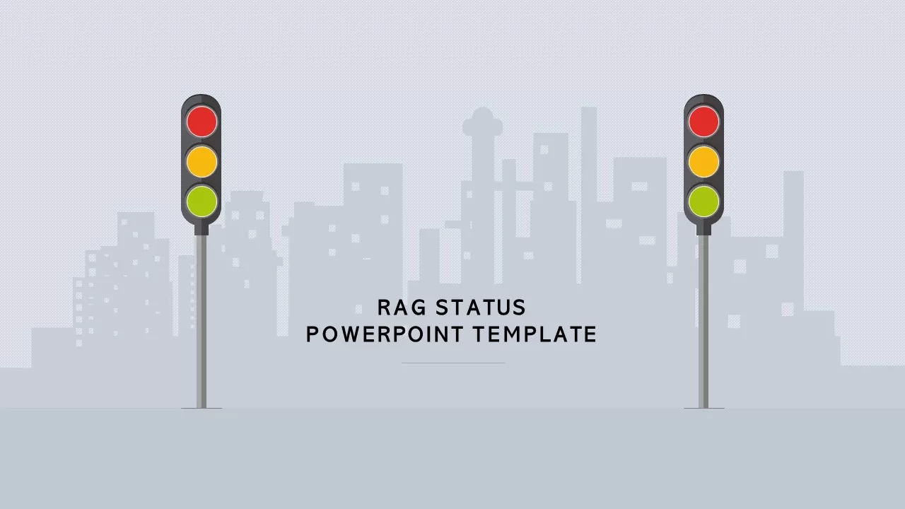
RAG Status Infographic Comparison Template for PowerPoint & Google Slides
Project
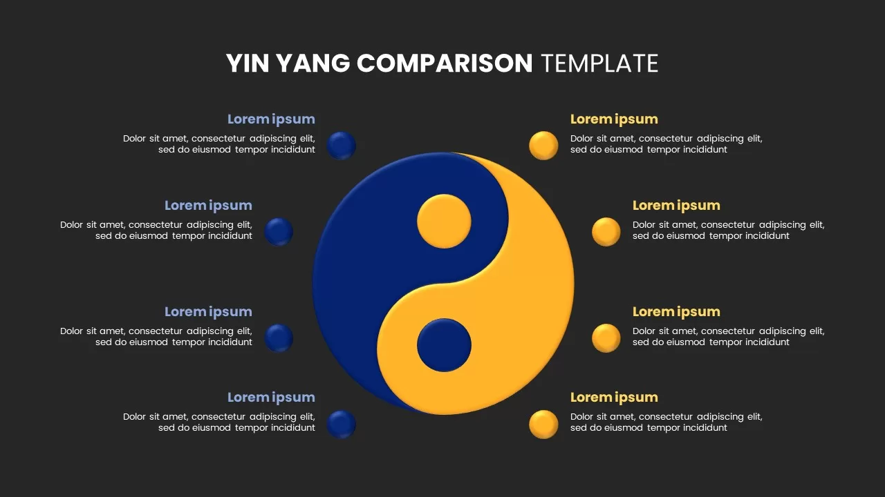
Yin Yang Comparison template for PowerPoint & Google Slides
Business
Comparison Infographic Overview template for PowerPoint & Google Slides
Business
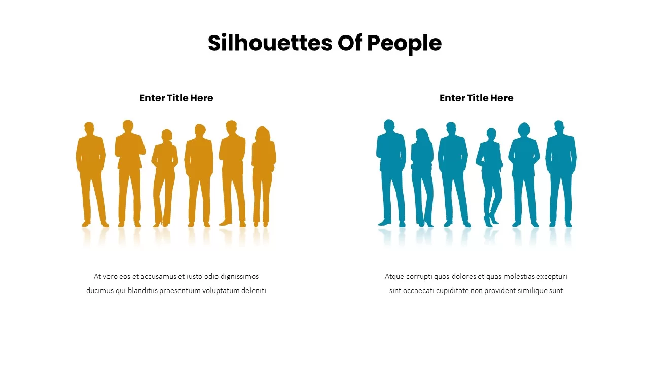
Business Silhouettes Comparison Slide Template for PowerPoint & Google Slides
HR
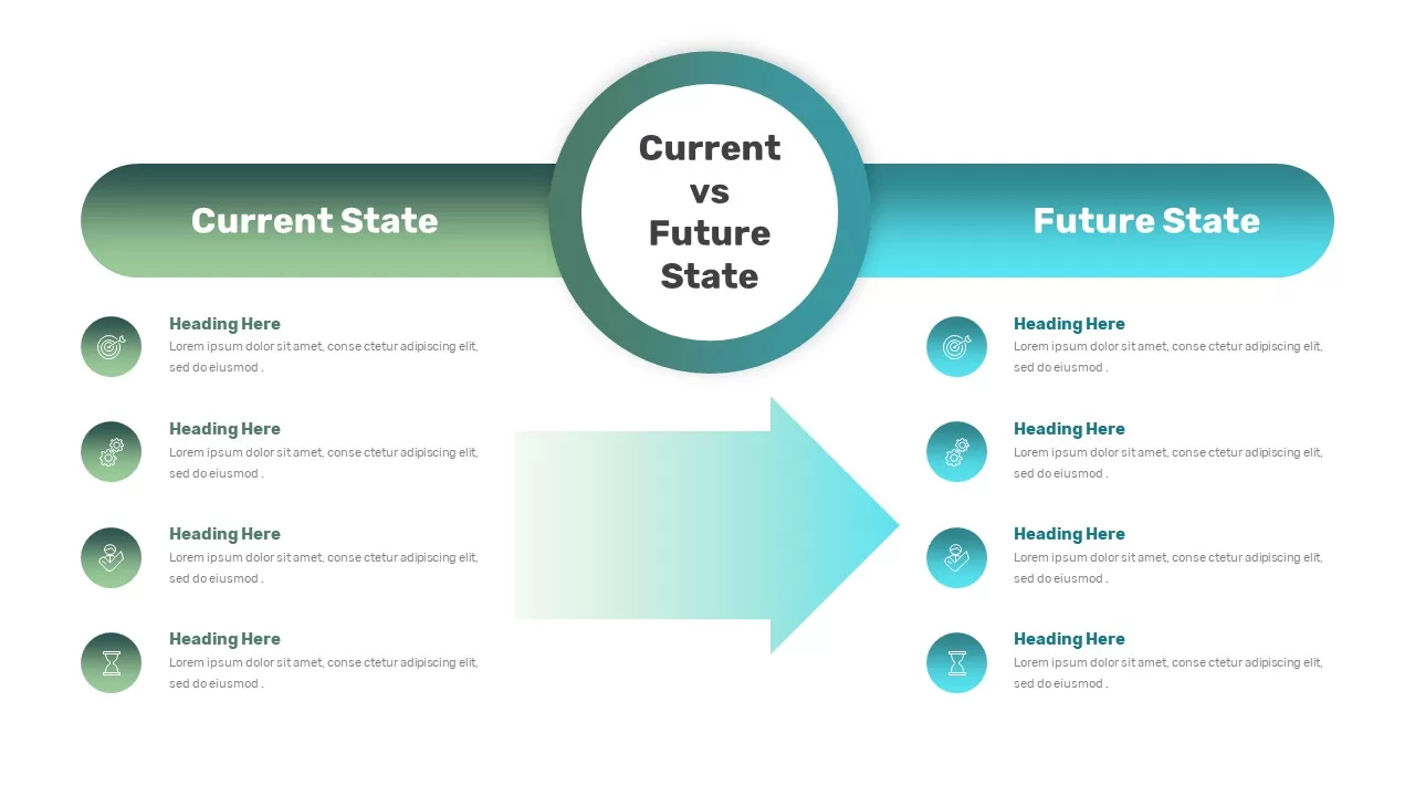
Current vs Future State Comparison Slide Template for PowerPoint & Google Slides
Comparison Chart
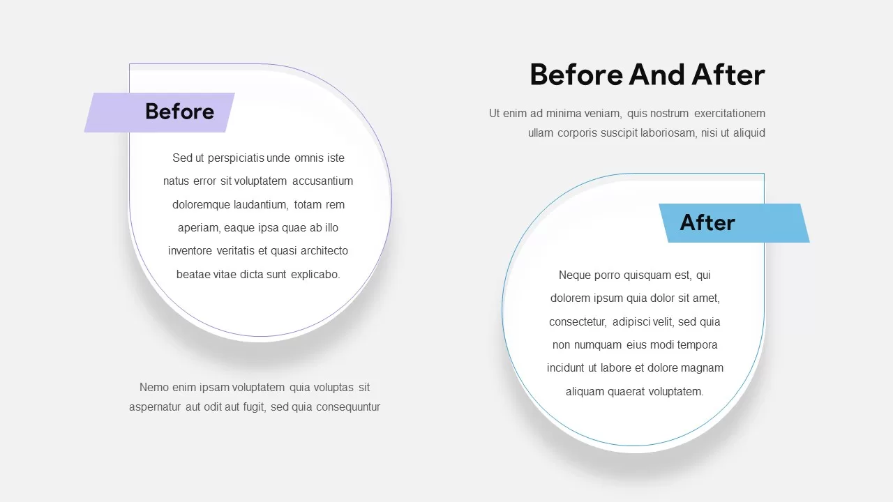
Before and After Comparison Slide Template for PowerPoint & Google Slides
Comparison
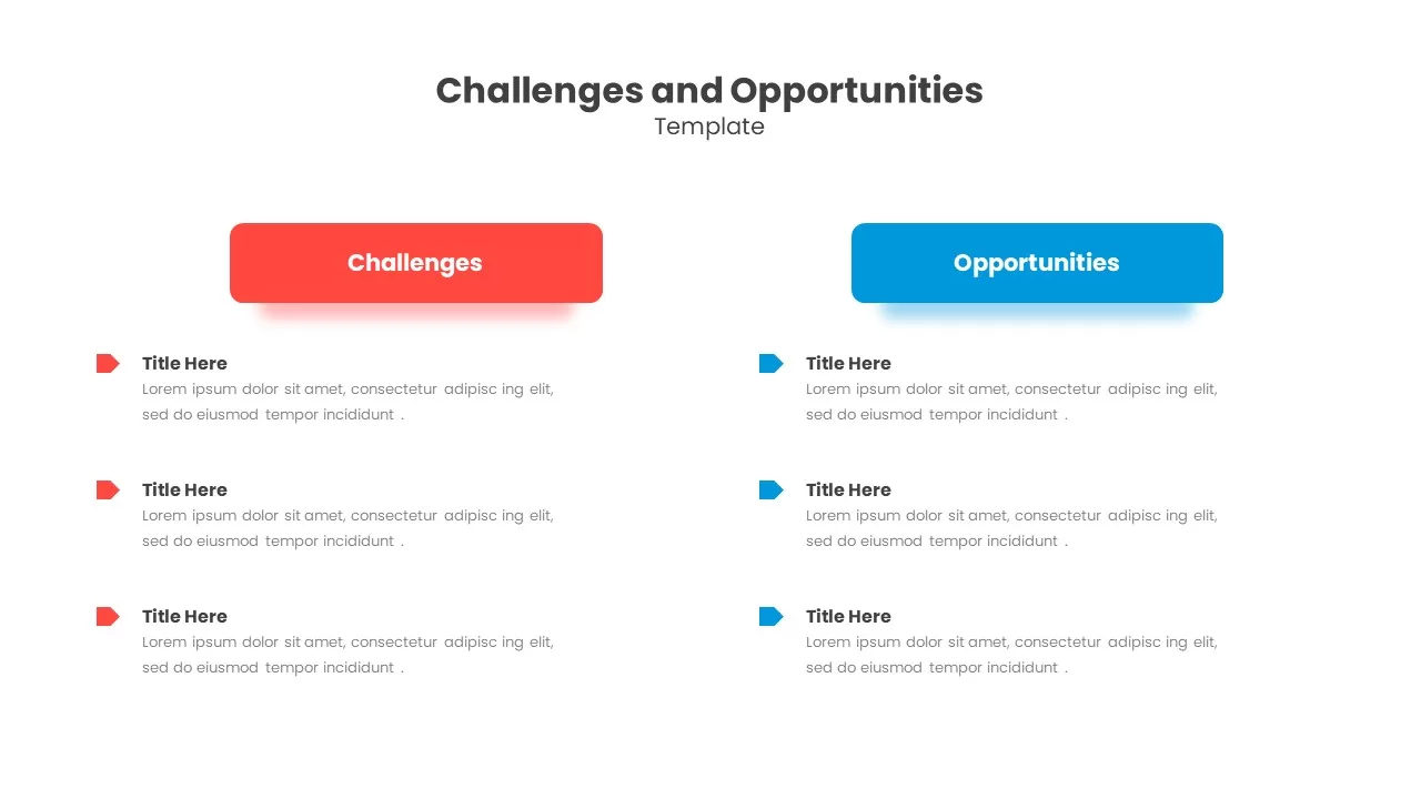
Challenges & Opportunities Comparison Template for PowerPoint & Google Slides
Opportunities Challenges
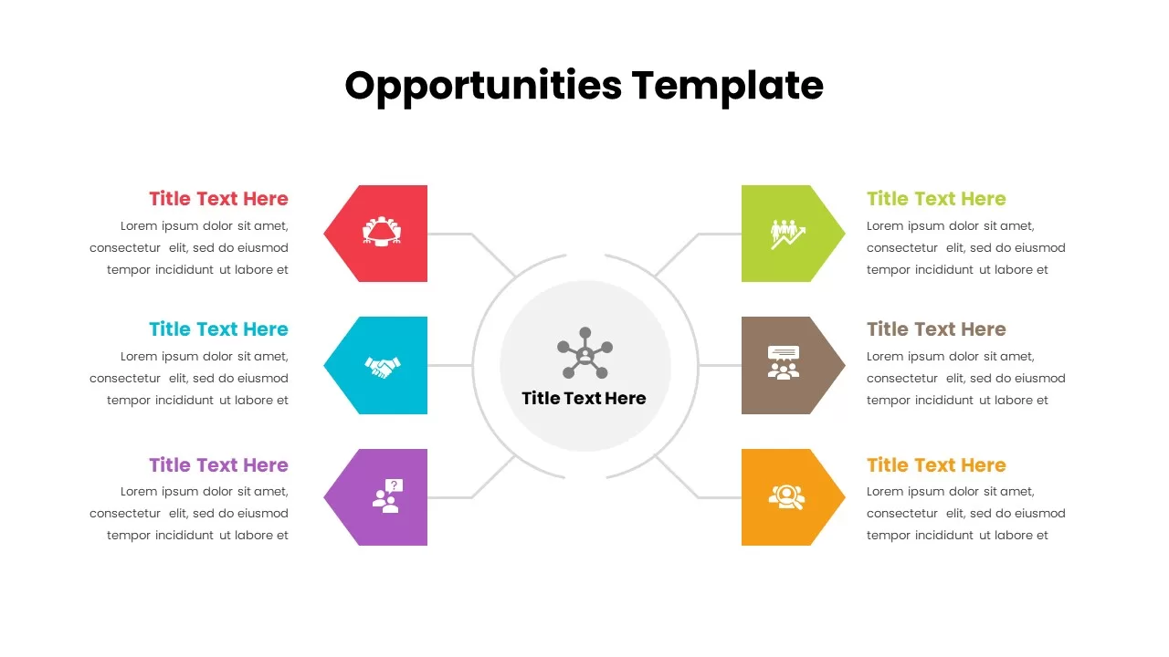
Opportunities Hub-and-Spoke Comparison Diagram Template for PowerPoint & Google Slides
Opportunities Challenges
Modern Before and After Comparison Template for PowerPoint & Google Slides
Infographics
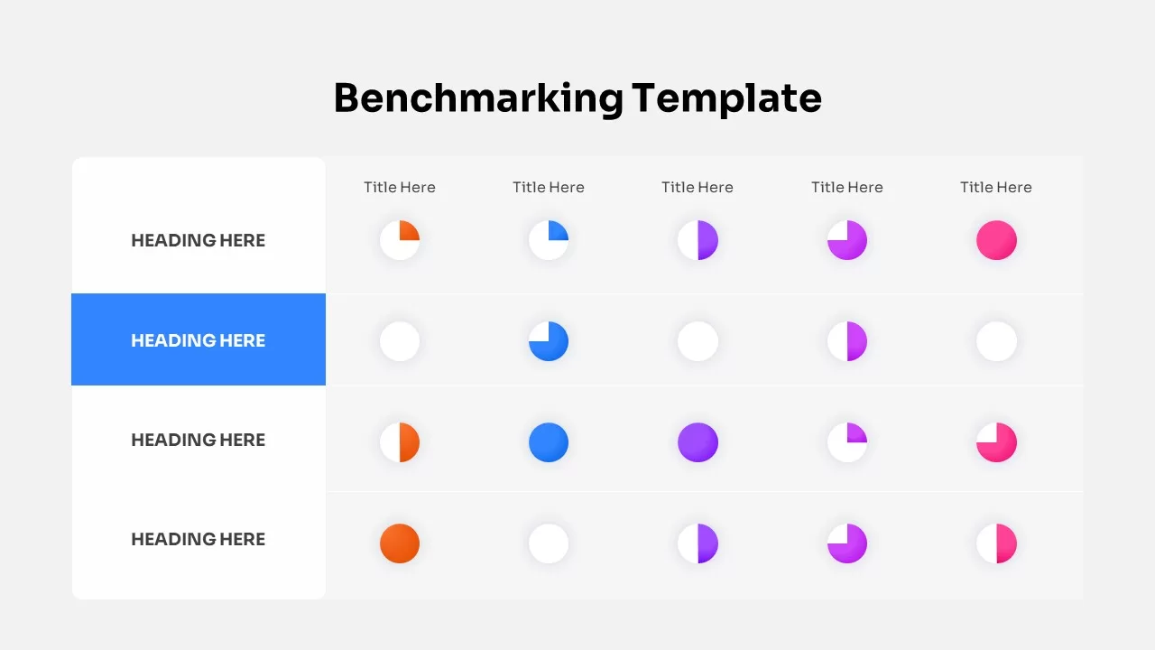
Benchmarking Metrics Comparison Slide Template for PowerPoint & Google Slides
Pie/Donut
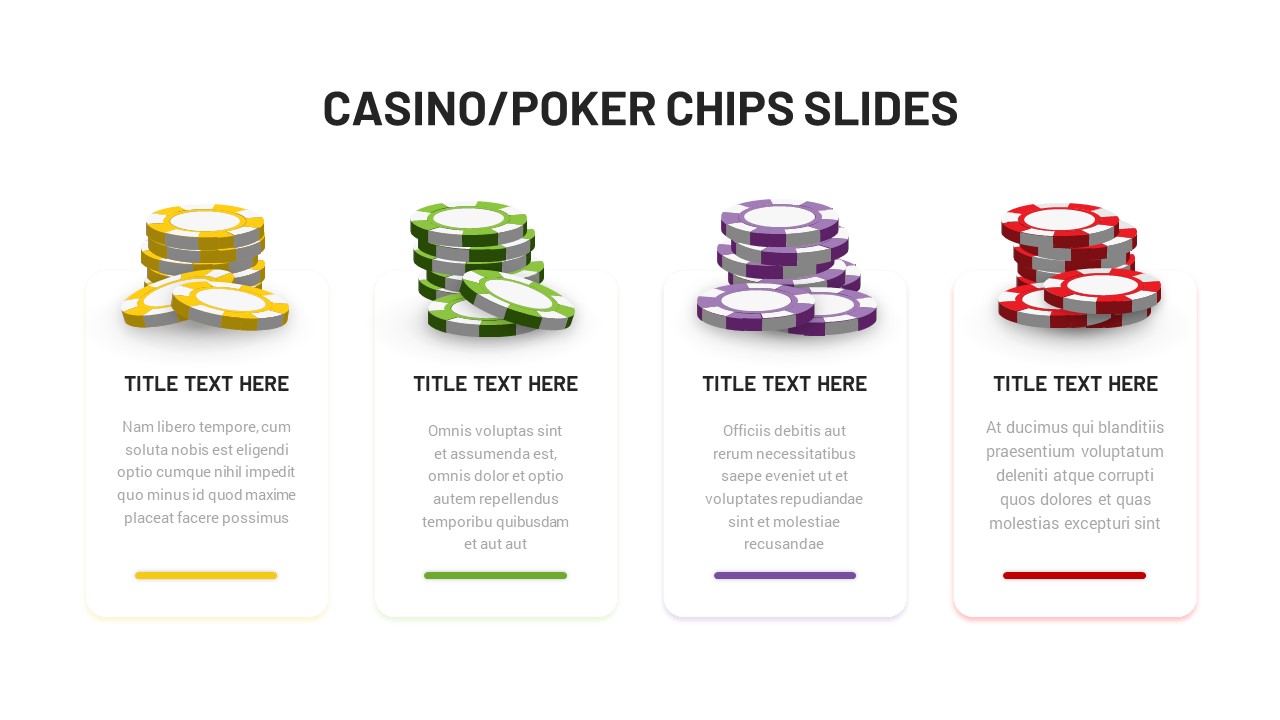
Casino Poker Chips Comparison Slide Template for PowerPoint & Google Slides
Comparison
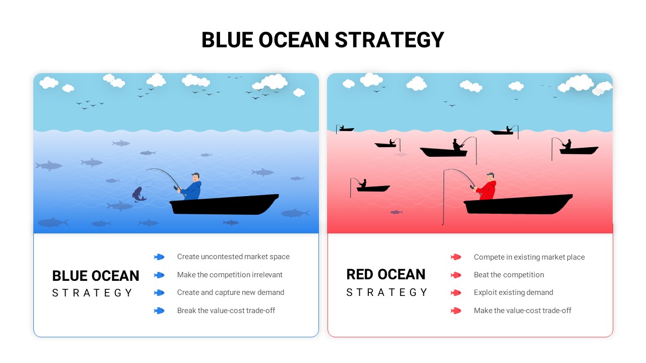
Blue vs Red Ocean Strategy Comparison Template for PowerPoint & Google Slides
Business Strategy
Surgery Infographics Comparison Template for PowerPoint & Google Slides
Health
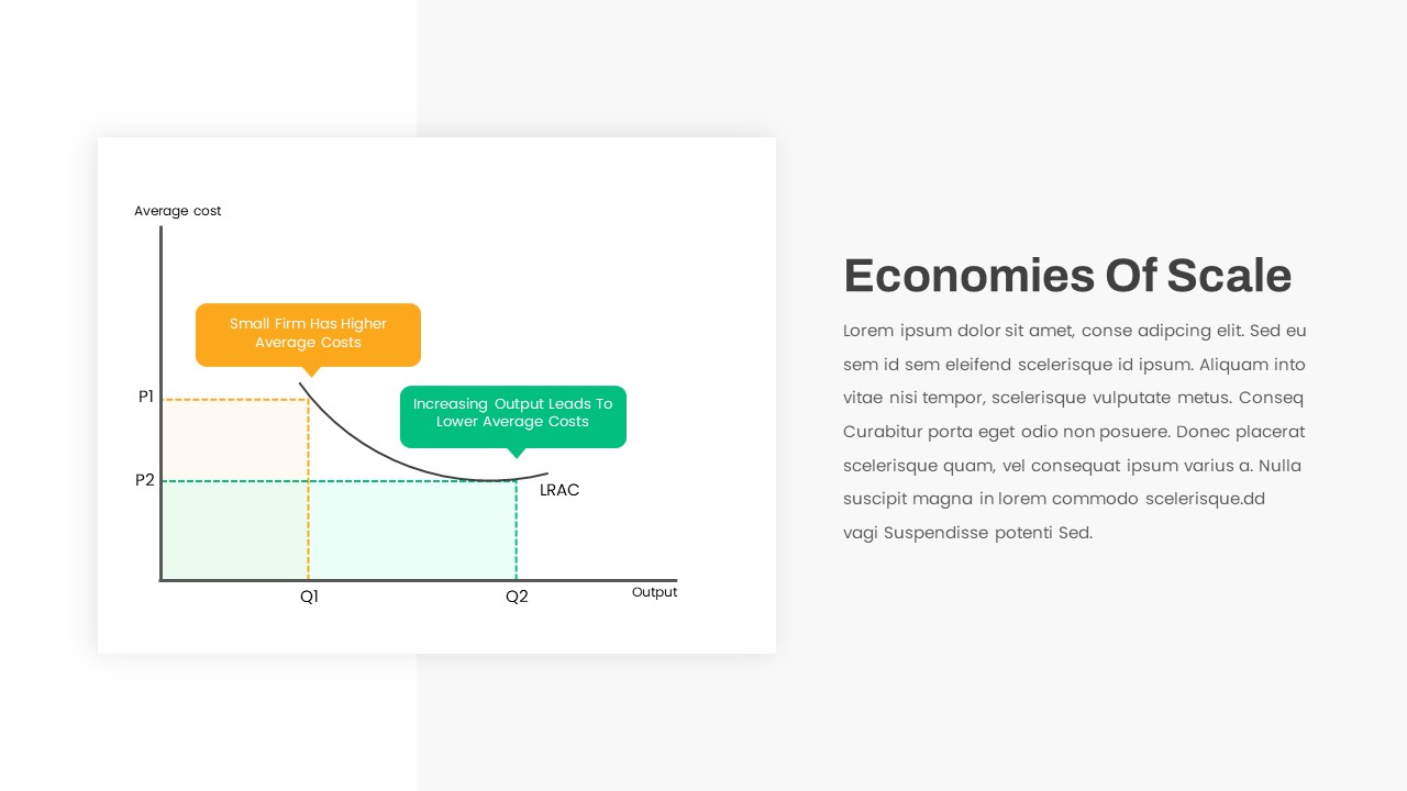
Economies of Scale Cost Curve Comparison Template for PowerPoint & Google Slides
Comparison Chart
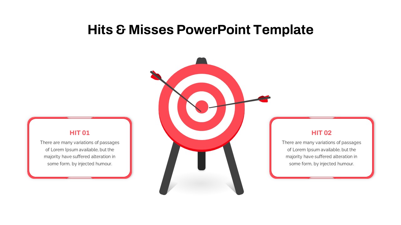
Hits & Misses Comparison Infographic Template for PowerPoint & Google Slides
Pitch Deck
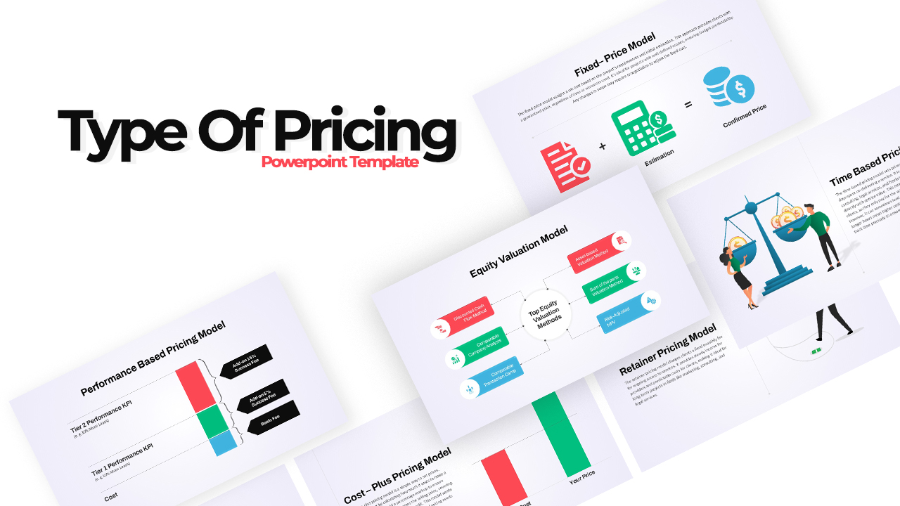
Pricing Model Types Comparison Infographic Template for PowerPoint & Google Slides
Pitch Deck
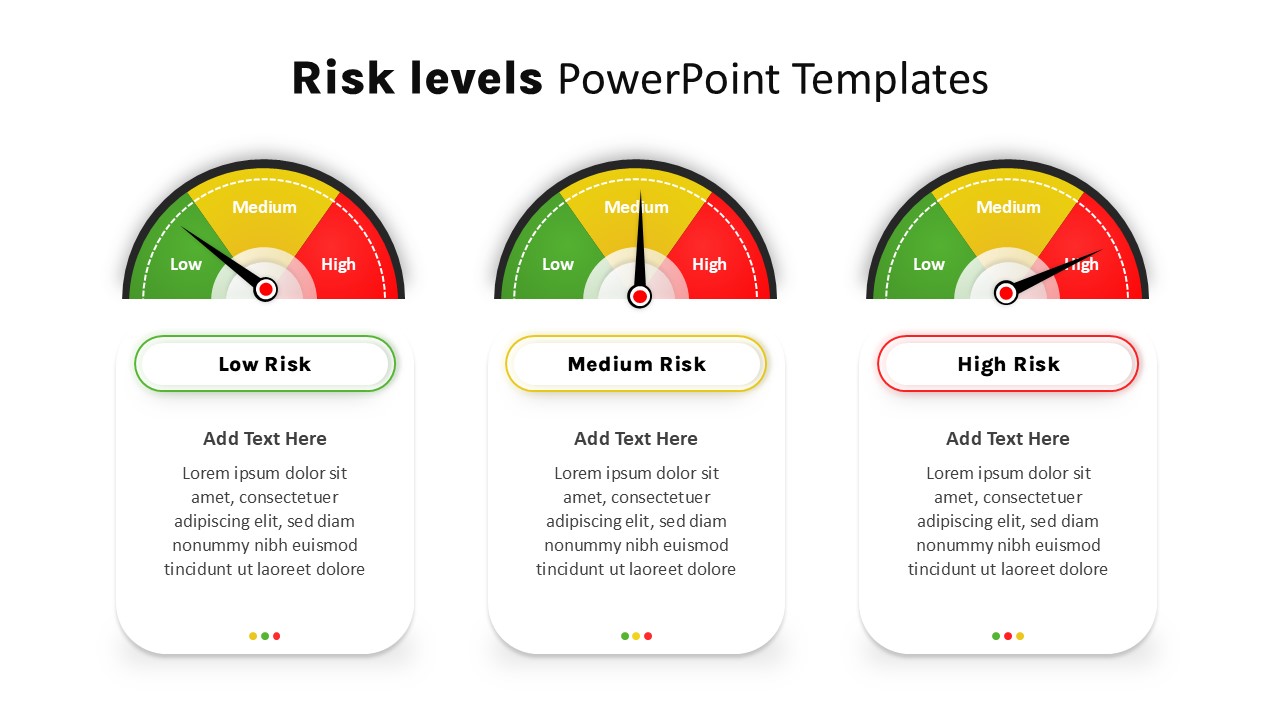
Risk Level Gauge Comparison Dashboard Template for PowerPoint & Google Slides
Comparison
Cross Sell & Up Sell Strategy Comparison template for PowerPoint & Google Slides
Comparison
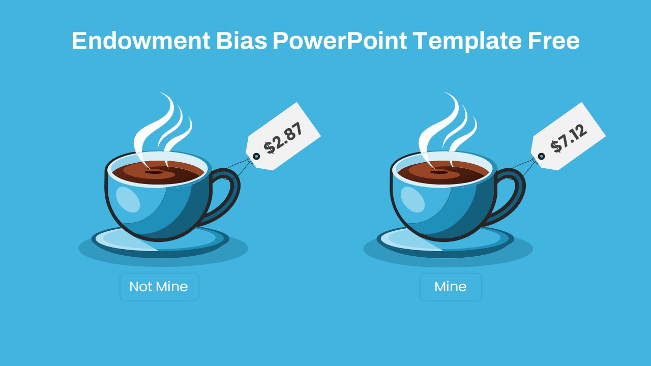
Endowment Bias Coffee Price Comparison Template for PowerPoint & Google Slides
Comparison
Free
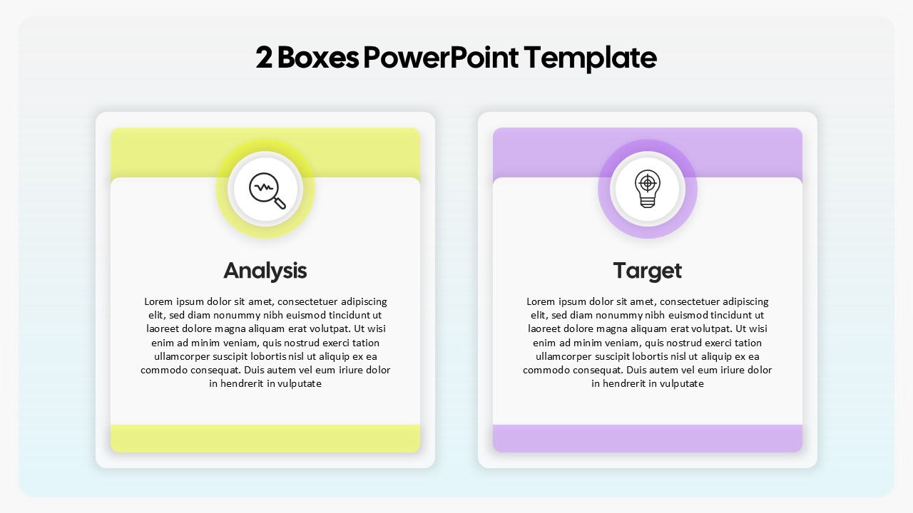
Two-Box Analysis & Target Comparison Template for PowerPoint & Google Slides
Comparison
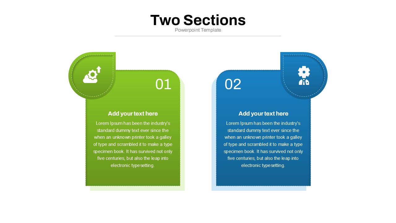
Two Section Comparison template for PowerPoint & Google Slides
Business Proposal
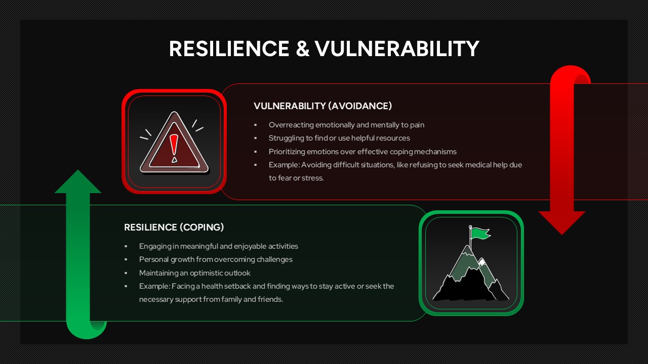
Resilience & Vulnerability Comparison Template for PowerPoint & Google Slides
Comparison
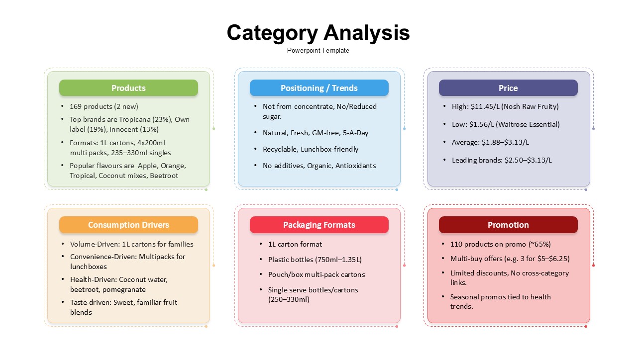
Category Analysis Comparison Infographic Template for PowerPoint & Google Slides
Comparison
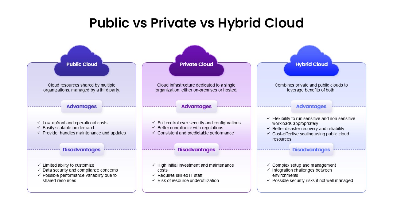
Public, Private & Hybrid Cloud Comparison Template for PowerPoint & Google Slides
Cloud Computing
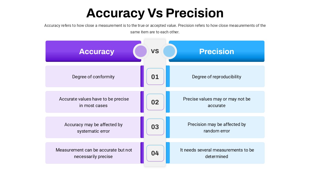
Accuracy Vs Precision Comparison Template for PowerPoint & Google Slides
Comparison Chart
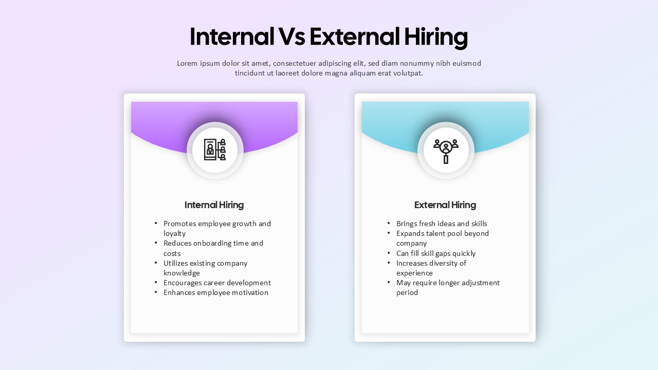
Internal vs External Hiring Comparison Template for PowerPoint & Google Slides
Comparison
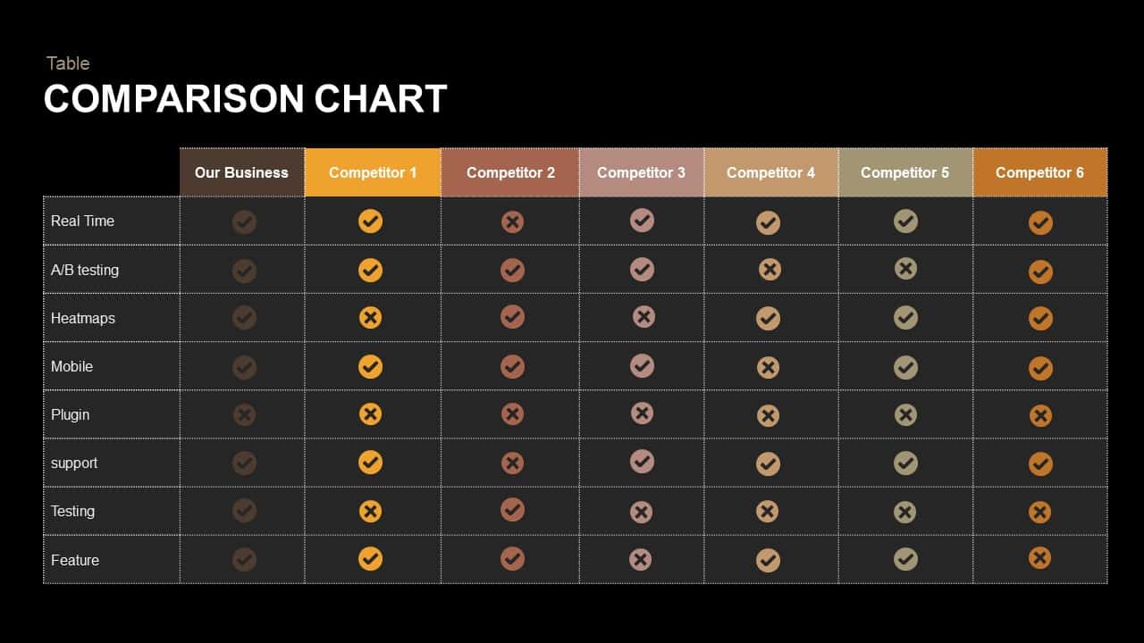
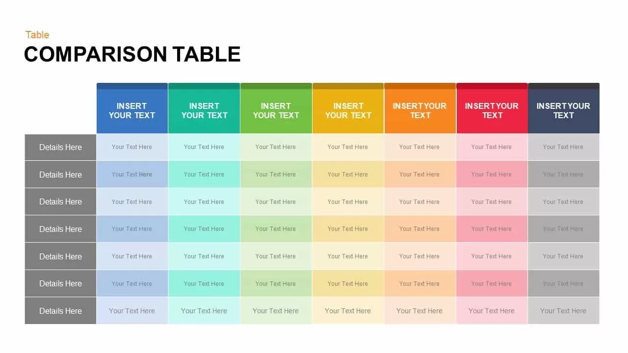
Comparison Table Presentation Template for PowerPoint & Google Slides
Table
Colorful Comparison Table Presentation Template for PowerPoint & Google Slides
Table
Five Column Comparison Table Layout Template for PowerPoint & Google Slides
Comparison
Pros and Cons Comparison Table Template for PowerPoint & Google Slides
Comparison Chart
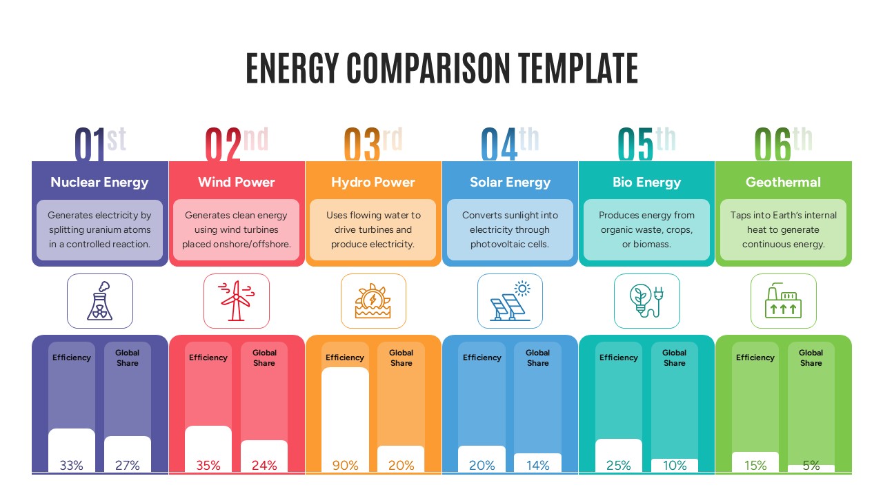
Energy Comparison Template for PowerPoint & Google Slides
Comparison
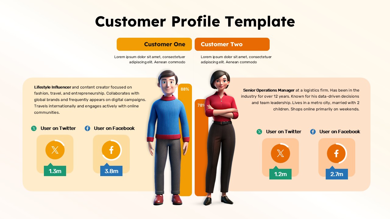
Customer Persona Comparison Profile Template for PowerPoint & Google Slides
Business
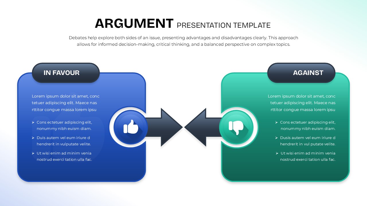
Argument Comparison Template for PowerPoint & Google Slides
Comparison
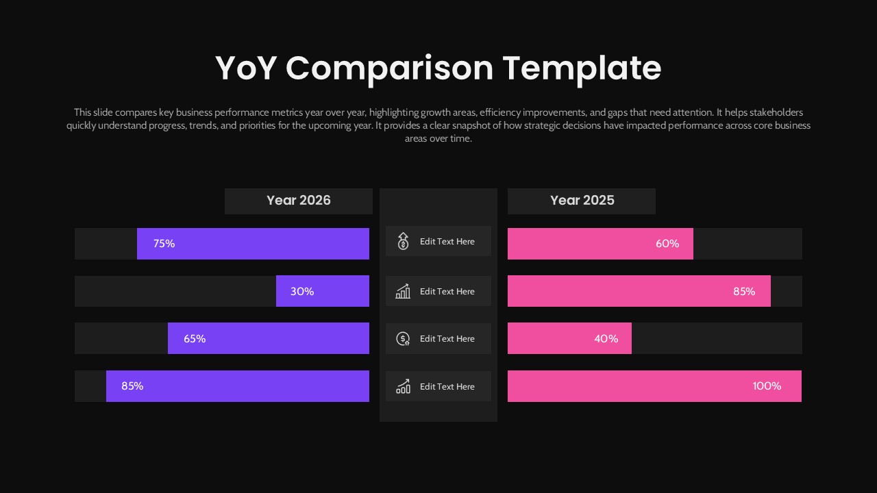
Year-over-Year Performance Comparison Template for PowerPoint & Google Slides
Comparison Chart