Pugh Matrix Decision Comparison Chart Template for PowerPoint & Google Slides

Description
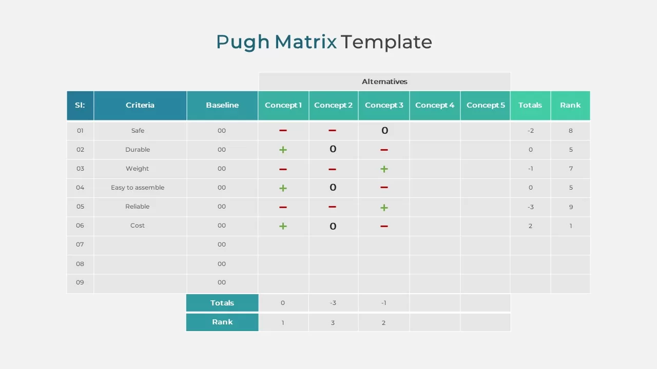
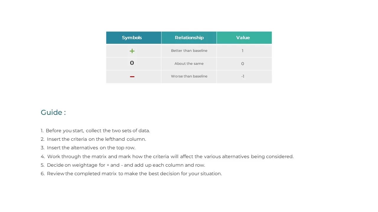
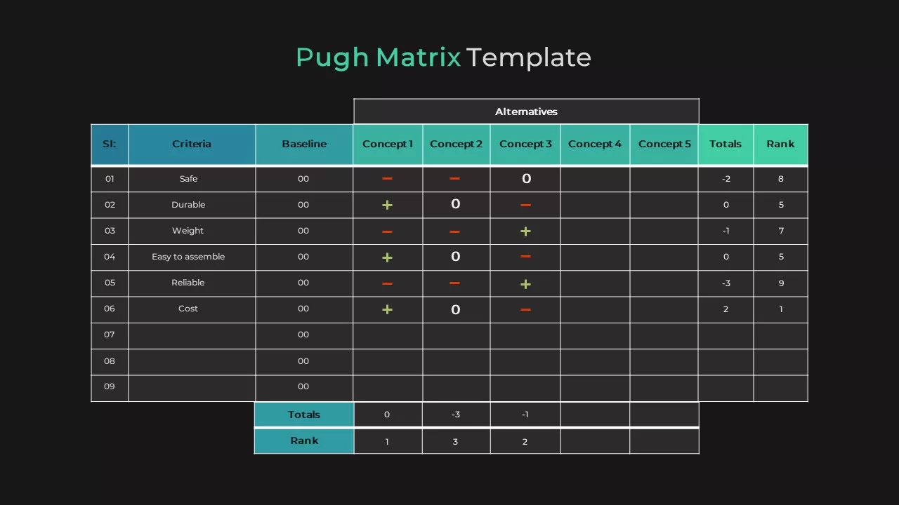
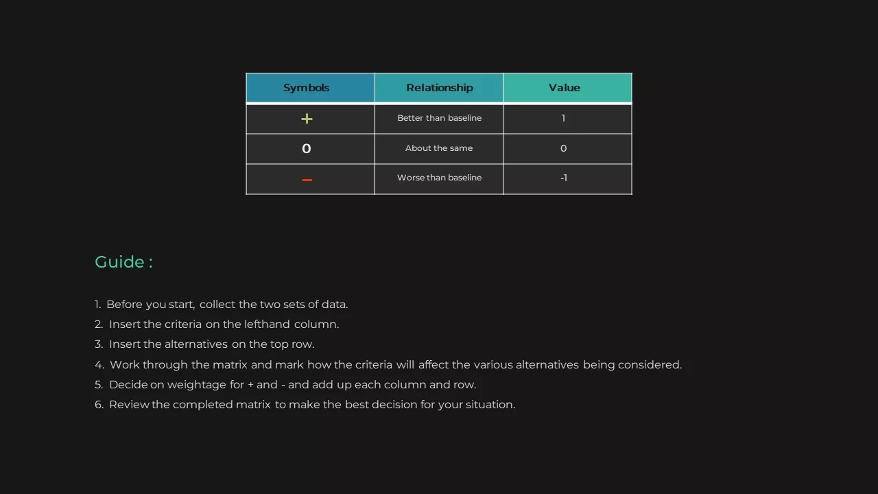
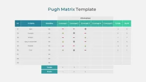
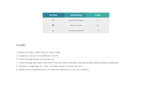
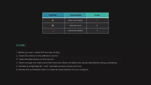
Evaluate and rank multiple alternatives with confidence using this Pugh Matrix decision comparison chart slide. The clean grid layout features a baseline column alongside five concept columns, each scored with intuitive “+” (better), “0” (equal), and “–” (worse) symbols. Totals and rank rows at the bottom automatically highlight the top-performing option, guiding your team toward data‐driven decisions. A dedicated legend slide decodes the symbols and includes a step-by-step user guide, ensuring seamless adoption even for first-time users.
Fully editable in both PowerPoint and Google Slides, every cell, icon, and accent is vector-based for effortless resizing and recoloring to match your brand. Master slide support locks in consistent fonts, header colors, and spacing, while customizable table rows let you add or remove criteria as needed. Simply enter your own criteria labels, baseline scores, and alternative names to transform subjective opinions into objective rankings in minutes.
Designed for clarity, the teal and gray color palette keeps focus on your analysis, and generous white space prevents visual clutter. This template renders crisply in virtual presentations, printed reports, and collaborative workshops. Duplicate the slide to compare additional concepts or integrate the legend and guide into existing decks to streamline decision-making processes.
Who is it for
Product managers, engineers, designers, project leaders, and strategy consultants who need to compare and rank design concepts, vendors, or strategic alternatives against key criteria.
Other Uses
Repurpose this matrix for feature prioritization, risk assessment, vendor selection, process improvement evaluations, or any scenario requiring structured comparison and consensus building.
Login to download this file

Item ID
SB02453
Related Templates

Decision Matrix & Prioritization Chart Template for PowerPoint & Google Slides
Comparison Chart
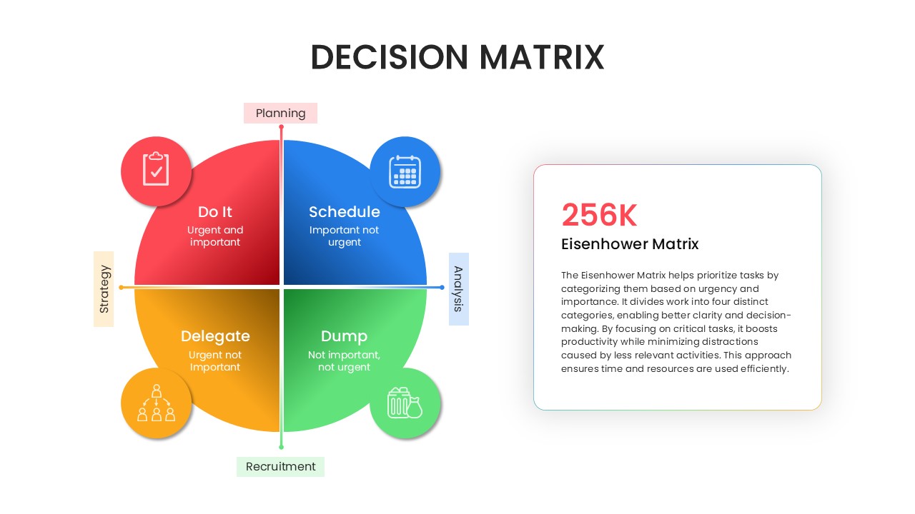
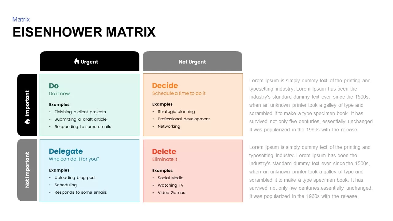
Eisenhower Matrix Decision-Making template for PowerPoint & Google Slides
Infographics
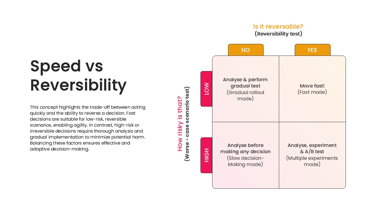
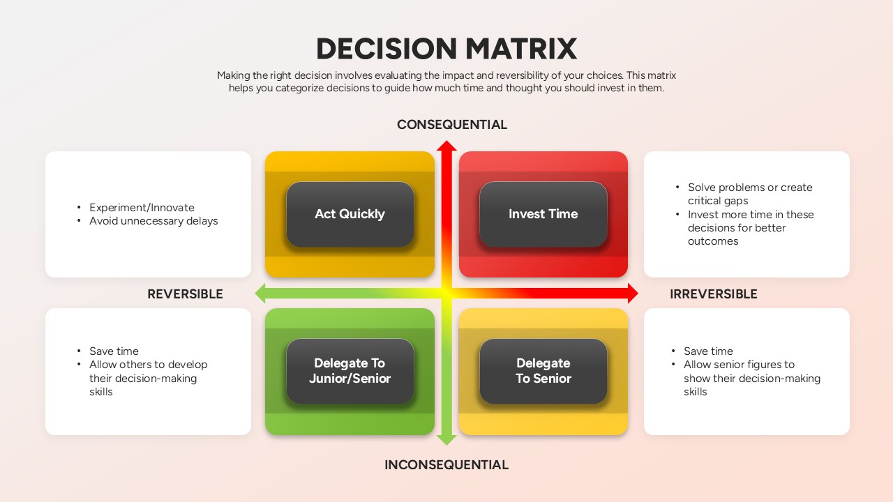
Speed vs Reversibility Decision Matrix Template for PowerPoint & Google Slides
Comparison
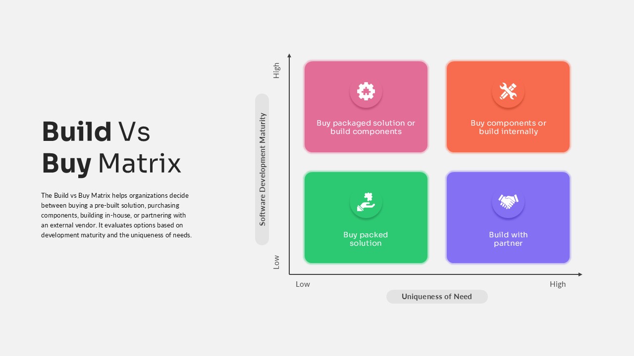
Build vs Buy Matrix Decision Framework template for PowerPoint & Google Slides
Business Strategy
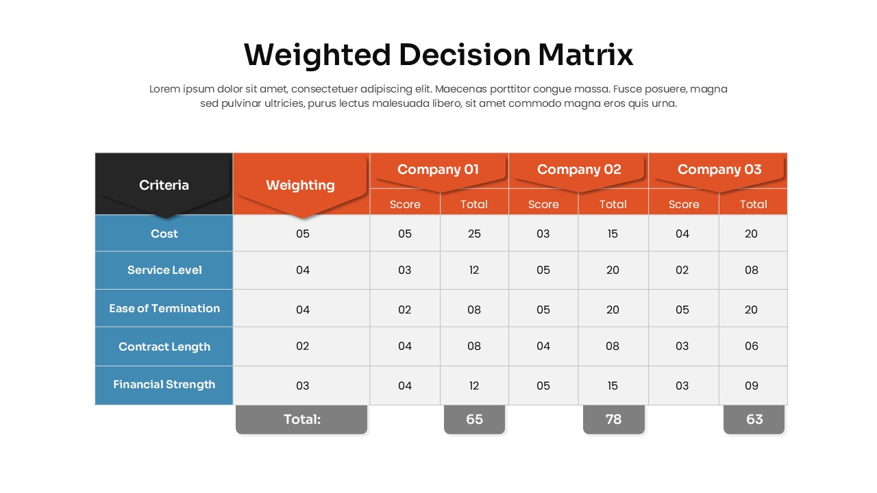
Weighted Decision Matrix template for PowerPoint & Google Slides
Business Models
Decision Matrix Evaluation Framework Slide Template for PowerPoint & Google Slides
Leadership
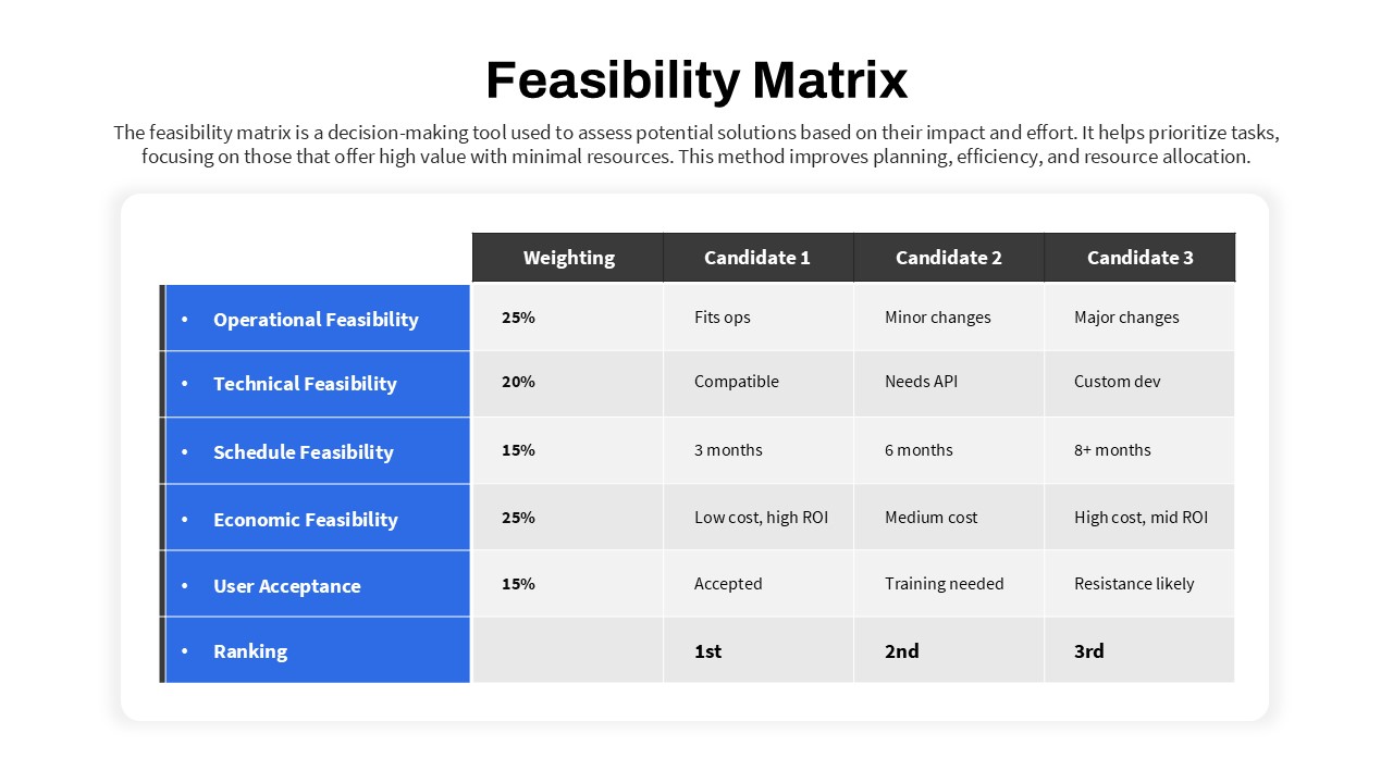
Feasibility Matrix Comparison Chart Template for PowerPoint & Google Slides
Comparison Chart
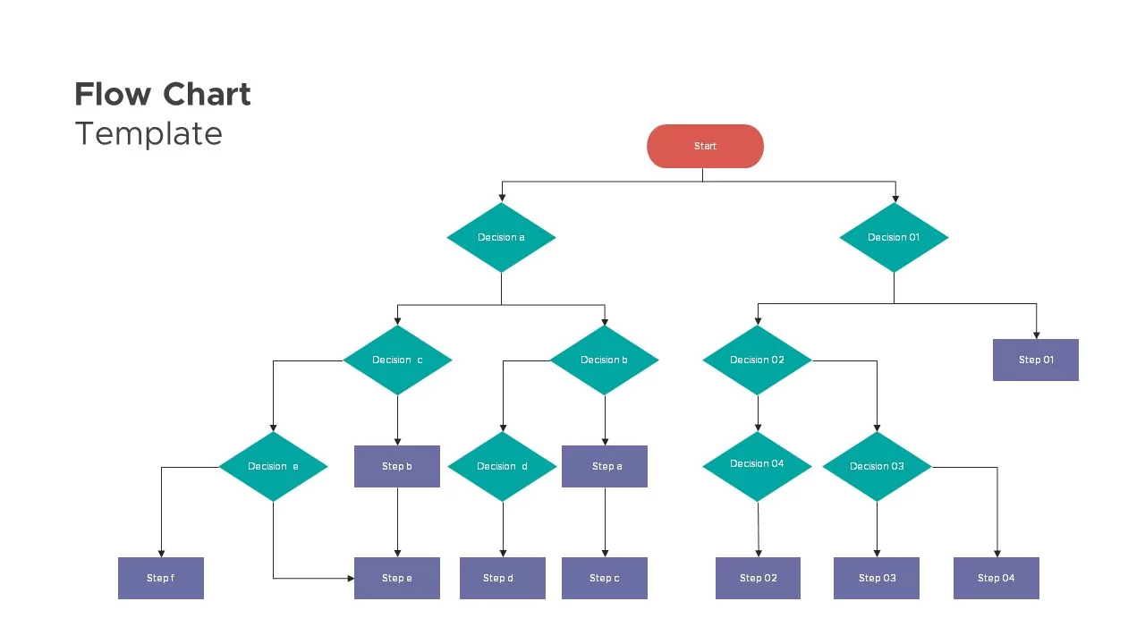
Flow Chart Decision Tree Template for PowerPoint & Google Slides
Flow Charts
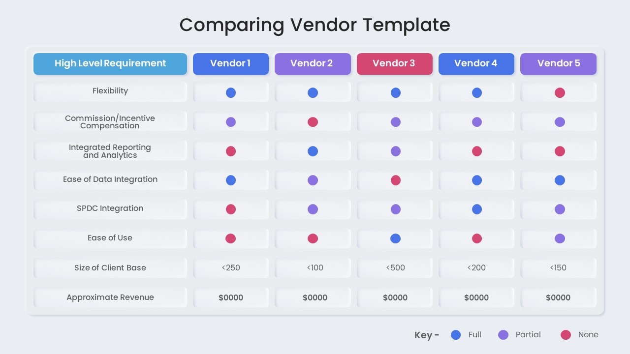
Vendor Comparison Matrix with High-Level Requirements template for PowerPoint & Google Slides
Comparison Chart
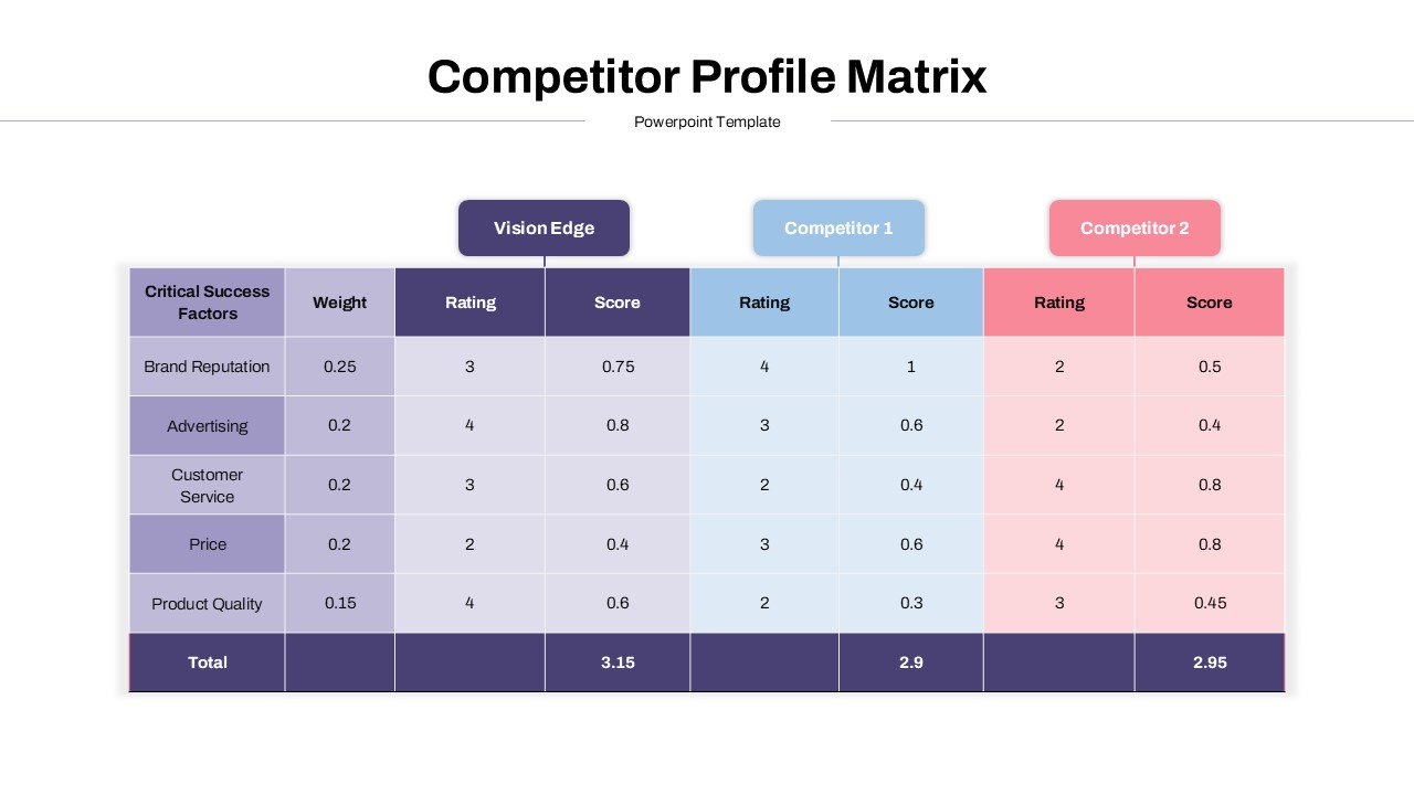
Competitor Profile Matrix Comparison Template for PowerPoint & Google Slides
Comparison Chart
Colorful Decision Tree Diagram template for PowerPoint & Google Slides
Decision Tree
Decision Tree Diagram template for PowerPoint & Google Slides
Decision Tree
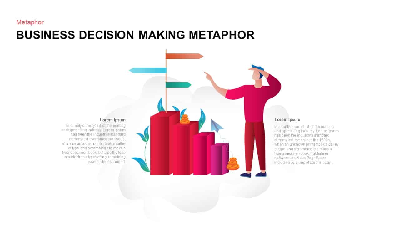
Business Decision-Making Metaphor Template for PowerPoint & Google Slides
Leadership
Three-Way Decision Process Arrow Diagram Template for PowerPoint & Google Slides
Arrow
Business Decision Making Metaphor Template for PowerPoint & Google Slides
Arrow
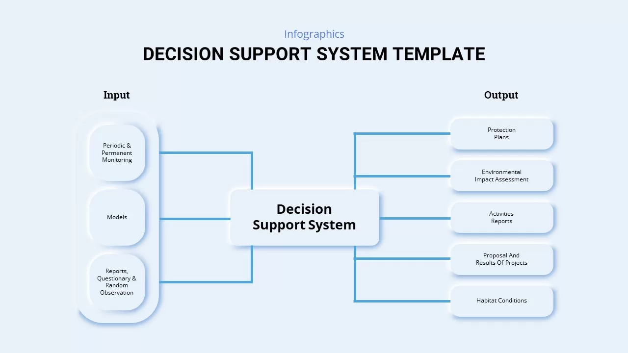
Decision Support System Diagram Template for PowerPoint & Google Slides
Process
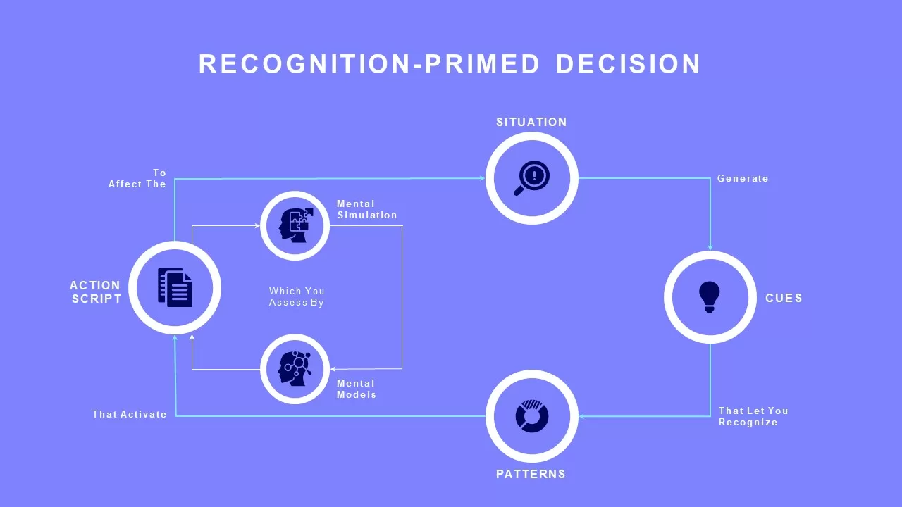
Recognition-Primed Decision Process Flow Template for PowerPoint & Google Slides
Flow Charts
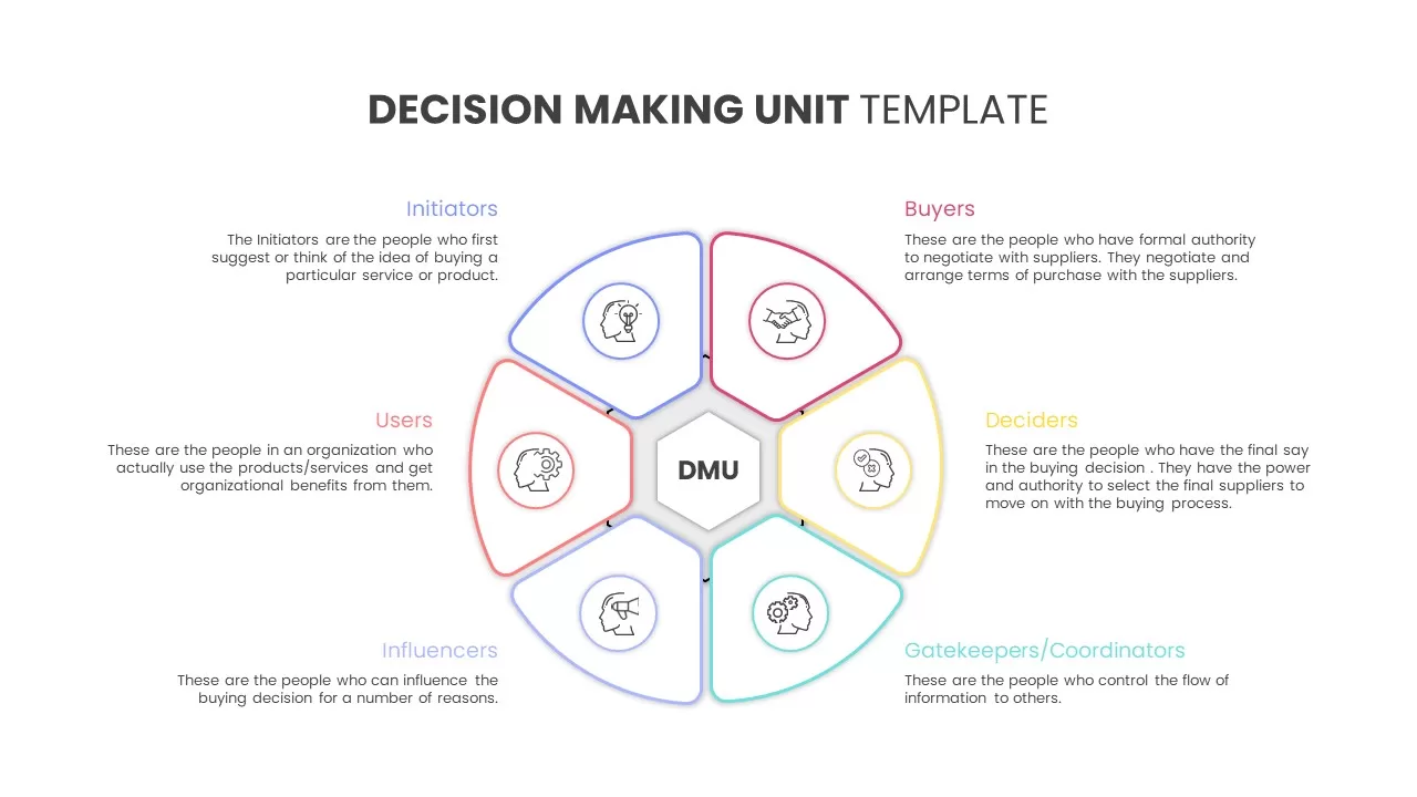
Decision Making Unit template for PowerPoint & Google Slides
Business
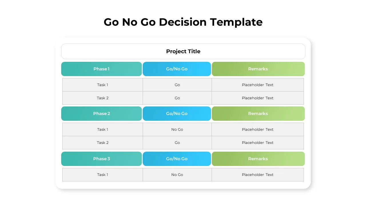
Go No Go Decision Infographic Template for PowerPoint & Google Slides
Comparison
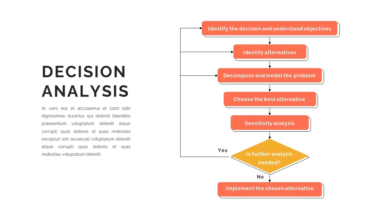
Decision Analysis Process Flowchart Template for PowerPoint & Google Slides
Flow Charts
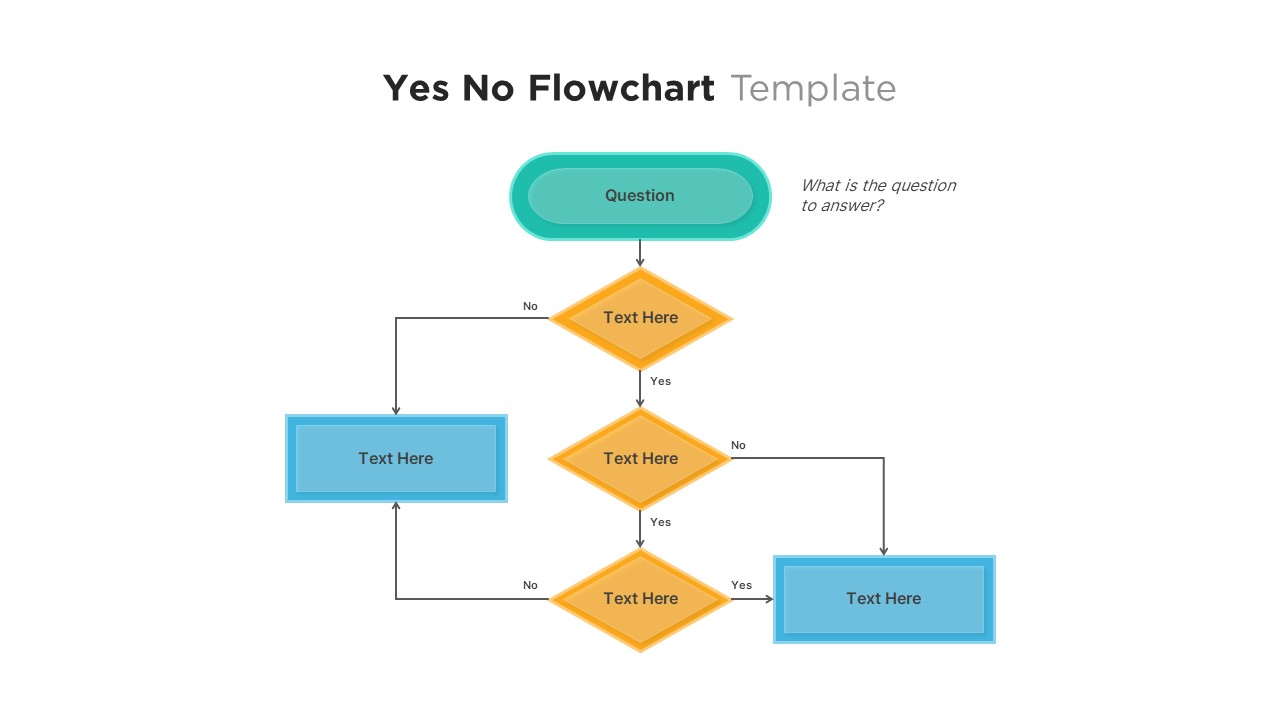
Professional Yes No Decision Flowchart Template for PowerPoint & Google Slides
Flow Charts
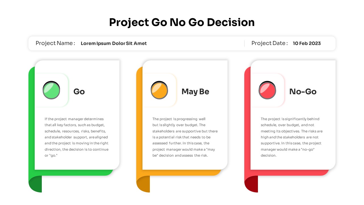
Project Go No-Go Decision Slide Template for PowerPoint & Google Slides
Process
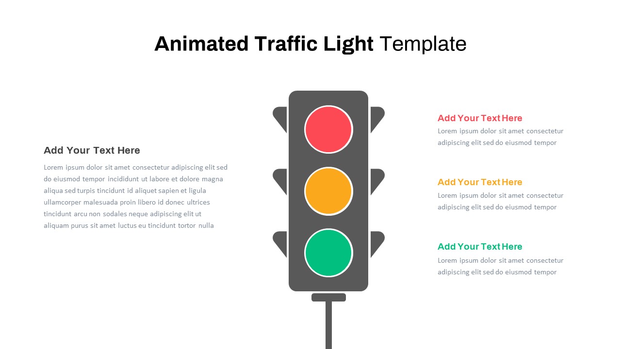
Animated Traffic Light Decision Diagram Template for PowerPoint & Google Slides
Process
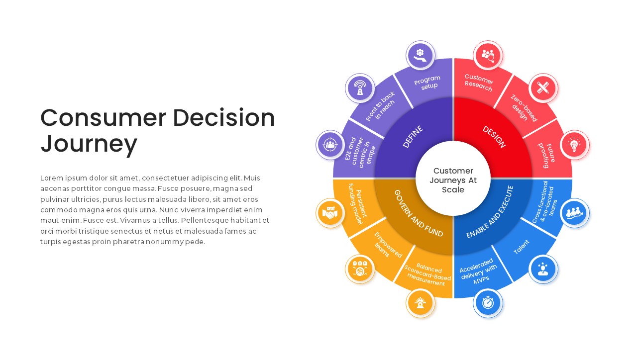
Consumer Decision Journey Radial Diagram Template for PowerPoint & Google Slides
Circular
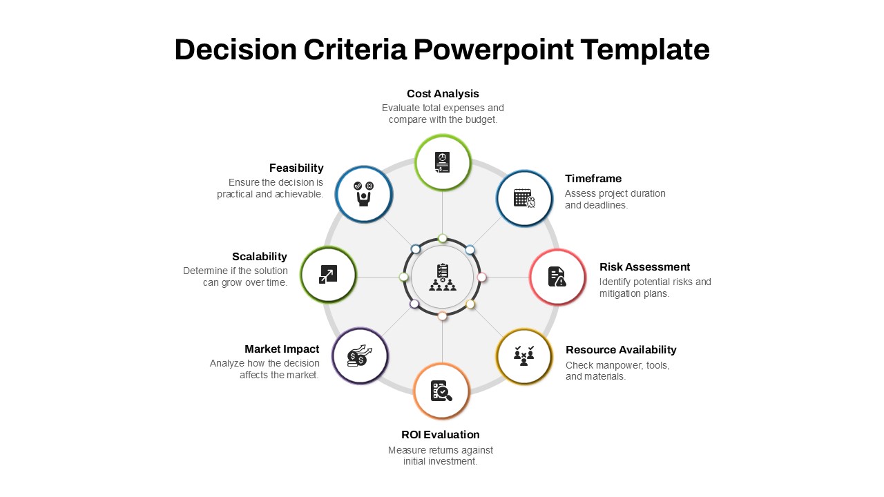
Decision Criteria Template for PowerPoint & Google Slides
Infographics
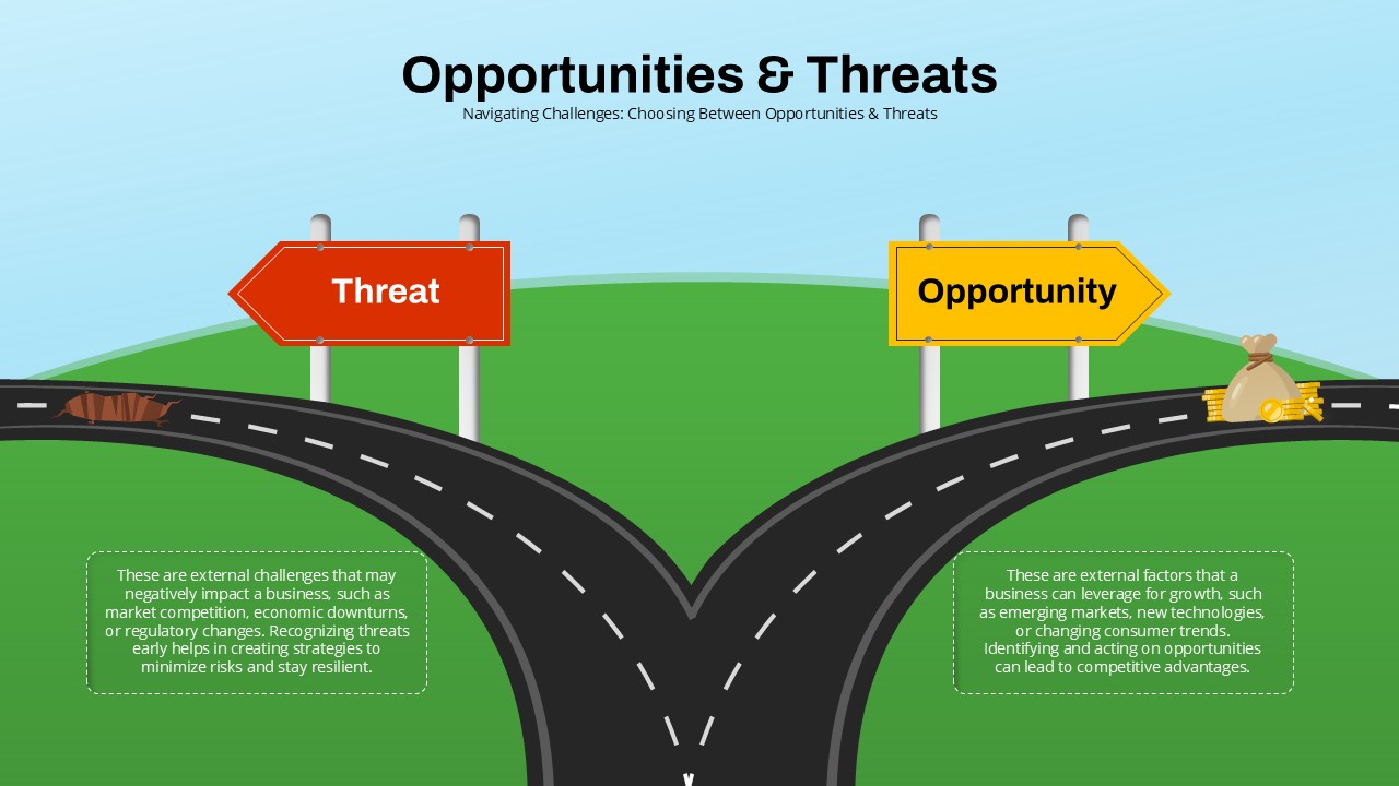
Opportunities & Threats Decision Roadmap Template for PowerPoint & Google Slides
Comparison
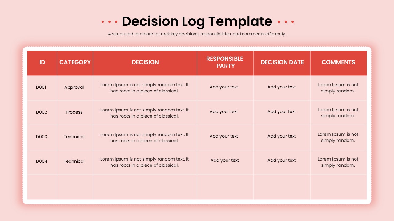
Decision Log Template for PowerPoint & Google Slides
Business
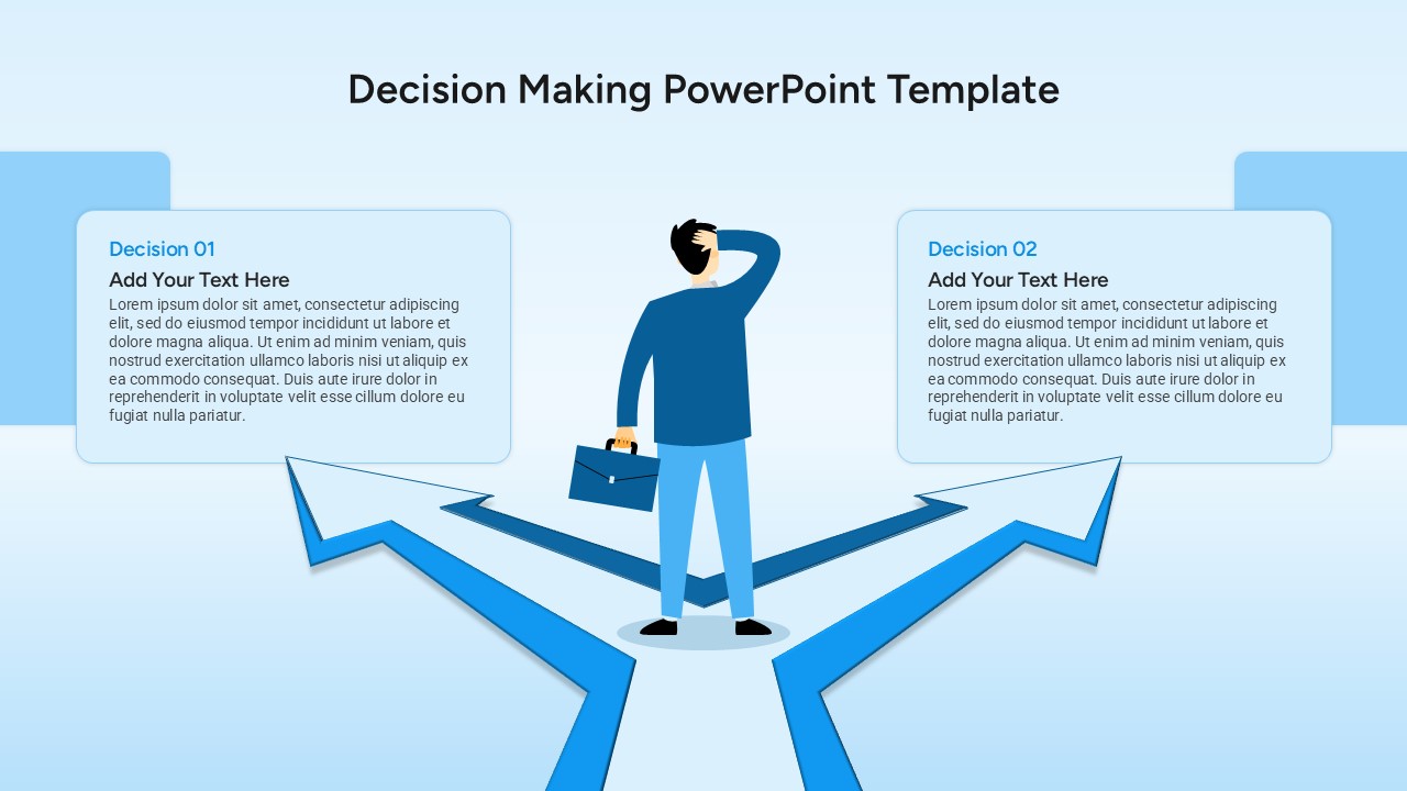
Decision Making Template for PowerPoint & Google Slides
Decision Tree
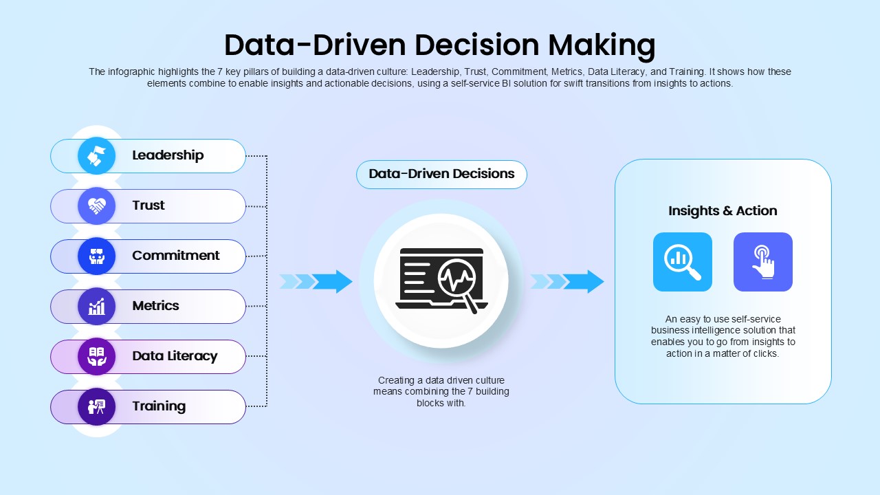
Data-Driven Decision Making overview template for PowerPoint & Google Slides
Business
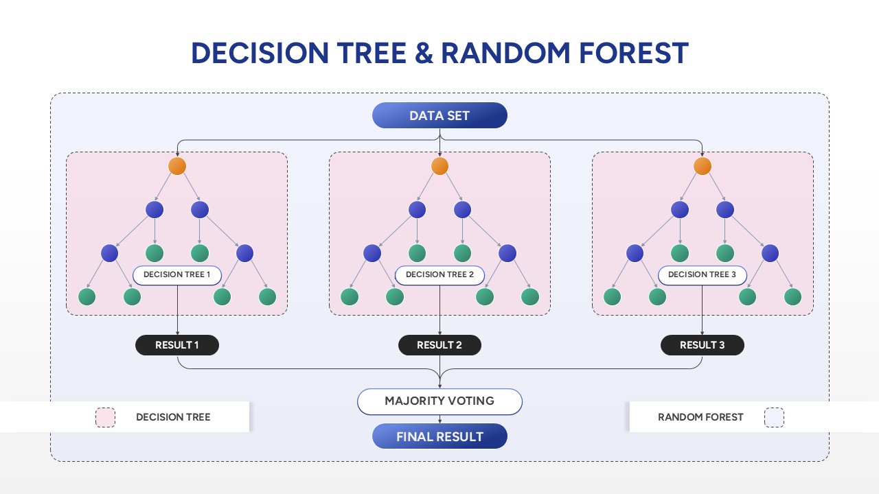
Decision Tree & Random Forest template for PowerPoint & Google Slides
Technology
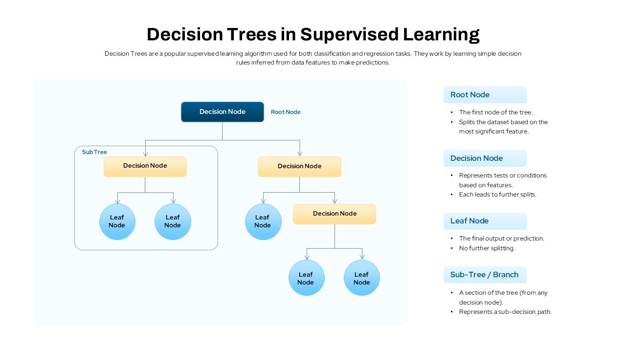
Decision Trees in Supervised Learning Template for PowerPoint & Google Slides
Machine Learning
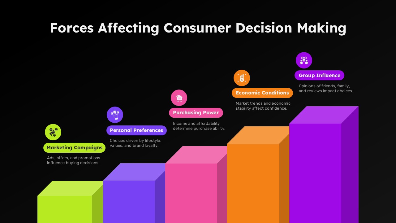
Forces Affecting Consumer Decision Making Template for PowerPoint & Google Slides
Marketing
Market Development Matrix Chart Template for PowerPoint & Google Slides
Comparison Chart
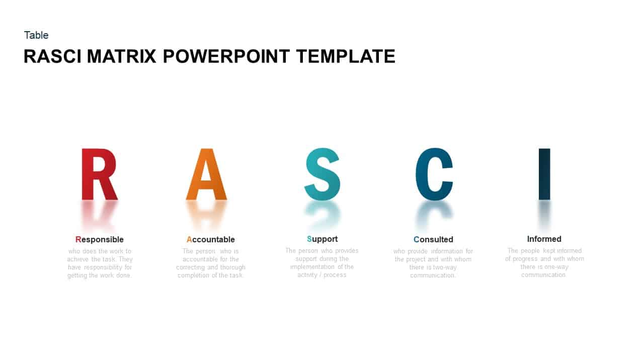
RASCI Responsibility Matrix Chart Template for PowerPoint & Google Slides
Business
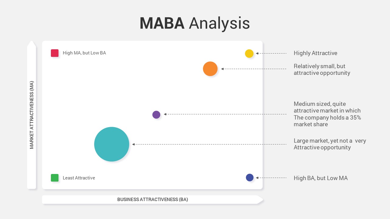
MABA Attractiveness Matrix Chart Template for PowerPoint & Google Slides
Comparison Chart
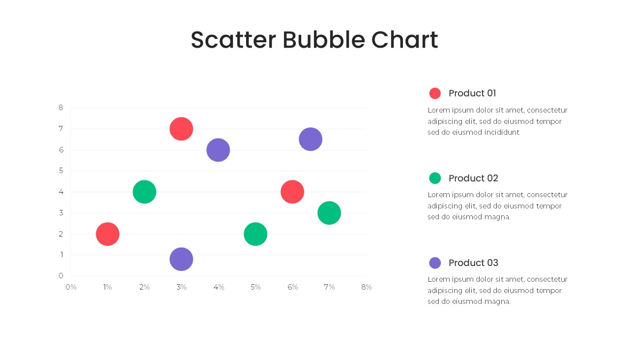
Bubble Chart Scatter, Diagram & Matrix Template for PowerPoint & Google Slides
Comparison Chart
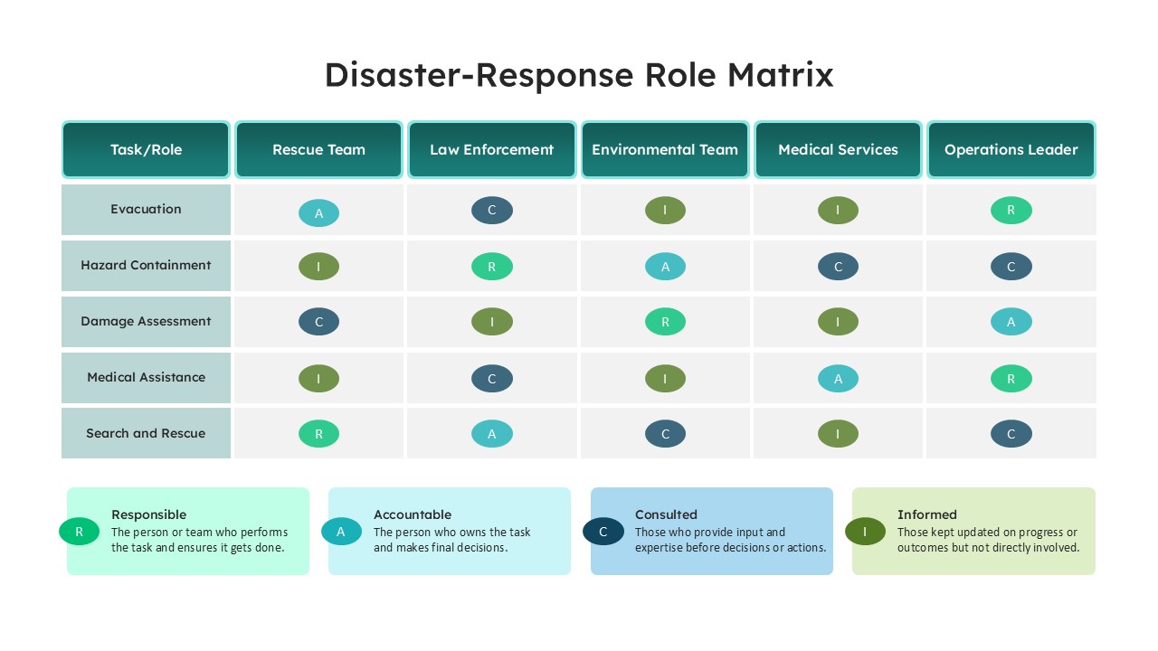
Disaster Response Role Matrix RACI Chart Template for PowerPoint & Google Slides
Project Status
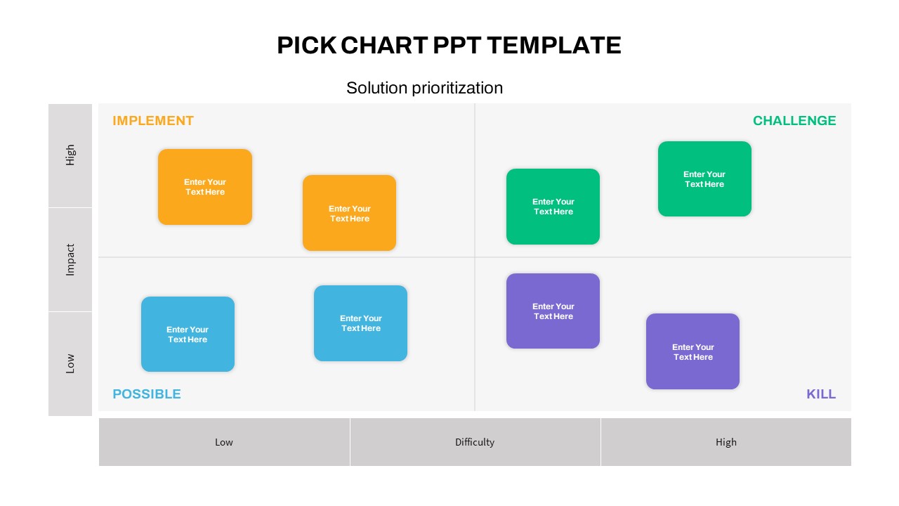
PICK Chart Matrix for Solution Prioritization in PowerPoint & Google Slides
Comparison
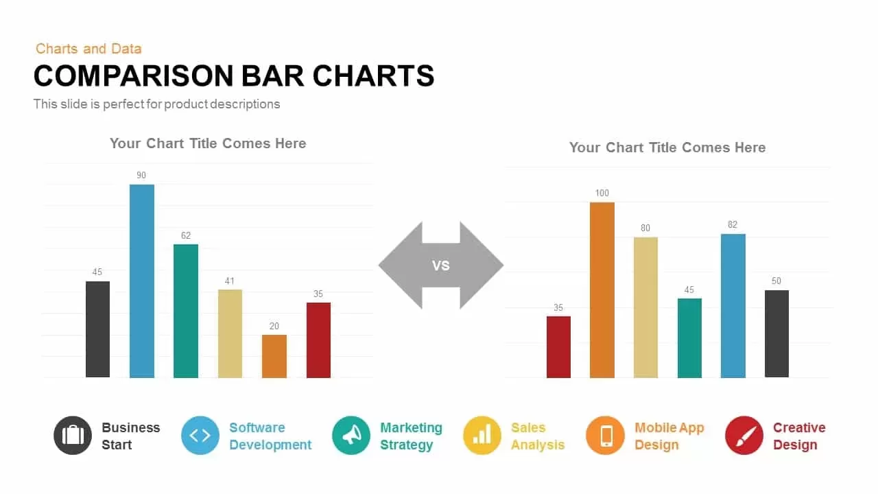
Comparison Bar Chart template for PowerPoint & Google Slides
Comparison Chart
Four Section Comparison Chart Diagram Template for PowerPoint & Google Slides
Infographics
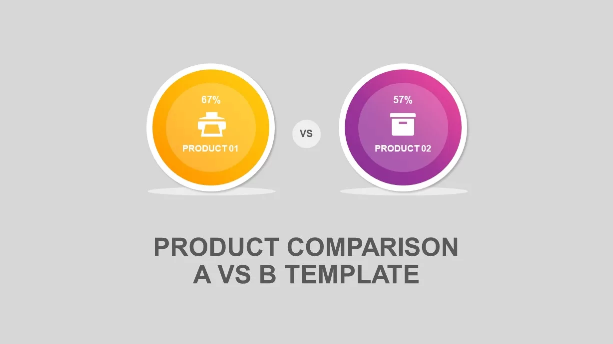
Interactive Product Comparison Bar Chart Template for PowerPoint & Google Slides
Bar/Column
Comparison Chart Overview template for PowerPoint & Google Slides
Comparison Chart
Tornado Chart Data Comparison Slide Template for PowerPoint & Google Slides
Bar/Column
Radar Chart Product Comparison Template for PowerPoint & Google Slides
Comparison Chart

BMI Category Comparison Chart Template for PowerPoint & Google Slides
Comparison
Circular Product Comparison Chart Template for PowerPoint & Google Slides
Comparison Chart
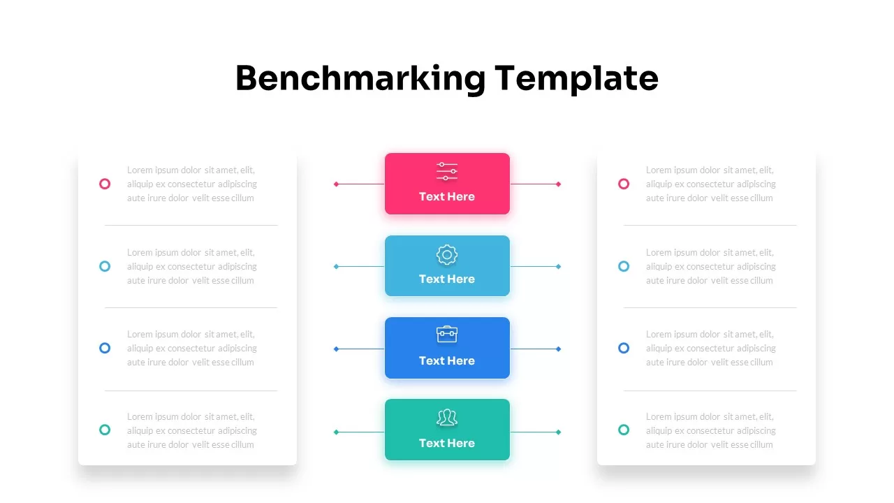
Dynamic Benchmarking Comparison Chart Template for PowerPoint & Google Slides
Comparison Chart
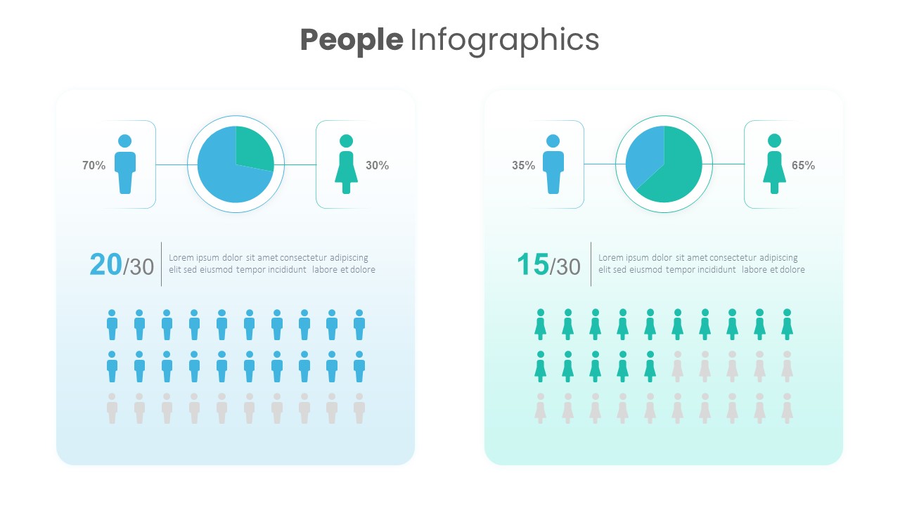
People Demographic Comparison Chart Template for PowerPoint & Google Slides
Comparison
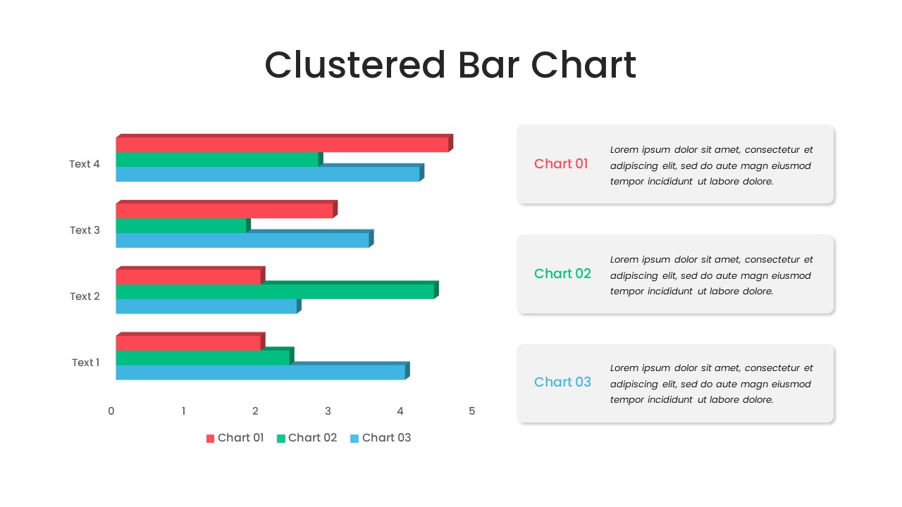
Clustered Bar Chart Comparison Template for PowerPoint & Google Slides
Bar/Column
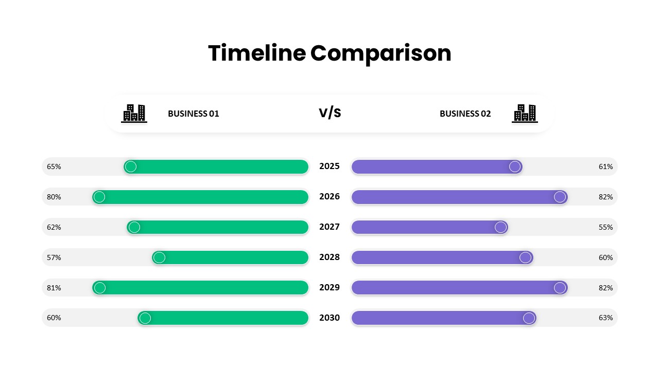
Business Timeline Comparison Bar Chart Template for PowerPoint & Google Slides
Comparison Chart
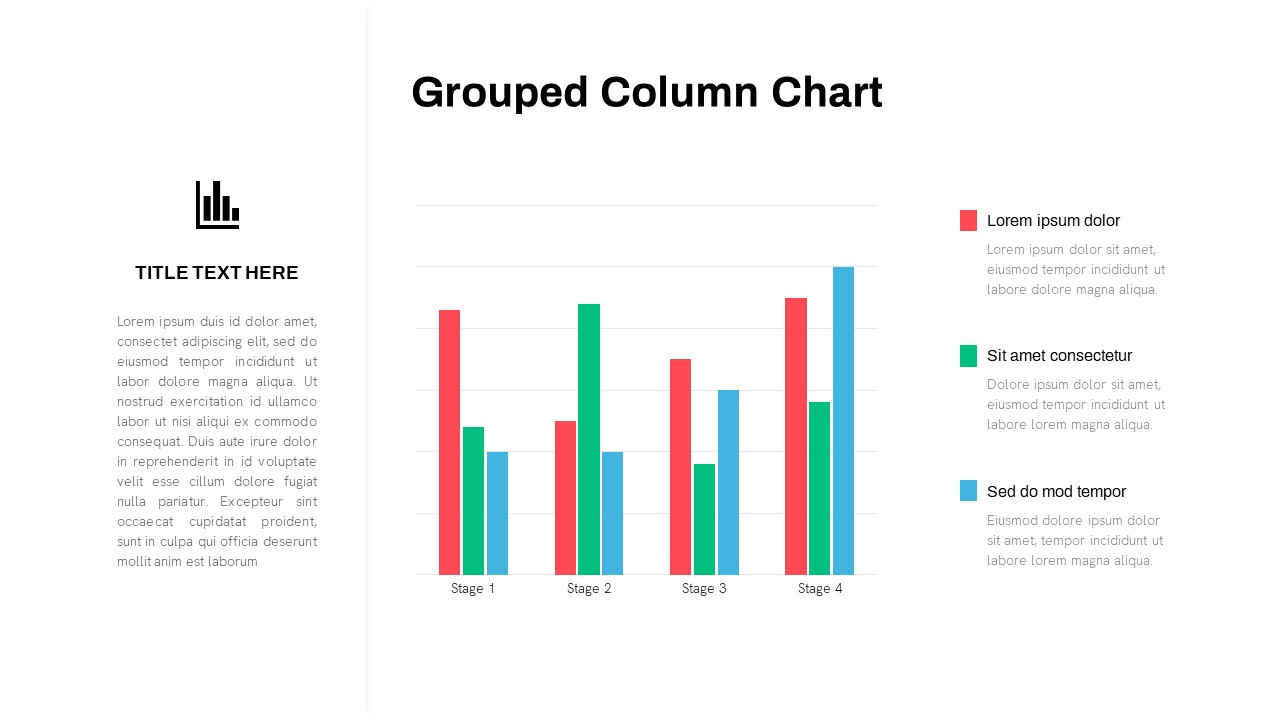
Grouped Column Chart Comparison Template for PowerPoint & Google Slides
Bar/Column
Multiple Line Chart Comparison Template for PowerPoint & Google Slides
Comparison Chart
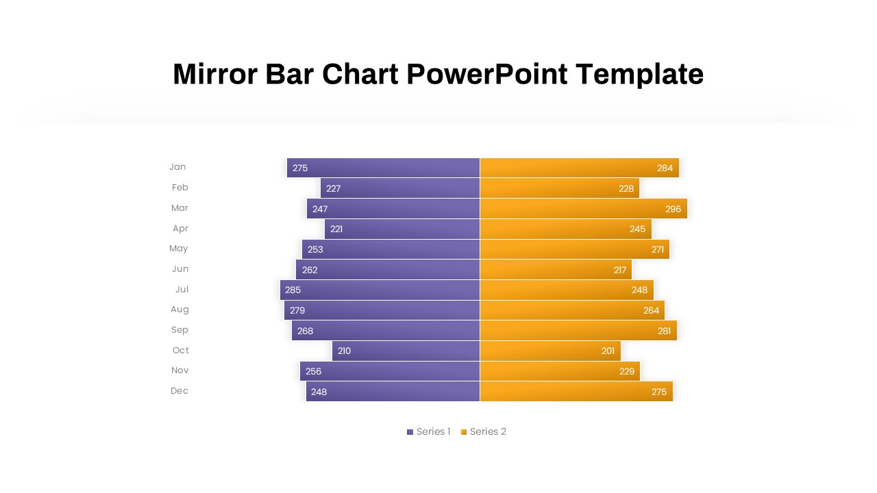
Mirror Bar Chart Comparison Template for PowerPoint & Google Slides
Bar/Column
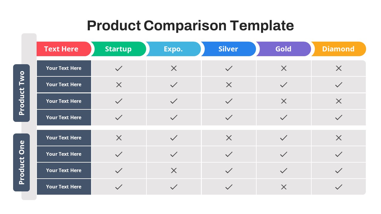
Free Versatile Product Comparison Chart Template for PowerPoint & Google Slides
Charts
Free
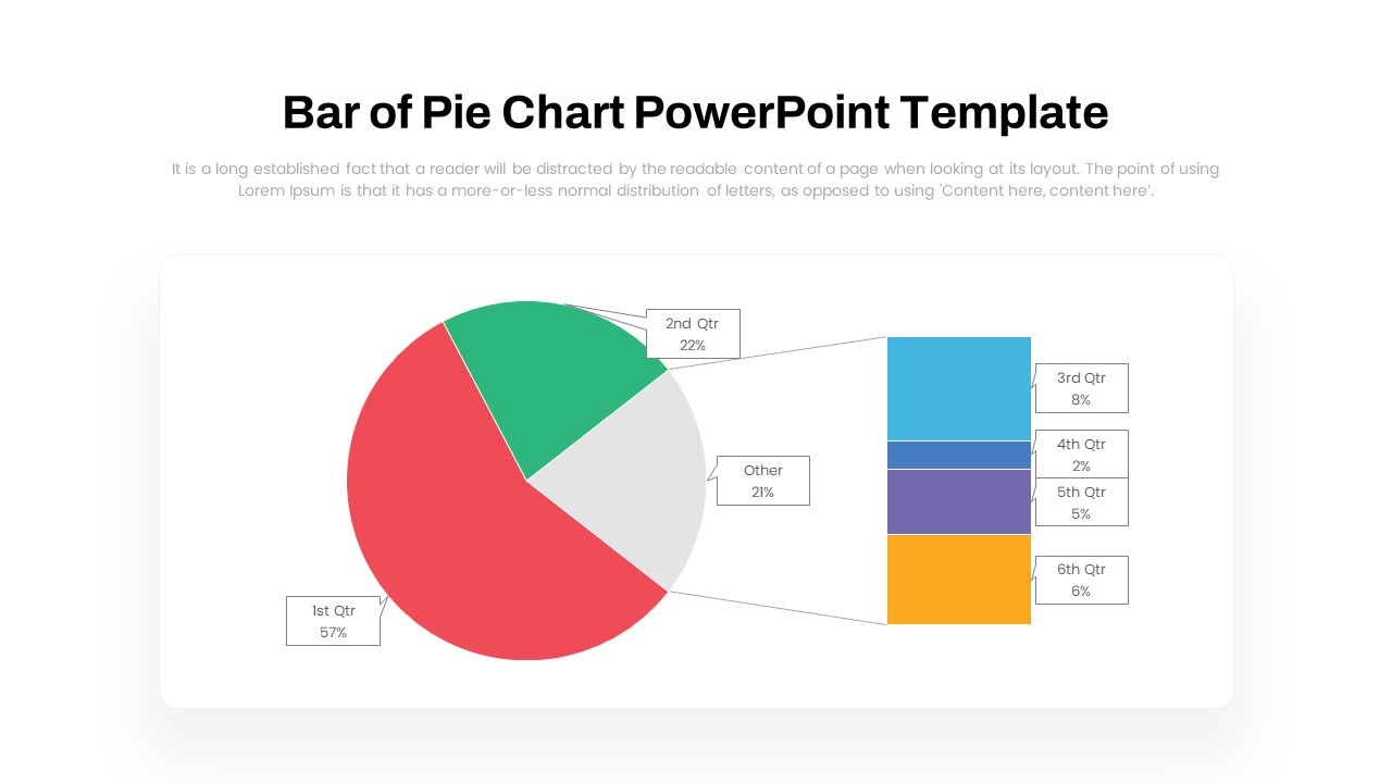
Dynamic Bar-of-Pie Chart Comparison Template for PowerPoint & Google Slides
Pie/Donut
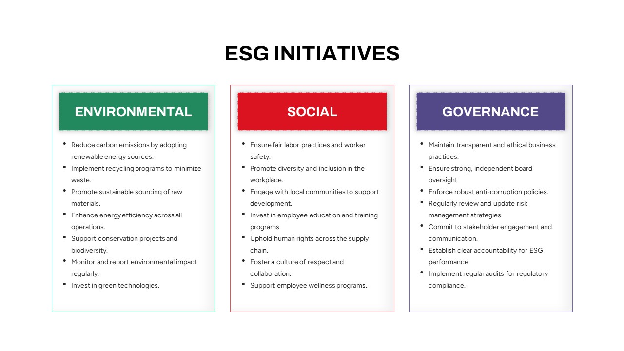
ESG Initiatives Comparison Chart Template for PowerPoint & Google Slides
Business
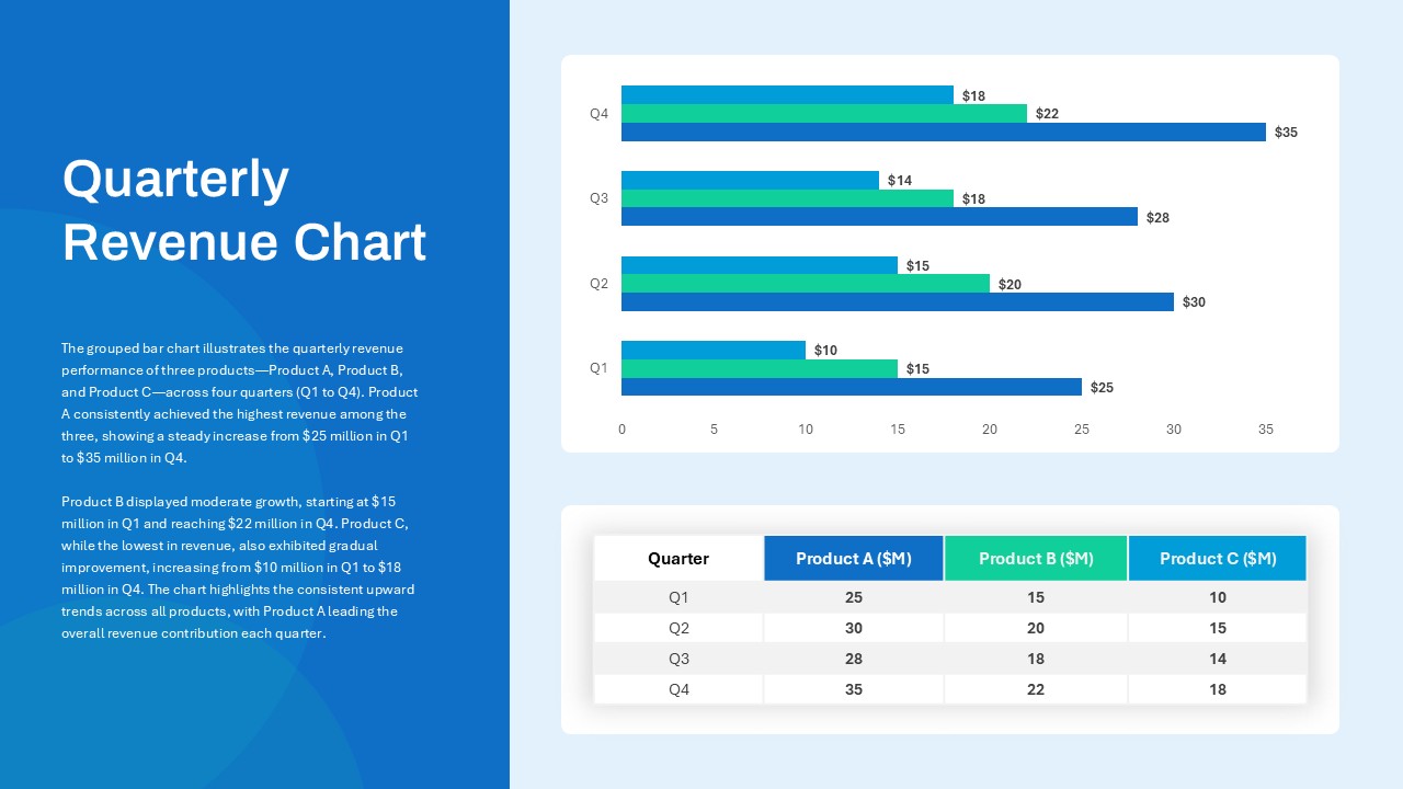
Quarterly Revenue Comparison Bar Chart Template for PowerPoint & Google Slides
Bar/Column
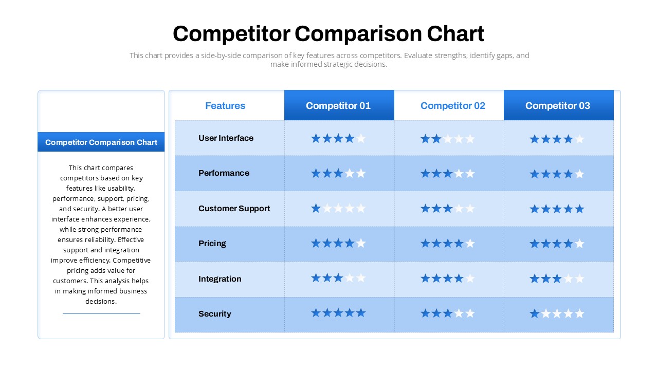
Competitor Comparison Chart Design Template for PowerPoint & Google Slides
Comparison
Two-Option Bar Chart Comparison Table Template for PowerPoint & Google Slides
Comparison
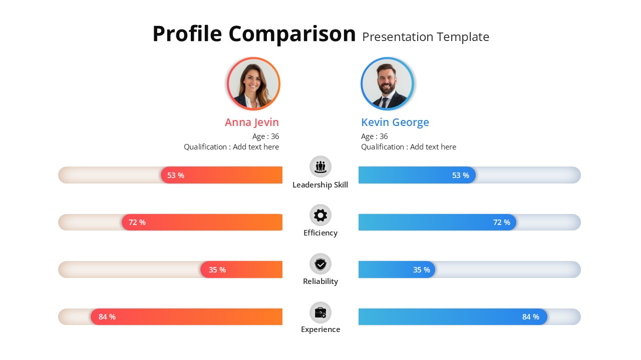
Profile Comparison Chart template for PowerPoint & Google Slides
Comparison Chart
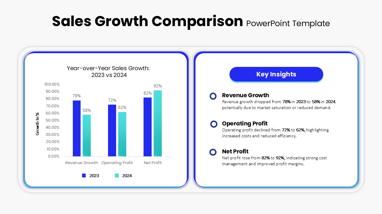
Sales Growth Comparison Chart & Table Template for PowerPoint & Google Slides
Bar/Column
Skills Gap Analysis Comparison Chart Template for PowerPoint & Google Slides
Gap
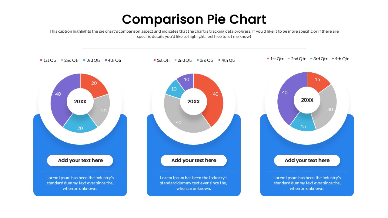
Quarterly Comparison Pie Chart Template for PowerPoint & Google Slides
Pie/Donut
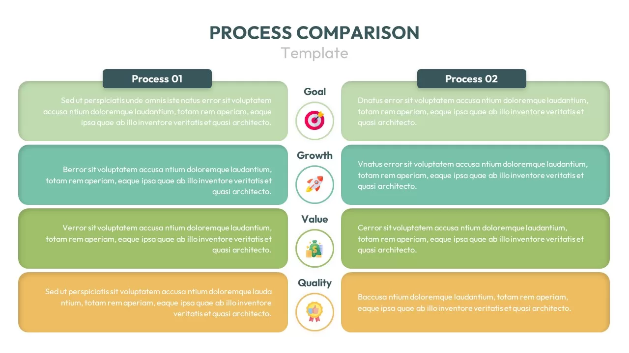
Process Comparison Chart for PowerPoint & Google Slides
Infographics

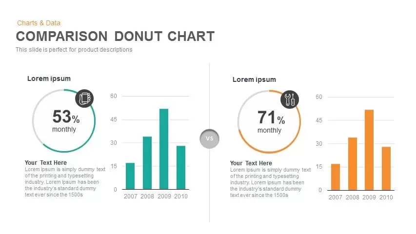
Comparison Donut Chart PowerPoint Template and Keynote
Pie/Donut
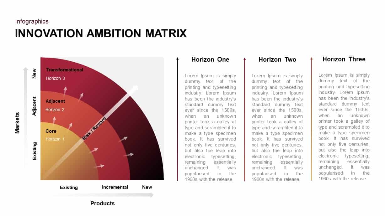
Innovation Ambition Matrix & Funnel Strategy Slides for PowerPoint & Google Slides
Process
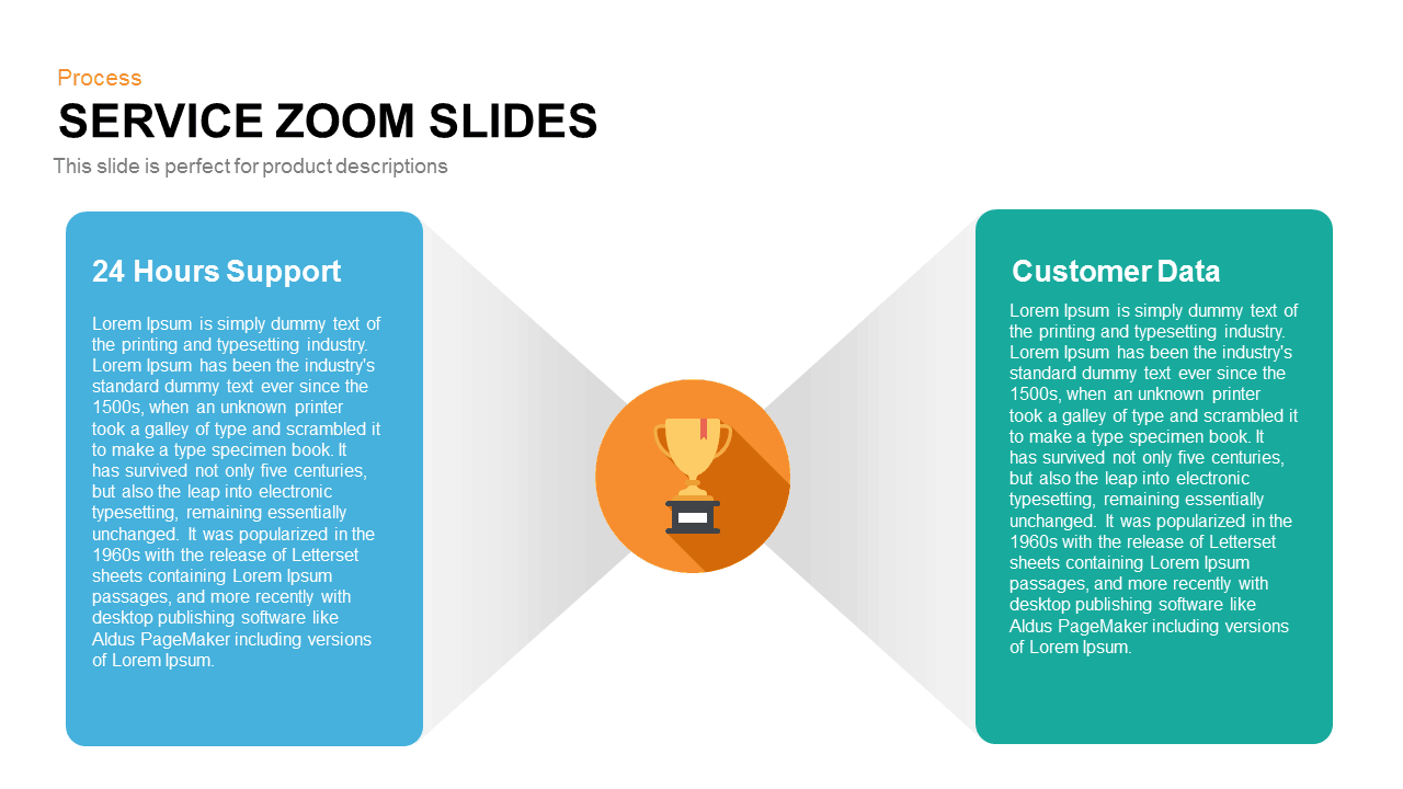
Service Zoom Feature Slides Comparison template for PowerPoint & Google Slides
Process
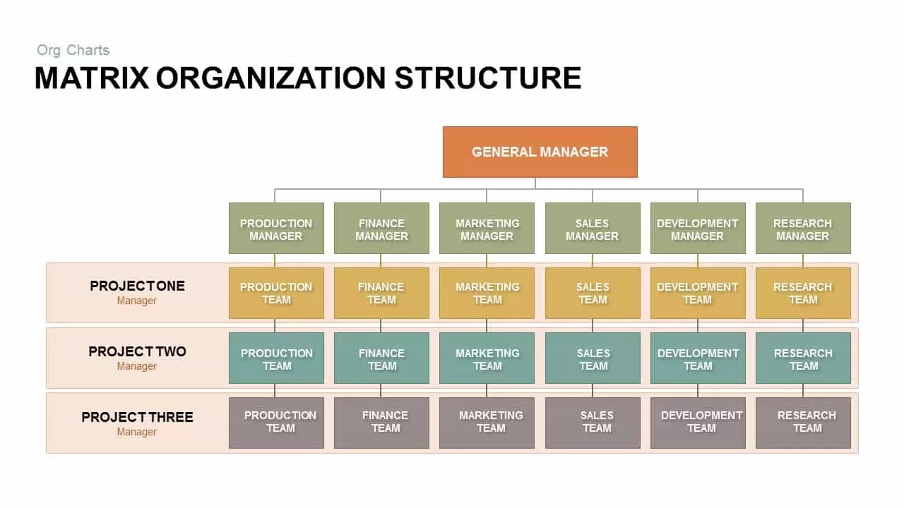
Matrix Organization Structure template for PowerPoint & Google Slides
Org Chart
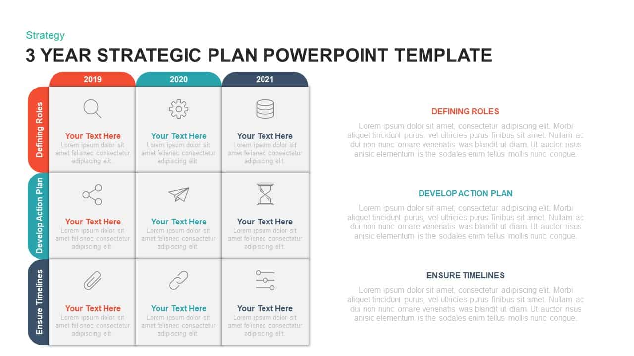
Three-Year Strategic Plan Matrix Template for PowerPoint & Google Slides
Timeline
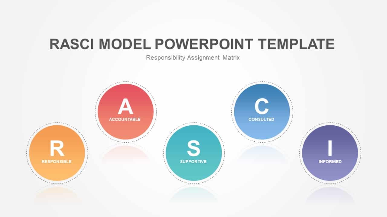
RASCI Responsibility Assignment Matrix Template for PowerPoint & Google Slides
Project
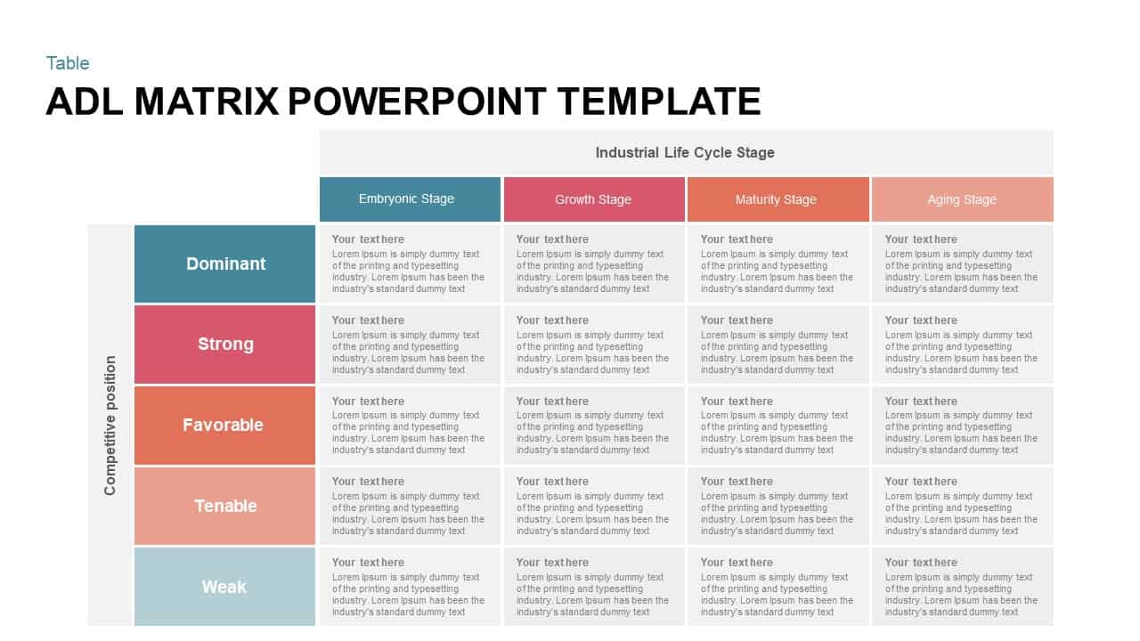
Strategic ADL Matrix by Industry Life Cycle & Position Template for PowerPoint & Google Slides
Business Strategy
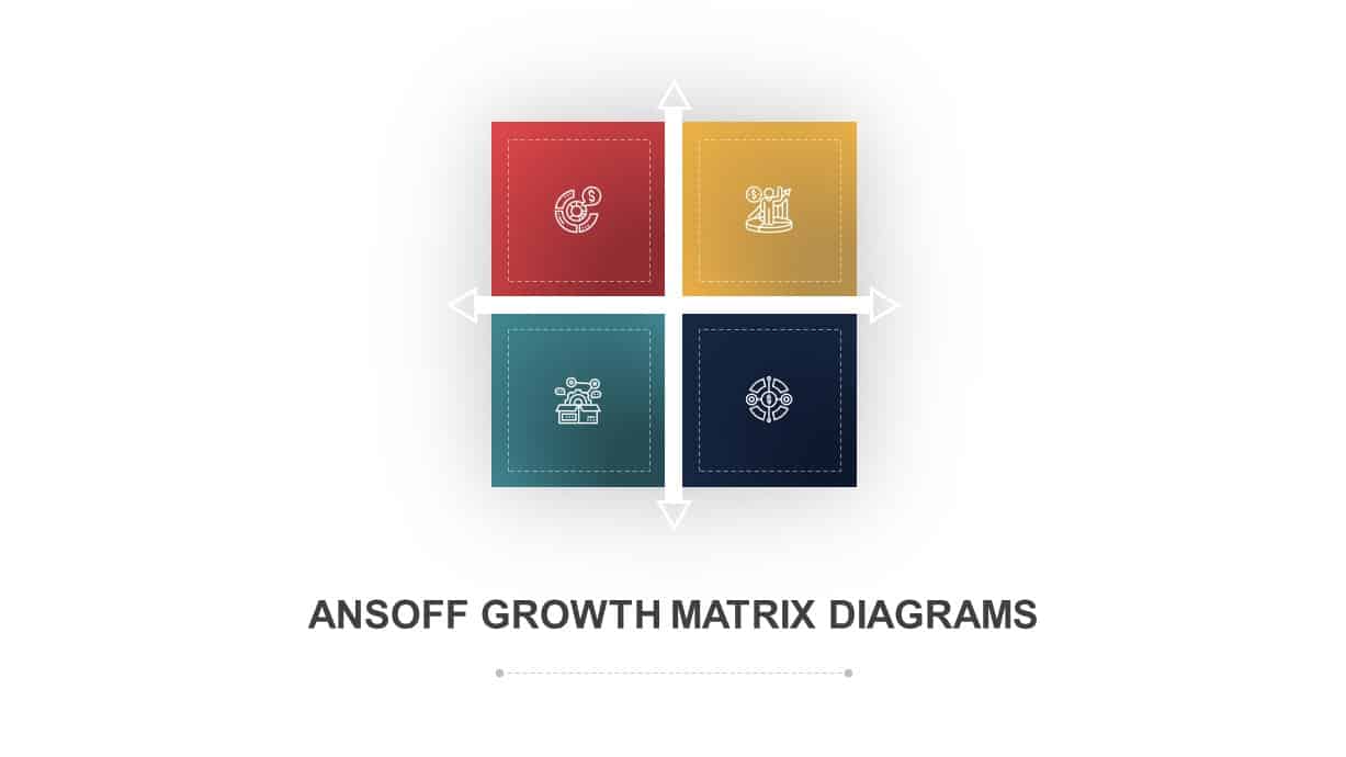
Ansoff Growth Matrix Strategy Diagram Template for PowerPoint & Google Slides
Business Strategy
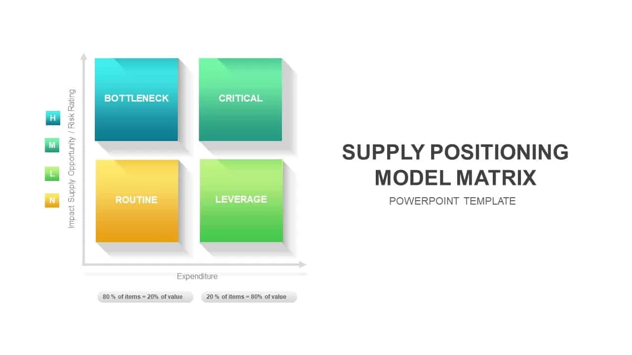
Supply Positioning Model Matrix Template for PowerPoint & Google Slides
Comparison Chart
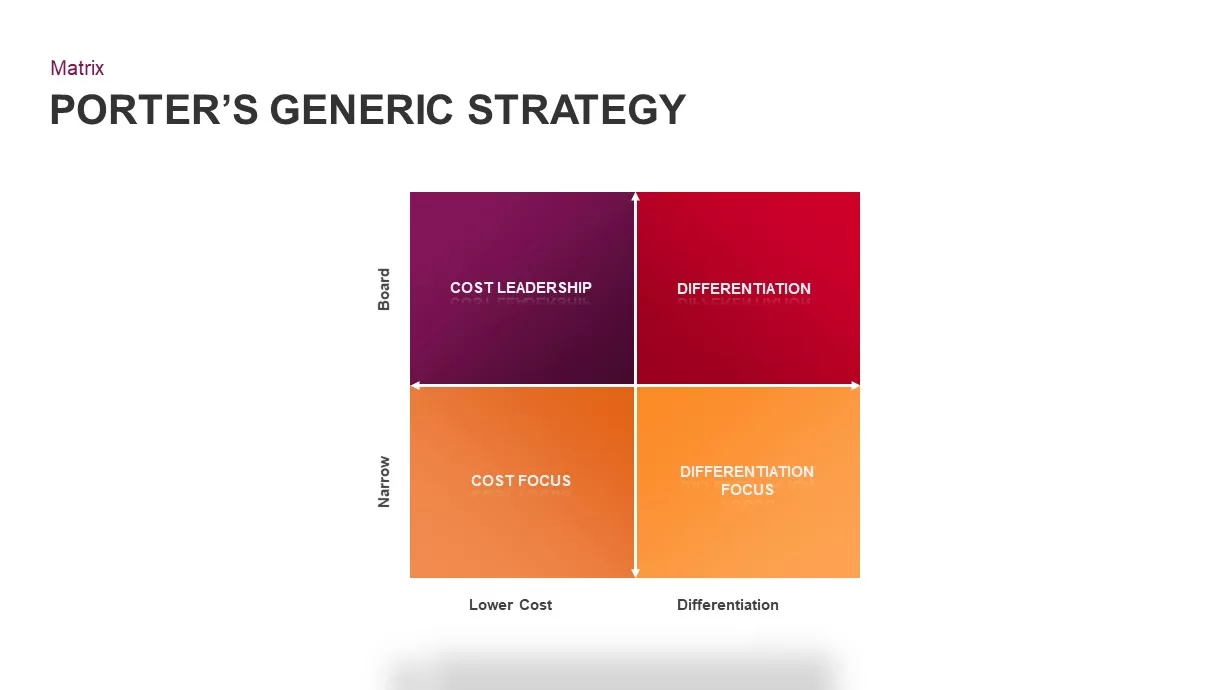
Porter’s Generic Strategy Matrix Diagram Template for PowerPoint & Google Slides
Competitor Analysis
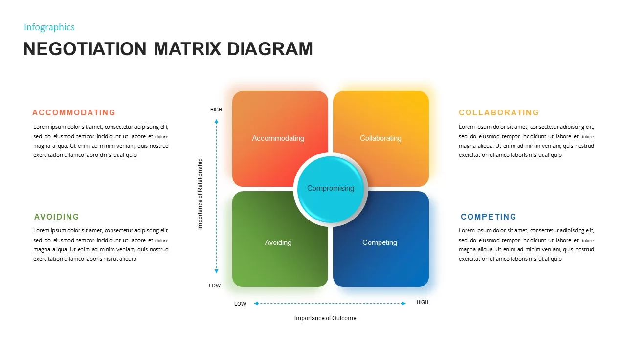
Negotiation Matrix Diagram Template for PowerPoint & Google Slides
Business
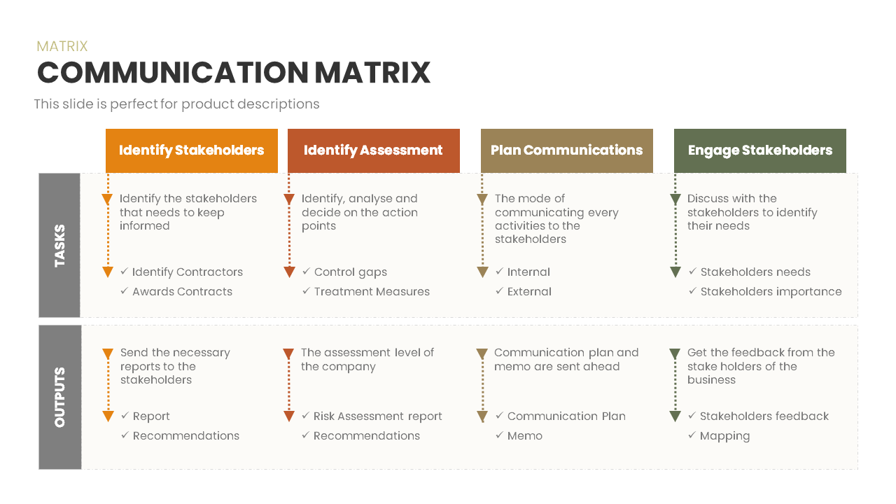
Communication Matrix Overview Template for PowerPoint & Google Slides
Business
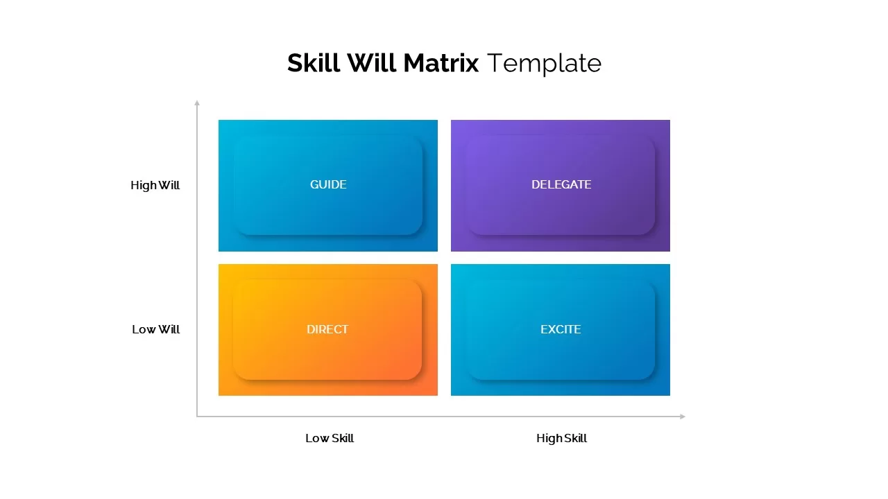
Skill Will Matrix Template for PowerPoint & Google Slides
Infographics
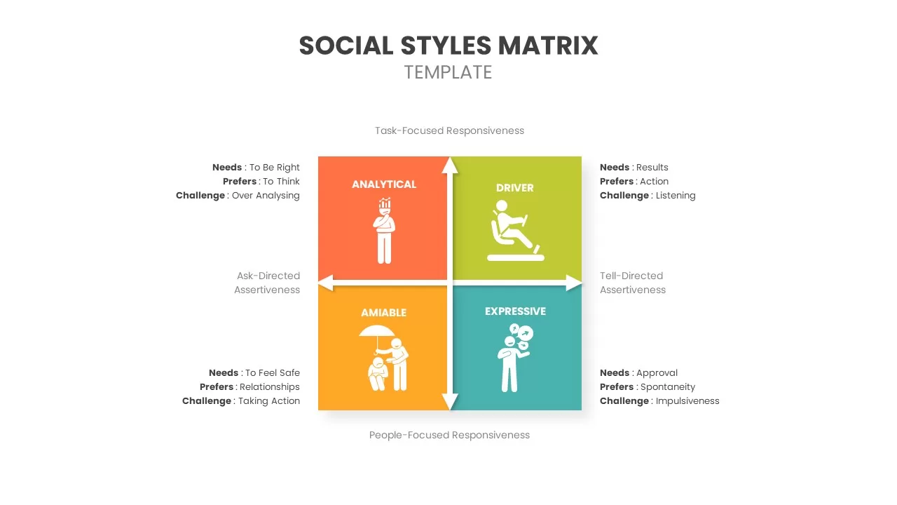
Social Styles Matrix Template for PowerPoint & Google Slides
Business
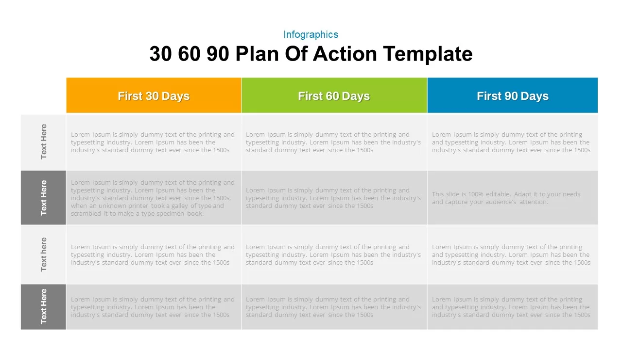
30 60 90 Day Plan Matrix Table Template for PowerPoint & Google Slides
Timeline
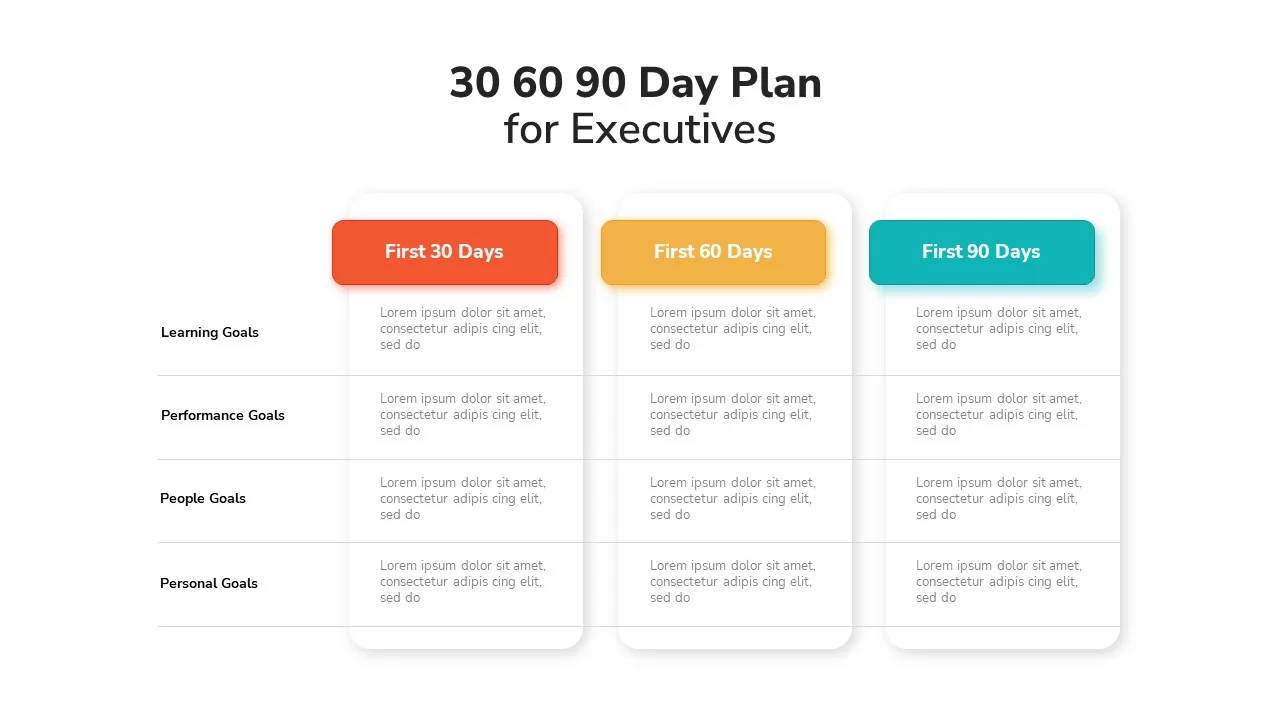
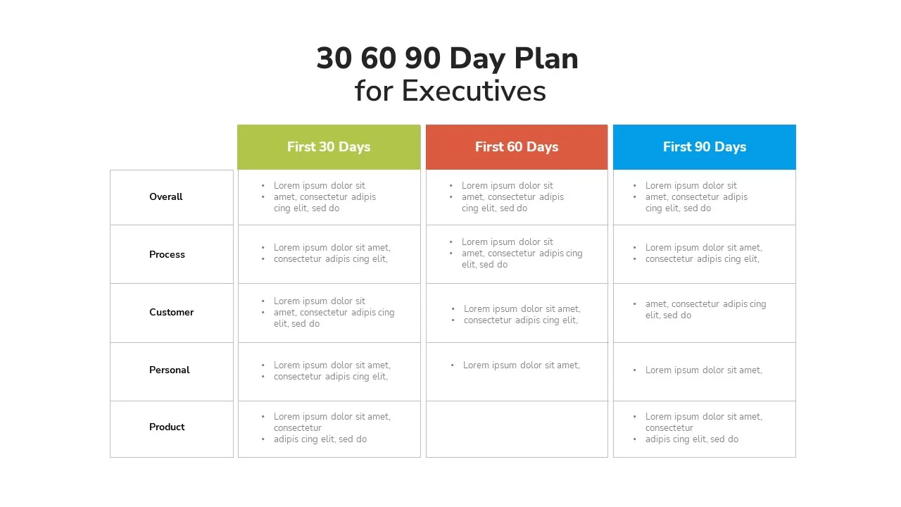
Executive 30-60-90 Day Plan Matrix Template for PowerPoint & Google Slides
Timeline
Executive 30-60-90 Day Plan Matrix Template for PowerPoint & Google Slides
Timeline
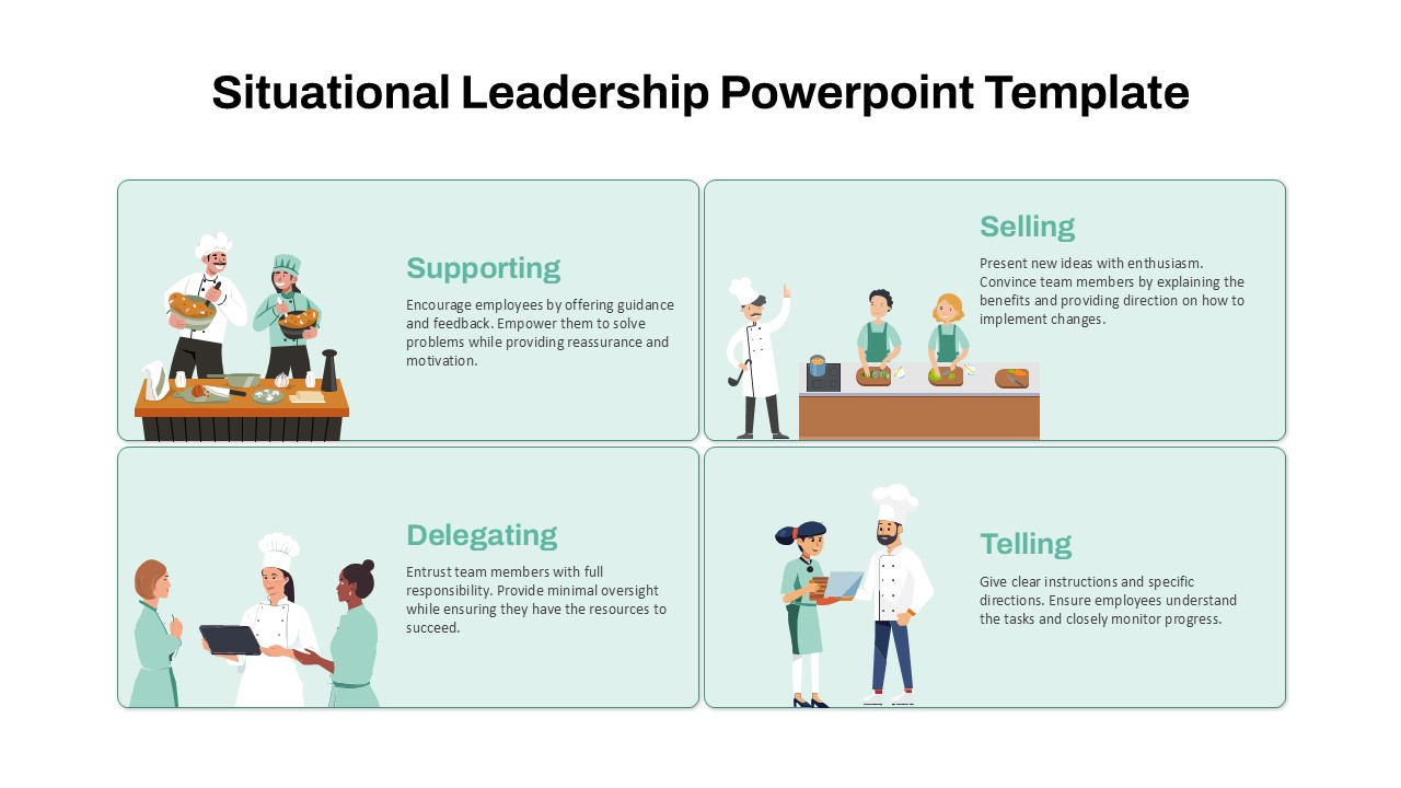
Situational Leadership Matrix Template for PowerPoint & Google Slides
Process
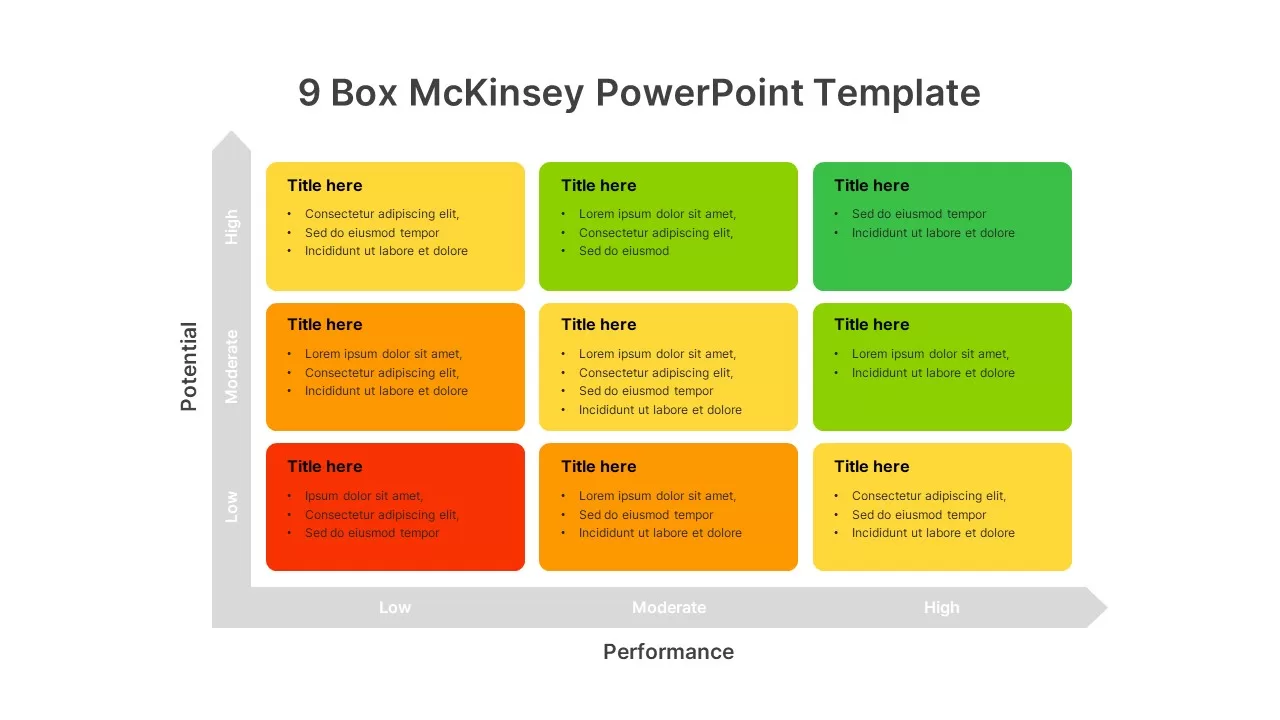
9-Box Matrix for Performance & Potential Template for PowerPoint & Google Slides
Employee Performance
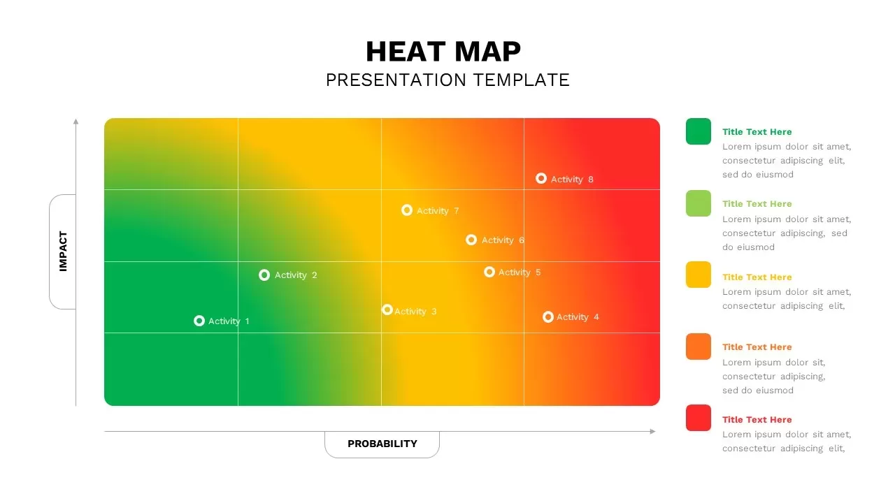
Heat Map Risk Matrix Dashboard Template for PowerPoint & Google Slides
Comparison Chart
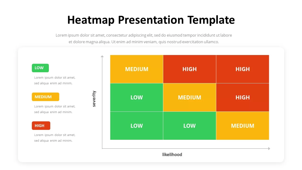
Heatmap Matrix Template for PowerPoint & Google Slides
Maps
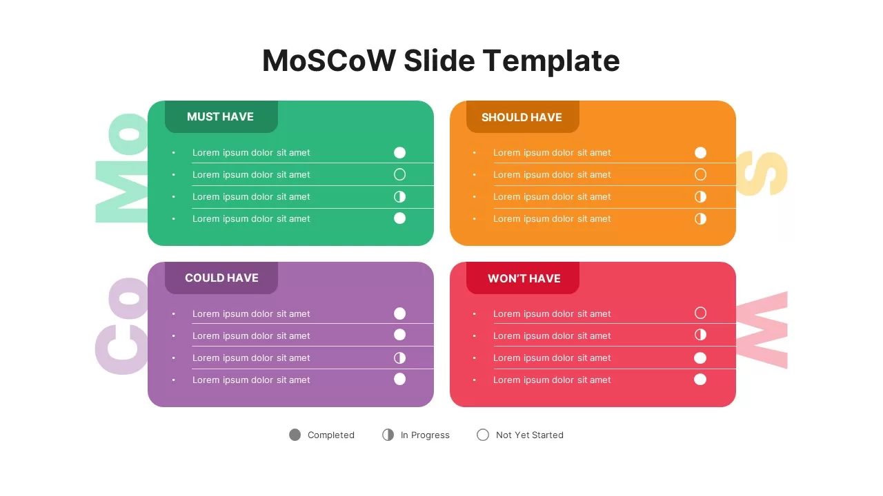
MoSCoW Prioritization Matrix Slide Template for PowerPoint & Google Slides
Business Strategy
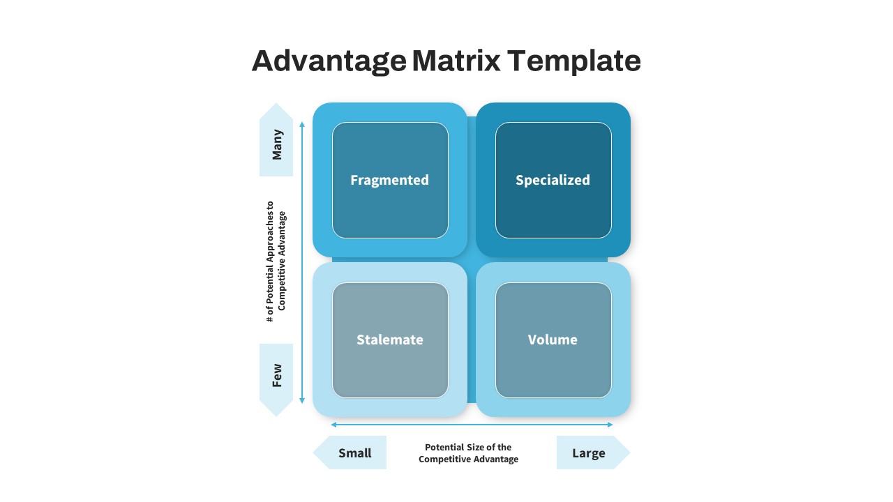
Advantage Matrix 2×2 Framework Template for PowerPoint & Google Slides
Competitor Analysis
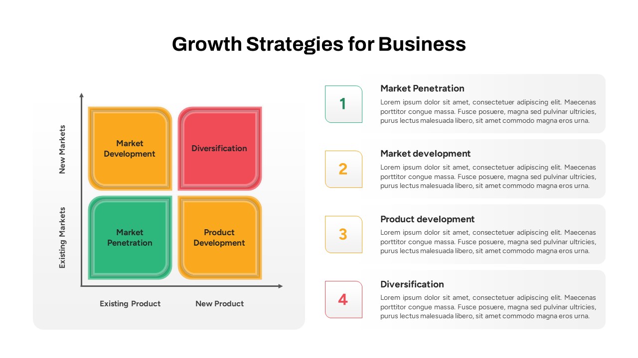
Business Growth Strategies Matrix Template for PowerPoint & Google Slides
Comparison
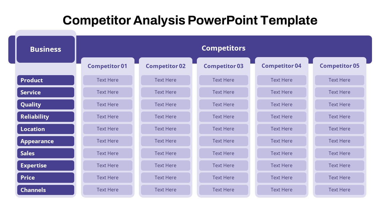
Free Competitor Analysis Matrix Template for PowerPoint & Google Slides
Competitor Analysis
Free
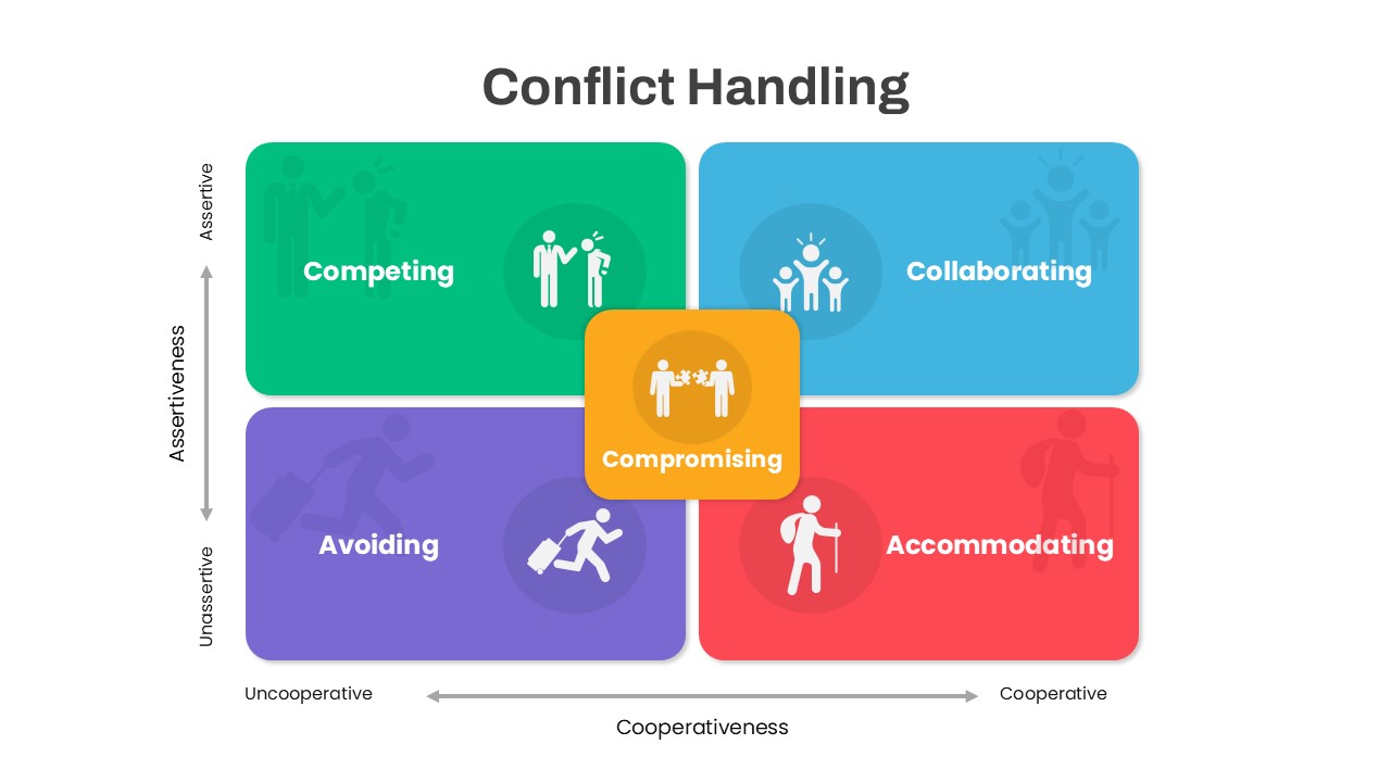
Colorful Conflict Handling Matrix Template for PowerPoint & Google Slides
Comparison
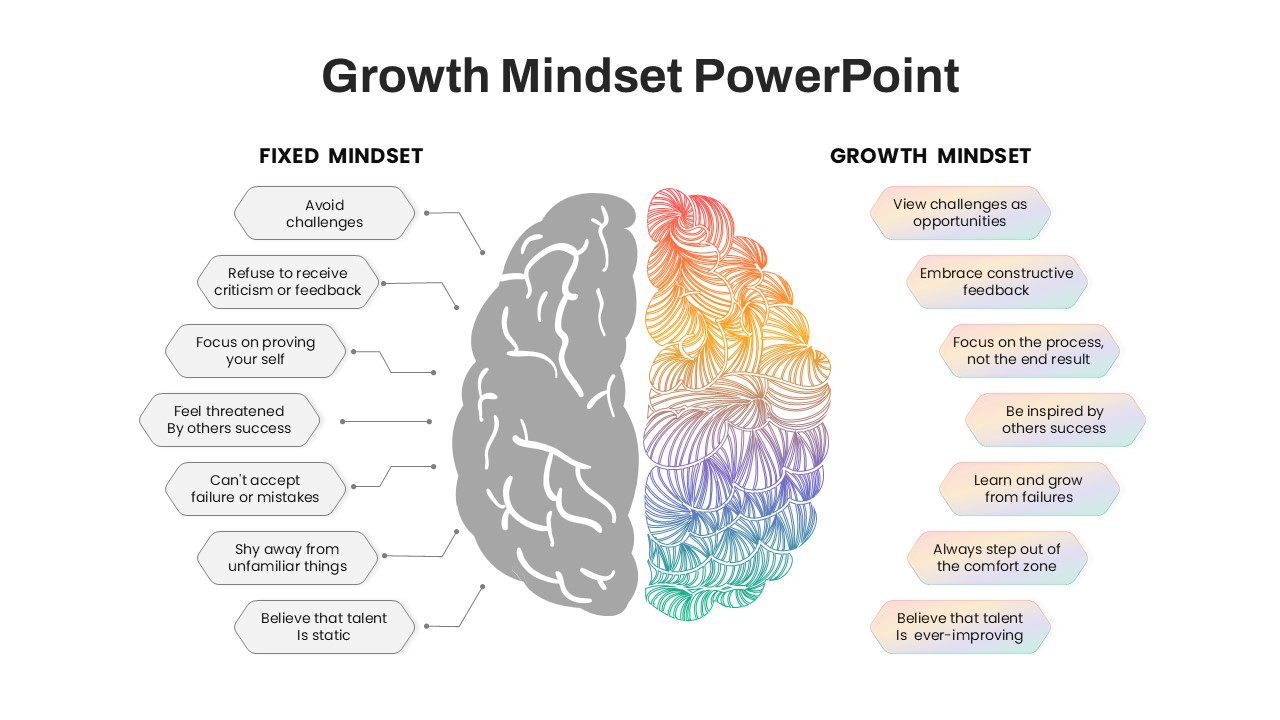
Fixed vs Growth Mindset Matrix Template for PowerPoint & Google Slides
Comparison
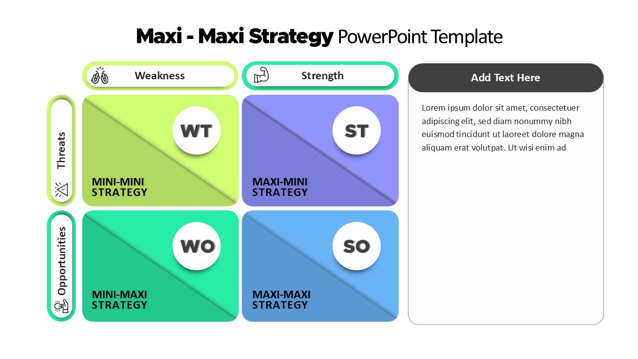
Maxi-Maxi Strategy Matrix SWOT Diagram Template for PowerPoint & Google Slides
SWOT
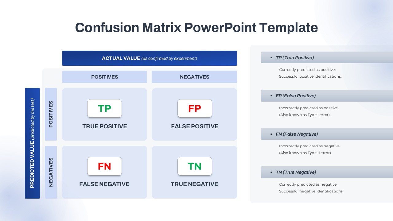
Confusion Matrix Diagram Overview Template for PowerPoint & Google Slides
Comparison
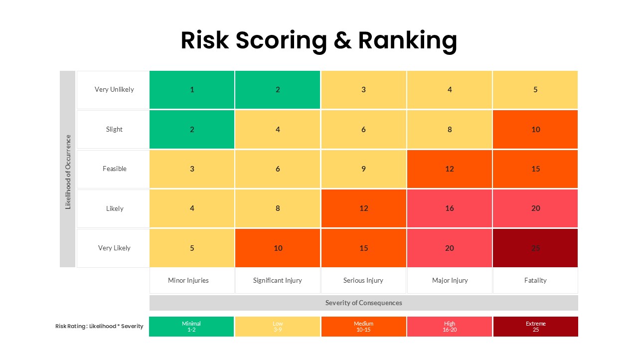
Risk Scoring & Ranking Heatmap Matrix Template for PowerPoint & Google Slides
Risk Management
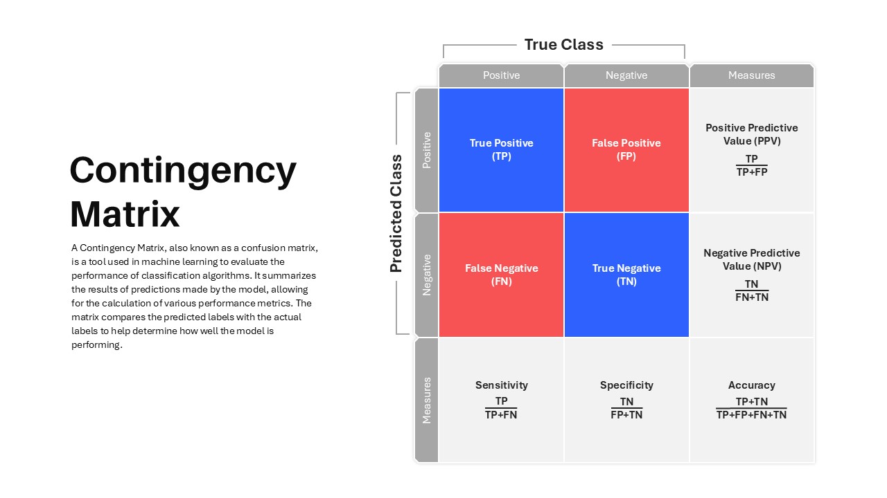
Contingency Matrix in Machine Learning template for PowerPoint & Google Slides
Technology
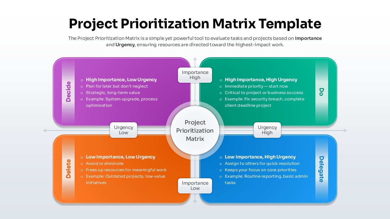
Project Prioritization Matrix Template for PowerPoint & Google Slides
Project
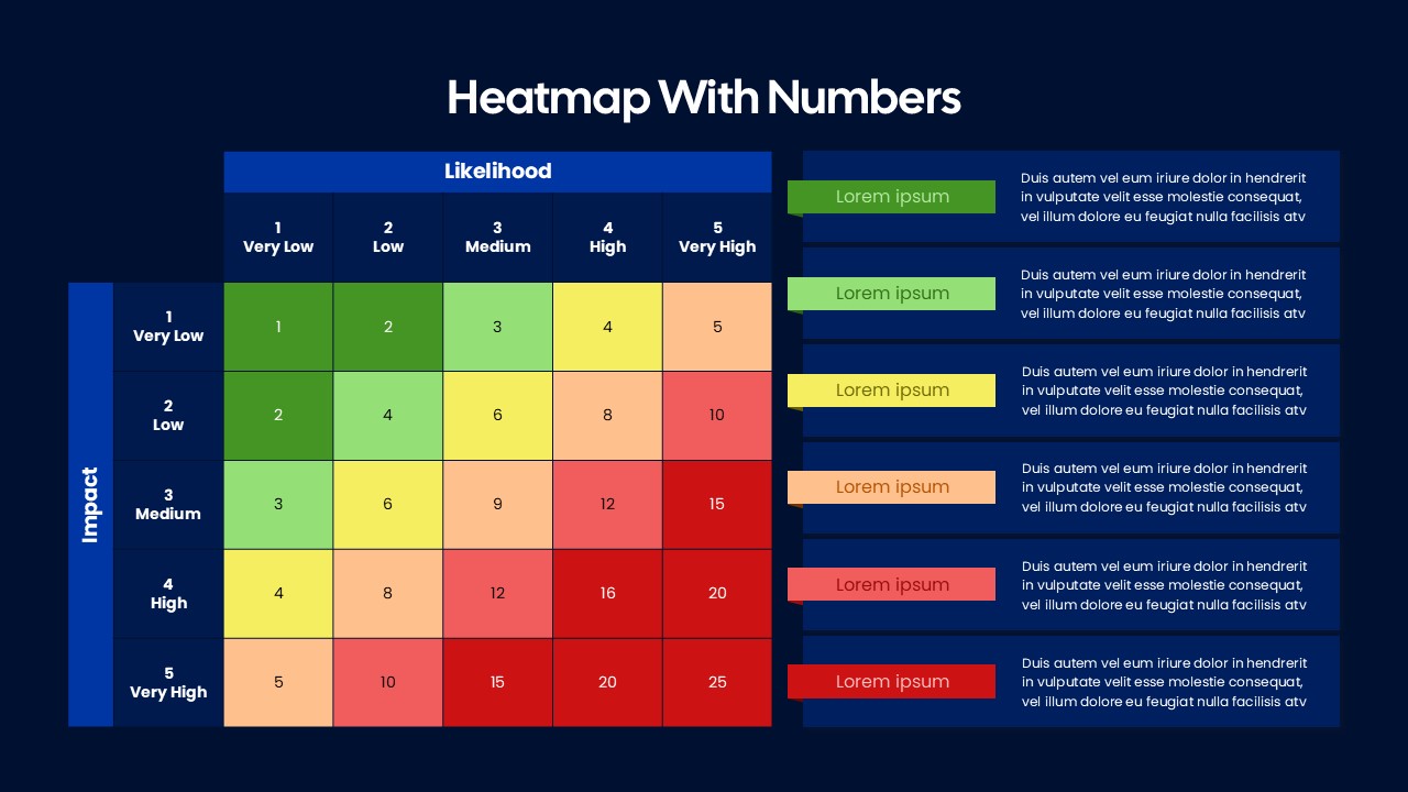
Heatmap Matrix with Numbers Template for PowerPoint & Google Slides
Project

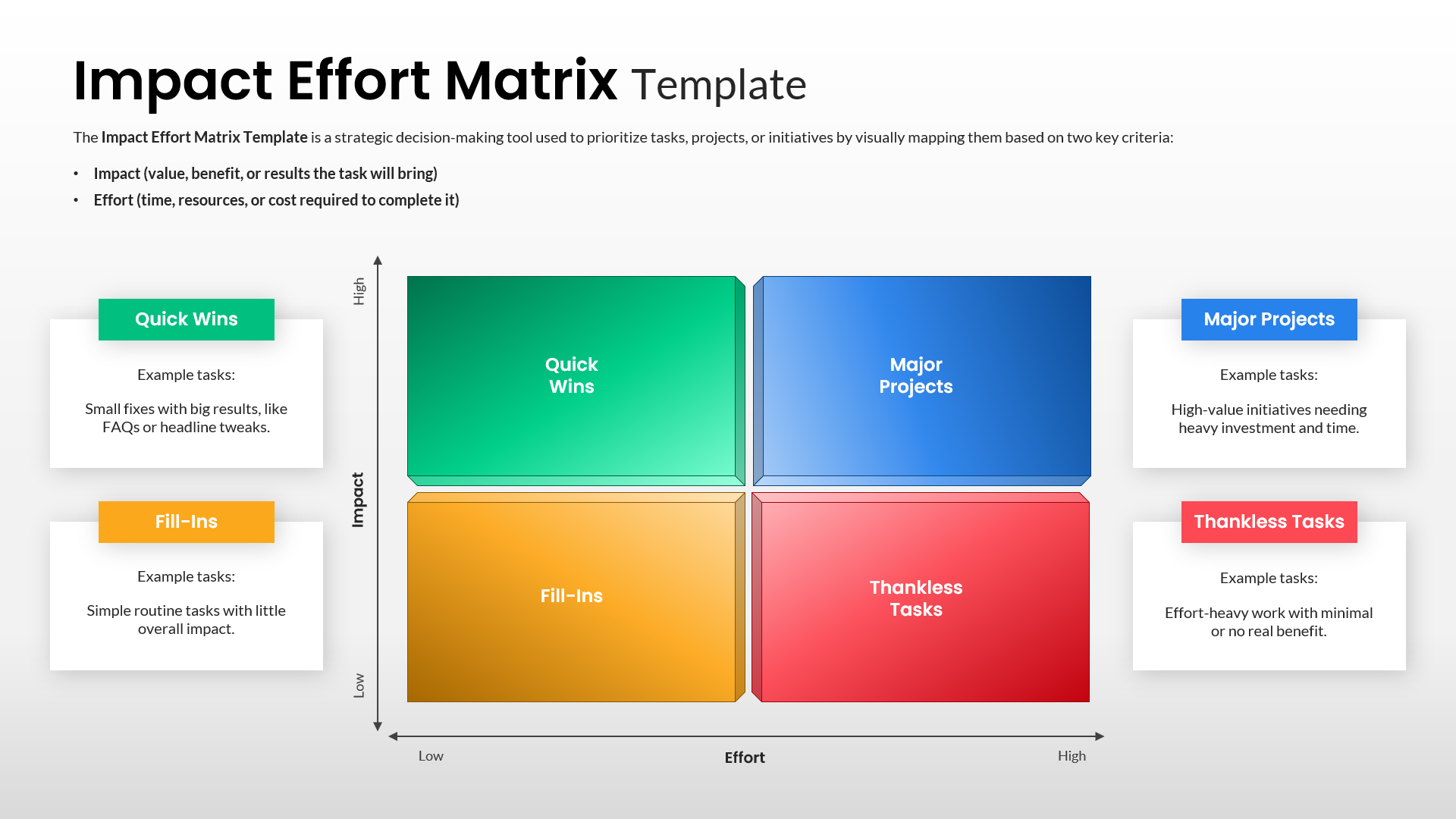
Impact Effort Matrix Template for PowerPoint & Google Slides
Comparison Chart
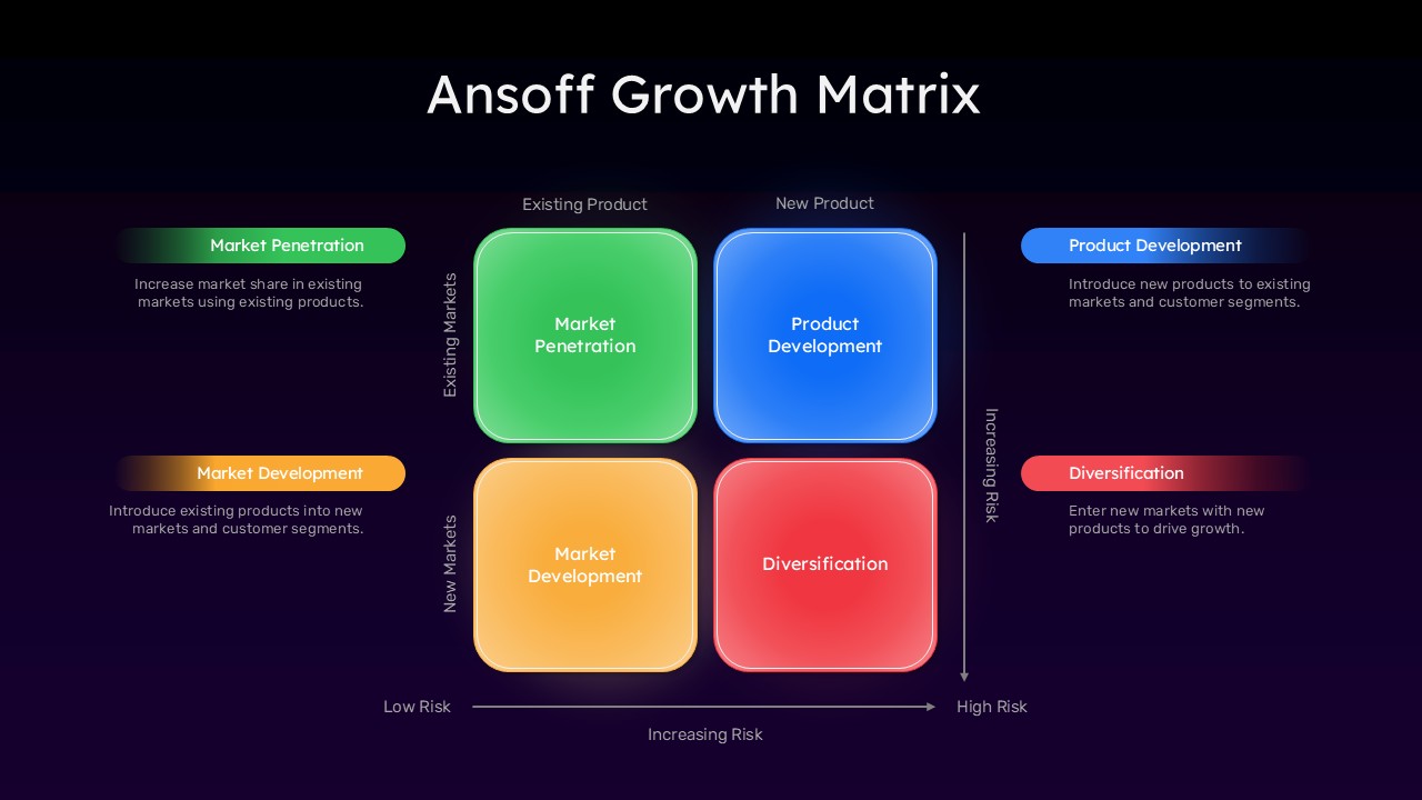
Ansoff Growth Matrix Template for PowerPoint & Google Slides
Business Strategy
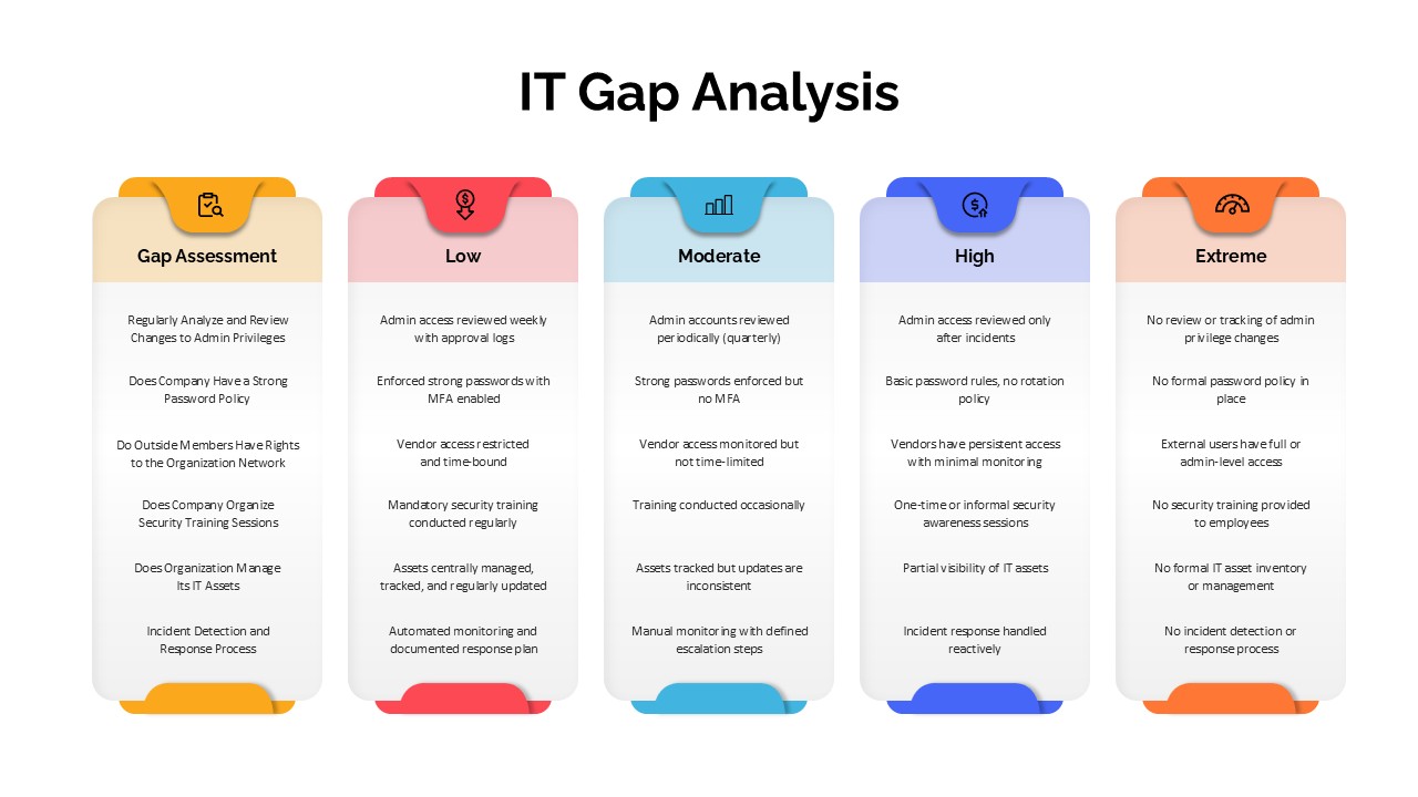
IT Gap Analysis Assessment Matrix Template for PowerPoint & Google Slides
Information Technology