North America Percentage Map Infographic Template for PowerPoint & Google Slides


Description
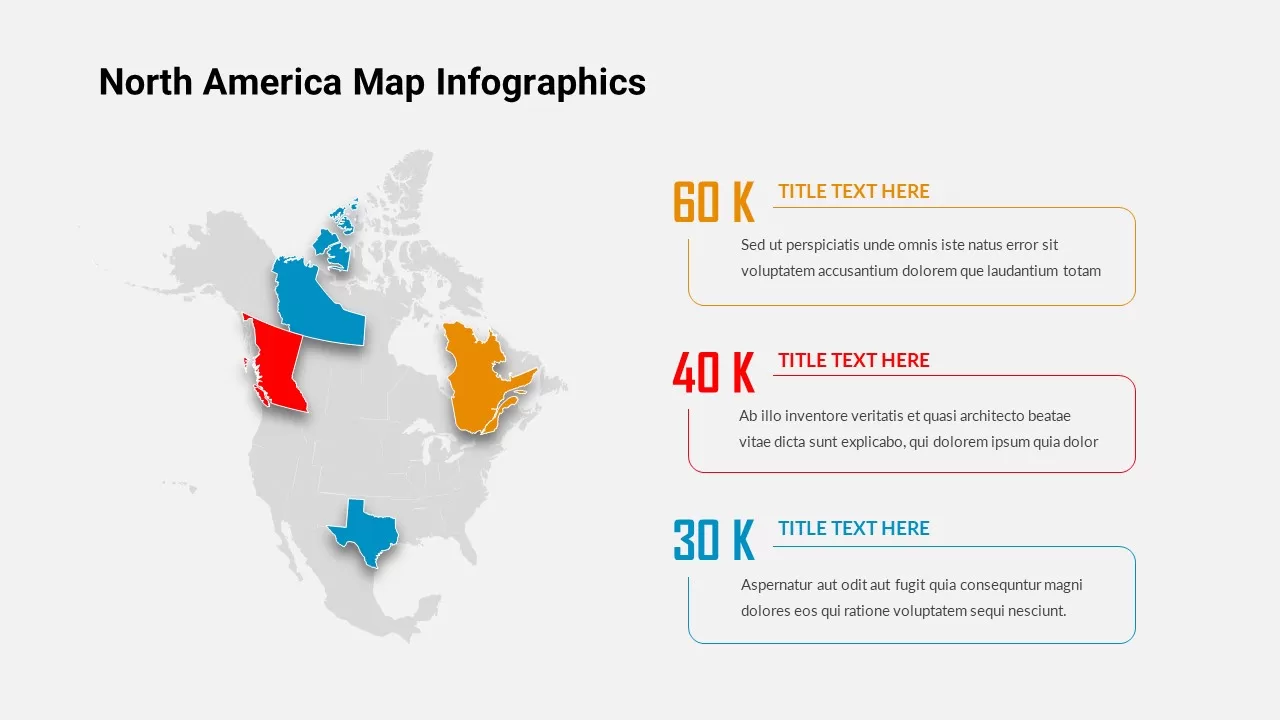
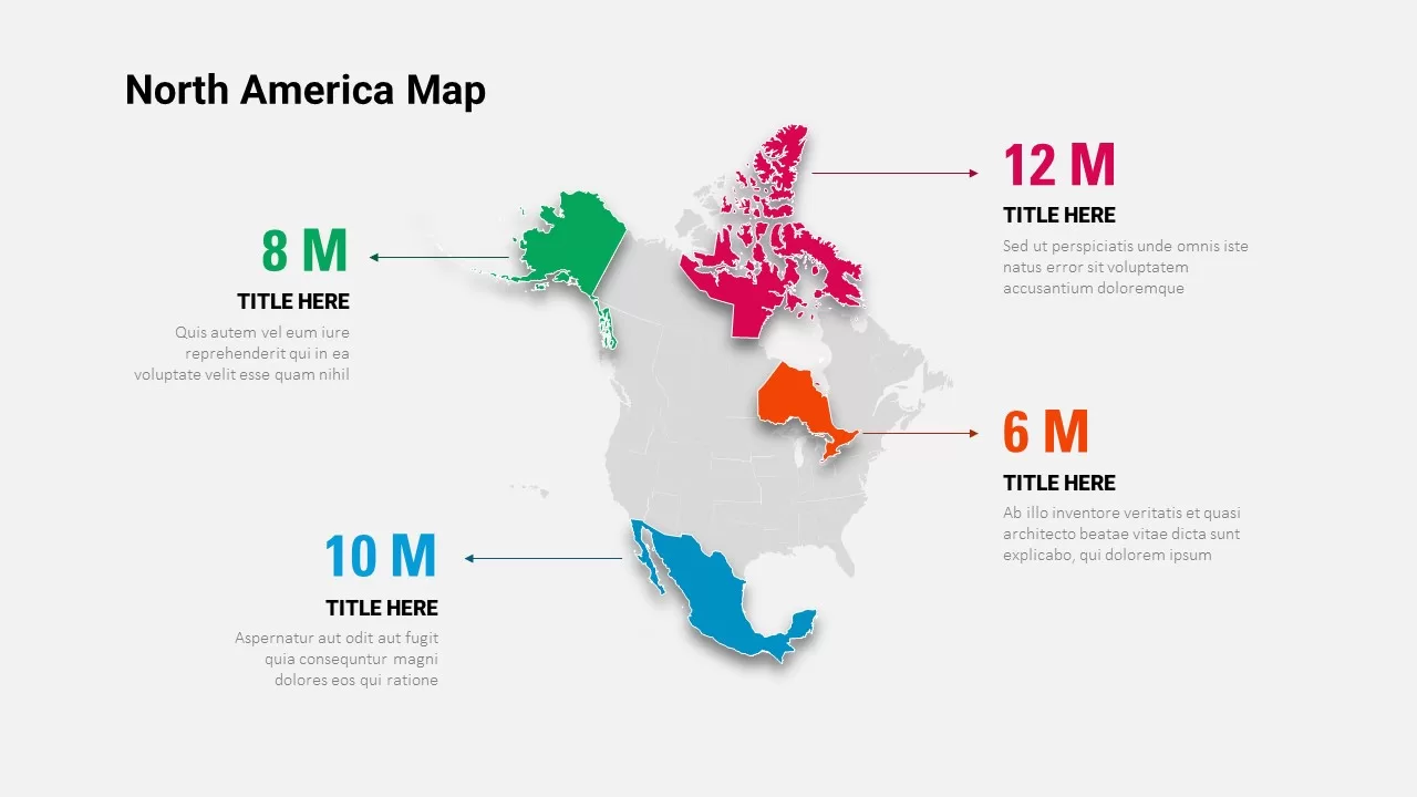
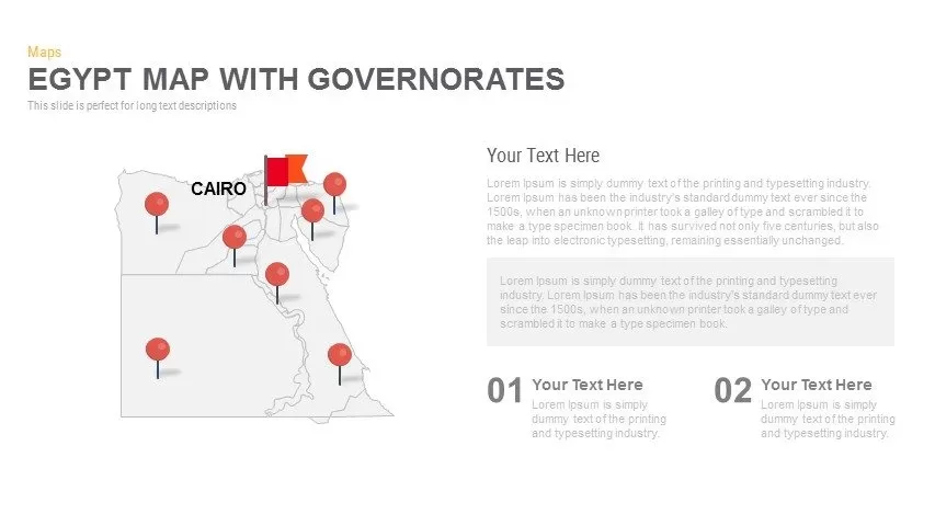
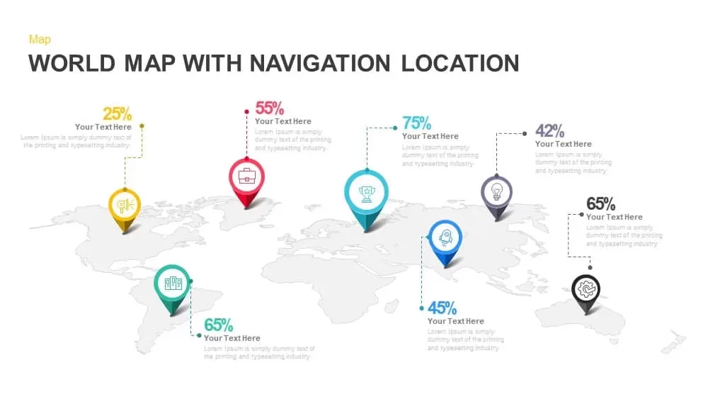
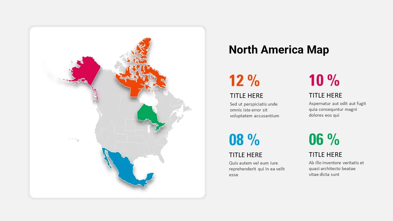
Leverage this North America percentage map infographic slide to visualize regional KPIs with clarity and impact. The slide features a stylized flat map of North America with four highlighted regions—Alaska in pink, northern Canada in orange, Ontario in green, and Mexico in blue—each corresponding to a color-coded percentage value displayed alongside the map. Bold percentage labels appear in matching hues (12% orange, 10% magenta, 8% cyan, and 6% green) with concise headlines and placeholder text beneath, enabling audiences to quickly associate metrics with geographic areas.
The minimalist layout balances a large map graphic on the left against four metric panels on the right, creating a clear visual hierarchy that guides viewers from geographic context to data insights. Rounded corners, subtle drop shadows, and ample white space lend a modern aesthetic while ensuring readability across devices. Built with fully editable vector shapes and text placeholders, this slide can be customized in seconds: swap region colors, update percentages, or adjust headlines to fit your narrative and branding guidelines.
Optimized for both PowerPoint and Google Slides, this slide maintains consistent formatting and resolution on desktop and mobile platforms, eliminating manual adjustments and version conflicts. The design leverages master slides and intuitive layer organization, so you can duplicate, resize, or reposition elements without compromising alignment or style coherence. Whether you are presenting a quarterly market report, sales territory analysis, or strategic expansion plan, this North America map infographic empowers you to communicate complex geographic data in a compelling, data-driven format.
Designed with user-friendly placeholders, this template supports quick theme adjustments and color scheme updates via slide master, making it easy to align with corporate branding or client style guides. Each region shape is vector-based, allowing infinite scalability without loss of quality, so you can zoom or crop as needed for infographics or handouts.
Who is it for
Marketing teams, sales managers, and business analysts will benefit from this map infographic when presenting regional performance metrics or market share breakdowns. Consultants, executives, and project leads can leverage the clear geographic call-outs to drive data-driven discussions.
Other Uses
Beyond KPI reporting, repurpose this slide for demographic distribution, resource allocation planning, risk assessment across territories, or site-selection analysis. Use the map to support investor briefings, training modules, or strategic planning workshops by swapping in your own data and regional focus.
Login to download this file

Item ID
SB02677
Related Templates

North America Map Infographic Slide Template for PowerPoint & Google Slides
World Maps
North America Map template for PowerPoint & Google Slides
World Maps
North America Location Pin Map Overview Template for PowerPoint & Google Slides
World Maps
North America Regional Map Overview Template for PowerPoint & Google Slides
World Maps
North America Data Map Callouts Template for PowerPoint & Google Slides
World Maps
North America Travel Destinations Template for PowerPoint & Google Slides
World Maps

North Korea Map with Provinces Infographic Pack Template for PowerPoint & Google Slides
Maps
Harvey Balls Percentage Infographic Template for PowerPoint & Google Slides
Harvey Balls
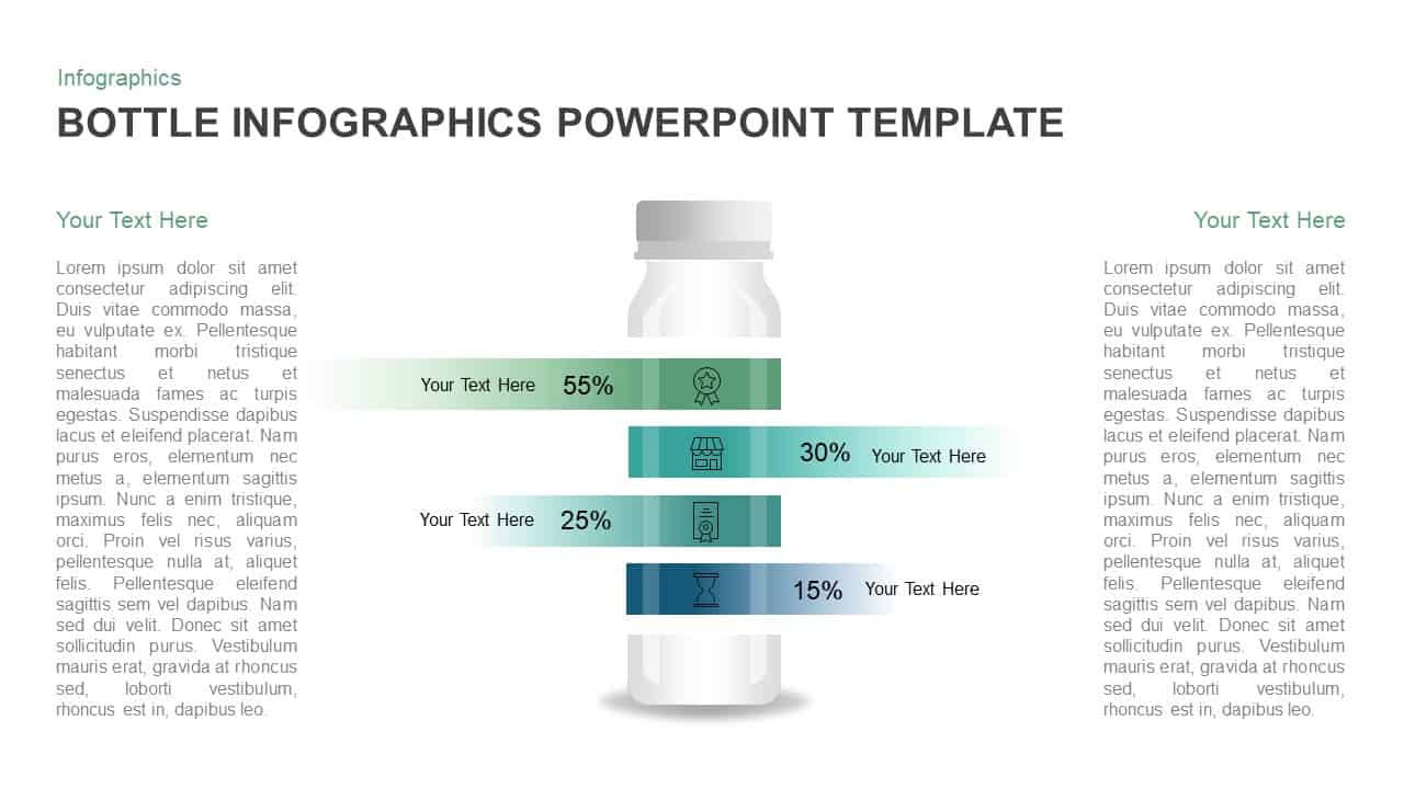
Bottle Data Percentage Infographic Template for PowerPoint & Google Slides
Infographics
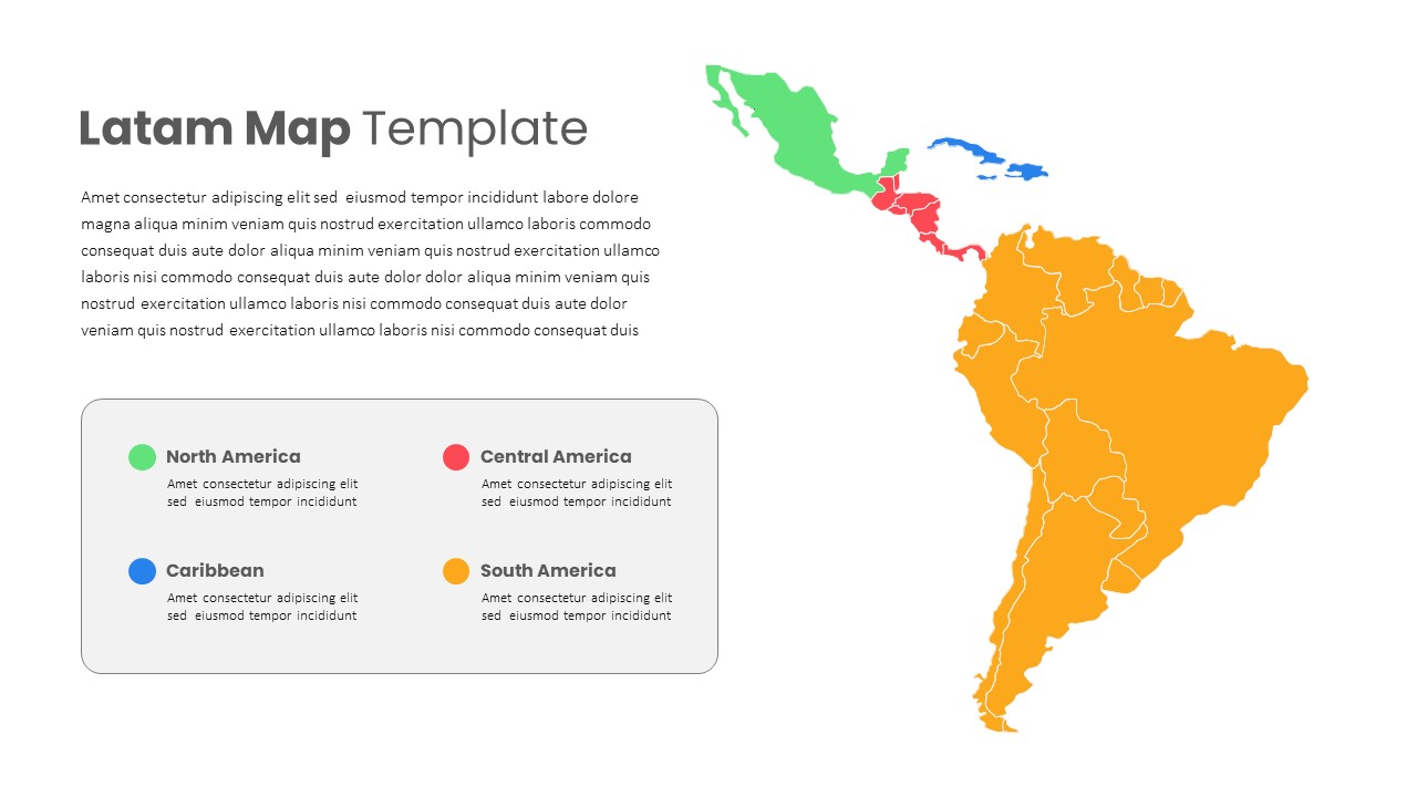
Latin America Regional Map Breakdown Template for PowerPoint & Google Slides
World Maps
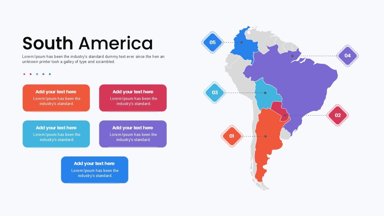
South America Map template for PowerPoint & Google Slides
Maps
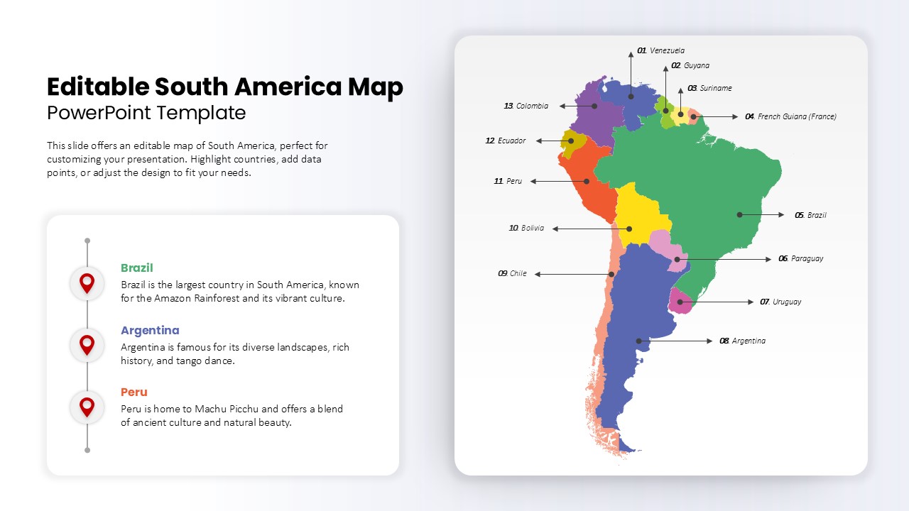
Editable South America Map Diagram Template for PowerPoint & Google Slides
Maps
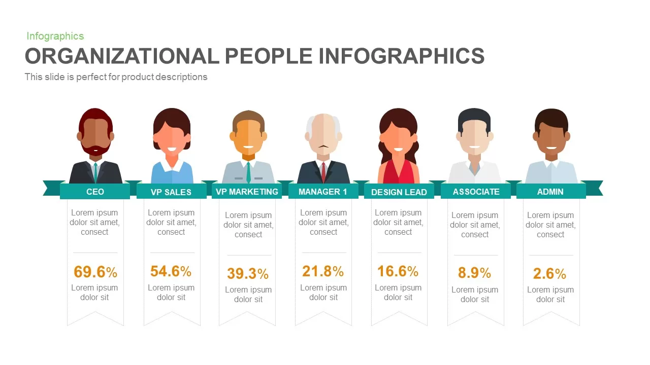
Organizational People Percentage Chart template for PowerPoint & Google Slides
Org Chart

Dual Percentage Comparison Metaphor Template for PowerPoint & Google Slides
Comparison
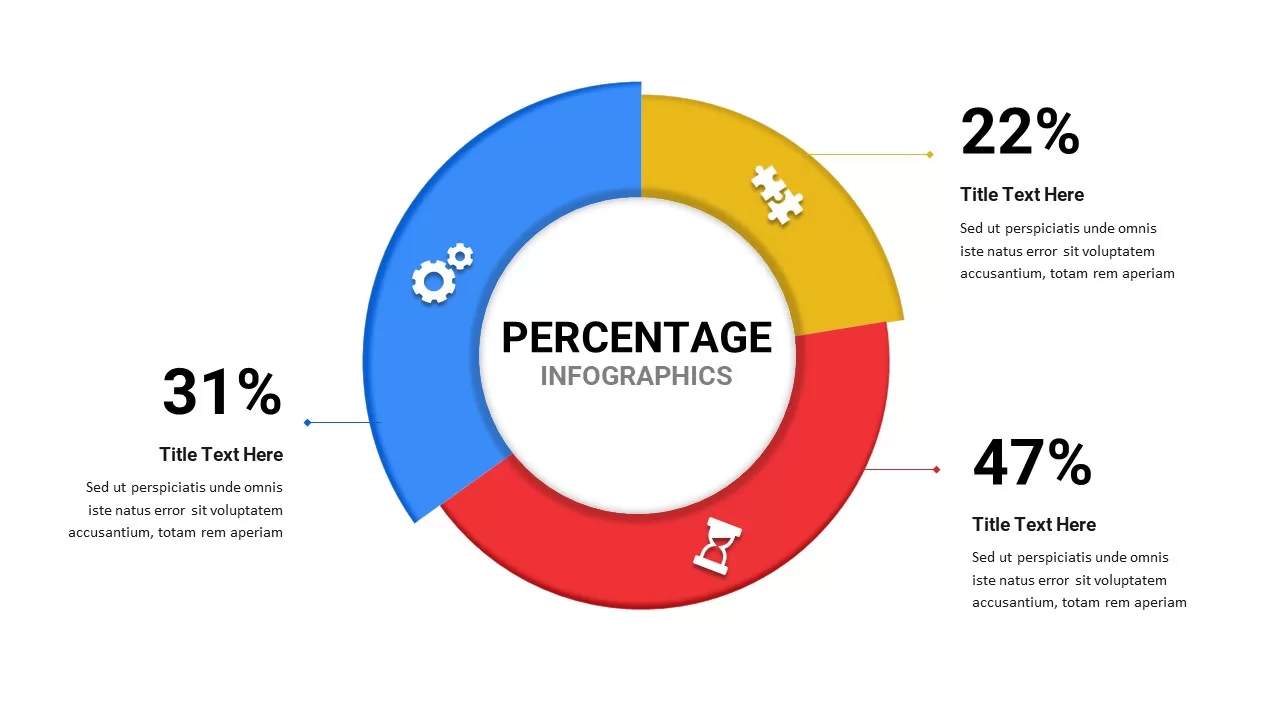
Free Percentage Infographics template for PowerPoint & Google Slides
Comparison
Free
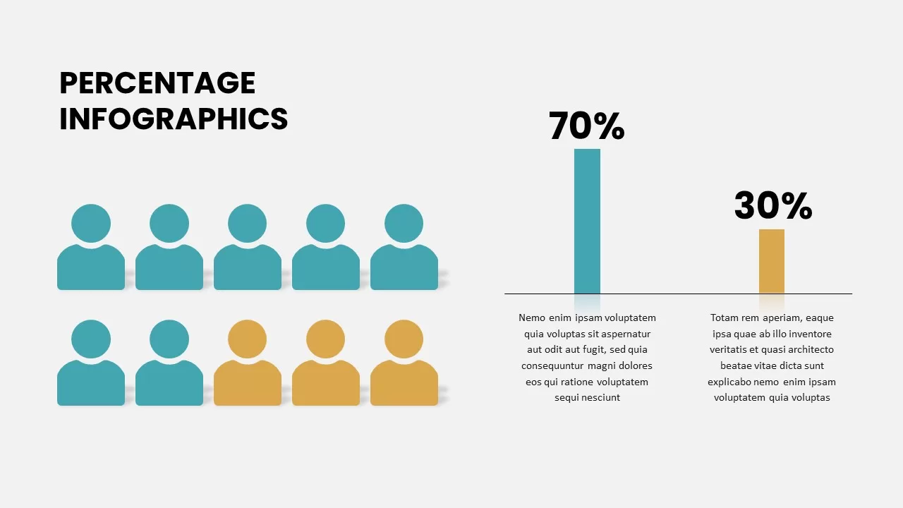
Percentage Infographics template for PowerPoint & Google Slides
Comparison
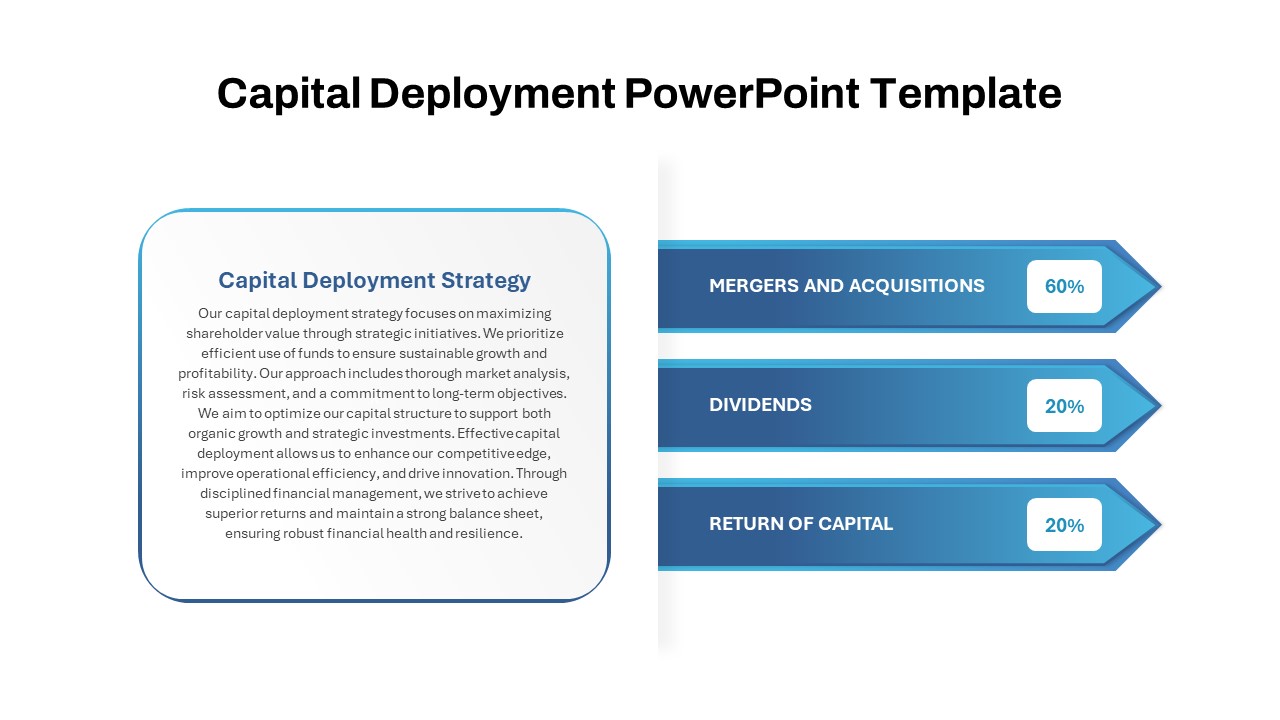
Capital Deployment Percentage Breakdown Template for PowerPoint & Google Slides
Pitch Deck
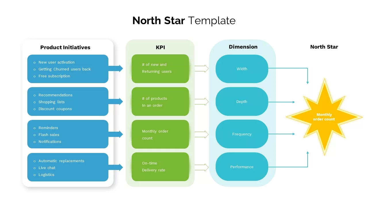
North Star template for PowerPoint & Google Slides
Business
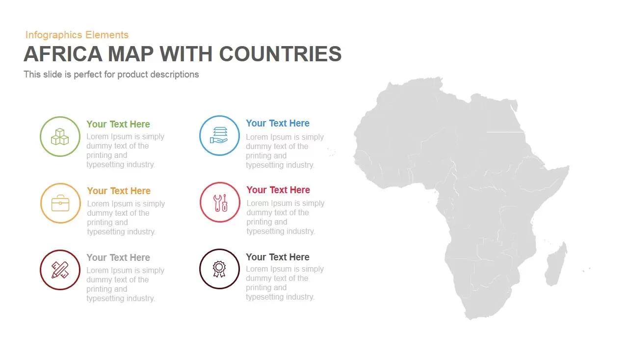
Africa Country Map Infographic Template for PowerPoint & Google Slides
World Maps
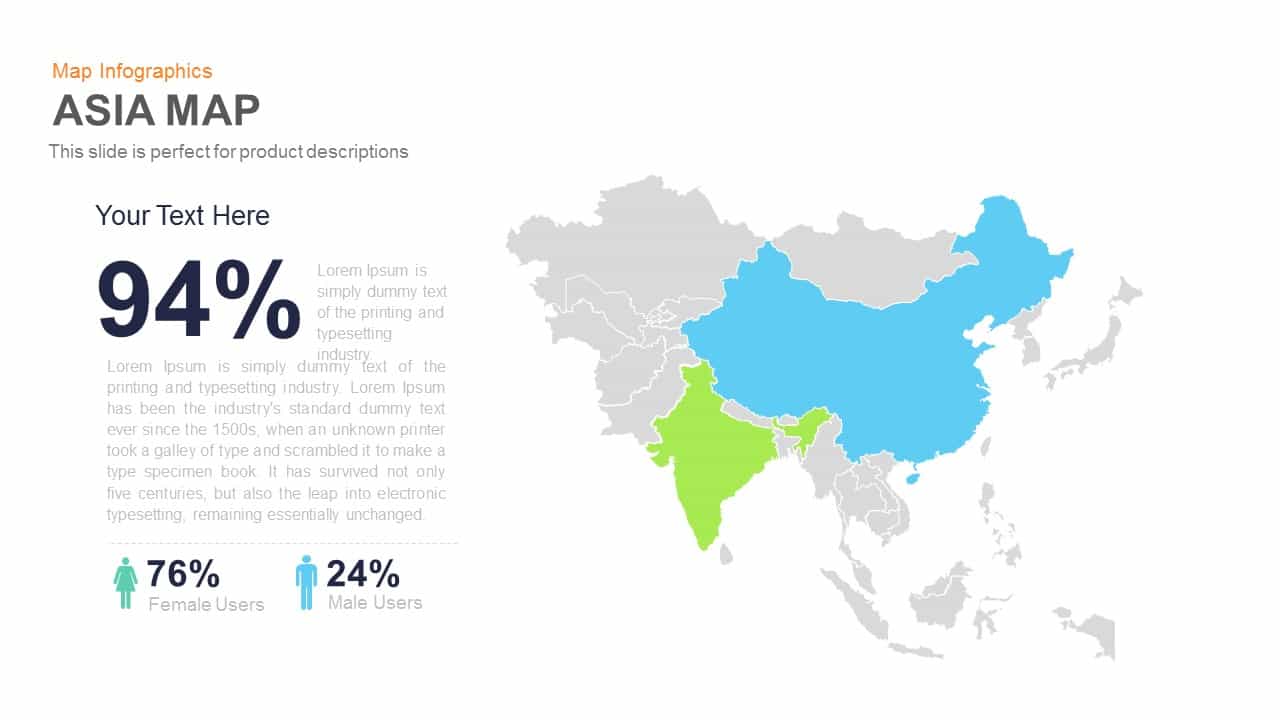
Asia Map Infographic with Demographics template for PowerPoint & Google Slides
World Maps
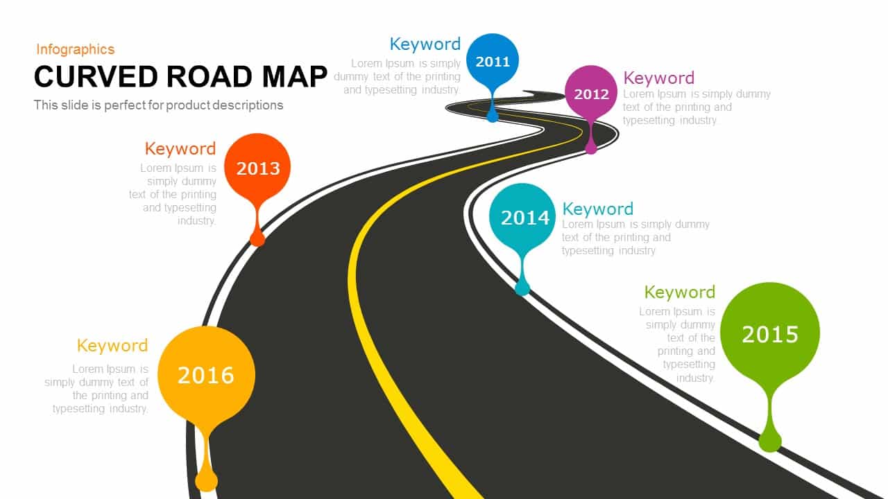
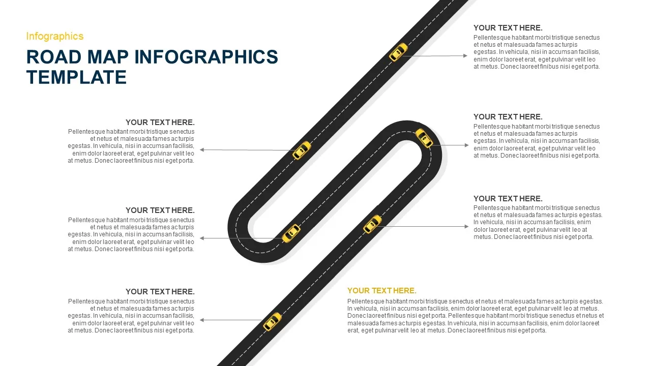
Curved Road Map Timeline Infographic Template for PowerPoint & Google Slides
Roadmap
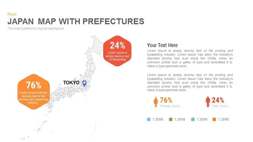
Japan Province Map Infographic Template for PowerPoint & Google Slides
Maps
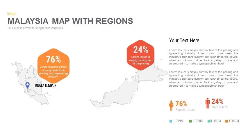
Malaysia Regional Map Infographic Template for PowerPoint & Google Slides
Maps
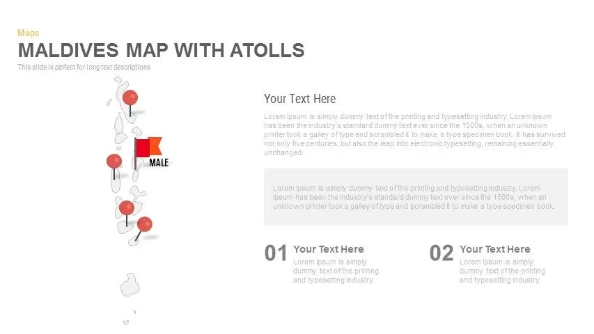
Maldives Map Infographic Template for PowerPoint & Google Slides
Maps
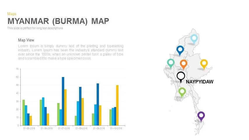
Myanmar (Burma) Provincial Map Infographic Template for PowerPoint & Google Slides
Maps
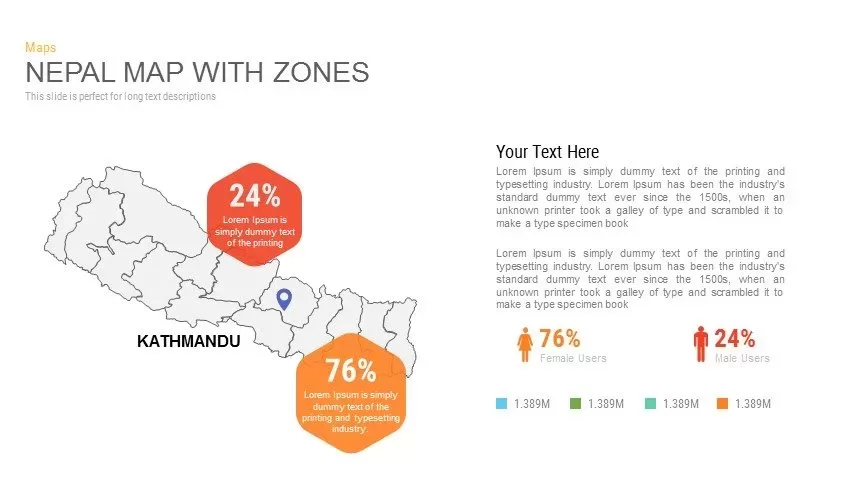
Nepal Map with Zones Infographic Template for PowerPoint & Google Slides
Maps
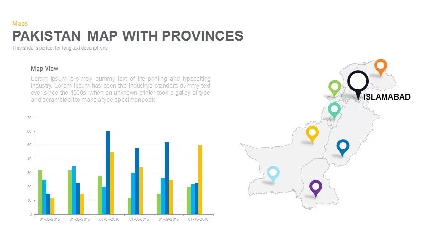
Pakistan Provinces Map Infographic Pack Template for PowerPoint & Google Slides
Maps
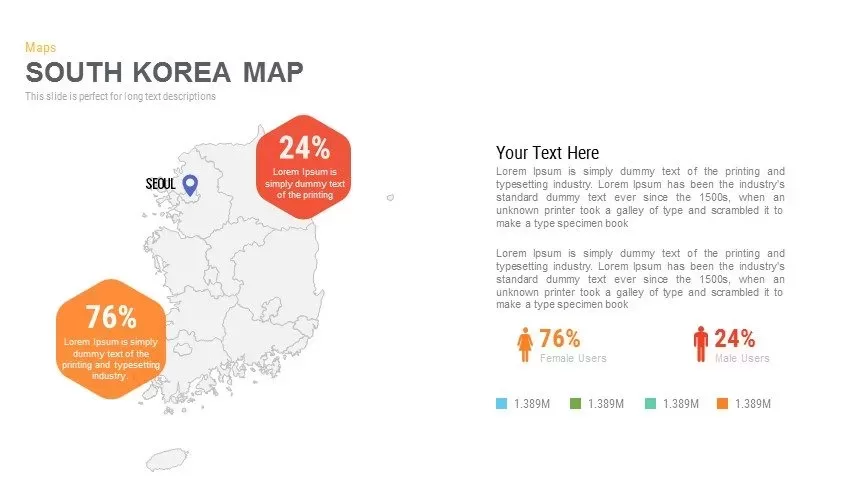
Infographic South Korea Map Template for PowerPoint & Google Slides
Maps
Sri Lanka Map Infographic Pack Template for PowerPoint & Google Slides
Maps
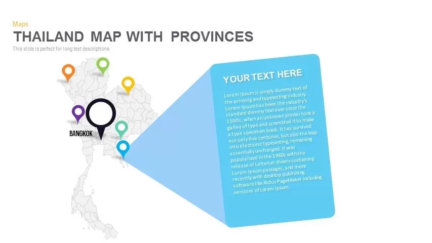
Thailand Provinces Map Infographic Pack Template for PowerPoint & Google Slides
Maps
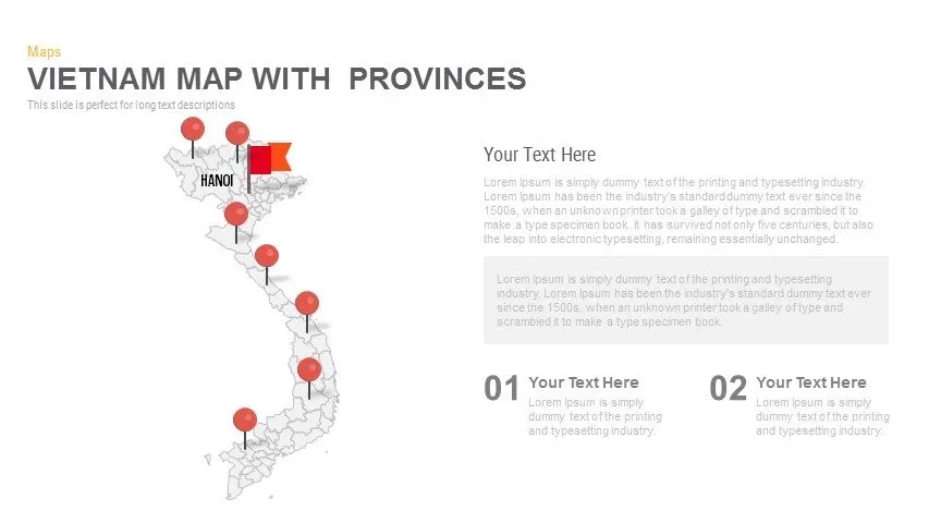
Vietnam Provinces Map Infographic Pack Template for PowerPoint & Google Slides
Maps
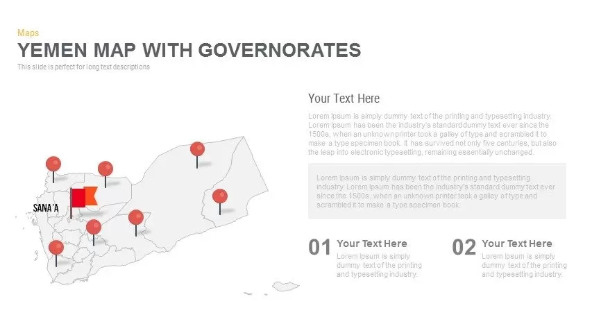
Yemen Governorates Infographic Map Template for PowerPoint & Google Slides
Maps

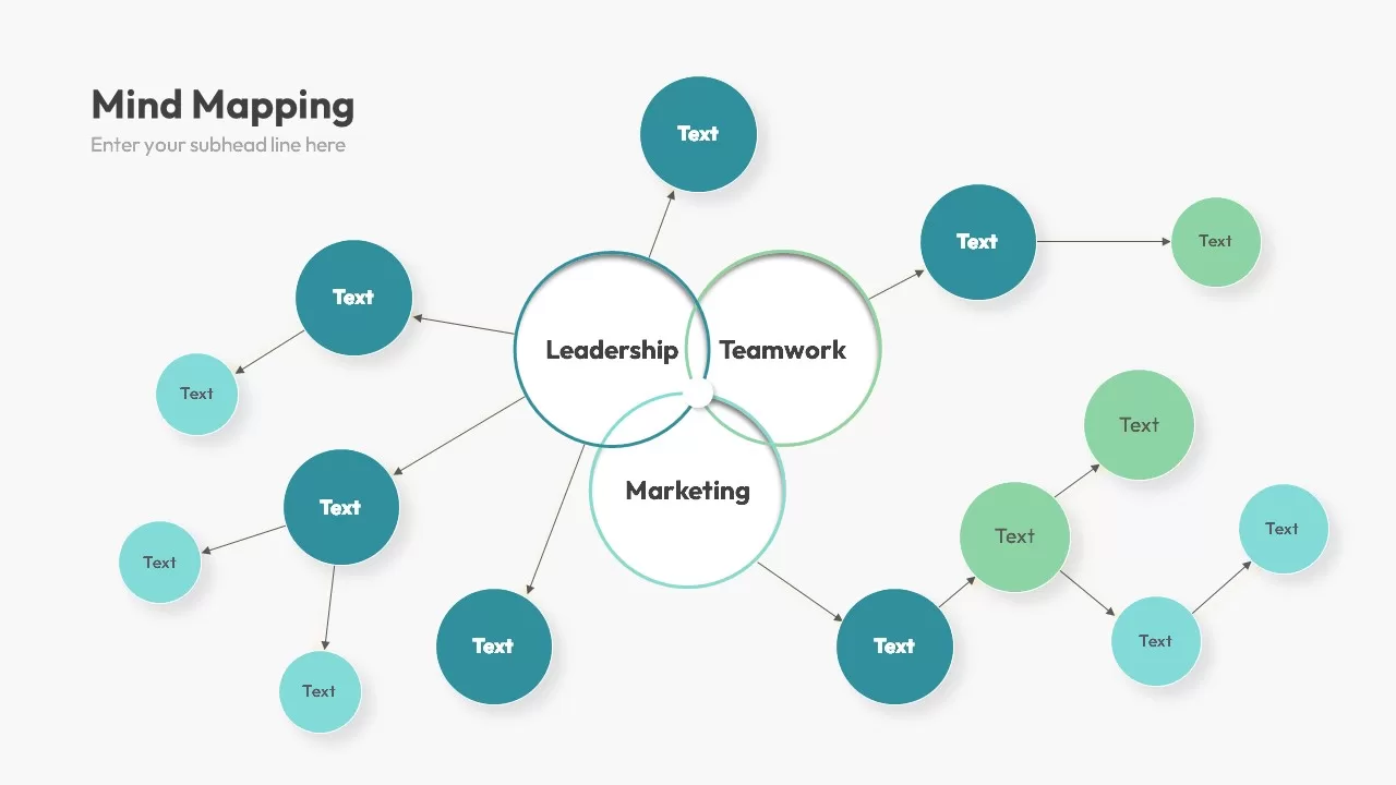
Multi-Cluster Mind Map Infographic Template for PowerPoint & Google Slides
Mind Maps
Colorful Mind Map Infographic Template with Icons for PowerPoint & Google Slides
Mind Maps
Colorful Mind Map Infographic Template for PowerPoint & Google Slides
Mind Maps
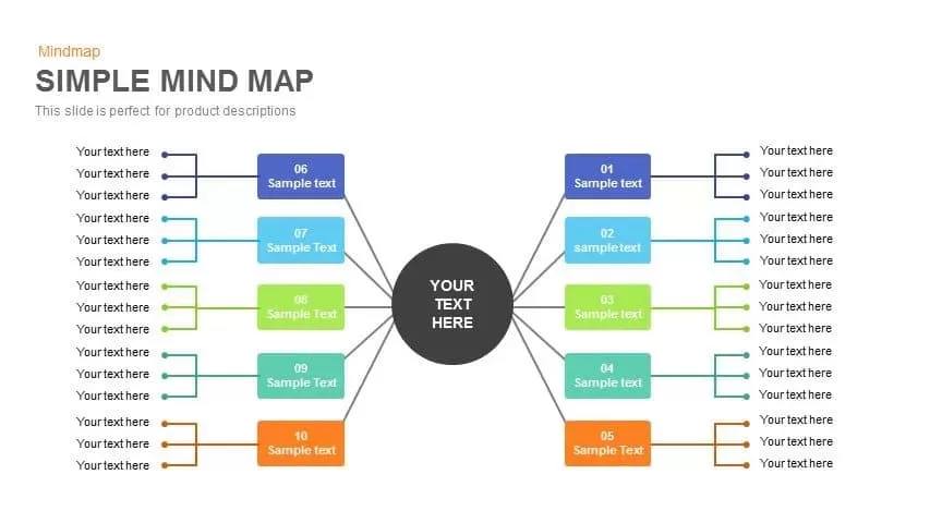
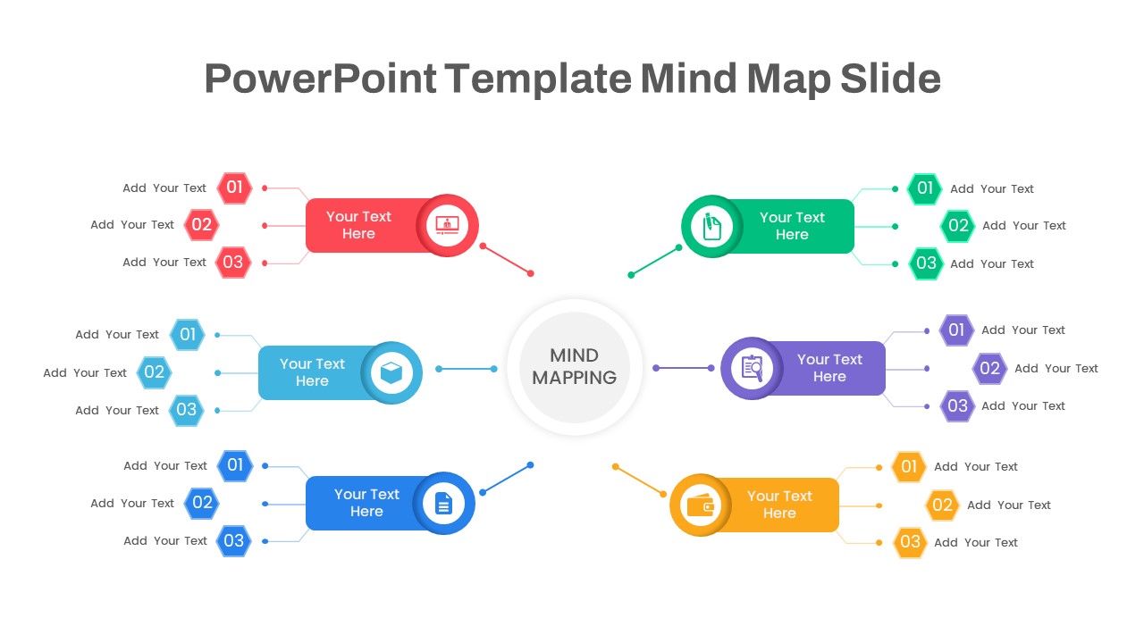
Mind Map Infographic Slide Template for PowerPoint & Google Slides
Mind Maps

Modern World Map Callout Infographic Template for PowerPoint & Google Slides
World Maps
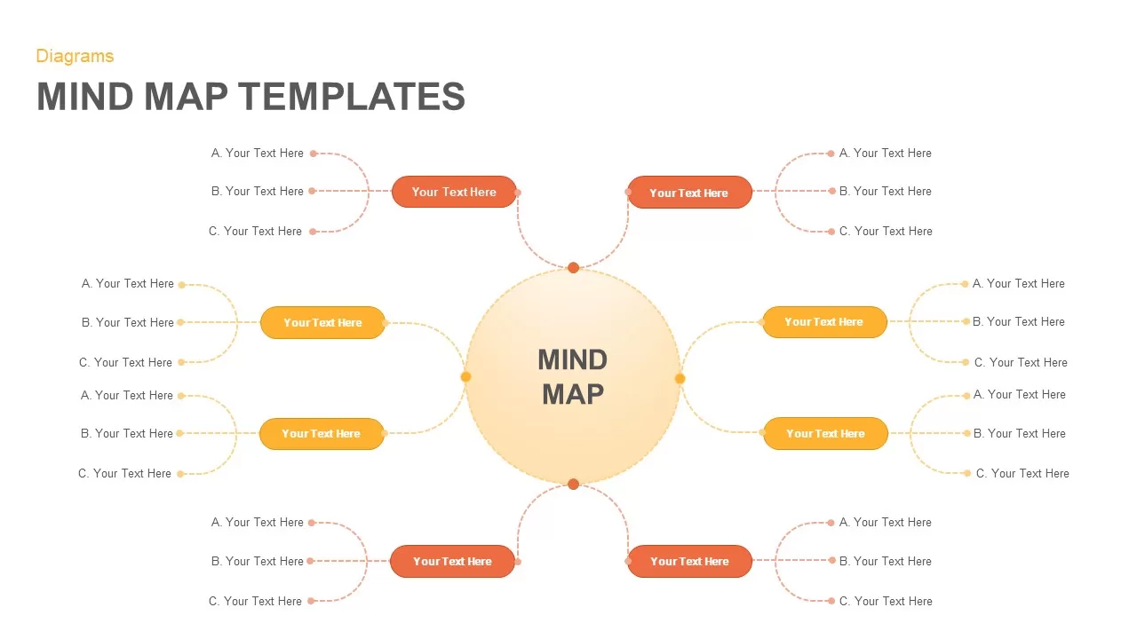
Eight-Node Mind Map Infographic Diagram Template for PowerPoint & Google Slides
Mind Maps
Six-Stage Road Map Infographic Timeline Template for PowerPoint & Google Slides
Roadmap
Versatile Mind Map Infographic Template for PowerPoint & Google Slides
Mind Maps
Structured Mind Map Infographic Diagram Template for PowerPoint & Google Slides
Mind Maps
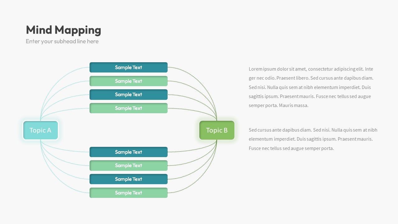
Dual Topic Mind Map Infographic Template for PowerPoint & Google Slides
Mind Maps
Tri-Cluster Mind Map Infographic Template for PowerPoint & Google Slides
Mind Maps
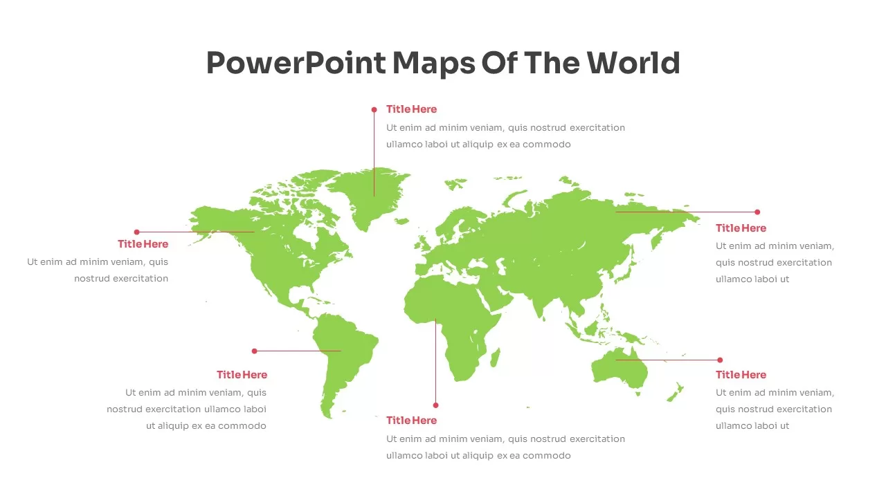
Fully Editable World Map Infographic Template for PowerPoint & Google Slides
World Maps
Editable World Map Callout Infographic Template for PowerPoint & Google Slides
World Maps
Editable World Map Callout Infographic Template for PowerPoint & Google Slides
World Maps
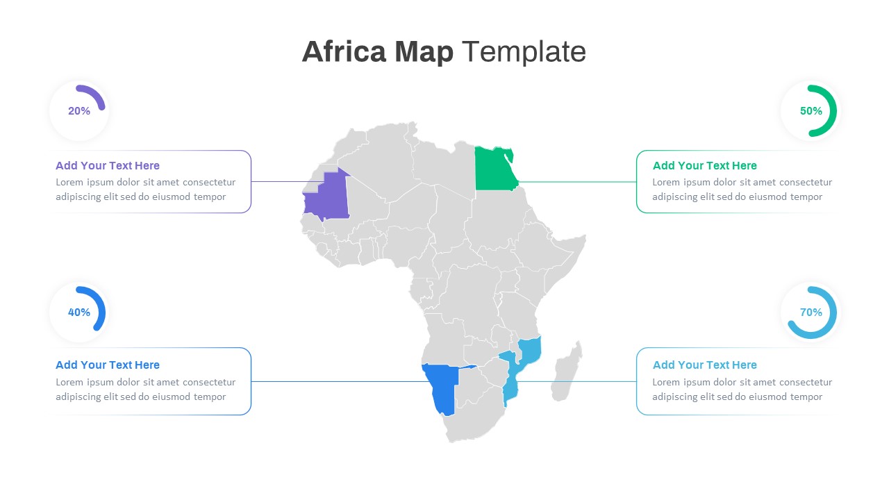
Editable Africa Map Infographic Data Template for PowerPoint & Google Slides
World Maps
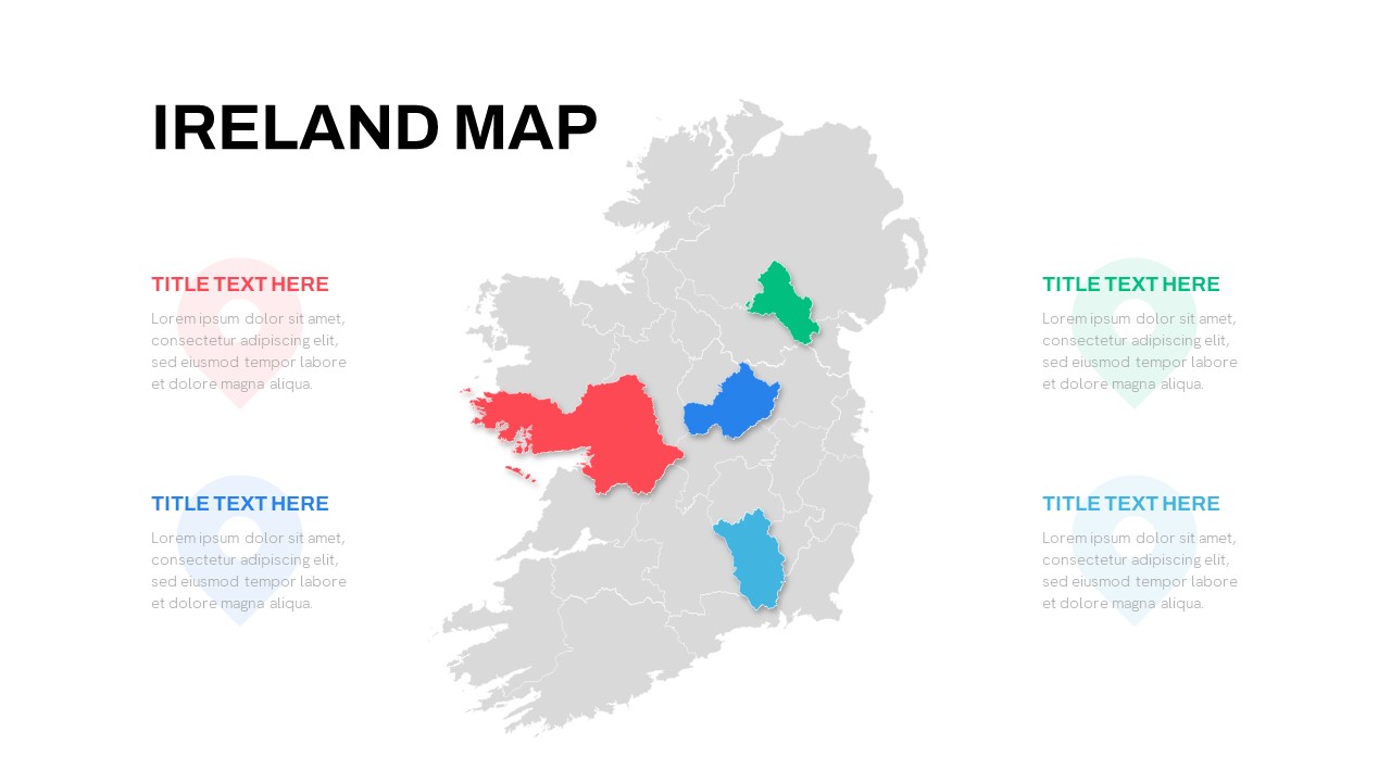
Editable Ireland Map Infographic Slide Template for PowerPoint & Google Slides
World Maps
Free
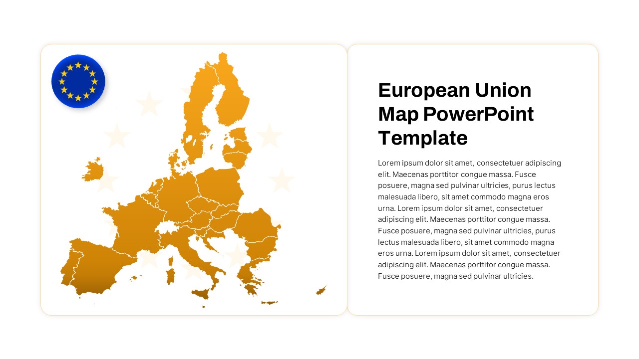
European Union Map Infographic Template for PowerPoint & Google Slides
World Maps
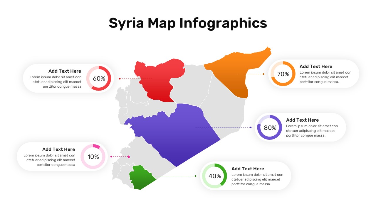
Syria Regional Data Map Infographic Template for PowerPoint & Google Slides
World Maps
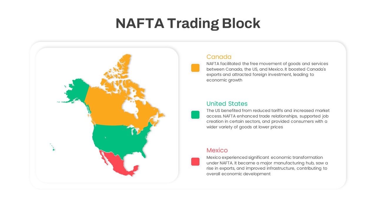
NAFTA Trading Block Map Infographic Template for PowerPoint & Google Slides
World Maps
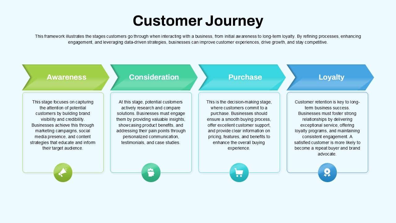
Customer Journey Process Map Infographic Template for PowerPoint & Google Slides
Customer Journey
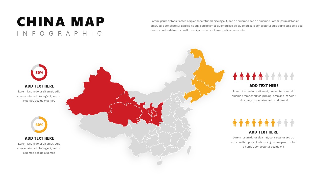
China Map Infographic Regional Stats Template for PowerPoint & Google Slides
World Maps
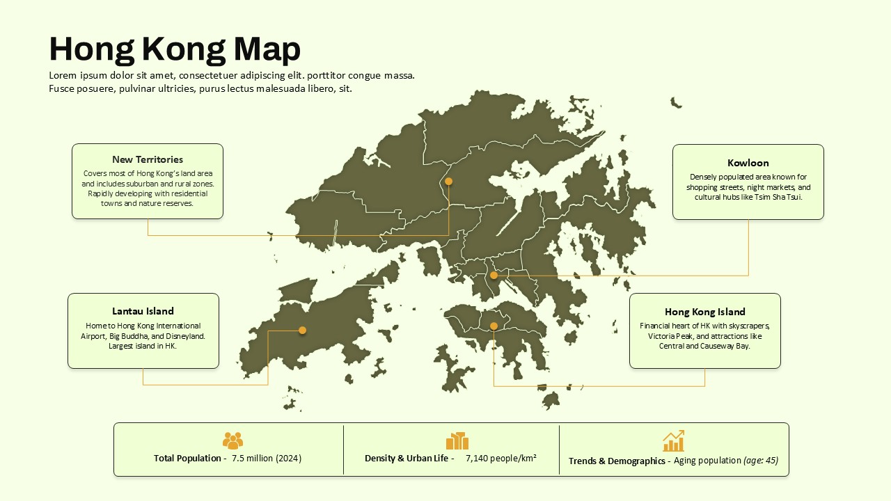
Hong Kong Geographic Map Infographic Template for PowerPoint & Google Slides
World Maps
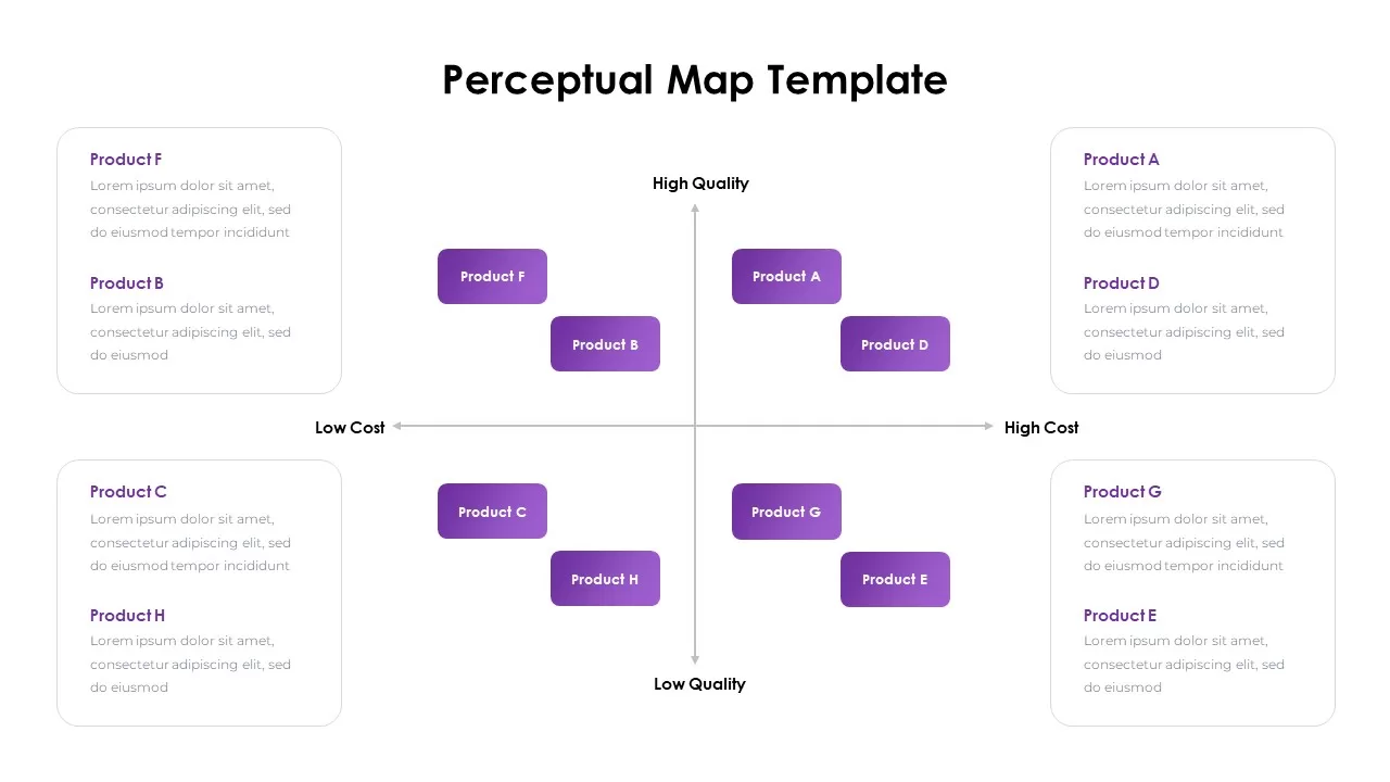
Perceptual Map infographic for PowerPoint & Google Slides
Competitor Analysis
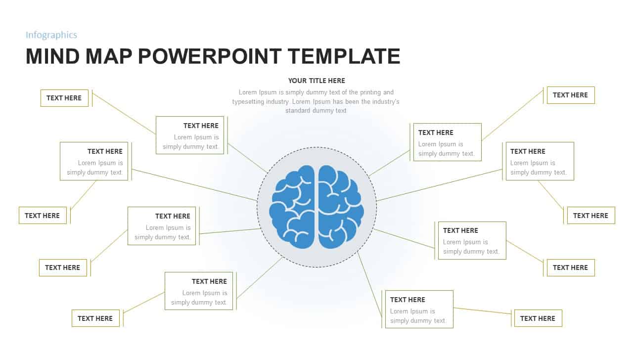
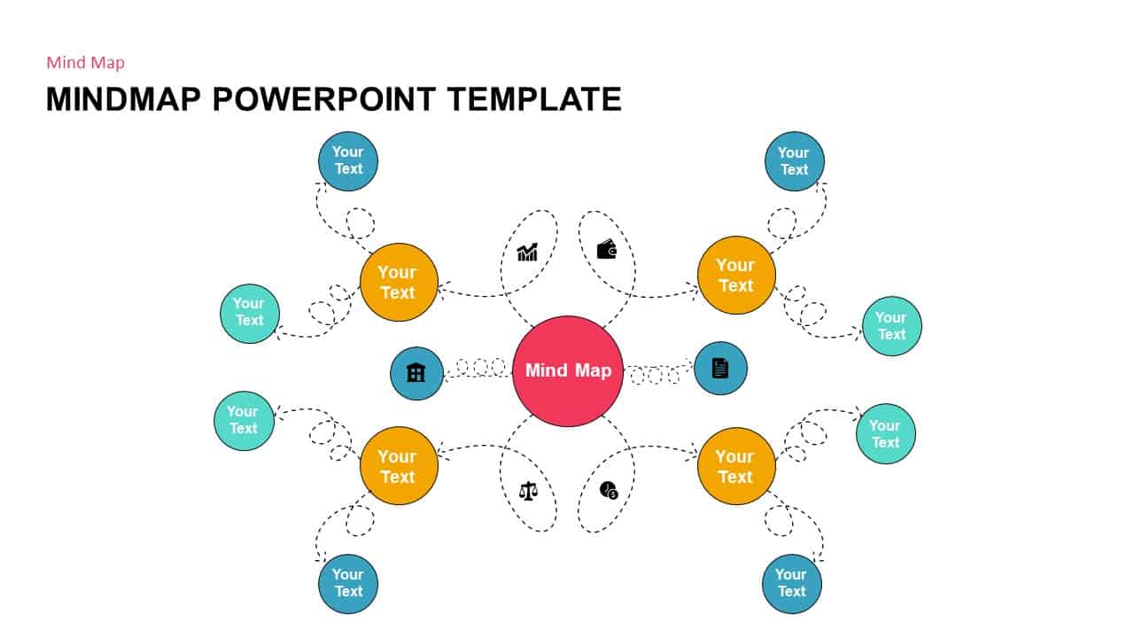
Mind Map PowerPoint template for PowerPoint & Google Slides
Mind Maps
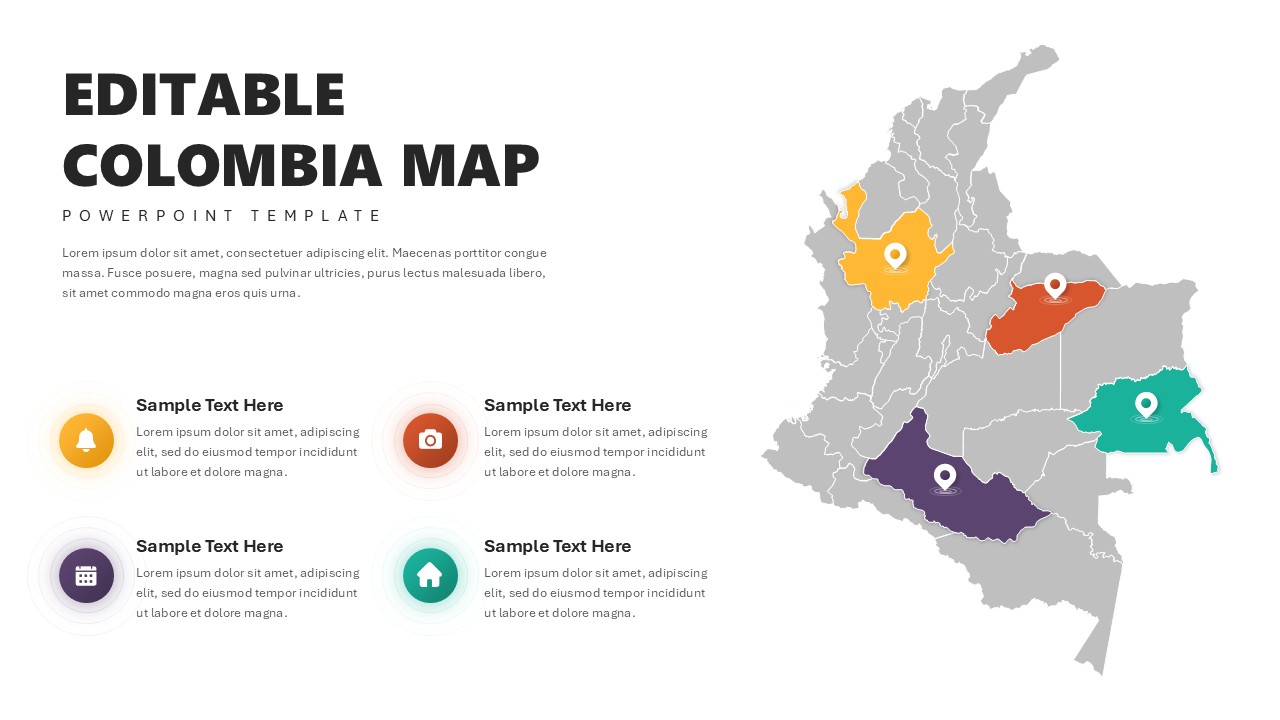
Editable Colombia Map PowerPoint Template for PowerPoint & Google Slides
Business Models
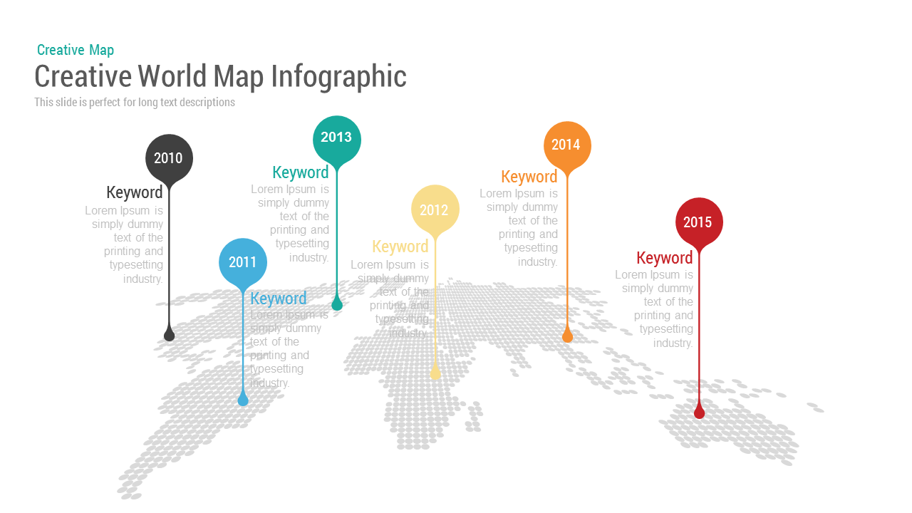
Creative World Map template for PowerPoint & Google Slides
World Maps

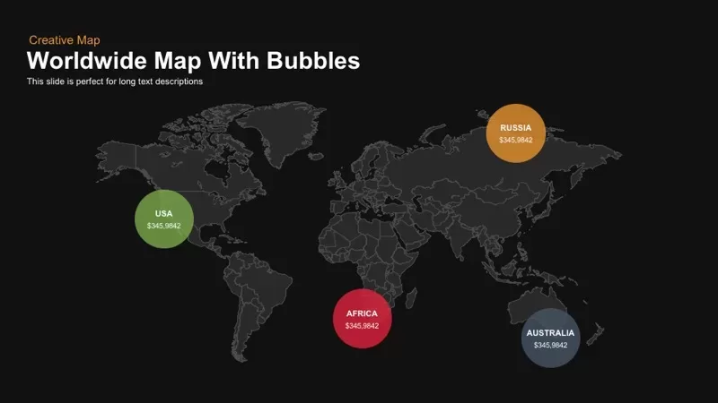
Worldwide Map with Bubbles template for PowerPoint & Google Slides
World Maps
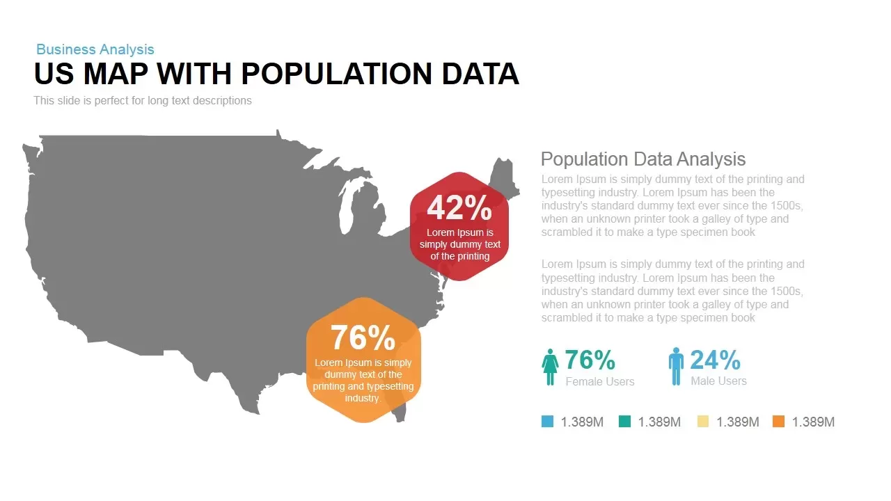
Interactive US Population Data Map Slide Template for PowerPoint & Google Slides
World Maps
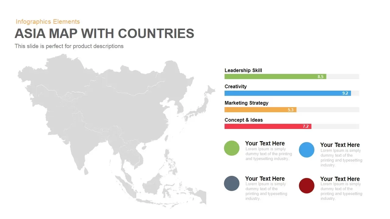
Asia Map with KPI Metrics and Legend Template for PowerPoint & Google Slides
World Maps
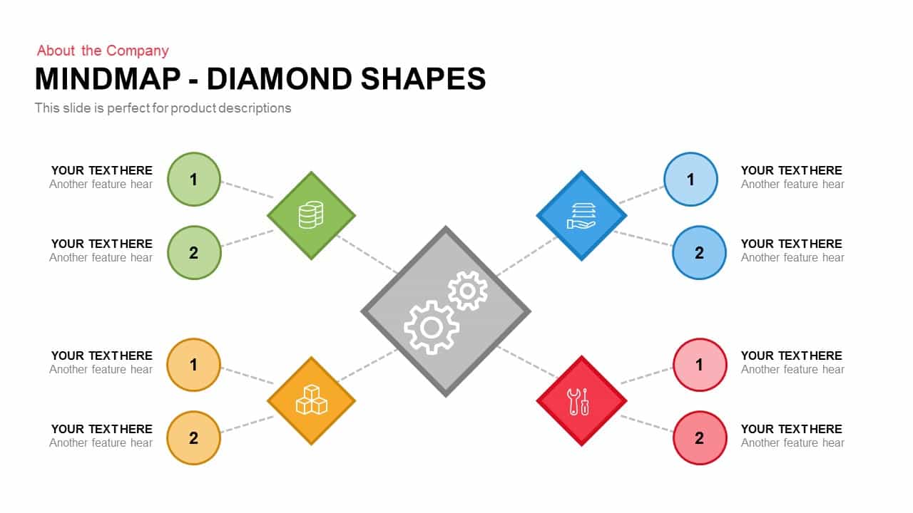
Diamond Mind Map Diagram Four Branches Template for PowerPoint & Google Slides
Mind Maps
Simple Multi-Branch Mind Map Template for PowerPoint & Google Slides
Mind Maps
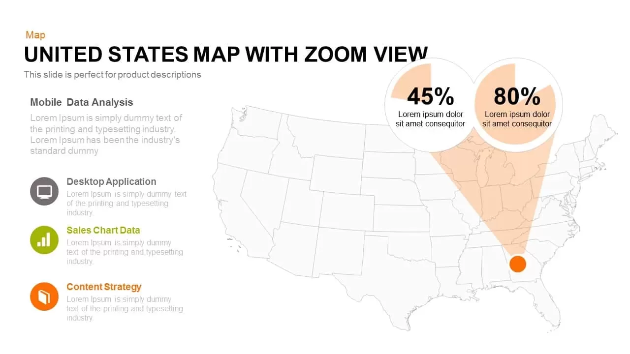
United States Map with Zoom View template for PowerPoint & Google Slides
World Maps
Customizable USA Map With State Markers Template for PowerPoint & Google Slides
World Maps
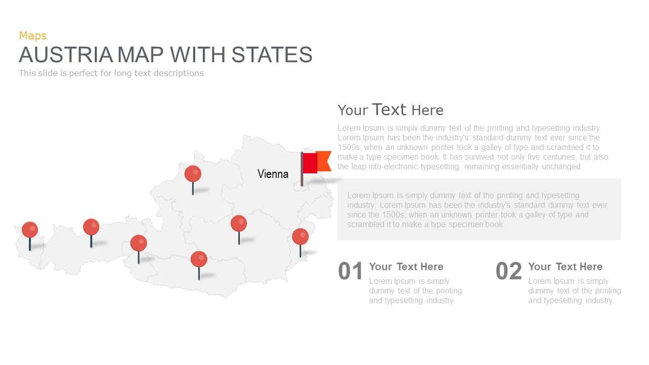
Austria Map With State Markers Template for PowerPoint & Google Slides
World Maps
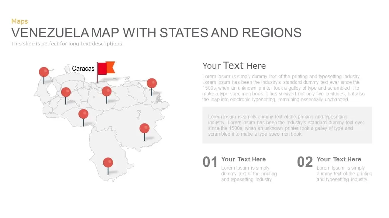
Venezuela Map with States and Regions Template for PowerPoint & Google Slides
World Maps
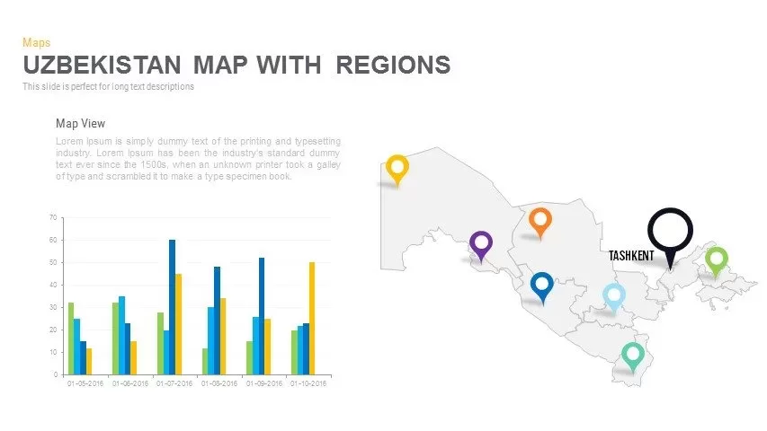
Uzbekistan Map with Regions Pack Template for PowerPoint & Google Slides
Maps
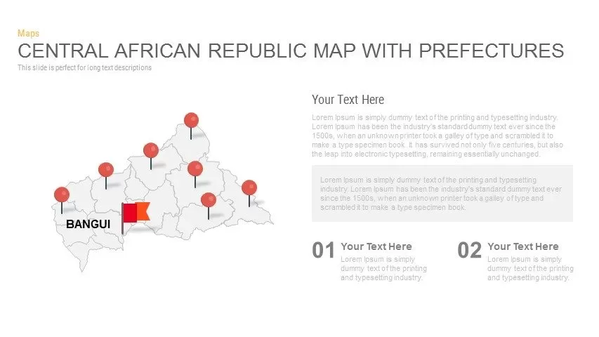
Central African Republic Prefectures Map Template for PowerPoint & Google Slides
World Maps
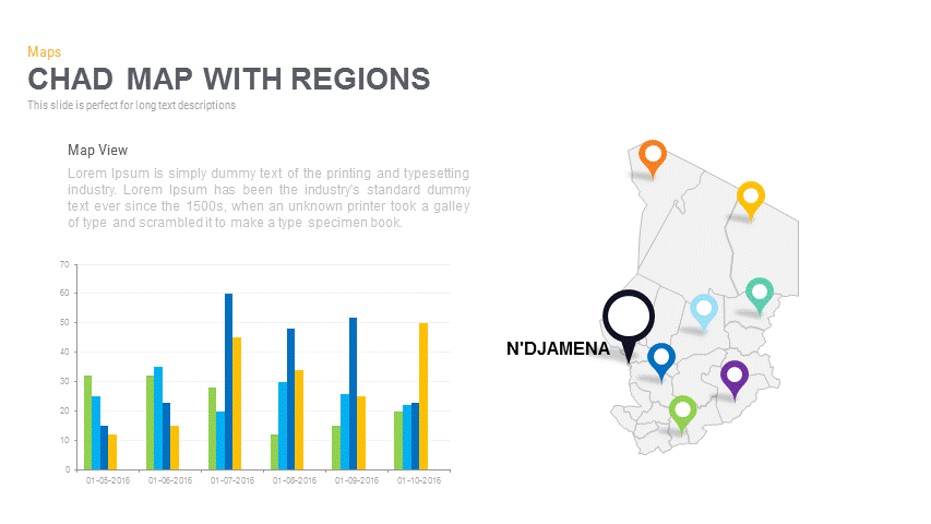
Chad Map with Regions Slide Pack Template for PowerPoint & Google Slides
World Maps
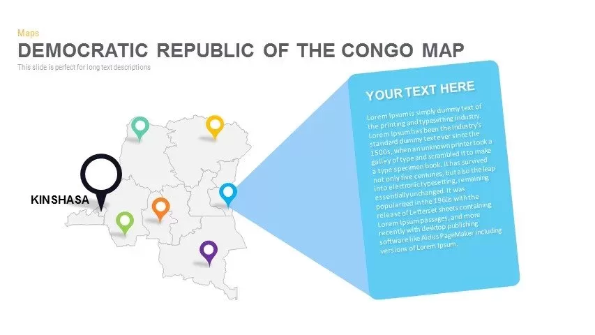
DR Congo Prefecture Map Slide Pack Template for PowerPoint & Google Slides
World Maps
Egypt Regional Map Slide Pack Template for PowerPoint & Google Slides
World Maps

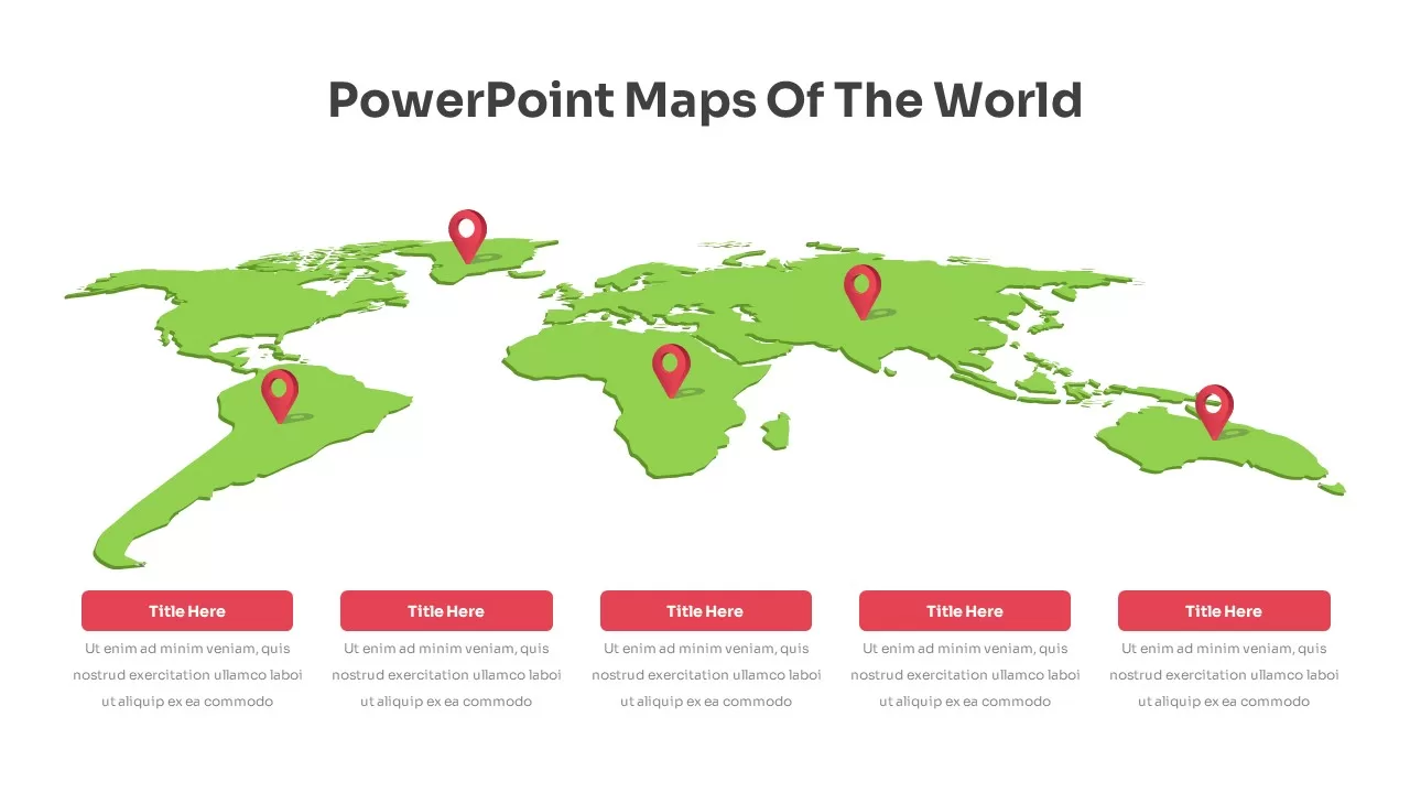
Global Map with Location Markers Template for PowerPoint & Google Slides
World Maps
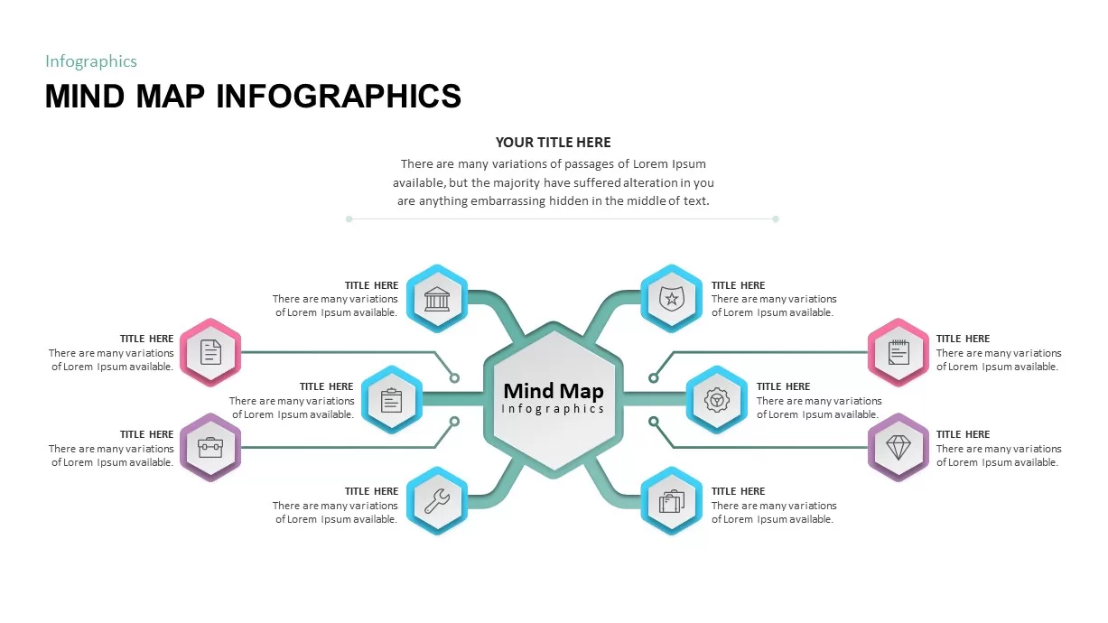
Mind Map Infographics template for PowerPoint & Google Slides
Mind Maps
Mind Map Diagram Template for PowerPoint & Google Slides
Mind Maps
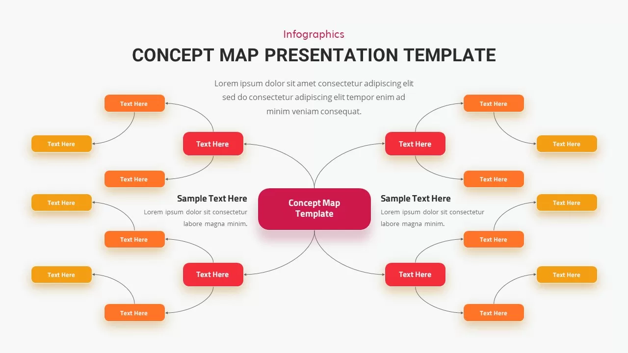
Concept Map Presentation Template for PowerPoint & Google Slides
Mind Maps
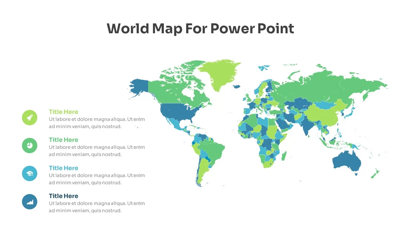
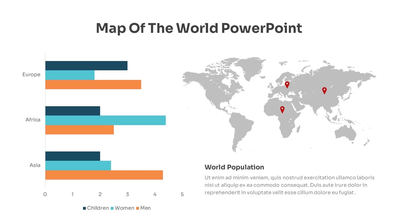
Global Population Demographics & Map Template for PowerPoint & Google Slides
Bar/Column
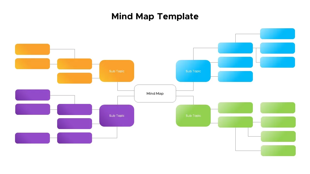
Mind Map Template for PowerPoint & Google Slides
Mind Maps
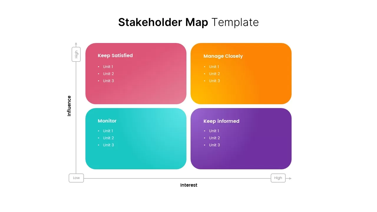
Stakeholder Map Template for PowerPoint & Google Slides
Business
Colorful Mind Map with Icons Template for PowerPoint & Google Slides
Mind Maps
Colorful Mind Map Template for PowerPoint & Google Slides
Mind Maps
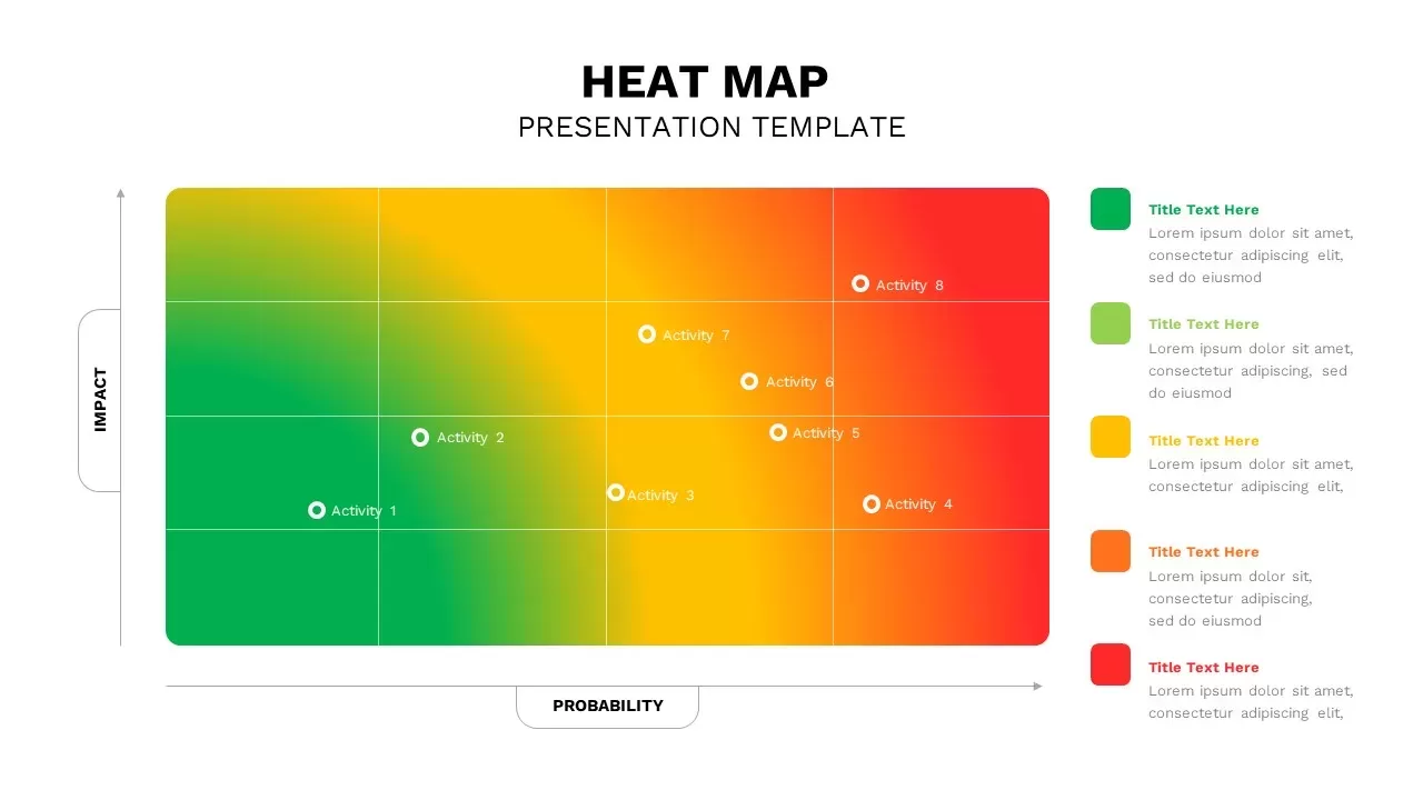
Heat Map Analysis Template for PowerPoint & Google Slides
Risk Management
Professional Risk Heat Map Visualization Template for PowerPoint & Google Slides
Risk Management
Heat Map Risk Matrix Dashboard Template for PowerPoint & Google Slides
Comparison Chart
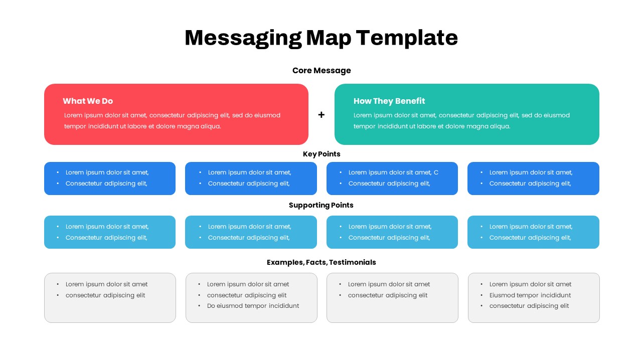
Comprehensive Messaging Map Framework Template for PowerPoint & Google Slides
Process
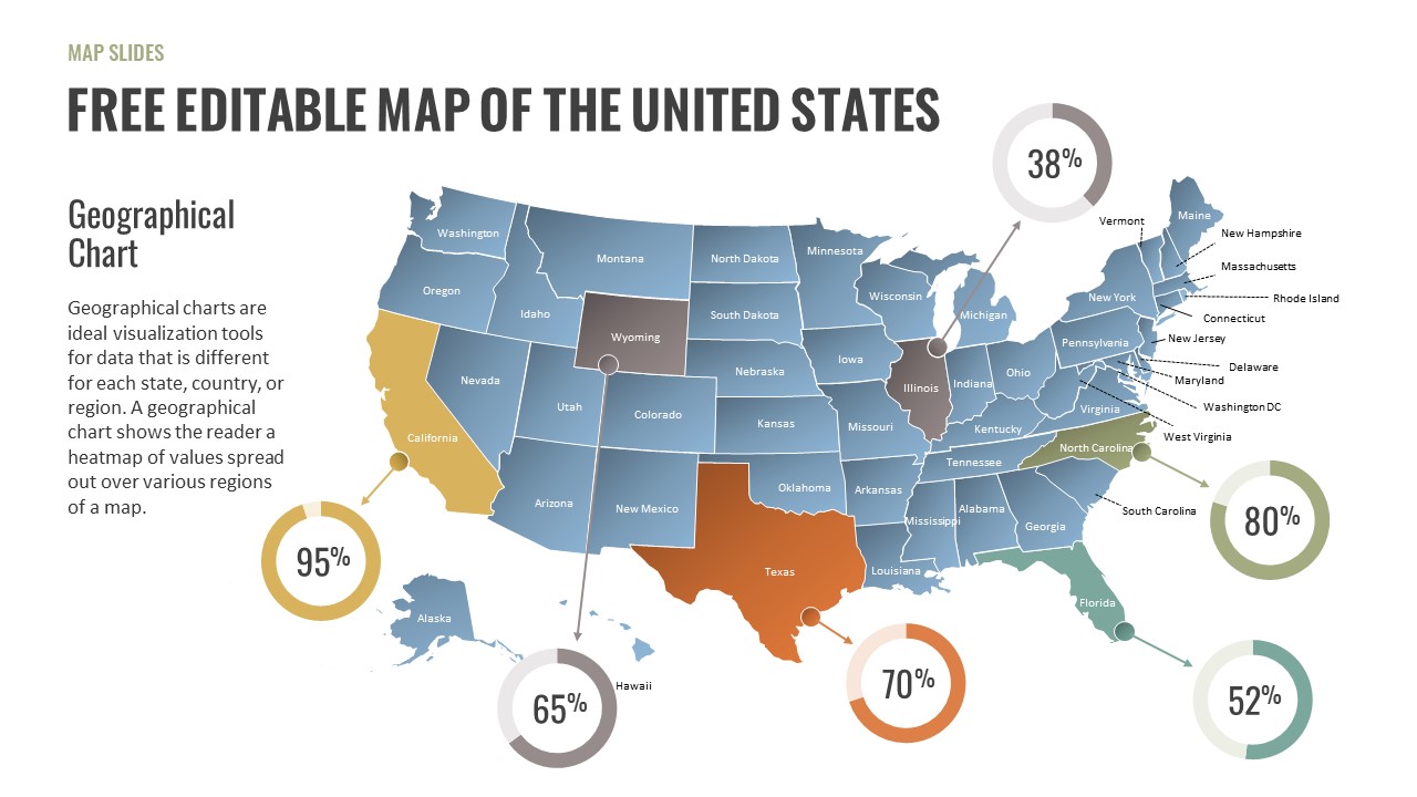
Free Editable U.S. Map with Regional Metrics Template for PowerPoint & Google Slides
World Maps
Free
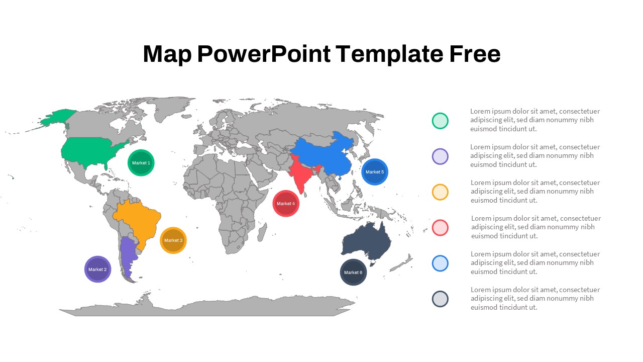
Free Global Market Distribution Map Template for PowerPoint & Google Slides
World Maps
Free
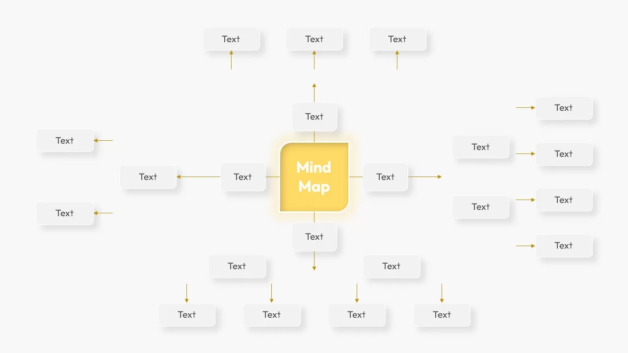
Modern Custom Eight-Branch Mind Map Template for PowerPoint & Google Slides
Mind Maps
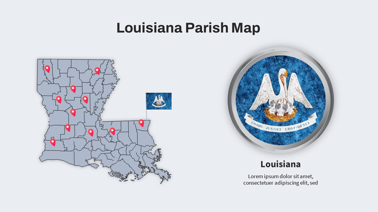
Louisiana Parish Map with Markers Template for PowerPoint & Google Slides
Maps
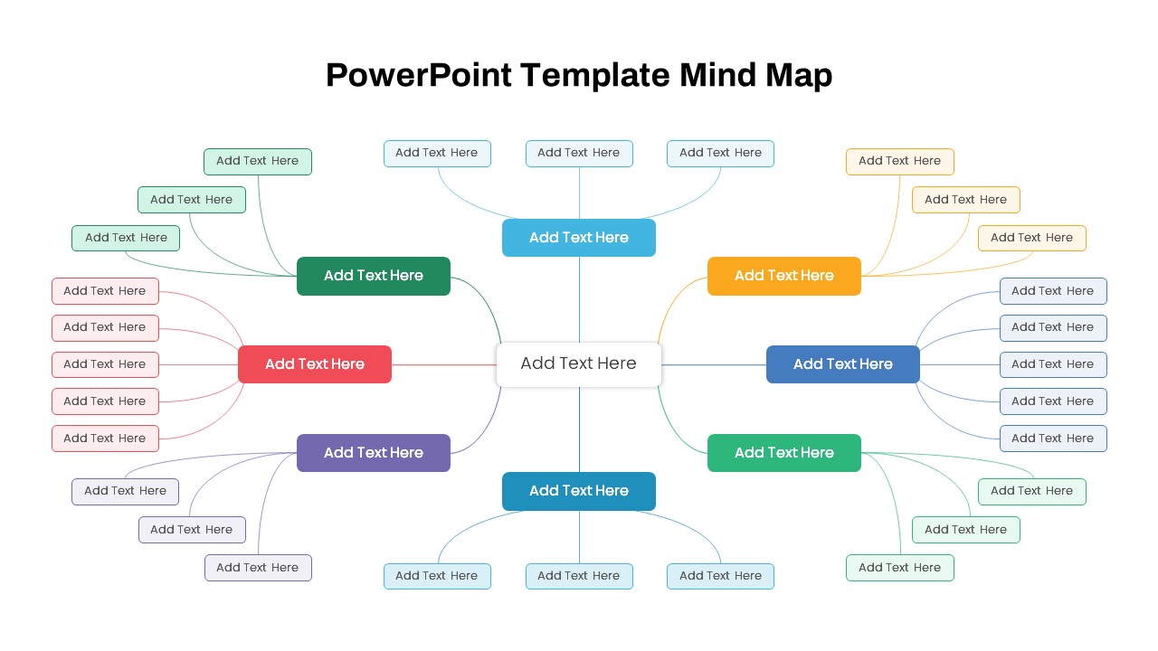
Colorful Multi-Branch Mind Map Slide Template for PowerPoint & Google Slides
Mind Maps
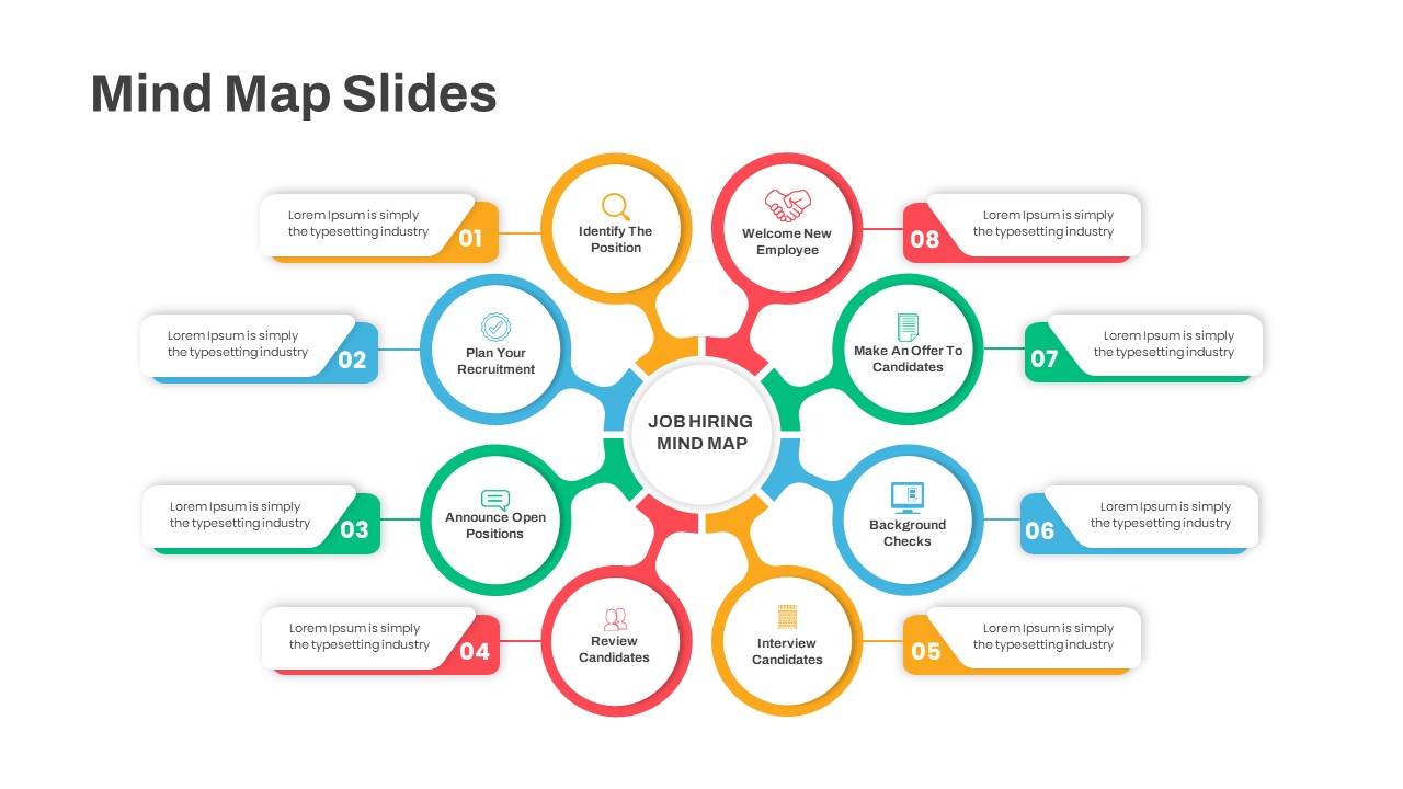
Eight-Step Job Hiring Mind Map Template for PowerPoint & Google Slides
Mind Maps
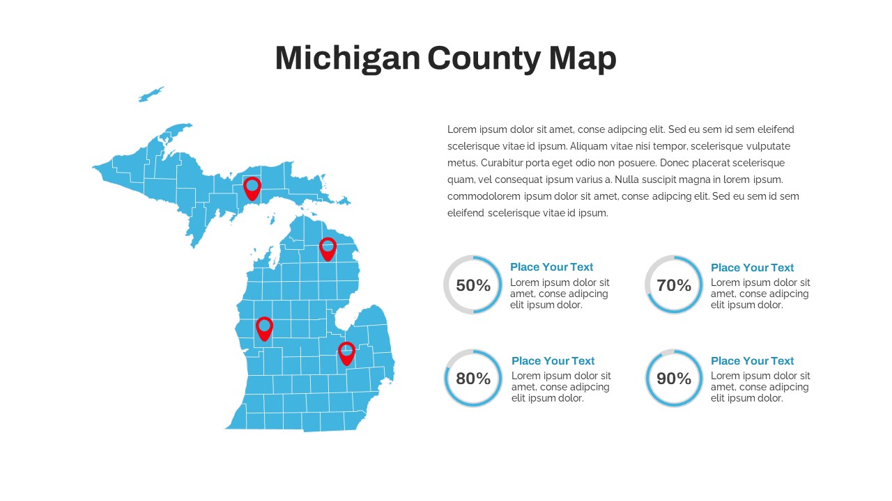
Michigan County Map with KPI Dashboard Template for PowerPoint & Google Slides
World Maps
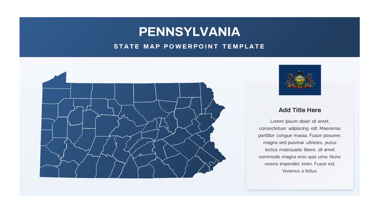
Pennsylvania State Map Diagram Template for PowerPoint & Google Slides
World Maps
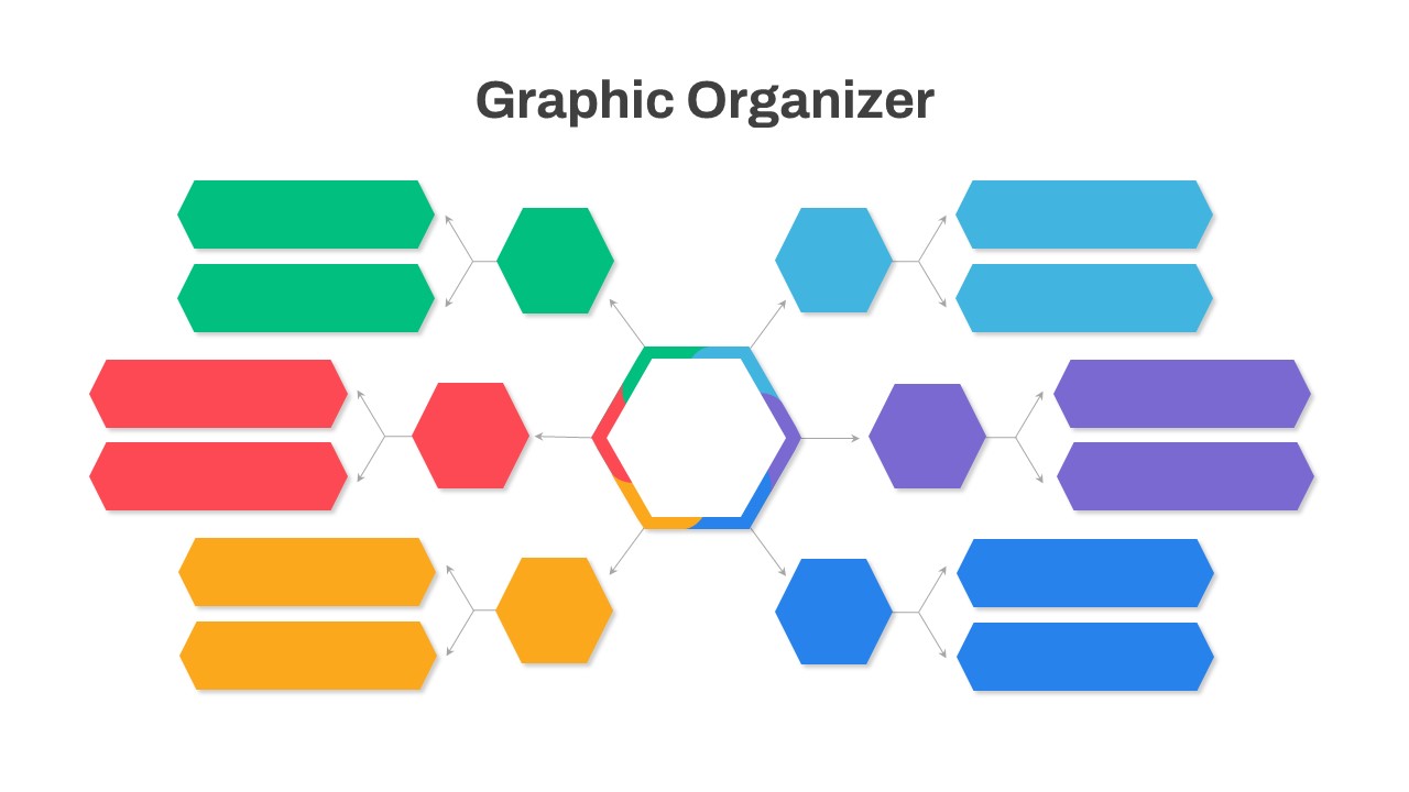
Graphic Organizer & Double Bubble Map Template for PowerPoint & Google Slides
Maps
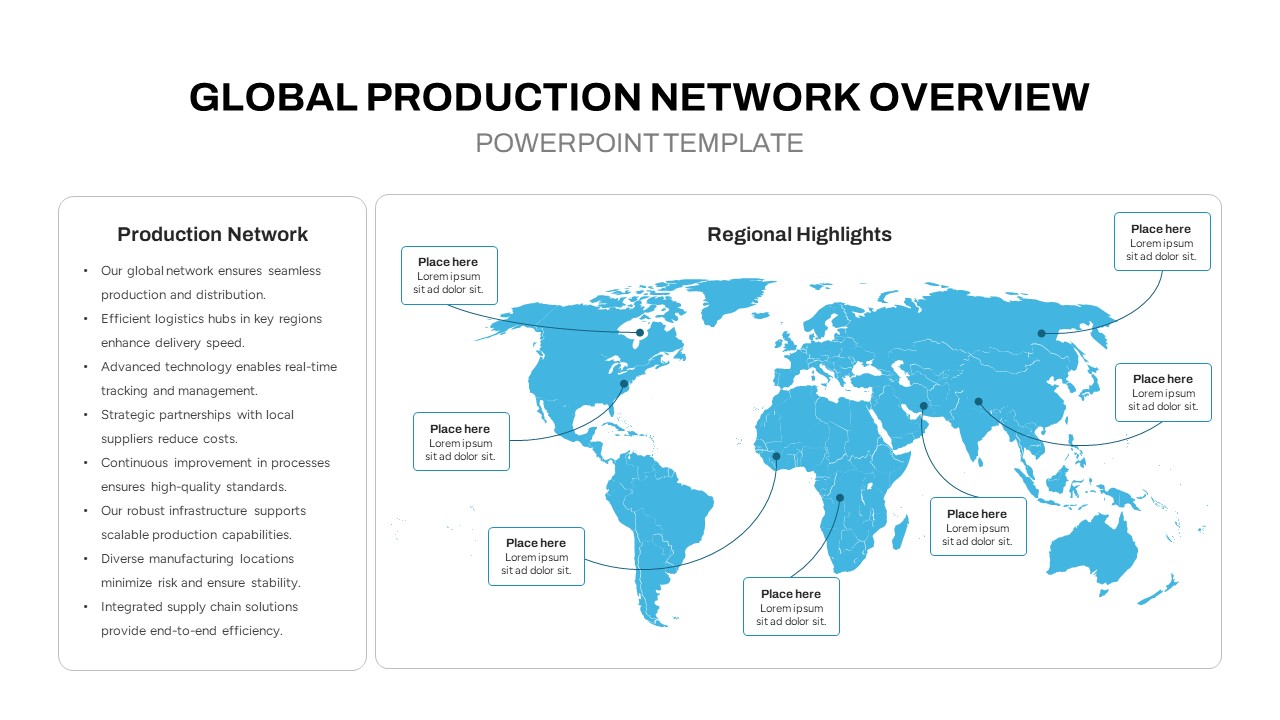
Global Production Network Overview Map Template for PowerPoint & Google Slides
World Maps
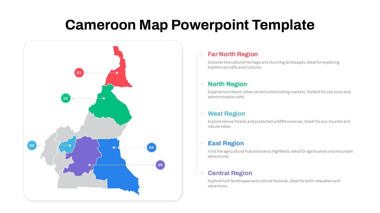
Numbered Cameroon Regional Map Slide Template for PowerPoint & Google Slides
World Maps
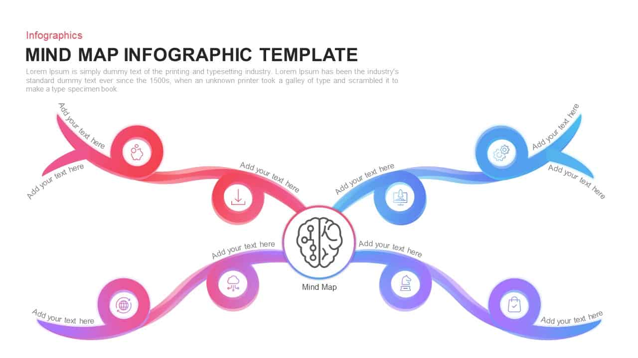
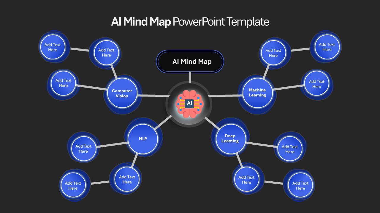
AI Mind Map & Hub-and-Spoke Diagram Template for PowerPoint & Google Slides
Mind Maps
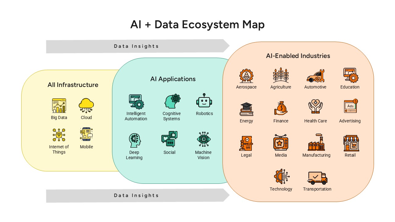
AI and Data Ecosystem Map Template for PowerPoint & Google Slides
AI
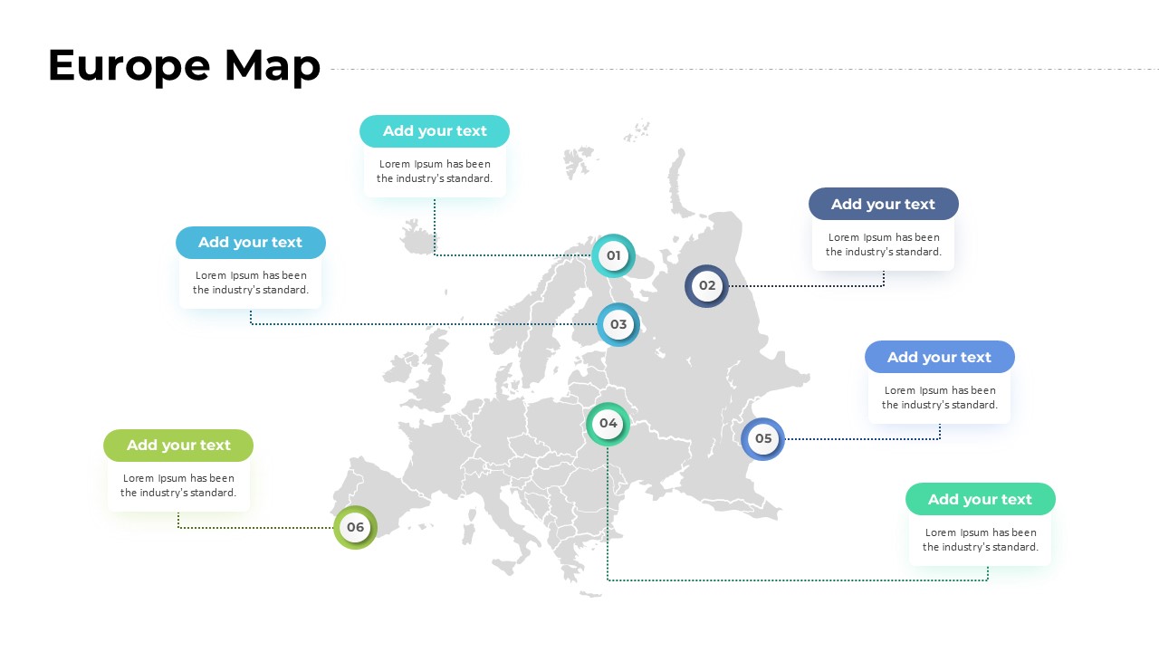
Europe Map with Six Editable Points Template for PowerPoint & Google Slides
World Maps
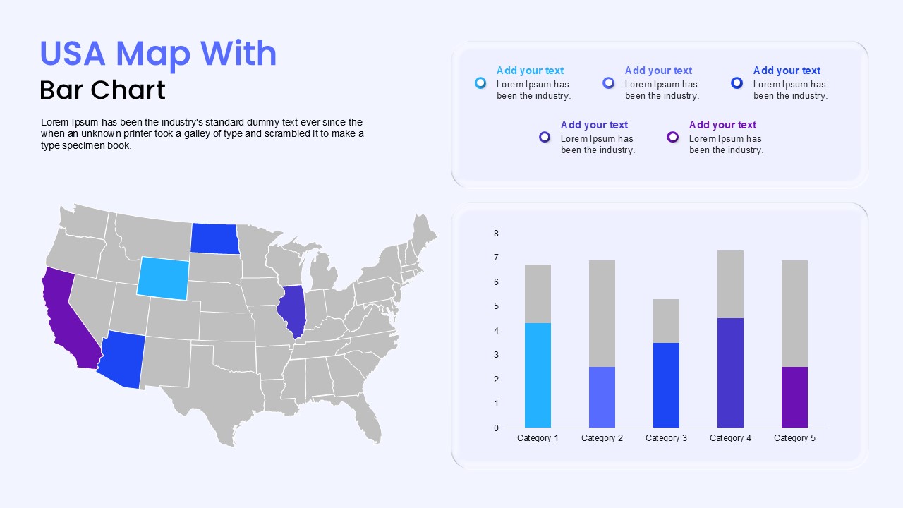
USA Map with Bar Chart Template for PowerPoint & Google Slides
World Maps