Five Options Business Bar Graph for PowerPoint & Google Slides
Description
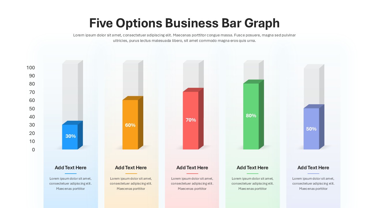
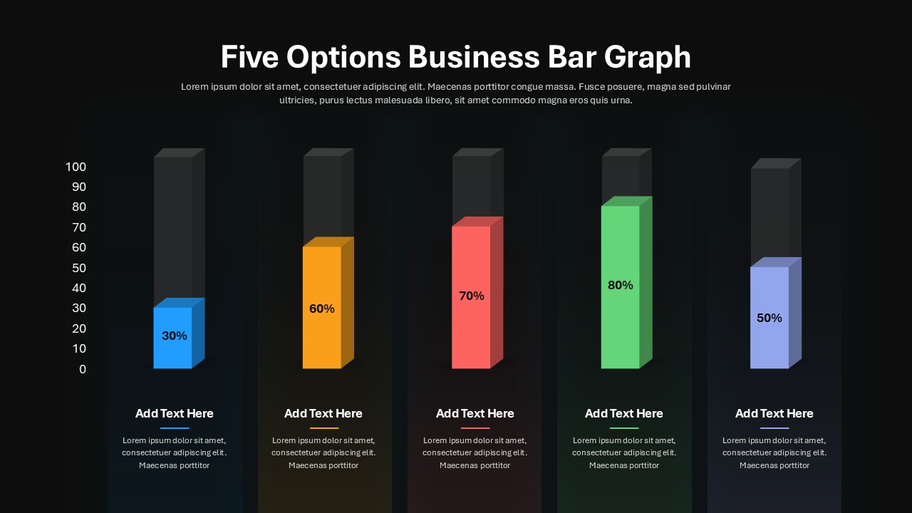
This Five Options Business Bar Graph slide provides a clean and visually engaging way to represent data with distinct color-coded bar graphs. Each bar shows percentage values (30%, 60%, 70%, 80%, and 50%) using blue, orange, red, green, and light blue colors, respectively, offering a quick visual comparison across five business options. The minimalist design ensures clarity, with space to add titles and explanatory text, making it perfect for showcasing business metrics, performance, or progress comparisons.
The layout is fully editable, allowing for customization of bar values, color schemes, and text to suit various business presentations, such as financial reports, market analysis, and team performance reviews. The bar graph is ideal for illustrating progress, survey results, or any metric-driven data, ensuring a professional and streamlined presentation. The template is designed for seamless integration with both PowerPoint and Google Slides, ensuring consistency across platforms.
With intuitive placeholders and master slides, you can easily update the content, making it versatile for different business contexts, whether you’re preparing for a client meeting, investor pitch, or internal review session.
Who is it for
Business professionals, managers, analysts, and team leaders can use this graph to present data-driven insights clearly and concisely. It’s also a useful tool for marketing teams, sales departments, or consultants when comparing performance across different strategies or initiatives.
Other Uses
Beyond business metrics, this slide can be adapted for educational purposes, project status reports, or to visualize survey results. It’s an excellent choice for presenting milestones, growth charts, or any scenario requiring a comparative bar graph.
Login to download this file

Item ID
SB04989
Related Templates

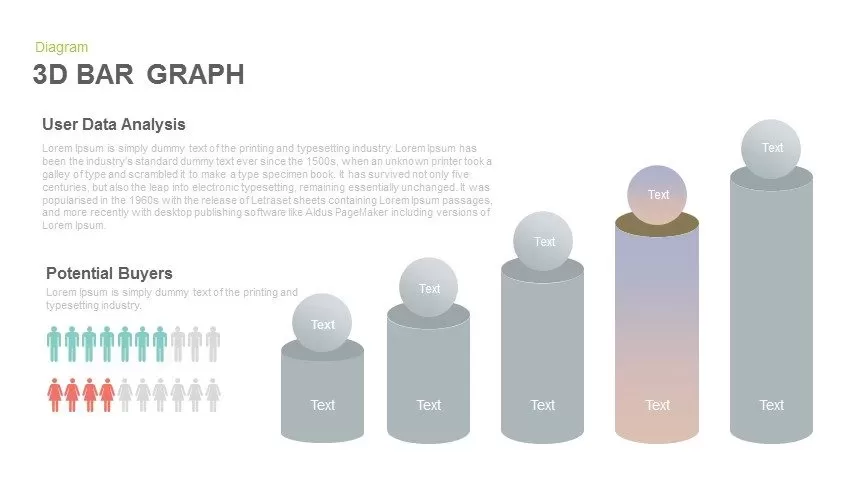
3D Bar Graph Infographic Template for PowerPoint & Google Slides
Bar/Column

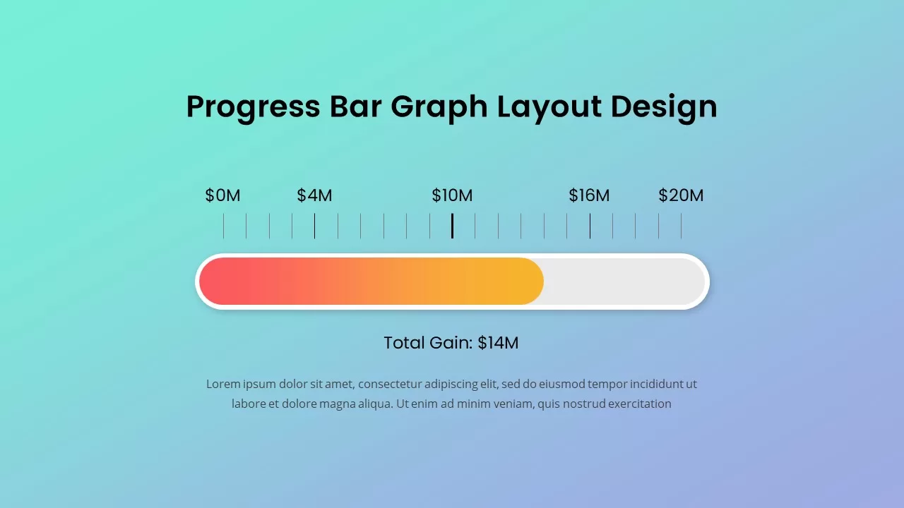
Progress Bar Graph Layout Design for PowerPoint & Google Slides
Charts

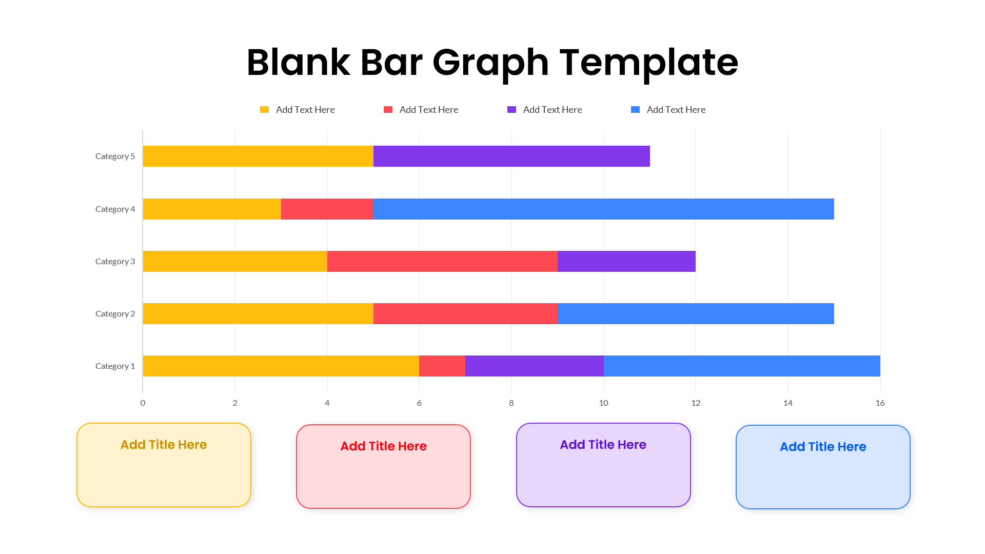
Blank Bar Graph Template for PowerPoint & Google Slides
Bar/Column
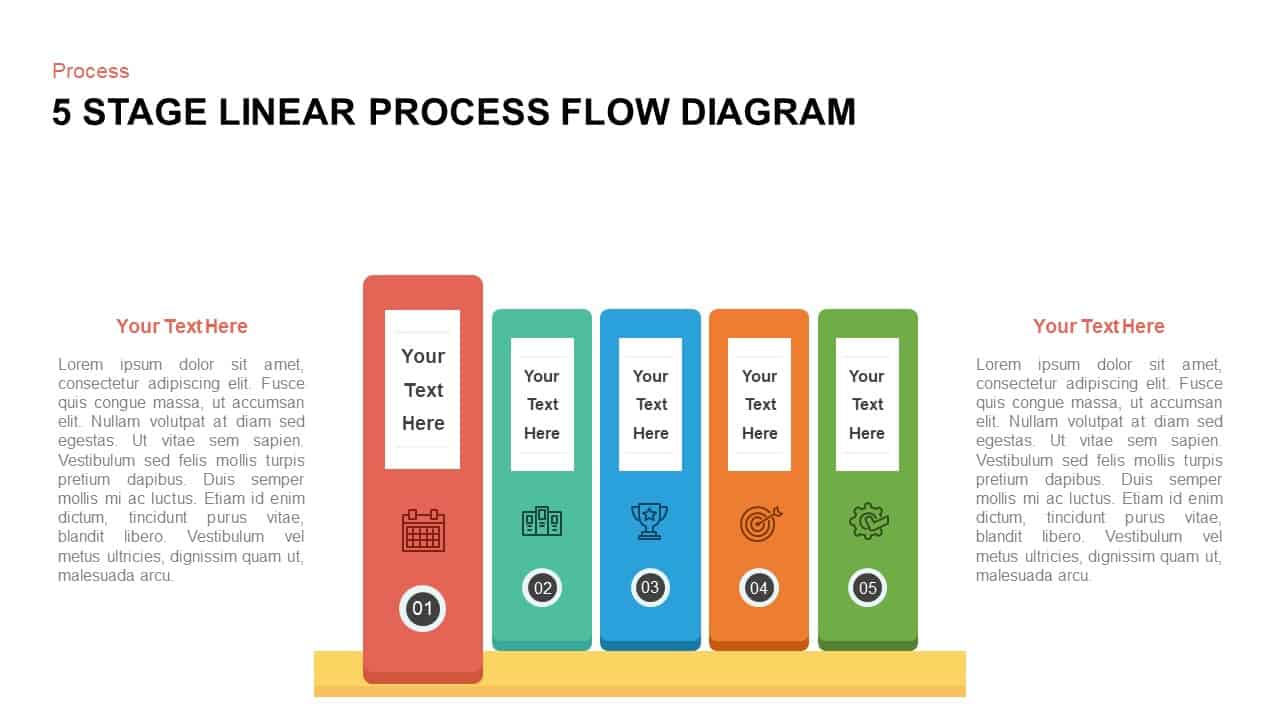
Five-Stage Vertical Bar Process Template for PowerPoint & Google Slides
Process
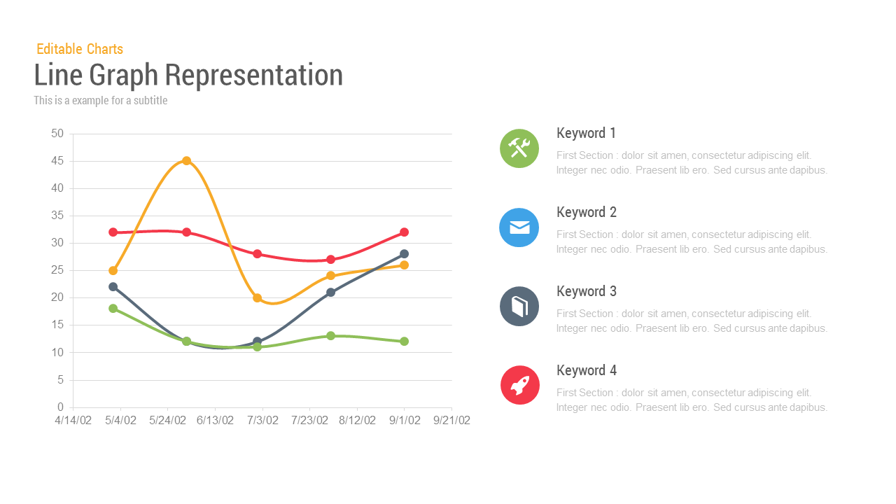
Line Graph Analysis template for PowerPoint & Google Slides
Charts
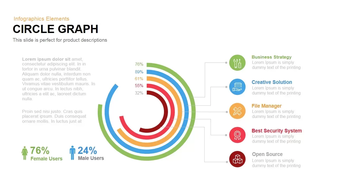
Circle Graph Data Visualization Template for PowerPoint & Google Slides
Circular
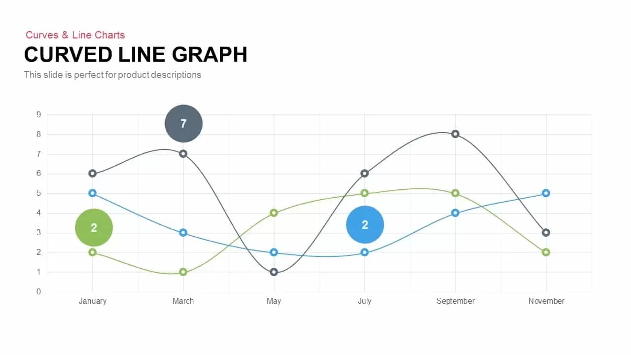
Multi-Series Curved Line Graph Analytics Template for PowerPoint & Google Slides
Comparison Chart
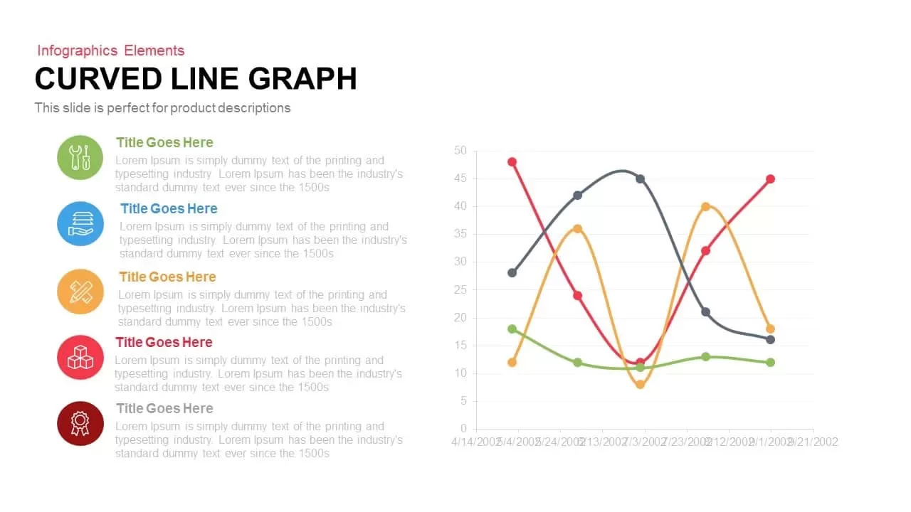
Curved Line Graph for PowerPoint & Google Slides
Timeline
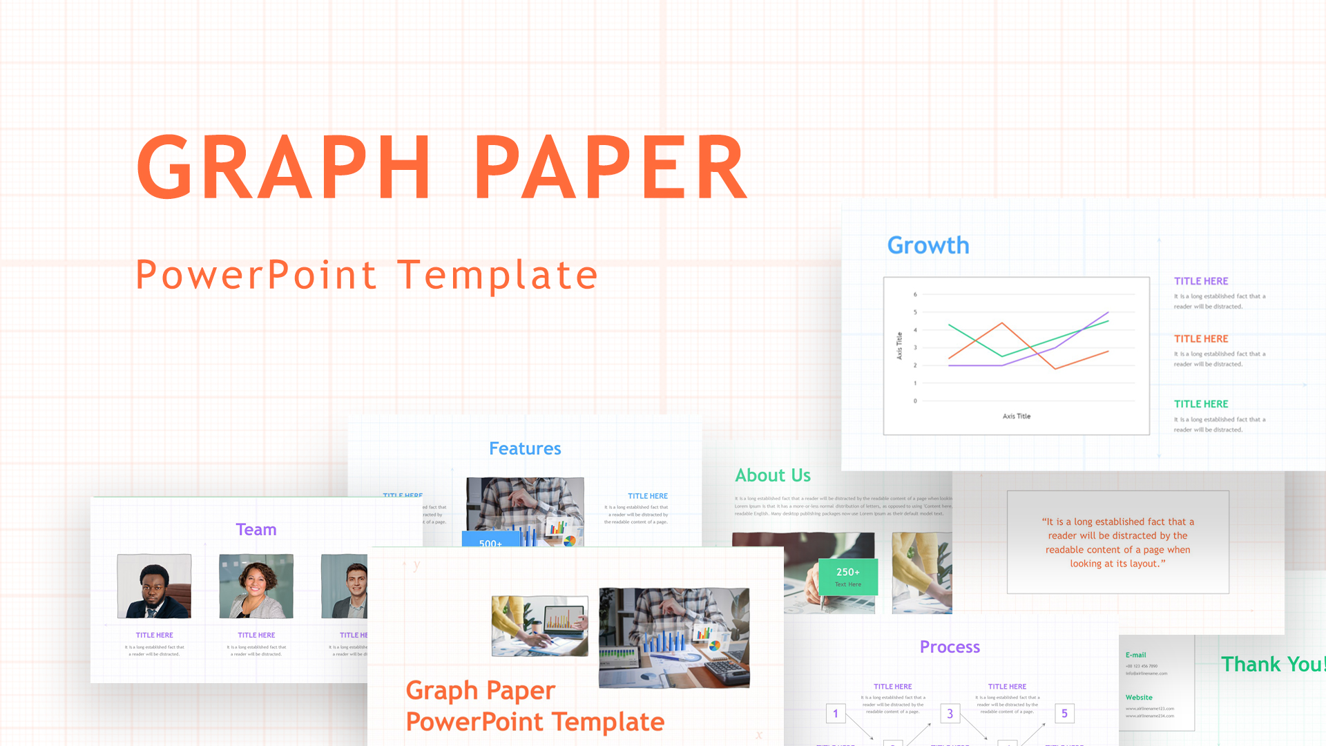
Graph Paper Background Presentation Template for PowerPoint & Google Slides
Company Profile
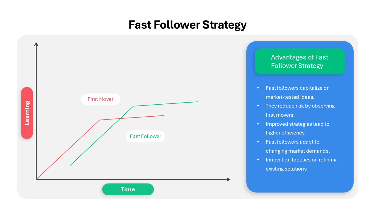
Fast Follower Strategy Line Graph Template for PowerPoint & Google Slides
Comparison Chart
Four Options Infographic Slides Template for PowerPoint & Google Slides
Comparison
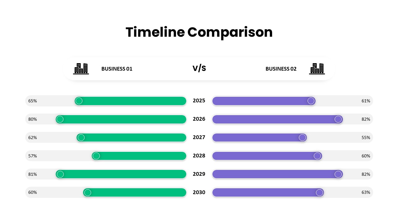
Business Timeline Comparison Bar Chart Template for PowerPoint & Google Slides
Comparison Chart
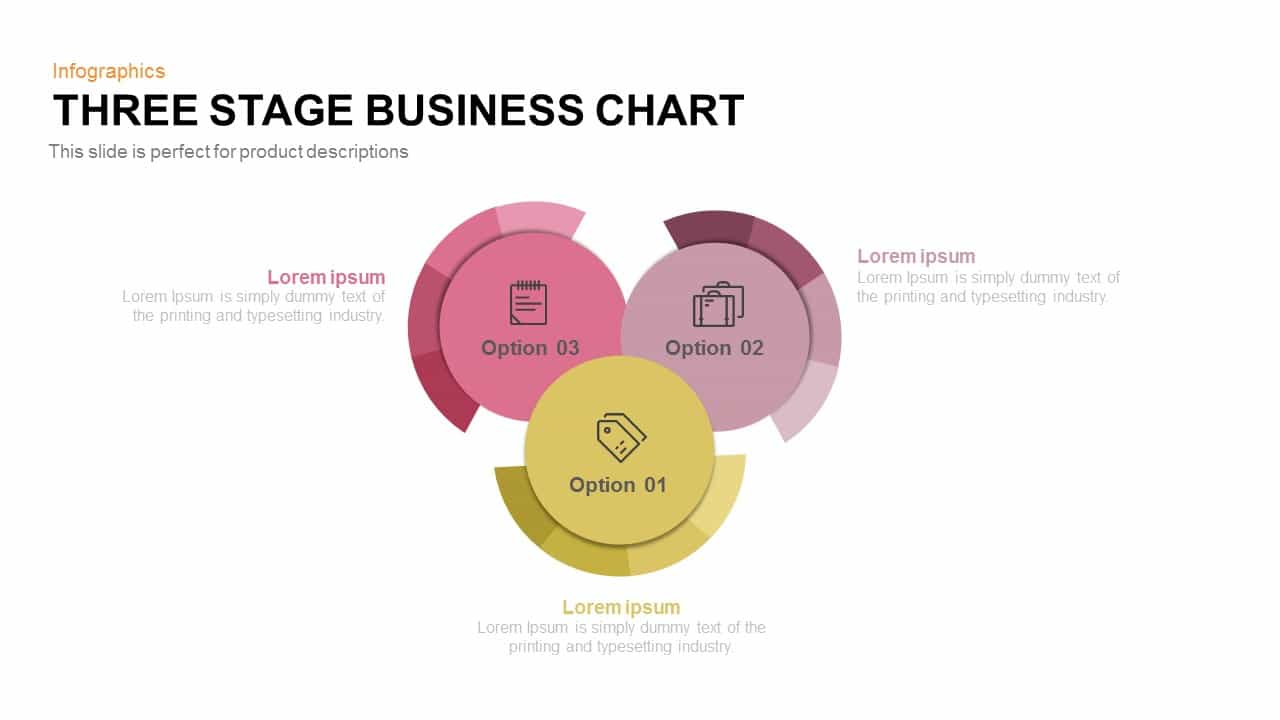
Three-Stage Circular Options Chart Template for PowerPoint & Google Slides
Comparison
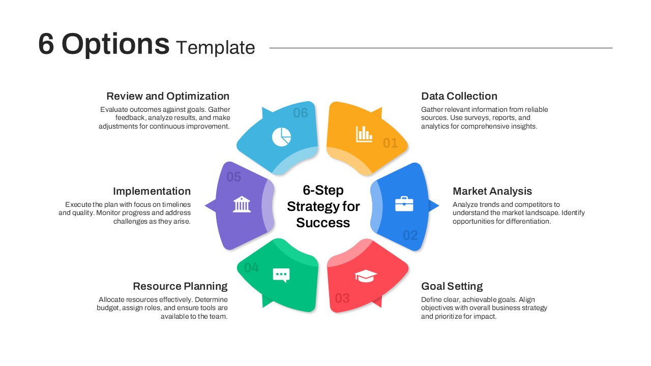
Versatile 6 Options Infographic Layout Template for PowerPoint & Google Slides
Process
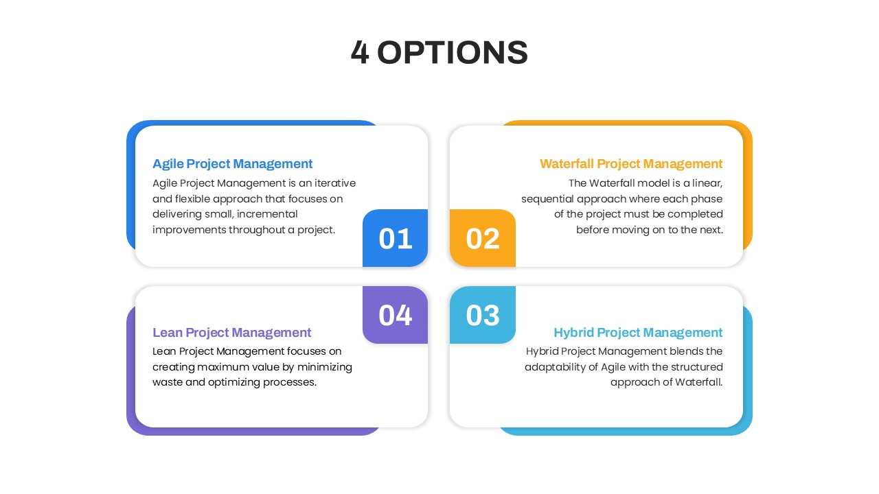
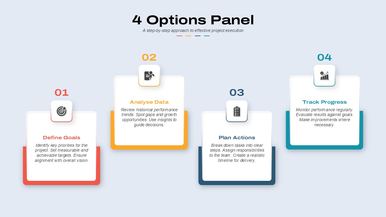
4 Options Panel template for PowerPoint & Google Slides
Business
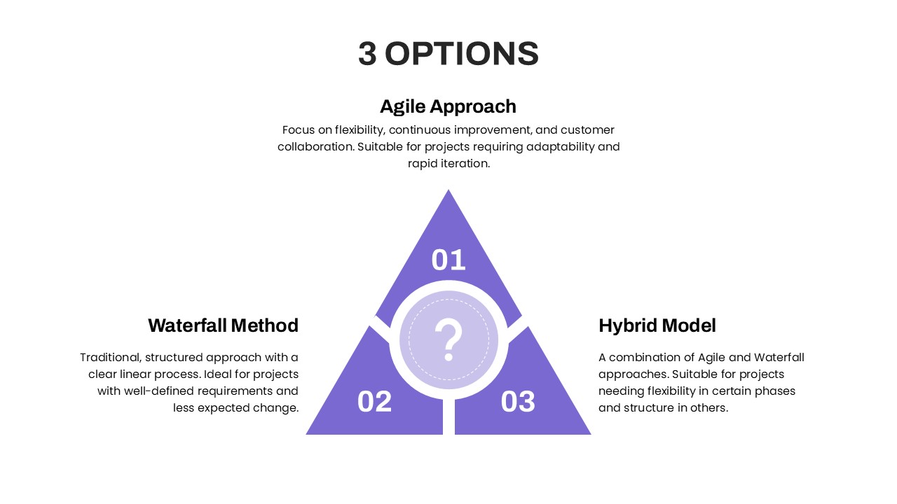
Three Options Infographic Pack Template for PowerPoint & Google Slides
Process
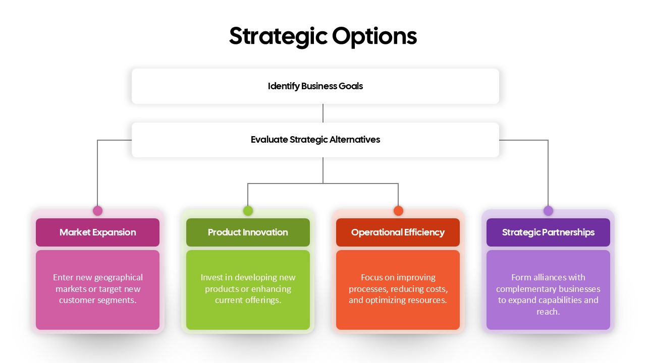
Strategic Options Overview for PowerPoint & Google Slides
Business
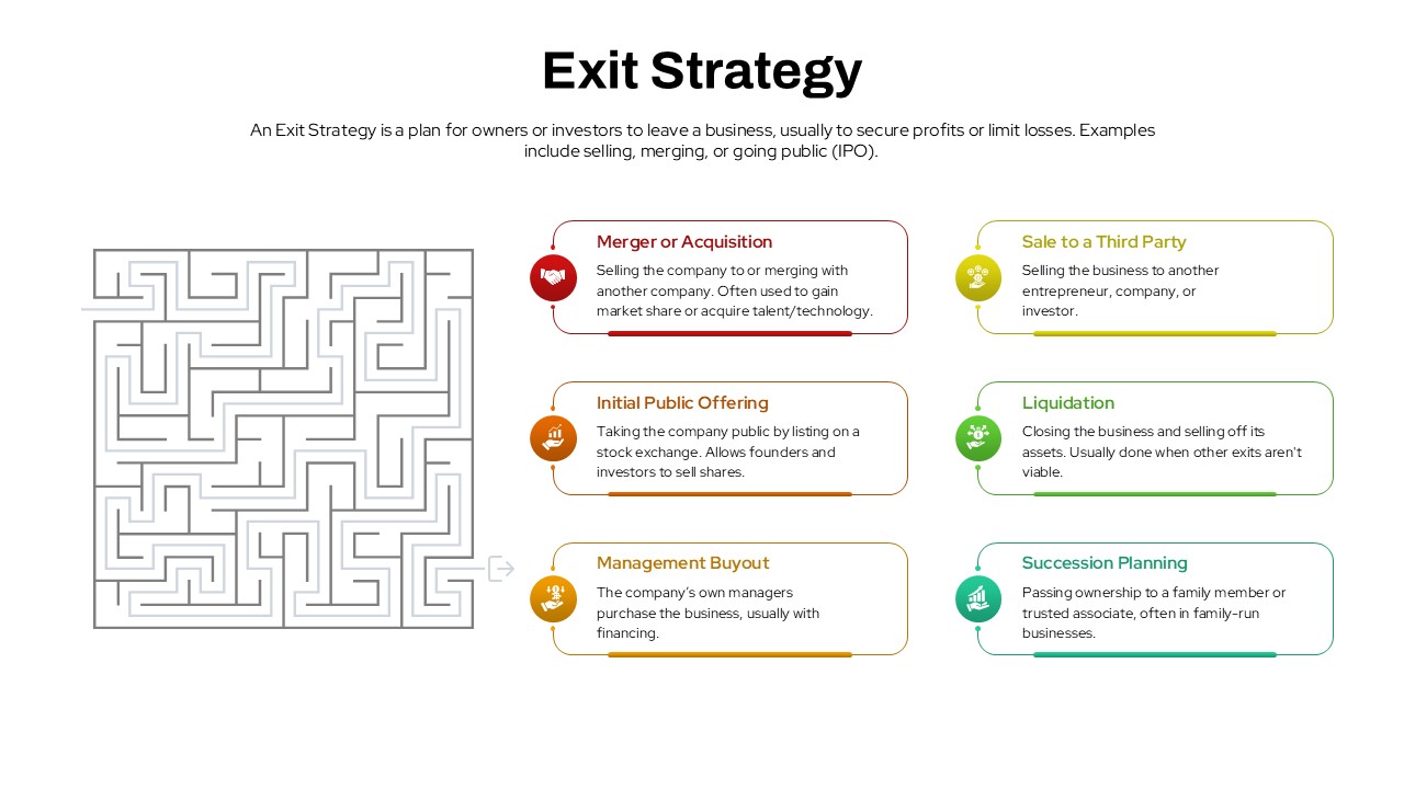
Exit Strategy Options Overview Template for PowerPoint & Google Slides
Business Plan
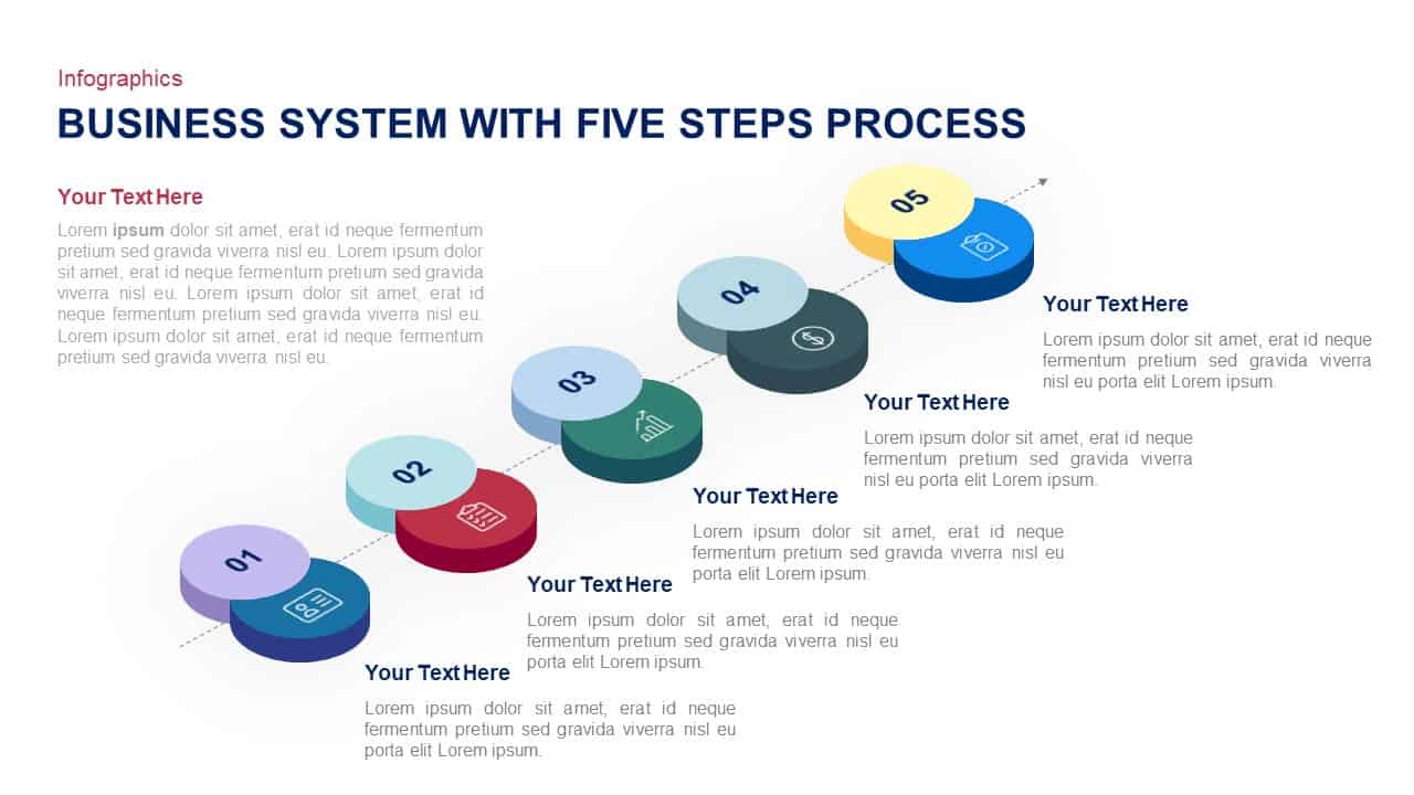
Business System Five-Step Process Template for PowerPoint & Google Slides
Process
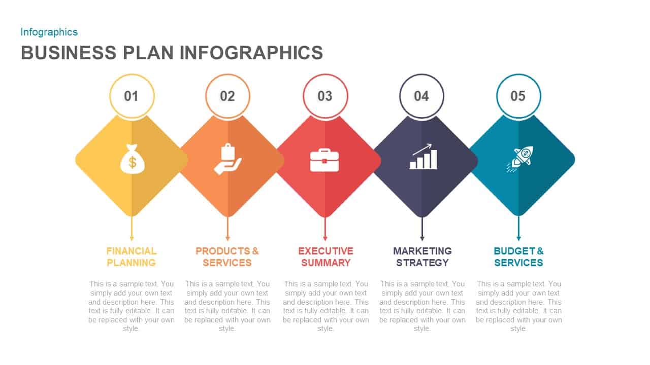
Five-Step Business Plan Infographic Template for PowerPoint & Google Slides
Business Plan

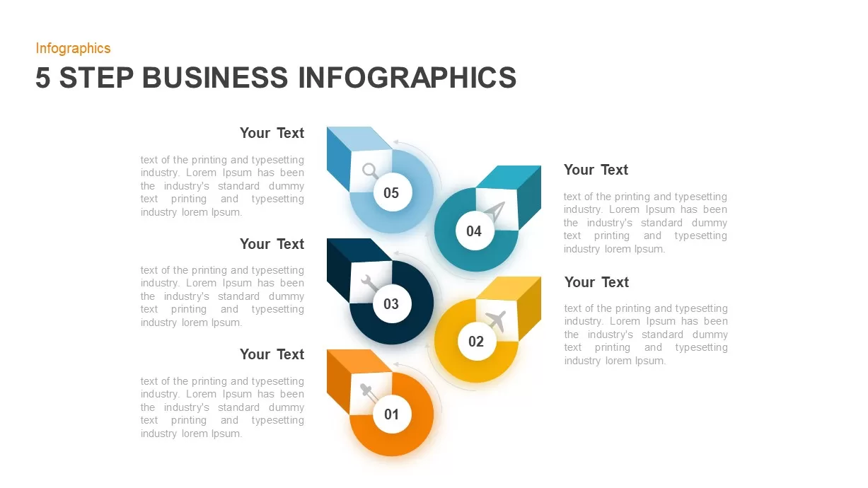
Five-Step Business Infographics Template for PowerPoint & Google Slides
Infographics
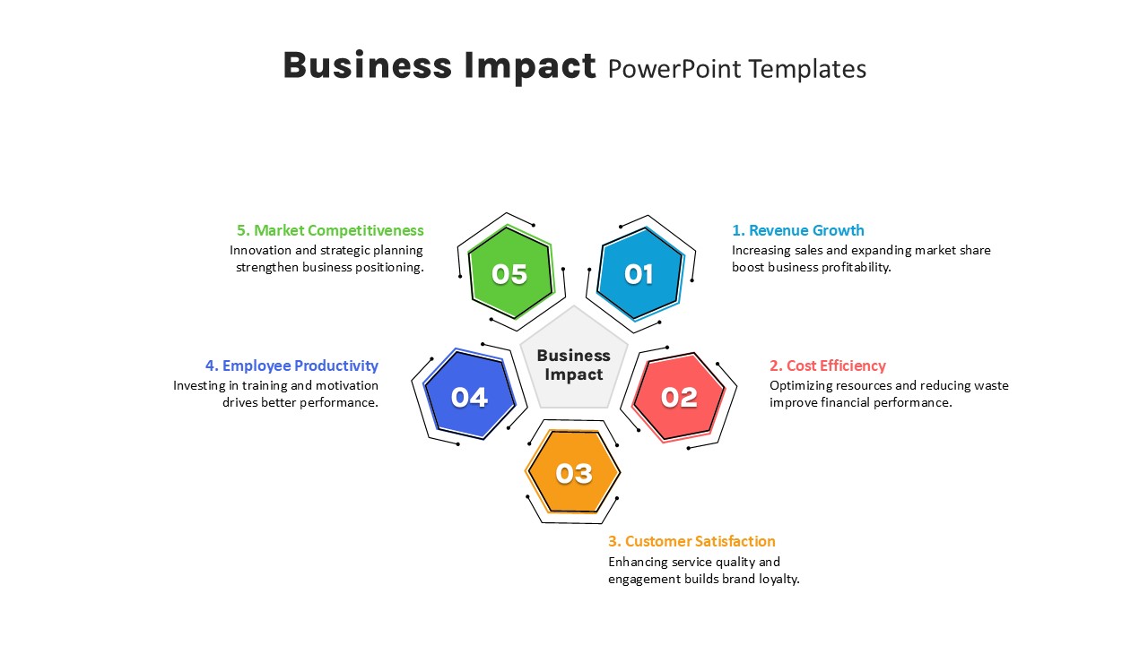
Five-Step Hexagon Business Impact Template for PowerPoint & Google Slides
Circular
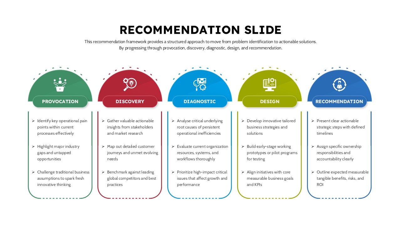
Five-Step Business Recommendation Slide for PowerPoint & Google Slides
Process
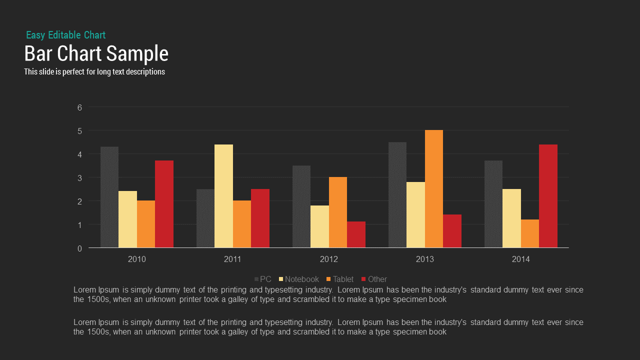
Bar Chart Sample template for PowerPoint & Google Slides
Bar/Column
Creative Data Analysis Bar Chart template for PowerPoint & Google Slides
Bar/Column
3D Bar Chart Data Infographics Template for PowerPoint & Google Slides
Bar/Column
Creative Bar Chart template for PowerPoint & Google Slides
Charts
Comparison Bar Chart template for PowerPoint & Google Slides
Comparison Chart
Three-Year Bar Chart template for PowerPoint & Google Slides
Charts
3D Cylinder Bar Chart Template for PowerPoint & Google Slides
Bar/Column
Pencil Bar Chart Data Analysis Template for PowerPoint & Google Slides
Bar/Column

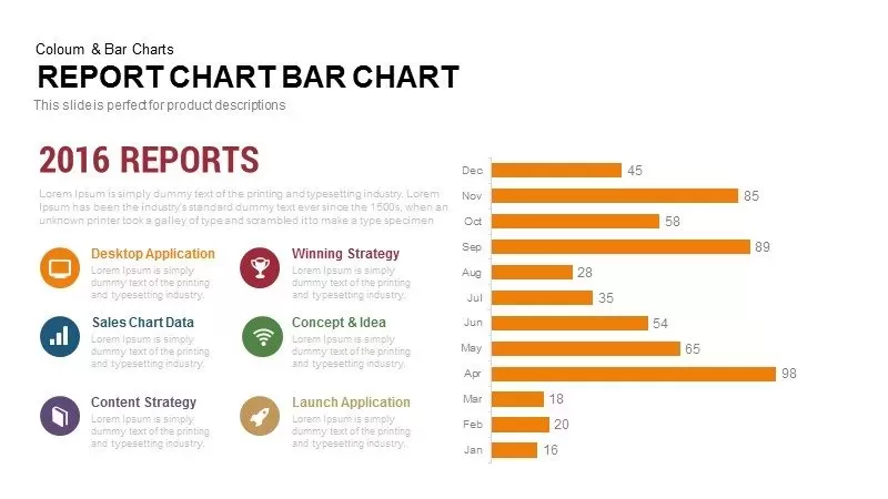
Monthly Reports Bar Chart template for PowerPoint & Google Slides
Bar/Column
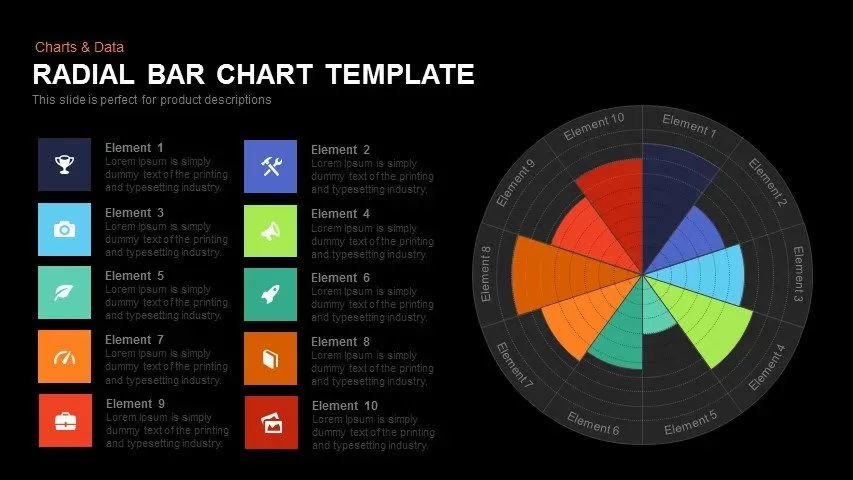
Colorful Radial Bar Chart Template for PowerPoint & Google Slides
Bar/Column
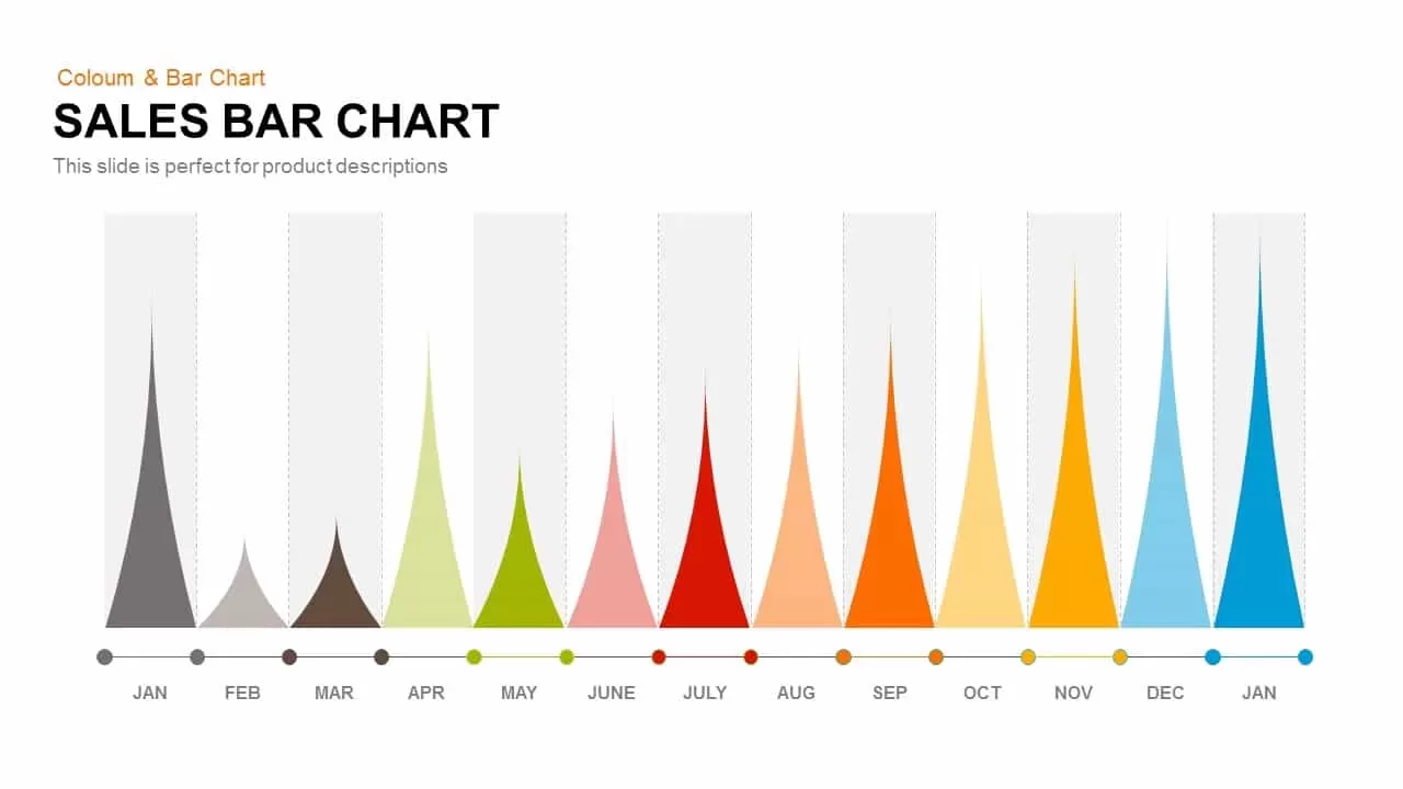
Sales Bar Chart for PowerPoint & Google Slides
Bar/Column
Interactive Product Comparison Bar Chart Template for PowerPoint & Google Slides
Bar/Column
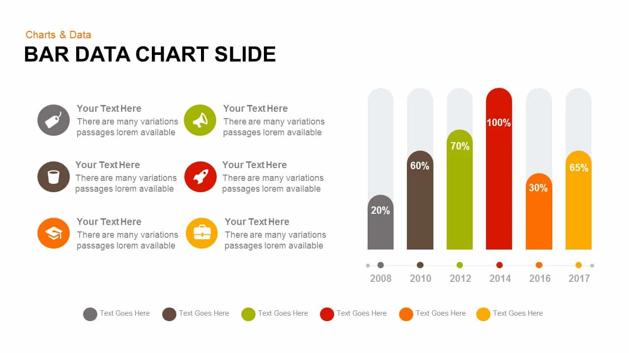
Bar Data Chart Slide for PowerPoint & Google Slides
Bar/Column

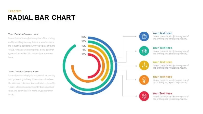
Radial Bar Chart Diagram for PowerPoint & Google Slides
Bar/Column
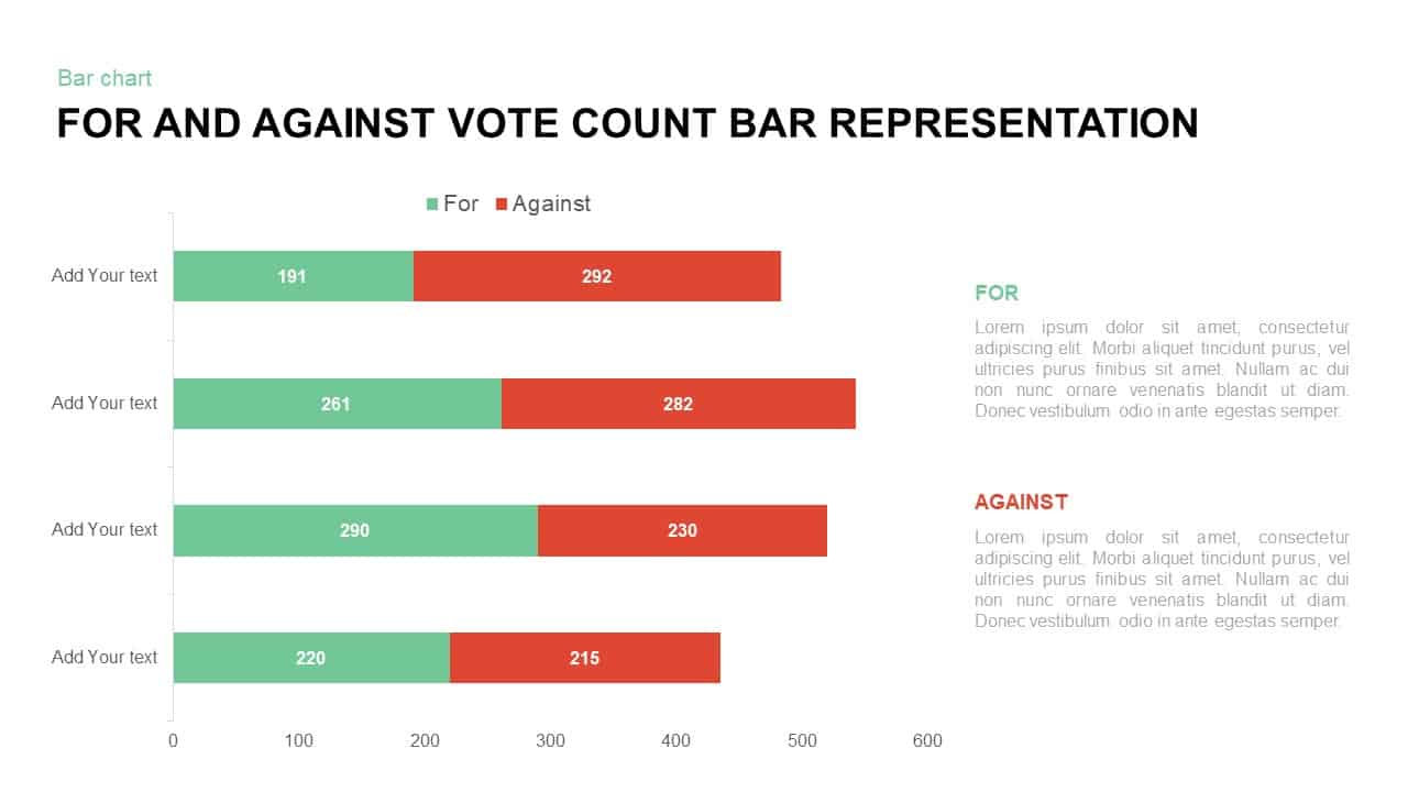
For and Against Vote Count Bar Chart Template for PowerPoint & Google Slides
Bar/Column
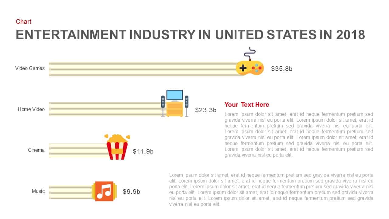
Entertainment Industry Revenue Bar Chart Template for PowerPoint & Google Slides
Bar/Column
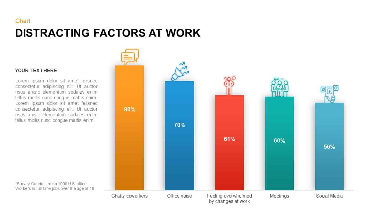
Distracting Factors at Work Bar Chart Template for PowerPoint & Google Slides
Bar/Column
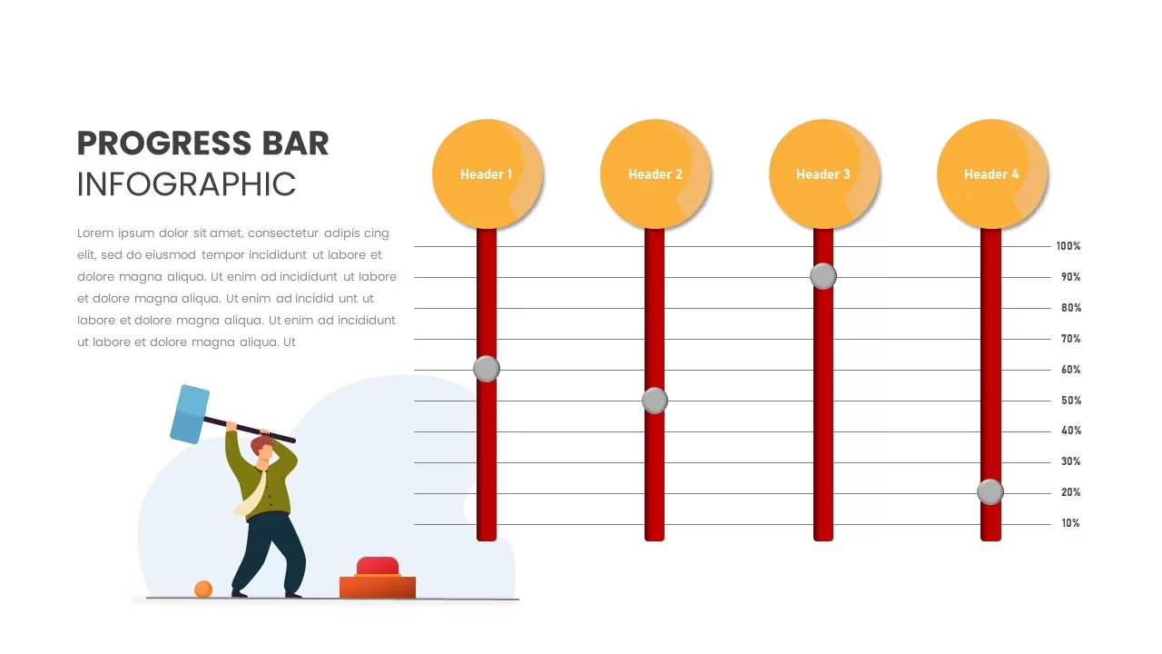
Progress Bar Infographic for PowerPoint & Google Slides
Business
Progress Bar infographic pack for PowerPoint & Google Slides
Business
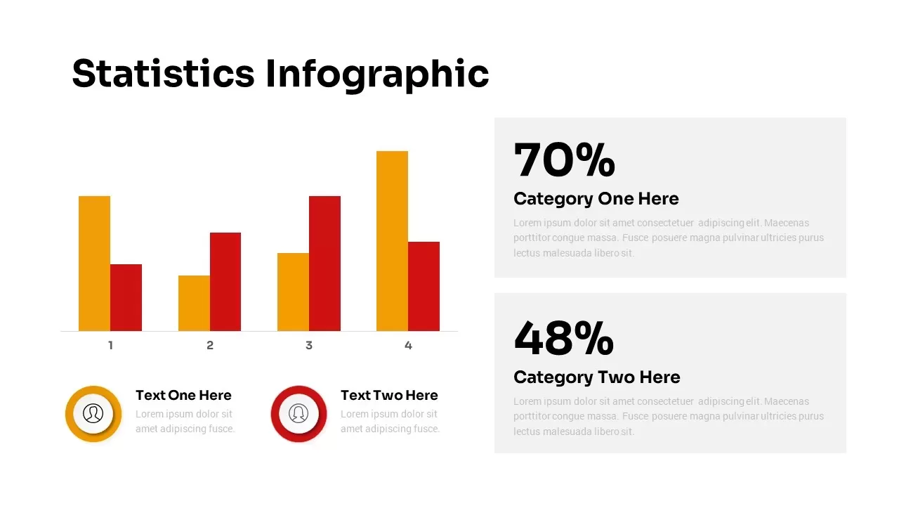
Statistics Infographic & KPI Bar Chart Template for PowerPoint & Google Slides
Bar/Column
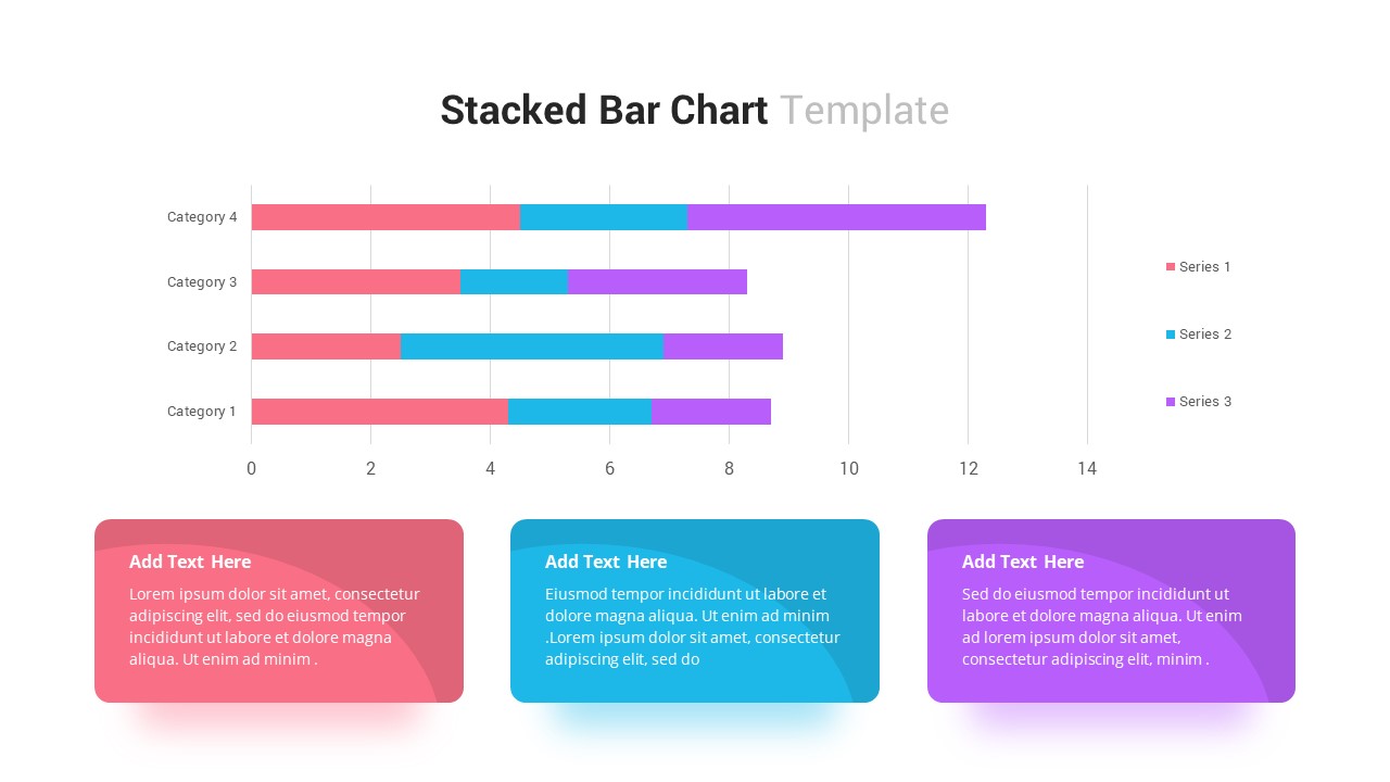
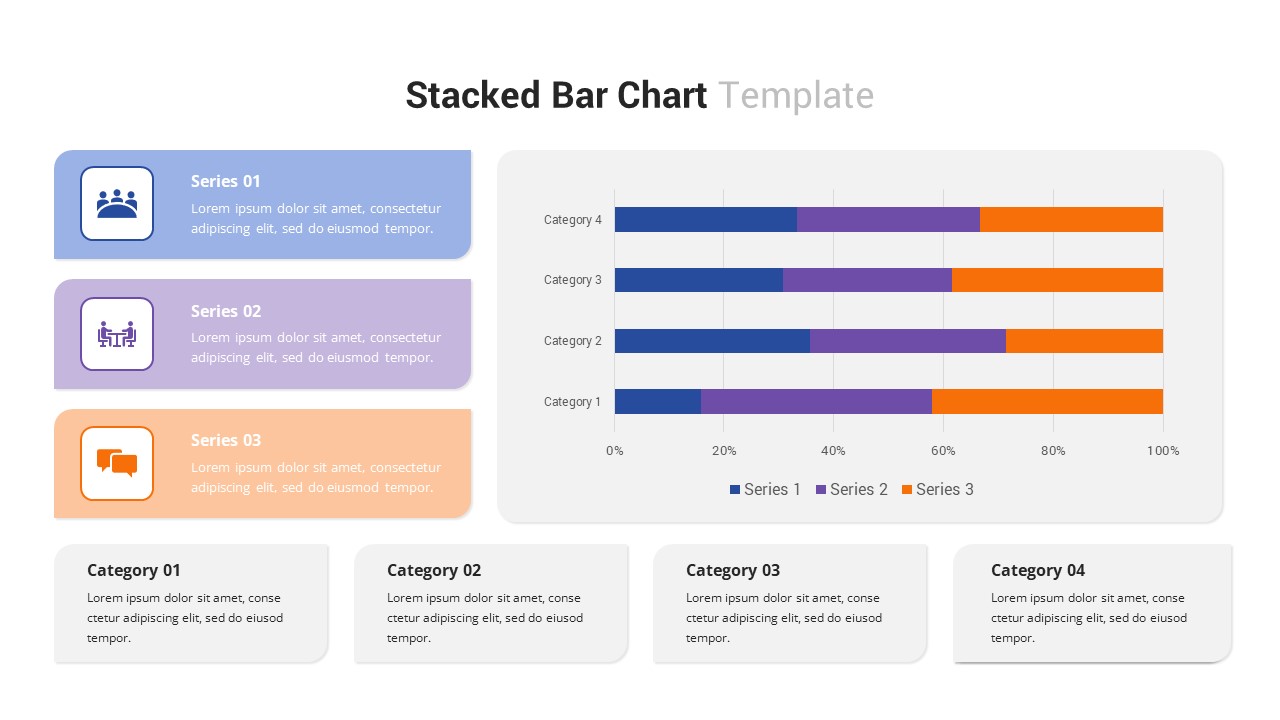
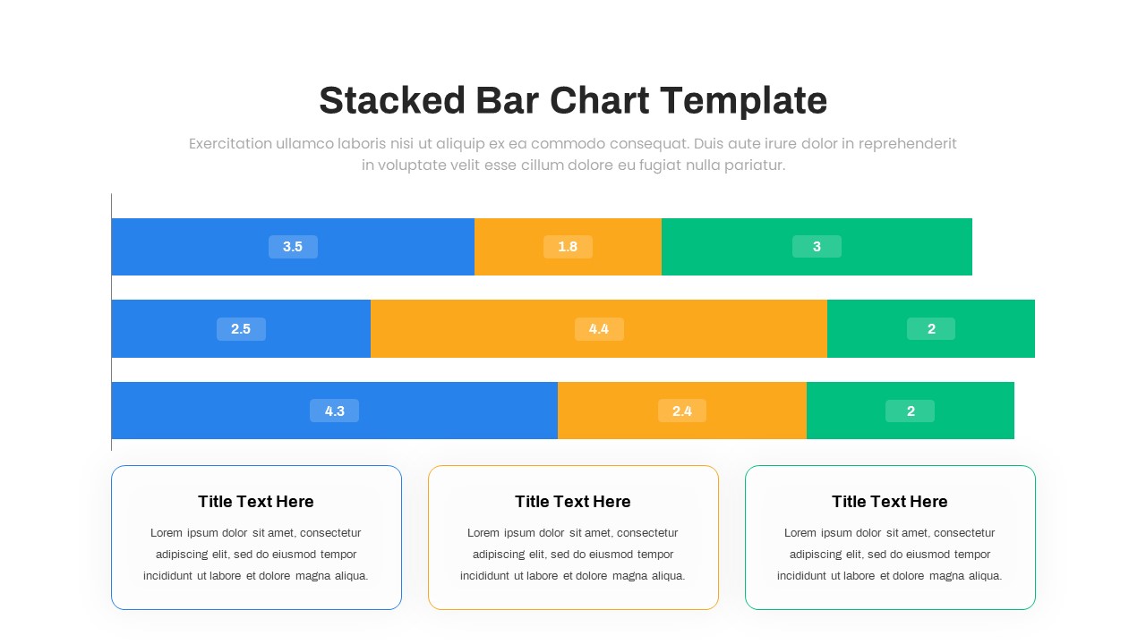
Stacked Bar Chart for PowerPoint & Google Slides
Bar/Column
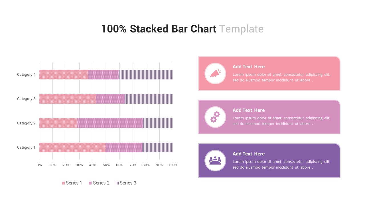
100% Stacked Bar Chart for PowerPoint & Google Slides
Bar/Column
Multi-Series Stacked Bar Chart Template for PowerPoint & Google Slides
Bar/Column
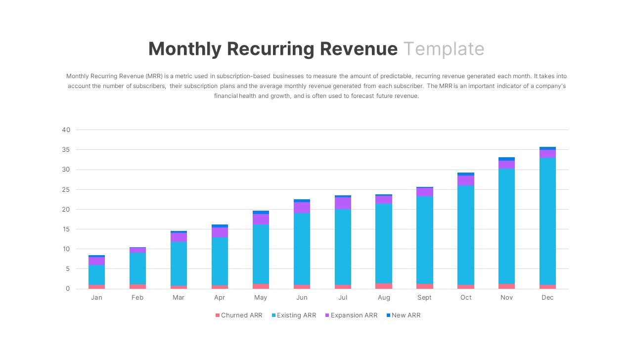
Monthly Recurring Revenue KPI Bar Chart Template for PowerPoint & Google Slides
Bar/Column
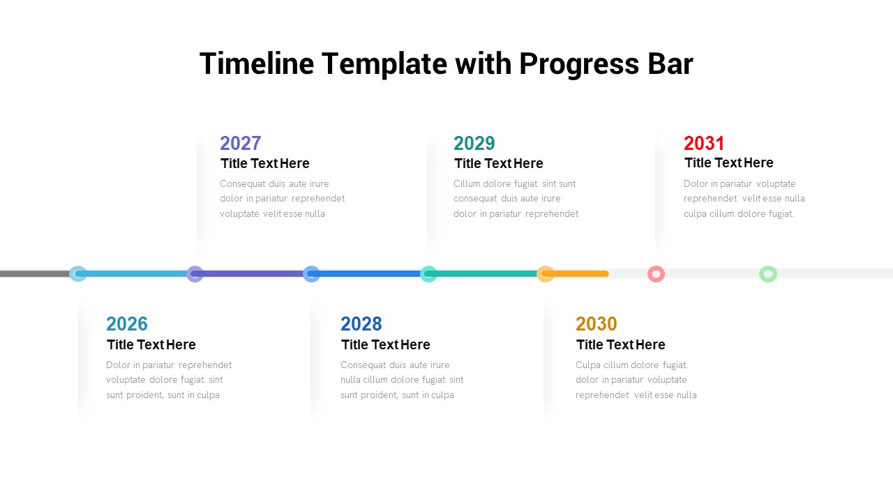
Timeline Roadmap with Progress Bar Template for PowerPoint & Google Slides
Timeline
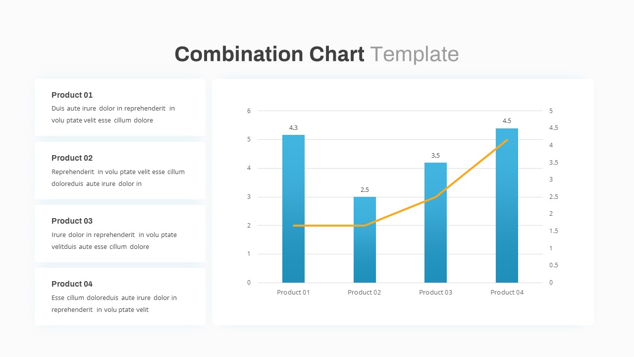
Combination Bar and Line Chart Template for PowerPoint & Google Slides
Bar/Column
Animated Clustered Bar Chart Template for PowerPoint & Google Slides
Bar/Column
Animated Stacked Bar Chart Template for PowerPoint & Google Slides
Bar/Column
Simple Bar Chart Data Visualization Template for PowerPoint & Google Slides
Bar/Column
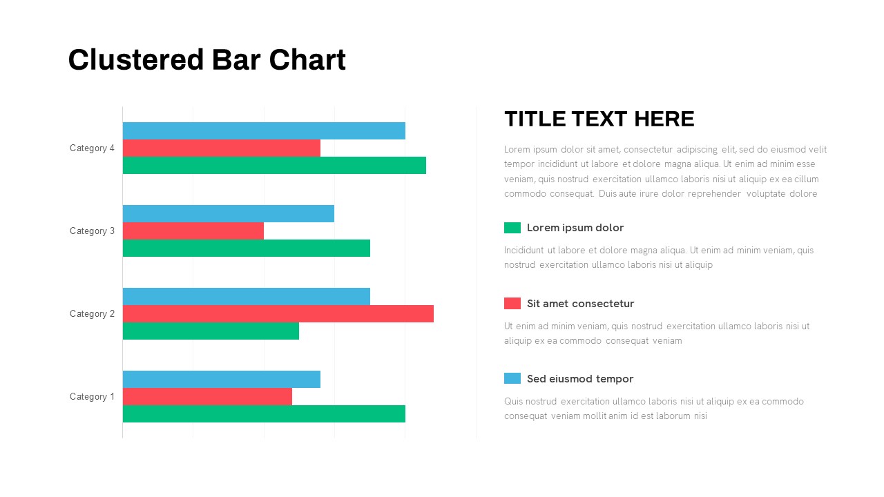
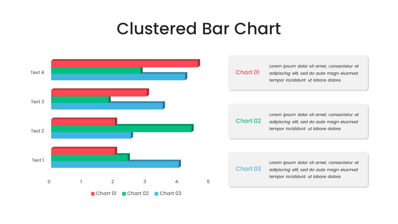
Clustered Bar Chart Comparison Template for PowerPoint & Google Slides
Bar/Column
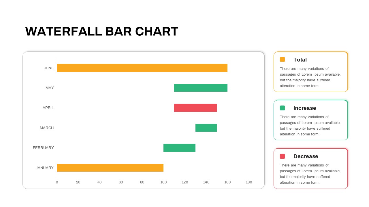
Waterfall Bar Chart Analysis Template for PowerPoint & Google Slides
Bar/Column
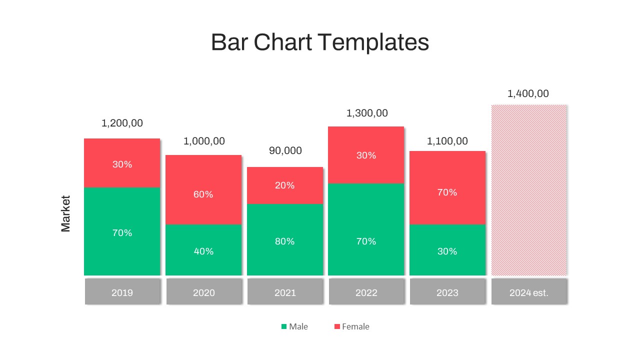
Year-over-Year Stacked Gender Bar Chart Template for PowerPoint & Google Slides
Bar/Column
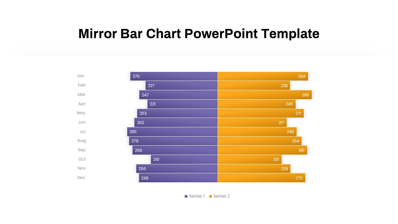
Mirror Bar Chart Comparison Template for PowerPoint & Google Slides
Bar/Column
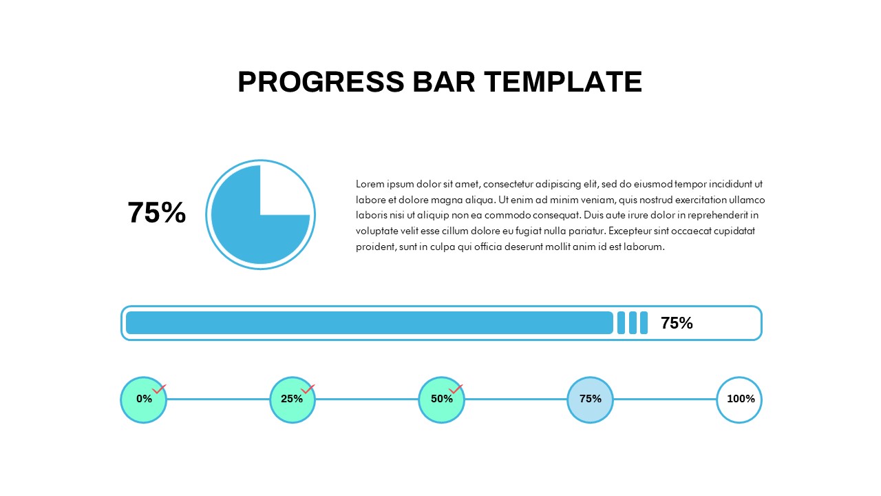
Progress Bar and Milestone Visualization Template for PowerPoint & Google Slides
Timeline
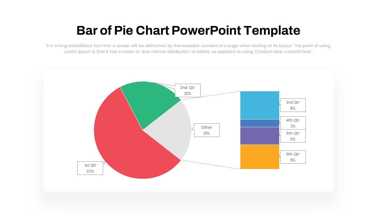
Dynamic Bar-of-Pie Chart Comparison Template for PowerPoint & Google Slides
Pie/Donut
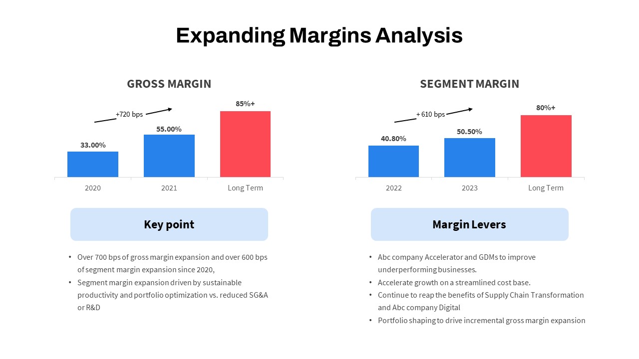
Expanding Margins Analysis Bar Chart Template for PowerPoint & Google Slides
Charts
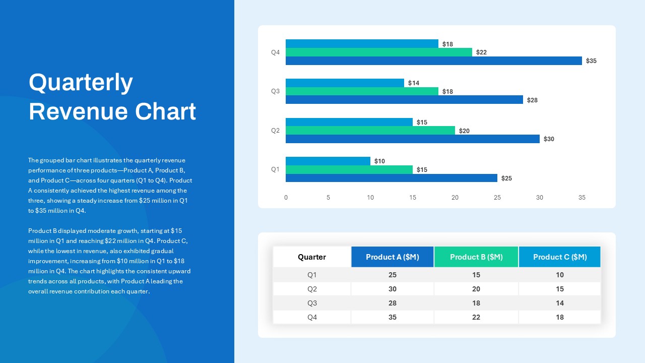
Quarterly Revenue Comparison Bar Chart Template for PowerPoint & Google Slides
Bar/Column
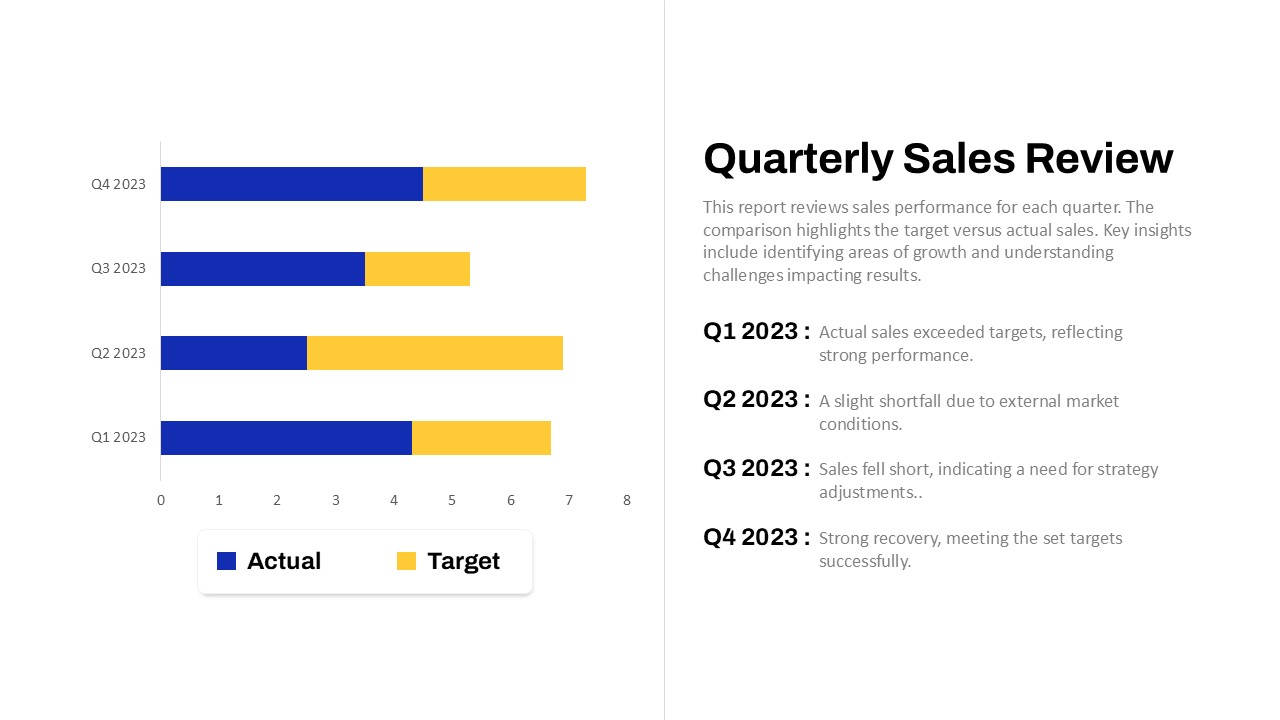
Quarterly Sales Review Bar Chart Template for PowerPoint & Google Slides
Bar/Column
Data Analysis Bar Chart with Insights Template for PowerPoint & Google Slides
Bar/Column
Free
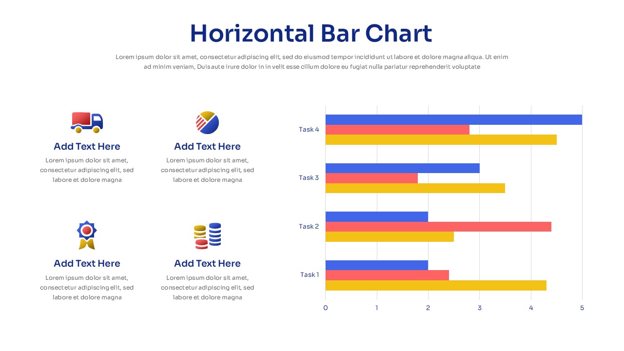
Horizontal Bar Chart Slide with Icons Template for PowerPoint & Google Slides
Bar/Column
Two-Option Bar Chart Comparison Table Template for PowerPoint & Google Slides
Comparison
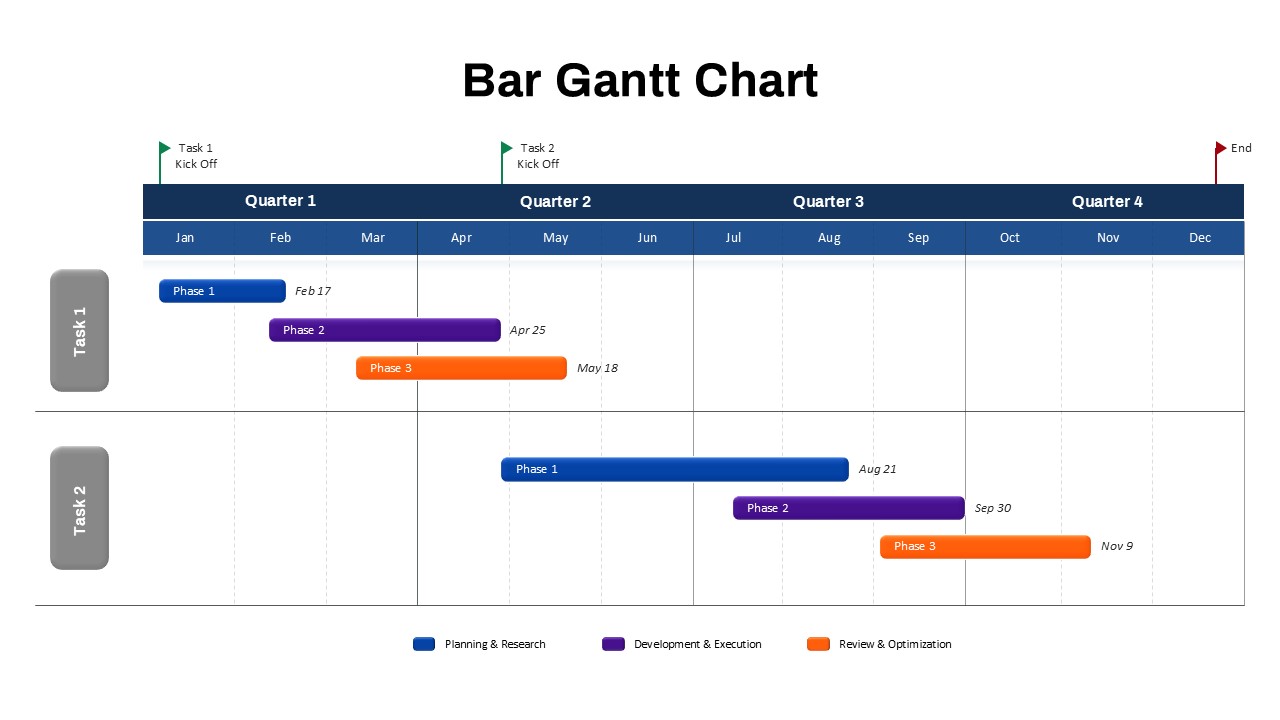
Bar Gantt Chart Template for PowerPoint & Google Slides
Gantt Chart
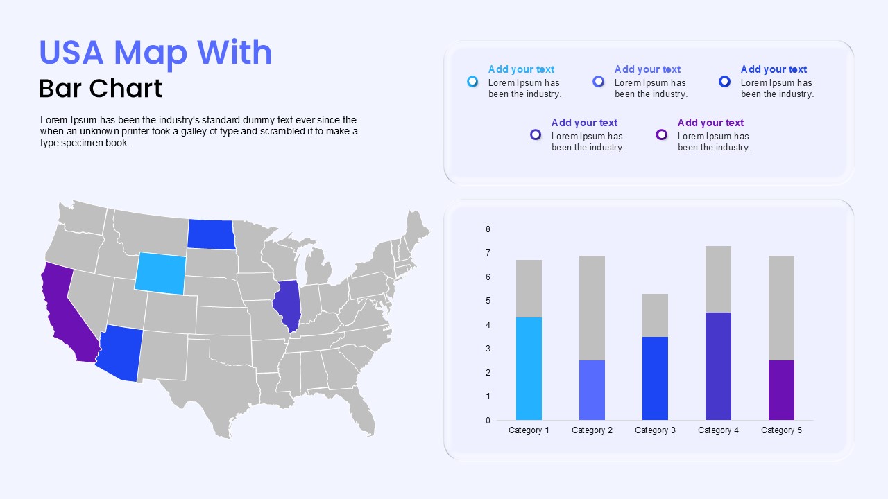
USA Map with Bar Chart Template for PowerPoint & Google Slides
World Maps
Three Four Five Stage Timeline Infographic Template for PowerPoint & Google Slides
Timeline
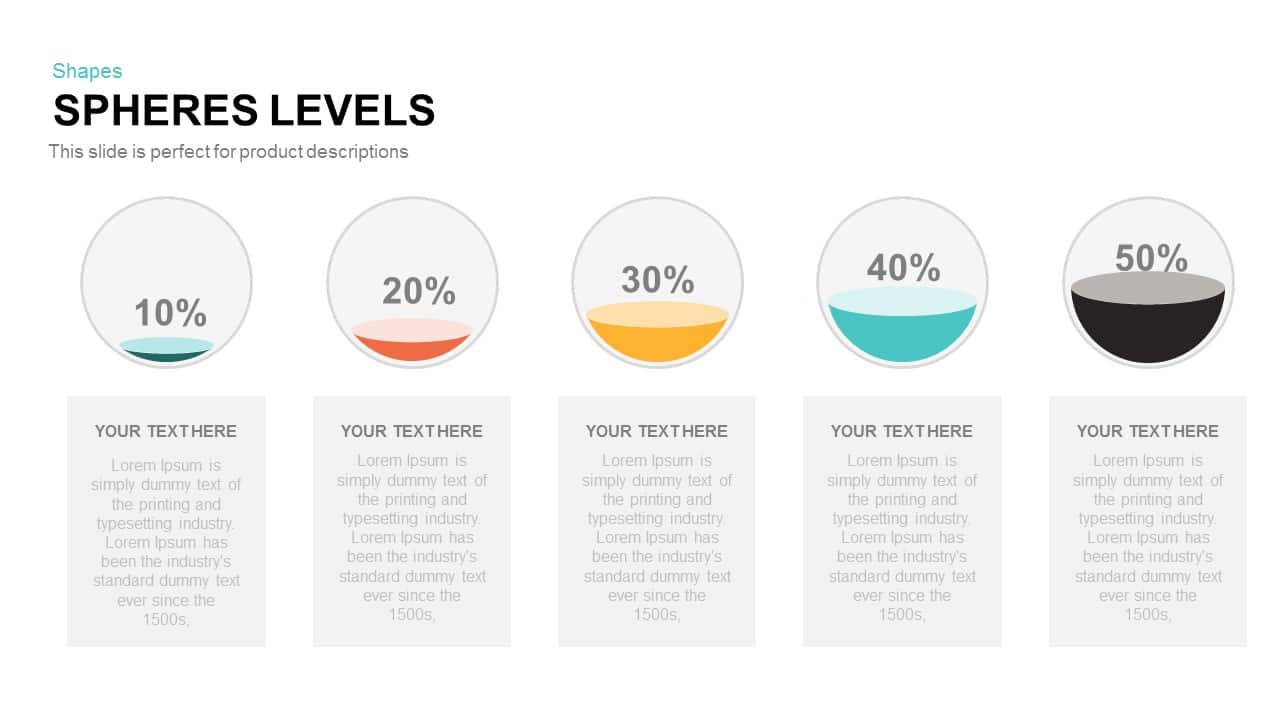
Five-Level Sphere Indicators Diagram template for PowerPoint & Google Slides
Infographics
Curved Five-Section Timeline Infographic template for PowerPoint & Google Slides
Timeline
Five-Section Circular Arrow Diagram Template for PowerPoint & Google Slides
Circular
Five-Stage Direct Flow Arrow Process Template for PowerPoint & Google Slides
Arrow
Five-Step Concept to Delivery Process Template for PowerPoint & Google Slides
Process

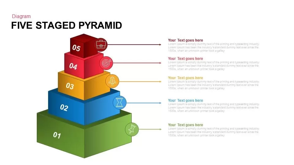
Five Staged Pyramid Diagram for PowerPoint & Google Slides
Pyramid

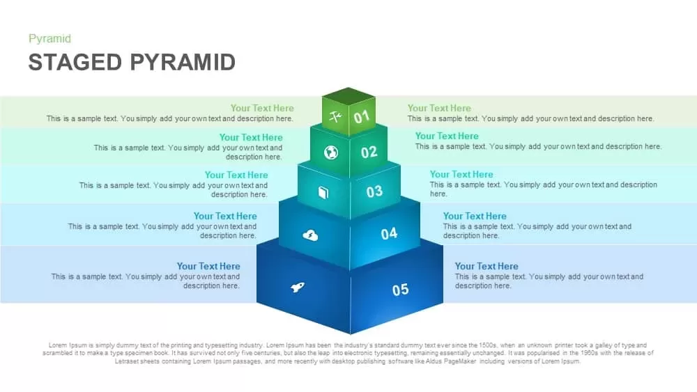
Five-Level Staged Pyramid Diagram Template for PowerPoint & Google Slides
Pyramid
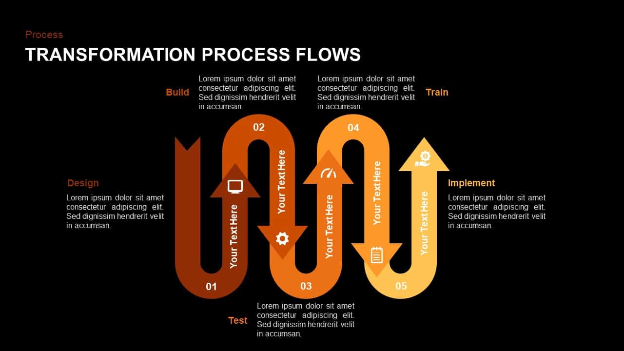
Wavy Five-Stage Transformation Flow Template for PowerPoint & Google Slides
Process
Isometric Five-Stage Process Flow Template for PowerPoint & Google Slides
Process
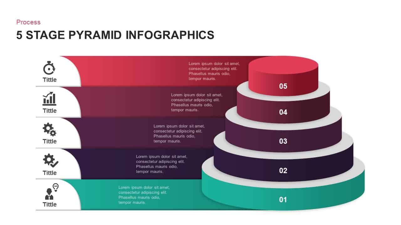
Five-Stage Pyramid Infographics Process Template for PowerPoint & Google Slides
Pyramid
Gradient Chevron Five-Stage Process Flow Template for PowerPoint & Google Slides
Arrow
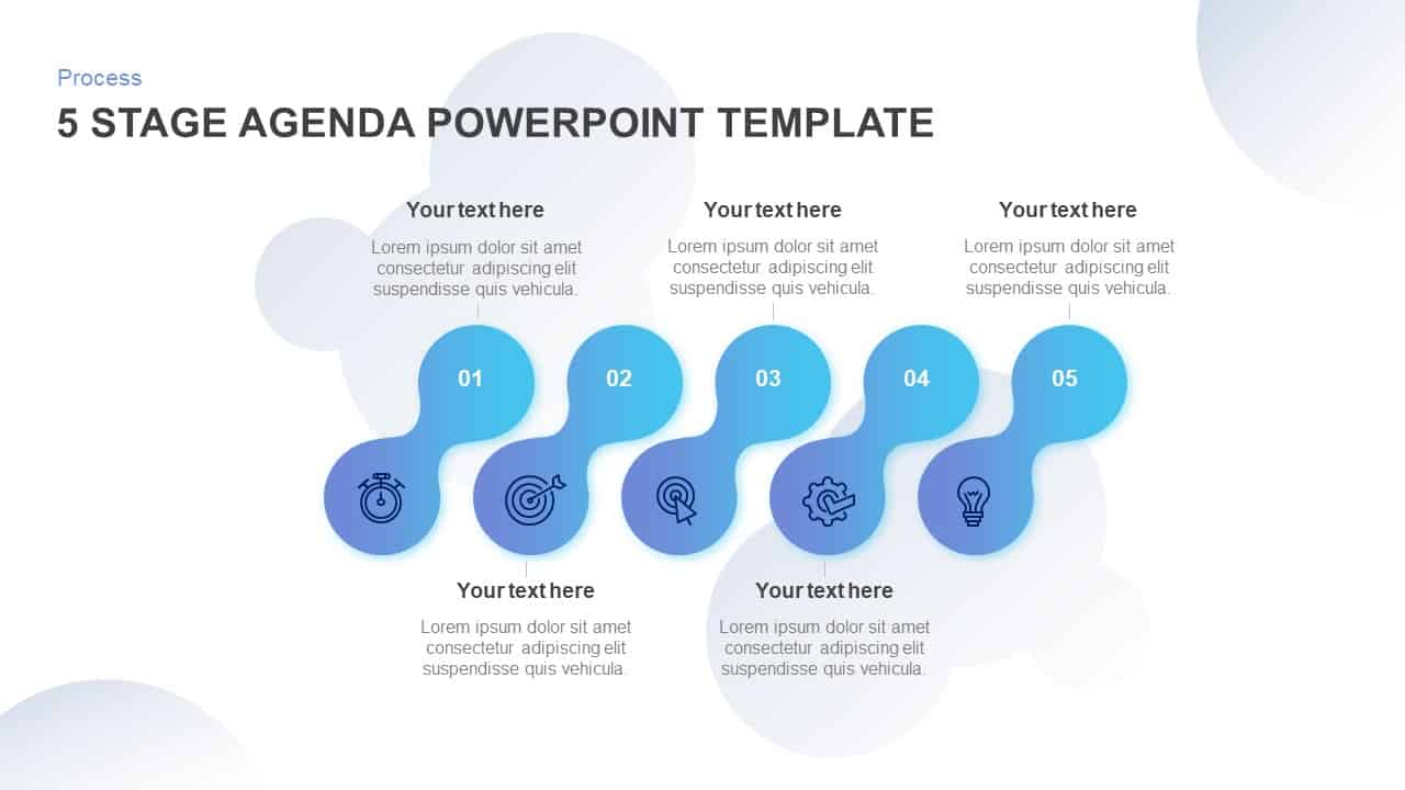
Five-Stage Agenda Flow Diagram Template for PowerPoint & Google Slides
Agenda
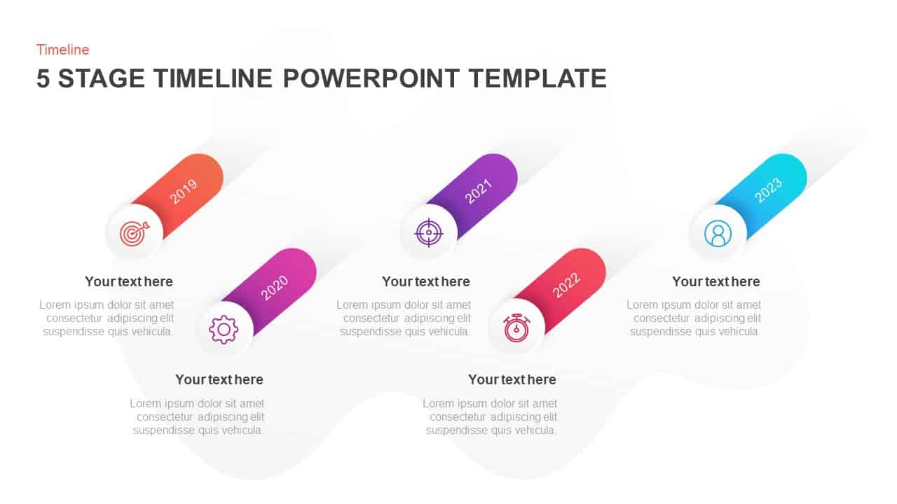
Five-Stage Slanted Timeline Diagram Template for PowerPoint & Google Slides
Timeline
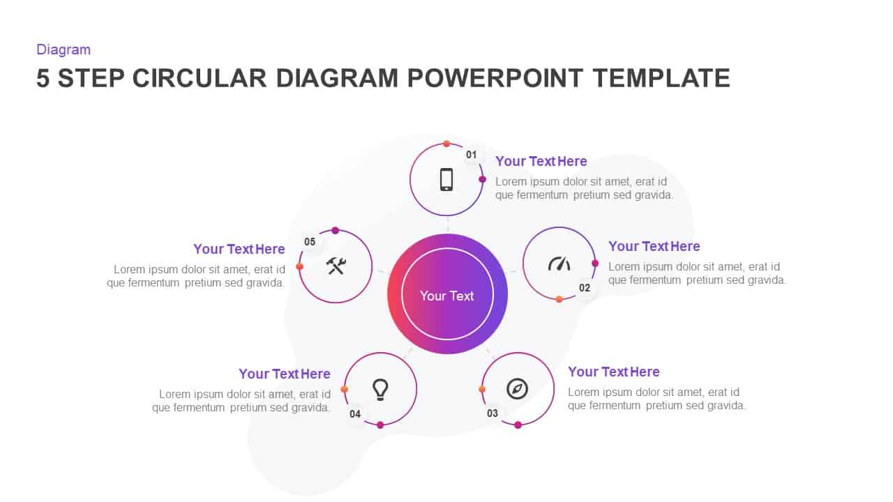
Five-Step Circular Process Diagram Template for PowerPoint & Google Slides
Circular
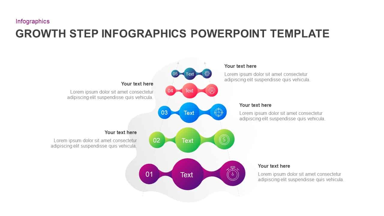
Five-Step Growth Infographic Slide Template for PowerPoint & Google Slides
Process
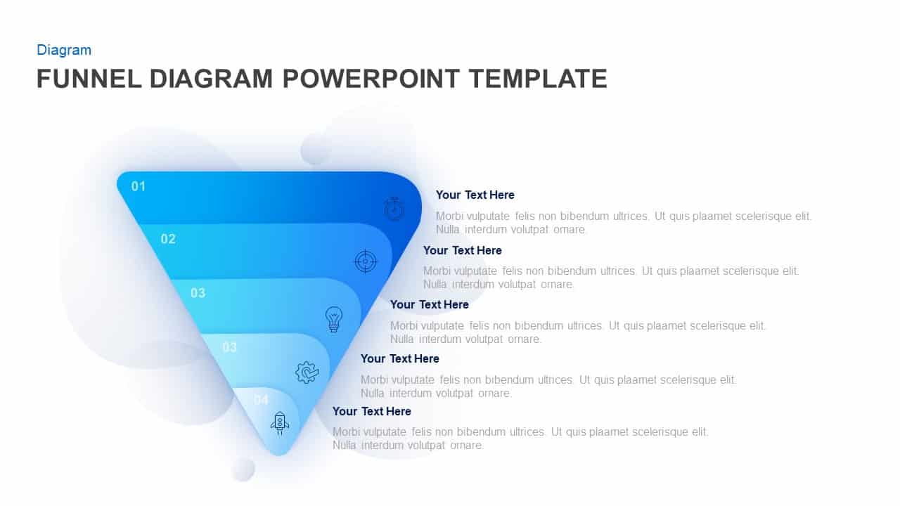
Five-Step Gradient Blue Funnel Diagram Template for PowerPoint & Google Slides
Funnel
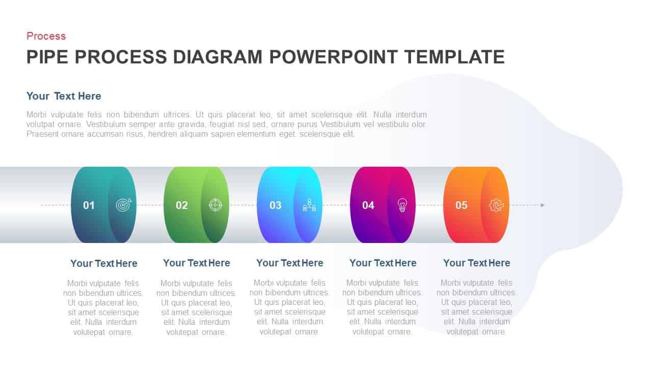
Five-Stage Pipe Process Diagram Template for PowerPoint & Google Slides
Process
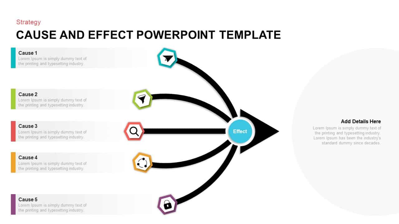
Five-Input Cause and Effect Diagram Template for PowerPoint & Google Slides
Arrow
Five-Step Circular Badge Infographics Template for PowerPoint & Google Slides
Circular
Multi-Color Five-Step Curved Arrow Template for PowerPoint & Google Slides
Process
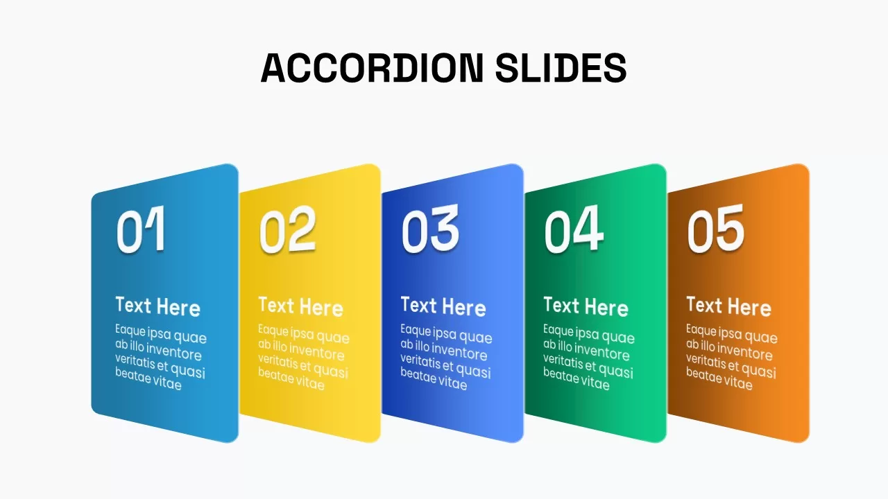
Five-Step Animated Accordion Process Template for PowerPoint & Google Slides
Process
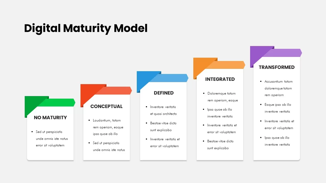
Five-Stage Digital Maturity Model Diagram Template for PowerPoint & Google Slides
Process
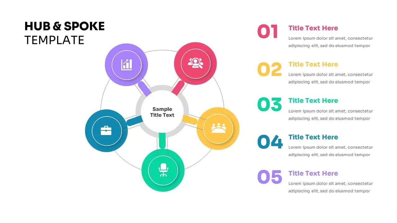
Five-Node Hub & Spoke Diagram Process Template for PowerPoint & Google Slides
Business Models
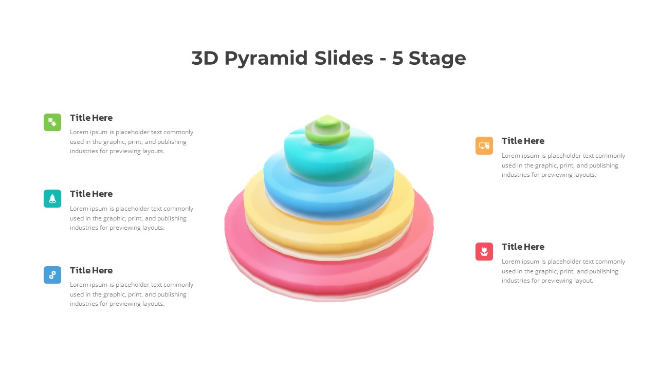
3D Five-Stage Pyramid Diagram Slide Template for PowerPoint & Google Slides
Pyramid
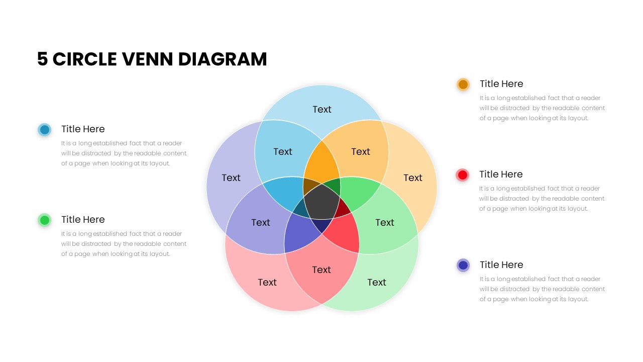
Five Circle Venn Diagram for Template for PowerPoint & Google Slides
Circular
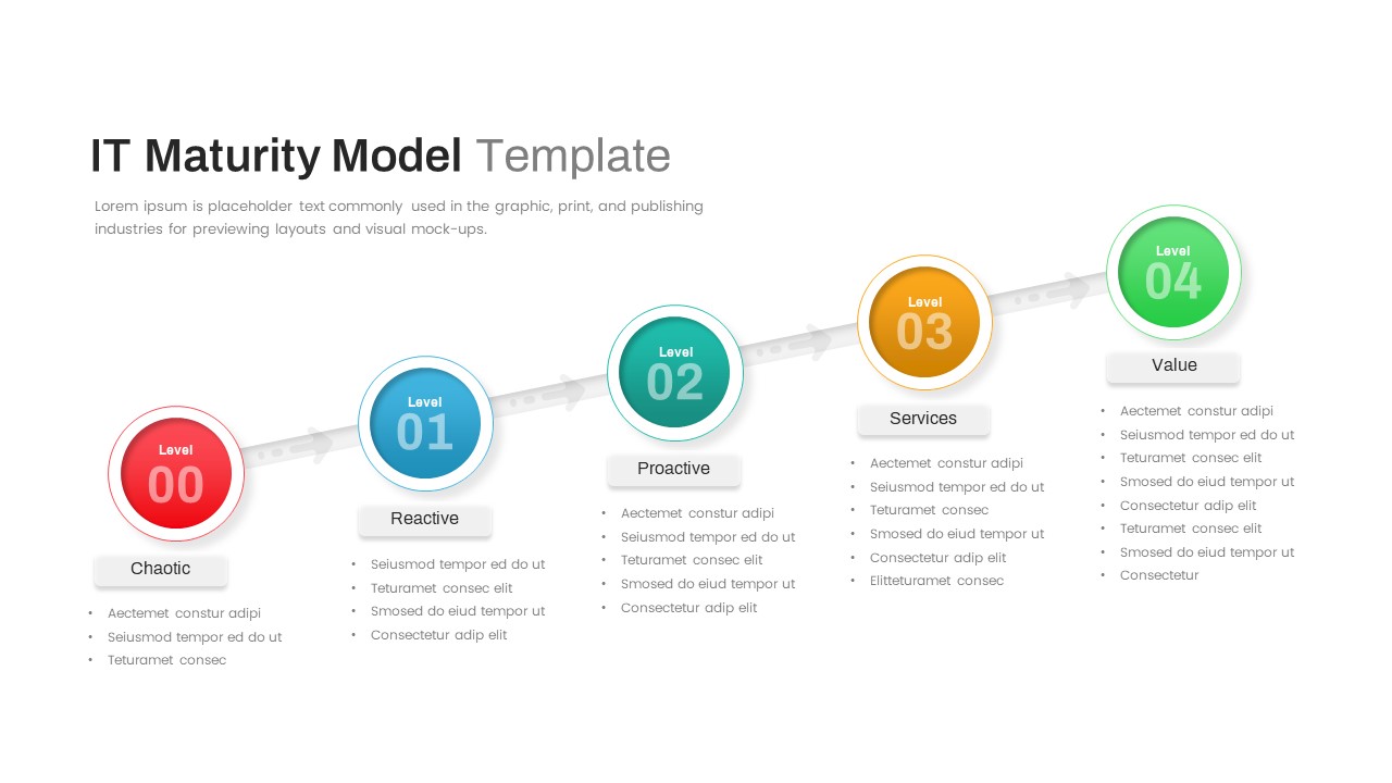
IT Maturity Model with Five Stages Template for PowerPoint & Google Slides
Timeline
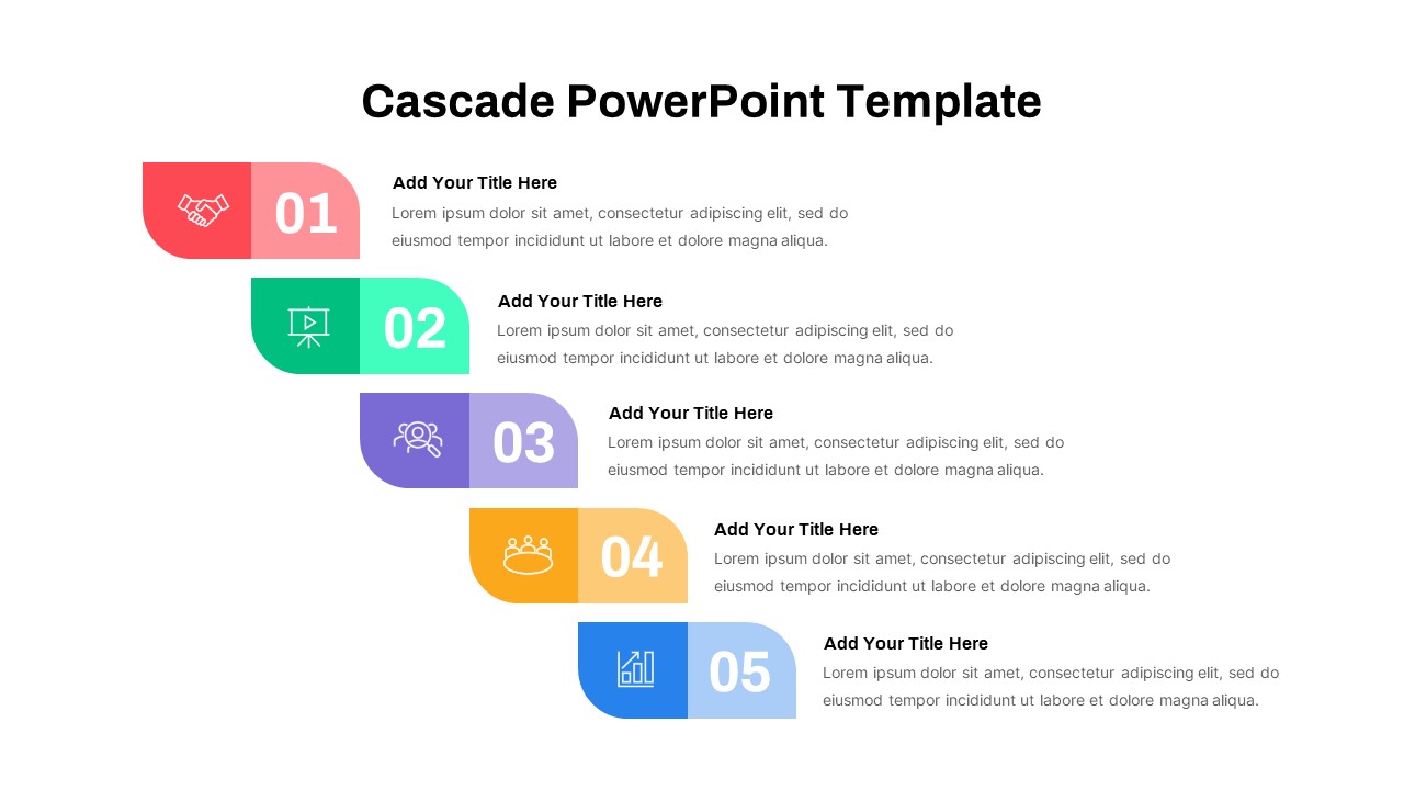
Five-Step Cascade Diagram & Timeline Template for PowerPoint & Google Slides
Process
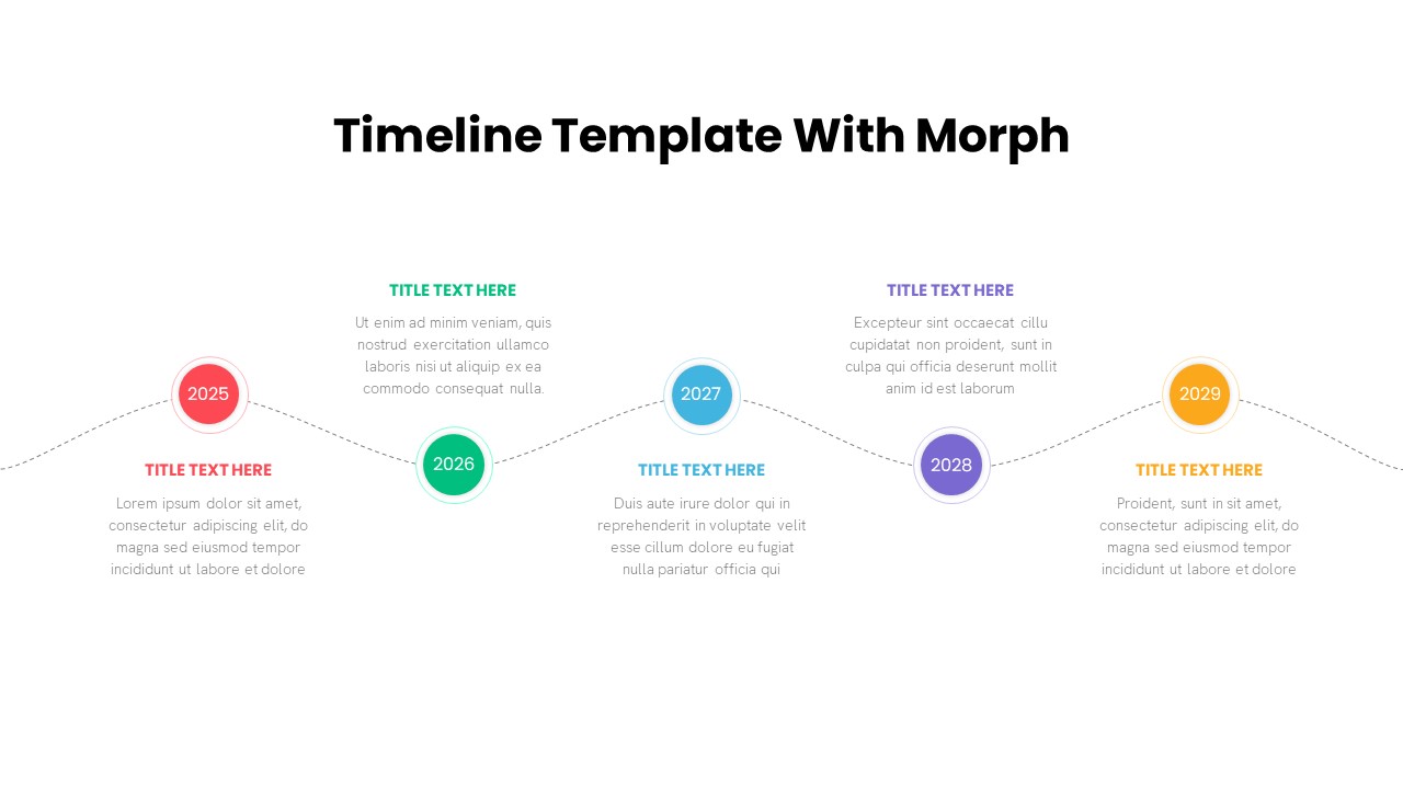
Five-Step Timeline with Morph Animation Template for PowerPoint & Google Slides
Timeline
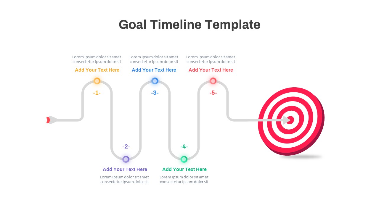
Colorful Five-Step Goal Timeline Template for PowerPoint & Google Slides
Timeline
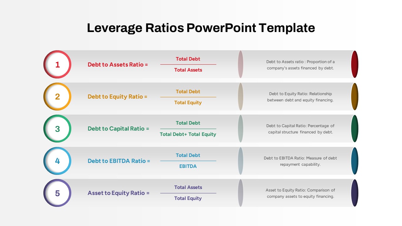
Five Key Leverage Ratios Overview Template for PowerPoint & Google Slides
Finance
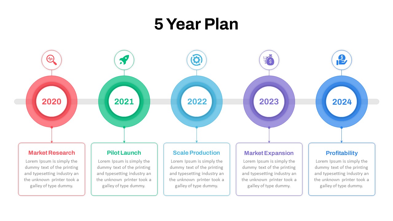
Five-Year Plan Timeline Diagram Template for PowerPoint & Google Slides
Timeline
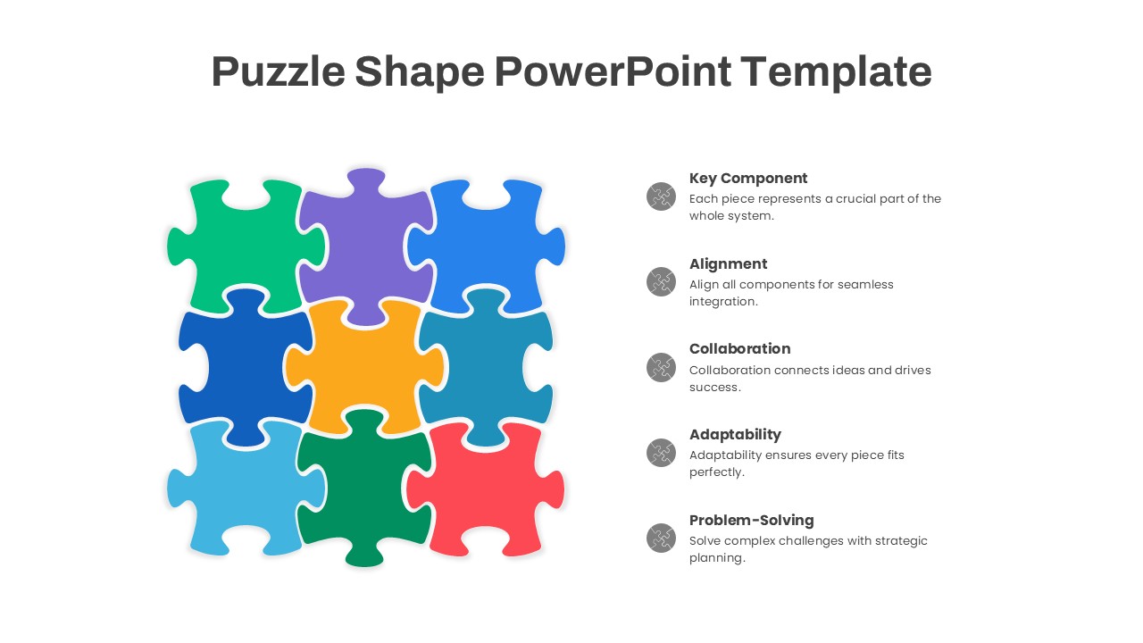
Puzzle Shape Diagram with Five Elements Template for PowerPoint & Google Slides
Circular
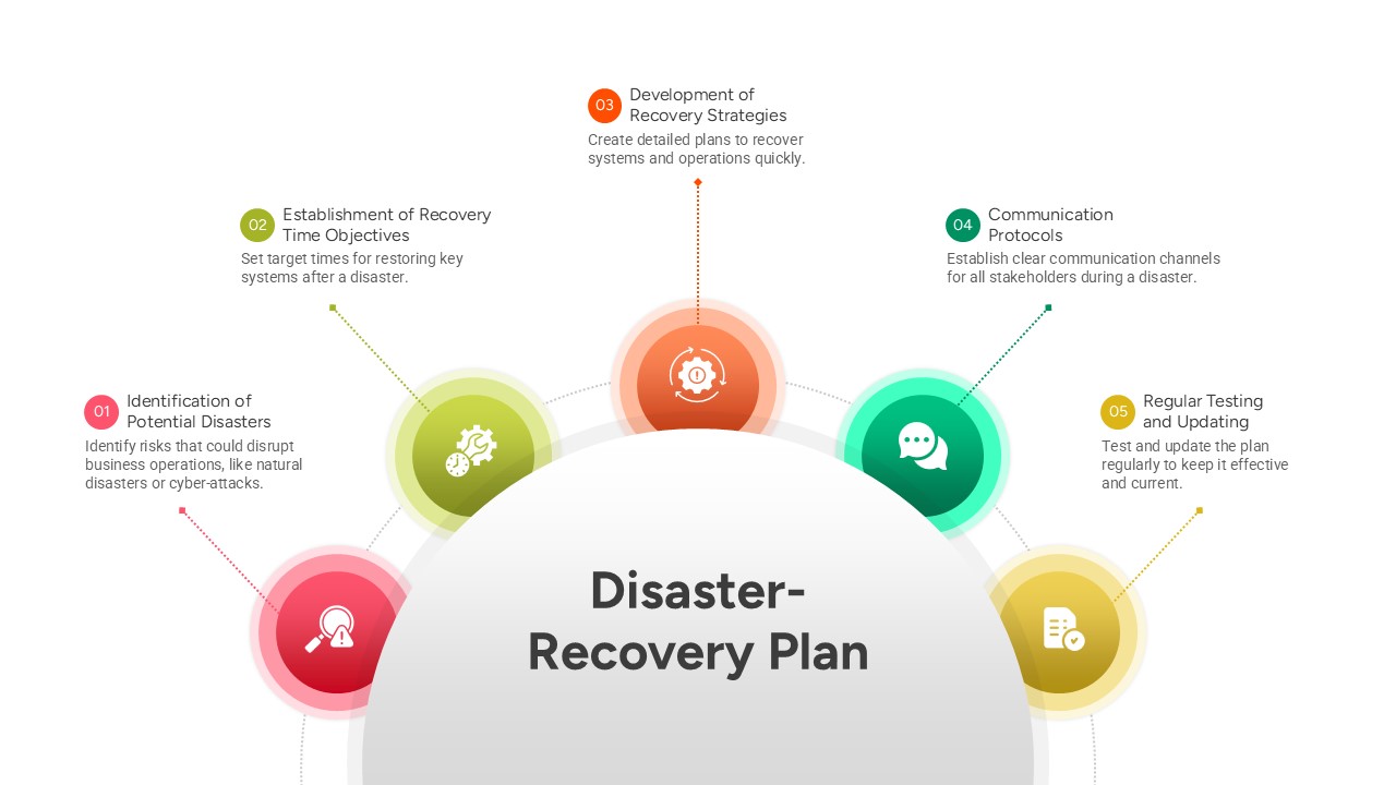
Five-Step Disaster Recovery Plan Template for PowerPoint & Google Slides
Project