Bar Data Chart Slide for PowerPoint & Google Slides
Description
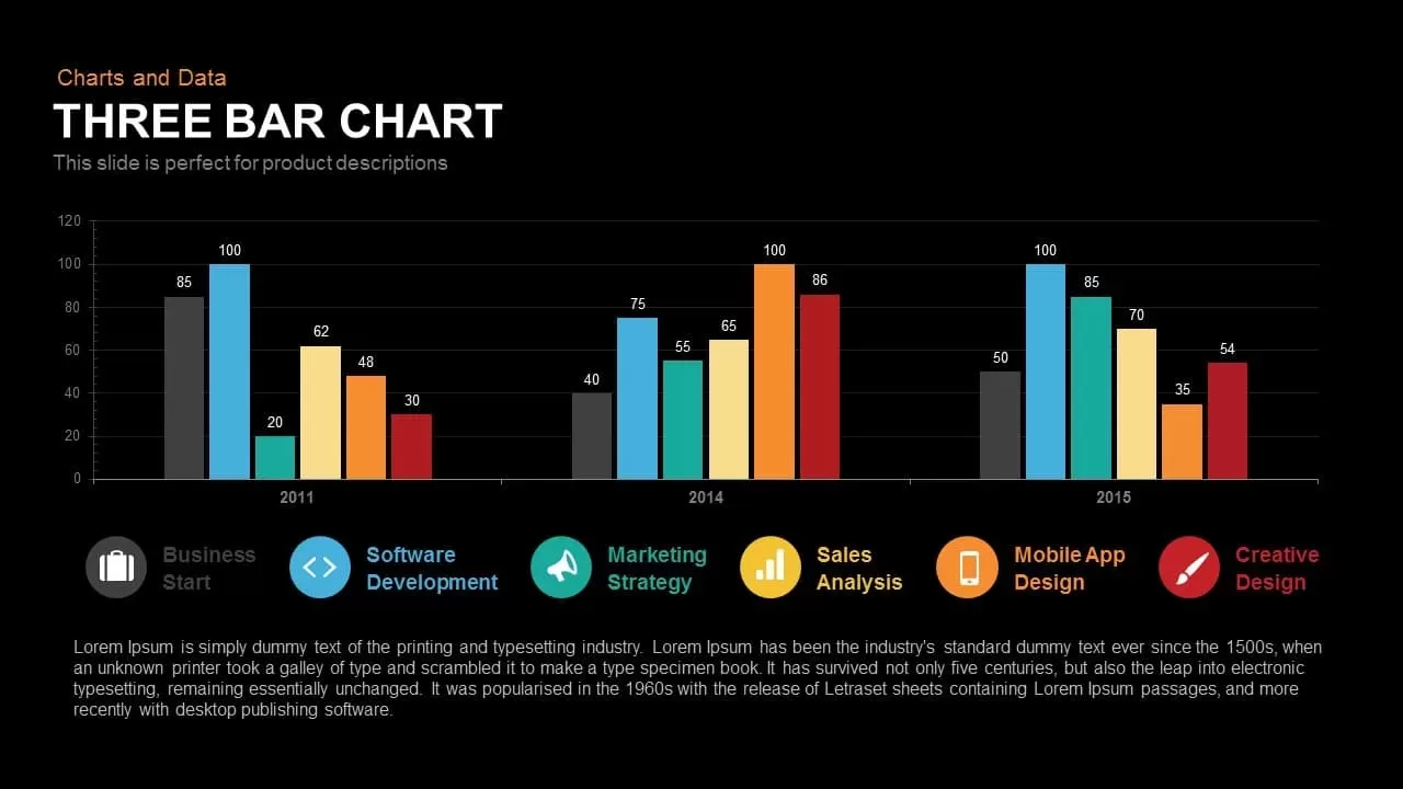
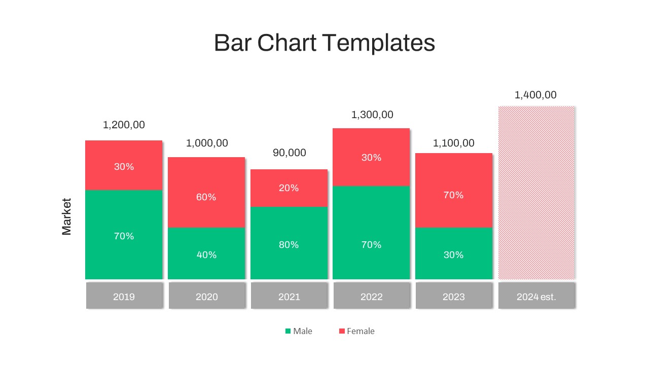
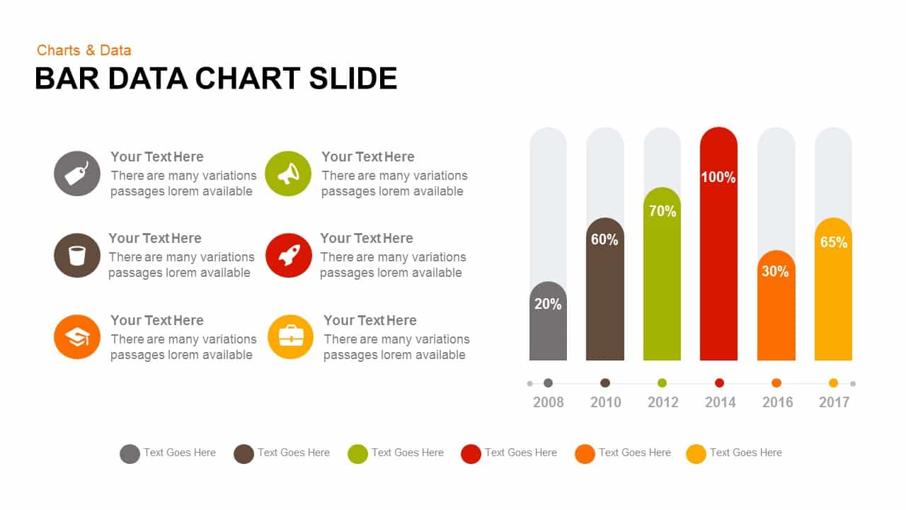
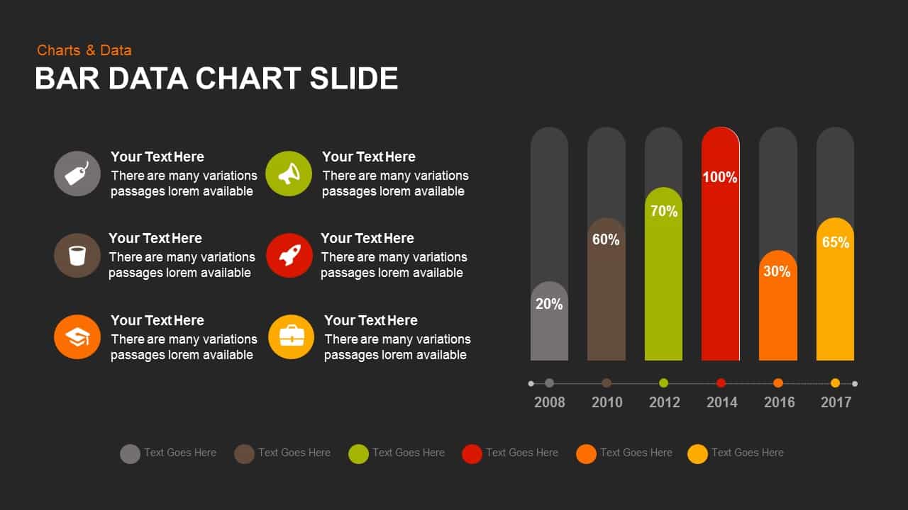
This “Bar Data Chart” slide visually represents data progression over several years using bar charts. It effectively displays the performance across different categories (color-coded for clarity), with percentage values on each bar indicating the corresponding data. The slide’s clear, professional design helps in illustrating trends or comparisons across multiple timeframes, making it perfect for business reports, performance reviews, and other data-driven presentations.
Each section of the chart has a corresponding icon to represent the data category, making it easier for the audience to understand what each bar represents. The chart includes space for textual data and explanations, ensuring the slide remains functional as well as visually engaging.
Who is it for
This slide is ideal for business analysts, marketing professionals, sales teams, and anyone needing to present data in a concise, easy-to-understand format. It’s especially useful for executives, project managers, and data-driven teams during quarterly or annual reviews, performance reports, or marketing campaigns analysis.
Other Uses
Beyond business use, this bar chart can be repurposed for educational or research purposes to present survey results, test scores, or project milestones. It’s also suitable for any other context where visualizing data over multiple time periods or categories is necessary.
Login to download this file

Item ID
SB00727
Related Templates

Creative Data Analysis Bar Chart template for PowerPoint & Google Slides
Bar/Column
3D Bar Chart Data Infographics Template for PowerPoint & Google Slides
Bar/Column
Pencil Bar Chart Data Analysis Template for PowerPoint & Google Slides
Bar/Column
Simple Bar Chart Data Visualization Template for PowerPoint & Google Slides
Bar/Column
Data Analysis Bar Chart with Insights Template for PowerPoint & Google Slides
Bar/Column
Free
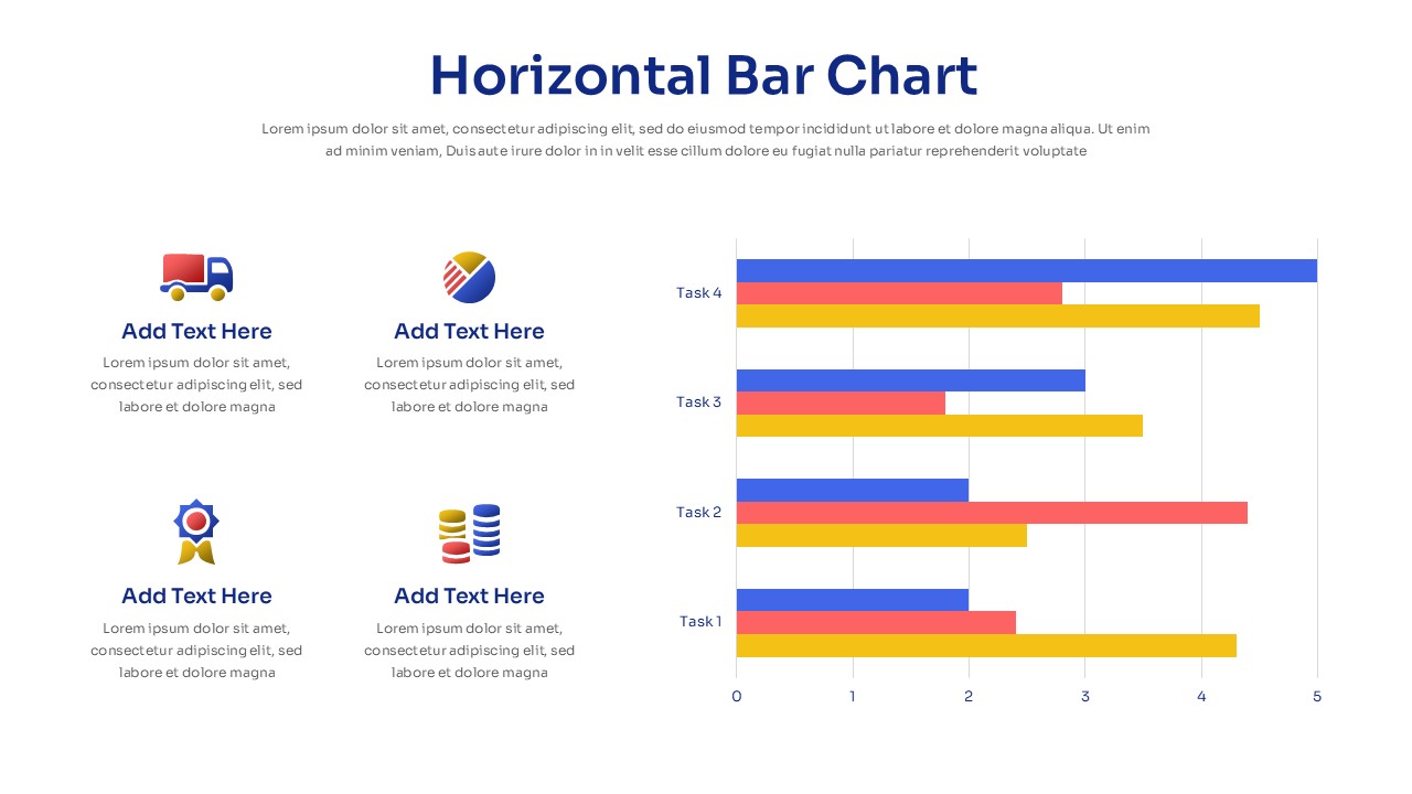
Horizontal Bar Chart Slide with Icons Template for PowerPoint & Google Slides
Bar/Column
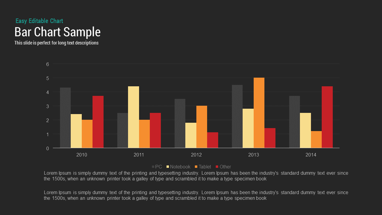
Bar Chart Sample template for PowerPoint & Google Slides
Bar/Column
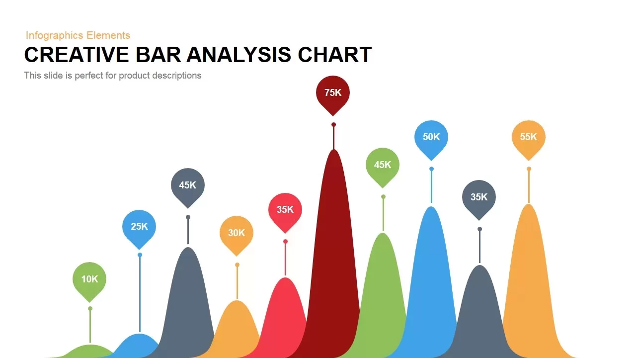
Creative Bar Chart template for PowerPoint & Google Slides
Charts
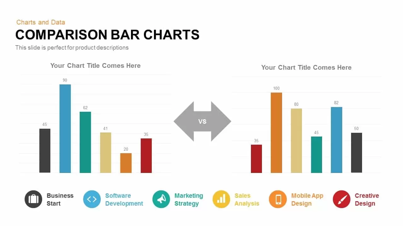
Comparison Bar Chart template for PowerPoint & Google Slides
Comparison Chart
Three-Year Bar Chart template for PowerPoint & Google Slides
Charts
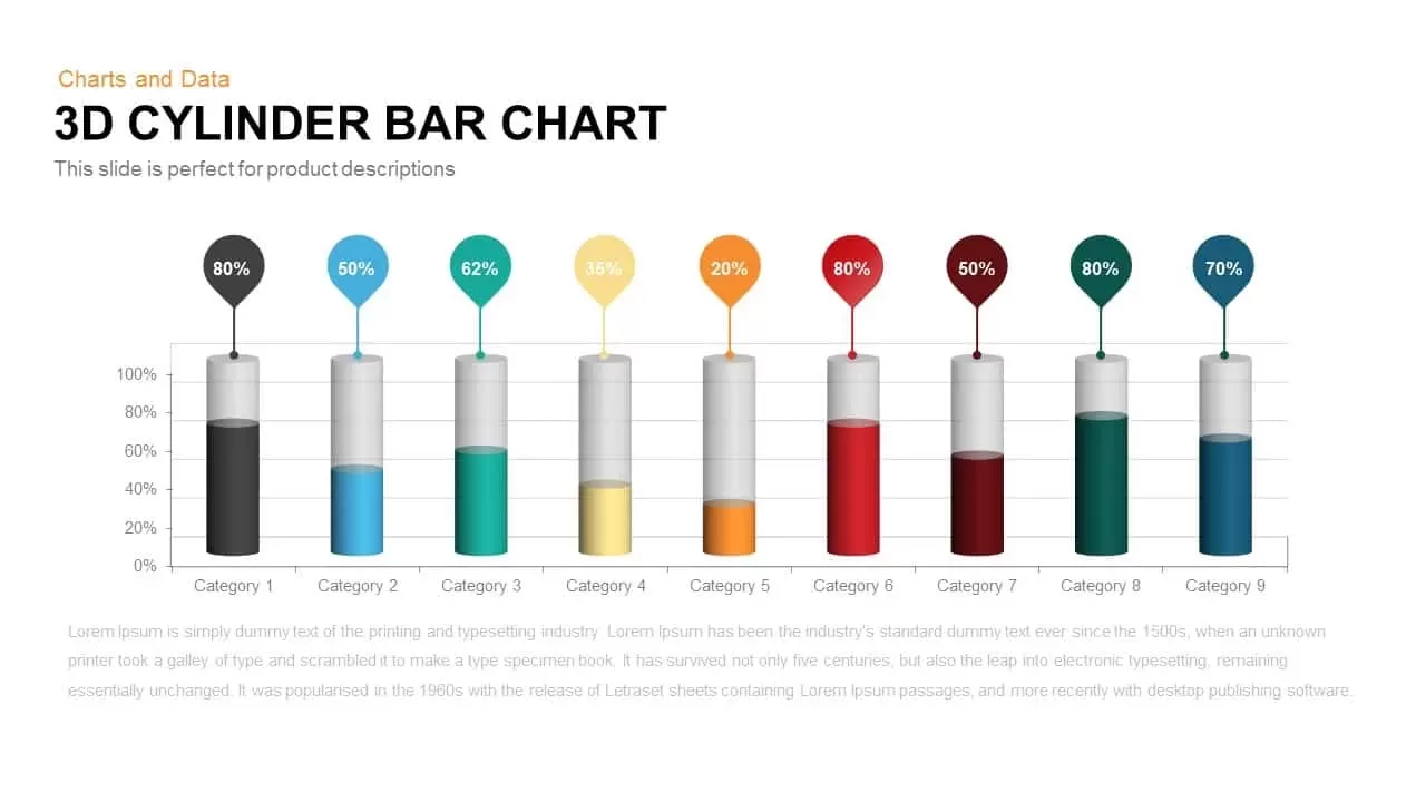
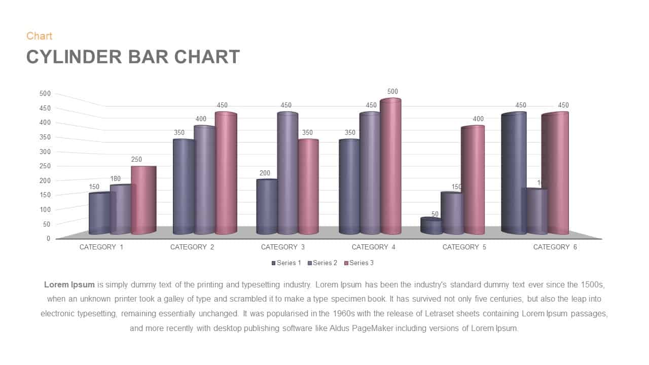
3D Cylinder Bar Chart Template for PowerPoint & Google Slides
Bar/Column

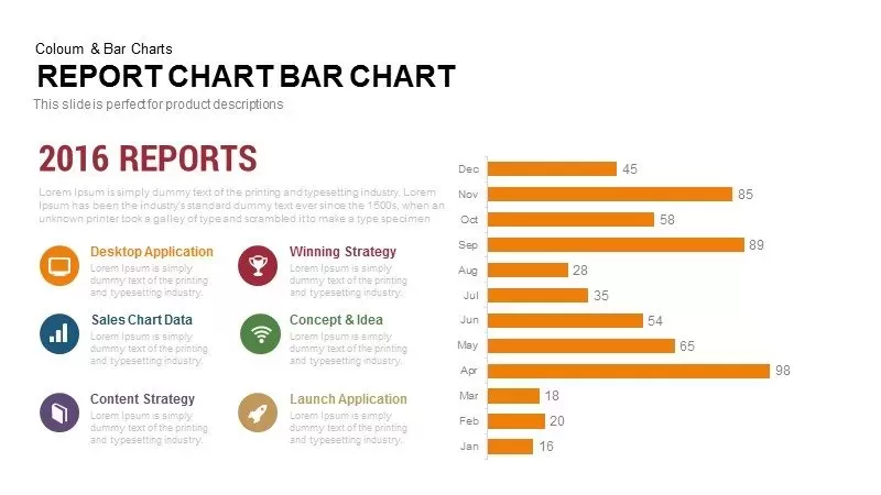
Monthly Reports Bar Chart template for PowerPoint & Google Slides
Bar/Column

Colorful Radial Bar Chart Template for PowerPoint & Google Slides
Bar/Column
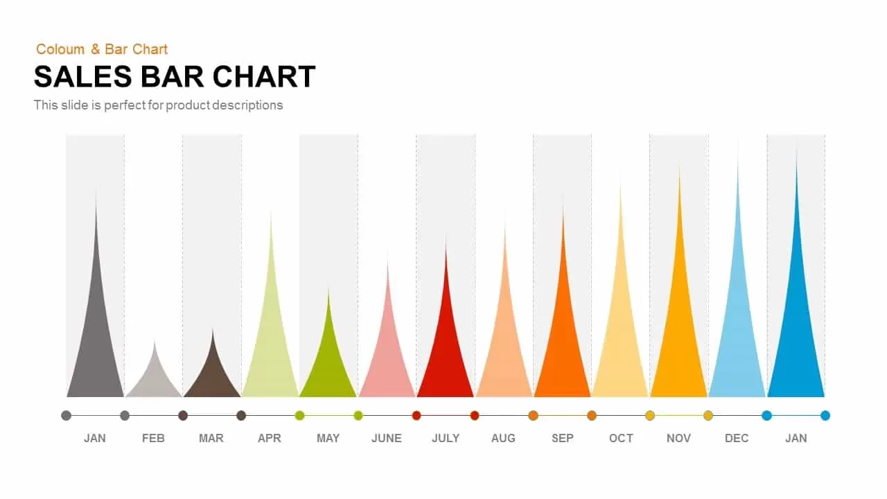
Sales Bar Chart for PowerPoint & Google Slides
Bar/Column
Interactive Product Comparison Bar Chart Template for PowerPoint & Google Slides
Bar/Column

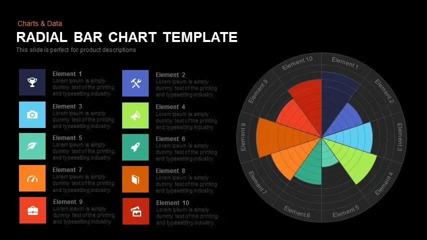
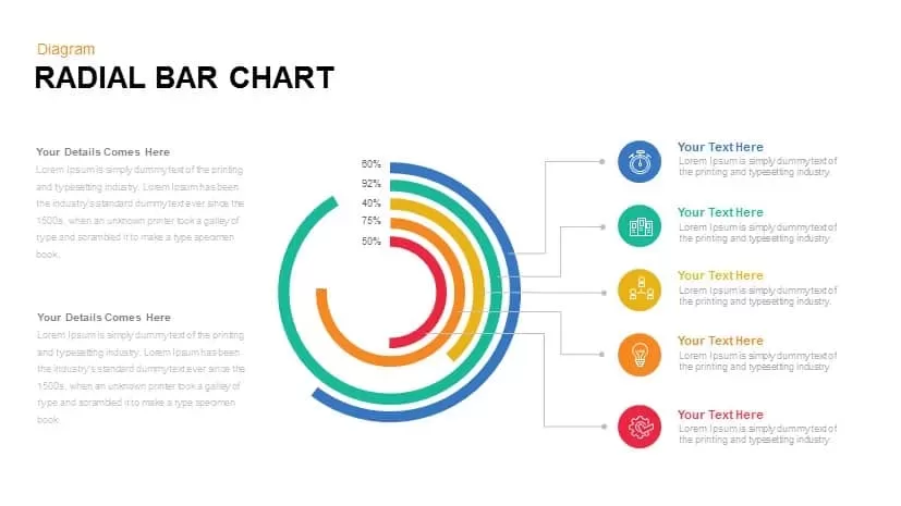
Radial Bar Chart Diagram for PowerPoint & Google Slides
Bar/Column
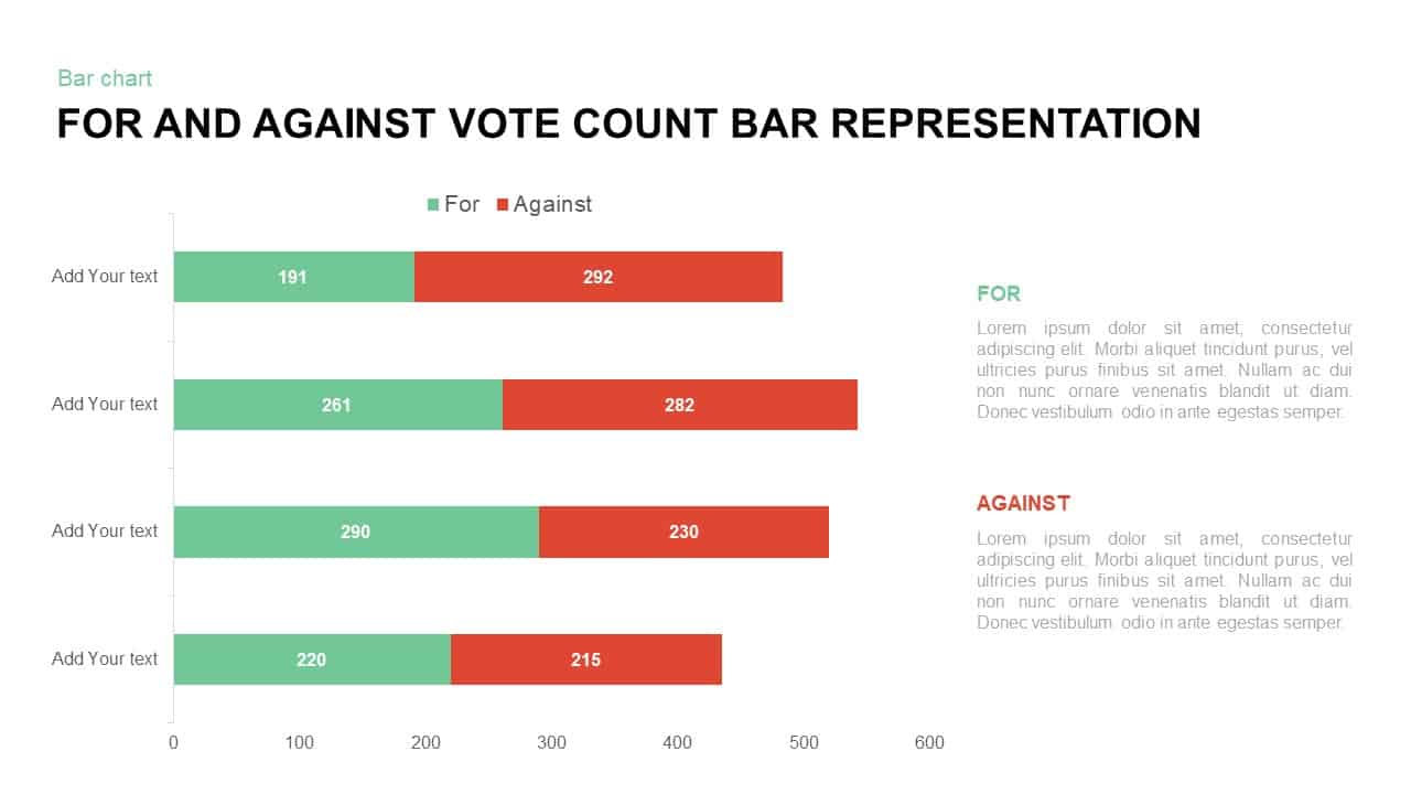
For and Against Vote Count Bar Chart Template for PowerPoint & Google Slides
Bar/Column
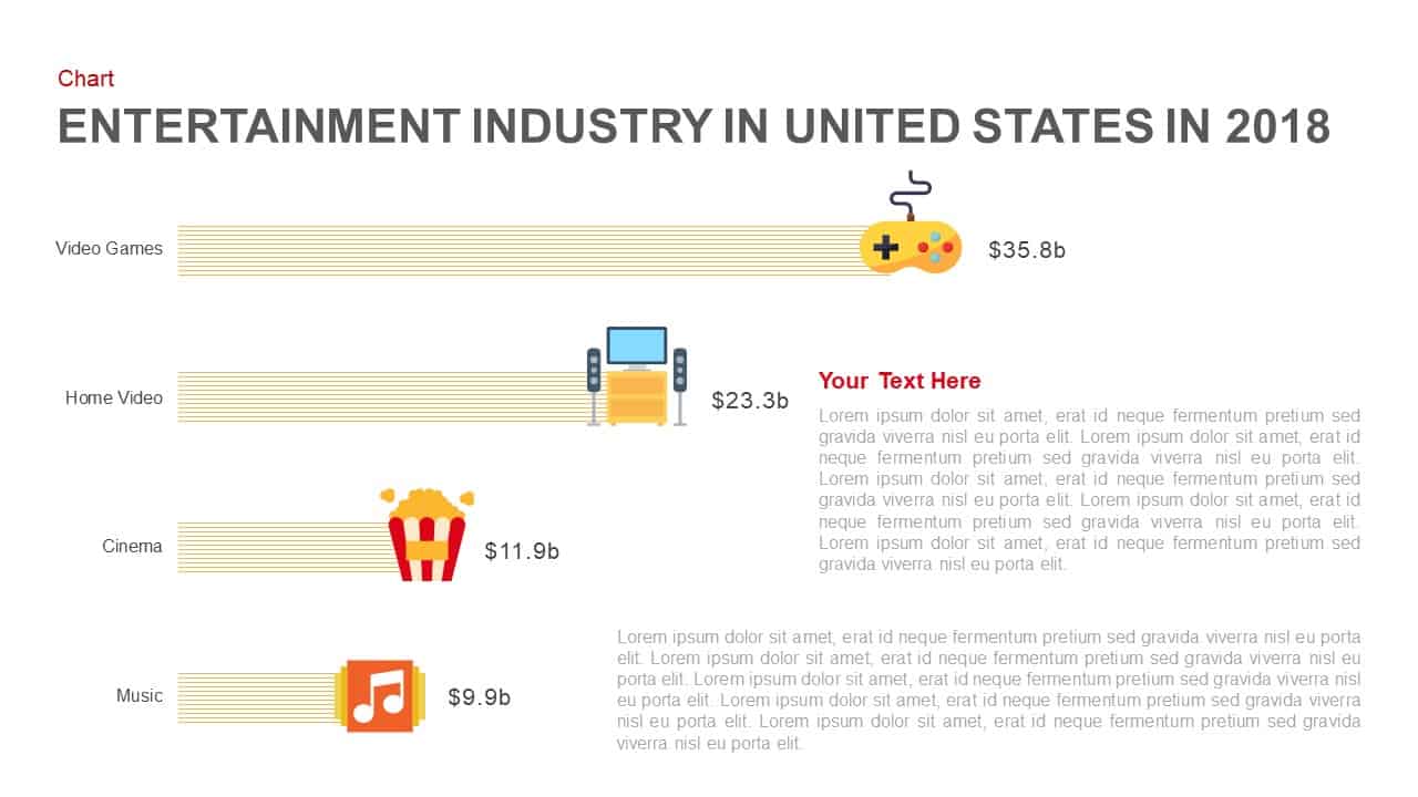
Entertainment Industry Revenue Bar Chart Template for PowerPoint & Google Slides
Bar/Column
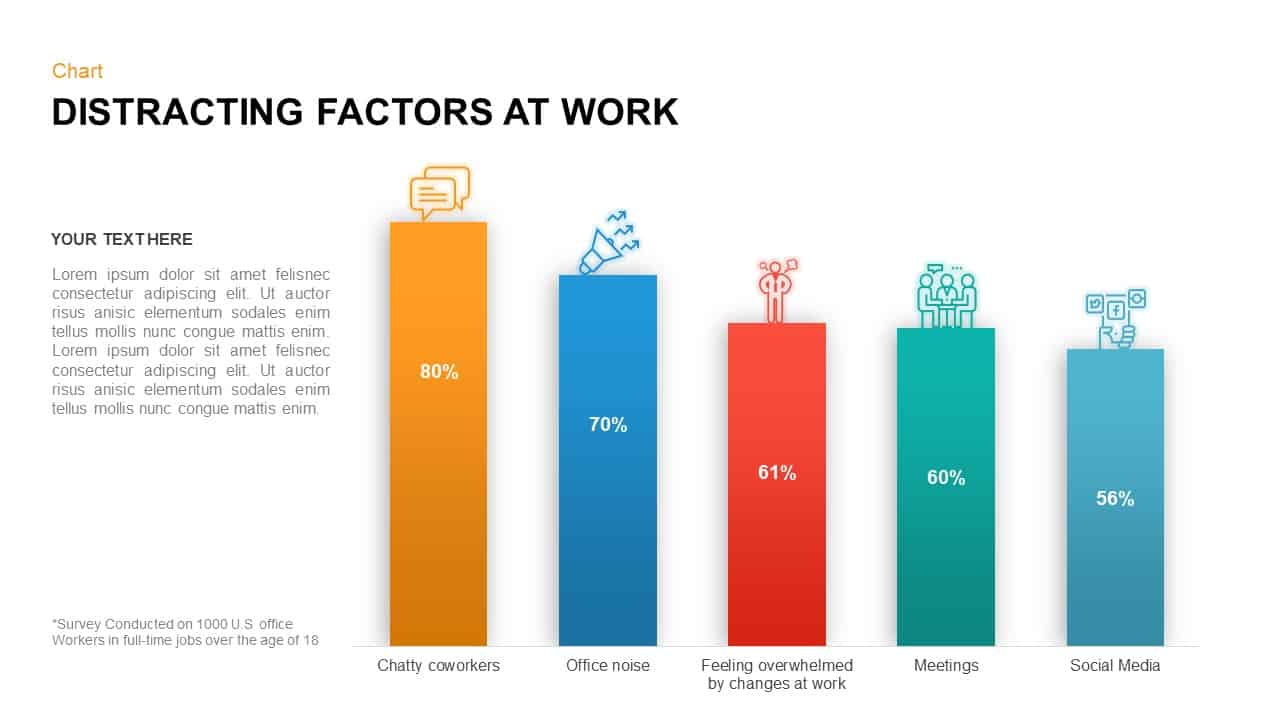
Distracting Factors at Work Bar Chart Template for PowerPoint & Google Slides
Bar/Column
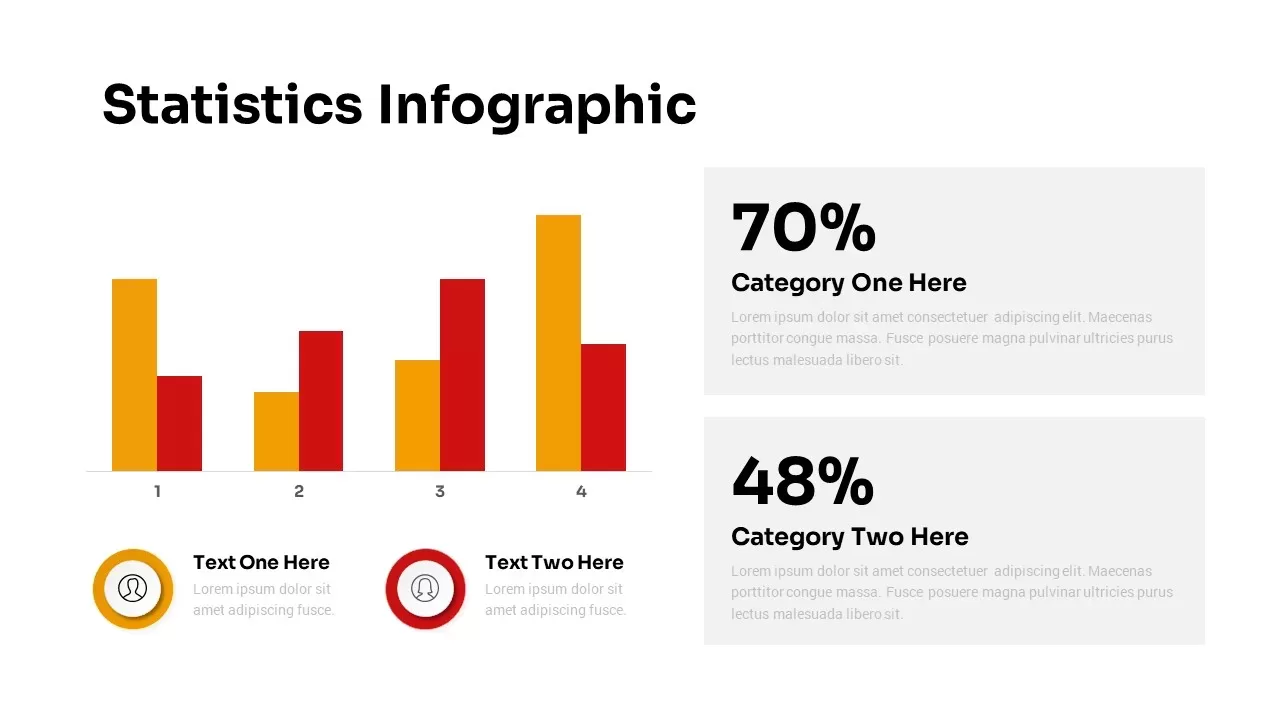
Statistics Infographic & KPI Bar Chart Template for PowerPoint & Google Slides
Bar/Column
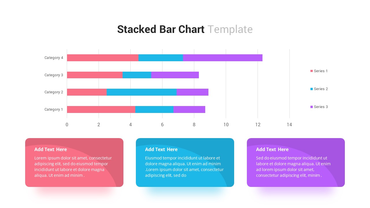
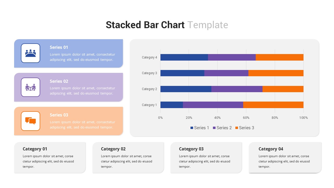
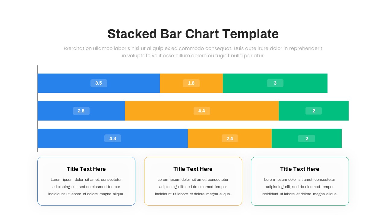
Stacked Bar Chart for PowerPoint & Google Slides
Bar/Column
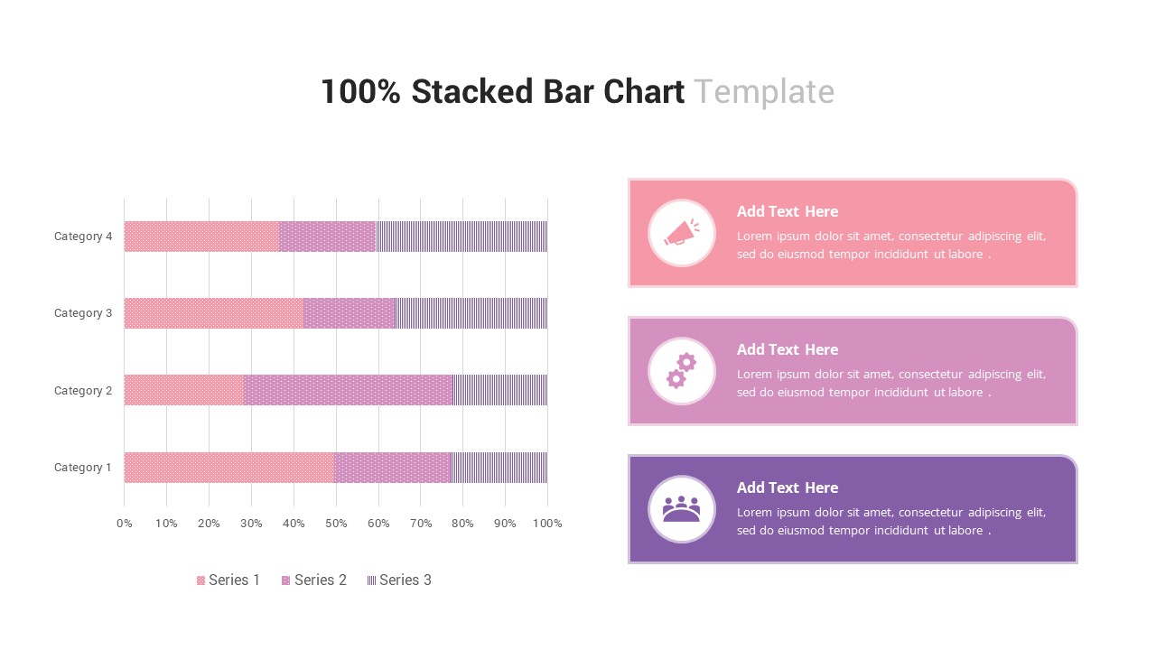
100% Stacked Bar Chart for PowerPoint & Google Slides
Bar/Column
Multi-Series Stacked Bar Chart Template for PowerPoint & Google Slides
Bar/Column
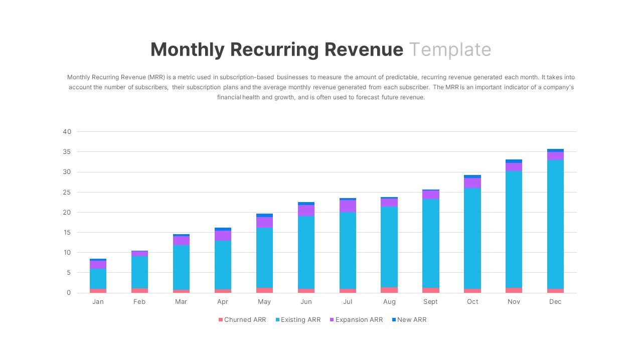
Monthly Recurring Revenue KPI Bar Chart Template for PowerPoint & Google Slides
Bar/Column
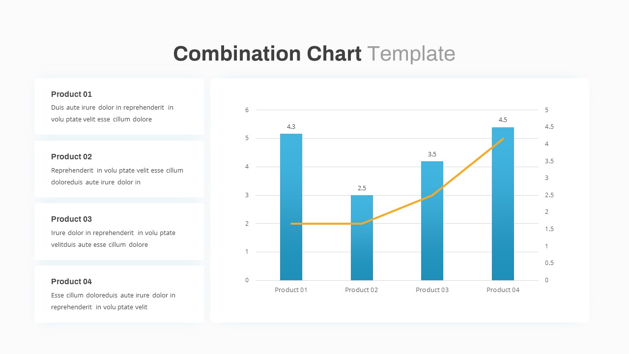
Combination Bar and Line Chart Template for PowerPoint & Google Slides
Bar/Column
Animated Clustered Bar Chart Template for PowerPoint & Google Slides
Bar/Column
Animated Stacked Bar Chart Template for PowerPoint & Google Slides
Bar/Column
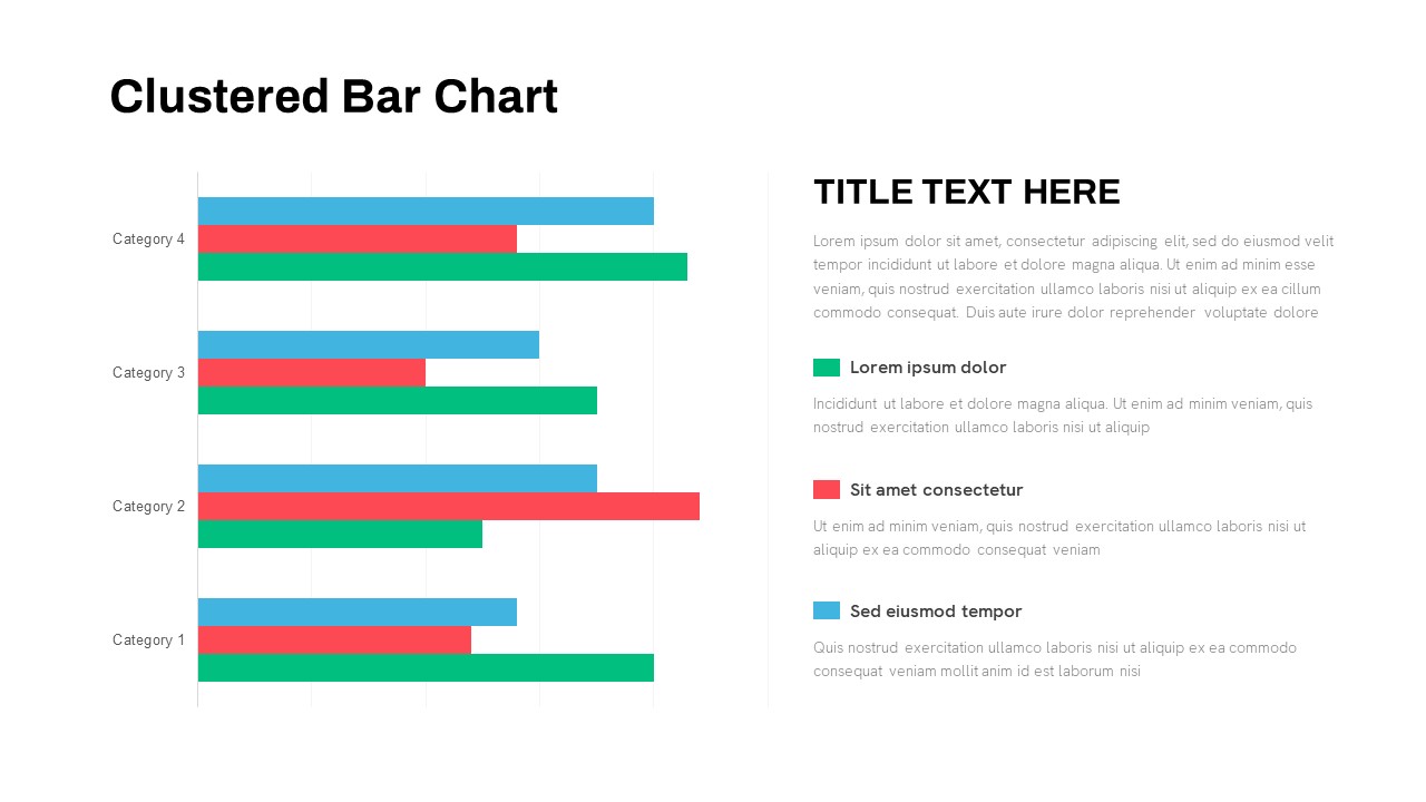
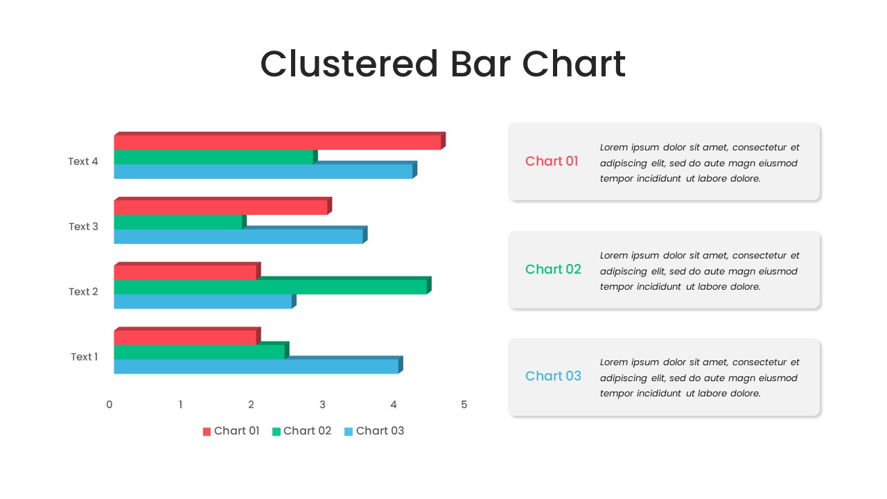
Clustered Bar Chart Comparison Template for PowerPoint & Google Slides
Bar/Column
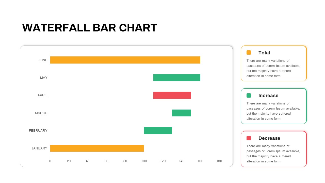
Waterfall Bar Chart Analysis Template for PowerPoint & Google Slides
Bar/Column
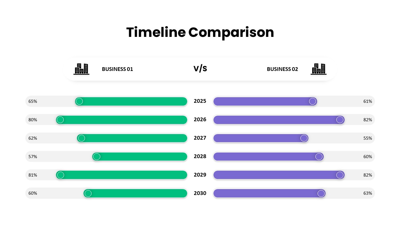
Business Timeline Comparison Bar Chart Template for PowerPoint & Google Slides
Comparison Chart
Year-over-Year Stacked Gender Bar Chart Template for PowerPoint & Google Slides
Bar/Column
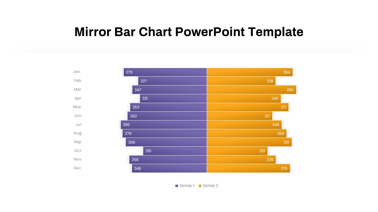
Mirror Bar Chart Comparison Template for PowerPoint & Google Slides
Bar/Column
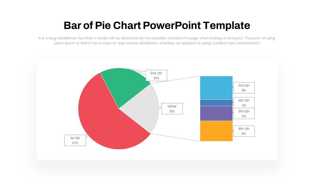
Dynamic Bar-of-Pie Chart Comparison Template for PowerPoint & Google Slides
Pie/Donut
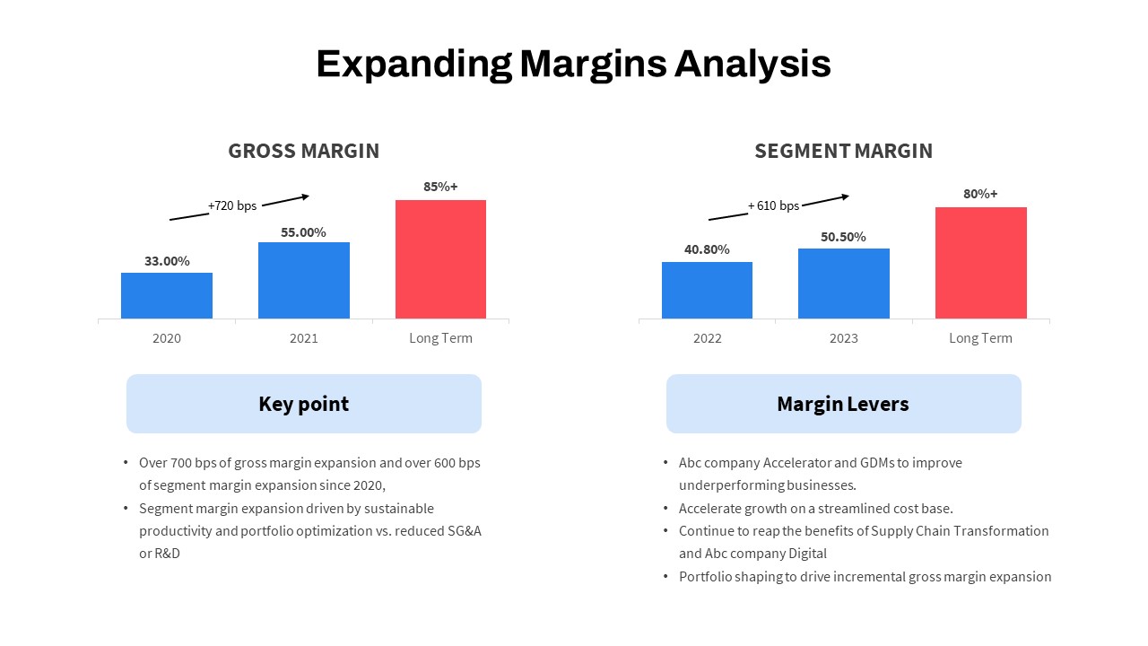
Expanding Margins Analysis Bar Chart Template for PowerPoint & Google Slides
Charts
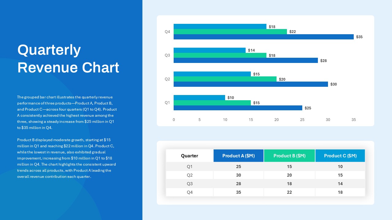
Quarterly Revenue Comparison Bar Chart Template for PowerPoint & Google Slides
Bar/Column
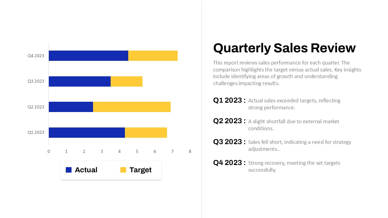
Quarterly Sales Review Bar Chart Template for PowerPoint & Google Slides
Bar/Column
Two-Option Bar Chart Comparison Table Template for PowerPoint & Google Slides
Comparison
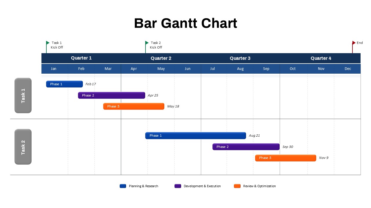
Bar Gantt Chart Template for PowerPoint & Google Slides
Gantt Chart
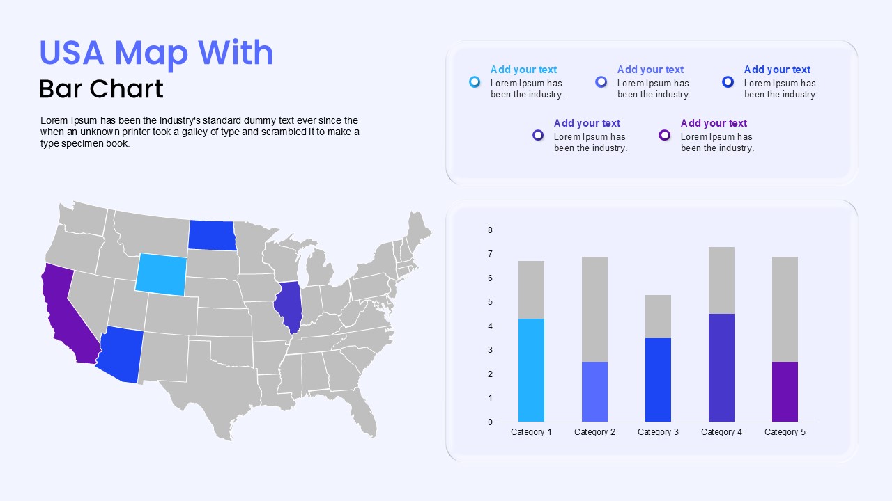
USA Map with Bar Chart Template for PowerPoint & Google Slides
World Maps
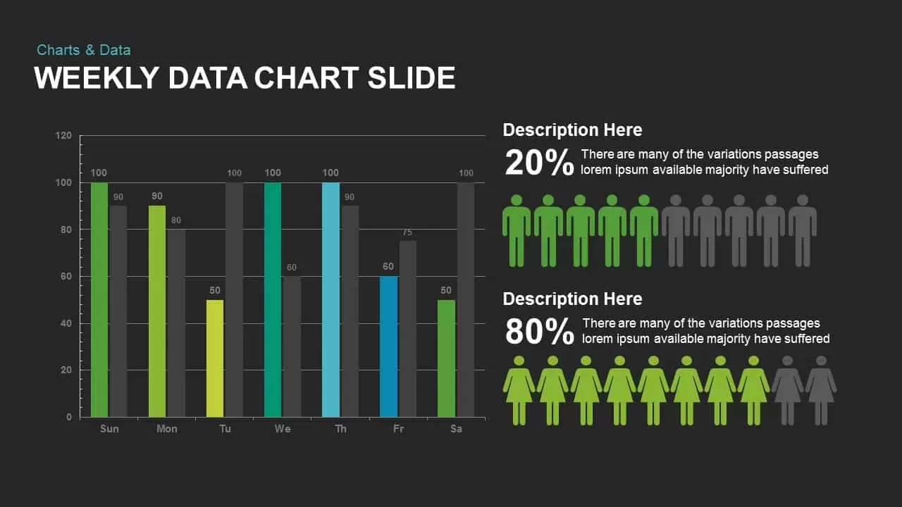
Weekly Data Chart Slide for PowerPoint & Google Slides
Comparison Chart
Tornado Chart Data Comparison Slide Template for PowerPoint & Google Slides
Bar/Column

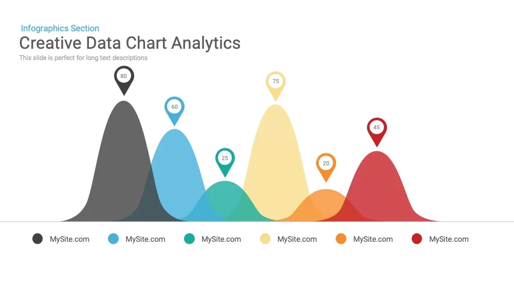
Creative data chart analytics template for PowerPoint & Google Slides
Charts
Mobile Data Analysis Chart template for PowerPoint & Google Slides
Charts
Circle Chart Data template for PowerPoint & Google Slides
Pie/Donut
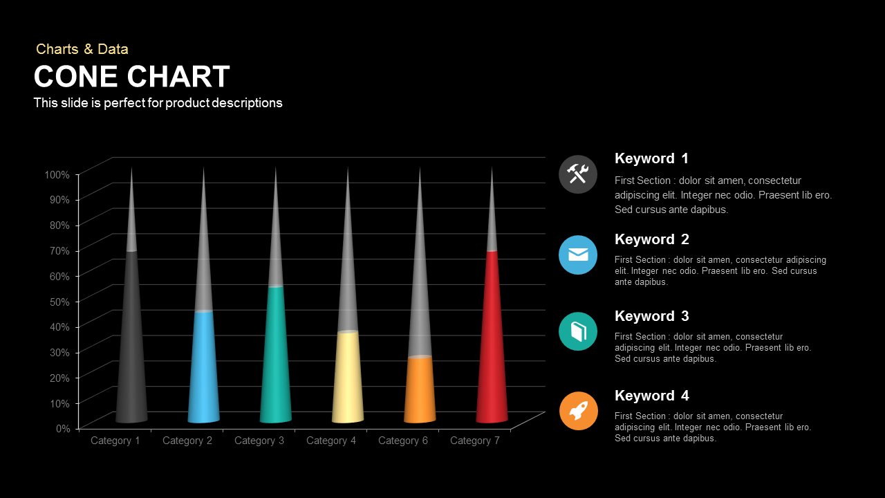
3D Cone Chart Data Visualization template for PowerPoint & Google Slides
Bar/Column

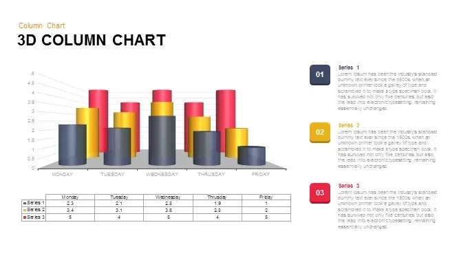
3D Column Chart with Data Table for PowerPoint & Google Slides
Bar/Column
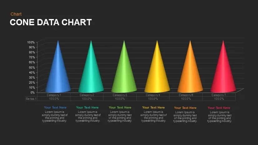
Cone Data Chart for PowerPoint & Google Slides
Charts
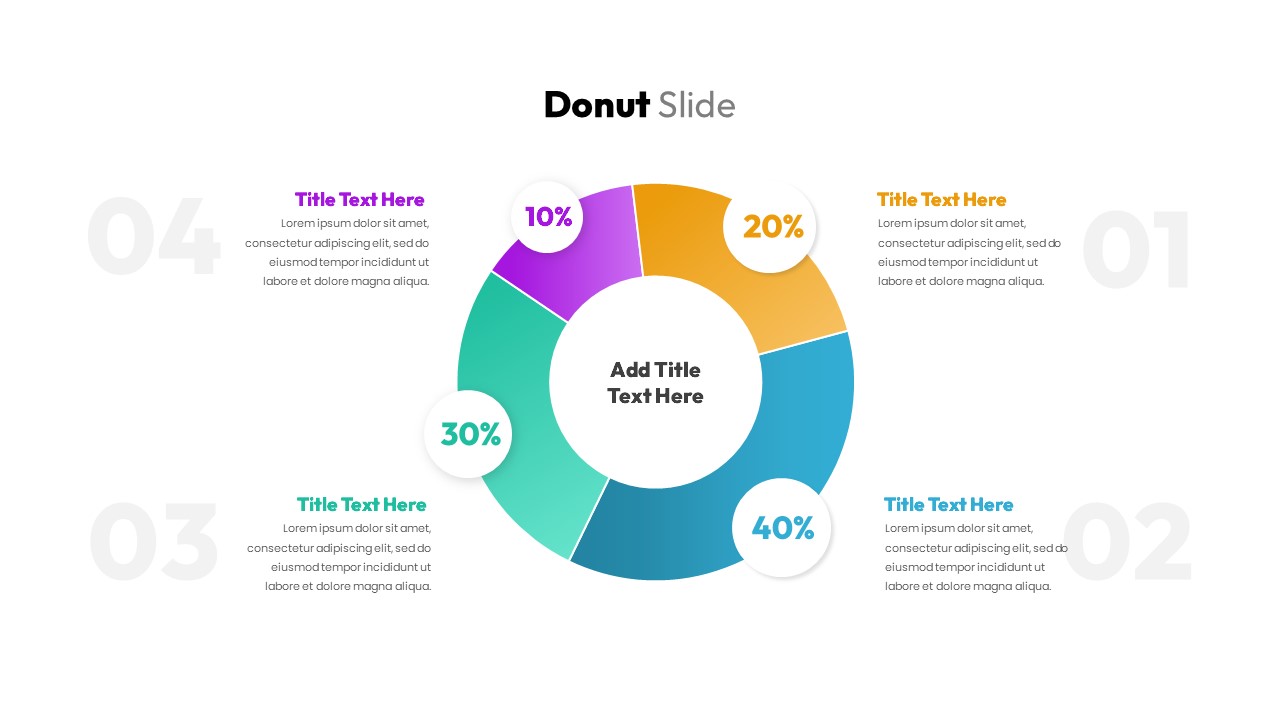
Donut Chart Data Breakdown template for PowerPoint & Google Slides
Pie/Donut
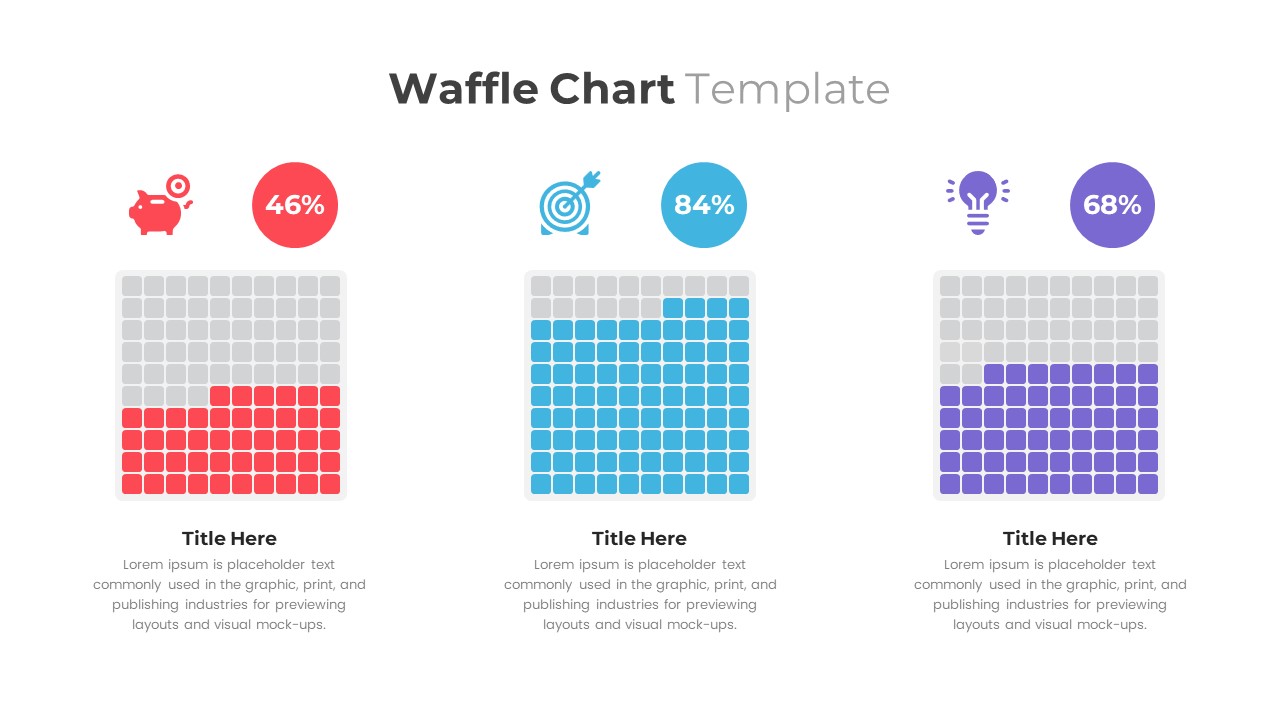
Waffle Chart Data Visualization Template for PowerPoint & Google Slides
Comparison Chart
Free Stacked Column Chart Data Visualization Template for PowerPoint & Google Slides
Bar/Column
Free
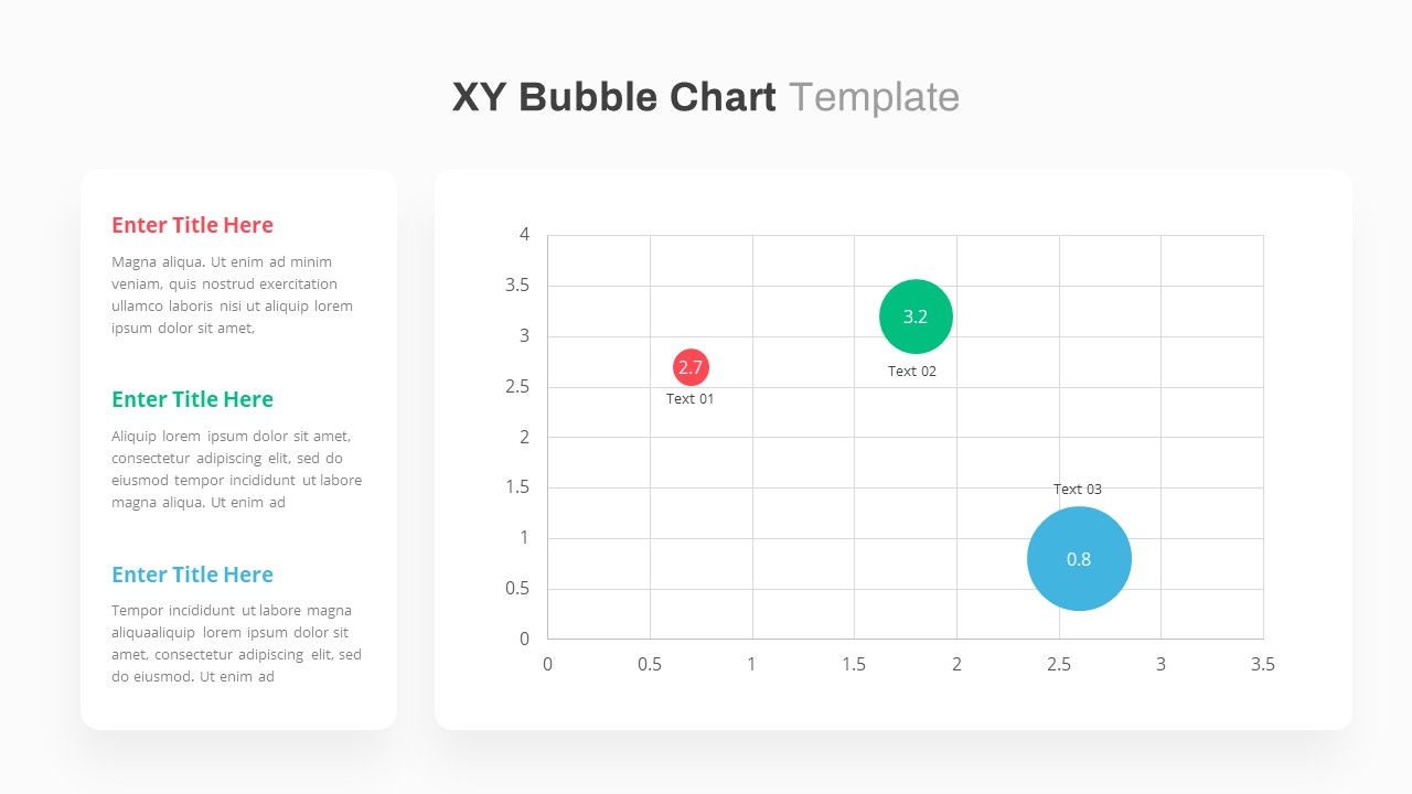
XY Bubble Chart Data Visualization Template for PowerPoint & Google Slides
Comparison Chart
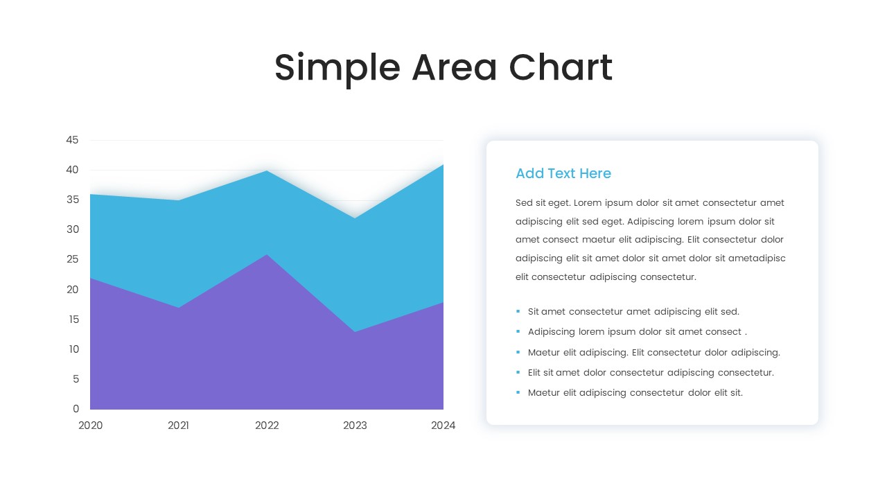
Simple Area Chart Data Trends Analysis Template for PowerPoint & Google Slides
Comparison Chart
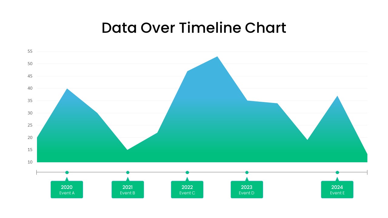
Data Over Time Line Chart template for PowerPoint & Google Slides
Charts
Waterfall Chart Data Visualization Template for PowerPoint & Google Slides
Comparison Chart
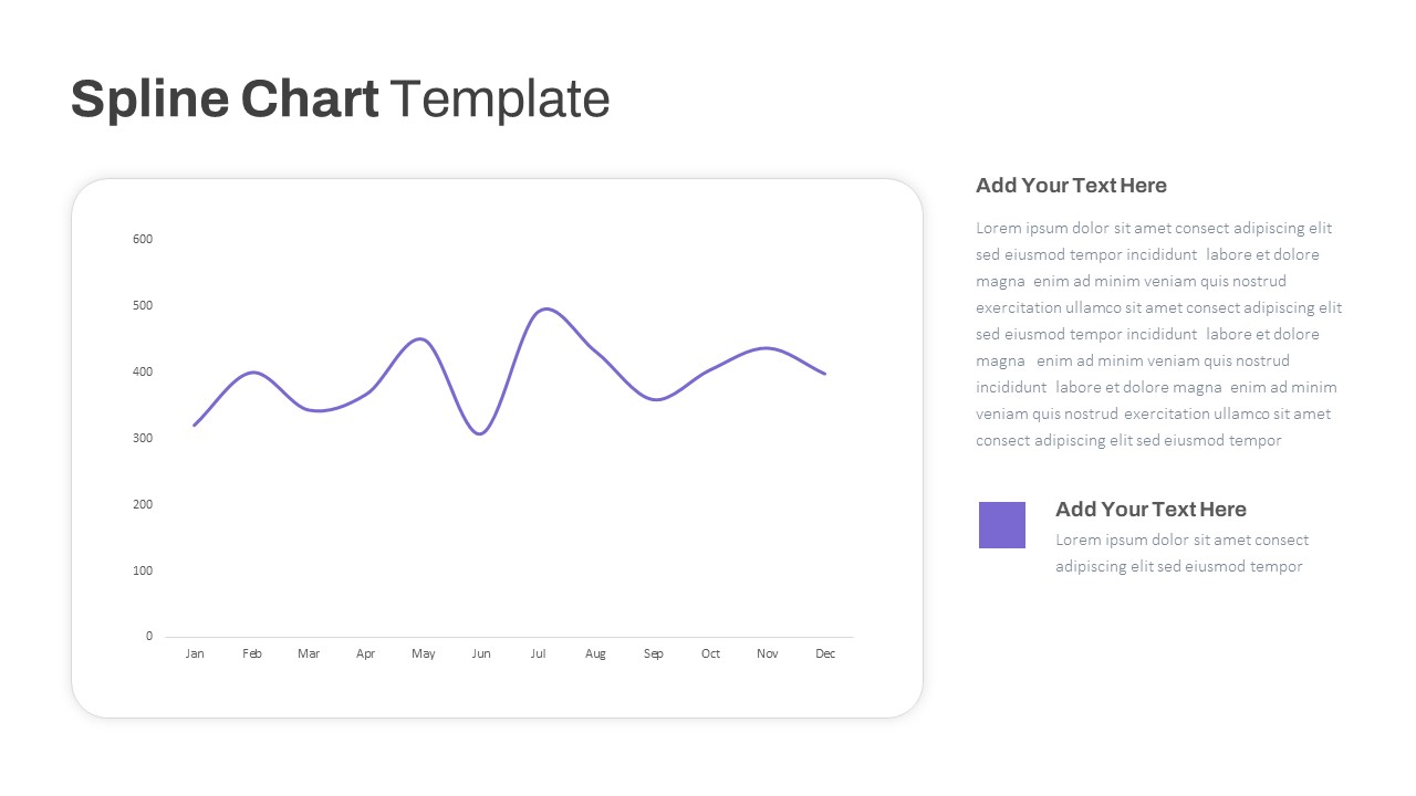
Multipurpose Spline Chart Data Trend Template for PowerPoint & Google Slides
Bar/Column
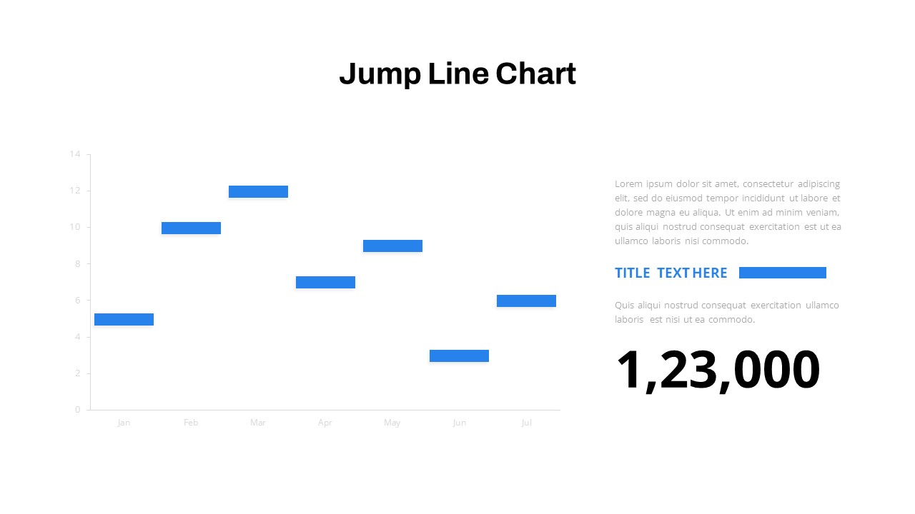
Interactive Jump Line Data Chart Template for PowerPoint & Google Slides
Comparison Chart
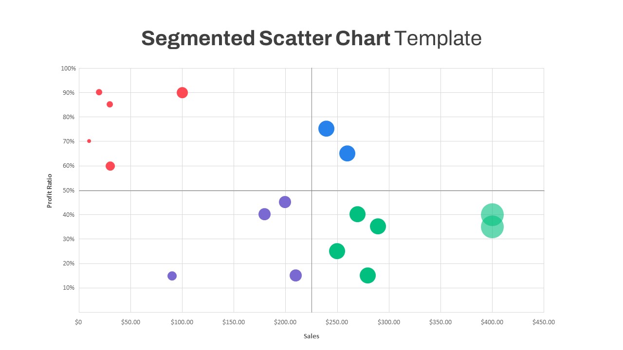
Segmented Scatter Chart Data Visualization Template for PowerPoint & Google Slides
Business Strategy
3D Cylinder Bar Chart Visualization Template for PowerPoint
Bar/Column
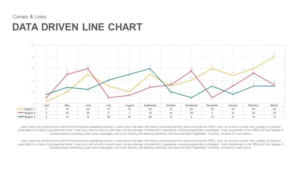
Data-Driven Line Chart Diagram Template for PowerPoint
Comparison Chart
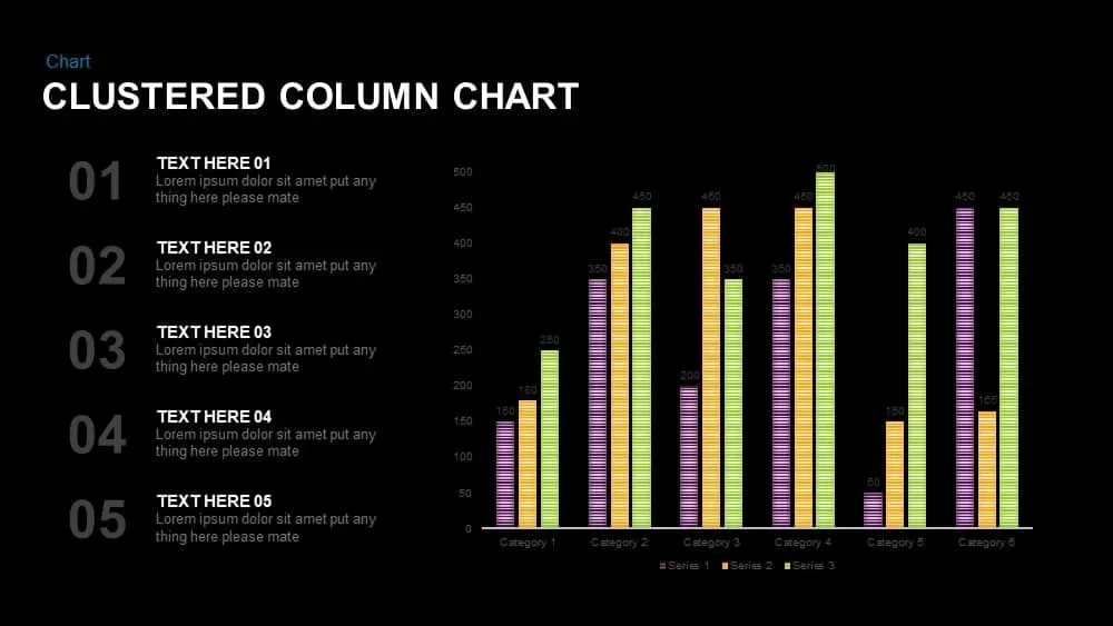
Clustered Column Chart Data Analysis Template for PowerPoint
Bar/Column
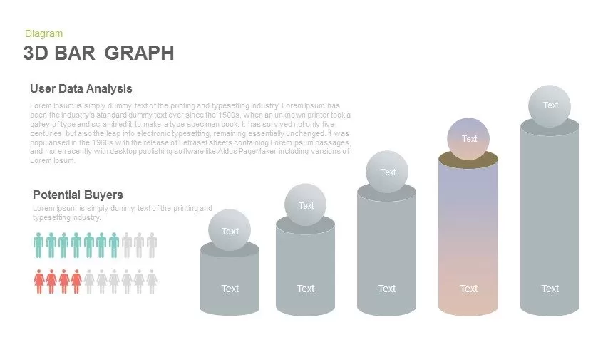
3D Bar Graph Infographic Template for PowerPoint & Google Slides
Bar/Column
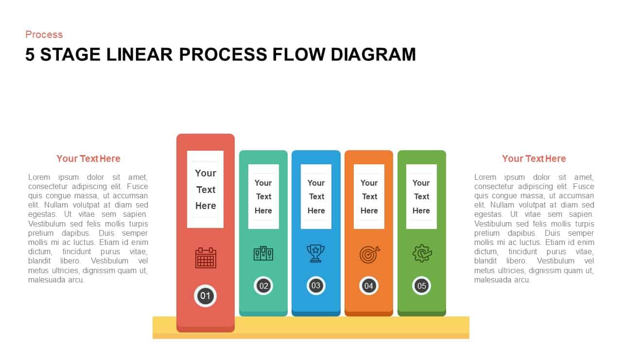
Five-Stage Vertical Bar Process Template for PowerPoint & Google Slides
Process
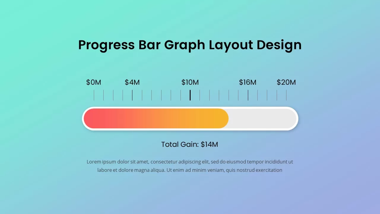
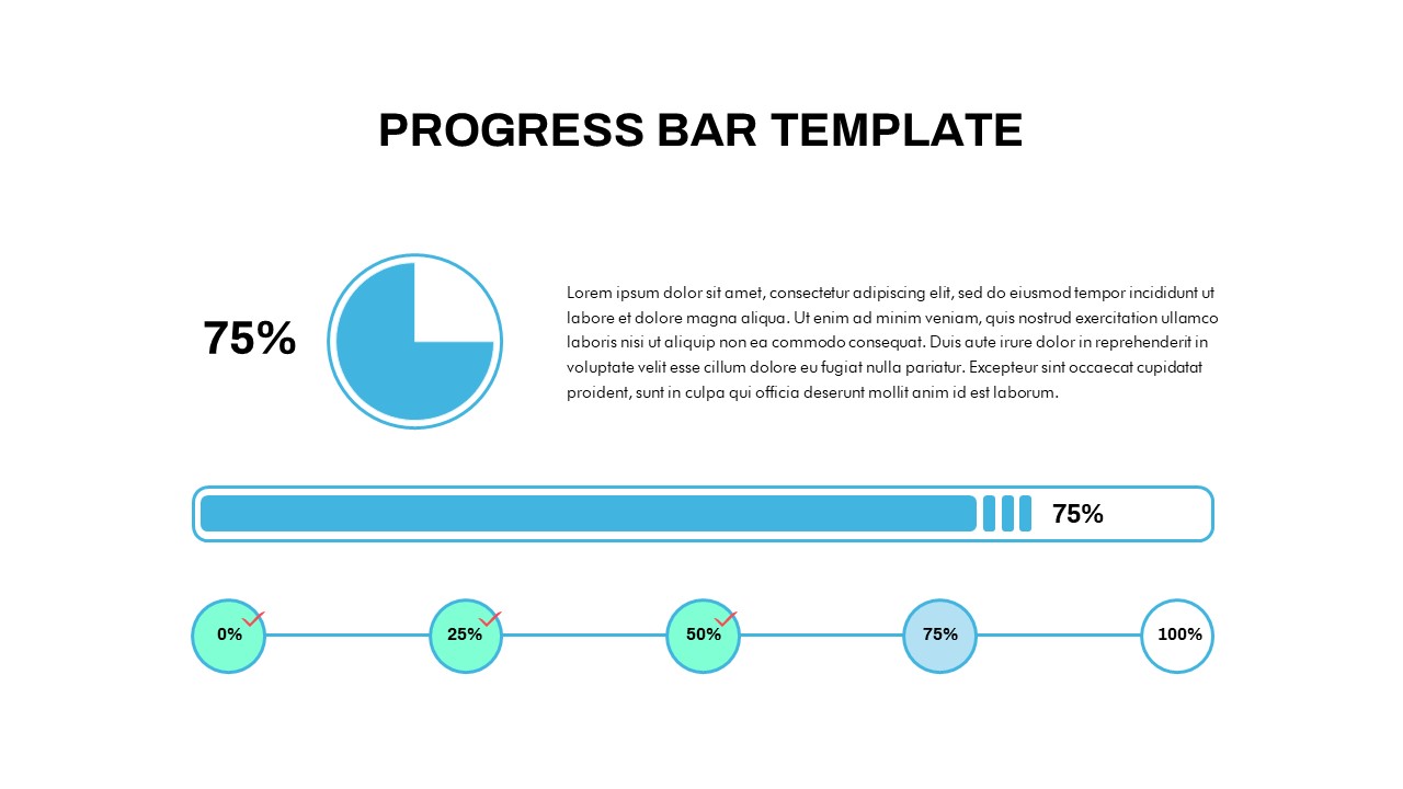
Progress Bar Graph Layout Design for PowerPoint & Google Slides
Charts
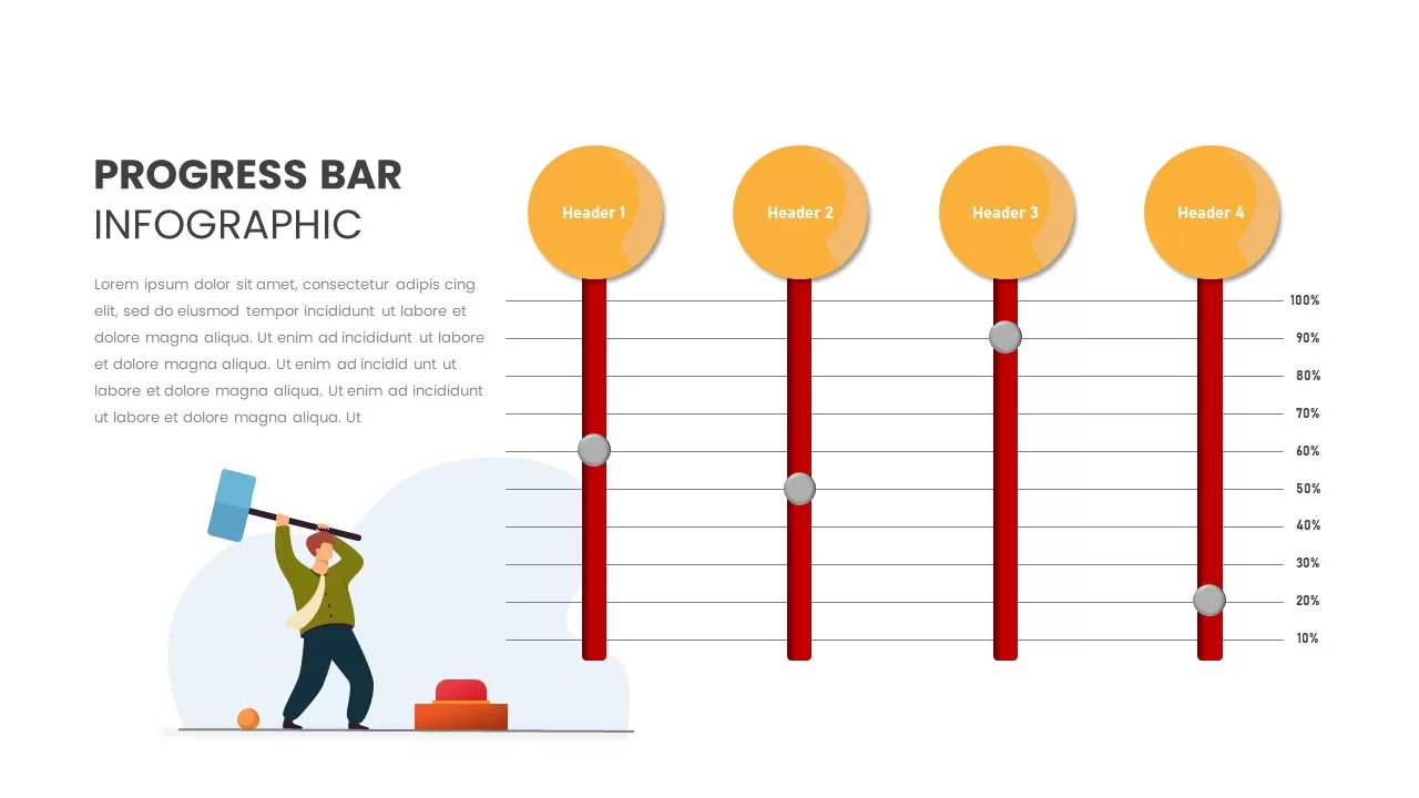
Progress Bar Infographic for PowerPoint & Google Slides
Business
Progress Bar infographic pack for PowerPoint & Google Slides
Business
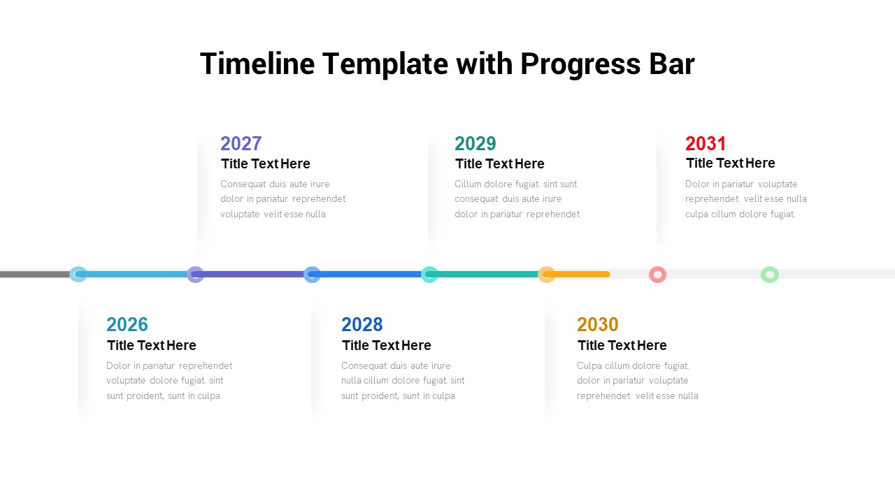
Timeline Roadmap with Progress Bar Template for PowerPoint & Google Slides
Timeline
Progress Bar and Milestone Visualization Template for PowerPoint & Google Slides
Timeline
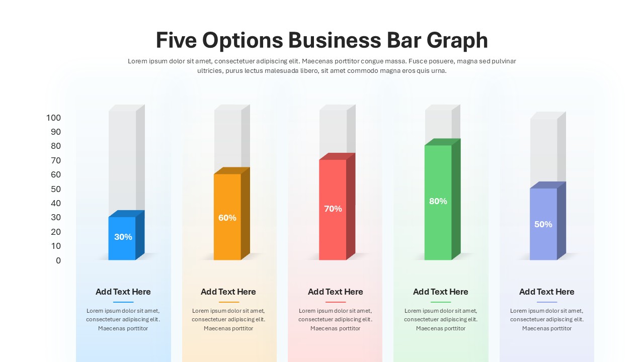
Five Options Business Bar Graph for PowerPoint & Google Slides
Business Report

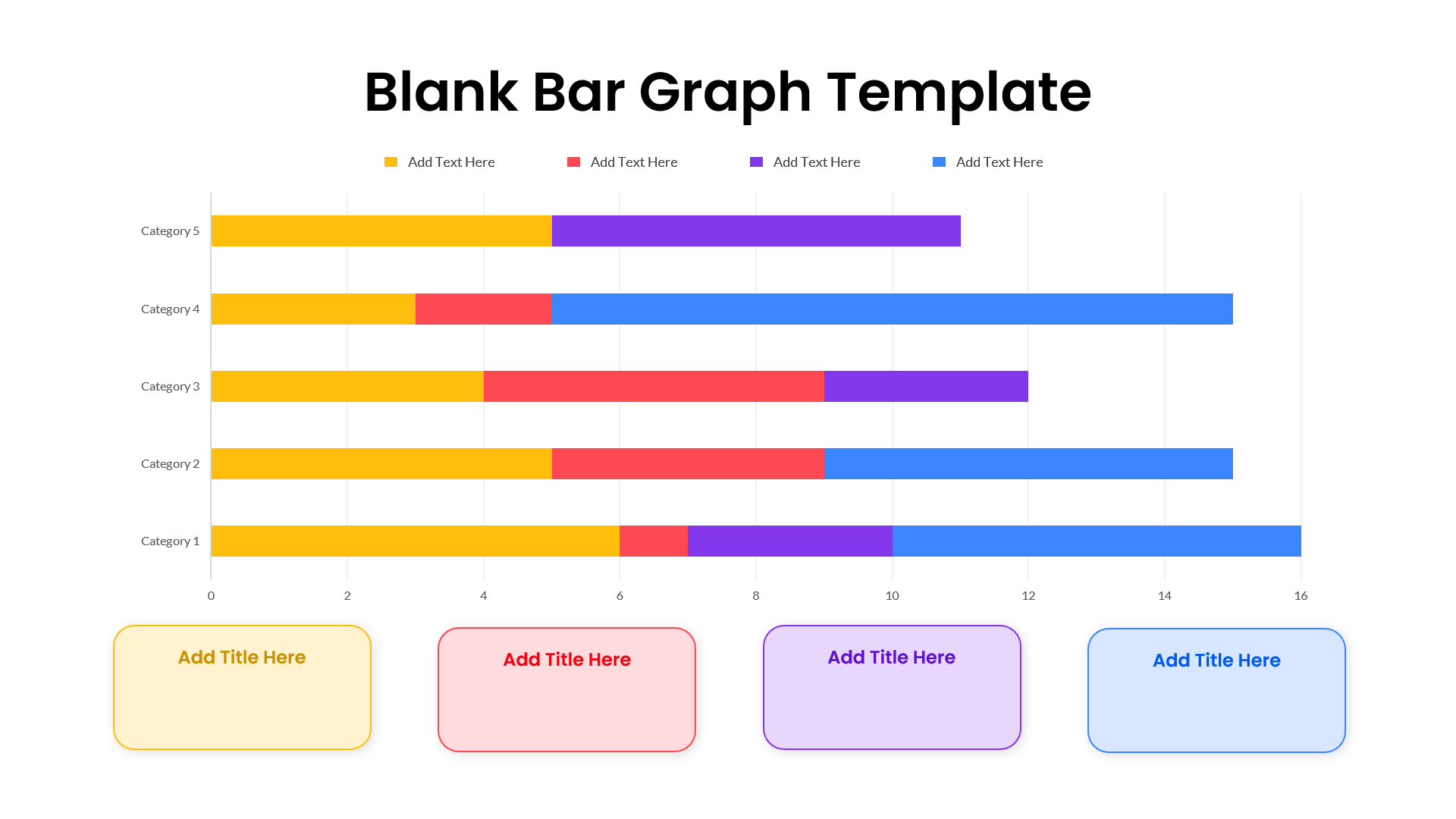
Blank Bar Graph Template for PowerPoint & Google Slides
Bar/Column
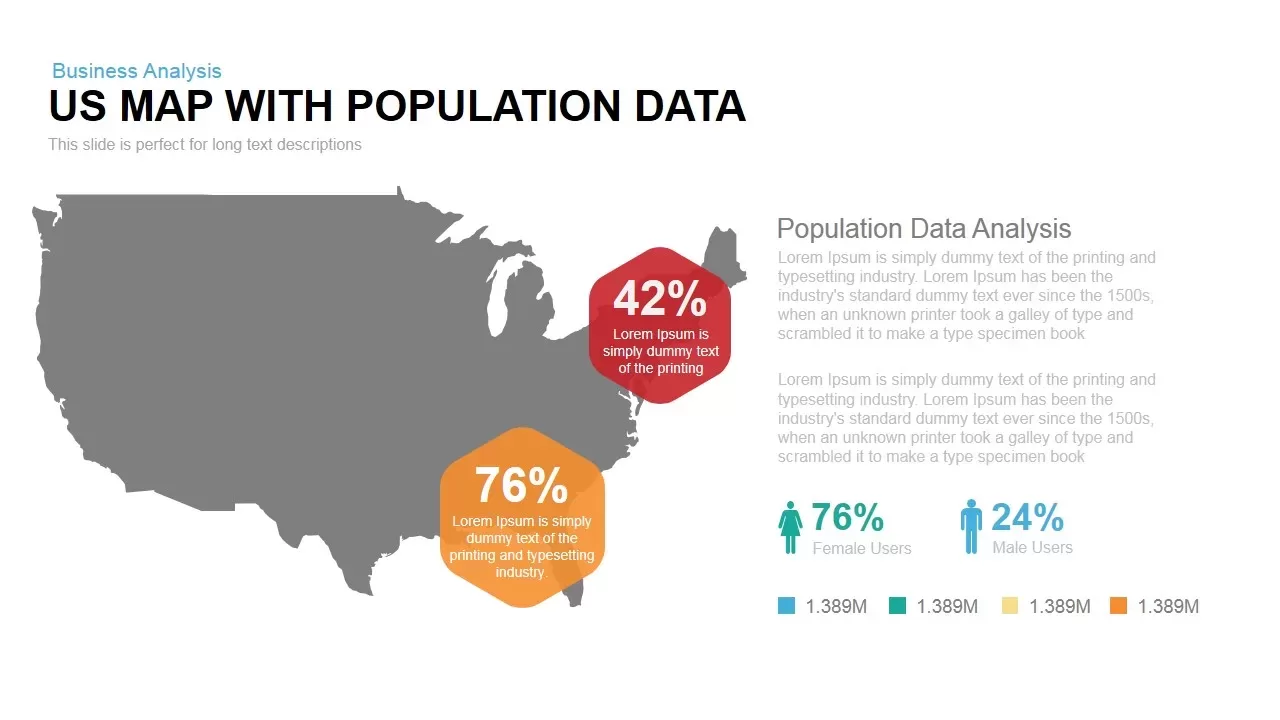
Interactive US Population Data Map Slide Template for PowerPoint & Google Slides
World Maps
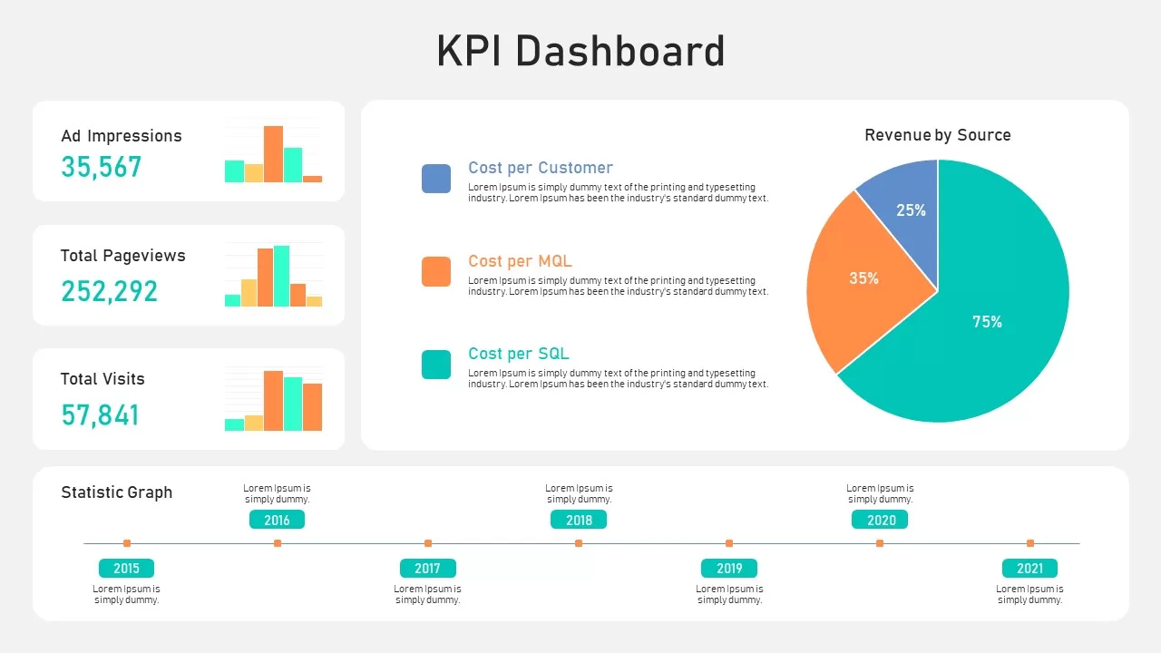
KPI Dashboard Data Overview Slide Template for PowerPoint & Google Slides
Bar/Column
Data Science PowerPoint Presentation Template for PowerPoint & Google Slides
Pitch Deck
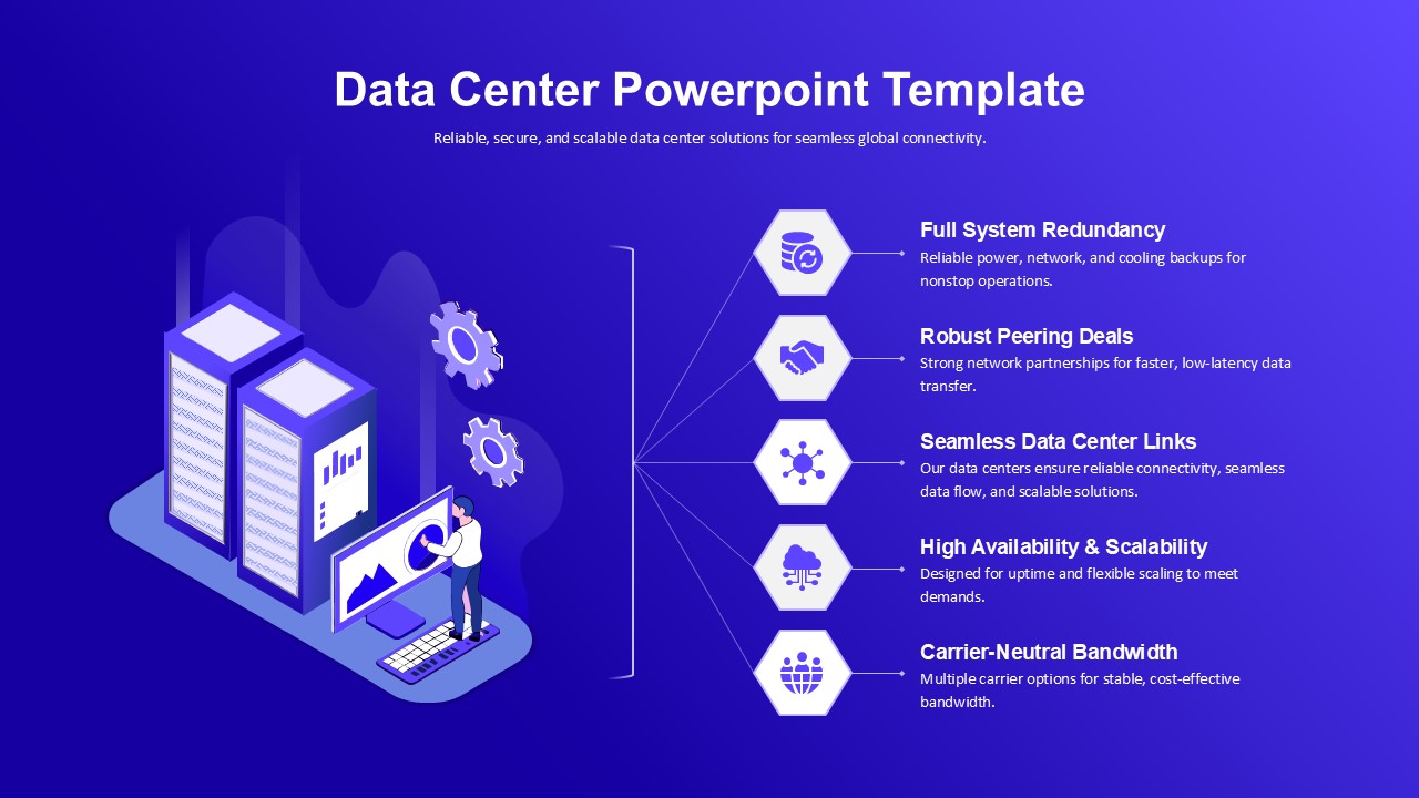
Data Center PowerPoint Template for PowerPoint & Google Slides
Information Technology
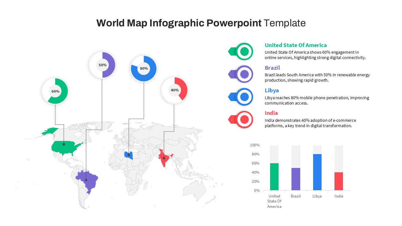
World Map Data template for PowerPoint & Google Slides
World Maps
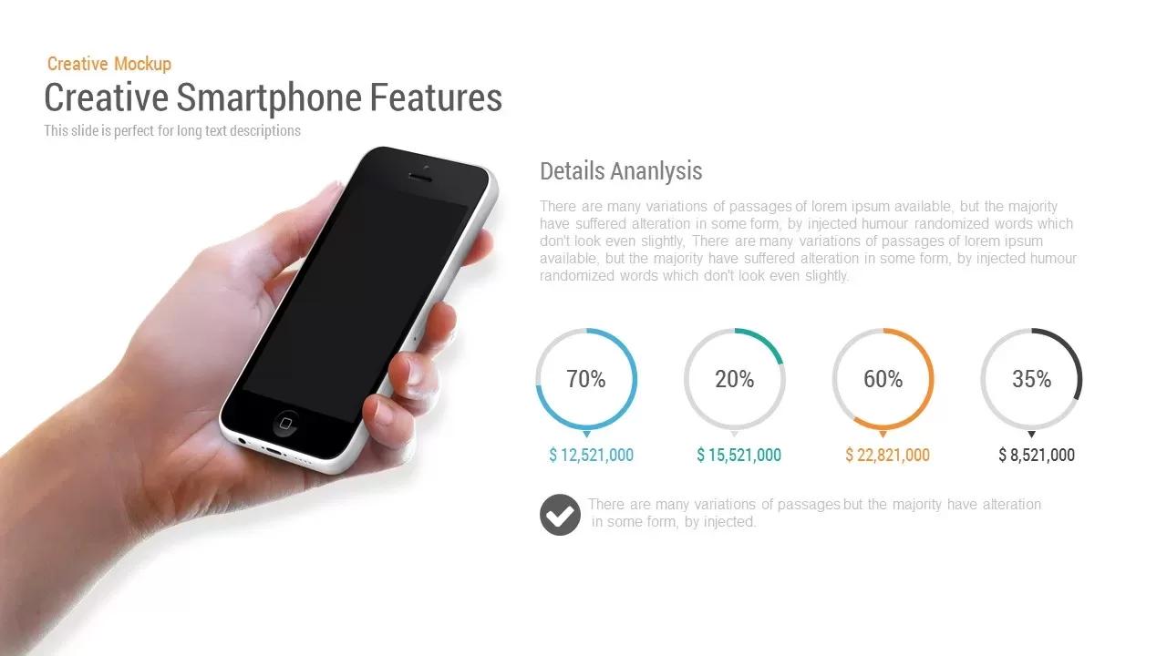
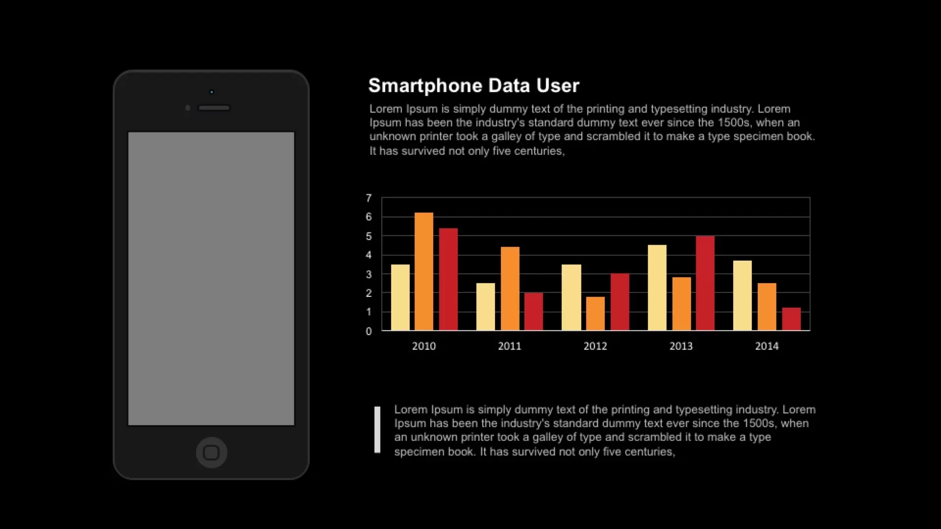
Smartphone Data User template for PowerPoint & Google Slides
Charts
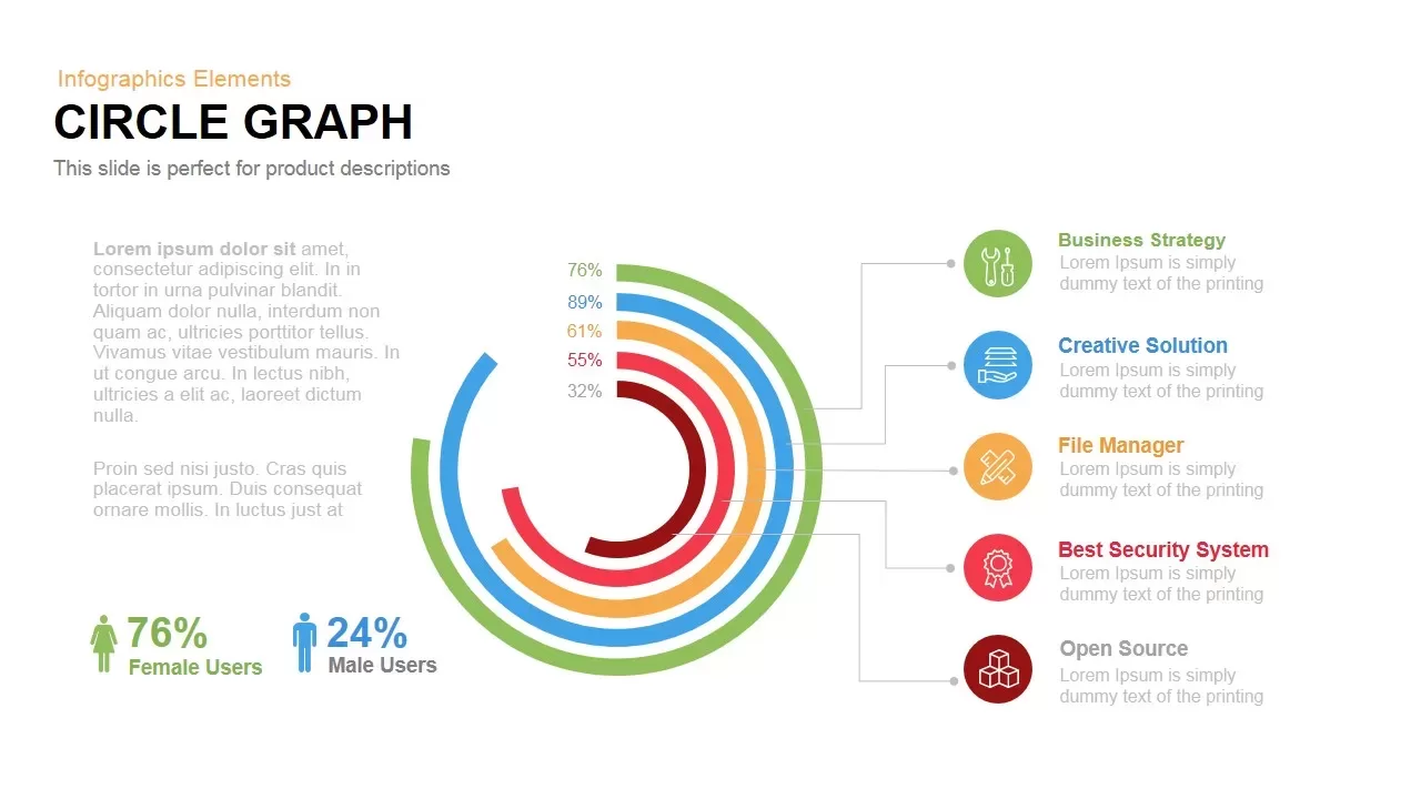
Circle Graph Data Visualization Template for PowerPoint & Google Slides
Circular
Data Analytics Dashboard Design template for PowerPoint & Google Slides
Bar/Column
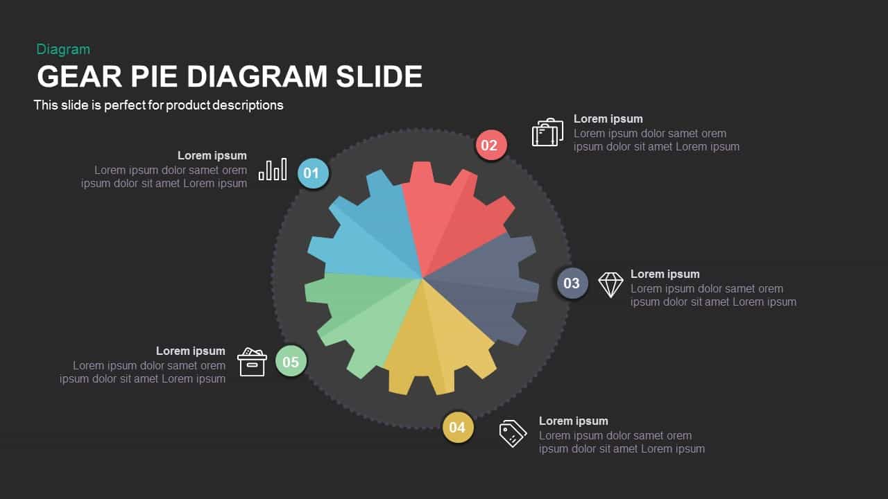
Gear Pie Diagram Data Visualization Template for PowerPoint & Google Slides
Pie/Donut
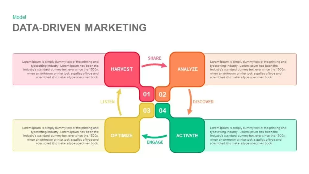
Data-Driven Marketing Cycle Diagram Template for PowerPoint & Google Slides
Customer Journey
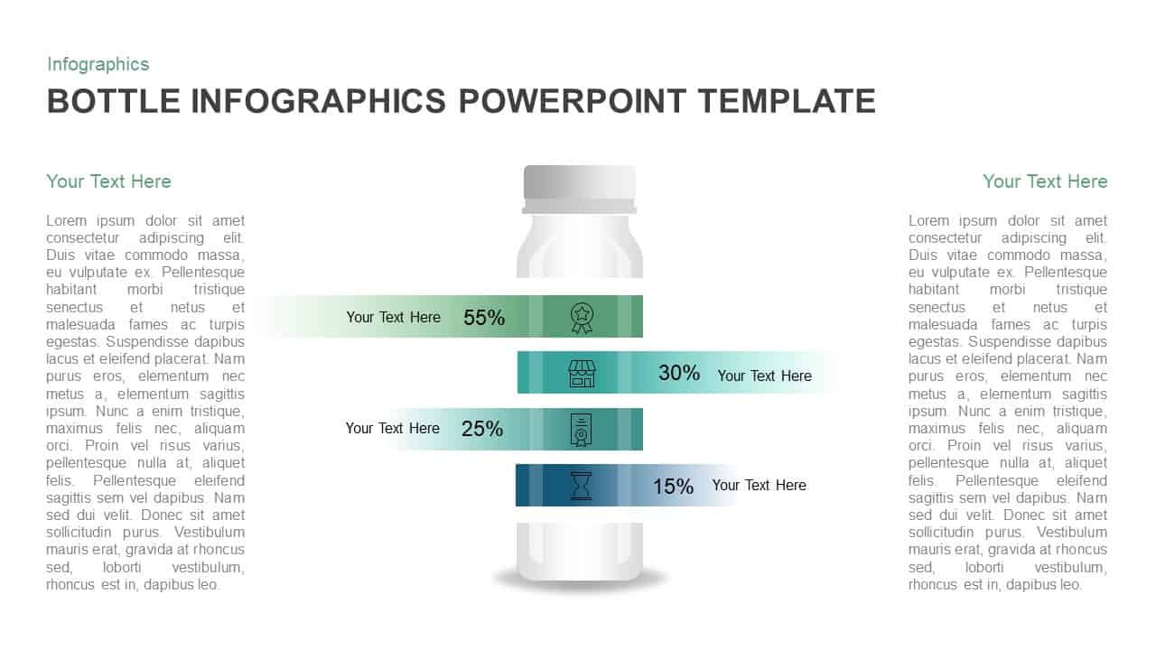
Bottle Data Percentage Infographic Template for PowerPoint & Google Slides
Infographics
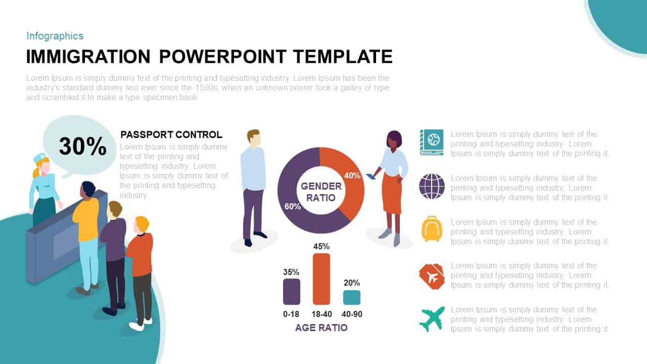
Immigration Data Dashboard Template for PowerPoint & Google Slides
Bar/Column
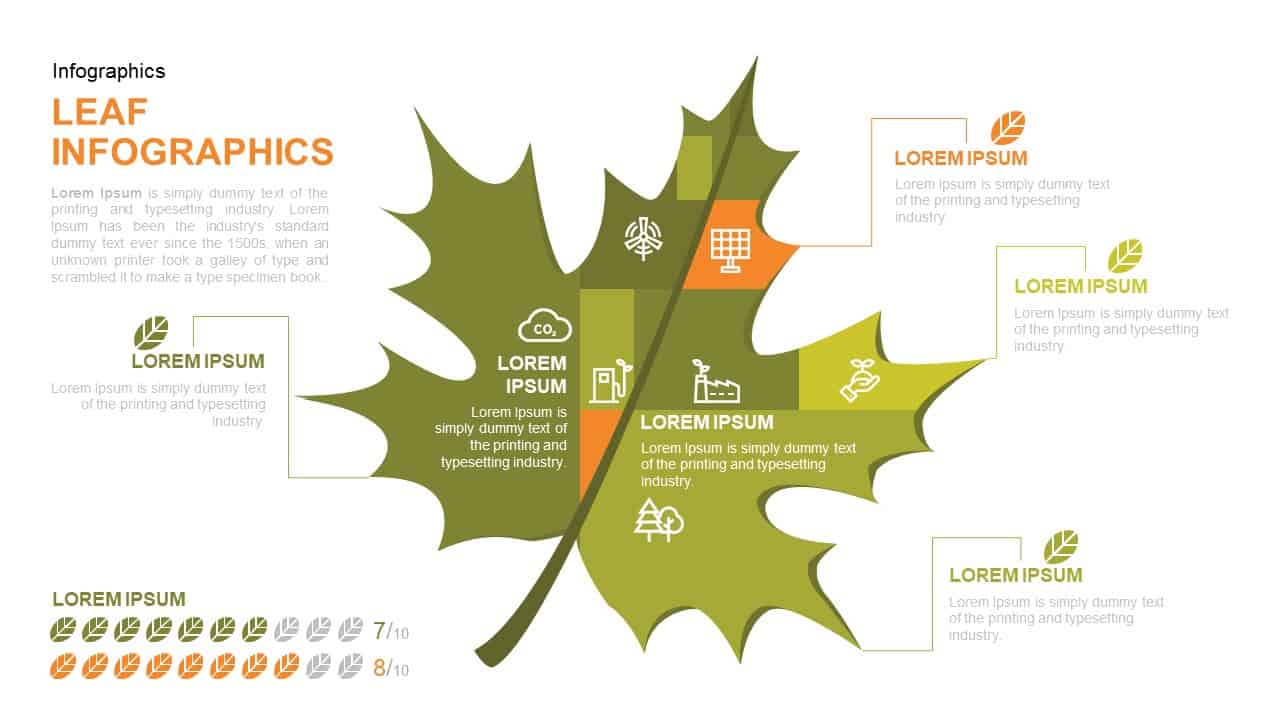
Leaf Infographic Data Visualization Template for PowerPoint & Google Slides
Infographics
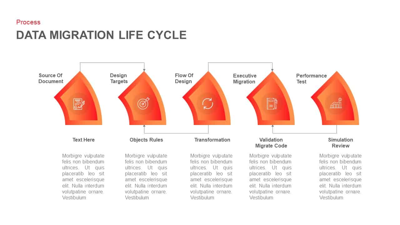
Data Migration Life Cycle Curved Diagram Template for PowerPoint & Google Slides
Process
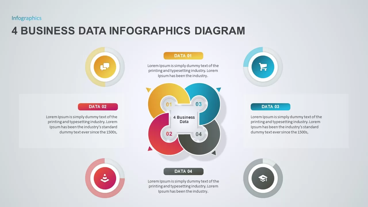
4 Business Data Infographics Diagram for PowerPoint & Google Slides
Process
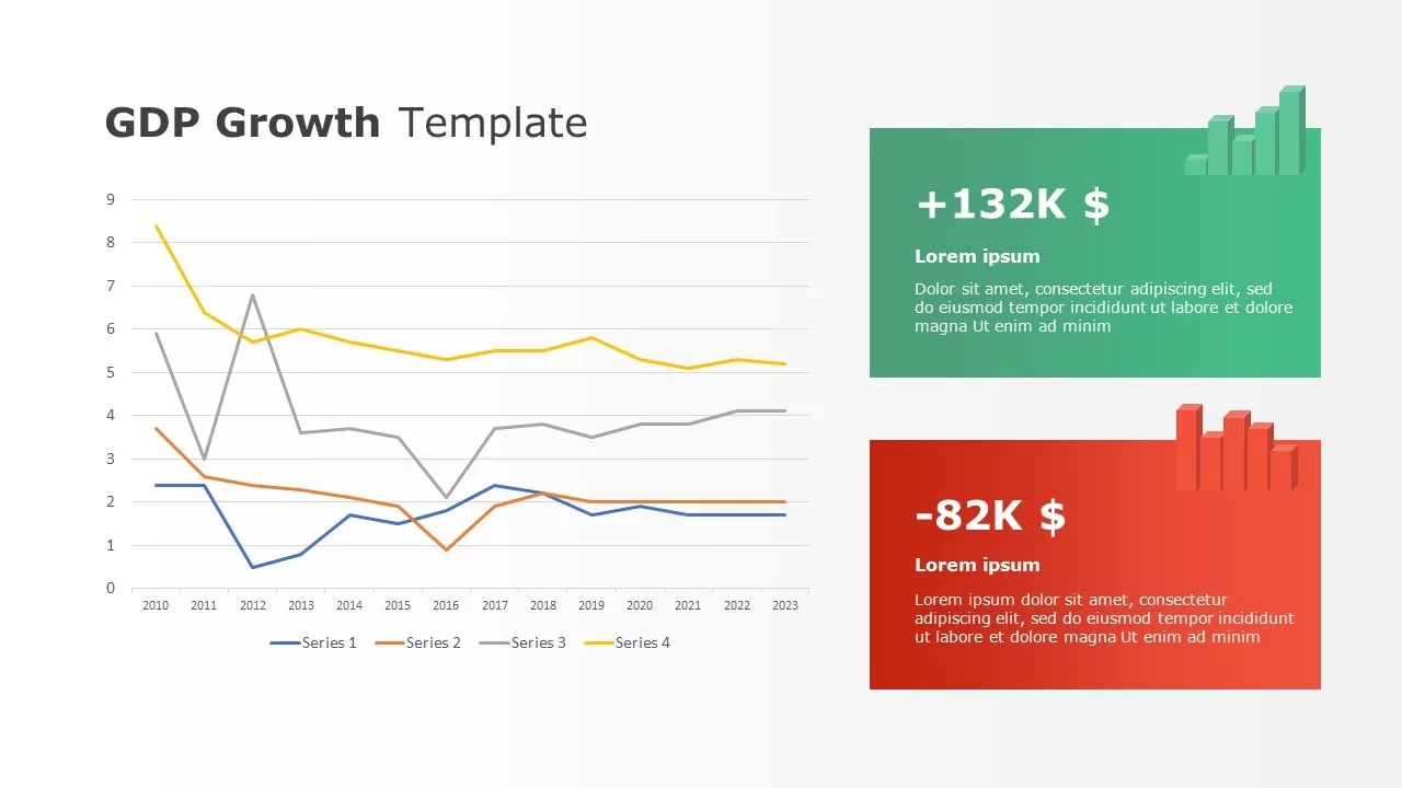
Data-driven GDP Growth Infographic Pack Template for PowerPoint & Google Slides
Infographics
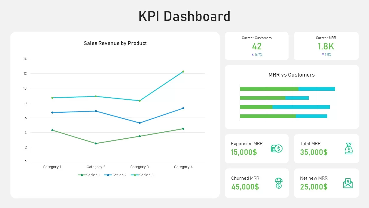
KPI Dashboard Data Visualization Template for PowerPoint & Google Slides
Bar/Column
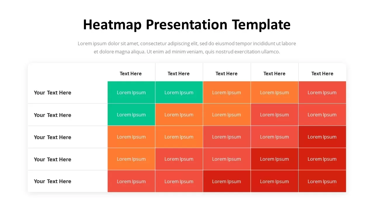
Professional Heatmap Data Visualization Template for PowerPoint & Google Slides
Infographics
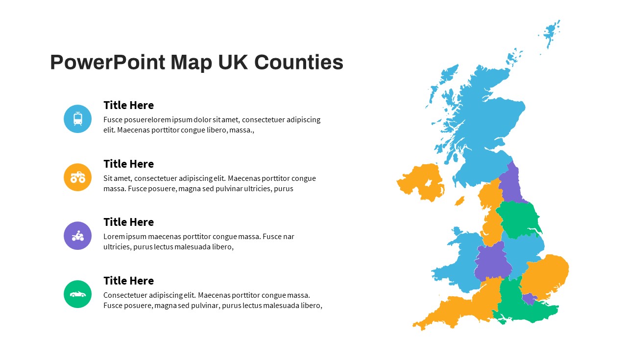
UK Counties Map Data Visualization Template for PowerPoint & Google Slides
World Maps
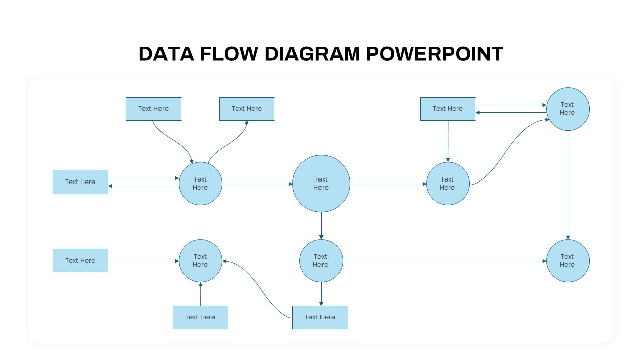
Advanced Data Flow Diagram Pack Template for PowerPoint & Google Slides
Flow Charts
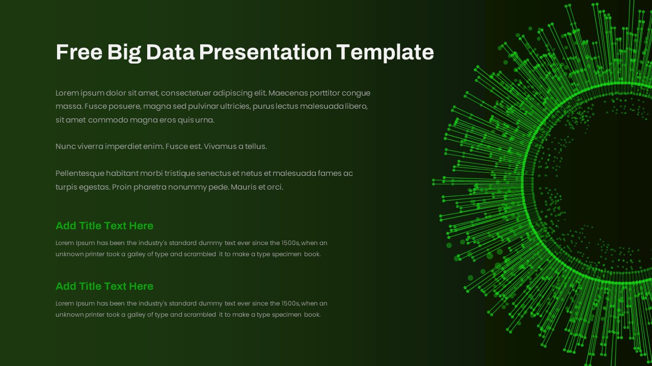
Free Big Data Network Visualization Template for PowerPoint & Google Slides
Circular
Free
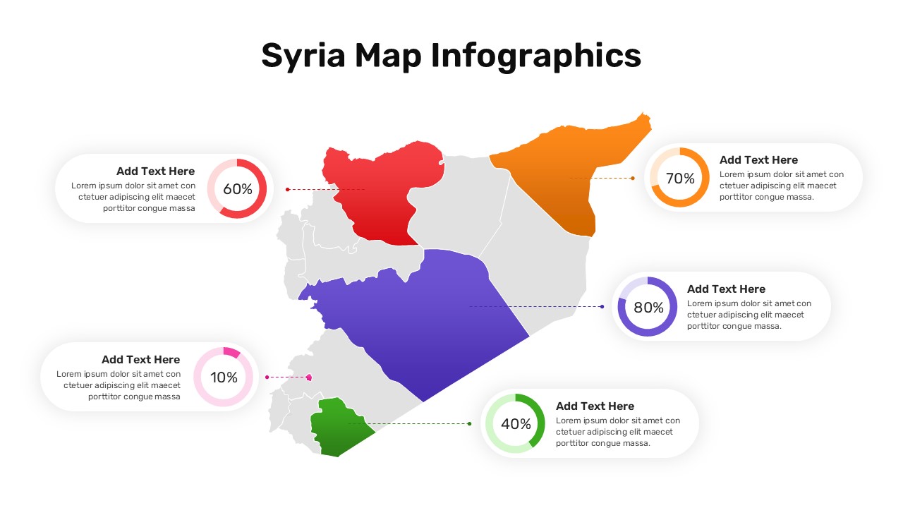
Syria Regional Data Map Infographic Template for PowerPoint & Google Slides
World Maps
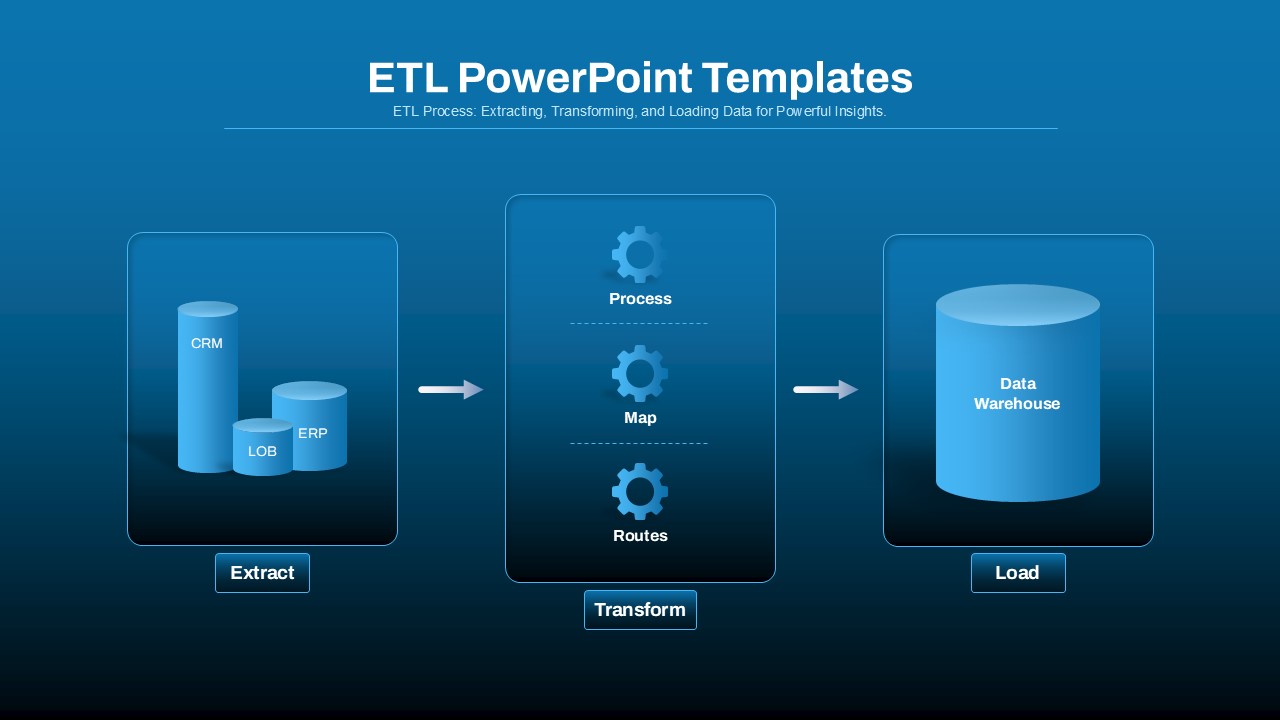
ETL Data Pipeline Workflow Diagram Template for PowerPoint & Google Slides
Process
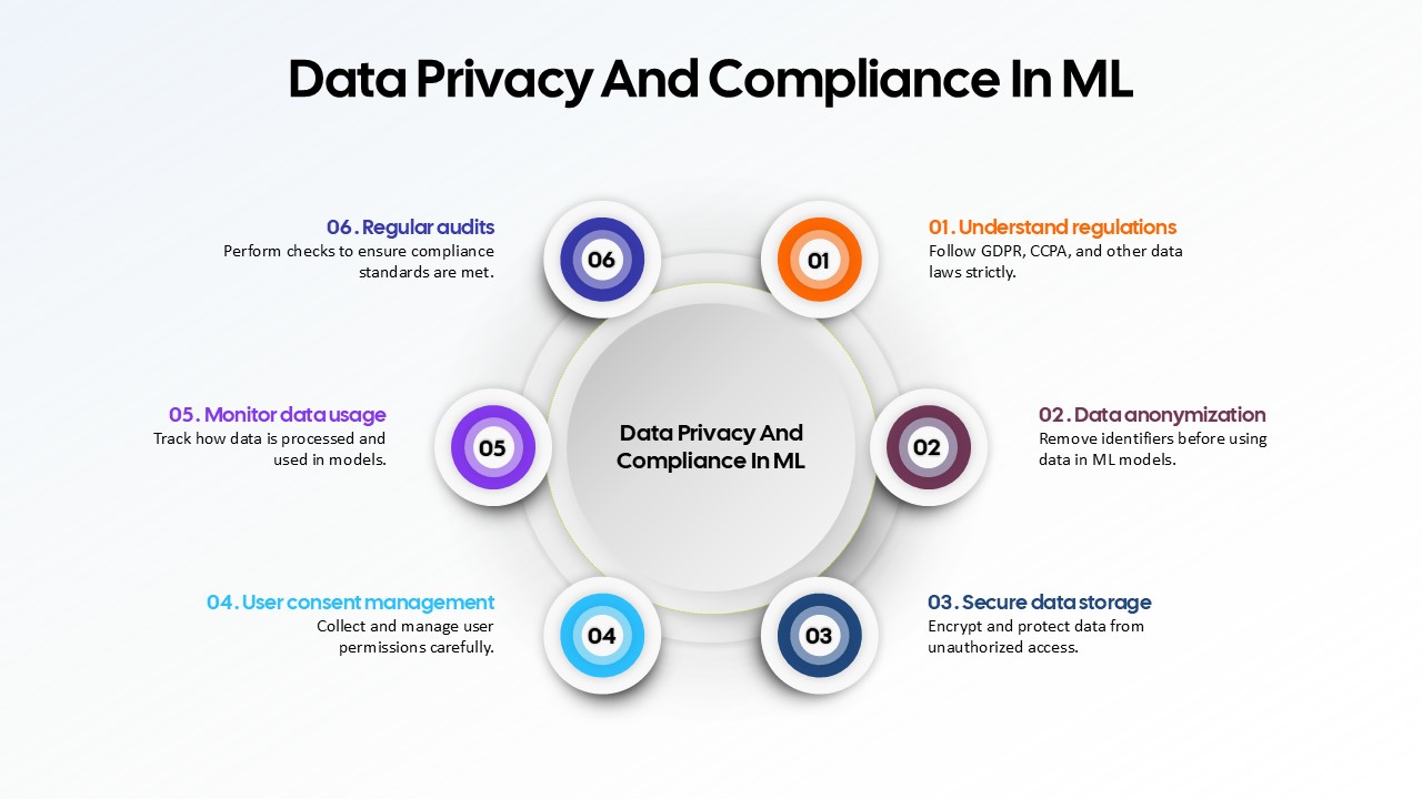
Data Privacy and Compliance in ML template for PowerPoint & Google Slides
Technology
Data-Driven AI in Insurance Infographic Template for PowerPoint & Google Slides
Circular
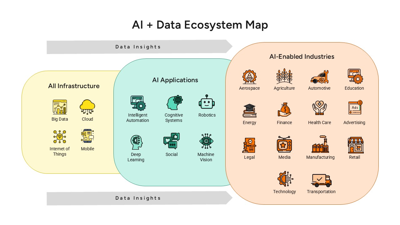
AI and Data Ecosystem Map Template for PowerPoint & Google Slides
AI
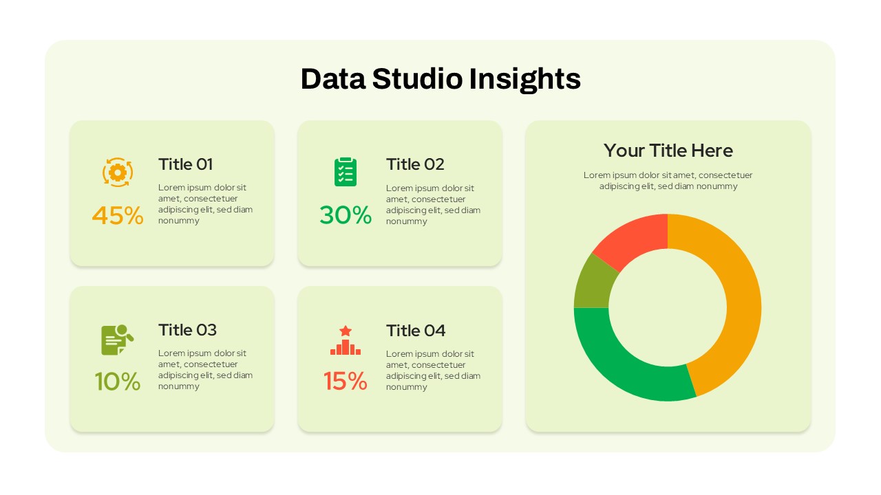
Data Studio Insights template for PowerPoint & Google Slides
Business Report
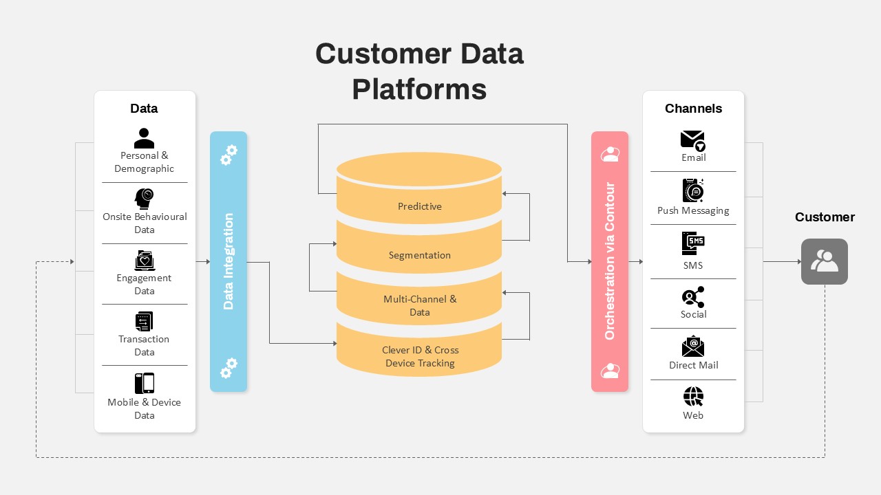
Customer Data Platform Workflow Diagram Template for PowerPoint & Google Slides
Information Technology
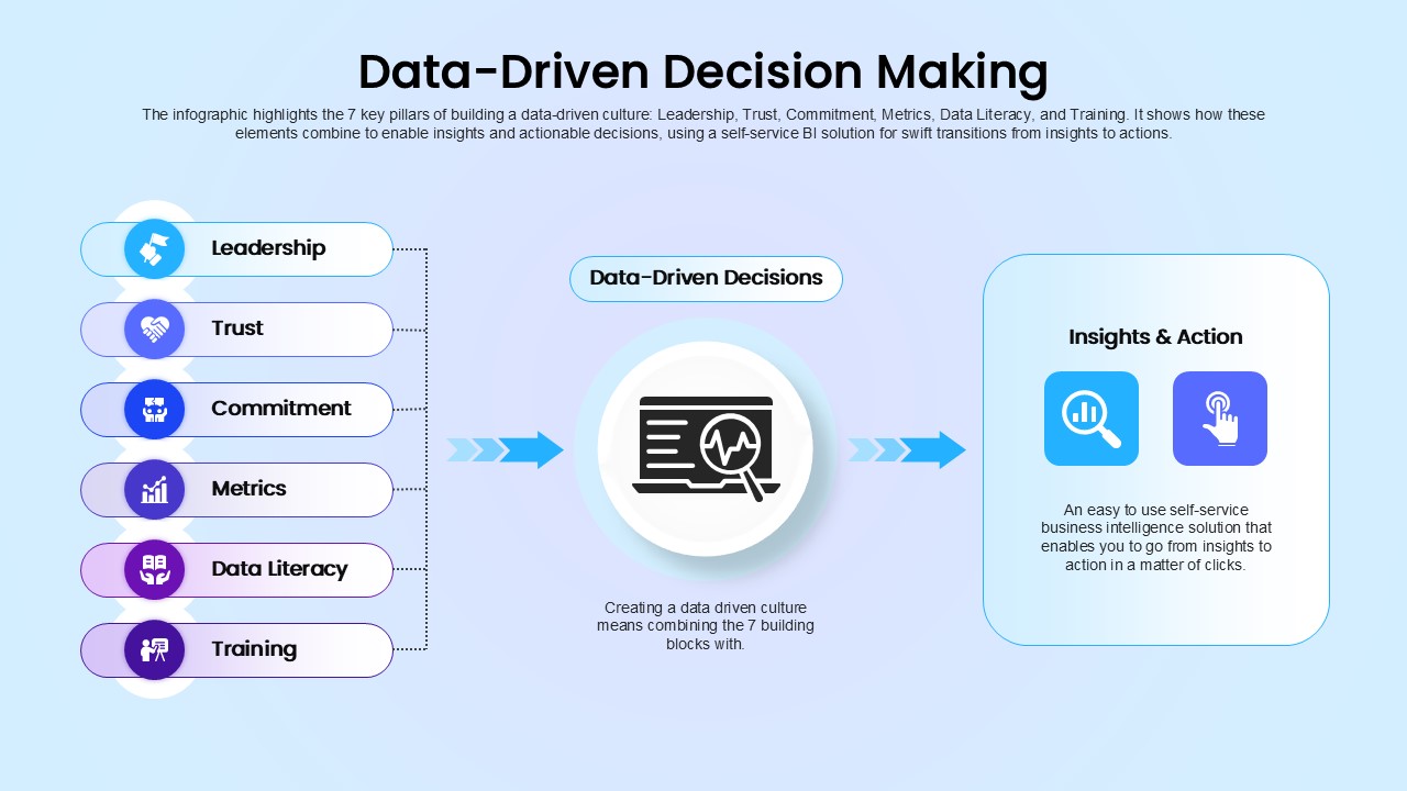
Data-Driven Decision Making overview template for PowerPoint & Google Slides
Business
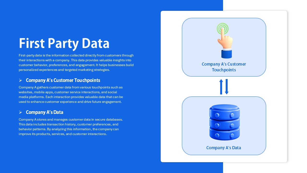
First Party Data Overview Template for PowerPoint & Google Slides
Business
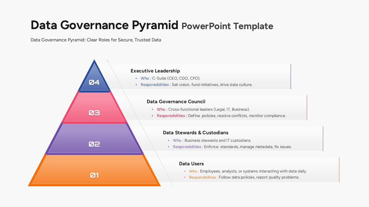
Data Governance Roles Pyramid Diagram Template for PowerPoint & Google Slides
Pyramid