100% Stacked Bar Chart for PowerPoint & Google Slides


Description
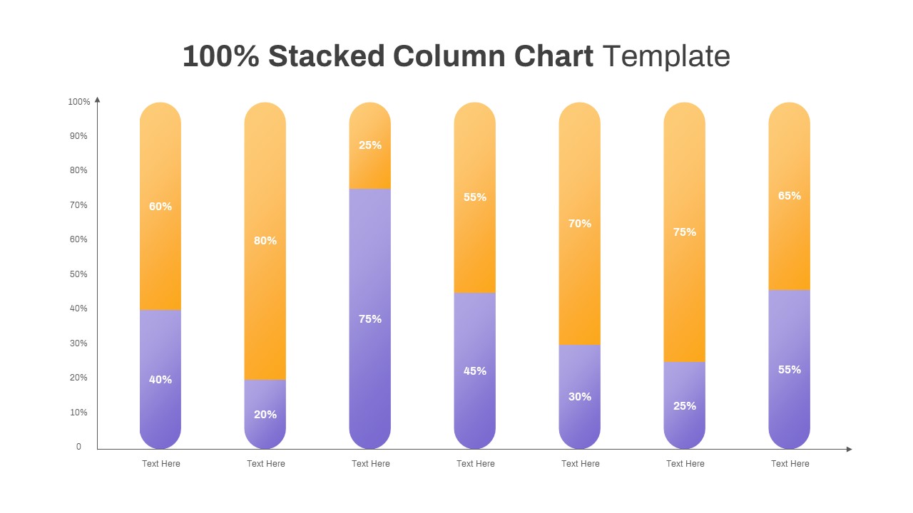
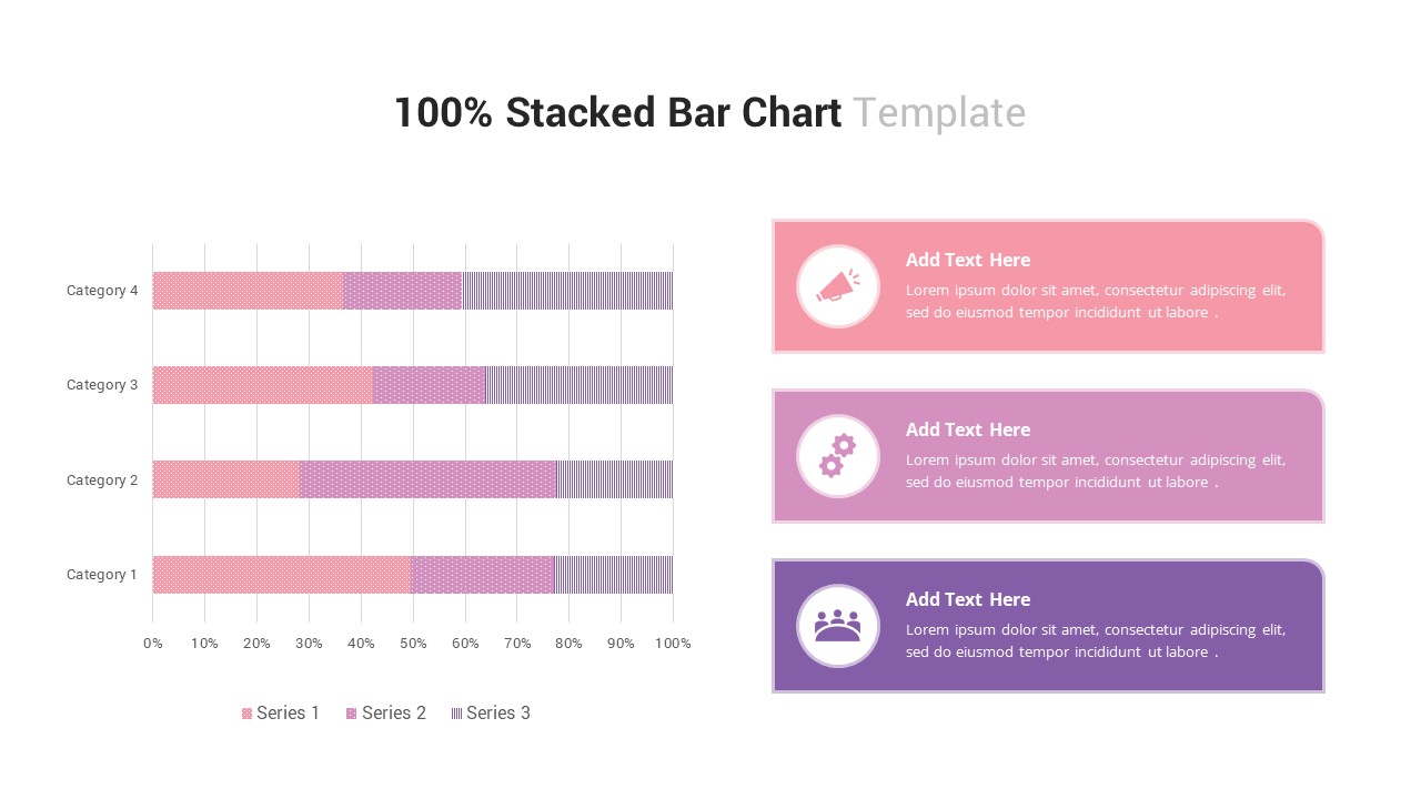
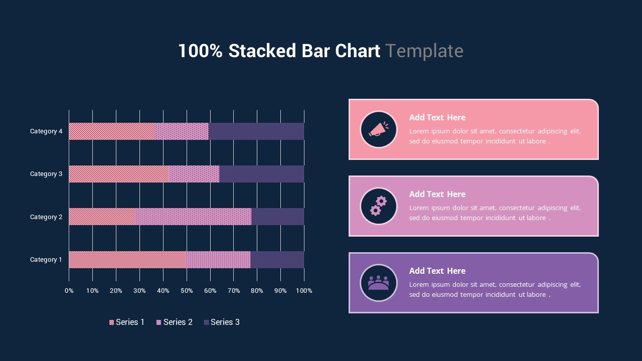
The “100% Stacked Bar Chart” slide is a dynamic and effective way to present comparative data across categories, highlighting the proportions of each series. This chart uses a 100% scale to show the contribution of each series within each category, making it ideal for illustrating how different variables contribute to a whole. The chart features three series in varying shades of pink and purple, and is accompanied by three customizable text boxes on the right for further explanation or analysis.
This slide is perfect for financial presentations, market share analysis, or any situation where proportional comparison is key. The vibrant colors and clean design help your data stand out, making it easier for your audience to interpret the information. The accompanying text boxes provide space for detailed descriptions, ensuring that each data point is clearly explained.
Fully editable, this slide allows you to adjust the data, text, and colors to match your presentation needs. It is compatible with both PowerPoint and Google Slides, providing flexibility and seamless integration into your existing presentations.
Who is it for
This slide is ideal for business analysts, project managers, marketers, and financial professionals who need to present comparative data or performance metrics. It’s perfect for showcasing market share, sales distribution, survey results, or any other type of proportional data analysis.
Other Uses
Beyond financial analysis, this slide can be used in project management to show task allocation or resource distribution, or in marketing presentations to illustrate customer segmentation or campaign performance.
Login to download this file

Item ID
SB03263
Related Templates

Professional 100% Stacked Column Chart Template for PowerPoint & Google Slides
Bar/Column
Stacked Bar Chart for PowerPoint & Google Slides
Bar/Column
Multi-Series Stacked Bar Chart Template for PowerPoint & Google Slides
Bar/Column
Animated Stacked Bar Chart Template for PowerPoint & Google Slides
Bar/Column
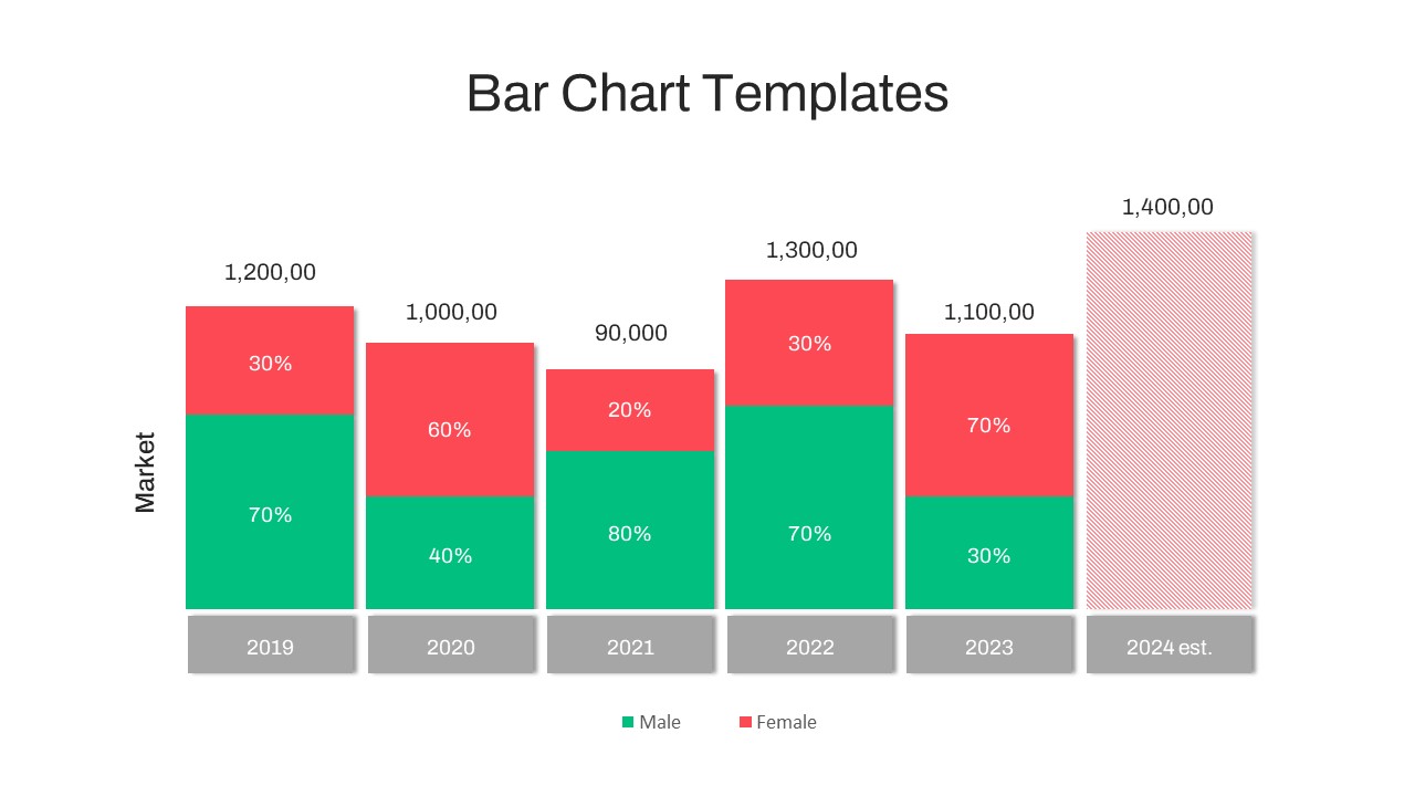
Year-over-Year Stacked Gender Bar Chart Template for PowerPoint & Google Slides
Bar/Column
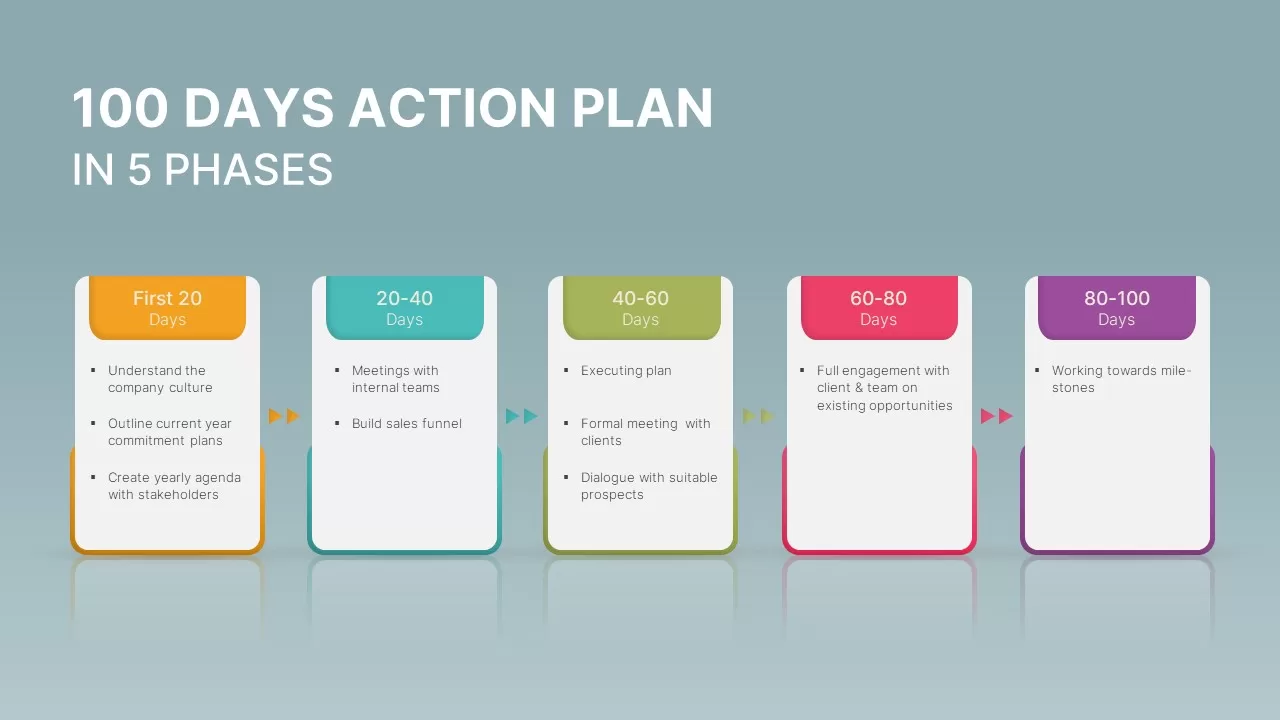
100 Days Action Plan in 5 Phases Template for PowerPoint & Google Slides
Business Plan
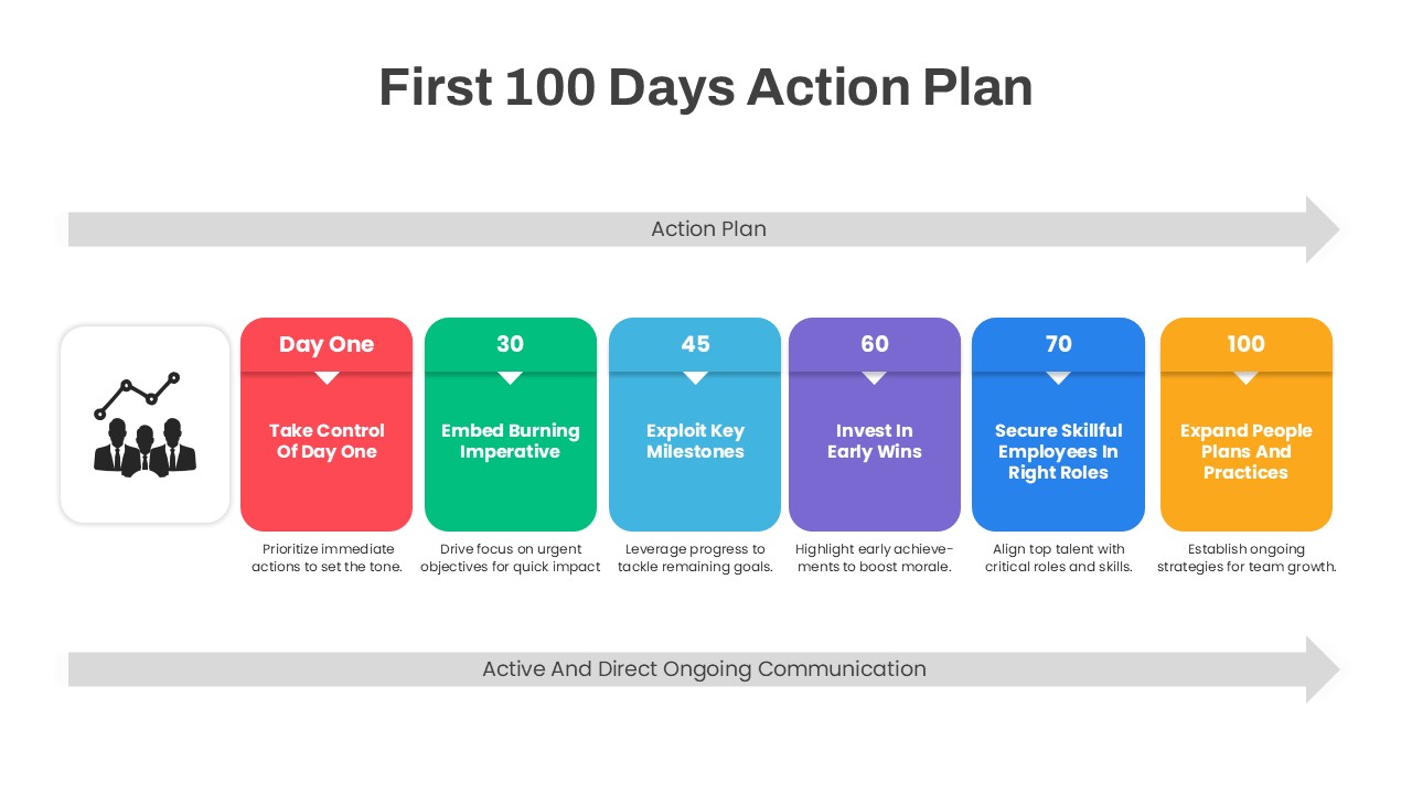
First 100 Days Action Plan Infographic Template for PowerPoint & Google Slides
Timeline
Free Stacked Column Chart Data Visualization Template for PowerPoint & Google Slides
Bar/Column
Free
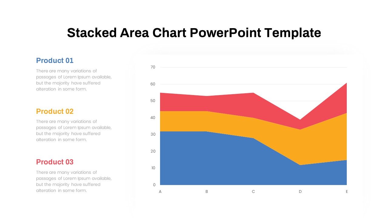
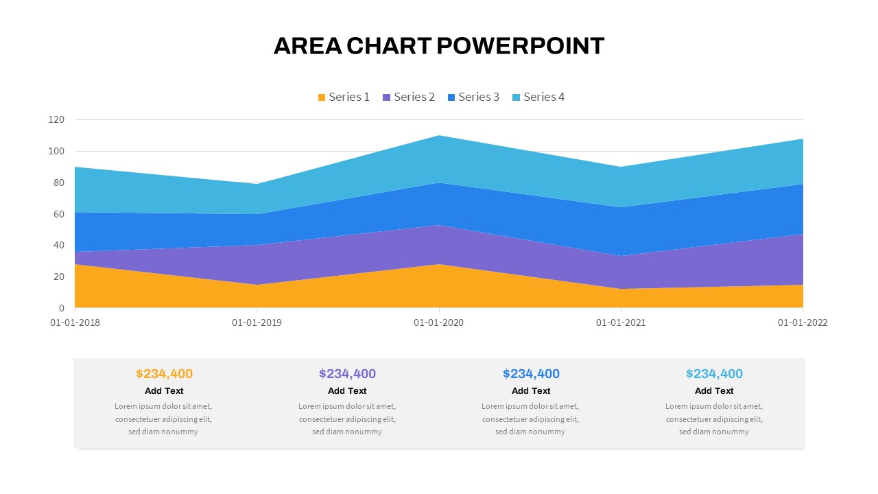
Dynamic Three-Series Stacked Area Chart Template for PowerPoint & Google Slides
Comparison Chart
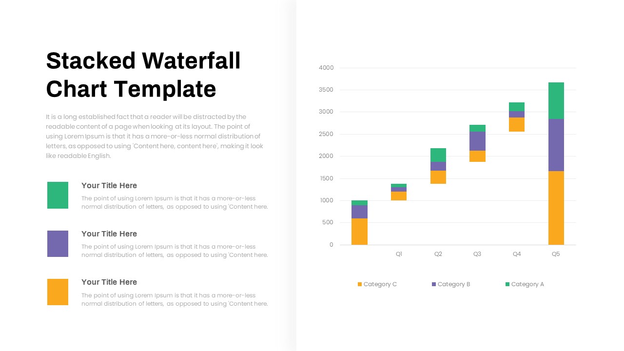
Stacked Waterfall Chart Template for PowerPoint & Google Slides
Bar/Column
Stacked Area Chart with Financial Highlights for PowerPoint & Google Slides
Finance
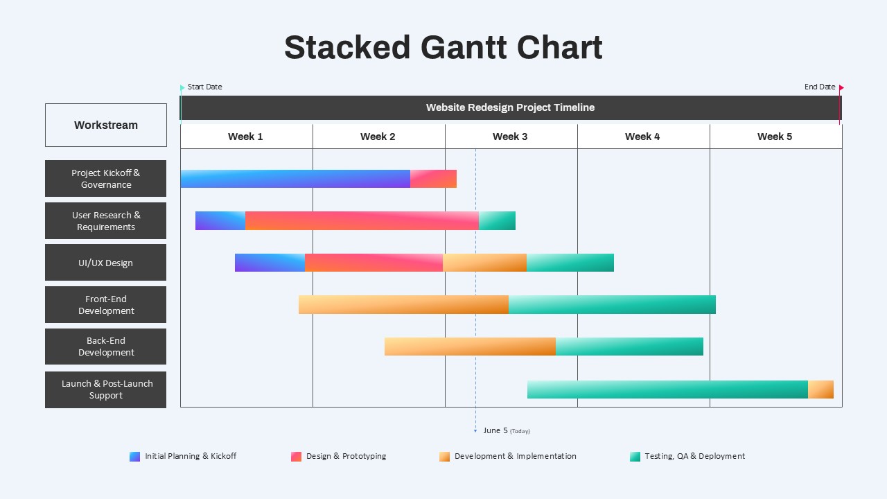
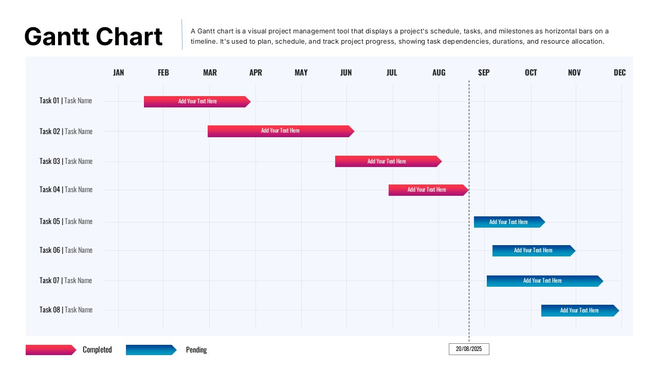
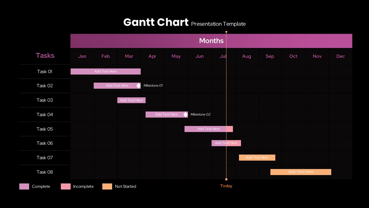
Stacked Gantt Chart Timeline Slide Template for PowerPoint & Google Slides
Gantt Chart
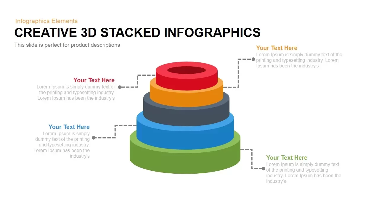
3D Stacked Infographic Layers Data Template for PowerPoint & Google Slides
Pyramid

Stacked Cubes Pyramid Infographic Template for PowerPoint & Google Slides
Pyramid
Vertical Stacked Process Infographic Template for PowerPoint & Google Slides
Process
Stacked Cubes Pyramid Six-Option Diagram Template for PowerPoint & Google Slides
Pyramid
Elegant Stacked Photo Collage Layout Template for PowerPoint & Google Slides
Graphics
Bar Chart Sample template for PowerPoint & Google Slides
Bar/Column
Creative Data Analysis Bar Chart template for PowerPoint & Google Slides
Bar/Column
3D Bar Chart Data Infographics Template for PowerPoint & Google Slides
Bar/Column
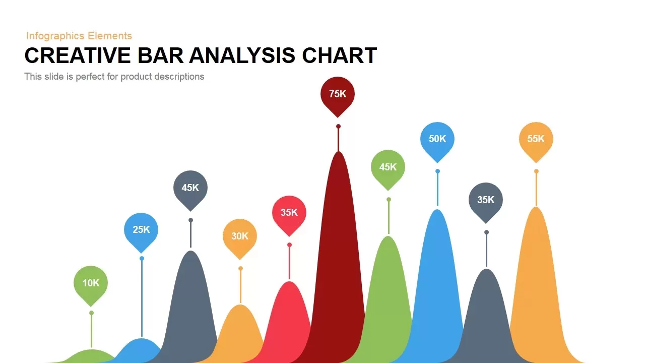
Creative Bar Chart template for PowerPoint & Google Slides
Charts
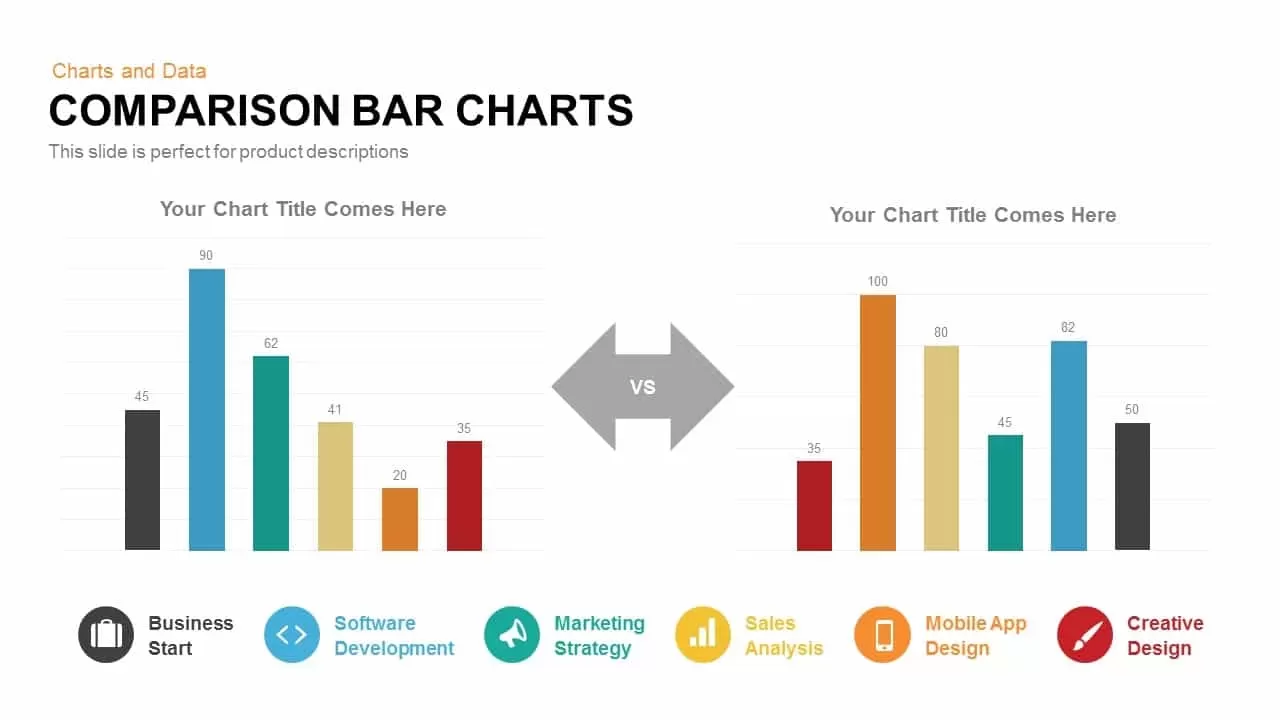
Comparison Bar Chart template for PowerPoint & Google Slides
Comparison Chart
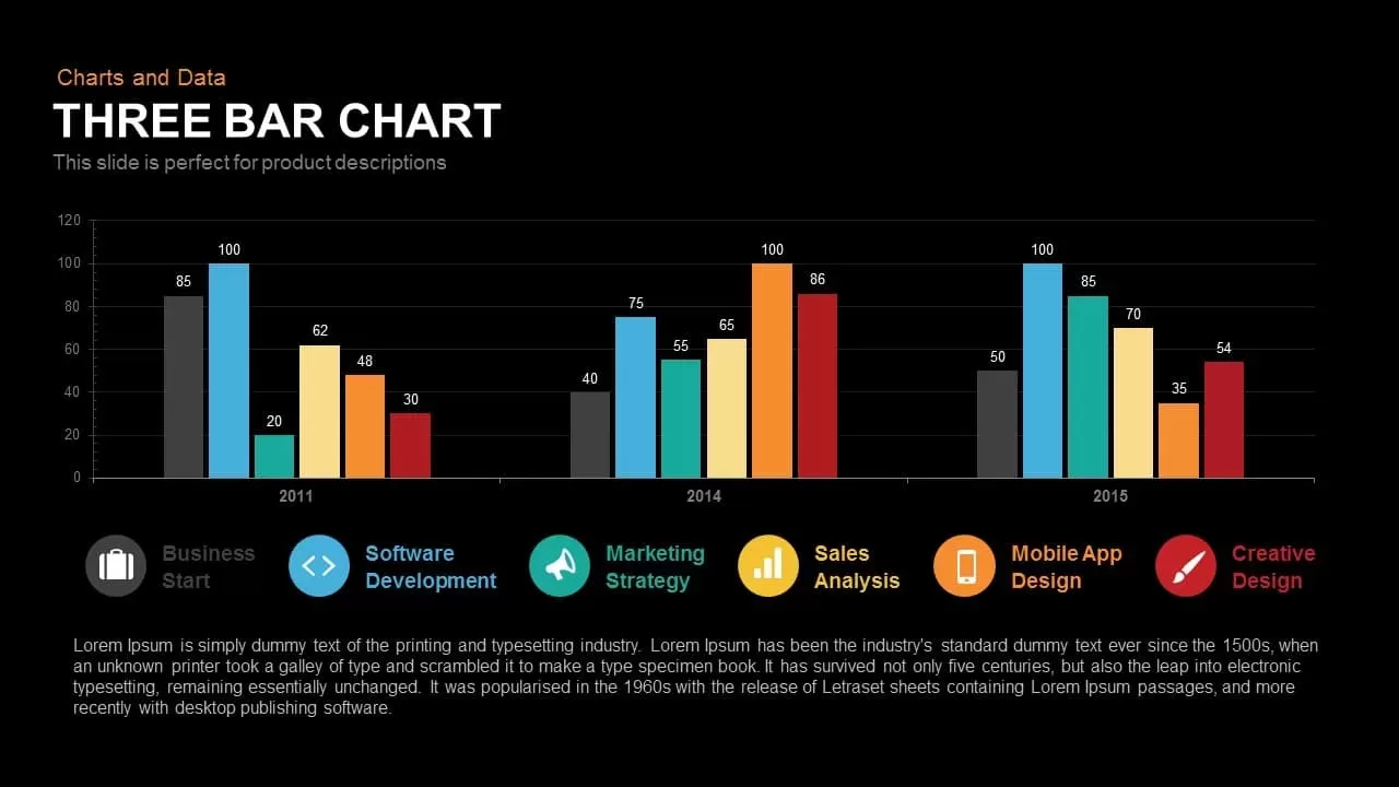
Three-Year Bar Chart template for PowerPoint & Google Slides
Charts
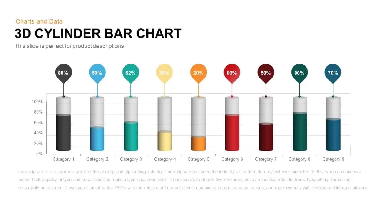
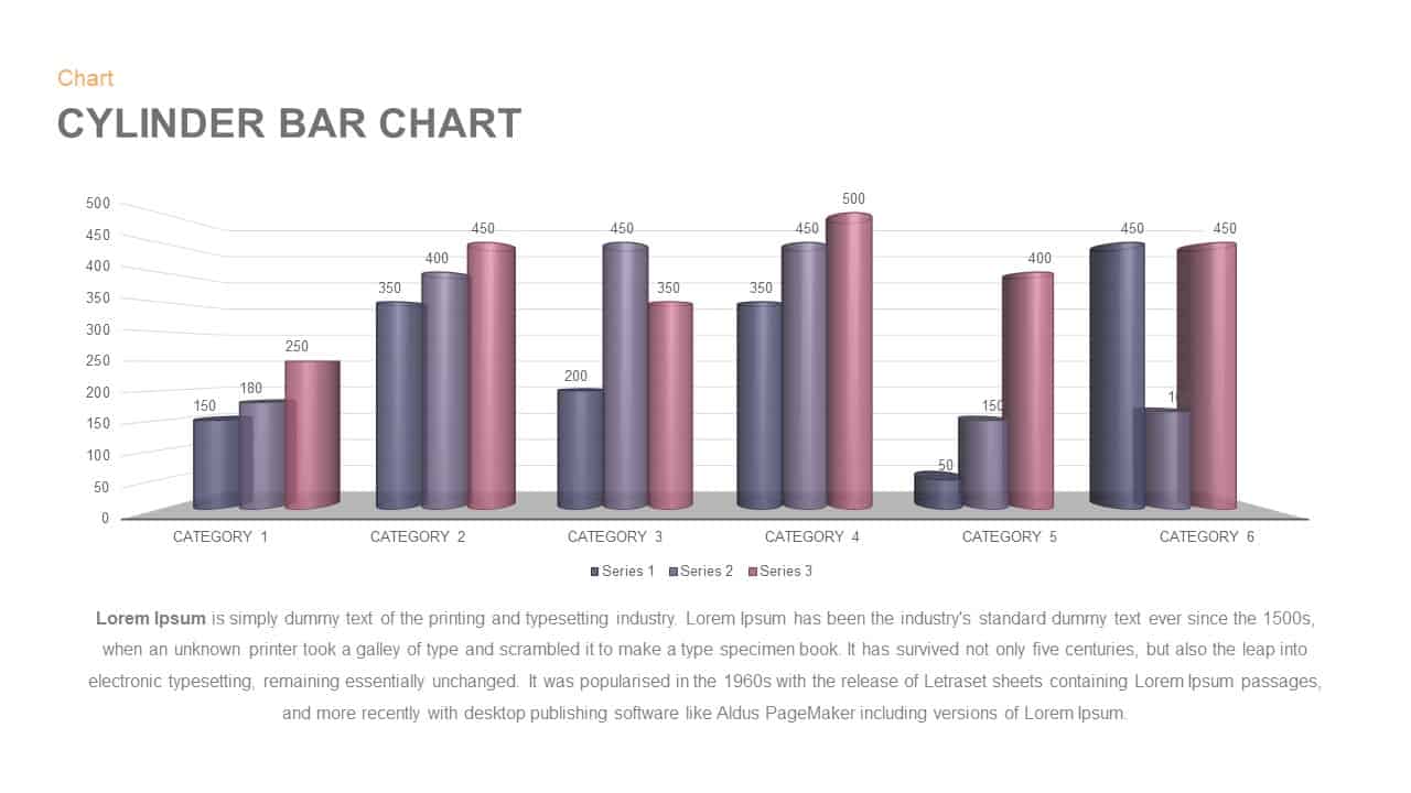
3D Cylinder Bar Chart Template for PowerPoint & Google Slides
Bar/Column
Pencil Bar Chart Data Analysis Template for PowerPoint & Google Slides
Bar/Column

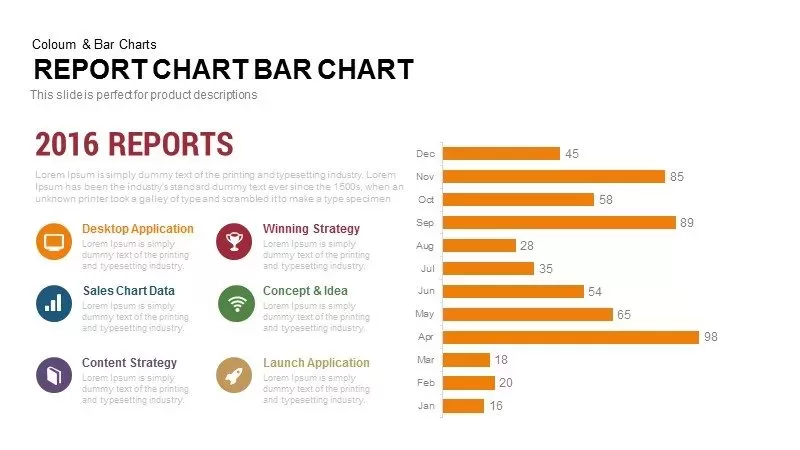
Monthly Reports Bar Chart template for PowerPoint & Google Slides
Bar/Column

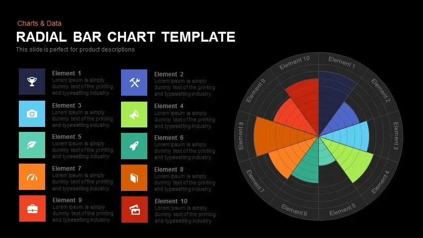
Colorful Radial Bar Chart Template for PowerPoint & Google Slides
Bar/Column
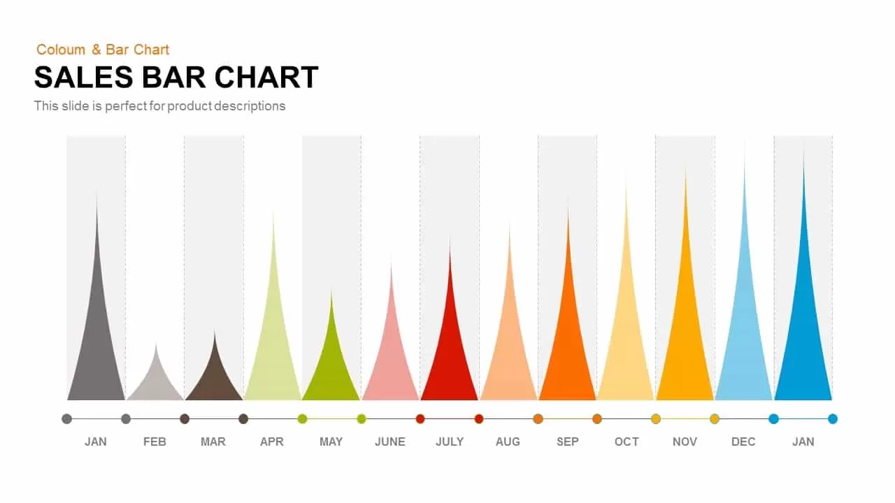
Sales Bar Chart for PowerPoint & Google Slides
Bar/Column
Interactive Product Comparison Bar Chart Template for PowerPoint & Google Slides
Bar/Column
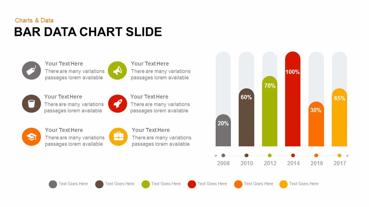
Bar Data Chart Slide for PowerPoint & Google Slides
Bar/Column

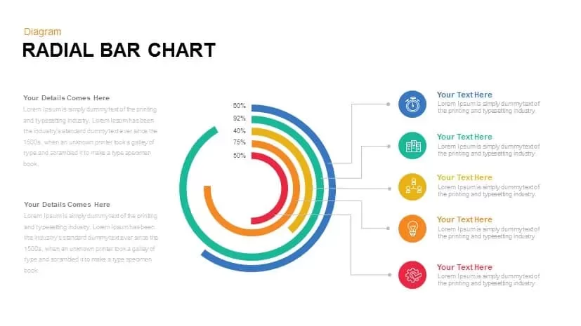
Radial Bar Chart Diagram for PowerPoint & Google Slides
Bar/Column
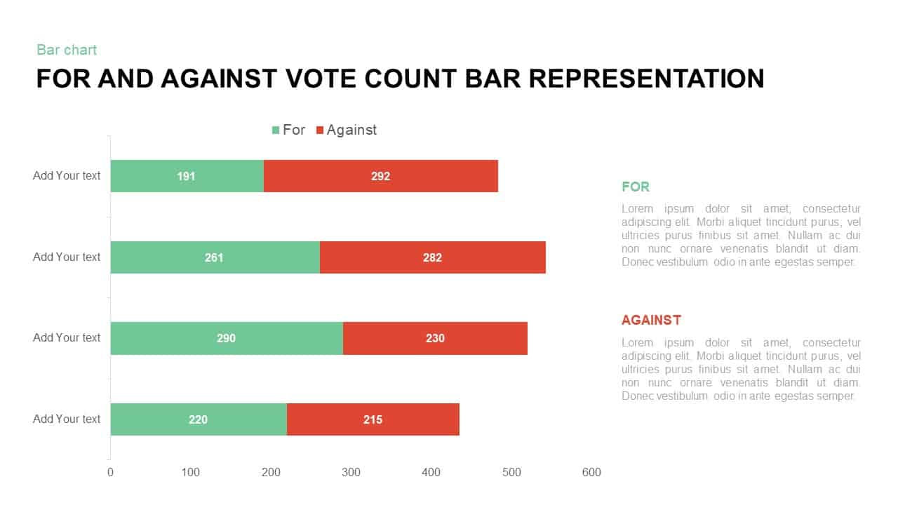
For and Against Vote Count Bar Chart Template for PowerPoint & Google Slides
Bar/Column
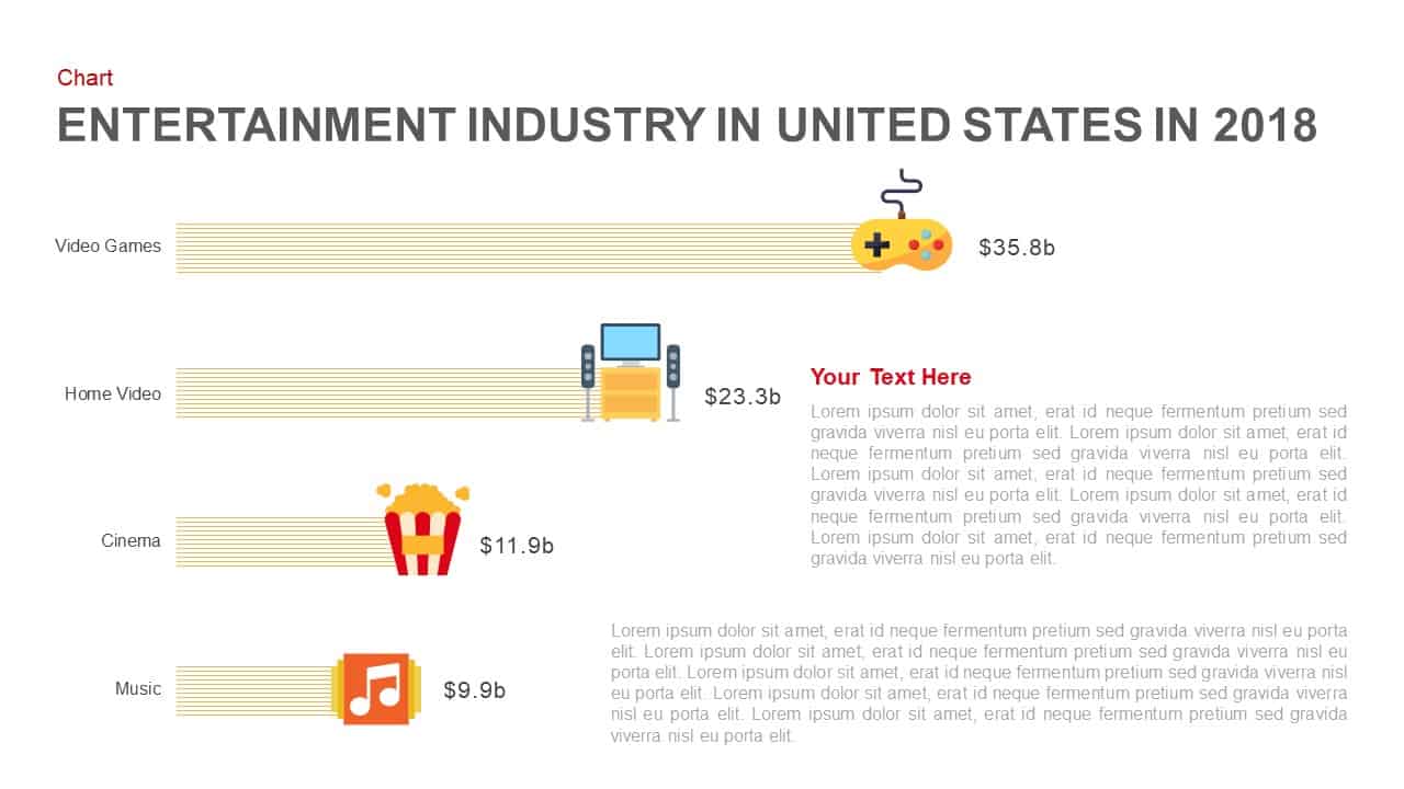
Entertainment Industry Revenue Bar Chart Template for PowerPoint & Google Slides
Bar/Column
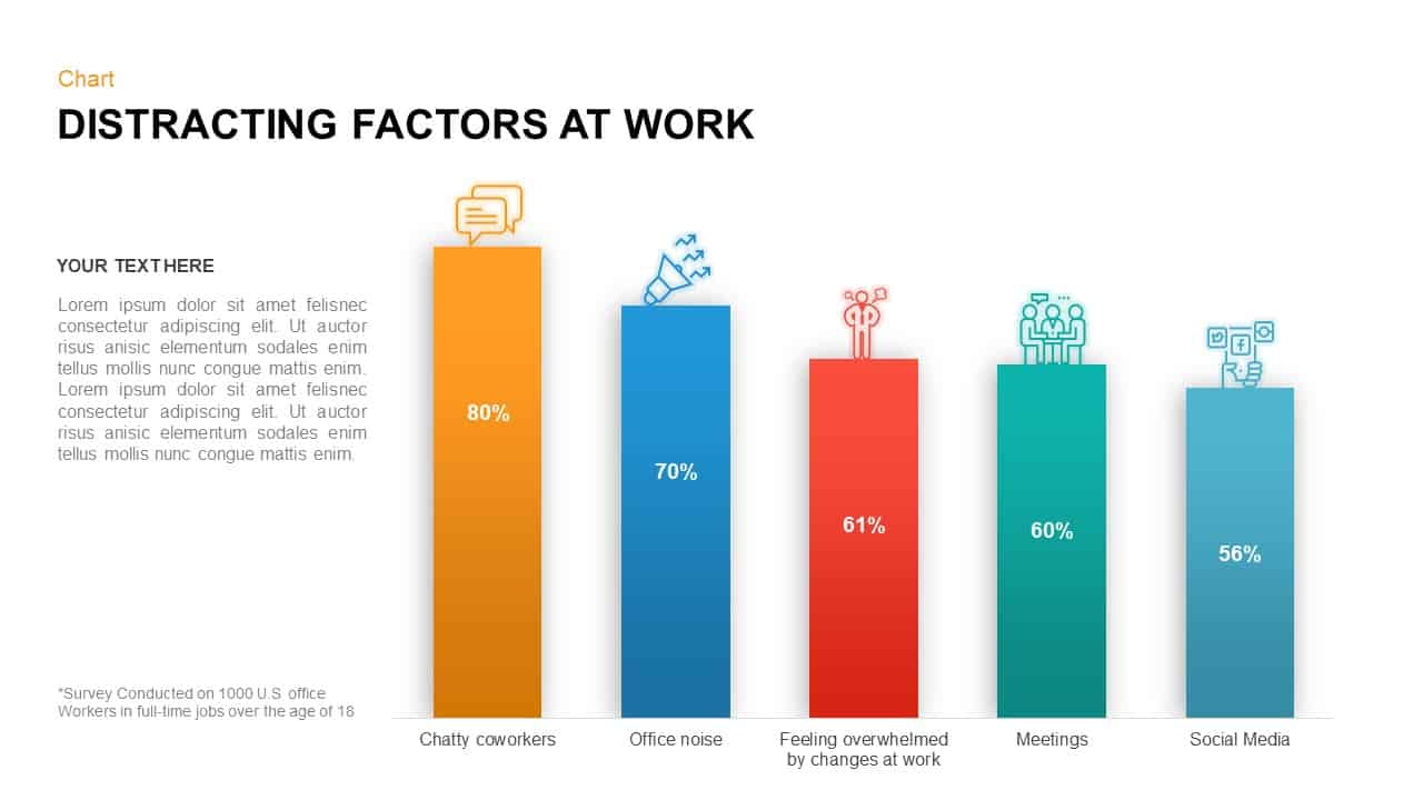
Distracting Factors at Work Bar Chart Template for PowerPoint & Google Slides
Bar/Column
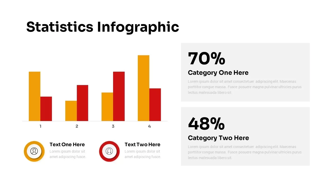
Statistics Infographic & KPI Bar Chart Template for PowerPoint & Google Slides
Bar/Column
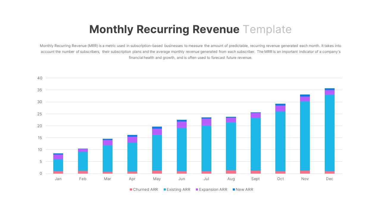
Monthly Recurring Revenue KPI Bar Chart Template for PowerPoint & Google Slides
Bar/Column
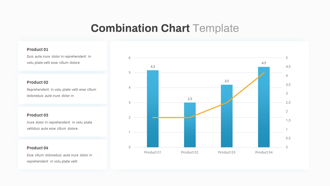
Combination Bar and Line Chart Template for PowerPoint & Google Slides
Bar/Column
Animated Clustered Bar Chart Template for PowerPoint & Google Slides
Bar/Column
Simple Bar Chart Data Visualization Template for PowerPoint & Google Slides
Bar/Column
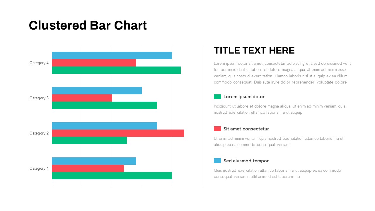
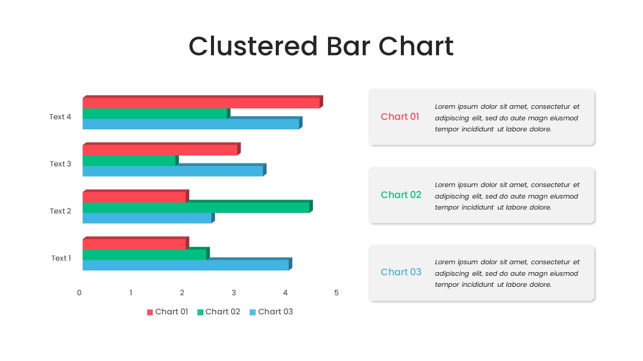
Clustered Bar Chart Comparison Template for PowerPoint & Google Slides
Bar/Column
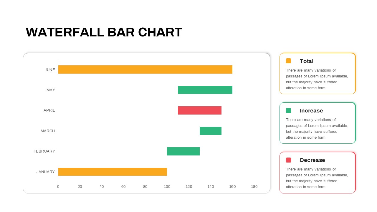
Waterfall Bar Chart Analysis Template for PowerPoint & Google Slides
Bar/Column
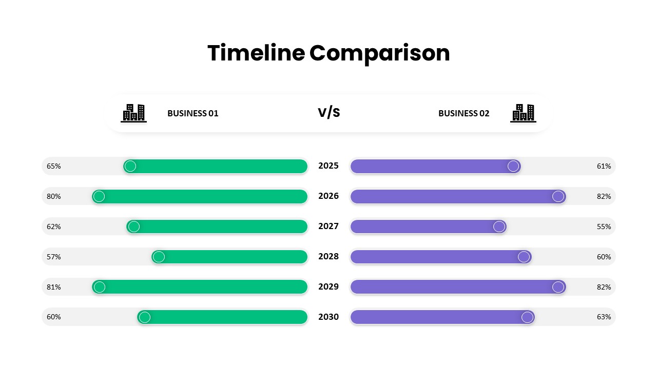
Business Timeline Comparison Bar Chart Template for PowerPoint & Google Slides
Comparison Chart
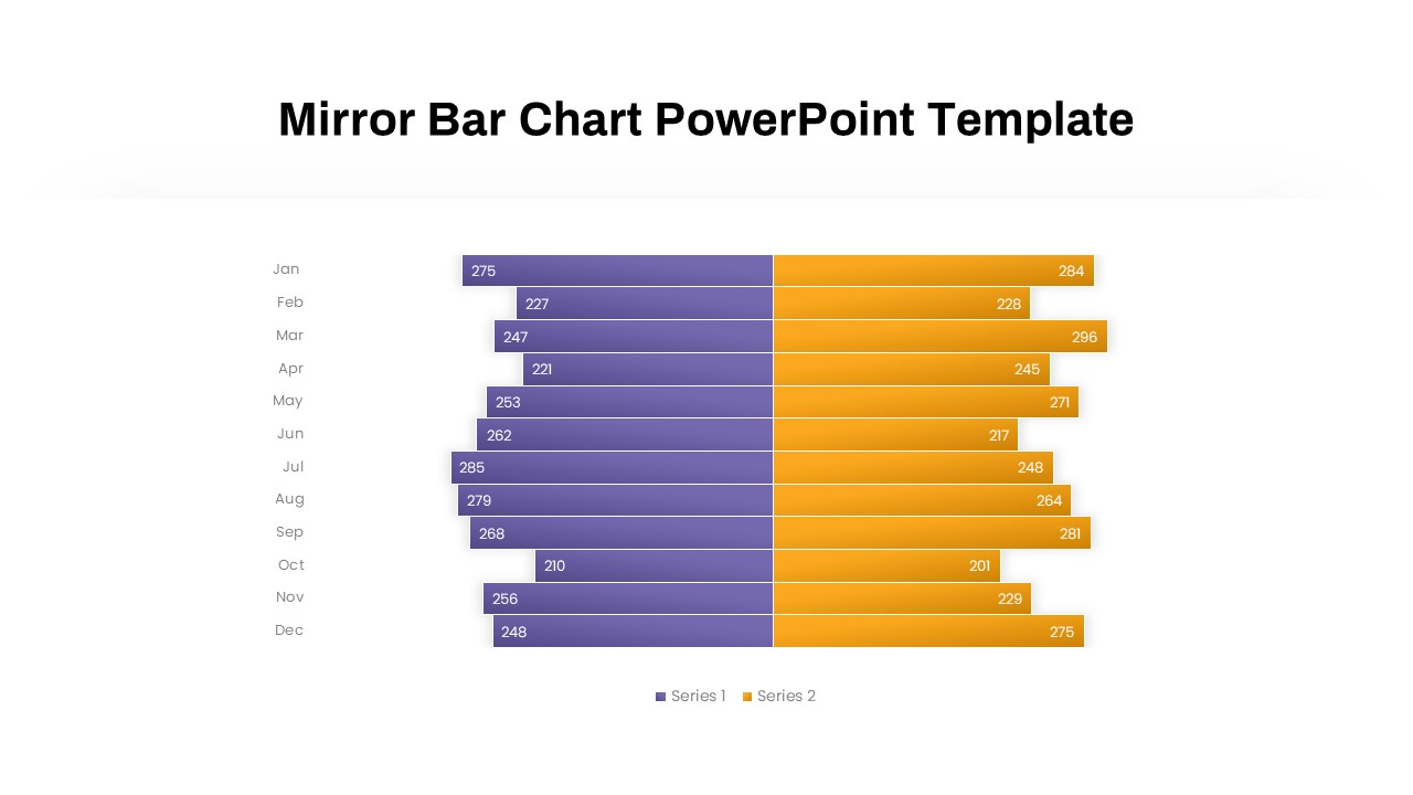
Mirror Bar Chart Comparison Template for PowerPoint & Google Slides
Bar/Column
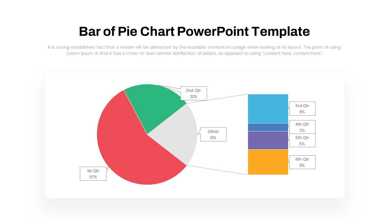
Dynamic Bar-of-Pie Chart Comparison Template for PowerPoint & Google Slides
Pie/Donut
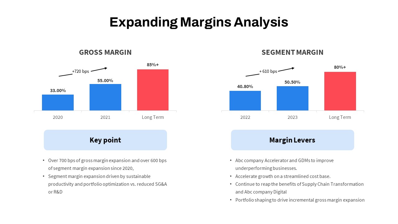
Expanding Margins Analysis Bar Chart Template for PowerPoint & Google Slides
Charts
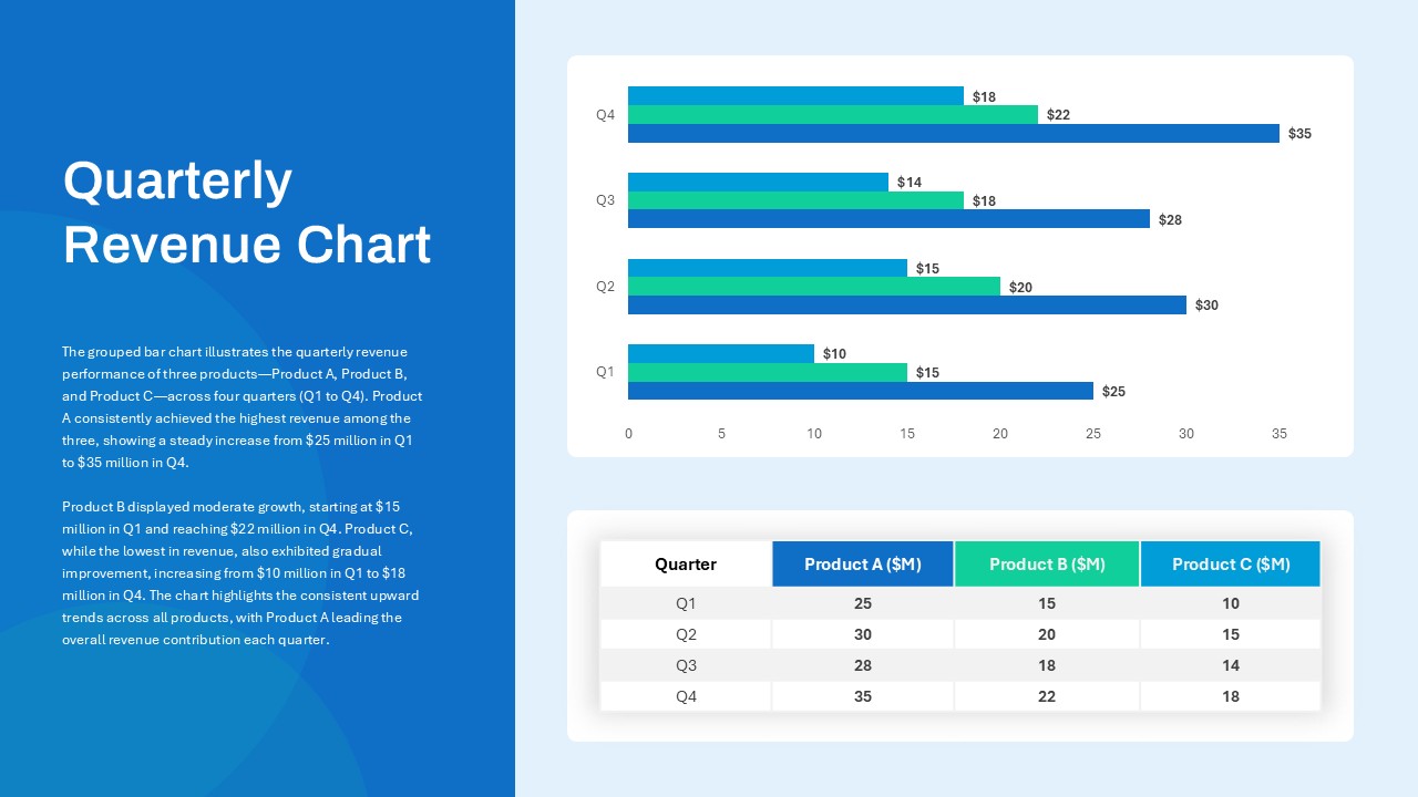
Quarterly Revenue Comparison Bar Chart Template for PowerPoint & Google Slides
Bar/Column
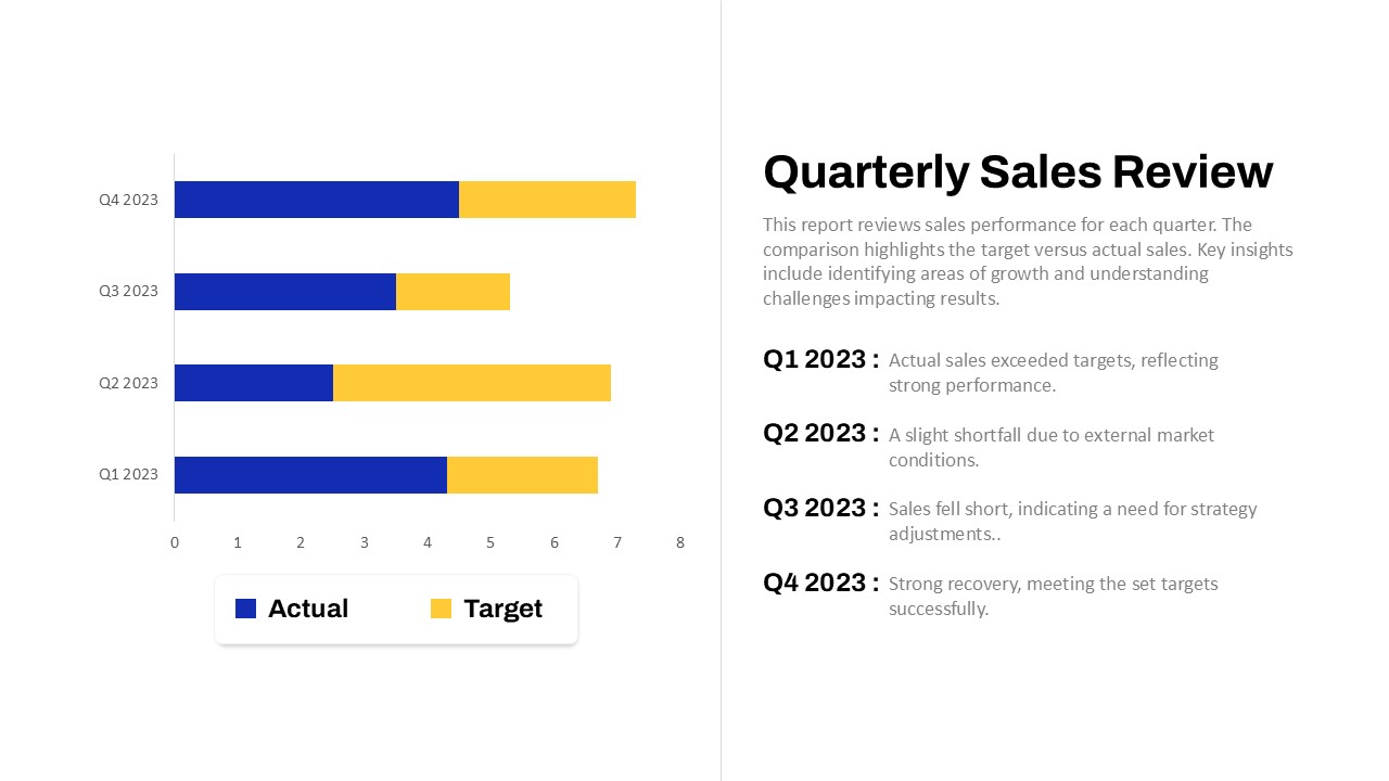
Quarterly Sales Review Bar Chart Template for PowerPoint & Google Slides
Bar/Column
Data Analysis Bar Chart with Insights Template for PowerPoint & Google Slides
Bar/Column
Free
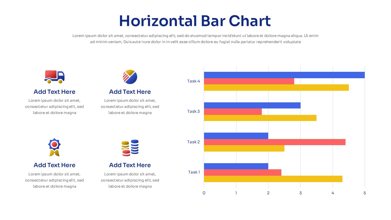
Horizontal Bar Chart Slide with Icons Template for PowerPoint & Google Slides
Bar/Column
Two-Option Bar Chart Comparison Table Template for PowerPoint & Google Slides
Comparison
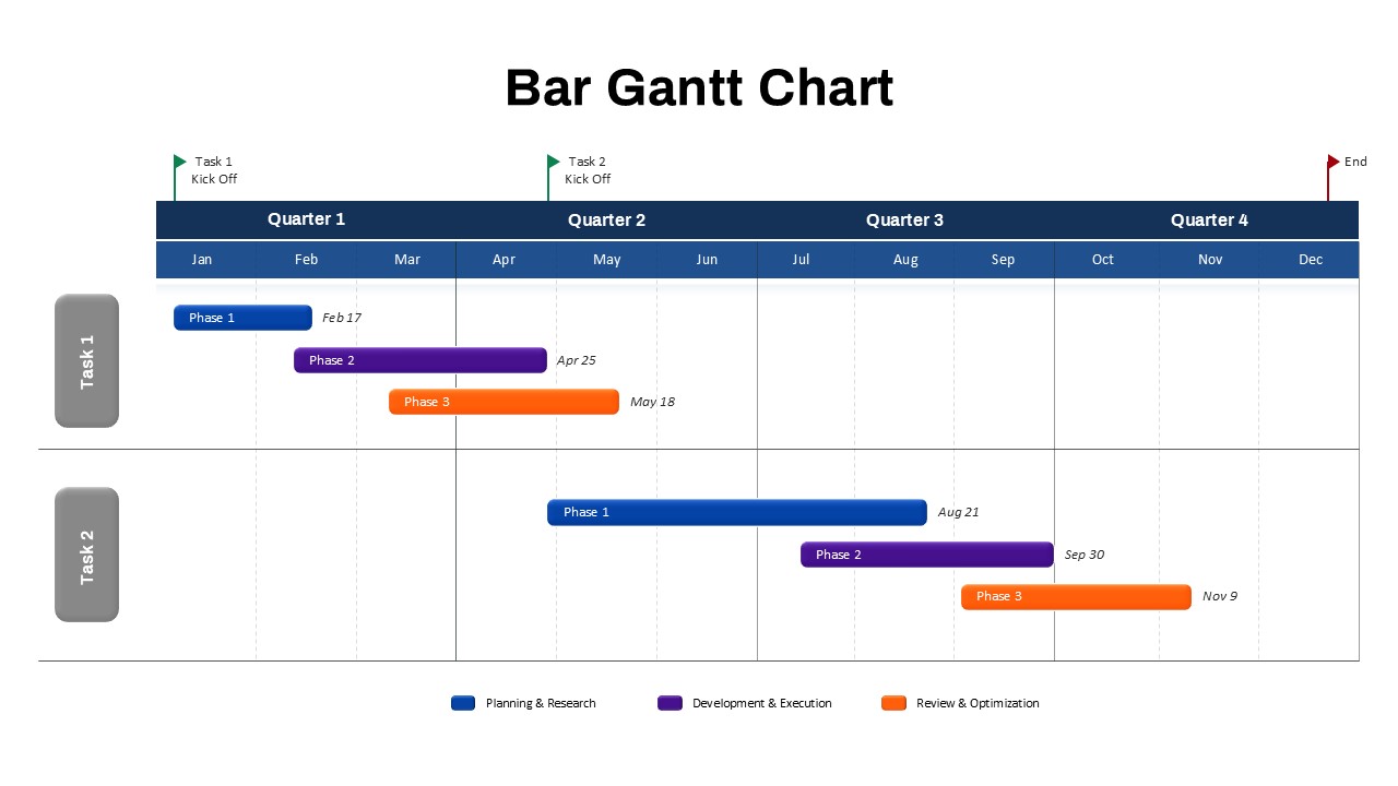
Bar Gantt Chart Template for PowerPoint & Google Slides
Gantt Chart
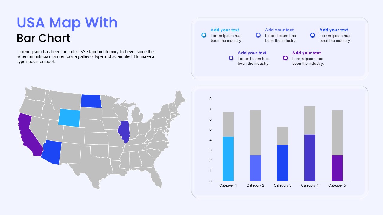
USA Map with Bar Chart Template for PowerPoint & Google Slides
World Maps
3D Cylinder Bar Chart Visualization Template for PowerPoint
Bar/Column
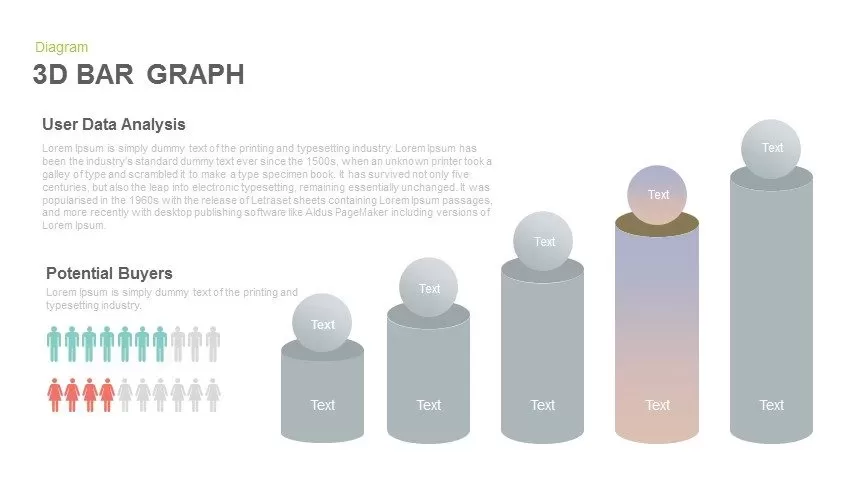
3D Bar Graph Infographic Template for PowerPoint & Google Slides
Bar/Column
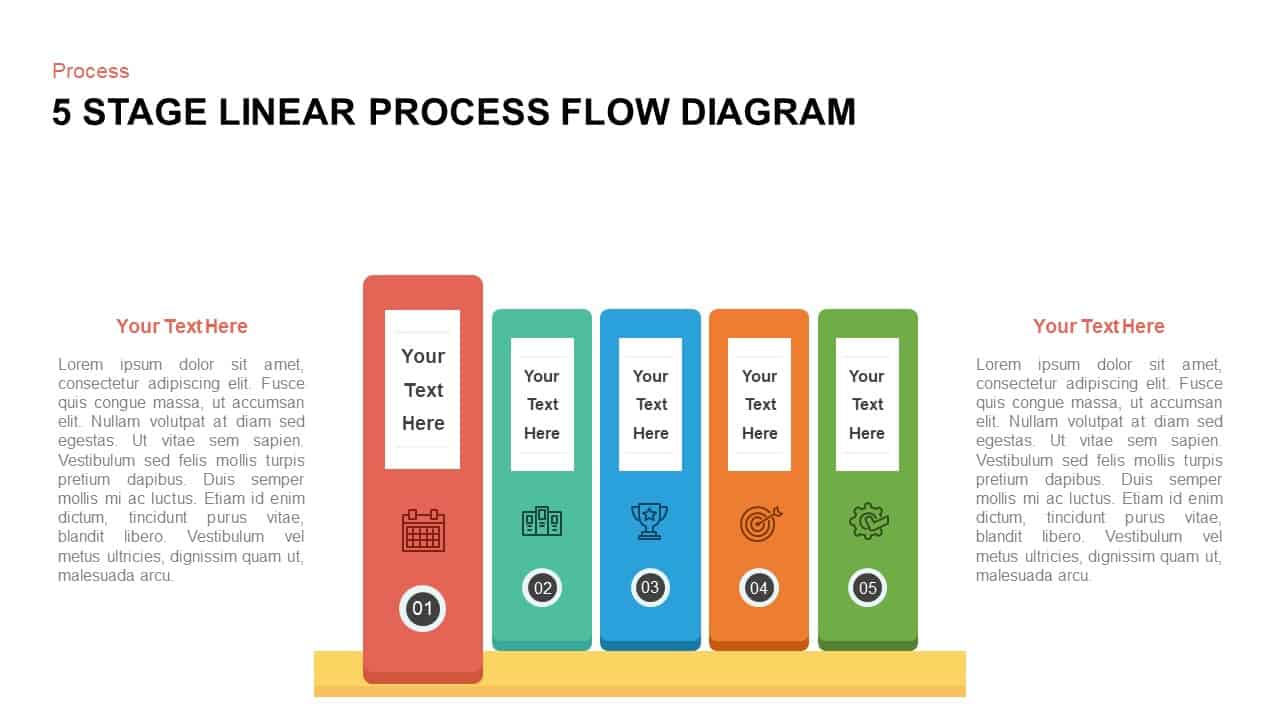
Five-Stage Vertical Bar Process Template for PowerPoint & Google Slides
Process
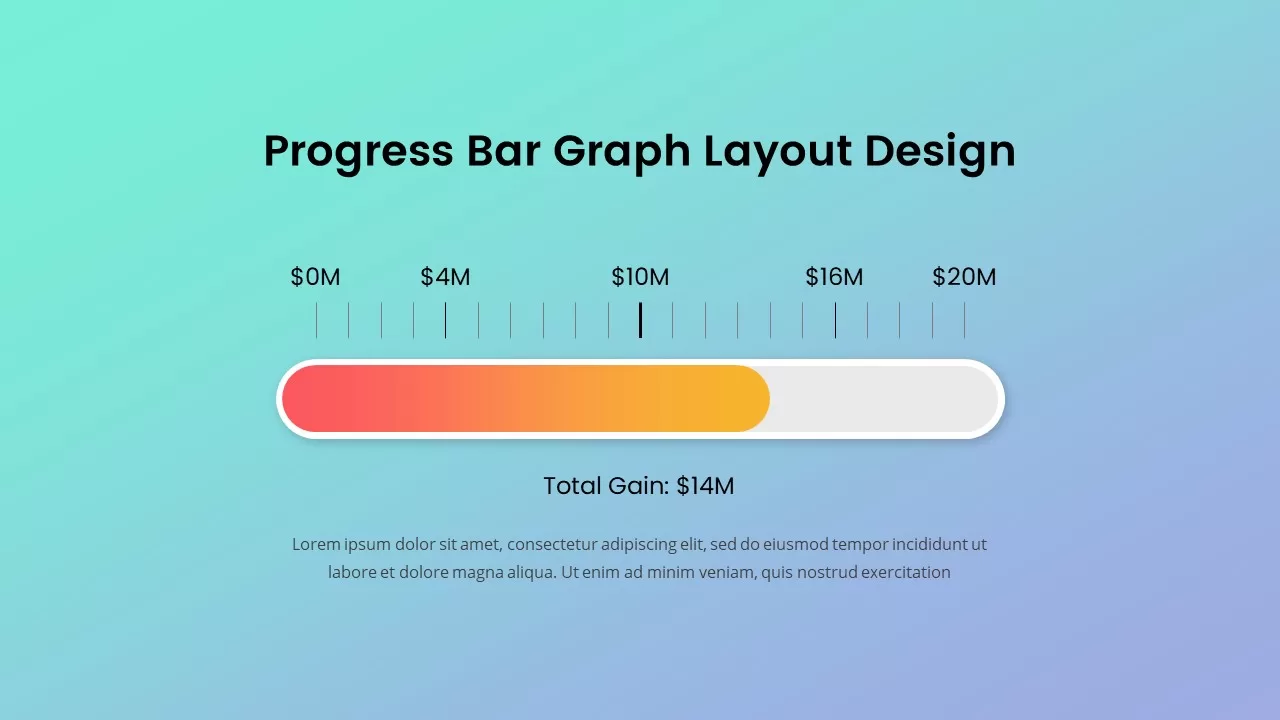
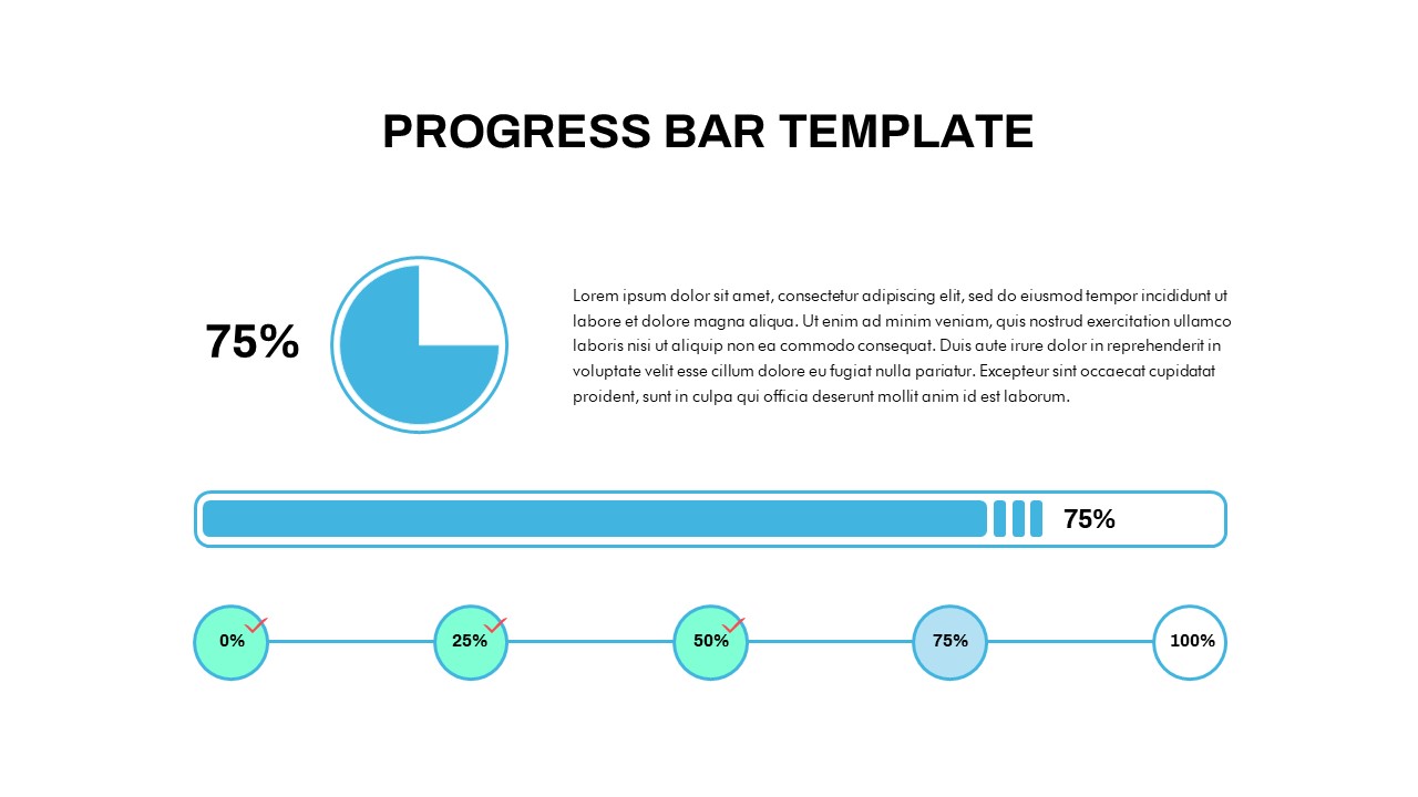
Progress Bar Graph Layout Design for PowerPoint & Google Slides
Charts
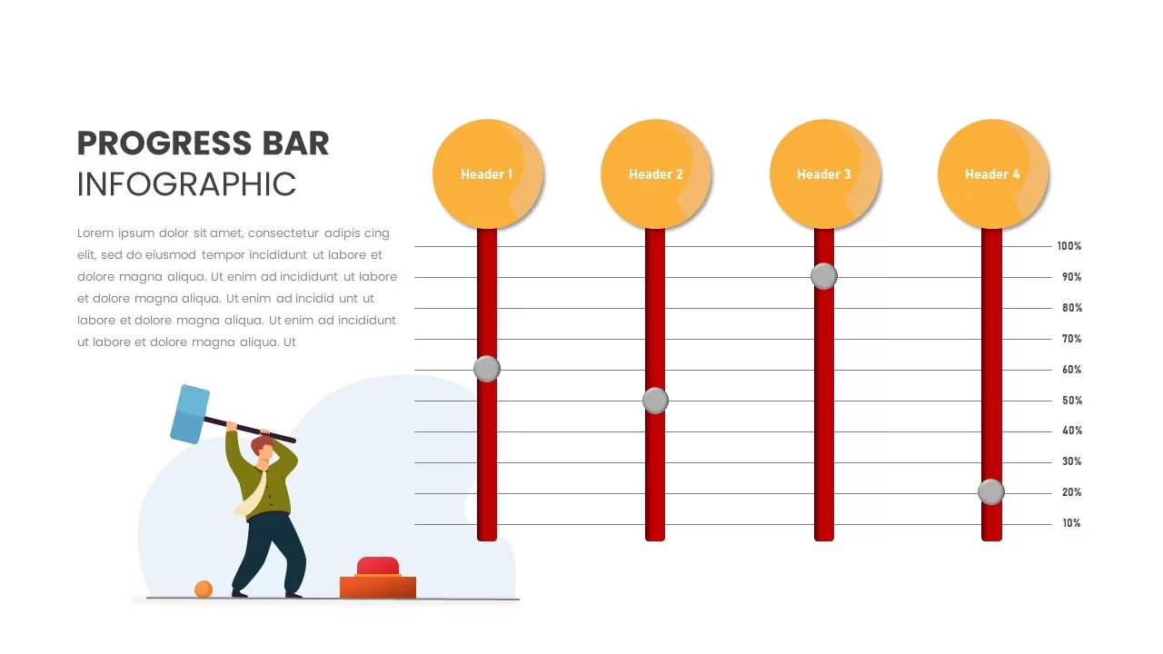
Progress Bar Infographic for PowerPoint & Google Slides
Business
Progress Bar infographic pack for PowerPoint & Google Slides
Business
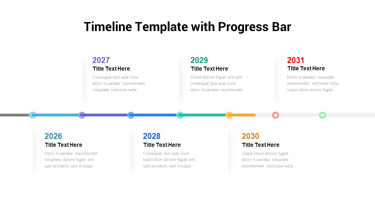
Timeline Roadmap with Progress Bar Template for PowerPoint & Google Slides
Timeline
Progress Bar and Milestone Visualization Template for PowerPoint & Google Slides
Timeline
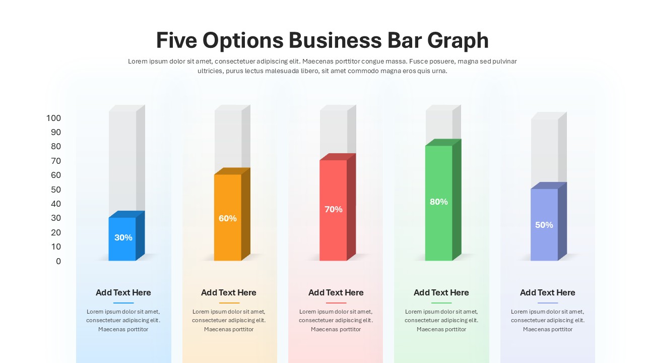
Five Options Business Bar Graph for PowerPoint & Google Slides
Business Report

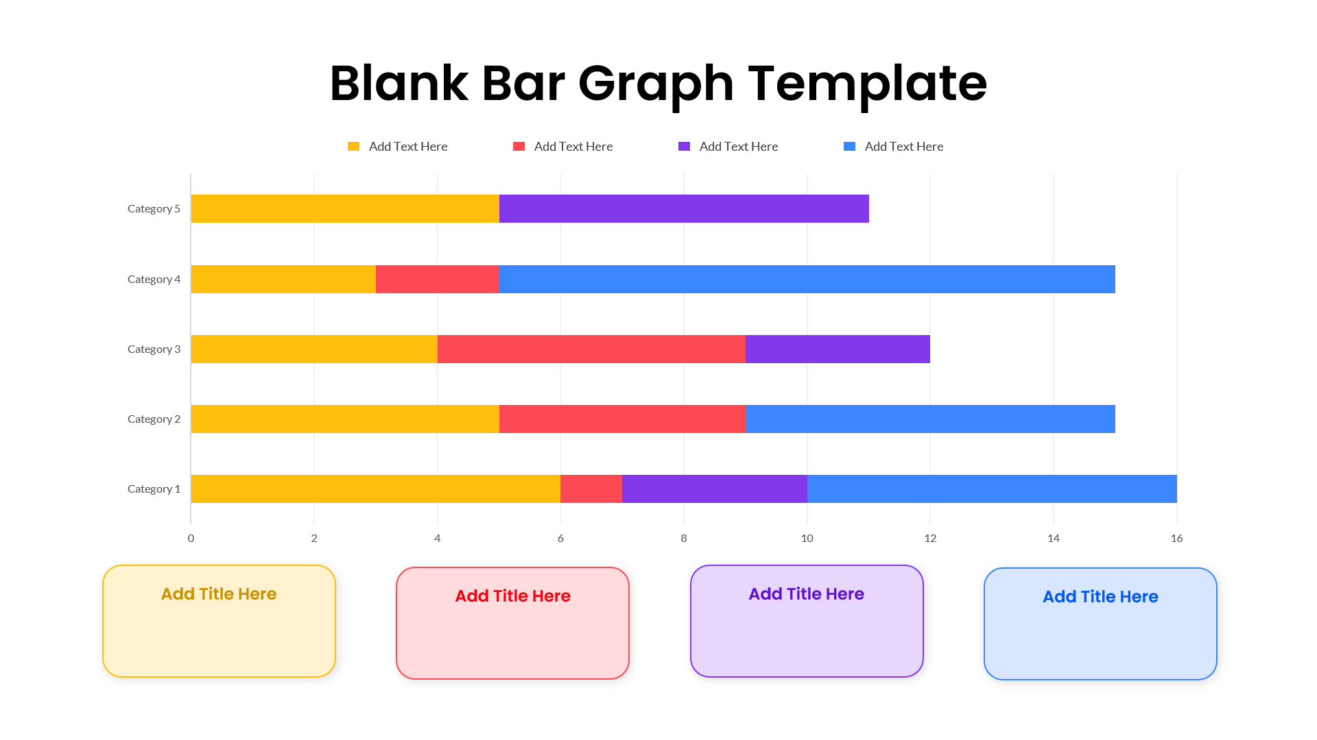
Blank Bar Graph Template for PowerPoint & Google Slides
Bar/Column
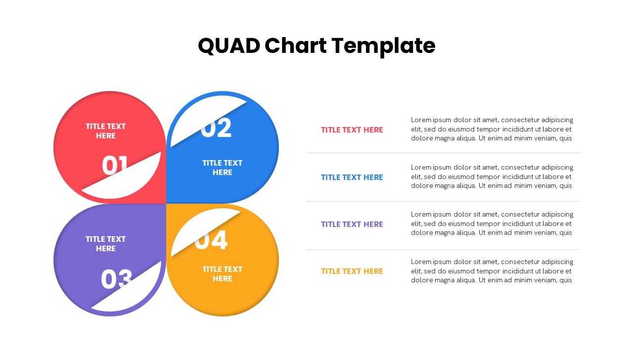
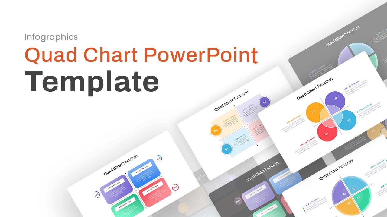
Quad Chart Infographic Pack of 8 Slides Template for PowerPoint & Google Slides
Comparison Chart
Free Professional Gantt Chart Pack – 4 Slides Template for PowerPoint & Google Slides
Gantt Chart
Free
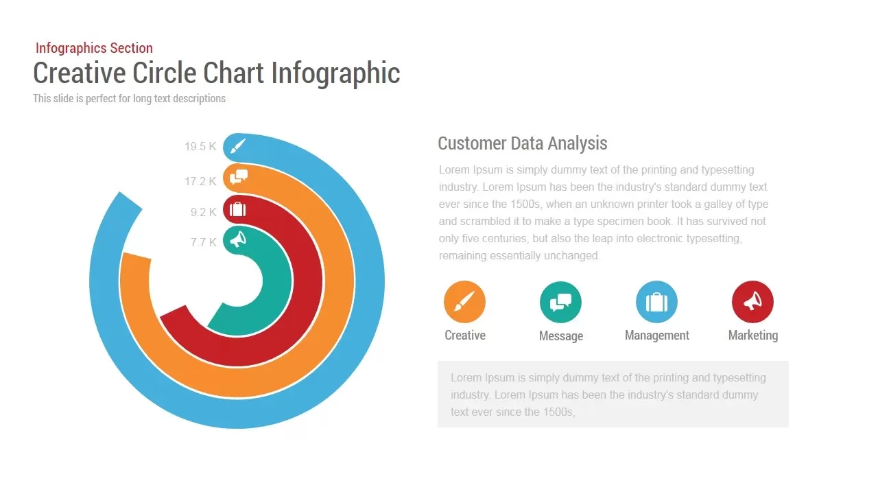
Circle Chart Data template for PowerPoint & Google Slides
Pie/Donut
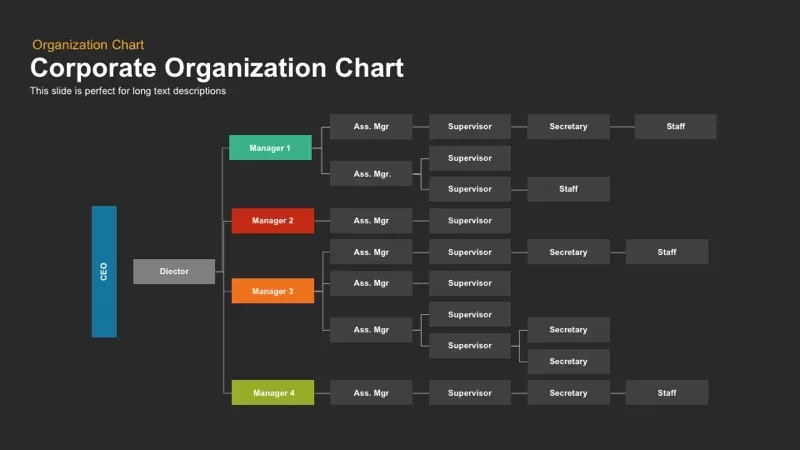
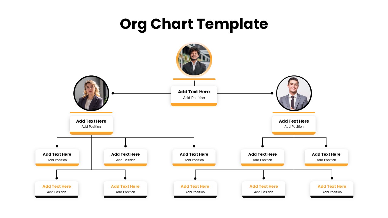
Corporate Organization Chart template for PowerPoint & Google Slides
Org Chart
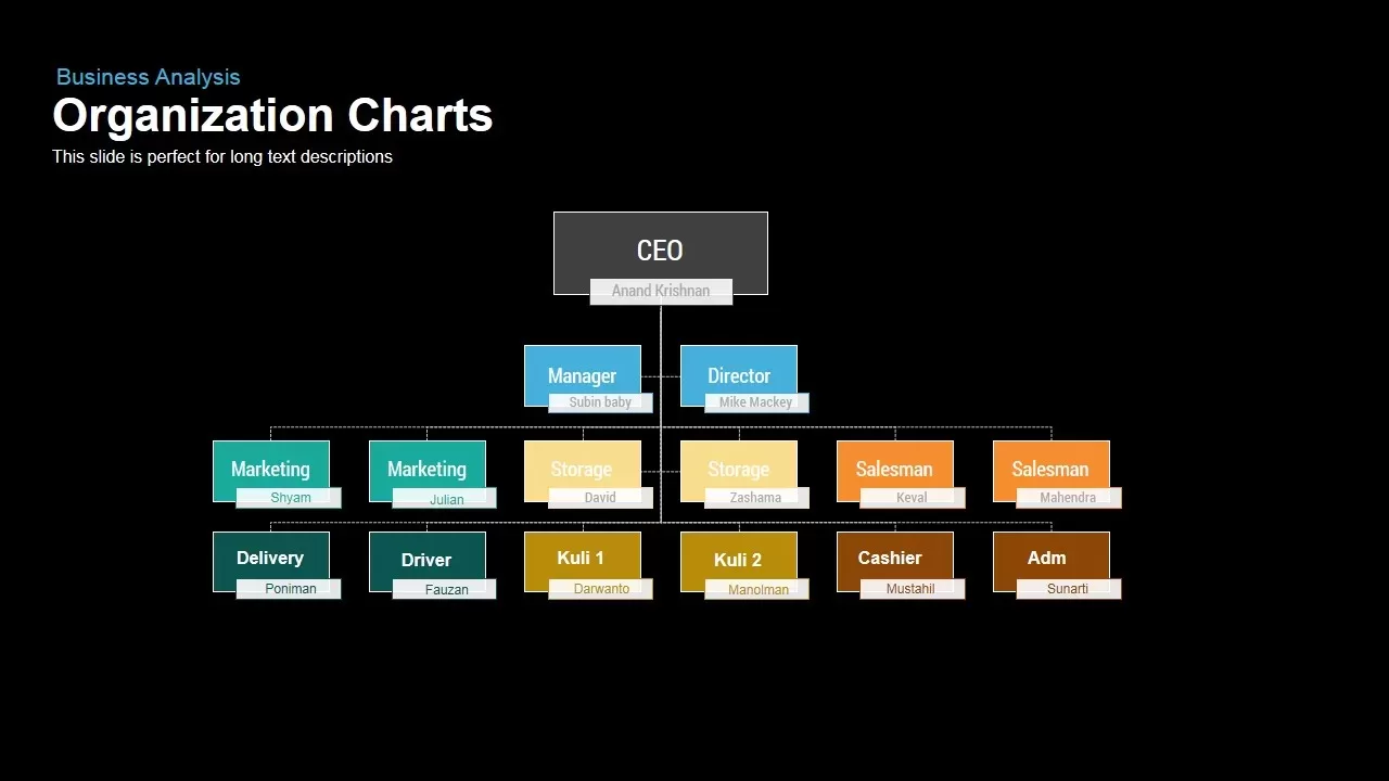
Business Organization Chart Hierarchy Template for PowerPoint & Google Slides
Org Chart
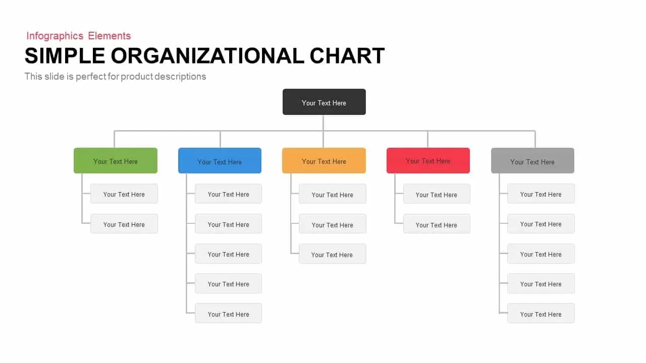
Simple Organizational Chart Infographic Template for PowerPoint & Google Slides
Org Chart
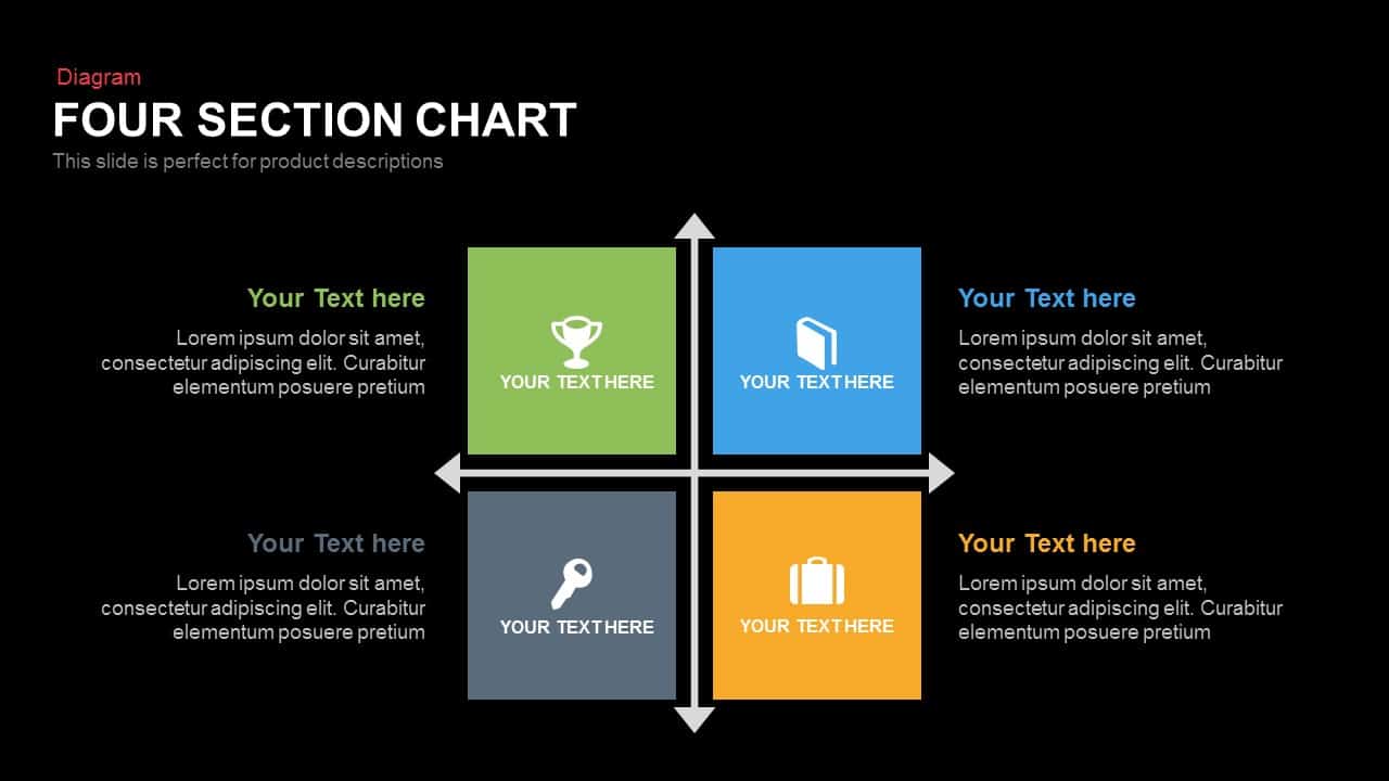
Four Section Comparison Chart Diagram Template for PowerPoint & Google Slides
Infographics
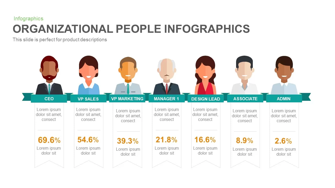
Organizational People Percentage Chart template for PowerPoint & Google Slides
Org Chart
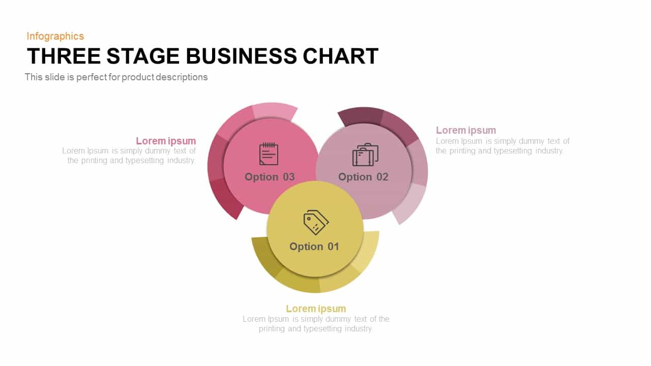
Three-Stage Circular Options Chart Template for PowerPoint & Google Slides
Comparison

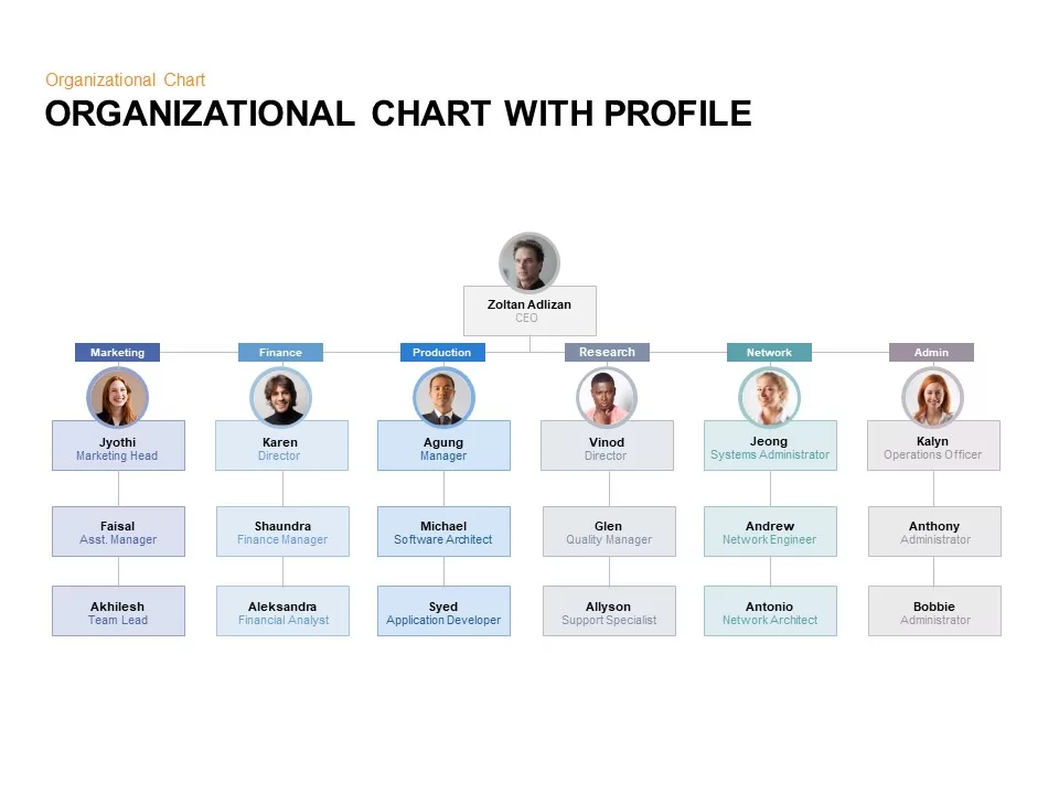
Organizational Chart with Profile for PowerPoint & Google Slides
Org Chart
3D Organization Hierarchy Chart Template for PowerPoint & Google Slides
Org Chart
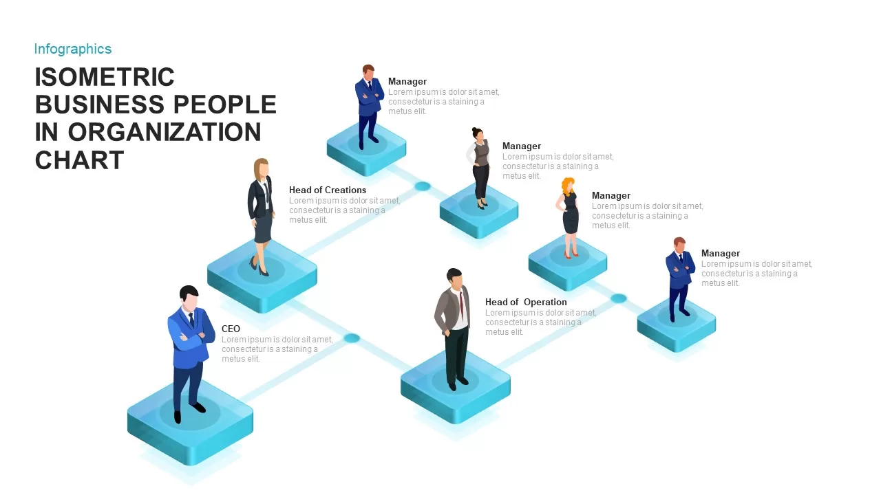
Isometric Business Organization Chart Template for PowerPoint & Google Slides
Org Chart
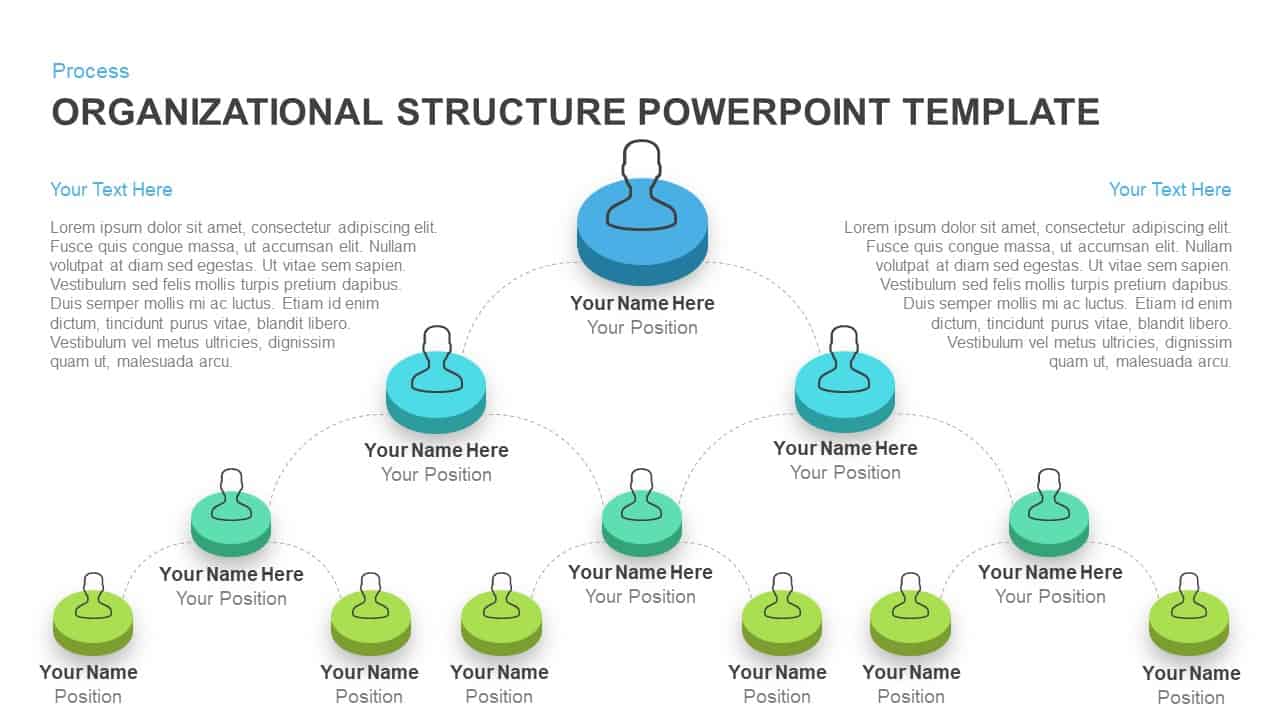
Isometric Organizational Structure Chart Template for PowerPoint & Google Slides
Org Chart
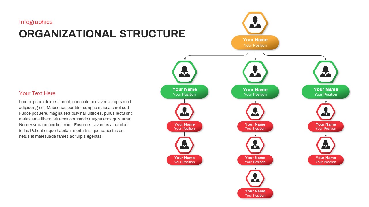
Organizational Structure Hierarchy Chart Template for PowerPoint & Google Slides
Org Chart
3D Color Block Organizational Chart Slide for PowerPoint & Google Slides
Org Chart
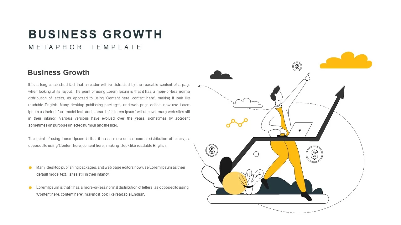
Business Growth Metaphor Chart Template for PowerPoint & Google Slides
Business
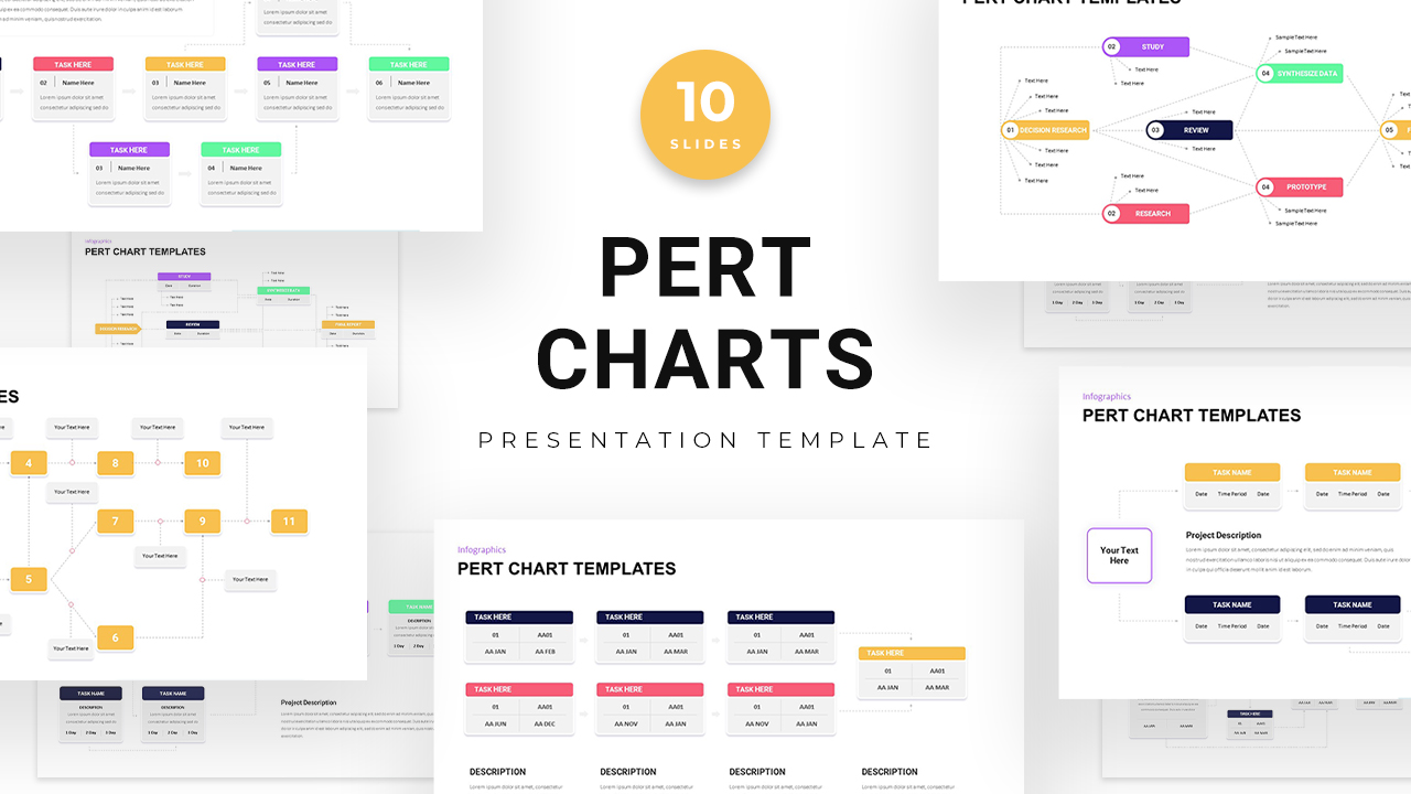
PERT Chart Project Management template for PowerPoint & Google Slides
Project Status
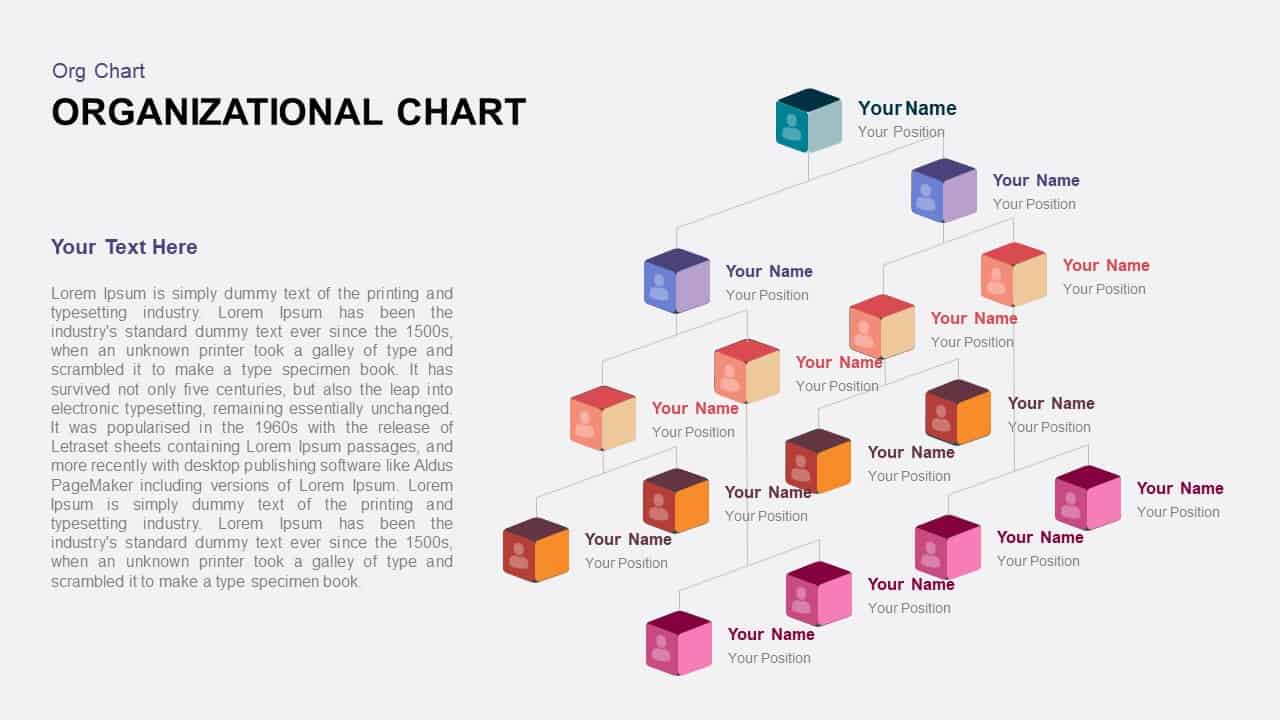
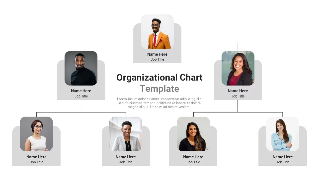
Professional Organizational Chart Diagram Template for PowerPoint & Google Slides
Org Chart
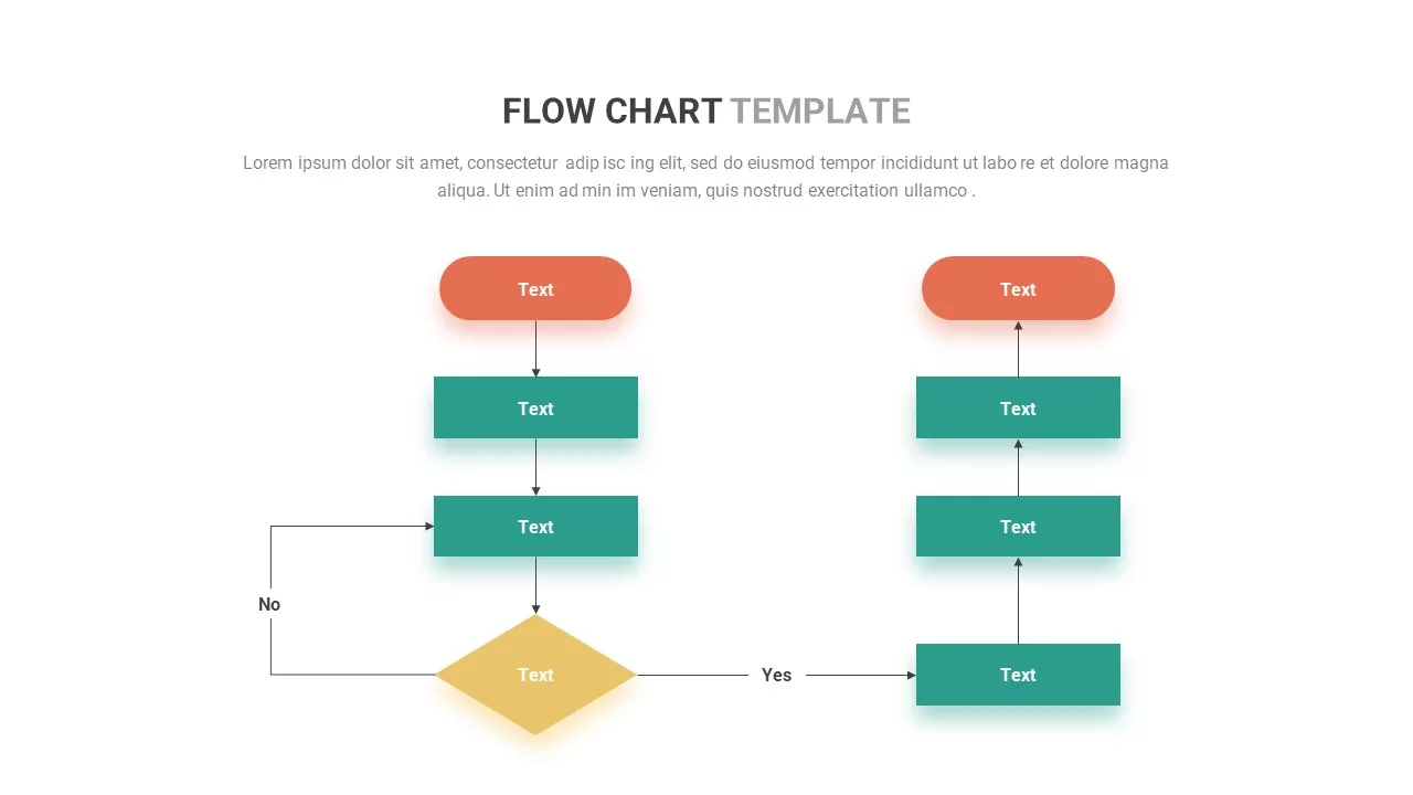
Flow Chart template for PowerPoint & Google Slides
Flow Charts
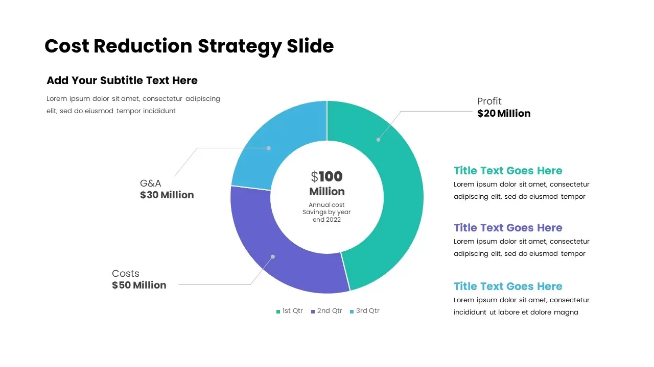
Cost Reduction Strategy Donut Chart Template for PowerPoint & Google Slides
Pie/Donut
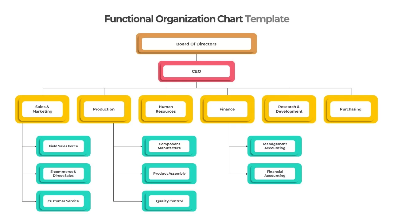
Colorful Functional Organization Chart Template for PowerPoint & Google Slides
Org Chart
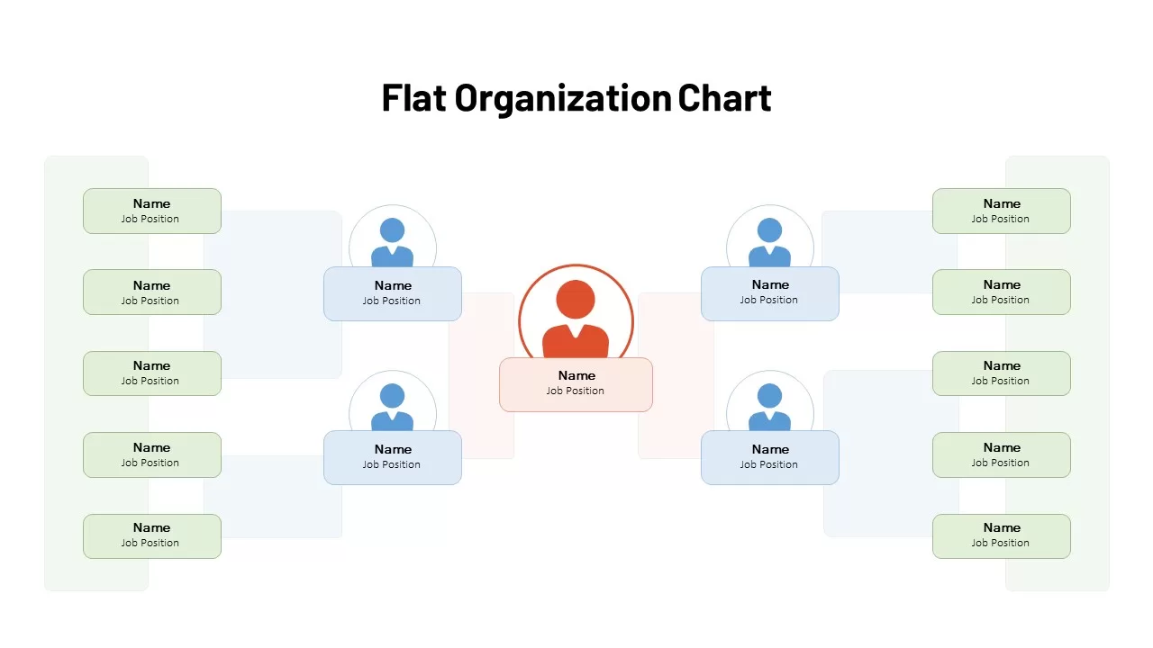
Flat Organization Chart Diagram Template for PowerPoint & Google Slides
Org Chart
Flat Organization Chart Diagram Template for PowerPoint & Google Slides
Org Chart
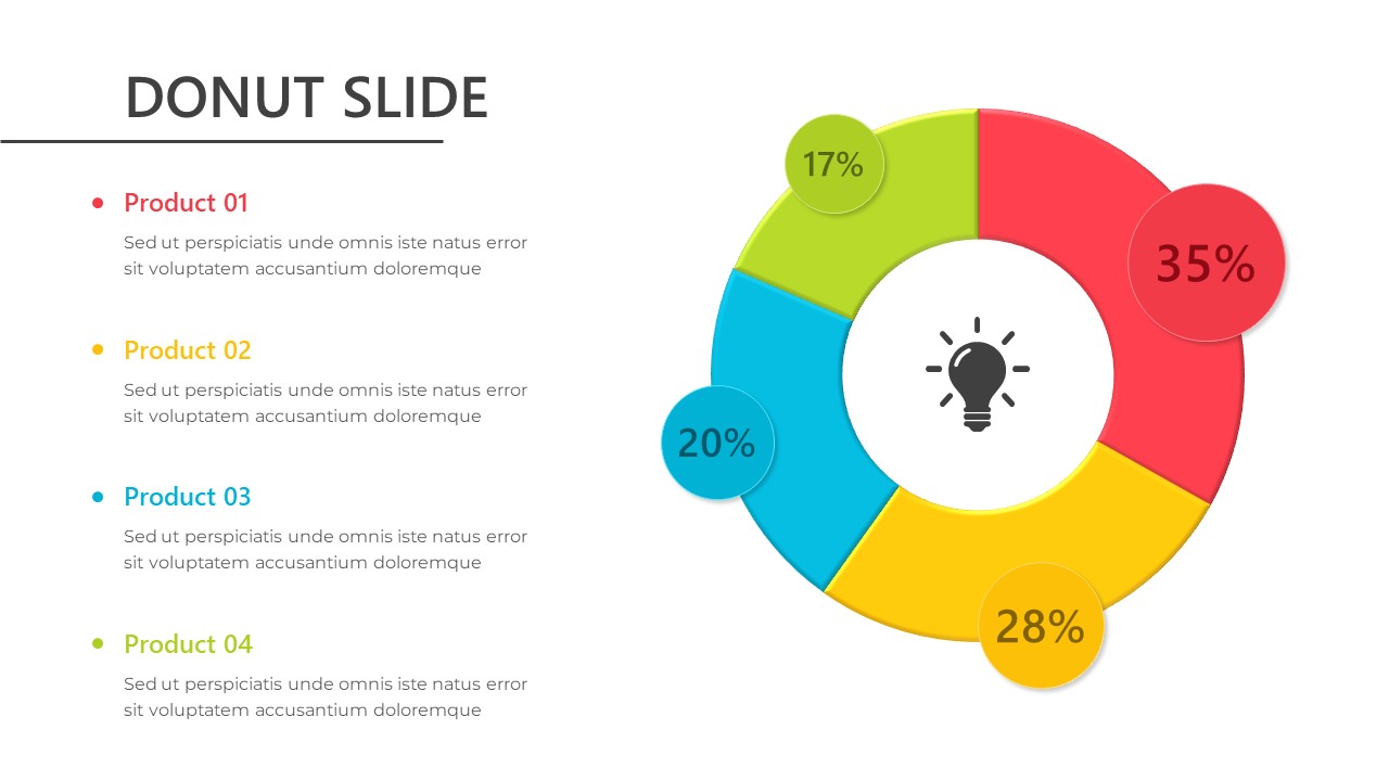
Donut Chart for PowerPoint & Google Slides
Pie/Donut
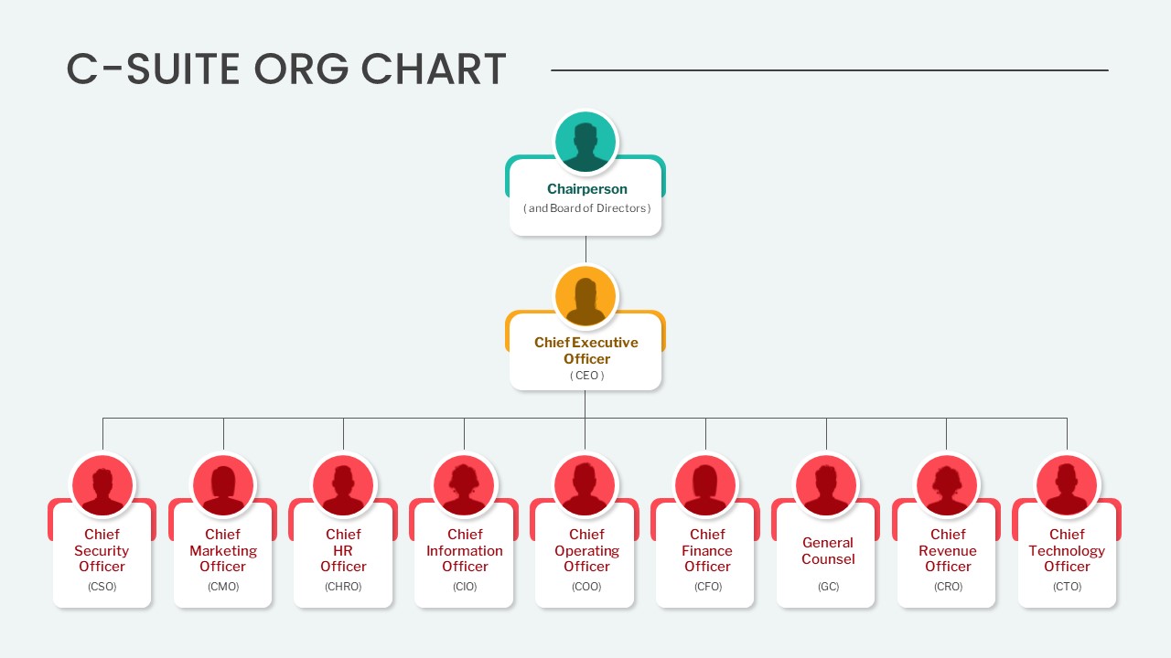
Editable C-Suite Organizational Chart Template for PowerPoint & Google Slides
Org Chart
Professional Quad Chart Layout Template for PowerPoint & Google Slides
Pie/Donut
Arrow Line Chart Template for PowerPoint & Google Slides
Comparison Chart
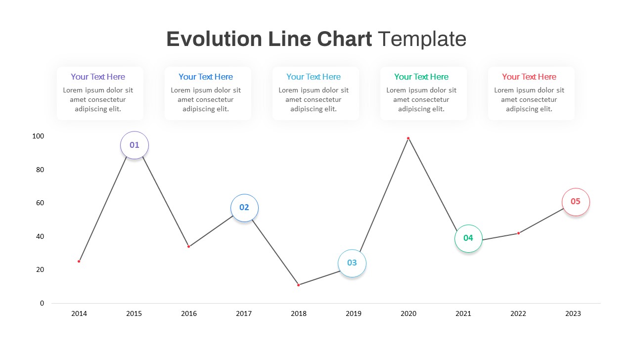
Evolution Line Chart with Milestones Template for PowerPoint & Google Slides
Timeline
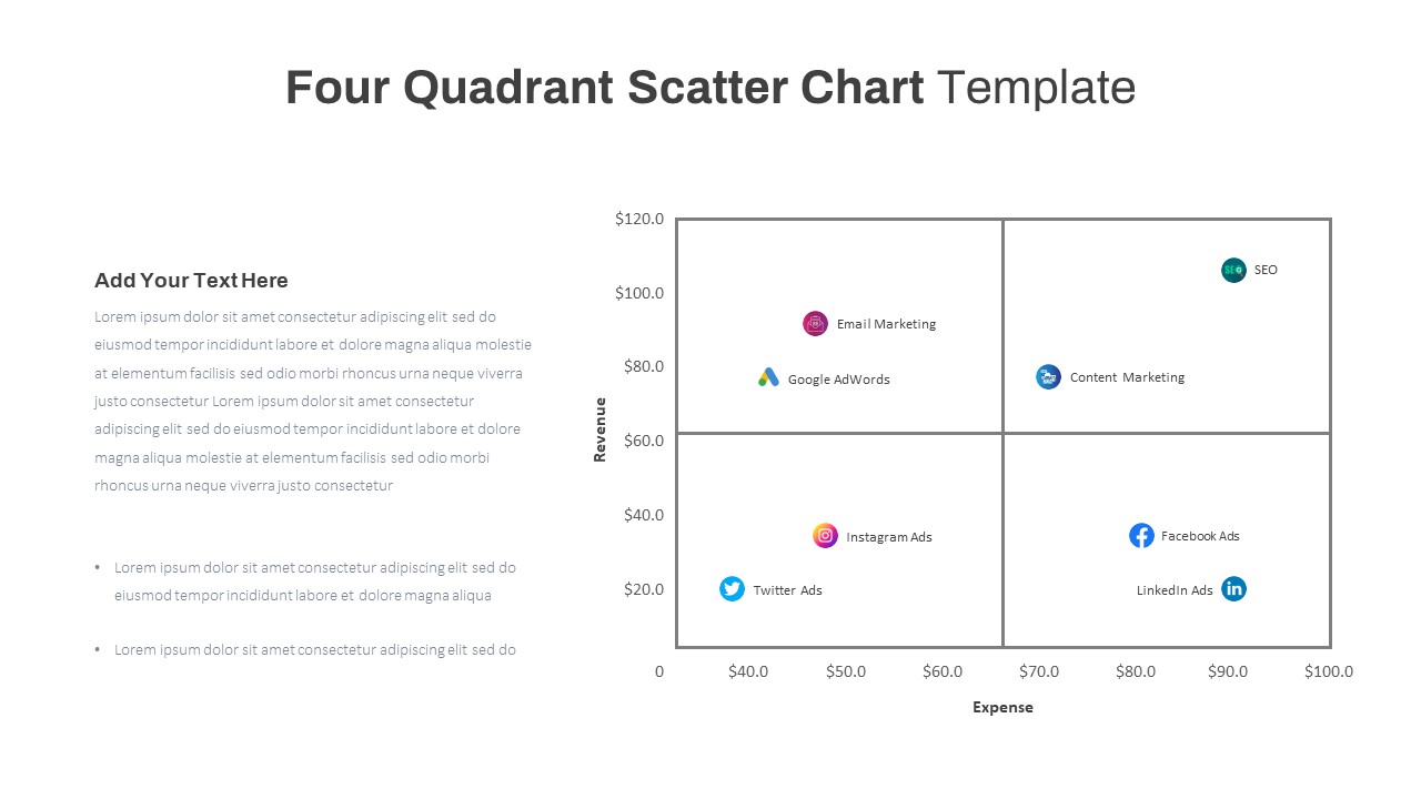
Four Quadrant Scatter Chart Analysis Template for PowerPoint & Google Slides
Comparison Chart
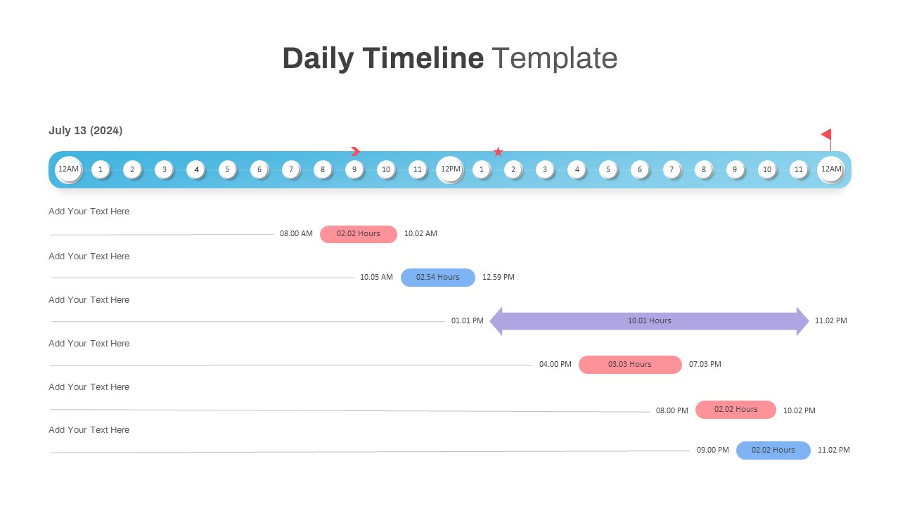
Interactive Daily Timeline Schedule Chart Template for PowerPoint & Google Slides
Timeline
Multi-Variation Circular Chart Diagram Template for PowerPoint & Google Slides
Circular
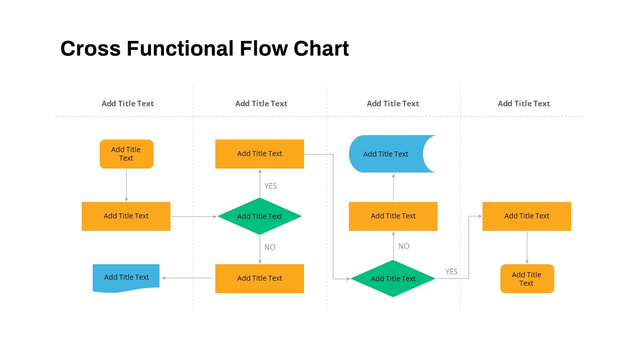
Cross Functional Swimlane Flow Chart Template for PowerPoint & Google Slides
Flow Charts
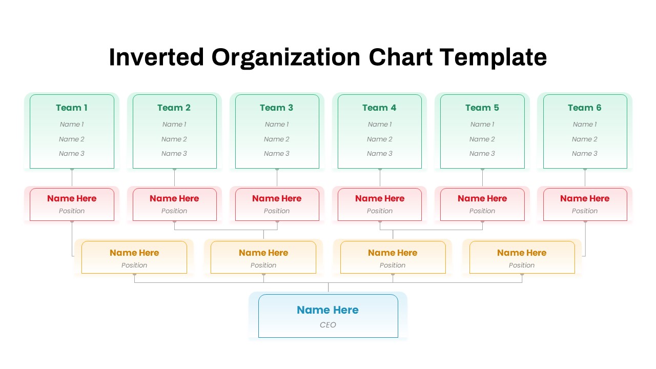
Inverted Organization Chart Diagram Template for PowerPoint & Google Slides
Org Chart
Project Tracker Timeline Gantt Chart Template for PowerPoint & Google Slides
Project Status
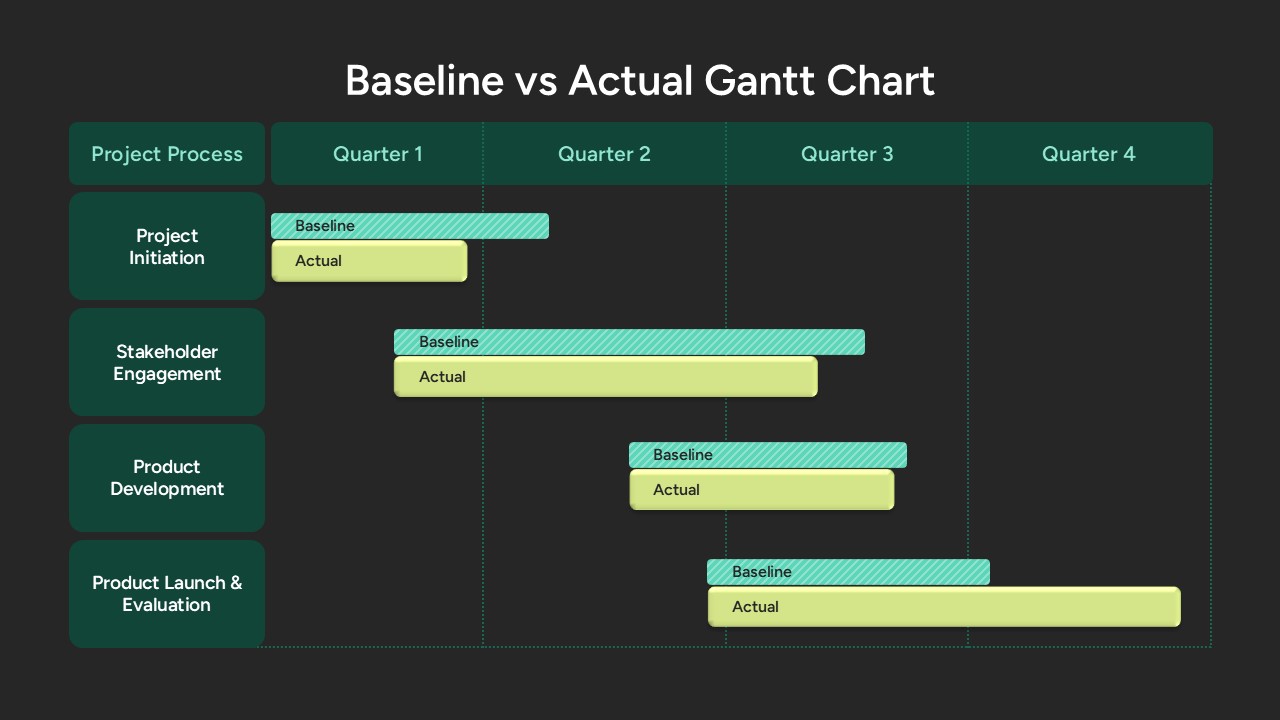
Baseline vs Actual Gantt Chart Template for PowerPoint & Google Slides
Gantt Chart
Project Gantt Chart Template for PowerPoint & Google Slides
Gantt Chart
Colorful Annual Gantt Chart Timeline Template for PowerPoint & Google Slides
Gantt Chart
Corporate Hierarchy Org Chart Template for PowerPoint & Google Slides
Org Chart