Dynamic Statistics & Progress Charts Template for PowerPoint & Google Slides
Statistics Infographic Template for PowerPoint & Google Slides
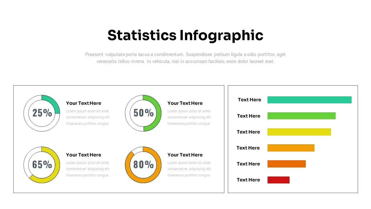
Presenting performance metrics, survey analysis, financial results, or operational KPIs requires a clean, dual-pane data visualization layout. A statistics infographic template gives data analysts, marketing directors, project managers, and business consultants a structured visual platform to communicate key quantitative insights. Combining circular percentage gauge charts with a horizontal bar graph, this slide turns complex statistical reports into an easy-to-read executive summary.
Present Quantitative Data and Performance Rankings
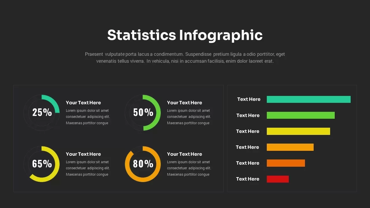
- Four Percentage Donut Gauges: Features four circular progress rings displaying key percentage milestones: 25% (green), 50% (lime green), 65% (yellow), and 80% (orange), to highlight progress toward goals.
- Paired Donut Text Fields: Dedicated title and paragraph placeholders beside each percentage ring allow space to explain specific metrics, research sources, or data context.
- Six-Tier Horizontal Bar Graph: Highlights comparative rankings or distribution metrics across six color-coded bars transitioning from green down to red.
- Side-by-Side Dual Container Layout: Separates circular progress charts and horizontal bar graphs into distinct framed panels for visual balance and effortless scanning.
- Fully Editable Data Visuals: Easily adjust bar lengths, change percentage values, modify color gradients, and customize copy within this template across major slide platforms.
Whether you are delivering quarterly business reviews, presenting customer satisfaction survey results, or showcasing campaign performance to executive boards, this structured statistics infographic ensures your data narrative stays clear and professional.
Login to download this file

Item ID
SB03040


Related Templates

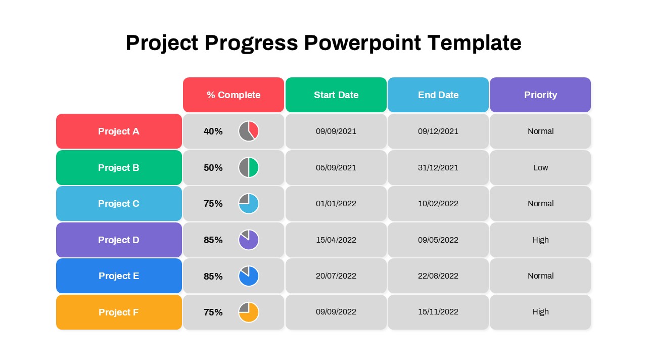
Project Progress PowerPoint Template
Project
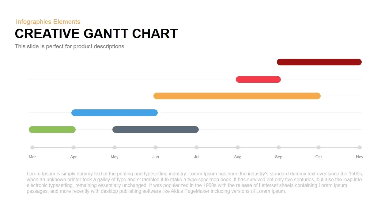
Creative Dynamic Gantt Chart Timeline Template for PowerPoint & Google Slides
Timeline
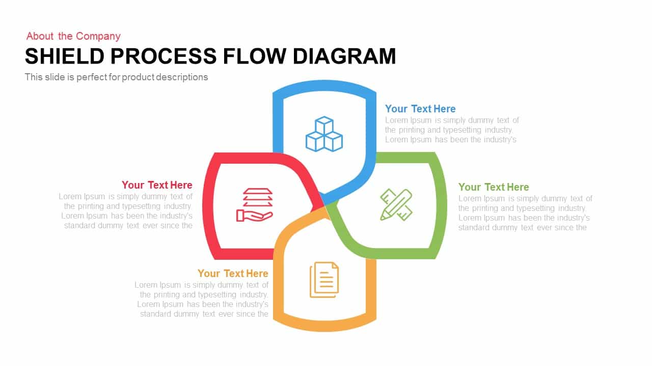
Dynamic Shield Process Flow Diagram template for PowerPoint & Google Slides
Process

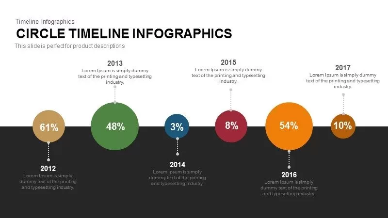
Dynamic Circle Timeline Infographics template for PowerPoint & Google Slides
Timeline
Dynamic Five-Step Ribbon Agenda Layout Template for PowerPoint & Google Slides
Agenda
Dynamic Winding Roadmap Infographic Template for PowerPoint & Google Slides
Roadmap
Dynamic Growth Arrow Step Infographic Template for PowerPoint & Google Slides
Process
Online Education Template for PowerPoint Presentation
Business Proposal
Dynamic Curved Arrow Process Roadmap Template for PowerPoint & Google Slides
Process
Dynamic Circular Hub-and-Spoke Infographic Template for PowerPoint & Google Slides
Circular
Dynamic Four-Step Gear Process Template for PowerPoint & Google Slides
Process
Dynamic Soccer Stadium Presentation Template for PowerPoint & Google Slides
Graphics
Cycling PowerPoint Template
Graphics
Dynamic Boxing Training Cover Slide Template for PowerPoint & Google Slides
Graphics
Dynamic Chevron Timeline Infographic Template for PowerPoint & Google Slides
Timeline
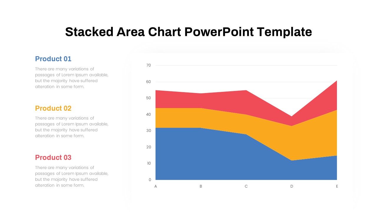
Dynamic Three-Series Stacked Area Chart Template for PowerPoint & Google Slides
Comparison Chart
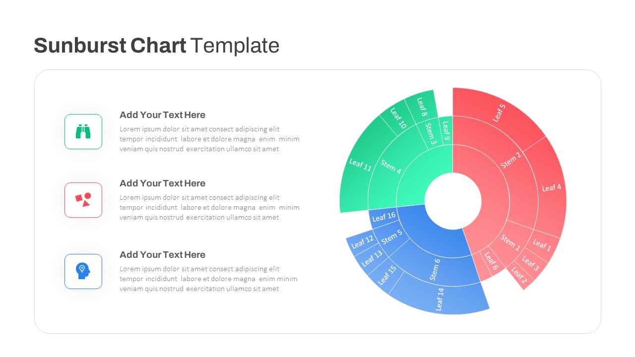
Dynamic Sunburst Chart Visualization Template for PowerPoint & Google Slides
Charts
PowerPoint Presentation Abstract Theme
Decks
Investment and Finance PowerPoint Template
Finance
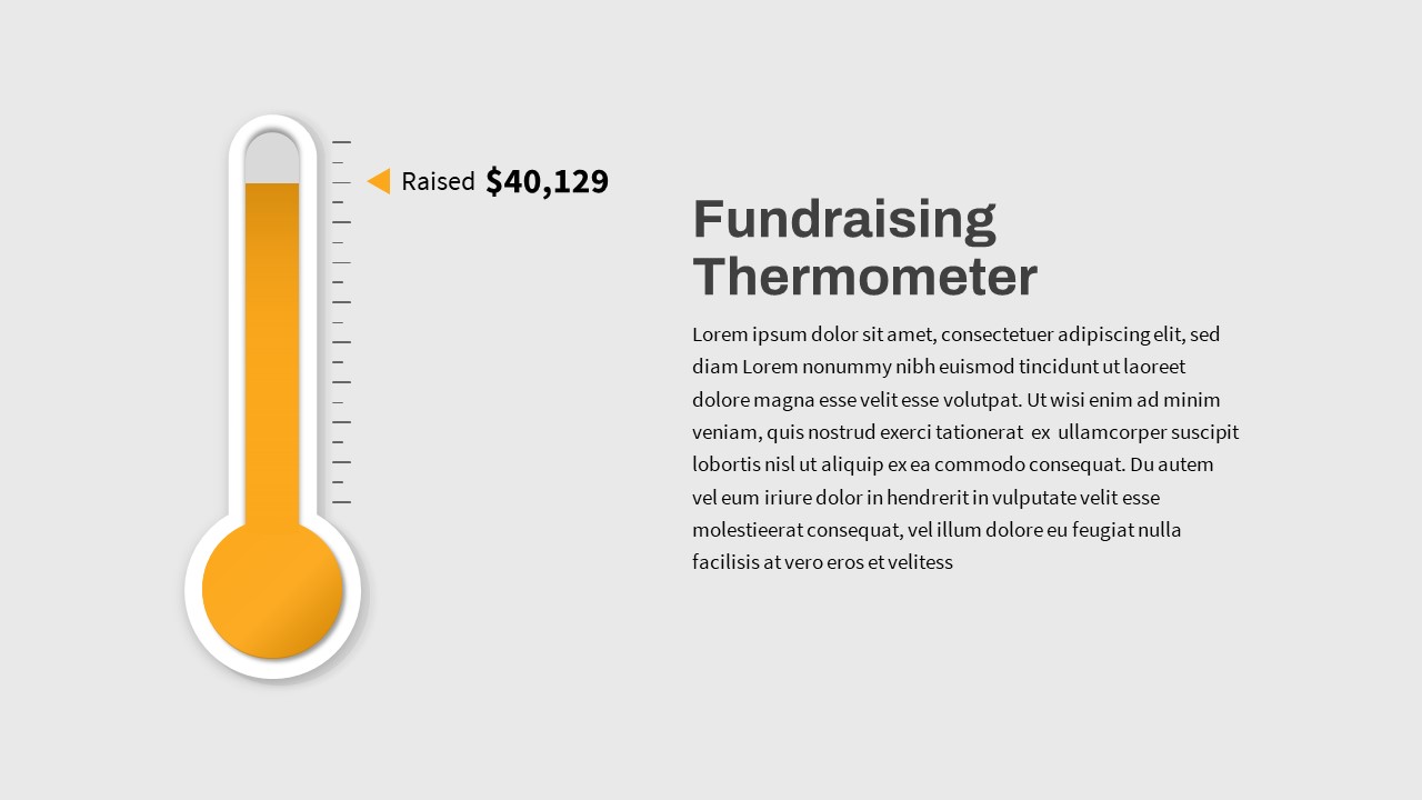
Fundraising Thermometer PowerPoint Template
Revenue