Free Mobile/Tablet App Report Presentation Template
Mobile and Tablet App Report Presentation Template for PowerPoint & Google Slides
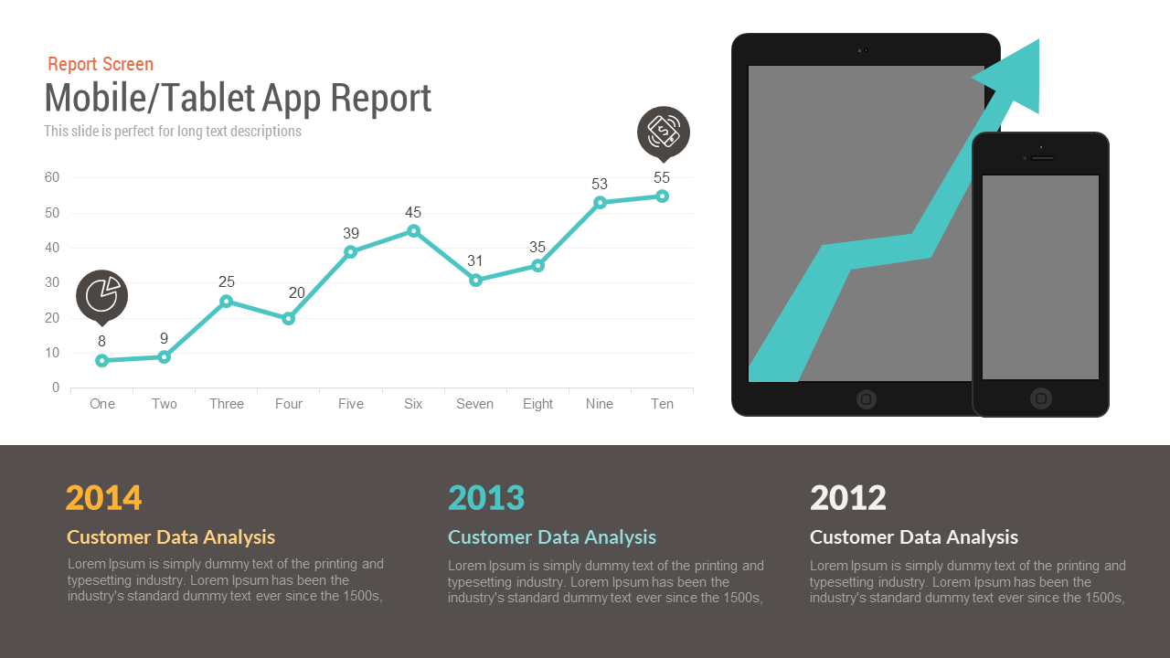
Digital product reviews lose executive engagement when app metrics and multi-device roadmaps are shown without clear visual context. Designed around realistic tablet and smartphone hardware frames paired with a ten-interval growth chart, this mobile application report slide helps product teams, growth marketers, and engineering leaders communicate adoption trajectories, performance trends, and platform reach.
The balanced two-tiered composition connects visual hardware mockups with quantitative data trends and multi-year historical analysis. Founders, product directors, and client managers can use this framework to demonstrate cross-platform capability, report active user growth, and highlight strategic milestone achievements across past operating cycles.
Where This Framework Adds Value
- App Performance & Growth Reviews: Present active user spikes, monthly recurring engagement, or app store download velocities across ten specific reporting intervals.
- Cross-Platform Product Roadmaps: Showcase responsive mobile and tablet user experiences simultaneously within realistic device mockups.
- Multi-Year Business Trajectory Briefings: Contextualize present product performance by charting progress against historical annual benchmarks.
- Investor Updates & Startup Pitches: Validate product-market fit by combining visual hardware delivery with upward-trending traction data.
Core Strategic Focus Areas
The visual hierarchy connects current metric performance with historical business foundations:
- Interval Performance Tracking: A continuous teal line graph charts progress across ten intervals, displaying exact numerical badges from initial baselines to peak performance.
- Multi-Device Hardware Anchor: Layered tablet and smartphone frames featuring a bold upward growth arrow underscore digital platform readiness and scaling success.
- Multi-Year Retrospective Foundation: A dedicated lower charcoal console divides historical context across three distinct years (2014, 2013, and 2012) to compare customer data insights over time.
Layout Highlights
- Clean header section establishes clear reporting context with category labeling and dedicated subtitle space.
- Ten-point line chart in vibrant teal includes circular data pins, numeric labels, and integrated pie and device icons for quick scanning.
- Hardware mockup cluster on the right combines a tablet and a smartphone with a stylized ascending vector arrow across the screens.
- High-contrast bottom band in dark charcoal features gold, teal, and white headline typography for annual customer data reviews.
- Fully editable components in Microsoft PowerPoint and Google Slides enable effortless modifications to data points, graph lines, device screens, and descriptive copy.
Check out more presentation slides with charts like this.
Login to download this file

Item ID
SBF00008


Related Templates

Mobile App Presentation PowerPoint Template
Pitch Deck
Mobile App Features template for PowerPoint & Google Slides
Technology
Mobile App Usage Chart PowerPoint Template
Comparison Chart
Mobile App Social Media Metaphor Template for PowerPoint & Google Slides
Infographics
School Communication App Deck Template for PowerPoint Presentation
Pitch Deck

Smartphone App Presentation Template
Pitch Deck
iPad App Mockup with Progress Metrics Template for PowerPoint & Google Slides
Bar/Column
Google Nexus App Mockup Template for PowerPoint & Google Slides
Infographics
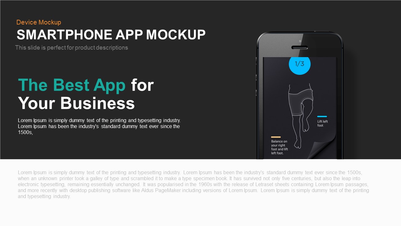
Smartphone App Mockup PowerPoint Template
Software Development
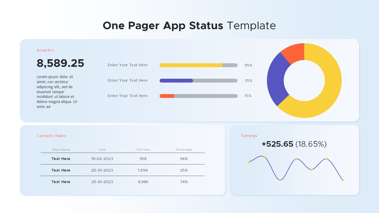
One Pager App Status PowerPoint Template
Business Report
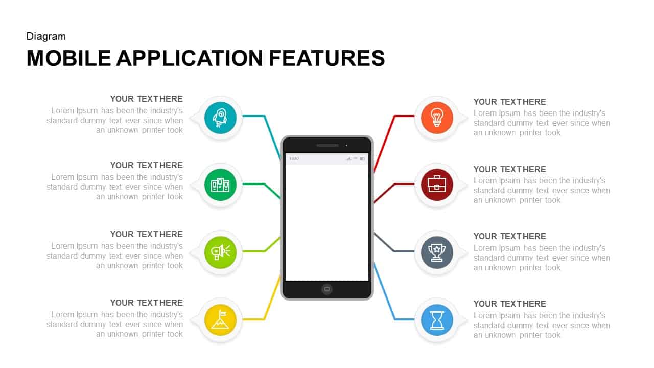
Mobile Application Features Presentation Template
Technology
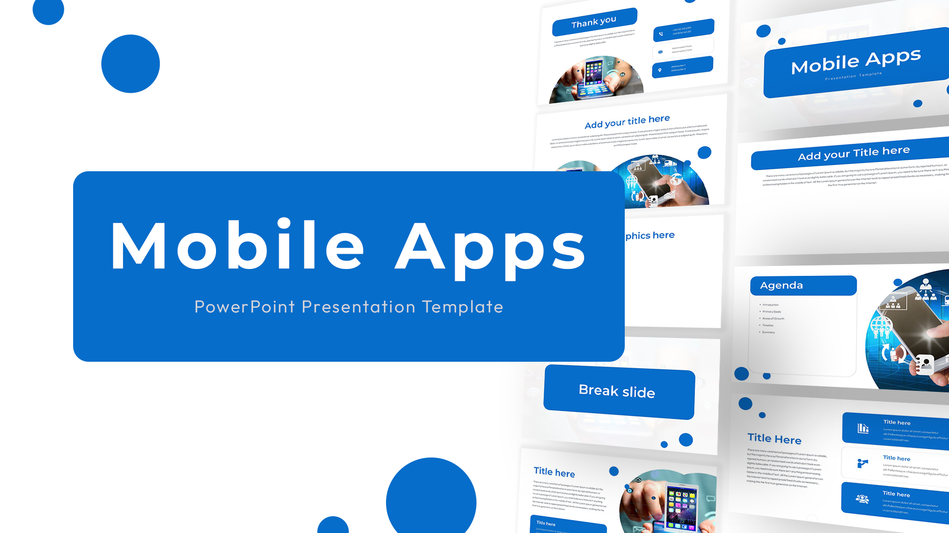
Mobile Apps PowerPoint Presentation Template
Information Technology

Mobile Service Comparison Template for PowerPoint
Comparison
Mobile Service Features Infographic Template for PowerPoint & Google Slides
Process
Mobile User Data Analysis Template
Process
iPhone Mobile Mockup PowerPoint Template
Graphics
Mobile Mockup with Social Callouts Template for PowerPoint & Google Slides
Software Development
Mobile Apps Infographic Interface Template for PowerPoint & Google Slides
Software Development
Mobile Marketing Strategy PowerPoint Template
Business
Mobile Application Features Mockup for PowerPoint & Google Slides
Graphics