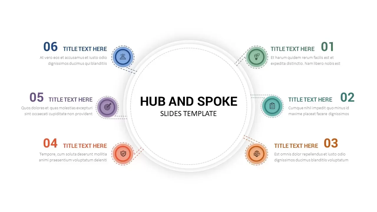
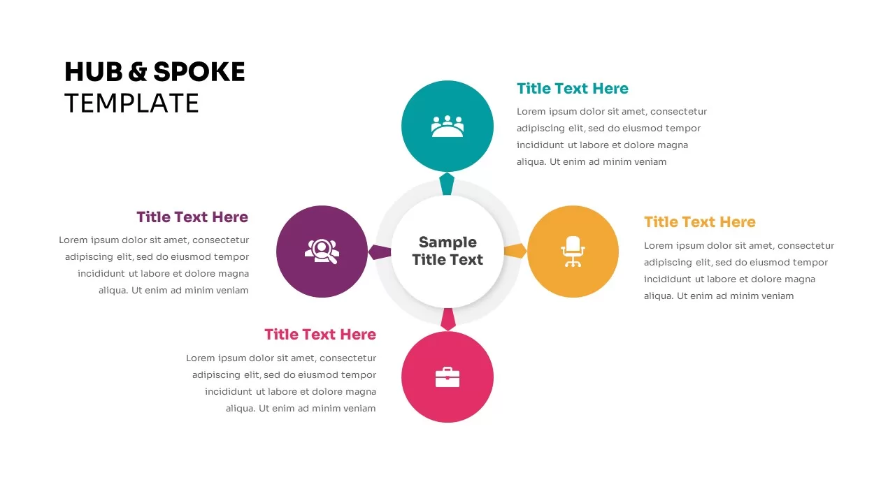
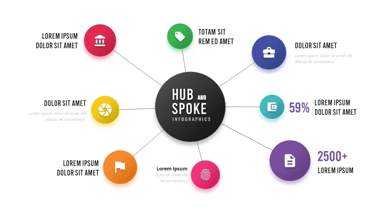
Colorful Hub-and-Spoke Infographic Template for PowerPoint & Google Slides

Description
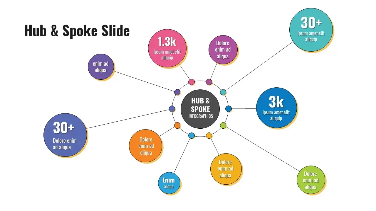
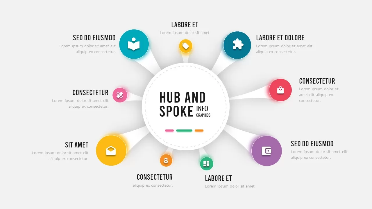
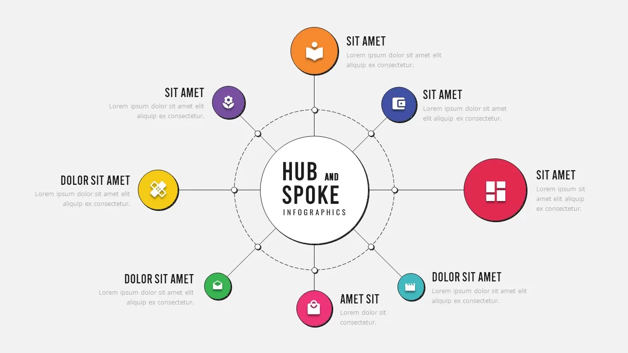
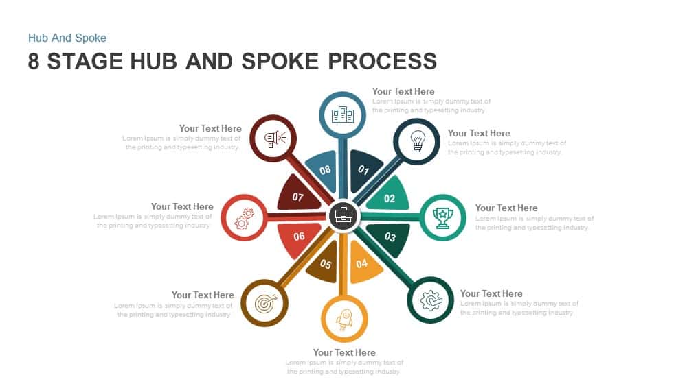
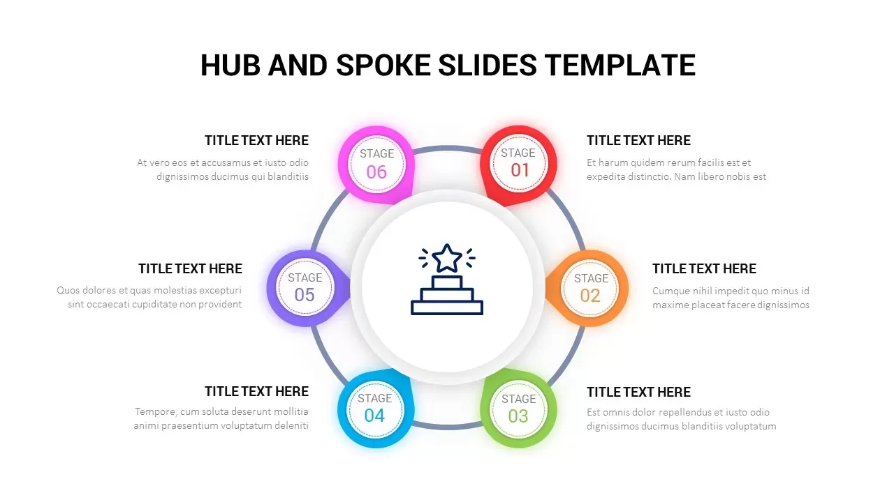
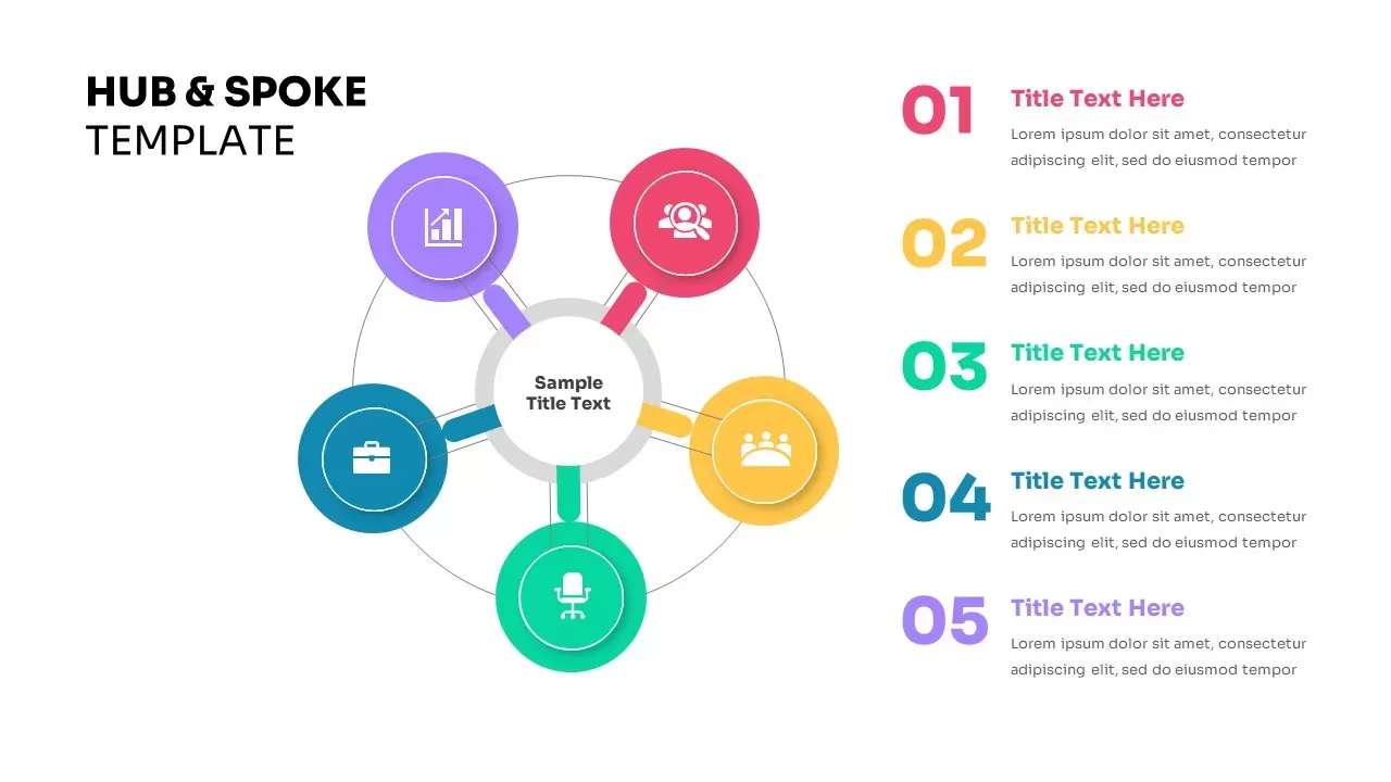
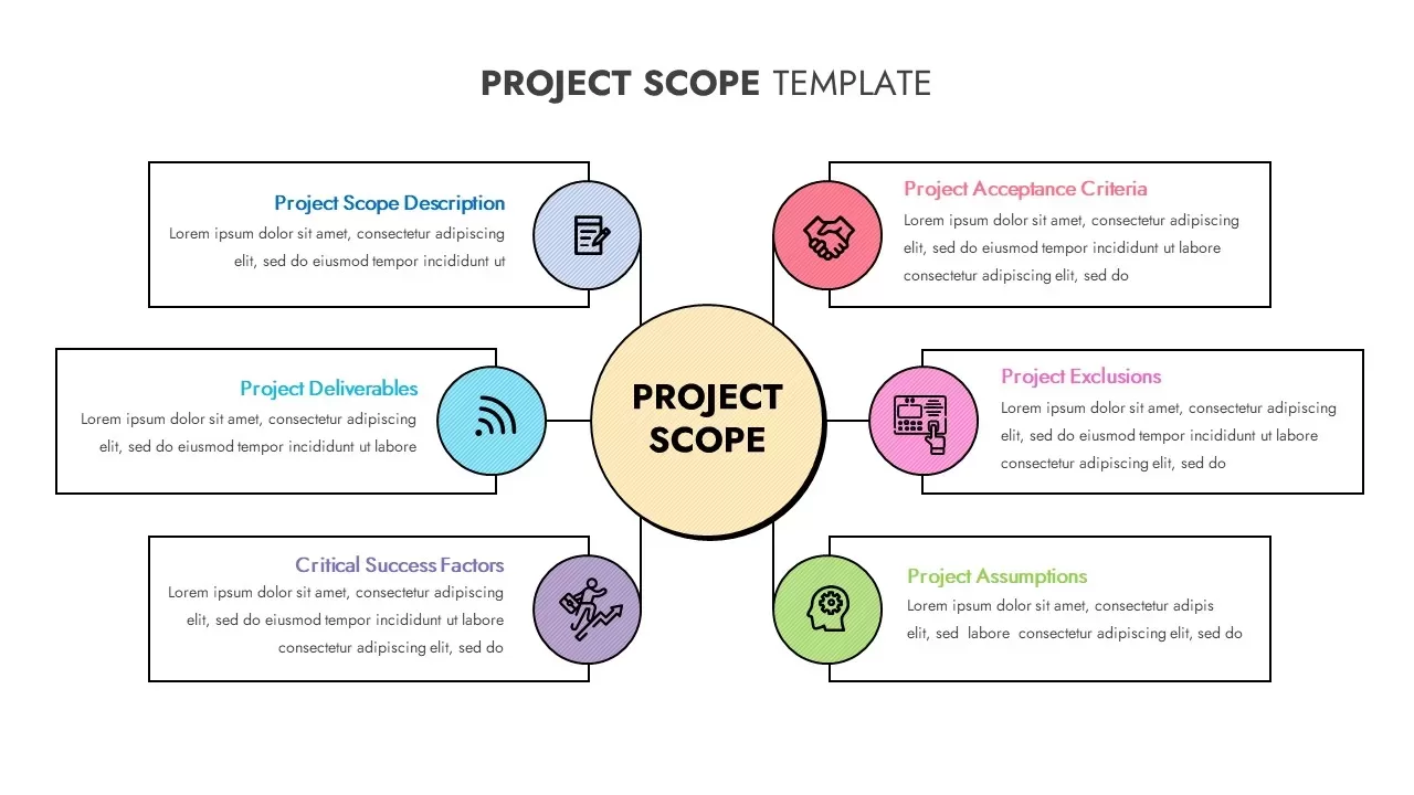
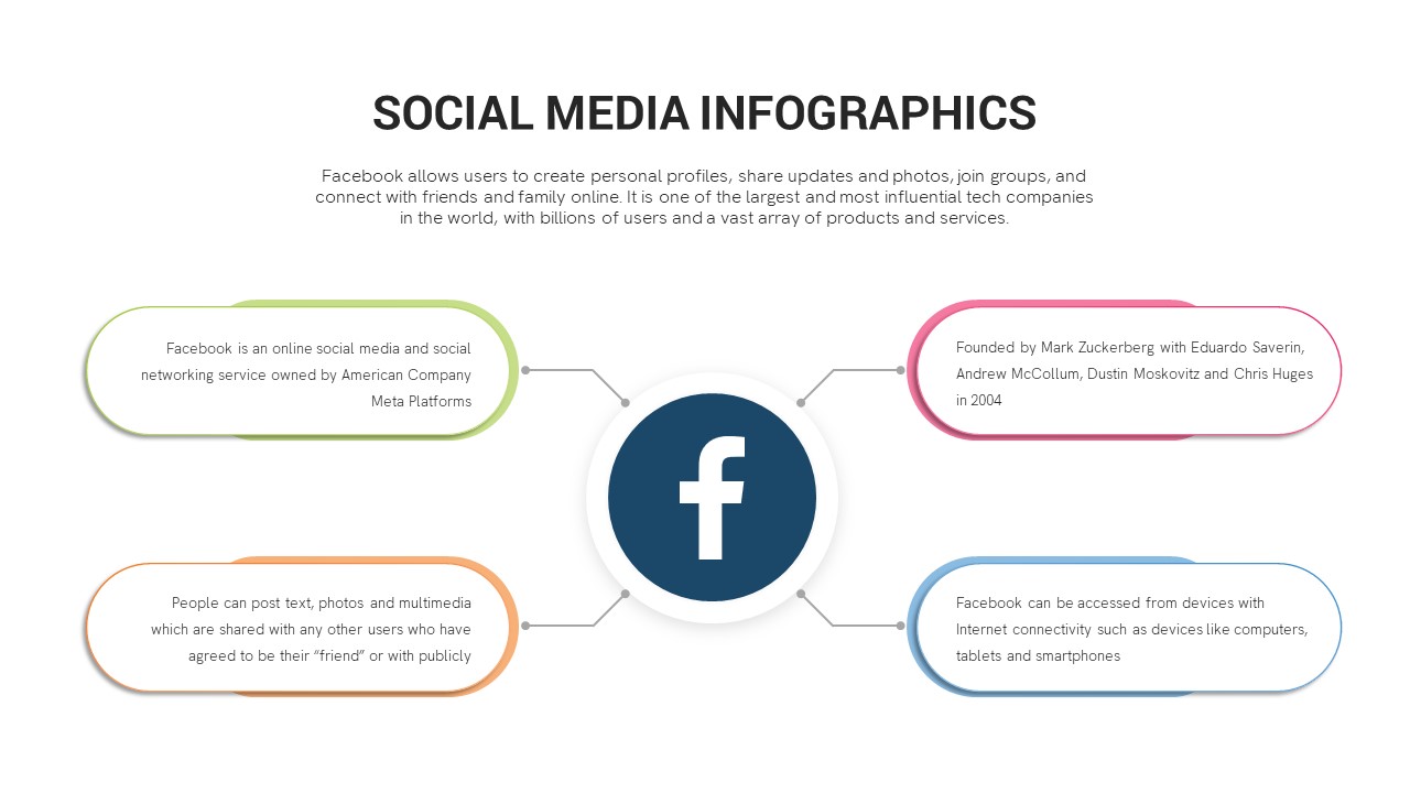
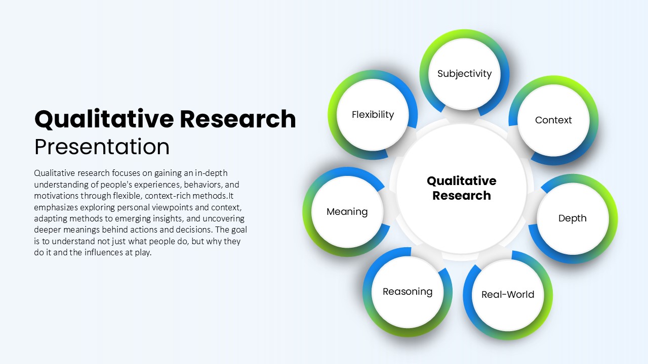
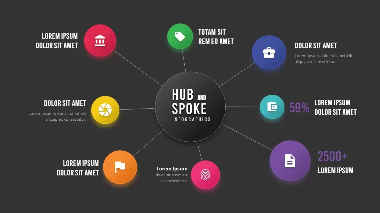
Drive audience understanding with this dynamic hub-and-spoke infographic slide, designed for PowerPoint & Google Slides. The central node anchors eight vibrant satellite circles, each connected by slim vector lines to represent core-and-periphery relationships in organizational models, workflows, or strategic frameworks. Master slides with editable vector graphics allow you to swap icons, recolor circles, and adjust connector spacing instantly without manual alignment. The crisp black-and-white central hub contrasts sharply with multi-hued spokes—red, green, blue, teal, purple, pink, orange, and yellow—ensuring each category stands out while preserving visual harmony. Generous white space, subtle drop shadows, and clean sans-serif typography maintain a polished, minimalist aesthetic that places emphasis on your content.
To customize, simply replace the circular icons with imagery from your brand’s icon set, edit the descriptive text placeholders, or reposition nodes to suit your narrative flow. The modular design supports resizing for any number of spokes, enabling you to expand or contract the diagram as needed. Whether illustrating stakeholder networks, product feature clusters, customer segments, or project deliverables, this slide delivers clarity through structured visual hierarchy and data-driven color design. Seamless compatibility with desktop, web, and mobile ensures high-fidelity rendering across screens, while built-in alignment guides and vector-based shapes preserve sharpness in high-resolution presentations. Engage stakeholders by animating individual spokes to reveal detailed insights sequentially, or group related nodes to highlight thematic connections. Export the diagram as a standalone graphic for reports, embed it in larger decks, or collaborate in real time on Google Slides to refine the layout collectively. Integrate annotated callouts for quantitative metrics or qualitative insights beside individual nodes to support data-driven discussions.
Who is it for
Business analysts, project managers, marketing strategists, and organizational consultants who need a visually engaging slide to map central concepts and their interrelated components in corporate, educational, or client presentations.
Other Uses
Repurpose this infographic to illustrate product ecosystems, service portfolios, UX feature sets, customer journey touchpoints, or any scenario requiring a clear visualization of a core idea branching into multiple subcategories.
Login to download this file

Item ID
SB03030
Related Templates

Colorful Hub-and-Spoke Infographic Template for PowerPoint & Google Slides
Circle
Premium
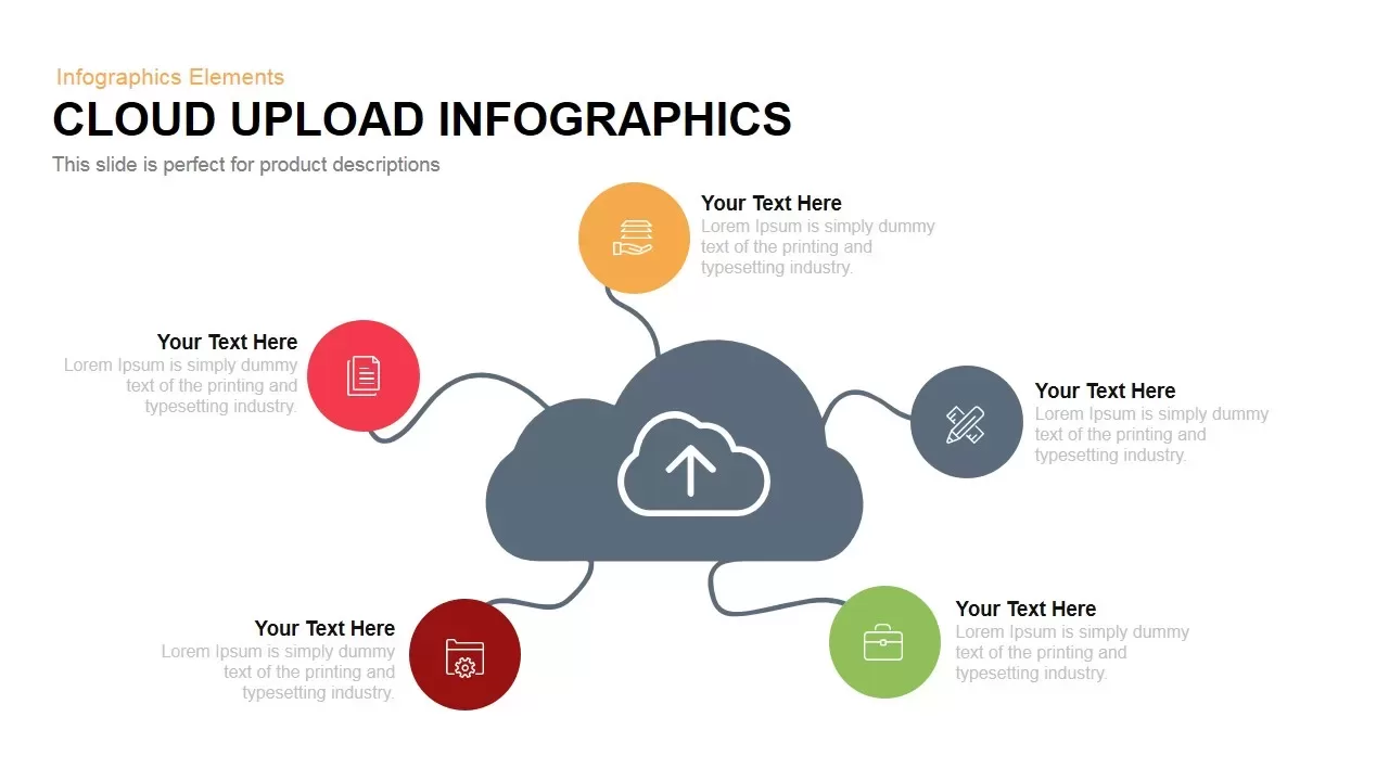
Cloud Upload Hub-and-Spoke Infographic Template for PowerPoint & Google Slides
Circle
Premium

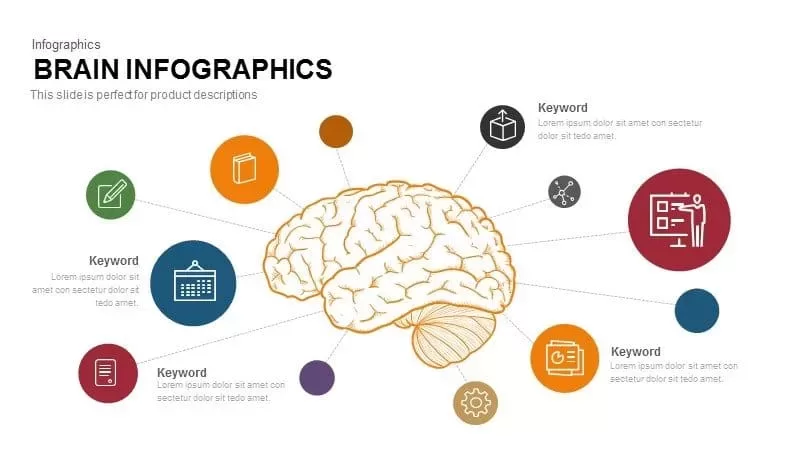
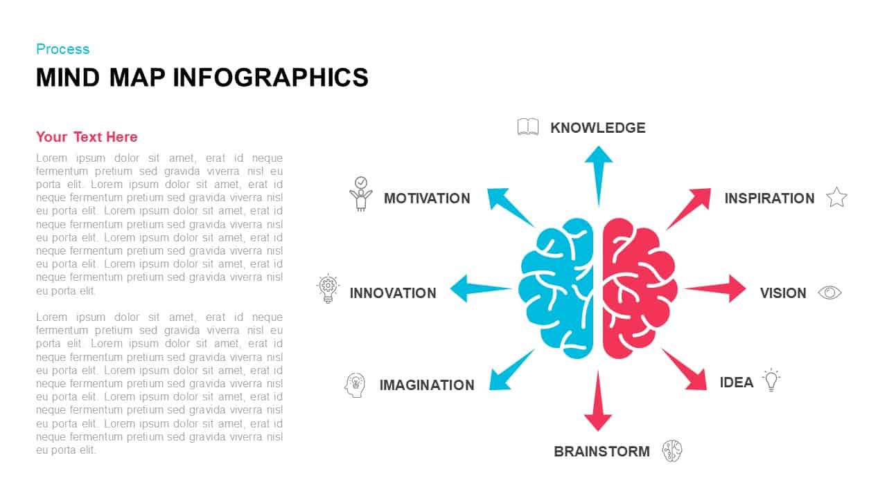
Brain Hub-and-Spoke Infographic template for PowerPoint & Google Slides
Org Chart
Premium

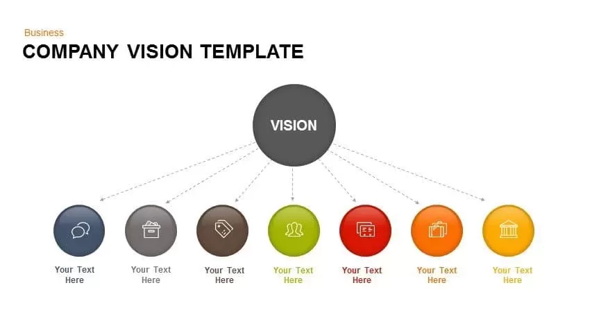
Company Vision Hub and Spoke Infographic Template for PowerPoint & Google Slides
Vision and Mission
Premium
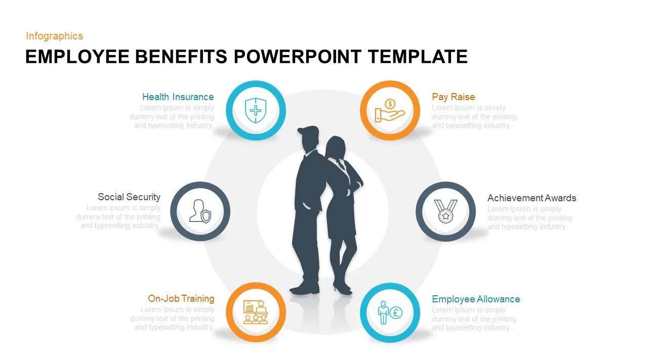
Employee Benefits Hub and Spoke Infographic Template for PowerPoint & Google Slides
HR
Premium
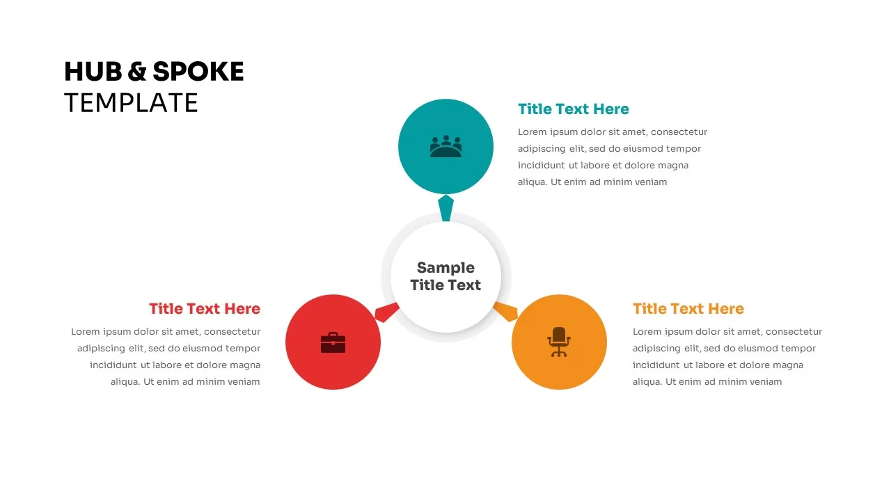
Hub & Spoke Infographic Diagram Template for PowerPoint & Google Slides
Process
Premium
Hub-and-Spoke Infographic Layout Template for PowerPoint & Google Slides
Circle
Premium
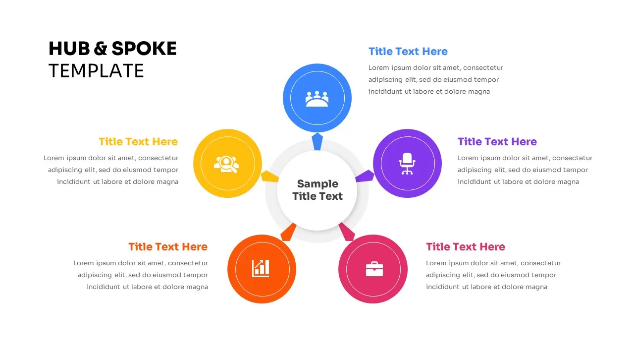
Dynamic Hub-and-Spoke Infographic Diagram Template for PowerPoint & Google Slides
Circle
Premium
Dynamic Circular Hub-and-Spoke Infographic Template for PowerPoint & Google Slides
Circle
Premium
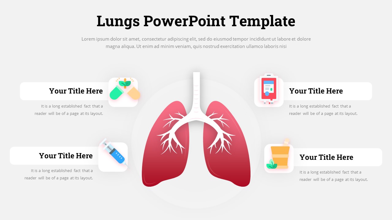
Lungs Hub-and-Spoke Infographic Template for PowerPoint & Google Slides
Health
Premium
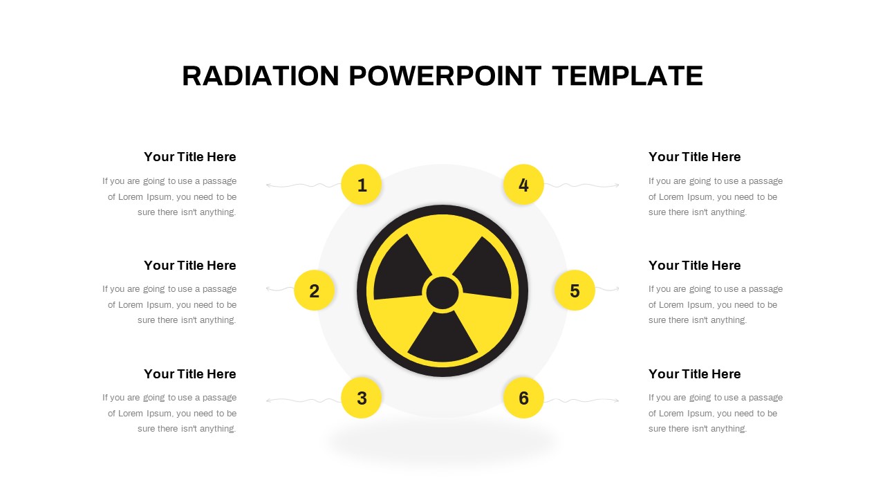
Free Radiation Hub and Spoke Infographic Template for PowerPoint & Google Slides
Circle
Free
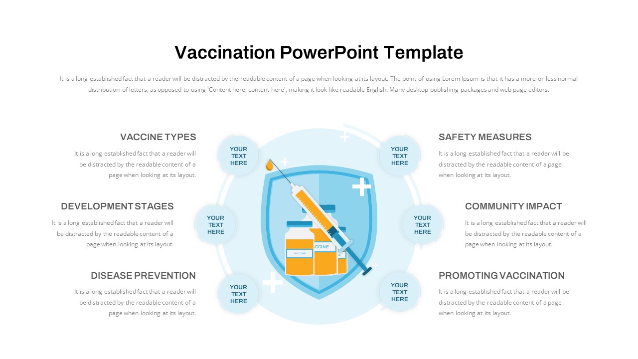
Vaccination Hub-and-Spoke Infographic Template for PowerPoint & Google Slides
Circle
Premium
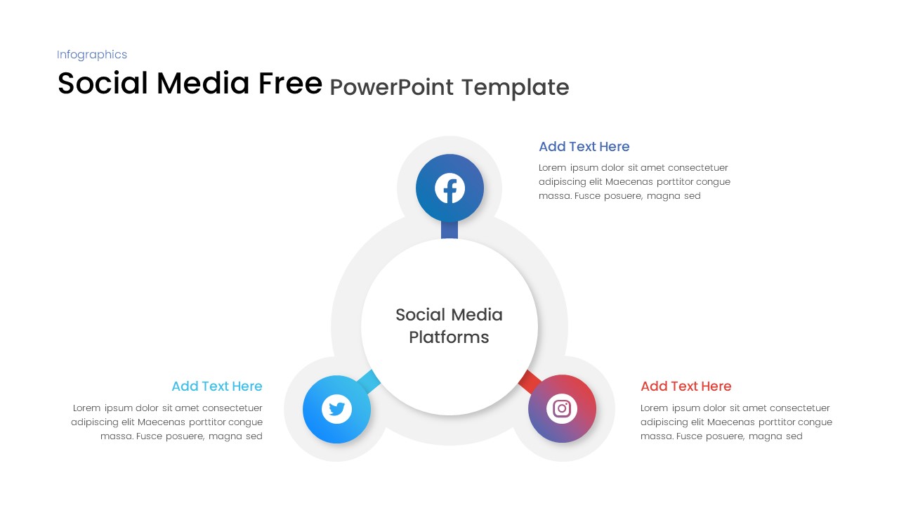
Free Social Media Hub-and-Spoke Infographic Template for PowerPoint & Google Slides
Circle
Free
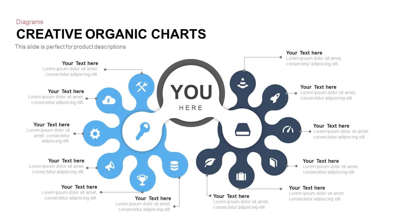
Creative Organic Hub-and-Spoke Diagram template for PowerPoint & Google Slides
Circle
Premium
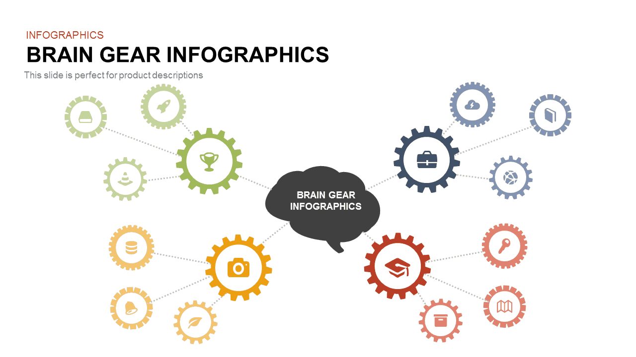
Brain Gear Hub-and-Spoke Infographics template for PowerPoint & Google Slides
Org Chart
Premium
Email Marketing Hub and Spoke Diagram template for PowerPoint & Google Slides
Circle
Premium
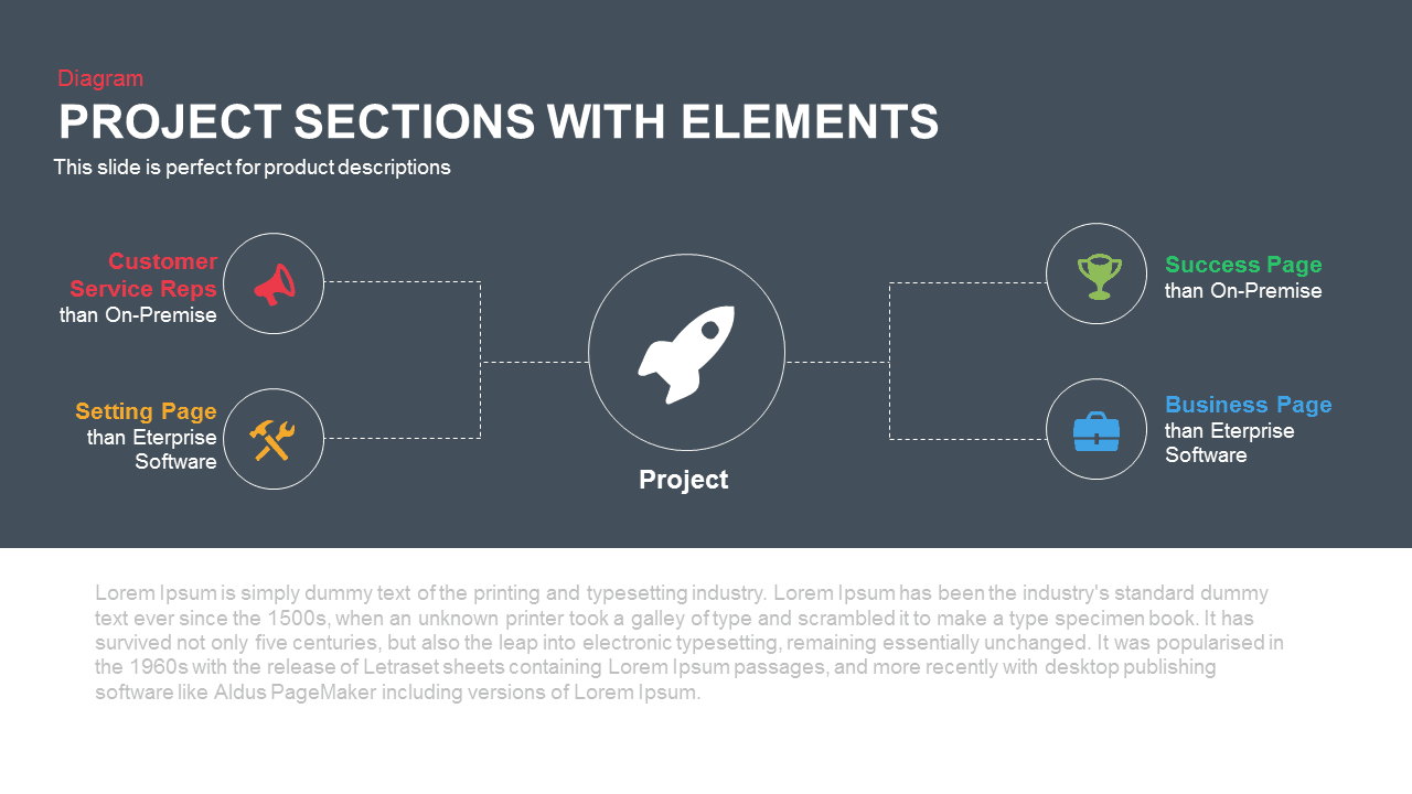
Project Sections Hub-and-Spoke Diagram template for PowerPoint & Google Slides
Flow Charts
Premium
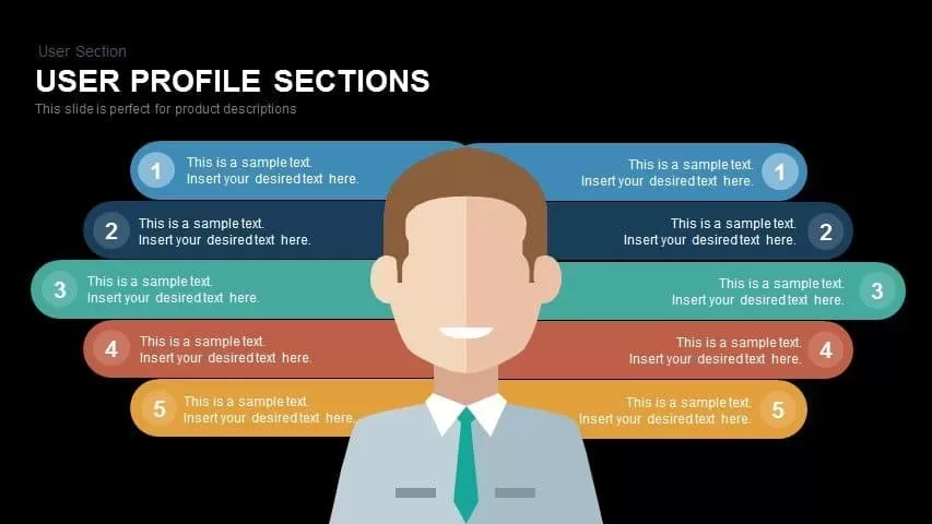
User Profile Hub-and-Spoke Diagram Template for PowerPoint & Google Slides
Our Team
Premium

Cloud Computing Hub and Spoke Diagram Template for PowerPoint & Google Slides
Cloud Computing
Premium
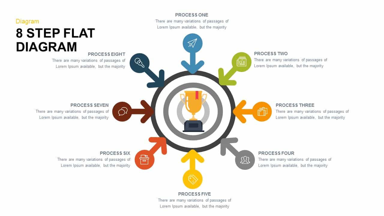
Eight-Step Hub and Spoke Diagram Template for PowerPoint & Google Slides
Process
Premium
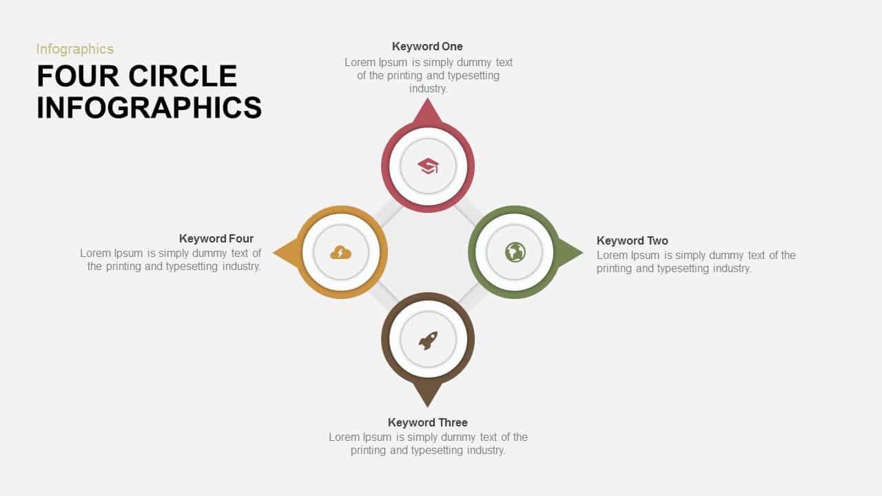
Four-Circle Hub and Spoke Diagram Template for PowerPoint & Google Slides
Process
Premium
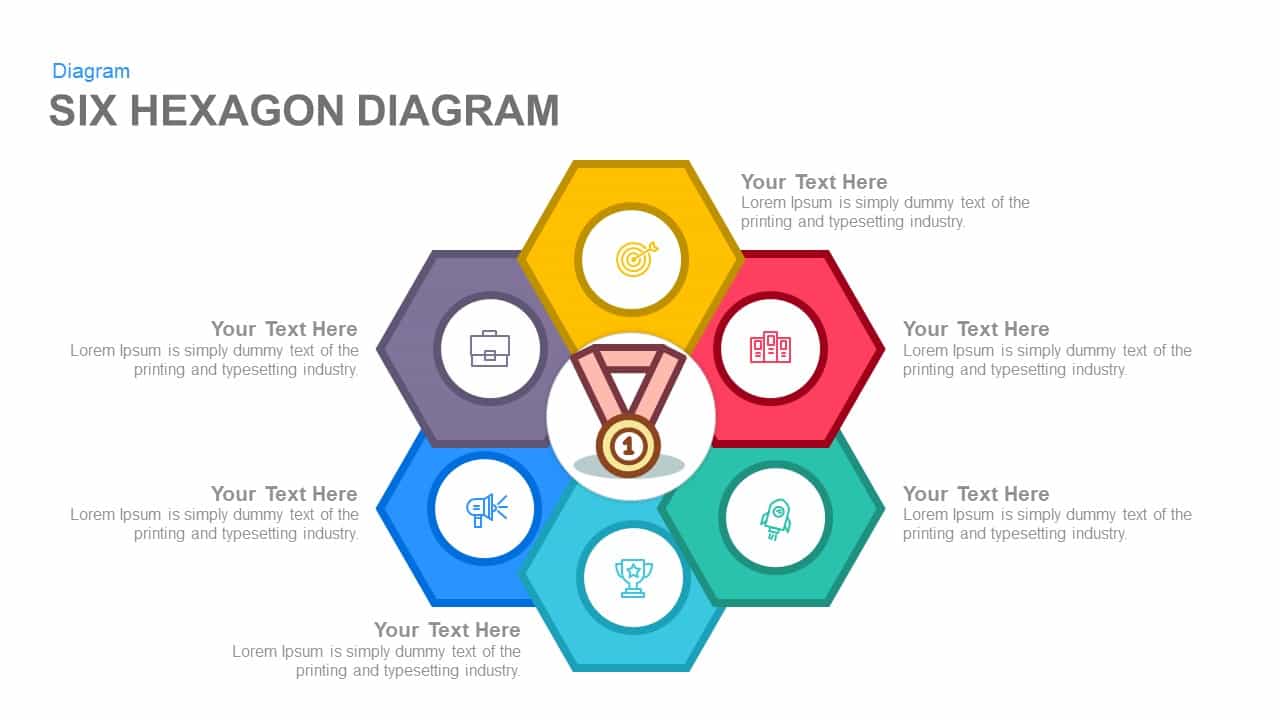
Six Hexagon Hub-and-Spoke Diagram Template for PowerPoint & Google Slides
Process
Premium

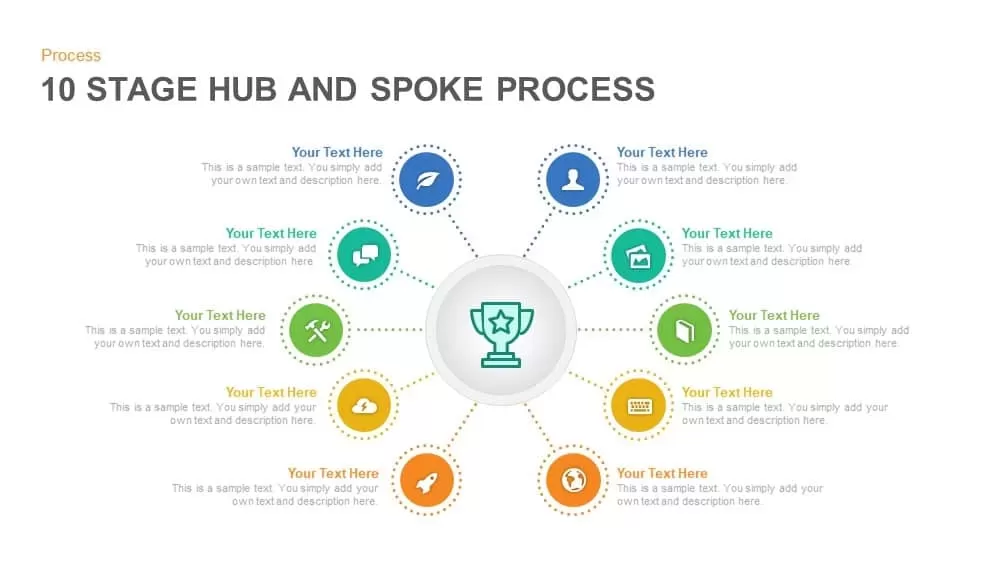
Ten-Stage Hub and Spoke Process Diagram Template for PowerPoint & Google Slides
Process
Premium
Eight-Stage Hub & Spoke Process Template for PowerPoint & Google Slides
Process
Premium
Social Media Hub & Spoke Model Template for PowerPoint & Google Slides
Process
Premium
Hub and Spoke Time Management Process Template for PowerPoint & Google Slides
Process
Premium
Mind Mapping Hub and Spoke Diagram Template for PowerPoint & Google Slides
Mind Maps
Premium
Mind Mapping Hub and Spoke Diagram Template for PowerPoint & Google Slides
Mind Maps
Premium
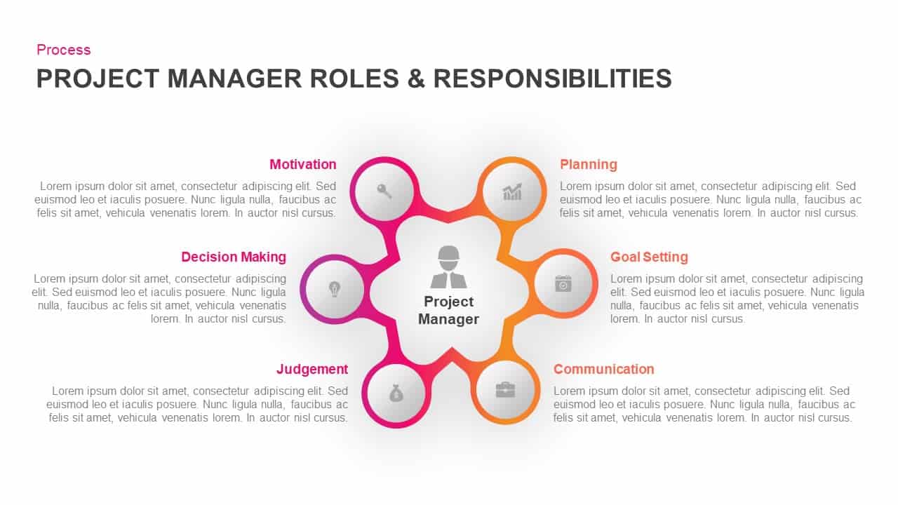
Project Manager Roles Hub-Spoke Process Template for PowerPoint & Google Slides
Process
Premium
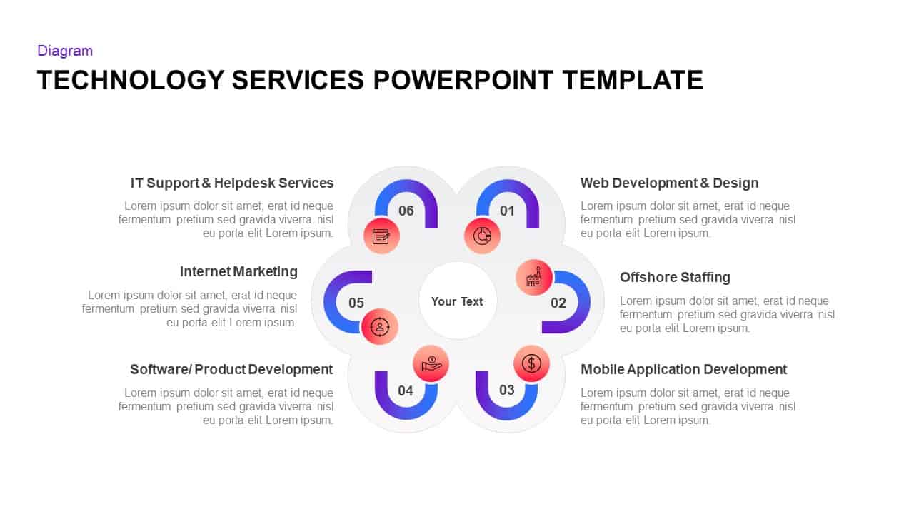
Technology Services Hub-Spoke Diagram Template for PowerPoint & Google Slides
Information Technology
Premium
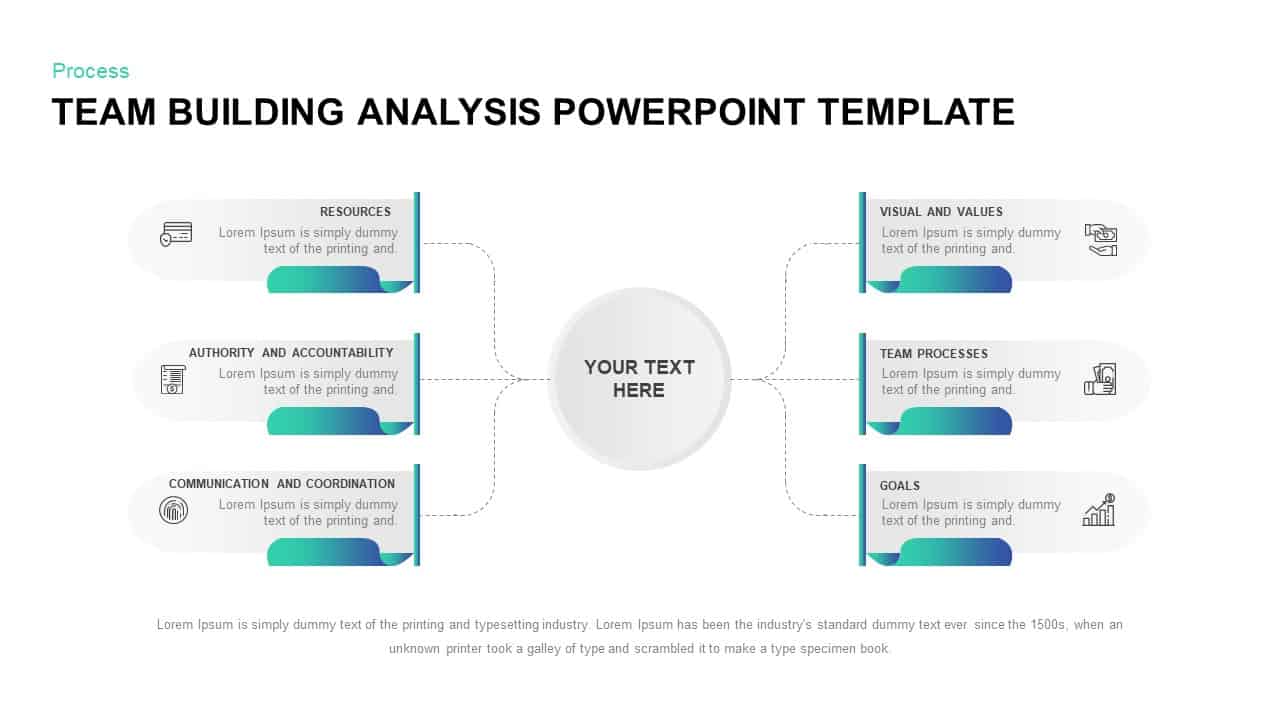
Team Building Hub-and-Spoke Analysis Template for PowerPoint & Google Slides
Process
Premium
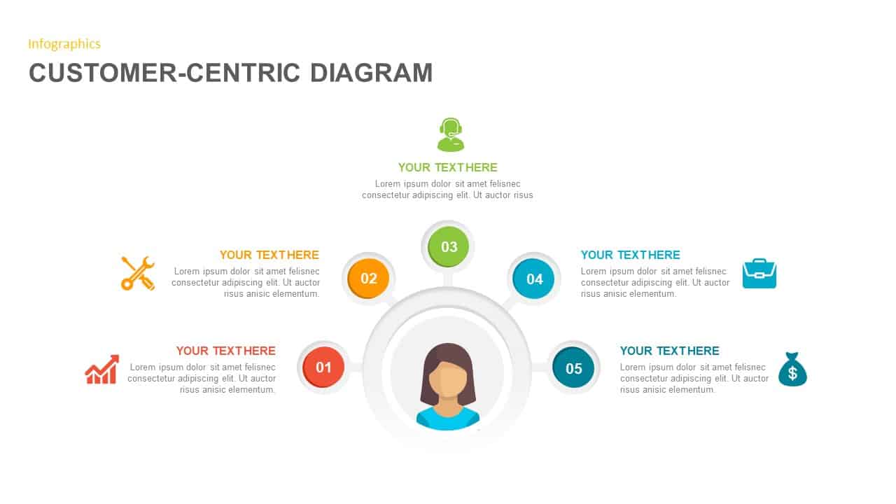
Customer-Centric Hub and Spoke Diagram Template for PowerPoint & Google Slides
Customer Experience
Premium
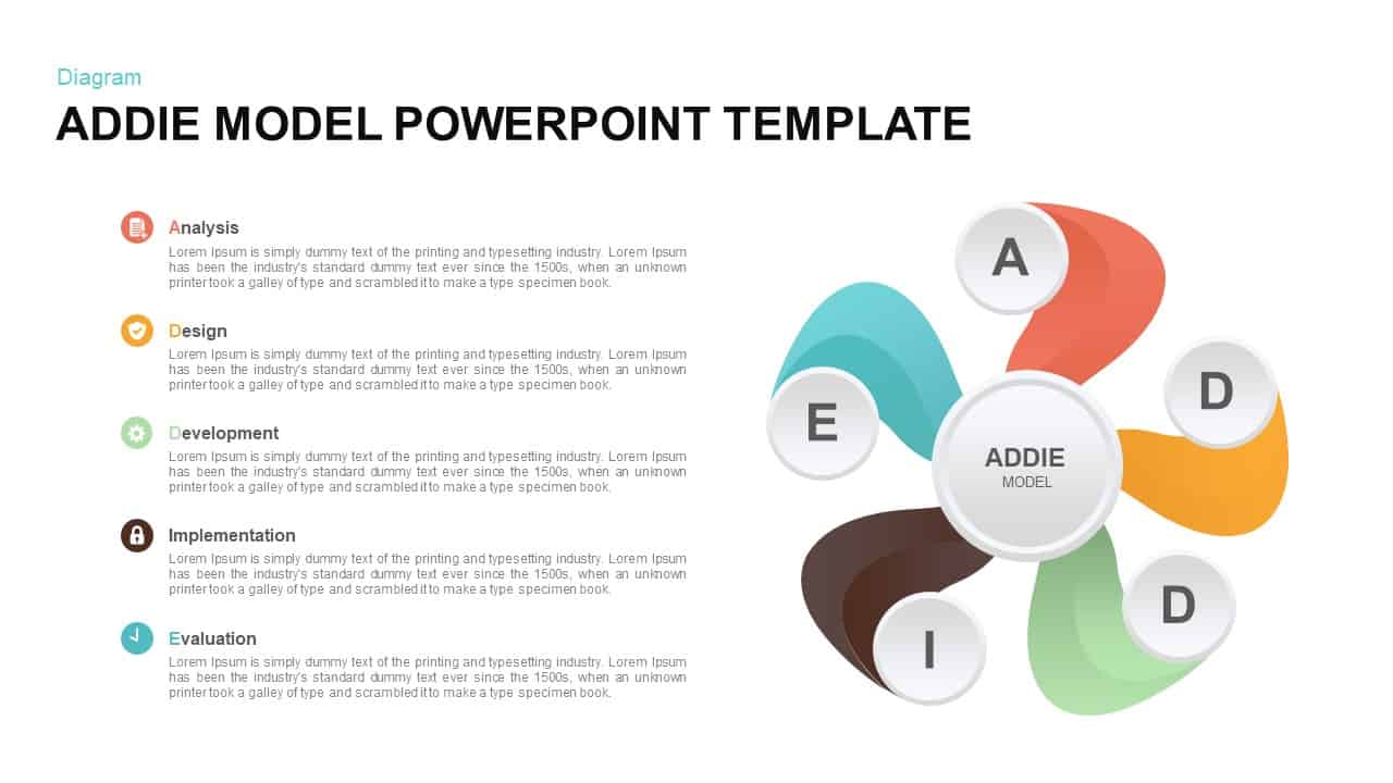
ADDIE Model Hub and Spoke Diagram Template for PowerPoint & Google Slides
Process
Premium

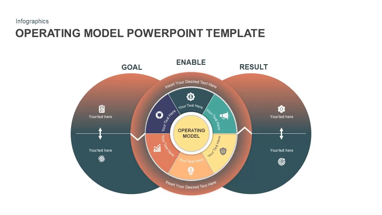
Operating Model Hub-and-Spoke Diagram Template for PowerPoint & Google Slides
Business Models
Premium
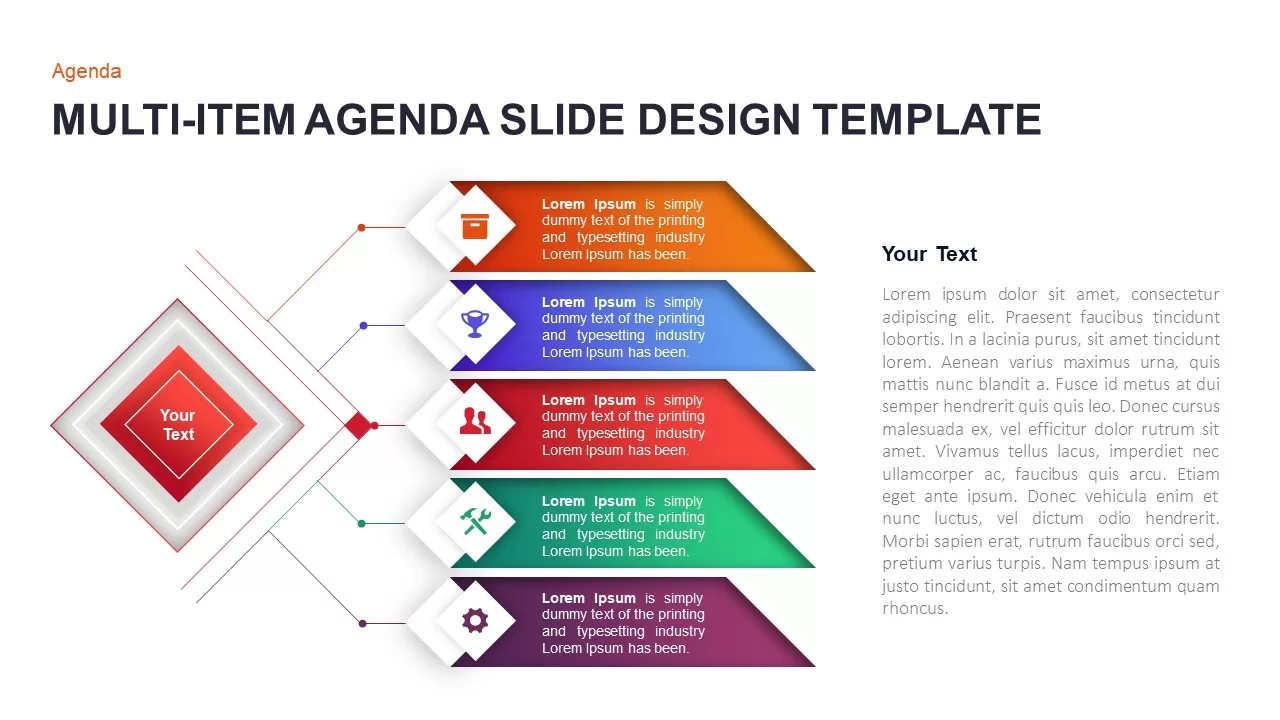
Multi-Item Agenda Hub-and-Spoke Diagram Template for PowerPoint & Google Slides
Agenda
Premium
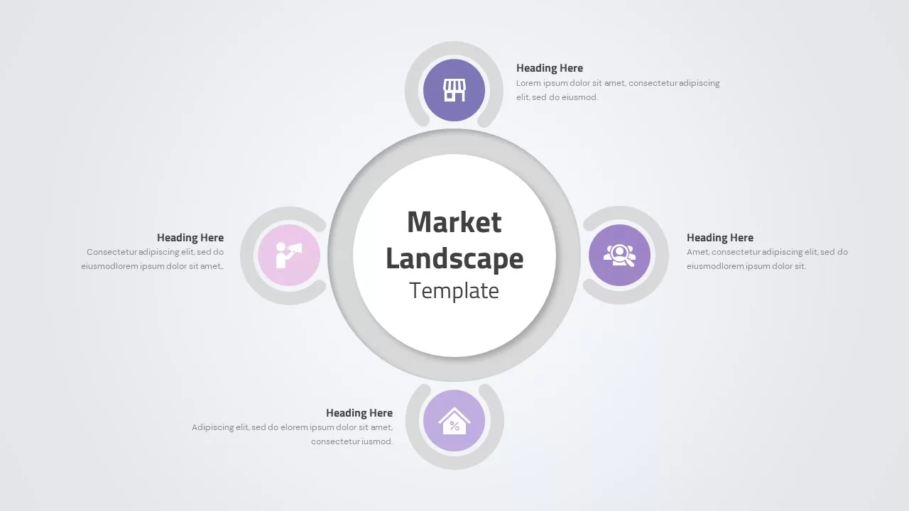
Market Landscape Hub and Spoke Diagram Template for PowerPoint & Google Slides
Infographics
Premium
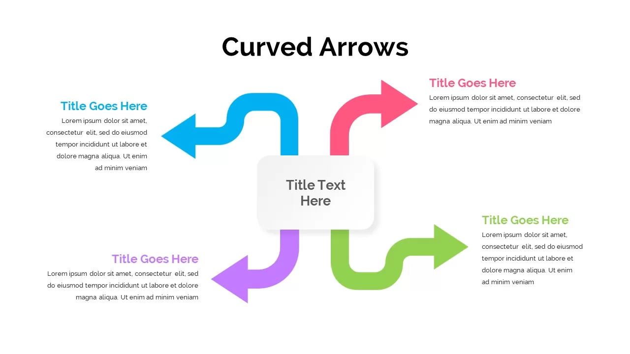
Four-Arrow Curved Hub-and-Spoke Diagram Template for PowerPoint & Google Slides
Arrow
Premium
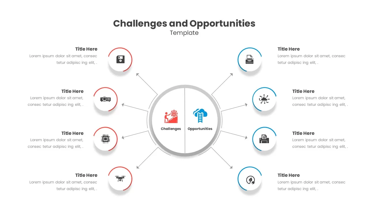
Challenges & Opportunities Hub-Spoke Template for PowerPoint & Google Slides
Circle
Premium
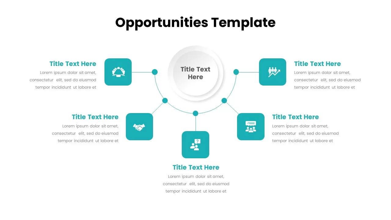
Opportunities Hub-and-Spoke Comparison Diagram Template for PowerPoint & Google Slides
Opportunities Challenges
Premium
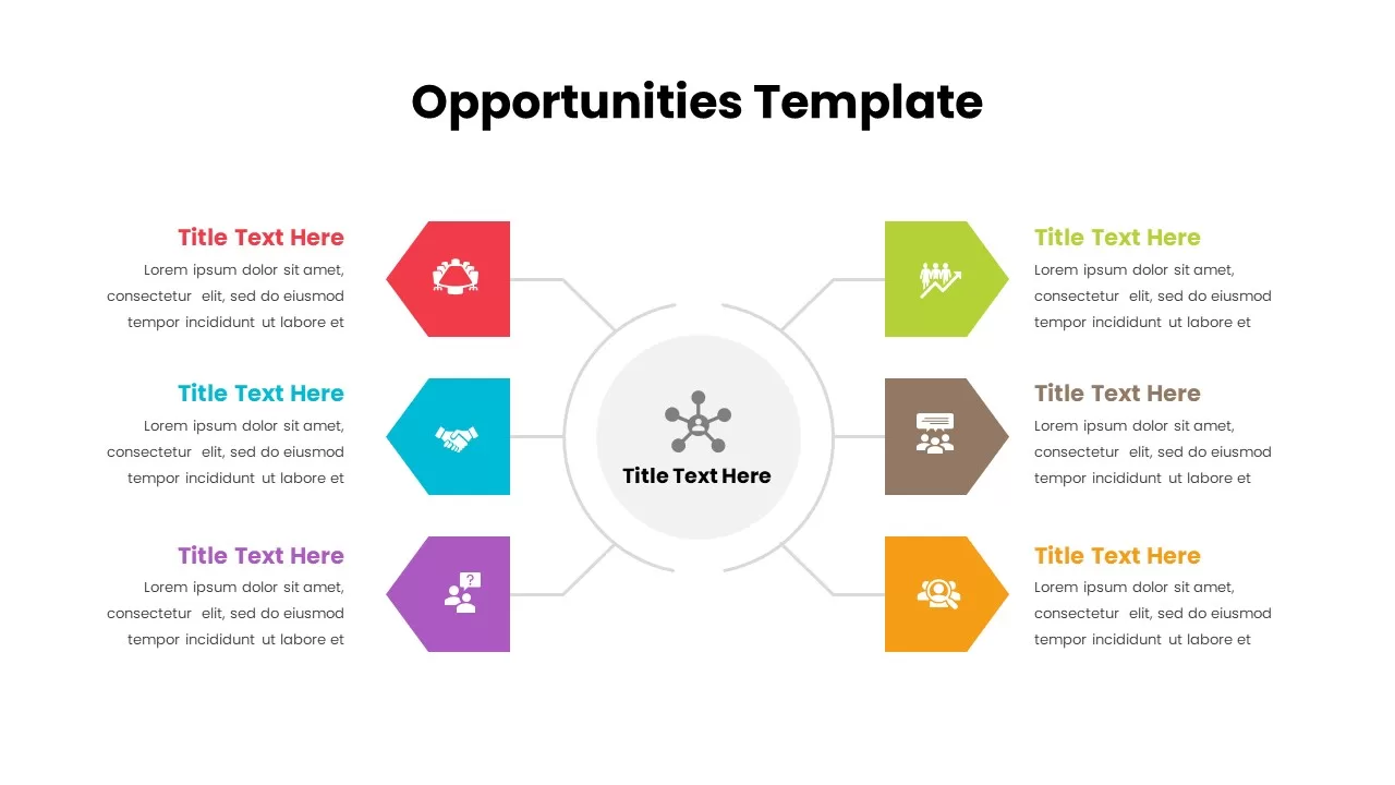
Opportunities Hub-and-Spoke Diagram Template for PowerPoint & Google Slides
Circle
Premium
Three-Step Hub and Spoke Diagram Template for PowerPoint & Google Slides
Circle
Premium
Five-Node Hub and Spoke Diagram Template for PowerPoint & Google Slides
Business Strategy
Premium
Four-Point Hub and Spoke Diagram Template for PowerPoint & Google Slides
Business Strategy
Premium
6 Stage Hub and Spoke Stages template for PowerPoint & Google Slides
Business Models
Premium
Five-Node Hub & Spoke Diagram Process Template for PowerPoint & Google Slides
Business Models
Premium
Project Scope Hub & Spoke Layout Template for PowerPoint & Google Slides
Process
Premium
Social Media Hub-and-Spoke Infographics Template for PowerPoint & Google Slides
Circle
Premium
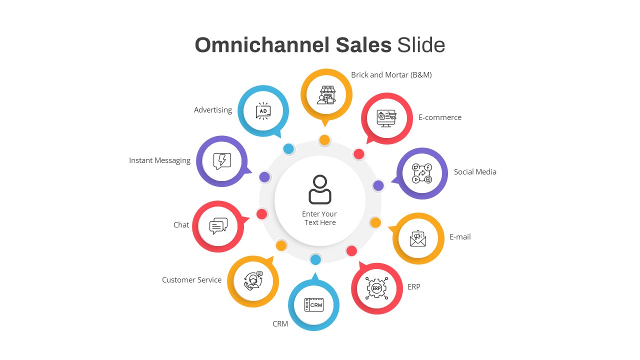
Omnichannel Sales Circular Hub & Spoke Template for PowerPoint & Google Slides
Digital Marketing
Premium
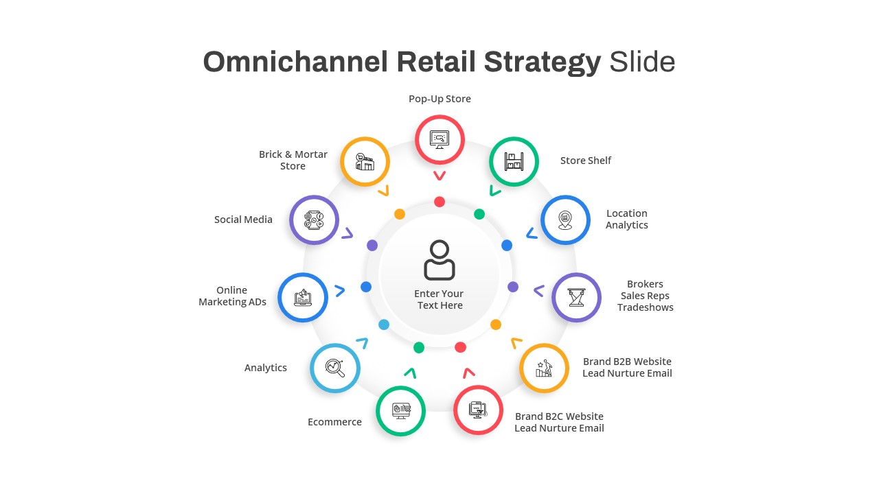
Omnichannel Retail Strategy Hub & Spoke Template for PowerPoint & Google Slides
Business Strategy
Premium
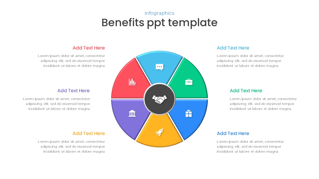
Free Six-Part Hub-and-Spoke Benefits Template for PowerPoint & Google Slides
Circle
Free
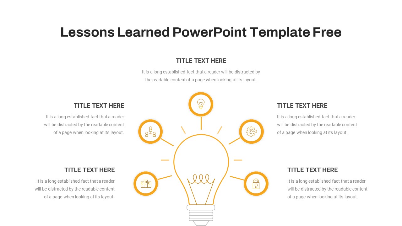
Lessons Learned Hub and Spoke Diagram Template for PowerPoint & Google Slides
Leadership
Free
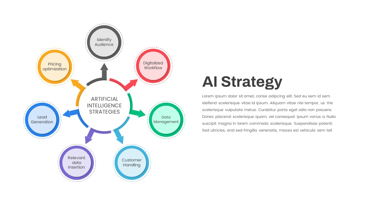
AI Strategy Hub-and-Spoke Diagram Template for PowerPoint & Google Slides
Circle
Premium
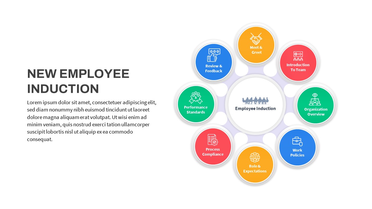
Free New Employee Induction Hub-and-Spoke Template for PowerPoint & Google Slides
Recruitment
Free
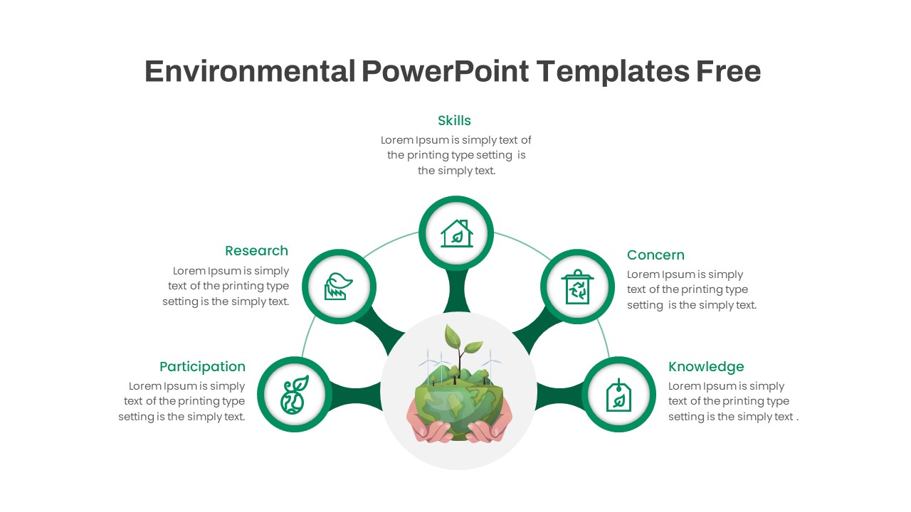
Free Environmental Hub-and-Spoke Diagram Template for PowerPoint & Google Slides
Circle
Free
AI Rules Hub and Spoke Diagram Template for PowerPoint & Google Slides
AI
Premium
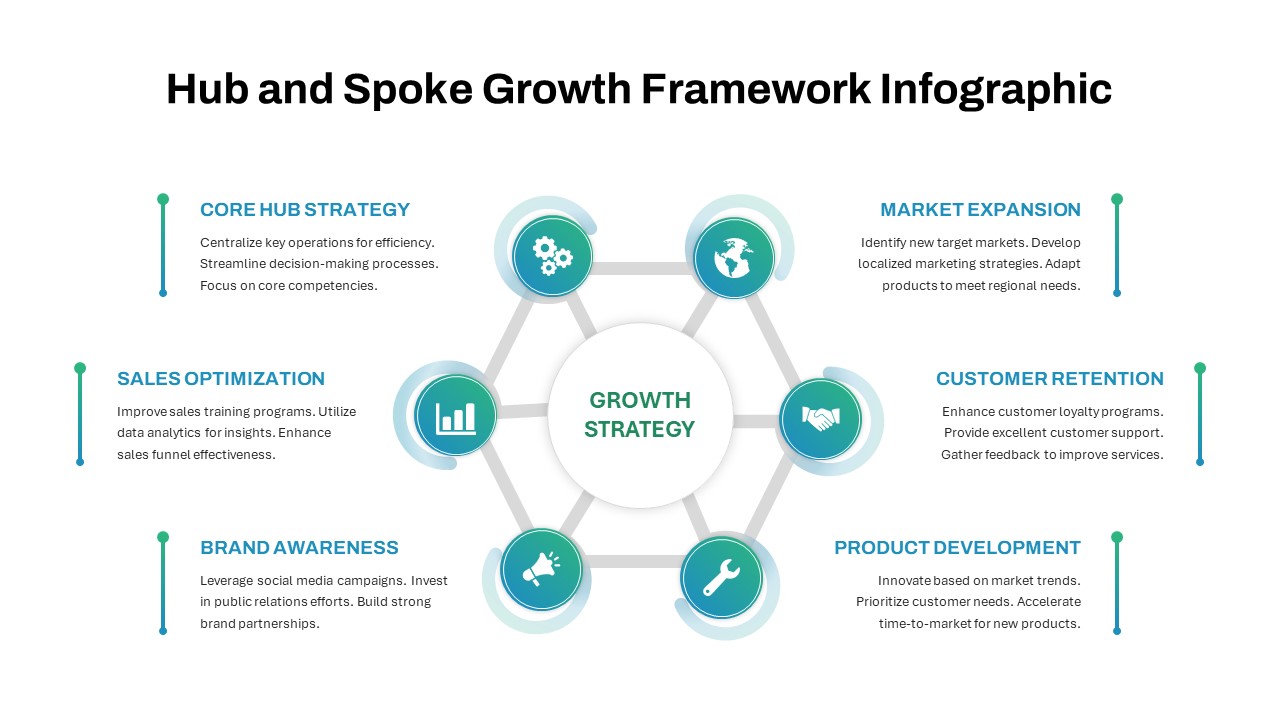
Hub and Spoke Growth Framework Template for PowerPoint & Google Slides
Circle
Premium
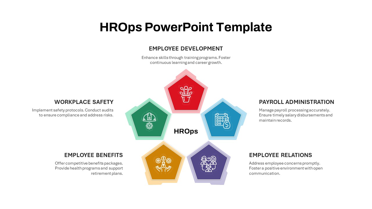
HROps Hub and Spoke Circular Diagram Template for PowerPoint & Google Slides
Circle
Premium
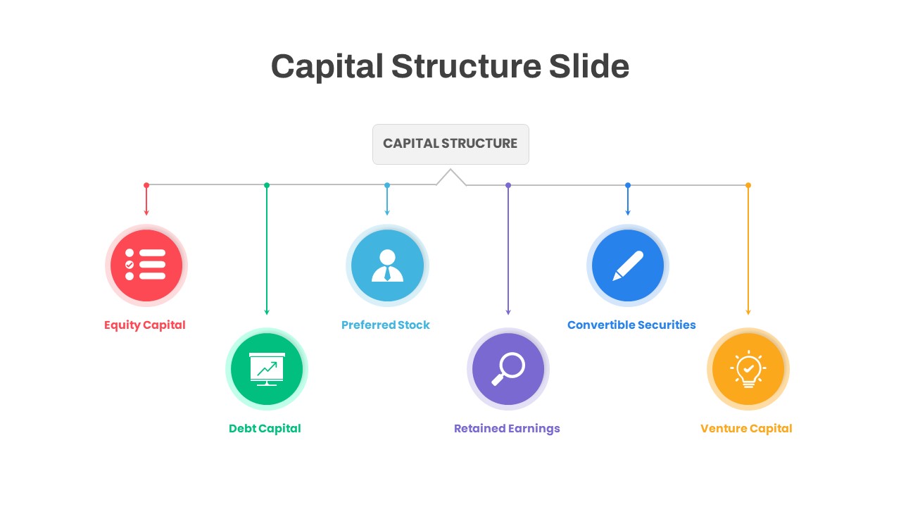
Capital Structure Hub & Spoke Diagram Template for PowerPoint & Google Slides
Process
Premium
Career Portfolio Hub-and-Spoke Diagram Template for PowerPoint & Google Slides
Circle
Premium
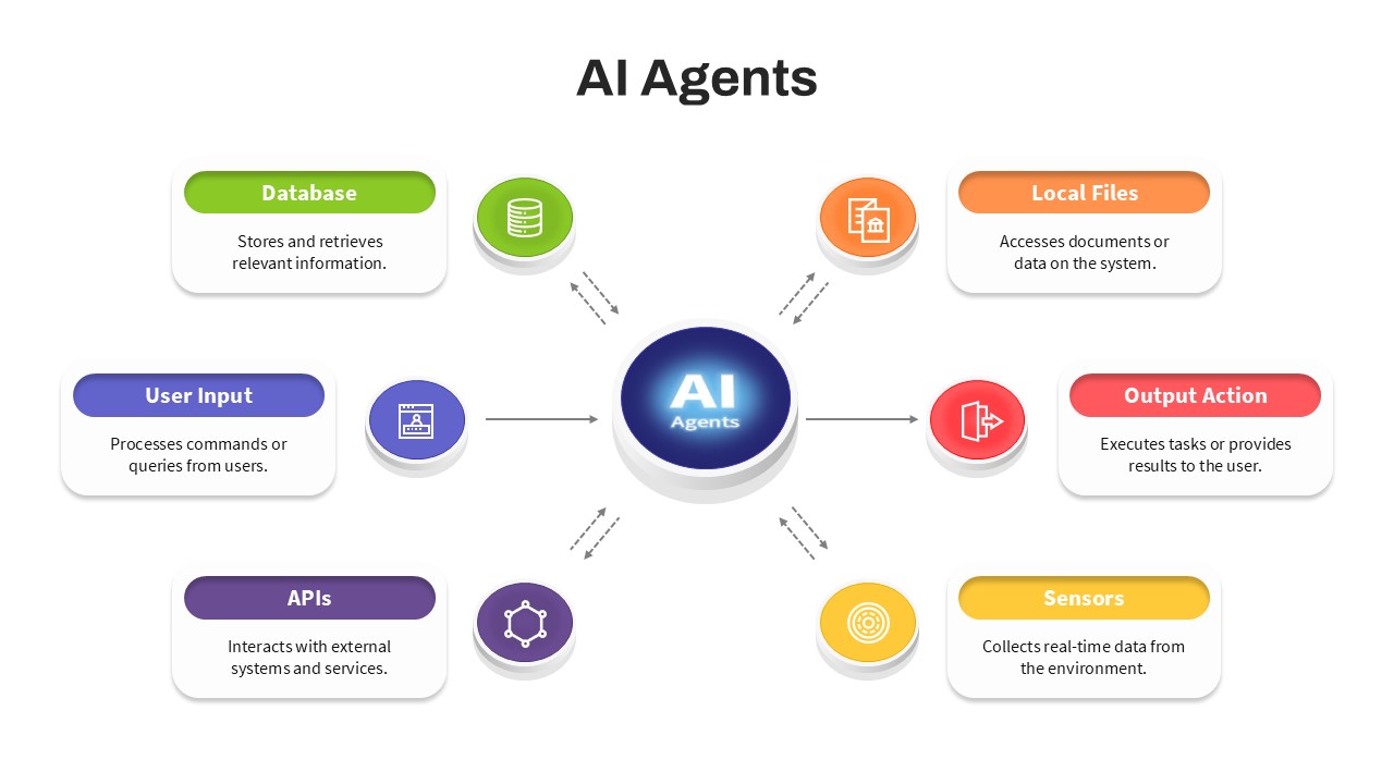
AI Agents Hub and Spoke Diagram Template for PowerPoint & Google Slides
AI
Premium
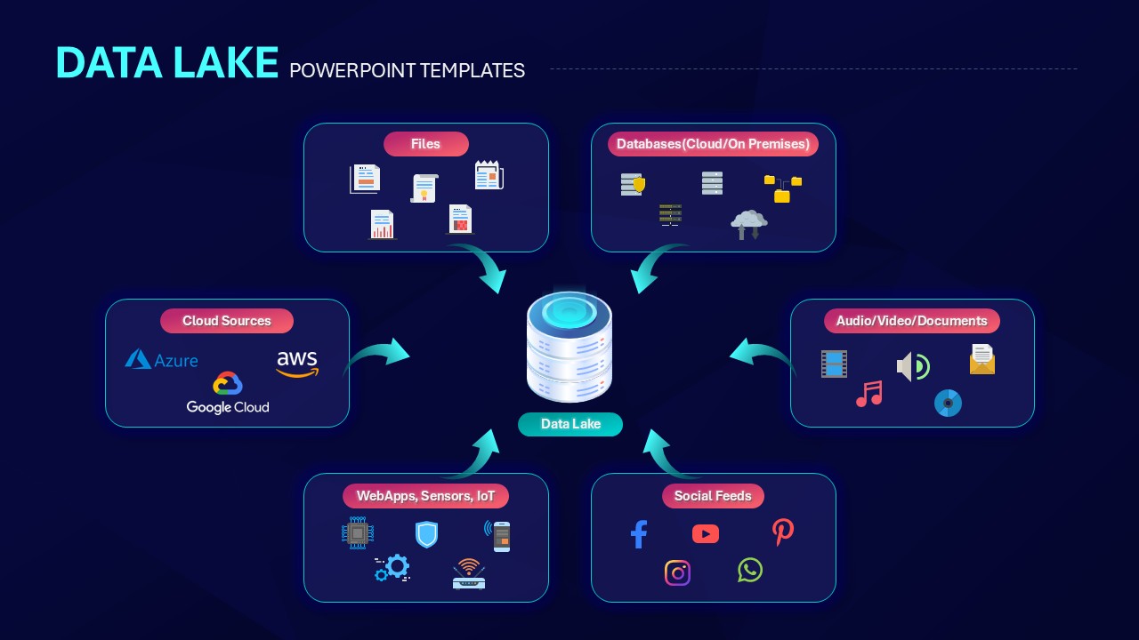
Data Lake Hub-and-Spoke Diagram Template for PowerPoint & Google Slides
Cloud Computing
Premium
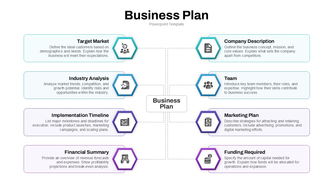
Business Plan Hub-and-Spoke Slide Template for PowerPoint & Google Slides
Business Plan
Premium
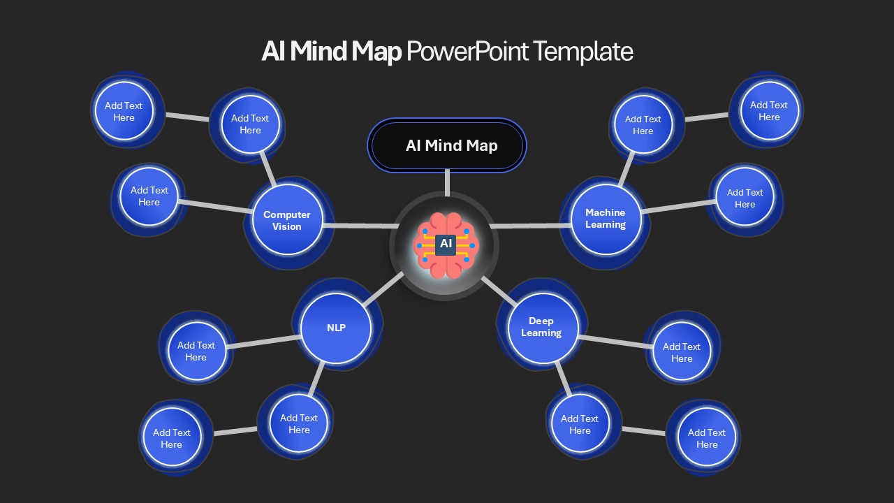
AI Mind Map & Hub-and-Spoke Diagram Template for PowerPoint & Google Slides
Mind Maps
Premium
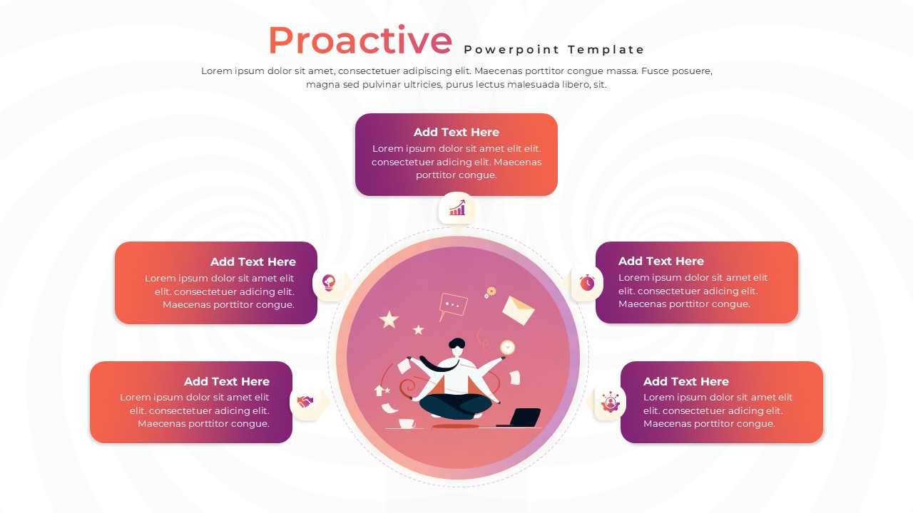
Proactive Hub-and-Spoke Diagram Template for PowerPoint & Google Slides
Process
Premium
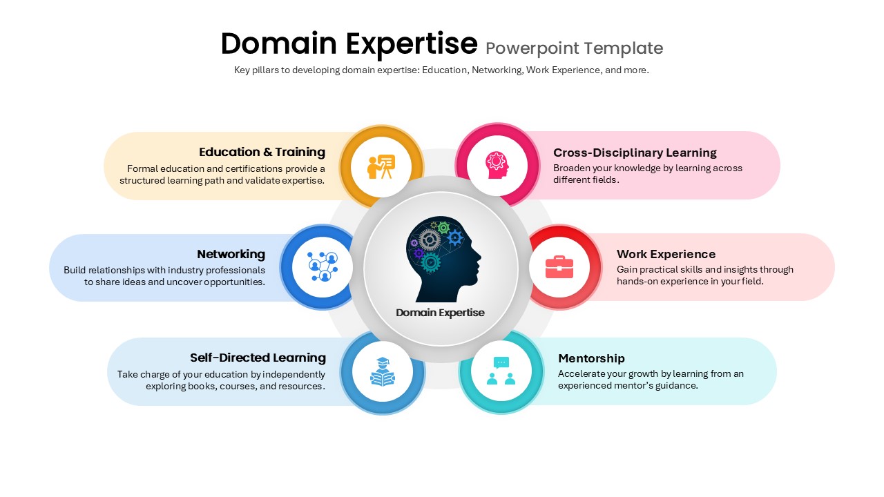
Domain Expertise Pillars Hub-and-Spoke Template for PowerPoint & Google Slides
Circle
Premium
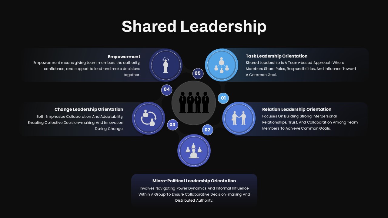
Shared Leadership Hub-and-Spoke Template for PowerPoint & Google Slides
Circle
Premium
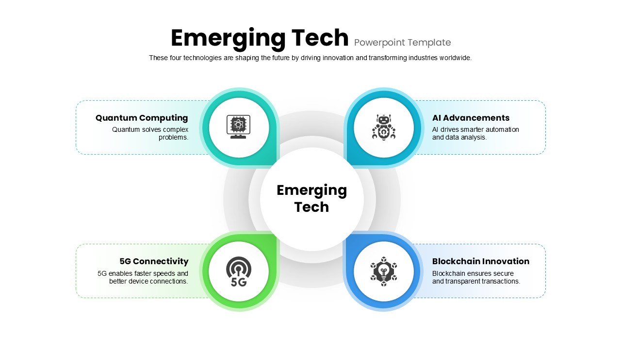
Emerging Tech Hub-and-Spoke Diagram Template for PowerPoint & Google Slides
Technology
Premium
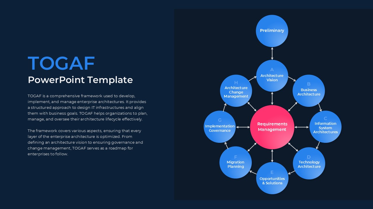
TOGAF Architecture Hub-and-Spoke Template for PowerPoint & Google Slides
Circle
Premium
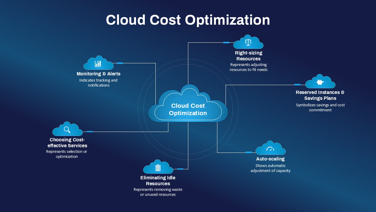
Cloud Cost Optimization Hub-and-Spoke Template for PowerPoint & Google Slides
Cloud Computing
Premium
Qualitative Research Hub and Spoke Template for PowerPoint & Google Slides
Circle
Premium
7 Hub and Spoke Diagram Slide for PowerPoint & Google Slides
Process
Premium
Hub and Spoke Diagram Slide for PowerPoint & Google Slides
Circle
Premium
Hub and Spoke Diagram for PowerPoint & Google Slides
Business Models
Premium
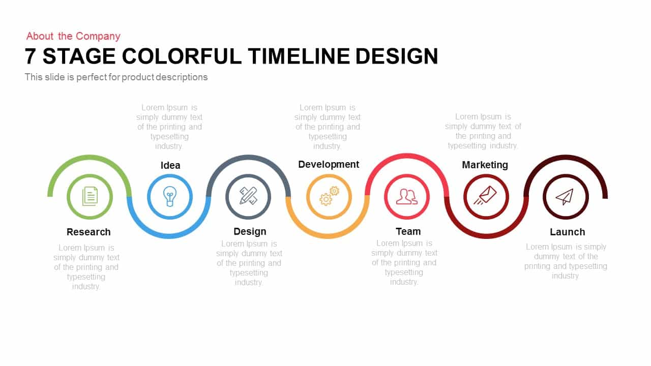
7-Stage Colorful Timeline Infographic Template for PowerPoint & Google Slides
Timeline
Premium

Colorful Photo Capture Infographic Template for PowerPoint & Google Slides
Advertising
Premium
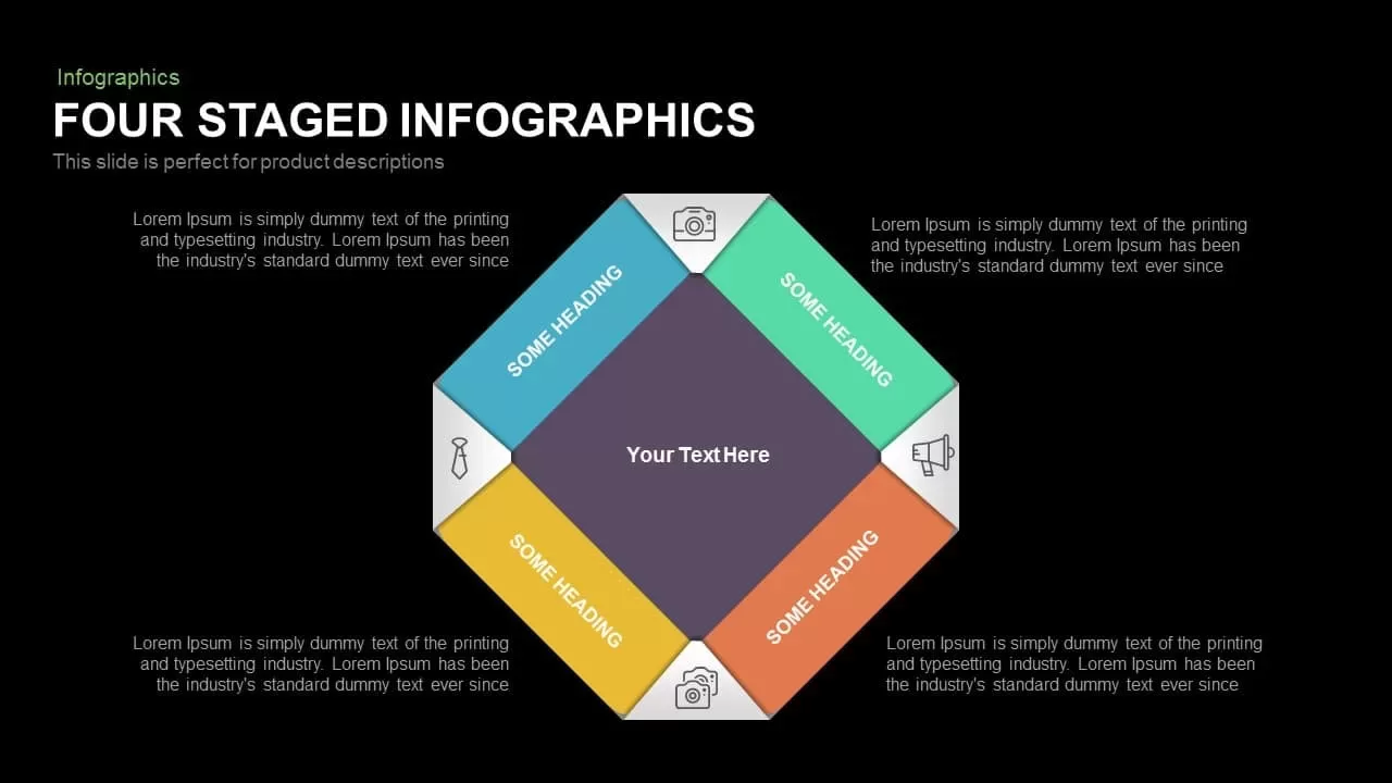
Colorful Four-Stage Infographic Process Template for PowerPoint & Google Slides
Process
Premium
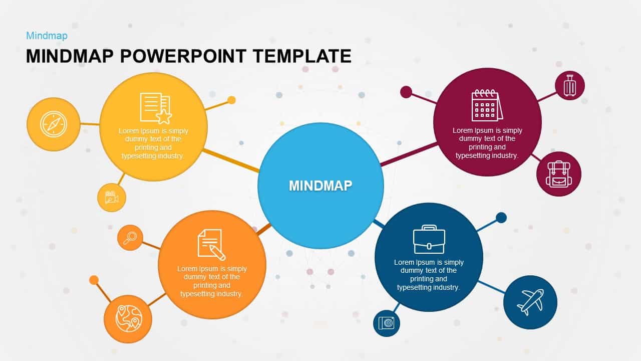
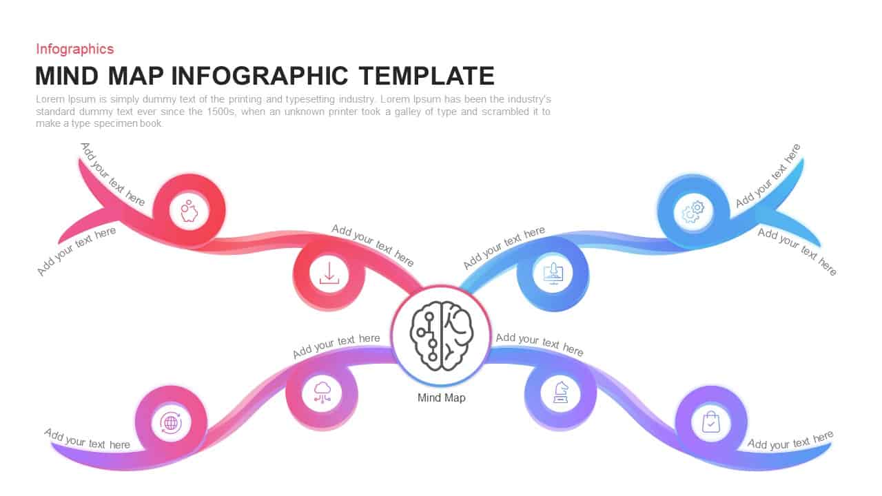
Colorful Mind Map Infographic Template with Icons for PowerPoint & Google Slides
Mind Maps
Premium
Colorful Mind Map Infographic Template for PowerPoint & Google Slides
Mind Maps
Premium
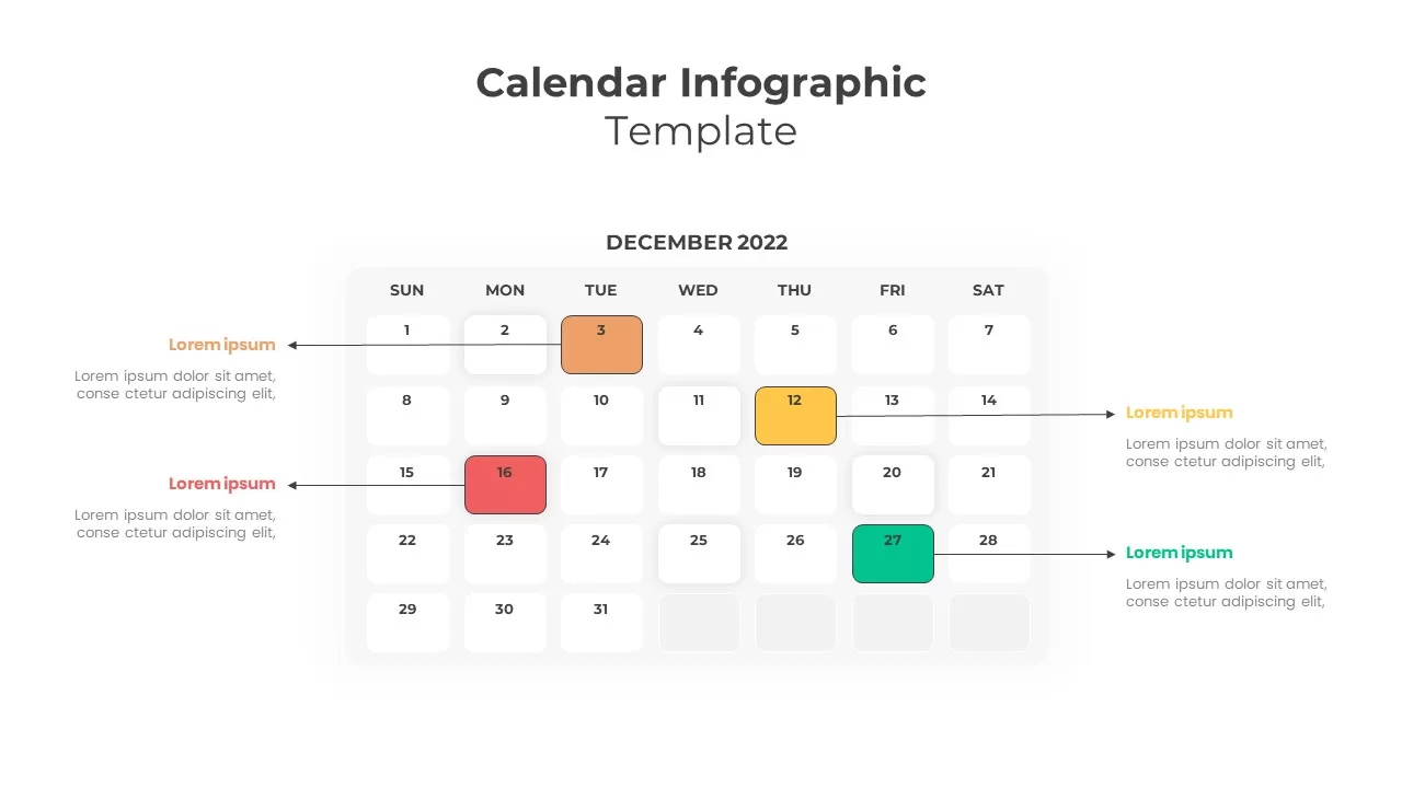
Colorful Callout Calendar Infographic Template for PowerPoint & Google Slides
Infographics
Premium
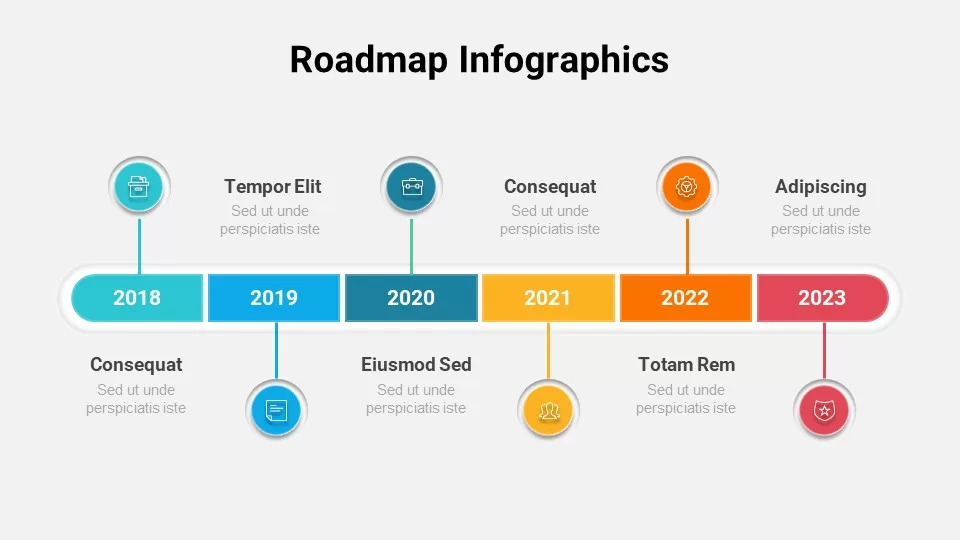
Free Colorful Roadmap Timeline Infographic Template for PowerPoint & Google Slides
Roadmap
Free
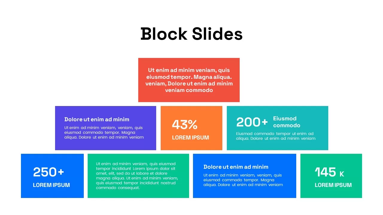
Colorful Block Infographic Metrics Slide Template for PowerPoint & Google Slides
Infographics
Premium
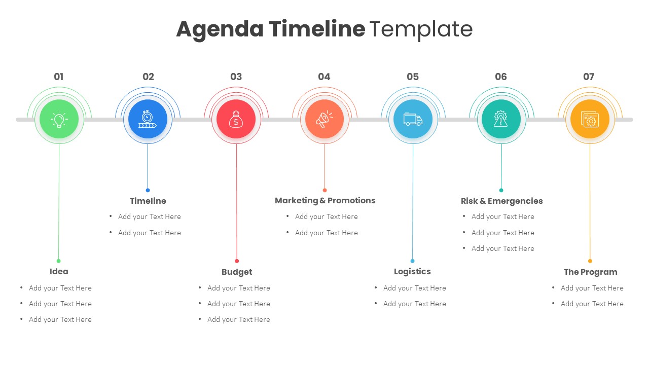
Colorful Agenda Timeline Infographic Template for PowerPoint & Google Slides
Agenda
Premium
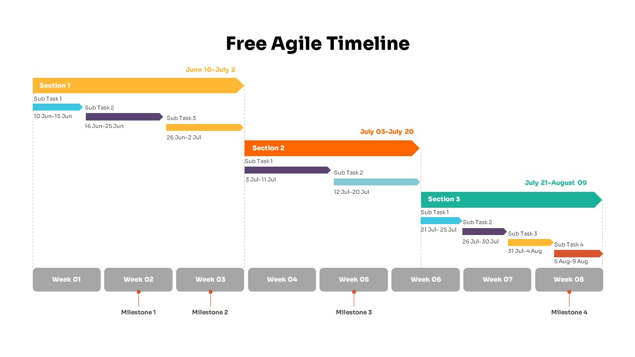
Colorful Agile Timeline Infographic Template for PowerPoint & Google Slides
Timeline
Free

Free Colorful Infographic Slide Pack Template for PowerPoint & Google Slides
Roadmap
Free
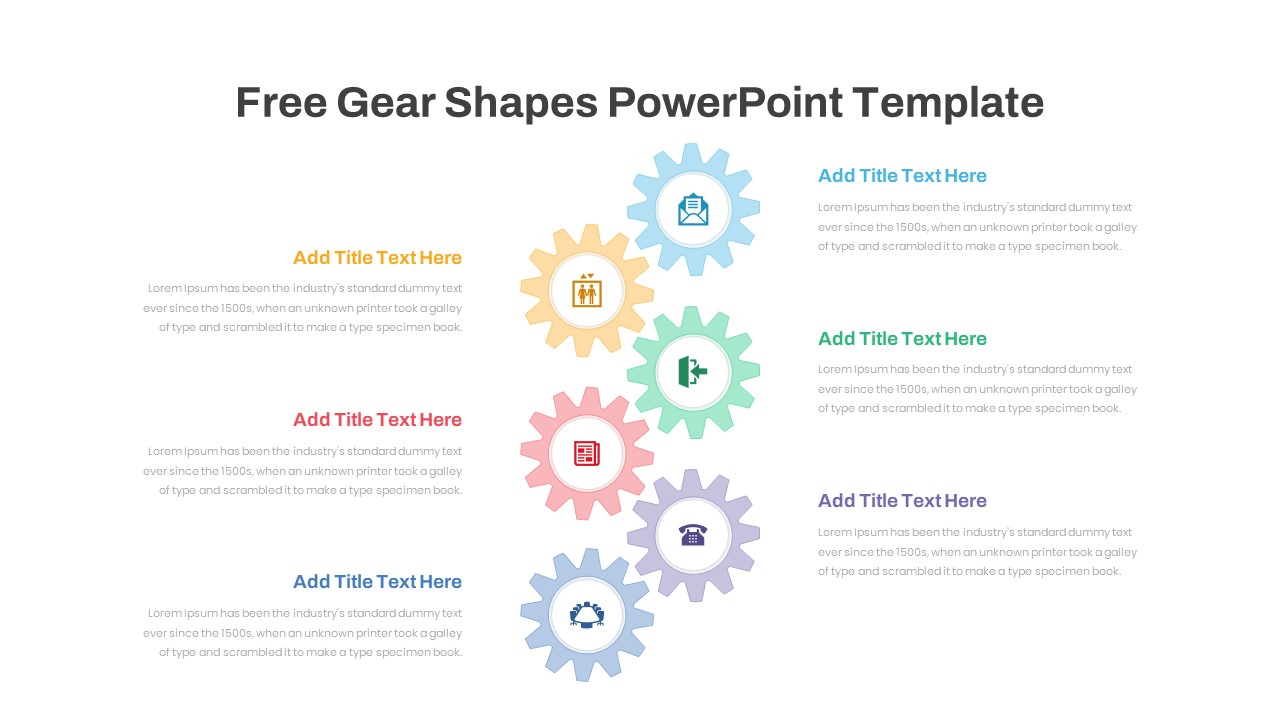
Six Colorful Gear Shapes Infographic Template for PowerPoint & Google Slides
Process
Free
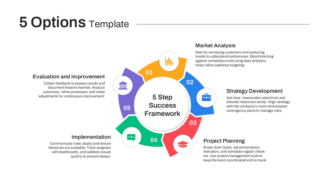
Colorful Five-Option Ribbon Infographic Template for PowerPoint & Google Slides
Process
Premium
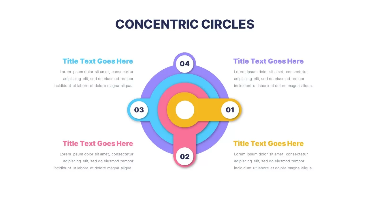
Colorful Concentric Circles Infographic Slide for PowerPoint & Google Slides
Process
Premium
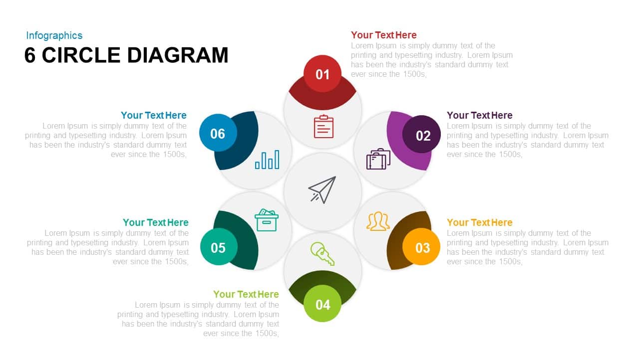
Six-Segment Circular Hub Infographic Template for PowerPoint & Google Slides
Circle
Premium
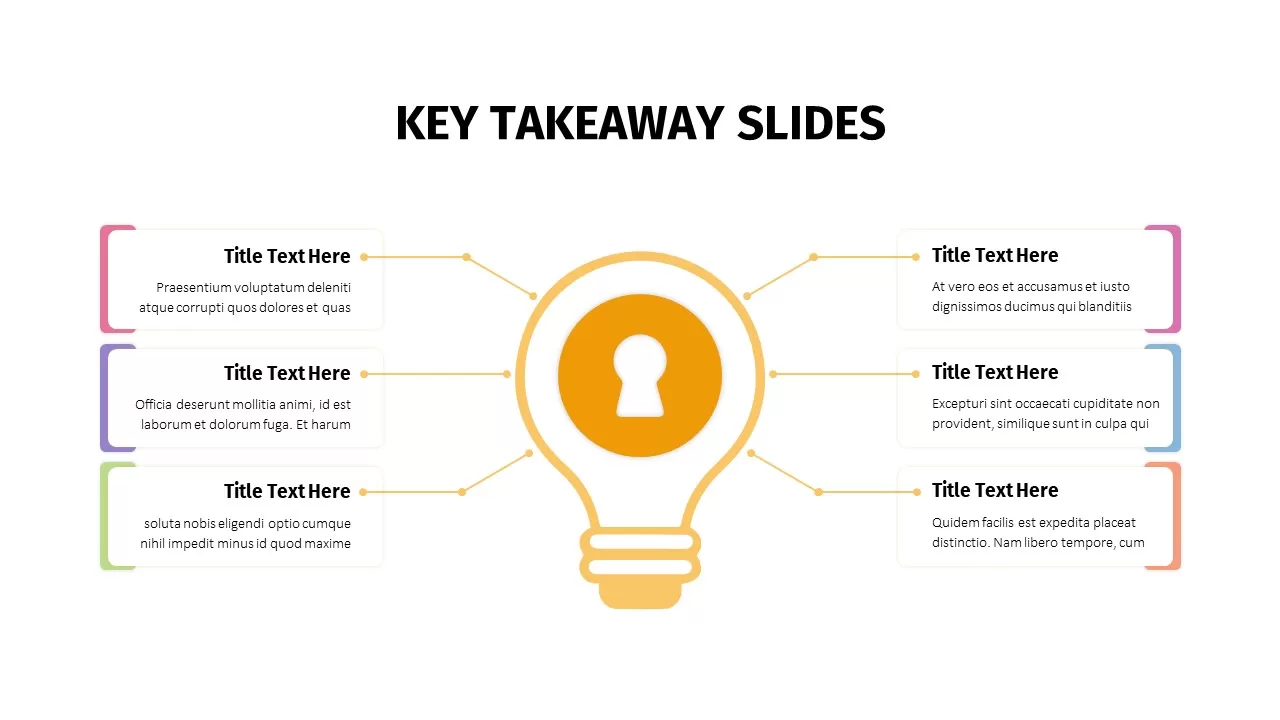
Animated Key Takeaway Spoke Infographic Template for PowerPoint & Google Slides
Infographics
Premium
Colorful Rainbow Slides Template for PowerPoint & Google Slides
Graphics
Premium
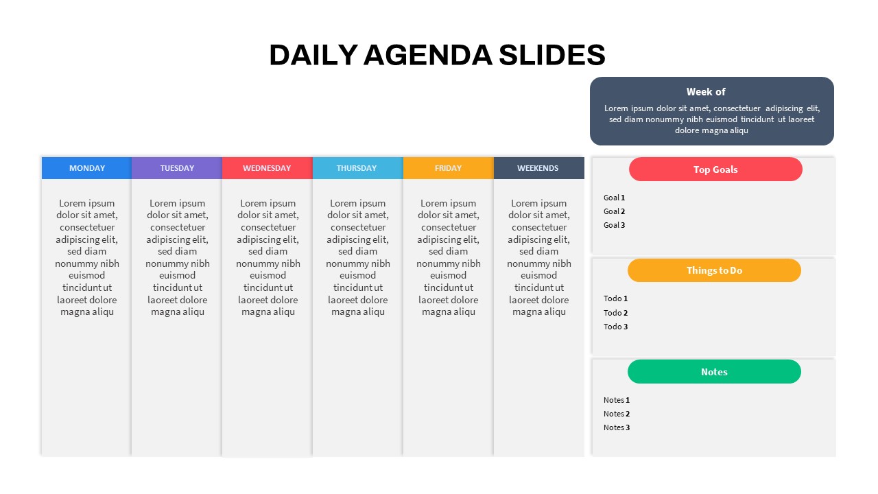
Editable Colorful Daily Agenda Slides Template for PowerPoint & Google Slides
Agenda
Premium
Free Colorful Morning Meeting Agenda Slides Template for PowerPoint & Google Slides
Agenda
Free
Colorful Birthday Celebration Slides for PowerPoint & Google Slides
Graphics
Premium
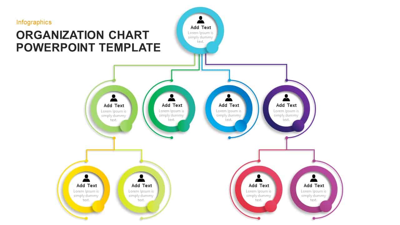
Modern Colorful Circular Org Chart Template for PowerPoint & Google Slides
Org Chart
Premium
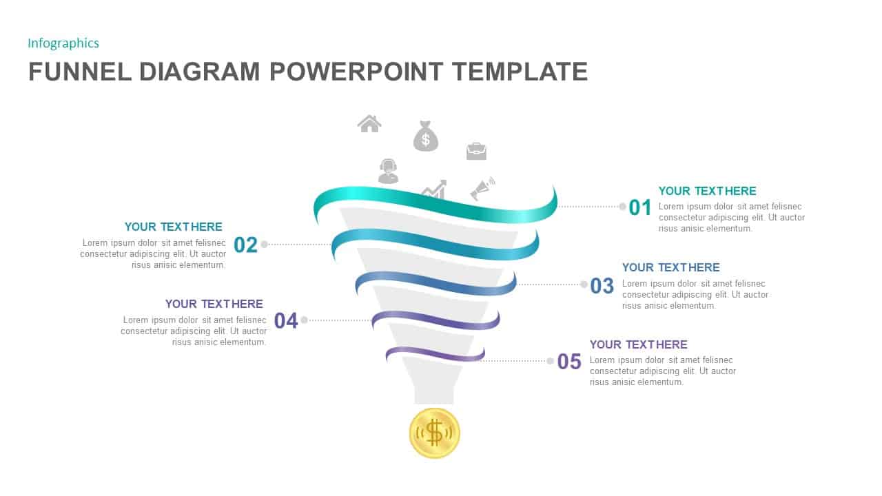
5-Step Colorful Funnel Diagram Template for PowerPoint & Google Slides
Funnel
Premium
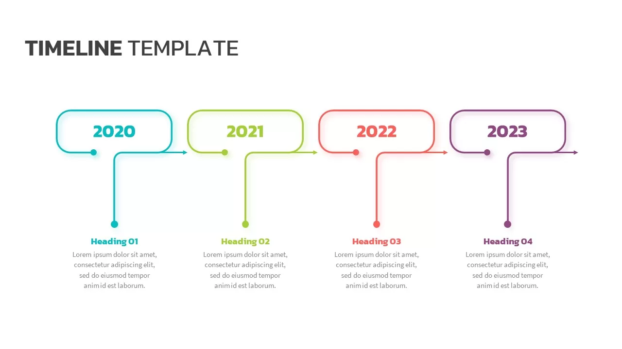
Colorful Four-Year Timeline Layout Template for PowerPoint & Google Slides
Timeline
Premium
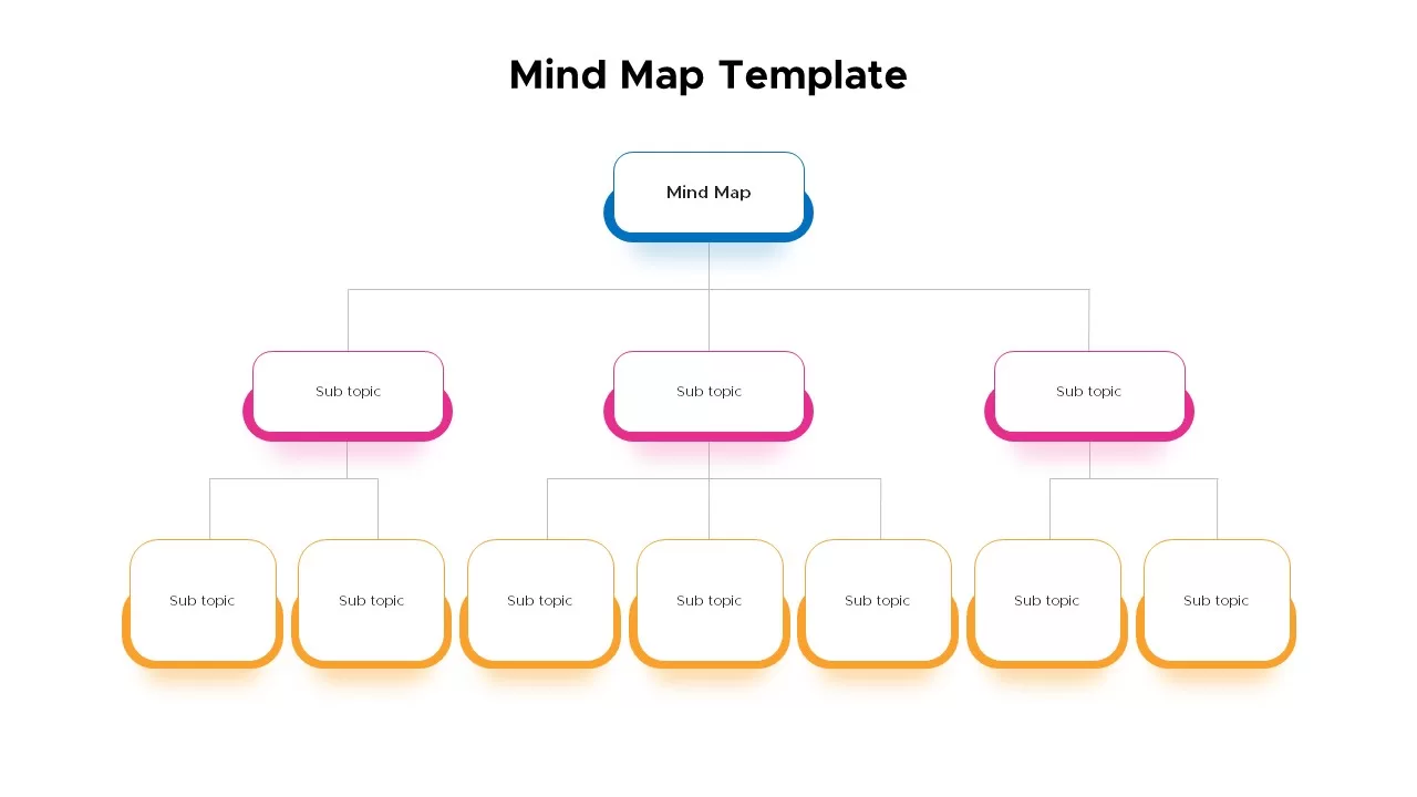
Colorful Mind Map Template for PowerPoint & Google Slides
Mind Maps
Premium
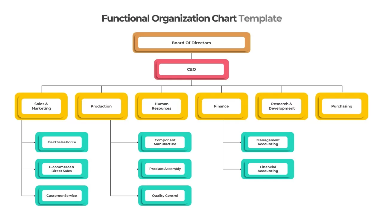
Colorful Functional Organization Chart Template for PowerPoint & Google Slides
Org Chart
Premium
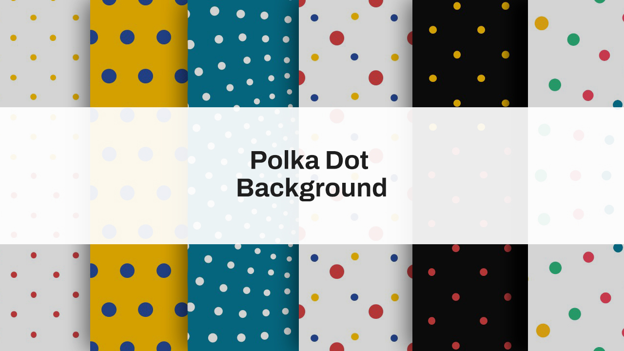
Colorful Polka Dot Background Theme Template for PowerPoint & Google Slides
Decks
Premium
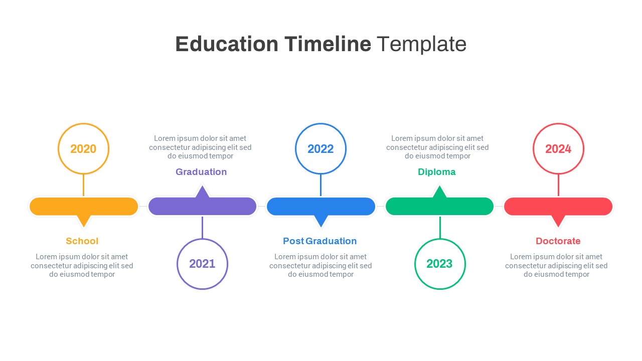
Colorful Five-Stage Education Timeline Template for PowerPoint & Google Slides
Timeline
Premium