Before and After Comparison Infographic Template for PowerPoint & Google Slides
Description
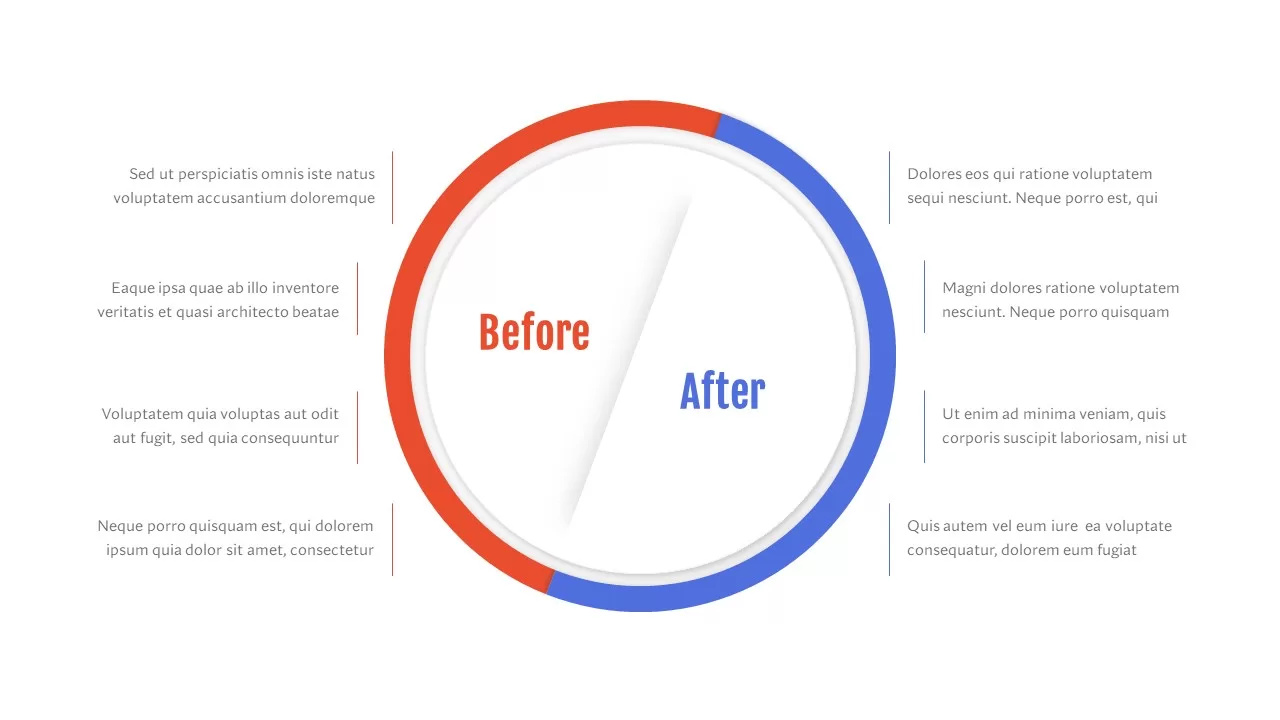
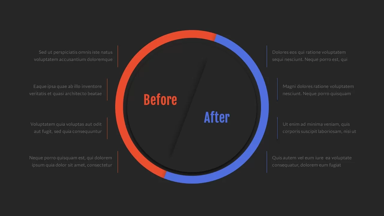
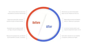
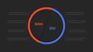
Leverage this sleek before-and-after comparison infographic to highlight transformation stories with clarity and impact. At its center sits a donut-style circular border split diagonally into two vibrant halves—orange on the left for “Before” and blue on the right for “After”—anchored by matching color-coded labels that guide audience focus. Surrounding the circle, four evenly spaced text callouts on each side connect via slim, colored lines, providing dedicated spaces to outline key challenges, improvements, metrics, or features. Clean sans-serif typography, ample white space, and subtle drop shadows ensure maximum readability and a polished, professional aesthetic across devices.
Fully editable in both PowerPoint and Google Slides, this slide empowers you to adjust border thickness, swap accent colors, and modify callout count in seconds. Simply duplicate or delete callout elements to scale from fewer points up to eight by default, and update text placeholders with your own content. Predefined master slides maintain consistent styling and spacing, while simple animation presets can animate the divider or fade in callouts for dynamic reveals. This agile layout eliminates formatting headaches and accelerates your presentation workflow by combining structured design with intuitive customization.
Ideal for illustrating performance improvements, process optimizations, before/after case studies, and product enhancements, this infographic lets presenters map out challenges versus outcomes in a single, unified view. Use the contrasting halves to reinforce narrative flow, highlight root-cause fixes, or showcase feature upgrades, ensuring every transformation point stands out in boardroom presentations, investor briefs, or training sessions.
Who is it for
Project managers, marketing teams, consultants, and product managers will benefit from this slide when highlighting before-and-after scenarios, performance improvements, or transformation case studies. Executive stakeholders, training facilitators, and sales enablement professionals can also use the diagram to reinforce key messaging with clear visual comparisons.
Other Uses
Beyond case studies, repurpose this layout for A/B test results, process improvement reviews, user journey redlines, cost-benefit analyses, or workflow refinements. Use the callouts to detail features, risks, corrective actions, or results comparisons, adapting the number of points as needed.
Login to download this file

Item ID
SB02816
Related Templates

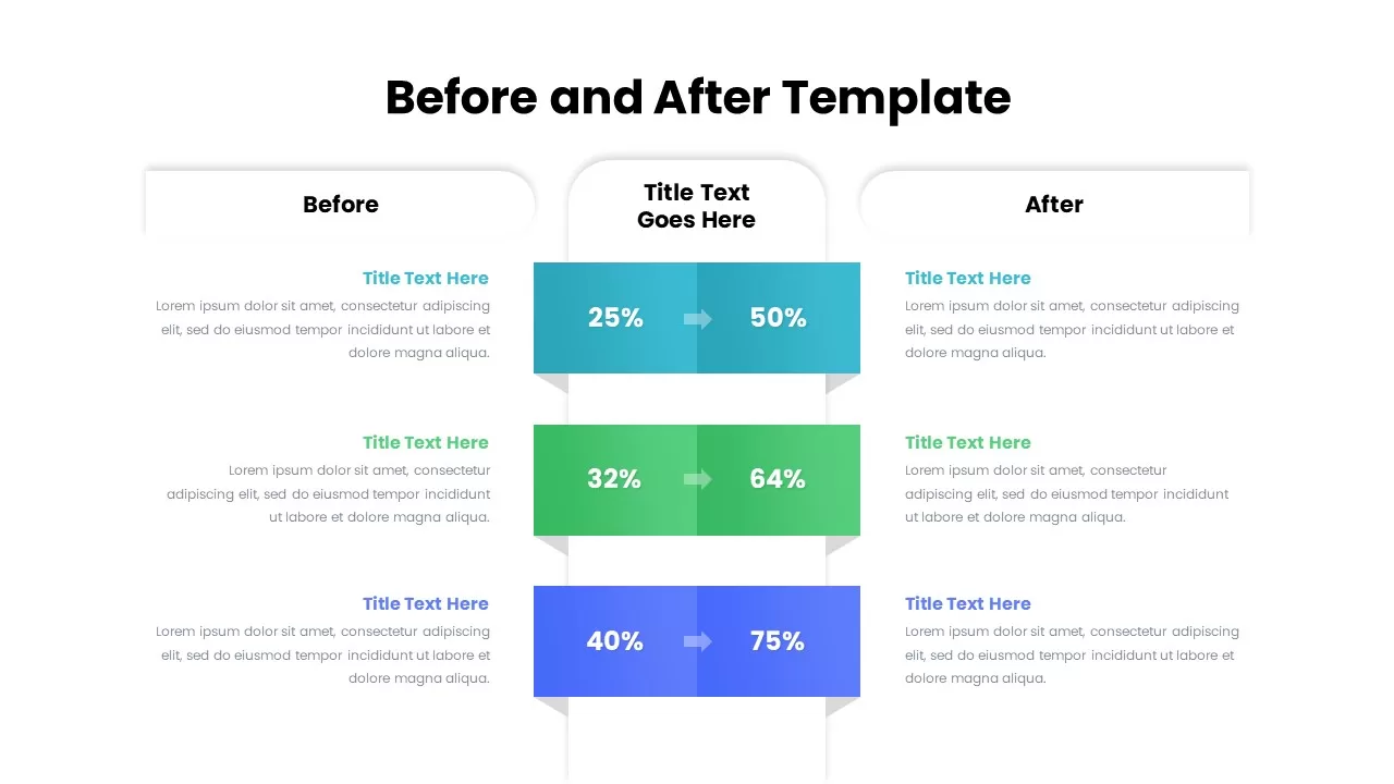
Before and After Comparison Infographics Template for PowerPoint & Google Slides
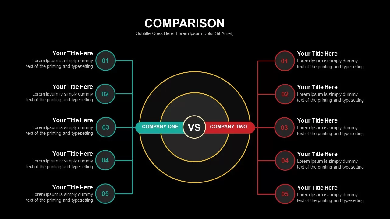
Comparison
Premium
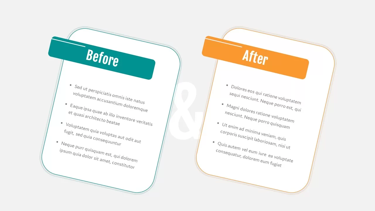
Before and After Comparison Slide Template for PowerPoint & Google Slides
Comparison
Premium
Modern Before and After Comparison Template for PowerPoint & Google Slides
Infographics
Premium
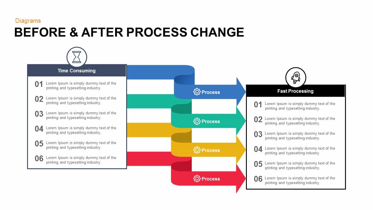
Before & After Process Change template for PowerPoint & Google Slides
Process
Premium
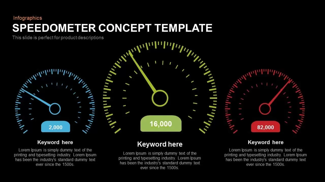
Speedometer Infographic Gauge Comparison Template for PowerPoint & Google Slides
Comparison
Premium

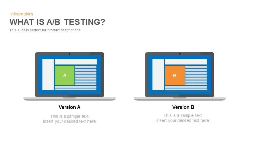
A/B Testing Comparison Infographic template for PowerPoint & Google Slides
Comparison
Premium
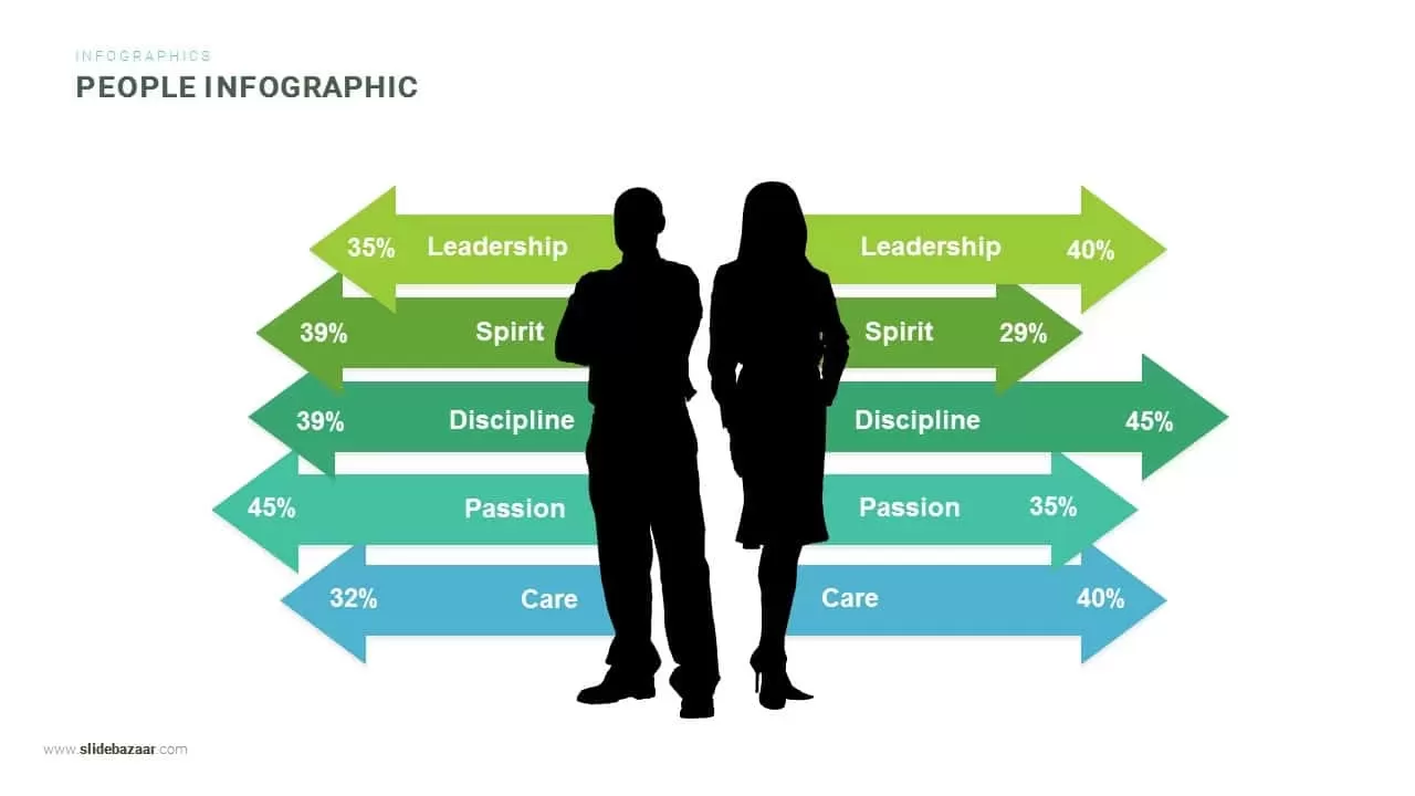
Gender Comparison People Infographic Template for PowerPoint & Google Slides
Comparison
Premium

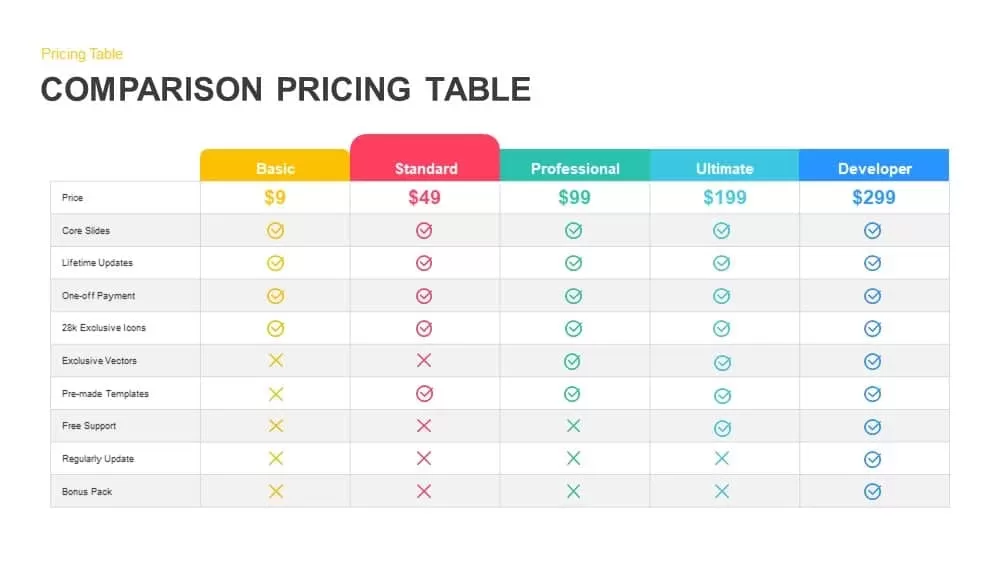
Comparison Pricing Table Infographic Template for PowerPoint & Google Slides
Comparison Chart
Premium
Two-Column Comparison Infographic Slide Template for PowerPoint & Google Slides
Comparison
Premium
Seller Portals Comparison Infographic Template for PowerPoint & Google Slides
Process
Premium
Generations Comparison Infographic Template for PowerPoint & Google Slides
Timeline
Premium
RAG Status Infographic Comparison Template for PowerPoint & Google Slides
Project
Premium
Comparison Infographic Overview template for PowerPoint & Google Slides
Business
Premium
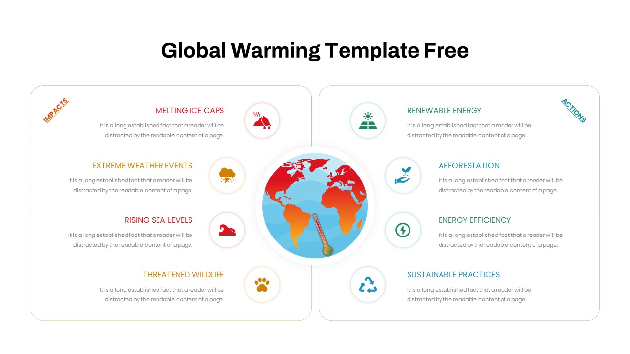
Free Global Warming Infographic Comparison Template for PowerPoint & Google Slides
Comparison Chart
Free
Types of AI Comparison Infographic Template for PowerPoint & Google Slides
AI
Premium
Hits & Misses Comparison Infographic Template for PowerPoint & Google Slides
Pitch Deck
Premium
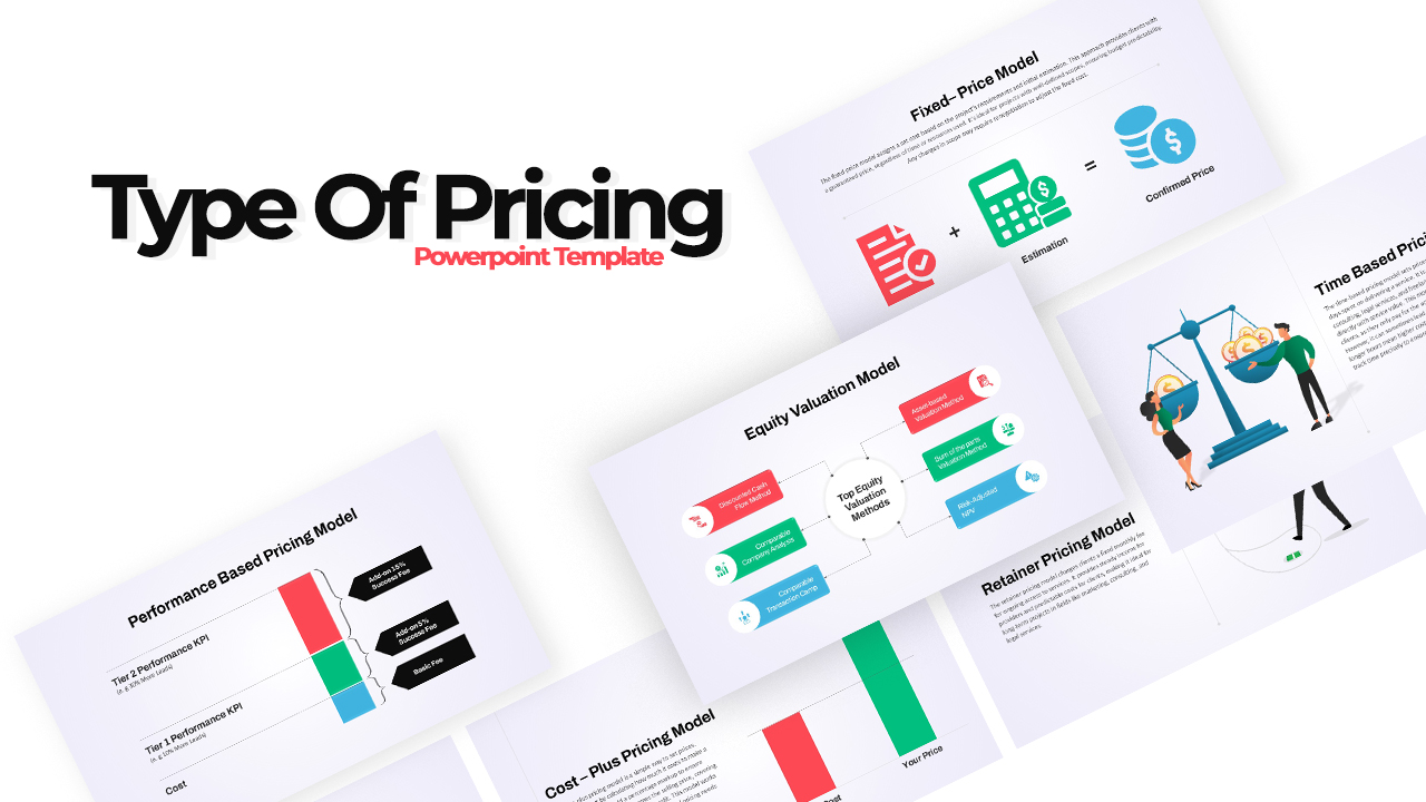
Pricing Model Types Comparison Infographic Template for PowerPoint & Google Slides
Pitch Deck
Premium
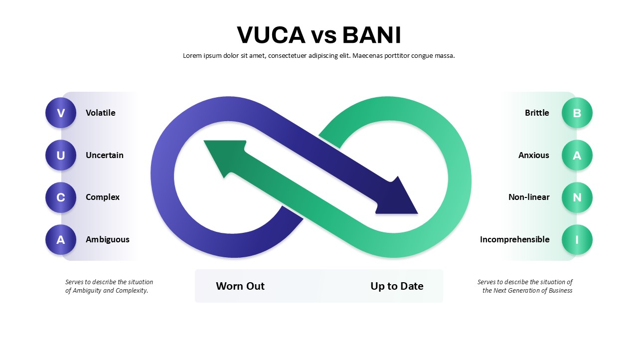
VUCA vs BANI Comparison Infographic Template for PowerPoint & Google Slides
Comparison
Premium
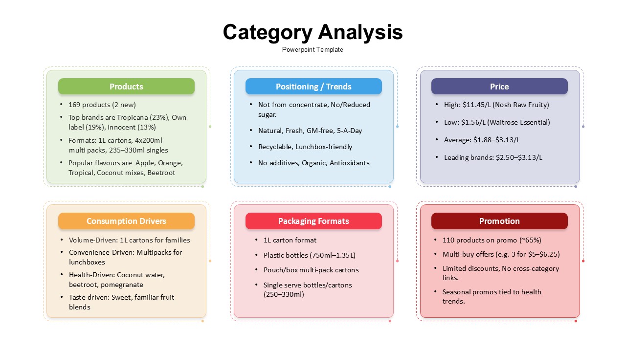
Category Analysis Comparison Infographic Template for PowerPoint & Google Slides
Comparison
Premium
Service Zoom Feature Slides Comparison template for PowerPoint & Google Slides
Process
Premium
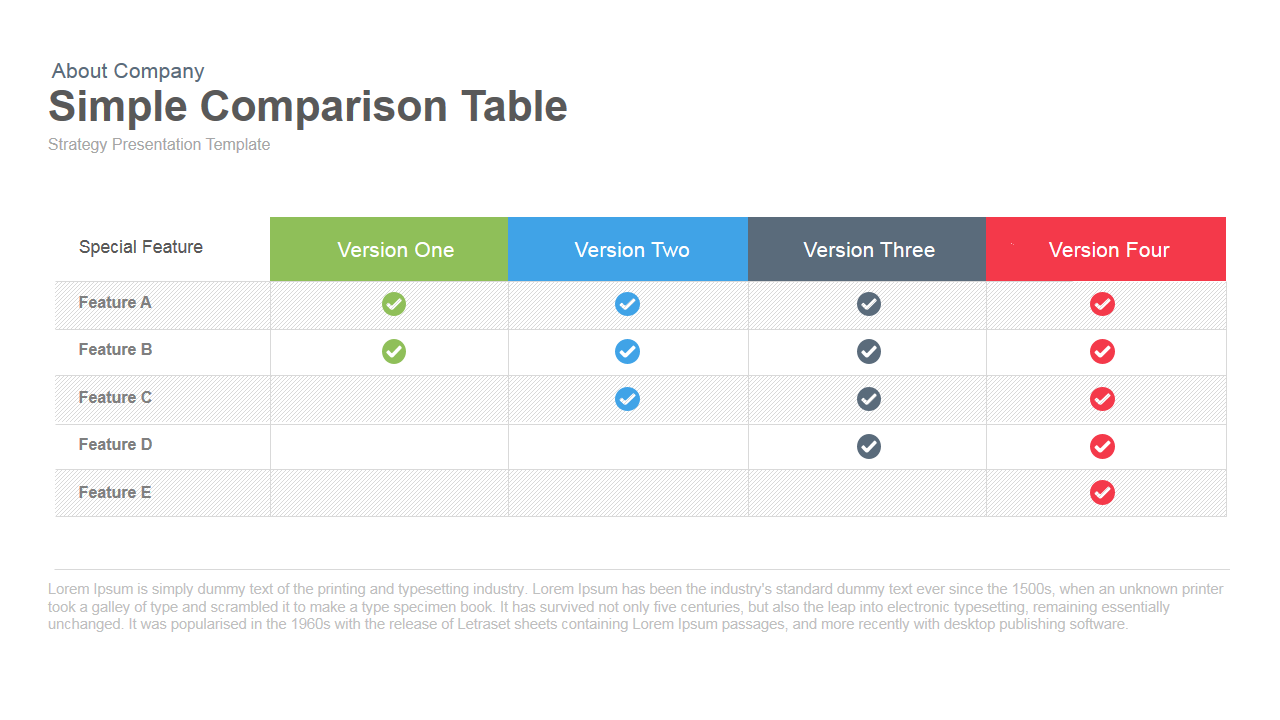
Simple Comparison Table Template for PowerPoint & Google Slides
Comparison
Premium
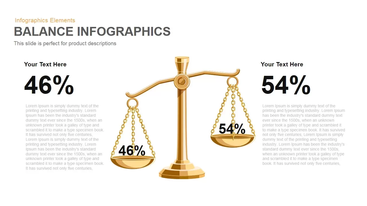
Gold Scales Balance Comparison Template for PowerPoint & Google Slides
Comparison
Premium
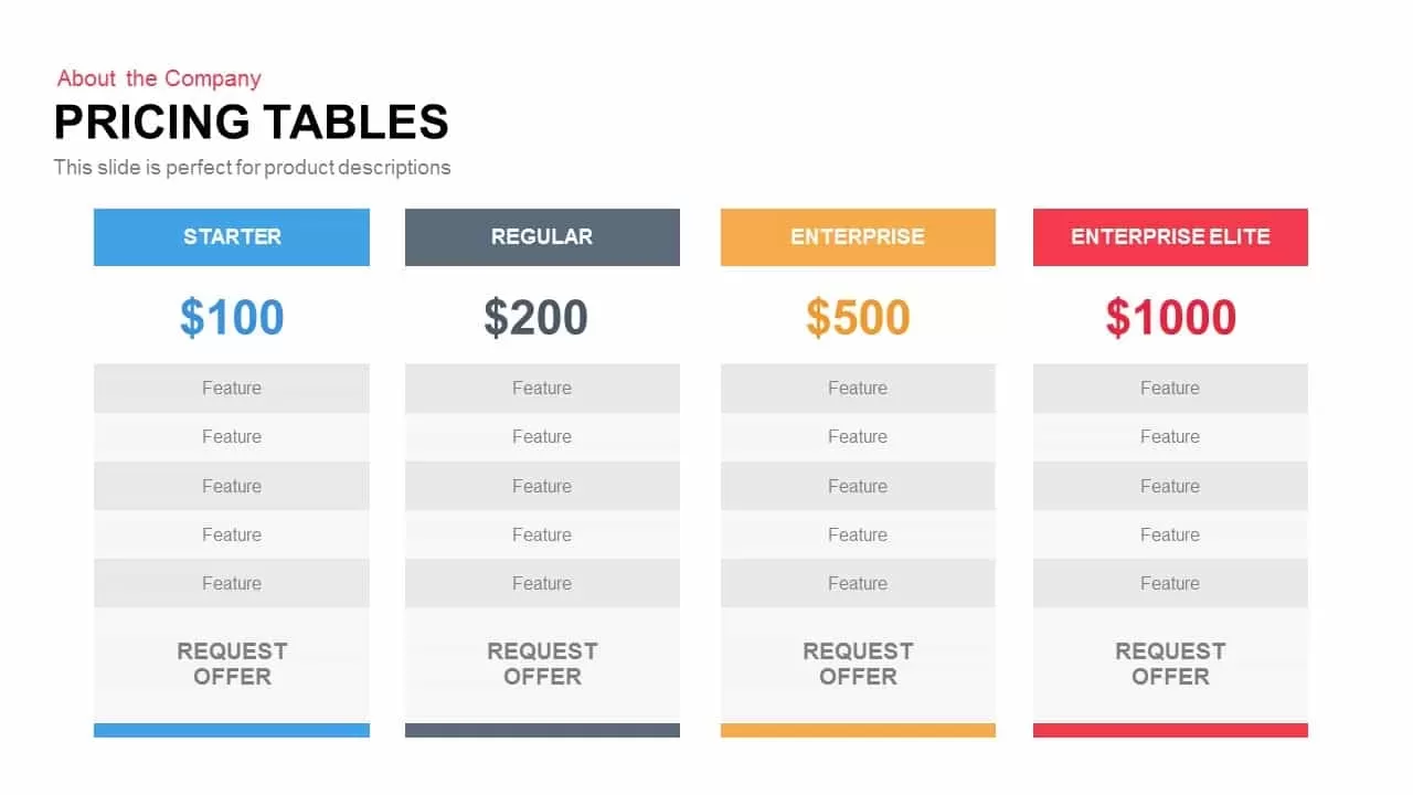
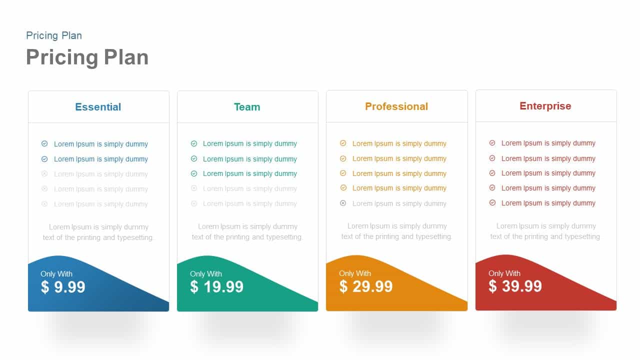
Four-Tier Pricing Comparison Table Template for PowerPoint & Google Slides
Comparison
Premium
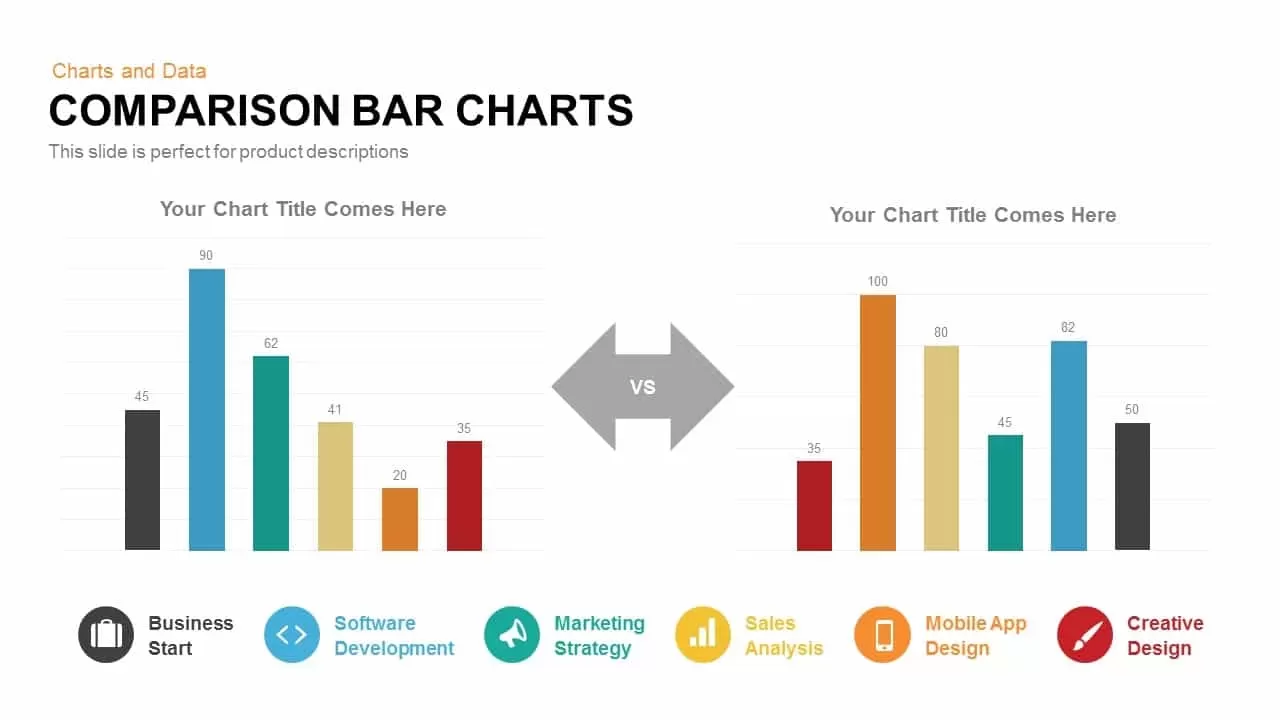
Comparison Bar Chart template for PowerPoint & Google Slides
Comparison Chart
Premium
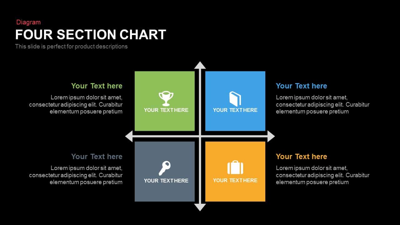
Four Section Comparison Chart Diagram Template for PowerPoint & Google Slides
Infographics
Premium
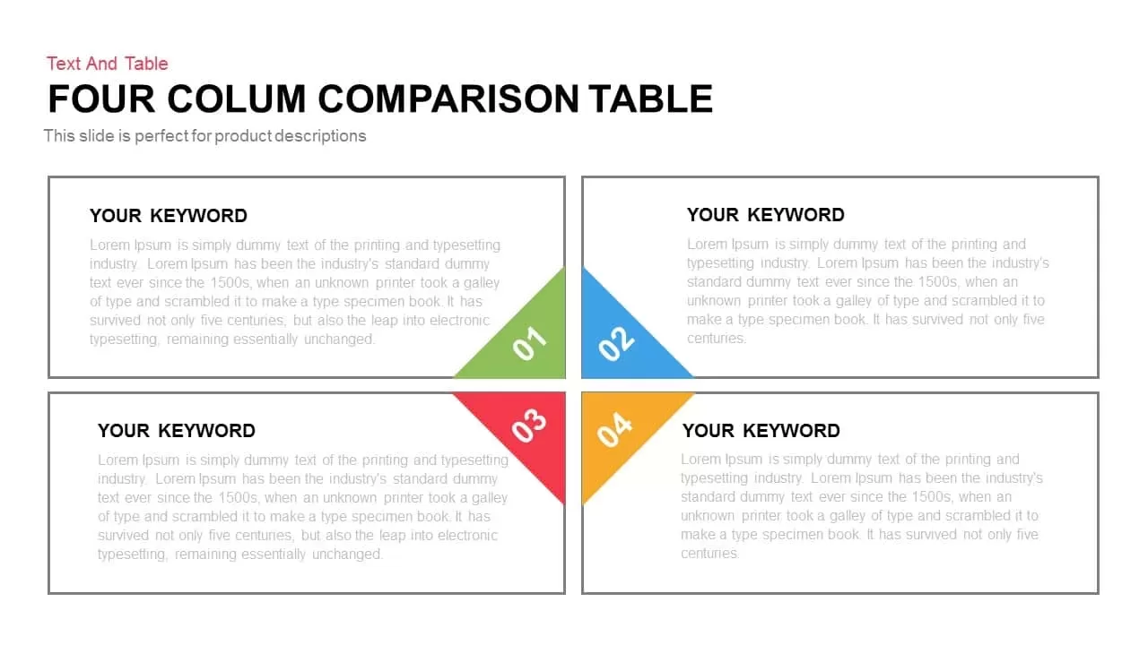
3-Column Comparison template for PowerPoint & Google Slides
Comparison
Premium
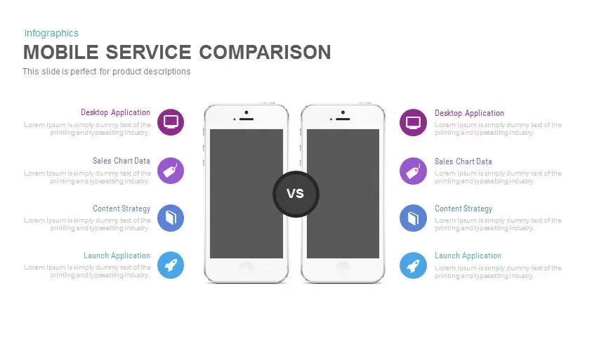
Clean Mobile Service Comparison Slide Template for PowerPoint & Google Slides
Comparison
Premium

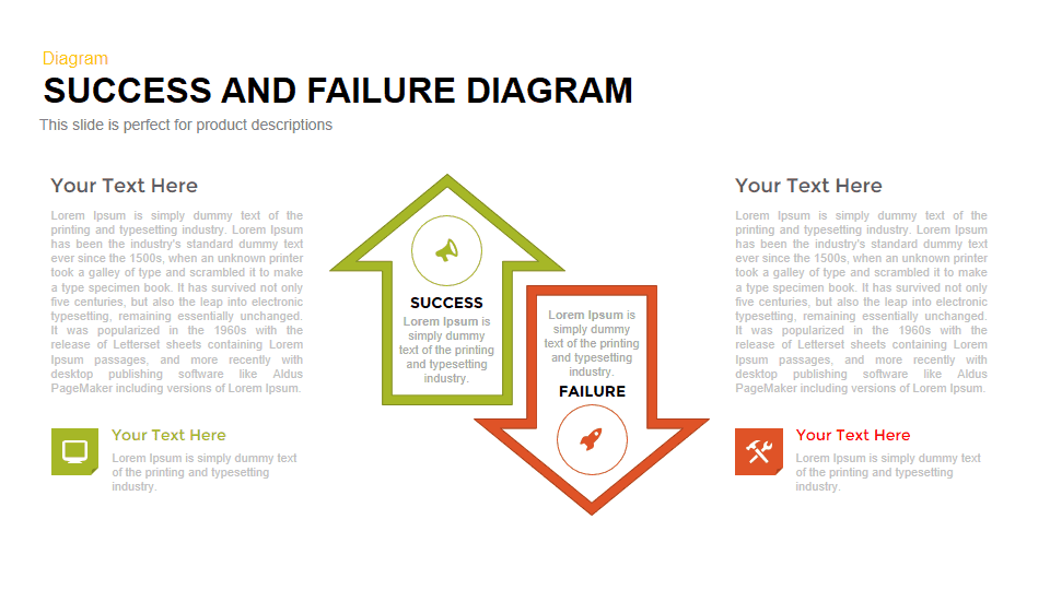
Success vs Failure Comparison Diagram Template for PowerPoint & Google Slides
Comparison
Premium
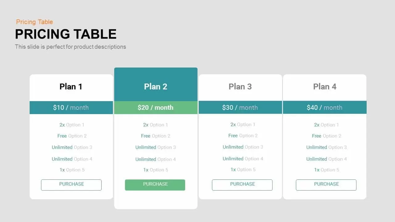
Four-Plan Pricing Table Comparison Template for PowerPoint & Google Slides
Comparison
Premium
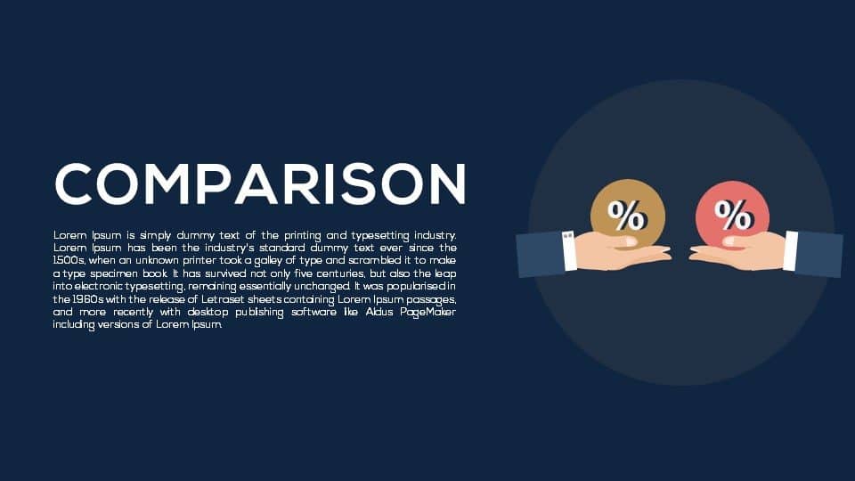
Dual Percentage Comparison Metaphor Template for PowerPoint & Google Slides
Comparison
Premium
Interactive Product Comparison Bar Chart Template for PowerPoint & Google Slides
Bar/Column
Premium
Comparison Chart Overview template for PowerPoint & Google Slides
Comparison Chart
Premium
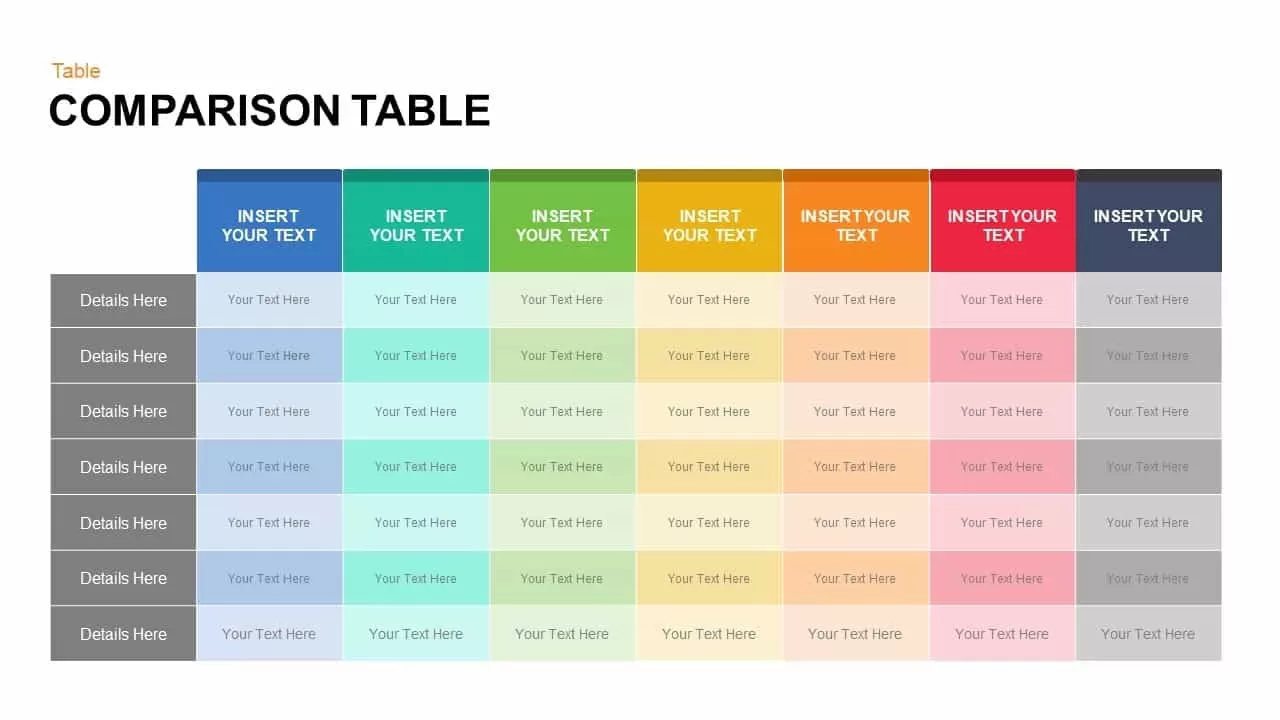
Dynamic Multicolor Comparison Table Template for PowerPoint & Google Slides
Comparison
Premium
Interactive Pricing Plan Comparison Template for PowerPoint & Google Slides
Comparison
Premium
Five-Option Text Boxes Table Comparison Template for PowerPoint & Google Slides
Business Report
Premium
Six-Metric Green Product Comparison Template for PowerPoint & Google Slides
Comparison
Premium
Challenges vs Solutions Comparison Template for PowerPoint & Google Slides
Comparison
Premium
Pros and Cons Comparison Slide Template for PowerPoint & Google Slides
Comparison
Premium
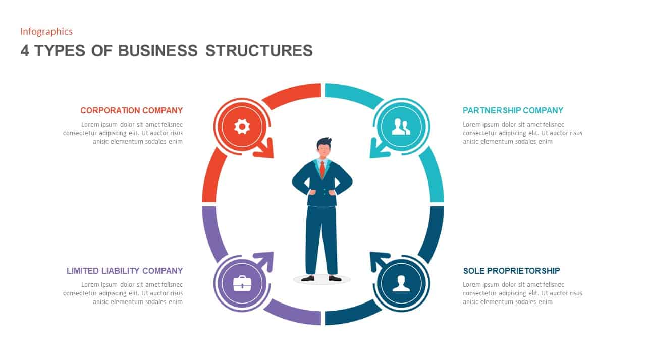
Four Business Structure Types Comparison Diagram Template for PowerPoint & Google Slides
Business Strategy
Premium

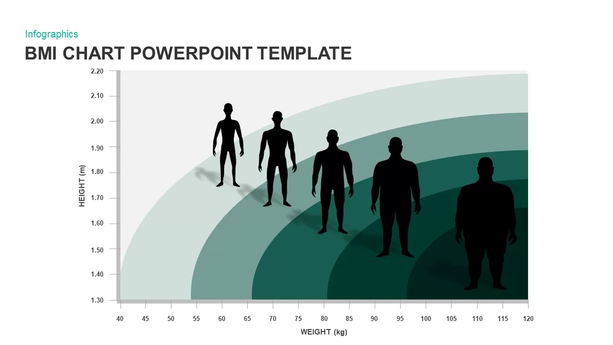
BMI Category Comparison Chart Template for PowerPoint & Google Slides
Comparison
Premium
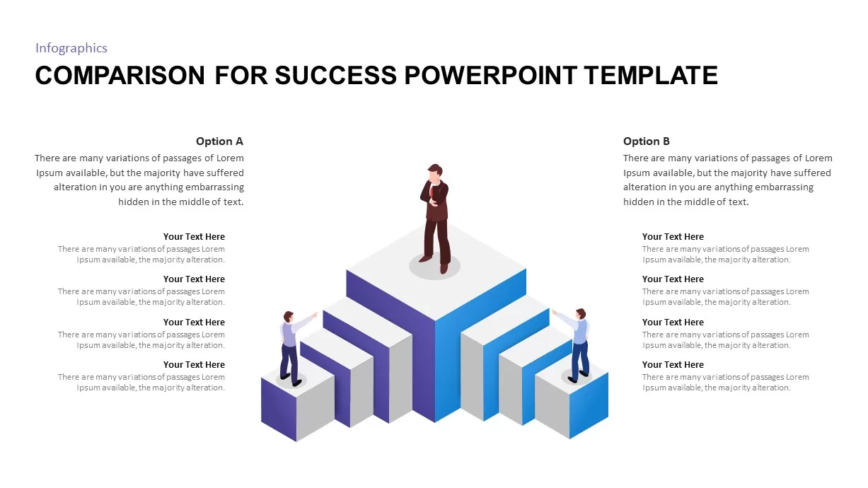
Isometric 3D Block Comparison Diagram Template for PowerPoint & Google Slides
Comparison
Premium
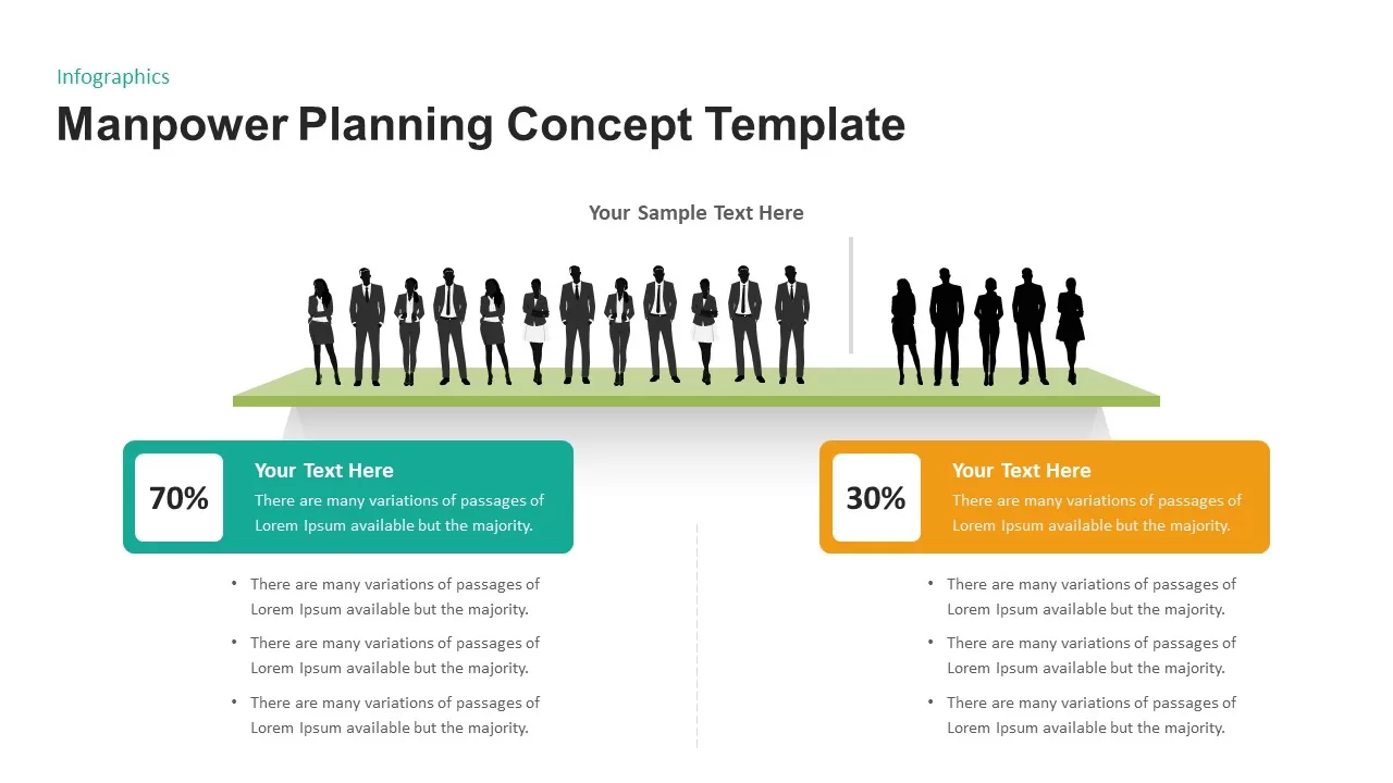
Manpower Planning Concept Comparison Template for PowerPoint & Google Slides
Comparison Chart
Premium
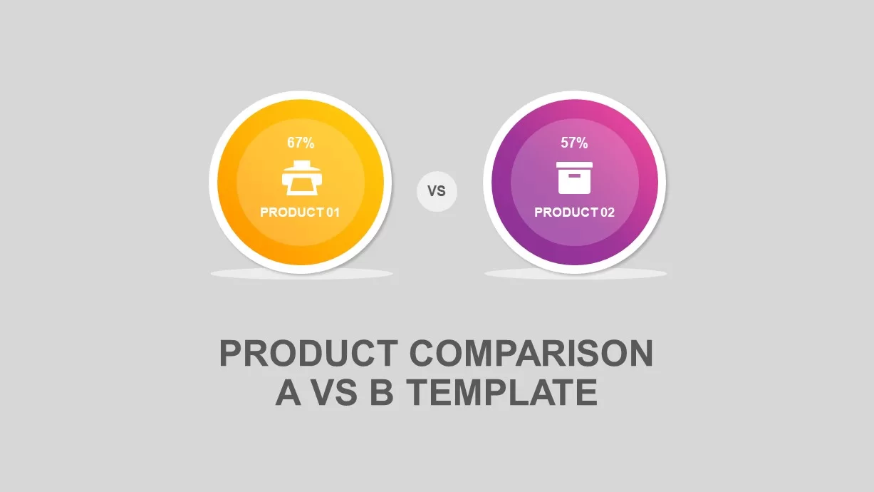
Circular Product Comparison Chart Template for PowerPoint & Google Slides
Comparison Chart
Premium
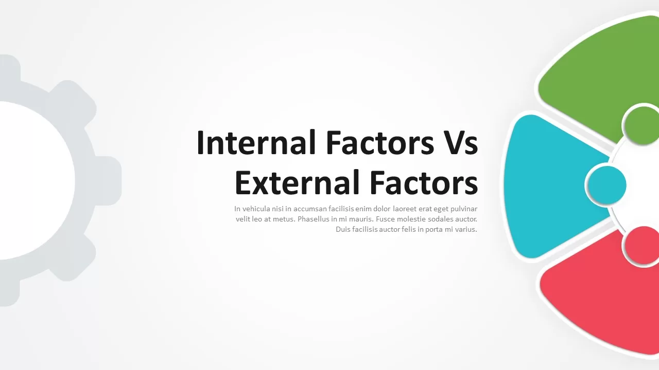
Internal vs External Factors Comparison Template for PowerPoint & Google Slides
Comparison
Premium
Theory X and Theory Y Comparison Template for PowerPoint & Google Slides
Comparison
Premium
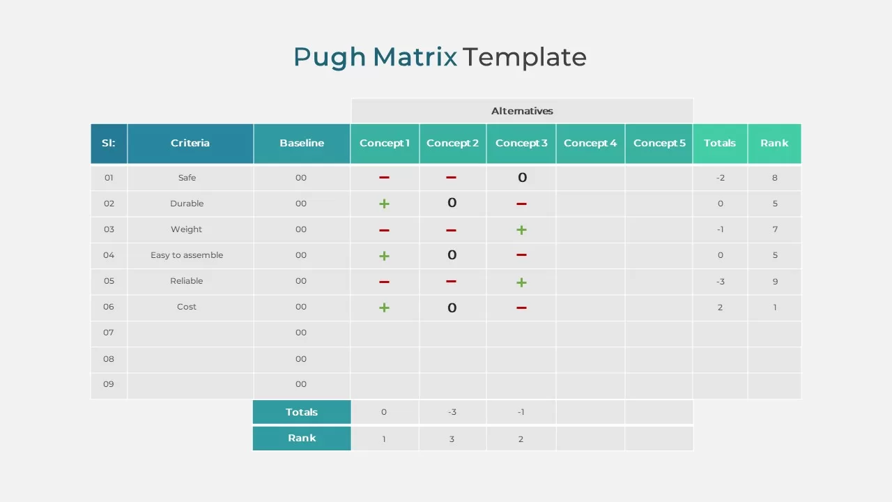
Pugh Matrix Decision Comparison Chart Template for PowerPoint & Google Slides
Comparison Chart
Premium
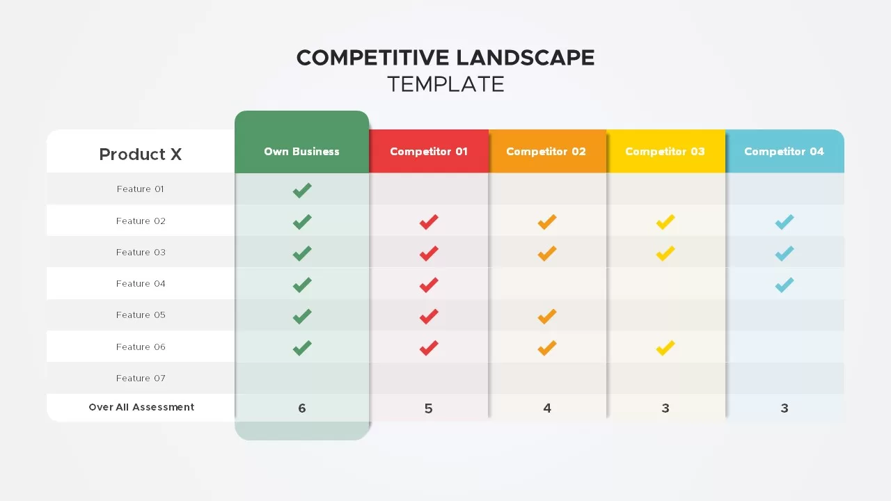
Competitive Landscape Comparison Template Pack for PowerPoint & Google Slides
Comparison
Premium
Business Silhouettes Comparison Slide Template for PowerPoint & Google Slides
HR
Premium
Current vs Future State Comparison Slide Template for PowerPoint & Google Slides
Comparison Chart
Premium
Challenges and Solutions Comparison Template for PowerPoint & Google Slides
Opportunities Challenges
Premium
Benchmarking Metrics Comparison Slide Template for PowerPoint & Google Slides
Pie/Donut
Premium
Dynamic Benchmarking Comparison Chart Template for PowerPoint & Google Slides
Comparison Chart
Premium
Challenges & Solutions Comparison Template for PowerPoint & Google Slides
Opportunities Challenges
Premium
Cost Benefit Analysis Comparison Template for PowerPoint & Google Slides
Comparison
Premium
Adam’s Equity Theory Scale Comparison Template for PowerPoint & Google Slides
Comparison
Premium
Risk Heatmap Comparison Template for PowerPoint & Google Slides
Maps
Premium
Heatmap Comparison Template for PowerPoint & Google Slides
Maps
Premium
Casino Poker Chips Comparison Slide Template for PowerPoint & Google Slides
Comparison
Premium
Vendor Comparison Analysis template for PowerPoint & Google Slides
Comparison Chart
Premium
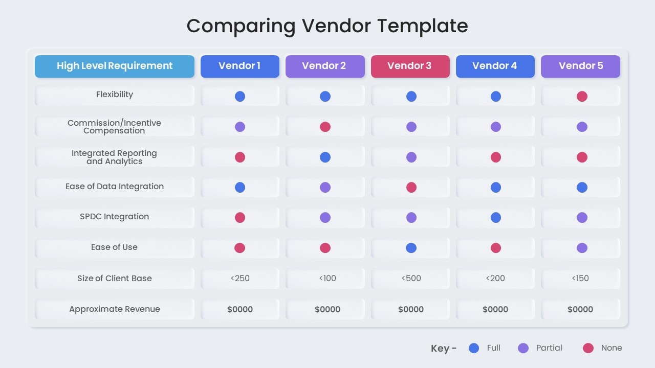
Vendor Comparison Matrix with High-Level Requirements template for PowerPoint & Google Slides
Comparison Chart
Premium
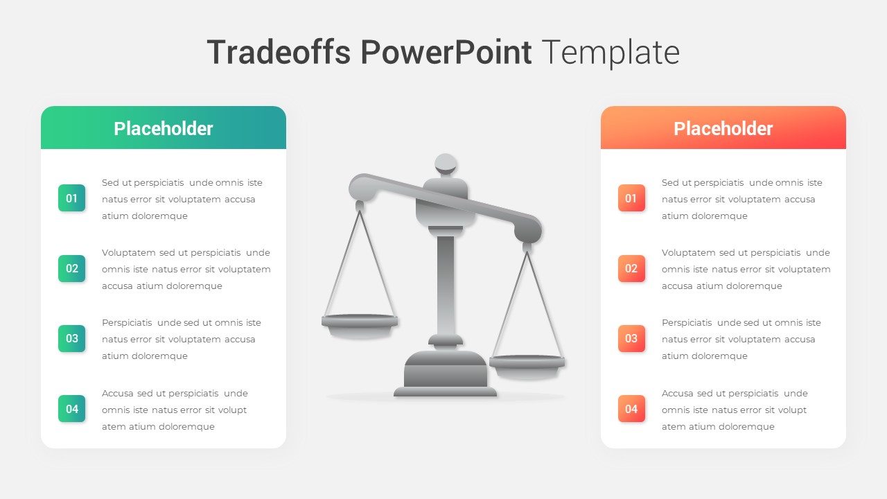
Modern Tradeoffs Comparison Slide Template for PowerPoint & Google Slides
Comparison
Premium
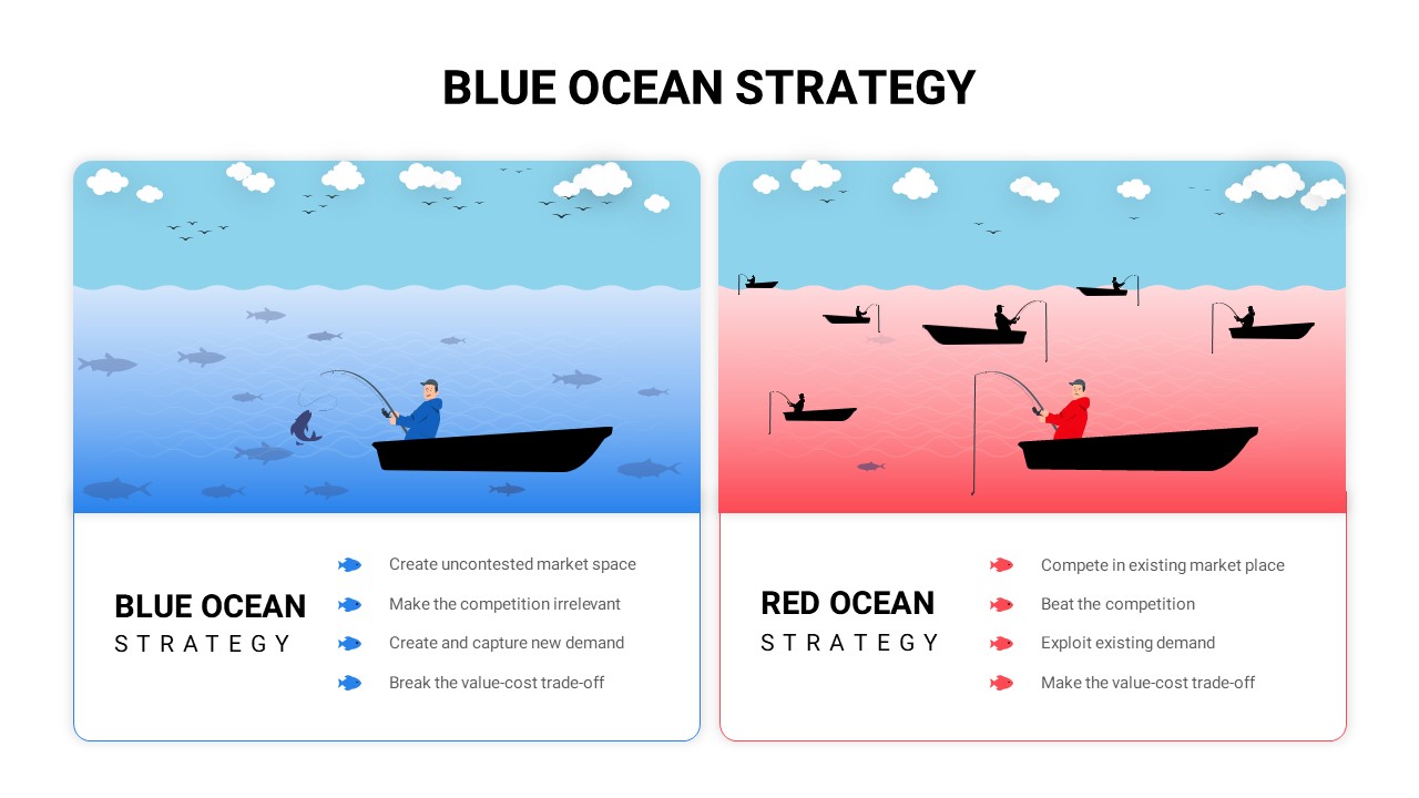
Blue vs Red Ocean Strategy Comparison Template for PowerPoint & Google Slides
Business Strategy
Premium
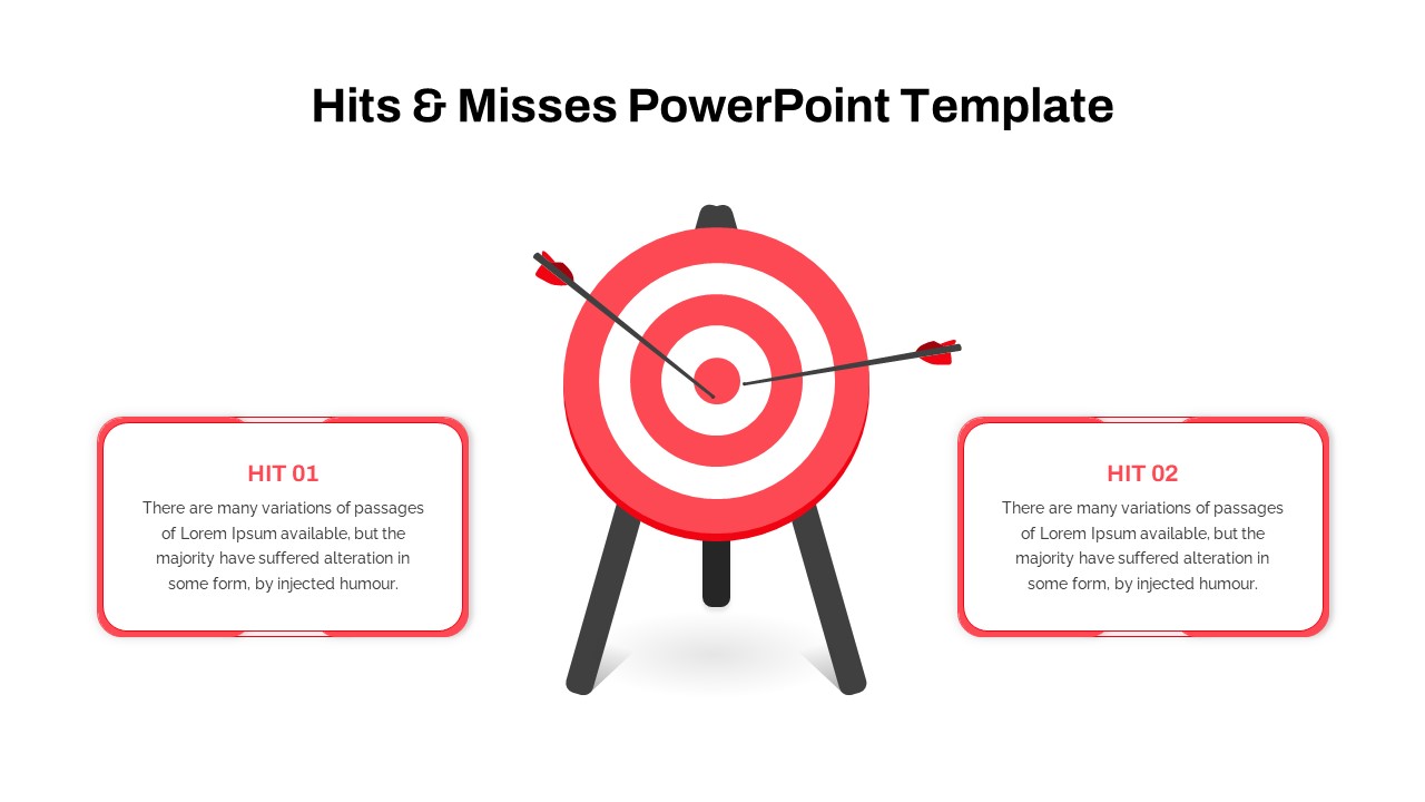
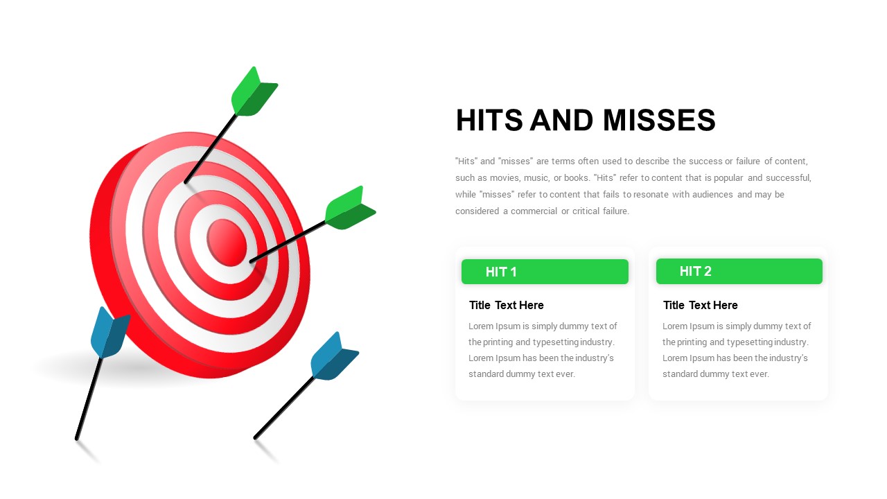
Hits and Misses Performance Comparison Template for PowerPoint & Google Slides
Comparison
Premium
People Demographic Comparison Chart Template for PowerPoint & Google Slides
Comparison
Premium
Conflict Infographics Comparison Template for PowerPoint & Google Slides
Infographics
Premium
Surgery Infographics Comparison Template for PowerPoint & Google Slides
Health
Premium
Clustered Bar Chart Comparison Template for PowerPoint & Google Slides
Bar/Column
Premium
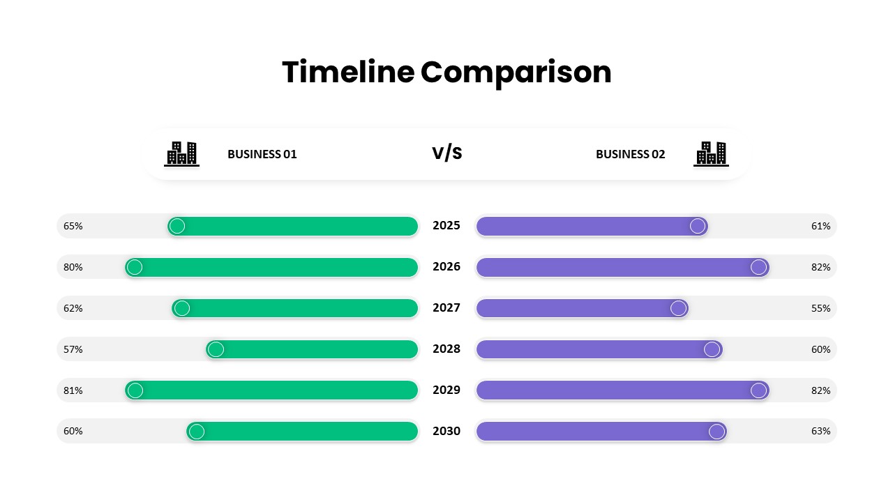
Business Timeline Comparison Bar Chart Template for PowerPoint & Google Slides
Comparison Chart
Premium
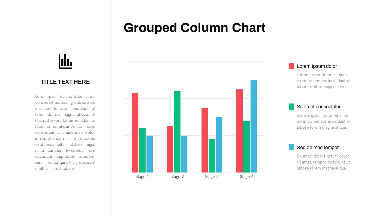
Grouped Column Chart Comparison Template for PowerPoint & Google Slides
Bar/Column
Premium
Multiple Line Chart Comparison Template for PowerPoint & Google Slides
Comparison Chart
Premium
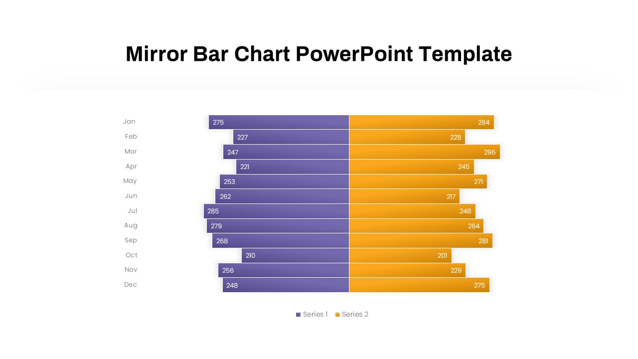
Mirror Bar Chart Comparison Template for PowerPoint & Google Slides
Bar/Column
Premium
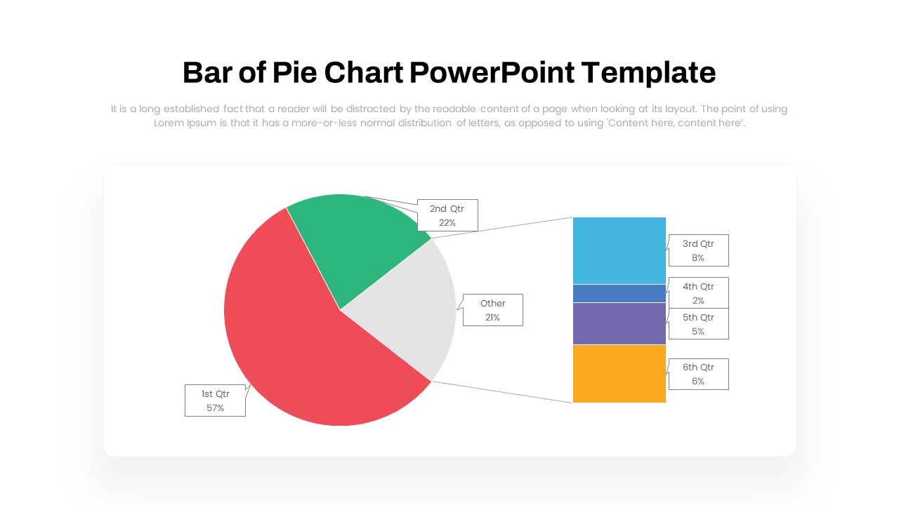
Dynamic Bar-of-Pie Chart Comparison Template for PowerPoint & Google Slides
Pie/Donut
Premium
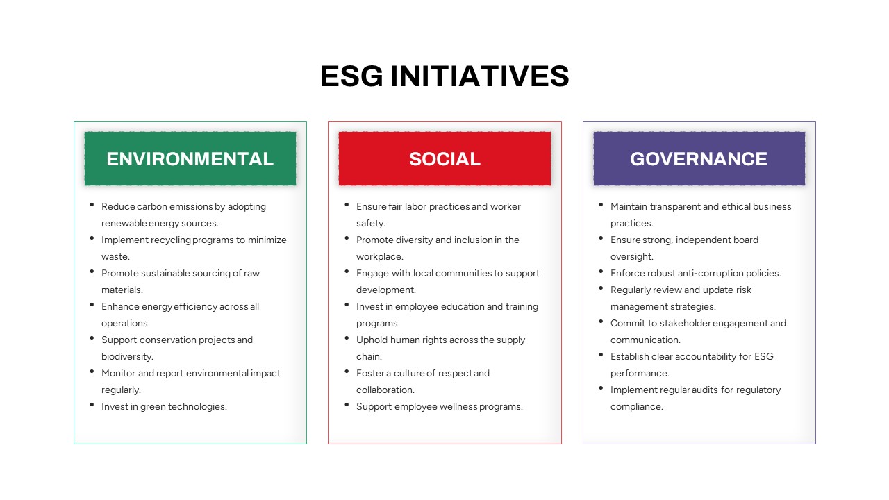
ESG Initiatives Comparison Chart Template for PowerPoint & Google Slides
Business
Premium
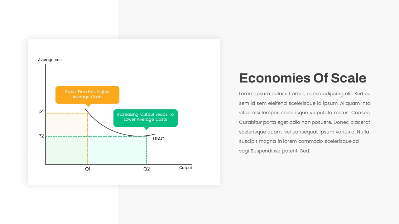
Economies of Scale Cost Curve Comparison Template for PowerPoint & Google Slides
Comparison Chart
Premium
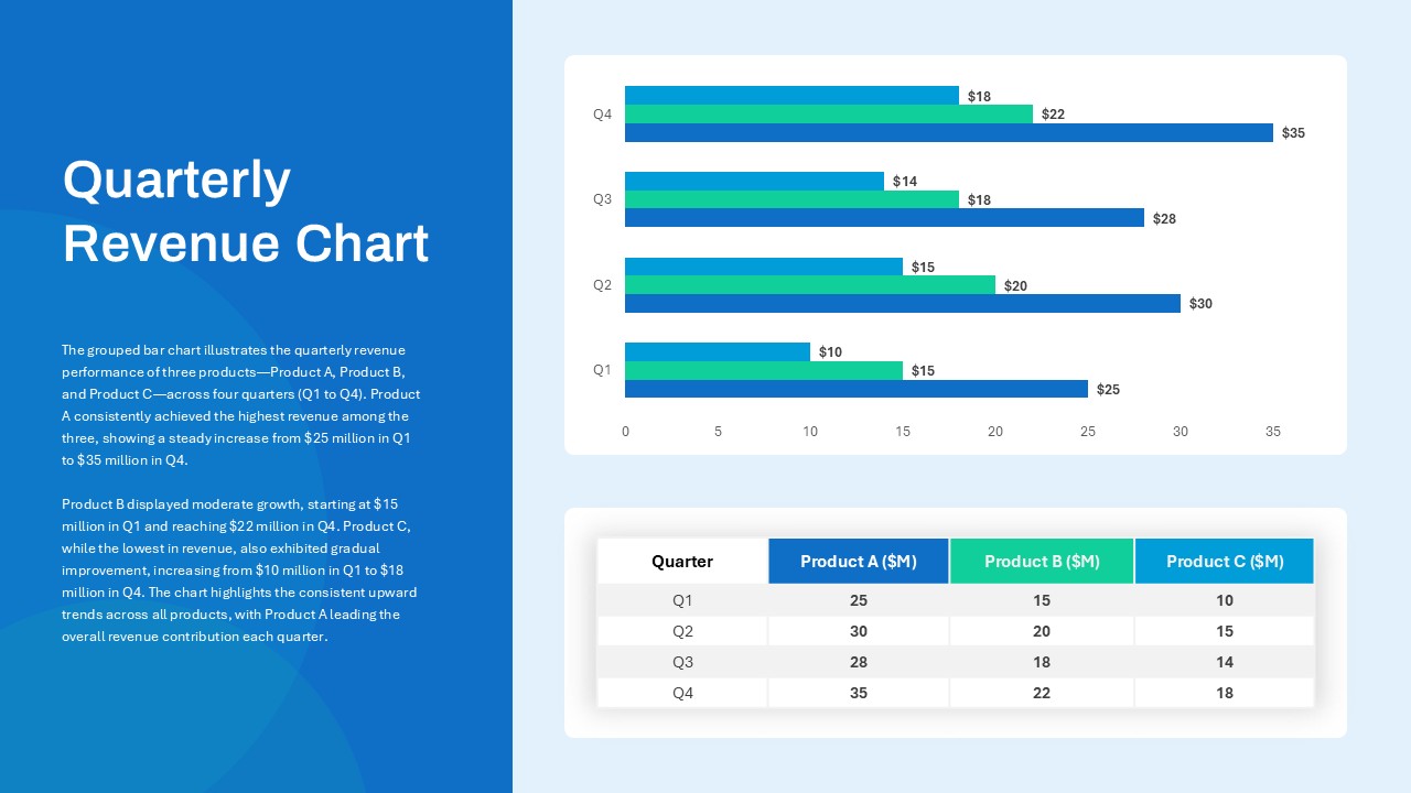
Quarterly Revenue Comparison Bar Chart Template for PowerPoint & Google Slides
Bar/Column
Premium
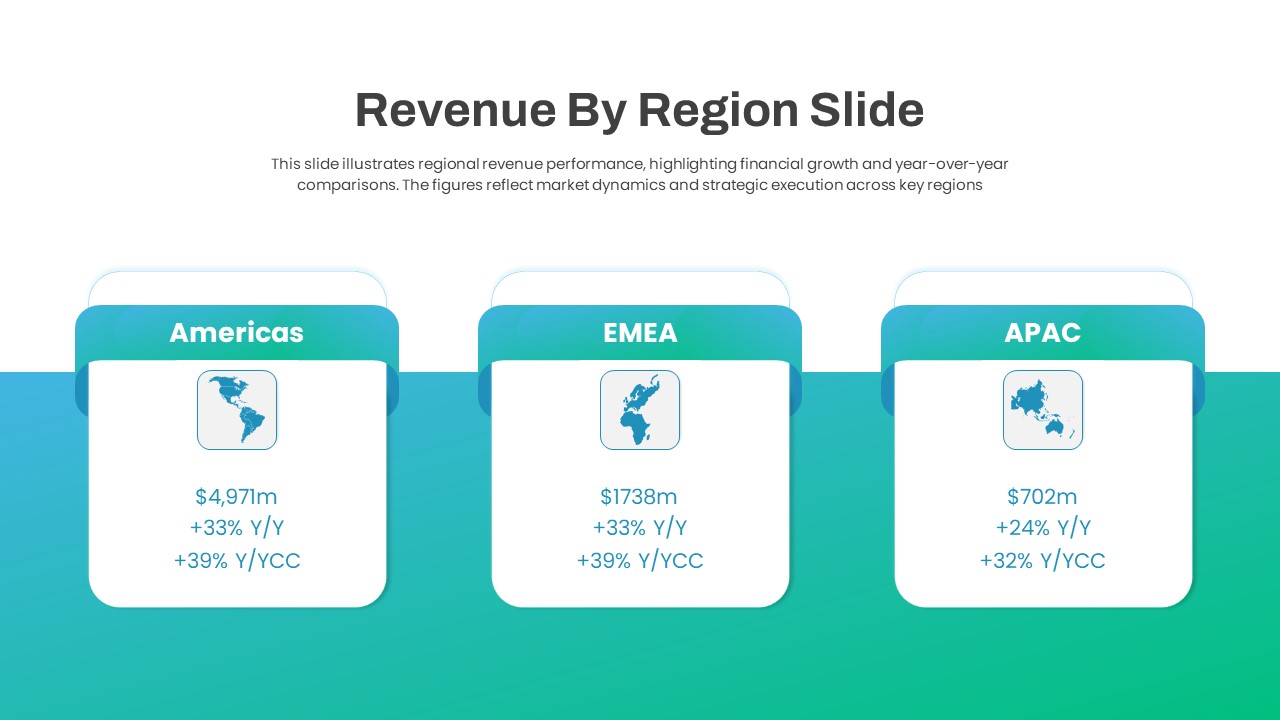
Regional Revenue Comparison Overview Template for PowerPoint & Google Slides
Comparison
Premium
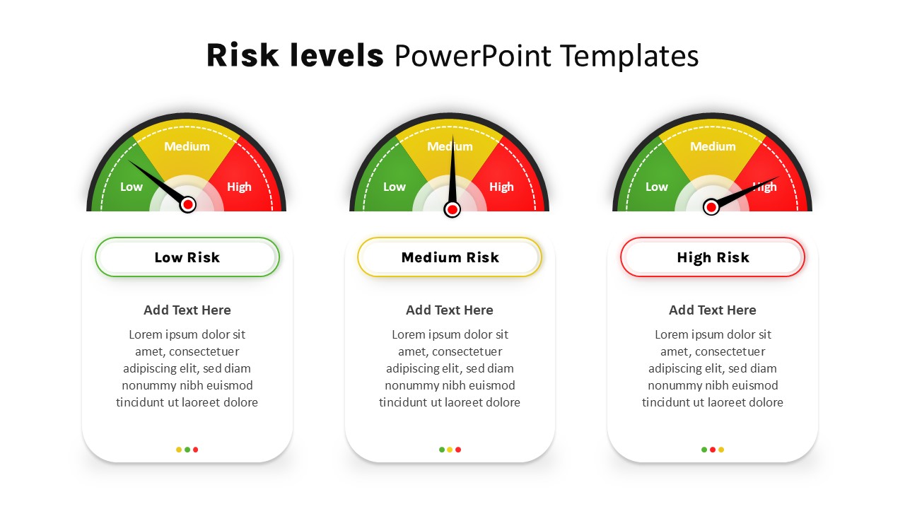
Risk Level Gauge Comparison Dashboard Template for PowerPoint & Google Slides
Comparison
Premium
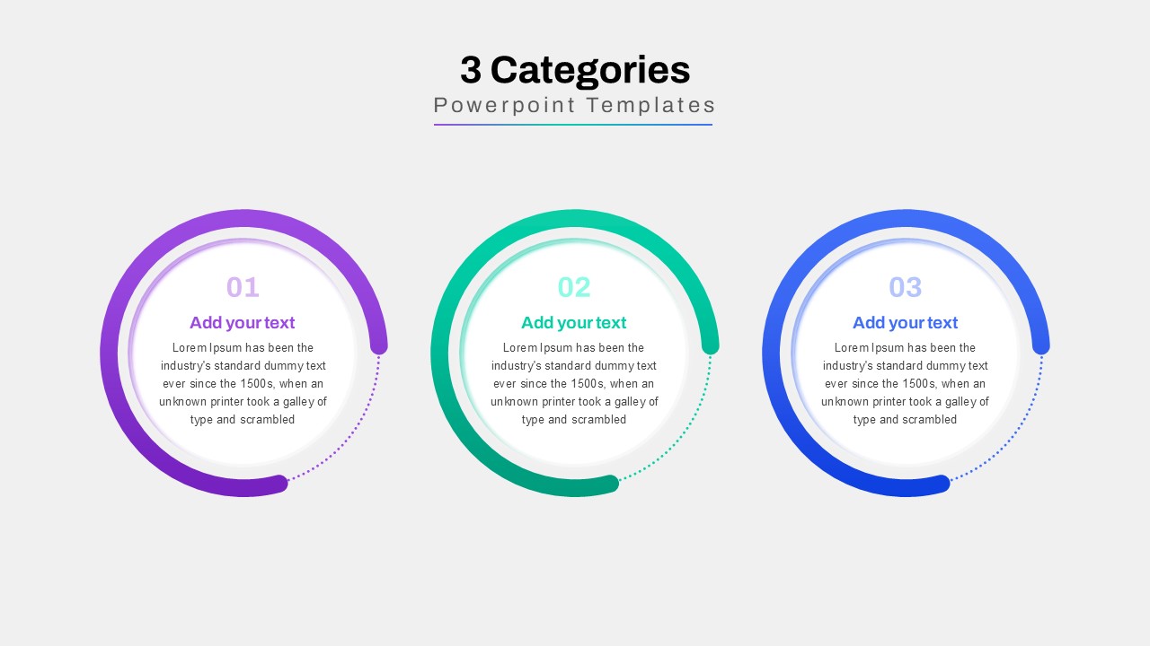
Three-Category Comparison Template for PowerPoint & Google Slides
Comparison
Premium
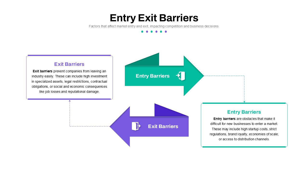
Entry and Exit Barriers Comparison Template for PowerPoint & Google Slides
Comparison
Premium
Cross Sell & Up Sell Strategy Comparison template for PowerPoint & Google Slides
Comparison
Premium
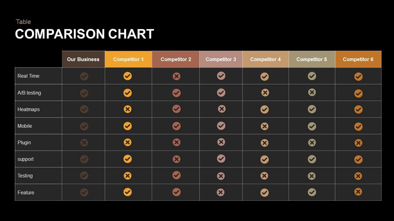
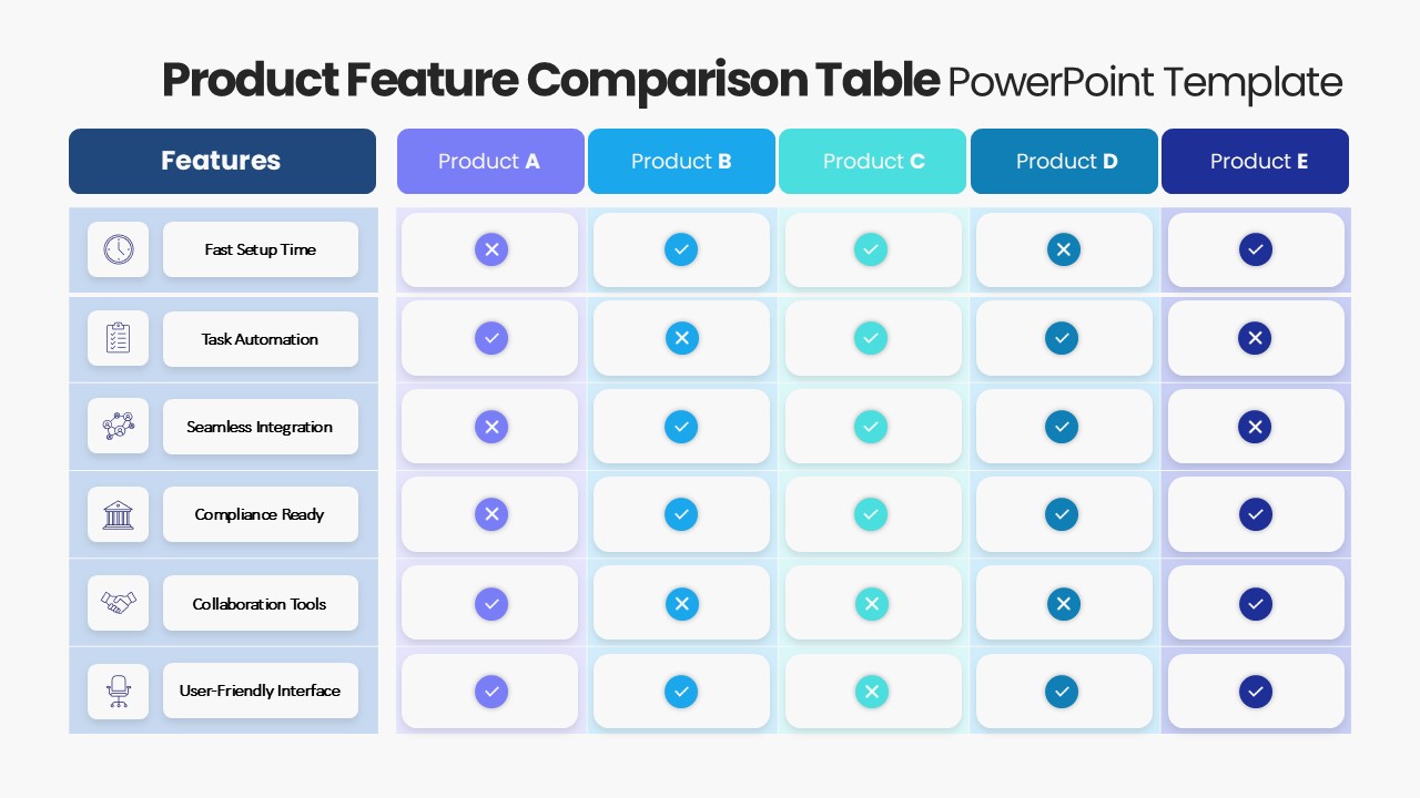
Product Feature Comparison Table Template for PowerPoint & Google Slides
Comparison Chart
Premium
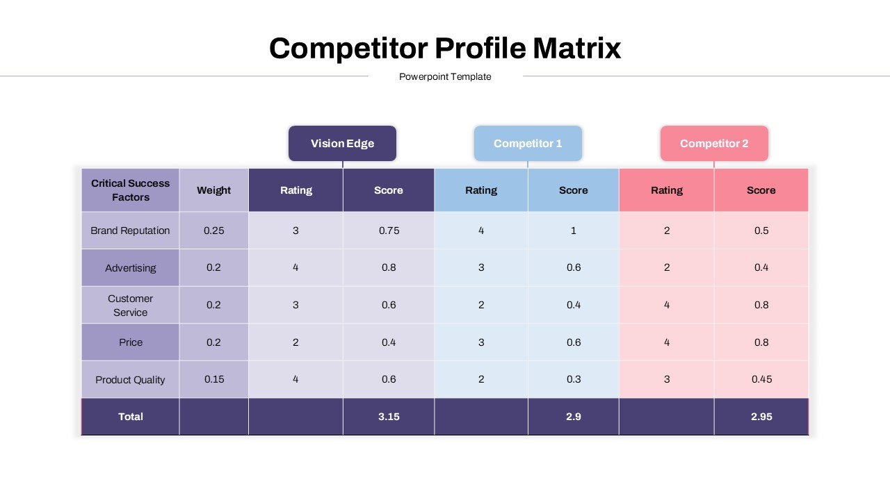
Competitor Profile Matrix Comparison Template for PowerPoint & Google Slides
Comparison Chart
Premium
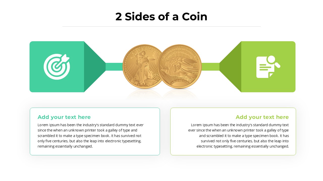
Two-Sided Coin Comparison Diagram Template for PowerPoint & Google Slides
Comparison
Premium
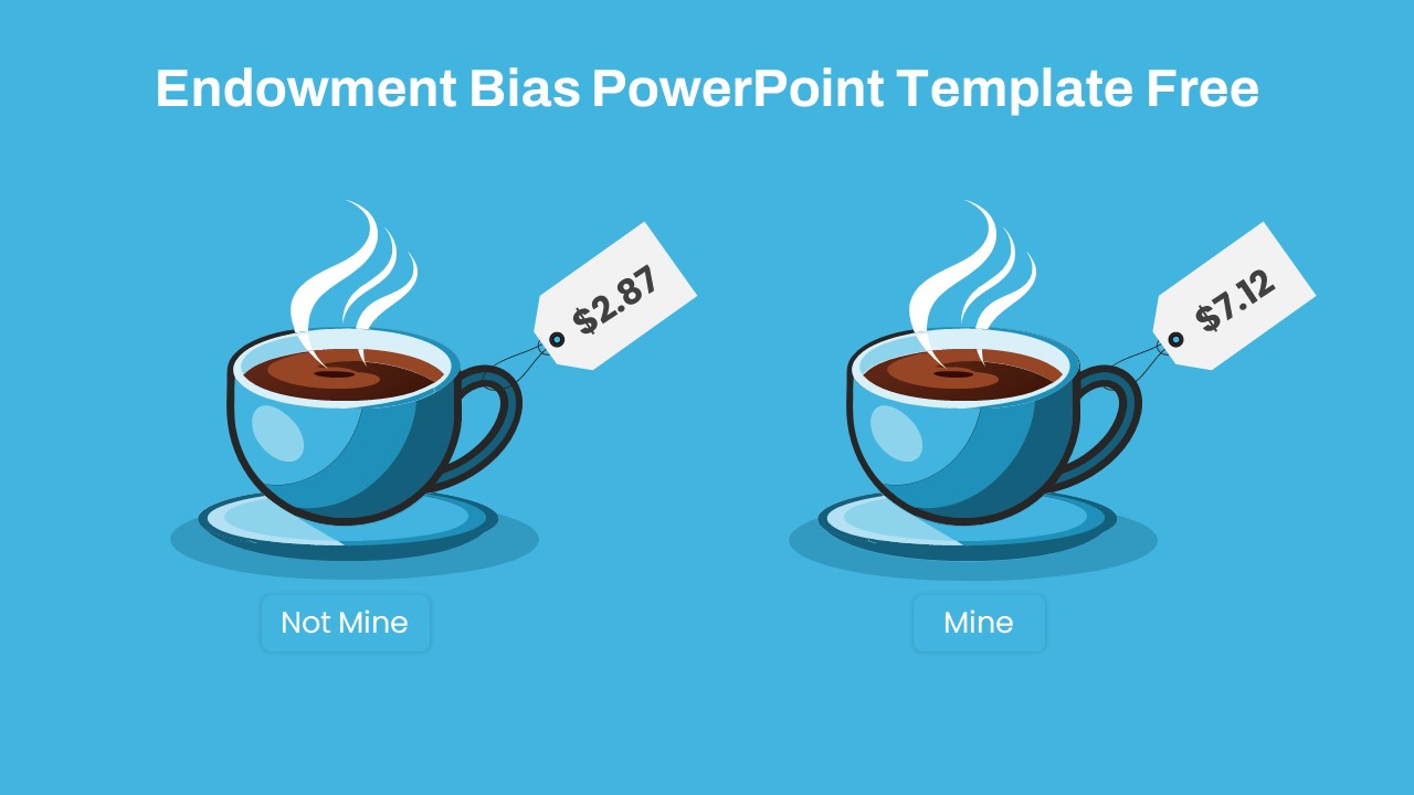
Endowment Bias Coffee Price Comparison Template for PowerPoint & Google Slides
Comparison
Free
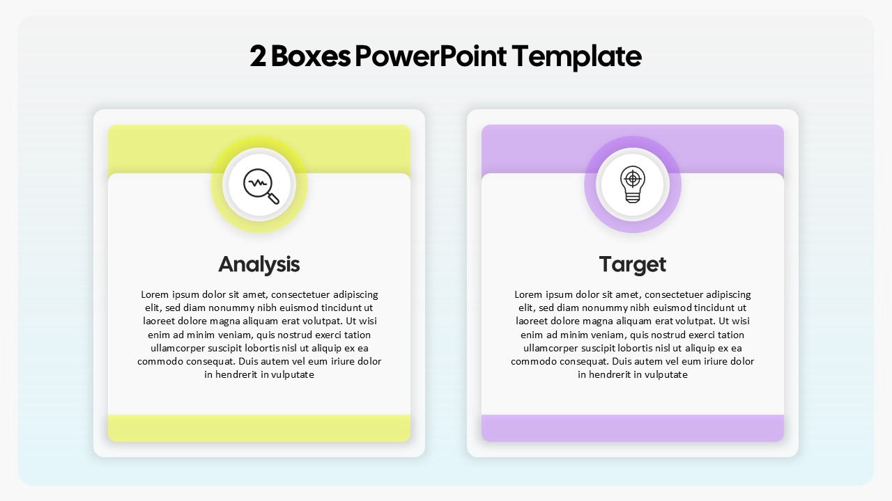
Two-Box Analysis & Target Comparison Template for PowerPoint & Google Slides
Comparison
Premium
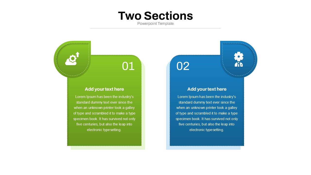
Two Section Comparison template for PowerPoint & Google Slides
Business Proposal
Premium
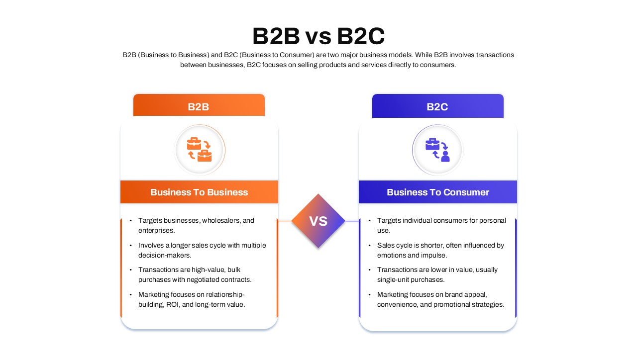
B2B vs B2C Comparison template for PowerPoint & Google Slides
Business Models
Premium
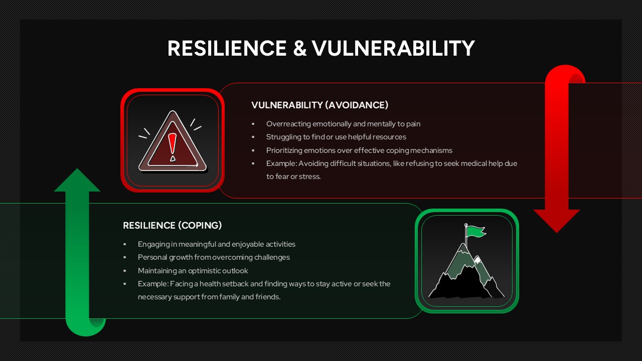
Resilience & Vulnerability Comparison Template for PowerPoint & Google Slides
Comparison
Premium
Skills Gap Analysis Comparison Chart Template for PowerPoint & Google Slides
Comparison
Premium
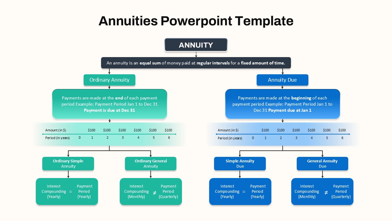
Hierarchical Annuity Comparison Flowchart Template for PowerPoint & Google Slides
Business Report
Premium
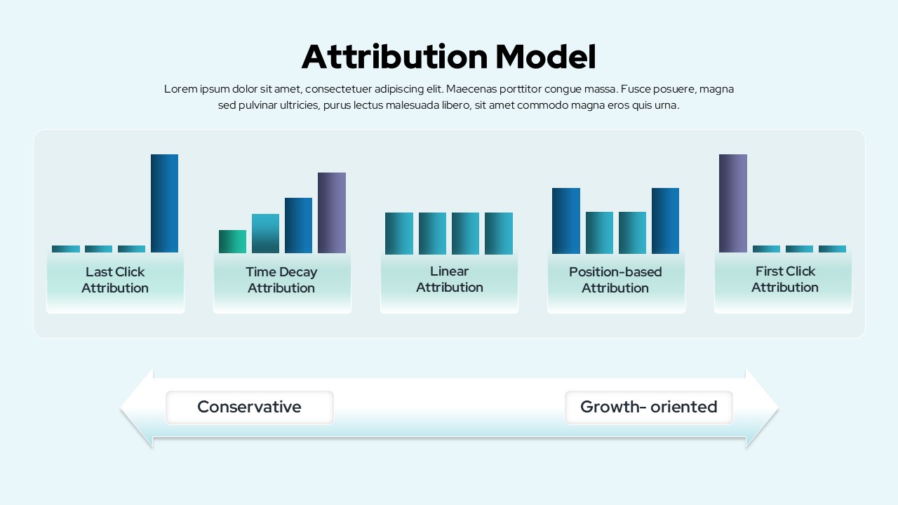
Attribution Models Comparison Diagram Template for PowerPoint & Google Slides
Comparison
Premium
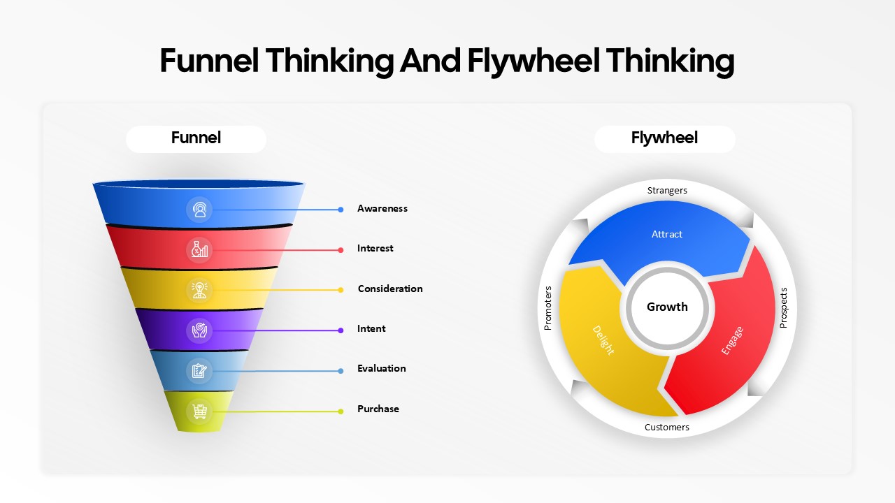
Funnel and Flywheel Thinking Comparison template for PowerPoint & Google Slides
Infographics
Premium
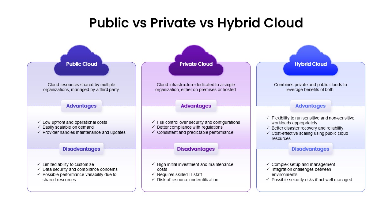
Public, Private & Hybrid Cloud Comparison Template for PowerPoint & Google Slides
Cloud Computing
Premium
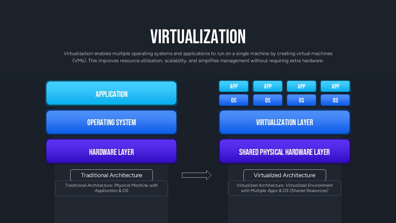
Virtualization Architecture Comparison Template for PowerPoint & Google Slides
Comparison Chart
Premium
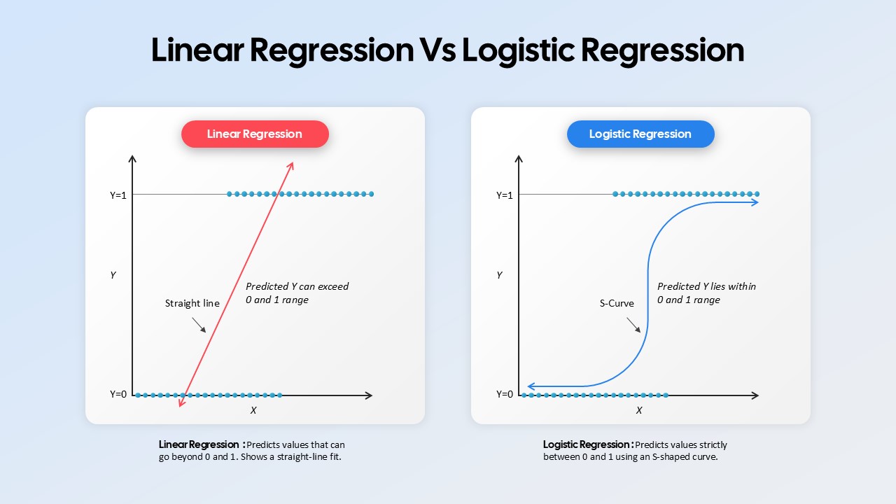
Linear Regression vs Logistic Regression Comparison template for PowerPoint & Google Slides
Comparison
Premium
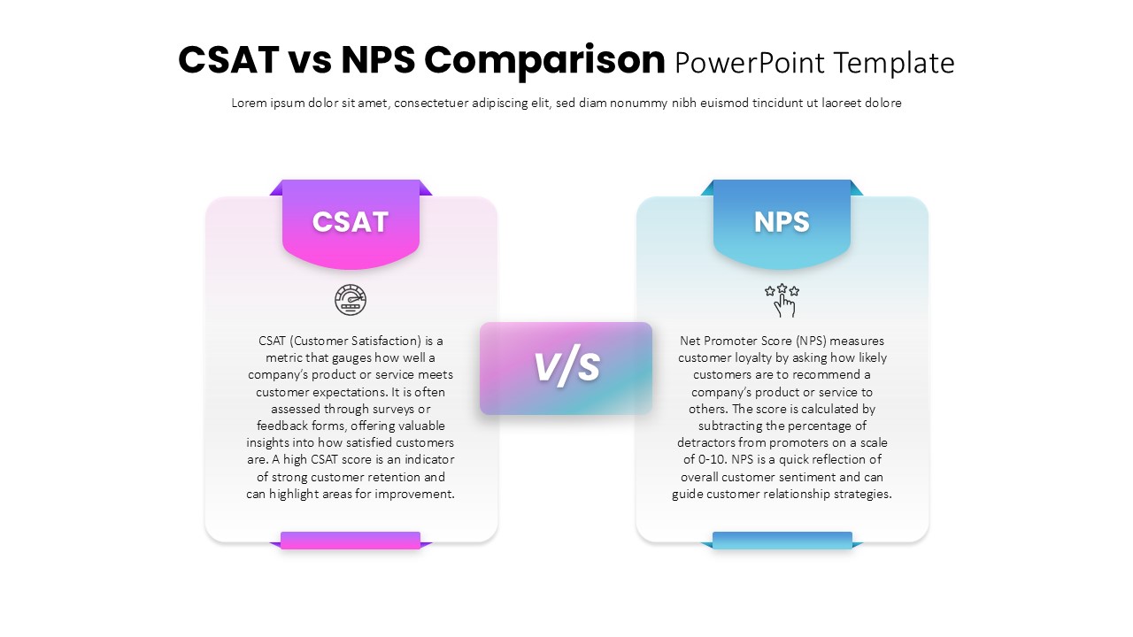
CSAT vs NPS Comparison template for PowerPoint & Google Slides
Business Strategy
Premium
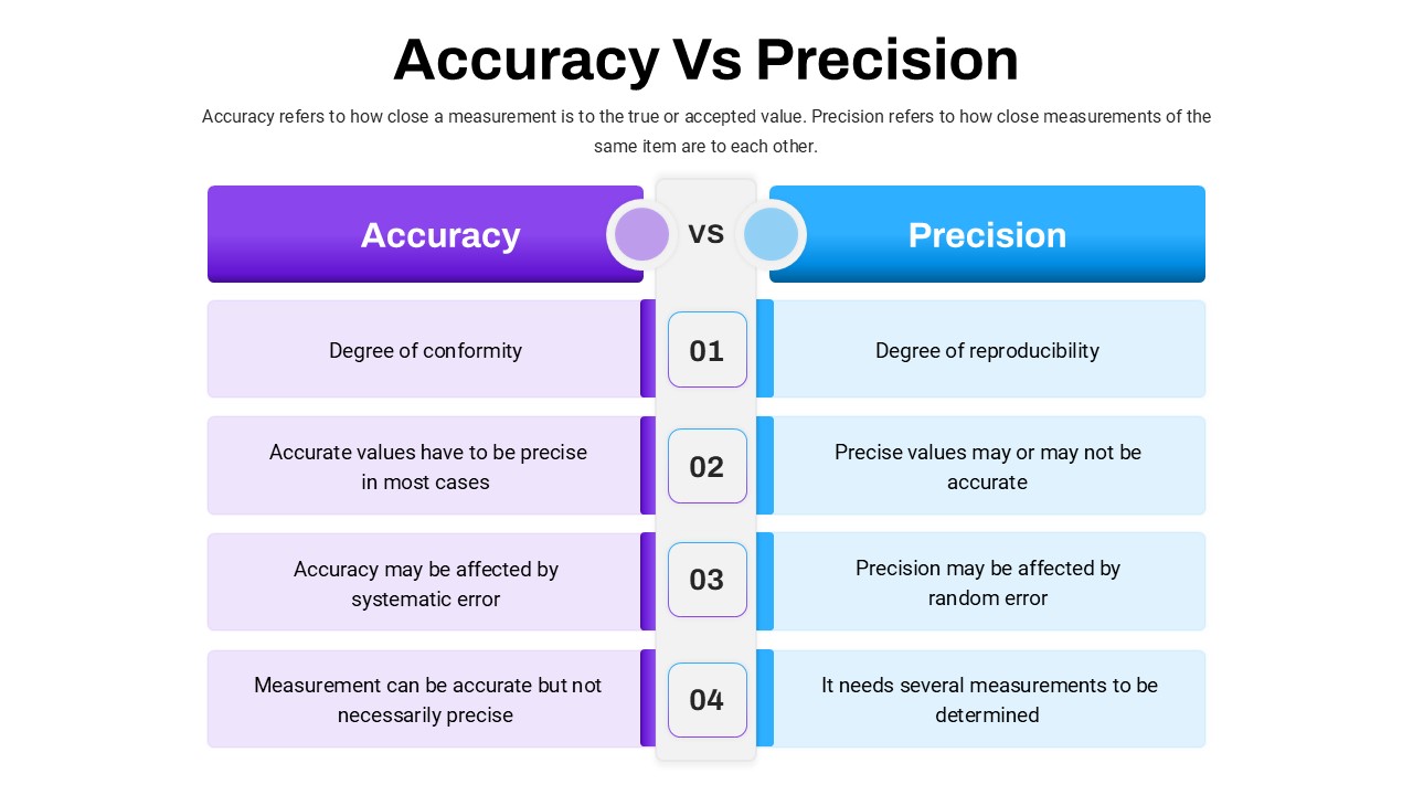
Accuracy Vs Precision Comparison Template for PowerPoint & Google Slides
Comparison Chart
Premium
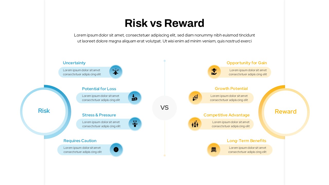
Risk vs Reward Comparison Template for PowerPoint & Google Slides
Opportunities Challenges
Premium
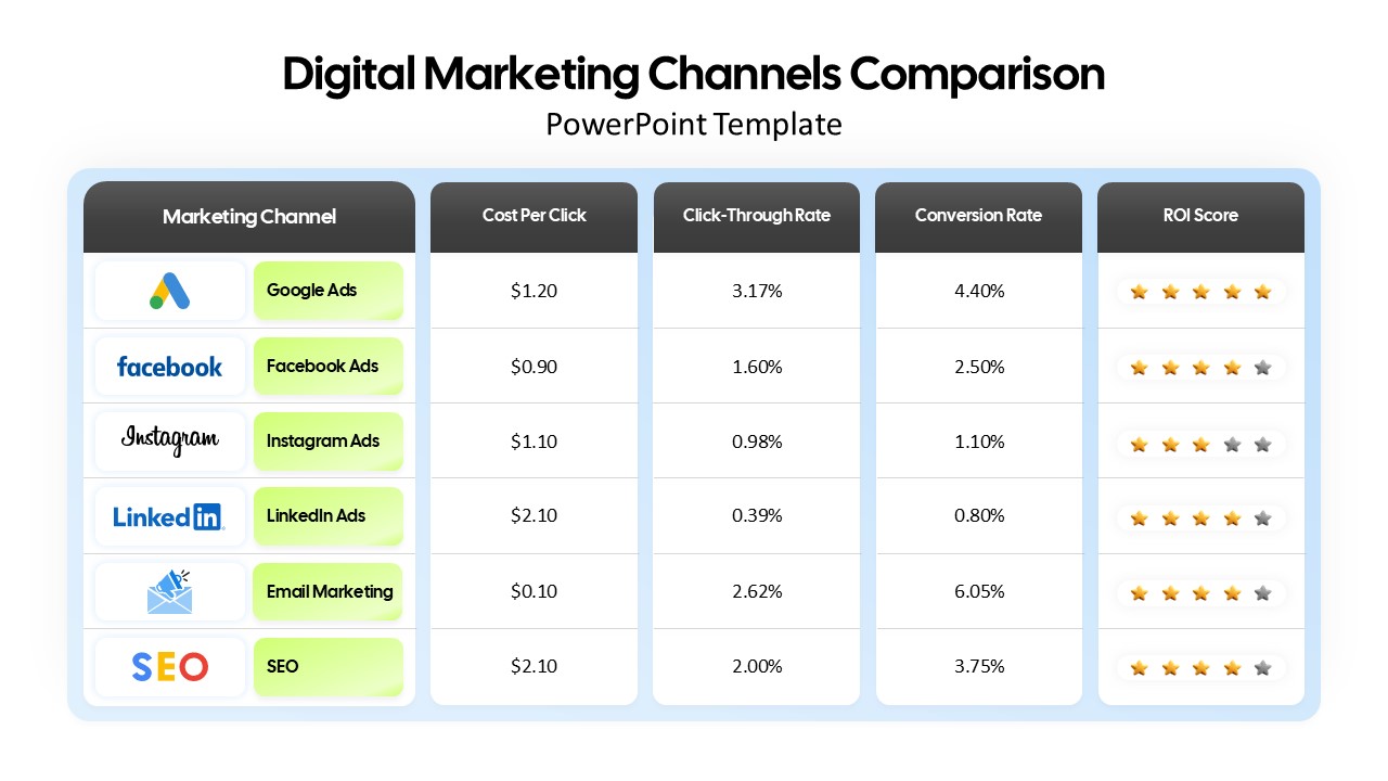
Digital Marketing Channels Comparison template for PowerPoint & Google Slides
Business
Premium
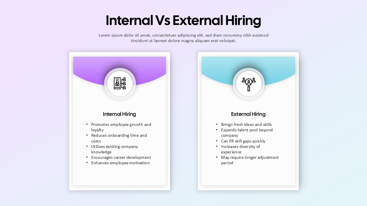
Internal vs External Hiring Comparison Template for PowerPoint & Google Slides
Comparison
Premium