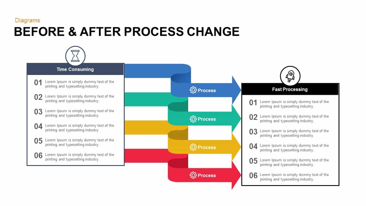
Before & After Process Change PowerPoint Template

Before & After Comparison PowerPoint Template & Google Slides
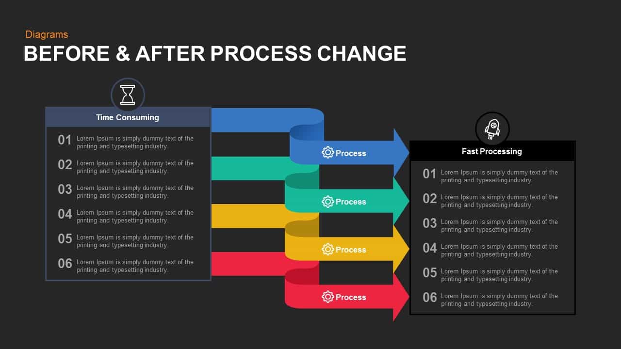
The Before & After PowerPoint Template is an essential tool for illustrating the transformation of processes within your organization. This visually engaging template effectively compares time-consuming processes with improved, fast-processing workflows, making it ideal for presentations aimed at showcasing efficiency gains, process optimizations, or operational improvements.
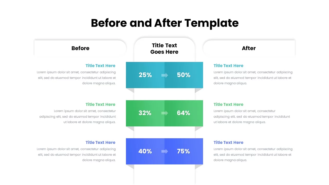
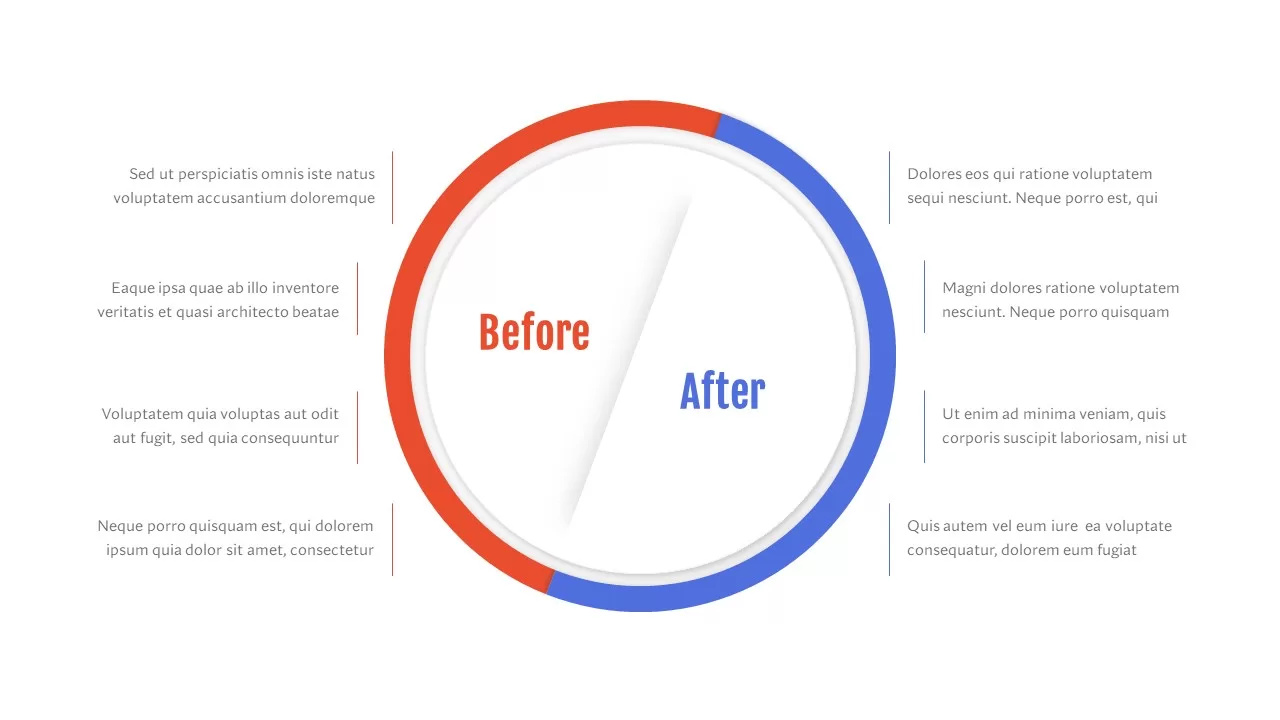
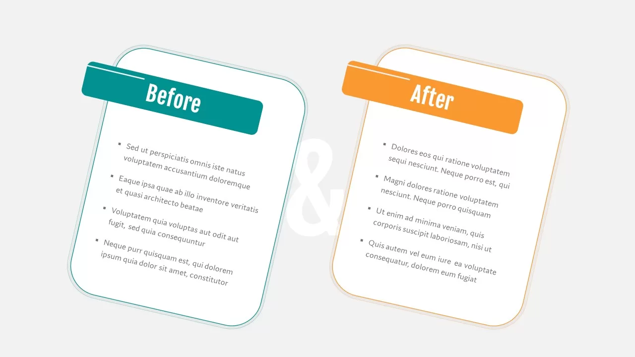
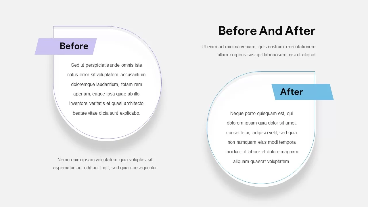
The template features a dual-column layout, clearly delineating the “Before” and “After” states. On the left side, the “Time Consuming” section lists six steps of a process, highlighting areas where inefficiencies exist. Each step is enumerated and paired with placeholder text, allowing for detailed descriptions of each stage. The right side, labeled “Fast Processing,” mirrors this structure, presenting the same six steps in an optimized format that emphasizes speed and efficiency.
Connecting these two sections are dynamic, colorful arrows that represent the transformation process. Each arrow is labeled “Process” and designed in distinct colors to enhance visual appeal and facilitate comprehension. Icons are strategically placed to symbolize the nature of each process, such as an hourglass for time-consuming tasks and a rocket for fast processing, reinforcing the contrast between the two states.
This before and after presentation template for PowerPoint is versatile and fully customizable, suitable for various applications including business process reengineering, workflow optimization presentations, and continuous improvement initiatives. It also offers flexibility and ease of use, enabling you to tailor the content to your specific needs effortlessly.
These before and after presentation slides are designed and developed by professionals who will fulfill your requirements through statistical analysis, before and after experimentation which means business or product improvement before and after a strategic change. The PowerPoint template is useful to evaluate and present the actual condition of your product and services to your viewers. The shape of the design and the pointing arrows are useful to share the values without any confusion. This process change flowchart template transports your concepts of change to your needy. If you are looking for another before and after slides or comparison ppt presentation template then check out our massive collection.
Login to download this file

Item ID
SB00813
Related Templates

Before and After Comparison Infographics Template for PowerPoint & Google Slides
Comparison
Free Before And After Slide PowerPoint Template
Comparison
Free
Before and After Comparison Slide Template for PowerPoint & Google Slides
Comparison
Modern Before and After Comparison Template for PowerPoint & Google Slides
Infographics
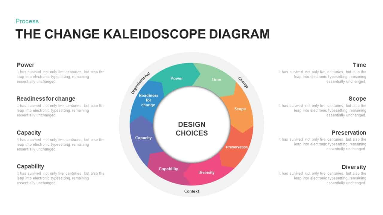
Change Kaleidoscope Process Diagram Template for PowerPoint & Google Slides
Circular
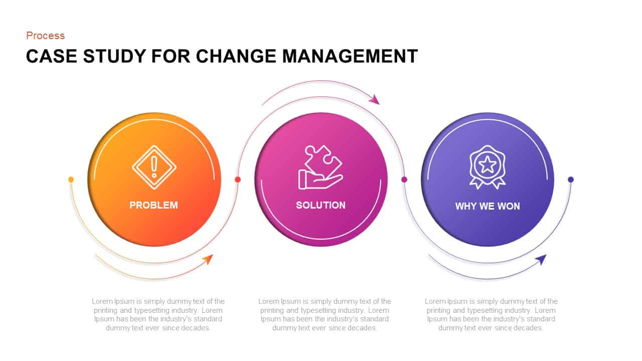
Case Study for Change Management Process Template for PowerPoint & Google Slides
Process
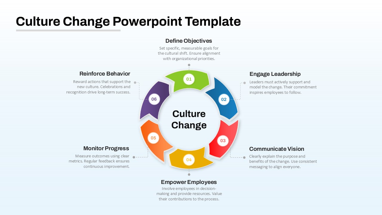
Culture Change Circular Process Diagram Template for PowerPoint & Google Slides
Process
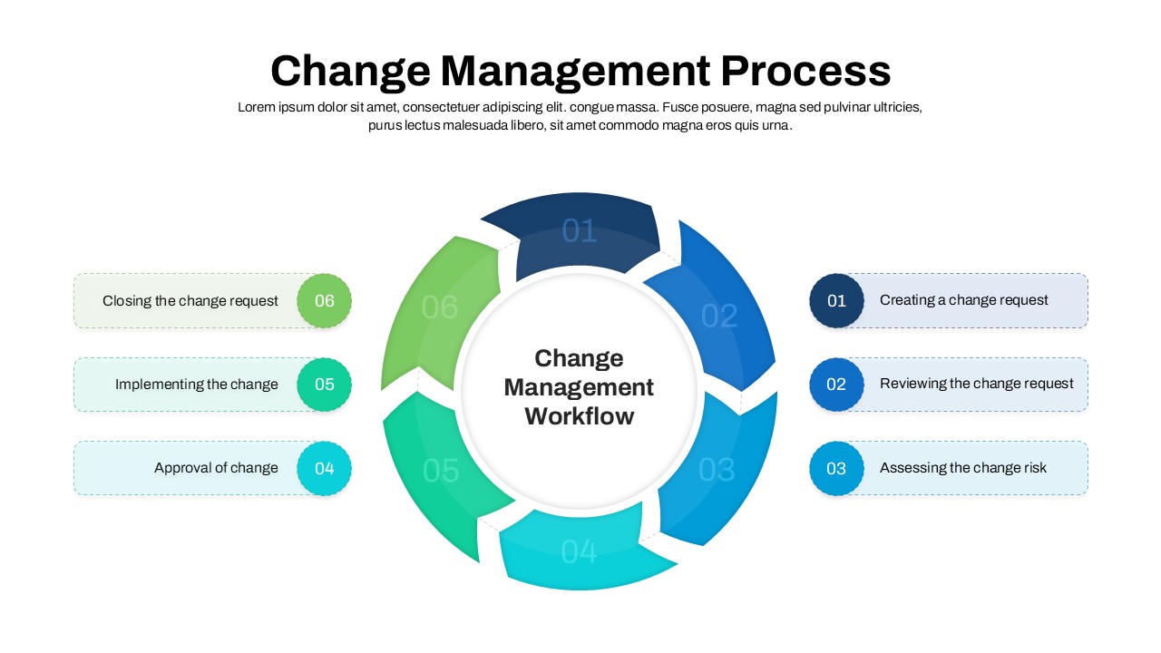
Change Management Process Cycle Diagram Template for PowerPoint & Google Slides
Process

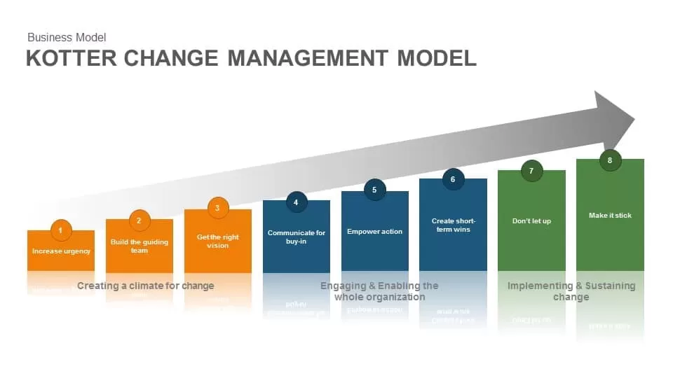
Kotter Change Management Model template for PowerPoint & Google Slides
Business Strategy
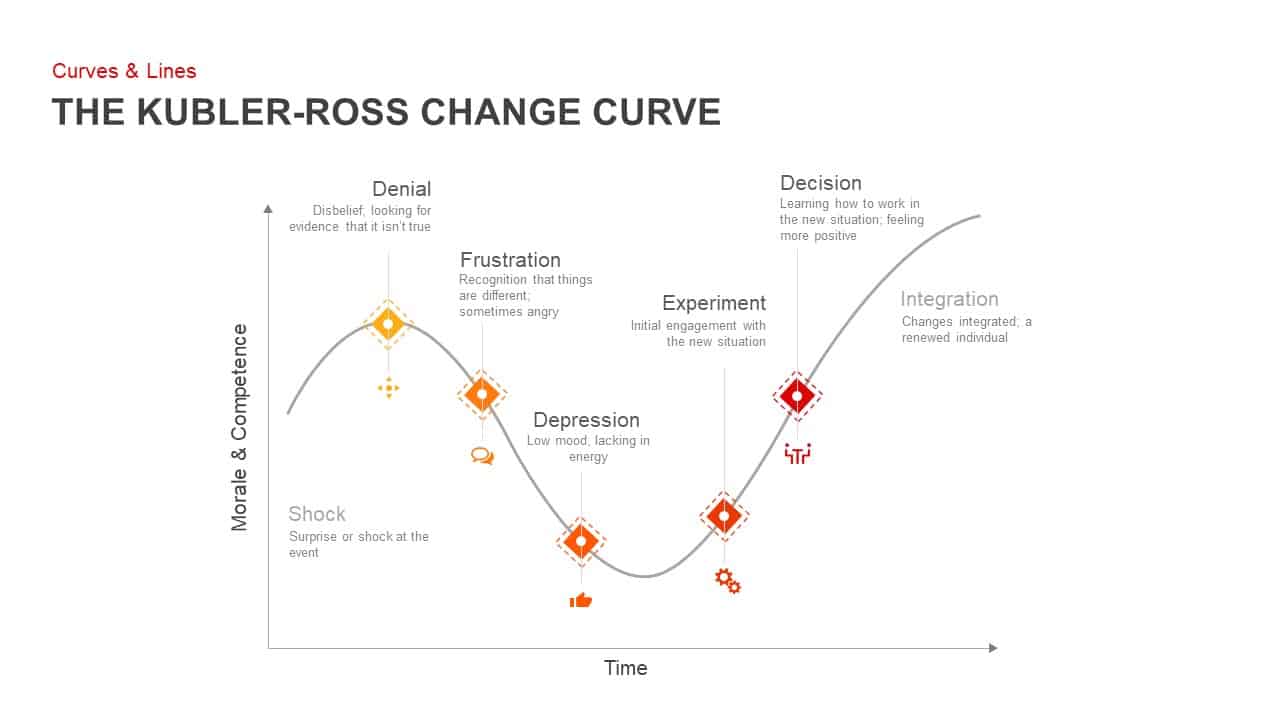
Kubler-Ross Change Curve Diagram Template for PowerPoint & Google Slides
Timeline
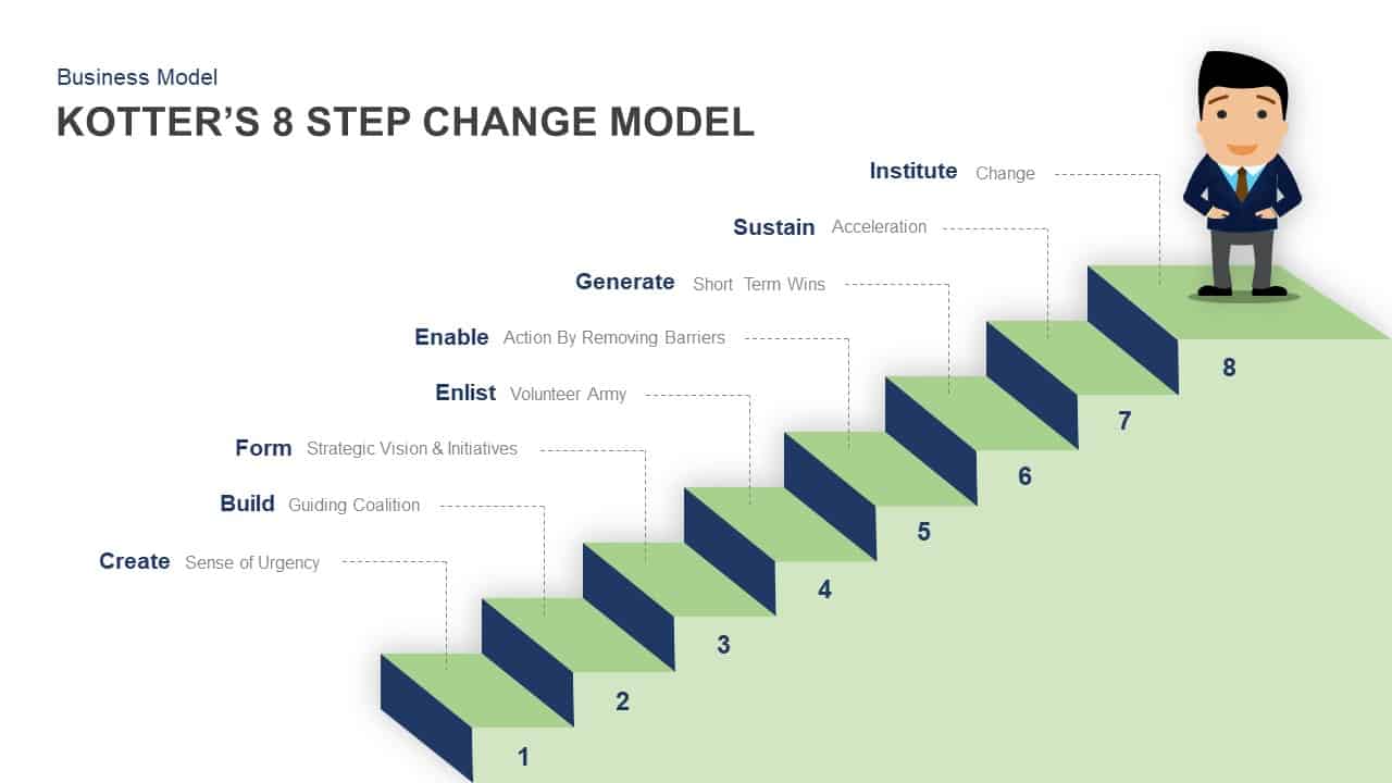
Kotter’s 8 Step Change Model Template for PowerPoint & Keynote
Business Models
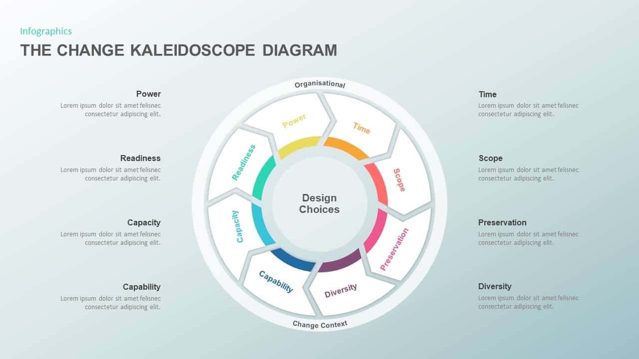
The Change Kaleidoscope Diagram template for PowerPoint & Google Slides
Pitch Deck

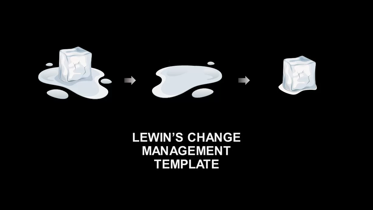
Lewin’s Change Management Diagram Template for PowerPoint & Google Slides
Process
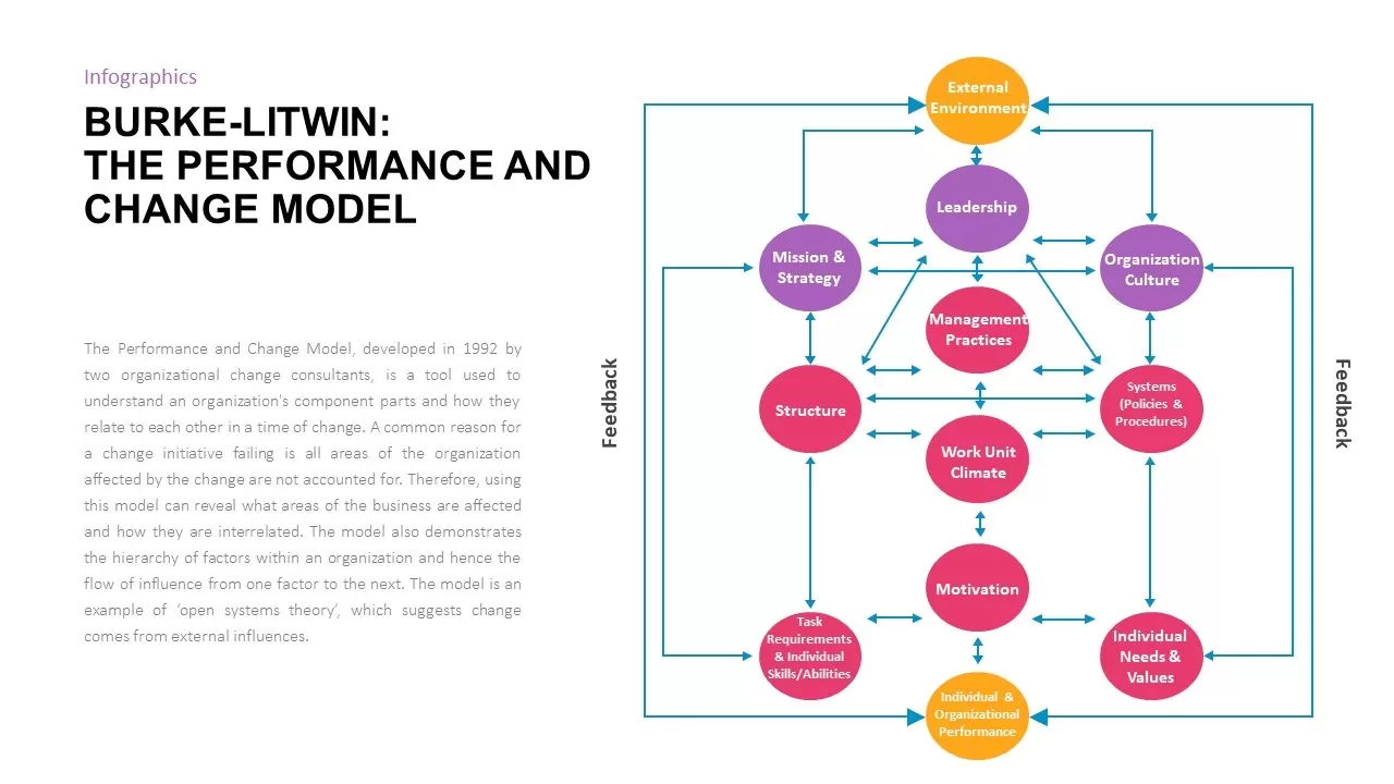
Burke-Litwin Performance and Change Model template for PowerPoint & Google Slides
Infographics
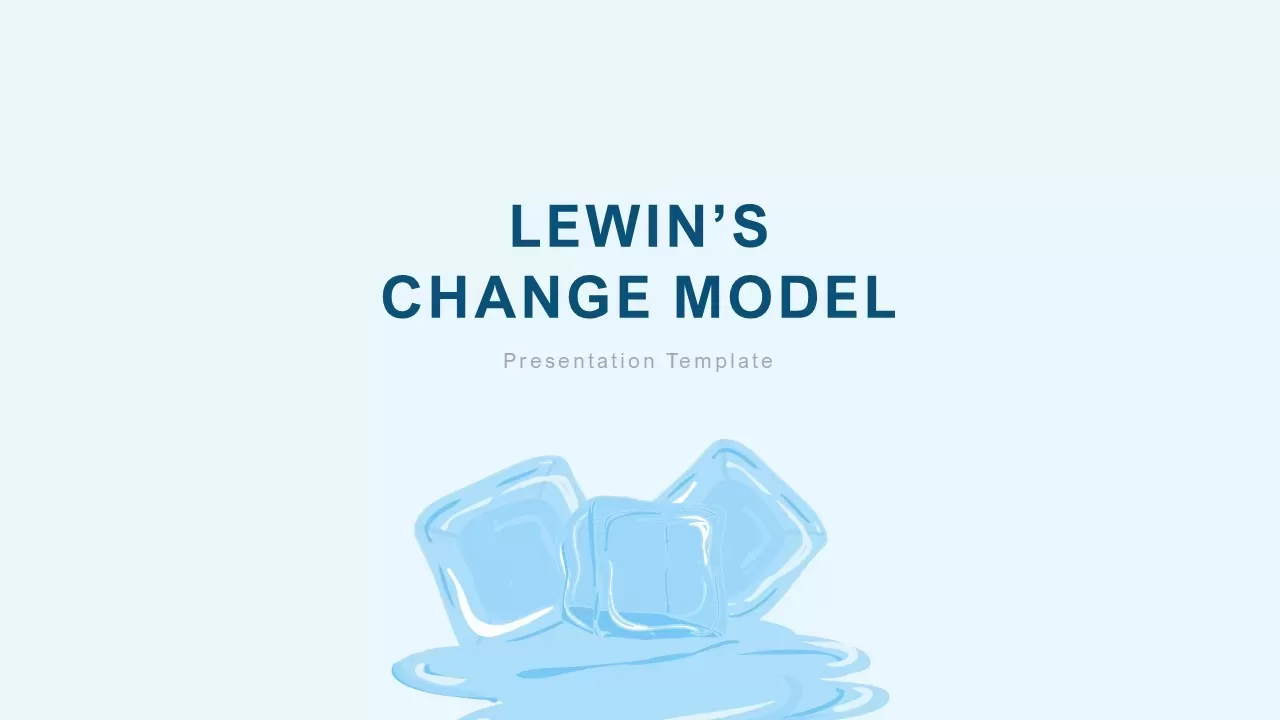
Lewin’s Change Model Overview Template for PowerPoint & Google Slides
Gap
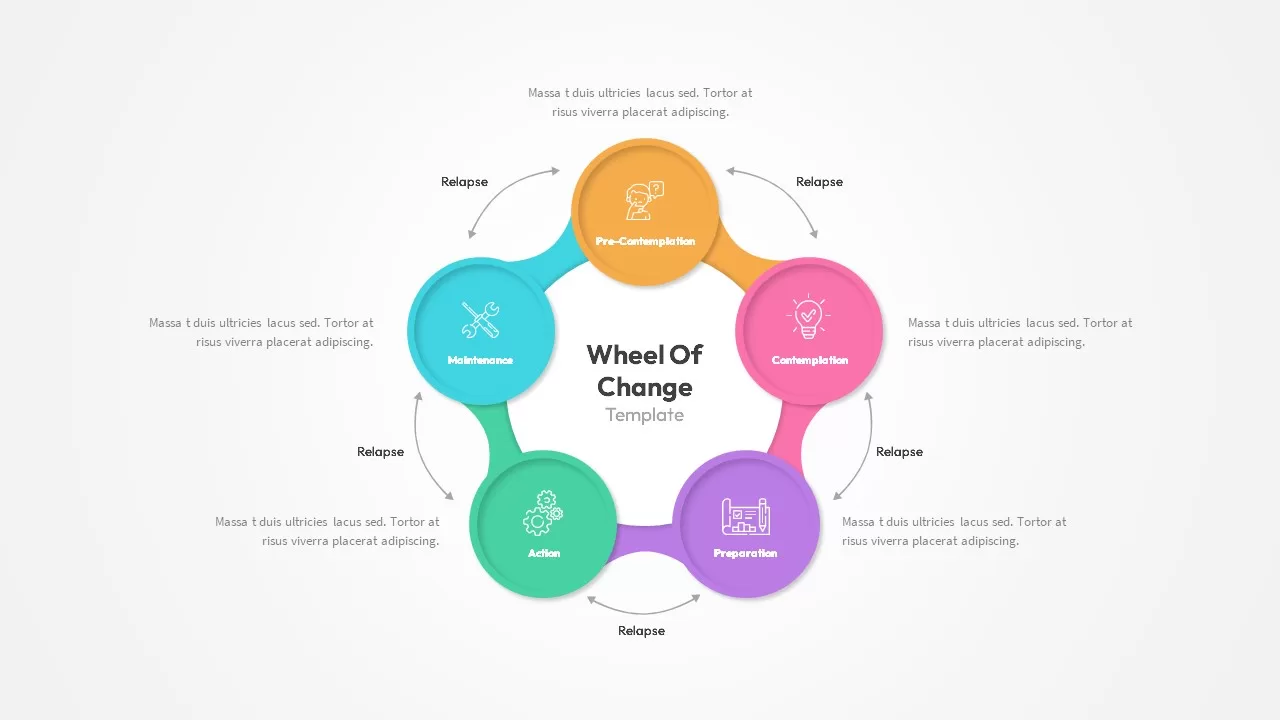
Wheel of Change Model template for PowerPoint & Google Slides
Business Strategy

Change Management Infographic Deck Template for PowerPoint & Google Slides
Business Strategy
Colorful Change Management Roadmap Template for PowerPoint & Google Slides
Roadmap
Rosabeth Moss Kanter’s Model of Change Template for PowerPoint & Google Slides
Circular

Change Management Consulting template for PowerPoint & Google Slides
Company Profile

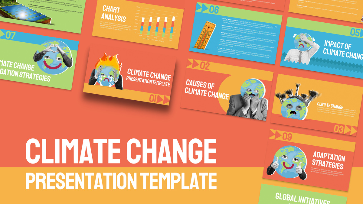
Free Climate Change Awareness Deck for PowerPoint & Google Slides
Decks
Free
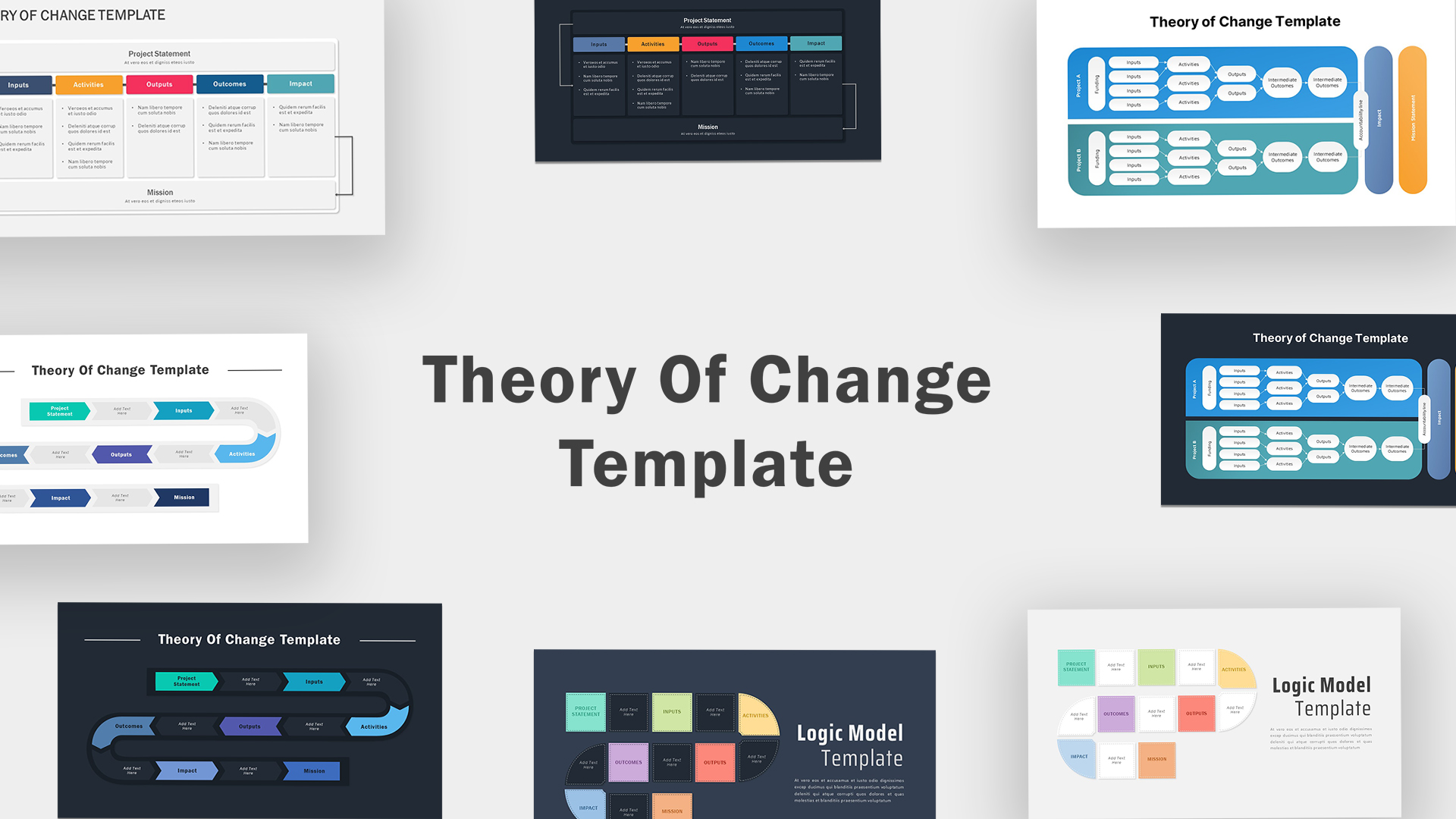
Theory Of Change Template PPT Slide
Process
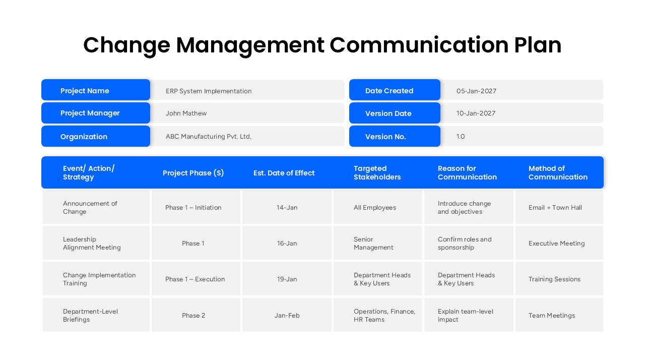
Change Management Communication Plan Presentation Template
Project Management