Website Performance Monitoring Dashboard Template for PowerPoint & Google Slides

Description
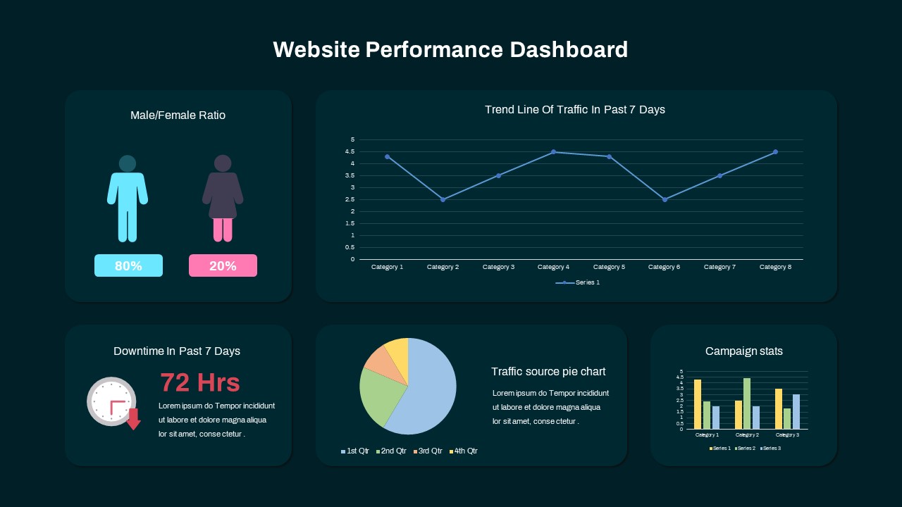
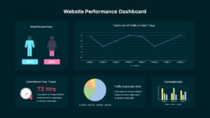
Use this fully customizable six-segment 360° dashboard slide to visualize a comprehensive overview of website performance metrics and KPIs with clarity and impact. The central circular hub features a custom icon placeholder for your core metric, while six evenly spaced colored panels radiate around it: a teal block showing male vs. female ratio, a large line chart mapping traffic trends over the past seven days, a downtime panel with a clock icon and “72 Hrs” callout, a pie-donut chart illustrating traffic-source distribution by quarter, and a campaign-stats bar-column chart comparing three key campaigns. Each segment links via fine connector lines to matching text boxes, offering space for concise headings and descriptive copy.
Built with vector shapes and master layouts in both PowerPoint and Google Slides, this dashboard ensures seamless cross-platform compatibility and rapid customization. Swap icons, adjust segment colors, edit data placeholders, or reposition panels in seconds without losing alignment or quality. Preconfigured animations guide audiences through each metric in sequence—highlighting correlations between audience demographics, traffic patterns, and campaign performance. The modern flat design, accented by subtle drop shadows and clean typography, maintains focus on your data while delivering a professional aesthetic that suits corporate and creative branding.
Whether you’re conducting executive reviews, marketing performance presentations, or operational briefings, this infographic slide empowers you to present multiple KPIs on one cohesive canvas. Use the gender-ratio block to highlight audience demographics, the traffic-trend panel to illustrate user-engagement fluctuations, and the downtime section to underscore reliability metrics. The pie and bar charts provide quick visual breakdowns of traffic sources and campaign comparisons.
Who is it for
Workshop facilitators, marketing directors, and product managers will benefit from this slide when presenting website analytics, user-behavior trends, or campaign performance to executive teams. Consultants and cross-functional stakeholders can leverage the clear visual hierarchy to drive alignment and data-driven decision-making.
Other Uses
Repurpose this dashboard for e-commerce performance reviews, social-media analytics, IT-operations monitoring, or quarterly business updates. The flexible layout also supports customer-journey mapping, ROI analysis, or finance-reporting dashboards.
Login to download this file

Item ID
SB03169
Related Templates

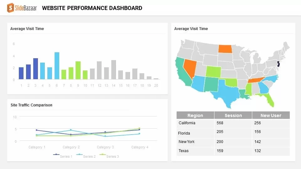
Website Performance Dashboard template for PowerPoint & Google Slides
Charts

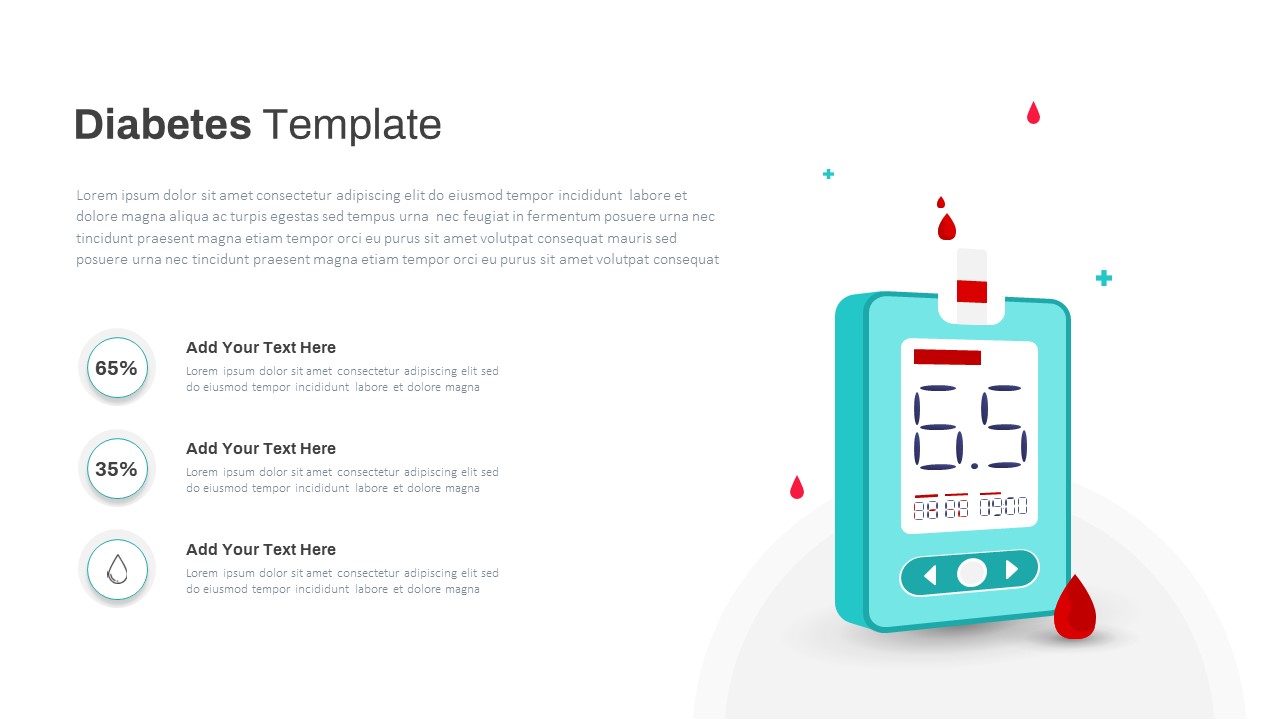
Diabetes Blood Glucose Monitoring Template for PowerPoint & Google Slides
Health
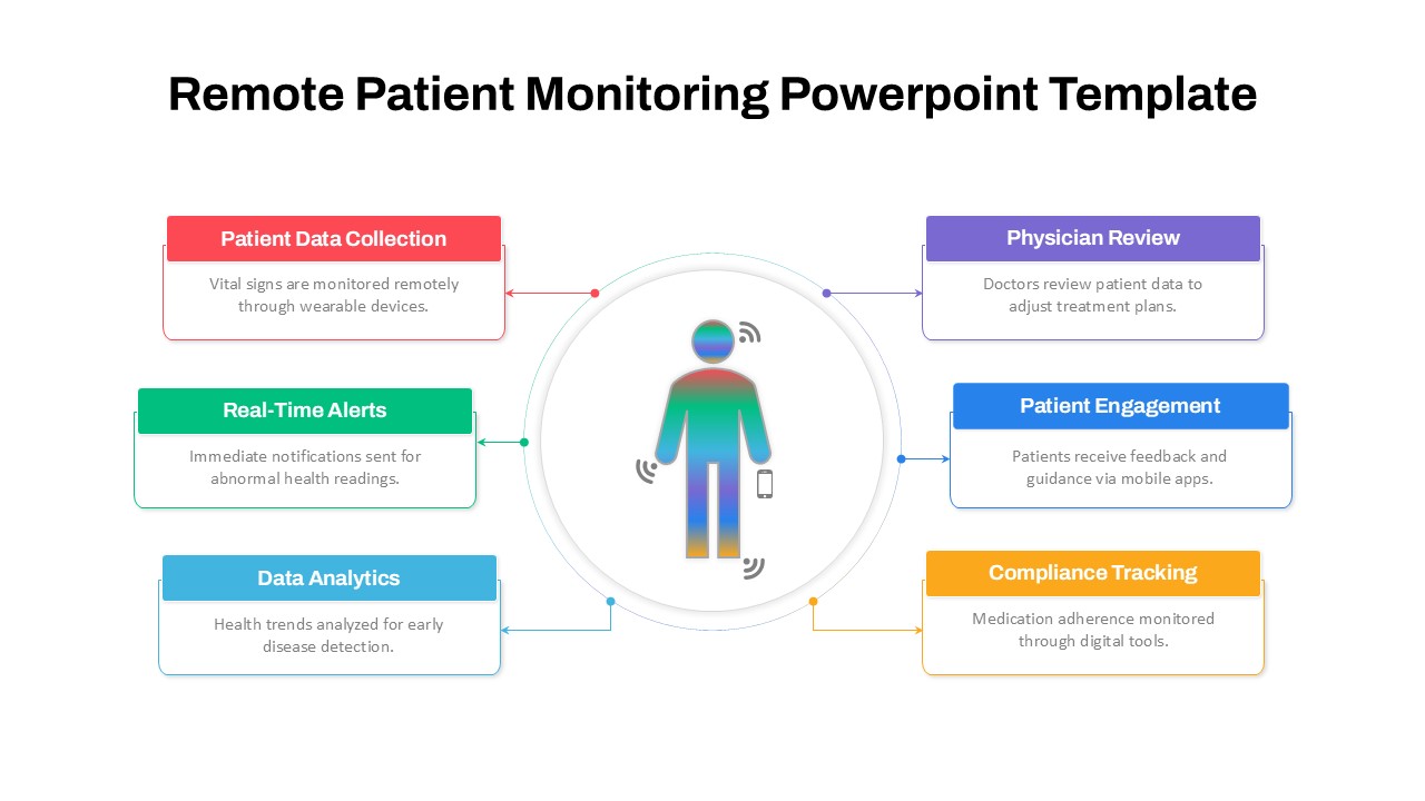
Remote Patient Monitoring Diagram Template for PowerPoint & Google Slides
Health
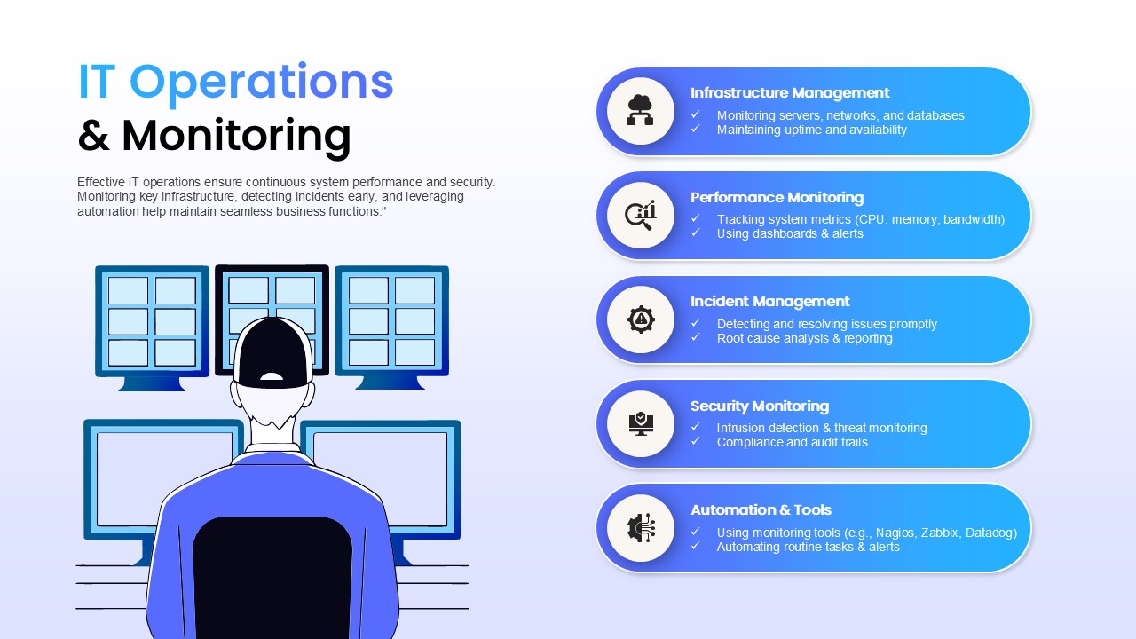
IT Operations & Monitoring Template for PowerPoint & Google Slides
Information Technology
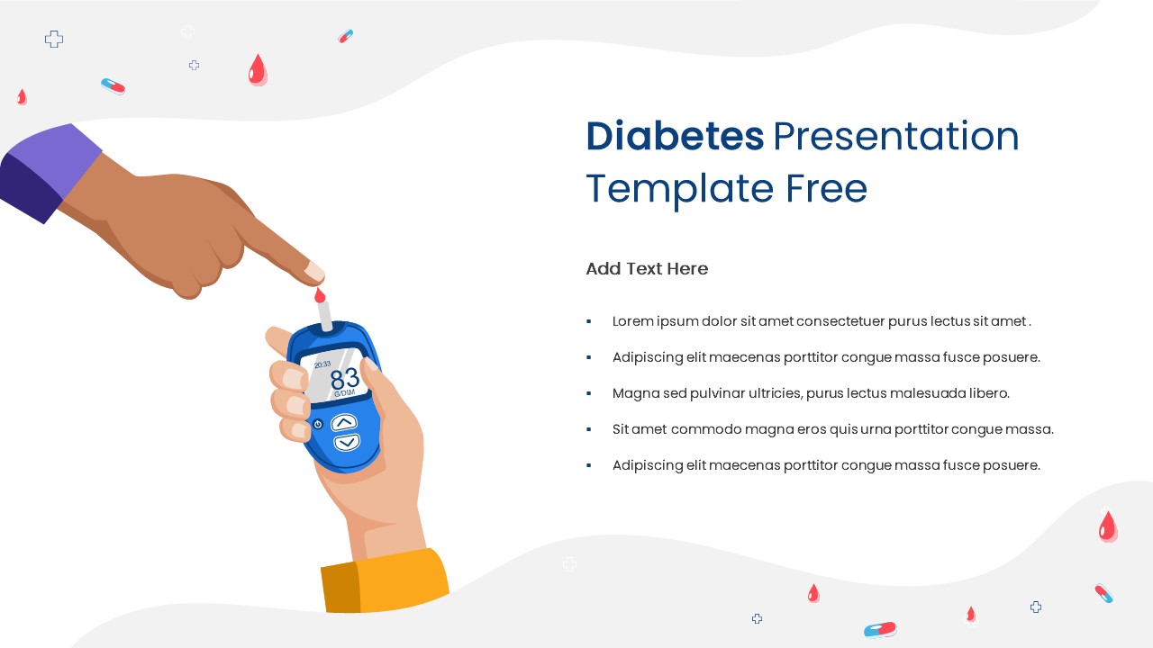
Free Diabetes Monitoring Awareness Slide for PowerPoint & Google Slides
Health
Free
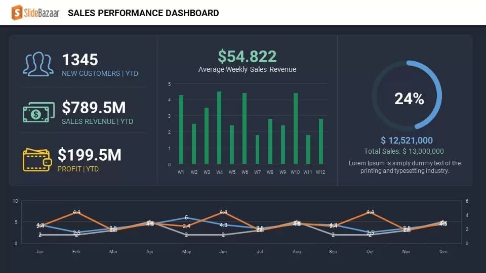
Sales Performance Dashboard template for PowerPoint & Google Slides
Business Report
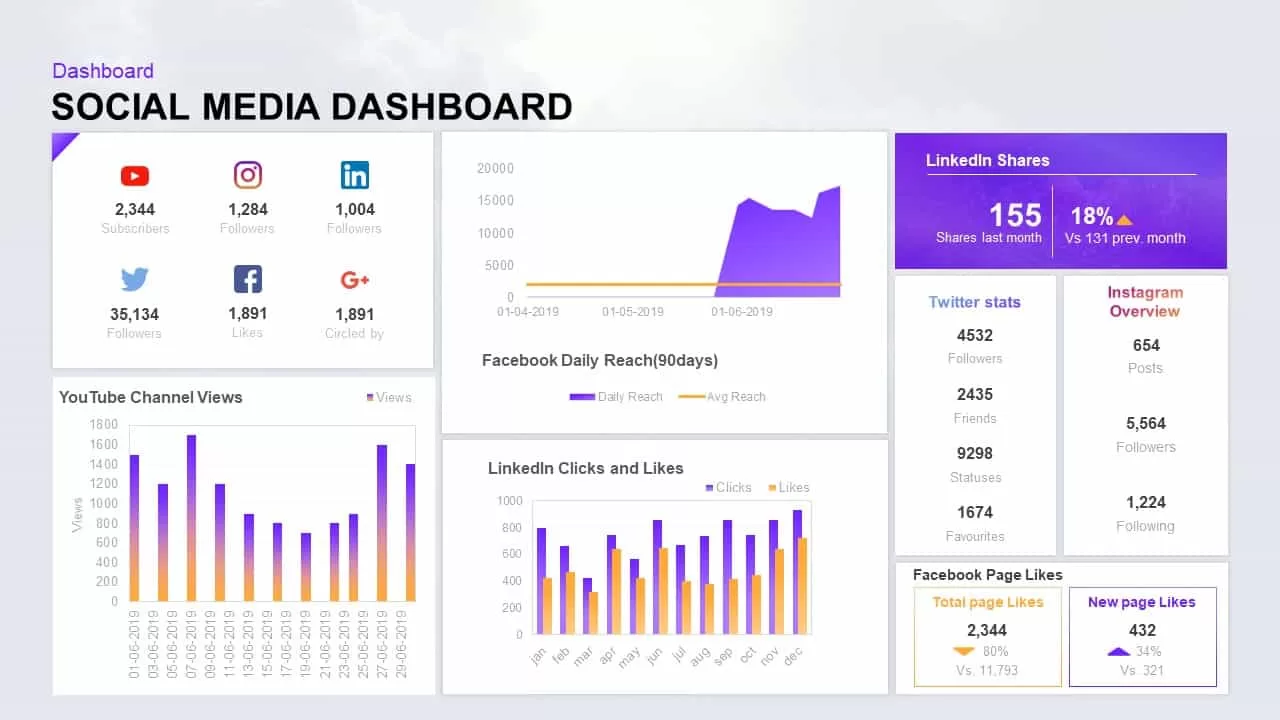
Social Media Performance Dashboard Template for PowerPoint & Google Slides
Bar/Column
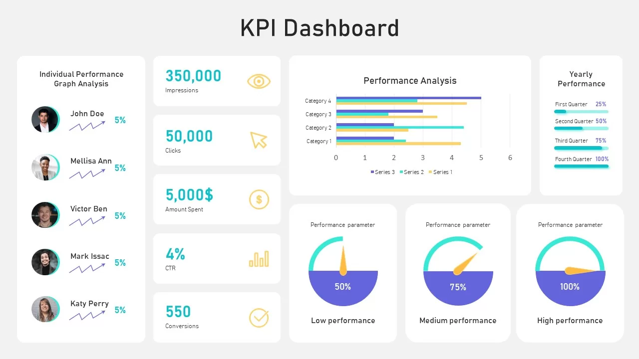
Performance KPI Dashboard Slide Template for PowerPoint & Google Slides
Business Report
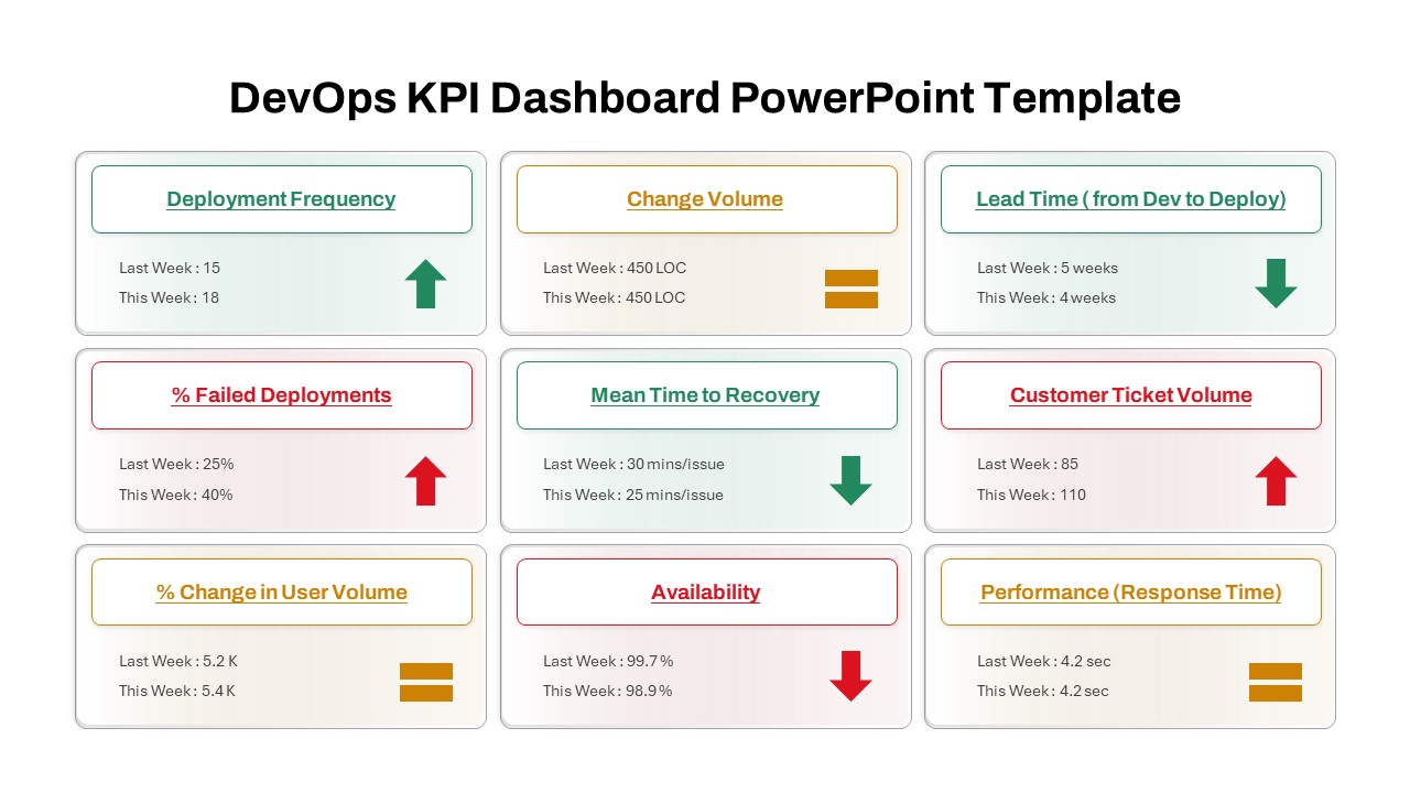
DevOps KPI Dashboard Performance Metrics Template for PowerPoint & Google Slides
Software Development
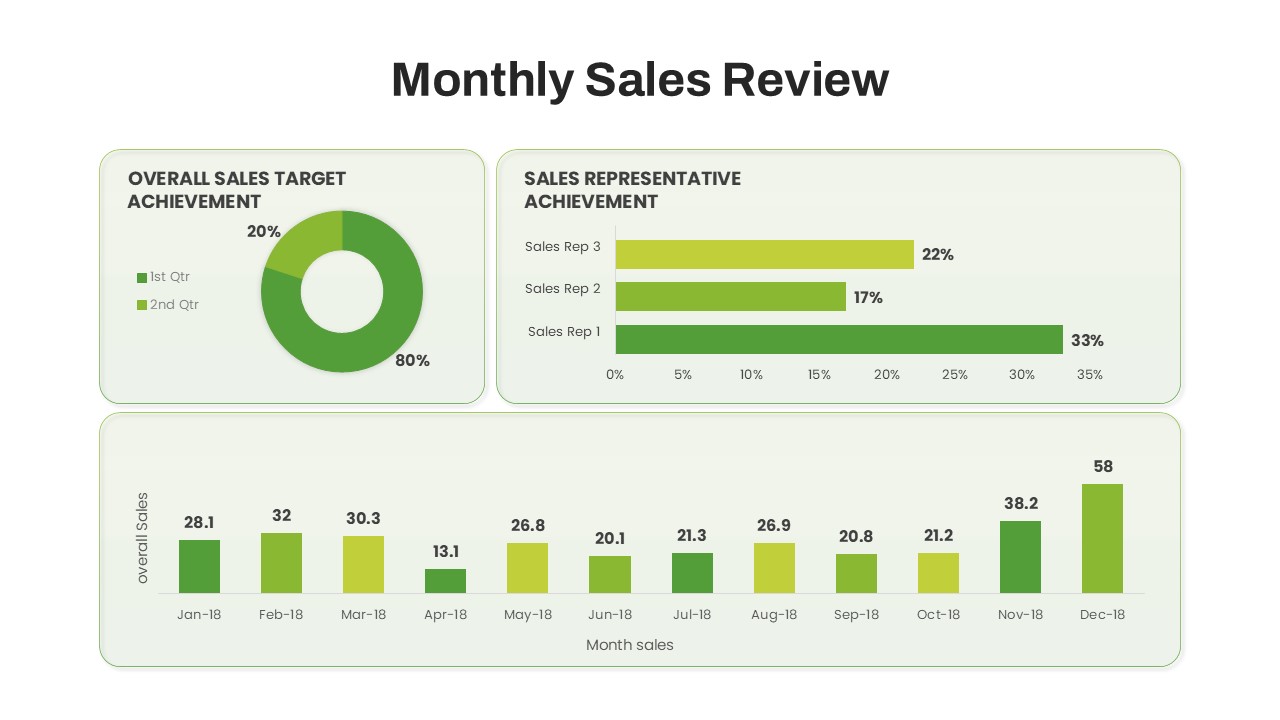
Monthly Sales Performance Dashboard Template for PowerPoint & Google Slides
Charts
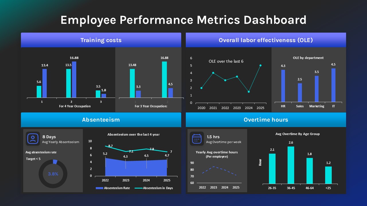
Employee Performance Metrics Dashboard Template for PowerPoint & Google Slides
Employee Performance
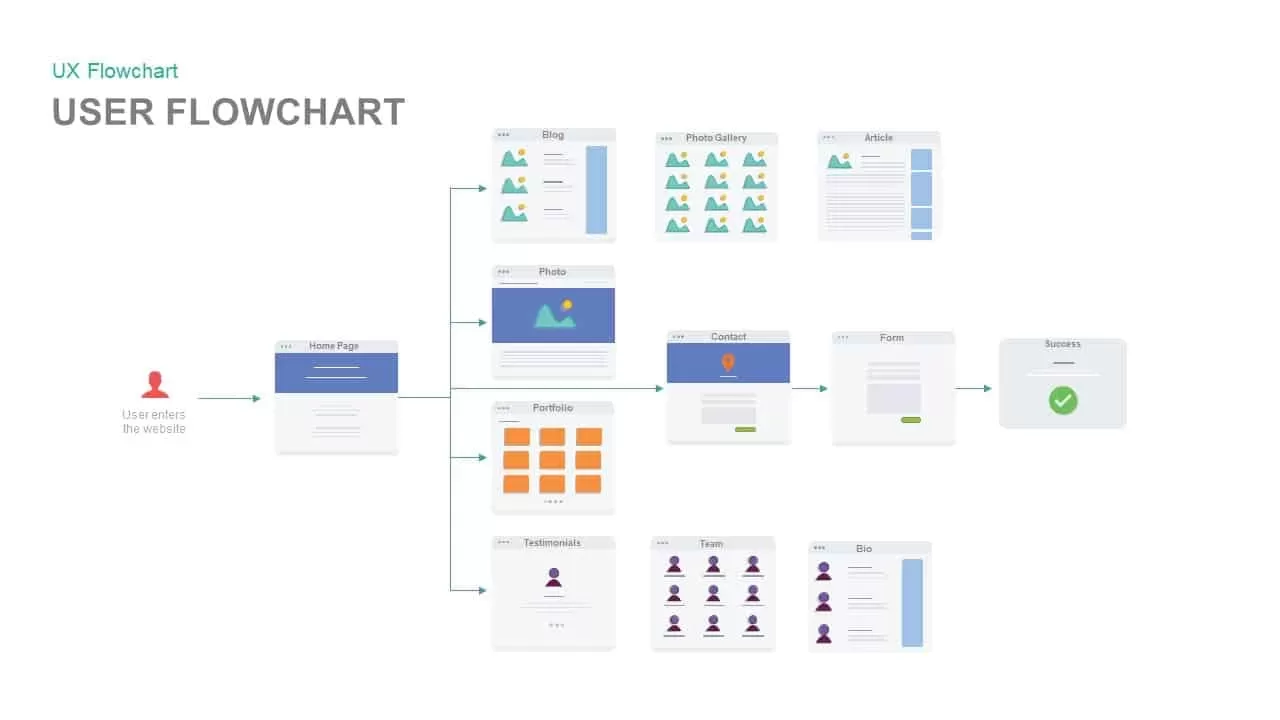
Website User Flowchart Diagram Template for PowerPoint & Google Slides
Process
Website Promotion Strategy Deck Template for PowerPoint & Google Slides
Pitch Deck
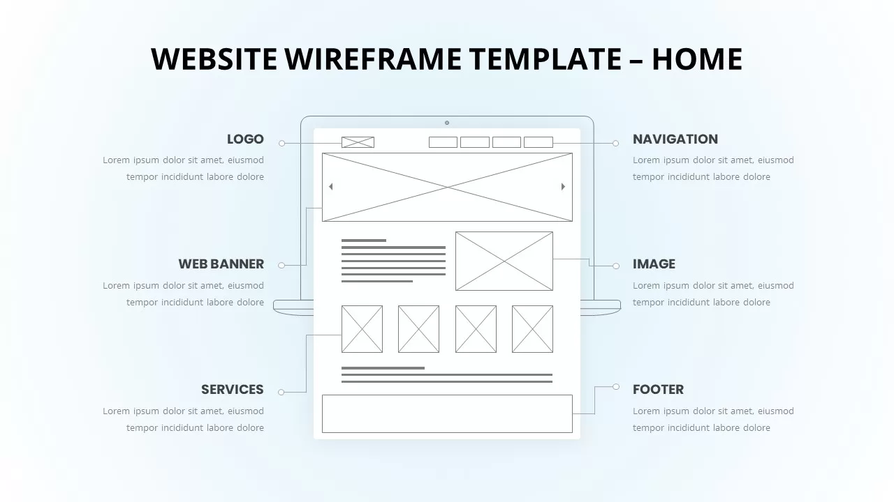
Homepage Website Wireframe & Mockup Template for PowerPoint & Google Slides
Information Technology
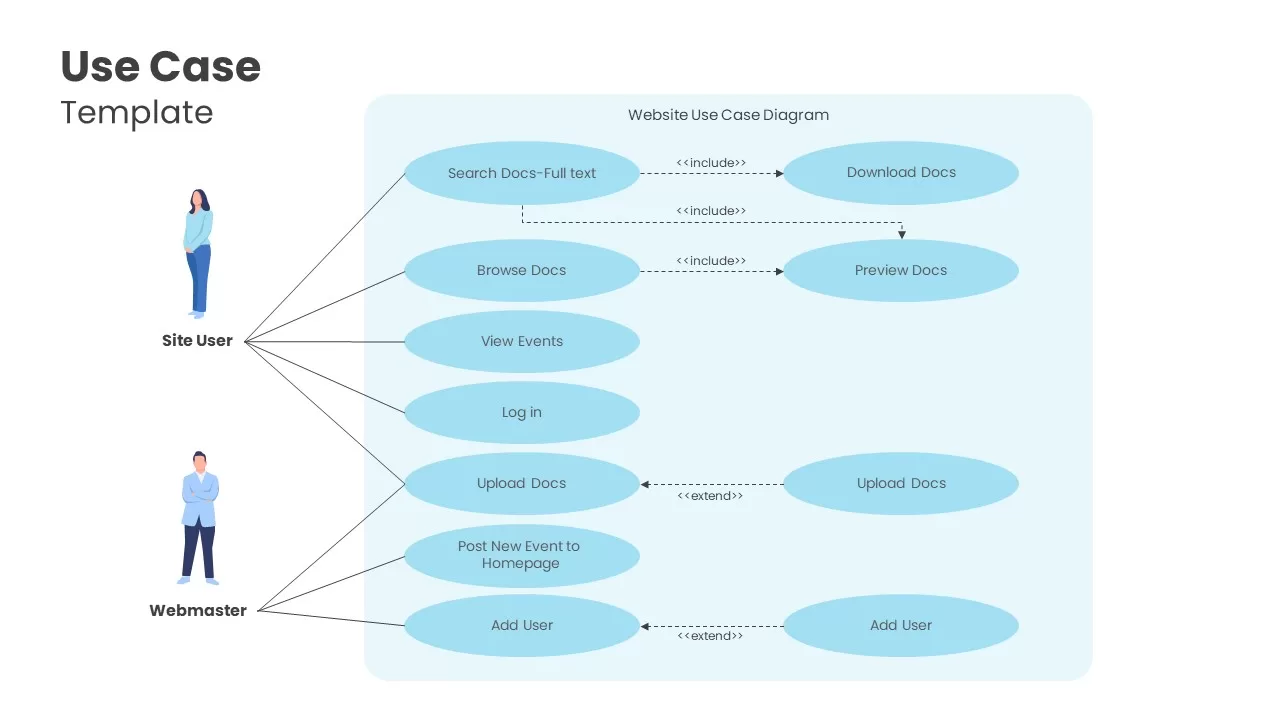
Website Use Case Diagram Template for PowerPoint & Google Slides
Software Development
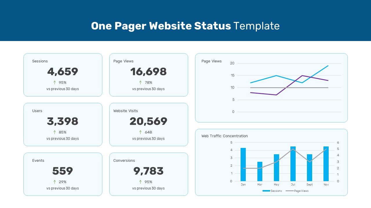
One Pager Website Status Template for PowerPoint & Google Slides
Digital Marketing
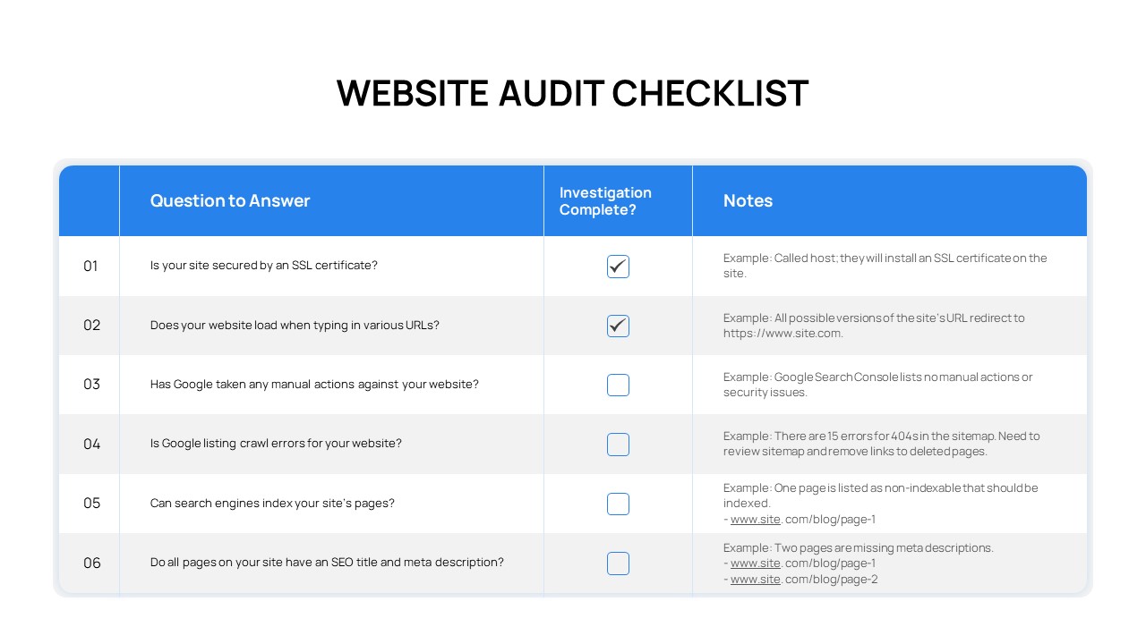
Comprehensive Website Audit Checklist Template for PowerPoint & Google Slides
Technology
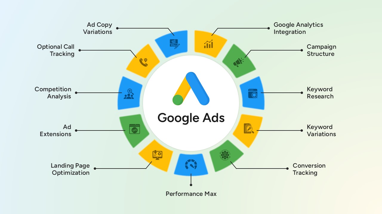
Google Ads Optimization & Performance Infographic Template for PowerPoint & Google Slides
Digital Marketing
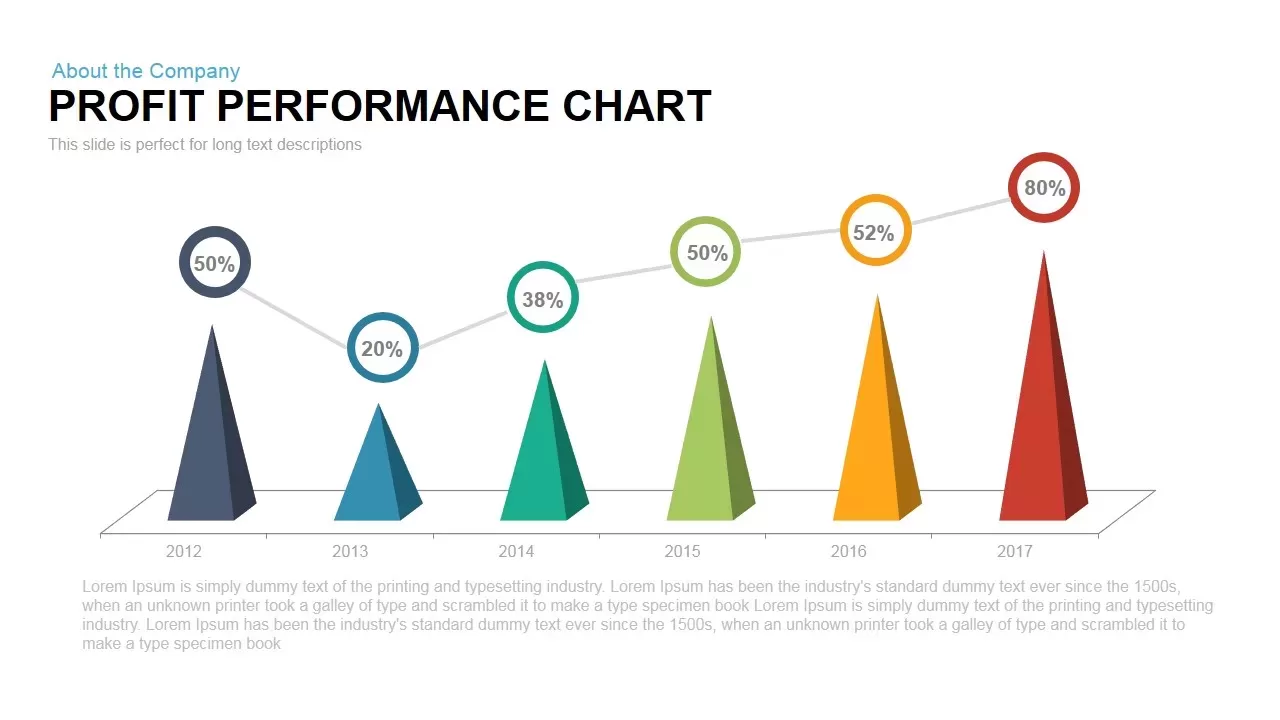
Profit Performance Trend Chart Template for PowerPoint & Google Slides
Finance
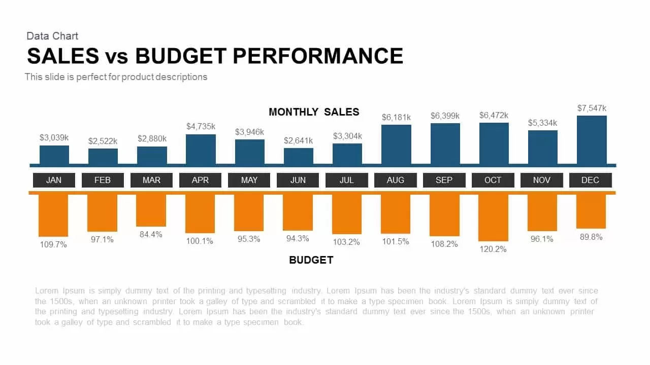
Sales vs Budget Performance Chart Template for PowerPoint & Google Slides
Bar/Column
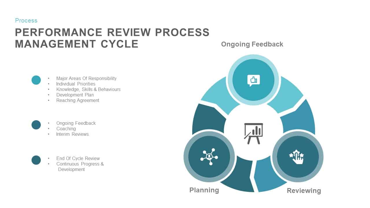
Performance Review Process Management Cycle template for PowerPoint & Google Slides
Employee Performance
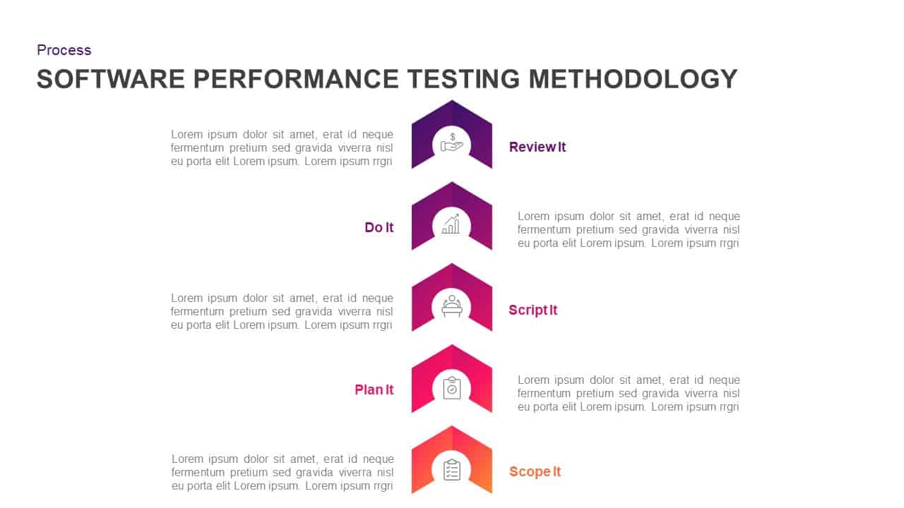
Software Performance Testing Methodology Template for PowerPoint & Google Slides
Process
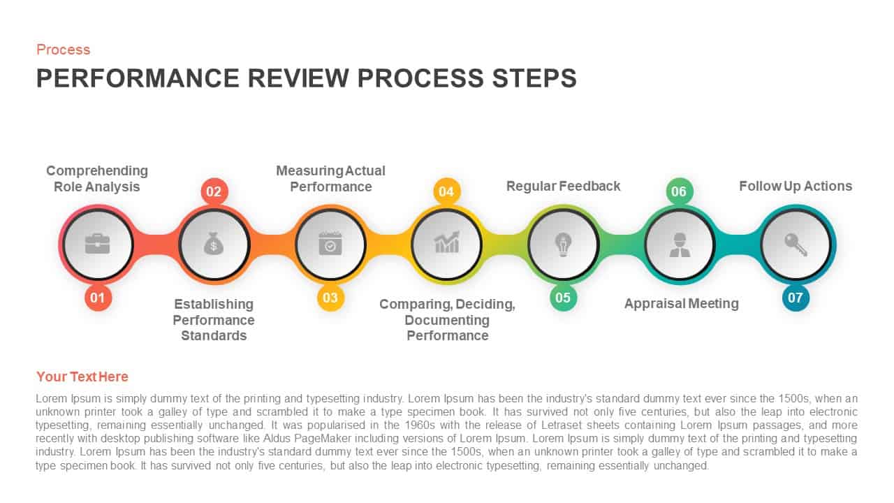
Performance Review Process Steps Template for PowerPoint & Google Slides
Employee Performance
Professional Sales Performance Report Template for PowerPoint & Google Slides
Business Report
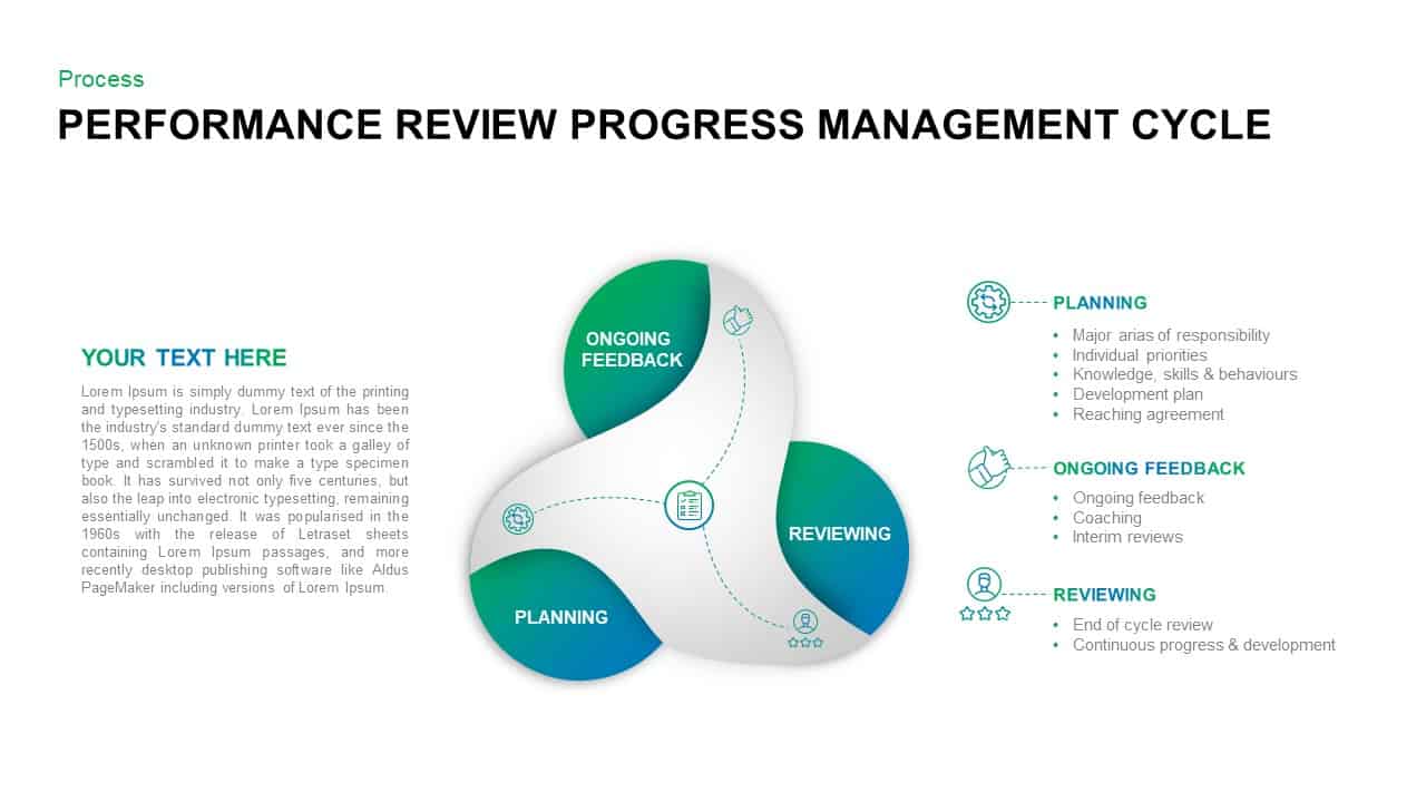
Performance Review Progress Management Template for PowerPoint & Google Slides
Process
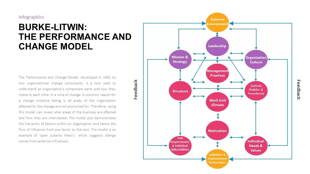
Burke-Litwin Performance and Change Model template for PowerPoint & Google Slides
Infographics
Corporate Performance Management Template for PowerPoint & Google Slides
Pitch Deck
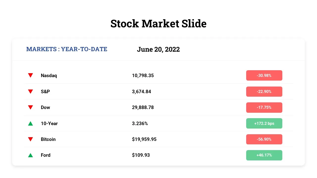
Free Stock Market Performance Overview template for PowerPoint & Google Slides
Finance
Free
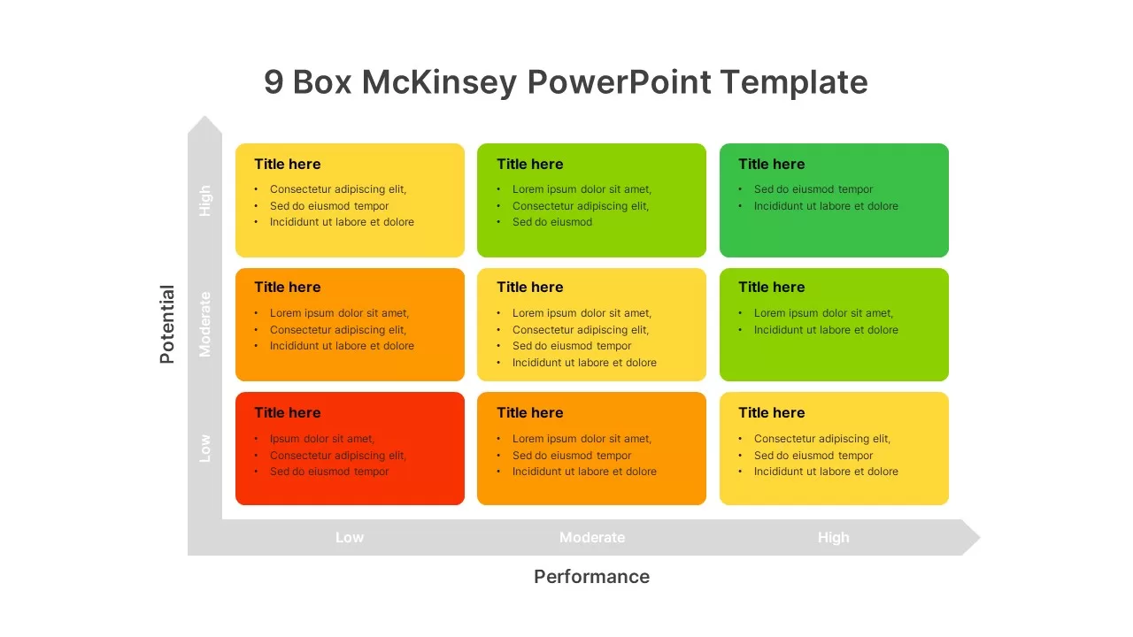
9-Box Matrix for Performance & Potential Template for PowerPoint & Google Slides
Employee Performance
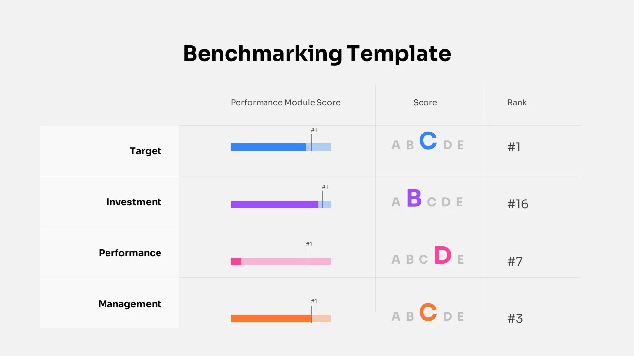
Benchmarking Performance Score Template for PowerPoint & Google Slides
Comparison Chart
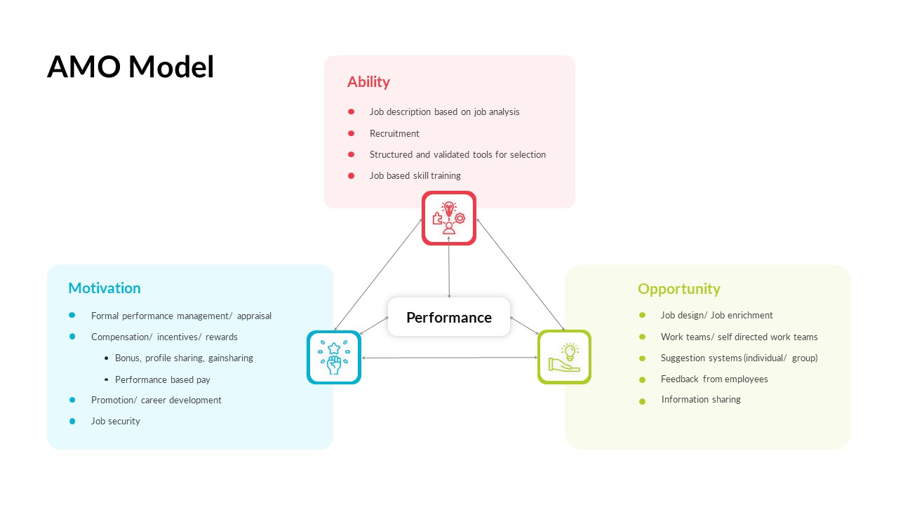
AMO Performance Model Feedback Diagram Template for PowerPoint & Google Slides
Employee Performance
Hits and Misses Performance Comparison Template for PowerPoint & Google Slides
Comparison
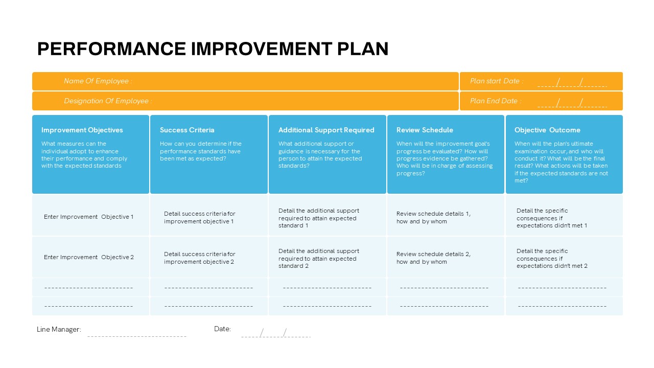
Detailed Performance Improvement Plan Template for PowerPoint & Google Slides
Employee Performance
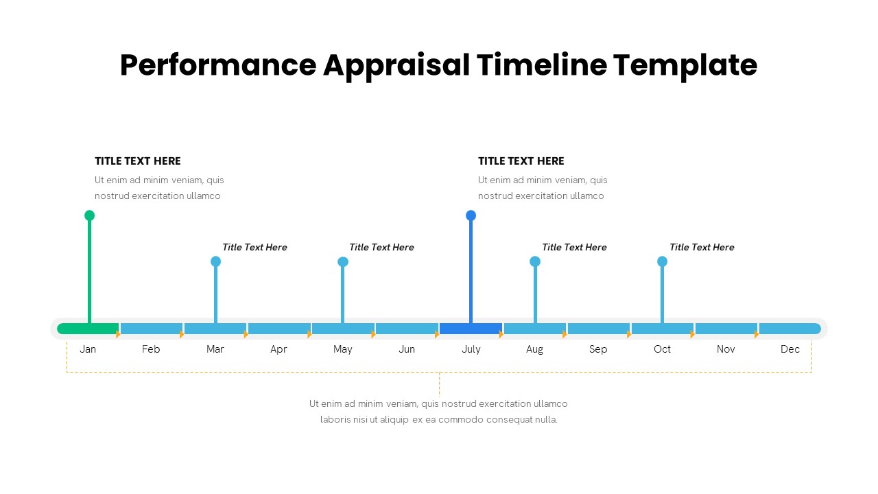
Performance Appraisal Timeline Diagram Template for PowerPoint & Google Slides
Timeline
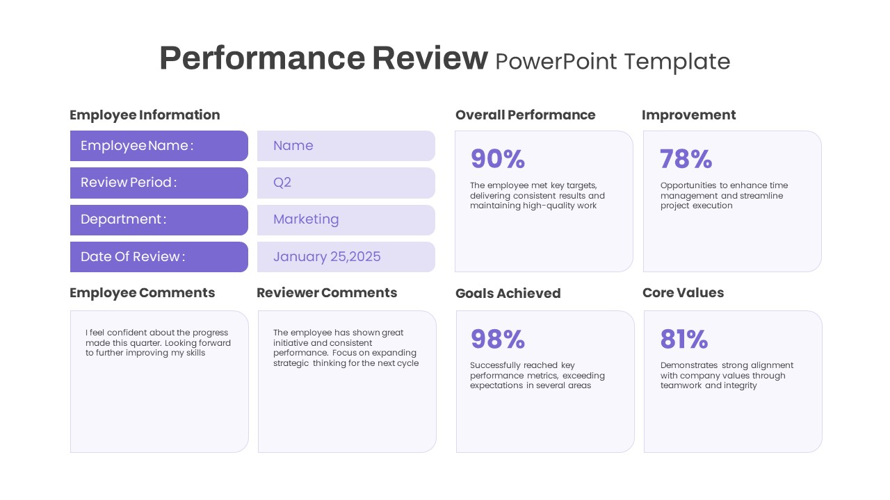
Performance Review template for PowerPoint & Google Slides
Employee Performance
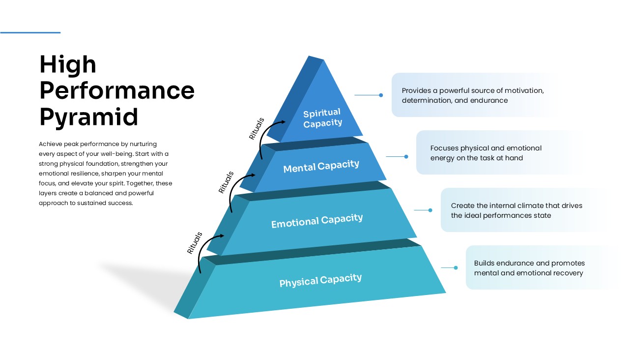
High Performance Pyramid Diagram Template for PowerPoint & Google Slides
Pyramid
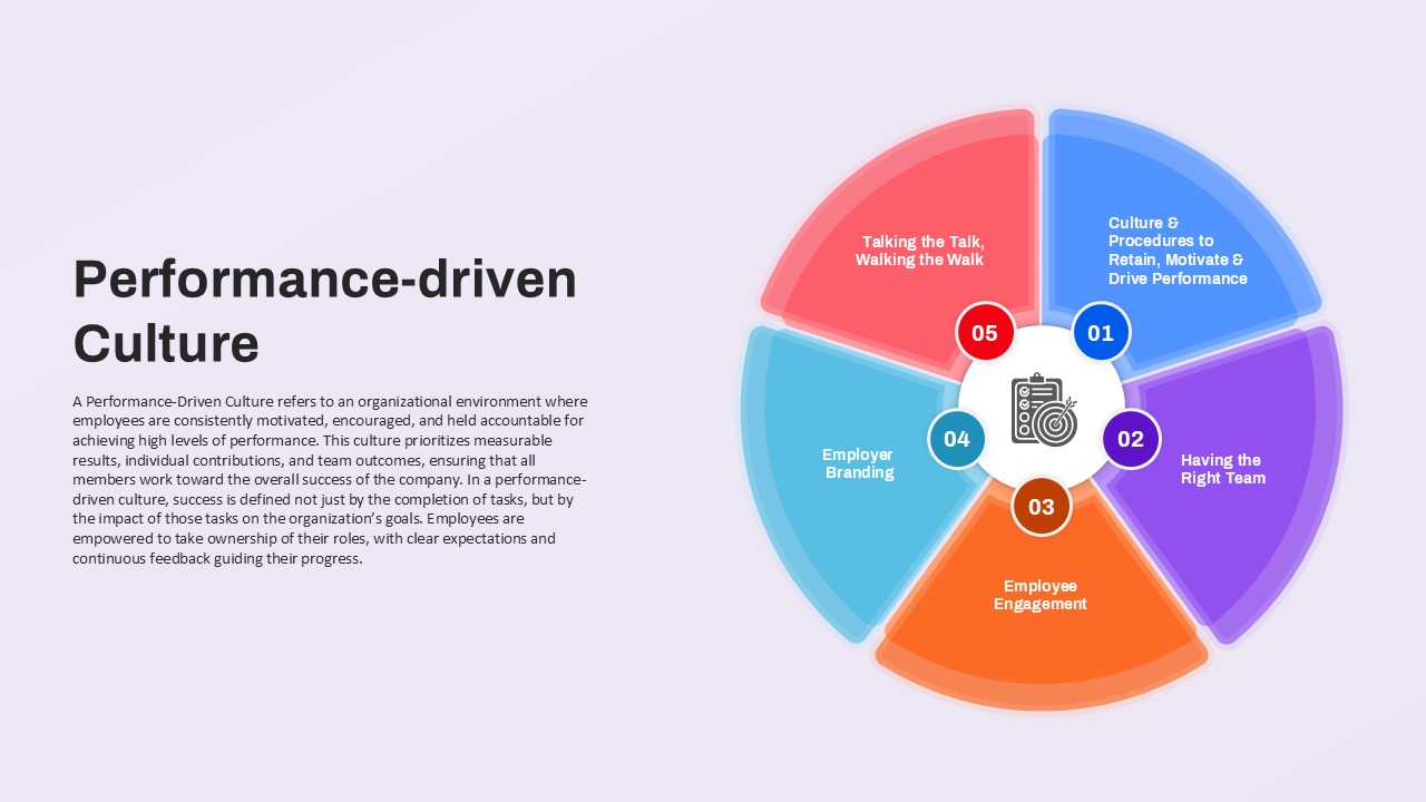
Performance-driven Culture framework template for PowerPoint & Google Slides
Leadership
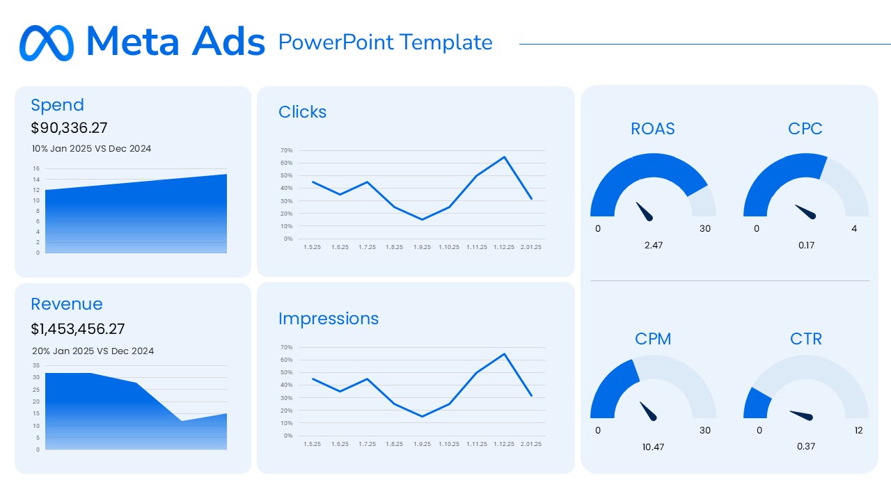
Meta Ads Performance Overview template for PowerPoint & Google Slides
Advertising
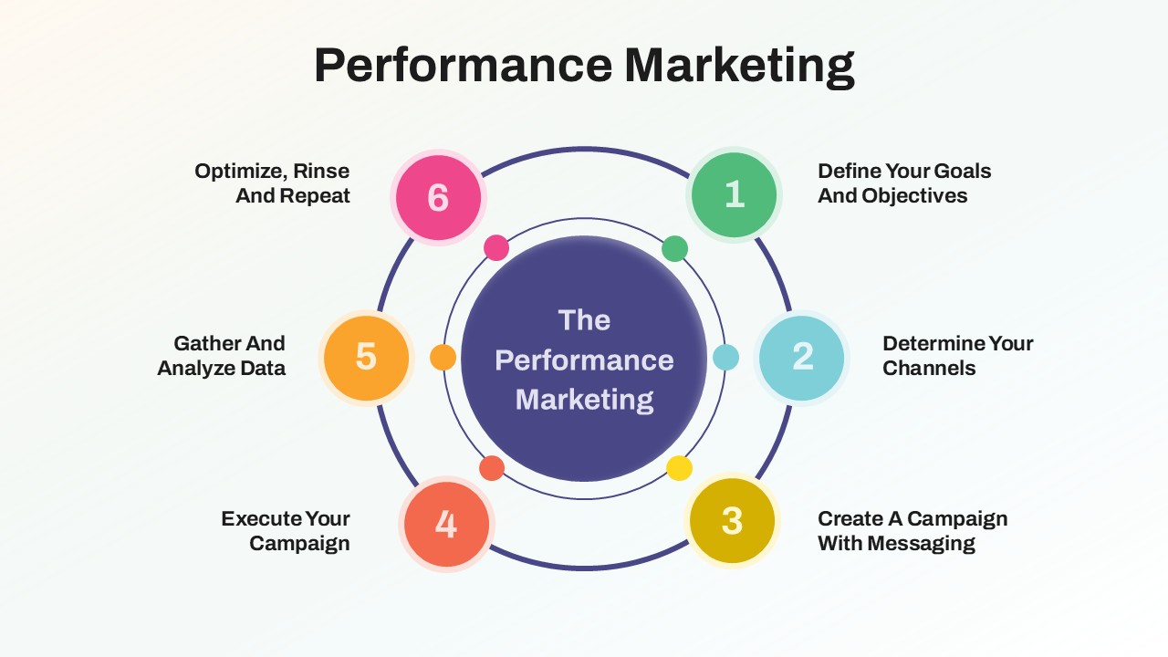
Performance Marketing Strategy template for PowerPoint & Google Slides
Digital Marketing
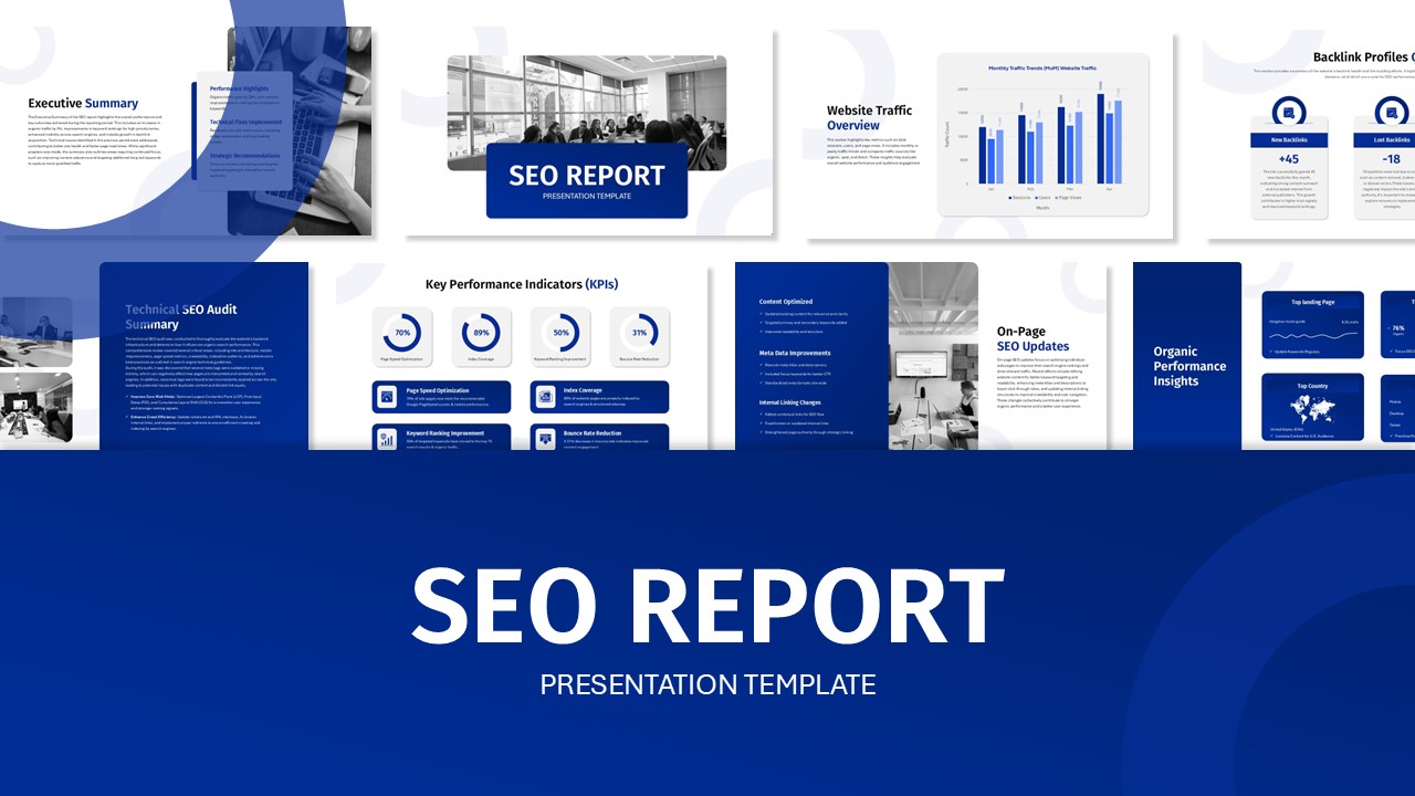
SEO Performance Report Overview template for PowerPoint & Google Slides
Digital Marketing
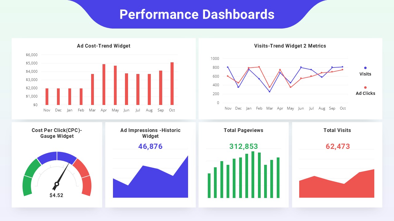
Performance Dashboards Overview Template for PowerPoint & Google Slides
Business Report
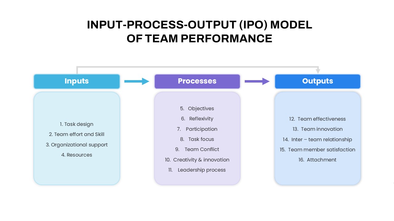
IPO Model of Team Performance for PowerPoint & Google Slides
Process
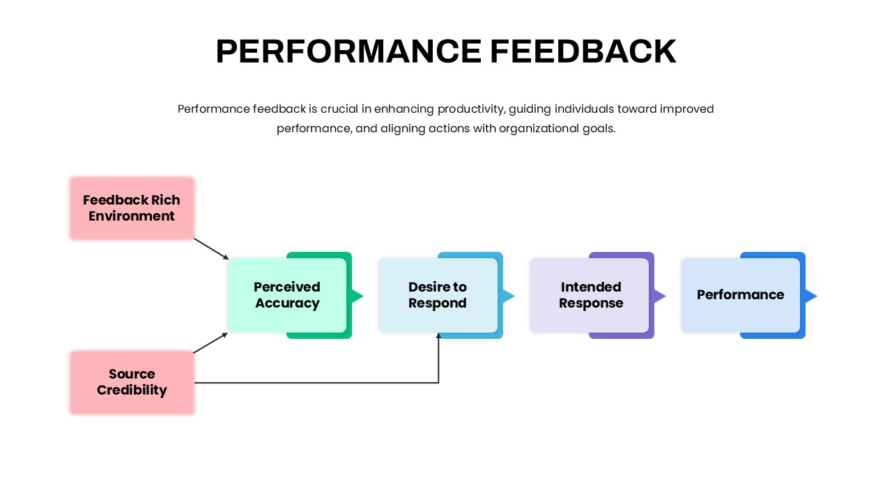
Performance Feedback Model for PowerPoint & Google Slides
Employee Performance
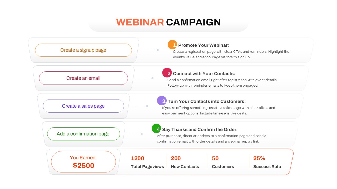
Webinar Campaign Steps and Performance for PowerPoint & Google Slides
Advertising
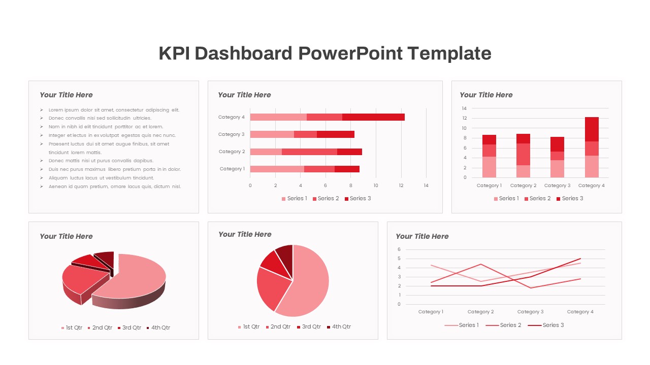
Free KPI Dashboard PowerPoint Template for PowerPoint & Google Slides
Charts
Free
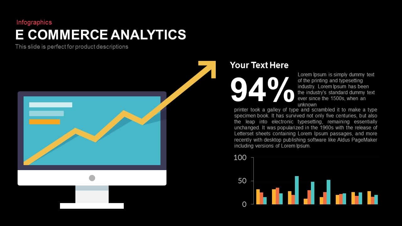
E-commerce Analytics Dashboard Template for PowerPoint & Google Slides
Bar/Column

Dynamic Data Dashboard Infographic Template for PowerPoint & Google Slides
Bar/Column
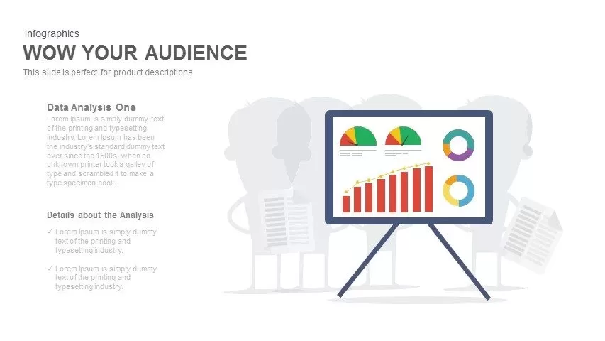
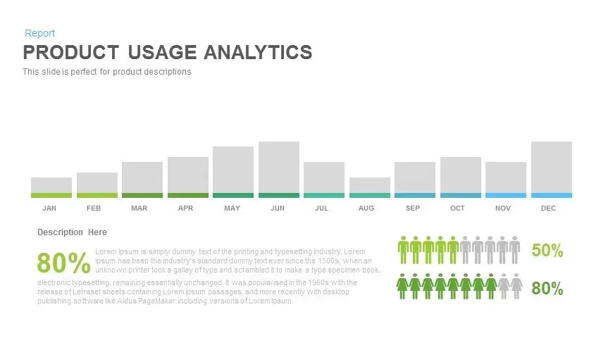
Product Usage Analytics Dashboard Chart Template for PowerPoint & Google Slides
Bar/Column
Data Analytics Dashboard Design template for PowerPoint & Google Slides
Bar/Column
Business Dashboard Analytics & KPIs Template for PowerPoint & Google Slides
Bar/Column
Professional Team Efficiency Dashboard Template for PowerPoint & Google Slides
Business Report
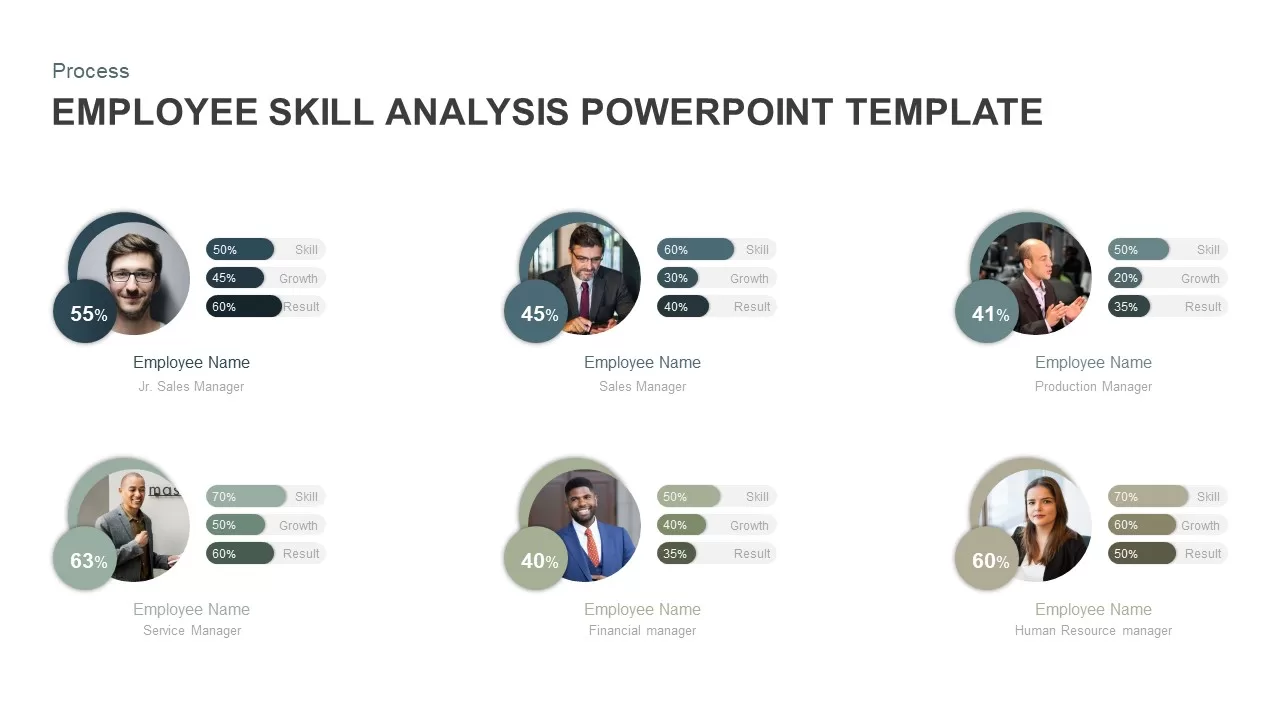
Employee Skill Analysis Dashboard Template for PowerPoint & Google Slides
Employee Performance

Net Promoter Score Dashboard Template for PowerPoint & Google Slides
Customer Experience
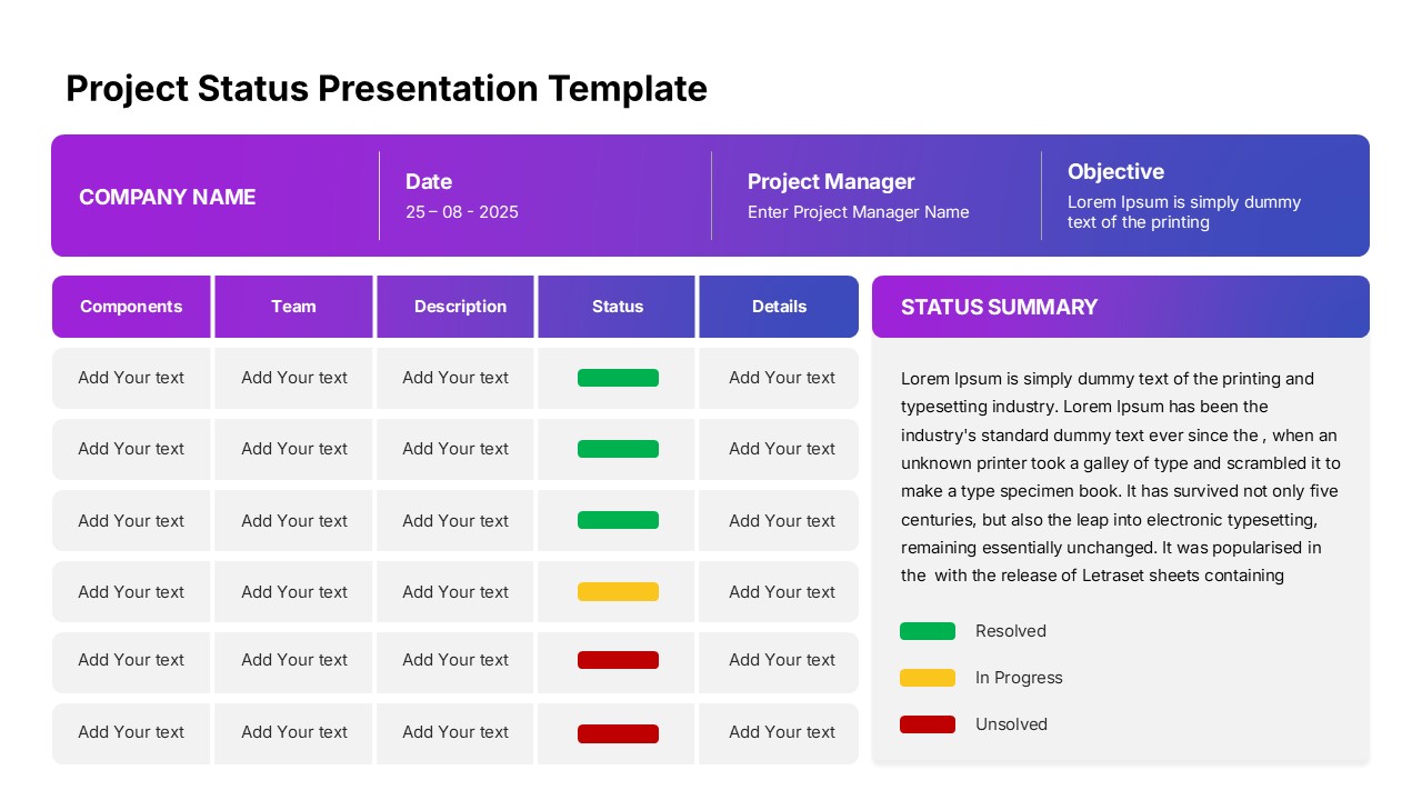
Modern Project Status Report Dashboard Template for PowerPoint & Google Slides
Project Status
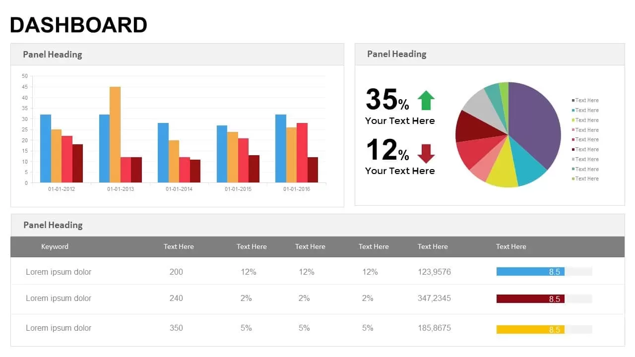
KPI Dashboard template for PowerPoint & Google Slides
Business Report
KPI Dashboard Data Visualization Template for PowerPoint & Google Slides
Bar/Column
KPI Dashboard Data Overview Slide Template for PowerPoint & Google Slides
Bar/Column
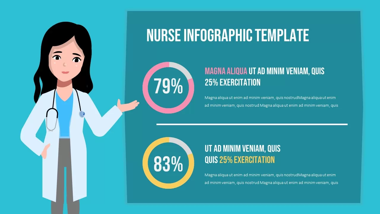
Professional Nurse Infographic Dashboard Template for PowerPoint & Google Slides
Nursing
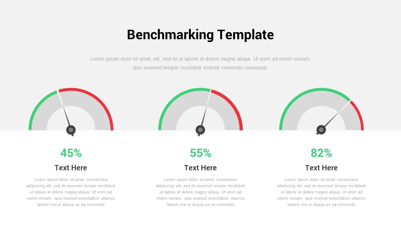
Interactive Benchmarking Gauge Dashboard Template for PowerPoint & Google Slides
Pie/Donut
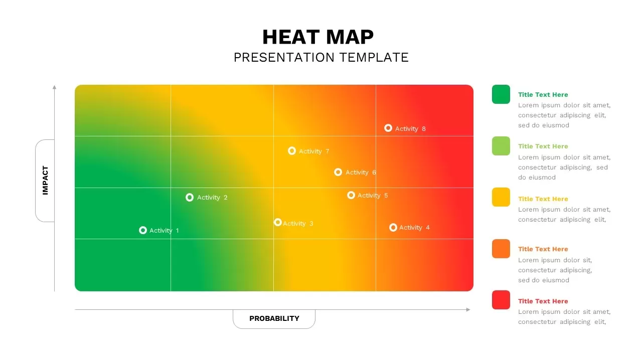
Heat Map Risk Matrix Dashboard Template for PowerPoint & Google Slides
Comparison Chart
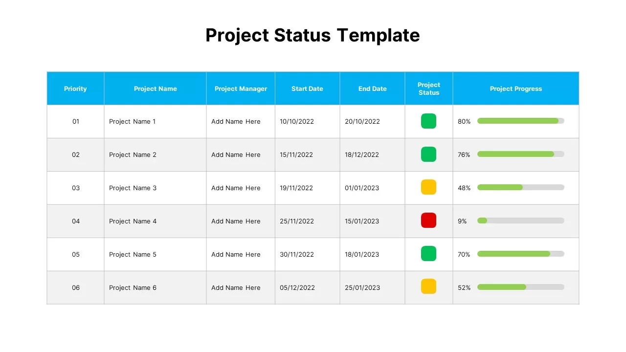
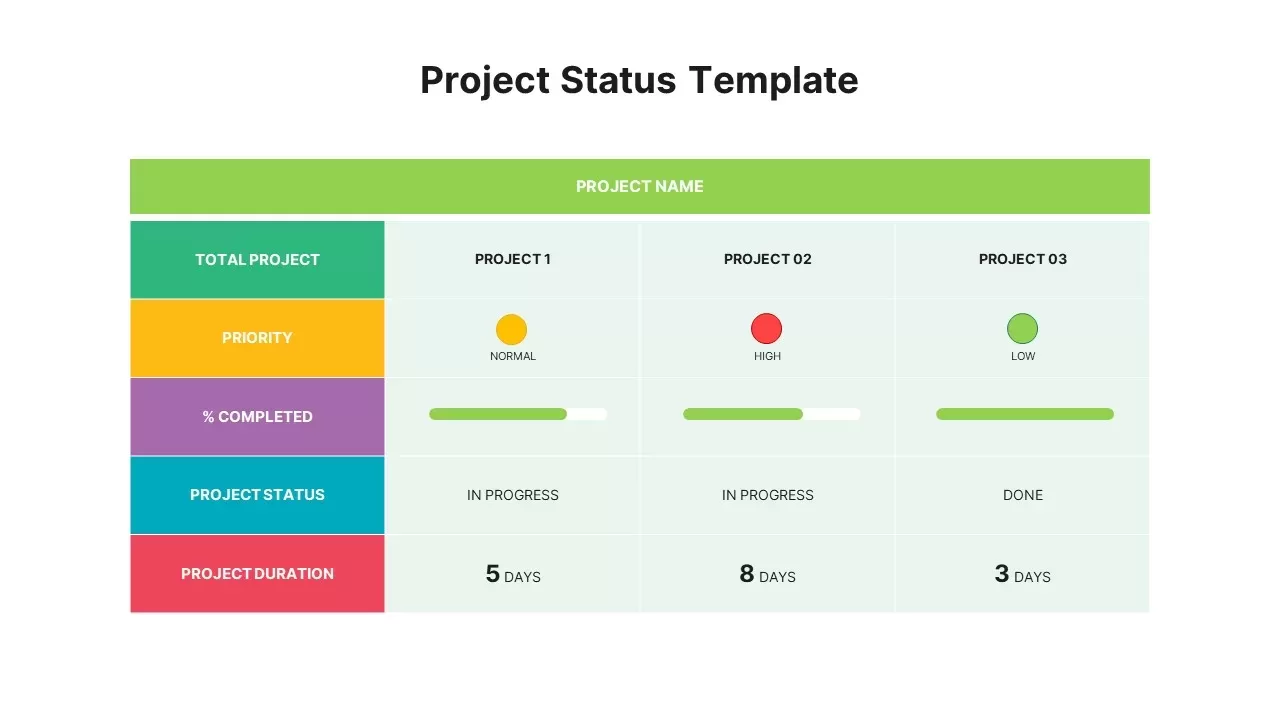
Project Status Dashboard Table Template for PowerPoint & Google Slides
Project Status
Project Status Dashboard with Metrics Template for PowerPoint & Google Slides
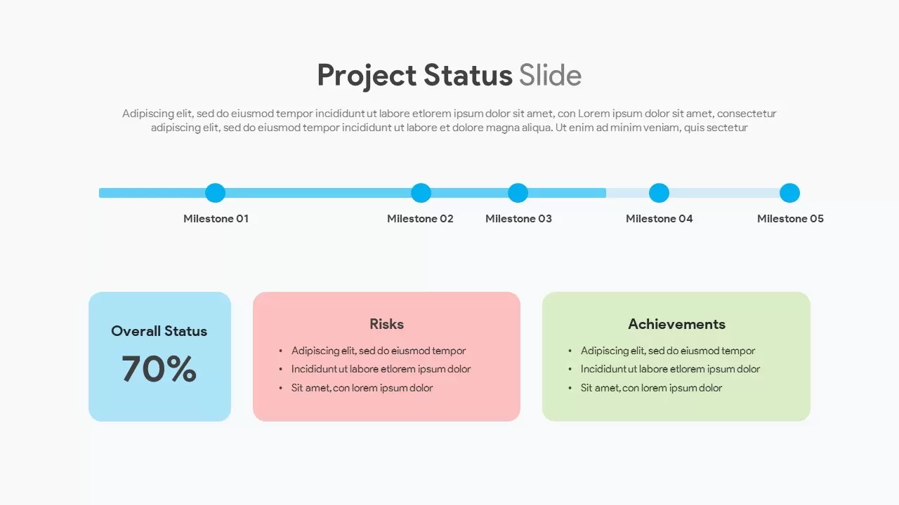
Project Status
Colorful Project Status Dashboard Template for PowerPoint & Google Slides
Project Status
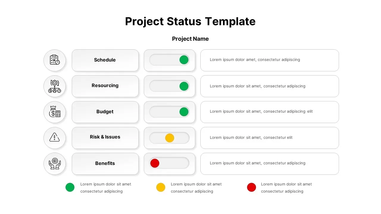
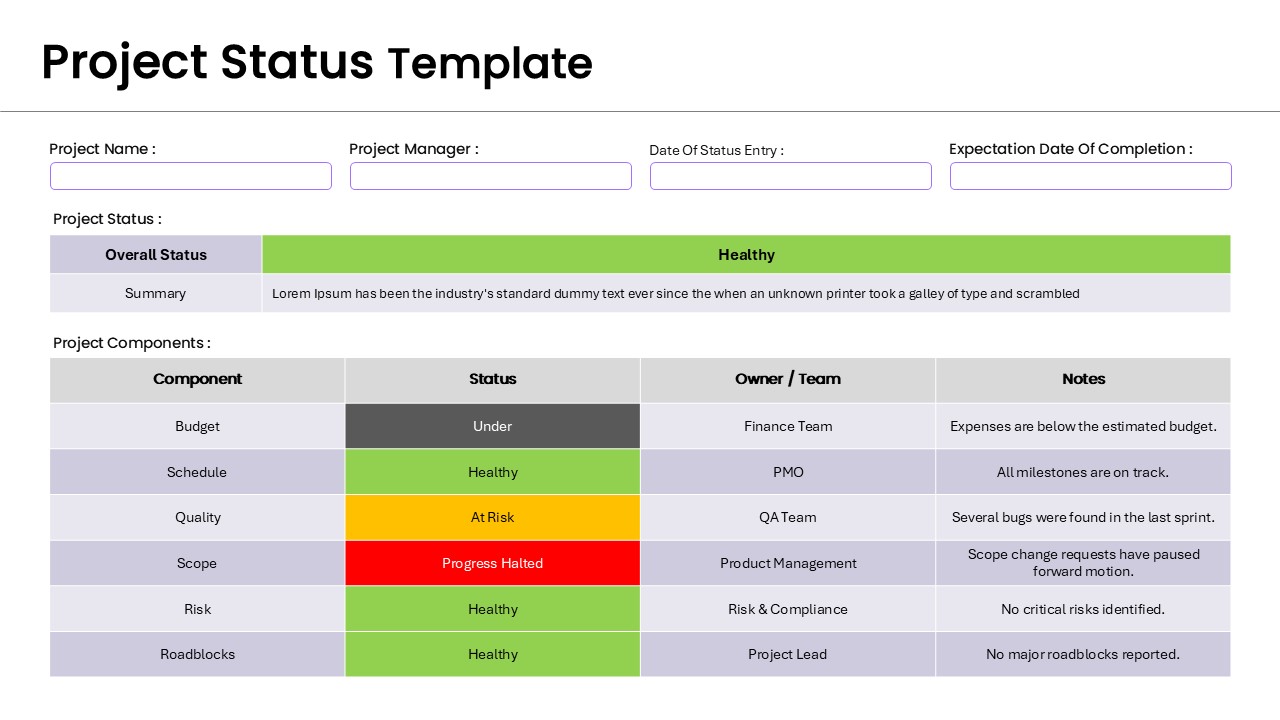
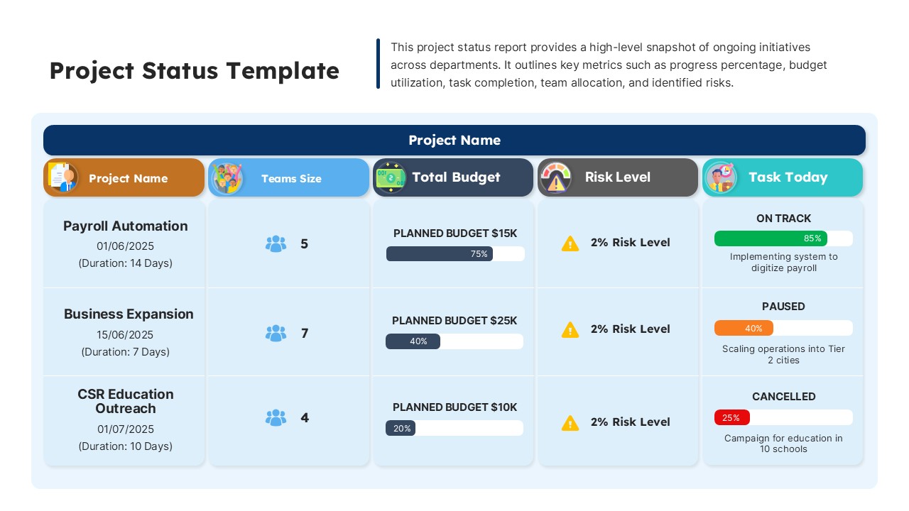
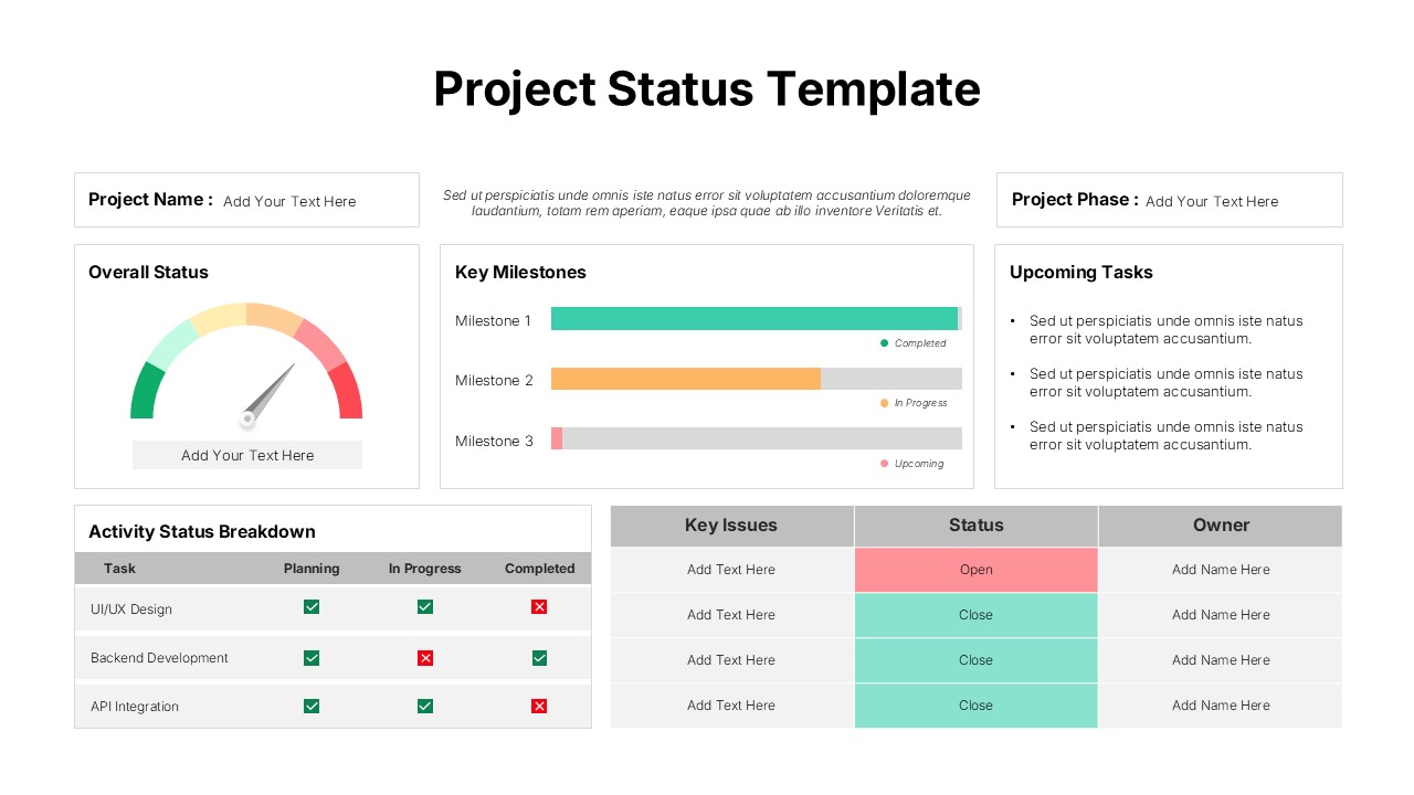
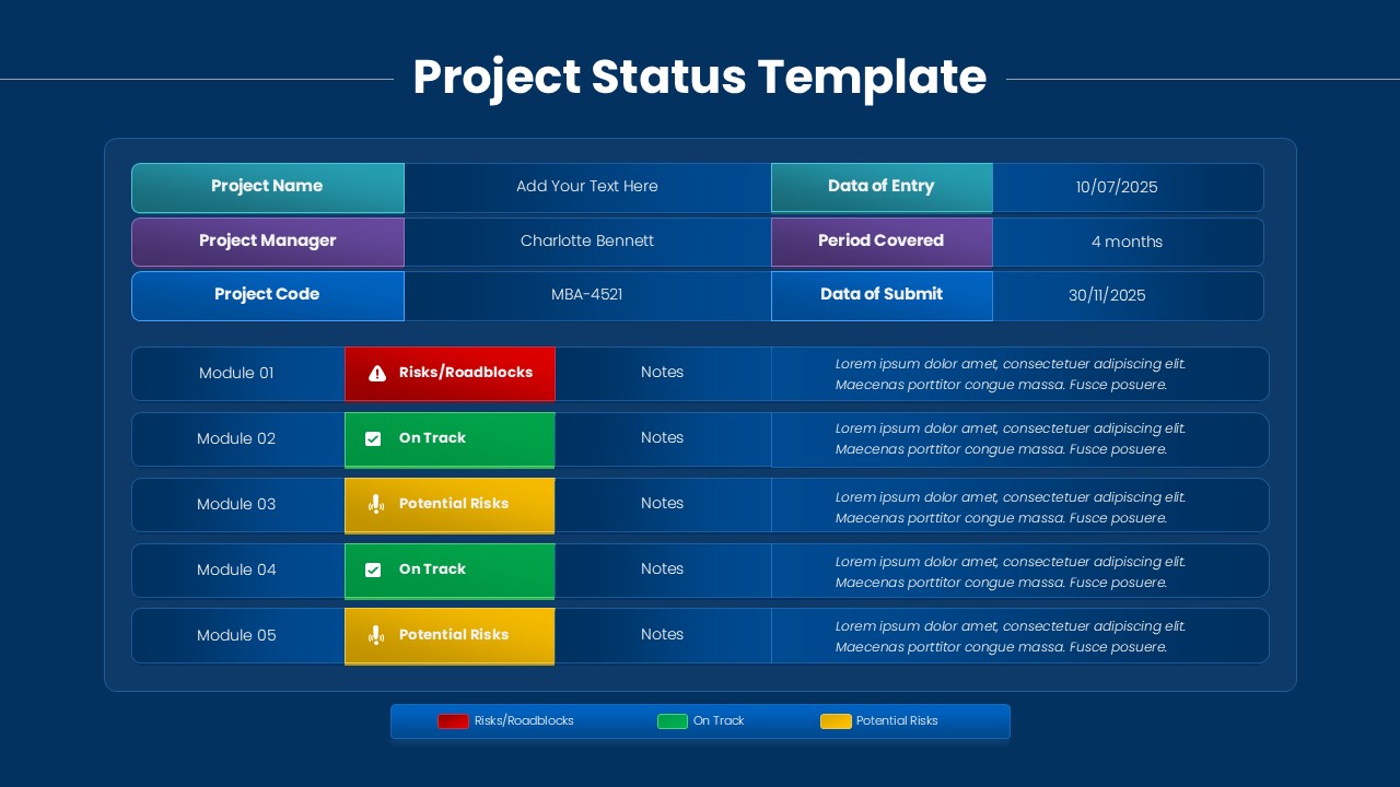
Project Status Dashboard Template for PowerPoint & Google Slides
Project Status
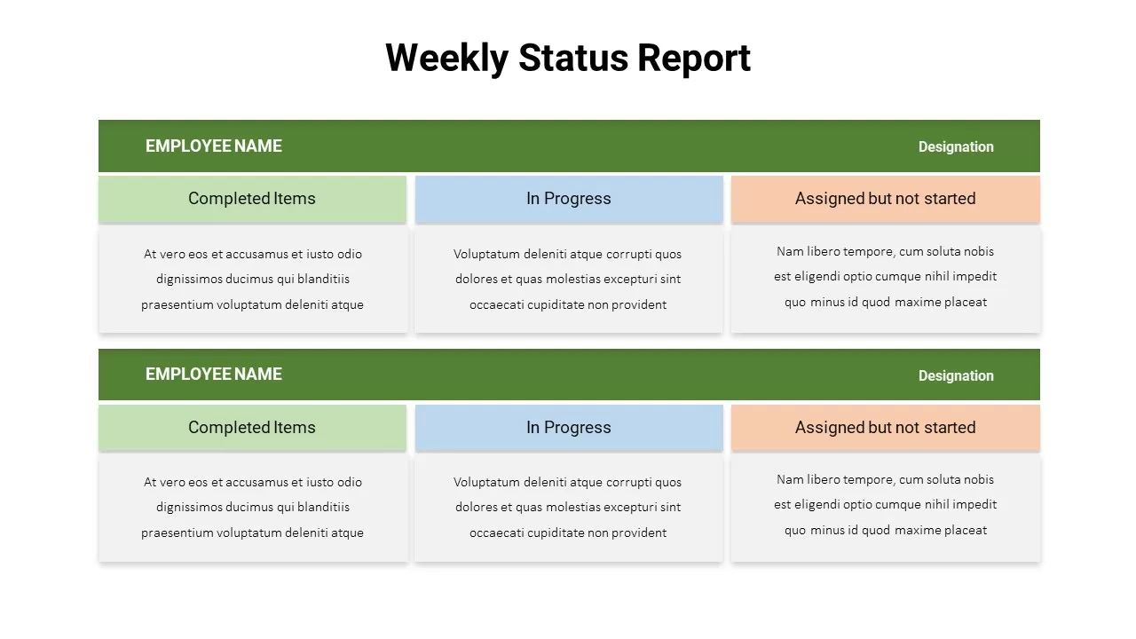
Weekly Status Report Dashboard Template for PowerPoint & Google Slides
HR
Free Metro UI Dashboard Infographic Template for PowerPoint & Google Slides
Business Report
Free
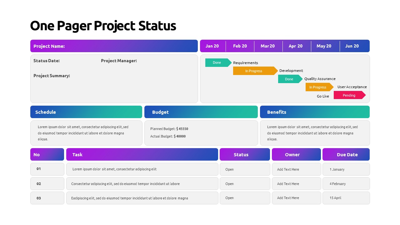
One Pager Project Status Dashboard Template for PowerPoint & Google Slides
Project Status
One Pager Annual Report Dashboard Template for PowerPoint & Google Slides
Business Report
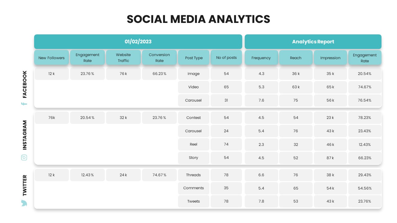
Social Media Analytics Dashboard Template for PowerPoint & Google Slides
Digital Marketing
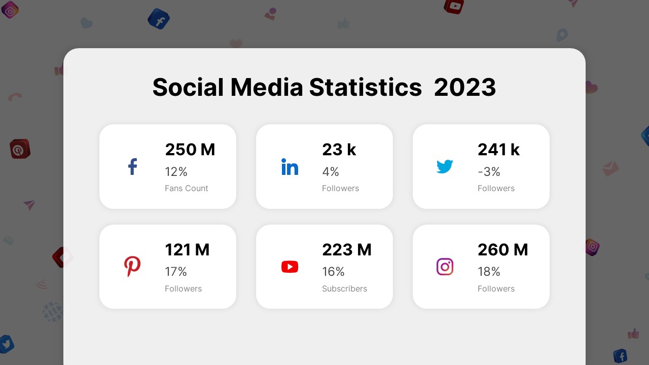
Social Media Statistics 2023 Dashboard Template for PowerPoint & Google Slides
Comparison
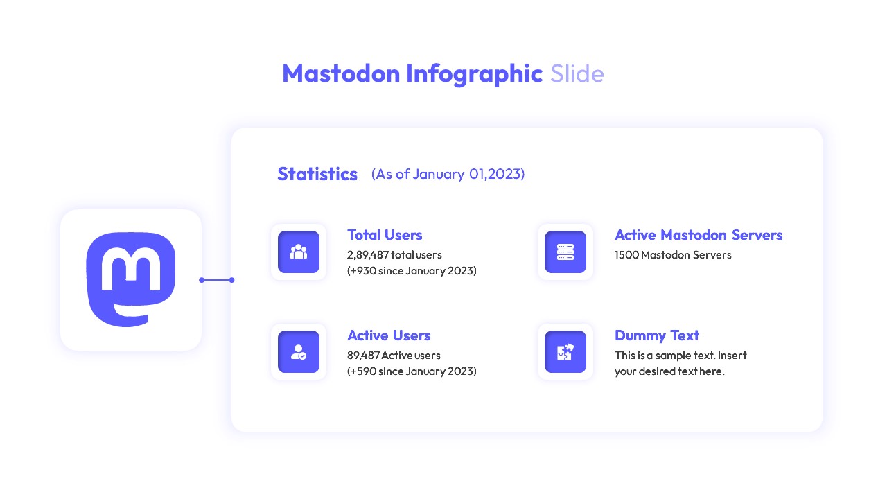
Mastodon Metrics Infographic Dashboard Template for PowerPoint & Google Slides
Business Report
Soccer Match Stats Dashboard Slide Template for PowerPoint & Google Slides
Graphics
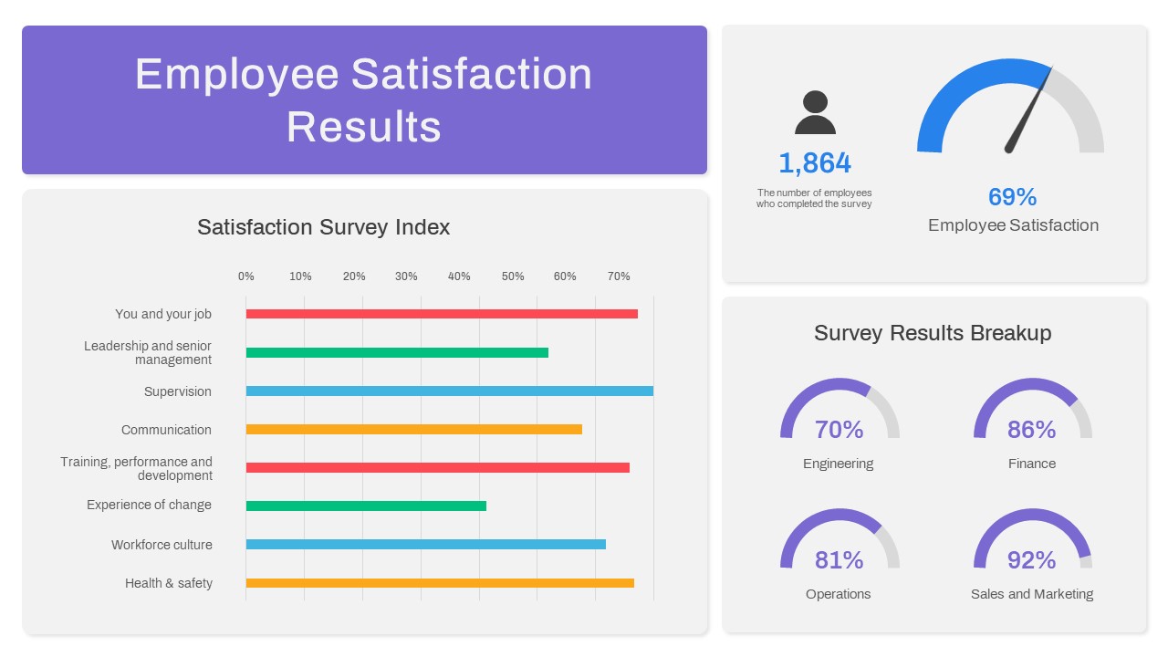
Employee Satisfaction Survey Dashboard Template for PowerPoint & Google Slides
Employee Performance
Customer Satisfaction KPI Dashboard Template for PowerPoint & Google Slides
Customer Experience
Weekly Project Status Dashboard Template for PowerPoint & Google Slides
Project Status
Freight Logistics Dashboard Infographic Template for PowerPoint & Google Slides
Comparison Chart
Free Quarterly Business Review Dashboard Template for PowerPoint & Google Slides
Business
Free
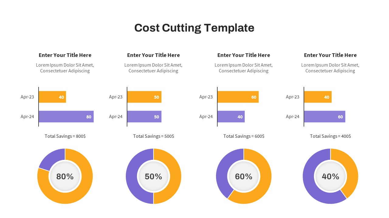
Cost Cutting Savings Dashboard Template for PowerPoint & Google Slides
Pie/Donut
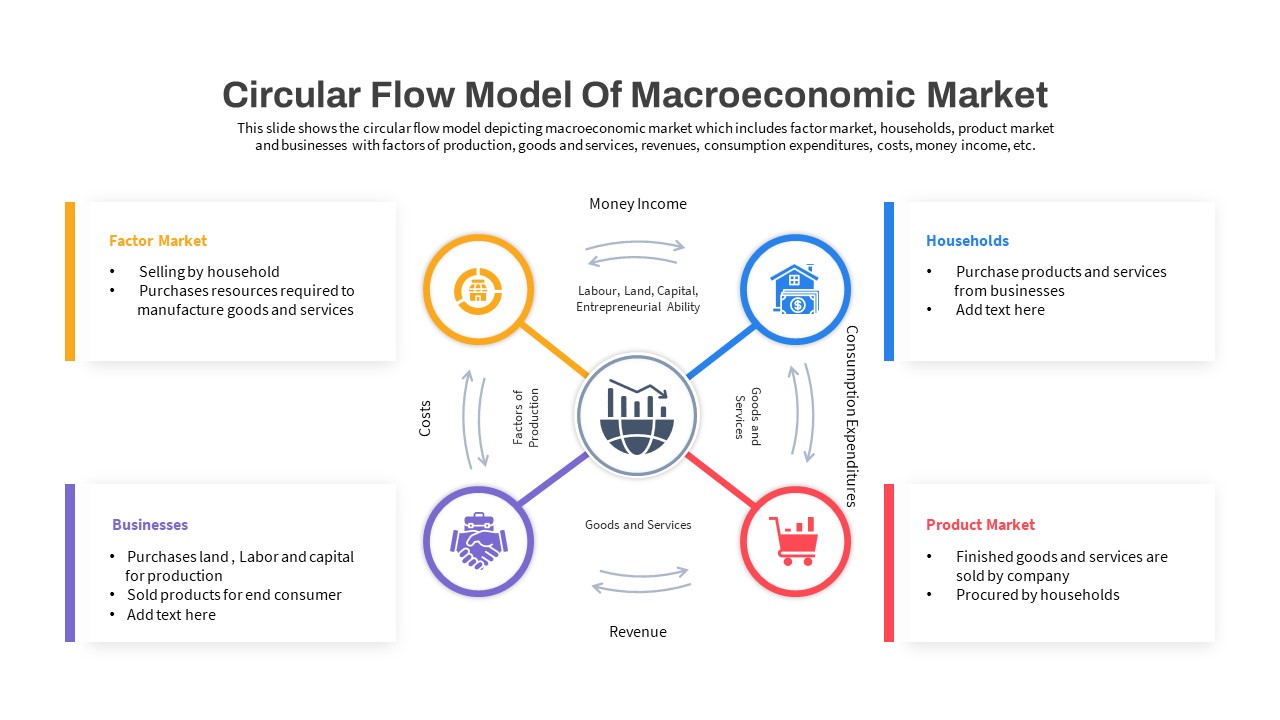
Macroeconomic Indicators Dashboard Template for PowerPoint & Google Slides
PEST
Free Monthly Report PowerPoint Template for PowerPoint & Google Slides
Business Report
Free
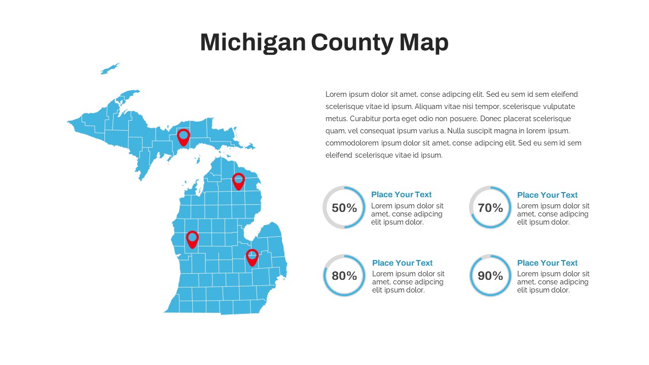
Michigan County Map with KPI Dashboard Template for PowerPoint & Google Slides
World Maps
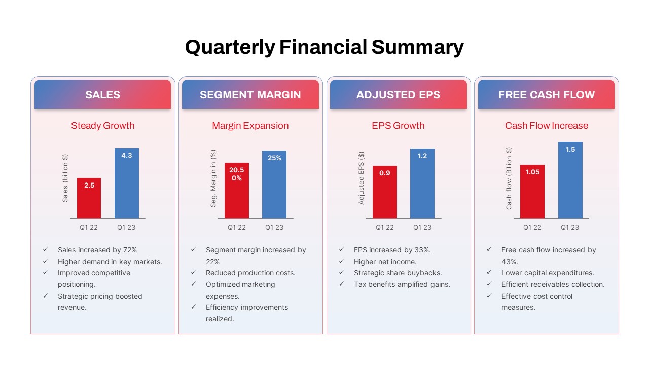
Quarterly Financial Summary Dashboard Template for PowerPoint & Google Slides
Business Report
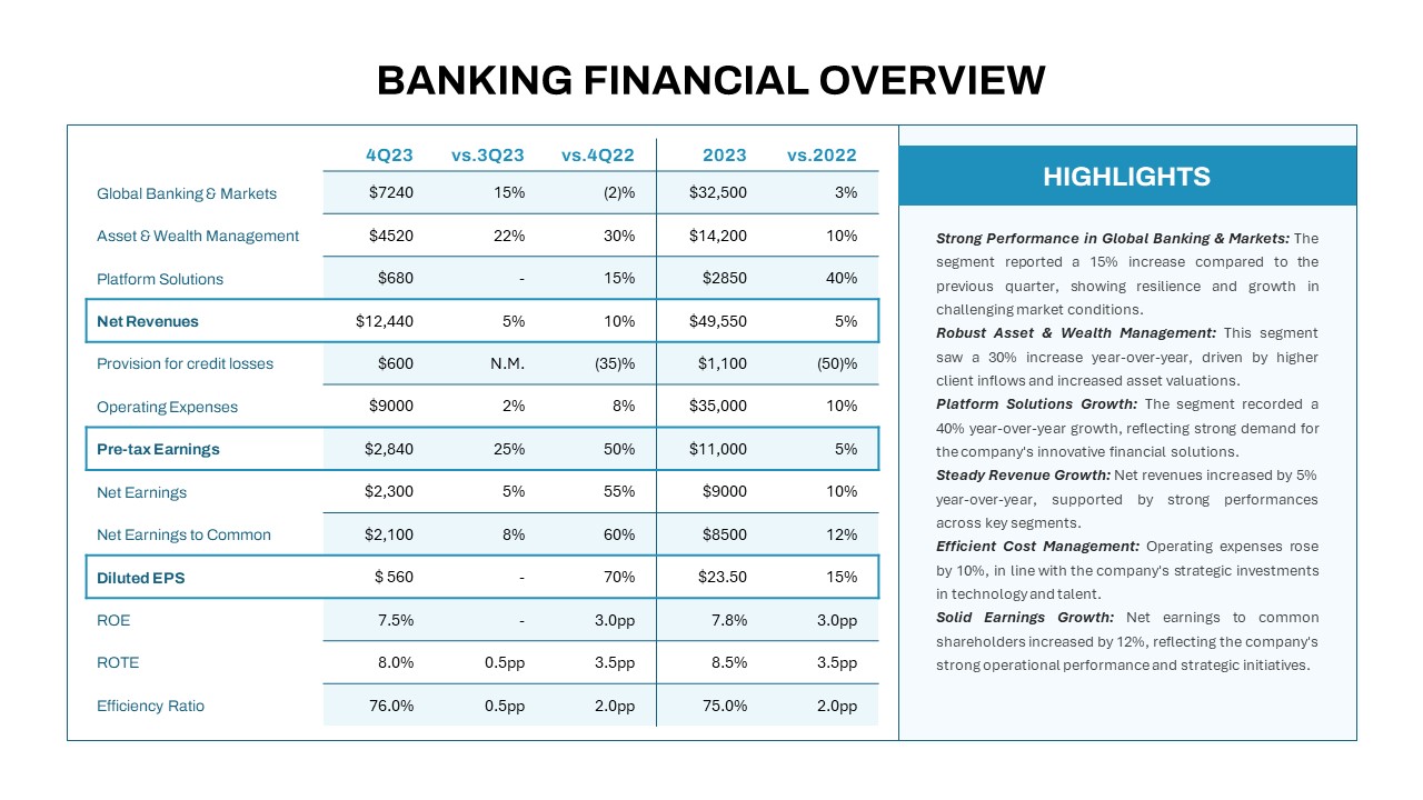
Banking Financial Overview Dashboard Template for PowerPoint & Google Slides
Finance
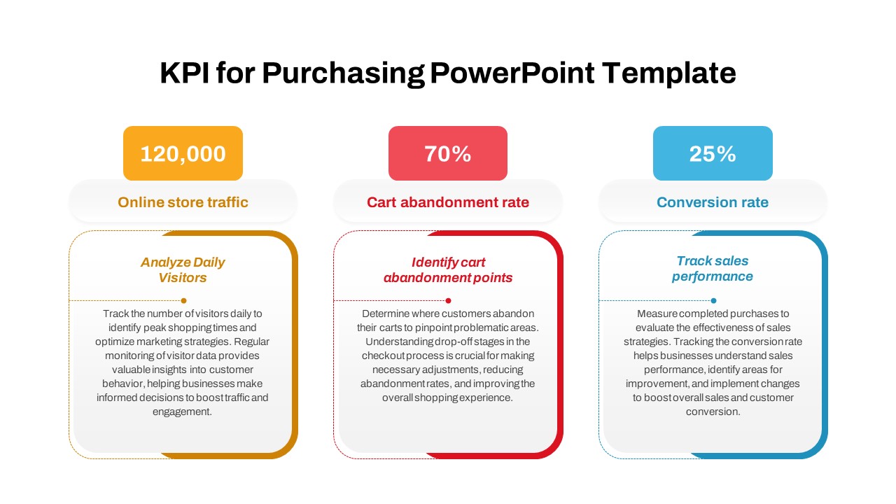
Purchasing KPI Metrics Dashboard Template for PowerPoint & Google Slides
Business Report
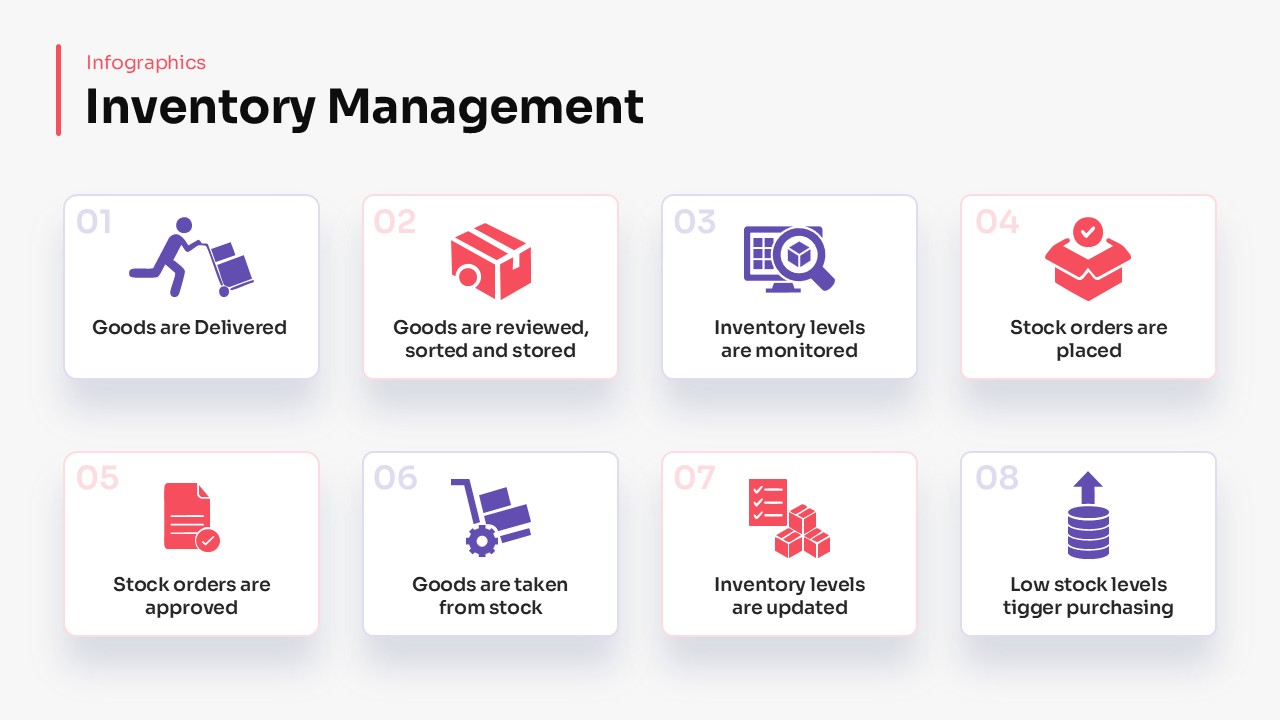
Inventory Management Dashboard Template for PowerPoint & Google Slides
Process
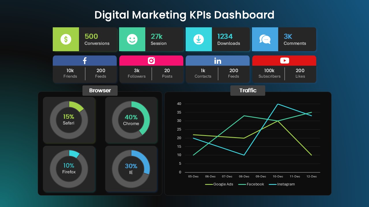
Digital Marketing KPIs Dashboard Dark Template for PowerPoint & Google Slides
Business Report
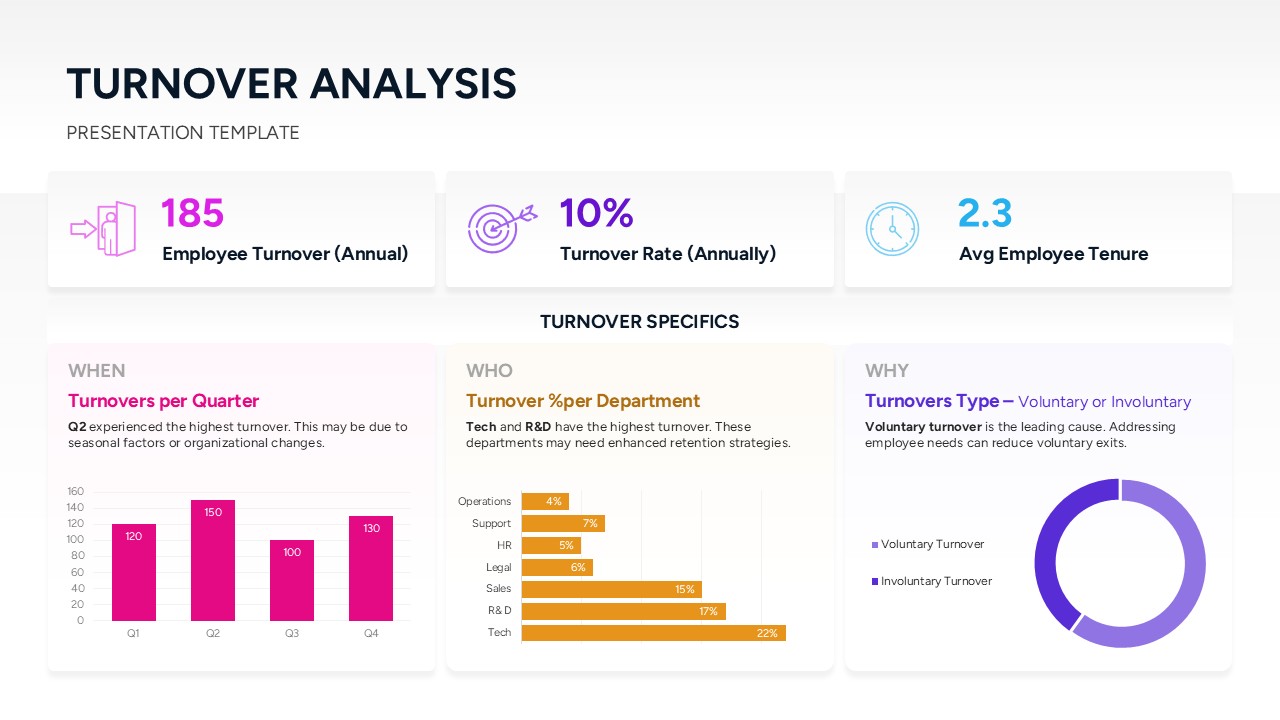
Turnover Analysis Dashboard Template for PowerPoint & Google Slides
Employee Performance
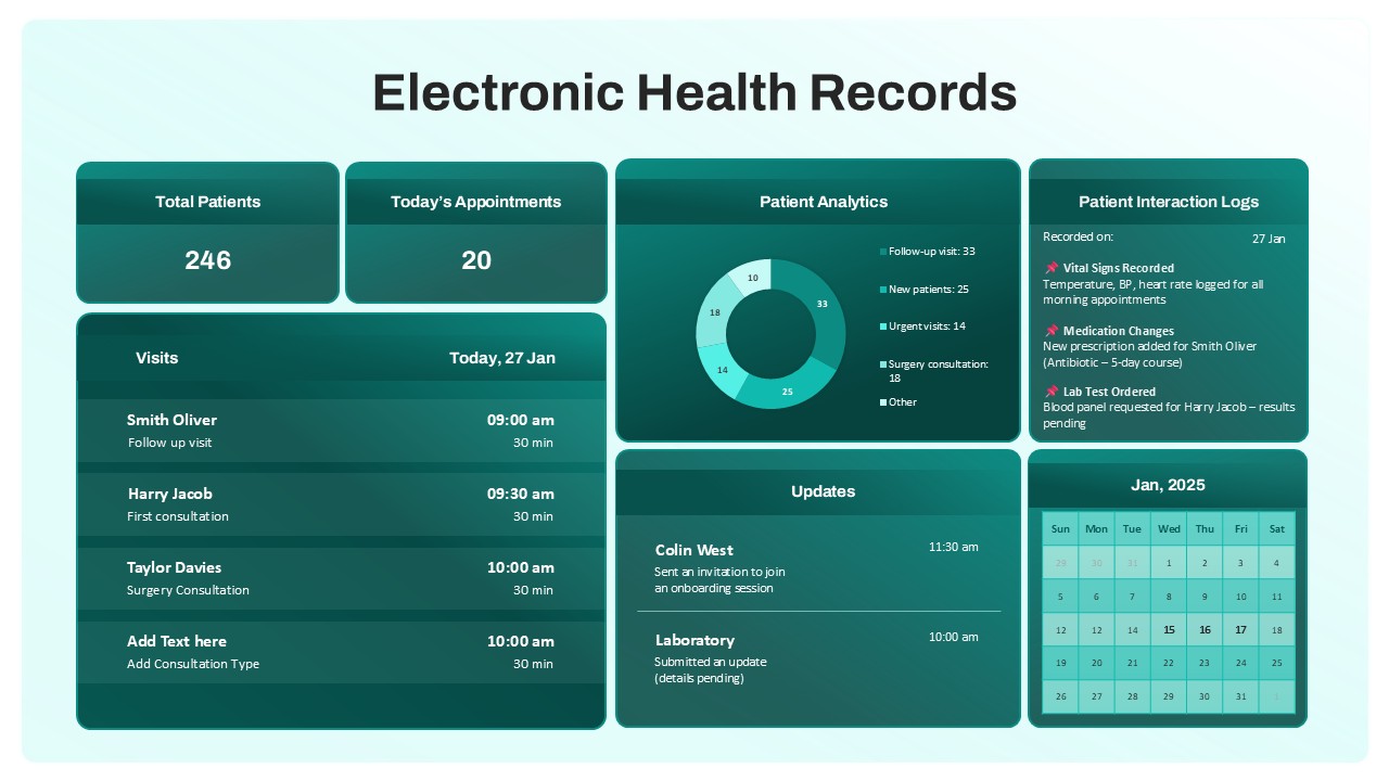
Electronic Health Records Dashboard template for PowerPoint & Google Slides
Health
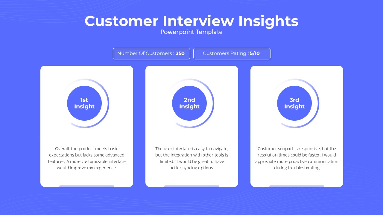
Customer Interview Insights Dashboard Template for PowerPoint & Google Slides
Customer Experience
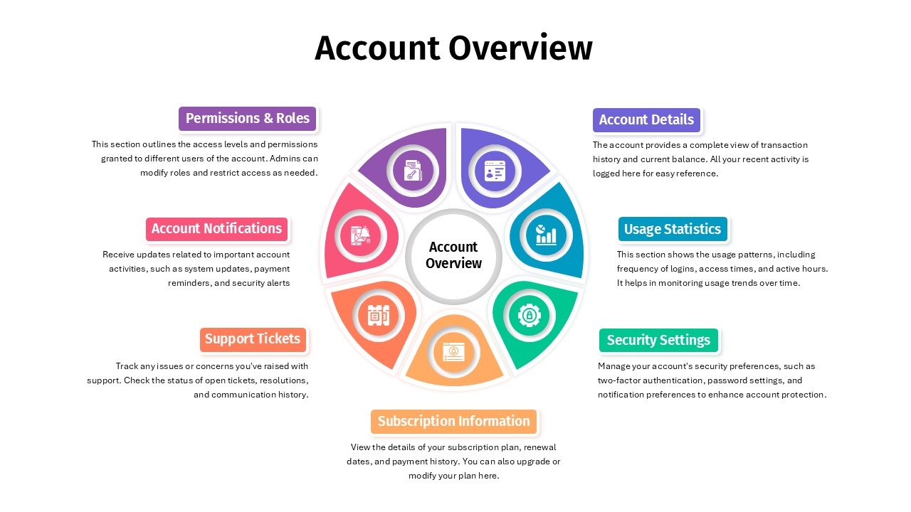
Account Overview Dashboard template for PowerPoint & Google Slides
Business
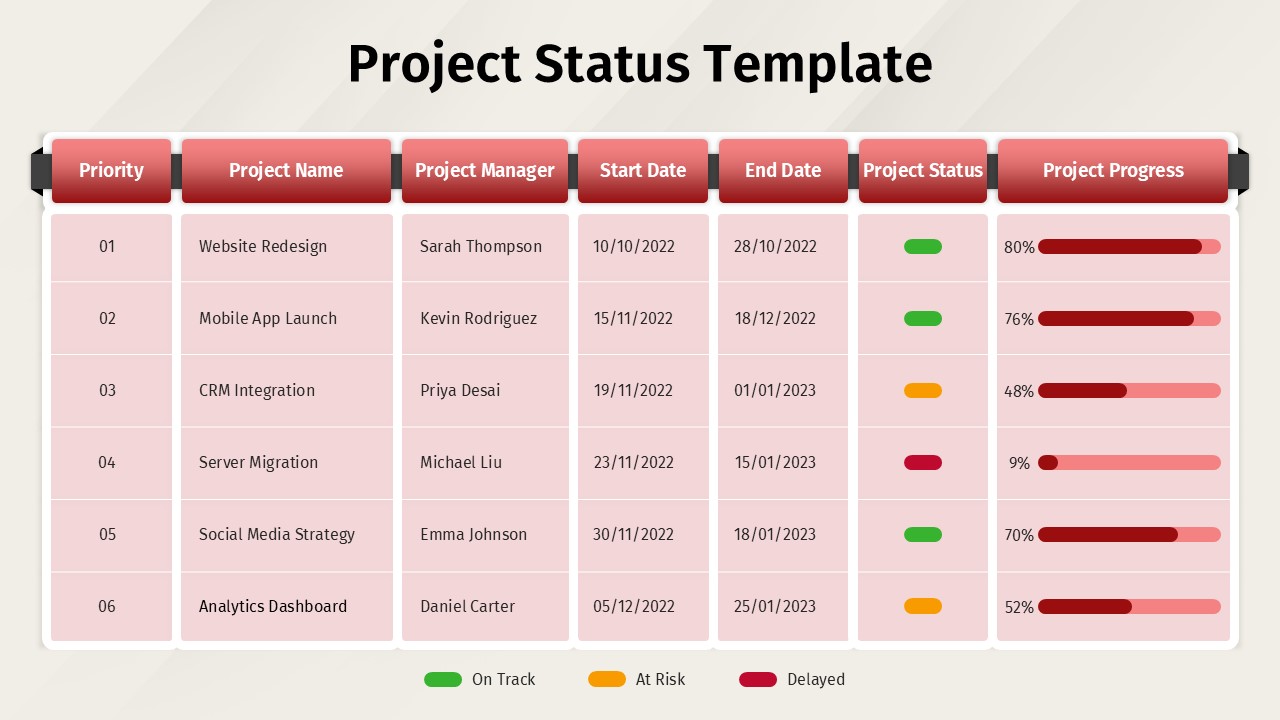
Project Status Dashboard Report Template for PowerPoint & Google Slides
Project Status
Project Status Update Dashboard Table Template for PowerPoint & Google Slides
Project Status
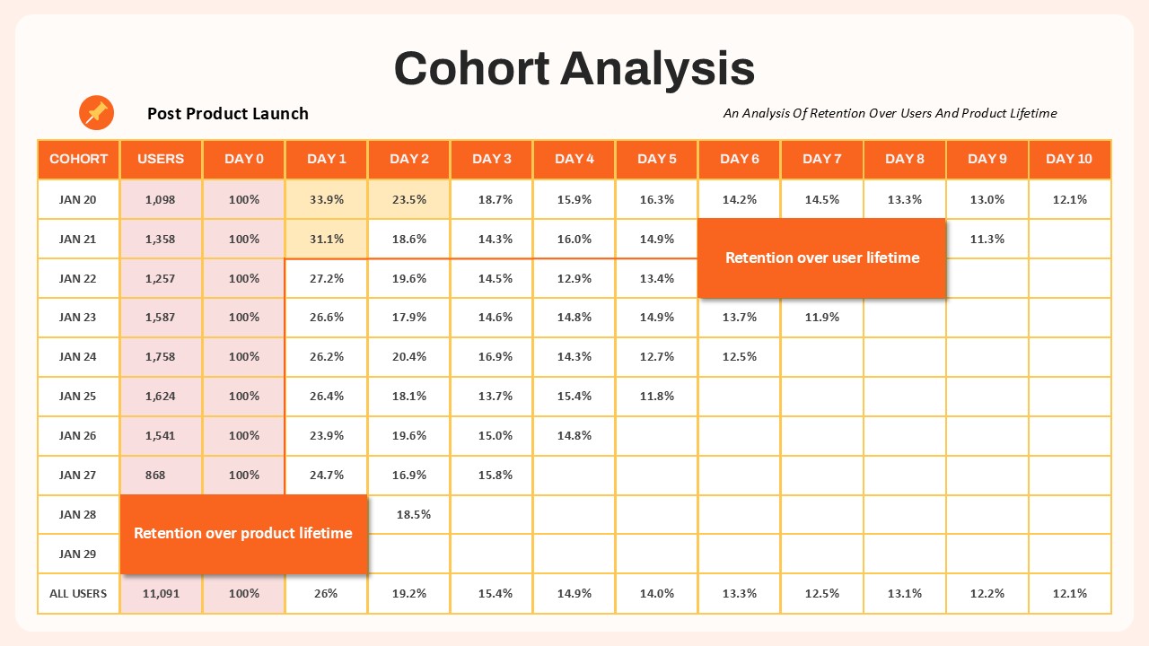
Cohort Analysis Retention Dashboard Template for PowerPoint & Google Slides
Comparison Chart
Project Status Dashboard Template for PowerPoint & Google Slides
Project Status
Dashboard Project Status Template for PowerPoint & Google Slides
Project Status
Project Status Template Dashboard with Gauge for PowerPoint & Google Slides
Project Status
Project Status Dashboard with RAG Legend Template for PowerPoint & Google Slides
Project Status
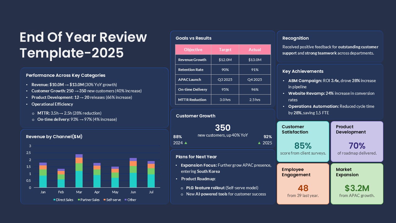
End of Year Review Dashboard Template for PowerPoint & Google Slides
Business Report
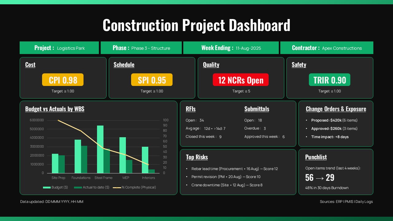
Construction Project Dashboard Template for PowerPoint & Google Slides
Project
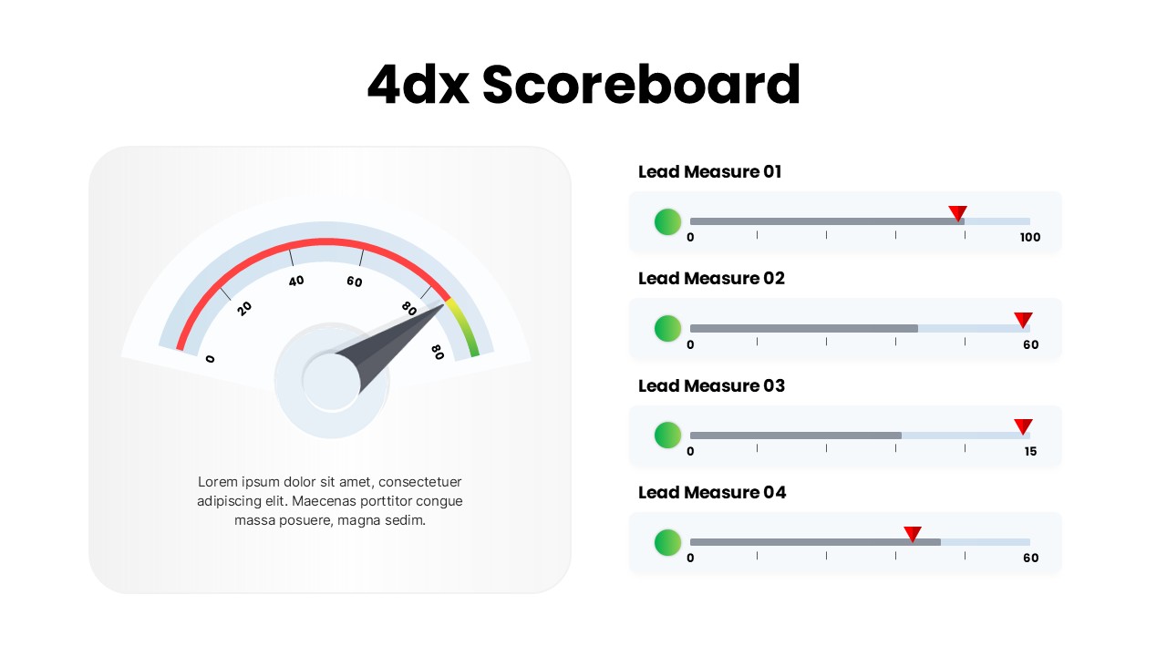
4DX Scoreboard KPI Gauge Dashboard Template for PowerPoint & Google Slides
Business Strategy