Simple Area Chart Data Trends Analysis Template for PowerPoint & Google Slides


Description
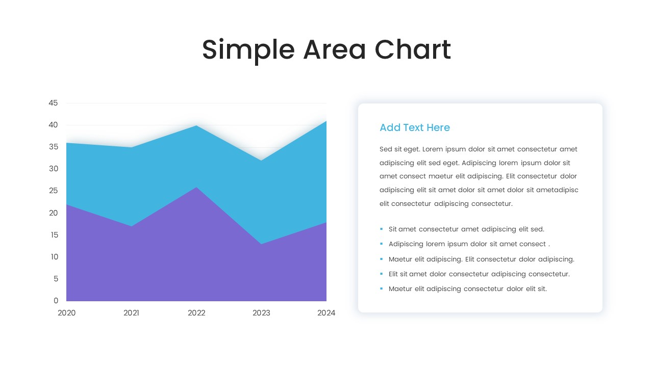
This simple area chart slide template offers a clean and versatile layout to visualize two data series across a timeline of years. Featuring a crisp white background, minimalist grid lines, and dual-color area fills for comparative analysis, the slide enables viewers to quickly grasp performance trends. A dedicated text panel with a highlighted header and bullet-list placeholders provides space for contextual insights, key takeaways, and supporting commentary. Ideal for quarterly reviews, financial overviews, or marketing analytics, each element—from chart axes and labels to color swatches and text boxes—is fully editable.
Built on a single master layout, this template grants seamless customization: update data points with Excel-linked charts or manual imports, adjust series colors to reflect brand guidelines, and modify font styles and sizes to suit presentation tone. The area shapes, grid lines, and chart markers are vector-based and easily recolored or resized without loss of clarity. The text pane supports markdown-style formatting, allowing quick adaptation of lists, highlights, or callout text for emphasis.
Optimized for both PowerPoint and Google Slides, this slide maintains high-resolution integrity across devices, ensuring consistent display from desktop to projector and web viewers. Leverage this asset to track sales growth, website traffic, customer acquisition metrics, or any time-based KPIs, and present insights with a professional, modern aesthetic. Slide placeholders make it easy to swap data, apply new color themes, or insert icons, while preserving overall layout balance. Save time on design, accelerate data storytelling, and keep audiences engaged with a polished, data-driven narrative that communicates complex information with clarity.
Who is it for
Data analysts, business intelligence professionals, and marketing managers can leverage this slide to communicate performance trends and comparative insights effectively. Consultants, financial advisors, and project leads will find the editable chart and text placeholders ideal for storytelling and stakeholder updates.
Other Uses
Beyond time-series analysis, this slide can support KPI dashboards, forecasting presentations, budget reviews, and project status updates. Use it to display survey results, website metrics, or resource allocation trends in any business or academic context.
Login to download this file

Item ID
SB03628
Related Templates

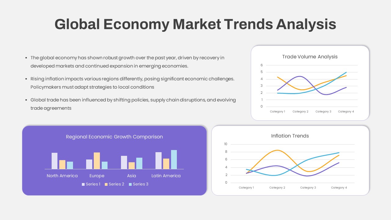
Global Economy Market Trends Analysis Template for PowerPoint & Google Slides
Comparison Chart
Simple Bar Chart Data Visualization Template for PowerPoint & Google Slides
Bar/Column
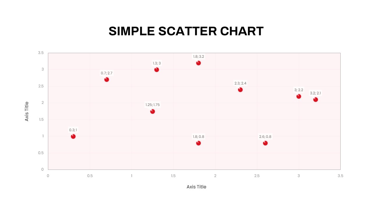
Simple Scatter Chart Analysis Template for PowerPoint & Google Slides
Comparison Chart

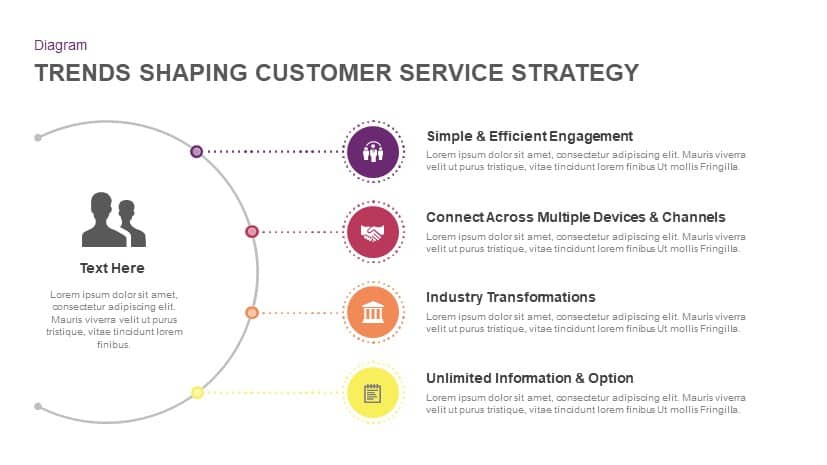
Trends Shaping Customer Service Strategy template for PowerPoint & Google Slides
Marketing
Animated Business Trends Creative Deck Template for PowerPoint & Google Slides
Pitch Deck
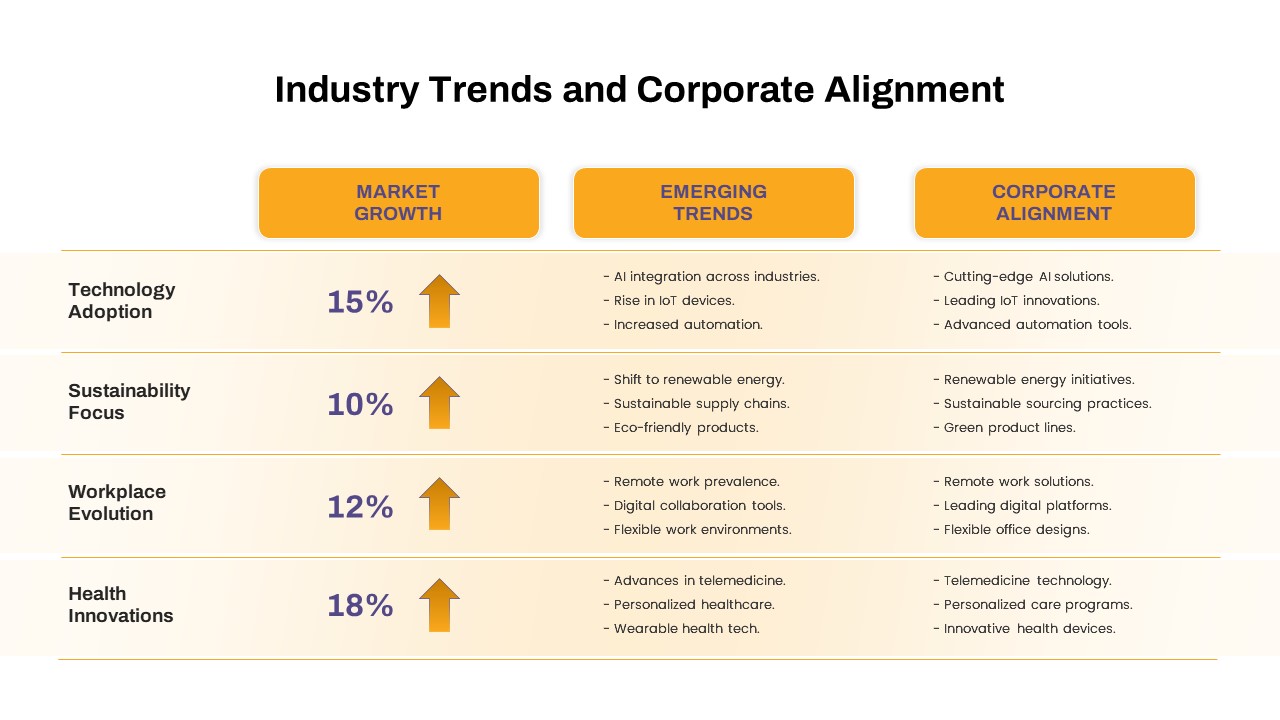
Industry Trends & Corporate Alignment Template for PowerPoint & Google Slides
Business Strategy
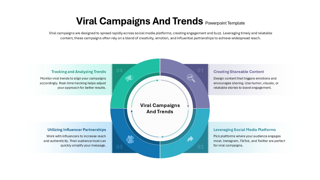
Viral Campaigns and Trends Strategy for PowerPoint & Google Slides
Advertising
Mobile Data Analysis Chart template for PowerPoint & Google Slides
Charts
Creative Data Analysis Bar Chart template for PowerPoint & Google Slides
Bar/Column
Pencil Bar Chart Data Analysis Template for PowerPoint & Google Slides
Bar/Column
Data Analysis Bar Chart with Insights Template for PowerPoint & Google Slides
Bar/Column
Free

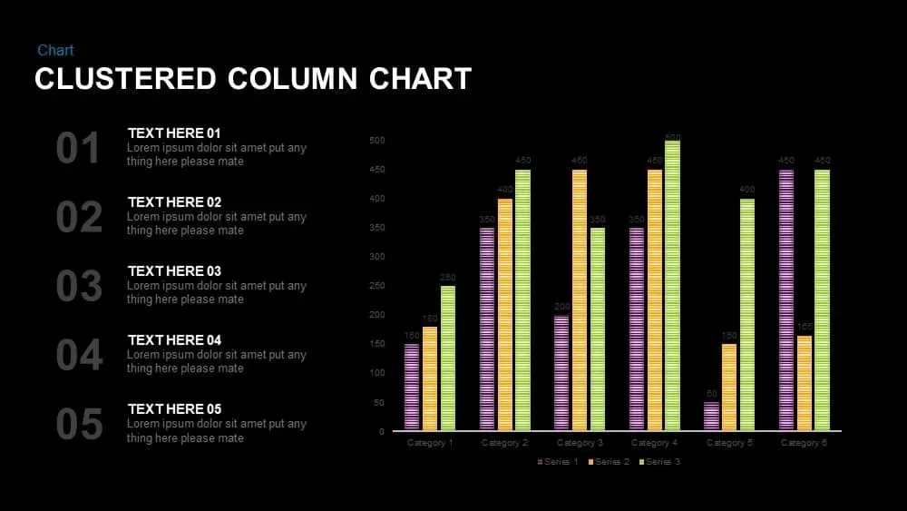
Clustered Column Chart Data Analysis Template for PowerPoint
Bar/Column
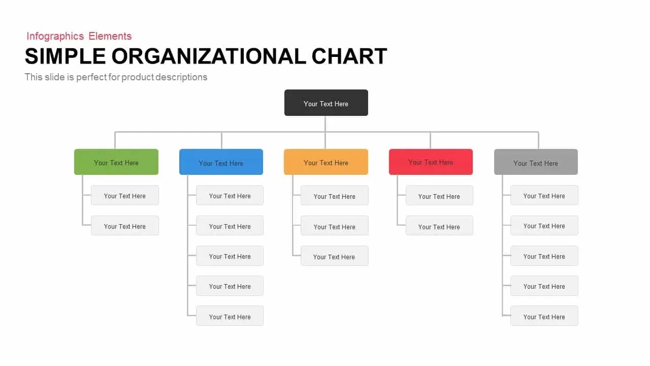
Simple Organizational Chart Infographic Template for PowerPoint & Google Slides
Org Chart
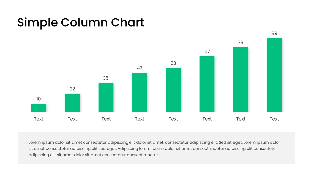
Free Editable Simple Column Chart Slide Template for PowerPoint & Google Slides
Bar/Column
Free
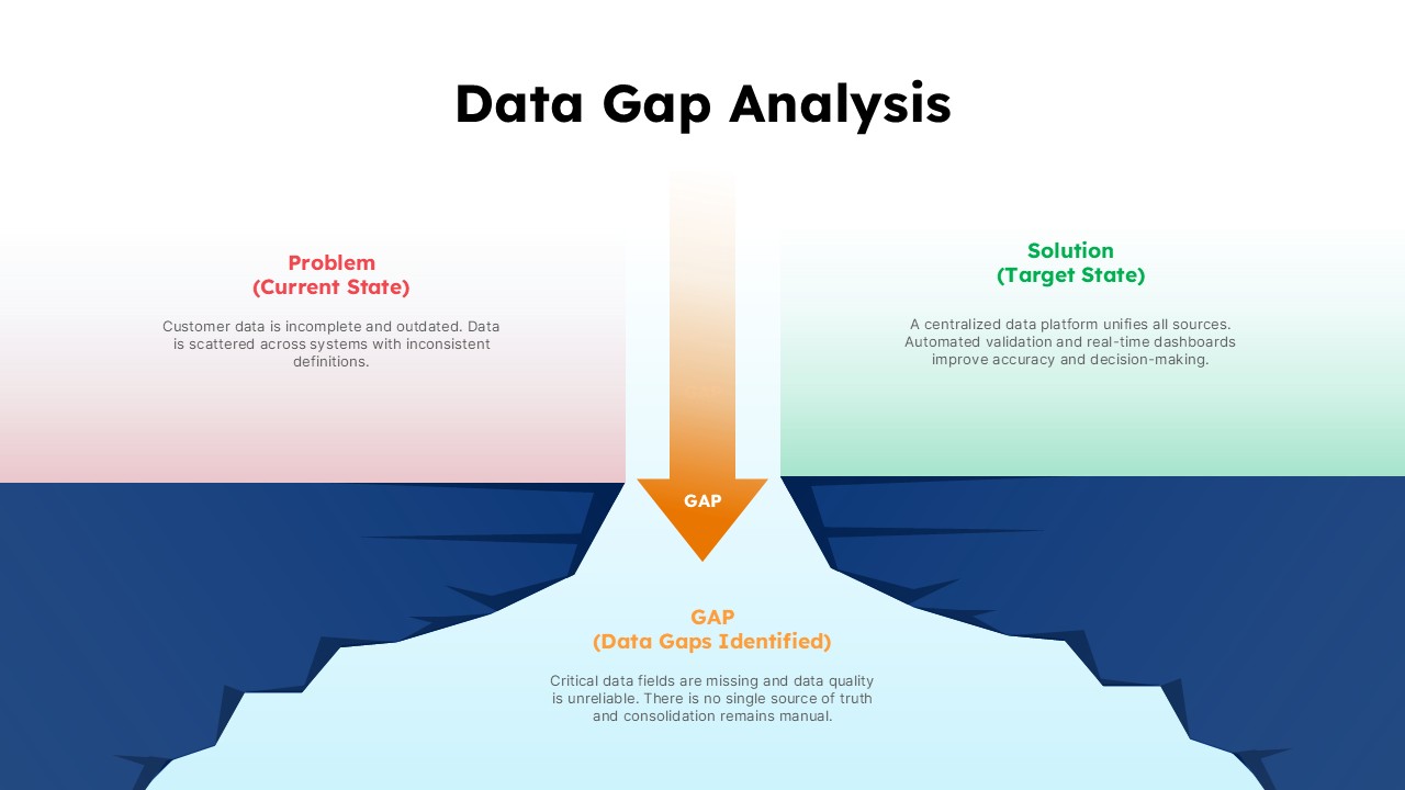
Data Gap Analysis Template for PowerPoint & Google Slides
Business
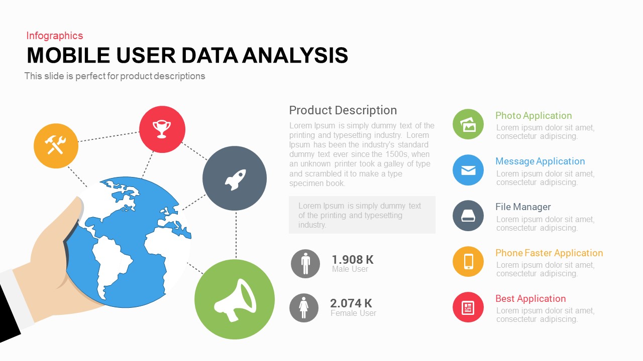
Mobile User Data Analysis Infographic for PowerPoint & Google Slides
Process
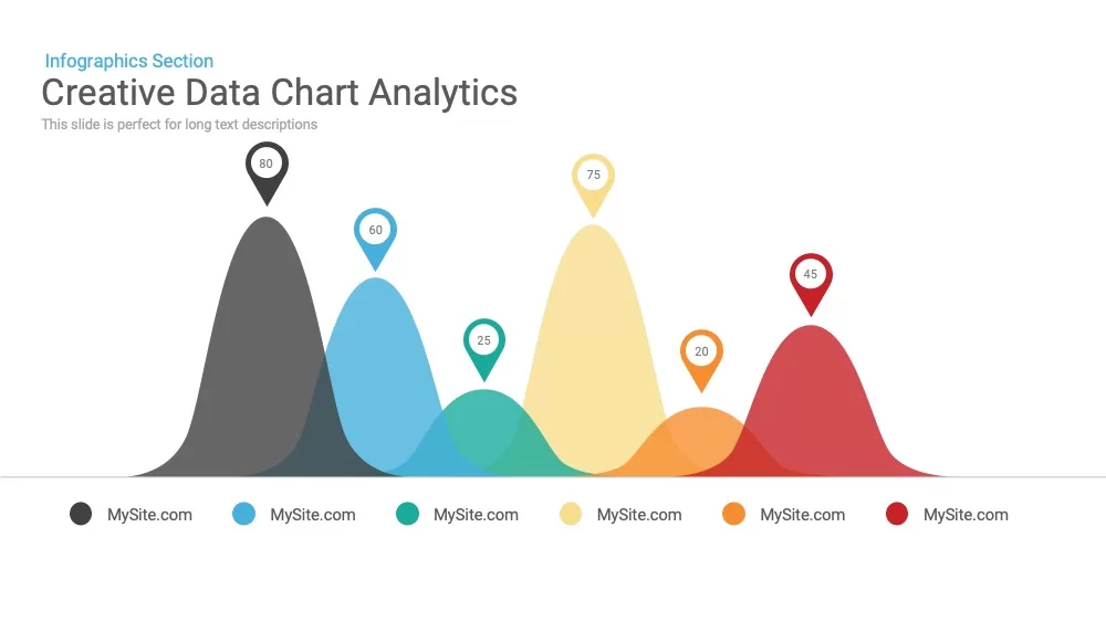
Creative data chart analytics template for PowerPoint & Google Slides
Charts
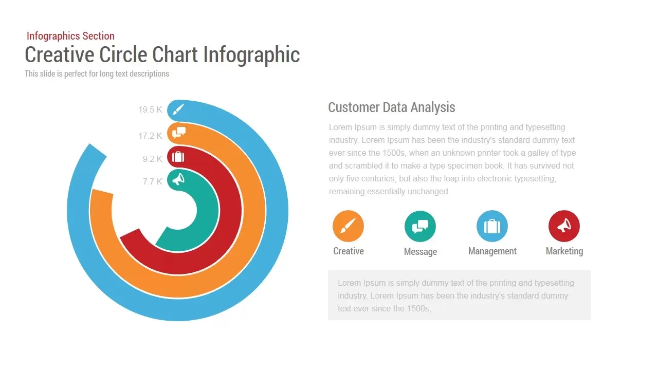
Circle Chart Data template for PowerPoint & Google Slides
Pie/Donut
3D Bar Chart Data Infographics Template for PowerPoint & Google Slides
Bar/Column
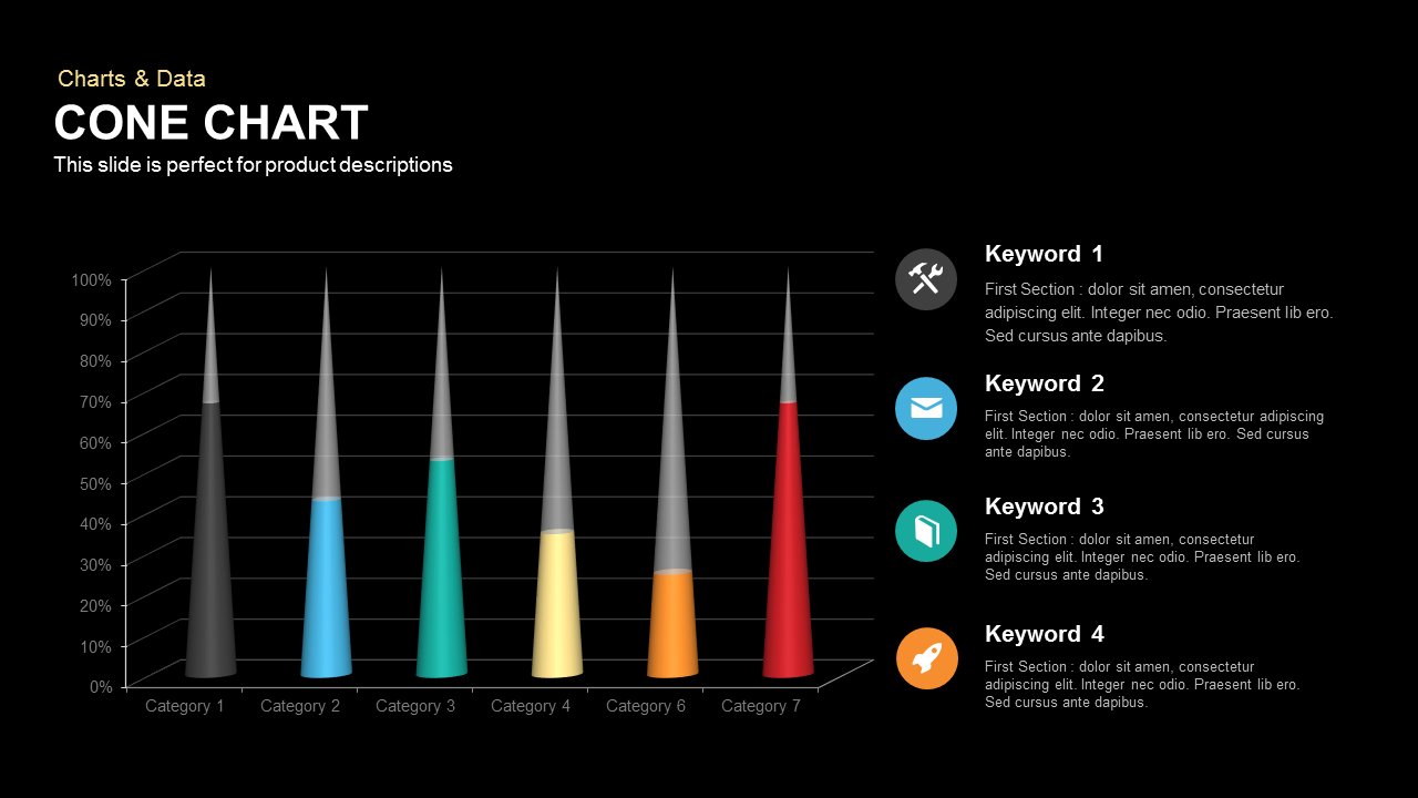
3D Cone Chart Data Visualization template for PowerPoint & Google Slides
Bar/Column
Tornado Chart Data Comparison Slide Template for PowerPoint & Google Slides
Bar/Column
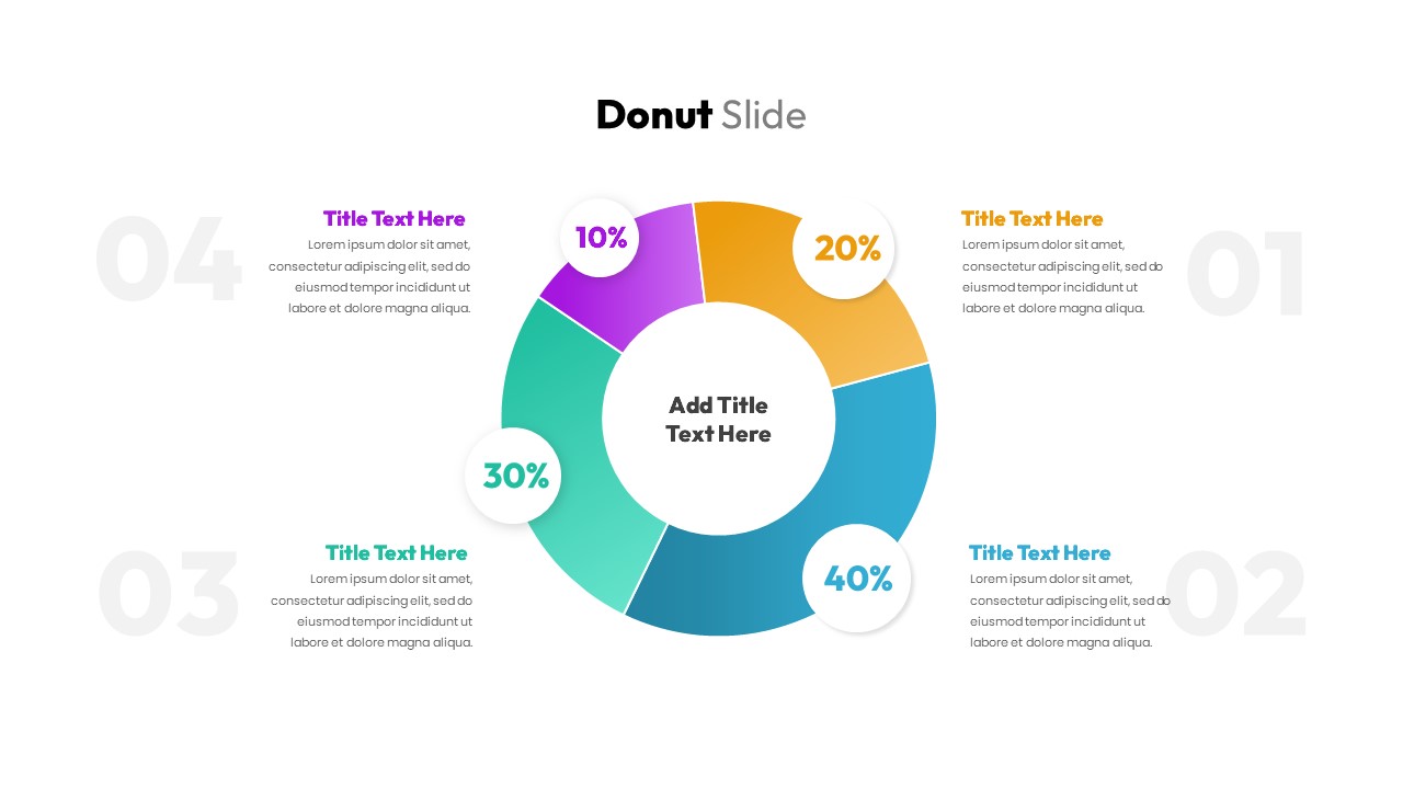
Donut Chart Data Breakdown template for PowerPoint & Google Slides
Pie/Donut
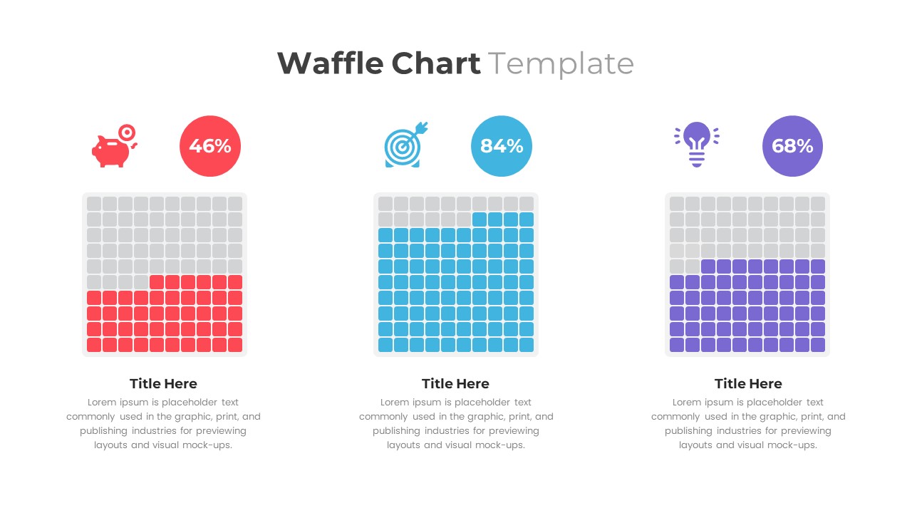
Waffle Chart Data Visualization Template for PowerPoint & Google Slides
Comparison Chart
Free Stacked Column Chart Data Visualization Template for PowerPoint & Google Slides
Bar/Column
Free
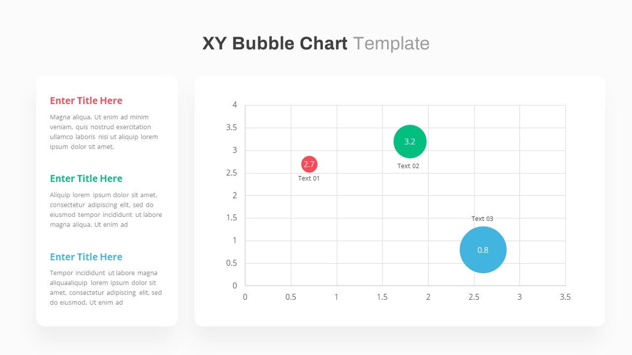
XY Bubble Chart Data Visualization Template for PowerPoint & Google Slides
Comparison Chart
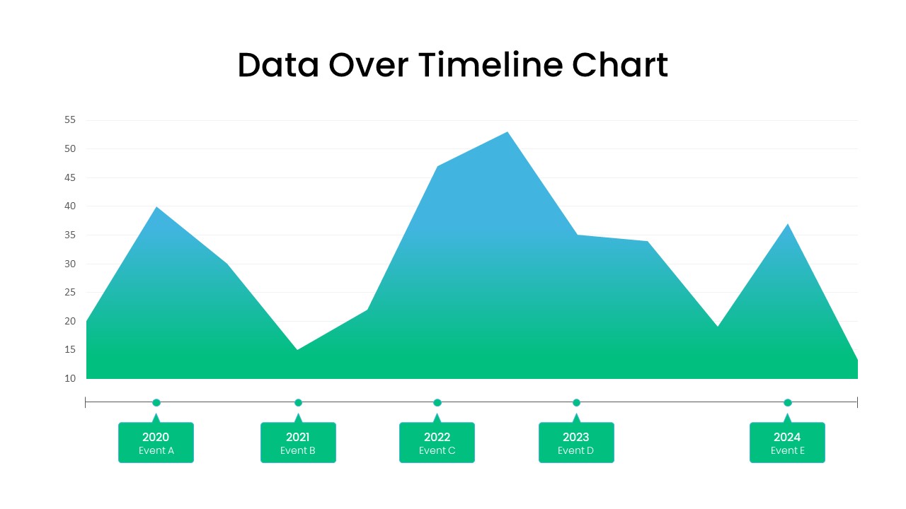
Data Over Time Line Chart template for PowerPoint & Google Slides
Charts
Waterfall Chart Data Visualization Template for PowerPoint & Google Slides
Comparison Chart
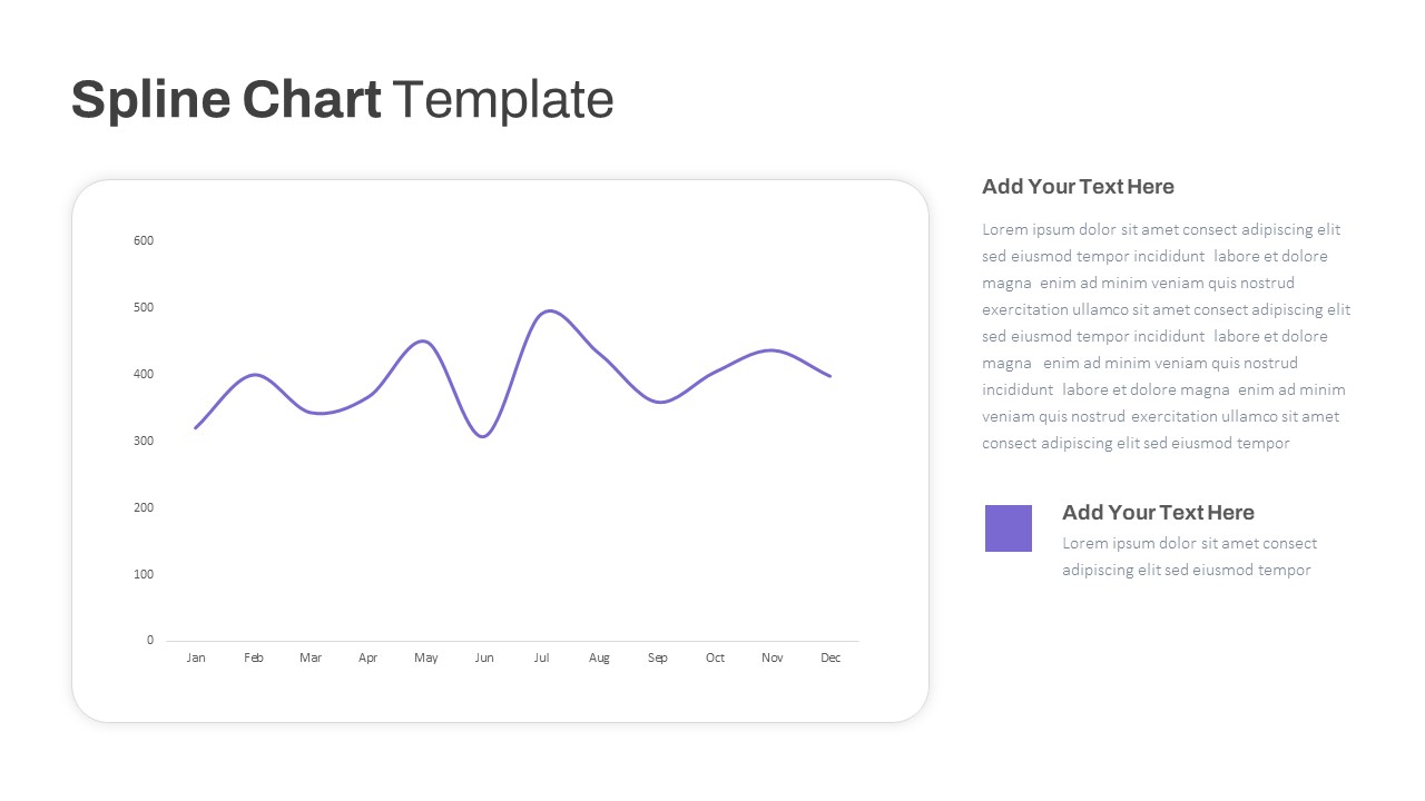
Multipurpose Spline Chart Data Trend Template for PowerPoint & Google Slides
Bar/Column
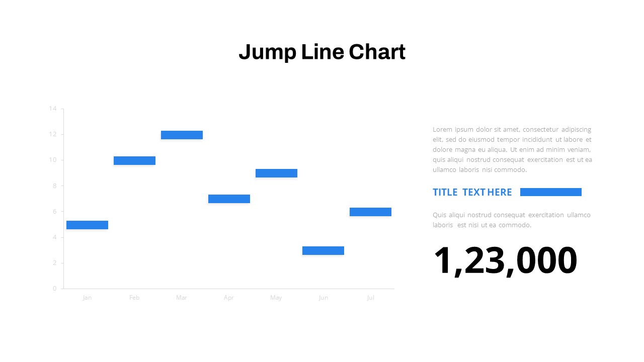
Interactive Jump Line Data Chart Template for PowerPoint & Google Slides
Comparison Chart
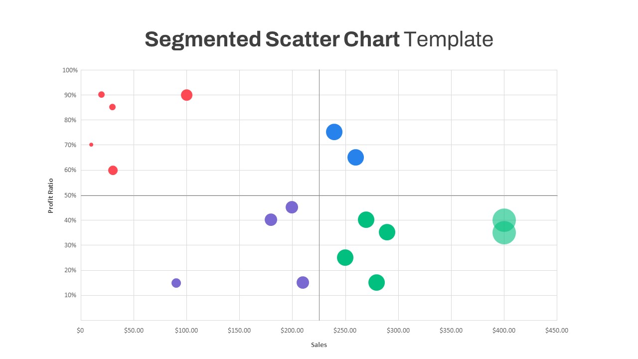
Segmented Scatter Chart Data Visualization Template for PowerPoint & Google Slides
Business Strategy
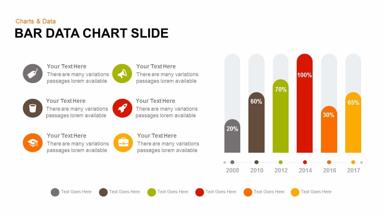
Bar Data Chart Slide for PowerPoint & Google Slides
Bar/Column
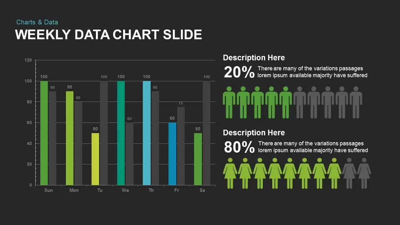
Weekly Data Chart Slide for PowerPoint & Google Slides
Comparison Chart

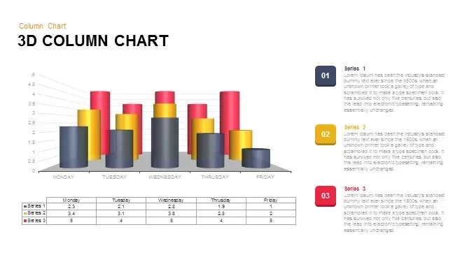
3D Column Chart with Data Table for PowerPoint & Google Slides
Bar/Column
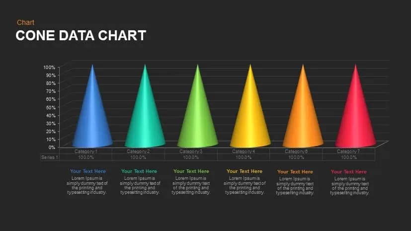
Cone Data Chart for PowerPoint & Google Slides
Charts
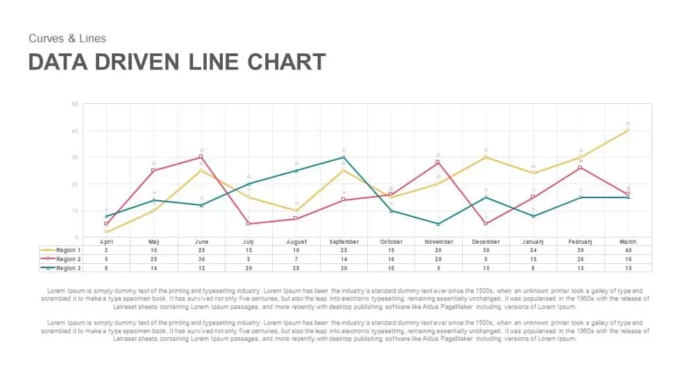
Data-Driven Line Chart Diagram Template for PowerPoint
Comparison Chart
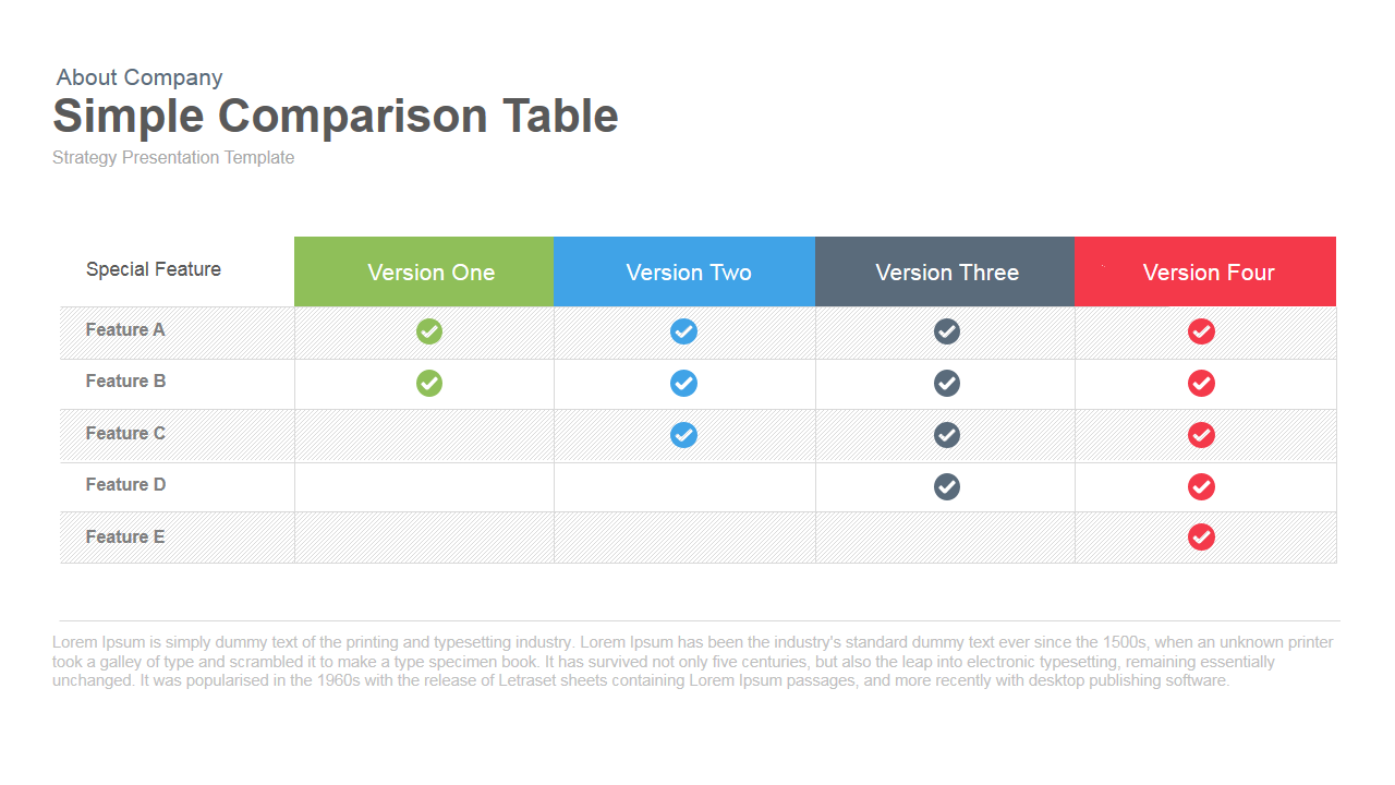
Simple Comparison Table Template for PowerPoint & Google Slides
Comparison

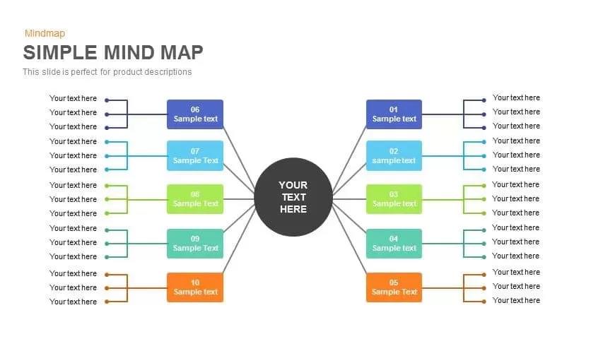
Simple Multi-Branch Mind Map Template for PowerPoint & Google Slides
Mind Maps
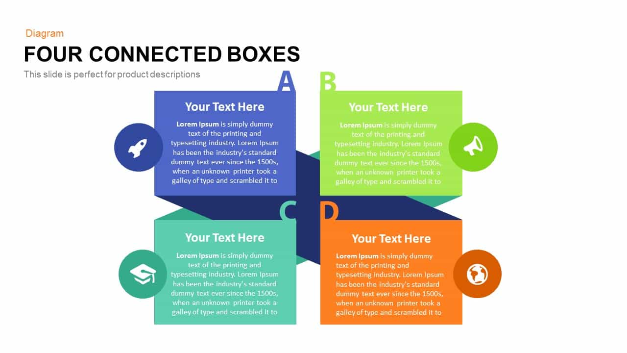
Simple Four Connected Boxes Diagram Template for PowerPoint & Google Slides
Business Models
Simple Business Company Profile Deck Template for PowerPoint & Google Slides
Company Profile
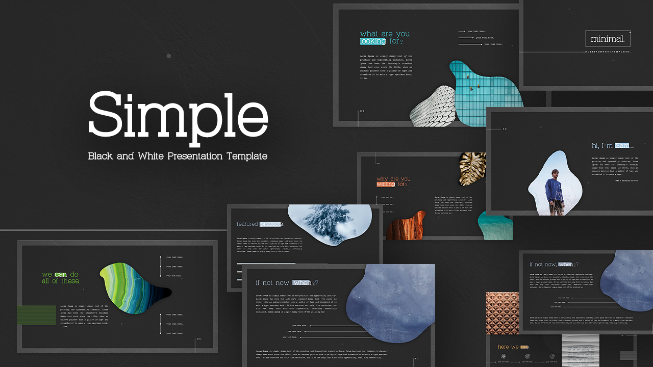
Simple Black and White Presentation Template for PowerPoint & Google Slides
Pitch Deck

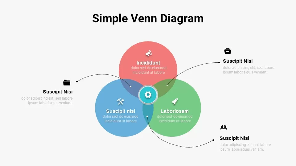
Free Simple Venn Diagram Overview template for PowerPoint & Google Slides
Comparison Chart
Free
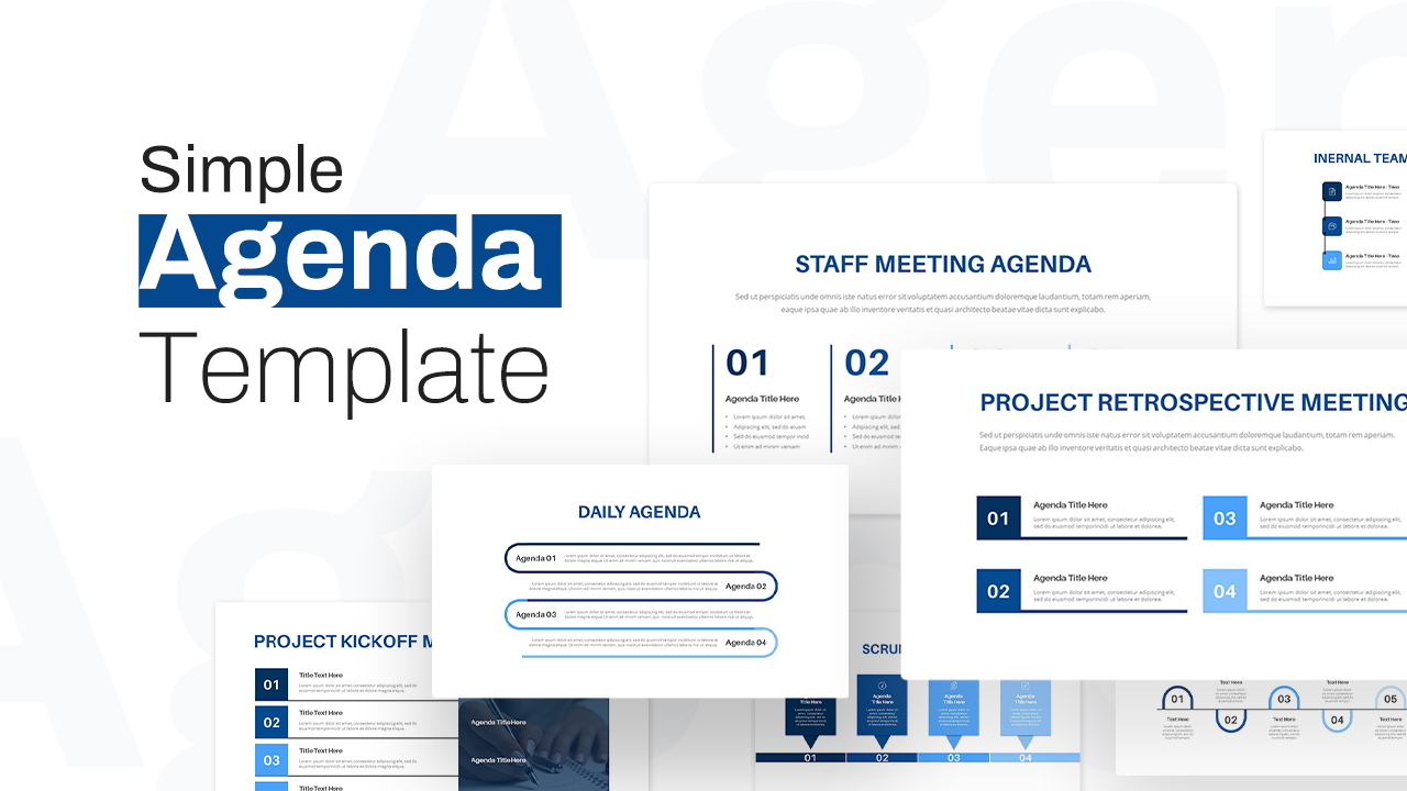
Simple Agenda Slide Deck Overview Template for PowerPoint & Google Slides
Agenda
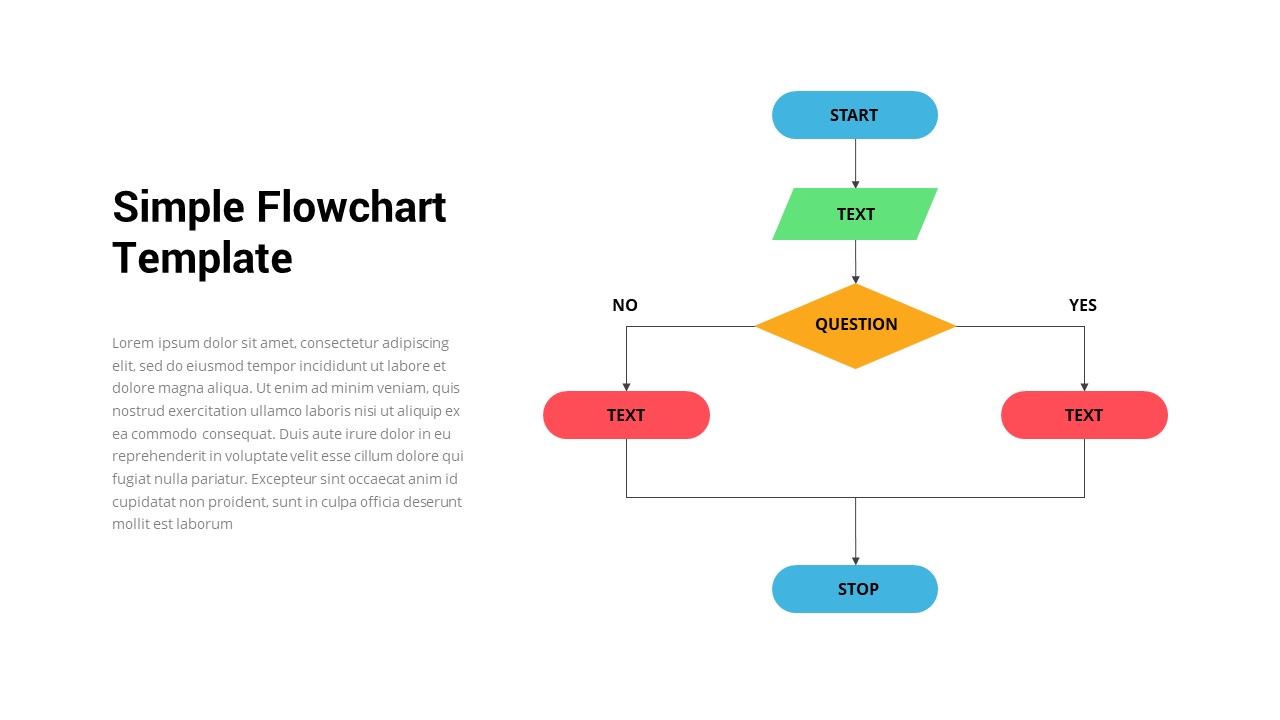
Simple Flowchart Process Diagram Template for PowerPoint & Google Slides
Flow Charts

Free Simple Green Plant Company Profile Deck Template for PowerPoint & Google Slides
Company Profile
Free
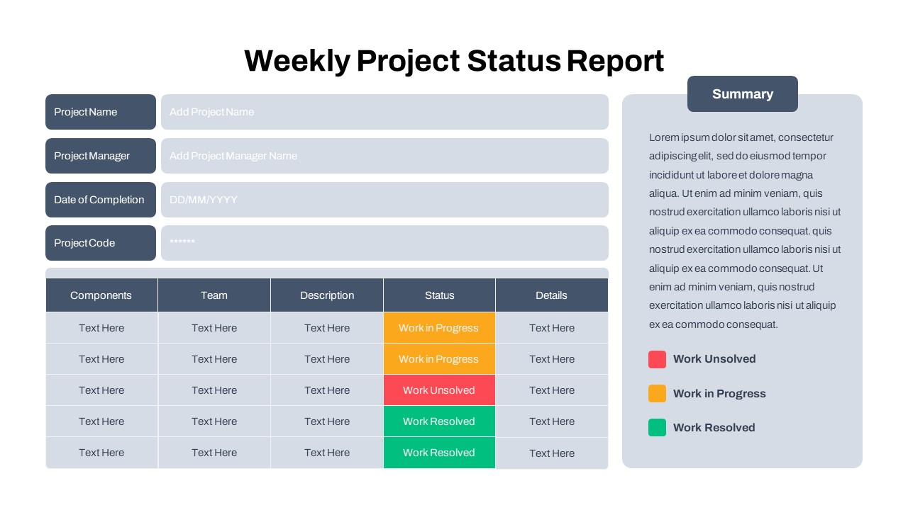
Free Simple Weekly Project Status Report Template for PowerPoint & Google Slides
Project Status
Free
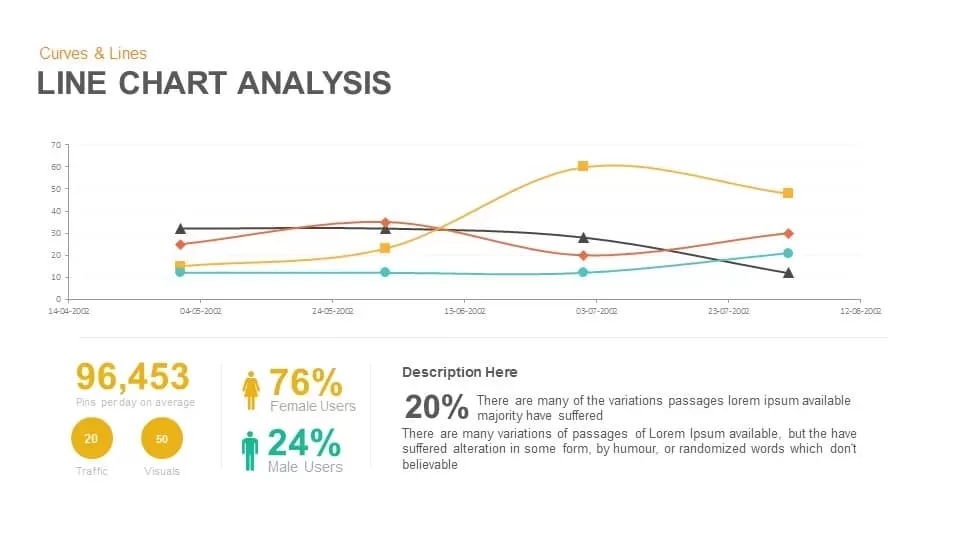
Line Chart Analysis template for PowerPoint & Google Slides
Charts
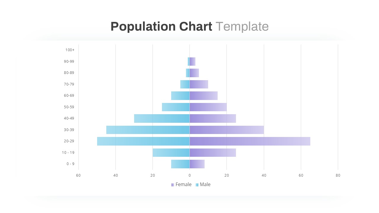
Population Pyramid Chart Analysis Template for PowerPoint & Google Slides
Bar/Column
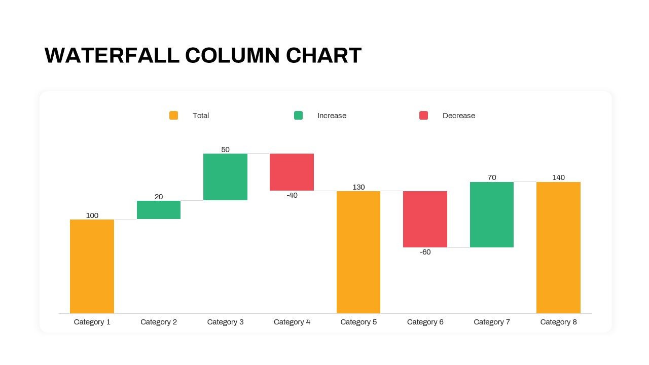
Waterfall Column Chart Analysis Template for PowerPoint & Google Slides
Bar/Column
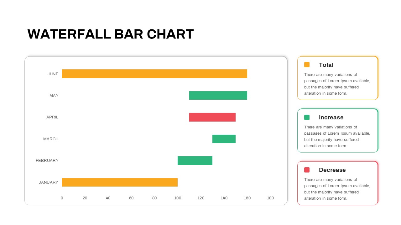
Waterfall Bar Chart Analysis Template for PowerPoint & Google Slides
Bar/Column
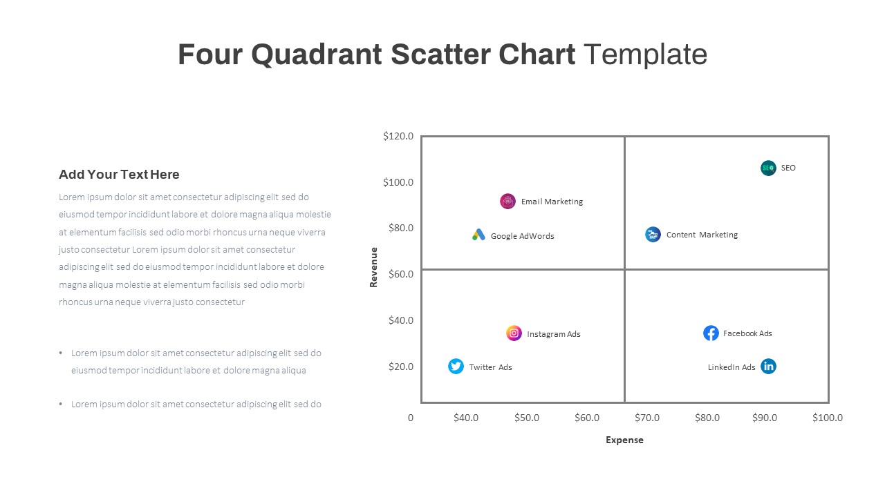
Four Quadrant Scatter Chart Analysis Template for PowerPoint & Google Slides
Comparison Chart
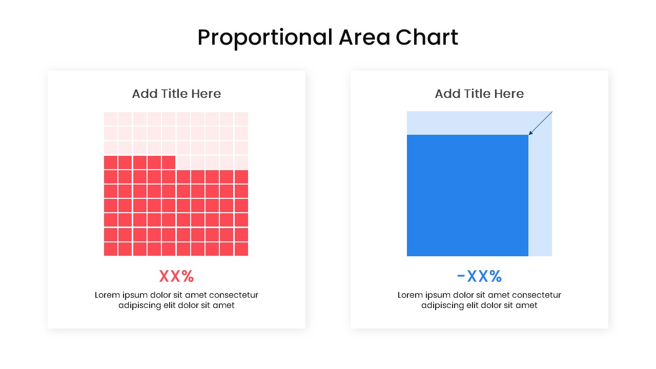
Proportional Area Chart Analysis Template for PowerPoint & Google Slides
Comparison Chart
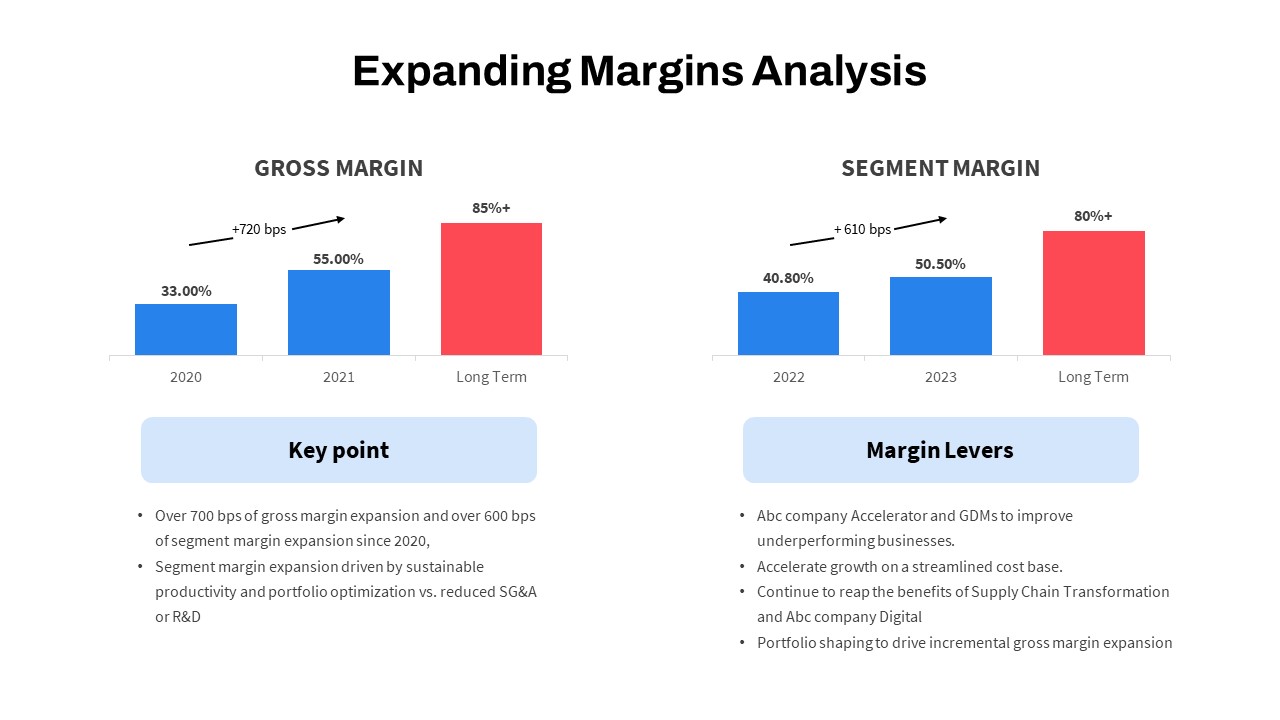
Expanding Margins Analysis Bar Chart Template for PowerPoint & Google Slides
Charts
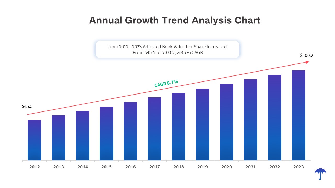
Annual Growth Trend Analysis Chart template for PowerPoint & Google Slides
Business Report
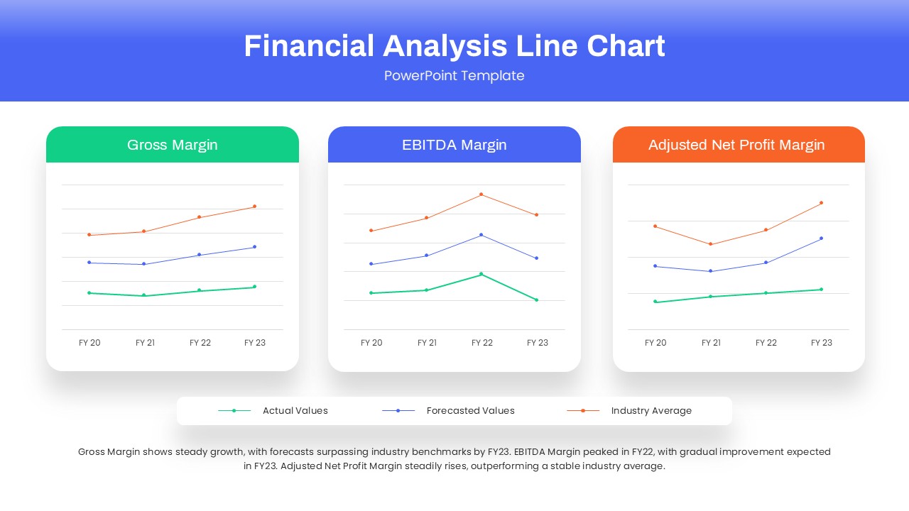
Dynamic Financial Analysis Line Chart Template for PowerPoint & Google Slides
Finance
Skills Gap Analysis Comparison Chart Template for PowerPoint & Google Slides
Gap
Data Science PowerPoint Presentation Template for PowerPoint & Google Slides
Pitch Deck
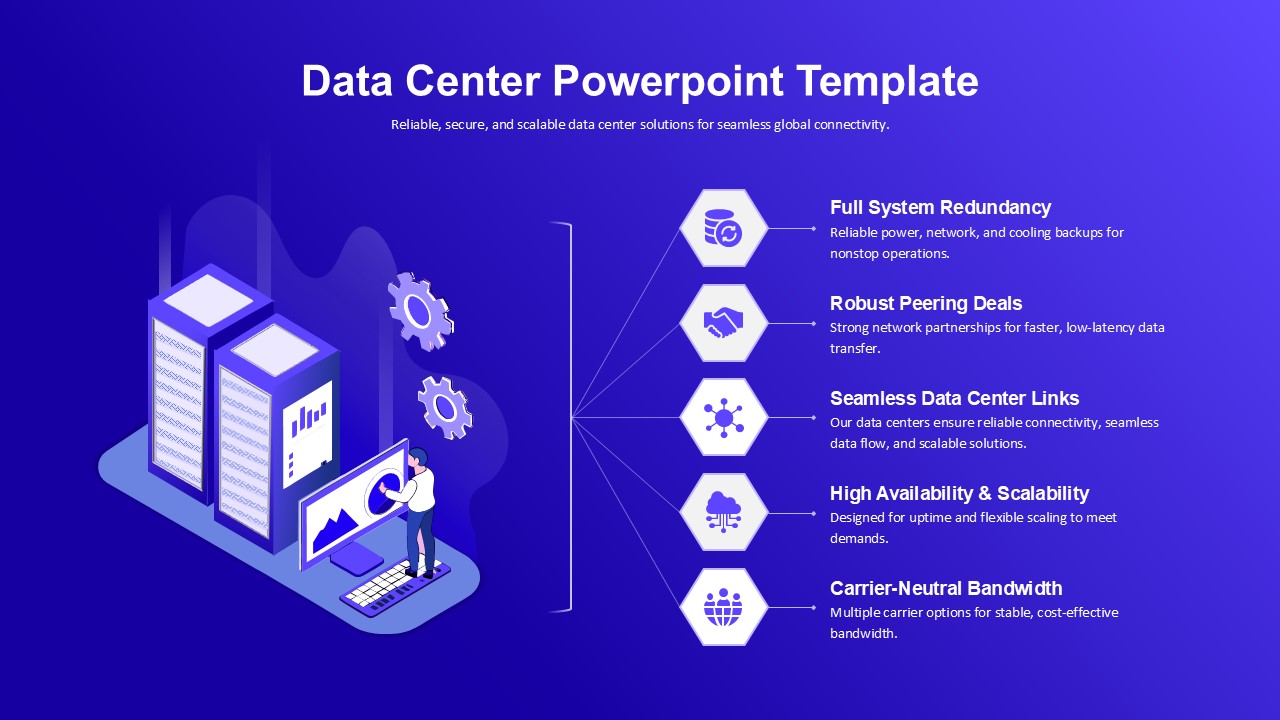
Data Center PowerPoint Template for PowerPoint & Google Slides
Information Technology
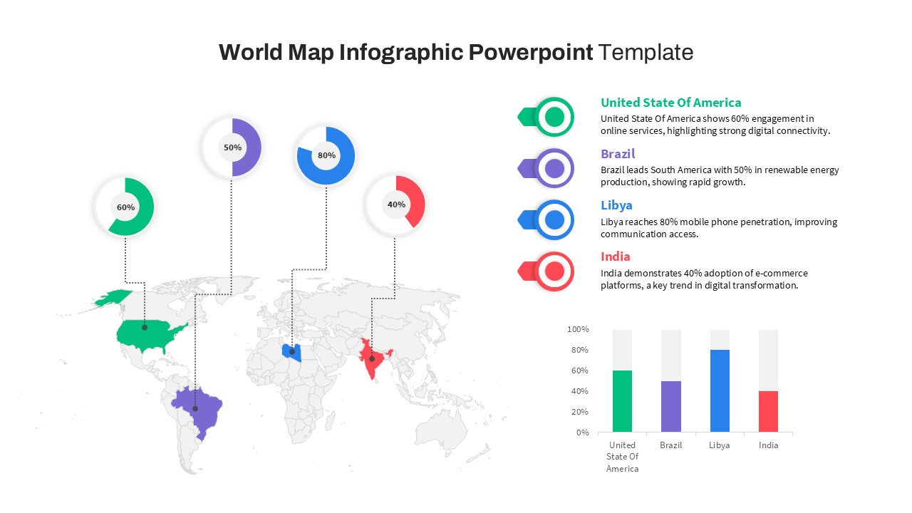
World Map Data template for PowerPoint & Google Slides
World Maps
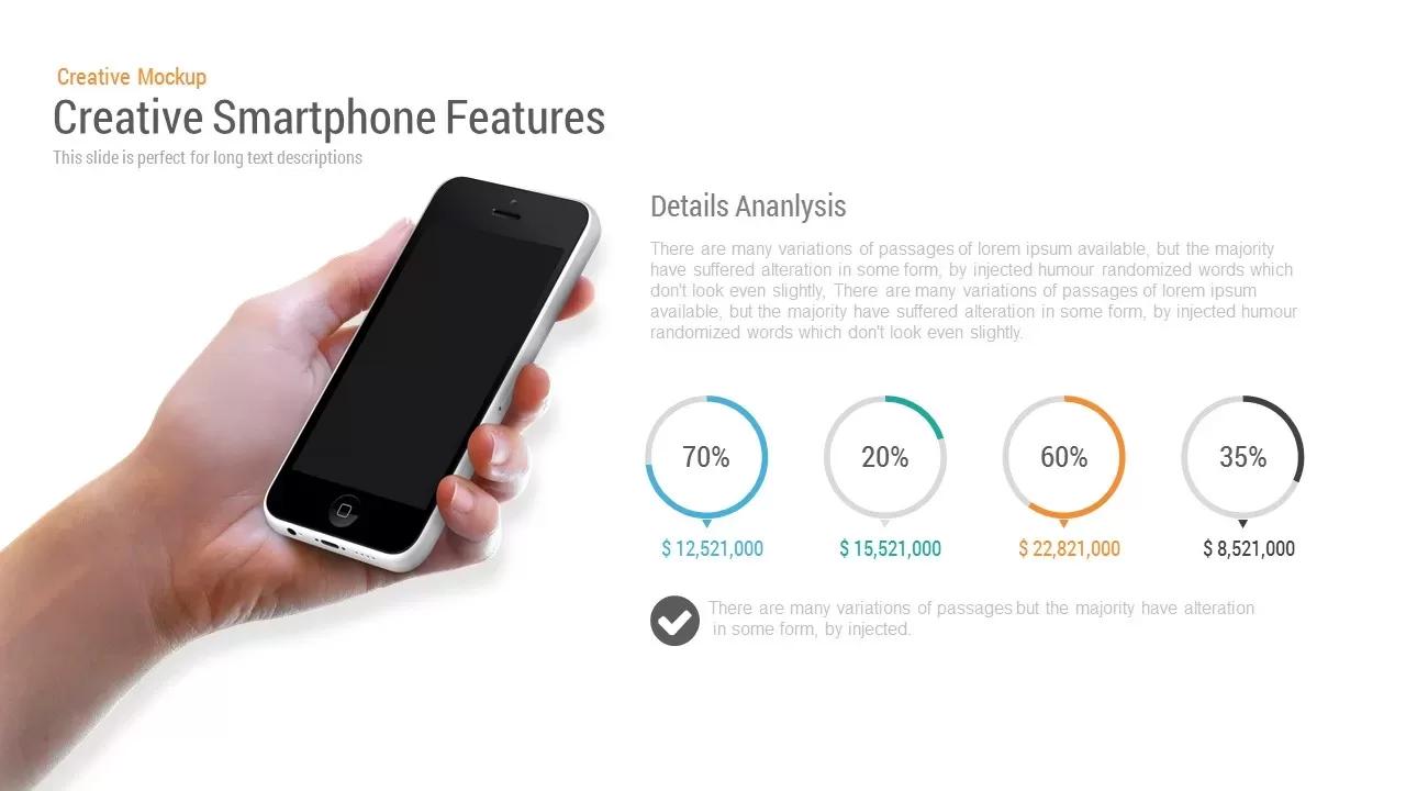
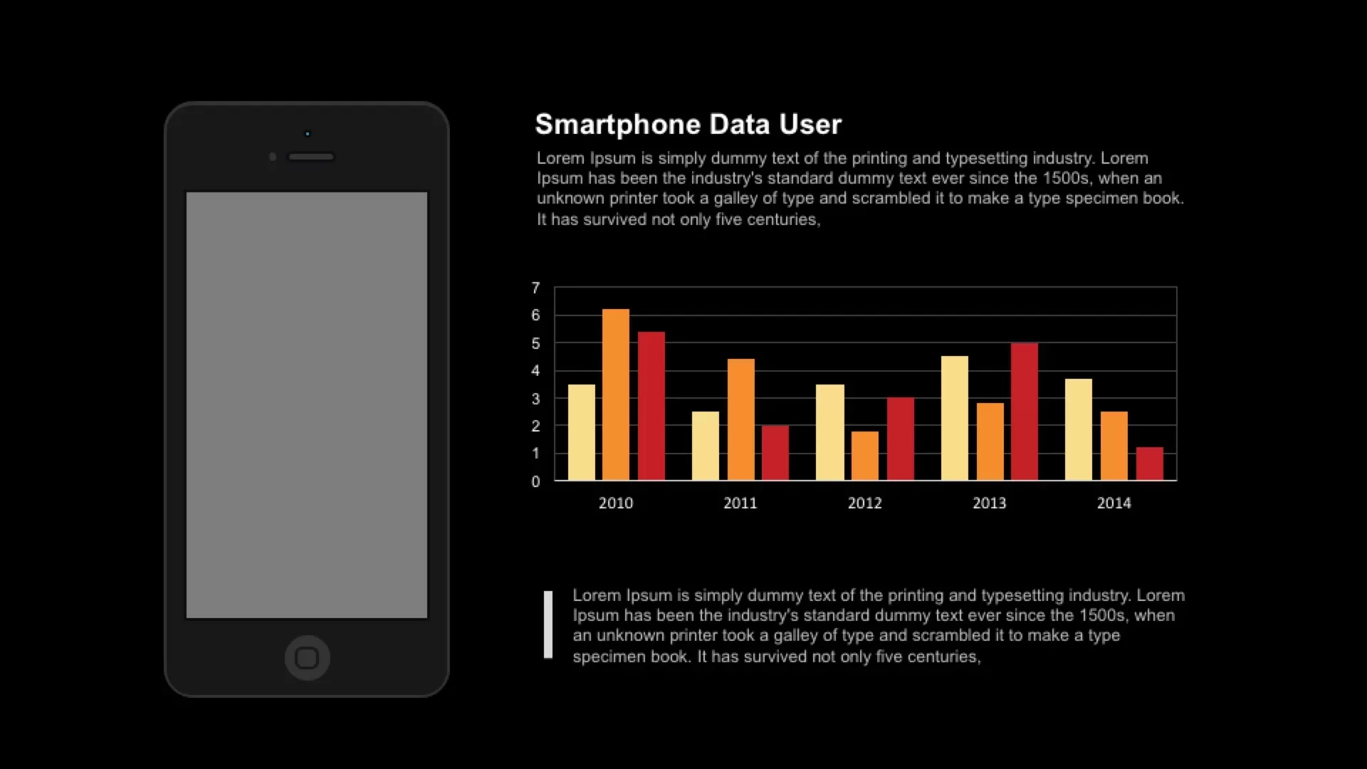
Smartphone Data User template for PowerPoint & Google Slides
Charts
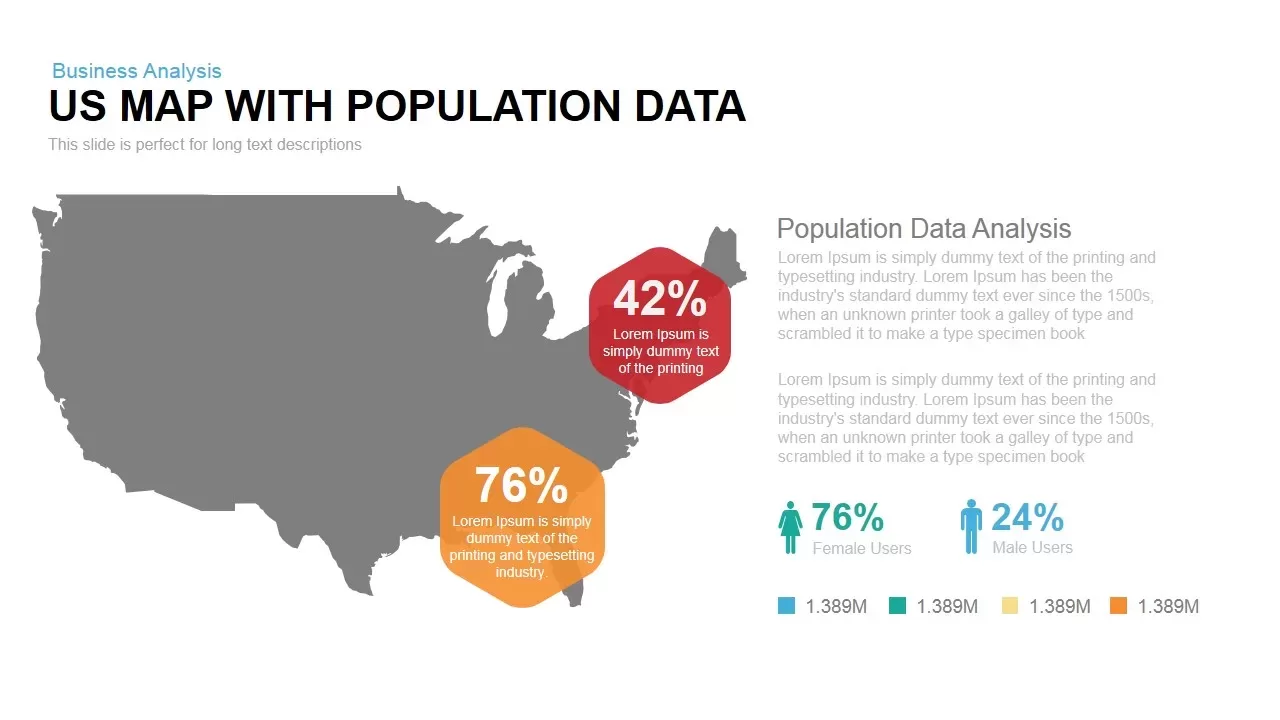
Interactive US Population Data Map Slide Template for PowerPoint & Google Slides
World Maps
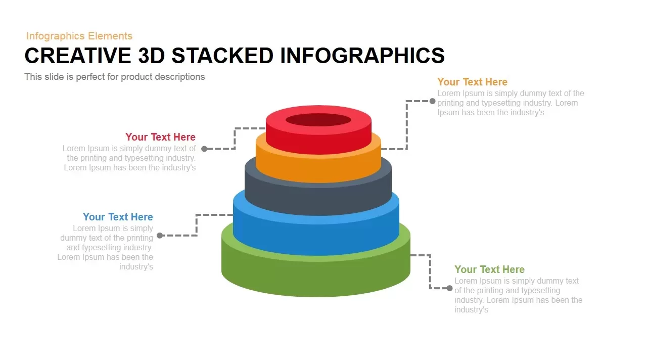
3D Stacked Infographic Layers Data Template for PowerPoint & Google Slides
Pyramid
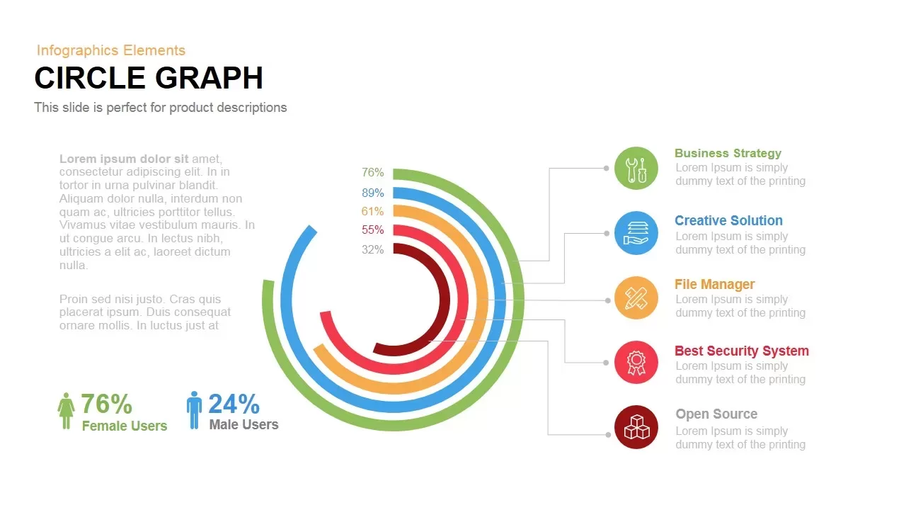
Circle Graph Data Visualization Template for PowerPoint & Google Slides
Circular
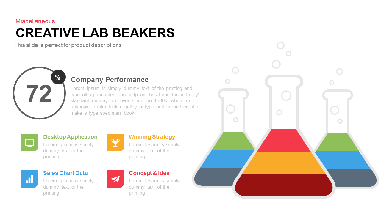
Creative Lab Beakers Data Infographic template for PowerPoint & Google Slides
Infographics
Dynamic Data Dashboard Infographic Template for PowerPoint & Google Slides
Bar/Column
Data Analytics Dashboard Design template for PowerPoint & Google Slides
Bar/Column
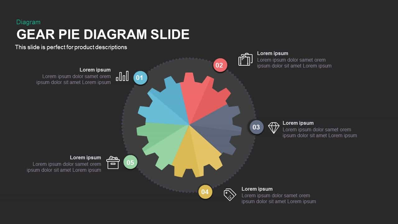
Gear Pie Diagram Data Visualization Template for PowerPoint & Google Slides
Pie/Donut
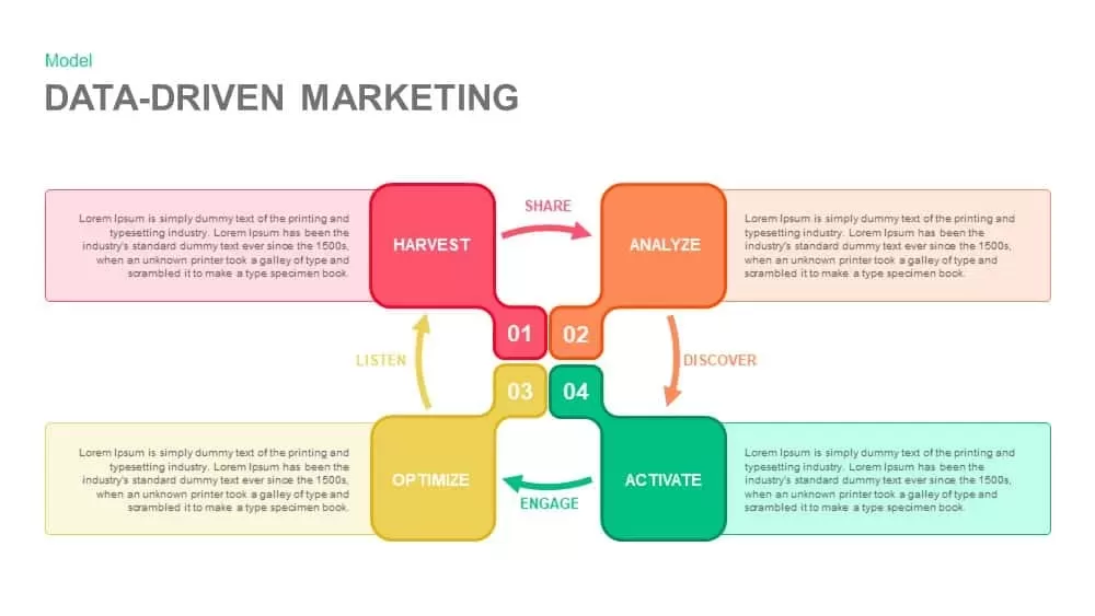
Data-Driven Marketing Cycle Diagram Template for PowerPoint & Google Slides
Customer Journey
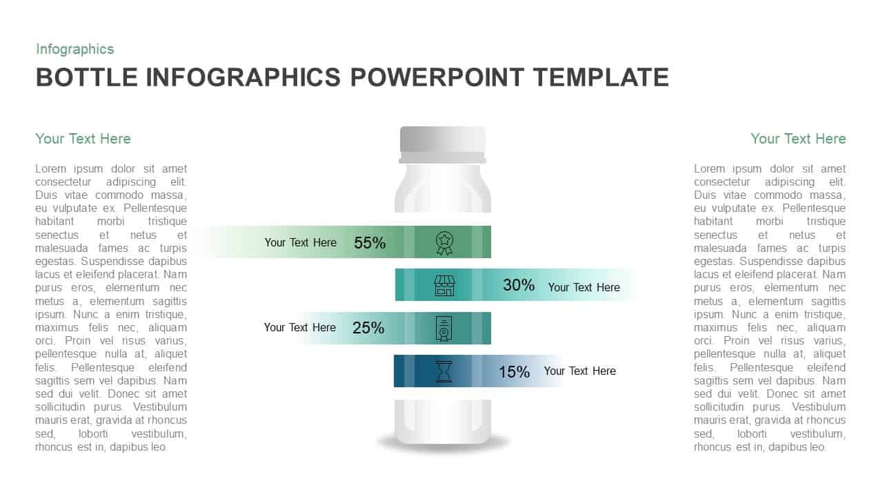
Bottle Data Percentage Infographic Template for PowerPoint & Google Slides
Infographics
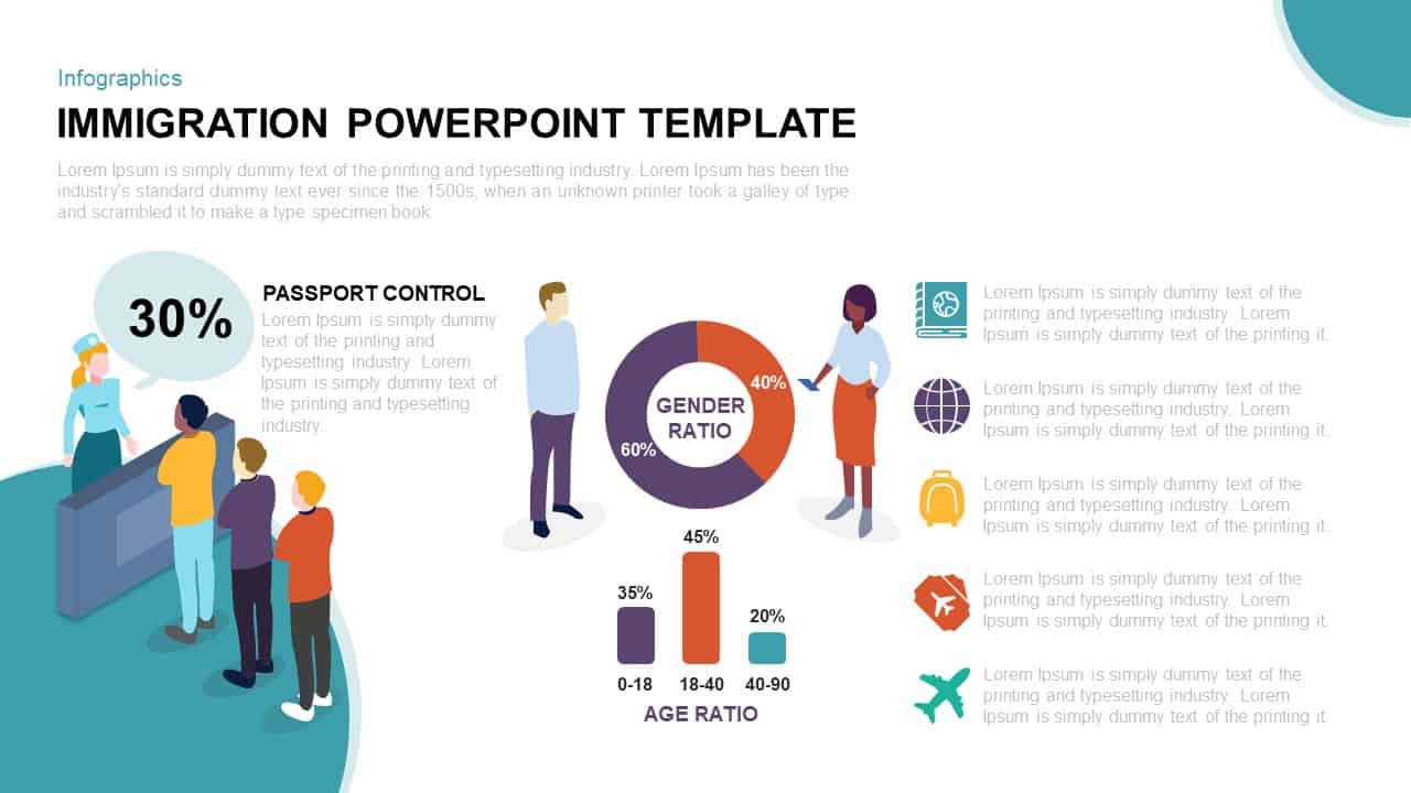
Immigration Data Dashboard Template for PowerPoint & Google Slides
Bar/Column
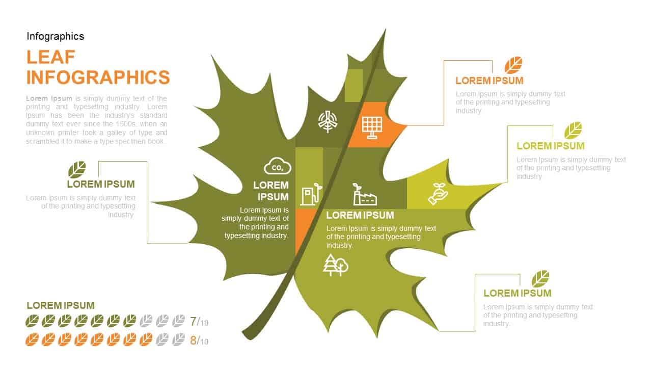
Leaf Infographic Data Visualization Template for PowerPoint & Google Slides
Infographics
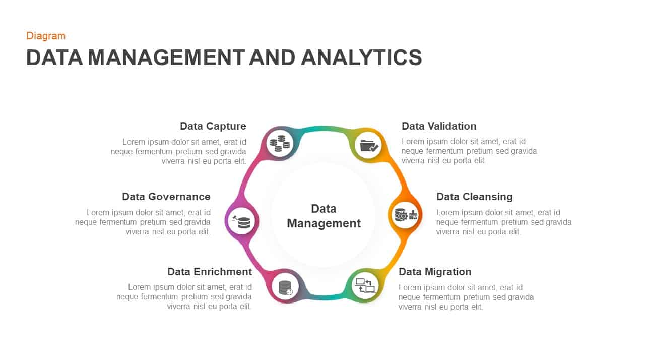
Data Management and Analytics Diagram Template for PowerPoint & Google Slides
Circular
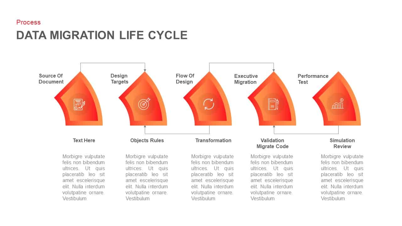
Data Migration Life Cycle Curved Diagram Template for PowerPoint & Google Slides
Process
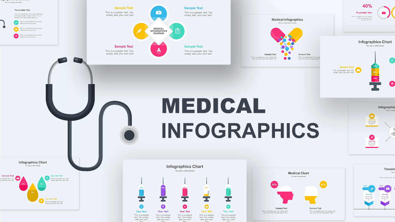
Medical Infographics Data Visualization Template for PowerPoint & Google Slides
Health
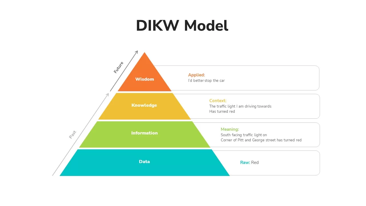
DIKW Data to Wisdom Pyramid Model Template for PowerPoint & Google Slides
Pyramid
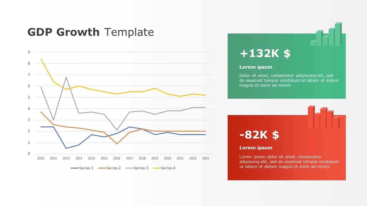
Data-driven GDP Growth Infographic Pack Template for PowerPoint & Google Slides
Infographics
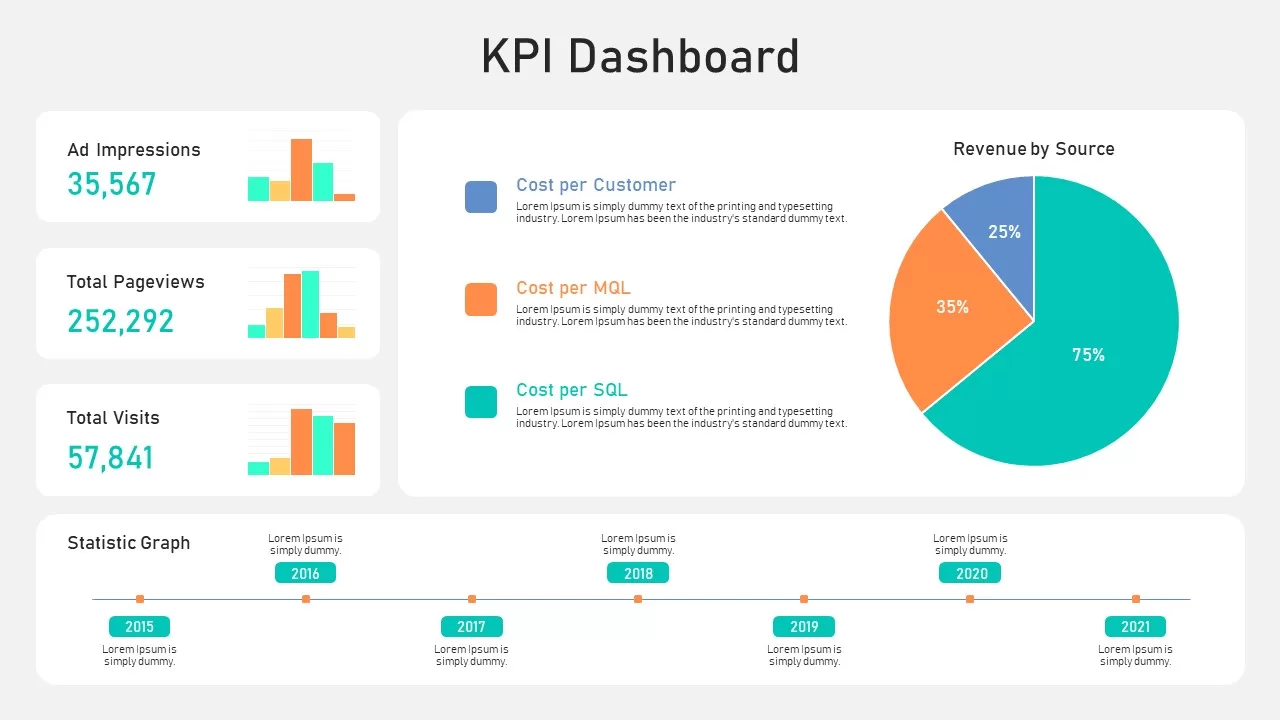
KPI Dashboard Data Overview Slide Template for PowerPoint & Google Slides
Bar/Column
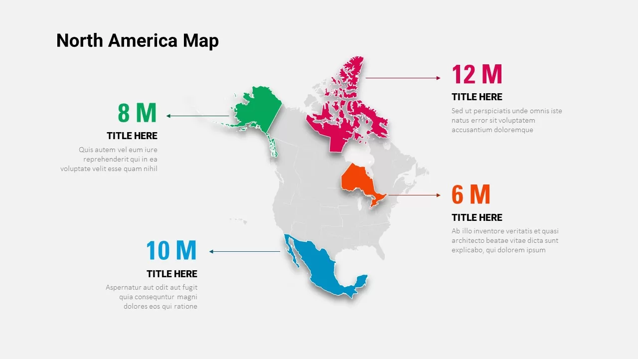
North America Data Map Callouts Template for PowerPoint & Google Slides
World Maps

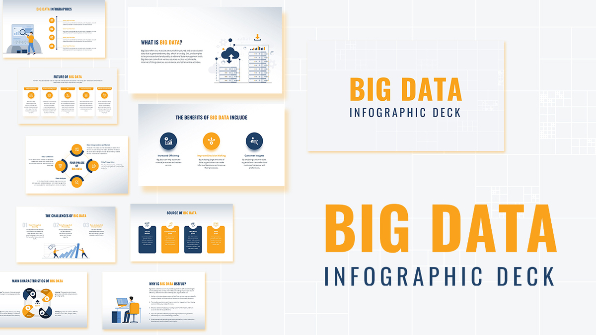
Modern Big Data Infographic Deck Template for PowerPoint & Google Slides
Decks
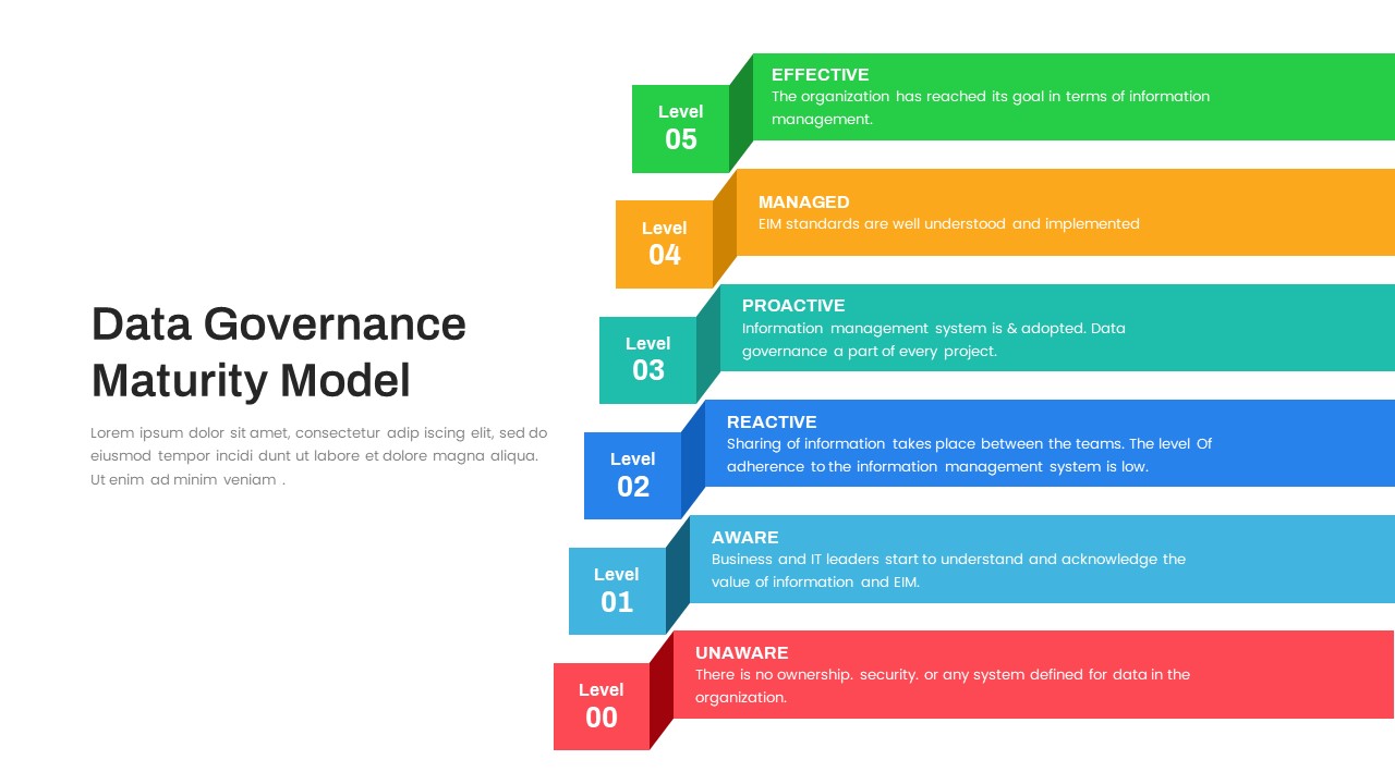
Layered Data Governance Maturity Model Template for PowerPoint & Google Slides
Process
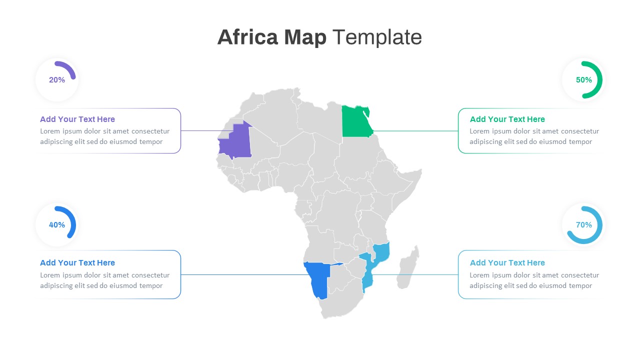
Editable Africa Map Infographic Data Template for PowerPoint & Google Slides
World Maps
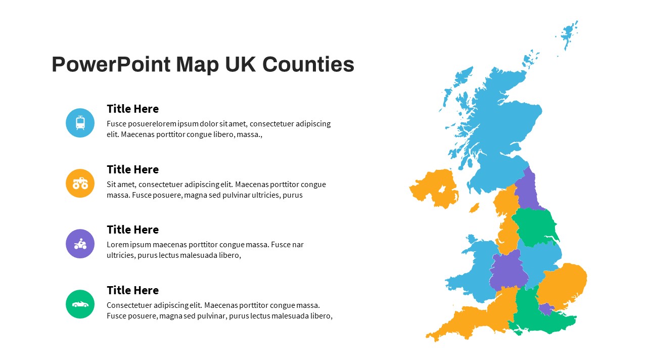
UK Counties Map Data Visualization Template for PowerPoint & Google Slides
World Maps
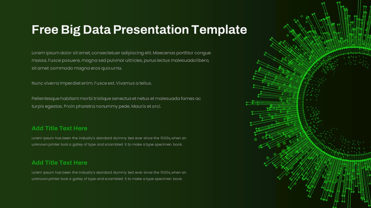
Free Big Data Network Visualization Template for PowerPoint & Google Slides
Circular
Free
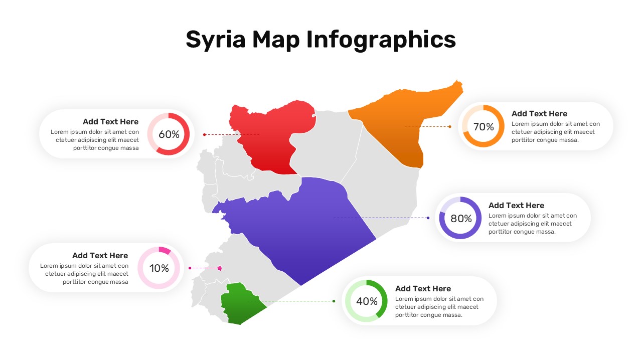
Syria Regional Data Map Infographic Template for PowerPoint & Google Slides
World Maps
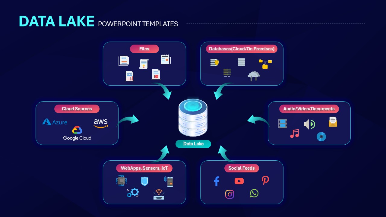
Data Lake Hub-and-Spoke Diagram Template for PowerPoint & Google Slides
Cloud Computing
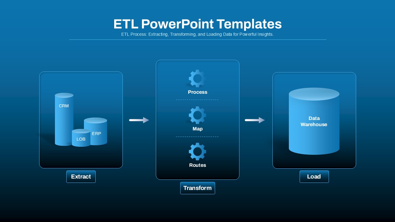
ETL Data Pipeline Workflow Diagram Template for PowerPoint & Google Slides
Process
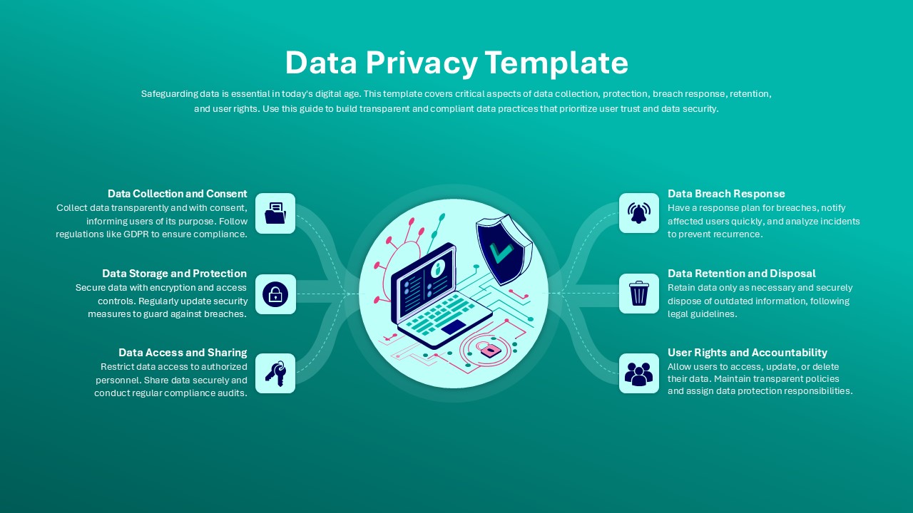
Data Privacy template for PowerPoint & Google Slides
Information Technology
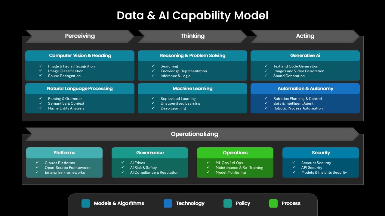
Comprehensive Data & AI Capability Model Template for PowerPoint & Google Slides
AI
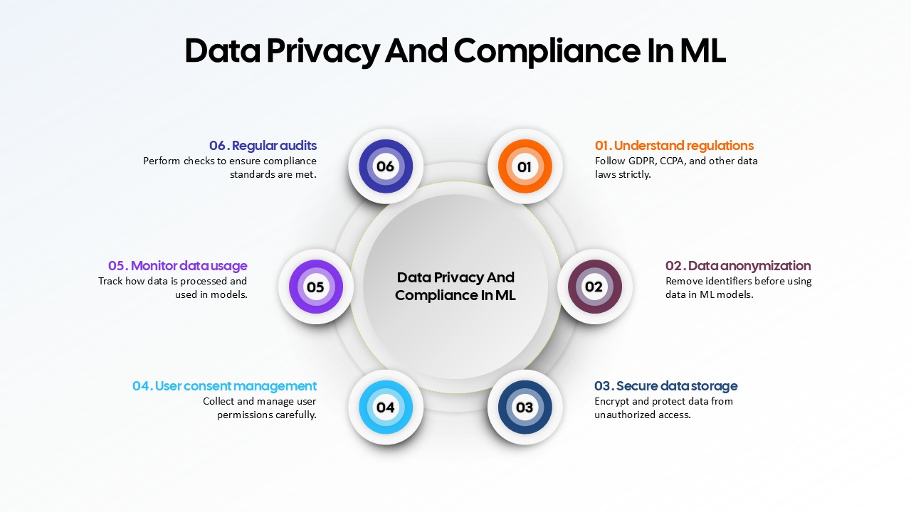
Data Privacy and Compliance in ML template for PowerPoint & Google Slides
Technology
Data-Driven AI in Insurance Infographic Template for PowerPoint & Google Slides
Circular
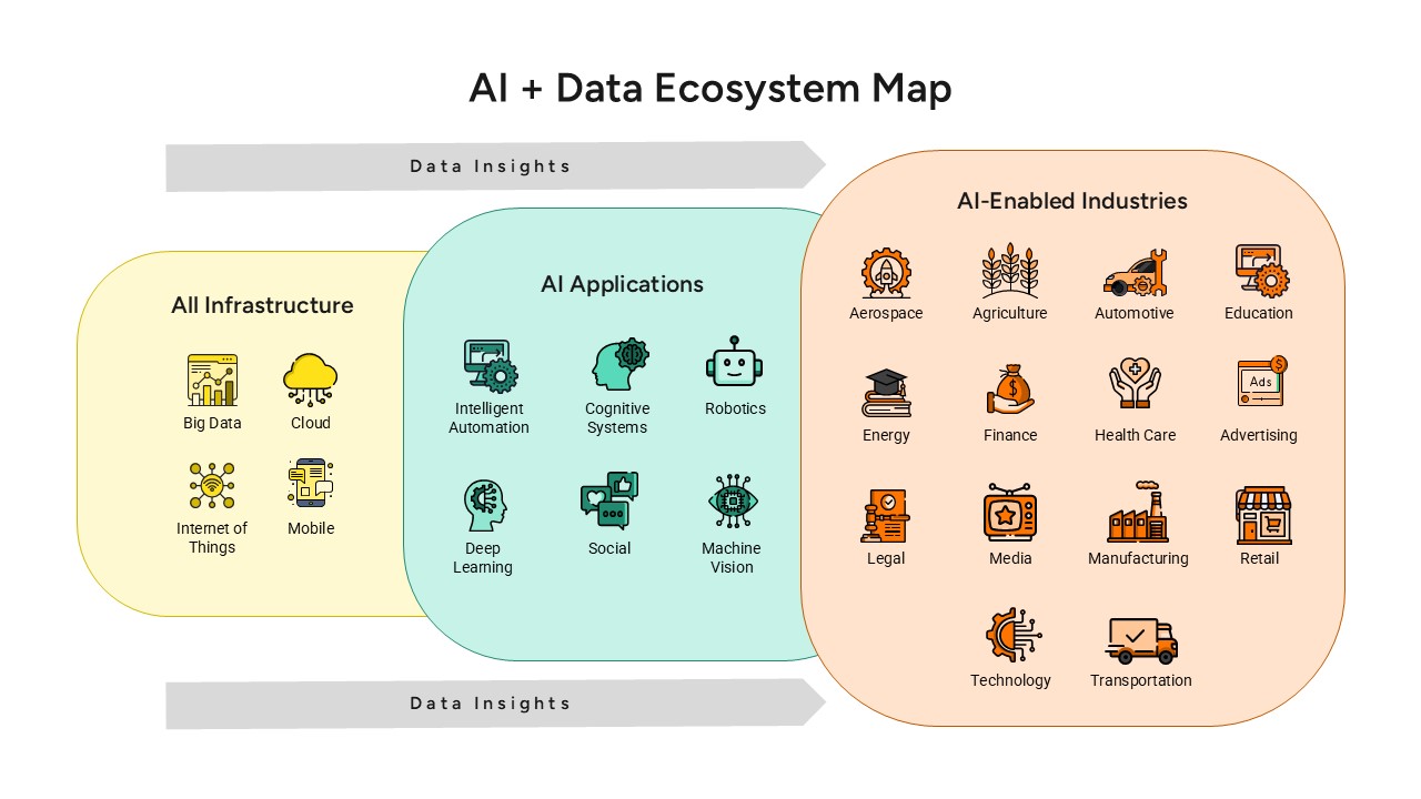
AI and Data Ecosystem Map Template for PowerPoint & Google Slides
AI
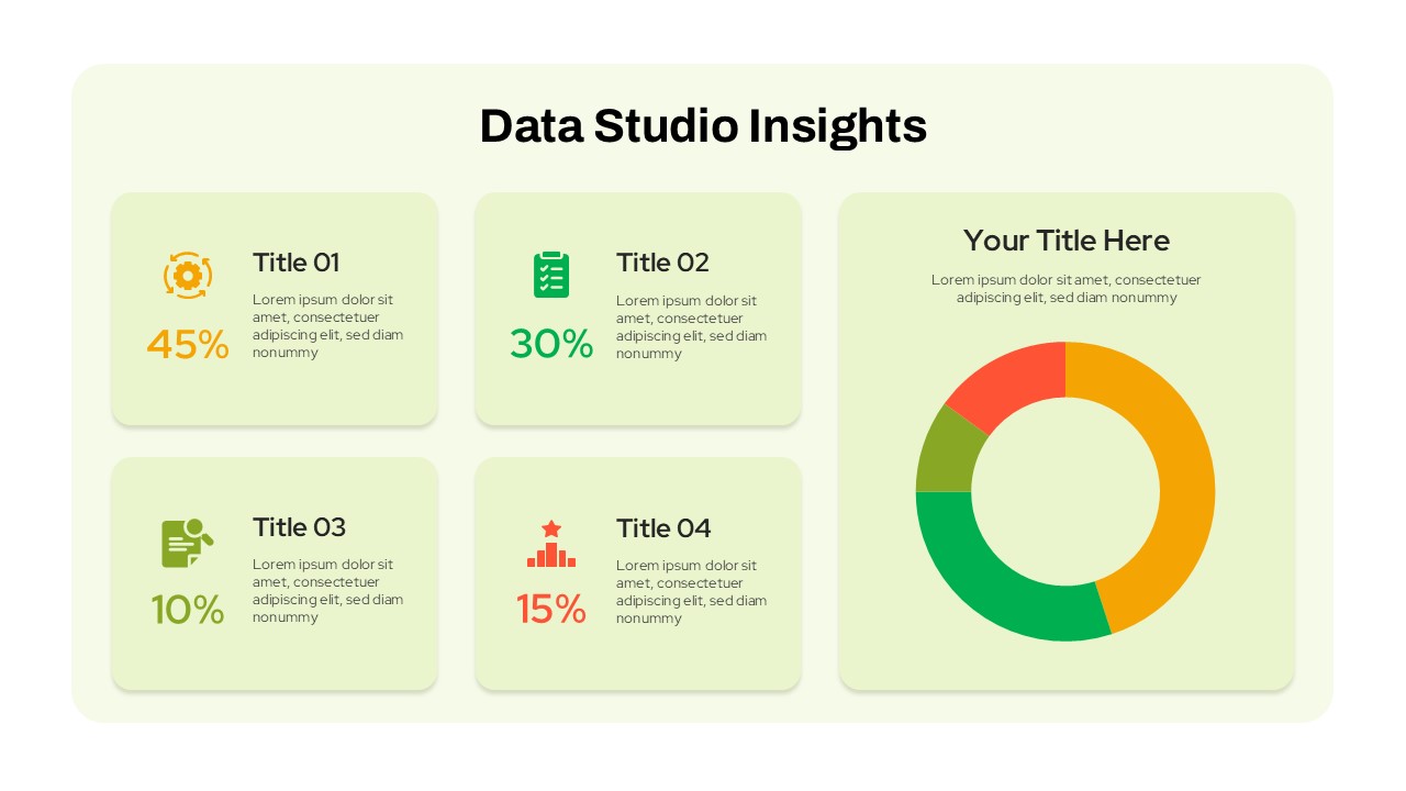
Data Studio Insights template for PowerPoint & Google Slides
Business Report
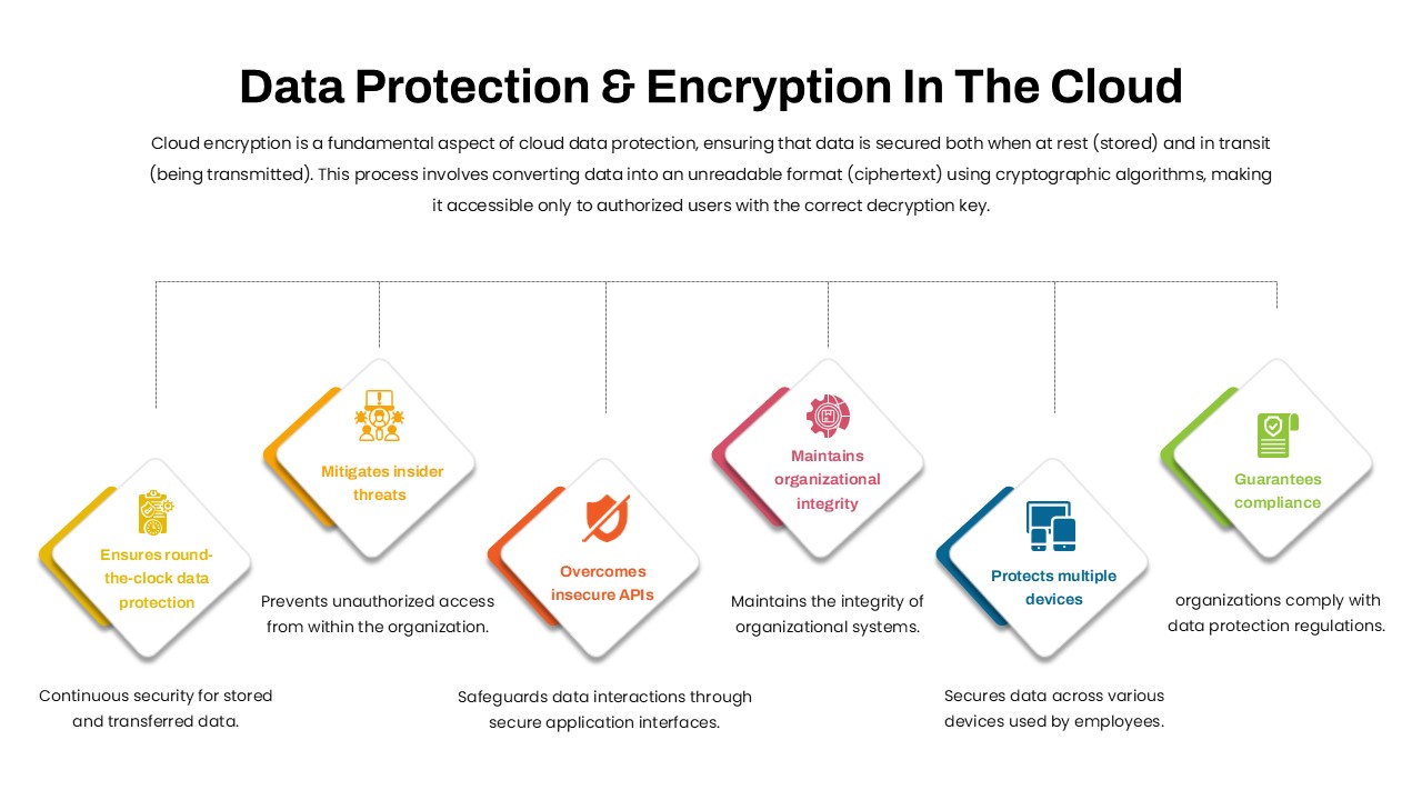
Data Protection & Encryption in the Cloud Overview template for PowerPoint & Google Slides
Cloud Computing
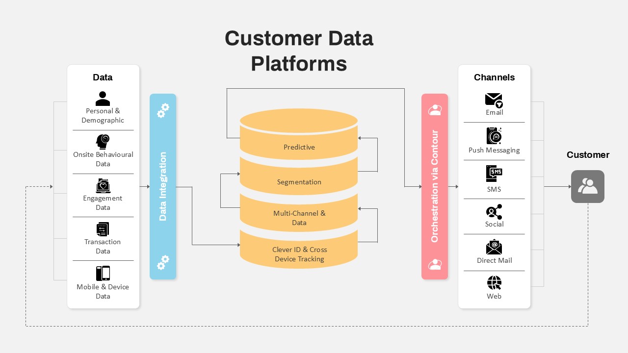
Customer Data Platform Workflow Diagram Template for PowerPoint & Google Slides
Information Technology
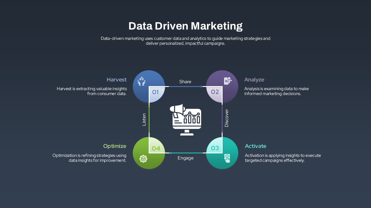
Data-Driven Marketing Lifecycle Diagram Template for PowerPoint & Google Slides
Process
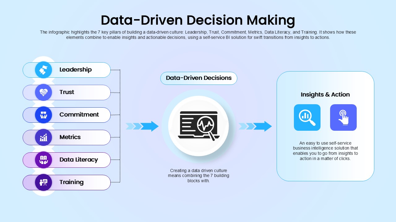
Data-Driven Decision Making overview template for PowerPoint & Google Slides
Business
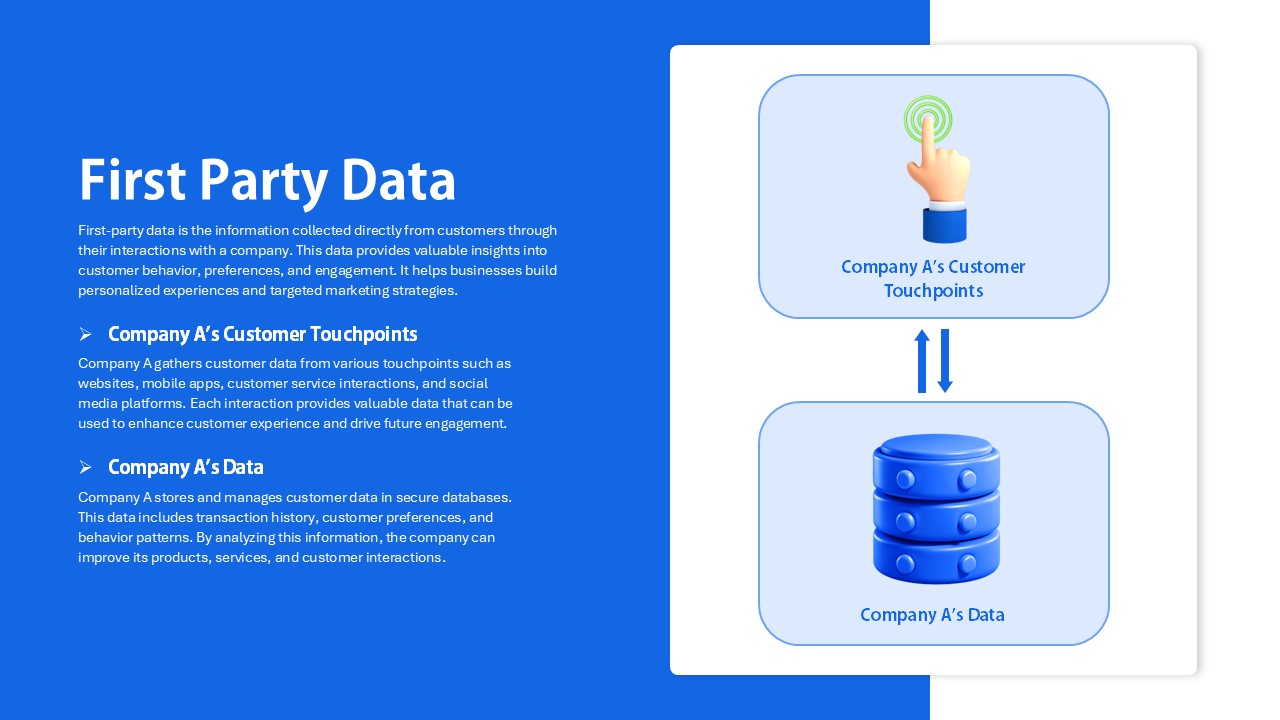
First Party Data Overview Template for PowerPoint & Google Slides
Business
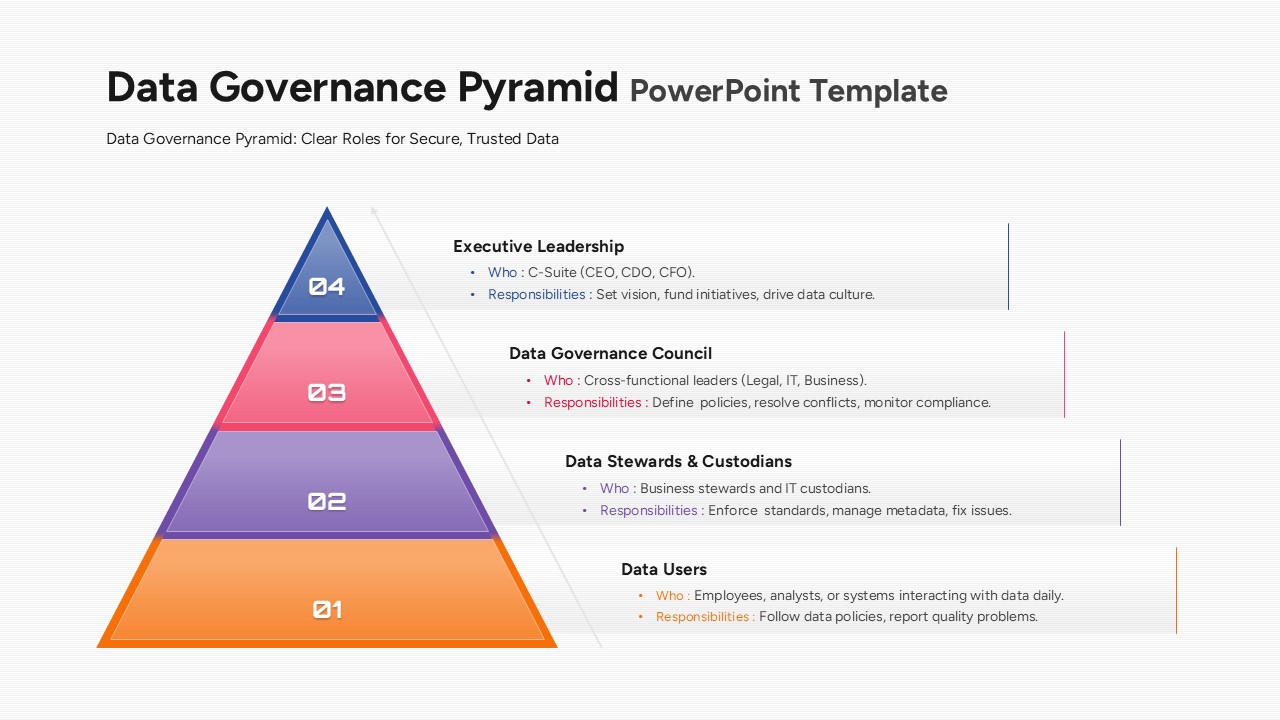
Data Governance Roles Pyramid Diagram Template for PowerPoint & Google Slides
Pyramid
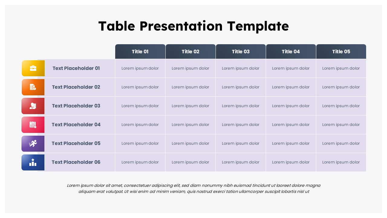
Colorful Business Data Comparison Table Template for PowerPoint & Google Slides
Table
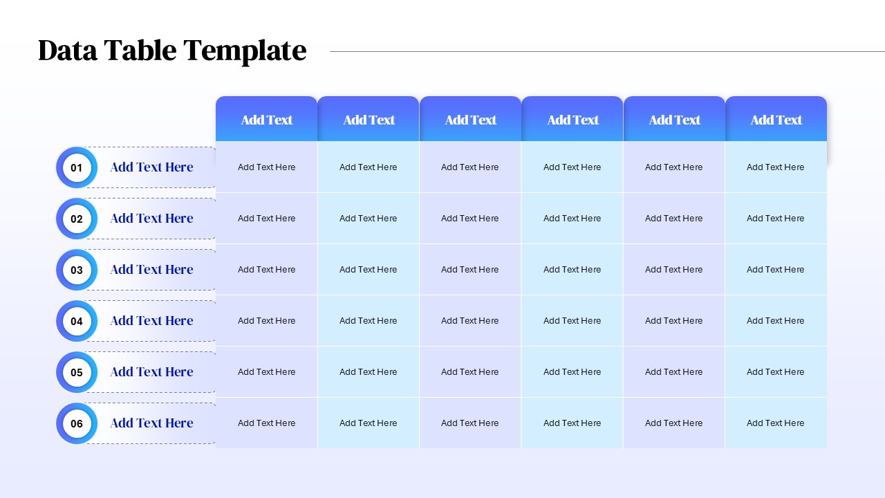
Six Column Data Table Template for PowerPoint & Google Slides
Table
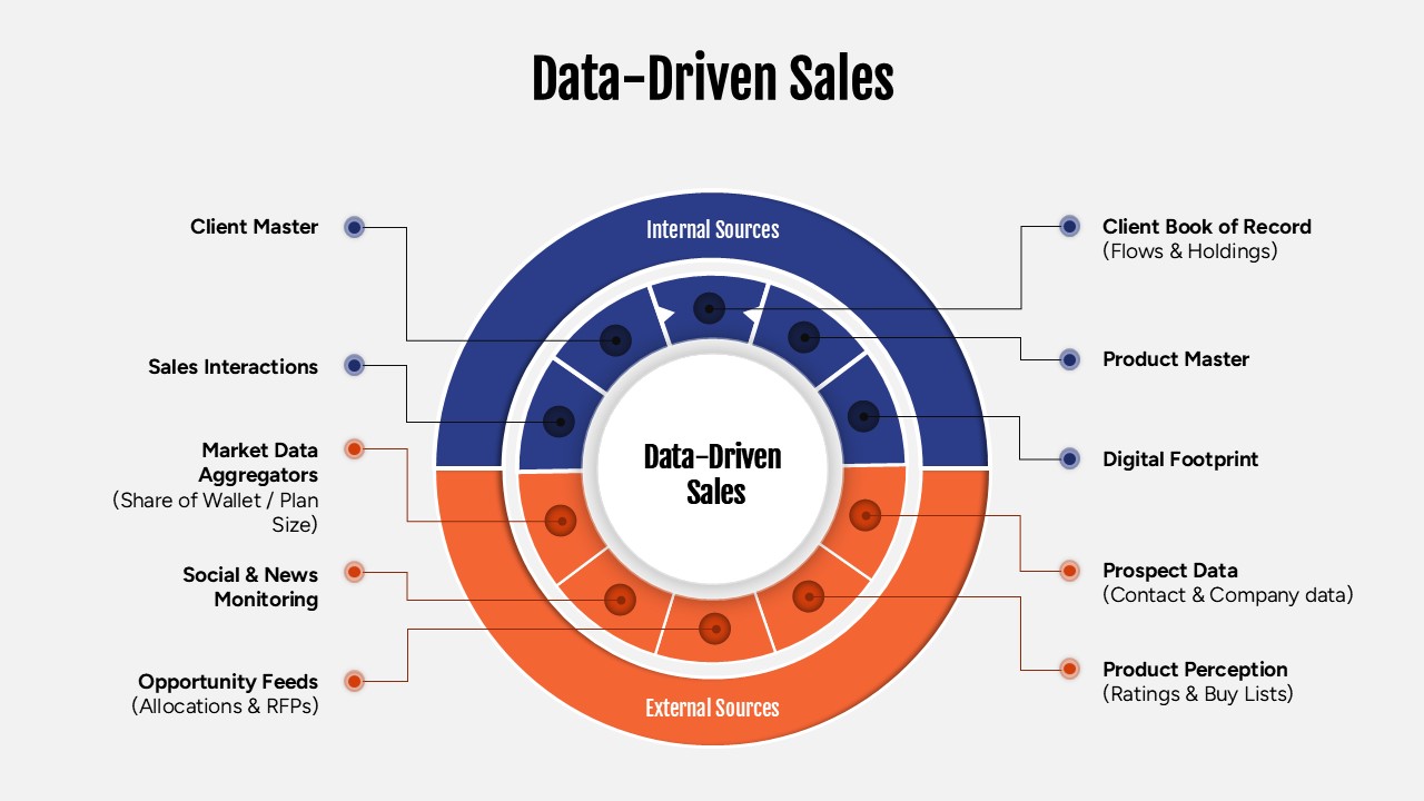
Data-Driven Sales Strategy Diagram Template for PowerPoint & Google Slides
Marketing