Free Metro UI Dashboard Infographic Template for PowerPoint & Google Slides
Description
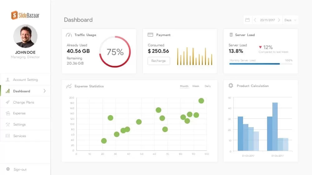
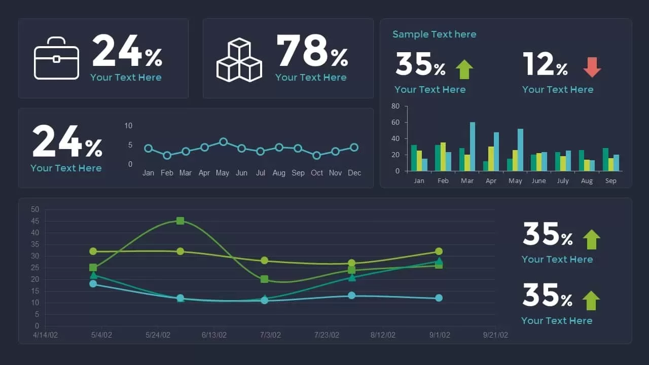
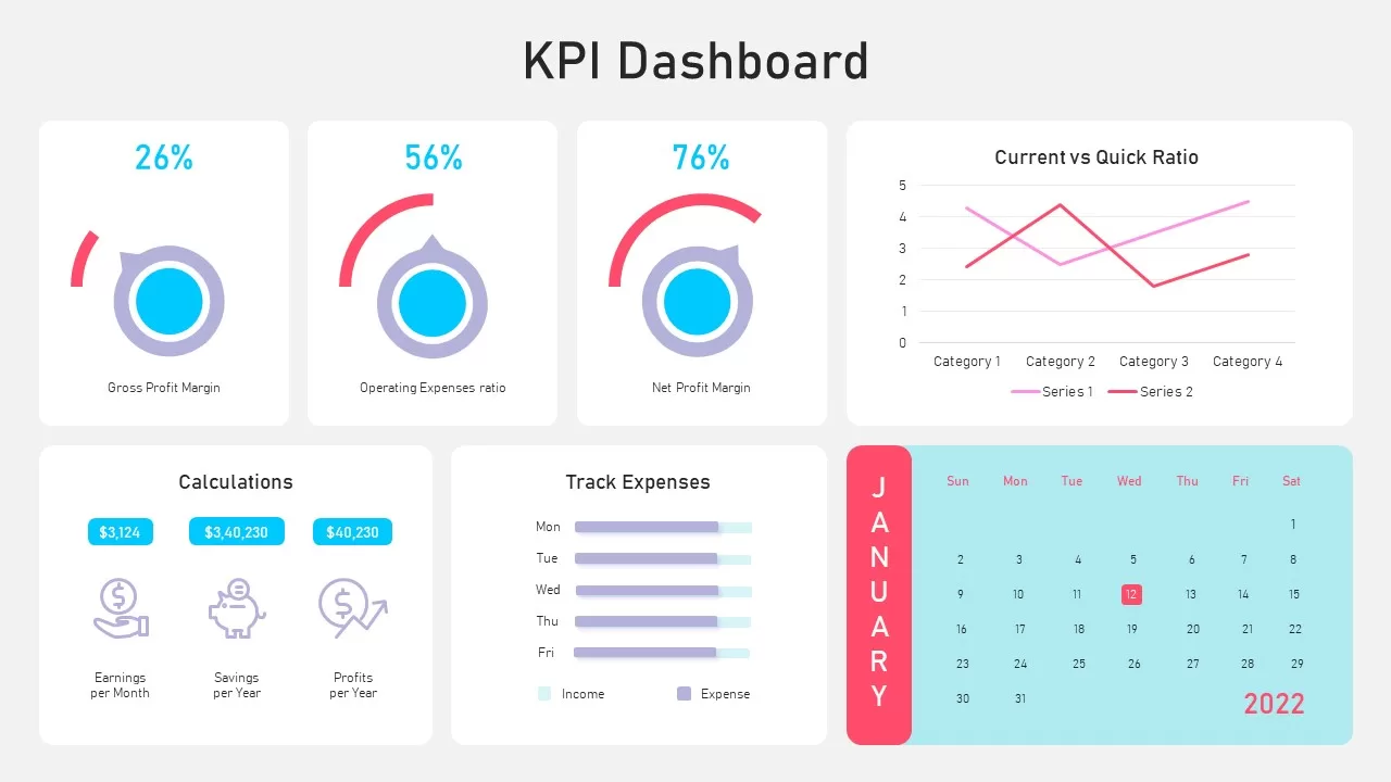
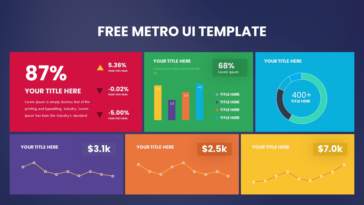
Use this free Metro UI dashboard slide to present six key metrics and charts on a single screen for your PowerPoint & Google Slides presentations. The slide features six vibrant colored panels on a sleek gradient background: a red KPI block with a prominent percentage, a green bar-chart section, a cyan donut chart, and three bottom-row line charts in purple, orange, and yellow. Each panel includes editable headings, icons, data placeholders, and descriptive text boxes. Fully built with vector shapes and master slide layouts, the templates ensure rapid customization without misalignment—swap colors, adjust layouts, and replace icons or chart values in a few clicks.
Preconfigured animations and connector lines guide audiences through each data point in logical sequence, making it ideal for executive dashboards, marketing reports, or performance reviews. The modern flat design, accented by subtle drop shadows and bold typography, keeps focus on your metrics while ensuring readability across devices and screen resolutions. Cross-platform compatibility between PowerPoint and Google Slides eliminates formatting headaches and version-control issues, facilitating smooth team collaboration.
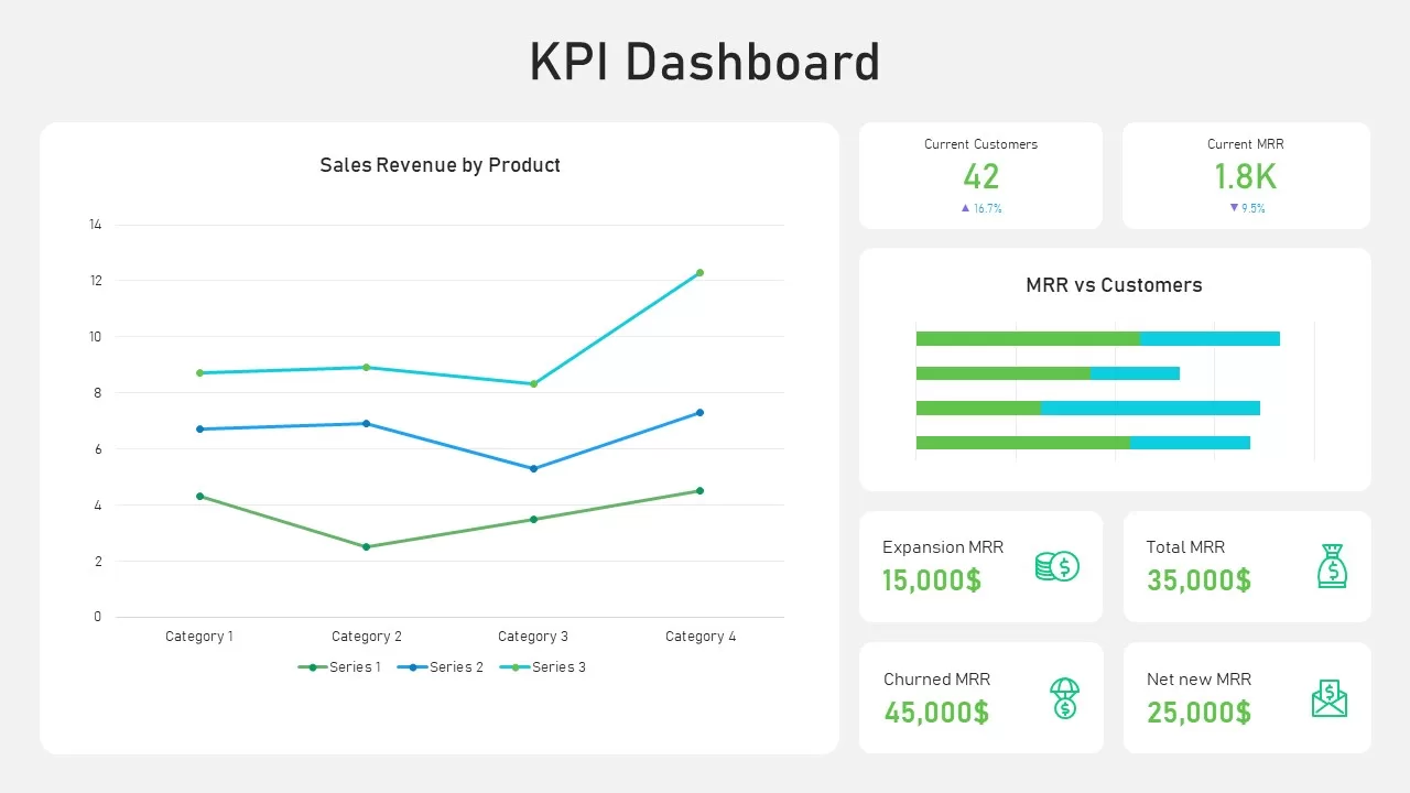
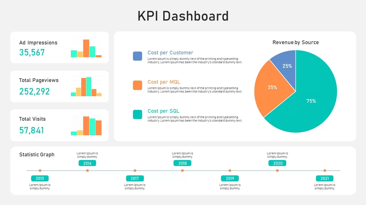
Whether you’re visualizing sales performance, web analytics, customer retention trends, or financial forecasts, this versatile pack adapts to diverse business needs. Use the top-left KPI panel to highlight critical health metrics, the bar chart for comparative analysis, the donut chart for proportion breakdowns, and the line charts for trend visualization. Duplicate or rearrange panels to accommodate additional data or spotlight specific departments. With minimal setup time and robust design features, this Metro UI dashboard infographic pack empowers you to deliver data-driven insights with polish and precision.
Who is it for
Workshop facilitators, marketing directors, product managers, and consultants will benefit from this pack when presenting comprehensive dashboards, KPI analyses, and performance overviews. Executive teams and cross-functional stakeholders can leverage the clear visual hierarchy to drive alignment, identify gaps, and prioritize initiatives.
Other Uses
Beyond business reporting, repurpose these slides for project status updates, risk management reviews, training modules, strategic roadmaps, or investor pitch decks. The flexible layouts also support customer journey mapping, portfolio performance snapshots, or departmental scorecards.
Login to download this file

Item ID
SB03161
Related Templates

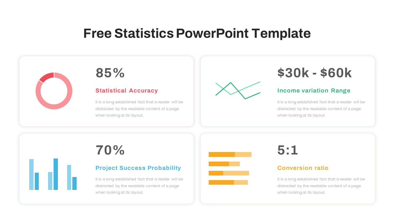
Free Infographic Statistics Dashboard Slide for PowerPoint & Google Slides
Bar/Column
Free

Dynamic Data Dashboard Infographic Template for PowerPoint & Google Slides
Bar/Column
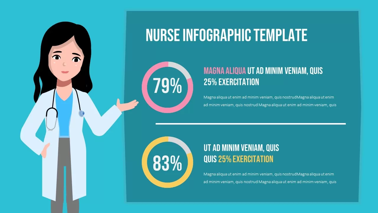
Professional Nurse Infographic Dashboard Template for PowerPoint & Google Slides
Nursing
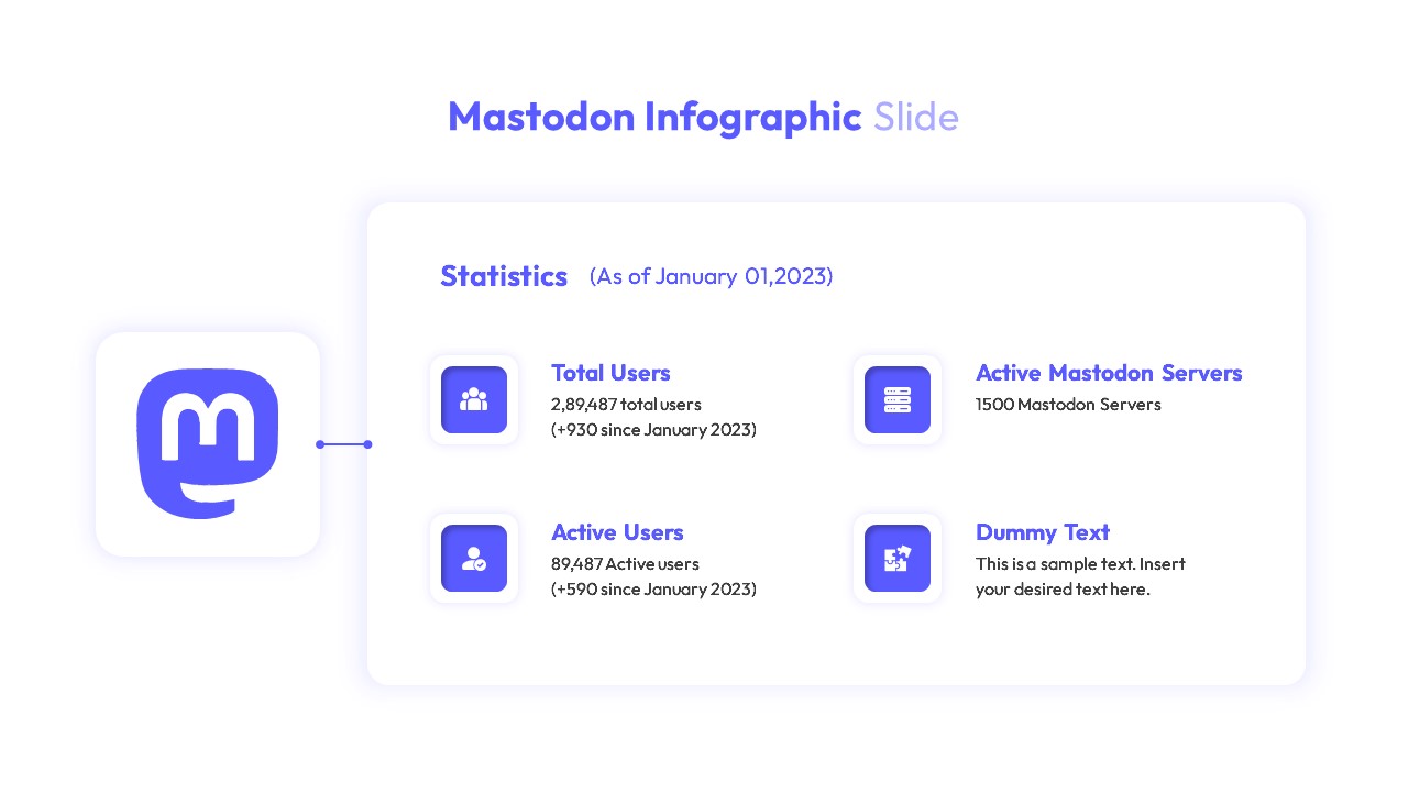
Mastodon Metrics Infographic Dashboard Template for PowerPoint & Google Slides
Business Report
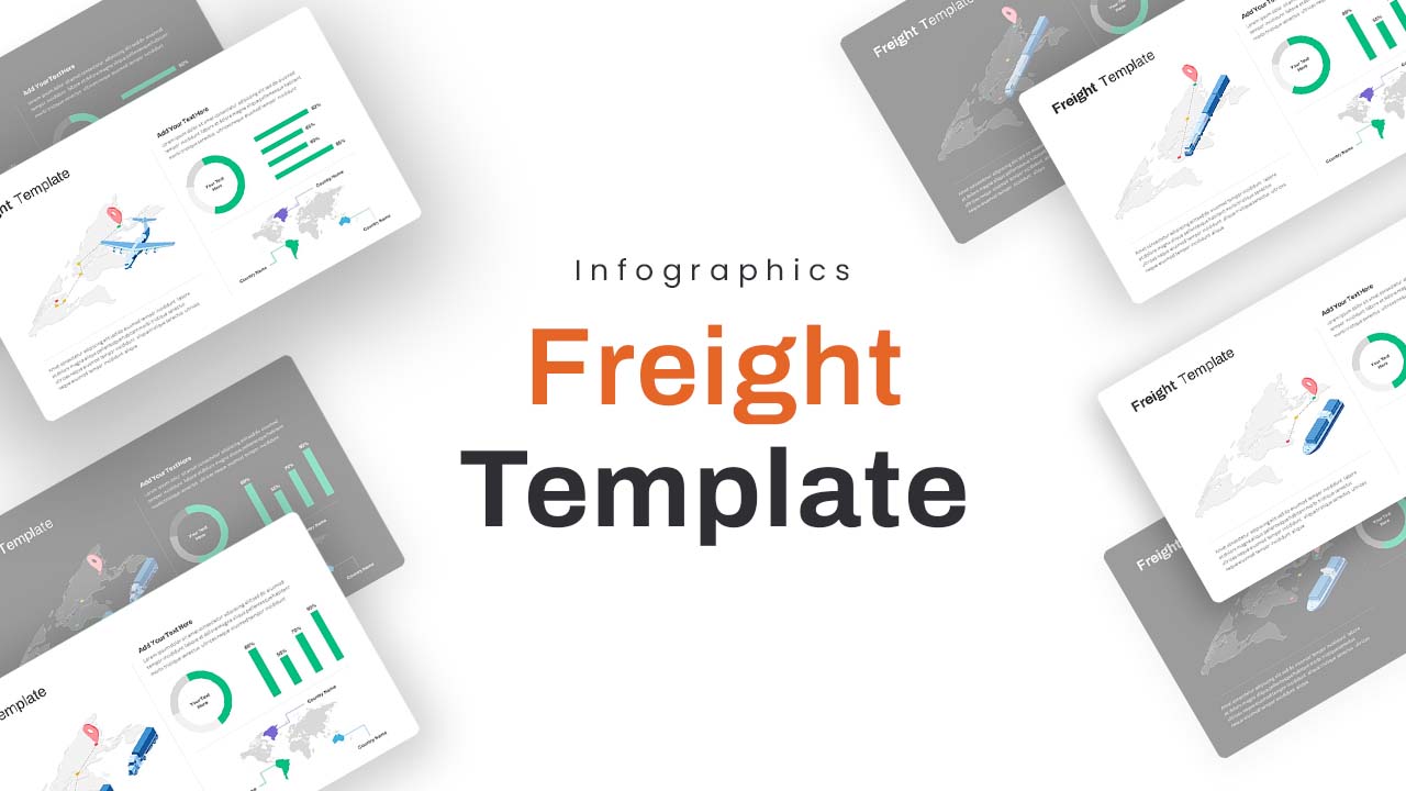
Freight Logistics Dashboard Infographic Template for PowerPoint & Google Slides
Comparison Chart
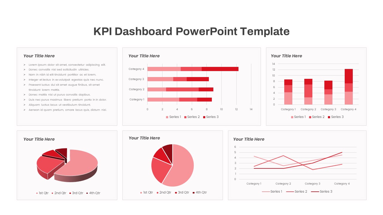
Free KPI Dashboard PowerPoint Template for PowerPoint & Google Slides
Charts
Free
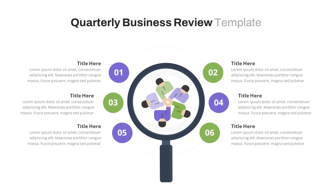
Free Quarterly Business Review Dashboard Template for PowerPoint & Google Slides
Business
Free
Free Monthly Report PowerPoint Template for PowerPoint & Google Slides
Business Report
Free

Free Data Analytics Dashboard Template for PowerPoint
Charts
Free
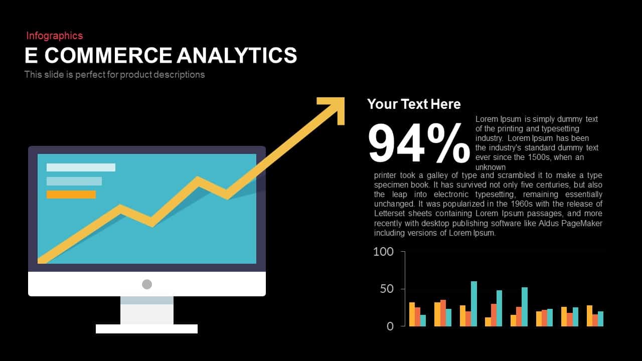
E-commerce Analytics Dashboard Template for PowerPoint & Google Slides
Bar/Column
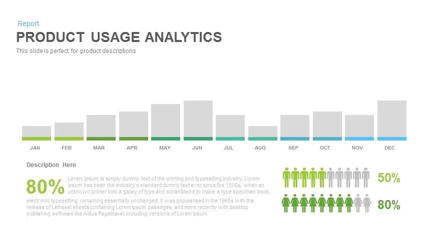
Product Usage Analytics Dashboard Chart Template for PowerPoint & Google Slides
Bar/Column
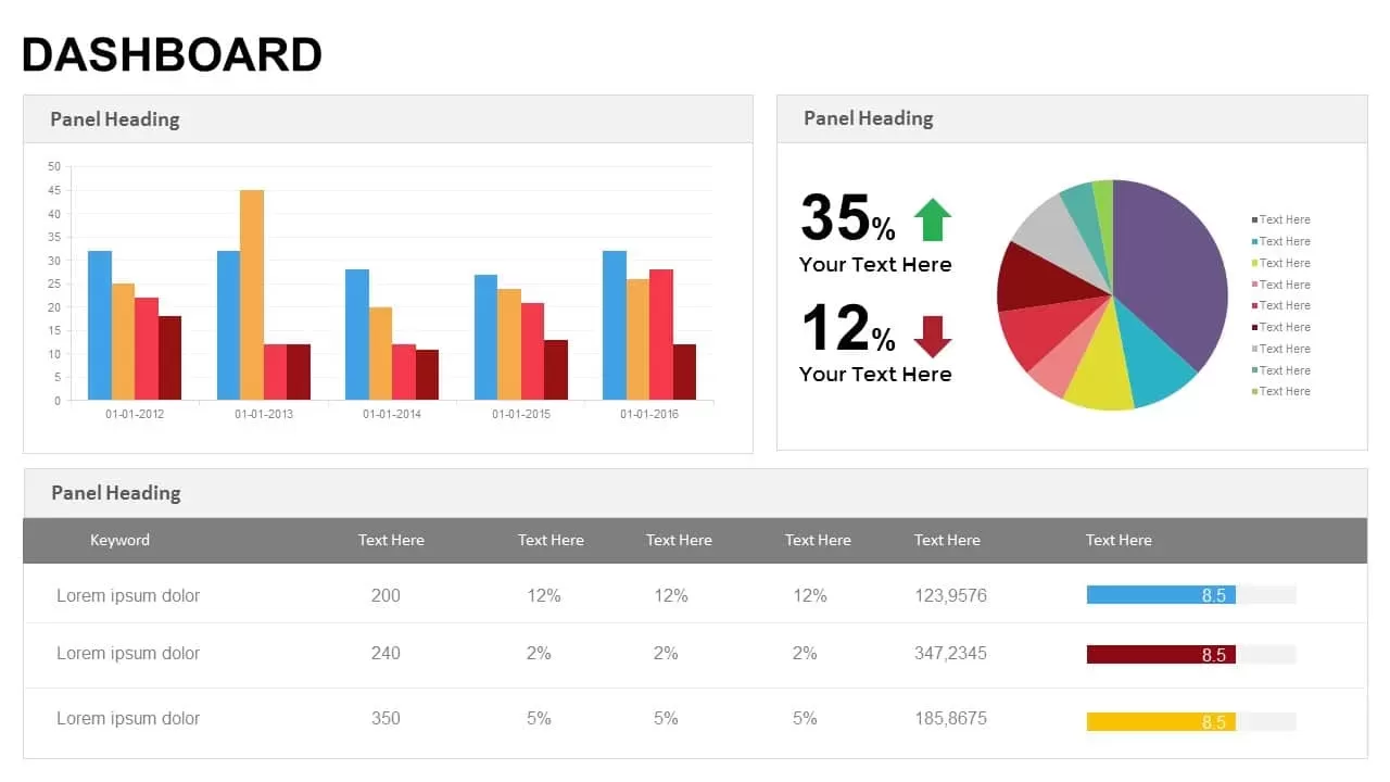
Data Analytics Dashboard Design template for PowerPoint & Google Slides
Bar/Column

Efficiency KPI Dashboard Metaphor Template for PowerPoint & Google Slides
Infographics
Business Dashboard Analytics & KPIs Template for PowerPoint & Google Slides
Bar/Column

Professional Team Efficiency Dashboard Template for PowerPoint & Google Slides
Business Report
Project Management Dashboard Template for PowerPoint & Google Slides
Project
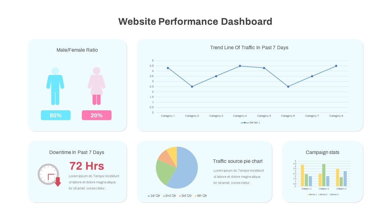
Website Performance Dashboard template for PowerPoint & Google Slides
Charts
Sales Performance Dashboard template for PowerPoint & Google Slides
Business Report
Immigration Data Dashboard Template for PowerPoint & Google Slides
Bar/Column
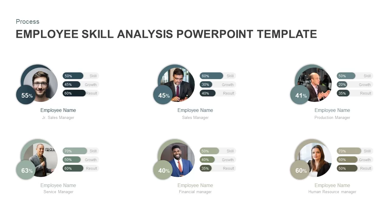
Employee Skill Analysis Dashboard Template for PowerPoint & Google Slides
Employee Performance
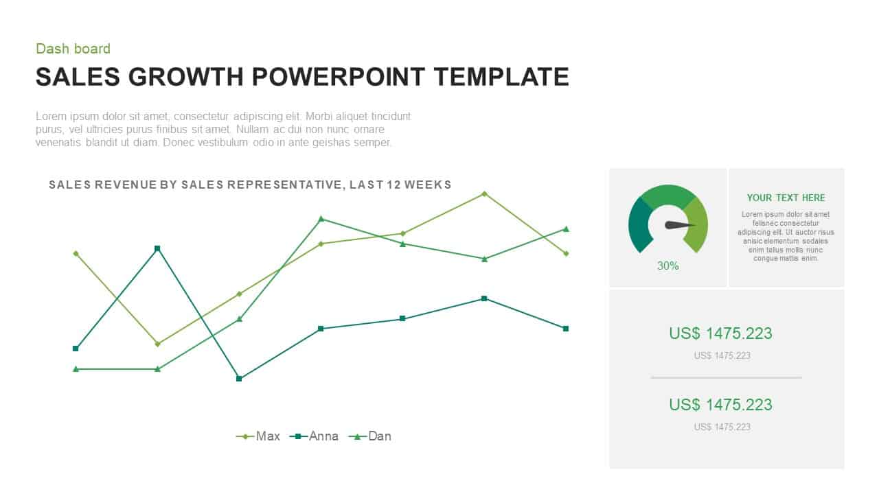
Sales Growth Dashboard: KPI Gauge & Line Template for PowerPoint & Google Slides
Revenue
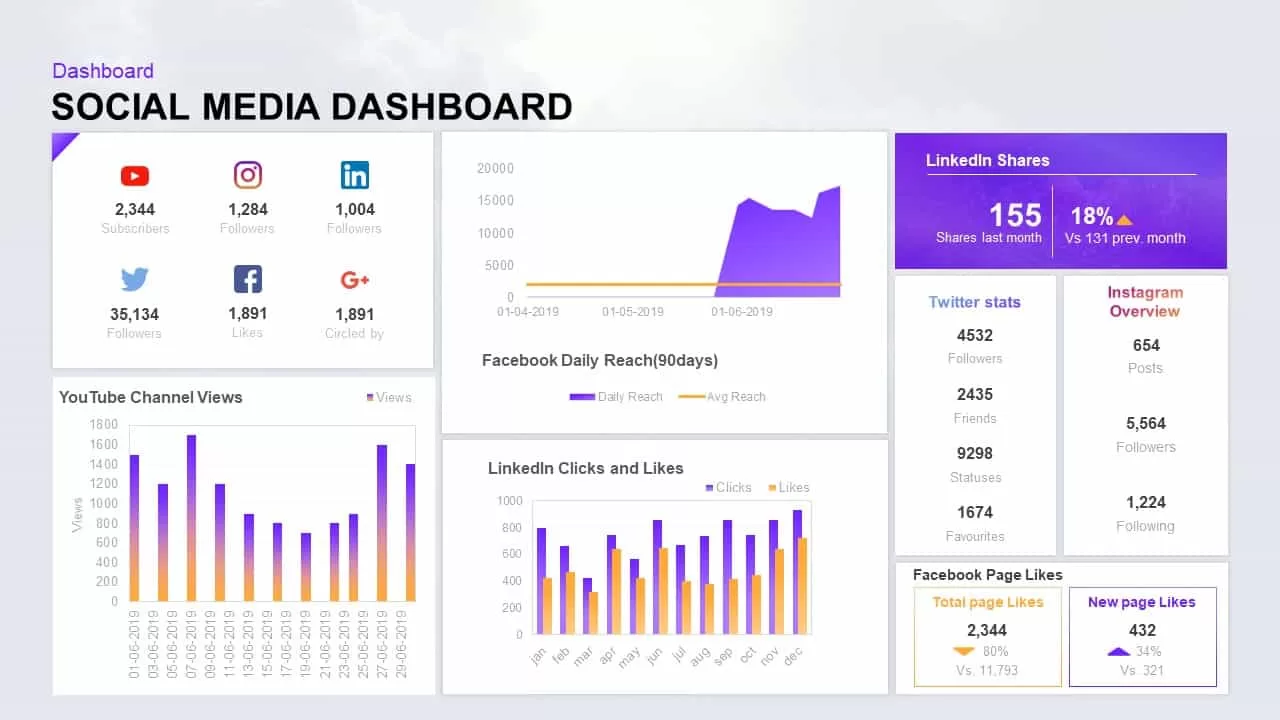
Social Media Performance Dashboard Template for PowerPoint & Google Slides
Bar/Column

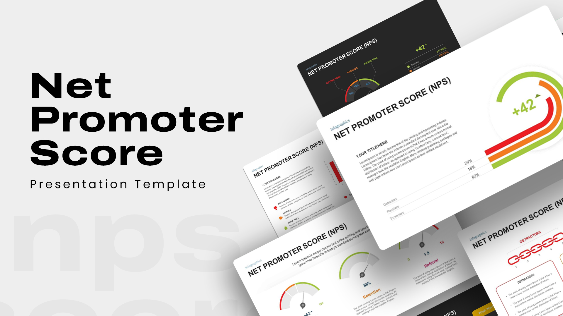
Net Promoter Score Dashboard Template for PowerPoint & Google Slides
Customer Experience
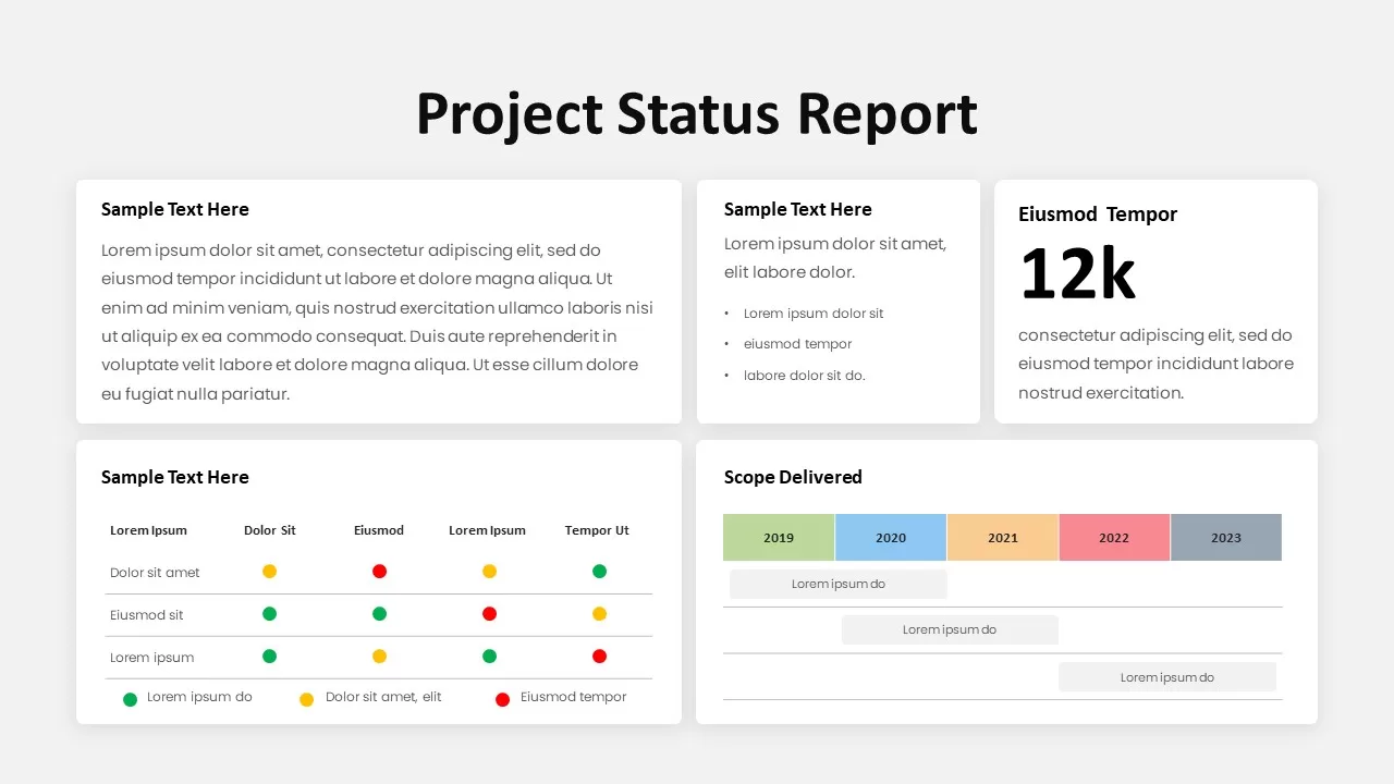
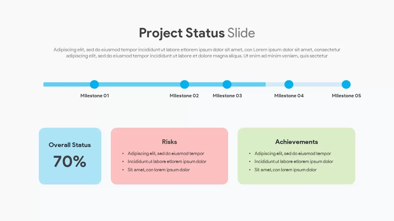
Modern Project Status Report Dashboard Template for PowerPoint & Google Slides
Project Status
Performance KPI Dashboard Slide Template for PowerPoint & Google Slides
Business Report
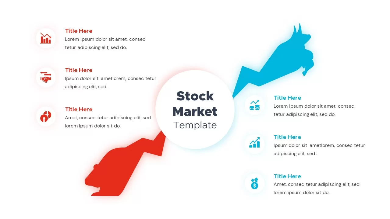
Bull and Bear Stock Market Dashboard Template for PowerPoint & Google Slides
Infographics
KPI Dashboard template for PowerPoint & Google Slides
Business Report
KPI Dashboard Overview template for PowerPoint & Google Slides
Finance
KPI Dashboard Data Visualization Template for PowerPoint & Google Slides
Bar/Column
KPI Dashboard Data Overview Slide Template for PowerPoint & Google Slides
Bar/Column
Interactive Benchmarking Gauge Dashboard Template for PowerPoint & Google Slides
Pie/Donut
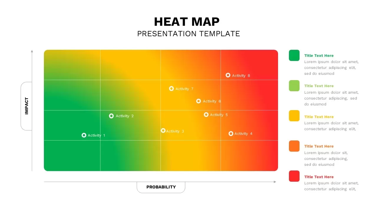
Heat Map Risk Matrix Dashboard Template for PowerPoint & Google Slides
Comparison Chart
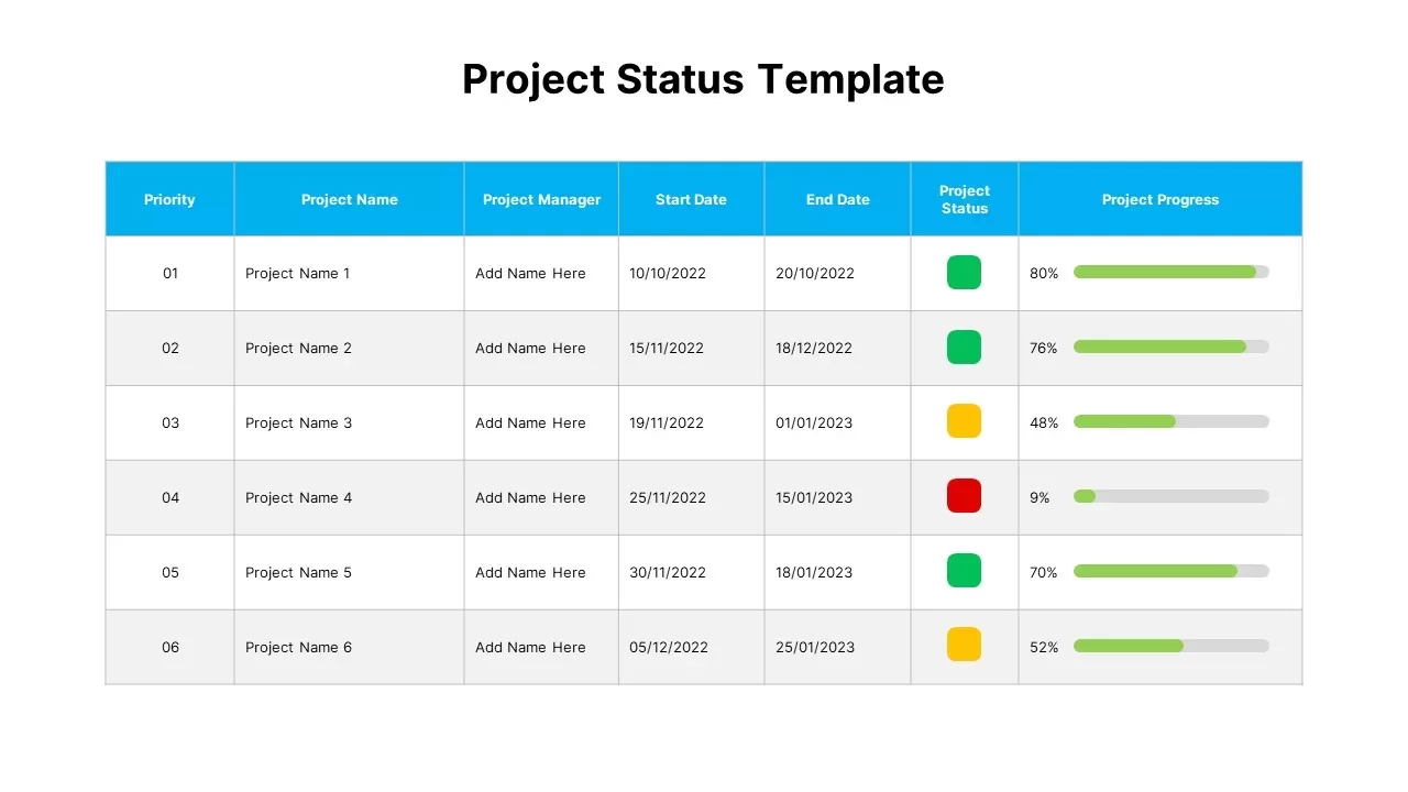
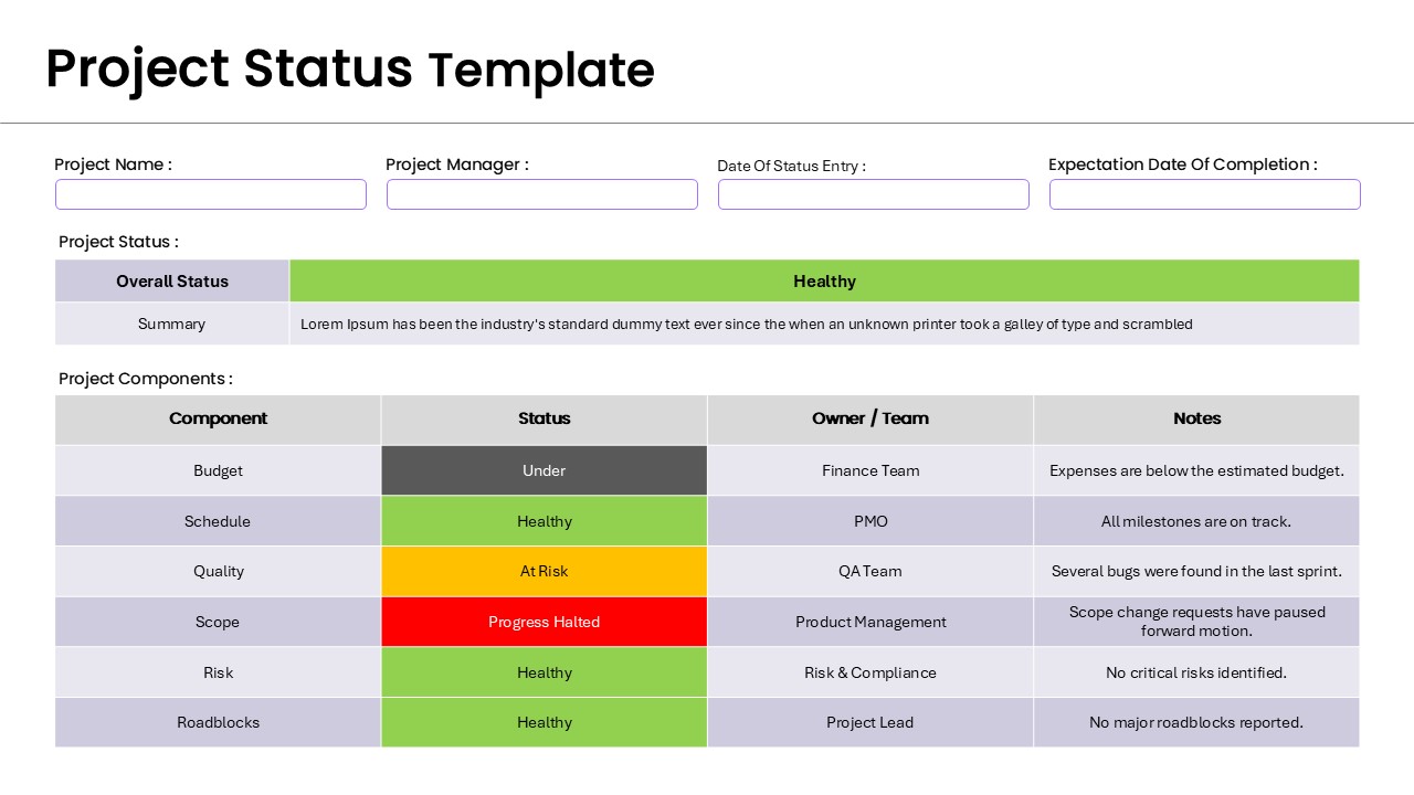
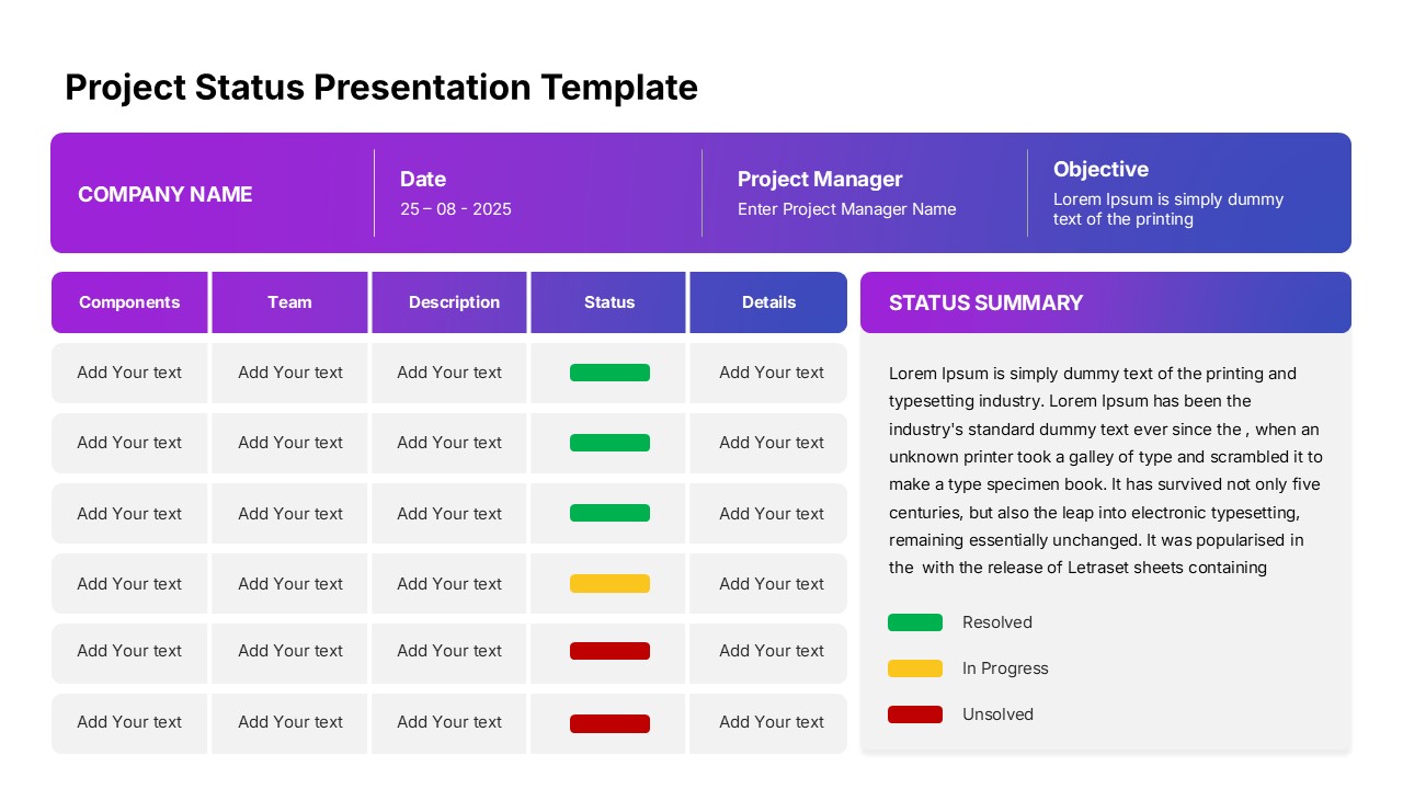
Project Status Dashboard Table Template for PowerPoint & Google Slides
Project Status
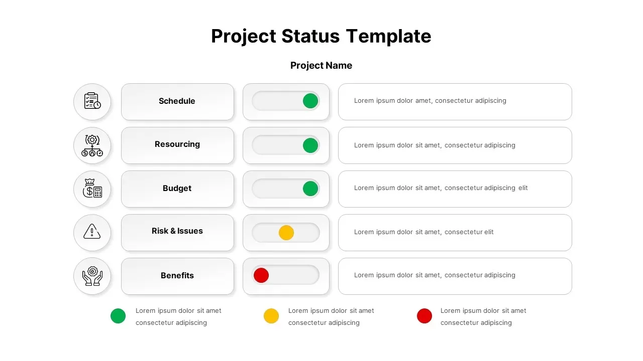
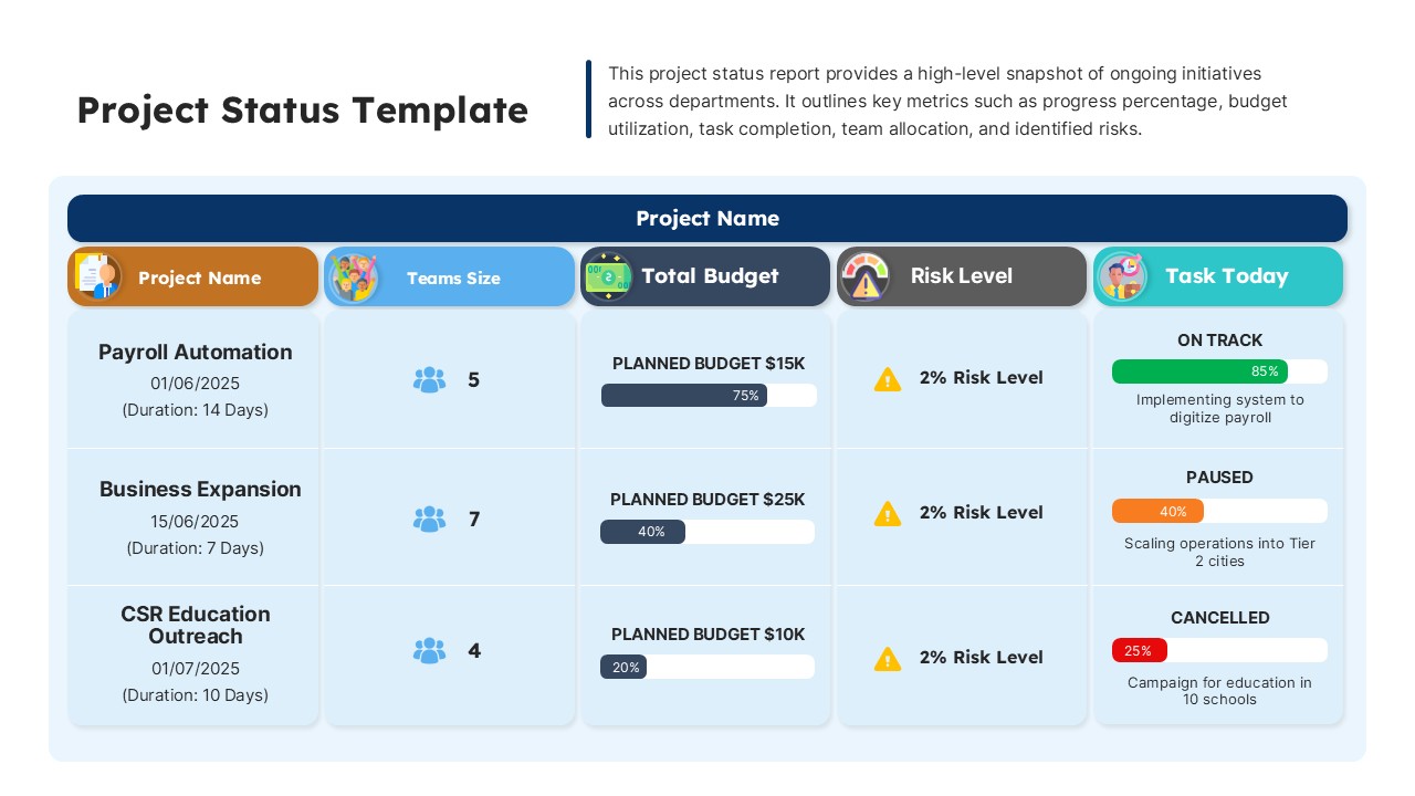
Project Status Dashboard with Metrics Template for PowerPoint & Google Slides
Project Status
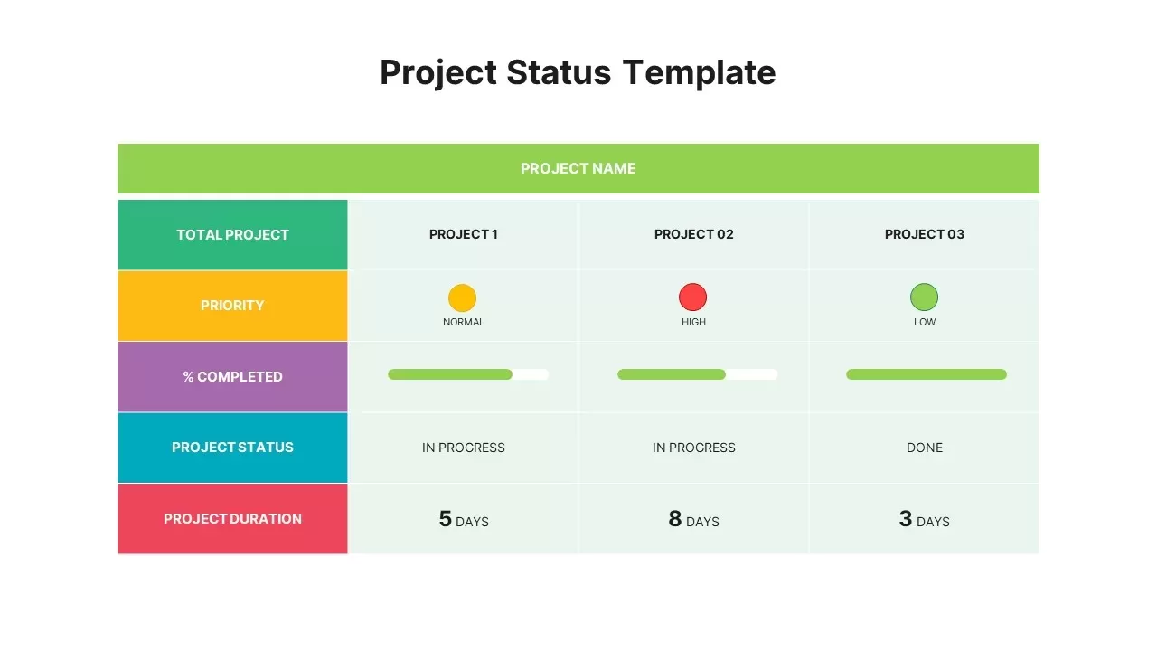
Colorful Project Status Dashboard Template for PowerPoint & Google Slides
Project Status
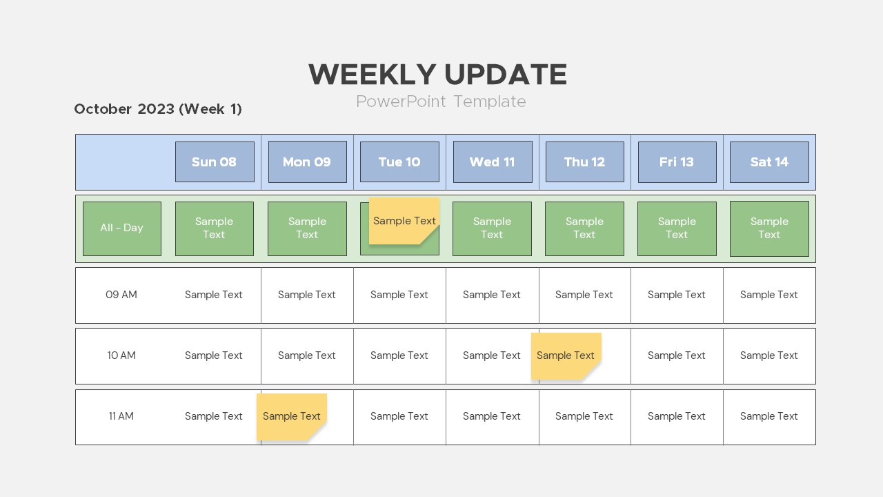
Weekly Update Schedule Dashboard Template for PowerPoint & Google Slides
Agenda
Project Status Dashboard Template for PowerPoint & Google Slides
Project Status
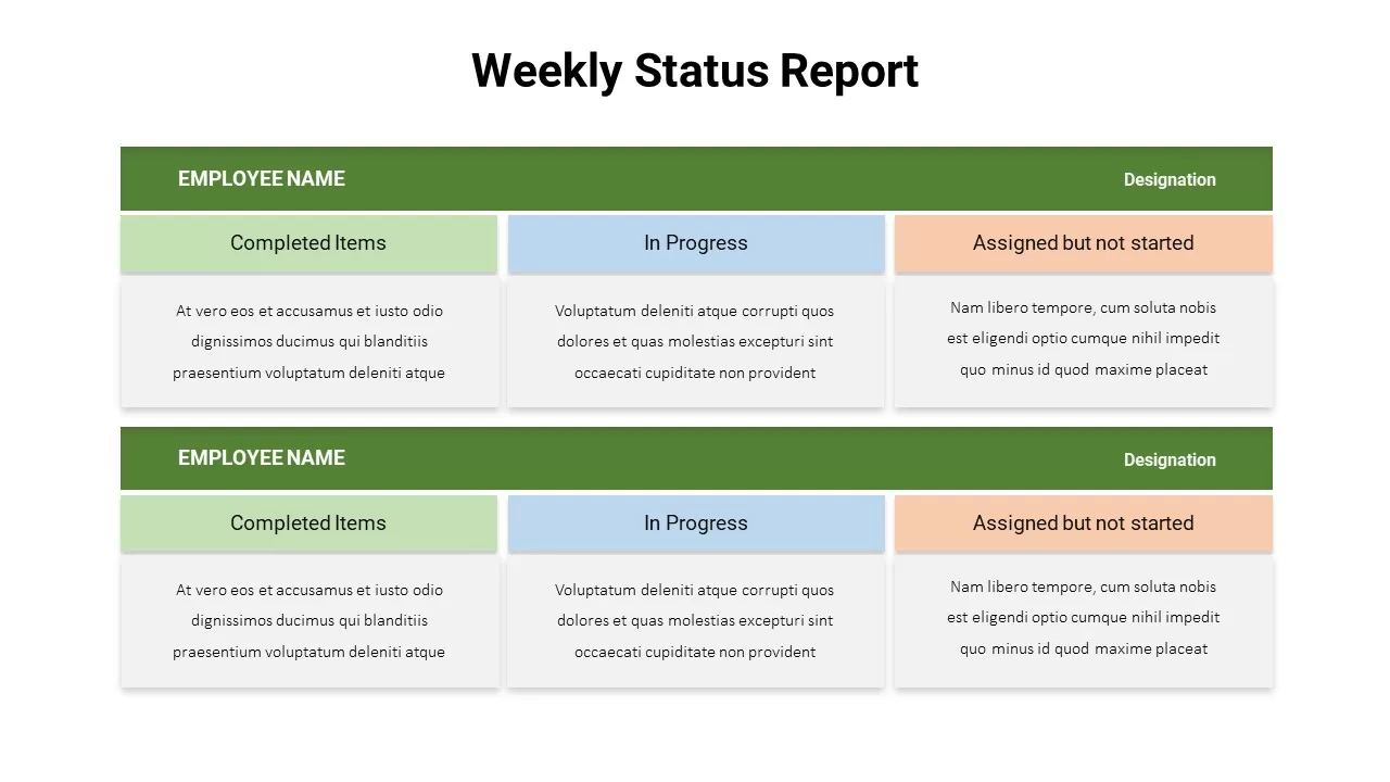
Weekly Status Report Dashboard Template for PowerPoint & Google Slides
HR
Website Performance Monitoring Dashboard Template for PowerPoint & Google Slides
Business Report
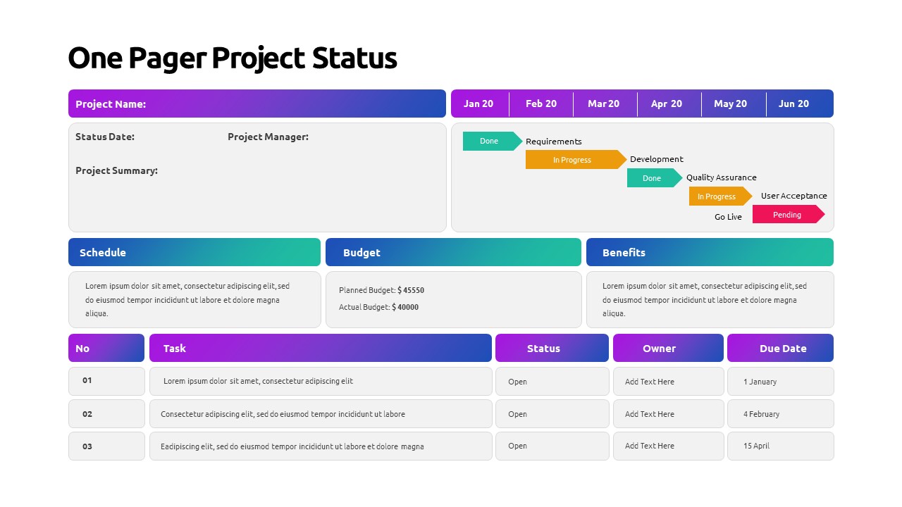
One Pager Project Status Dashboard Template for PowerPoint & Google Slides
Project Status
One Pager Annual Report Dashboard Template for PowerPoint & Google Slides
Business Report
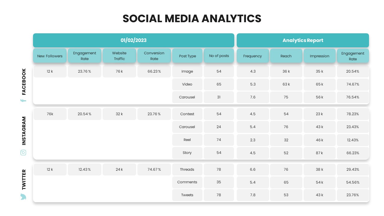
Social Media Analytics Dashboard Template for PowerPoint & Google Slides
Digital Marketing
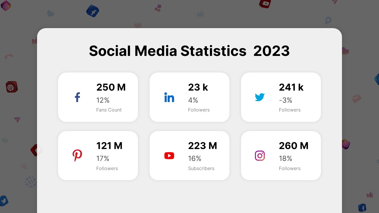
Social Media Statistics 2023 Dashboard Template for PowerPoint & Google Slides
Comparison
Soccer Match Stats Dashboard Slide Template for PowerPoint & Google Slides
Graphics
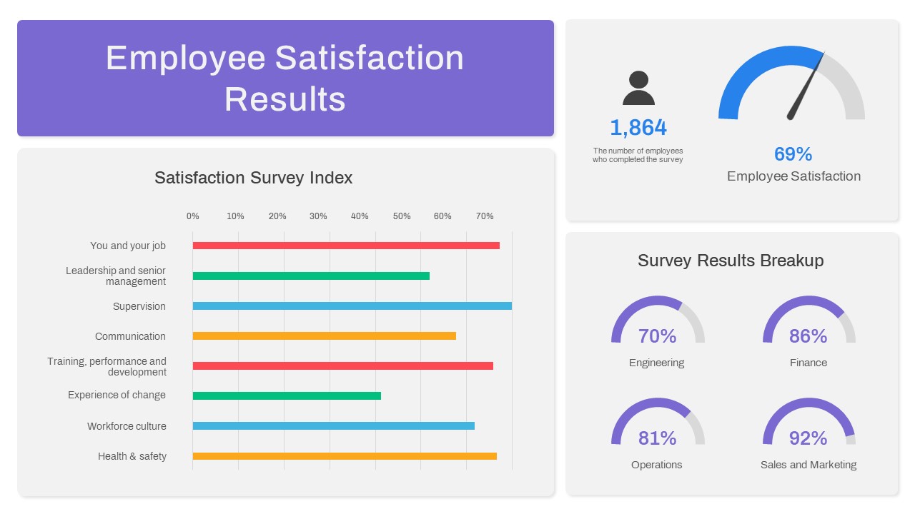
Employee Satisfaction Survey Dashboard Template for PowerPoint & Google Slides
Employee Performance
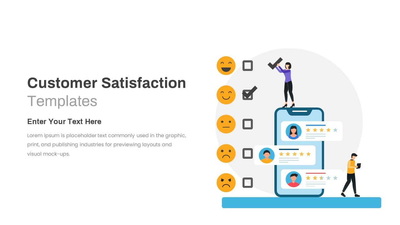
Customer Satisfaction KPI Dashboard Template for PowerPoint & Google Slides
Customer Experience
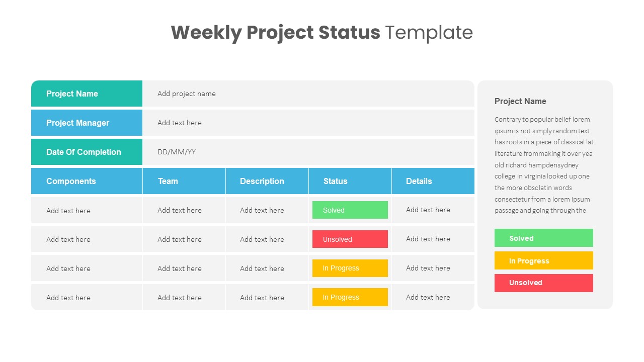
Weekly Project Status Dashboard Template for PowerPoint & Google Slides
Project Status
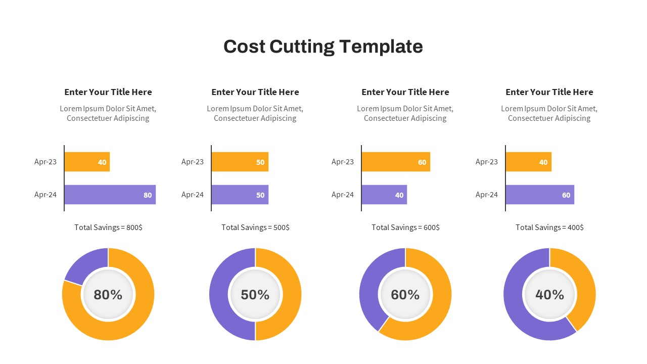
Cost Cutting Savings Dashboard Template for PowerPoint & Google Slides
Pie/Donut
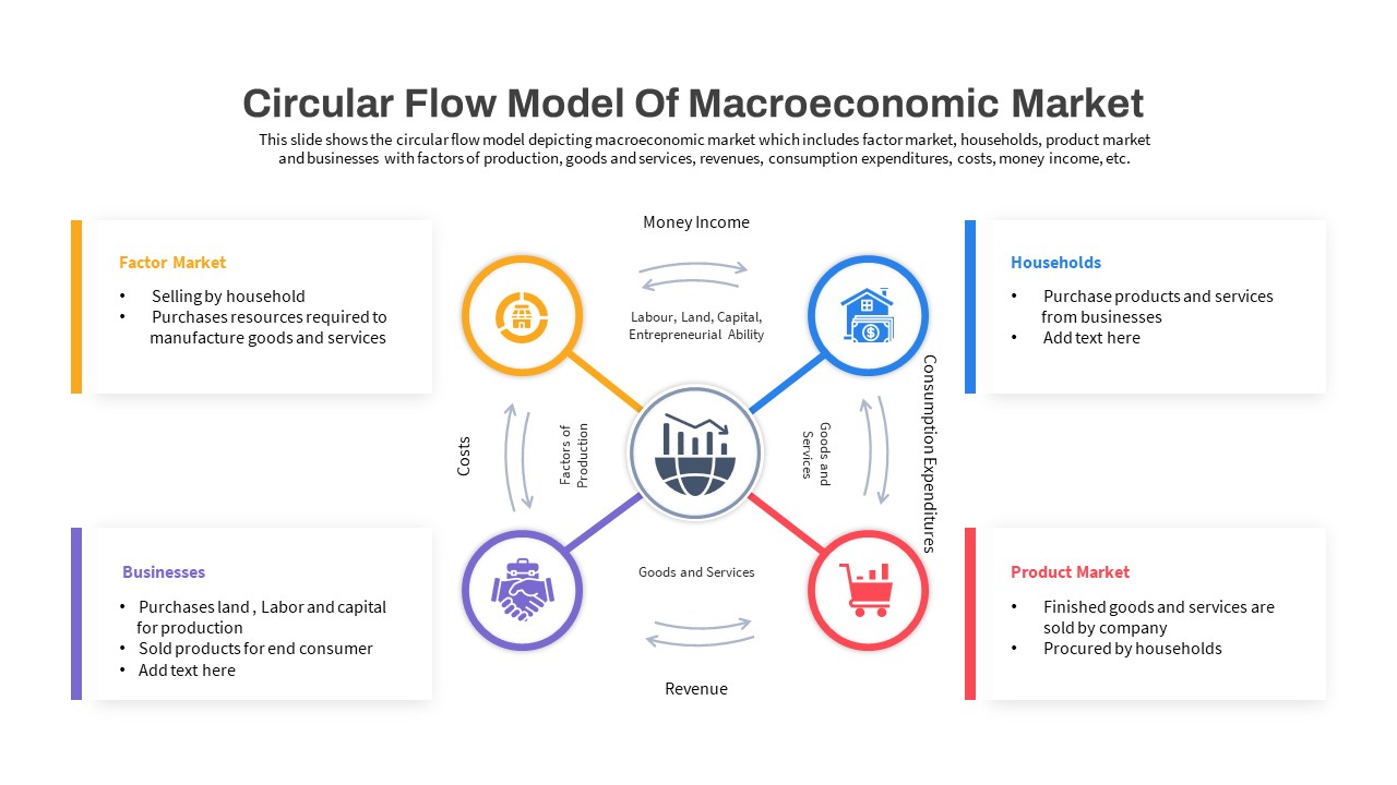
Macroeconomic Indicators Dashboard Template for PowerPoint & Google Slides
PEST
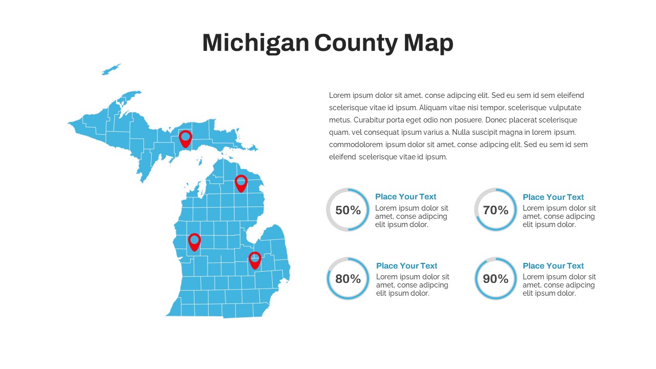
Michigan County Map with KPI Dashboard Template for PowerPoint & Google Slides
World Maps
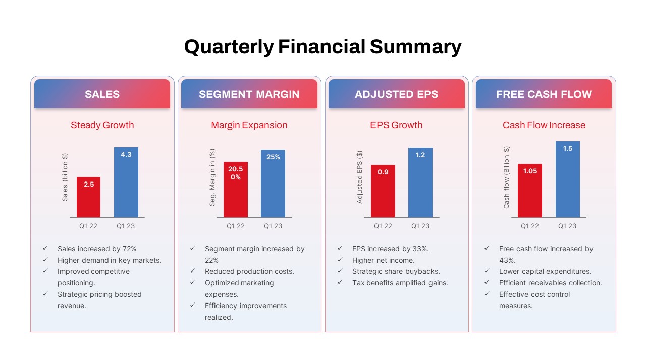
Quarterly Financial Summary Dashboard Template for PowerPoint & Google Slides
Business Report
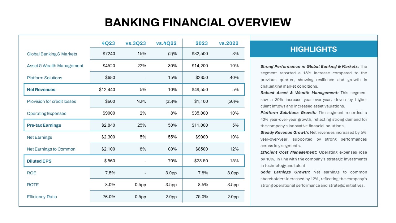
Banking Financial Overview Dashboard Template for PowerPoint & Google Slides
Finance
Quarterly Business Review Dashboard Template for PowerPoint & Google Slides
Pitch Deck
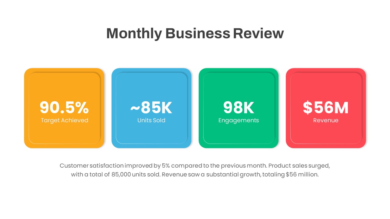
Monthly Business Review Dashboard Deck Template for PowerPoint & Google Slides
Business Report
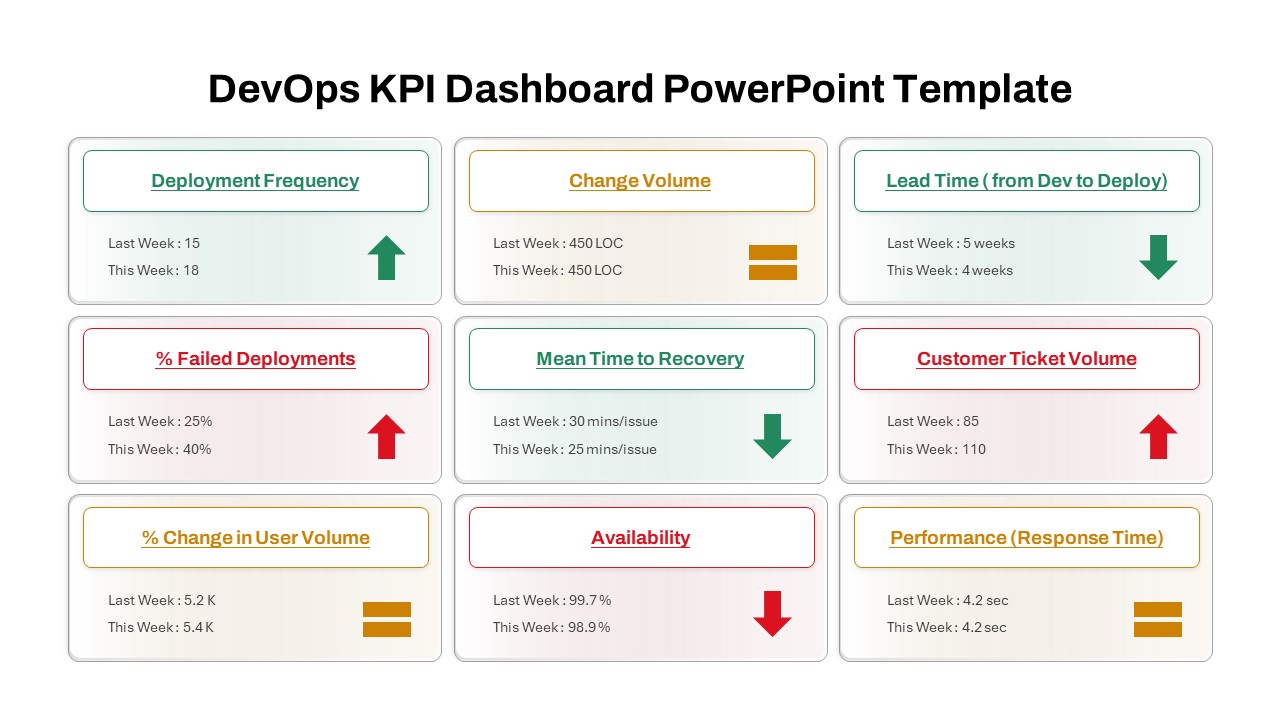
DevOps KPI Dashboard Performance Metrics Template for PowerPoint & Google Slides
Software Development
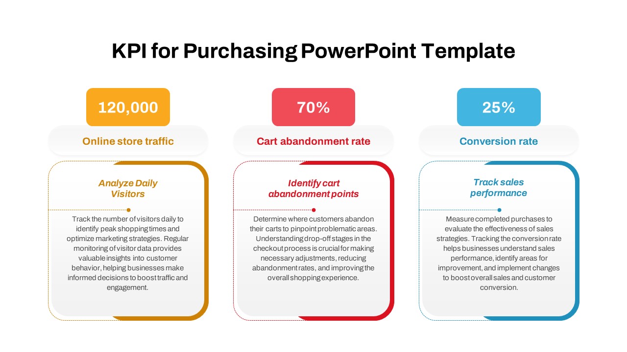
Purchasing KPI Metrics Dashboard Template for PowerPoint & Google Slides
Business Report
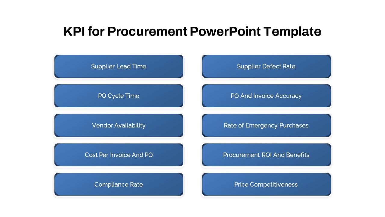
Procurement KPI Dashboard & Metrics Template for PowerPoint & Google Slides
Business Report
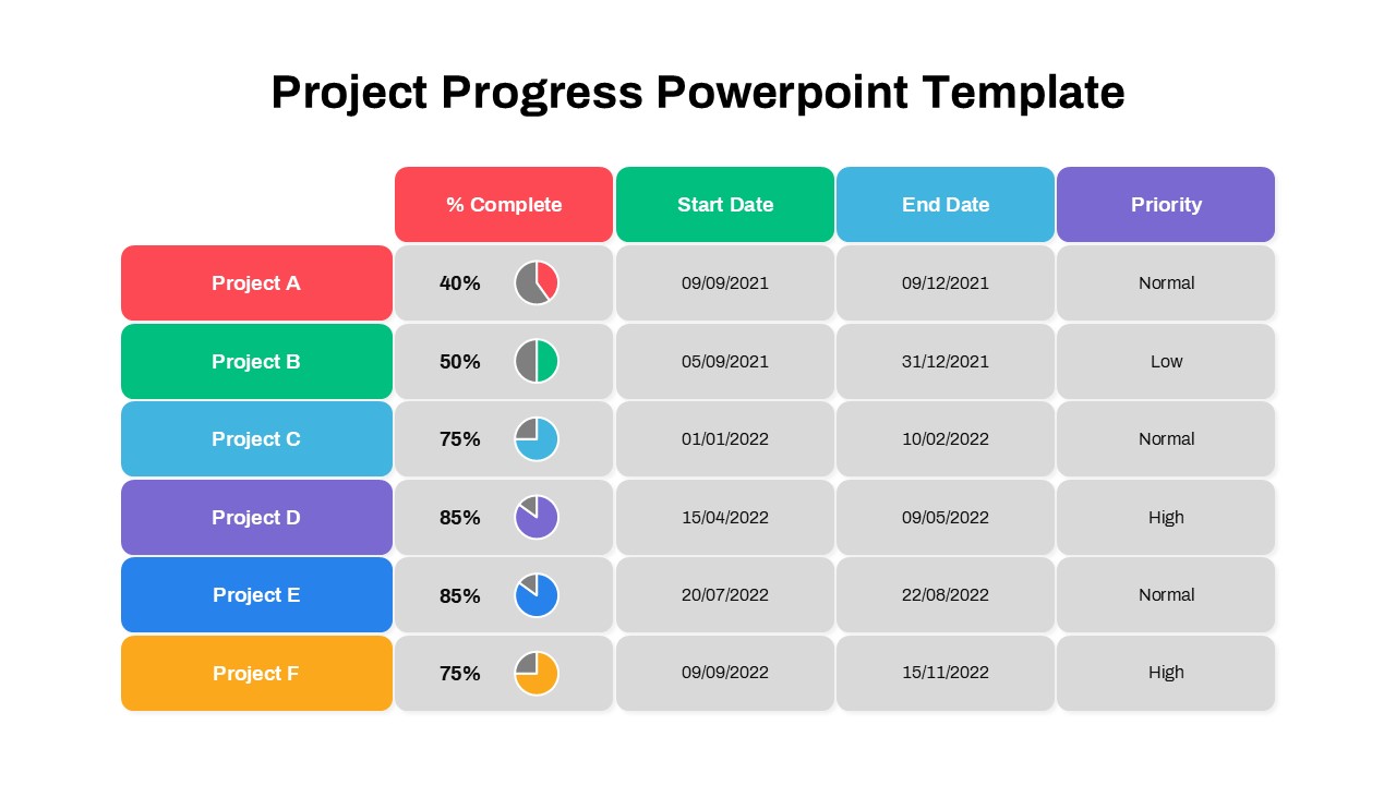
Project Progress Dashboard Pie Charts Template for PowerPoint & Google Slides
Project
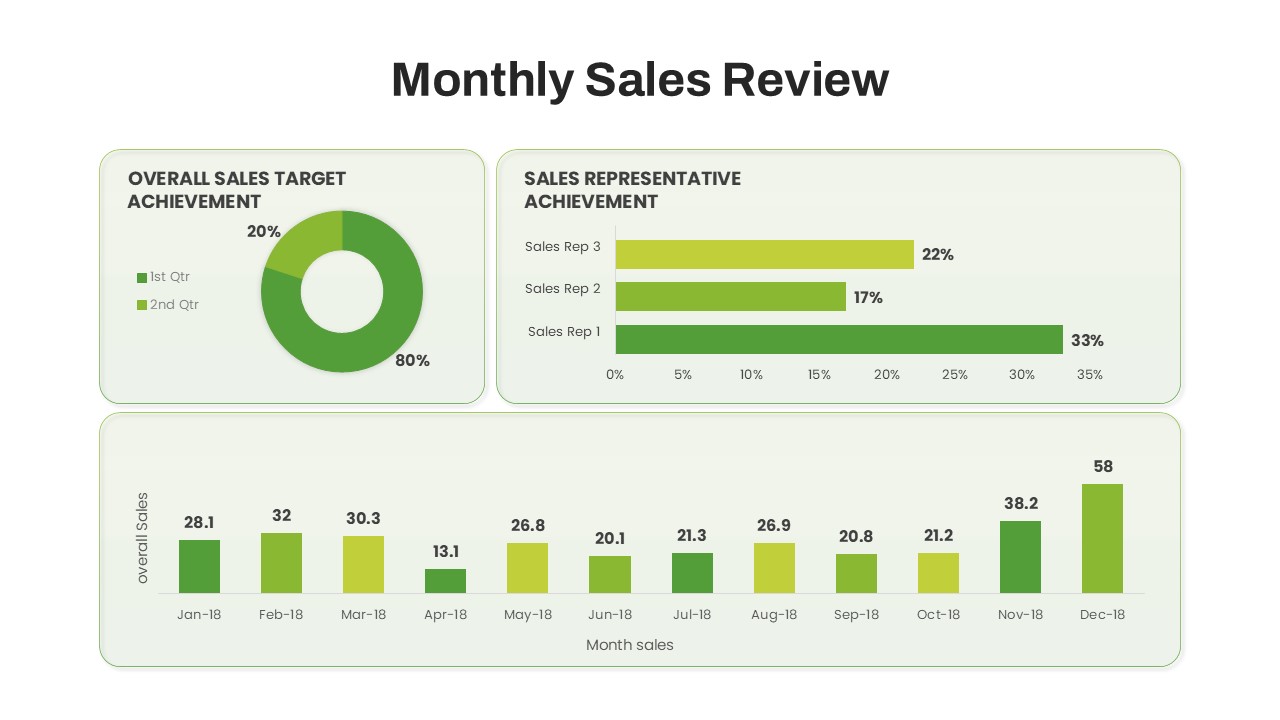
Monthly Sales Performance Dashboard Template for PowerPoint & Google Slides
Charts
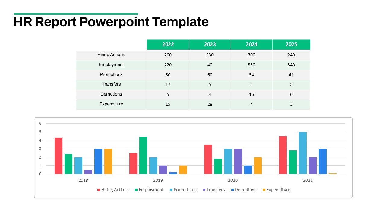
HR Report Dashboard Template for PowerPoint & Google Slides
Employee Performance
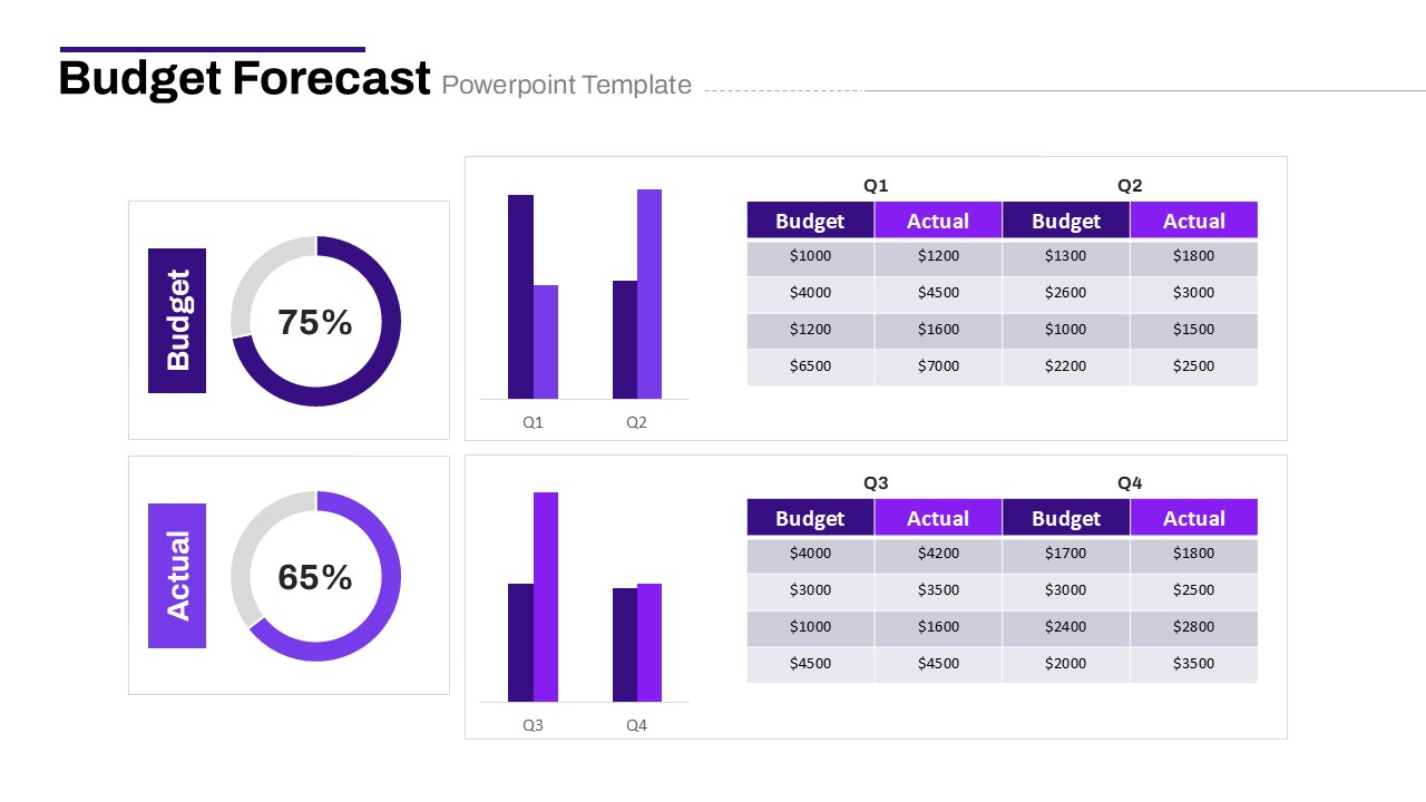
Budget Forecast Dashboard & Donut Charts Template for PowerPoint & Google Slides
Pie/Donut
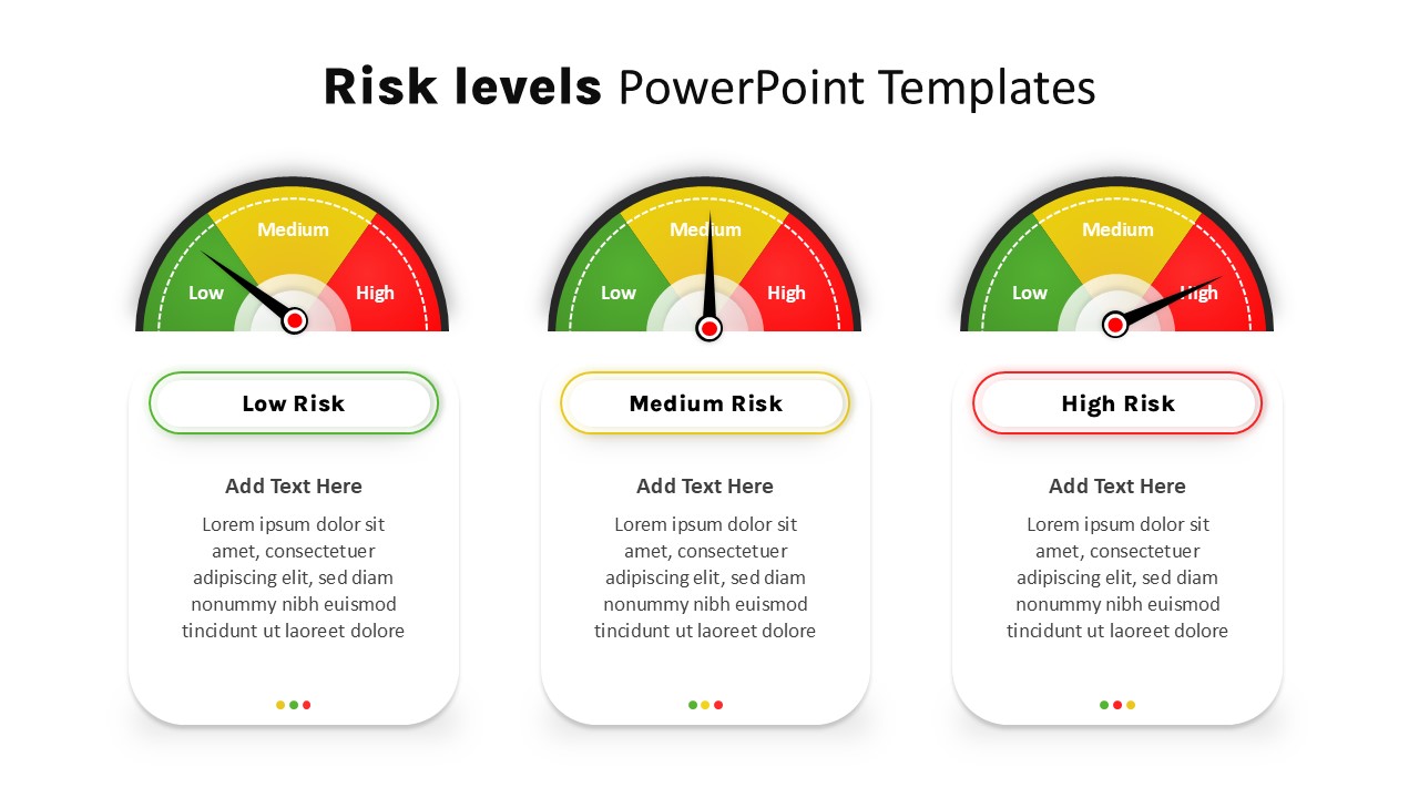
Risk Level Gauge Comparison Dashboard Template for PowerPoint & Google Slides
Comparison
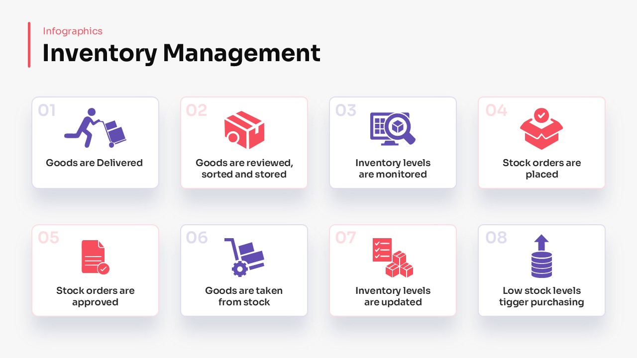
Inventory Management Dashboard Template for PowerPoint & Google Slides
Process
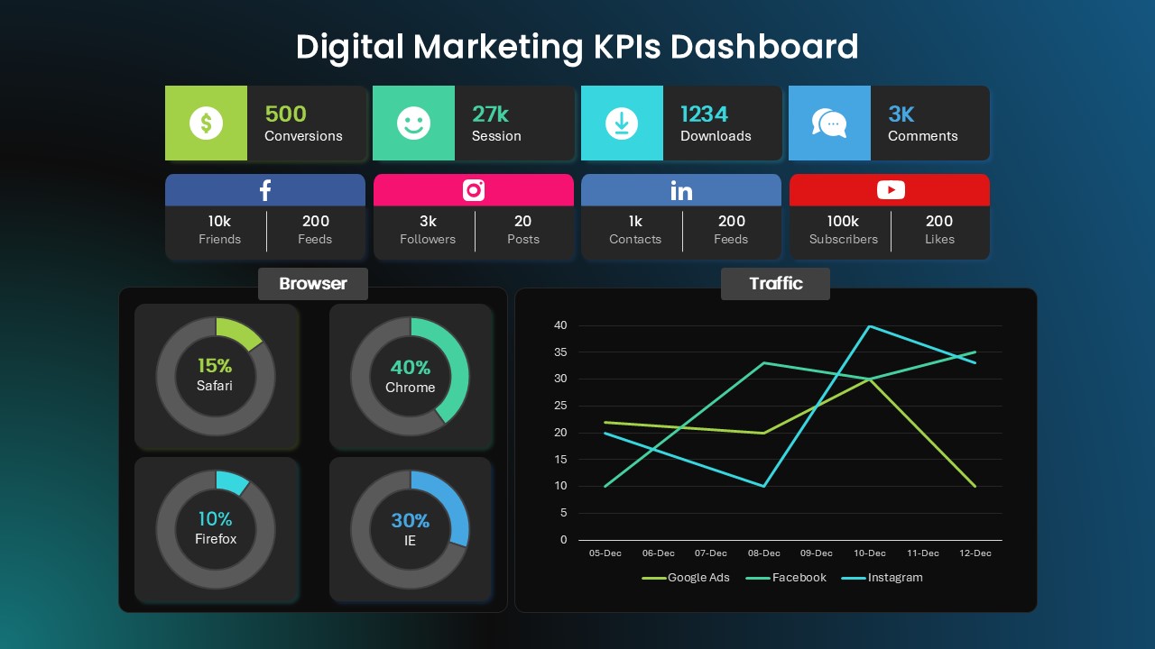
Digital Marketing KPIs Dashboard Dark Template for PowerPoint & Google Slides
Business Report
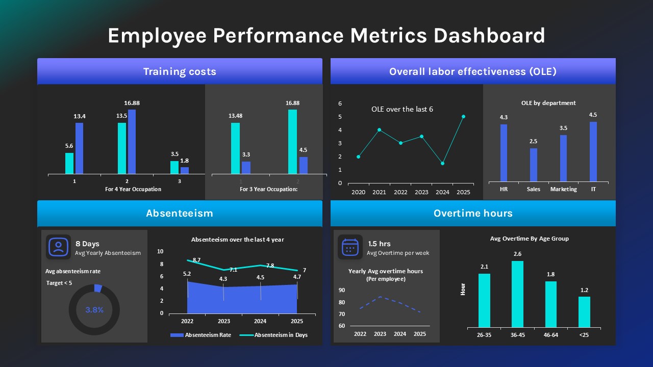
Employee Performance Metrics Dashboard Template for PowerPoint & Google Slides
Employee Performance
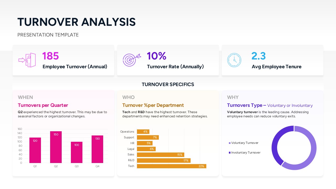
Turnover Analysis Dashboard Template for PowerPoint & Google Slides
Employee Performance
Project Tracking Dashboard Table Template for PowerPoint & Google Slides
Project Status
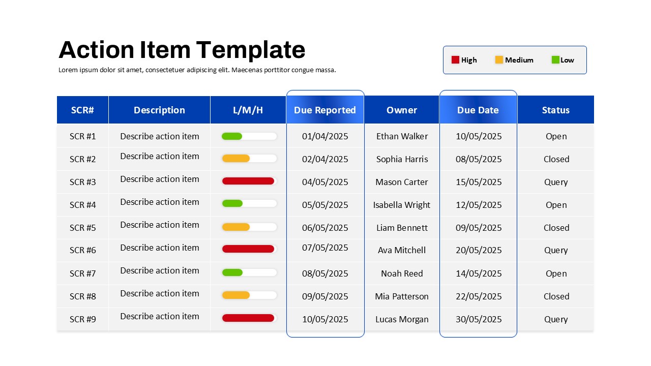
Action Items Management Dashboard Table Template for PowerPoint & Google Slides
Project Status
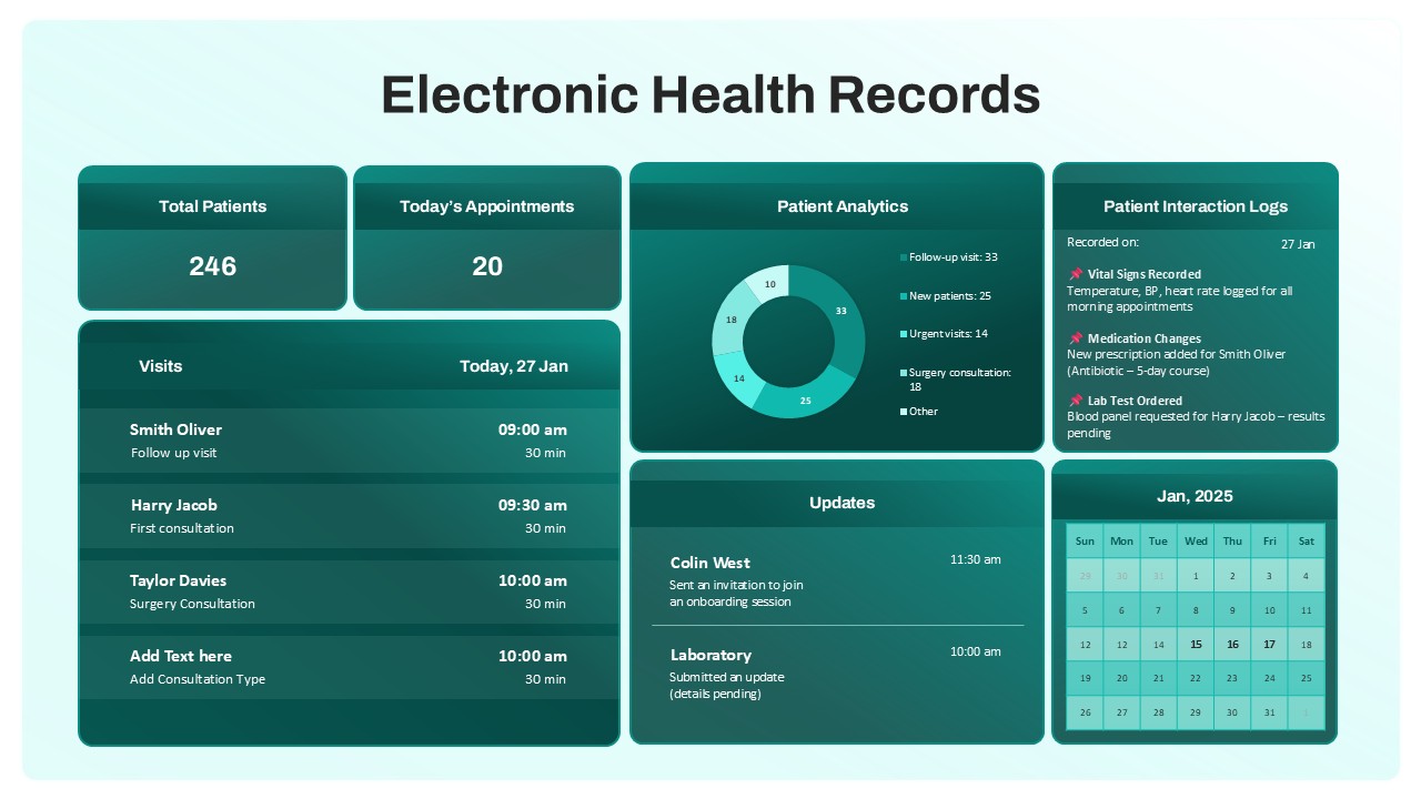
Electronic Health Records Dashboard template for PowerPoint & Google Slides
Health
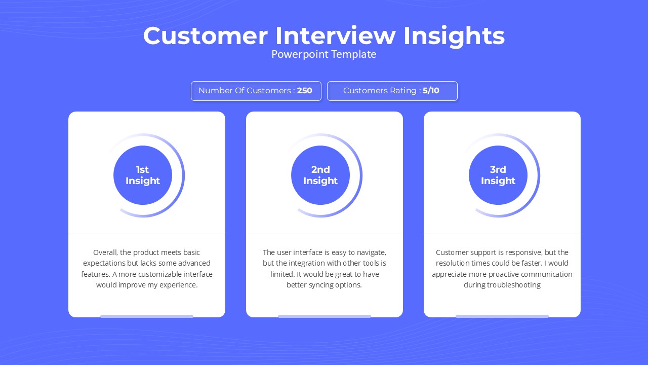
Customer Interview Insights Dashboard Template for PowerPoint & Google Slides
Customer Experience
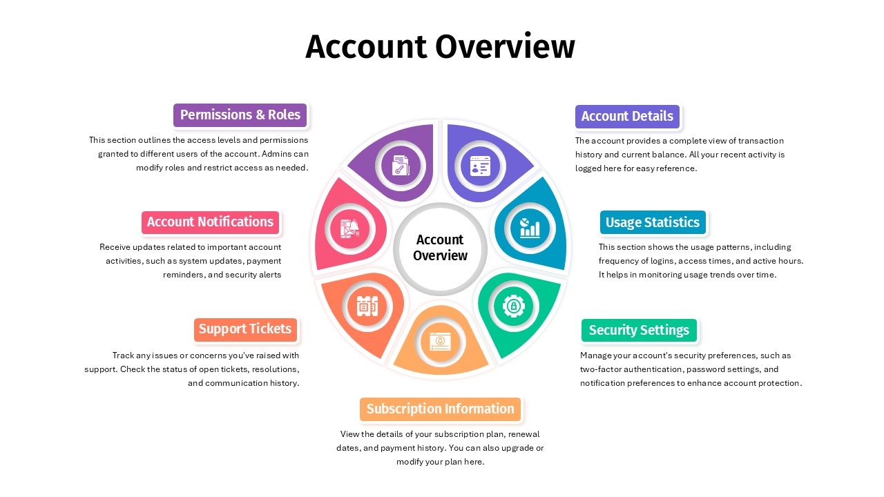
Account Overview Dashboard template for PowerPoint & Google Slides
Business
Project Status Dashboard Report Template for PowerPoint & Google Slides
Project Status
Project Status Update Dashboard Table Template for PowerPoint & Google Slides
Project Status
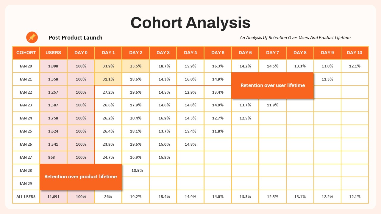
Cohort Analysis Retention Dashboard Template for PowerPoint & Google Slides
Comparison Chart
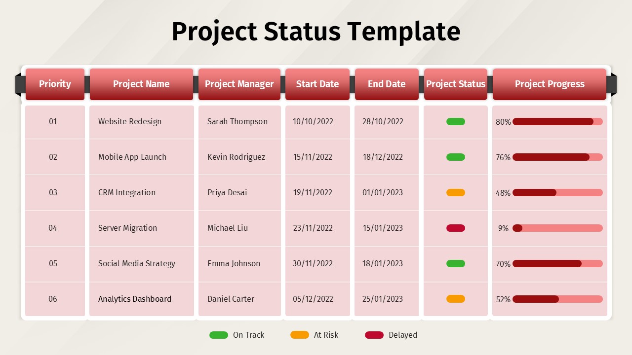
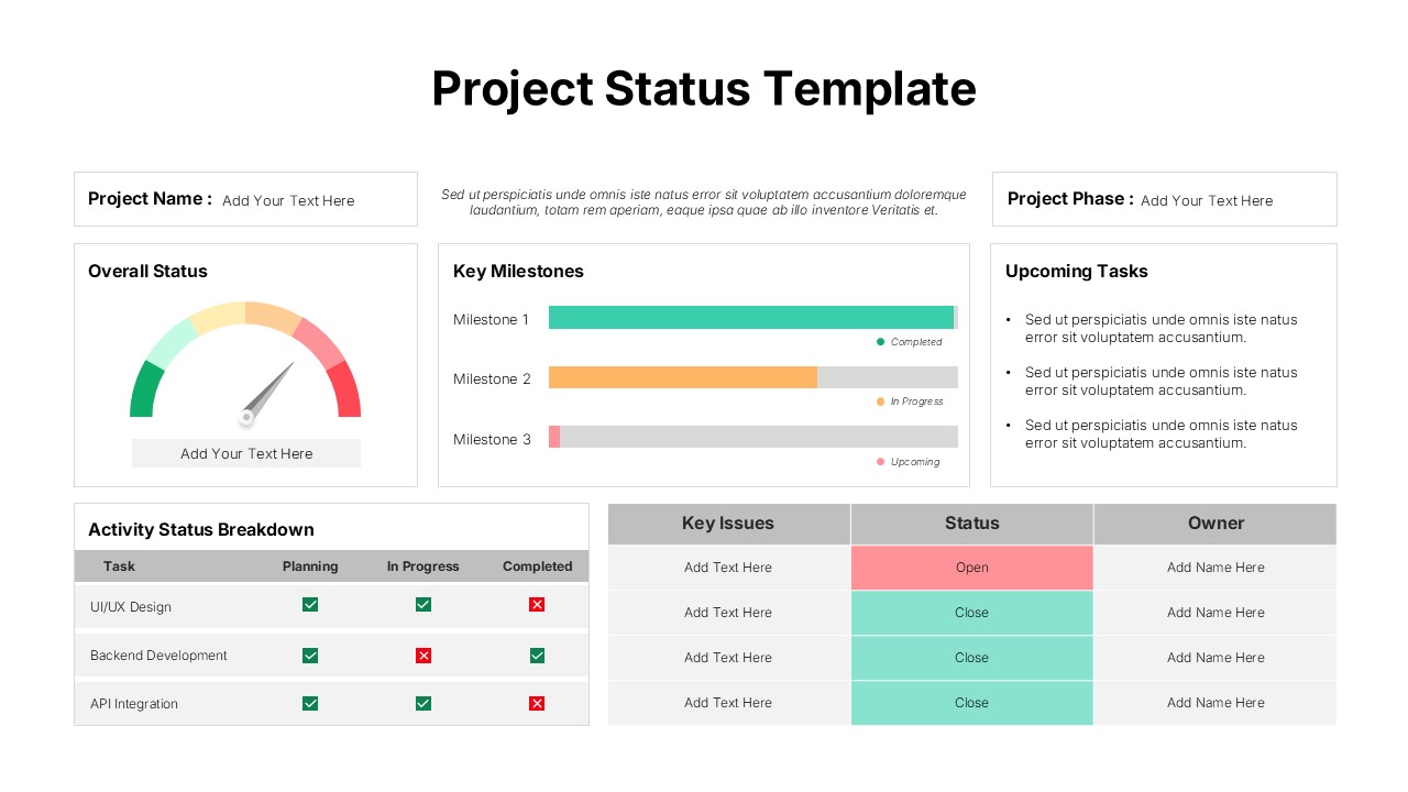
Project Status Dashboard Template for PowerPoint & Google Slides
Project Status
Dashboard Project Status Template for PowerPoint & Google Slides
Project Status
Project Status Template Dashboard with Gauge for PowerPoint & Google Slides
Project Status
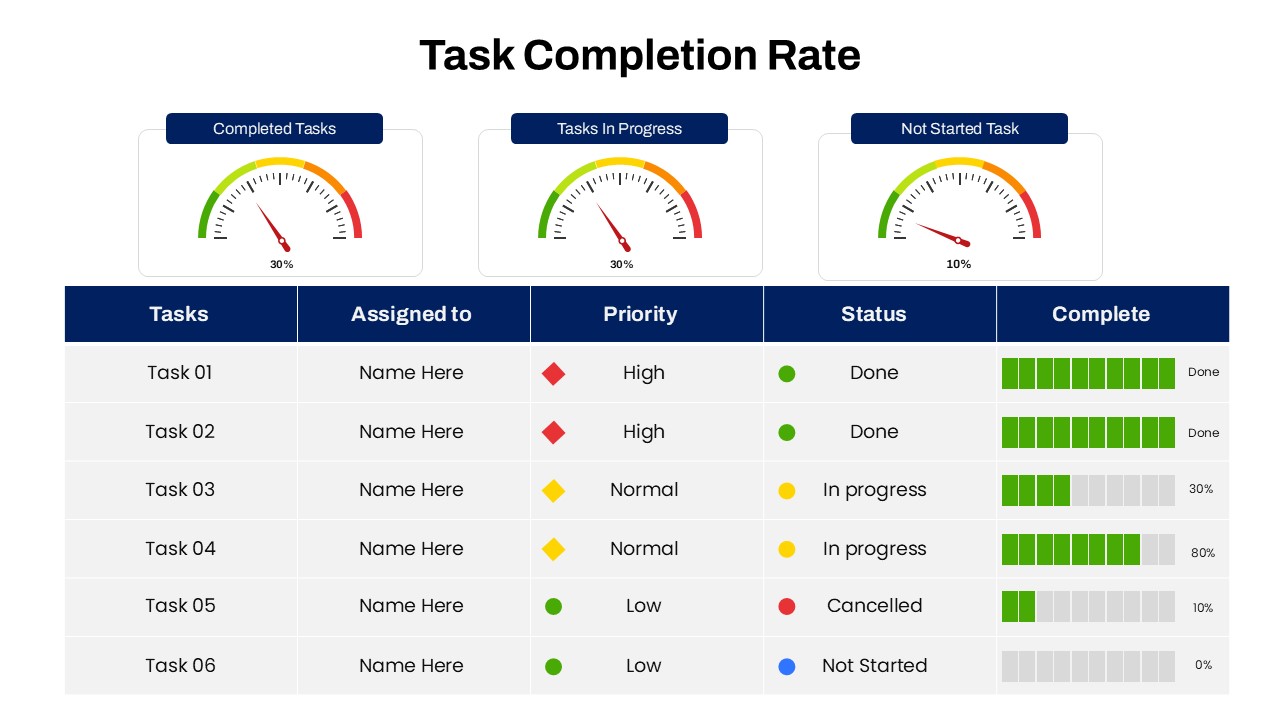
Task Completion Rate Dashboard Template for PowerPoint & Google Slides
Business
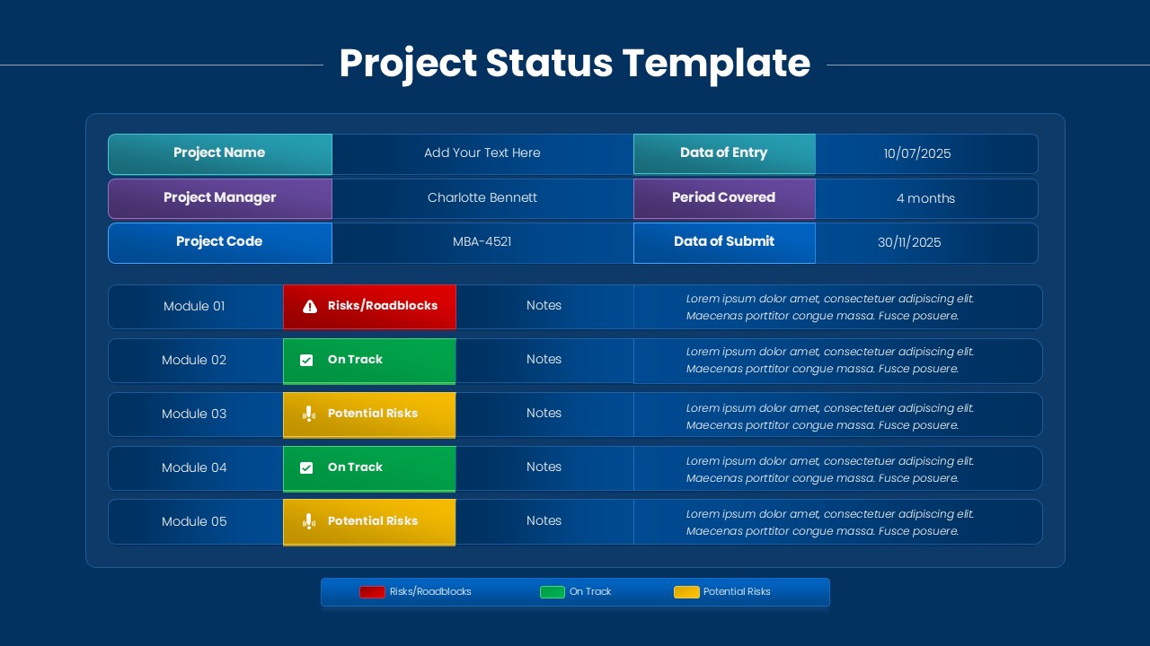
Project Status Dashboard with RAG Legend Template for PowerPoint & Google Slides
Project Status
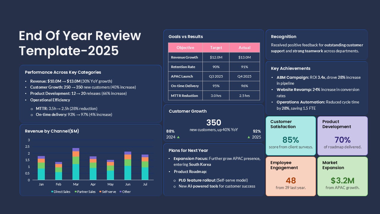
End of Year Review Dashboard Template for PowerPoint & Google Slides
Business Report
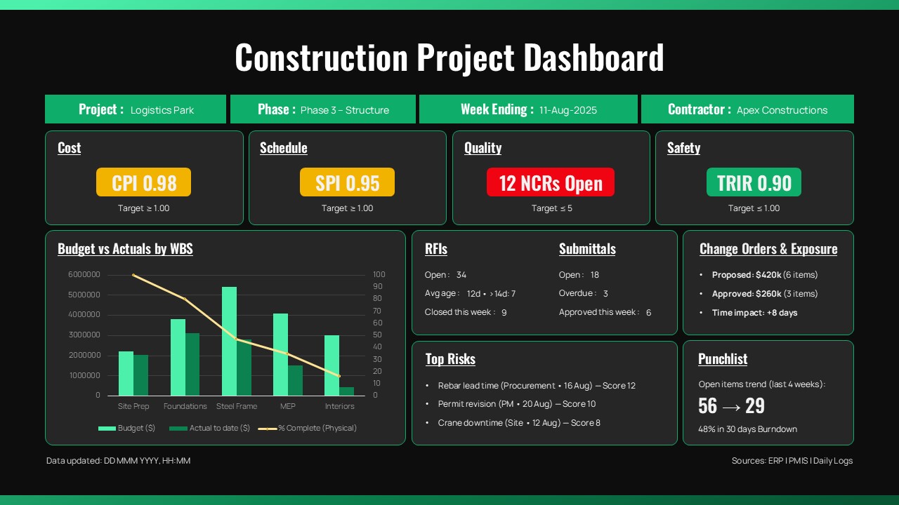
Construction Project Dashboard Template for PowerPoint & Google Slides
Project
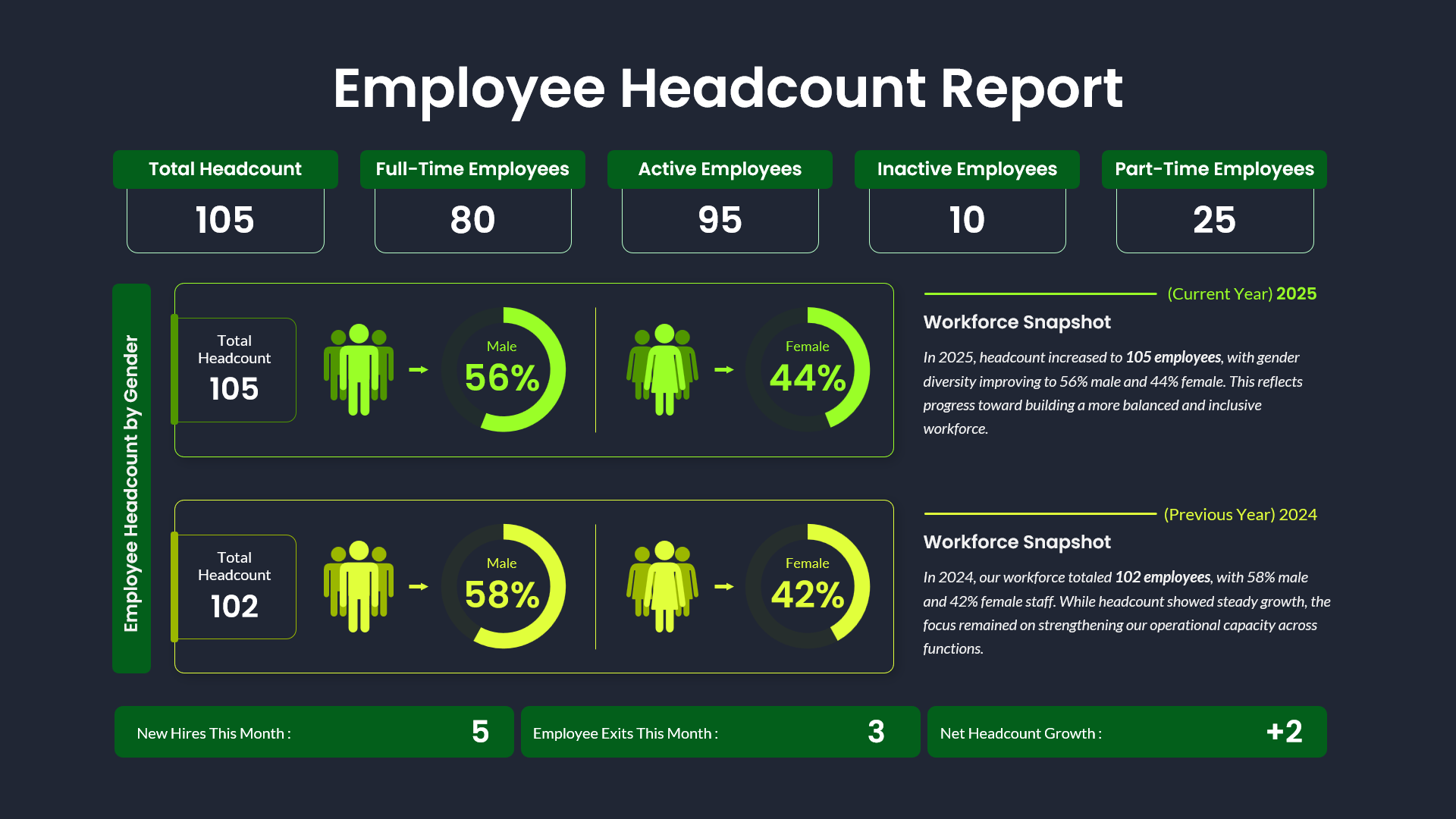
Employee Headcount Dashboard Report Template for PowerPoint & Google Slides
Employee Performance
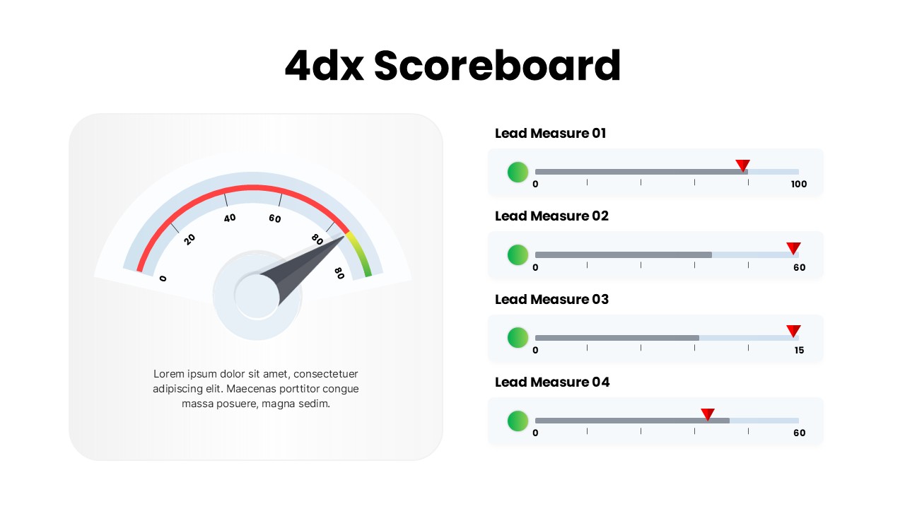
4DX Scoreboard KPI Gauge Dashboard Template for PowerPoint & Google Slides
Business Strategy
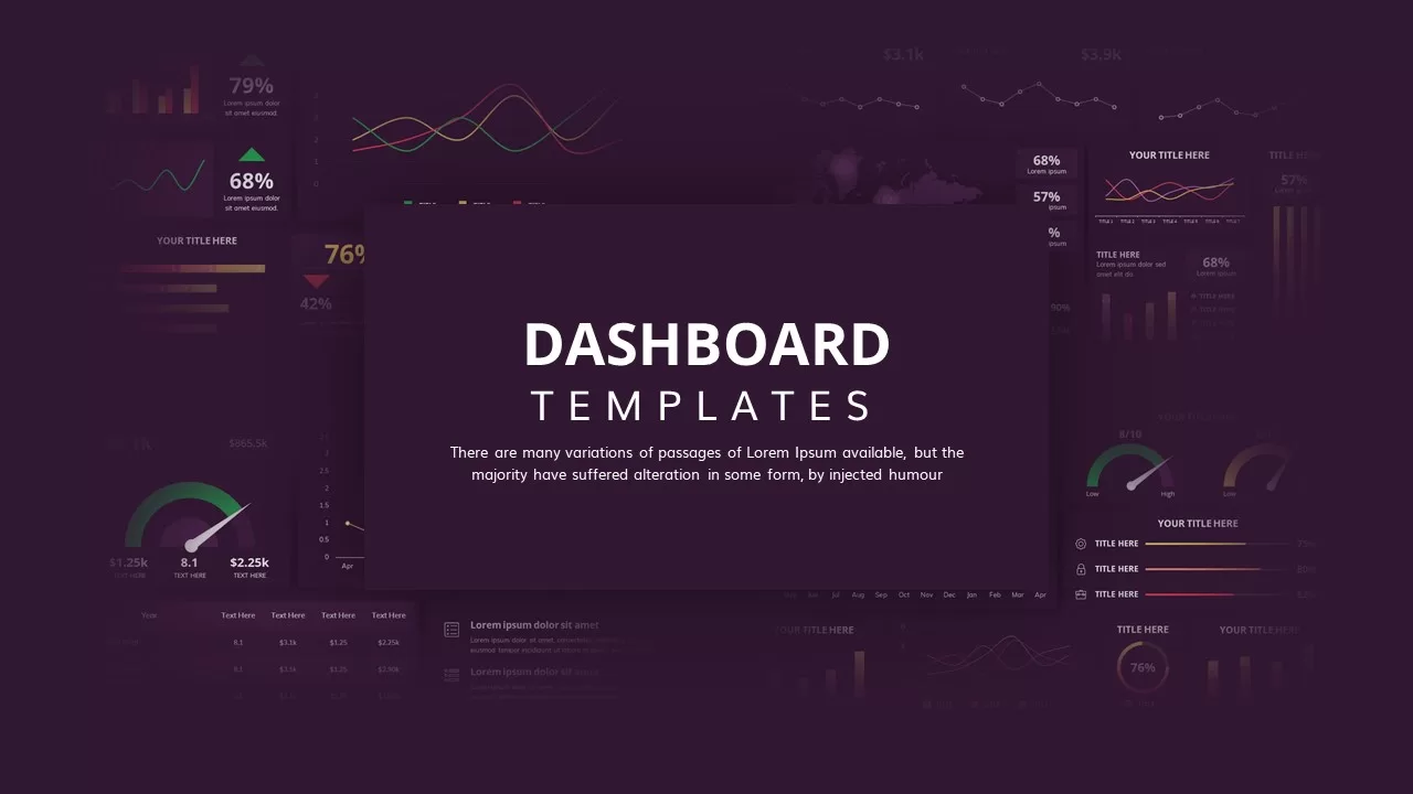
Dashboard Templates for PowerPoint & Google Slides
Bar/Column
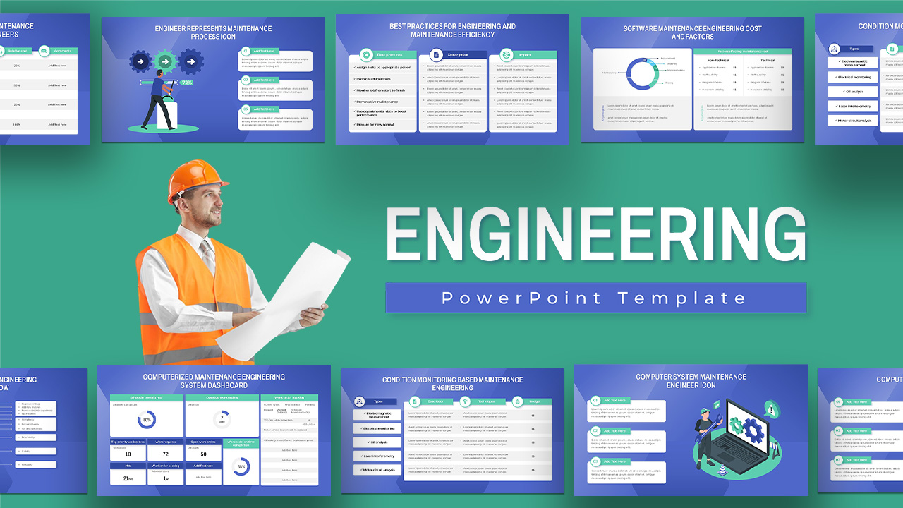
Engineering Maintenance Dashboard Slide for PowerPoint & Google Slides
Software Development
Incident Tracking Dashboard for PowerPoint & Google Slides
Business Plan
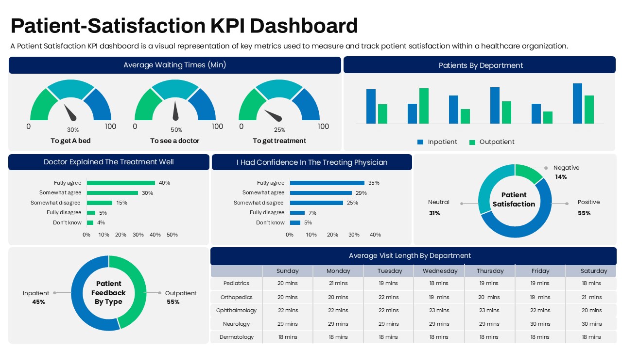
Patient-Satisfaction KPI Dashboard for PowerPoint & Google Slides
Business
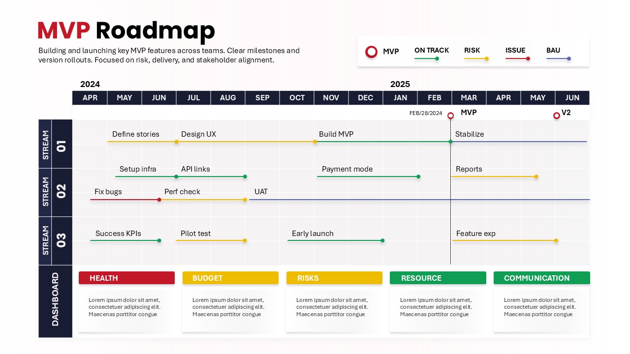
MVP Product Roadmap Delivery Dashboard for PowerPoint & Google Slides
Roadmap
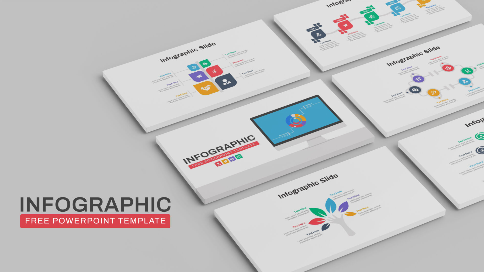
Free Infographic Deck PowerPoint Pack for PowerPoint & Google Slides
Infographics
Free
Free Application Mockup Screens Infographic Template for PowerPoint & Google Slides
Comparison
Free
Free Multi-Year Arrow Timeline Infographic Template for PowerPoint & Google Slides
Timeline
Free
Free Five-Step Circular Timeline Infographic Template for PowerPoint & Google Slides
Timeline
Free
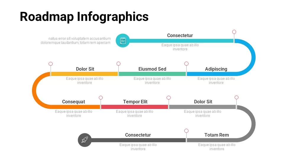
Free Multi-Level Roadmap Infographic Template for PowerPoint & Google Slides
Roadmap
Free
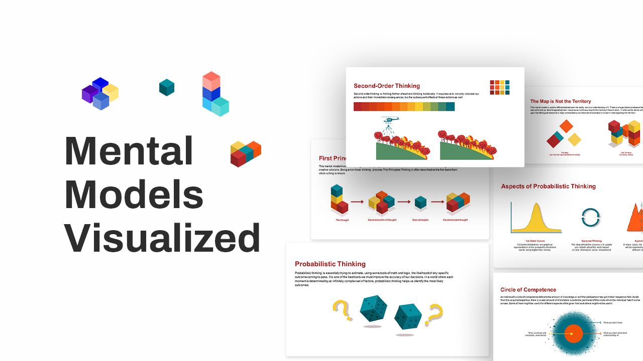
Free Mental Models Infographic Diagrams Template for PowerPoint & Google Slides
Process
Free
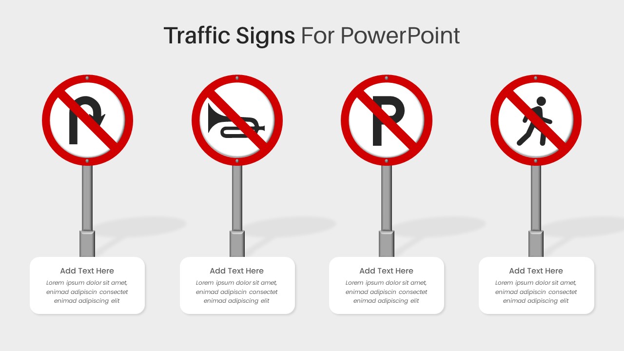
Free Traffic Signs Infographic Template for PowerPoint & Google Slides
Infographics
Free
Free ChatGPT Infographic Presentation Template for PowerPoint & Google Slides
Pitch Deck
Free
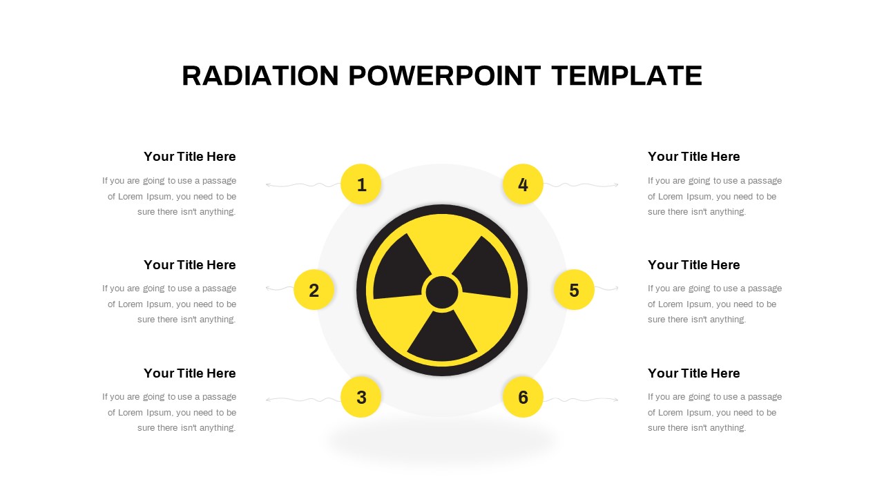
Free Radiation Hub and Spoke Infographic Template for PowerPoint & Google Slides
Circular
Free

Free Colorful Infographic Slide Pack Template for PowerPoint & Google Slides
Roadmap
Free
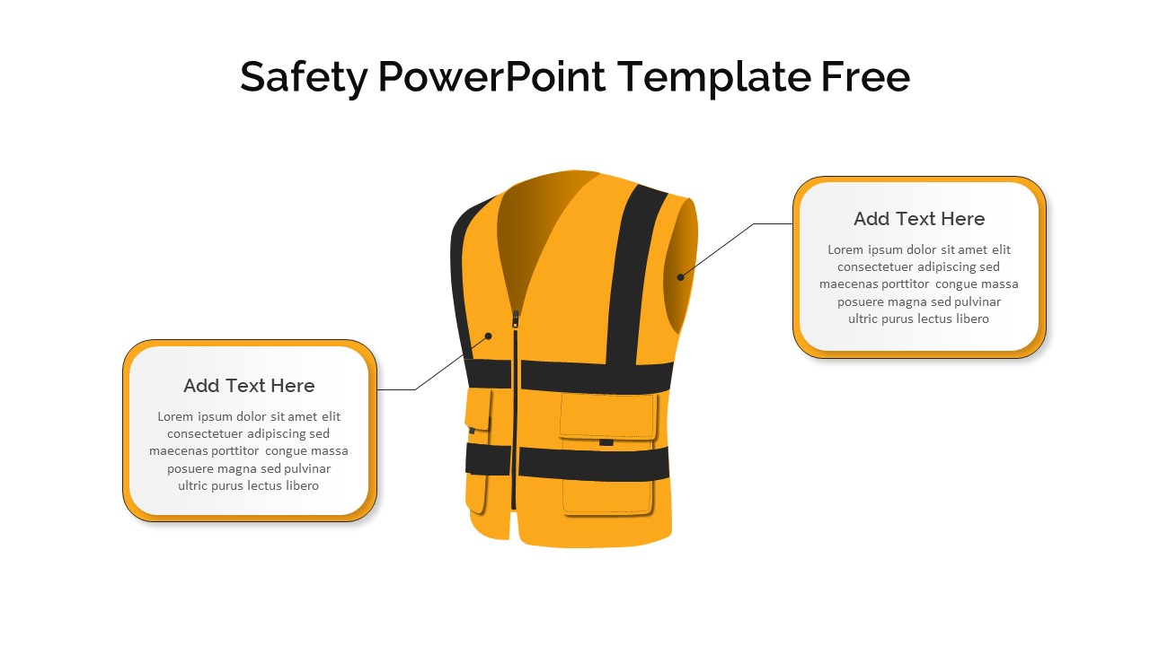
Free 4 Safety Equipment Infographic Pack Template for PowerPoint & Google Slides
Pitch Deck
Free
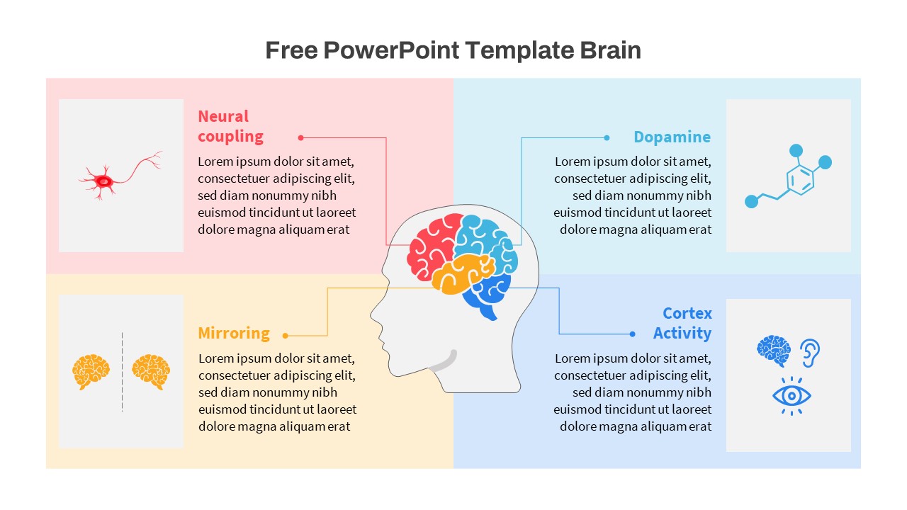
Free Brain Function Diagram Infographic Template for PowerPoint & Google Slides
Process
Free