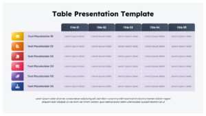
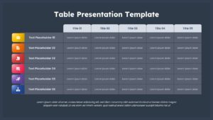
Colorful Business Data Comparison Table Template for PowerPoint & Google Slides


Description
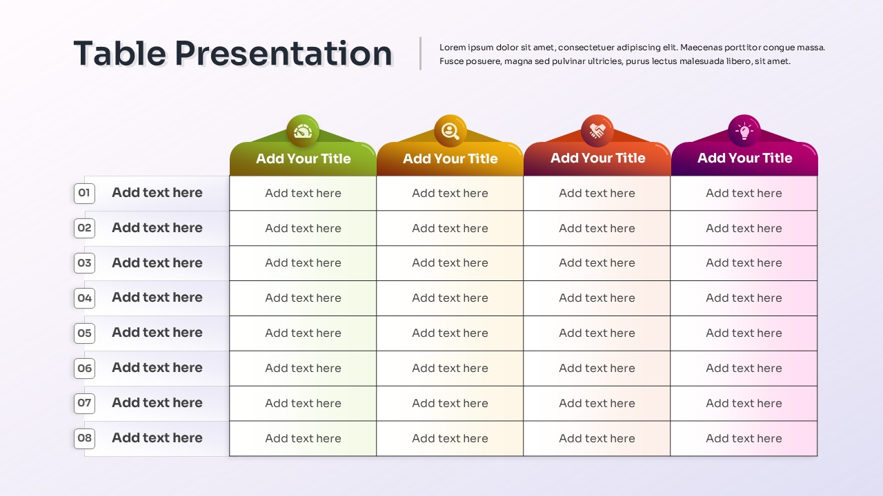
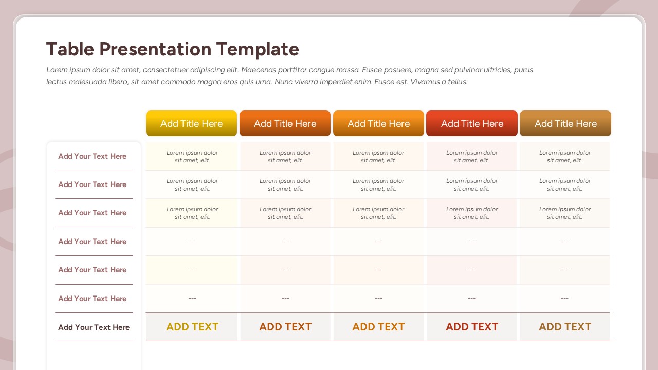
Present structured information with clarity using this Colorful Business Data Comparison Table template for PowerPoint and Google Slides. The slide features a clean five-column table layout with six rows, ideal for organizing data, project metrics, or performance insights. Each row is enhanced with a vibrant gradient-colored icon on the left—ranging from business, calendar, analytics, and activity symbols—ensuring quick visual categorization and audience engagement.
The dark background contrasts sharply with the white header titles, enhancing readability while maintaining a professional, modern look. With editable placeholders for text, titles, and icons, this template allows full customization to suit different industries and presentation needs. The balanced grid design ensures consistency, making it easy to compare multiple categories across five dimensions.
Perfect for corporate reports, project overviews, and performance tracking, this template is optimized for both PowerPoint and Google Slides. Its sleek structure eliminates clutter and presents complex information in a straightforward, easy-to-follow manner. The visual integration of icons further improves comprehension, making data not only informative but also visually engaging.
Who is it for
This template is designed for business analysts, project managers, executives, and consultants who need to present structured data in board meetings, strategy sessions, or performance reviews. It also benefits educators and trainers who require a clean, comparative table format for academic or workshop presentations.
Other Uses
Beyond business reporting, this table can be repurposed for product comparisons, event scheduling, KPI tracking, survey result analysis, or departmental overviews. The editable icons and rows make it flexible for both corporate and educational contexts.
Login to download this file

Item ID
SB05446Designed By
Krishnapriya
Related Templates

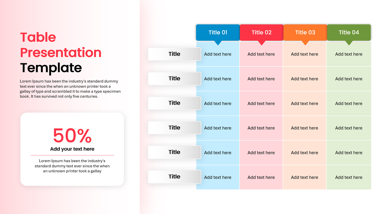
Colorful Comparison Table Presentation Template for PowerPoint & Google Slides
Table
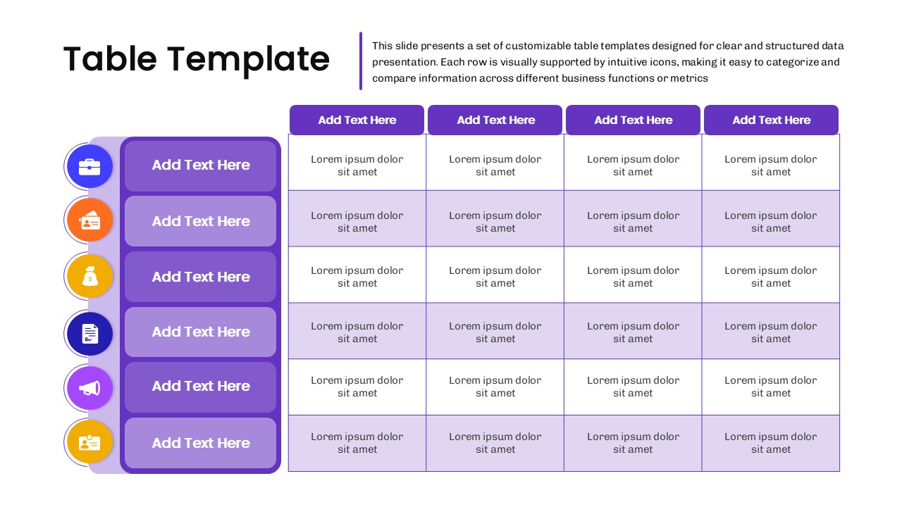
Business Data Table Template for PowerPoint & Google Slides
Table
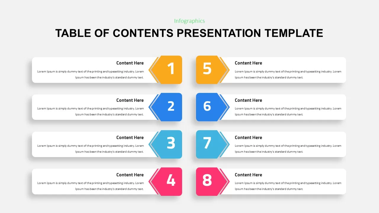
Eight-Step Colorful Table of Contents Template for PowerPoint & Google Slides
Infographics
Colorful Four-Column Table Layout Template for PowerPoint & Google Slides
Table
Colorful Table Presentation Template for PowerPoint & Google Slides
Table
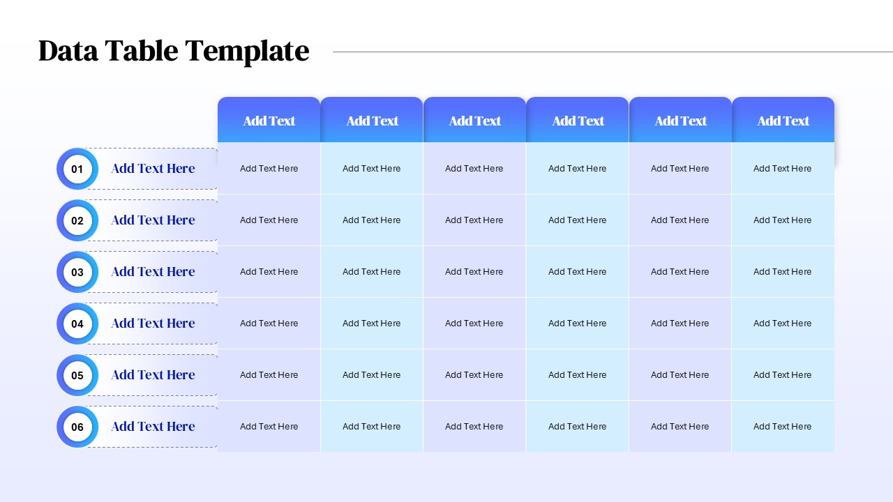
Six Column Data Table Template for PowerPoint & Google Slides
Table

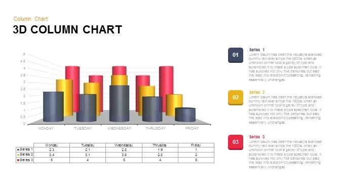
3D Column Chart with Data Table for PowerPoint & Google Slides
Bar/Column
Tornado Chart Data Comparison Slide Template for PowerPoint & Google Slides
Bar/Column
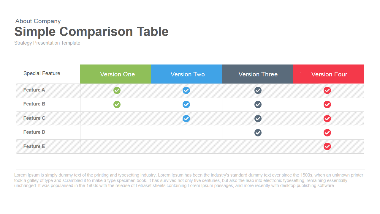
Simple Comparison Table Template for PowerPoint & Google Slides
Comparison
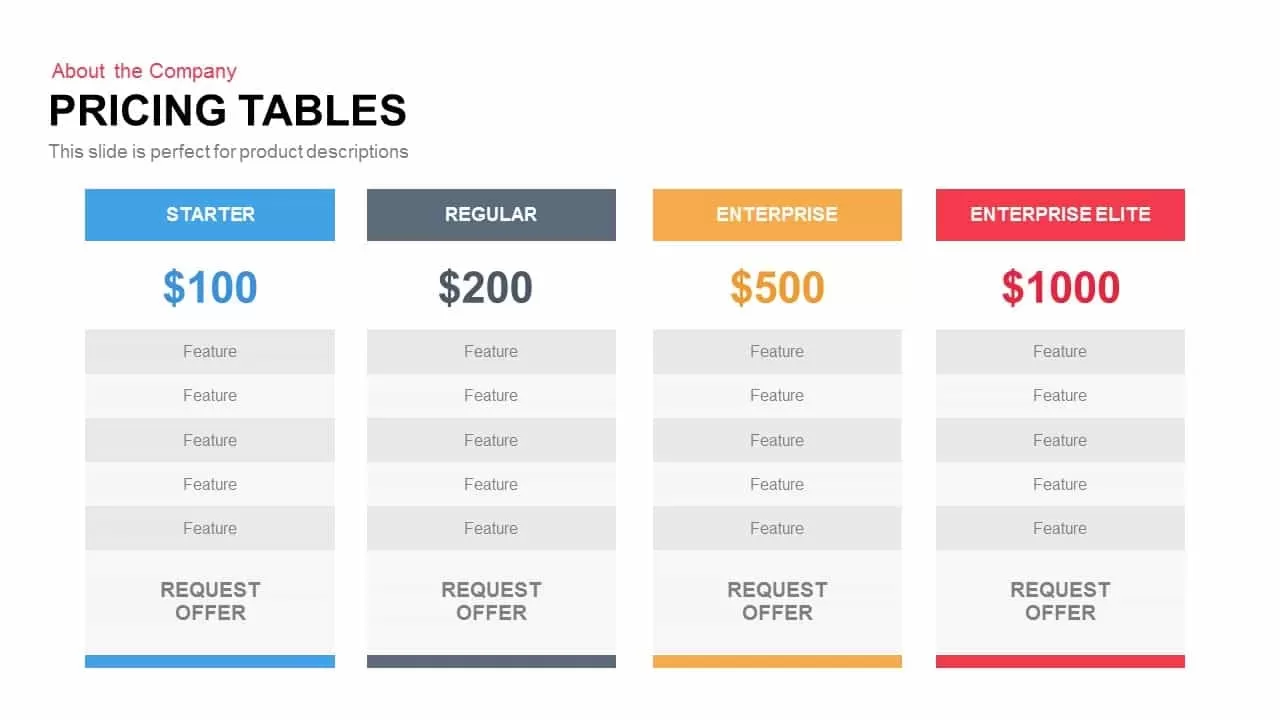
Four-Tier Pricing Comparison Table Template for PowerPoint & Google Slides
Comparison
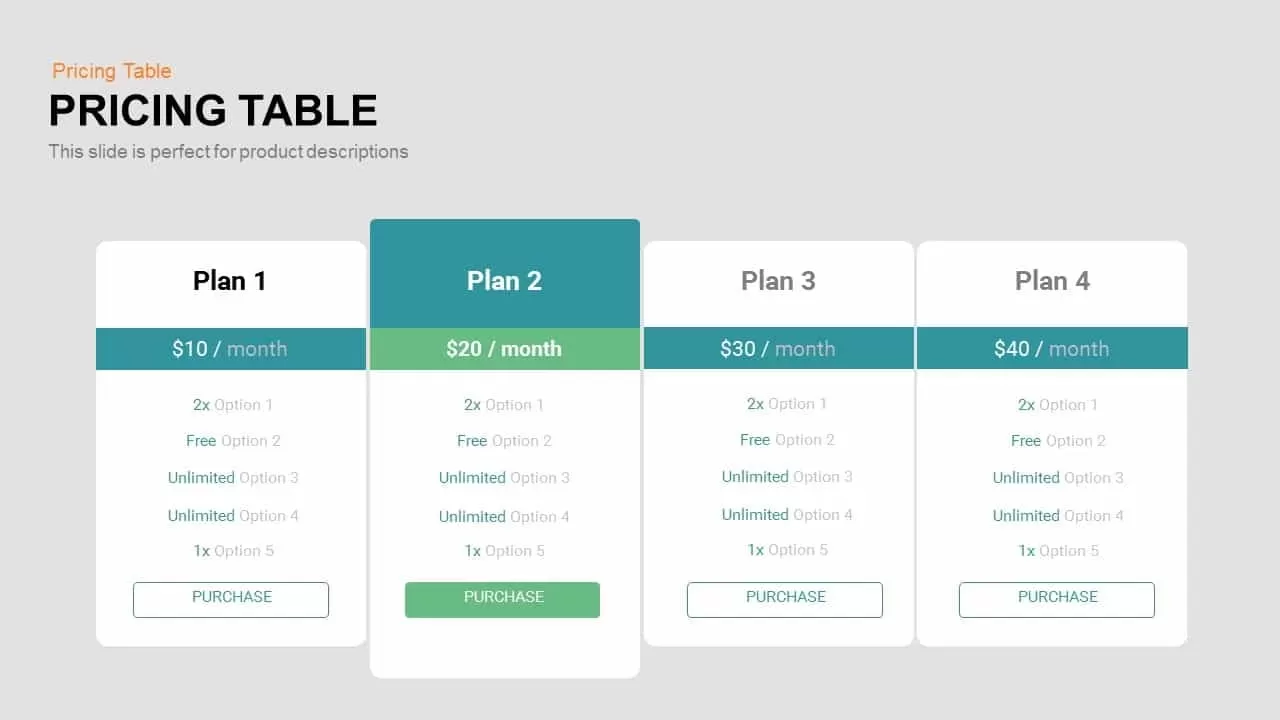
Four-Plan Pricing Table Comparison Template for PowerPoint & Google Slides
Comparison
Dynamic Multicolor Comparison Table Template for PowerPoint & Google Slides
Comparison

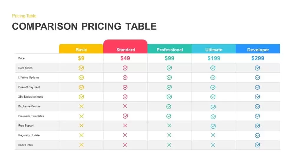
Comparison Pricing Table Infographic Template for PowerPoint & Google Slides
Comparison Chart
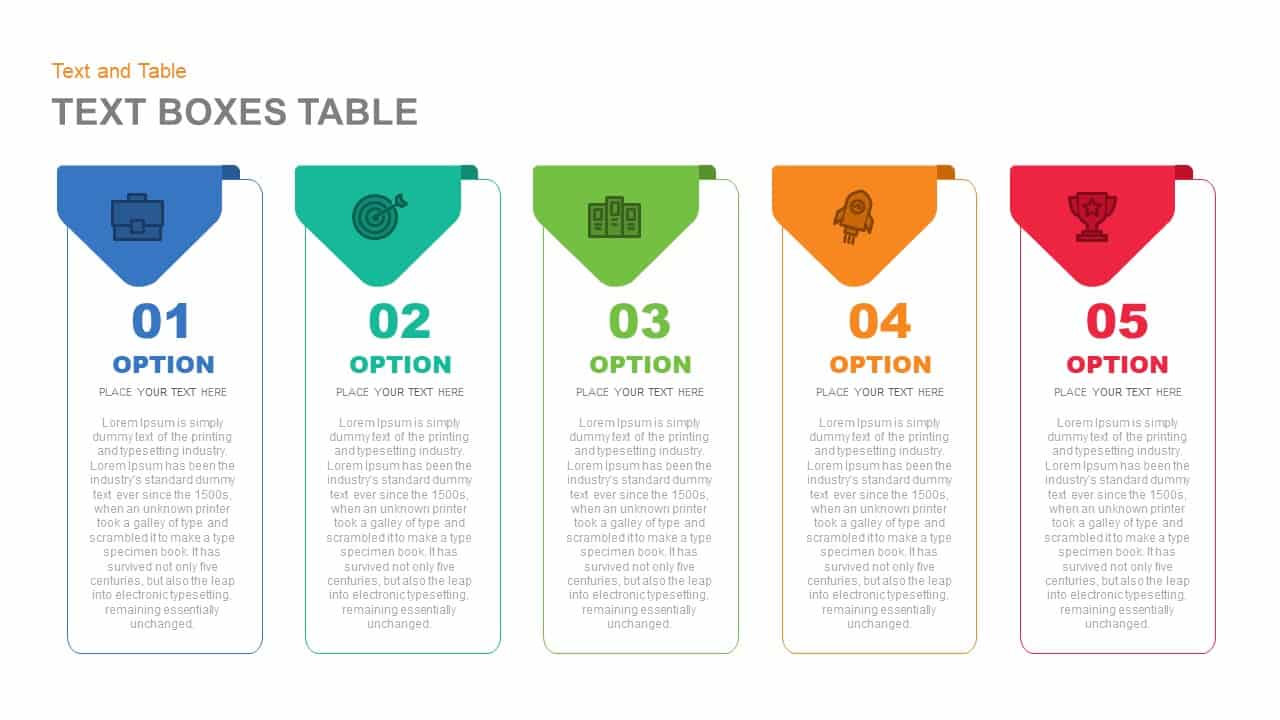
Five-Option Text Boxes Table Comparison Template for PowerPoint & Google Slides
Business Report
Two-Option Bar Chart Comparison Table Template for PowerPoint & Google Slides
Comparison
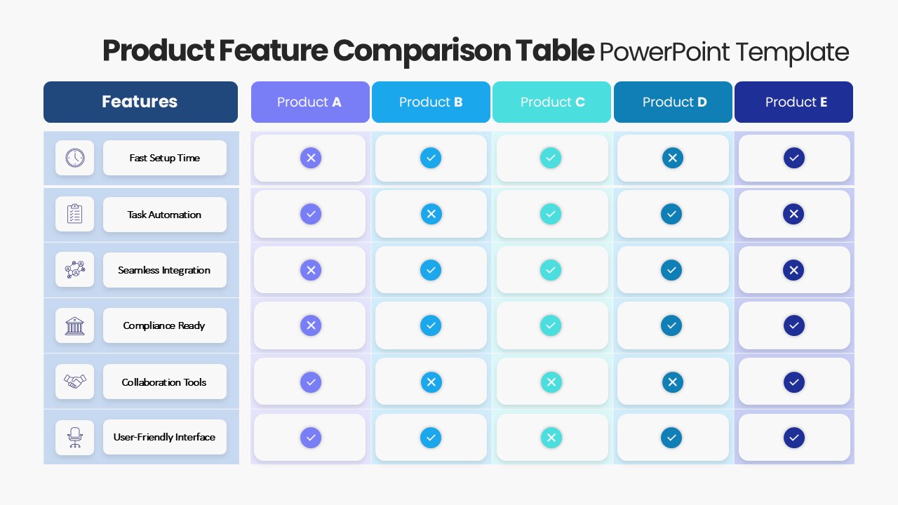
Product Feature Comparison Table Template for PowerPoint & Google Slides
Comparison Chart
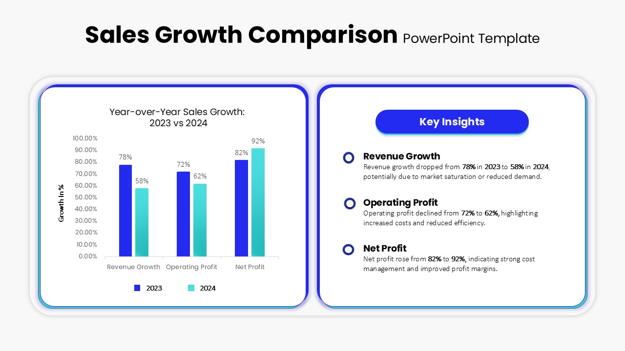
Sales Growth Comparison Chart & Table Template for PowerPoint & Google Slides
Bar/Column
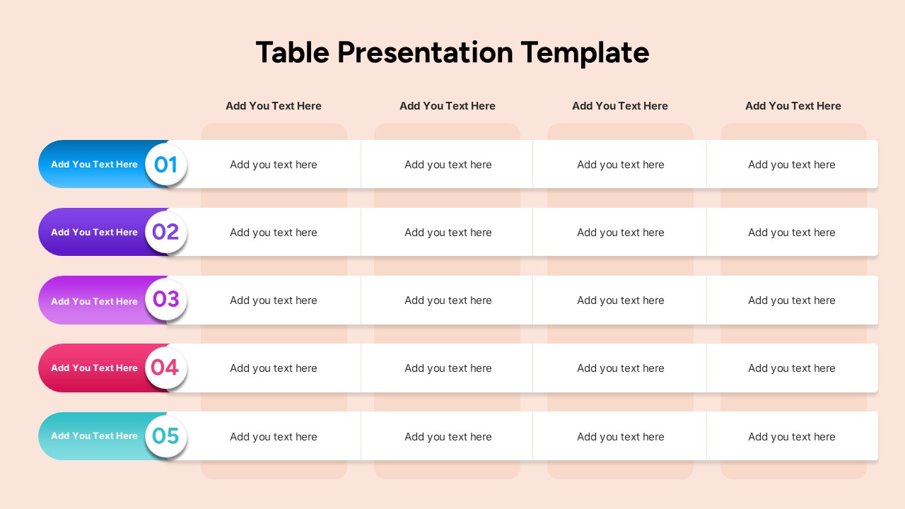
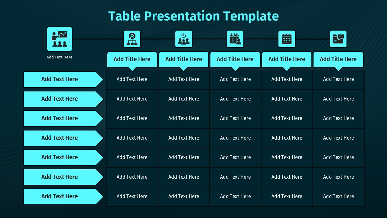
Comparison Table Presentation Template for PowerPoint & Google Slides
Table
Five Column Comparison Table Layout Template for PowerPoint & Google Slides
Comparison
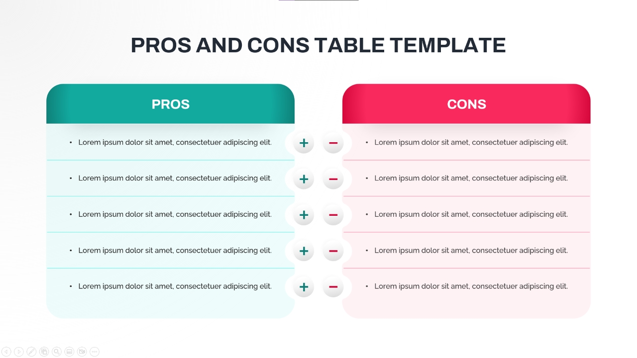
Pros and Cons Comparison Table Template for PowerPoint & Google Slides
Comparison Chart

Free Modern Colorful Business Plan Deck Template for PowerPoint & Google Slides
Business Plan
Free
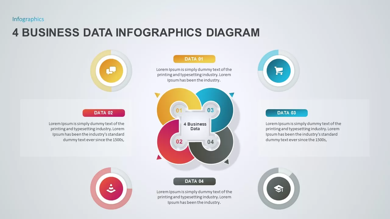
4 Business Data Infographics Diagram for PowerPoint & Google Slides
Process
Colorful Rainbow Slides Template for PowerPoint & Google Slides
Graphics
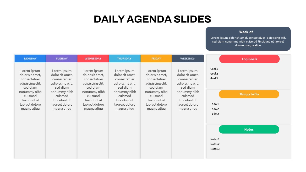
Editable Colorful Daily Agenda Slides Template for PowerPoint & Google Slides
Agenda
Free Colorful Morning Meeting Agenda Slides Template for PowerPoint & Google Slides
Agenda
Free
Colorful Birthday Celebration Slides for PowerPoint & Google Slides
Graphics
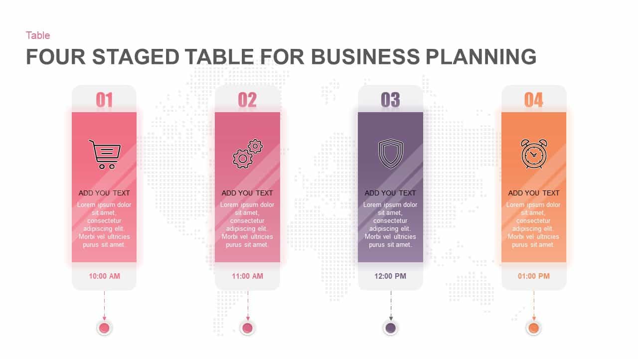
Four-Stage Business Planning Table Template for PowerPoint & Google Slides
Business Plan
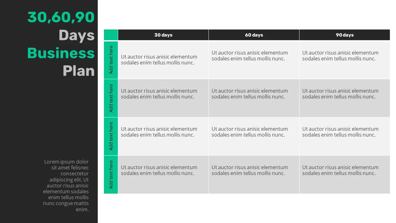
30-60-90 Business Plan Table Template for PowerPoint & Google Slides
Timeline
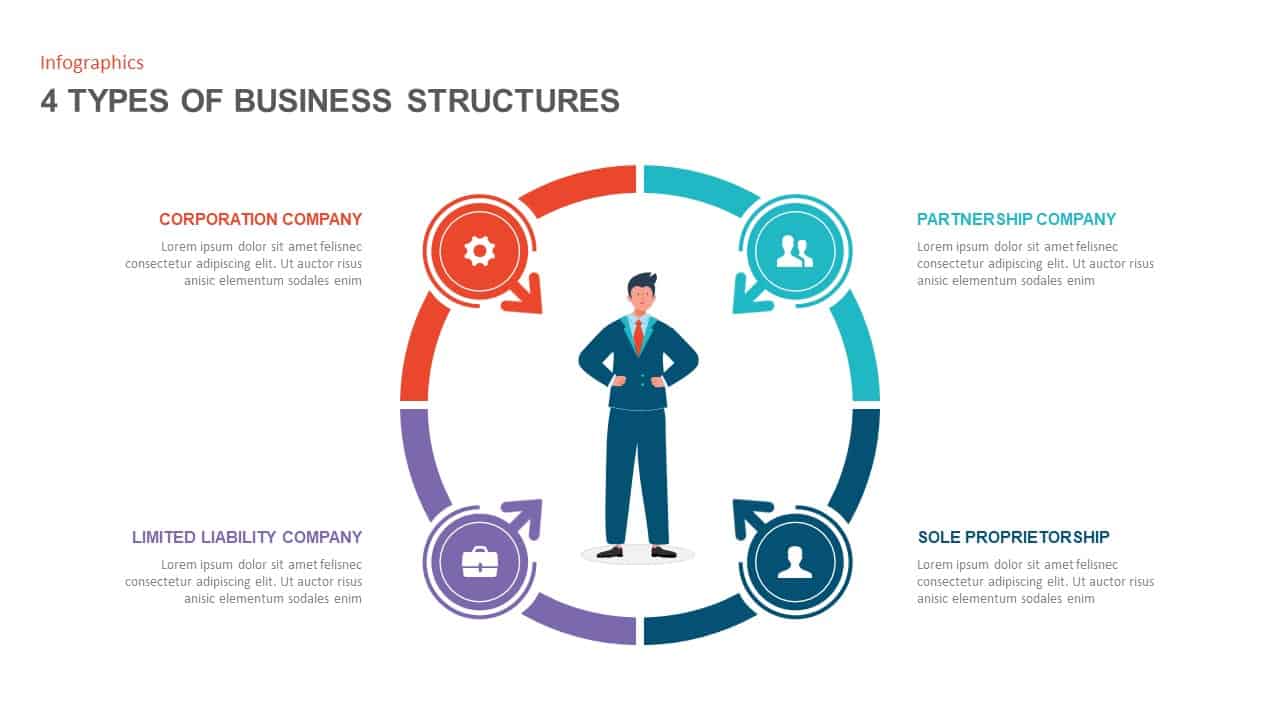
Four Business Structure Types Comparison Diagram Template for PowerPoint & Google Slides
Business Strategy
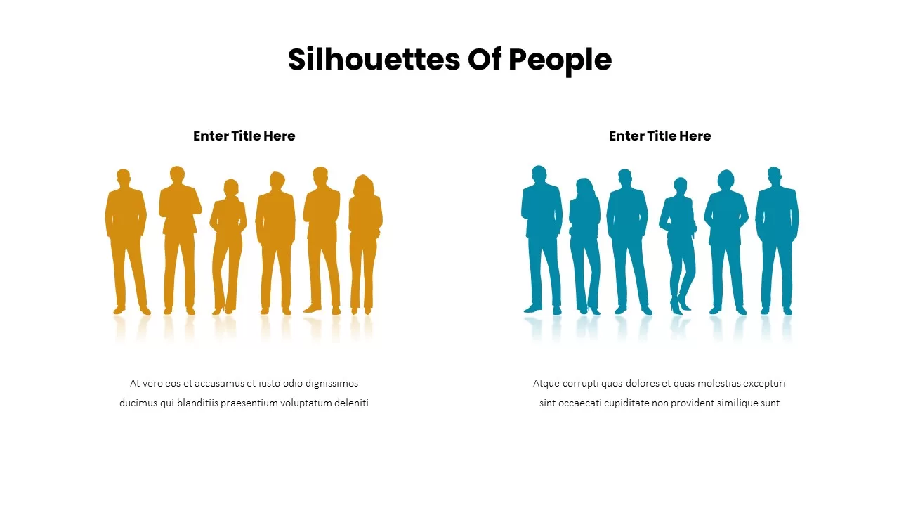
Business Silhouettes Comparison Slide Template for PowerPoint & Google Slides
HR
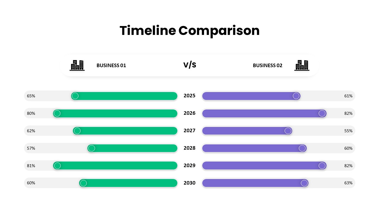
Business Timeline Comparison Bar Chart Template for PowerPoint & Google Slides
Comparison Chart
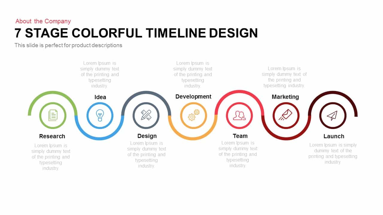
7-Stage Colorful Timeline Infographic Template for PowerPoint & Google Slides
Timeline
Colorful Arrow Process Diagram Template for PowerPoint & Google Slides
Arrow
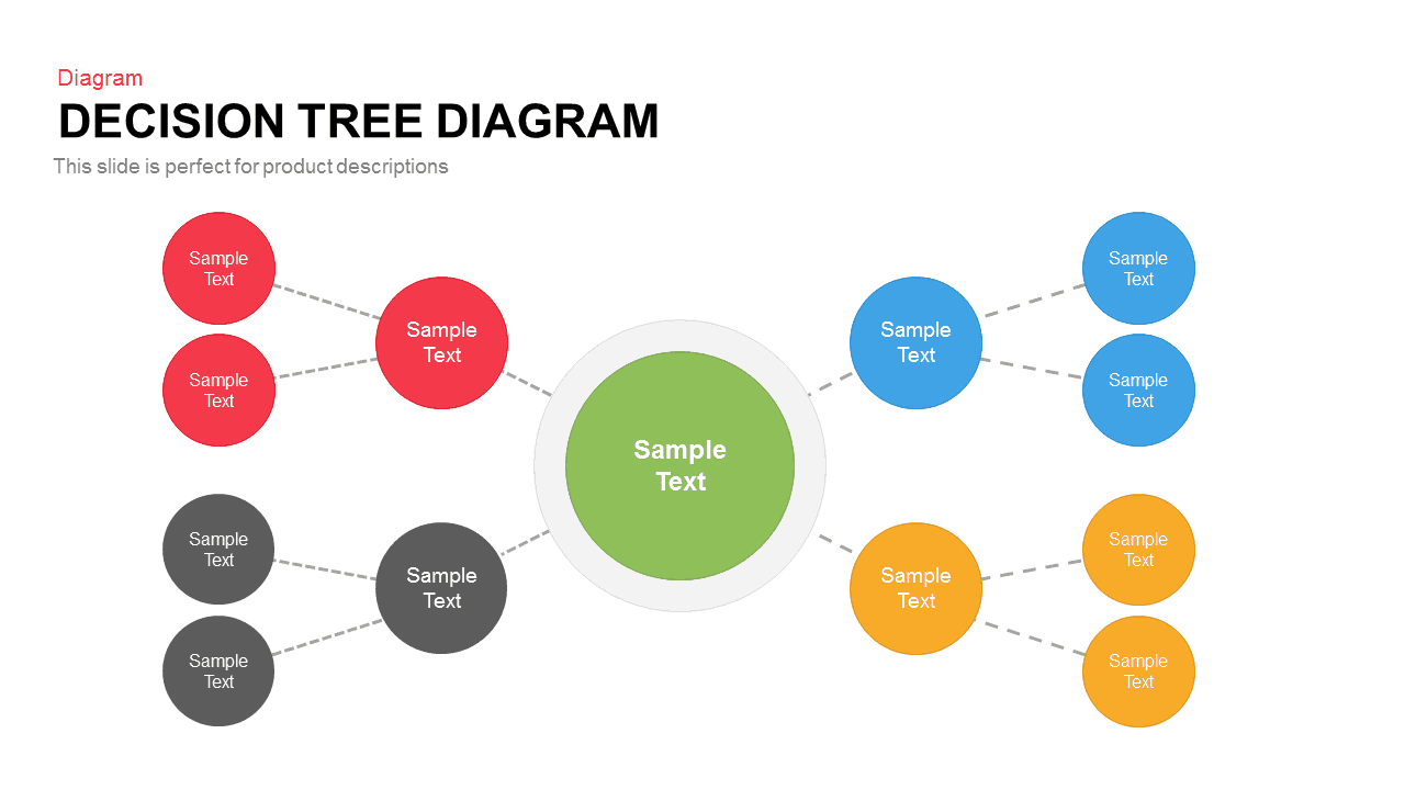
Colorful Decision Tree Diagram template for PowerPoint & Google Slides
Decision Tree
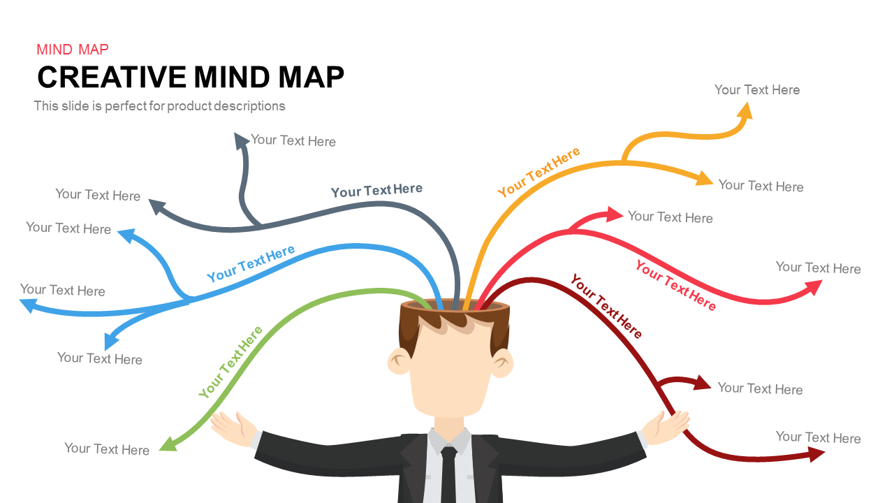
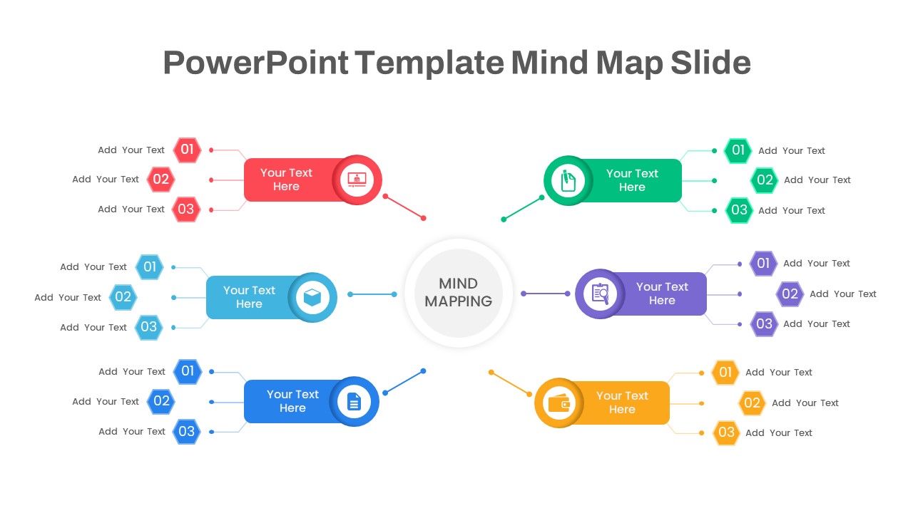
Colorful Creative Mind Map Diagram template for PowerPoint & Google Slides
Mind Maps

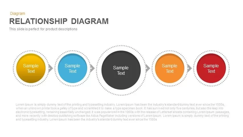
Colorful Five-Stage Relationship Diagram Template for PowerPoint & Google Slides
Process
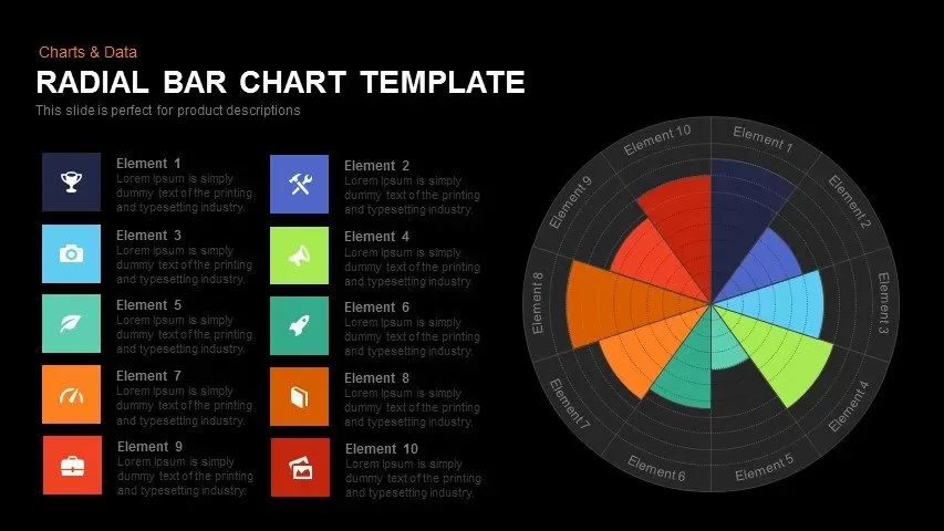
Colorful Radial Bar Chart Template for PowerPoint & Google Slides
Bar/Column

Colorful Photo Capture Infographic Template for PowerPoint & Google Slides
Advertising
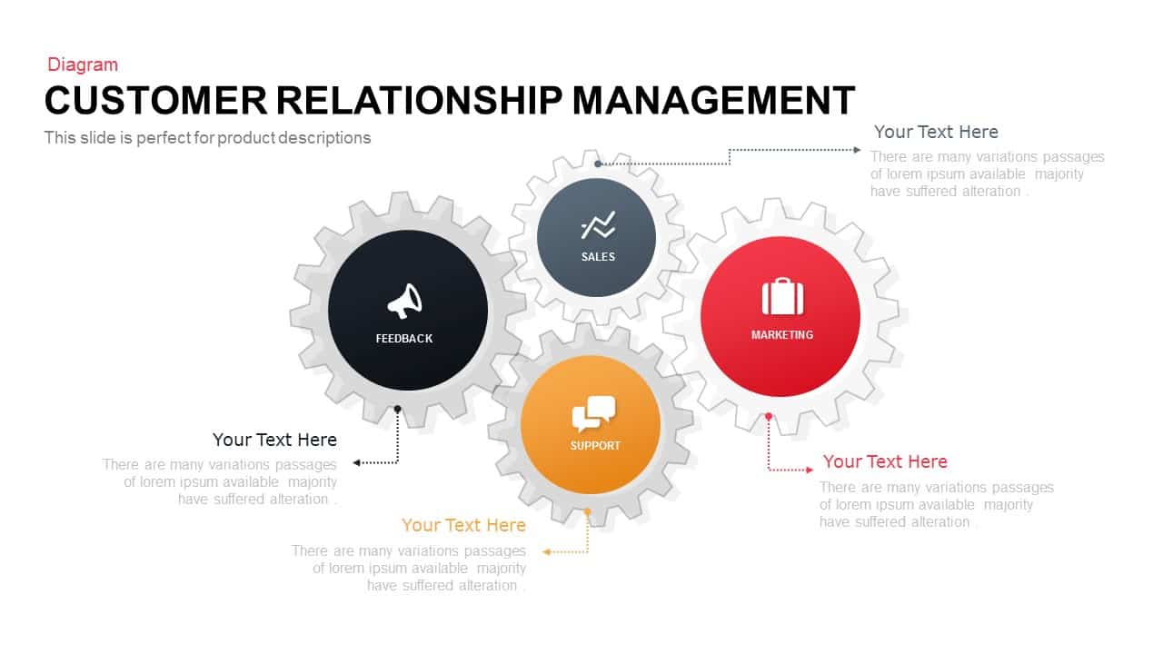
Colorful Modern CRM Gear Diagram Template for PowerPoint & Google Slides
Customer Experience
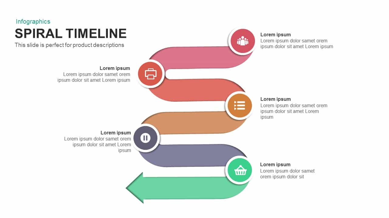
Six-Stage Colorful Spiral Timeline Template for PowerPoint & Google Slides
Timeline
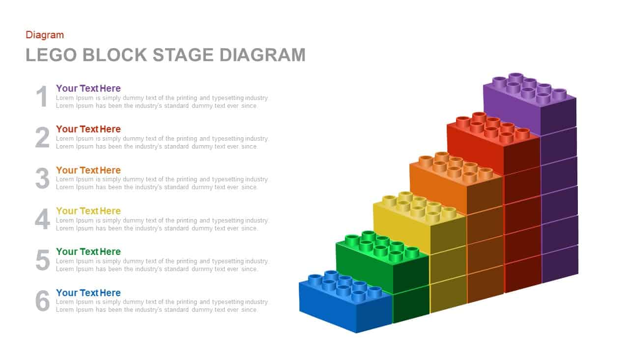
Colorful LEGO Block Stage Diagram Template for PowerPoint & Google Slides
Process
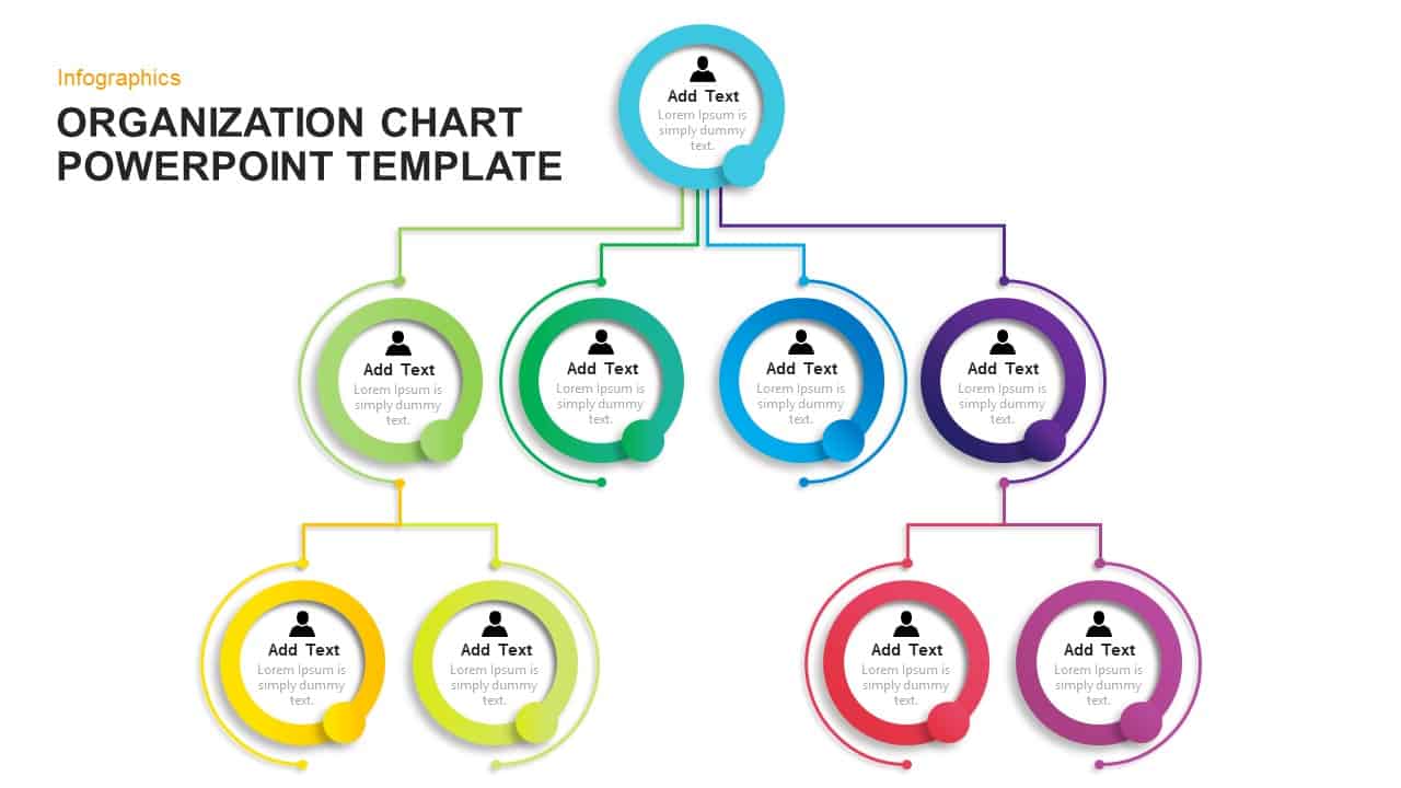
Modern Colorful Circular Org Chart Template for PowerPoint & Google Slides
Org Chart
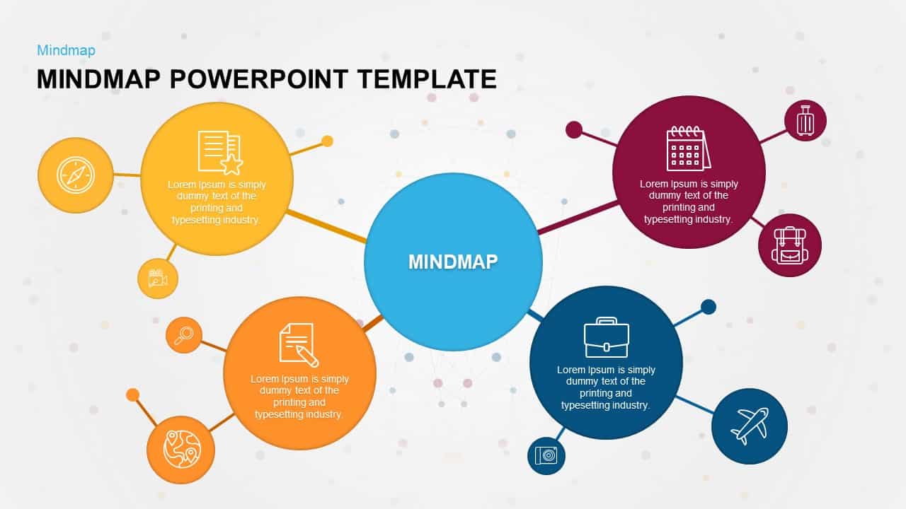
Colorful Mind Map Infographic Template with Icons for PowerPoint & Google Slides
Mind Maps
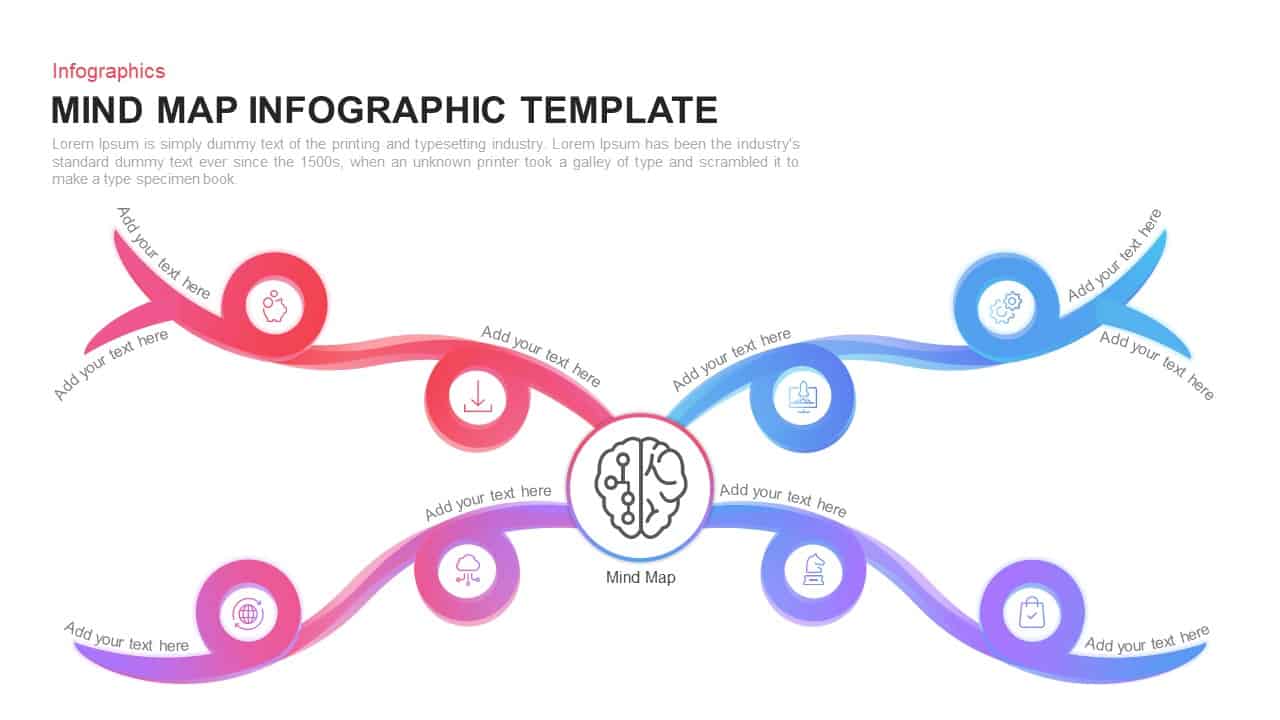
Colorful Mind Map Infographic Template for PowerPoint & Google Slides
Mind Maps
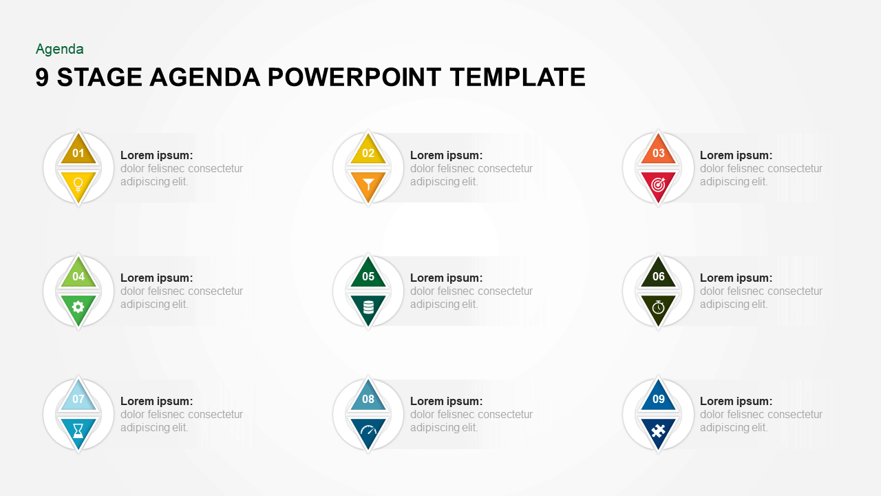
Colorful Nine-Stage Agenda Slide Template for PowerPoint & Google Slides
Agenda
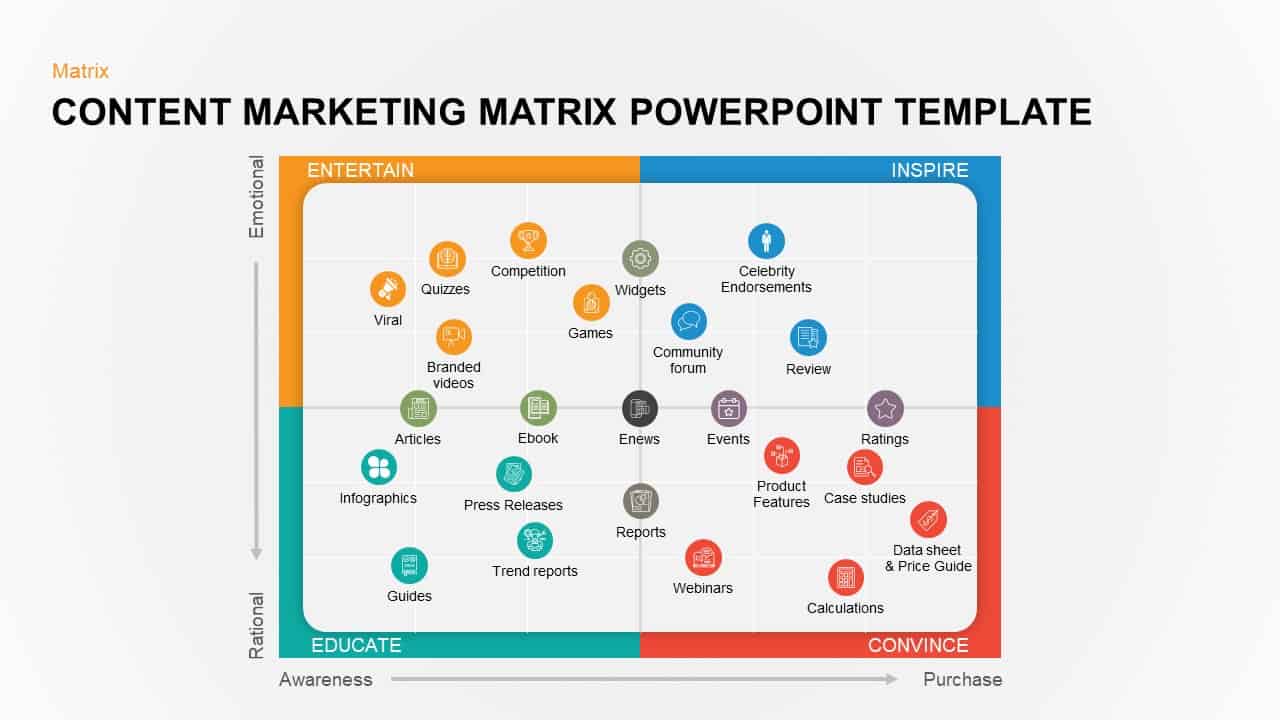
Colorful Content Marketing Matrix Template for PowerPoint & Google Slides
Comparison
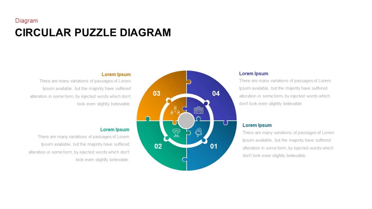
Colorful Circular Puzzle Diagram Template for PowerPoint & Google Slides
Circular
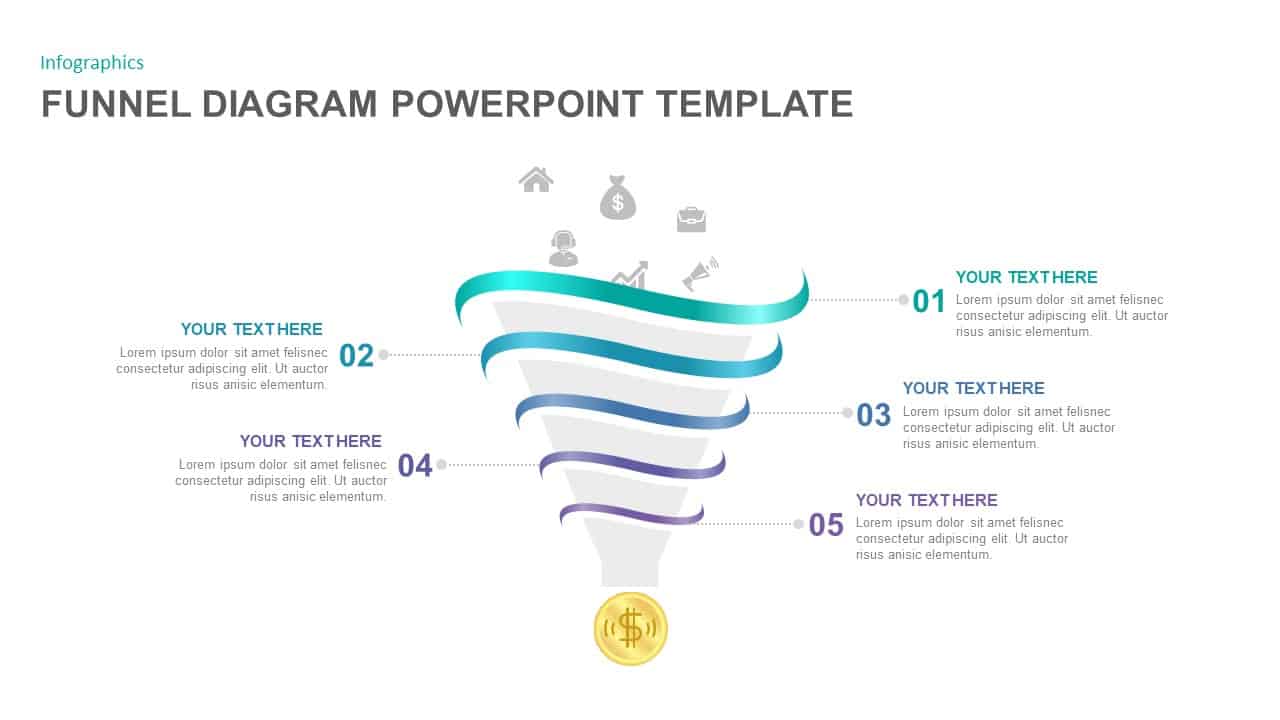
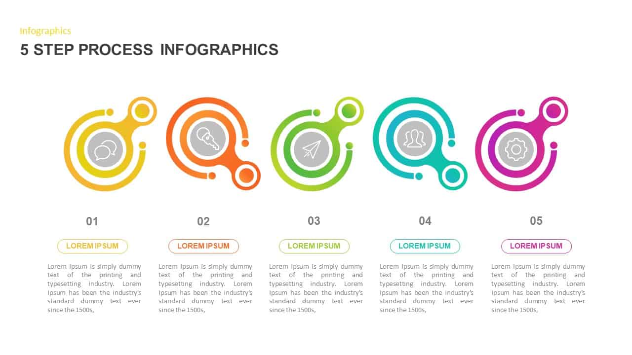
5-Step Colorful Funnel Diagram Template for PowerPoint & Google Slides
Funnel
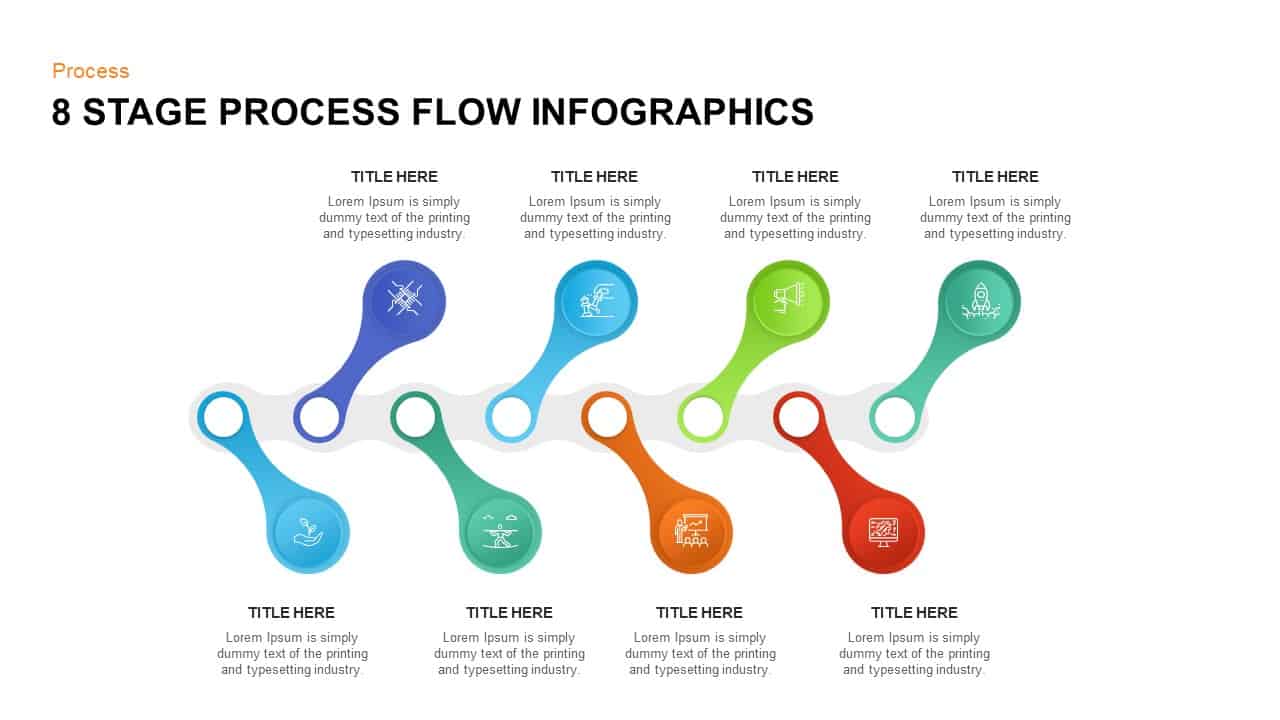
Colorful 8-Stage Droplet Process Flow Diagram Template for PowerPoint & Google Slides
Process
Colorful 5-Step Circular Process Template for PowerPoint & Google Slides
Process
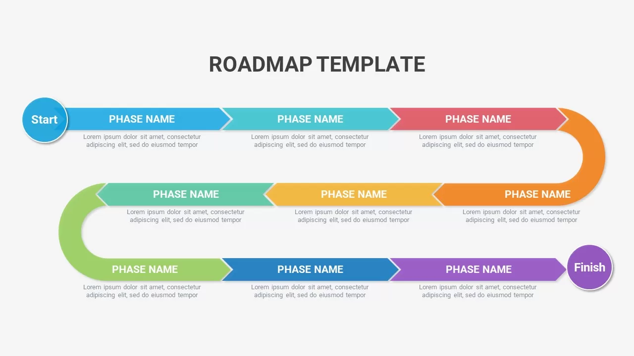
Colorful Curved Roadmap Phases Template for PowerPoint & Google Slides
Roadmap
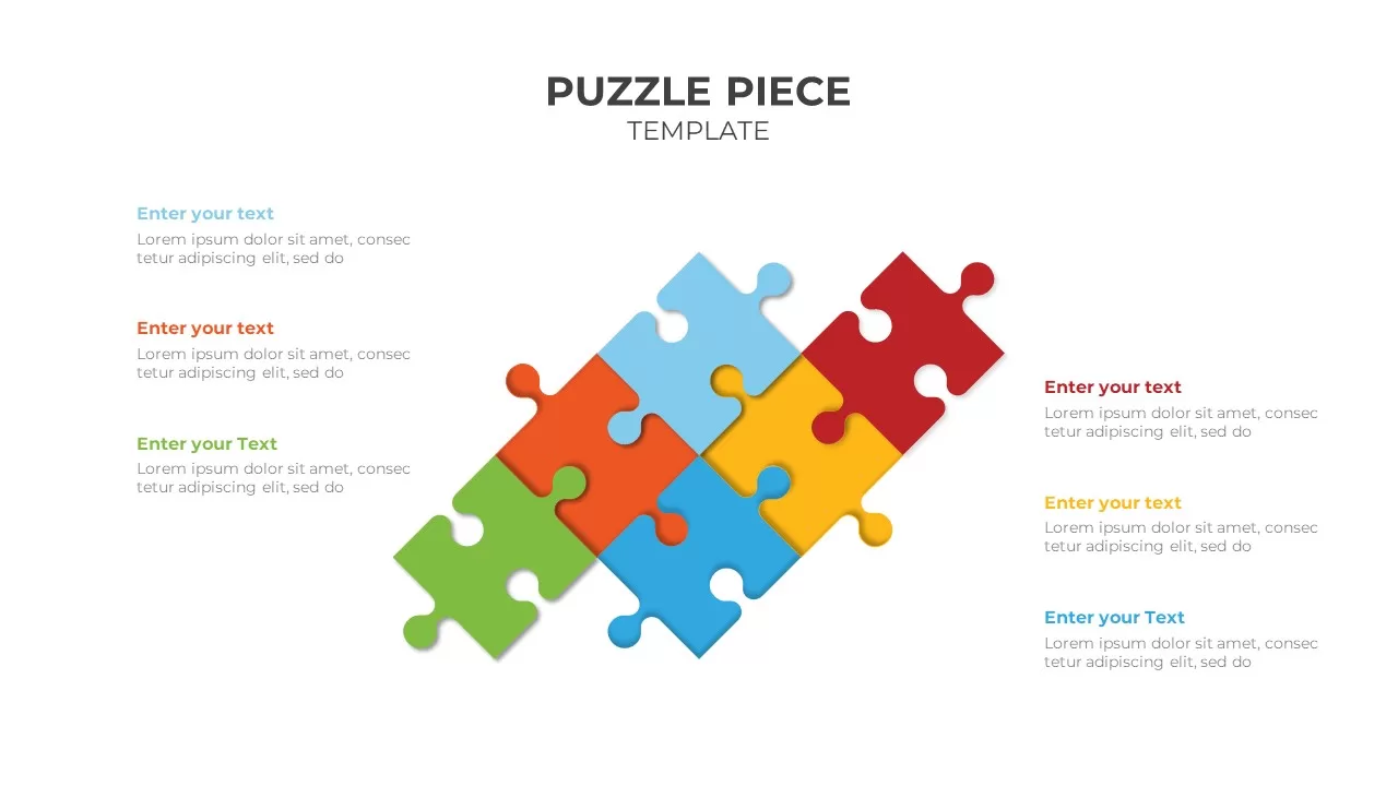
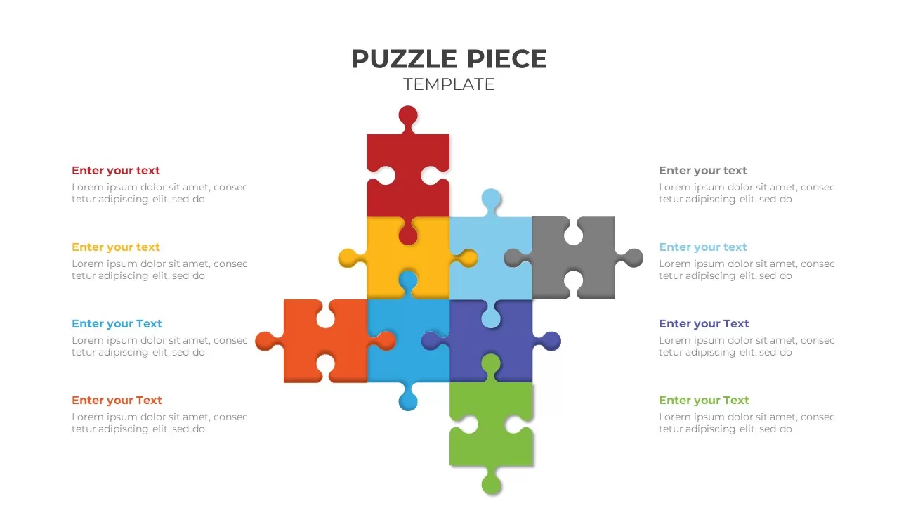
Colorful Six-Piece Puzzle Diagram Template for PowerPoint & Google Slides
Infographics
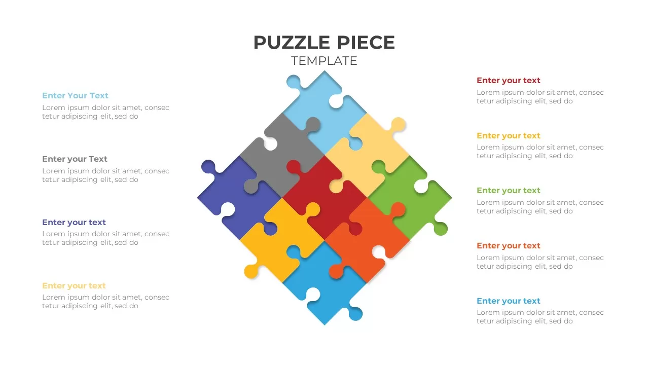
Colorful Eight-Piece Puzzle Diagram Template for PowerPoint & Google Slides
Process
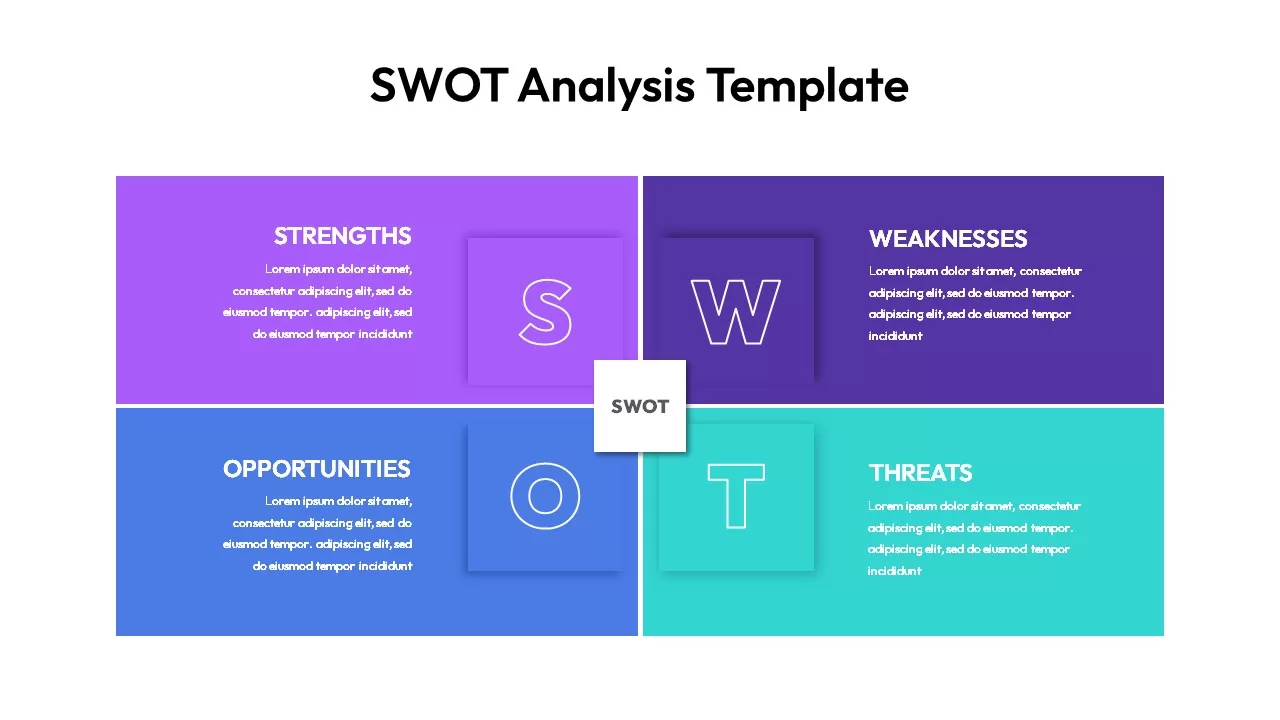
Modern Colorful SWOT Quadrant Analysis Template for PowerPoint & Google Slides
SWOT
Colorful Nine-Piece Puzzle Diagram Template for PowerPoint & Google Slides
Process
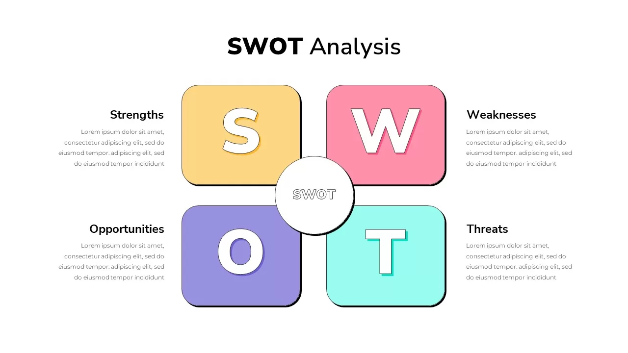
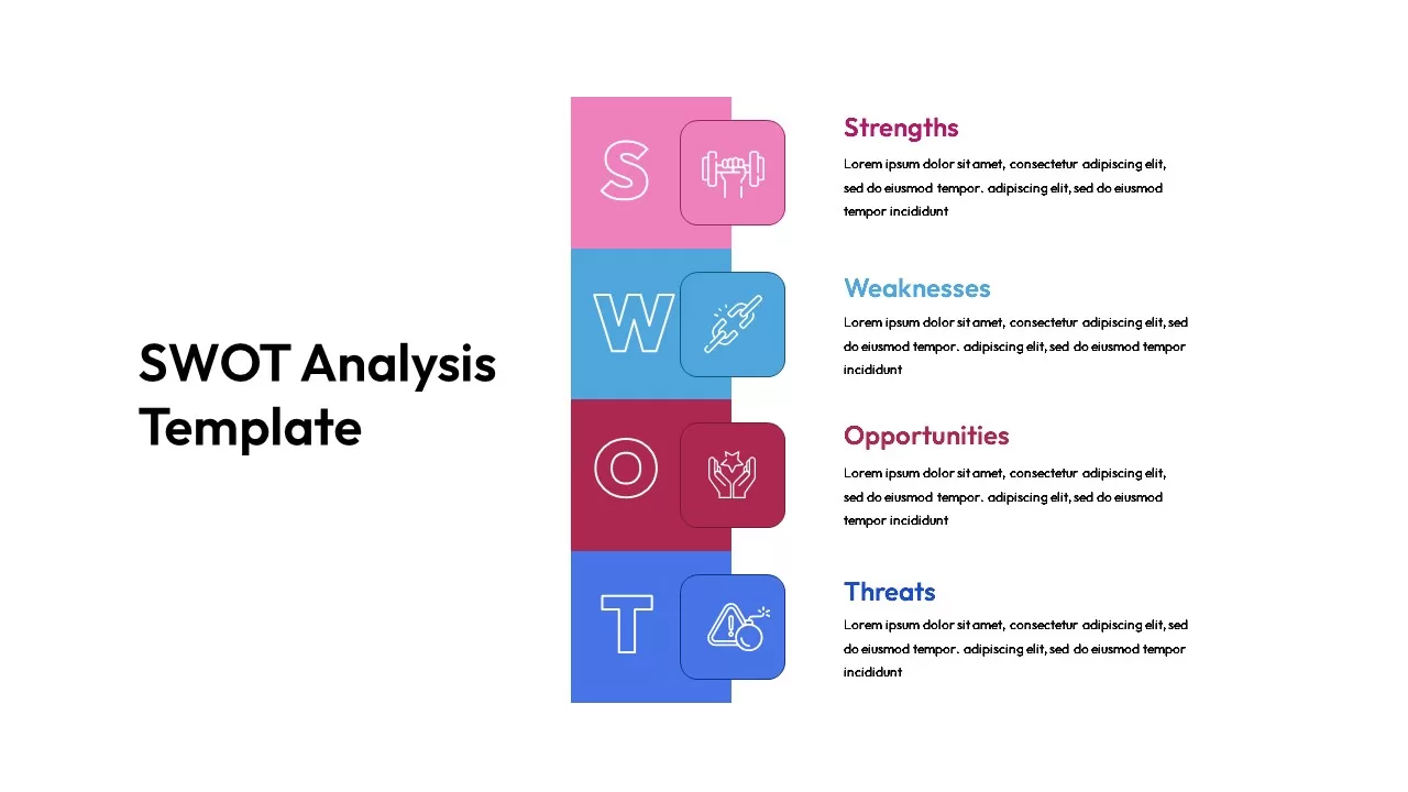
Colorful SWOT Analysis Quadrant Template for PowerPoint & Google Slides
SWOT
Colorful Vertical SWOT Analysis Layout Template for PowerPoint & Google Slides
SWOT
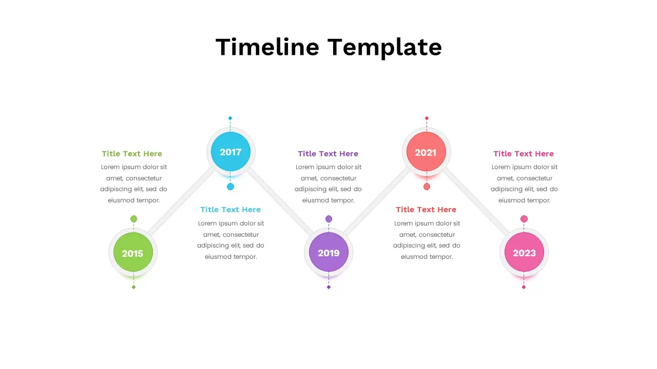
Colorful Five-Year Timeline Layout Template for PowerPoint & Google Slides
Timeline
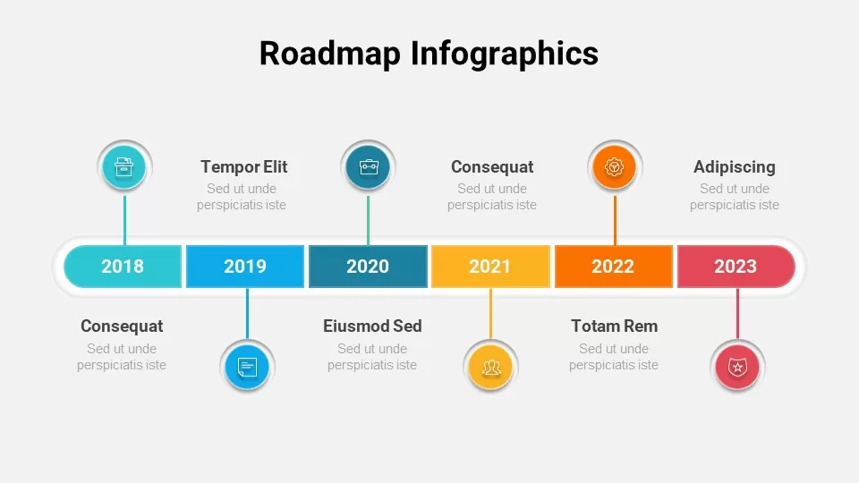
Free Colorful Roadmap Timeline Infographic Template for PowerPoint & Google Slides
Roadmap
Free
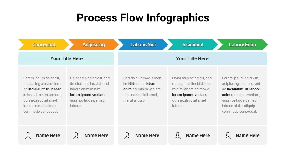
Free Colorful Process Flow Infographics Template for PowerPoint & Google Slides
Process
Free
Colorful Mind Map with Icons Template for PowerPoint & Google Slides
Mind Maps
Colorful Process Flow Template for PowerPoint & Google Slides
Process
Colorful Mind Map Template for PowerPoint & Google Slides
Mind Maps
Colorful Process Flow Infographics Template for PowerPoint & Google Slides
Process
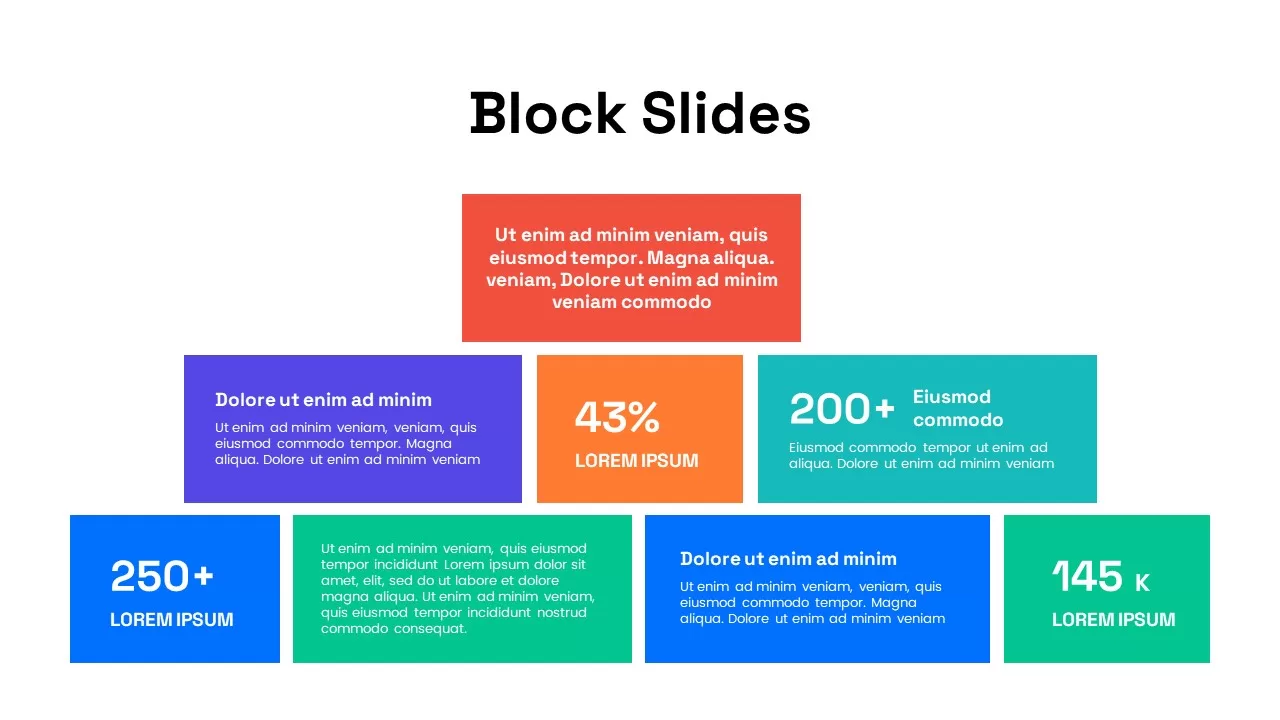
Colorful Block Infographic Metrics Slide Template for PowerPoint & Google Slides
Infographics
Colorful Nursing Presentation Deck Template for PowerPoint & Google Slides
Nursing
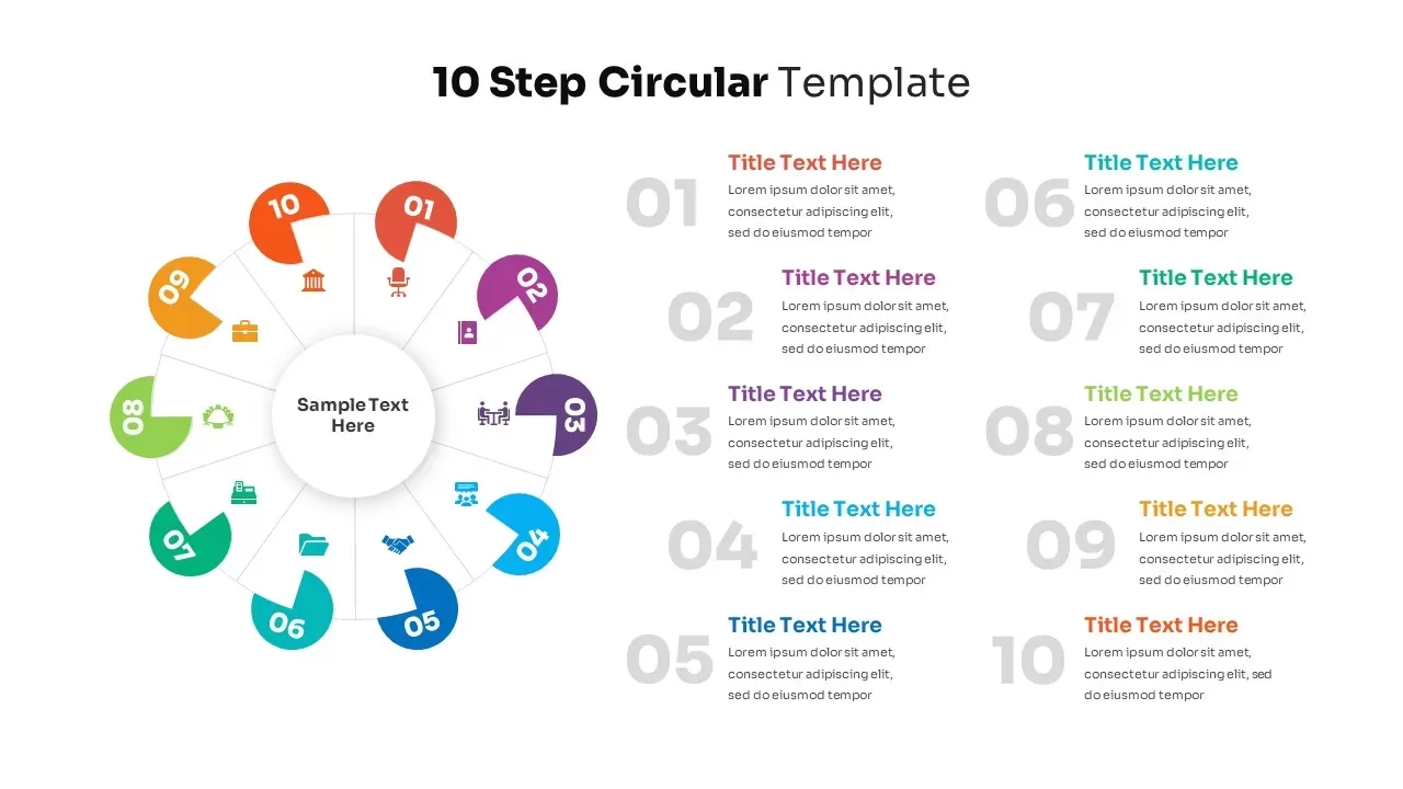
10-Step Colorful Circular Diagram Template for PowerPoint & Google Slides
Circular
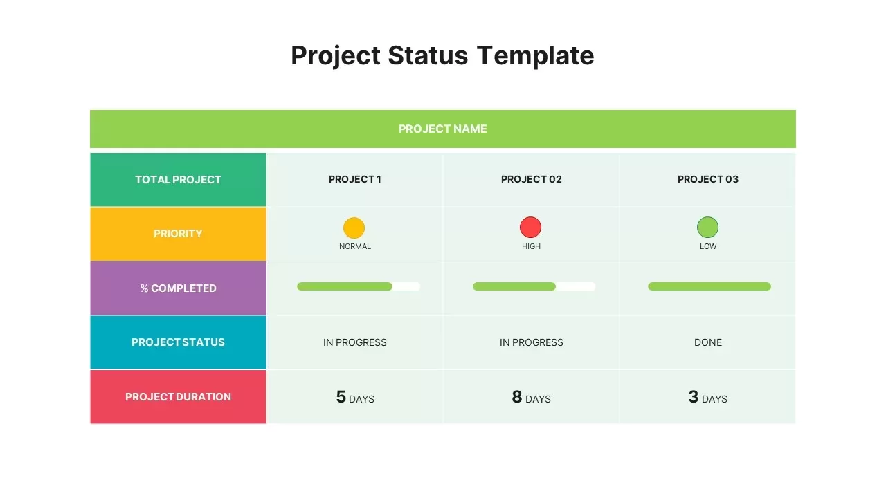
Colorful Project Status Dashboard Template for PowerPoint & Google Slides
Project Status
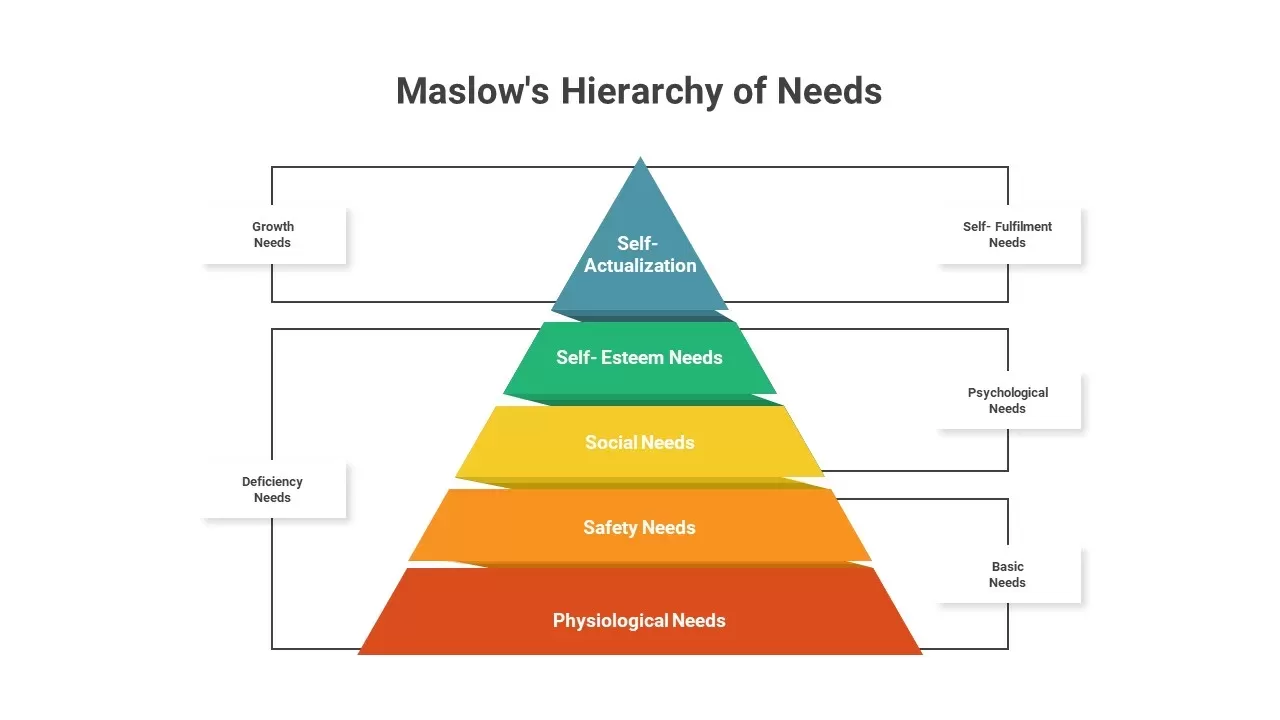
Maslow’s Colorful Pyramid of Needs Template for PowerPoint & Google Slides
Pyramid
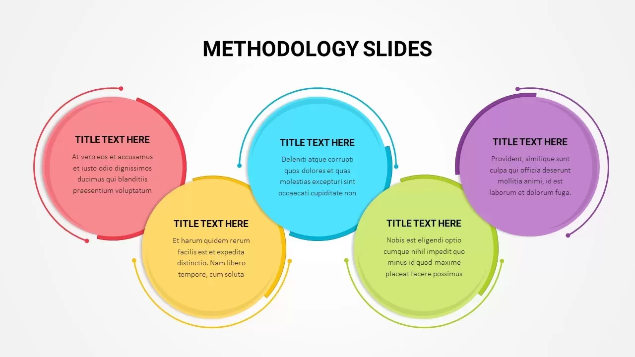
Colorful Five-Stage Methodology Diagram Template for PowerPoint & Google Slides
Process
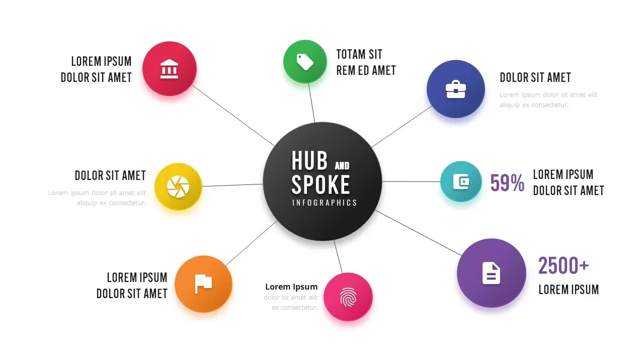
Colorful Hub-and-Spoke Infographic Template for PowerPoint & Google Slides
Circular
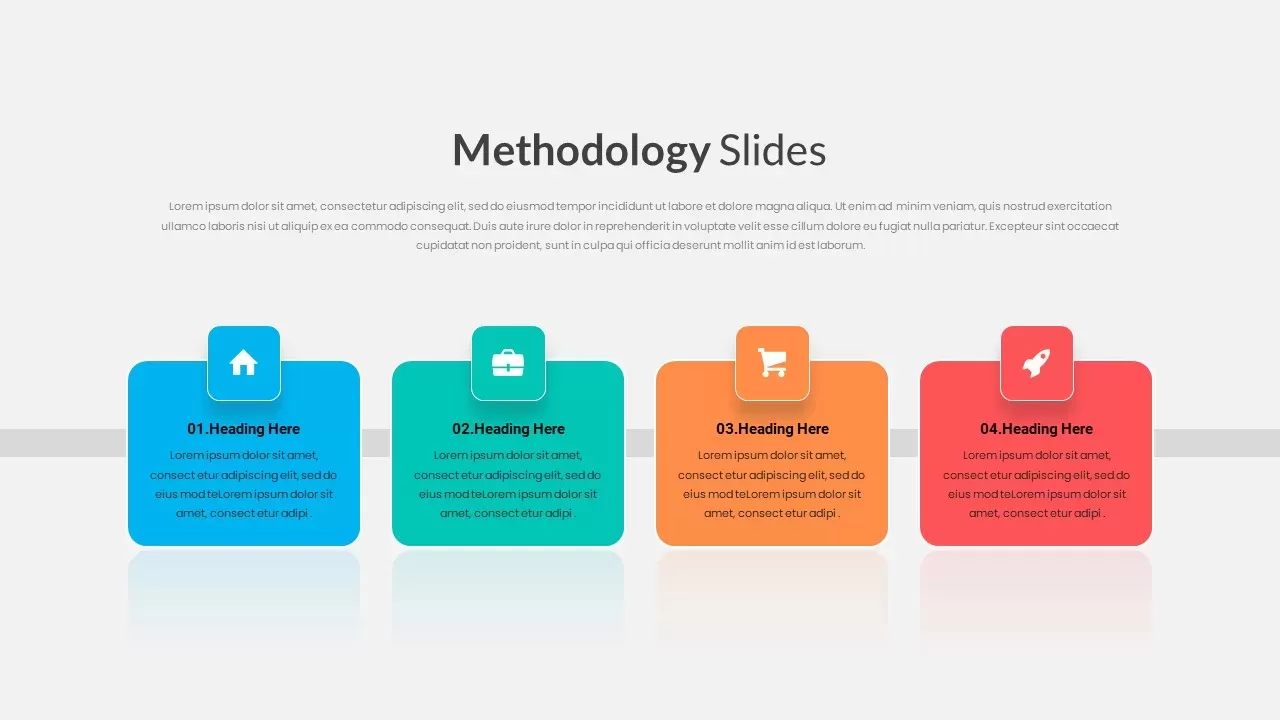
4 Step Vibrant Colorful Methodology Template for PowerPoint & Google Slides
Process
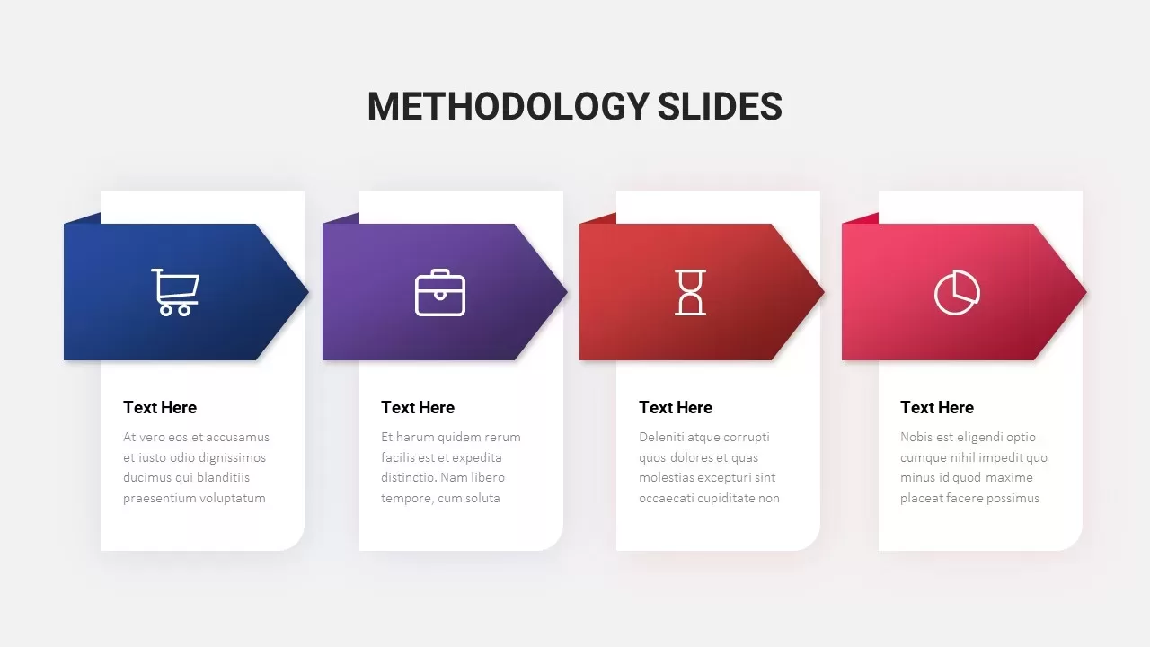
Colorful Arrow Methodology Steps Template for PowerPoint & Google Slides
Process
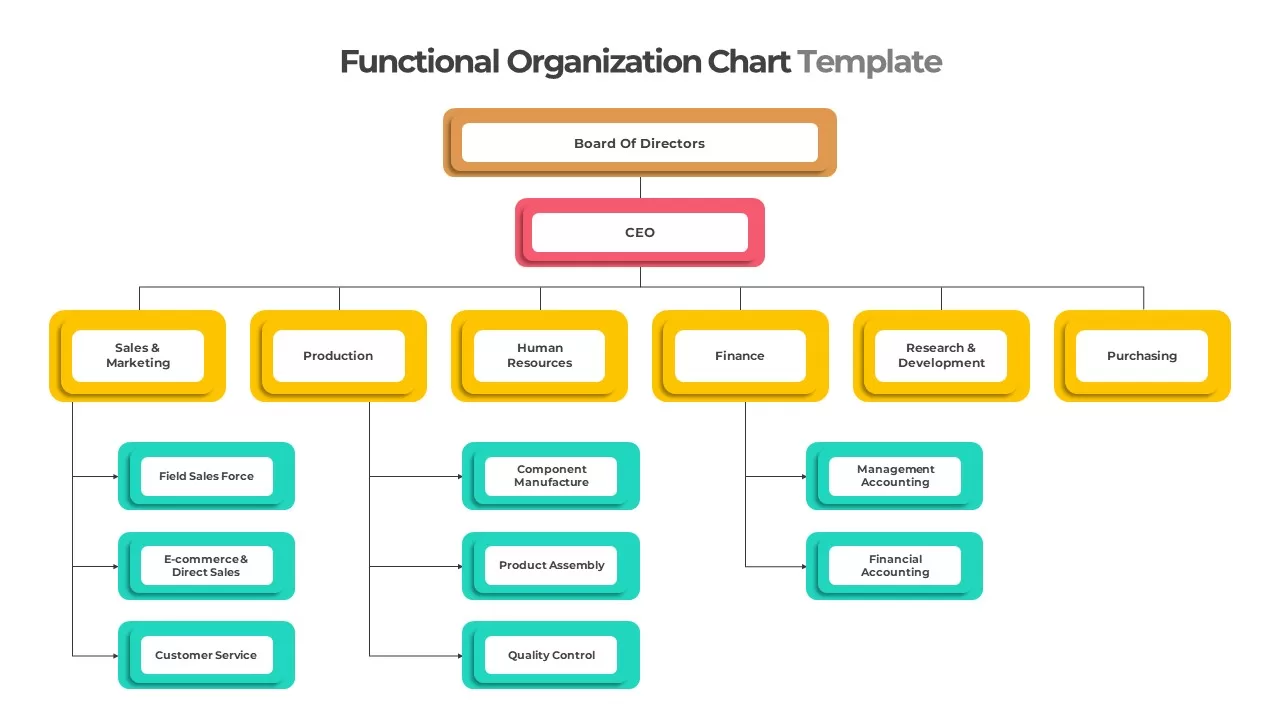
Colorful Functional Organization Chart Template for PowerPoint & Google Slides
Org Chart
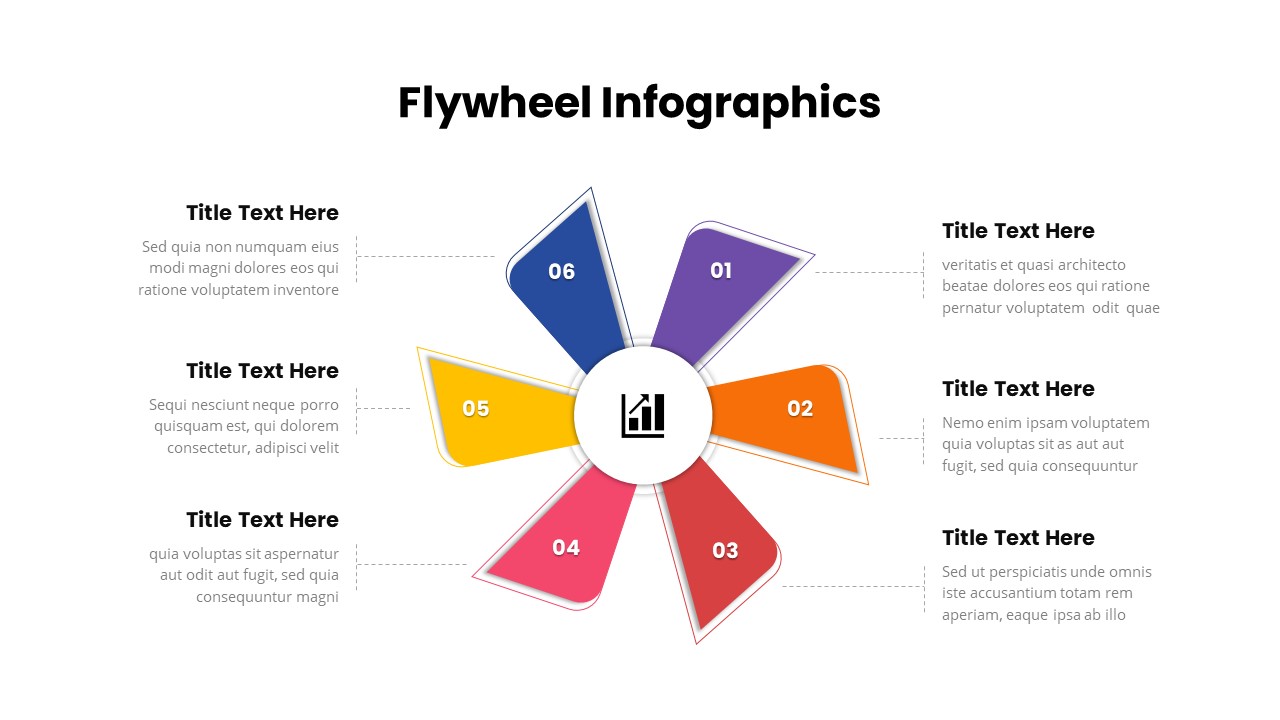
Six-Step Colorful Flywheel Diagram Template for PowerPoint & Google Slides
Circular
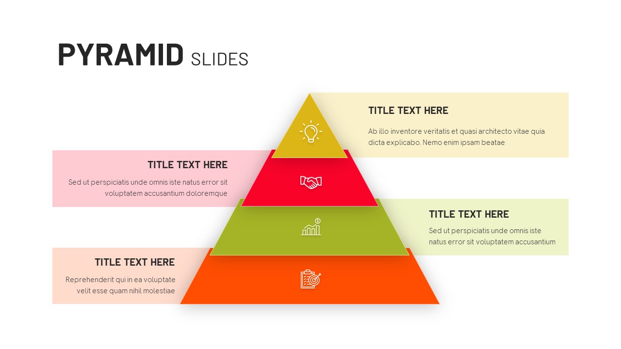
Four-Level Colorful Pyramid Diagram Template for PowerPoint & Google Slides
Pyramid
Colorful Polka Dot Background Theme Template for PowerPoint & Google Slides
Decks
Colorful Weekly Schedule Slide Deck Template for PowerPoint & Google Slides
Agenda
Colorful Agile Timeline Infographic Template for PowerPoint & Google Slides
Timeline
Free
Colorful Feature List Presentation Template for PowerPoint & Google Slides
Decks
Colorful Snake Process Diagram Template for PowerPoint & Google Slides
Process
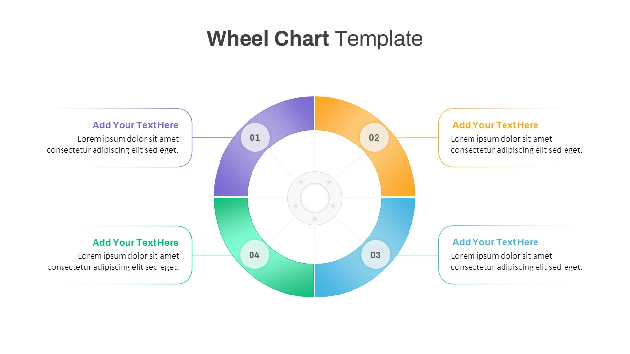
Colorful Four-Segment Wheel Chart Template for PowerPoint & Google Slides
Circular
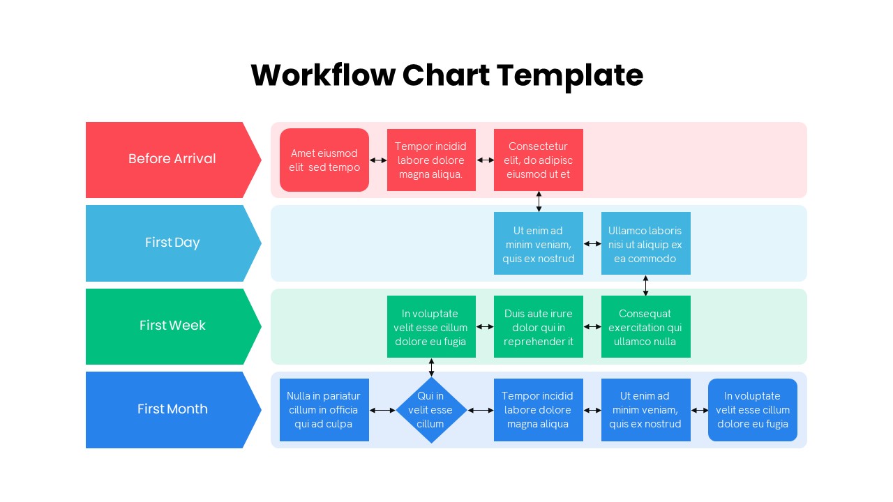
Colorful Multistage Workflow Chart Template for PowerPoint & Google Slides
Flow Charts
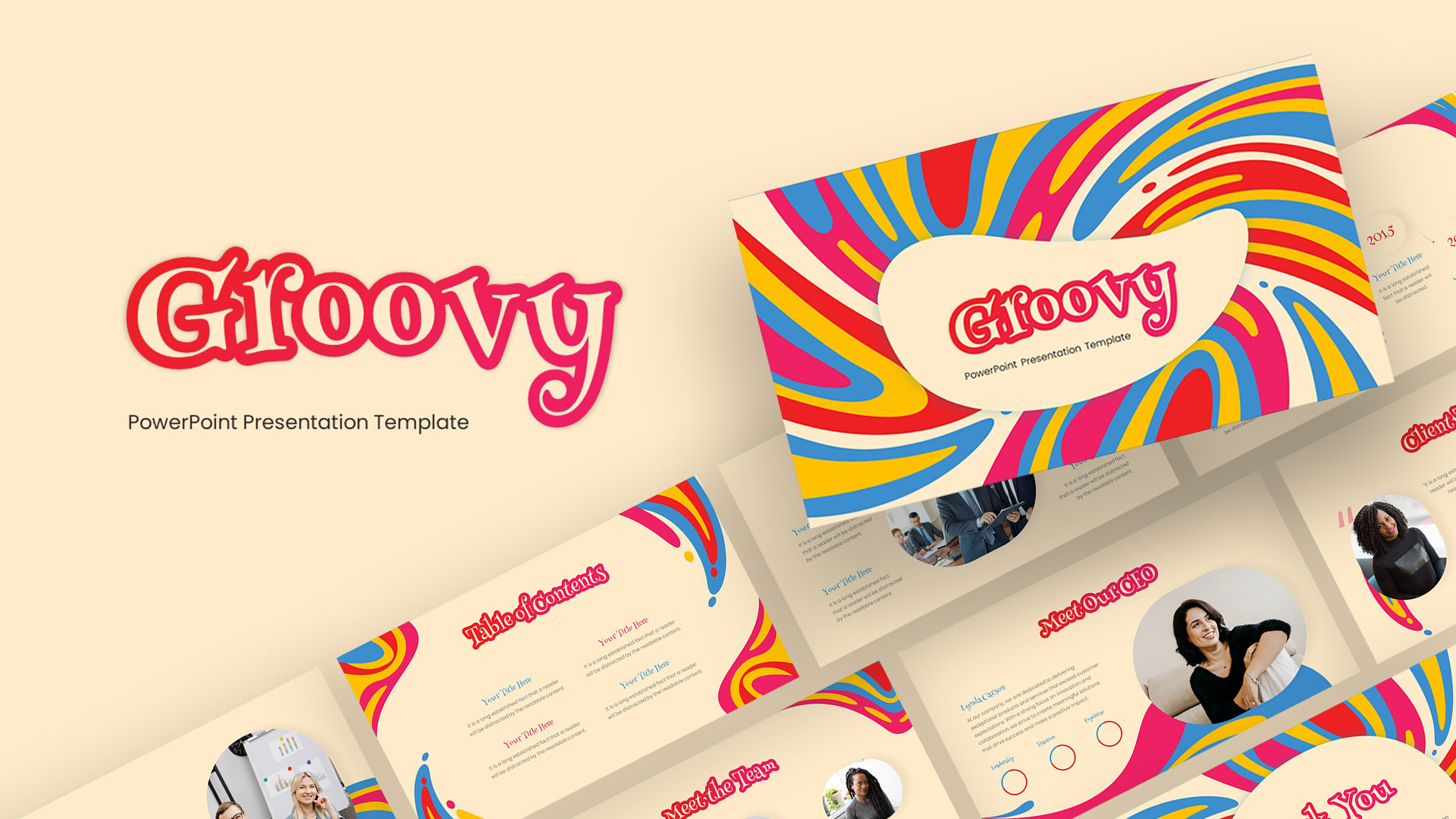
Groovy Retro Colorful Presentation Template for PowerPoint & Google Slides
Company Profile
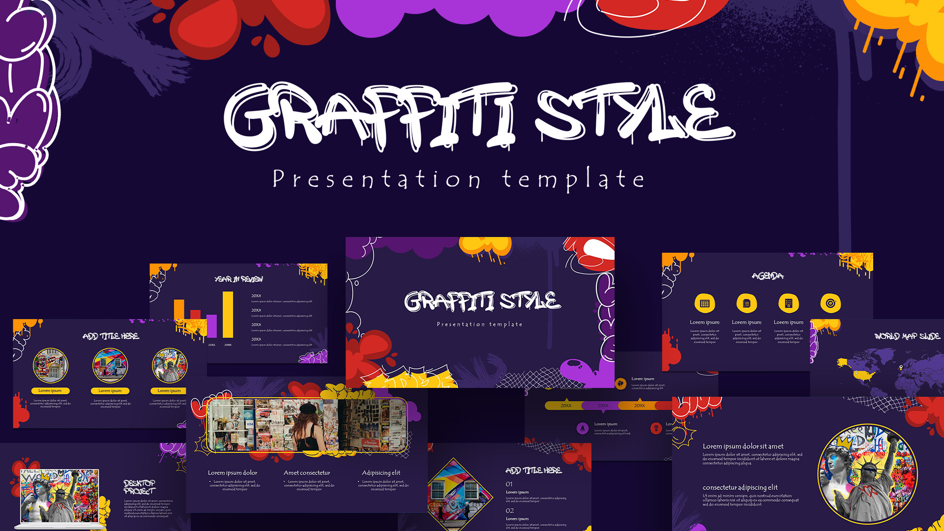
Free Graffiti Style Colorful Presentation Template for PowerPoint & Google Slides
Pitch Deck
Free
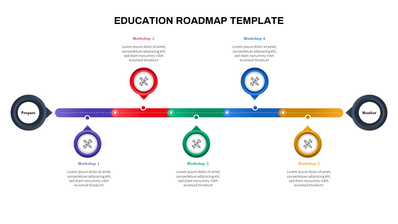
Colorful Education Roadmap Workshop Timeline Template for PowerPoint & Google Slides
Roadmap
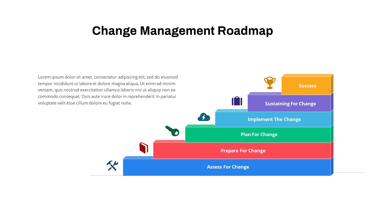
Colorful Change Management Roadmap Template for PowerPoint & Google Slides
Roadmap
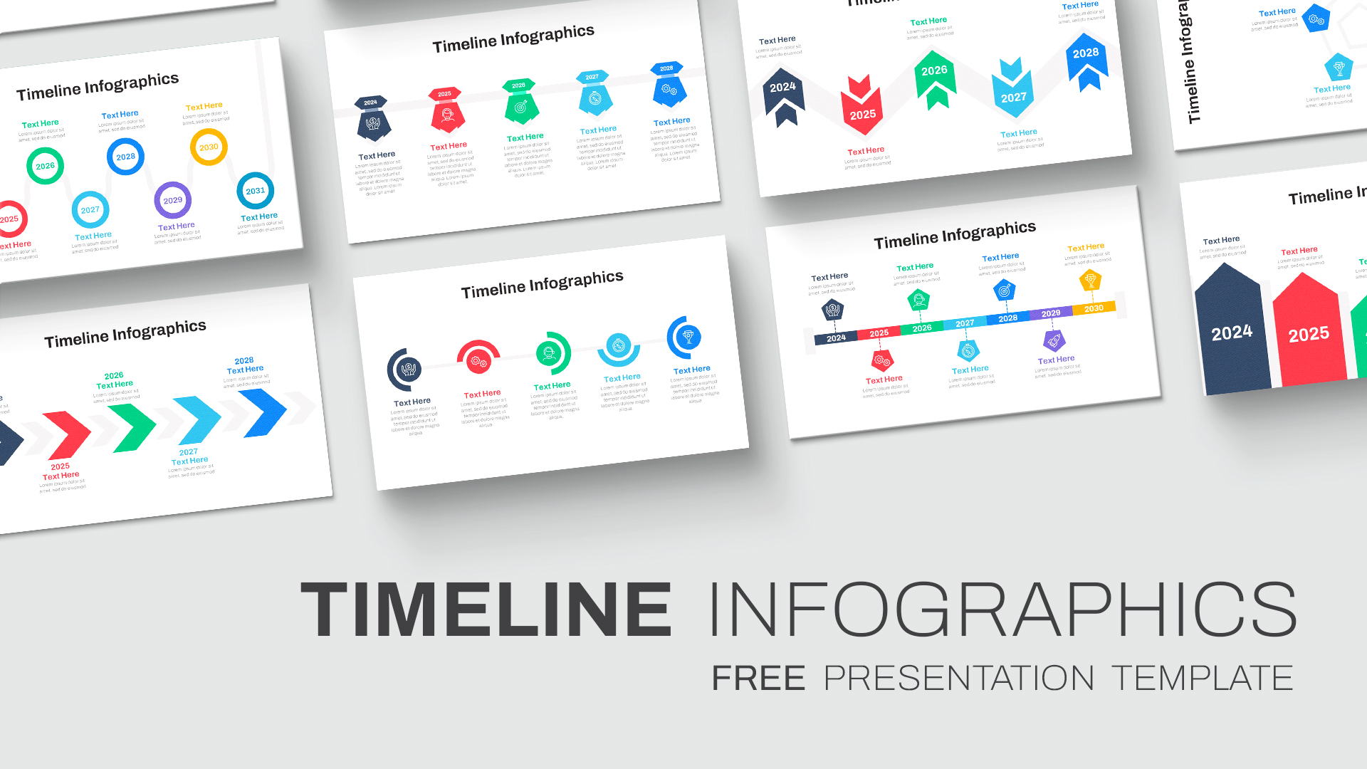
Free Colorful Timeline Infographics Template for PowerPoint & Google Slides
Timeline
Free
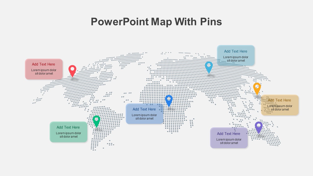
Colorful World Map with Location Pins Template for PowerPoint & Google Slides
World Maps
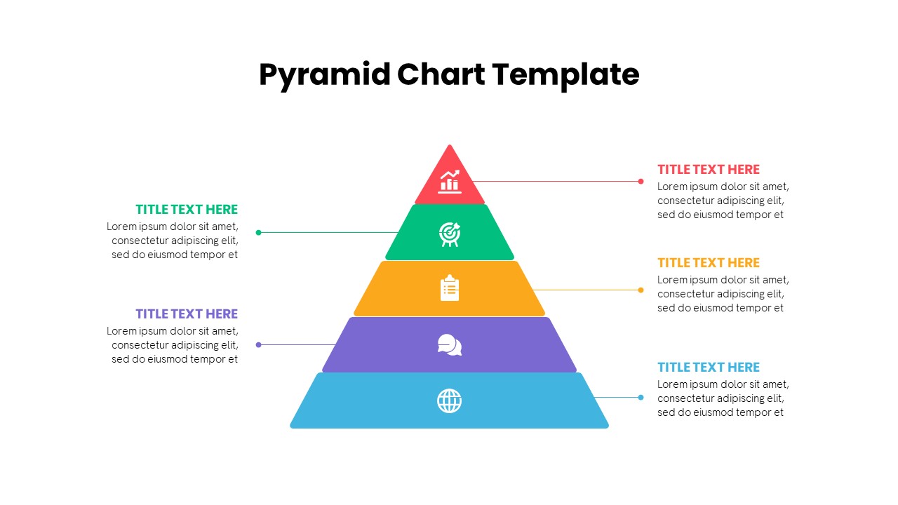
Multi-Level Colorful Pyramid Chart Template for PowerPoint & Google Slides
Pyramid
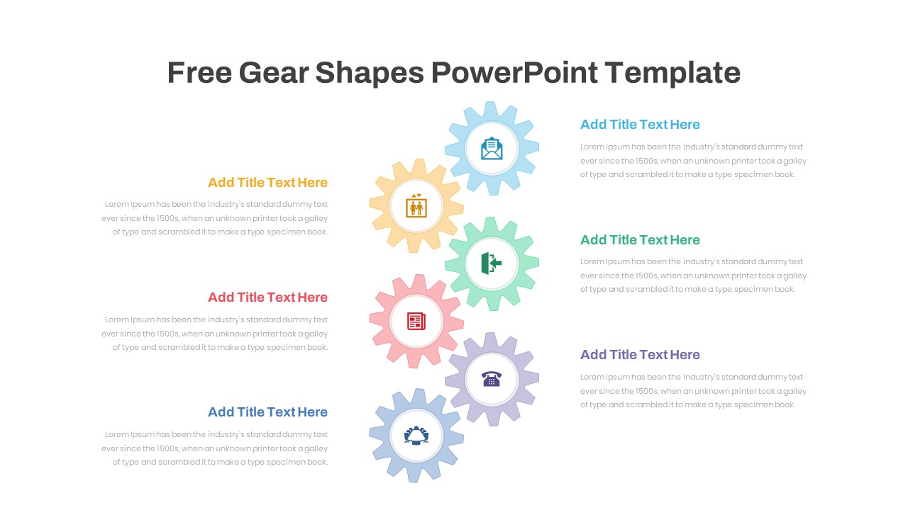
Six Colorful Gear Shapes Infographic Template for PowerPoint & Google Slides
Process
Free
Colorful Multi-Branch Mind Map Slide Template for PowerPoint & Google Slides
Mind Maps
Colorful Creative Presentation Deck Template for PowerPoint & Google Slides
Company Profile
Colorful Three-Presenter Profile Cards Template for PowerPoint & Google Slides
Our Team
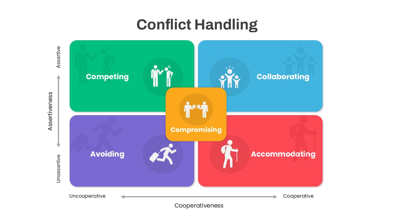
Colorful Conflict Handling Matrix Template for PowerPoint & Google Slides
Comparison
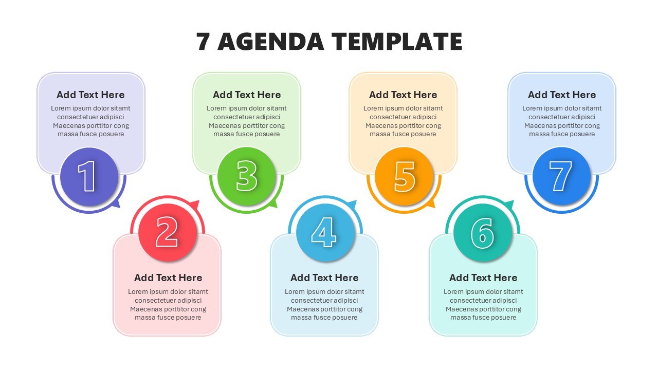
Colorful Seven-Item Agenda Slide Template for PowerPoint & Google Slides
Agenda
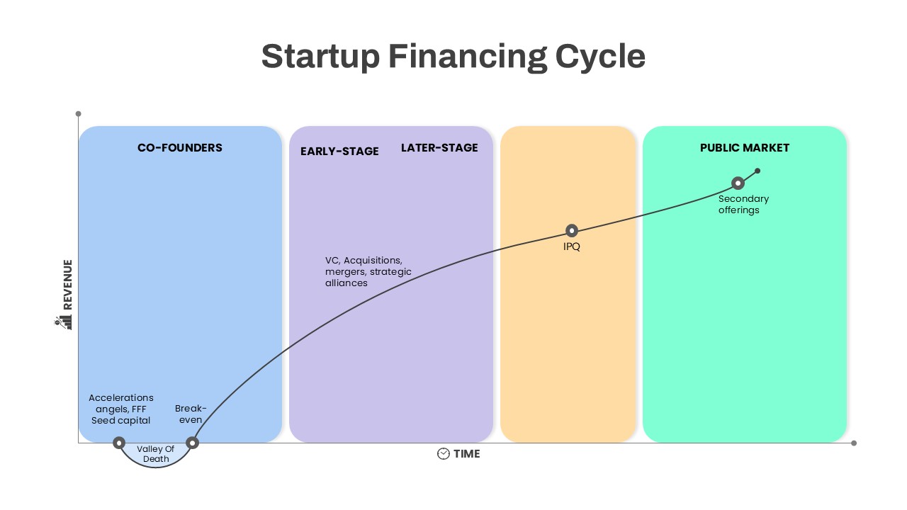
Colorful Startup Financing Cycle Diagram Template for PowerPoint & Google Slides
Finance
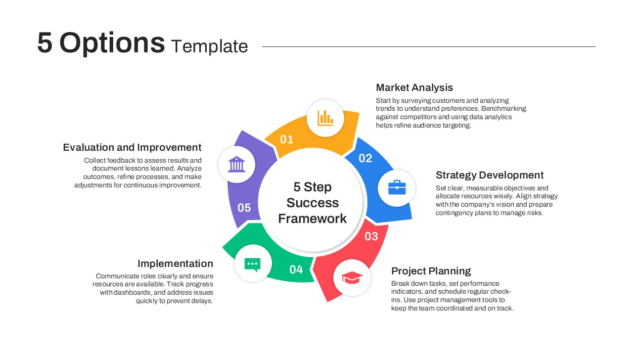
Colorful Five-Option Ribbon Infographic Template for PowerPoint & Google Slides
Process
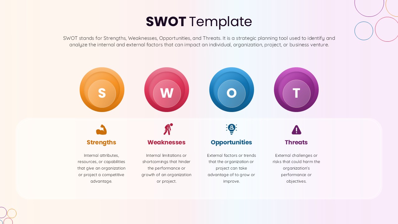
SWOT Template with Colorful Circles for PowerPoint & Google Slides
SWOT
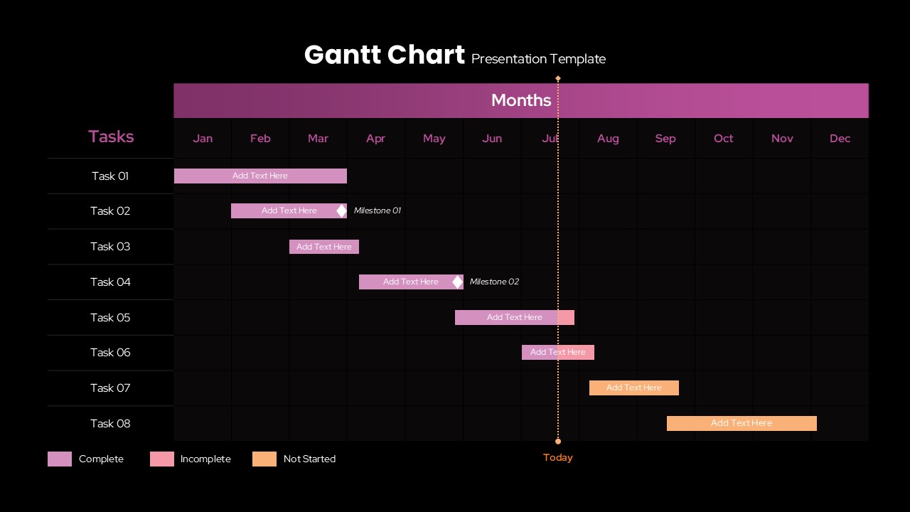
Colorful Annual Gantt Chart Timeline Template for PowerPoint & Google Slides
Gantt Chart