Bottle Data Percentage Infographic Template for PowerPoint & Google Slides
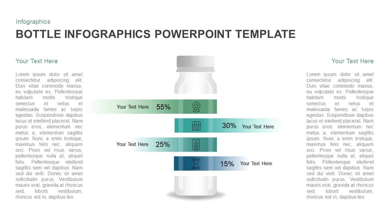
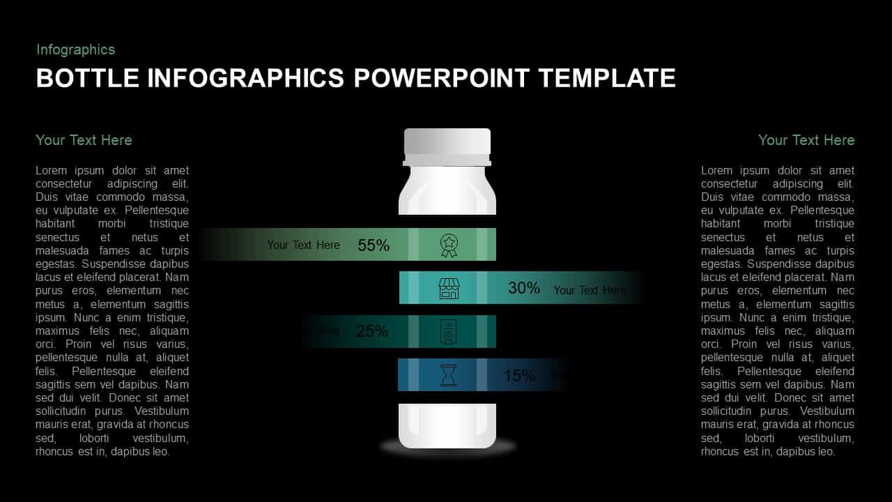
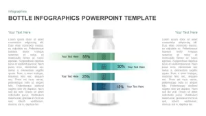
Visualize and compare four critical metrics with this bottle-themed infographic slide. The design features a central vector illustration of a vertical bottle container overlaid by four horizontal gradient bars representing percentage values—55%, 30%, 25%, and 15%—each paired with minimalist icons to reinforce the data narrative. Ample white space and subtle drop shadows ensure the layout remains clean, while seamless gradient transitions—from soft green to deep blue—add visual depth and guide the viewer’s eye through the sequence of metrics. Two side-aligned text placeholders allow you to elaborate on data insights or contextual commentary without detracting from the central graphic. Engineered with master slides, all elements are fully editable: adjust bar lengths, swap icons, change color stops, or update text fields within seconds, ensuring effortless alignment with brand guidelines or presentation themes.
Consistent vector styling and scalable graphics mean that this slide maintains crisp clarity across all display formats, from HD screens to printed handouts. The flat yet dynamic aesthetic, paired with legible sans-serif typography, ensures audience engagement while communicating complex percentage breakdowns in a digestible format. Perfectly compatible with both PowerPoint and Google Slides, this infographic minimizes formatting issues and accelerates slide deck development.
Whether used in performance reviews, financial reports, or product adoption presentations, this bottle infographic template translates raw data into an intuitive visual story. Simply replace placeholder text, tweak color gradients, or duplicate bars to support additional data points. By merging thematic illustration with quantitative analysis, this slide elevates conventional chart layouts into memorable, brand-centric narratives.
Who is it for
Marketing analysts, data consultants, and financial managers can leverage this slide to present percentage breakdowns and performance metrics in stakeholder briefings. Product managers, operations teams, and training facilitators will appreciate its intuitive, branded visual structure for clear data communication.
Other Uses
Beyond KPI presentations, repurpose this template for resource allocation reports, customer segmentation overviews, or milestone tracking. The bottle graphic can illustrate supply chain metrics, inventory levels, or sustainability data. Duplicate and recolor bars to create extended comparisons or time-based trend analyses.
Login to download this file

Item ID
SB01116
Related Templates

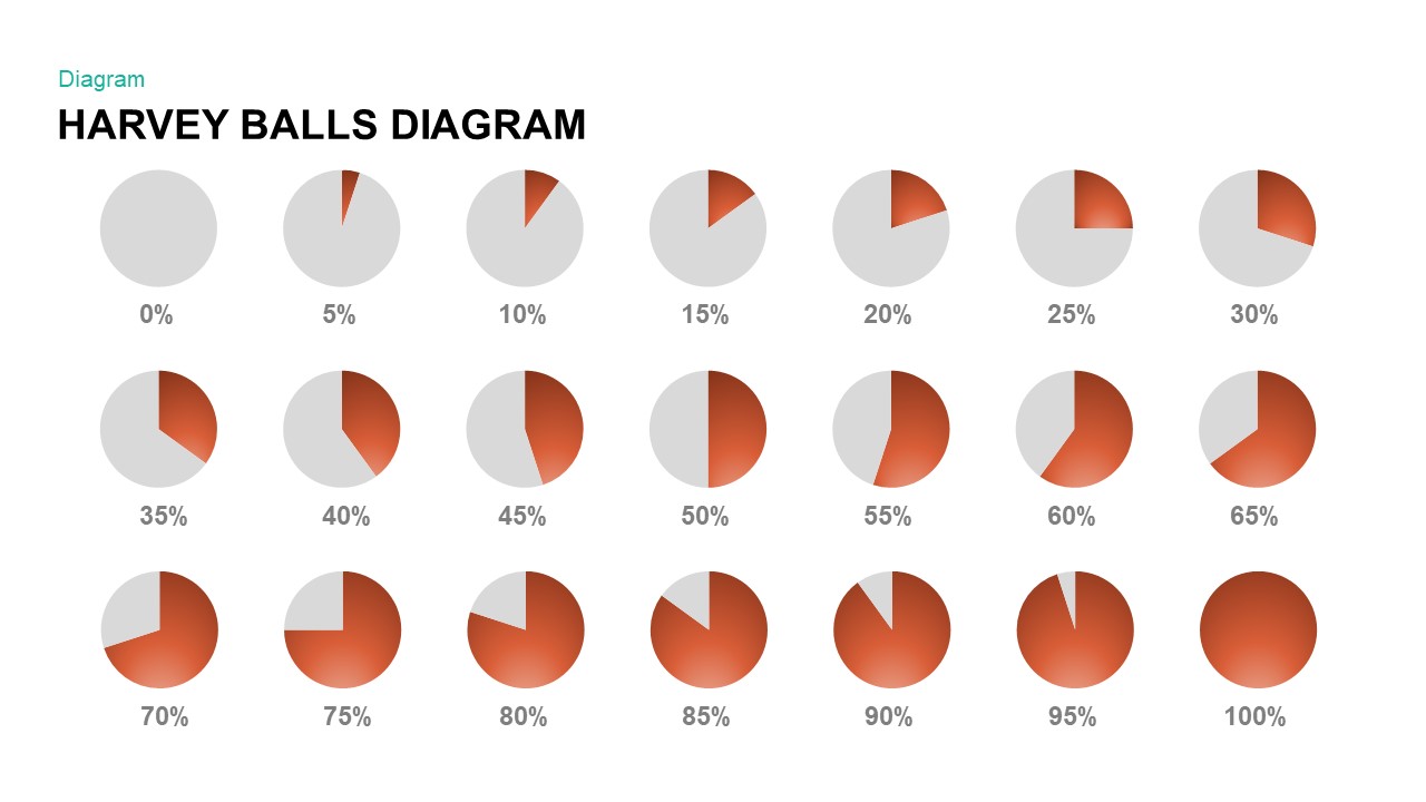
Harvey Balls Percentage Infographic Template for PowerPoint & Google Slides
Harvey Balls
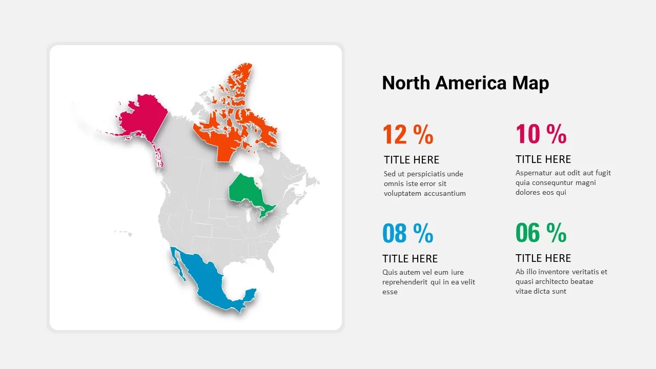
North America Percentage Map Infographic Template for PowerPoint & Google Slides
World Maps
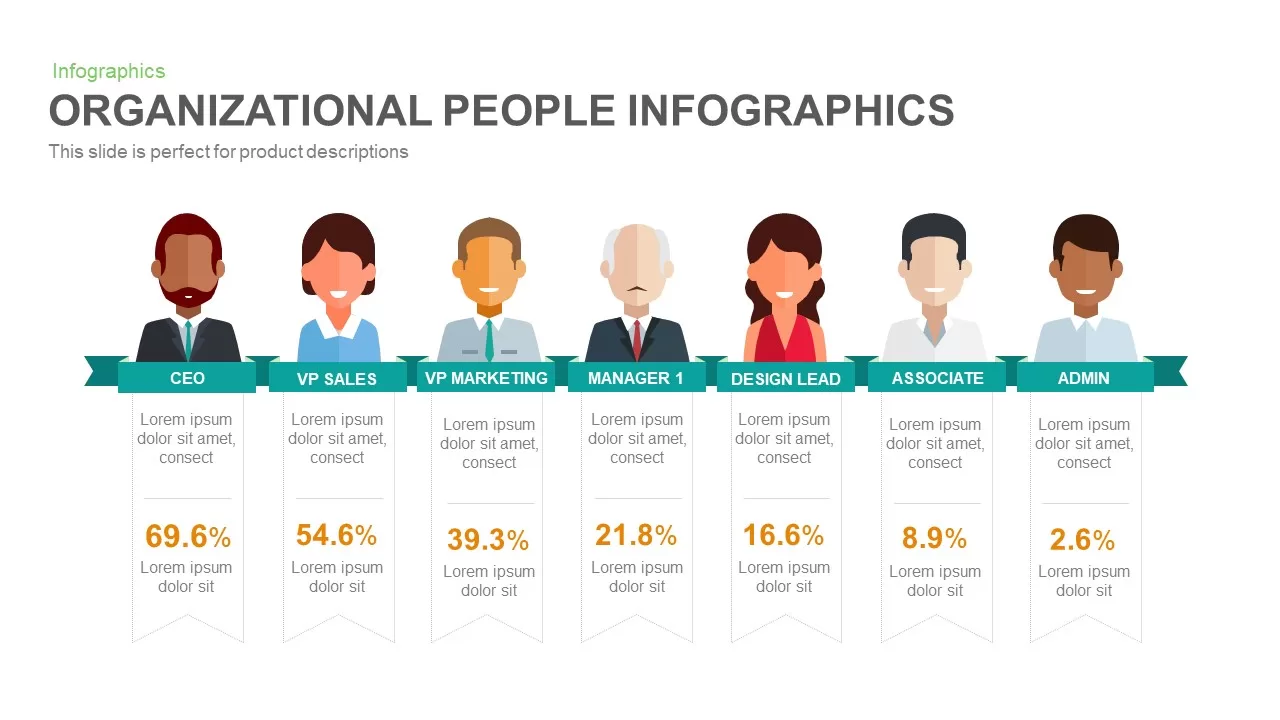
Organizational People Percentage Chart template for PowerPoint & Google Slides
Org Chart

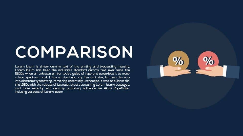
Dual Percentage Comparison Metaphor Template for PowerPoint & Google Slides
Comparison
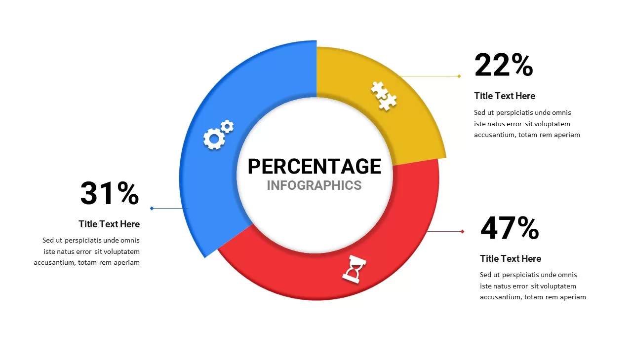
Free Percentage Infographics template for PowerPoint & Google Slides
Comparison
Free
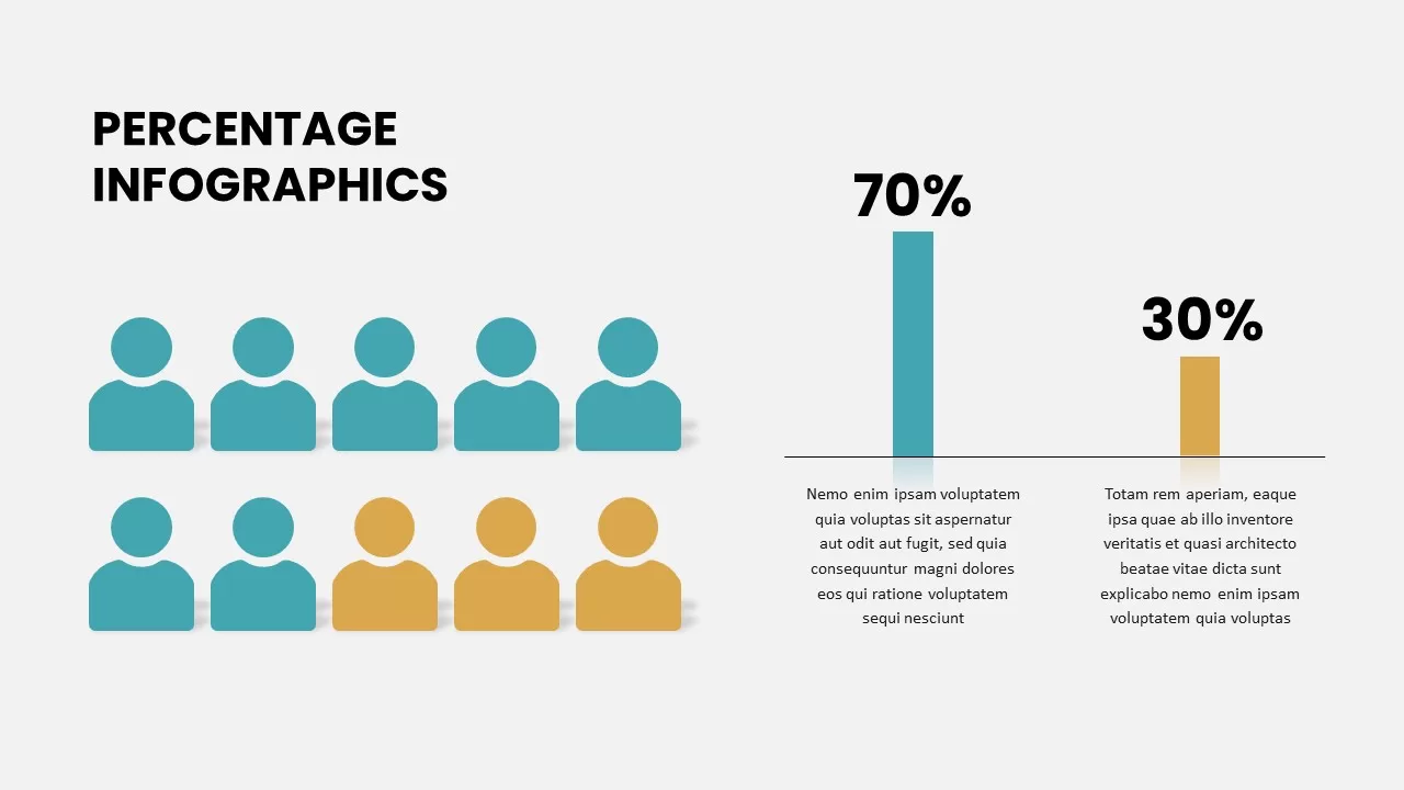
Percentage Infographics template for PowerPoint & Google Slides
Comparison
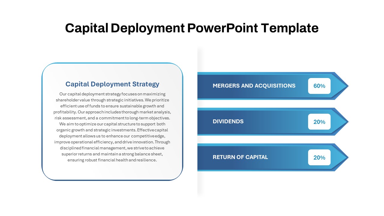
Capital Deployment Percentage Breakdown Template for PowerPoint & Google Slides
Pitch Deck
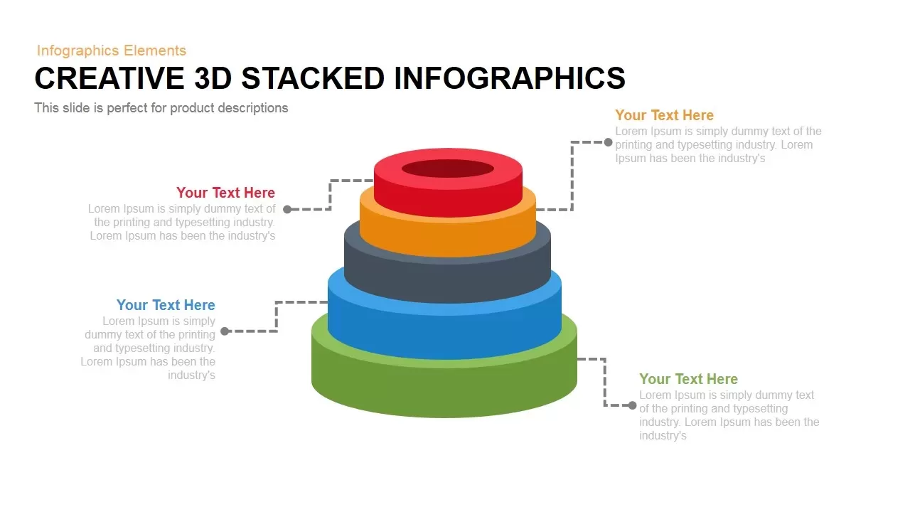
3D Stacked Infographic Layers Data Template for PowerPoint & Google Slides
Pyramid
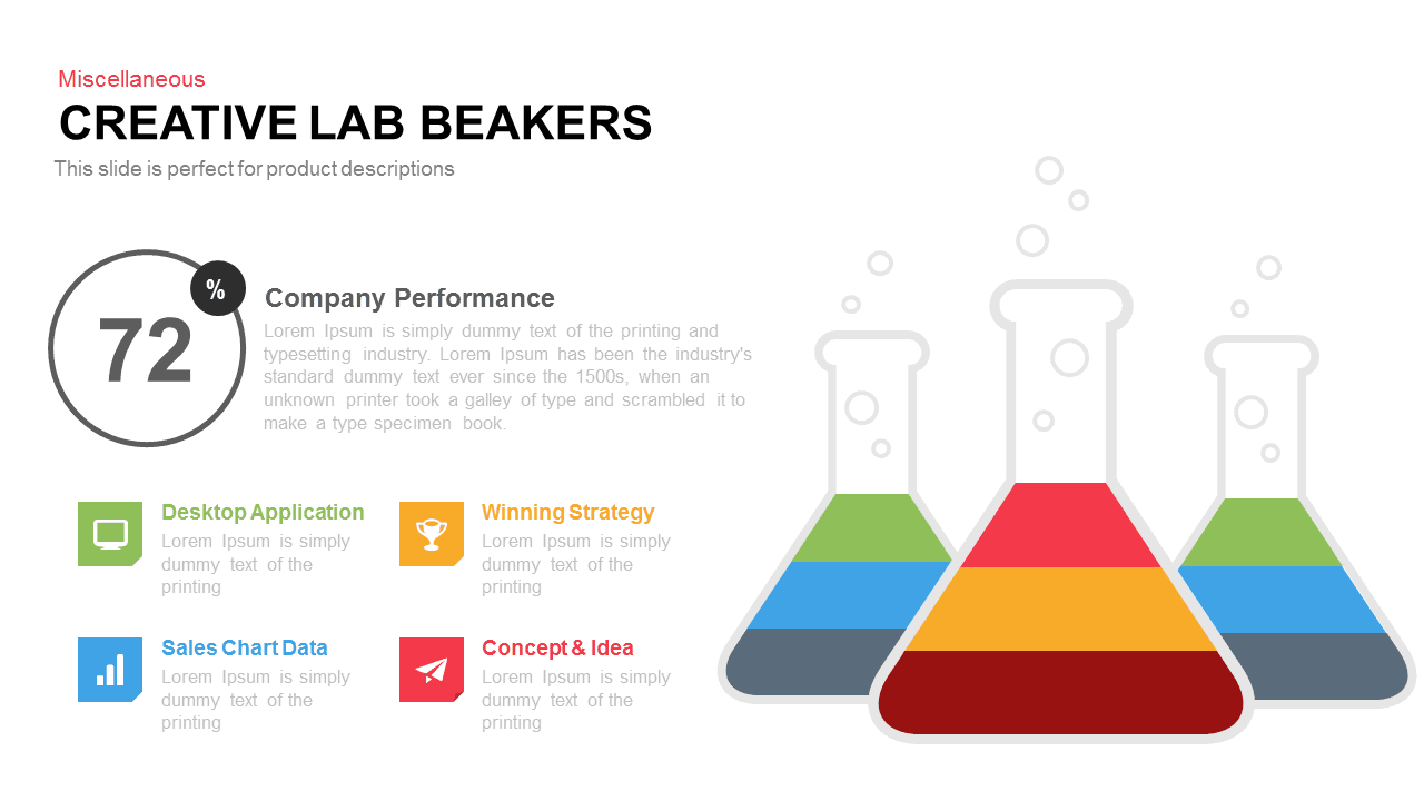
Creative Lab Beakers Data Infographic template for PowerPoint & Google Slides
Infographics

Dynamic Data Dashboard Infographic Template for PowerPoint & Google Slides
Bar/Column
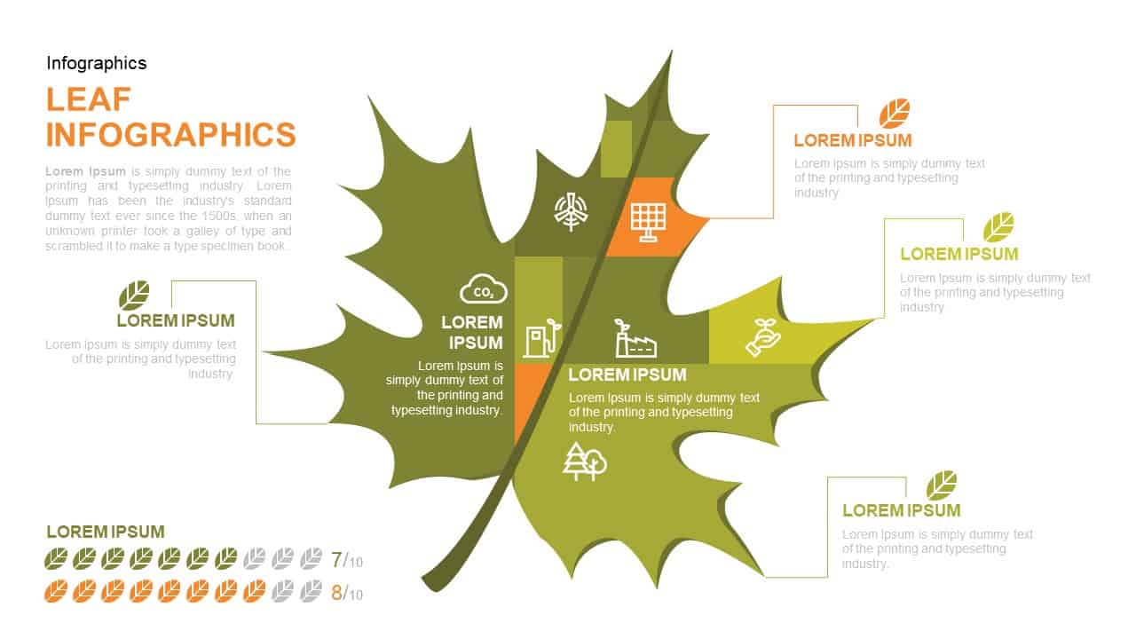
Leaf Infographic Data Visualization Template for PowerPoint & Google Slides
Infographics
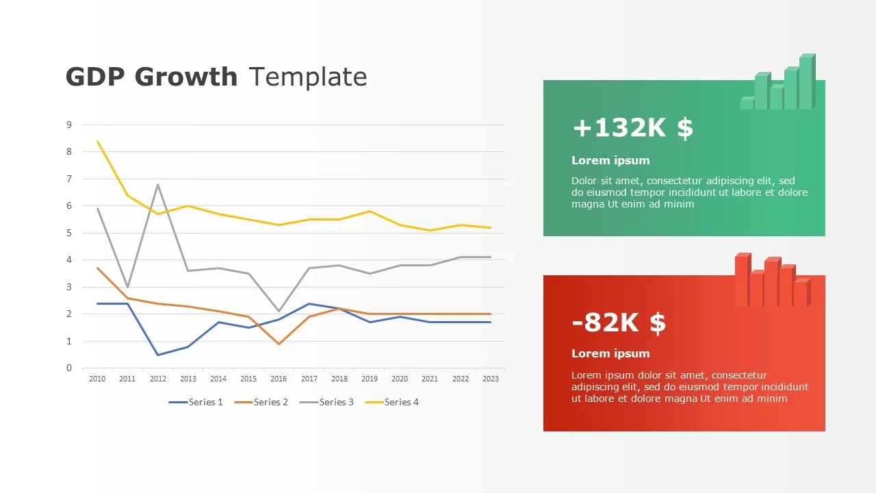
Data-driven GDP Growth Infographic Pack Template for PowerPoint & Google Slides
Infographics

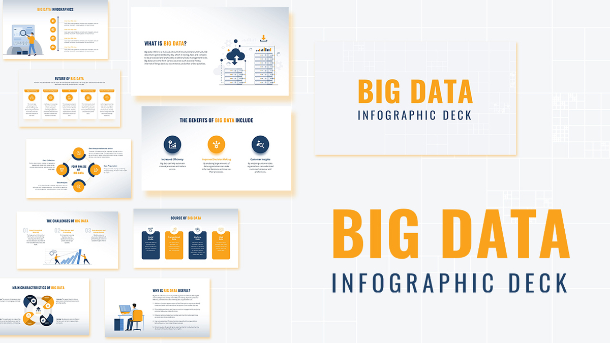
Modern Big Data Infographic Deck Template for PowerPoint & Google Slides
Decks
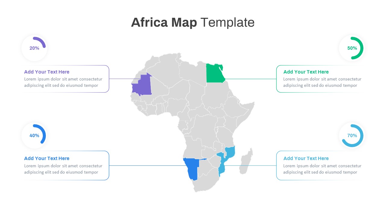
Editable Africa Map Infographic Data Template for PowerPoint & Google Slides
World Maps
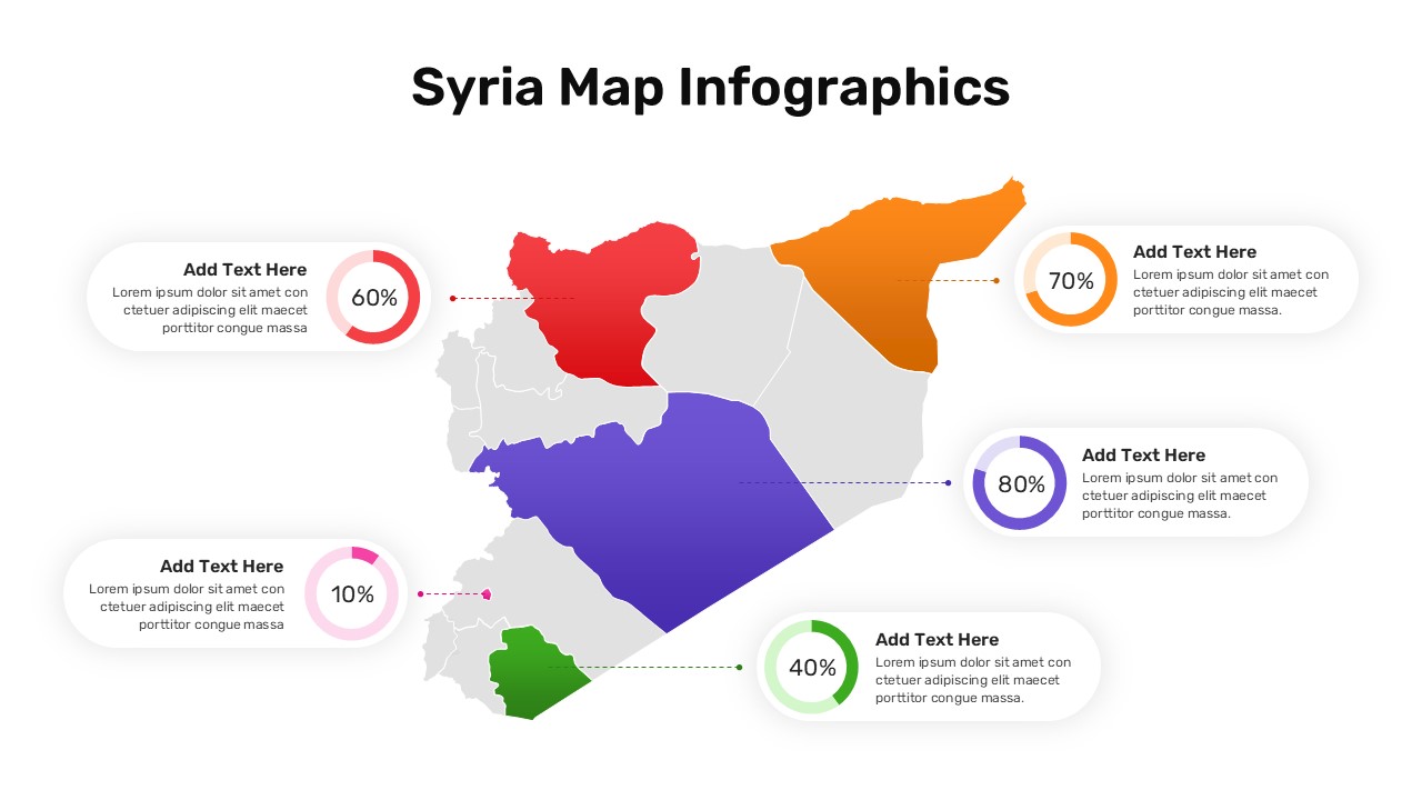
Syria Regional Data Map Infographic Template for PowerPoint & Google Slides
World Maps
Data-Driven AI in Insurance Infographic Template for PowerPoint & Google Slides
Circular
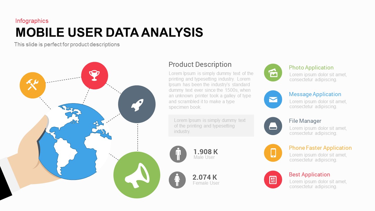
Mobile User Data Analysis Infographic for PowerPoint & Google Slides
Process
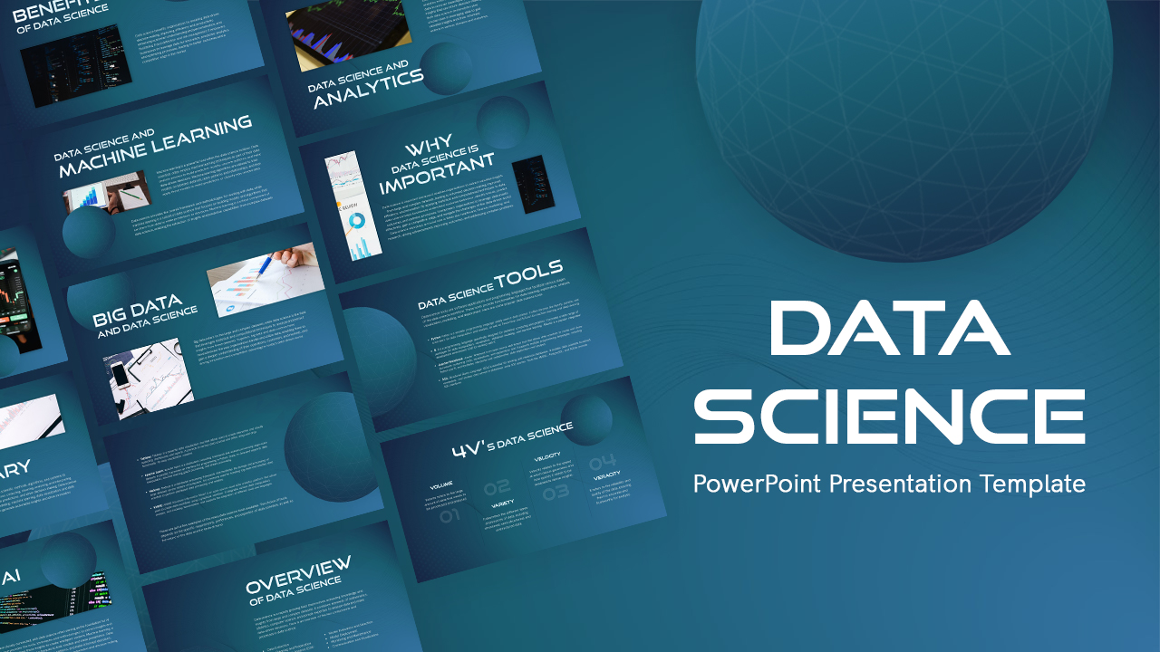
Data Science PowerPoint Presentation Template for PowerPoint & Google Slides
Pitch Deck
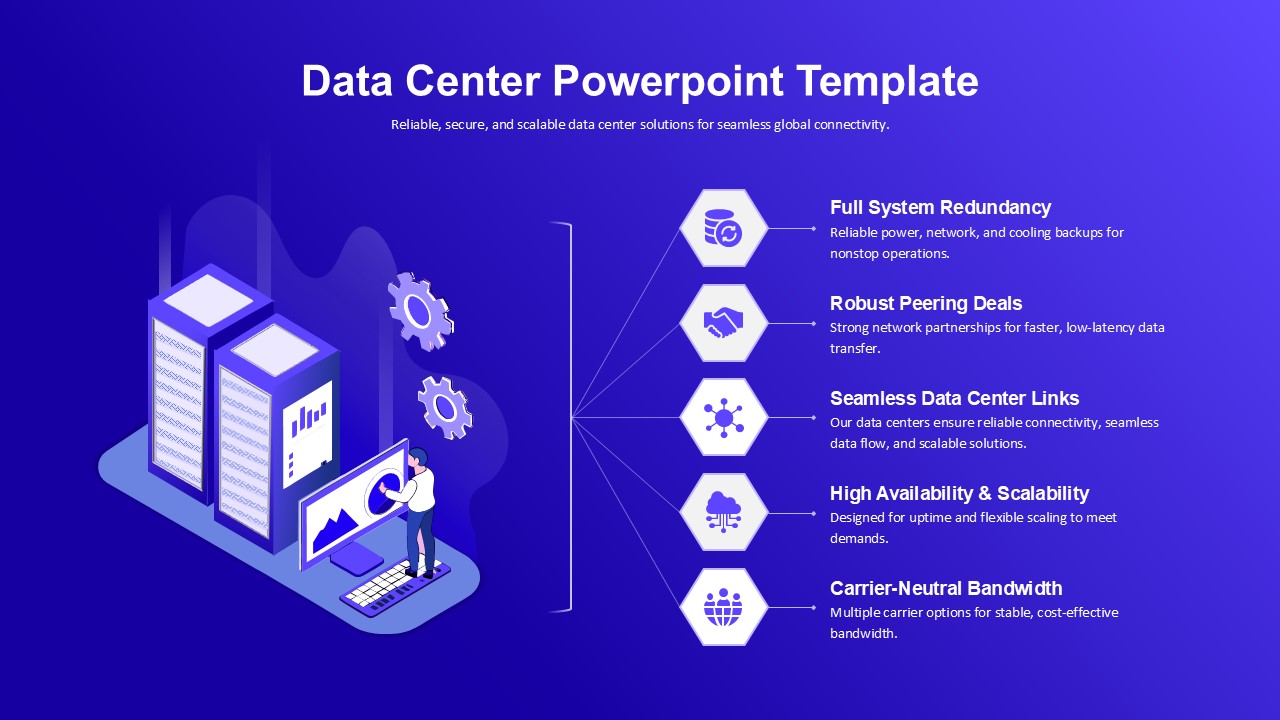
Data Center PowerPoint Template for PowerPoint & Google Slides
Information Technology

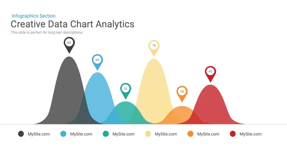
Creative data chart analytics template for PowerPoint & Google Slides
Charts
Mobile Data Analysis Chart template for PowerPoint & Google Slides
Charts
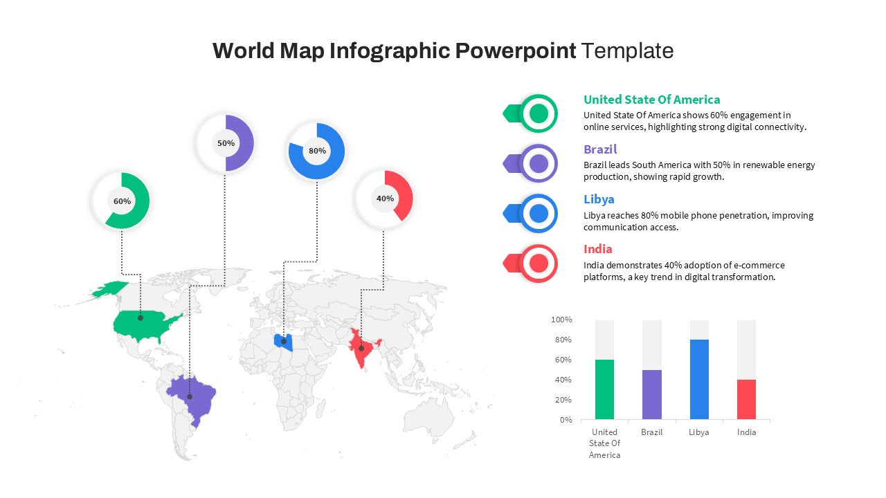
World Map Data template for PowerPoint & Google Slides
World Maps
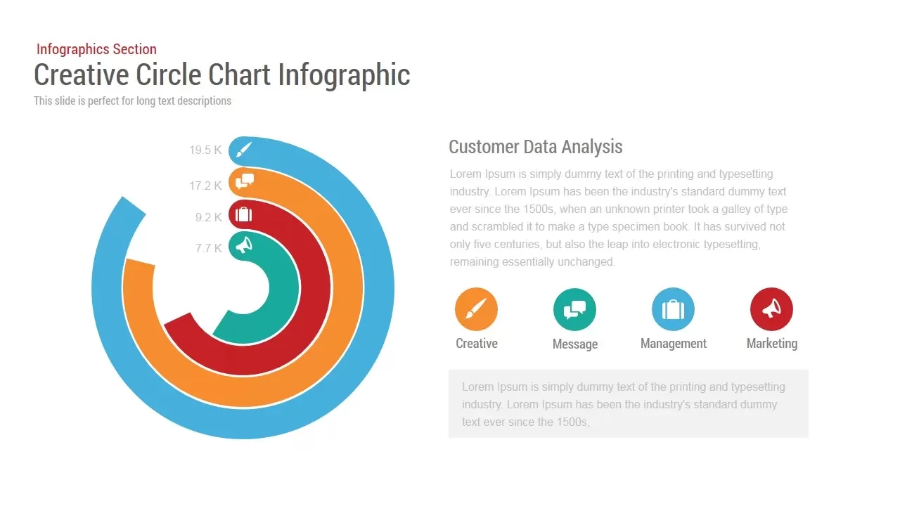
Circle Chart Data template for PowerPoint & Google Slides
Pie/Donut
Creative Data Analysis Bar Chart template for PowerPoint & Google Slides
Bar/Column

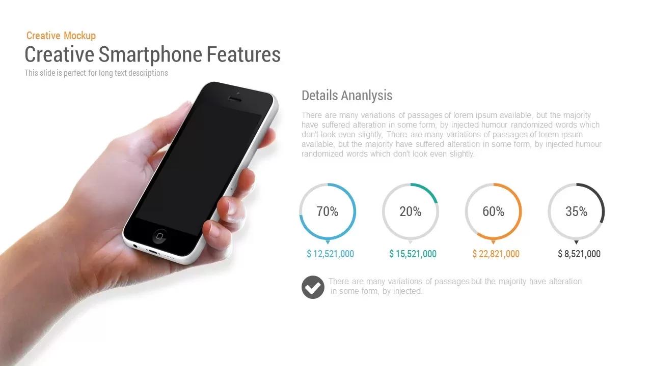
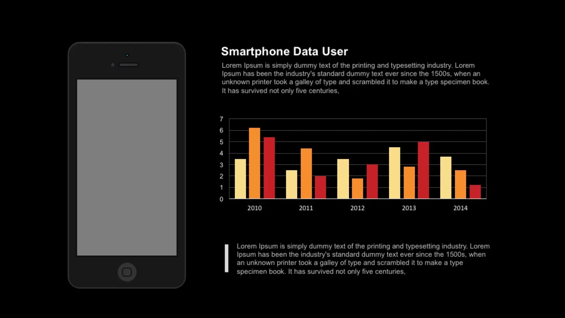
Smartphone Data User template for PowerPoint & Google Slides
Charts
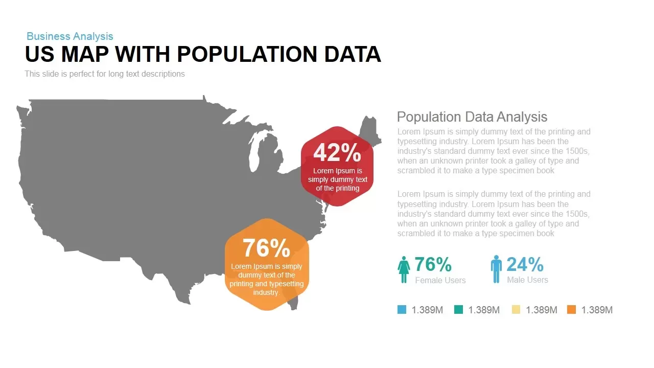
Interactive US Population Data Map Slide Template for PowerPoint & Google Slides
World Maps
3D Bar Chart Data Infographics Template for PowerPoint & Google Slides
Bar/Column
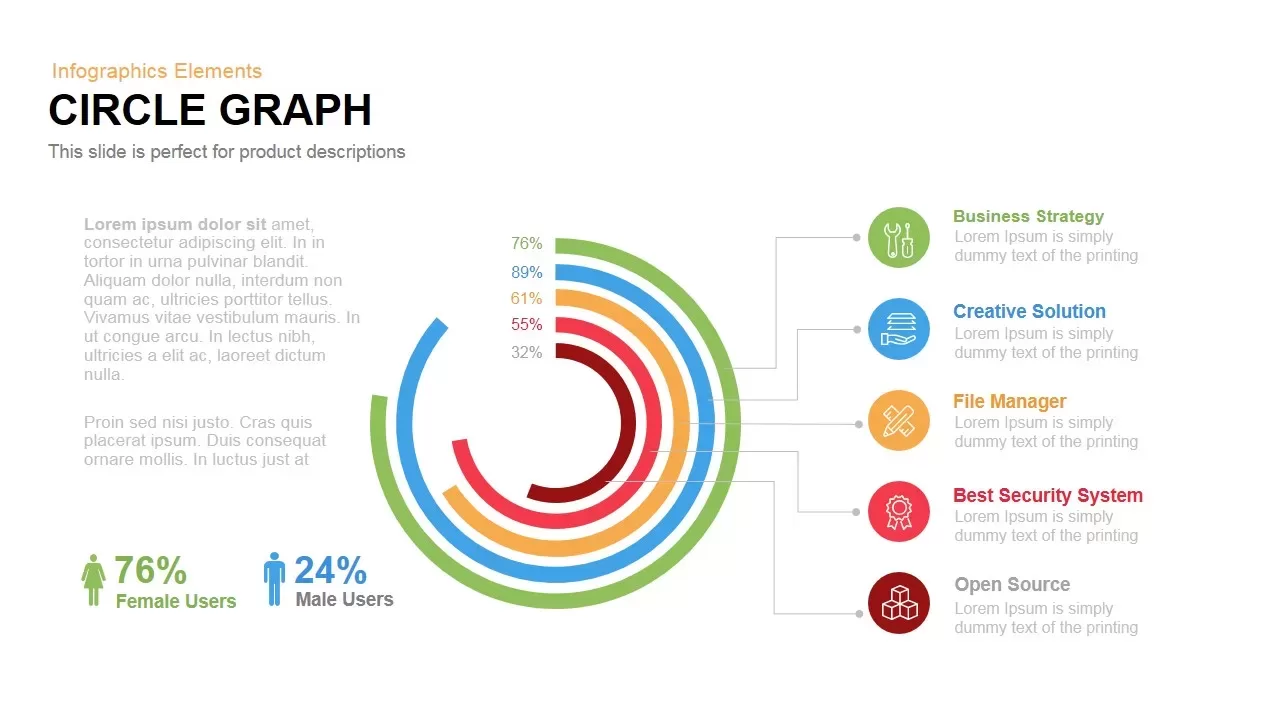
Circle Graph Data Visualization Template for PowerPoint & Google Slides
Circular
Pencil Bar Chart Data Analysis Template for PowerPoint & Google Slides
Bar/Column
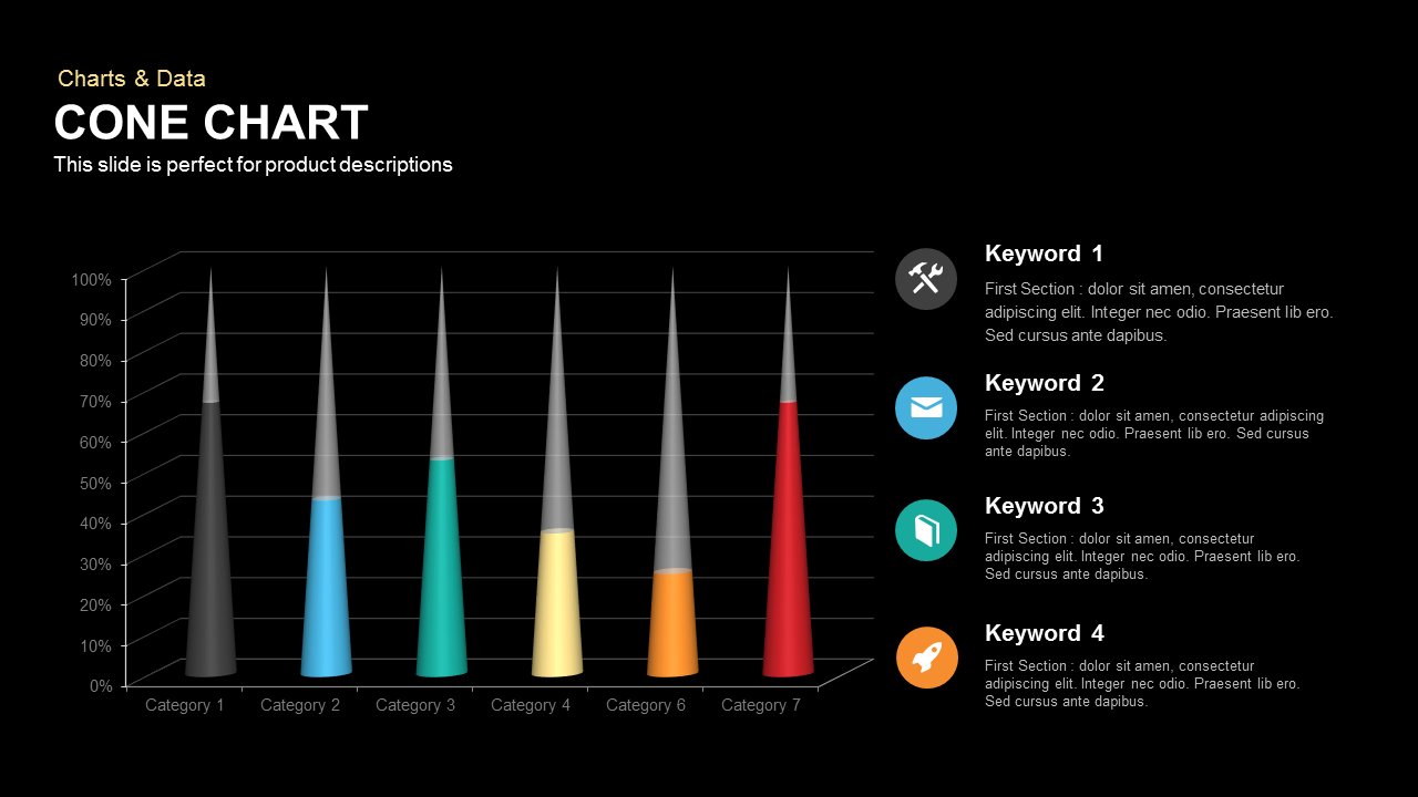
3D Cone Chart Data Visualization template for PowerPoint & Google Slides
Bar/Column
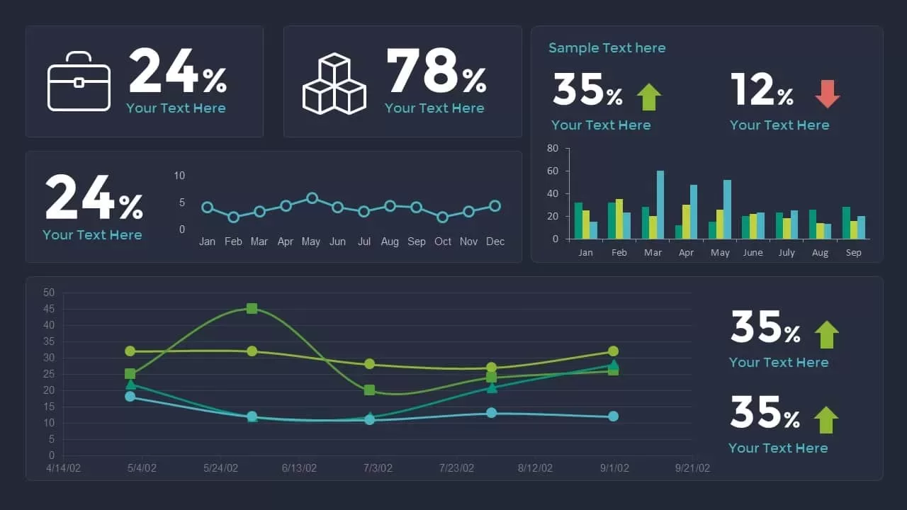
Data Analytics Dashboard Design template for PowerPoint & Google Slides
Bar/Column
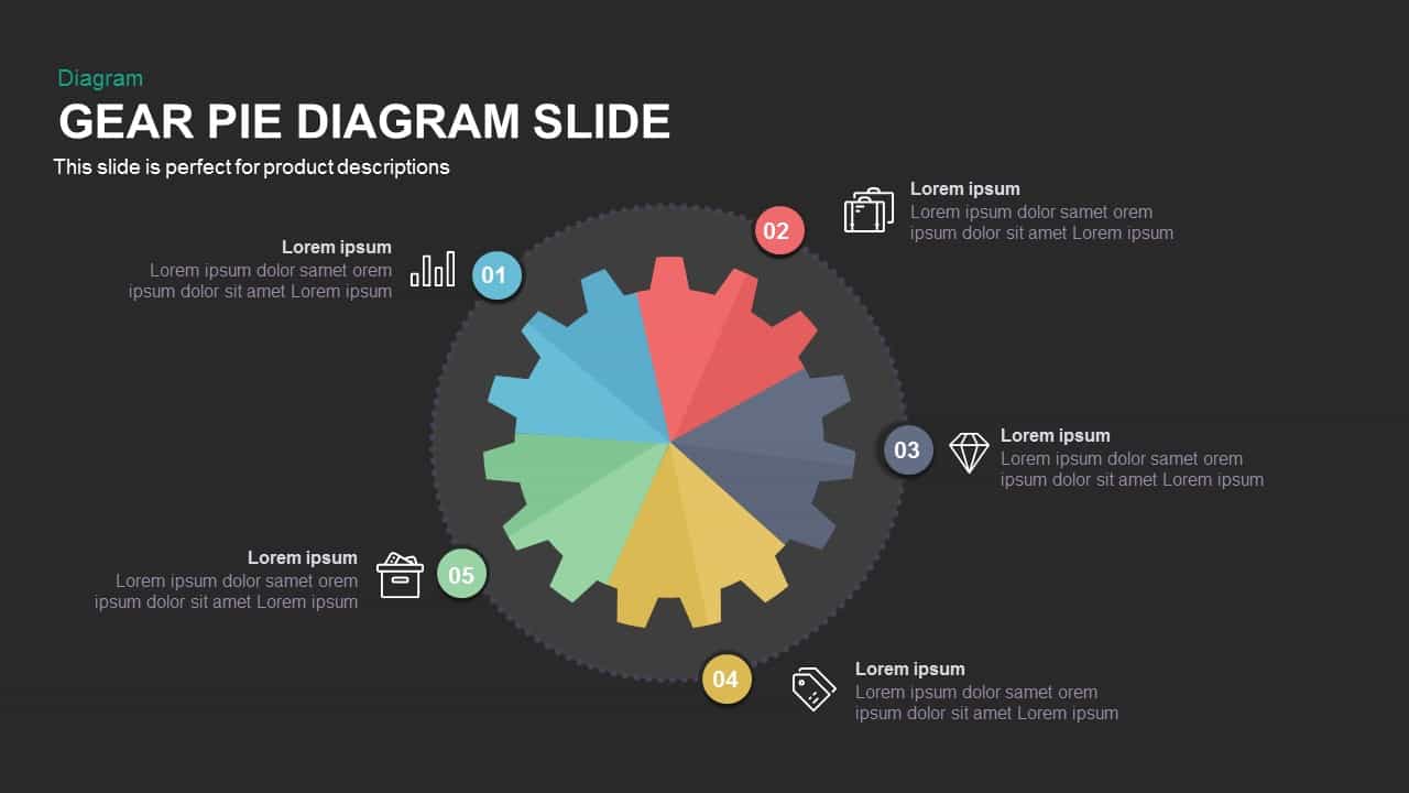
Gear Pie Diagram Data Visualization Template for PowerPoint & Google Slides
Pie/Donut
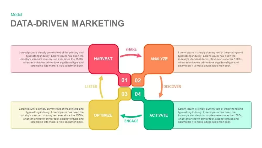
Data-Driven Marketing Cycle Diagram Template for PowerPoint & Google Slides
Customer Journey
Tornado Chart Data Comparison Slide Template for PowerPoint & Google Slides
Bar/Column
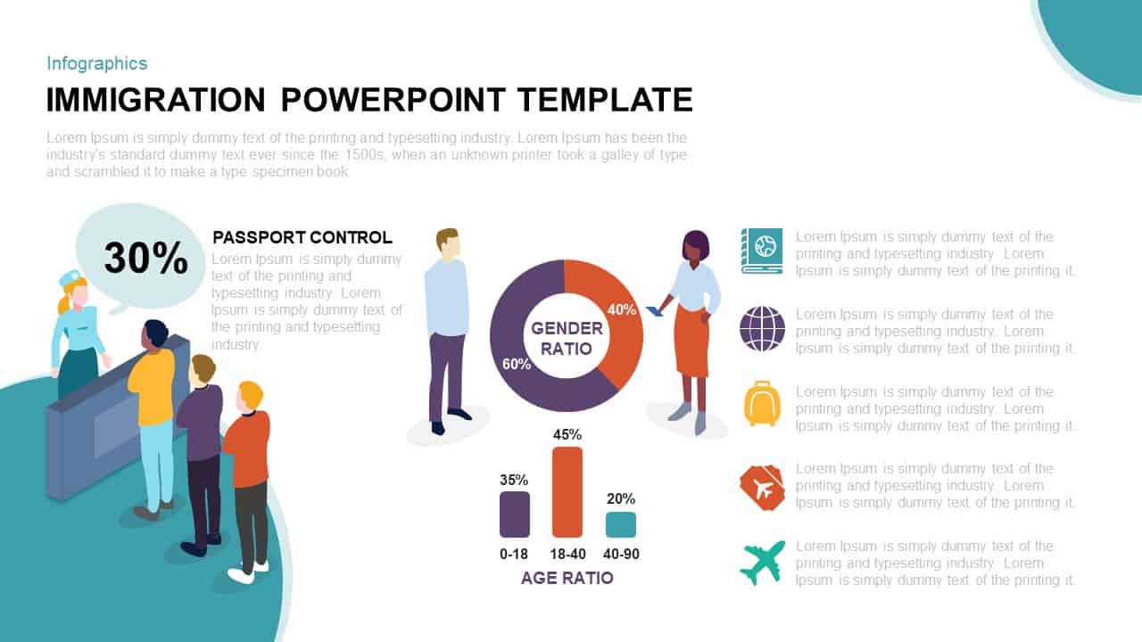
Immigration Data Dashboard Template for PowerPoint & Google Slides
Bar/Column
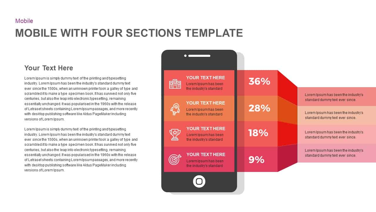
Mobile Infographics Data Visualization Template for PowerPoint & Google Slides
Infographics
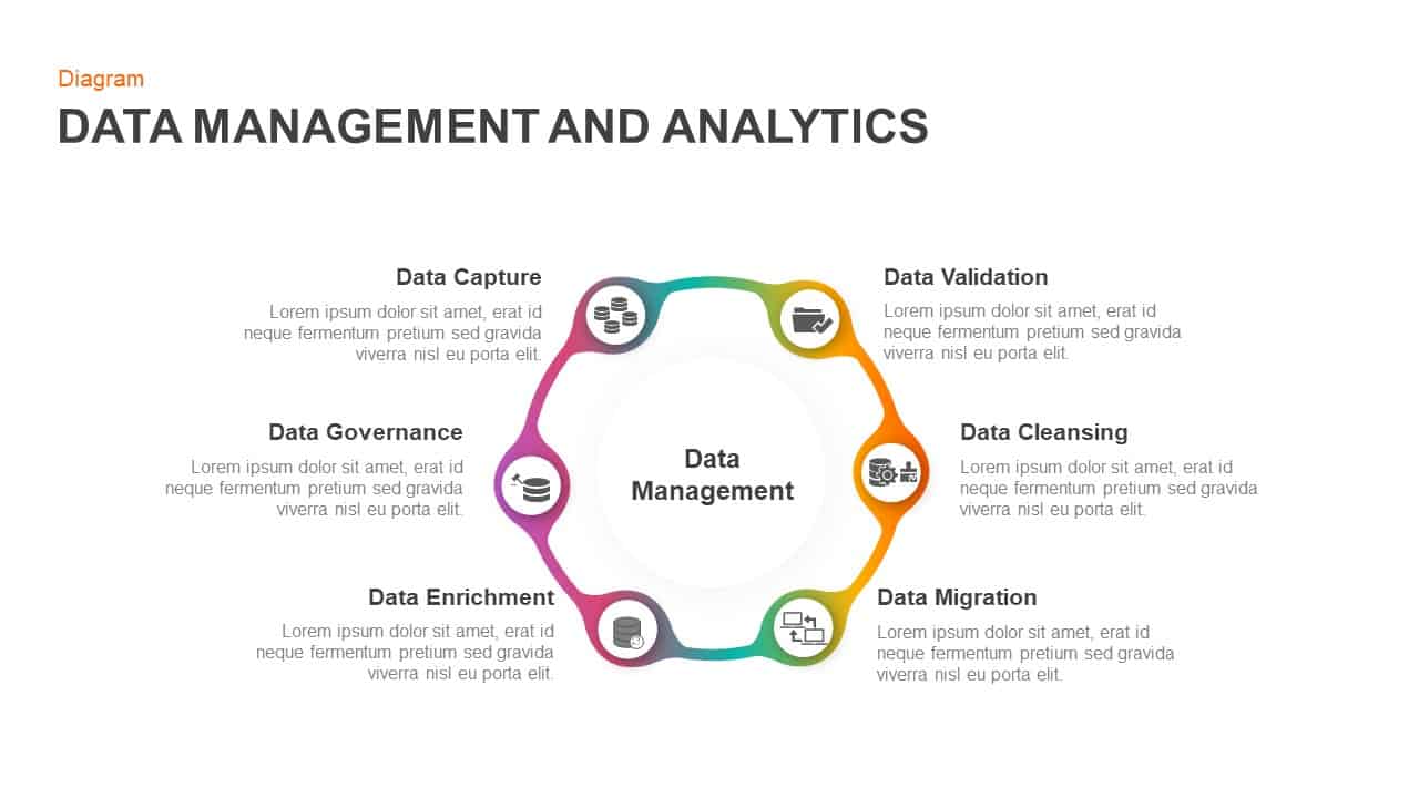
Data Management and Analytics Diagram Template for PowerPoint & Google Slides
Circular
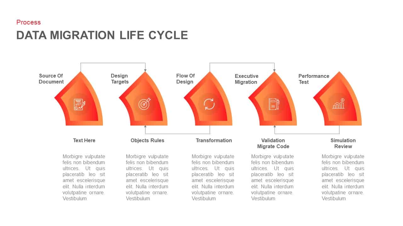
Data Migration Life Cycle Curved Diagram Template for PowerPoint & Google Slides
Process
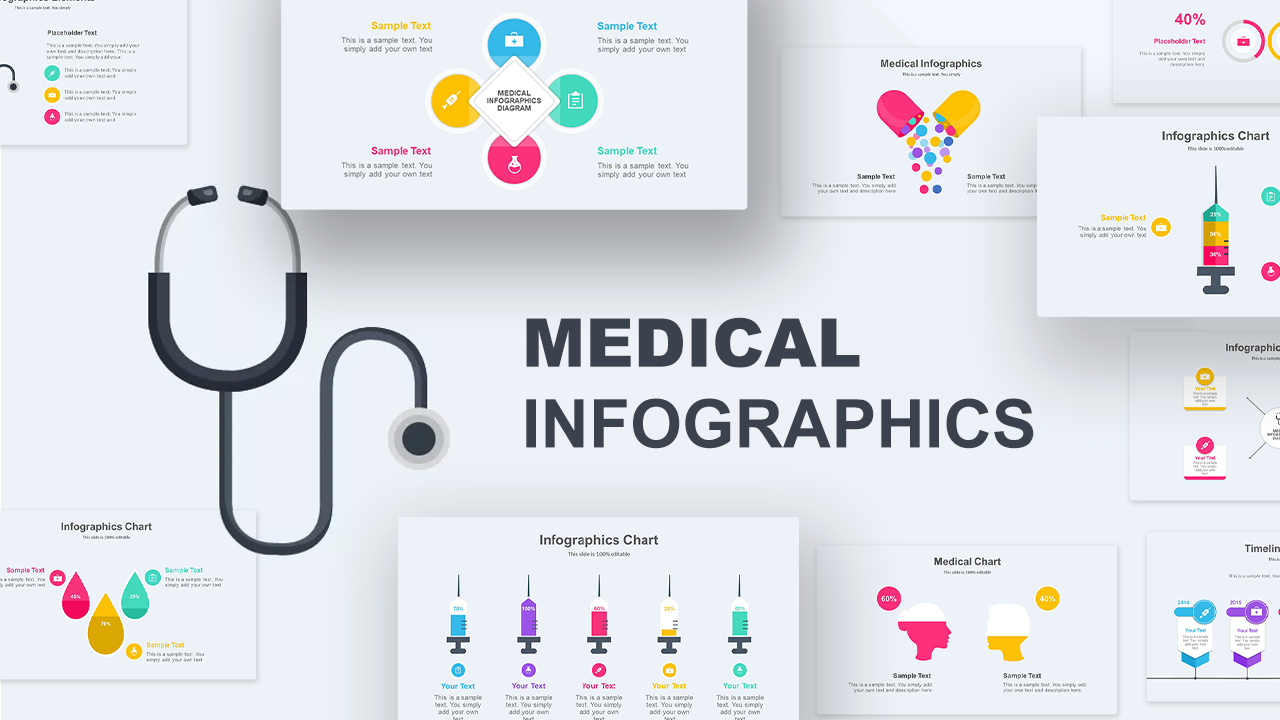
Medical Infographics Data Visualization Template for PowerPoint & Google Slides
Health
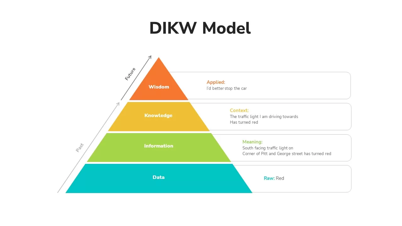
DIKW Data to Wisdom Pyramid Model Template for PowerPoint & Google Slides
Pyramid
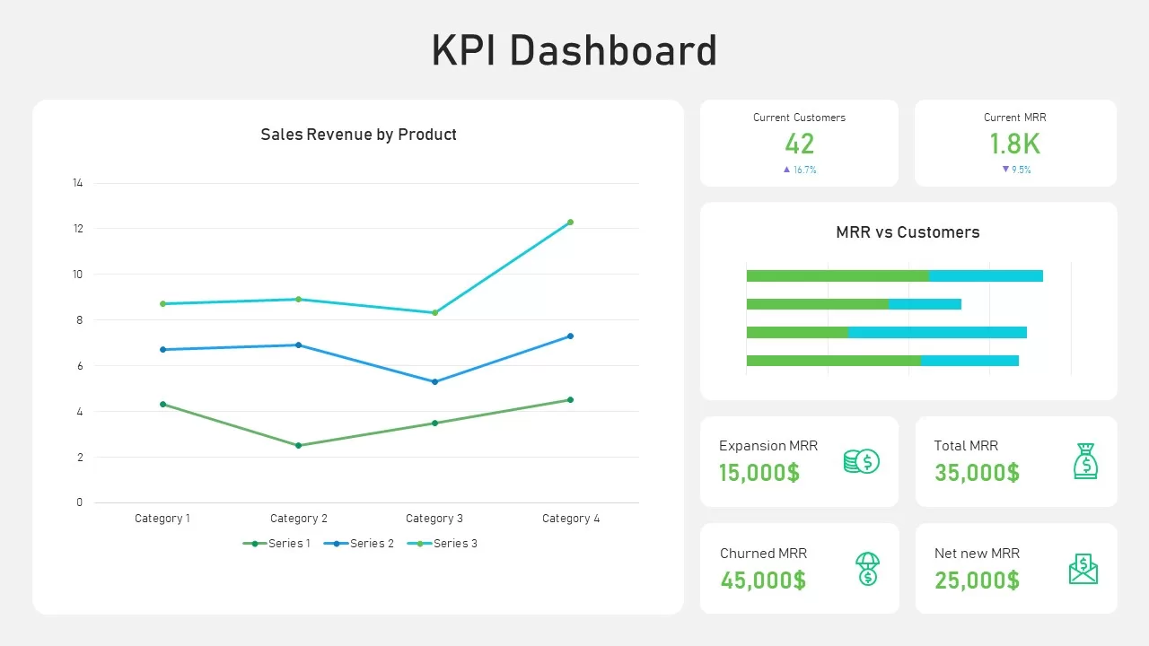
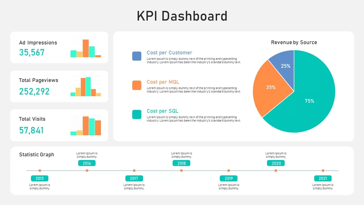
KPI Dashboard Data Visualization Template for PowerPoint & Google Slides
Bar/Column
KPI Dashboard Data Overview Slide Template for PowerPoint & Google Slides
Bar/Column
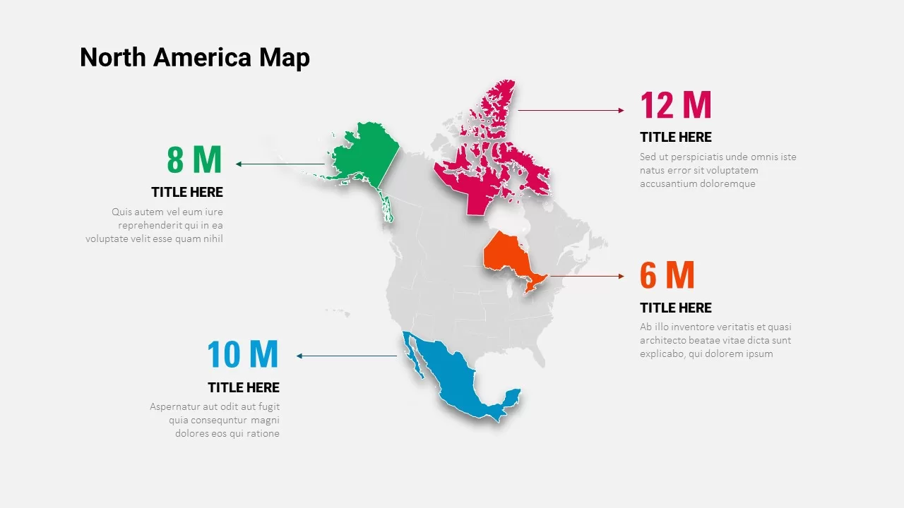
North America Data Map Callouts Template for PowerPoint & Google Slides
World Maps
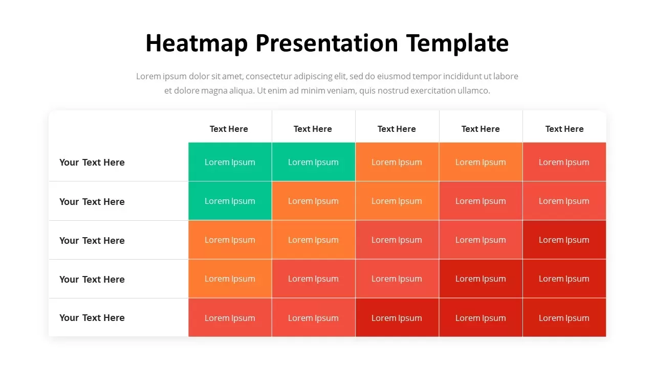
Professional Heatmap Data Visualization Template for PowerPoint & Google Slides
Infographics
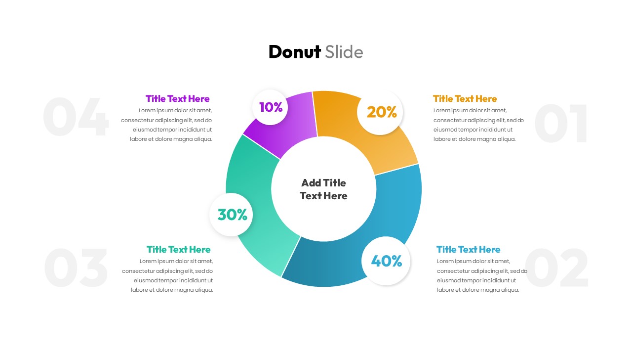
Donut Chart Data Breakdown template for PowerPoint & Google Slides
Pie/Donut
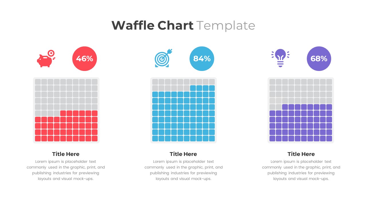
Waffle Chart Data Visualization Template for PowerPoint & Google Slides
Comparison Chart
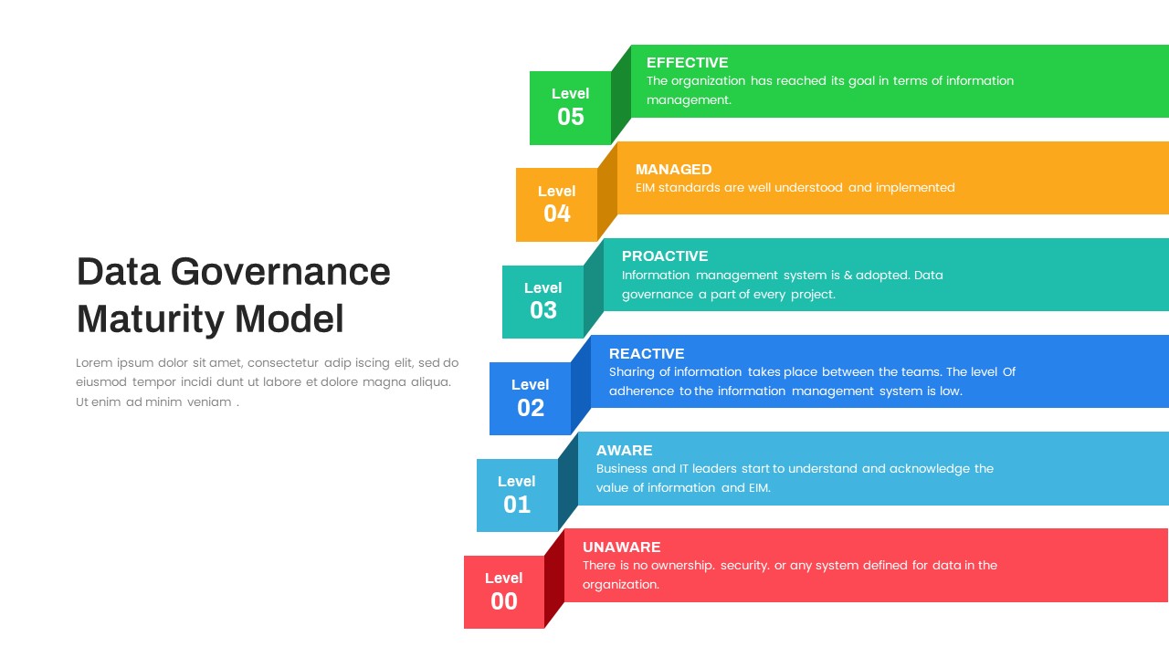
Layered Data Governance Maturity Model Template for PowerPoint & Google Slides
Process
Free Stacked Column Chart Data Visualization Template for PowerPoint & Google Slides
Bar/Column
Free
Simple Bar Chart Data Visualization Template for PowerPoint & Google Slides
Bar/Column
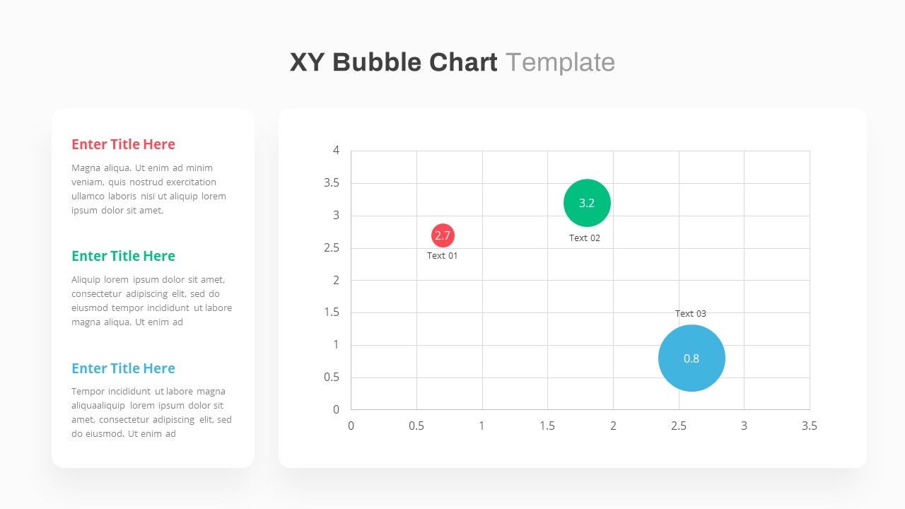
XY Bubble Chart Data Visualization Template for PowerPoint & Google Slides
Comparison Chart
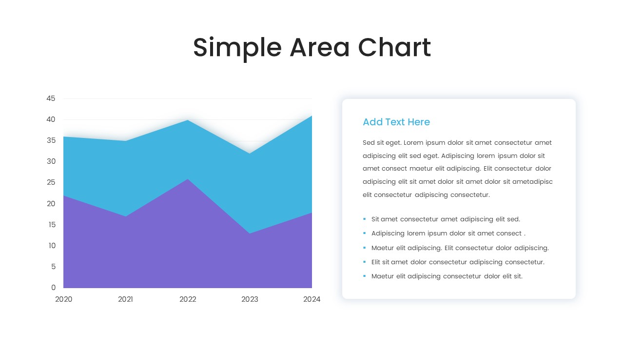
Simple Area Chart Data Trends Analysis Template for PowerPoint & Google Slides
Comparison Chart
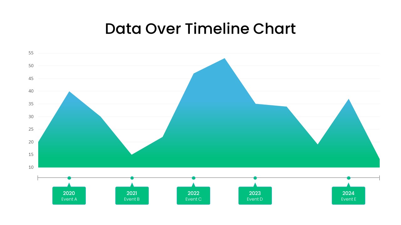
Data Over Time Line Chart template for PowerPoint & Google Slides
Charts
Waterfall Chart Data Visualization Template for PowerPoint & Google Slides
Comparison Chart
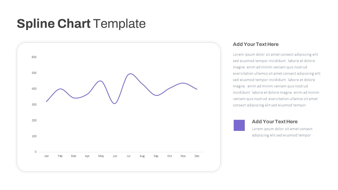
Multipurpose Spline Chart Data Trend Template for PowerPoint & Google Slides
Bar/Column
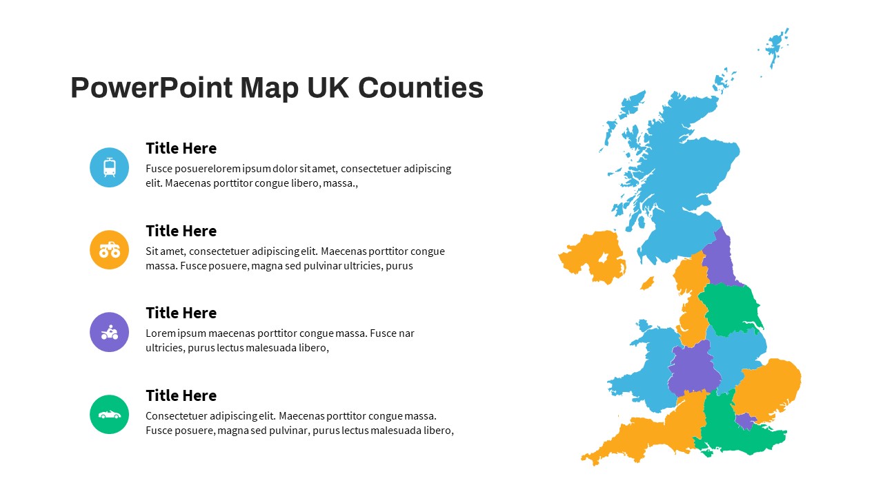
UK Counties Map Data Visualization Template for PowerPoint & Google Slides
World Maps
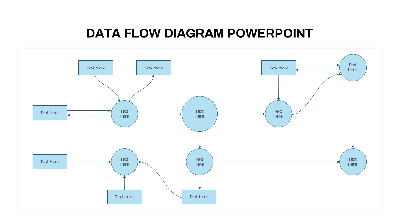
Advanced Data Flow Diagram Pack Template for PowerPoint & Google Slides
Flow Charts
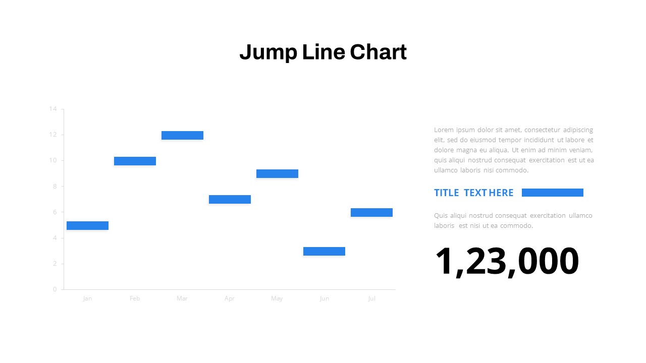
Interactive Jump Line Data Chart Template for PowerPoint & Google Slides
Comparison Chart
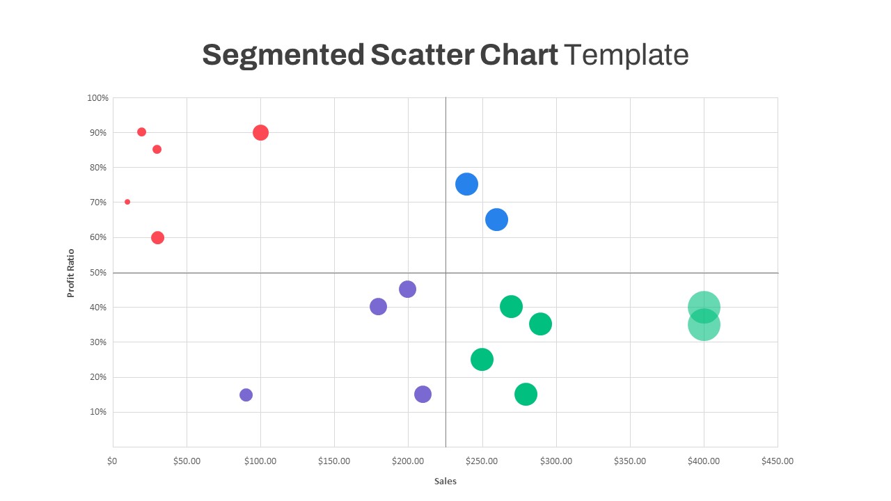
Segmented Scatter Chart Data Visualization Template for PowerPoint & Google Slides
Business Strategy
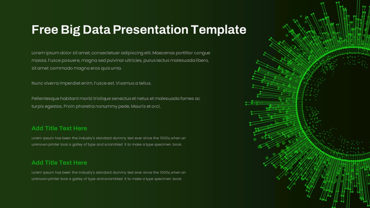
Free Big Data Network Visualization Template for PowerPoint & Google Slides
Circular
Free
Data Analysis Bar Chart with Insights Template for PowerPoint & Google Slides
Bar/Column
Free
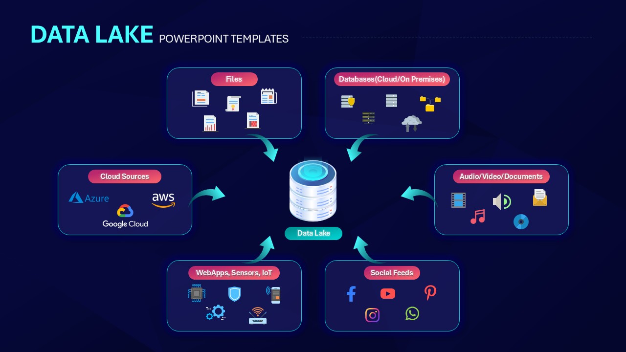
Data Lake Hub-and-Spoke Diagram Template for PowerPoint & Google Slides
Cloud Computing
ETL Data Pipeline Workflow Diagram Template for PowerPoint & Google Slides
Process
Data Privacy template for PowerPoint & Google Slides
Information Technology
Data Protection Strategies template for PowerPoint & Google Slides
Information Technology
Comprehensive Data & AI Capability Model Template for PowerPoint & Google Slides
AI
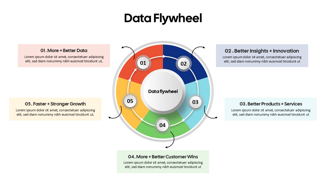
Data Flywheel Strategy template for PowerPoint & Google Slides
Business
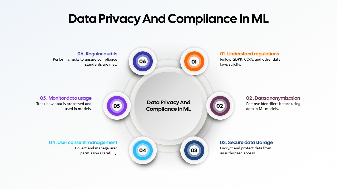
Data Privacy and Compliance in ML template for PowerPoint & Google Slides
Technology
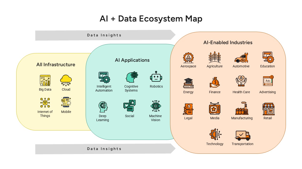
AI and Data Ecosystem Map Template for PowerPoint & Google Slides
AI
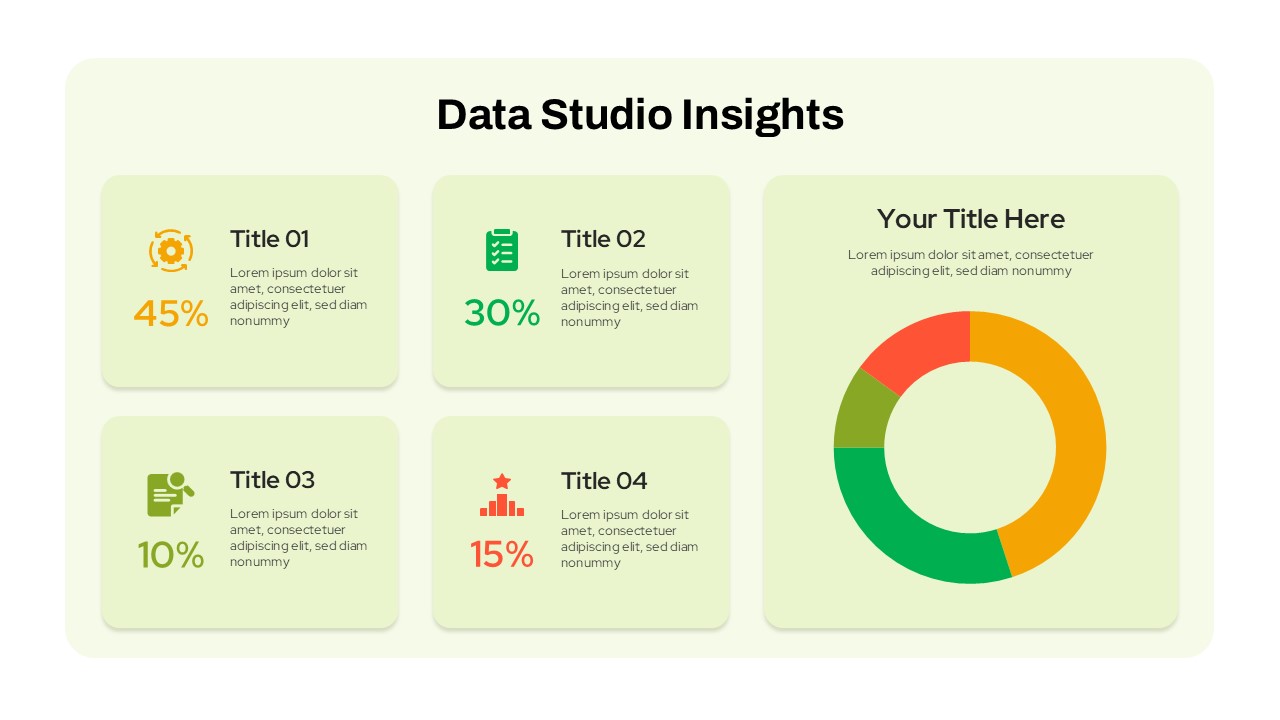
Data Studio Insights template for PowerPoint & Google Slides
Business Report
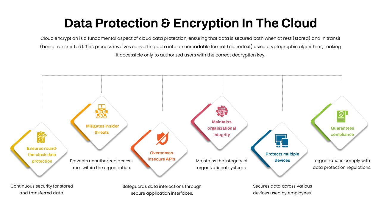
Data Protection & Encryption in the Cloud Overview template for PowerPoint & Google Slides
Cloud Computing
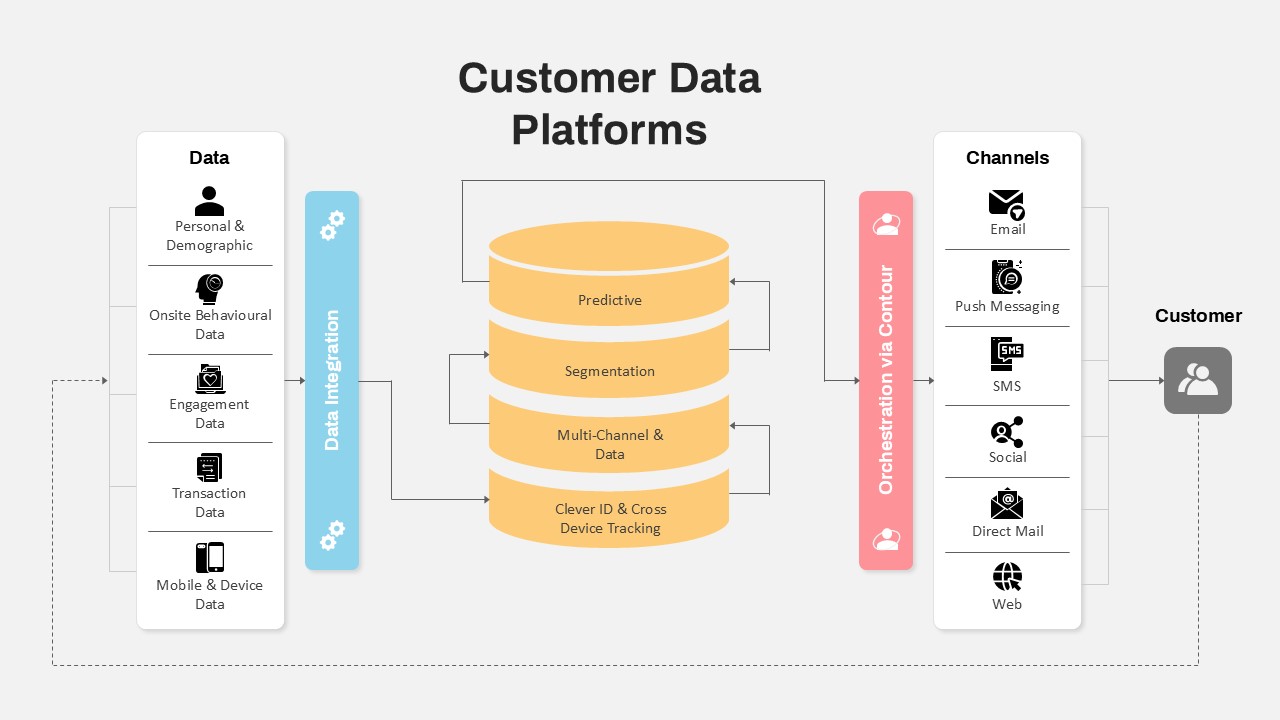
Customer Data Platform Workflow Diagram Template for PowerPoint & Google Slides
Information Technology
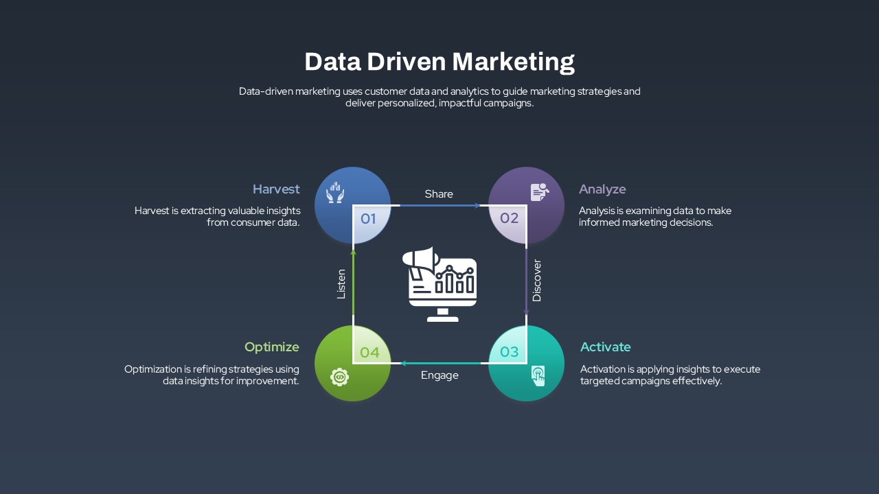
Data-Driven Marketing Lifecycle Diagram Template for PowerPoint & Google Slides
Process
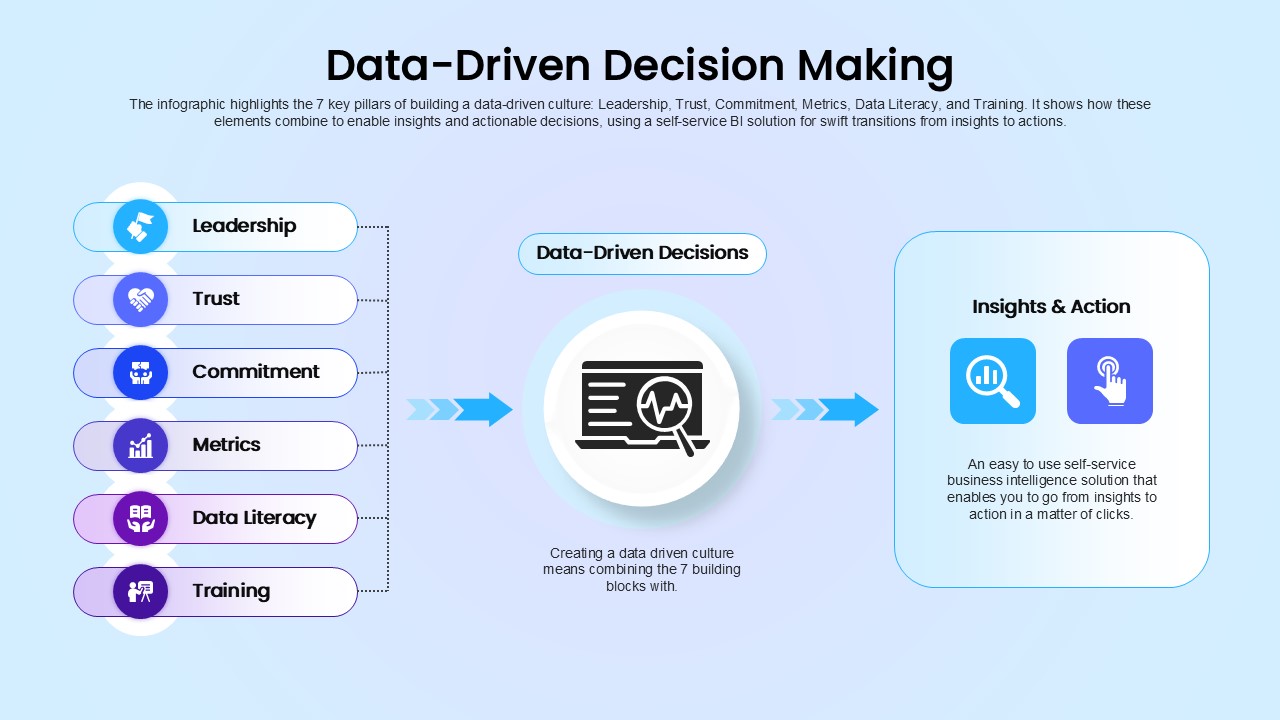
Data-Driven Decision Making overview template for PowerPoint & Google Slides
Business
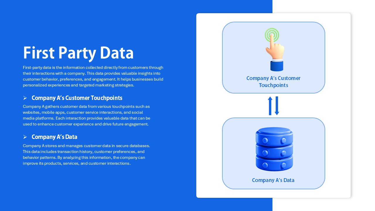
First Party Data Overview Template for PowerPoint & Google Slides
Business
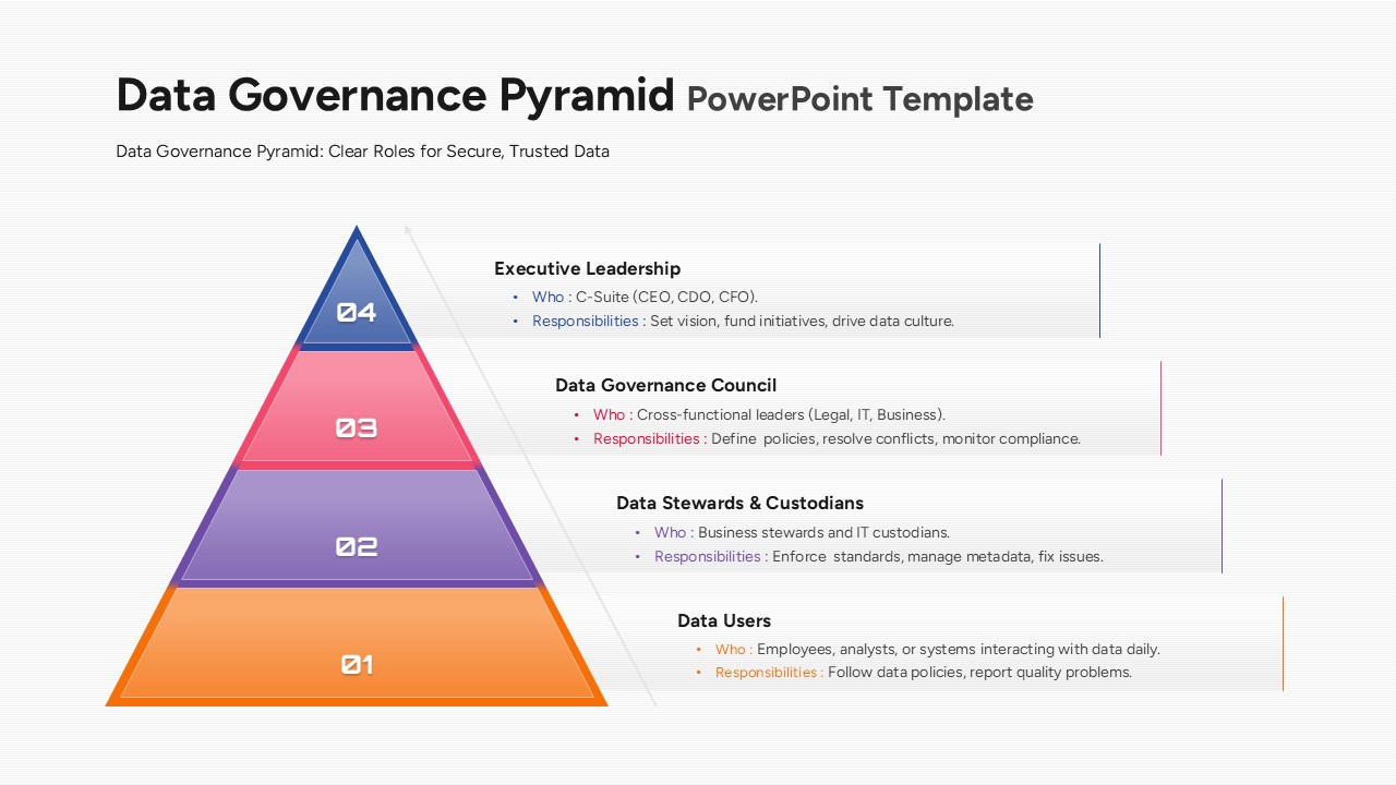
Data Governance Roles Pyramid Diagram Template for PowerPoint & Google Slides
Pyramid
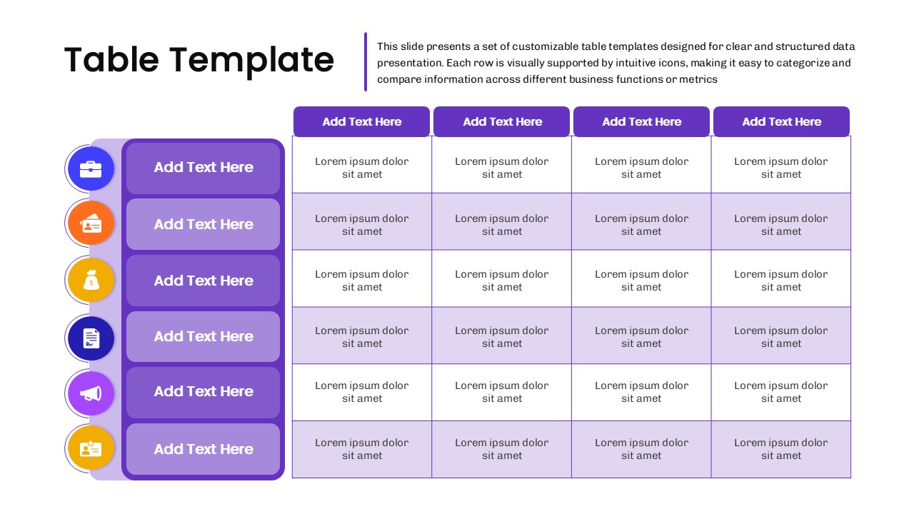
Business Data Table Template for PowerPoint & Google Slides
Table
Colorful Business Data Comparison Table Template for PowerPoint & Google Slides
Table
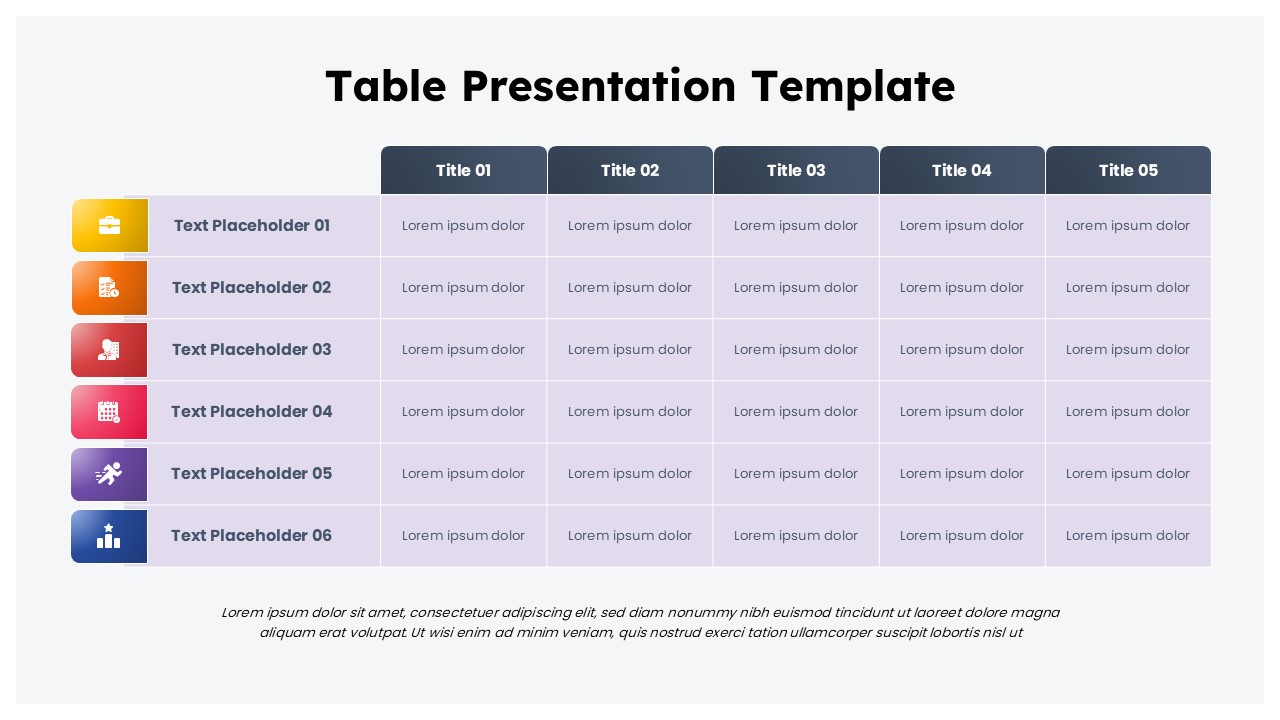
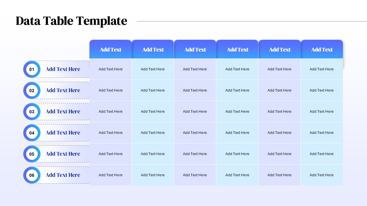
Six Column Data Table Template for PowerPoint & Google Slides
Table
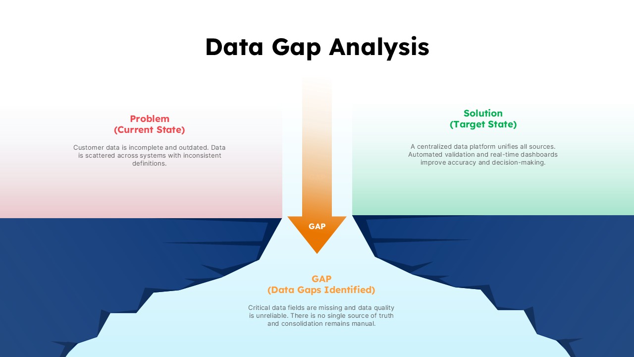
Data Gap Analysis Template for PowerPoint & Google Slides
Business
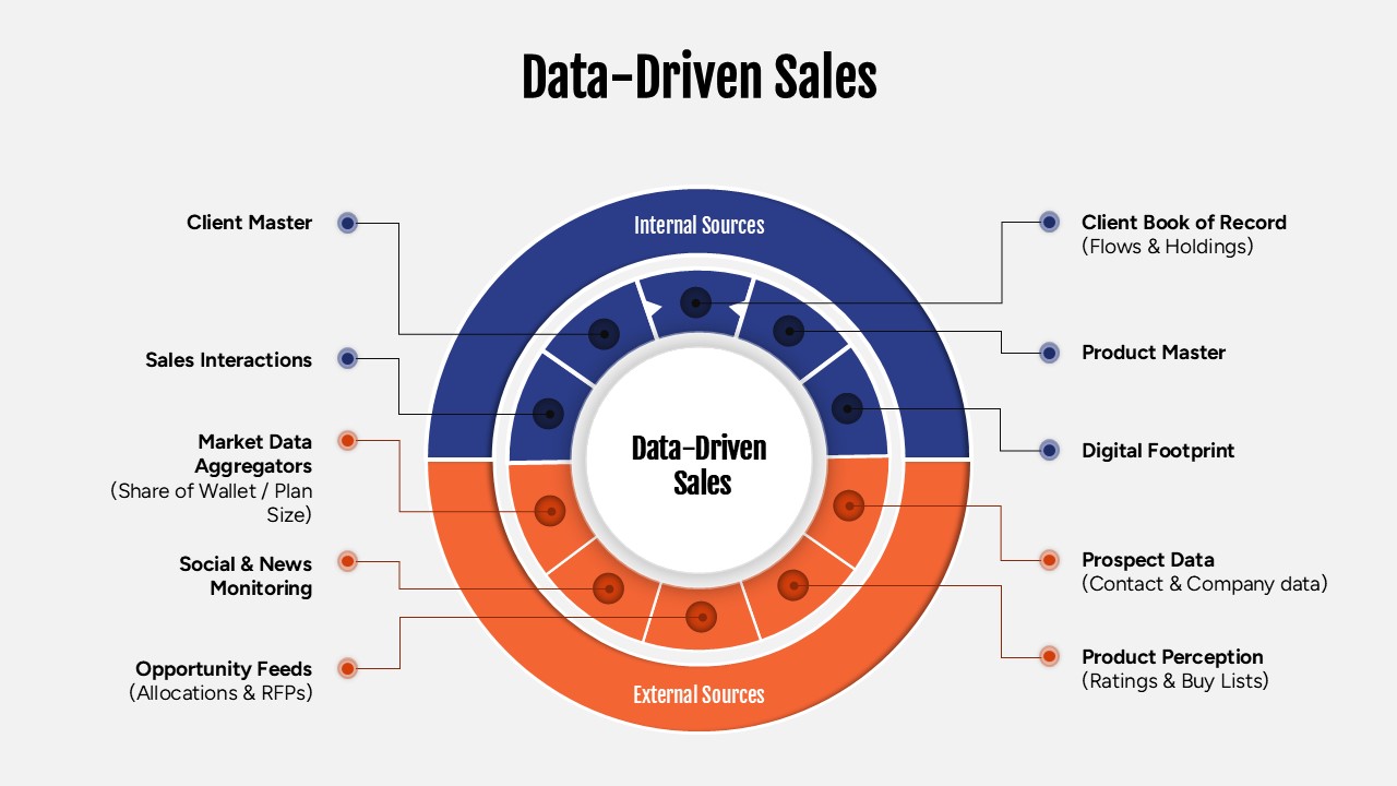
Data-Driven Sales Strategy Diagram Template for PowerPoint & Google Slides
Marketing
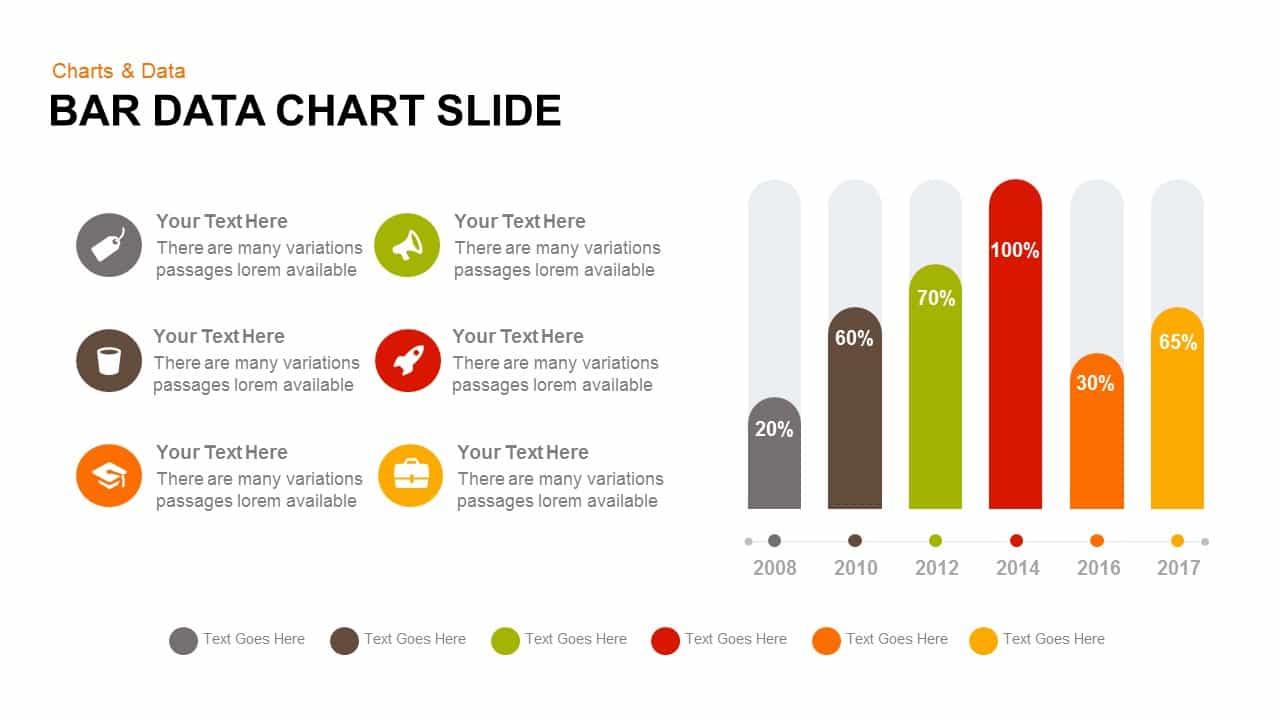
Bar Data Chart Slide for PowerPoint & Google Slides
Bar/Column
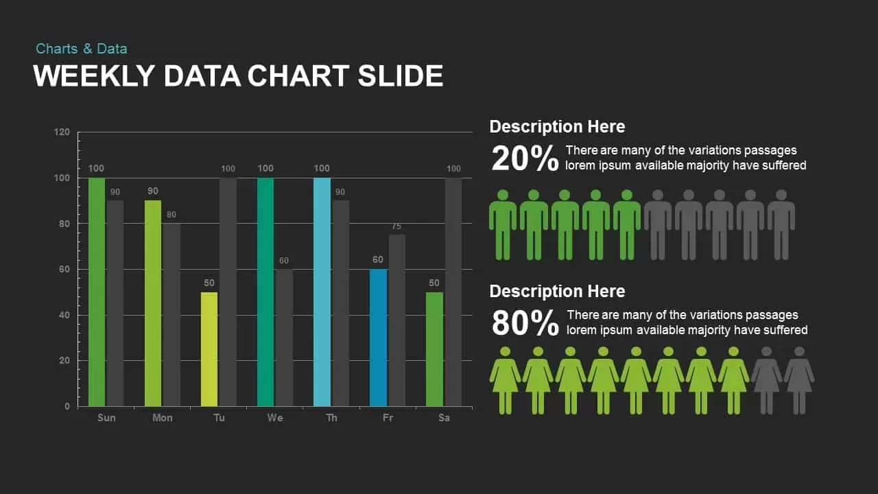
Weekly Data Chart Slide for PowerPoint & Google Slides
Comparison Chart

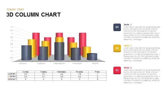
3D Column Chart with Data Table for PowerPoint & Google Slides
Bar/Column

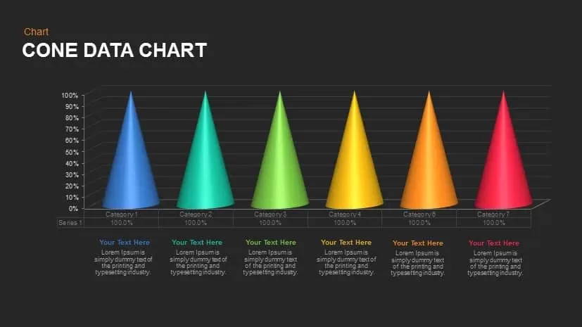
Cone Data Chart for PowerPoint & Google Slides
Charts
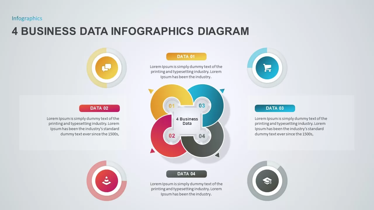
4 Business Data Infographics Diagram for PowerPoint & Google Slides
Process
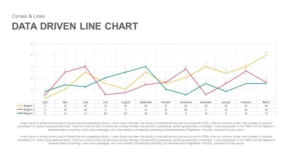
Data-Driven Line Chart Diagram Template for PowerPoint
Comparison Chart
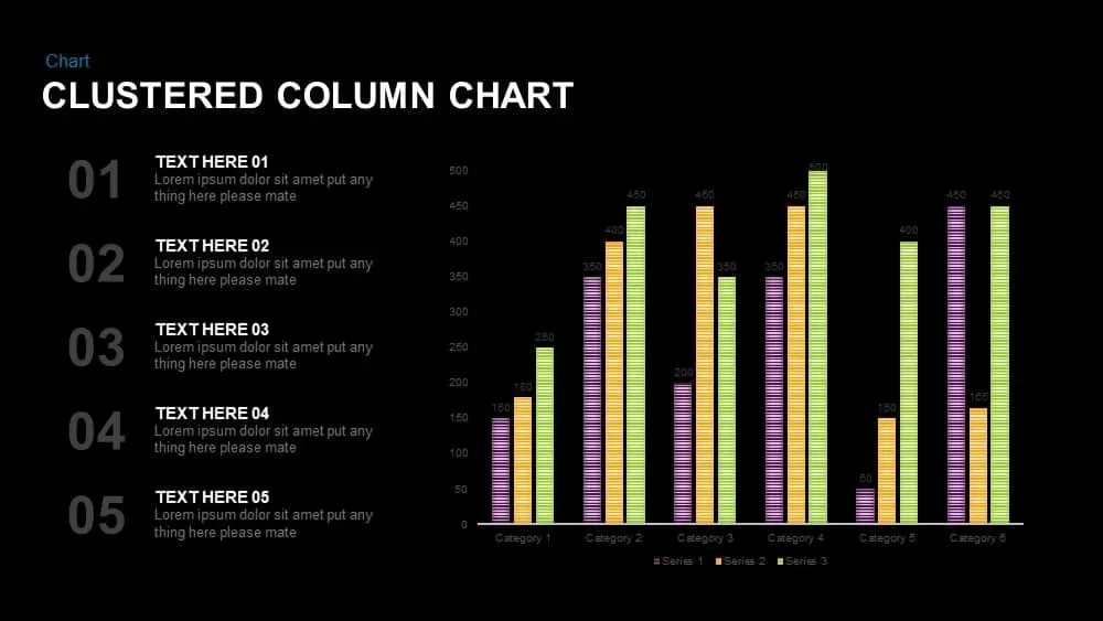
Clustered Column Chart Data Analysis Template for PowerPoint
Bar/Column
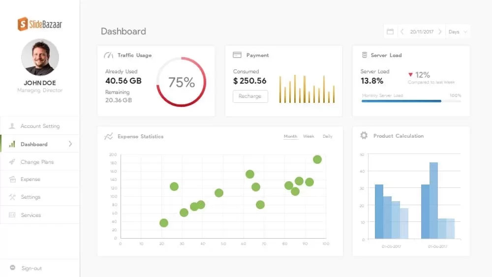
Free Data Analytics Dashboard Template for PowerPoint
Charts
Free
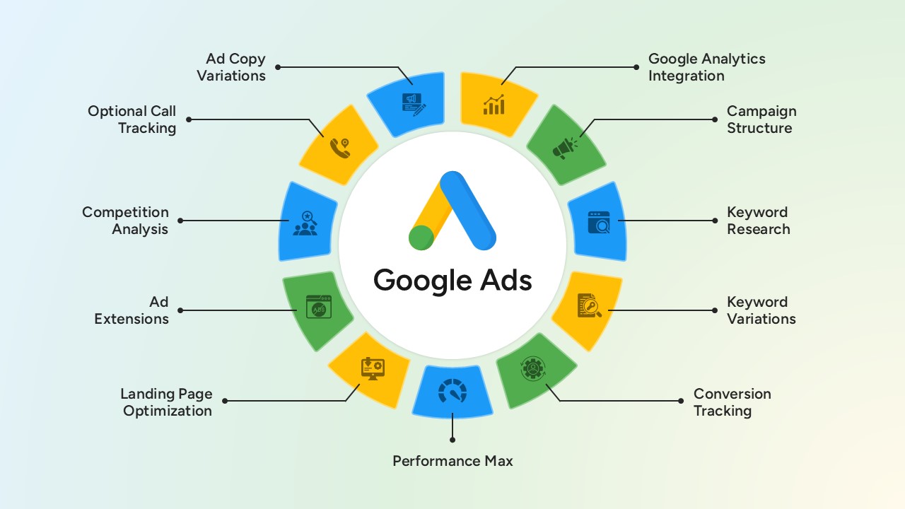
Google Ads Optimization & Performance Infographic Template for PowerPoint & Google Slides
Digital Marketing
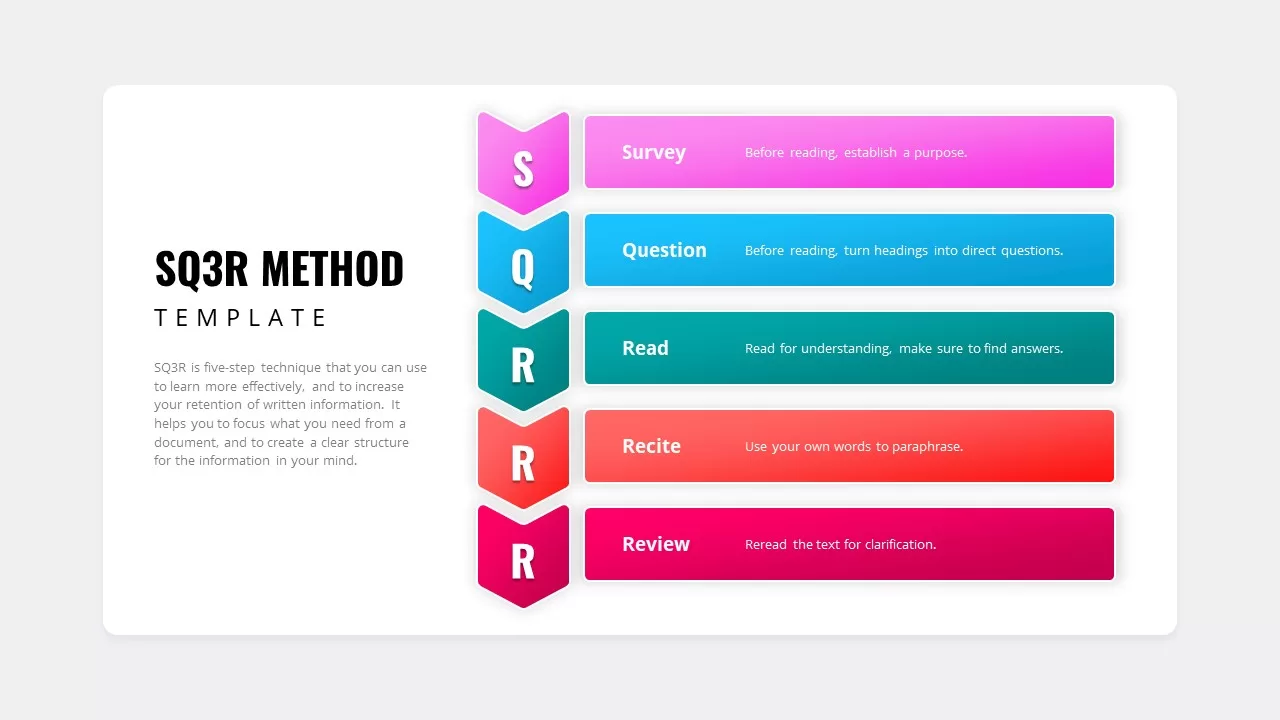
SQ3R Study Strategy Infographic Slides Template for PowerPoint & Google Slides
Business Strategy
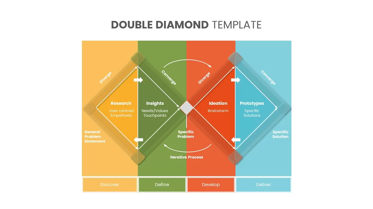
Six Double Diamond Infographic Slides Template for PowerPoint & Google Slides
Process
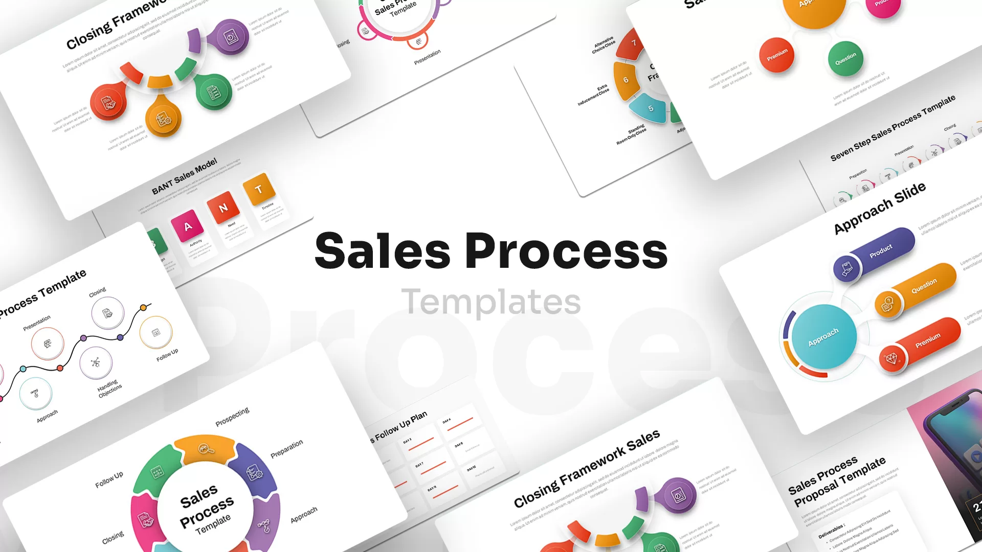
Sales Process Infographic Slides Pack Template for PowerPoint & Google Slides
Process
Casino/Poker Chips Infographic Slides template for PowerPoint & Google Slides
Business Strategy
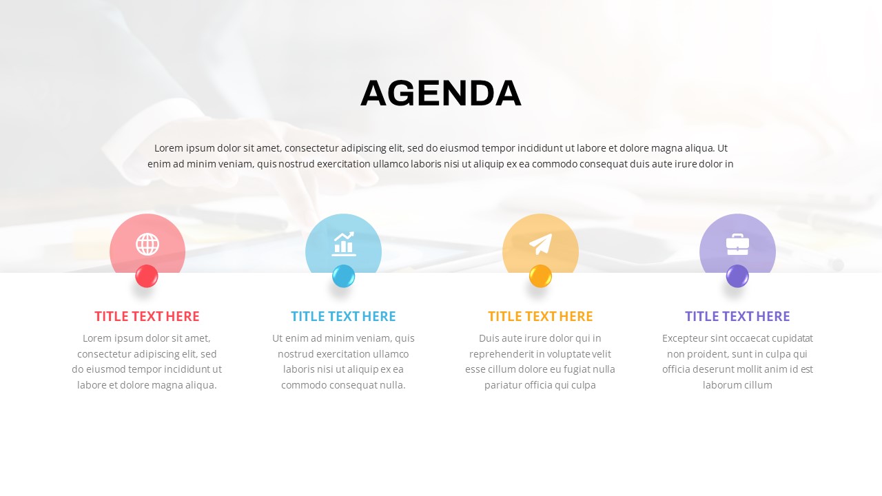
Agenda Infographic Pack of 2 Slides Template for PowerPoint & Google Slides
Agenda
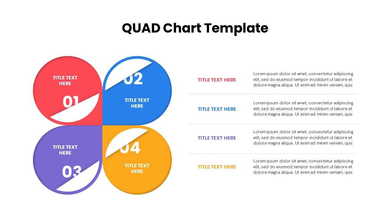
Quad Chart Infographic Pack of 8 Slides Template for PowerPoint & Google Slides
Comparison Chart
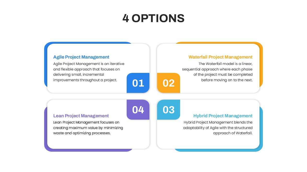
Four Options Infographic Slides Template for PowerPoint & Google Slides
Comparison
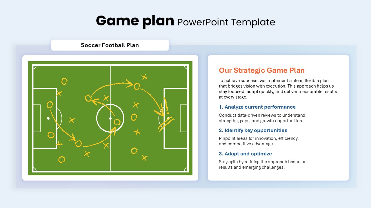
Game Plan Infographic Slides Pack Template for PowerPoint & Google Slides
Infographics
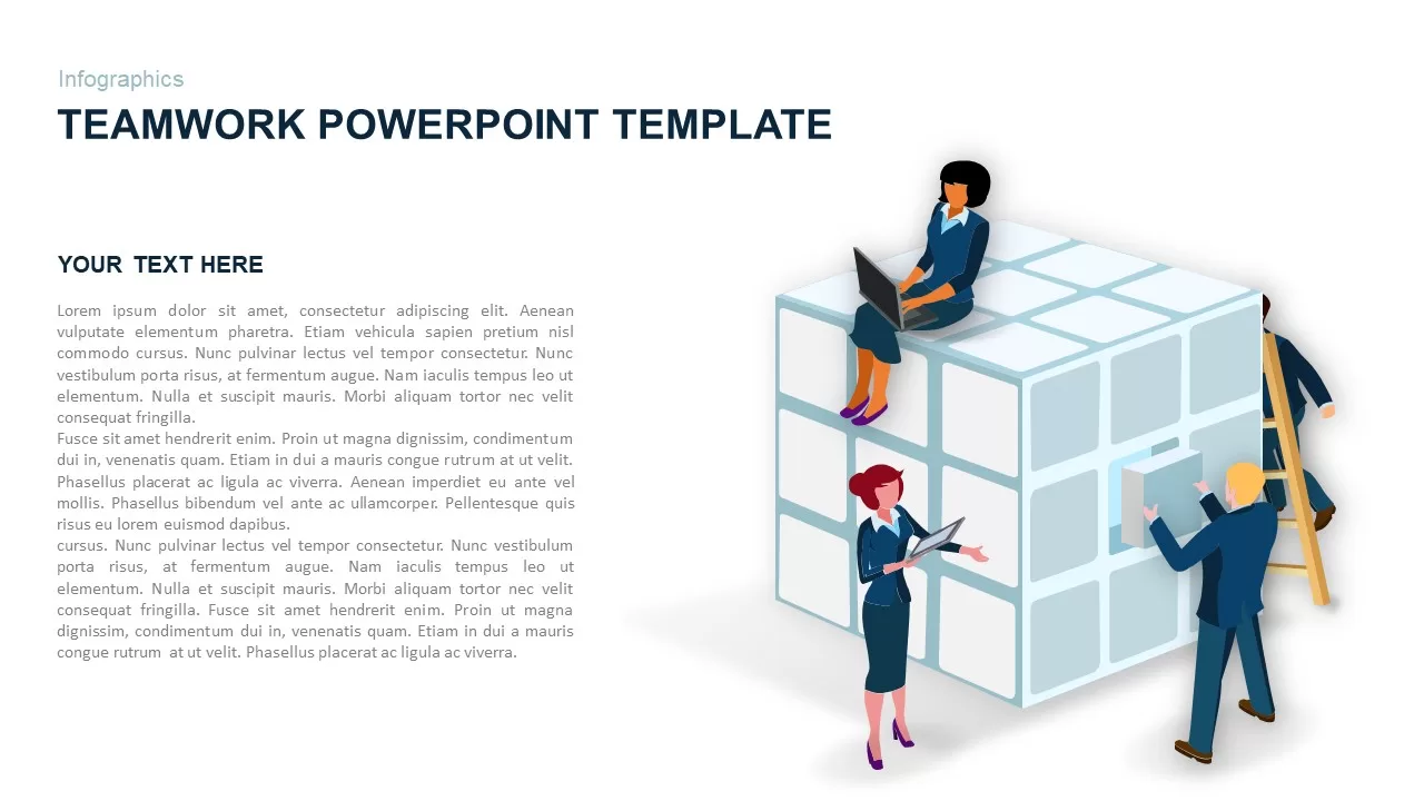
Teamwork PowerPoint Infographic Template for PowerPoint & Google Slides
Leadership
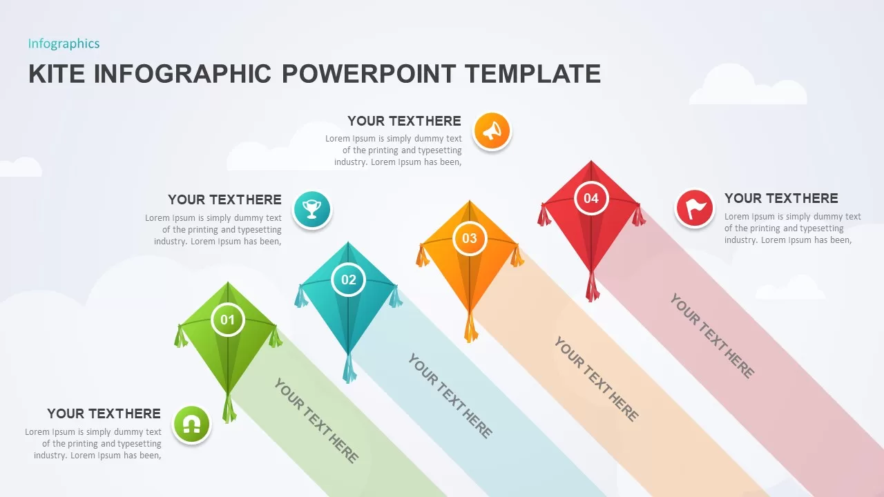
Kite Infographic PowerPoint Template for PowerPoint & Google Slides
Process
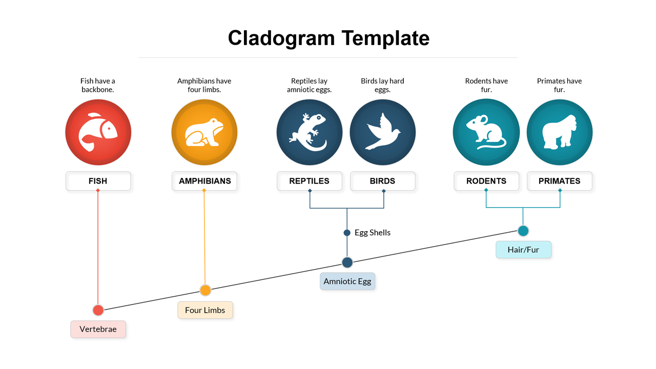
Cladogram Infographic Di Template for PowerPoint & Google Slides Template
Decision Tree