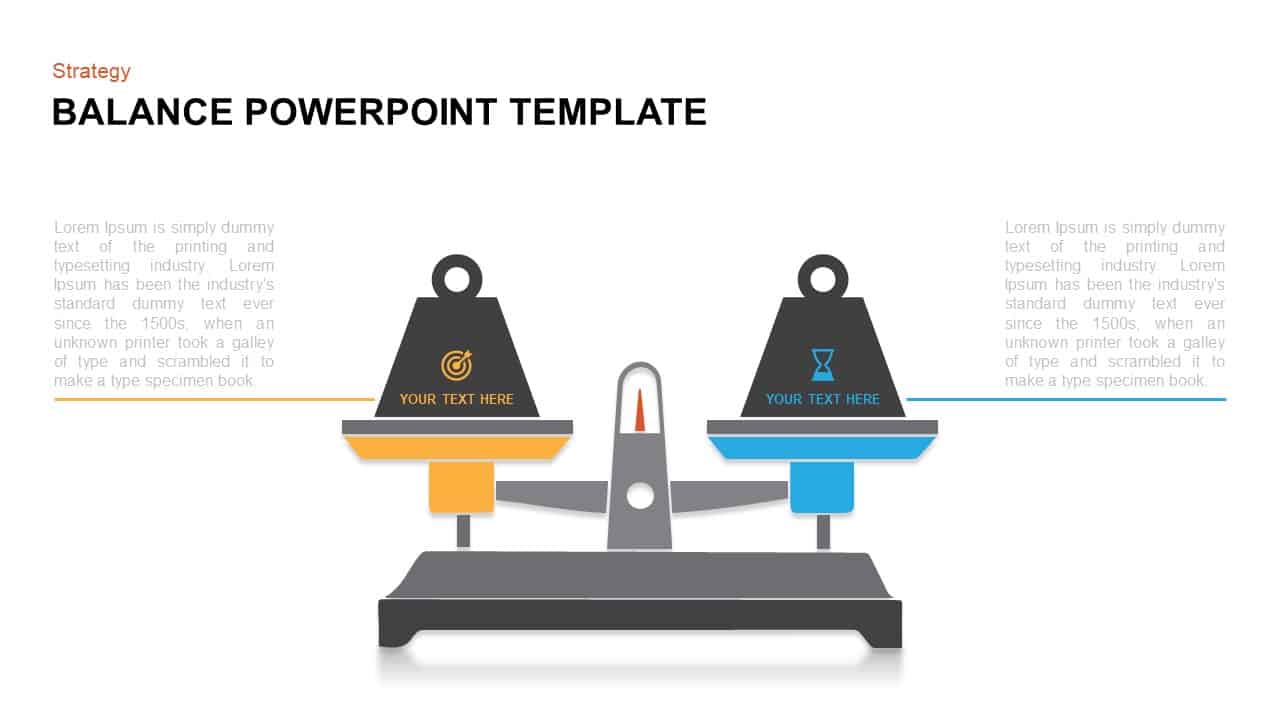
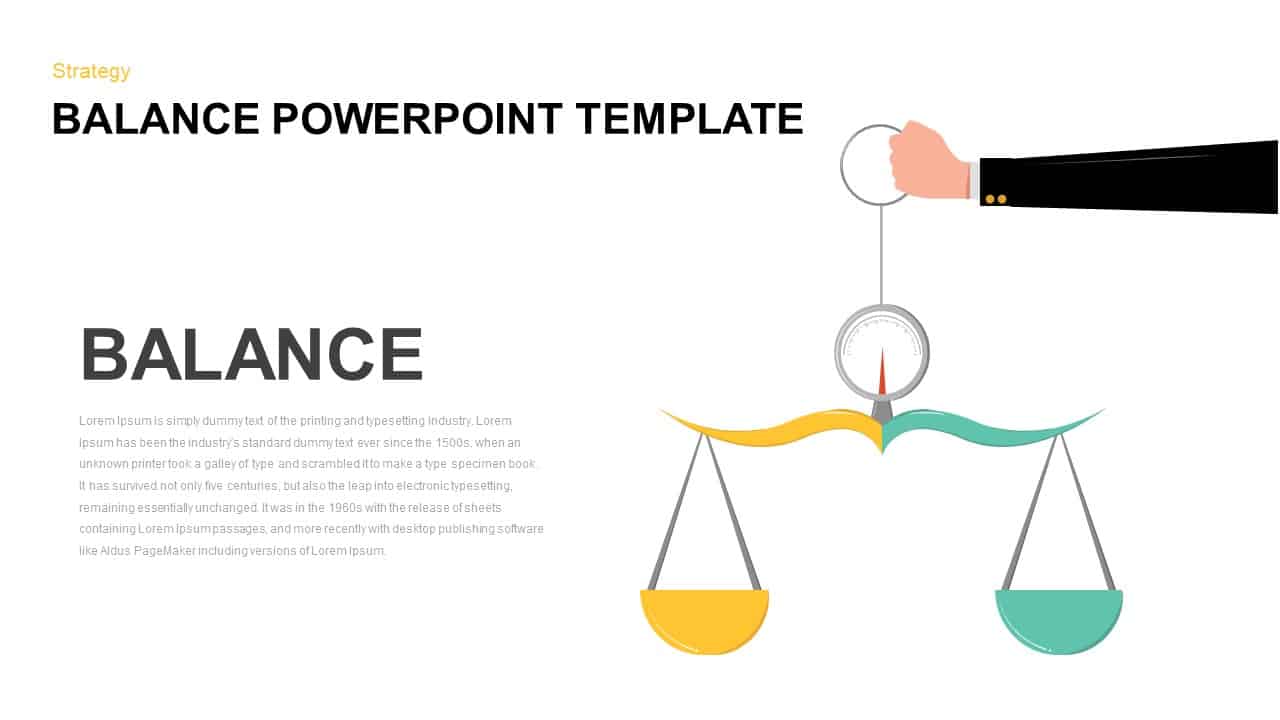
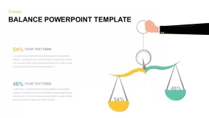
Balance Scale Visualization Infographic Template for PowerPoint & Google Slides


Description
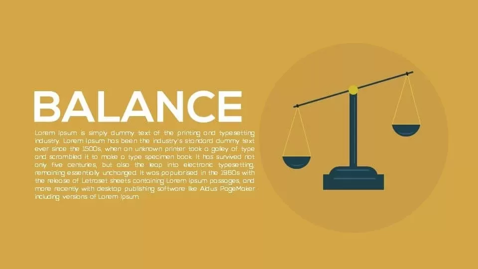
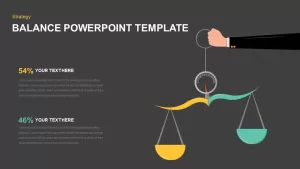
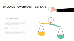
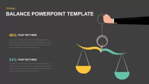
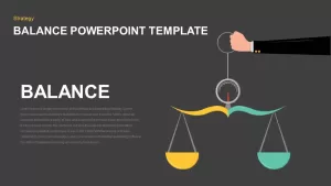
Leverage this balance scale visualization infographic to compare two metrics side by side with clarity and impact. A stylized hand holds a central dial controlling two curved arms—one in yellow and one in teal—each supporting a hanging pan. Editable percentage labels float above each pan, while adjacent text blocks with bold headings and light-gray body text offer space for detailed insights. The clean white canvas ensures legibility, and subtle drop shadows on the scale elements add depth without clutter.
Built on master slide layouts, every element is fully customizable: change arm and pan colors via theme swatches, swap percentage values or icons, and adjust text blocks in seconds. All shapes are vector-based and grouped for easy drag-and-drop repositioning. Use the first version to introduce the concept of balance, then switch to the percentage slides to highlight performance comparisons. Preconfigured animations let you reveal each side sequentially, guiding audience focus and reinforcing narrative flow.
Optimized for both PowerPoint and Google Slides, this infographic maintains sharp resolution on any display. Organized theme colors and font styles allow seamless branding updates. Whether illustrating resource allocation, survey results, or risk-benefit analyses, this balance scale slide delivers professional polish and visual memorability.
Who is it for
Business analysts, marketing strategists, and project managers will use this slide to compare KPIs, budget allocations, or performance metrics. Educators and researchers can apply it to present experimental results or survey comparisons.
Other Uses
Repurpose the balance infographic to showcase cost-benefit trade-offs, pros and cons, risk versus reward, or dual-scenario analyses. Simply update the labels, percentages, and text placeholders to suit any comparative narrative.
Login to download this file

Item ID
SB01482
Related Templates

Mustard and Navy Balance Scale Metaphor Template for PowerPoint & Google Slides
Comparison

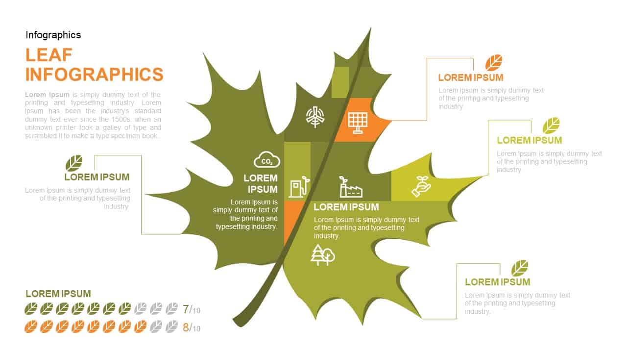
Leaf Infographic Data Visualization Template for PowerPoint & Google Slides
Infographics
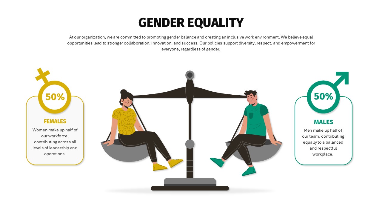
Balanced Gender Equality Scale Infographic Template for PowerPoint & Google Slides
Comparison
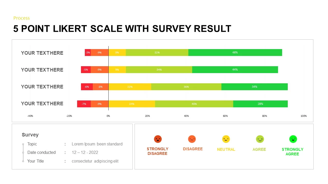
Likert Scale Survey Results infographic pack for PowerPoint & Google Slides
Business
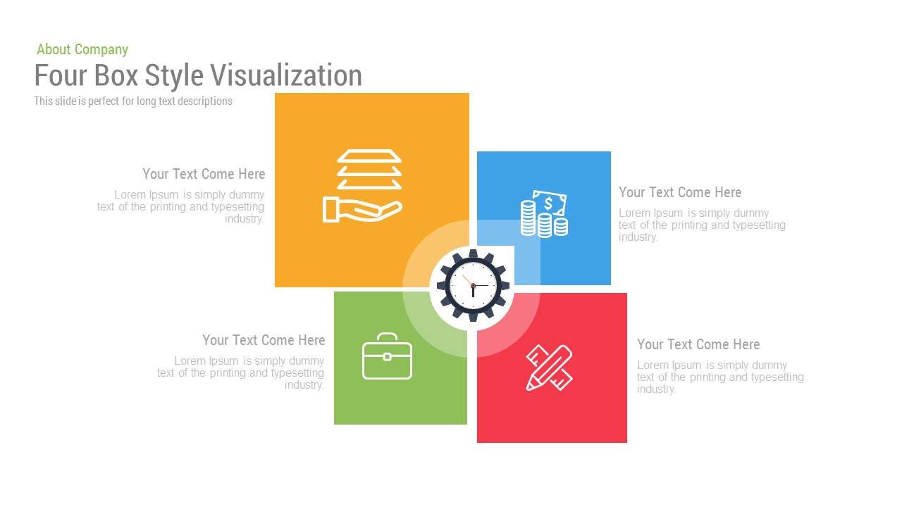
Free Four Box Style Visualization template for PowerPoint & Google Slides
Process
Free
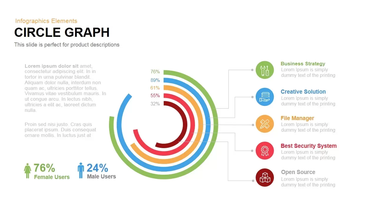
Circle Graph Data Visualization Template for PowerPoint & Google Slides
Circular
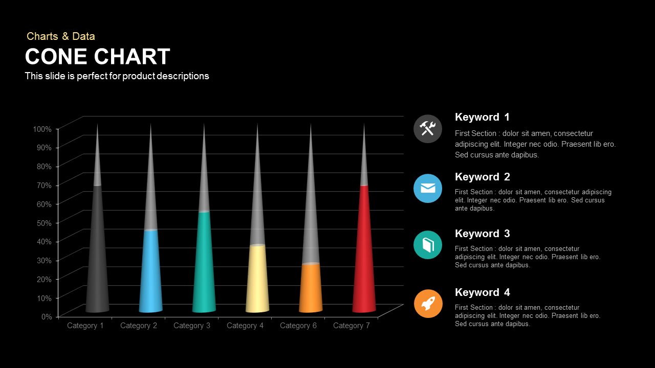
3D Cone Chart Data Visualization template for PowerPoint & Google Slides
Bar/Column

Bold Diamond Risk Alert Visualization Template for PowerPoint & Google Slides
Risk Management
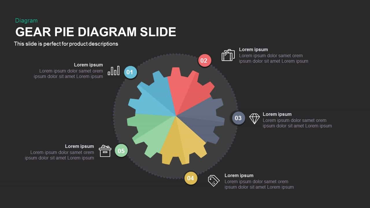
Gear Pie Diagram Data Visualization Template for PowerPoint & Google Slides
Pie/Donut
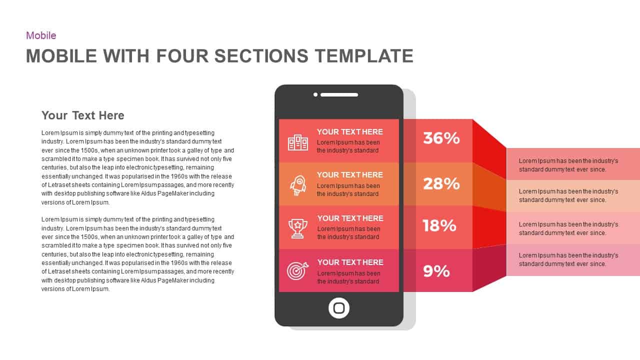
Mobile Infographics Data Visualization Template for PowerPoint & Google Slides
Infographics
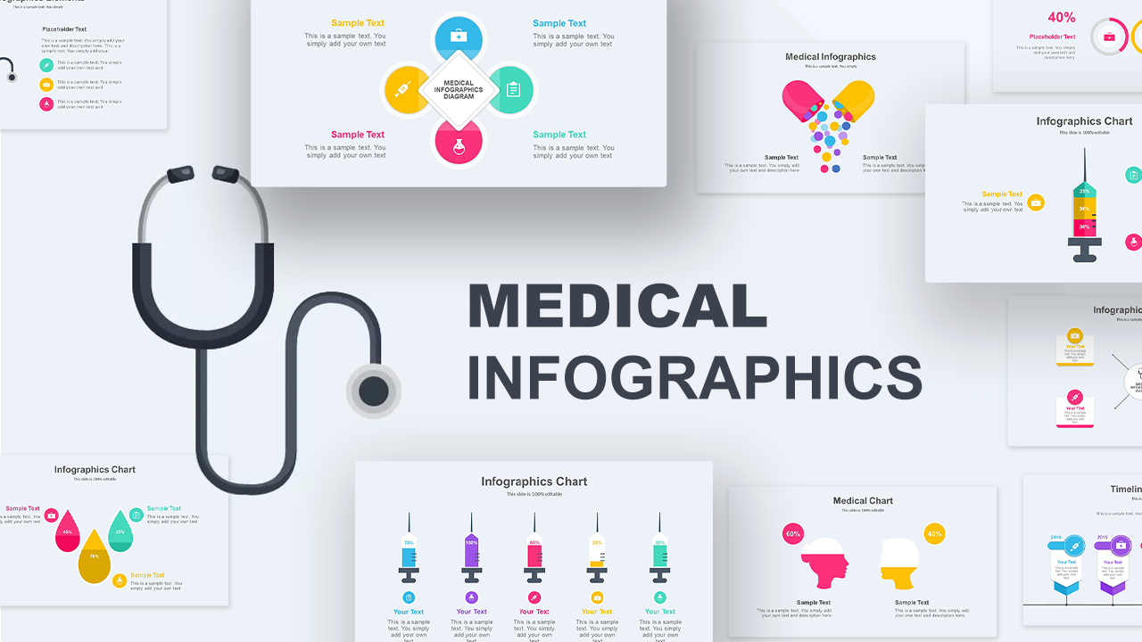
Medical Infographics Data Visualization Template for PowerPoint & Google Slides
Health
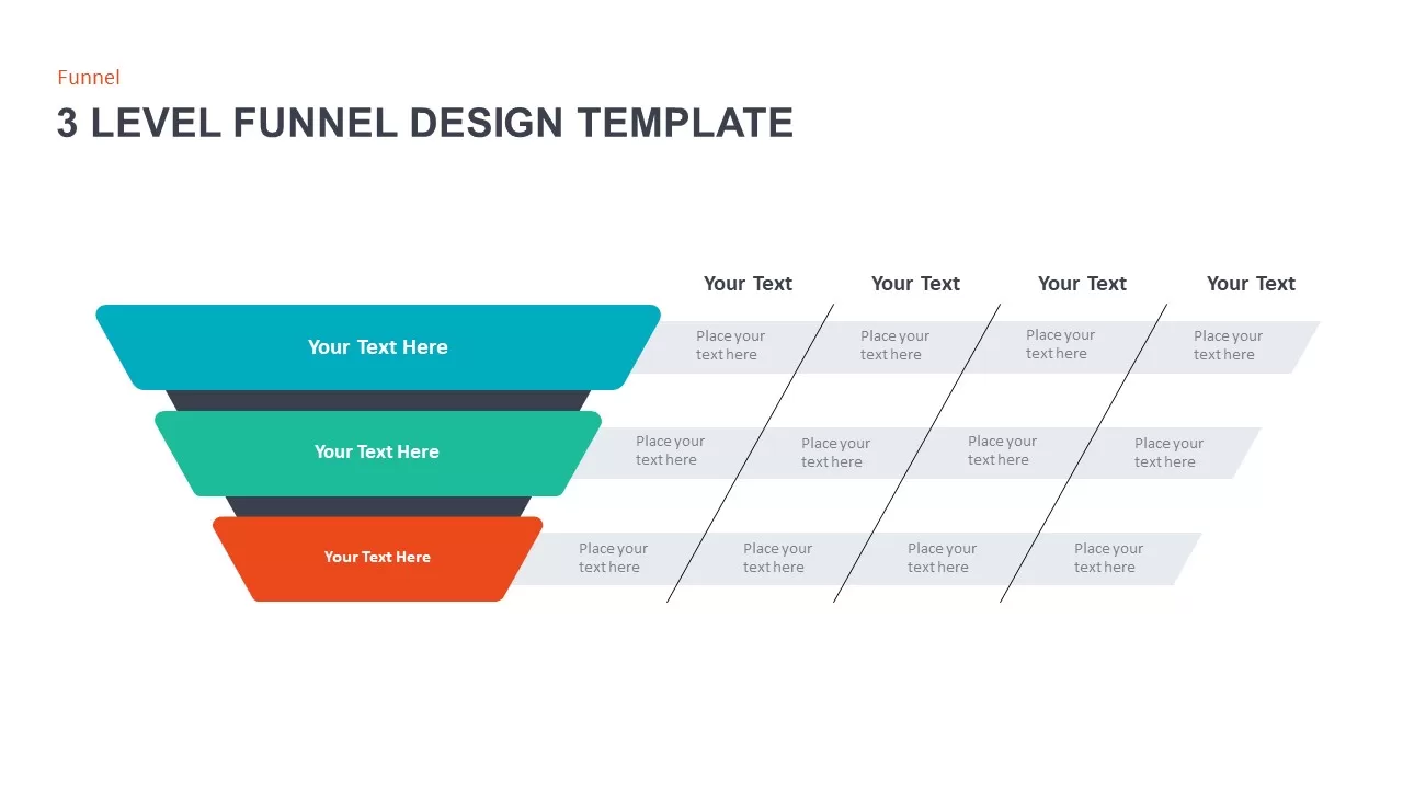
3 Level Funnel Design Visualization Template for PowerPoint & Google Slides
Funnel
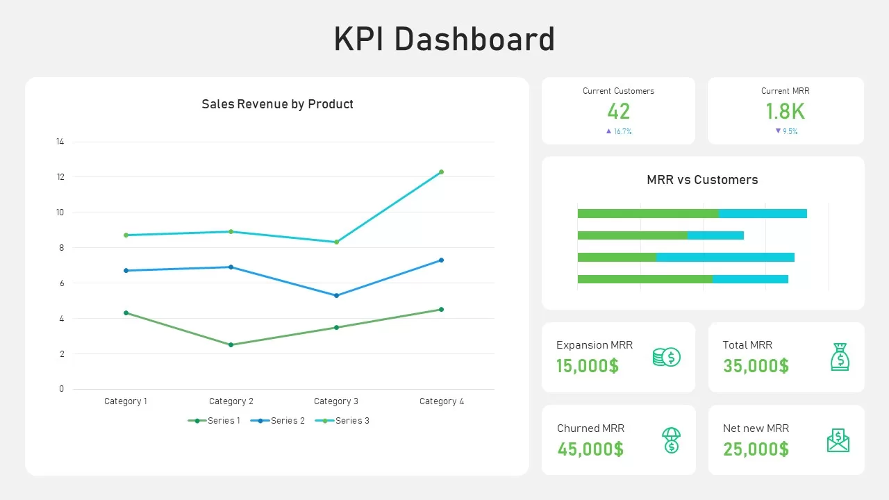
KPI Dashboard Data Visualization Template for PowerPoint & Google Slides
Bar/Column
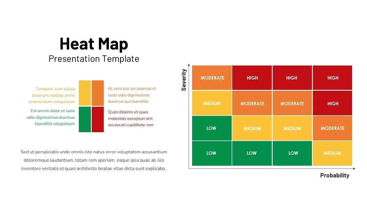
Professional Risk Heat Map Visualization Template for PowerPoint & Google Slides
Risk Management
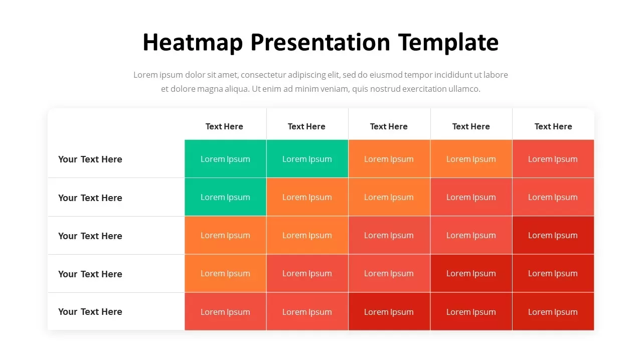
Professional Heatmap Data Visualization Template for PowerPoint & Google Slides
Infographics
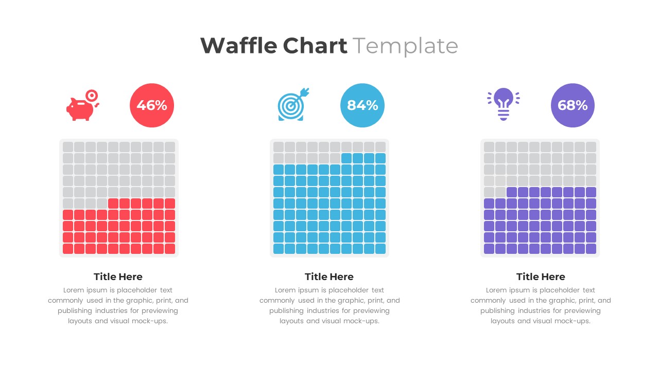
Waffle Chart Data Visualization Template for PowerPoint & Google Slides
Comparison Chart
Free Stacked Column Chart Data Visualization Template for PowerPoint & Google Slides
Bar/Column
Free
Simple Bar Chart Data Visualization Template for PowerPoint & Google Slides
Bar/Column
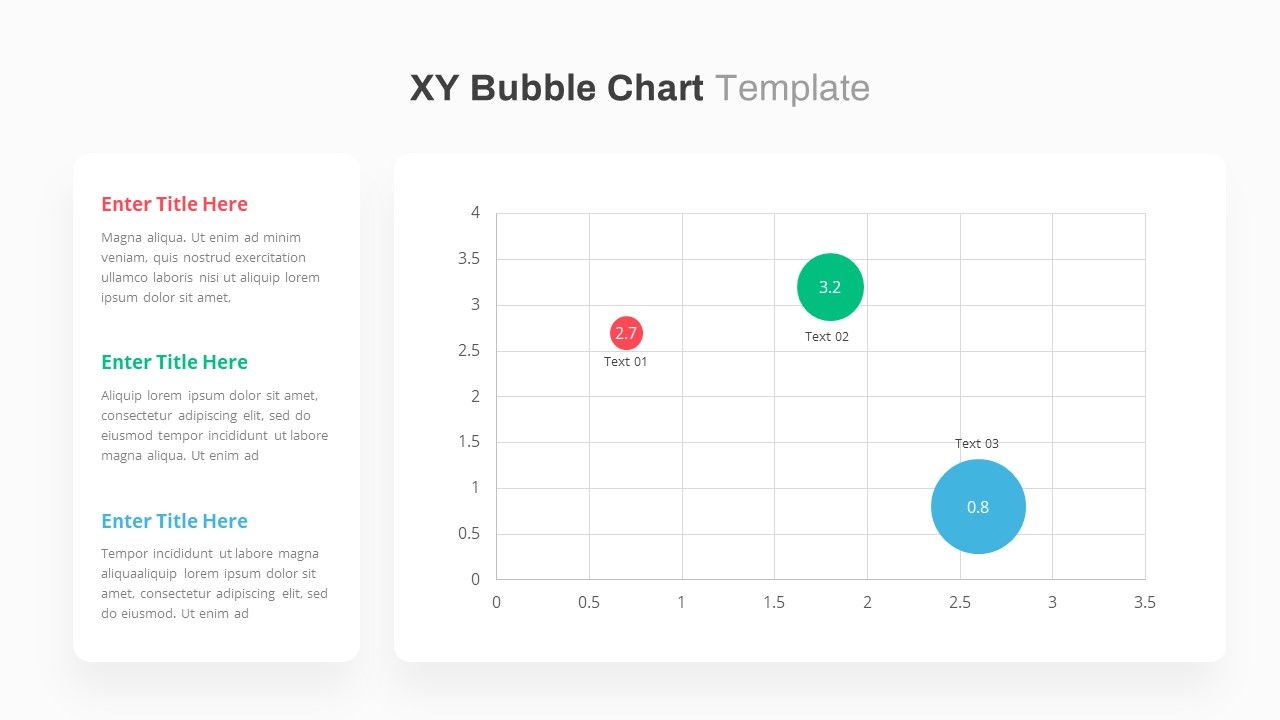
XY Bubble Chart Data Visualization Template for PowerPoint & Google Slides
Comparison Chart
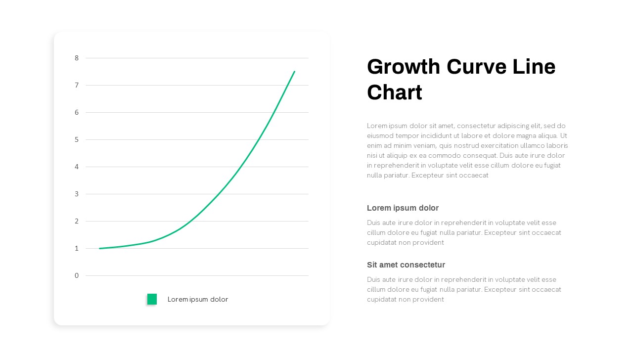
Growth Curve Line Chart Visualization Template for PowerPoint & Google Slides
Charts
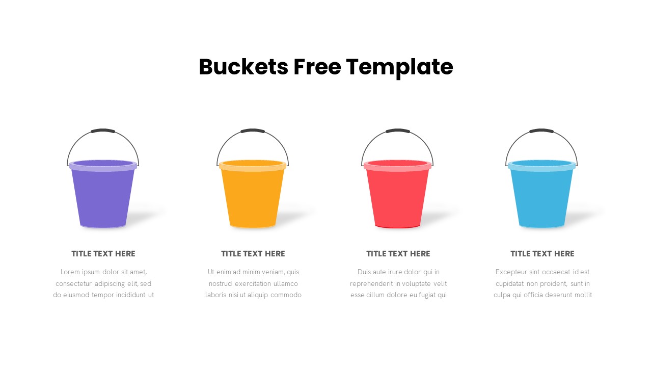
Free Bucket Process Visualization Template for PowerPoint & Google Slides
Process
Free
Waterfall Chart Data Visualization Template for PowerPoint & Google Slides
Comparison Chart
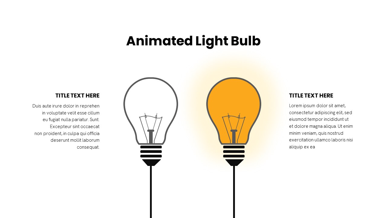
Animated Light Bulb Visualization Template for PowerPoint & Google Slides
Process
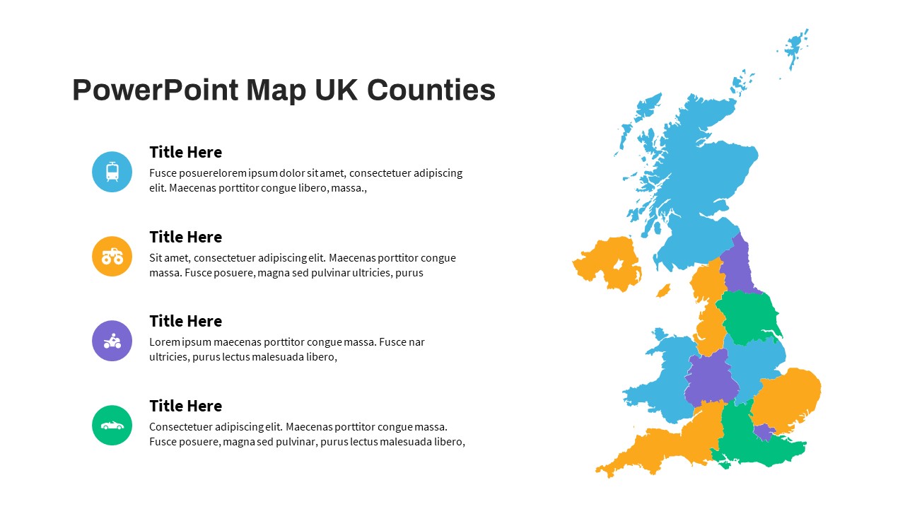
UK Counties Map Data Visualization Template for PowerPoint & Google Slides
World Maps
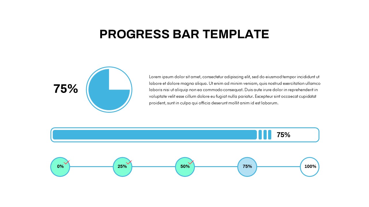
Progress Bar and Milestone Visualization Template for PowerPoint & Google Slides
Timeline
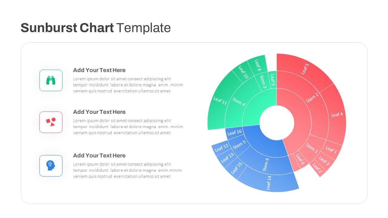
Dynamic Sunburst Chart Visualization Template for PowerPoint & Google Slides
Charts
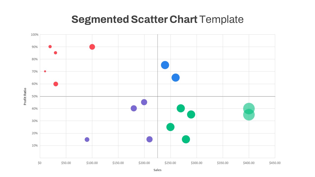
Segmented Scatter Chart Data Visualization Template for PowerPoint & Google Slides
Business Strategy
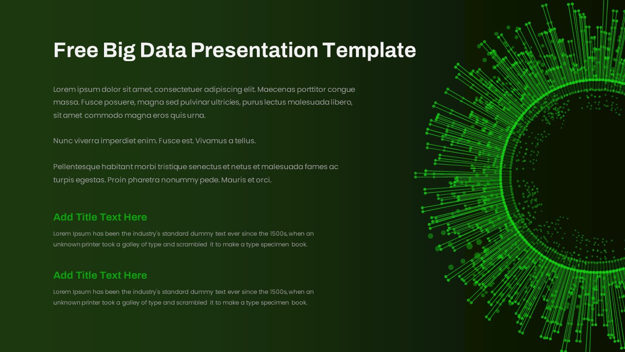
Free Big Data Network Visualization Template for PowerPoint & Google Slides
Circular
Free
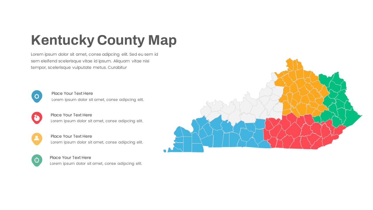
Kentucky County Map Visualization Template for PowerPoint & Google Slides
World Maps
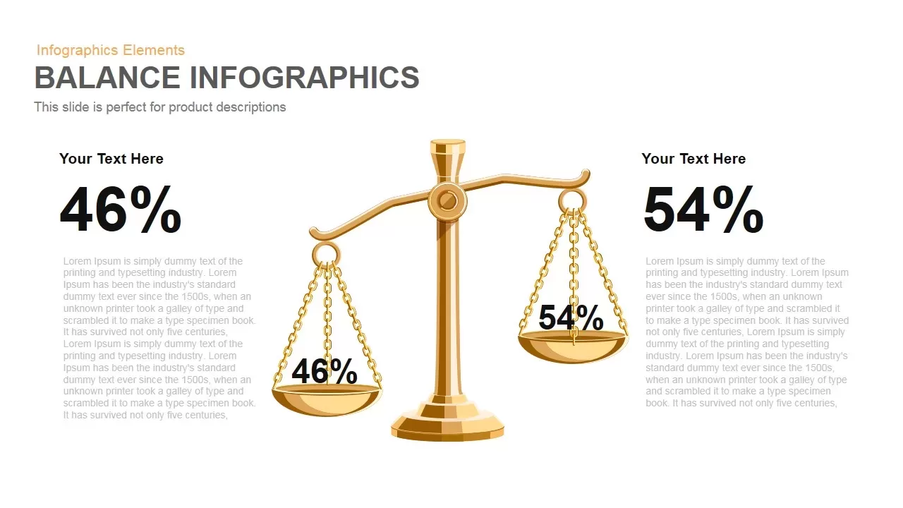
Gold Scales Balance Comparison Template for PowerPoint & Google Slides
Comparison
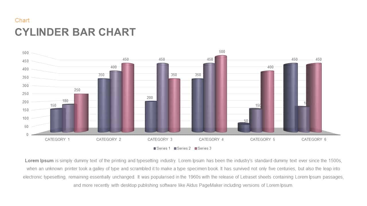
3D Cylinder Bar Chart Visualization Template for PowerPoint
Bar/Column
Balance Template for PowerPoint & Keynote
Comparison
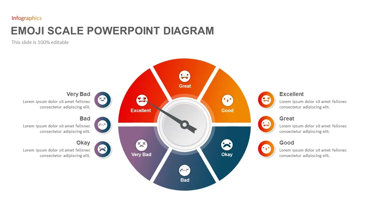
Emoji Scale PowerPoint Diagram for PowerPoint & Google Slides
Infographics
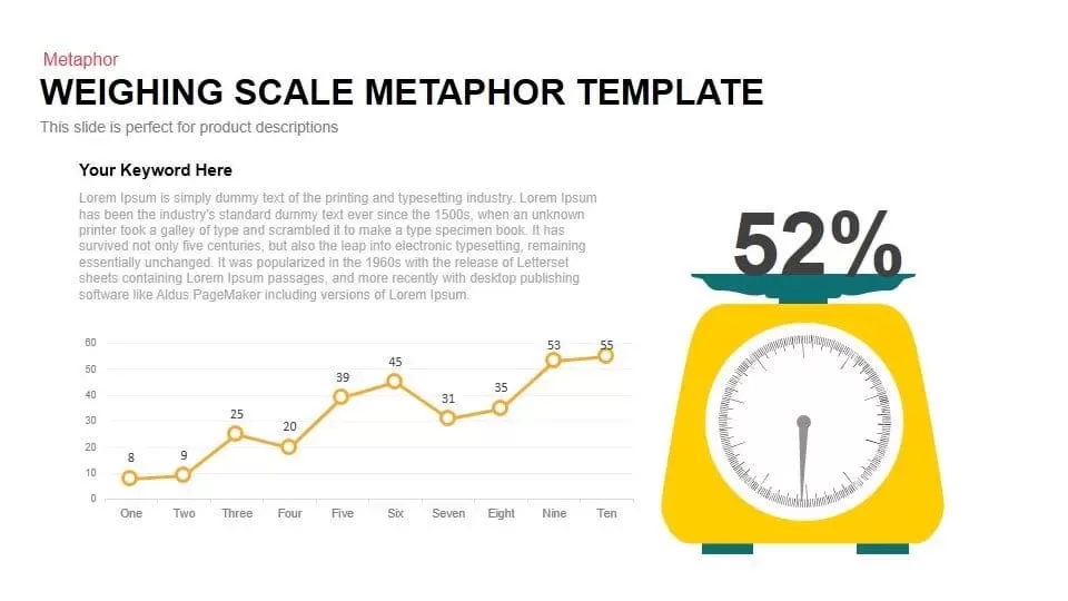
Scale Metaphor Metrics Comparison Template for PowerPoint & Google Slides
Charts
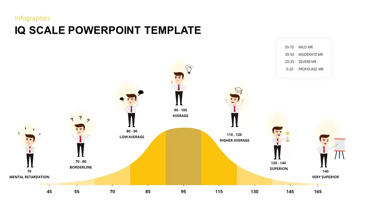
IQ Scale Analysis Diagram template for PowerPoint & Google Slides
Employee Performance
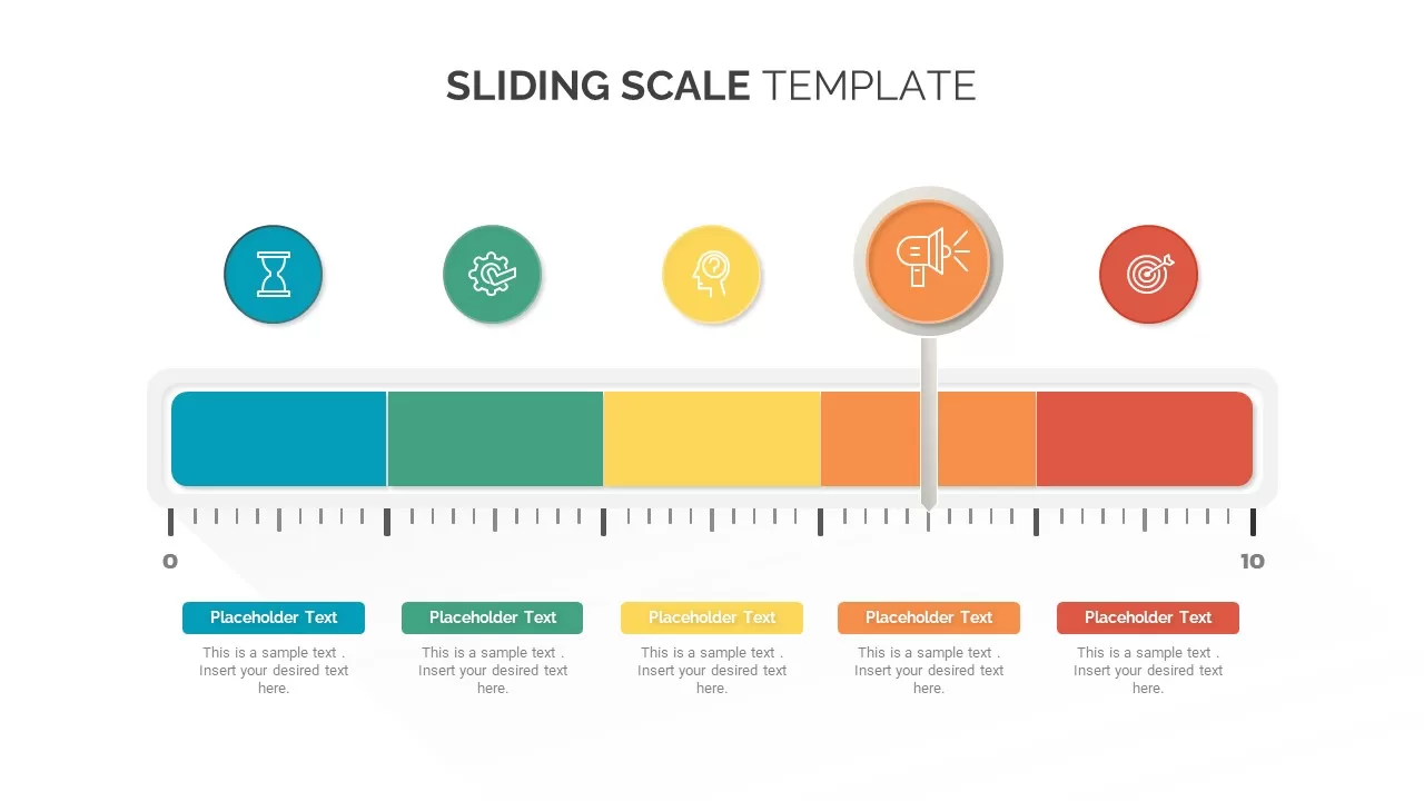
Sliding Scale template for PowerPoint & Google Slides
Business
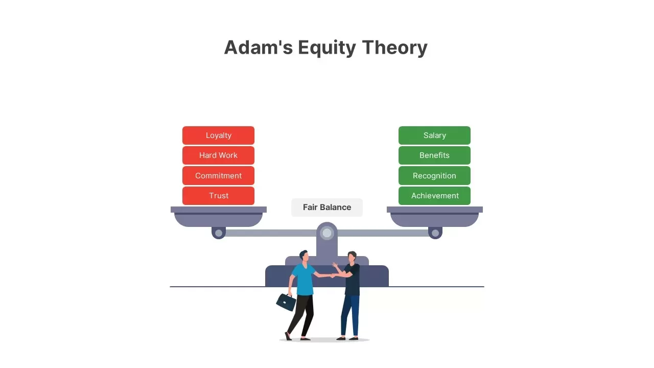
Adam’s Equity Theory Scale Comparison Template for PowerPoint & Google Slides
Comparison
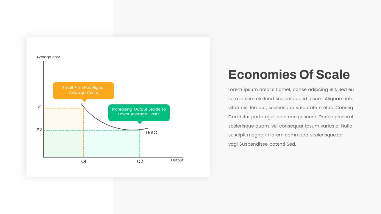
Economies of Scale Cost Curve Comparison Template for PowerPoint & Google Slides
Comparison Chart
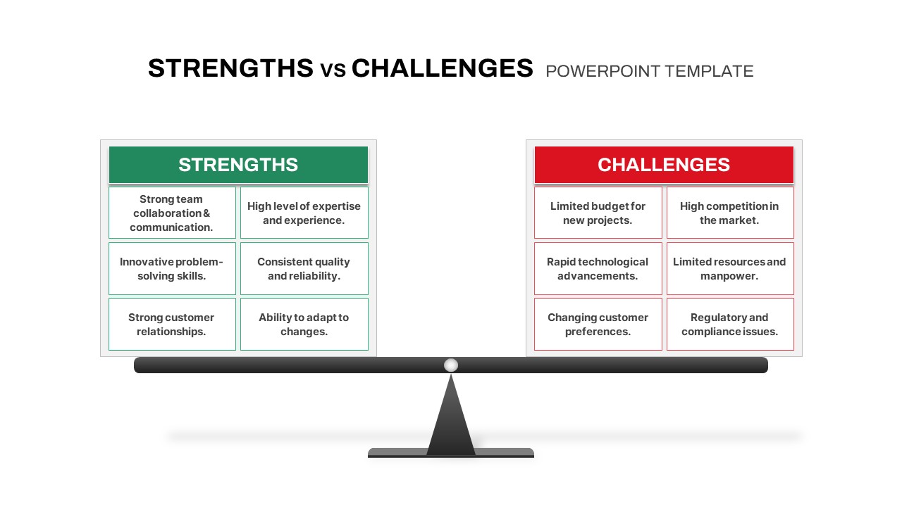
Strengths vs Challenges Weighing Scale Template for PowerPoint & Google Slides
Opportunities Challenges
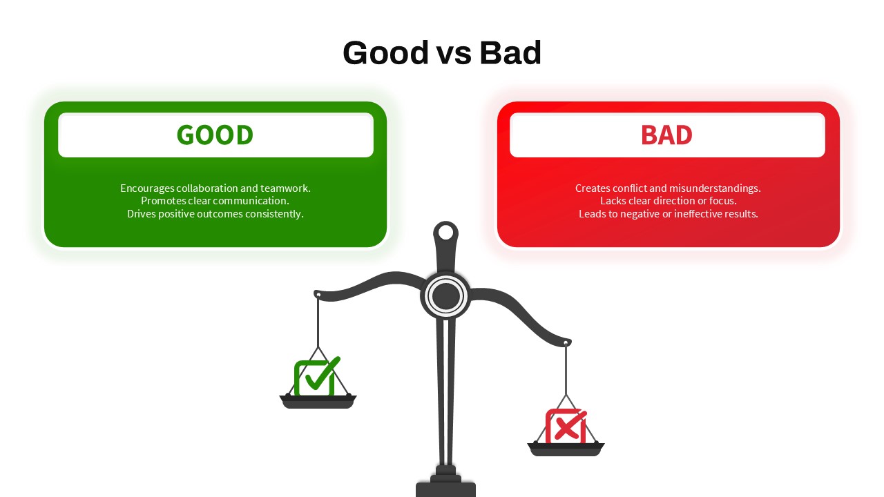
Good vs Bad Comparison with Scale Template for PowerPoint & Google Slides
Comparison
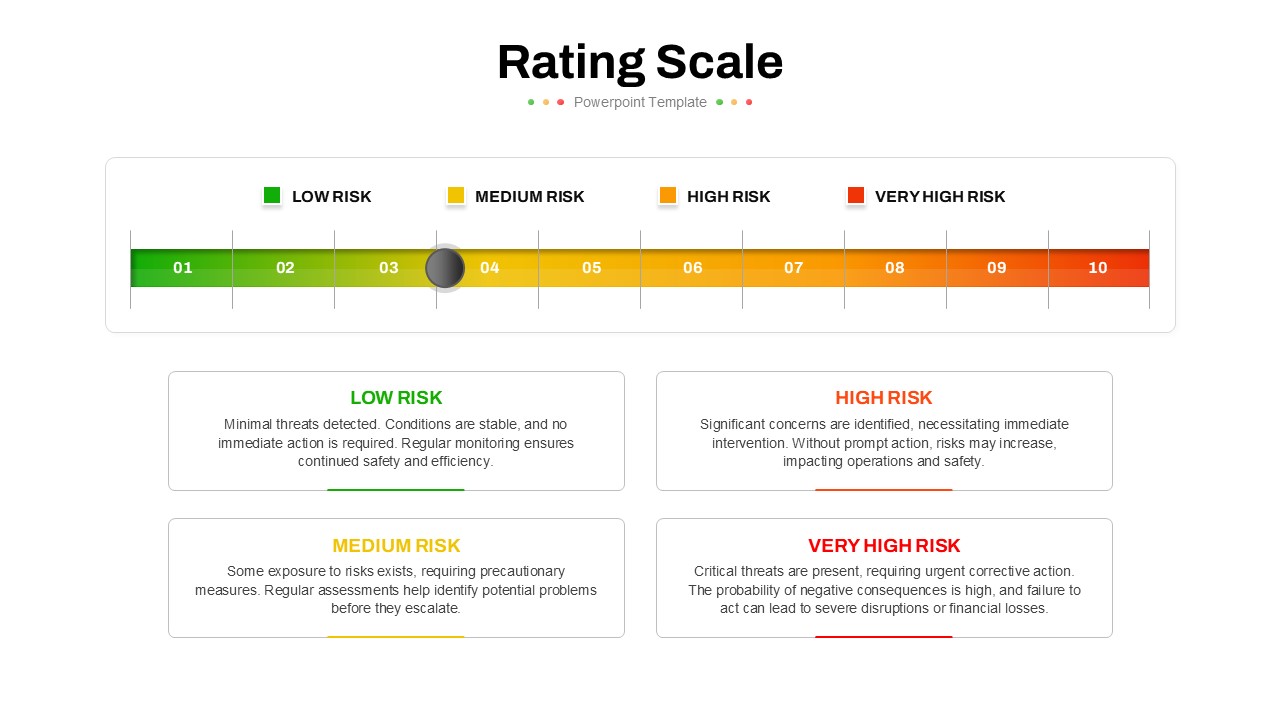
Five-Point Rating Scale Feedback Template for PowerPoint & Google Slides
Employee Performance
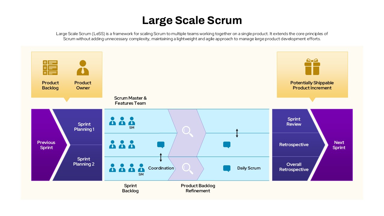
Large Scale Scrum Framework Process Template for PowerPoint & Google Slides
Scrum
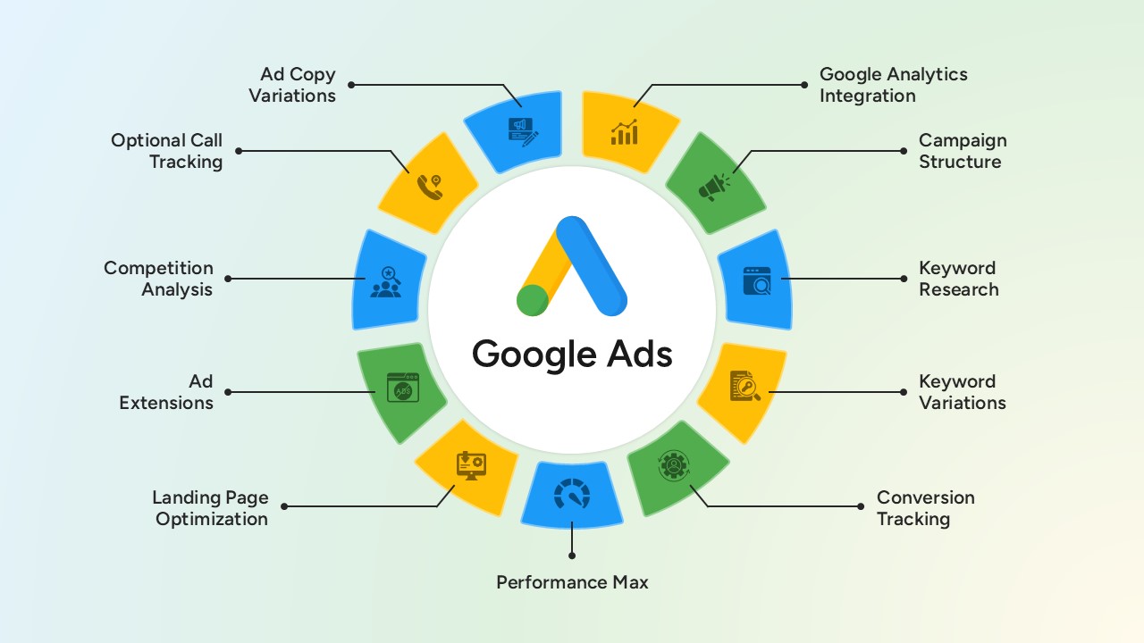
Google Ads Optimization & Performance Infographic Template for PowerPoint & Google Slides
Digital Marketing
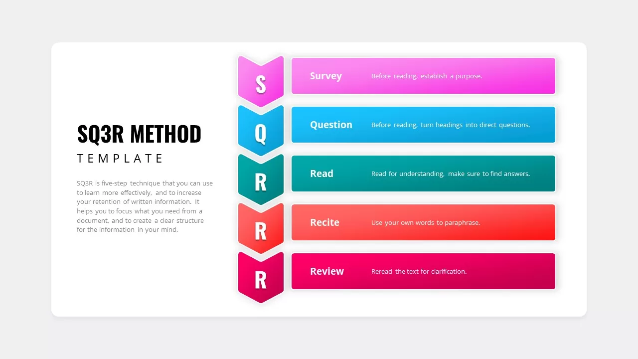
SQ3R Study Strategy Infographic Slides Template for PowerPoint & Google Slides
Business Strategy
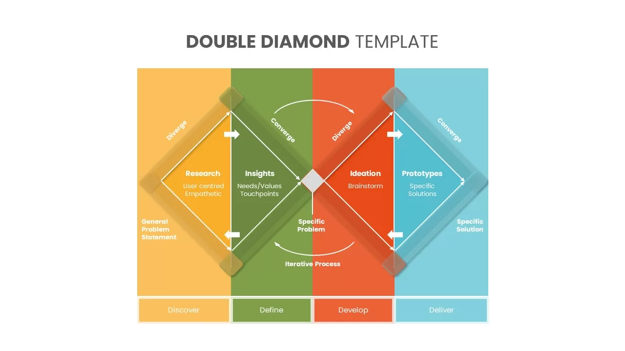
Six Double Diamond Infographic Slides Template for PowerPoint & Google Slides
Process

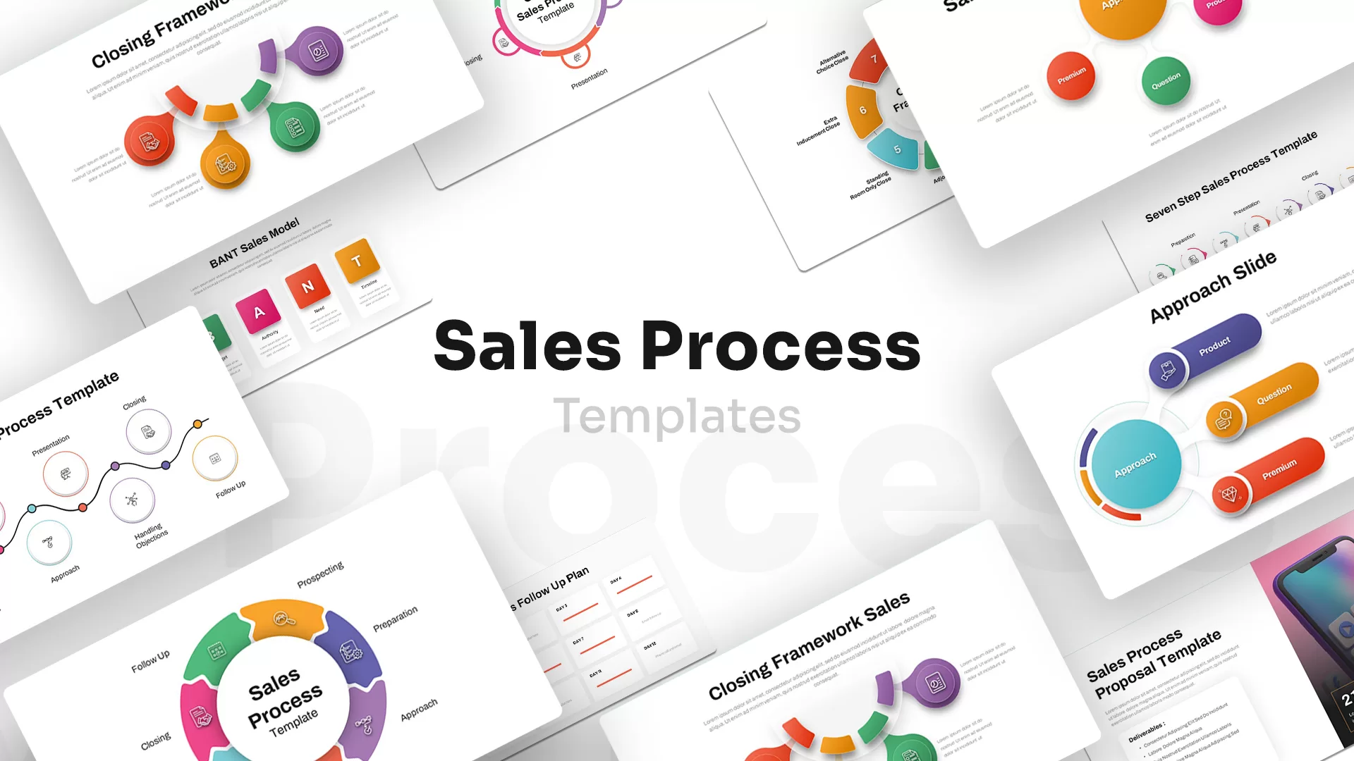
Sales Process Infographic Slides Pack Template for PowerPoint & Google Slides
Process
Casino/Poker Chips Infographic Slides template for PowerPoint & Google Slides
Business Strategy
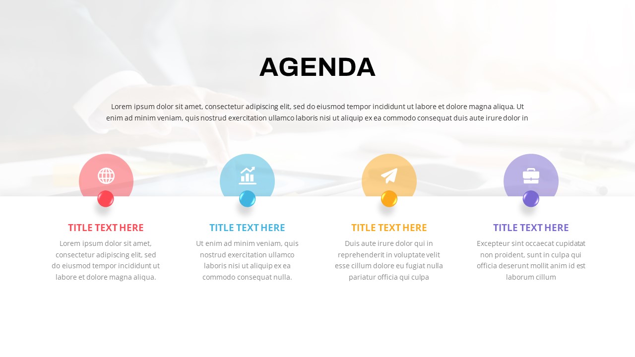
Agenda Infographic Pack of 2 Slides Template for PowerPoint & Google Slides
Agenda
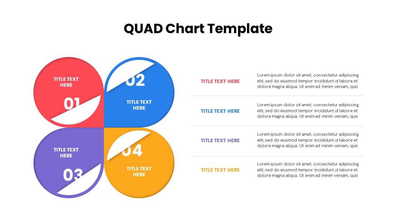
Quad Chart Infographic Pack of 8 Slides Template for PowerPoint & Google Slides
Comparison Chart
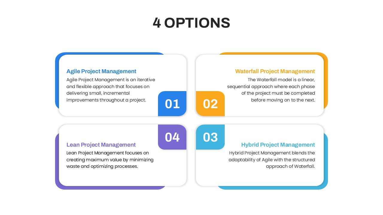
Four Options Infographic Slides Template for PowerPoint & Google Slides
Comparison
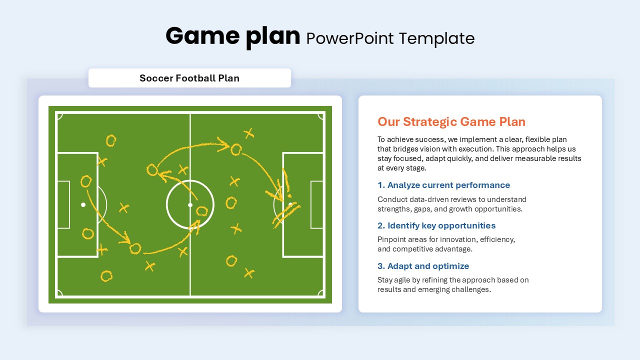
Game Plan Infographic Slides Pack Template for PowerPoint & Google Slides
Infographics
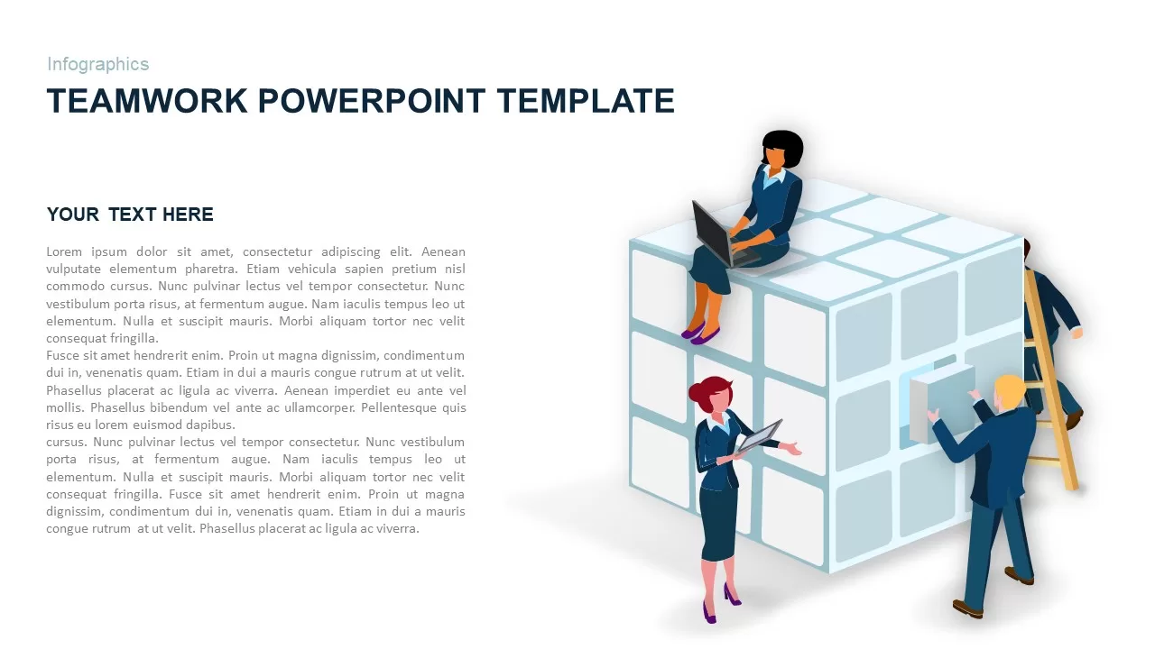
Teamwork PowerPoint Infographic Template for PowerPoint & Google Slides
Leadership
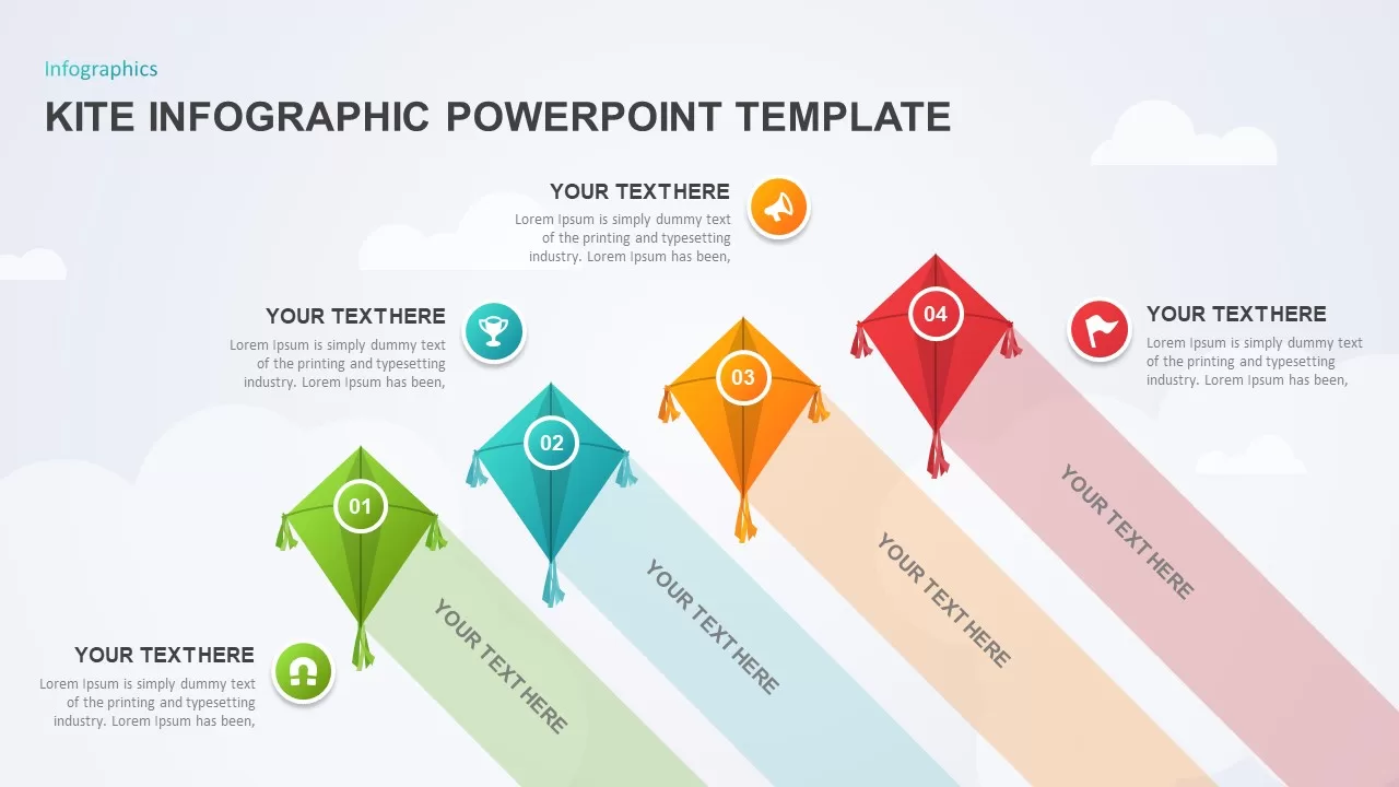
Kite Infographic PowerPoint Template for PowerPoint & Google Slides
Process
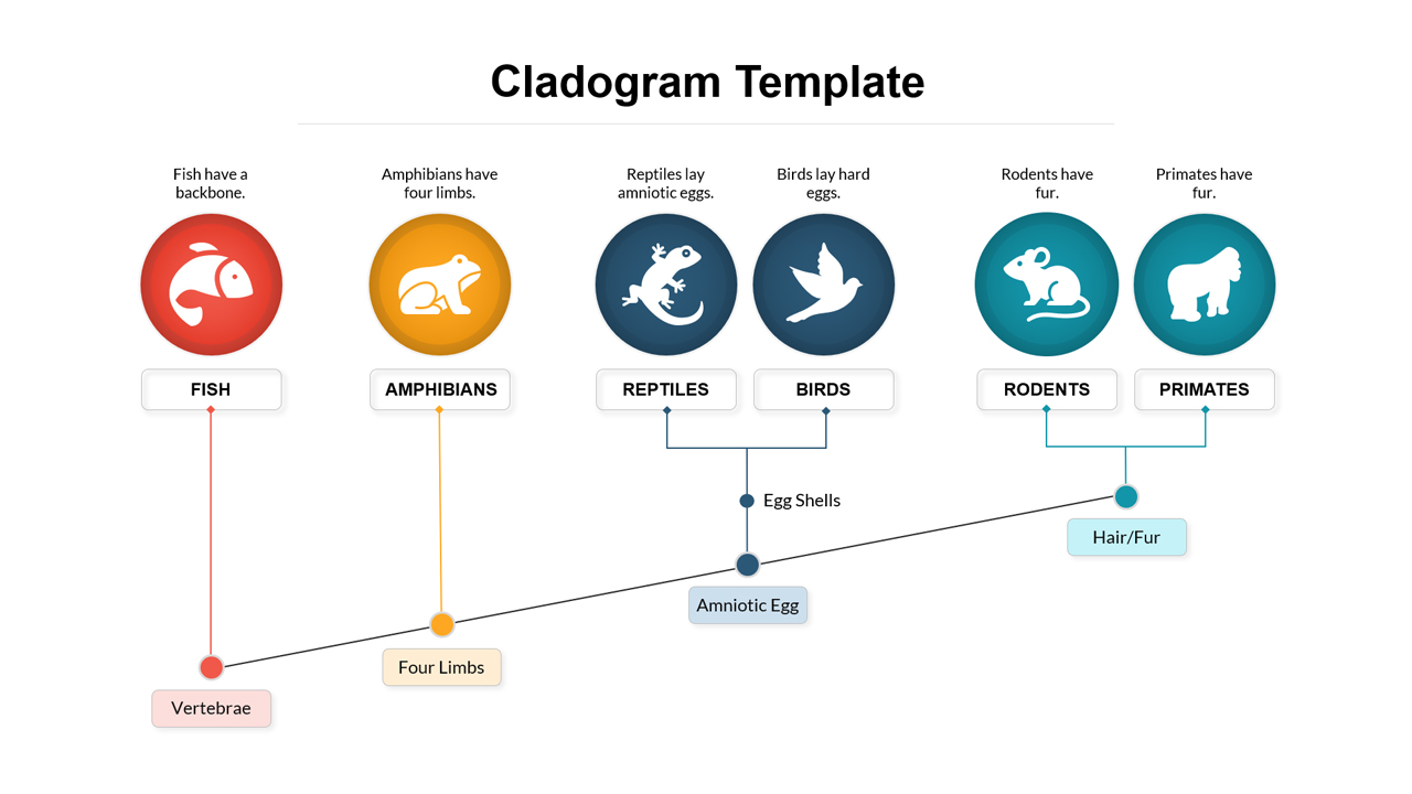
Cladogram Infographic Di Template for PowerPoint & Google Slides Template
Decision Tree
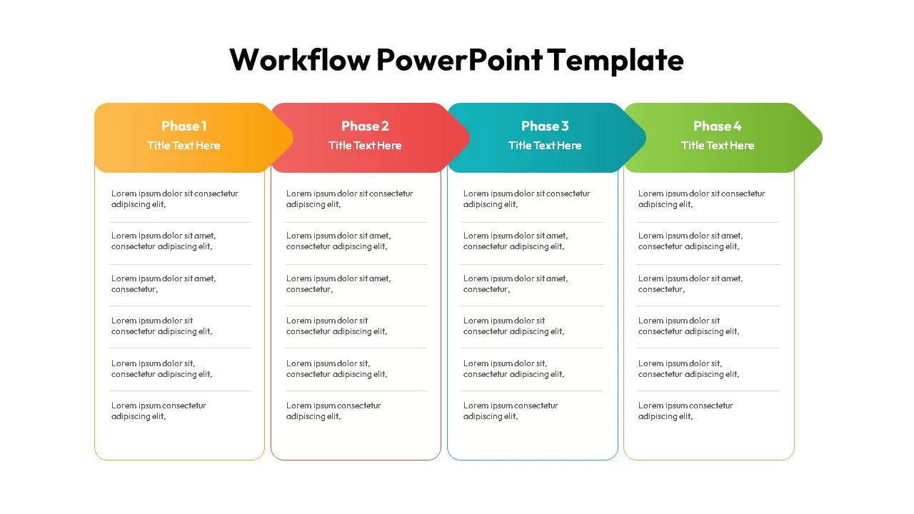
Workflow PowerPoint Process infographic for PowerPoint & Google Slides
Process
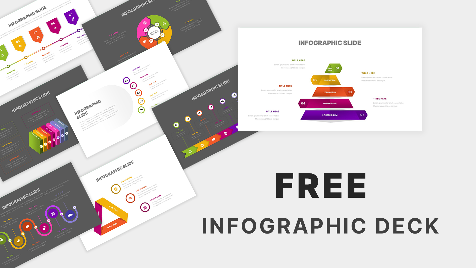
Free Infographic Deck PowerPoint Pack for PowerPoint & Google Slides
Infographics
Free
Business Stages Progression Infographic template for PowerPoint & Google Slides
Process
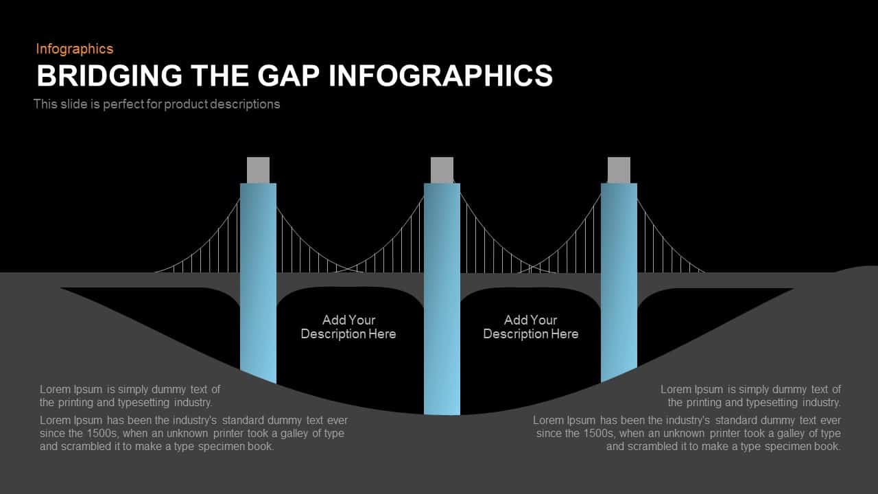
Bridging the Gap Infographic Process template for PowerPoint & Google Slides
Process
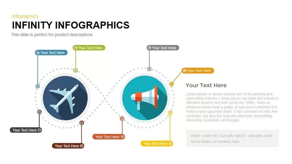
Looped Infinity Infographic Slide Template for PowerPoint & Google Slides
Process
Colorful Photo Capture Infographic Template for PowerPoint & Google Slides
Advertising
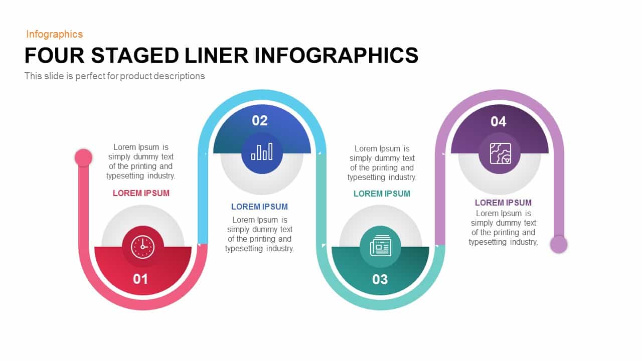
Four-Stage Linear Infographic Diagram Template for PowerPoint & Google Slides
Process
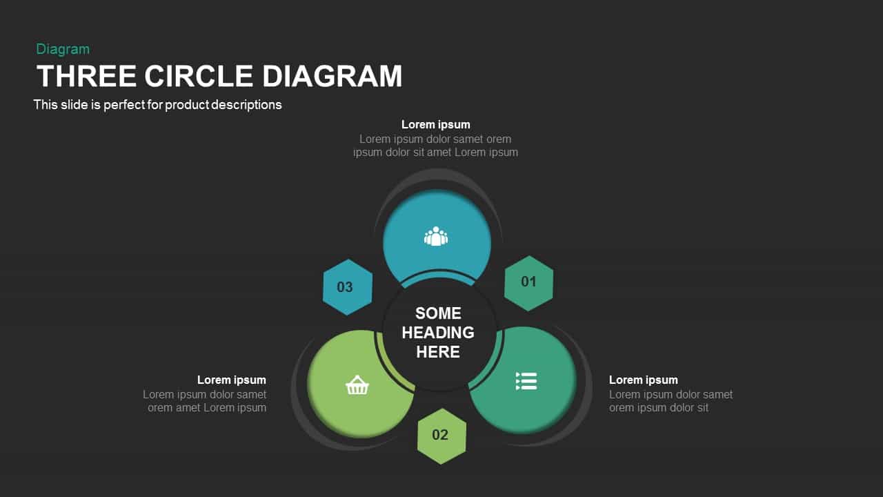
Three-Circle Diagram Infographic Template for PowerPoint & Google Slides
Circular
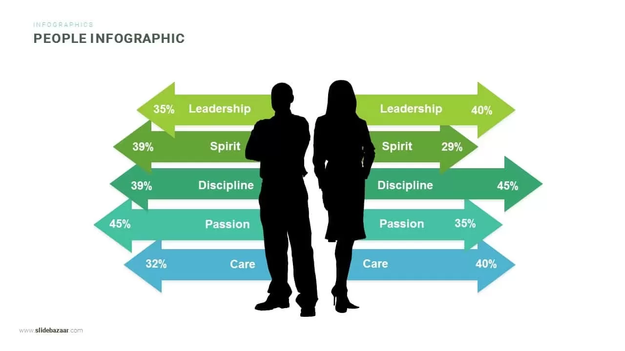
Gender Comparison People Infographic Template for PowerPoint & Google Slides
Comparison
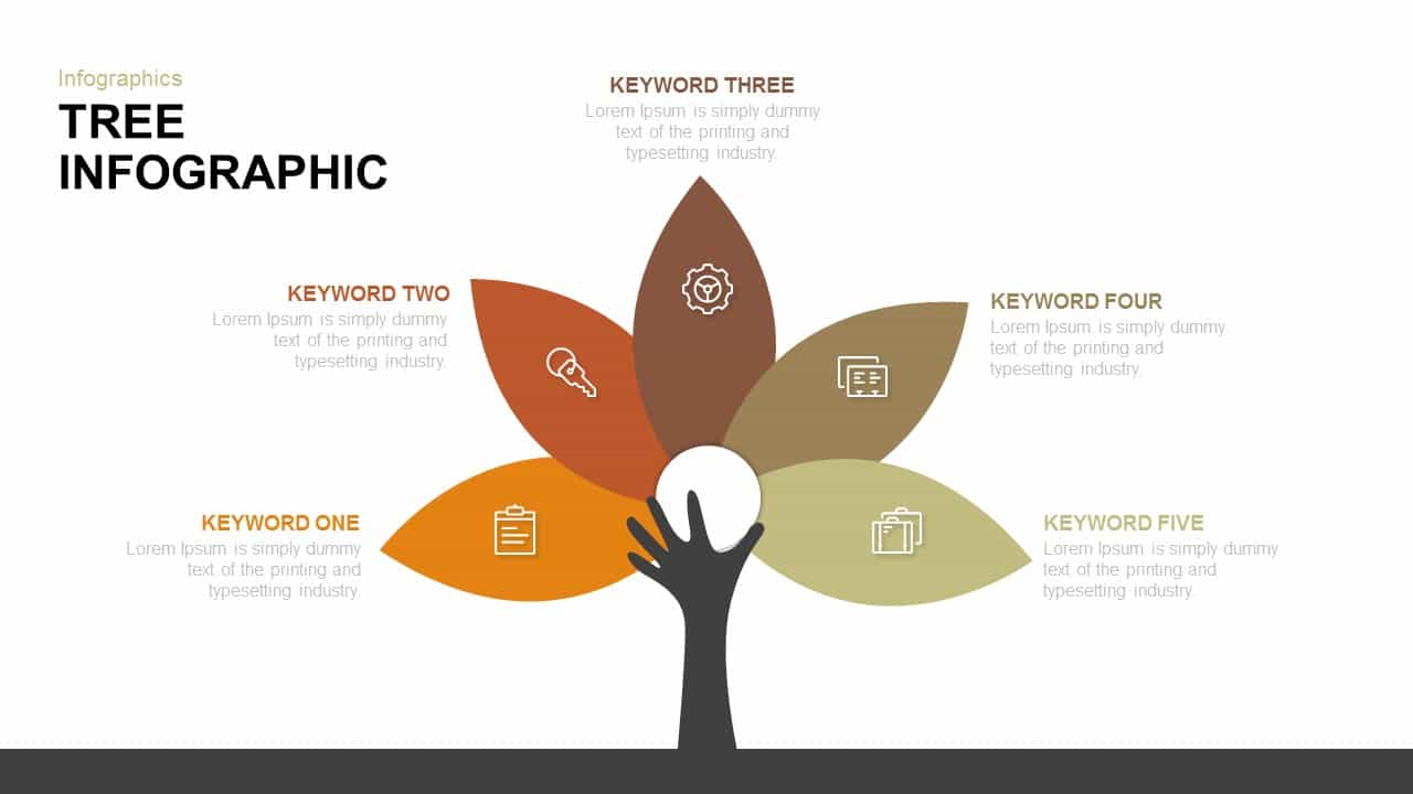
Tree Keyword Petals Infographic Template for PowerPoint & Google Slides
Process
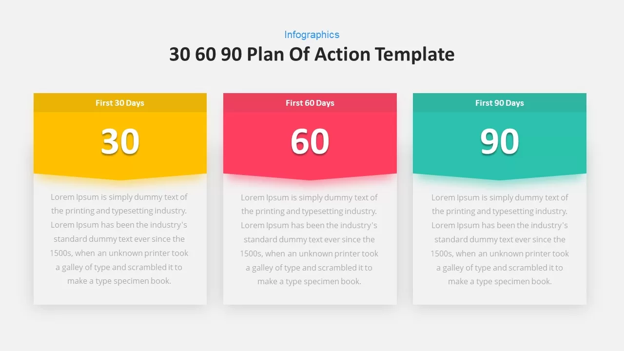
30 60 90-Day Plan Infographic Slide Template for PowerPoint & Google Slides
Business
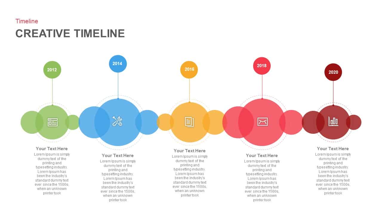
Creative Bubble Timeline Infographic Template for PowerPoint & Google Slides
Timeline
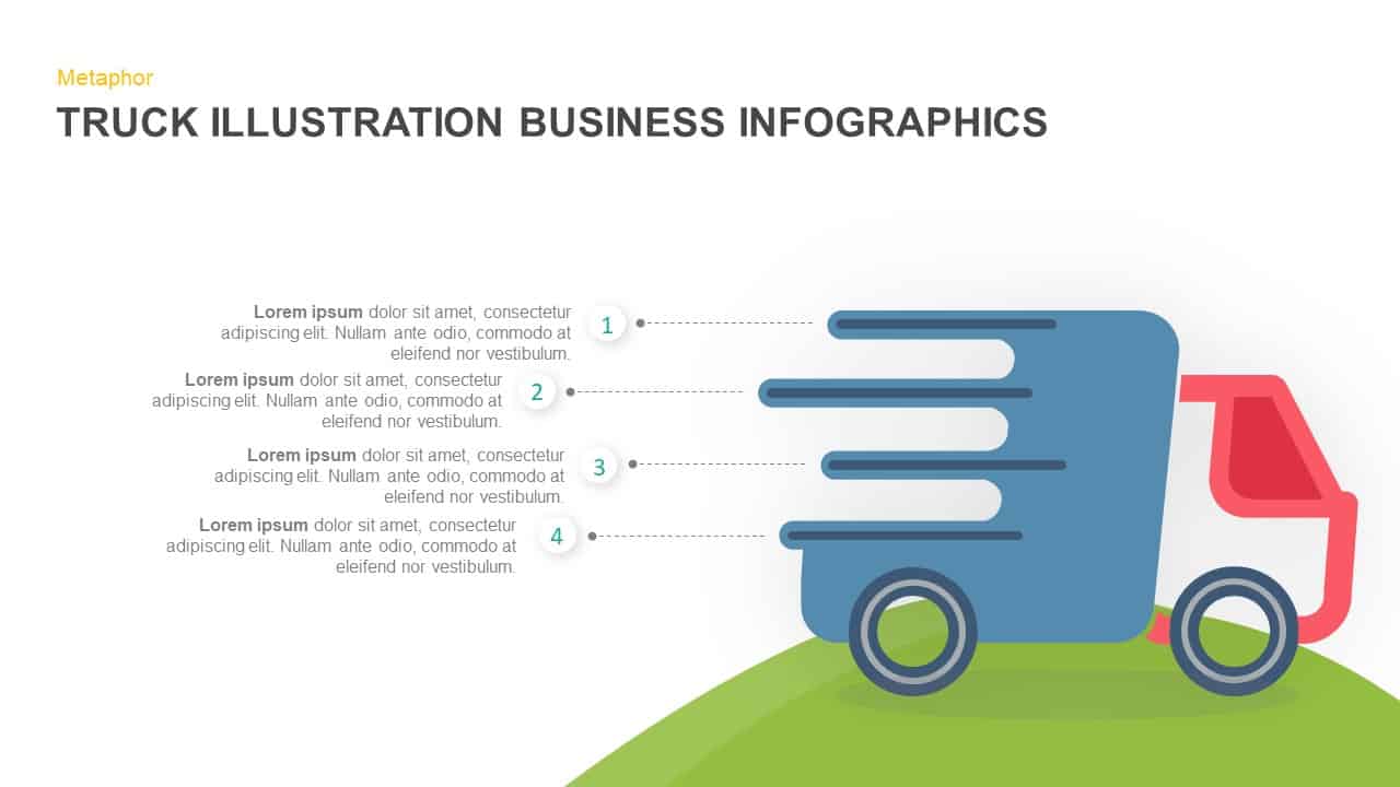
Truck Illustration Infographic Template for PowerPoint & Google Slides
Process

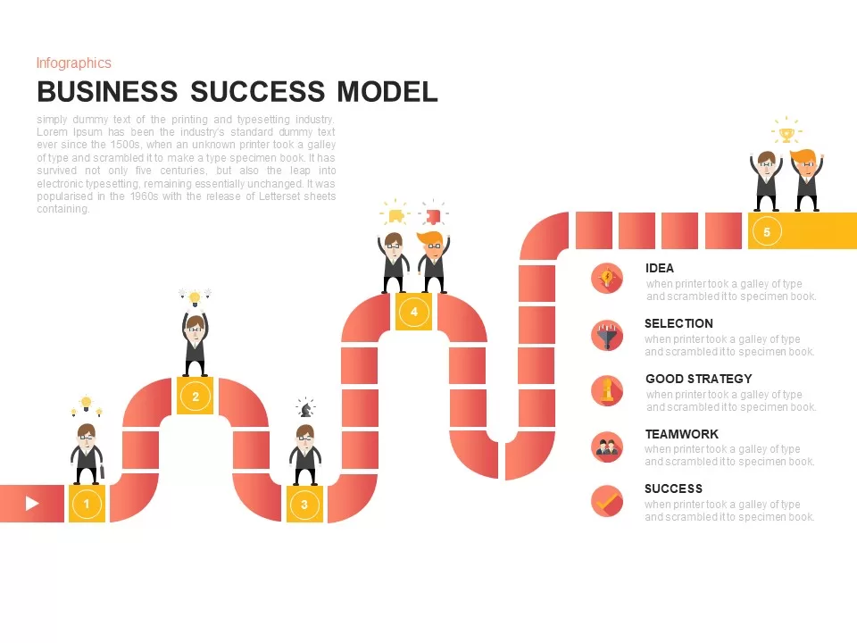
Business Success Model Infographic Template for PowerPoint & Google Slides
Roadmap
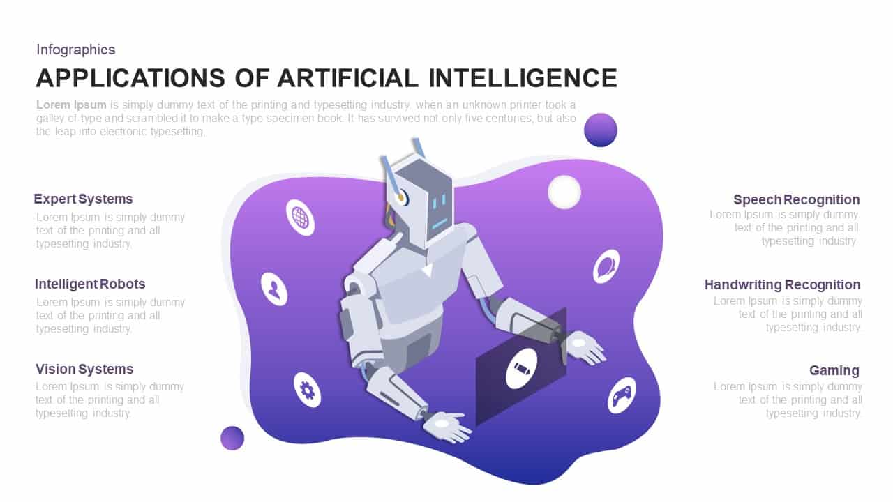
Dynamic AI Applications Infographic Template for PowerPoint & Google Slides
AI
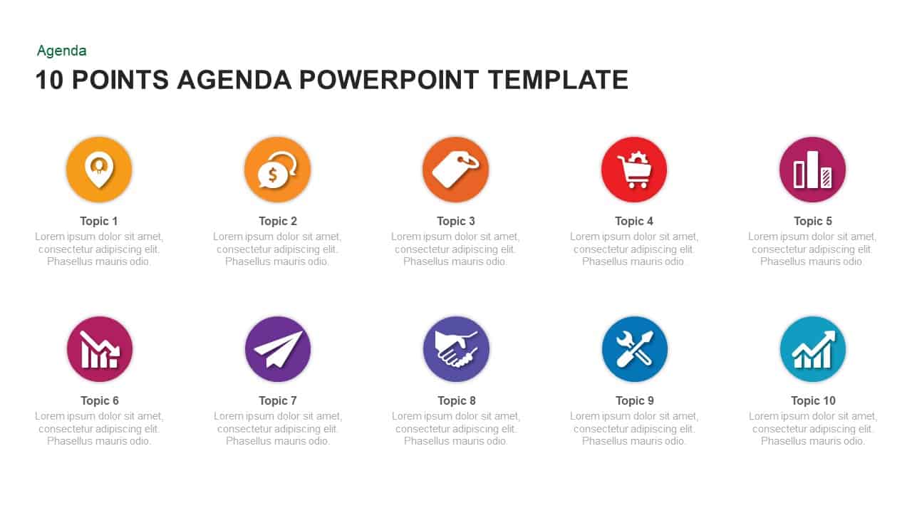
Modern 10-Point Agenda Infographic Template for PowerPoint & Google Slides
Agenda
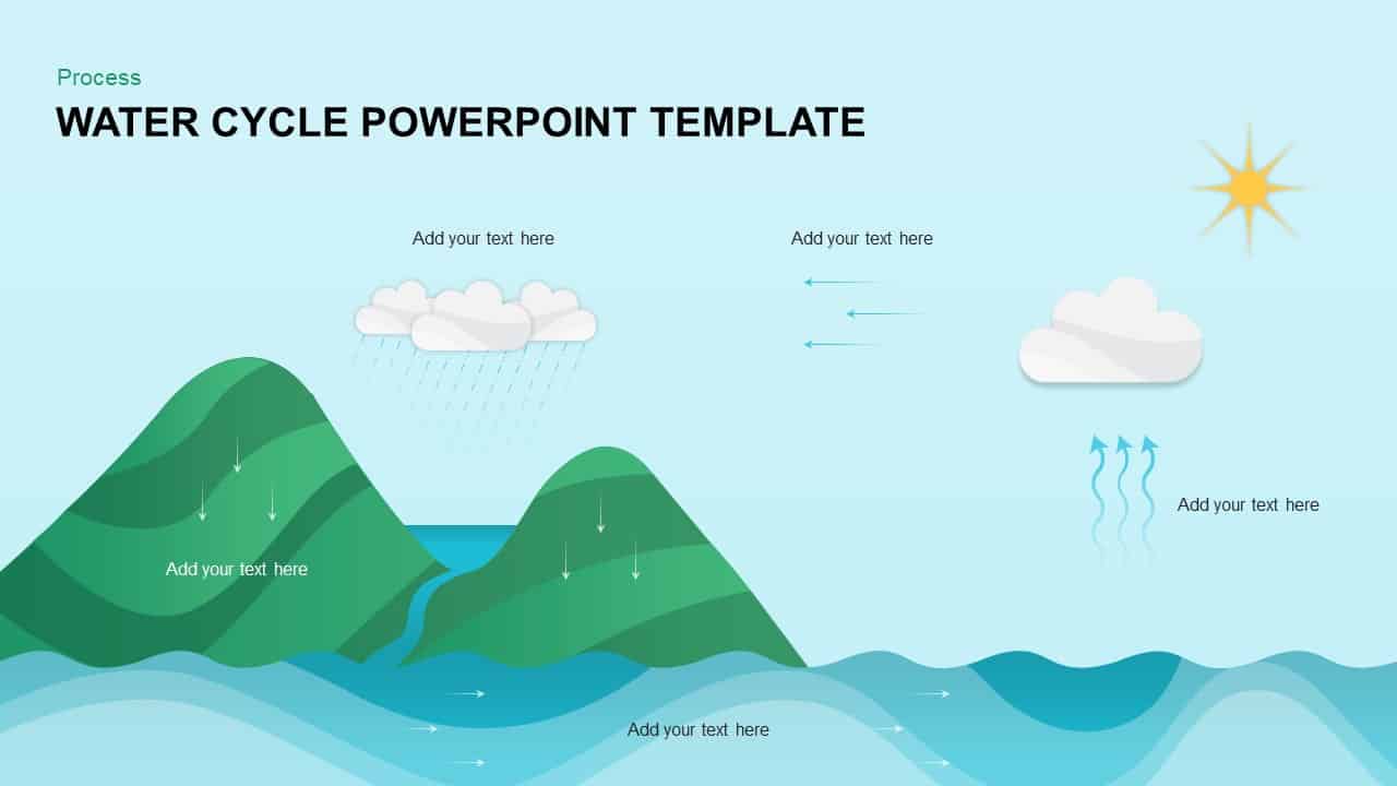
Water Cycle Process Infographic Template for PowerPoint & Google Slides
Process
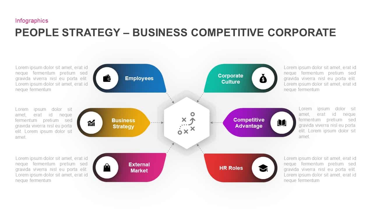
Corporate People Strategy Infographic Template for PowerPoint & Google Slides
Process
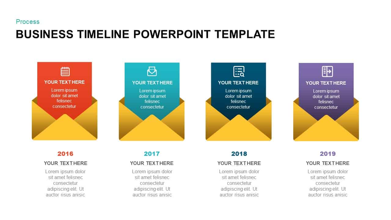
Business Timeline Envelope Infographic Template for PowerPoint & Google Slides
Timeline
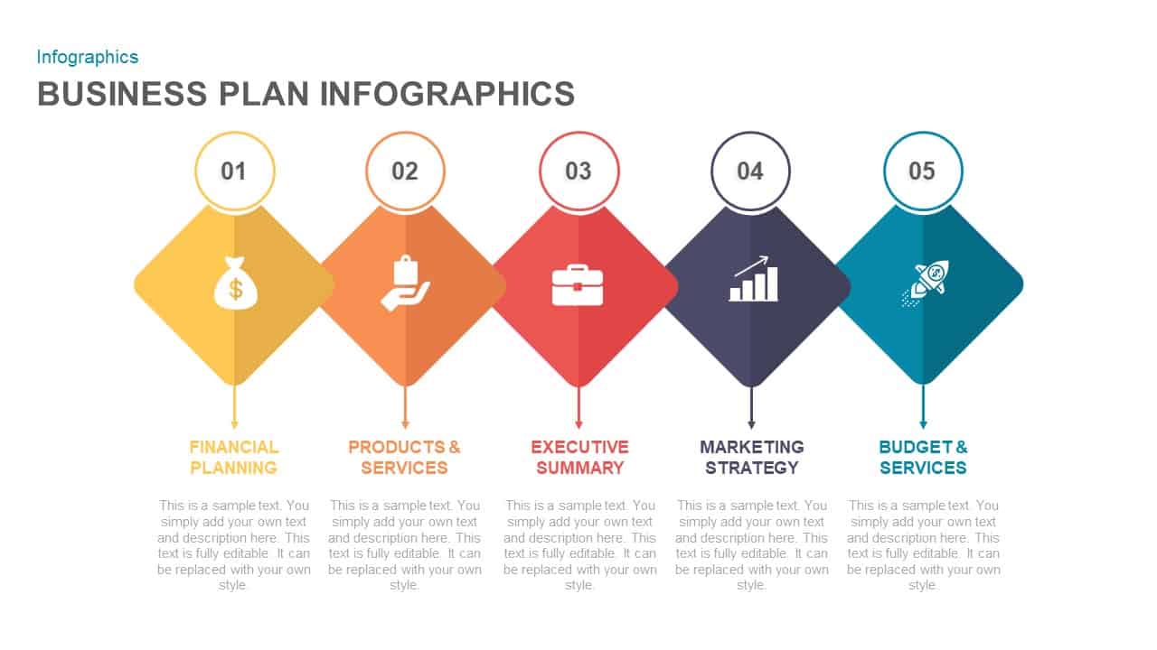
Five-Step Business Plan Infographic Template for PowerPoint & Google Slides
Business Plan
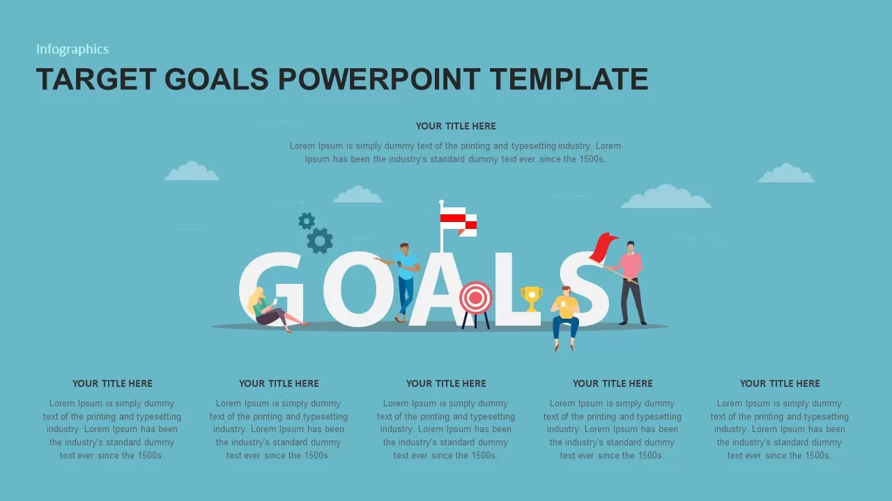
Target Goals Infographic Slide Template for PowerPoint & Google Slides
Goals
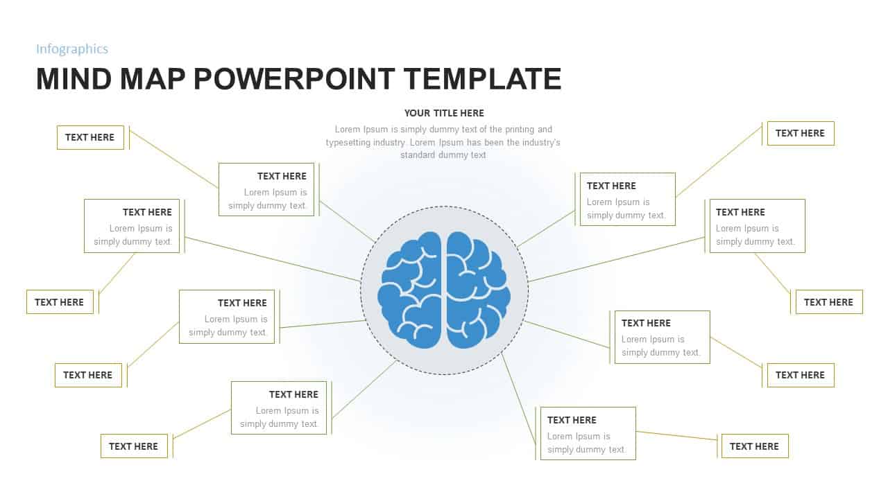
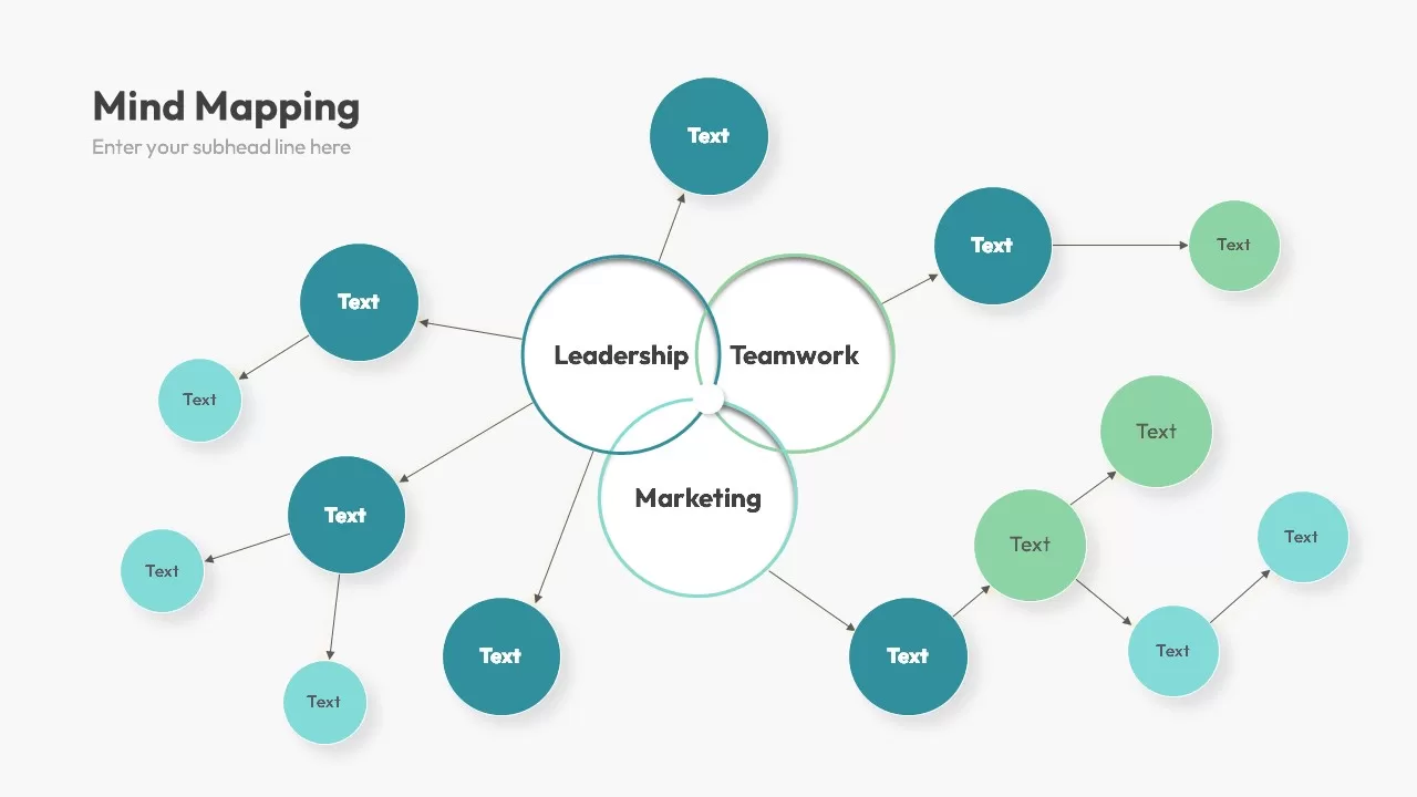
Mind Map Infographic Slide Template for PowerPoint & Google Slides
Mind Maps
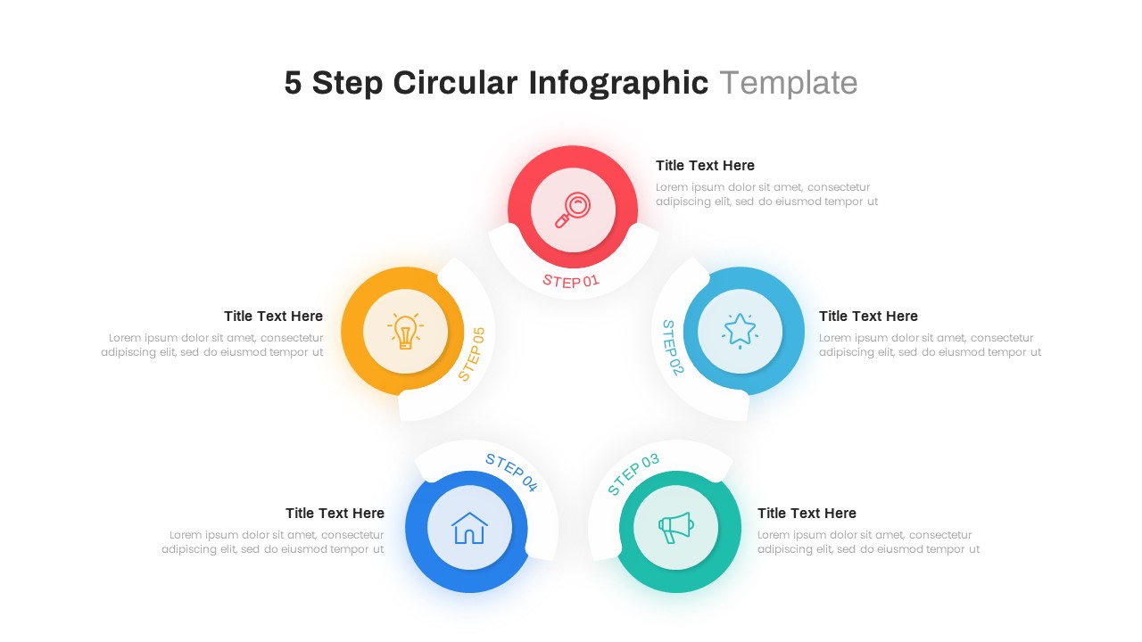
Five-Step Infographic Process and Agenda Template for PowerPoint & Google Slides
Process

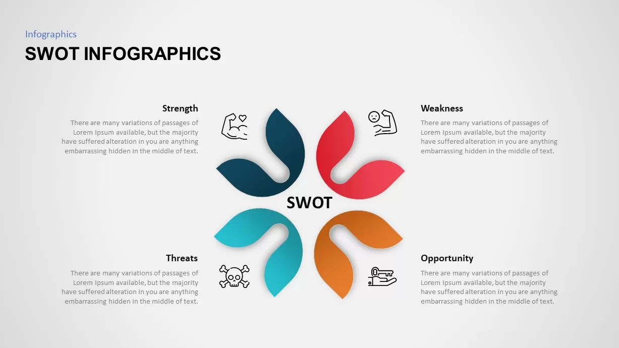
SWOT Analysis Petal Infographic Template for PowerPoint & Google Slides
SWOT
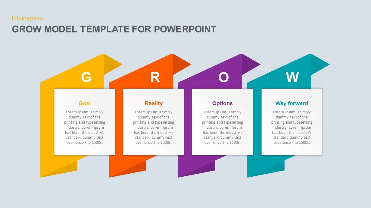
GROW Model Coaching Infographic Template for PowerPoint & Google Slides
Process
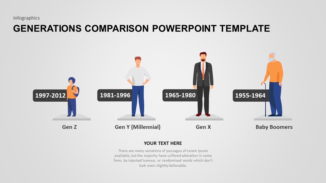
Generations Comparison Infographic Template for PowerPoint & Google Slides
Timeline
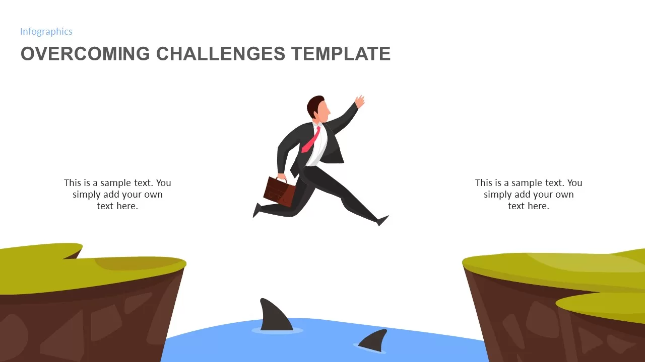
Overcoming Challenges Infographic Pack Template for PowerPoint & Google Slides
Opportunities Challenges
Affinity Diagram Infographic Template for PowerPoint & Google Slides
Business
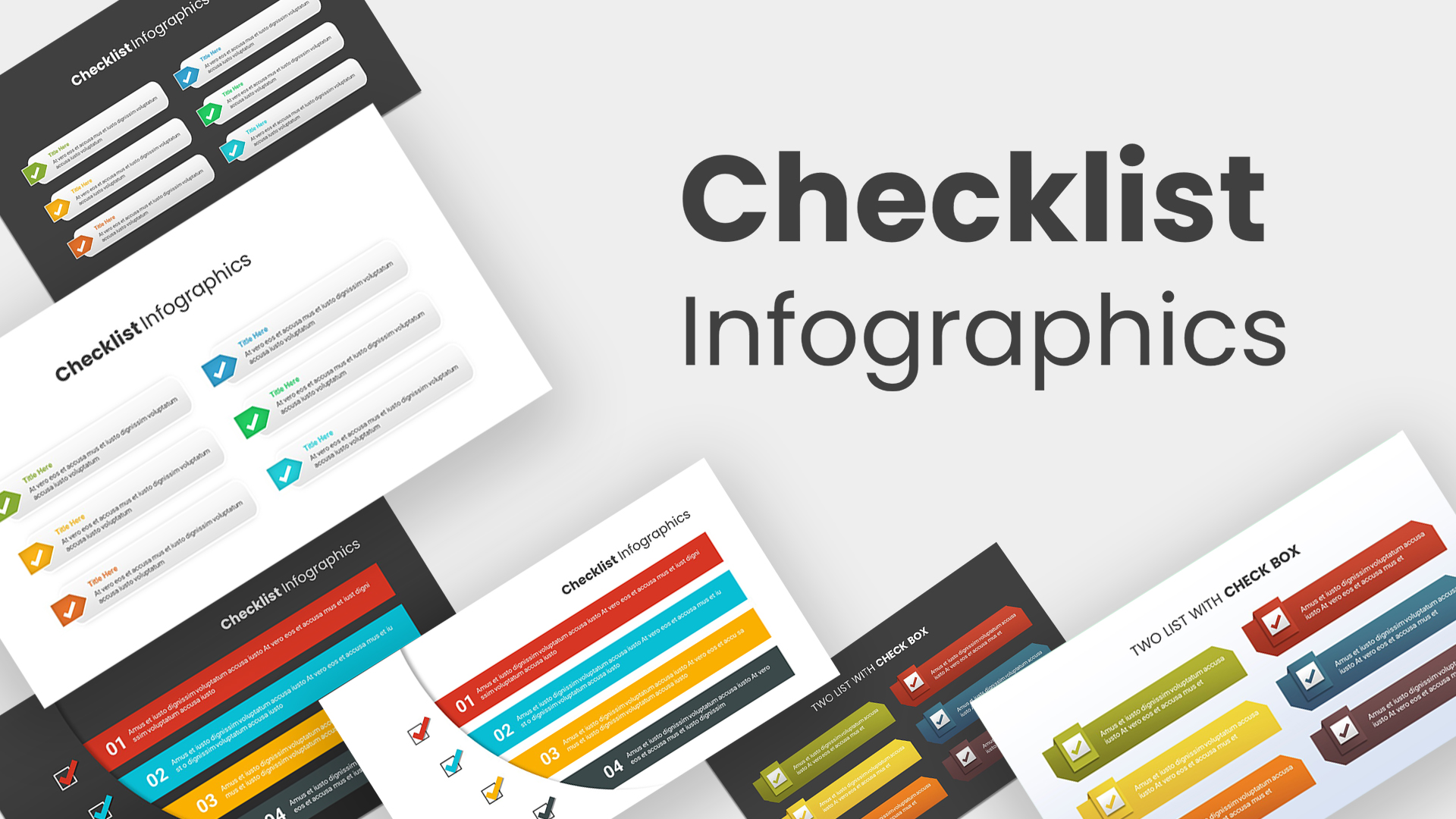
Checklist infographic template for PowerPoint & Google Slides
Infographics
Tri-Cluster Mind Map Infographic Template for PowerPoint & Google Slides
Mind Maps
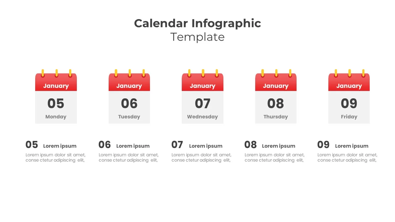
5-Day Calendar Event Infographic Template for PowerPoint & Google Slides
Agenda
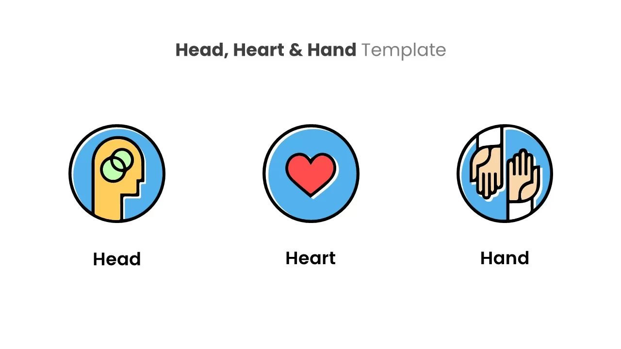
Head, Heart & Hand Infographic Template for PowerPoint & Google Slides
Process
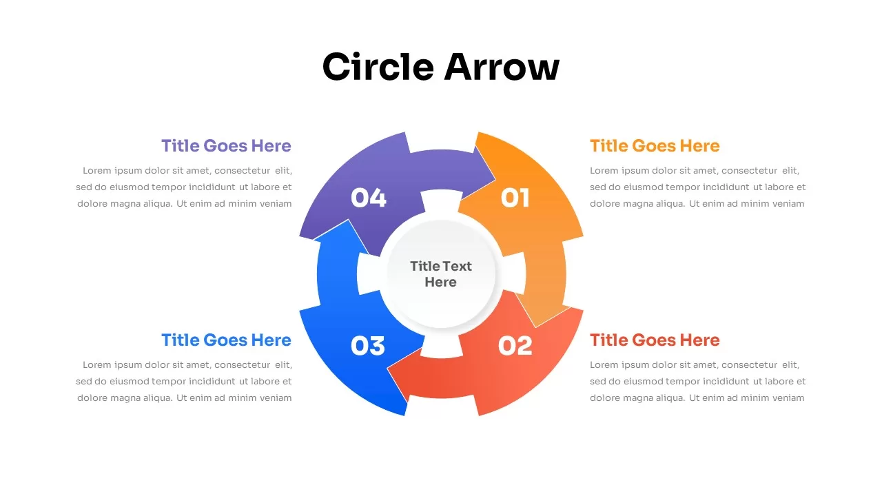
Four-Stage Circle Arrow Infographic Template for PowerPoint & Google Slides
Circular
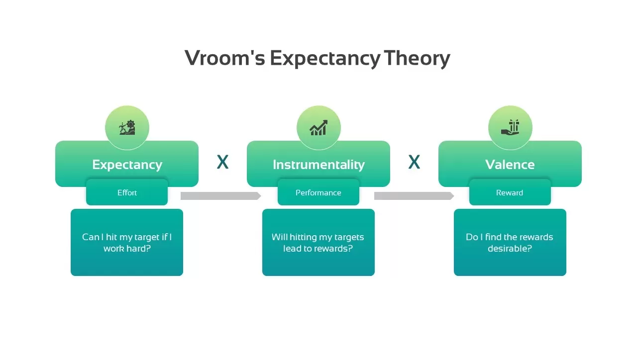
Vroom’s Expectancy Theory Infographic Template for PowerPoint & Google Slides
Process
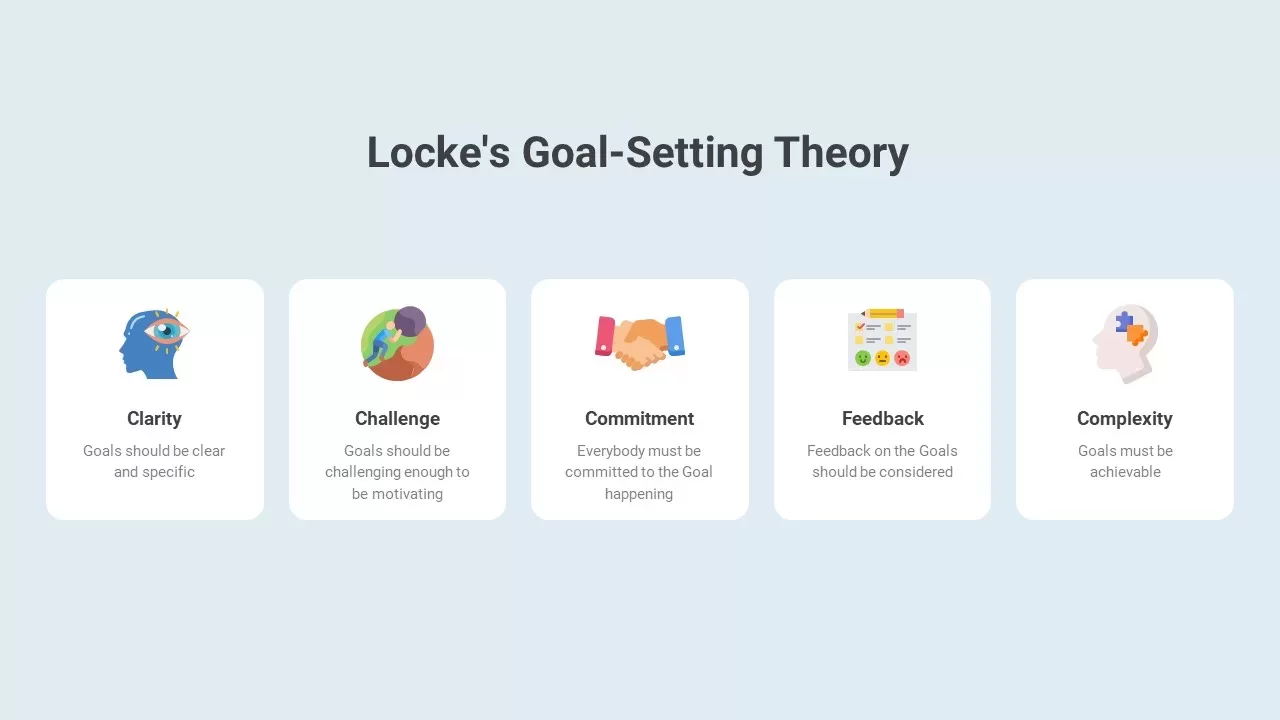
Locke’s Goal-Setting Theory Infographic Template for PowerPoint & Google Slides
Goals
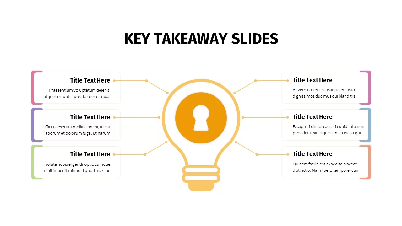
Animated Key Takeaway Spoke Infographic Template for PowerPoint & Google Slides
Infographics
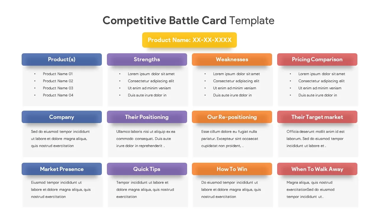
Competitive Battle Card Infographic Pack Template for PowerPoint & Google Slides
Competitor Analysis
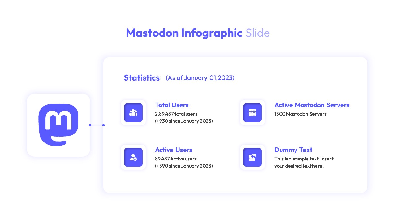
Mastodon Metrics Infographic Dashboard Template for PowerPoint & Google Slides
Business Report
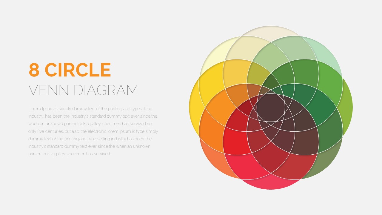
8 Circle Venn Diagram Infographic Design Template for PowerPoint & Google Slides
Circular
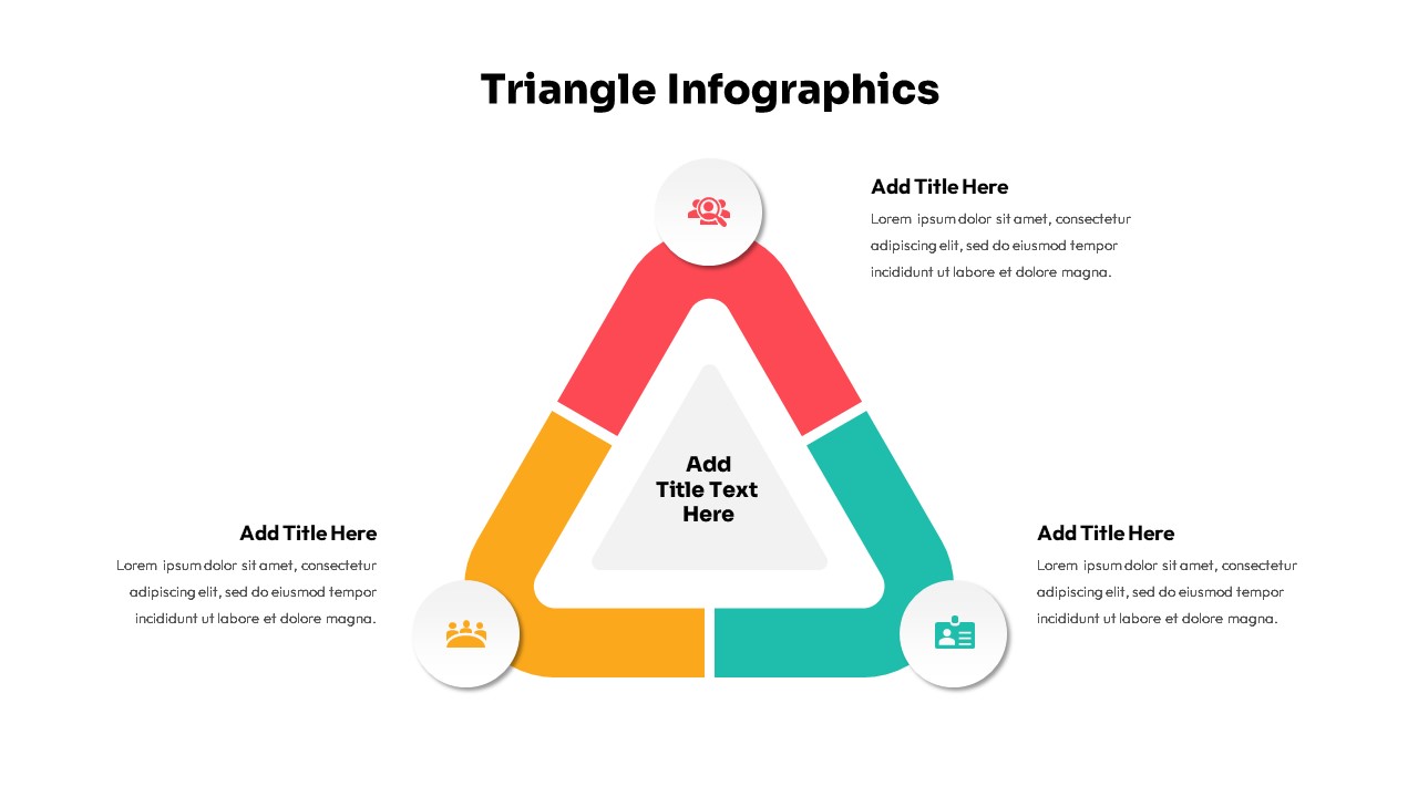
Triangle Infographic Slide Collection Template for PowerPoint & Google Slides
Decks
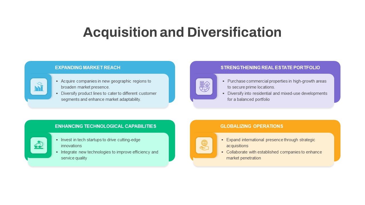
Acquisition & Diversification Infographic Template for PowerPoint & Google Slides
Business Plan
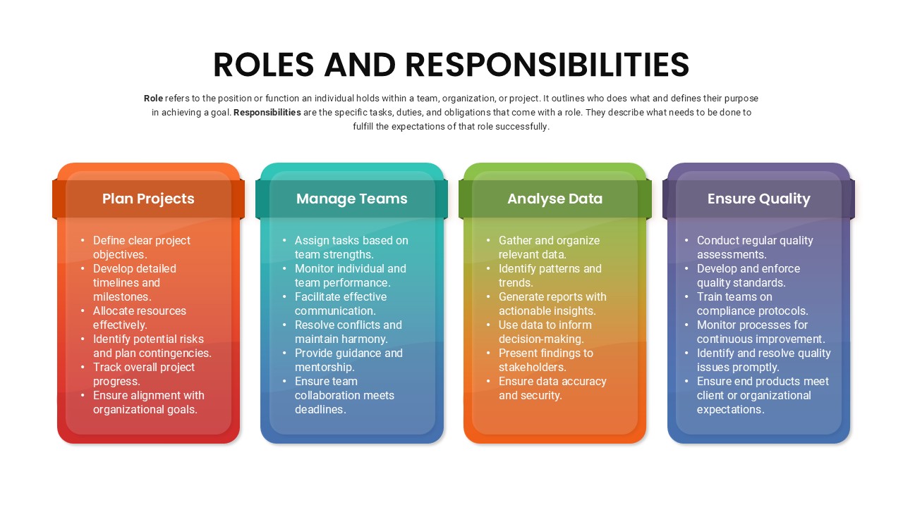
Roles and Responsibilities Infographic Template for PowerPoint & Google Slides
Our Team
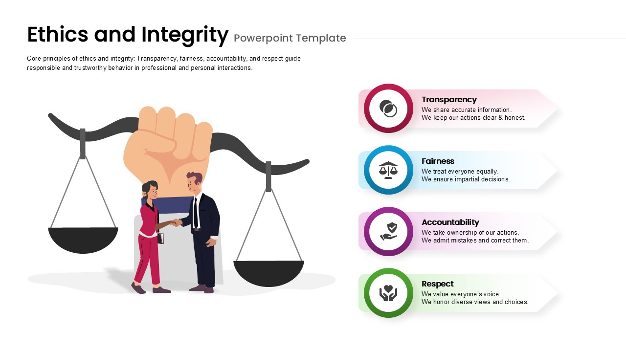
Ethics & Integrity Infographic Template for PowerPoint & Google Slides
Process
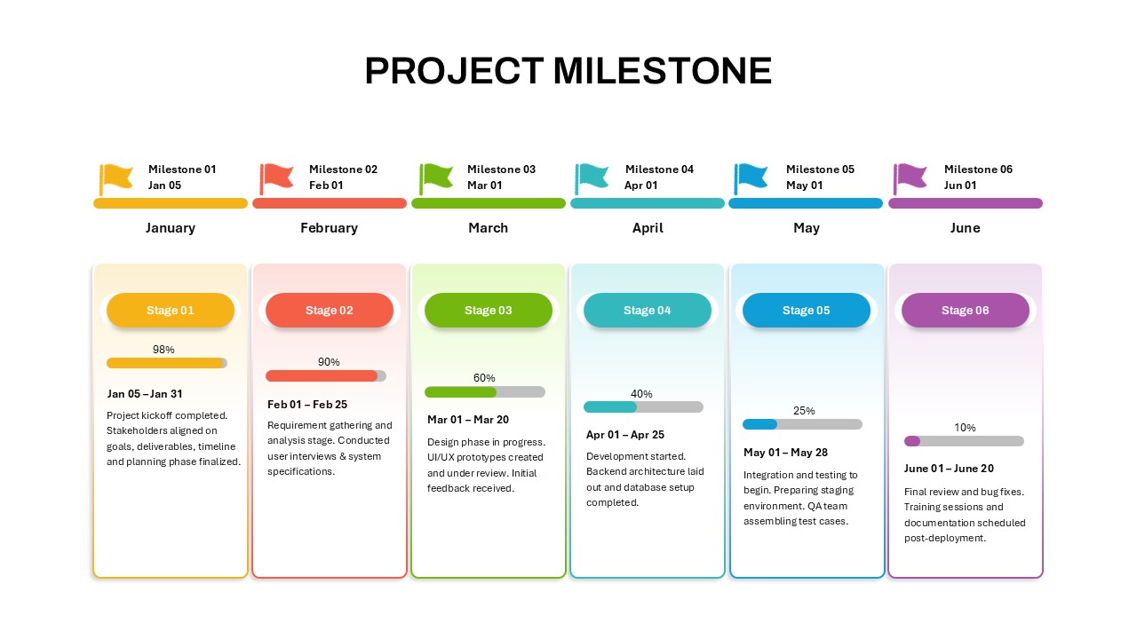
Project Milestone Timeline Infographic Template for PowerPoint & Google Slides
Timeline
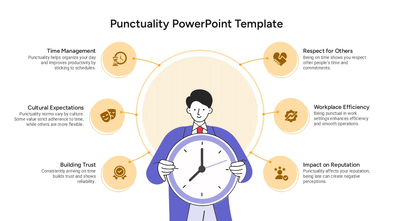
Punctuality Principles Infographic Template for PowerPoint & Google Slides
Infographics
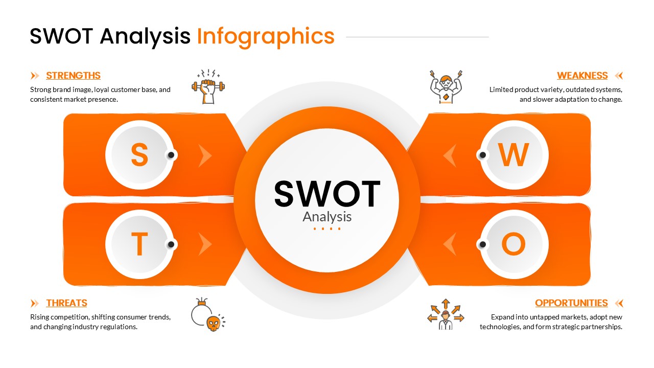
Orange SWOT Analysis Infographic Template for PowerPoint & Google Slides
SWOT