Experience Curve Analysis Diagram Template for PowerPoint & Google Slides
Description
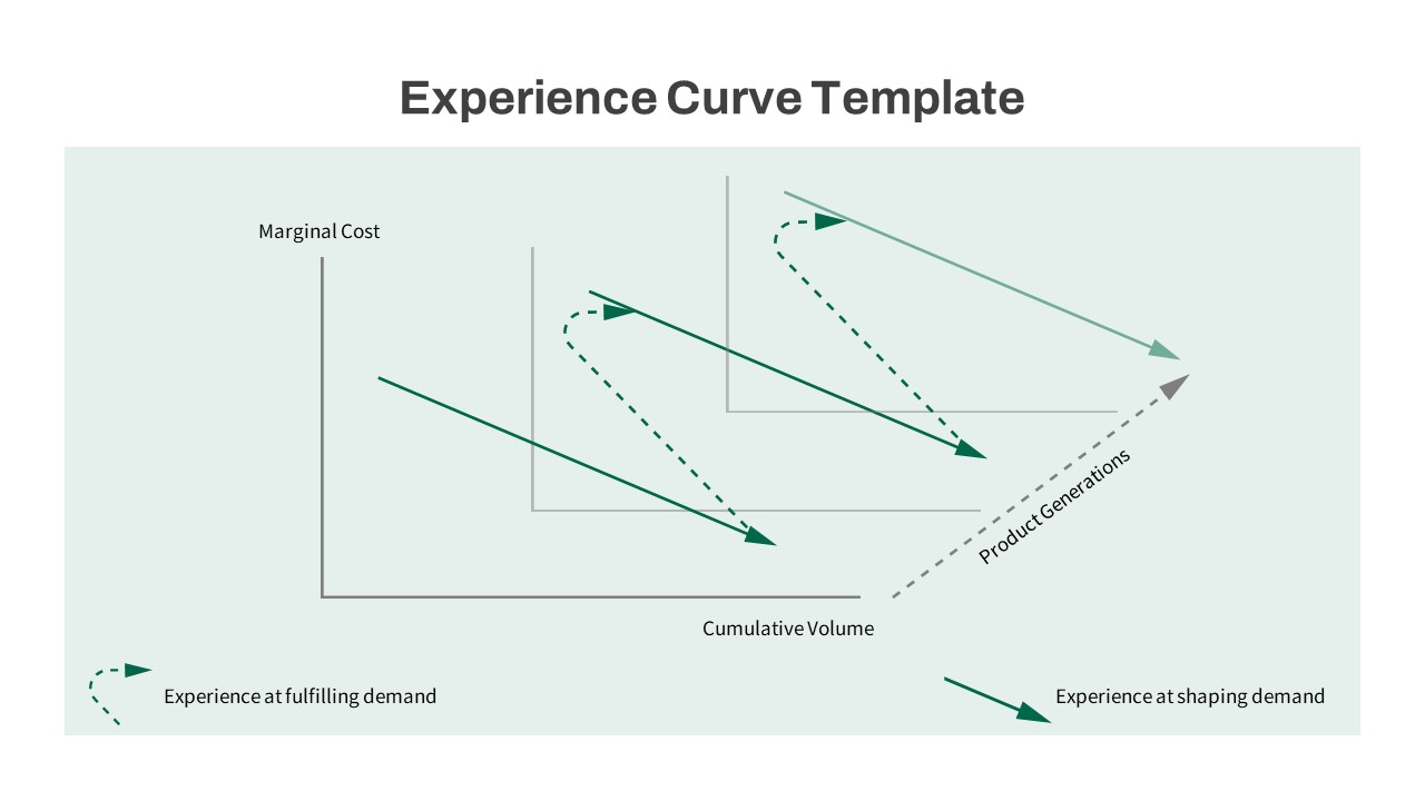
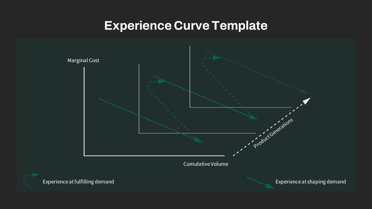
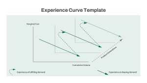
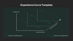
Illustrate the relationship between cost efficiency and cumulative production using the Experience Curve Analysis Diagram. This professionally designed slide visually demonstrates how increasing production volumes over multiple product generations lead to reductions in marginal costs. Featuring clear, directional arrows and intersecting axes representing cumulative volume and marginal cost, this diagram simplifies complex economic principles, making them intuitive and accessible for varied audiences. Its clean layout highlights distinct pathways for “experience at fulfilling demand” and “experience at shaping demand,” supporting strategic decision-making processes.
Who is it for
Ideal for business strategists, production managers, consultants, and analysts focused on cost optimization and operational efficiency. This slide particularly benefits those in manufacturing, product development, and business consulting, enabling clear communication of cost-saving strategies derived from scale and learning effects.
Other Uses
Beyond manufacturing contexts, use this template for evaluating service delivery models, illustrating economies of scale, or in strategic workshops to identify cost reduction opportunities. It can also be repurposed in educational settings to explain microeconomic concepts or business strategy frameworks involving production efficiency and learning curves.
Login to download this file

Item ID
SB03999
Related Templates

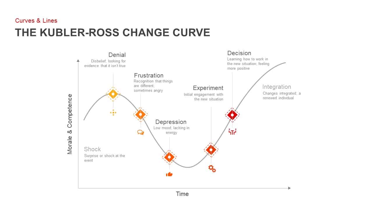
Kubler-Ross Change Curve Diagram Template for PowerPoint & Google Slides
Timeline

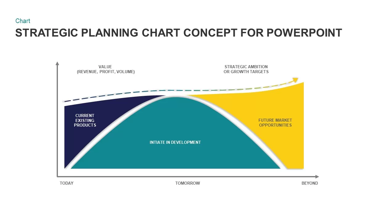
Strategic Planning Curve Diagram Template for PowerPoint & Google Slides
Charts
Snake Shaped Curve Diagram template for PowerPoint & Google Slides
Business
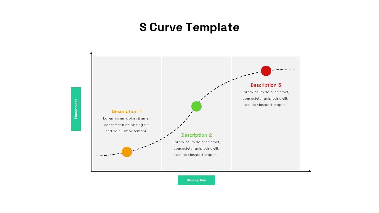
S-Curve Progression Framework Diagram Template for PowerPoint & Google Slides
Charts
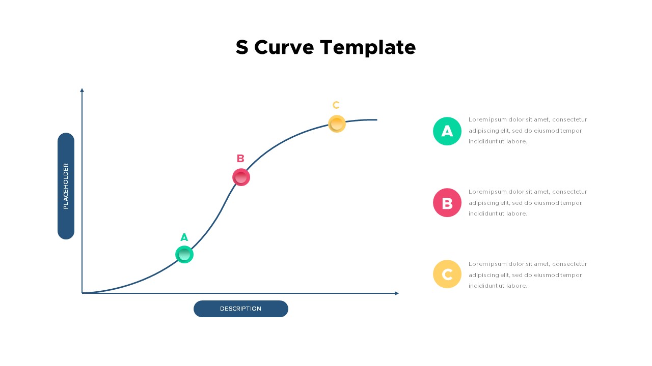
Three-Stage S Curve Growth Diagram Template for PowerPoint & Google Slides
Process
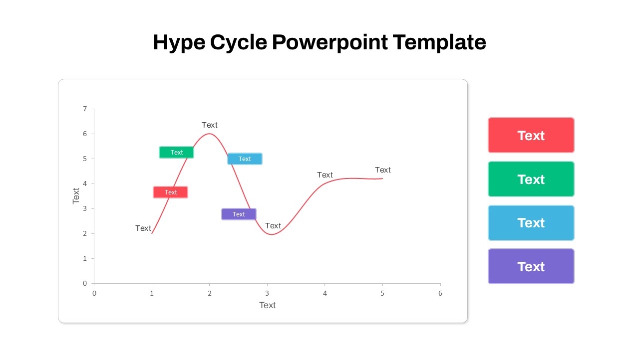
Gartner Hype Cycle Adoption Curve Diagram Template for PowerPoint & Google Slides
Infographics
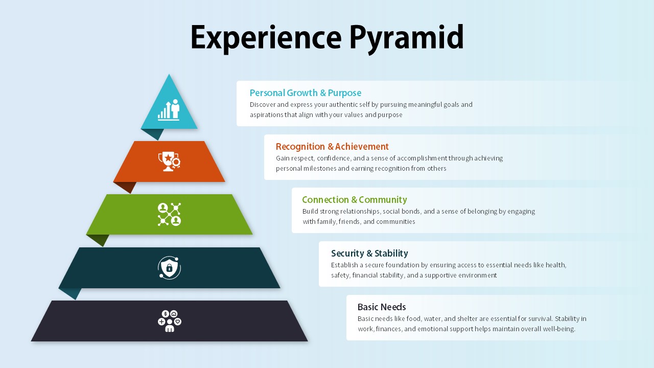
Experience Pyramid Hierarchy Diagram Template for PowerPoint & Google Slides
Pyramid
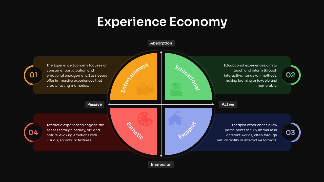
Experience Economy Quadrant Diagram Template for PowerPoint & Google Slides
Circular
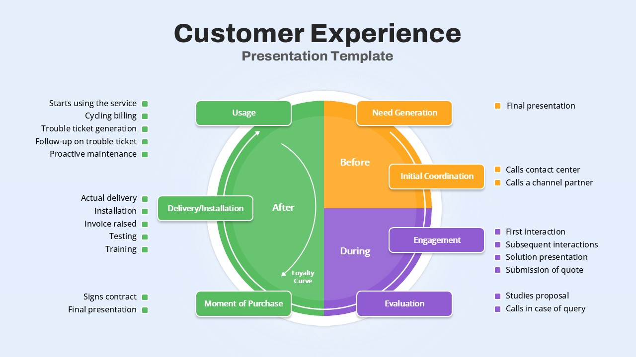
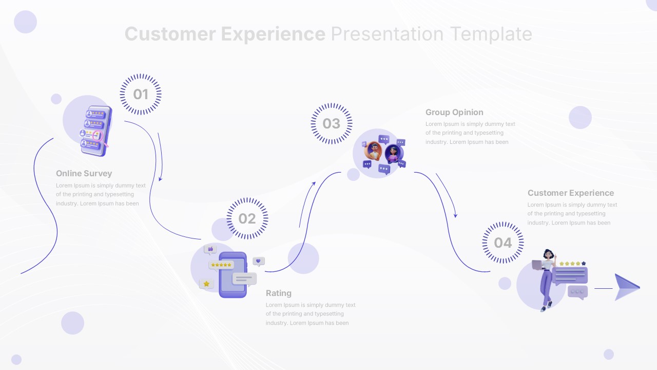
Customer Experience Journey Diagram Template for PowerPoint & Google Slides
Customer Journey
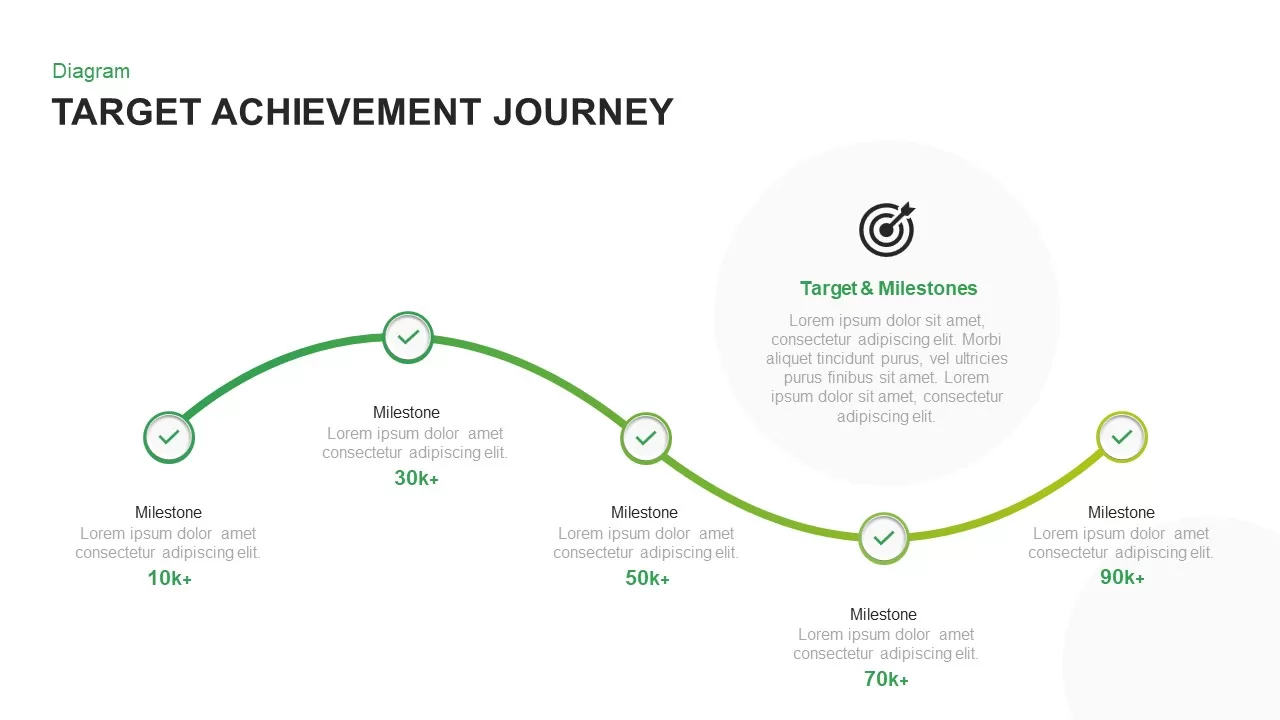
Target Achievement Milestone Curve Template for PowerPoint & Google Slides
Roadmap
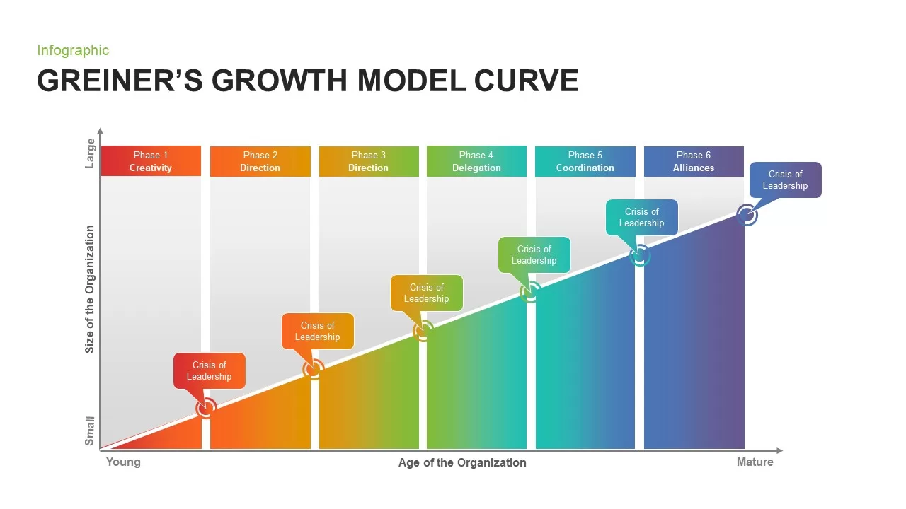
Greiner’s Growth Model Curve template for PowerPoint & Google Slides
Infographics
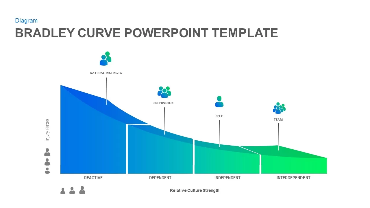
Bradley Curve Infographic Template for PowerPoint & Google Slides
Infographics
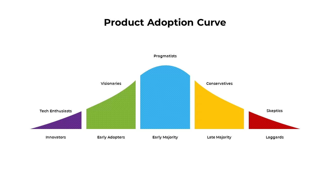
Product Adoption Curve Template for PowerPoint & Google Slides
Process
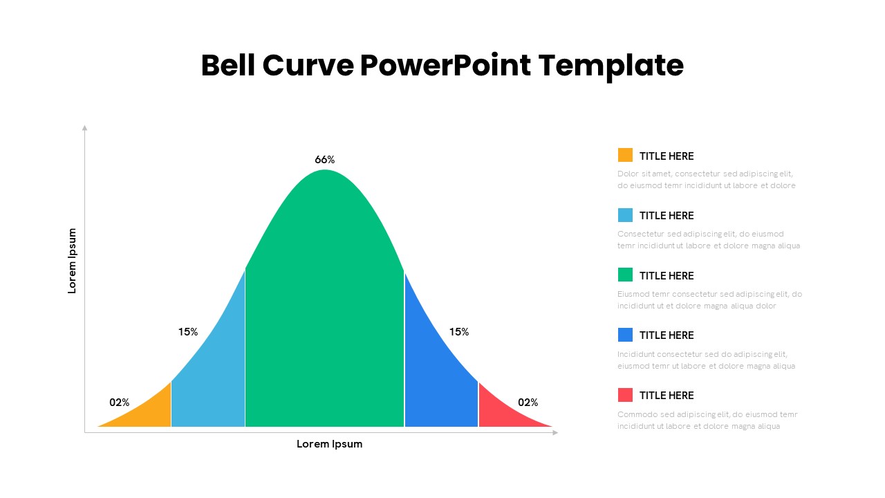
8-Bell Curve Infographic Slide Template for PowerPoint & Google Slides
Comparison Chart
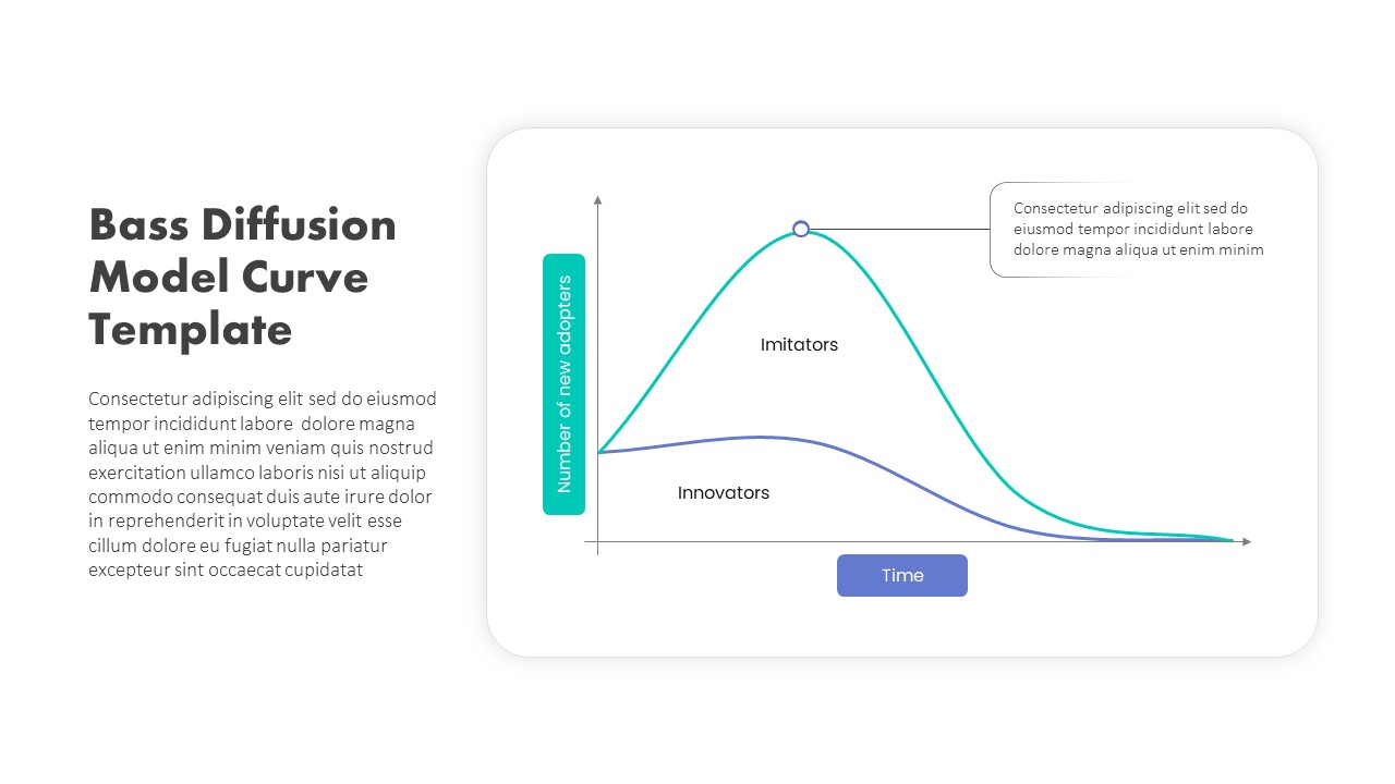
Bass Diffusion Model Curve for Adoption Template for PowerPoint & Google Slides
Comparison Chart
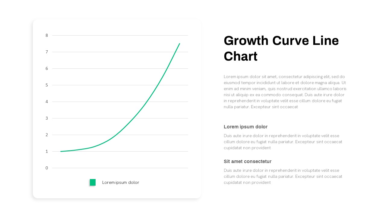
Growth Curve Line Chart Visualization Template for PowerPoint & Google Slides
Charts
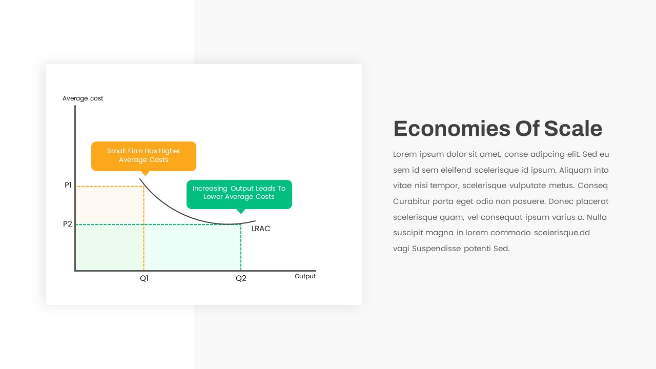
Economies of Scale Cost Curve Comparison Template for PowerPoint & Google Slides
Comparison Chart
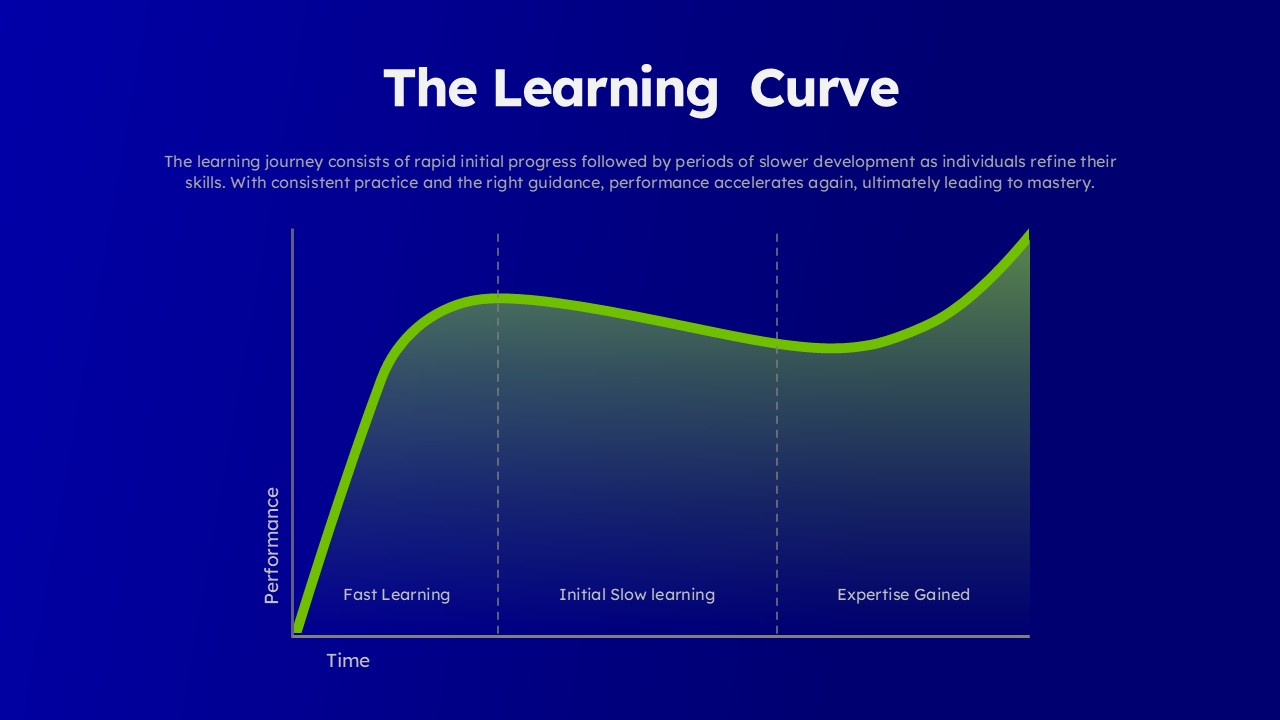
Learning Curve Performance Growth Chart Template for PowerPoint & Google Slides
Employee Performance
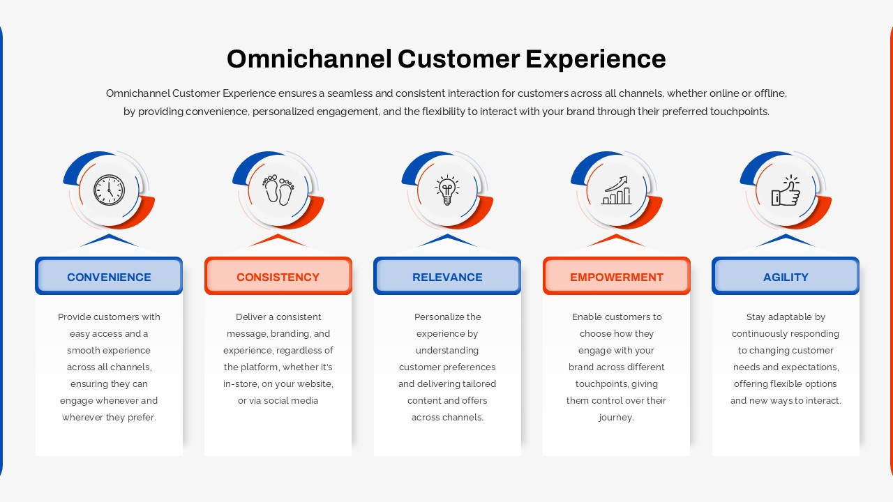
Omnichannel Customer Experience Overview Template for PowerPoint & Google Slides
Customer Journey
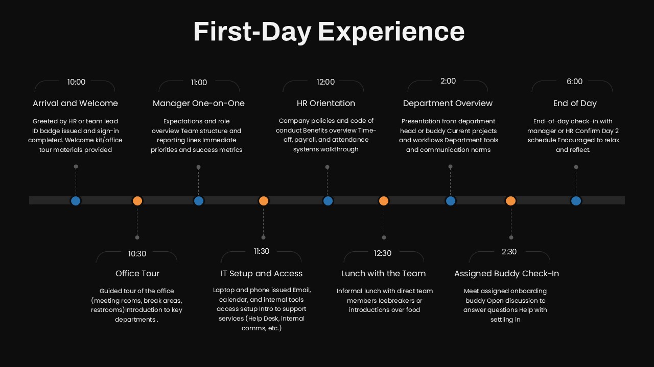
First-Day Experience Onboarding Schedule template for PowerPoint & Google Slides
Recruitment
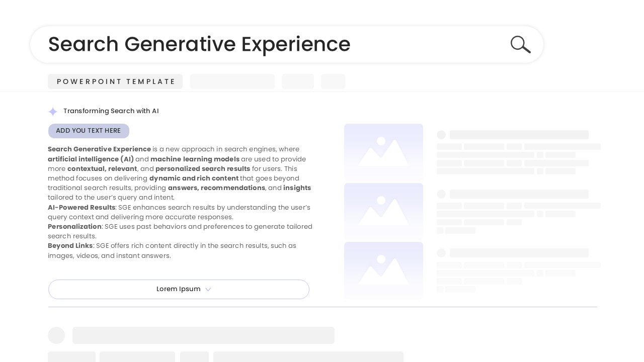
Search Generative Experience template for PowerPoint & Google Slides
Digital Marketing
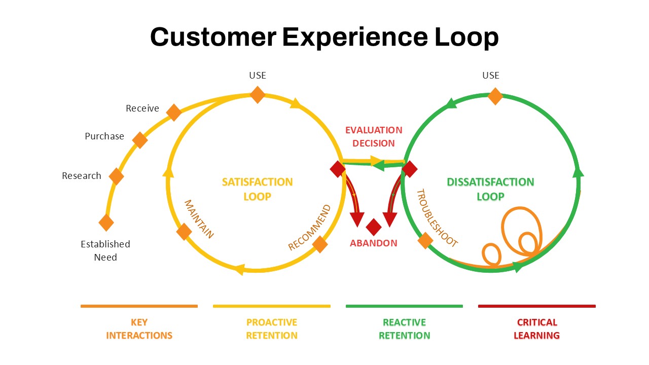
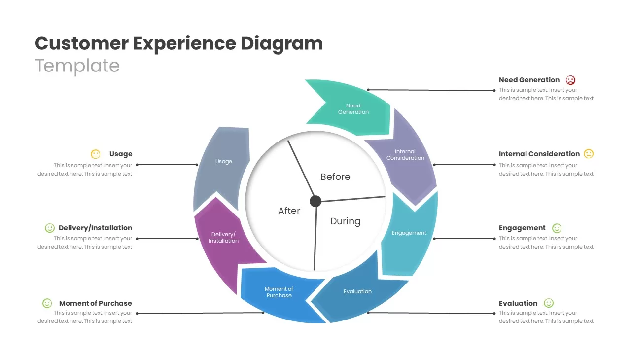
Customer Experience Loop Template for PowerPoint & Google Slides
Customer Experience
Customer Experience Journey Template for PowerPoint & Google Slides
Customer Journey
Customer Experience Journey Template for PowerPoint & Google Slides
Customer Journey
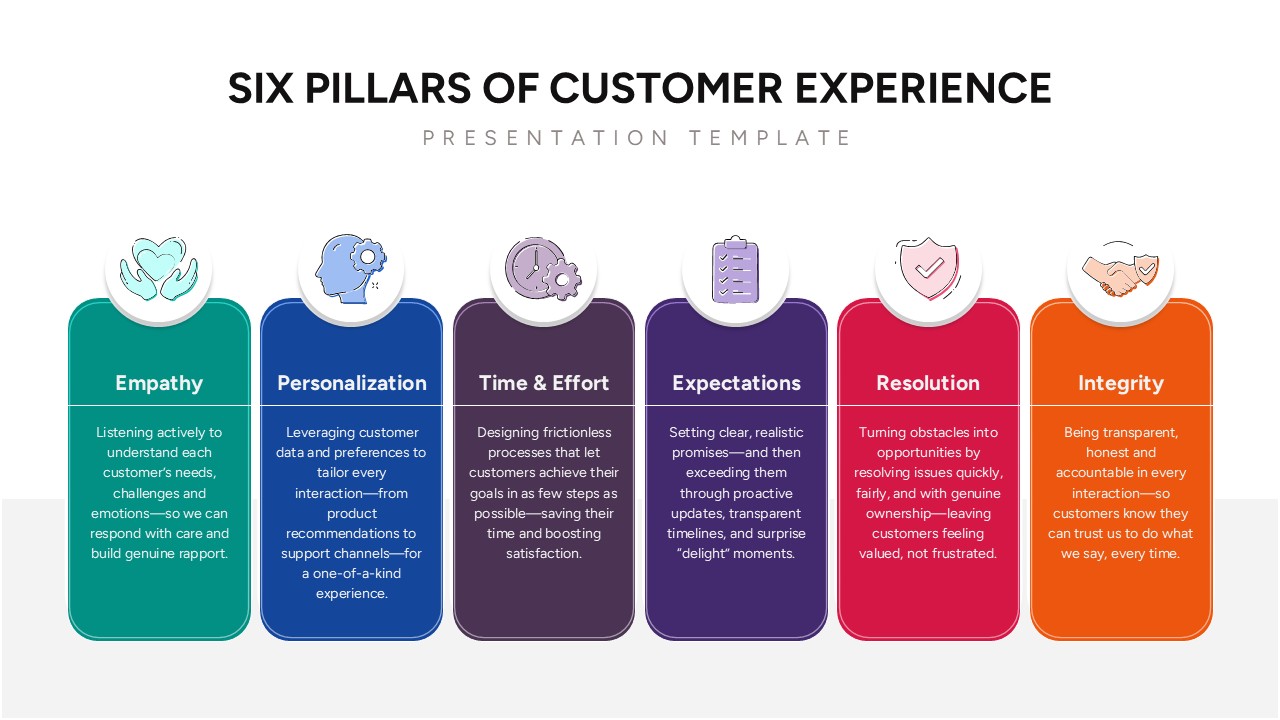
Pillars of Customer Experience Template for PowerPoint & Google Slides
Customer Experience
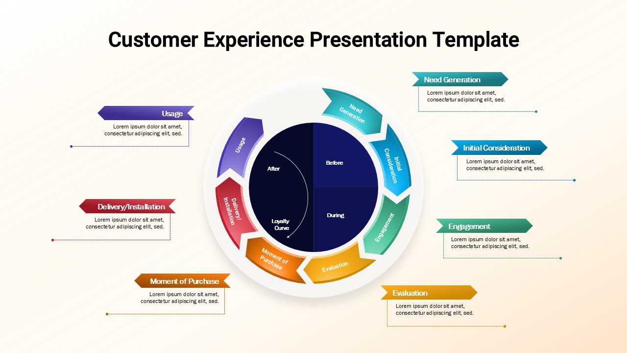
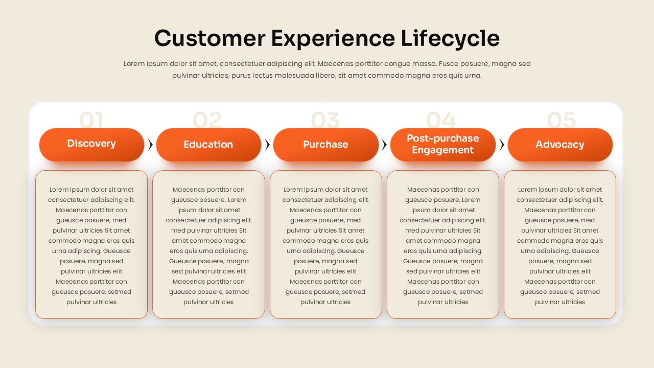
Customer Experience Lifecycle Template for PowerPoint & Google Slides
Customer Journey
Customer Experience 4-Step Journey Template for PowerPoint & Google Slides
Customer Journey
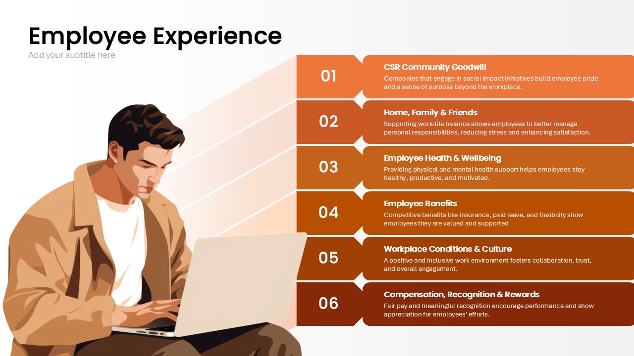
Employee Experience Template for PowerPoint & Google Slides
Employee Performance
Customer Experience & Journey Infographic Templates for PowerPoint & Google Slides
Process

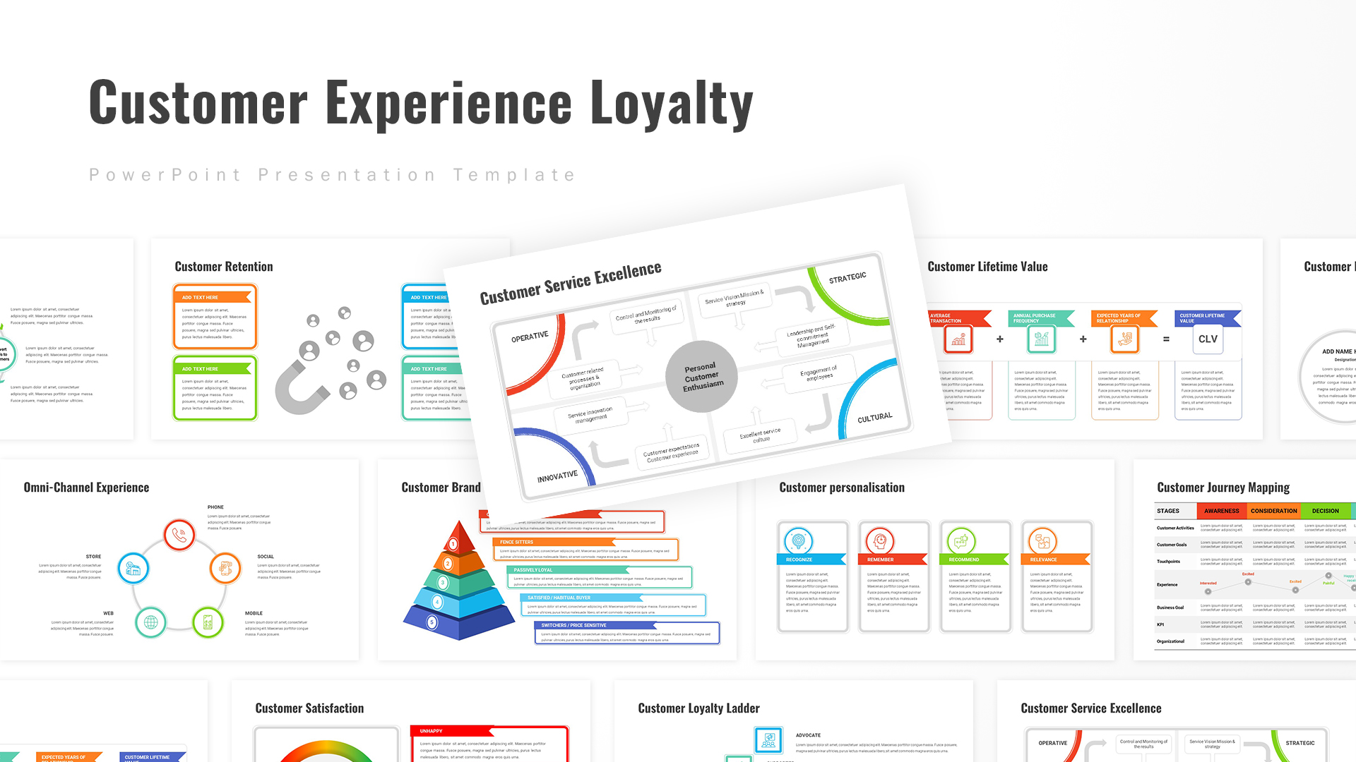
Customer Experience Loyalty Deck for PowerPoint & Google Slides
Customer Experience
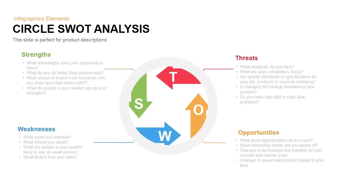
Modern Circle SWOT Analysis Diagram Template for PowerPoint & Google Slides
SWOT
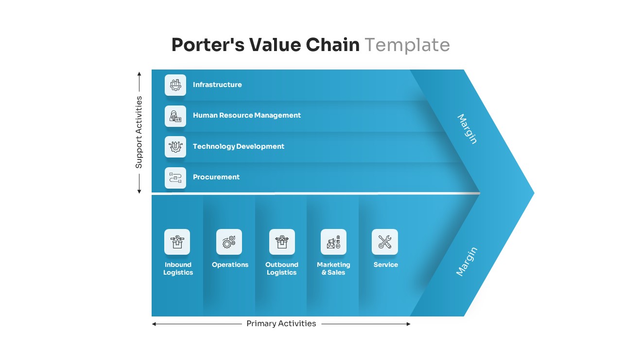
Porter’s Value Chain Analysis Diagram Template for PowerPoint & Google Slides
Business Strategy
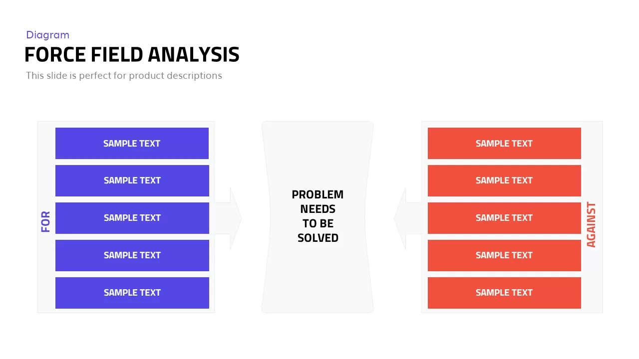
Editable Force Field Analysis Diagram Template for PowerPoint & Google Slides
Business Plan

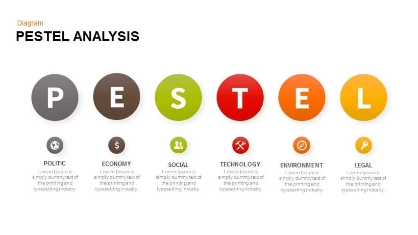
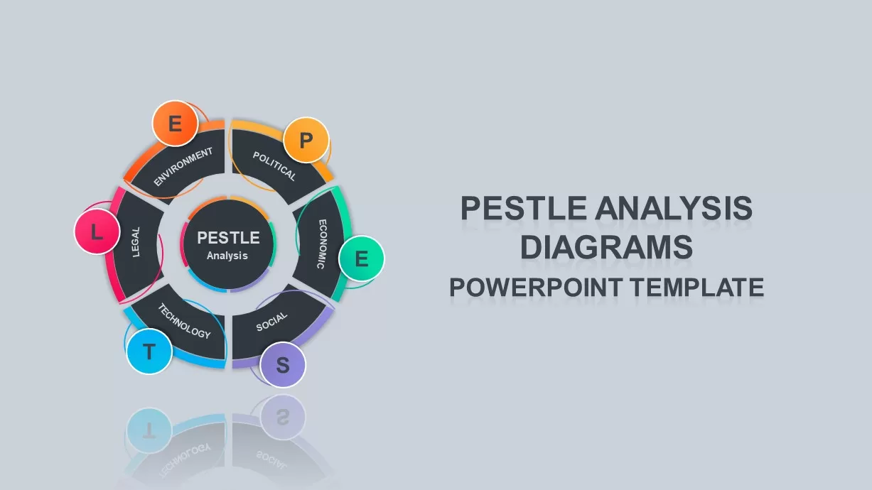
Professional PESTEL Analysis Diagram Template for PowerPoint & Google Slides
PEST
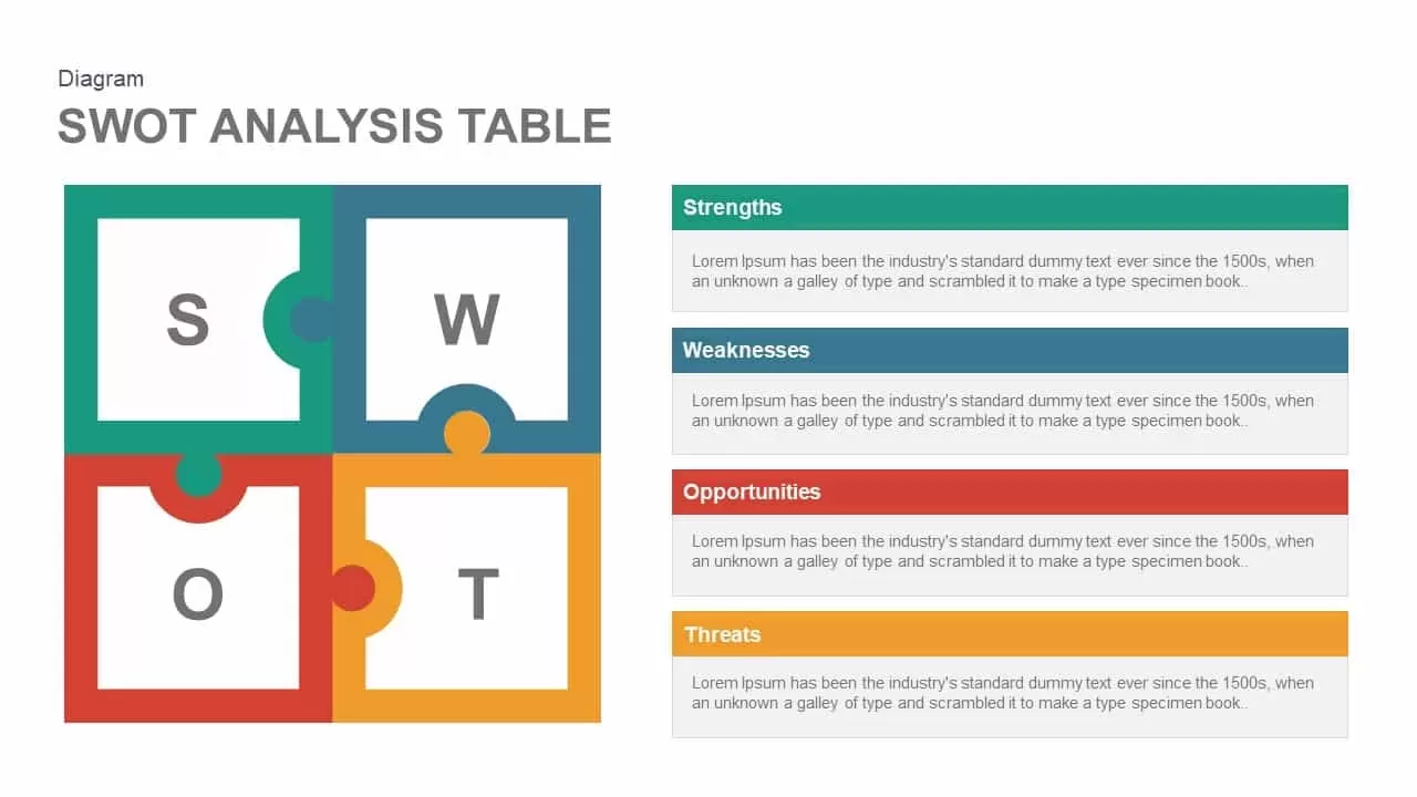
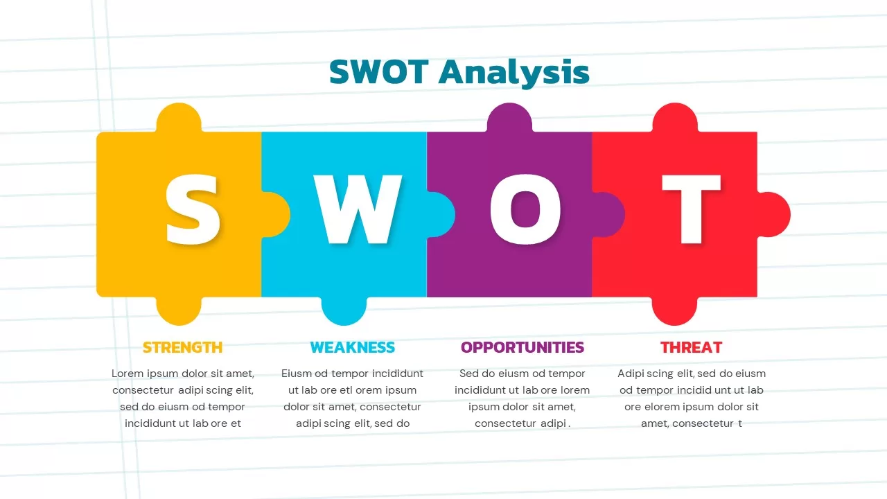
Puzzle-Style SWOT Analysis Table Diagram Template for PowerPoint & Google Slides
SWOT
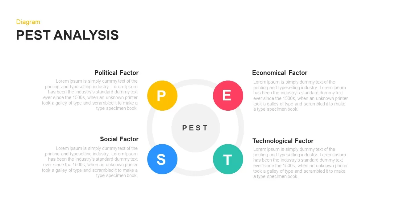
PEST Analysis Circular Diagram Template for PowerPoint & Google Slides
PEST
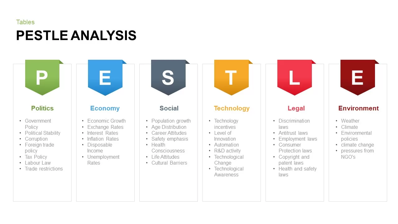
PESTLE Analysis Table Layout Diagram Template for PowerPoint & Google Slides
PEST
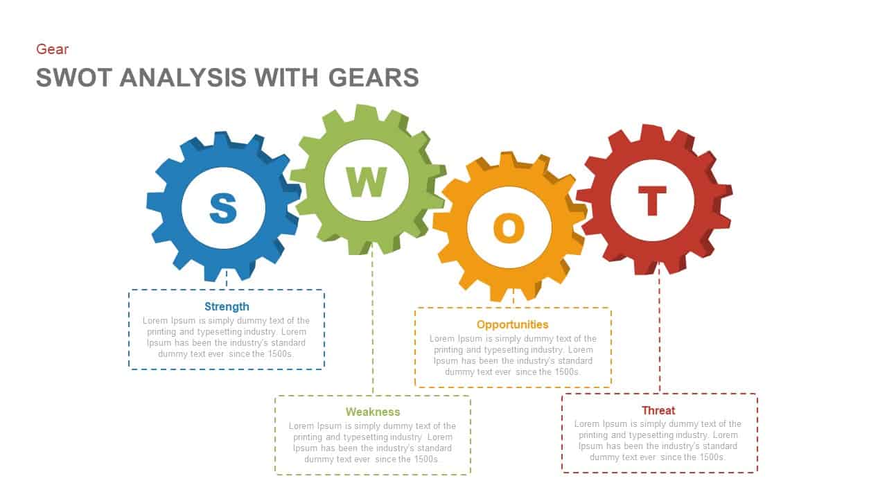
SWOT Analysis Gear Diagram Slide Template for PowerPoint & Google Slides
SWOT

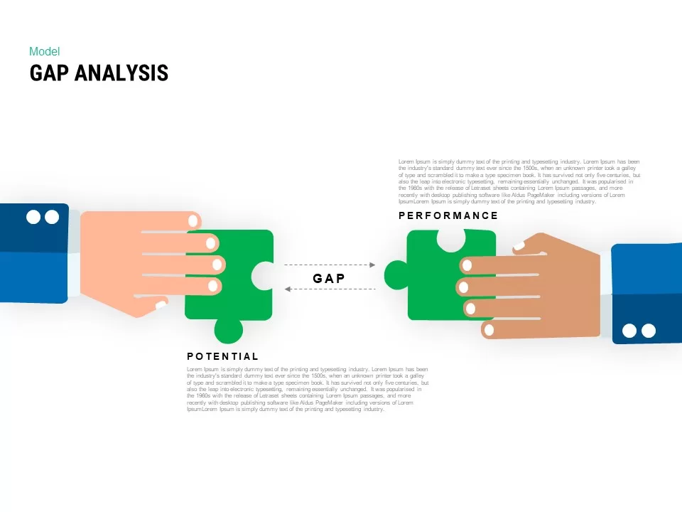
Interactive Gap Analysis Puzzle Diagram Template for PowerPoint & Google Slides
Gap
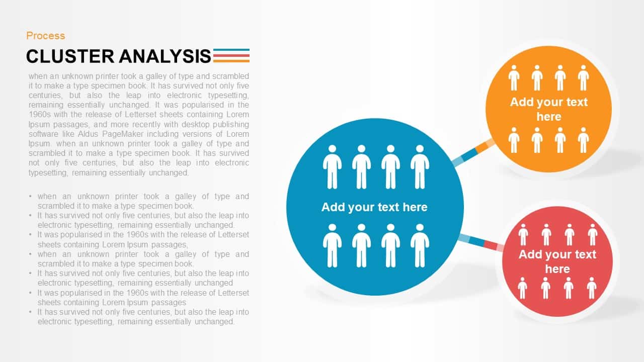
Cluster Analysis Infographic Diagram Template for PowerPoint & Google Slides
Business
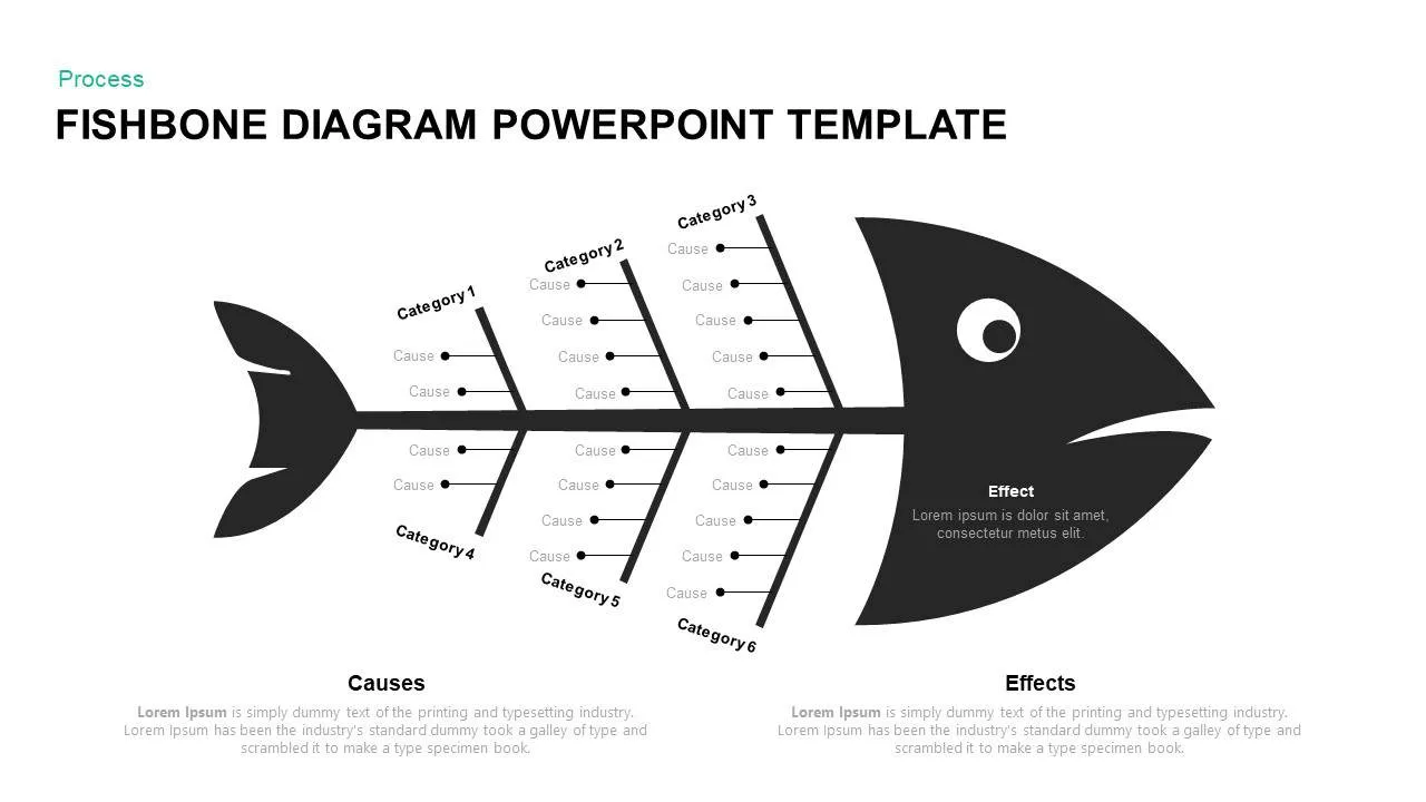
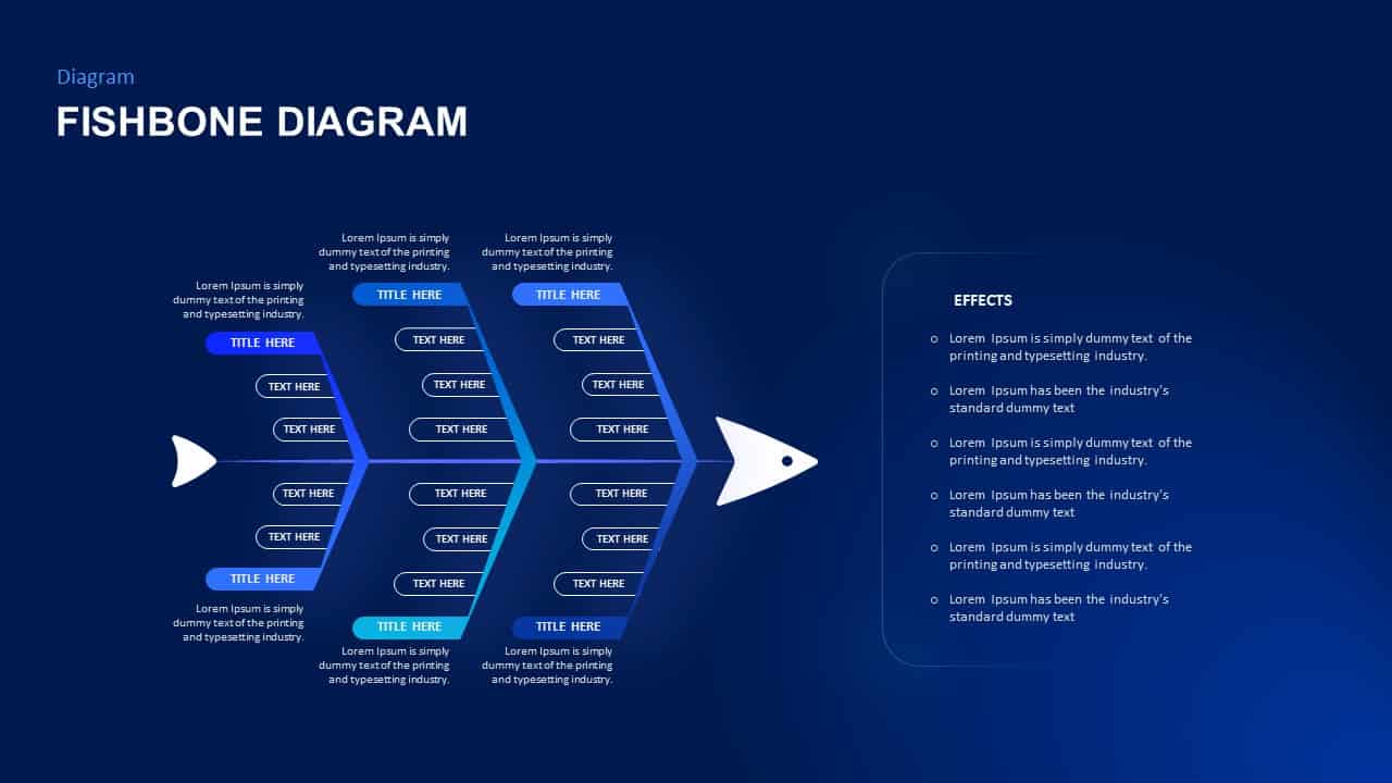
Fishbone Diagram Analysis Template for PowerPoint & Google Slides
Flow Charts
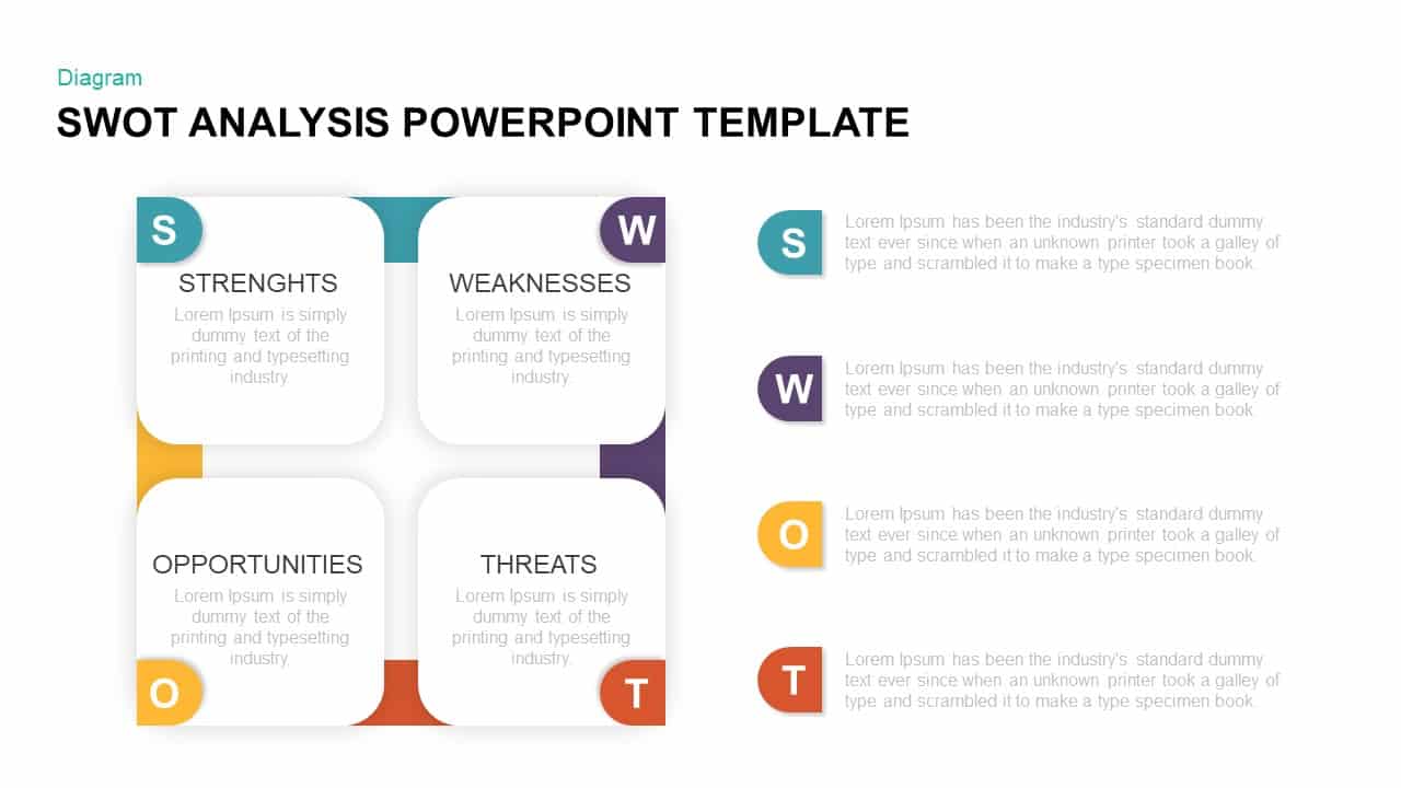
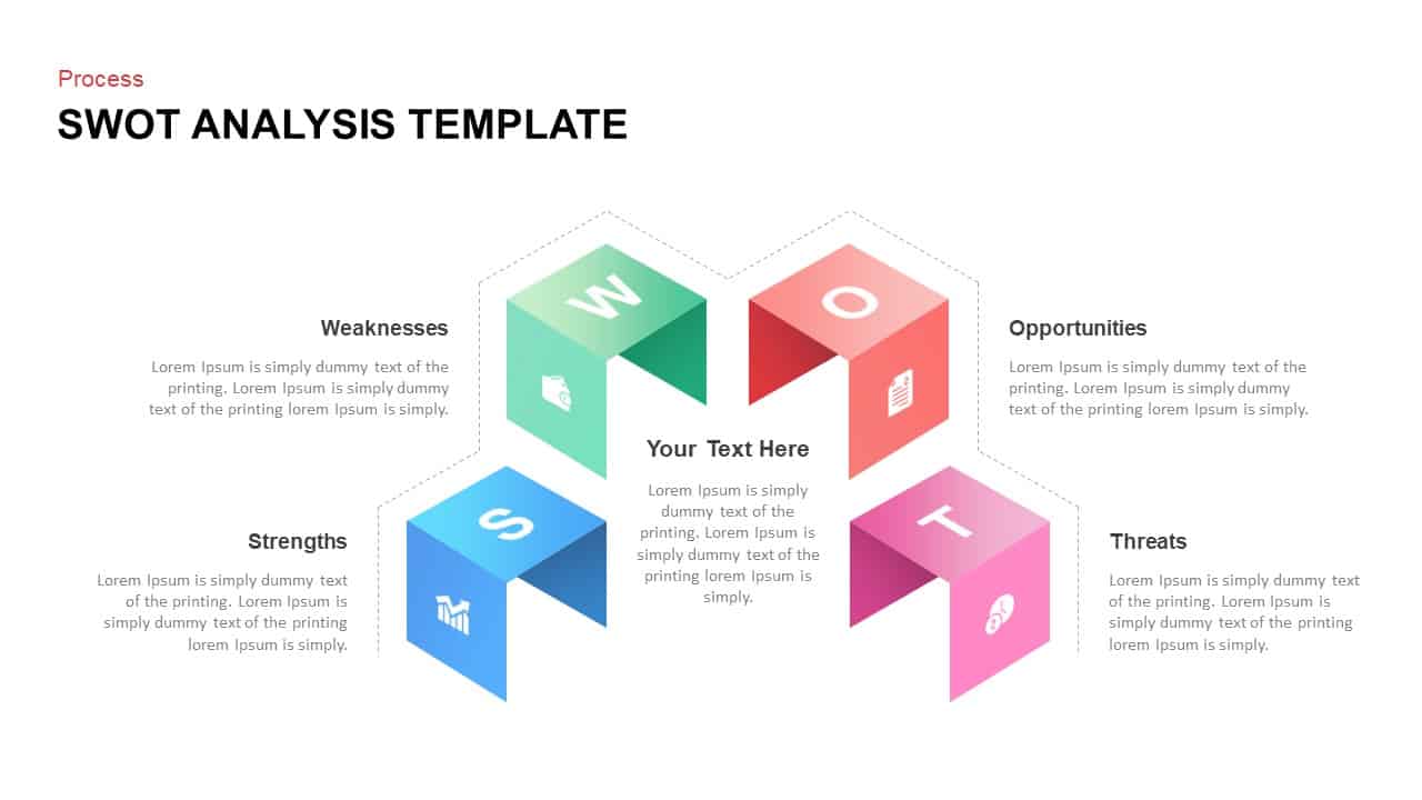
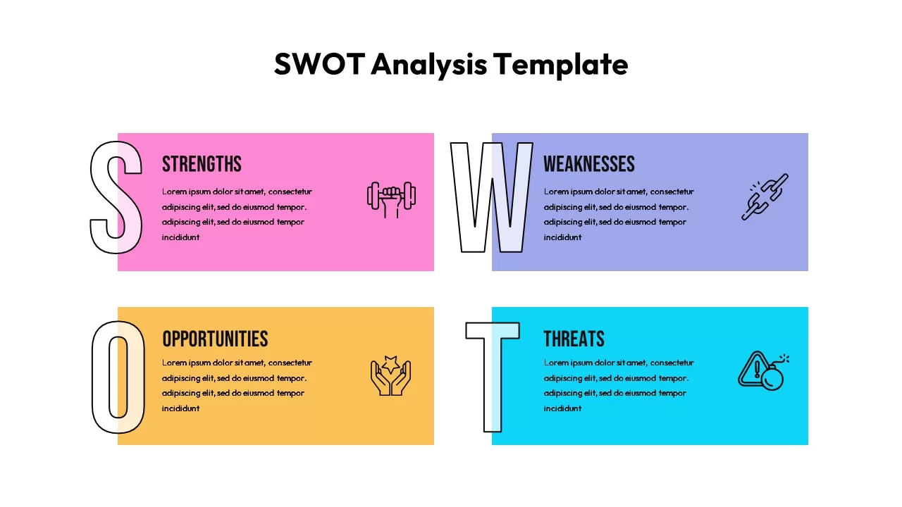
Four-Quadrant SWOT Analysis Diagram Template for PowerPoint & Google Slides
SWOT
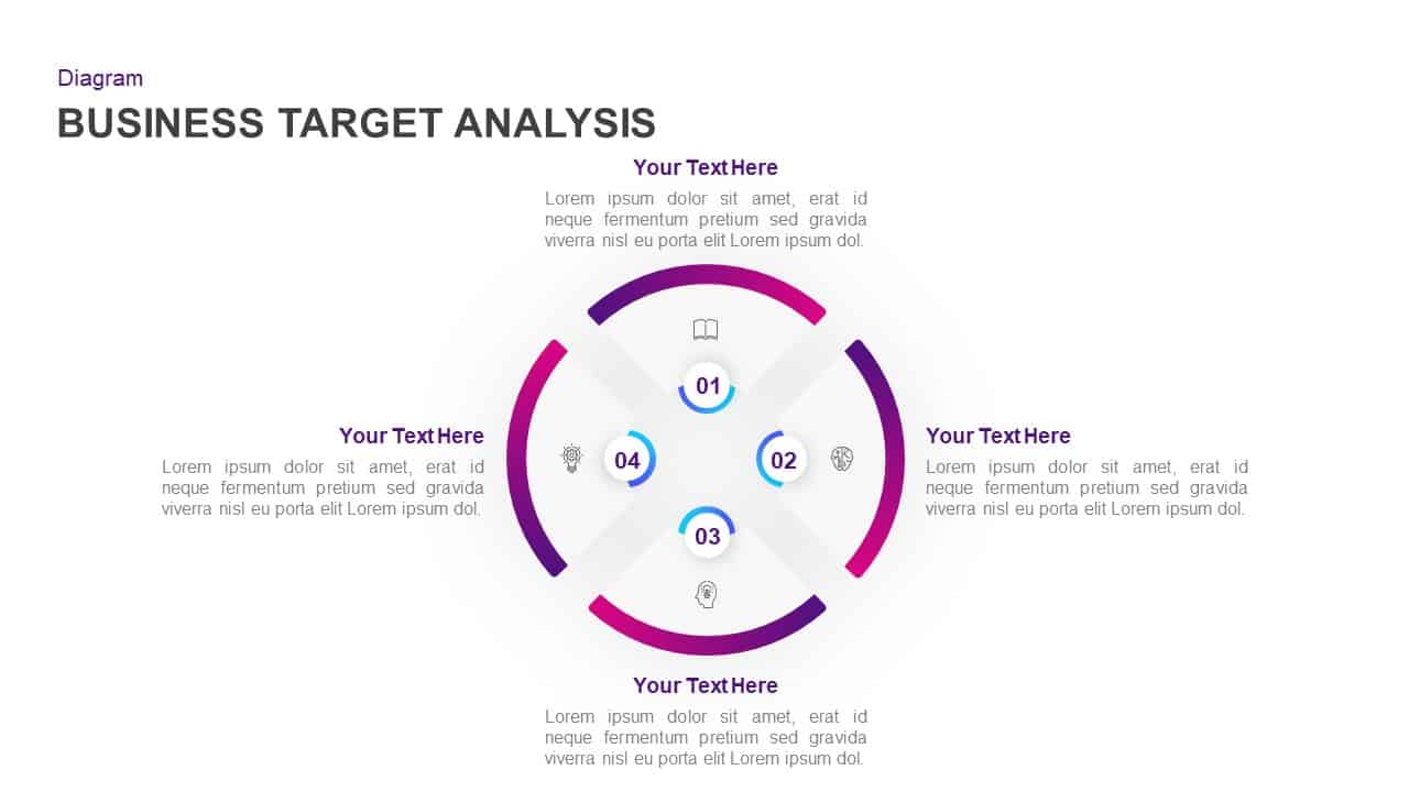
Business Target Analysis Diagram Template for PowerPoint & Google Slides
Circular
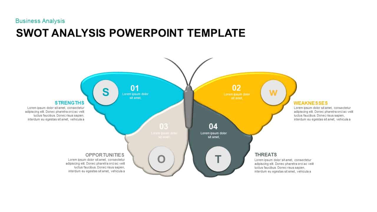
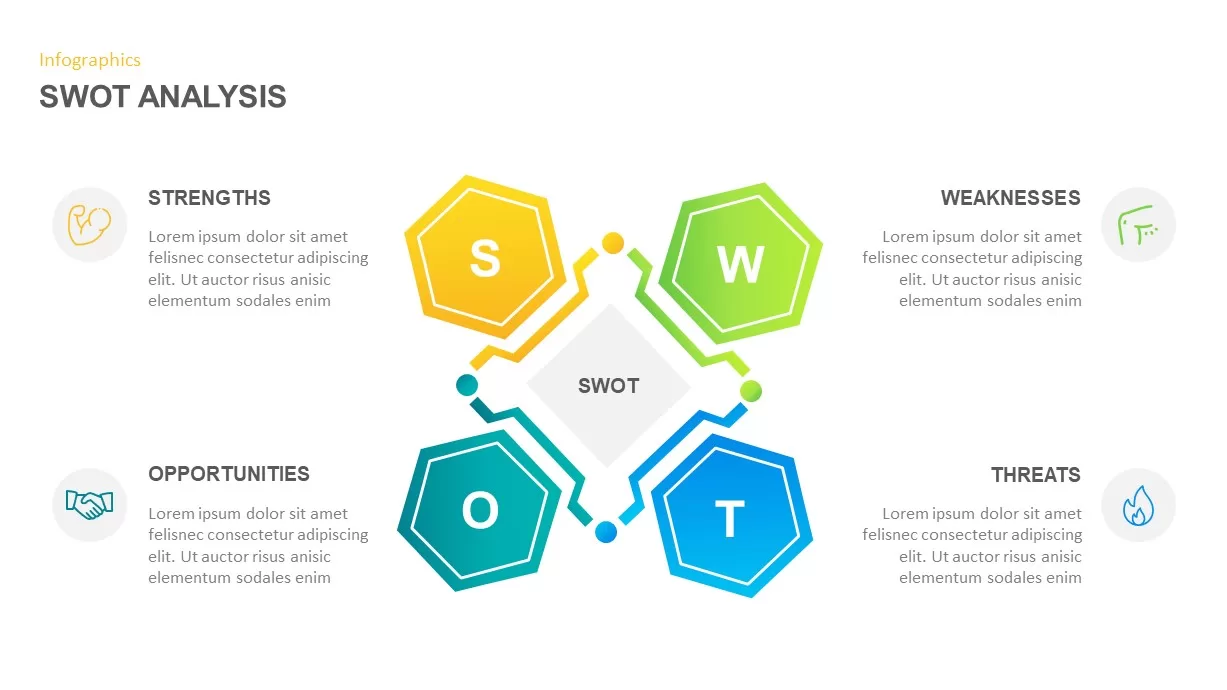
Butterfly SWOT Analysis Diagram Template for PowerPoint & Google Slides
SWOT
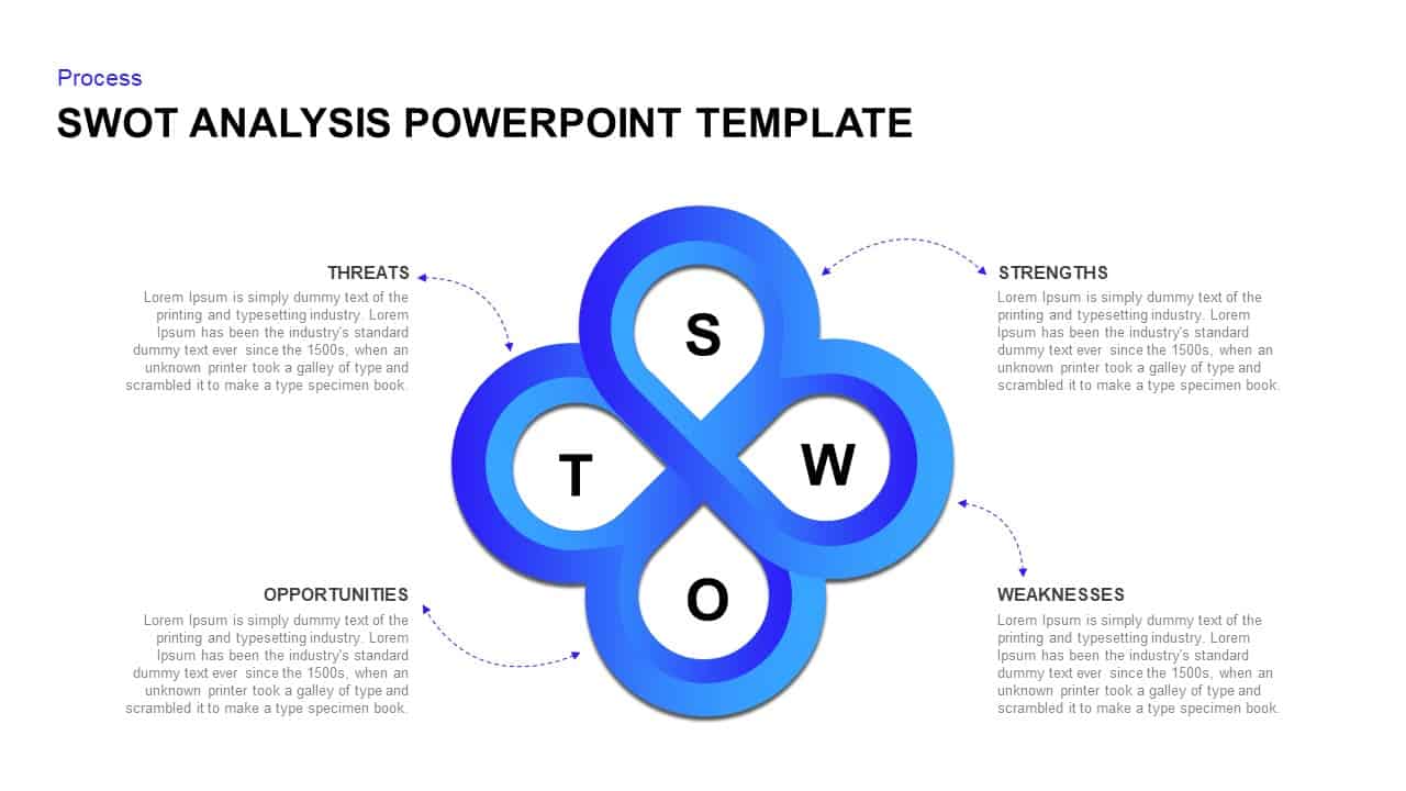
Four-Part SWOT Analysis Diagram Template for PowerPoint & Google Slides
SWOT
Fishbone Cause Analysis Diagram Template for PowerPoint & Google Slides
Process
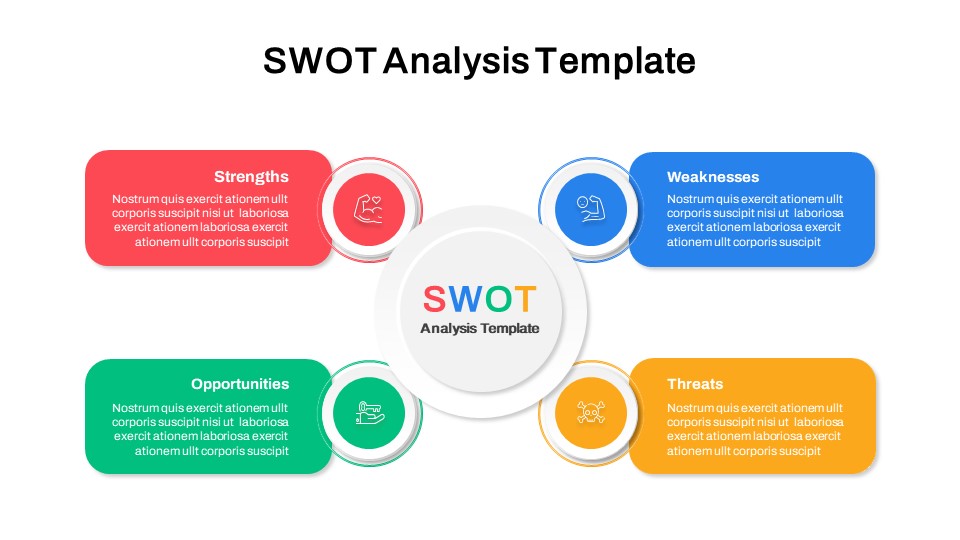
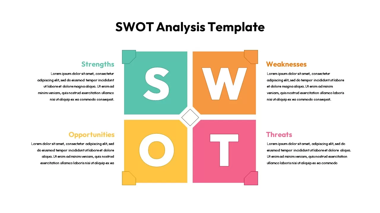
SWOT Analysis Infographic Diagram Template for PowerPoint & Google Slides
SWOT
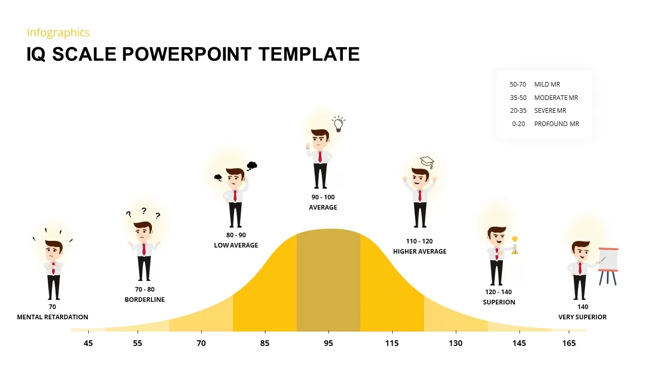
IQ Scale Analysis Diagram template for PowerPoint & Google Slides
Employee Performance
Puzzle Piece SWOT Analysis Diagram Template for PowerPoint & Google Slides
Opportunities Challenges
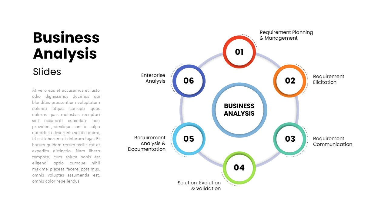
Six-Step Business Analysis Diagram template for PowerPoint & Google Slides
Circular
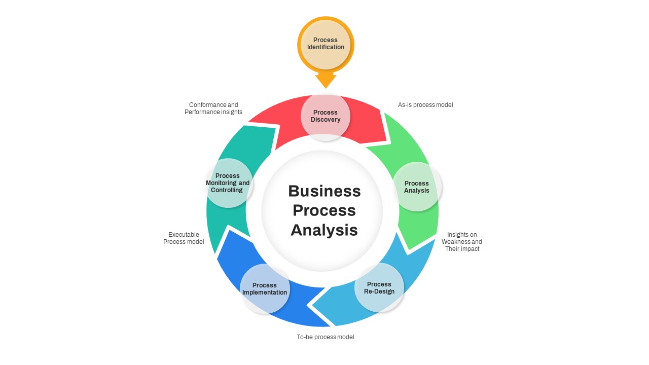
Business Process Analysis Cycle Diagram Template for PowerPoint & Google Slides
Business Strategy
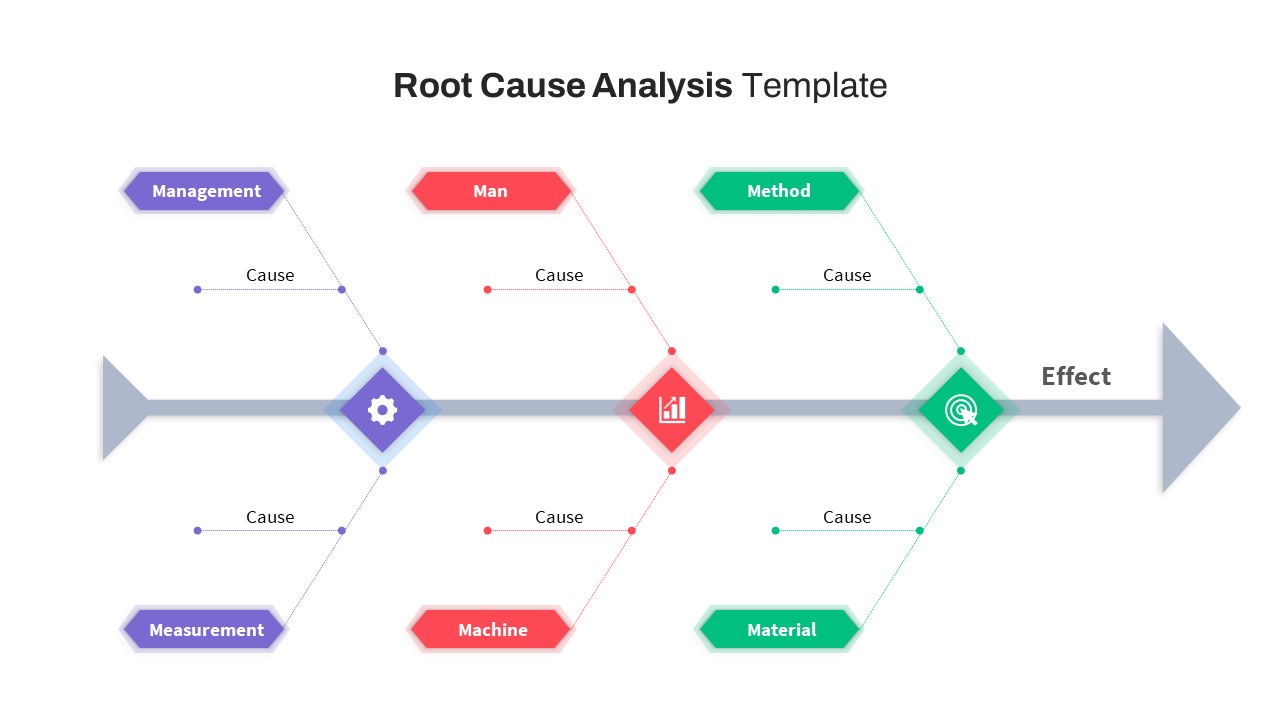
Free Root Cause Analysis Fishbone Diagram Template for PowerPoint & Google Slides
Process
Free
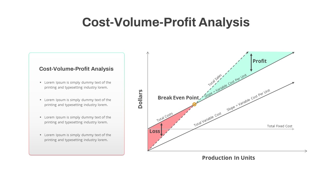
Cost-Volume-Profit Analysis Diagram Template for PowerPoint & Google Slides
Finance

Colorful SWOT Analysis Diagram Template for PowerPoint & Google Slides
SWOT
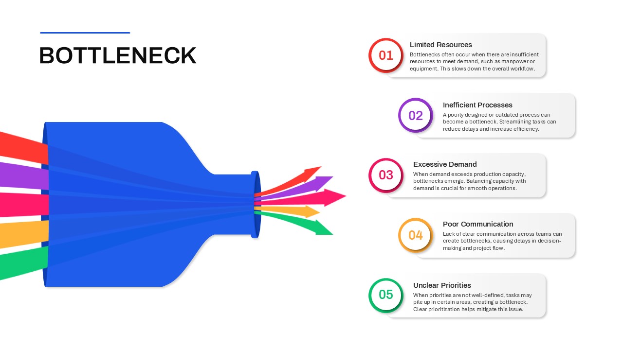
Bottleneck Process Analysis Diagram Template for PowerPoint & Google Slides
Process
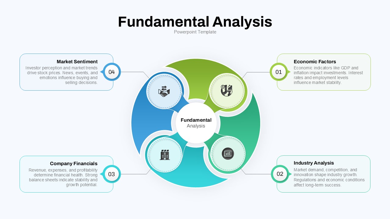
Fundamental Analysis Circular Diagram Template for PowerPoint & Google Slides
Circular
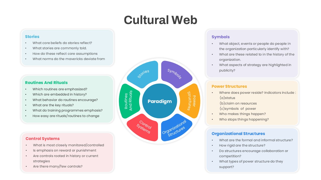
Cultural Web Analysis Circular Diagram Template for PowerPoint & Google Slides
Circular
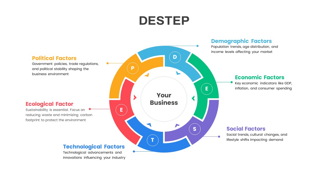
DESTEP Marketing Analysis Diagram Template for PowerPoint & Google Slides
Circular
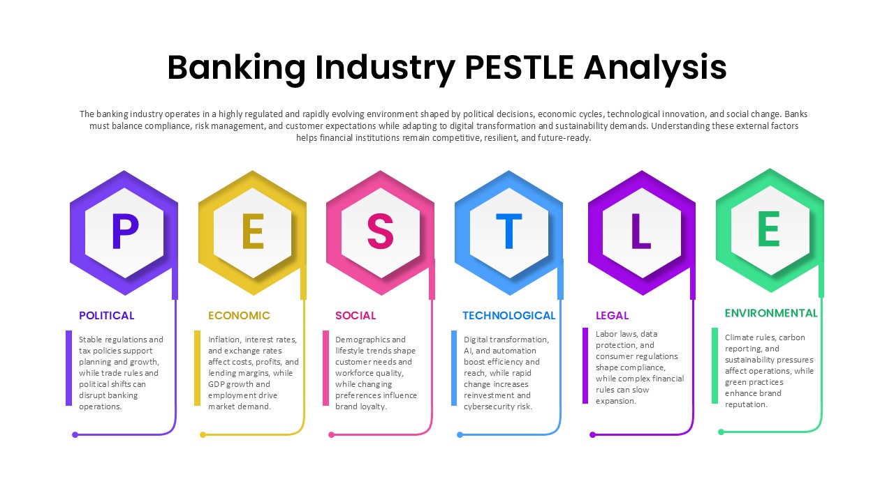
Banking Industry PESTLE Analysis Diagram Template for PowerPoint & Google Slides
PEST
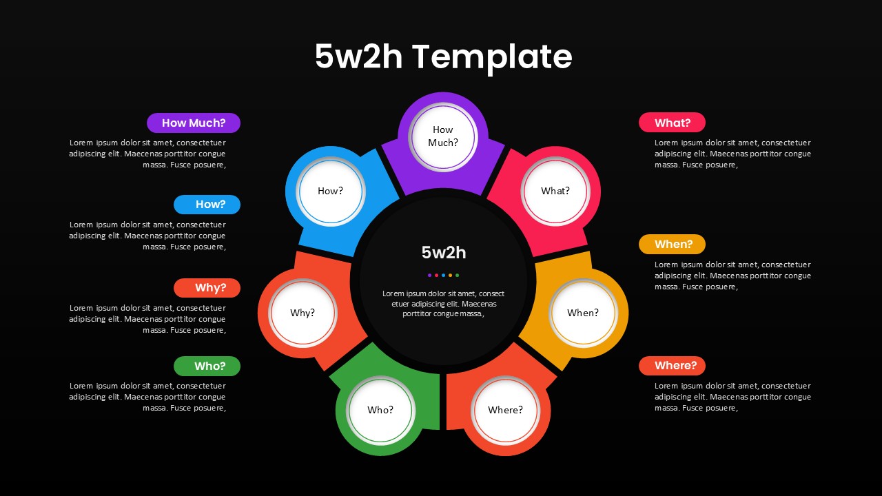
5W2H Analysis Radial Diagram Template for PowerPoint & Google Slides
Decision Tree
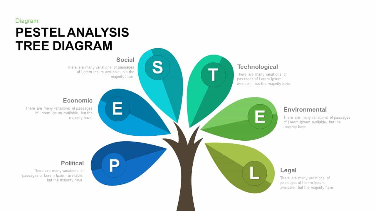
PESTEL Analysis Tree Diagram for PowerPoint & Google Slides
Process
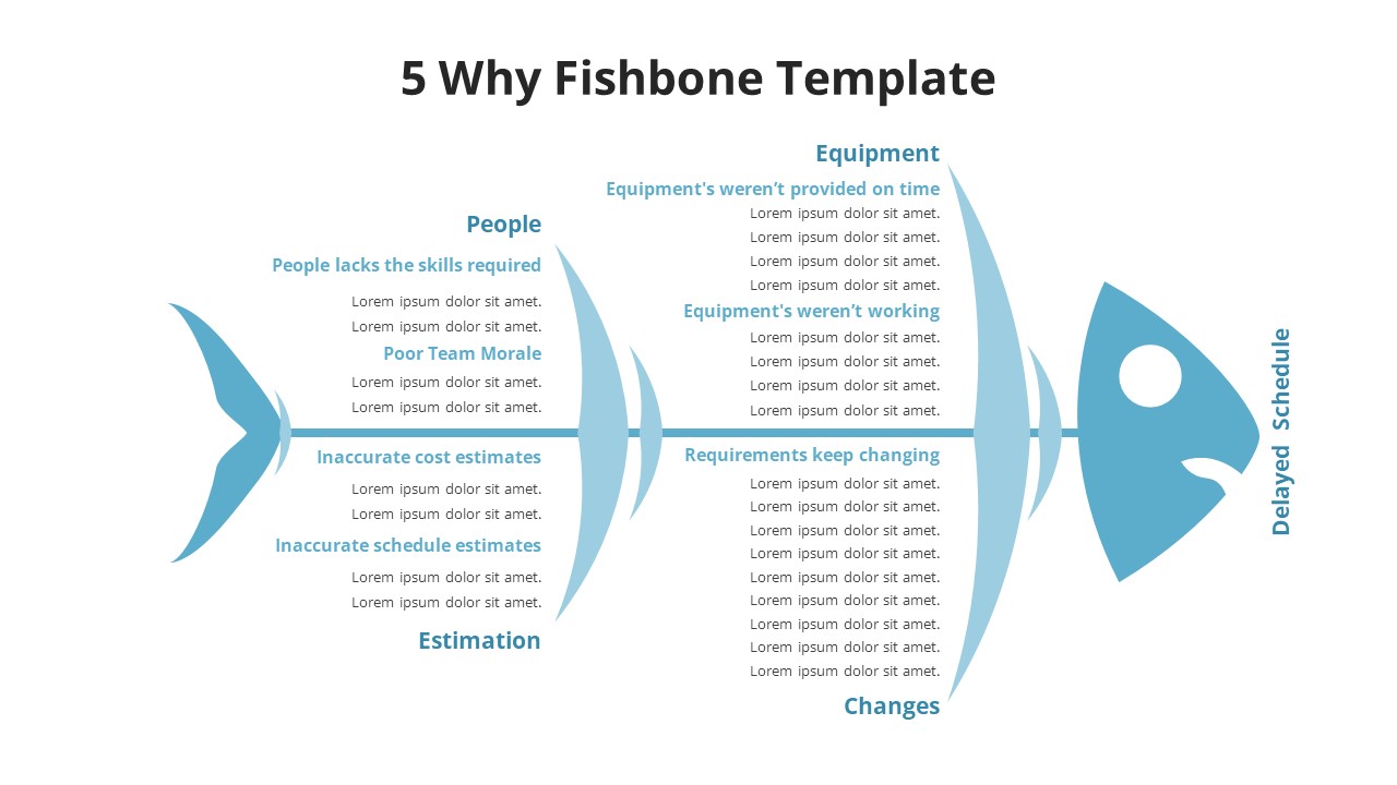
5 Why Fishbone Diagram for Root Cause Analysis in PowerPoint & Google Slides
Process
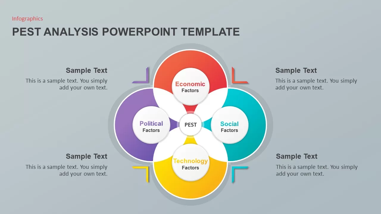
PEST Analysis PowerPoint Template for PowerPoint & Google Slides
Business Strategy

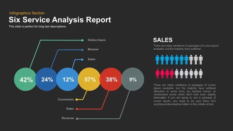
Six Service Analysis Report template for PowerPoint & Google Slides
Infographics
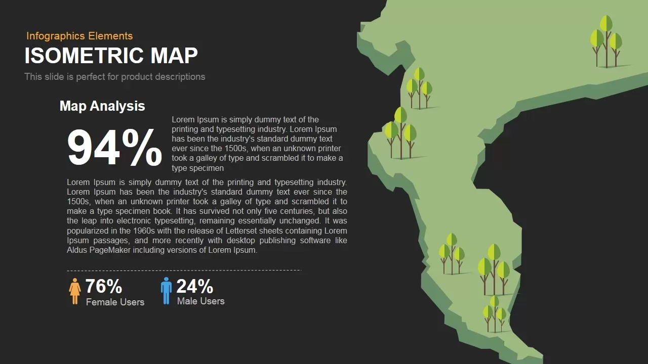
Isometric Map Analysis Slide Template for PowerPoint & Google Slides
World Maps
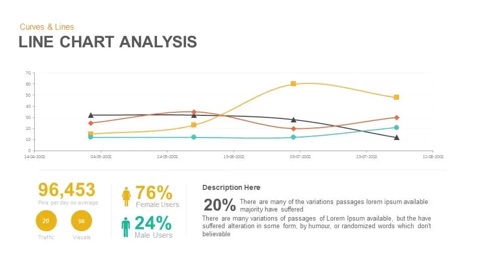
Line Chart Analysis template for PowerPoint & Google Slides
Charts
3D Cube SWOT Analysis Infographic Template for PowerPoint & Google Slides
SWOT
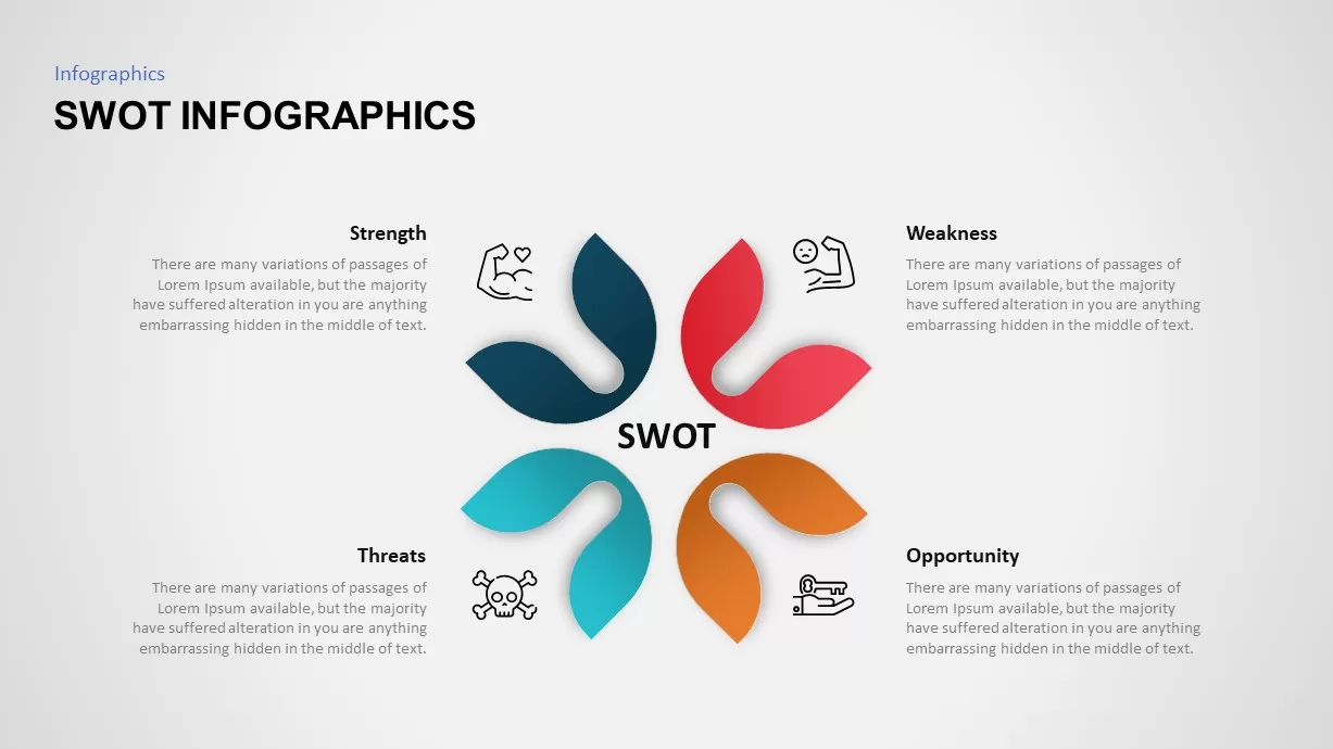
SWOT Analysis Petal Infographic Template for PowerPoint & Google Slides
SWOT
PESTLE and PEST Strategic Analysis Diagrams Template for PowerPoint & Google Slides
Business Strategy
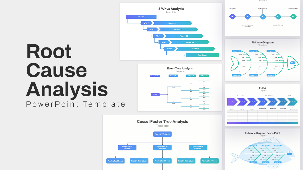
Root Cause Analysis PowerPoint & Google Slides Template for Presentations
Business Strategy
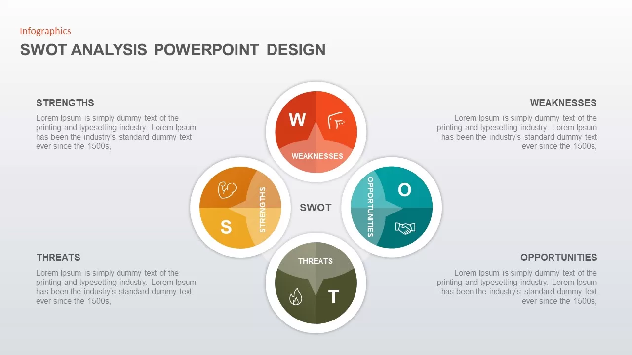
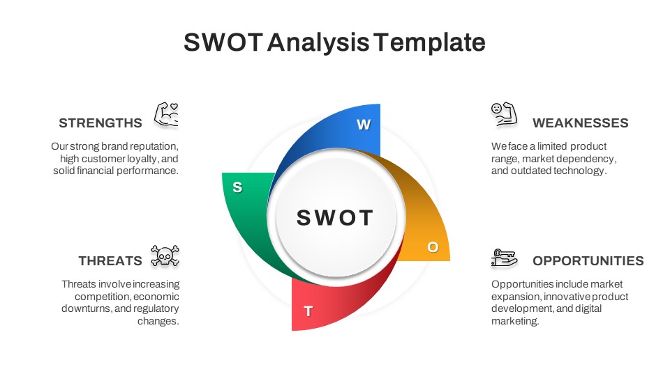
SWOT Analysis Circular Infographic Template for PowerPoint & Google Slides
SWOT
Sky and Tree Root Cause Analysis Deck Template for PowerPoint & Google Slides
Opportunities Challenges
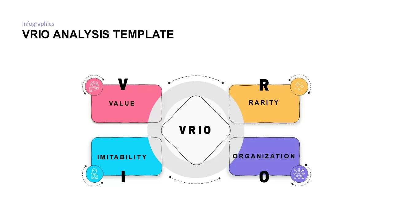
VRIO Analysis Framework template for PowerPoint & Google Slides
Business Strategy
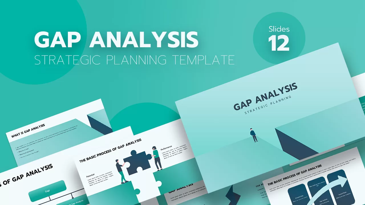
Gap Analysis Strategic Planning Template for PowerPoint & Google Slides
Gap
Root Cause Analysis Infographic Pack Template for PowerPoint & Google Slides
Process
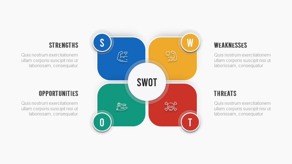
SWOT Analysis Quadrant template for PowerPoint & Google Slides
Business Strategy
SWOT Analysis Blocks template for PowerPoint & Google Slides
Business Strategy
Free SWOT Analysis Template for PowerPoint & Google Slides
SWOT
Free
Free SWOT Analysis Overview template for PowerPoint & Google Slides
SWOT
Free
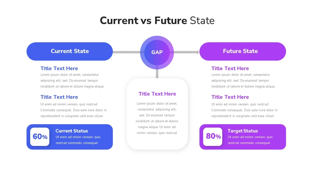
Current vs Future State Gap Analysis template for PowerPoint & Google Slides
Comparison
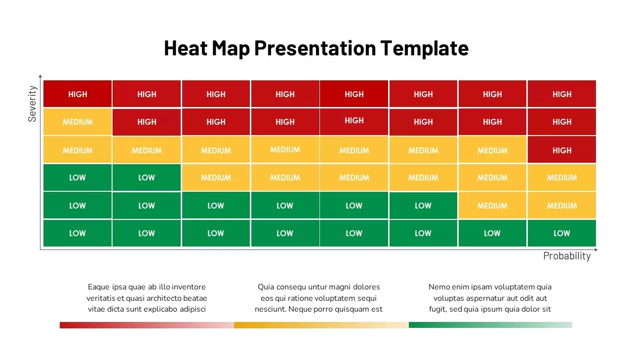
Heat Map Analysis Template for PowerPoint & Google Slides
Risk Management
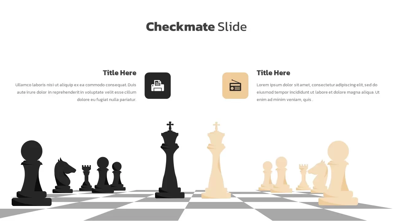
Checkmate Slide for Competitor Analysis Template for PowerPoint & Google Slides
Competitor Analysis
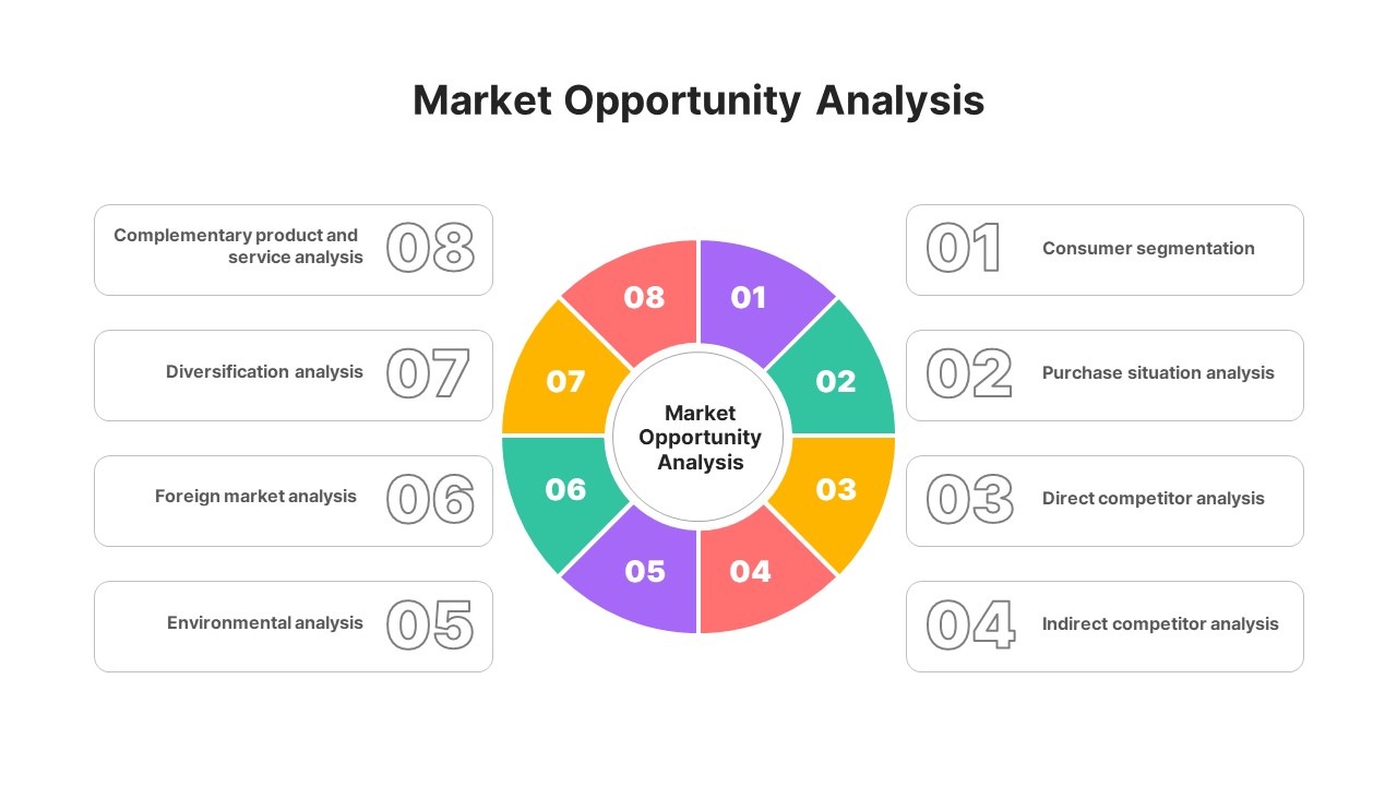
Market Opportunity Analysis Wheel template for PowerPoint & Google Slides
Business Strategy
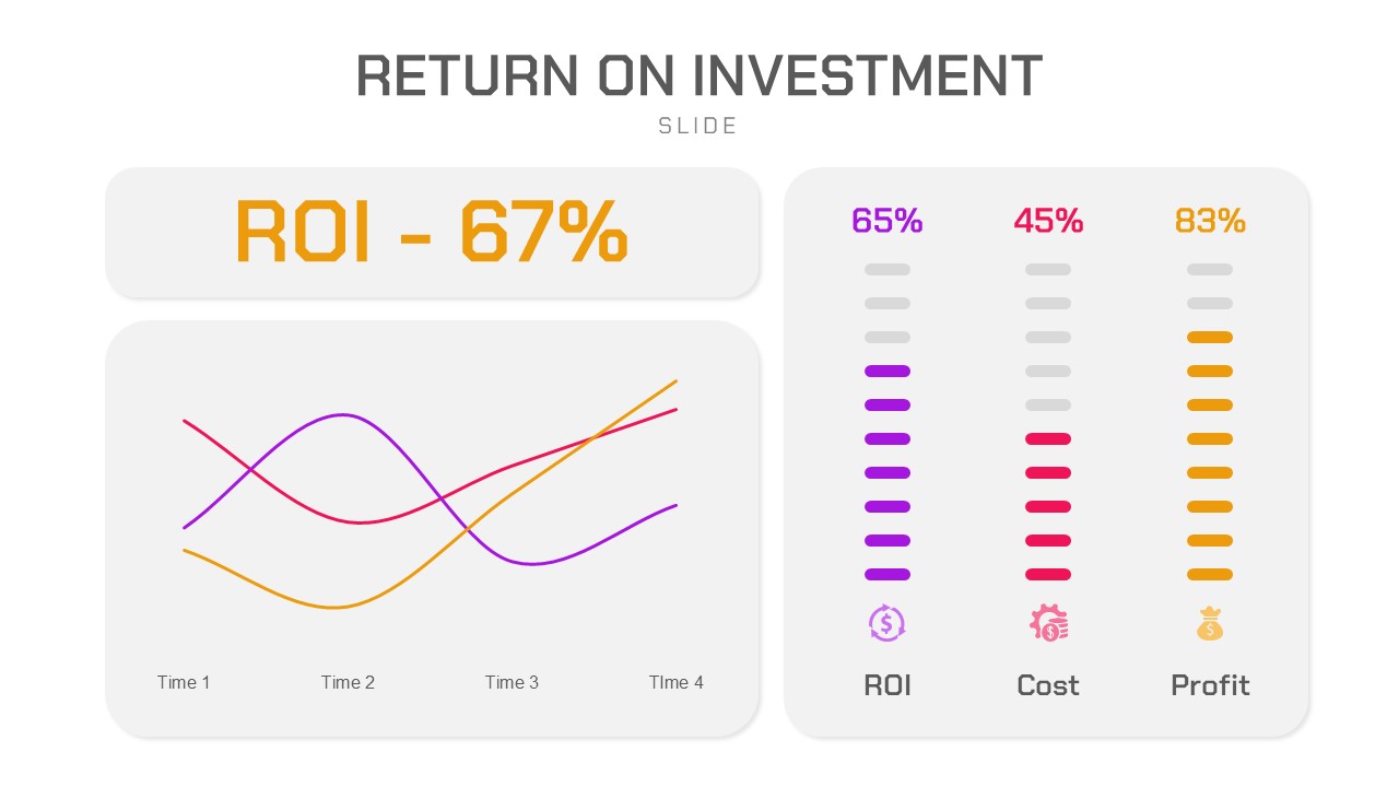
Return on Investment (ROI) Analysis template for PowerPoint & Google Slides
Business Report
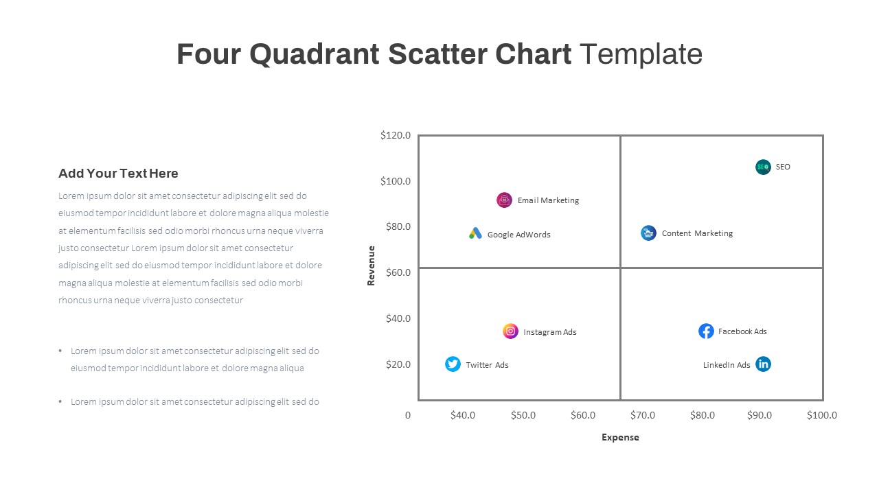
Four Quadrant Scatter Chart Analysis Template for PowerPoint & Google Slides
Comparison Chart
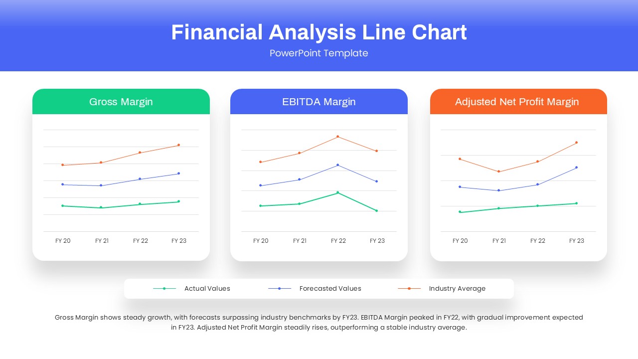
Dynamic Financial Analysis Line Chart Template for PowerPoint & Google Slides
Finance
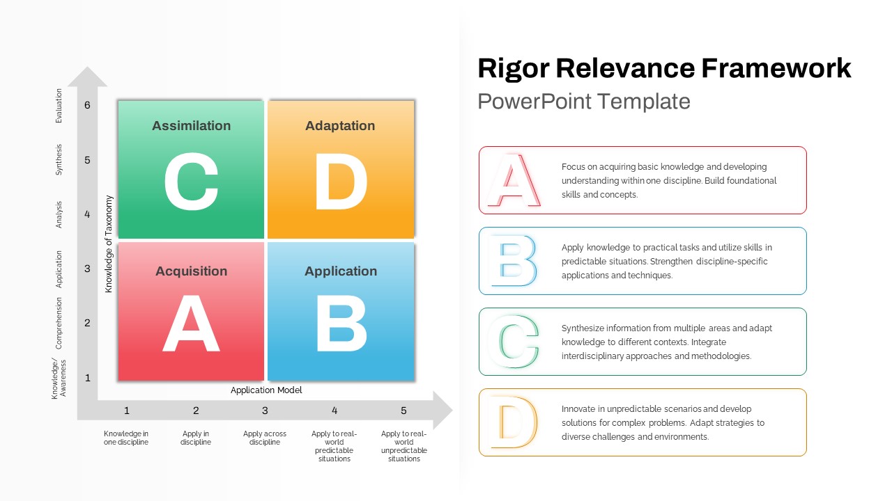
Rigor Relevance Framework Analysis Template for PowerPoint & Google Slides
Comparison
Data Analysis Bar Chart with Insights Template for PowerPoint & Google Slides
Bar/Column
Free
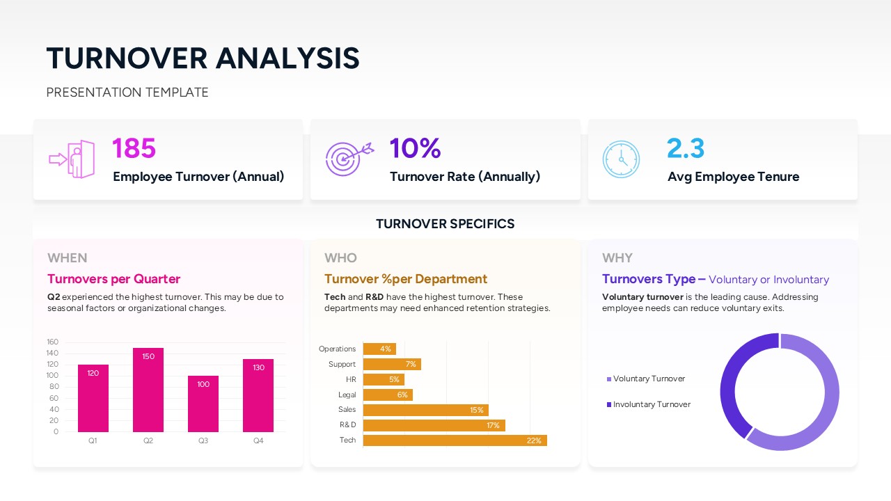
Turnover Analysis Dashboard Template for PowerPoint & Google Slides
Employee Performance
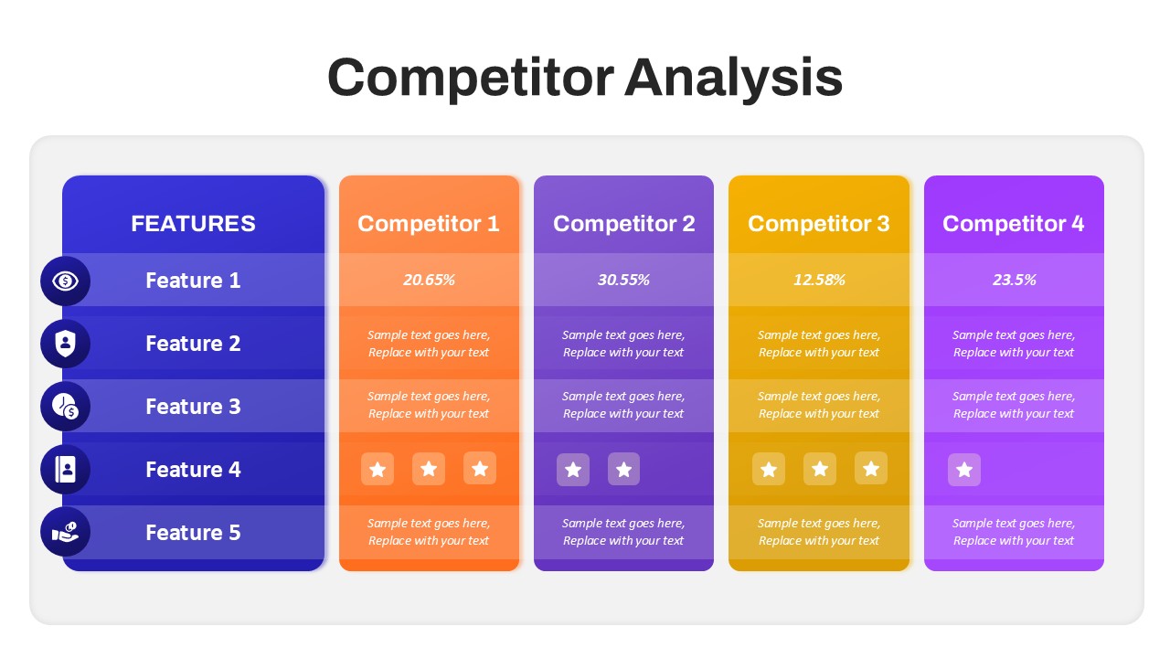
Competitor Analysis Overview template for PowerPoint & Google Slides
Competitor Analysis
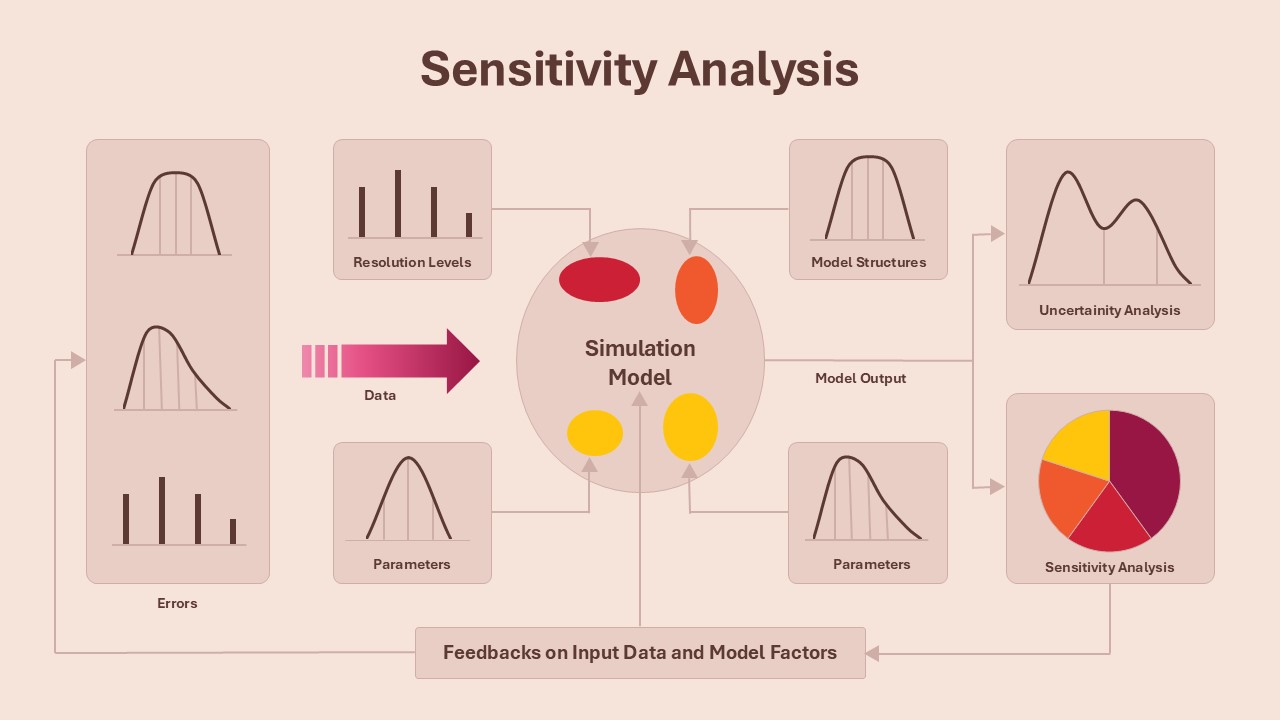
Sensitivity Analysis Framework template for PowerPoint & Google Slides
Business Strategy
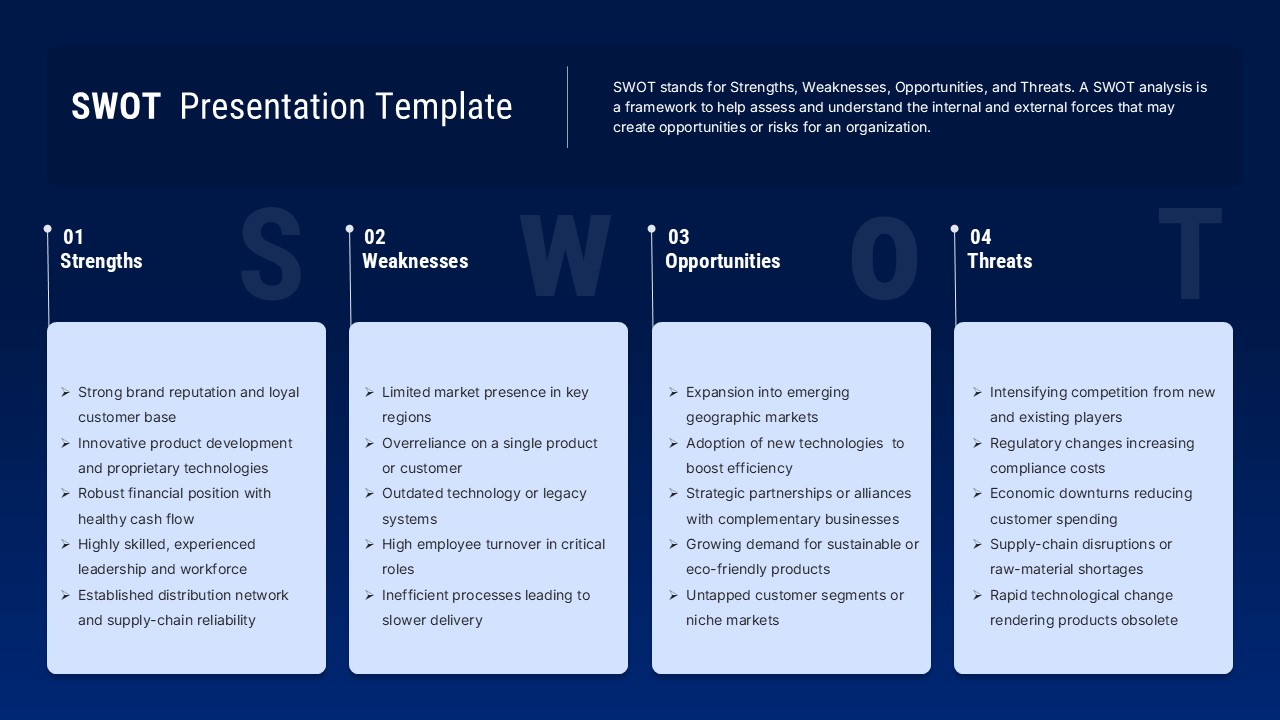
Blue SWOT Analysis Presentation Template for PowerPoint & Google Slides
SWOT
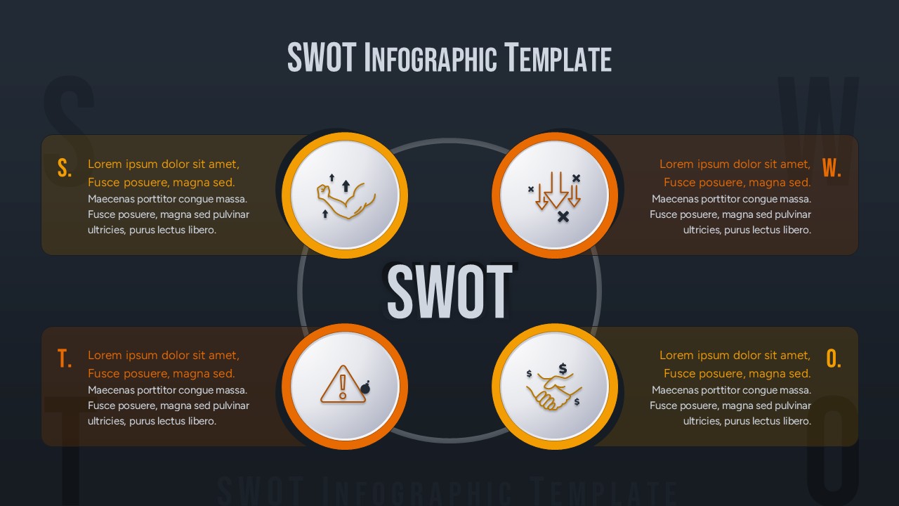
SWOT Analysis Infographic with Circular Icons Template for PowerPoint & Google Slides
SWOT
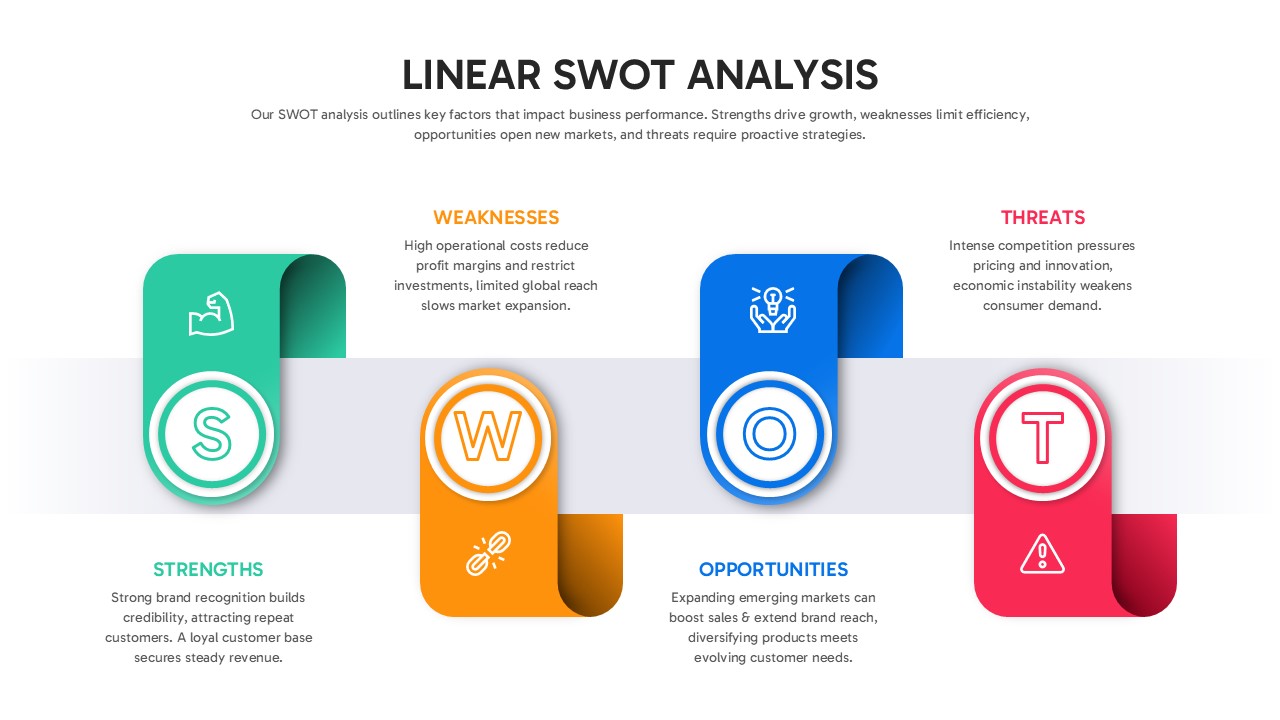
Linear SWOT Analysis Slide Template for PowerPoint & Google Slides
SWOT
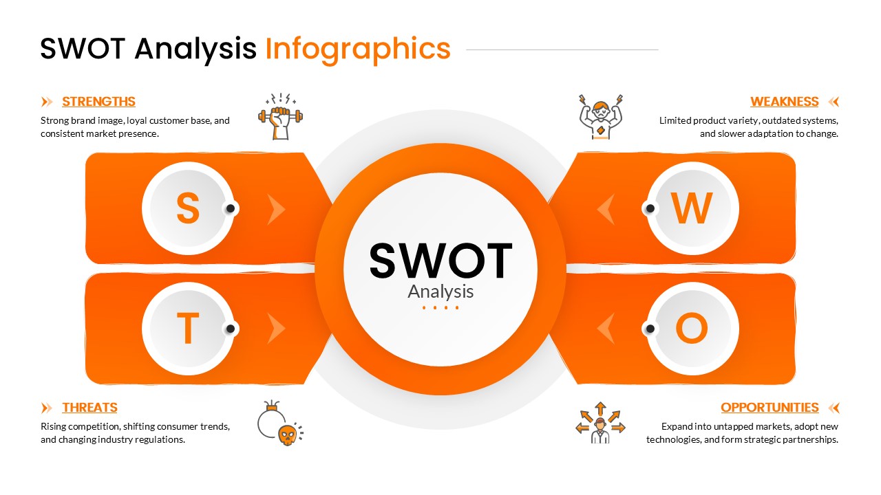
Orange SWOT Analysis Infographic Template for PowerPoint & Google Slides
SWOT
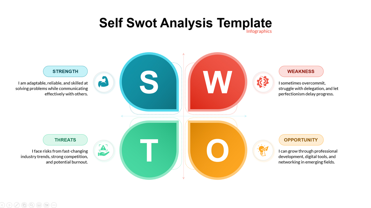
Self SWOT Analysis Template for PowerPoint & Google Slides
SWOT
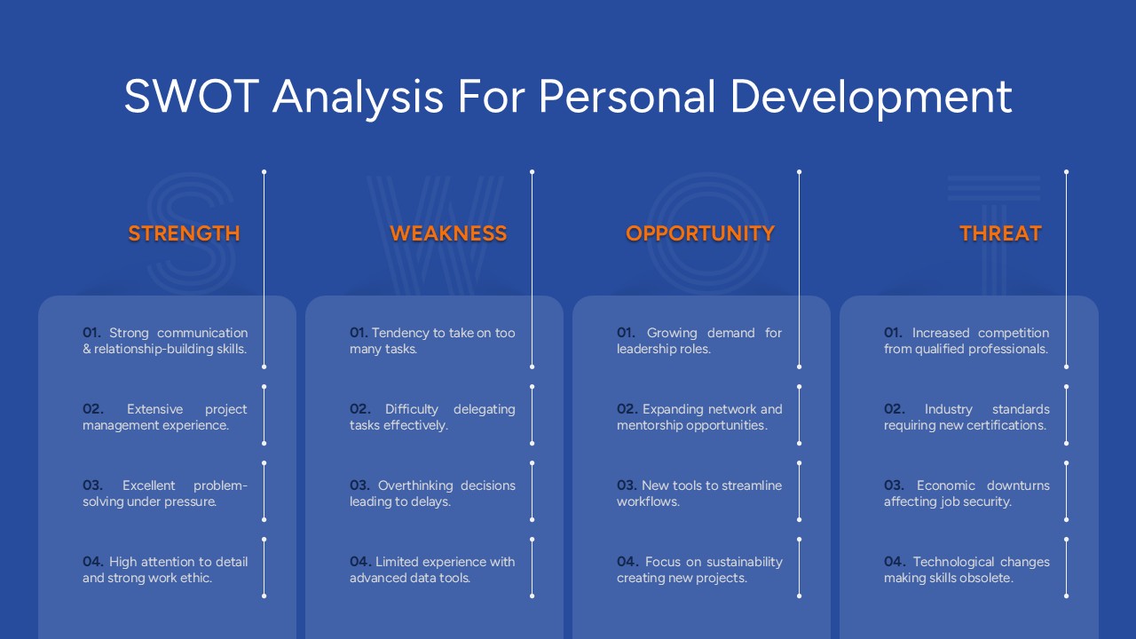
Free SWOT Analysis for Personal Development Template for PowerPoint & Google Slides
SWOT
Free
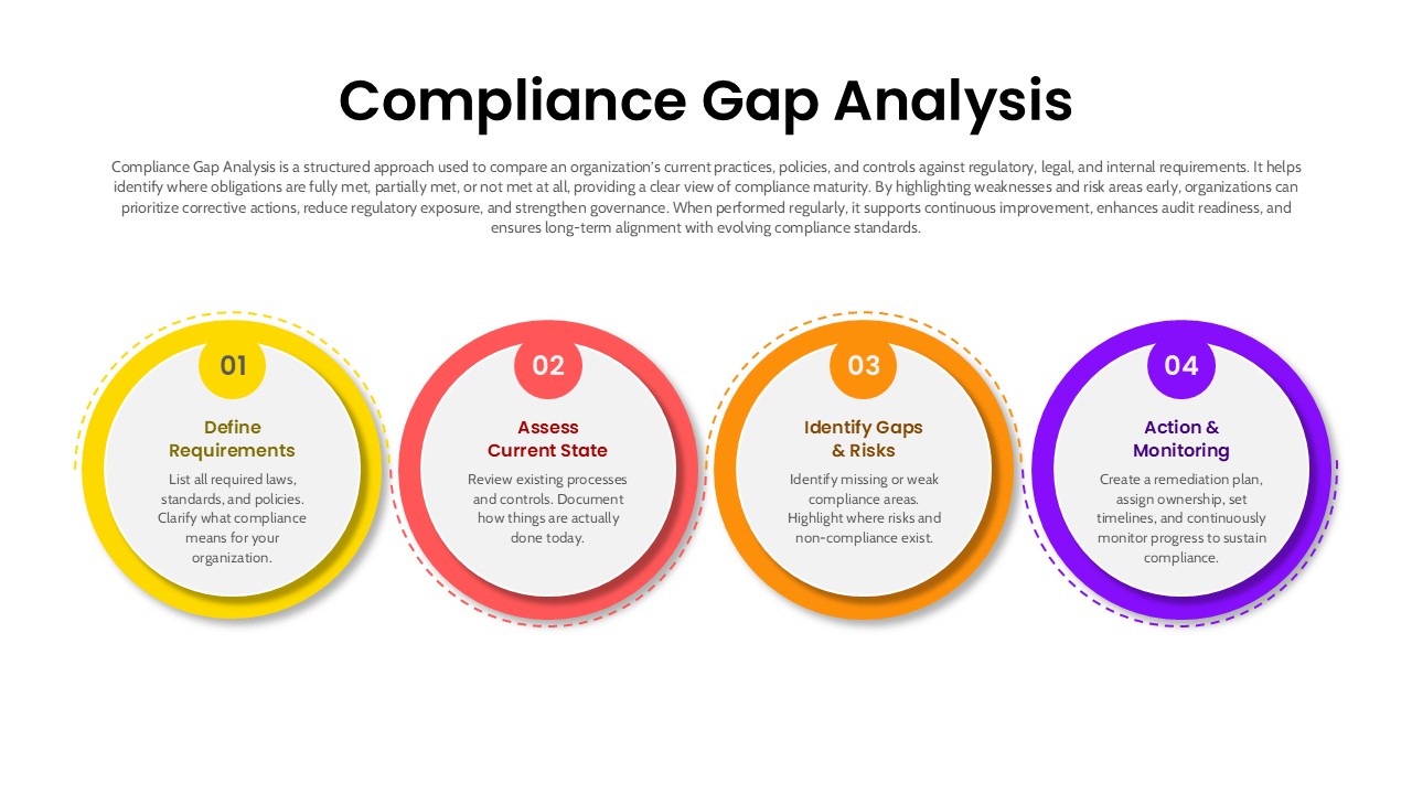
4 Step Compliance Gap Analysis Process Template for PowerPoint & Google Slides
Risk Management
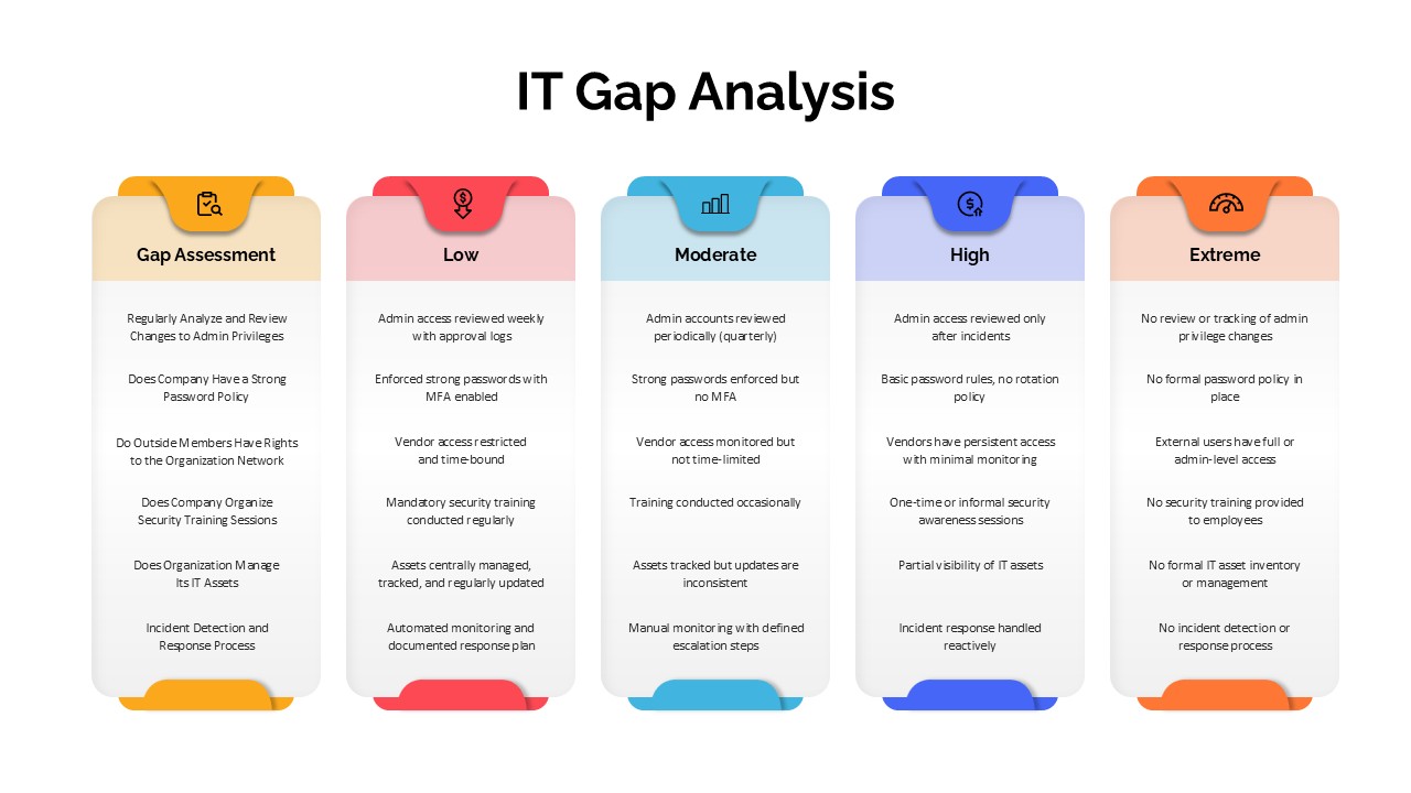
IT Gap Analysis Assessment Matrix Template for PowerPoint & Google Slides
Information Technology
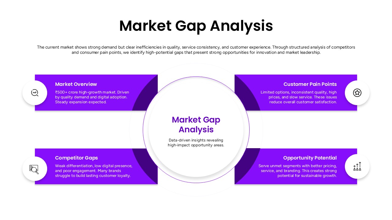
Market Gap Analysis Template for PowerPoint & Google Slides
Gap