Donut Chart for PowerPoint & Google Slides

Description
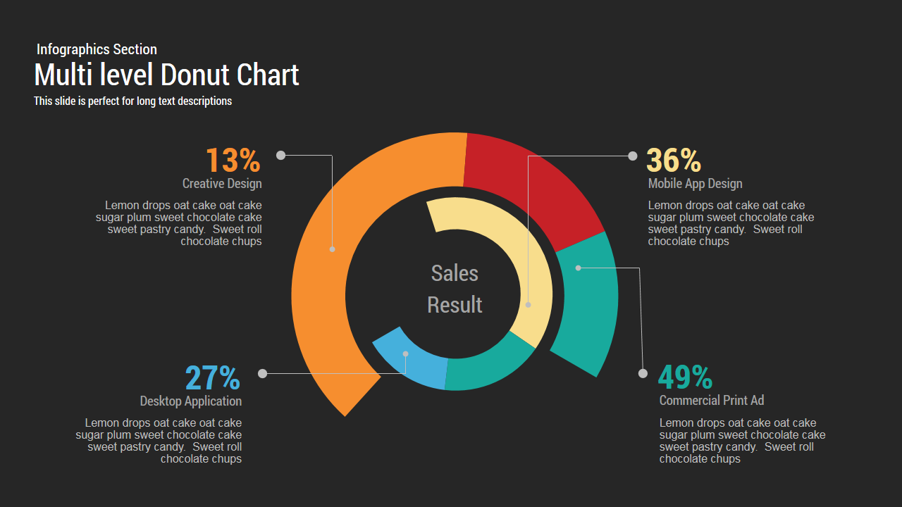
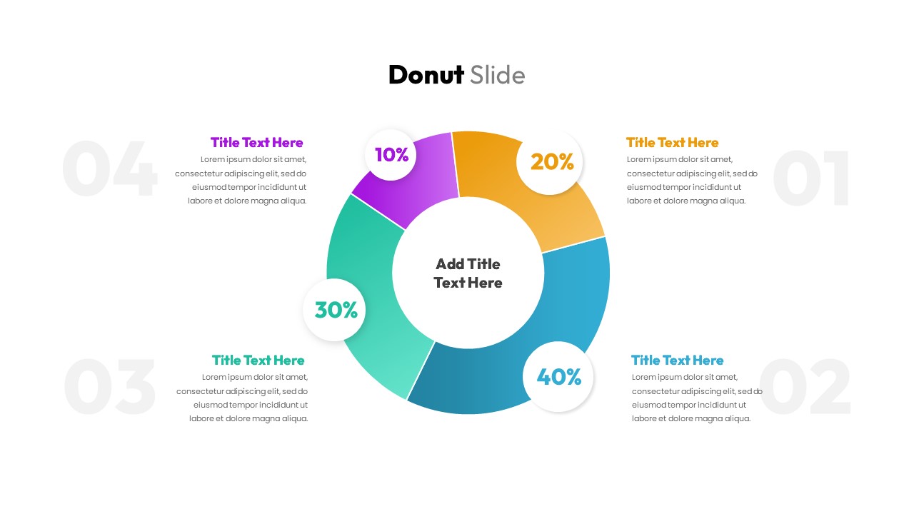
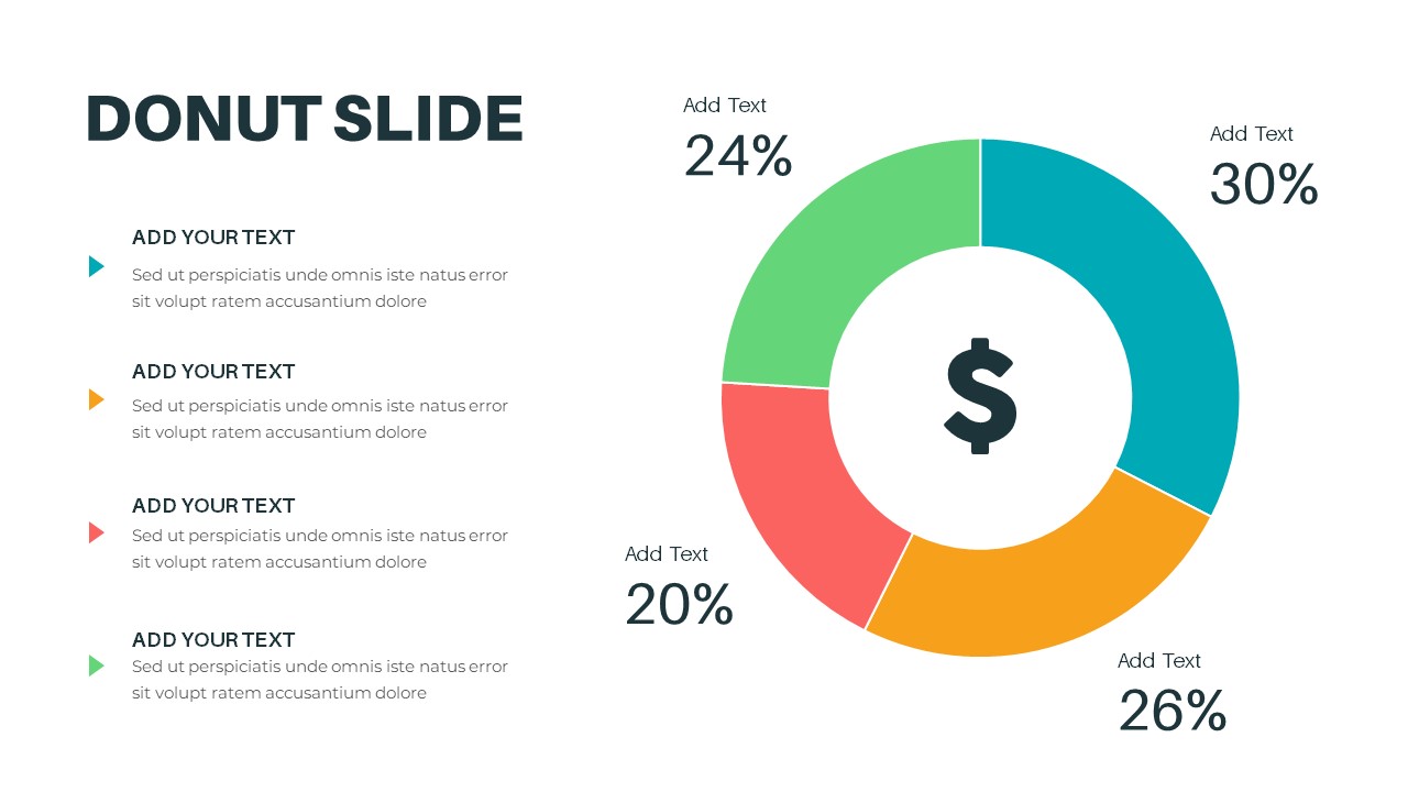
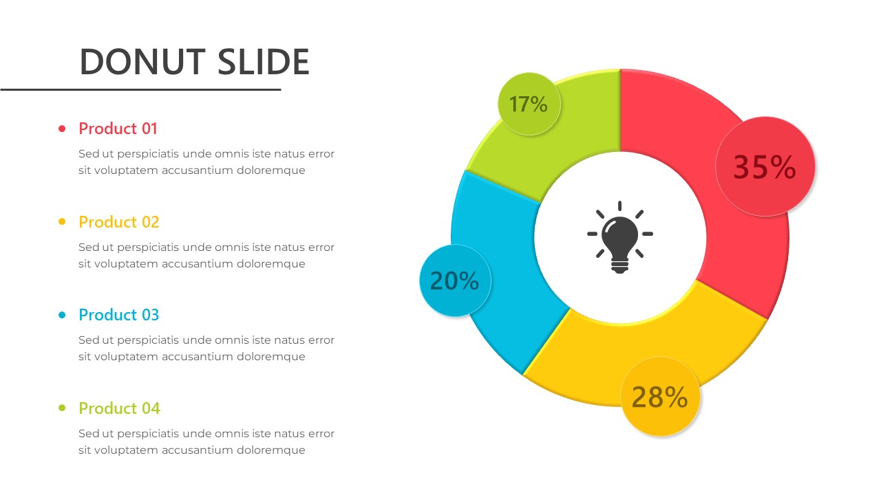
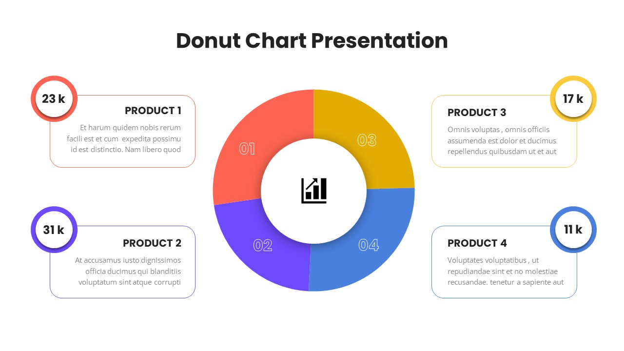
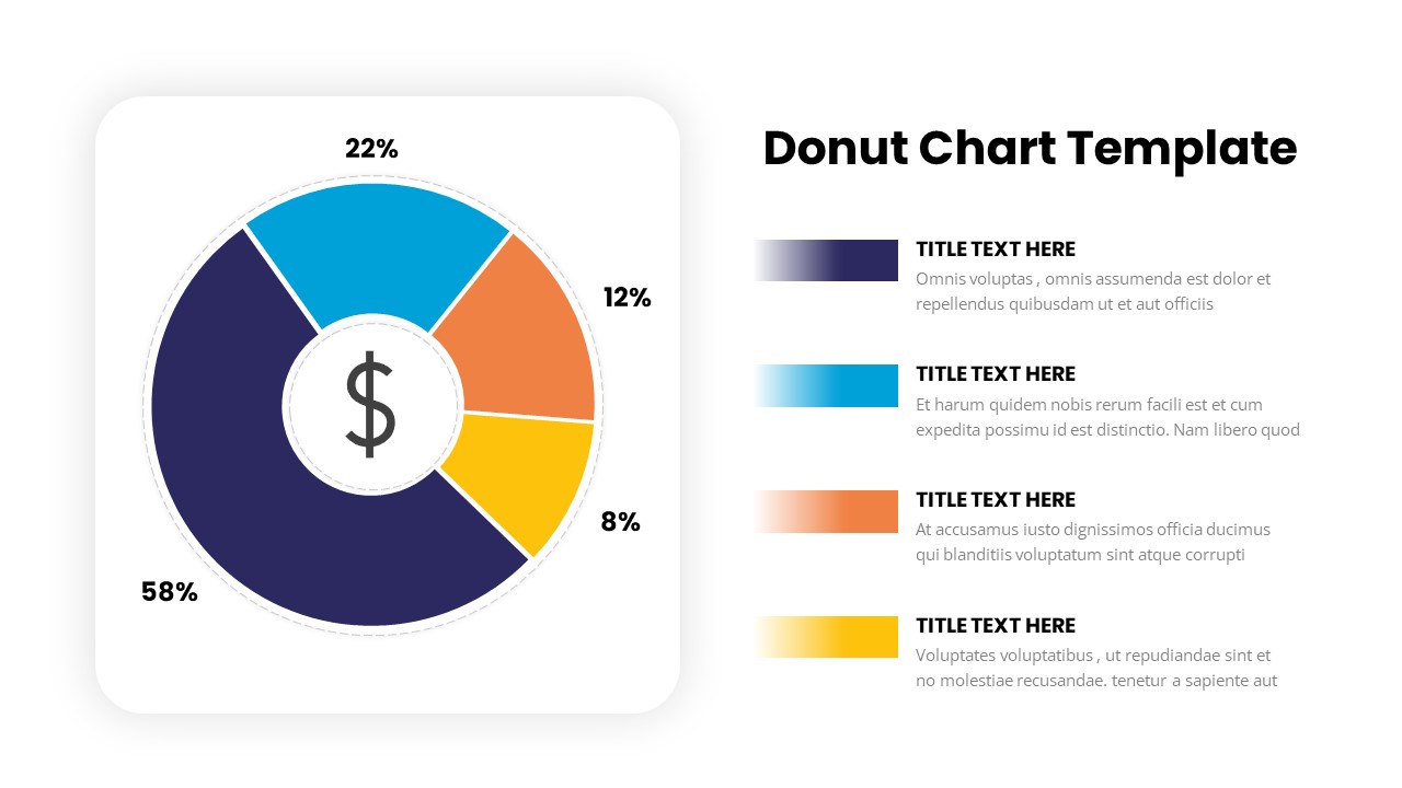
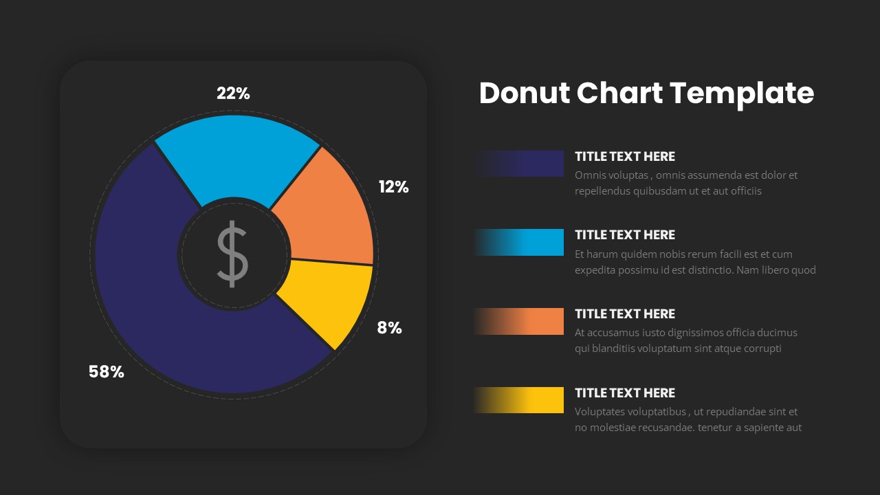
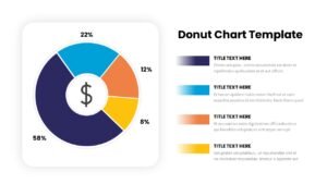
The “Donut Chart” slide provides a sleek and engaging way to display data in a circular format, with each segment representing a different category or value. The chart is divided into four sections, each with distinct colors—blue, yellow, orange, and purple—showcasing their respective percentages (58%, 22%, 12%, and 8%). The central area of the chart includes a dollar sign icon, making it ideal for financial or budget-related presentations.
This slide is perfect for comparing different categories, product sales, market shares, or performance metrics. Its vibrant colors and clean design make the information easy to read and visually appealing. The layout also includes space for accompanying text, so you can provide more context or explain each segment in detail.
Fully editable, this slide allows you to adjust the percentages, text, and color scheme to suit your needs. It works seamlessly in both PowerPoint and Google Slides, offering flexibility and customization for your data visualization needs.
Who is it for
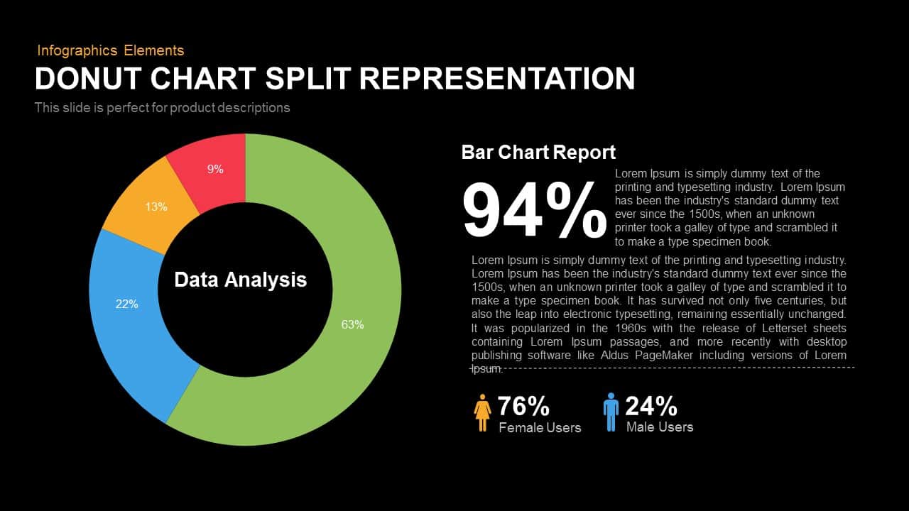
This slide is ideal for financial analysts, marketers, product managers, and business professionals who need to present comparative data in a clear and engaging format. It’s perfect for reporting on sales performance, budget breakdowns, or any scenario that involves proportional data visualization.
Other Uses
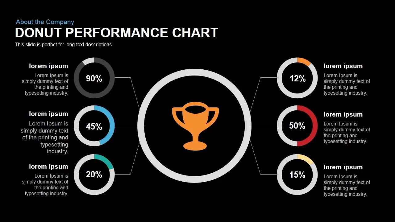
Beyond financial presentations, this slide can be used to show survey results, resource allocation, customer segmentation, or project task distribution. It is also effective in visualizing progress or milestones in a project, making it a versatile tool for various industries and business needs.
Login to download this file

Item ID
SB03240
Related Templates

Donut Chart template for PowerPoint & Google Slides
Pie/Donut
Premium
Donut Chart template for PowerPoint & Google Slides
Pie/Donut
Premium
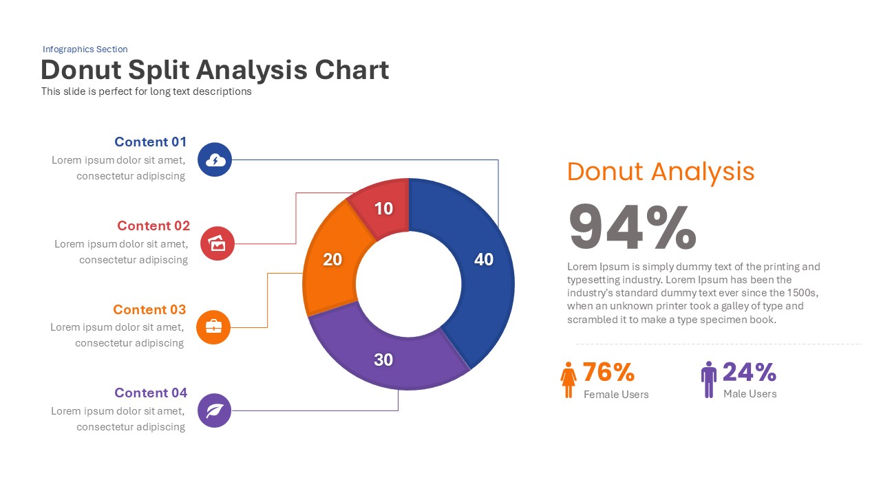
Donut Chart Split Template for PowerPoint & Google Slides
Charts
Premium
Success Key Diagram with Donut Chart Template for PowerPoint & Google Slides
Pie/Donut
Premium

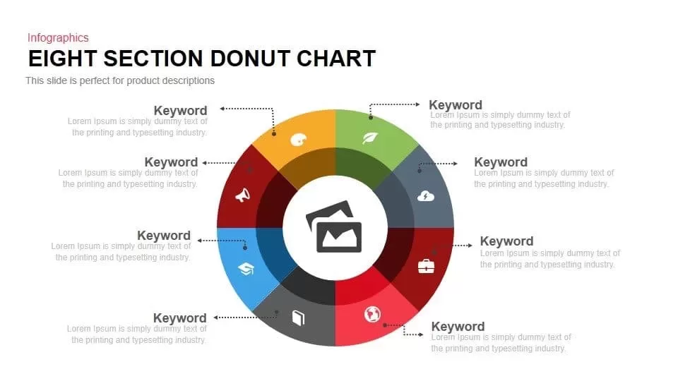
Eight Section Donut Chart Infographic Template for PowerPoint & Google Slides
Pie/Donut
Premium
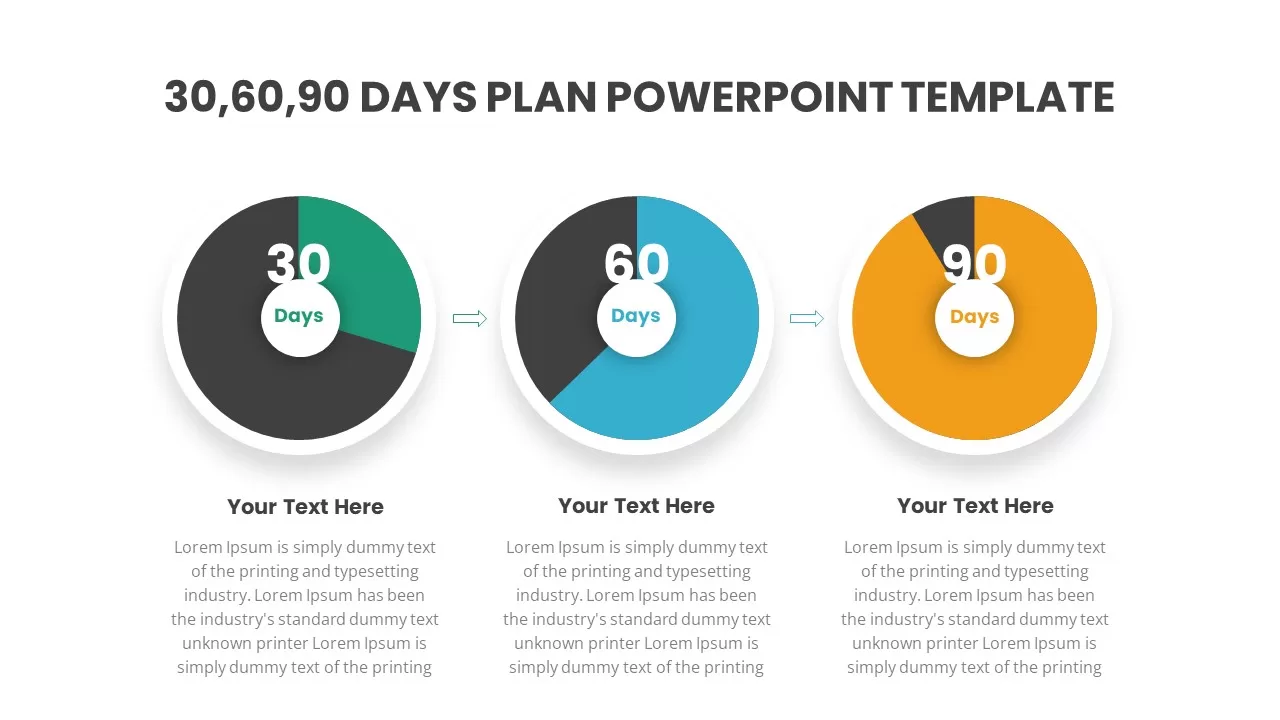
30-60-90 Day Donut Chart Plan Infographic Template for PowerPoint & Google Slides
Timeline
Premium
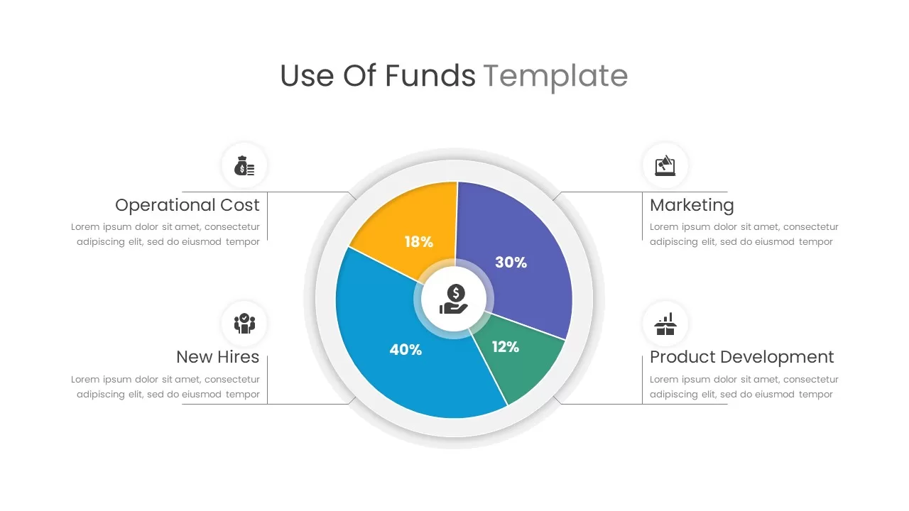
Use of Funds Donut Chart Infographic Template for PowerPoint & Google Slides
Circle
Premium
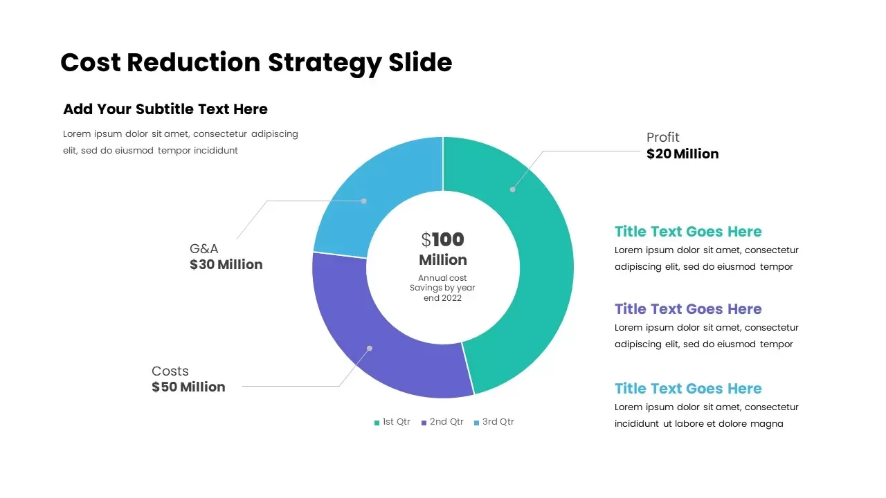
Cost Reduction Strategy Donut Chart Template for PowerPoint & Google Slides
Pie/Donut
Premium
Donut Chart Data Breakdown template for PowerPoint & Google Slides
Pie/Donut
Premium
Donut Chart for PowerPoint & Google Slides
Pie/Donut
Premium
Donut Chart for PowerPoint & Google Slides
Pie/Donut
Premium
Donut Chart Presentation for PowerPoint & Google Slides
Pie/Donut
Premium
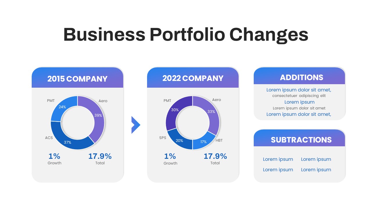
Business Portfolio Changes Donut Chart Template for PowerPoint & Google Slides
Pie/Donut
Premium
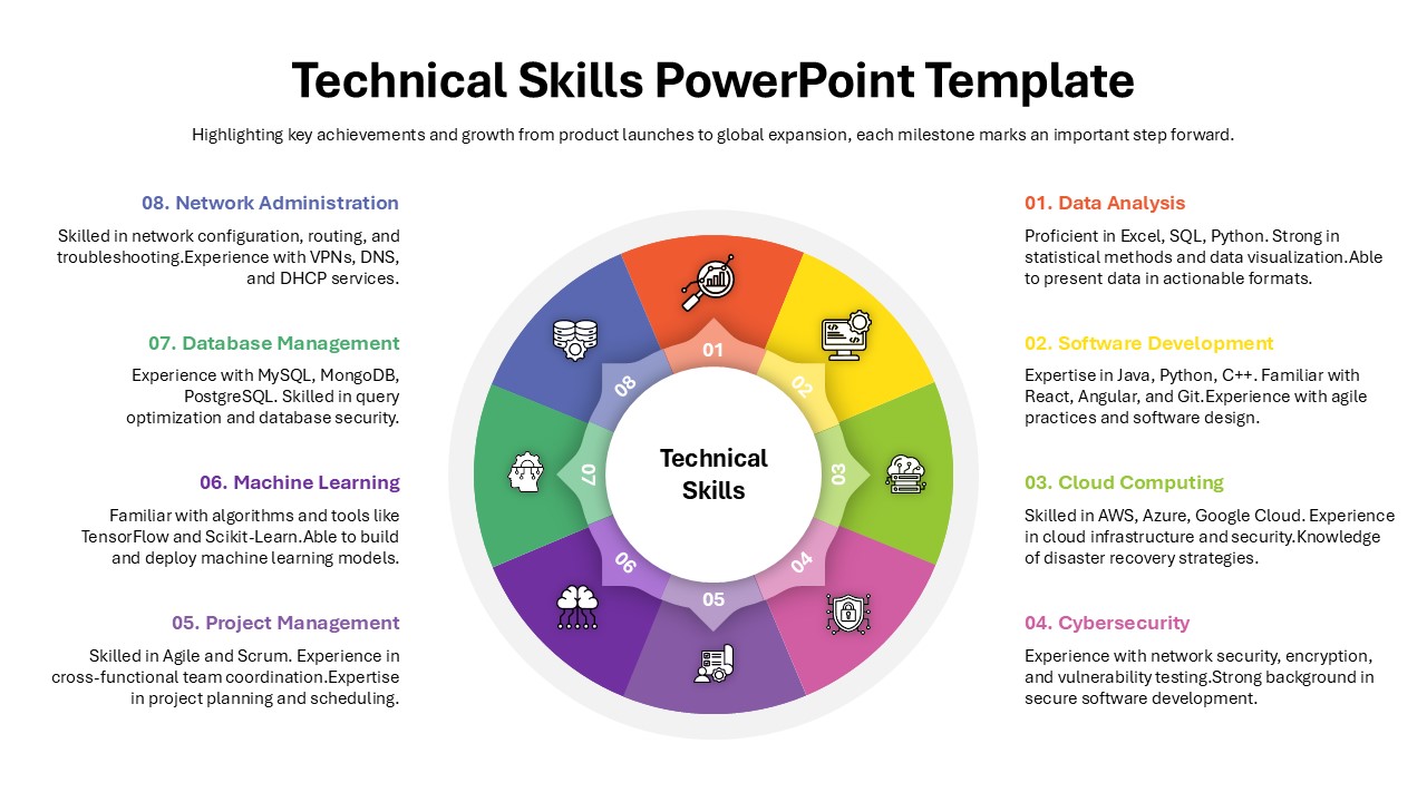
Technical Skills Donut Chart Overview Template for PowerPoint & Google Slides
HR
Premium
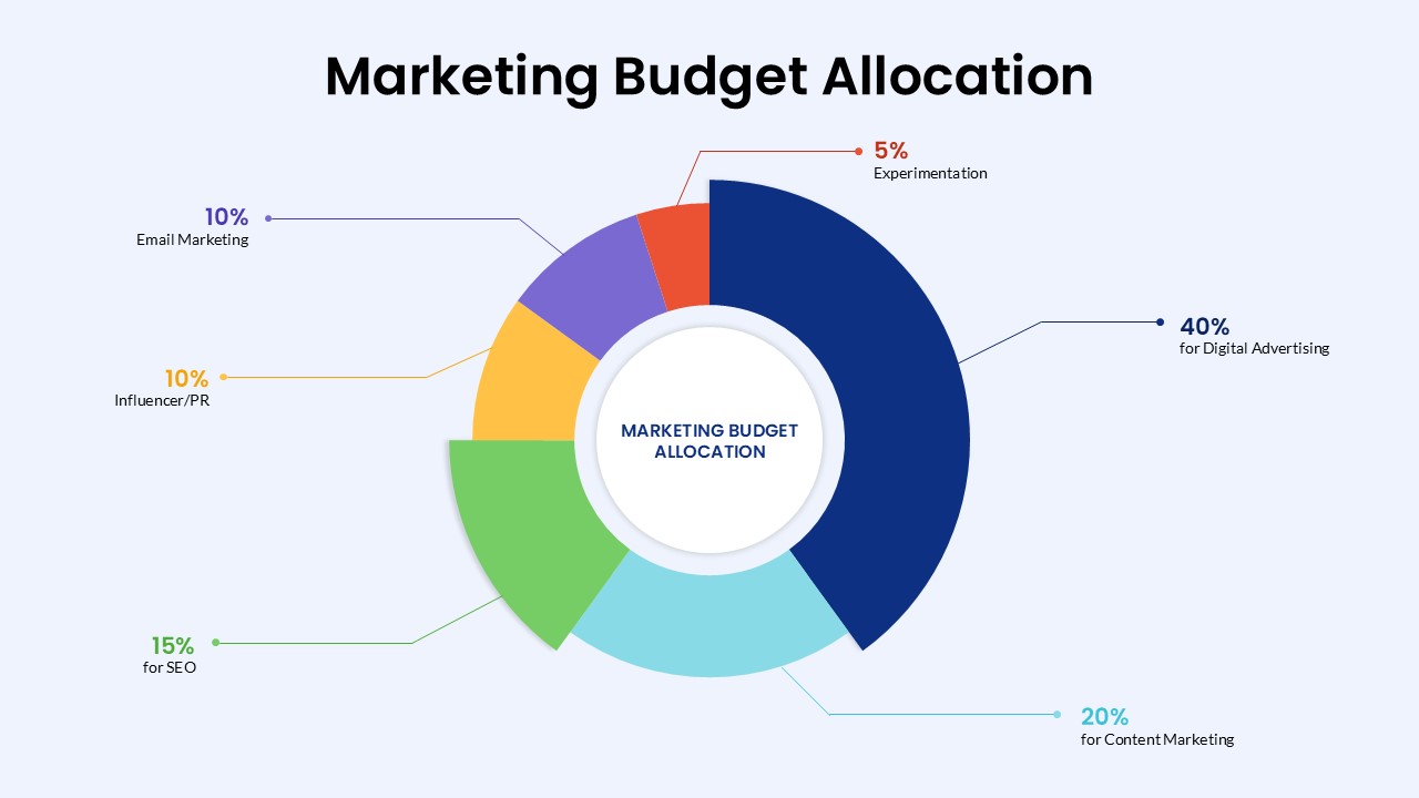
Marketing Budget Allocation Donut Chart Template for PowerPoint & Google Slides
Marketing
Premium

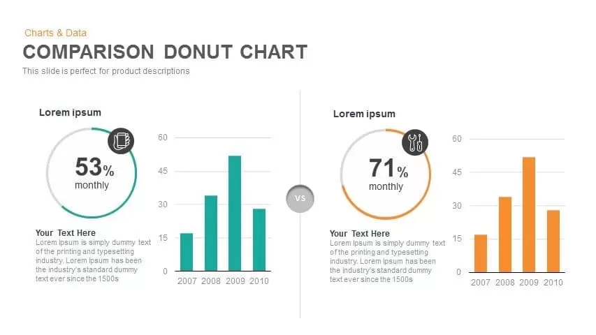
Comparison Donut Chart PowerPoint Template and Keynote
Pie/Donut
Premium
Donut Split Analysis template for PowerPoint & Google Slides
Pie/Donut
Premium
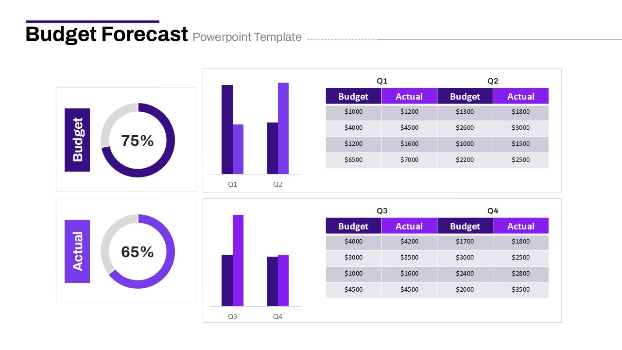
Budget Forecast Dashboard & Donut Charts Template for PowerPoint & Google Slides
Pie/Donut
Premium
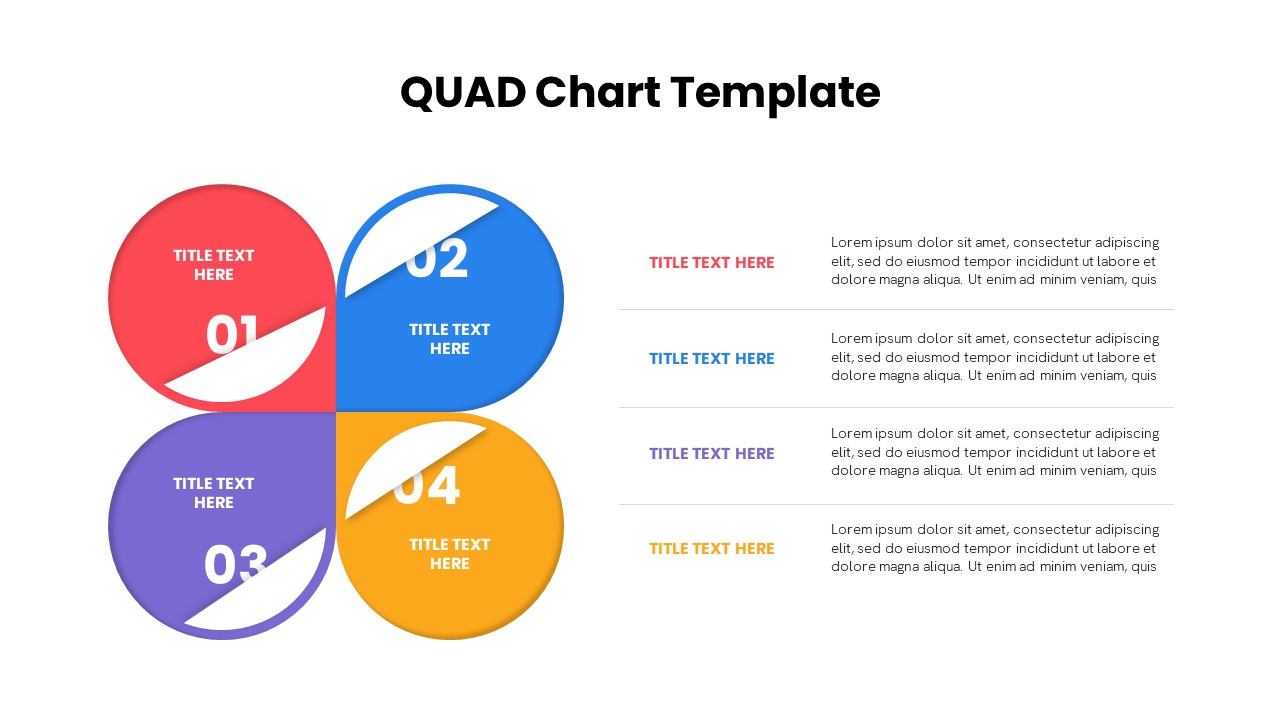
Quad Chart Infographic Pack of 8 Slides Template for PowerPoint & Google Slides
Comparison Chart
Premium
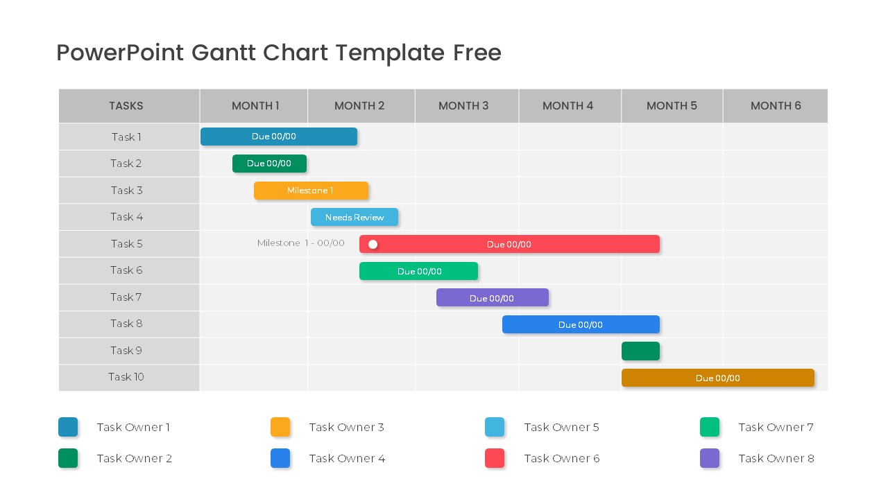
Free Professional Gantt Chart Pack – 4 Slides Template for PowerPoint & Google Slides
Gantt Chart
Free
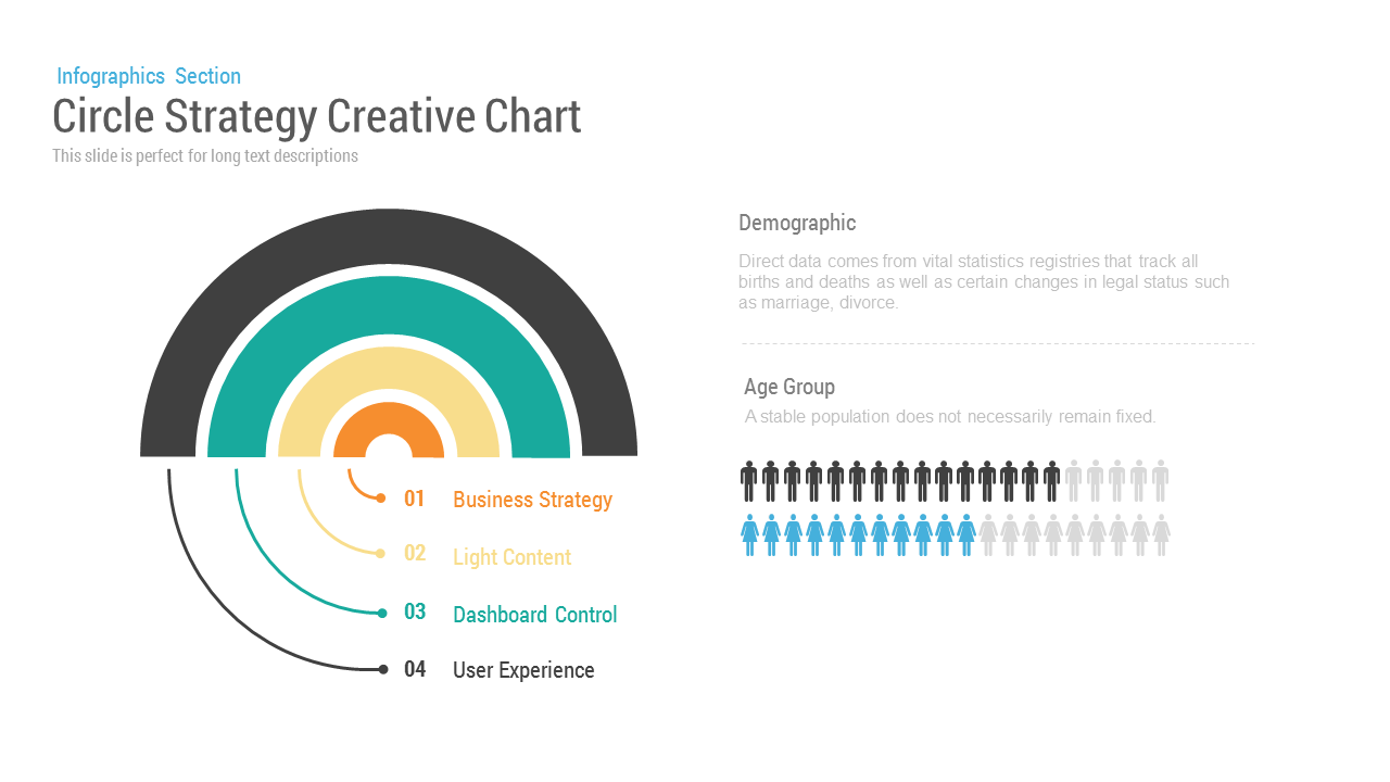
Circle Strategy Creative Chart template for PowerPoint & Google Slides
Business Strategy
Premium
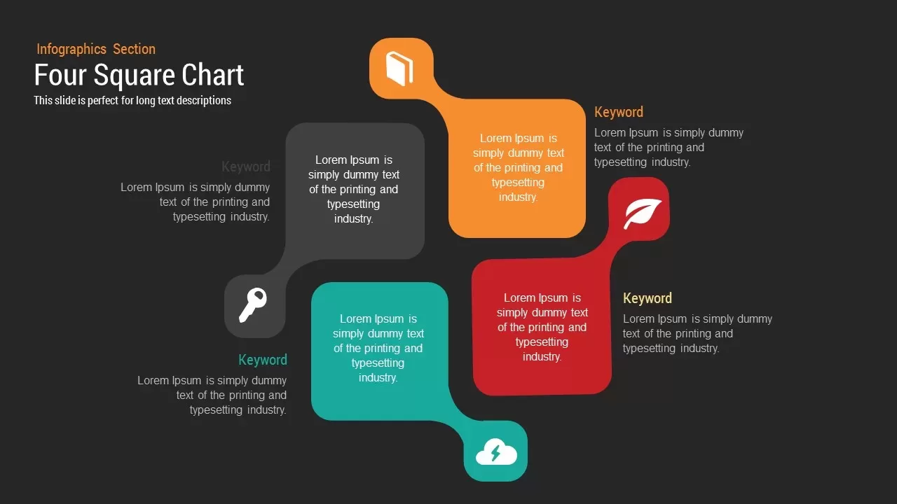
Four Square Chart template for PowerPoint & Google Slides
Charts
Premium
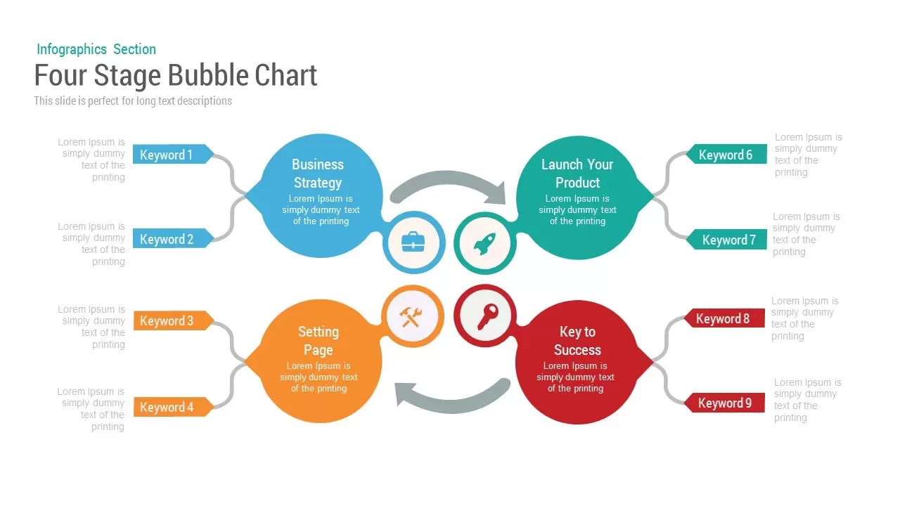
Bubble Chart template for PowerPoint & Google Slides
Charts
Premium
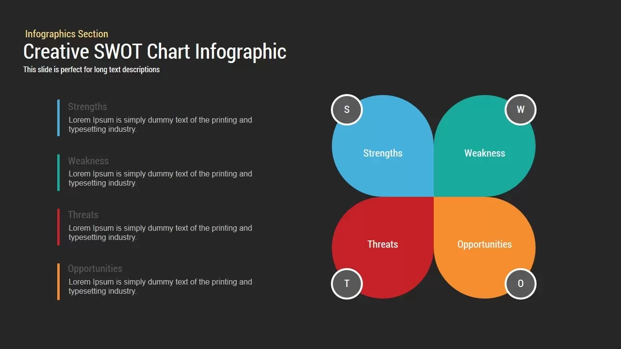
Creative SWOT Chart template for PowerPoint & Google Slides
SWOT
Premium

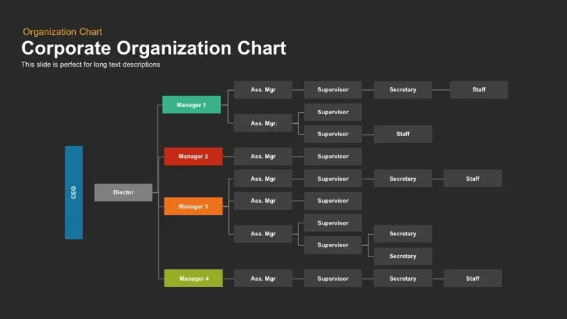
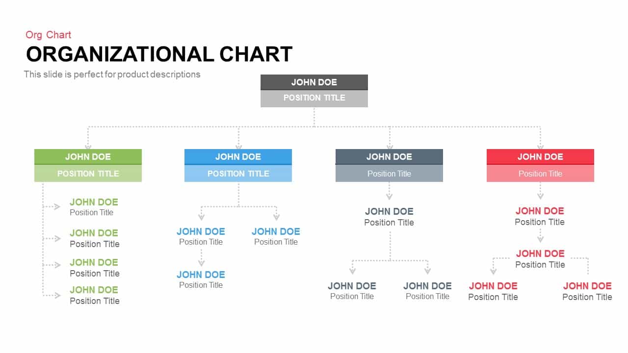
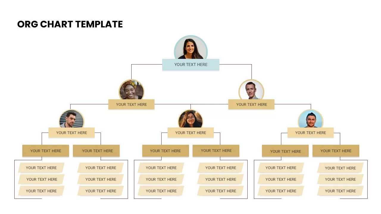
Corporate Organization Chart template for PowerPoint & Google Slides
Org Chart
Premium
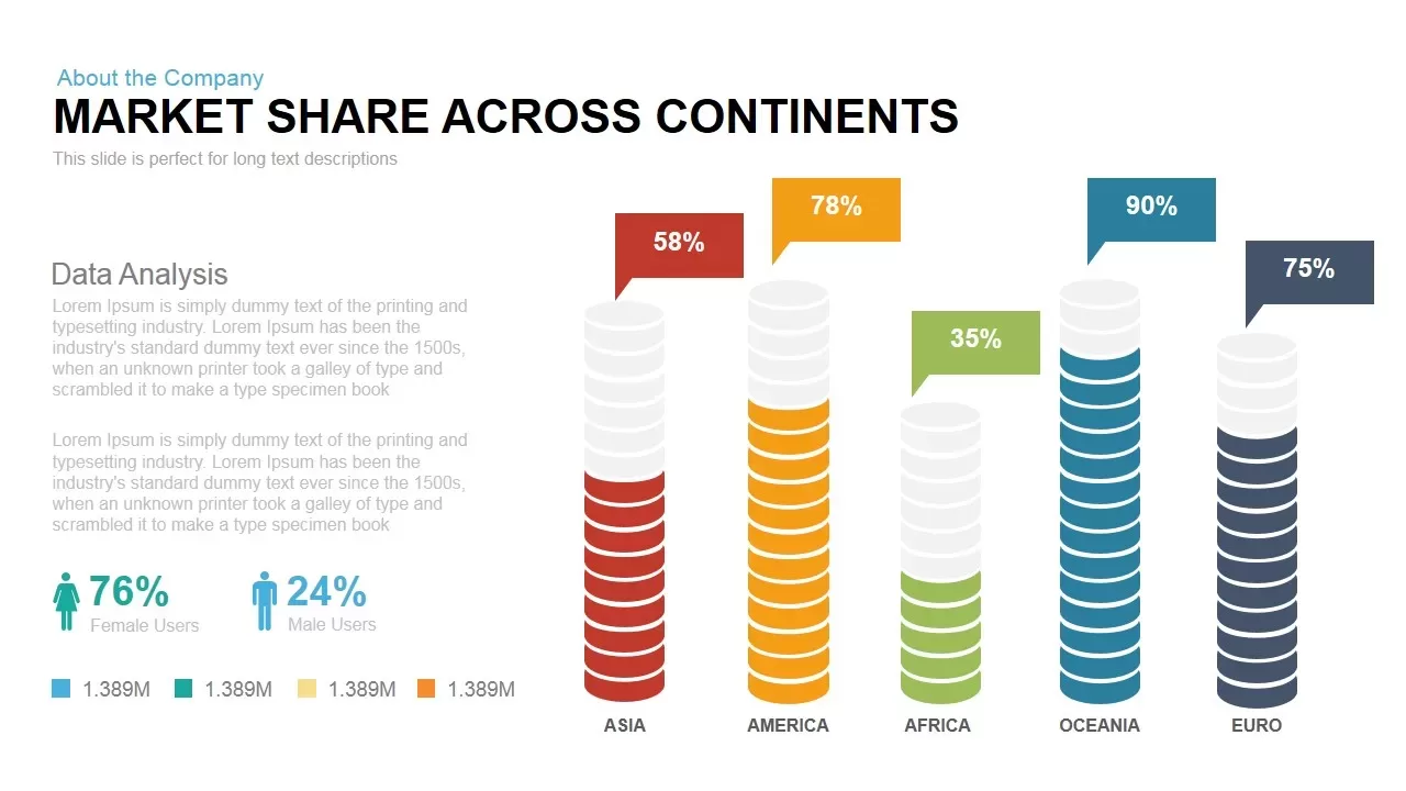
Global Market Share Cylinder Chart Template for PowerPoint & Google Slides
Bar/Column
Premium
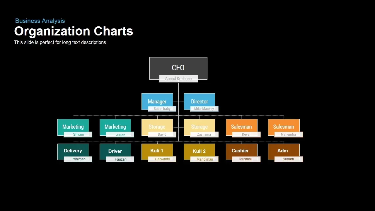
Business Organization Chart Hierarchy Template for PowerPoint & Google Slides
Org Chart
Premium
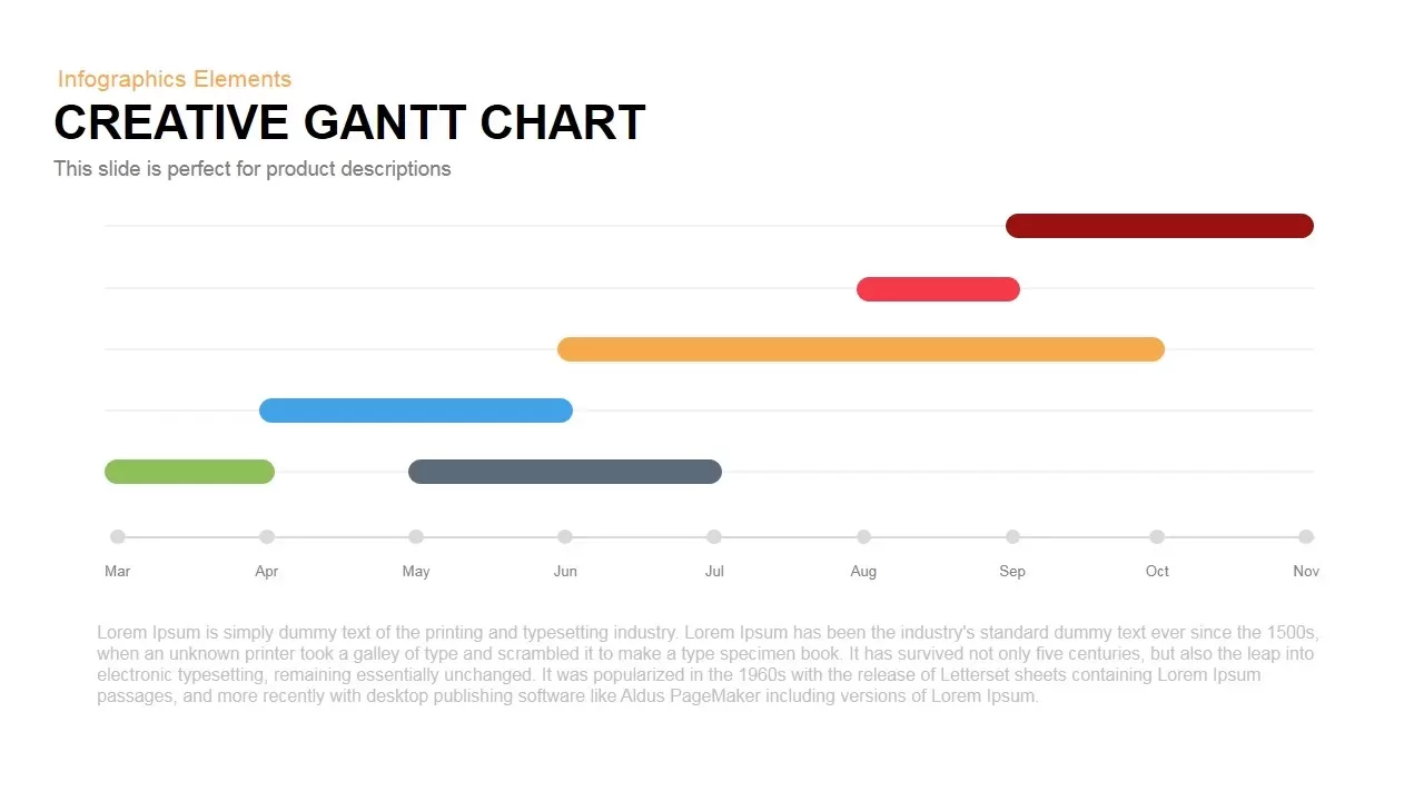
Creative Dynamic Gantt Chart Timeline Template for PowerPoint & Google Slides
Timeline
Premium
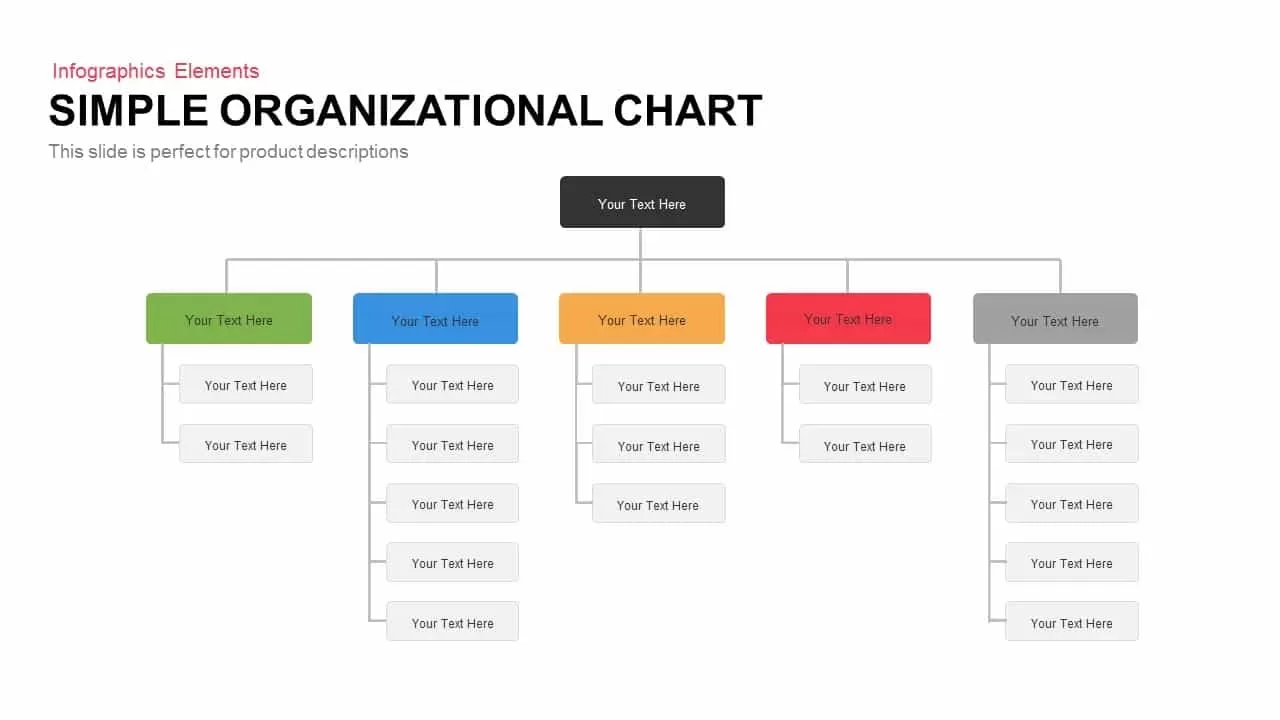
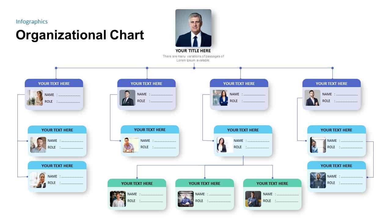
Simple Organizational Chart Infographic Template for PowerPoint & Google Slides
Org Chart
Premium
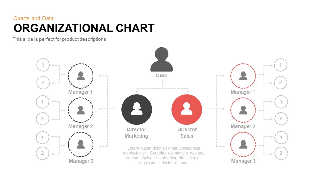
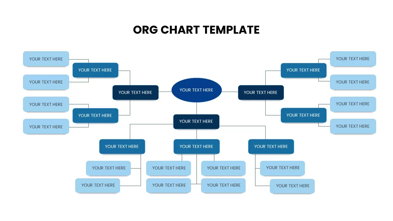
Organizational Chart Template for PowerPoint & Google Slides
Org Chart
Premium
Pencil Bar Chart Data Analysis Template for PowerPoint & Google Slides
Bar/Column
Premium
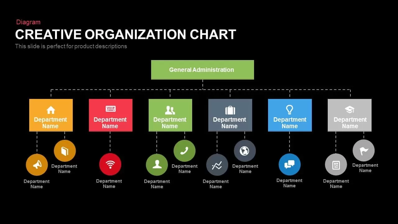
Creative Organization Chart Diagram Template for PowerPoint & Google Slides
Org Chart
Premium
Corporate Org Chart template for PowerPoint & Google Slides
Org Chart
Premium

Fully Editable Gantt Chart Timeline template for PowerPoint & Google Slides
Gantt Chart
Premium
Modern Ten-Block Section Title Chart template for PowerPoint & Google Slides
Comparison
Premium
Product Usage Analytics Dashboard Chart Template for PowerPoint & Google Slides
Bar/Column
Premium
Five-Stage People Infographic Chart template for PowerPoint & Google Slides
Process
Premium
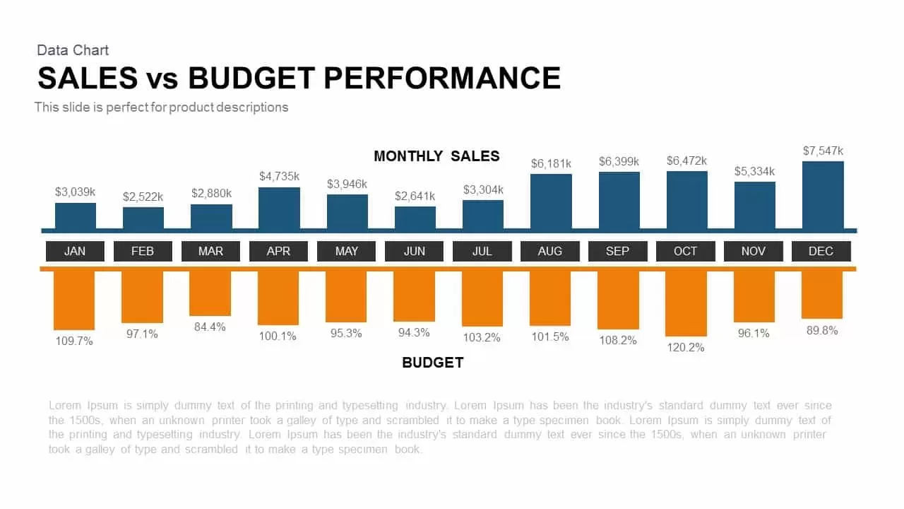
Sales vs Budget Performance Chart Template for PowerPoint & Google Slides
Bar/Column
Premium
Interactive Product Comparison Bar Chart Template for PowerPoint & Google Slides
Bar/Column
Premium
Organizational Chart Structure template for PowerPoint & Google Slides
Org Chart
Premium

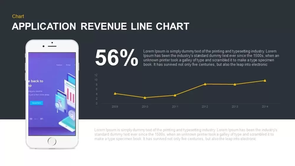
Application Revenue Line Chart KPI Template for PowerPoint & Google Slides
Revenue
Premium
Tornado Chart Data Comparison Slide Template for PowerPoint & Google Slides
Bar/Column
Premium
Modern Colorful Circular Org Chart Template for PowerPoint & Google Slides
Org Chart
Premium
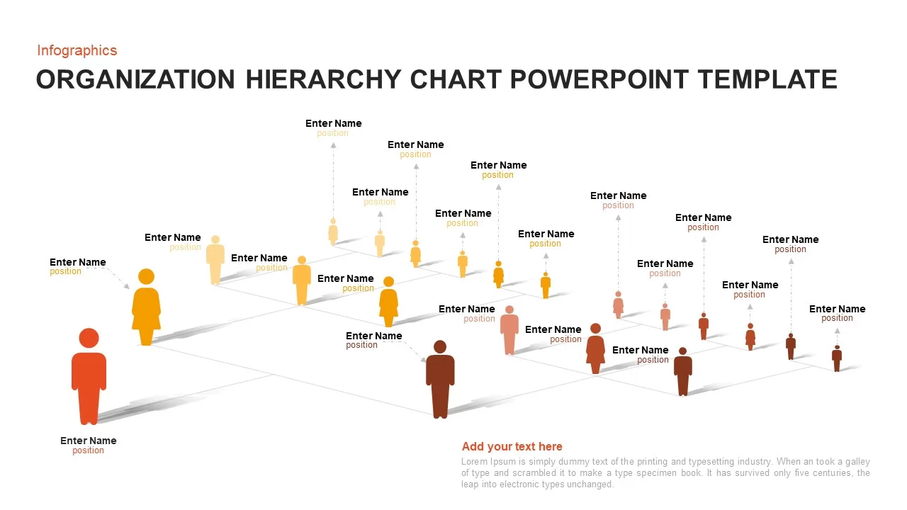
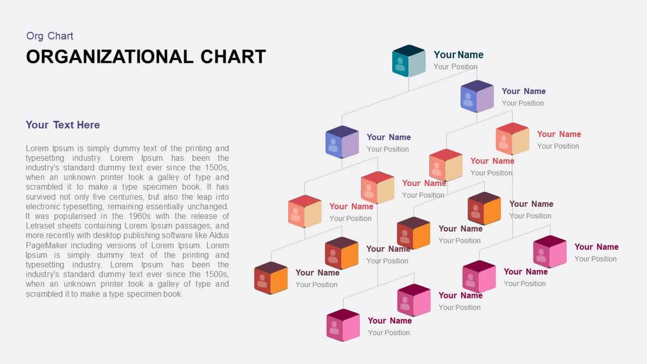
3D Organization Hierarchy Chart Template for PowerPoint & Google Slides
Org Chart
Premium
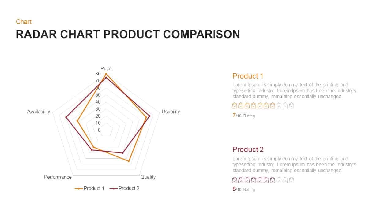
Radar Chart Product Comparison Template for PowerPoint & Google Slides
Comparison Chart
Premium
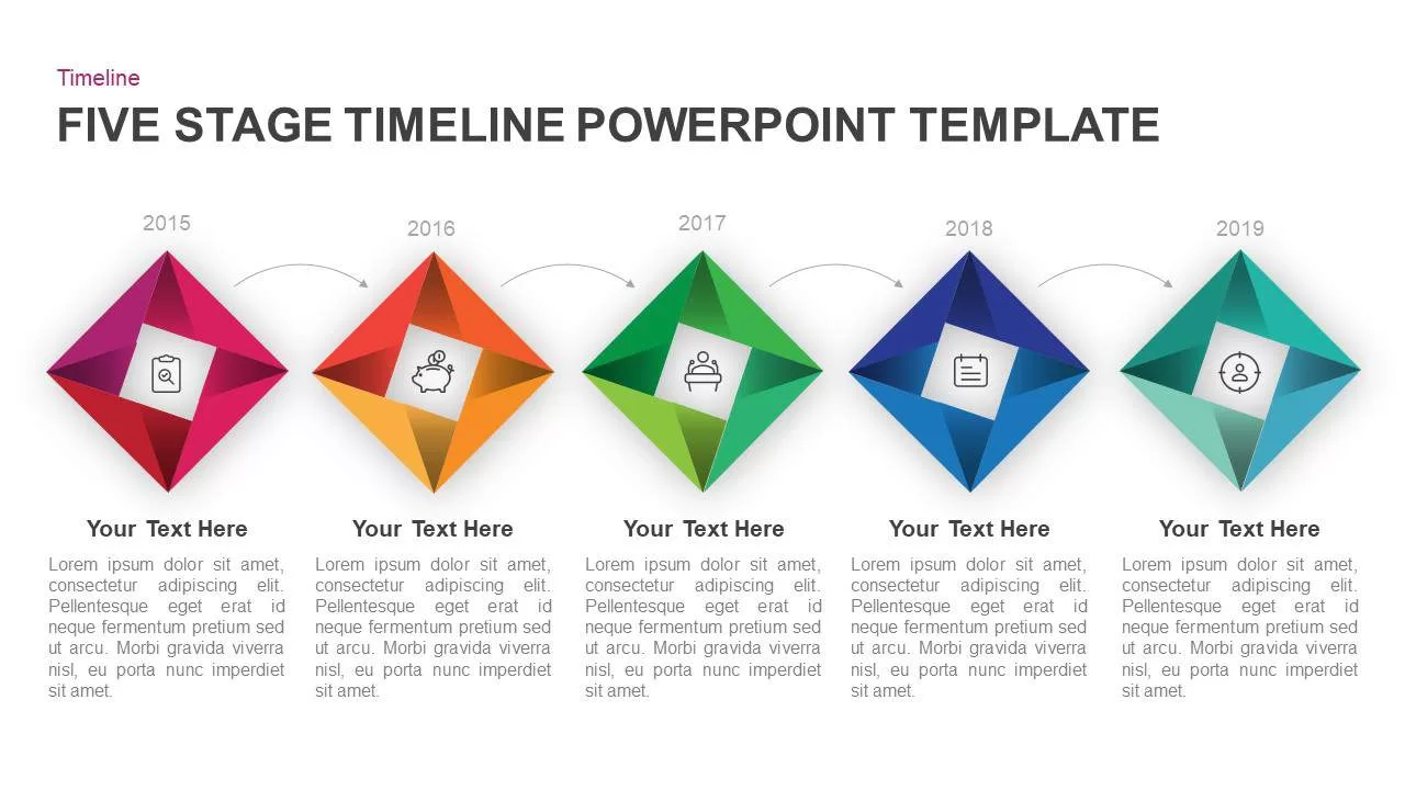
Five-Stage Diamond Timeline Chart Template for PowerPoint & Google Slides
Timeline
Premium
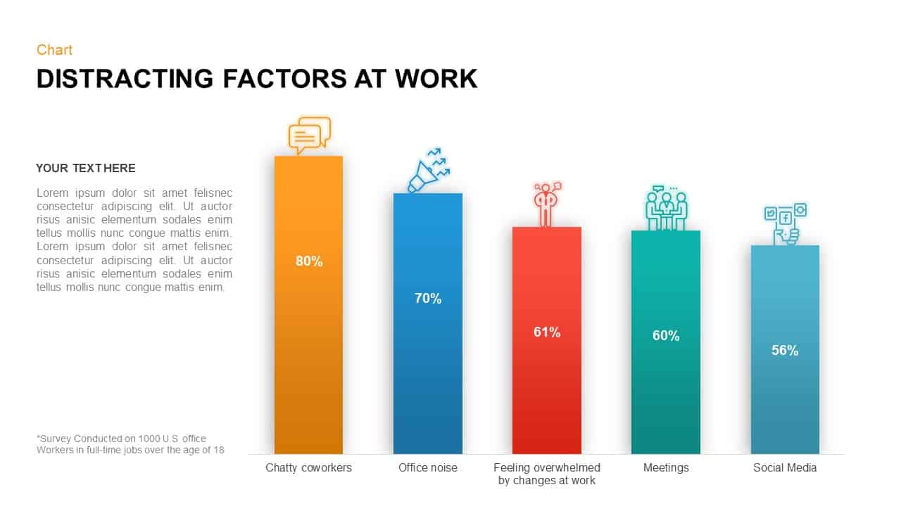
Distracting Factors at Work Bar Chart Template for PowerPoint & Google Slides
Bar/Column
Premium
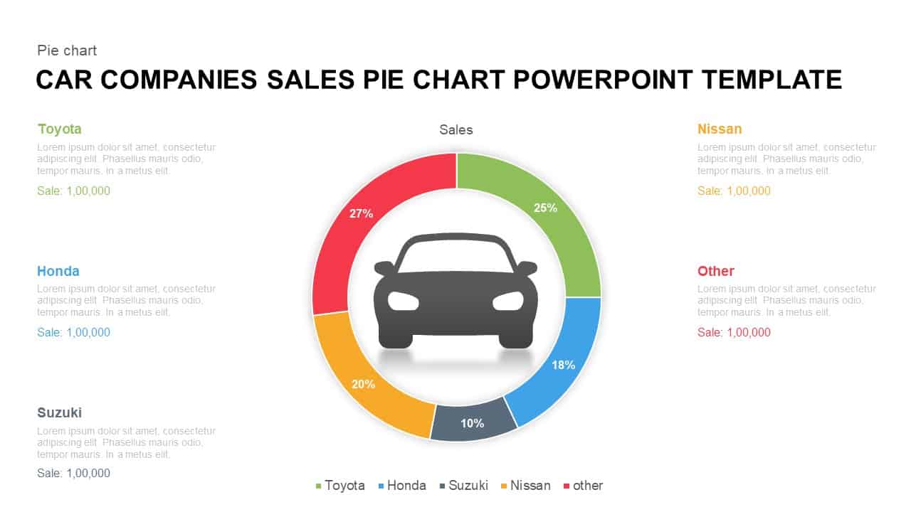
Car Sales Market Share Pie Chart Template for PowerPoint & Google Slides
BCG
Premium
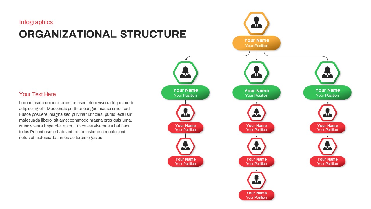
Organizational Structure Hierarchy Chart Template for PowerPoint & Google Slides
Org Chart
Premium
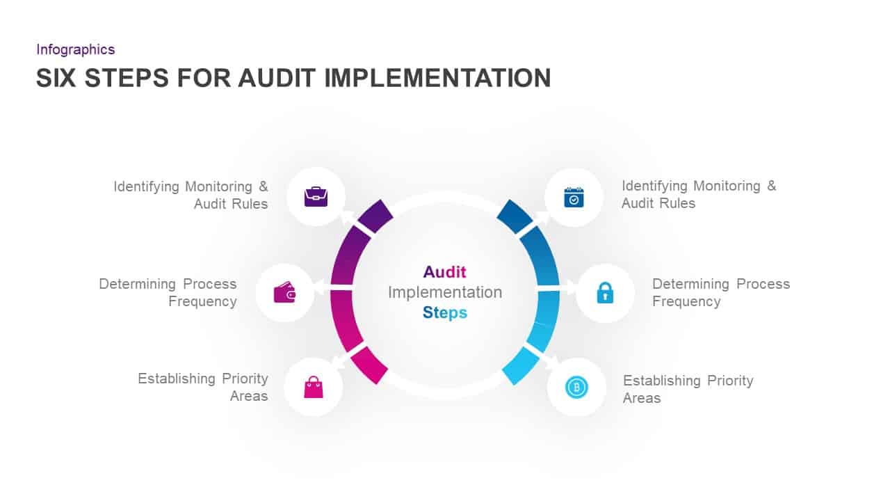
Six-Step Audit Implementation Chart Template for PowerPoint & Google Slides
Circle
Premium
Vertical Split Flow Chart Diagram Template for PowerPoint & Google Slides
Flow Charts
Premium
Modern Organizational Chart Hierarchy Template for PowerPoint & Google Slides
Org Chart
Premium
3D Color Block Organizational Chart Slide for PowerPoint & Google Slides
Org Chart
Premium

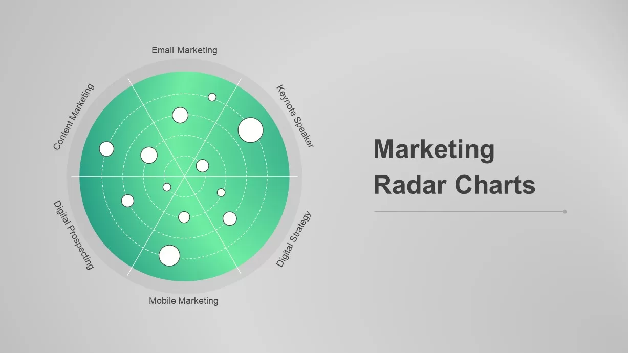
Dynamic Marketing Radar Chart Analytics Template for PowerPoint & Google Slides
Comparison
Premium
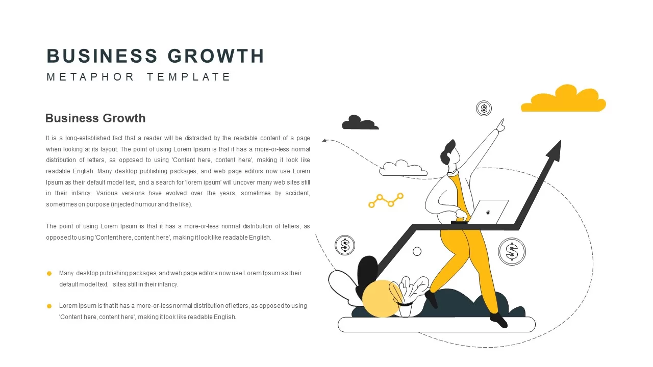
Business Growth Metaphor Chart Template for PowerPoint & Google Slides
Business
Premium
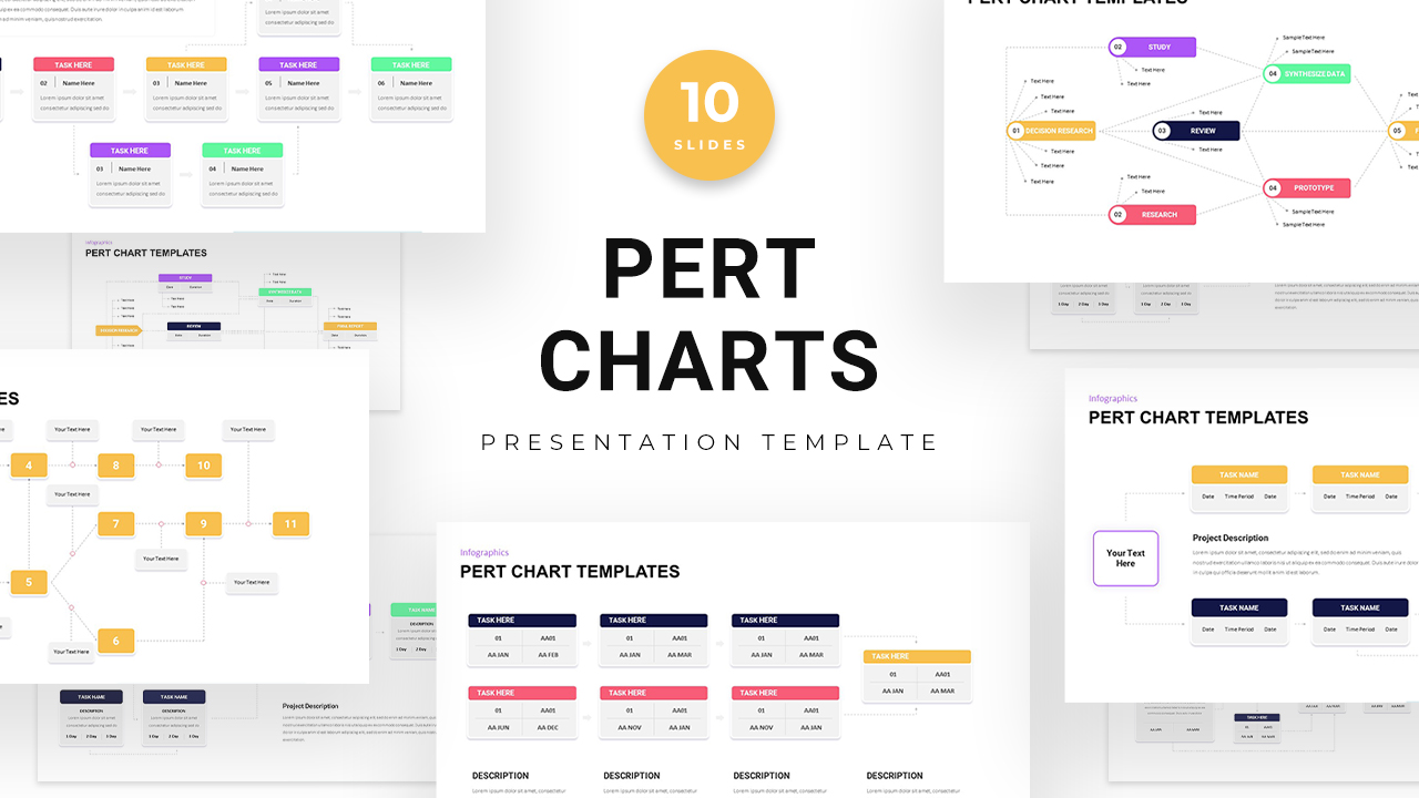
PERT Chart Project Management template for PowerPoint & Google Slides
Project Status
Premium
Organizational Chart Overview template for PowerPoint & Google Slides
Org Chart
Premium
Org Chart Structure template for PowerPoint & Google Slides
Org Chart
Premium
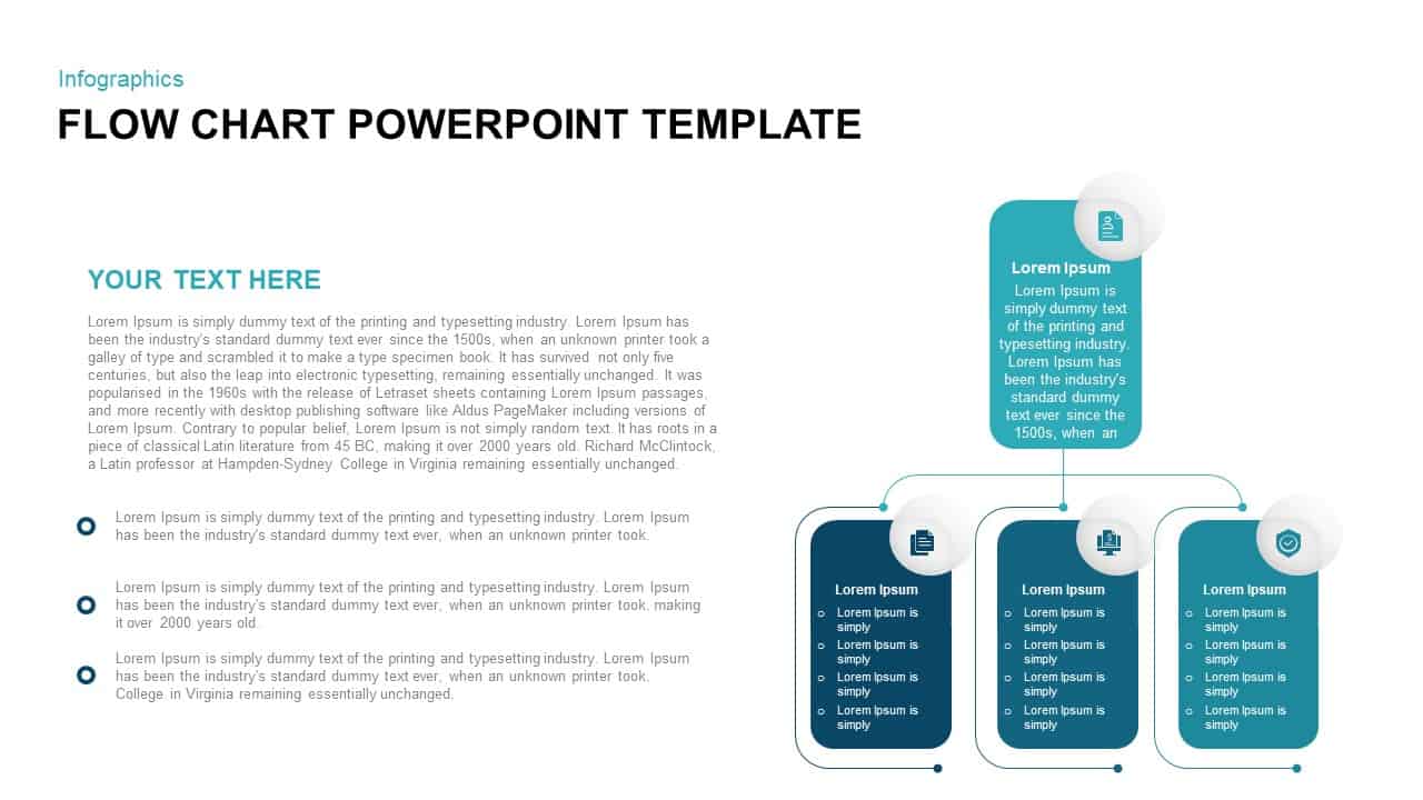
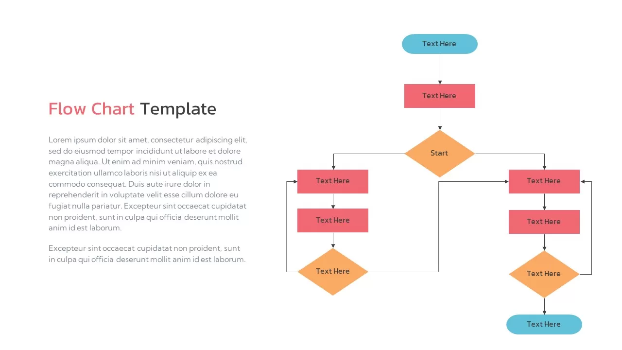
Flow Chart Template for PowerPoint & Google Slides
Flow Charts
Premium
Interactive Project Gantt Chart Timeline Template for PowerPoint & Google Slides
Gantt Chart
Premium
Dynamic Benchmarking Comparison Chart Template for PowerPoint & Google Slides
Comparison Chart
Premium
Modern Divisional Organization Chart Template for PowerPoint & Google Slides
Org Chart
Premium
Divisional Organization Chart Template for PowerPoint & Google Slides
Org Chart
Premium
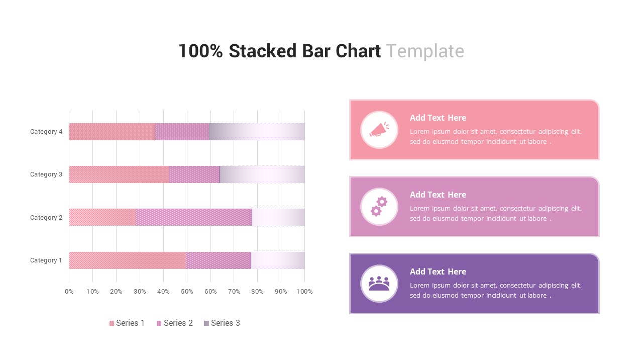
100% Stacked Bar Chart for PowerPoint & Google Slides
Bar/Column
Premium
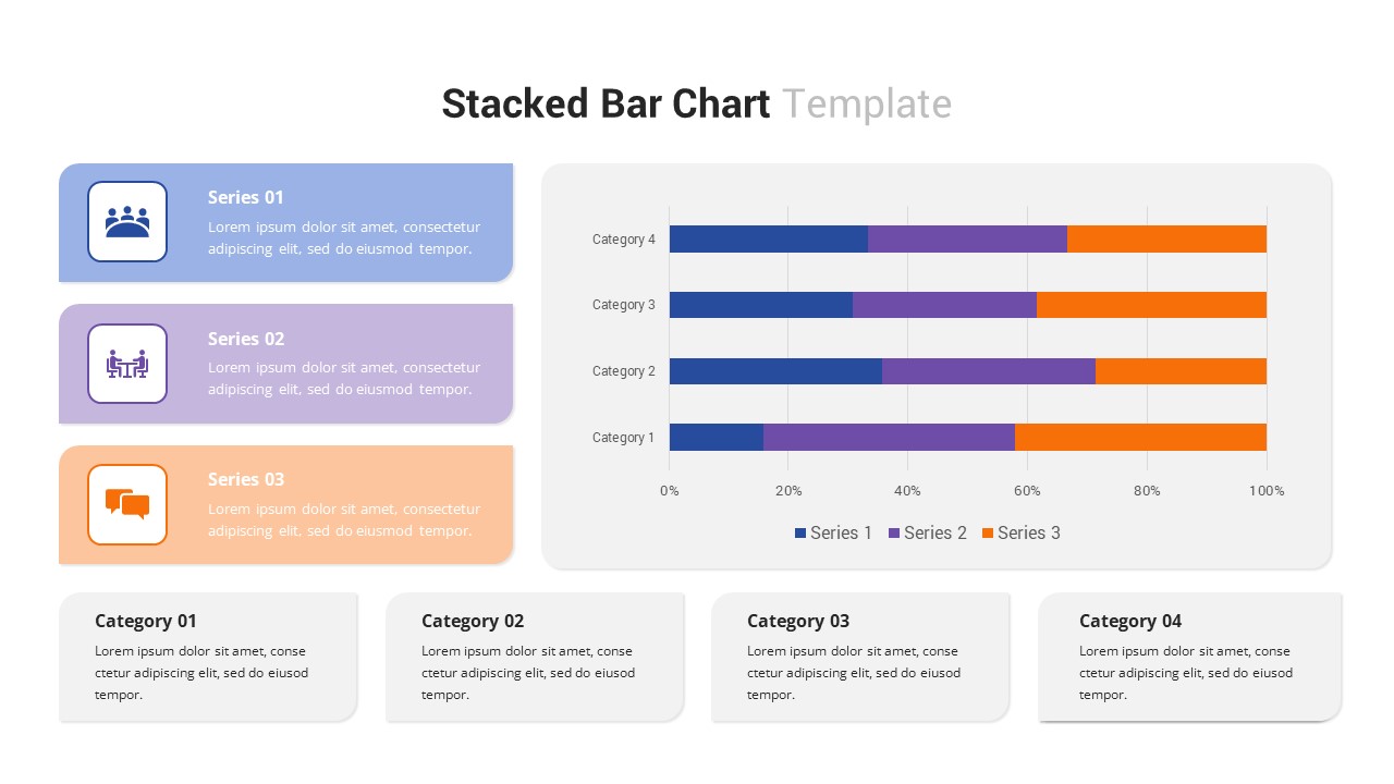
Multi-Series Stacked Bar Chart Template for PowerPoint & Google Slides
Bar/Column
Premium
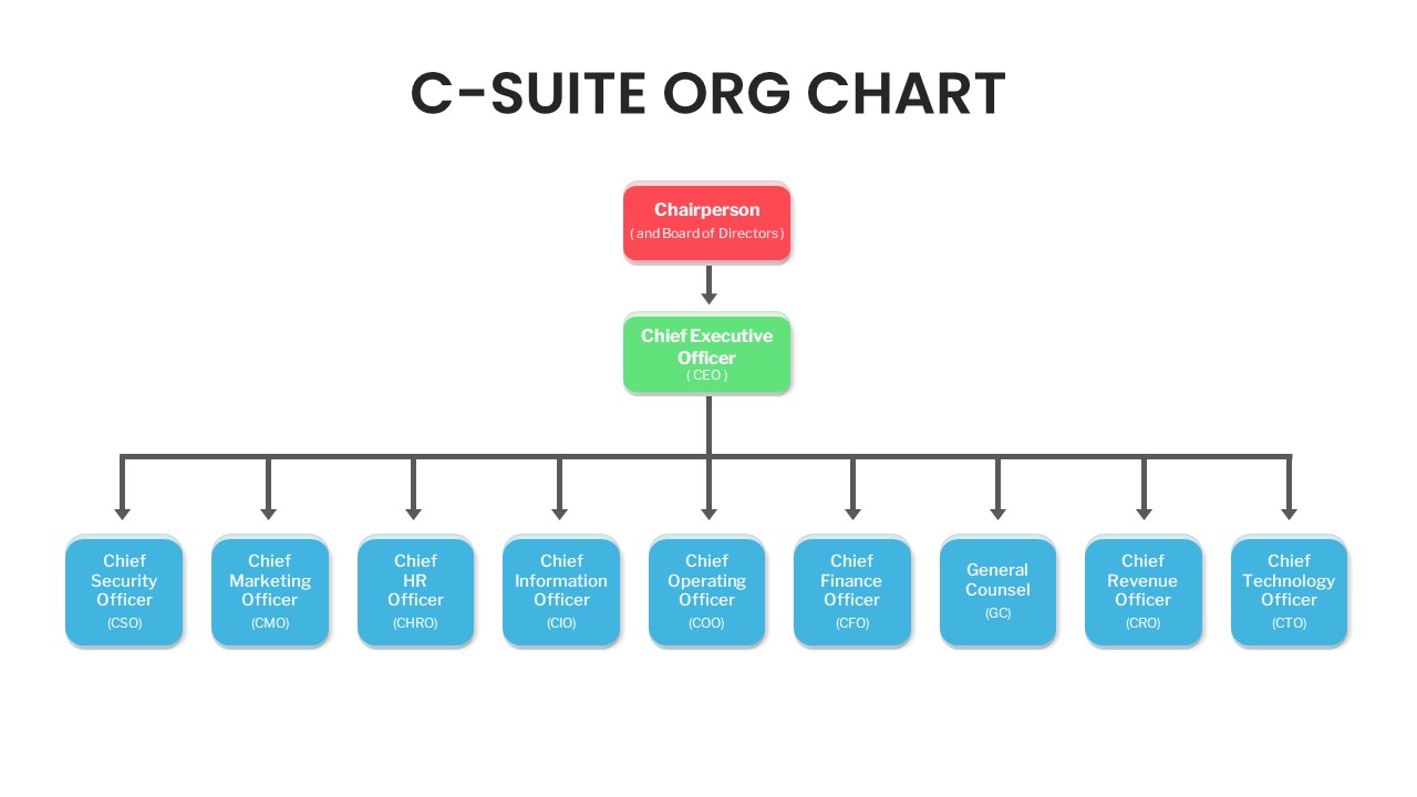
C-Suite Executive Org Chart Diagram Template for PowerPoint & Google Slides
Org Chart
Premium
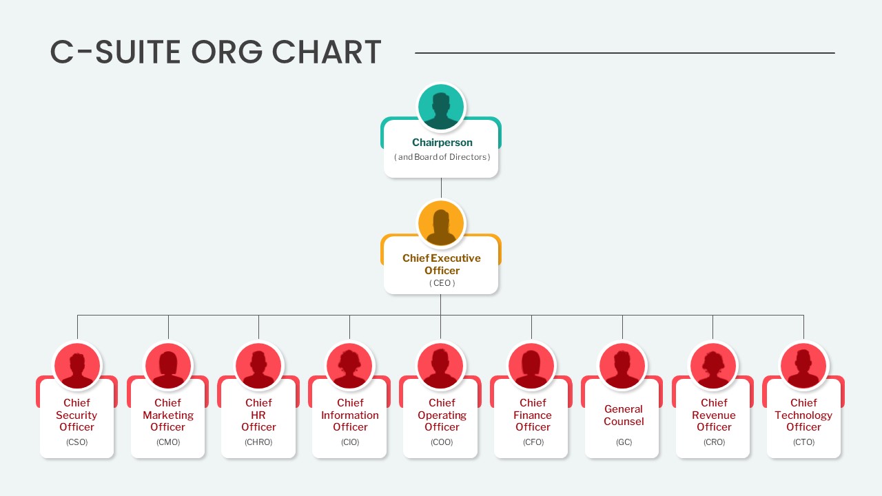
Editable C-Suite Organizational Chart Template for PowerPoint & Google Slides
Org Chart
Premium
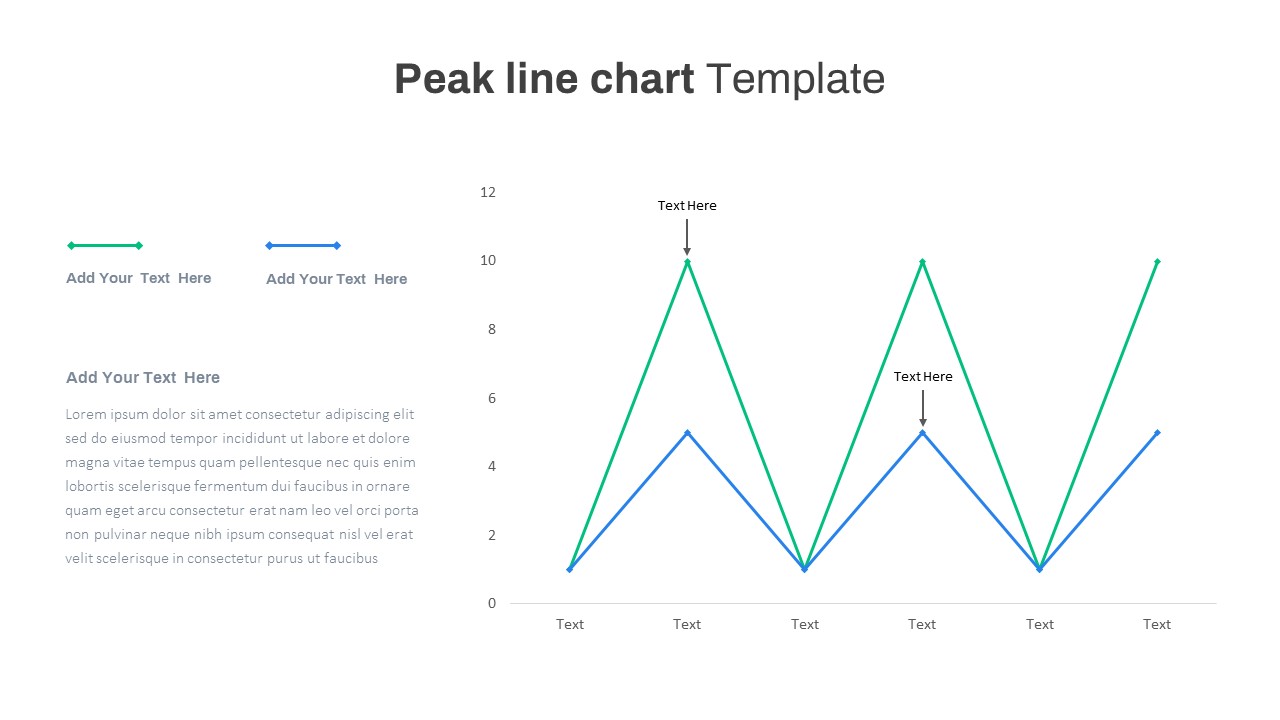
Editable Multi-Series Peak Line Chart Template for PowerPoint & Google Slides
Comparison Chart
Premium
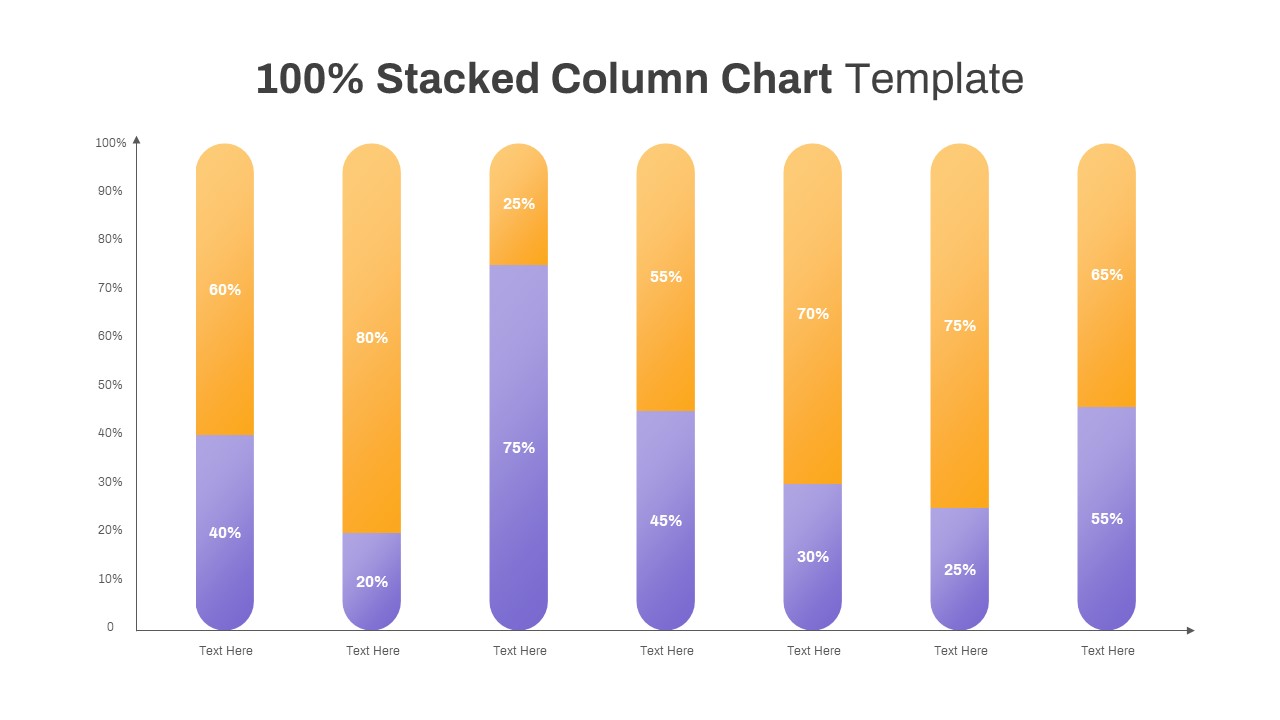
Professional 100% Stacked Column Chart Template for PowerPoint & Google Slides
Bar/Column
Premium
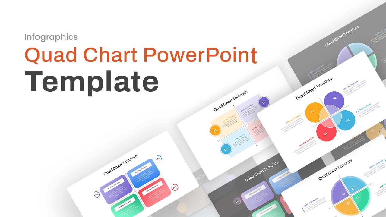
Professional Quad Chart Layout Template for PowerPoint & Google Slides
Pie/Donut
Premium
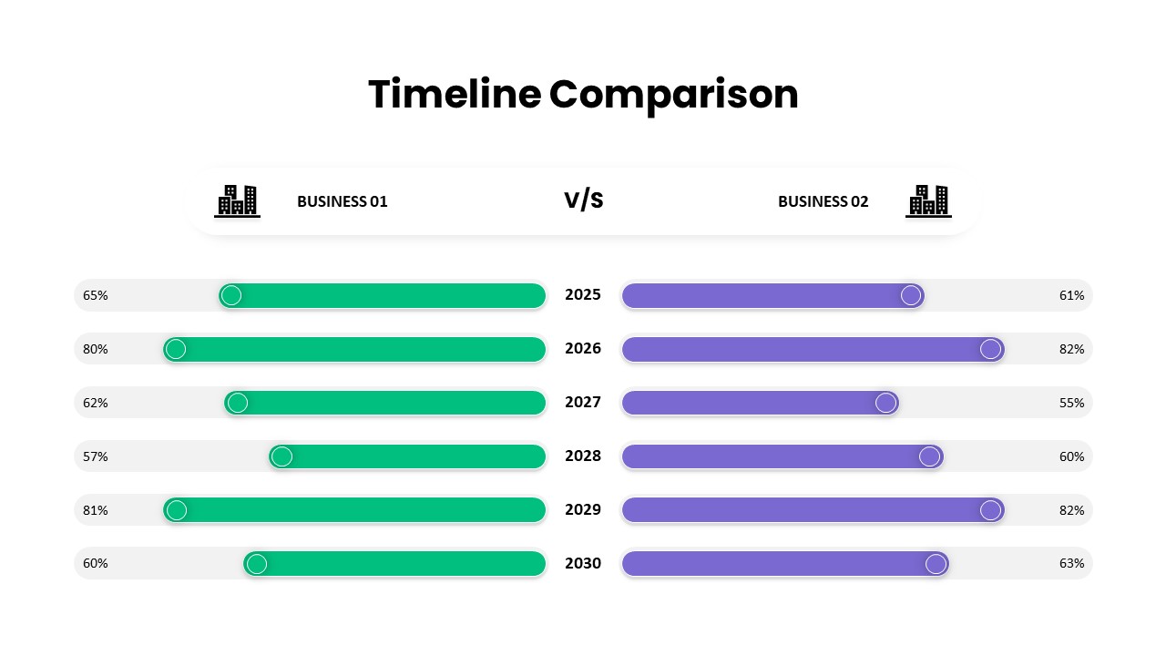
Business Timeline Comparison Bar Chart Template for PowerPoint & Google Slides
Comparison Chart
Premium
Grouped Column Chart Comparison Template for PowerPoint & Google Slides
Bar/Column
Premium
Five-Phase and Three-Phase Phases Chart Template for PowerPoint & Google Slides
Charts
Premium
Excel-Driven Gradient Timeline Chart Template for PowerPoint & Google Slides
Premium
Multi-Series Line Chart with Icons Template for PowerPoint & Google Slides
Comparison Chart
Premium
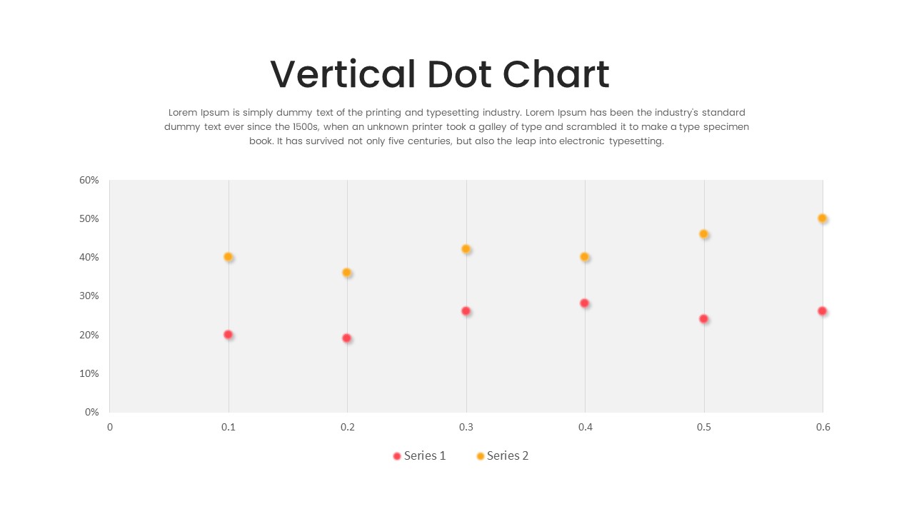
Multi-Series Vertical Dot Chart Template for PowerPoint & Google Slides
Comparison Chart
Premium
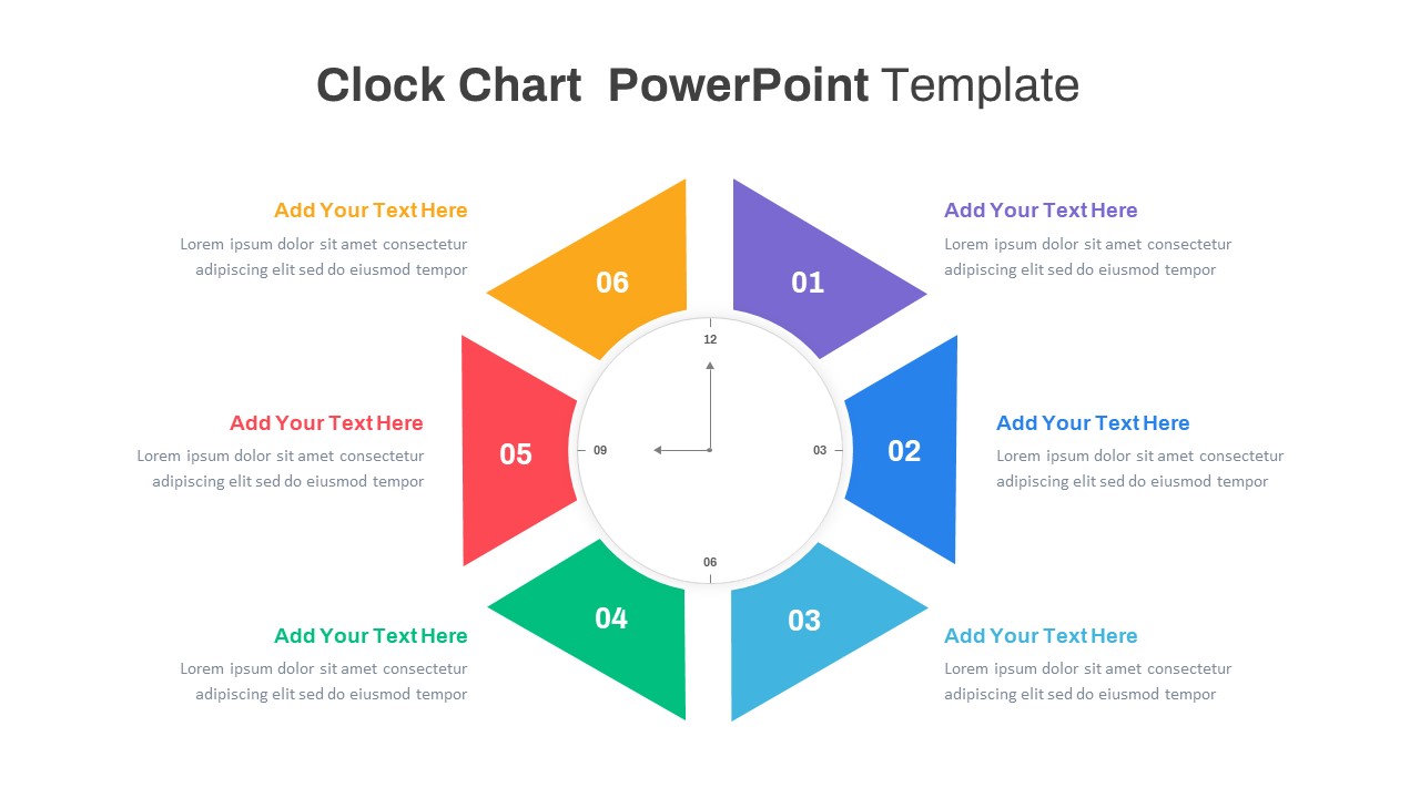
Multi-Style Clock Chart Diagram Template for PowerPoint & Google Slides
Circle
Premium
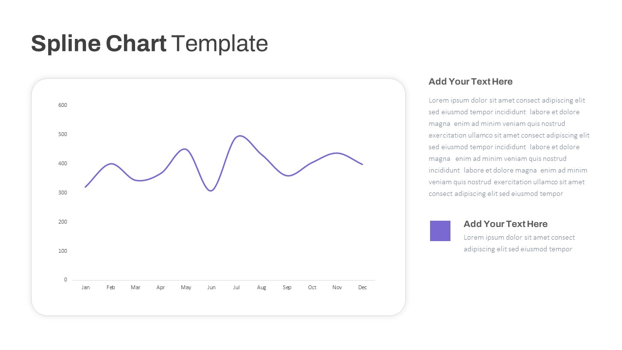
Multipurpose Spline Chart Data Trend Template for PowerPoint & Google Slides
Bar/Column
Premium
Multi-Variation Circular Chart Diagram Template for PowerPoint & Google Slides
Circle
Premium
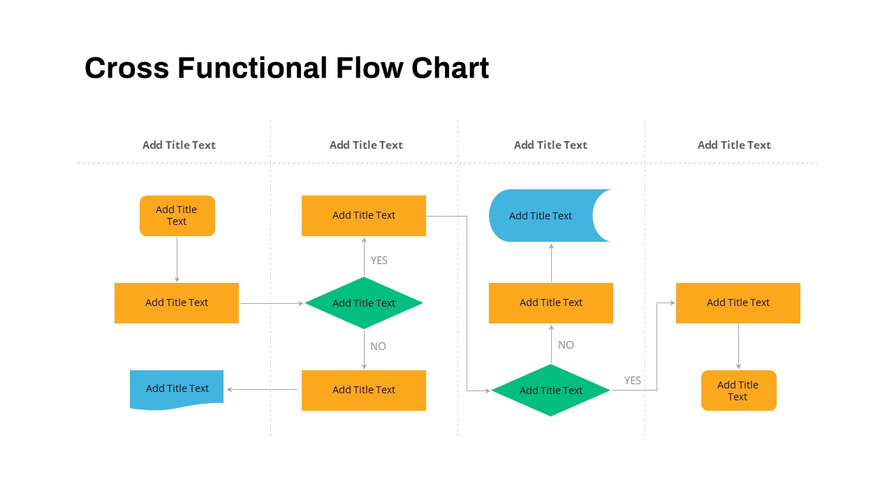
Cross Functional Swimlane Flow Chart Template for PowerPoint & Google Slides
Flow Charts
Premium
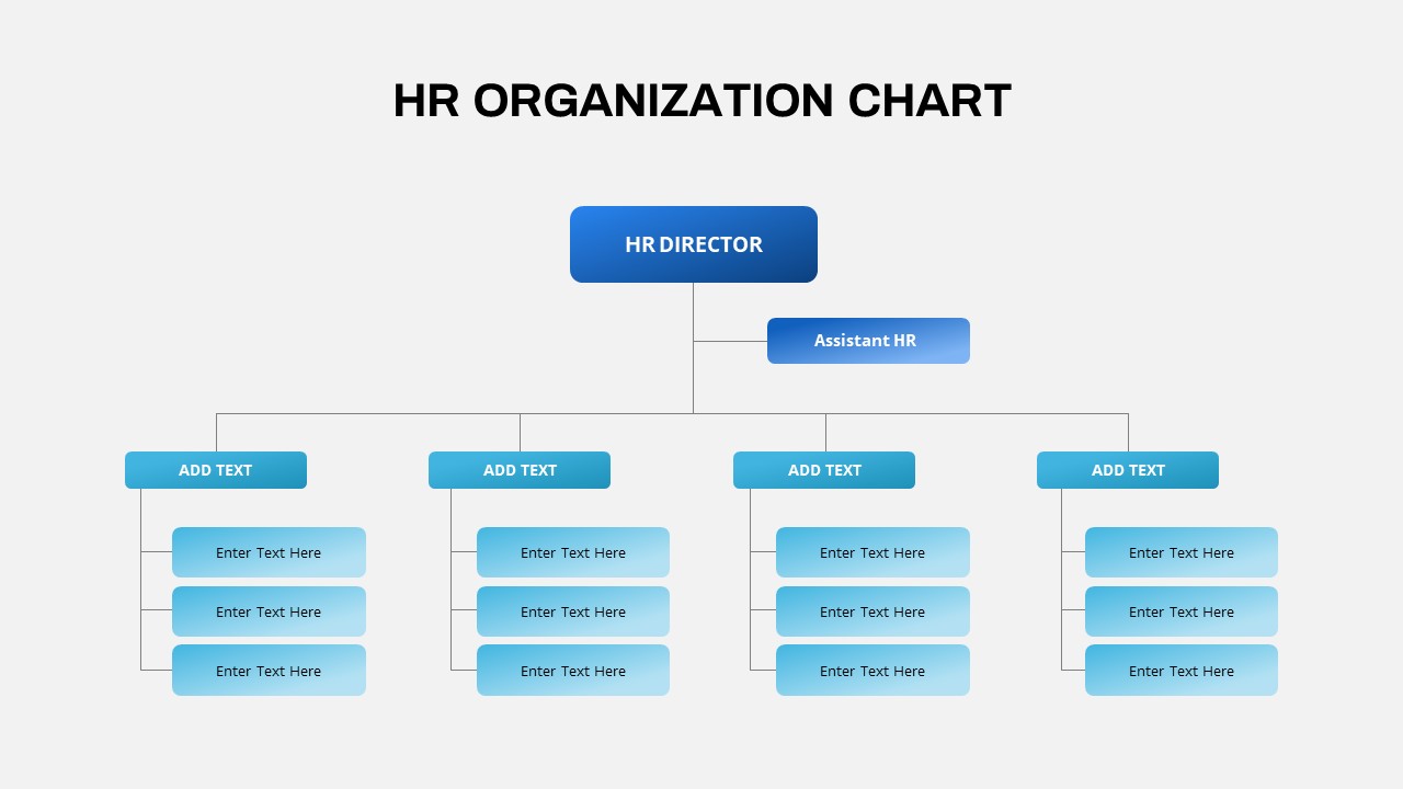
Professional HR Organization Chart Template for PowerPoint & Google Slides
Org Chart
Premium
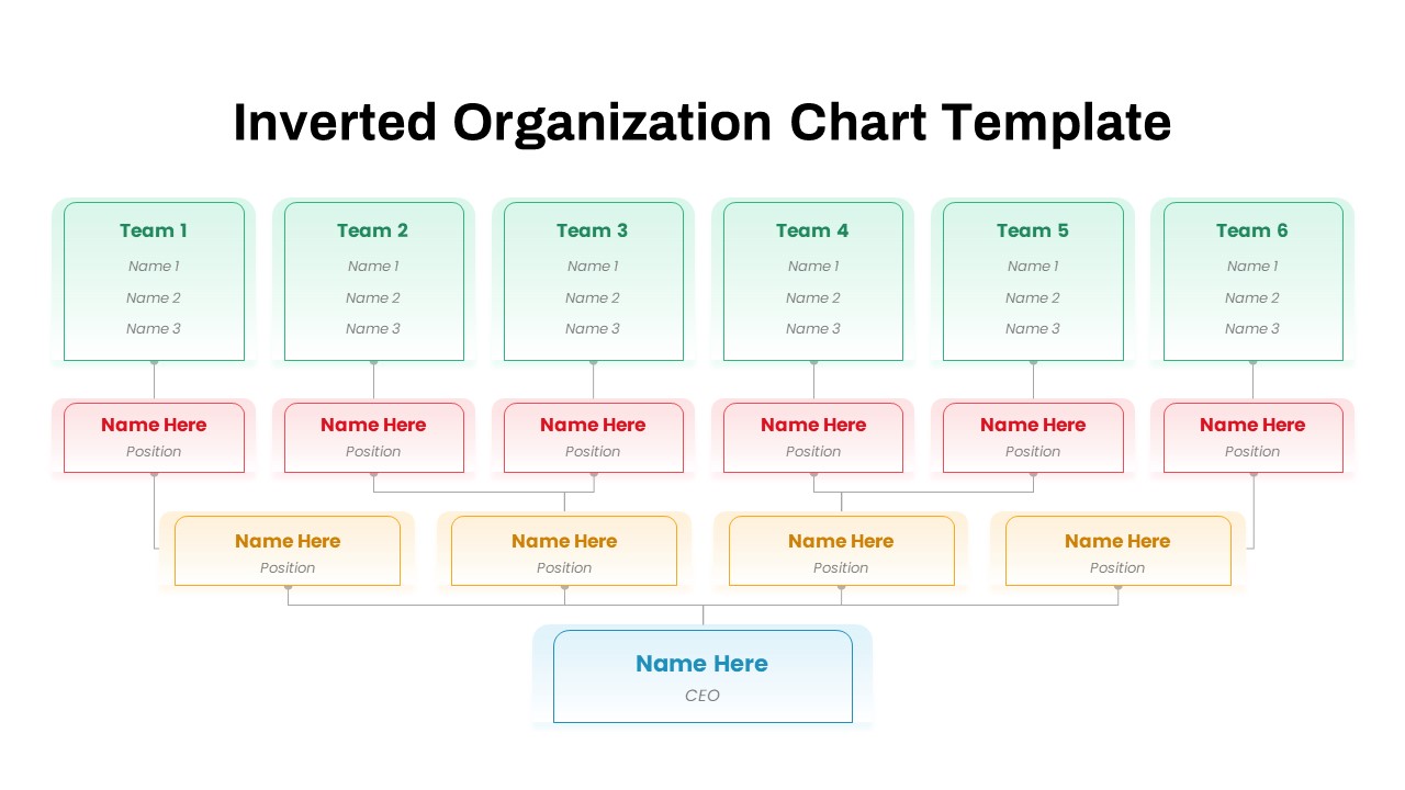
Inverted Organization Chart Diagram Template for PowerPoint & Google Slides
Org Chart
Premium
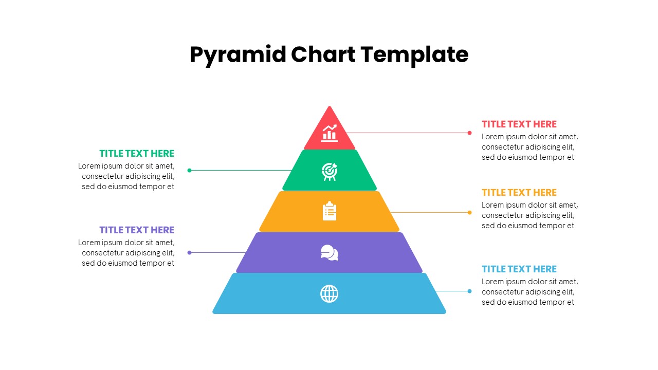
Multi-Level Colorful Pyramid Chart Template for PowerPoint & Google Slides
Pyramid
Premium
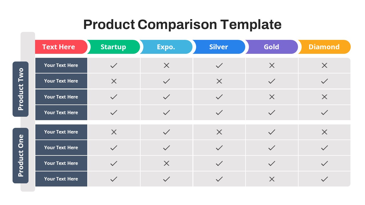
Free Versatile Product Comparison Chart Template for PowerPoint & Google Slides
Comparison Chart
Free
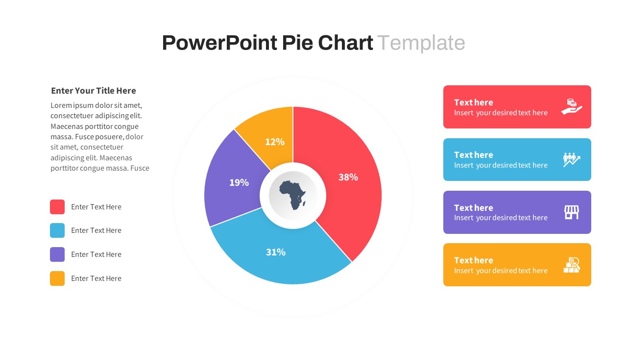
Segmented Pie Chart Infographic with Icons for PowerPoint & Google Slides
Pie/Donut
Premium
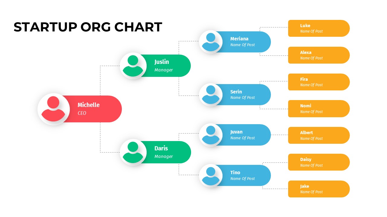
Color-Coded Startup Org Chart Slide for PowerPoint & Google Slides
Org Chart
Premium
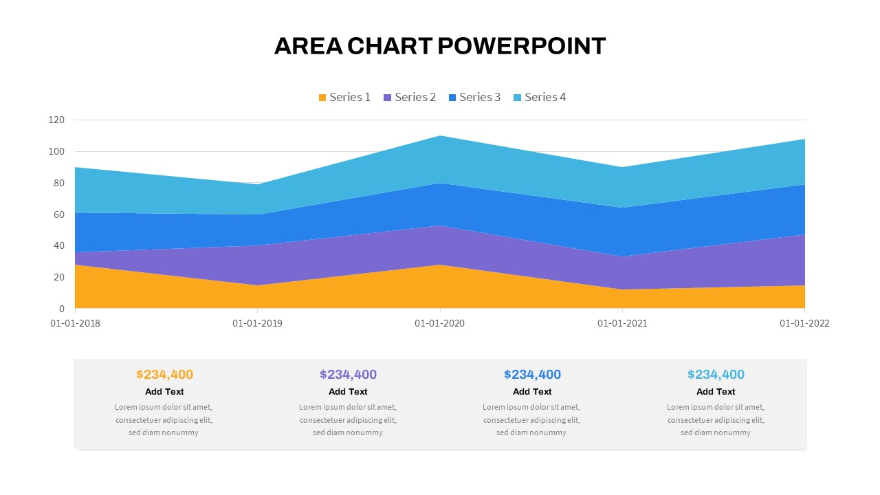
Stacked Area Chart with Financial Highlights for PowerPoint & Google Slides
Finance
Premium
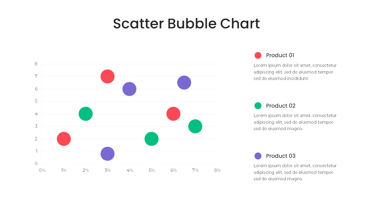
Bubble Chart Scatter, Diagram & Matrix Template for PowerPoint & Google Slides
Comparison Chart
Premium
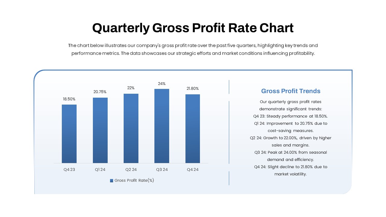
Quarterly Gross Profit Rate Chart Template for PowerPoint & Google Slides
Revenue
Premium
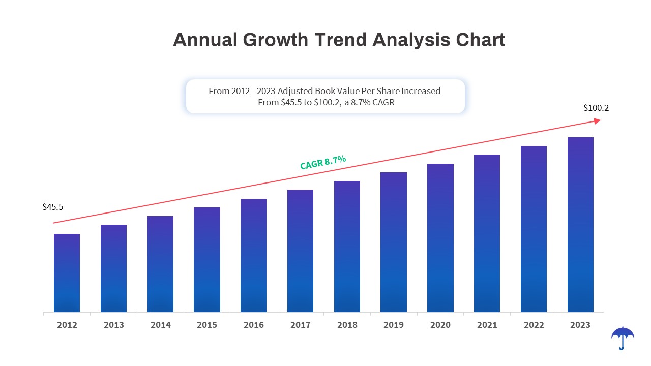
Annual Growth Trend Analysis Chart template for PowerPoint & Google Slides
Business Report
Premium
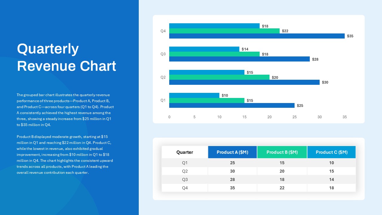
Quarterly Revenue Comparison Bar Chart Template for PowerPoint & Google Slides
Bar/Column
Premium
Data Analysis Bar Chart with Insights Template for PowerPoint & Google Slides
Bar/Column
Free
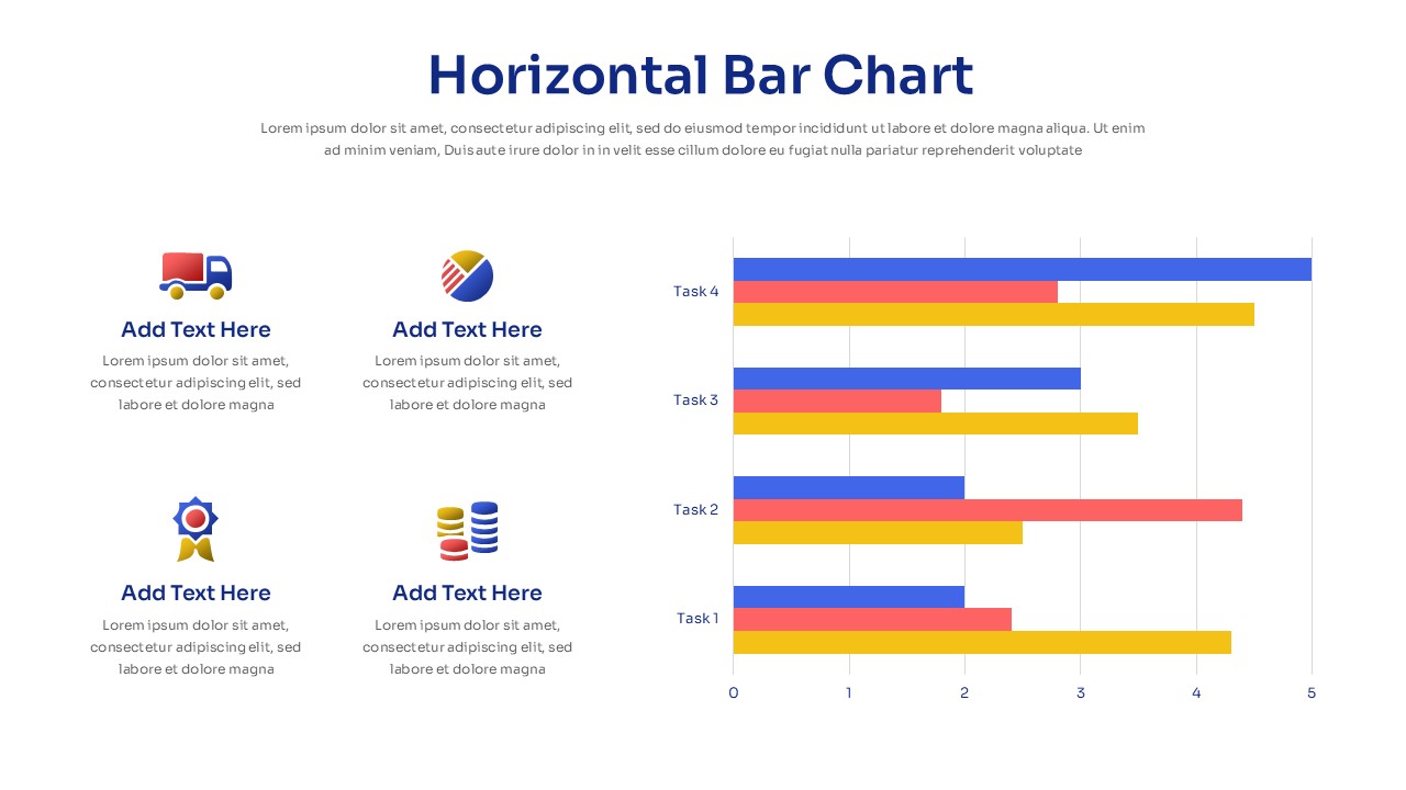
Horizontal Bar Chart Slide with Icons Template for PowerPoint & Google Slides
Bar/Column
Premium
Project Tracker Timeline Gantt Chart Template for PowerPoint & Google Slides
Project Status
Premium
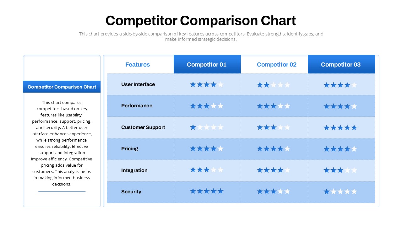
Competitor Comparison Chart Design Template for PowerPoint & Google Slides
Comparison
Premium
Two-Option Bar Chart Comparison Table Template for PowerPoint & Google Slides
Comparison
Premium
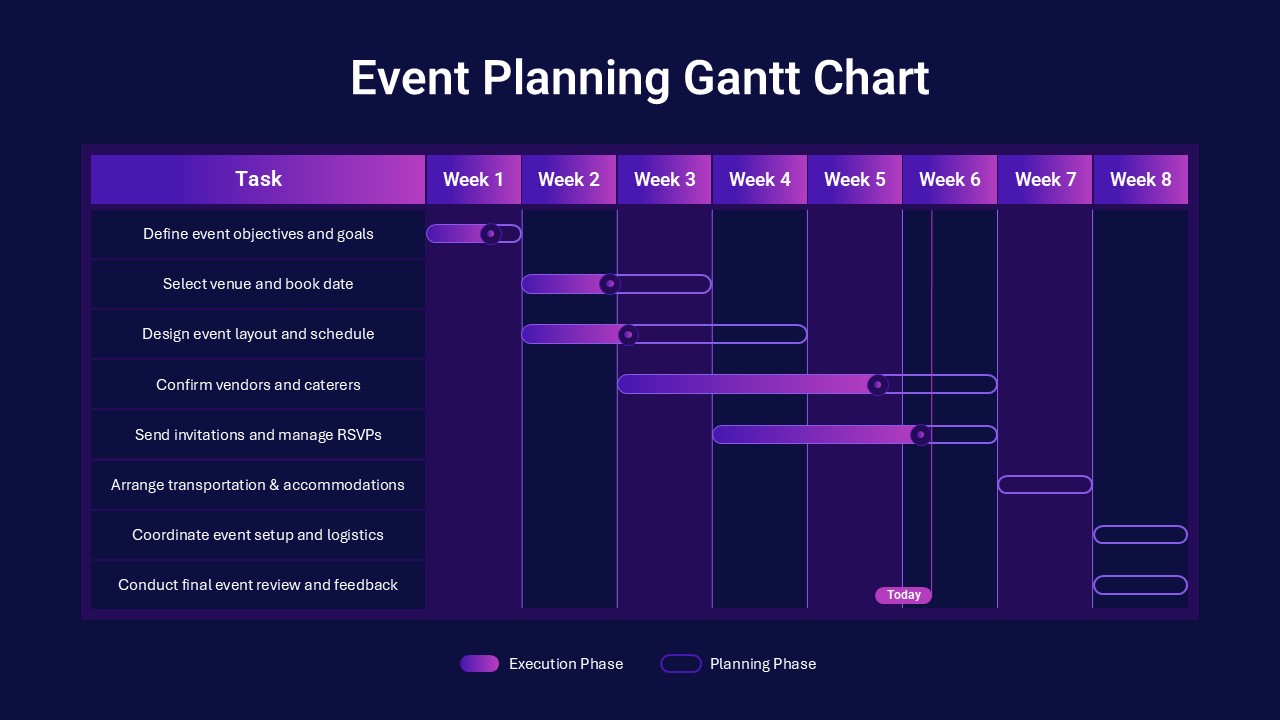
Event Planning Gantt Chart template for PowerPoint & Google Slides
Business
Premium
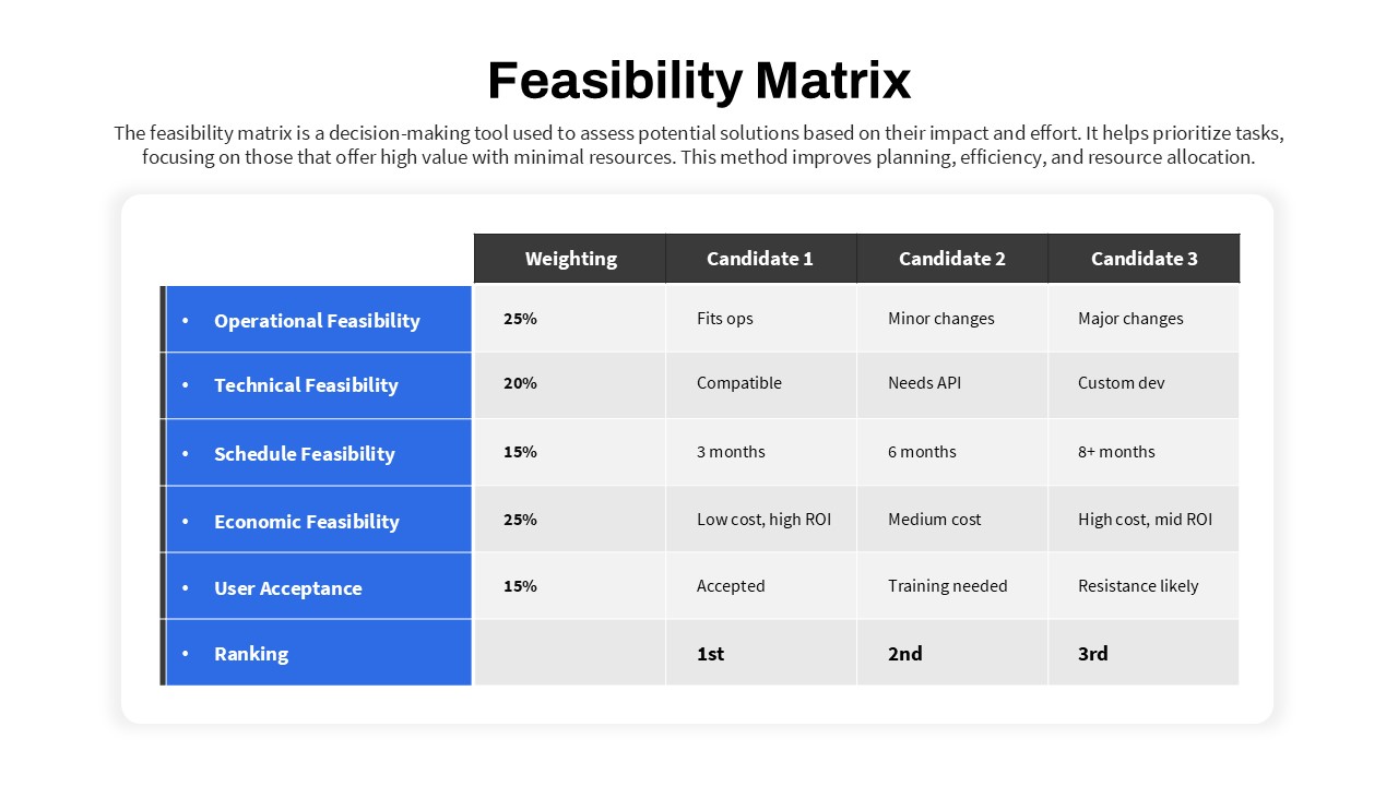
Feasibility Matrix Comparison Chart Template for PowerPoint & Google Slides
Comparison Chart
Premium
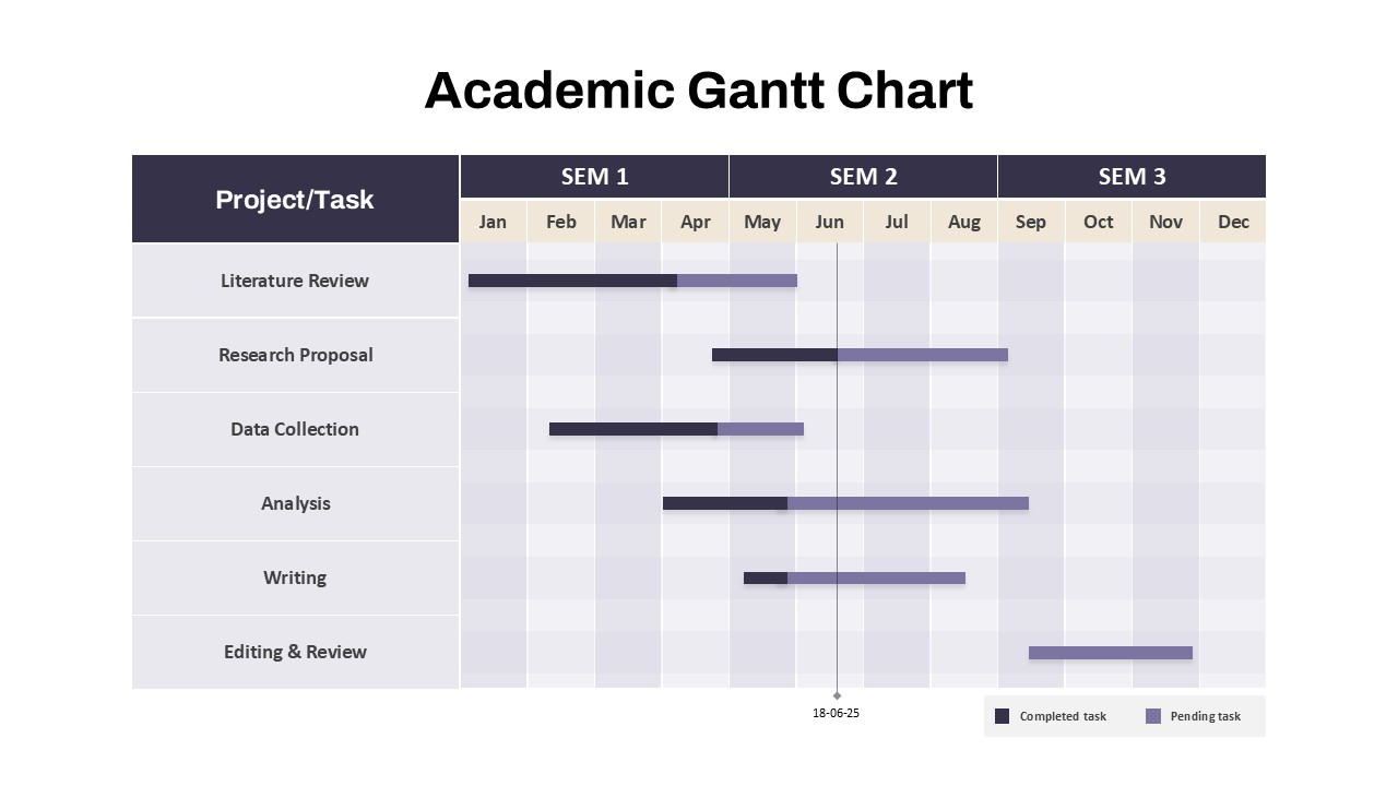
Academic Gantt Chart template for PowerPoint & Google Slides
Business
Premium
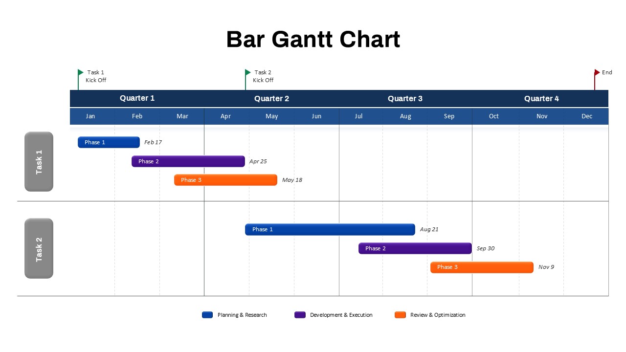
Bar Gantt Chart Template for PowerPoint & Google Slides
Gantt Chart
Premium