Syria Regional Data Map Infographic Template for PowerPoint & Google Slides


Description
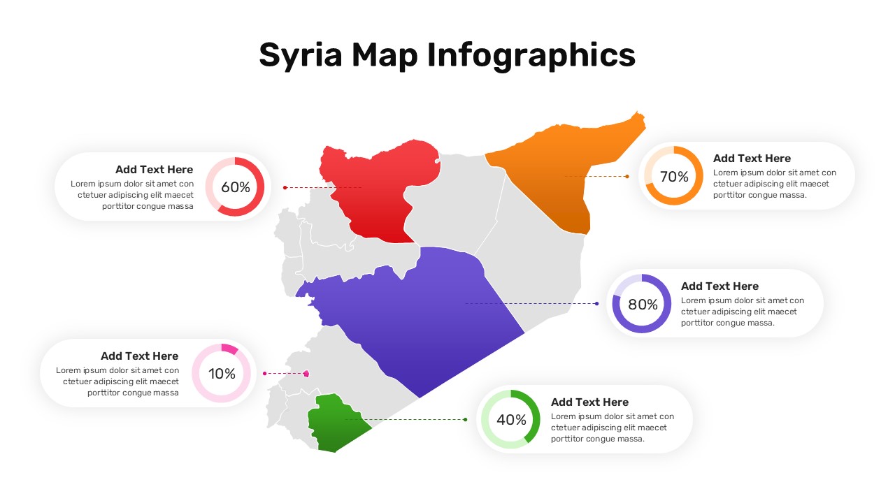
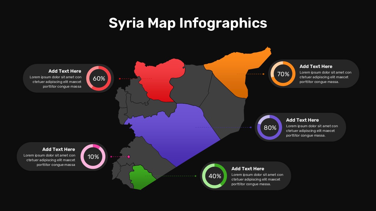
Present detailed regional data across five highlighted governorates of Syria with this map infographic slide. Each region is color-coded and linked via a dashed connector line to a circular progress chart displaying metrics at 60%, 70%, 80%, 40%, and 10%. Placeholder text boxes allow for concise annotations next to each chart, ensuring clear storytelling. The large map, set against a light background, is balanced by rounded-corner callouts and contrasting color rings, creating an engaging, data-driven visual.
Fully editable in PowerPoint and Google Slides, this template leverages master slides, vector graphics, and intuitive placeholders. Swap region colors, adjust percentage values, and replace the map or icons in seconds. Typography presets ensure legibility, while layered shapes and guides maintain alignment as you customize. The slide supports dynamic data updates, enabling you to refresh charts automatically or manually based on your preferred workflow.
Ideal for market analysis, sales reporting, or socio-economic studies, this infographic enhances presentations by offering a holistic view of geographic performance. Use it to compare regional sales, demographic trends, or resource allocations across Syria’s provinces. Reorder connectors, duplicate callouts, or scale the map to fit different layouts without losing resolution. Optimized for seamless cross-device rendering, it maintains clarity on desktop, web, or mobile screens. Pair with complementary infographics or dashboards to build comprehensive reports, strategic roadmaps, or stakeholder briefings that drive actionable insights.
Advanced customization features include adjustable connectors, grouping functions for locked edits, and optional animations to highlight regional metrics. Export high-resolution PDFs or share via cloud services for version consistency. The infographic remains crisp whether presented live or in virtual meetings.
Who is it for
Market analysts, regional planners, sales directors, and consultants will find this map infographic essential for visualizing geographic performance and comparing key metrics across provinces. Government agencies and NGOs can leverage it for socio-economic reporting and resource allocation briefings.
Other Uses
Beyond regional data, repurpose this slide for project phase mapping, risk assessment heat maps, supply chain routes, or demographic overlays. Adjust callout labels and metrics to suit any five-area geographic analysis or comparison.
Login to download this file

Item ID
SB04676
Related Templates

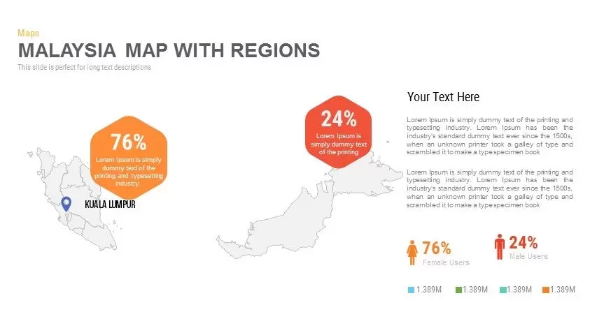
Malaysia Regional Map Infographic Template for PowerPoint & Google Slides
Maps

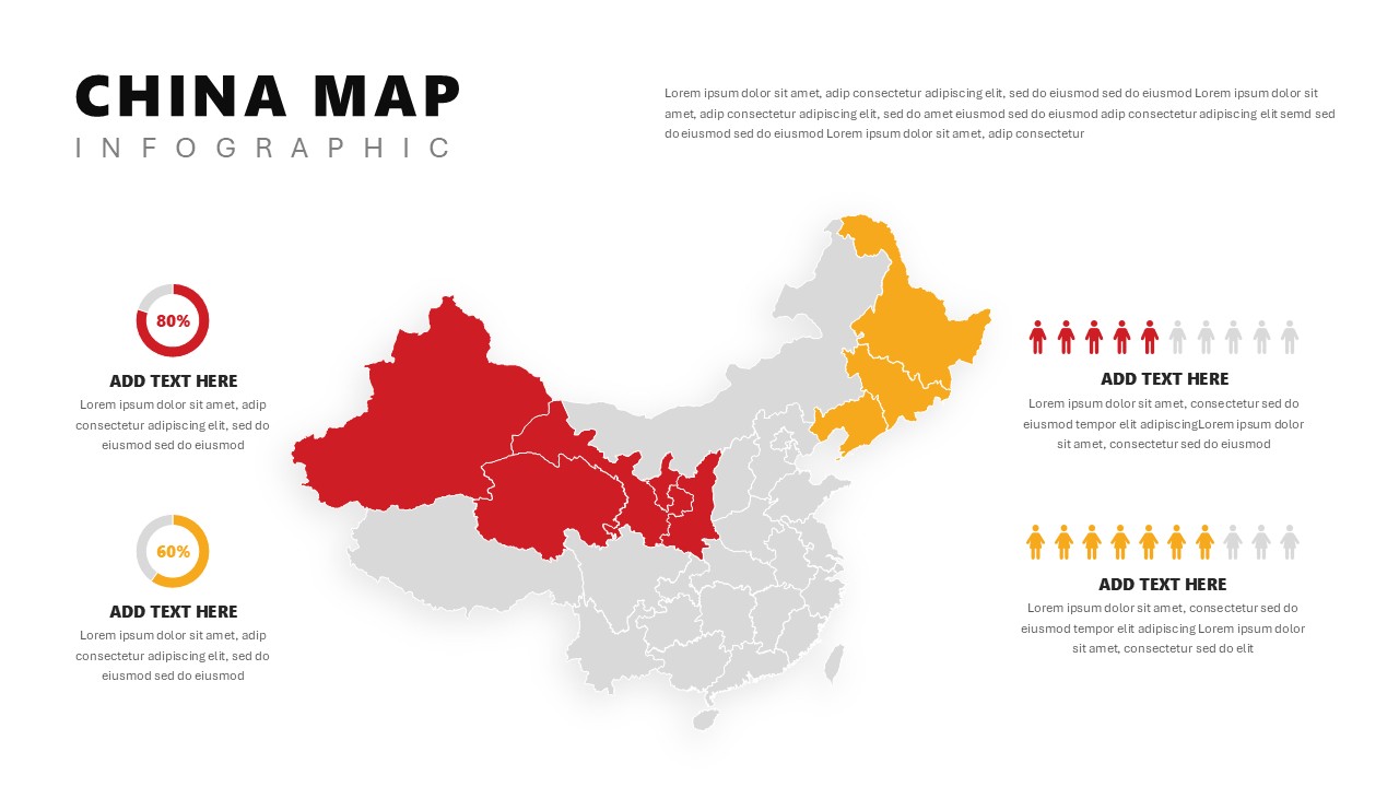
China Map Infographic Regional Stats Template for PowerPoint & Google Slides
World Maps
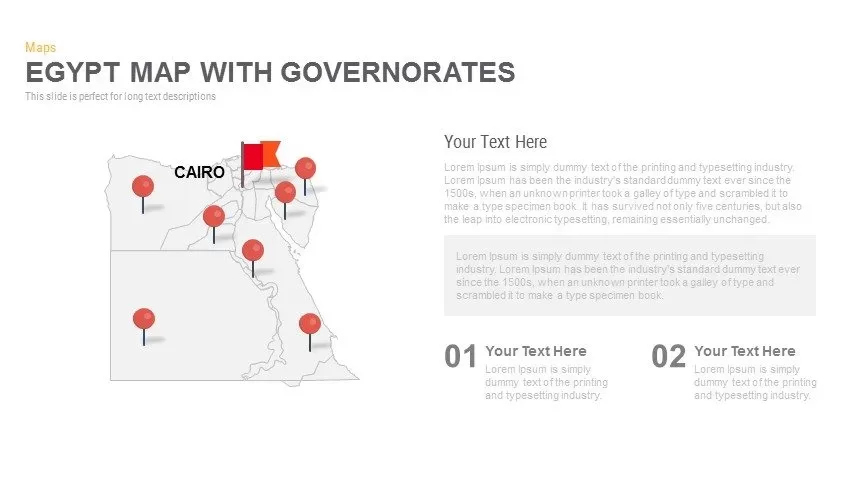
Egypt Regional Map Slide Pack Template for PowerPoint & Google Slides
World Maps
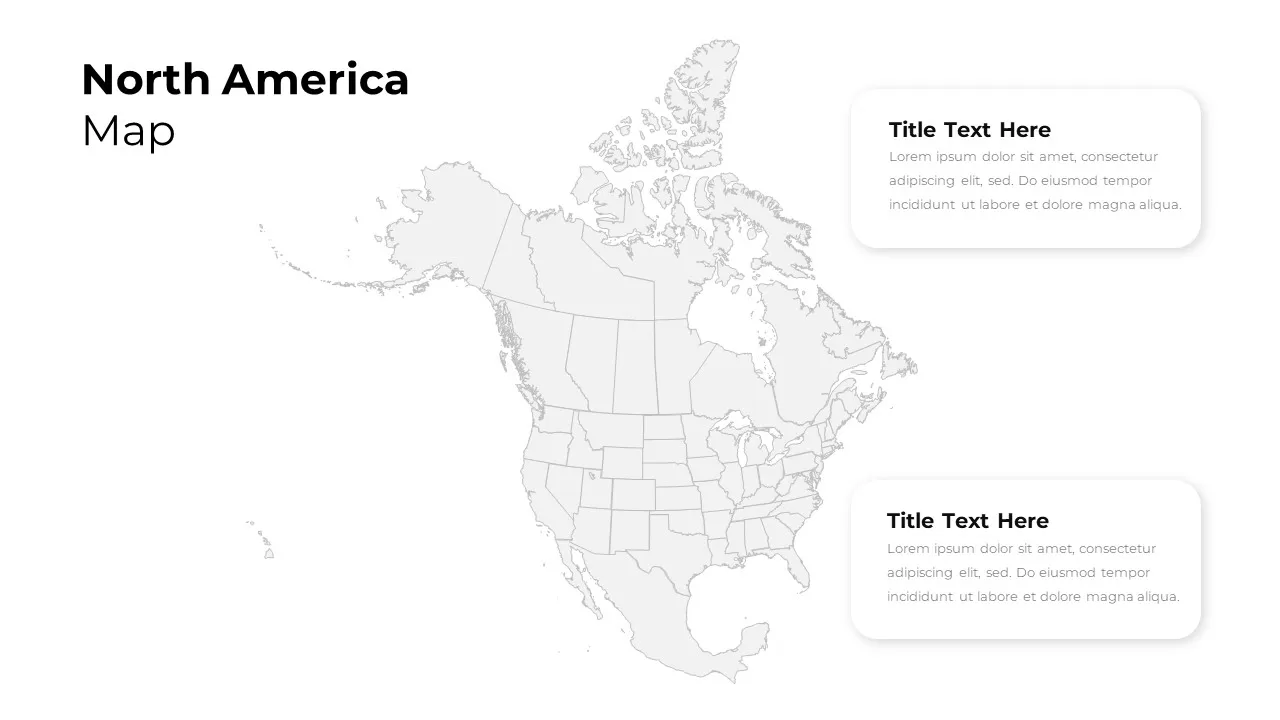
North America Regional Map Overview Template for PowerPoint & Google Slides
World Maps
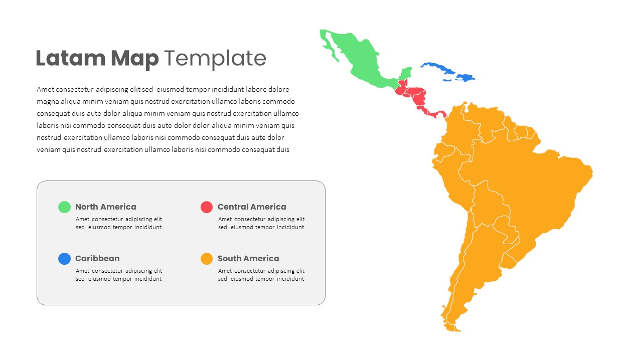
Latin America Regional Map Breakdown Template for PowerPoint & Google Slides
World Maps
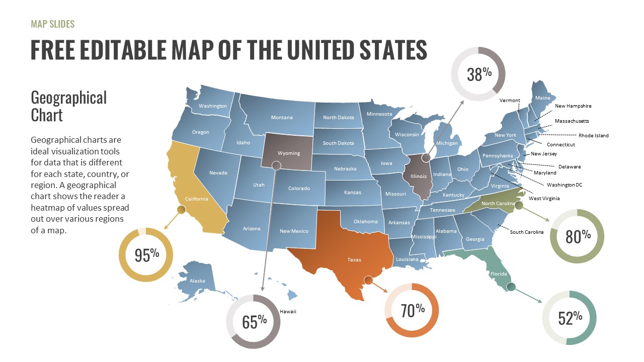
Free Editable U.S. Map with Regional Metrics Template for PowerPoint & Google Slides
World Maps
Free
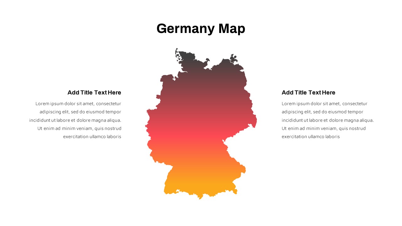
Germany Map with Regional Callouts Template for PowerPoint & Google Slides
World Maps
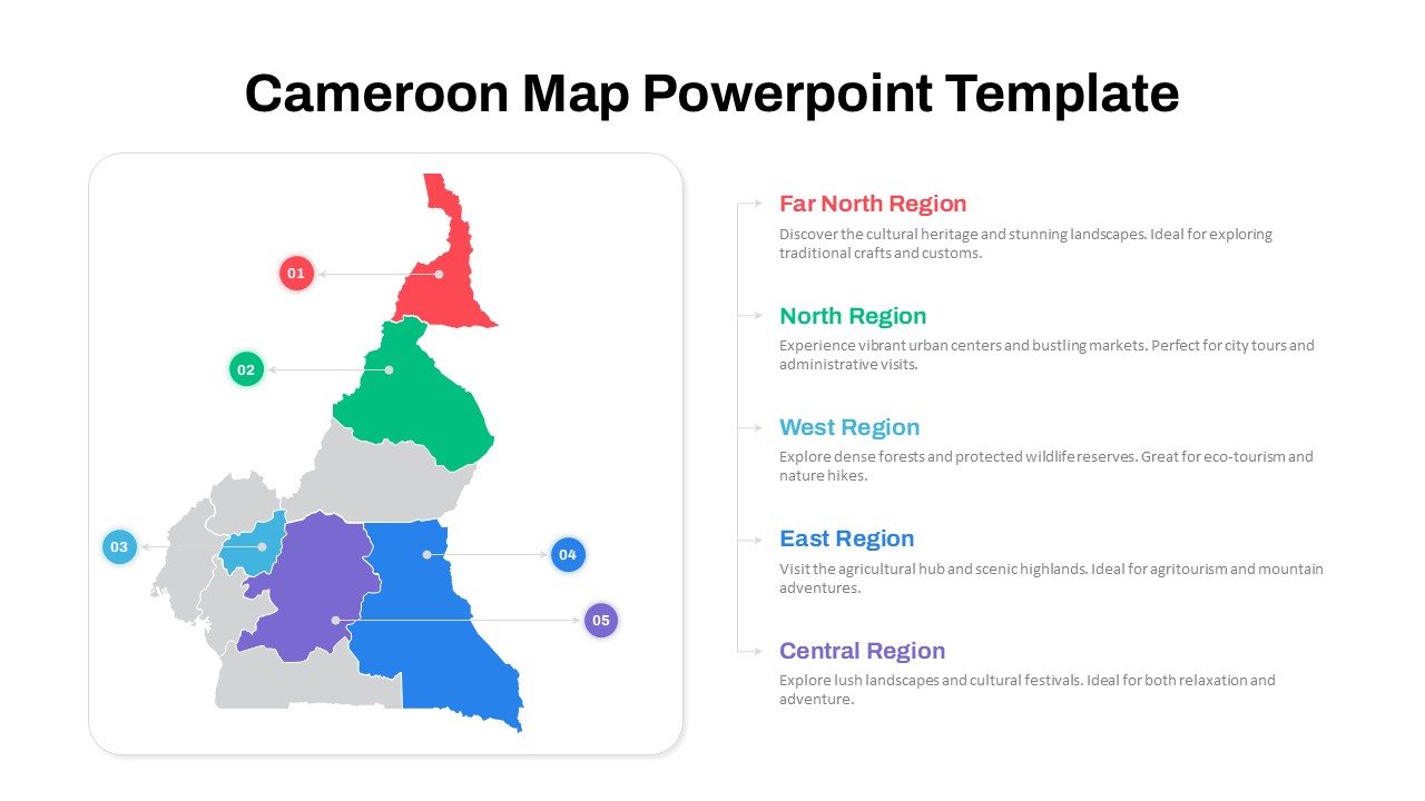
Numbered Cameroon Regional Map Slide Template for PowerPoint & Google Slides
World Maps
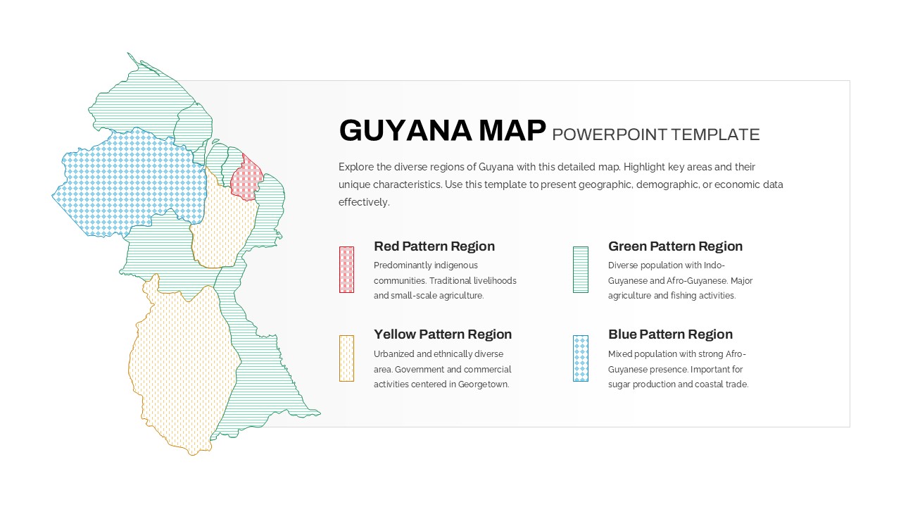
Patterned Guyana Regional Map Template for PowerPoint & Google Slides
World Maps
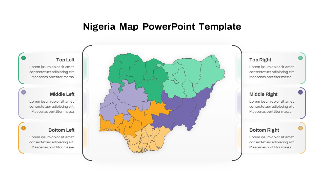
Nigeria Regional Callout Map Diagram Template for PowerPoint & Google Slides
Maps
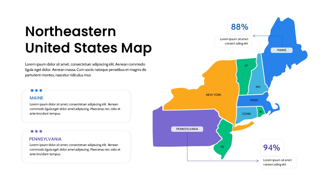
Northeastern United States Regional Map for PowerPoint & Google Slides
World Maps
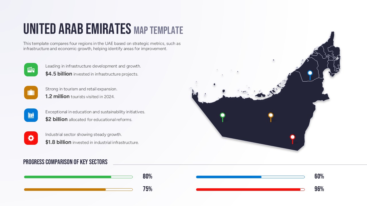
Free United Arab Emirates Regional Map for PowerPoint & Google Slides
World Maps
Free
Regional Revenue Comparison Overview Template for PowerPoint & Google Slides
Comparison
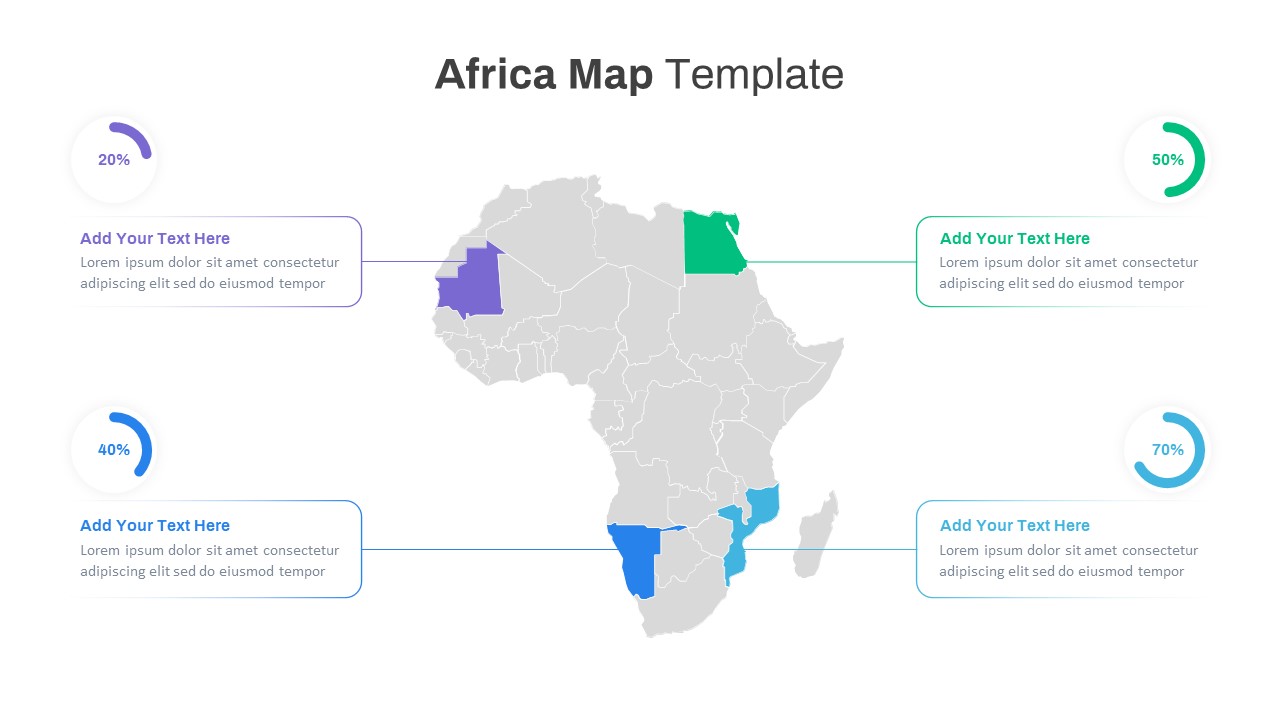
Editable Africa Map Infographic Data Template for PowerPoint & Google Slides
World Maps
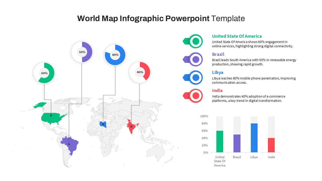
World Map Data template for PowerPoint & Google Slides
World Maps
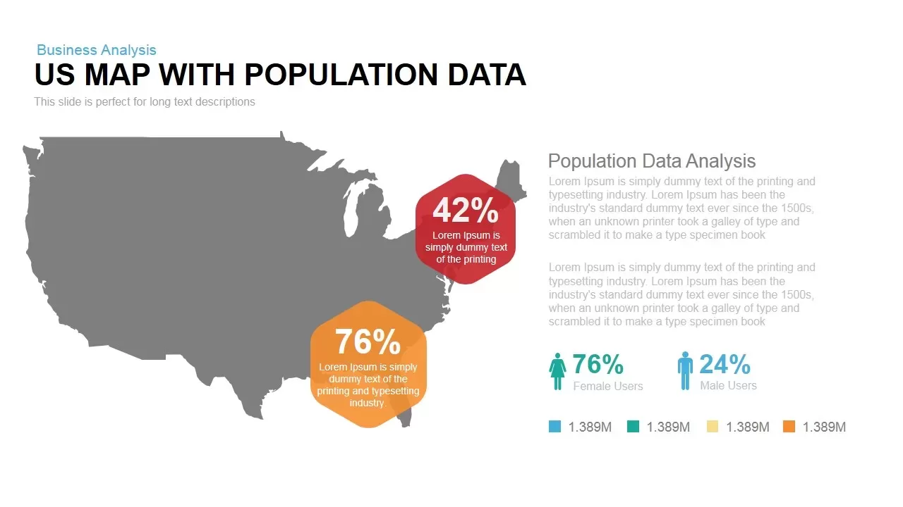
Interactive US Population Data Map Slide Template for PowerPoint & Google Slides
World Maps
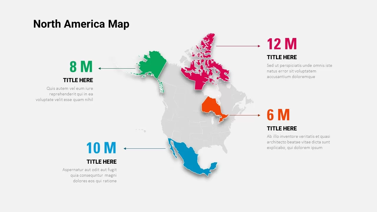
North America Data Map Callouts Template for PowerPoint & Google Slides
World Maps
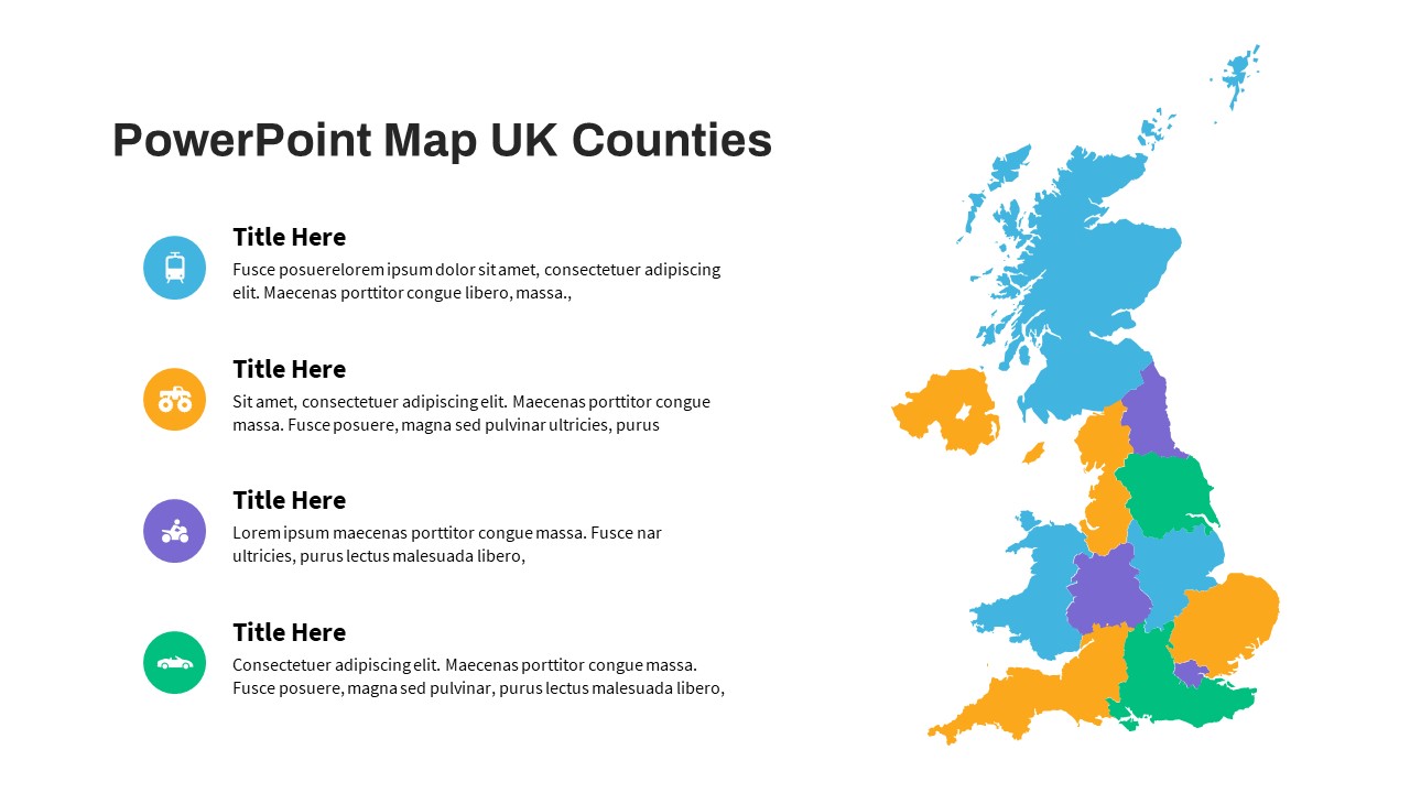
UK Counties Map Data Visualization Template for PowerPoint & Google Slides
World Maps
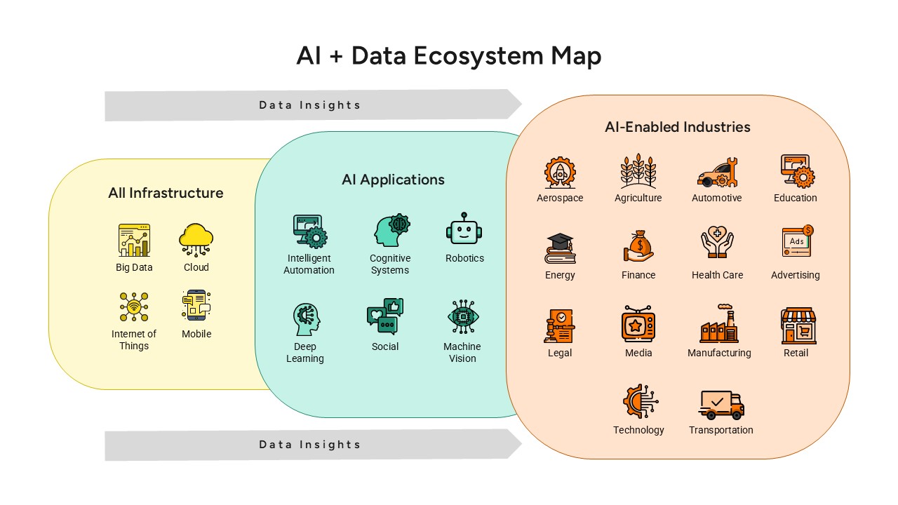
AI and Data Ecosystem Map Template for PowerPoint & Google Slides
AI
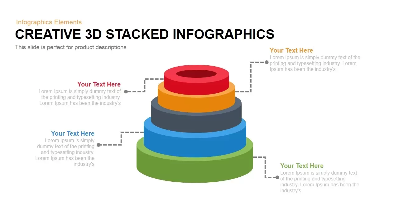
3D Stacked Infographic Layers Data Template for PowerPoint & Google Slides
Pyramid
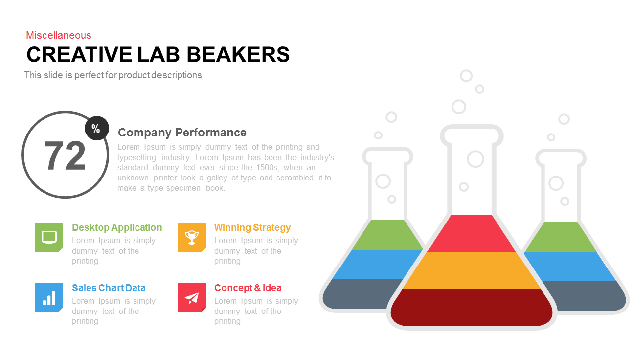
Creative Lab Beakers Data Infographic template for PowerPoint & Google Slides
Infographics
Dynamic Data Dashboard Infographic Template for PowerPoint & Google Slides
Bar/Column
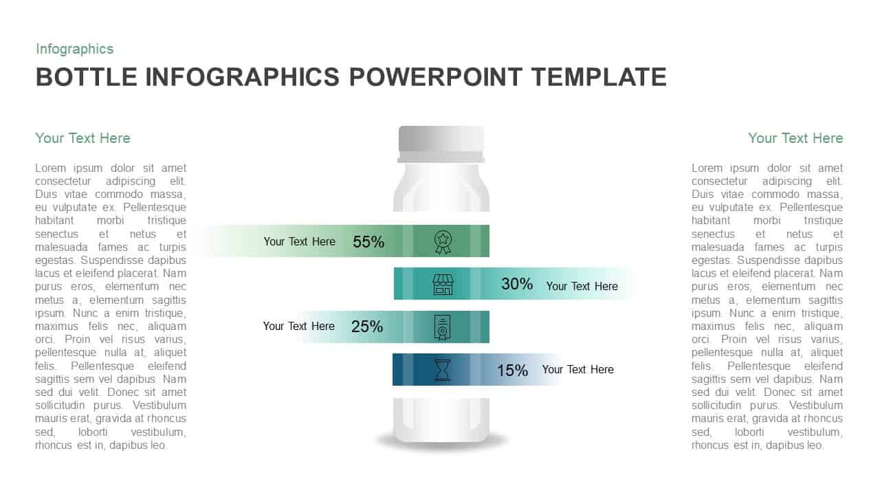
Bottle Data Percentage Infographic Template for PowerPoint & Google Slides
Infographics
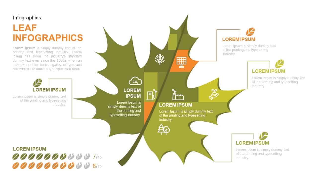
Leaf Infographic Data Visualization Template for PowerPoint & Google Slides
Infographics
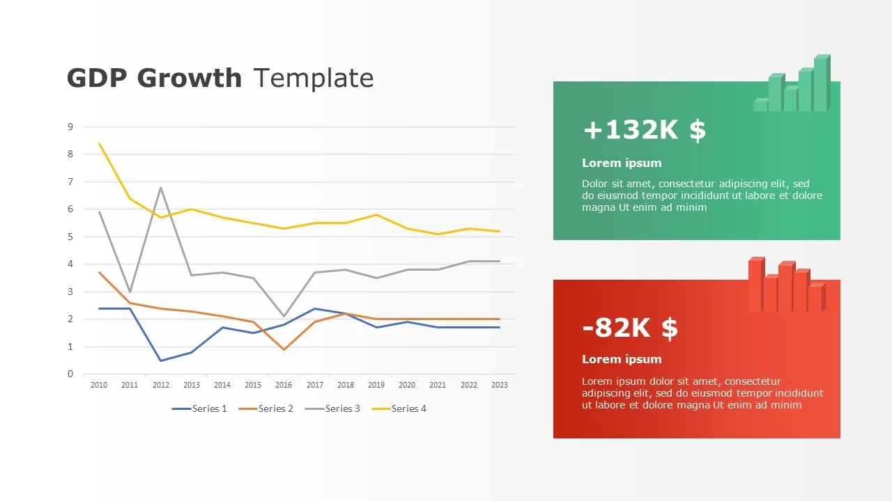
Data-driven GDP Growth Infographic Pack Template for PowerPoint & Google Slides
Infographics

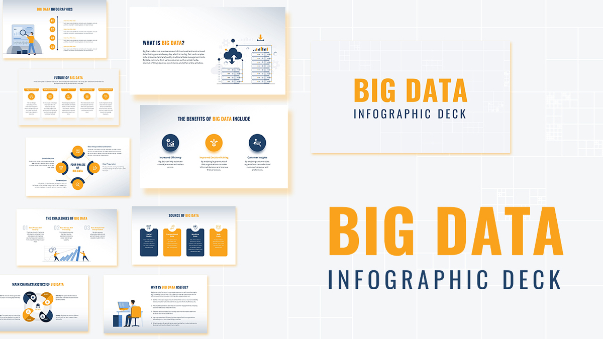
Modern Big Data Infographic Deck Template for PowerPoint & Google Slides
Decks
Data-Driven AI in Insurance Infographic Template for PowerPoint & Google Slides
Circular
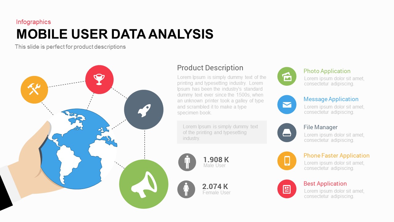
Mobile User Data Analysis Infographic for PowerPoint & Google Slides
Process
Data Science PowerPoint Presentation Template for PowerPoint & Google Slides
Pitch Deck
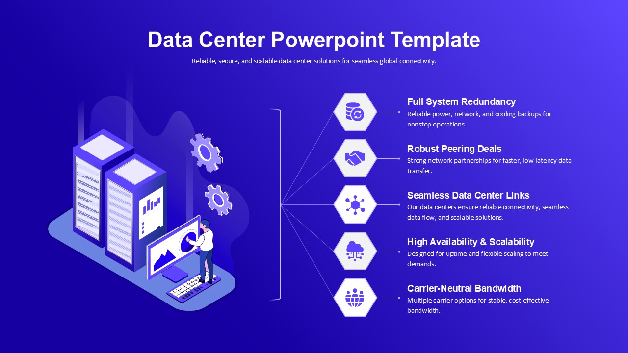
Data Center PowerPoint Template for PowerPoint & Google Slides
Information Technology

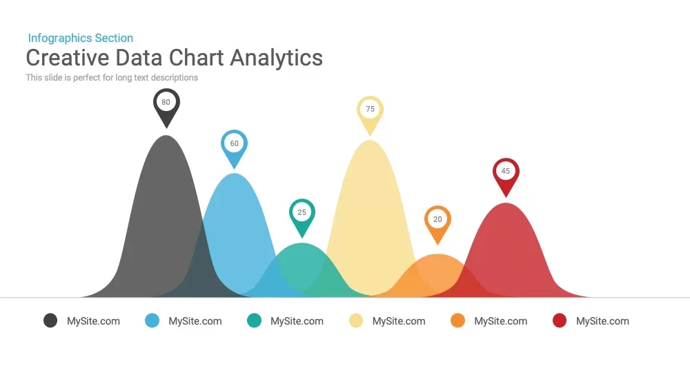
Creative data chart analytics template for PowerPoint & Google Slides
Charts
Mobile Data Analysis Chart template for PowerPoint & Google Slides
Charts
Circle Chart Data template for PowerPoint & Google Slides
Pie/Donut
Creative Data Analysis Bar Chart template for PowerPoint & Google Slides
Bar/Column

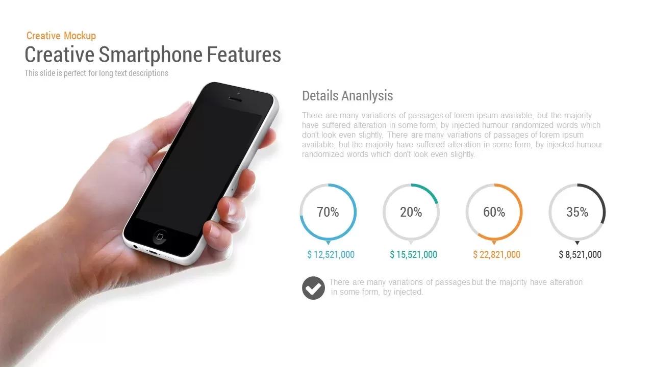
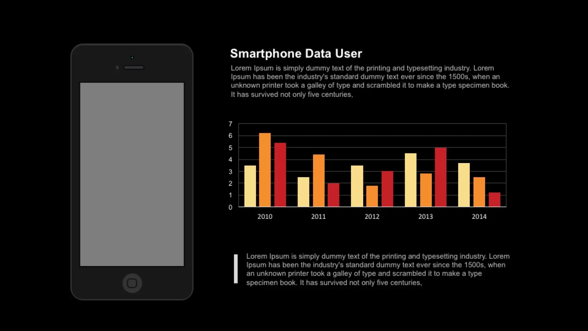
Smartphone Data User template for PowerPoint & Google Slides
Charts
3D Bar Chart Data Infographics Template for PowerPoint & Google Slides
Bar/Column
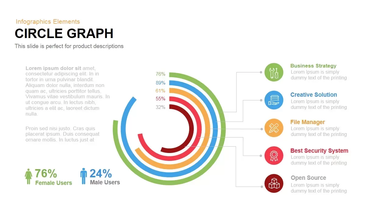
Circle Graph Data Visualization Template for PowerPoint & Google Slides
Circular
Pencil Bar Chart Data Analysis Template for PowerPoint & Google Slides
Bar/Column
3D Cone Chart Data Visualization template for PowerPoint & Google Slides
Bar/Column
Data Analytics Dashboard Design template for PowerPoint & Google Slides
Bar/Column
Gear Pie Diagram Data Visualization Template for PowerPoint & Google Slides
Pie/Donut
Data-Driven Marketing Cycle Diagram Template for PowerPoint & Google Slides
Customer Journey
Tornado Chart Data Comparison Slide Template for PowerPoint & Google Slides
Bar/Column
Immigration Data Dashboard Template for PowerPoint & Google Slides
Bar/Column
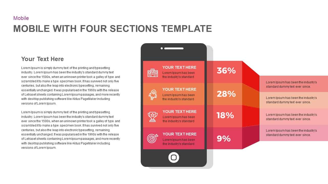
Mobile Infographics Data Visualization Template for PowerPoint & Google Slides
Infographics
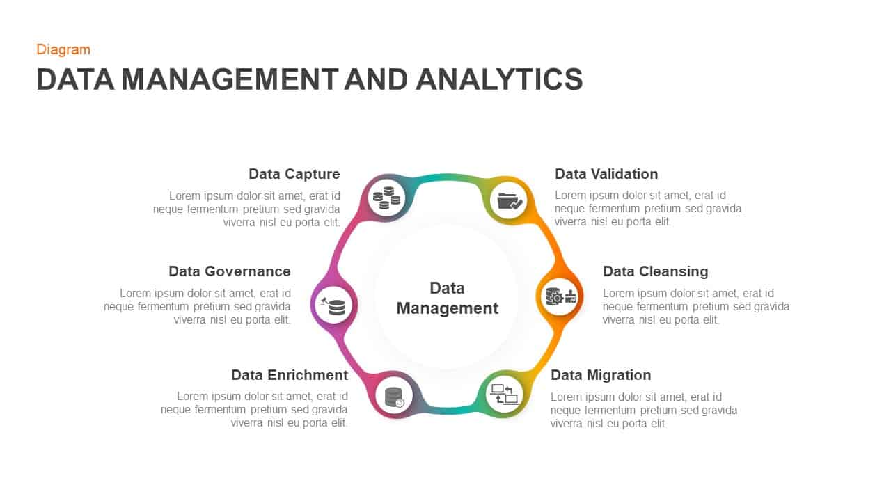
Data Management and Analytics Diagram Template for PowerPoint & Google Slides
Circular
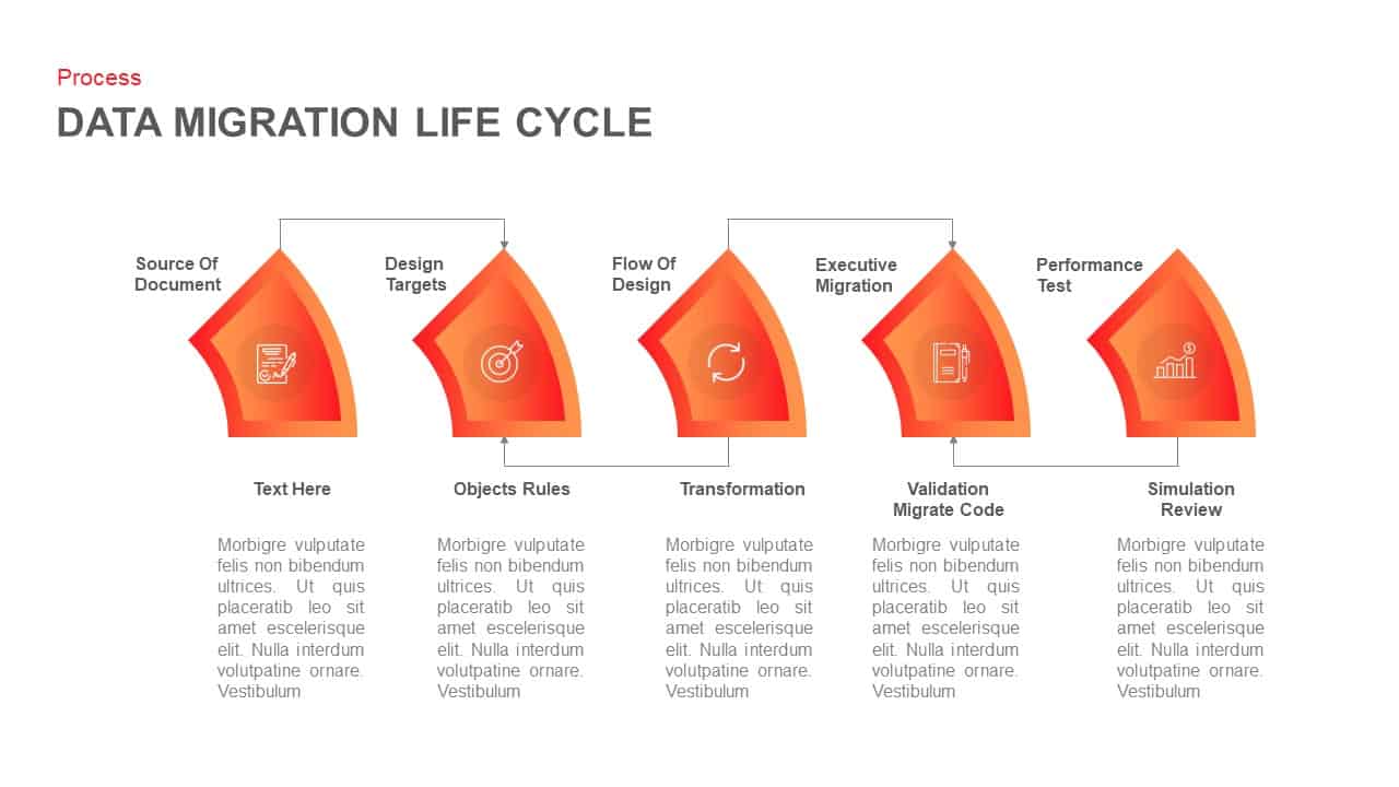
Data Migration Life Cycle Curved Diagram Template for PowerPoint & Google Slides
Process
Medical Infographics Data Visualization Template for PowerPoint & Google Slides
Health
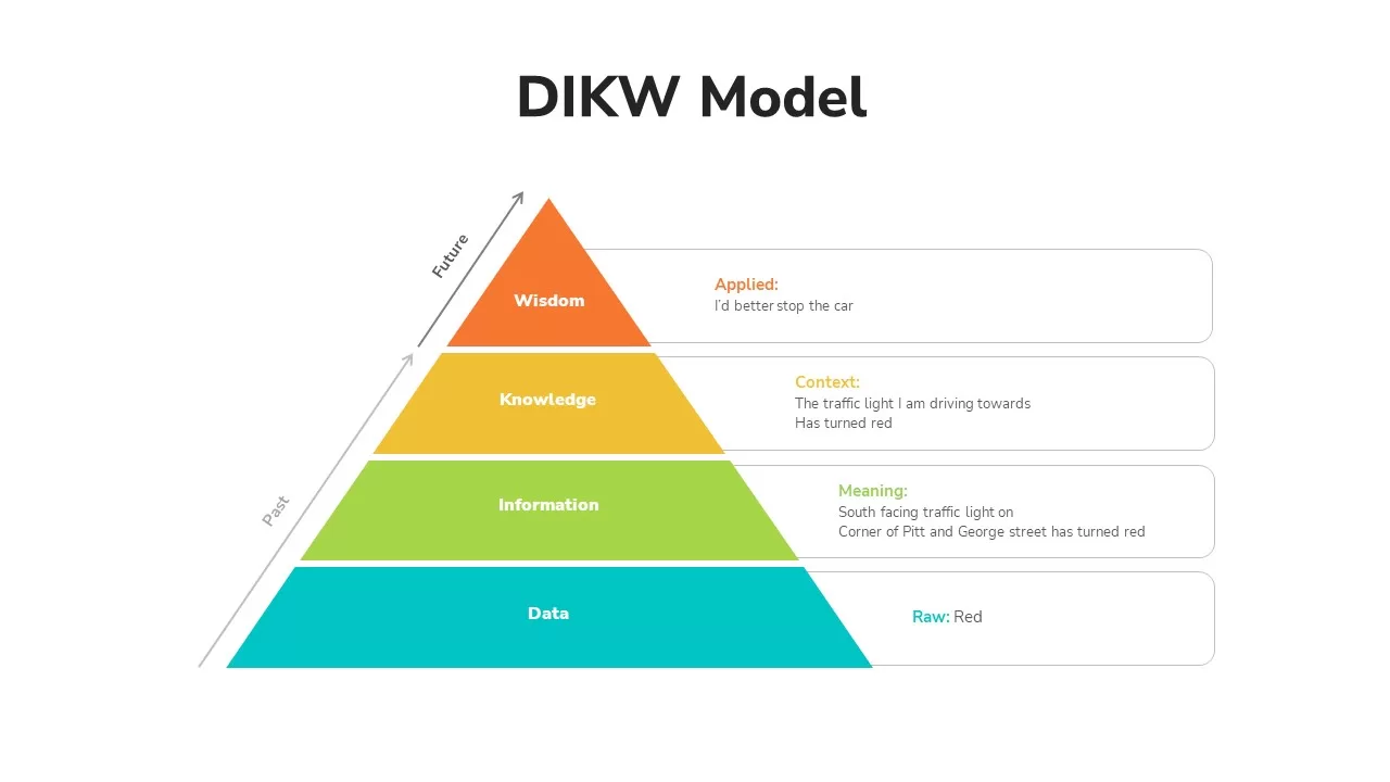
DIKW Data to Wisdom Pyramid Model Template for PowerPoint & Google Slides
Pyramid
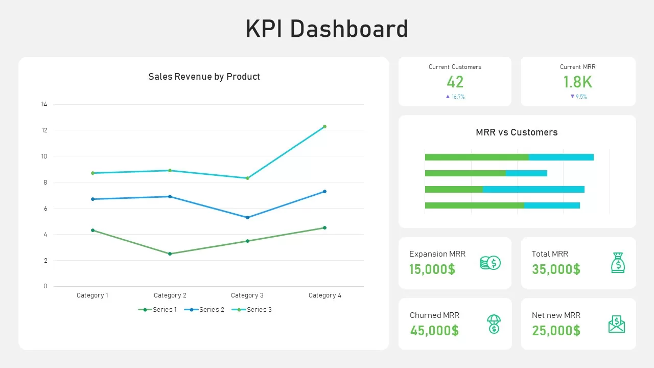
KPI Dashboard Data Visualization Template for PowerPoint & Google Slides
Bar/Column
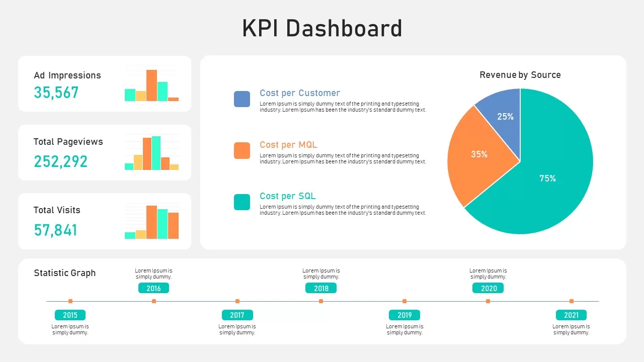
KPI Dashboard Data Overview Slide Template for PowerPoint & Google Slides
Bar/Column
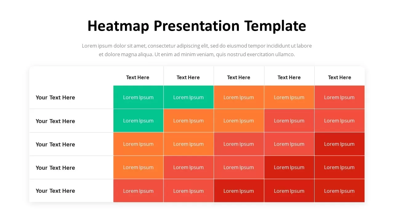
Professional Heatmap Data Visualization Template for PowerPoint & Google Slides
Infographics
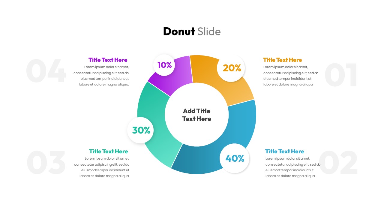
Donut Chart Data Breakdown template for PowerPoint & Google Slides
Pie/Donut
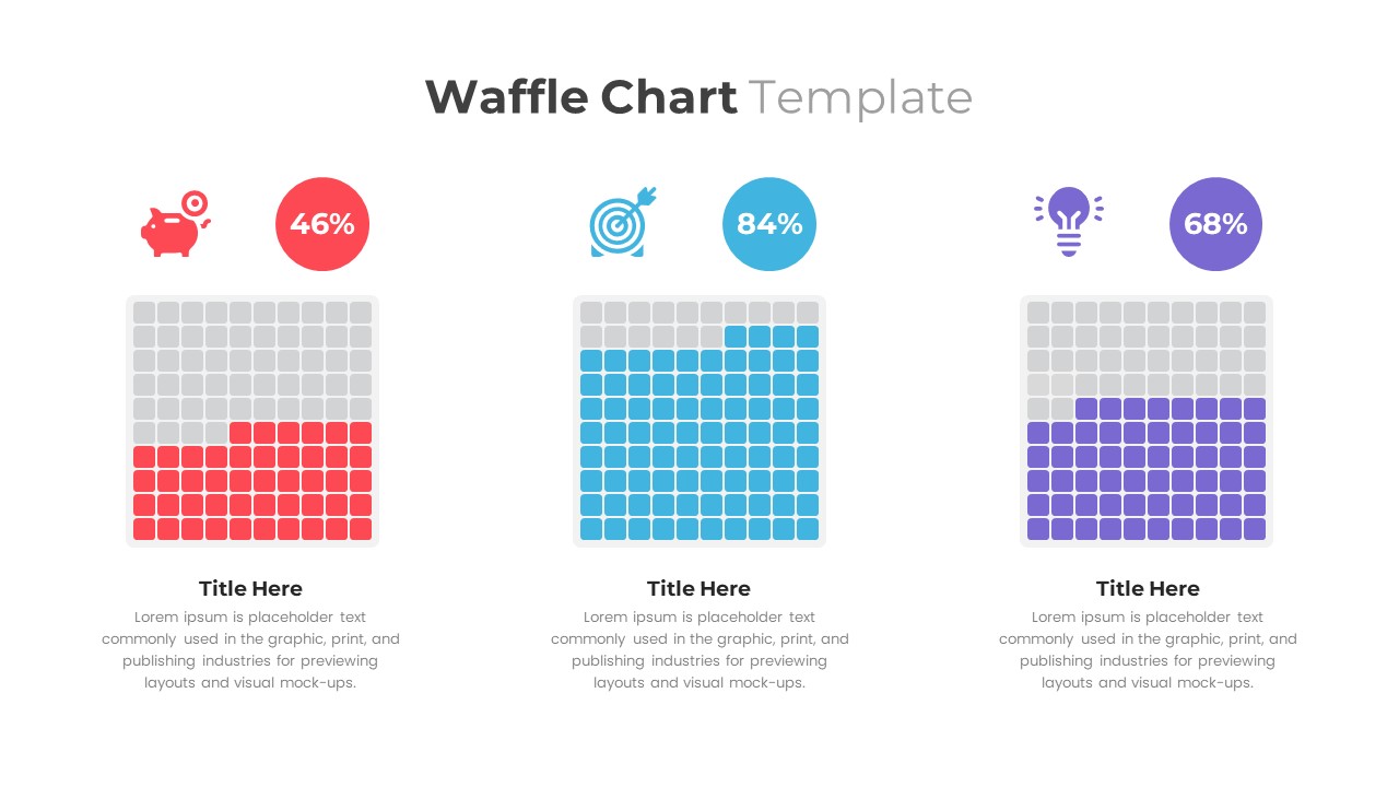
Waffle Chart Data Visualization Template for PowerPoint & Google Slides
Comparison Chart
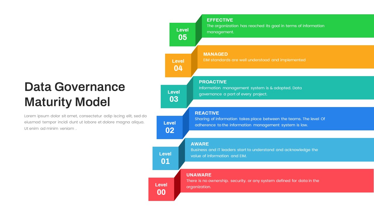
Layered Data Governance Maturity Model Template for PowerPoint & Google Slides
Process
Free Stacked Column Chart Data Visualization Template for PowerPoint & Google Slides
Bar/Column
Free
Simple Bar Chart Data Visualization Template for PowerPoint & Google Slides
Bar/Column
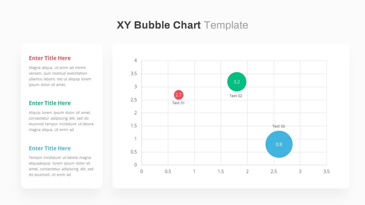
XY Bubble Chart Data Visualization Template for PowerPoint & Google Slides
Comparison Chart
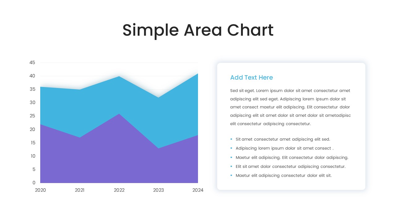
Simple Area Chart Data Trends Analysis Template for PowerPoint & Google Slides
Comparison Chart
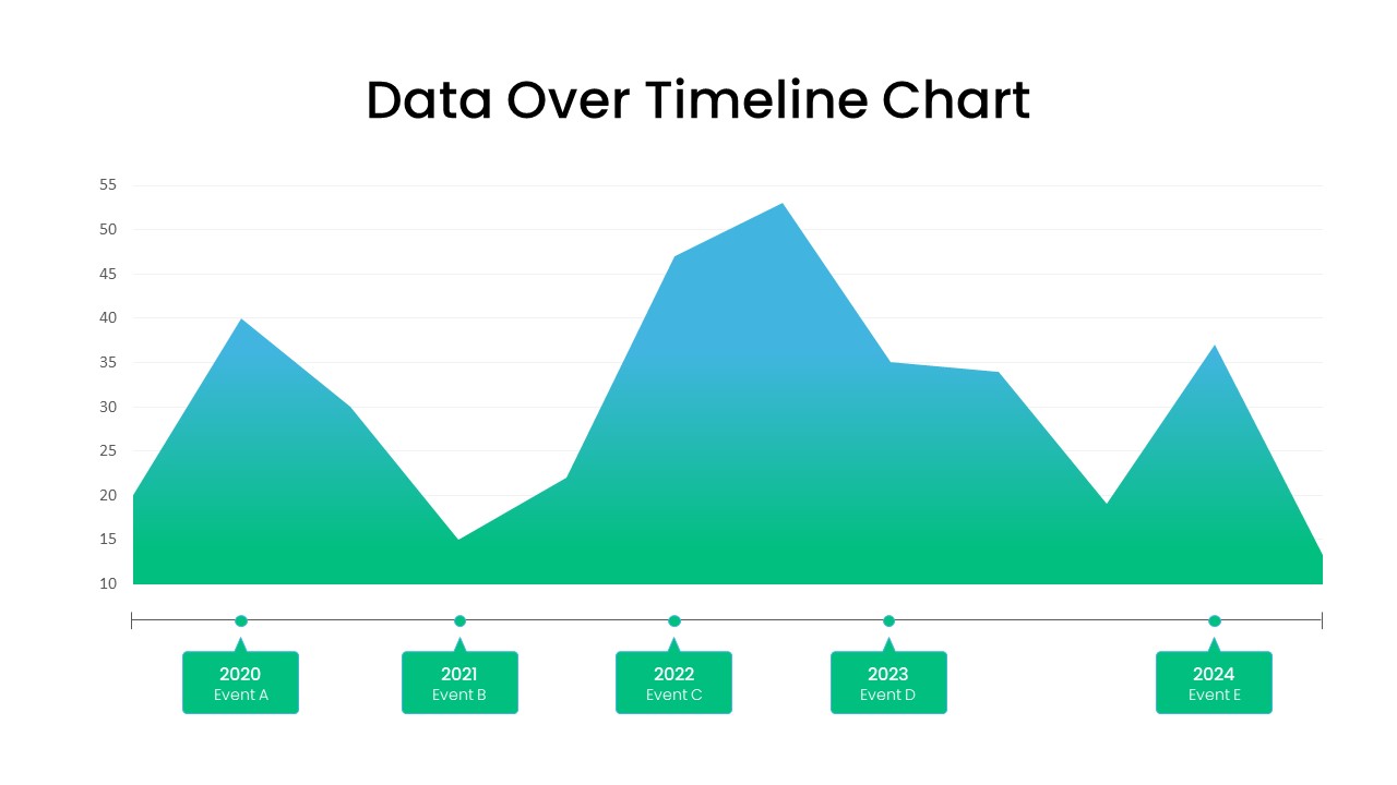
Data Over Time Line Chart template for PowerPoint & Google Slides
Charts
Waterfall Chart Data Visualization Template for PowerPoint & Google Slides
Comparison Chart
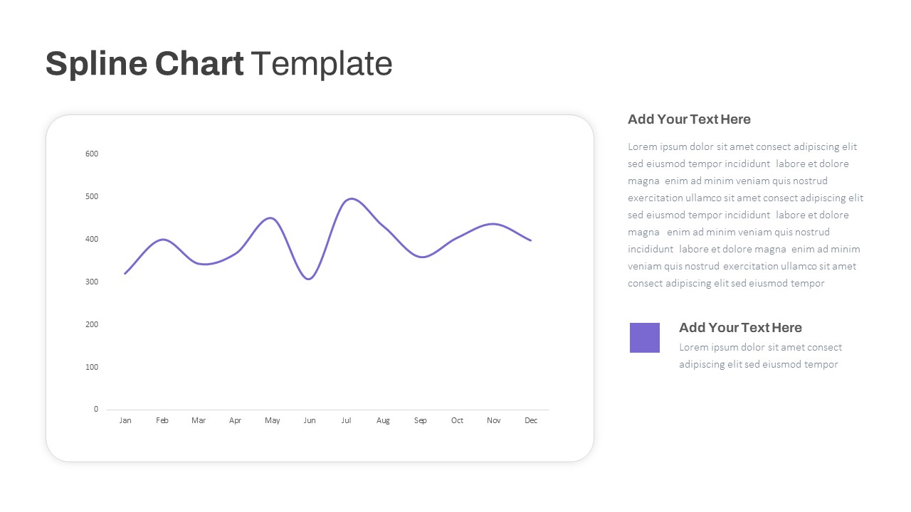
Multipurpose Spline Chart Data Trend Template for PowerPoint & Google Slides
Bar/Column
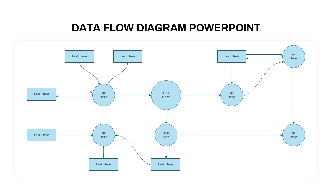
Advanced Data Flow Diagram Pack Template for PowerPoint & Google Slides
Flow Charts
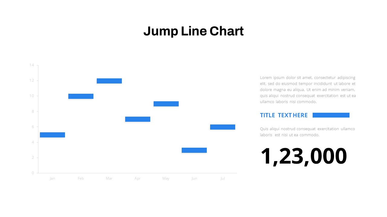
Interactive Jump Line Data Chart Template for PowerPoint & Google Slides
Comparison Chart
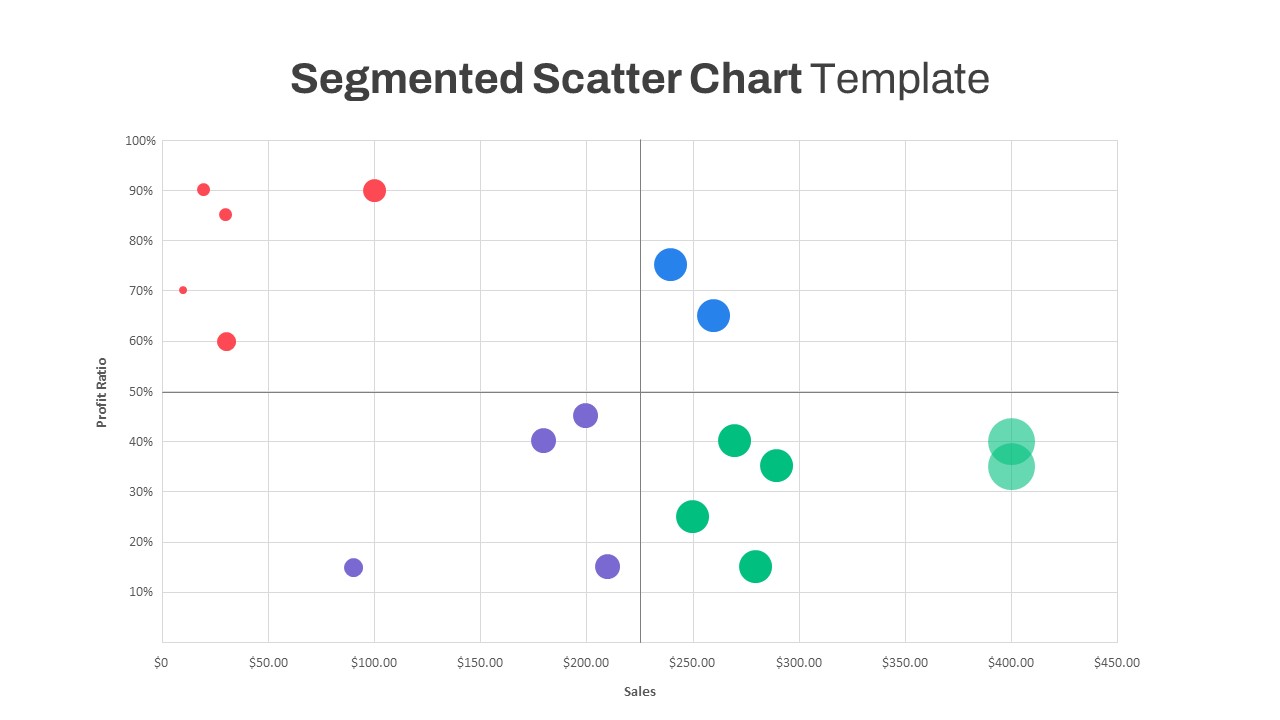
Segmented Scatter Chart Data Visualization Template for PowerPoint & Google Slides
Business Strategy
Free Big Data Network Visualization Template for PowerPoint & Google Slides
Circular
Free
Data Analysis Bar Chart with Insights Template for PowerPoint & Google Slides
Bar/Column
Free
Data Lake Hub-and-Spoke Diagram Template for PowerPoint & Google Slides
Cloud Computing
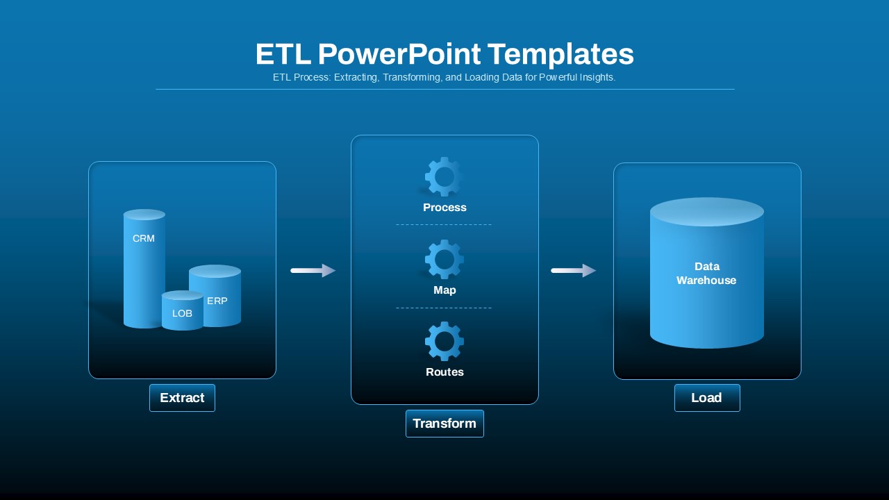
ETL Data Pipeline Workflow Diagram Template for PowerPoint & Google Slides
Process
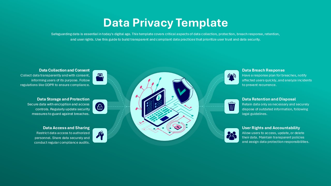
Data Privacy template for PowerPoint & Google Slides
Information Technology
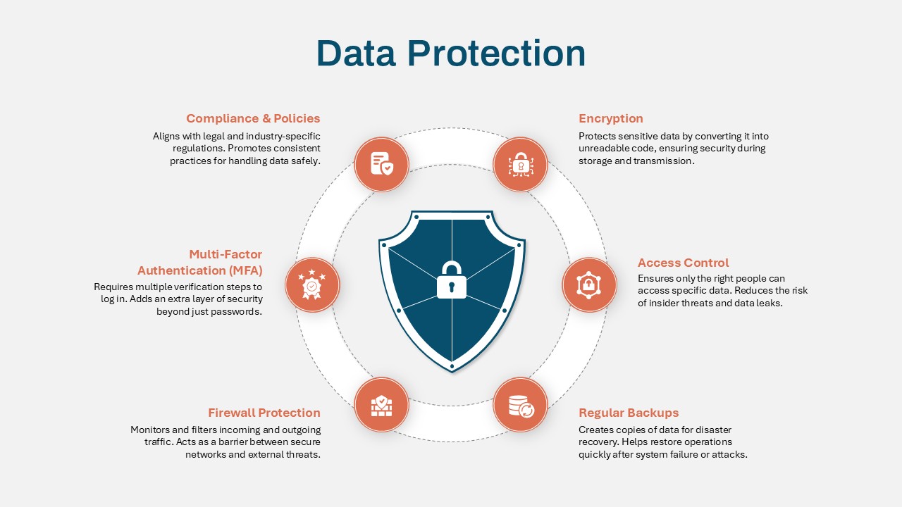
Data Protection Strategies template for PowerPoint & Google Slides
Information Technology
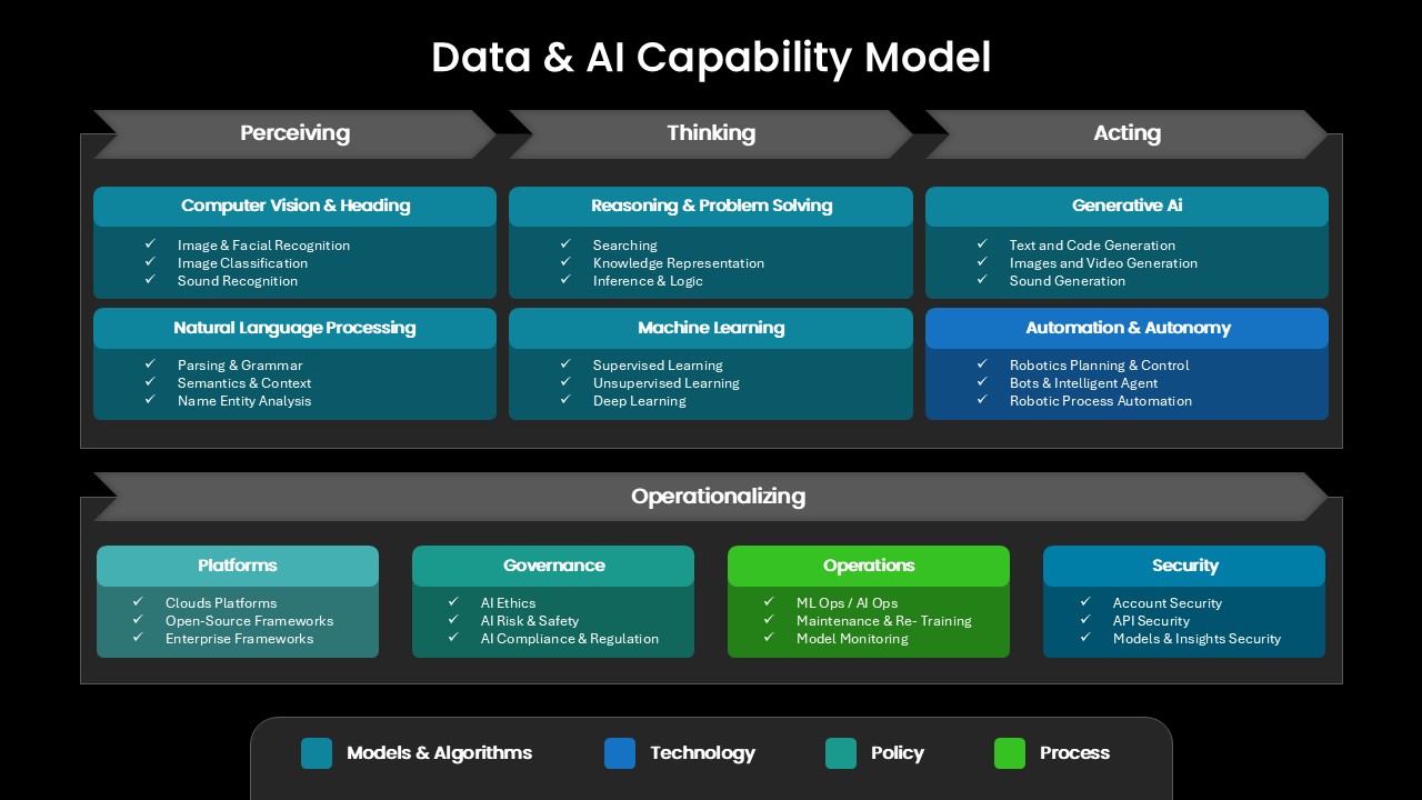
Comprehensive Data & AI Capability Model Template for PowerPoint & Google Slides
AI
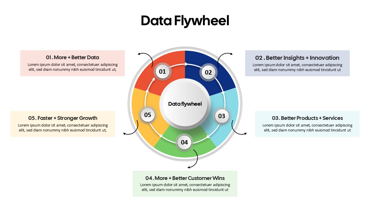
Data Flywheel Strategy template for PowerPoint & Google Slides
Business
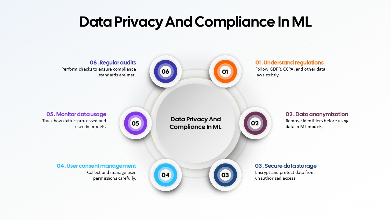
Data Privacy and Compliance in ML template for PowerPoint & Google Slides
Technology
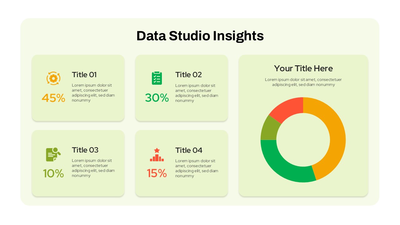
Data Studio Insights template for PowerPoint & Google Slides
Business Report
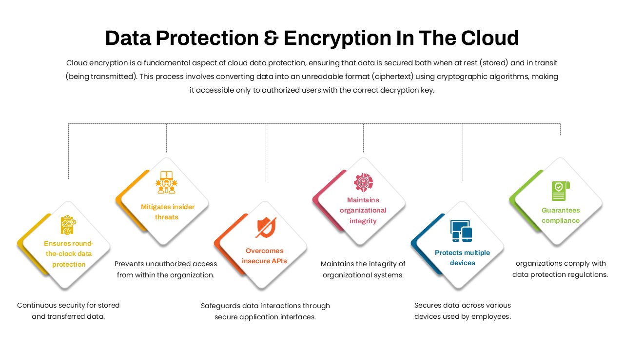
Data Protection & Encryption in the Cloud Overview template for PowerPoint & Google Slides
Cloud Computing
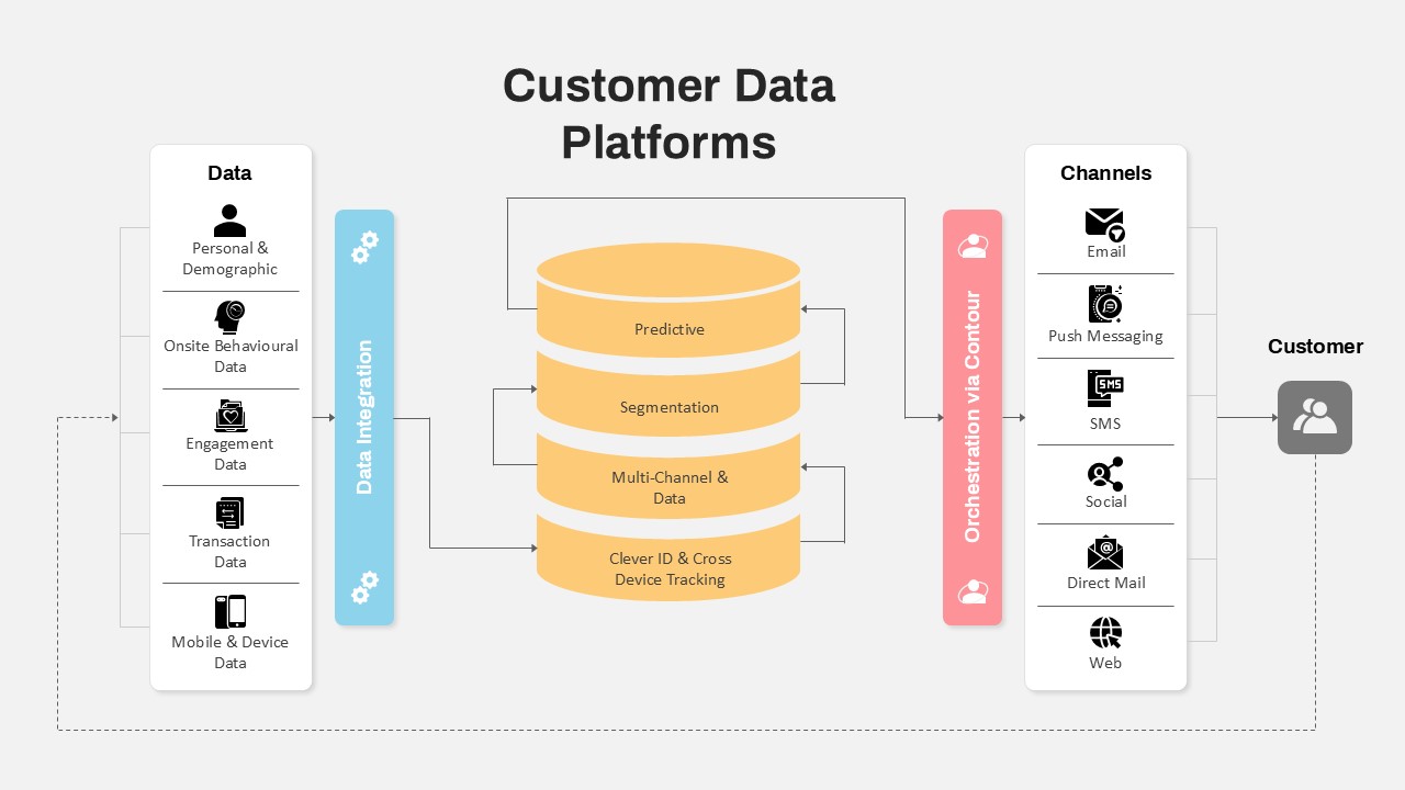
Customer Data Platform Workflow Diagram Template for PowerPoint & Google Slides
Information Technology
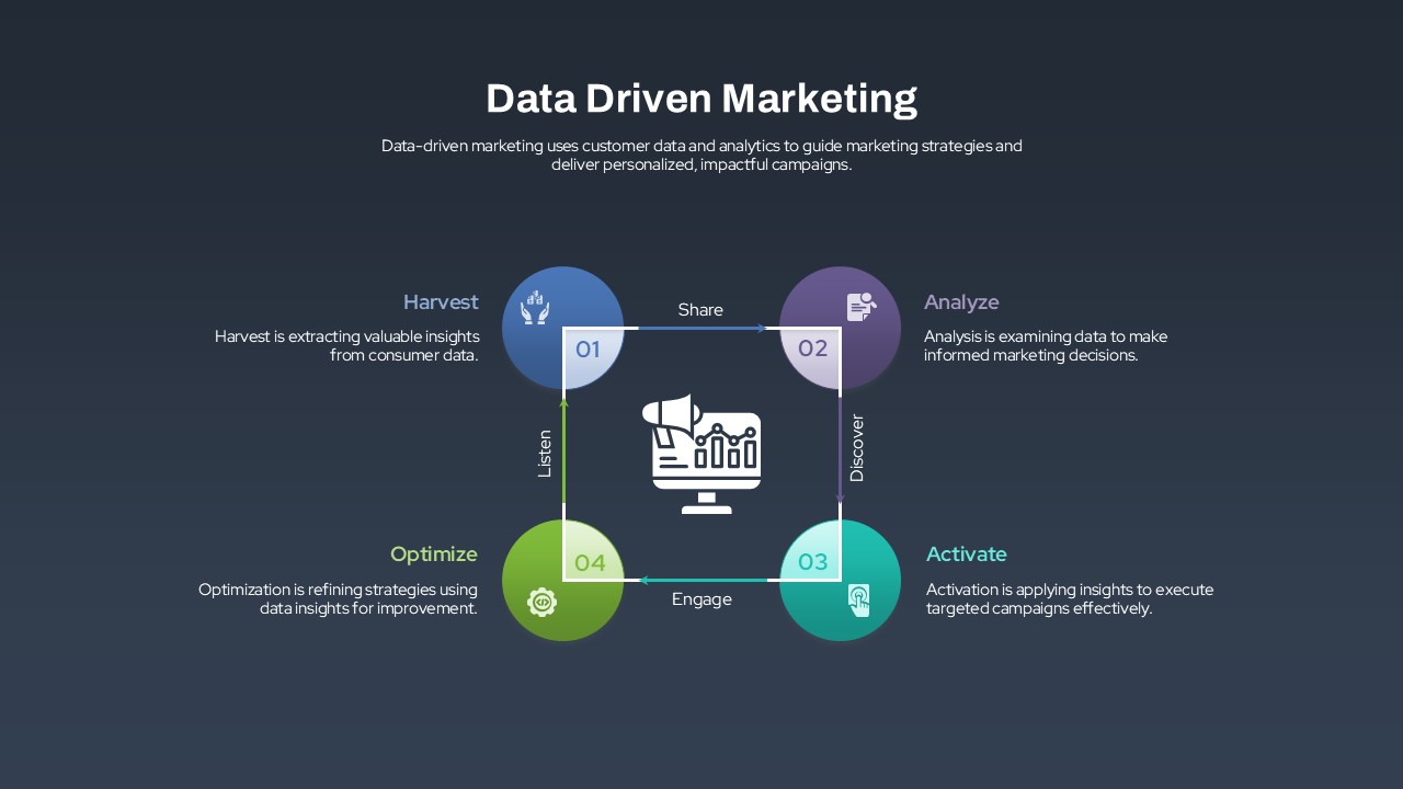
Data-Driven Marketing Lifecycle Diagram Template for PowerPoint & Google Slides
Process
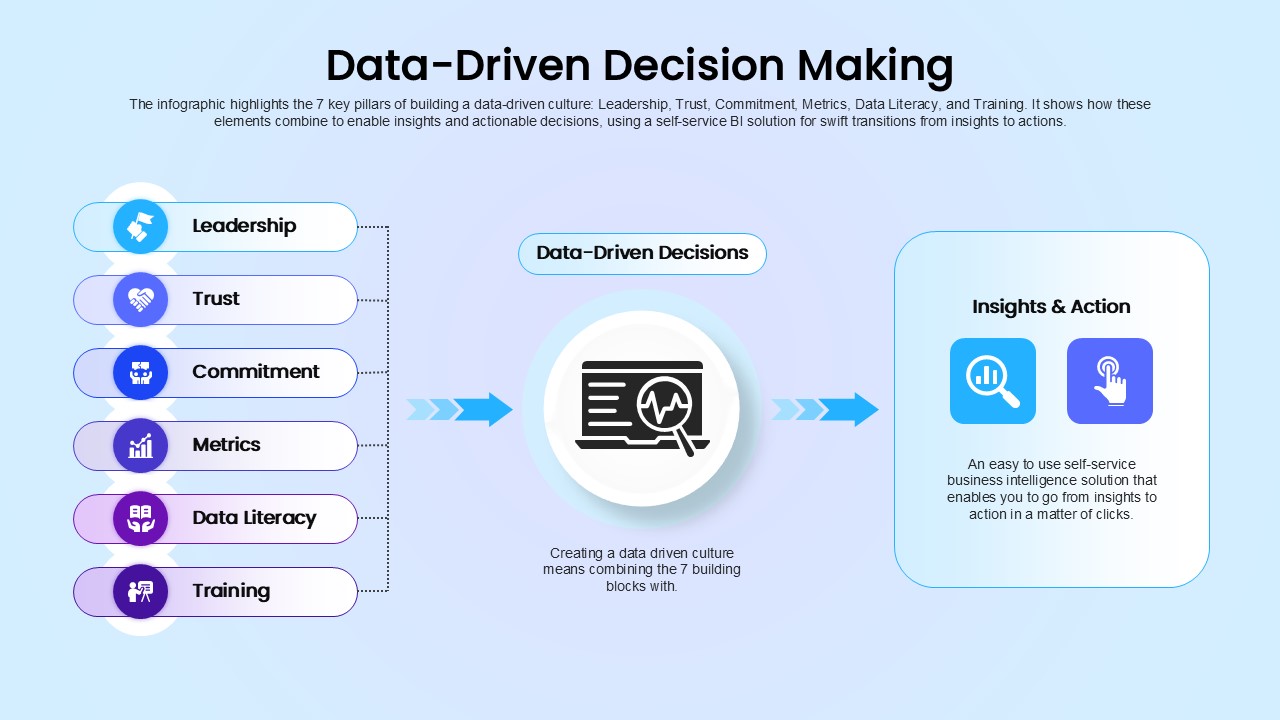
Data-Driven Decision Making overview template for PowerPoint & Google Slides
Business
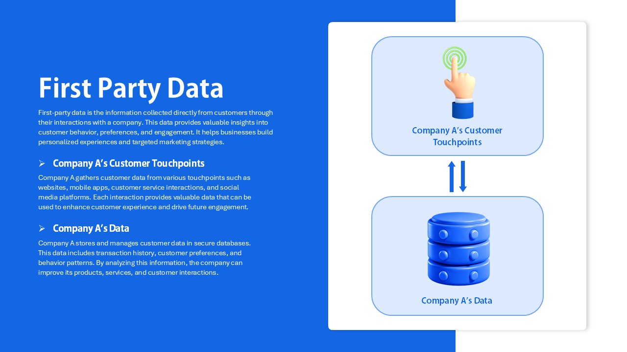
First Party Data Overview Template for PowerPoint & Google Slides
Business
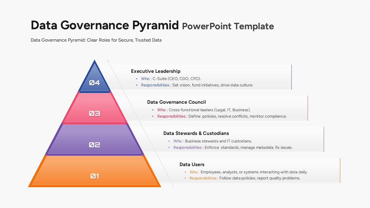
Data Governance Roles Pyramid Diagram Template for PowerPoint & Google Slides
Pyramid
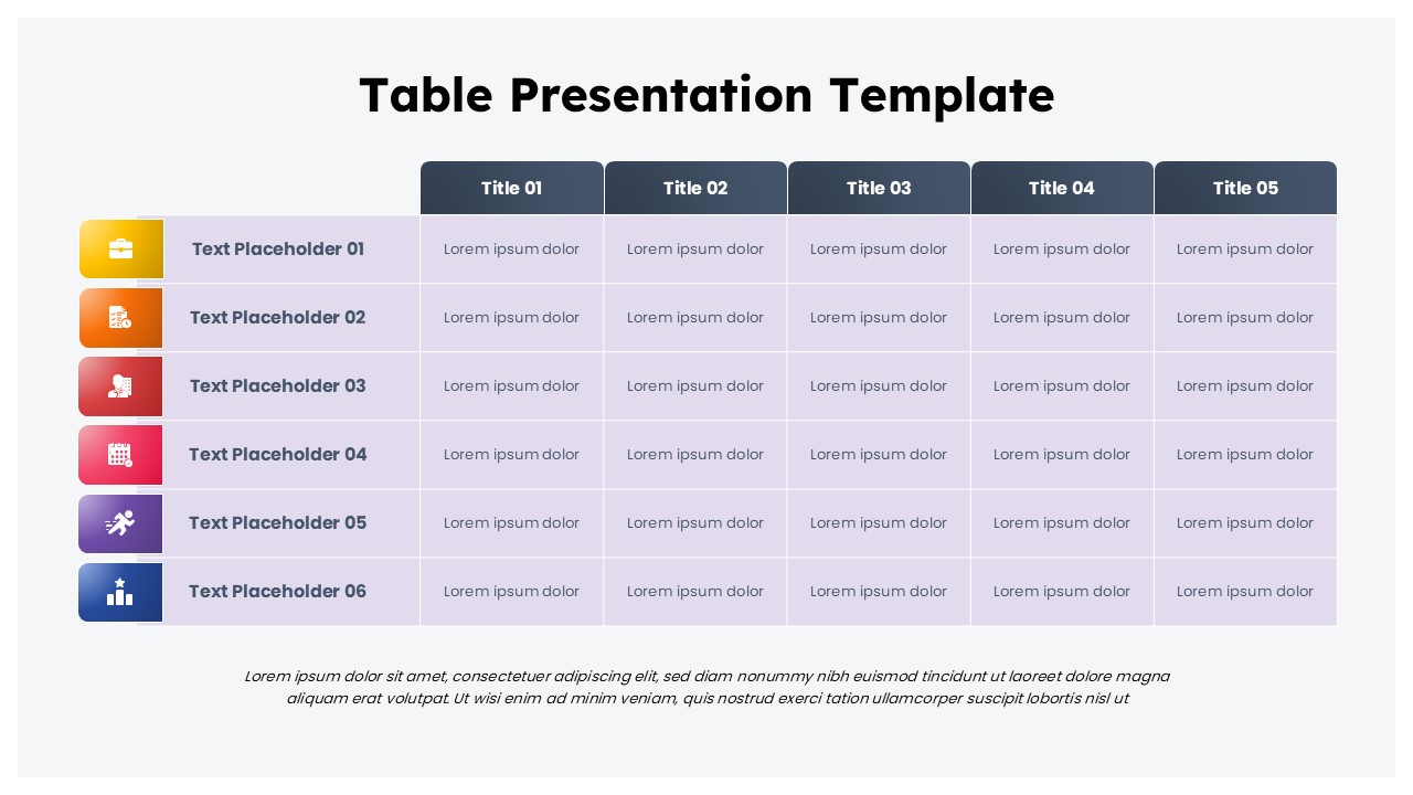
Business Data Table Template for PowerPoint & Google Slides
Table
Colorful Business Data Comparison Table Template for PowerPoint & Google Slides
Table
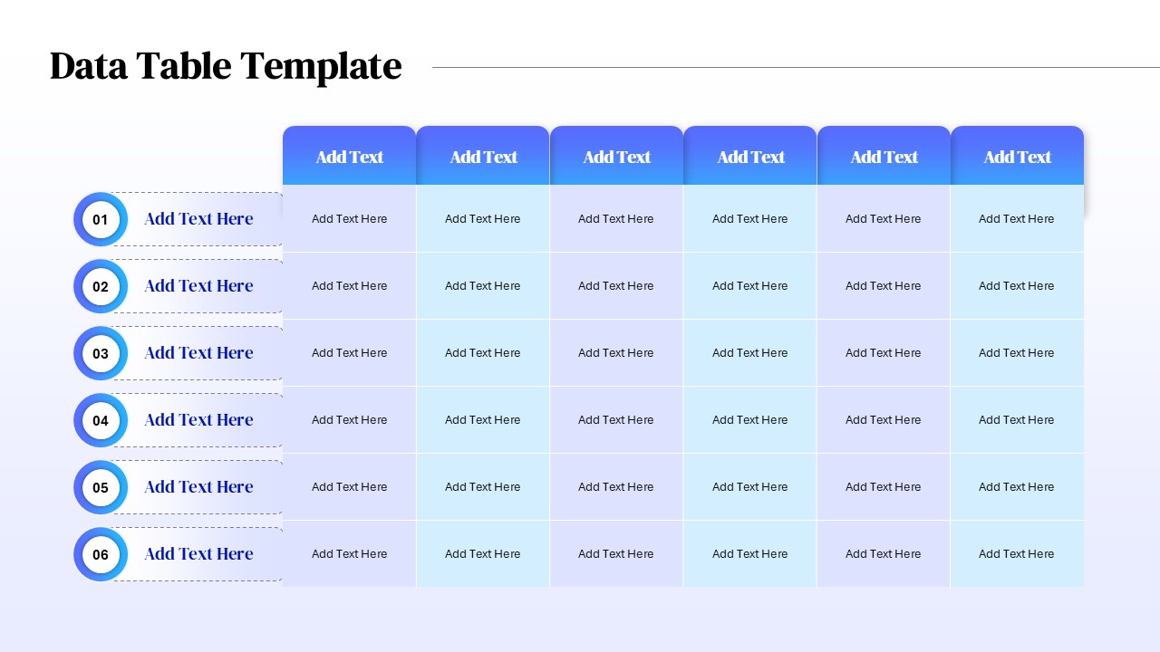
Six Column Data Table Template for PowerPoint & Google Slides
Table
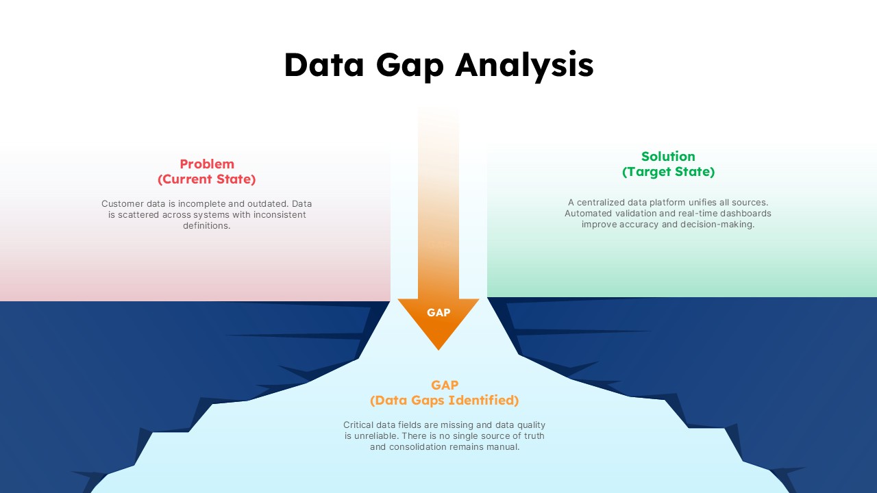
Data Gap Analysis Template for PowerPoint & Google Slides
Business
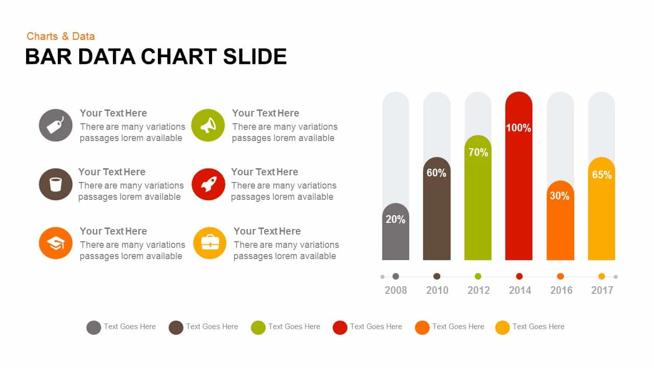
Bar Data Chart Slide for PowerPoint & Google Slides
Bar/Column
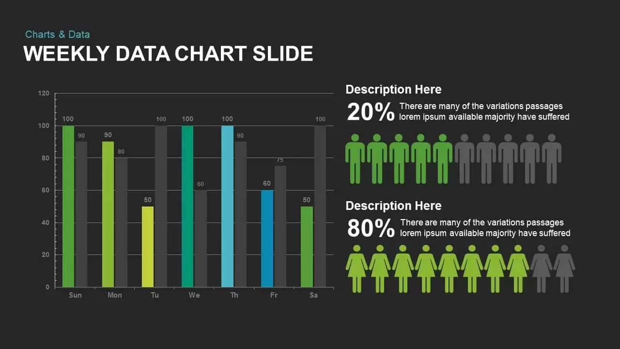
Weekly Data Chart Slide for PowerPoint & Google Slides
Comparison Chart

3D Column Chart with Data Table for PowerPoint & Google Slides
Bar/Column

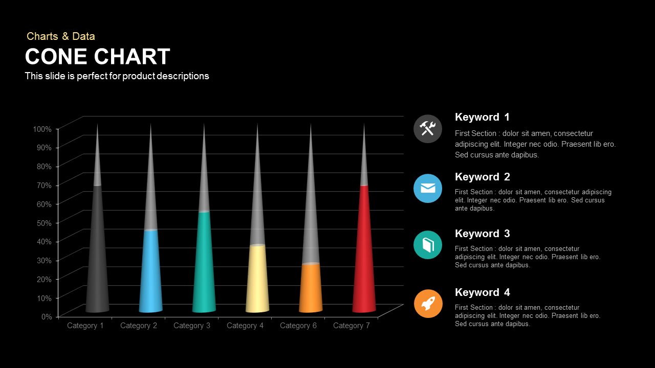
Cone Data Chart for PowerPoint & Google Slides
Charts
4 Business Data Infographics Diagram for PowerPoint & Google Slides
Process
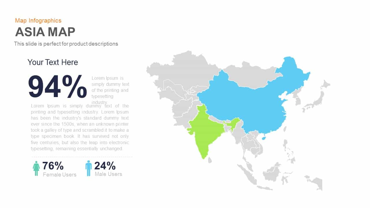
Asia Map Infographic with Demographics template for PowerPoint & Google Slides
World Maps
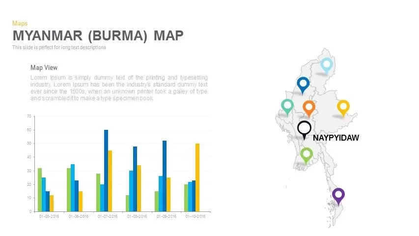
Myanmar (Burma) Provincial Map Infographic Template for PowerPoint & Google Slides
Maps
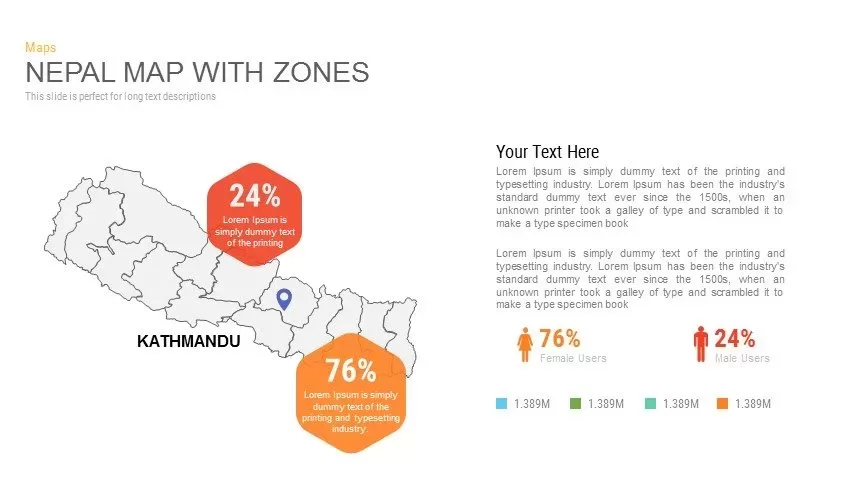
Nepal Map with Zones Infographic Template for PowerPoint & Google Slides
Maps
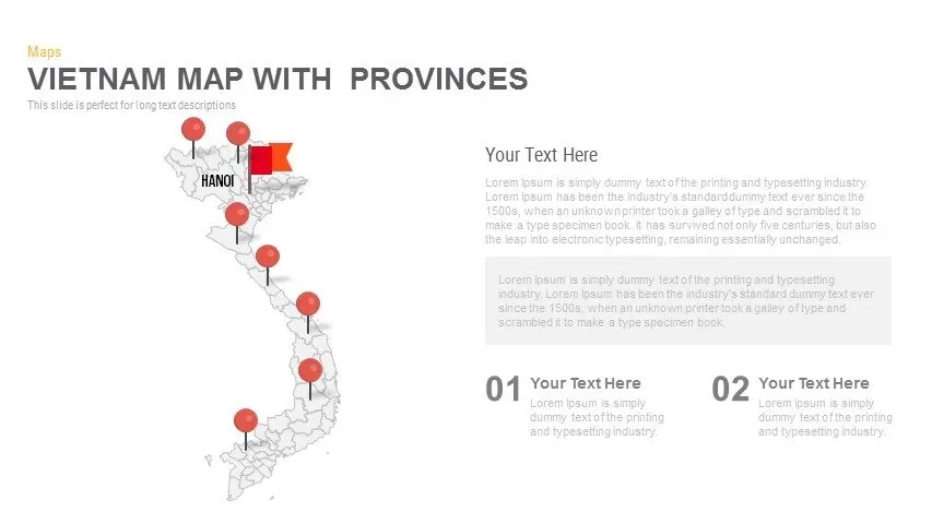
Vietnam Provinces Map Infographic Pack Template for PowerPoint & Google Slides
Maps
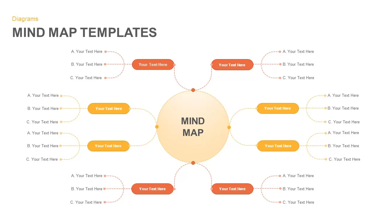
Versatile Mind Map Infographic Template for PowerPoint & Google Slides
Mind Maps
Structured Mind Map Infographic Diagram Template for PowerPoint & Google Slides
Mind Maps
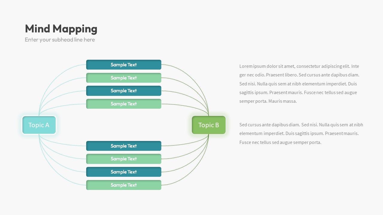
Dual Topic Mind Map Infographic Template for PowerPoint & Google Slides
Mind Maps
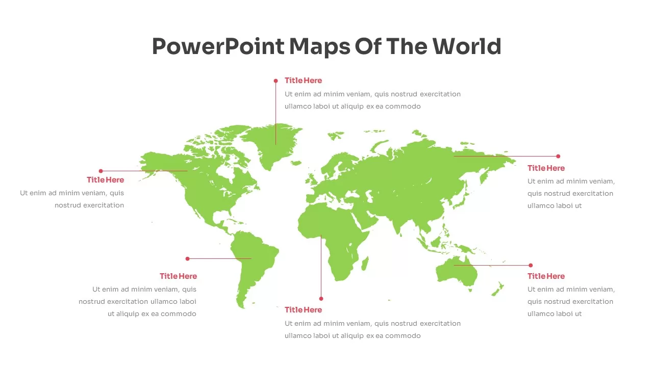
Editable World Map Callout Infographic Template for PowerPoint & Google Slides
World Maps
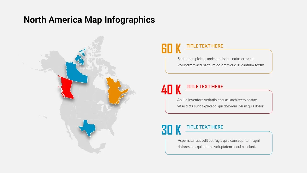
North America Map Infographic Slide Template for PowerPoint & Google Slides
World Maps
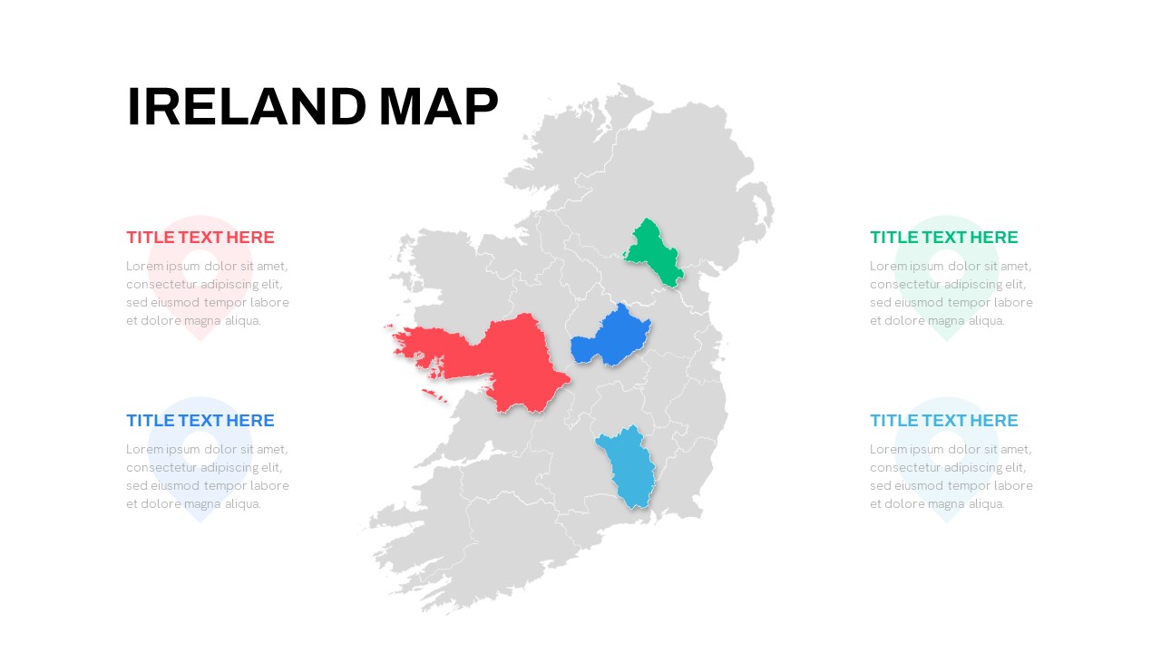
Editable Ireland Map Infographic Slide Template for PowerPoint & Google Slides
World Maps
Free