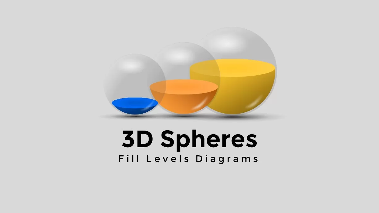
Five-Level Sphere Indicators Diagram template for PowerPoint & Google Slides
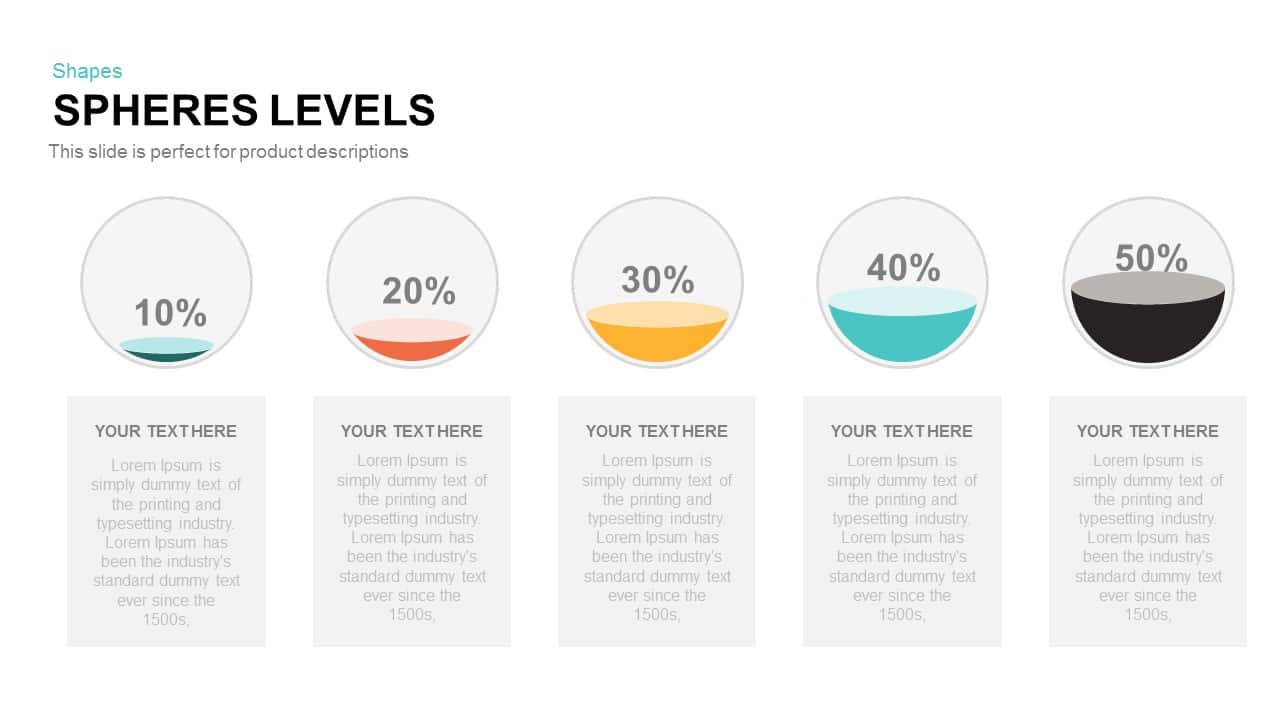
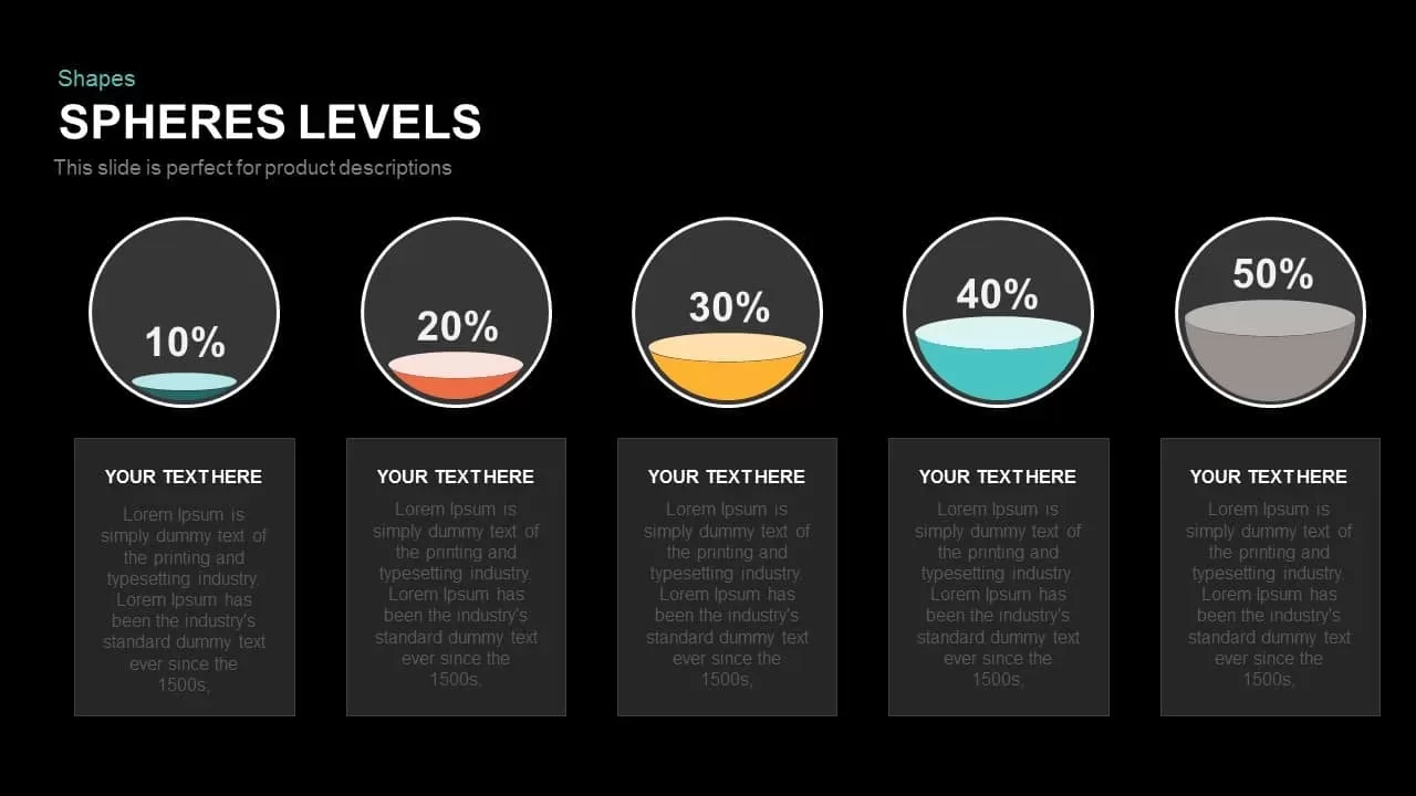
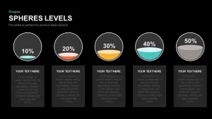
Leverage this dynamic Spheres Levels slide to showcase quantitative progress or performance across five distinct stages with clarity and visual appeal. The fully editable design presents five transparent spheres, each partially filled to indicate percentage values from 10% to 50%, with customizable fill colors for immediate data recognition. Below each sphere, placeholders allow for concise text descriptions, enabling you to contextualize metrics such as completion rates, resource utilization, or customer satisfaction levels.
Built on master slides in Microsoft PowerPoint and Google Slides, this template employs vector shapes and smart placeholders to simplify customization. Adjust fill heights to reflect actual values, swap out default colors to align with corporate branding, replace percentage labels with real data, and update text blocks with your own key insights. The minimalist layout ensures audiences remain engaged, while subtle drop shadows and uniform sphere sizes maintain visual consistency.
This Spheres Levels diagram excels in illustrating progress tracking, milestone achievements, or comparative performance metrics. Use it to map a five-phase rollout plan, monitor project completion percentages, present quarterly sales targets, or visualize team skill proficiencies. Its modular structure also supports scaling: duplicate the slide to compare multiple datasets, reorder spheres to prioritize specific stages, or resize elements without sacrificing clarity.
Designed for seamless collaboration, this asset reduces version-control headaches by leveraging built-in slide masters and editable components. The clear callouts and balanced spacing facilitate quick comprehension during boardroom briefings, training sessions, or stakeholder updates. With full-resolution fidelity across devices, your presentations will look polished whether viewed on a laptop, large-format display, or remote conference platform.
Optimize your next report or pitch by turning raw percentages into a compelling visual narrative that resonates with data-driven audiences.
Who is it for
Product managers, project leads, marketing analysts, and business consultants will find this slide invaluable for tracking progress metrics or milestone achievements. Training facilitators, educators, and team leads can also leverage the spheres to illustrate completion rates, skill proficiencies, or resource utilization across multiple stages in workshops, reports, or stakeholder presentations.
Other Uses
Apart from progress tracking, repurpose this diagram for budget allocation breakdowns, sales pipeline stages, user adoption rates, or operational readiness assessments. Adjust fill levels and labels to visualize resource distribution, performance goals, risk levels, or survey results, making this versatile asset suitable for finance reviews, HR reports, or strategic planning sessions.
Login to download this file

Item ID
SB00306
Related Templates

3D Sphere Arrow Process Diagram template for PowerPoint & Google Slides
Arrow

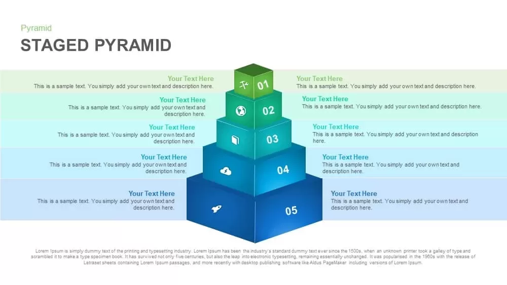
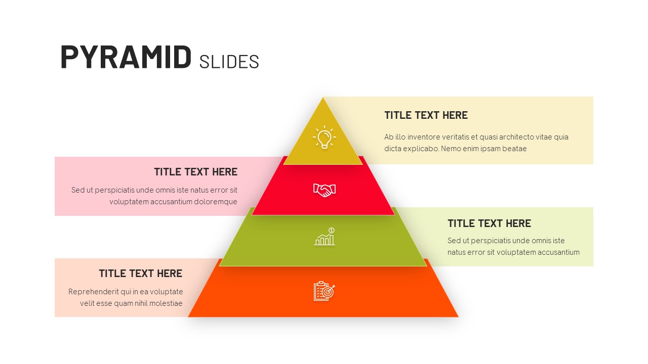
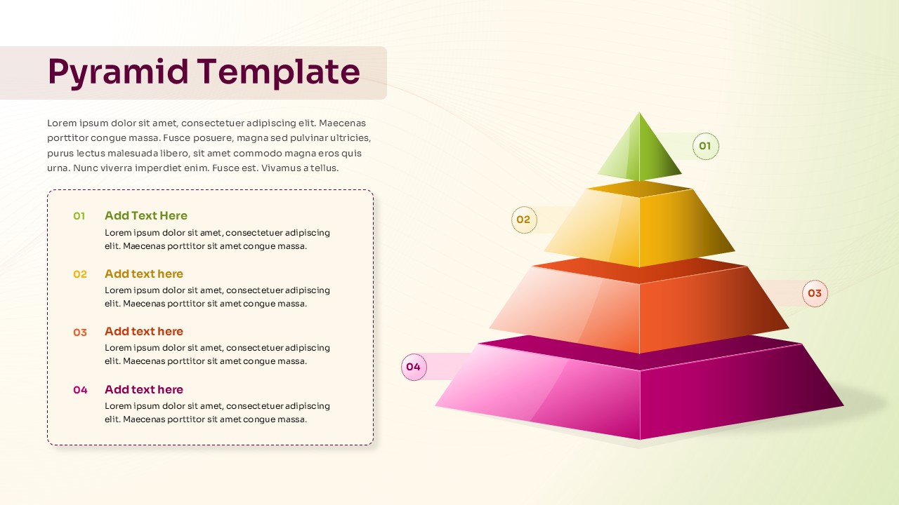
Five-Level Staged Pyramid Diagram Template for PowerPoint & Google Slides
Pyramid
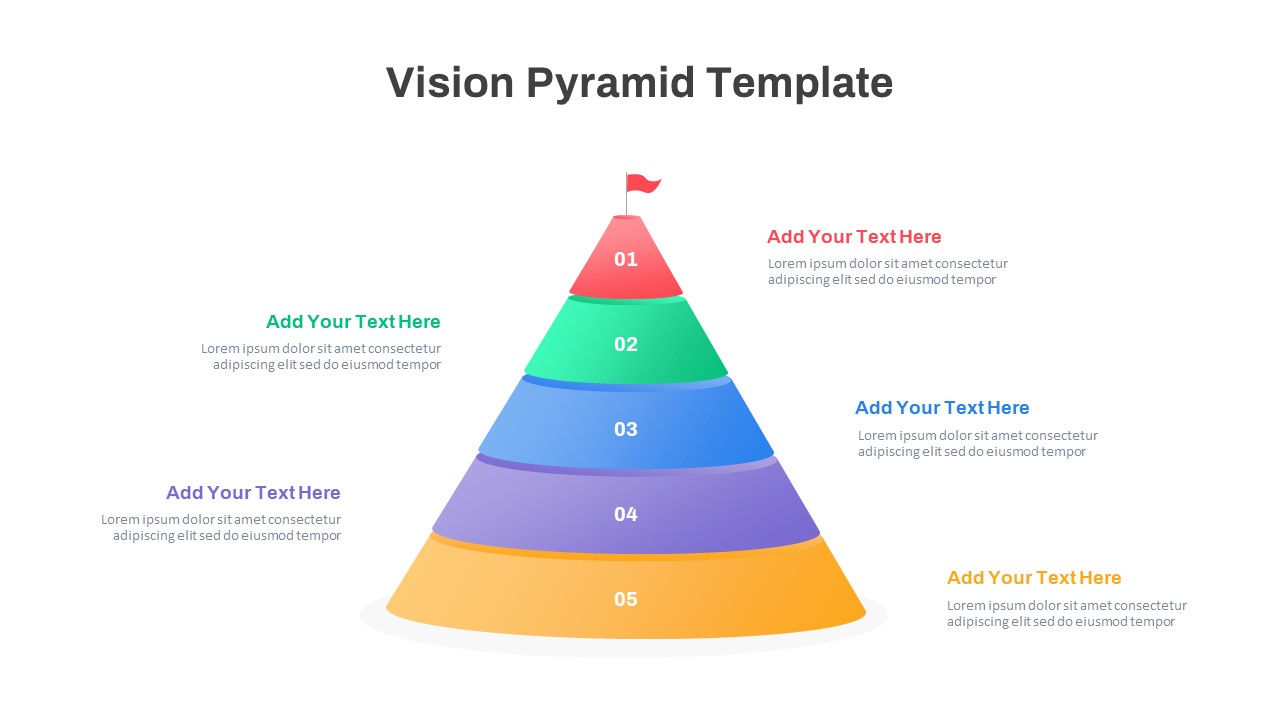
Five-Level Vision Pyramid Diagram Template for PowerPoint & Google Slides
Pyramid
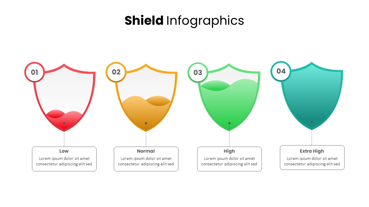
Shield Infographics Risk Indicators Template for PowerPoint & Google Slides
Infographics
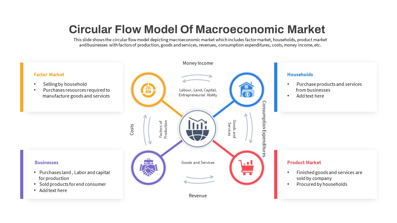
Macroeconomic Indicators Dashboard Template for PowerPoint & Google Slides
PEST
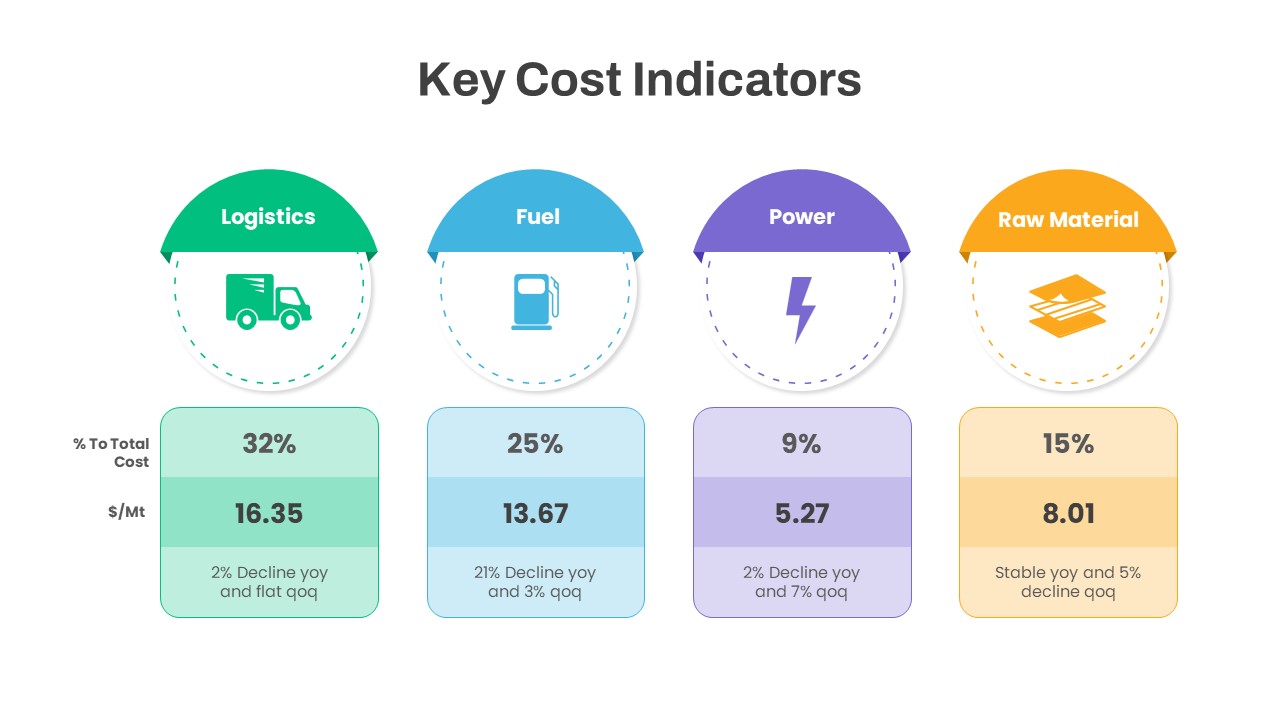
Key Cost Indicators Infographic Template for PowerPoint & Google Slides
Finance
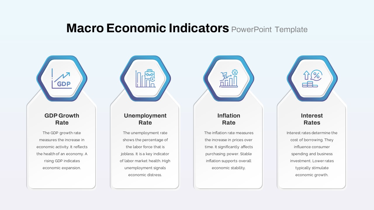
Macro Economic Indicators Infographic Template for PowerPoint & Google Slides
Comparison
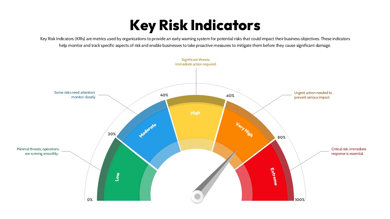
Key Risk Indicators (KRI) Gauge Template for PowerPoint & Google Slides
Risk Management
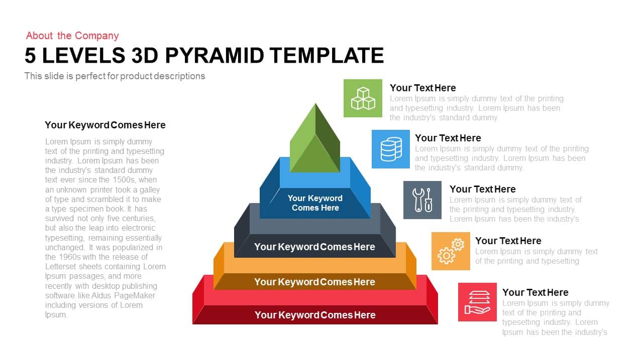
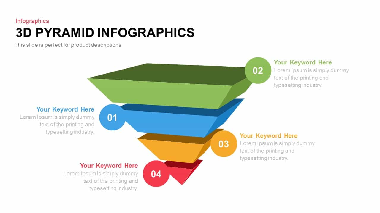
Five-Level 3D Pyramid Hierarchy Template for PowerPoint & Google Slides
Pyramid
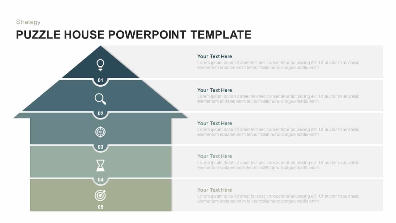
Five-Level Puzzle House Infographic Template for PowerPoint & Google Slides
Pyramid
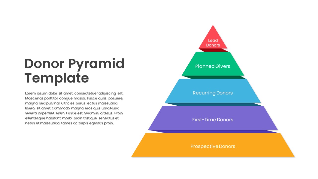
Five-Level Donor Pyramid Philanthropy Template for PowerPoint & Google Slides
Pyramid
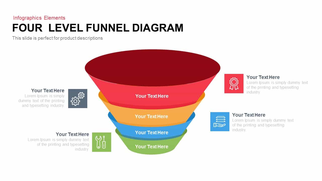
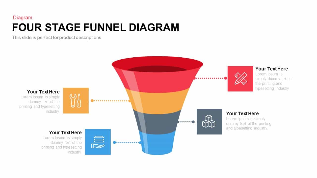
4 Level Funnel Diagram Template for PowerPoint & Google Slides
Funnel
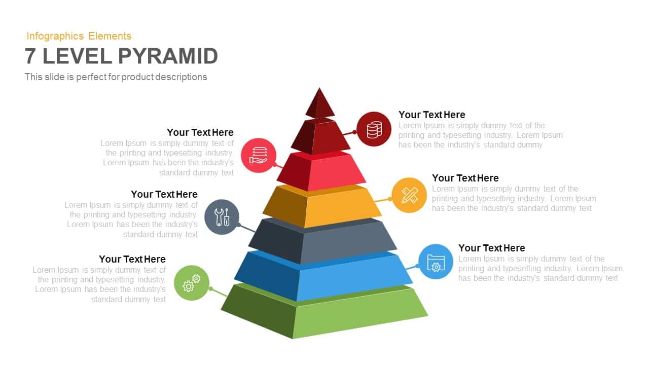
7-Level 3D Pyramid Infographic Diagram Template for PowerPoint & Google Slides
Pyramid
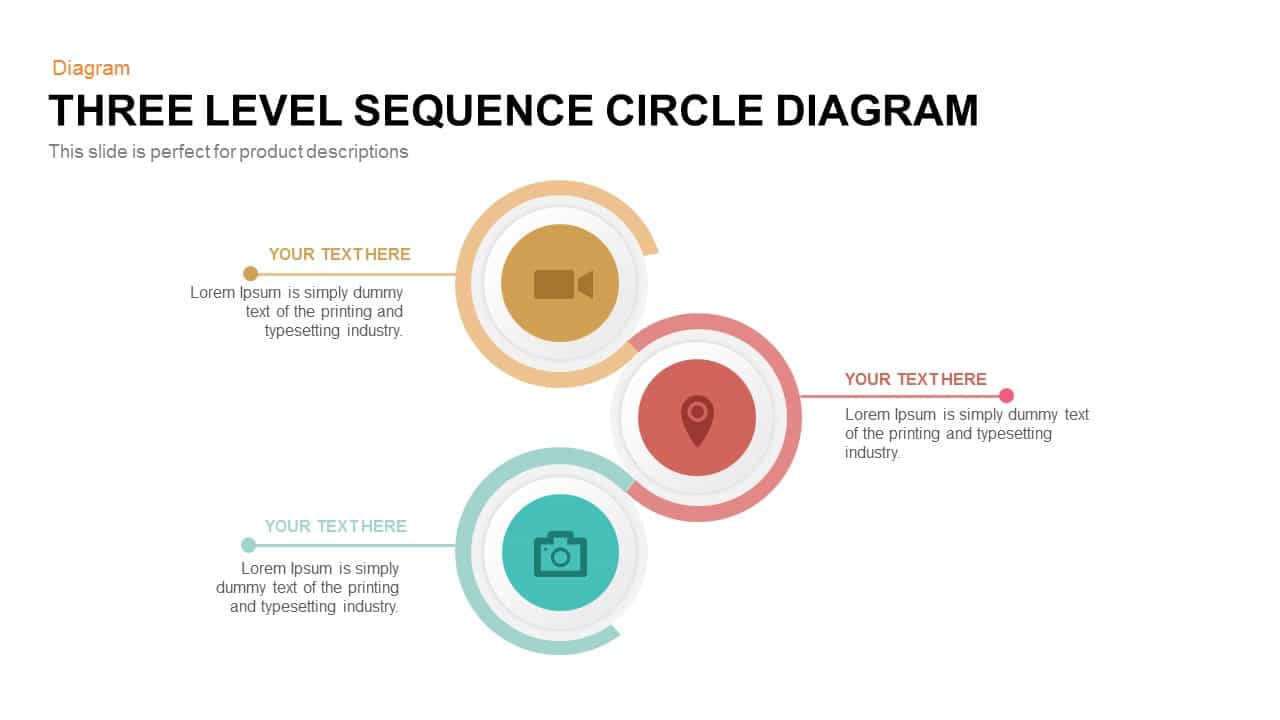
Three-Level Sequence Circle Diagram Template for PowerPoint & Google Slides
Circular
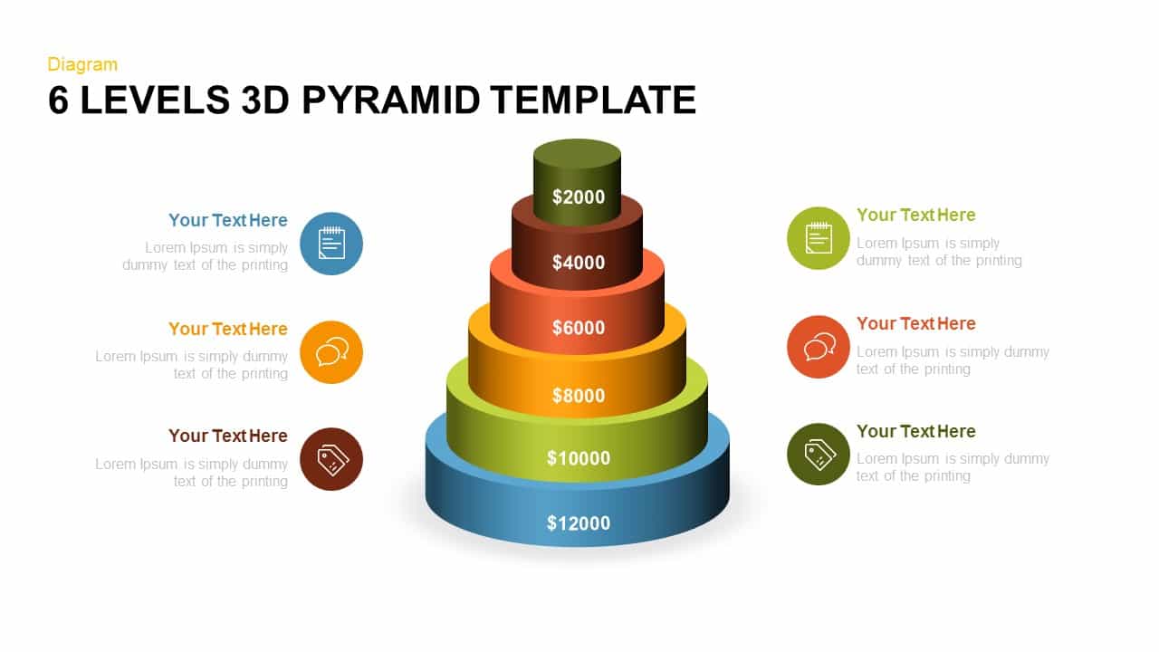
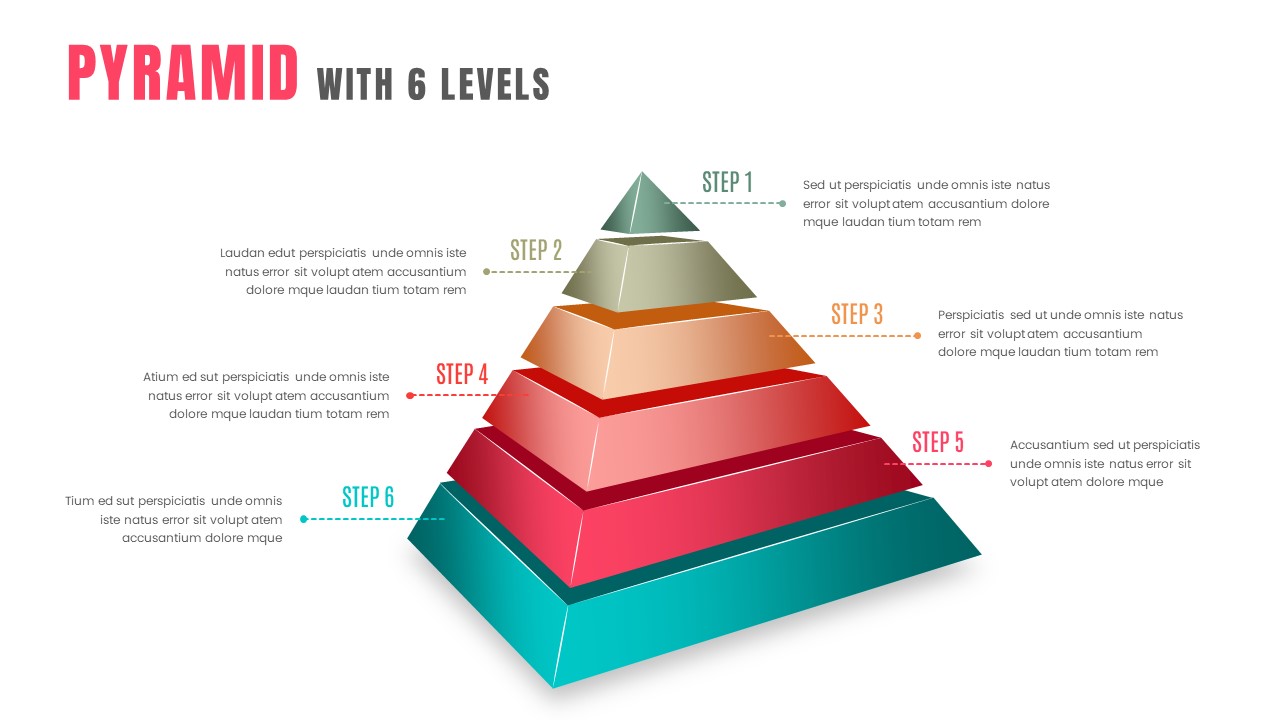
Editable Six-Level 3D Pyramid Diagram Template for PowerPoint & Google Slides
Pyramid
Four-Level Business Pyramid Diagram Template for PowerPoint & Google Slides
Pyramid
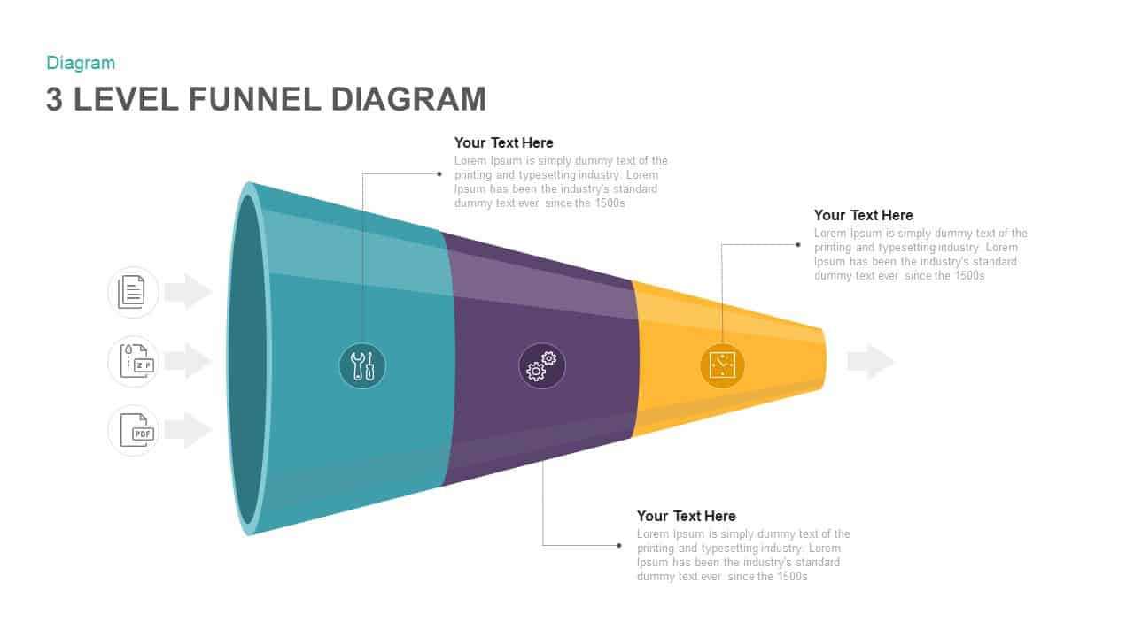
Three Level Funnel Process Diagram Template for PowerPoint & Google Slides
Funnel
Four-Level Colorful Pyramid Diagram Template for PowerPoint & Google Slides
Pyramid
3D Six-Level Pyramid Diagram Infographic Template for PowerPoint & Google Slides
Pyramid
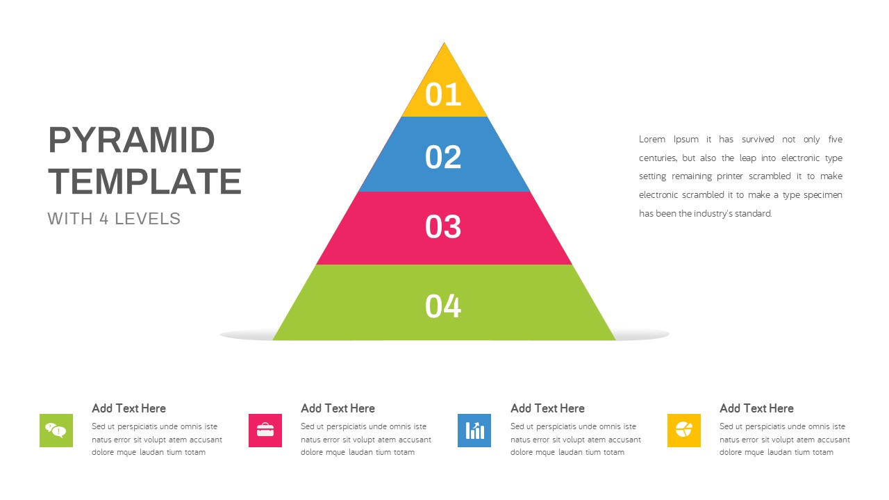
Modern Four-Level Pyramid Diagram Template for PowerPoint & Google Slides
Pyramid
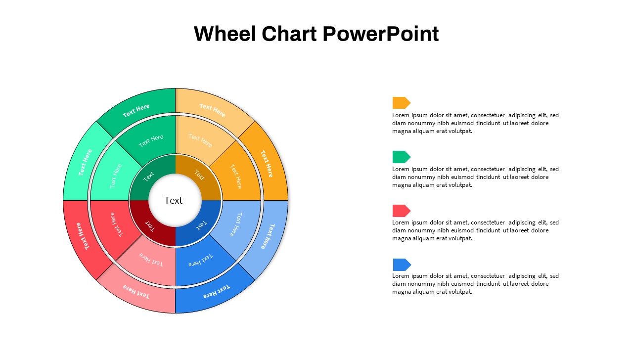
Multi-Level Wheel Chart Diagram template for PowerPoint & Google Slides
Pie/Donut
Four-Level Colorful Pyramid Diagram Template for PowerPoint & Google Slides
Pyramid
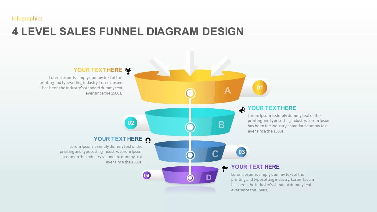
4 Level Sales Funnel Diagram Design for PowerPoint & Google Slides
Marketing Funnel
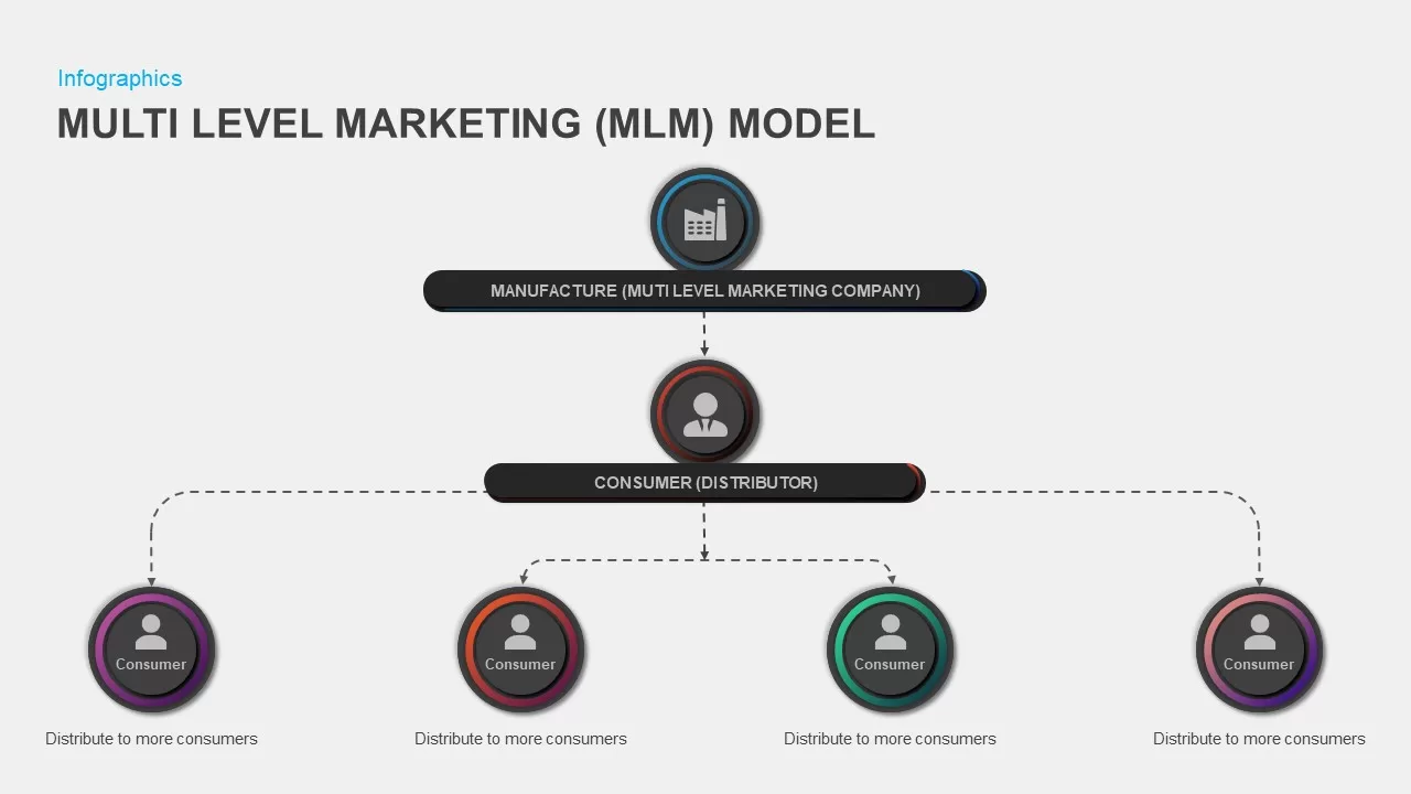
Multi-Level Marketing PowerPoint Template for PowerPoint & Google Slides
Business Models
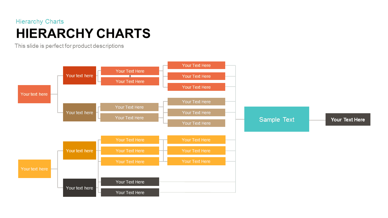
Horizontal Multi-Level Hierarchy Chart template for PowerPoint & Google Slides
Org Chart
Four-Level 3D Pyramid Infographic Template for PowerPoint & Google Slides
Pyramid
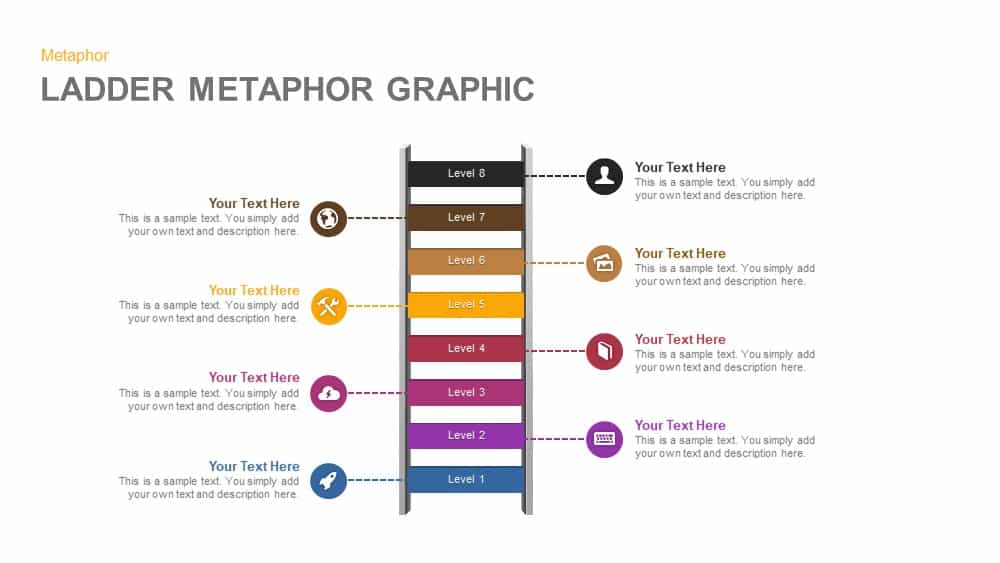
Eight-Level Ladder Metaphor Graphic Template for PowerPoint & Google Slides
Process

3D Spheres Fill Level Infographic Deck Template for PowerPoint & Google Slides
Comparison
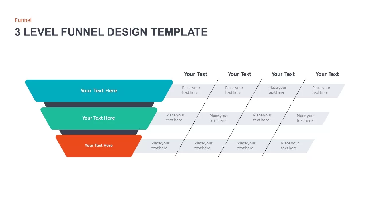
3 Level Funnel Design Visualization Template for PowerPoint & Google Slides
Funnel
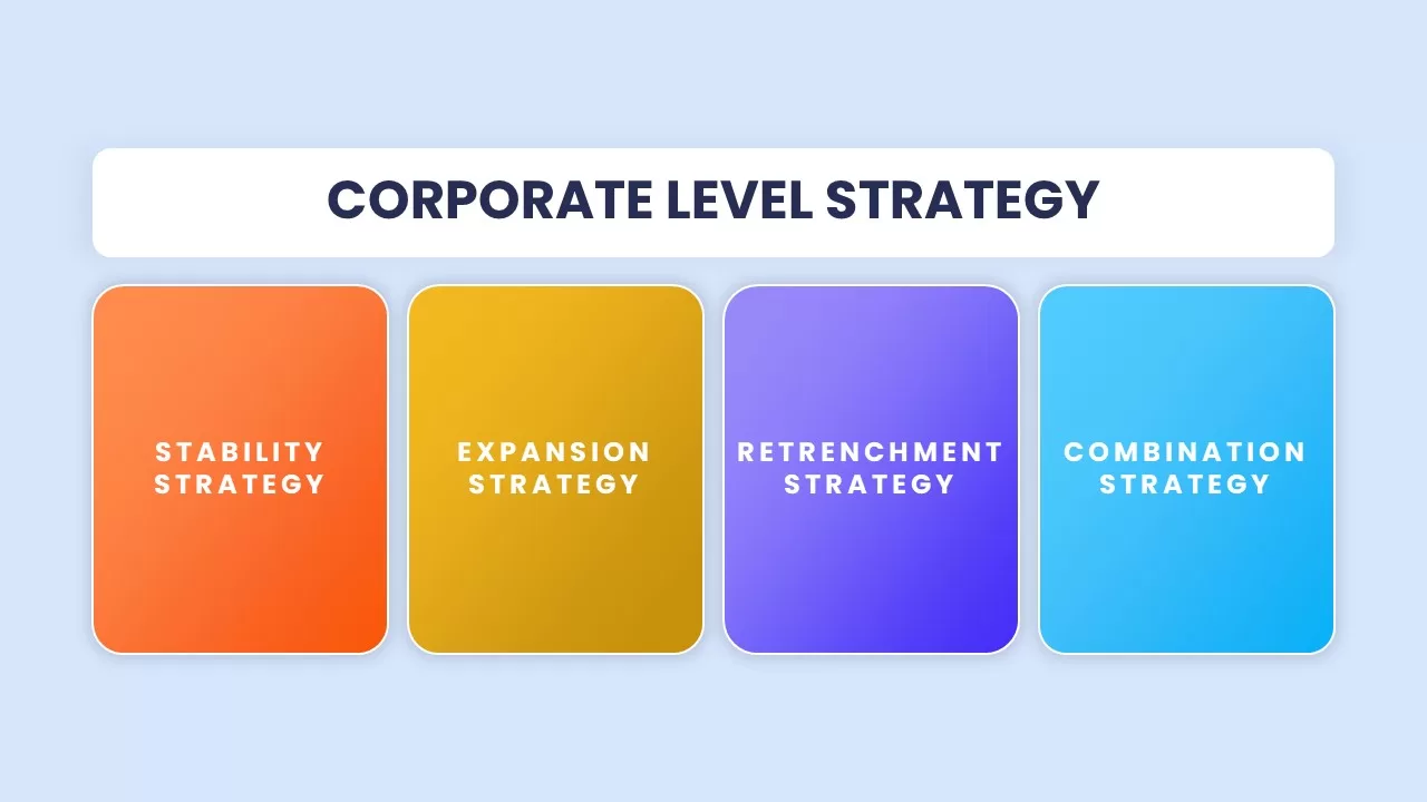
Corporate Level Strategy Overview template for PowerPoint & Google Slides
Business Strategy
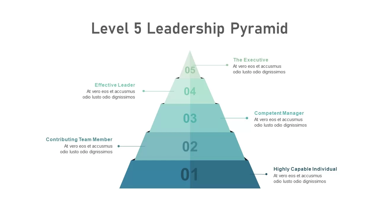
Level 5 Leadership Pyramid Infographic Template for PowerPoint & Google Slides
Pyramid

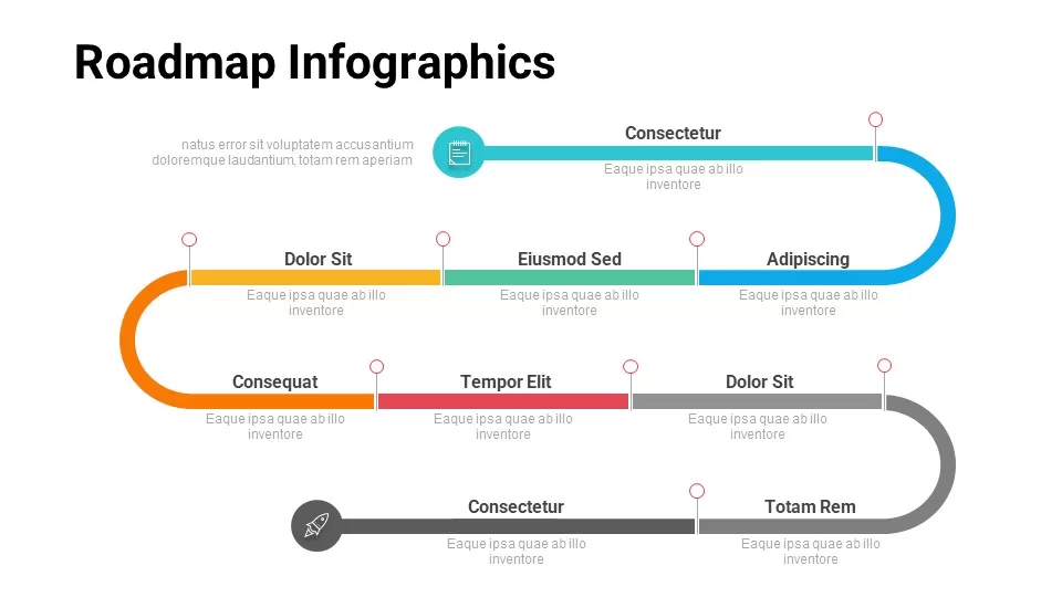
Free Multi-Level Roadmap Infographic Template for PowerPoint & Google Slides
Roadmap
Free
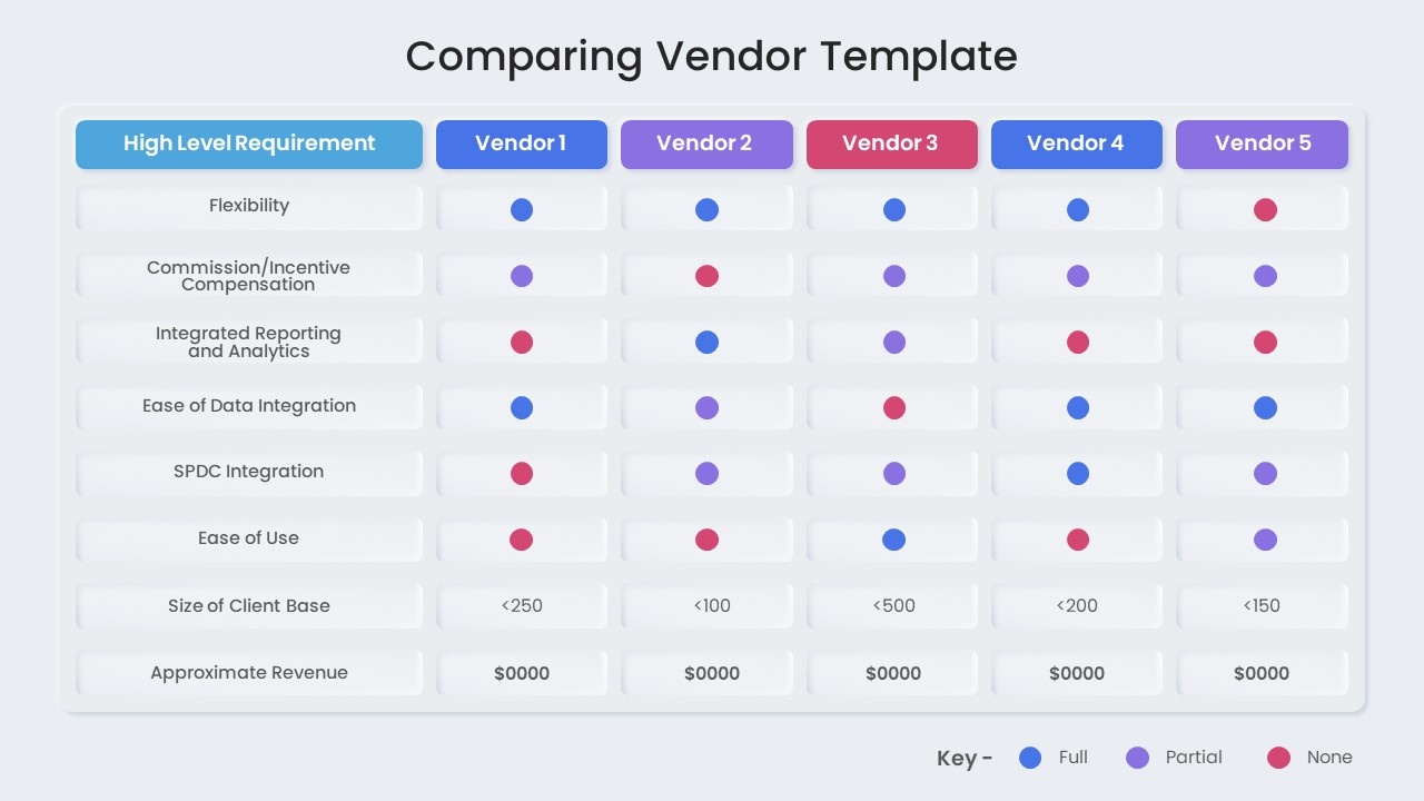
Vendor Comparison Matrix with High-Level Requirements template for PowerPoint & Google Slides
Comparison Chart
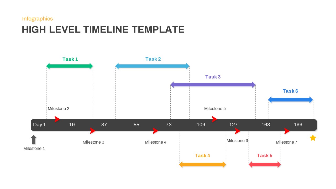
High-Level Timeline Infographic Template for PowerPoint & Google Slides
Timeline
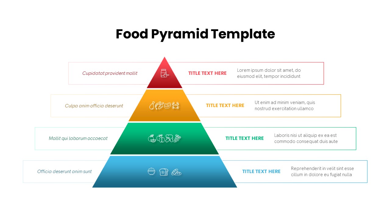
Four-Level Food Pyramid Infographic Template for PowerPoint & Google Slides
Pyramid
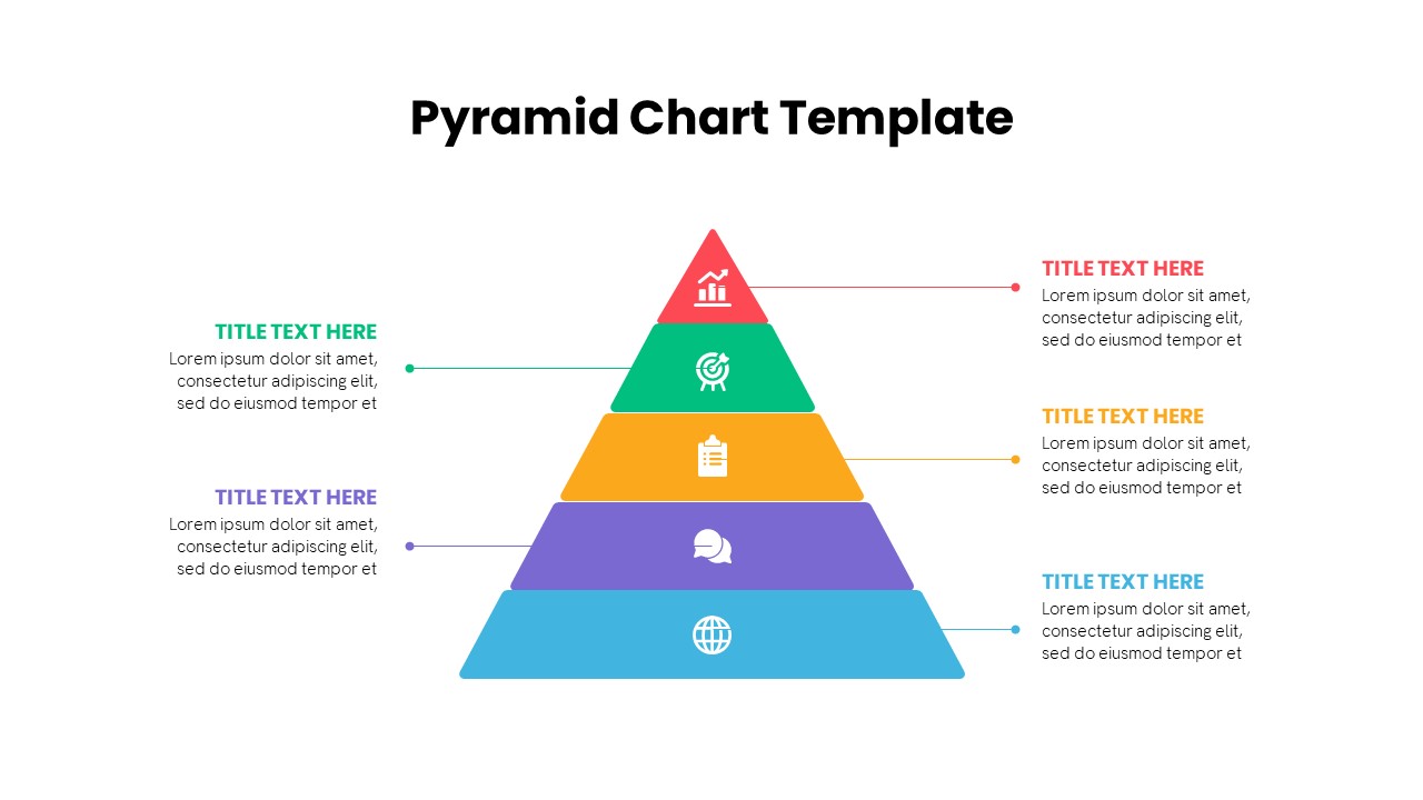
Multi-Level Colorful Pyramid Chart Template for PowerPoint & Google Slides
Pyramid
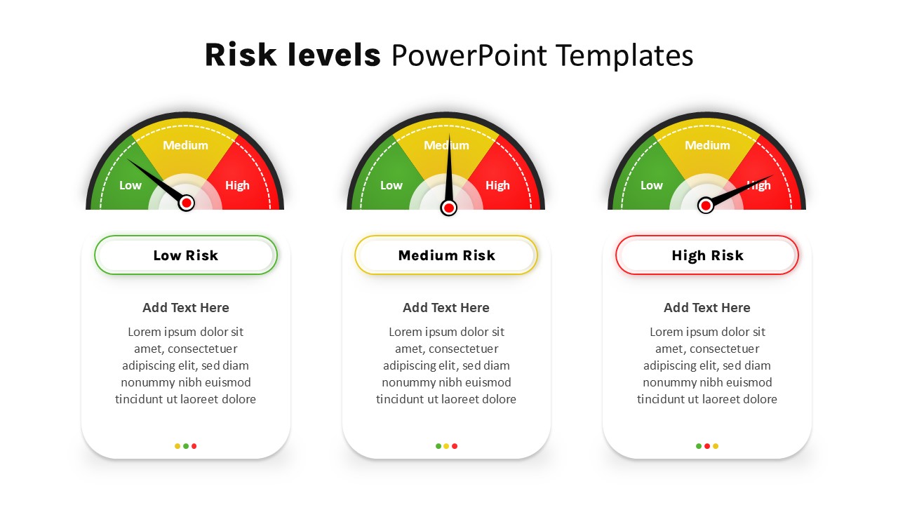
Risk Level Gauge Comparison Dashboard Template for PowerPoint & Google Slides
Comparison
Four Level Pyramid Infographic Template for PowerPoint & Google Slides
Pyramid
5 Level Hierarchy Pyramid Template for PowerPoint & Google Slides
Pyramid
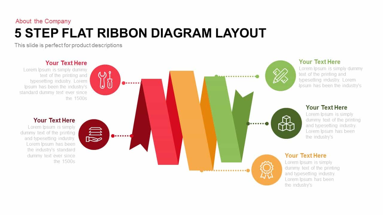
Five-Step Flat Ribbon Diagram Layout template for PowerPoint & Google Slides
Process
Five Up Arrow Infographic Diagram Template for PowerPoint & Google Slides
Arrow
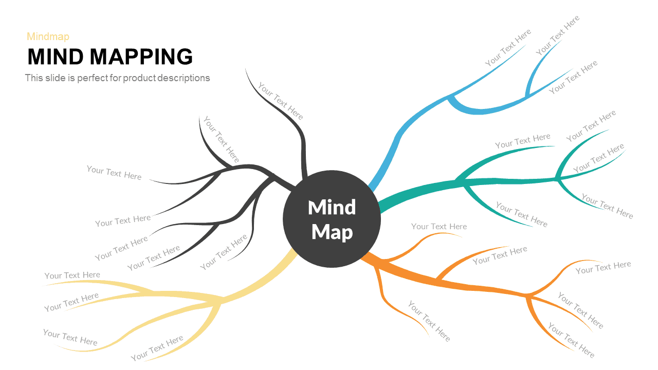
Five-Branch Mind Mapping Diagram template for PowerPoint & Google Slides
Mind Maps

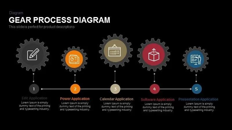
Five-Step Gear Process Diagram Template for PowerPoint & Google Slides
Process
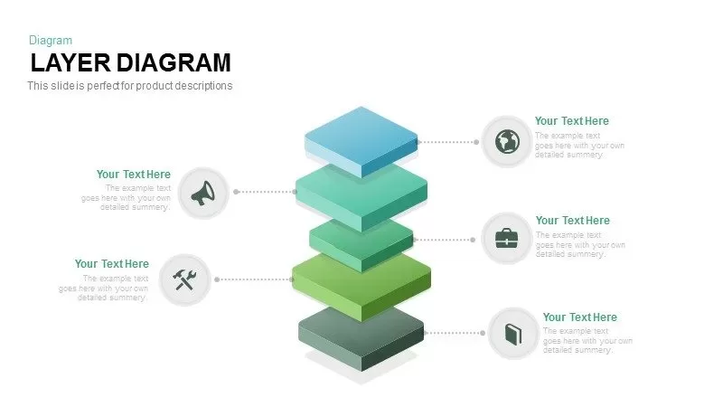
Five Layer Product Architecture Diagram Template for PowerPoint & Google Slides
Process

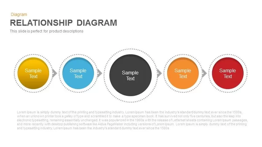
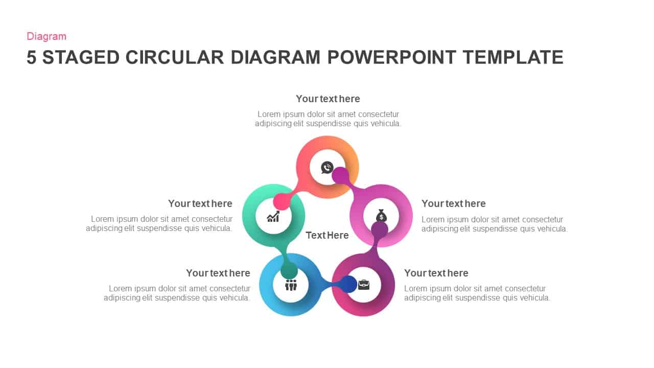
Colorful Five-Stage Relationship Diagram Template for PowerPoint & Google Slides
Process
Five-Section Circular Arrow Diagram Template for PowerPoint & Google Slides
Circular
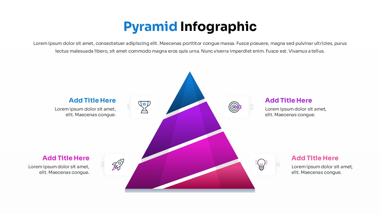
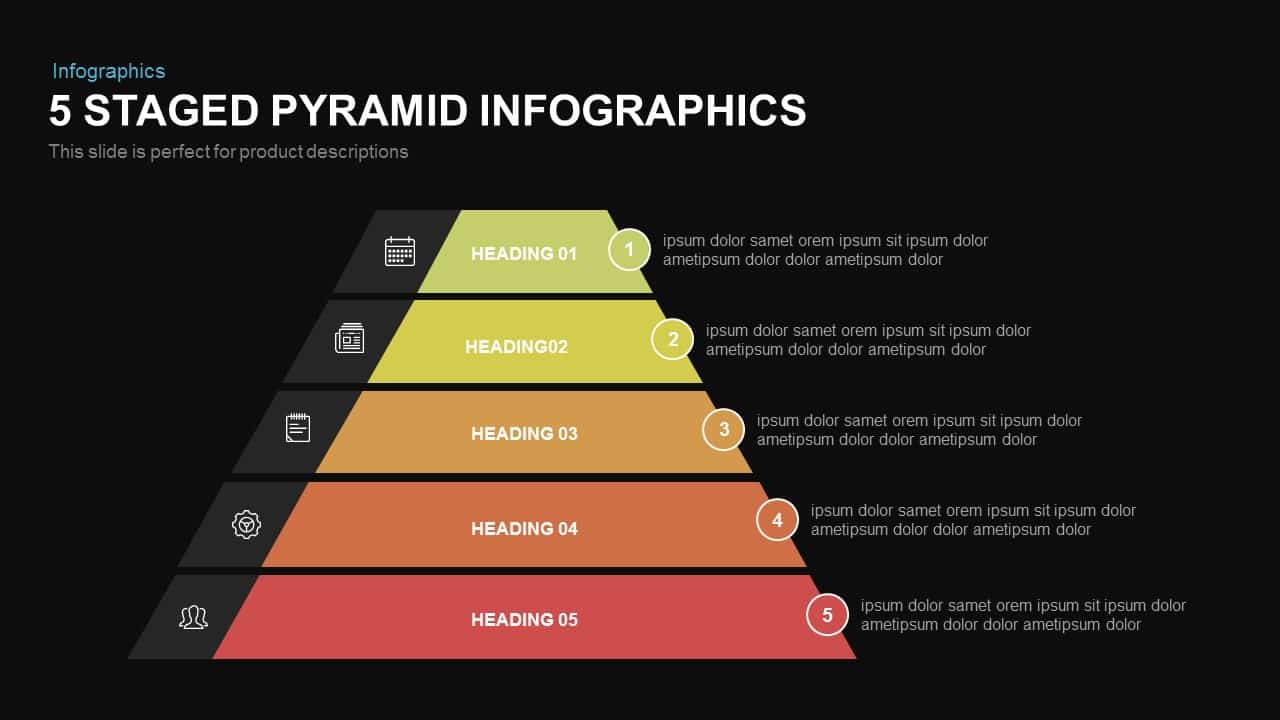
Five-Stage Pyramid Infographics Diagram Template for PowerPoint & Google Slides
Pyramid
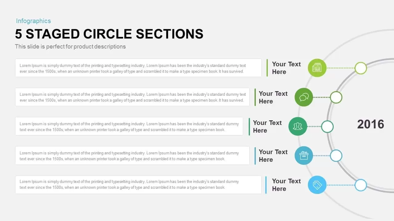
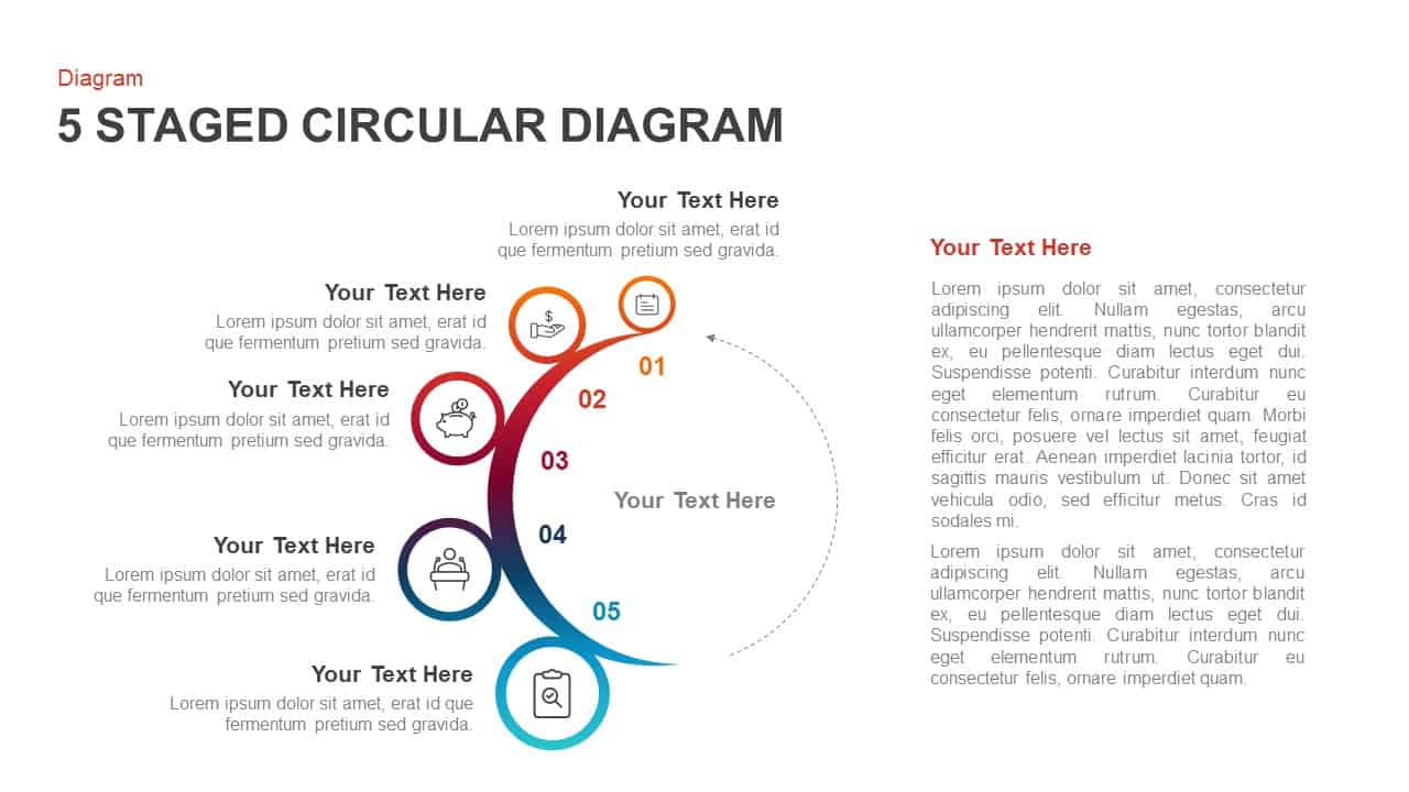
Five-Staged Circle Sections Diagram Template for PowerPoint & Google Slides
Circular
Five-Stage Zig-Zag Arrow Diagram Template for PowerPoint & Google Slides
Process
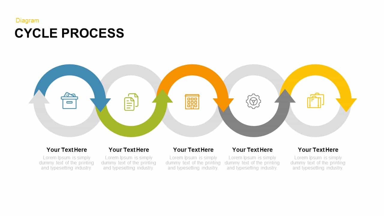
Modern Five-Stage Cycle Process Diagram Template for PowerPoint & Google Slides
Process
Five-Section Arrow Signpost Diagram Template for PowerPoint & Google Slides
Arrow
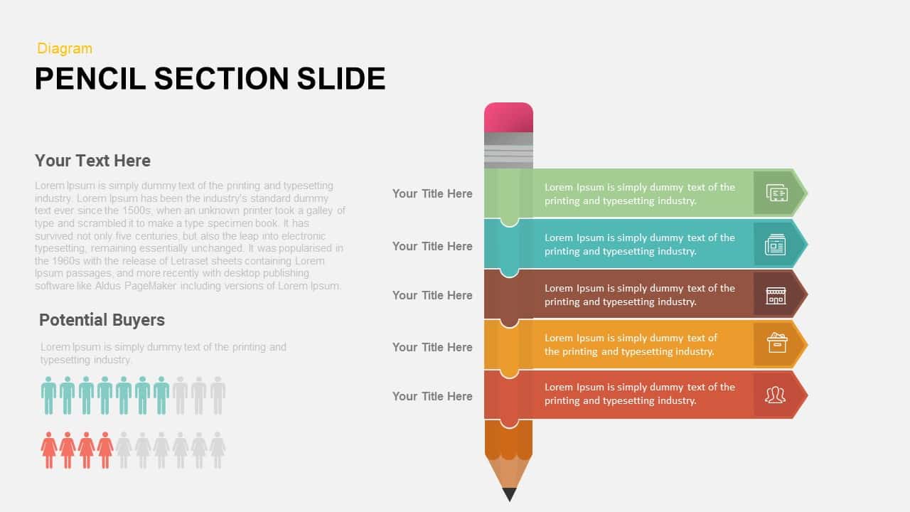
Pencil Section Five-Part Diagram Template for PowerPoint & Google Slides
Process
Engaging Five-Stage Process Diagram Template for PowerPoint & Google Slides
Process
Four and Five-Stage Funnel Diagram Template for PowerPoint & Google Slides
Funnel
Five-Stage Circle Arrow Diagram Template for PowerPoint & Google Slides
Circular
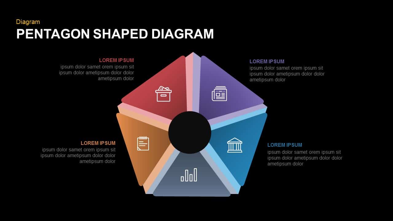
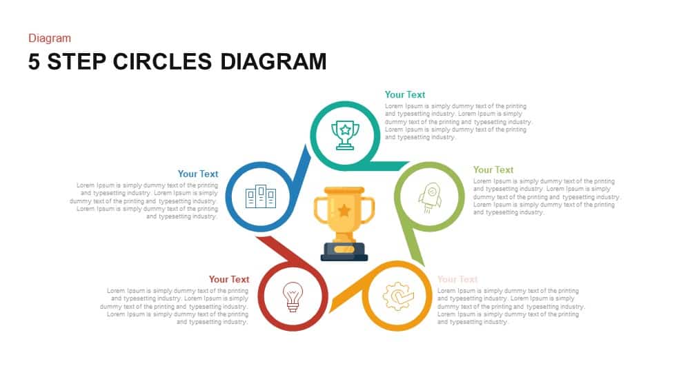
Five-Part Pentagon Shaped Diagram Template for PowerPoint & Google Slides
Process
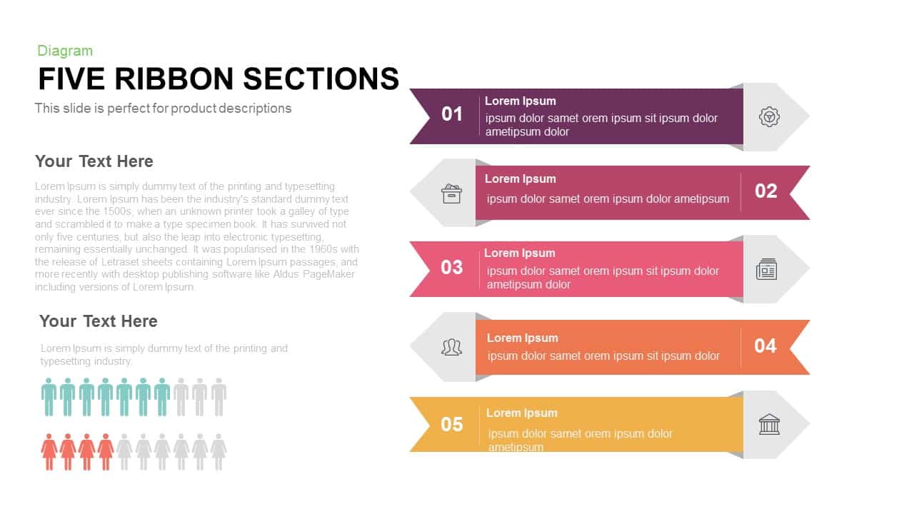
Five Ribbon Sections Process Diagram Template for PowerPoint & Google Slides
Process
Five-Stage Pentagon Arrow Diagram Template for PowerPoint & Google Slides
Arrow
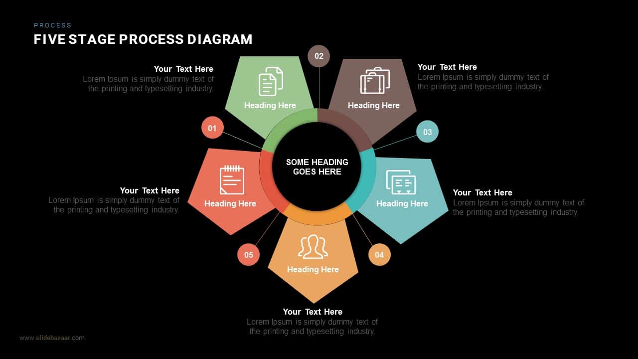
Five Stage Process Diagram Infographic Template for PowerPoint & Google Slides
Process
Five Stage Process Diagram template for PowerPoint & Google Slides
Process
Free
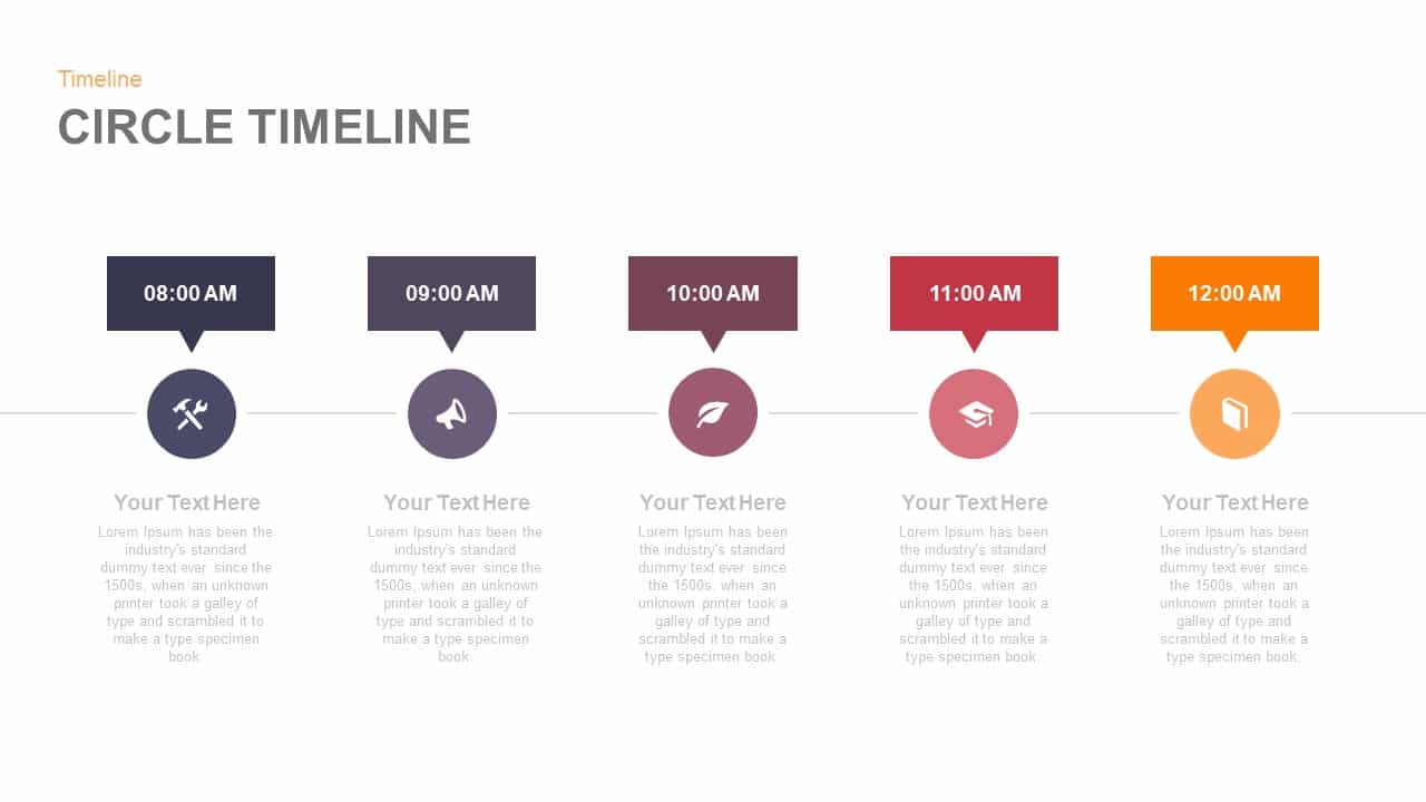
Five-Point Circle Timeline Diagram Template for PowerPoint & Google Slides
Timeline
Five-Stage Cyclic Process Arrow Diagram Template for PowerPoint & Google Slides
Process
Modern Five-Step Circles Process Diagram Template for PowerPoint & Google Slides
Circular
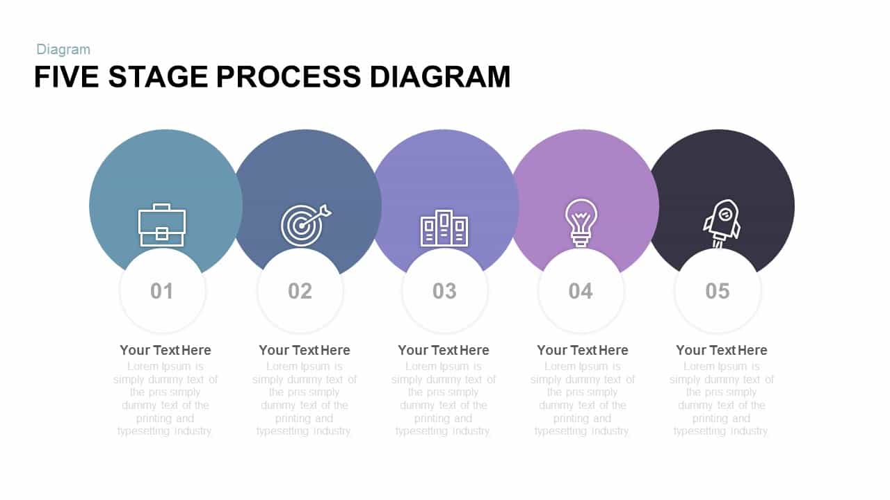
Five-Stage Process Diagram Template for PowerPoint & Google Slides
Process
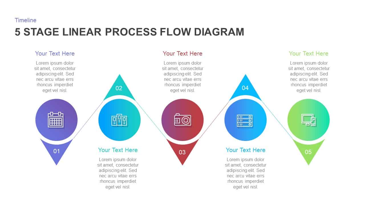
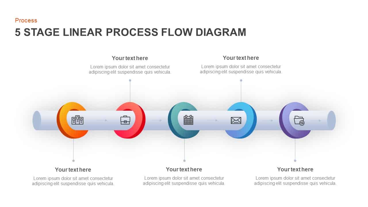
Five Stage Linear Process Flow Diagram Template for PowerPoint & Google Slides
Process
Five-Stage Linear Process Flow Diagram Template for PowerPoint & Google Slides
Process
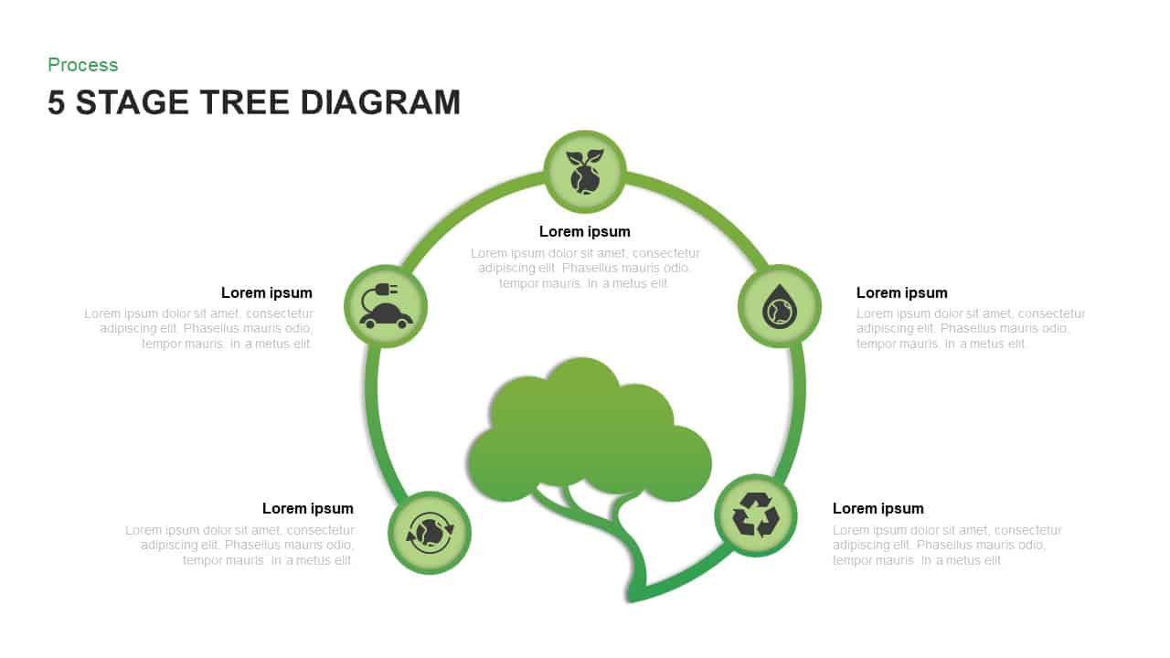
Five-Stage Eco Tree Process Diagram Template for PowerPoint & Google Slides
Process
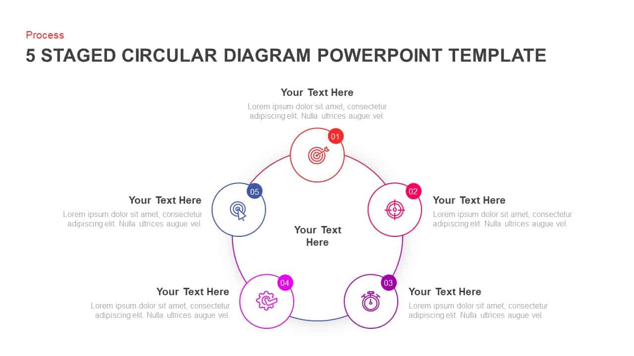
Five-Stage Circular Infographic Diagram Template for PowerPoint & Google Slides
Process
Five-Stage Circular Process Diagram Template for PowerPoint & Google Slides
Circular
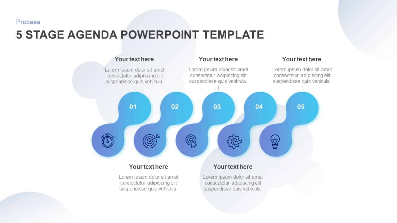
Five-Stage Agenda Flow Diagram Template for PowerPoint & Google Slides
Agenda
Five Stage Circular Arrow Diagram Template for PowerPoint & Google Slides
Process
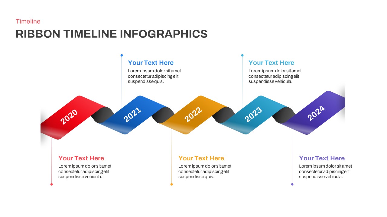
Five-Year Ribbon Timeline Diagram Template for PowerPoint & Google Slides
Timeline
Five-Stage Circular Process Flow Diagram Template for PowerPoint & Google Slides
Circular
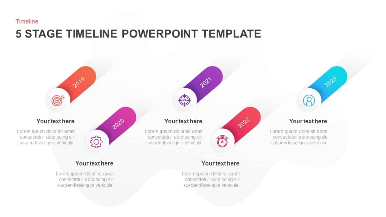
Five-Stage Slanted Timeline Diagram Template for PowerPoint & Google Slides
Timeline
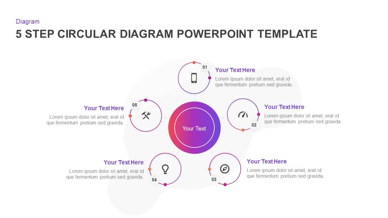
Five-Step Circular Process Diagram Template for PowerPoint & Google Slides
Circular
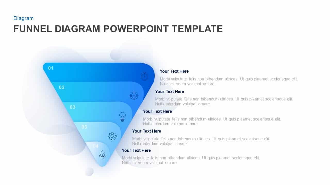
Five-Step Gradient Blue Funnel Diagram Template for PowerPoint & Google Slides
Funnel
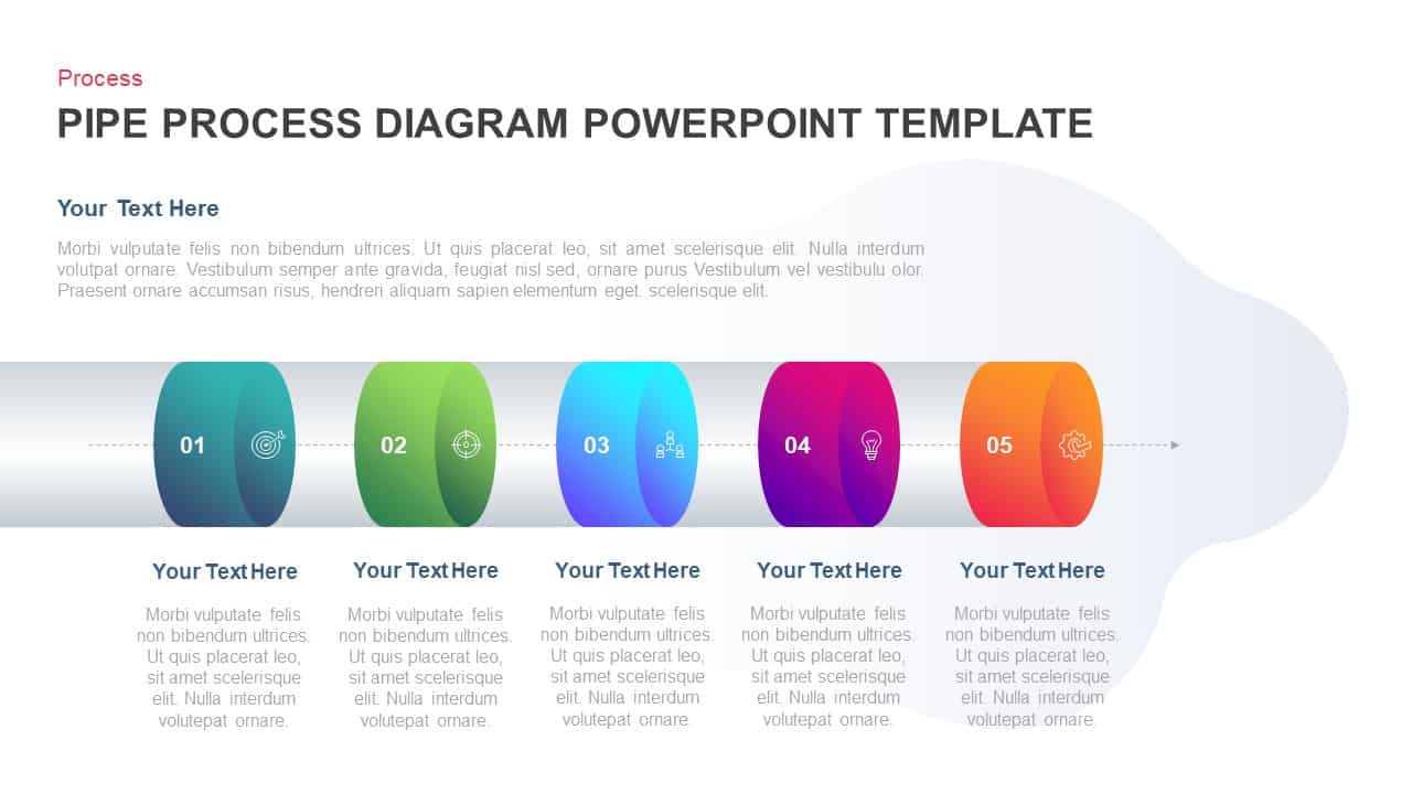
Five-Stage Pipe Process Diagram Template for PowerPoint & Google Slides
Process
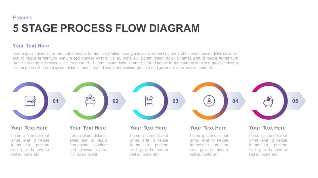
Five-Stage Process Flow Diagram Template for PowerPoint & Google Slides
Process
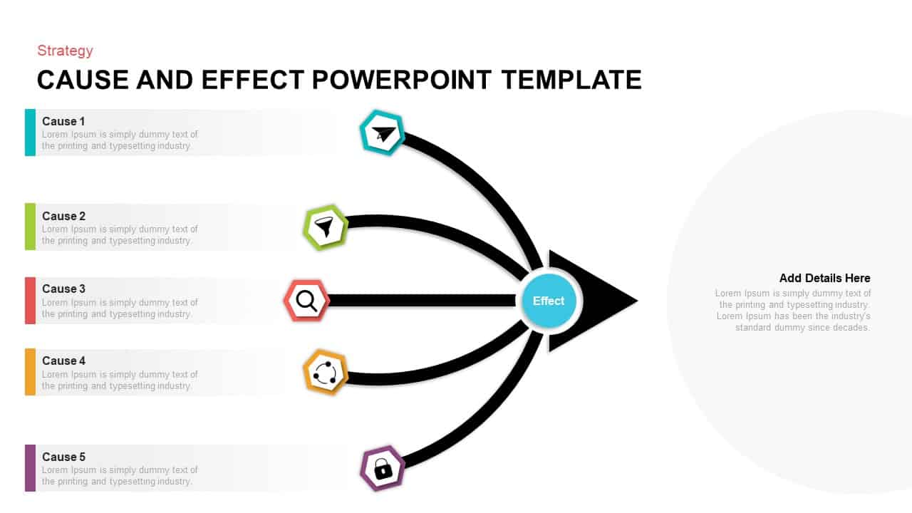
Five-Input Cause and Effect Diagram Template for PowerPoint & Google Slides
Arrow
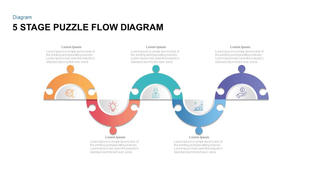
Five Stage Puzzle Flow Diagram Template for PowerPoint & Google Slides
Process
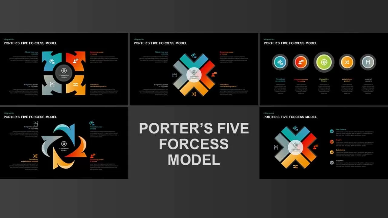
Porter’s Five Forces Visual Diagram Template for PowerPoint & Google Slides
Infographics
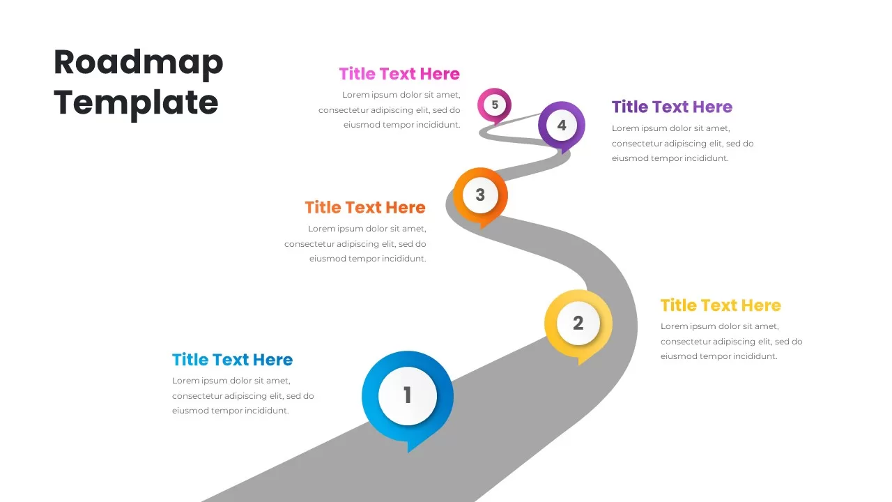
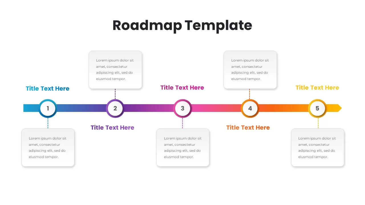
Colorful Five-Step Roadmap Diagram Template for PowerPoint & Google Slides
Roadmap
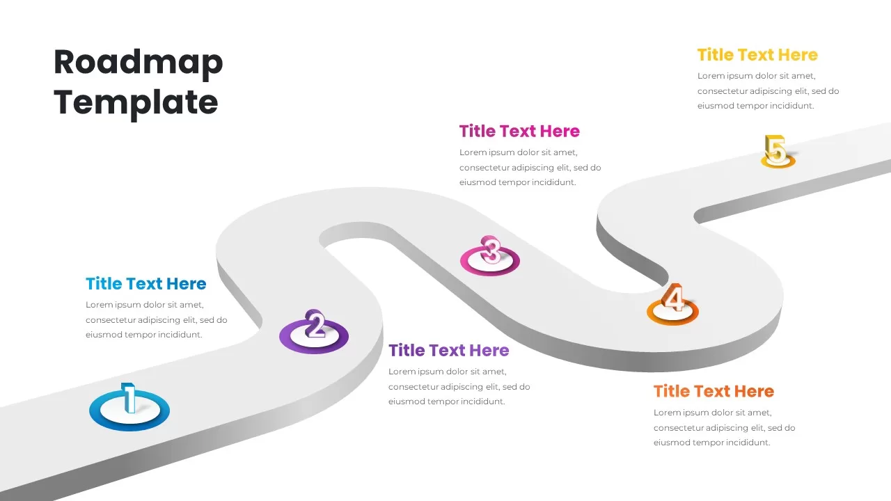
3D Five-Step Roadmap Diagram Slide Layout Template for PowerPoint & Google Slides
Roadmap
Gradient Five-Step Roadmap Diagram Template for PowerPoint & Google Slides
Roadmap
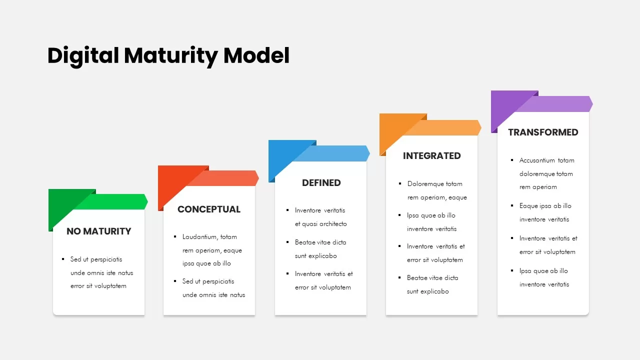
Five-Stage Digital Maturity Model Diagram Template for PowerPoint & Google Slides
Process
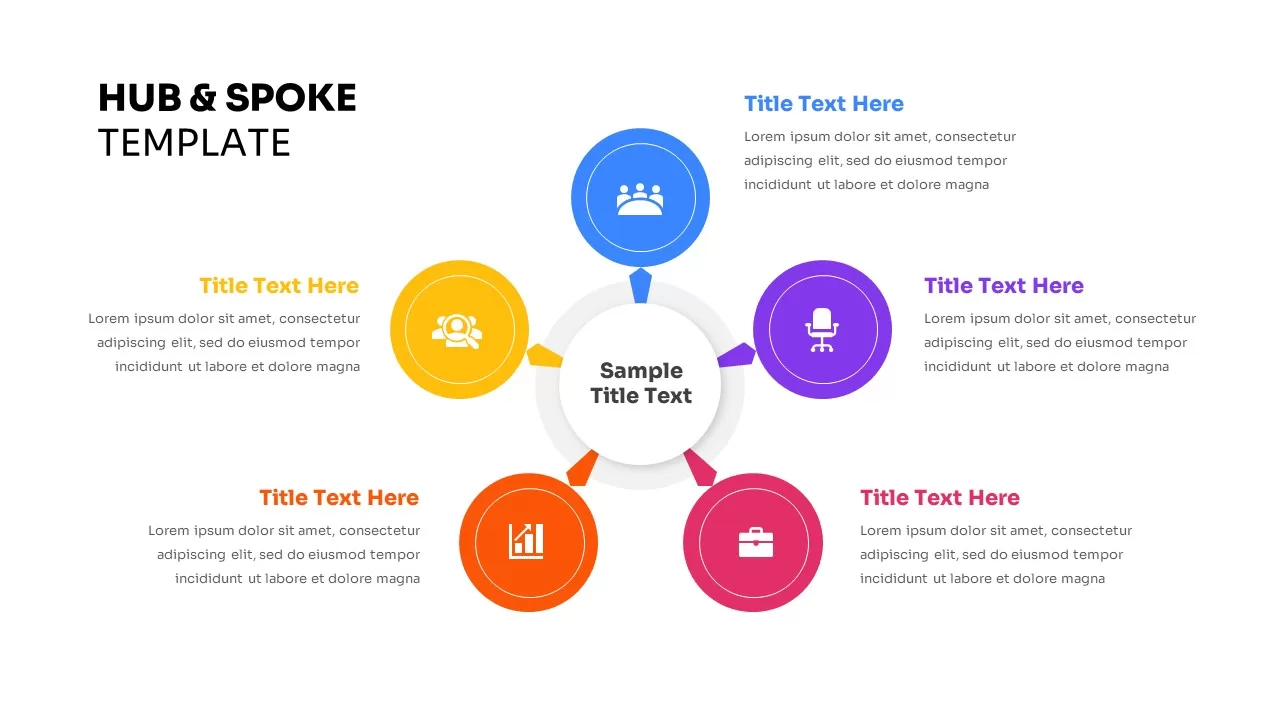
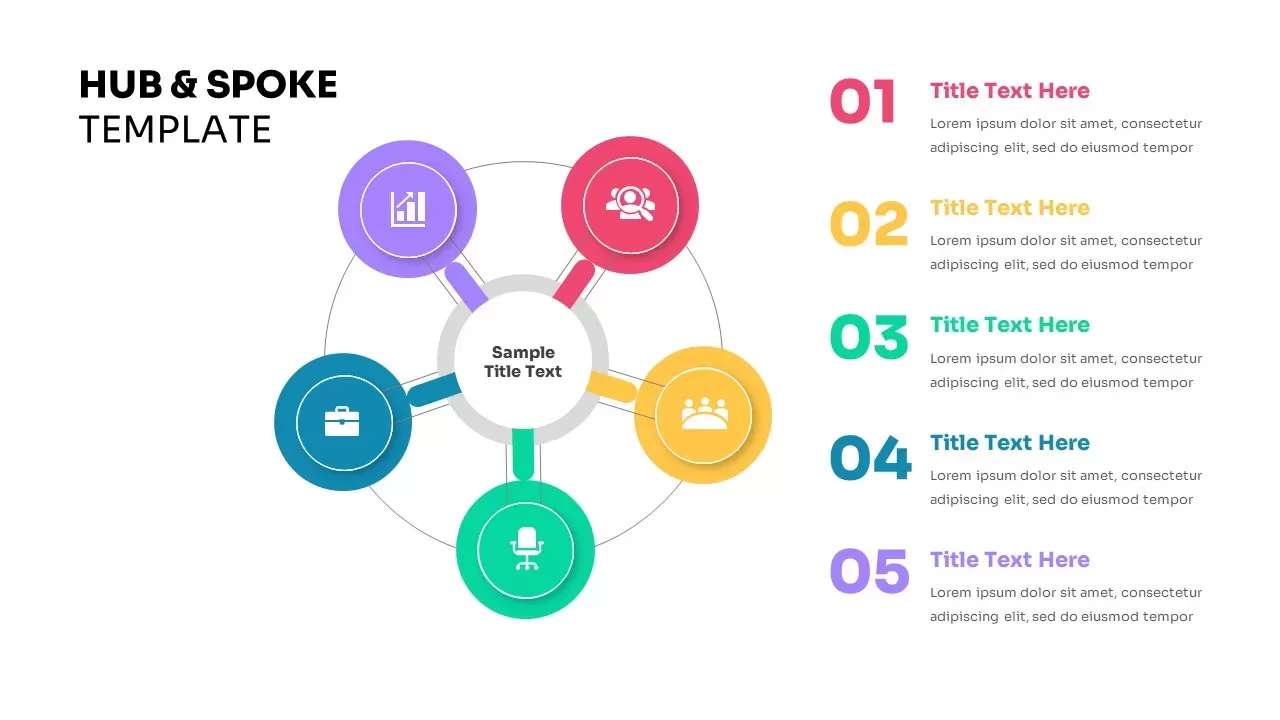
Five-Node Hub and Spoke Diagram Template for PowerPoint & Google Slides
Business Strategy
Five-Node Hub & Spoke Diagram Process Template for PowerPoint & Google Slides
Business Models
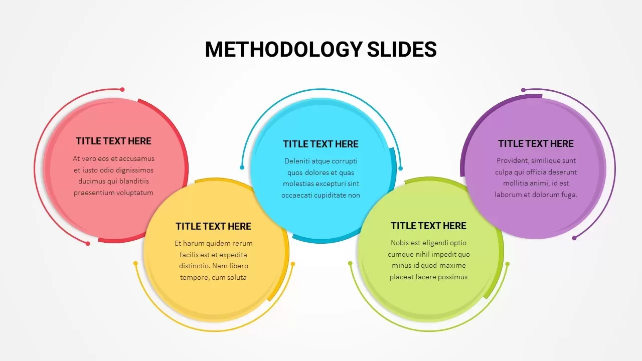
Colorful Five-Stage Methodology Diagram Template for PowerPoint & Google Slides
Process
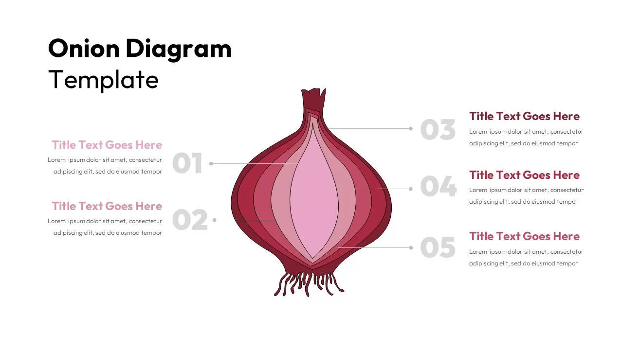
Five-Layer Onion Diagram Infographic Template for PowerPoint & Google Slides
Process
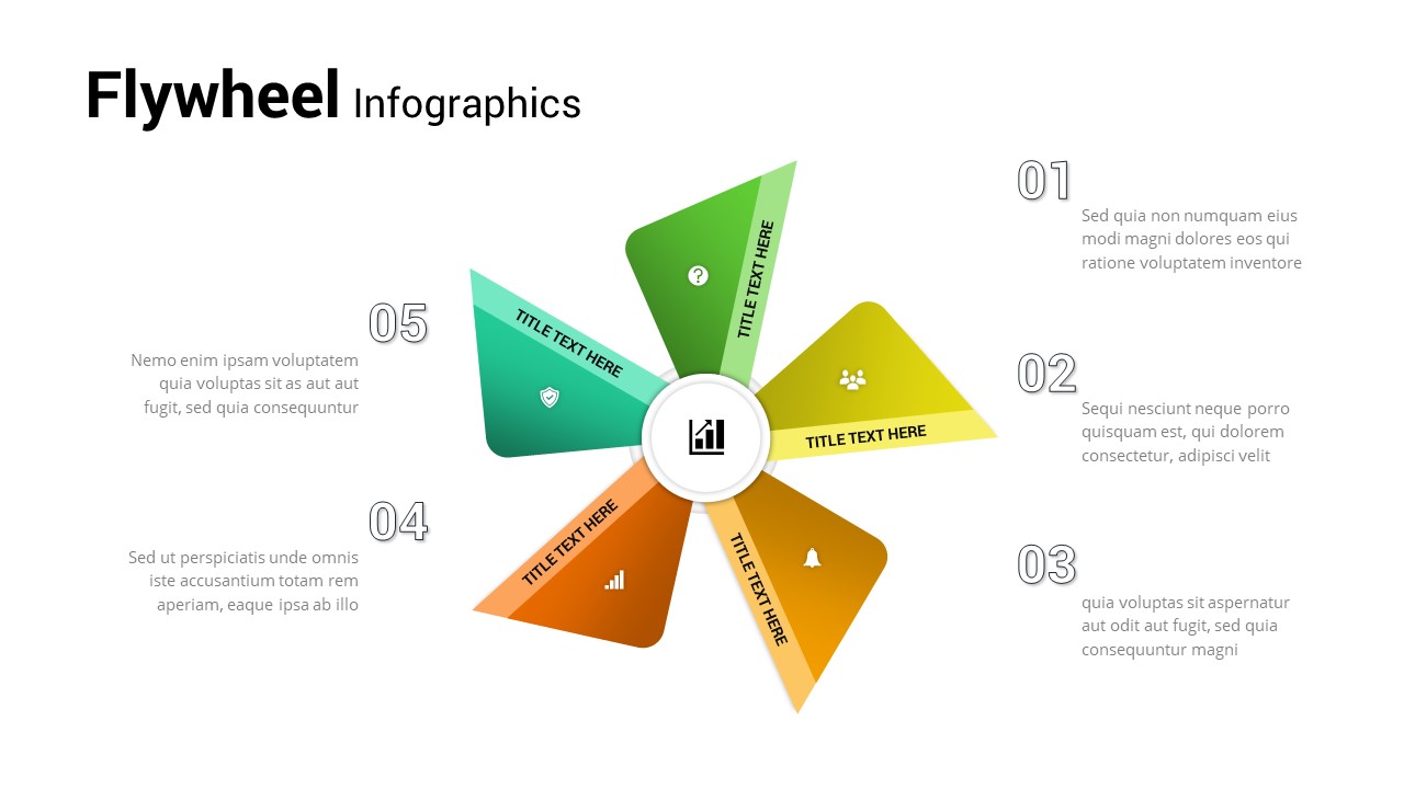
Five-Step Flywheel Infographic Diagram Template for PowerPoint & Google Slides
Process
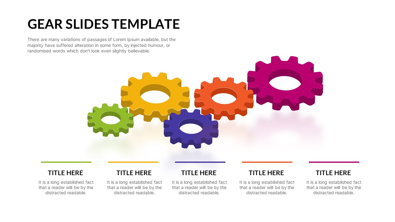
Five-Step Interlocking Gears Diagram Template for PowerPoint & Google Slides
Process
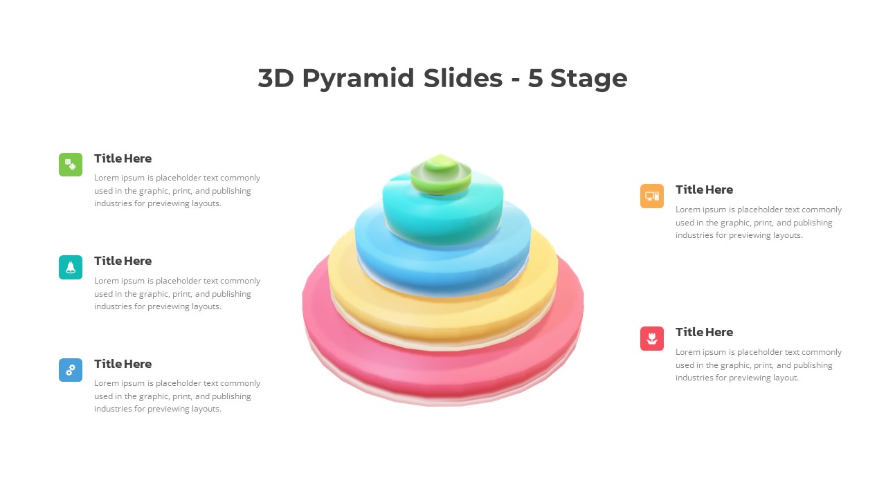
3D Five-Stage Pyramid Diagram Slide Template for PowerPoint & Google Slides
Pyramid
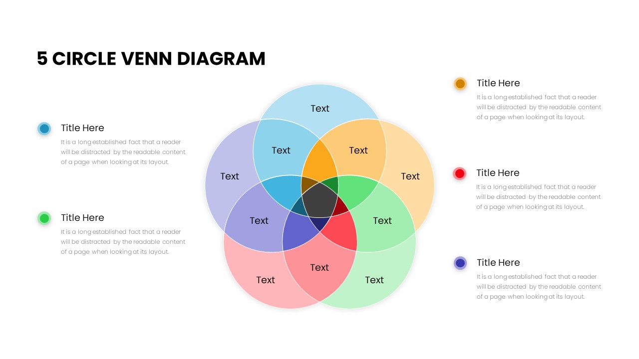
Five Circle Venn Diagram for Template for PowerPoint & Google Slides
Circular
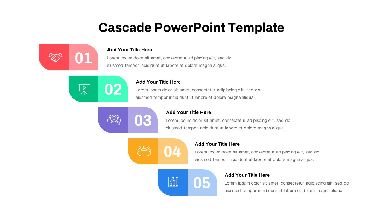
Five-Step Cascade Diagram & Timeline Template for PowerPoint & Google Slides
Process
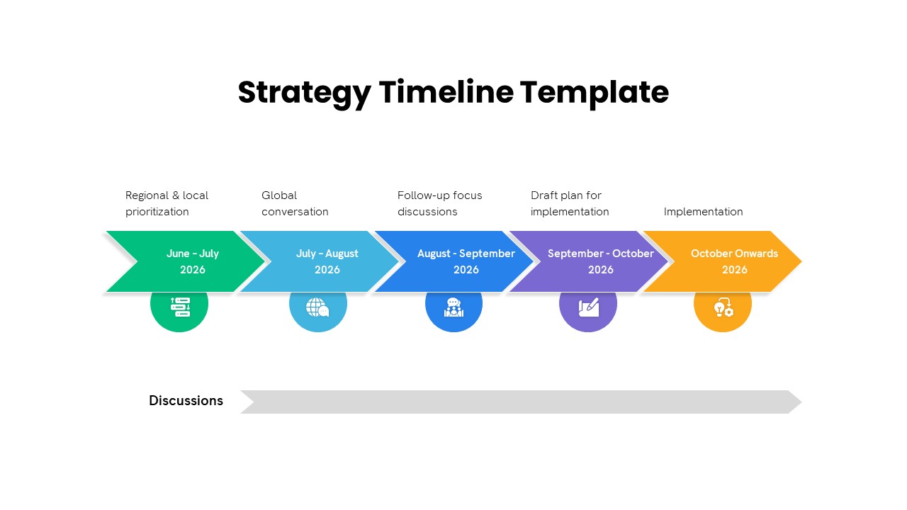
Five-Phase Strategy Timeline Diagram Template for PowerPoint & Google Slides
Timeline
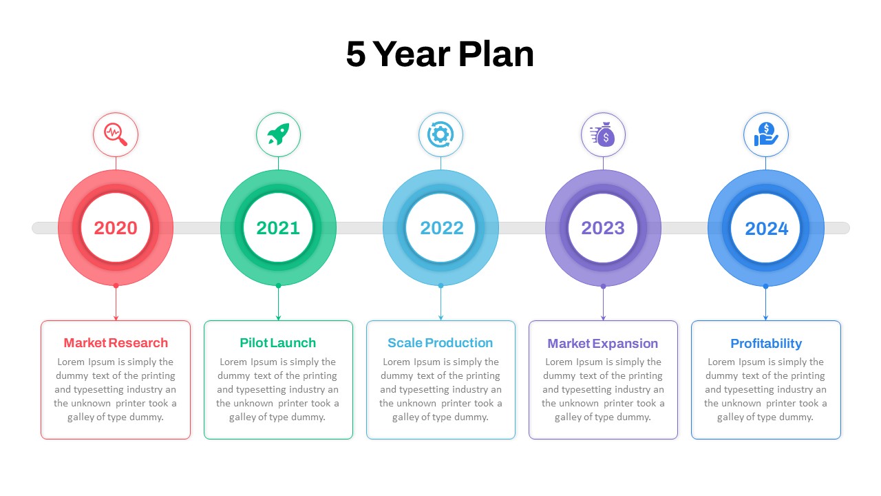
Five-Year Plan Timeline Diagram Template for PowerPoint & Google Slides
Timeline
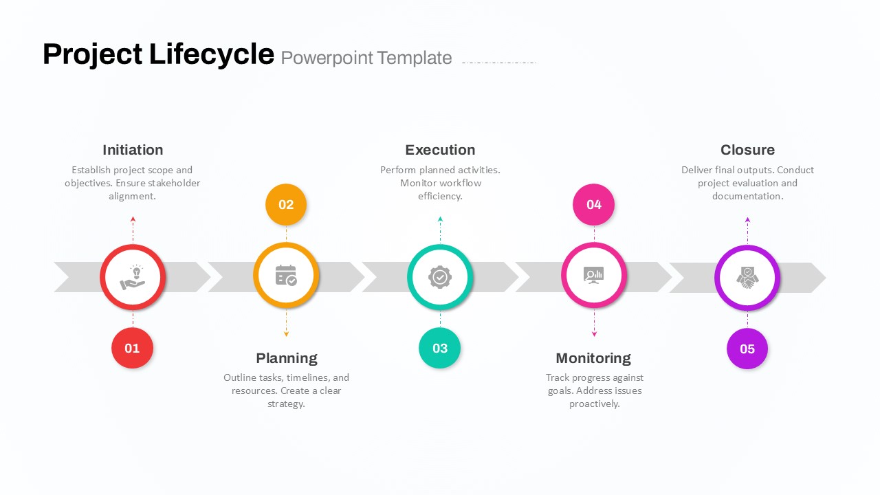
Five-Phase Project Lifecycle Diagram Template for PowerPoint & Google Slides
Infographics
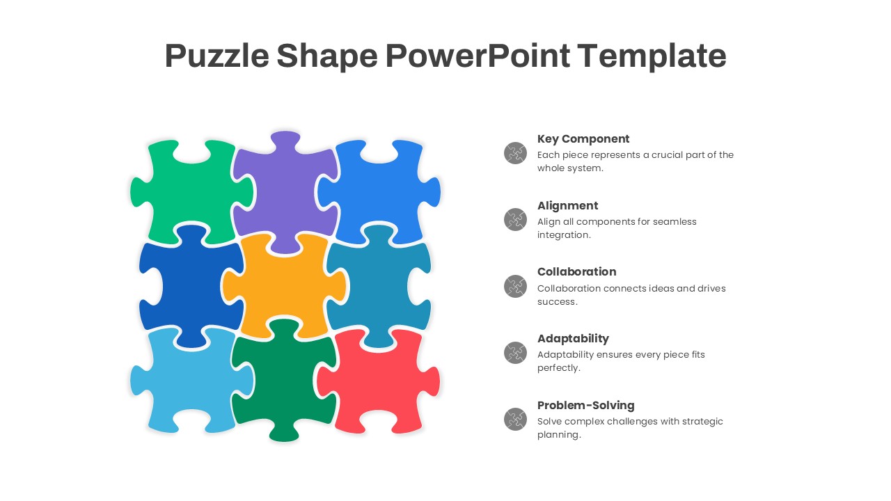
Puzzle Shape Diagram with Five Elements Template for PowerPoint & Google Slides
Circular
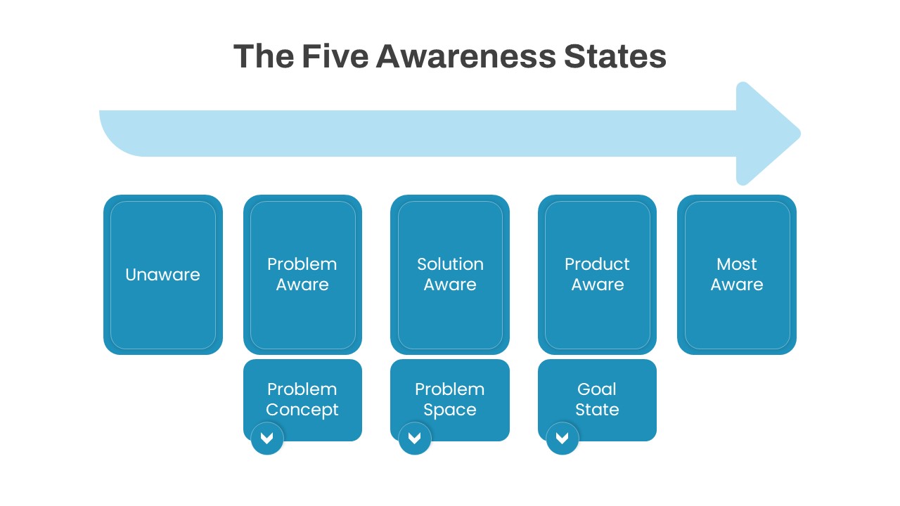
The Five Awareness States diagram template for PowerPoint & Google Slides
Infographics
Five-Step Modern Funnel Diagram Template for PowerPoint & Google Slides
Funnel