Clustered Column Chart Data Analysis Template for PowerPoint
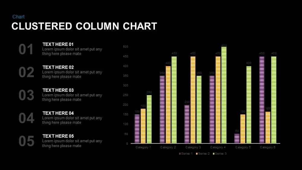
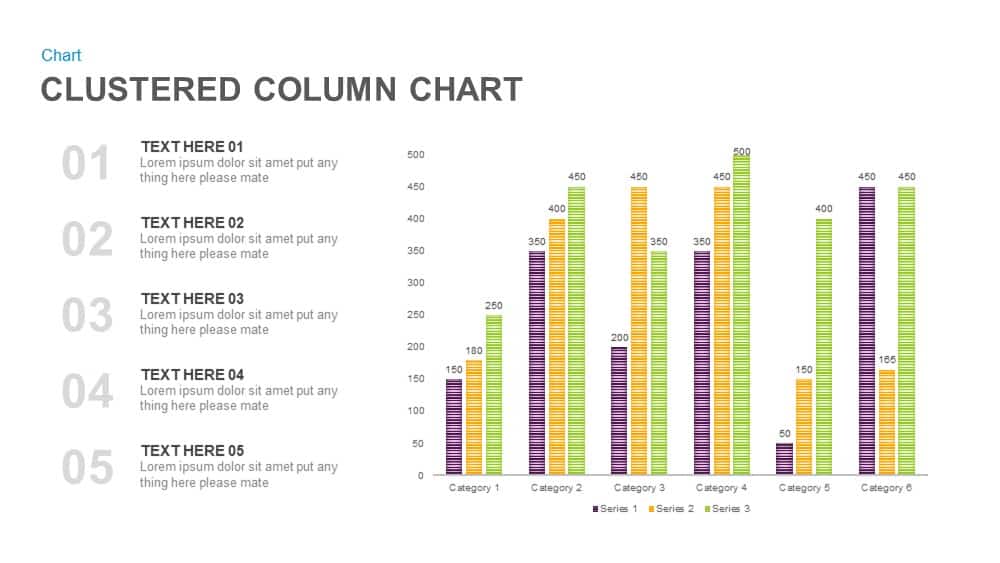

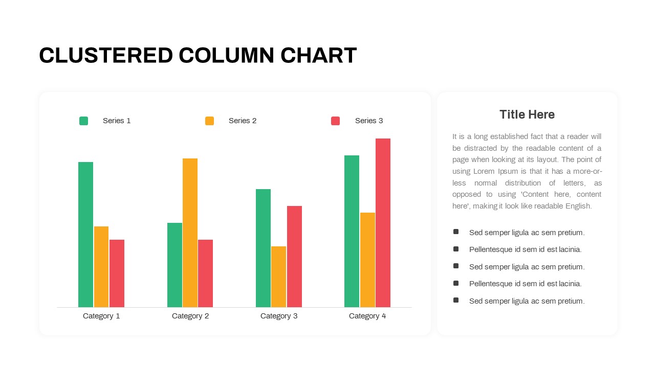
Leverage this clustered column chart slide to present multi-series data comparisons across categories with precision and clarity. The infographic features six categories on the horizontal axis and three series—each rendered in purple, gold, and green—displayed as striped, flat-design bars with numeric labels at their tops. A vertical value axis with gridlines ensures accurate interpretation, while the adjacent numbered callouts on the left allow you to pair each category with descriptive text and insights. Built on master slides with vector shapes, theme-aware color palettes, and editable axis labels, you can swap series colors, adjust data values, modify fonts, or replace callout text in seconds. Grid-based alignment and hidden guides maintain perfect spacing, and the minimalist white background with modern sans-serif typography keeps focus on your data. Ideal for quarterly reports, market analyses, performance tracking, or financial reviews, this slide streamlines storytelling by highlighting trends, outliers, and comparisons at a glance. Compatible with PowerPoint, it preserves high-resolution graphics across devices, eliminates formatting headaches, and accelerates collaboration with preformatted placeholders and consistent styling.
Who is it for
Data analysts, marketing managers, financial controllers, and consultants who need to showcase comparative metrics, performance trends, or category breakdowns in a professional format.
Other Uses
Repurpose this layout for sales performance reviews, product comparisons, risk assessments, resource allocation charts, or executive summaries by relabeling axes and callouts to suit any dataset.
Login to download this file

Item ID
SB00863
Related Templates

Professional Clustered Column Chart Template for PowerPoint & Google Slides
Bar/Column
Animated Clustered Bar Chart Template for PowerPoint & Google Slides
Bar/Column
Clustered Bar Chart Comparison Template for PowerPoint & Google Slides
Bar/Column
Free Stacked Column Chart Data Visualization Template for PowerPoint & Google Slides
Bar/Column
Free

3D Column Chart with Data Table for PowerPoint & Google Slides
Bar/Column
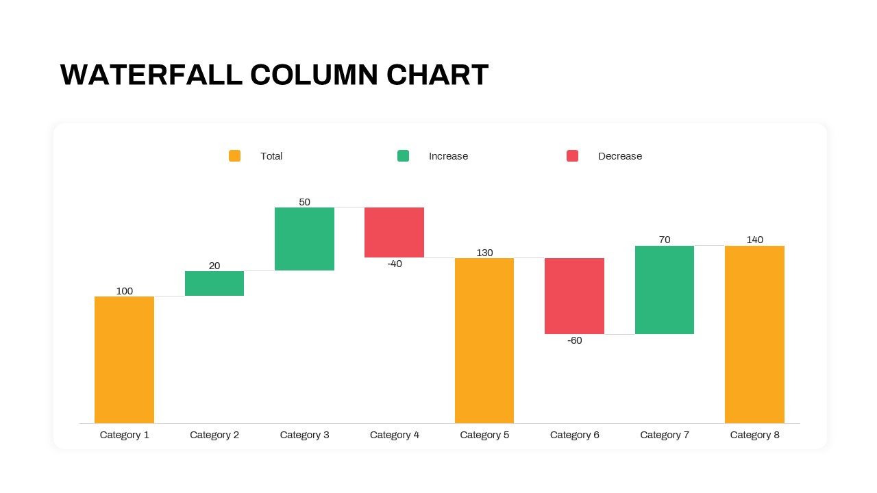
Waterfall Column Chart Analysis Template for PowerPoint & Google Slides
Bar/Column
Six Column Data Table Template for PowerPoint & Google Slides
Table
Mobile Data Analysis Chart template for PowerPoint & Google Slides
Charts
Creative Data Analysis Bar Chart template for PowerPoint & Google Slides
Bar/Column
Pencil Bar Chart Data Analysis Template for PowerPoint & Google Slides
Bar/Column
Simple Area Chart Data Trends Analysis Template for PowerPoint & Google Slides
Comparison Chart
Data Analysis Bar Chart with Insights Template for PowerPoint & Google Slides
Bar/Column
Free
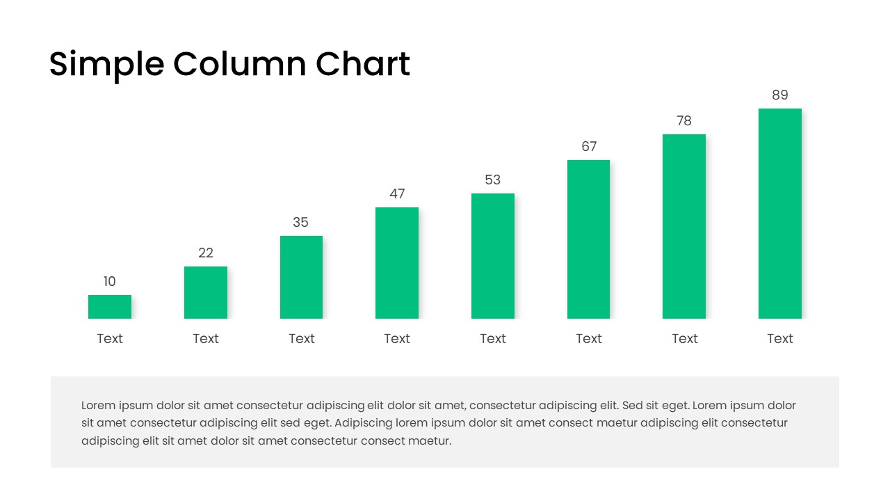
Free Editable Simple Column Chart Slide Template for PowerPoint & Google Slides
Bar/Column
Free
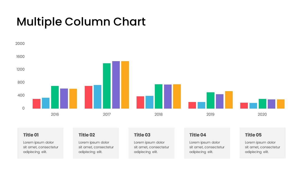
Minimal Multi-Year Column Chart Template for PowerPoint & Google Slides
Bar/Column
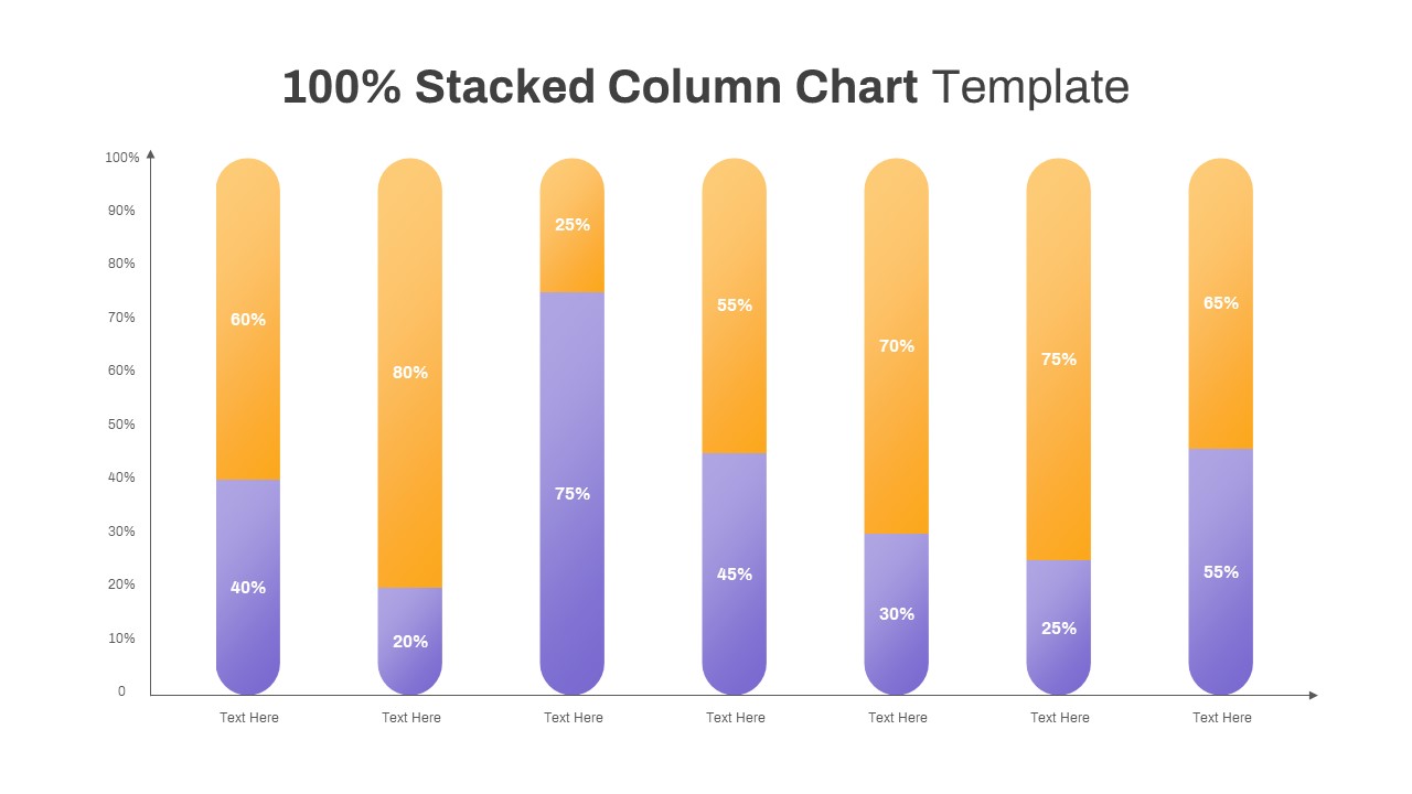
Professional 100% Stacked Column Chart Template for PowerPoint & Google Slides
Bar/Column
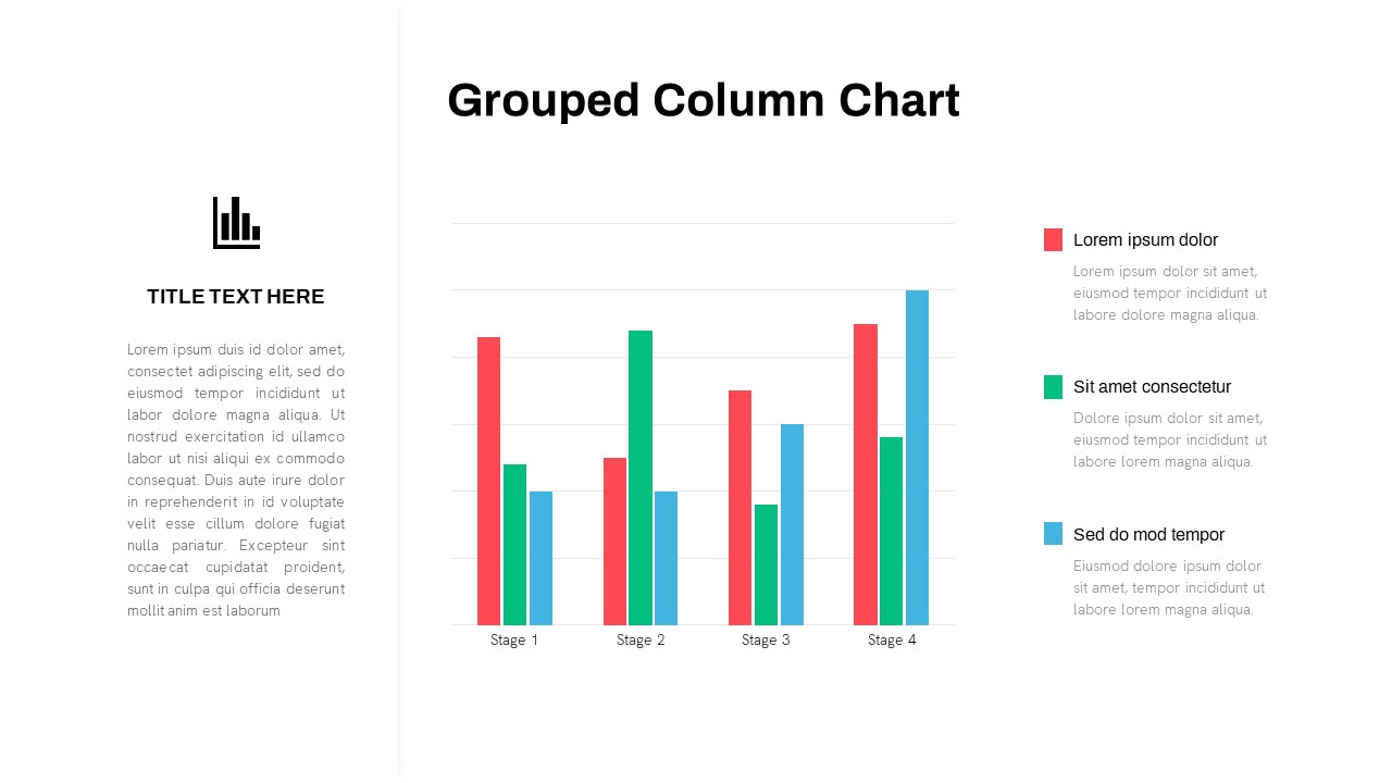
Grouped Column Chart Comparison Template for PowerPoint & Google Slides
Bar/Column
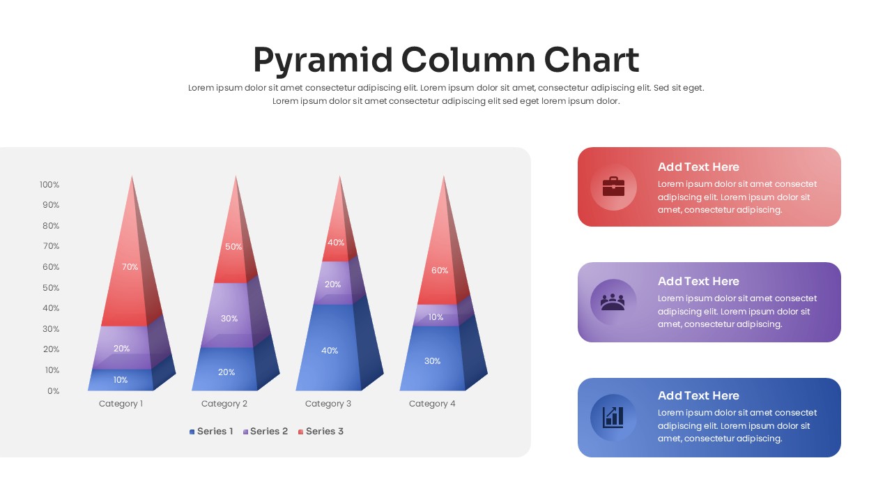
3D Pyramid Column Chart Infographic Template for PowerPoint & Google Slides
Bar/Column
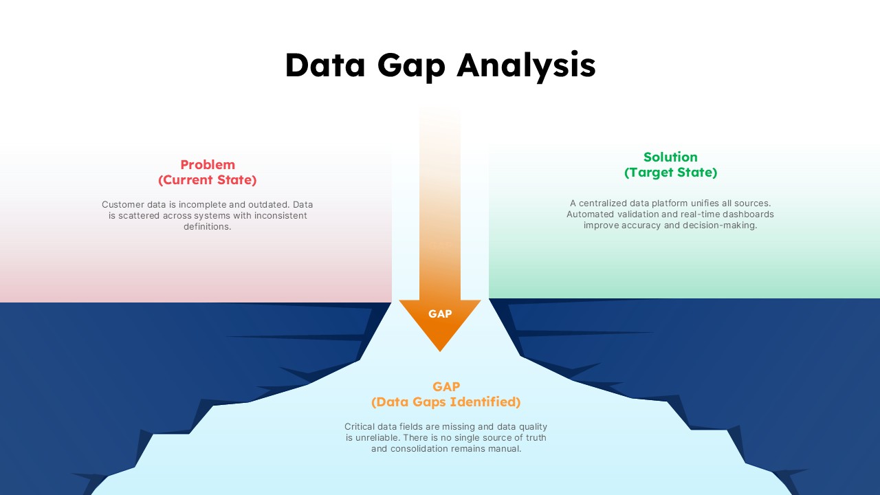
Data Gap Analysis Template for PowerPoint & Google Slides
Business
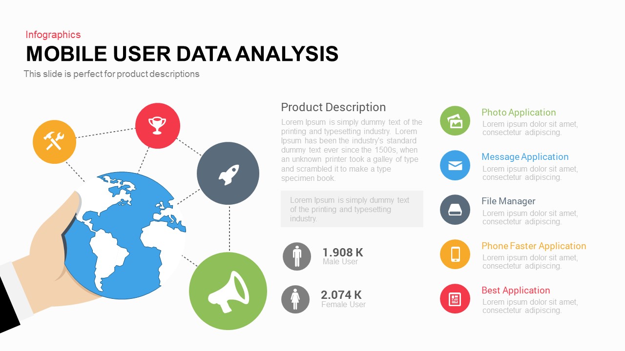
Mobile User Data Analysis Infographic for PowerPoint & Google Slides
Process

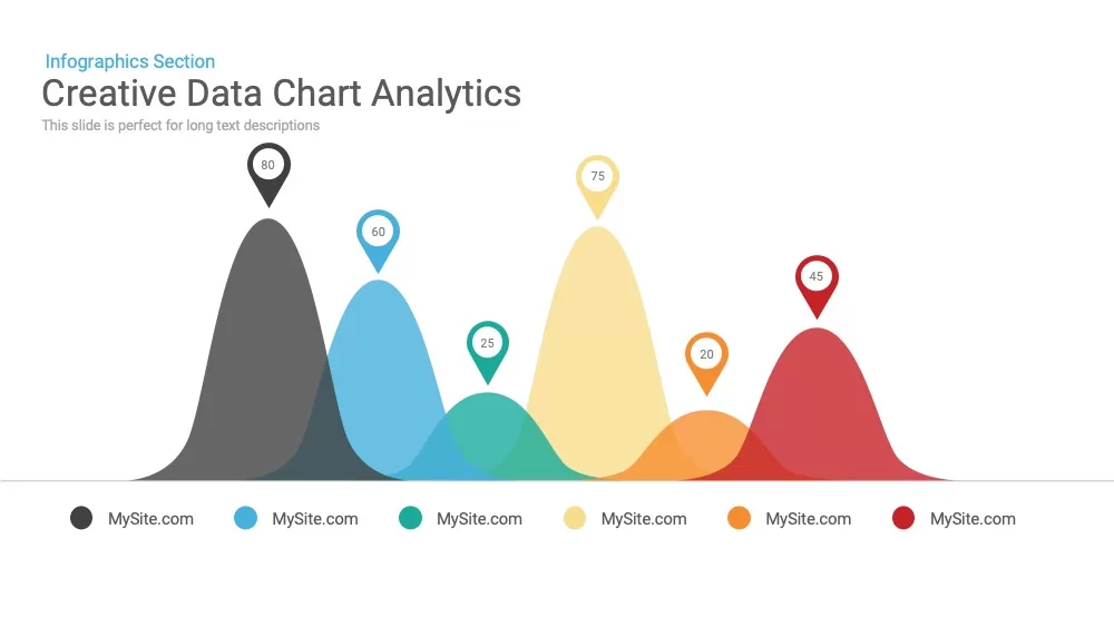
Creative data chart analytics template for PowerPoint & Google Slides
Charts
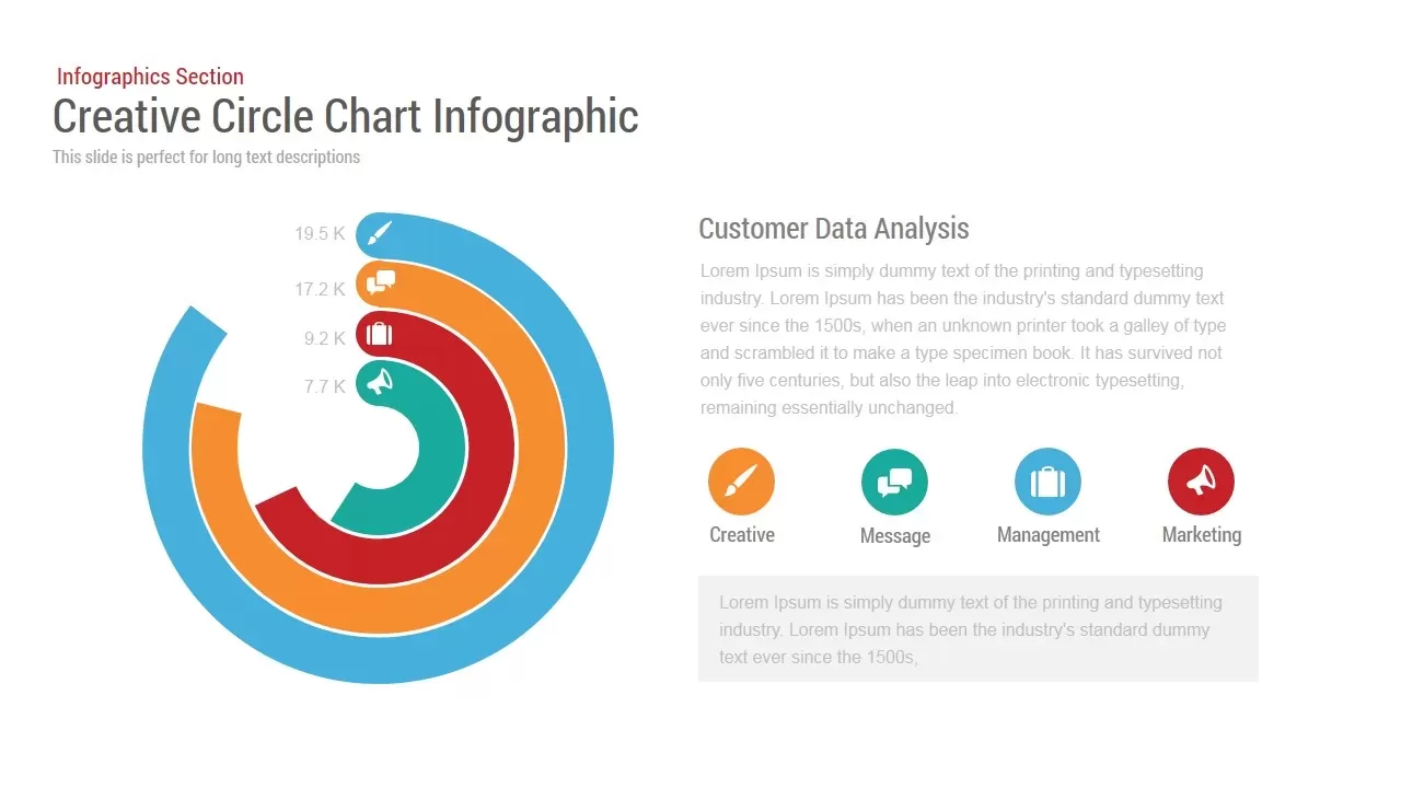
Circle Chart Data template for PowerPoint & Google Slides
Pie/Donut
3D Bar Chart Data Infographics Template for PowerPoint & Google Slides
Bar/Column
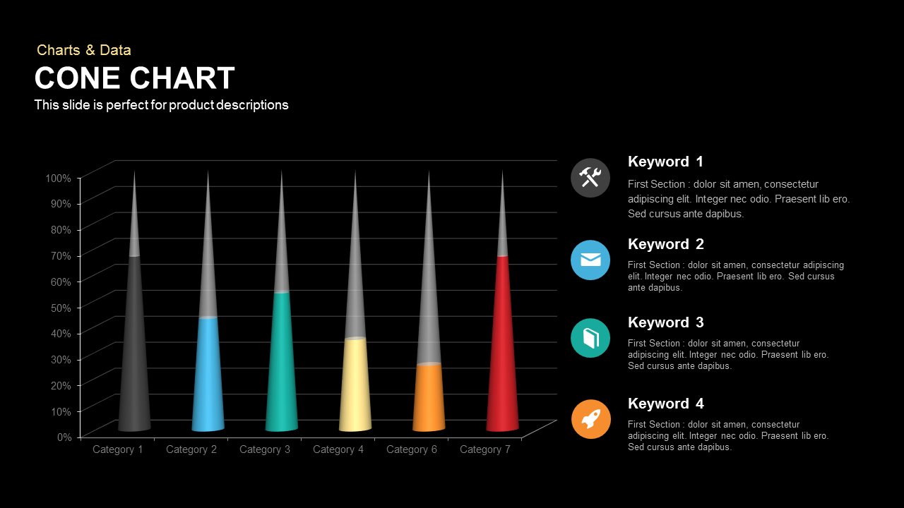
3D Cone Chart Data Visualization template for PowerPoint & Google Slides
Bar/Column
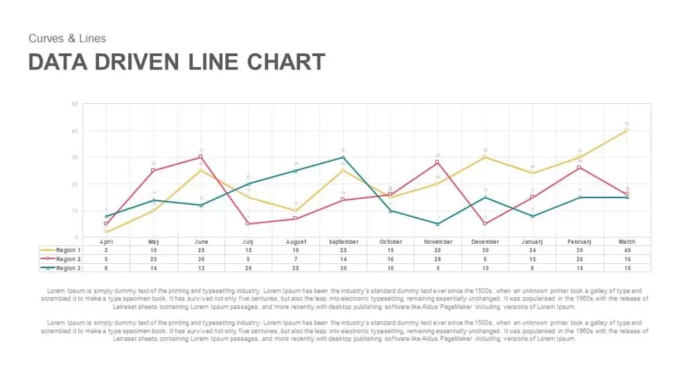
Data-Driven Line Chart Diagram Template for PowerPoint
Comparison Chart
Tornado Chart Data Comparison Slide Template for PowerPoint & Google Slides
Bar/Column
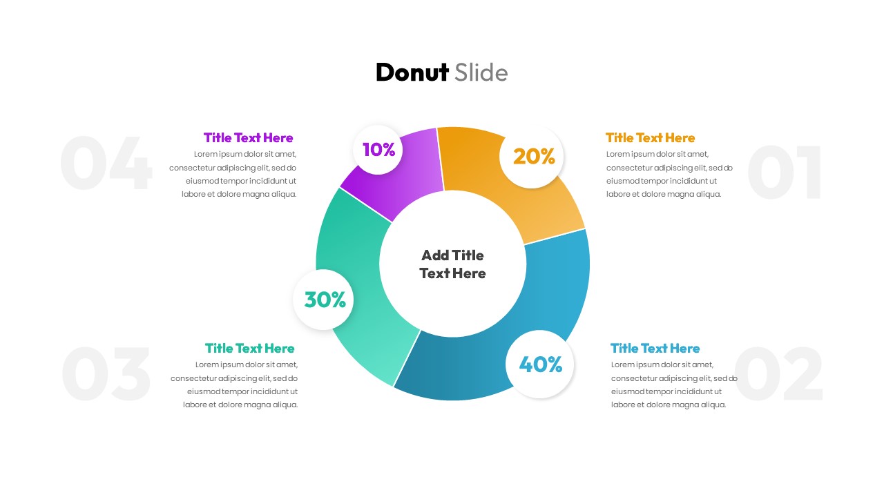
Donut Chart Data Breakdown template for PowerPoint & Google Slides
Pie/Donut
Waffle Chart Data Visualization Template for PowerPoint & Google Slides
Comparison Chart
Simple Bar Chart Data Visualization Template for PowerPoint & Google Slides
Bar/Column
XY Bubble Chart Data Visualization Template for PowerPoint & Google Slides
Comparison Chart
Data Over Time Line Chart template for PowerPoint & Google Slides
Charts
Waterfall Chart Data Visualization Template for PowerPoint & Google Slides
Comparison Chart
Multipurpose Spline Chart Data Trend Template for PowerPoint & Google Slides
Bar/Column
Interactive Jump Line Data Chart Template for PowerPoint & Google Slides
Comparison Chart
Segmented Scatter Chart Data Visualization Template for PowerPoint & Google Slides
Business Strategy
Bar Data Chart Slide for PowerPoint & Google Slides
Bar/Column
Weekly Data Chart Slide for PowerPoint & Google Slides
Comparison Chart

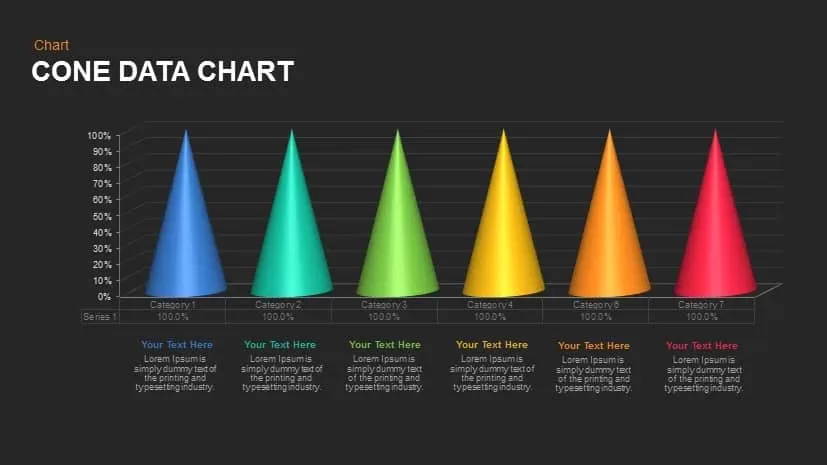
Cone Data Chart for PowerPoint & Google Slides
Charts
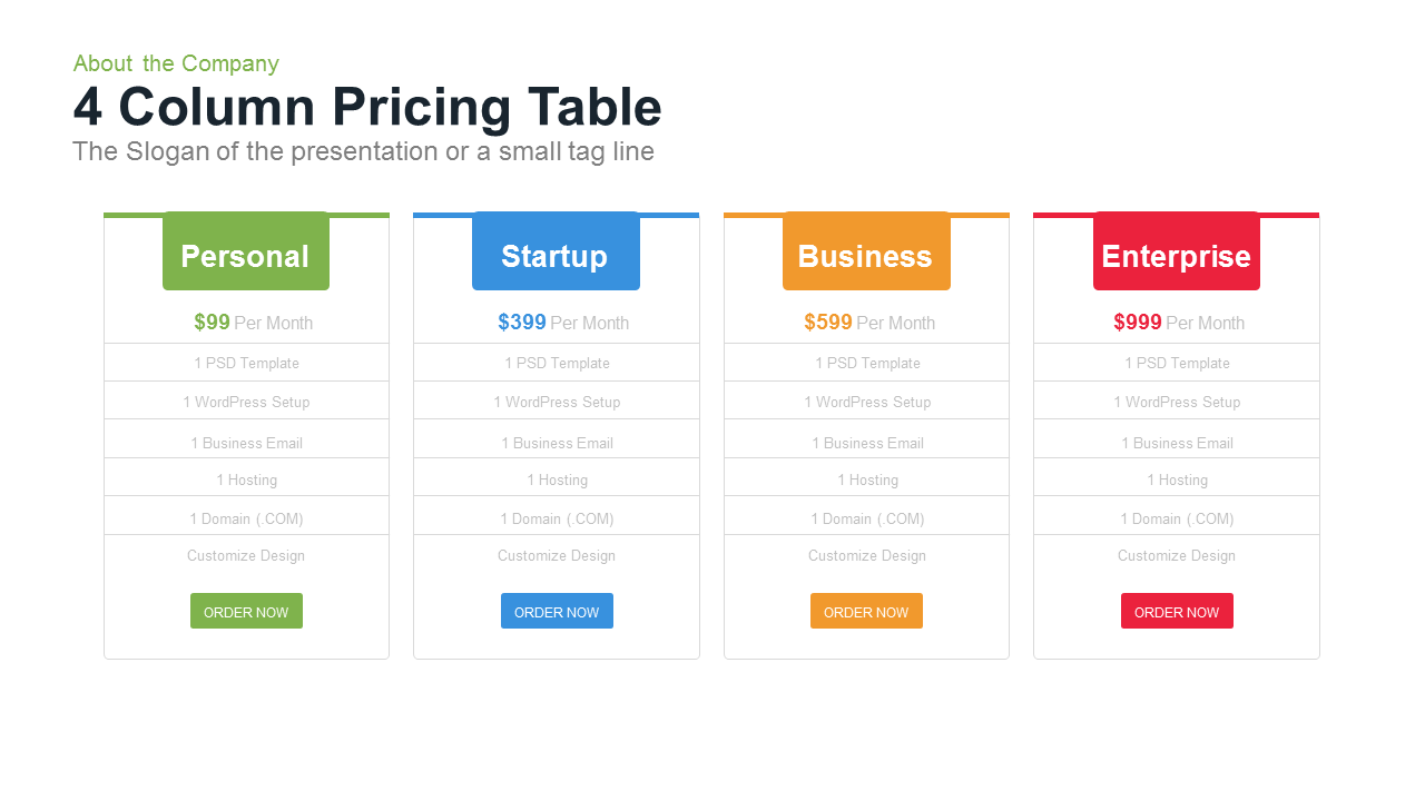
4 Column Pricing template for PowerPoint & Google Slides
Comparison
3-Column Comparison template for PowerPoint & Google Slides
Comparison
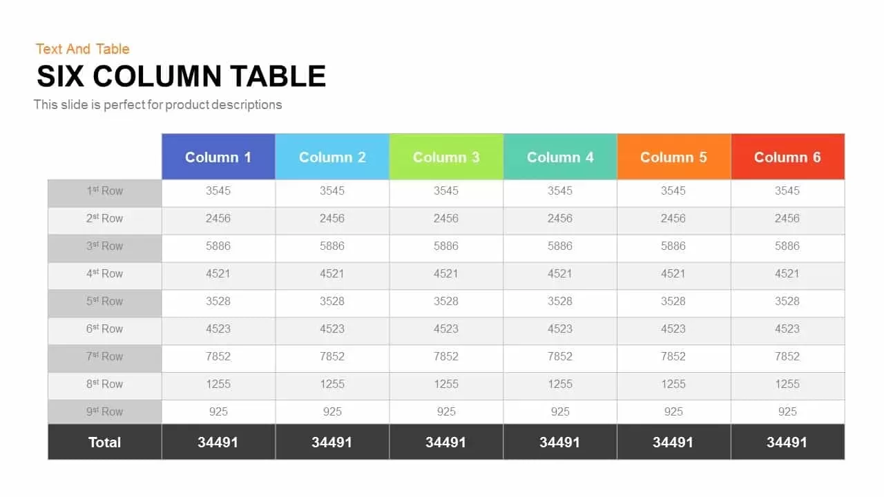
Six Column Table template for PowerPoint & Google Slides
Table
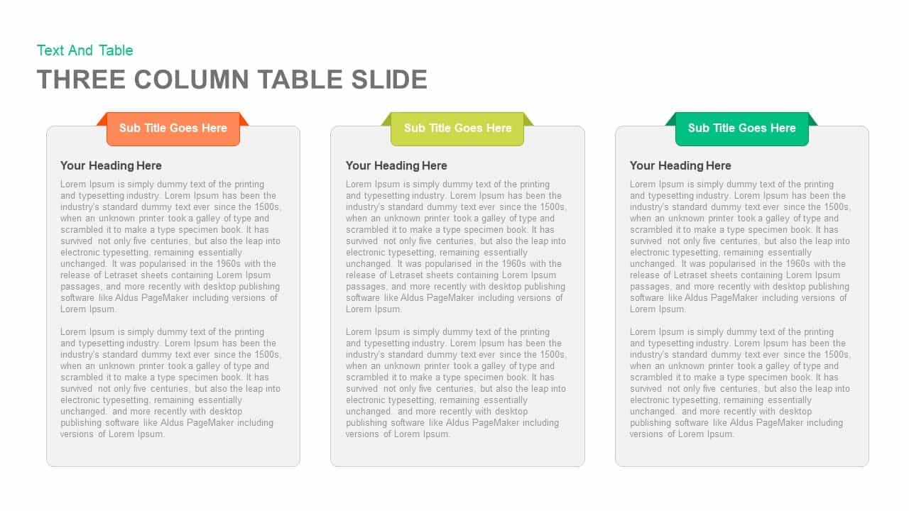
Clean Three-Four Column Table Slide Template for PowerPoint & Google Slides
Business Report
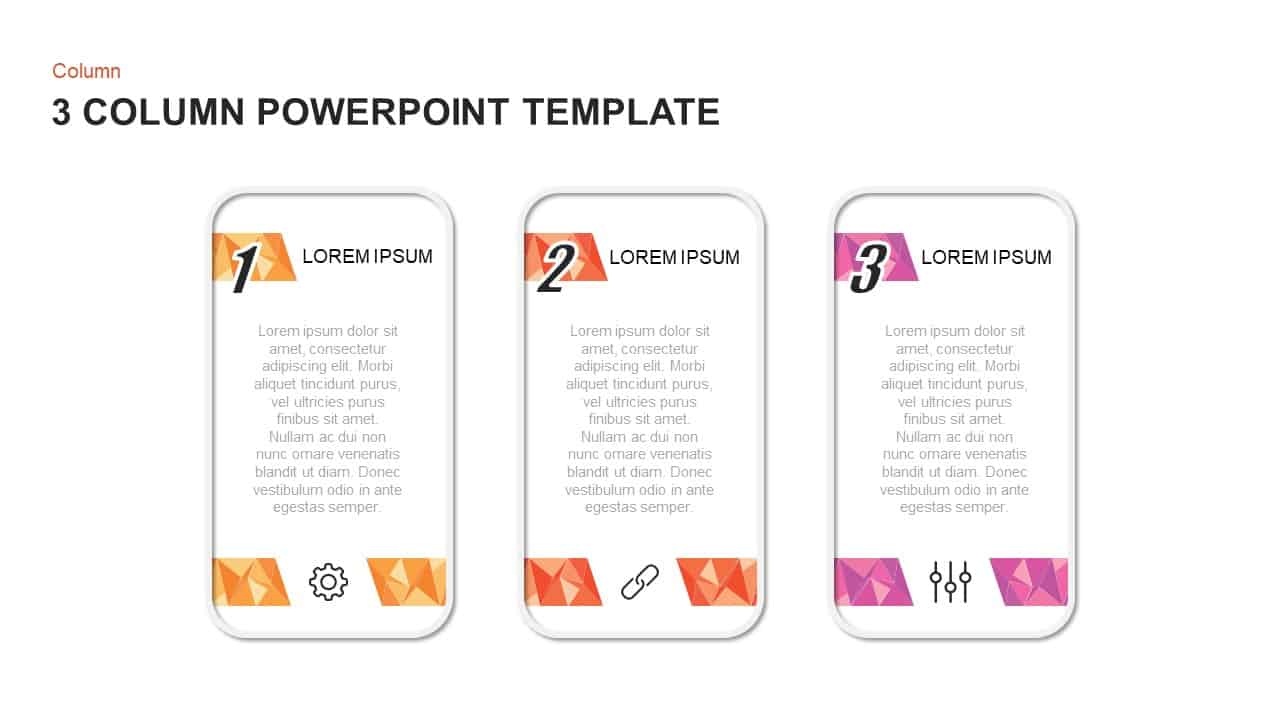
Three and Four-Column Card Layout Template for PowerPoint & Google Slides
Infographics
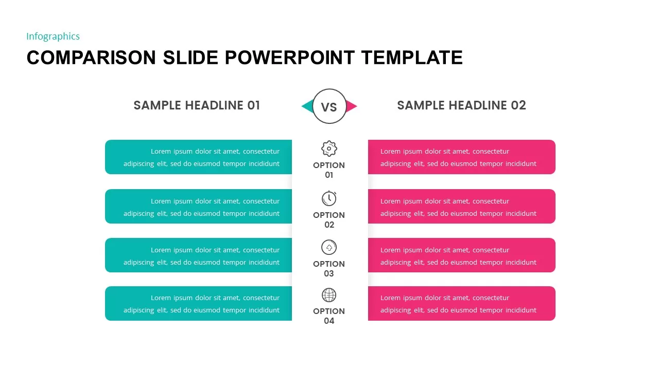
Two-Column Comparison Infographic Slide Template for PowerPoint & Google Slides
Comparison
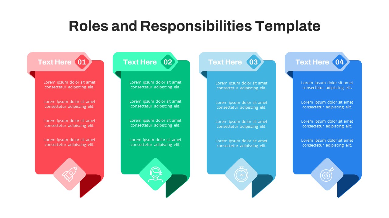
Free Four-Column Roles and Responsibilities Template for PowerPoint & Google Slides
Our Team
Free
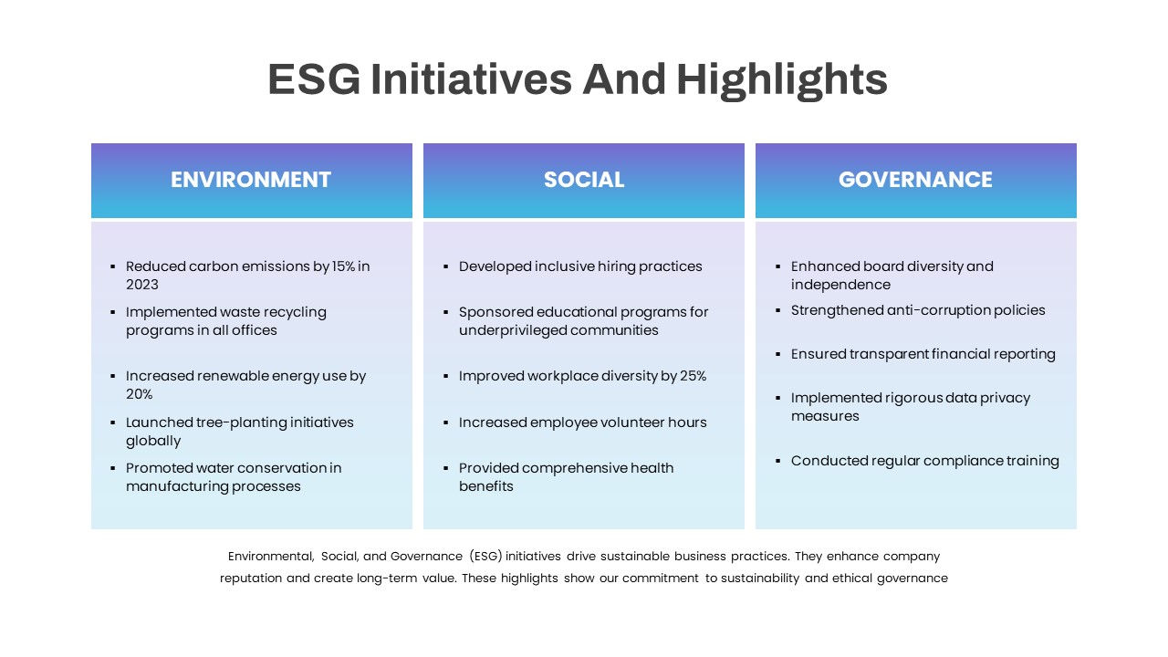
ESG Initiatives Three-Column Template for PowerPoint & Google Slides
Comparison
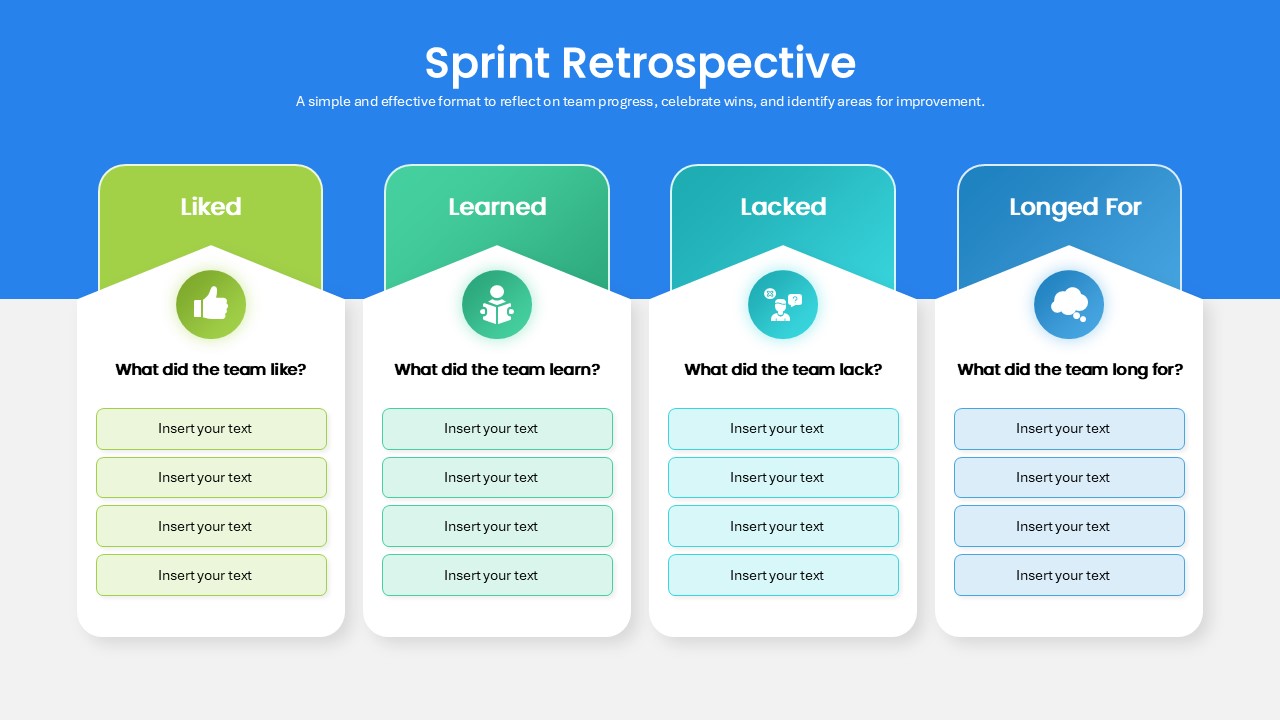
Sprint Retrospective Four-Column Template for PowerPoint & Google Slides
Process
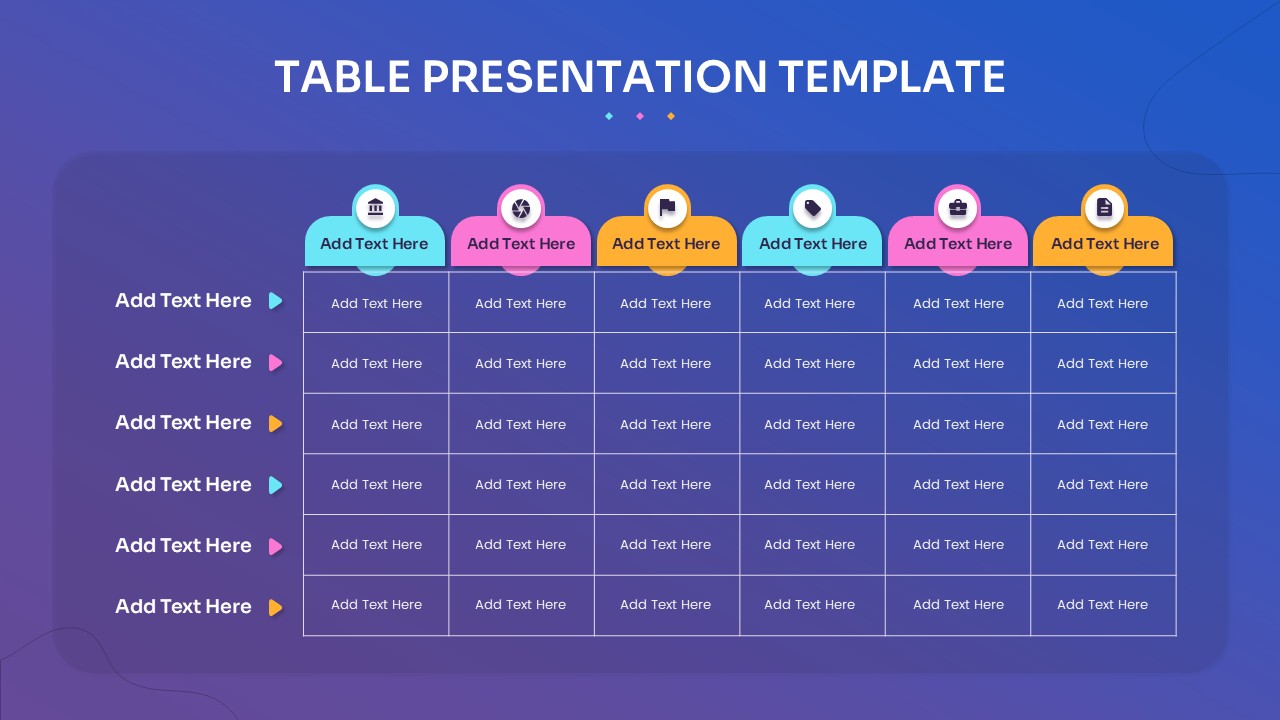
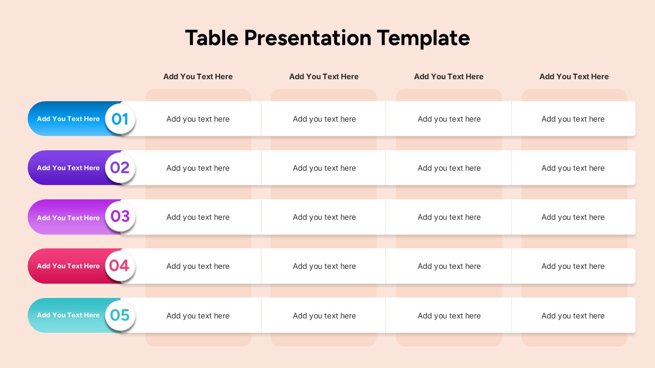
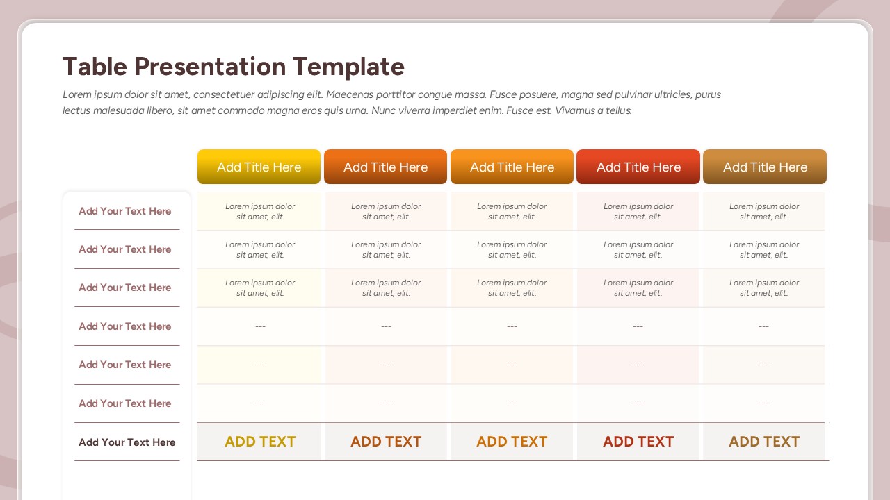
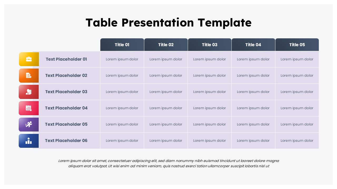
Multi-Column Table Presentation Template for PowerPoint & Google Slides
Table
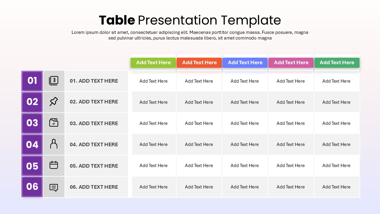
Six-Row Multi-Column Table Presentation Template for PowerPoint & Google Slides
Table
Colorful Four-Column Table Layout Template for PowerPoint & Google Slides
Table
Five Column Comparison Table Layout Template for PowerPoint & Google Slides
Comparison
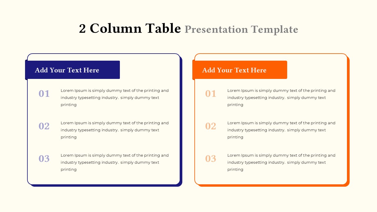
Two-Column Table Presentation Template for PowerPoint & Google Slides
Table
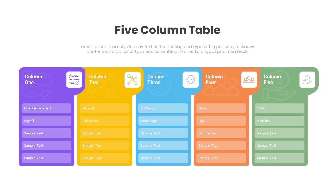
Five Column Table Infographics for PowerPoint & Google Slides
Business
1 to 5 Column infographic pack for PowerPoint & Google Slides
Business

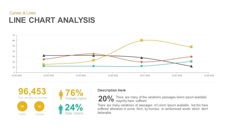
Line Chart Analysis template for PowerPoint & Google Slides
Charts
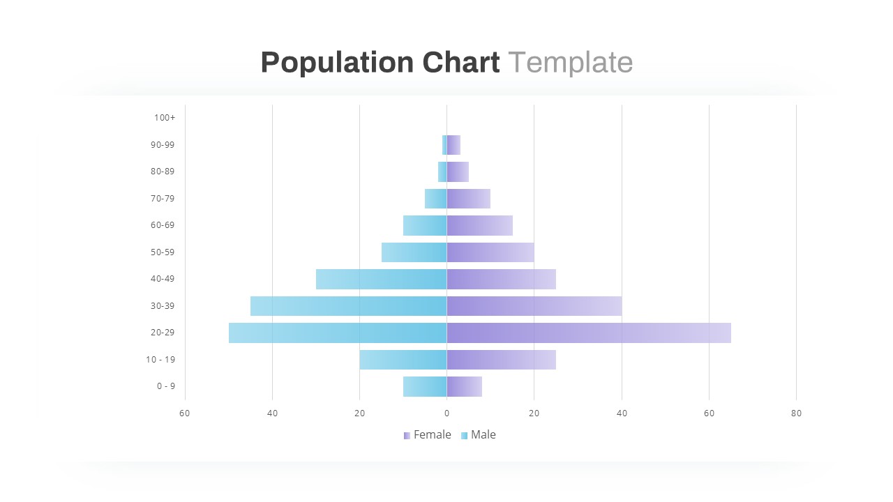
Population Pyramid Chart Analysis Template for PowerPoint & Google Slides
Bar/Column
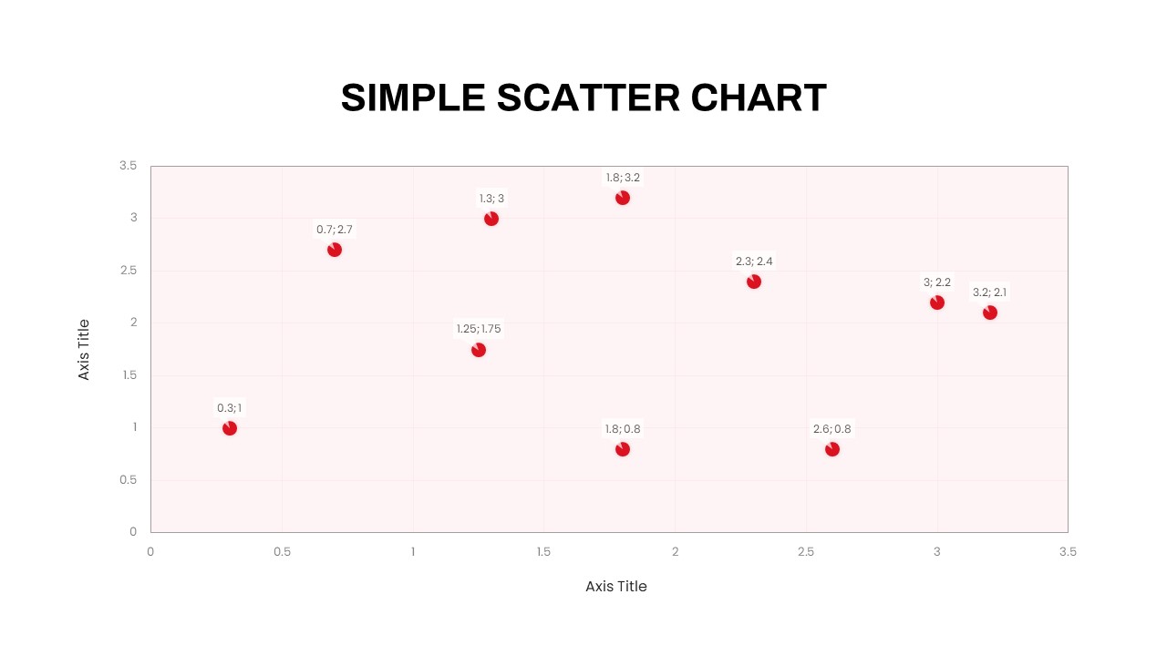
Simple Scatter Chart Analysis Template for PowerPoint & Google Slides
Comparison Chart
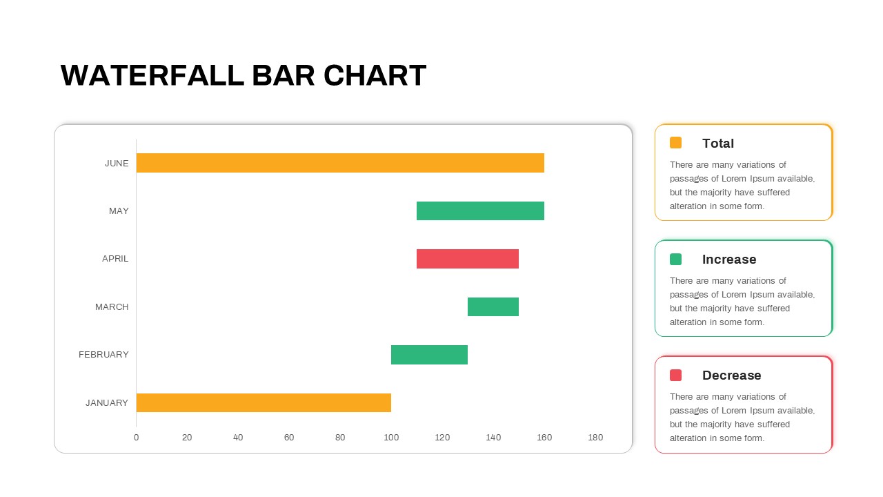
Waterfall Bar Chart Analysis Template for PowerPoint & Google Slides
Bar/Column
Four Quadrant Scatter Chart Analysis Template for PowerPoint & Google Slides
Comparison Chart
Proportional Area Chart Analysis Template for PowerPoint & Google Slides
Comparison Chart
Expanding Margins Analysis Bar Chart Template for PowerPoint & Google Slides
Charts
Annual Growth Trend Analysis Chart template for PowerPoint & Google Slides
Business Report
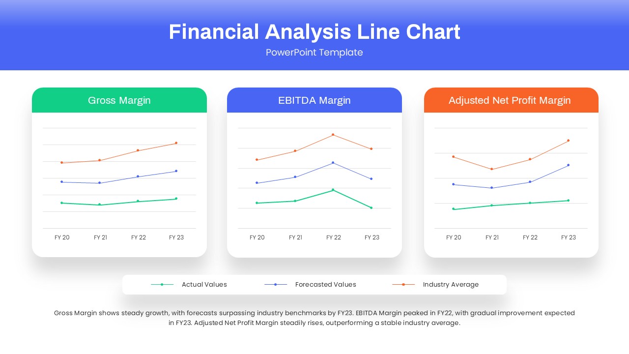
Dynamic Financial Analysis Line Chart Template for PowerPoint & Google Slides
Finance
Skills Gap Analysis Comparison Chart Template for PowerPoint & Google Slides
Gap
Data Science PowerPoint Presentation Template for PowerPoint & Google Slides
Pitch Deck
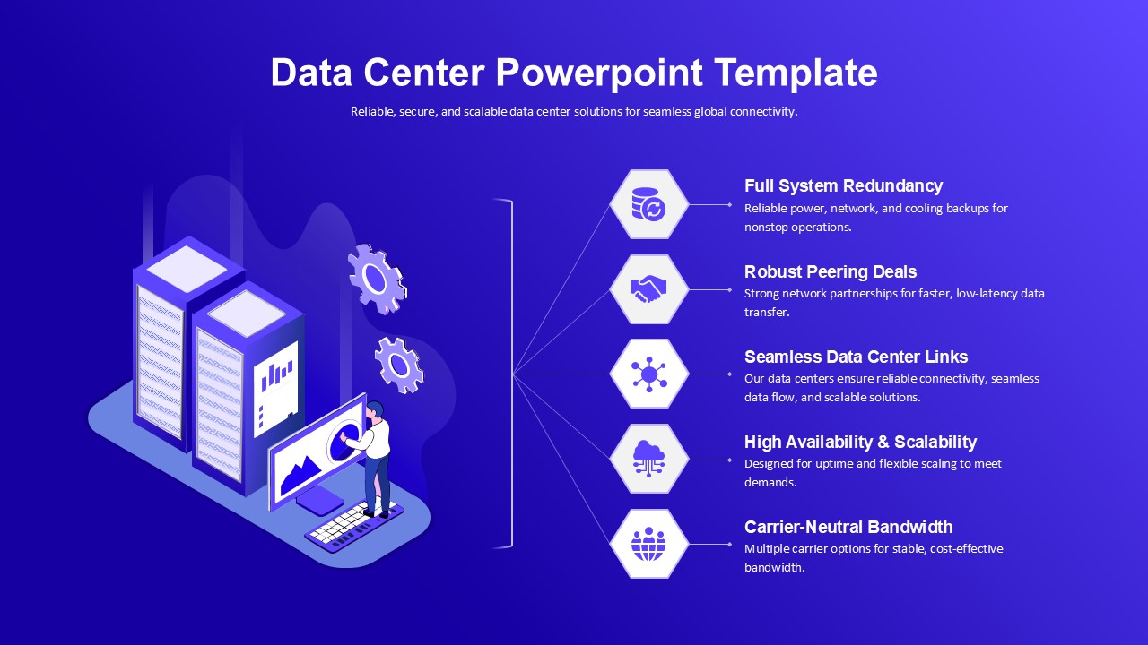
Data Center PowerPoint Template for PowerPoint & Google Slides
Information Technology
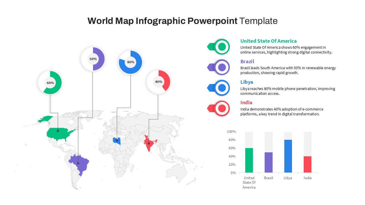
World Map Data template for PowerPoint & Google Slides
World Maps

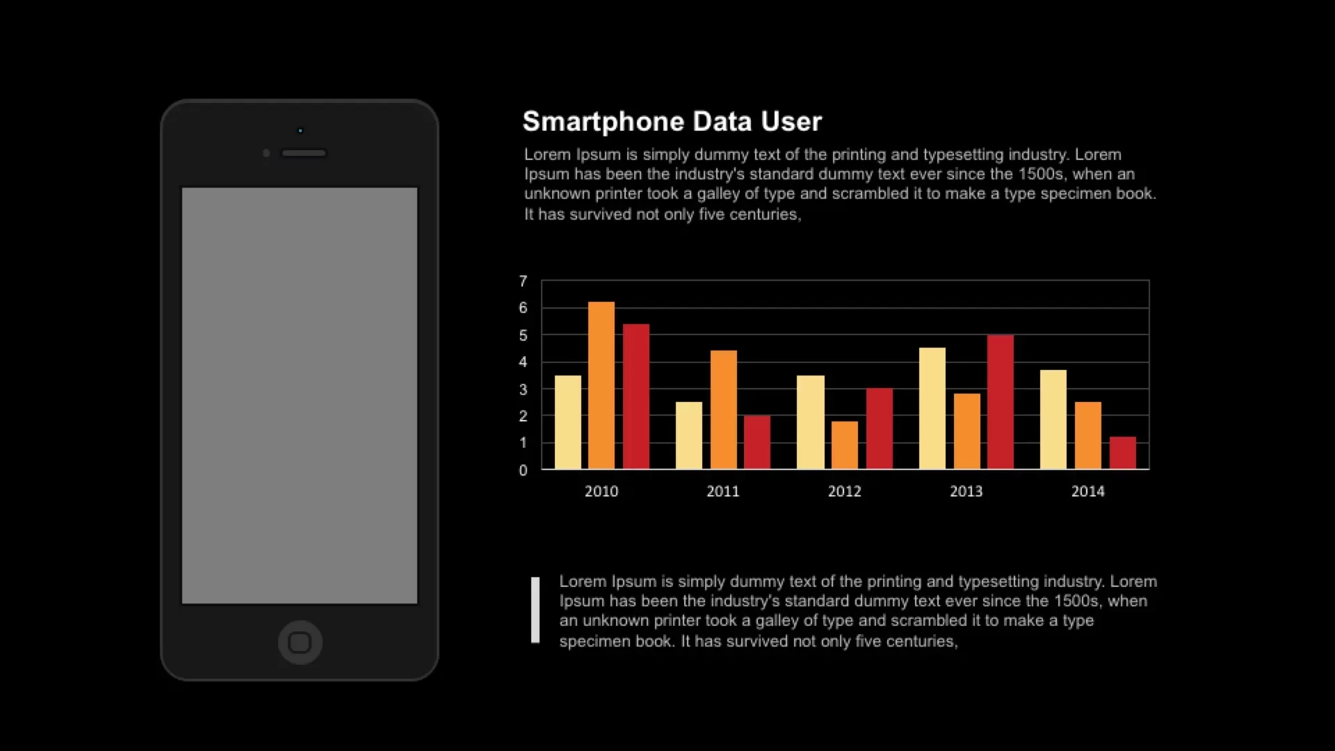
Smartphone Data User template for PowerPoint & Google Slides
Charts
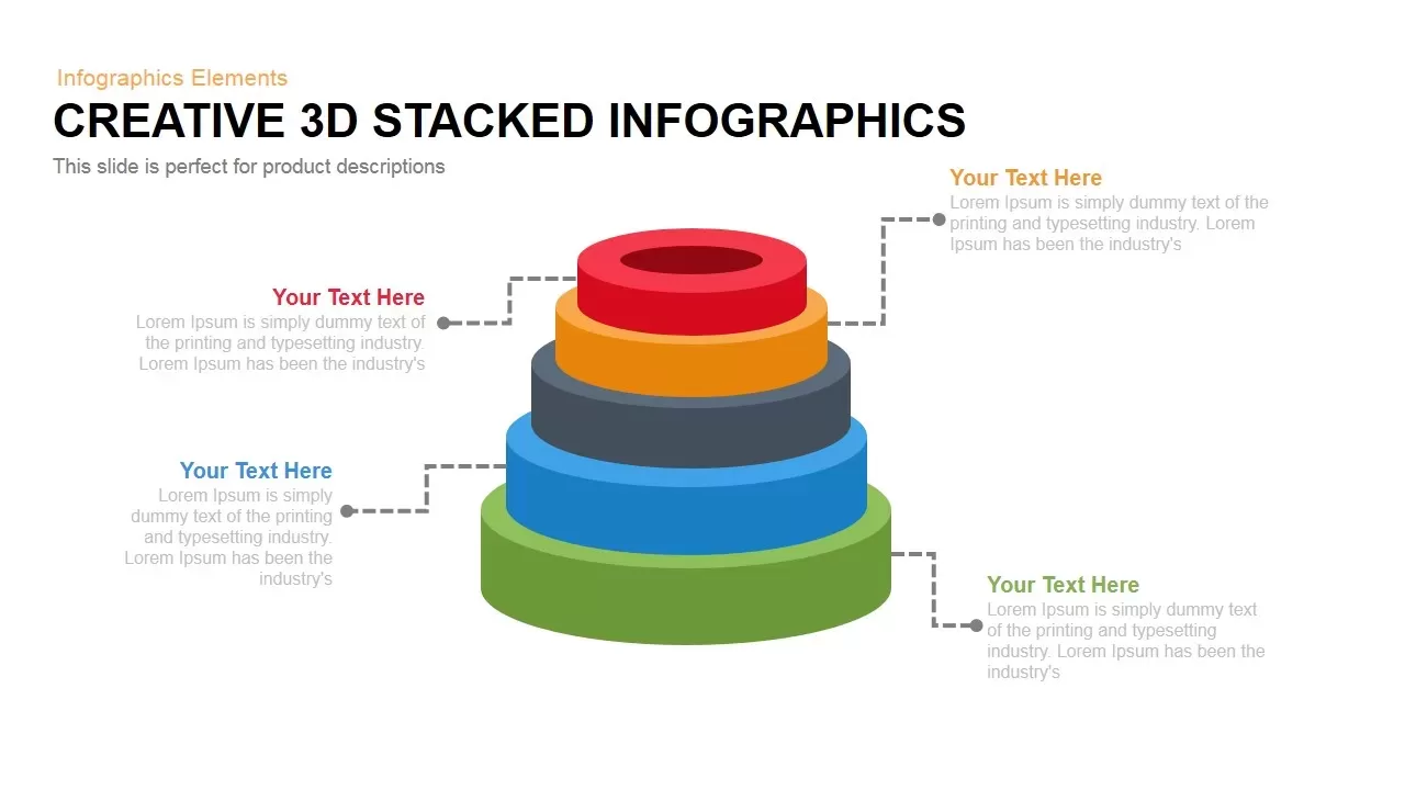
3D Stacked Infographic Layers Data Template for PowerPoint & Google Slides
Pyramid
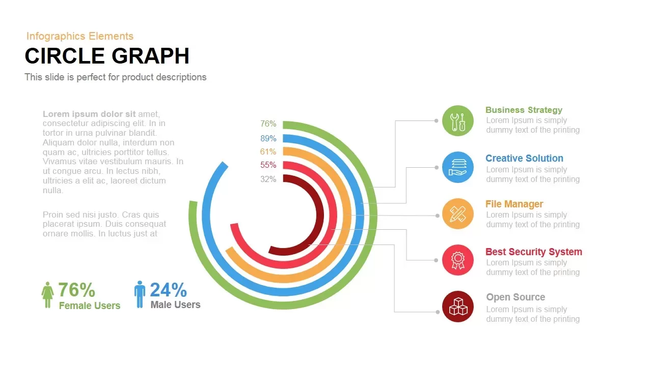
Circle Graph Data Visualization Template for PowerPoint & Google Slides
Circular
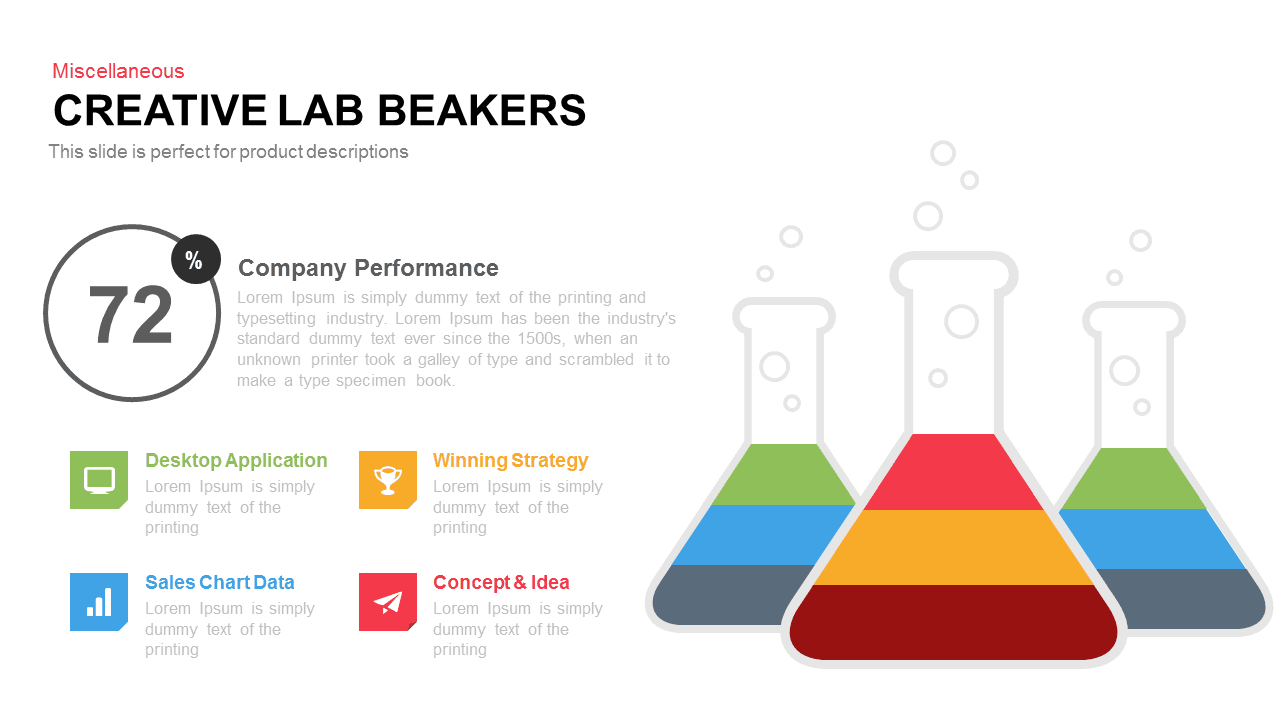
Creative Lab Beakers Data Infographic template for PowerPoint & Google Slides
Infographics

Dynamic Data Dashboard Infographic Template for PowerPoint & Google Slides
Bar/Column
Data Analytics Dashboard Design template for PowerPoint & Google Slides
Bar/Column
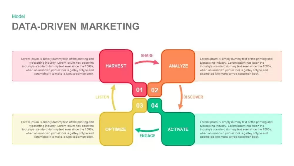
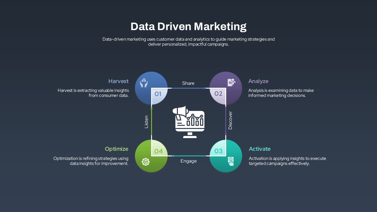
Data-Driven Marketing Cycle Diagram Template for PowerPoint & Google Slides
Customer Journey
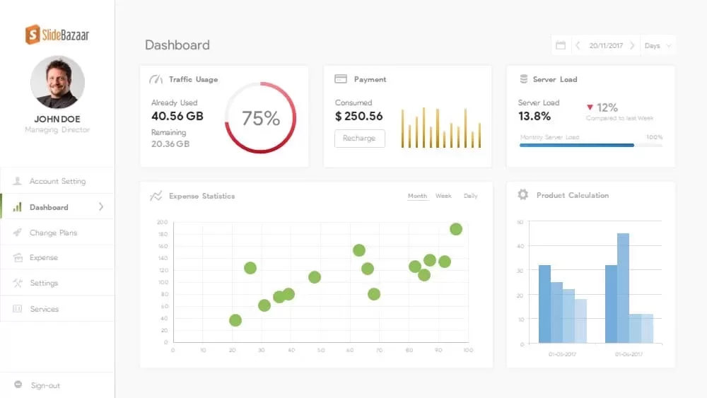
Free Data Analytics Dashboard Template for PowerPoint
Charts
Free
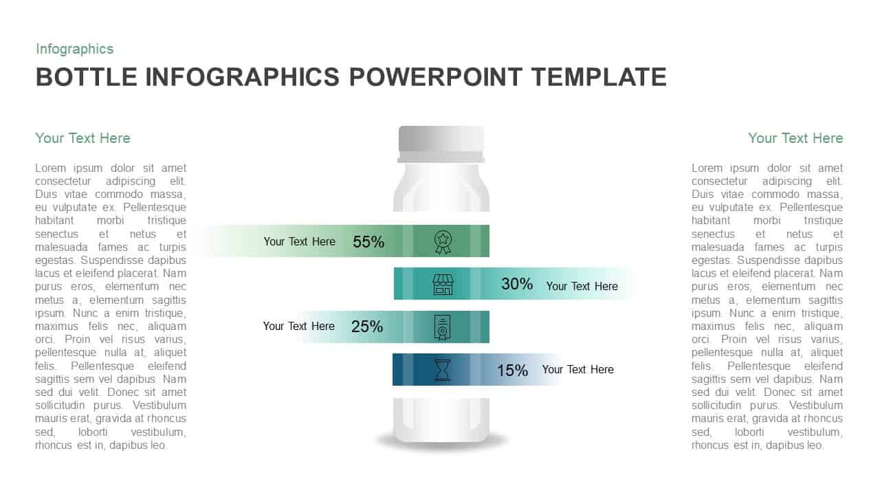
Bottle Data Percentage Infographic Template for PowerPoint & Google Slides
Infographics
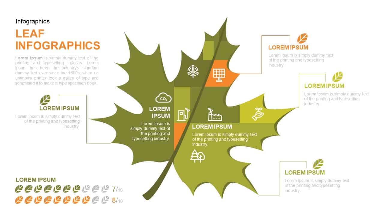
Leaf Infographic Data Visualization Template for PowerPoint & Google Slides
Infographics
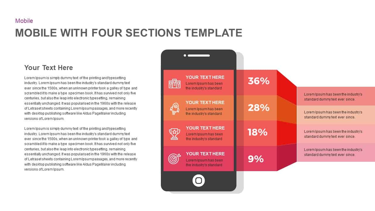
Mobile Infographics Data Visualization Template for PowerPoint & Google Slides
Infographics
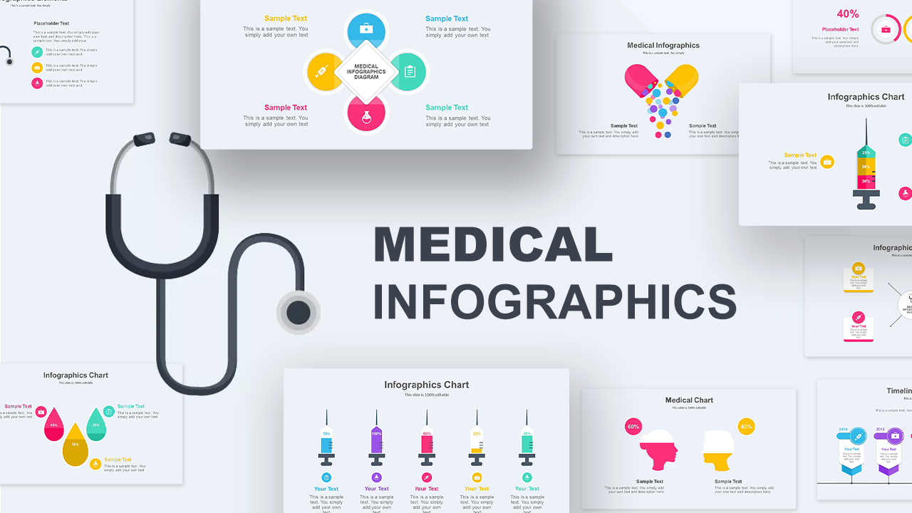
Medical Infographics Data Visualization Template for PowerPoint & Google Slides
Health
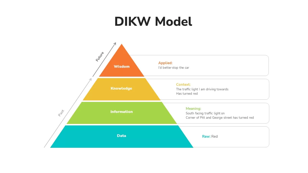
DIKW Data to Wisdom Pyramid Model Template for PowerPoint & Google Slides
Pyramid
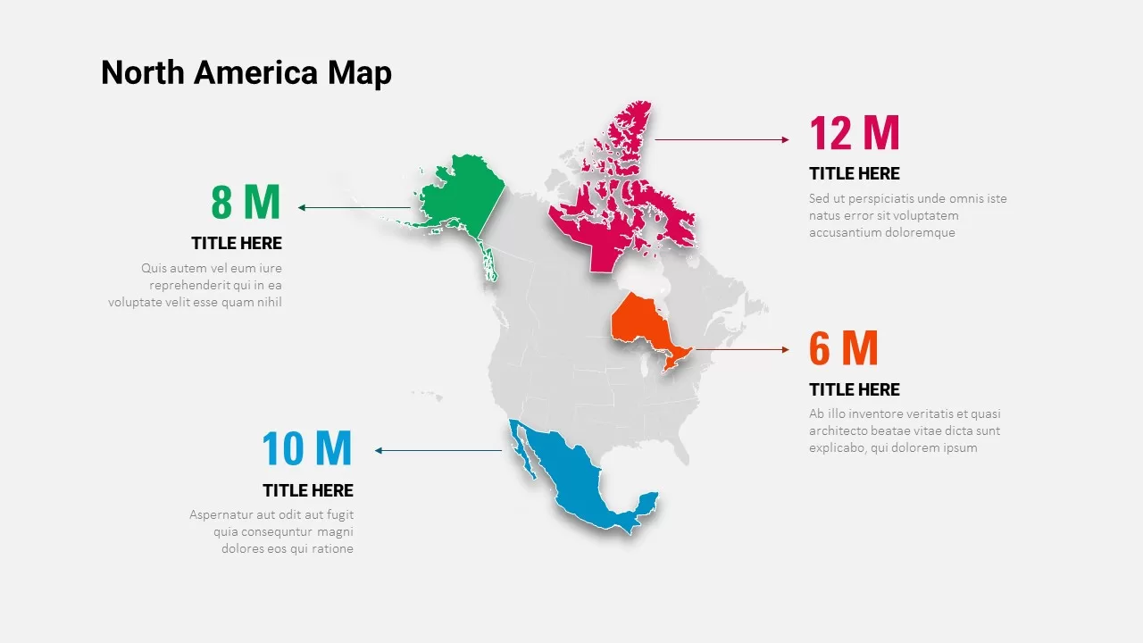
North America Data Map Callouts Template for PowerPoint & Google Slides
World Maps
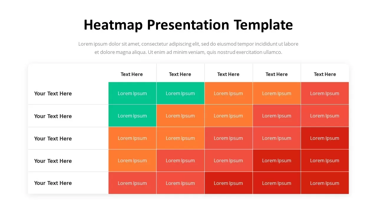
Professional Heatmap Data Visualization Template for PowerPoint & Google Slides
Infographics

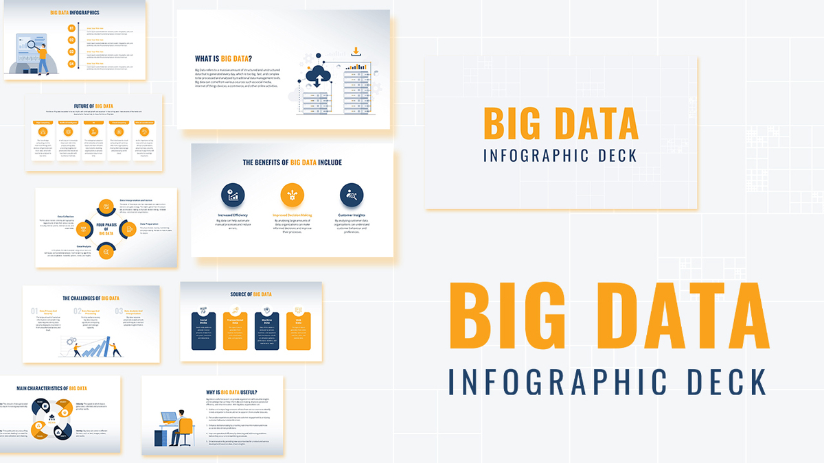
Modern Big Data Infographic Deck Template for PowerPoint & Google Slides
Decks
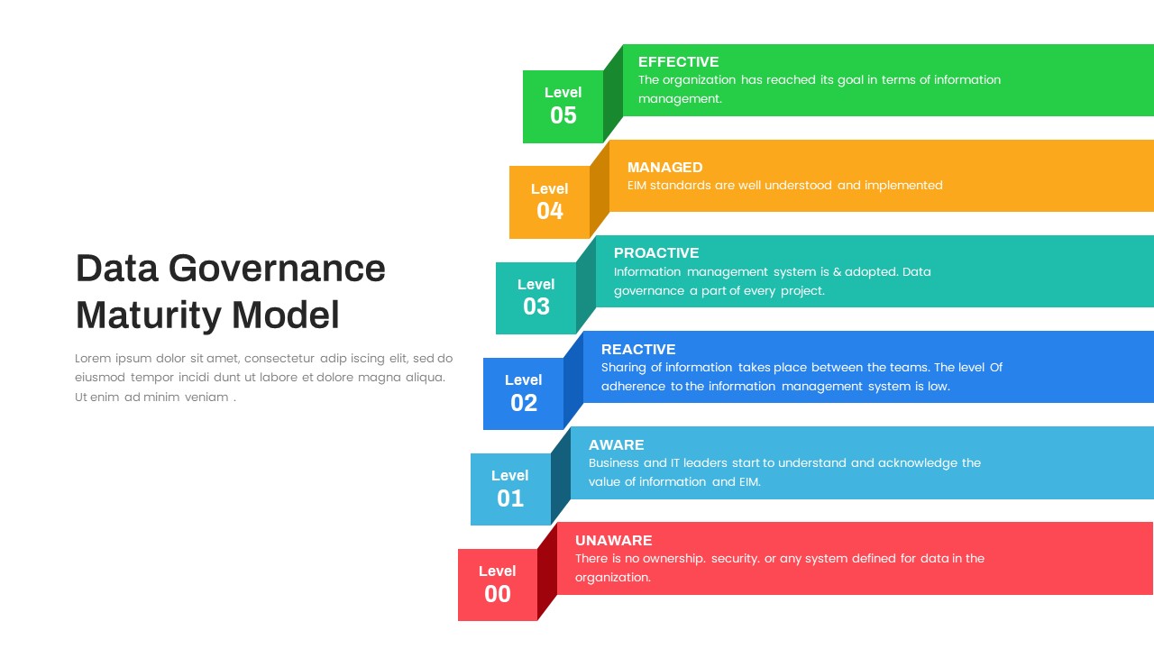
Layered Data Governance Maturity Model Template for PowerPoint & Google Slides
Process
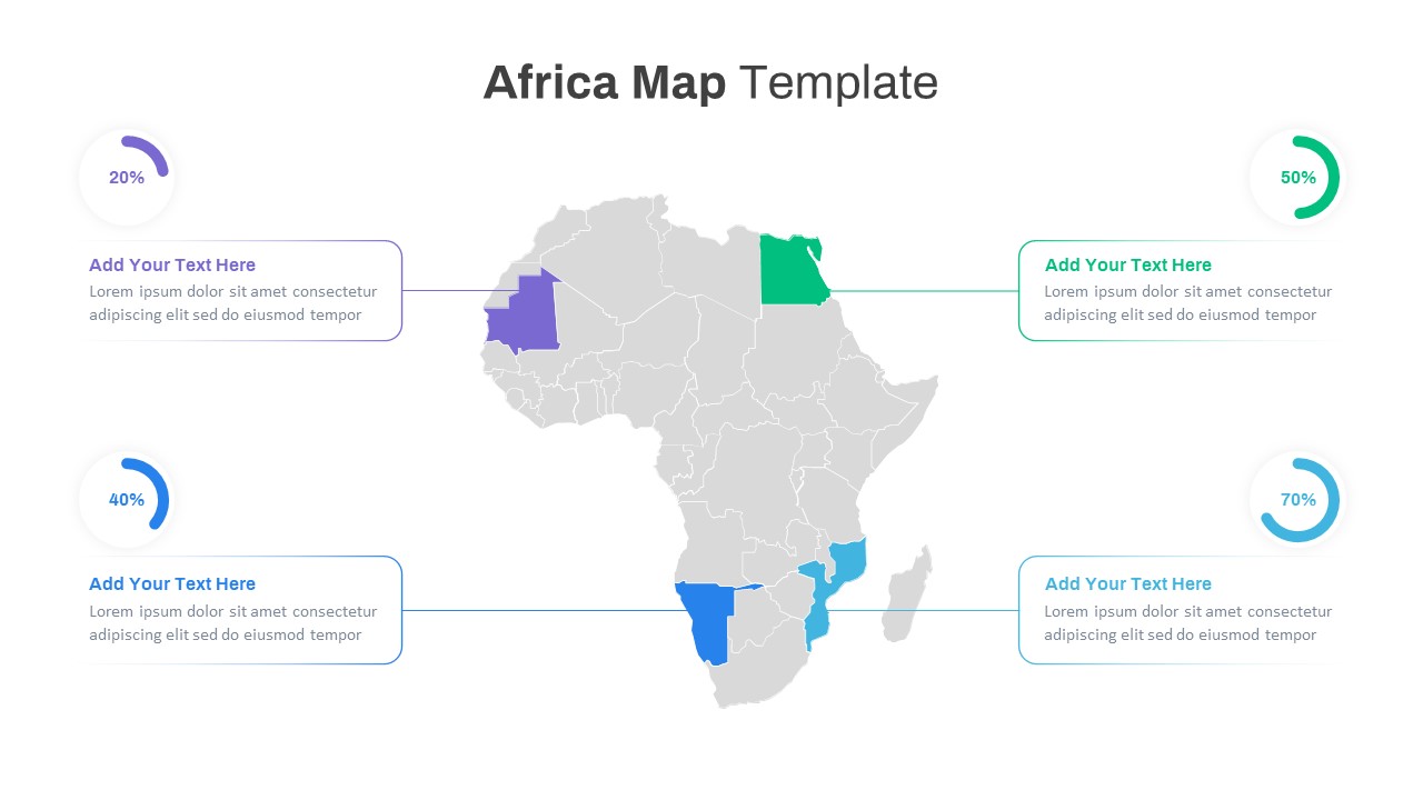
Editable Africa Map Infographic Data Template for PowerPoint & Google Slides
World Maps
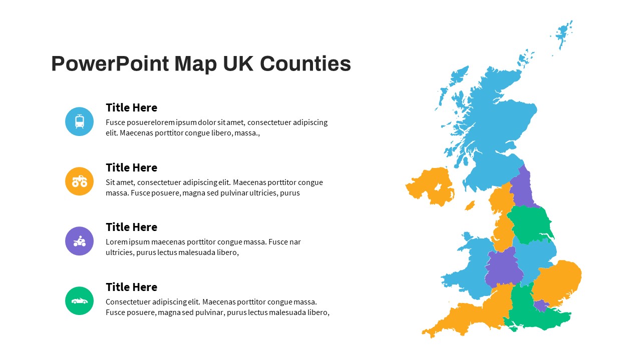
UK Counties Map Data Visualization Template for PowerPoint & Google Slides
World Maps
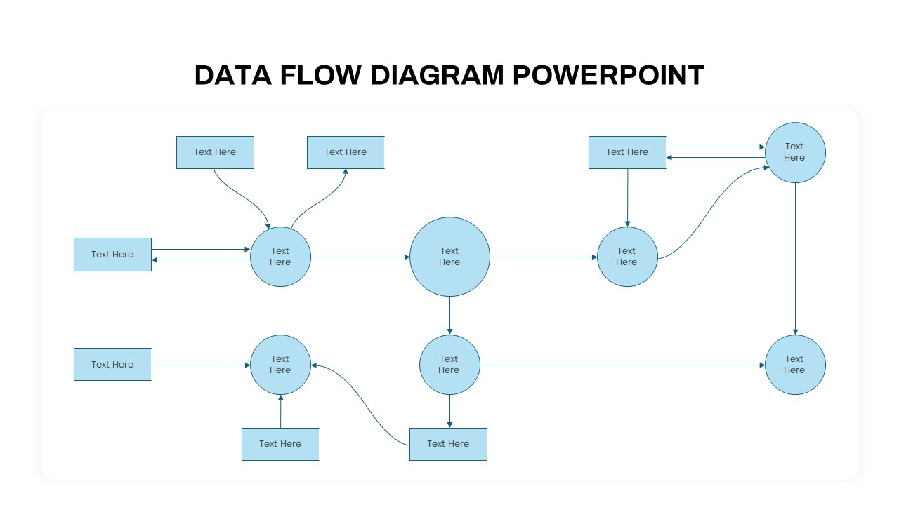
Advanced Data Flow Diagram Pack Template for PowerPoint & Google Slides
Flow Charts
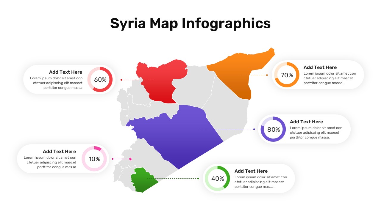
Syria Regional Data Map Infographic Template for PowerPoint & Google Slides
World Maps
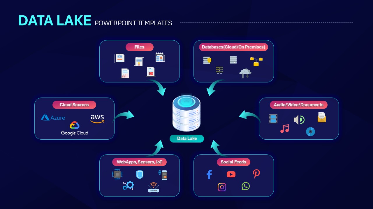
Data Lake Hub-and-Spoke Diagram Template for PowerPoint & Google Slides
Cloud Computing
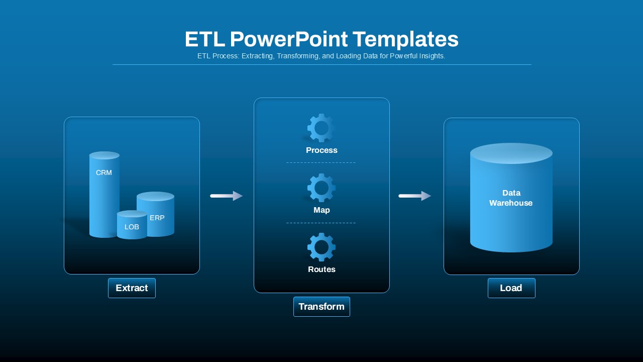
ETL Data Pipeline Workflow Diagram Template for PowerPoint & Google Slides
Process
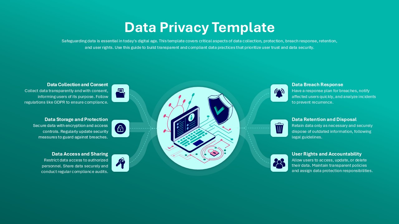
Data Privacy template for PowerPoint & Google Slides
Information Technology
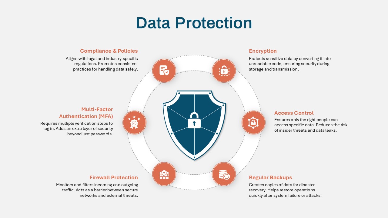
Data Protection Strategies template for PowerPoint & Google Slides
Information Technology
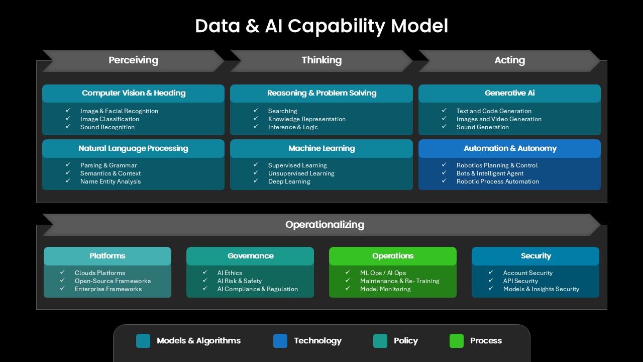
Comprehensive Data & AI Capability Model Template for PowerPoint & Google Slides
AI
Data-Driven AI in Insurance Infographic Template for PowerPoint & Google Slides
Circular
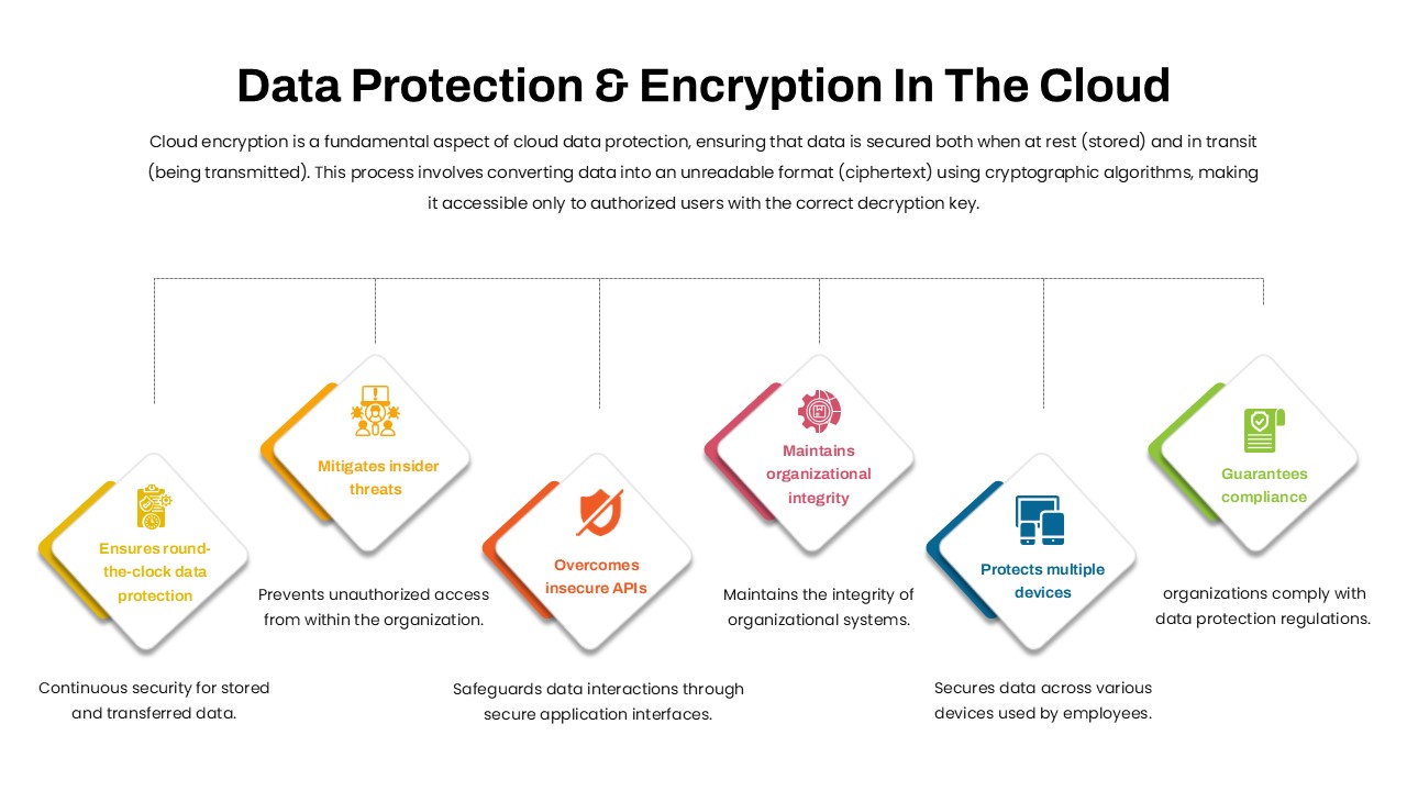
Data Protection & Encryption in the Cloud Overview template for PowerPoint & Google Slides
Cloud Computing
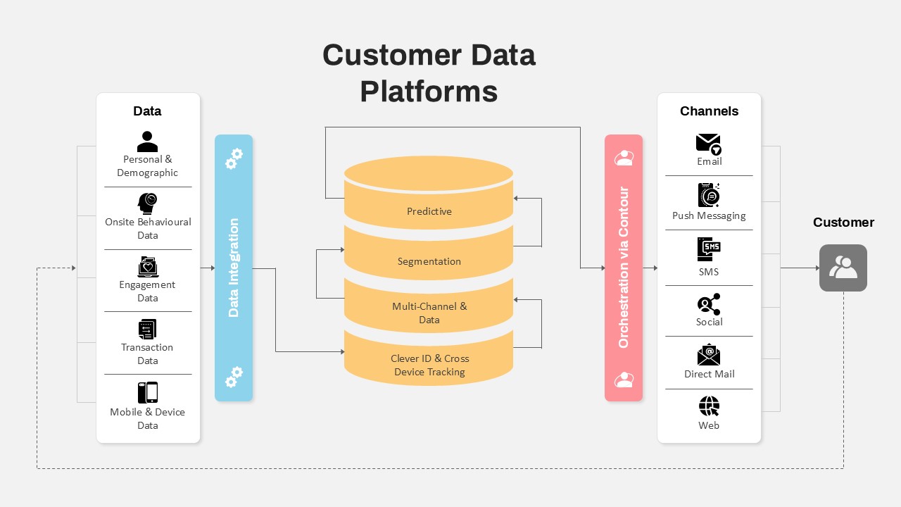
Customer Data Platform Workflow Diagram Template for PowerPoint & Google Slides
Information Technology
Data-Driven Marketing Lifecycle Diagram Template for PowerPoint & Google Slides
Process
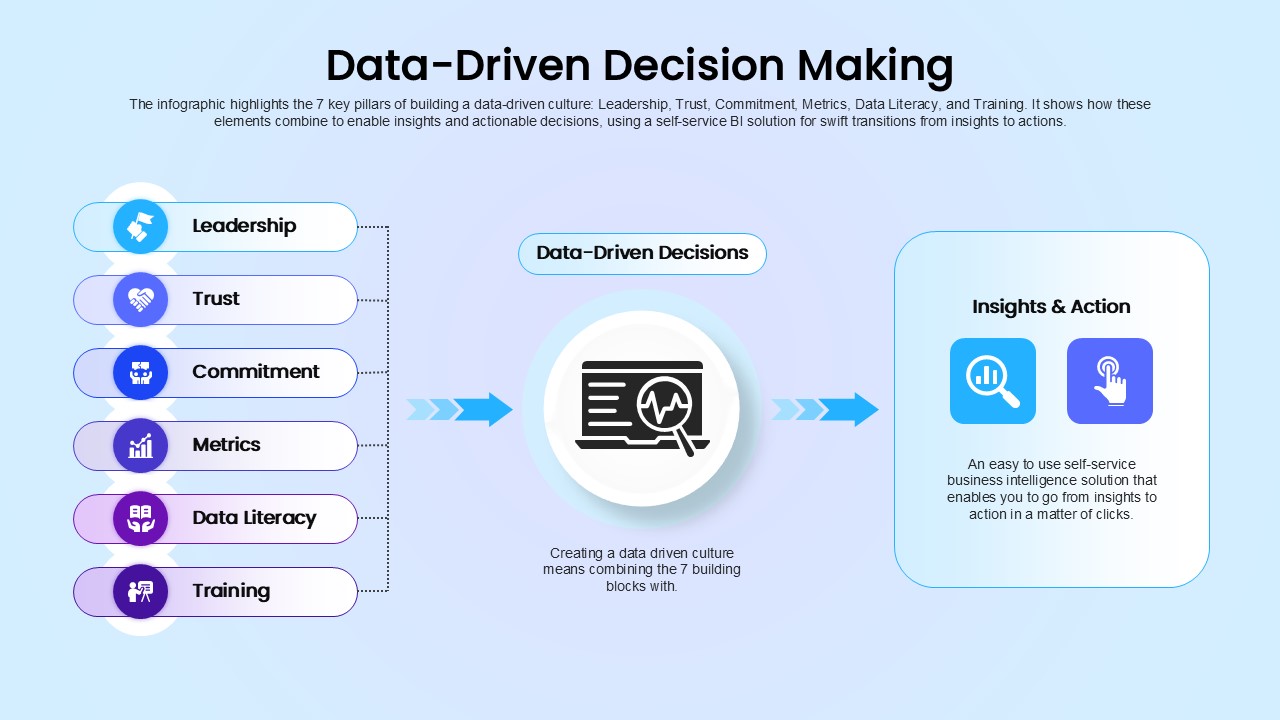
Data-Driven Decision Making overview template for PowerPoint & Google Slides
Business
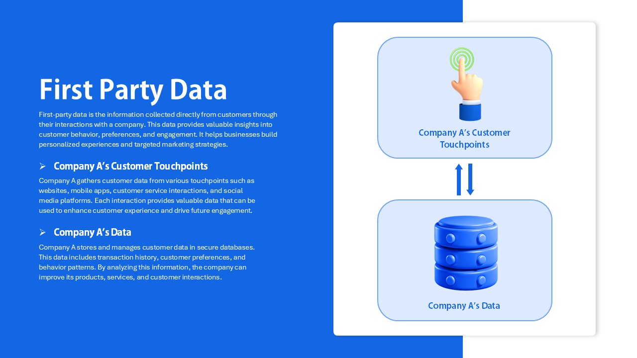
First Party Data Overview Template for PowerPoint & Google Slides
Business
Colorful Business Data Comparison Table Template for PowerPoint & Google Slides
Table
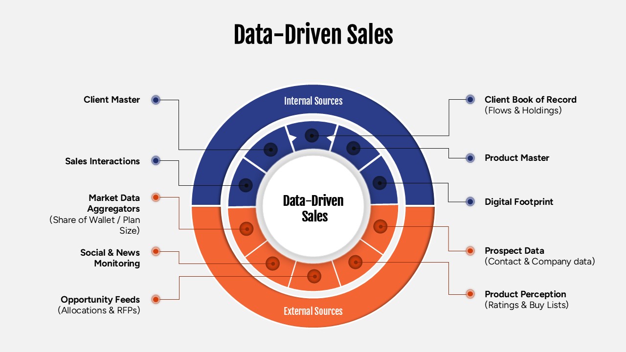
Data-Driven Sales Strategy Diagram Template for PowerPoint & Google Slides
Marketing