Circular Revenue Generation Diagram Template for PowerPoint & Google Slides

Description
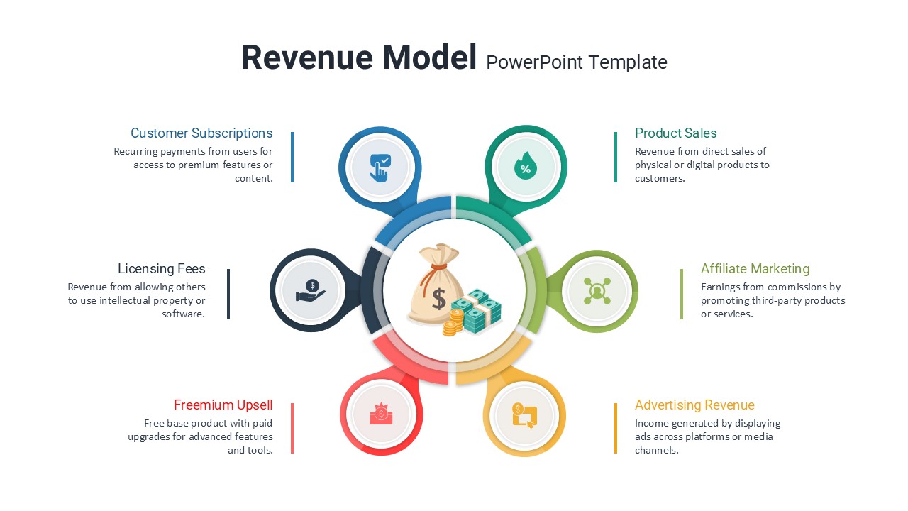
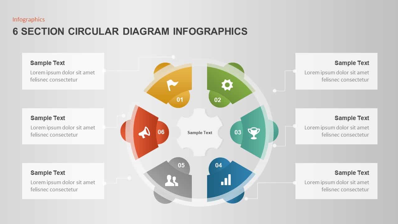
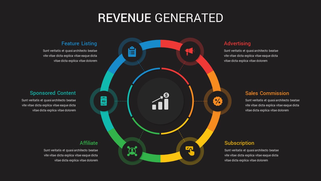
Leverage this dynamic circular revenue generation diagram to highlight six distinct income sources in a visually engaging radial infographic. The outer ring is divided into six color-coded segments—blue for Feature Listing, red for Advertising, orange for Sales Commission, yellow for Subscription, green for Affiliate, and teal for Sponsored Content—each marked with a corresponding icon and placeholder headline. The central hub features a concise revenue growth graphic that draws the eye and reinforces financial performance messaging. With editable master slides, vector shapes, and intuitive text placeholders, you can easily adjust colors, icons, or segment labels to align with your company’s branding or presentation theme.
This template is fully optimized for both PowerPoint and Google Slides, ensuring consistent formatting, seamless collaboration, and high-resolution output across devices. The clean typography and minimalistic iconography maintain a professional aesthetic while preserving clarity and impact. Whether you’re preparing a quarterly financial review, investor pitch, or marketing strategy presentation, this circular diagram simplifies complex data, guides audience focus, and supports data-driven discussions.
Advanced users can animate individual segments for progressive reveals or repurpose the structure to map cyclical processes, stakeholder networks, or project phases. The balanced layout and modular design also facilitate copy-and-paste customization—duplicate or reorder segments without disrupting the overall geometry. Harness the power of this radial revenue streams illustration to communicate diversified income models, track performance metrics, or forecast future growth in a compelling, easy-to-digest format.
Its scalable vector elements ensure crisp visuals at any resolution, while integrated icon libraries and color presets accelerate design workflows. The radial format naturally highlights priority segments, making it ideal for emphasizing top revenue channels or comparing trends at a glance.
Who is it for
Business analysts, financial planners, marketing managers, and executive teams can leverage this slide to present diversified revenue models and facilitate strategic discussions. Entrepreneurs and startup founders will appreciate the clear visualization of income mix during investor pitches or board meetings. Marketing agencies and SaaS companies can use the color-coded segments to showcase performance breakdowns in client presentations.
Other Uses
Repurpose this radial layout to map customer journey stages, illustrate stakeholder ecosystems, or depict cyclical processes such as product development phases. It also serves as a dynamic dashboard component for quarterly reports, performance audits, and risk assessments.
Login to download this file

Item ID
SB03409
Related Templates

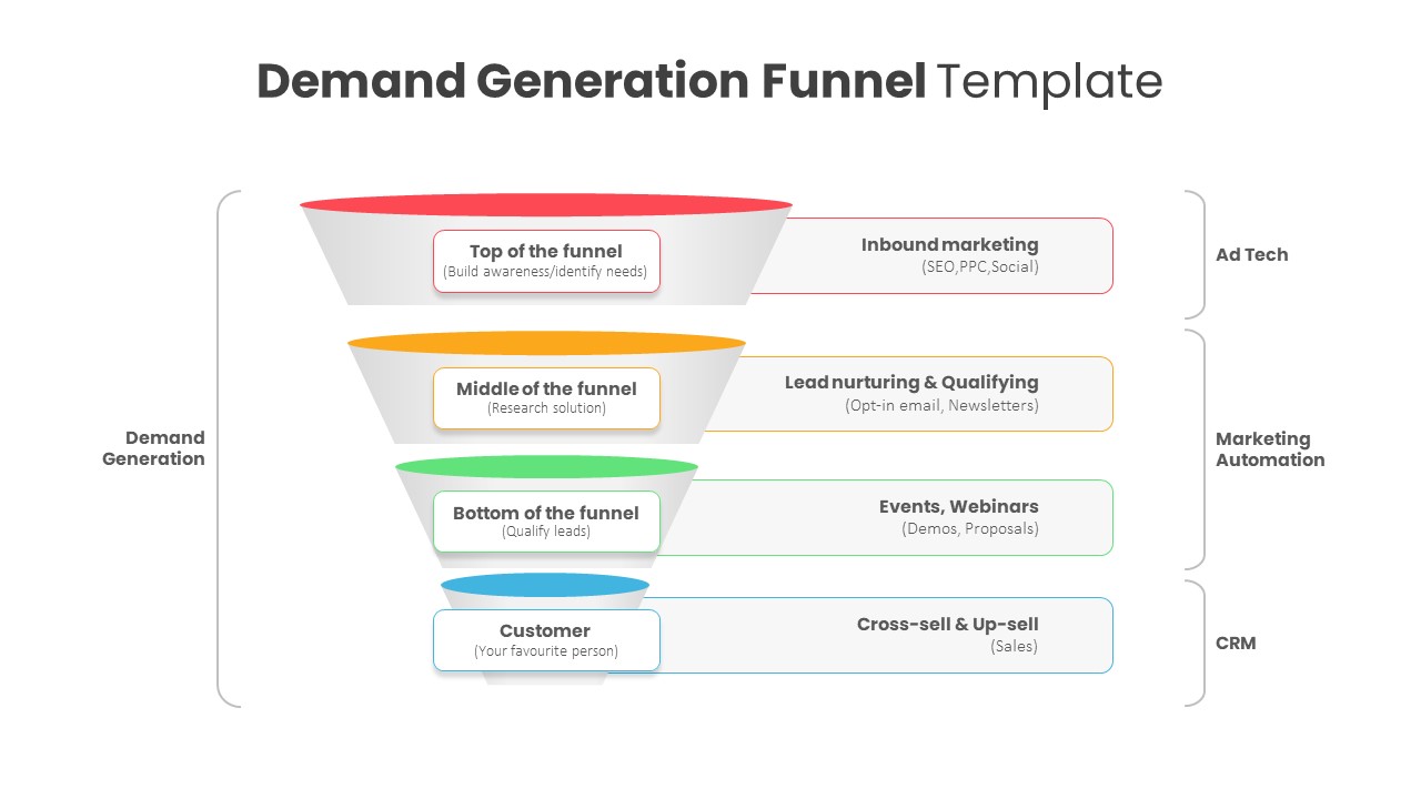
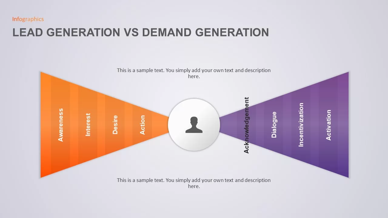
Demand Generation Funnel Diagram Template for PowerPoint & Google Slides
Funnel
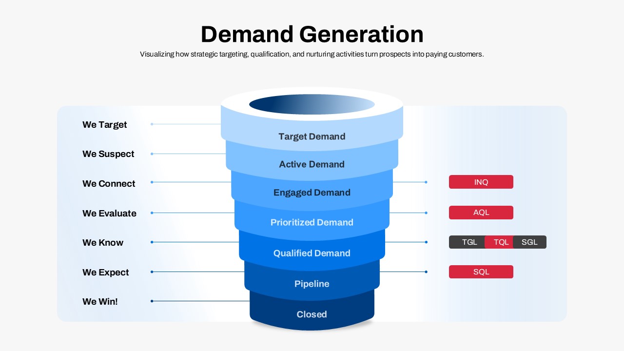
Demand Generation Funnel Process Diagram Template for PowerPoint & Google Slides
Funnel
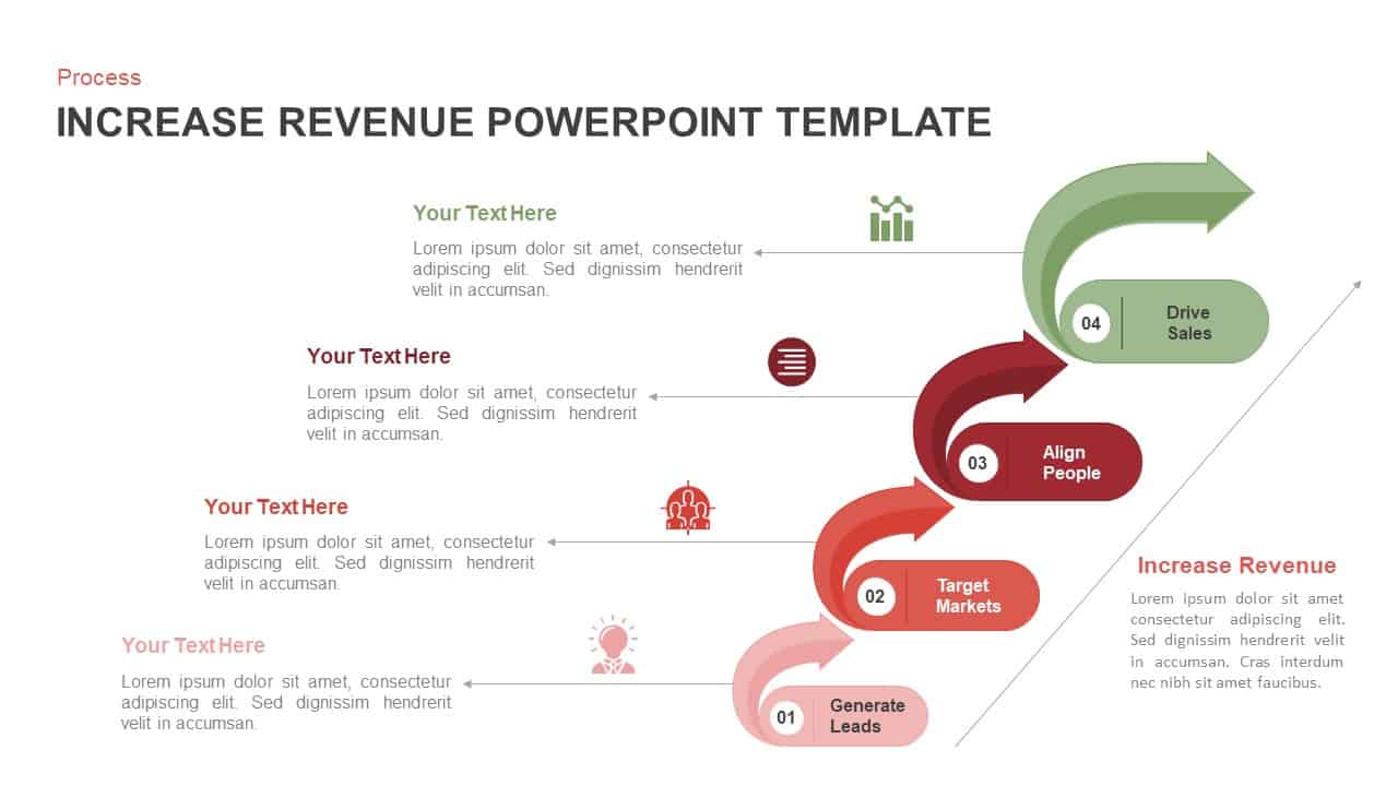
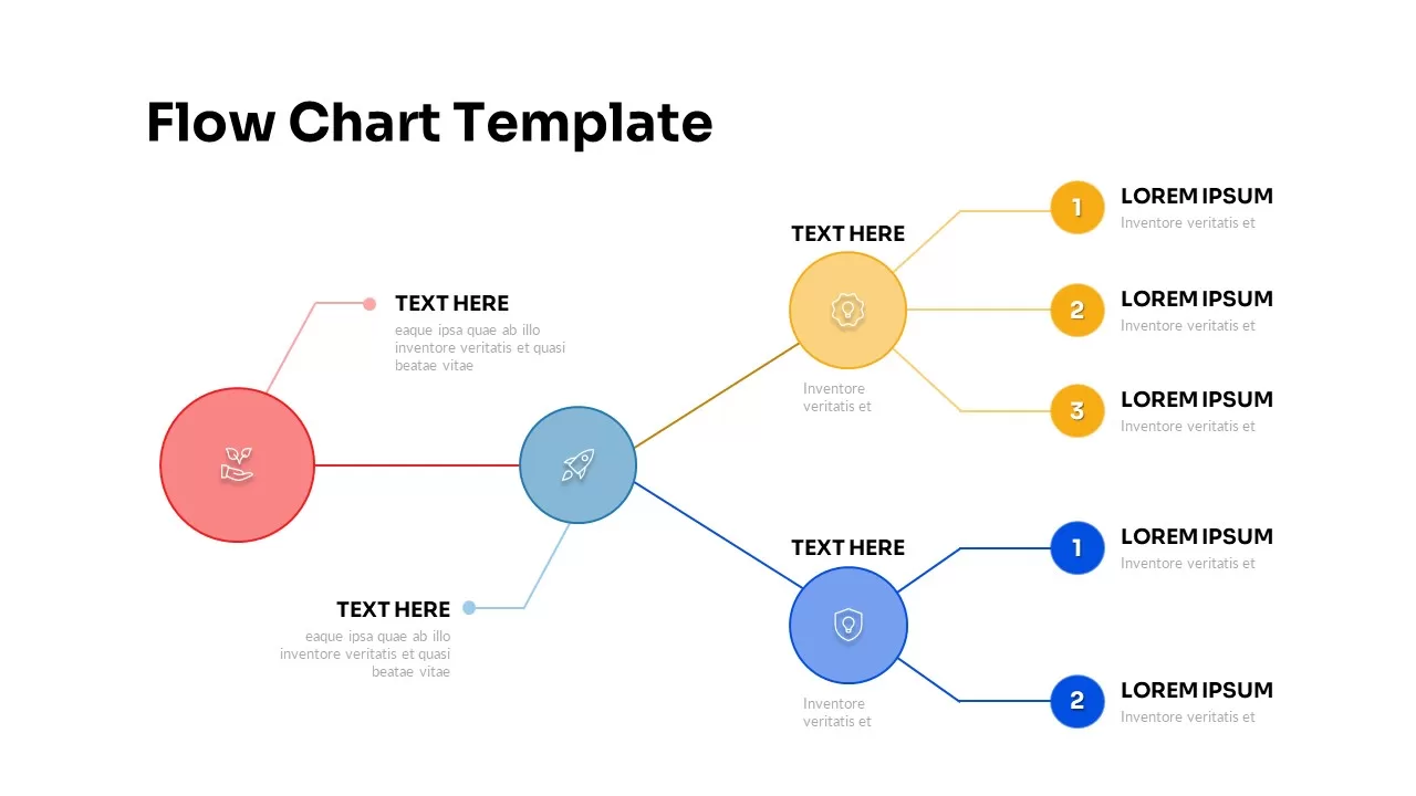
4 Step Revenue Growth Flow Diagram Template for PowerPoint & Google Slides
Process
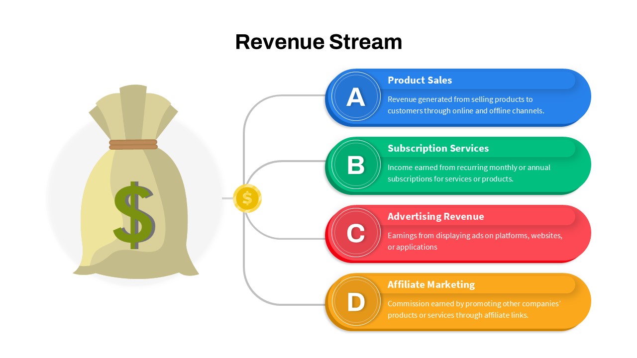
Revenue Streams: Four Channels Diagram Template for PowerPoint & Google Slides
Business Models
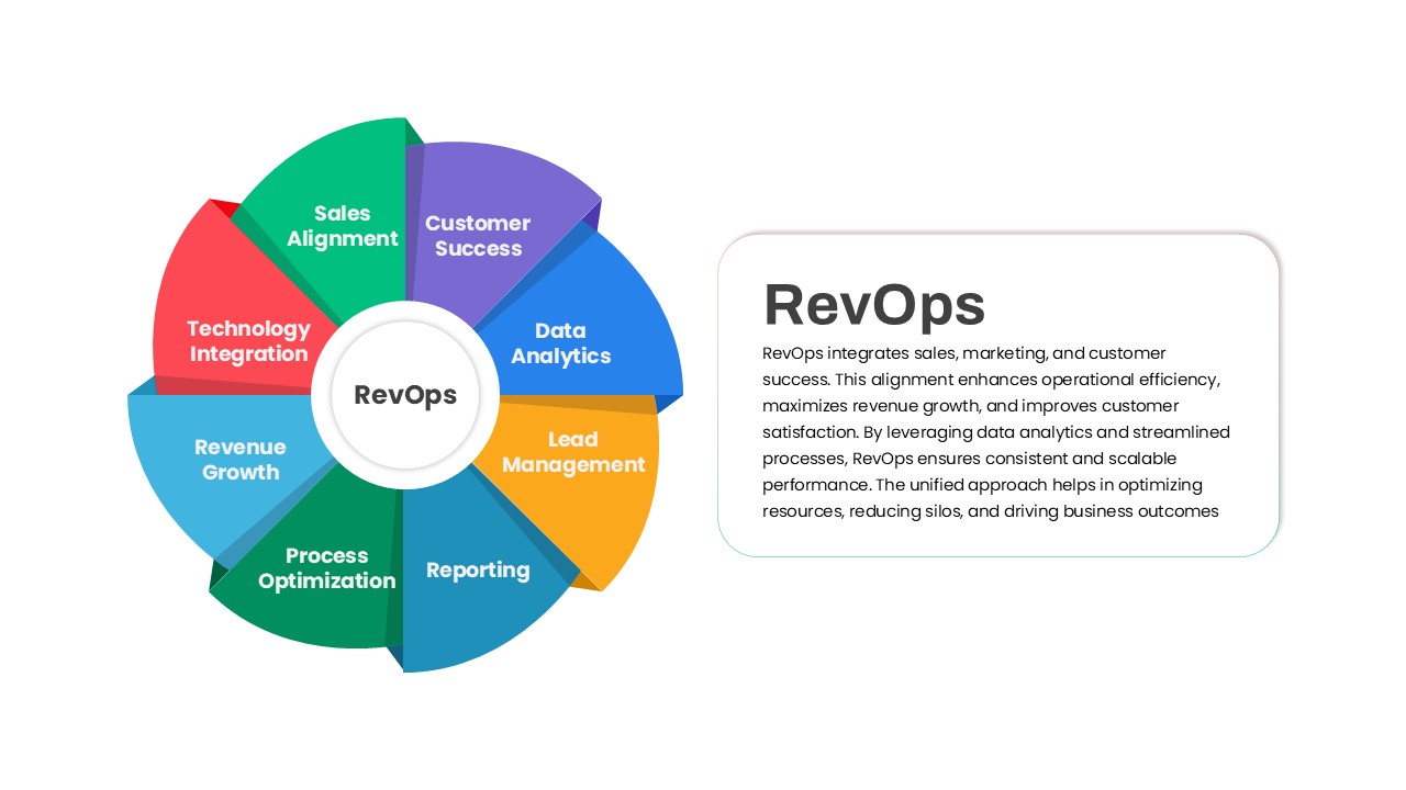
RevOps Revenue Operations Diagram Template for PowerPoint & Google Slides
Revenue
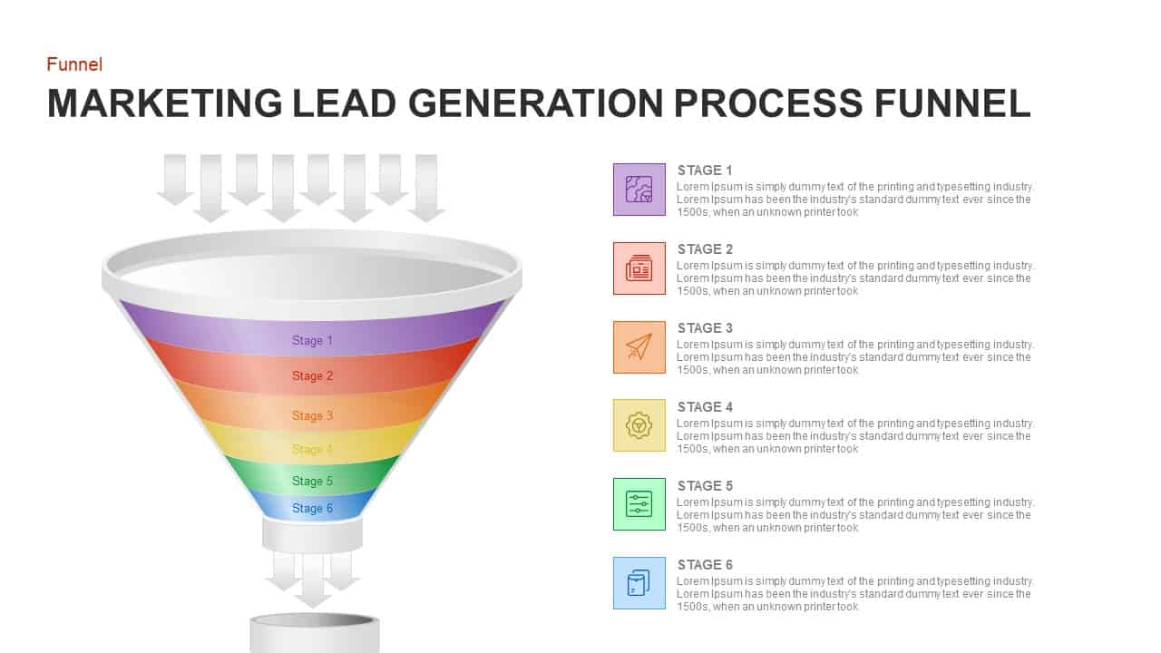
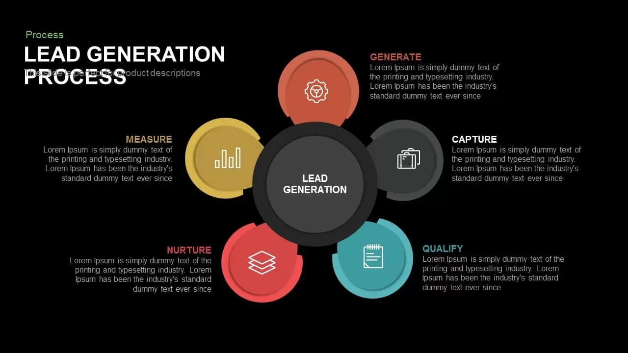
Marketing Lead Generation Process Funnel PowerPoint Template for PowerPoint & Google Slides
Funnel
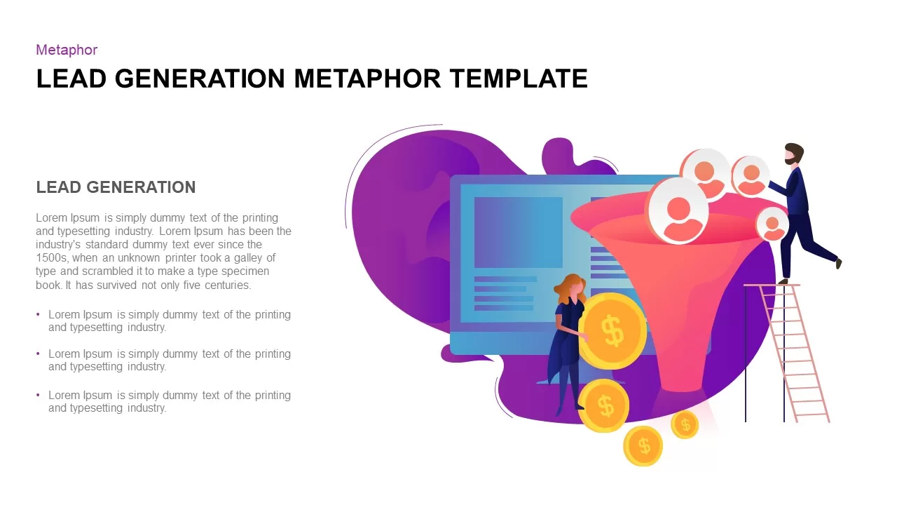
Lead Generation Funnel Metaphor Template for PowerPoint & Google Slides
Marketing Funnel

Demand Generation and Lead Nurturing Process Template for PowerPoint & Google Slides
Process
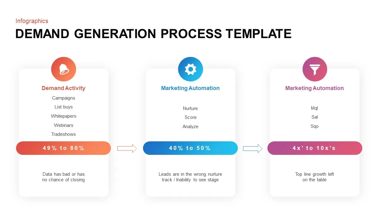
Demand Generation Process Template for PowerPoint & Google Slides
Customer Journey
Demand Generation Process Overview Template for PowerPoint & Google Slides
Marketing
Lead Generation Process for PowerPoint & Google Slides
Business Plan
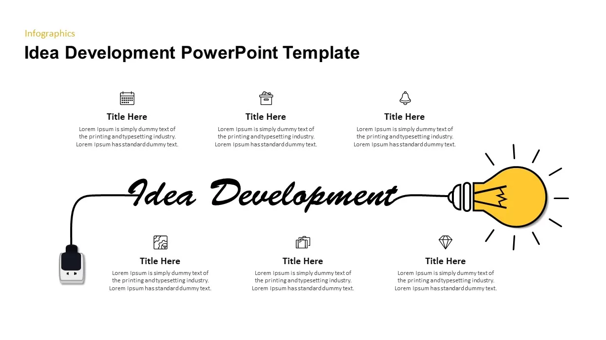
Idea Generation for PowerPoint & Google Slides
Graphics

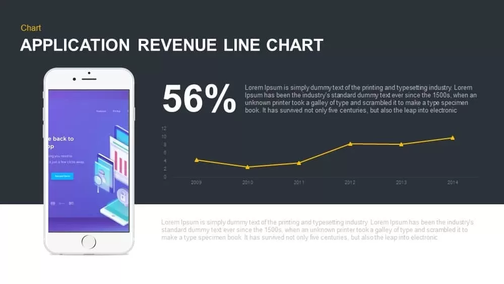
Application Revenue Line Chart KPI Template for PowerPoint & Google Slides
Revenue
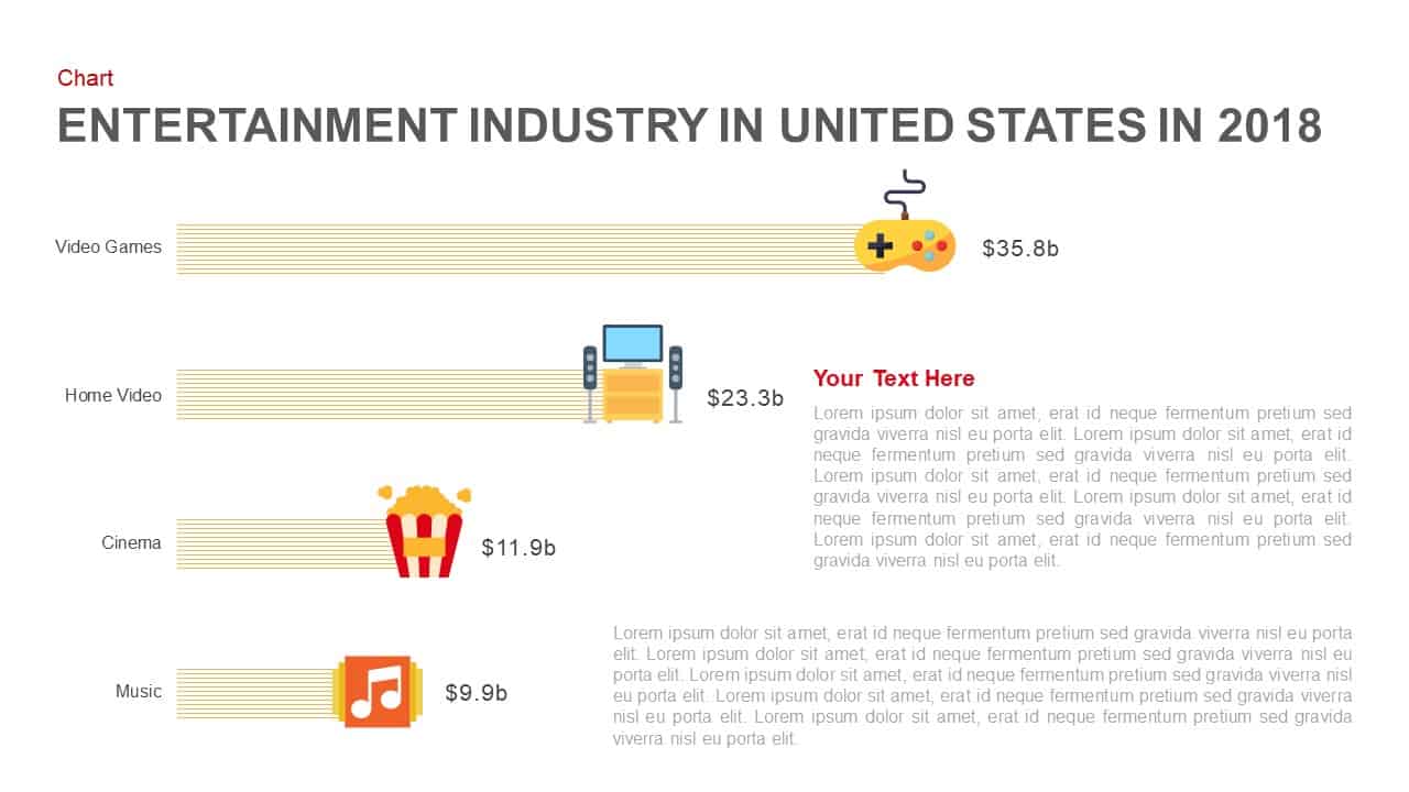
Entertainment Industry Revenue Bar Chart Template for PowerPoint & Google Slides
Bar/Column
Revenue Management Business Strategy Template for PowerPoint & Google Slides
Revenue
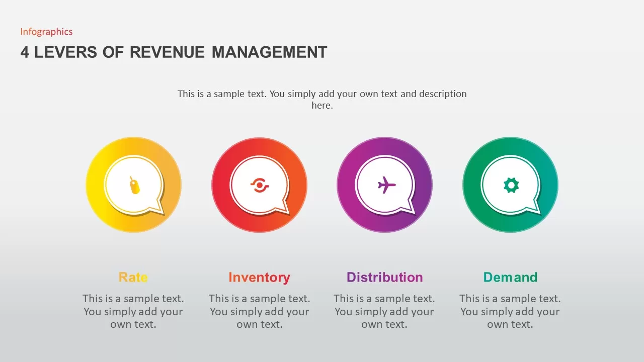
4 Levers of Revenue Management Infographic Template for PowerPoint & Google Slides
Infographics
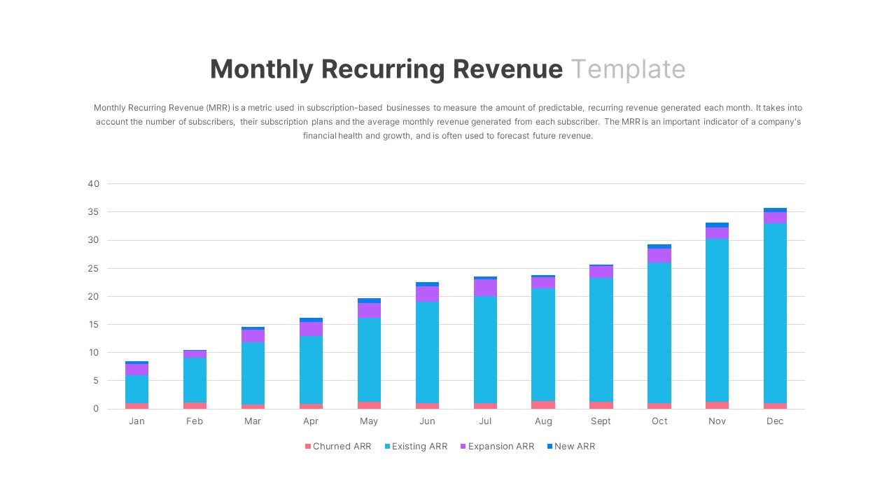
Monthly Recurring Revenue KPI Bar Chart Template for PowerPoint & Google Slides
Bar/Column
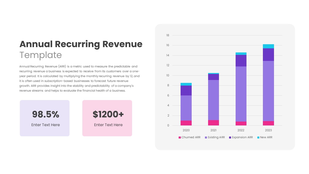
Annual Recurring Revenue Metrics Template for PowerPoint & Google Slides
Bar/Column
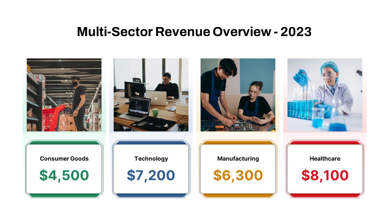
Multi-Sector Revenue Breakdown Cards Template for PowerPoint & Google Slides
Comparison
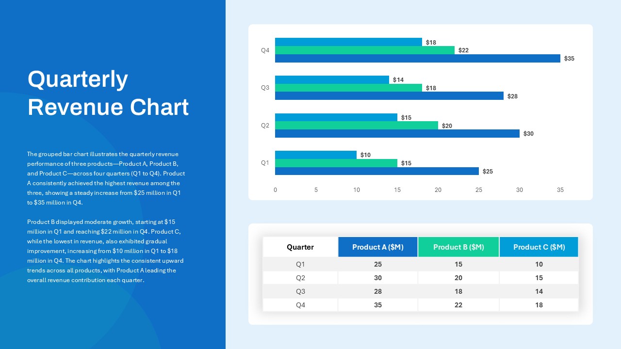
Quarterly Revenue Comparison Bar Chart Template for PowerPoint & Google Slides
Bar/Column
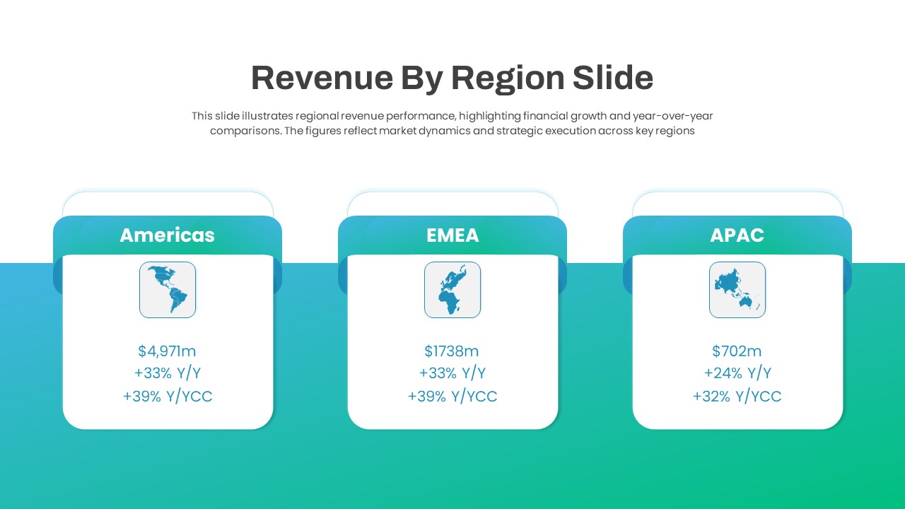
Regional Revenue Comparison Overview Template for PowerPoint & Google Slides
Comparison
Six Revenue Stream Model Infographic Template for PowerPoint & Google Slides
Circular

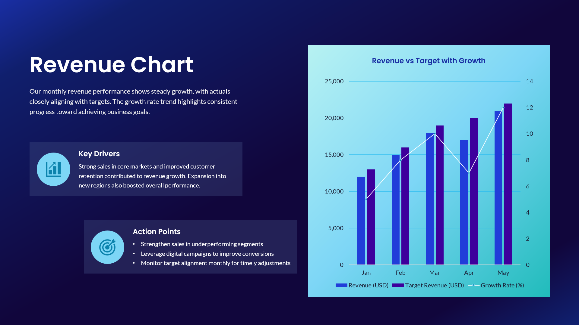
Revenue vs Target Growth Chart Template for PowerPoint & Google Slides
Revenue
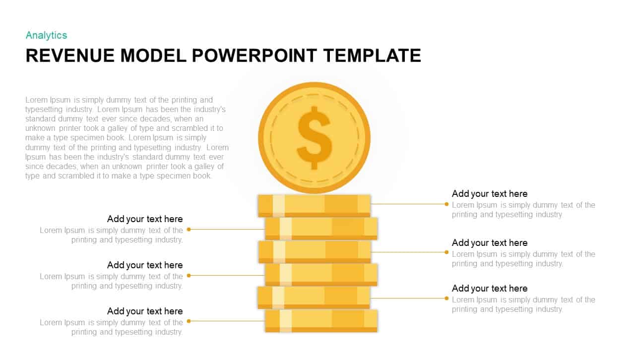
Revenue Model PowerPoint Template
Finance

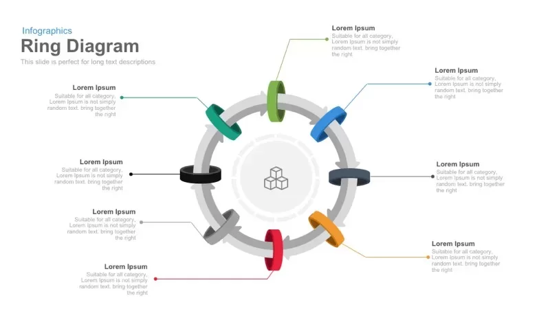
8 Circular Ring Diagram template for PowerPoint & Google Slides
Infographics
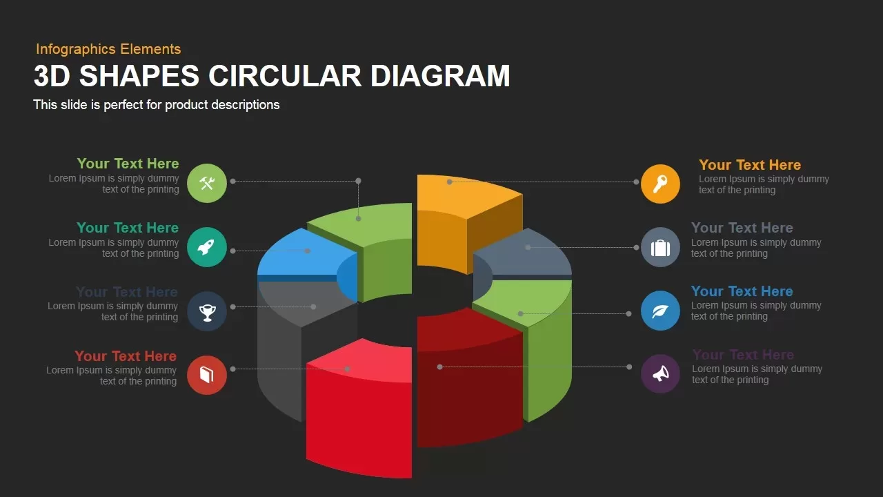
3D Circular Diagram template for PowerPoint & Google Slides
Circular
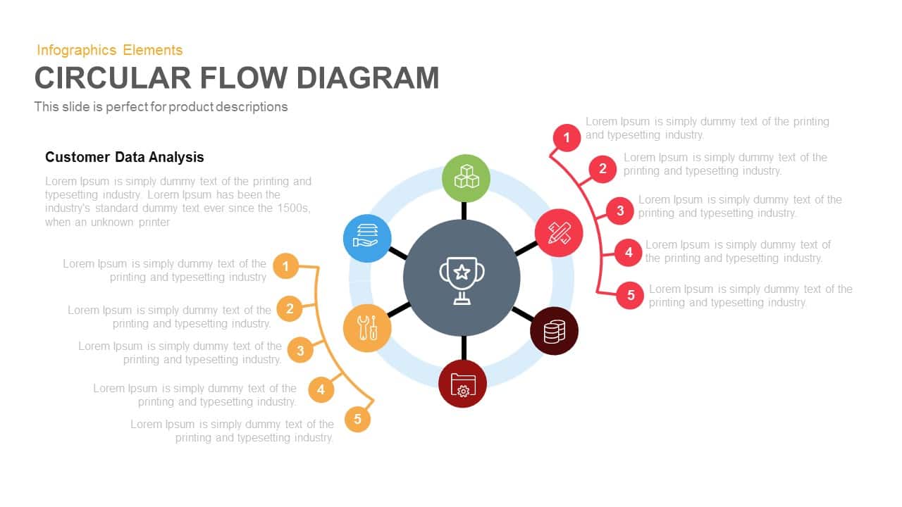
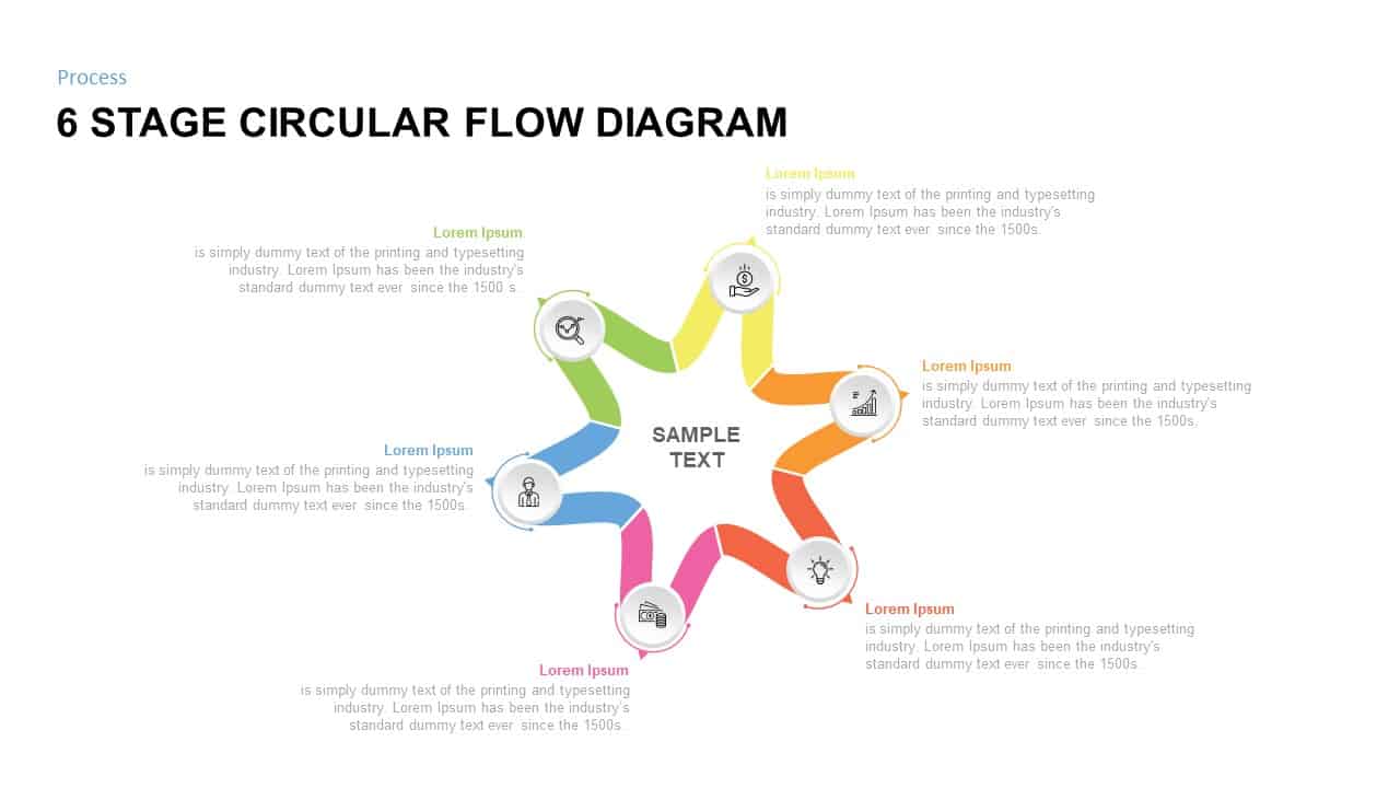
Circular Flow Diagram Template for PowerPoint & Google Slides
Infographics
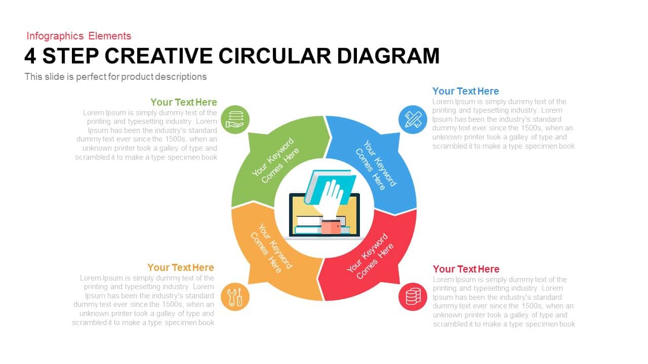
4 Step Creative Circular Diagram Template for PowerPoint & Google Slides
Infographics
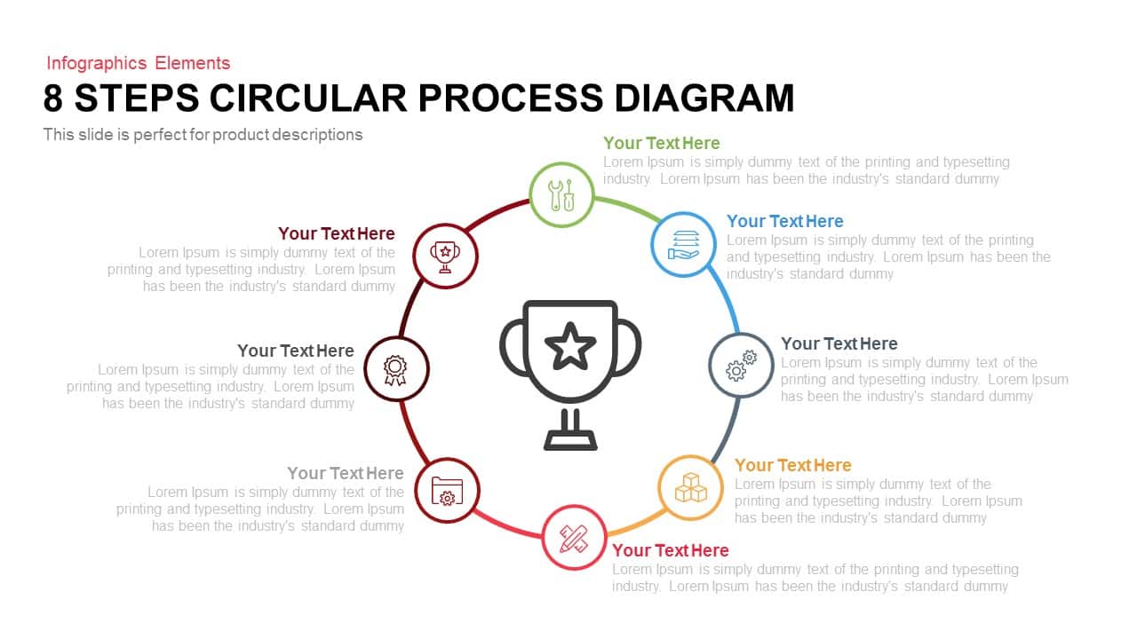
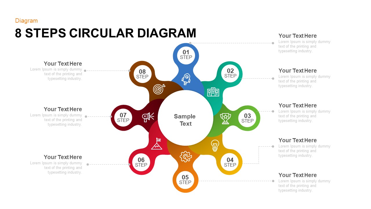
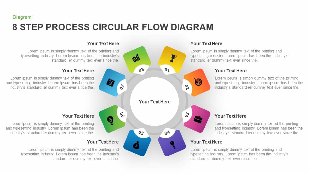
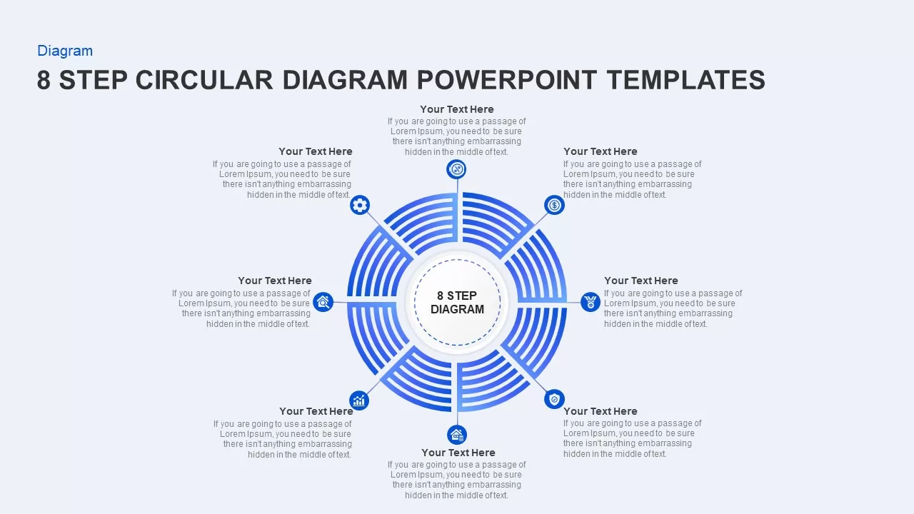
8 Steps Circular Process Diagram Template for PowerPoint & Google Slides
Process
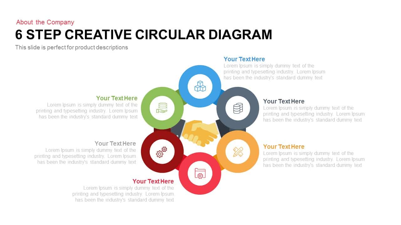
Six Step Creative Circular Diagram Template for PowerPoint & Google Slides
Circular
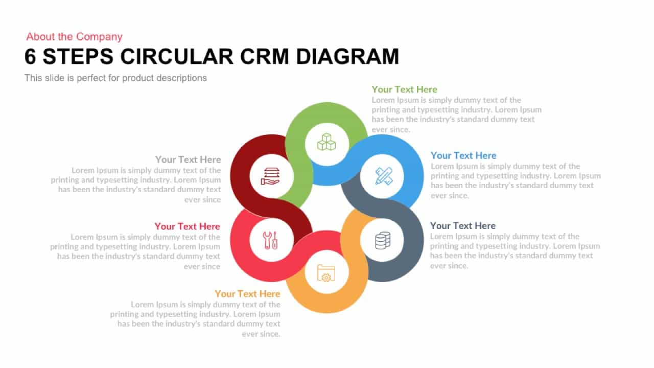
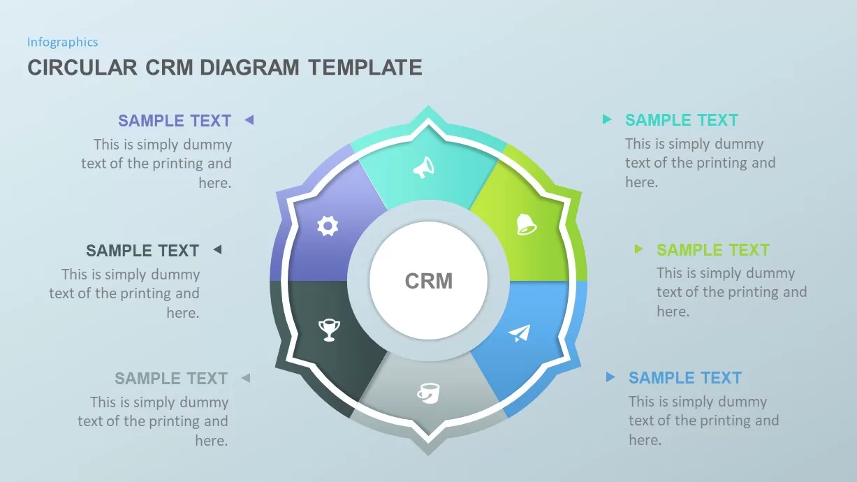
Six Steps Circular CRM Diagram Template for PowerPoint & Google Slides
Customer Journey
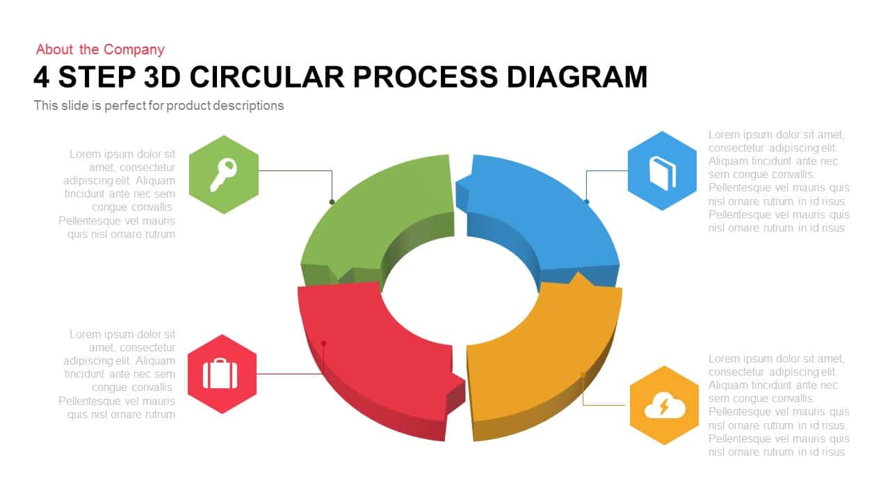
4 Step 3D Circular Process Diagram template for PowerPoint & Google Slides
Process
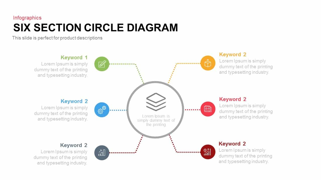
Six Section Circular Infographic Diagram Template for PowerPoint & Google Slides
Circular
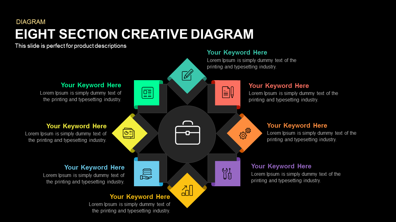
Eight-Section Circular Diagram template for PowerPoint & Google Slides
Circular

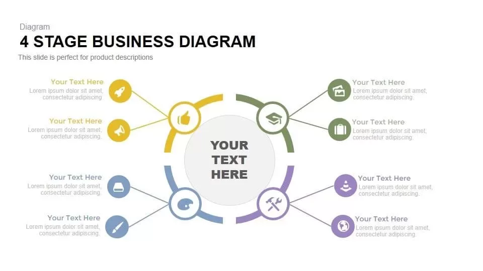
Four-Stage Business Circular Diagram Template for PowerPoint & Google Slides
Process

Light Bulb Idea Circular Diagram Template for PowerPoint & Google Slides
Infographics
Five-Section Circular Arrow Diagram Template for PowerPoint & Google Slides
Circular

8-Step Circular Arrow Diagram Template for PowerPoint & Google Slides
Arrow
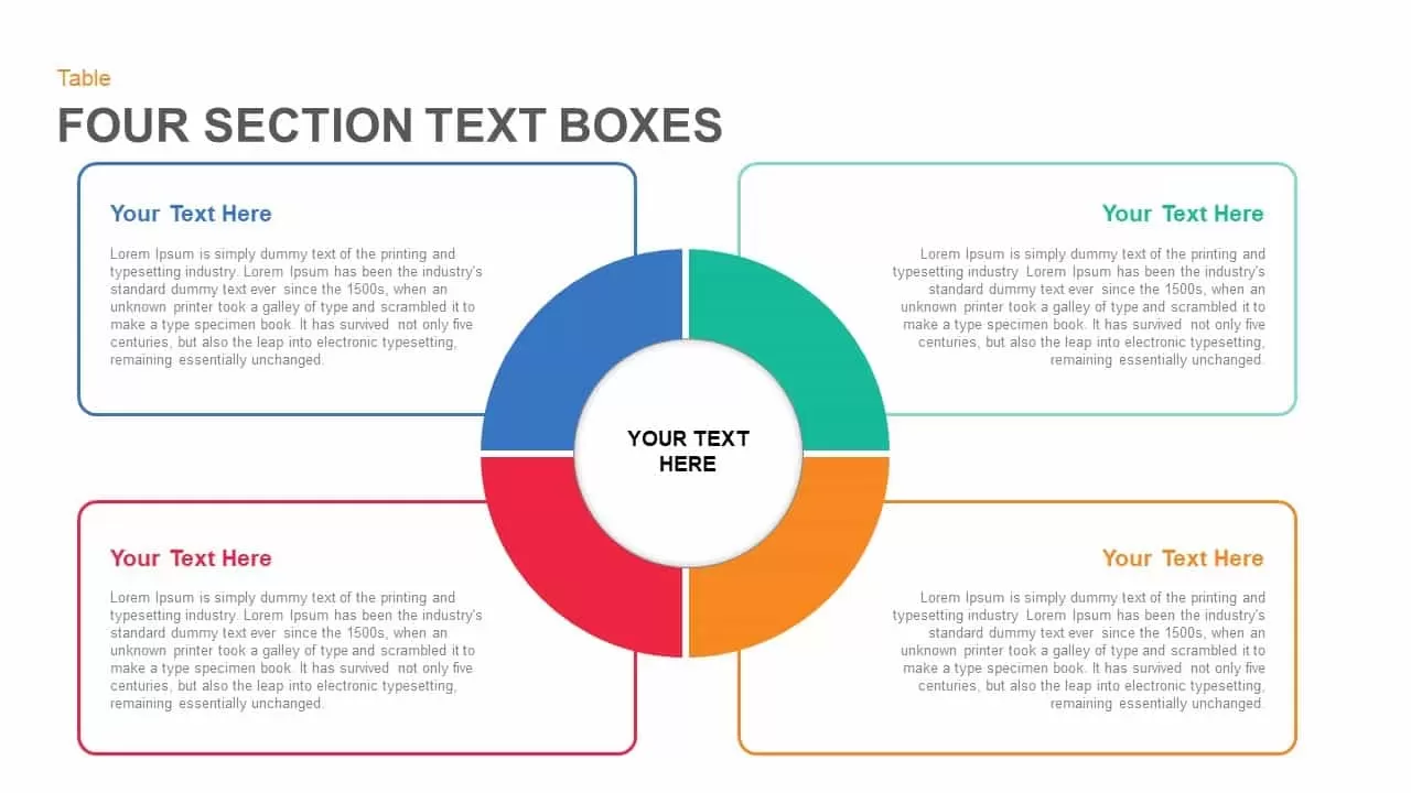
Four Section Circular Text Boxes Diagram Template for PowerPoint & Google Slides
Circular
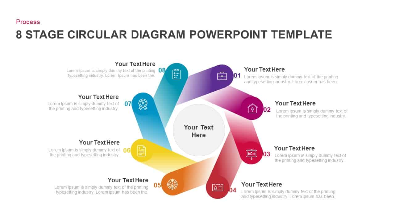
Eight-Step Circular Diagram Infographic Template for PowerPoint & Google Slides
Circular
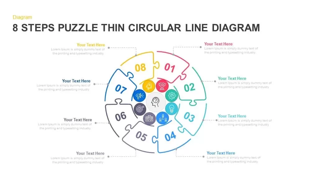
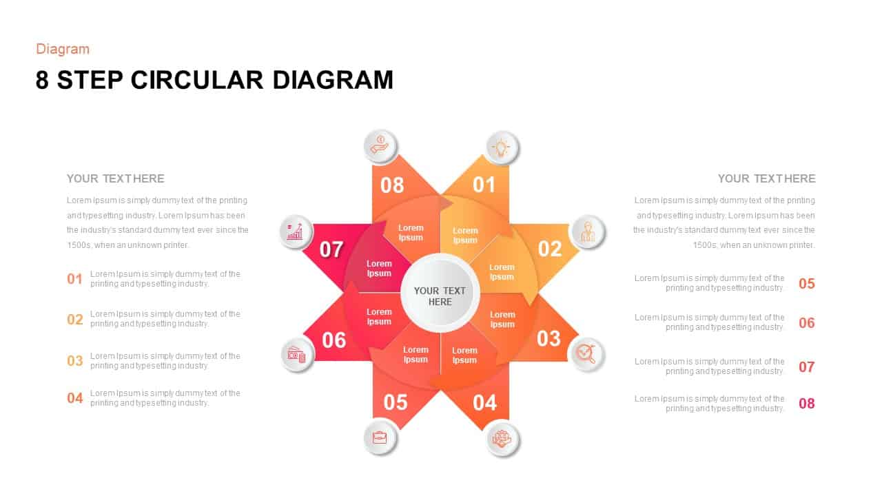
8-Step Puzzle Circular Diagram Template for PowerPoint & Google Slides
Circular
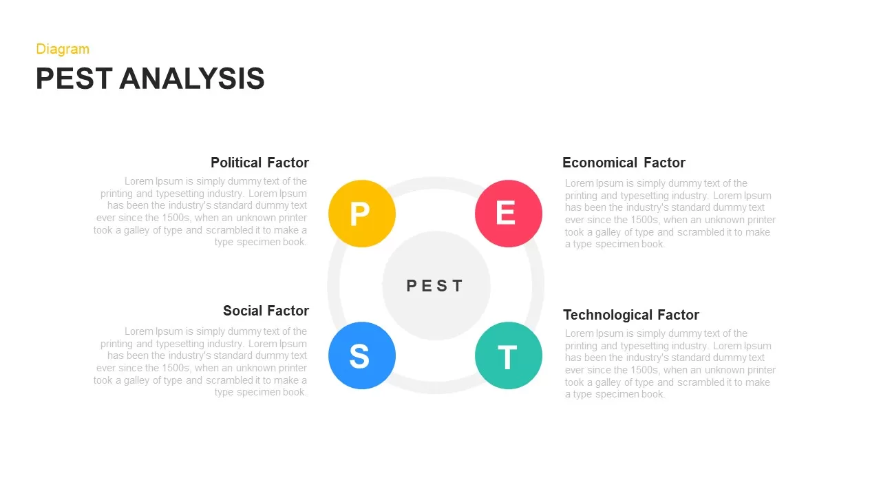
PEST Analysis Circular Diagram Template for PowerPoint & Google Slides
PEST
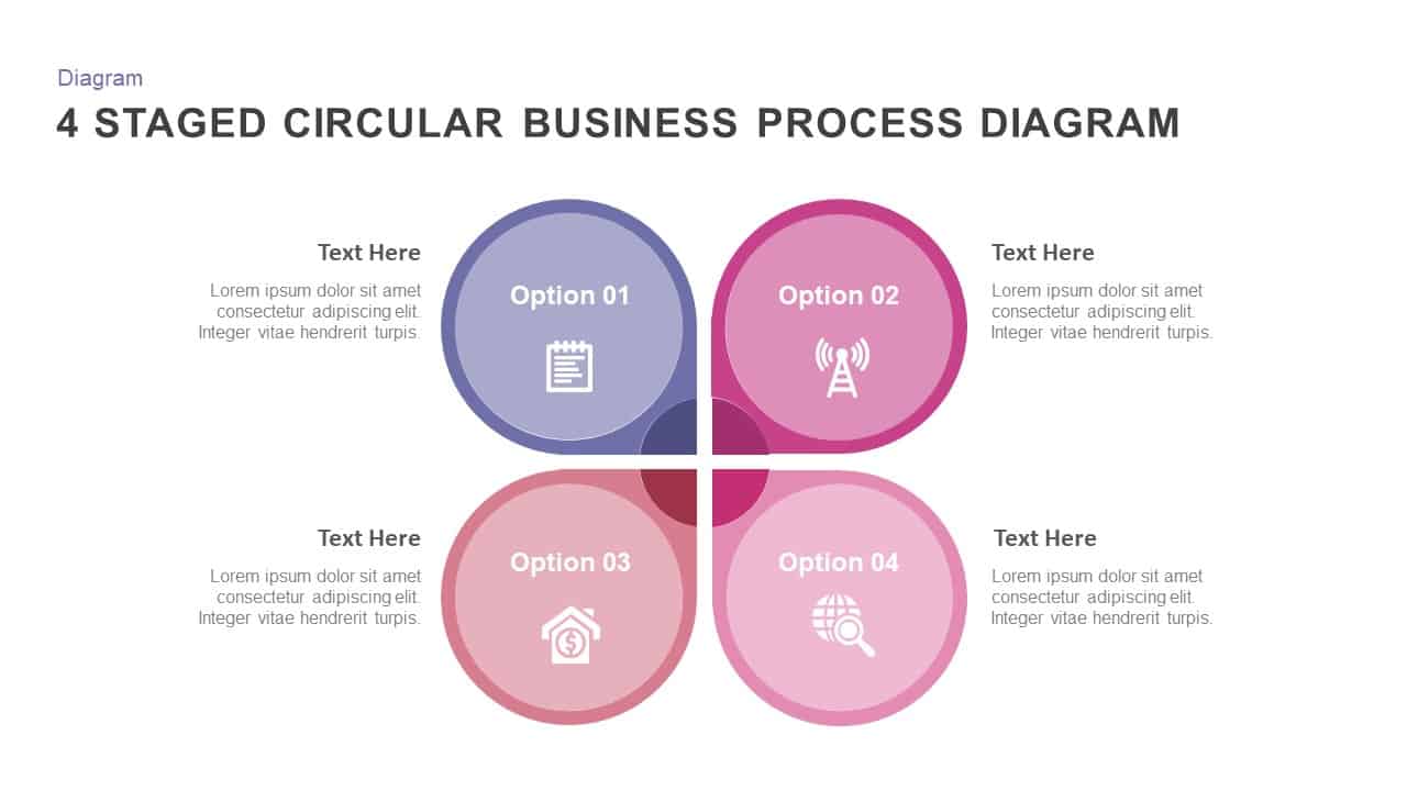
4 Staged Circular Business Process Diagram template for PowerPoint & Google Slides
Process
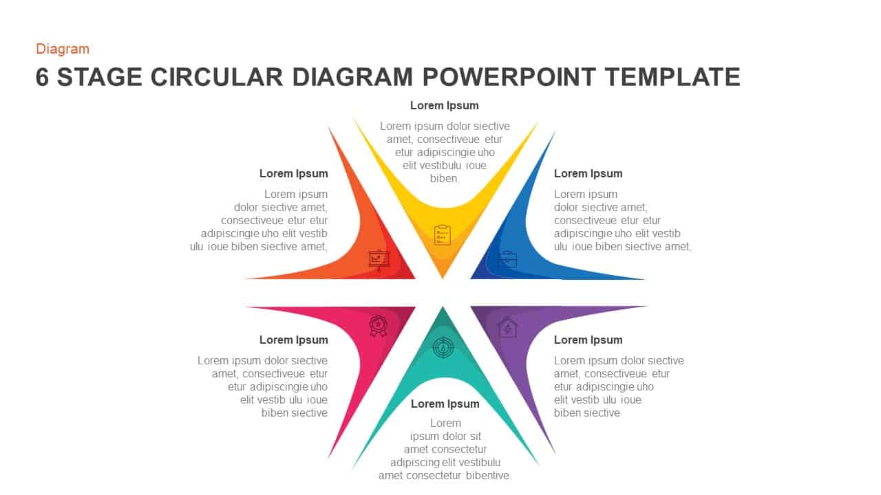
Six-Stage Circular Diagram Process Template for PowerPoint & Google Slides
Circular
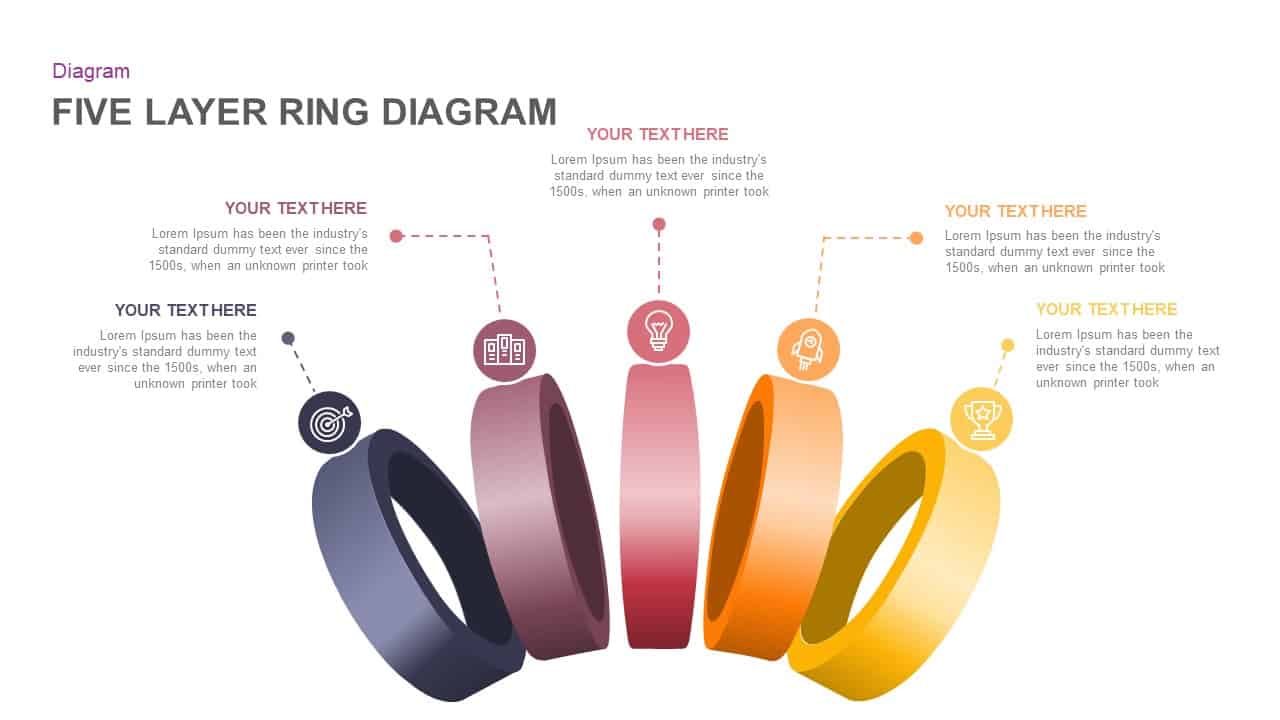
Five Layer Circular Ring Diagram Template for PowerPoint & Google Slides
Circular
Five Stage Circular Arrow Diagram Template for PowerPoint & Google Slides
Process
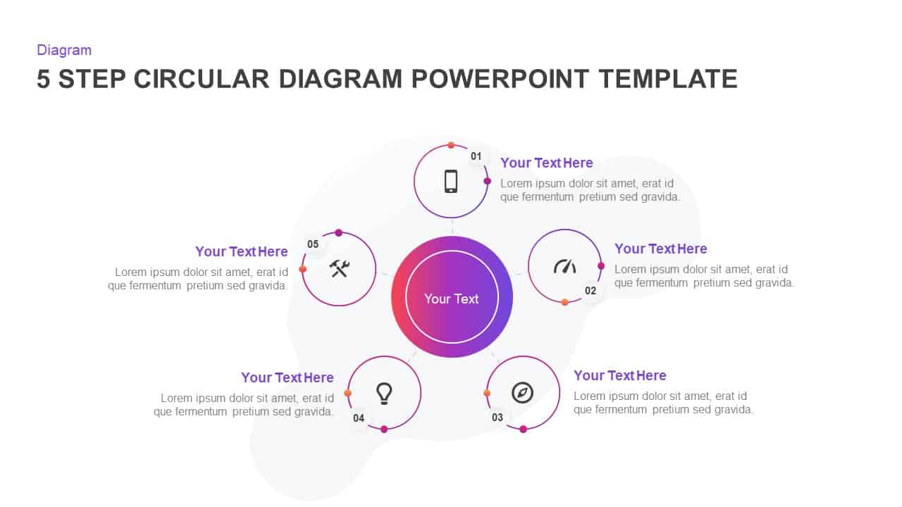
Five-Step Circular Process Diagram Template for PowerPoint & Google Slides
Circular
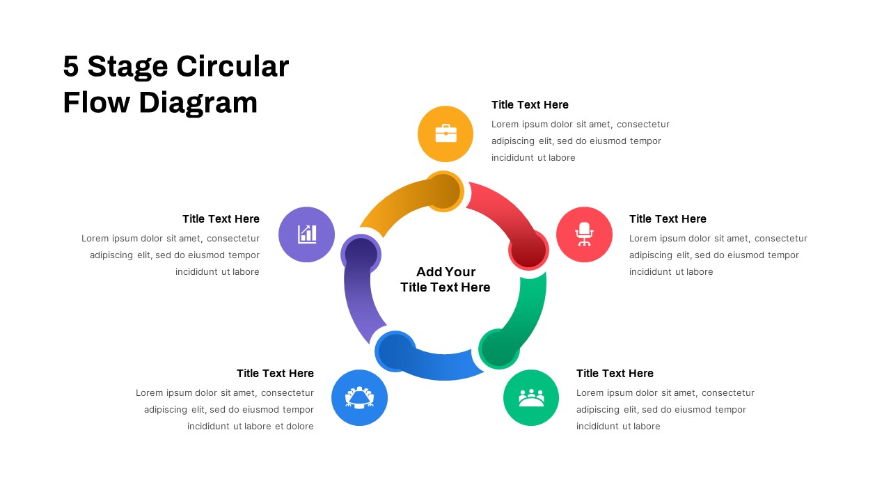
Five-Stage Circular Flow Diagram Template for PowerPoint & Google Slides
Circular
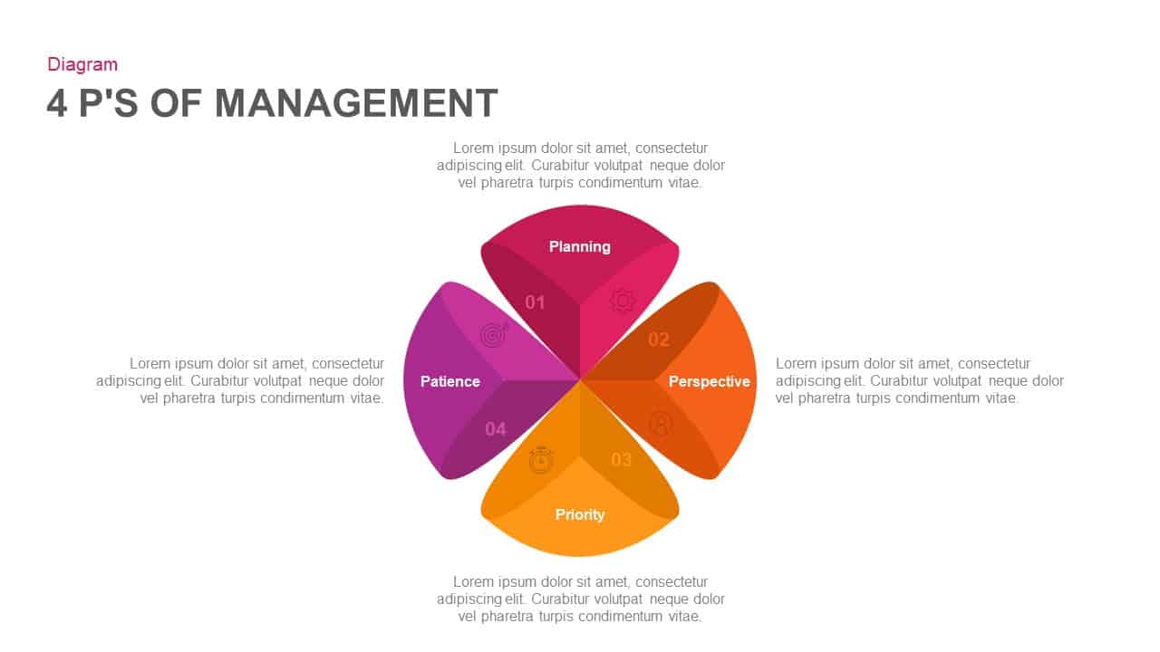
4 Ps of Management Circular Diagram Template for PowerPoint & Google Slides
Circular
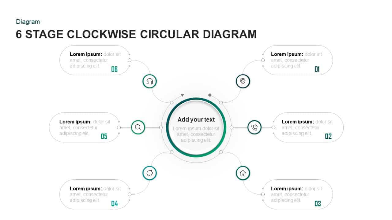
Six-Stage Clockwise Circular Diagram Template for PowerPoint & Google Slides
Circular
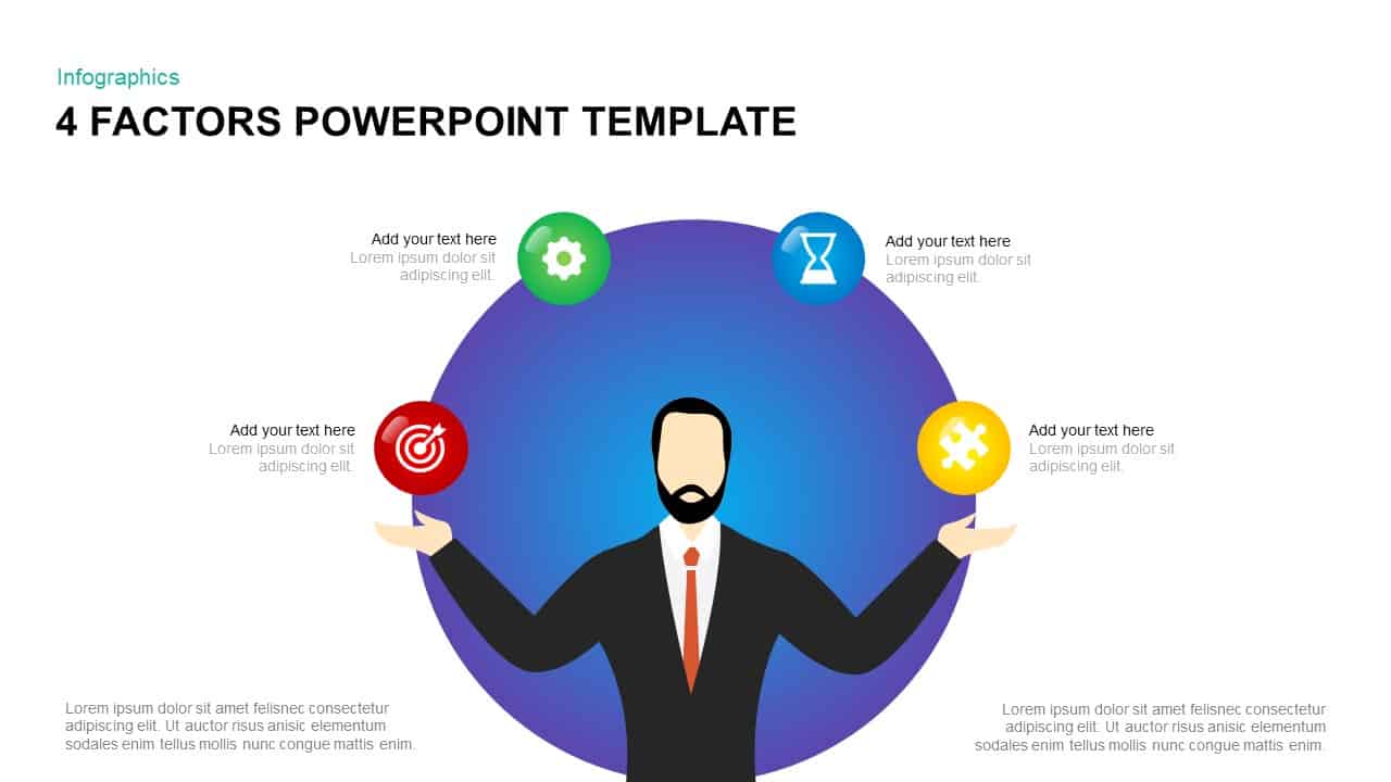
4 Factors Circular Diagram Infographic Template for PowerPoint & Google Slides
Circular
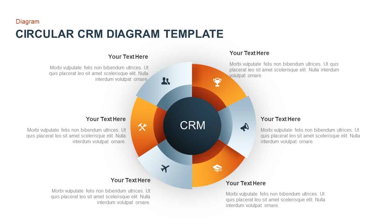
Circular CRM Process Diagram Infographic Template for PowerPoint & Google Slides
Circular
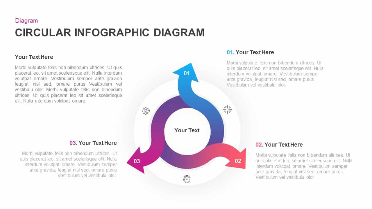
Circular Three-Step Infographic Diagram Template for PowerPoint & Google Slides
Circular
8 Step Circular Process Flow Diagram Template for PowerPoint & Google Slides
Process
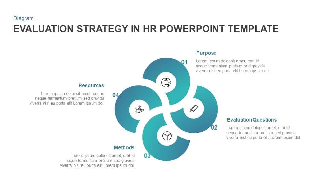
HR Evaluation Strategy Circular Diagram Template for PowerPoint & Google Slides
Circular
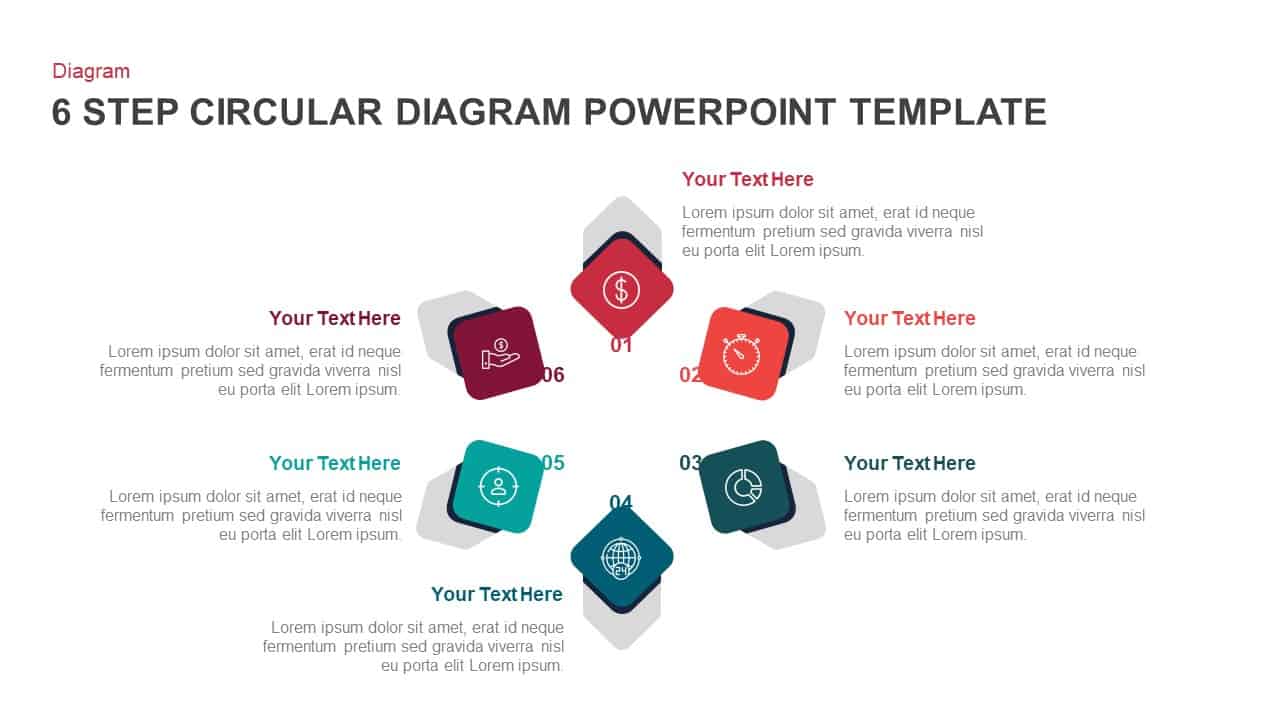
6-Step Circular Process Flow Diagram Template for PowerPoint & Google Slides
Process
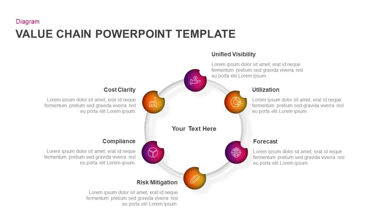
Value Chain Circular Process Diagram Template for PowerPoint & Google Slides
Business Models
Six-Stage Circular Flow Diagram Template for PowerPoint & Google Slides
Circular
8-Stage Chevron Circular Diagram Template for PowerPoint & Google Slides
Process
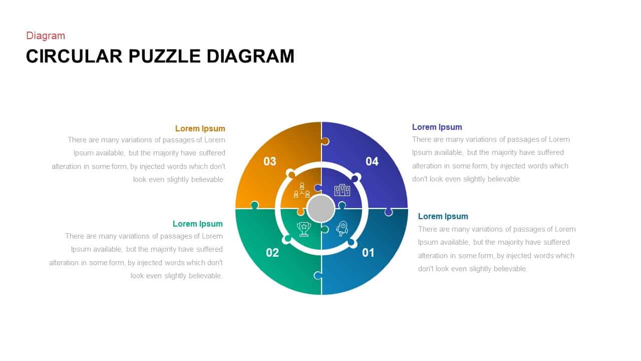
Colorful Circular Puzzle Diagram Template for PowerPoint & Google Slides
Circular
Eight Step Circular Diagram Template for PowerPoint & Google Slides
Circular
6-Part Circular Gear Infographic Diagram Template for PowerPoint & Google Slides
Process
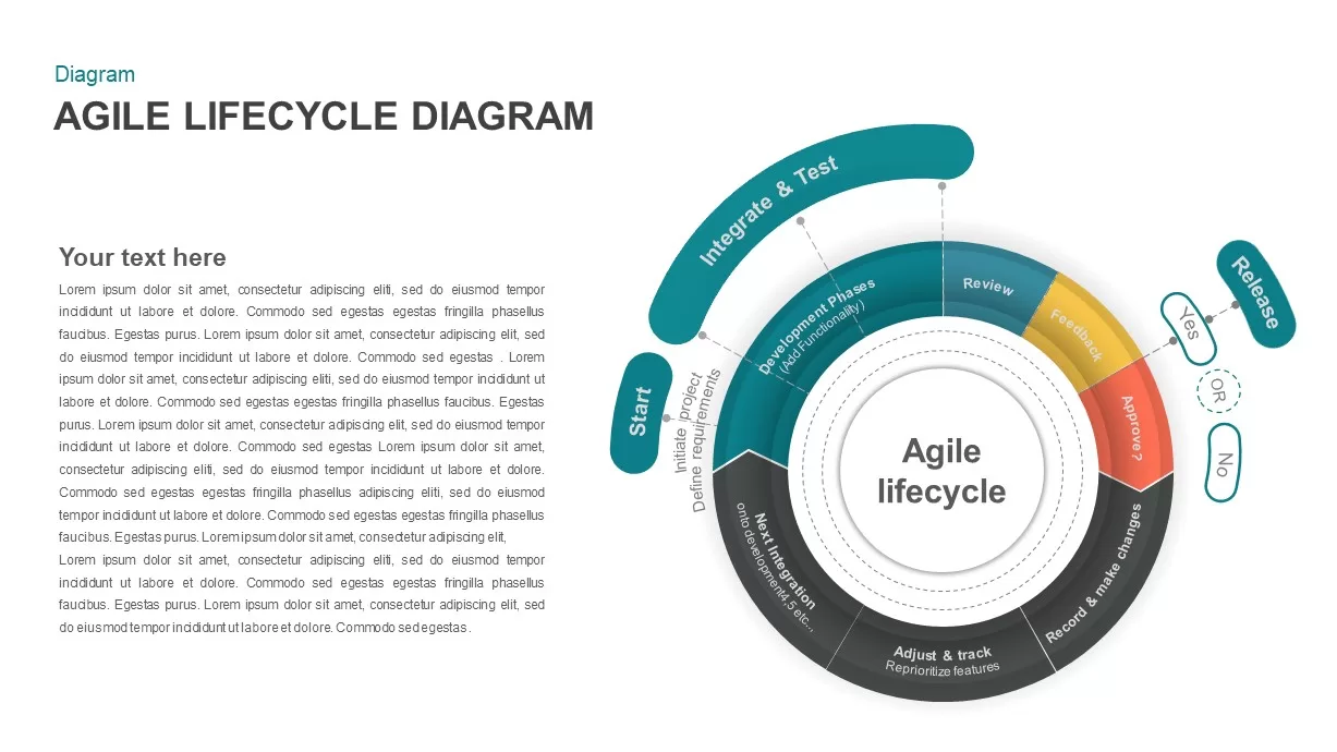
Agile Lifecycle Circular Diagram Template for PowerPoint & Google Slides
Circular
2-8 Step Circular Diagram Template for PowerPoint & Google Slides
Infographics
Circular CRM Process Infographic Diagram Template for PowerPoint & Google Slides
Circular
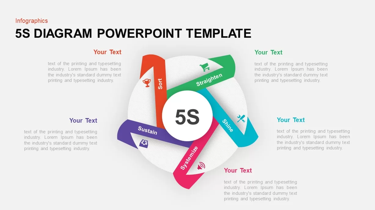
5S Lean Methodology Circular Diagram Template for PowerPoint & Google Slides
Process
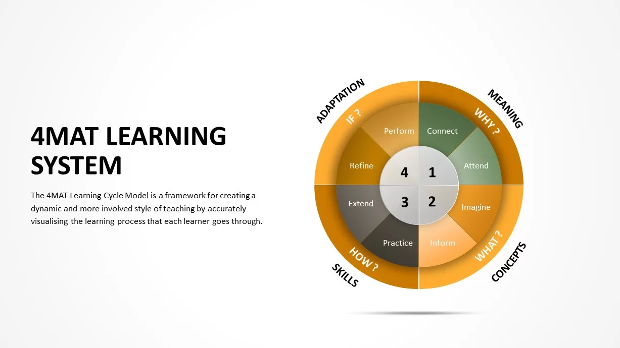
4MAT Learning Cycle Circular Diagram Template for PowerPoint & Google Slides
Circular
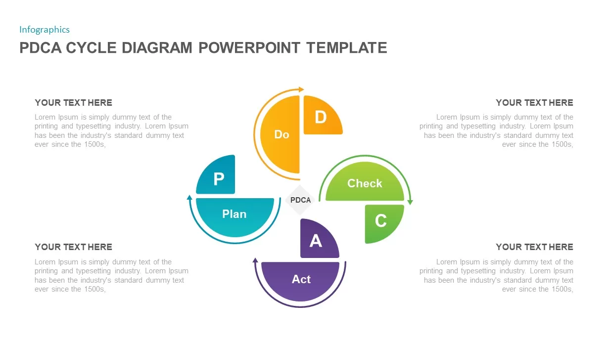
4-Step Circular PDCA Cycle Diagram Template for PowerPoint & Google Slides
Process
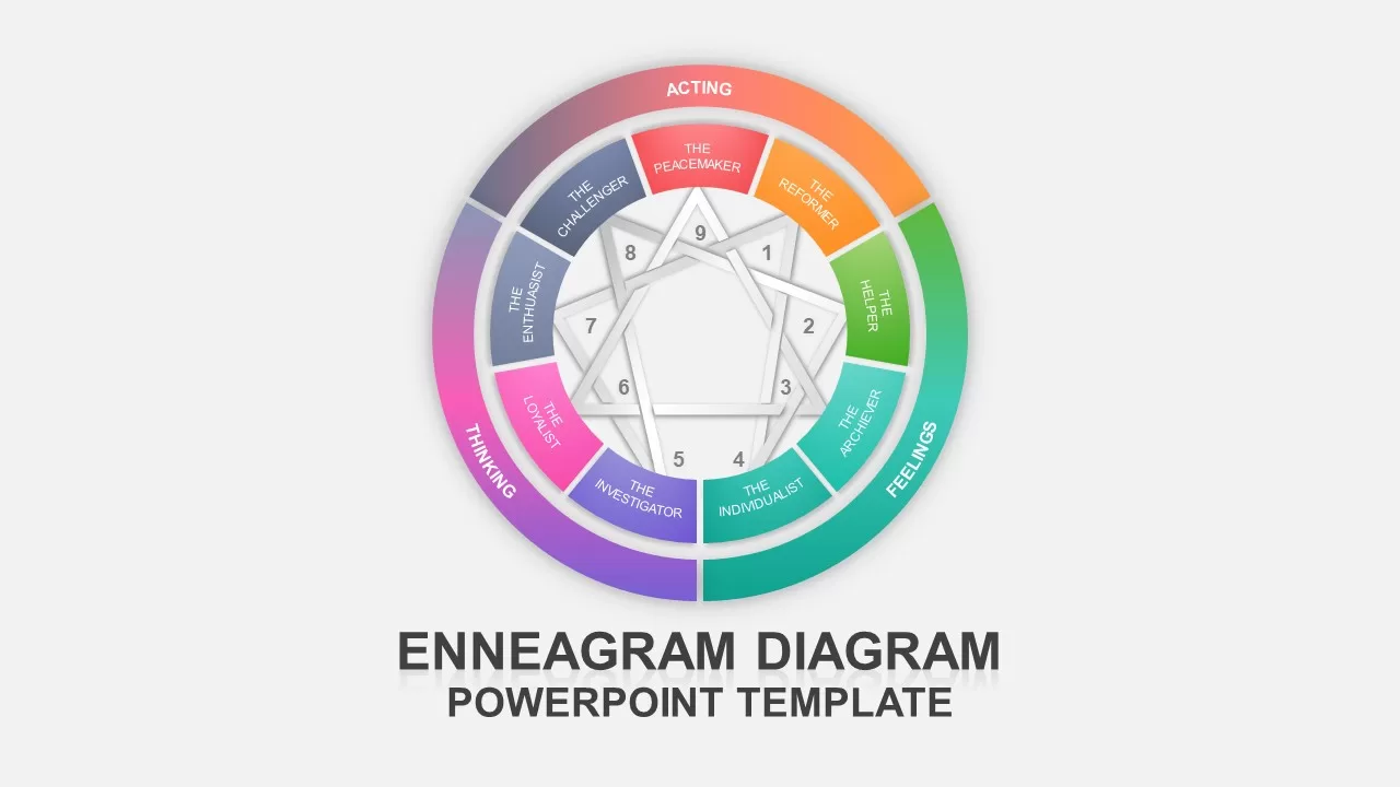
Multi-Color Enneagram Circular Diagram Template for PowerPoint & Google Slides
Circular
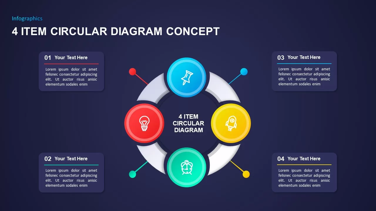
Four-Item Circular Diagram Concept Template for PowerPoint & Google Slides
Circular
8-Step Circular Diagram Infographics Template for PowerPoint & Google Slides
Circular
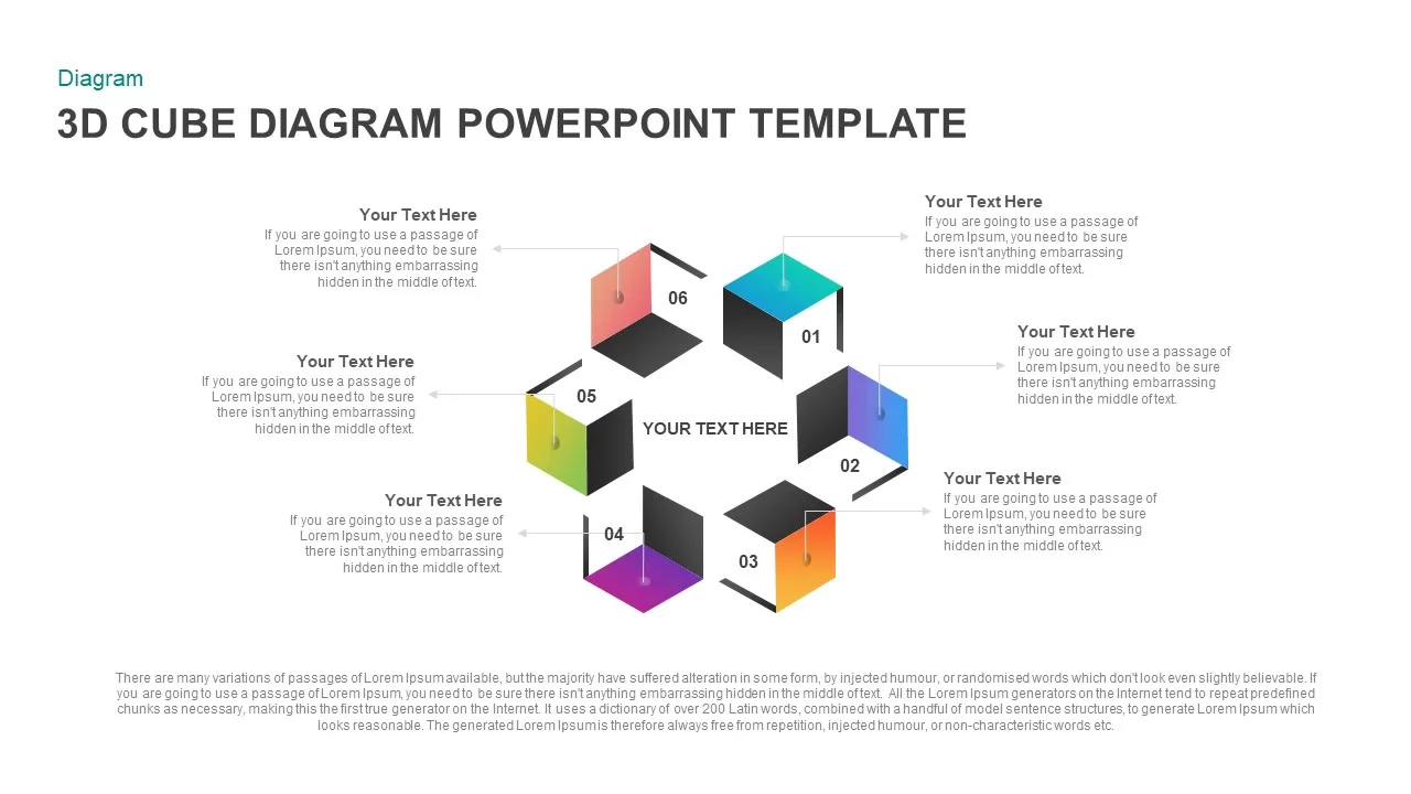
Circular 3D Cube Six-Segment Diagram Template for PowerPoint & Google Slides
Infographics
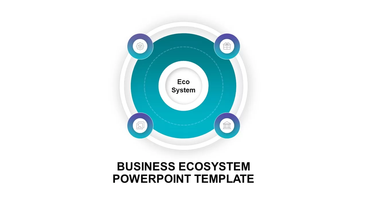
Circular Business Ecosystem Diagram Template for PowerPoint & Google Slides
Business Strategy
Free Circular Multi-Step Flow Chart Diagram Template for PowerPoint & Google Slides
Flow Charts
Free
Concentric Circular Arrow Cycle Diagram Template for PowerPoint & Google Slides
Process
Circular Arrow Process Diagram Template for PowerPoint & Google Slides
Circular
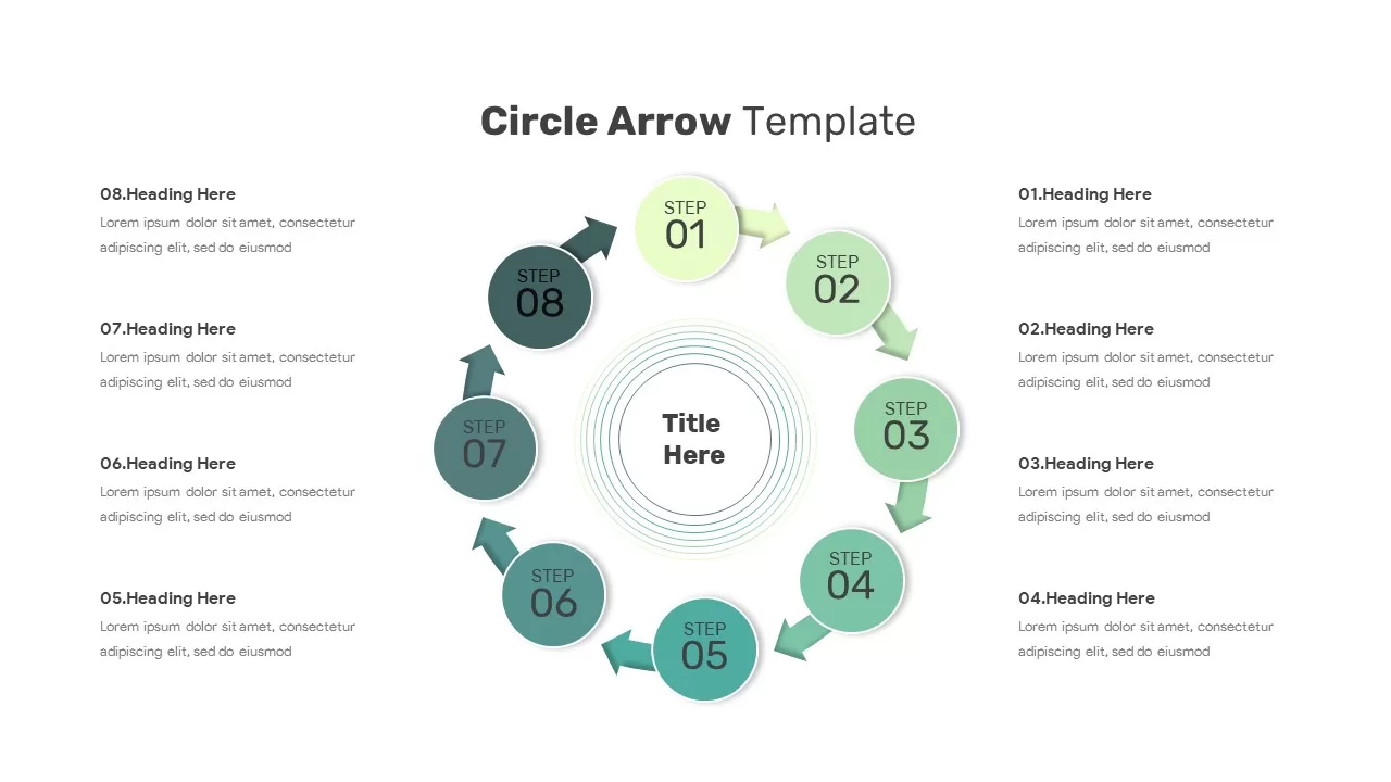
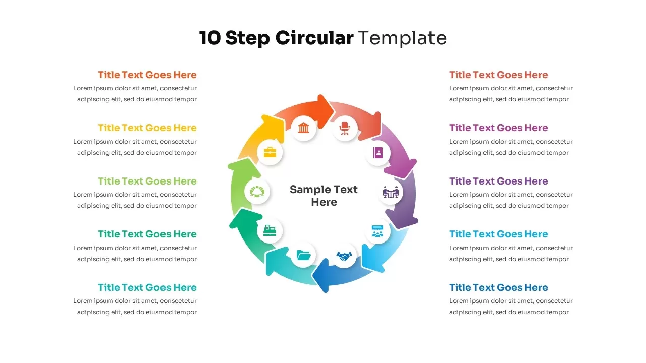
10-Step Circular Process Diagram Template for PowerPoint & Google Slides
Process
10 Step Circular Process Diagram Template for PowerPoint & Google Slides
Circular
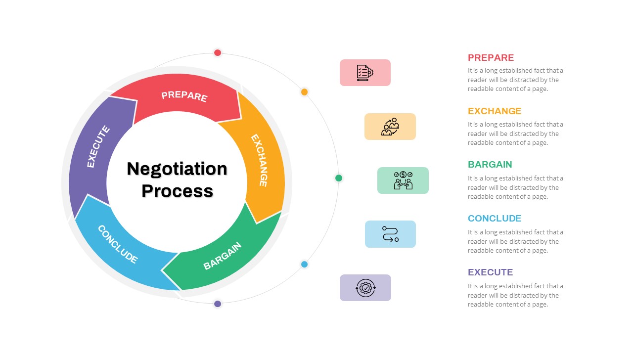
Negotiation Process Circular Diagram Template for PowerPoint & Google Slides
Circular
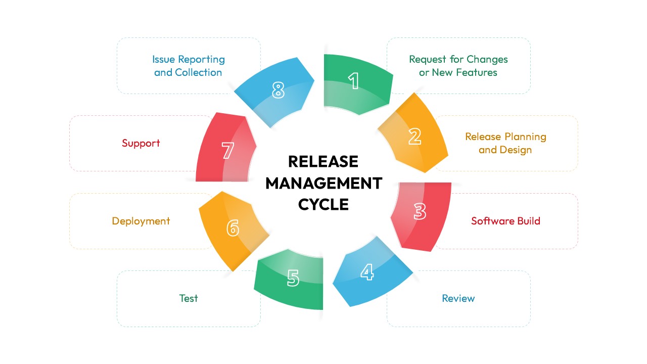
Release Management Cycle Circular Diagram Template for PowerPoint & Google Slides
Software Development
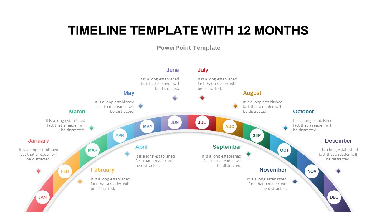
12-Month Semi-Circular Timeline Diagram Template for PowerPoint & Google Slides
Timeline
Multi-Variation Circular Chart Diagram Template for PowerPoint & Google Slides
Circular
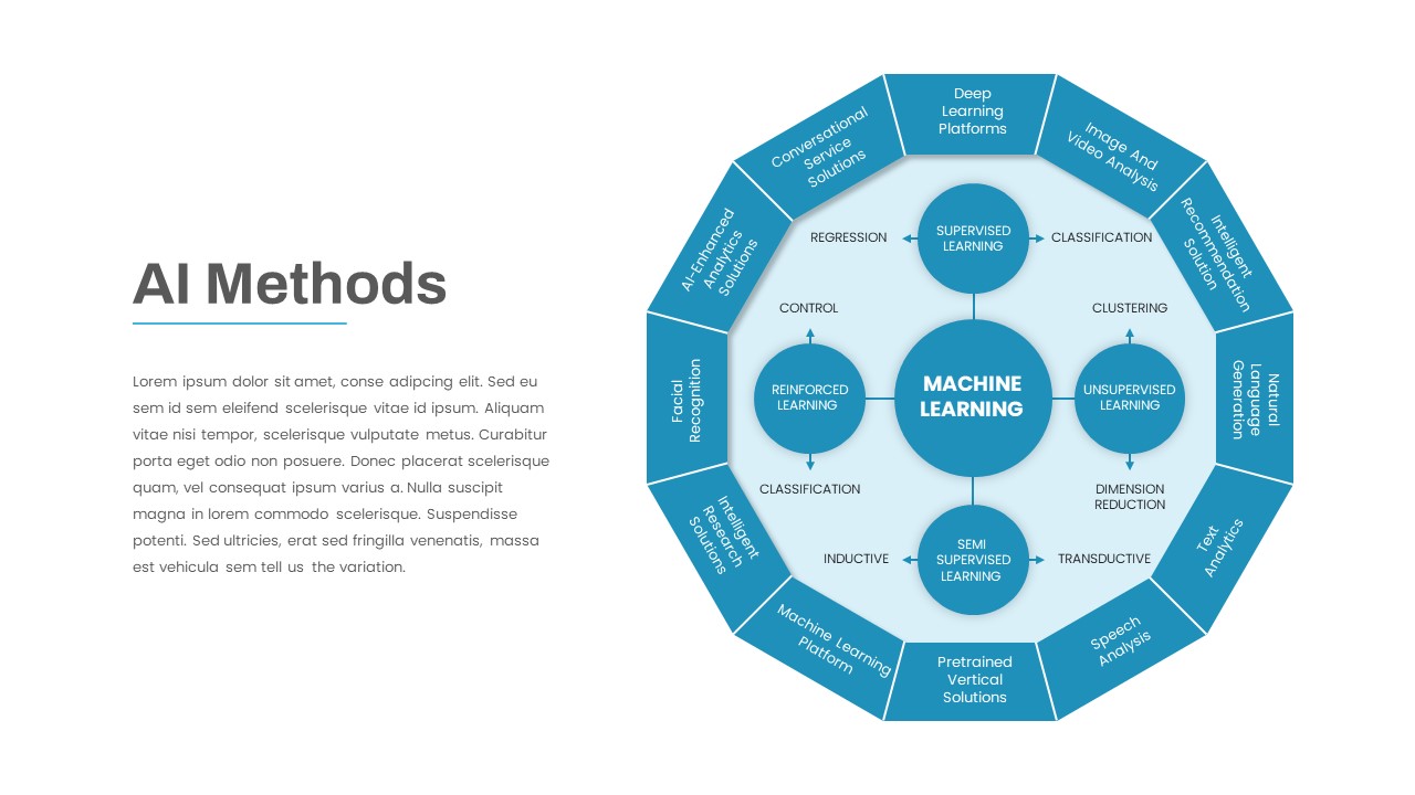
AI Methods Circular Diagram Slide Template for PowerPoint & Google Slides
AI
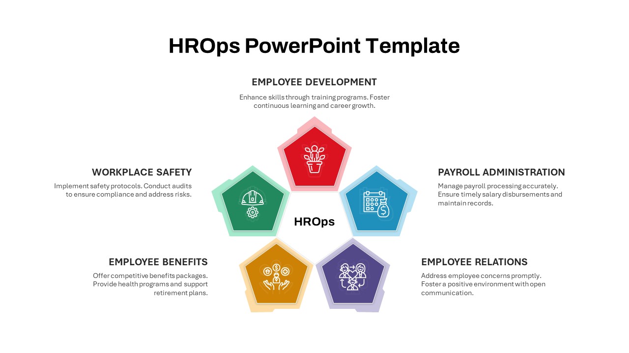
HROps Hub and Spoke Circular Diagram Template for PowerPoint & Google Slides
Circular
Entry Strategy Circular Diagram Template for PowerPoint & Google Slides
Circular
5Cs of Network Effect Circular Diagram Template for PowerPoint & Google Slides
Circular
Test Strategy Circular Diagram Template for PowerPoint & Google Slides
Circular
Circular Service Offering Diagram Template for PowerPoint & Google Slides
Circular
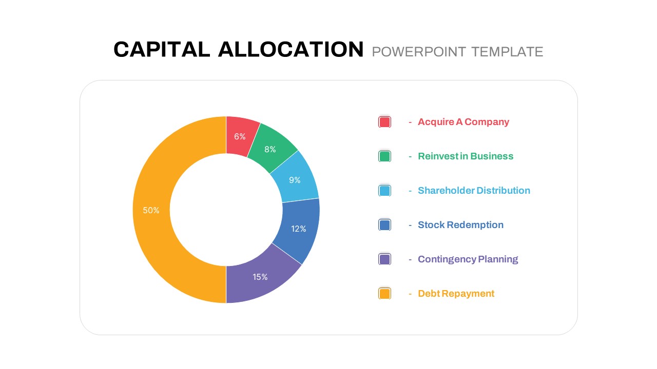
Circular Capital Allocation Diagram Template for PowerPoint & Google Slides
Business Models
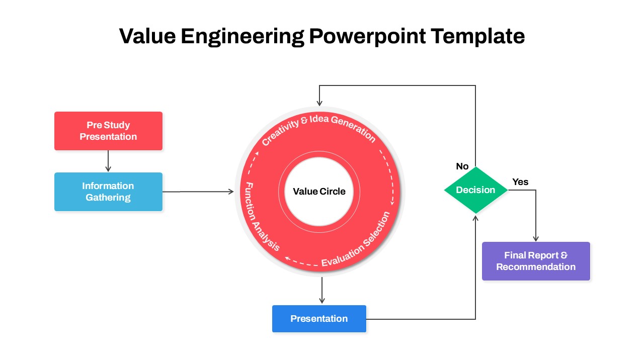
Circular Value Engineering Diagram Template for PowerPoint & Google Slides
Process
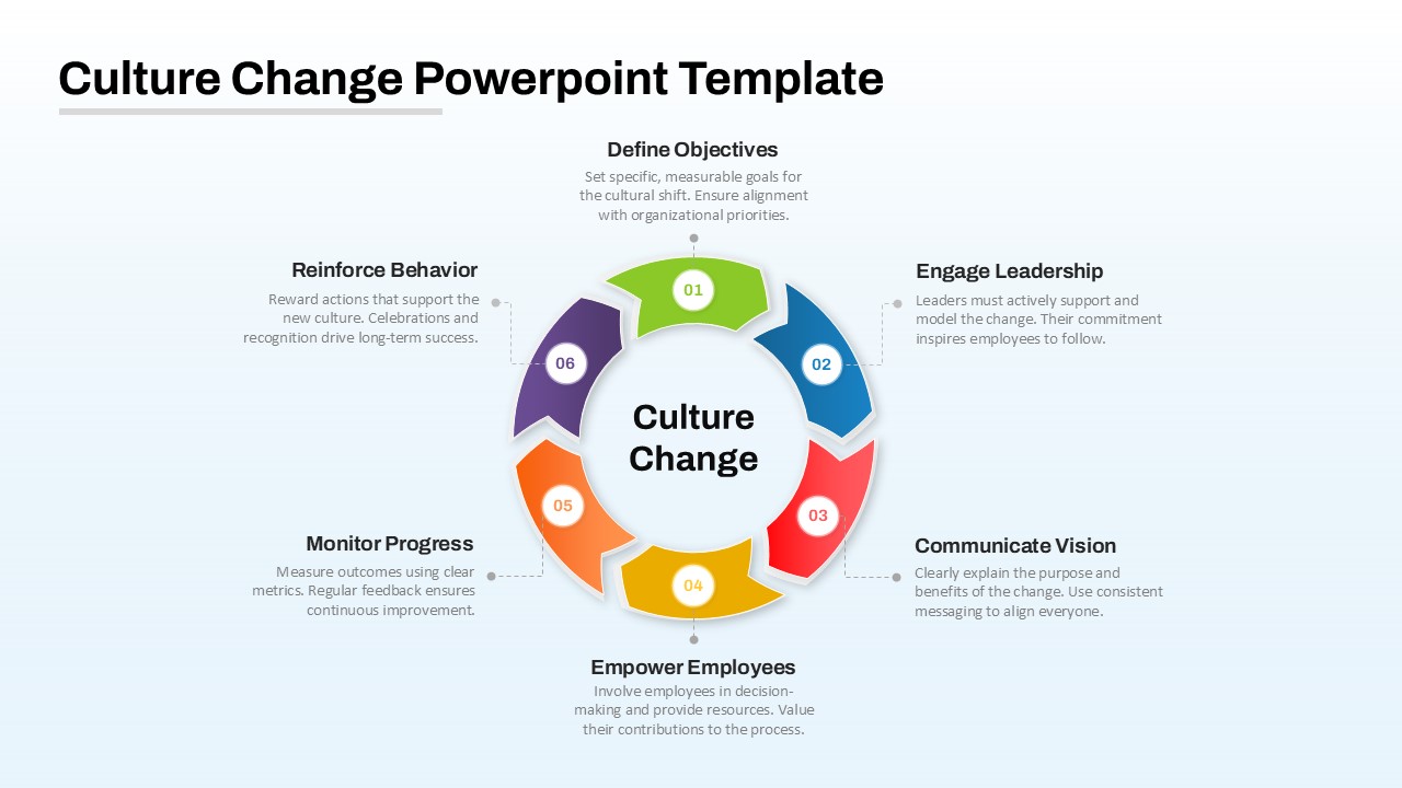
Culture Change Circular Process Diagram Template for PowerPoint & Google Slides
Process
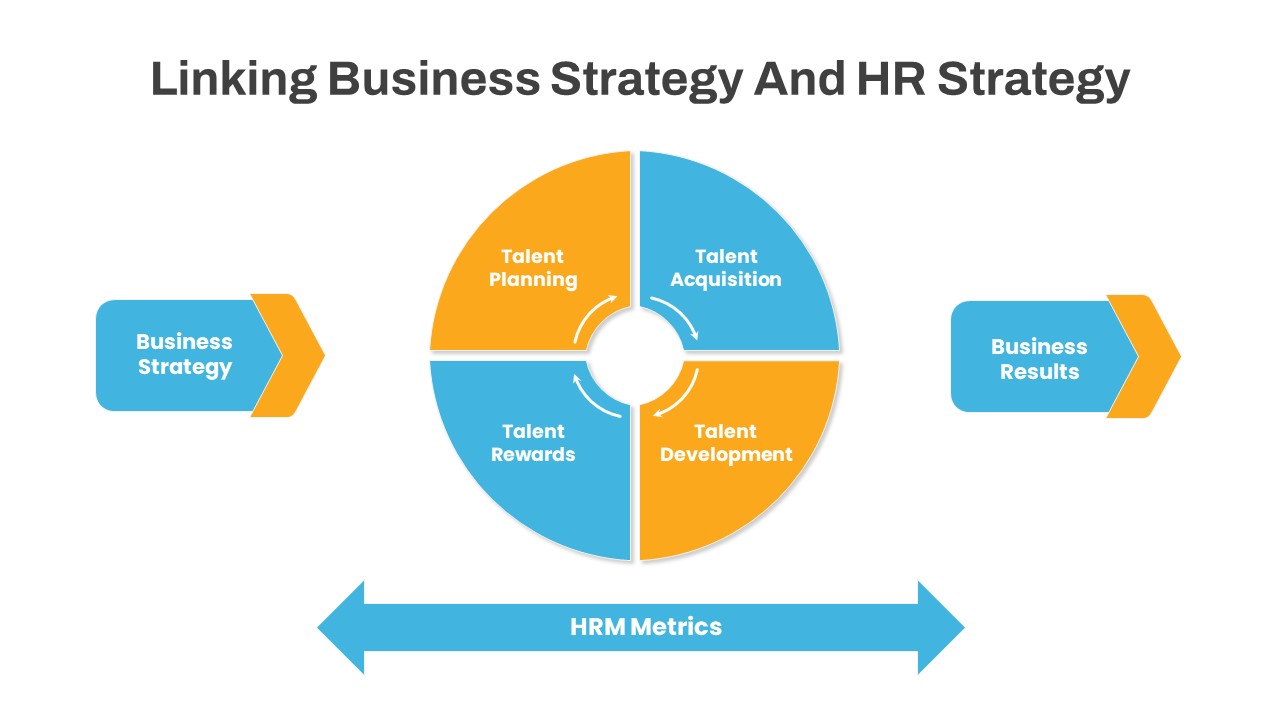
Linking Business HR Strategy Circular Diagram Template for PowerPoint & Google Slides
Business Strategy
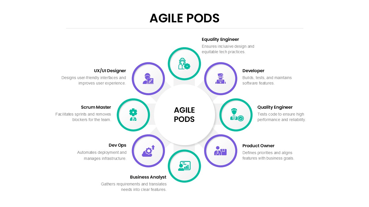
Agile Pods Team Roles Circular Diagram Template for PowerPoint & Google Slides
Circular
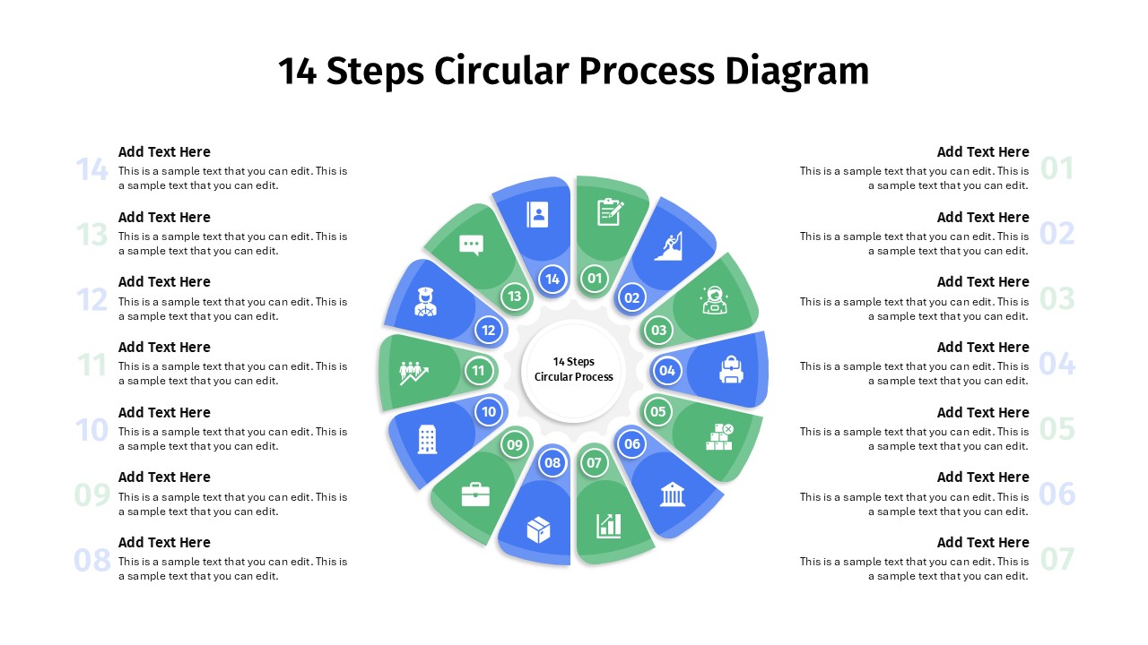
14 Steps Circular Process Diagram Template for PowerPoint & Google Slides
Circular
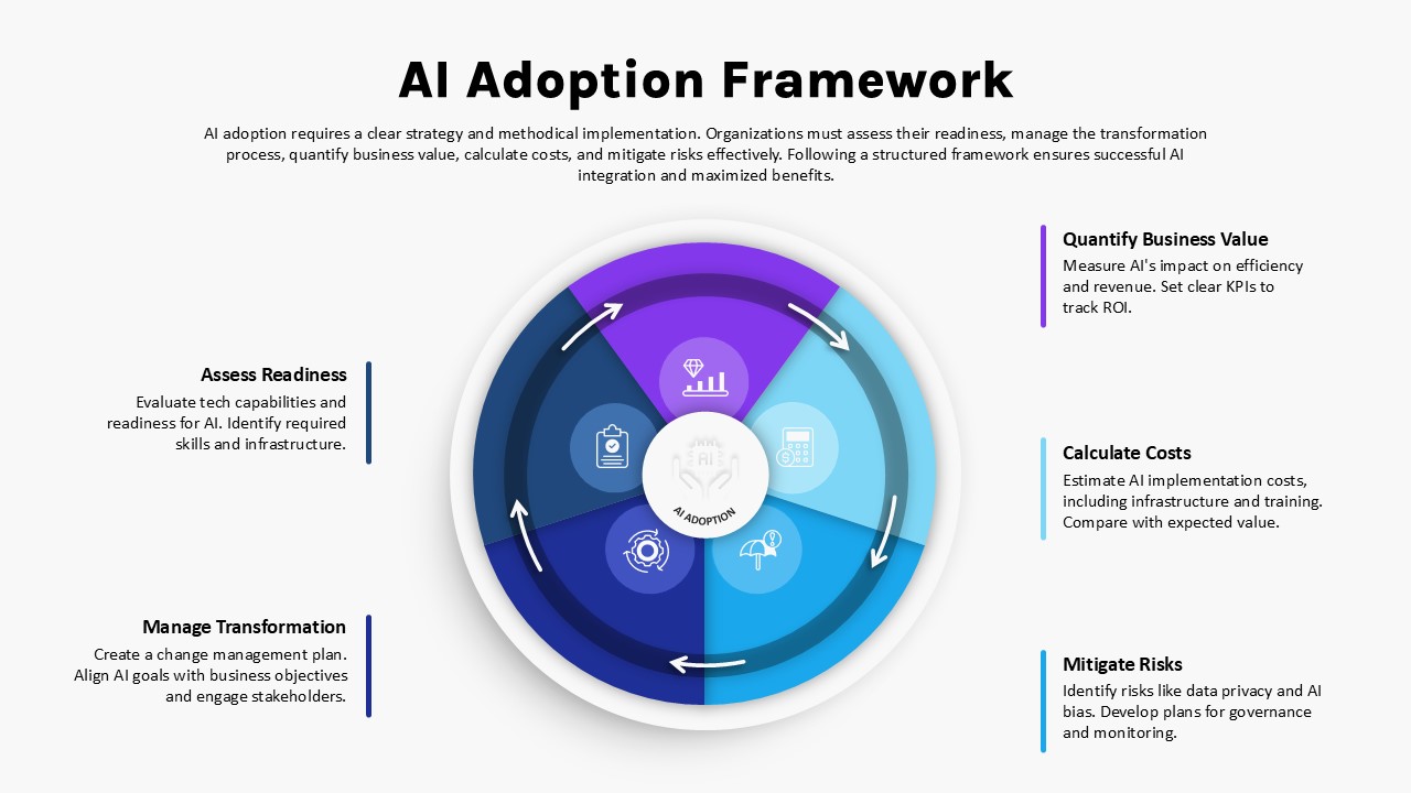
AI Adoption Framework Circular Diagram Template for PowerPoint & Google Slides
AI
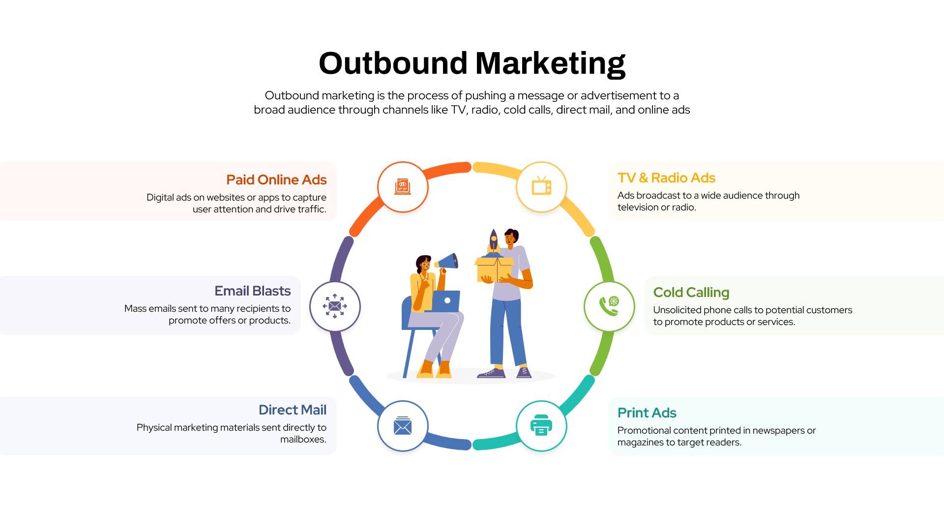
Outbound Marketing Circular Diagram Template for PowerPoint & Google Slides
Advertising
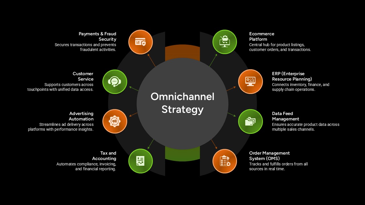
Omnichannel Strategy Circular Diagram Template for PowerPoint & Google Slides
Digital Marketing
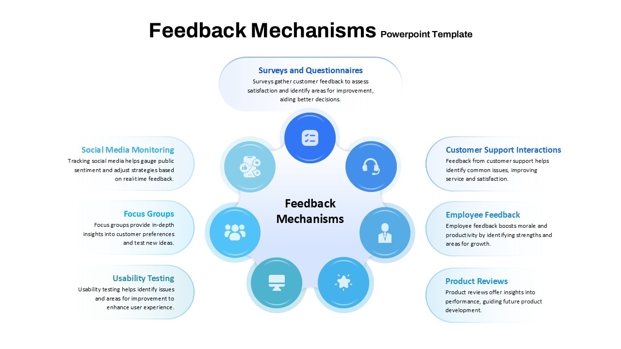
Feedback Mechanisms Circular Diagram Template for PowerPoint & Google Slides
Circular
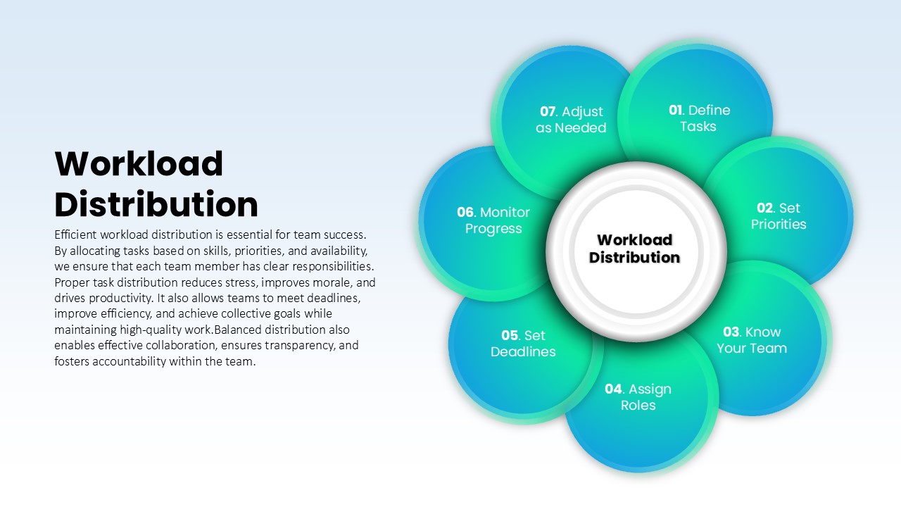
Workload Distribution Circular Diagram Template for PowerPoint & Google Slides
Circular
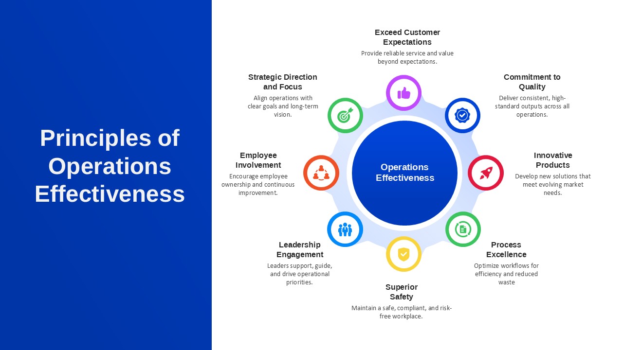
Principles of Operations Effectiveness Circular Diagram Template for PowerPoint & Google Slides
Leadership