Professional 100% Stacked Column Chart Template for PowerPoint & Google Slides


Description
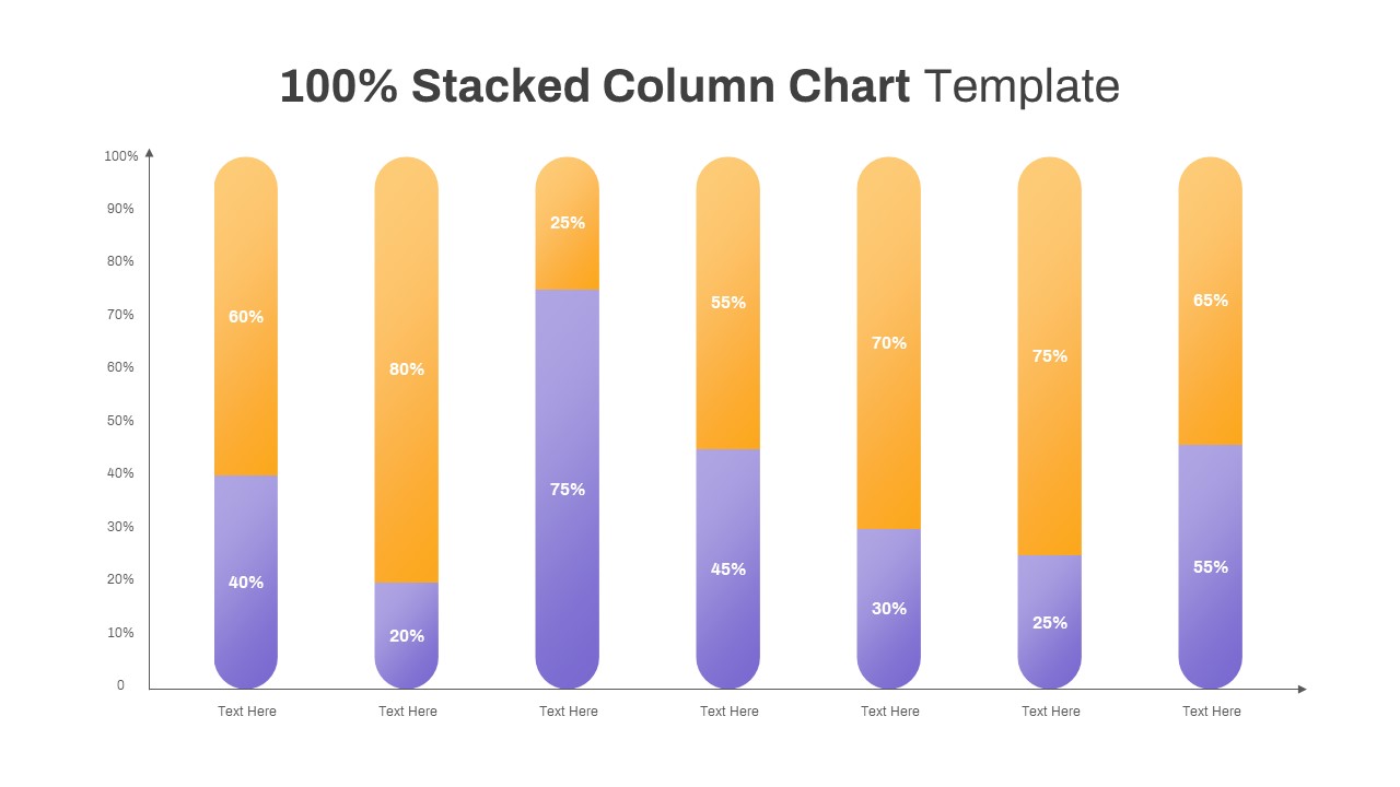
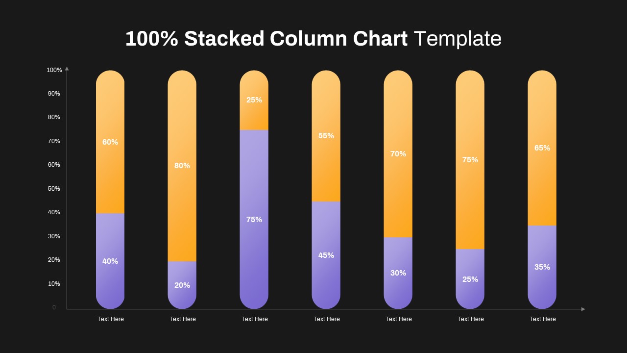
Leverage this 100% stacked column chart slide to illustrate proportional distributions across multiple categories with clarity and visual appeal. Each column features a smooth gradient fill transitioning from rich purple at the base to vibrant orange at the top, rounded caps, and bold white percentage labels embedded within each segment. The minimalist design positions the chart on a clean white canvas, complete with subtle vertical and horizontal axis lines, arrowheads, and customizable text placeholders for category names and data points.
Designed for data-driven presentations, this template leverages fully editable chart elements and master slides, enabling you to effortlessly update values, adjust color themes, switch out fonts to match your corporate identity, or integrate corporate logos and icons seamlessly. The slide’s intuitive placeholders and consistent layout streamline your design process, reduce formatting errors, and accelerate version control across PowerPoint & Google Slides.
Ideal for visualizing market share breakdowns, budget allocations, survey results, or performance metrics, this asset transforms complex numeric data into instantly digestible visuals. The stacked column format emphasizes relative proportions, facilitating quick comparisons across time periods, product lines, or demographic segments—perfect for boardroom briefings, executive reports, or stakeholder workshops.
With full resolution clarity on desktops, laptops, and projection systems, this slide ensures seamless delivery in any setting. Its scalable vector graphics maintain crisp lines and text at any size, while optional animation presets bring each series into focus one segment at a time. Whether you need to showcase distribution trends, resource utilizations, or KPI performance, this chart empowers you to communicate insights with impact and efficiency.
Compatible with both PowerPoint & Google Slides, this template includes layer-based .pptx and .gslides files, optimized for cloud collaboration and offline editing. Swap colors, resize charts, or convert to grayscale in seconds. The responsive layout automatically adapts when you add or remove data series, ensuring proportional accuracy without manual adjustments. Leverage this versatile slide across annual reviews, project kickoffs, or strategic planning sessions for consistent visual storytelling.
Who is it for
Data analysts, marketing managers, financial planners, and project leads will benefit from this flexible chart slide when presenting proportional data to stakeholders, executives, or cross-functional teams seeking visual clarity and efficient decision-making.
Other Uses
Besides corporate reports, repurpose this slide for educational presentations, sales pipeline breakdowns, social media engagement metrics, human resources headcount analysis, or any scenario requiring clear proportion comparisons. Duplicate and resize segments to tailor to your specific narrative.
Login to download this file

Item ID
SB03620
Related Templates

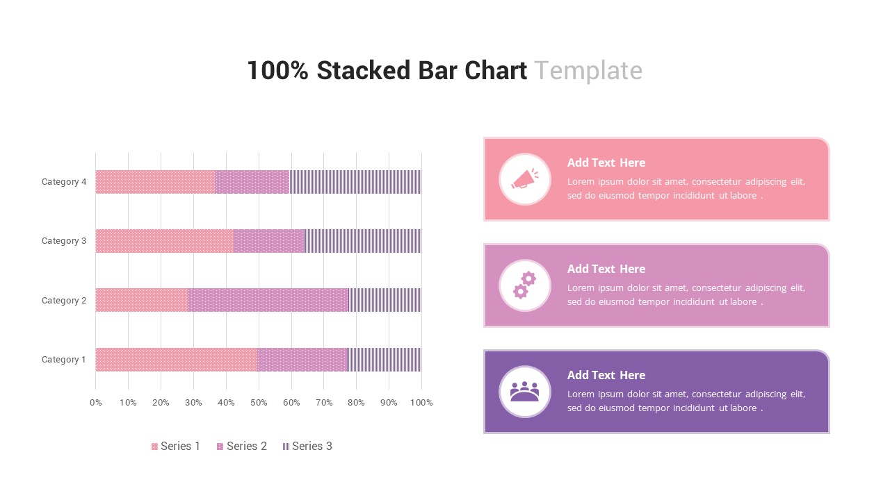
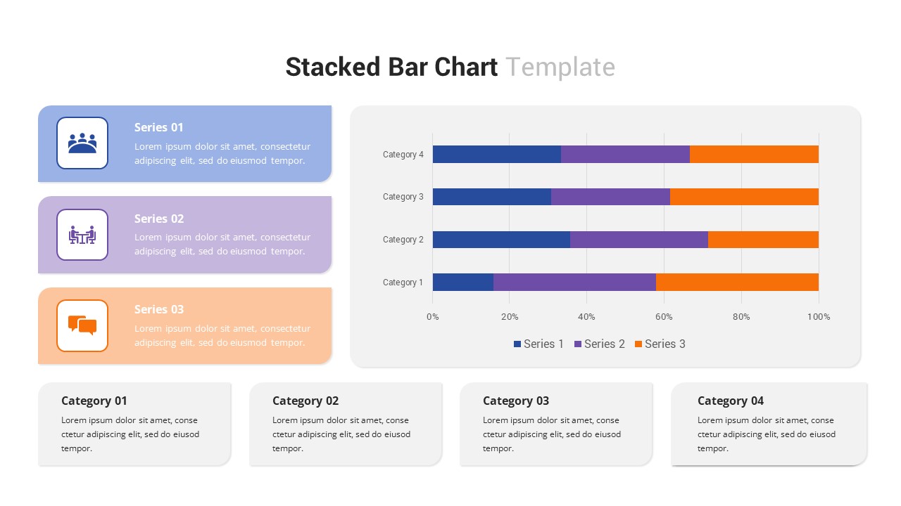
100% Stacked Bar Chart for PowerPoint & Google Slides
Bar/Column
Free Stacked Column Chart Data Visualization Template for PowerPoint & Google Slides
Bar/Column
Free
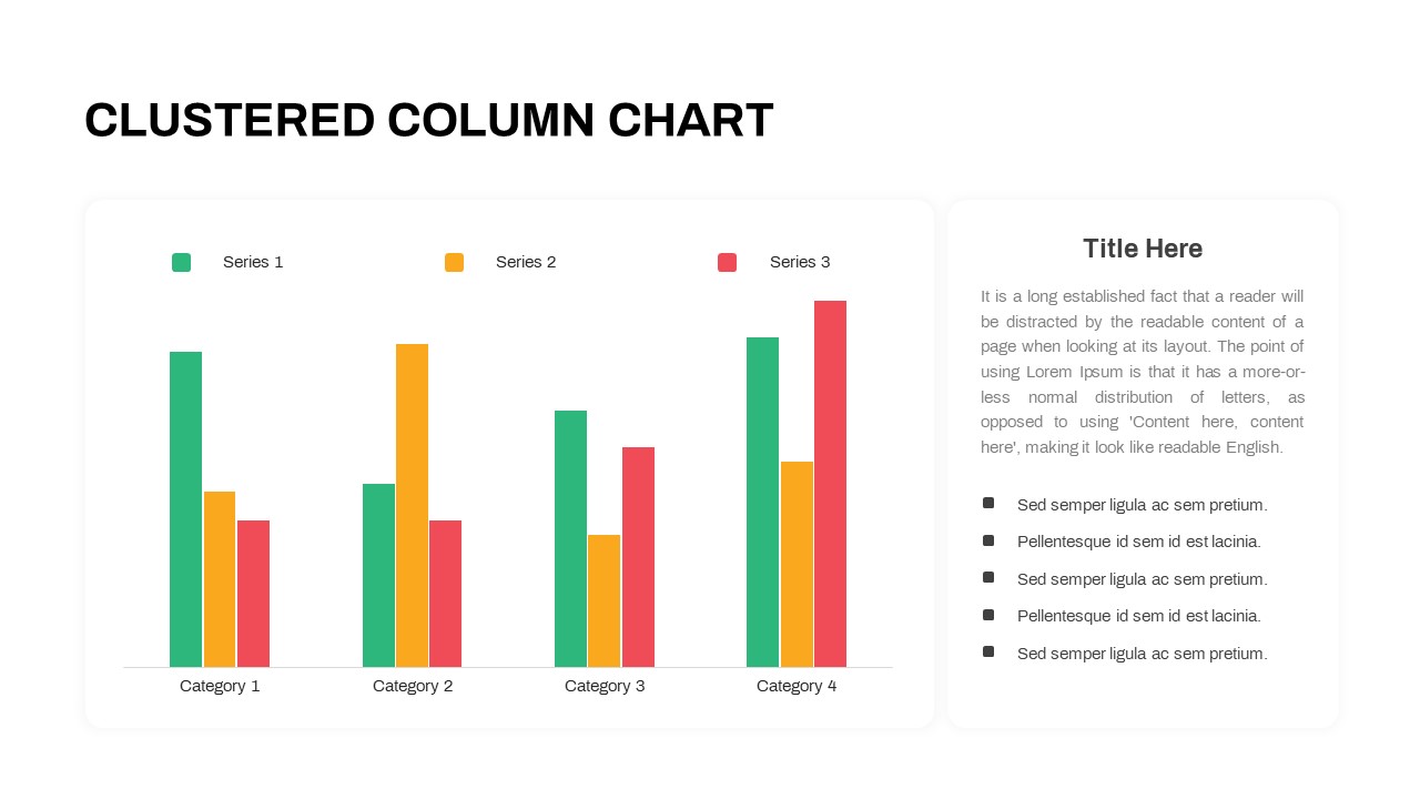
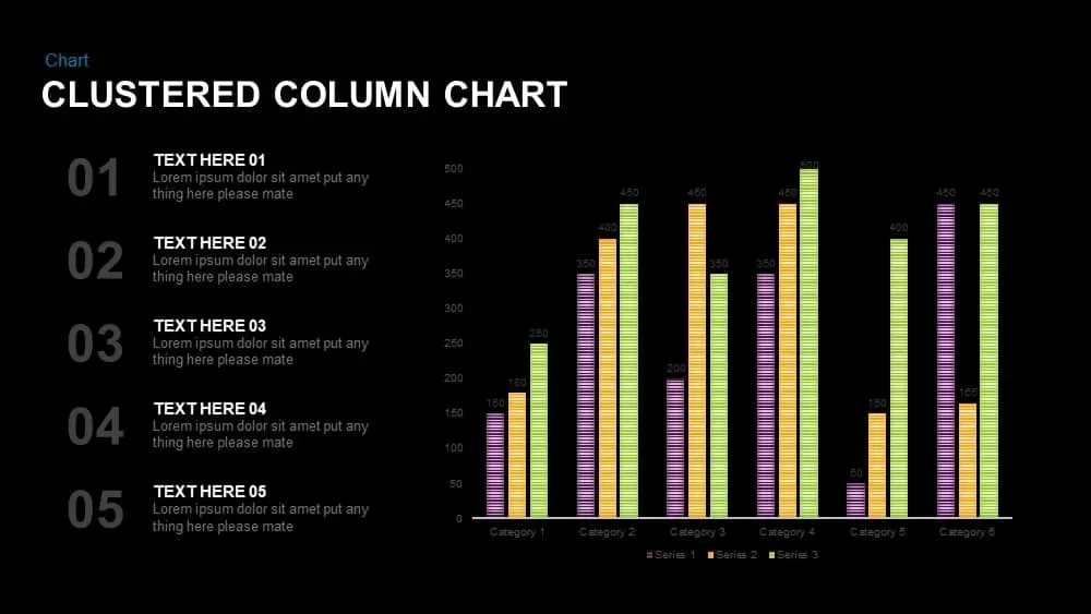
Professional Clustered Column Chart Template for PowerPoint & Google Slides
Bar/Column
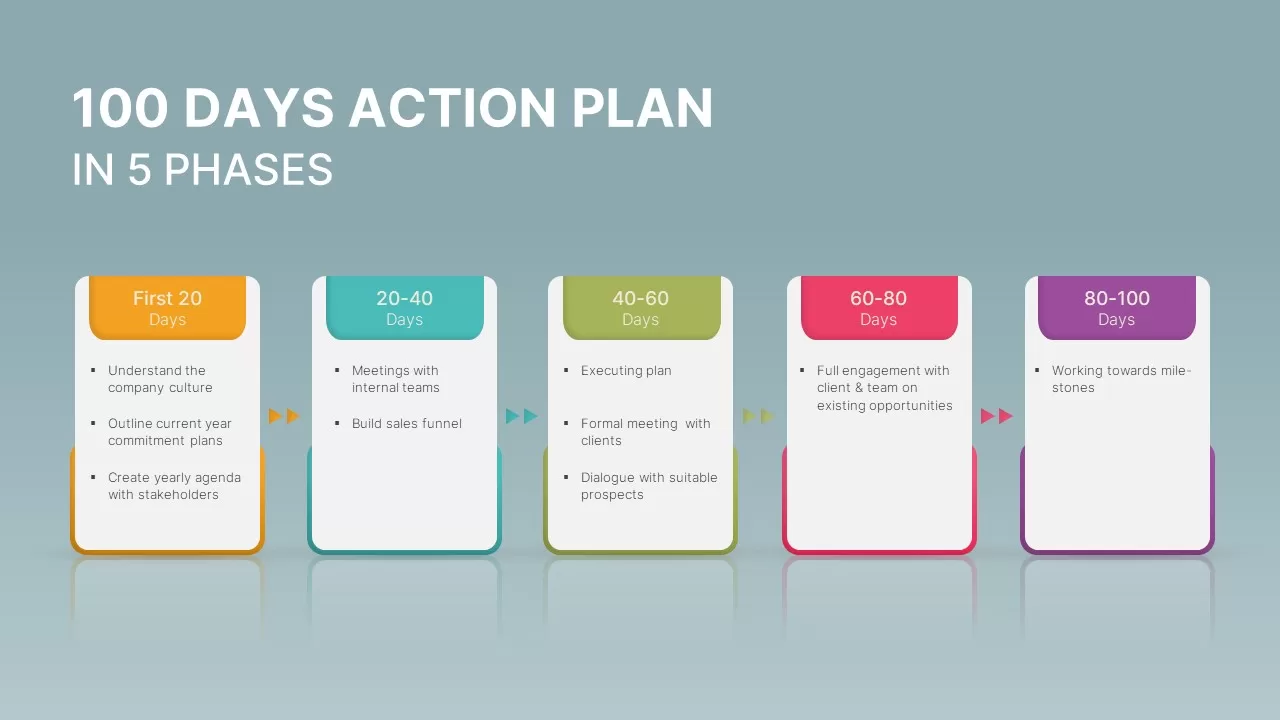
100 Days Action Plan in 5 Phases Template for PowerPoint & Google Slides
Business Plan
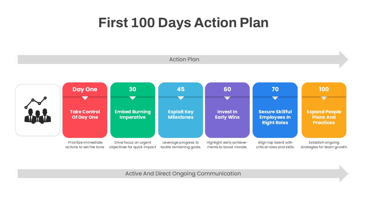
First 100 Days Action Plan Infographic Template for PowerPoint & Google Slides
Timeline
Multi-Series Stacked Bar Chart Template for PowerPoint & Google Slides
Bar/Column
Animated Stacked Bar Chart Template for PowerPoint & Google Slides
Bar/Column
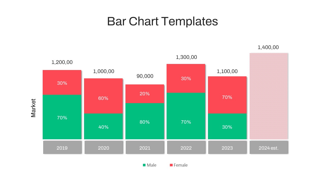
Year-over-Year Stacked Gender Bar Chart Template for PowerPoint & Google Slides
Bar/Column
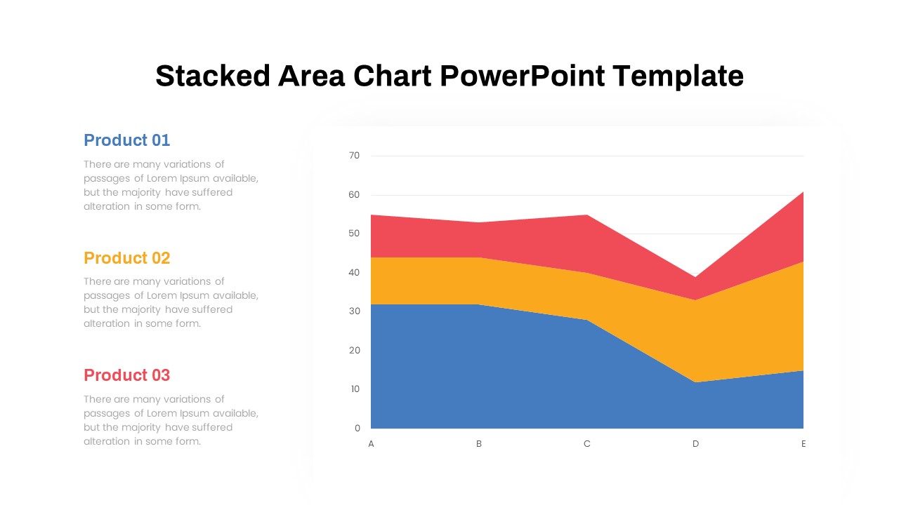
Dynamic Three-Series Stacked Area Chart Template for PowerPoint & Google Slides
Comparison Chart
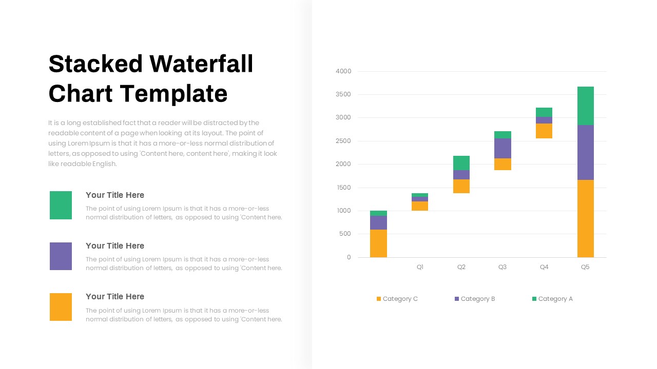
Stacked Waterfall Chart Template for PowerPoint & Google Slides
Bar/Column
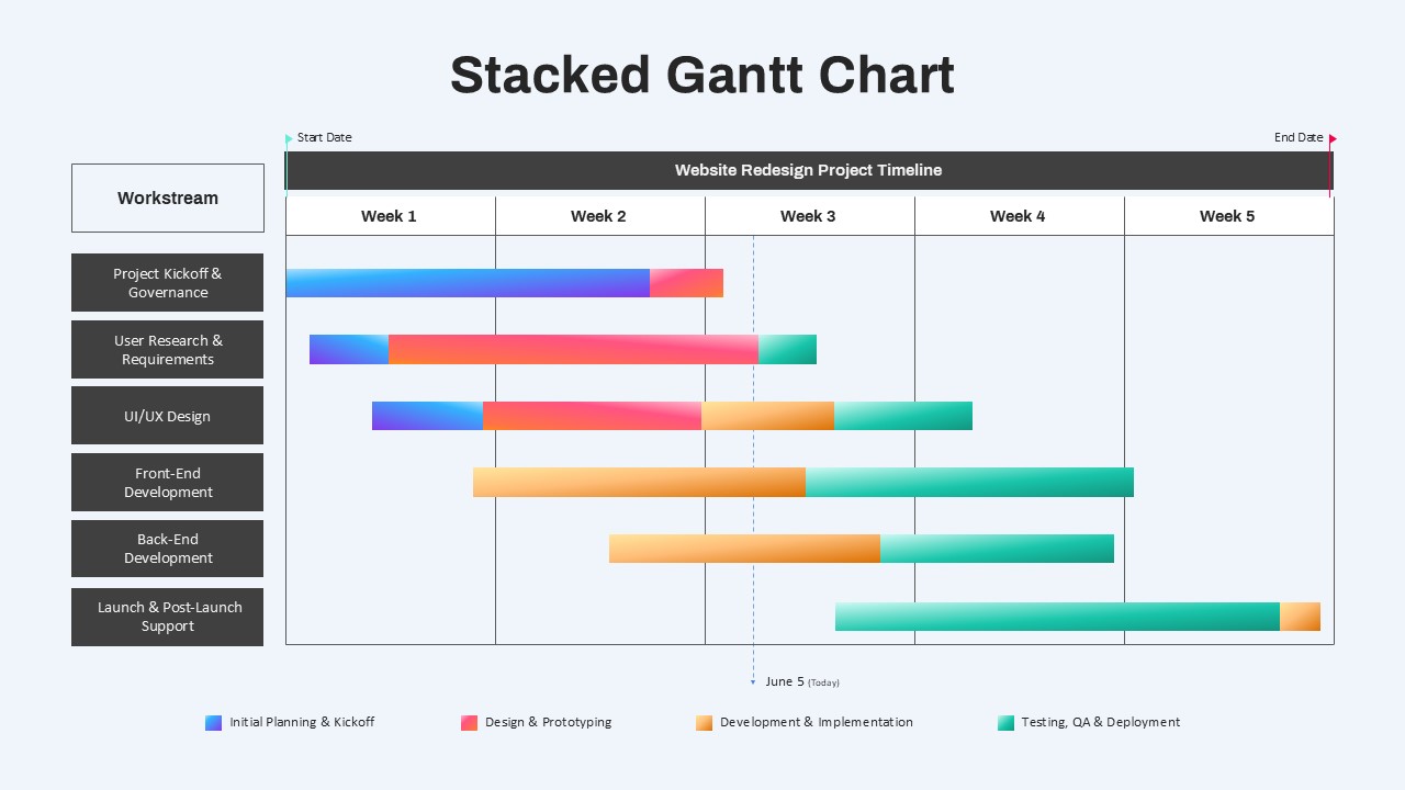
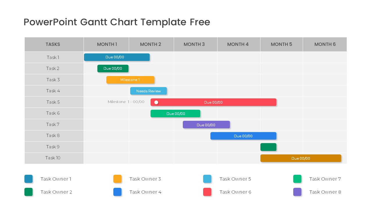
Stacked Gantt Chart Timeline Slide Template for PowerPoint & Google Slides
Gantt Chart
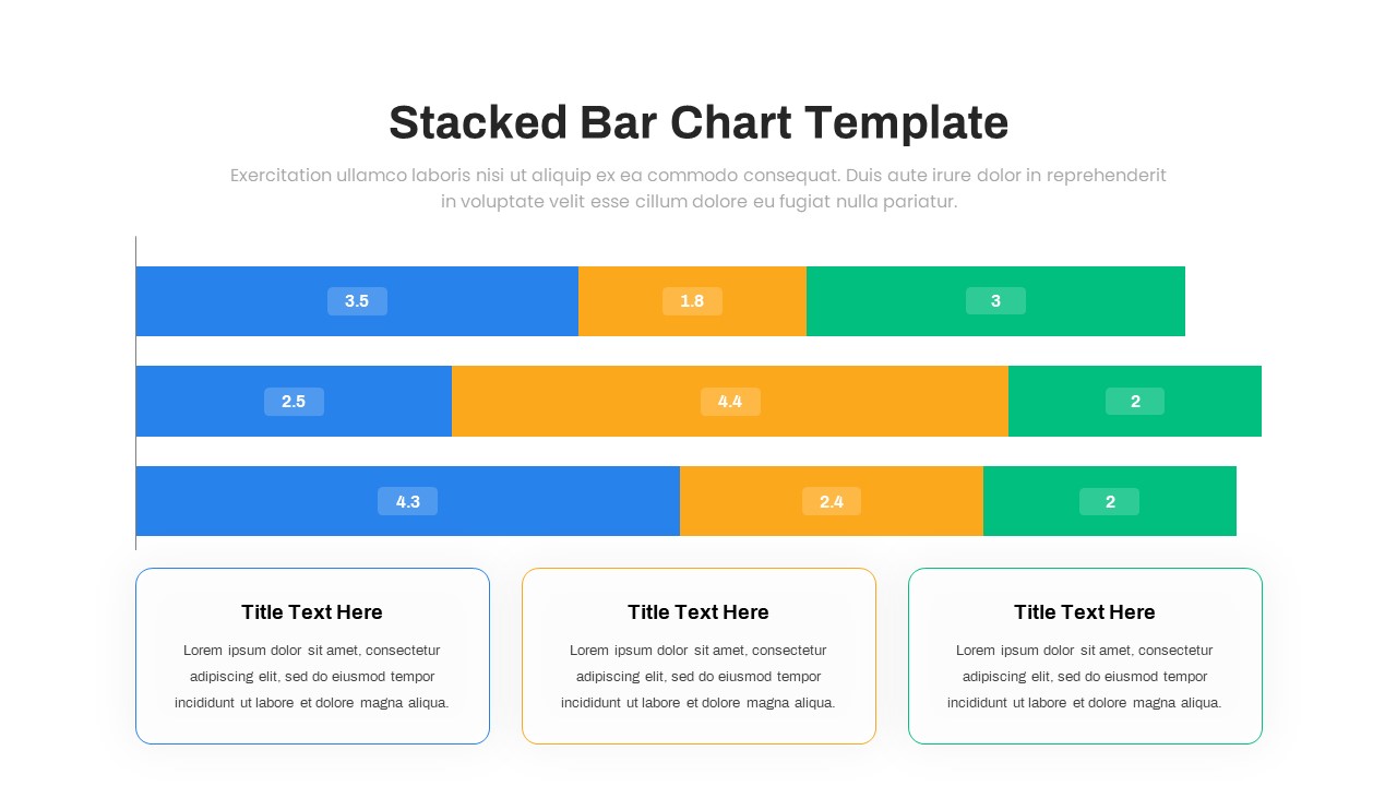
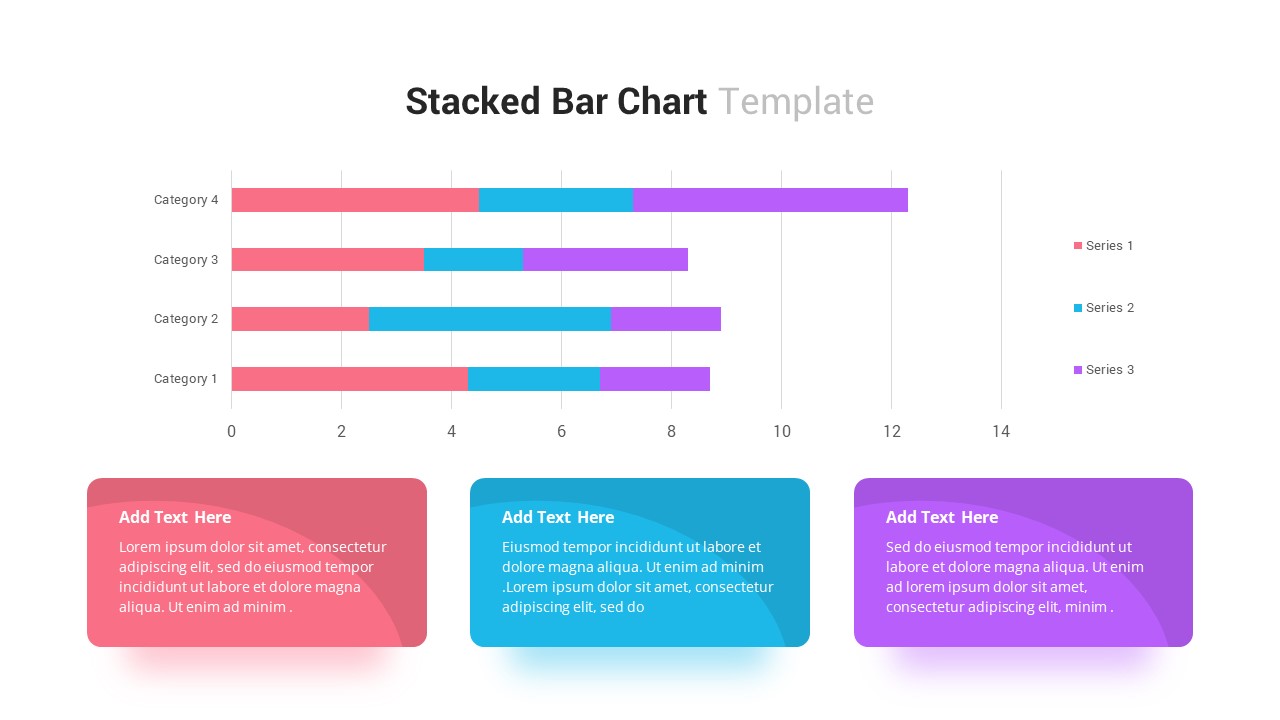
Stacked Bar Chart for PowerPoint & Google Slides
Bar/Column
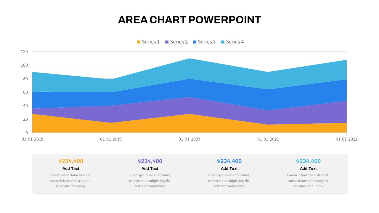
Stacked Area Chart with Financial Highlights for PowerPoint & Google Slides
Finance
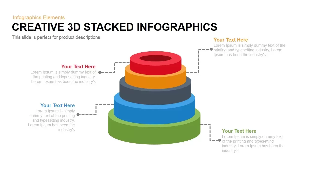
3D Stacked Infographic Layers Data Template for PowerPoint & Google Slides
Pyramid

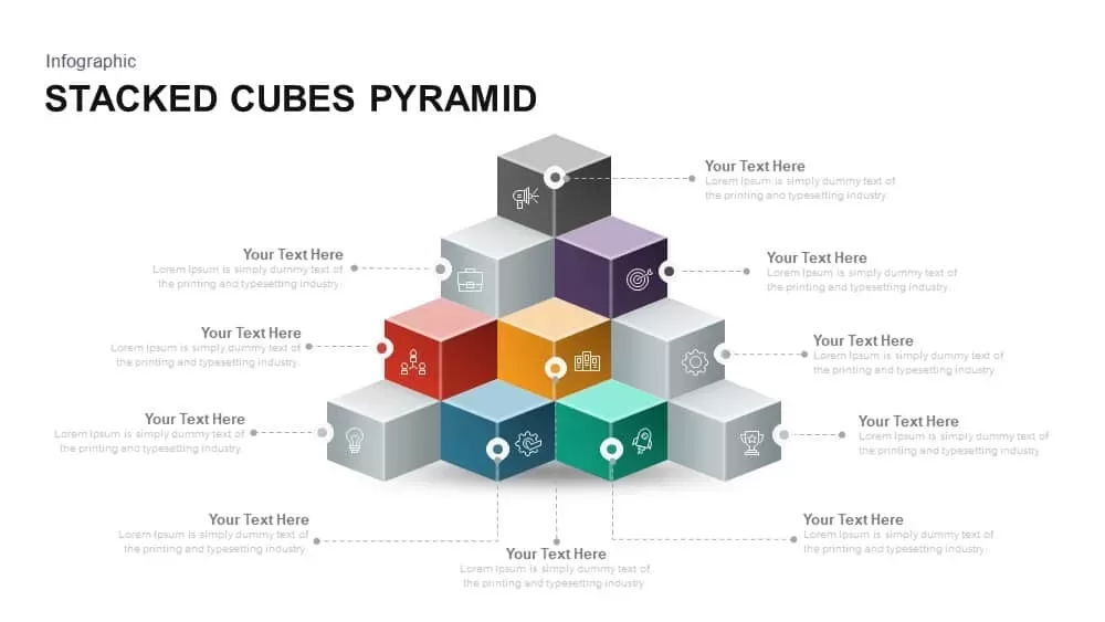
Stacked Cubes Pyramid Infographic Template for PowerPoint & Google Slides
Pyramid
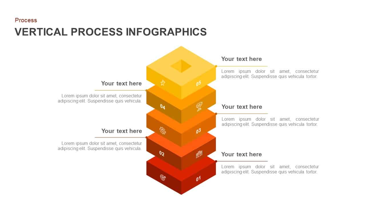
Vertical Stacked Process Infographic Template for PowerPoint & Google Slides
Process
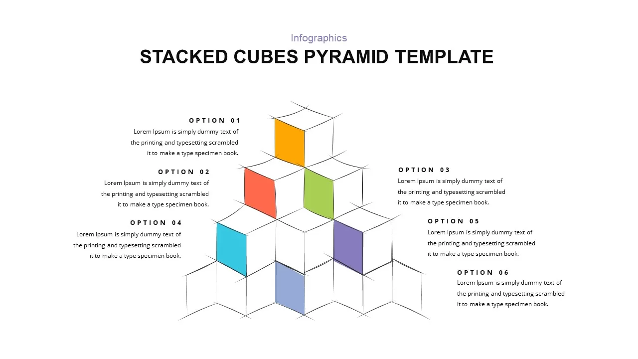
Stacked Cubes Pyramid Six-Option Diagram Template for PowerPoint & Google Slides
Pyramid
Elegant Stacked Photo Collage Layout Template for PowerPoint & Google Slides
Graphics
Free Professional Gantt Chart Pack – 4 Slides Template for PowerPoint & Google Slides
Gantt Chart
Free
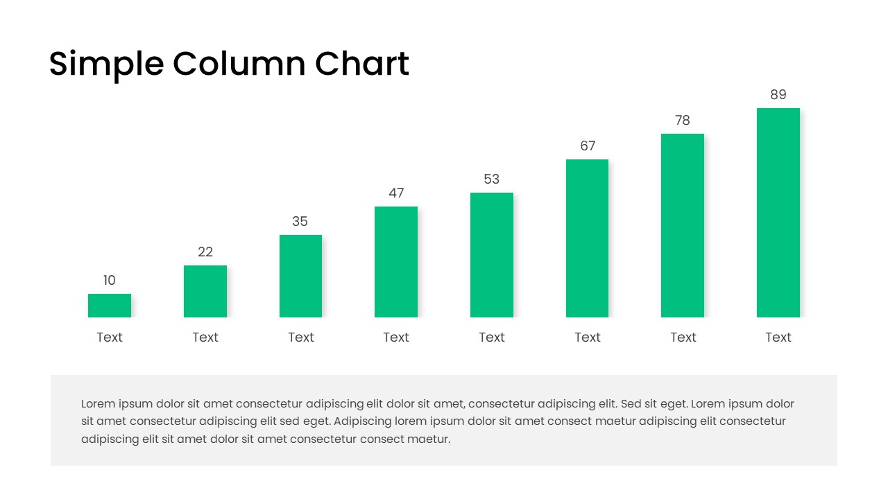
Free Editable Simple Column Chart Slide Template for PowerPoint & Google Slides
Bar/Column
Free
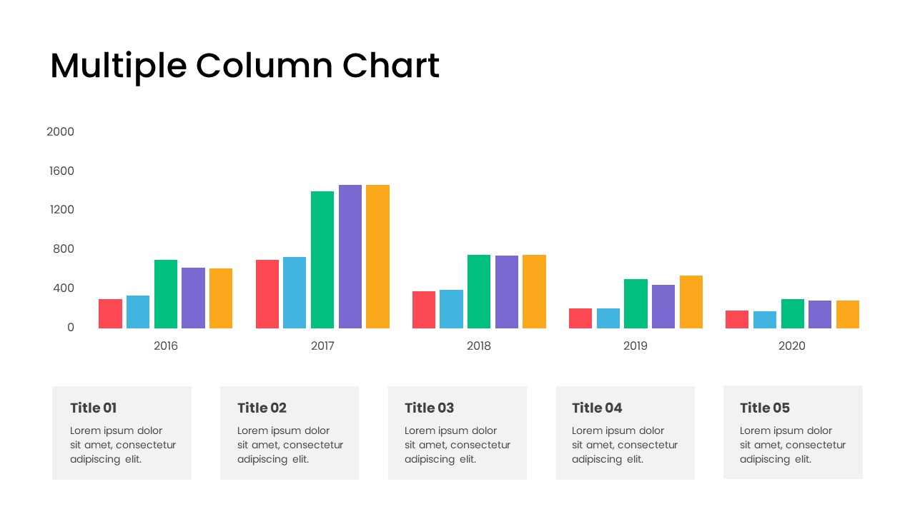
Minimal Multi-Year Column Chart Template for PowerPoint & Google Slides
Bar/Column
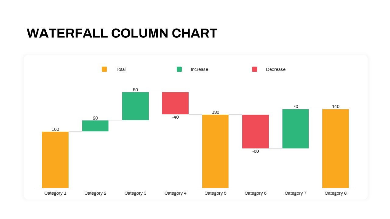
Waterfall Column Chart Analysis Template for PowerPoint & Google Slides
Bar/Column
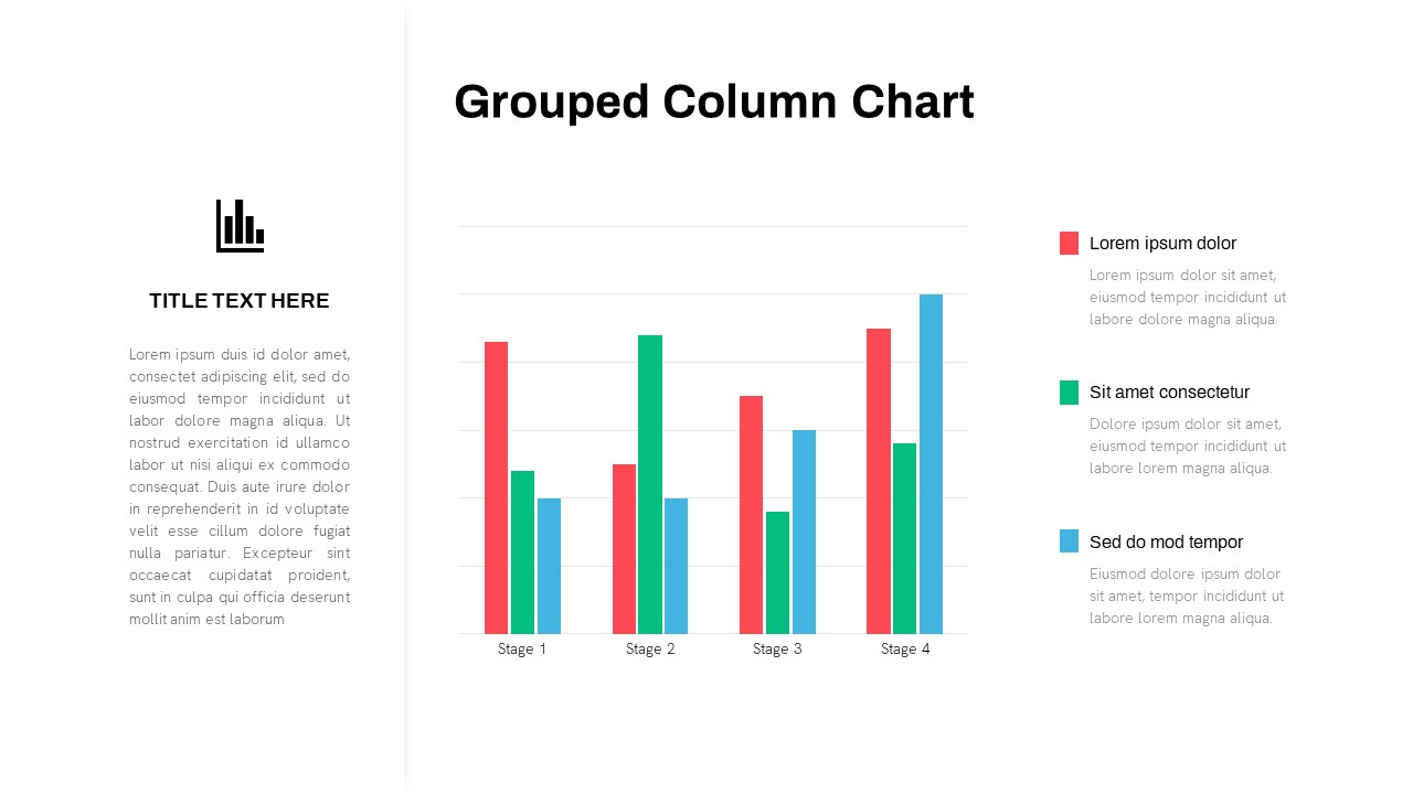
Grouped Column Chart Comparison Template for PowerPoint & Google Slides
Bar/Column
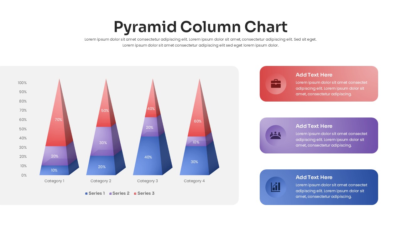
3D Pyramid Column Chart Infographic Template for PowerPoint & Google Slides
Bar/Column

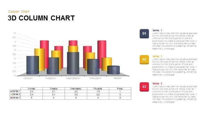
3D Column Chart with Data Table for PowerPoint & Google Slides
Bar/Column
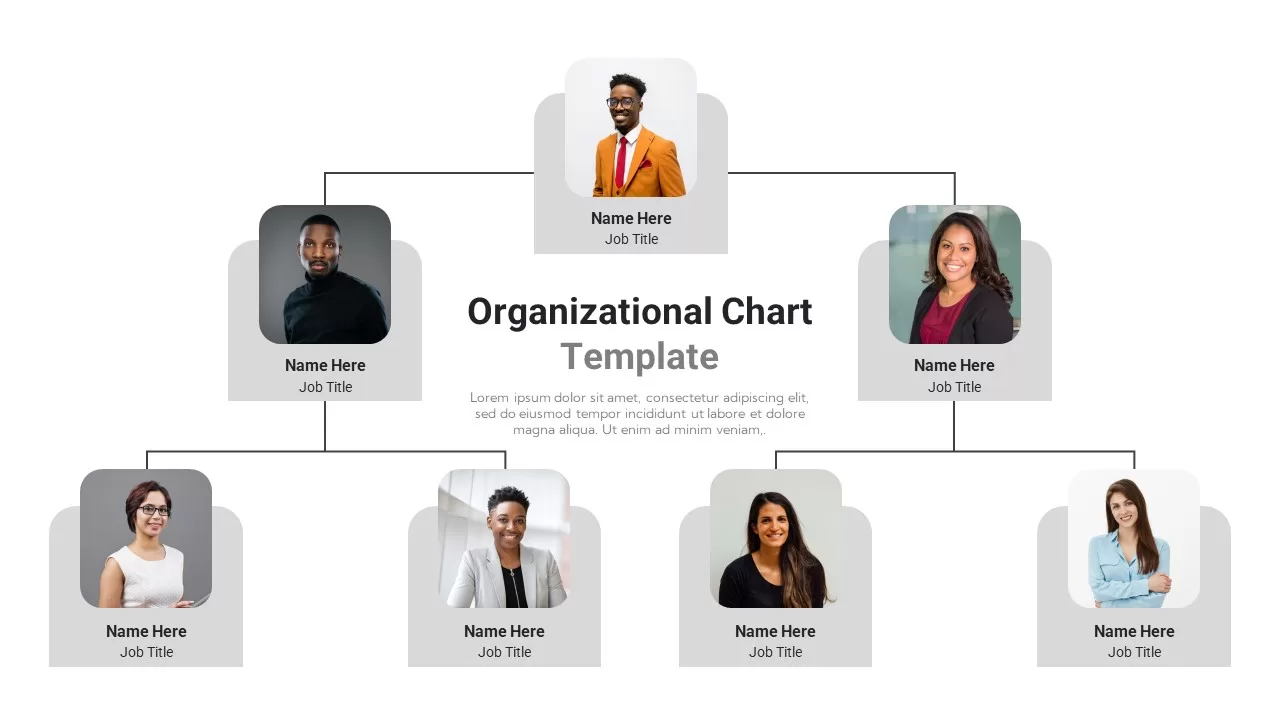
Professional Organizational Chart Diagram Template for PowerPoint & Google Slides
Org Chart
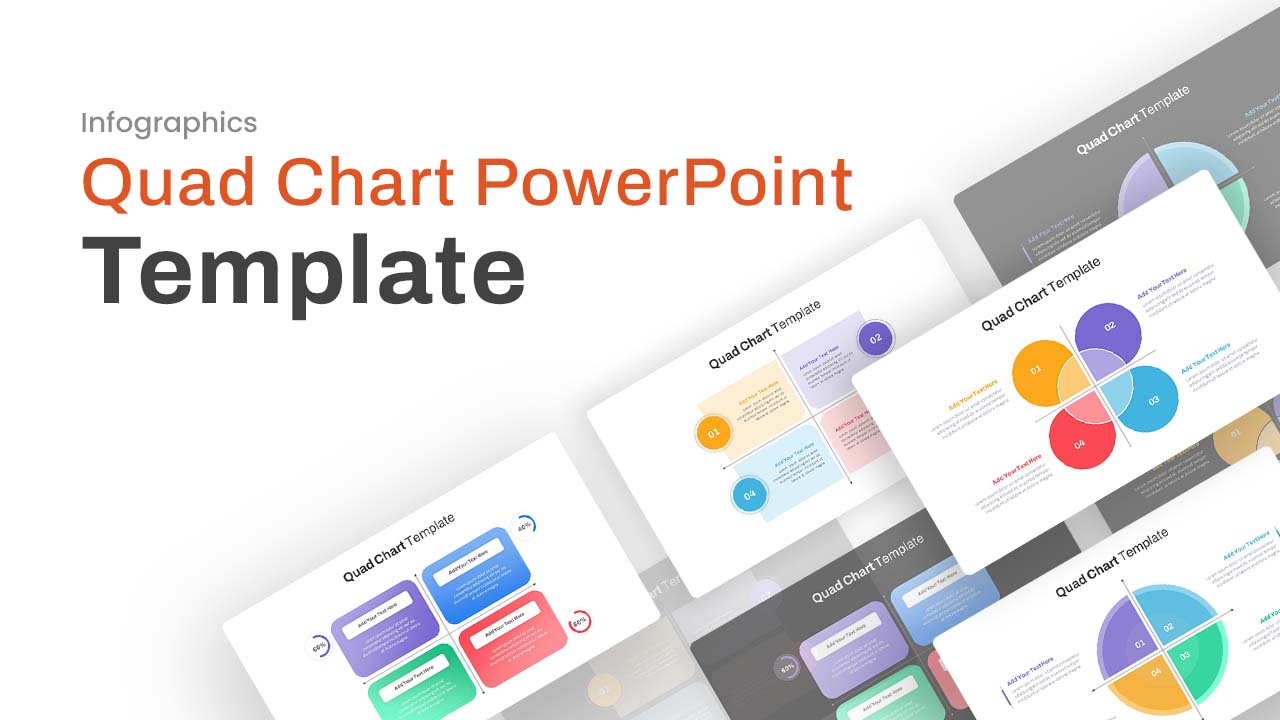
Professional Quad Chart Layout Template for PowerPoint & Google Slides
Pie/Donut
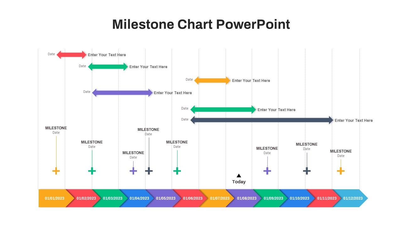
Professional Milestone Timeline Chart Template for PowerPoint & Google Slides
Timeline
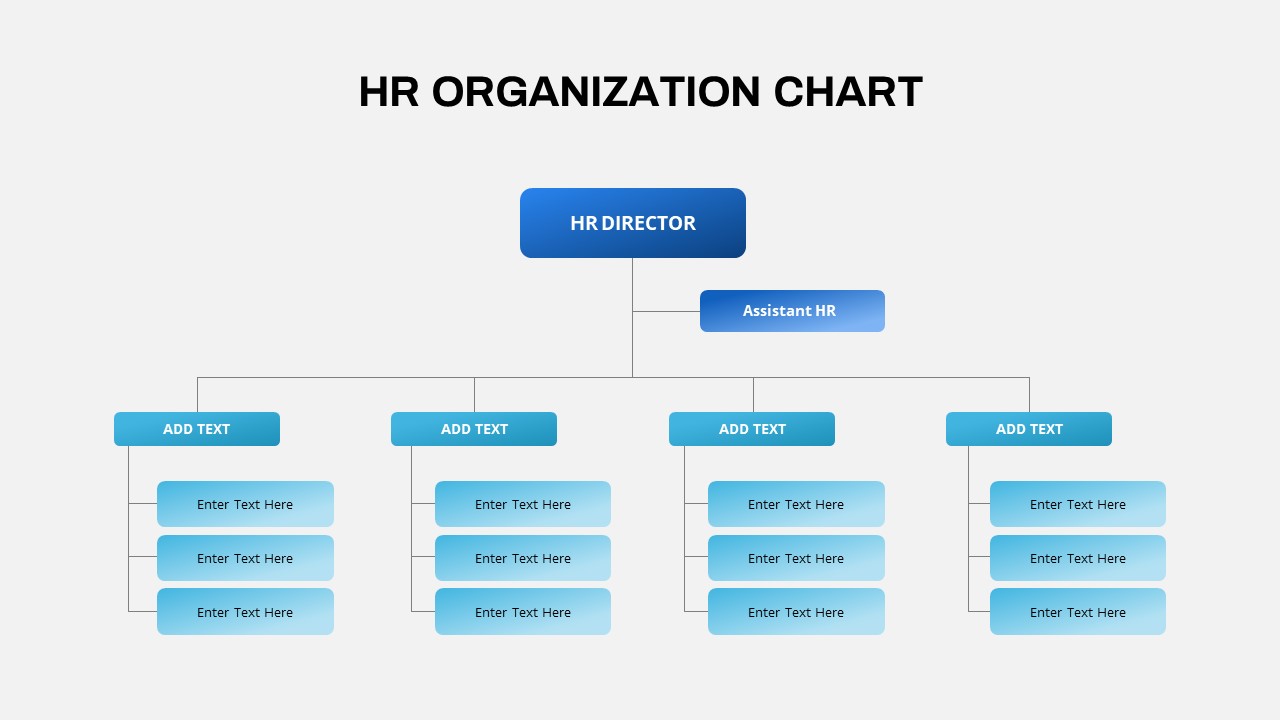
Professional HR Organization Chart Template for PowerPoint & Google Slides
Org Chart
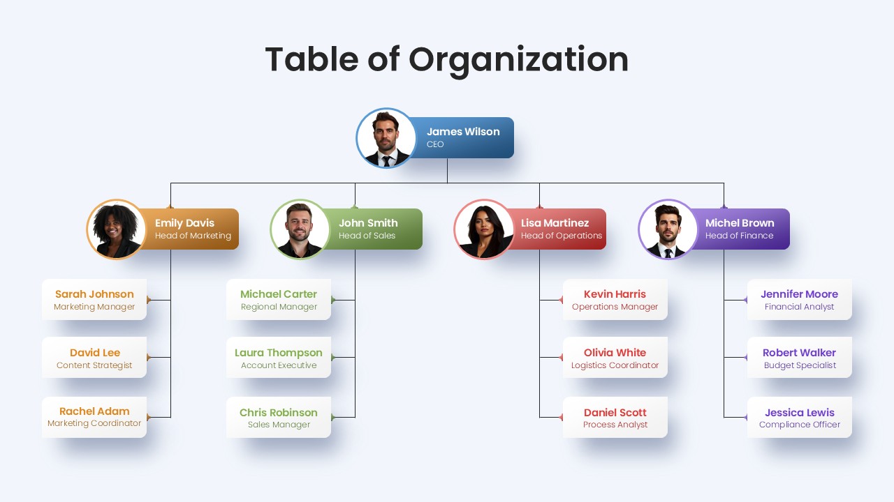
Professional Table of Organization Chart Template for PowerPoint & Google Slides
Org Chart
Clustered Column Chart Data Analysis Template for PowerPoint
Bar/Column
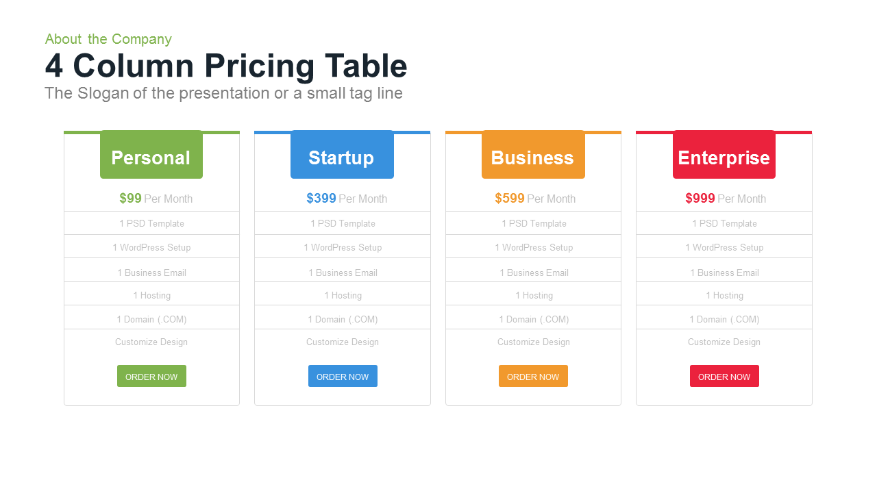
4 Column Pricing template for PowerPoint & Google Slides
Comparison
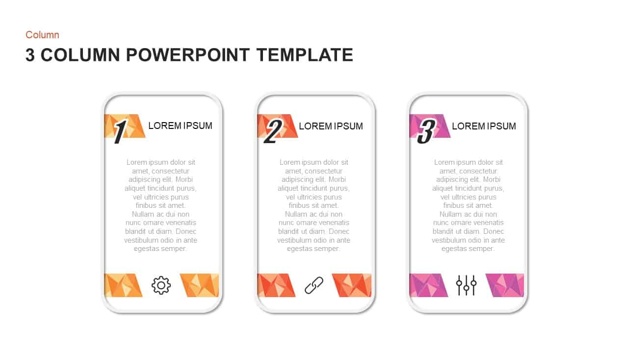
3-Column Comparison template for PowerPoint & Google Slides
Comparison
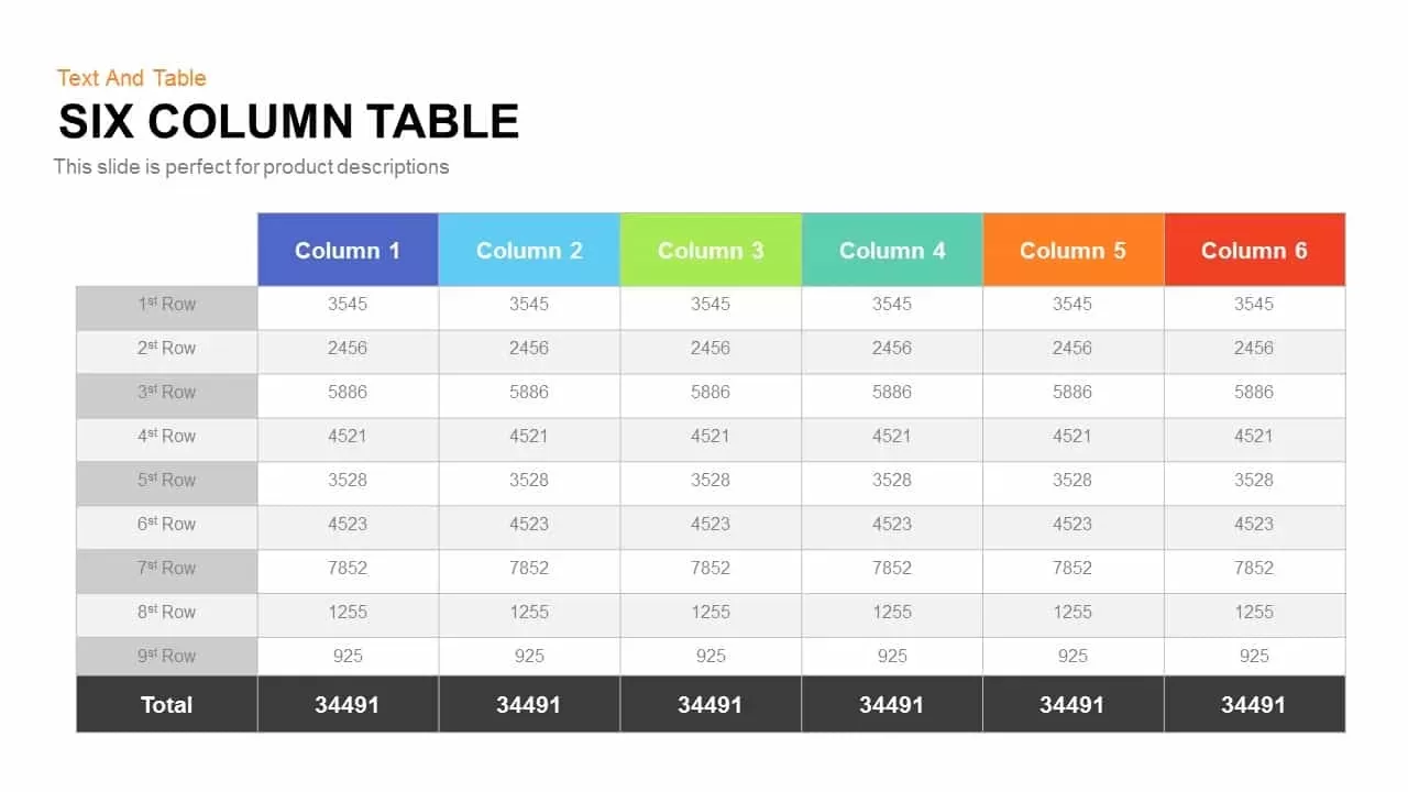
Six Column Table template for PowerPoint & Google Slides
Table
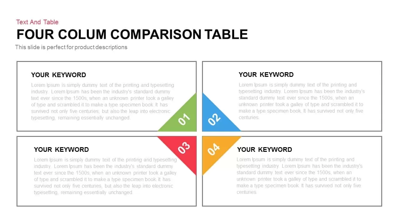
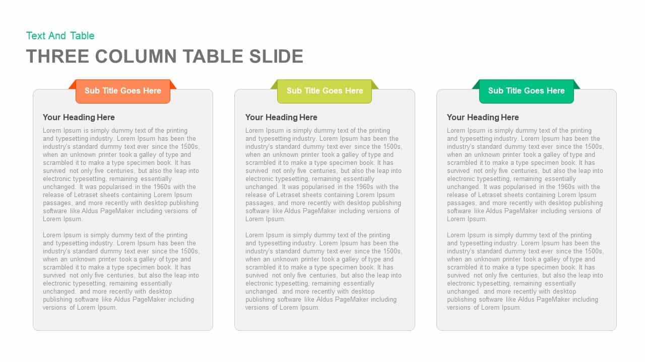
Clean Three-Four Column Table Slide Template for PowerPoint & Google Slides
Business Report
Three and Four-Column Card Layout Template for PowerPoint & Google Slides
Infographics
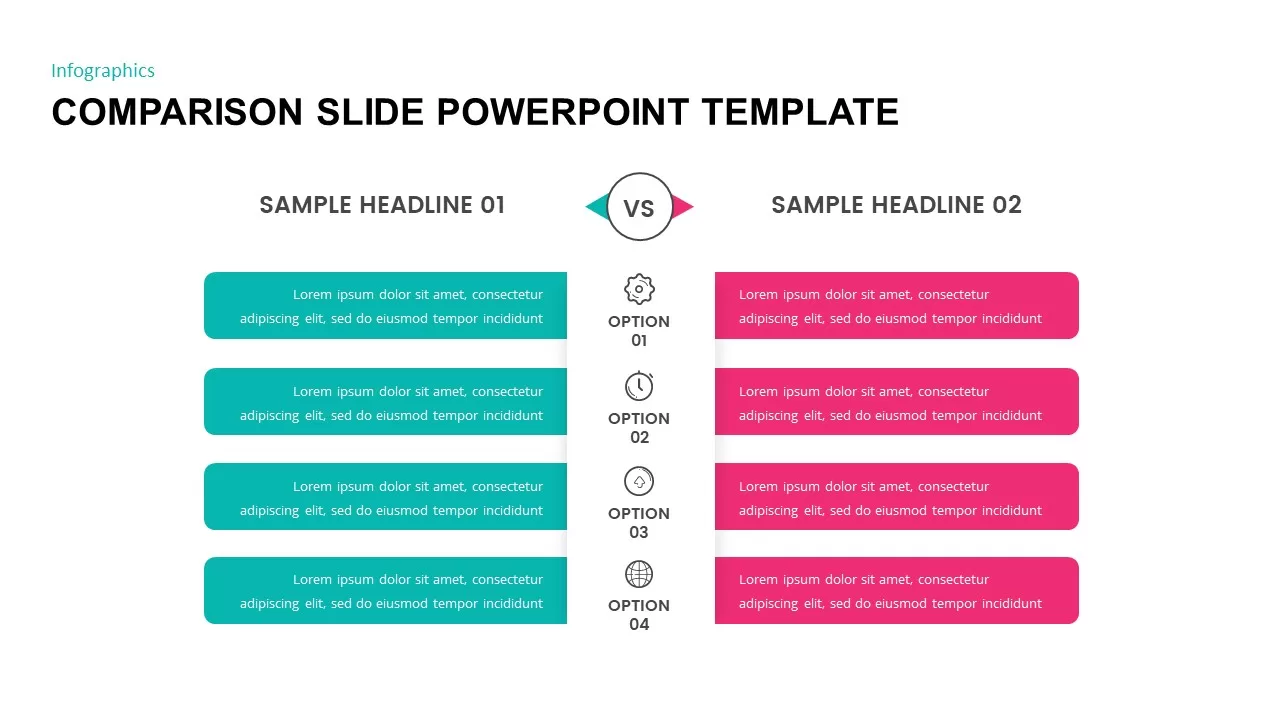
Two-Column Comparison Infographic Slide Template for PowerPoint & Google Slides
Comparison
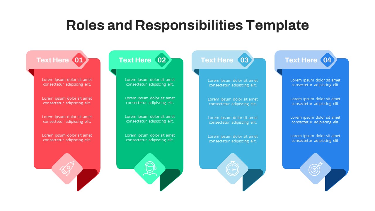
Free Four-Column Roles and Responsibilities Template for PowerPoint & Google Slides
Our Team
Free
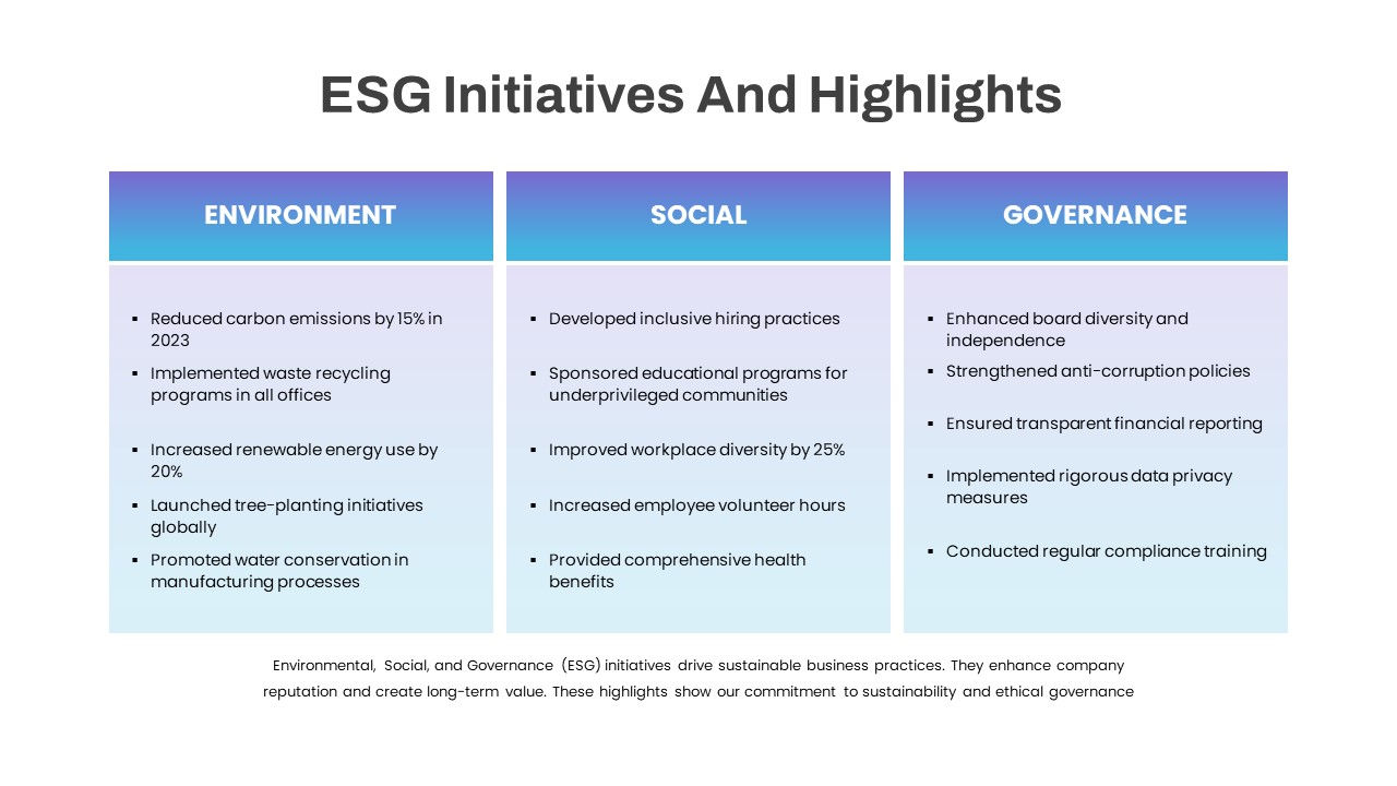
ESG Initiatives Three-Column Template for PowerPoint & Google Slides
Comparison
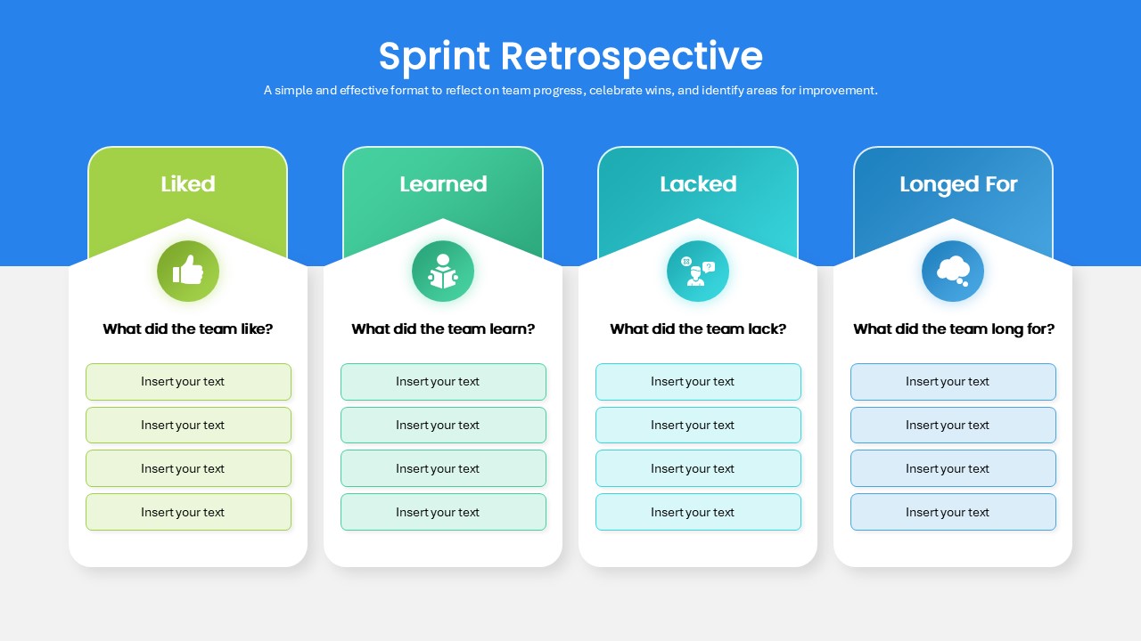
Sprint Retrospective Four-Column Template for PowerPoint & Google Slides
Process
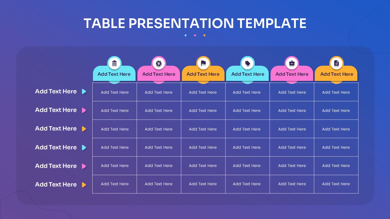
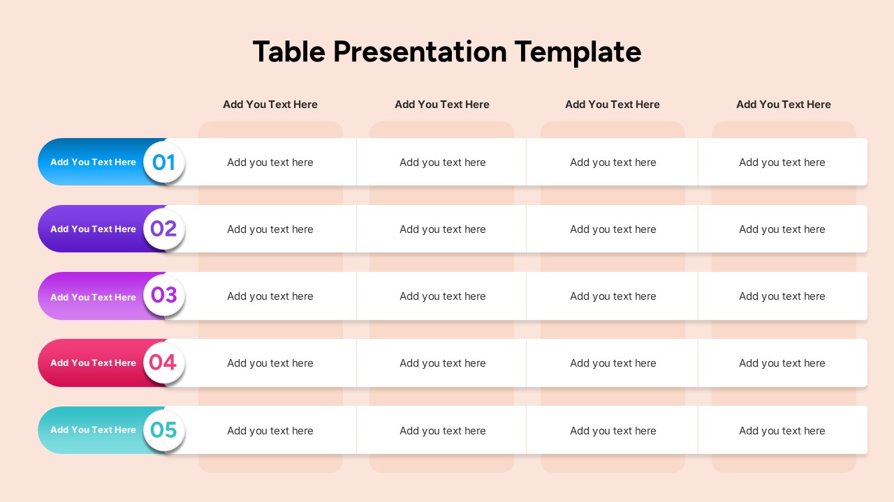
Multi-Column Table Presentation Template for PowerPoint & Google Slides
Table
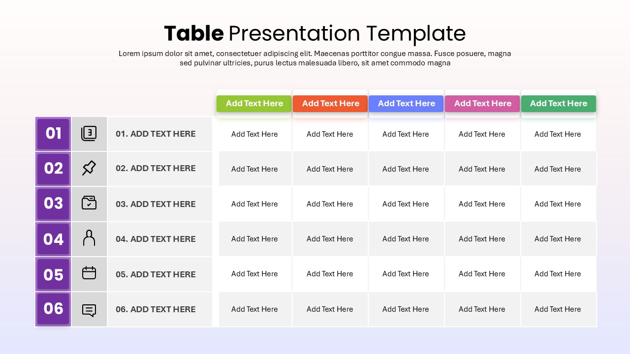
Six-Row Multi-Column Table Presentation Template for PowerPoint & Google Slides
Table
Colorful Four-Column Table Layout Template for PowerPoint & Google Slides
Table
Five Column Comparison Table Layout Template for PowerPoint & Google Slides
Comparison
Two-Column Table Presentation Template for PowerPoint & Google Slides
Table
Six Column Data Table Template for PowerPoint & Google Slides
Table
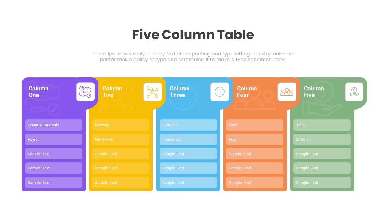
Five Column Table Infographics for PowerPoint & Google Slides
Business
1 to 5 Column infographic pack for PowerPoint & Google Slides
Business
Professional 3D Funnel Infographic Template for PowerPoint & Google Slides
Funnel
Professional 3D Gear Process Diagram Template for PowerPoint & Google Slides
Process
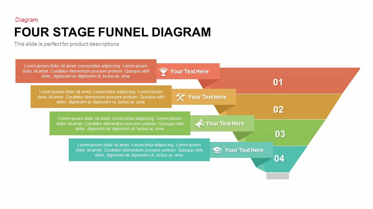
Professional Four-Stage Funnel Diagram Template for PowerPoint & Google Slides
Funnel

Professional Security Metaphor Diagram Template for PowerPoint & Google Slides
Information Technology
Professional Team Members Slide Template for PowerPoint & Google Slides
Our Team
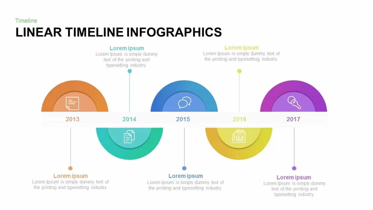
Professional Linear Timeline Infographic Template for PowerPoint & Google Slides
Timeline
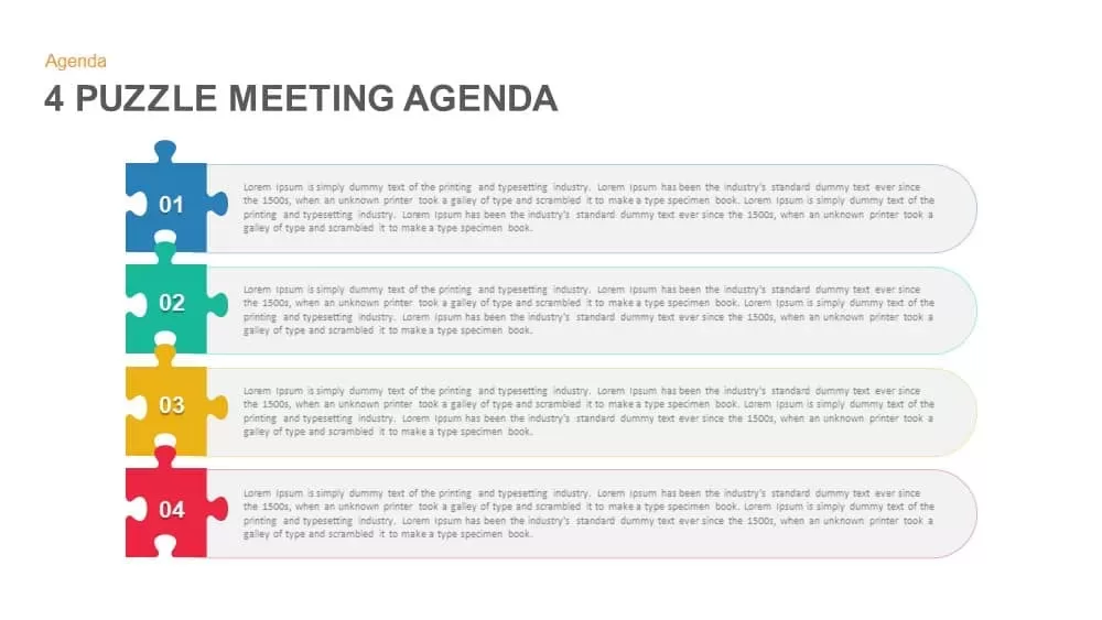
Professional Four Puzzle Meeting Agenda Template for PowerPoint & Google Slides
Agenda
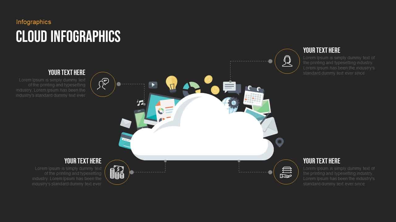
Free Professional Cloud Infographics Template for PowerPoint & Google Slides
Process
Free
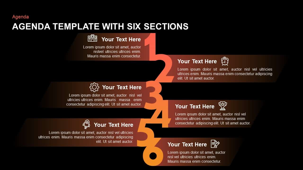
Six-Section Professional Agenda Template for PowerPoint & Google Slides
Agenda
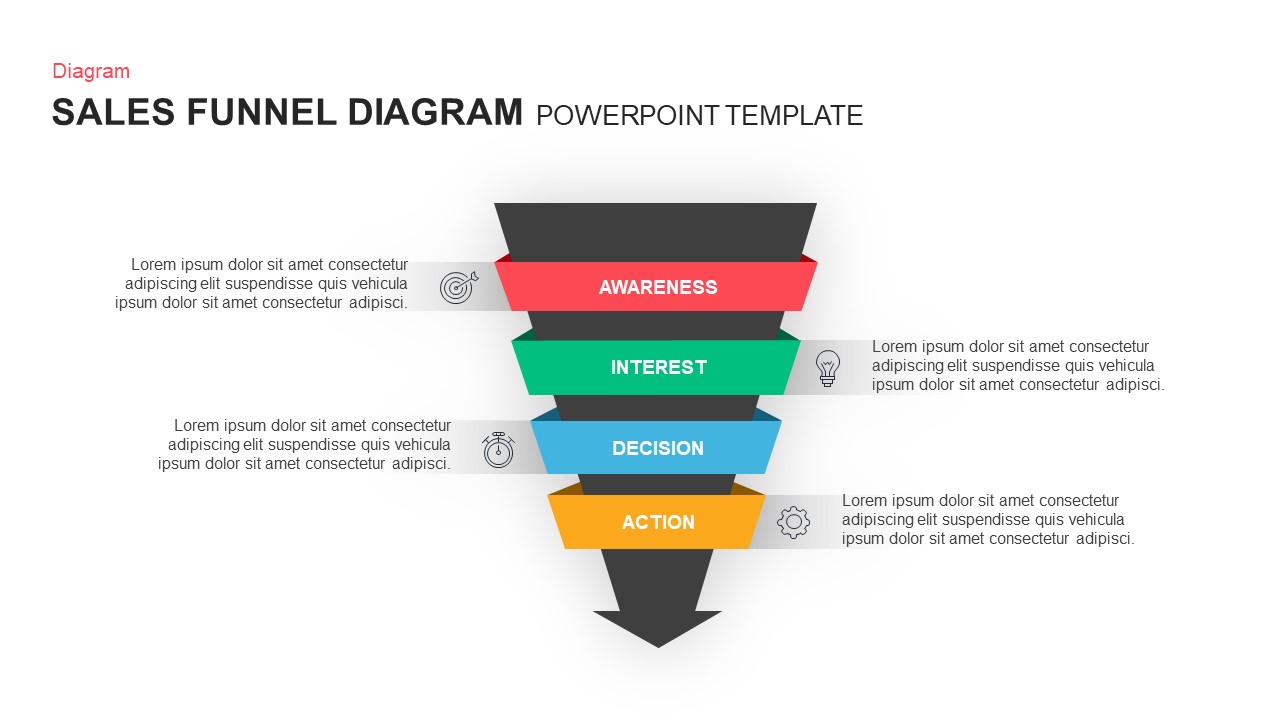
Professional Sales Funnel Diagram Template for PowerPoint & Google Slides
Funnel
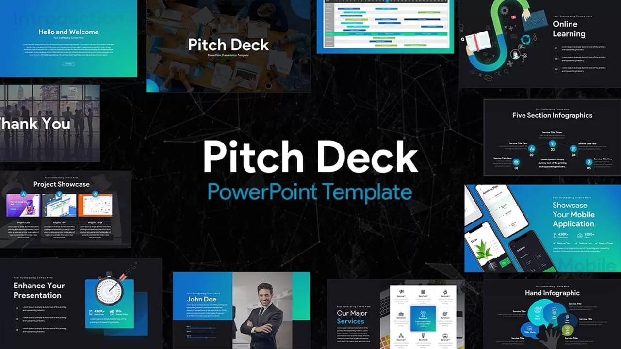
Professional Pitch Deck Template for PowerPoint & Google Slides
Pitch Deck
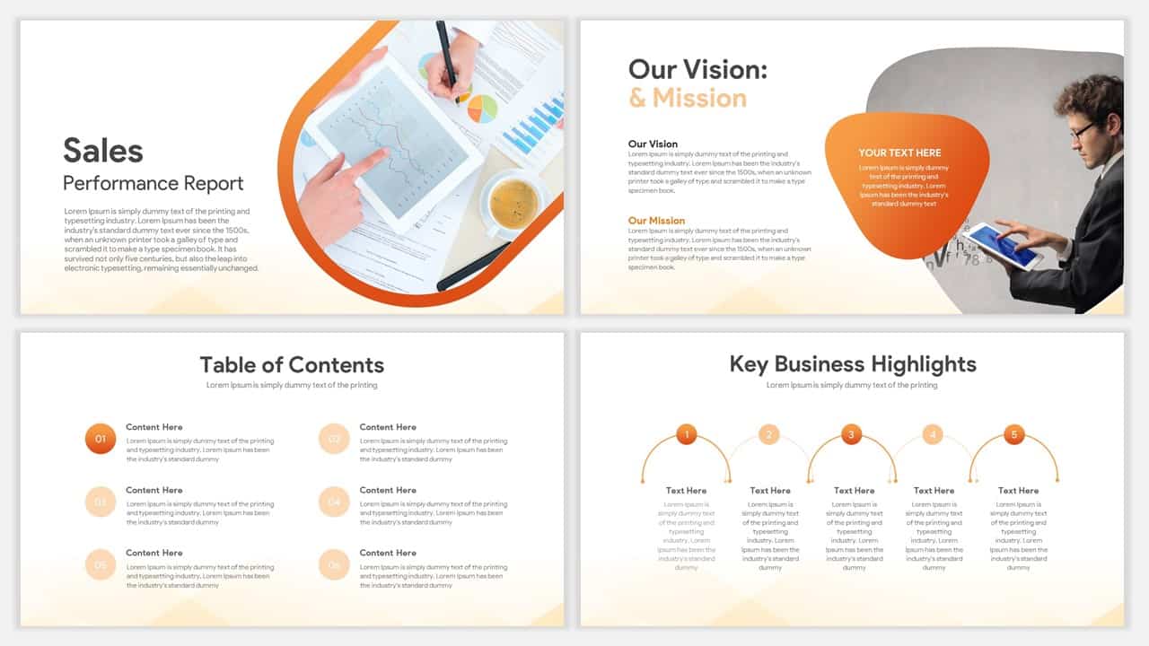
Professional Sales Performance Report Template for PowerPoint & Google Slides
Business Report
Professional Personal CV Presentation Template for PowerPoint & Google Slides
Company Profile
Professional Mobile App Showcase Deck Template for PowerPoint & Google Slides
Pitch Deck
Professional Sales Meeting Presentation Template for PowerPoint & Google Slides
Pitch Deck
Professional Book Review Infographic Template for PowerPoint & Google Slides
Business
Professional Portfolio Profile Template for PowerPoint & Google Slides
Decks

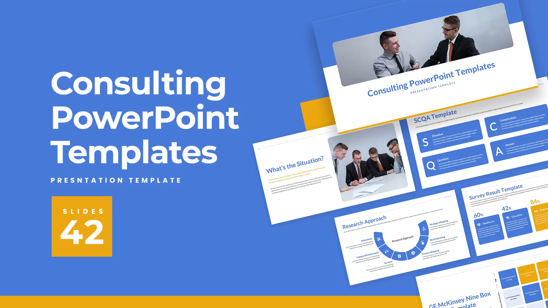
Professional Consulting Deck Presentation Template for PowerPoint & Google Slides
Pitch Deck
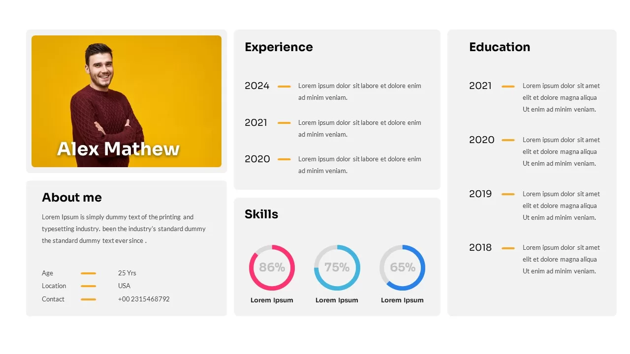
Professional Resume Profile Slide Template for PowerPoint & Google Slides
Recruitment
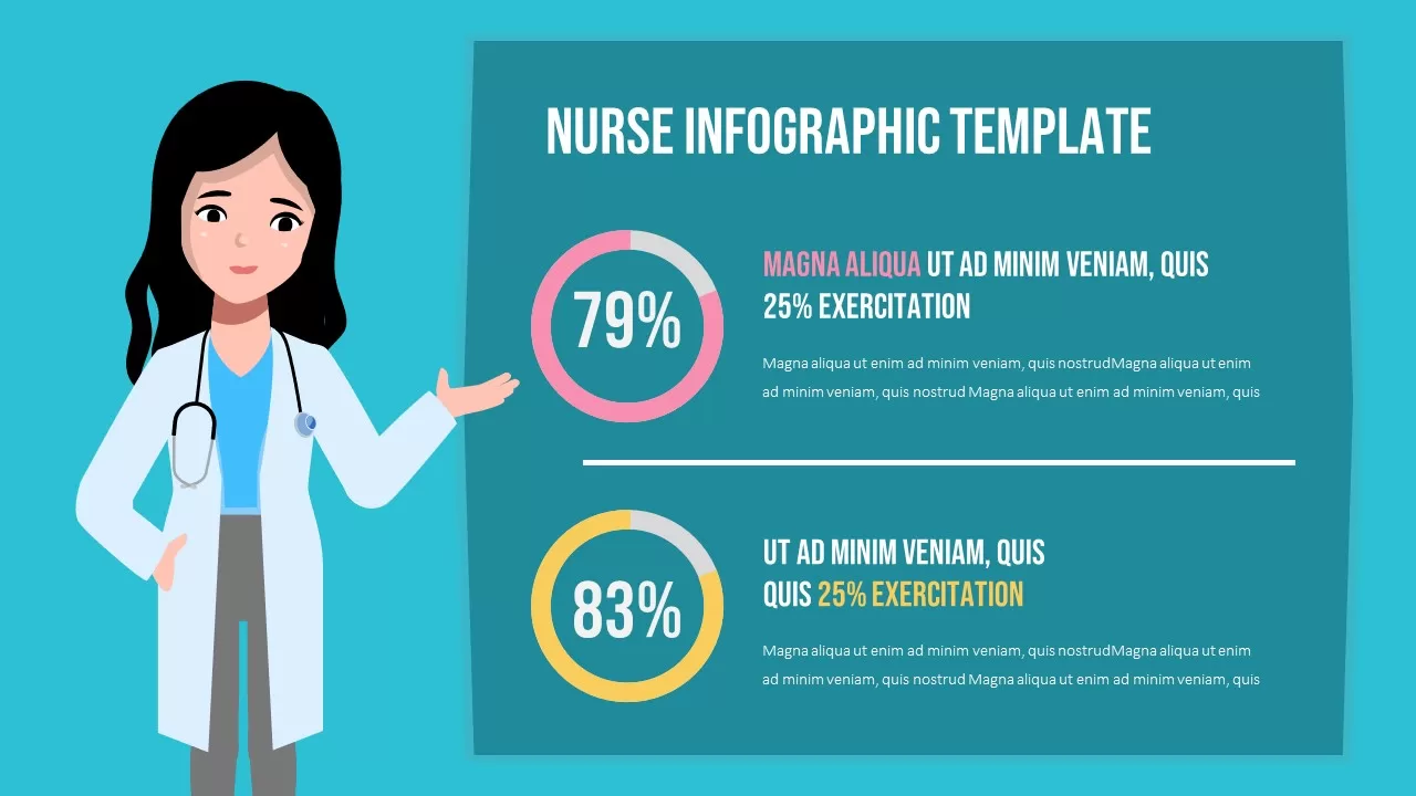
Professional Nurse Infographic Dashboard Template for PowerPoint & Google Slides
Nursing
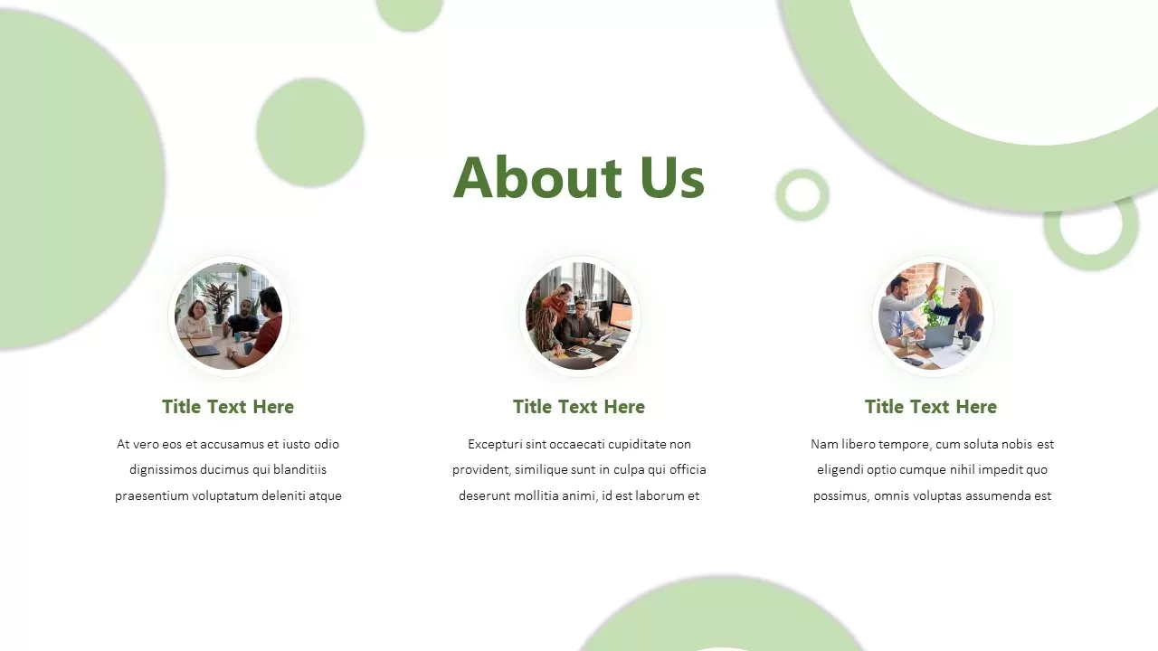
Professional Company About Us Slide Template for PowerPoint & Google Slides
Company Profile
Professional Corporate Company About Us Template for PowerPoint & Google Slides
Graphics
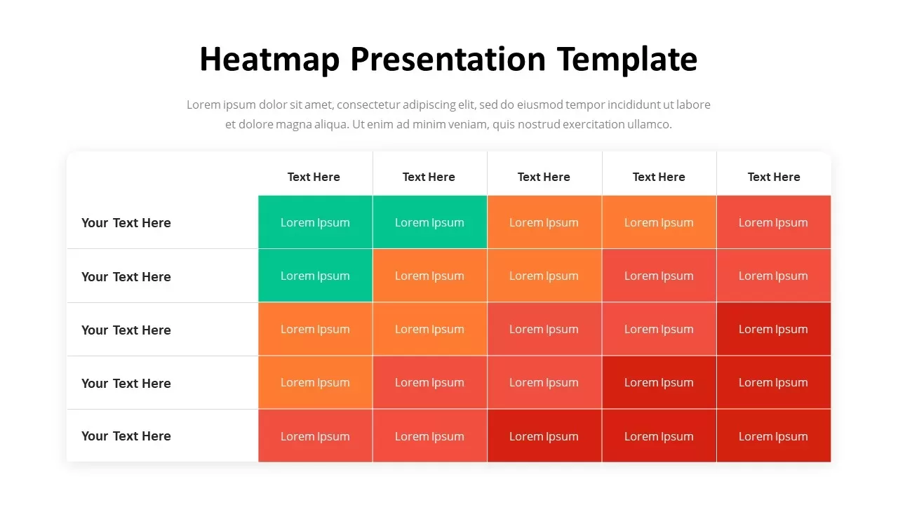
Professional Heatmap Data Visualization Template for PowerPoint & Google Slides
Infographics
Professional Angular Cover Slide Template for PowerPoint & Google Slides
Company Profile
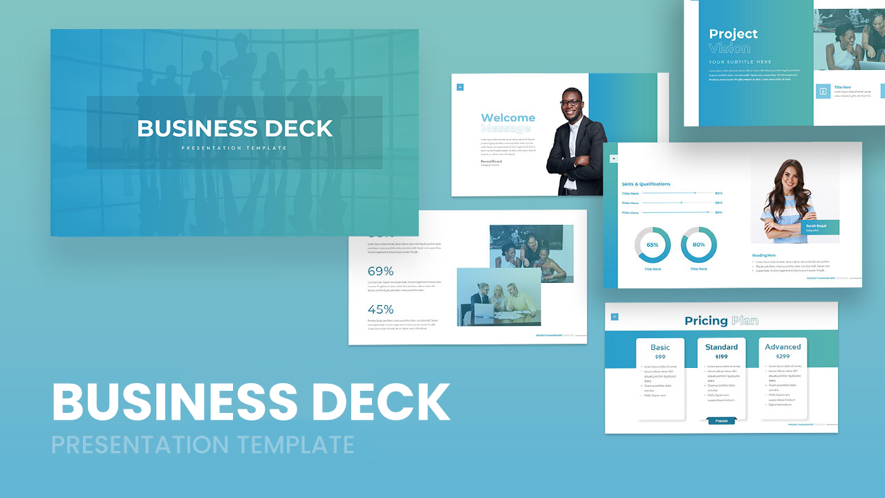
Professional Business Deck Presentation Template for PowerPoint & Google Slides
Company Profile
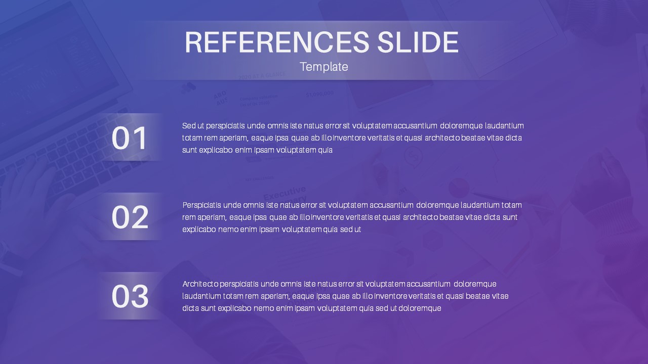
Professional References Slide Layout Template for PowerPoint & Google Slides
Infographics
Professional Photo References Slide Template for PowerPoint & Google Slides
Business
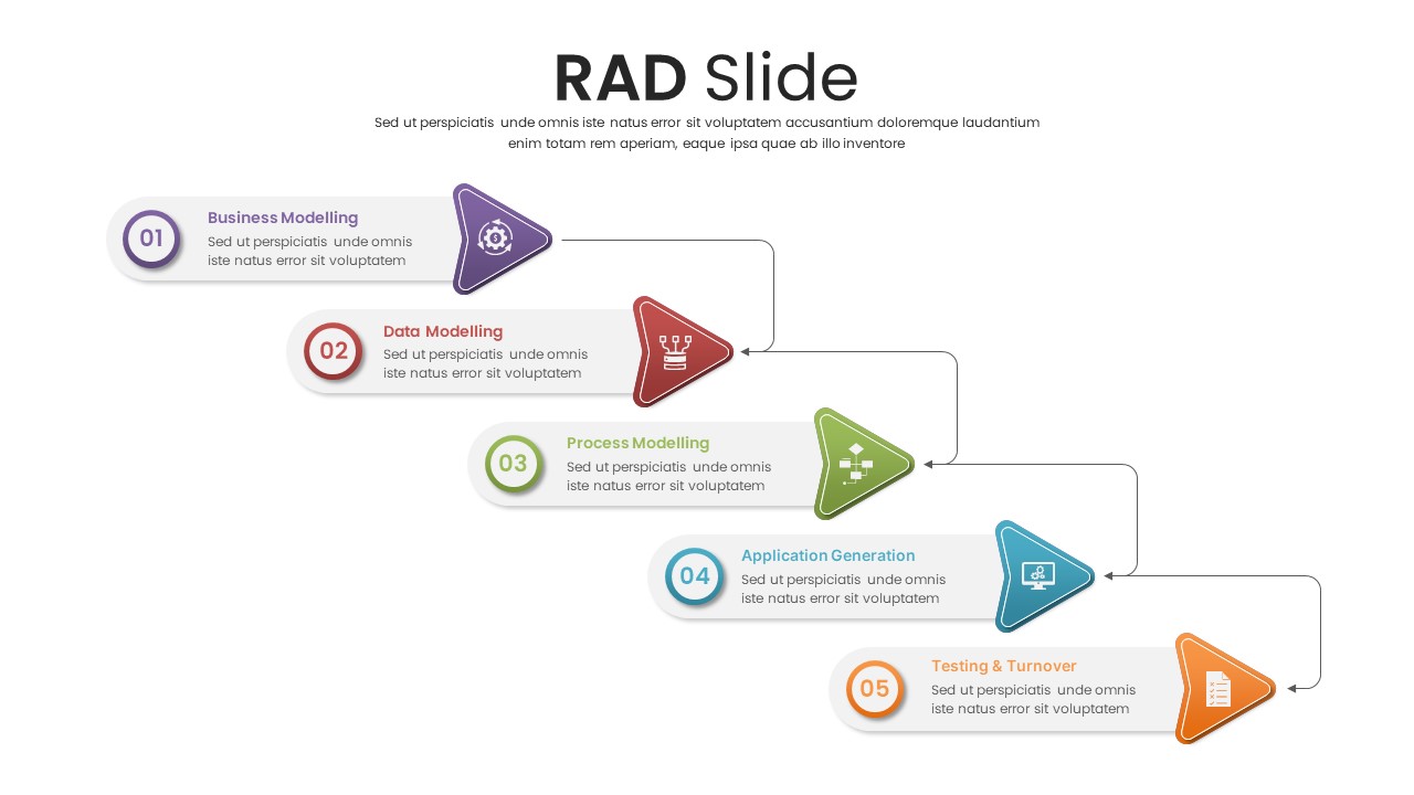
Professional Five-Step RAD Process Slide Template for PowerPoint & Google Slides
Process
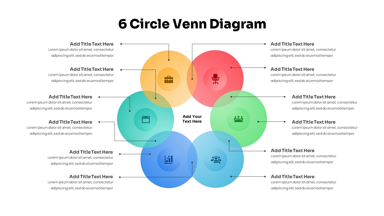
Professional 6 Circle Venn Diagram Template for PowerPoint & Google Slides
Circular
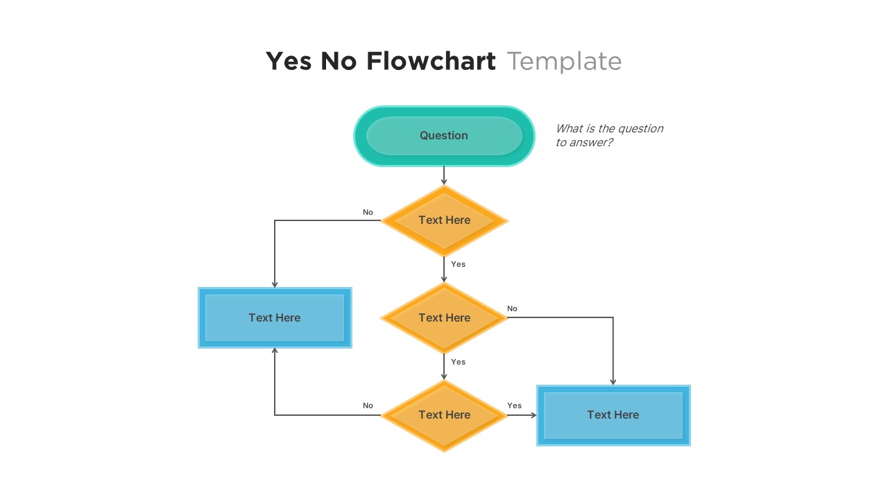
Professional Yes No Decision Flowchart Template for PowerPoint & Google Slides
Flow Charts
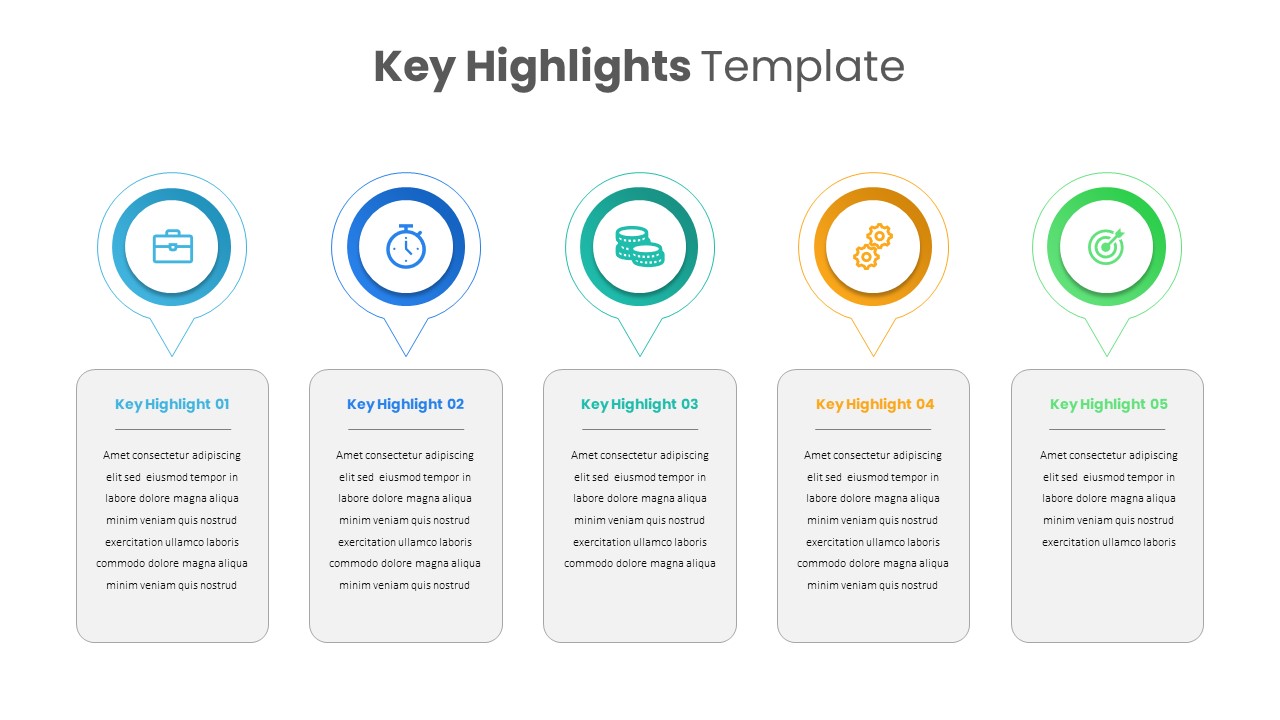
Professional Key Highlights Layout Template for PowerPoint & Google Slides
Business
Professional Golf Presentation Deck Template for PowerPoint & Google Slides
Graphics
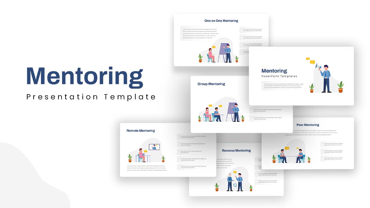
Professional Mentoring Presentation Template for PowerPoint & Google Slides
Leadership
Professional Statement of Work Template for PowerPoint & Google Slides
Project
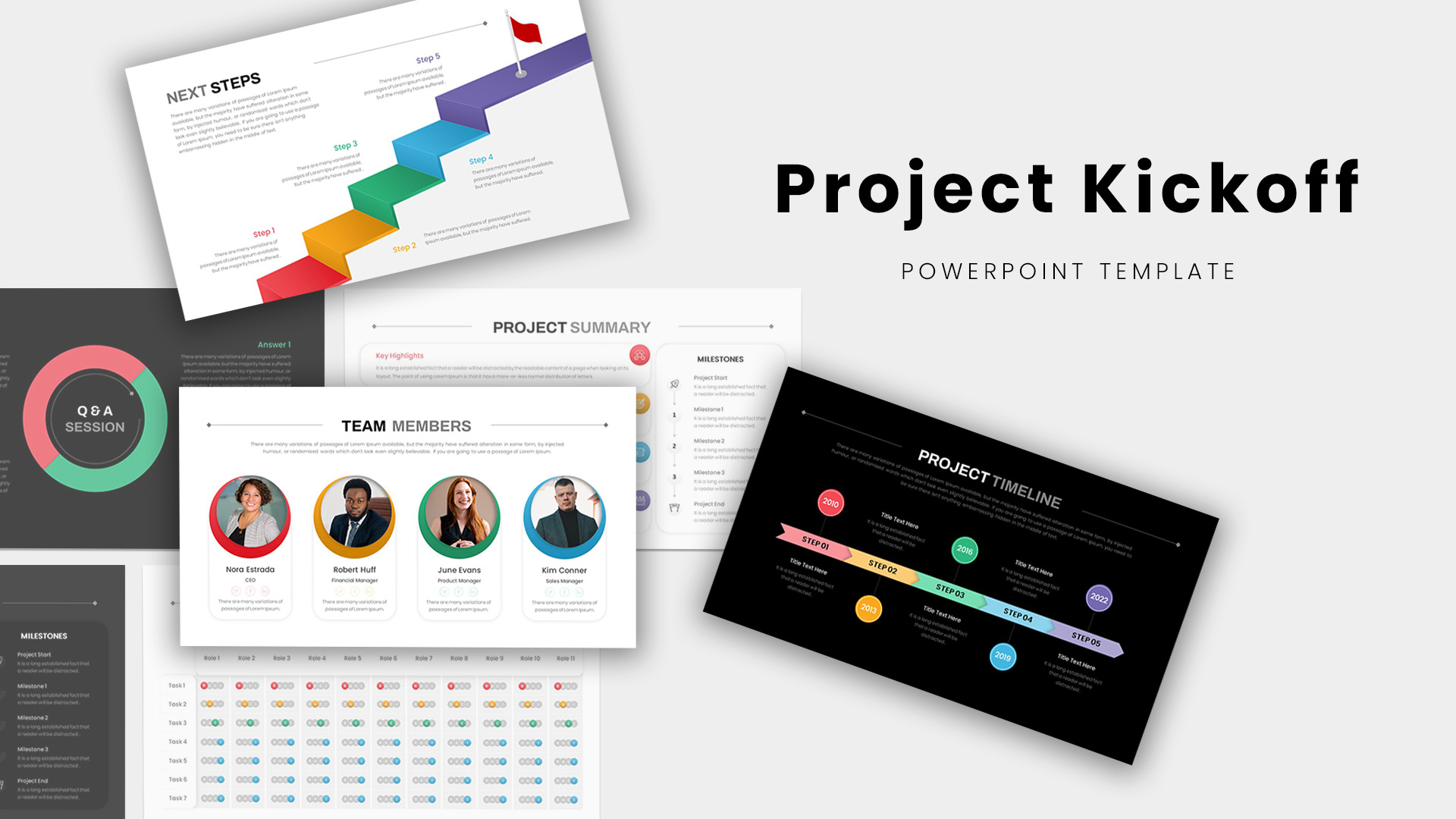
Professional Project Kickoff Deck Template for PowerPoint & Google Slides
Project

Professional Dental Clinic Profile Template for PowerPoint & Google Slides
Company Profile
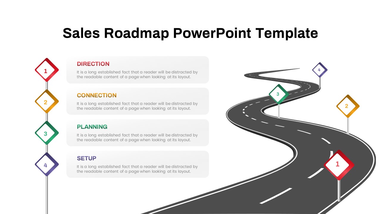
Professional Winding Road Sales Roadmap Template for PowerPoint & Google Slides
Roadmap
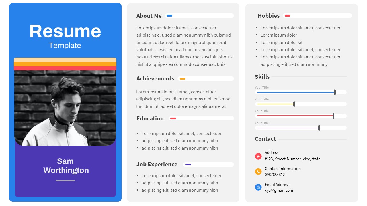
Professional Photo-Focused Resume Template for PowerPoint & Google Slides
Recruitment
Free
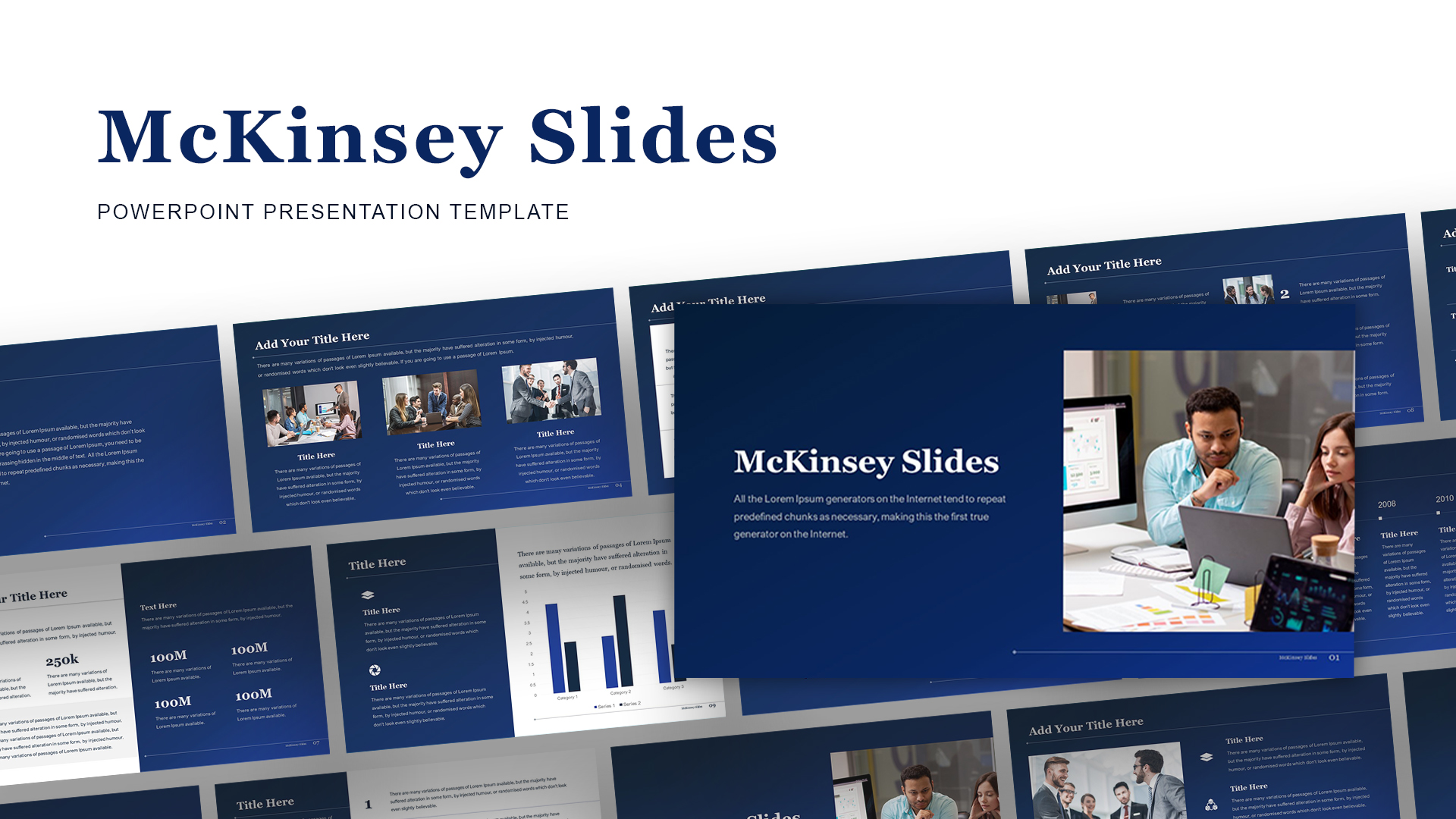
McKinsey-Style Professional Business Deck Template for PowerPoint & Google Slides
Business Report
Modern Professional Medical Service Template for PowerPoint & Google Slides
Health
Free Professional Carnival Pitch Deck Template for PowerPoint & Google Slides
Pitch Deck
Free
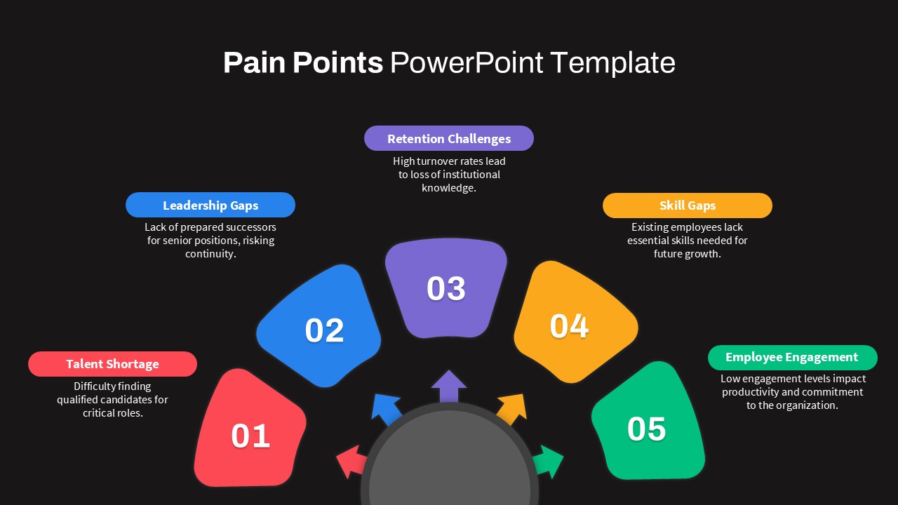
Professional Circular Pain Points Template for PowerPoint & Google Slides
Circular
Professional Green Geometric Background Template for PowerPoint & Google Slides
Background
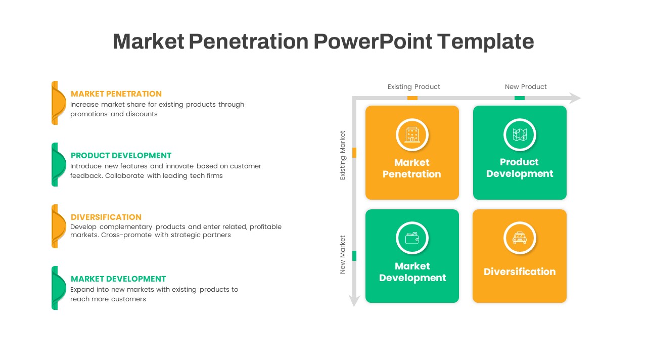
Ansoff Growth Matrix Professional Template for PowerPoint & Google Slides
Comparison
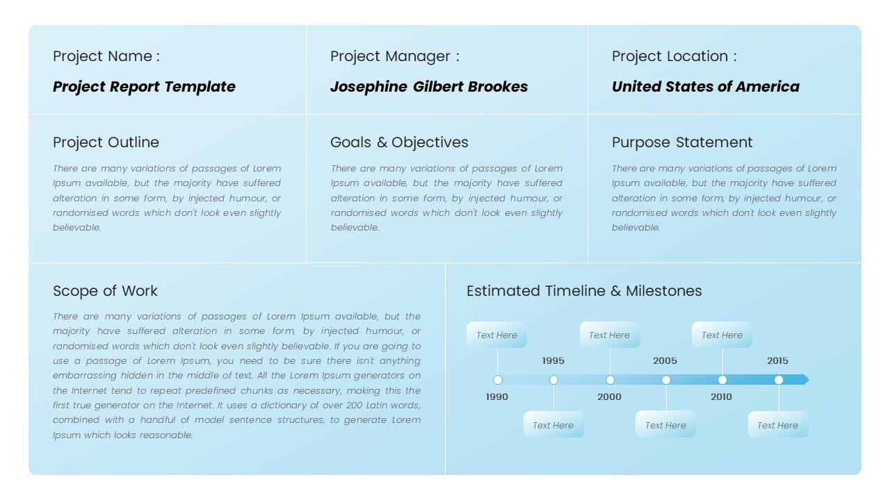
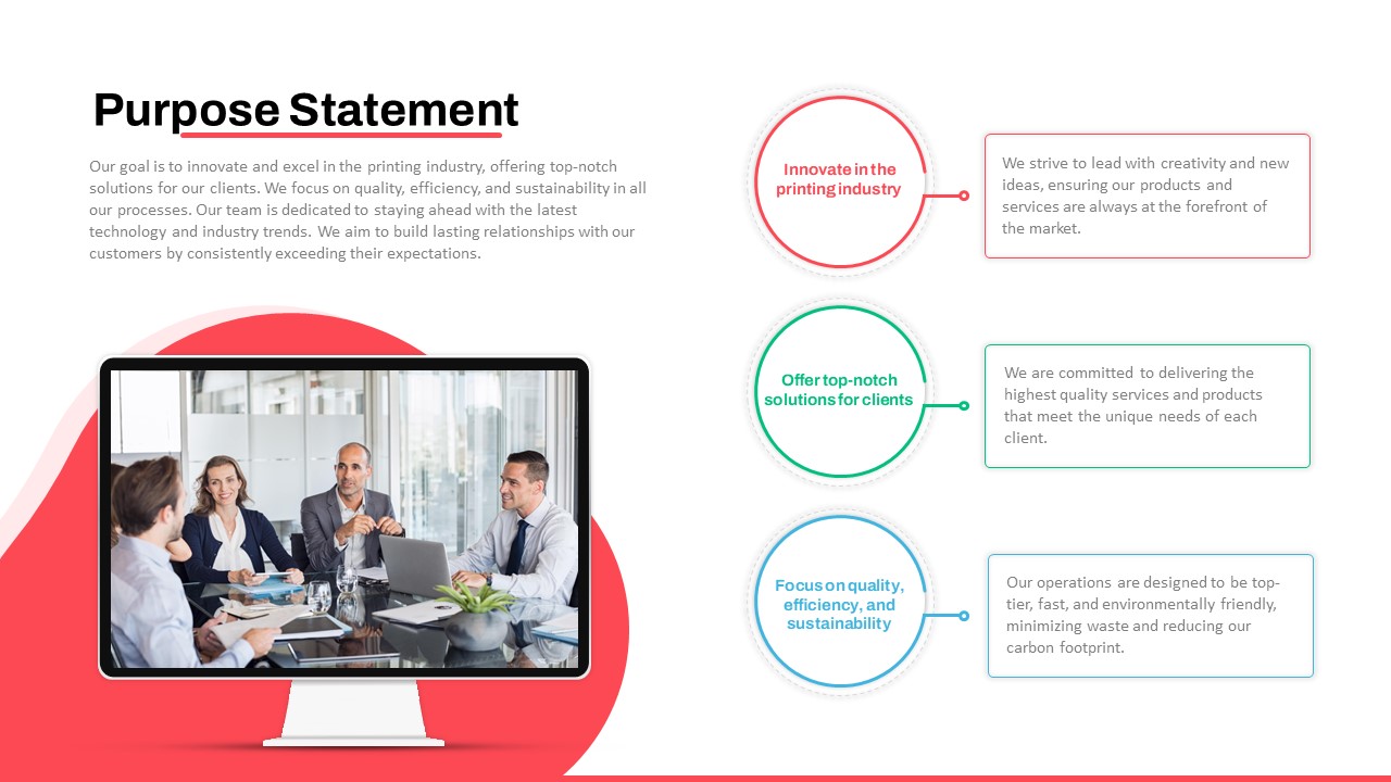
Professional Purpose Statement Slide Template for PowerPoint & Google Slides
Business Proposal
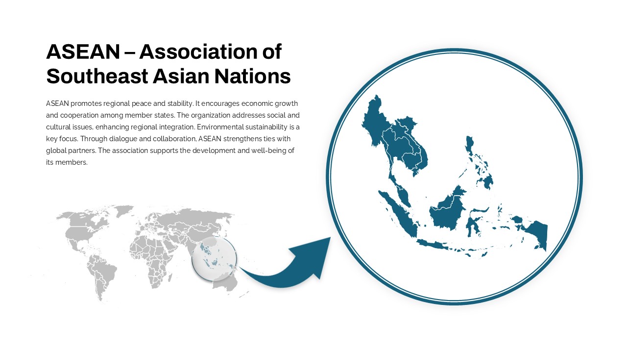
Professional ASEAN Region Zoom Map Slide Template for PowerPoint & Google Slides
World Maps
Professional Town Hall Cover Slide Template for PowerPoint & Google Slides
Graphics
Professional Executive Board Meeting Template for PowerPoint & Google Slides
Business Report

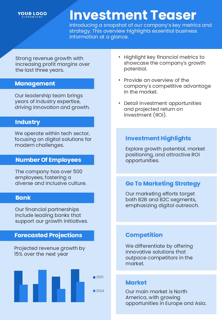
Professional Investment Teaser Slide Template for PowerPoint & Google Slides
Pitch Deck
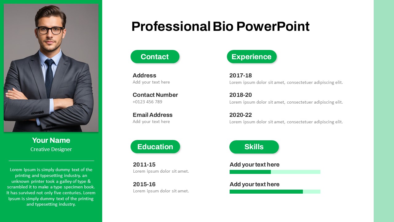
Modern Professional Bio Resume Slide Template for PowerPoint & Google Slides
Recruitment
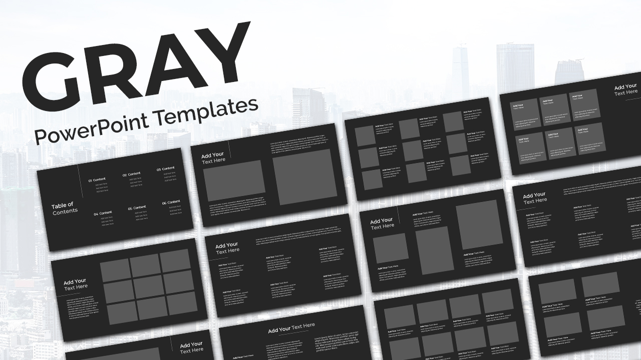
Gray Professional Deck template for PowerPoint & Google Slides
Pitch Deck
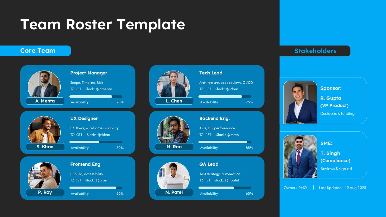
Professional Team Roster Template for PowerPoint & Google Slides
Our Team