Data Management and Analytics Diagram Template for PowerPoint & Google Slides
Description
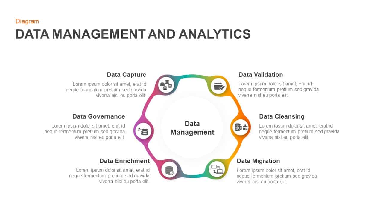
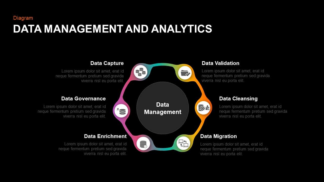
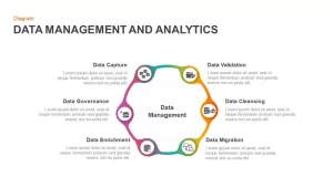
This data management and analytics diagram template features a flexible hexagonal cycle with six interconnected nodes representing critical stages of the data lifecycle: data capture, validation, cleansing, migration, enrichment, and governance. A smooth, multicolor gradient ring—from magenta through yellow to teal—reinforces the notion of continuous flow and cyclical improvement. Each node incorporates a minimal line icon, bold section title, and editable text block, while the central hub placeholder prominently displays “Data Management.” Dotted connectors align icons to descriptive callouts placed around the circle, preserving visual balance and readability.
Built on PowerPoint and Google Slides master slides, this fully editable template empowers you to swap icons in one click, adjust gradient colors via shape-fill controls, or reposition text boxes effortlessly. Smart guides and grouped layers maintain precise alignment when duplicating or rotating nodes, making it simple to extend the cycle or adapt the layout for hub-and-spoke or parallel workflows. Animation presets allow each stage to fade in sequentially, reinforcing narrative pacing and guiding audience attention through your process.
Optimized for widescreen (16:9) display and exportable to PDF or print, the design uses high-contrast typography and generous white space to ensure legibility in any format. Whether mapping a digital transformation roadmap, compliance framework, or predictive analytics workflow, this diagram transforms complex data processes into an engaging visual story. Advanced users can apply corporate branding by modifying gradient stops, change line-weight styles for emphasis, or layer additional callouts for KPI metrics—all with minimal effort thanks to the intuitive slide structure.
Who is it for
Data architects, business analysts, IT managers, and analytics teams will leverage this template to communicate data-driven strategies, process audits, or governance plans. Consultants, trainers, and executive leaders can also use it to present transformation initiatives, risk assessments, or performance dashboards.
Other Uses
Repurpose this cycle for project roadmaps, compliance audits, risk management frameworks, or customer journey maps. Adjust icons to reflect financial metrics, security checkpoints, or workflow automation steps. Duplicate node segments to create expanded lifecycles or concentric rings for multi-layered analysis.
Login to download this file

Item ID
SB01251
Related Templates

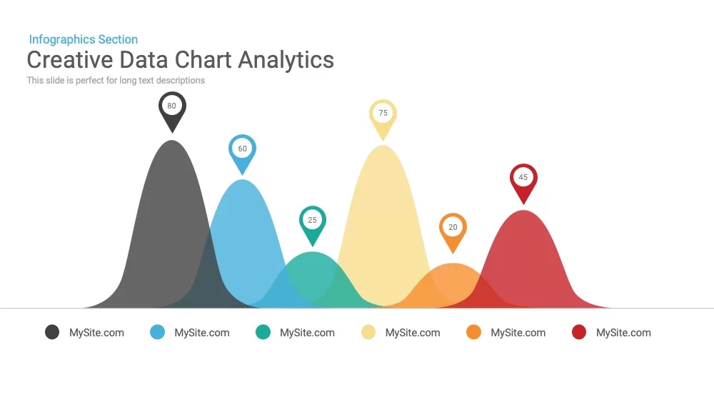
Creative data chart analytics template for PowerPoint & Google Slides
Charts
Premium

Data Analytics Dashboard Design template for PowerPoint & Google Slides
Bar/Column
Premium
Free Data Analytics Dashboard Template for PowerPoint
Charts
Free
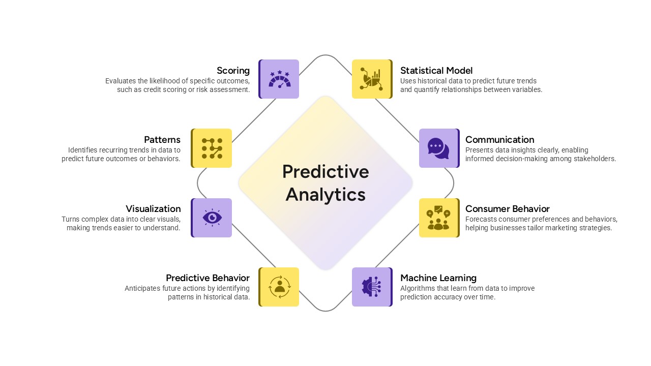
Predictive Analytics Diagram Template for PowerPoint & Google Slides
Process
Premium
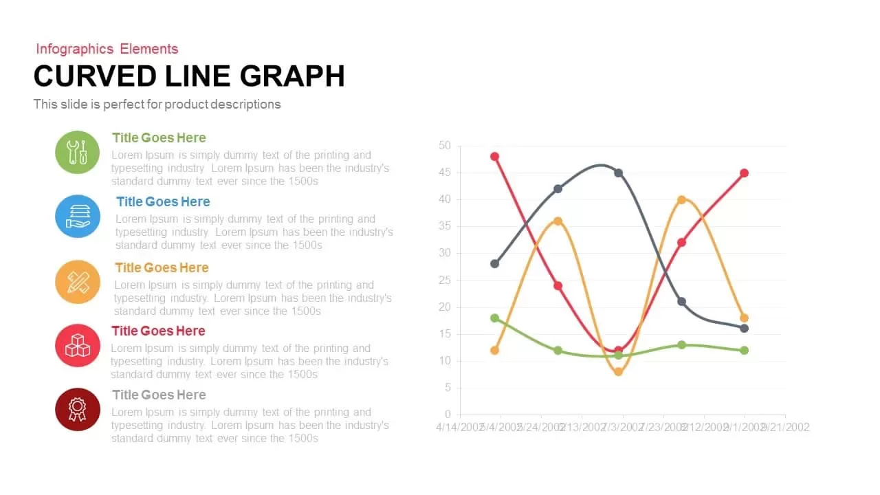
Multi-Series Curved Line Graph Analytics Template for PowerPoint & Google Slides
Comparison Chart
Premium
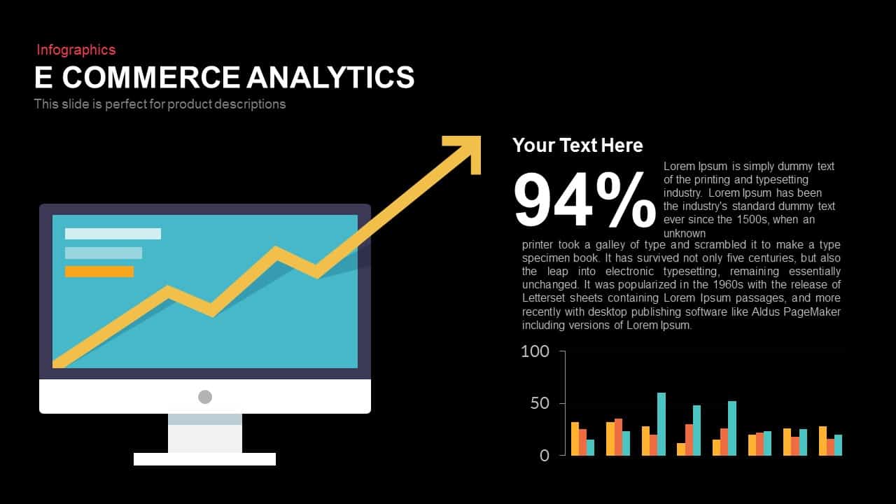
E-commerce Analytics Dashboard Template for PowerPoint & Google Slides
Bar/Column
Premium

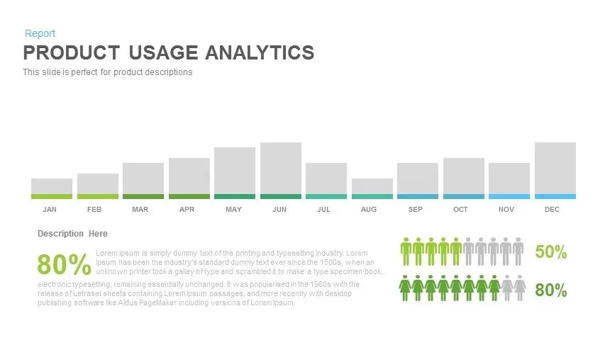
Product Usage Analytics Dashboard Chart Template for PowerPoint & Google Slides
Bar/Column
Premium
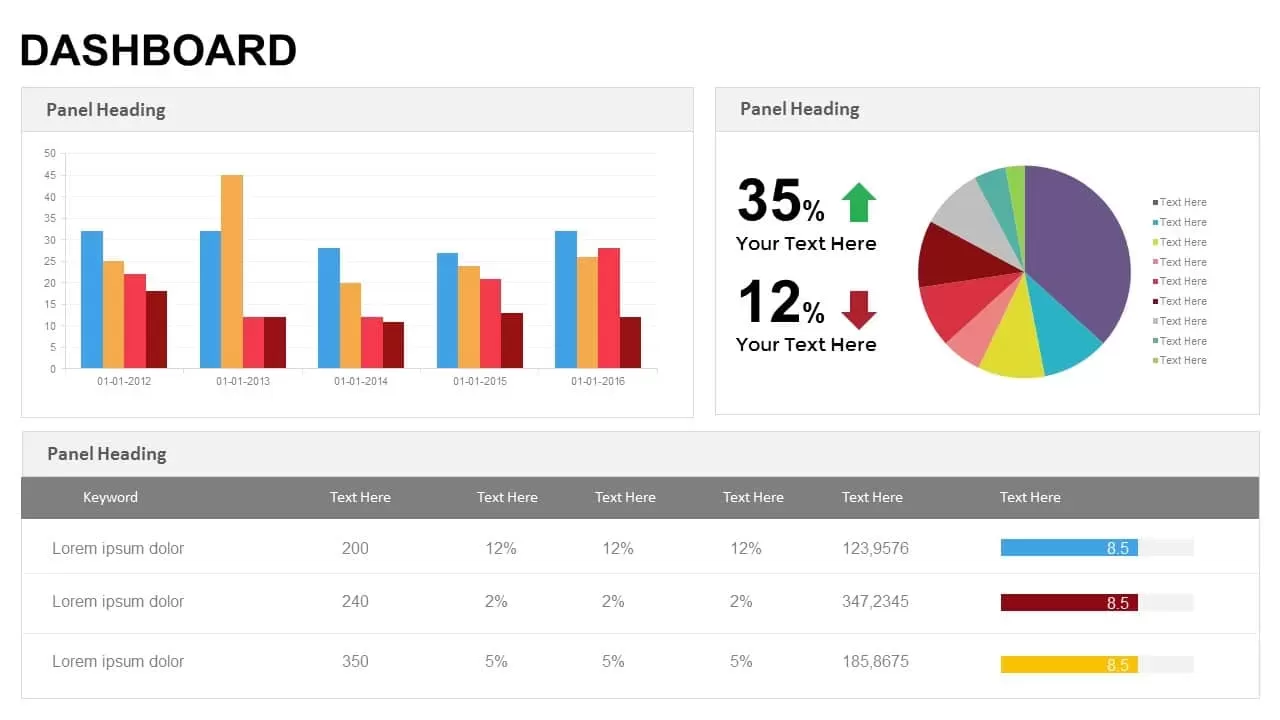
Business Dashboard Analytics & KPIs Template for PowerPoint & Google Slides
Bar/Column
Premium
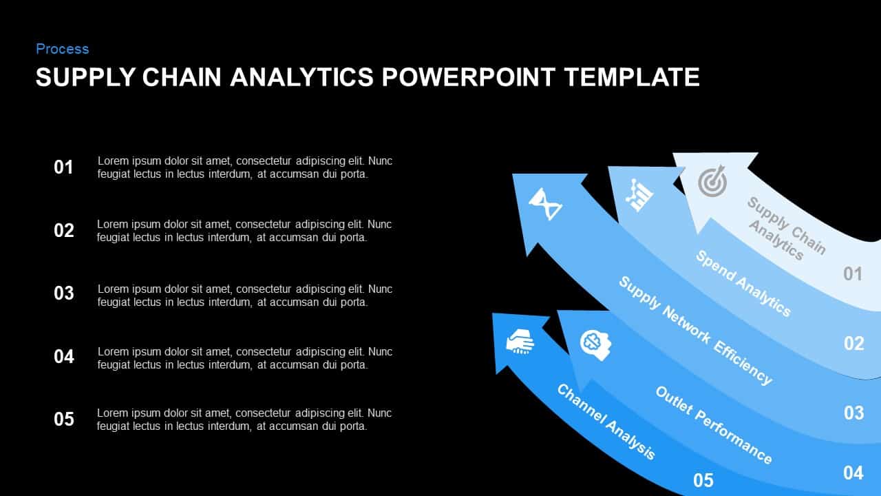
Supply Chain Analytics Process Template for PowerPoint & Google Slides
Process
Premium

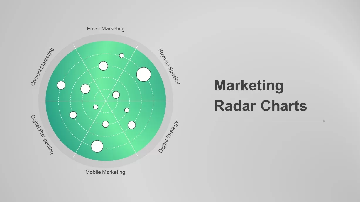
Dynamic Marketing Radar Chart Analytics Template for PowerPoint & Google Slides
Comparison
Premium
Digital Marketing Analytics Presentation Template for PowerPoint & Google Slides
Digital Marketing
Premium
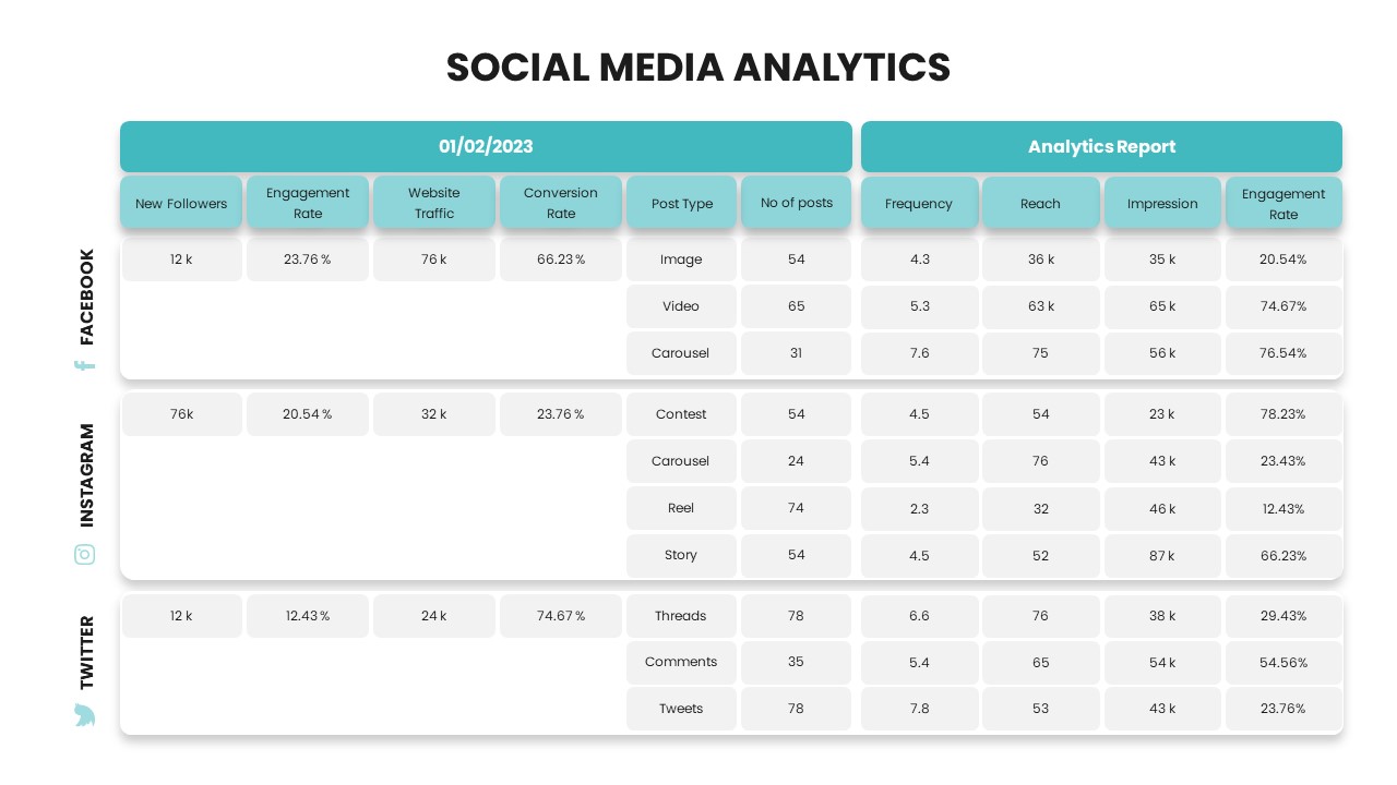
Social Media Analytics Dashboard Template for PowerPoint & Google Slides
Digital Marketing
Premium
Free TikTok Marketing Analytics Overview Template for PowerPoint & Google Slides
Company Profile
Free
Free Facebook Page Analytics Slide for PowerPoint & Google Slides
Customer Experience
Free
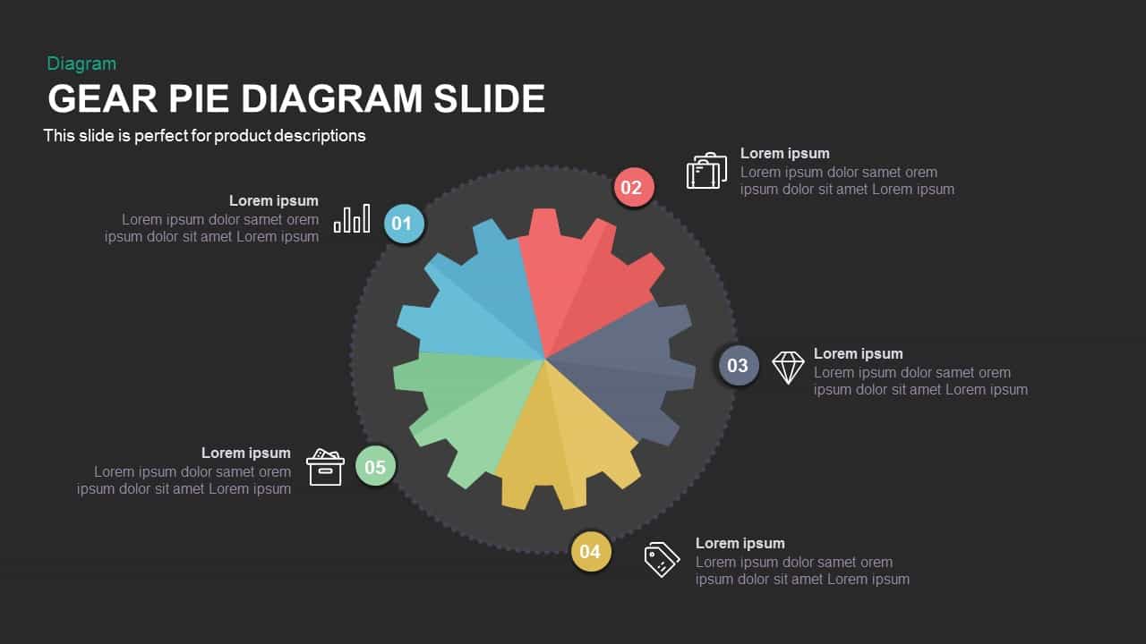
Gear Pie Diagram Data Visualization Template for PowerPoint & Google Slides
Pie/Donut
Premium
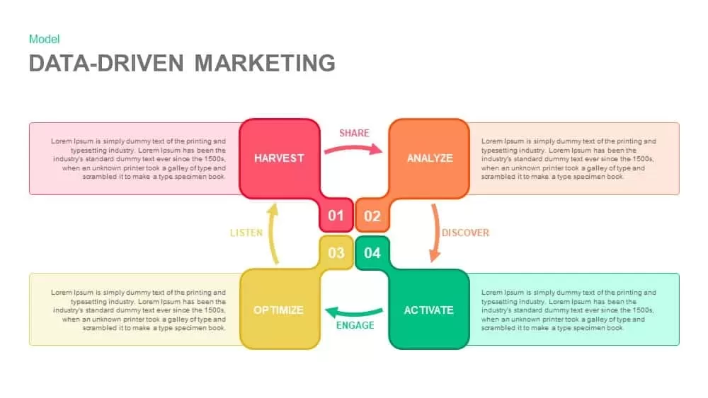
Data-Driven Marketing Cycle Diagram Template for PowerPoint & Google Slides
Customer Journey
Premium
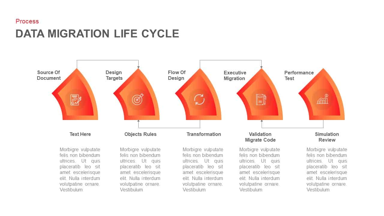
Data Migration Life Cycle Curved Diagram Template for PowerPoint & Google Slides
Process
Premium
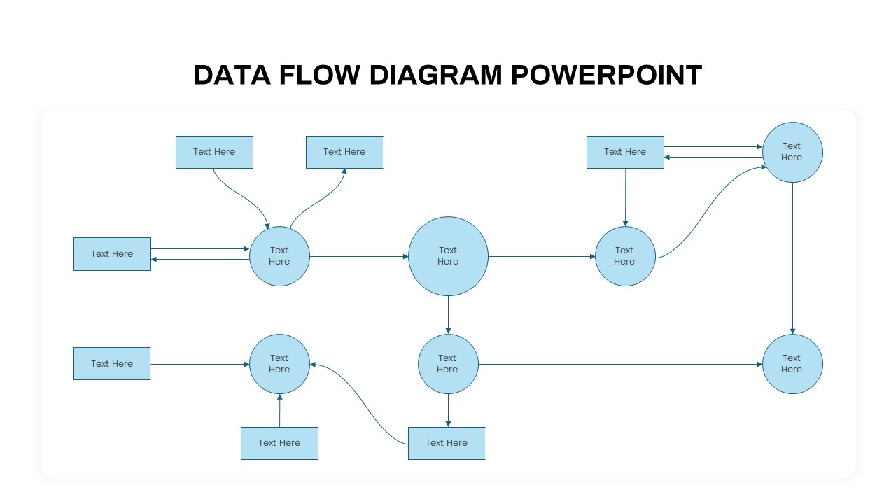
Advanced Data Flow Diagram Pack Template for PowerPoint & Google Slides
Flow Charts
Premium
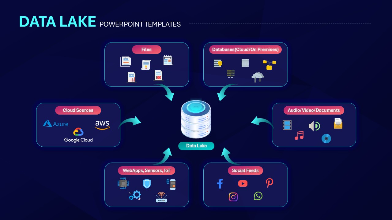
Data Lake Hub-and-Spoke Diagram Template for PowerPoint & Google Slides
Cloud Computing
Premium
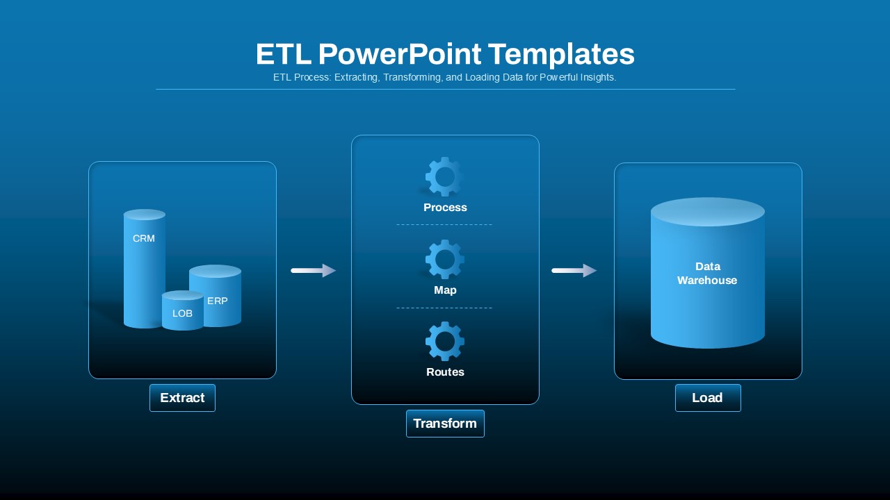
ETL Data Pipeline Workflow Diagram Template for PowerPoint & Google Slides
Process
Premium
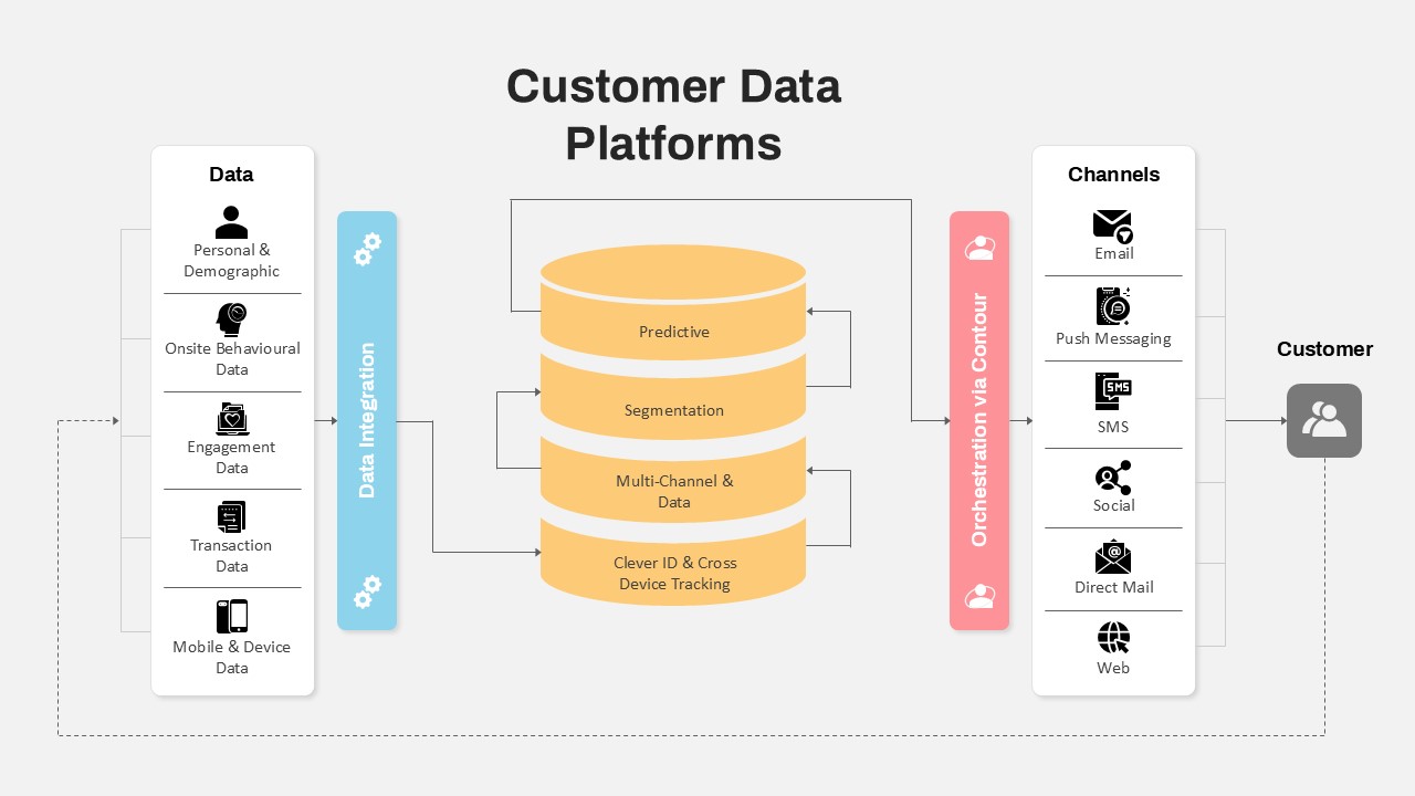
Customer Data Platform Workflow Diagram Template for PowerPoint & Google Slides
Information Technology
Premium
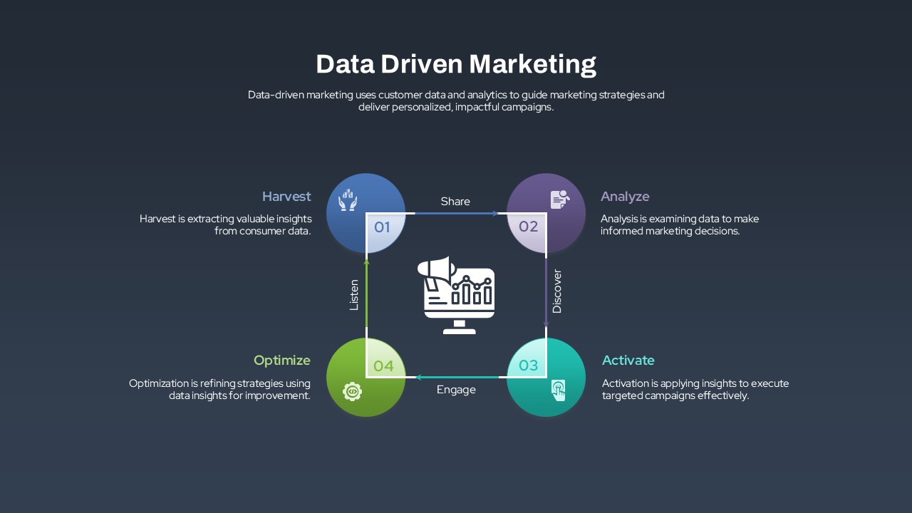
Data-Driven Marketing Lifecycle Diagram Template for PowerPoint & Google Slides
Process
Premium
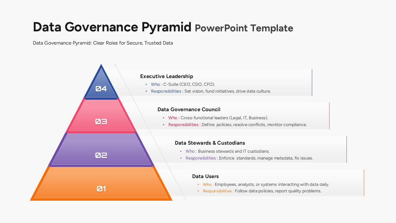
Data Governance Roles Pyramid Diagram Template for PowerPoint & Google Slides
Pyramid
Premium
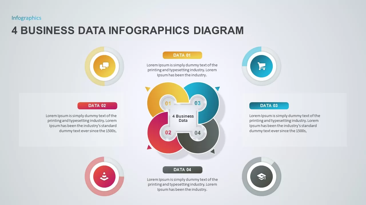
4 Business Data Infographics Diagram for PowerPoint & Google Slides
Process
Premium
Data Science PowerPoint Presentation Template for PowerPoint & Google Slides
Pitch Deck
Premium
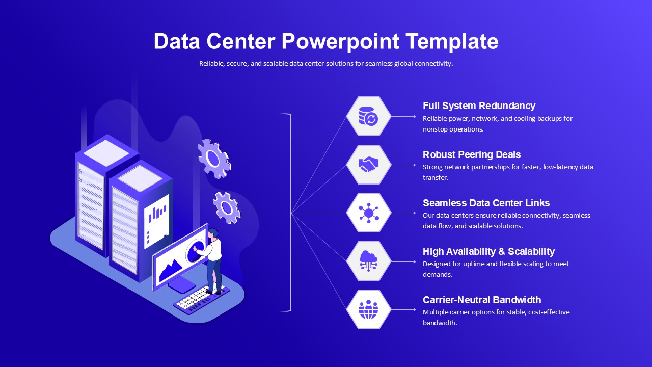
Data Center PowerPoint Template for PowerPoint & Google Slides
Information Technology
Premium
Mobile Data Analysis Chart template for PowerPoint & Google Slides
Charts
Premium
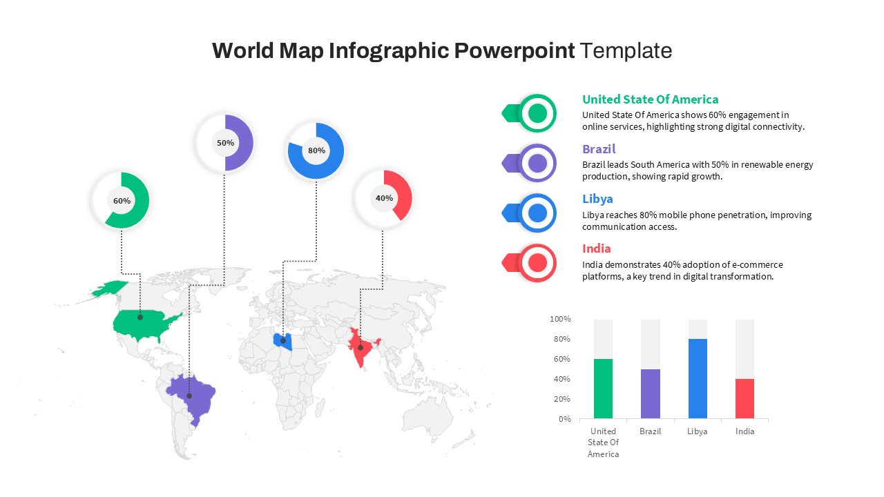
World Map Data template for PowerPoint & Google Slides
World Maps
Premium
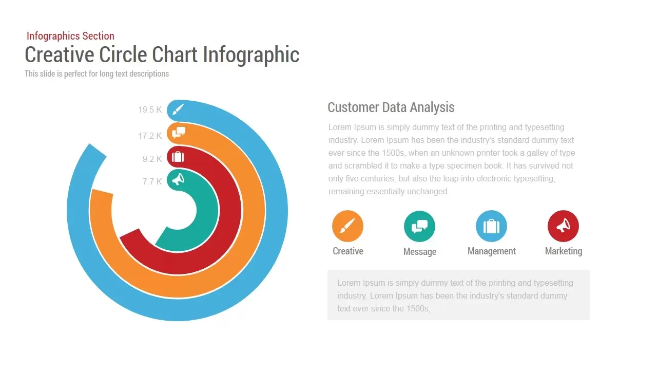
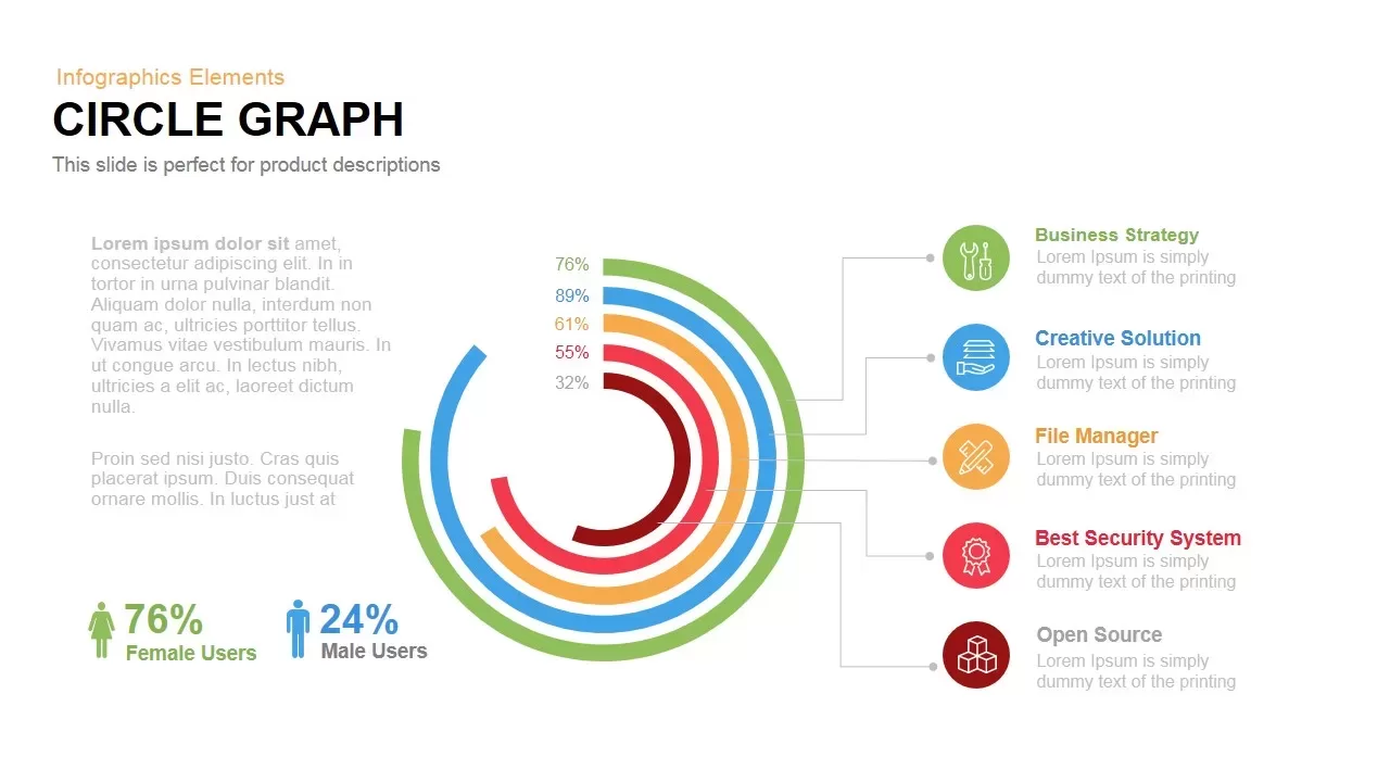
Circle Chart Data template for PowerPoint & Google Slides
Pie/Donut
Premium
Creative Data Analysis Bar Chart template for PowerPoint & Google Slides
Bar/Column
Premium

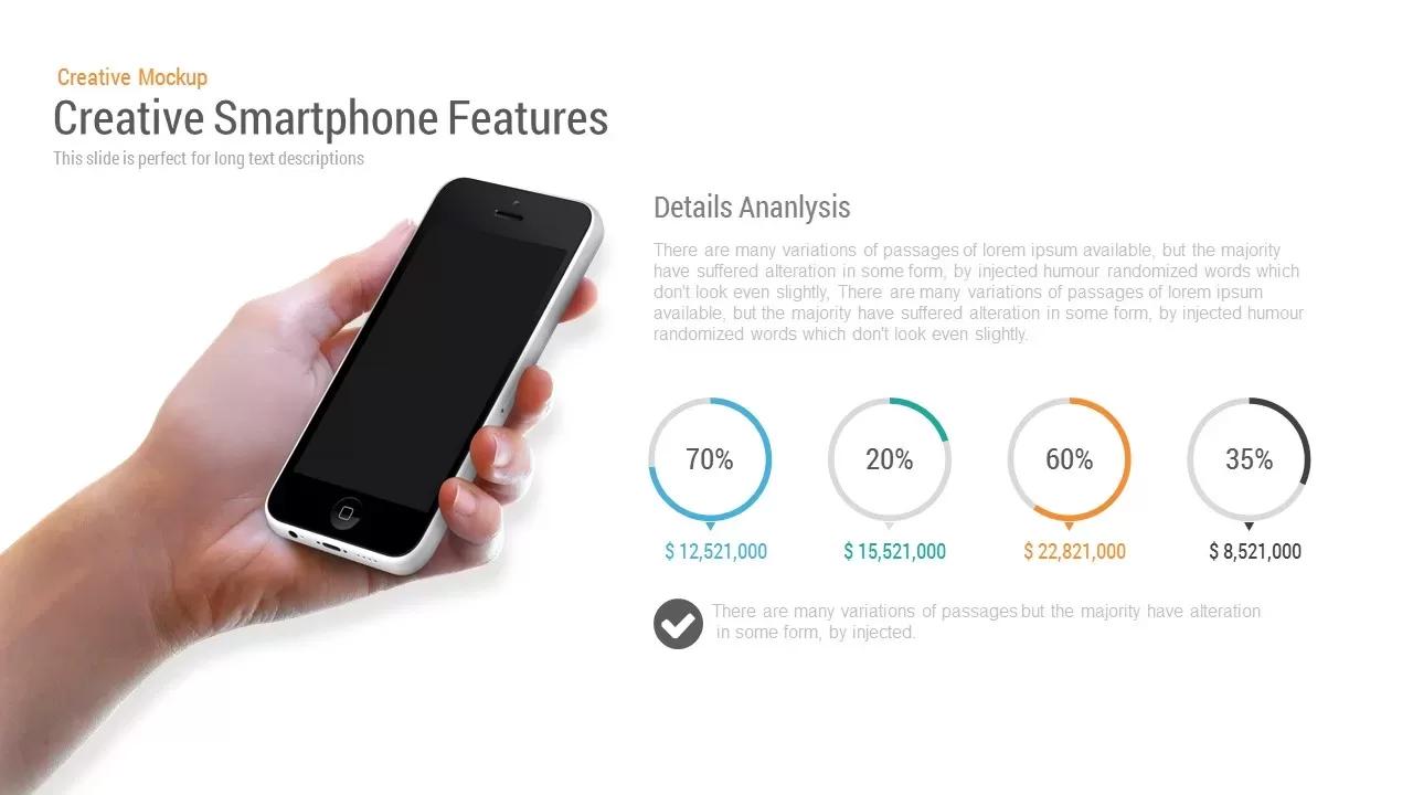
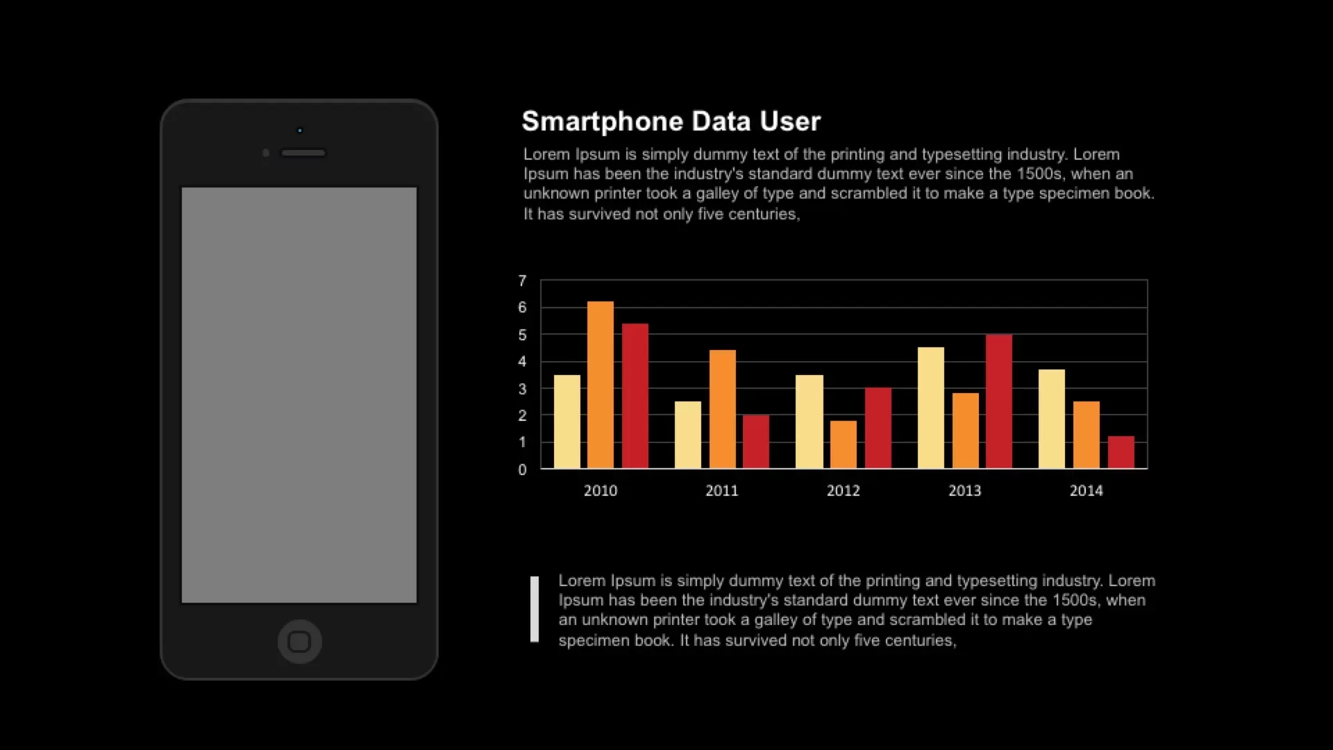
Smartphone Data User template for PowerPoint & Google Slides
Charts
Premium
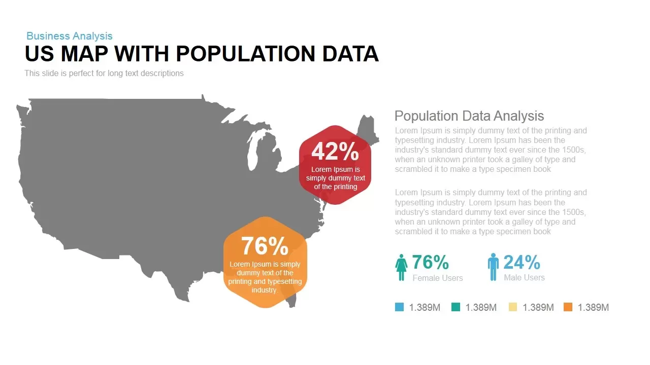
Interactive US Population Data Map Slide Template for PowerPoint & Google Slides
World Maps
Premium
3D Bar Chart Data Infographics Template for PowerPoint & Google Slides
Bar/Column
Premium
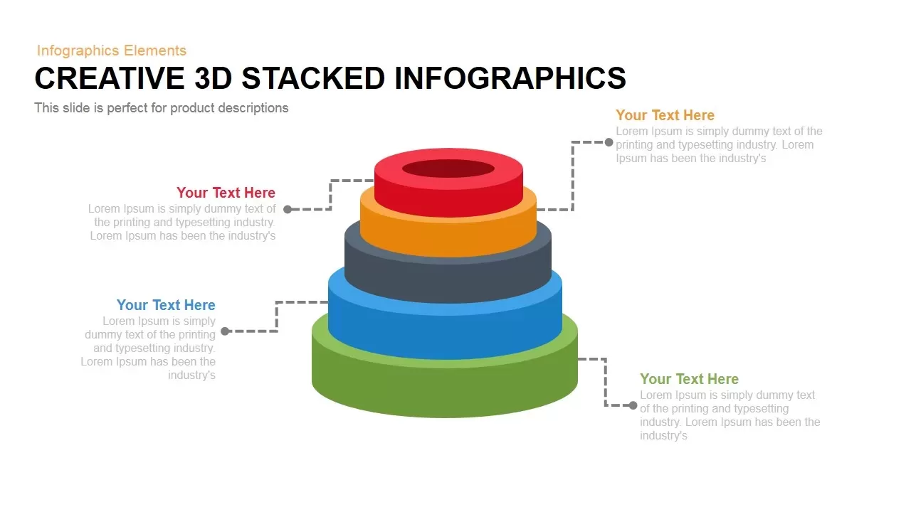
3D Stacked Infographic Layers Data Template for PowerPoint & Google Slides
Pyramid
Premium
Circle Graph Data Visualization Template for PowerPoint & Google Slides
Circle
Premium
Pencil Bar Chart Data Analysis Template for PowerPoint & Google Slides
Bar/Column
Premium
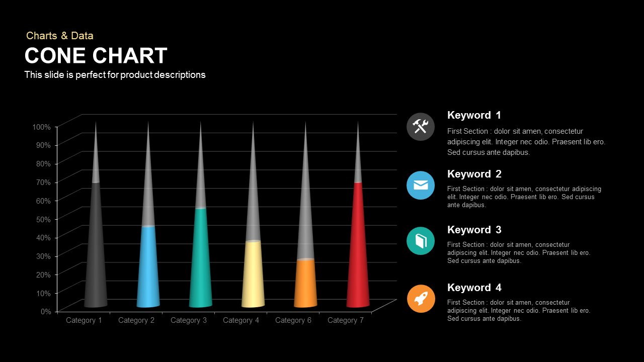
3D Cone Chart Data Visualization template for PowerPoint & Google Slides
Bar/Column
Premium
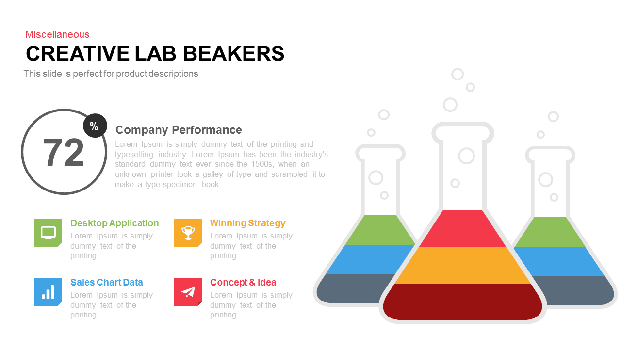
Creative Lab Beakers Data Infographic template for PowerPoint & Google Slides
Infographics
Premium
Dynamic Data Dashboard Infographic Template for PowerPoint & Google Slides
Bar/Column
Premium
Tornado Chart Data Comparison Slide Template for PowerPoint & Google Slides
Bar/Column
Premium
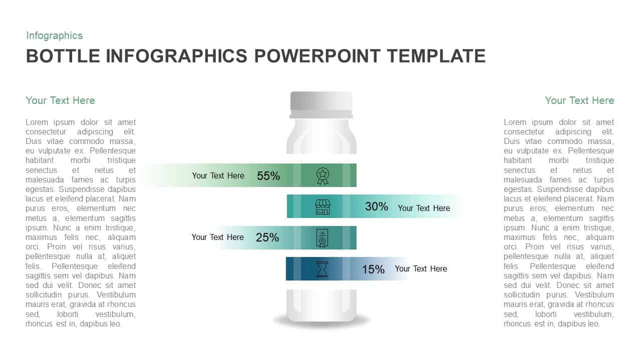
Bottle Data Percentage Infographic Template for PowerPoint & Google Slides
Infographics
Premium
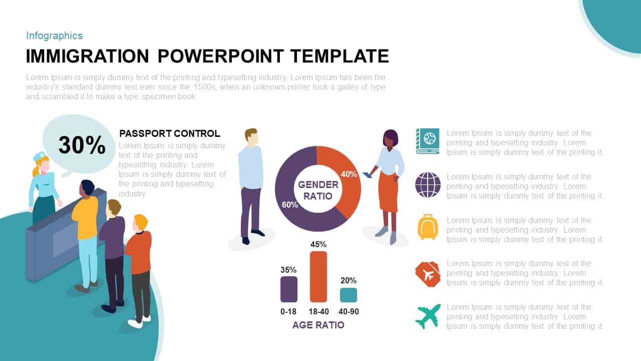
Immigration Data Dashboard Template for PowerPoint & Google Slides
Bar/Column
Premium
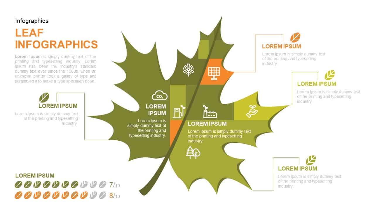
Leaf Infographic Data Visualization Template for PowerPoint & Google Slides
Infographics
Premium
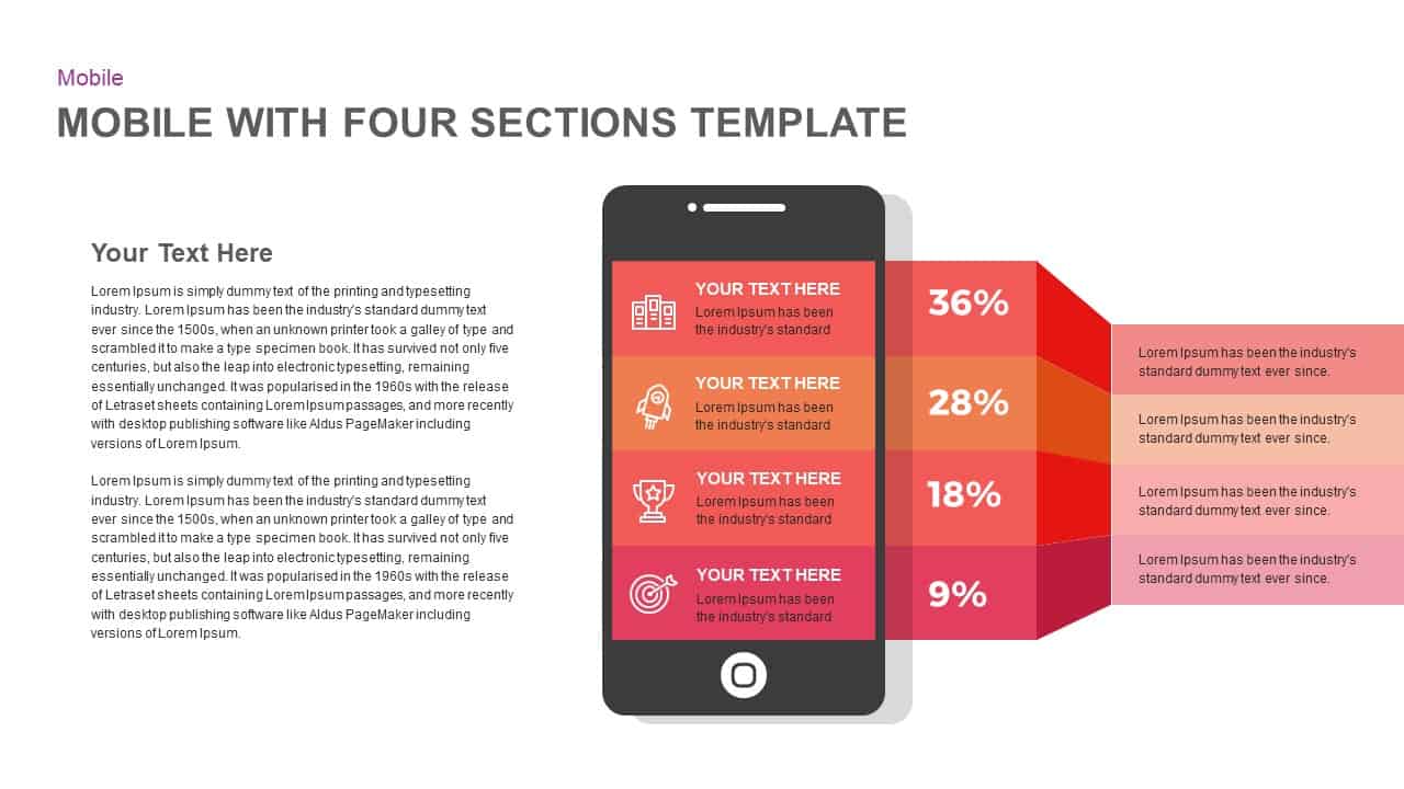
Mobile Infographics Data Visualization Template for PowerPoint & Google Slides
Infographics
Premium
Medical Infographics Data Visualization Template for PowerPoint & Google Slides
Health
Premium
DIKW Data to Wisdom Pyramid Model Template for PowerPoint & Google Slides
Pyramid
Premium
Data-driven GDP Growth Infographic Pack Template for PowerPoint & Google Slides
Infographics
Premium
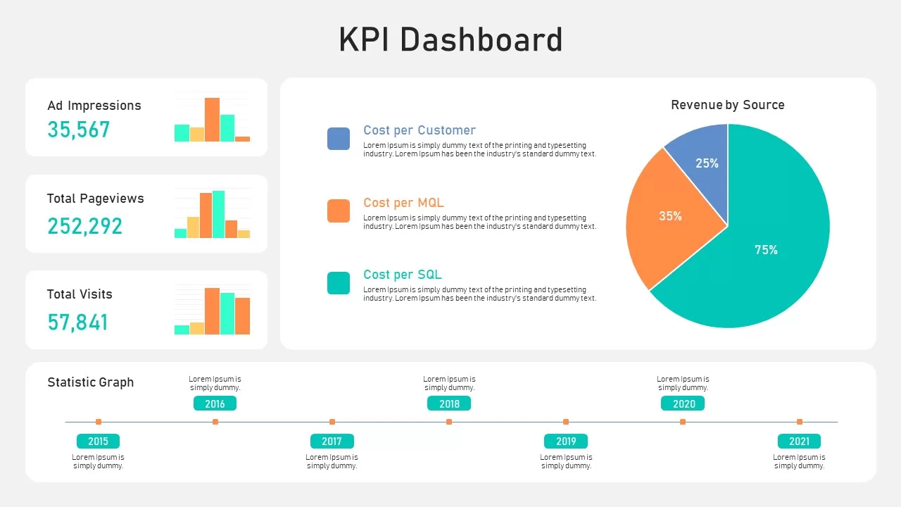
KPI Dashboard Data Visualization Template for PowerPoint & Google Slides
Bar/Column
Premium
KPI Dashboard Data Overview Slide Template for PowerPoint & Google Slides
Bar/Column
Premium
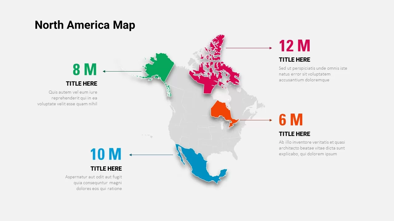
North America Data Map Callouts Template for PowerPoint & Google Slides
World Maps
Premium
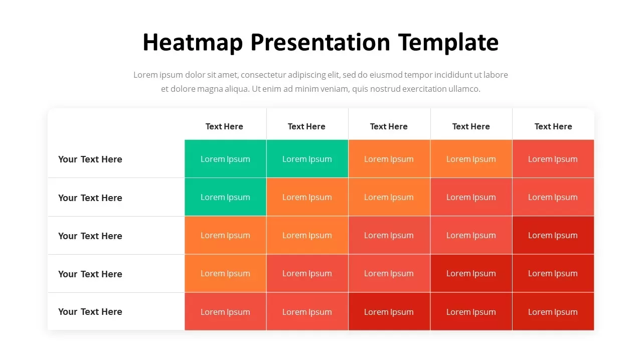
Professional Heatmap Data Visualization Template for PowerPoint & Google Slides
Infographics
Premium
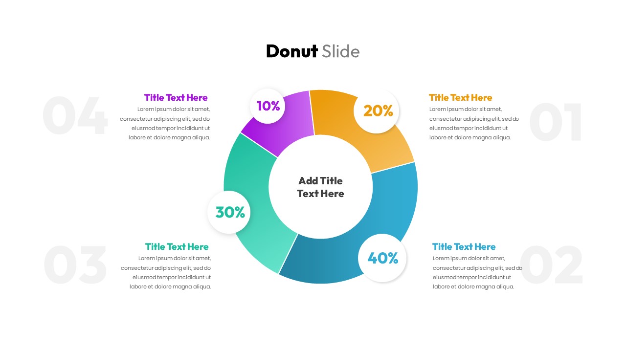
Donut Chart Data Breakdown template for PowerPoint & Google Slides
Pie/Donut
Premium

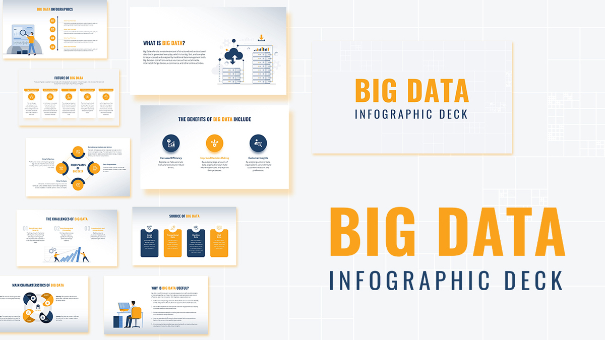
Modern Big Data Infographic Deck Template for PowerPoint & Google Slides
Decks
Premium
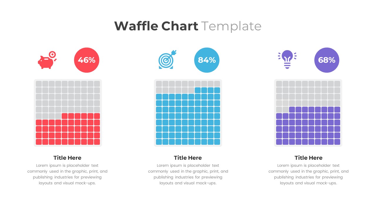
Waffle Chart Data Visualization Template for PowerPoint & Google Slides
Comparison Chart
Premium
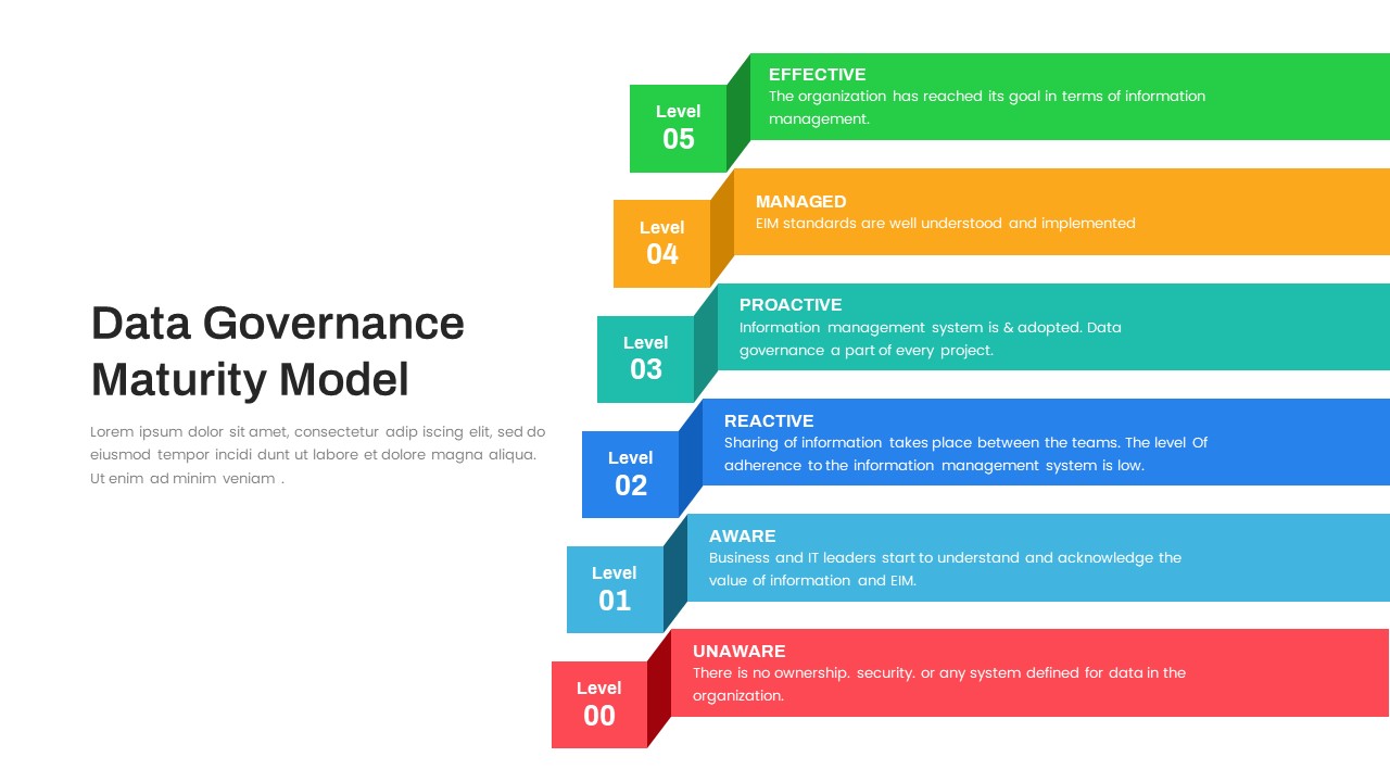
Layered Data Governance Maturity Model Template for PowerPoint & Google Slides
Process
Premium
Free Stacked Column Chart Data Visualization Template for PowerPoint & Google Slides
Bar/Column
Free
Simple Bar Chart Data Visualization Template for PowerPoint & Google Slides
Bar/Column
Premium
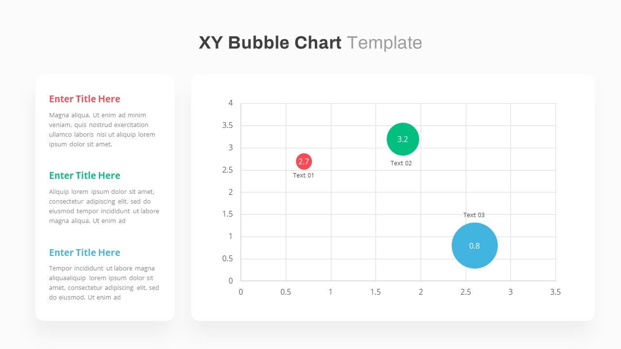
XY Bubble Chart Data Visualization Template for PowerPoint & Google Slides
Comparison Chart
Premium
Simple Area Chart Data Trends Analysis Template for PowerPoint & Google Slides
Comparison Chart
Premium
Data Over Time Line Chart template for PowerPoint & Google Slides
Charts
Premium
Waterfall Chart Data Visualization Template for PowerPoint & Google Slides
Comparison Chart
Premium
Multipurpose Spline Chart Data Trend Template for PowerPoint & Google Slides
Bar/Column
Premium
Editable Africa Map Infographic Data Template for PowerPoint & Google Slides
World Maps
Premium
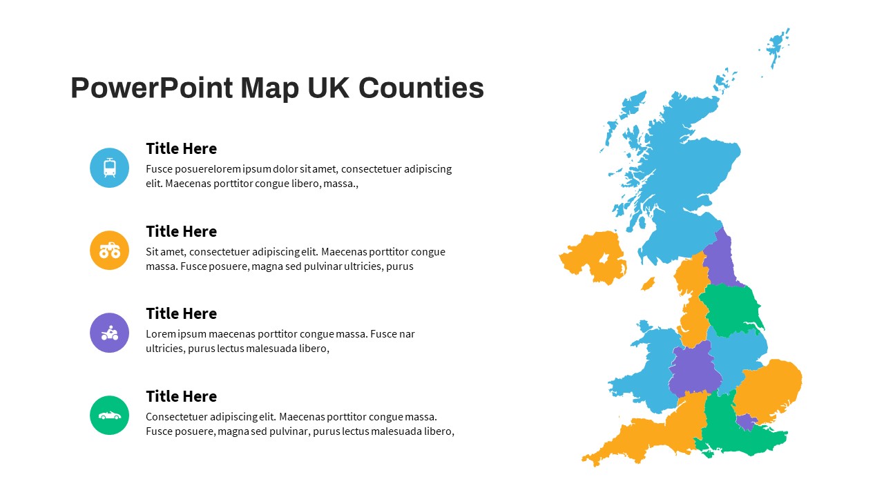
UK Counties Map Data Visualization Template for PowerPoint & Google Slides
World Maps
Premium
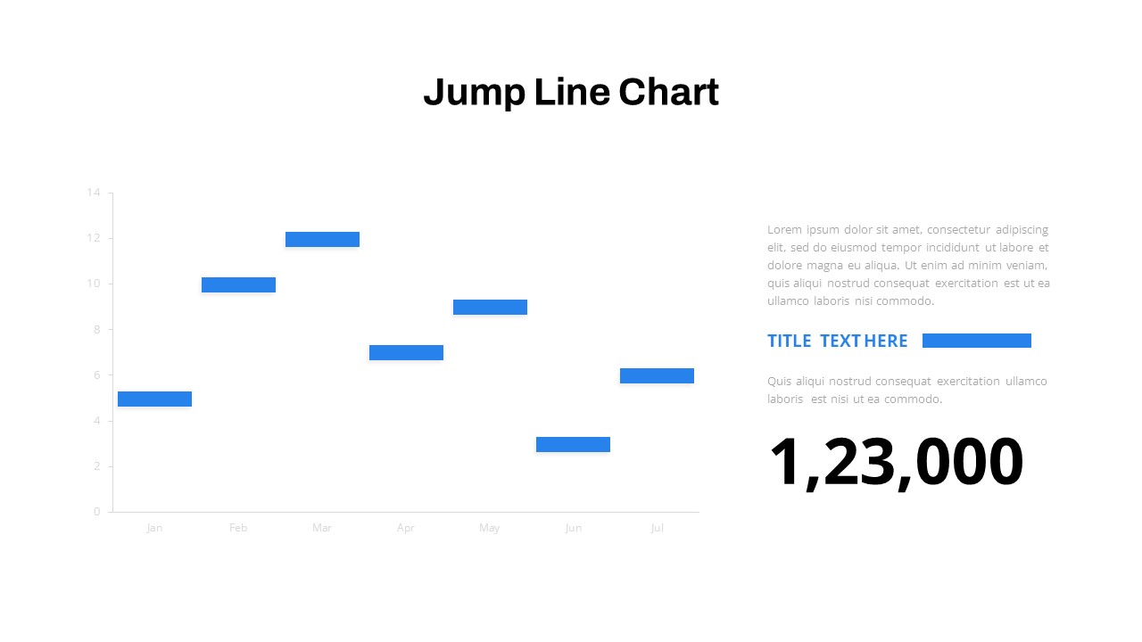
Interactive Jump Line Data Chart Template for PowerPoint & Google Slides
Comparison Chart
Premium
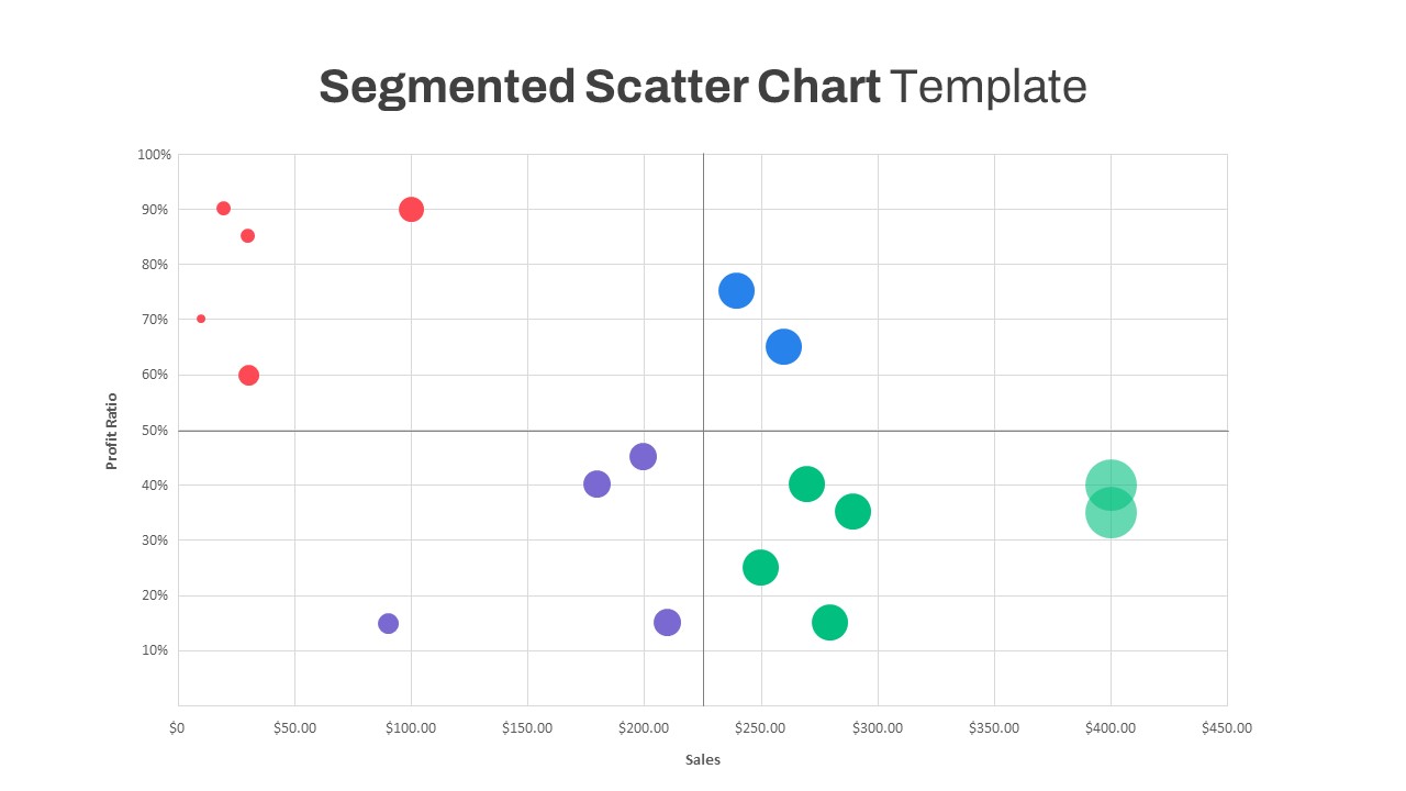
Segmented Scatter Chart Data Visualization Template for PowerPoint & Google Slides
Business Strategy
Premium
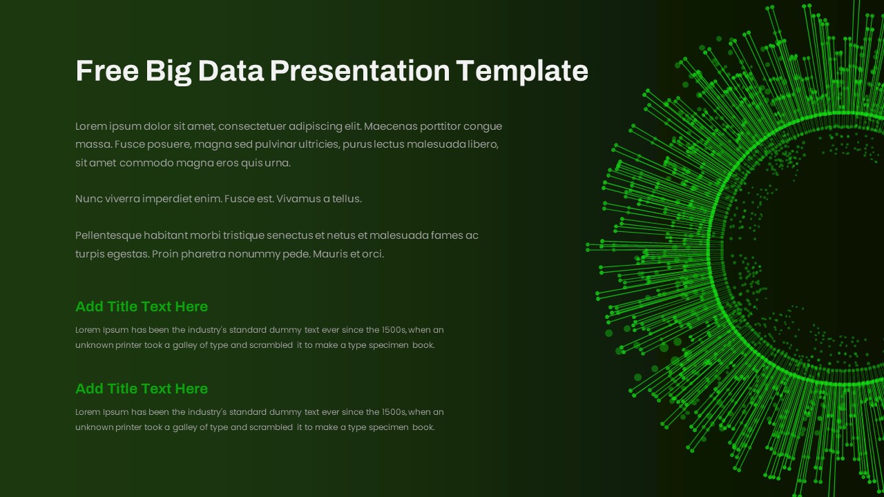
Free Big Data Network Visualization Template for PowerPoint & Google Slides
Circle
Free
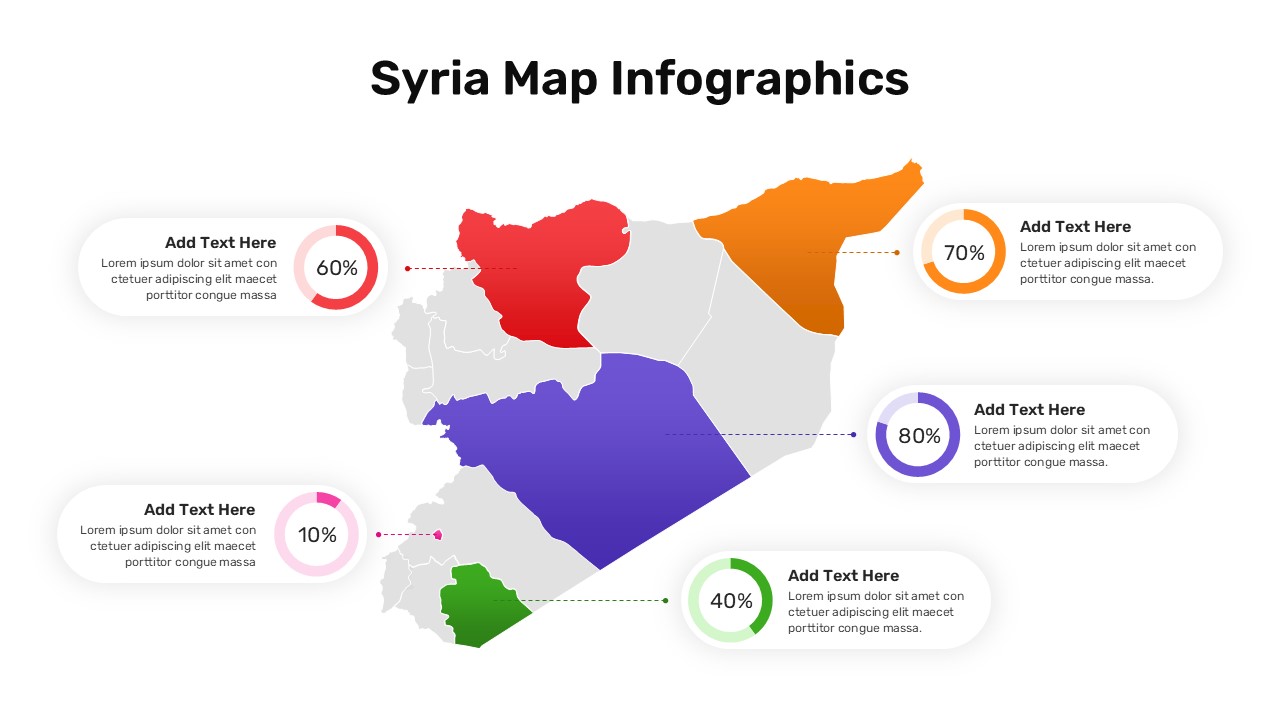
Syria Regional Data Map Infographic Template for PowerPoint & Google Slides
World Maps
Premium
Data Analysis Bar Chart with Insights Template for PowerPoint & Google Slides
Bar/Column
Free
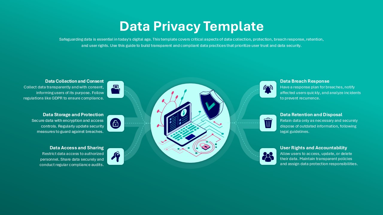
Data Privacy template for PowerPoint & Google Slides
Information Technology
Premium
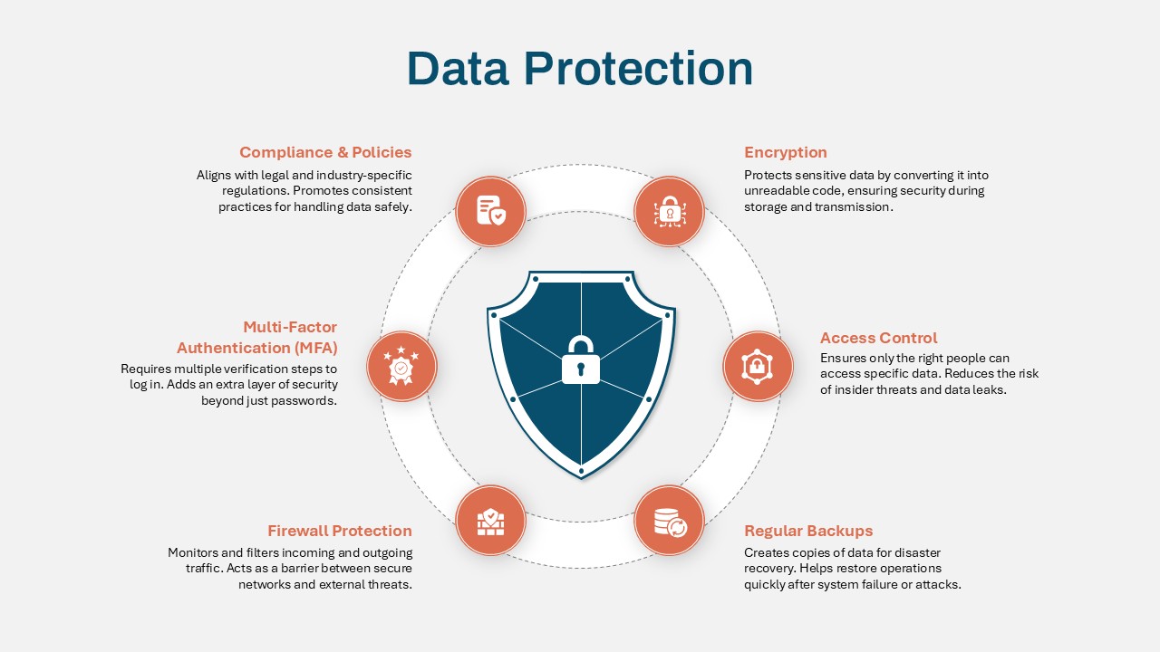
Data Protection Strategies template for PowerPoint & Google Slides
Information Technology
Premium
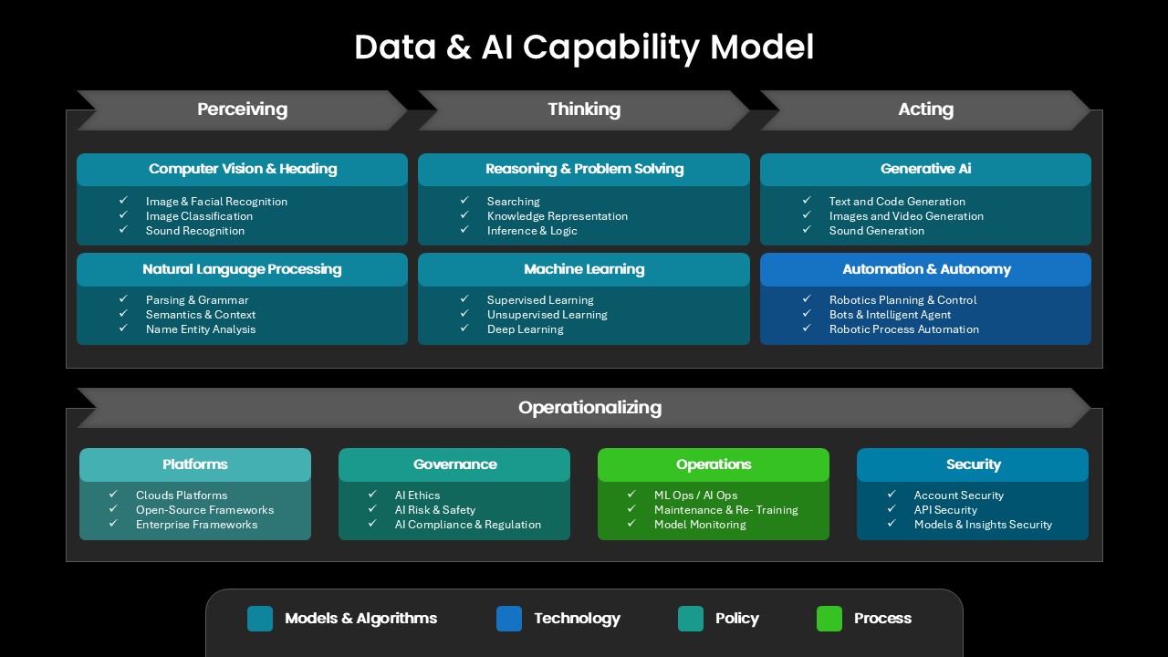
Comprehensive Data & AI Capability Model Template for PowerPoint & Google Slides
AI
Premium
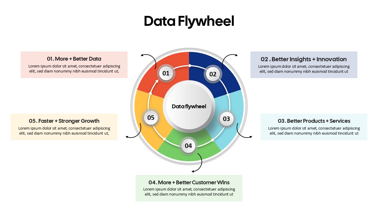
Data Flywheel Strategy template for PowerPoint & Google Slides
Business
Premium
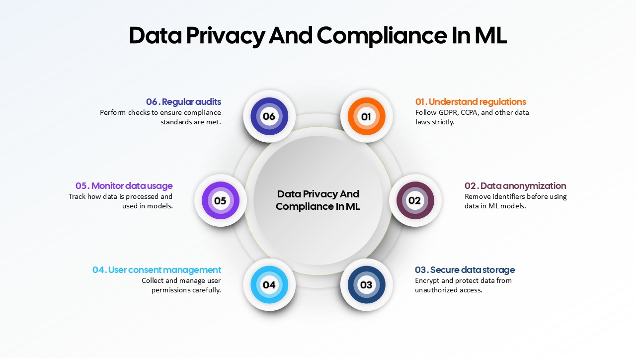
Data Privacy and Compliance in ML template for PowerPoint & Google Slides
Technology
Premium
Data-Driven AI in Insurance Infographic Template for PowerPoint & Google Slides
Circle
Premium
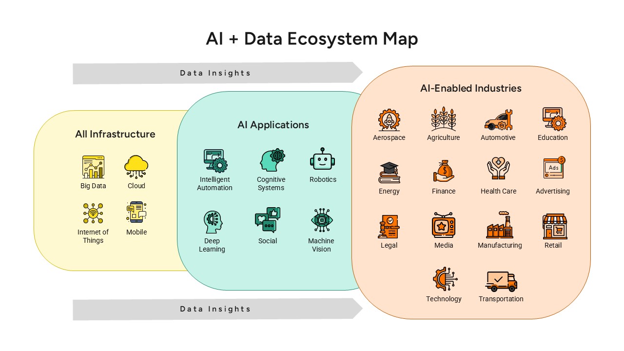
AI and Data Ecosystem Map Template for PowerPoint & Google Slides
AI
Premium
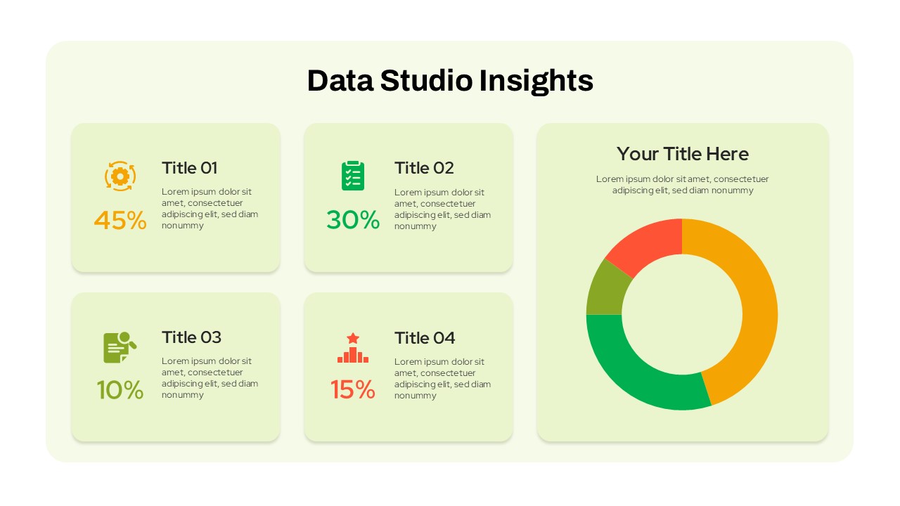
Data Studio Insights template for PowerPoint & Google Slides
Business Report
Premium
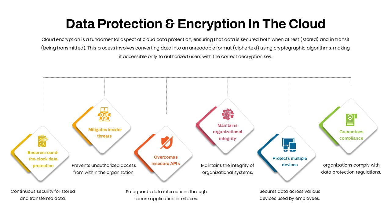
Data Protection & Encryption in the Cloud Overview template for PowerPoint & Google Slides
Cloud Computing
Premium
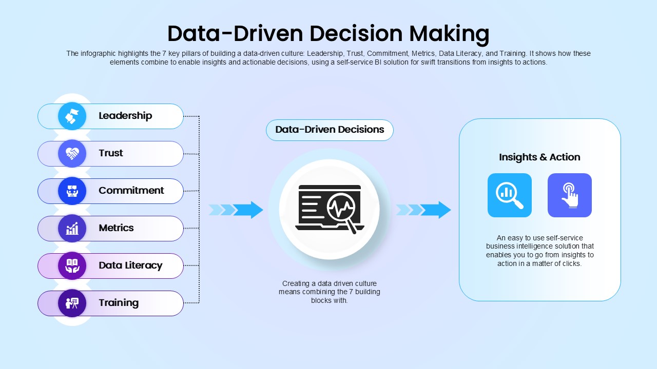
Data-Driven Decision Making overview template for PowerPoint & Google Slides
Business
Premium
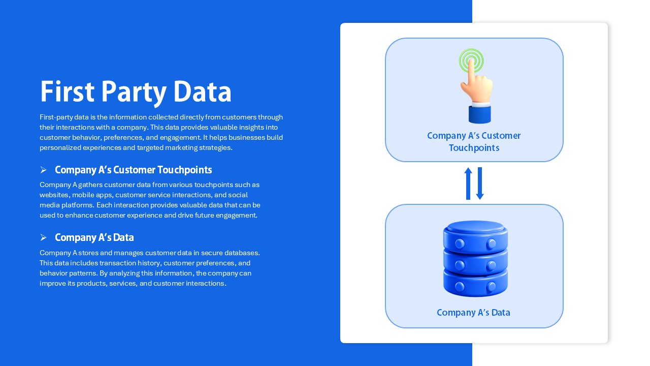
First Party Data Overview Template for PowerPoint & Google Slides
Business
Premium
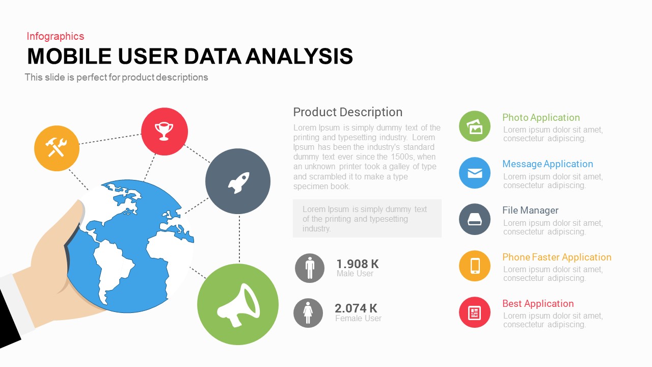
Mobile User Data Analysis Infographic for PowerPoint & Google Slides
Process
Premium
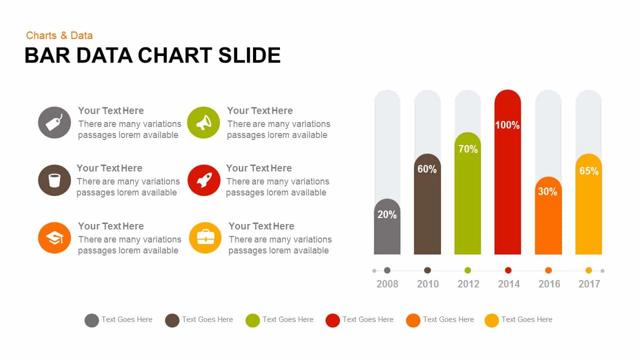
Bar Data Chart Slide for PowerPoint & Google Slides
Bar/Column
Premium
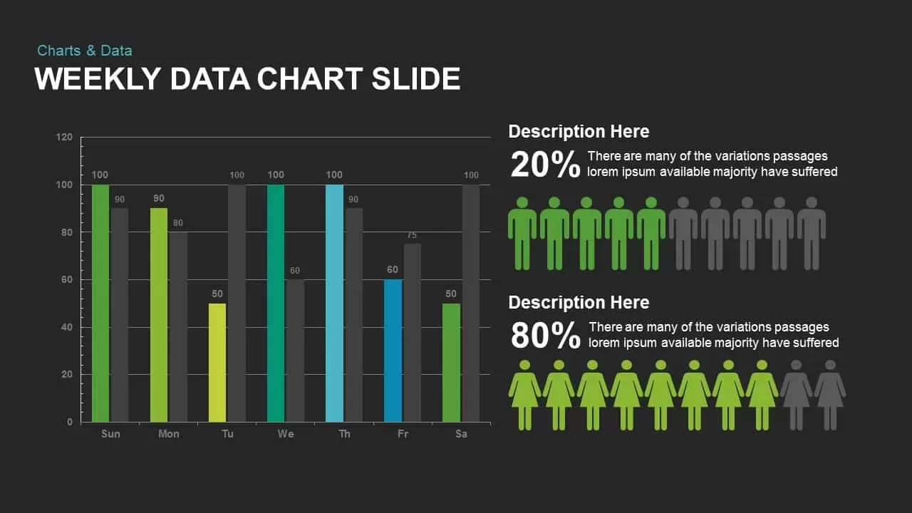
Weekly Data Chart Slide for PowerPoint & Google Slides
Comparison Chart
Premium

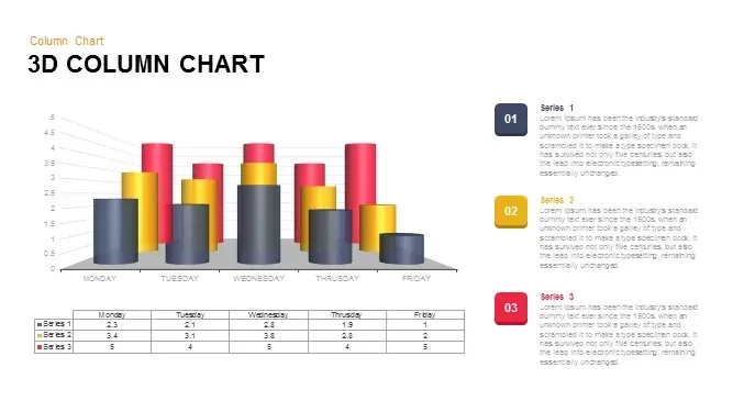
3D Column Chart with Data Table for PowerPoint & Google Slides
Bar/Column
Premium

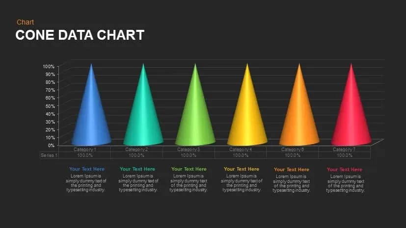
Cone Data Chart for PowerPoint & Google Slides
Charts
Premium
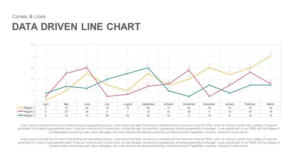
Data-Driven Line Chart Diagram Template for PowerPoint
Comparison Chart
Premium
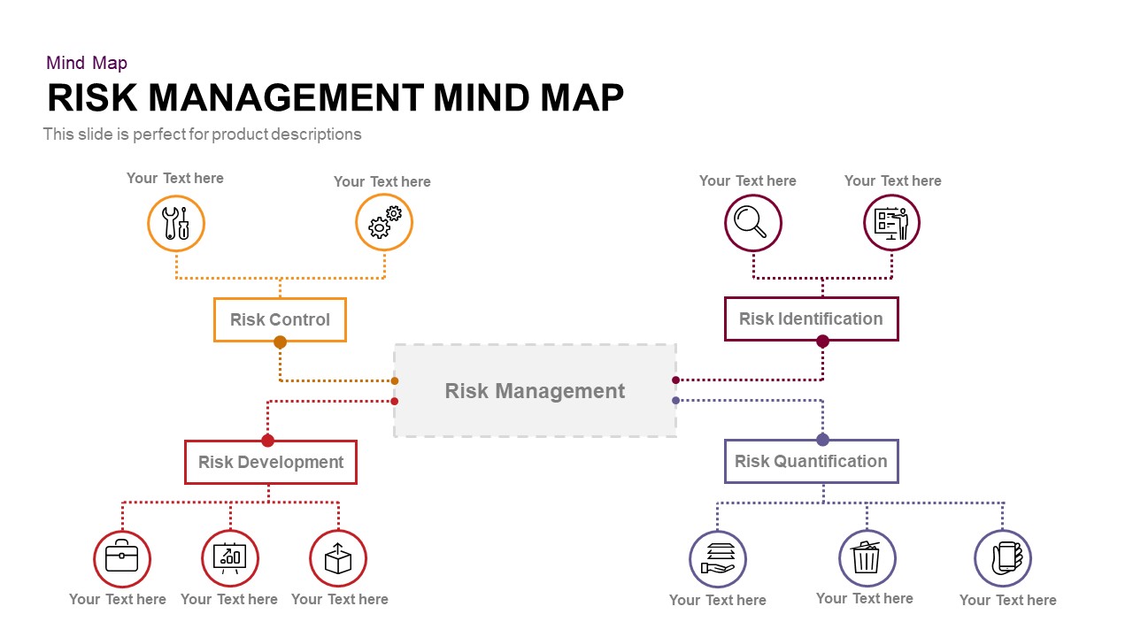
Risk Management Mind Map Radial Diagram template for PowerPoint & Google Slides
Mind Maps
Premium
Business Management Hexagon Diagram Template for PowerPoint & Google Slides
Comparison
Premium
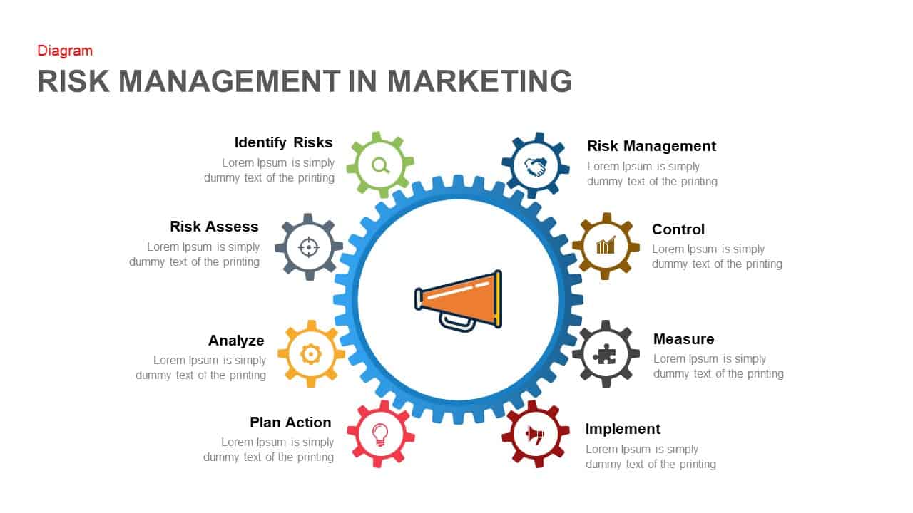
Marketing Risk Management Gear Diagram Template for PowerPoint & Google Slides
Risk Management
Premium
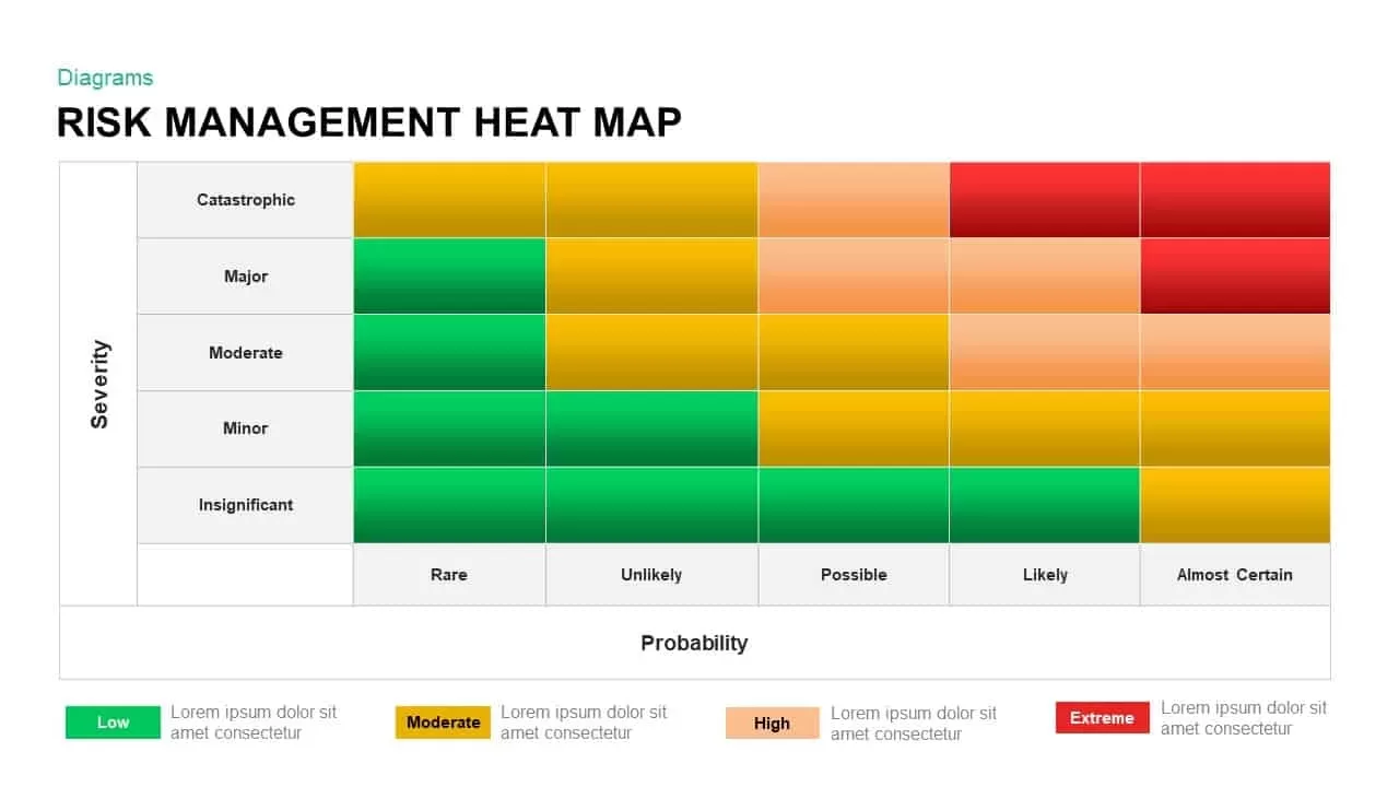
Risk Management Heat Map Diagram Template for PowerPoint & Google Slides
Comparison Chart
Premium
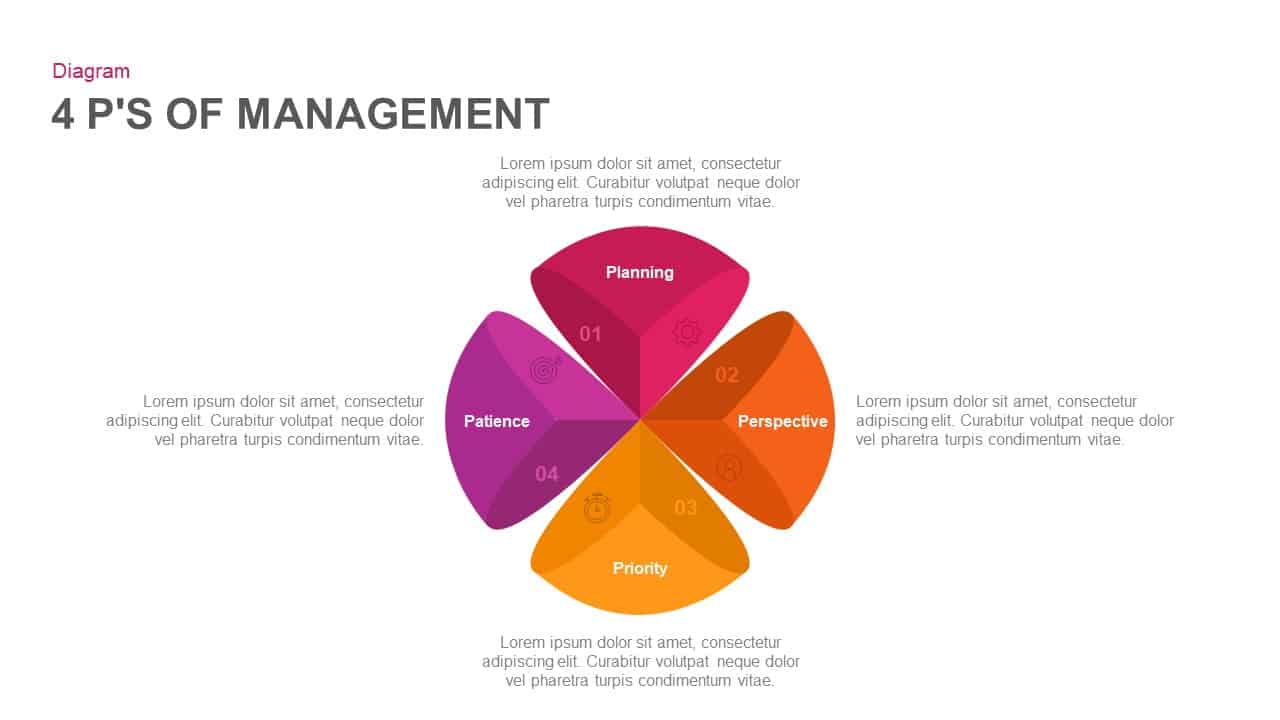
4 Ps of Management Circular Diagram Template for PowerPoint & Google Slides
Circle
Premium
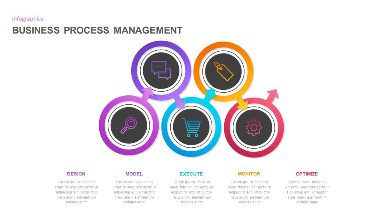
Business Process Management Flow Diagram Template for PowerPoint & Google Slides
Process
Premium
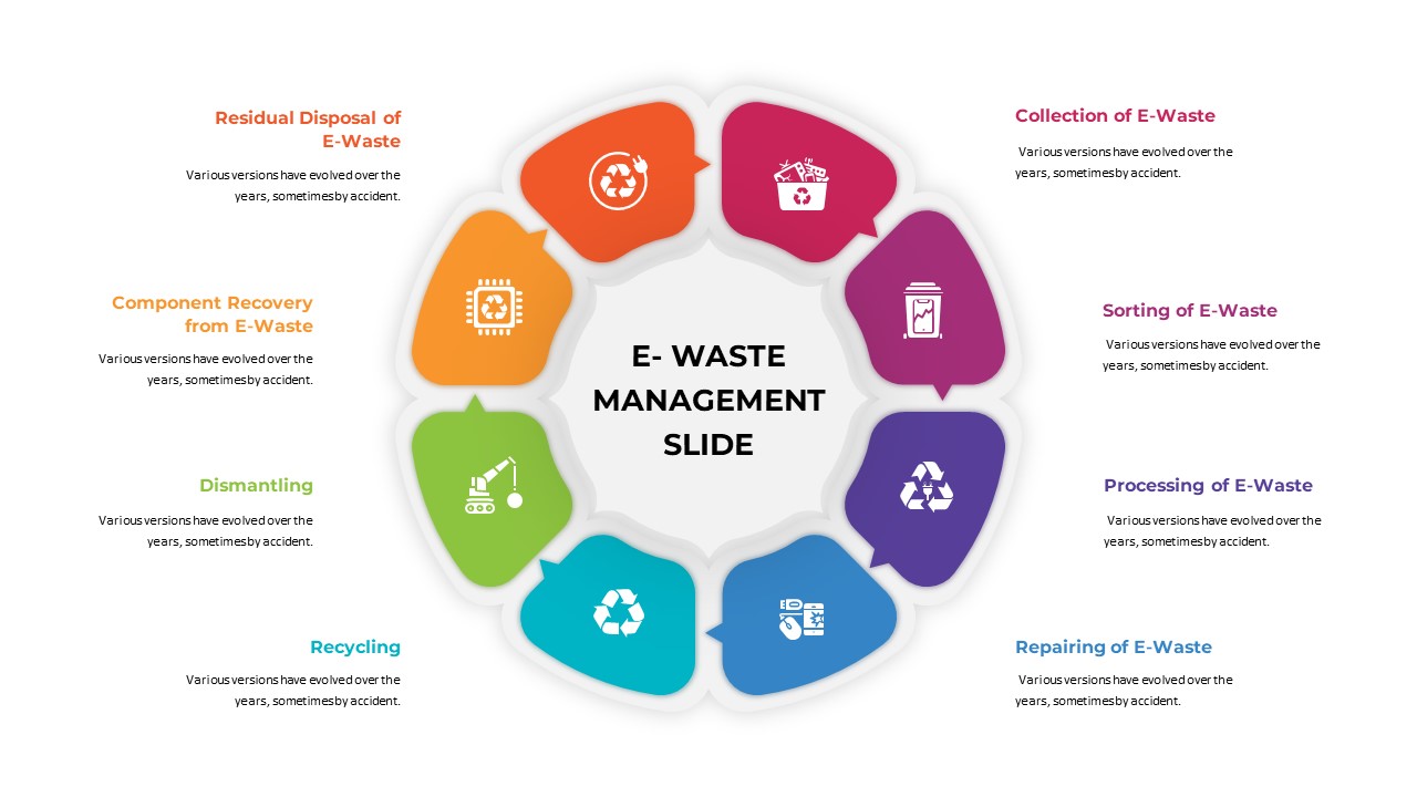
E-Waste Management Diagram Template for PowerPoint & Google Slides
Infographics
Premium
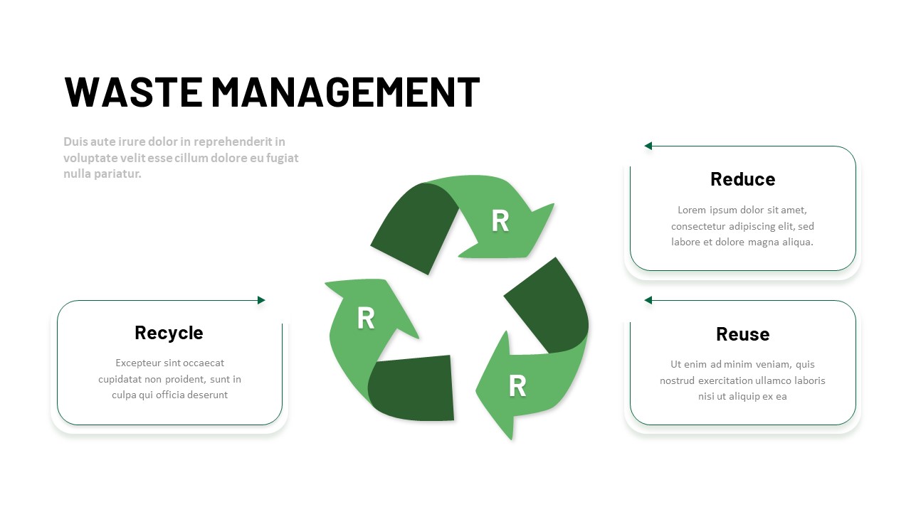
3R Waste Management Cycle Diagram Template for PowerPoint & Google Slides
Circle
Premium
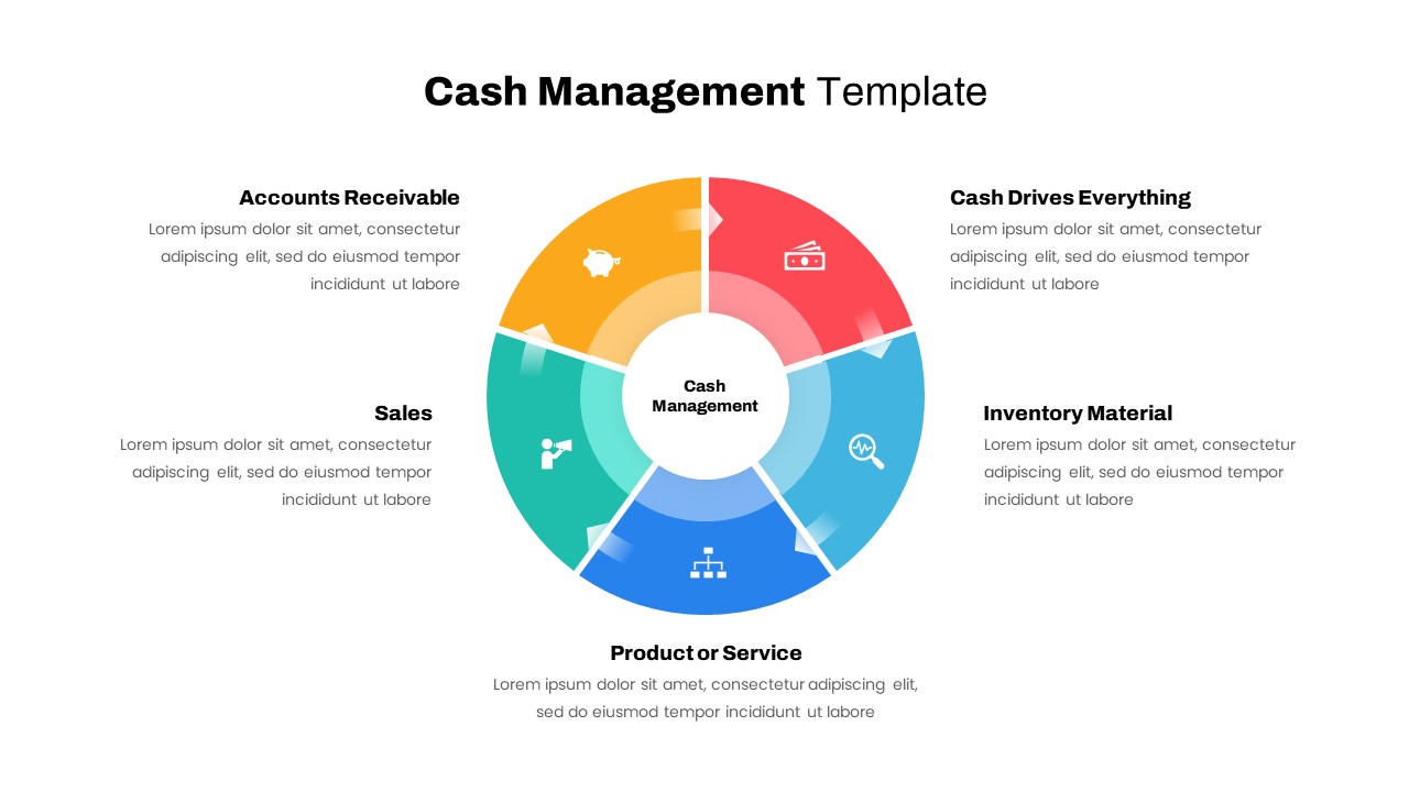
Cash Management Infographic Diagram Template for PowerPoint & Google Slides
Circle
Premium
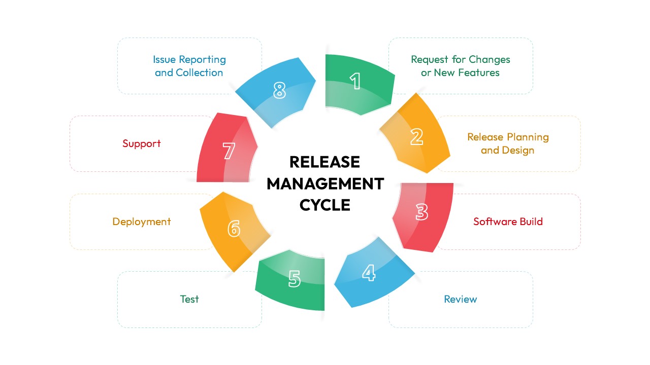
Release Management Cycle Circular Diagram Template for PowerPoint & Google Slides
Software Development
Premium
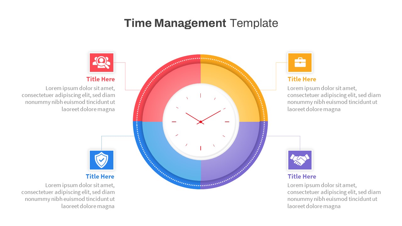
Free Time Management Clock Cycle Diagram Template for PowerPoint & Google Slides
Process
Free
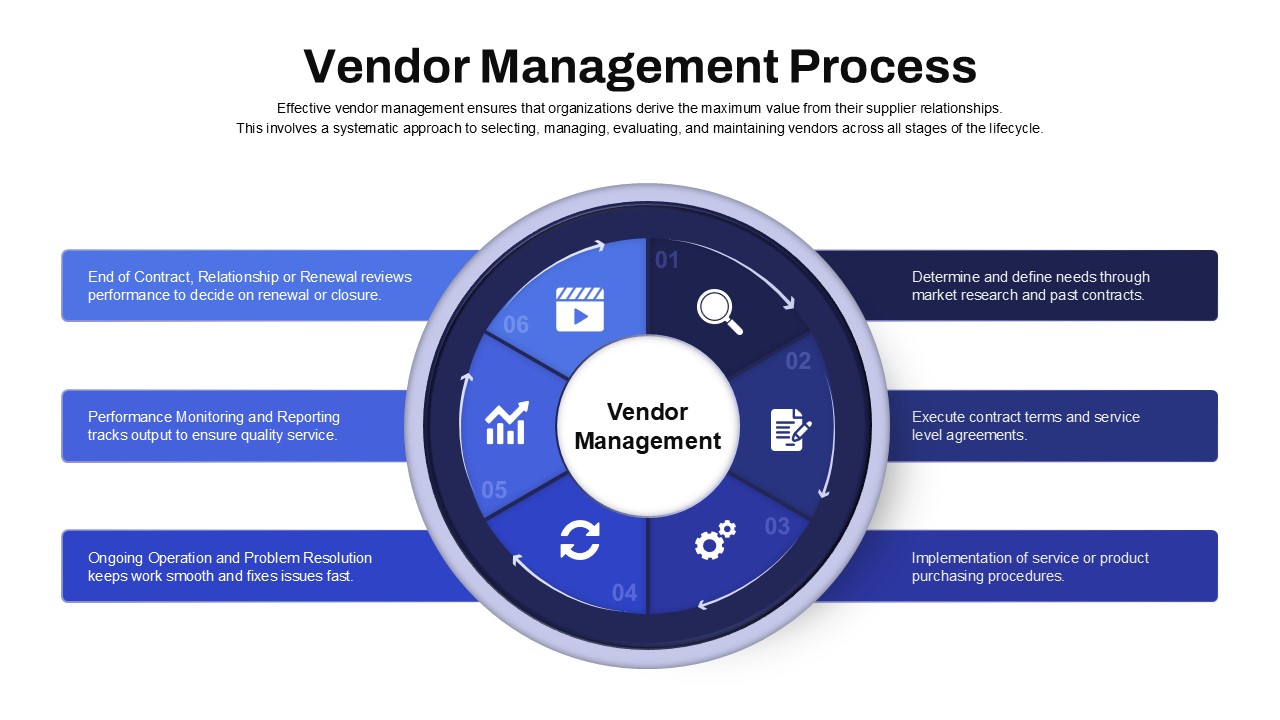
Vendor Management Process Diagram Template for PowerPoint & Google Slides
Process
Premium
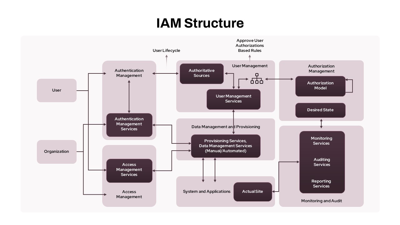
IAM Access Management Structure Diagram Template for PowerPoint & Google Slides
Flow Charts
Premium
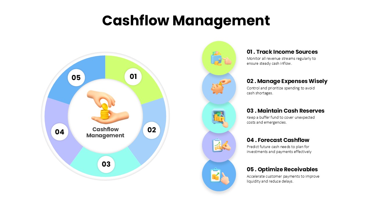
Cashflow Management Cycle Diagram Template for PowerPoint & Google Slides
Finance
Premium