Interactive US Population Data Map Slide Template for PowerPoint & Google Slides

Description
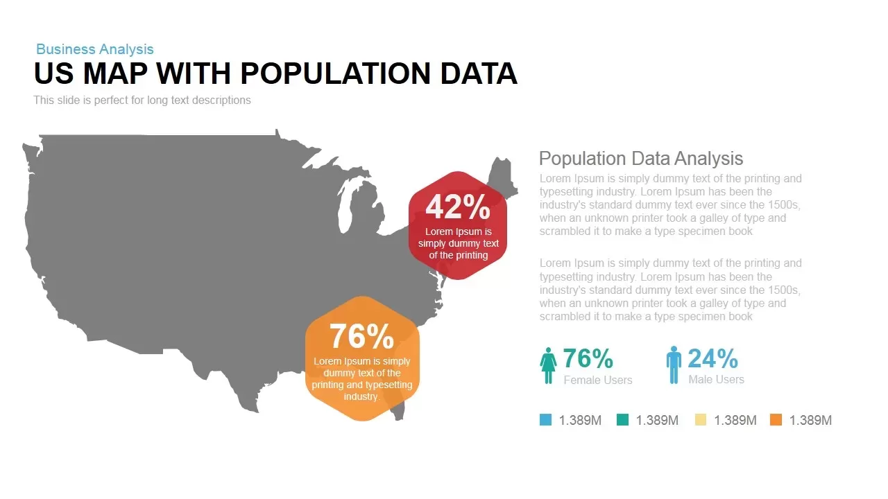
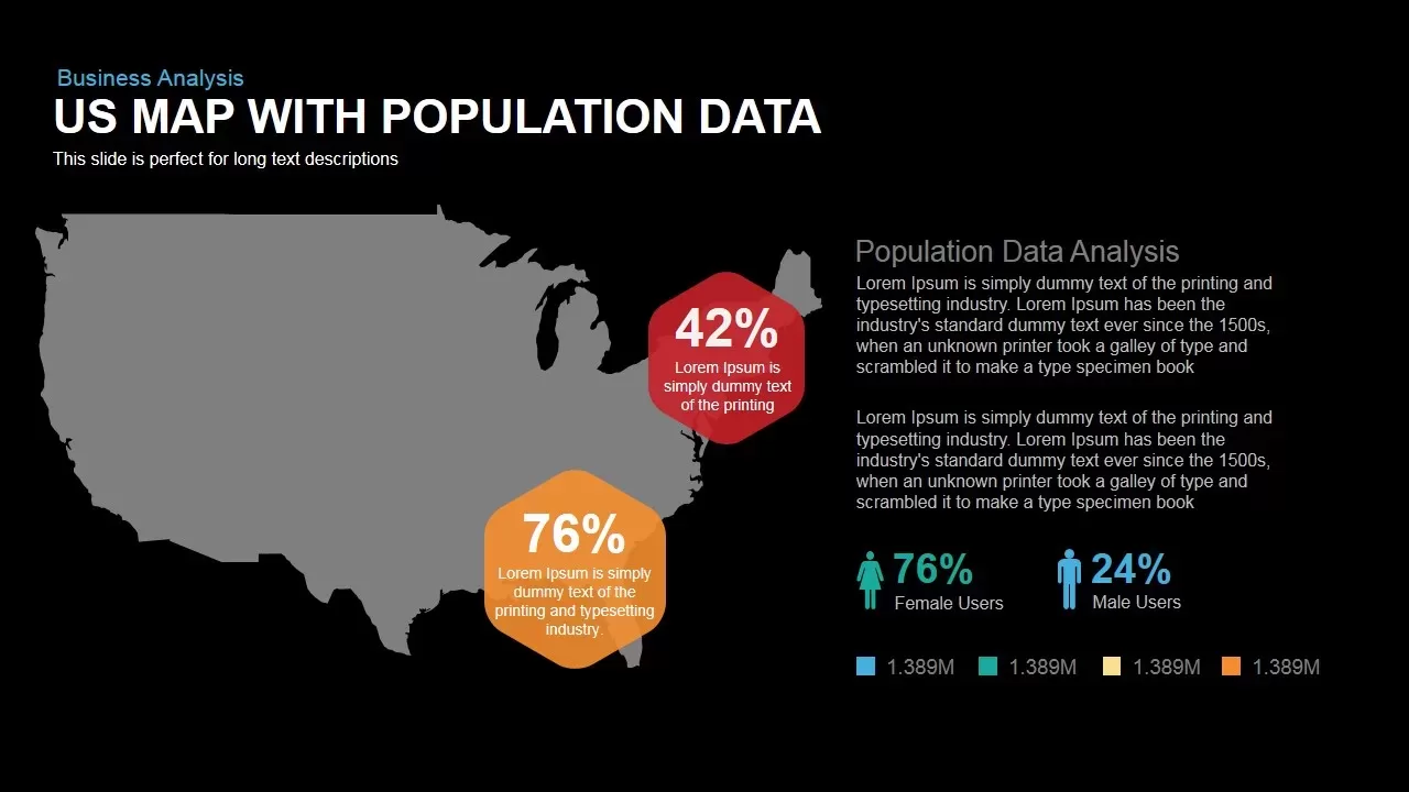
This slide features a bold US silhouette map on a clean white canvas, complemented by two vibrant hexagonal callouts positioned over key regions to display population percentages—42% in the Northeast (red hexagon) and 76% in the South (orange hexagon). Each callout contains customizable placeholder text for brief context. To the right, a dedicated content area titled “Population Data Analysis” offers space for long-form narrative, with intuitive text blocks for detailed explanations. Below, gender-specific icons visualize a demographic split of 76% female and 24% male users, reinforced by a color-coded legend with four distinct population categories.
Built on editable master slides, this template includes vector-based hexagon shapes, map outline, icons, and legends that are fully customizable. Users can adjust callout positions, update percentage values, recolor hexagons to match branding, or swap placeholder text in seconds. Alignment guides and distribution tools allow adding additional callouts or resizing the map for different aspect ratios. The slide supports both PowerPoint and Google Slides, ensuring consistent formatting and seamless collaboration. For enhanced storytelling, apply sequential entrance animations to each callout and demographic icon to guide audience focus through data points. The professional sans-serif typography and balanced white space ensure readability and visual impact in boardroom presentations, investor briefings, or academic reports.
Who is it for
Market researchers, demographic analysts, and business strategists can leverage this slide to present population distributions across U.S. regions. Educators, public policy experts, and marketing teams will find the hexagon callouts ideal for highlighting regional statistics, survey results, or campaign reach.
Other Uses
Beyond population metrics, repurpose this layout for sales territory maps, resource allocation plans, or geographic performance dashboards. Replace callouts with sales figures, customer growth rates, or infrastructure project statuses to adapt the design for diverse data storytelling.
Login to download this file

Item ID
SB00100
Related Templates

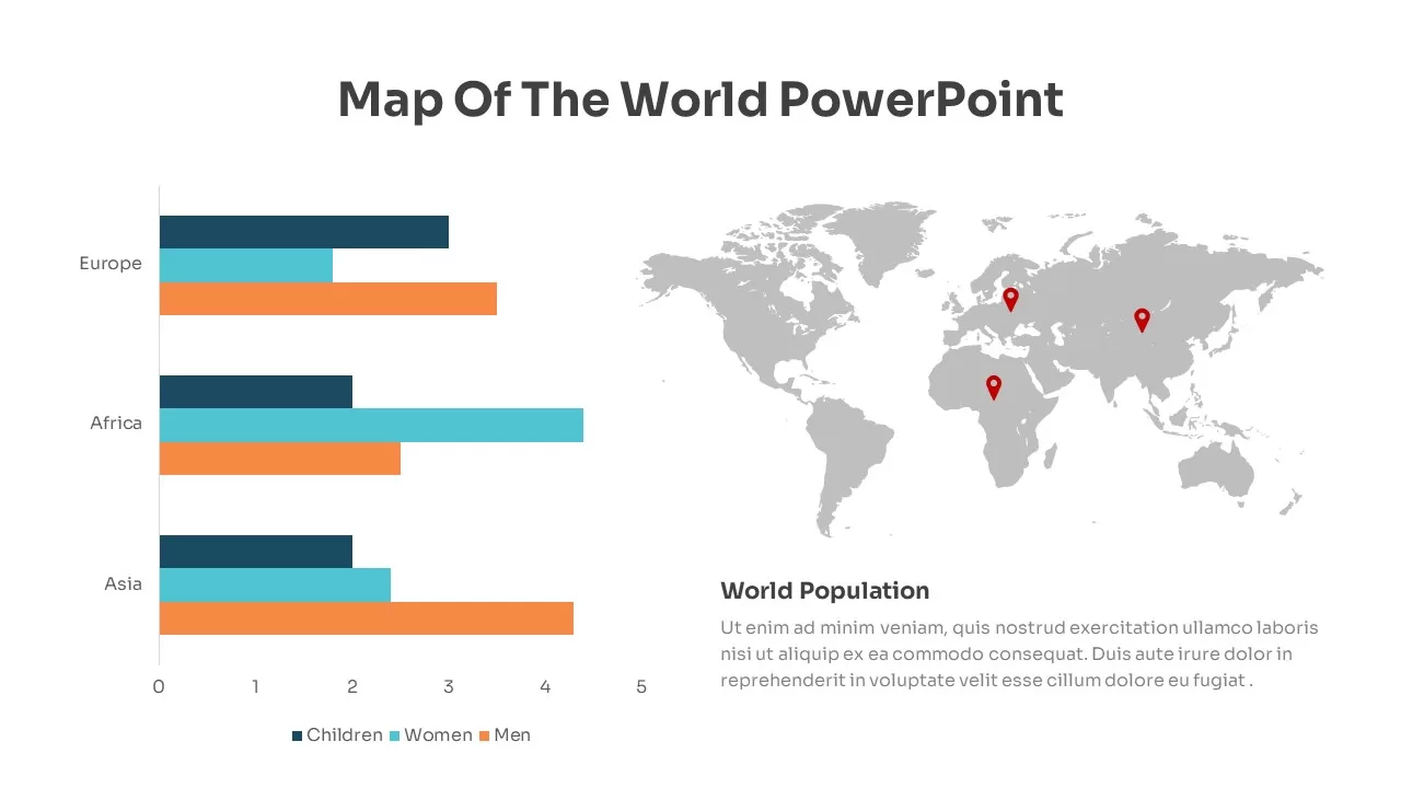
Global Population Demographics & Map Template for PowerPoint & Google Slides
Bar/Column
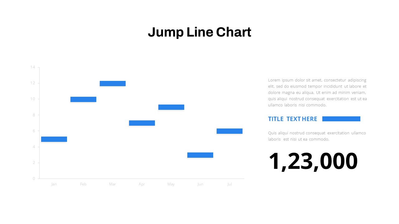
Interactive Jump Line Data Chart Template for PowerPoint & Google Slides
Comparison Chart

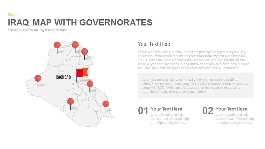
Interactive Iraq Map with Governorates Slide Pack for PowerPoint & Google Slides
World Maps
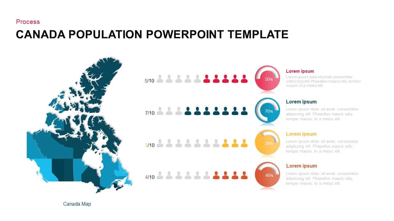
Canada Population Infographics Template for PowerPoint & Google Slides
World Maps
Population Infographics template for PowerPoint & Google Slides
Comparison
Population Infographic Template for PowerPoint & Google Slides
Comparison
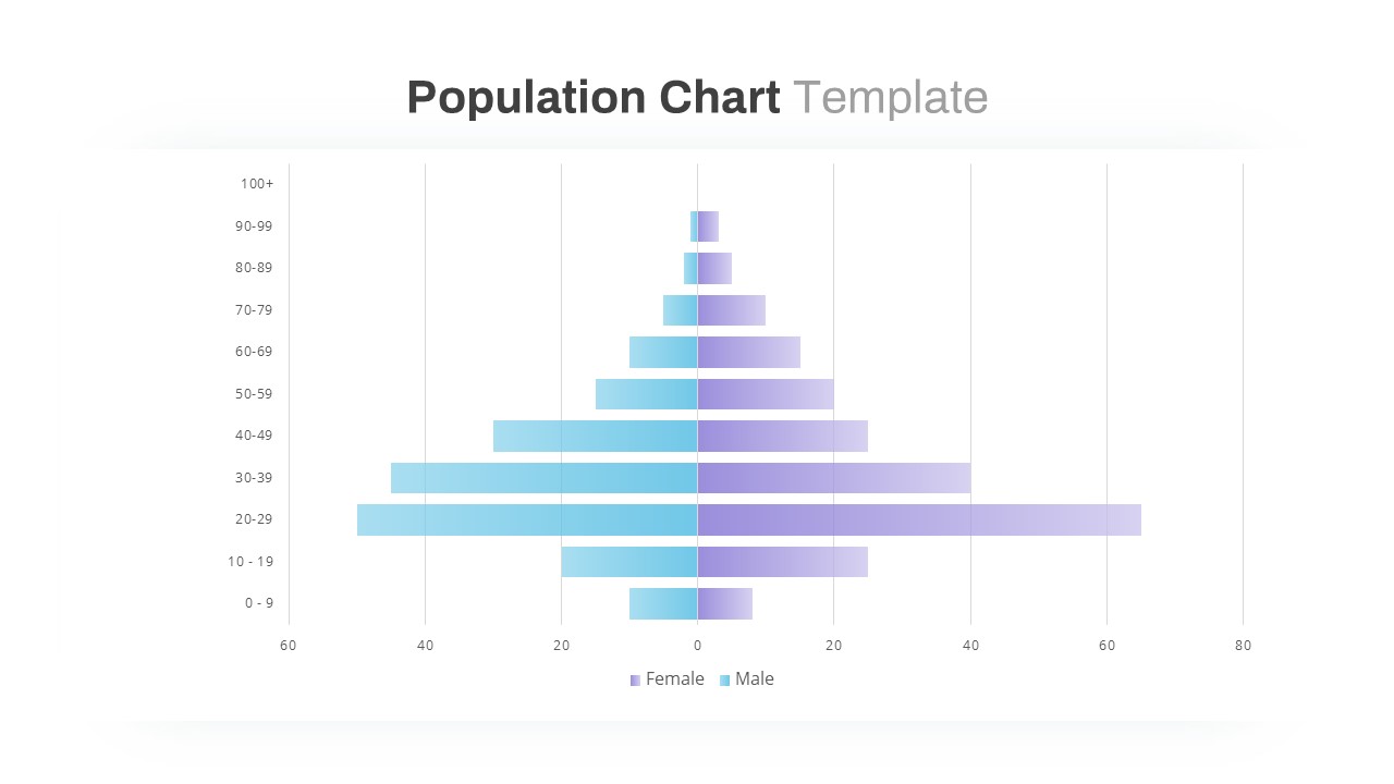
Population Pyramid Chart Analysis Template for PowerPoint & Google Slides
Bar/Column
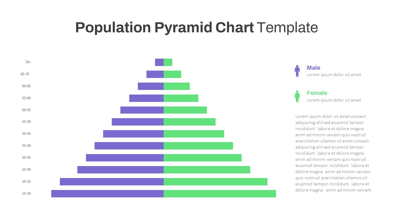
Population Age Distribution Pyramid Chart Template for PowerPoint & Google Slides
Pyramid
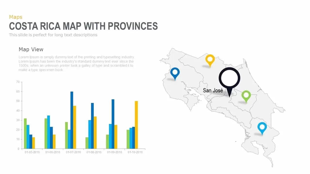
Interactive Costa Rica Province Map Template for PowerPoint & Google Slides
World Maps

Interactive Empathy Map Diagram Template for PowerPoint & Google Slides
Process
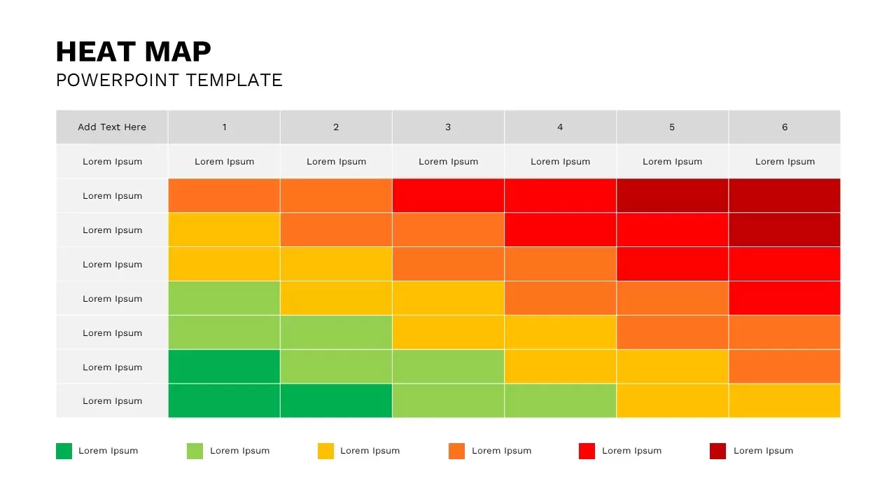
Professional Interactive Heat Map Matrix Template for PowerPoint & Google Slides
Comparison Chart
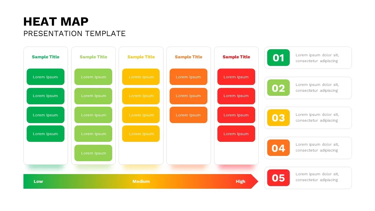
Interactive Heat Map Template for PowerPoint & Google Slides
Bar/Column
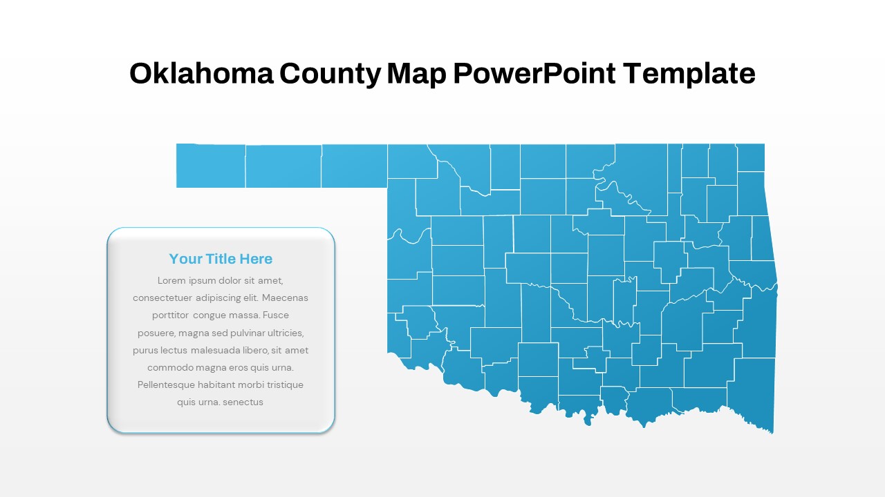
Interactive Oklahoma County Map Template for PowerPoint & Google Slides
World Maps
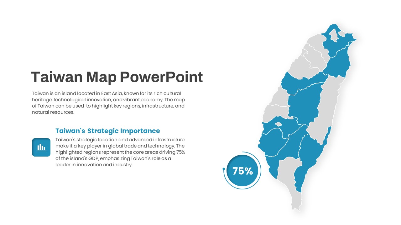
Interactive Taiwan Map Highlight Template for PowerPoint & Google Slides
World Maps
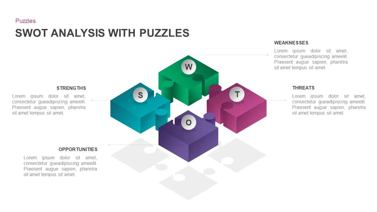
Interactive 3D Puzzle SWOT Analysis Slide Template for PowerPoint & Google Slides
SWOT
Interactive Slide Zoom & Transition Template for PowerPoint & Google Slides
Decks
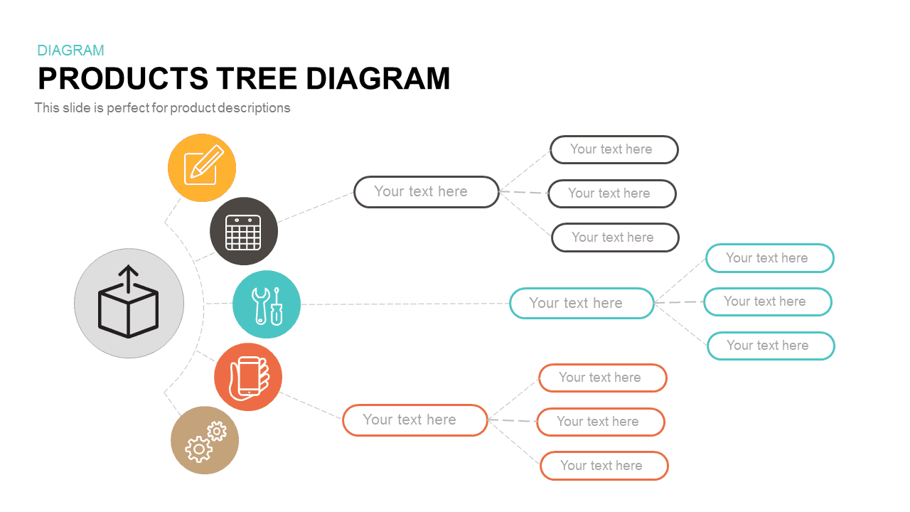
Interactive Products Tree Diagram template for PowerPoint & Google Slides
Org Chart
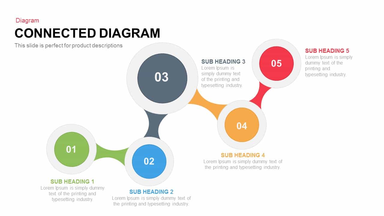
Interactive Connected Network Diagram Template for PowerPoint & Google Slides
Process
Interactive Product Comparison Bar Chart Template for PowerPoint & Google Slides
Bar/Column
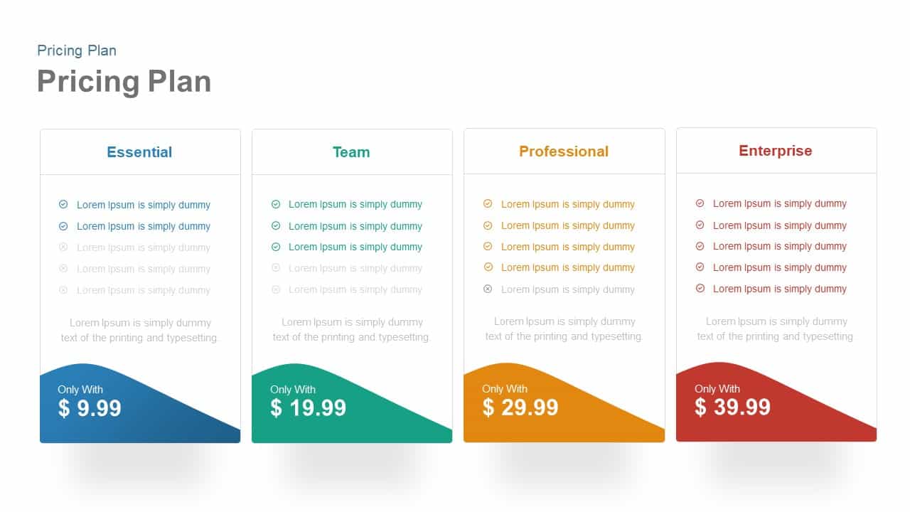
Interactive Pricing Plan Comparison Template for PowerPoint & Google Slides
Comparison

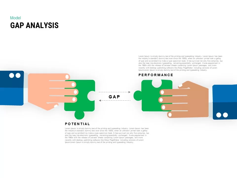
Interactive Gap Analysis Puzzle Diagram Template for PowerPoint & Google Slides
Gap

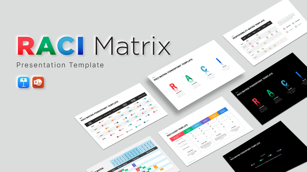
Interactive RACI Responsibility Matrix Template for PowerPoint & Google Slides
Project
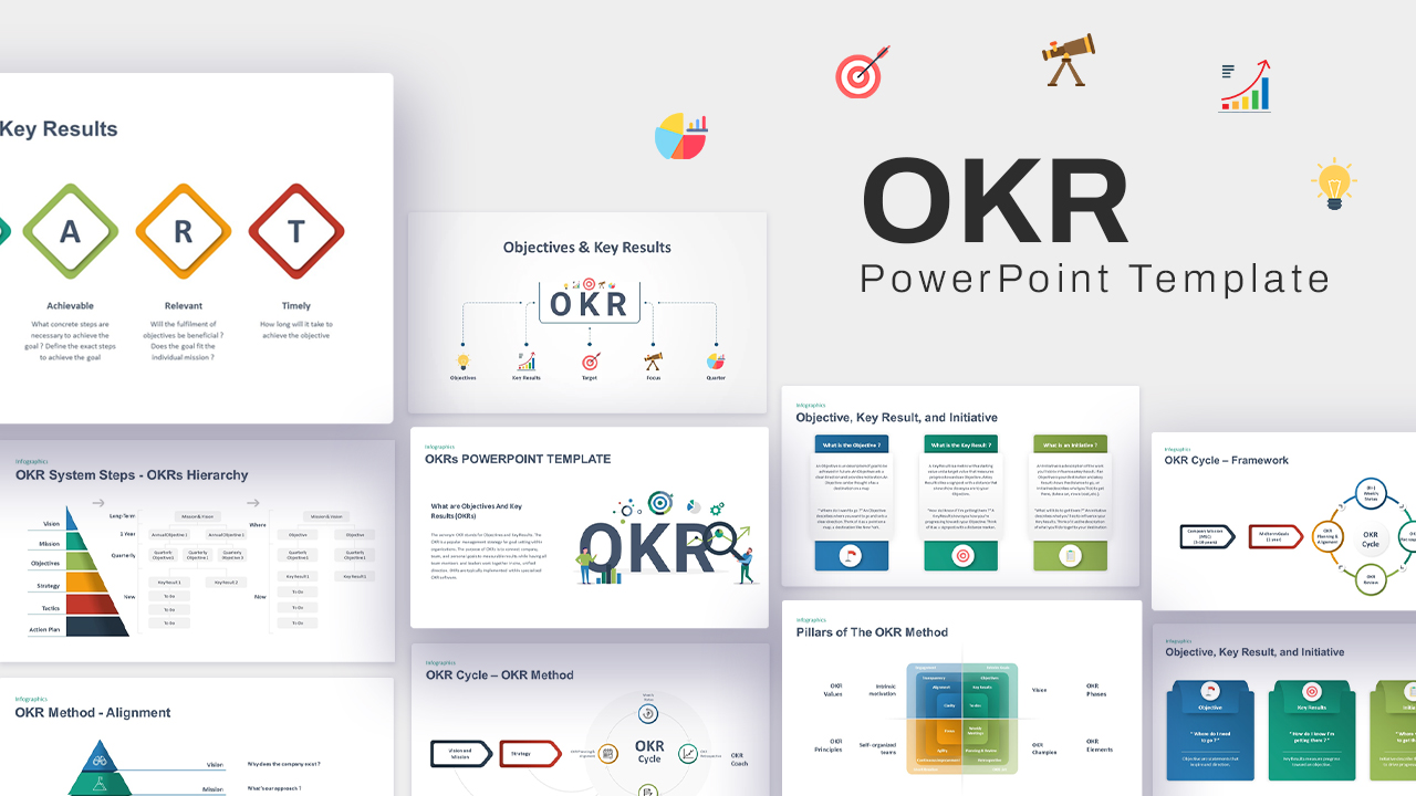
Interactive OKR Strategy Diagram Template for PowerPoint & Google Slides
Process
Free Interactive Online Course Presentation Template for PowerPoint & Google Slides
Pitch Deck
Free
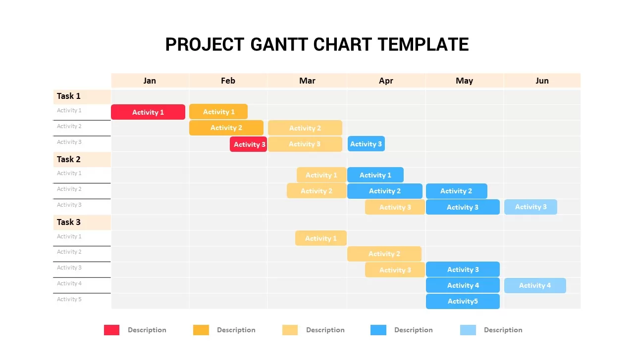
Interactive Project Gantt Chart Timeline Template for PowerPoint & Google Slides
Gantt Chart
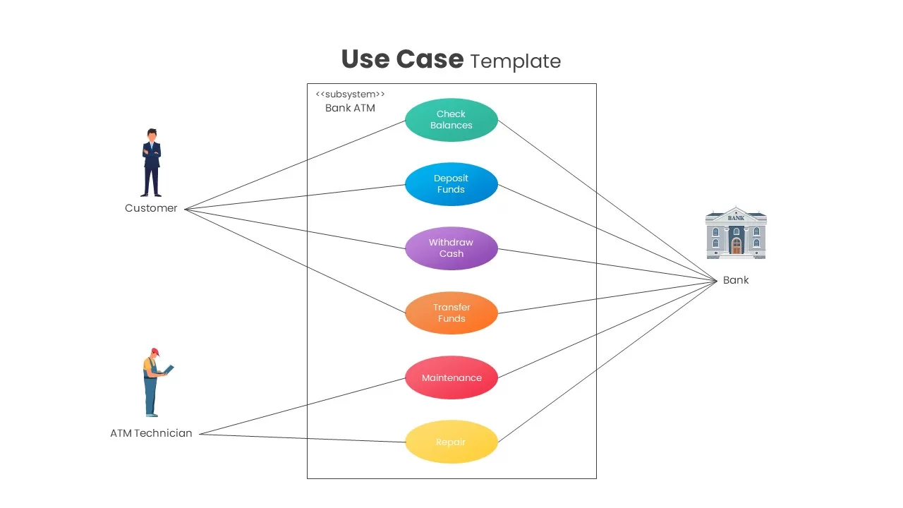
Interactive Bank ATM Use Case Diagram Template for PowerPoint & Google Slides
Software Development
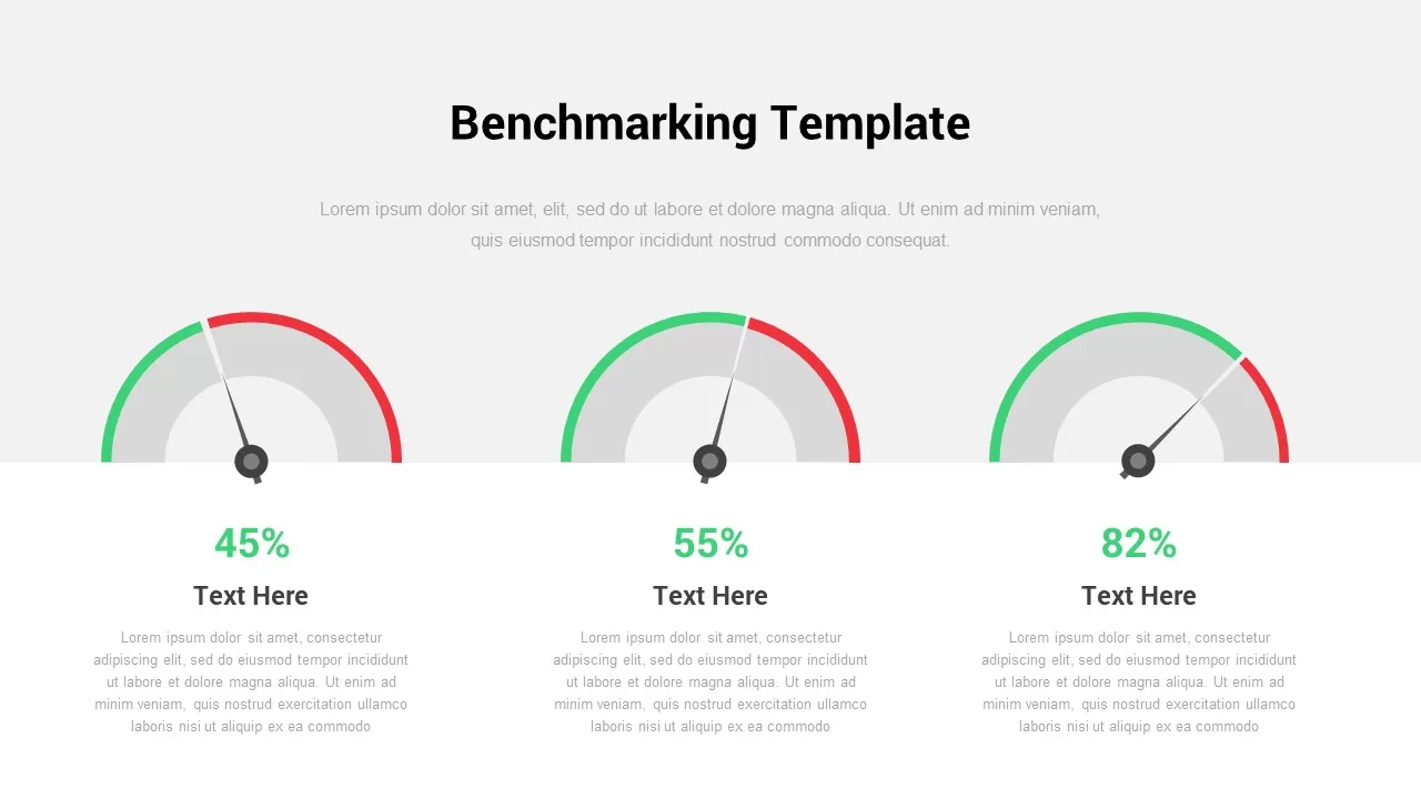
Interactive Benchmarking Gauge Dashboard Template for PowerPoint & Google Slides
Pie/Donut
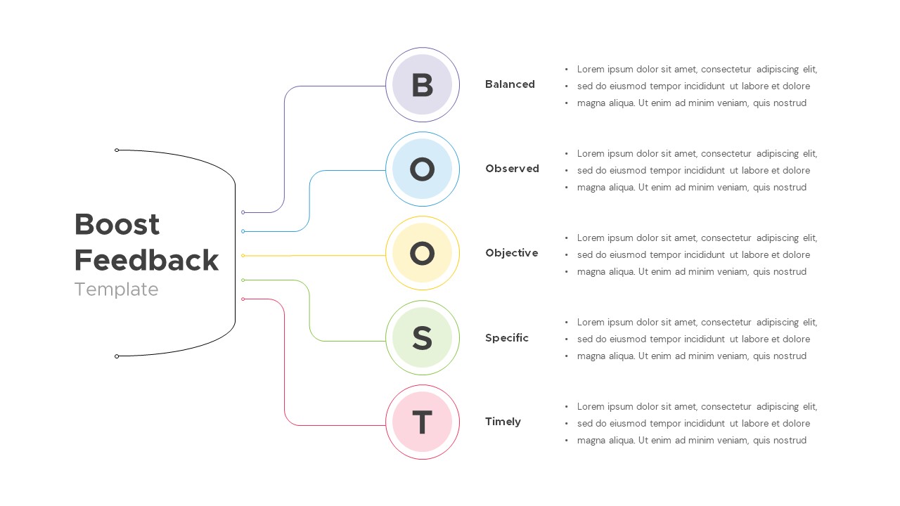
Interactive Boost Feedback Model Diagram Template for PowerPoint & Google Slides
Process

Free Interactive Trivia Presentation Template for PowerPoint & Google Slides
Graphics
Free
Free Interactive Two Truths and a Lie Game Template for PowerPoint & Google Slides
Decks
Free
Free Spin the Wheel Interactive Game Template for PowerPoint & Google Slides
Decks
Free
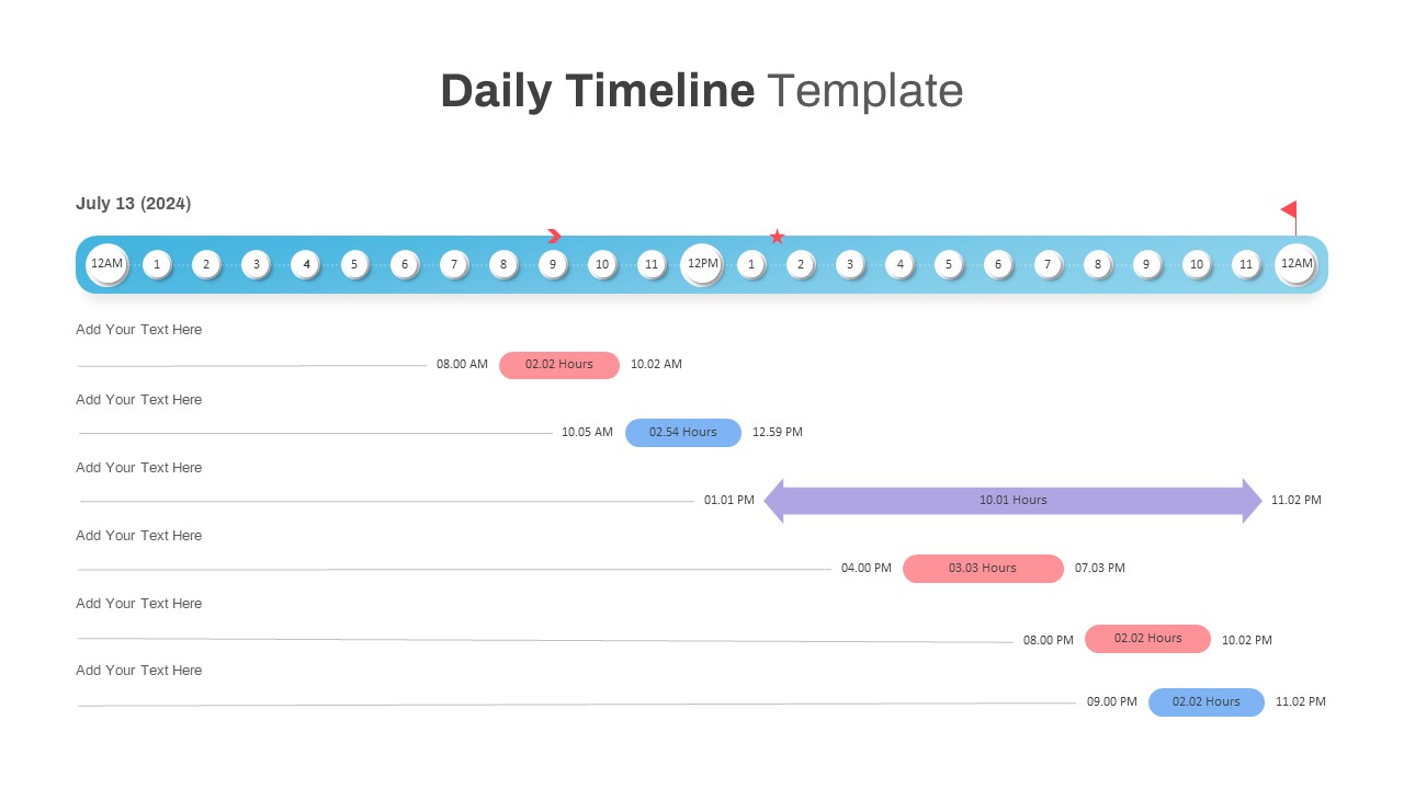
Interactive Daily Timeline Schedule Chart Template for PowerPoint & Google Slides
Timeline
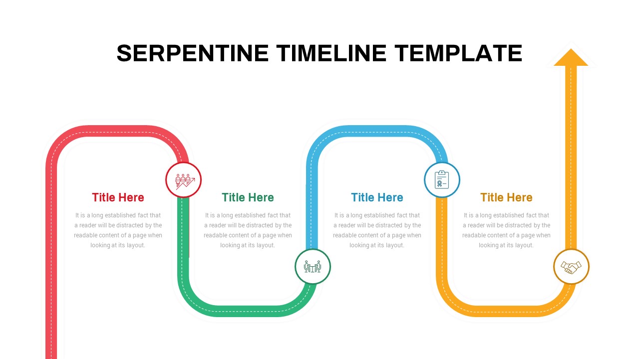
Interactive Serpentine Timeline Diagram Template for PowerPoint & Google Slides
Timeline
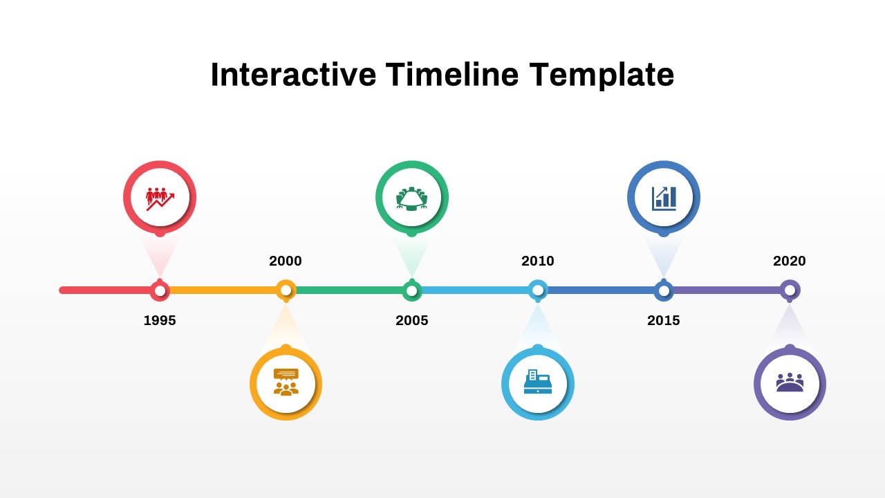
Interactive Milestone Timeline Template for PowerPoint & Google Slides
Timeline
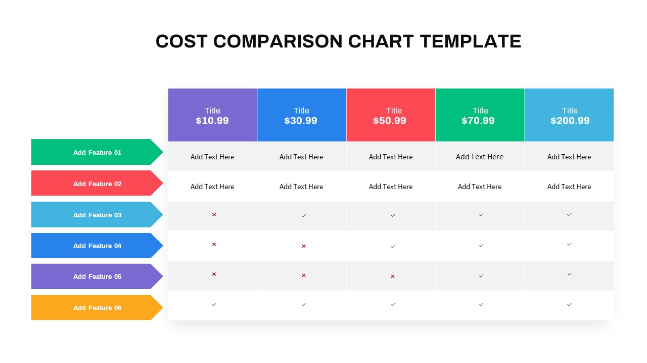
Interactive Multi-Use Cost Comparison Template for PowerPoint & Google Slides
Comparison
Free Animated Quiz Interactive Template for PowerPoint & Google Slides
Pitch Deck
Free
Interactive Quiz with Countdown Timer Template for PowerPoint & Google Slides
Pitch Deck
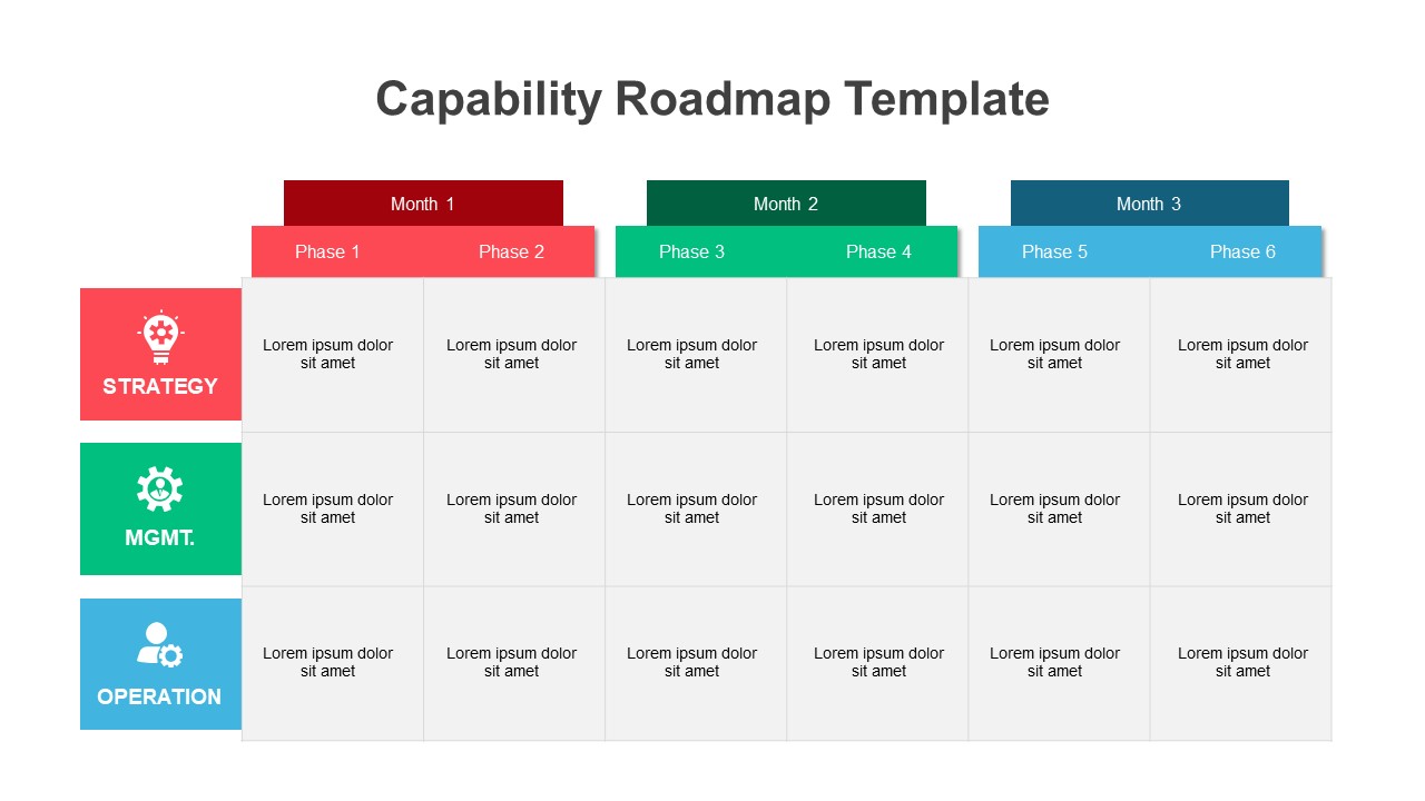
Interactive Strategic Capability Roadmap Template for PowerPoint & Google Slides
Roadmap
Interactive Quiz with Game Rules Template for PowerPoint & Google Slides
Graphics
Free
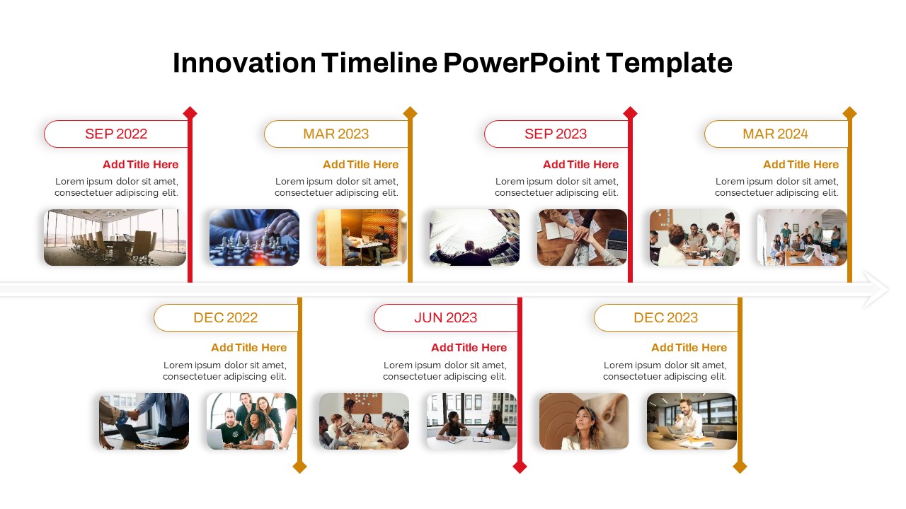
Interactive Innovation Timeline Roadmap Template for PowerPoint & Google Slides
Timeline
Free Interactive Flashcards Q&A Deck Template for PowerPoint & Google Slides
Free
Free
Free Interactive Notebook for PowerPoint & Google Slides
Business
Free
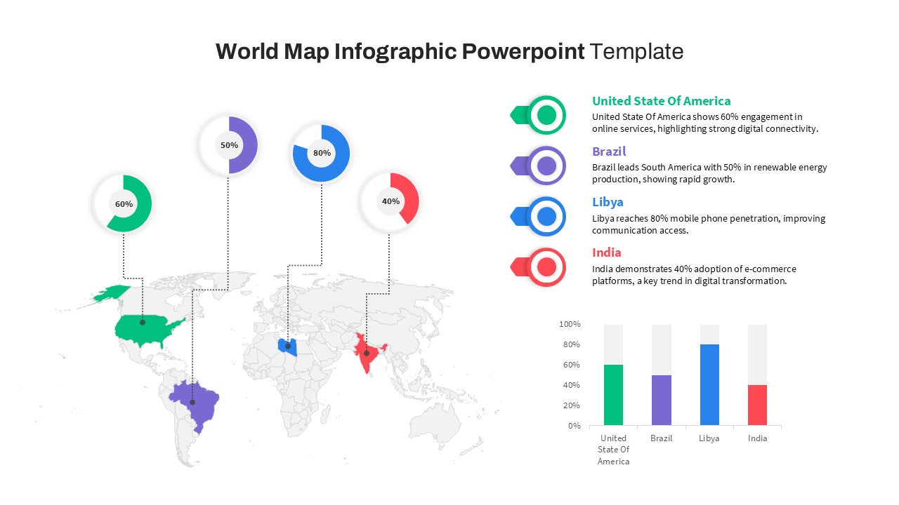
World Map Data template for PowerPoint & Google Slides
World Maps
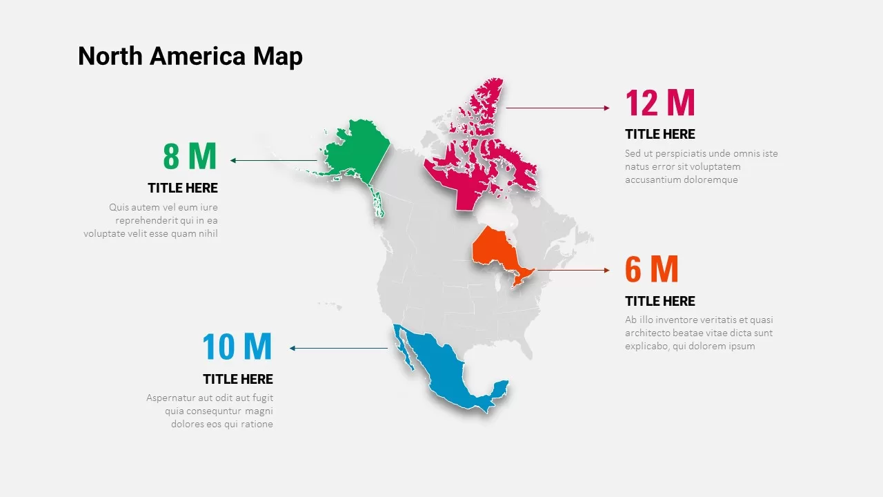
North America Data Map Callouts Template for PowerPoint & Google Slides
World Maps
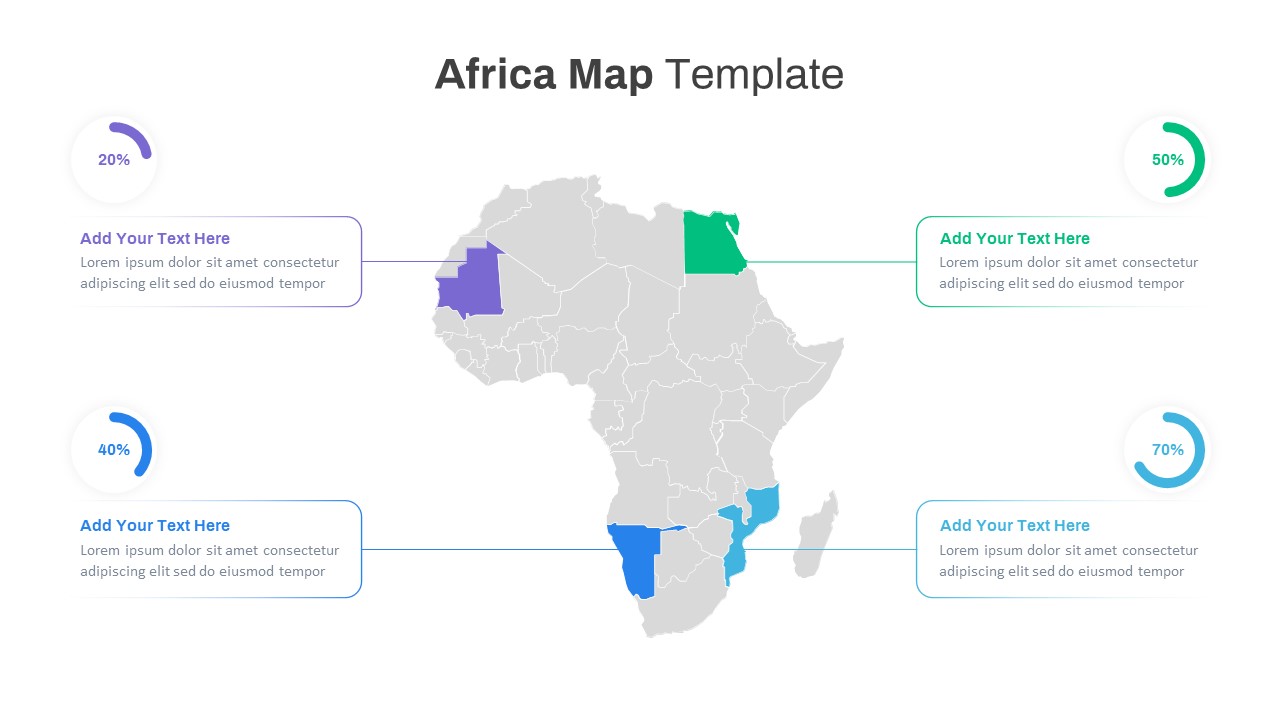
Editable Africa Map Infographic Data Template for PowerPoint & Google Slides
World Maps
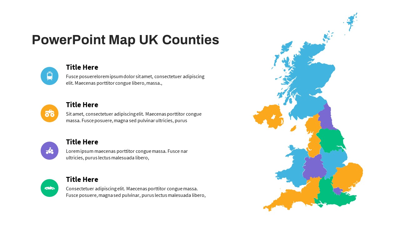
UK Counties Map Data Visualization Template for PowerPoint & Google Slides
World Maps
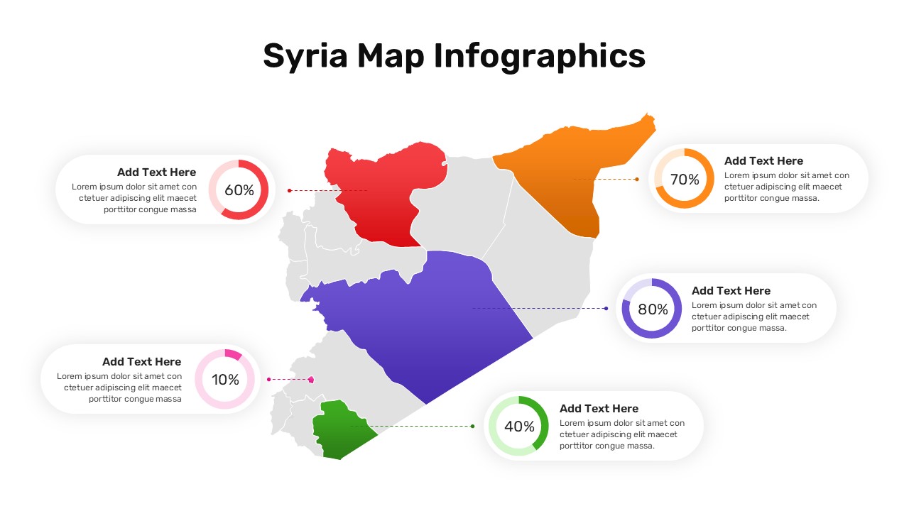
Syria Regional Data Map Infographic Template for PowerPoint & Google Slides
World Maps
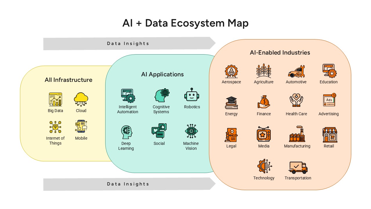
AI and Data Ecosystem Map Template for PowerPoint & Google Slides
AI
Tornado Chart Data Comparison Slide Template for PowerPoint & Google Slides
Bar/Column
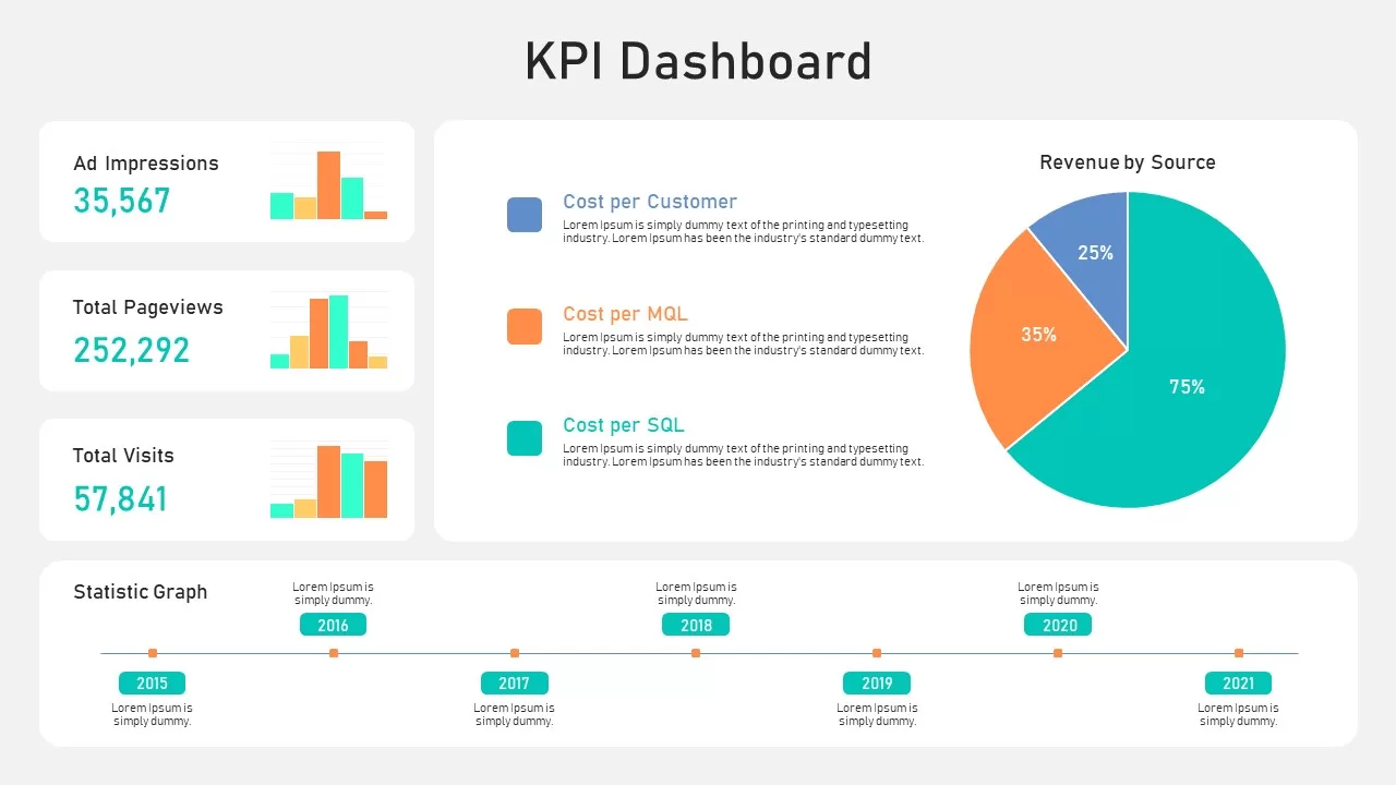
KPI Dashboard Data Overview Slide Template for PowerPoint & Google Slides
Bar/Column
Bar Data Chart Slide for PowerPoint & Google Slides
Bar/Column
Weekly Data Chart Slide for PowerPoint & Google Slides
Comparison Chart
Data Science PowerPoint Presentation Template for PowerPoint & Google Slides
Pitch Deck
Data Center PowerPoint Template for PowerPoint & Google Slides
Information Technology
Mobile Data Analysis Chart template for PowerPoint & Google Slides
Charts
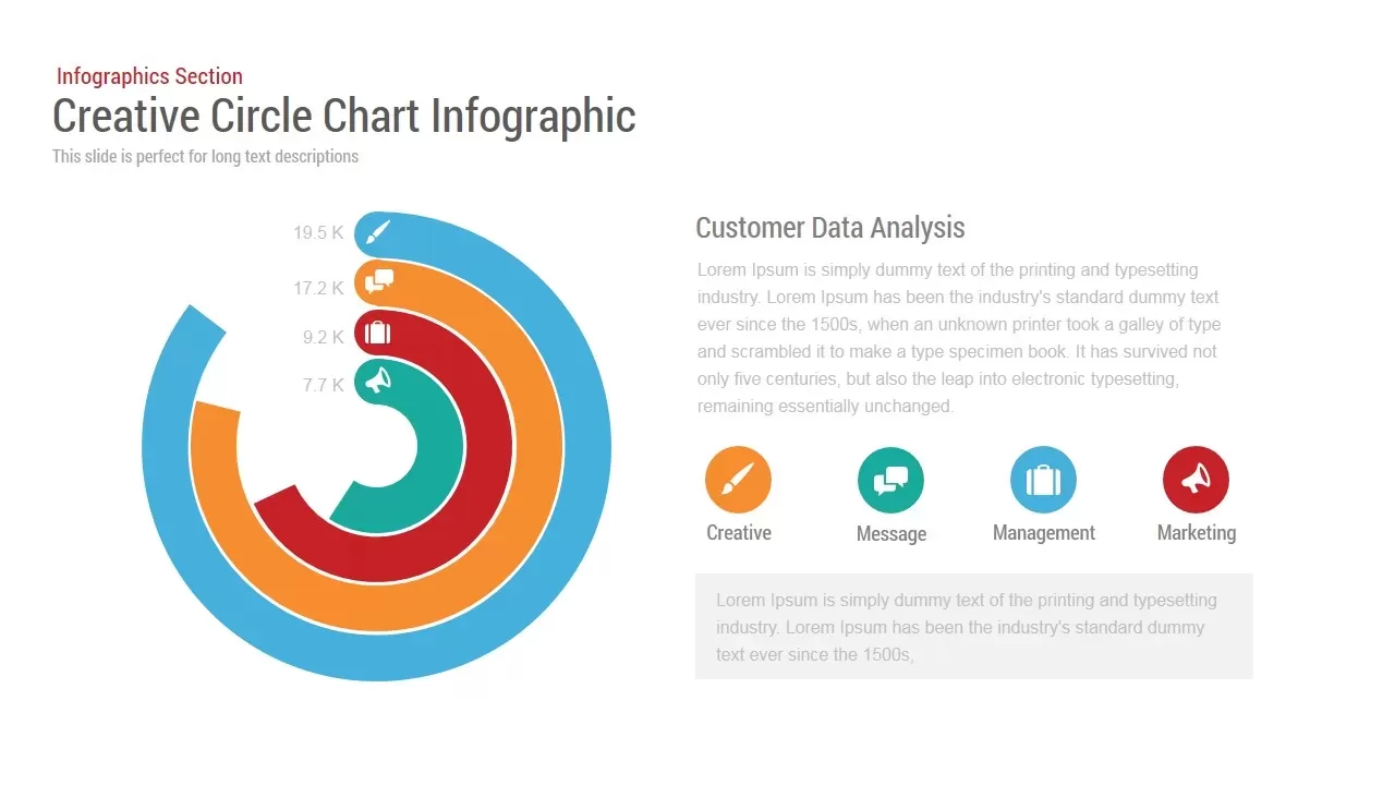
Circle Chart Data template for PowerPoint & Google Slides
Pie/Donut
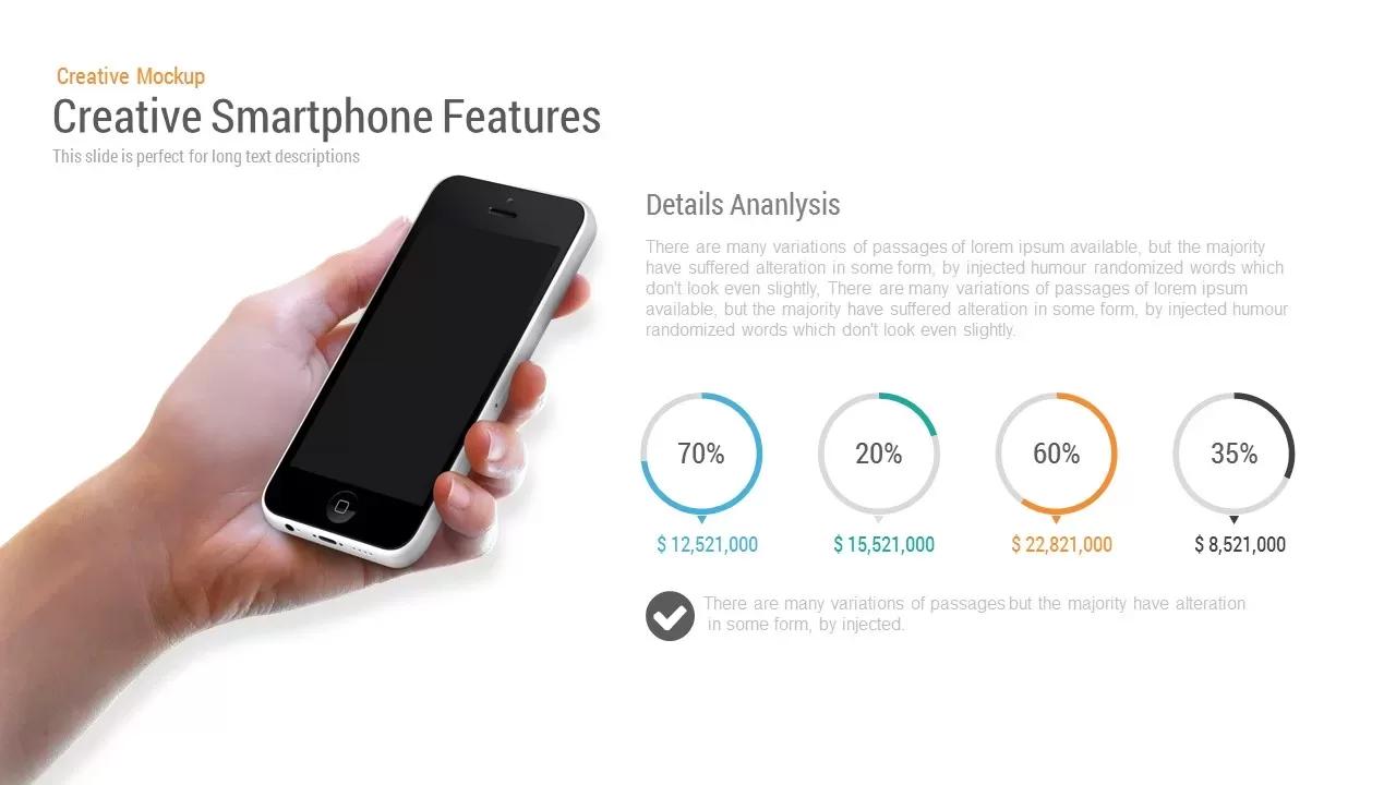
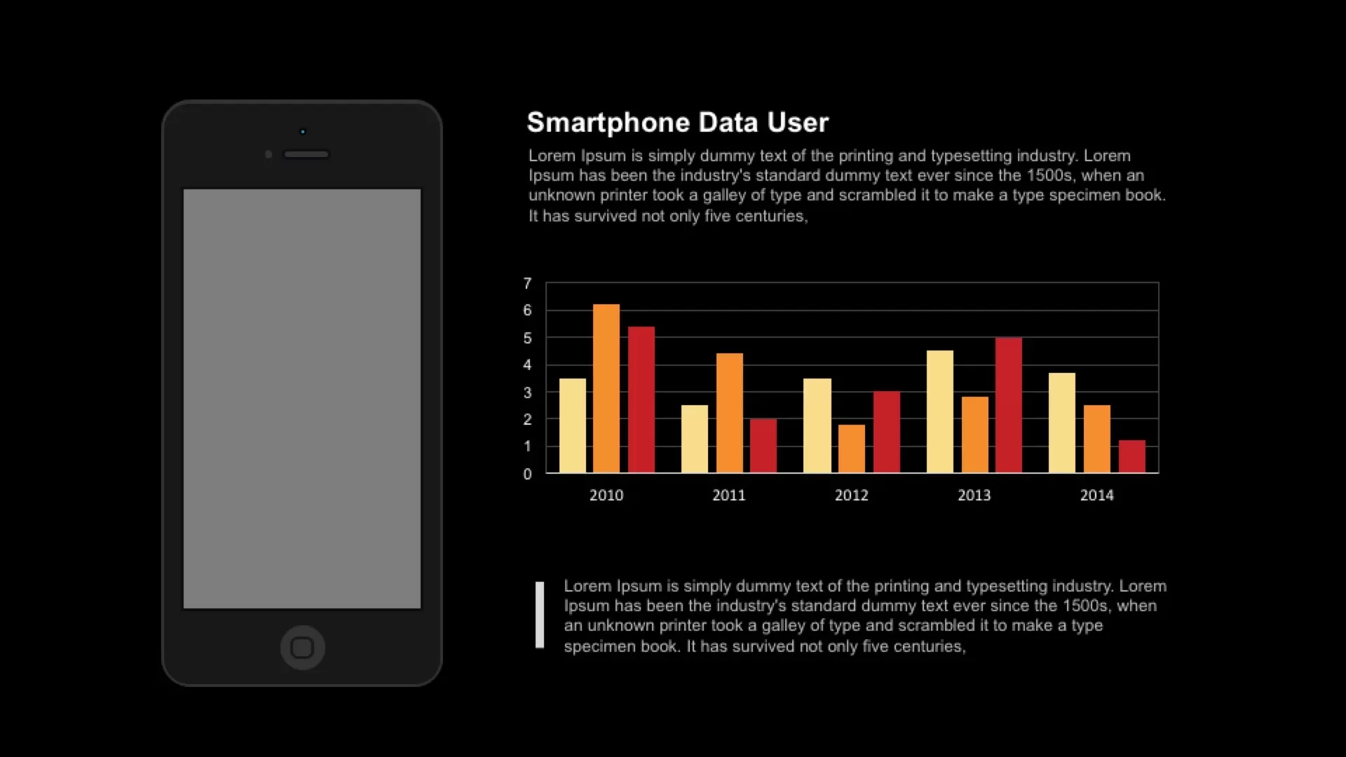
Smartphone Data User template for PowerPoint & Google Slides
Charts
3D Bar Chart Data Infographics Template for PowerPoint & Google Slides
Bar/Column
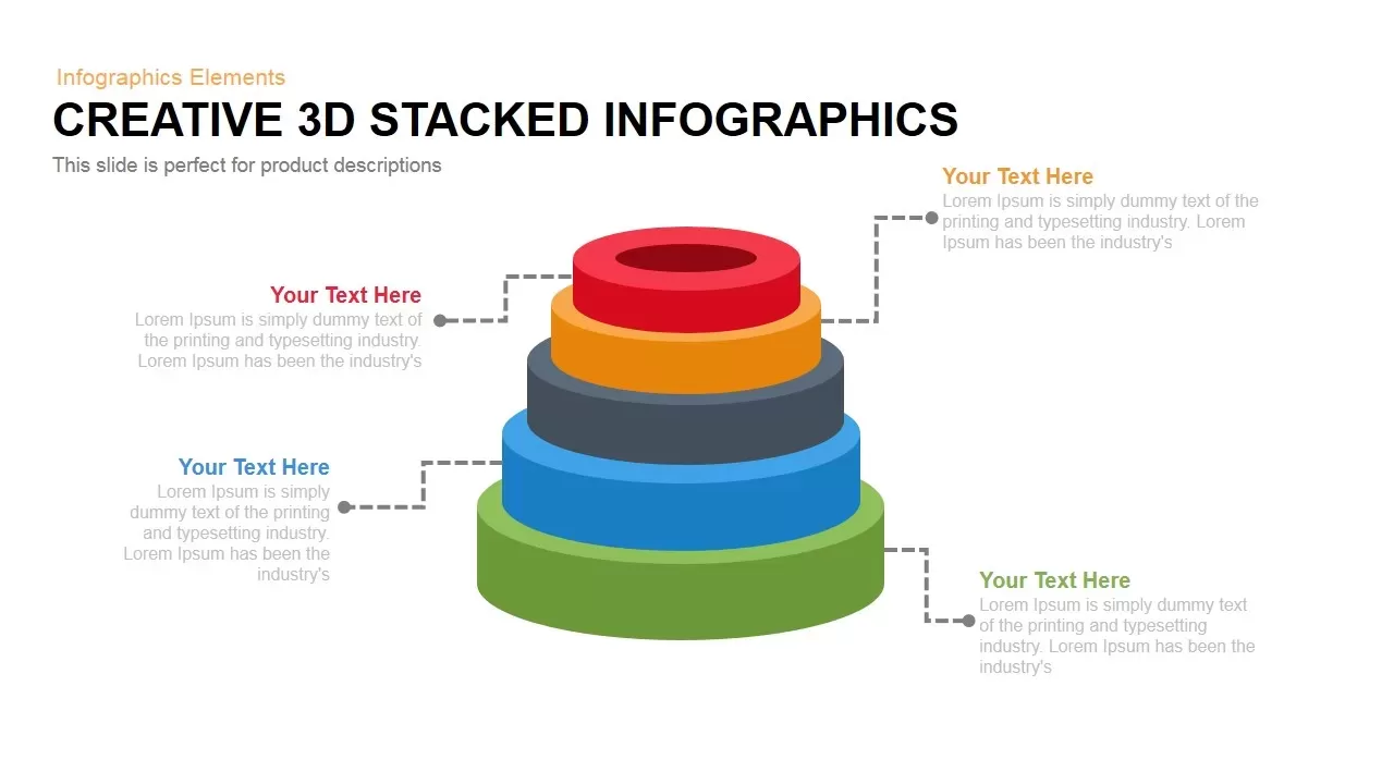
3D Stacked Infographic Layers Data Template for PowerPoint & Google Slides
Pyramid
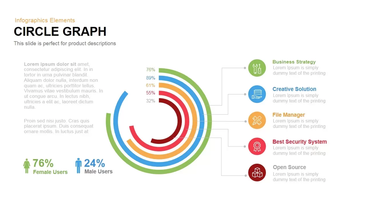
Circle Graph Data Visualization Template for PowerPoint & Google Slides
Circular
Pencil Bar Chart Data Analysis Template for PowerPoint & Google Slides
Bar/Column
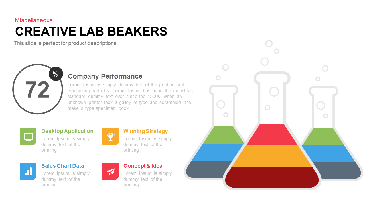
Creative Lab Beakers Data Infographic template for PowerPoint & Google Slides
Infographics
Dynamic Data Dashboard Infographic Template for PowerPoint & Google Slides
Bar/Column
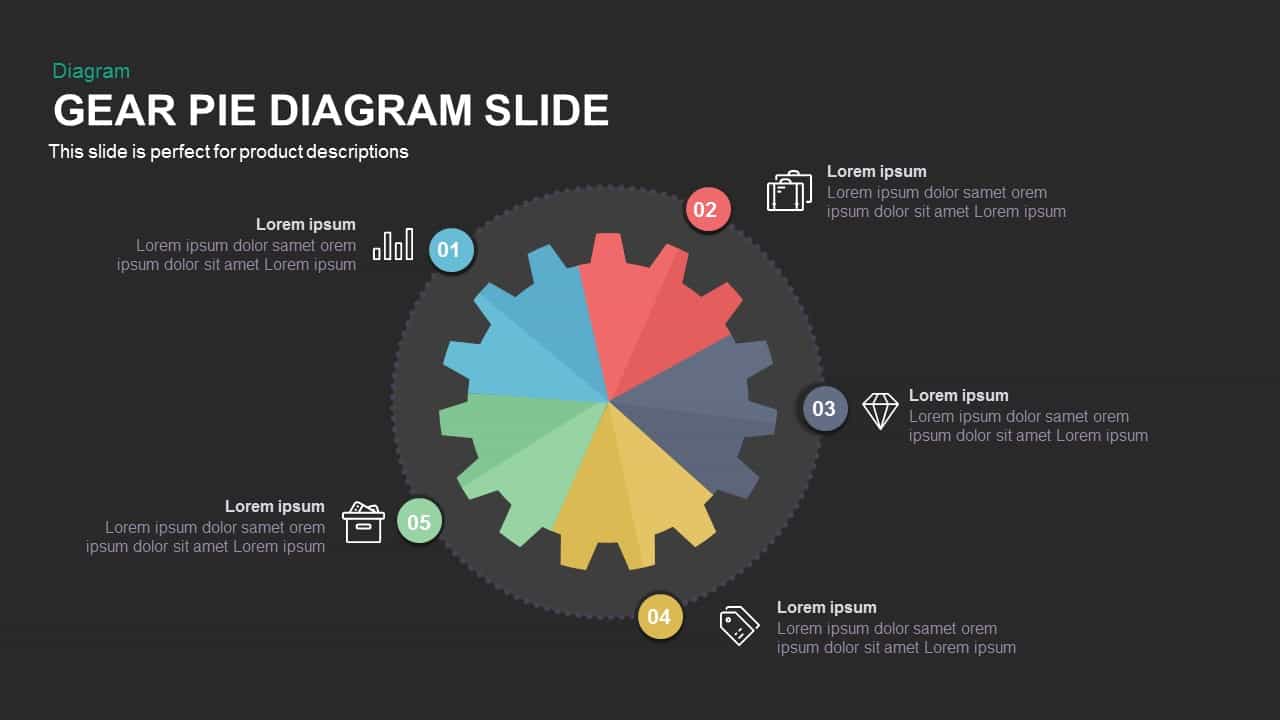
Gear Pie Diagram Data Visualization Template for PowerPoint & Google Slides
Pie/Donut

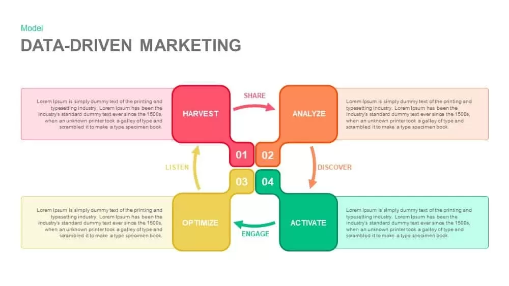
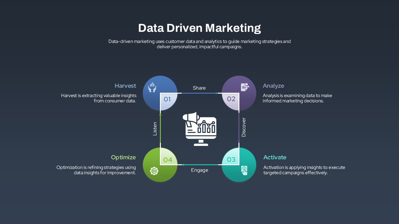
Data-Driven Marketing Cycle Diagram Template for PowerPoint & Google Slides
Customer Journey
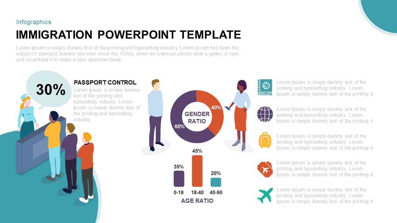
Immigration Data Dashboard Template for PowerPoint & Google Slides
Bar/Column
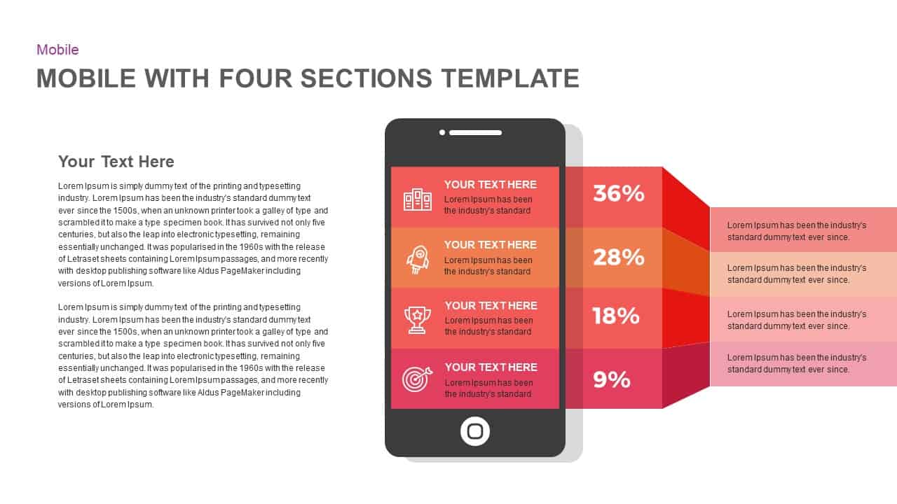
Mobile Infographics Data Visualization Template for PowerPoint & Google Slides
Infographics
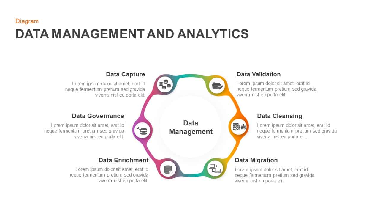
Data Management and Analytics Diagram Template for PowerPoint & Google Slides
Circular
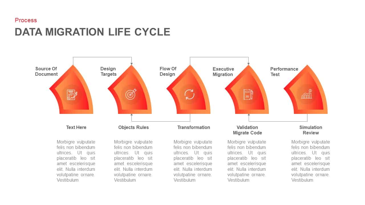
Data Migration Life Cycle Curved Diagram Template for PowerPoint & Google Slides
Process
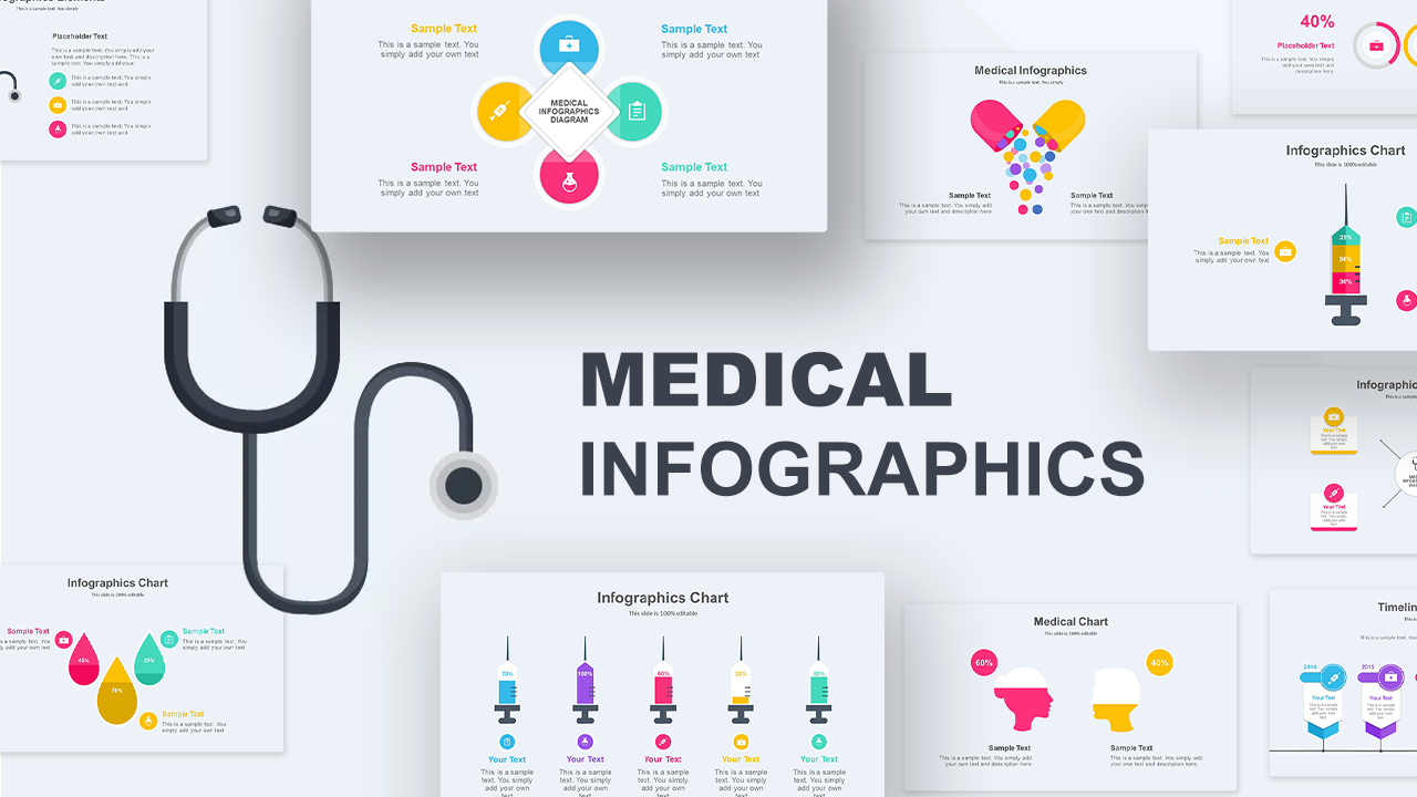
Medical Infographics Data Visualization Template for PowerPoint & Google Slides
Health
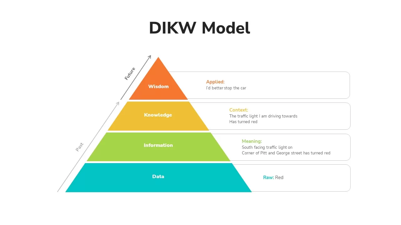
DIKW Data to Wisdom Pyramid Model Template for PowerPoint & Google Slides
Pyramid
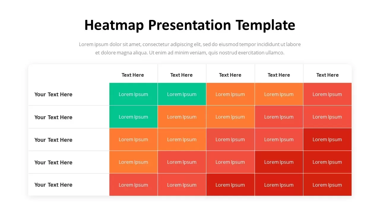
Professional Heatmap Data Visualization Template for PowerPoint & Google Slides
Infographics
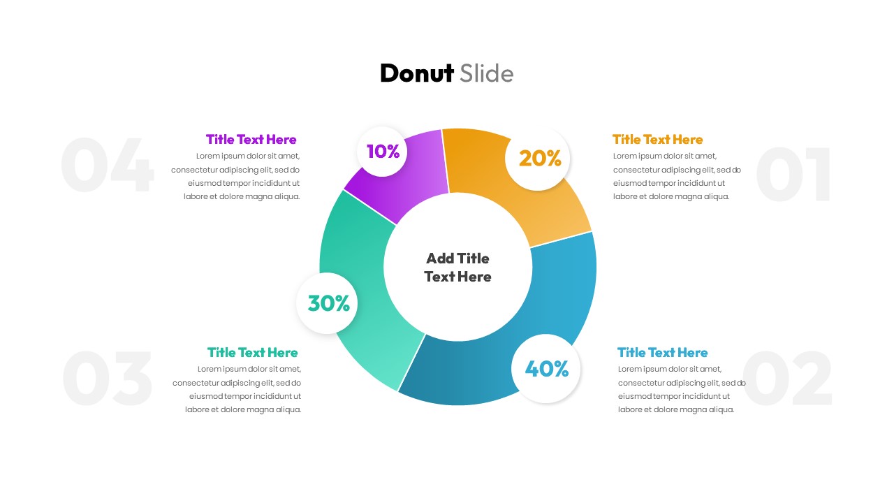
Donut Chart Data Breakdown template for PowerPoint & Google Slides
Pie/Donut
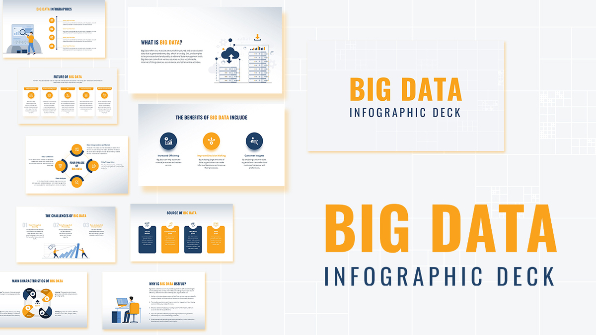
Modern Big Data Infographic Deck Template for PowerPoint & Google Slides
Decks
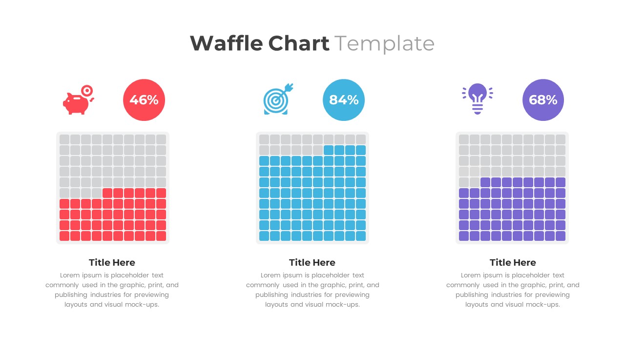
Waffle Chart Data Visualization Template for PowerPoint & Google Slides
Comparison Chart
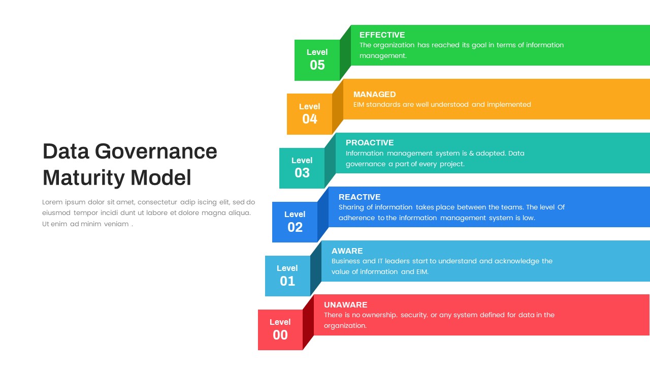
Layered Data Governance Maturity Model Template for PowerPoint & Google Slides
Process
Free Stacked Column Chart Data Visualization Template for PowerPoint & Google Slides
Bar/Column
Free
Simple Bar Chart Data Visualization Template for PowerPoint & Google Slides
Bar/Column
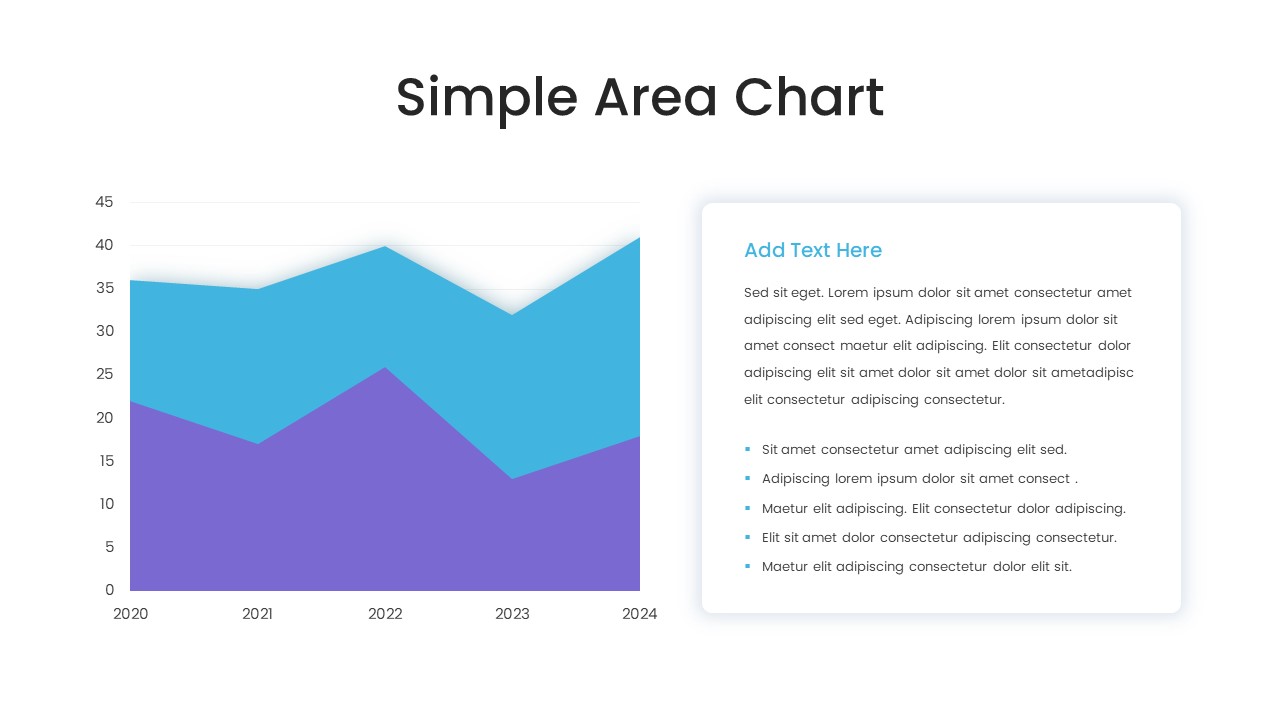
Simple Area Chart Data Trends Analysis Template for PowerPoint & Google Slides
Comparison Chart
Waterfall Chart Data Visualization Template for PowerPoint & Google Slides
Comparison Chart
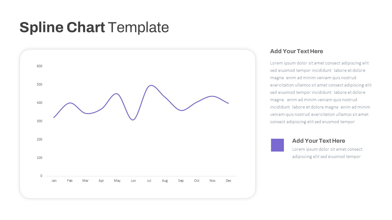
Multipurpose Spline Chart Data Trend Template for PowerPoint & Google Slides
Bar/Column
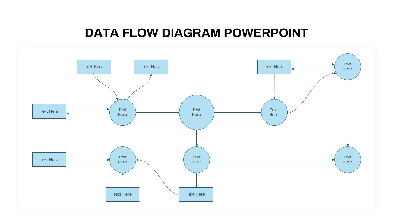
Advanced Data Flow Diagram Pack Template for PowerPoint & Google Slides
Flow Charts
Data Analysis Bar Chart with Insights Template for PowerPoint & Google Slides
Bar/Column
Free
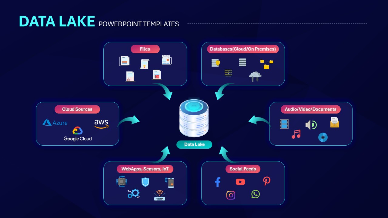
Data Lake Hub-and-Spoke Diagram Template for PowerPoint & Google Slides
Cloud Computing
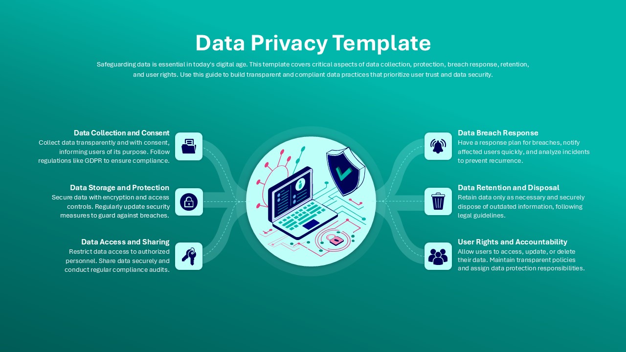
Data Privacy template for PowerPoint & Google Slides
Information Technology
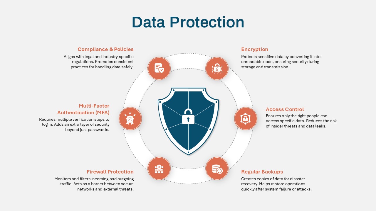
Data Protection Strategies template for PowerPoint & Google Slides
Information Technology
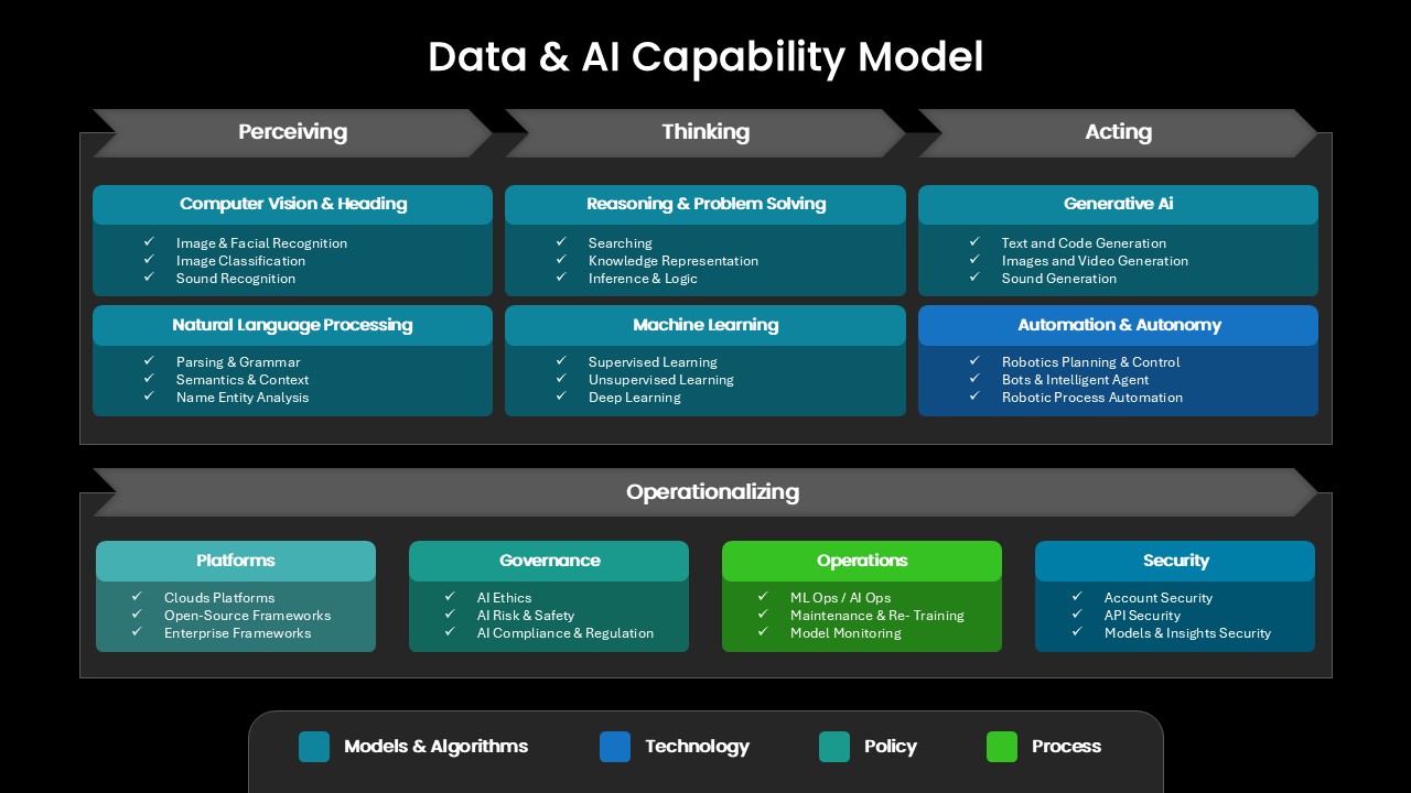
Comprehensive Data & AI Capability Model Template for PowerPoint & Google Slides
AI
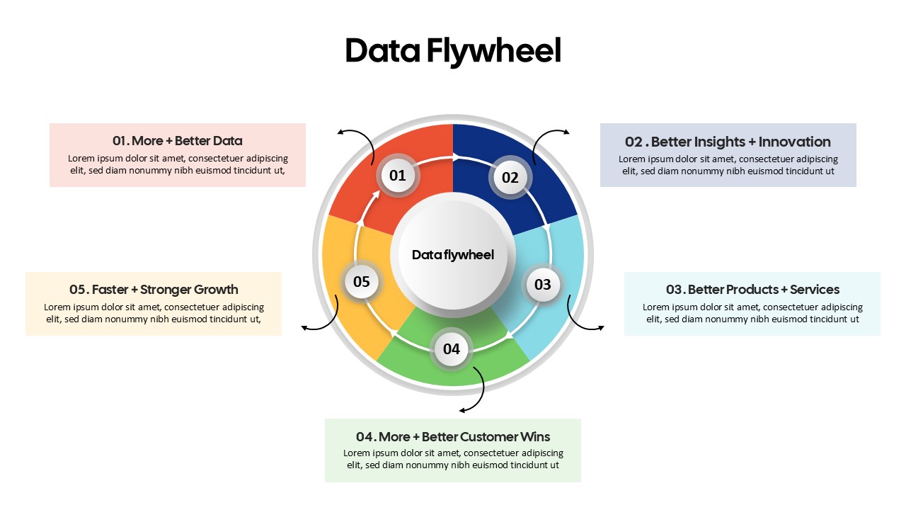
Data Flywheel Strategy template for PowerPoint & Google Slides
Business
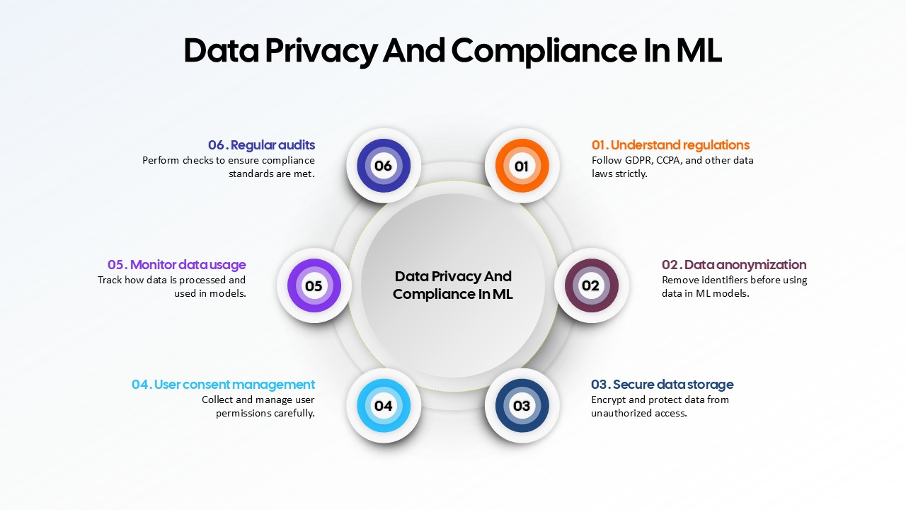
Data Privacy and Compliance in ML template for PowerPoint & Google Slides
Technology
Data-Driven AI in Insurance Infographic Template for PowerPoint & Google Slides
Circular
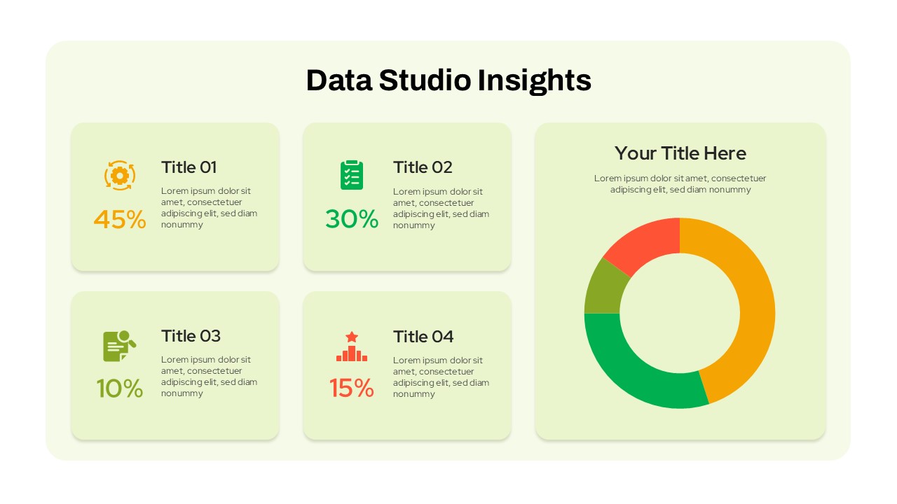
Data Studio Insights template for PowerPoint & Google Slides
Business Report
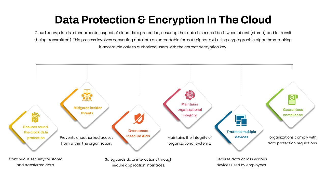
Data Protection & Encryption in the Cloud Overview template for PowerPoint & Google Slides
Cloud Computing
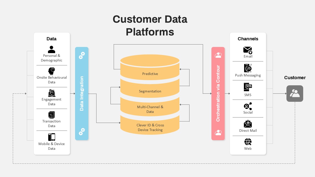
Customer Data Platform Workflow Diagram Template for PowerPoint & Google Slides
Information Technology
Data-Driven Marketing Lifecycle Diagram Template for PowerPoint & Google Slides
Process
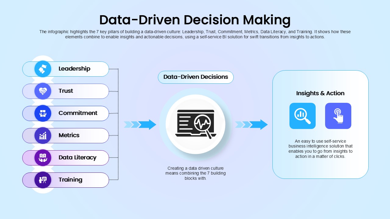
Data-Driven Decision Making overview template for PowerPoint & Google Slides
Business
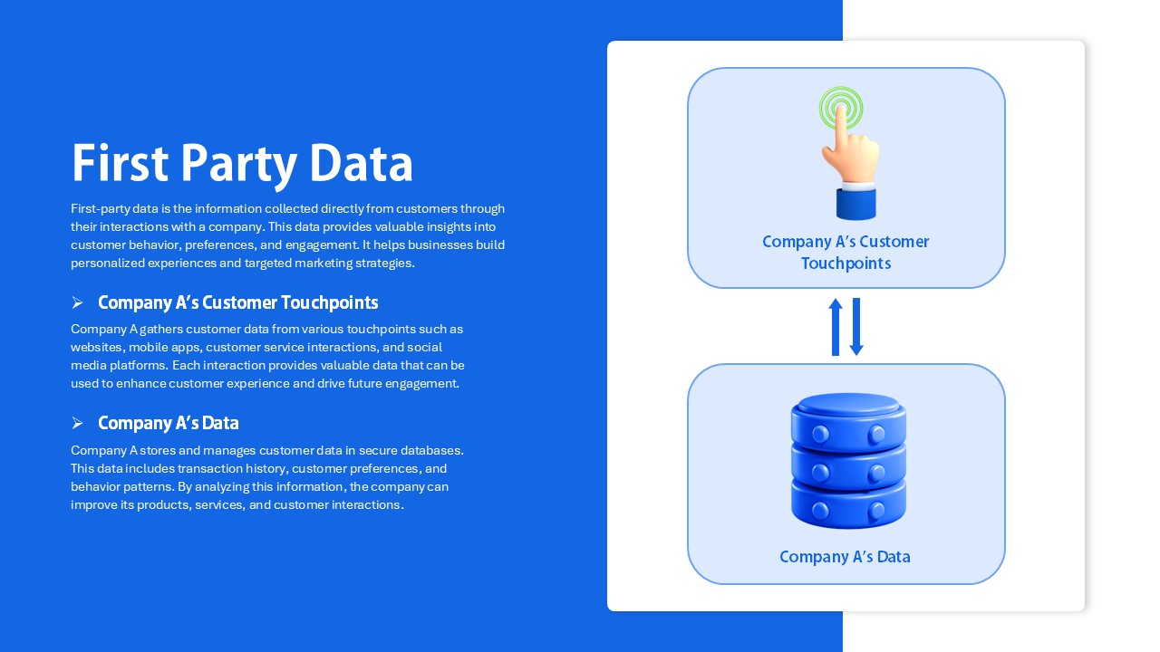
First Party Data Overview Template for PowerPoint & Google Slides
Business
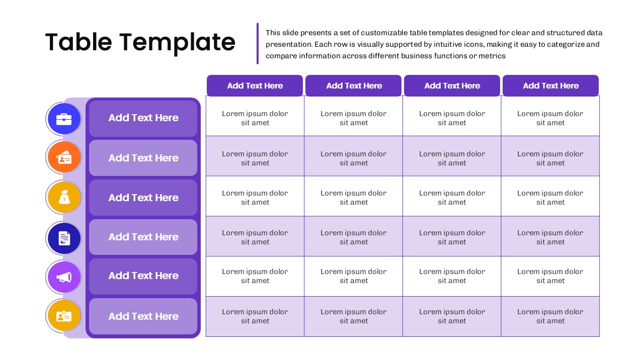
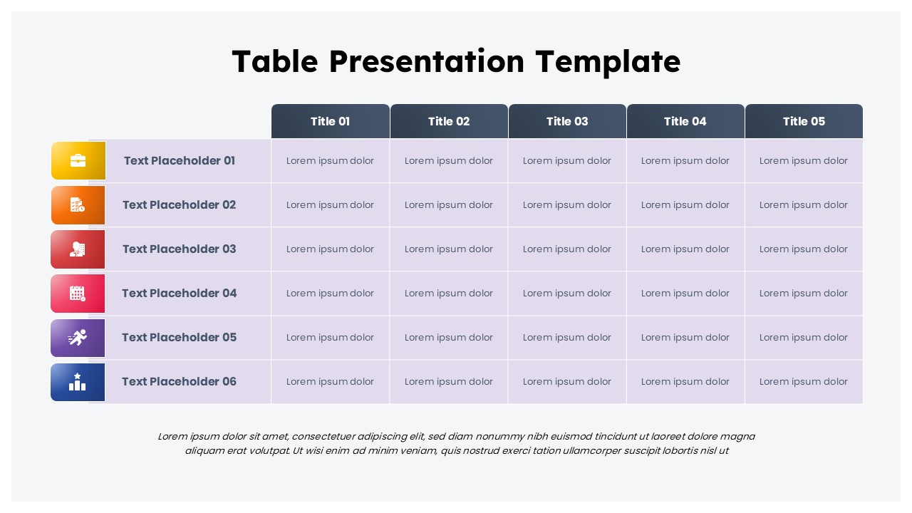
Business Data Table Template for PowerPoint & Google Slides
Table
Colorful Business Data Comparison Table Template for PowerPoint & Google Slides
Table
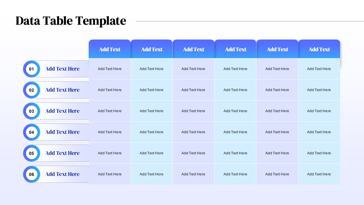
Six Column Data Table Template for PowerPoint & Google Slides
Table
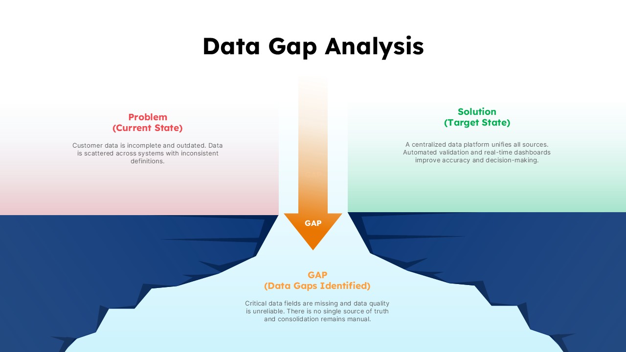
Data Gap Analysis Template for PowerPoint & Google Slides
Business