Mobile Usage Metrics template for PowerPoint & Google Slides
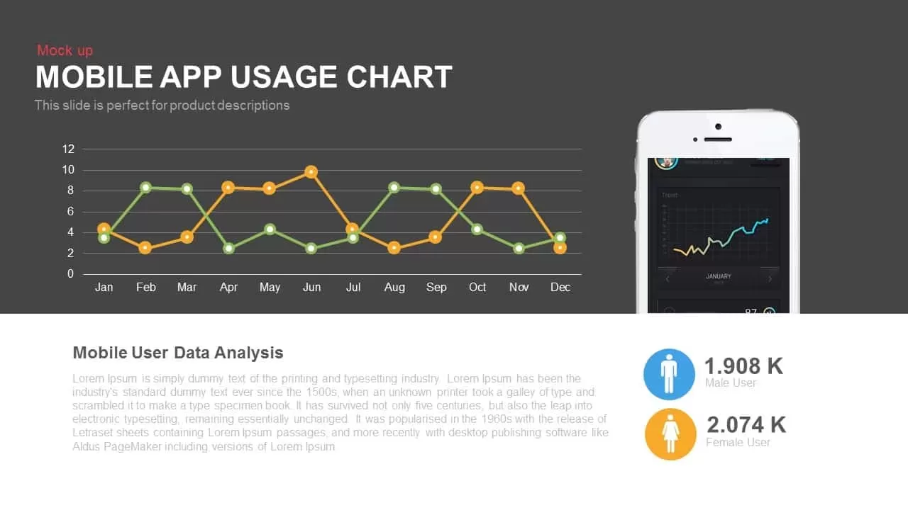
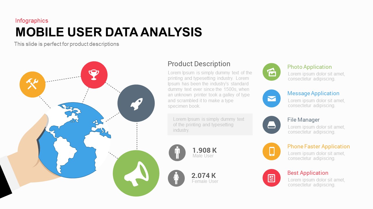
Elevate your data storytelling with this dynamic mobile app usage chart template, ideal for presenting monthly trends and demographic breakdowns at a glance. The slide features a sleek line chart spanning January through December, with two distinct data series rendered in green and orange to represent usage metrics or activity levels. Floating gridlines and minimalist axis labels ensure readability against the dark background, while markers highlight key data points for instant insight. On the right, a smartphone mockup displays a complementary miniaturized trend graph, reinforcing the mobile-centric context. Below, an editable text block titled “Mobile User Data Analysis” provides space for narrative details, supporting secondary commentary or key takeaways. Paired icons for male and female user counts, in blue and orange circles respectively, present gender distribution with clear numeric labels.
With fully editable vector shapes and master slide layouts, you can adjust chart line widths, axis scales, gridline density, and marker styles to suit your brand or data requirements. Customize date ranges or add additional series to track comparative metrics, such as new versus returning users. Replace the device mockup easily with any smartphone, tablet, or custom illustration to match your application platform. The slide retains pixel-perfect clarity in both widescreen (16:9) and standard (4:3) formats, and exports flawlessly for HD displays, print, or online sharing. No extra plugins are required for PowerPoint or Google Slides, ensuring seamless integration across platforms. Whether you need to showcase campaign performance, monitor retention rates, or benchmark engagement, this versatile template transforms complex usage data into compelling visual narratives.
Who is it for
Product managers, mobile marketers, UX researchers, data analysts, and digital strategy teams will find this slide invaluable for communicating monthly app performance. Marketing agencies can use it to demonstrate campaign reach, while executive leaders and investors can reference clear visuals to inform strategic decisions.
Other Uses
Repurpose the layout to compare revenue streams, feature adoption rates, or multi-region sales trends. Swap chart series and icons to visualize customer satisfaction scores, retention cohorts, or development sprint metrics. The mockup can be exchanged for any device or platform illustration, expanding its application to software demos, platform launches, or comparative technology analyses.
Login to download this file

Item ID
SB00286
Related Templates

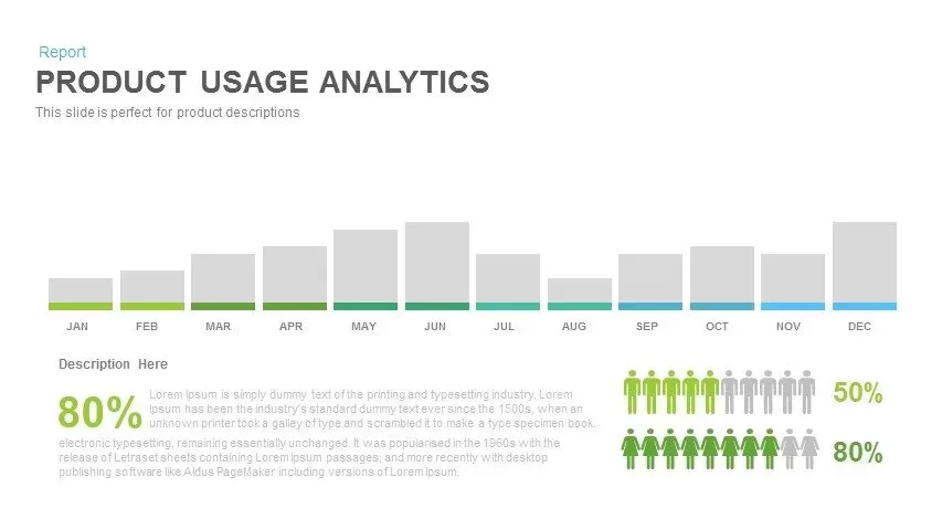
Product Usage Analytics Dashboard Chart Template for PowerPoint & Google Slides
Bar/Column

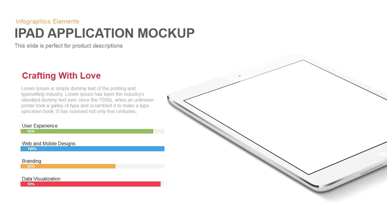
iPad App Mockup with Progress Metrics Template for PowerPoint & Google Slides
Bar/Column
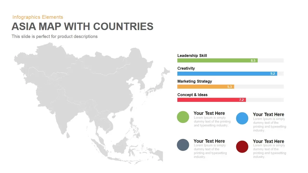
Asia Map with KPI Metrics and Legend Template for PowerPoint & Google Slides
World Maps
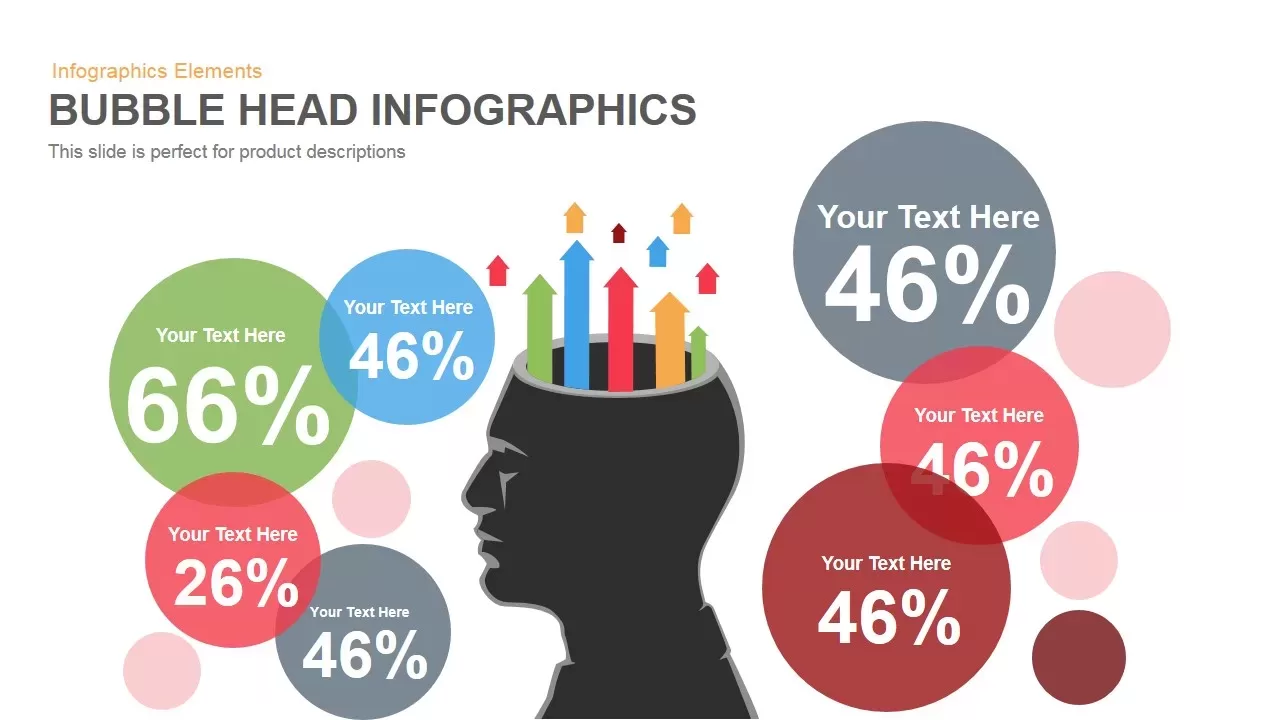
Bubble Head Metrics Infographic Template for PowerPoint & Google Slides
Circular
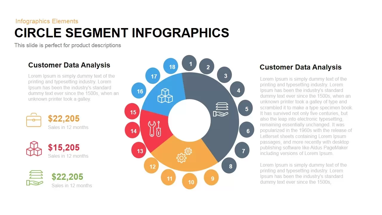
Circle Segment Sales Metrics Infographic Template for PowerPoint & Google Slides
Circular
Social Media Metrics template for PowerPoint & Google Slides
Comparison Chart

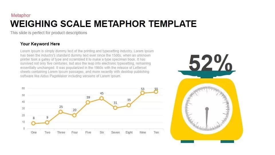
Scale Metaphor Metrics Comparison Template for PowerPoint & Google Slides
Charts
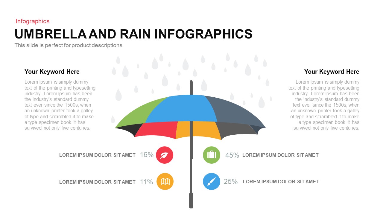
Umbrella and Rain Infographic Metrics Template for PowerPoint & Google Slides
Comparison
Comprehensive Recruitment Metrics Report Template for PowerPoint & Google Slides
Recruitment
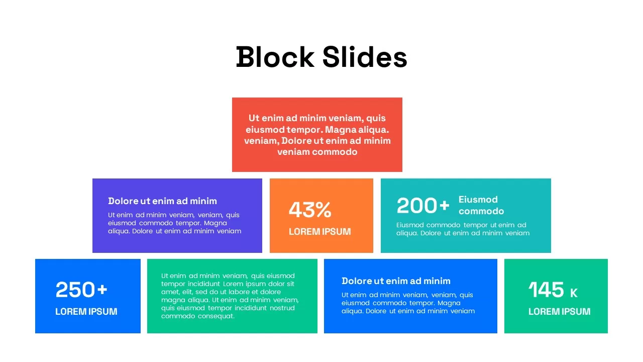
Colorful Block Infographic Metrics Slide Template for PowerPoint & Google Slides
Infographics
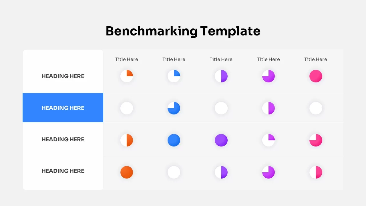
Benchmarking Metrics Comparison Slide Template for PowerPoint & Google Slides
Pie/Donut
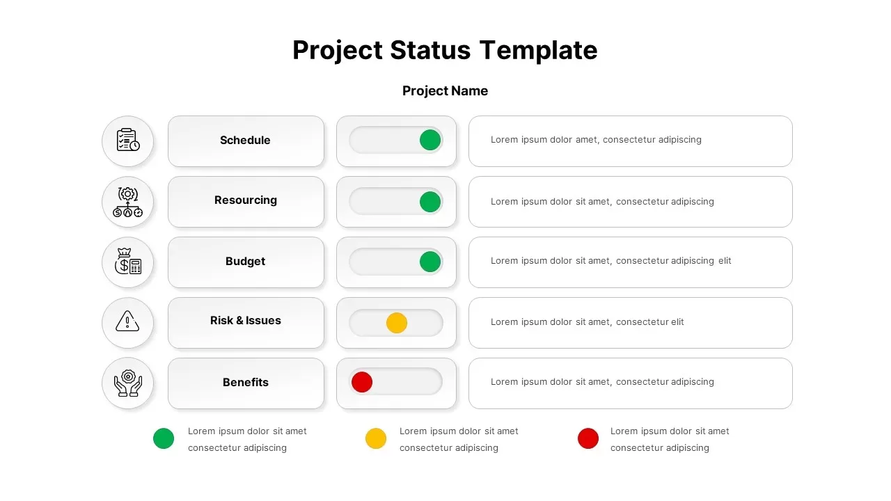
Project Status Dashboard with Metrics Template for PowerPoint & Google Slides
Project Status
Circular Image Gallery & KPI Metrics Template for PowerPoint & Google Slides
Pie/Donut
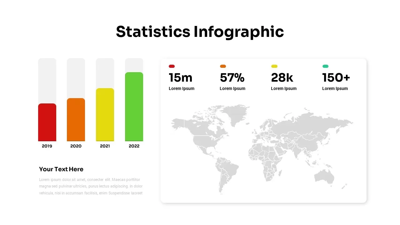
Statistics & Global Metrics Infographic Template for PowerPoint & Google Slides
Bar/Column
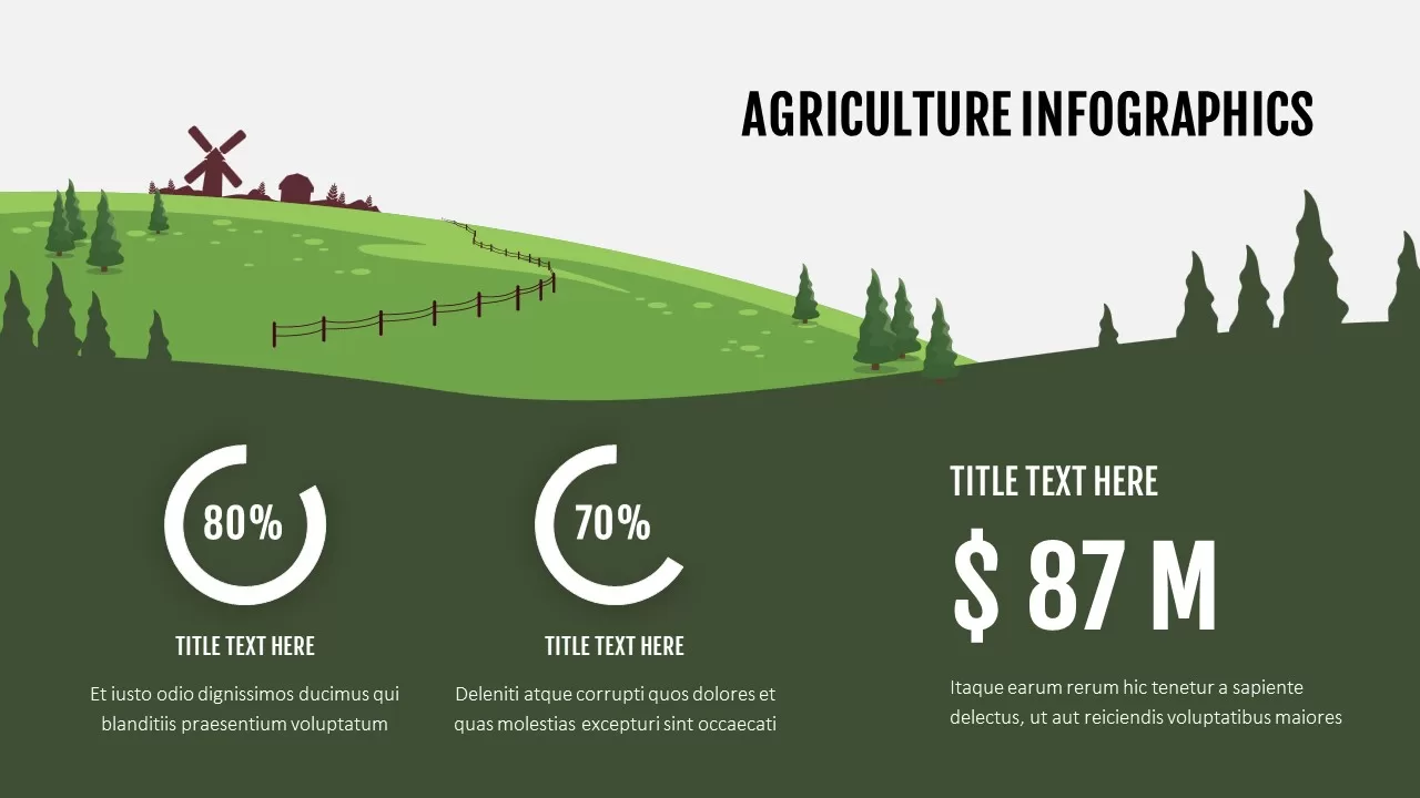
Agriculture Infographics Slide with Progress Rings & Metrics Template for PowerPoint & Google Slides
Pie/Donut
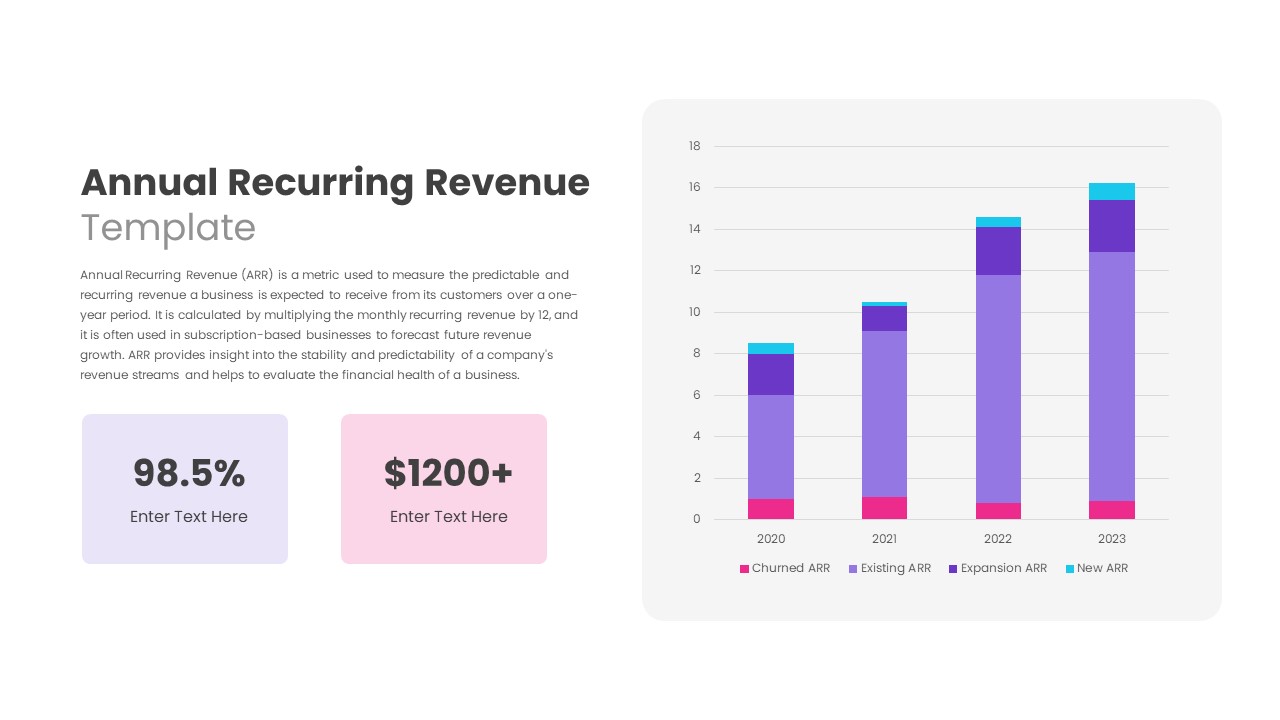
Annual Recurring Revenue Metrics Template for PowerPoint & Google Slides
Bar/Column
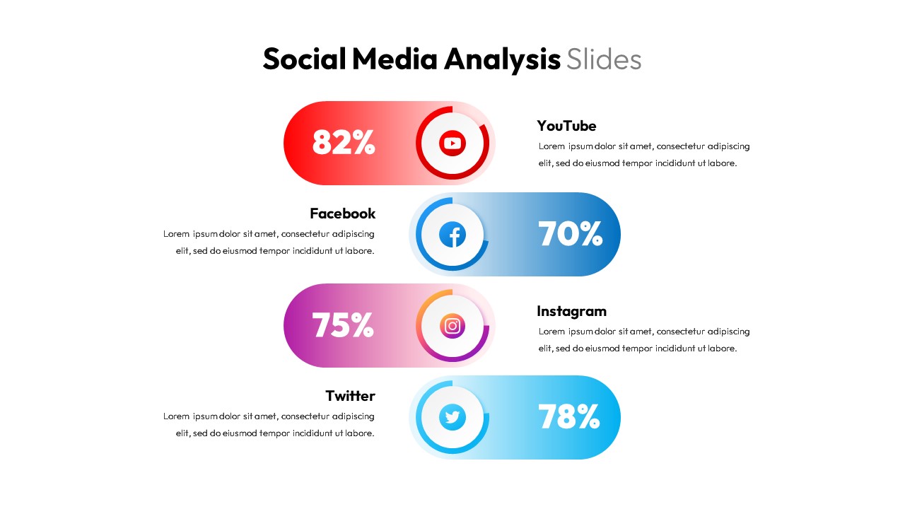
Social Media Analysis Metrics Slide Deck Template for PowerPoint & Google Slides
Digital Marketing
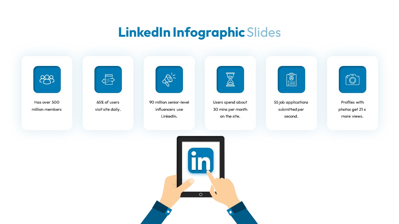
LinkedIn Metrics Infographic Slide Template for PowerPoint & Google Slides
Digital Marketing
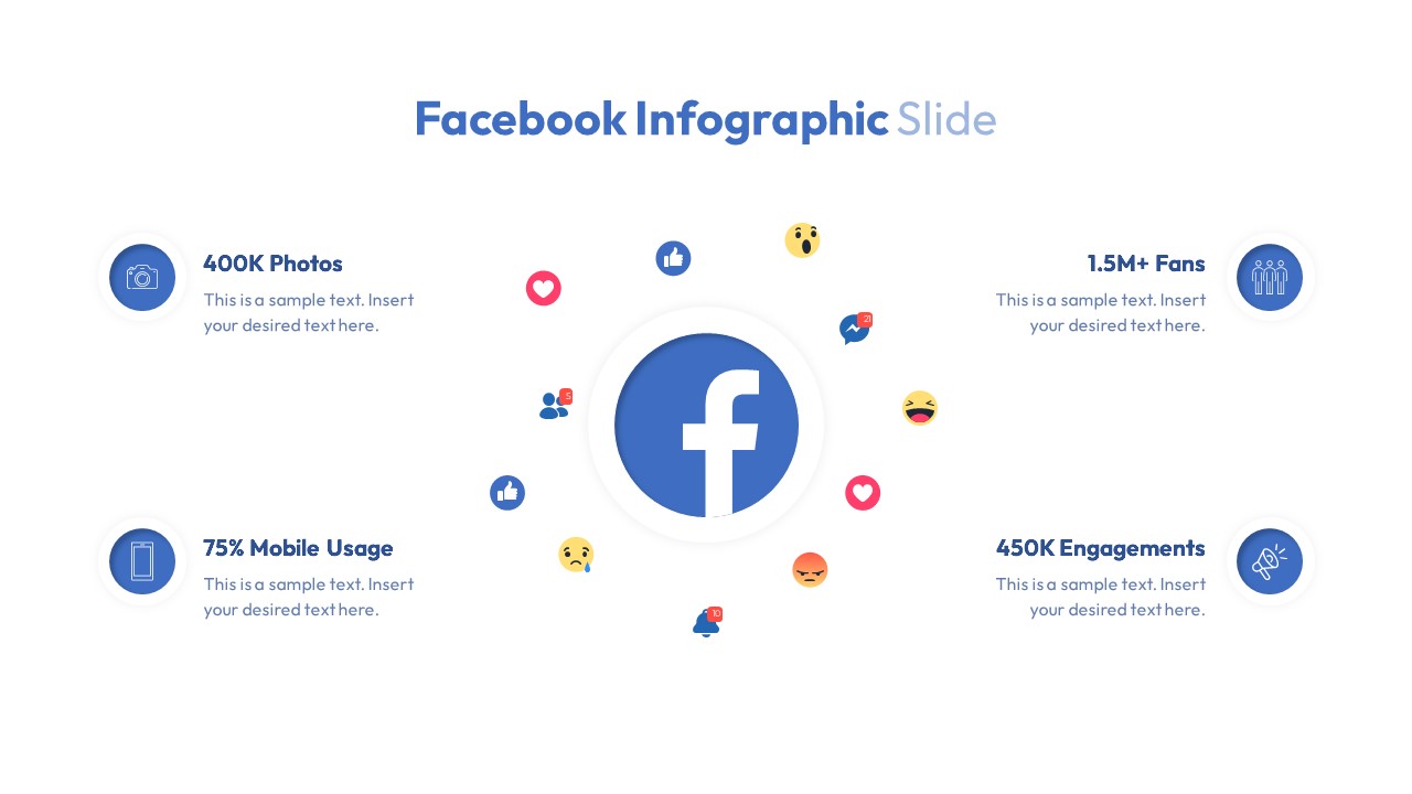
Facebook Social Metrics Infographic Template for PowerPoint & Google Slides
Graphics
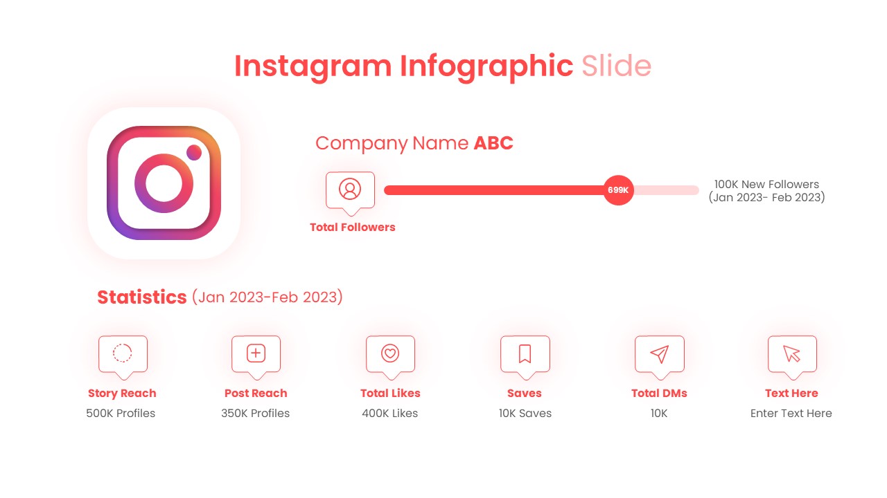
Instagram Infographic Metrics Slide Template for PowerPoint & Google Slides
Marketing
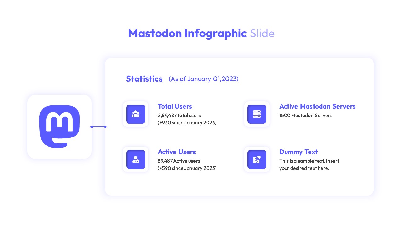
Mastodon Metrics Infographic Dashboard Template for PowerPoint & Google Slides
Business Report
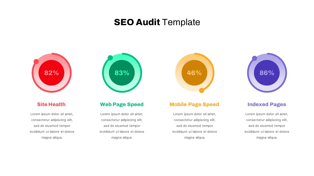
Detailed SEO Audit Metrics Overview Template for PowerPoint & Google Slides
Circular
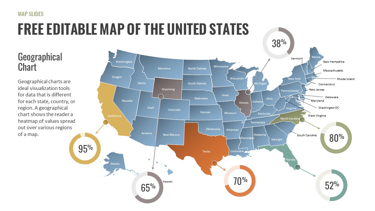
Free Editable U.S. Map with Regional Metrics Template for PowerPoint & Google Slides
World Maps
Free
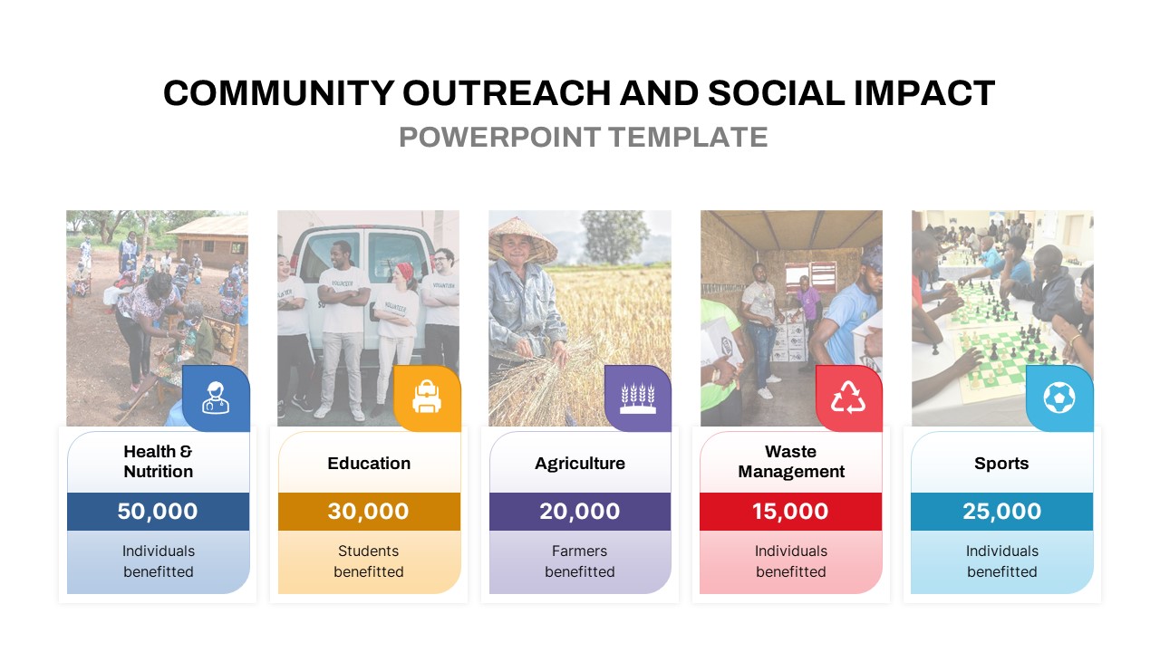
Community Outreach Impact Metrics Template for PowerPoint & Google Slides
Accomplishment
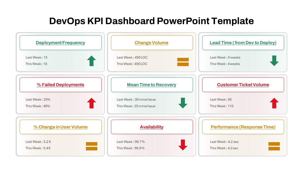
DevOps KPI Dashboard Performance Metrics Template for PowerPoint & Google Slides
Software Development
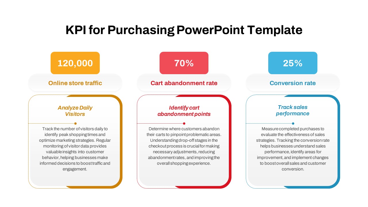
Purchasing KPI Metrics Dashboard Template for PowerPoint & Google Slides
Business Report
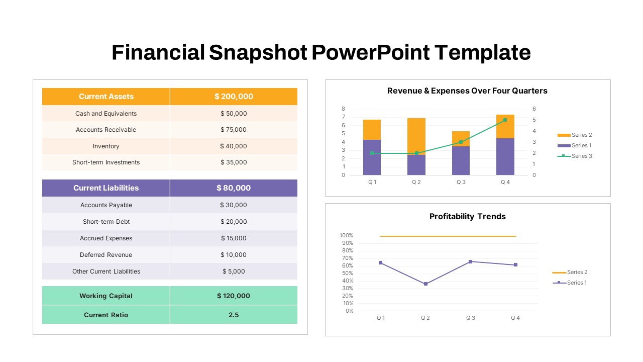
Financial Snapshot & Metrics Overview Template for PowerPoint & Google Slides
Finance
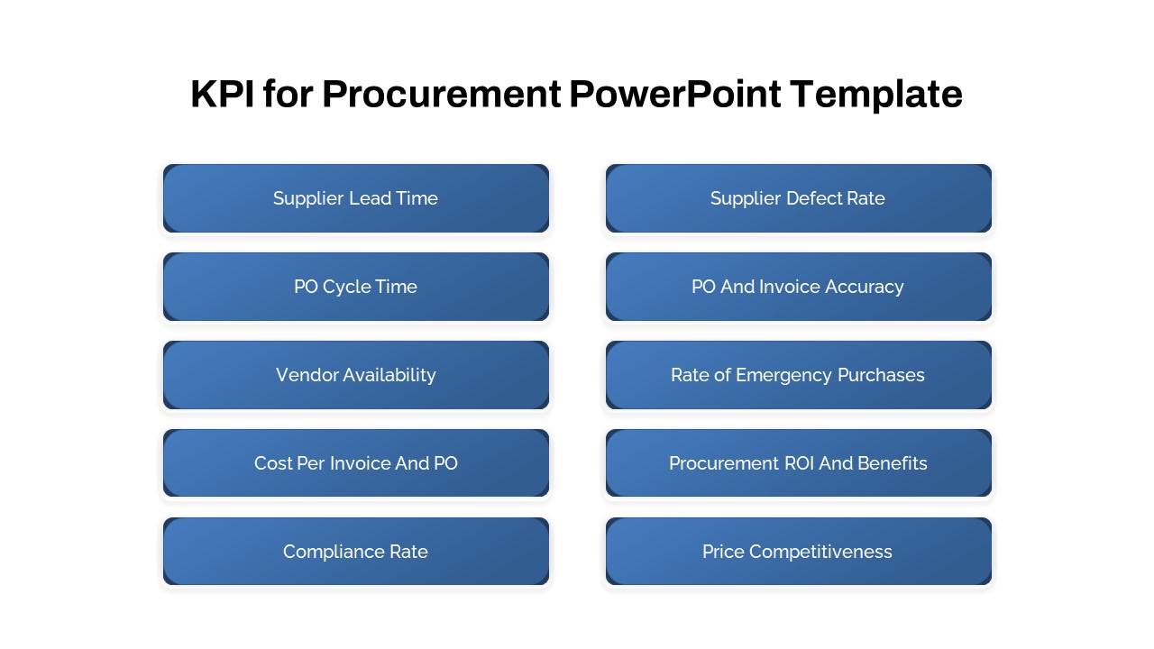
Procurement KPI Dashboard & Metrics Template for PowerPoint & Google Slides
Business Report
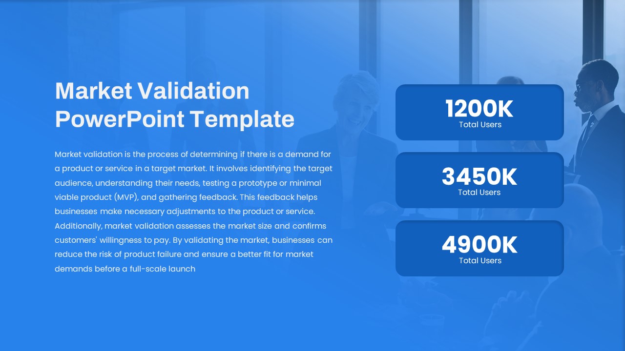
Market Validation Metrics Overview Template for PowerPoint & Google Slides
Business
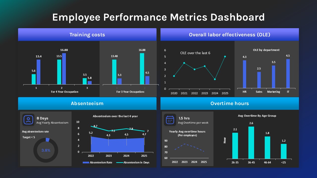
Employee Performance Metrics Dashboard Template for PowerPoint & Google Slides
Employee Performance
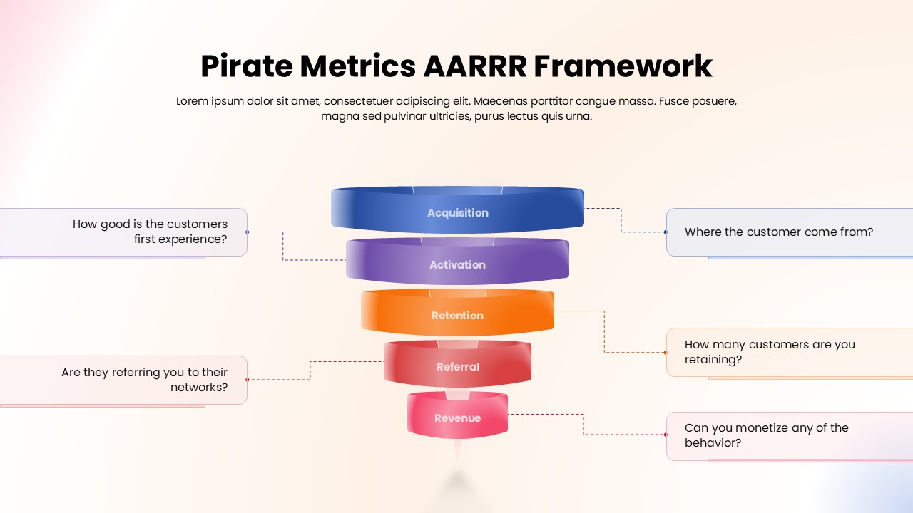
Pirate Metrics AARRR Funnel Framework Template for PowerPoint & Google Slides
Funnel
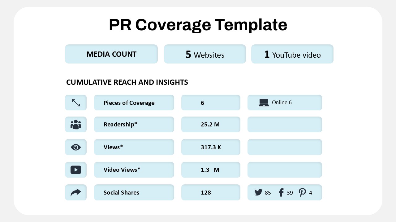
Public Relations Coverage Metrics Template for PowerPoint & Google Slides
Business Report
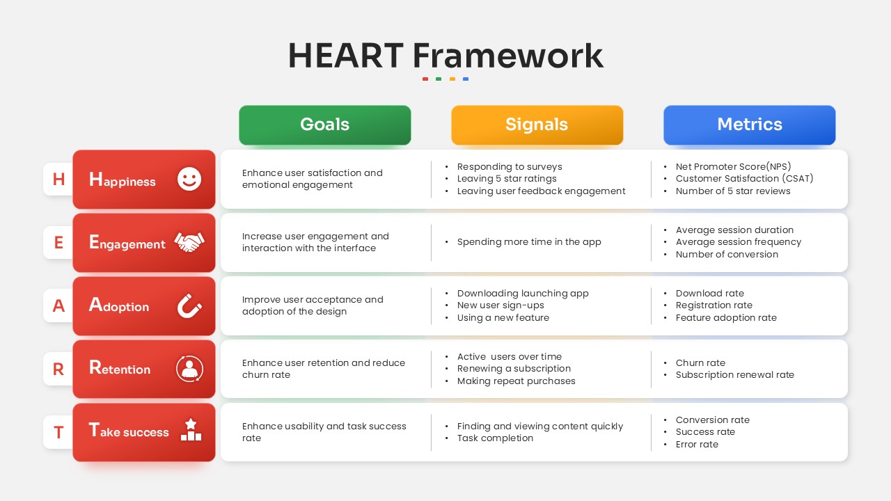
HEART Framework Goals, Signals & Metrics Template for PowerPoint & Google Slides
Process
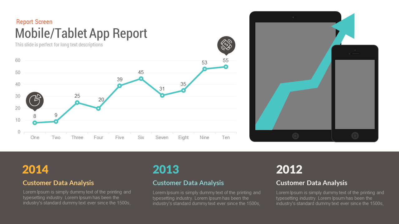
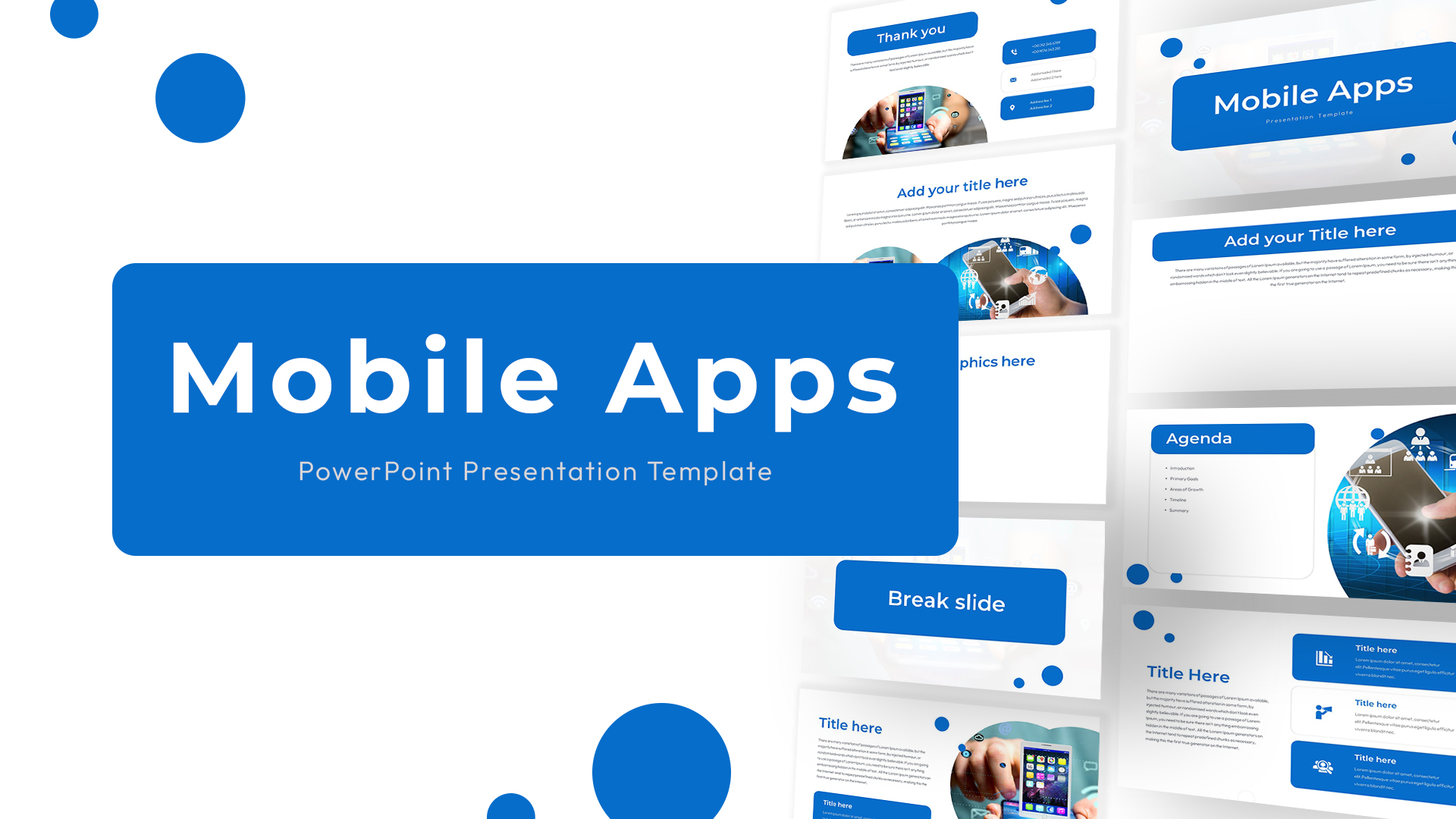
Mobile/Tablet App Report template for PowerPoint & Google Slides
Charts
Free
Mobile Data Analysis Chart template for PowerPoint & Google Slides
Charts
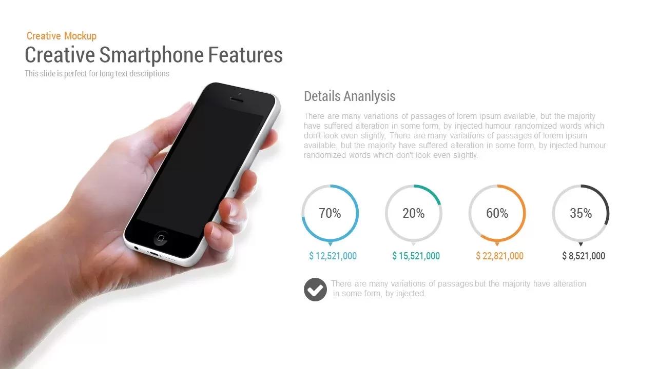
Mobile App Features template for PowerPoint & Google Slides
Technology
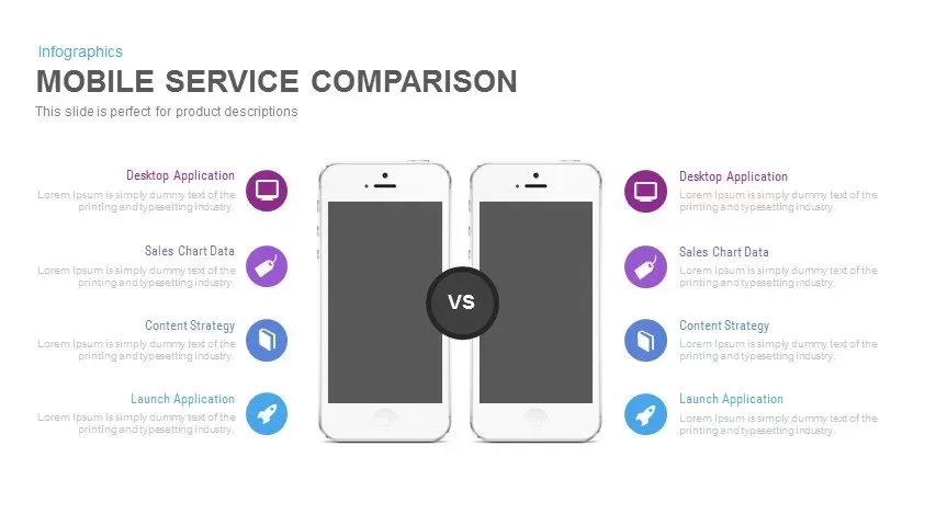
Clean Mobile Service Comparison Slide Template for PowerPoint & Google Slides
Comparison
Mobile Service Features Infographic Template for PowerPoint & Google Slides
Process
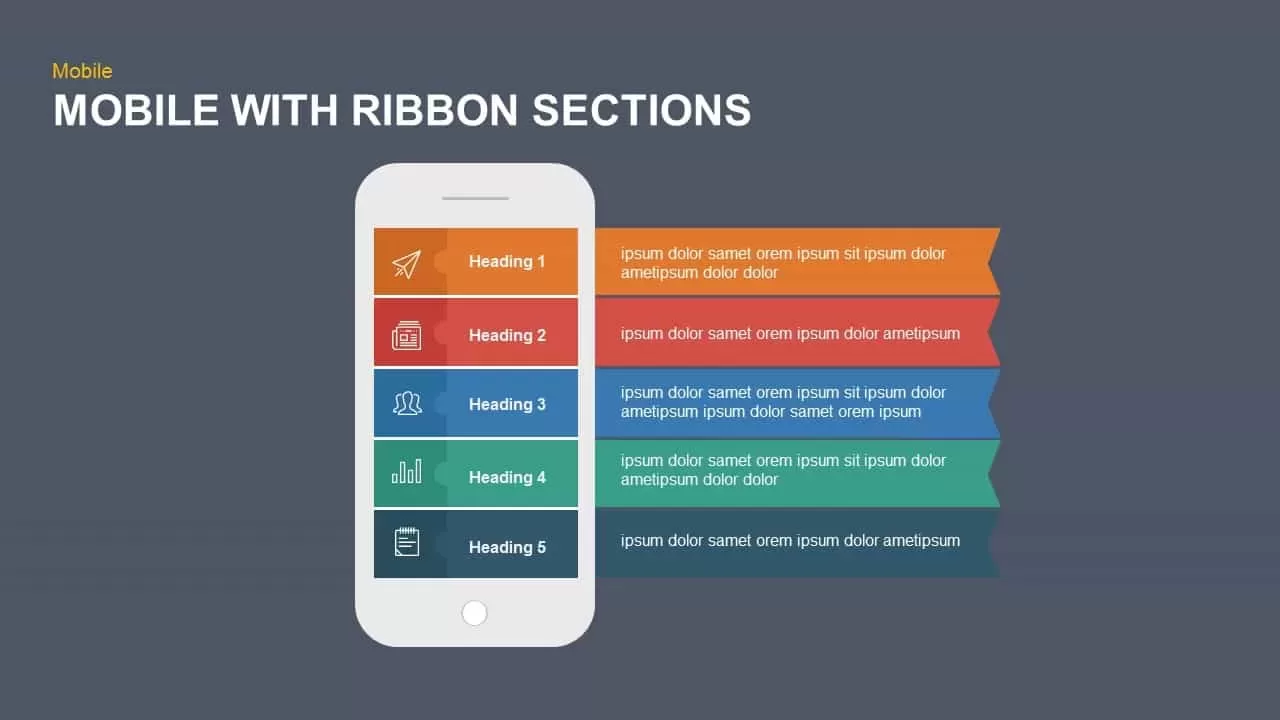
Mobile Ribbon Sections Diagram Template for PowerPoint & Google Slides
Process
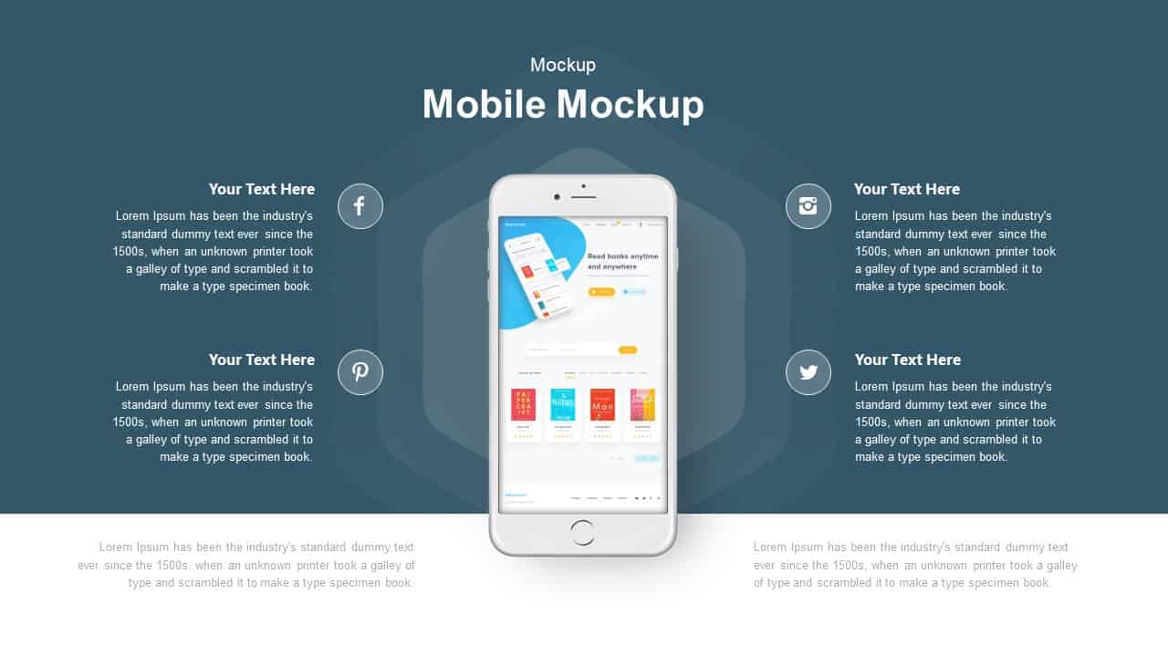
Mobile Mockup with Social Callouts Template for PowerPoint & Google Slides
Software Development
Mobile Infographics Data Visualization Template for PowerPoint & Google Slides
Infographics
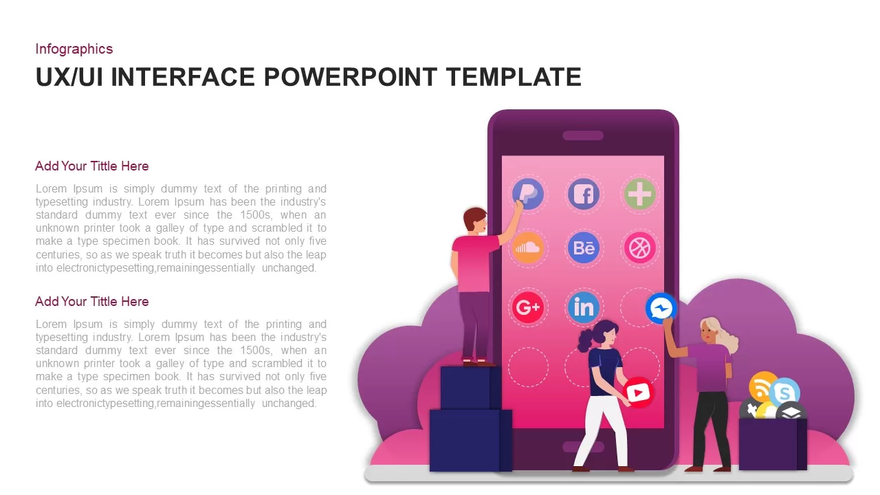
UX UI Mobile App Interface Infographic Template for PowerPoint & Google Slides
Software Development
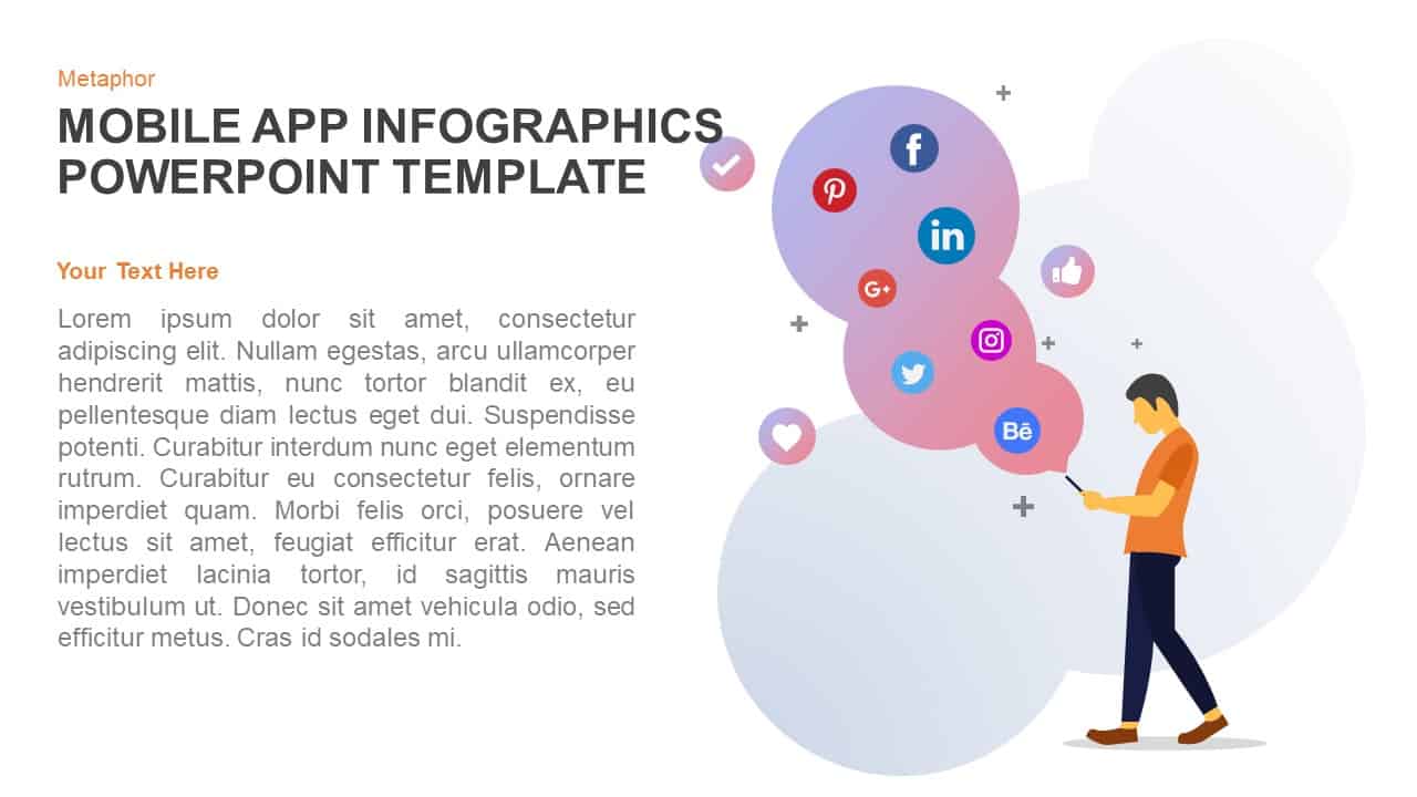
Mobile Apps Infographic Interface Template for PowerPoint & Google Slides
Software Development
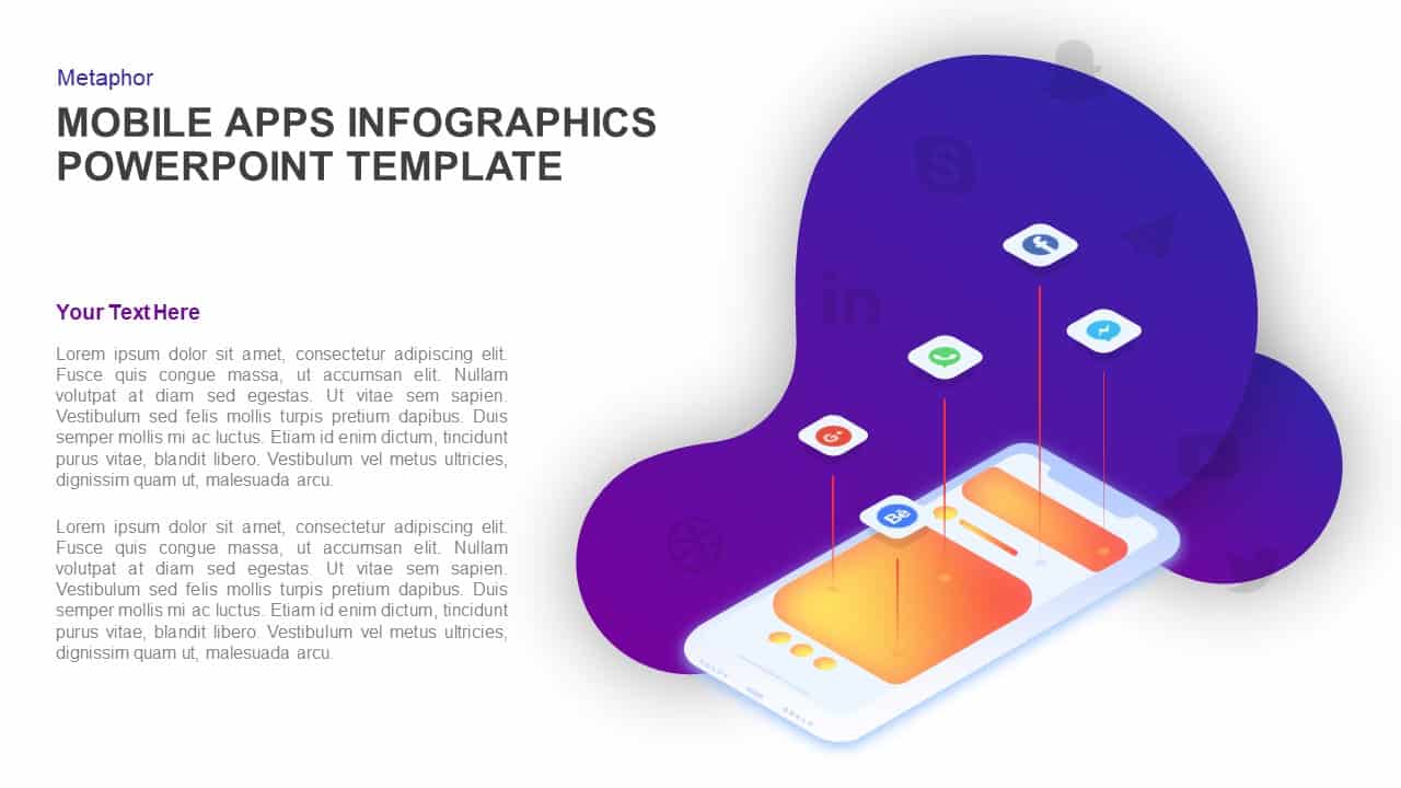
Mobile App Social Media Metaphor Template for PowerPoint & Google Slides
Infographics
Professional Mobile App Showcase Deck Template for PowerPoint & Google Slides
Pitch Deck

Blue Circle Mobile Apps Presentation Template for PowerPoint & Google Slides
Information Technology
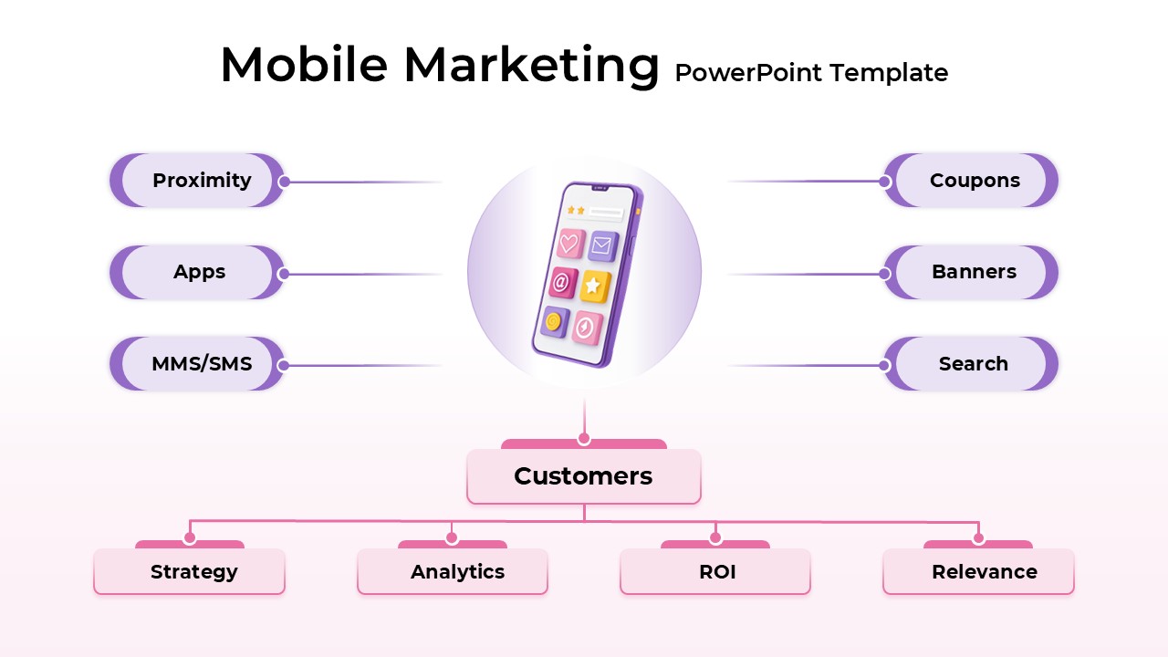
Mobile Marketing Strategy template for PowerPoint & Google Slides
Business
Mobile User Data Analysis Infographic for PowerPoint & Google Slides
Process
Mobile Application Features Mockup for PowerPoint & Google Slides
Graphics
iPhone Mobile Mockup for PowerPoint & Google Slides
Graphics
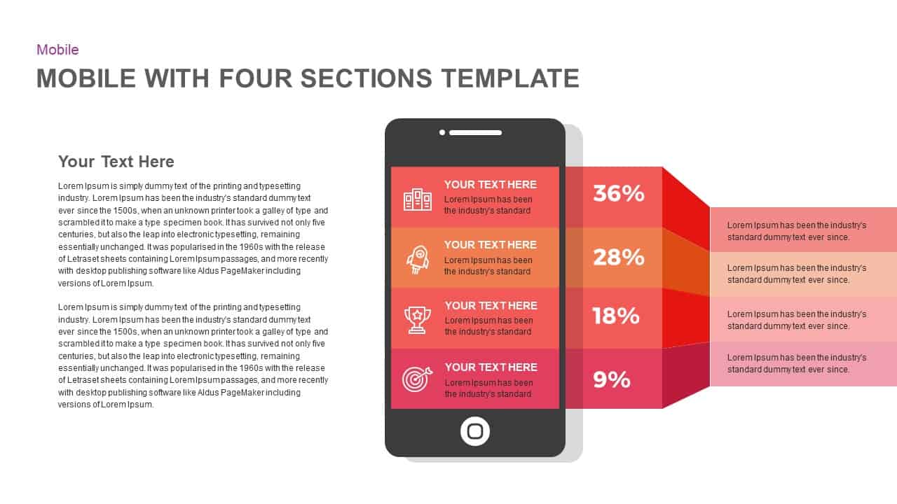
Mobile Application Features Diagram for PowerPoint & Google Slides
Technology