Interactive Empathy Map Diagram Template for PowerPoint & Google Slides


Description
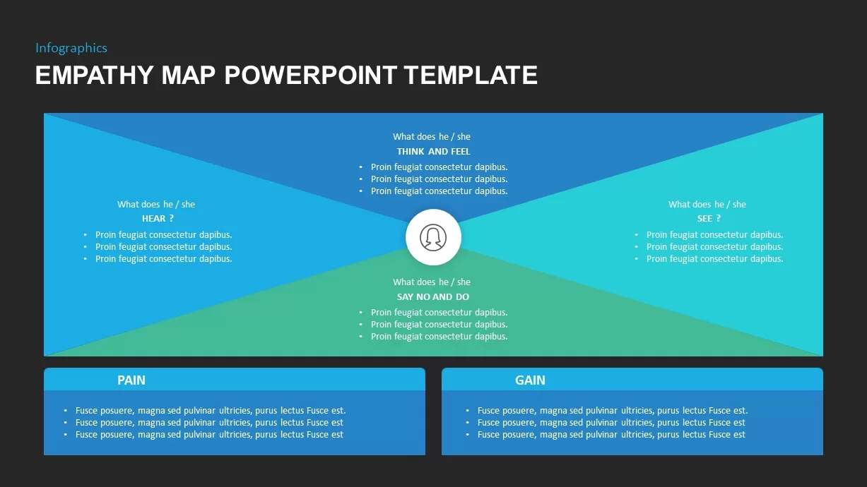
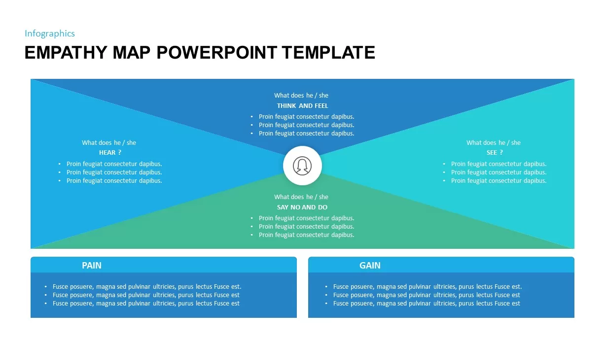
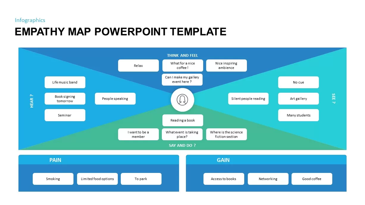
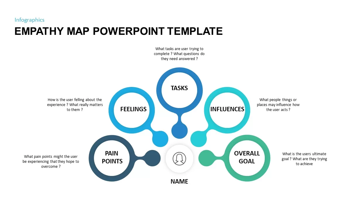
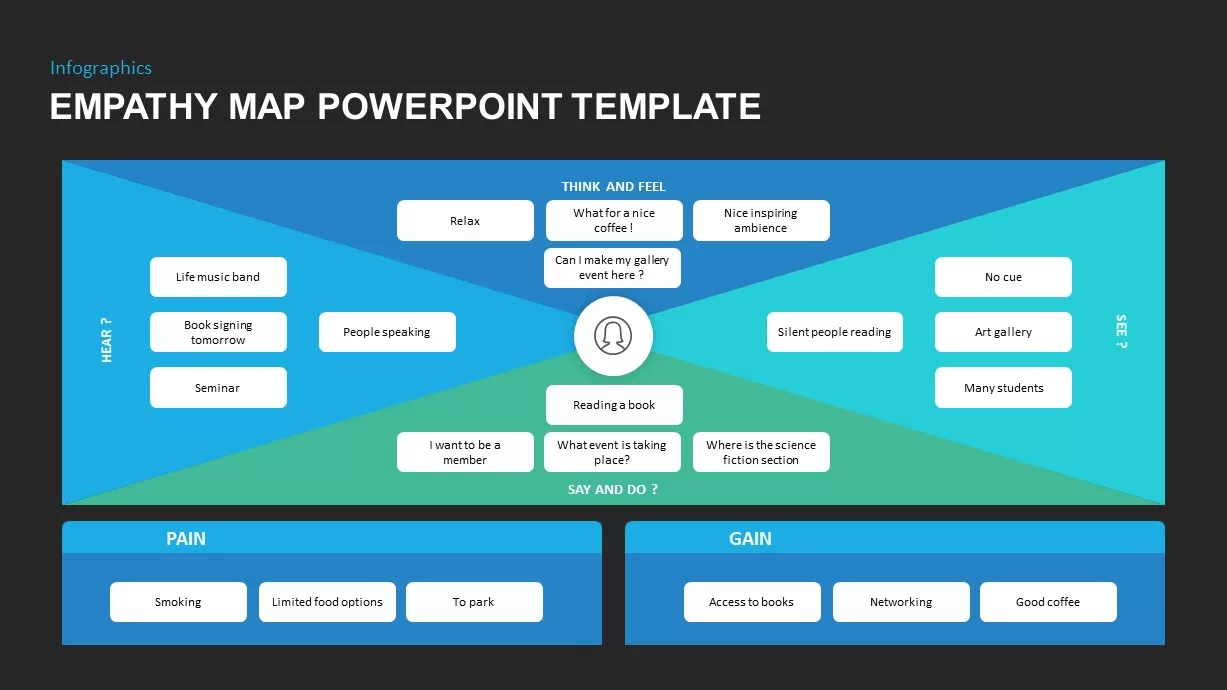
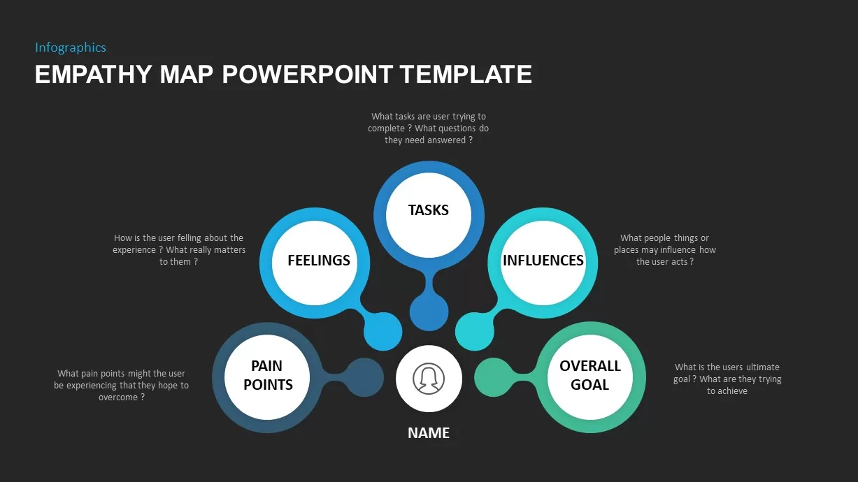
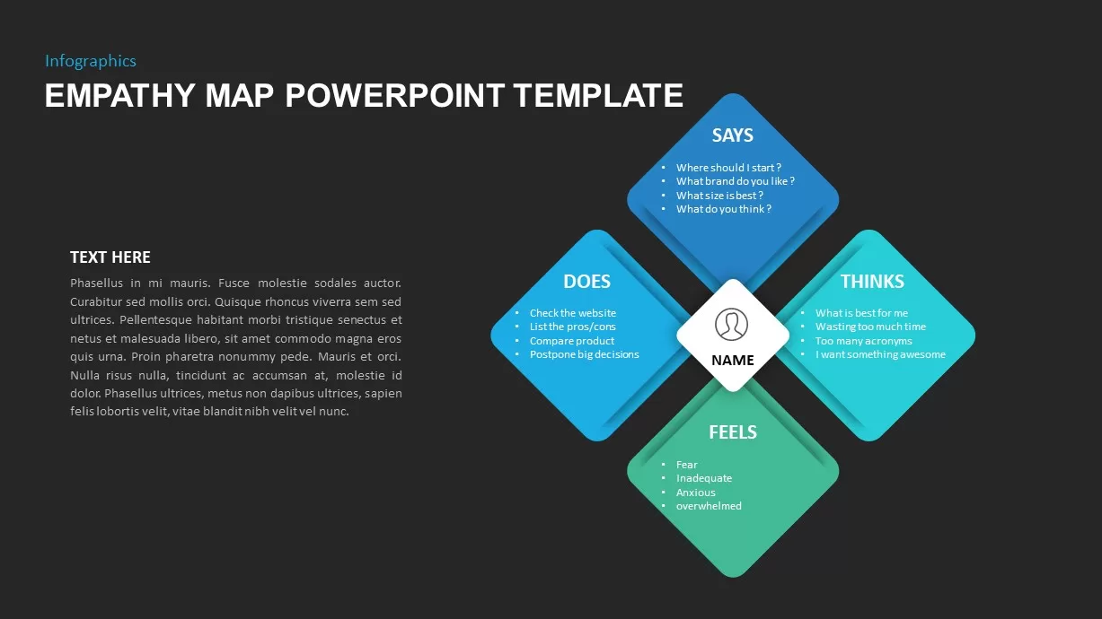
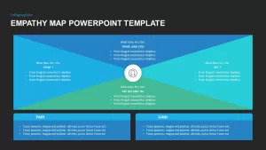
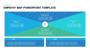
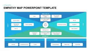
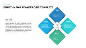
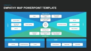
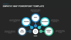
This modern empathy map infographic template transforms qualitative user research into an intuitive visual framework by dividing content into four distinct quadrants—Thought, Said, Did, and Felt—each linked to its corresponding color-coded dot in an embedded legend panel. Set against a clean white backdrop, the layout employs subtle drop shadows and precise alignment to create professional polish and ensure legibility in any presentation context. A central text placeholder anchors the design, enabling you to insert persona names, project titles, or descriptive overviews.
The semi-transparent legend box on the right clearly defines each colored dot for quick interpretation, yet you can freely reposition or resize it to adapt the map’s orientation. Developed on master slides, every element is fully editable: swap or recolor the legend markers, modify quadrant labels, and replace placeholder text without disturbing alignment, thanks to integrated grid guides and pre-defined layer groupings. All shapes and icons are high-resolution vectors, guaranteeing crisp rendering on projectors, retina displays, and printed handouts.
Optimized for both PowerPoint and Google Slides, this slide supports real-time collaboration in cloud environments, preserving formatting across multiple users and platform versions. Drag-and-drop functionality allows you to import custom icons, user photographs, or brand assets directly into quadrants. Simply duplicate the slide to generate comparative empathy maps for different customer segments or to illustrate evolving user needs over time. The template also includes optional guide overlays for precise element placement, helping you maintain consistency when layering additional charts or callouts alongside the map.
By offering ready-made text placeholders for user quotes, behavior summaries, emotional insights, and action items, this empathy map accelerates workshop sessions, design sprints, and stakeholder presentations. Convey complex human-centered insights with clarity, align cross-functional teams around customer priorities, and drive data-informed decisions with this versatile visual toolkit.
Who is it for
UX designers, product managers, researchers, and marketing teams who need to synthesize user sentiments, behaviors, and motivations into a clear, shareable visual format.
Other Uses
Repurpose this slide for stakeholder empathy exercises, customer journey mapping, persona comparisons, service design workshops, or cross-functional alignment sessions.
Login to download this file

Item ID
SB01761
Related Templates

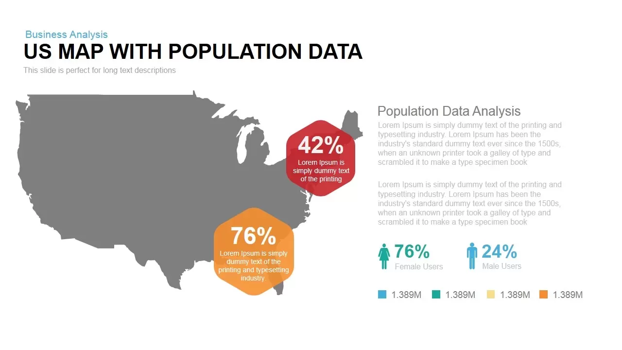
Interactive US Population Data Map Slide Template for PowerPoint & Google Slides
World Maps
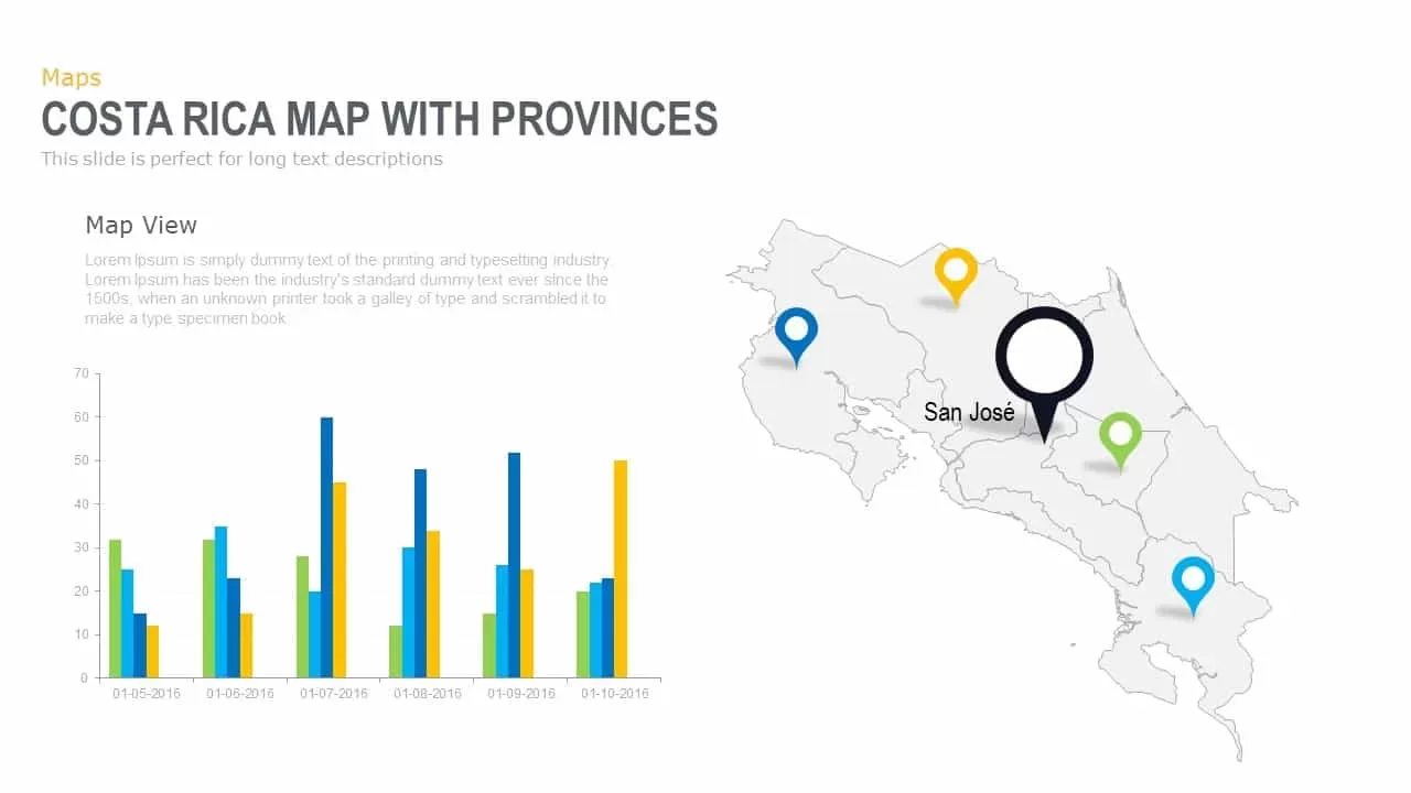
Interactive Costa Rica Province Map Template for PowerPoint & Google Slides
World Maps
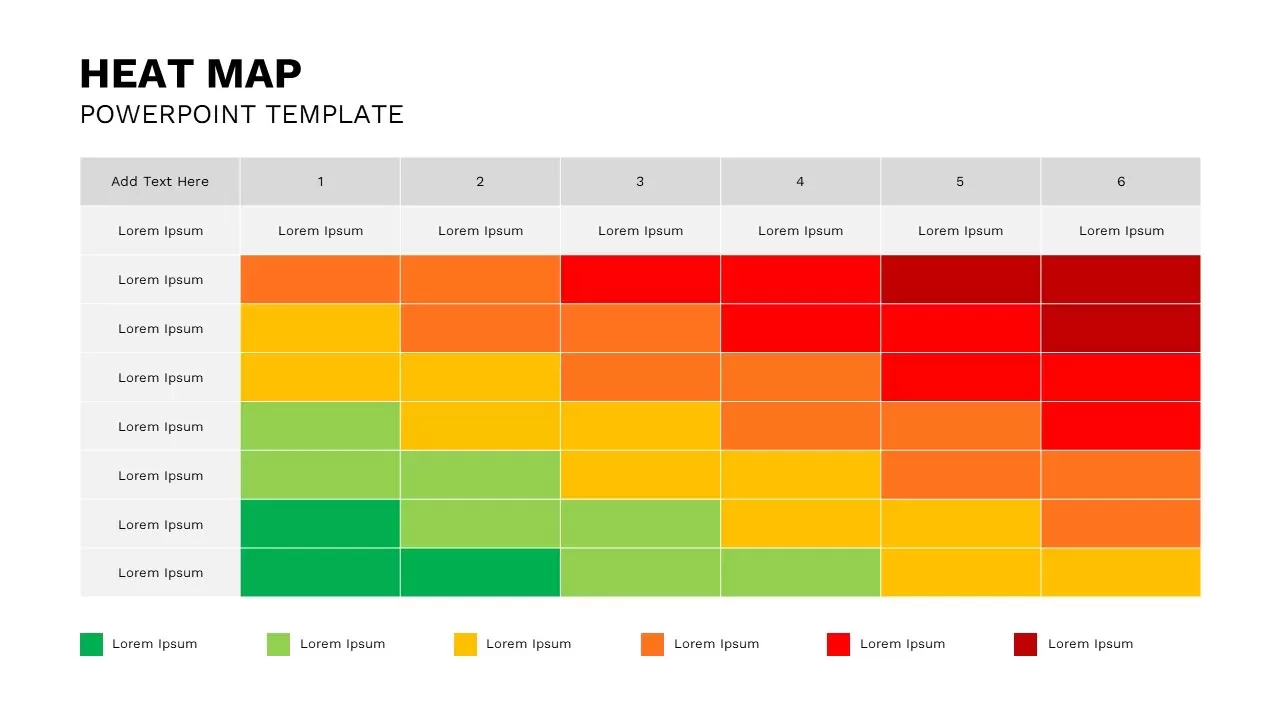
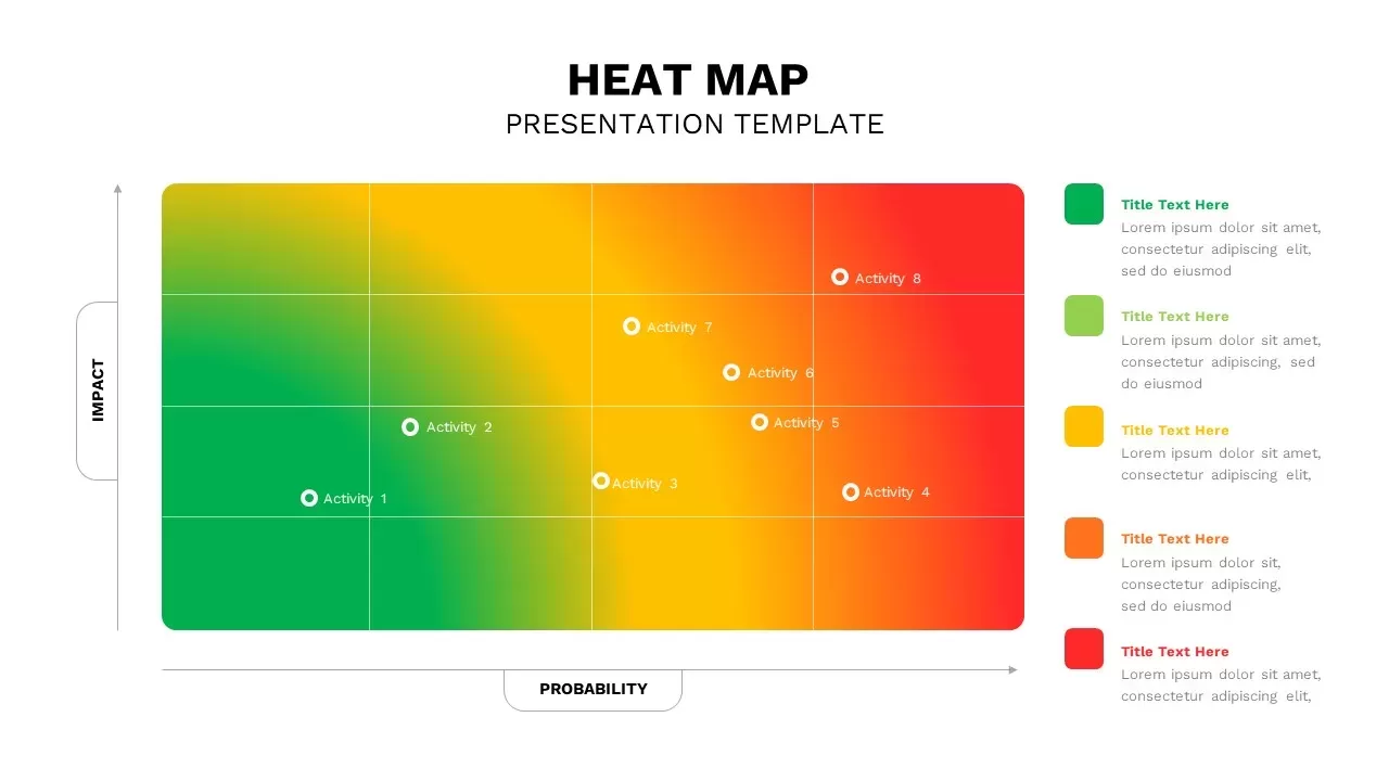
Professional Interactive Heat Map Matrix Template for PowerPoint & Google Slides
Comparison Chart
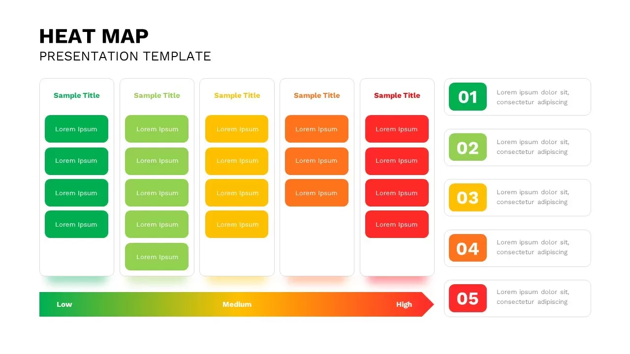
Interactive Heat Map Template for PowerPoint & Google Slides
Bar/Column
Interactive Oklahoma County Map Template for PowerPoint & Google Slides
World Maps
Interactive Taiwan Map Highlight Template for PowerPoint & Google Slides
World Maps

Interactive Iraq Map with Governorates Slide Pack for PowerPoint & Google Slides
World Maps
Interactive Products Tree Diagram template for PowerPoint & Google Slides
Org Chart
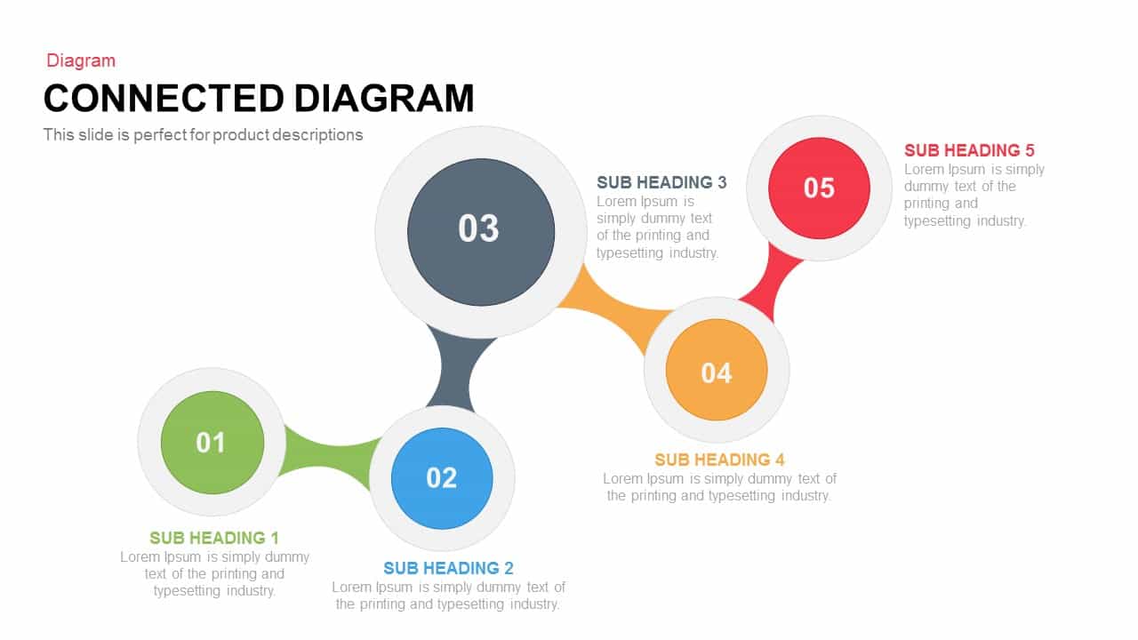
Interactive Connected Network Diagram Template for PowerPoint & Google Slides
Process

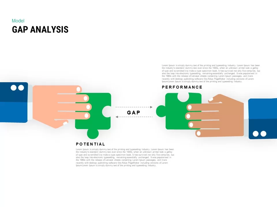
Interactive Gap Analysis Puzzle Diagram Template for PowerPoint & Google Slides
Gap
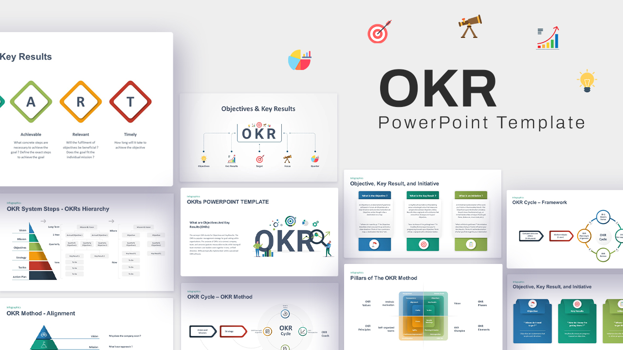
Interactive OKR Strategy Diagram Template for PowerPoint & Google Slides
Process
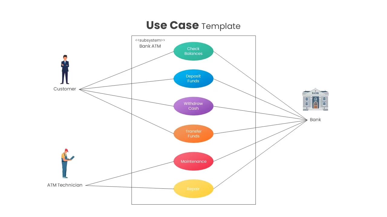
Interactive Bank ATM Use Case Diagram Template for PowerPoint & Google Slides
Software Development
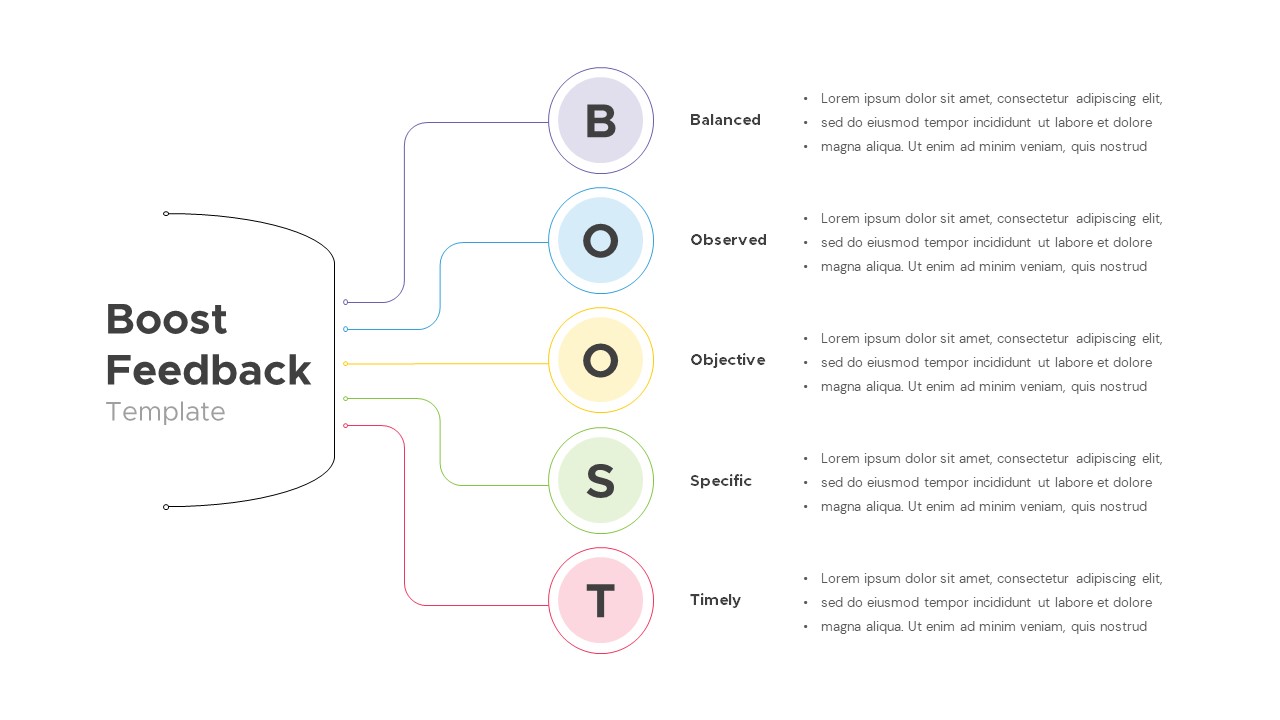
Interactive Boost Feedback Model Diagram Template for PowerPoint & Google Slides
Process
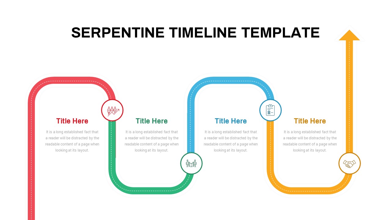
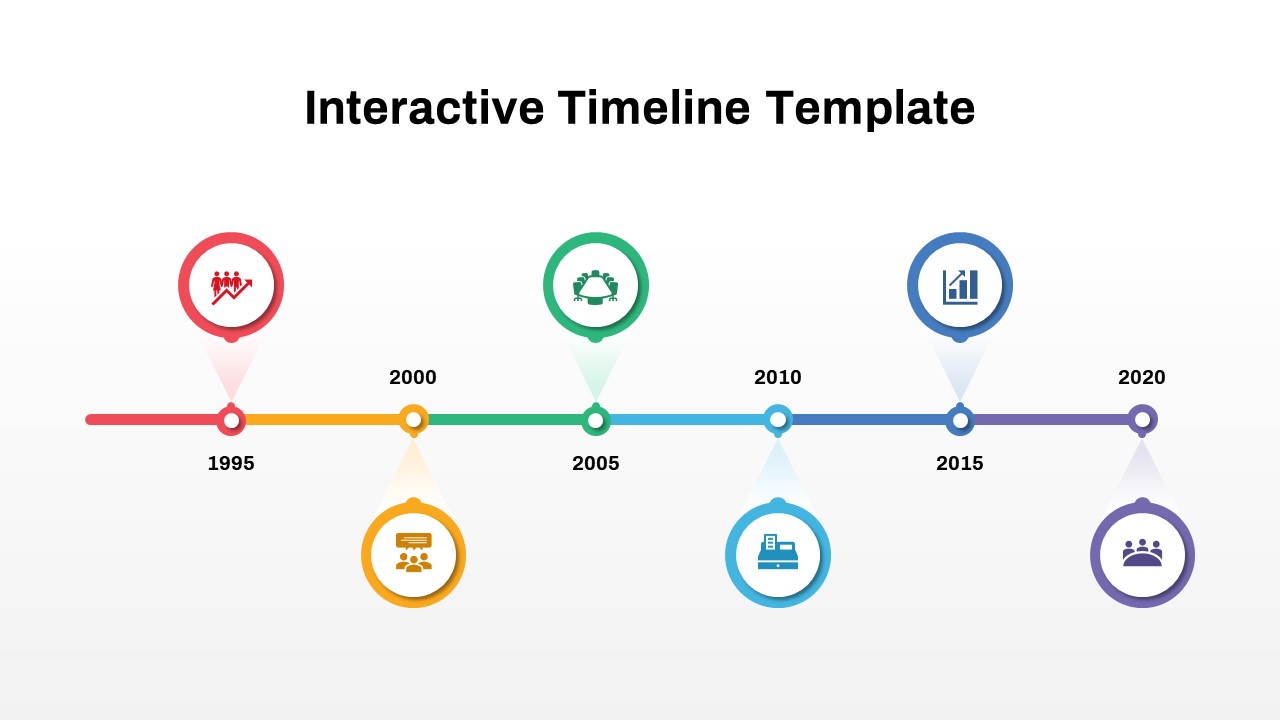
Interactive Serpentine Timeline Diagram Template for PowerPoint & Google Slides
Timeline
Interactive Product Comparison Bar Chart Template for PowerPoint & Google Slides
Bar/Column
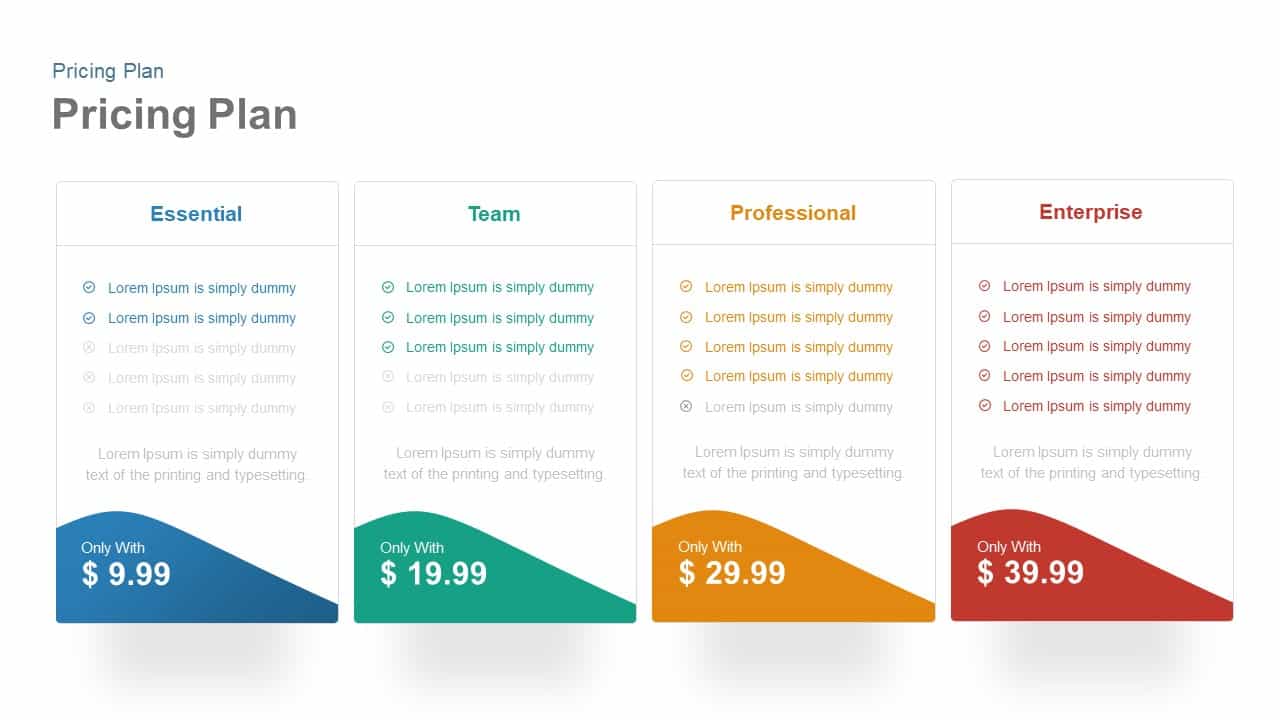
Interactive Pricing Plan Comparison Template for PowerPoint & Google Slides
Comparison

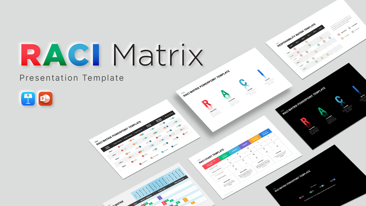
Interactive RACI Responsibility Matrix Template for PowerPoint & Google Slides
Project
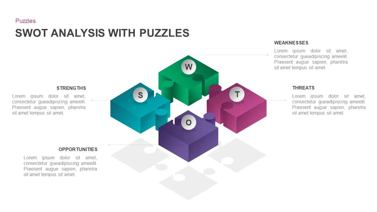
Interactive 3D Puzzle SWOT Analysis Slide Template for PowerPoint & Google Slides
SWOT
Free Interactive Online Course Presentation Template for PowerPoint & Google Slides
Pitch Deck
Free
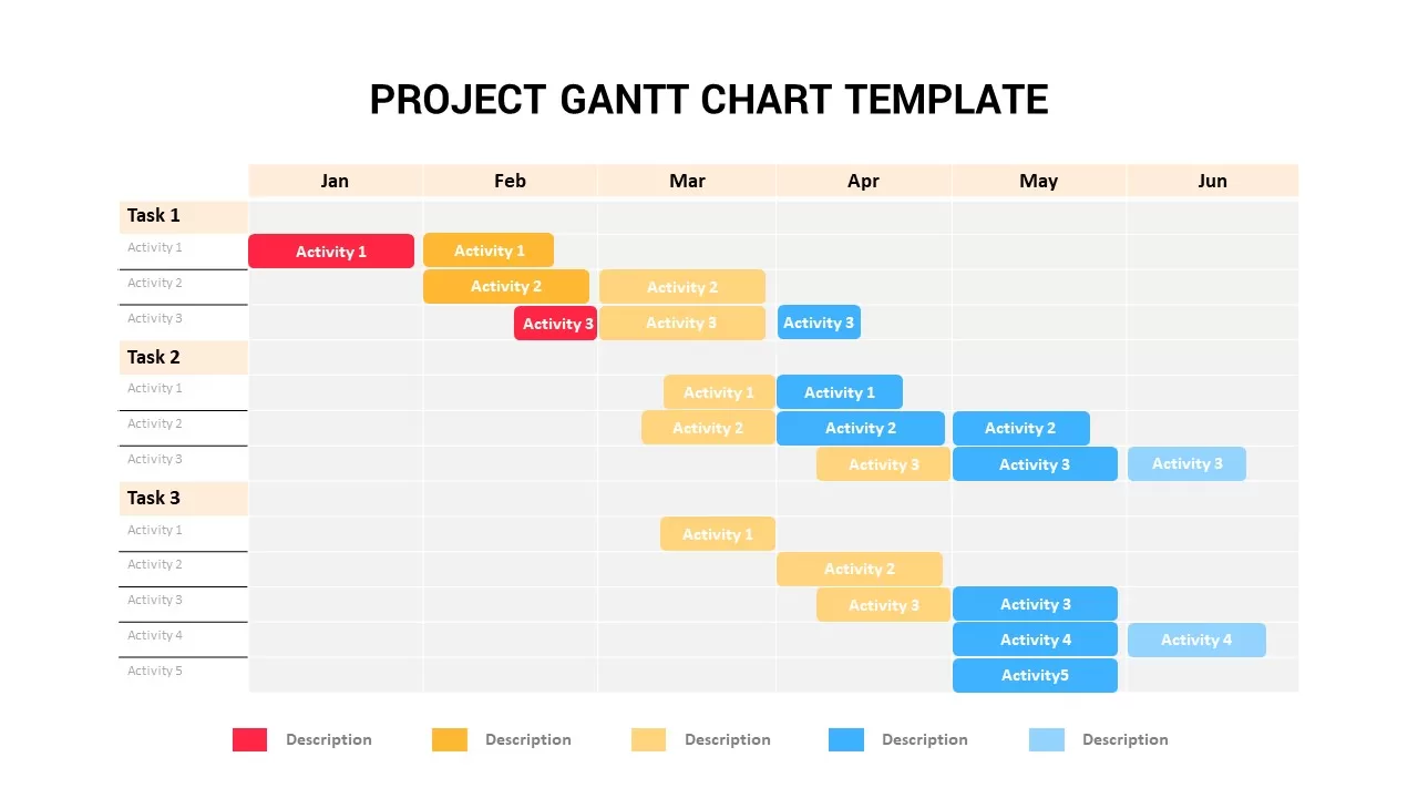
Interactive Project Gantt Chart Timeline Template for PowerPoint & Google Slides
Gantt Chart
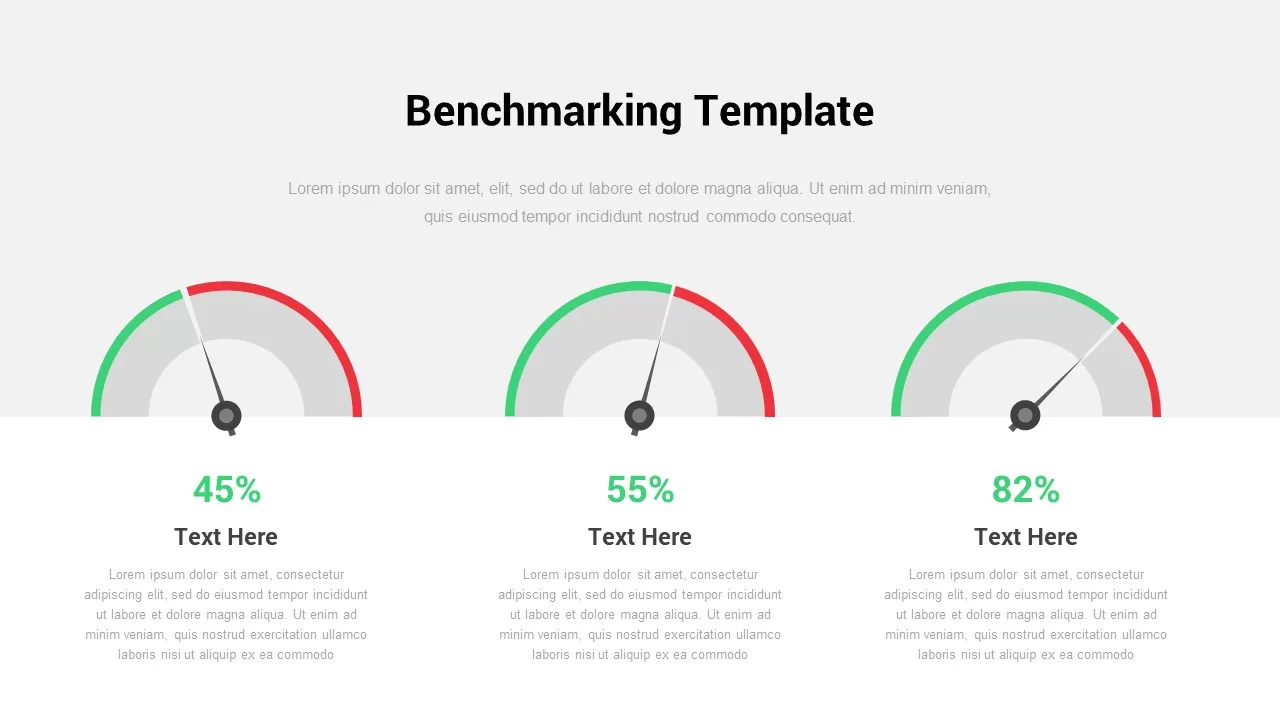
Interactive Benchmarking Gauge Dashboard Template for PowerPoint & Google Slides
Pie/Donut

Free Interactive Trivia Presentation Template for PowerPoint & Google Slides
Graphics
Free
Free Interactive Two Truths and a Lie Game Template for PowerPoint & Google Slides
Decks
Free
Free Spin the Wheel Interactive Game Template for PowerPoint & Google Slides
Decks
Free
Interactive Slide Zoom & Transition Template for PowerPoint & Google Slides
Decks
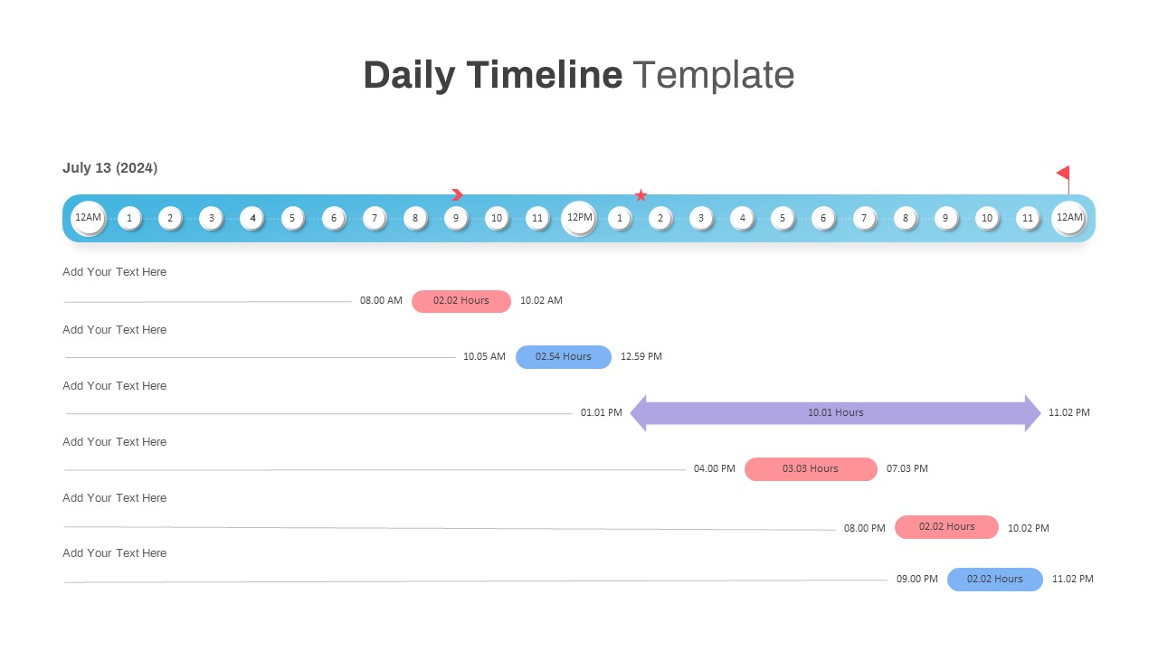
Interactive Daily Timeline Schedule Chart Template for PowerPoint & Google Slides
Timeline
Interactive Milestone Timeline Template for PowerPoint & Google Slides
Timeline
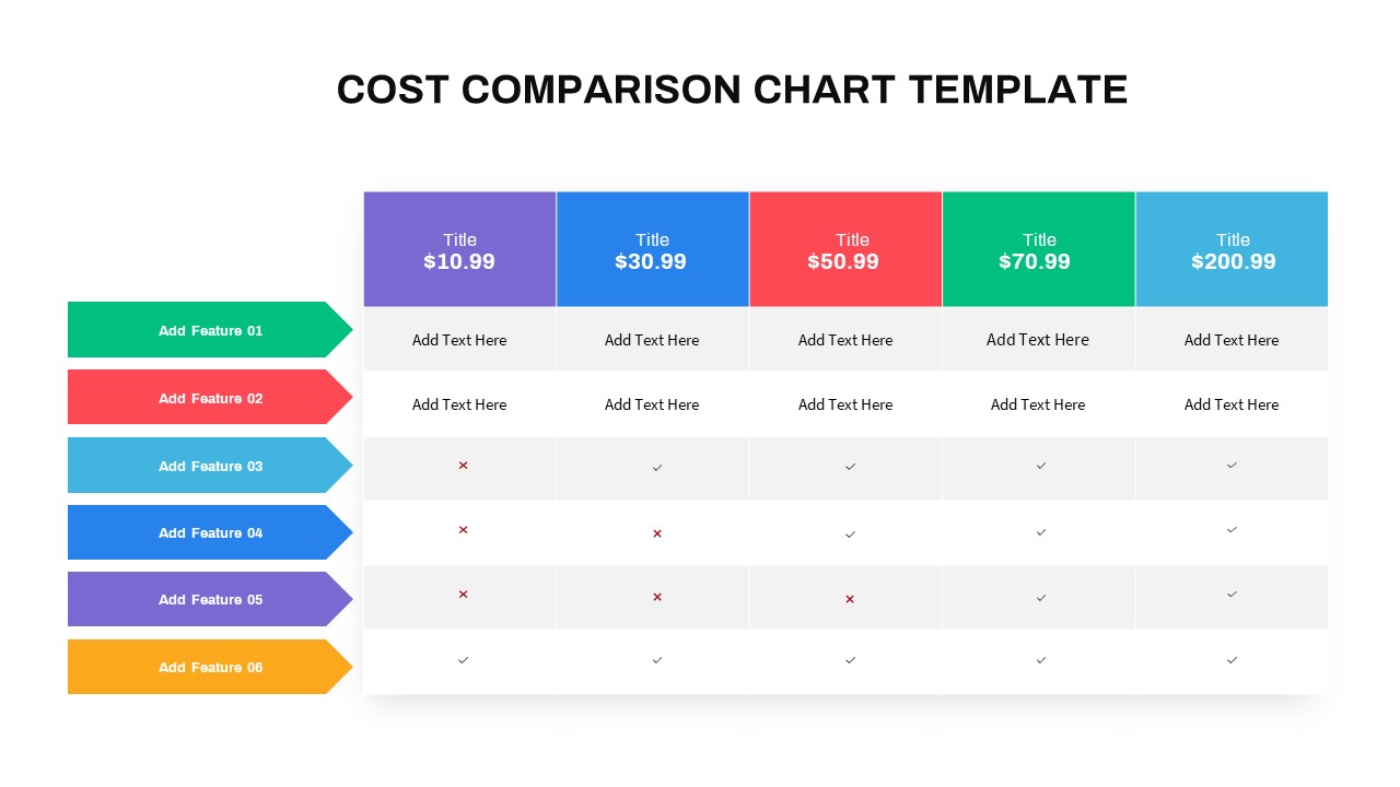
Interactive Multi-Use Cost Comparison Template for PowerPoint & Google Slides
Comparison
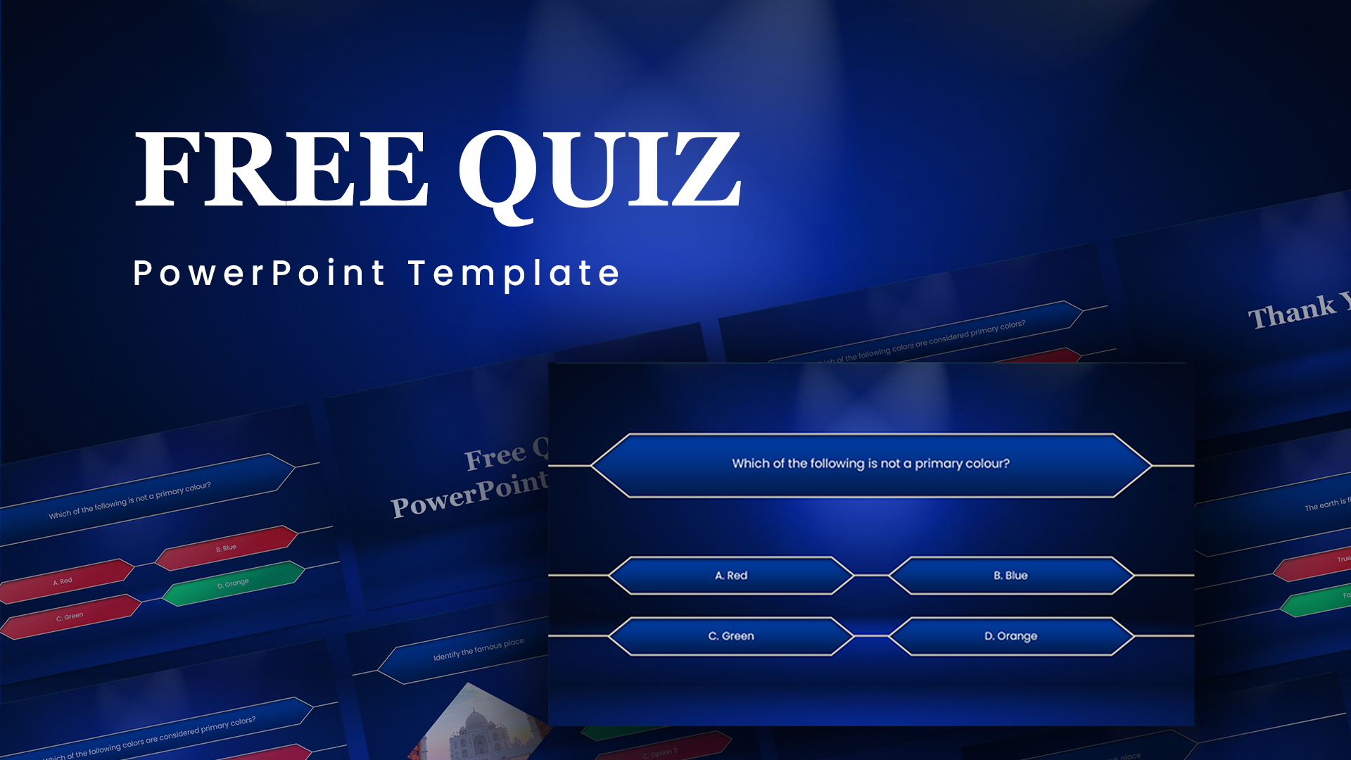
Free Animated Quiz Interactive Template for PowerPoint & Google Slides
Pitch Deck
Free
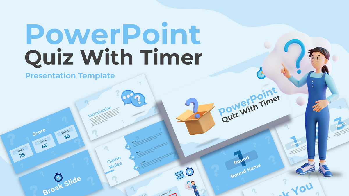
Interactive Quiz with Countdown Timer Template for PowerPoint & Google Slides
Pitch Deck
Interactive Strategic Capability Roadmap Template for PowerPoint & Google Slides
Roadmap
Interactive Jump Line Data Chart Template for PowerPoint & Google Slides
Comparison Chart
Interactive Quiz with Game Rules Template for PowerPoint & Google Slides
Graphics
Free
Interactive Innovation Timeline Roadmap Template for PowerPoint & Google Slides
Timeline
Free Interactive Flashcards Q&A Deck Template for PowerPoint & Google Slides
Free
Free
Free Interactive Notebook for PowerPoint & Google Slides
Business
Free
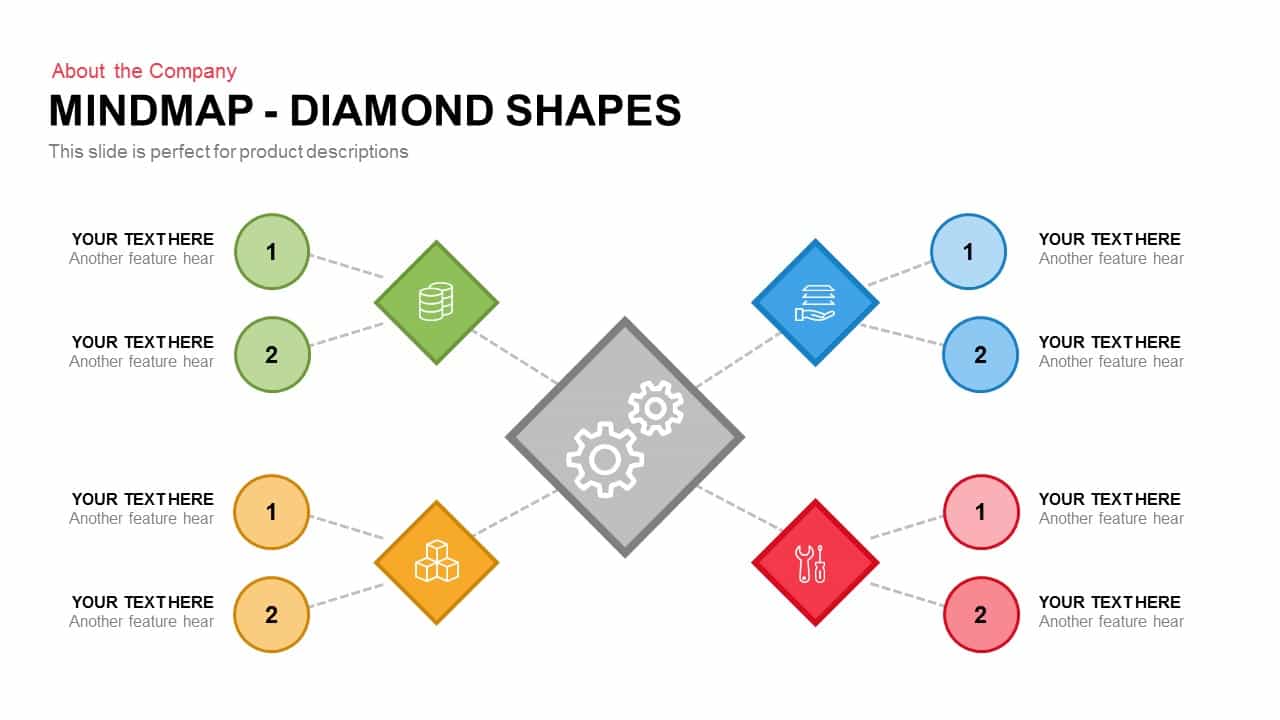
Diamond Mind Map Diagram Four Branches Template for PowerPoint & Google Slides
Mind Maps
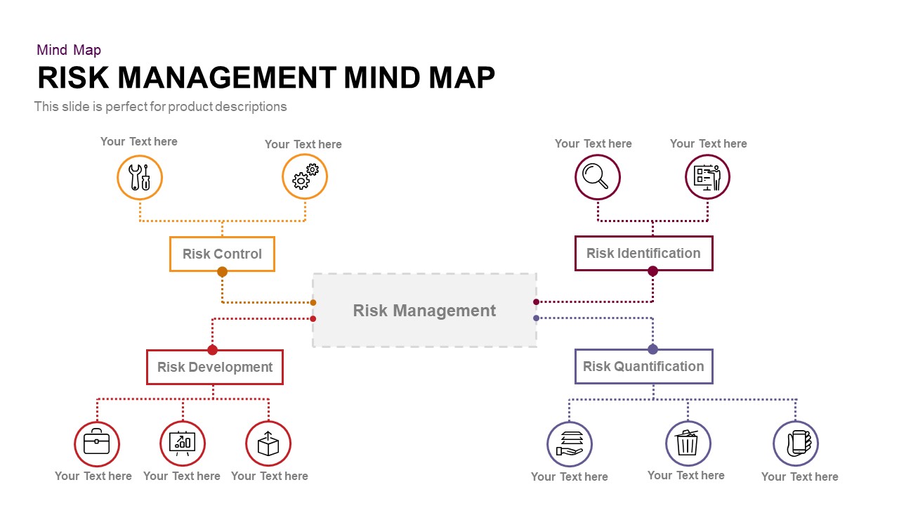
Risk Management Mind Map Radial Diagram template for PowerPoint & Google Slides
Mind Maps
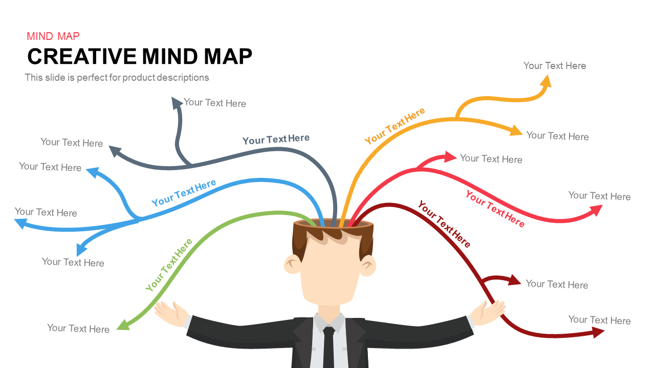
Colorful Creative Mind Map Diagram template for PowerPoint & Google Slides
Mind Maps
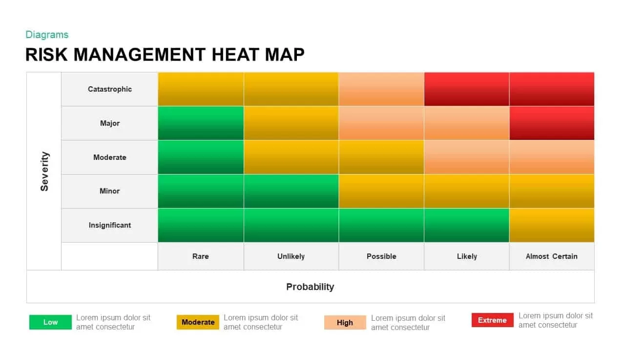
Risk Management Heat Map Diagram Template for PowerPoint & Google Slides
Comparison Chart
Five-Year Transformation Map Diagram Template for PowerPoint & Google Slides
Process

Eight-Node Mind Map Infographic Diagram Template for PowerPoint & Google Slides
Mind Maps
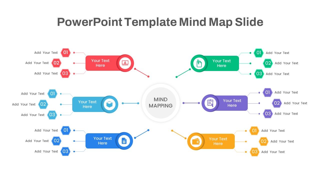
Mind Map Diagram Template for PowerPoint & Google Slides
Mind Maps
Structured Mind Map Infographic Diagram Template for PowerPoint & Google Slides
Mind Maps
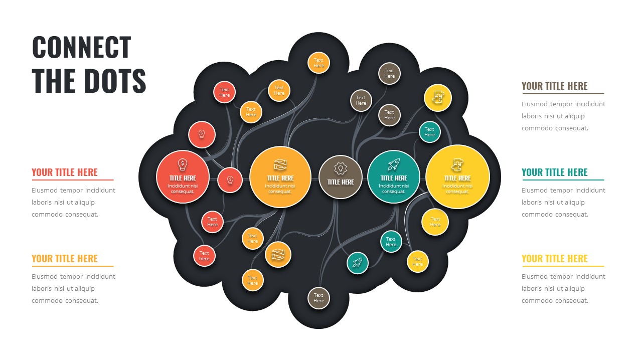
Connect the Dots Mind Map Diagram Template for PowerPoint & Google Slides
Mind Maps
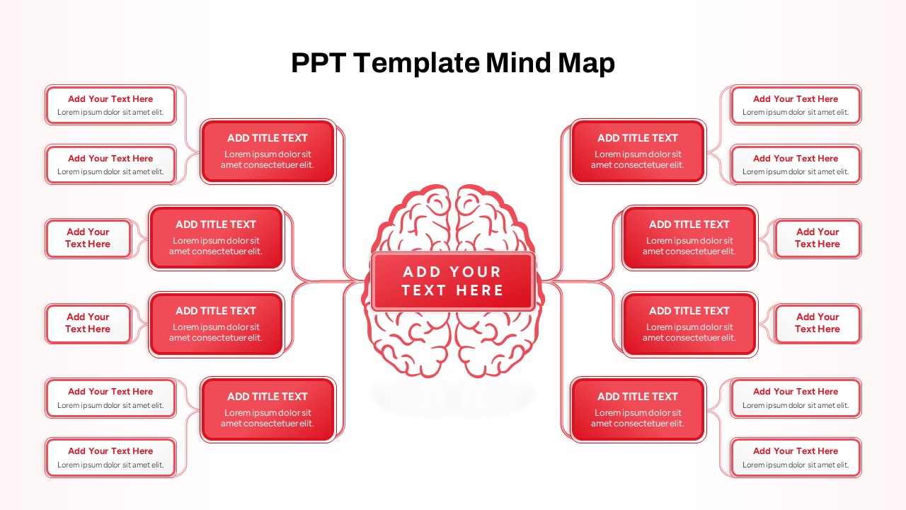
Red Brain Mind Map Diagram Template for PowerPoint & Google Slides
Mind Maps
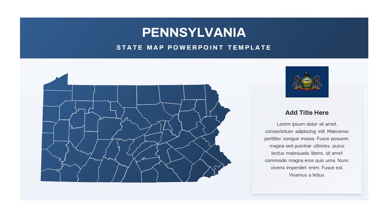
Pennsylvania State Map Diagram Template for PowerPoint & Google Slides
World Maps
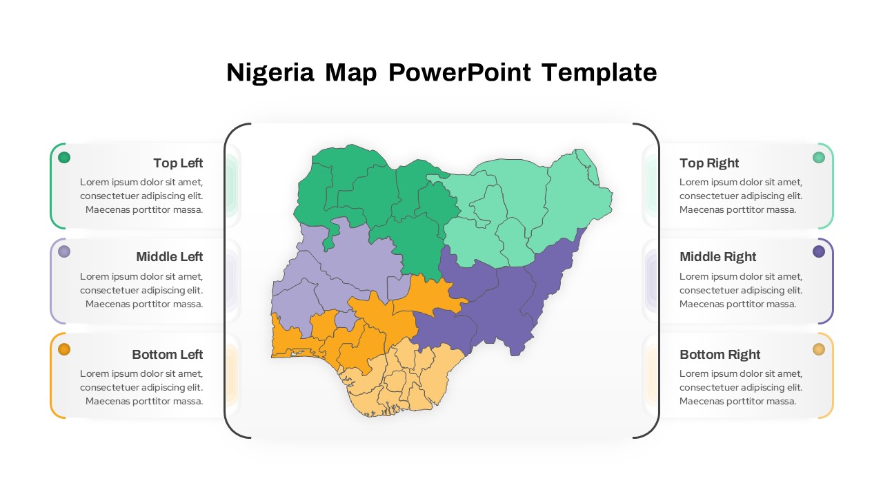
Nigeria Regional Callout Map Diagram Template for PowerPoint & Google Slides
Maps
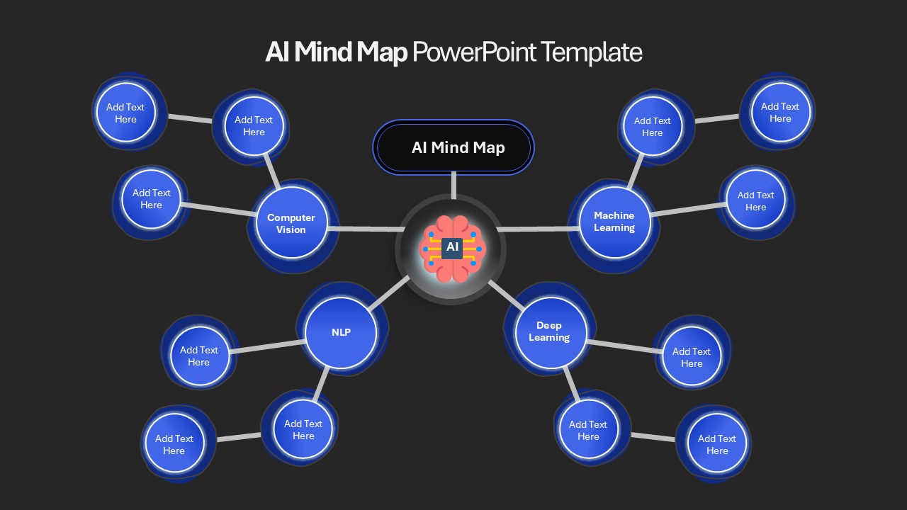
AI Mind Map & Hub-and-Spoke Diagram Template for PowerPoint & Google Slides
Mind Maps
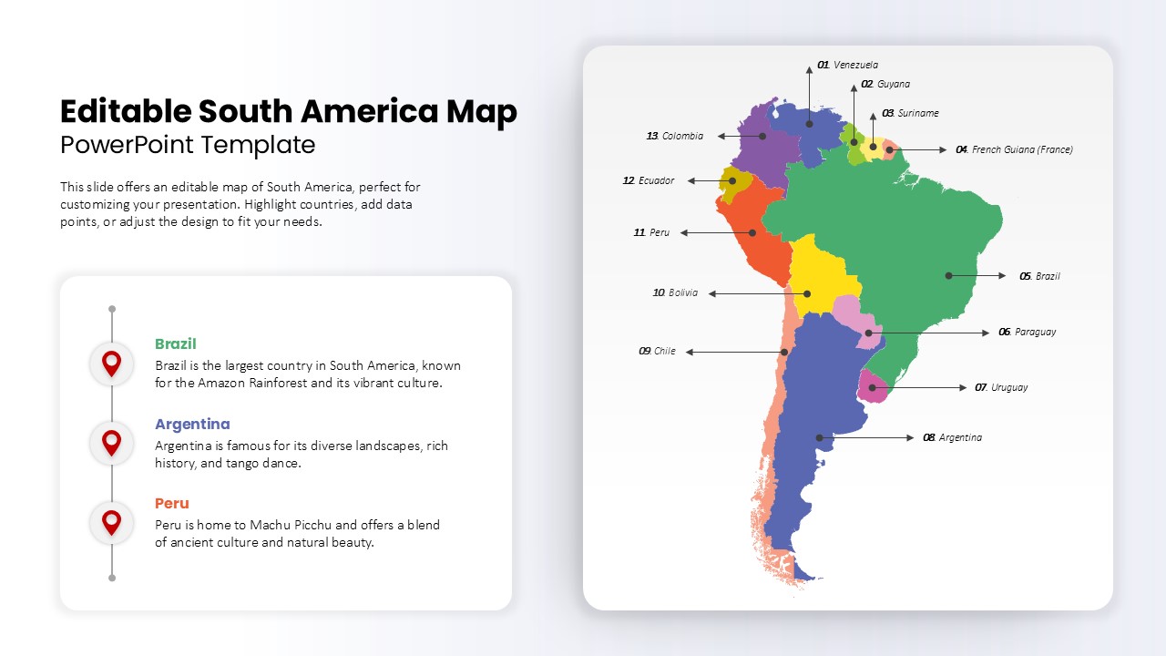
Editable South America Map Diagram Template for PowerPoint & Google Slides
Maps
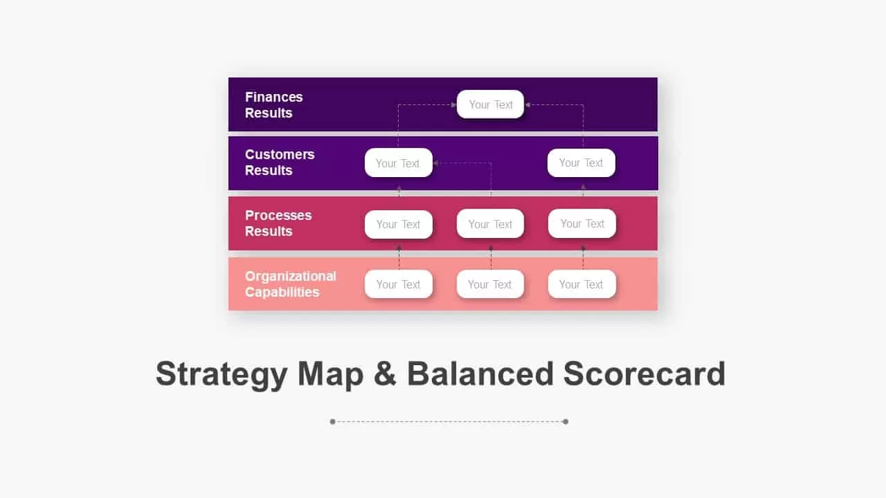
Balanced Scorecard Strategy Map Diagram Pack for PowerPoint & Google Slides
Business Strategy
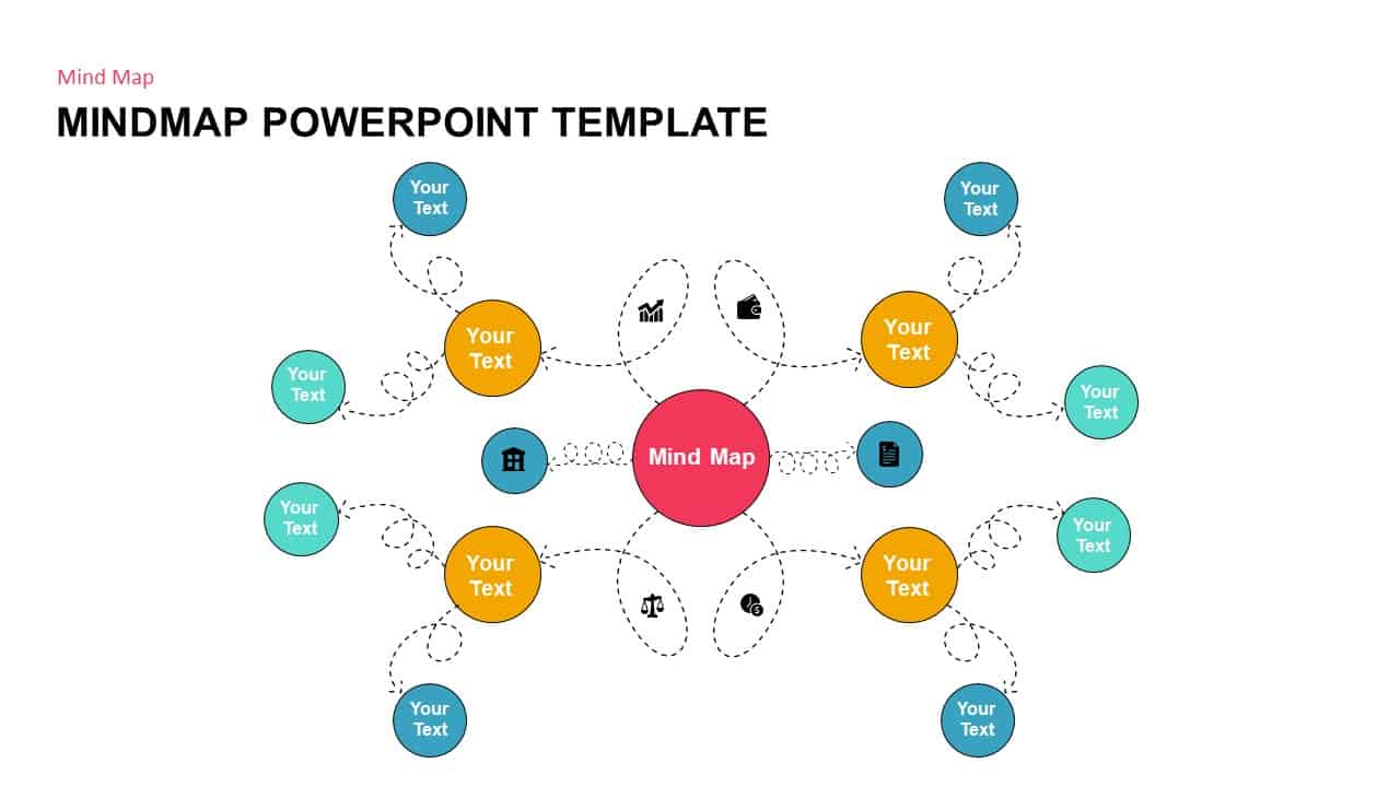
Mind Map PowerPoint template for PowerPoint & Google Slides
Mind Maps
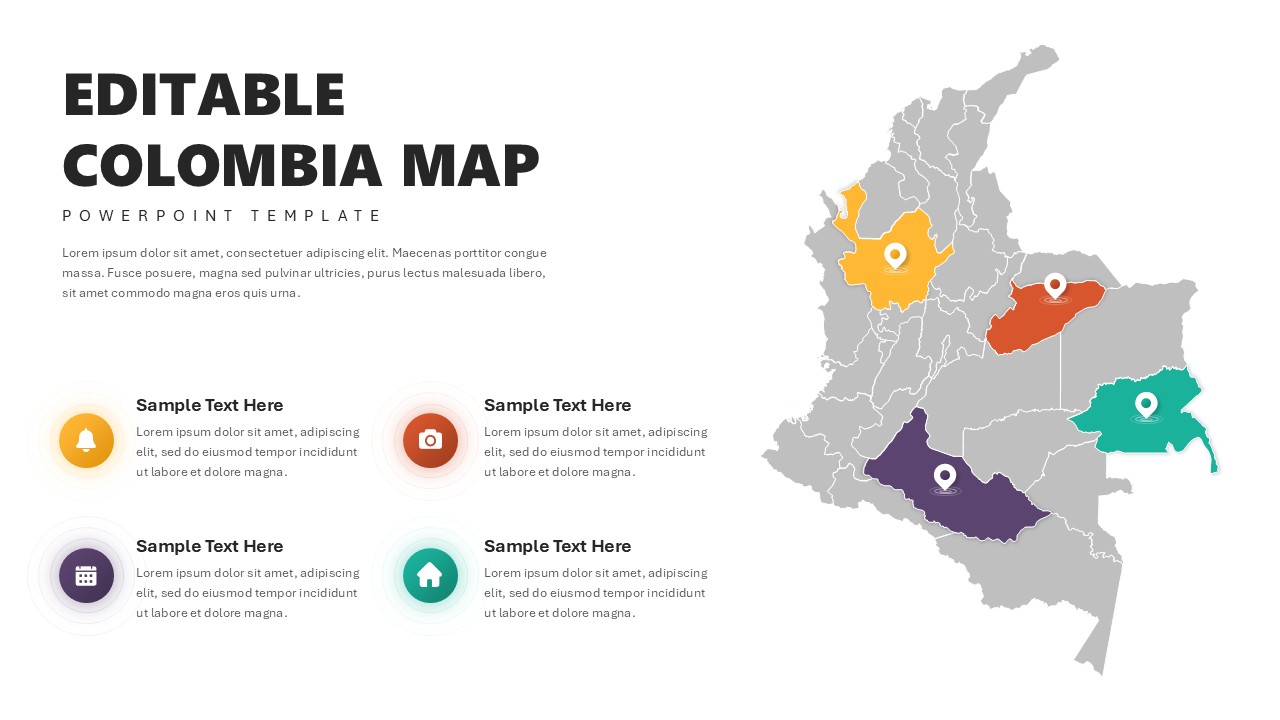
Editable Colombia Map PowerPoint Template for PowerPoint & Google Slides
Business Models
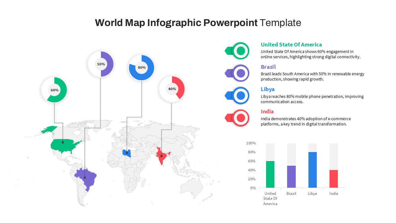
World Map Data template for PowerPoint & Google Slides
World Maps
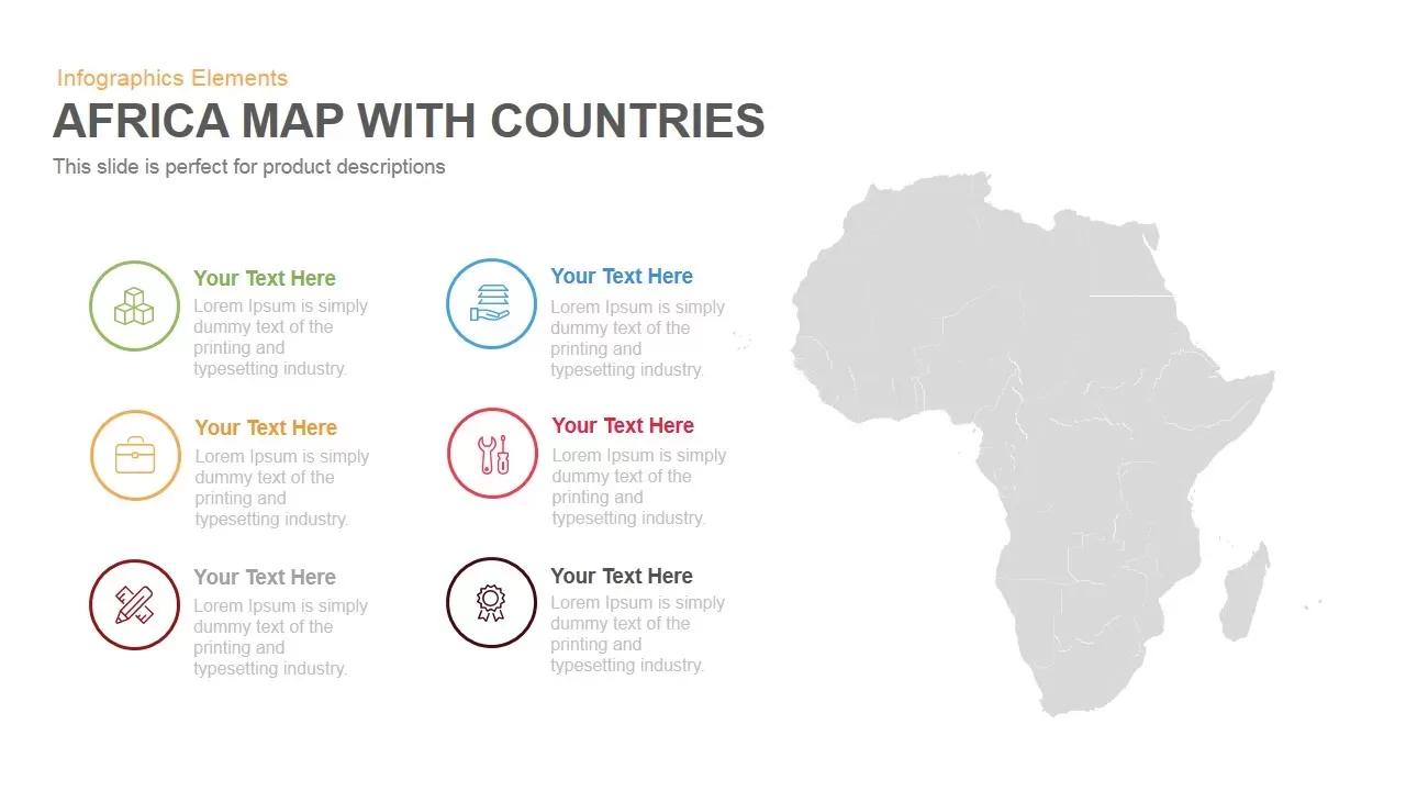
Africa Country Map Infographic Template for PowerPoint & Google Slides
World Maps
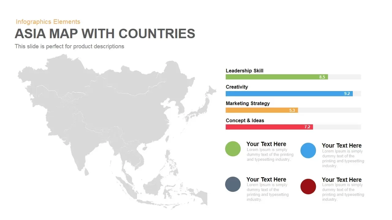
Asia Map with KPI Metrics and Legend Template for PowerPoint & Google Slides
World Maps
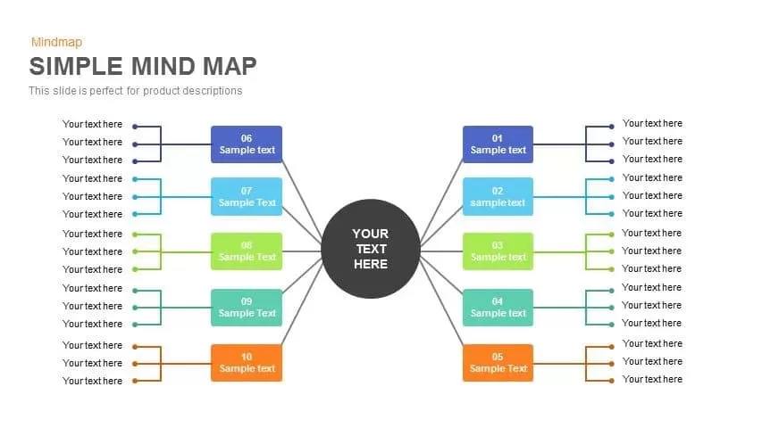
Simple Multi-Branch Mind Map Template for PowerPoint & Google Slides
Mind Maps
Customizable USA Map With State Markers Template for PowerPoint & Google Slides
World Maps
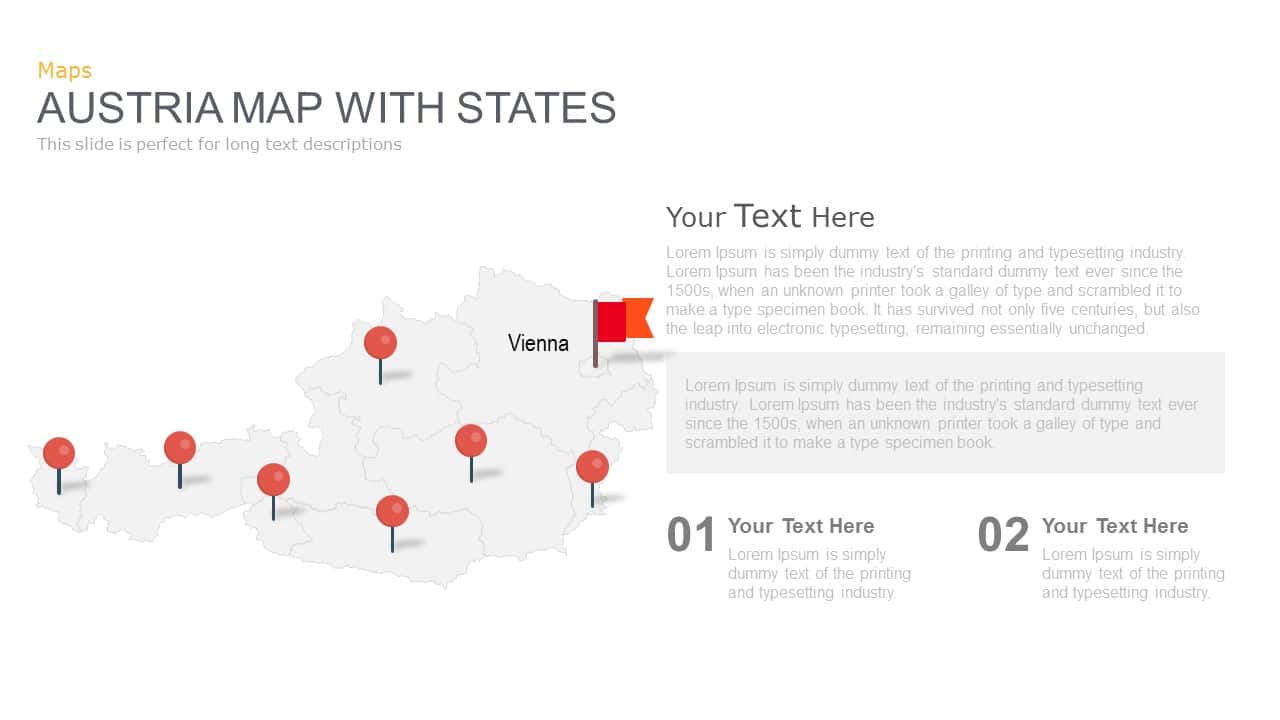
Austria Map With State Markers Template for PowerPoint & Google Slides
World Maps
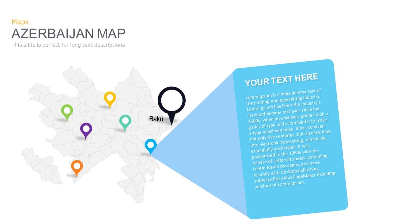
Azerbaijan Map with Provinces & Callouts Template for PowerPoint & Google Slides
World Maps
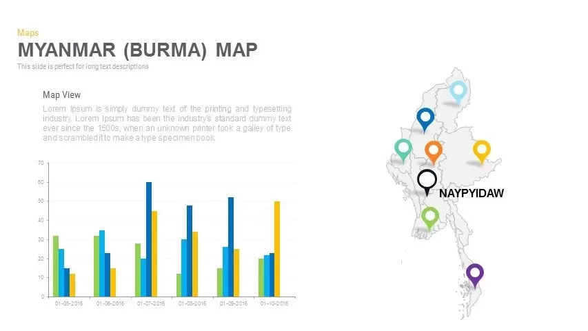
Myanmar (Burma) Provincial Map Infographic Template for PowerPoint & Google Slides
Maps
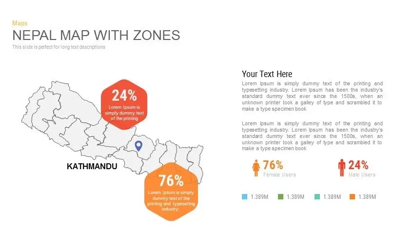
Nepal Map with Zones Infographic Template for PowerPoint & Google Slides
Maps
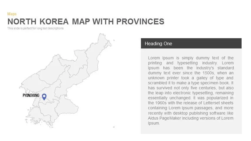
North Korea Map with Provinces Infographic Pack Template for PowerPoint & Google Slides
Maps
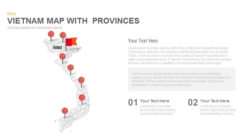
Vietnam Provinces Map Infographic Pack Template for PowerPoint & Google Slides
Maps
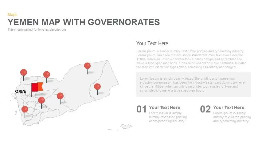
Yemen Governorates Infographic Map Template for PowerPoint & Google Slides
Maps
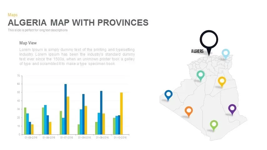
Algeria Map with Provinces Pack Template for PowerPoint & Google Slides
Maps
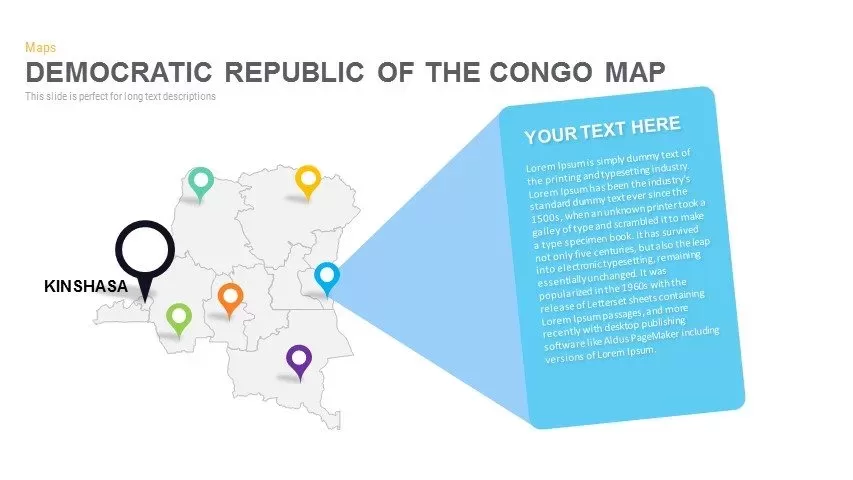
DR Congo Prefecture Map Slide Pack Template for PowerPoint & Google Slides
World Maps
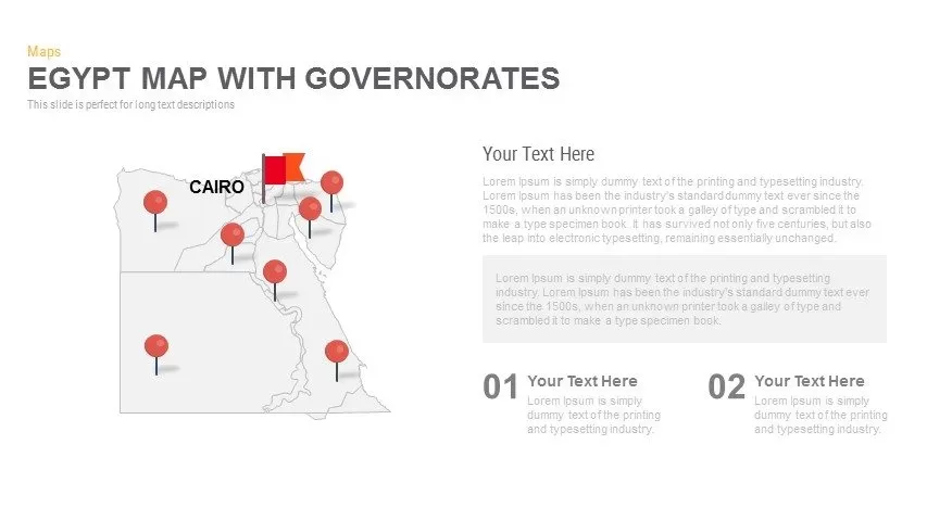
Egypt Regional Map Slide Pack Template for PowerPoint & Google Slides
World Maps
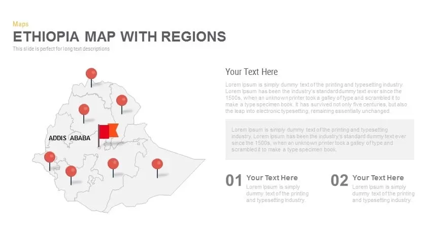
Ethiopia Map with Regions Slide Pack Template for PowerPoint & Google Slides
World Maps
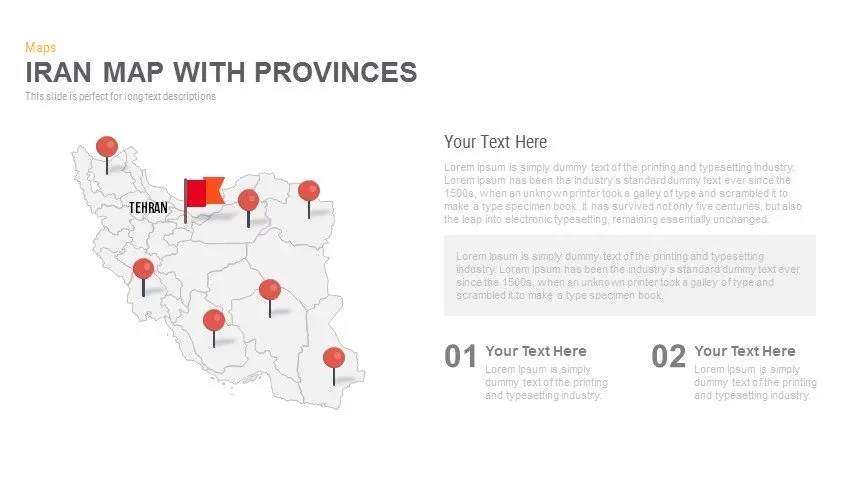
Iran Map with Provinces Slide Pack Template for PowerPoint & Google Slides
World Maps

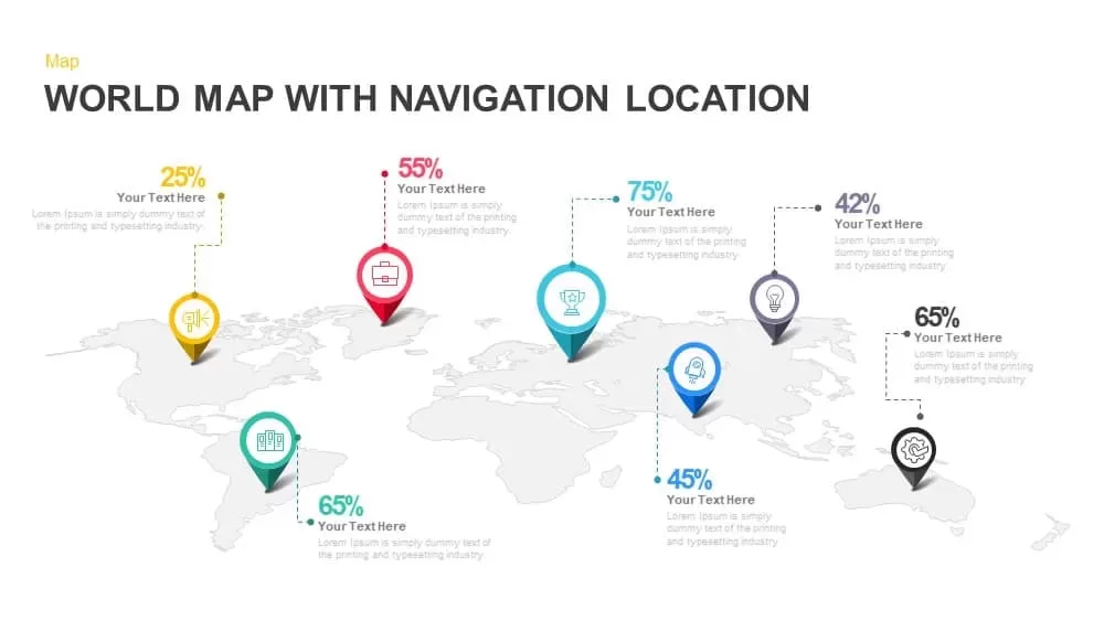
Global Map with Location Markers Template for PowerPoint & Google Slides
World Maps

Multi-Cluster Mind Map Infographic Template for PowerPoint & Google Slides
Mind Maps
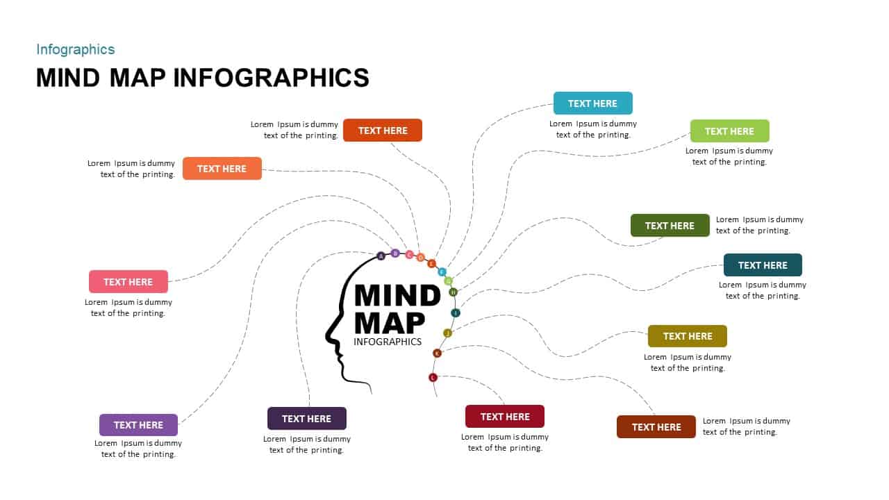
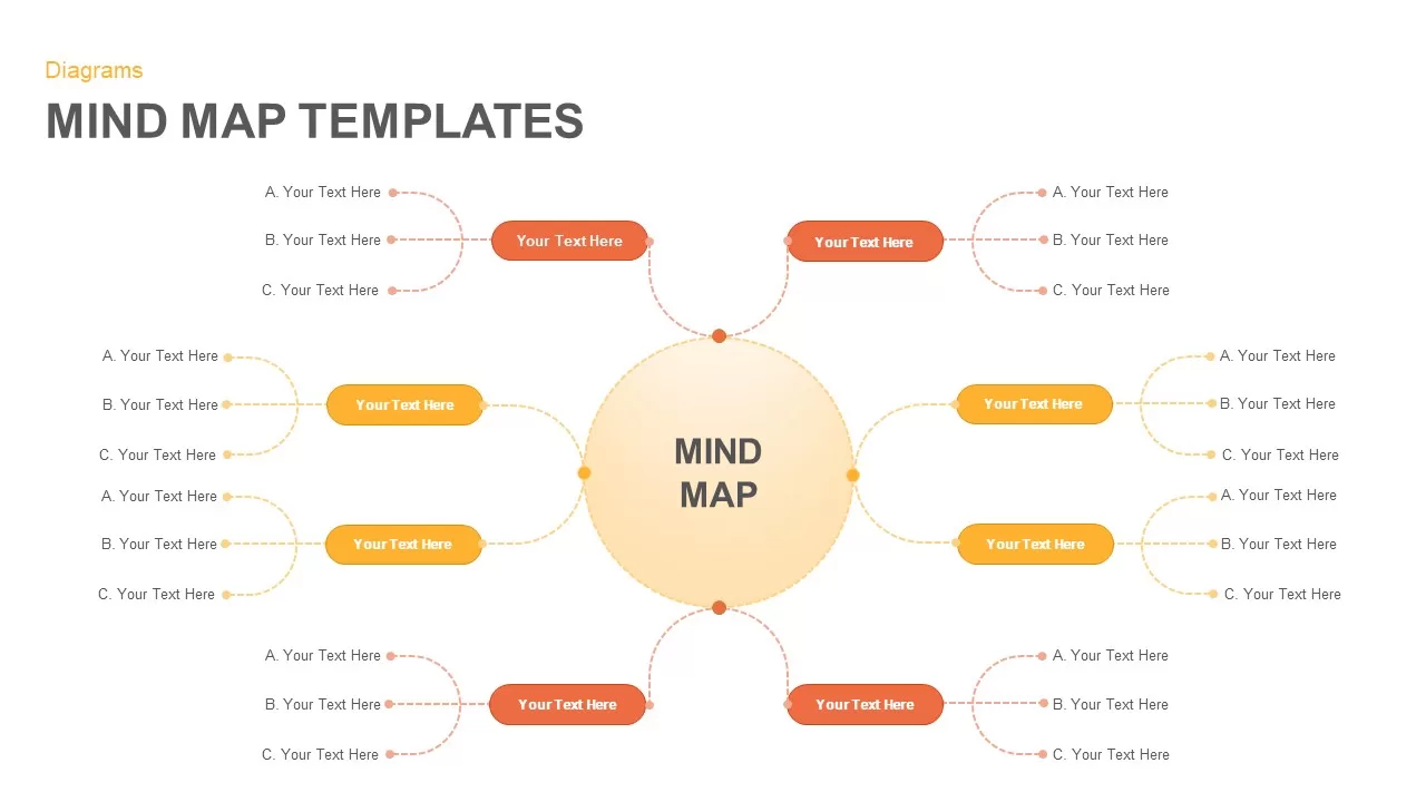
Mind Map Infographics template for PowerPoint & Google Slides
Mind Maps
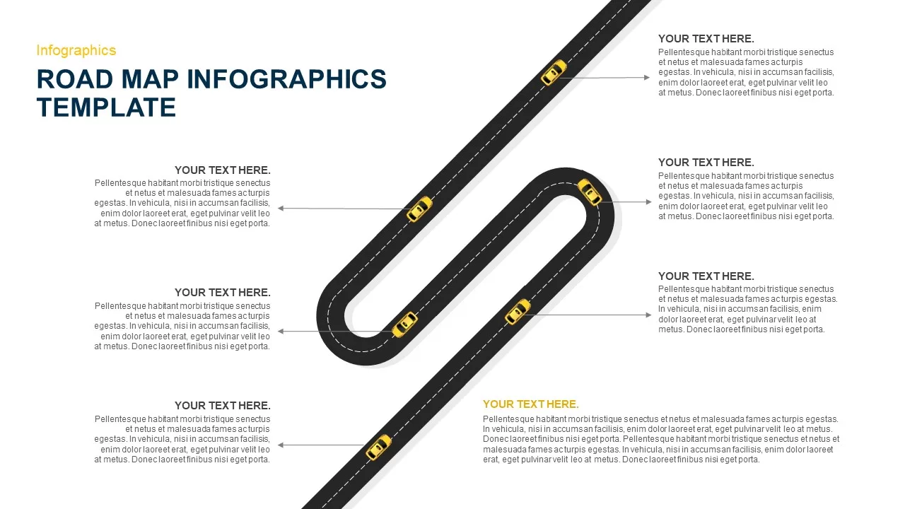
Six-Stage Road Map Infographic Timeline Template for PowerPoint & Google Slides
Roadmap
Versatile Mind Map Infographic Template for PowerPoint & Google Slides
Mind Maps
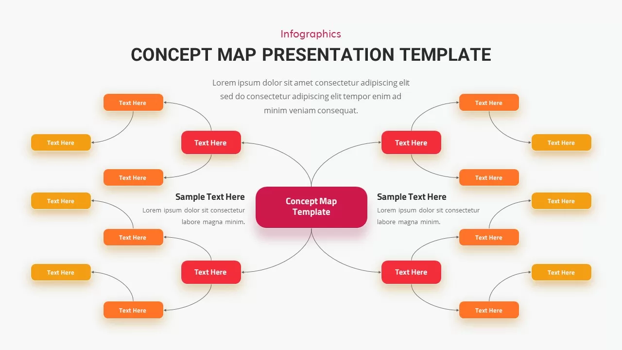
Concept Map Presentation Template for PowerPoint & Google Slides
Mind Maps
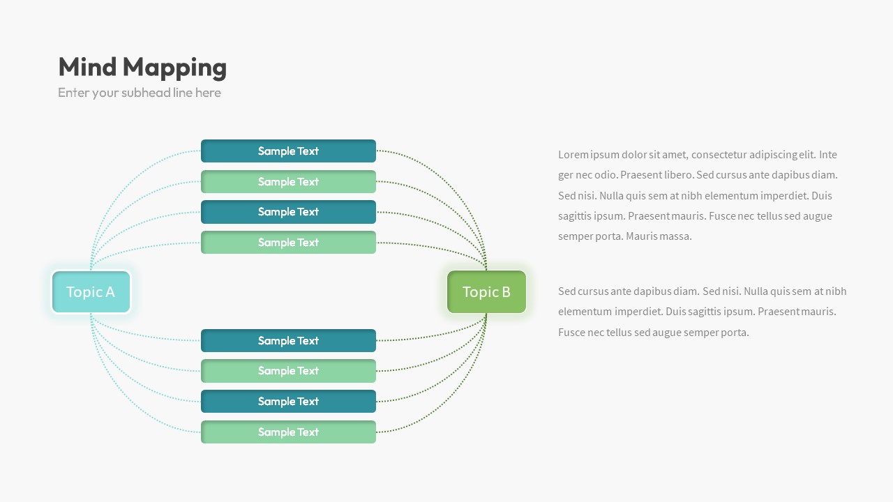
Dual Topic Mind Map Infographic Template for PowerPoint & Google Slides
Mind Maps
Editable World Map Callout Infographic Template for PowerPoint & Google Slides
World Maps
Editable World Map Callout Infographic Template for PowerPoint & Google Slides
World Maps
Stakeholder Map Template for PowerPoint & Google Slides
Business
Colorful Mind Map Template for PowerPoint & Google Slides
Mind Maps
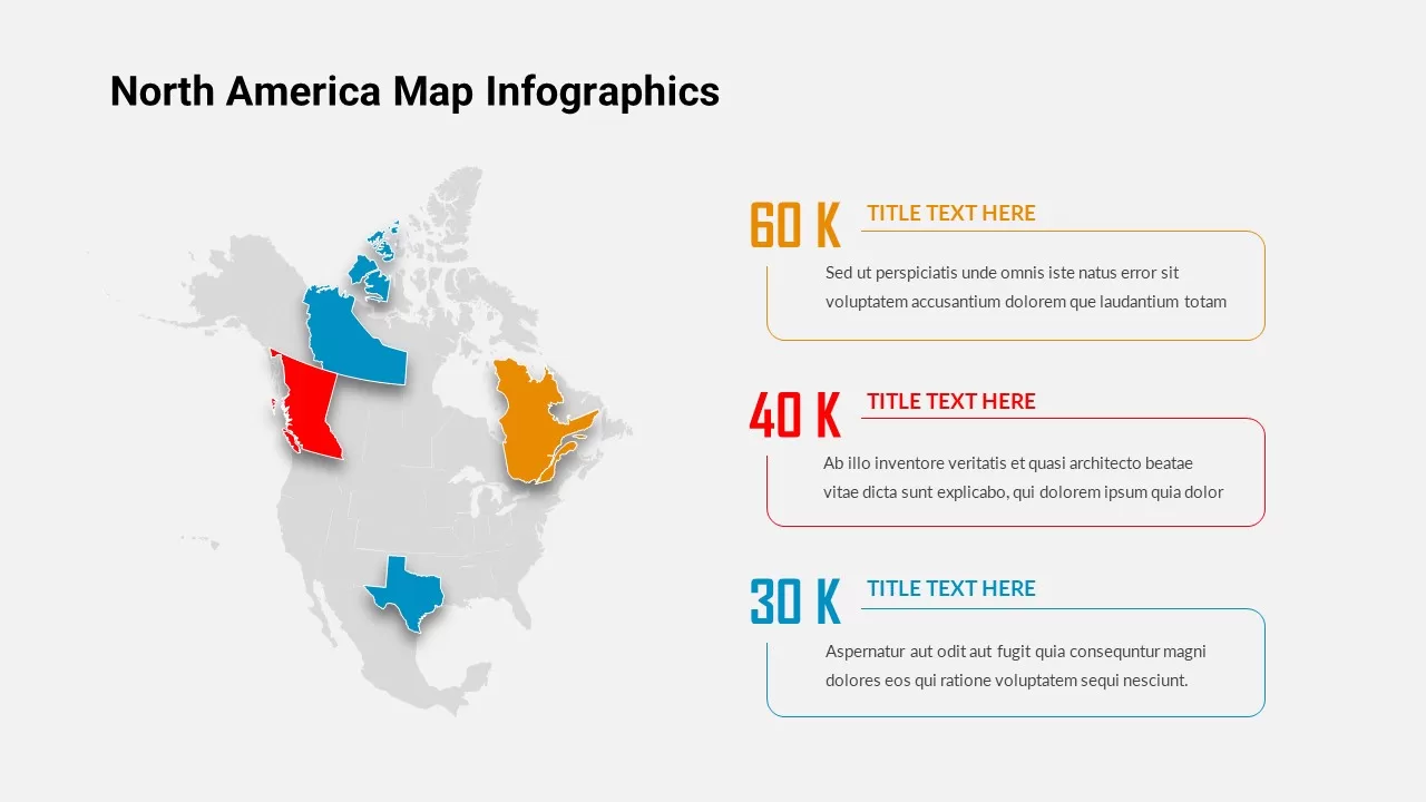
North America Map Infographic Slide Template for PowerPoint & Google Slides
World Maps
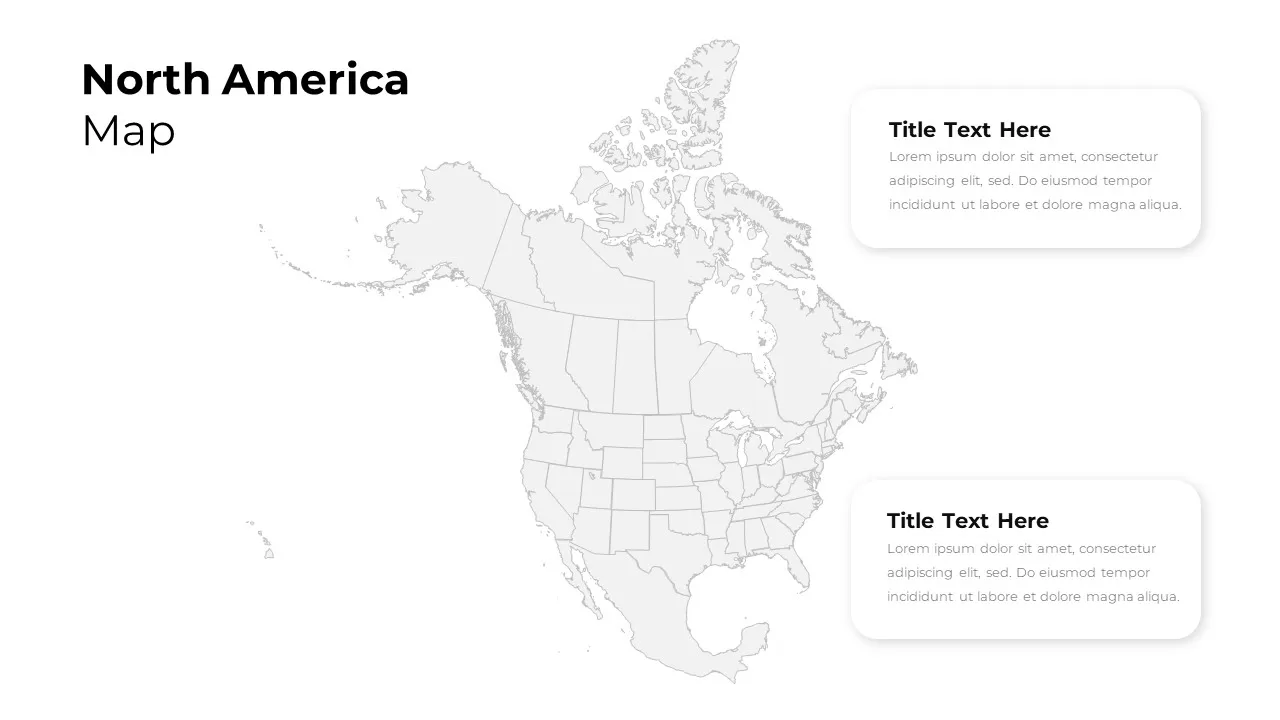
North America Regional Map Overview Template for PowerPoint & Google Slides
World Maps
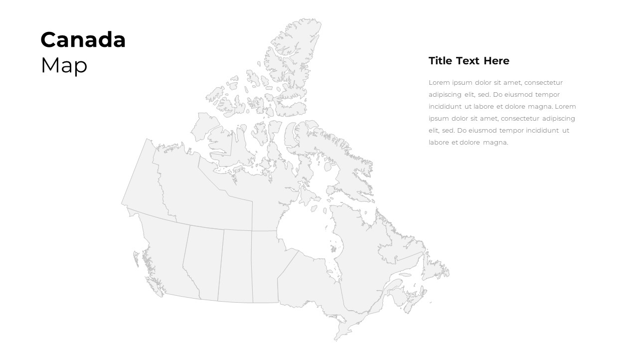
Customizable Canada Map Outline Template for PowerPoint & Google Slides
World Maps
Professional Risk Heat Map Visualization Template for PowerPoint & Google Slides
Risk Management
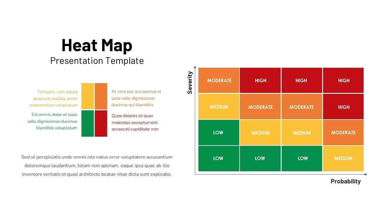
Heat Map Risk Matrix Dashboard Template for PowerPoint & Google Slides
Comparison Chart
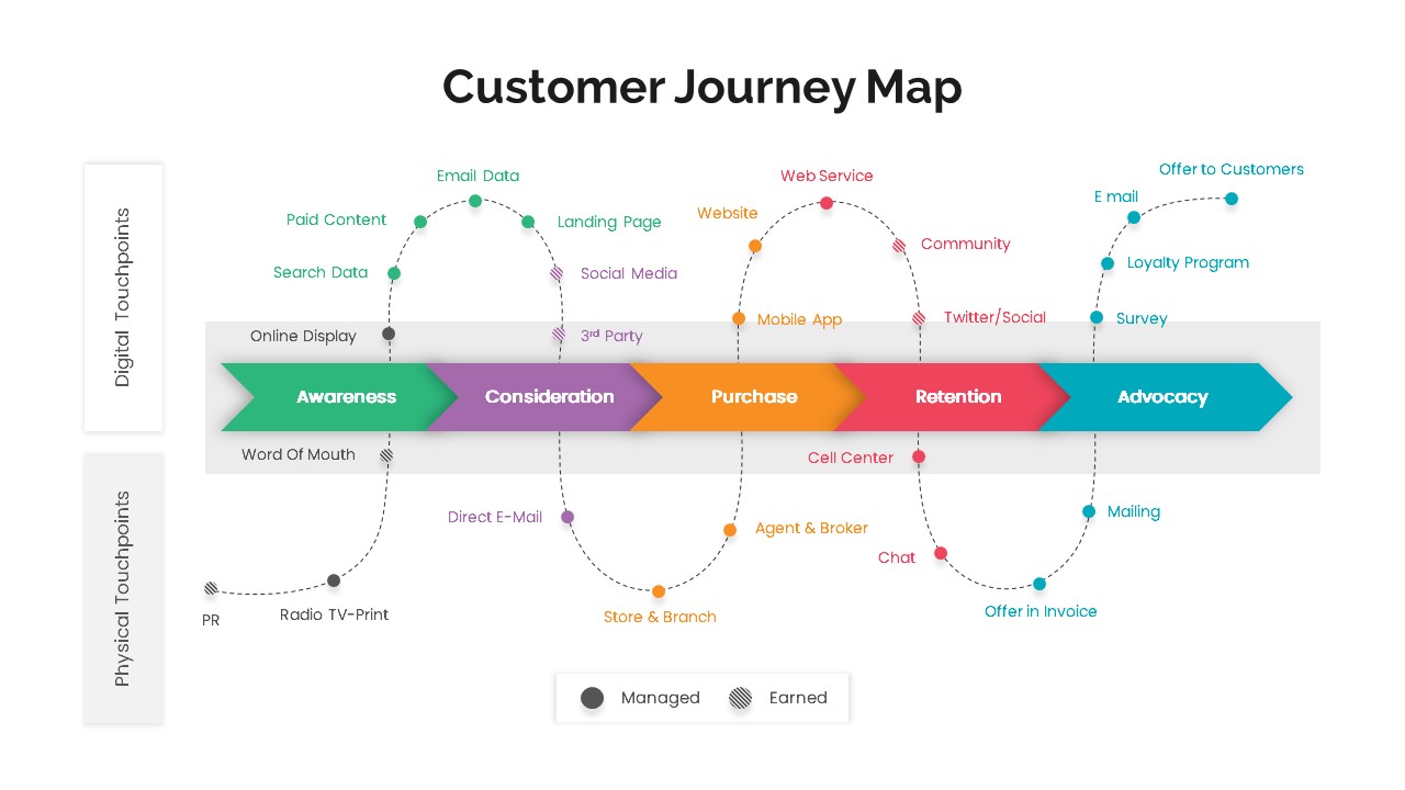
Versatile Customer Journey Map Template for PowerPoint & Google Slides
Customer Journey
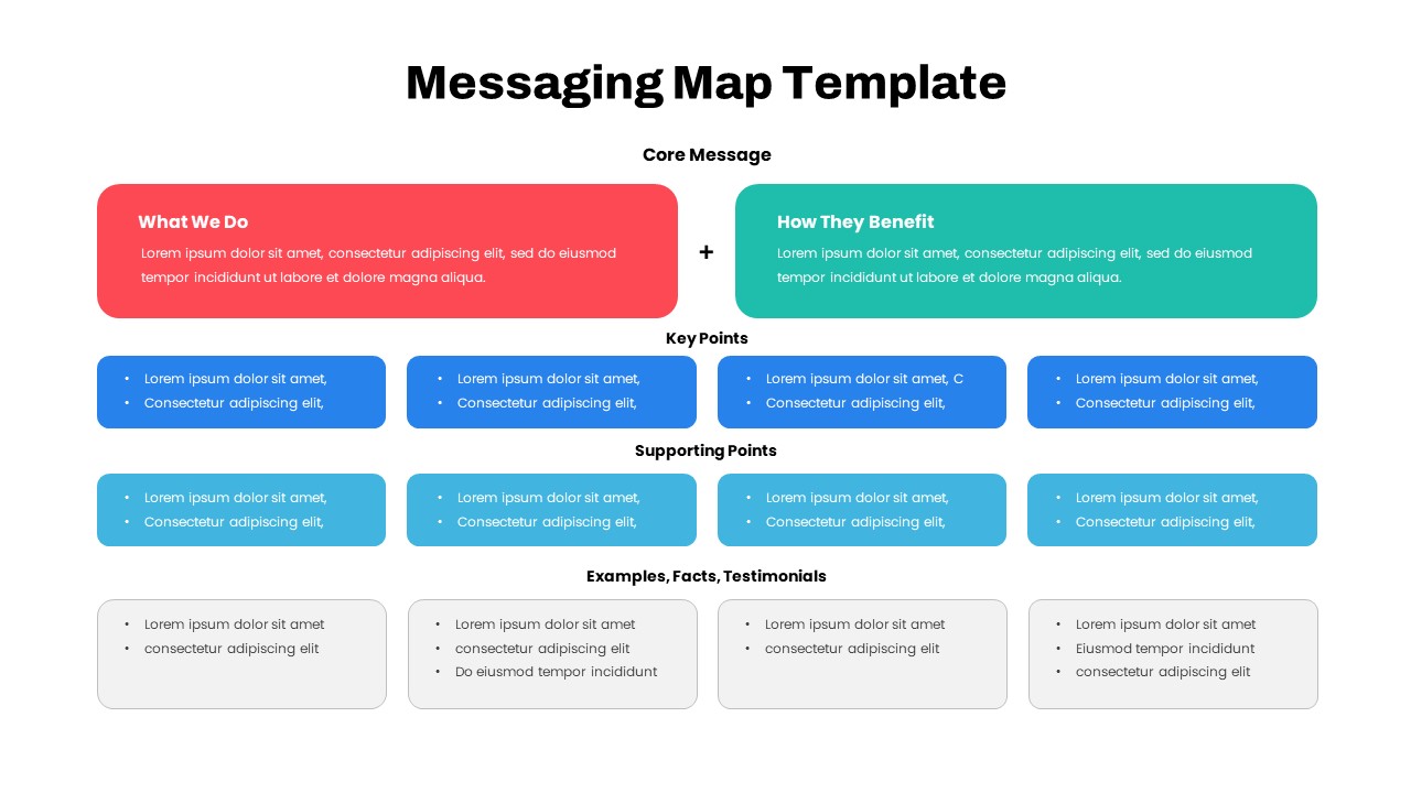
Comprehensive Messaging Map Framework Template for PowerPoint & Google Slides
Process
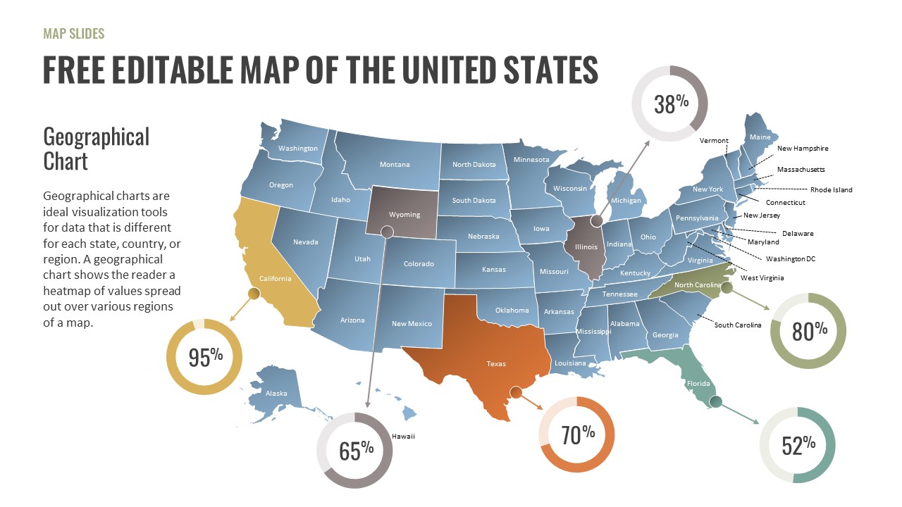
Free Editable U.S. Map with Regional Metrics Template for PowerPoint & Google Slides
World Maps
Free
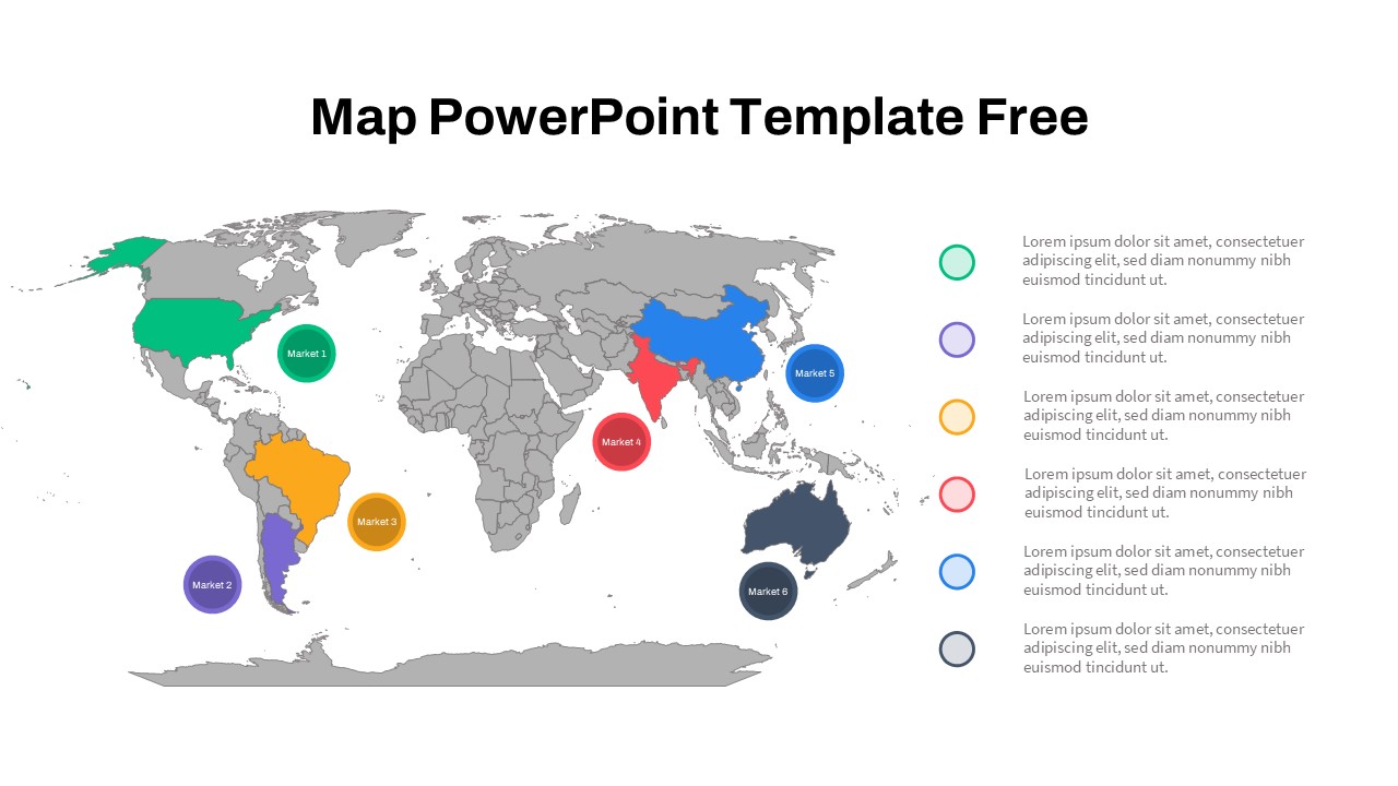
Free Global Market Distribution Map Template for PowerPoint & Google Slides
World Maps
Free
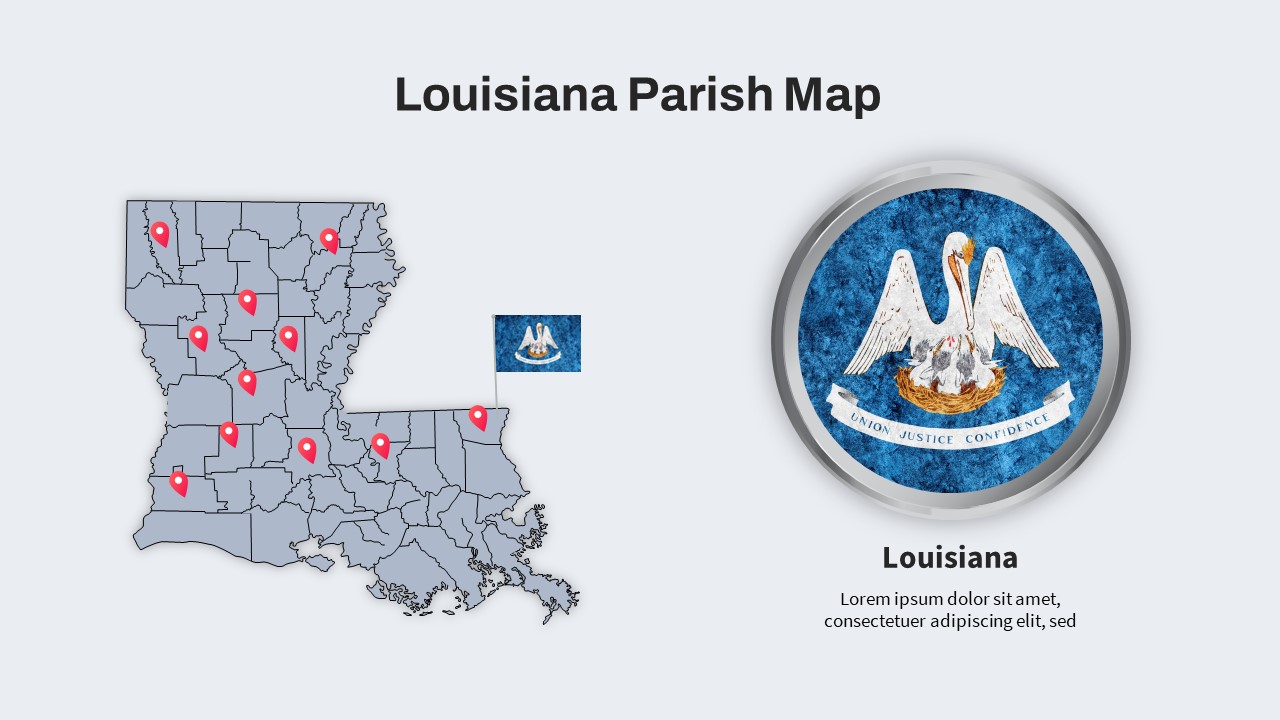
Louisiana Parish Map with Markers Template for PowerPoint & Google Slides
Maps
Colorful Multi-Branch Mind Map Slide Template for PowerPoint & Google Slides
Mind Maps
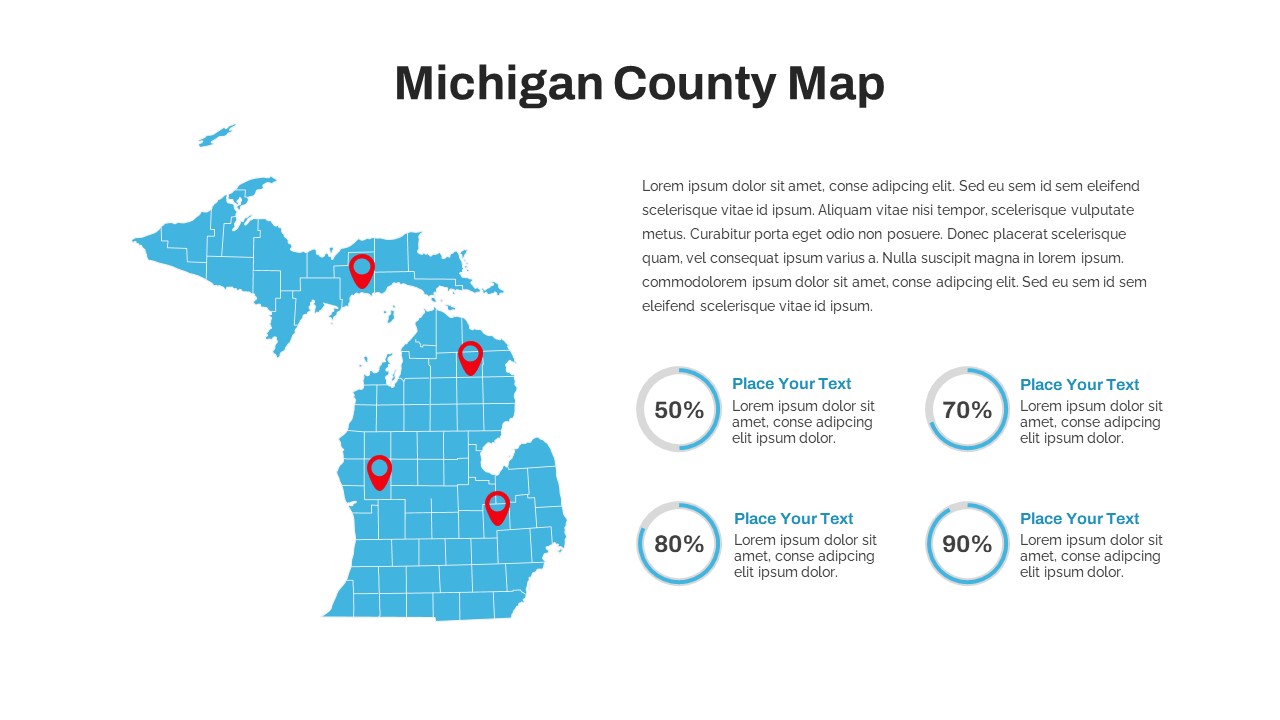
Michigan County Map with KPI Dashboard Template for PowerPoint & Google Slides
World Maps
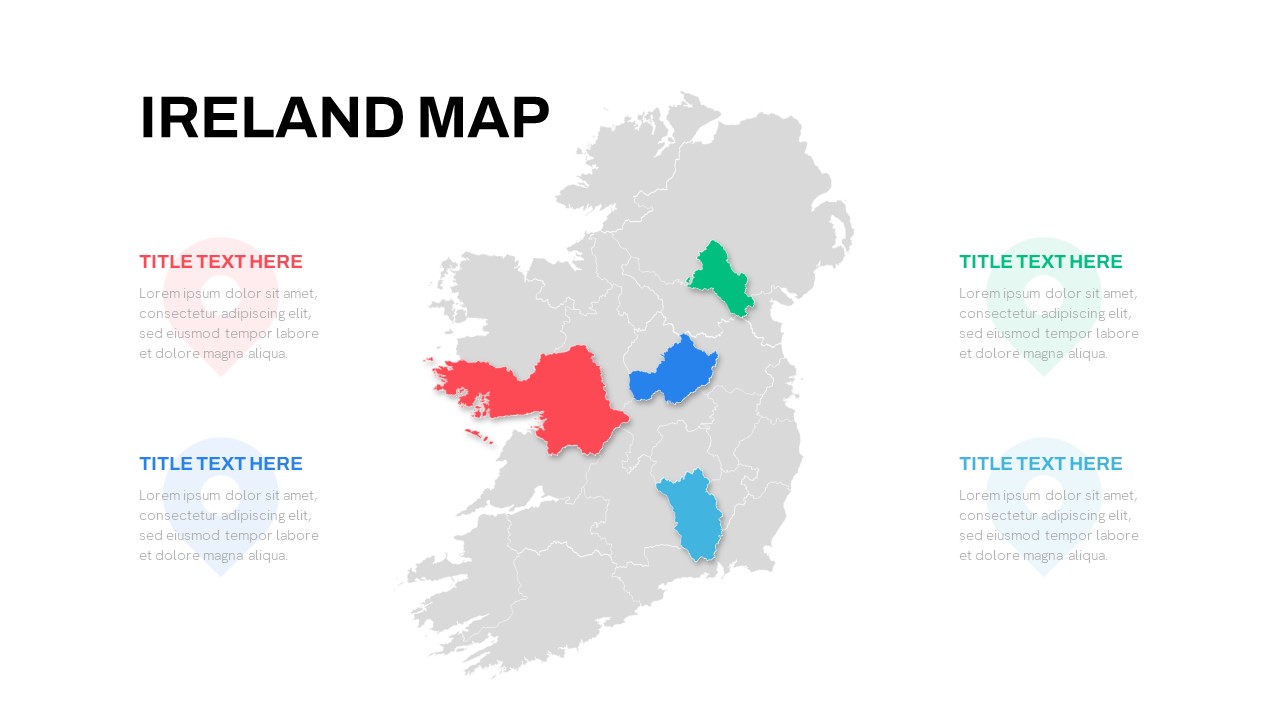
Editable Ireland Map Infographic Slide Template for PowerPoint & Google Slides
World Maps
Free
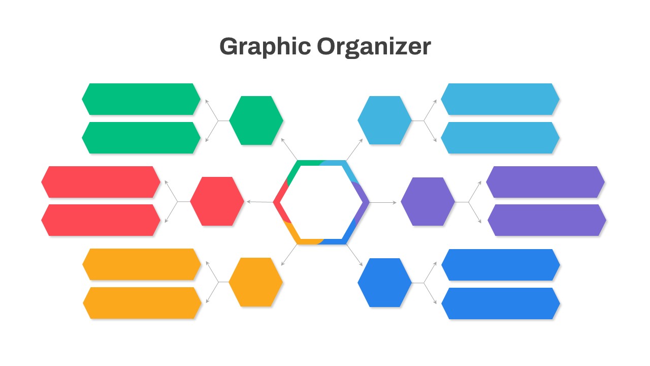
Graphic Organizer & Double Bubble Map Template for PowerPoint & Google Slides
Maps
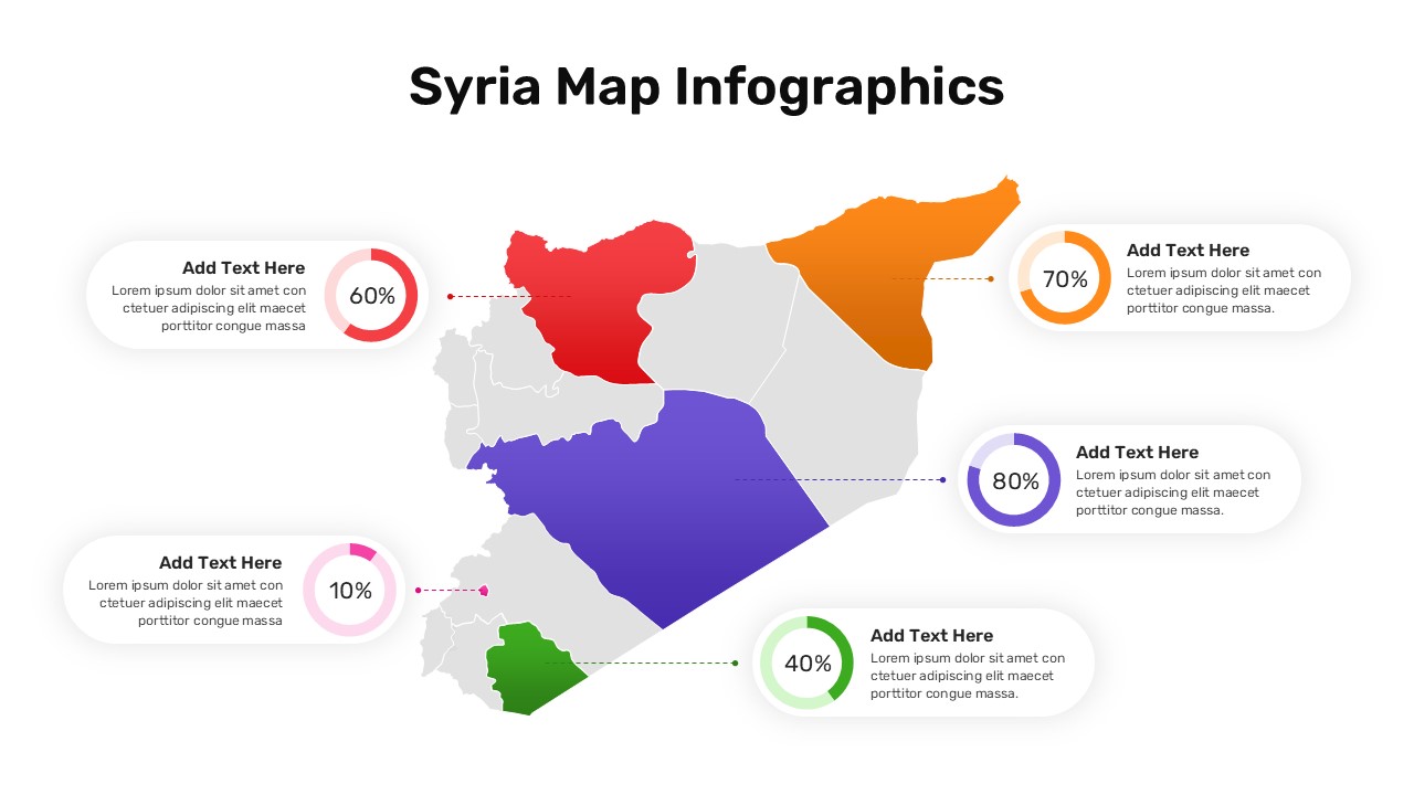
Syria Regional Data Map Infographic Template for PowerPoint & Google Slides
World Maps
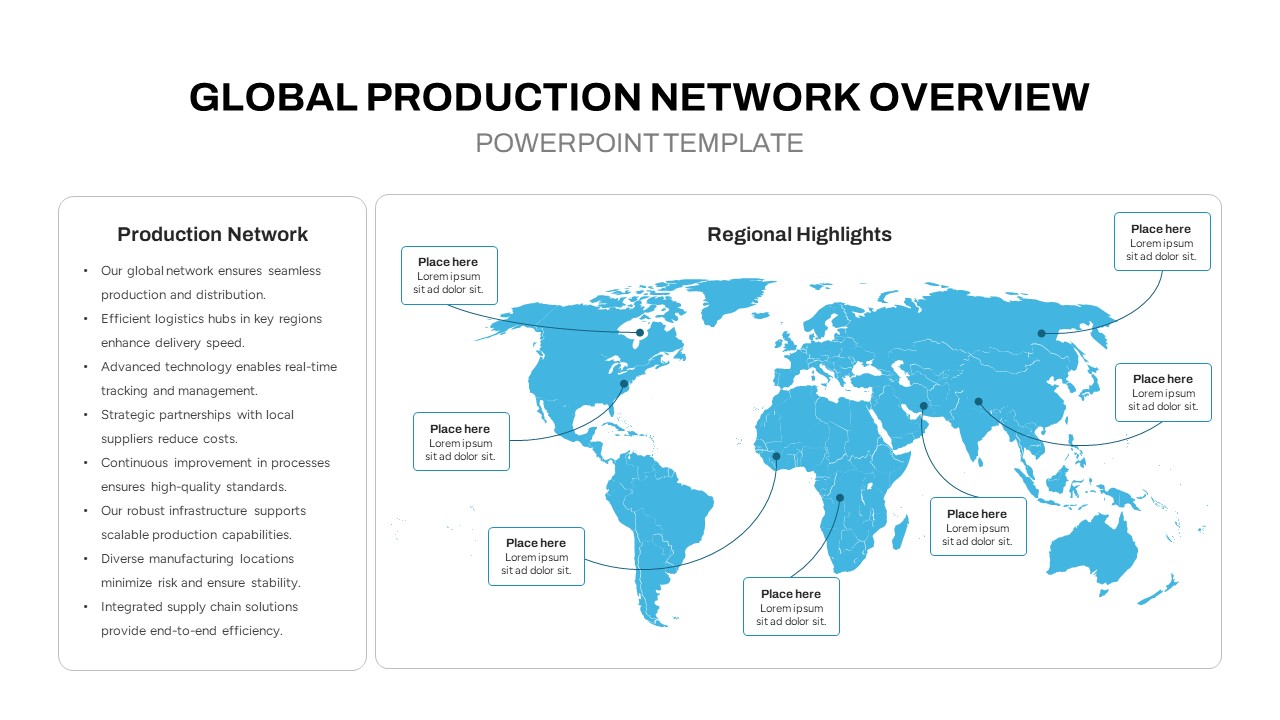
Global Production Network Overview Map Template for PowerPoint & Google Slides
World Maps
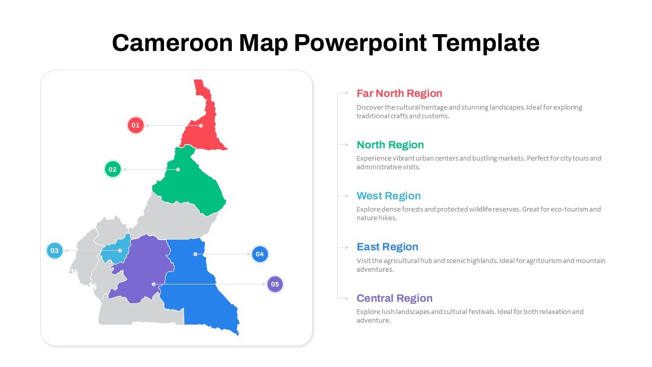
Numbered Cameroon Regional Map Slide Template for PowerPoint & Google Slides
World Maps
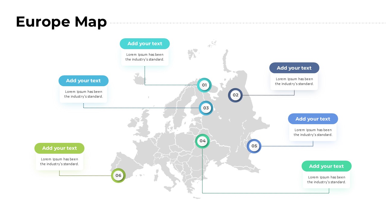
Europe Map with Six Editable Points Template for PowerPoint & Google Slides
World Maps
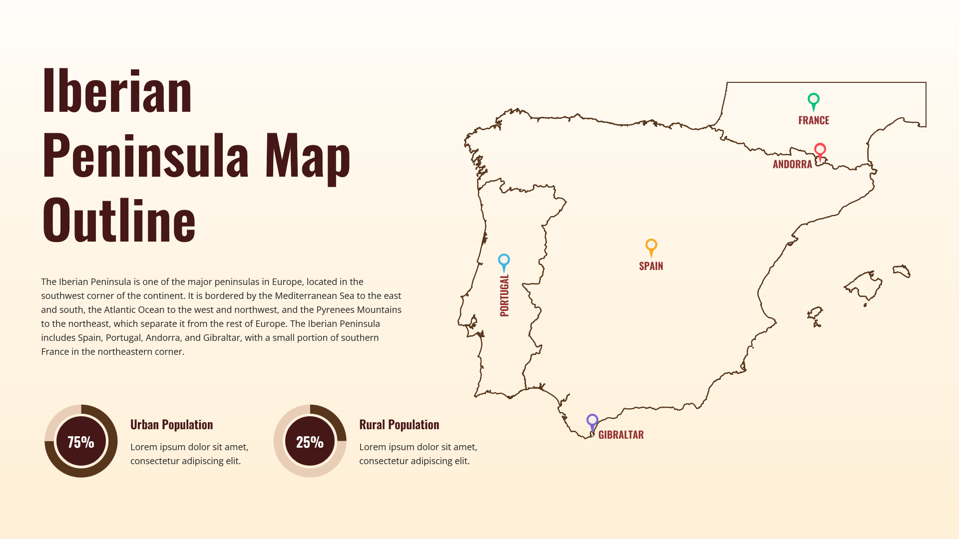
Iberian Peninsula Map Outline Infographic Template for PowerPoint & Google Slides
World Maps