Interactive Benchmarking Gauge Dashboard Template for PowerPoint & Google Slides
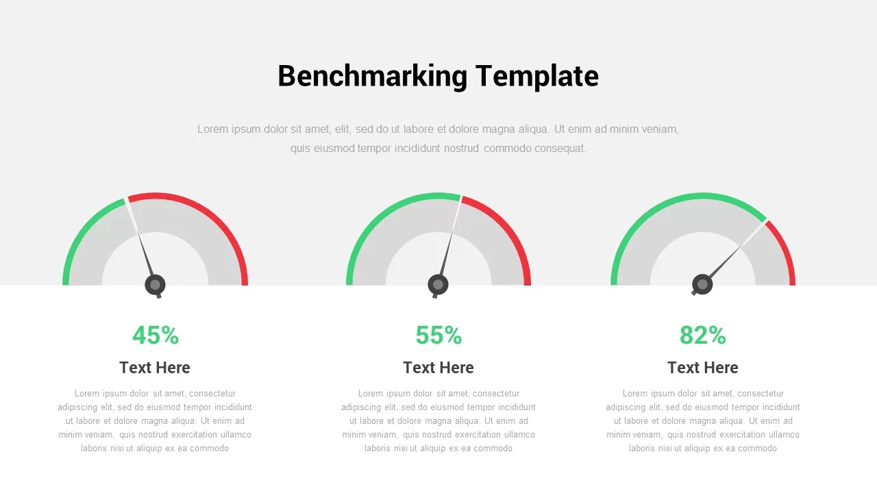
Description
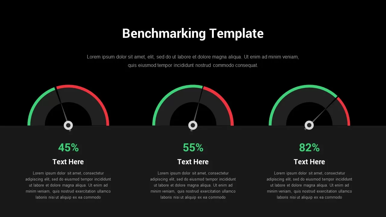
Visualize and compare key performance metrics at a glance with this benchmarking gauge dashboard slide for PowerPoint & Google Slides. Three customizable gauge charts display percentage values—45%, 55%, and 82%—against color-coded arcs (green for success, red for alerts, and grey for baseline) and precision pointers. Below each dial, a bold percentage label and title text area let you highlight individual KPIs, while a supporting text block provides context or analysis. Built on fully editable slide masters with vector shapes and alignment guides, you can adjust gauge ranges, recolor arcs, reposition pointers, and update labels in seconds—ensuring seamless branding and data updates across your entire deck.
The clean, modern design uses generous white space and subtle drop shadows to keep focus on the data, while supporting text in light grey helps maintain visual hierarchy. Whether you’re comparing quarterly targets, tracking product adoption rates, or reporting on operational metrics, these gauges bring clarity and visual impact to stakeholder briefings, boardroom presentations, and virtual meetings.
Who is it for
Business Analysts, Performance Managers, Marketing Directors, and C-Suite executives will benefit from this dashboard when benchmarking sales performance, customer satisfaction scores, product adoption rates, or operational KPIs. PMO teams and consultants can also leverage these gauges for executive summaries and status reports.
Other Uses
Beyond performance benchmarking, repurpose this slide for survey results, readiness assessments, risk-level indicators, project health checks, or progress tracking against milestones. Duplicate gauges to compare additional metrics or convert arcs into milestone markers for hybrid dashboard-timeline views.
Login to download this file

Item ID
SB02853
Related Templates

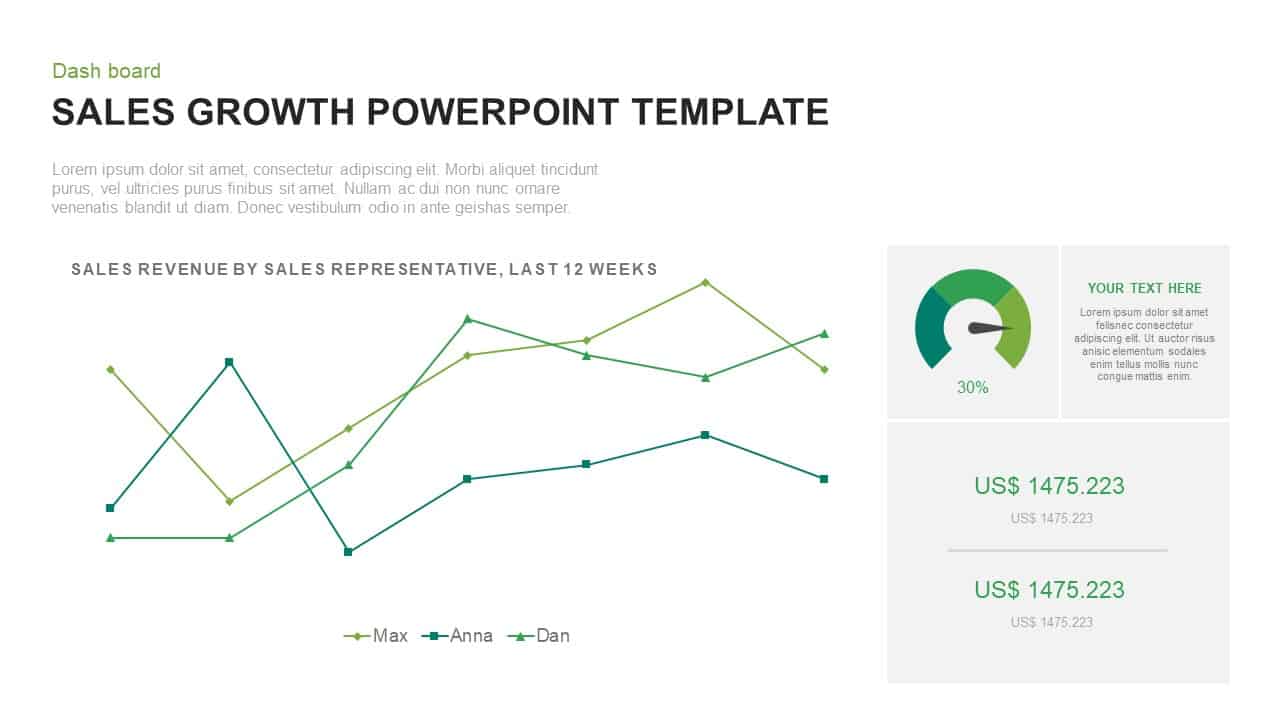
Sales Growth Dashboard: KPI Gauge & Line Template for PowerPoint & Google Slides
Revenue
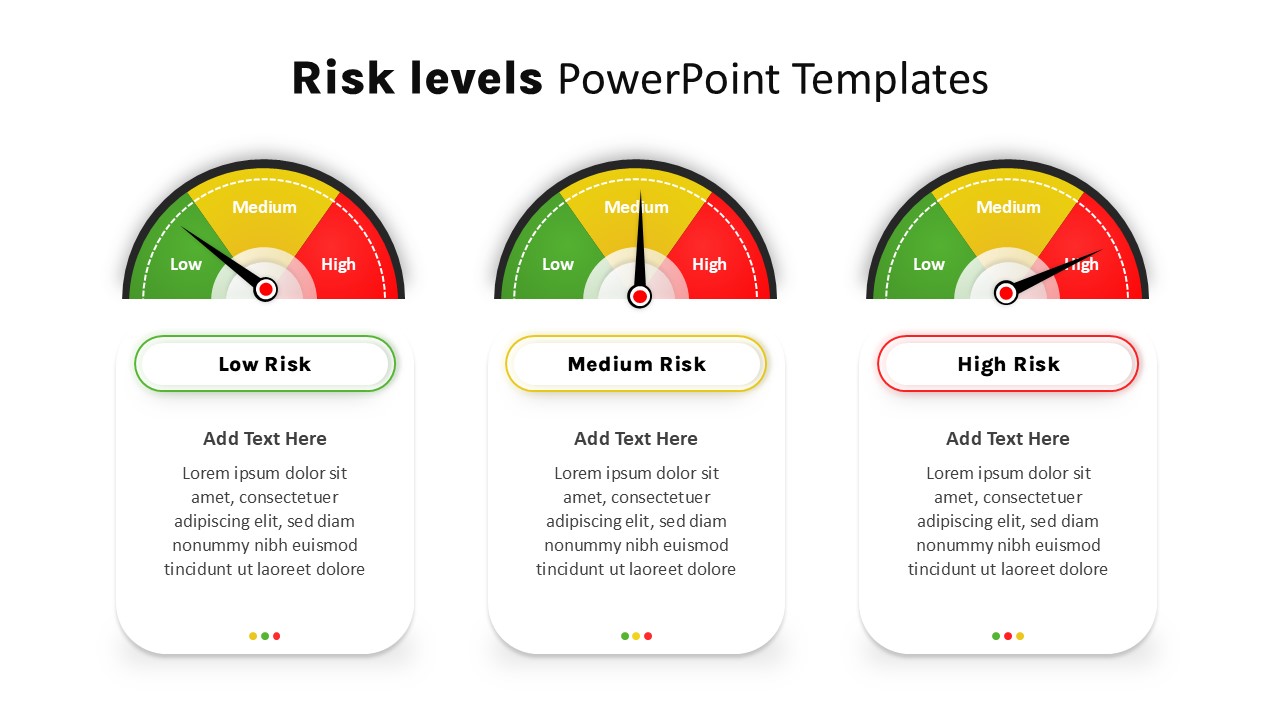
Risk Level Gauge Comparison Dashboard Template for PowerPoint & Google Slides
Comparison
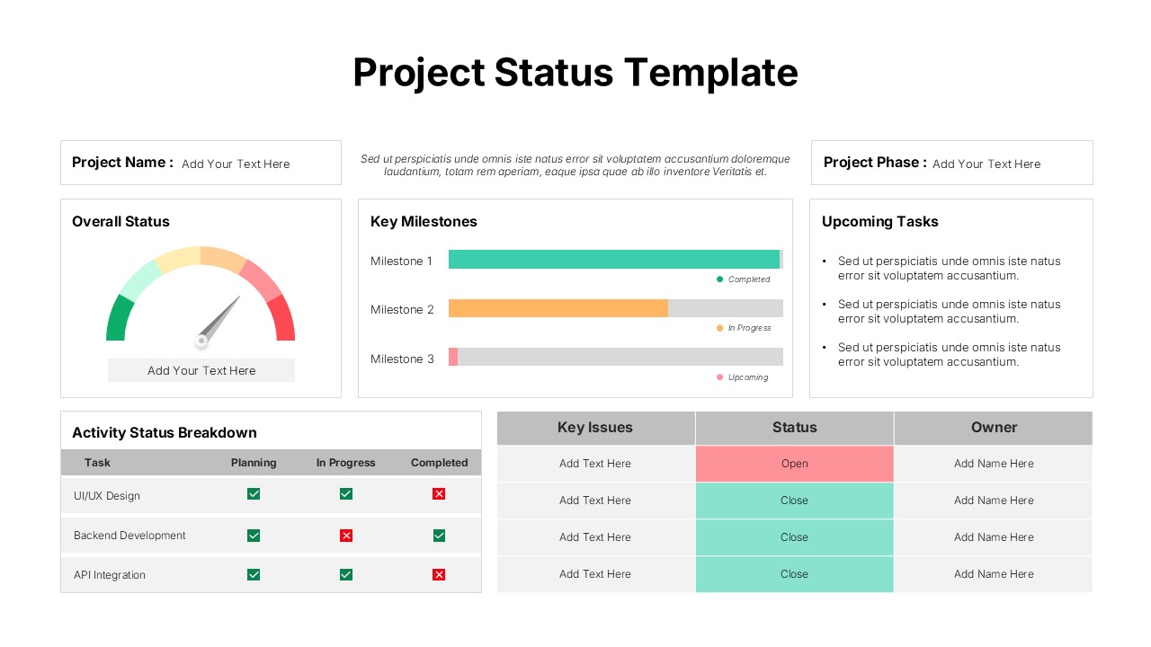
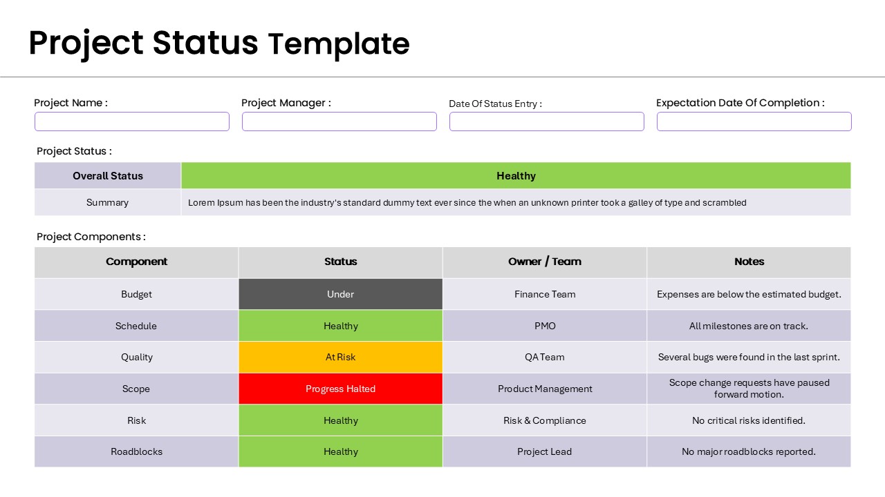
Project Status Template Dashboard with Gauge for PowerPoint & Google Slides
Project Status
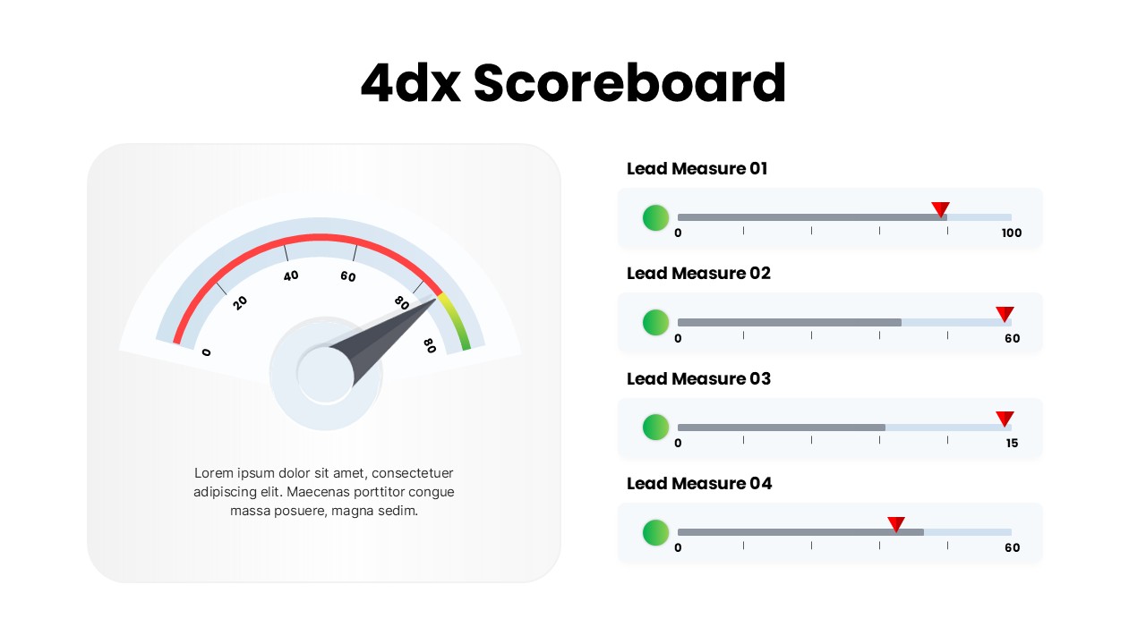
4DX Scoreboard KPI Gauge Dashboard Template for PowerPoint & Google Slides
Business Strategy
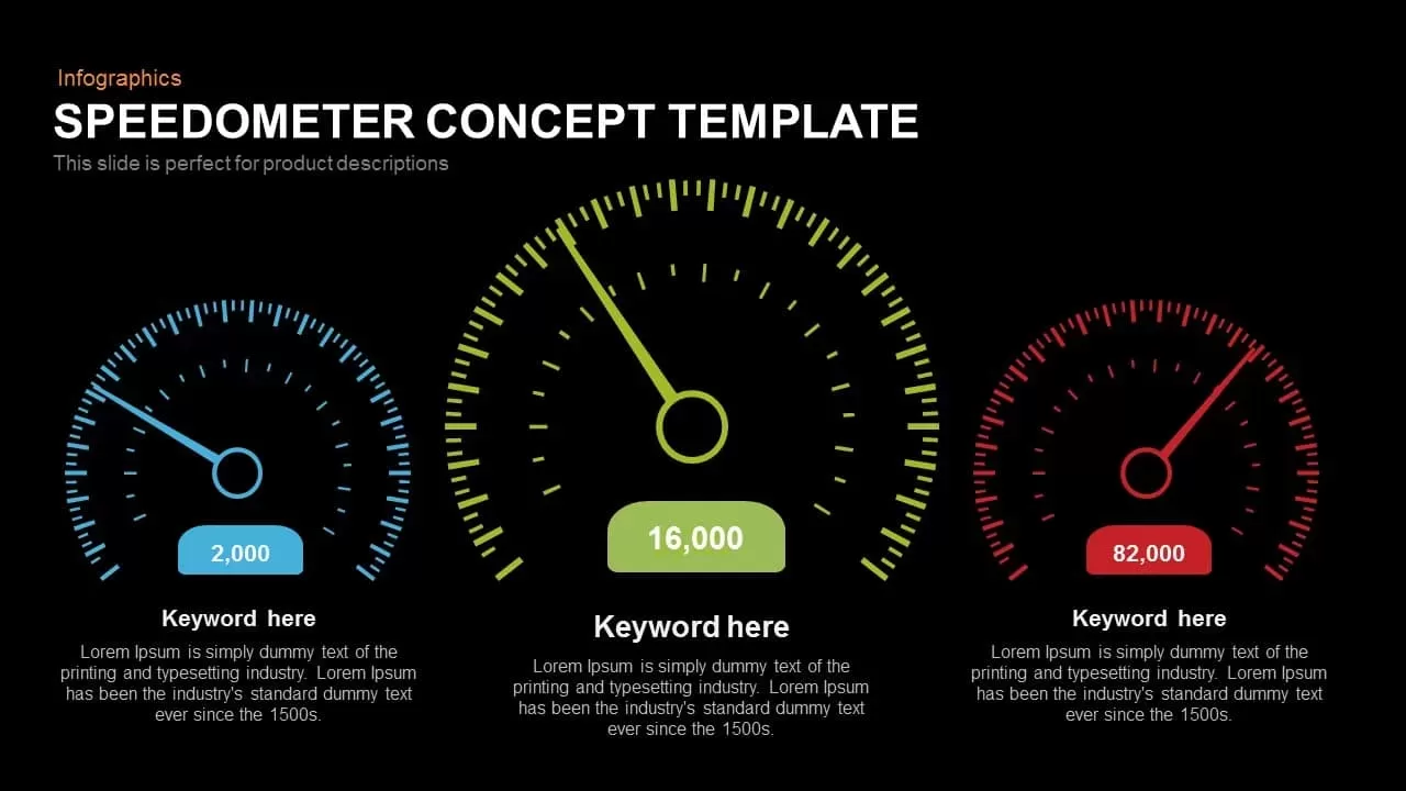
Speedometer Infographic Gauge Comparison Template for PowerPoint & Google Slides
Comparison
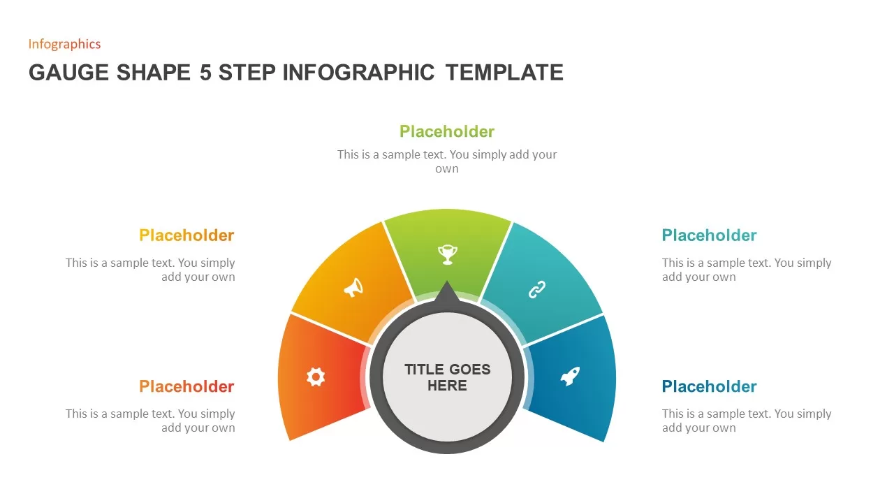
Gauge Shape 5-Step Infographic Diagram Template for PowerPoint & Google Slides
Process
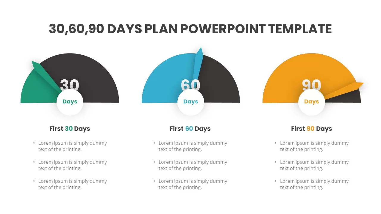
Gauge-Style 30-60-90 Day Plan Infographic Template for PowerPoint & Google Slides
Timeline
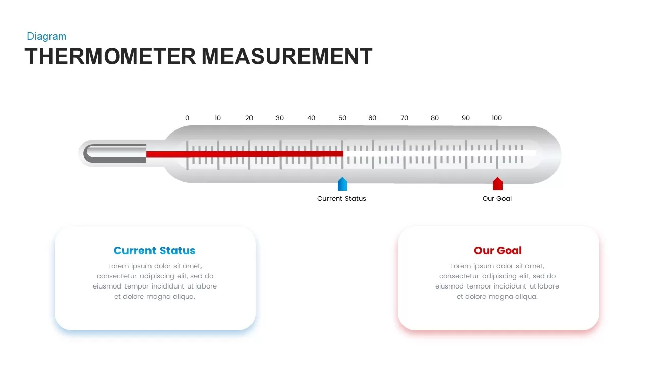
Thermometer Gauge Progress Measurement Template for PowerPoint & Google Slides
Comparison
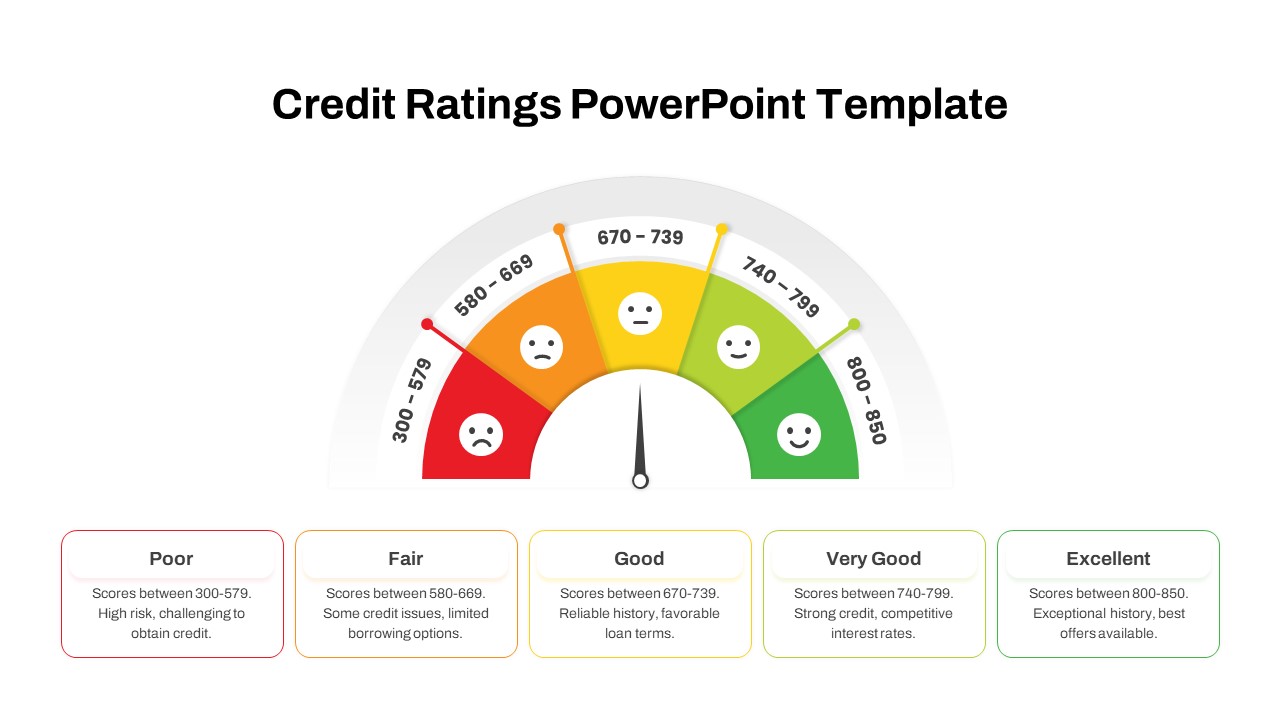
Credit Ratings Gauge Infographic Template for PowerPoint & Google Slides
Circular
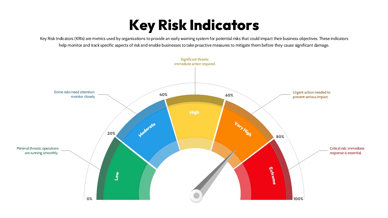
Key Risk Indicators (KRI) Gauge Template for PowerPoint & Google Slides
Risk Management
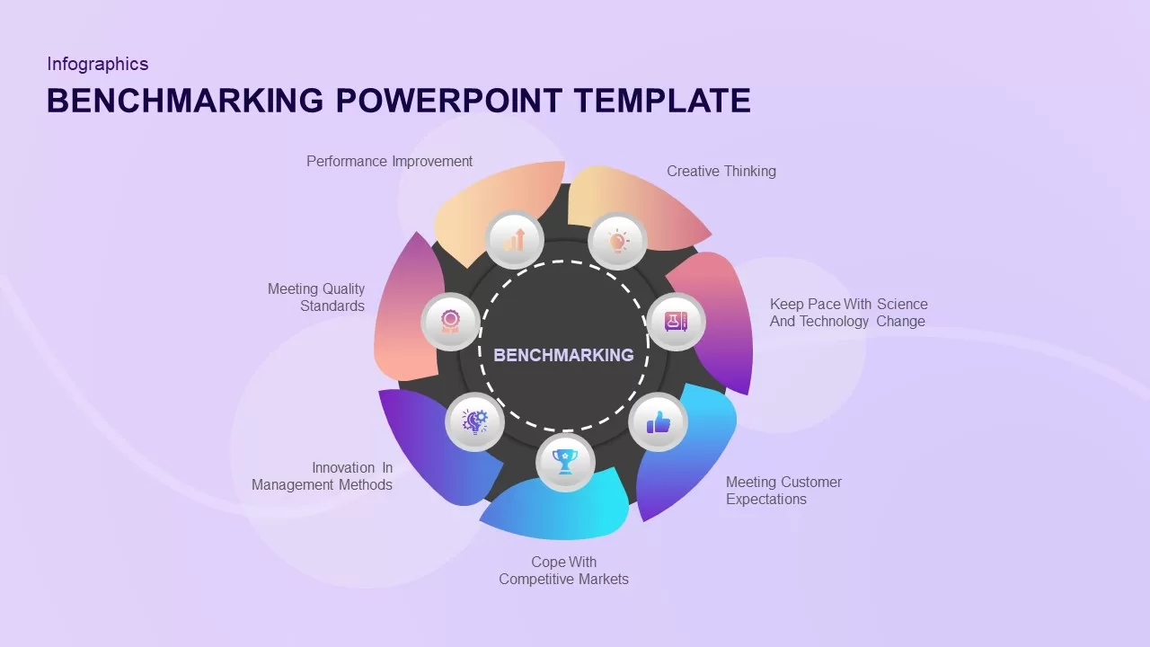
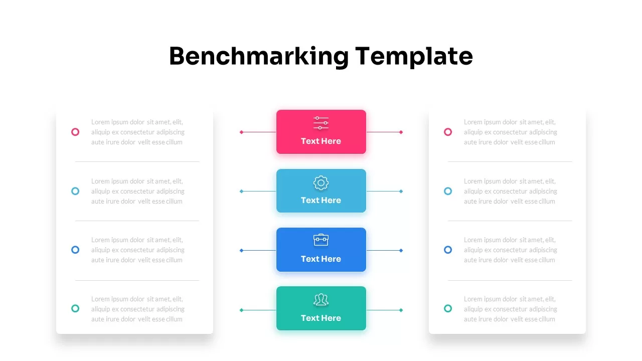
Benchmarking PowerPoint Template for PowerPoint & Google Slides
Process
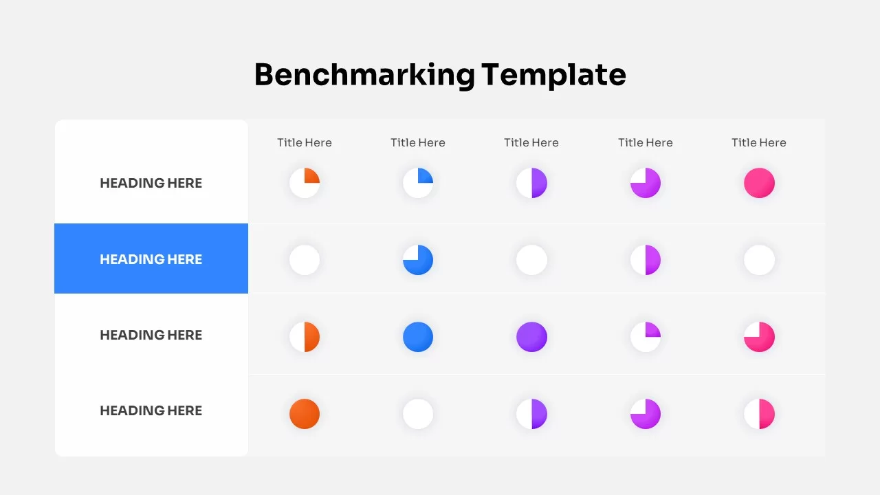
Benchmarking Metrics Comparison Slide Template for PowerPoint & Google Slides
Pie/Donut
Dynamic Benchmarking Comparison Chart Template for PowerPoint & Google Slides
Comparison Chart
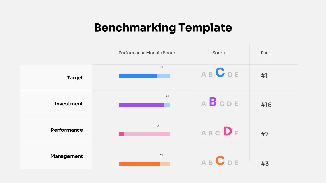
Benchmarking Performance Score Template for PowerPoint & Google Slides
Comparison Chart
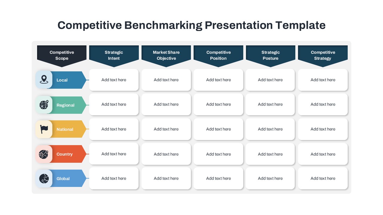
Competitive Benchmarking Presentation Template for PowerPoint & Google Slides
Comparison

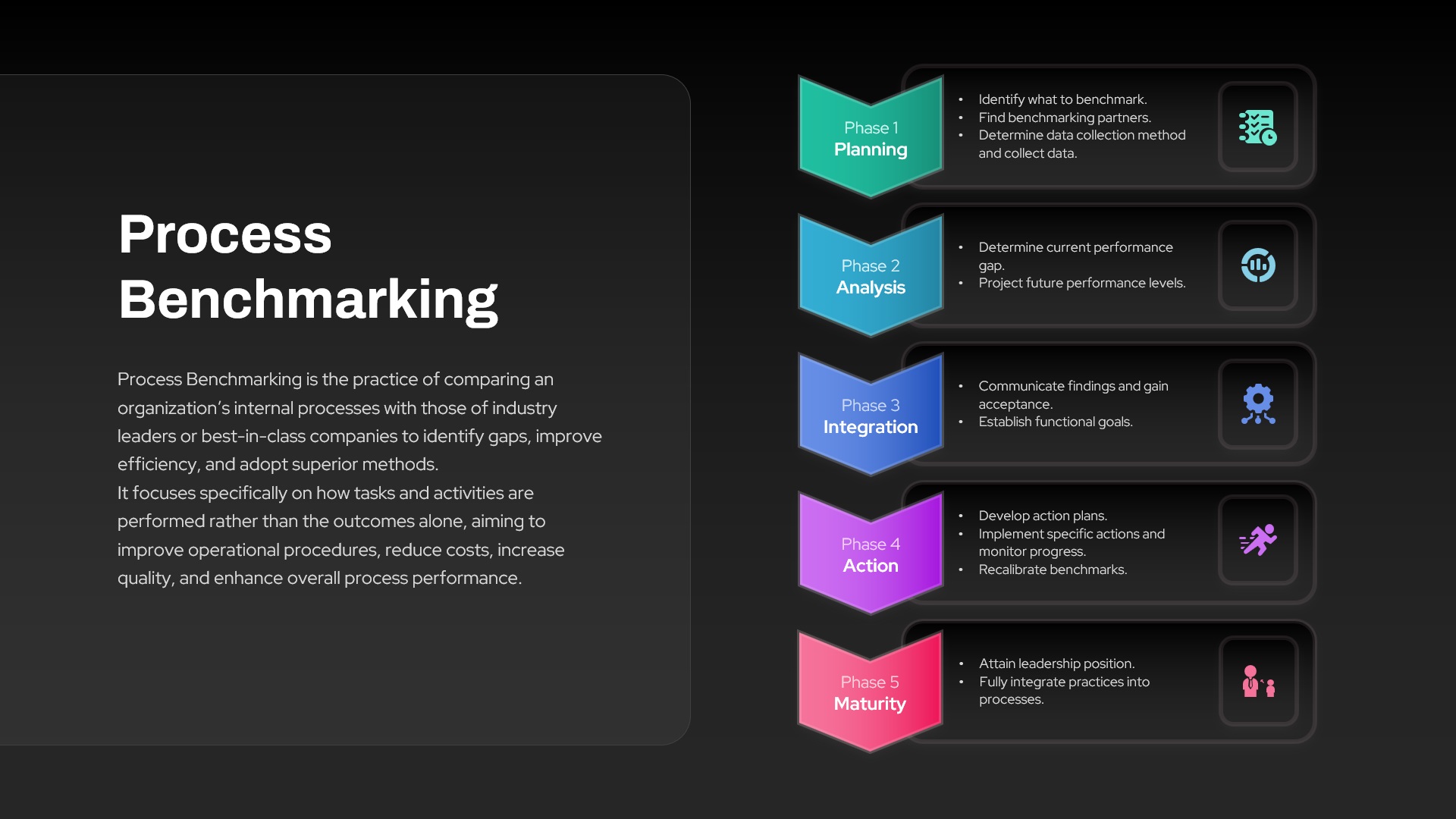
Process Benchmarking Five-Phase Framework Template for PowerPoint & Google Slides
Process
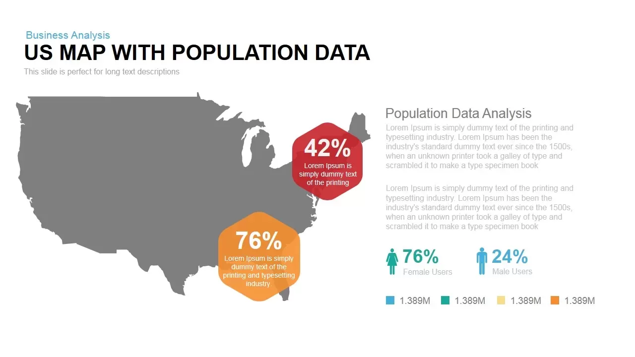
Interactive US Population Data Map Slide Template for PowerPoint & Google Slides
World Maps
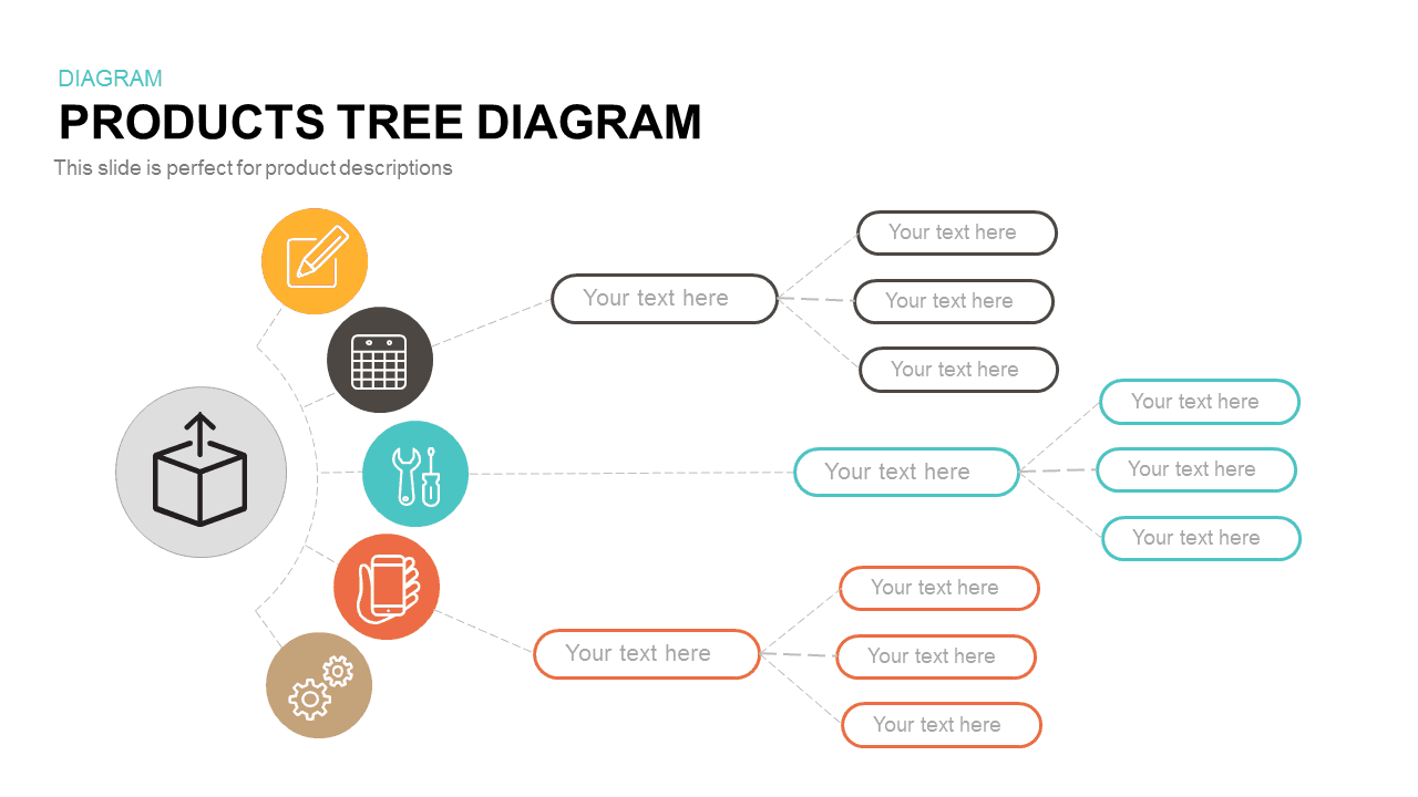
Interactive Products Tree Diagram template for PowerPoint & Google Slides
Org Chart
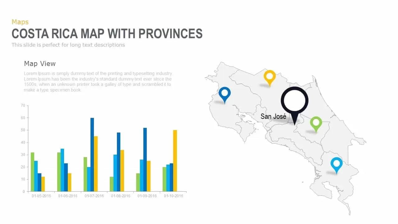
Interactive Costa Rica Province Map Template for PowerPoint & Google Slides
World Maps
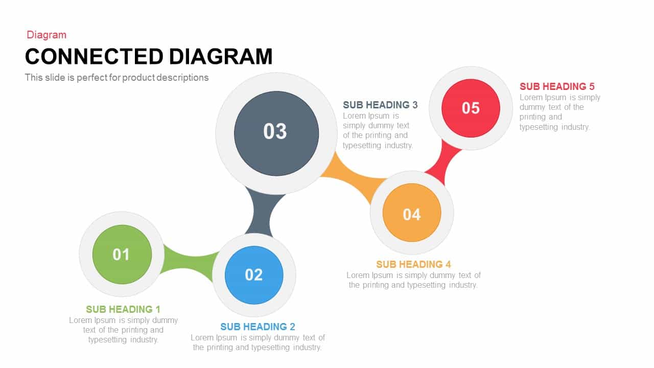
Interactive Connected Network Diagram Template for PowerPoint & Google Slides
Process
Interactive Product Comparison Bar Chart Template for PowerPoint & Google Slides
Bar/Column
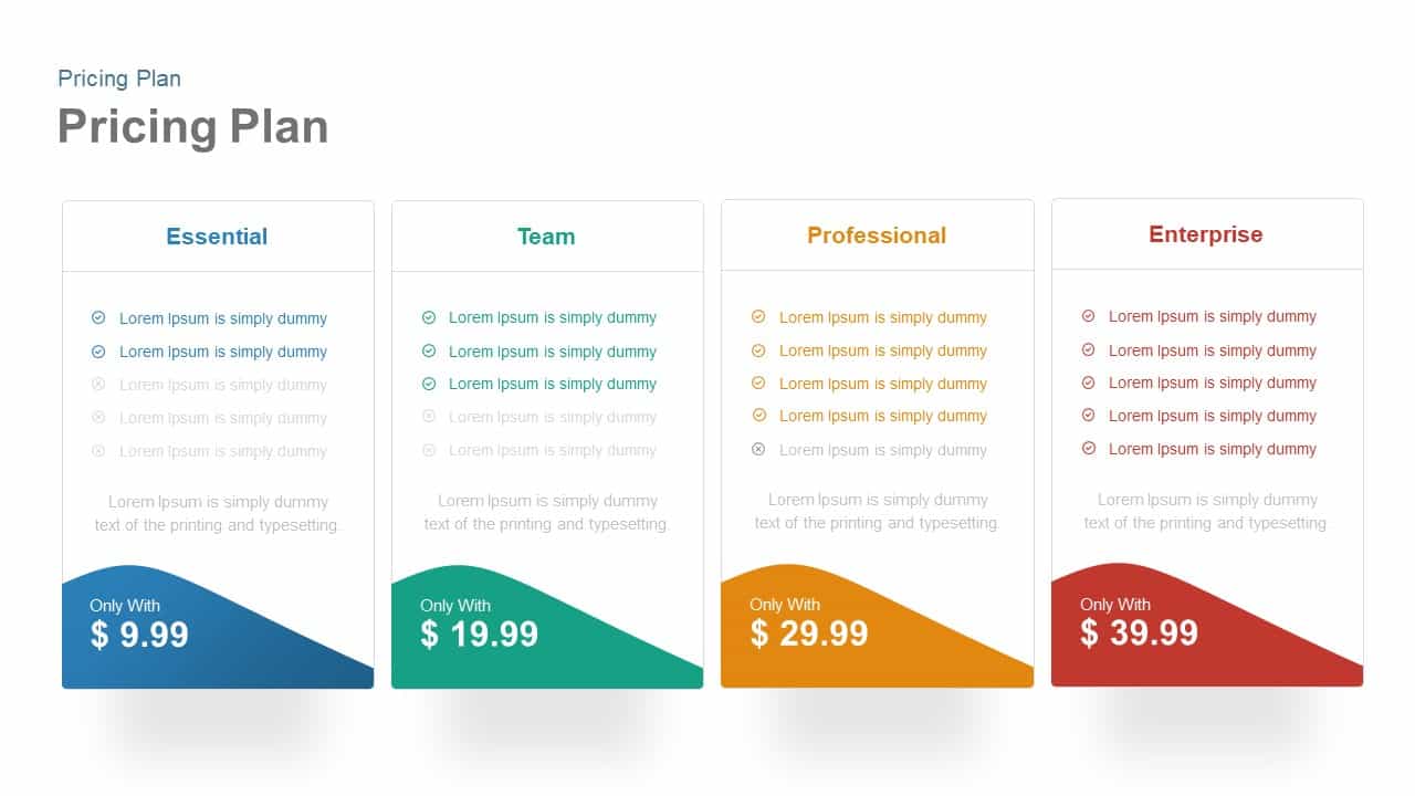
Interactive Pricing Plan Comparison Template for PowerPoint & Google Slides
Comparison

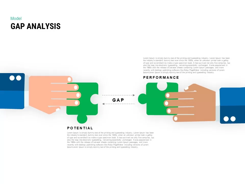
Interactive Gap Analysis Puzzle Diagram Template for PowerPoint & Google Slides
Gap

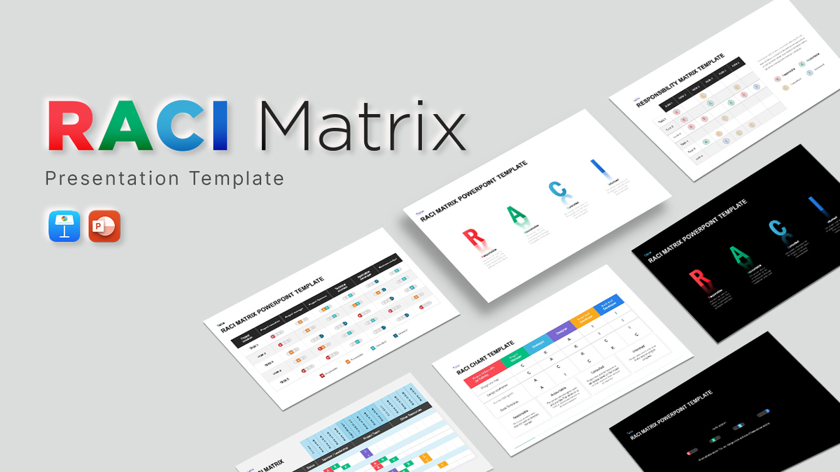
Interactive RACI Responsibility Matrix Template for PowerPoint & Google Slides
Project
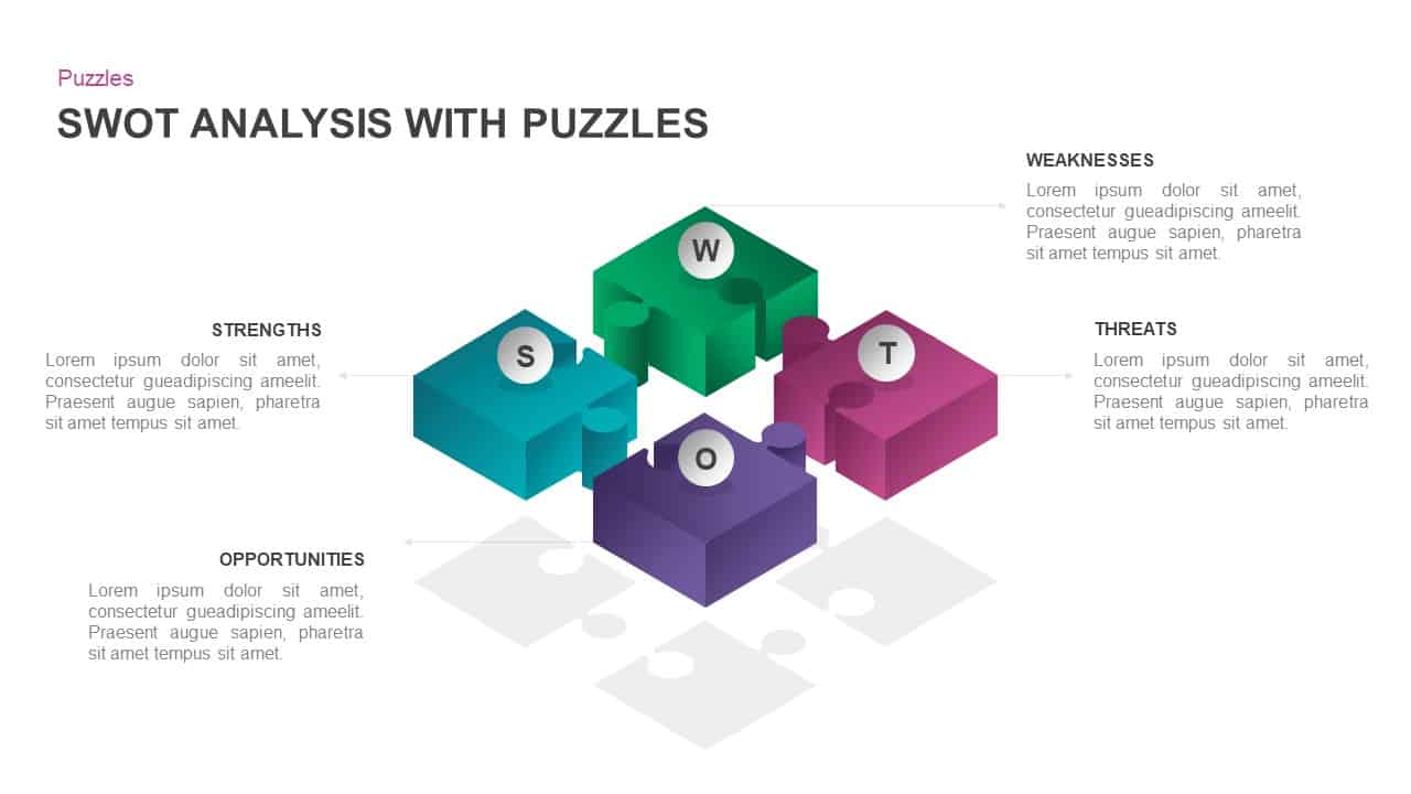
Interactive 3D Puzzle SWOT Analysis Slide Template for PowerPoint & Google Slides
SWOT

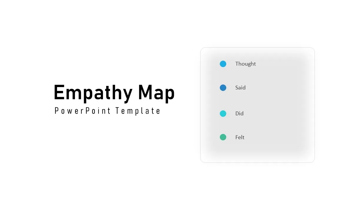
Interactive Empathy Map Diagram Template for PowerPoint & Google Slides
Process
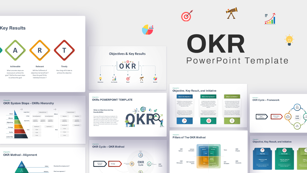
Interactive OKR Strategy Diagram Template for PowerPoint & Google Slides
Process
Free Interactive Online Course Presentation Template for PowerPoint & Google Slides
Pitch Deck
Free
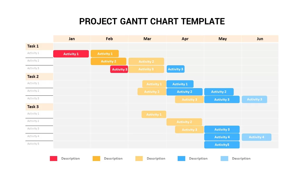
Interactive Project Gantt Chart Timeline Template for PowerPoint & Google Slides
Gantt Chart
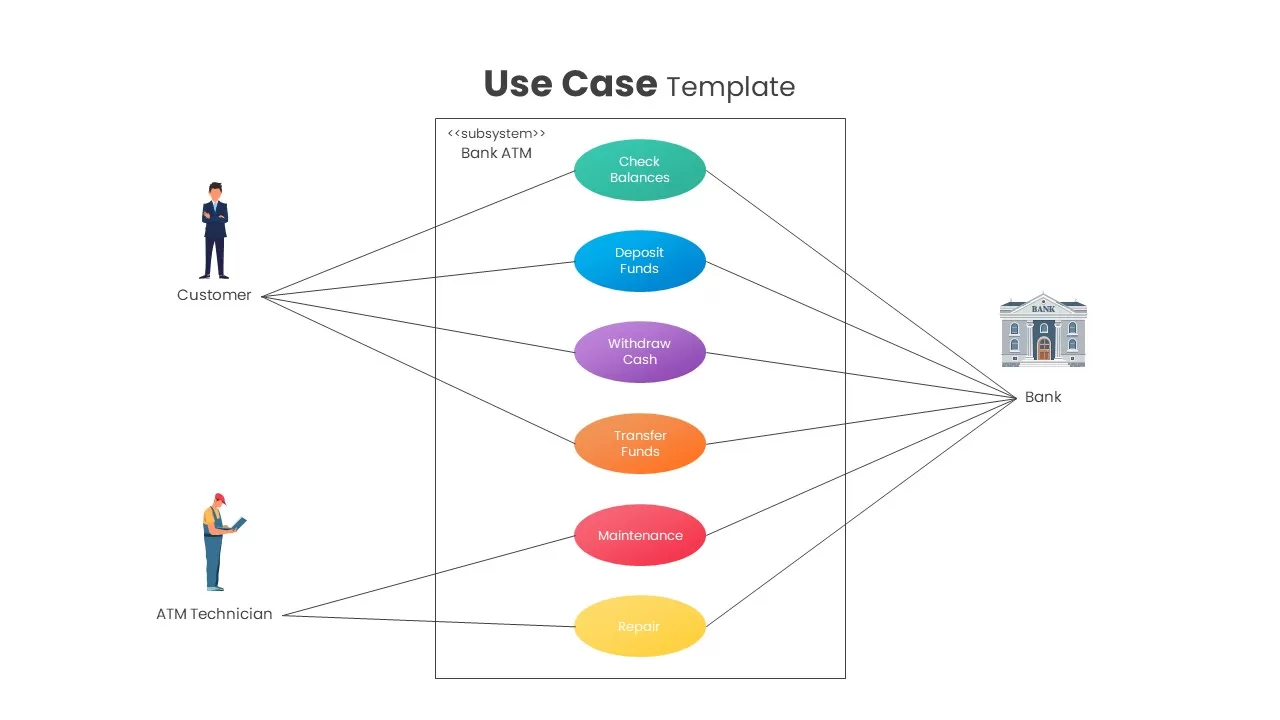
Interactive Bank ATM Use Case Diagram Template for PowerPoint & Google Slides
Software Development
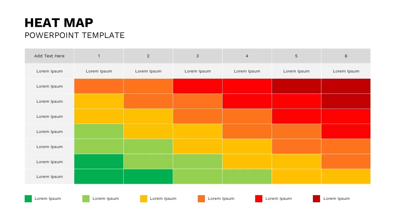
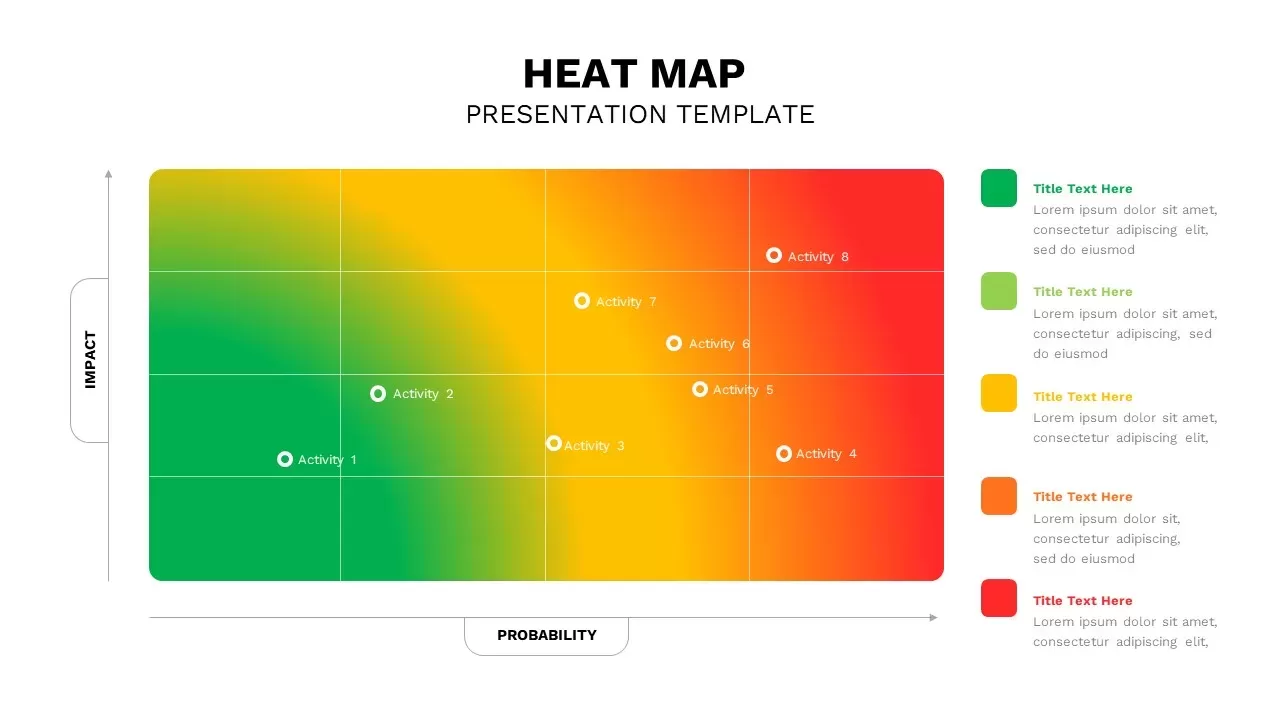
Professional Interactive Heat Map Matrix Template for PowerPoint & Google Slides
Comparison Chart
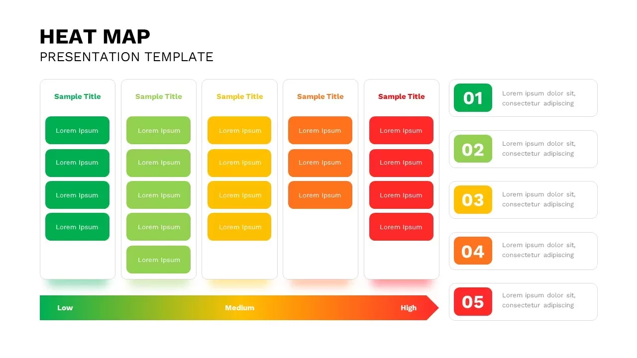
Interactive Heat Map Template for PowerPoint & Google Slides
Bar/Column
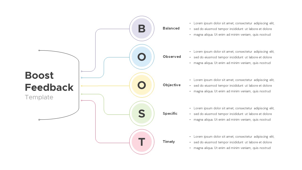
Interactive Boost Feedback Model Diagram Template for PowerPoint & Google Slides
Process
Free Interactive Trivia Presentation Template for PowerPoint & Google Slides
Graphics
Free
Free Interactive Two Truths and a Lie Game Template for PowerPoint & Google Slides
Decks
Free
Free Spin the Wheel Interactive Game Template for PowerPoint & Google Slides
Decks
Free
Interactive Slide Zoom & Transition Template for PowerPoint & Google Slides
Decks
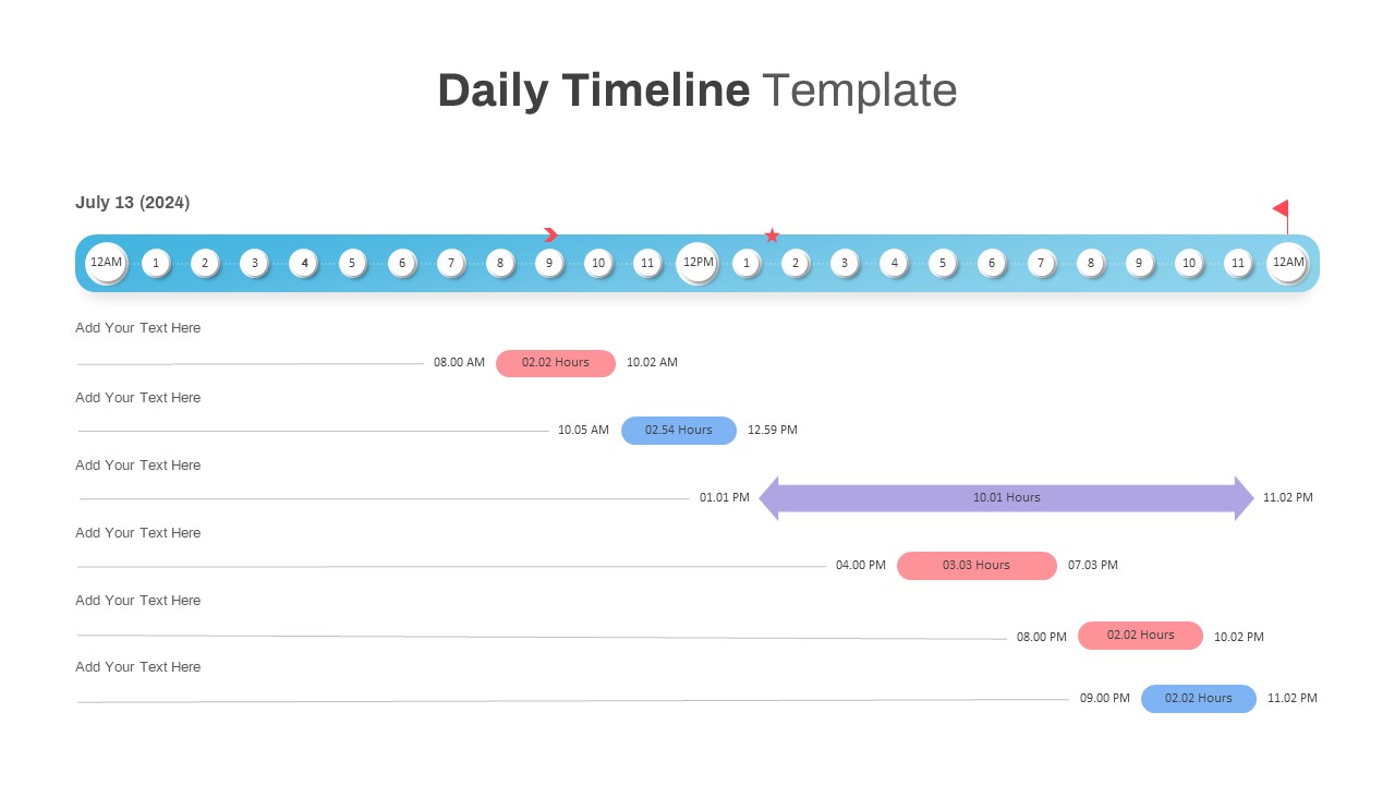
Interactive Daily Timeline Schedule Chart Template for PowerPoint & Google Slides
Timeline
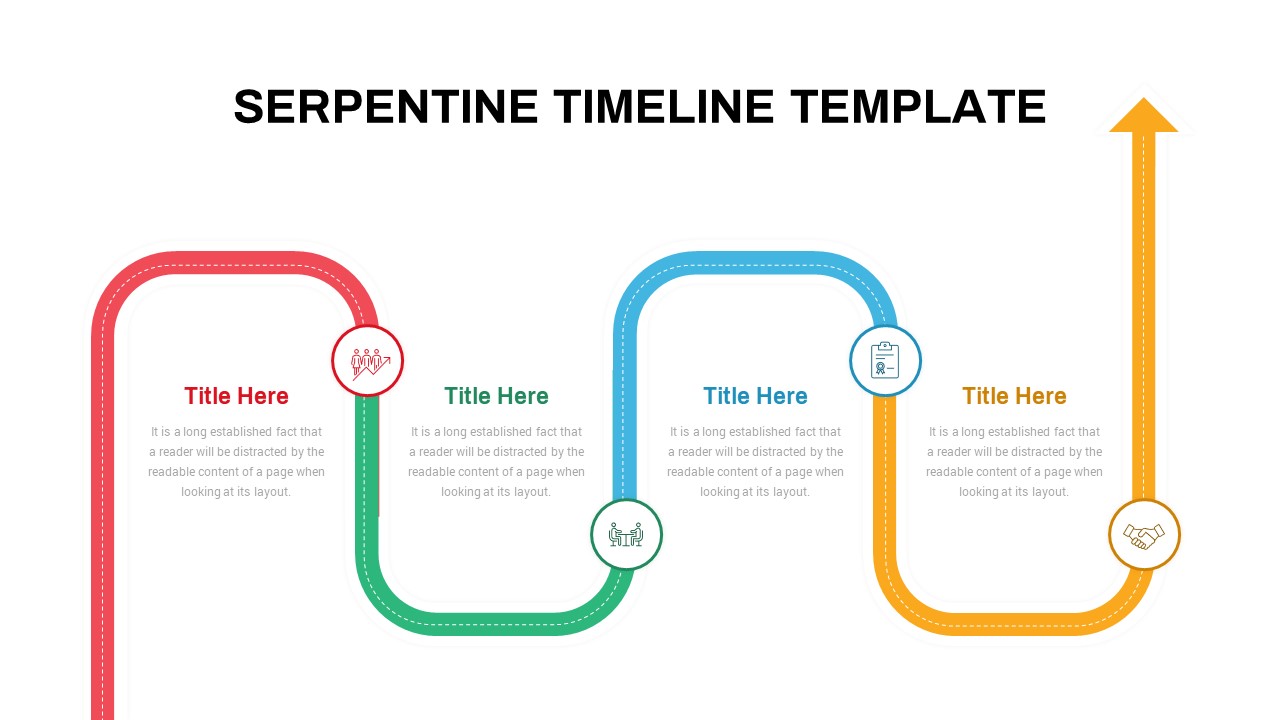
Interactive Serpentine Timeline Diagram Template for PowerPoint & Google Slides
Timeline
Interactive Milestone Timeline Template for PowerPoint & Google Slides
Timeline
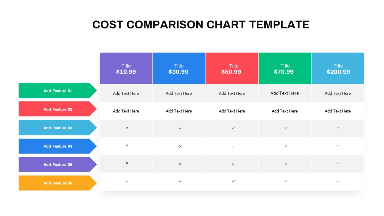
Interactive Multi-Use Cost Comparison Template for PowerPoint & Google Slides
Comparison
Free Animated Quiz Interactive Template for PowerPoint & Google Slides
Pitch Deck
Free
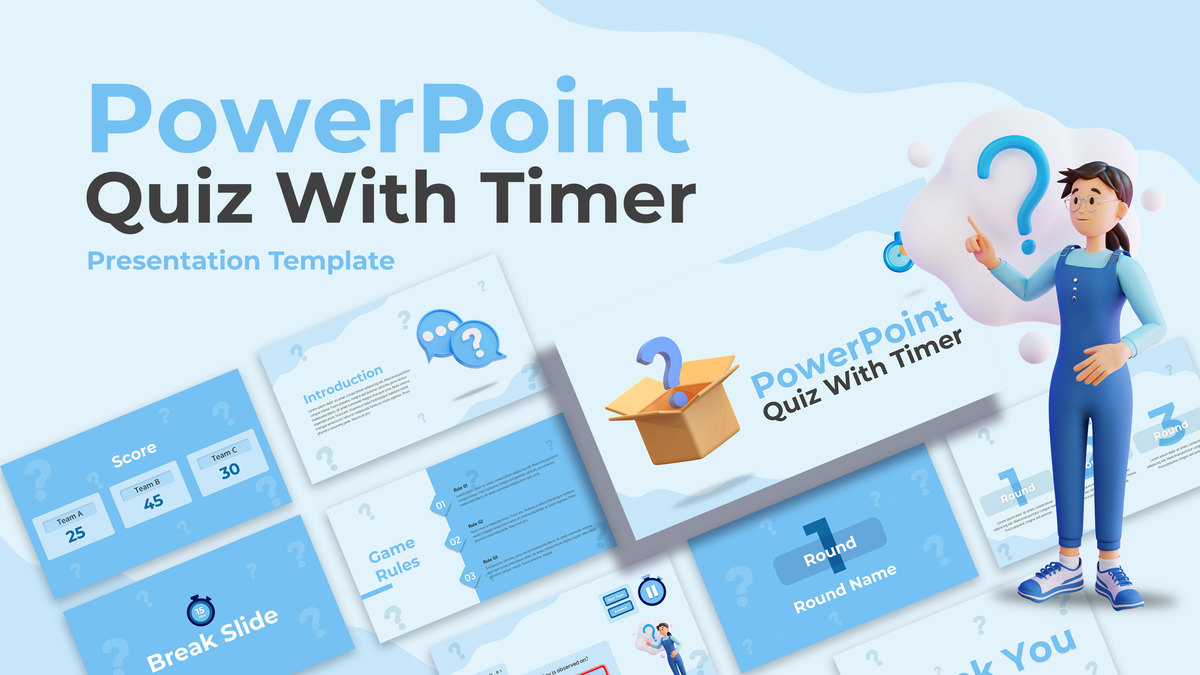
Interactive Quiz with Countdown Timer Template for PowerPoint & Google Slides
Pitch Deck
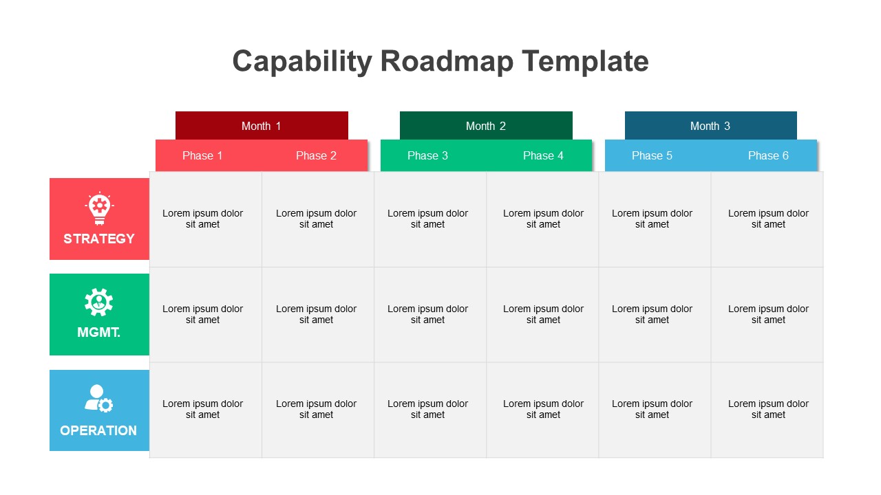
Interactive Strategic Capability Roadmap Template for PowerPoint & Google Slides
Roadmap
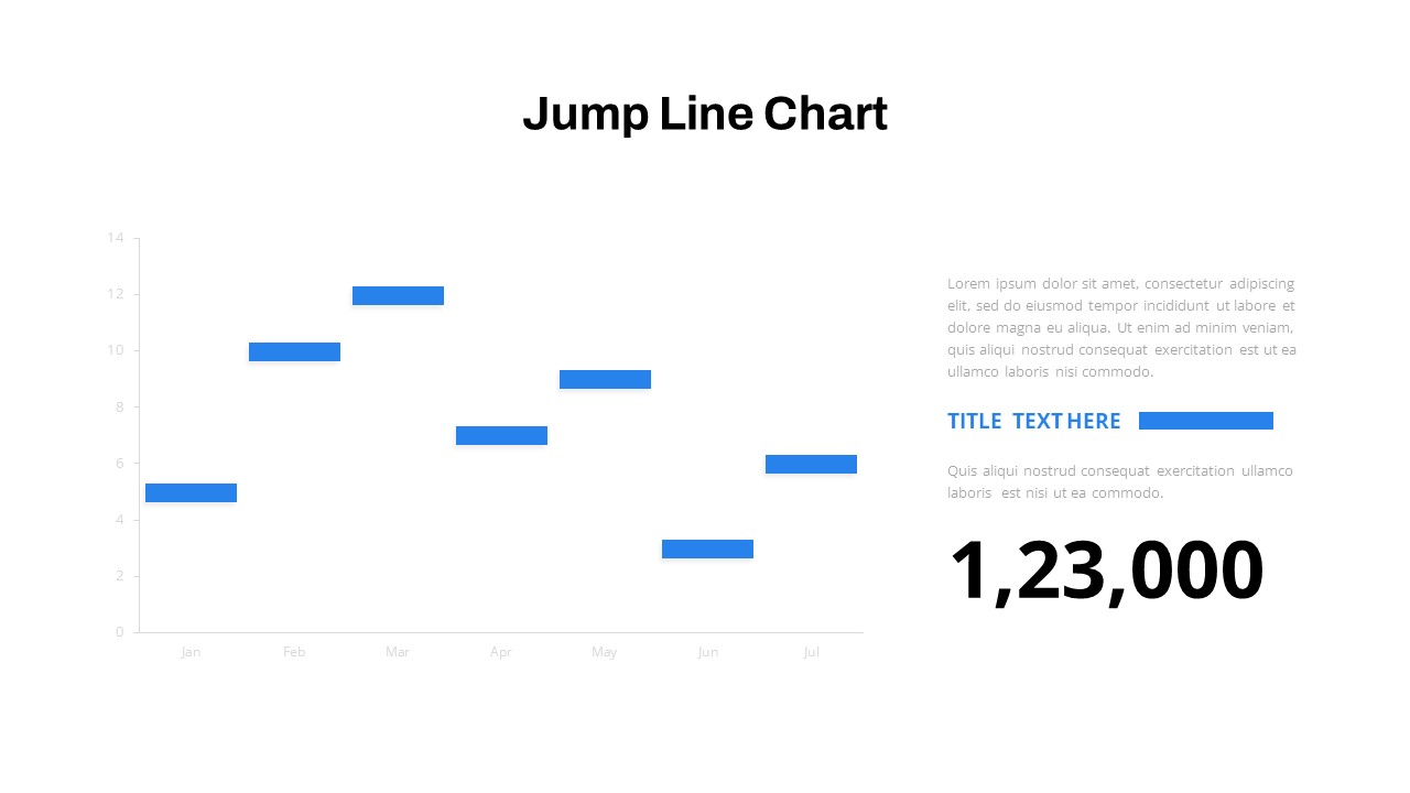
Interactive Jump Line Data Chart Template for PowerPoint & Google Slides
Comparison Chart
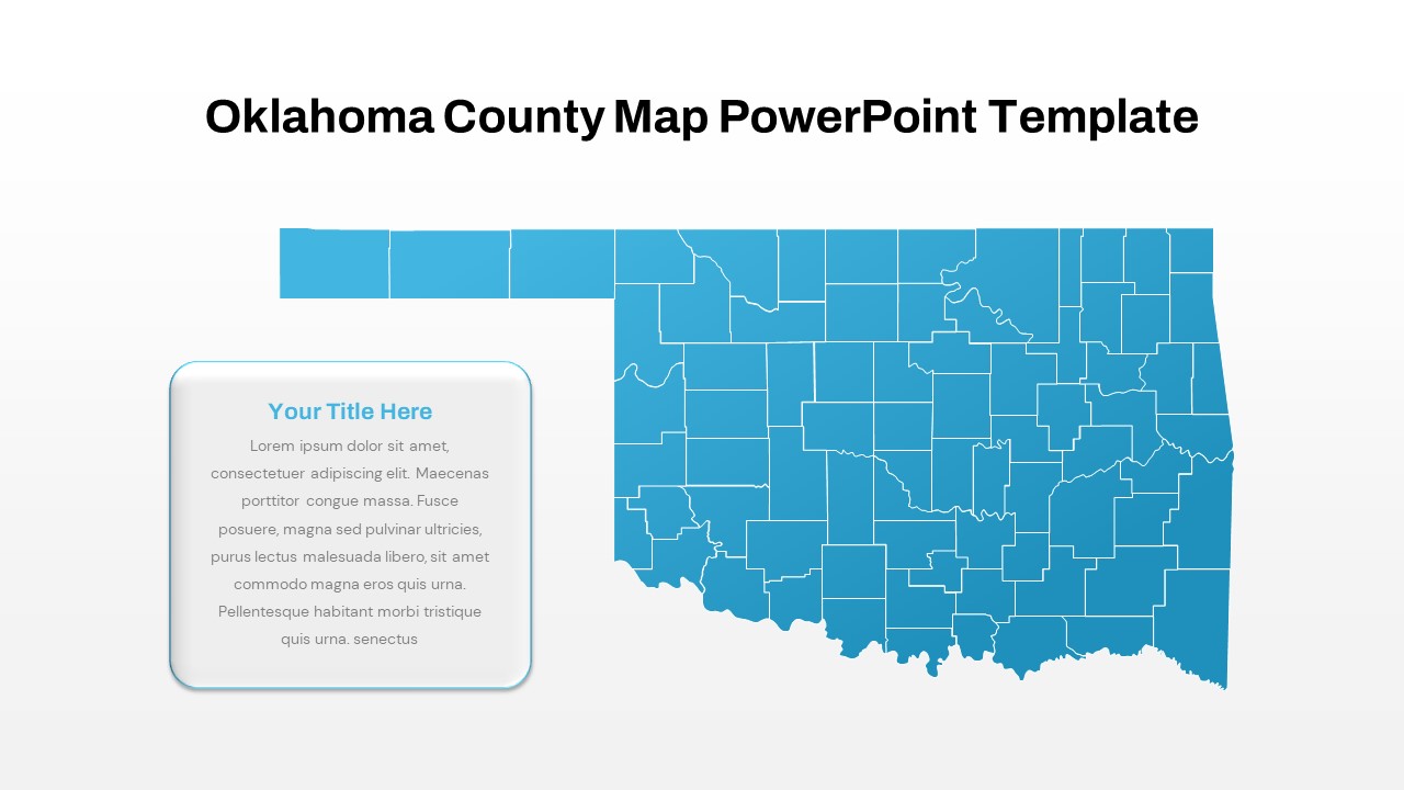
Interactive Oklahoma County Map Template for PowerPoint & Google Slides
World Maps
Interactive Quiz with Game Rules Template for PowerPoint & Google Slides
Graphics
Free
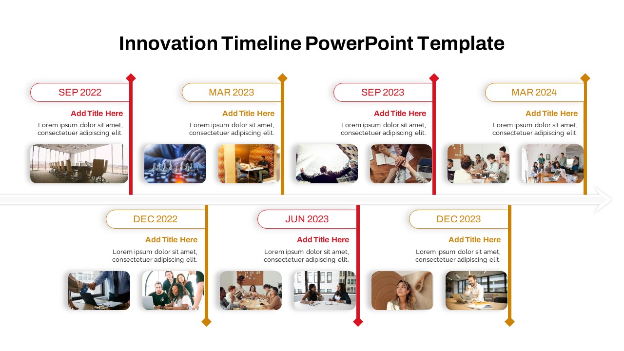
Interactive Innovation Timeline Roadmap Template for PowerPoint & Google Slides
Timeline
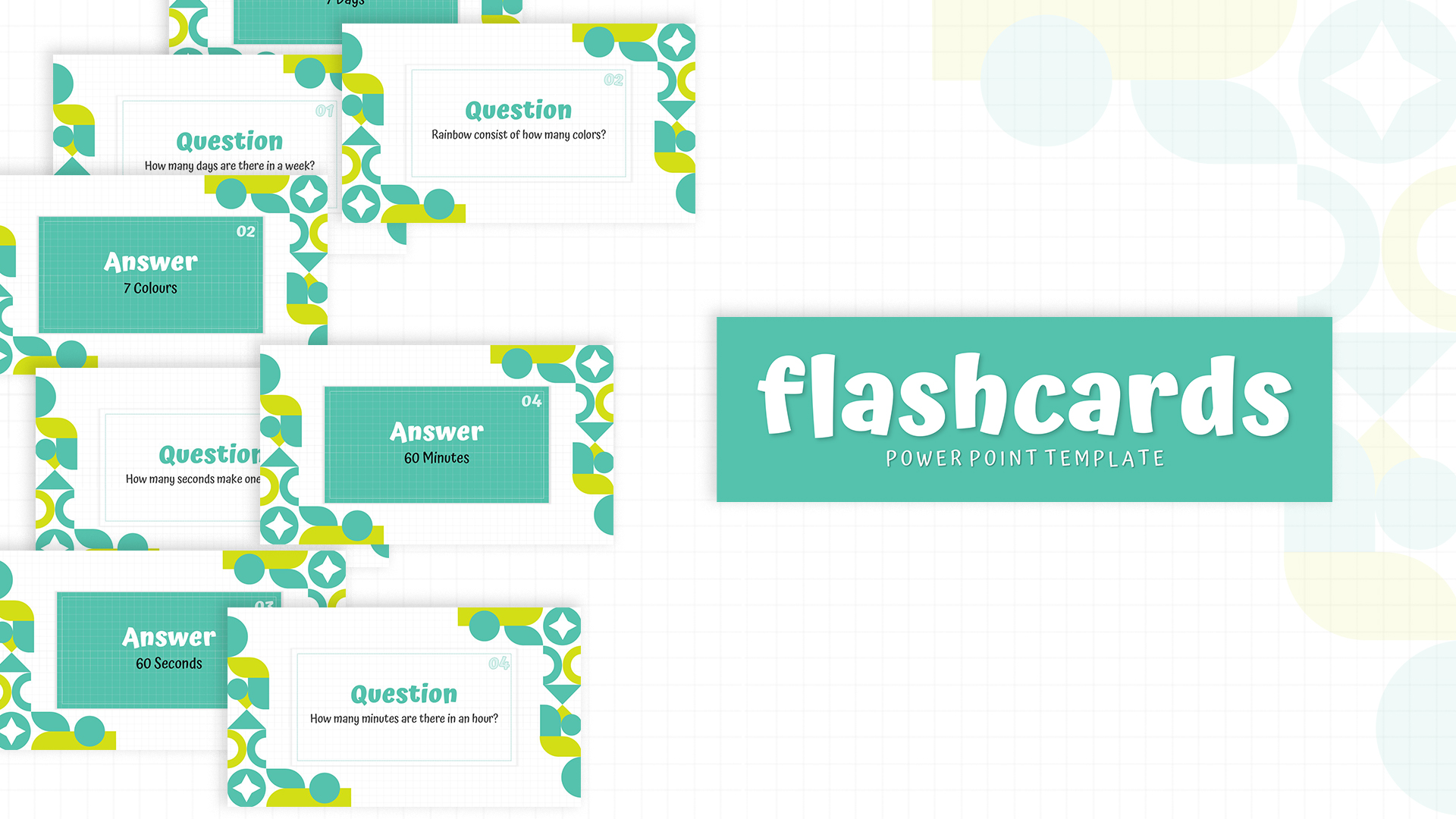
Free Interactive Flashcards Q&A Deck Template for PowerPoint & Google Slides
Free
Free
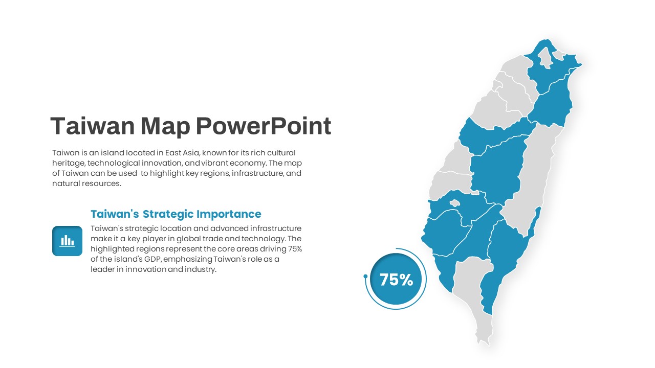
Interactive Taiwan Map Highlight Template for PowerPoint & Google Slides
World Maps

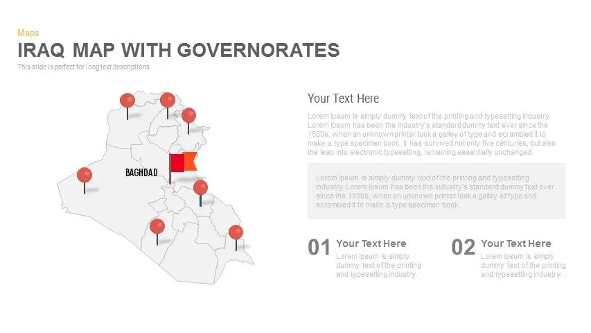
Interactive Iraq Map with Governorates Slide Pack for PowerPoint & Google Slides
World Maps
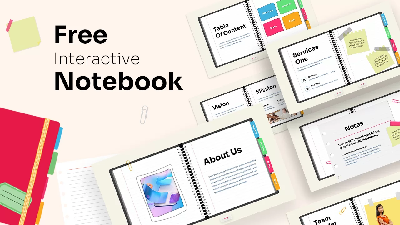
Free Interactive Notebook for PowerPoint & Google Slides
Business
Free
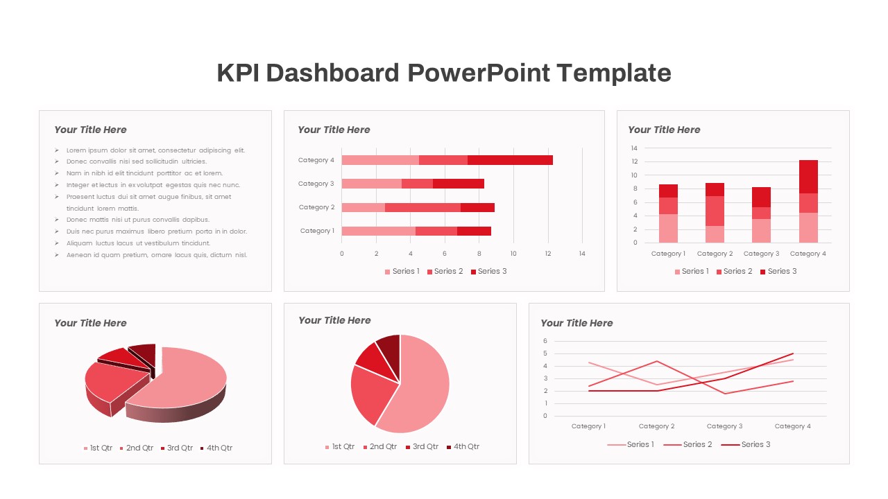
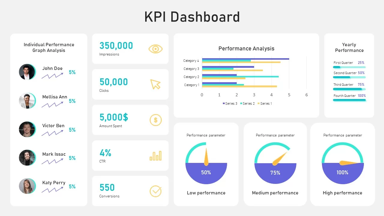
Free KPI Dashboard PowerPoint Template for PowerPoint & Google Slides
Charts
Free
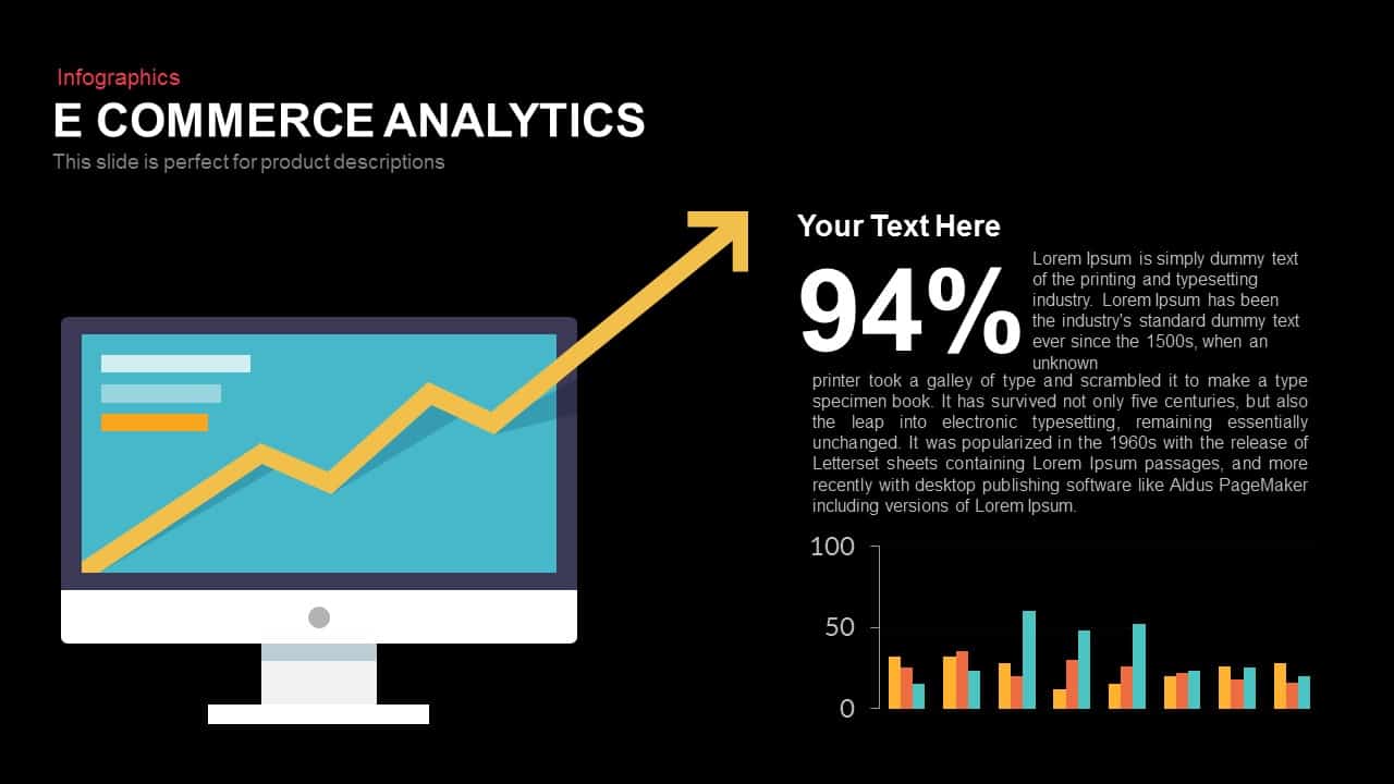
E-commerce Analytics Dashboard Template for PowerPoint & Google Slides
Bar/Column
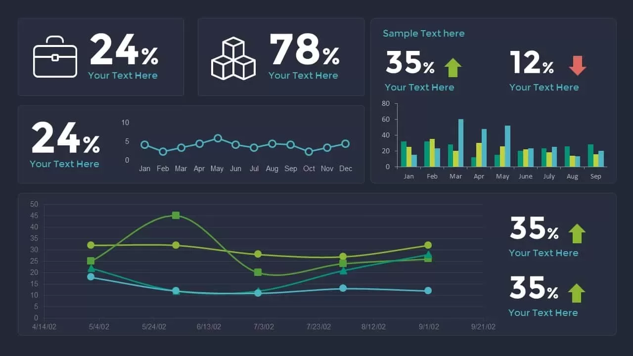
Data Analytics Dashboard Design template for PowerPoint & Google Slides
Bar/Column

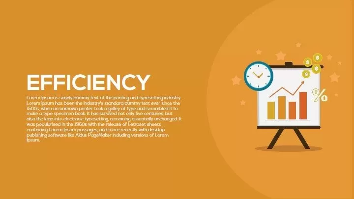
Efficiency KPI Dashboard Metaphor Template for PowerPoint & Google Slides
Infographics
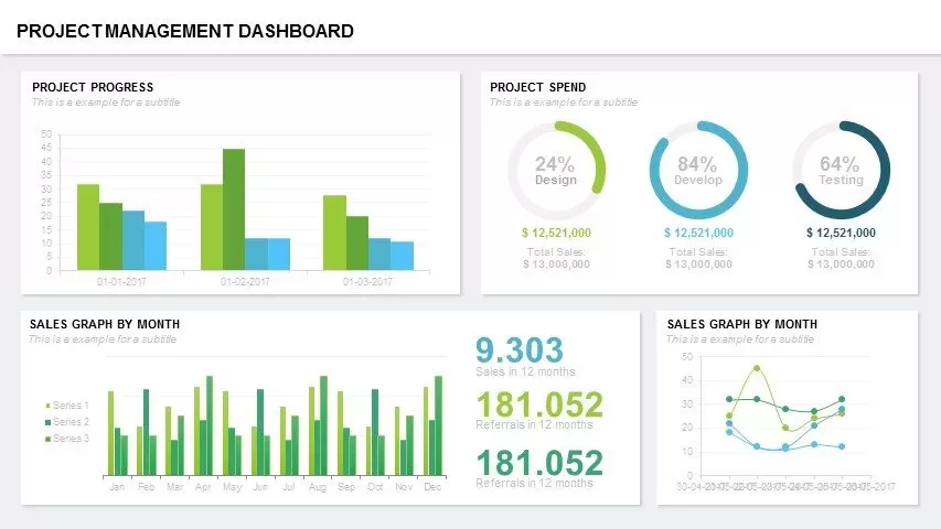
Project Management Dashboard Template for PowerPoint & Google Slides
Project

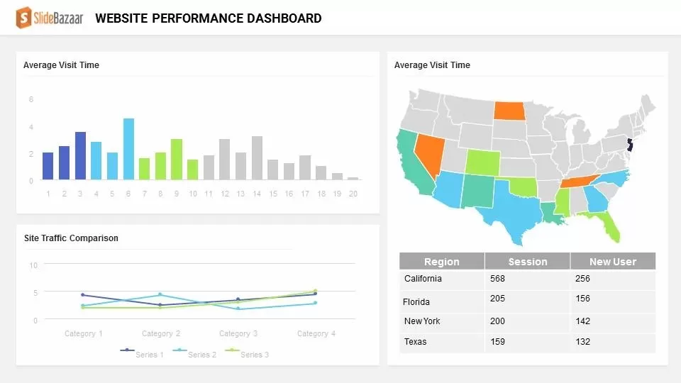
Website Performance Dashboard template for PowerPoint & Google Slides
Charts
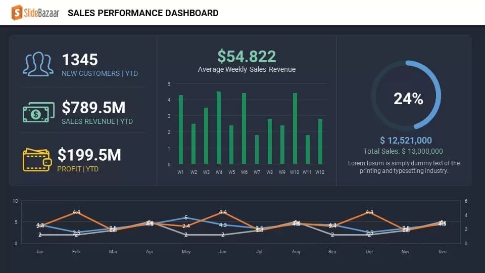
Sales Performance Dashboard template for PowerPoint & Google Slides
Business Report
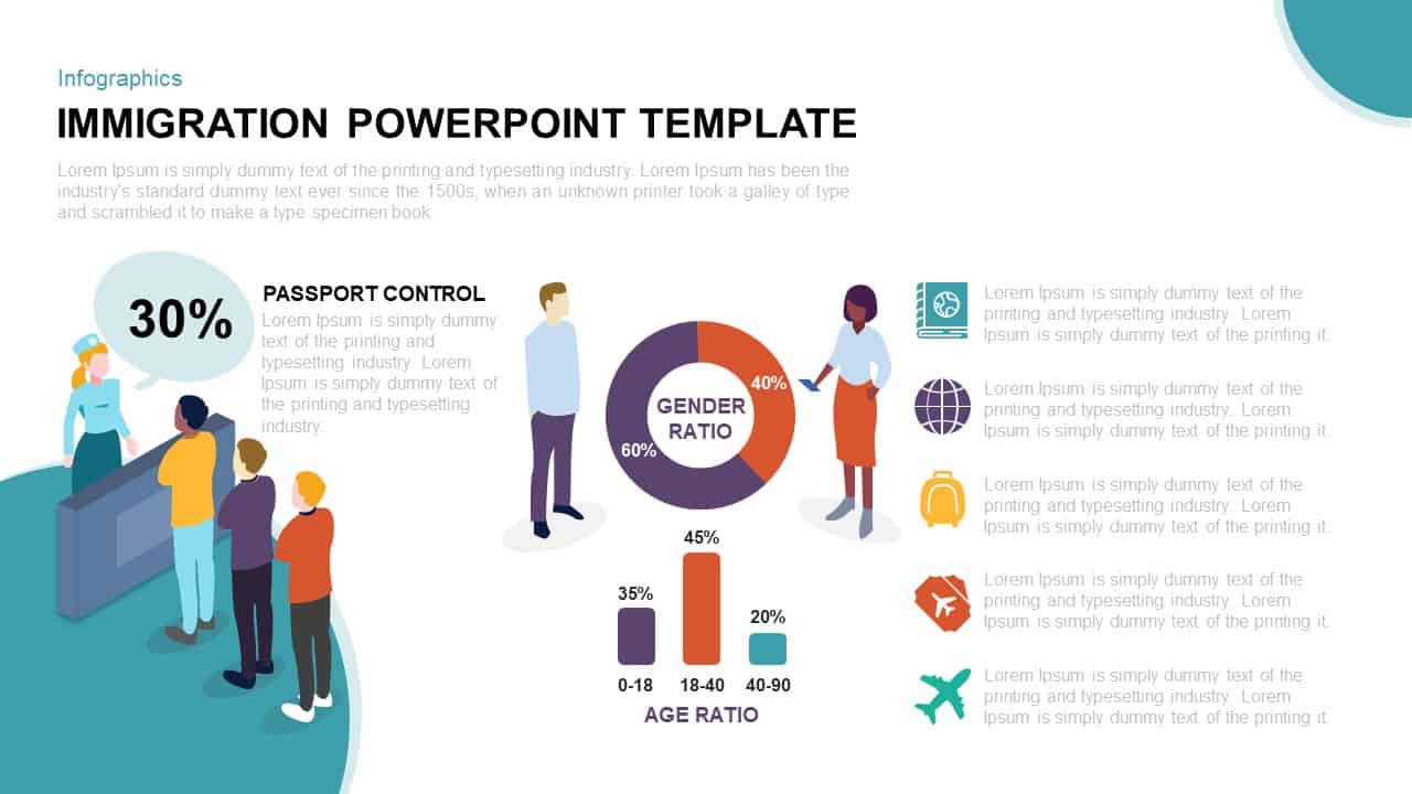
Immigration Data Dashboard Template for PowerPoint & Google Slides
Bar/Column
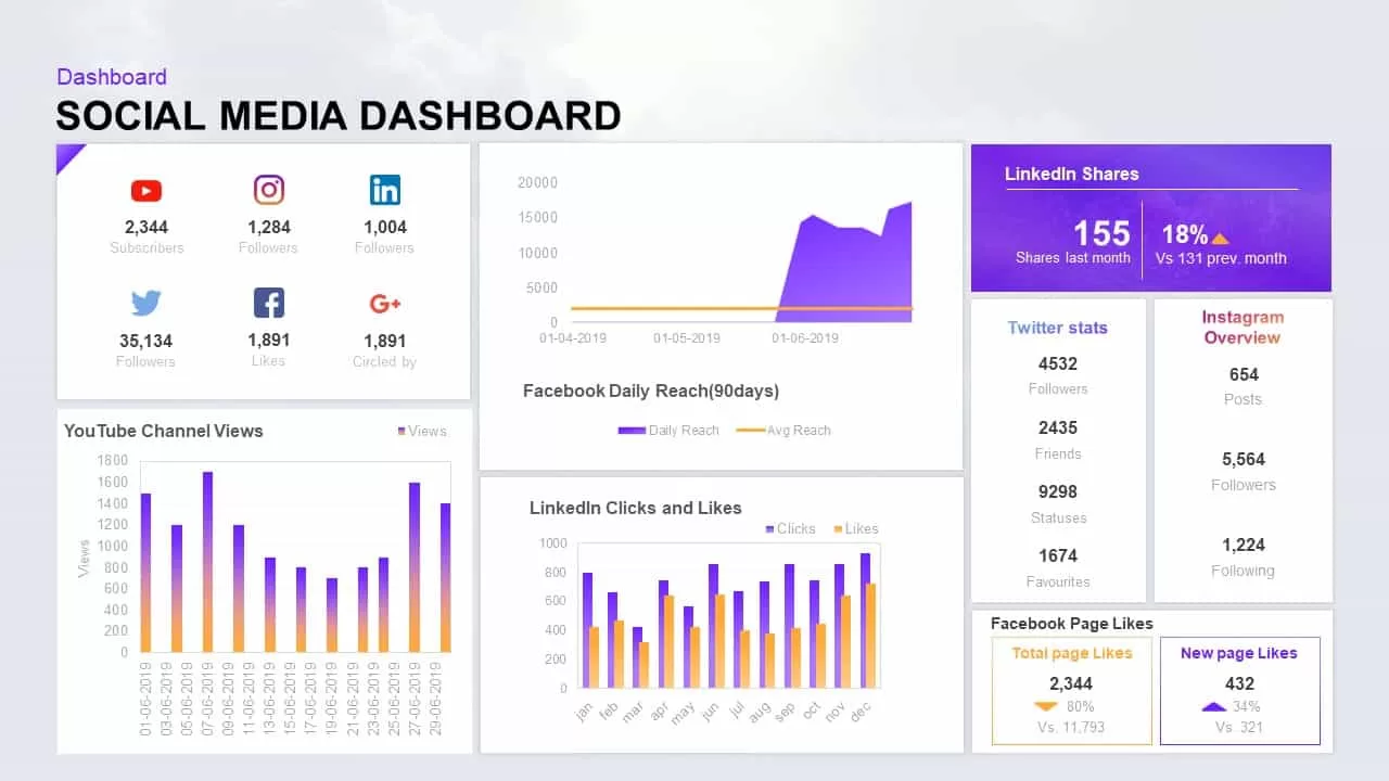
Social Media Performance Dashboard Template for PowerPoint & Google Slides
Bar/Column
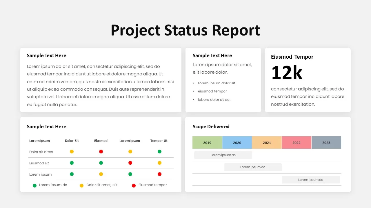
Modern Project Status Report Dashboard Template for PowerPoint & Google Slides
Project Status
Performance KPI Dashboard Slide Template for PowerPoint & Google Slides
Business Report
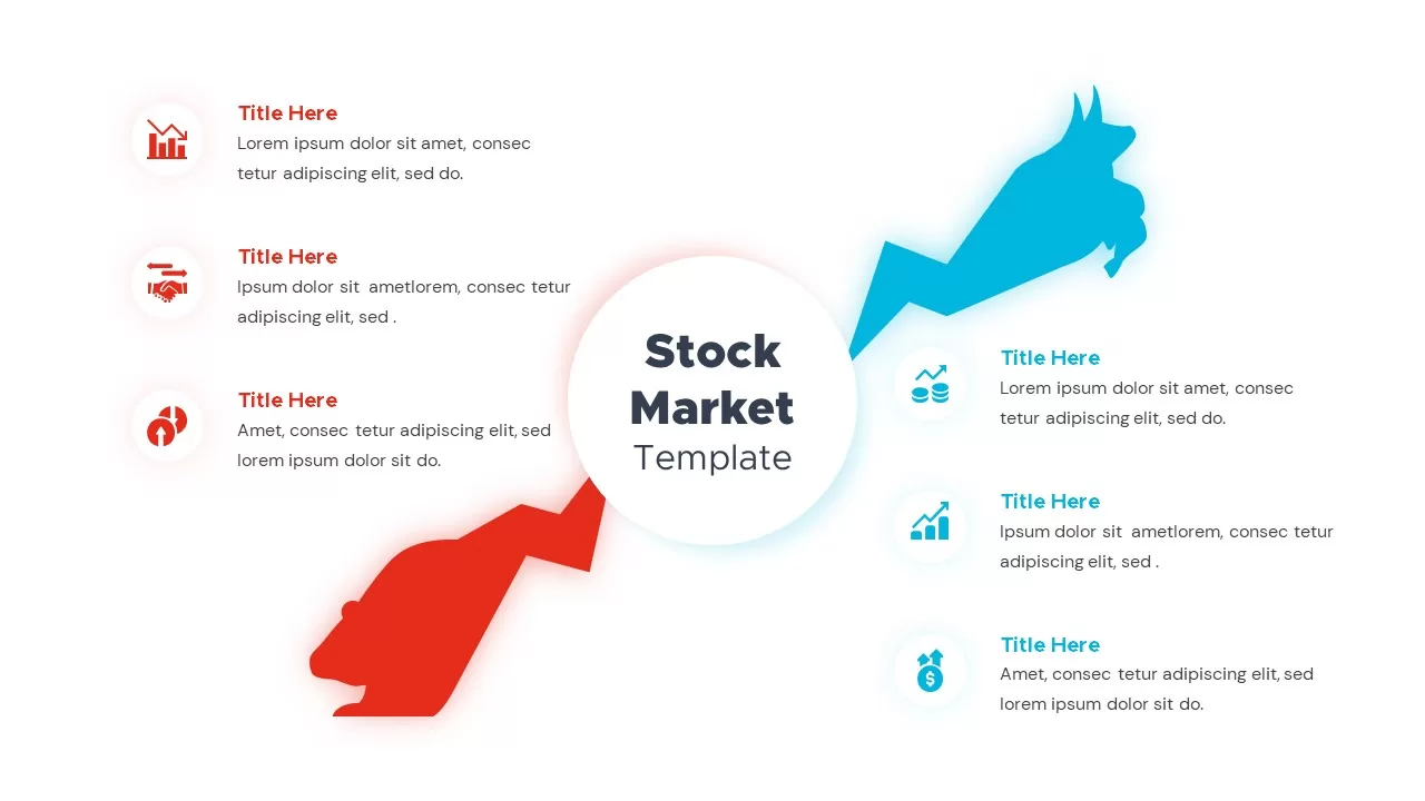
Bull and Bear Stock Market Dashboard Template for PowerPoint & Google Slides
Infographics
KPI Dashboard Overview template for PowerPoint & Google Slides
Finance
KPI Dashboard Data Visualization Template for PowerPoint & Google Slides
Bar/Column
KPI Dashboard Data Overview Slide Template for PowerPoint & Google Slides
Bar/Column
Heat Map Risk Matrix Dashboard Template for PowerPoint & Google Slides
Comparison Chart
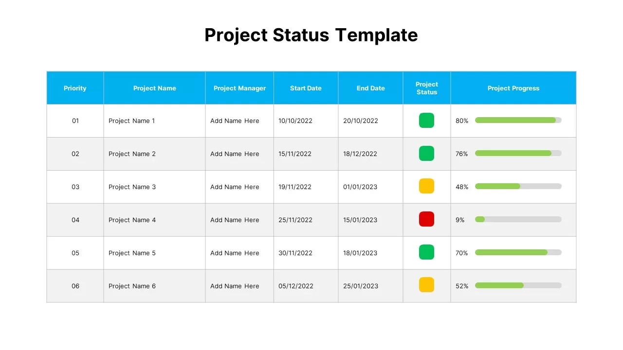
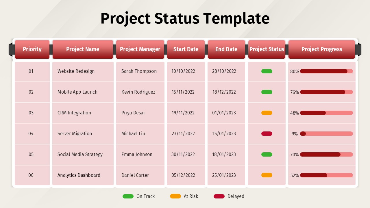
Project Status Dashboard Table Template for PowerPoint & Google Slides
Project Status
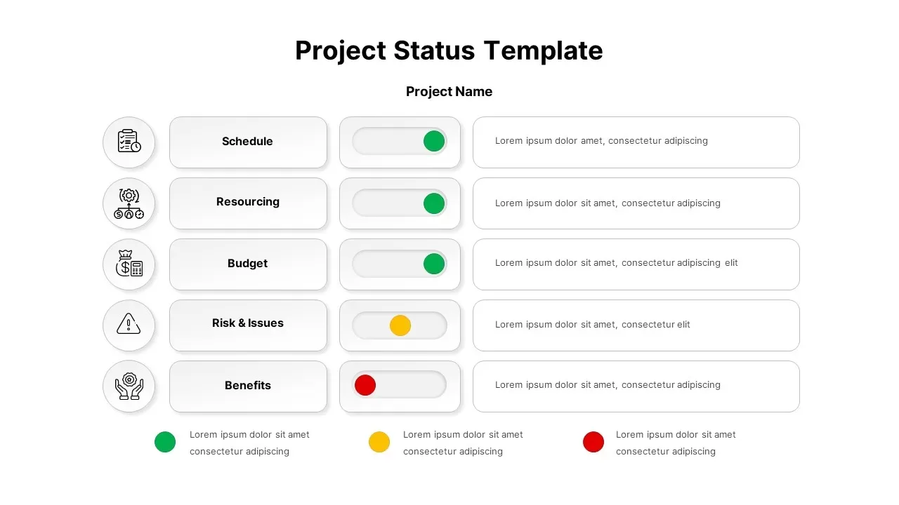
Project Status Dashboard with Metrics Template for PowerPoint & Google Slides
Project Status
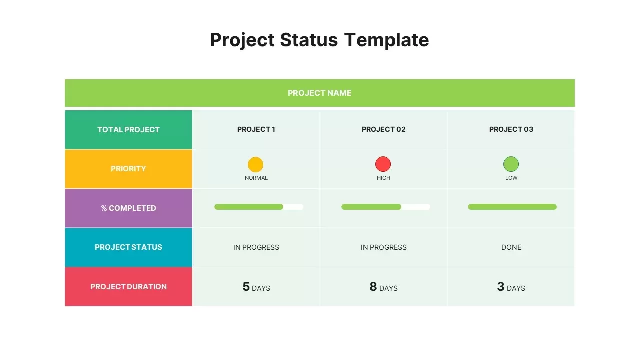
Colorful Project Status Dashboard Template for PowerPoint & Google Slides
Project Status
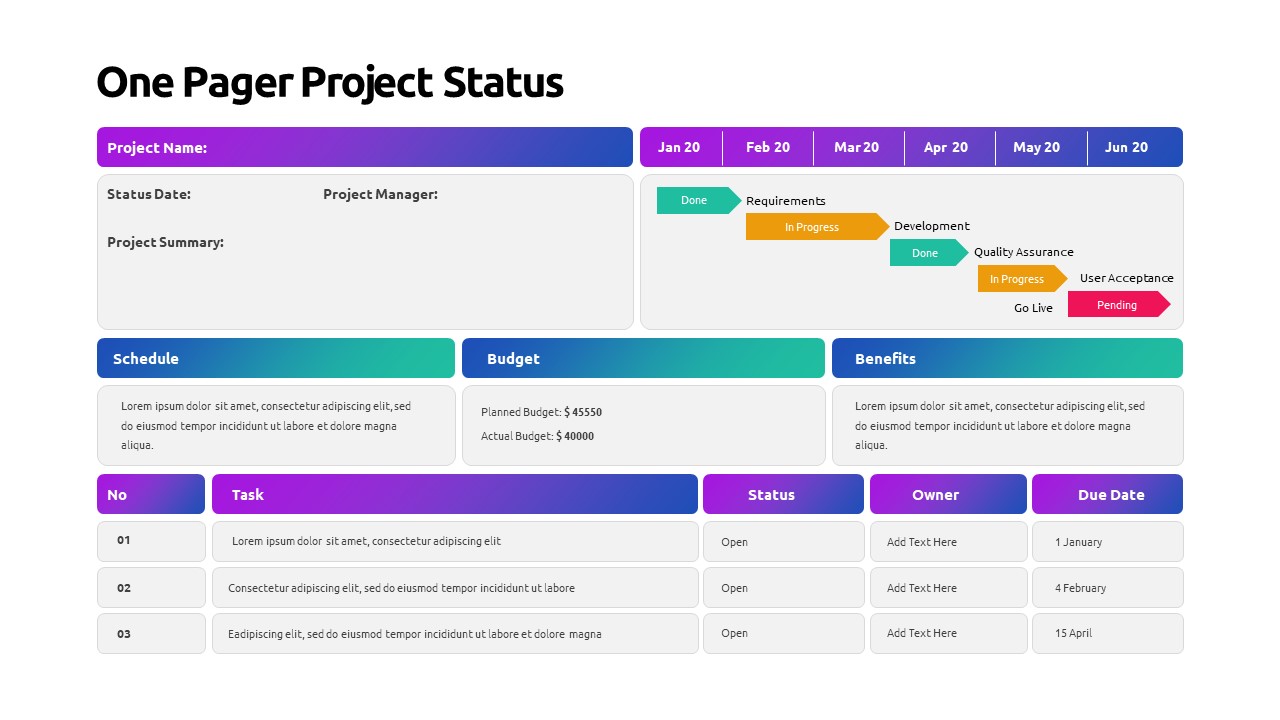
One Pager Project Status Dashboard Template for PowerPoint & Google Slides
Project Status
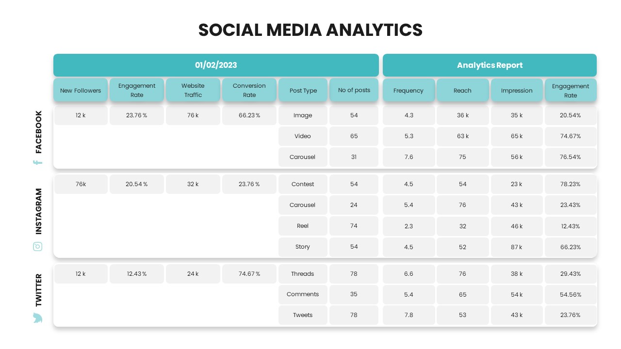
Social Media Analytics Dashboard Template for PowerPoint & Google Slides
Digital Marketing
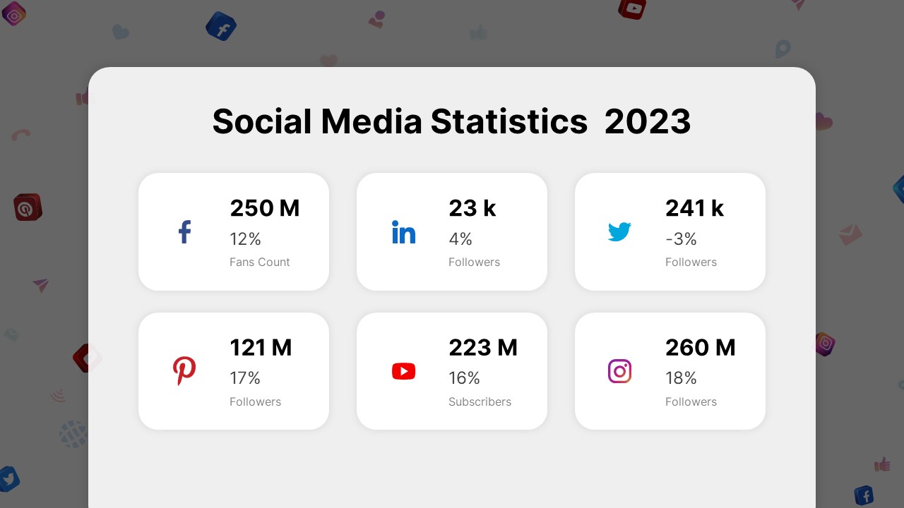
Social Media Statistics 2023 Dashboard Template for PowerPoint & Google Slides
Comparison
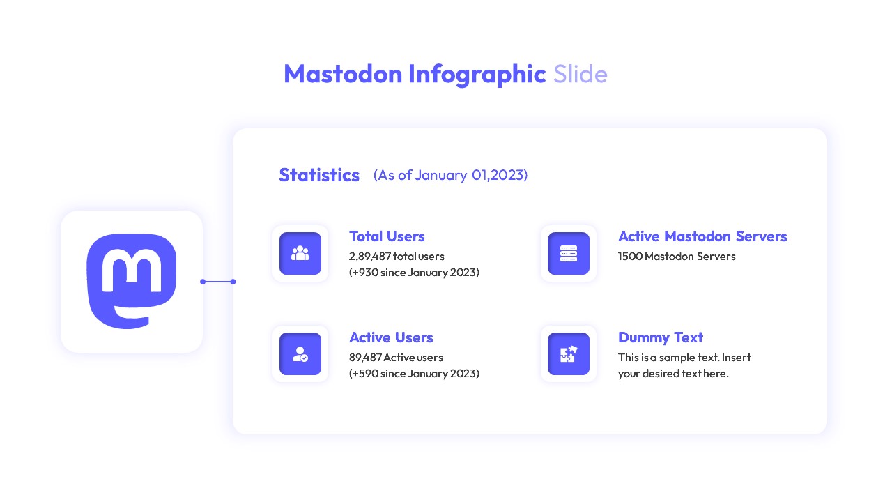
Mastodon Metrics Infographic Dashboard Template for PowerPoint & Google Slides
Business Report
Free Monthly Report PowerPoint Template for PowerPoint & Google Slides
Business Report
Free
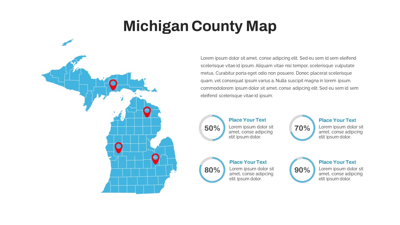
Michigan County Map with KPI Dashboard Template for PowerPoint & Google Slides
World Maps
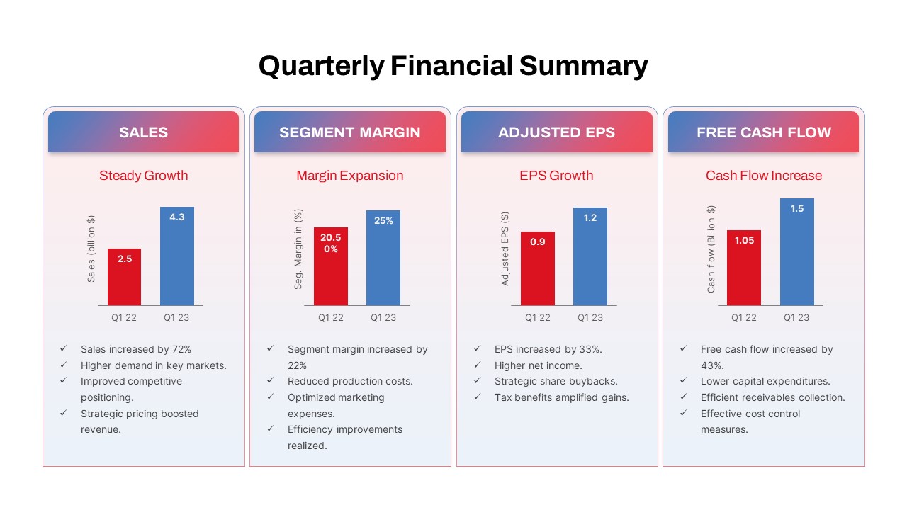
Quarterly Financial Summary Dashboard Template for PowerPoint & Google Slides
Business Report
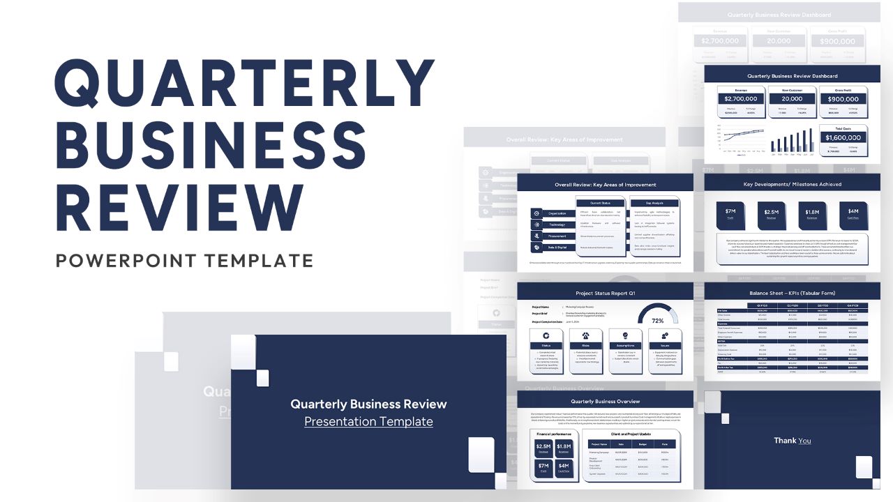
Quarterly Business Review Dashboard Template for PowerPoint & Google Slides
Pitch Deck
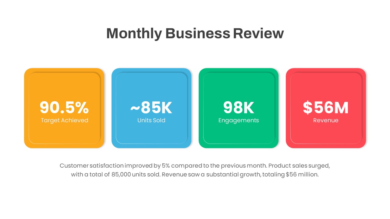
Monthly Business Review Dashboard Deck Template for PowerPoint & Google Slides
Business Report
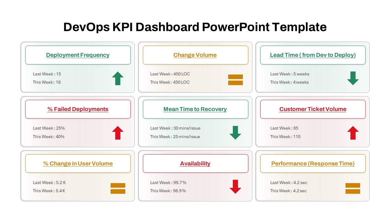
DevOps KPI Dashboard Performance Metrics Template for PowerPoint & Google Slides
Software Development
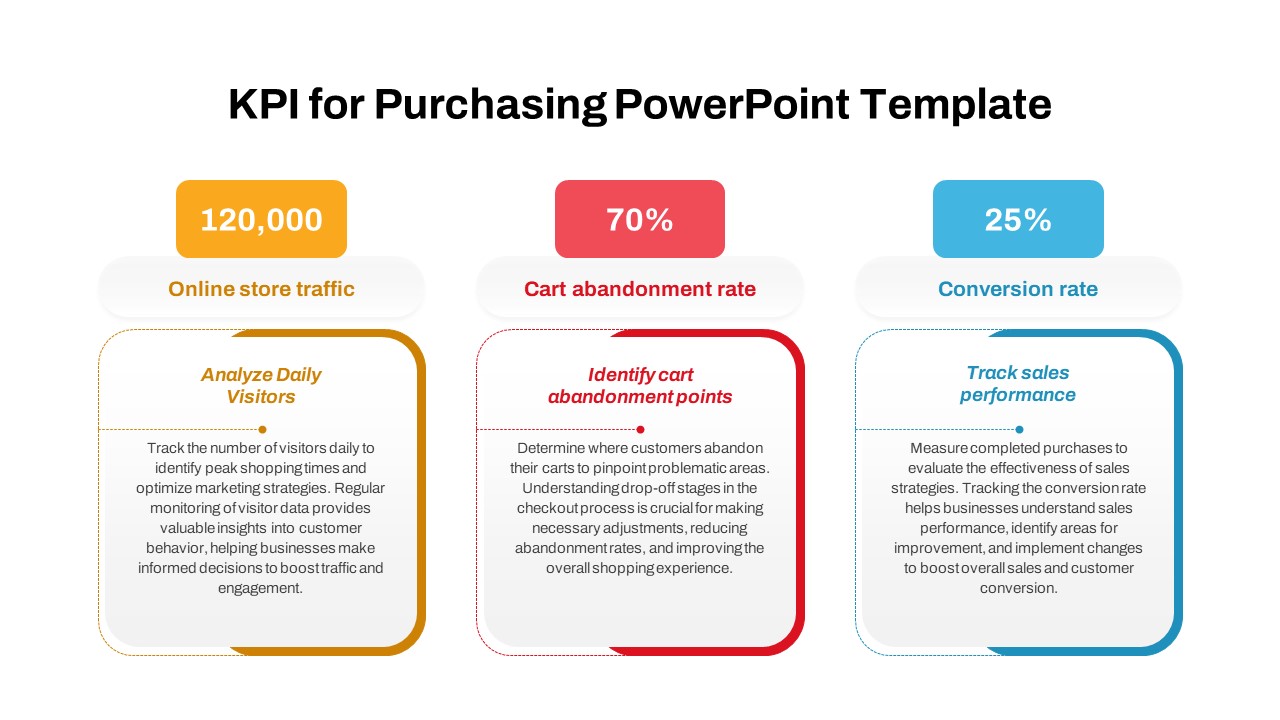
Purchasing KPI Metrics Dashboard Template for PowerPoint & Google Slides
Business Report
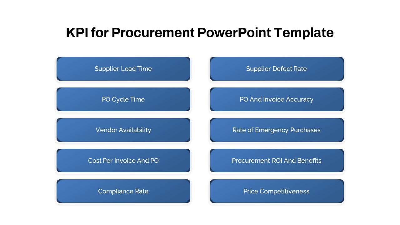
Procurement KPI Dashboard & Metrics Template for PowerPoint & Google Slides
Business Report
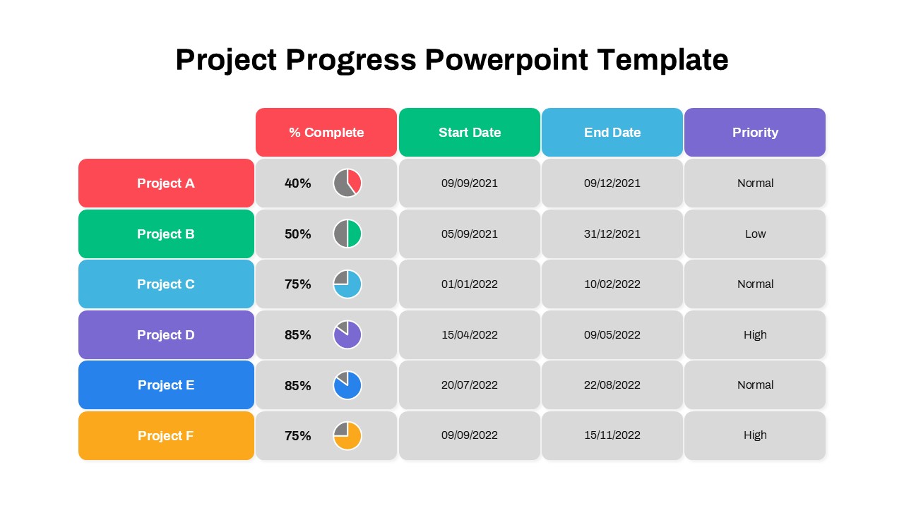
Project Progress Dashboard Pie Charts Template for PowerPoint & Google Slides
Project
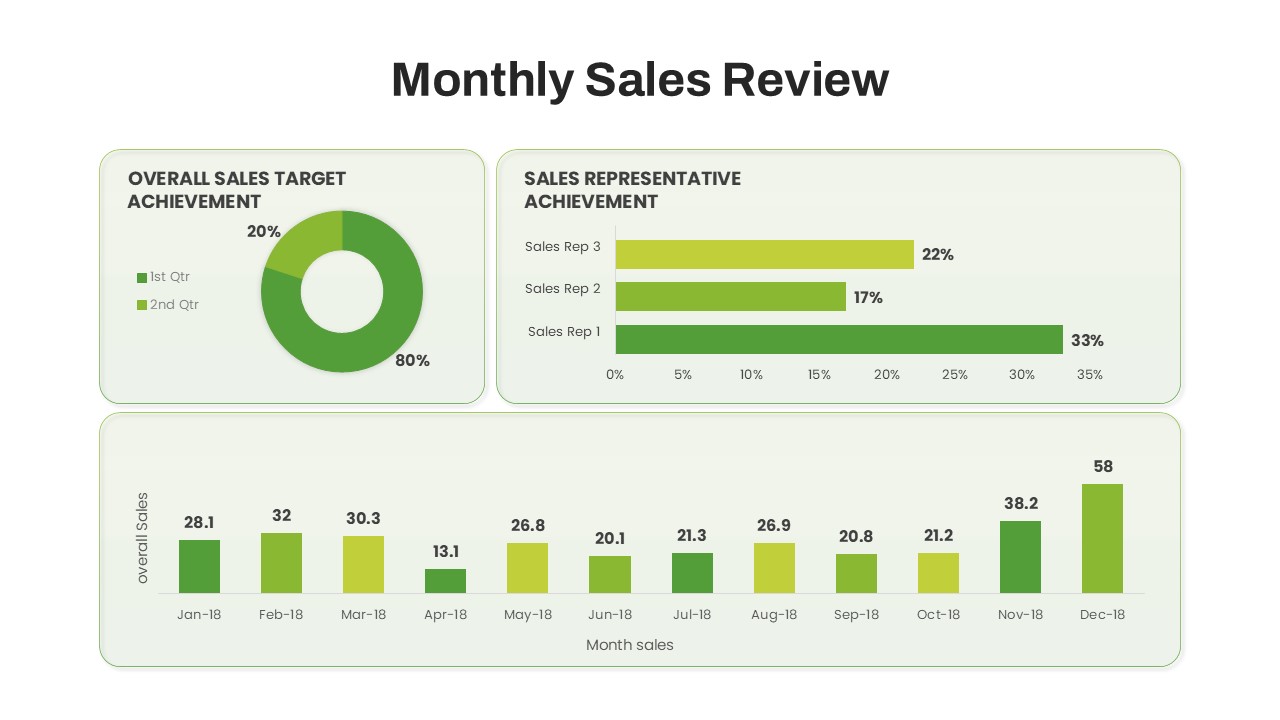
Monthly Sales Performance Dashboard Template for PowerPoint & Google Slides
Charts
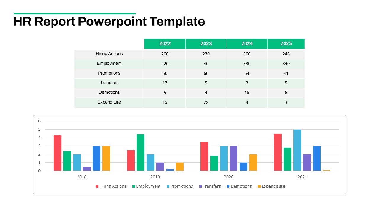
HR Report Dashboard Template for PowerPoint & Google Slides
Employee Performance
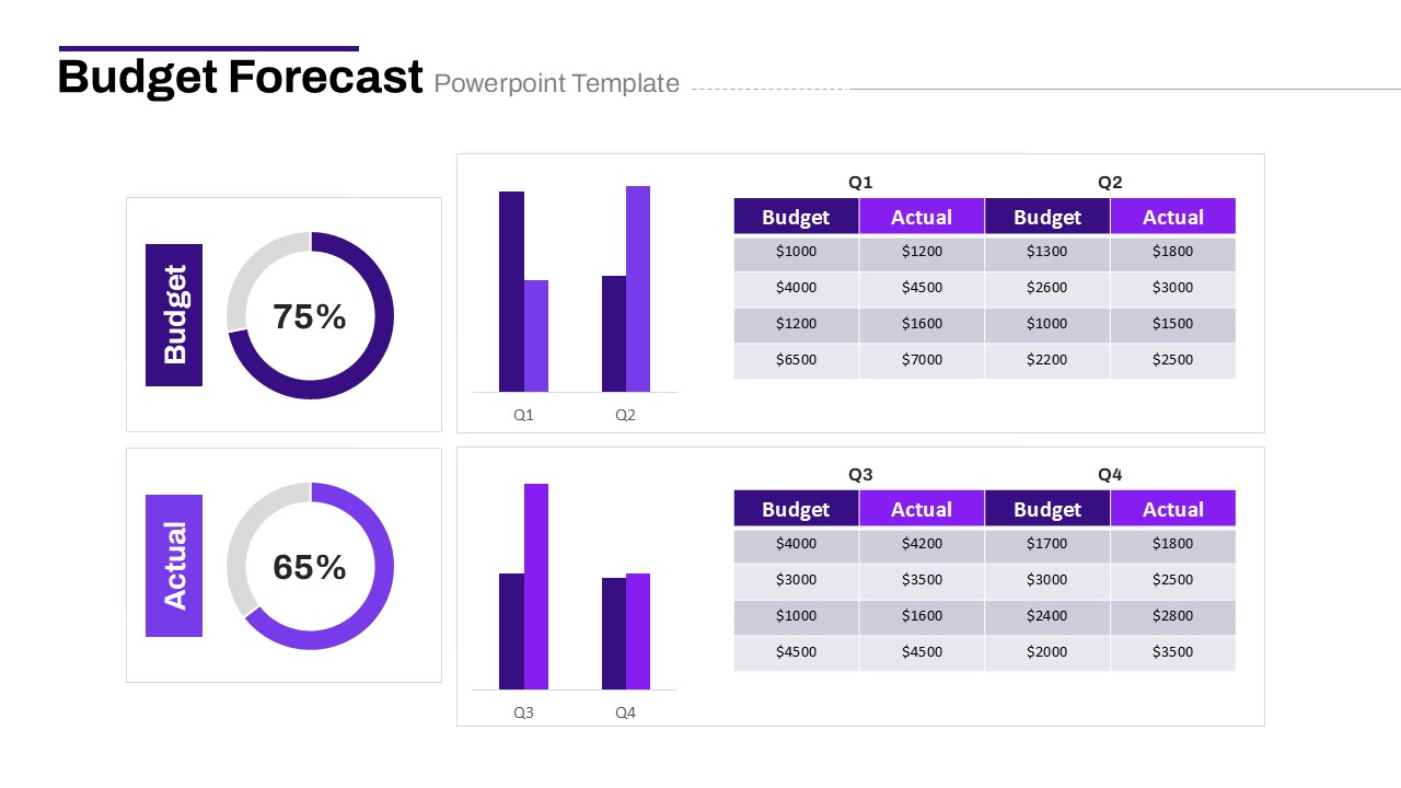
Budget Forecast Dashboard & Donut Charts Template for PowerPoint & Google Slides
Pie/Donut
Project Tracking Dashboard Table Template for PowerPoint & Google Slides
Project Status
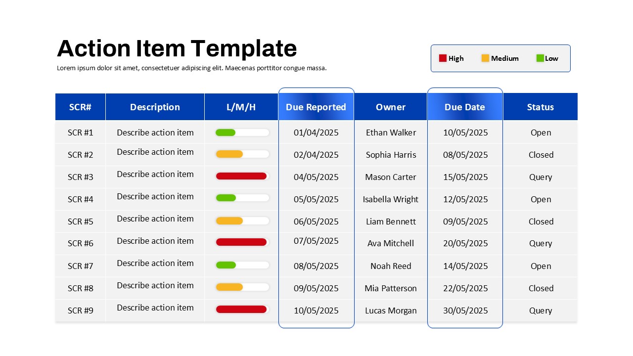
Action Items Management Dashboard Table Template for PowerPoint & Google Slides
Project Status
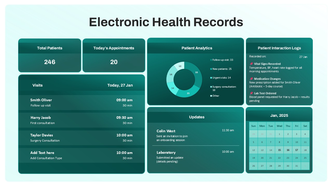
Electronic Health Records Dashboard template for PowerPoint & Google Slides
Health
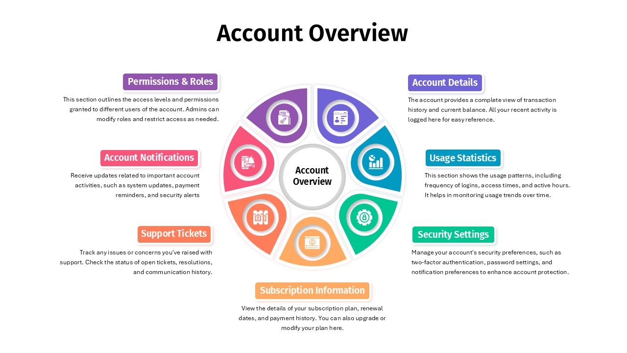
Account Overview Dashboard template for PowerPoint & Google Slides
Business
Project Status Dashboard Report Template for PowerPoint & Google Slides
Project Status
Project Status Update Dashboard Table Template for PowerPoint & Google Slides
Project Status
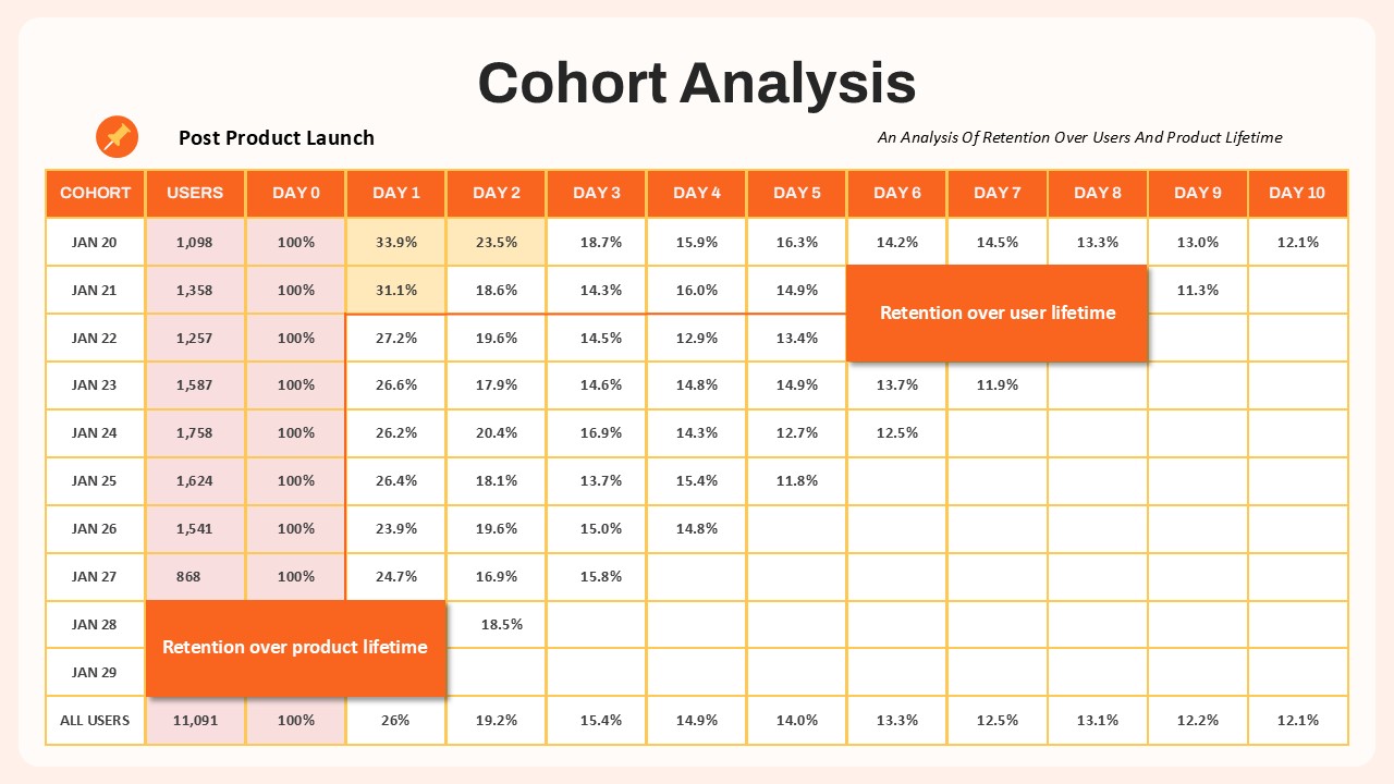
Cohort Analysis Retention Dashboard Template for PowerPoint & Google Slides
Comparison Chart
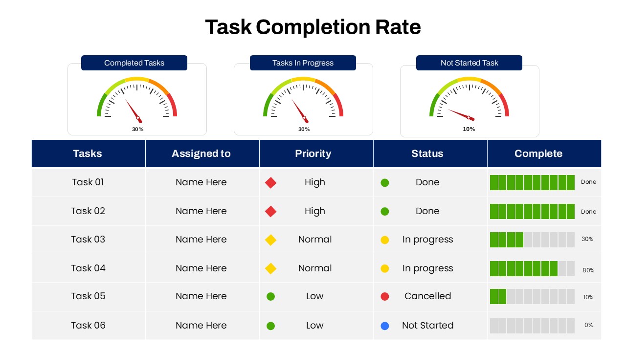
Task Completion Rate Dashboard Template for PowerPoint & Google Slides
Business
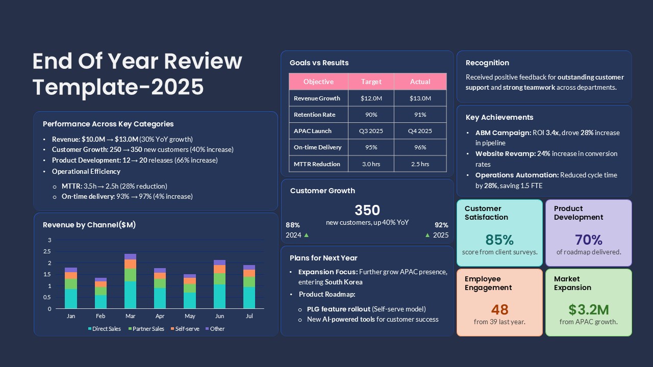
End of Year Review Dashboard Template for PowerPoint & Google Slides
Business Report
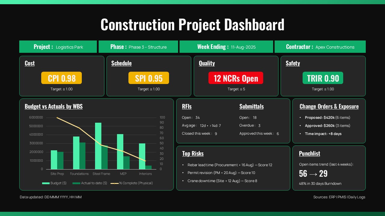
Construction Project Dashboard Template for PowerPoint & Google Slides
Project
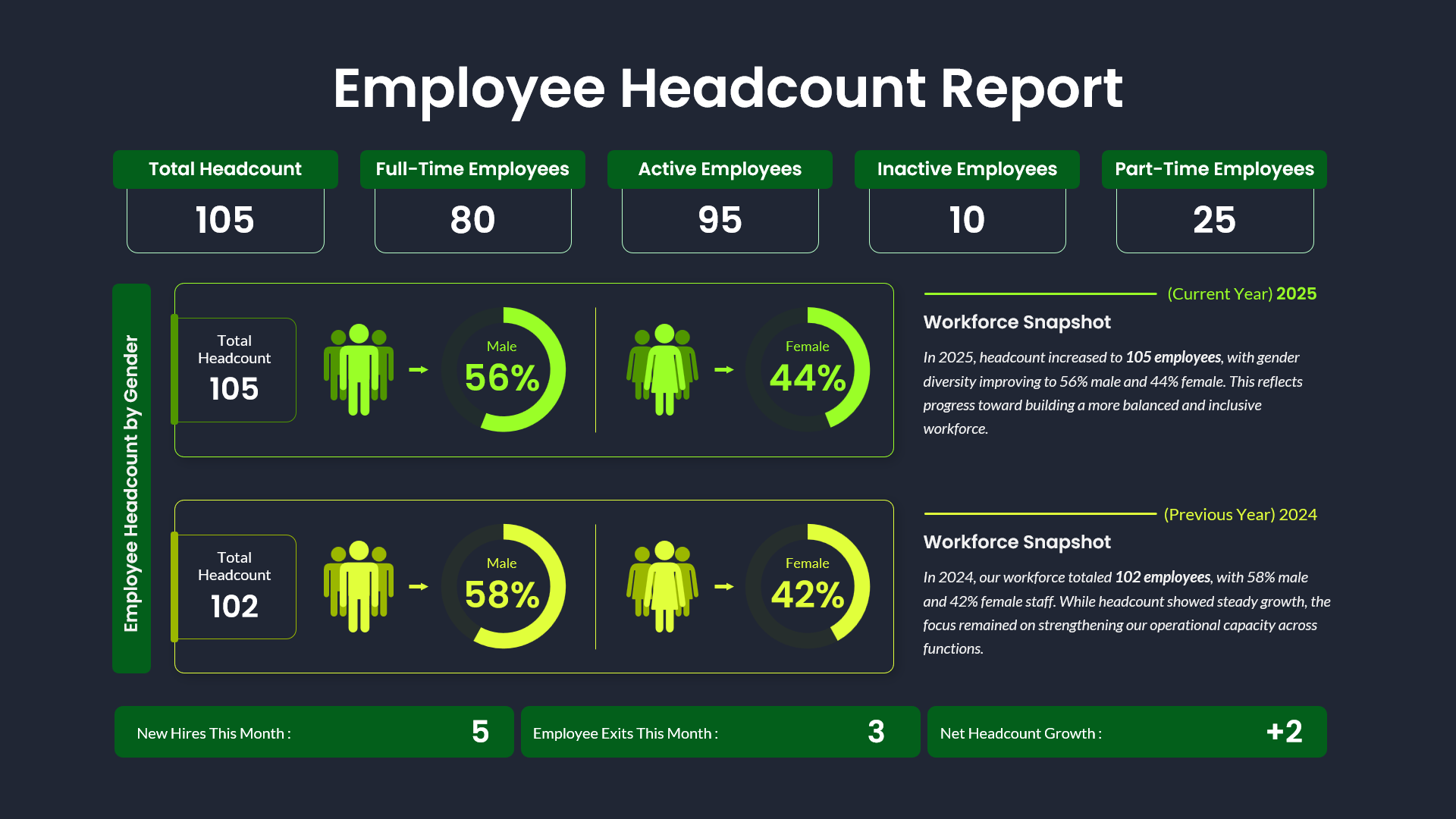
Employee Headcount Dashboard Report Template for PowerPoint & Google Slides
Employee Performance
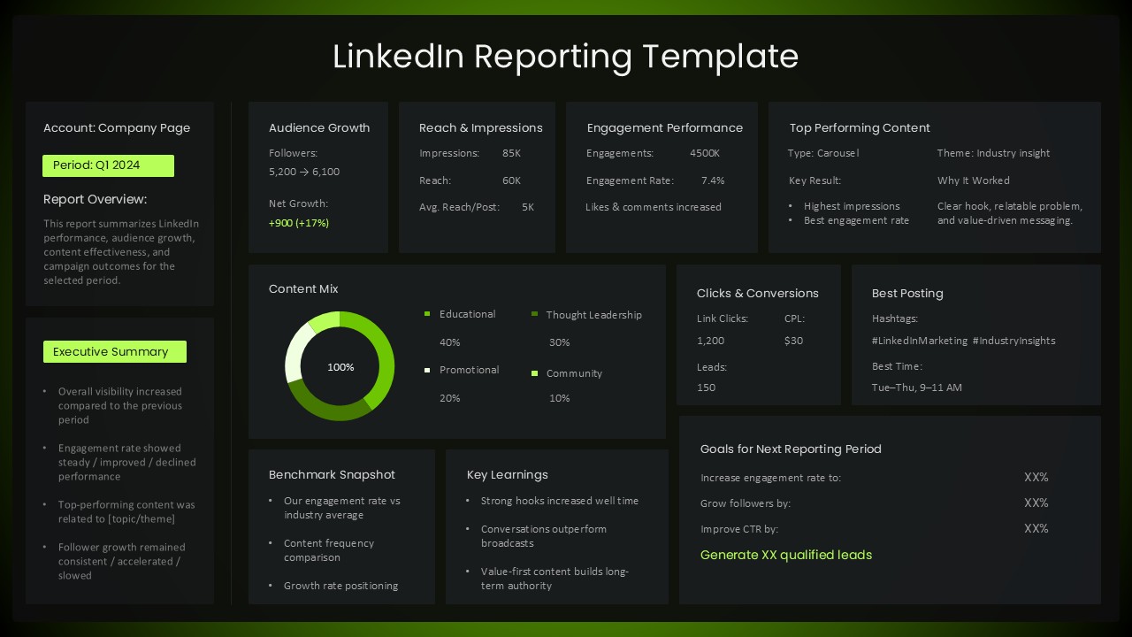
LinkedIn Performance Reporting Dashboard Template for PowerPoint & Google Slides
Digital Marketing
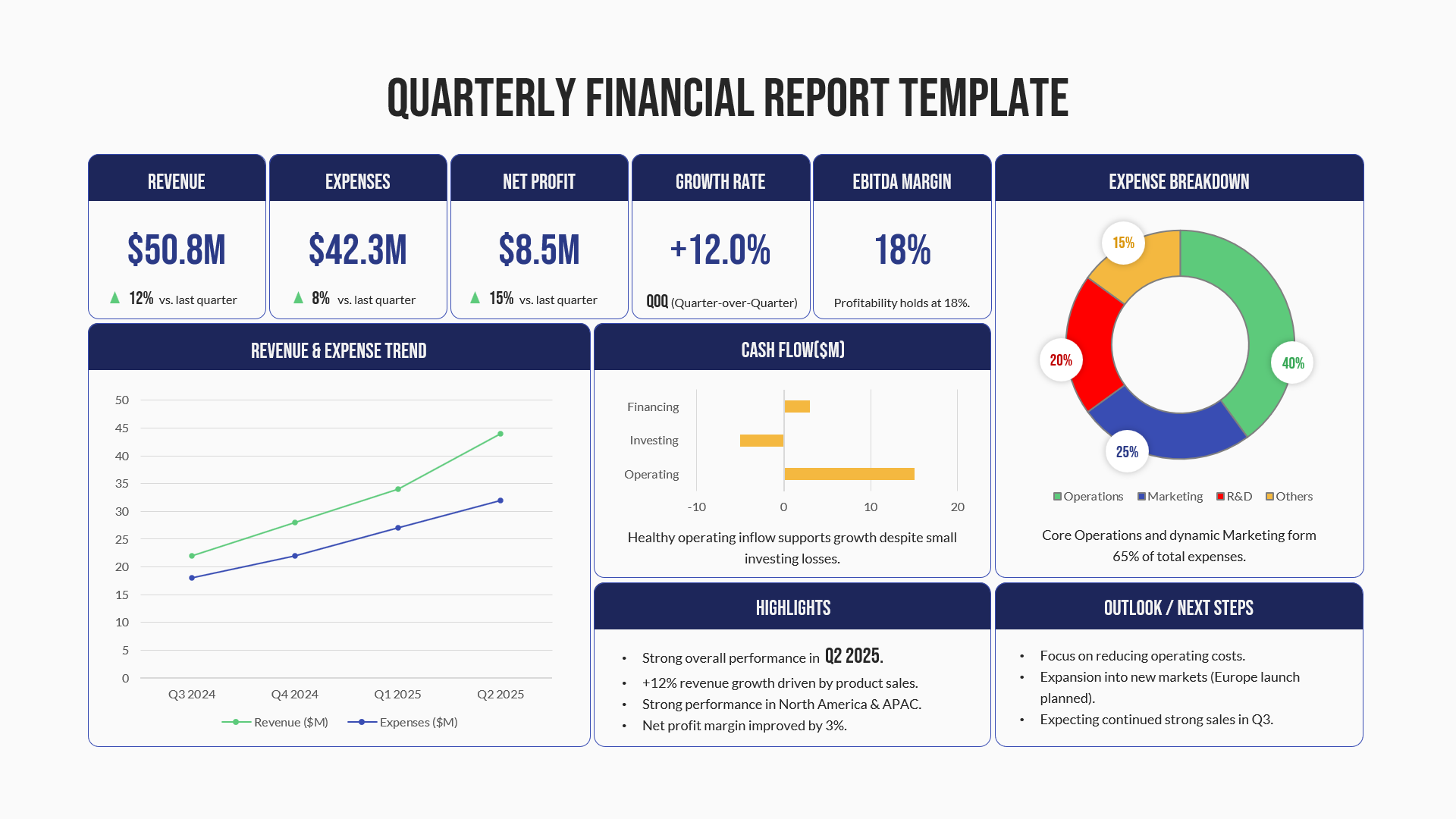
Quarterly Financial Report Dashboard Template for PowerPoint & Google Slides
Finance