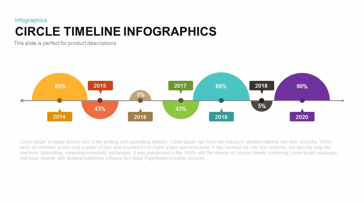
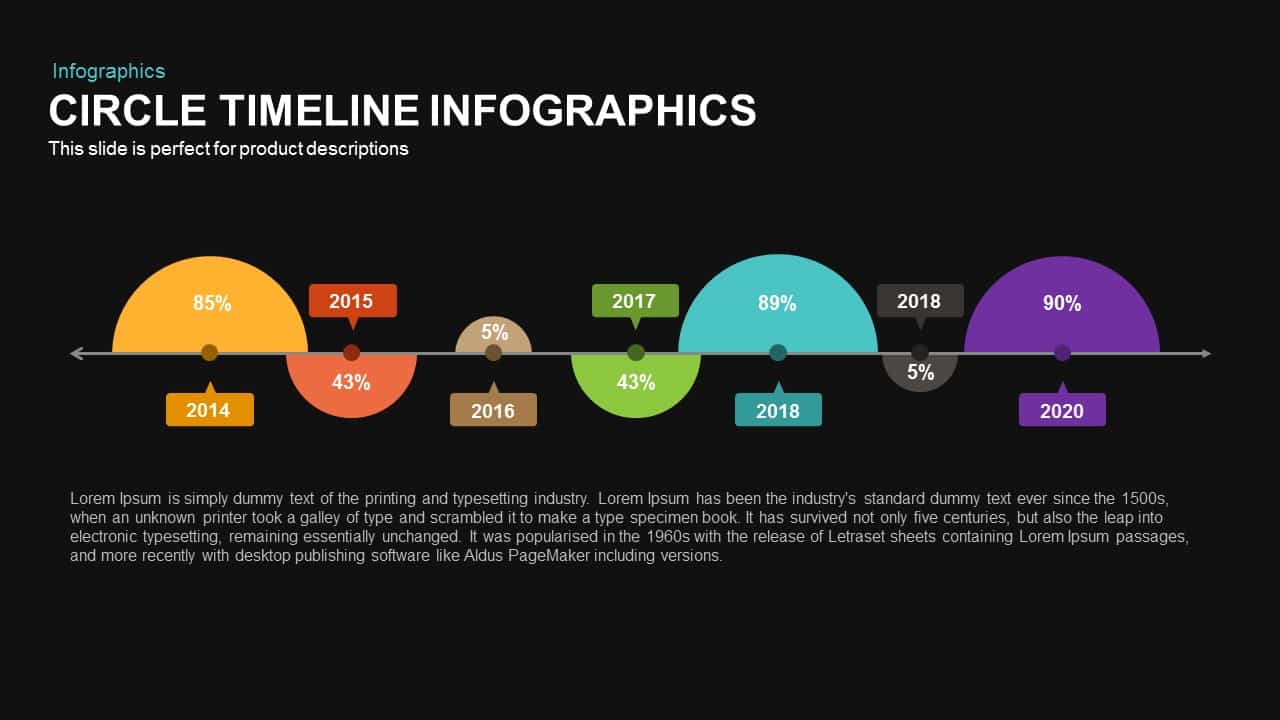
Alternating Circle Timeline Diagram Template for PowerPoint & Google Slides

Description
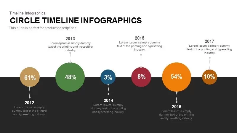
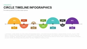
This dynamic slide visualizes sequential data using alternating semi-circles along a horizontal timeline arrow. Each stage features a colored half-circle with a percentage value inside and a matching callout label indicating the year. The semi-circles alternate above and below the line—highlighting performance peaks and dips in a clear, rhythmic pattern. A bold title placeholder at the top anchors the design, while a subtitle text area provides context or a project tagline. The bottom section offers room for detailed narrative or metrics.
Built with flat, vector shapes and crisp typography, the design maintains legibility across devices and screen sizes. All components are fully editable: resize semi-circles to emphasize key points, recolor elements to align with brand guidelines, swap percentage values, or adjust callout positions. The master slide setup and intuitive placeholders enable rapid customization without manual alignment, making it easy to add or remove timeline stages or shift dates. The template is optimized for both PowerPoint and Google Slides, ensuring seamless integration and consistency across platforms.
The vector-based design ensures crisp rendering at any size, from mobile screens to large-format displays, high-resolution printed posters, and presentation exports.
Designed for both PowerPoint and Google Slides, use this infographic to illustrate project milestones, sales growth trends, annual performance reports, product launch schedules, technology roadmaps, or educational timelines. The alternating layout is particularly effective at comparing positive versus negative trends, seasonal cycles, or before-and-after analyses. With unlimited color and content flexibility, presenters can adapt the slide for corporate briefings, startup pitches, academic lectures, or marketing reviews. This asset simplifies complex chronological data into an engaging, memorable narrative that resonates with stakeholders and drives data-informed decisions. This slide delivers clarity and engagement in every presentation.
Who is it for
Business analysts, project managers, marketing leaders, and executives will benefit from this timeline to showcase year-over-year metrics and milestones. Sales teams, product managers, educators, and consultants can leverage the alternating layout for trend comparisons and performance storytelling.
Other Uses
Beyond annual reports, repurpose this slide for product launch roadmaps, software release schedules, performance reviews, HR onboarding phases, historical event timelines, or academic course outlines. Adjust colors and icons to map event sequences, KPI benchmarks, or process flows in any industry.
Login to download this file

Item ID
SB00234
Related Templates

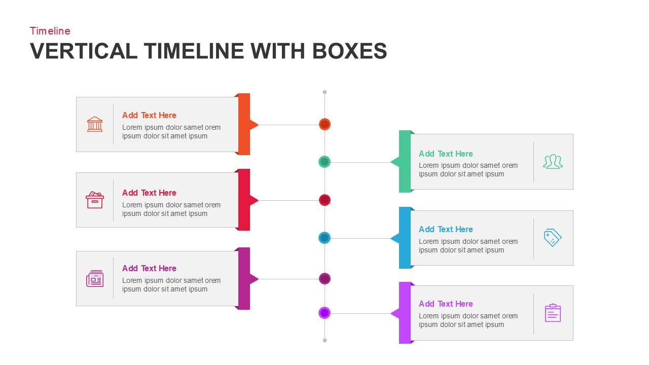
Vertical Timeline with Alternating Boxes Template for PowerPoint & Google Slides
Timeline
Multicolor Alternating Timeline Roadmap Template for PowerPoint & Google Slides
Timeline
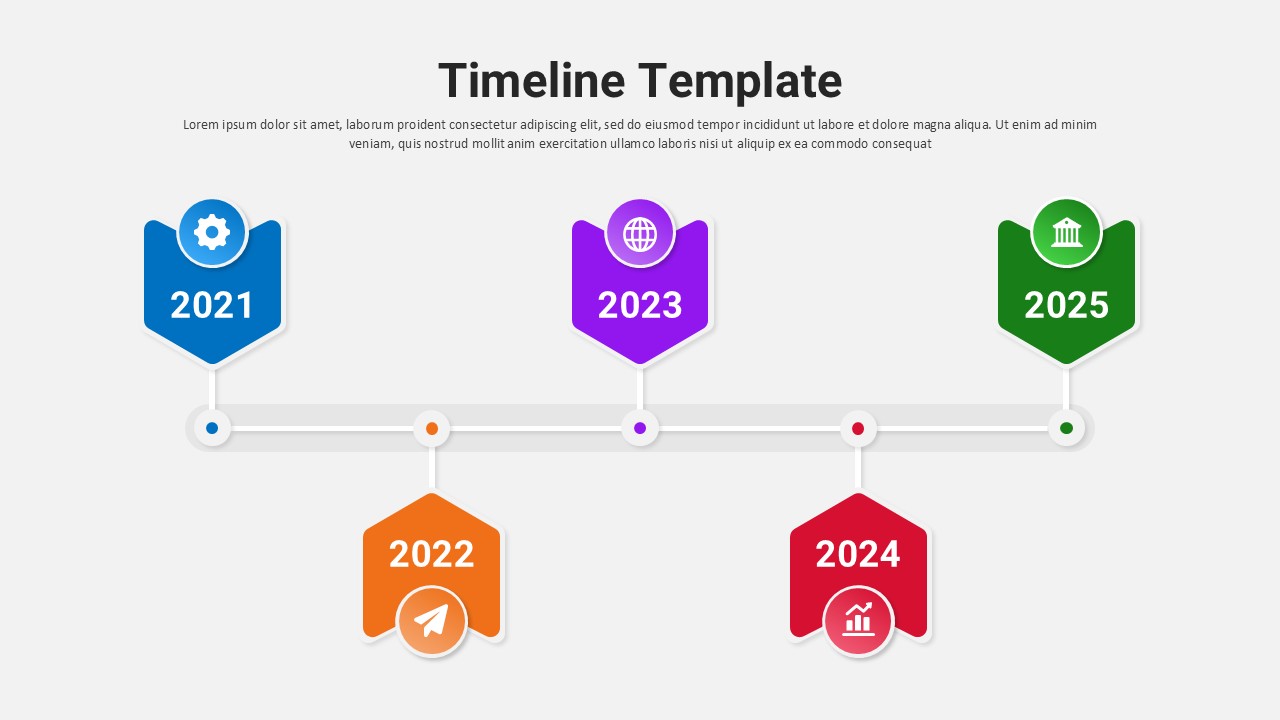
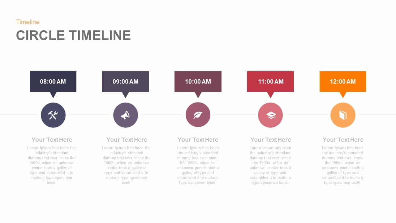
Five-Point Circle Timeline Diagram Template for PowerPoint & Google Slides
Timeline
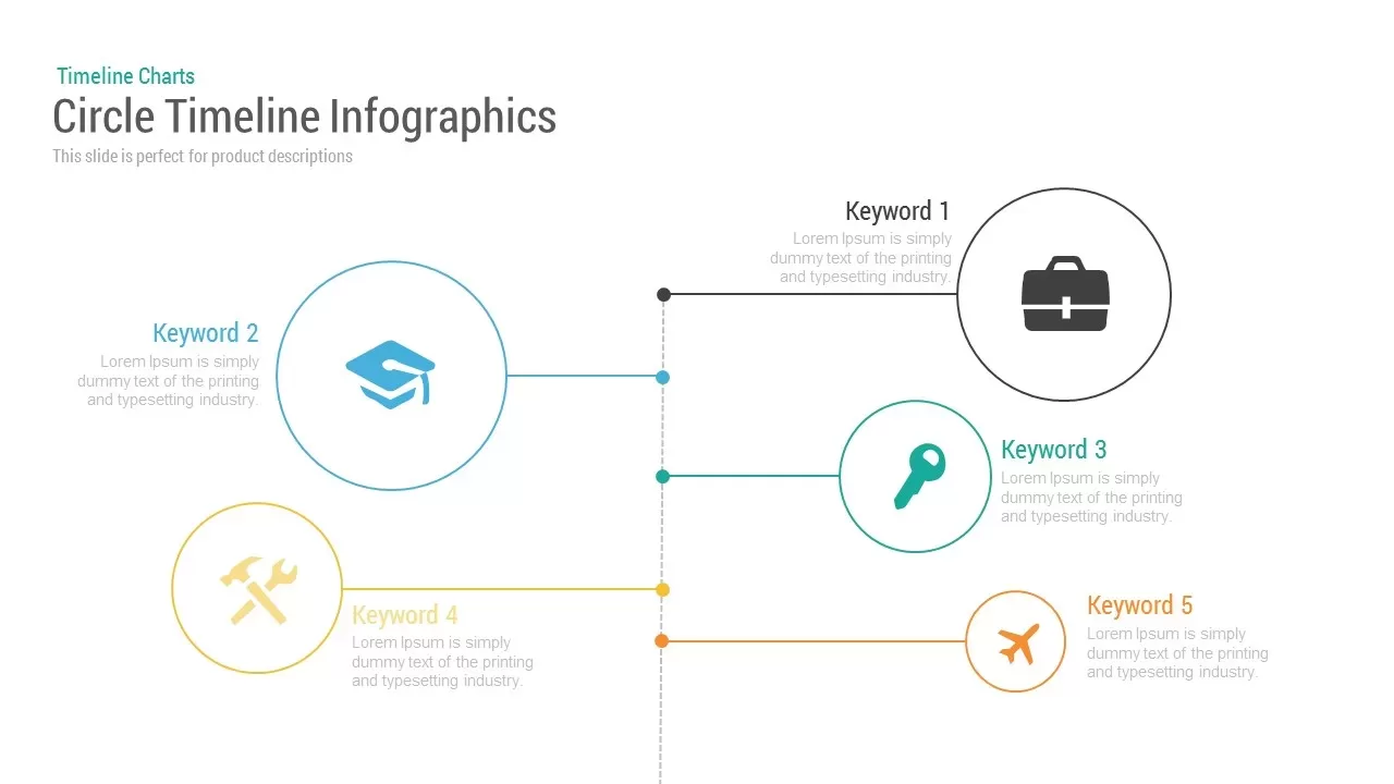
Circle Timeline Infographics template for PowerPoint & Google Slides
Timeline

Dynamic Circle Timeline Infographics template for PowerPoint & Google Slides
Timeline
Free Eight Circle Creative Diagram template for PowerPoint & Google Slides
Circular
Free
Circle Spider Diagram Representation Template for PowerPoint & Google Slides
Circular
Modern Circle SWOT Analysis Diagram Template for PowerPoint & Google Slides
SWOT
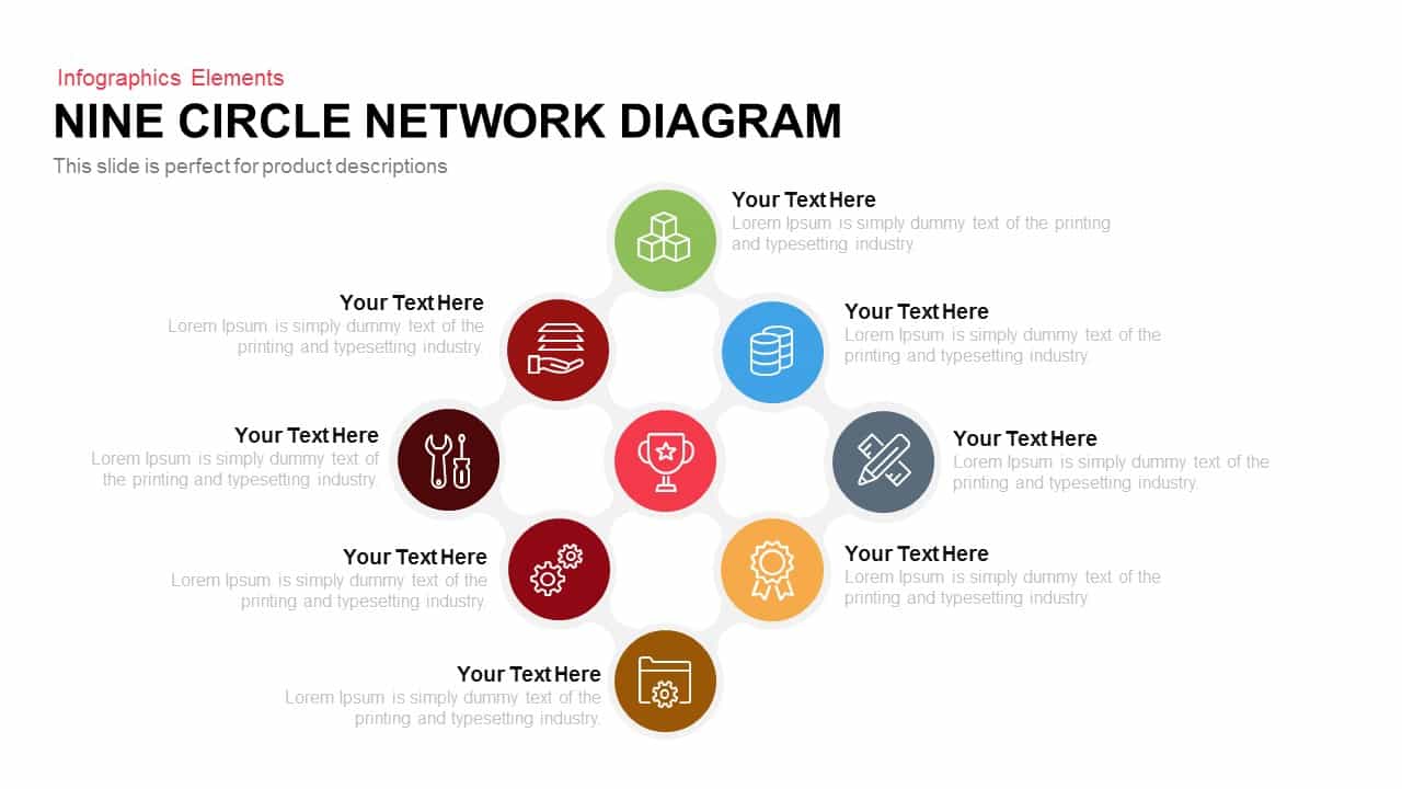
Modern Nine Circle Network Diagram Template for PowerPoint & Google Slides
Circular
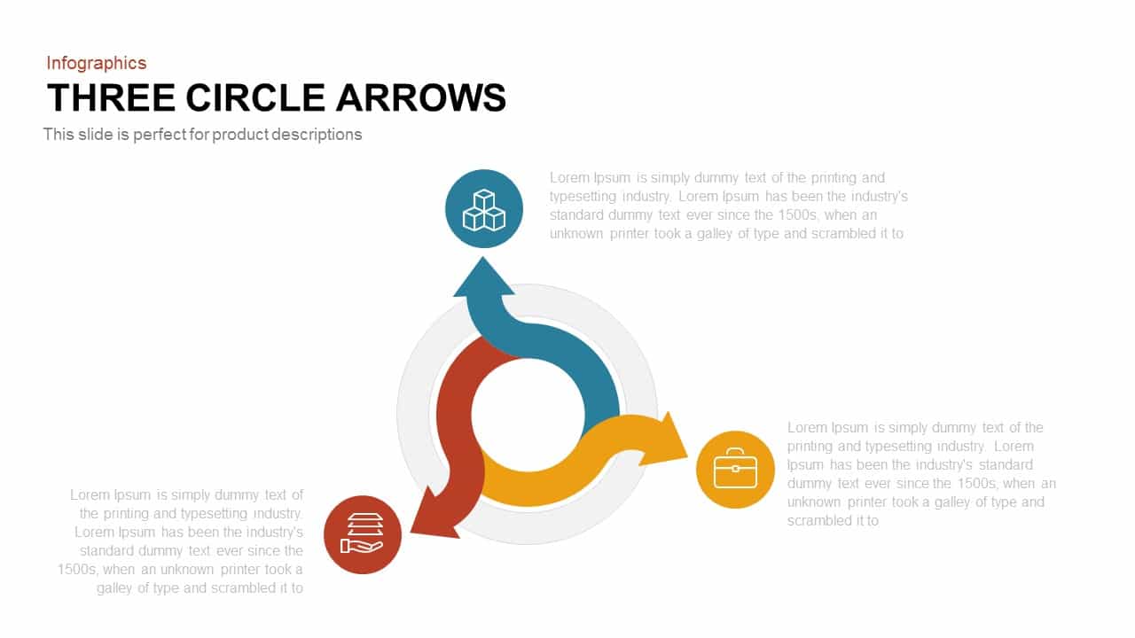
Three Circle Arrow Process Diagram template for PowerPoint & Google Slides
Circular
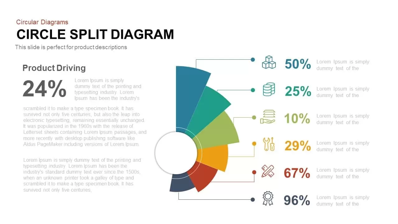
Multi-Segment Circle Split Diagram template for PowerPoint & Google Slides
Circular
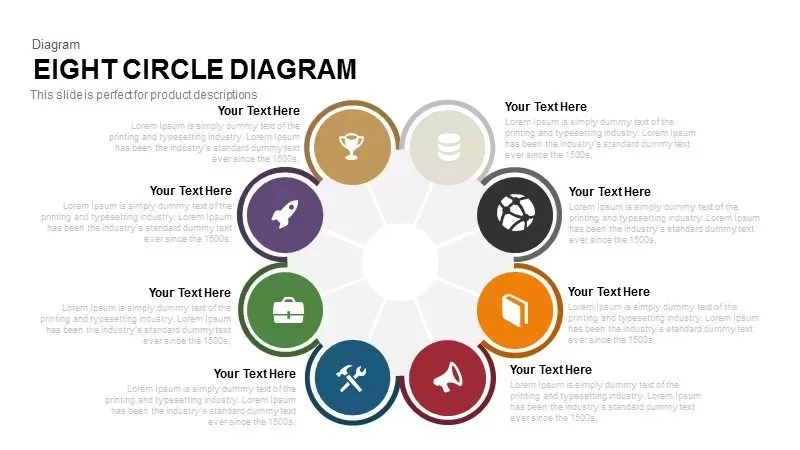
Eight Circle Diagram Template for PowerPoint & Google Slides
Circular
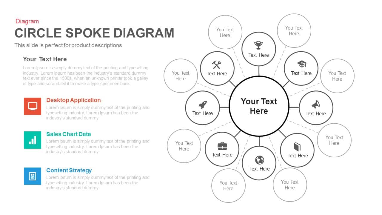
Multi-layout Circle Spoke Diagram Template for PowerPoint & Google Slides
Circular

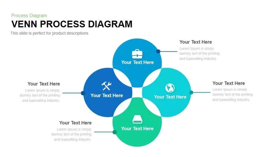
Four-Circle Venn Process Diagram template for PowerPoint & Google Slides
Process
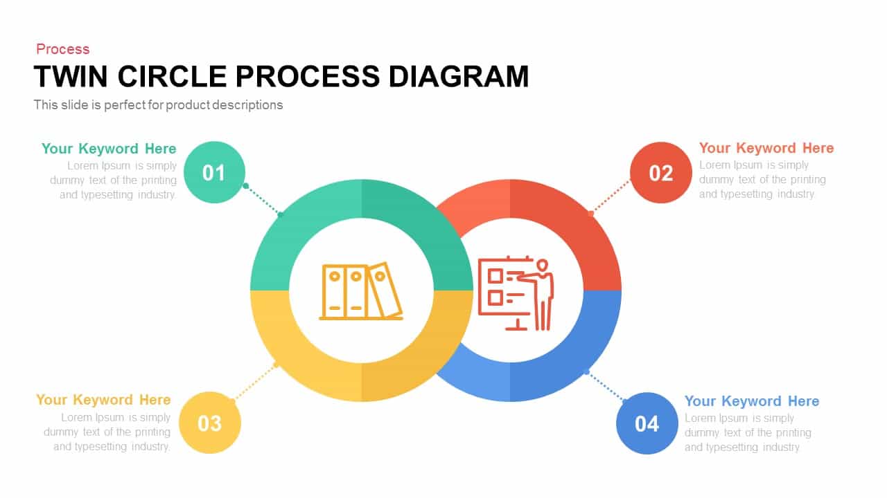
Editable Twin Circle Process Diagram Template for PowerPoint & Google Slides
Process
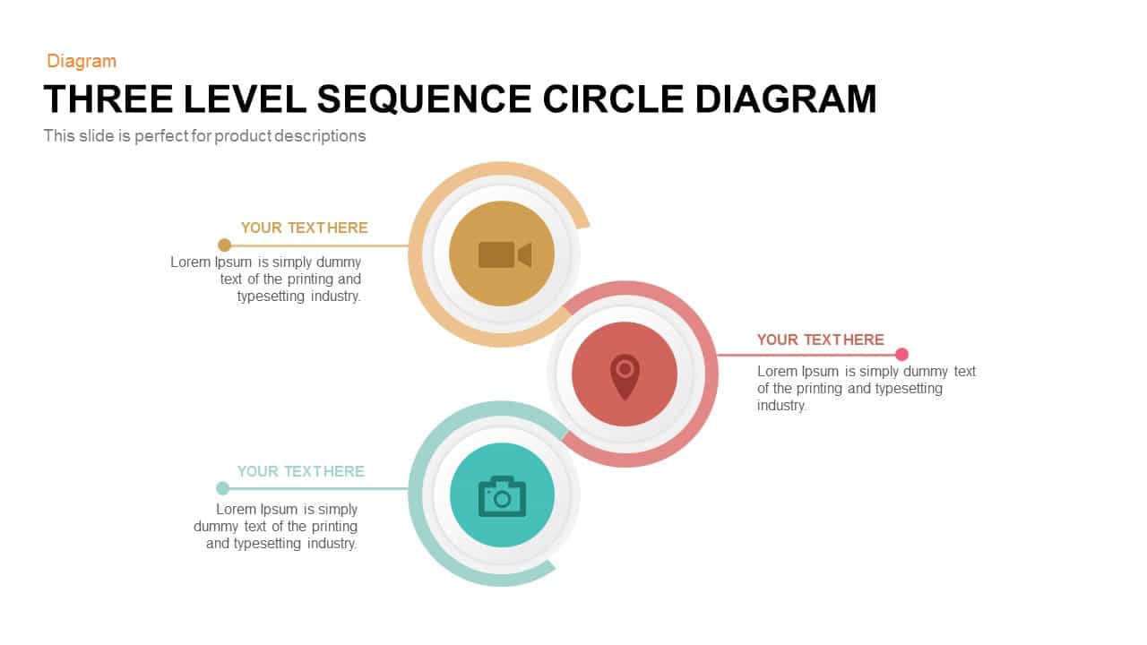
Three-Level Sequence Circle Diagram Template for PowerPoint & Google Slides
Circular
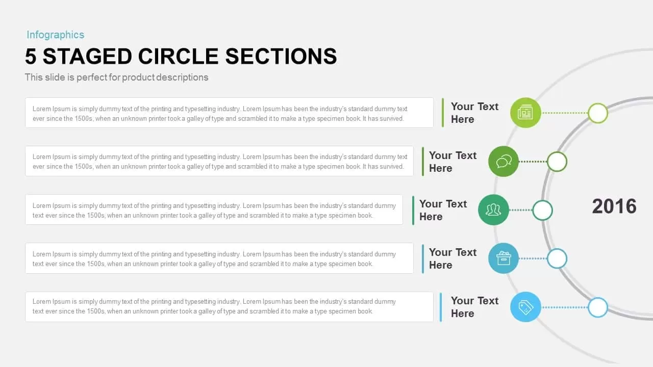
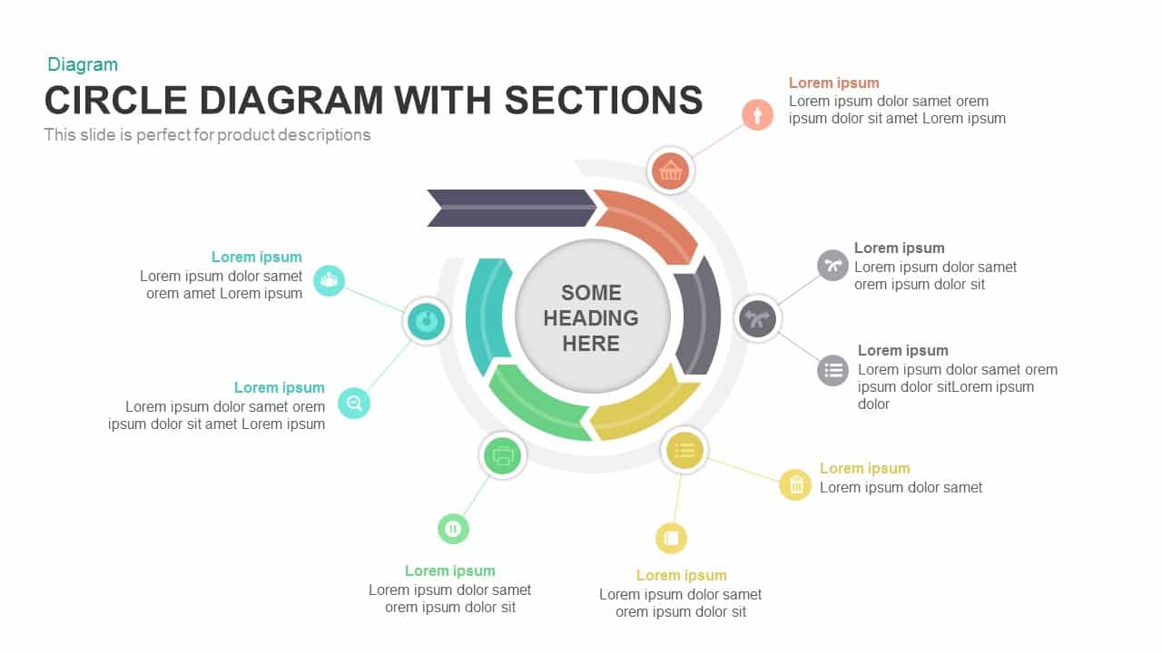
Five-Staged Circle Sections Diagram Template for PowerPoint & Google Slides
Circular
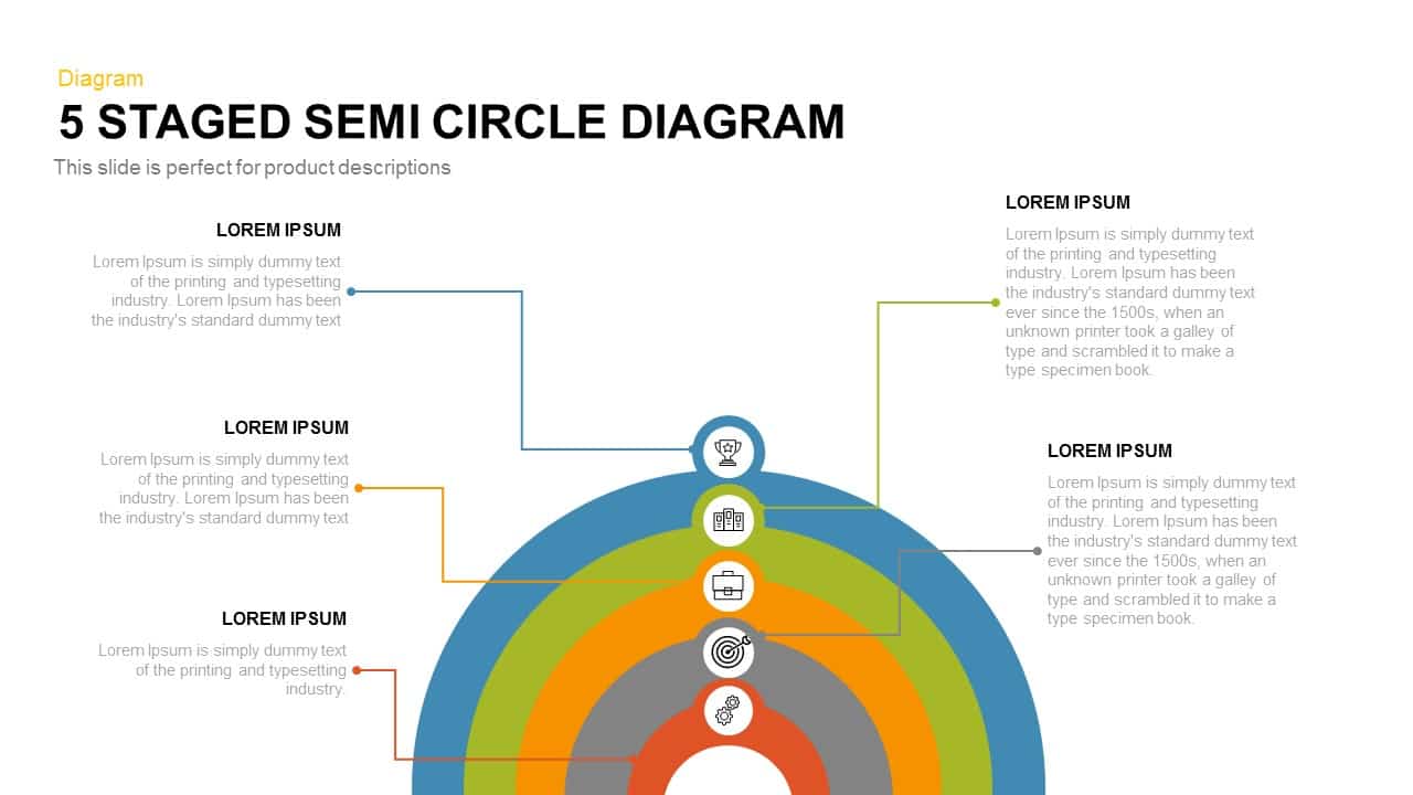
Five-Stage Semi-Circle Diagram Template for PowerPoint & Google Slides
Process
Five-Stage Circle Arrow Diagram Template for PowerPoint & Google Slides
Circular
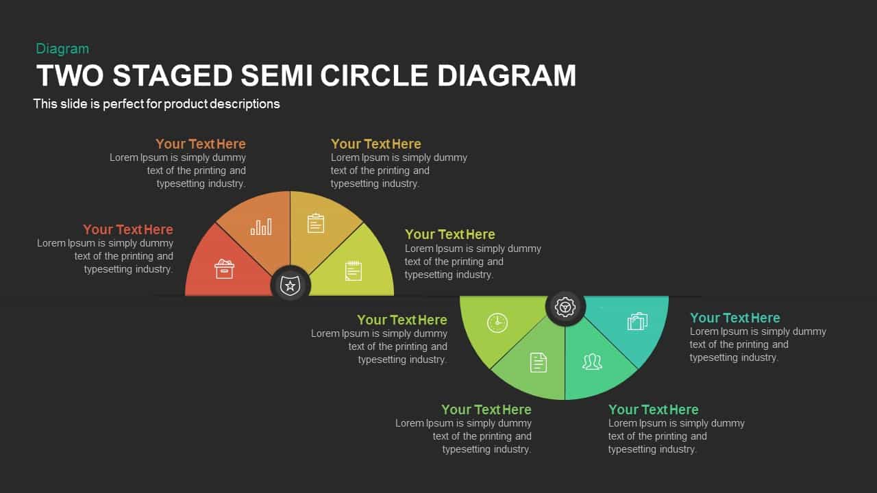
Two-Stage Semi-Circle Diagram Overview Template for PowerPoint & Google Slides
Circular
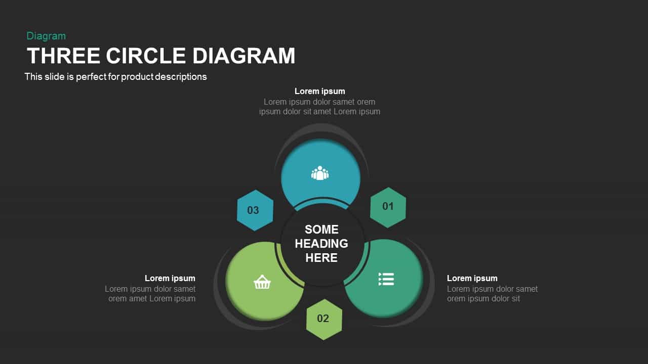
Three-Circle Diagram Infographic Template for PowerPoint & Google Slides
Circular
Modern Multi-Section Circle Diagram Template for PowerPoint & Google Slides
Circular
Six-Stage Semi-Circle Diagram with Icons Template for PowerPoint & Google Slides
Circular
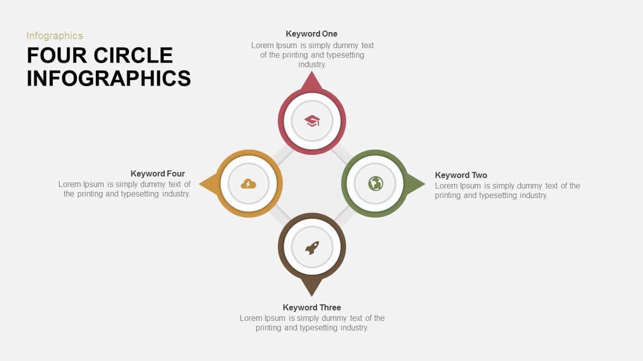
Four-Circle Hub and Spoke Diagram Template for PowerPoint & Google Slides
Process
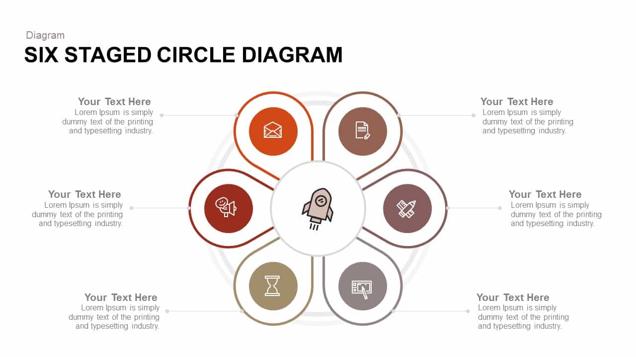
Six Staged Circle Diagram template for PowerPoint & Google Slides
Circular
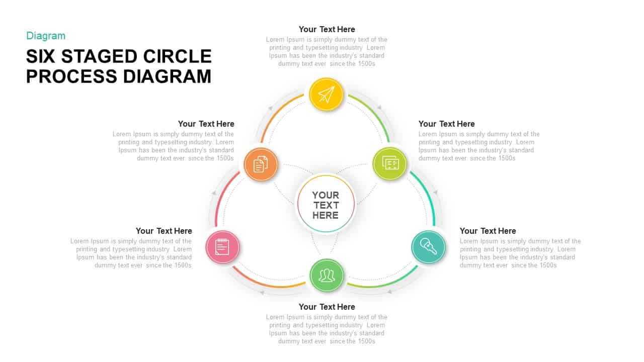
Six-Stage Circle Process Diagram Template for PowerPoint & Google Slides
Process
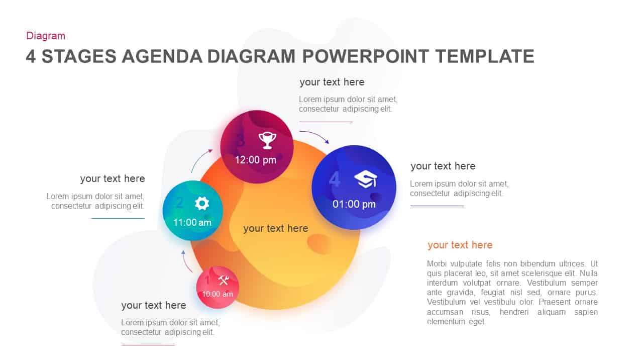
Four-Stage Agenda Circle Diagram Slide Template for PowerPoint & Google Slides
Agenda
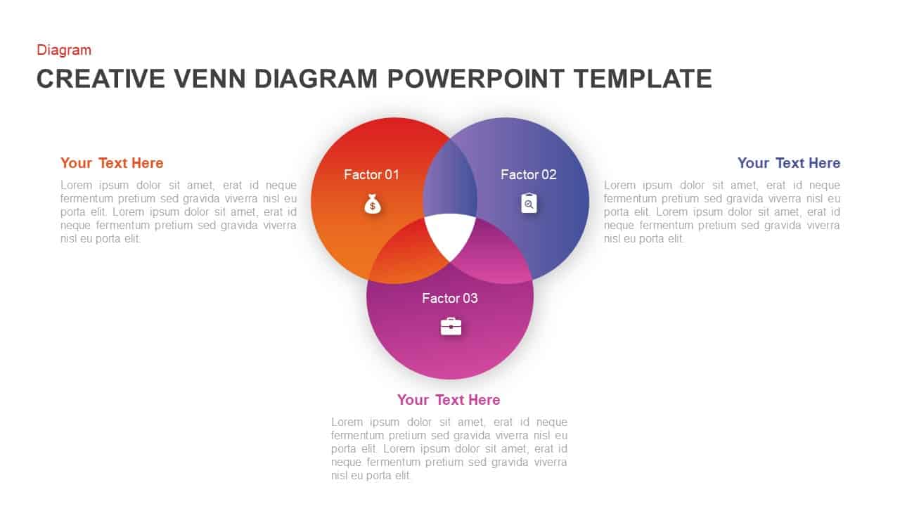
Creative Three-Circle Venn Diagram Template for PowerPoint & Google Slides
Comparison
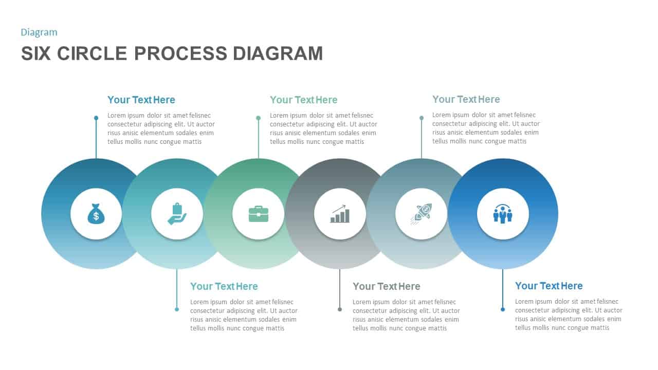
Six-Circle Process Infographic Diagram Template for PowerPoint & Google Slides
Circular
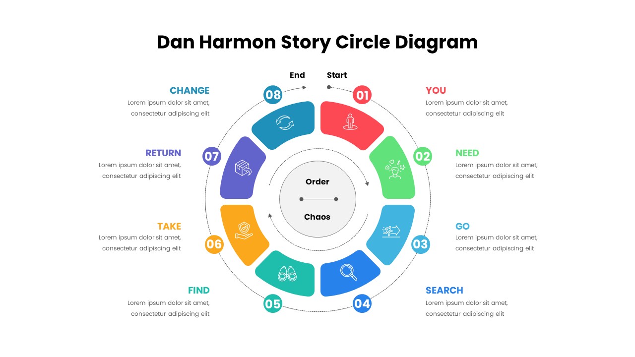
Dan Harmon Story Circle Diagram Template for PowerPoint & Google Slides
Circular
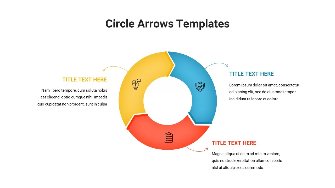
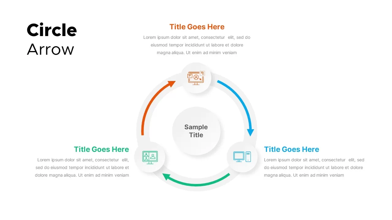
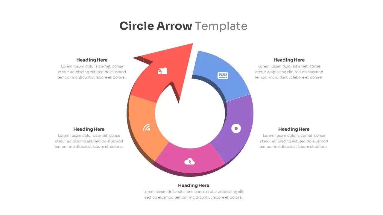
Circle Arrows Diagram template for PowerPoint & Google Slides
Process
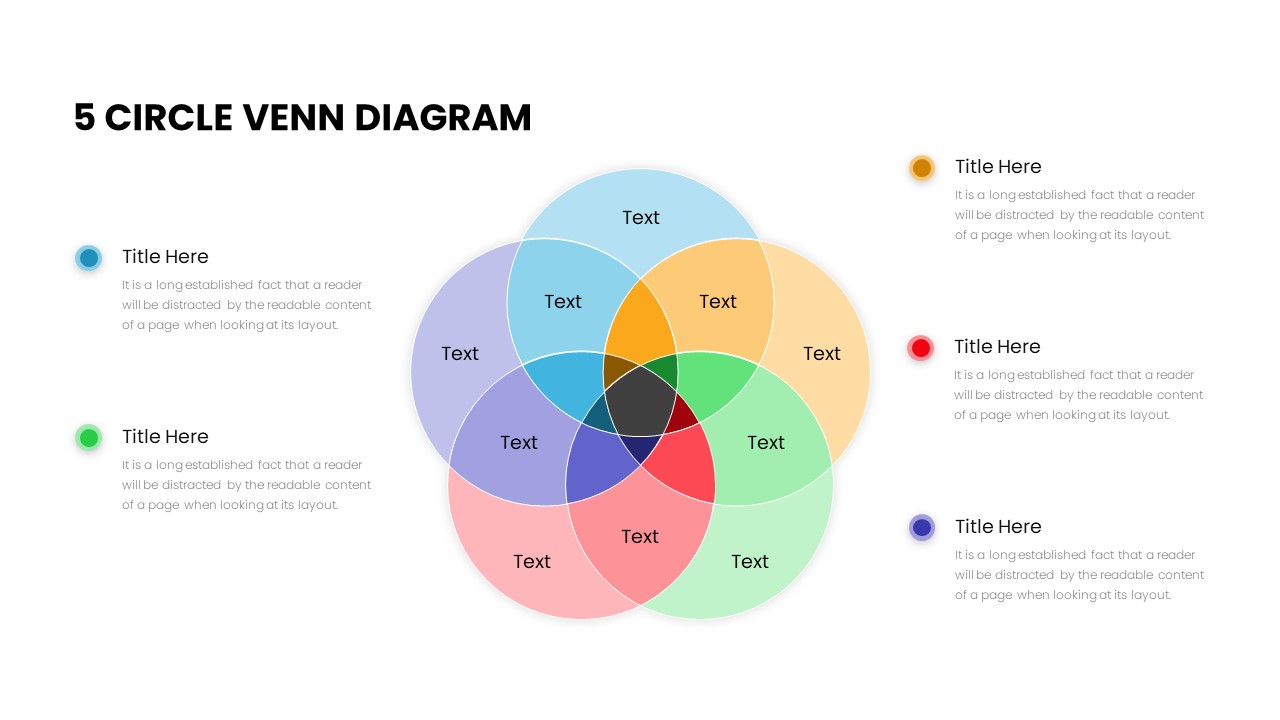
Five Circle Venn Diagram for Template for PowerPoint & Google Slides
Circular
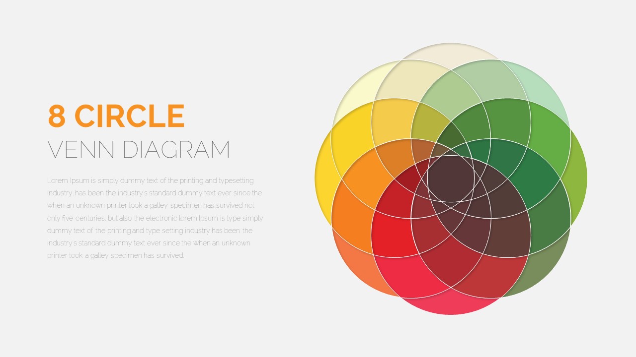
8 Circle Venn Diagram Infographic Design Template for PowerPoint & Google Slides
Circular
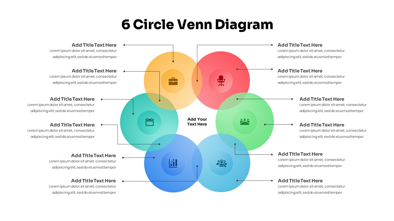
Professional 6 Circle Venn Diagram Template for PowerPoint & Google Slides
Circular
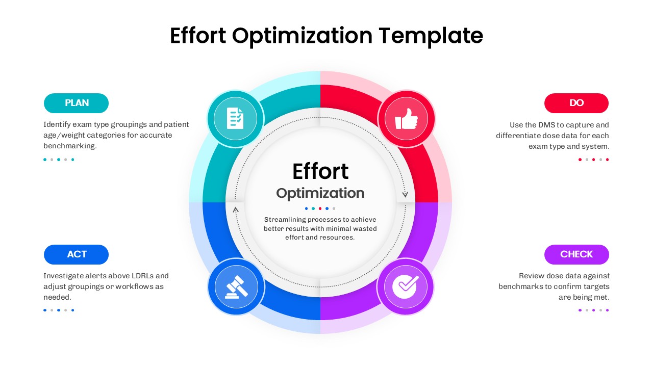
Effort Optimization PDCA Circle Diagram Template for PowerPoint & Google Slides
Circular
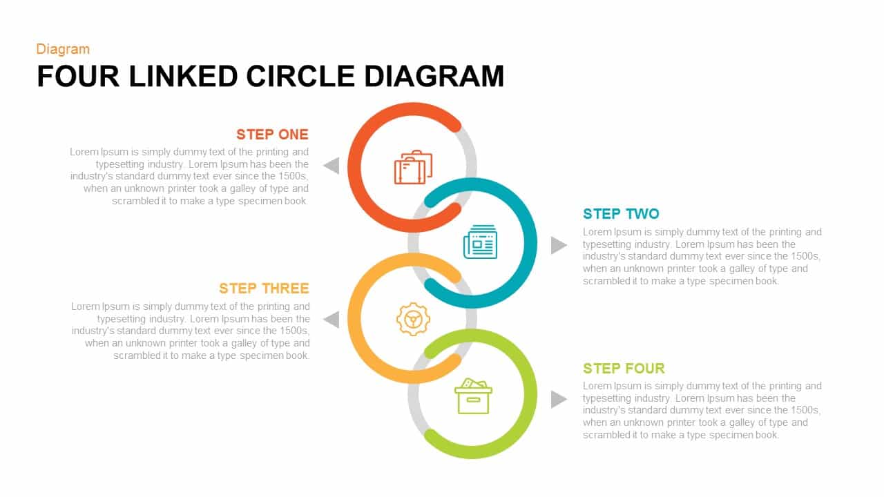
Four Linked Circle Diagram for PowerPoint & Google Slides
Process
Arrow Circle Flow Diagram for PowerPoint & Google Slides
Infographics

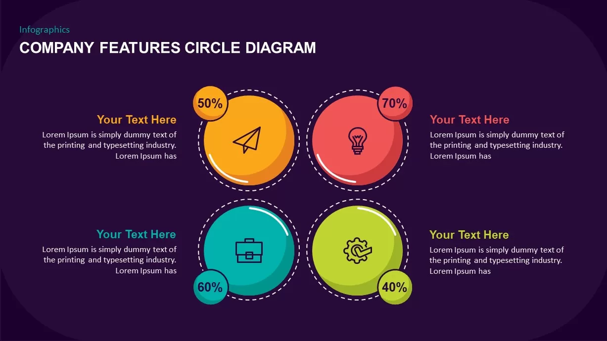
Company Features Circle Diagram for PowerPoint & Google Slides
Process
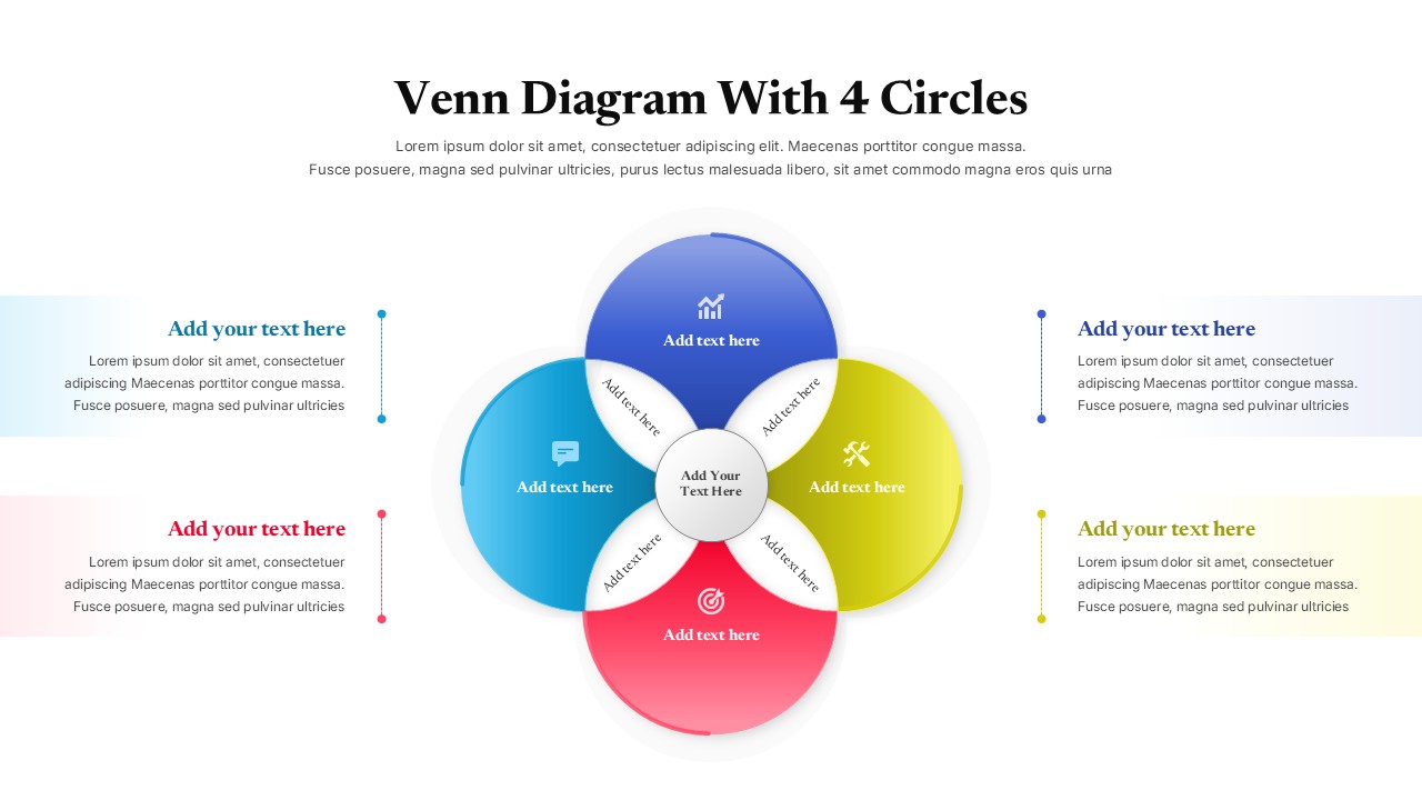
Colorful Venn Diagram with 4 Circle for PowerPoint & Google Slides
Circular
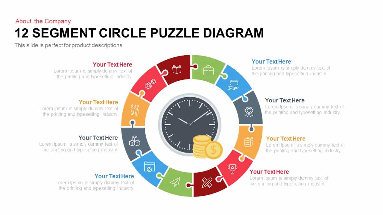
12 Segment Circle Puzzle Diagram Template for PowerPoint and Keynote
Circular
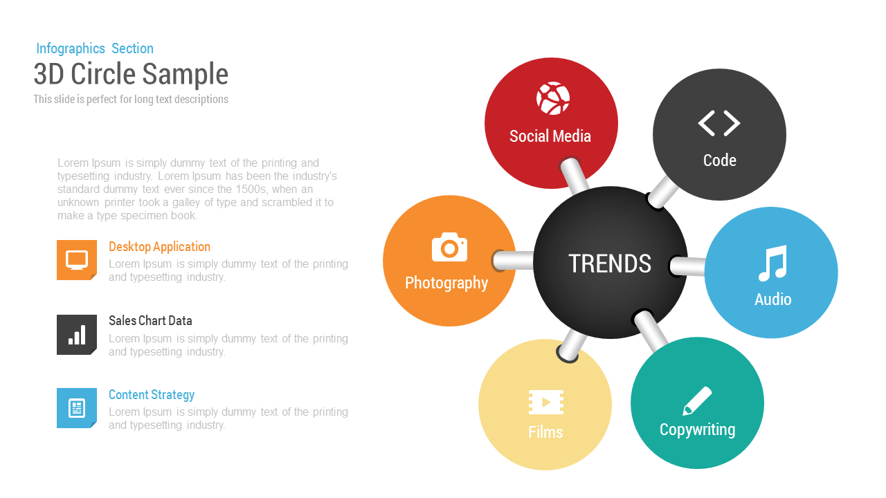
3D Circle Sample template for PowerPoint & Google Slides
Circular
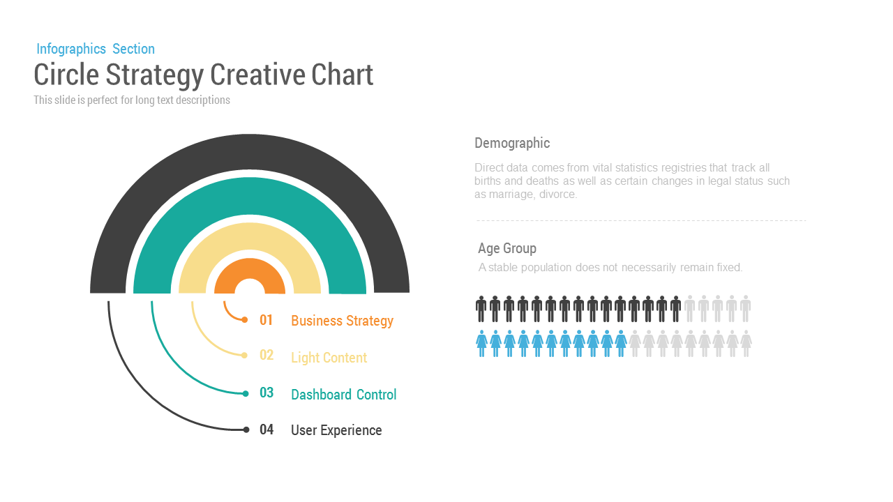
Circle Strategy Creative Chart template for PowerPoint & Google Slides
Business Strategy
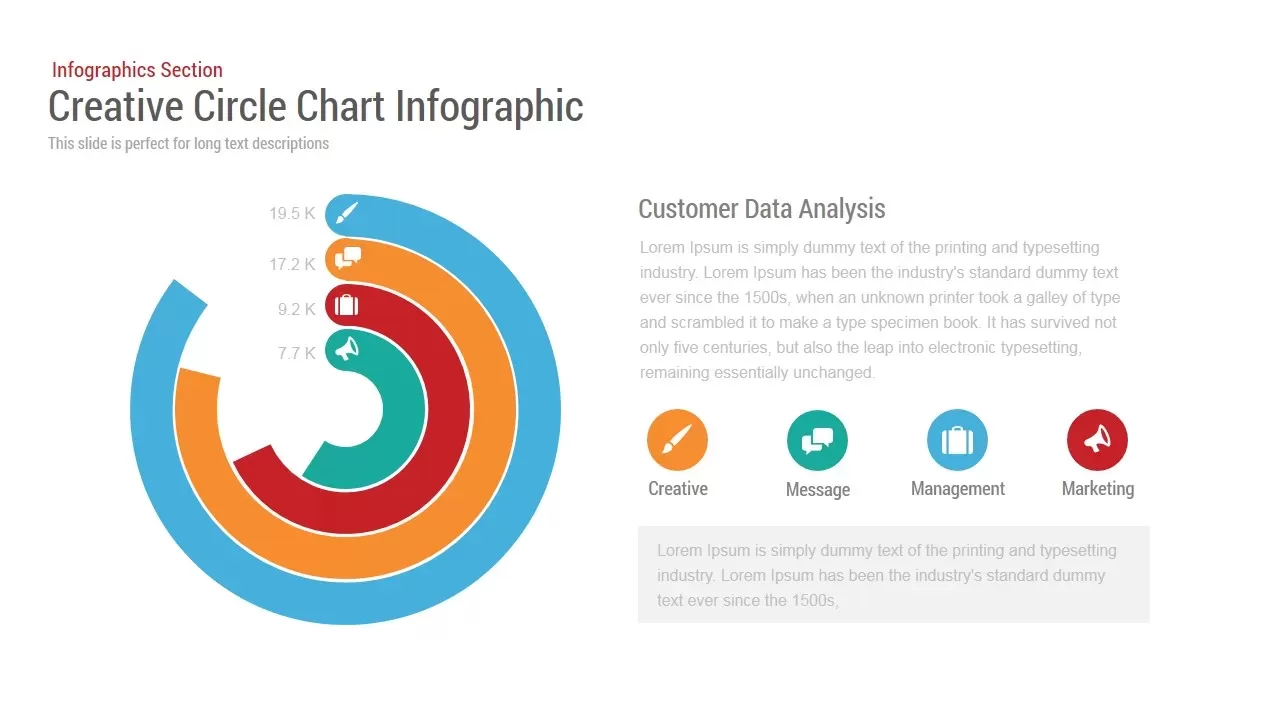
Circle Chart Data template for PowerPoint & Google Slides
Pie/Donut
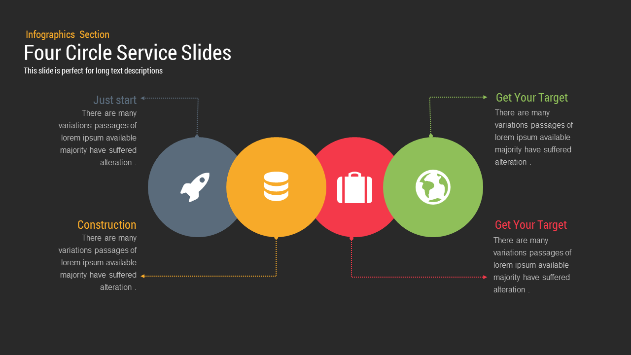
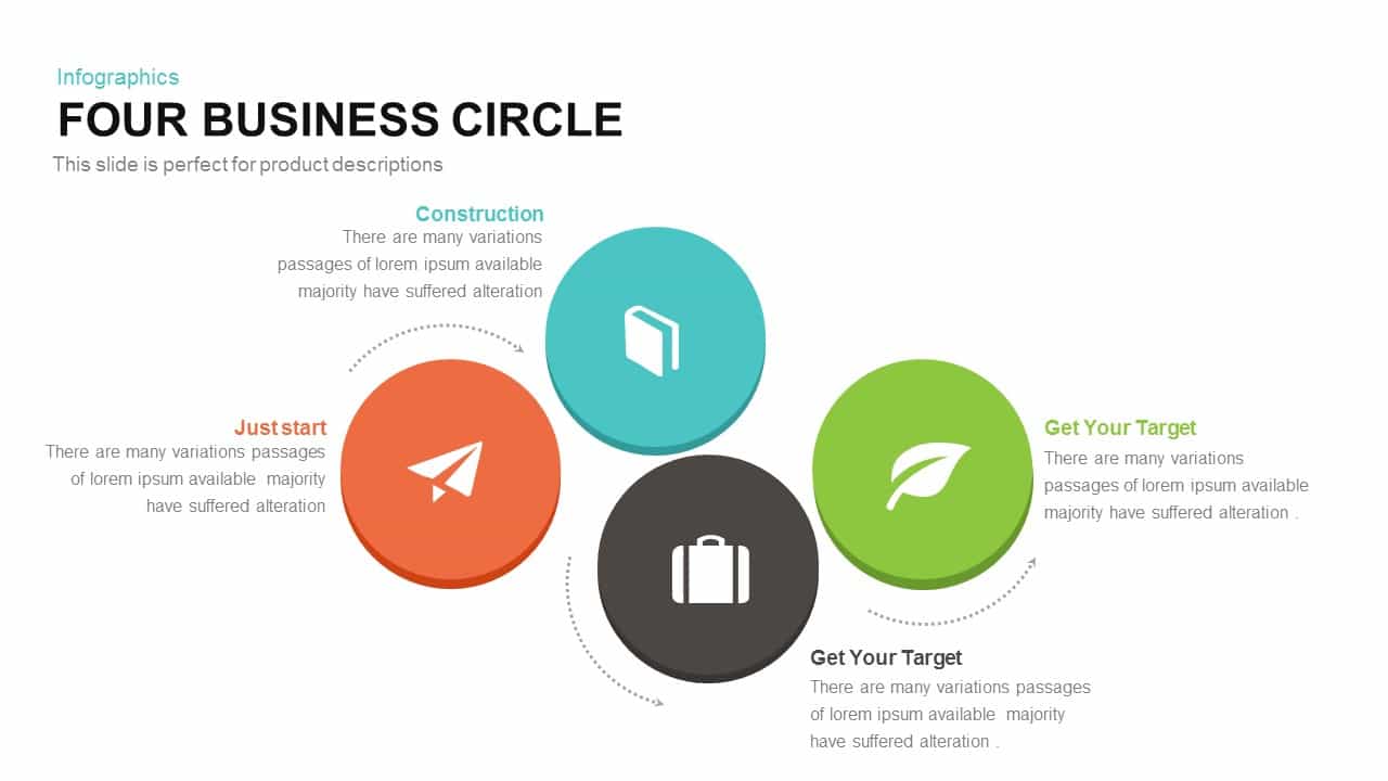
Four Circle Service template for PowerPoint & Google Slides
Process
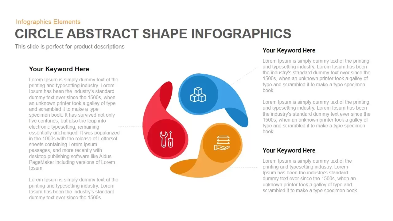
Circle Abstract Shape Infographics Template for PowerPoint & Google Slides
Circular
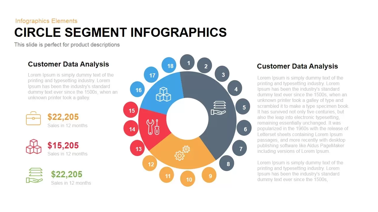
Circle Segment Sales Metrics Infographic Template for PowerPoint & Google Slides
Circular
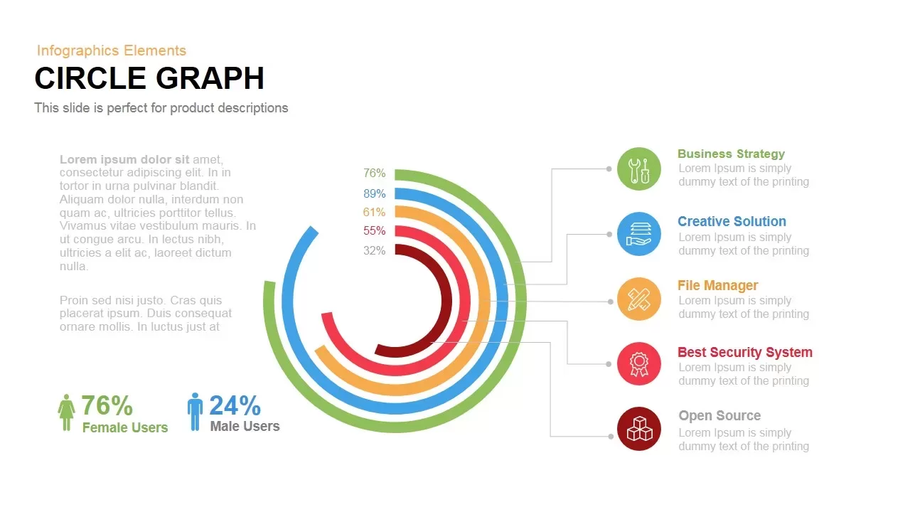
Circle Graph Data Visualization Template for PowerPoint & Google Slides
Circular
Four-Circle Business Process Infographic Template for PowerPoint & Google Slides
Circular
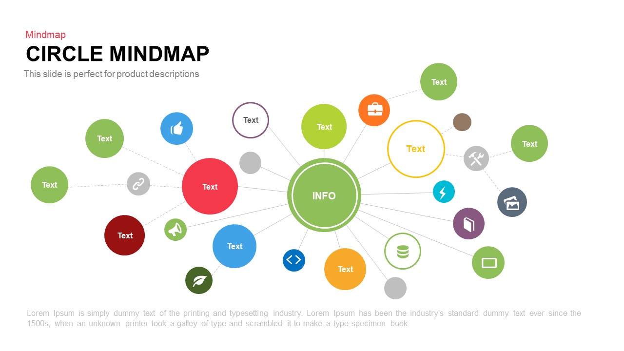
Circle Mindmap template for PowerPoint & Google Slides
Mind Maps

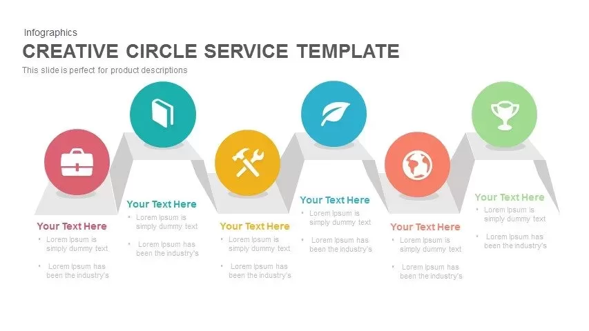
Creative Zigzag Circle Service Steps Template for PowerPoint & Google Slides
Process
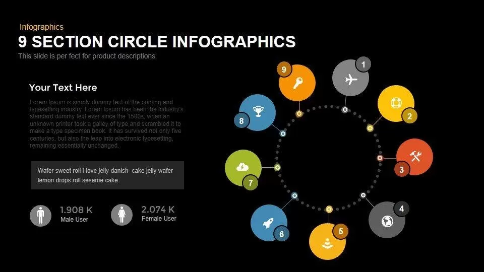
Modern 9-Section Circle Infographics Template for PowerPoint & Google Slides
Circular
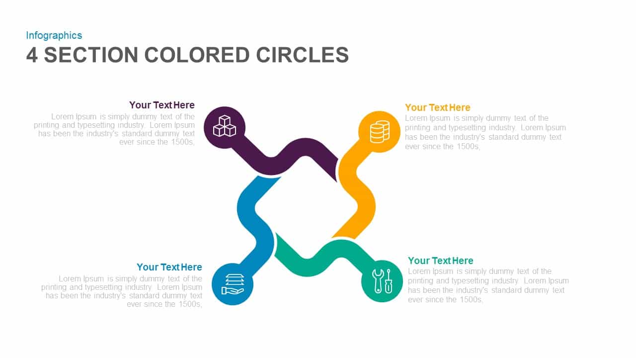
Four-Section Colored Circle Infographic Template for PowerPoint & Google Slides
Circular

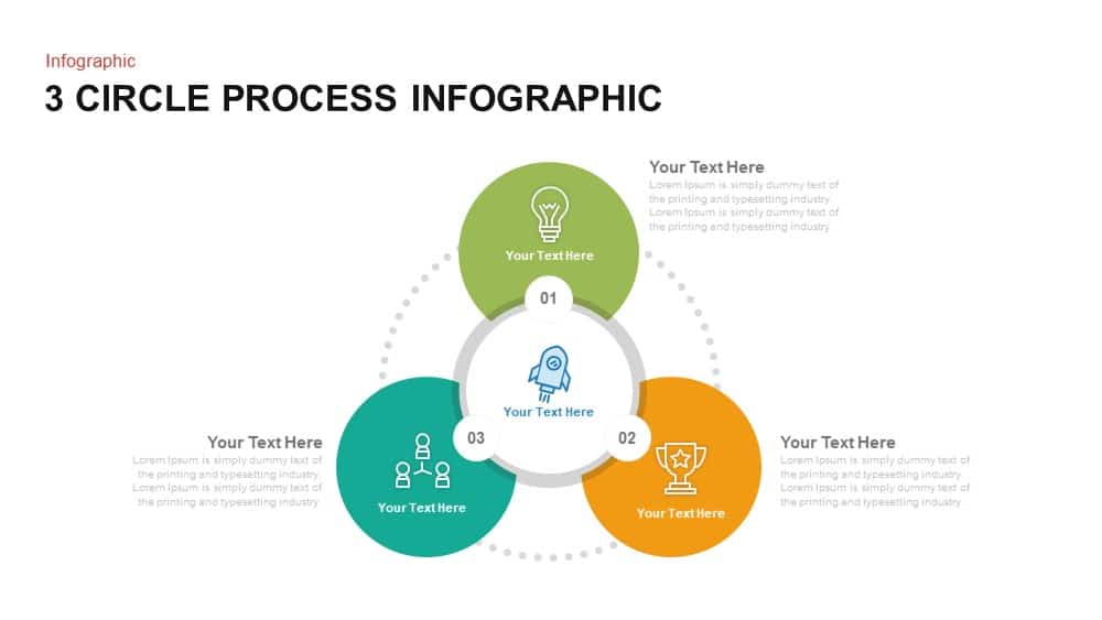
Three-Circle Process Infographic Template for PowerPoint & Google Slides
Circular
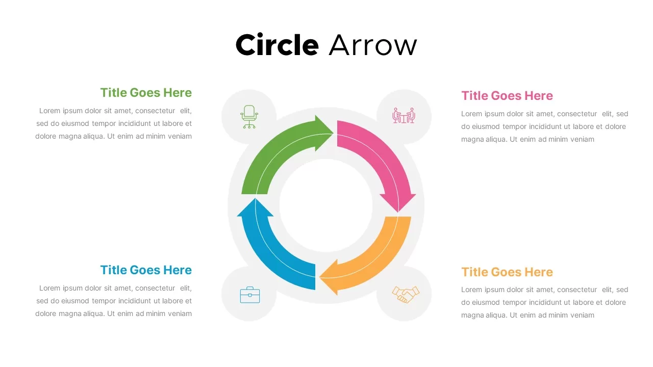
Circle Arrows Process Flow template for PowerPoint & Google Slides
Process
Circle Arrow Process Flow template for PowerPoint & Google Slides
Process
Circle Arrow Process Flow template for PowerPoint & Google Slides
Process
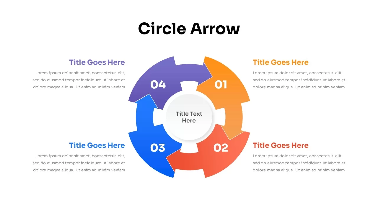
Four-Stage Circle Arrow Infographic Template for PowerPoint & Google Slides
Circular
Four-Stage Circle Arrow Infographic Template for PowerPoint & Google Slides
Circular
Free Graduation Photo Collage Circle Slide Template for PowerPoint & Google Slides
Decks
Free

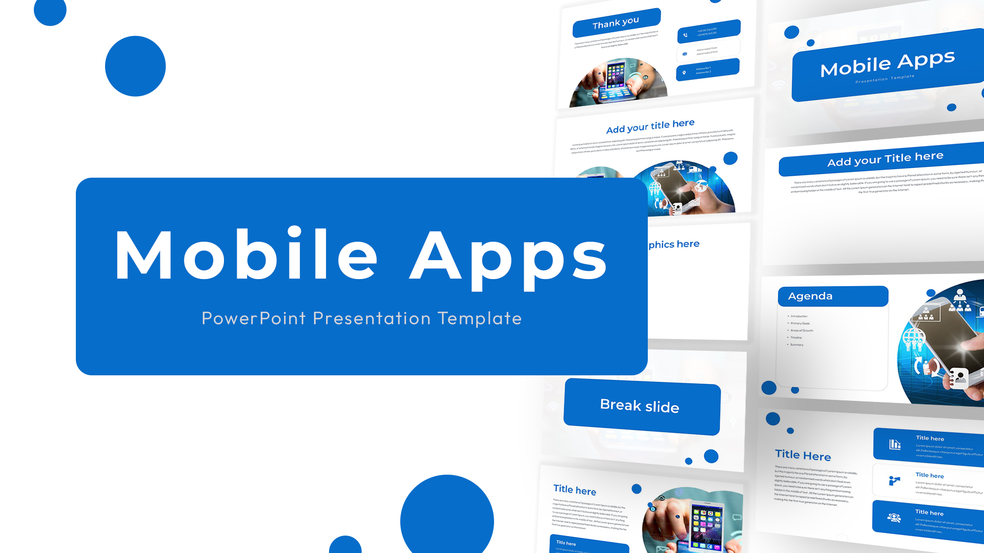
Blue Circle Mobile Apps Presentation Template for PowerPoint & Google Slides
Information Technology
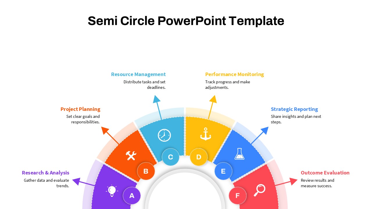
Modern Semi Circle Infographic Template for PowerPoint & Google Slides
Circular
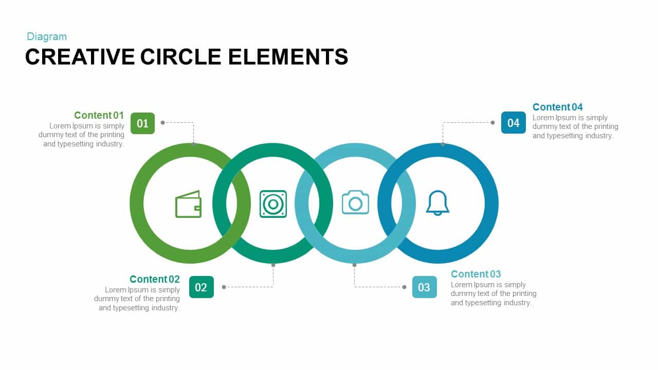
Creative Circle Elements for PowerPoint & Google Slides
Infographics
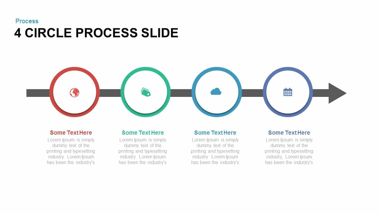
4 Circle Process for PowerPoint & Google Slides
Process
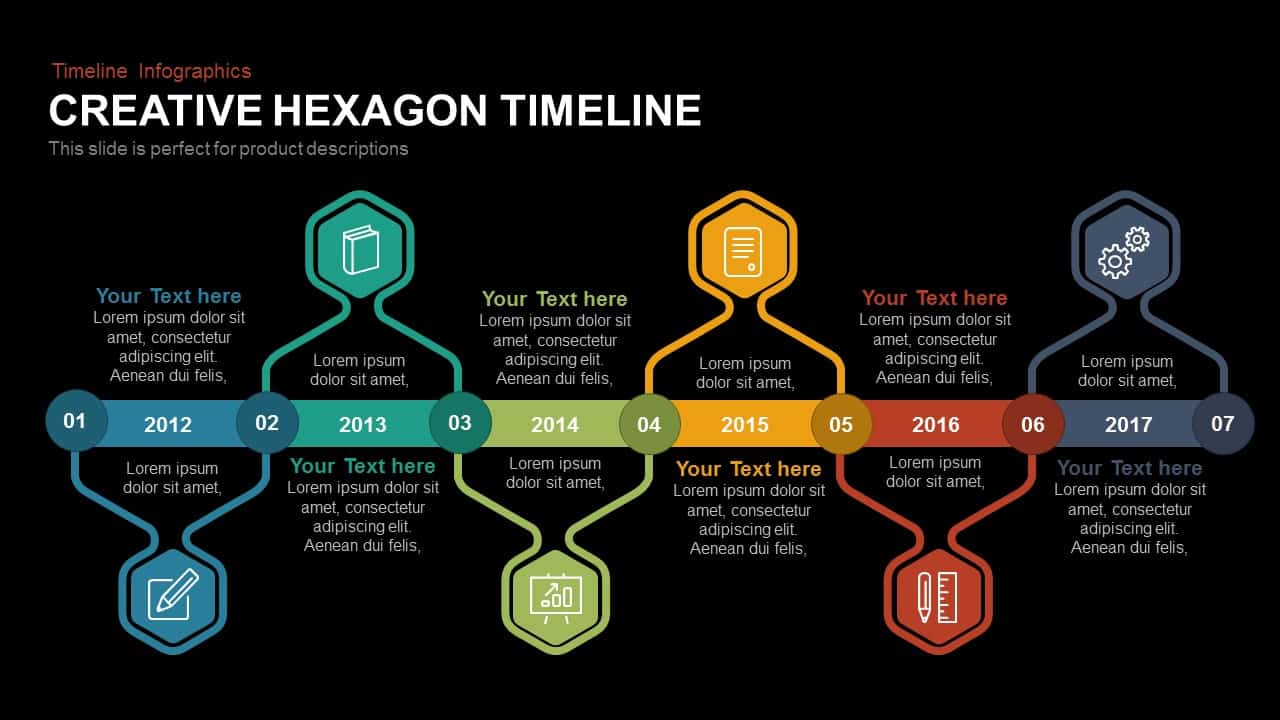
Annual Creative Hexagon Timeline Diagram Template for PowerPoint & Google Slides
Timeline
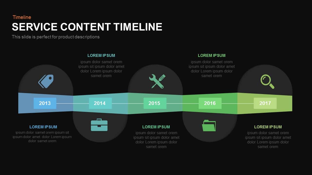
Service Content Timeline Diagram Template for PowerPoint & Google Slides
Timeline
Timeline Arrow Infographics Diagram Template for PowerPoint & Google Slides
Timeline
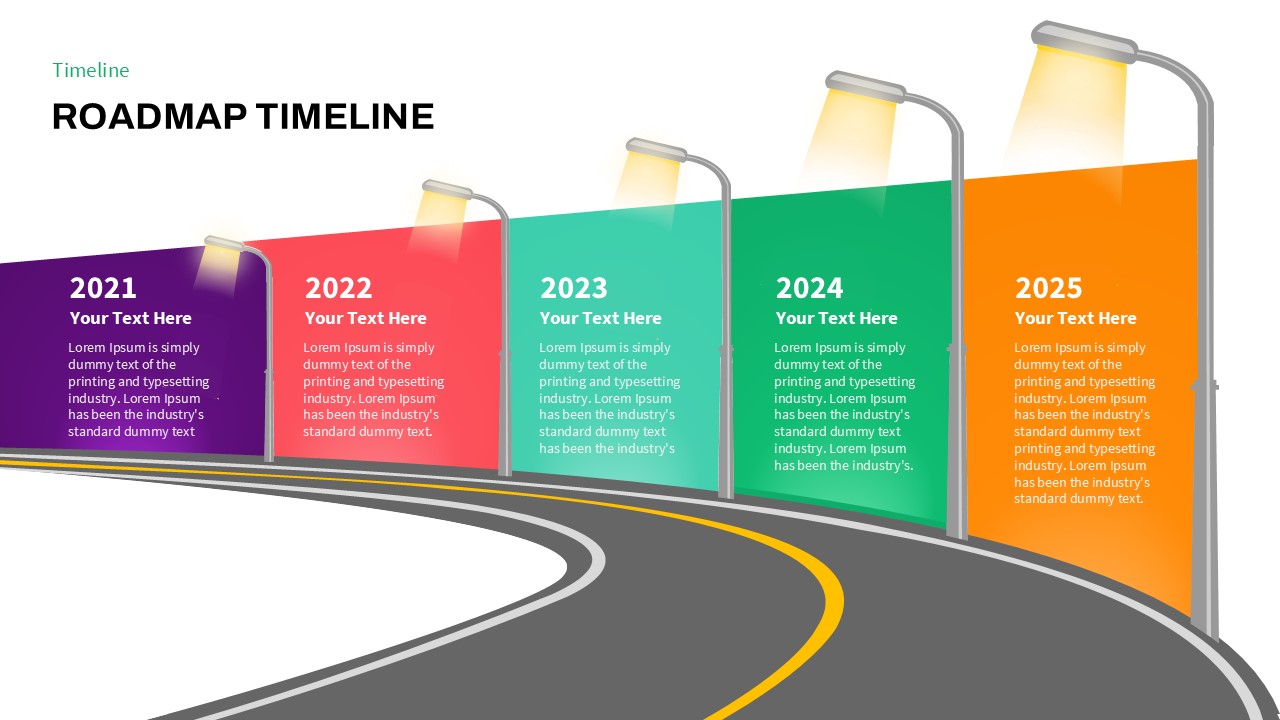
Curved Road Roadmap Timeline Diagram Template for PowerPoint & Google Slides
Roadmap
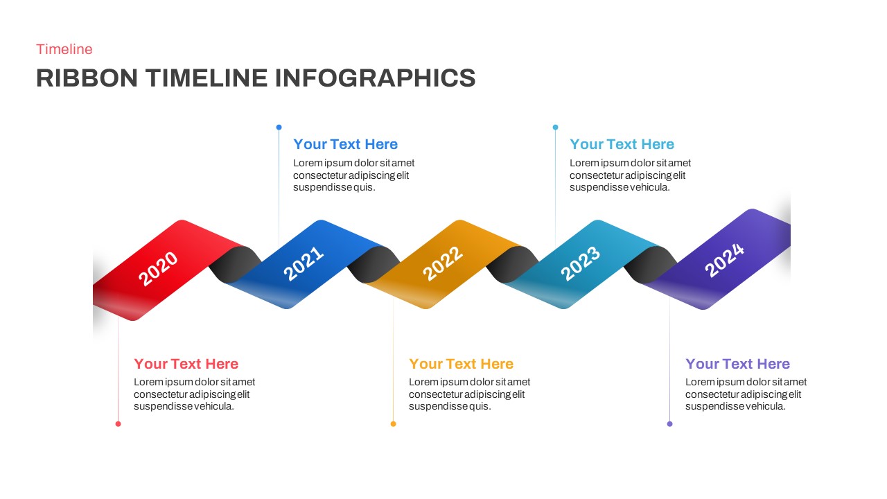
Five-Year Ribbon Timeline Diagram Template for PowerPoint & Google Slides
Timeline
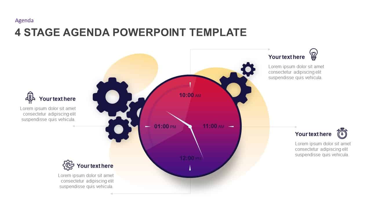
Gradient Clock Agenda Timeline Diagram Template for PowerPoint & Google Slides
Agenda
Six-Stage Arrow Timeline Diagram Template for PowerPoint & Google Slides
Timeline
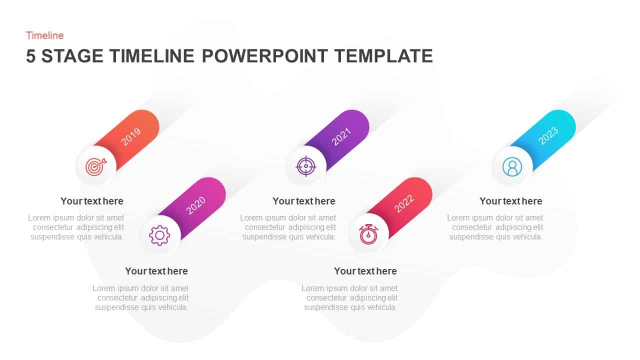
Five-Stage Slanted Timeline Diagram Template for PowerPoint & Google Slides
Timeline
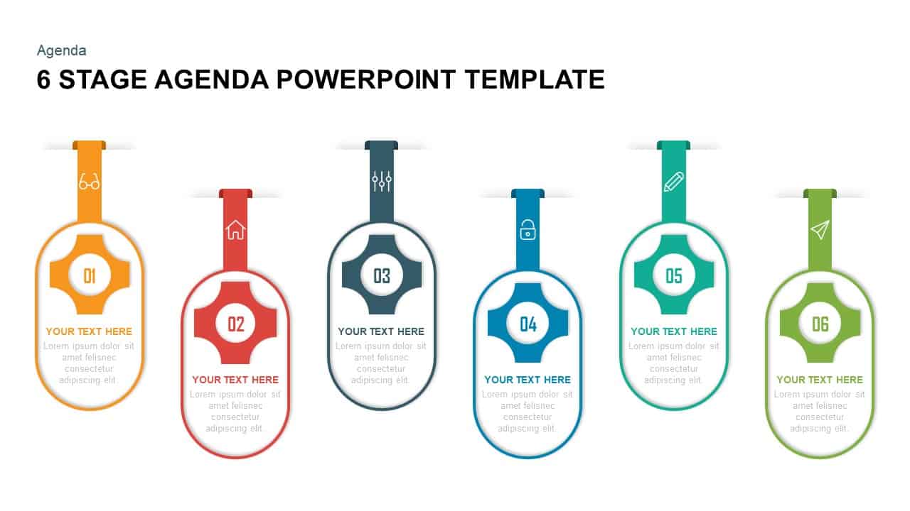
Six Stage Agenda Timeline Diagram template for PowerPoint & Google Slides
Agenda
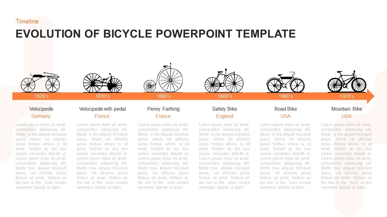
Evolution of Bicycle Timeline Diagram Template for PowerPoint & Google Slides
Timeline
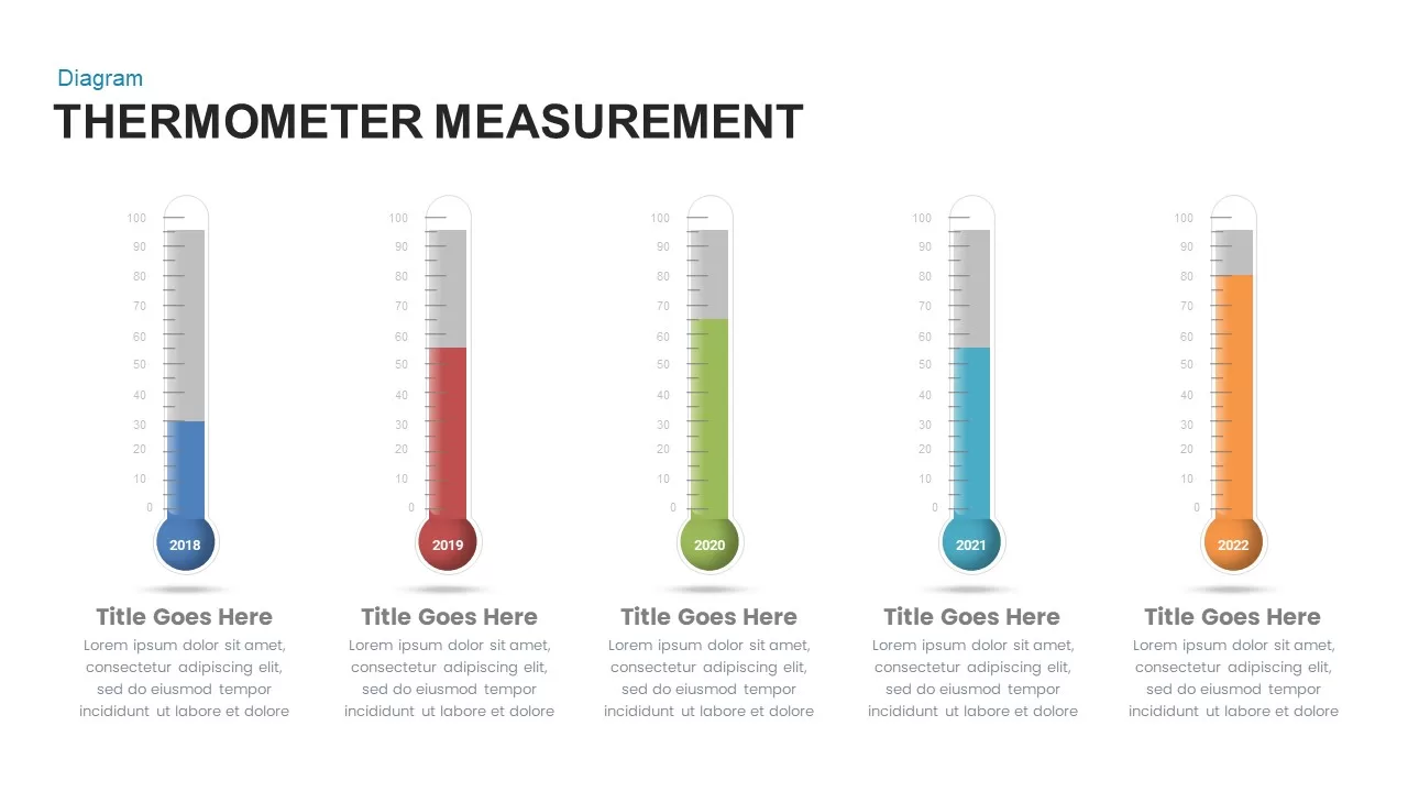
Thermometer Measurement Timeline Diagram Template for PowerPoint & Google Slides
Timeline
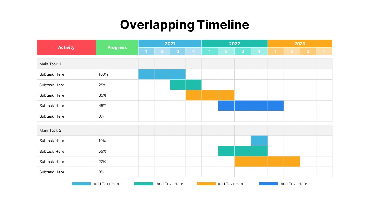
Overlapping Timeline Gantt Chart Diagram Template for PowerPoint & Google Slides
Timeline
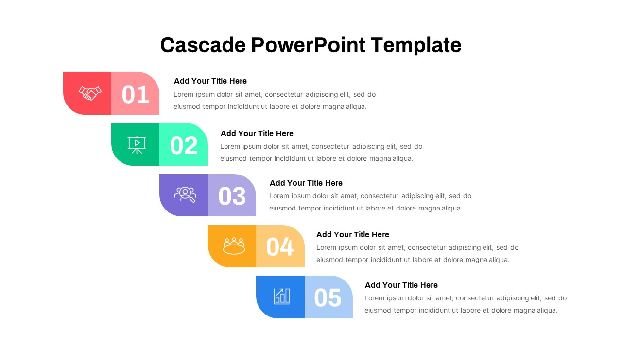
Five-Step Cascade Diagram & Timeline Template for PowerPoint & Google Slides
Process
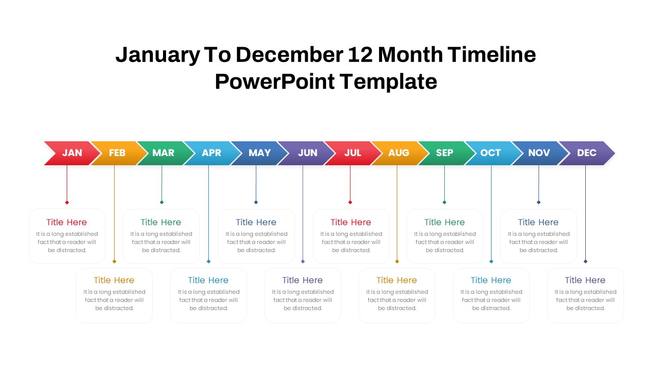
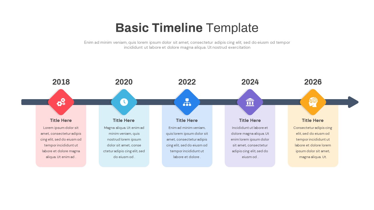
12-Month Timeline Diagram Template for PowerPoint & Google Slides
Timeline
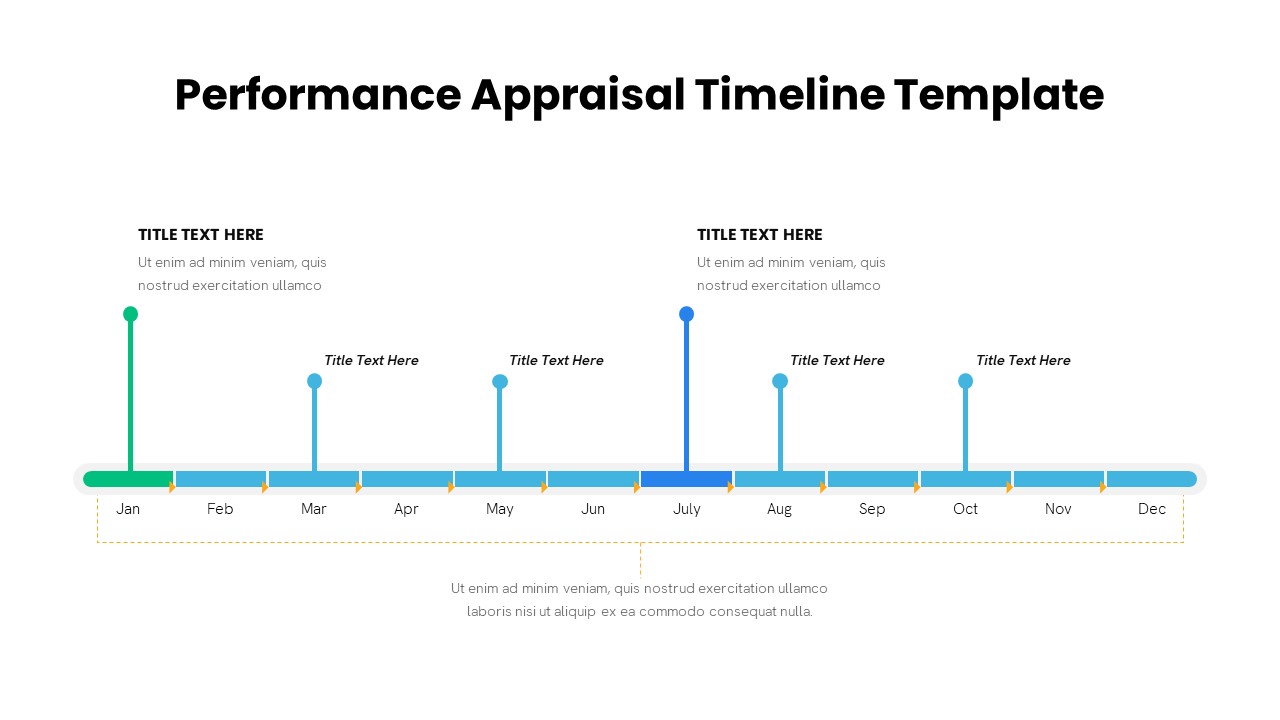
Performance Appraisal Timeline Diagram Template for PowerPoint & Google Slides
Timeline
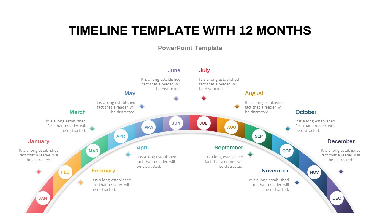
12-Month Semi-Circular Timeline Diagram Template for PowerPoint & Google Slides
Timeline
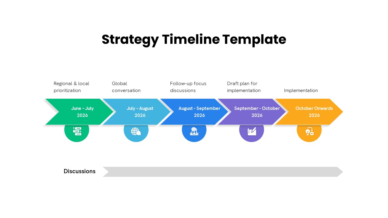
Five-Phase Strategy Timeline Diagram Template for PowerPoint & Google Slides
Timeline
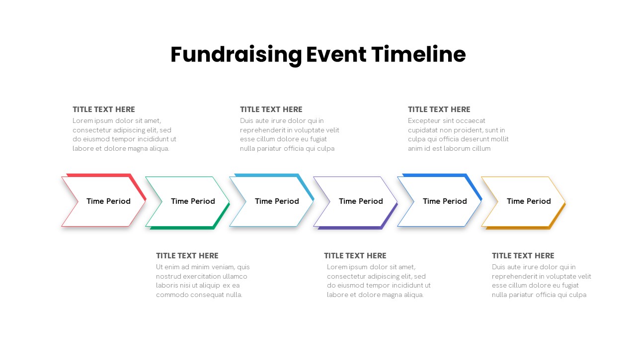
Fundraising Event Timeline Diagram Template for PowerPoint & Google Slides
Timeline
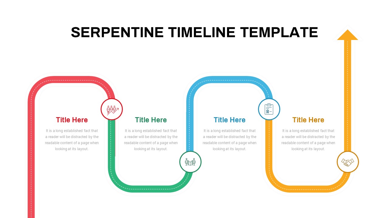
Interactive Serpentine Timeline Diagram Template for PowerPoint & Google Slides
Timeline
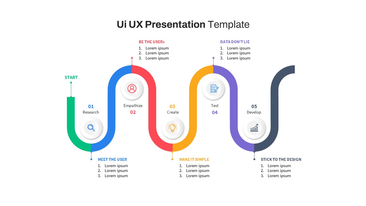
Free UI/UX Process Timeline Diagram Template for PowerPoint & Google Slides
Process
Free
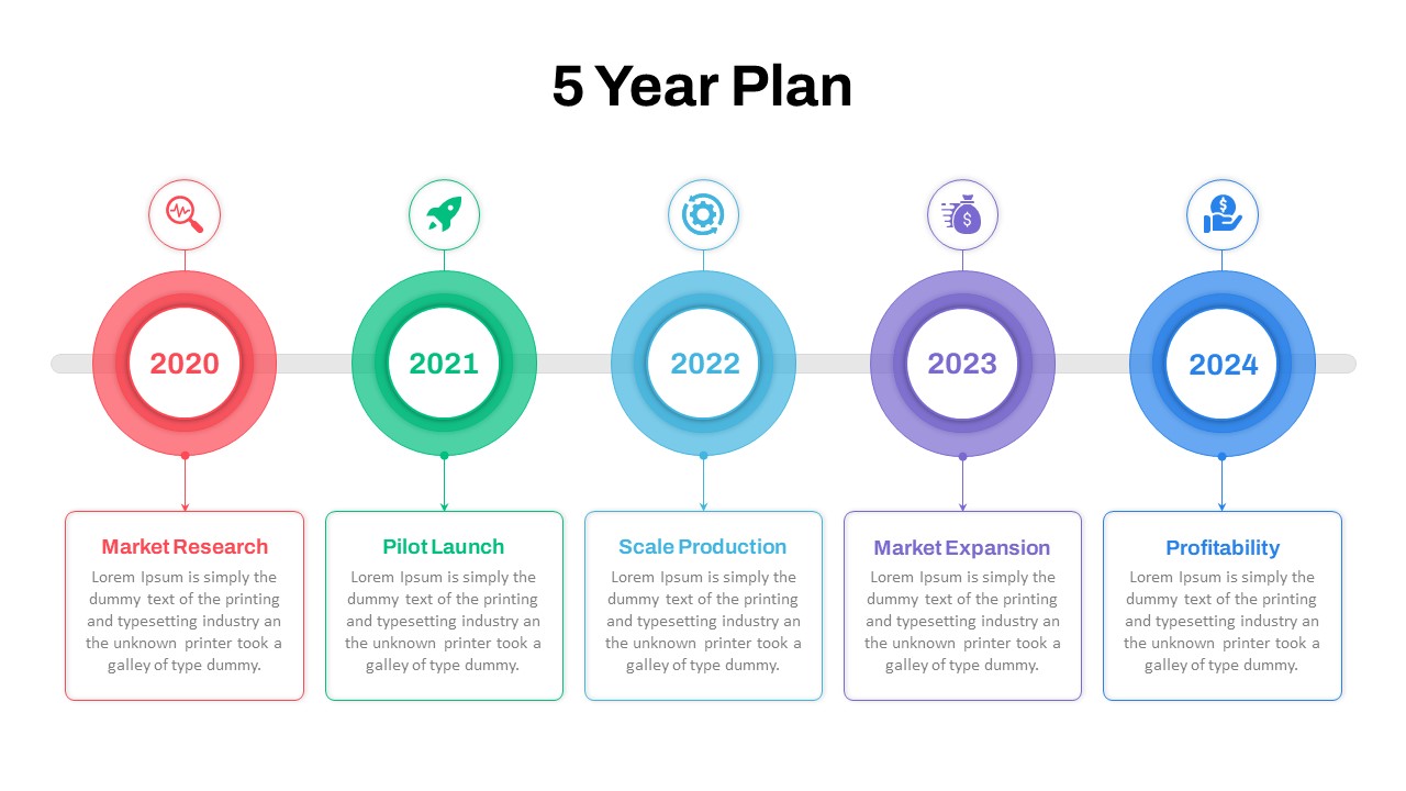
Five-Year Plan Timeline Diagram Template for PowerPoint & Google Slides
Timeline
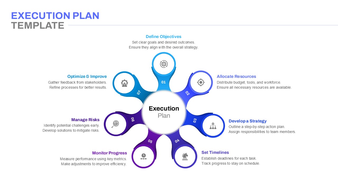
Execution Plan Timeline Diagram Template for PowerPoint & Google Slides
Timeline
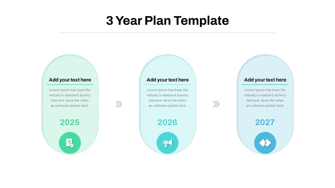
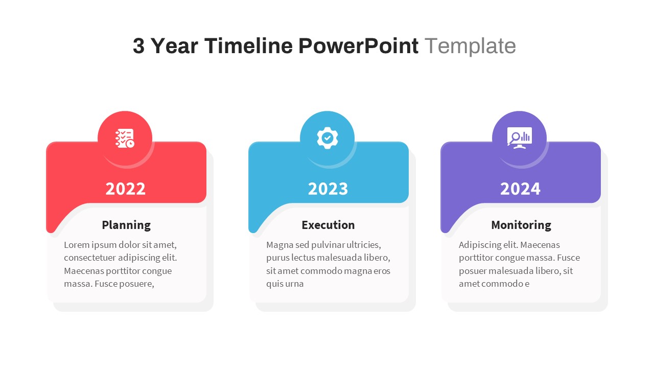
Three-Year Plan Timeline Diagram Template for PowerPoint & Google Slides
Timeline
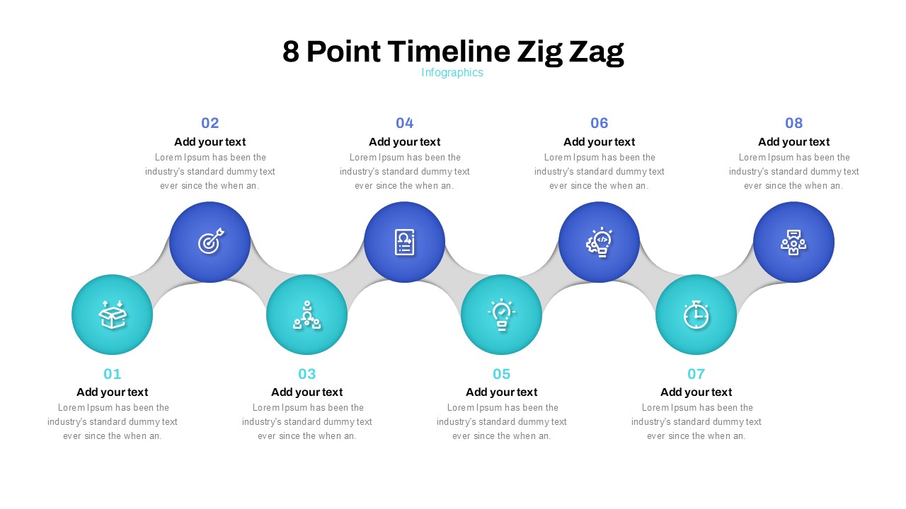
Zig Zag Eight-Point Timeline Diagram Template for PowerPoint & Google Slides
Timeline
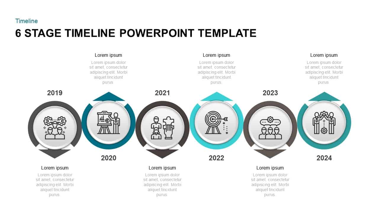
Six Stage Timeline Diagram for PowerPoint & Google Slides
Timeline
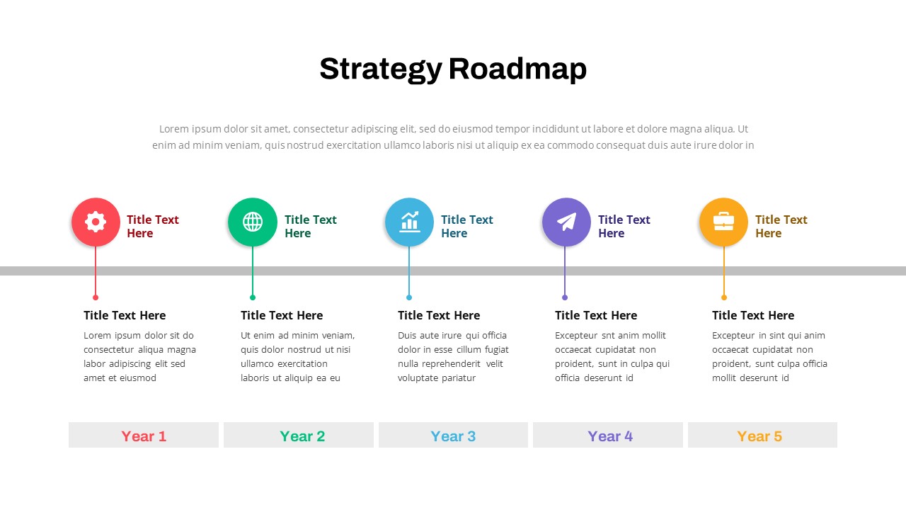
Strategy Roadmap Timeline Slides Template for PowerPoint & Google Slides
Roadmap
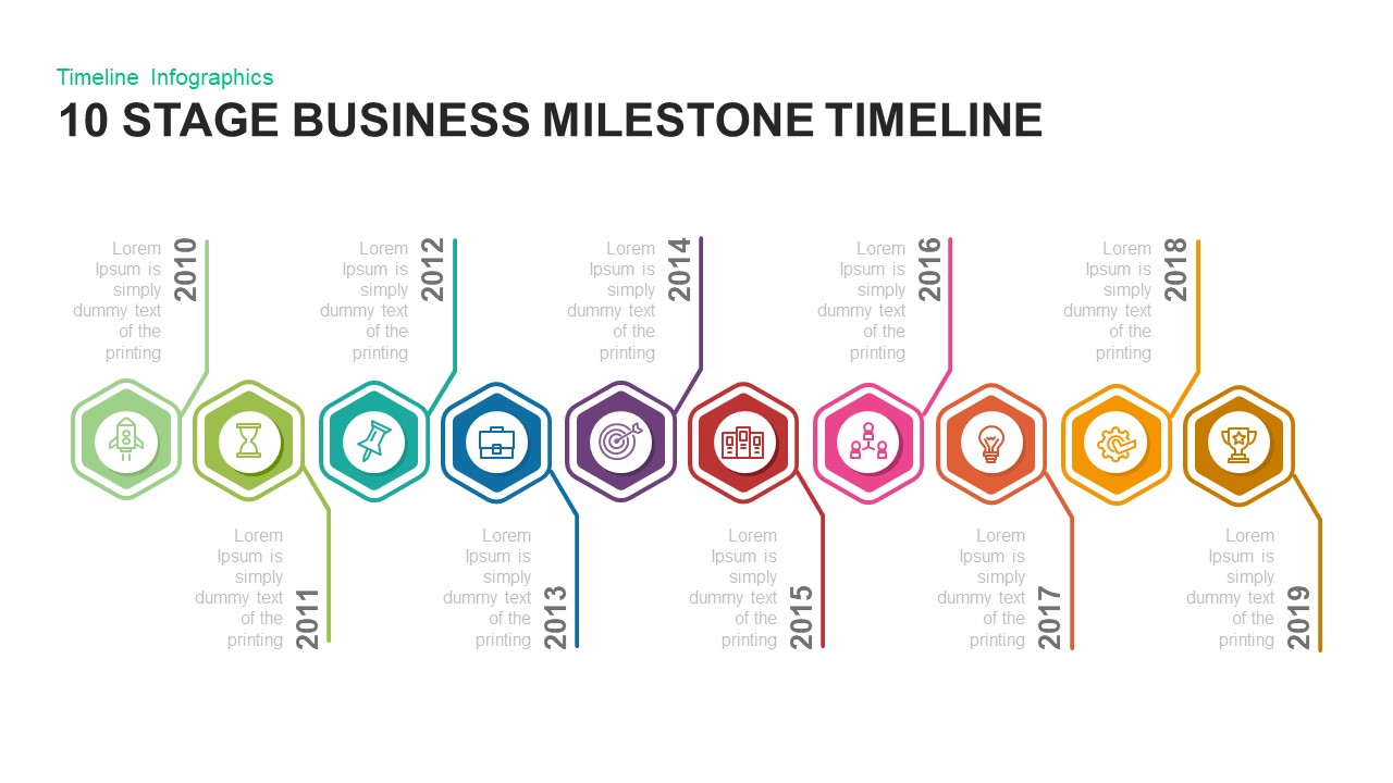
10 Stage Business Milestone Timeline PowerPoint Template for PowerPoint & Google Slides
Timeline
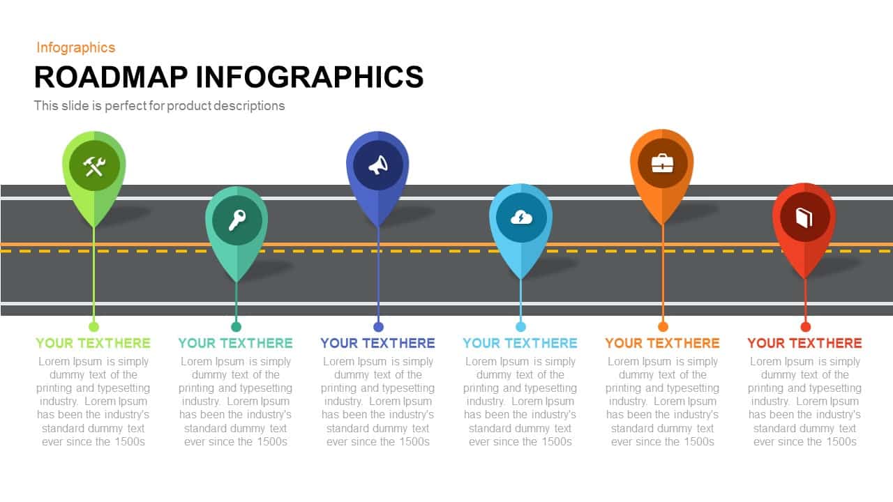
Roadmap Infographic Timeline Slide Template for PowerPoint & Google Slides
Roadmap
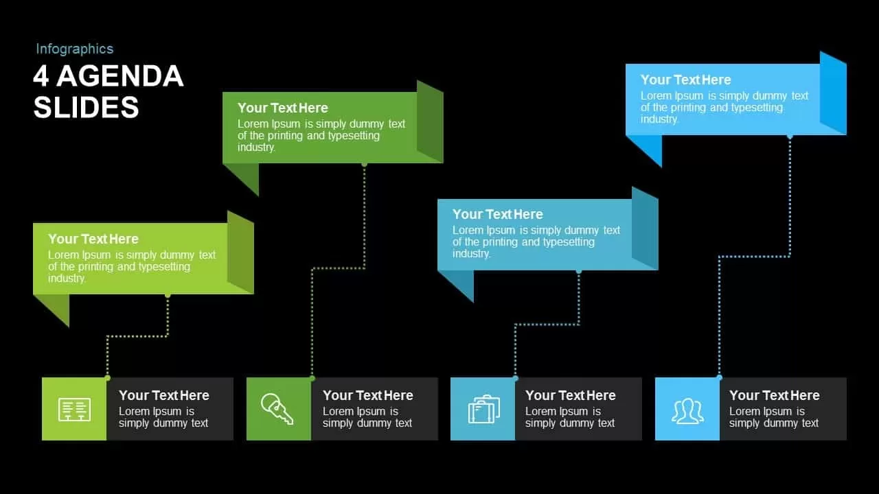
Editable Four-Point Timeline Agenda Template for PowerPoint & Google Slides
Agenda
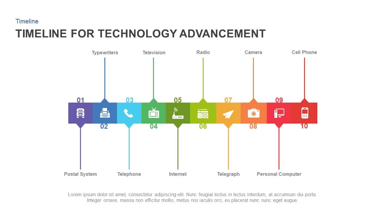
Technology Advancement Timeline Infographic Template for PowerPoint & Google Slides
Information Technology
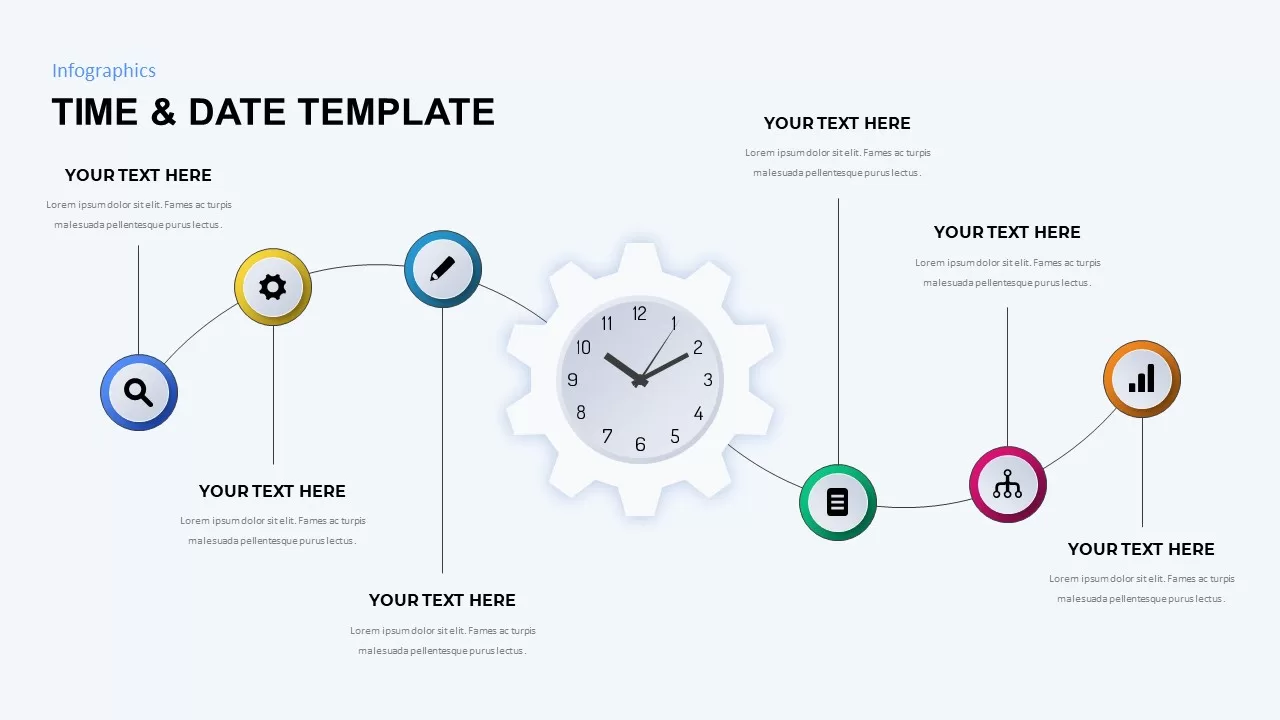
Time & Date Infographic Timeline Template for PowerPoint & Google Slides
Decks
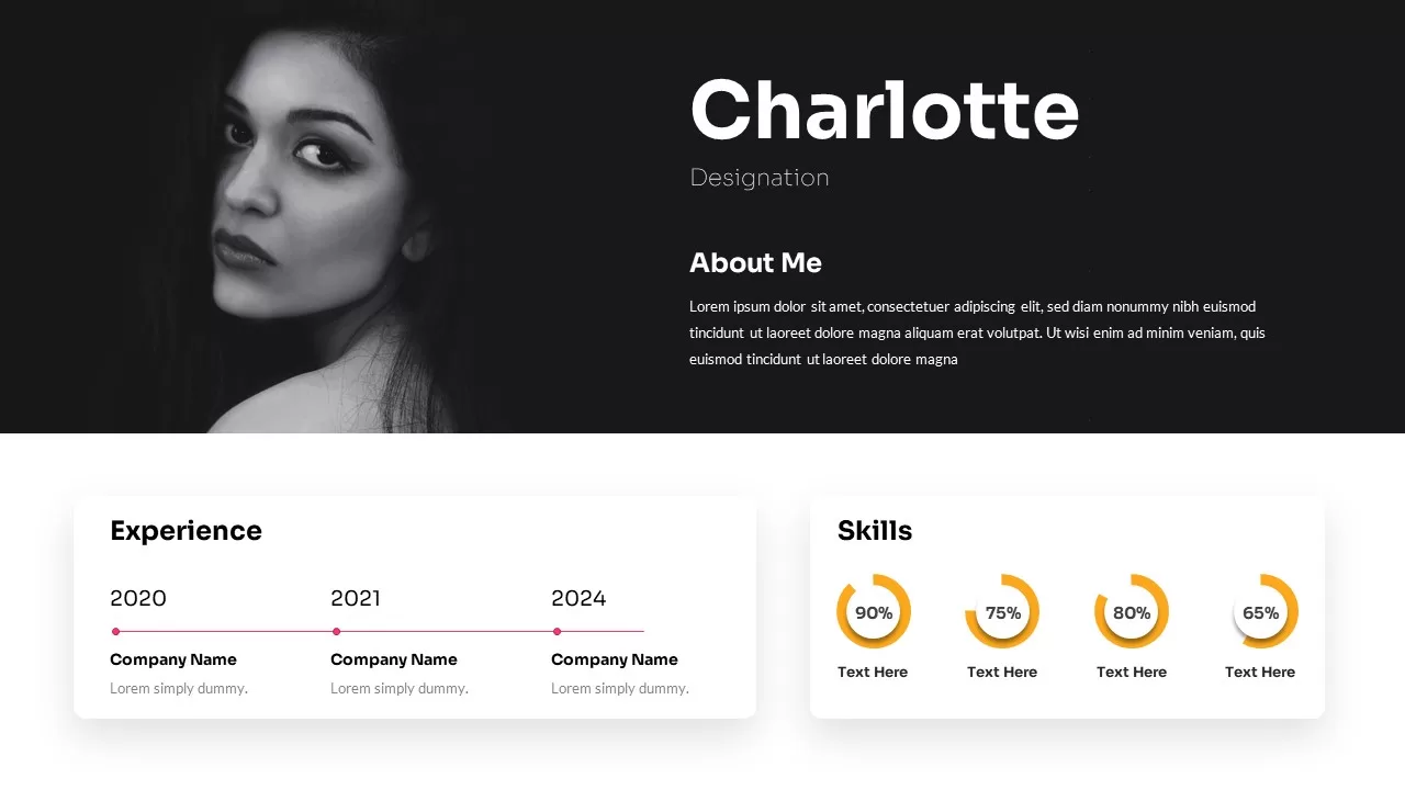
Profile Slide with Timeline & Skills Template for PowerPoint & Google Slides
Our Team
Minimalist Timeline Infographic Template for PowerPoint & Google Slides
Timeline
Three-Year Project Roadmap Timeline Template for PowerPoint & Google Slides
Timeline
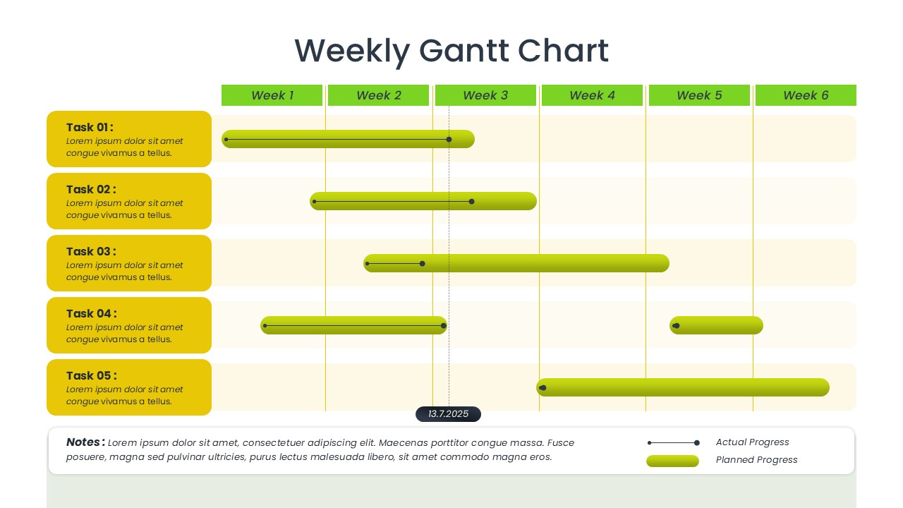
Weekly Gantt Chart Project Timeline Template for PowerPoint & Google Slides
Gantt Chart
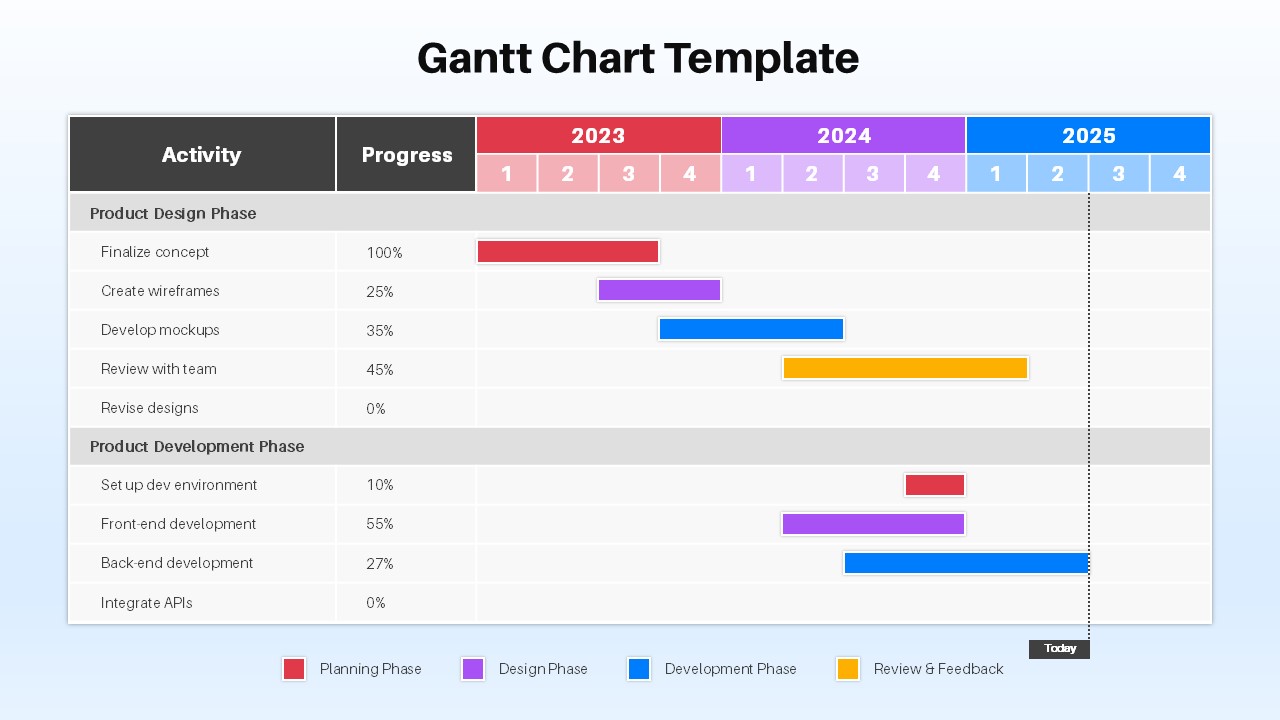
Project Timeline Gantt Chart Template for PowerPoint & Google Slides
Gantt Chart
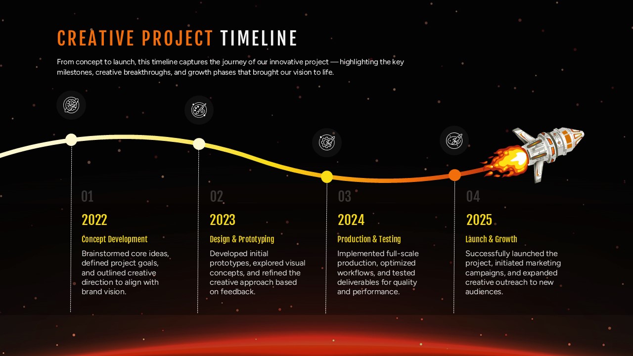
Creative Project Timeline Roadmap Template for PowerPoint & Google Slides
Timeline