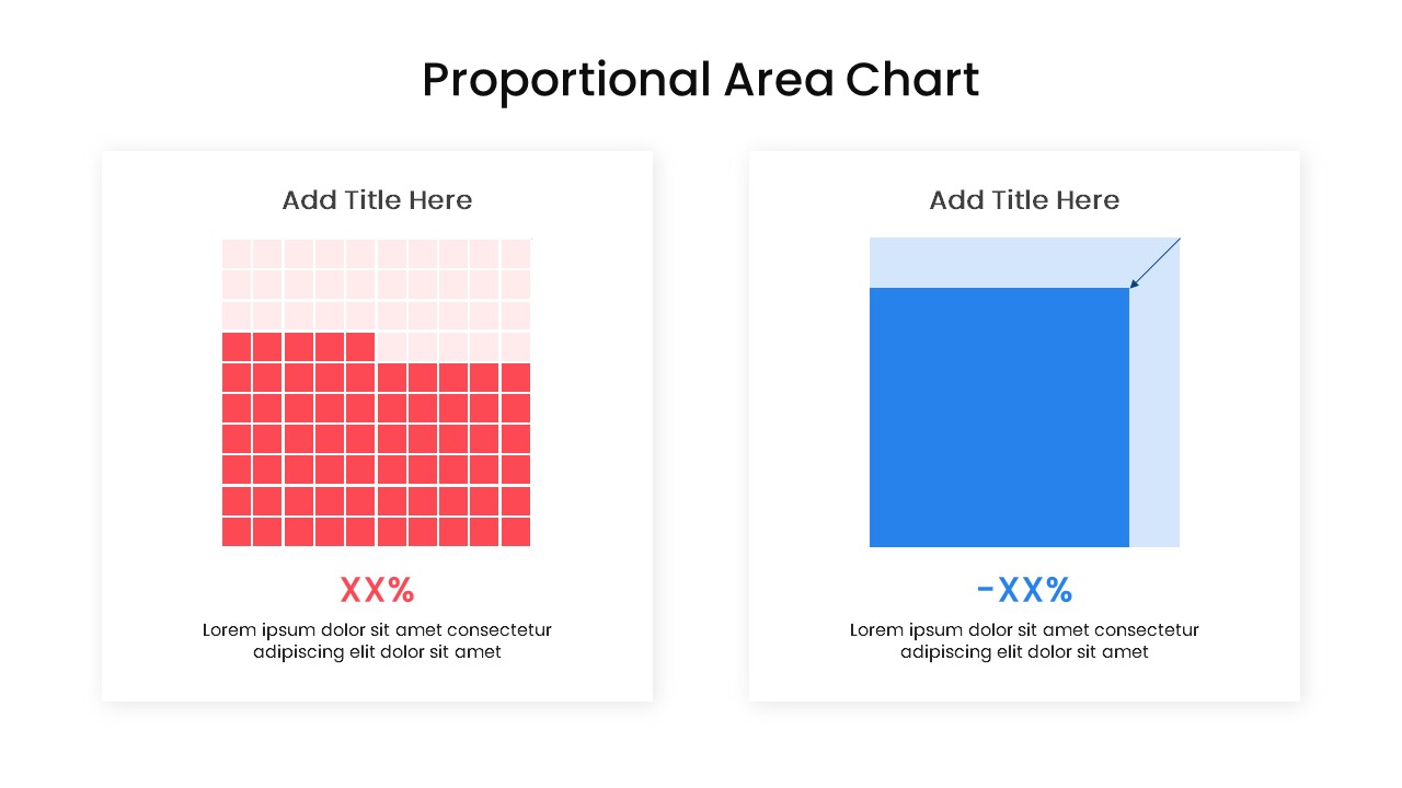
Proportional Area Chart Analysis Template for PowerPoint & Google Slides
Description
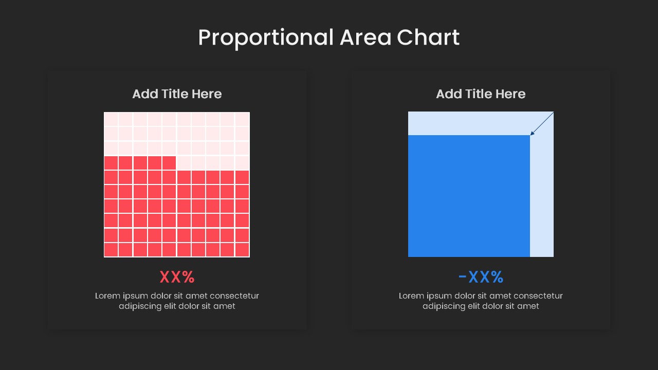
Visualize comparative metrics with precision using this Proportional Area Chart slide template for PowerPoint & Google Slides. The deck offers two synchronized layouts: a pixel-grid array that fills individual squares to represent discrete percentage points, and a proportional bar area chart with shaded overlays for immediate relative comparison. Both formats include editable master slides, color-coded segments, and clear annotation arrows to spotlight key data insights. The crisp white background and minimalist typography maintain focus on your figures, while spacious text zones beneath each chart allow for concise explanations of methodology and findings. Seamless drag-and-drop support for shape-based SmartArt means you can adjust values, swap colors, and update labels in seconds without disrupting the layout’s integrity.
Optimized for both PowerPoint and Google Slides, this template leverages native chart tools and vector shapes to guarantee sharp rendering across screens and projectors. Change the dominant red and blue accents to match your corporate palette, or repurpose the grid style for icon-based infographics. The synchronized formatting ensures that when you update one chart, the complementary layout adjusts automatically, preserving consistency throughout your presentation. Subtle drop shadows and light borders add depth without cluttering the slide, while built-in placeholder text prompts guide you to maintain clarity and brevity. Whether presenting sales penetration rates, survey results, market shares, or performance benchmarks, these proportional area visuals break down complex data into instantly digestible insights.
Who is it for
Data analysts, financial planners, marketing managers, and business consultants who need to present percentage-based comparisons, KPI progress, or survey outcomes in a visually engaging and easily interpretable format to stakeholders, clients, or executive teams.
Other Uses
Repurpose this template to showcase resource allocations, adoption rates, customer satisfaction percentages, project completion statuses, or budget breakdowns. Its flexible grid-and-area approach also works for training modules, academic research presentations, and industry reports.
Login to download this file

Item ID
SB04167
Related Templates

Mobile Data Analysis Chart template for PowerPoint & Google Slides
Charts
Creative Data Analysis Bar Chart template for PowerPoint & Google Slides
Bar/Column
Pencil Bar Chart Data Analysis Template for PowerPoint & Google Slides
Bar/Column

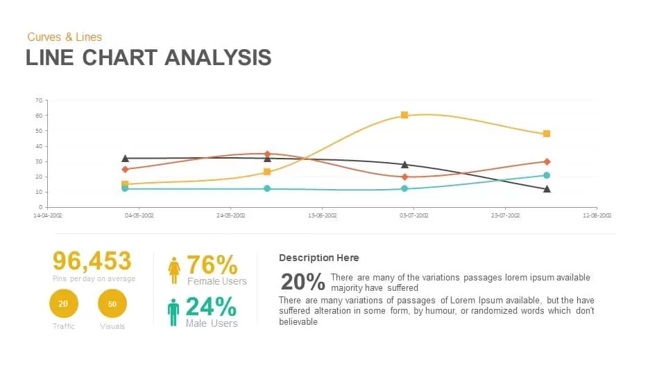
Line Chart Analysis template for PowerPoint & Google Slides
Charts
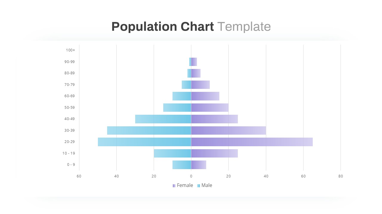
Population Pyramid Chart Analysis Template for PowerPoint & Google Slides
Bar/Column
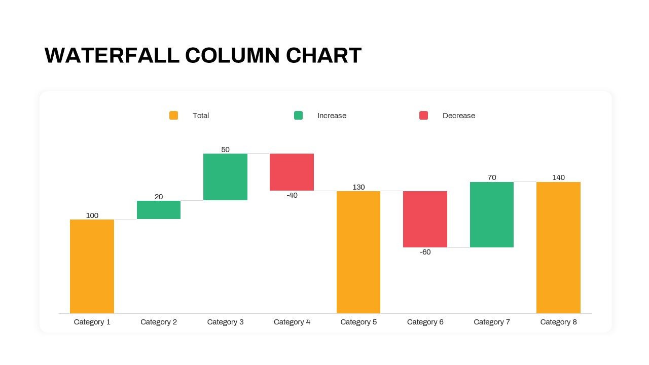
Waterfall Column Chart Analysis Template for PowerPoint & Google Slides
Bar/Column
Simple Scatter Chart Analysis Template for PowerPoint & Google Slides
Comparison Chart
Simple Area Chart Data Trends Analysis Template for PowerPoint & Google Slides
Comparison Chart
Waterfall Bar Chart Analysis Template for PowerPoint & Google Slides
Bar/Column
Four Quadrant Scatter Chart Analysis Template for PowerPoint & Google Slides
Comparison Chart
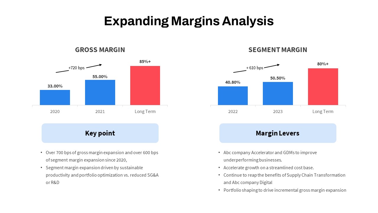
Expanding Margins Analysis Bar Chart Template for PowerPoint & Google Slides
Charts
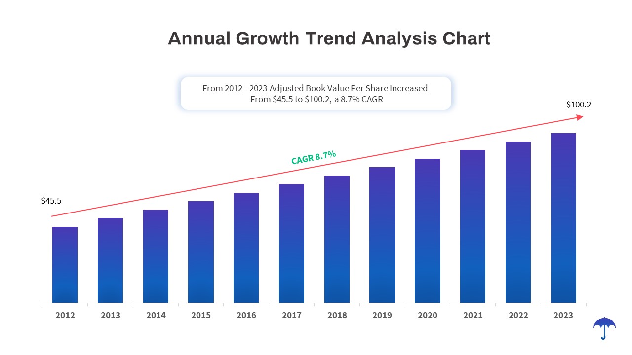
Annual Growth Trend Analysis Chart template for PowerPoint & Google Slides
Business Report
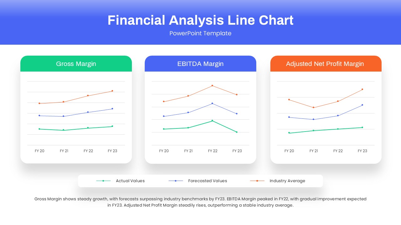
Dynamic Financial Analysis Line Chart Template for PowerPoint & Google Slides
Finance
Data Analysis Bar Chart with Insights Template for PowerPoint & Google Slides
Bar/Column
Free
Skills Gap Analysis Comparison Chart Template for PowerPoint & Google Slides
Gap

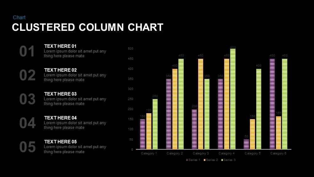
Clustered Column Chart Data Analysis Template for PowerPoint
Bar/Column
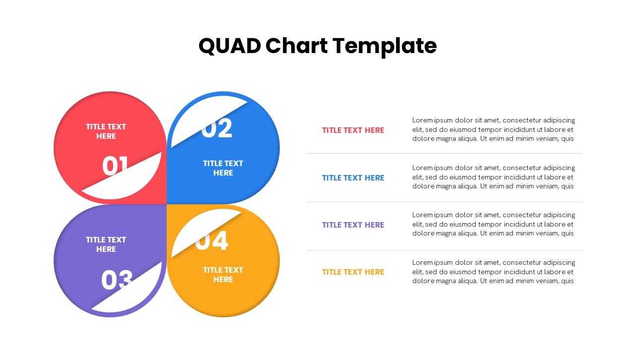
Quad Chart Infographic Pack of 8 Slides Template for PowerPoint & Google Slides
Comparison Chart
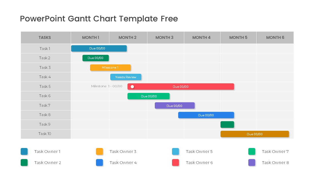
Free Professional Gantt Chart Pack – 4 Slides Template for PowerPoint & Google Slides
Gantt Chart
Free
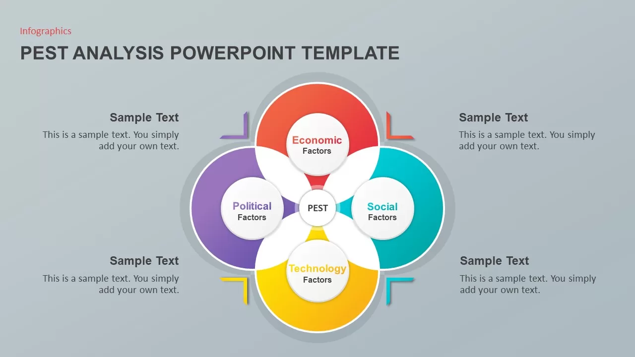
PEST Analysis PowerPoint Template for PowerPoint & Google Slides
Business Strategy
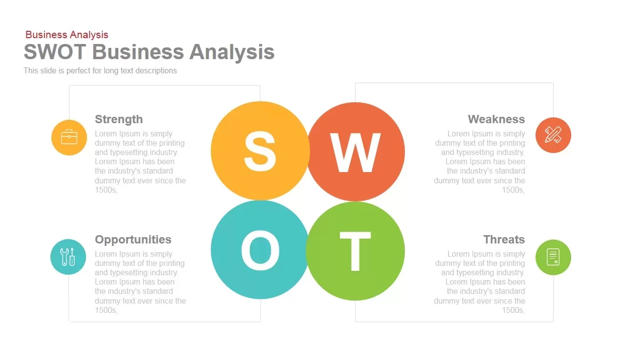
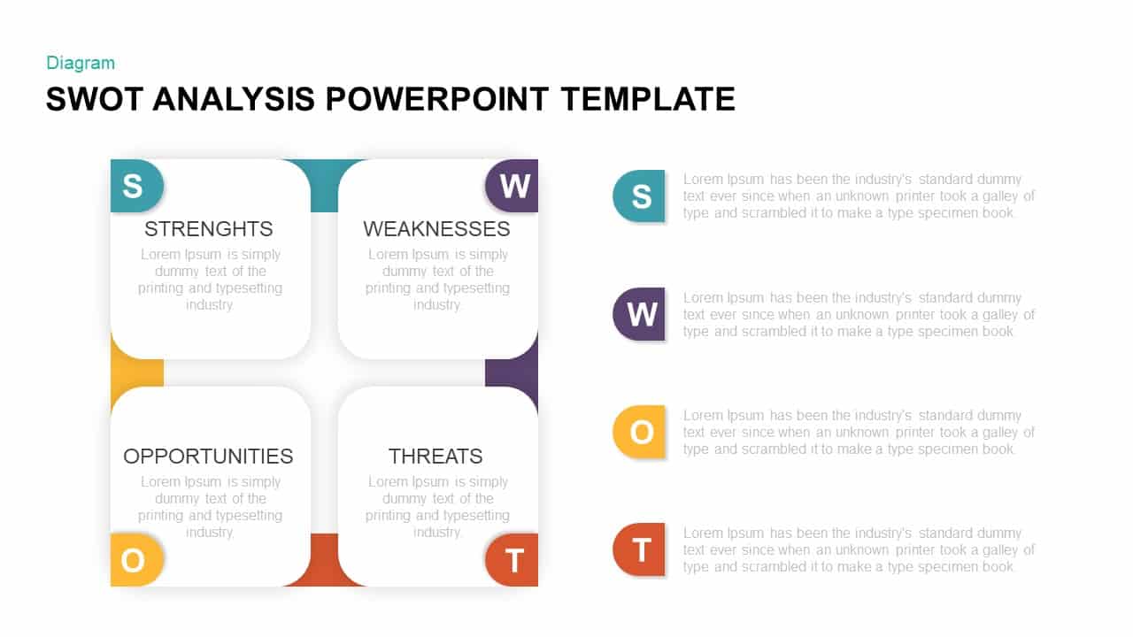
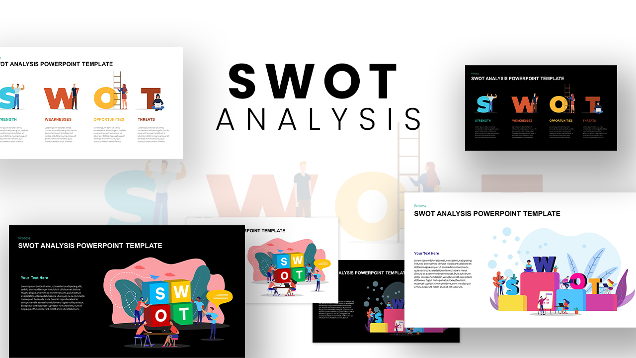
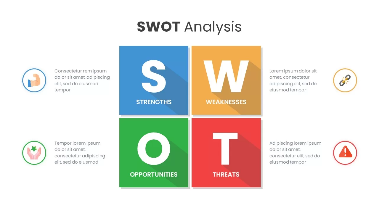
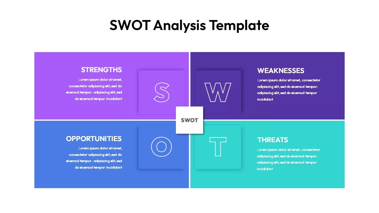
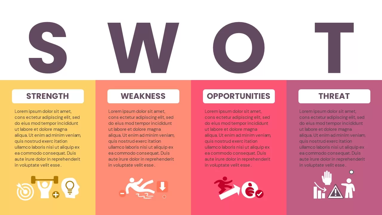
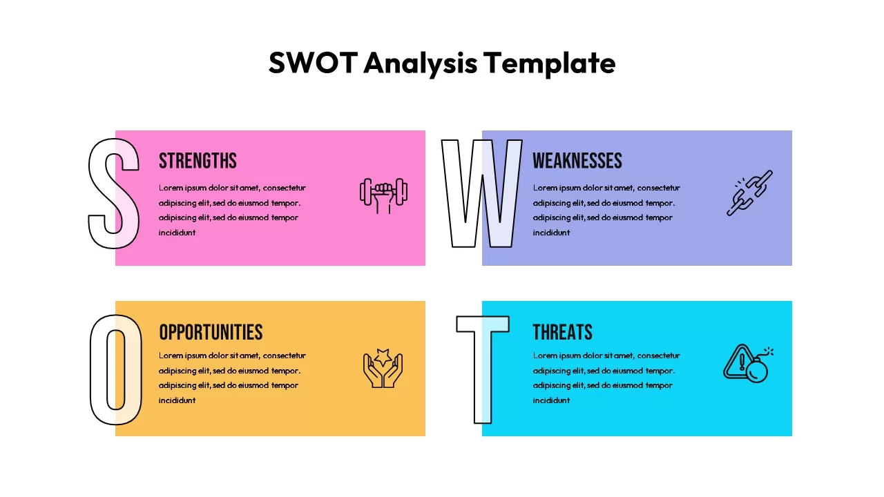
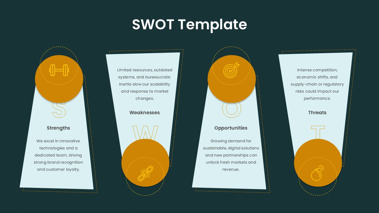
SWOT Business Analysis template for PowerPoint & Google Slides
SWOT
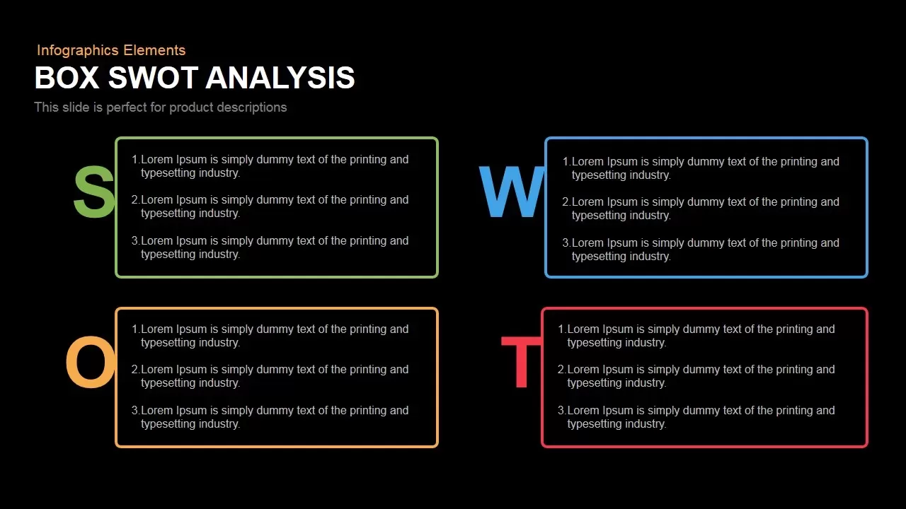
Box SWOT Analysis Infographic Template for PowerPoint & Google Slides
SWOT
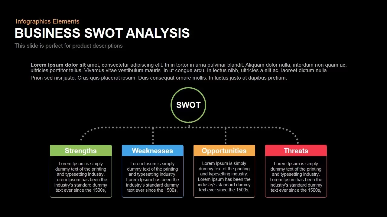
Box Business SWOT Analysis Template for PowerPoint & Google Slides
SWOT
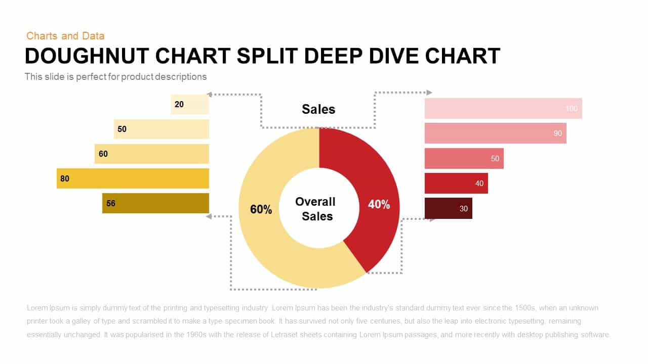
Split Doughnut Deep Dive Sales Analysis Template for PowerPoint & Google Slides
Pie/Donut
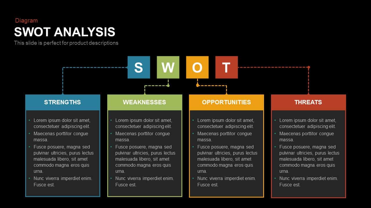
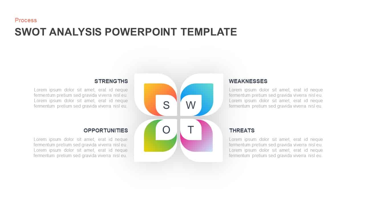
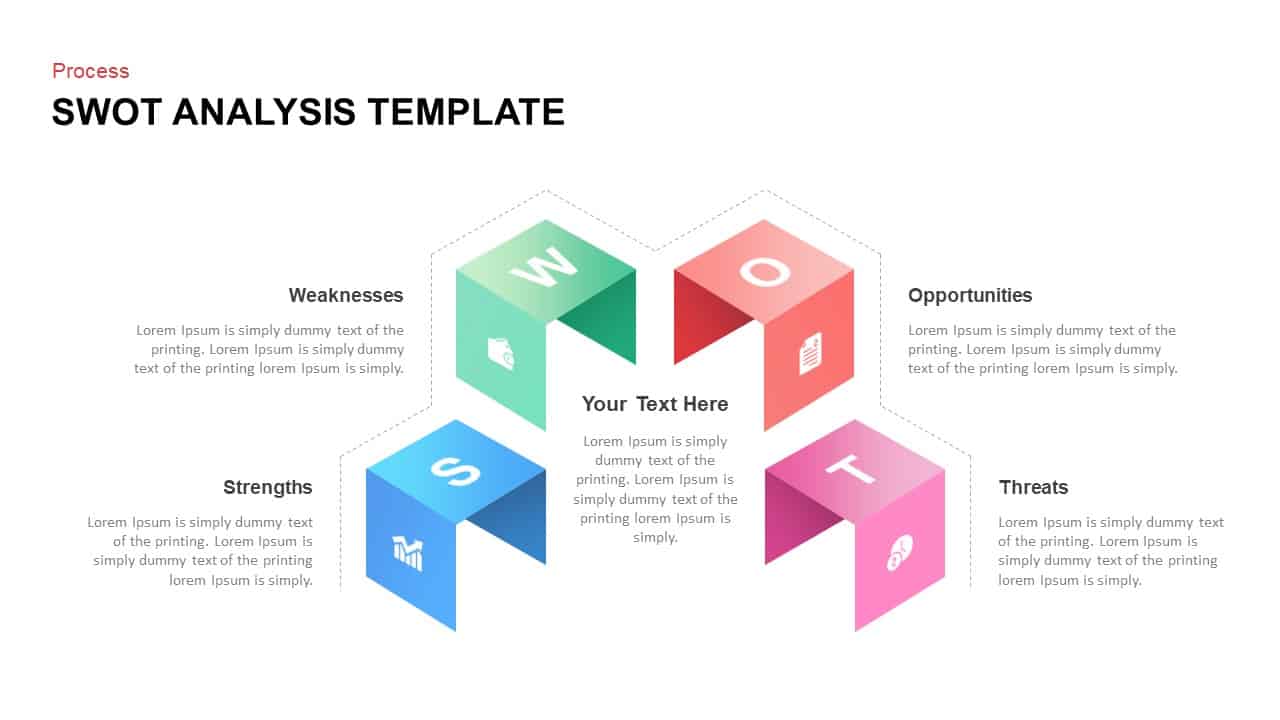
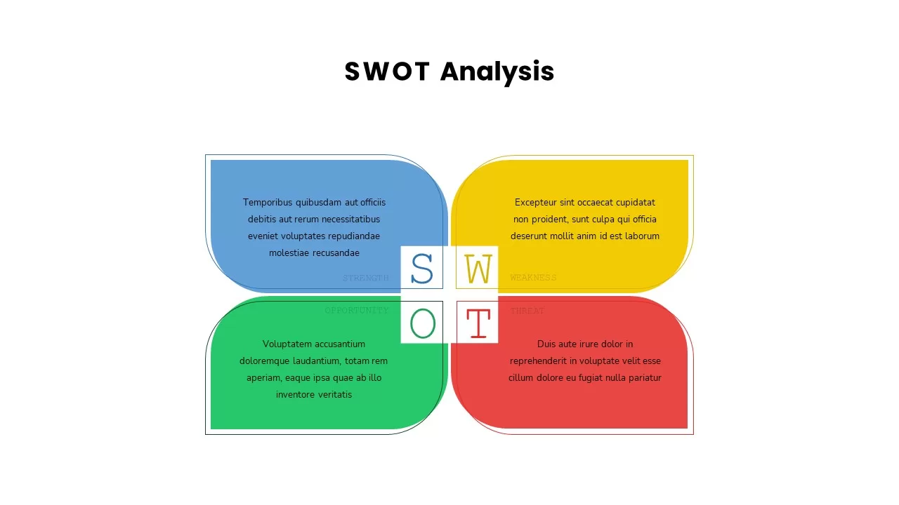
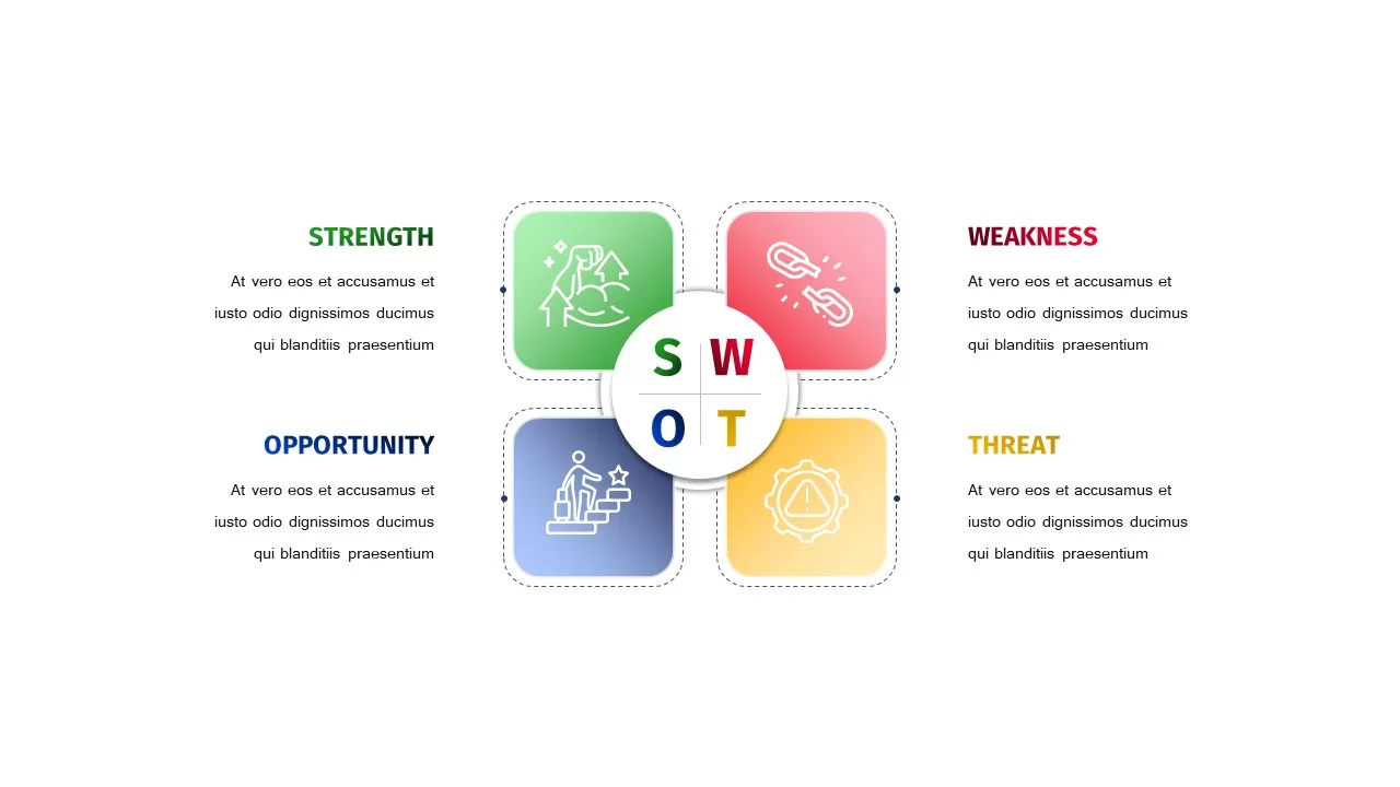
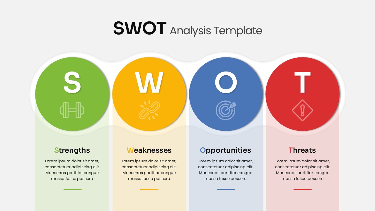
SWOT Analysis template for PowerPoint & Google Slides
SWOT
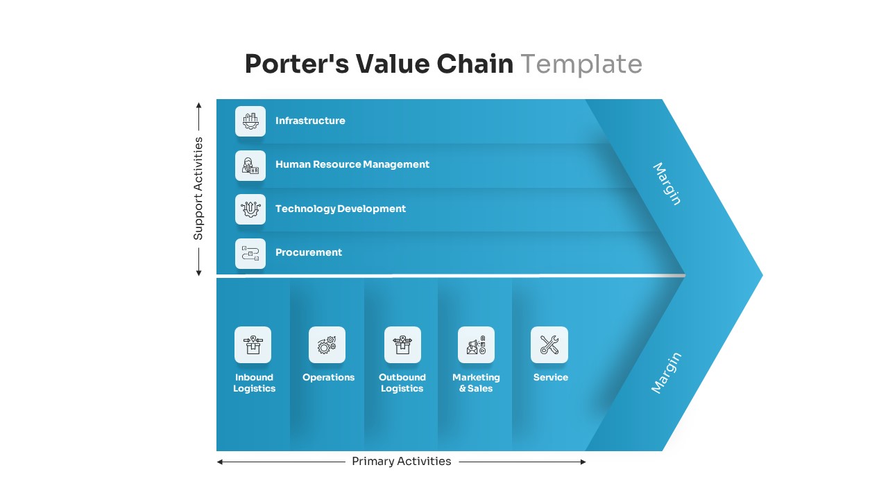
Porter’s Value Chain Analysis Diagram Template for PowerPoint & Google Slides
Business Strategy
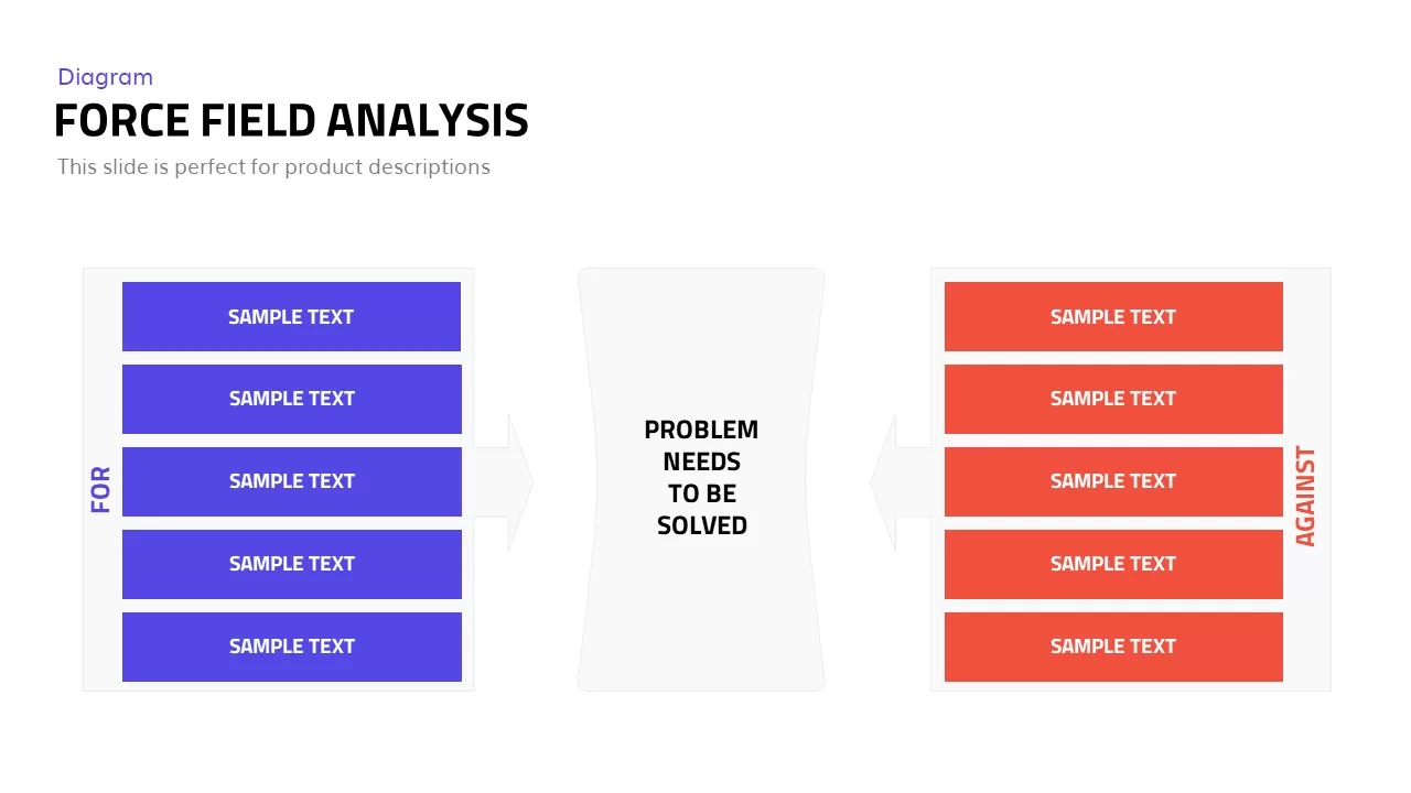
Editable Force Field Analysis Diagram Template for PowerPoint & Google Slides
Business Plan

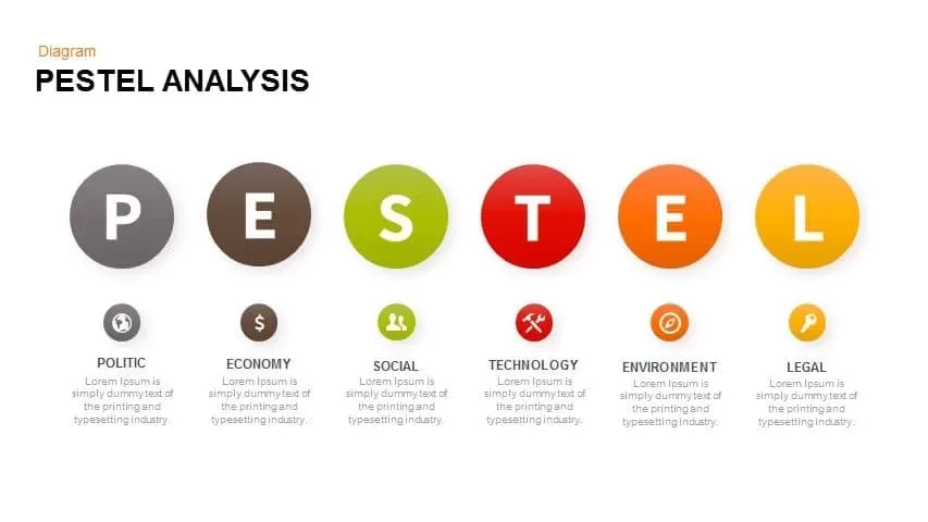
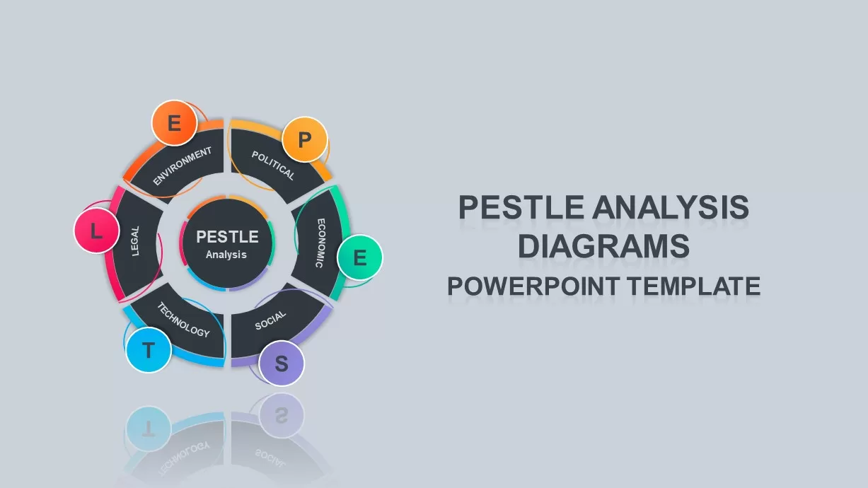
Professional PESTEL Analysis Diagram Template for PowerPoint & Google Slides
PEST
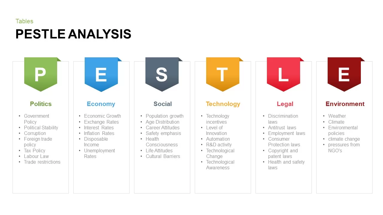
PESTLE Analysis Table Layout Diagram Template for PowerPoint & Google Slides
PEST

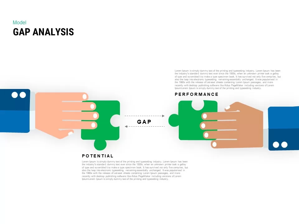
Interactive Gap Analysis Puzzle Diagram Template for PowerPoint & Google Slides
Gap
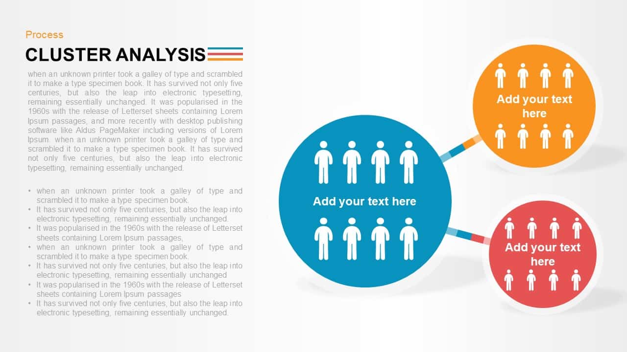
Cluster Analysis Infographic Diagram Template for PowerPoint & Google Slides
Business
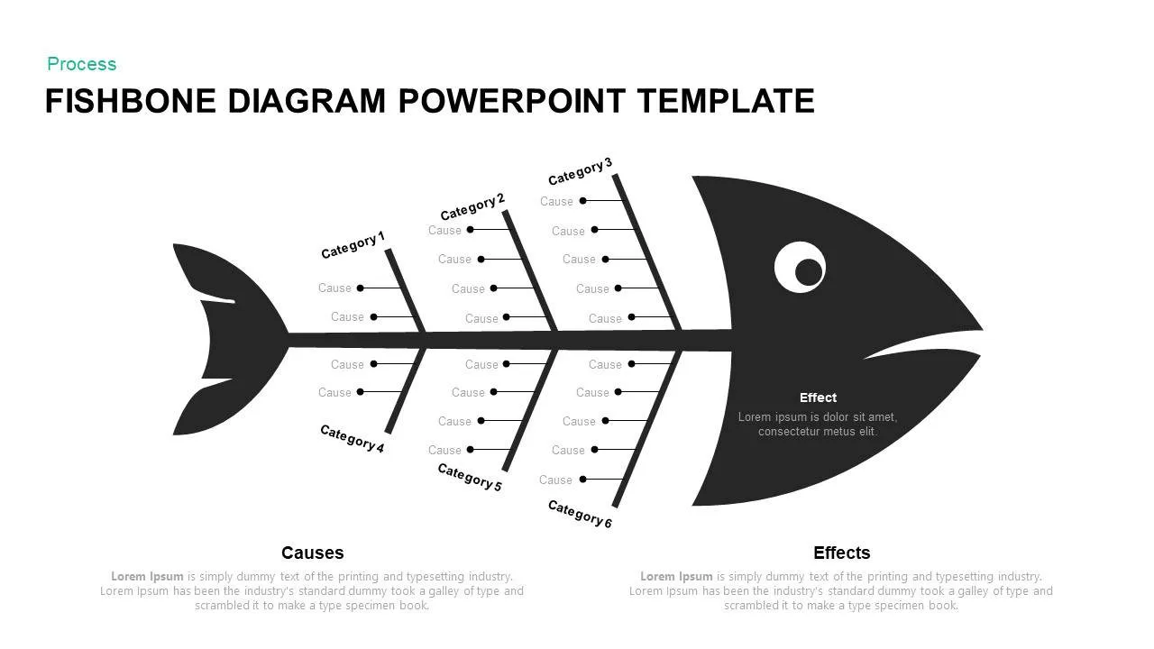
Fishbone Diagram Analysis Template for PowerPoint & Google Slides
Flow Charts
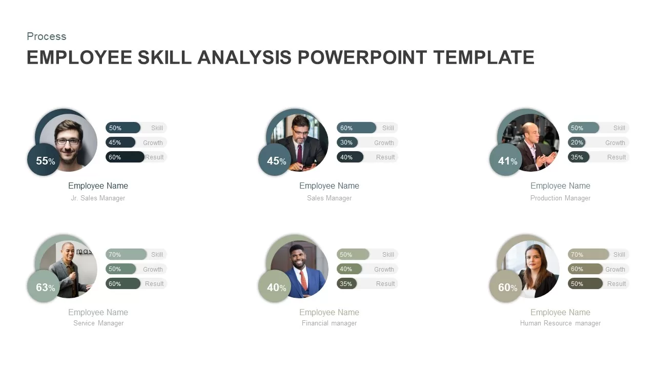
Employee Skill Analysis Dashboard Template for PowerPoint & Google Slides
Employee Performance
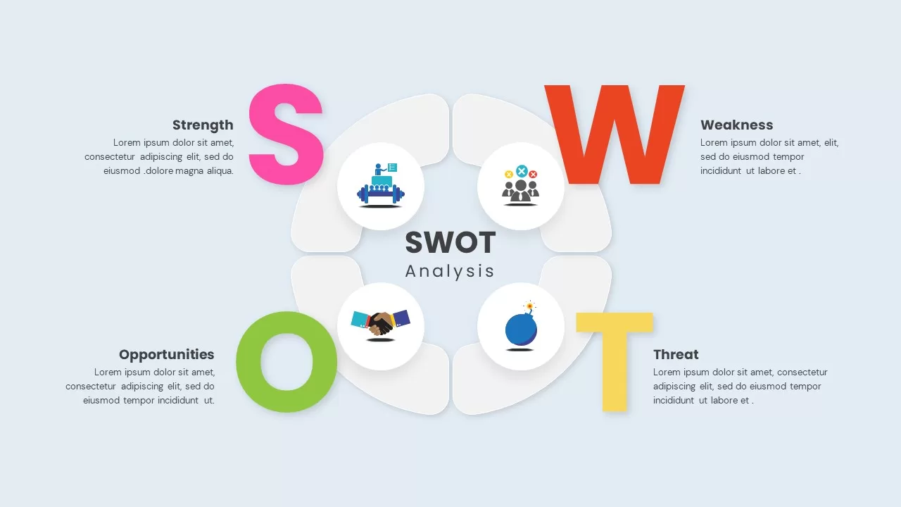
Four-Quadrant SWOT Analysis Diagram Template for PowerPoint & Google Slides
SWOT
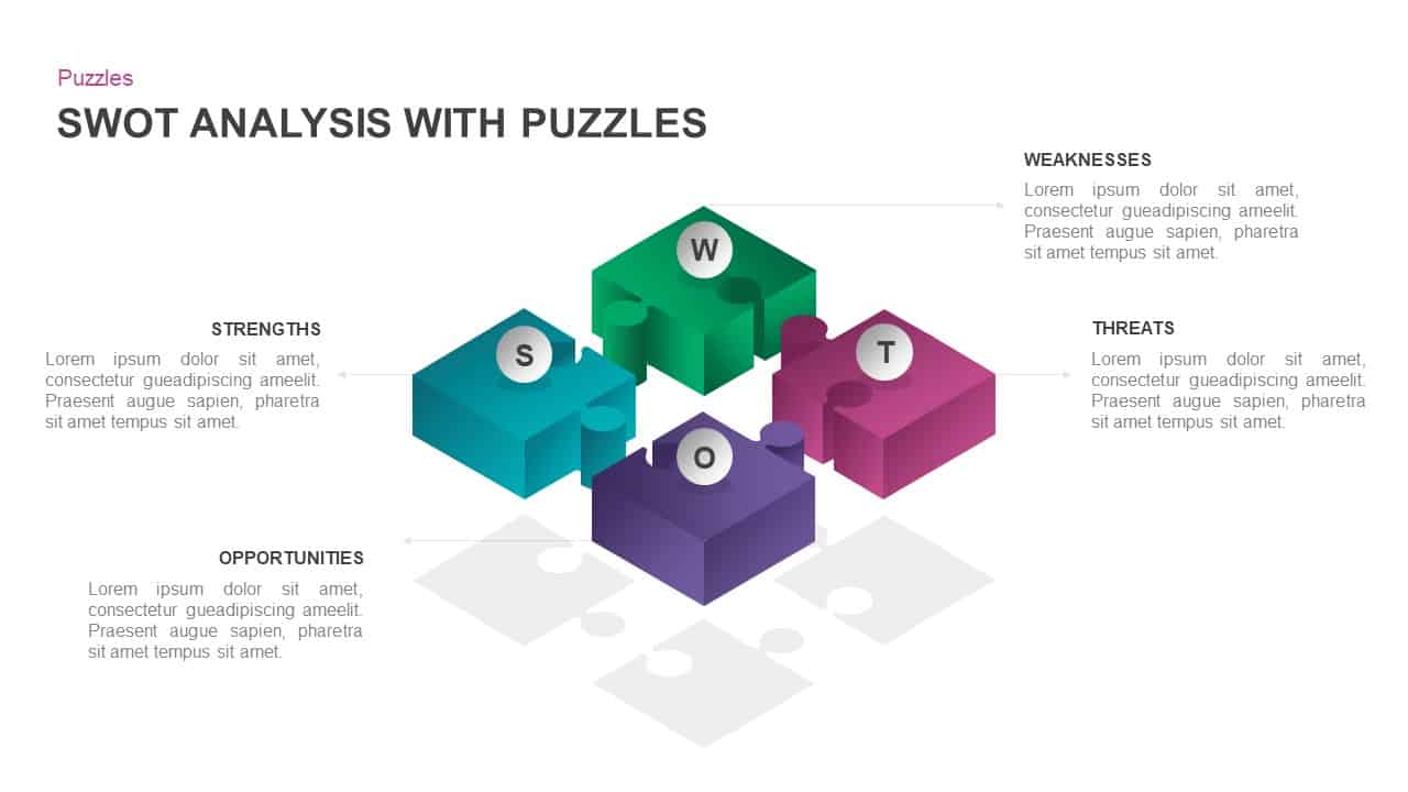
Interactive 3D Puzzle SWOT Analysis Slide Template for PowerPoint & Google Slides
SWOT
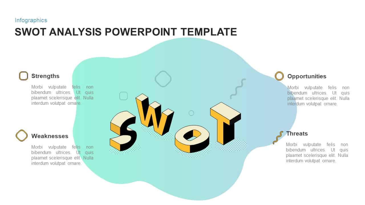
3D Blob SWOT Analysis Infographic Template for PowerPoint & Google Slides
SWOT
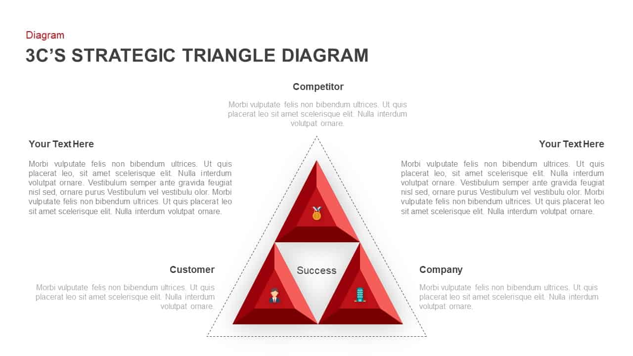
3C Strategic Triangle Analysis Template for PowerPoint & Google Slides
Competitor Analysis
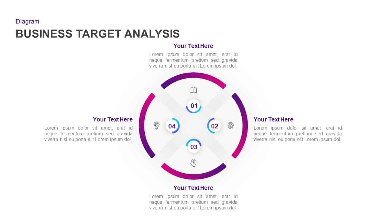
Business Target Analysis Diagram Template for PowerPoint & Google Slides
Circle
Gradient Petal SWOT Analysis Quadrant Template for PowerPoint & Google Slides
SWOT
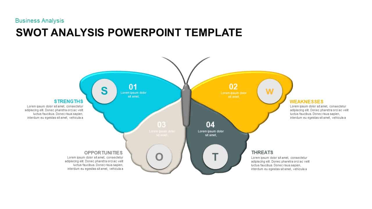
Butterfly SWOT Analysis Diagram Template for PowerPoint & Google Slides
SWOT
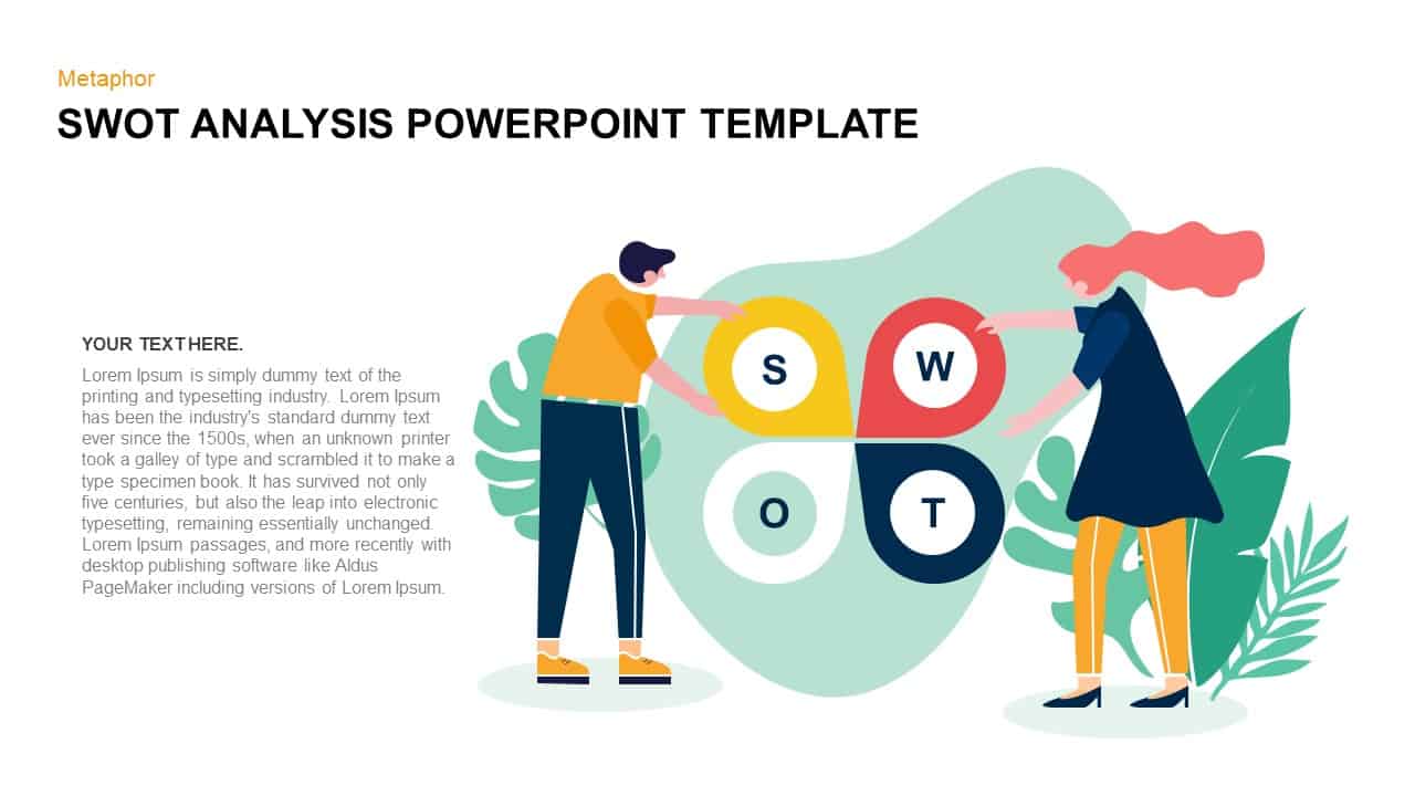
SWOT Analysis Metaphor Illustration Template for PowerPoint & Google Slides
SWOT
Versatile SWOT Analysis Slide Collection Template for PowerPoint & Google Slides
SWOT
3D Cube SWOT Analysis Infographic Template for PowerPoint & Google Slides
SWOT

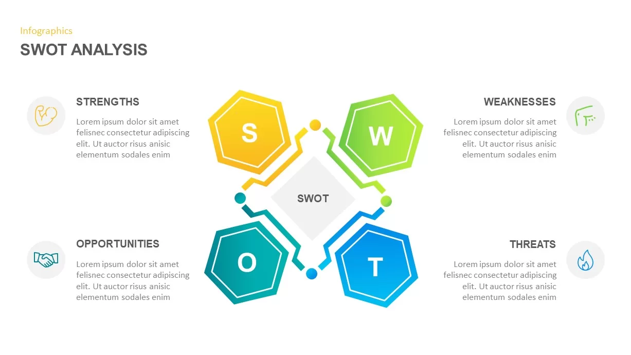
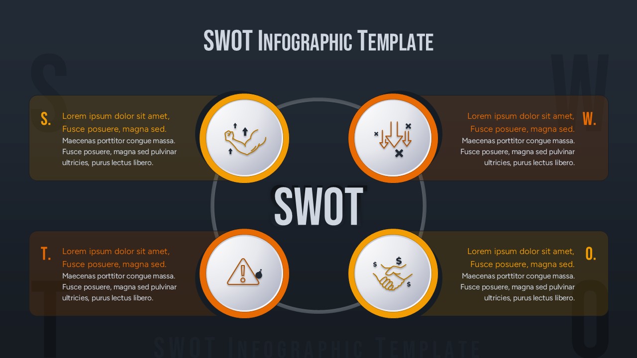
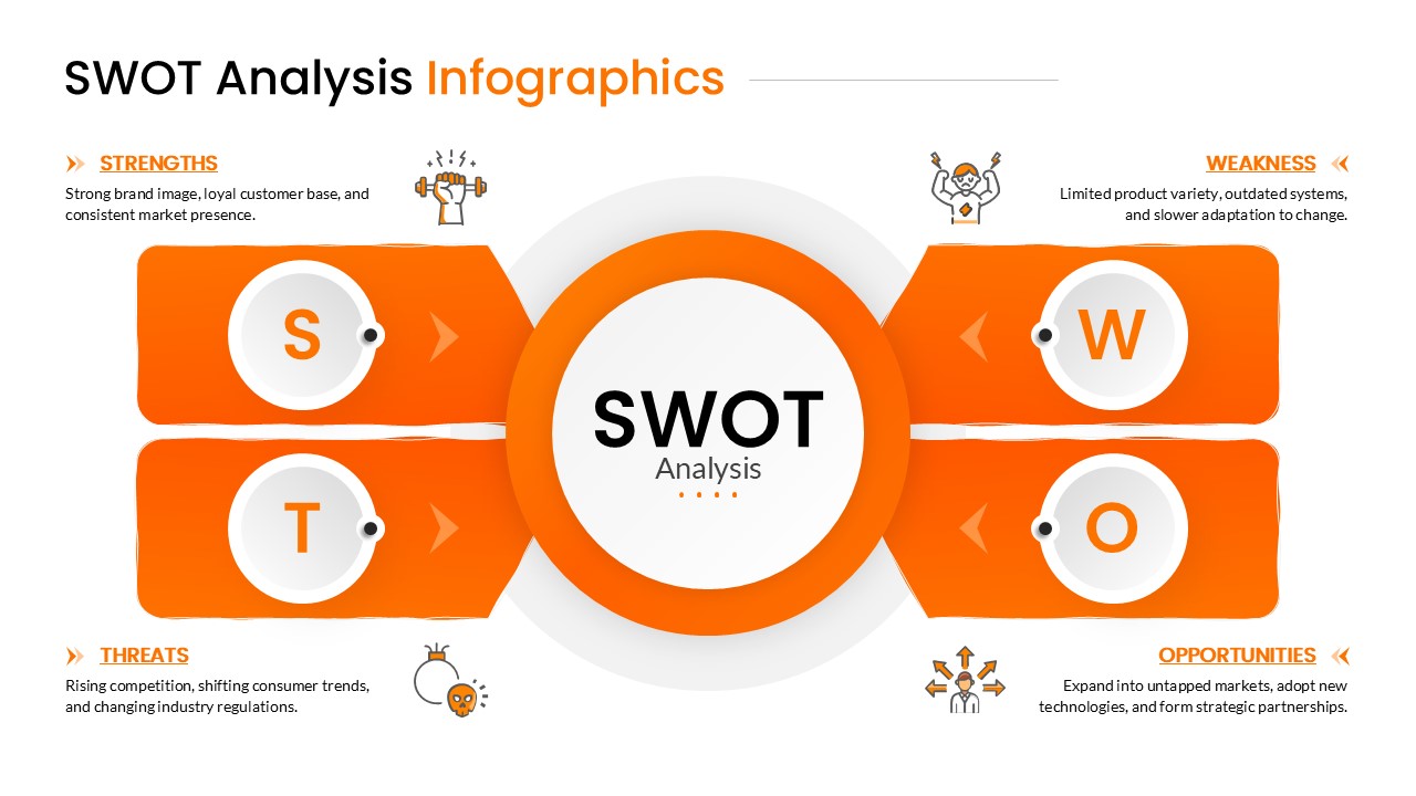
SWOT Analysis Infographic Diagram Template for PowerPoint & Google Slides
SWOT
PESTLE and PEST Strategic Analysis Diagrams Template for PowerPoint & Google Slides
Business Strategy
Sky and Tree Root Cause Analysis Deck Template for PowerPoint & Google Slides
Opportunities Challenges
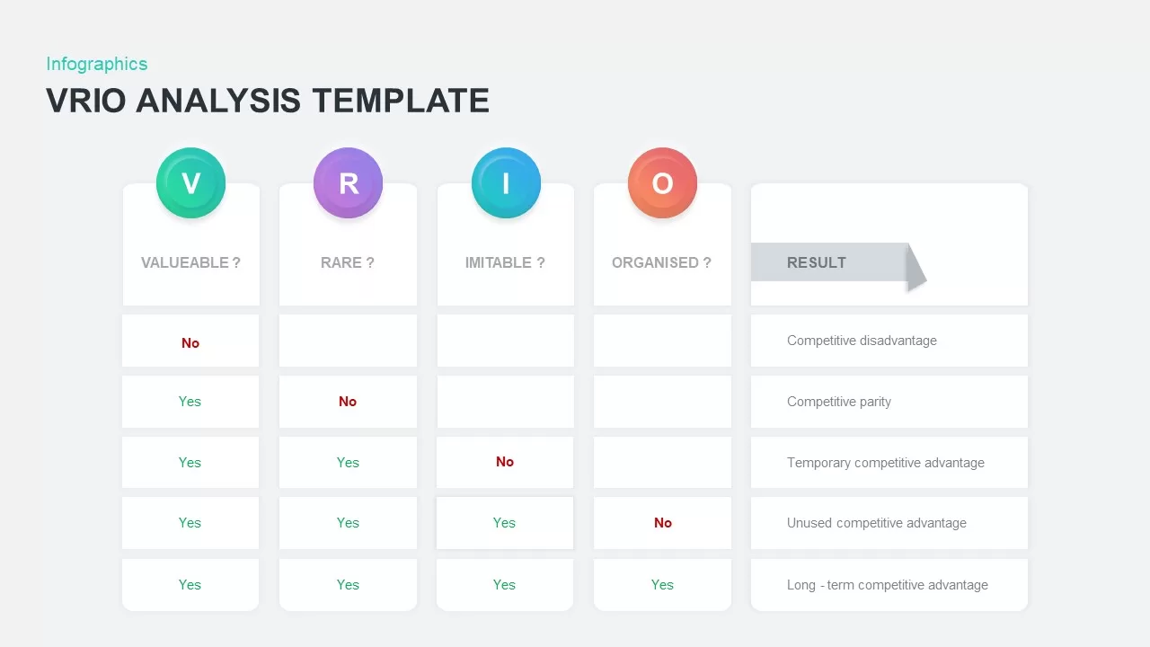
VRIO Analysis Infographic Template for PowerPoint & Google Slides
Business Strategy
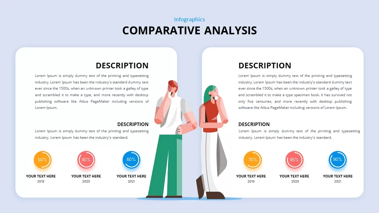
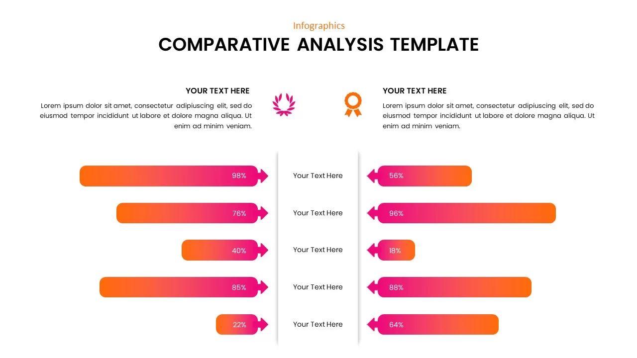
Comparative Analysis Template for PowerPoint & Google Slides
Comparison
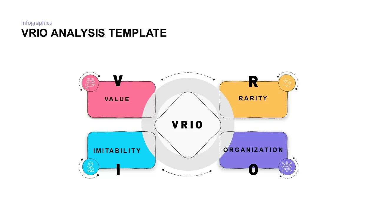
VRIO Analysis Framework template for PowerPoint & Google Slides
Business Strategy
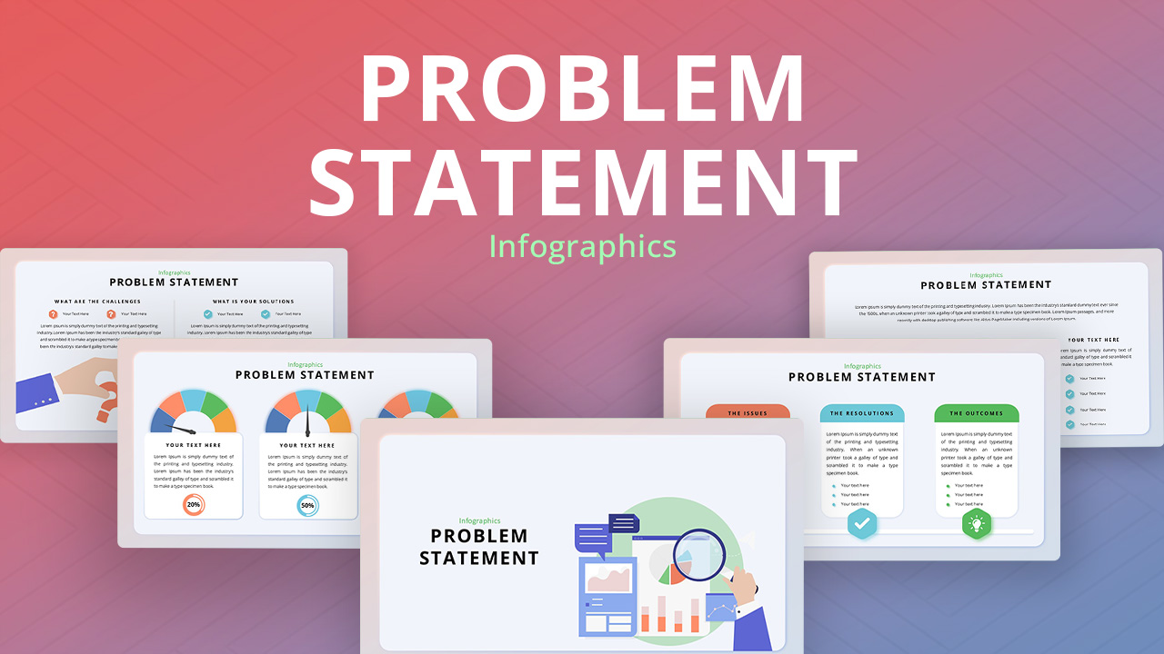
Problem Statement Analysis template for PowerPoint & Google Slides
Business Strategy
Comparative Analysis template for PowerPoint & Google Slides
Business Report
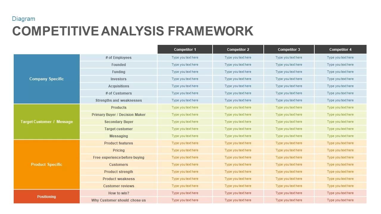
Competitive Analysis Framework template for PowerPoint & Google Slides
Business Report
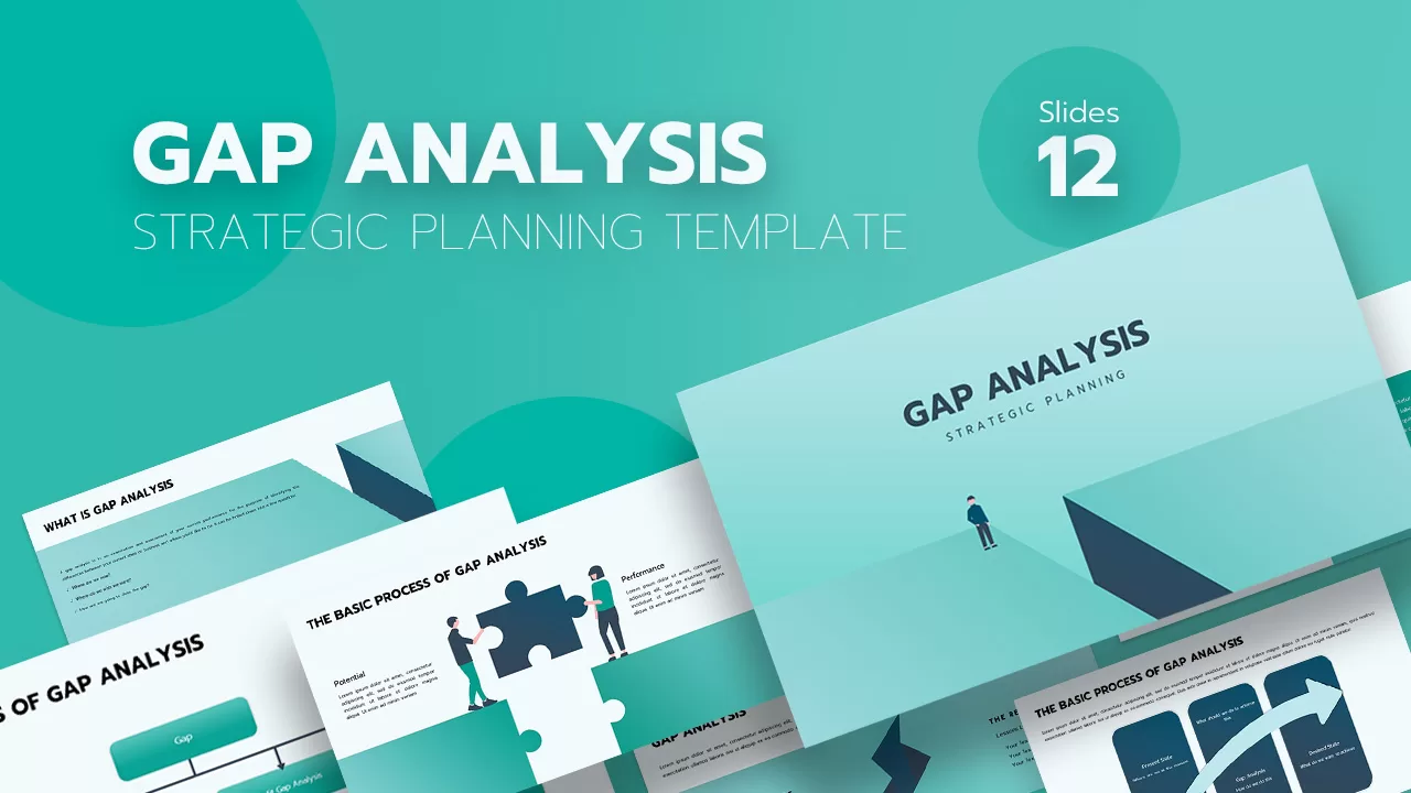
Gap Analysis Strategic Planning Template for PowerPoint & Google Slides
Gap
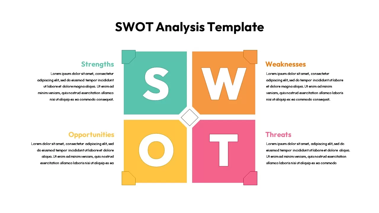
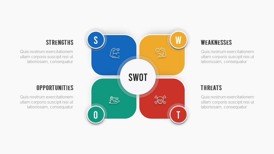
SWOT Analysis Grid Infographic Template for PowerPoint & Google Slides
SWOT
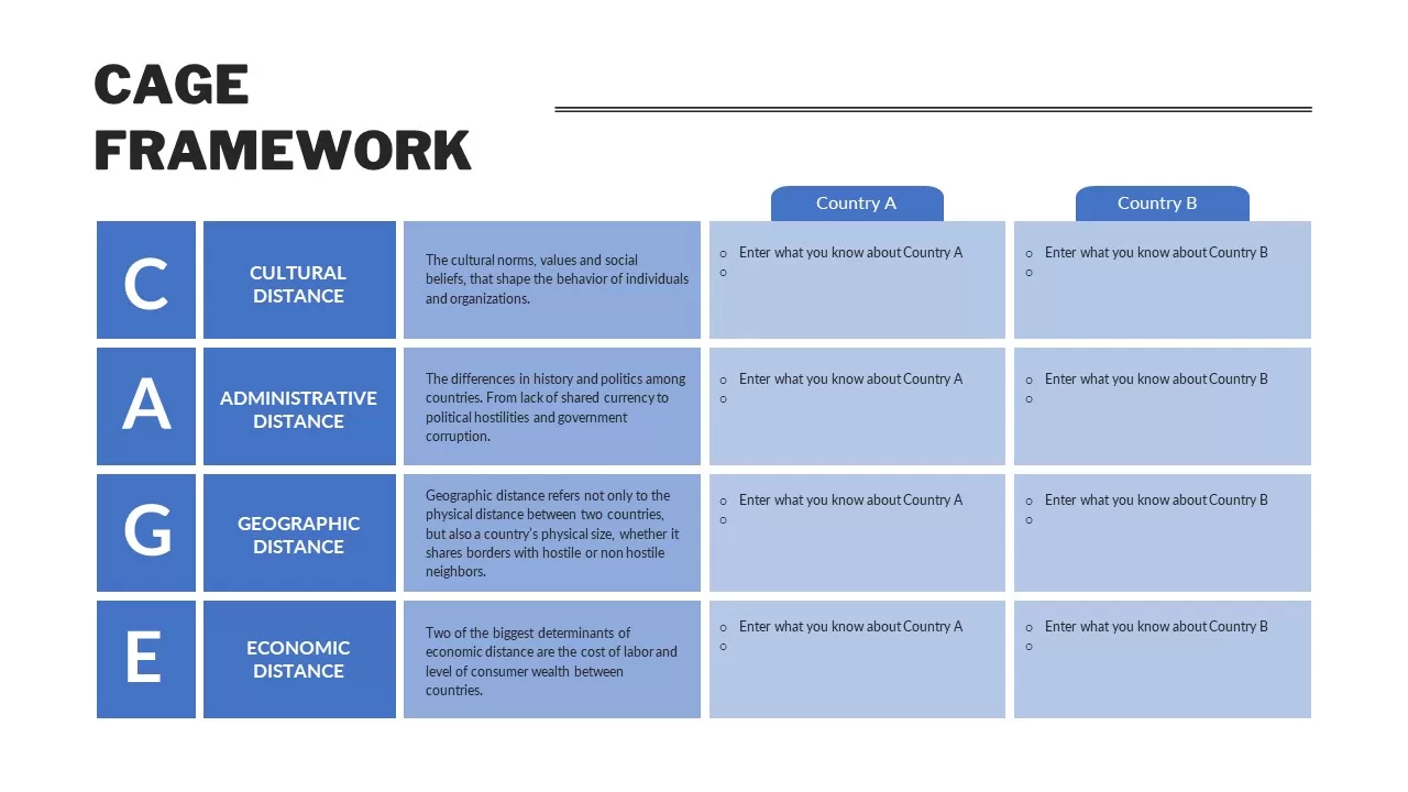
CAGE Distance Analysis Framework Template for PowerPoint & Google Slides
Competitor Analysis
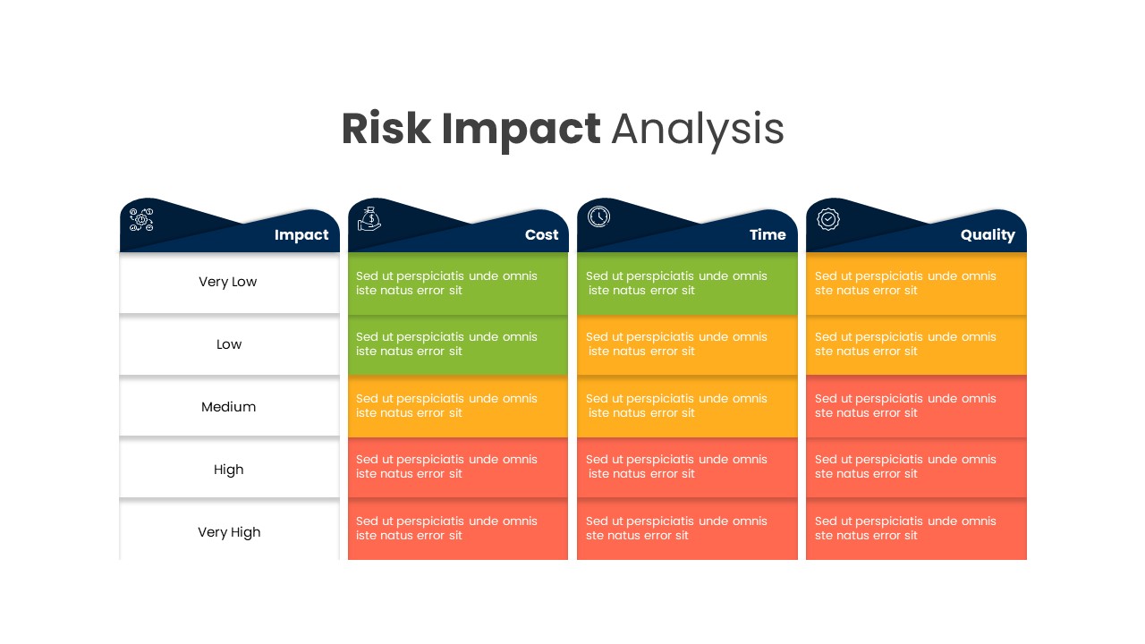
Comprehensive Risk Impact Analysis Template for PowerPoint & Google Slides
Risk Management
Colorful SWOT Analysis Quadrant Template for PowerPoint & Google Slides
SWOT
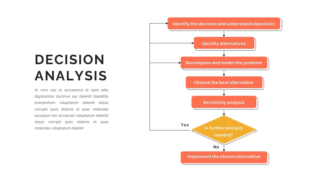
Decision Analysis Process Flowchart Template for PowerPoint & Google Slides
Flow Charts
SWOT Analysis Framework template for PowerPoint & Google Slides
SWOT
SWOT Analysis Overview template for PowerPoint & Google Slides
Business
SWOT Analysis Visual Overview template for PowerPoint & Google Slides
Business Strategy
SWOT Analysis Quadrant template for PowerPoint & Google Slides
Business Strategy
SWOT Analysis Blocks template for PowerPoint & Google Slides
Business Strategy
SWOT Analysis Template for PowerPoint & Google Slides
Business Strategy
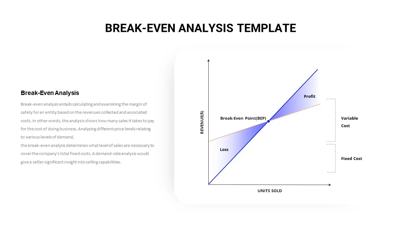
Break-Even Analysis Infographic Template for PowerPoint & Google Slides
Revenue
Free SWOT Analysis Overview template for PowerPoint & Google Slides
SWOT
Free
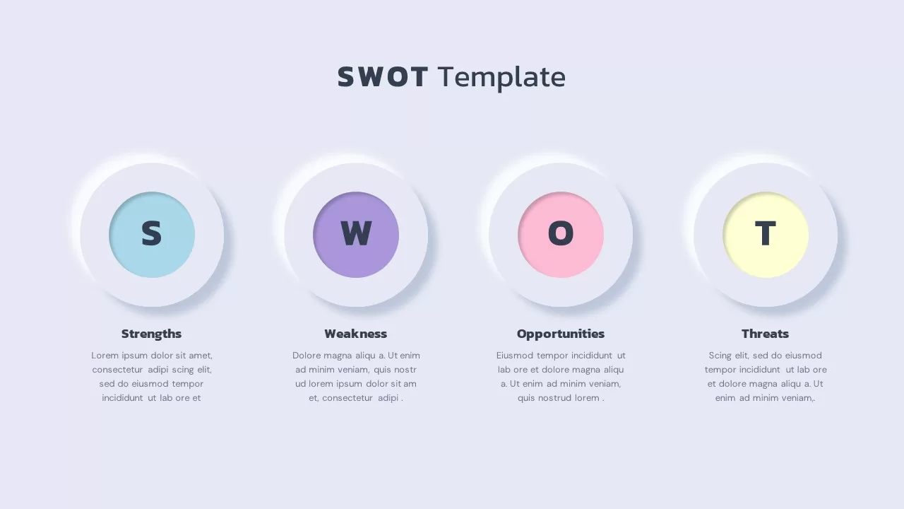
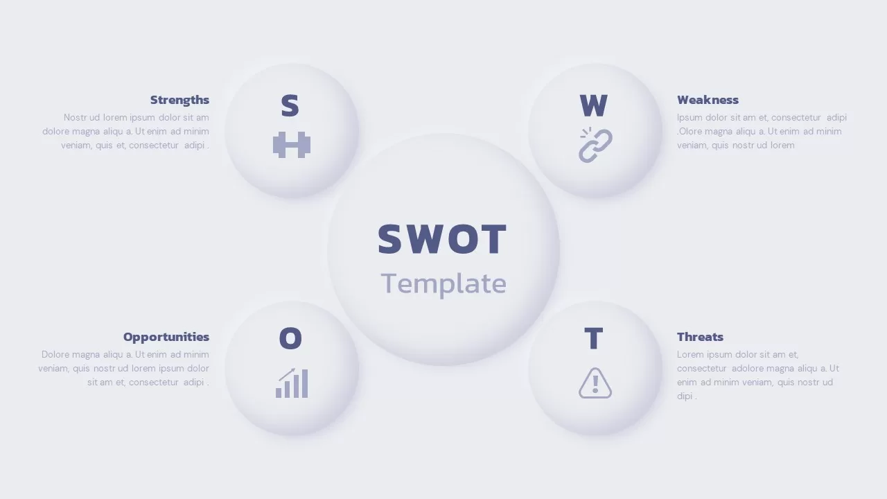
SWOT Analysis template for PowerPoint & Google Slides
SWOT
SWOT Analysis template for PowerPoint & Google Slides
SWOT
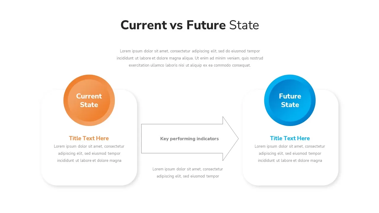
Current vs Future State Analysis template for PowerPoint & Google Slides
Comparison
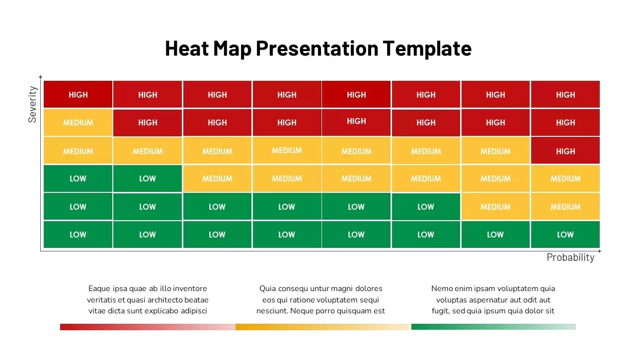
Heat Map Analysis Template for PowerPoint & Google Slides
Risk Management
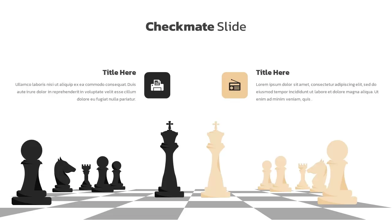
Checkmate Slide for Competitor Analysis Template for PowerPoint & Google Slides
Competitor Analysis
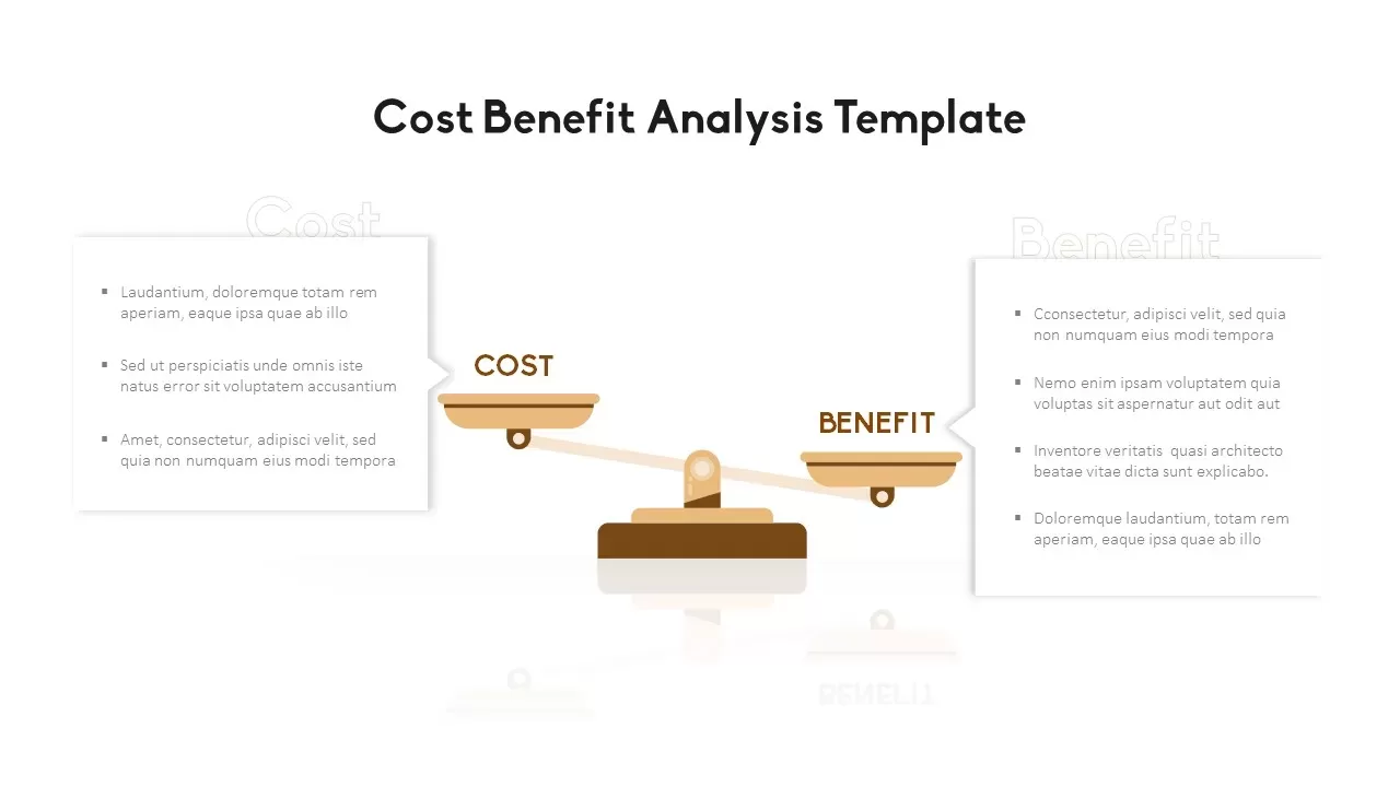
Cost Benefit Analysis Comparison Template for PowerPoint & Google Slides
Comparison
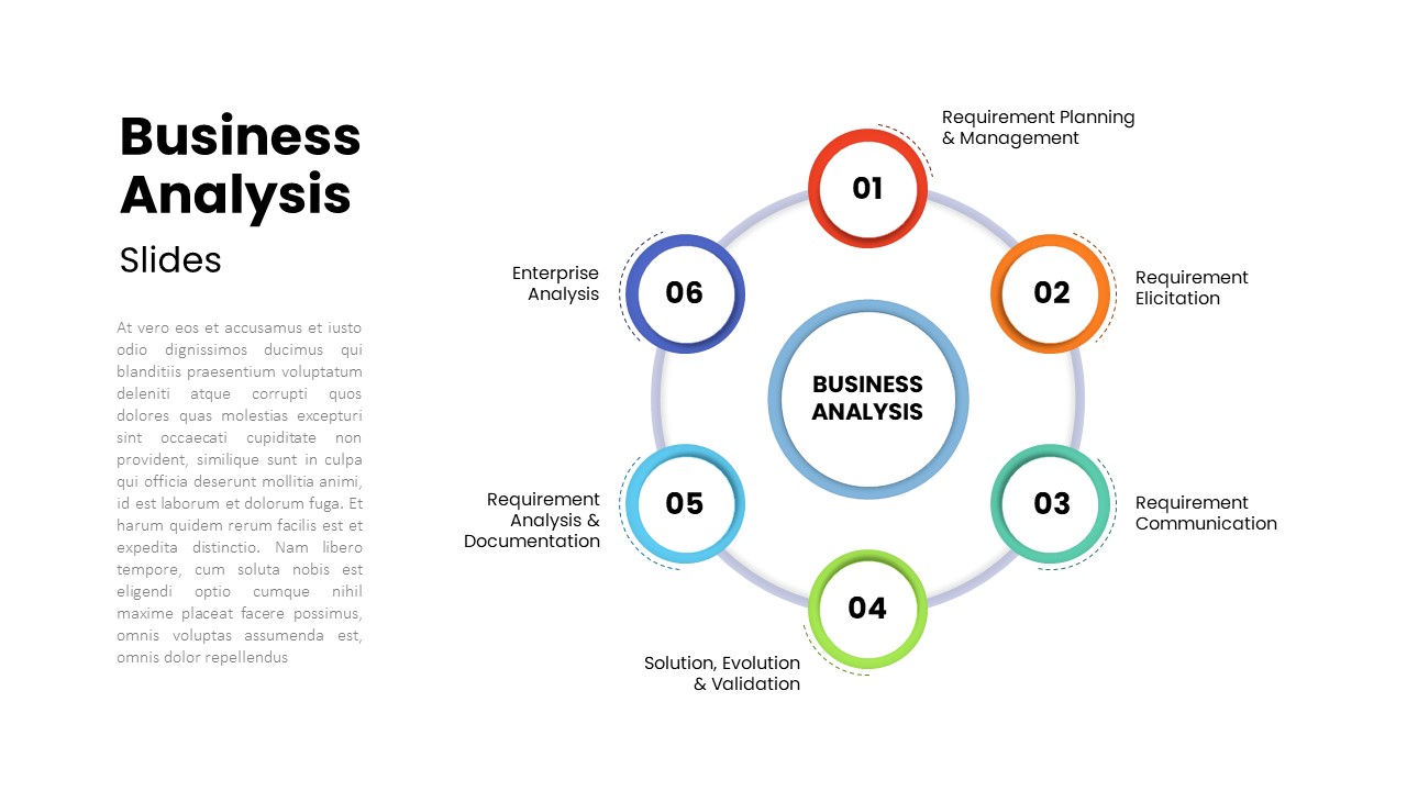
Six-Step Business Analysis Diagram template for PowerPoint & Google Slides
Circle
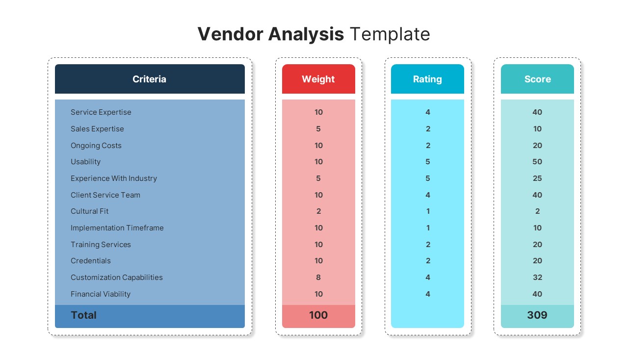
Vendor Analysis Criteria and Scoring template for PowerPoint & Google Slides
Business
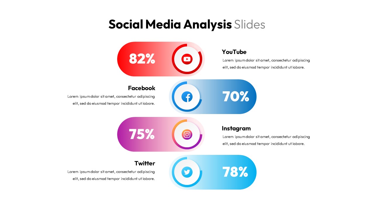
Social Media Analysis Metrics Slide Deck Template for PowerPoint & Google Slides
Digital Marketing
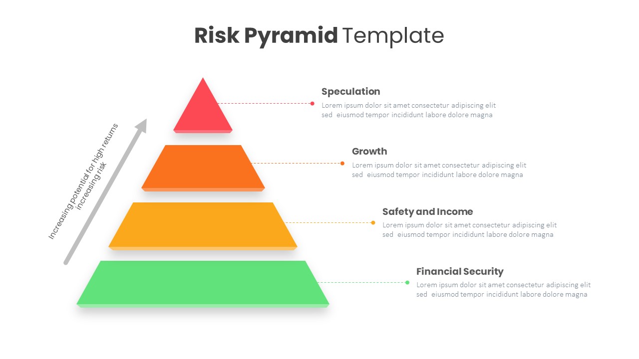
Risk Pyramid Hierarchy Analysis Template for PowerPoint & Google Slides
Pyramid
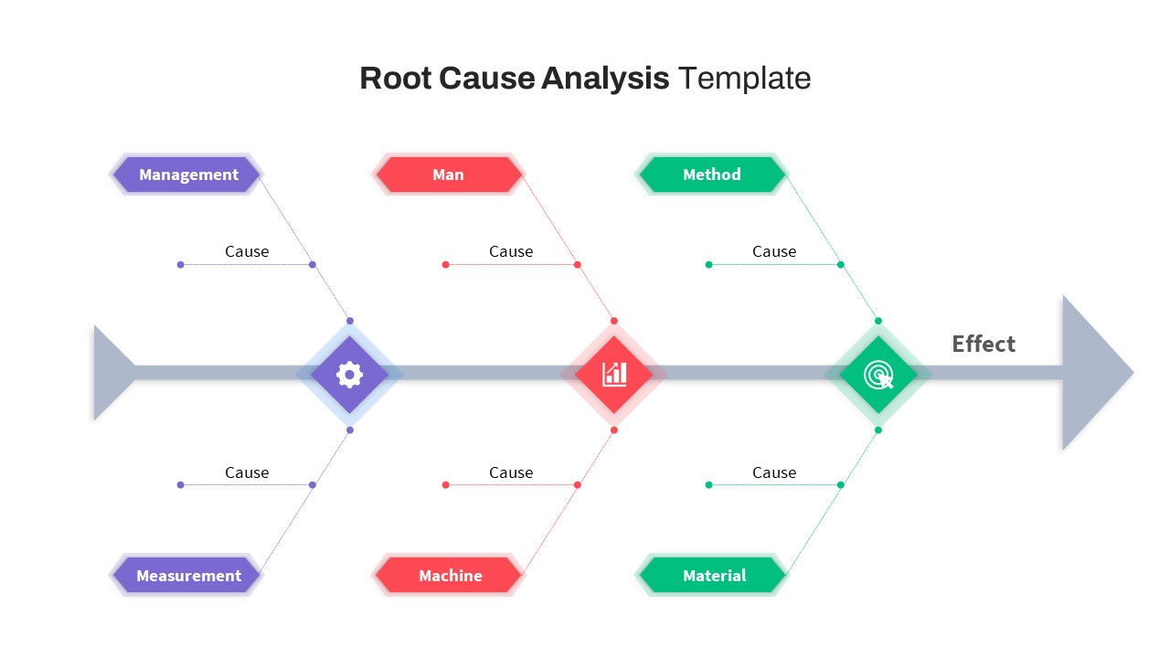
Free Root Cause Analysis Fishbone Diagram Template for PowerPoint & Google Slides
Process
Free
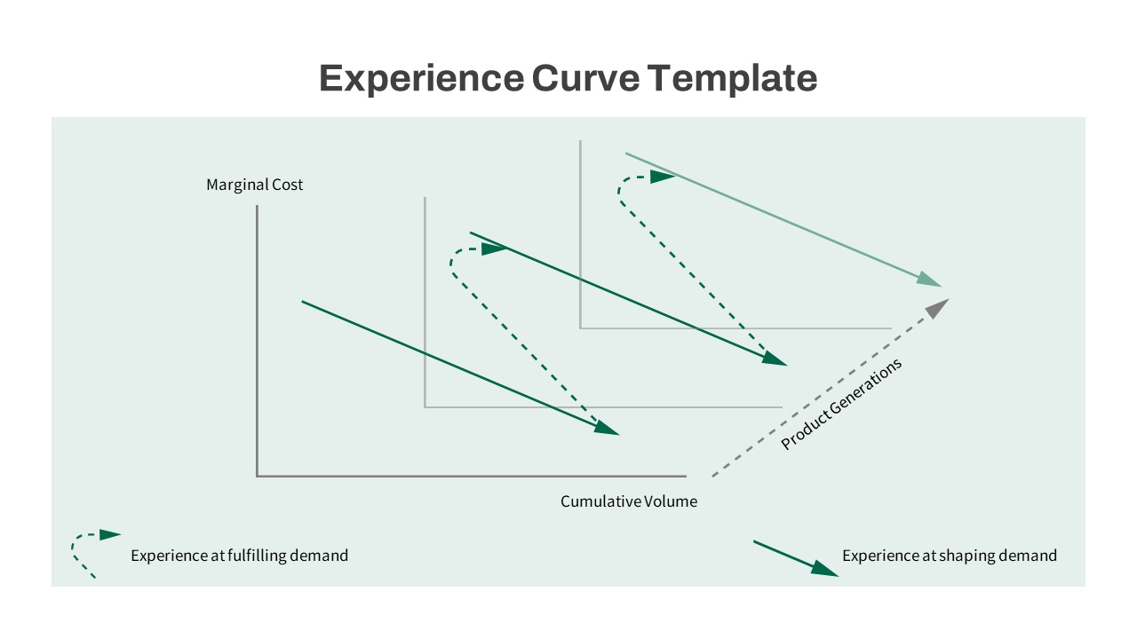
Experience Curve Analysis Diagram Template for PowerPoint & Google Slides
Business Strategy
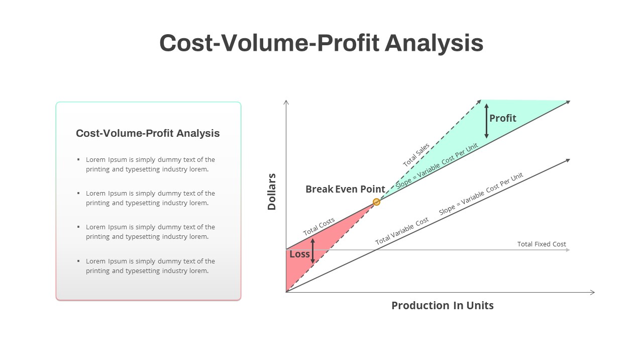
Cost-Volume-Profit Analysis Diagram Template for PowerPoint & Google Slides
Finance
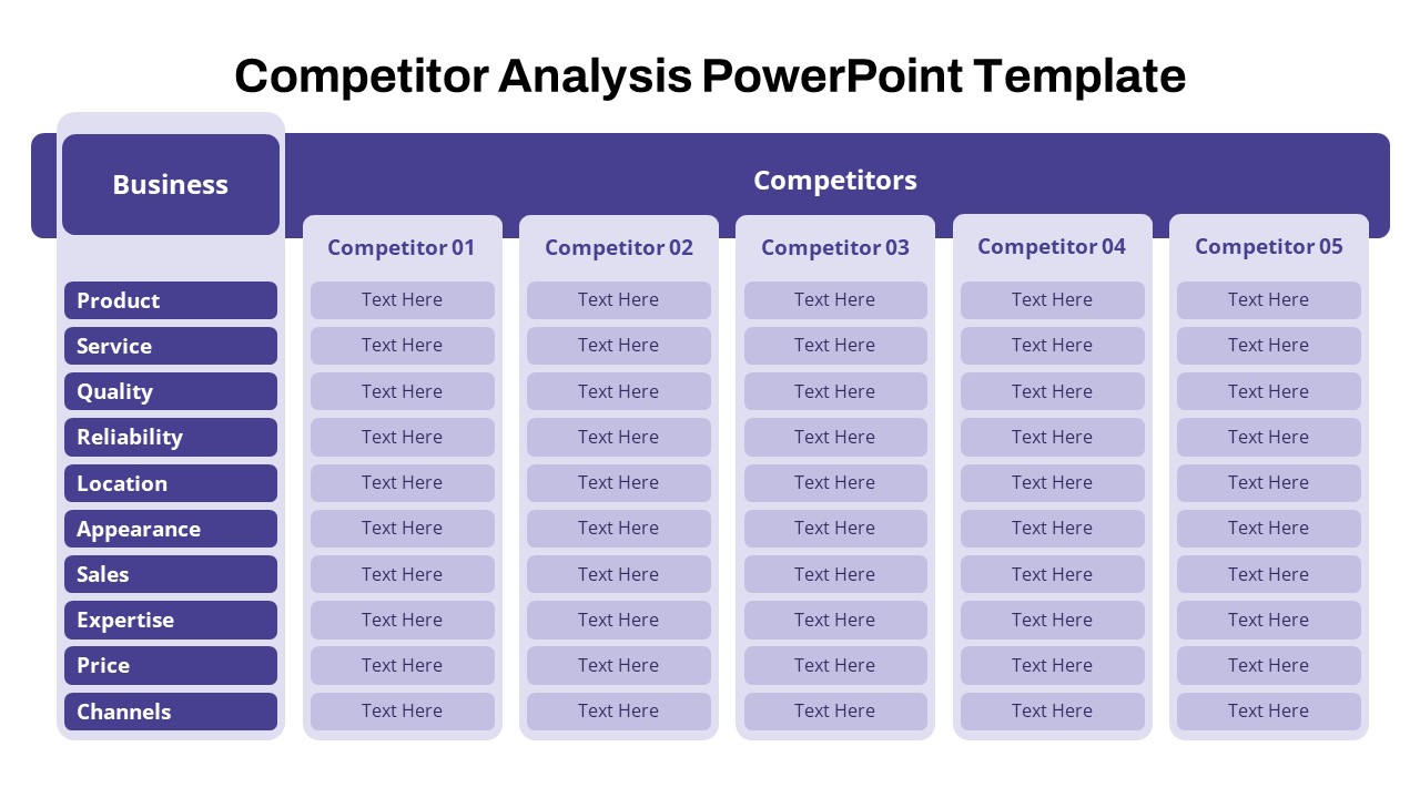
Free Competitor Analysis Matrix Template for PowerPoint & Google Slides
Competitor Analysis
Free
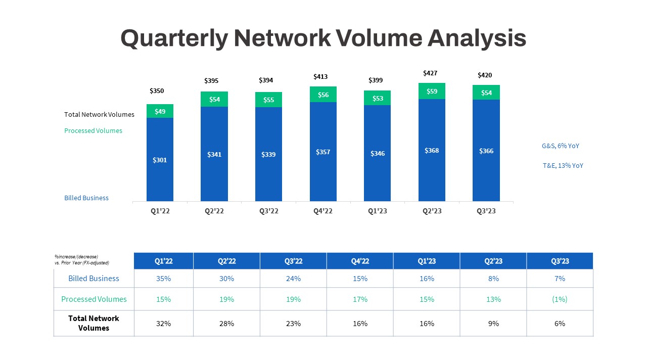
Quarterly Network Volume Analysis Template for PowerPoint & Google Slides
Business Report
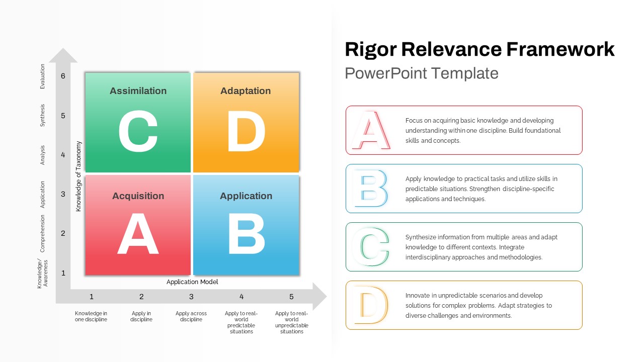
Rigor Relevance Framework Analysis Template for PowerPoint & Google Slides
Comparison
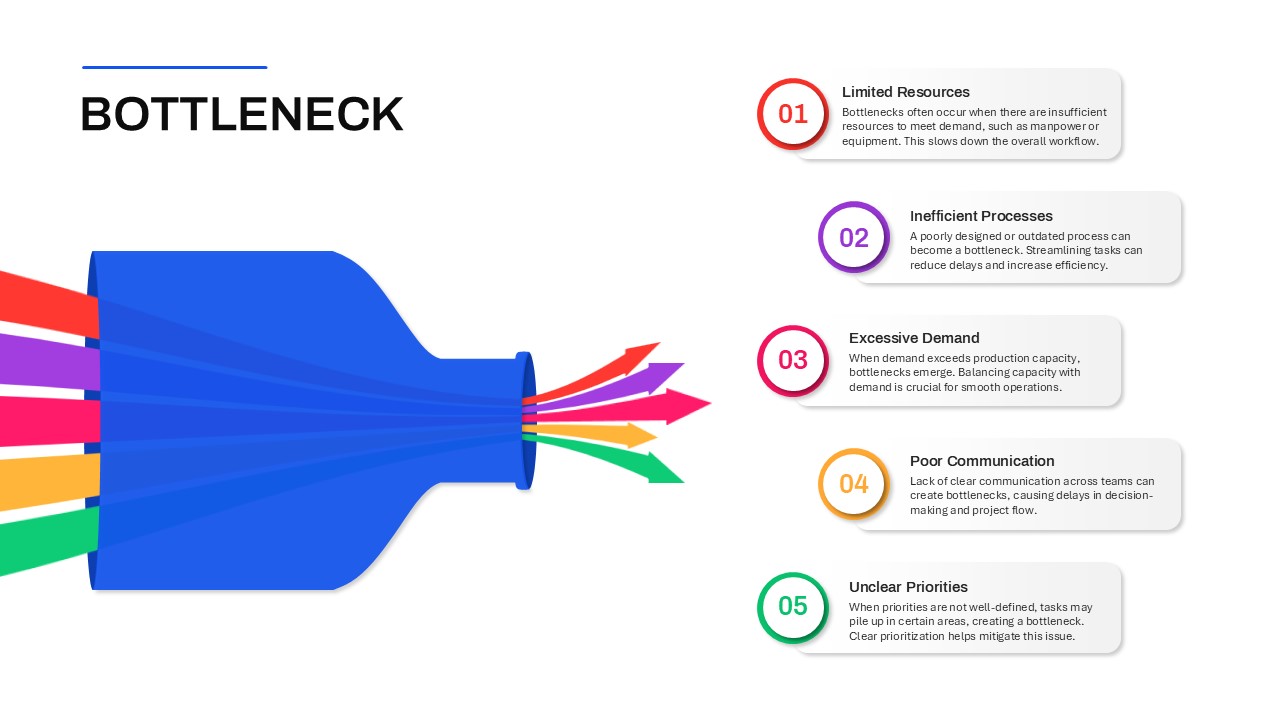
Bottleneck Process Analysis Diagram Template for PowerPoint & Google Slides
Process
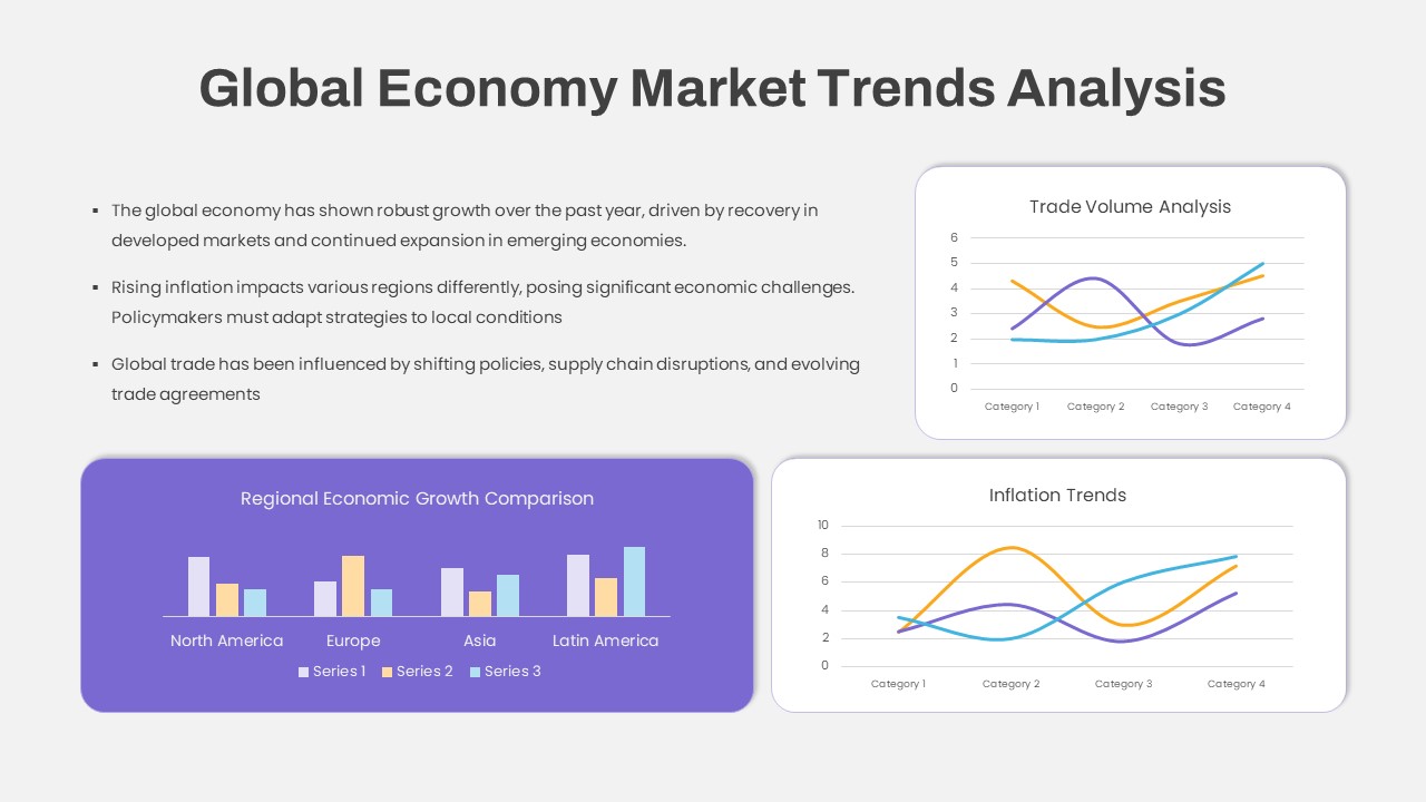
Global Economy Market Trends Analysis Template for PowerPoint & Google Slides
Comparison Chart
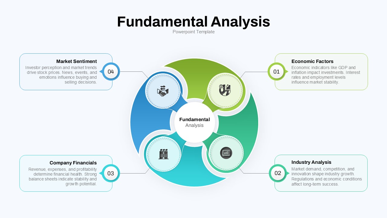
Fundamental Analysis Circular Diagram Template for PowerPoint & Google Slides
Circle
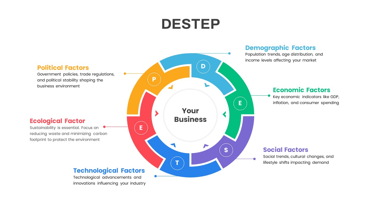
DESTEP Marketing Analysis Diagram Template for PowerPoint & Google Slides
Circle
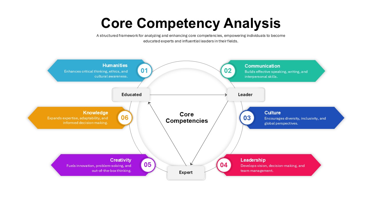
Core Competency Analysis Circular Template for PowerPoint & Google Slides
Circle
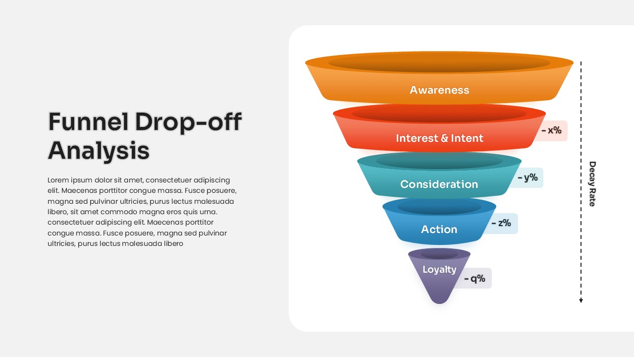
Funnel Drop-off Analysis template for PowerPoint & Google Slides
Business
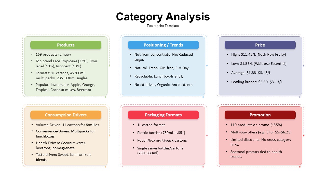
Category Analysis Comparison Infographic Template for PowerPoint & Google Slides
Comparison
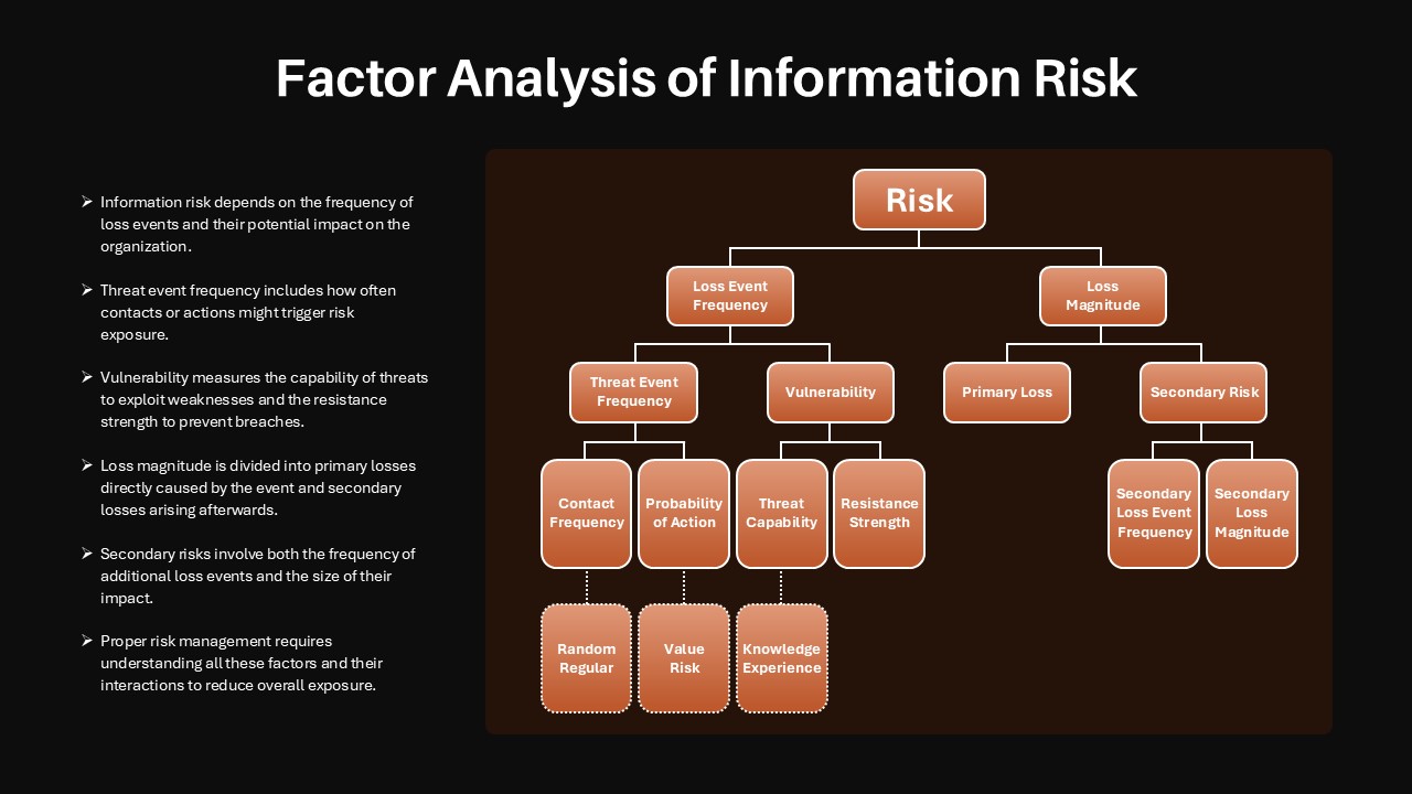
Factor Analysis of Information Risk Template for PowerPoint & Google Slides
Risk Management
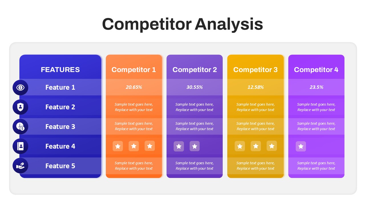
Competitor Analysis Overview template for PowerPoint & Google Slides
Competitor Analysis
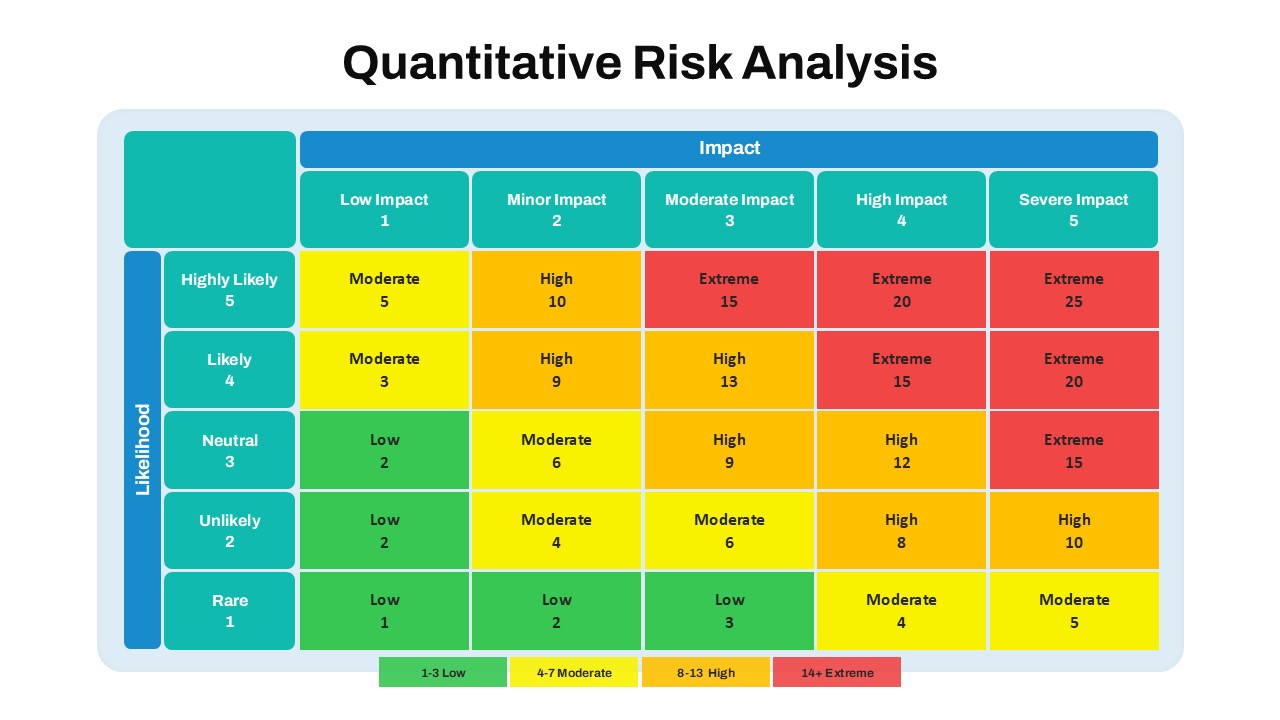
Quantitative Risk Analysis Matrix template for PowerPoint & Google Slides
Risk Management
Trapezoid SWOT Analysis Template for PowerPoint & Google Slides
SWOT
SWOT Analysis Infographic with Circular Icons Template for PowerPoint & Google Slides
SWOT
Multi Color SWOT Analysis Quadrant Template for PowerPoint & Google Slides
SWOT
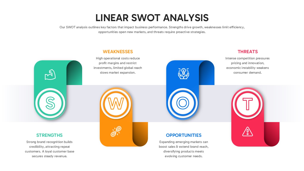
Linear SWOT Analysis Slide Template for PowerPoint & Google Slides
SWOT
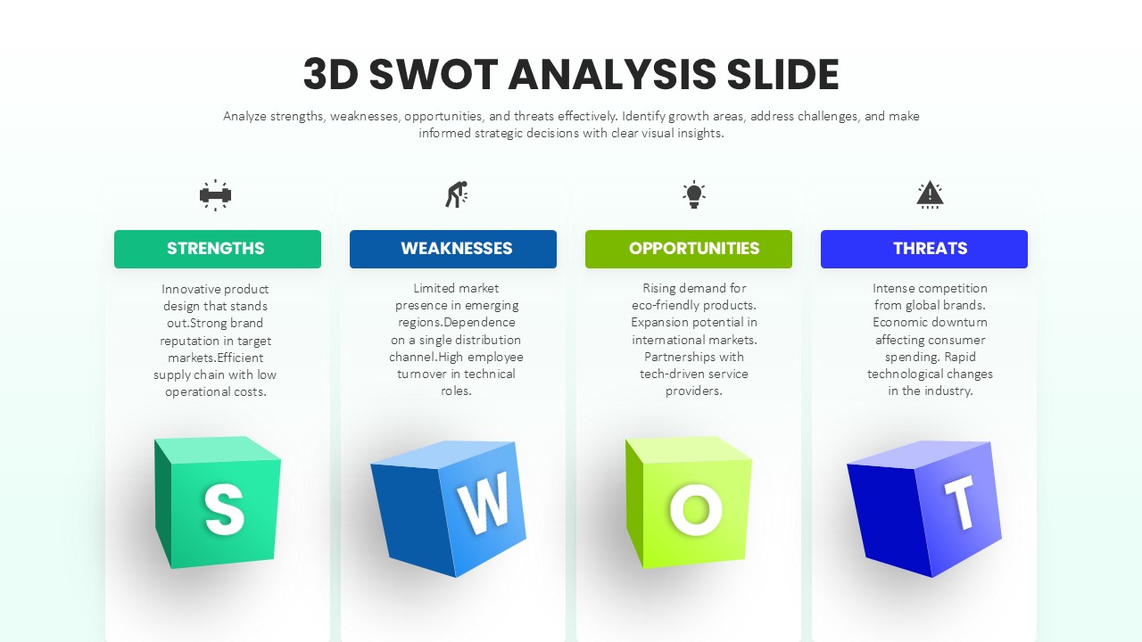
3D SWOT Analysis Template for PowerPoint & Google Slides
SWOT
Orange SWOT Analysis Infographic Template for PowerPoint & Google Slides
SWOT
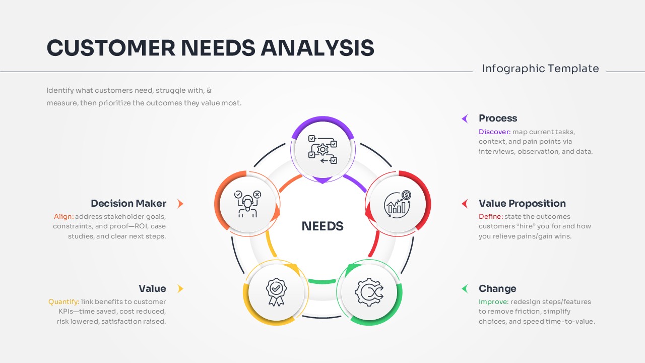
Customer Needs Analysis Template for PowerPoint & Google Slides
Customer Experience
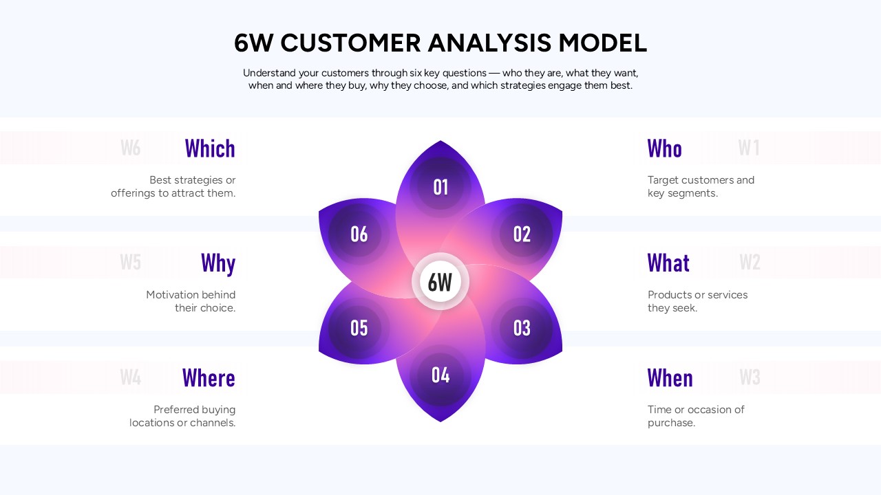
6W Customer Analysis Model Template for PowerPoint & Google Slides
Customer Experience
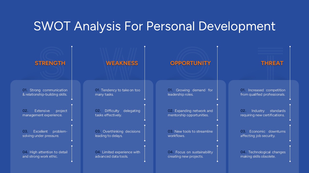
Free SWOT Analysis for Personal Development Template for PowerPoint & Google Slides
SWOT
Free