Polynomial Combination Chart PowerPoint Template and Google Slides
Polynomial Chart Template
Polynomial combination chart PowerPoint template and keynote is a statistical device to show the trends of data over the periods. Basically, the polynomial chart functions as a smooth continuous curve. The curves of the graph represent the up and down movements of an event. The main aspect of this type of graph is that you can use to help put the curve together. The polynomial graph chart PowerPoint is used to show the possible number of turning points. The business professionals and researchers can use this polynomial chart template to convey more accurate information through graphical representation. Use the leading coefficient test to find the end behavior of the sales and marketing strategies.
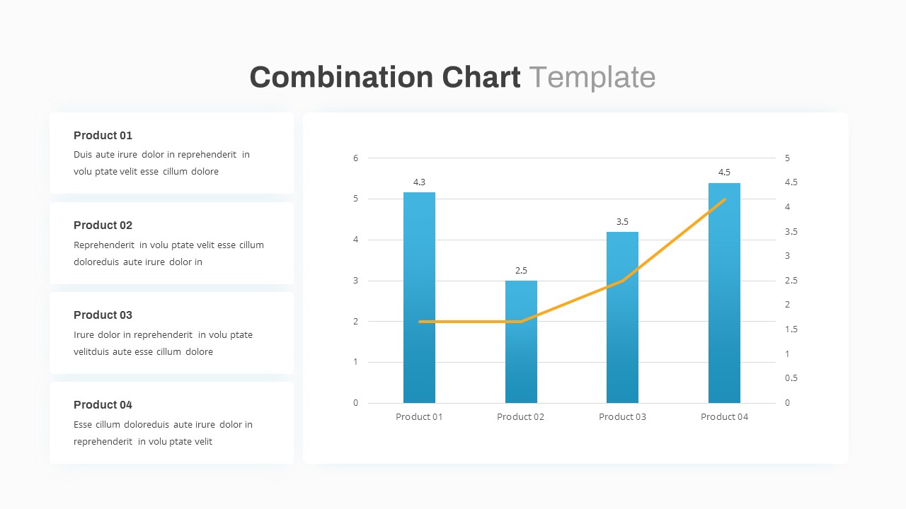
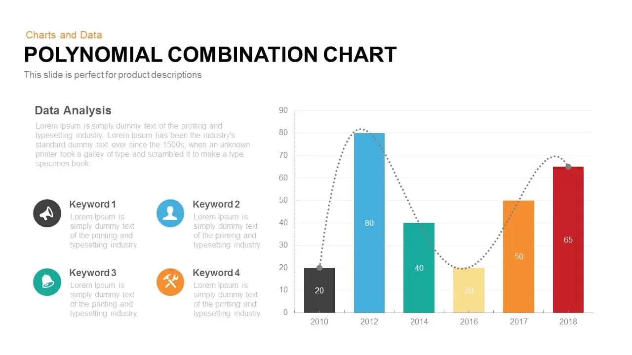
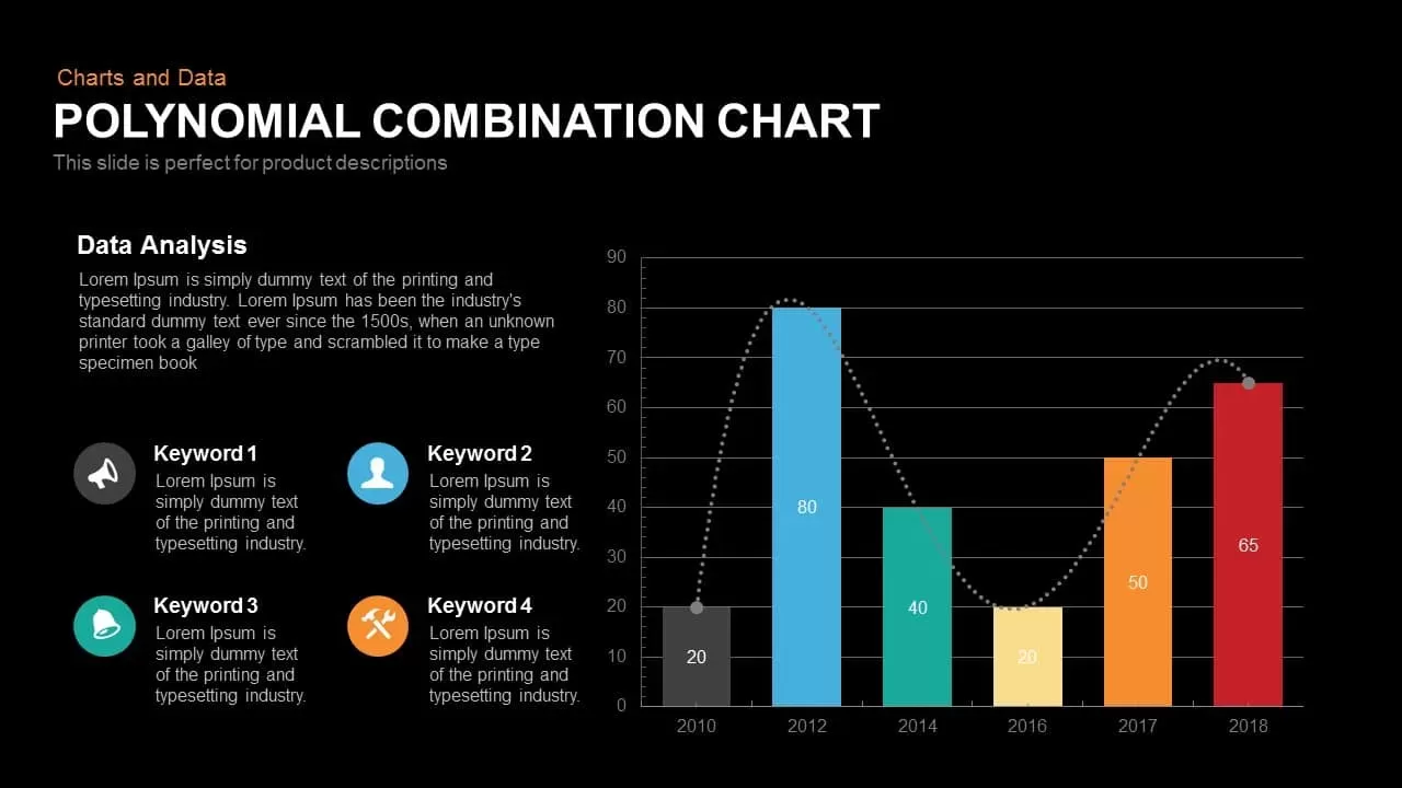
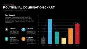
This polynomial chart for PowerPoint template presentation shows the highest and lowest values by a dotted line graph and bar graph. Polynomial Combination Chart PowerPoint template is fashioned in the form of a bar graph which can be well used to show statistics, figures or numerical data attained over the years; best used to represent the financial returns, profit and loss since the initiation of business. The template has six bars of varying heights and colors and you may represent each according to your choice. One axis of the Polynomial Combination Chart has years as variants and the other has numbers as variants. A dotted line emerges from the first bar connecting all the bars and rests at the last bar. On the left side of the design, there is sufficient space to write report according to the idea or subject you want to depict through the presentation. This Google Slides template is available in the black and white background and you may pick the subject to be revealed through this Polynomial Combination Chart PowerPoint and Google Slides for your presentation.
The customizable bar charts and graph PowerPoint colored attractively, so the viewers can easily extract the presentation theme and its data. Additionally, users can change or alter the length of the bars in accordance with the data in hand. The numbers and the background color is also changeable. For more statistical tools just go through our categories and download suitable PowerPoint templates.
Login to download this file

Item ID
SB00207


Related Templates

Combination Chart PowerPoint Template
Bar/Column
Combination of Success PowerPoint Template
Business Strategy
Organizational Chart Template (Org Chart Template)
Org Chart
Quad Chart Infographic Pack of 8 Slides Template for PowerPoint & Google Slides
Comparison Chart
Free Professional Gantt Chart Pack – 4 Slides Template for PowerPoint & Google Slides
Gantt Chart
Free
Creative Data Analysis Bar Chart template for PowerPoint & Google Slides
Bar/Column
Organization Chart template for PowerPoint & Google Slides
Org Chart
Creative Dynamic Gantt Chart Timeline Template for PowerPoint & Google Slides
Timeline
Five-Branch Hierarchy Structure Chart template for PowerPoint & Google Slides
Org Chart
Organizational Structure Org Chart Template for PowerPoint & Google Slides
Org Chart

Application Revenue Line Chart KPI Template
Revenue
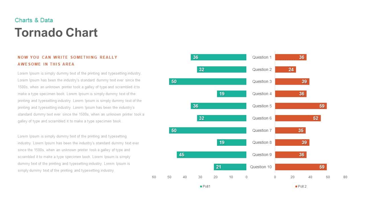
Tornado Chart Data Comparison Slide Template for PowerPoint & Google Slides
Bar/Column
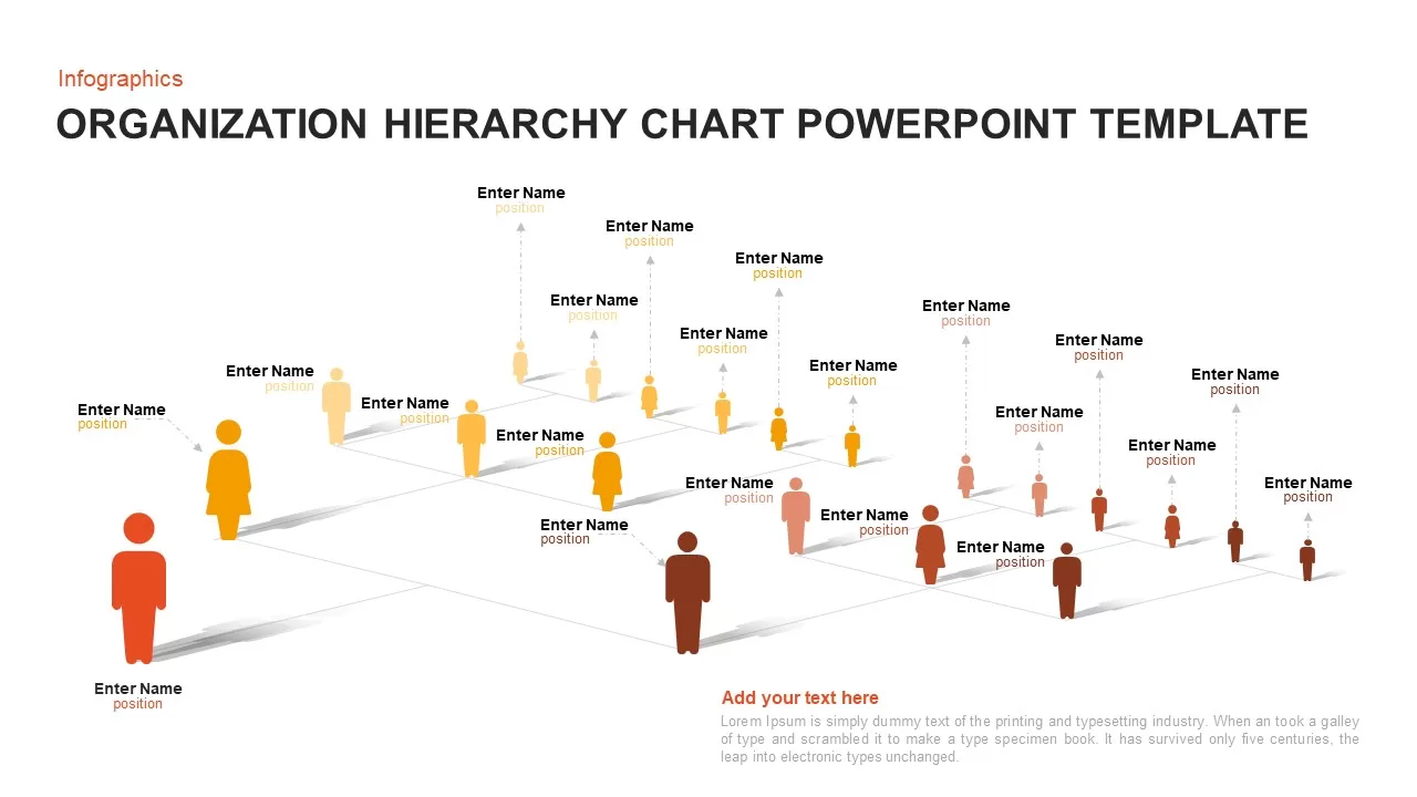
Organization Hierarchy Chart Template for PowerPoint and Google Slides
Org Chart
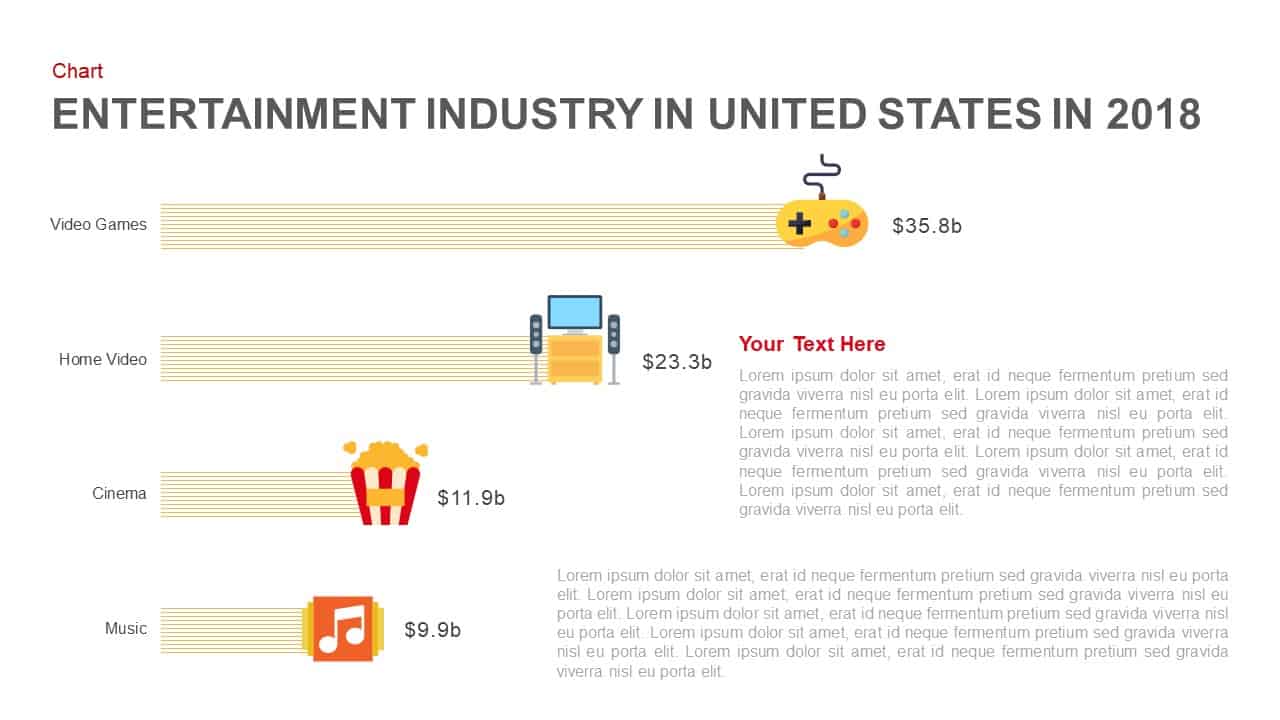
Entertainment Industry Revenue Bar Chart Template for PowerPoint & Google Slides
Bar/Column
Business Growth Metaphor Chart Template for PowerPoint & Google Slides
Business
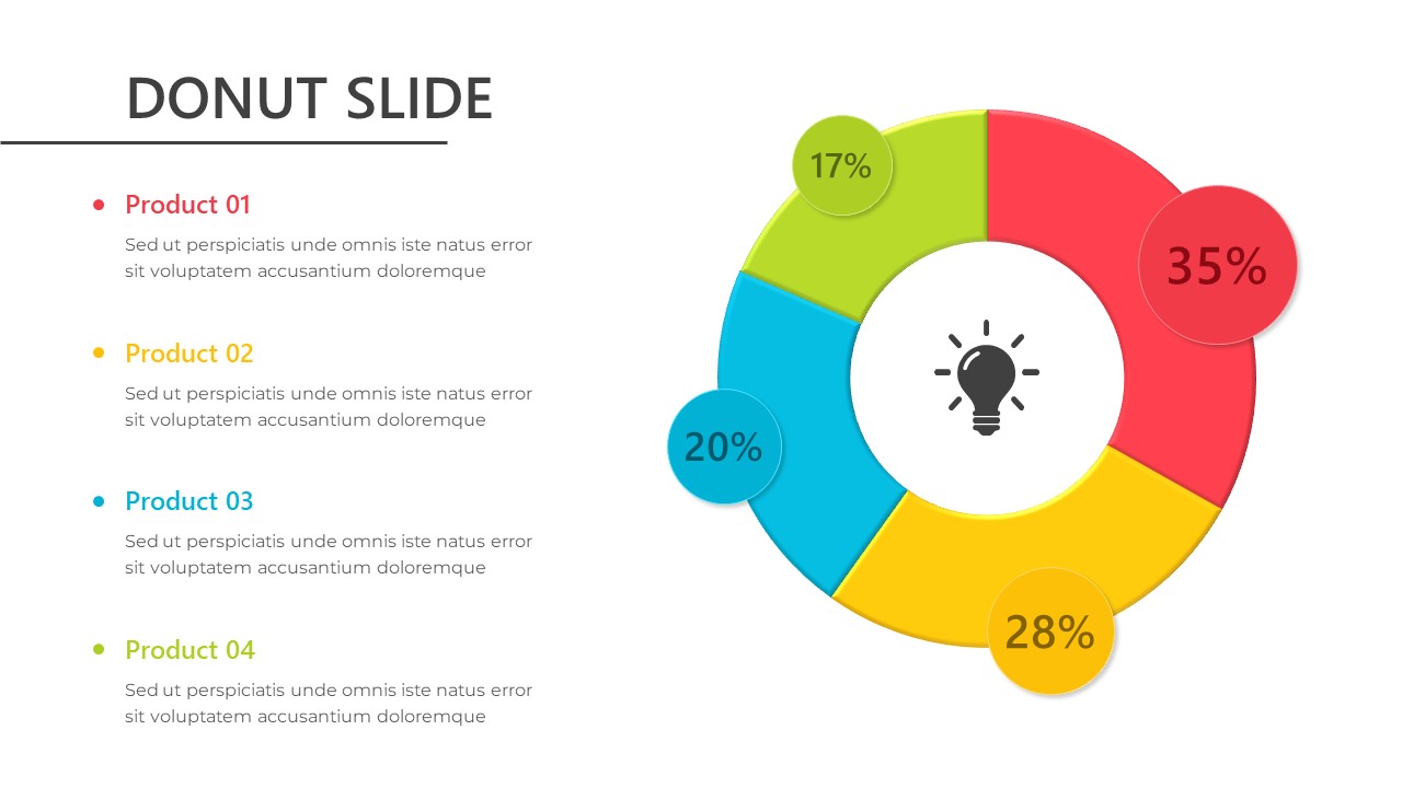
Donut Chart Template for PowerPoint & Google Slides
Pie/Donut
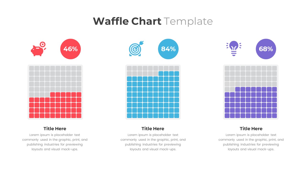
Waffle Chart Data Visualization Template for PowerPoint & Google Slides
Comparison Chart
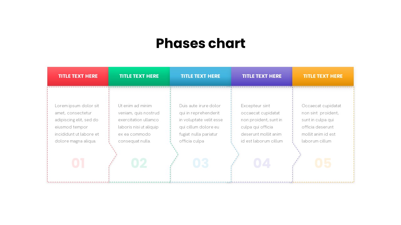
Five-Phase and Three-Phase Phases Chart Template for PowerPoint & Google Slides
Charts
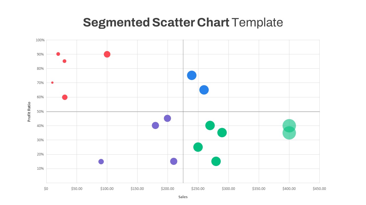
Segmented Scatter Chart Data Visualization Template for PowerPoint & Google Slides
Business Strategy
Weekly Gantt Chart with Milestones Template for PowerPoint & Google Slides
Gantt Chart