KPI Dashboard template for PowerPoint & Google Slides
KPI Dashboard PowerPoint and Google Slides Template
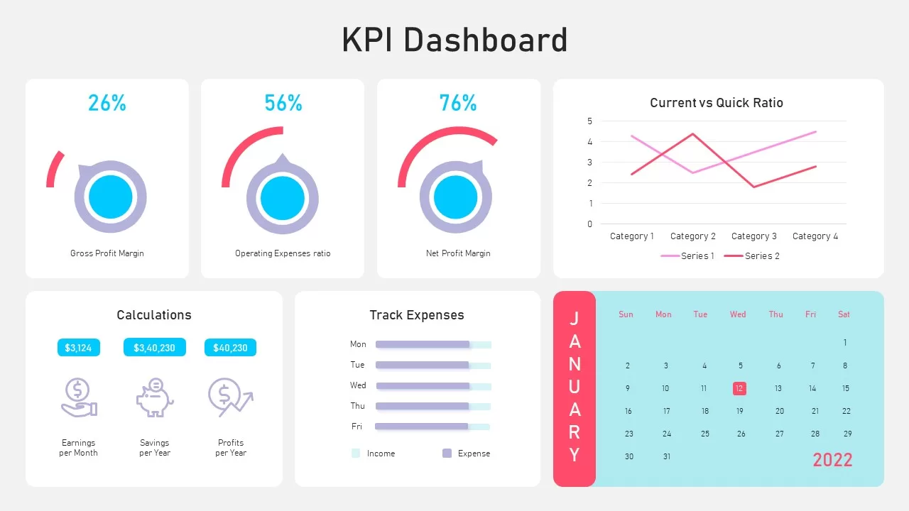
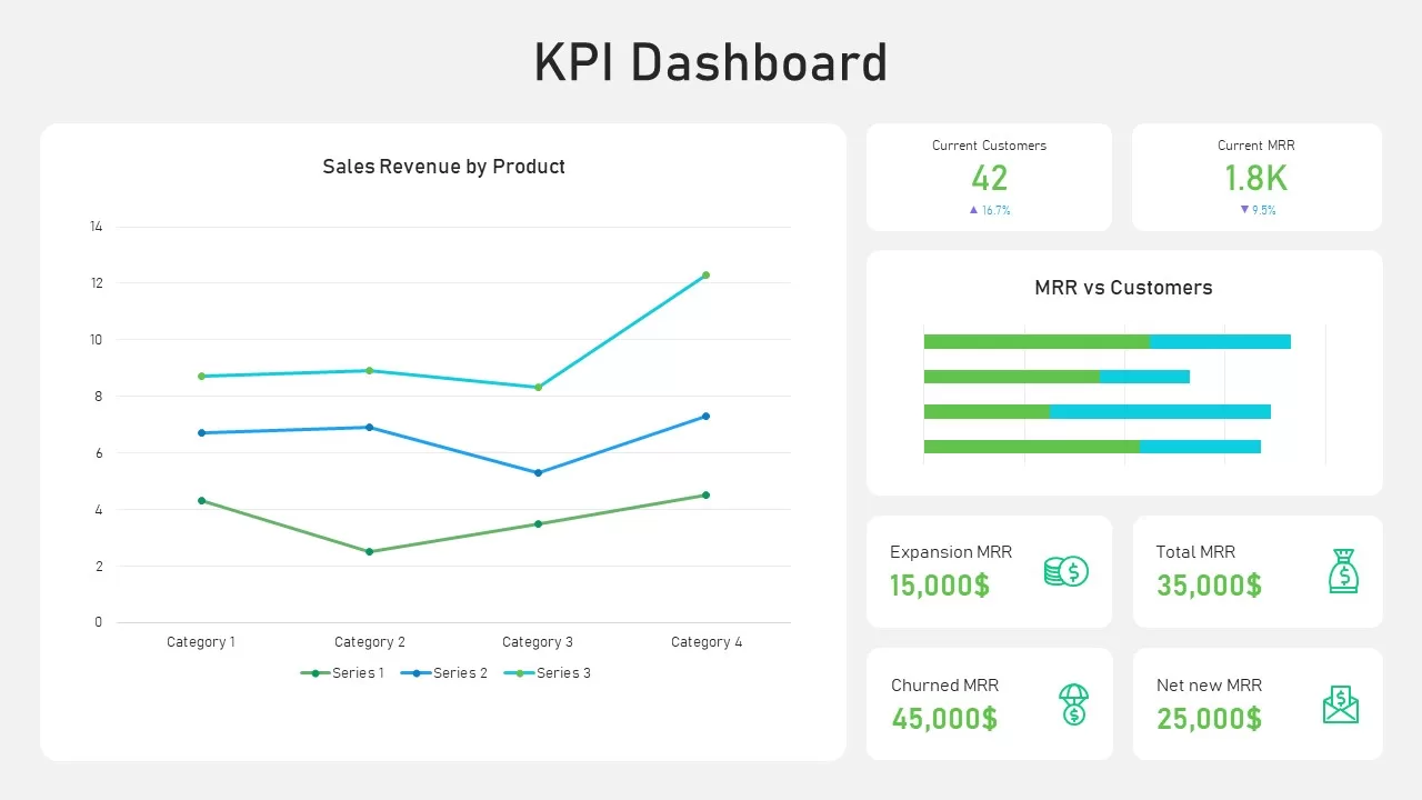
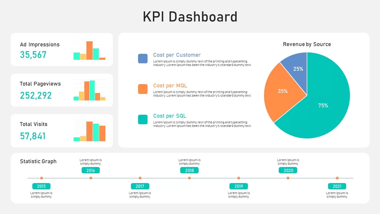
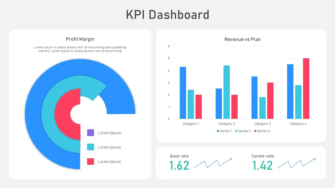
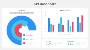
Tracking essential financial metrics, revenue performance, and liquidity benchmarks in a single visual interface helps leadership teams make informed data-driven decisions. This KPI dashboard PowerPoint template gives finance executives, operations directors, and business analysts a clean multi-widget layout to present high-level performance indicators side by side. Designed with modern rounded cards and vibrant data visualizations, this slide ensures executive boards and department heads can review complex quantitative trends with clarity and precision.
Key slide components and visual highlights include:
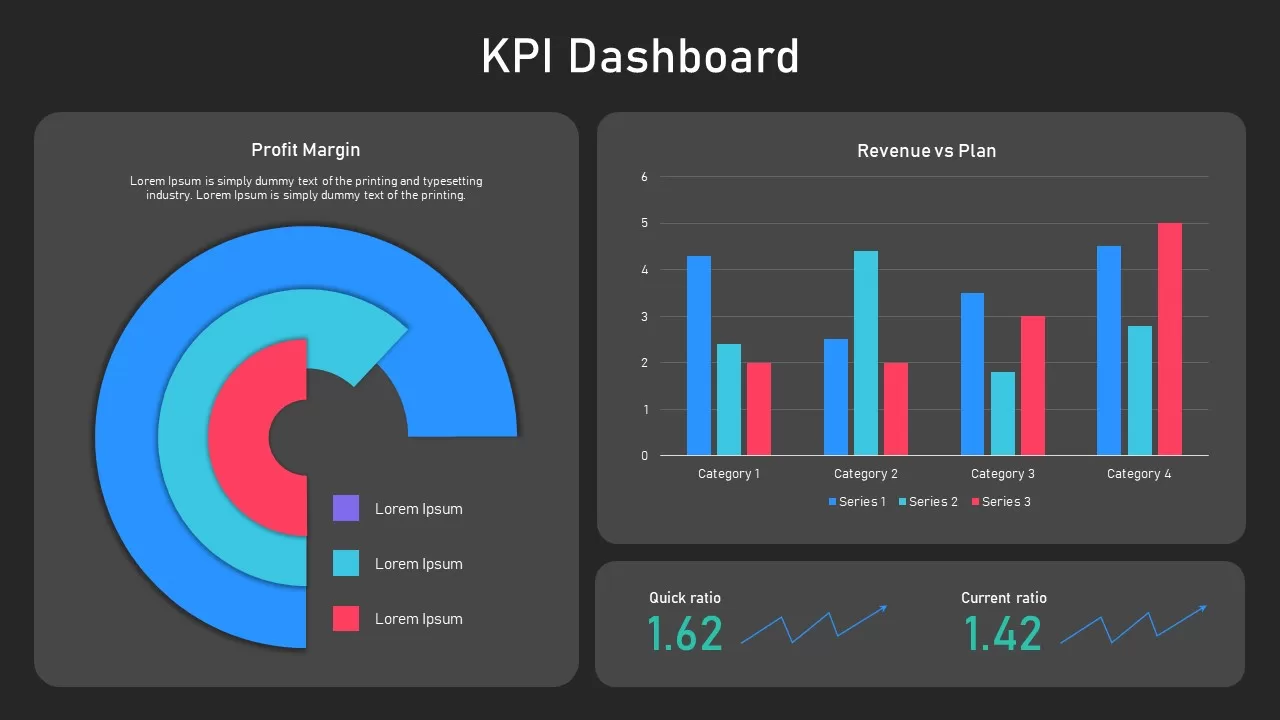
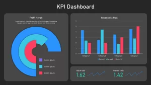
- A three-tier radial bar chart on the left dedicated to Profit Margin analysis, featuring concentric progress arcs in royal blue, cyan, and coral red alongside a color-coded legend.
- A multi-series column chart on the upper right comparing Revenue vs Plan across four distinct categories with a 0 to 6 numerical scale.
- Two bottom financial liquidity cards showcasing Quick Ratio (1.62) and Current Ratio (1.42) paired with upward-trending line sparklines.
- Modular card-based layout with soft drop shadows and rounded borders to separate distinct data streams cleanly.
- Harmonized color palette utilizing vivid blues, bright teals, and energetic reds for immediate data contrast against a light grey canvas.
- 100% editable chart elements, numerical callouts, and text placeholders that allow presenters to update values and adjust metrics directly within PowerPoint or Google Slides.
Login to download this file

Item ID
SB02753


Related Templates

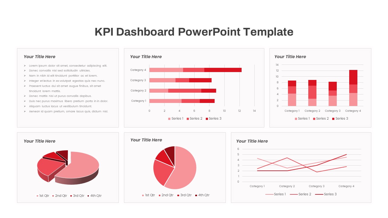
Free KPI Dashboard Template for PowerPoint & Google Slides
Charts
Free
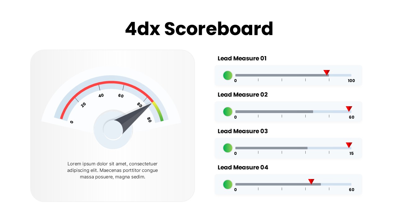
4DX Scoreboard Dashboard for PowerPoint & Google Slides
Business Strategy
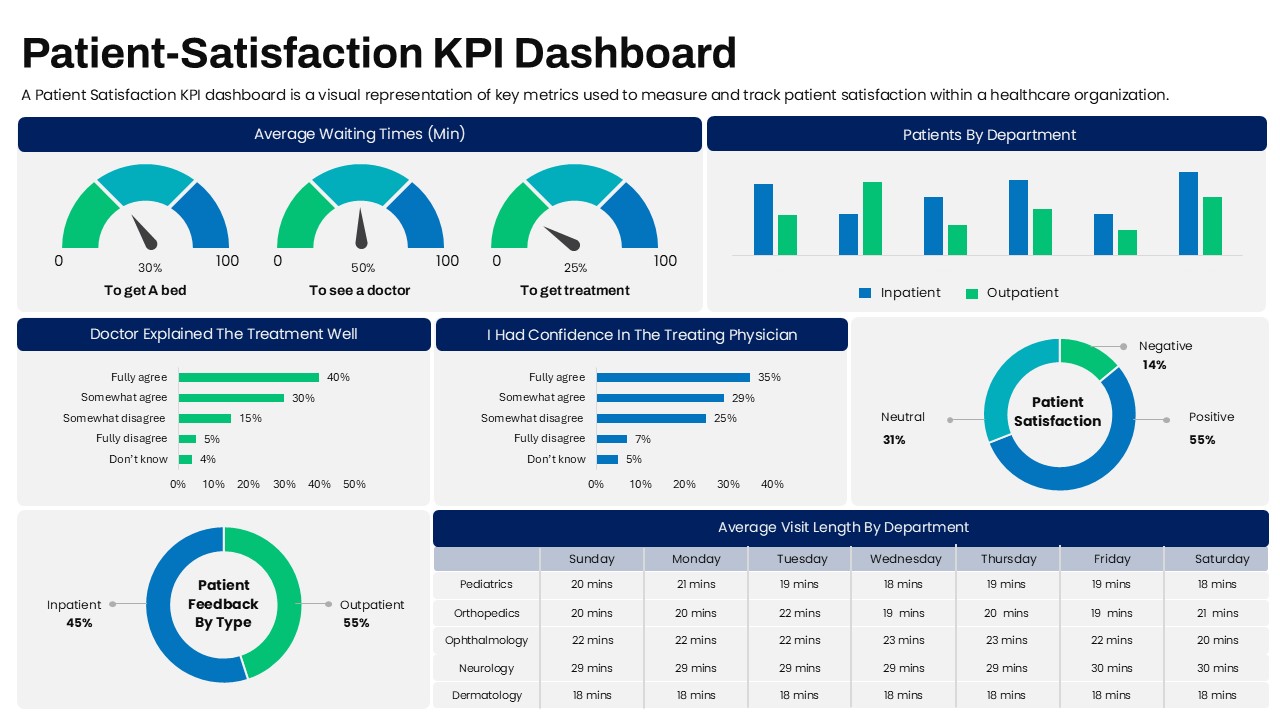
Patient Satisfaction KPI Dashboard
Business
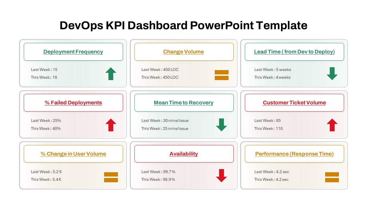
DevOps KPI Dashboard PowerPoint Template
Software Development
KPI Dashboard Infographics Template
Finance
KPI Dashboard Data Visualization Template
Bar/Column
KPI Dashboard Presentation Template
Bar/Column
Digital Marketing KPI Dashboard Template
Business Report

Application Revenue Line Chart KPI Template
Revenue
Professional Team Collage & KPI Slide Template for PowerPoint & Google Slides
Business
Circular Image Gallery & KPI Metrics Template for PowerPoint & Google Slides
Pie/Donut
Donut Chart Infographic Template for PowerPoint
Pie/Donut
KPI Tree Template
Infographics
Year in Review KPI Highlights Slide for PowerPoint & Google Slides
Business Report
Purchasing KPI Analysis PowerPoint Template
Business Report
Procurement KPI PowerPoint Template
Business Report
KPI Slide for PowerPoint
Business Report
KPI for Release and Deployment Template
Software Development
Google Analytics 4 (GA4) Dashboard Template for PowerPoint & Google Slides
Digital Marketing

Project Management Dashboard PowerPoint Template and Google Slides Template
Project