Call Center KPI Dashboard Template
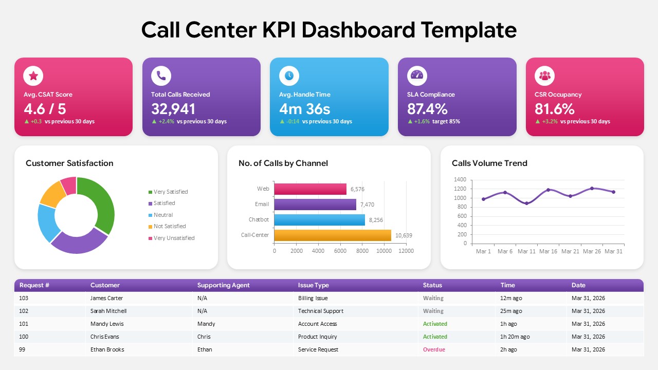
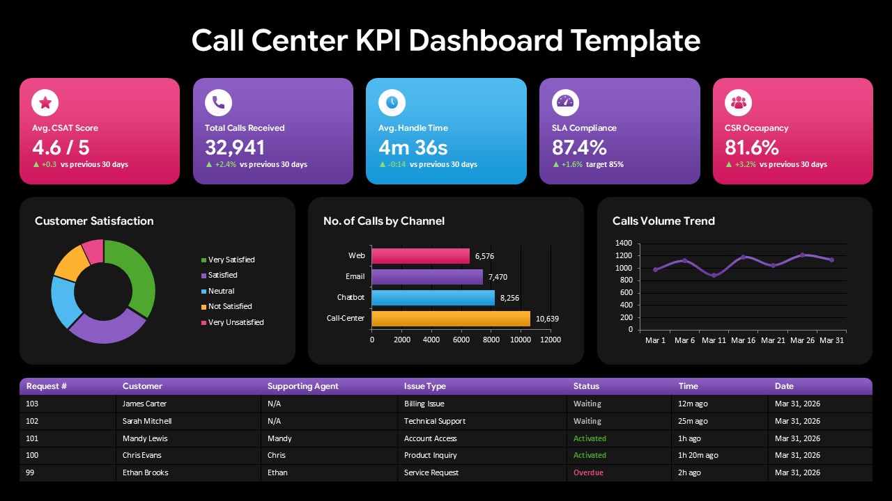
The Call Center KPI Dashboard Template provides a visual way to present essential customer support and contact center performance data. Designed as a professional dashboard layout, it combines headline metrics, analytical charts, trend information, and service request details within one structured presentation slide. The balanced arrangement of colorful KPI cards and data visualizations helps users communicate operational results in a simple and easy-to-follow format.
Customer support departments need to keep track of several performance indicators to understand service efficiency and customer experience. Metrics such as satisfaction ratings, incoming call volume, average handling time, SLA performance, and agent occupancy can provide useful insight into day-to-day operations. This Call Center KPI Dashboard brings these measurements together so that teams can review important service information from a centralized visual report.
The dashboard begins with five prominent KPI cards highlighting Avg. CSAT Score, Total Calls Received, Avg. Handle Time, SLA Compliance, and CSR Occupancy. These summary indicators are followed by three visual analysis sections covering customer satisfaction, call distribution by communication channel, and changes in call volume over time.
The primary features of Call Center KPI Dashboard are as follows:
- Customer satisfaction performance
- Channel-wise call distribution
- Call volume trend analysis
- Average handle time indicator
- SLA performance measurement
- CSR occupancy tracking
- Customer request monitoring
The Customer Satisfaction section uses a donut chart to display different satisfaction categories, including Very Satisfied, Satisfied, Neutral, Not Satisfied, and Very Unsatisfied. The No. of Calls by Channel chart compares incoming interactions across Web, Email, Chatbot, and Call-Center channels, making it easier to understand where customer contacts are originating.
A dedicated Calls Volume Trend graph presents changes in call activity across multiple dates, allowing viewers to observe fluctuations in incoming traffic. Together, these visual elements turn operational figures into presentation-friendly insights without requiring users to interpret lengthy data tables.
The lower portion of the dashboard contains a structured customer request table with fields for request number, customer, supporting agent, issue type, status, response time, and date. Different status treatments make waiting, activated, and overdue requests easier to distinguish, giving managers an additional snapshot of current support activity.
With the help of this Call Center KPI Dashboard PowerPoint Template, users can summarize contact center performance for management reviews, monthly reports, team discussions, service operations meetings, and customer support presentations. The editable dashboard components can also be customized with new figures, labels, categories, and organizational data to suit different reporting requirements.
The combination of KPI summaries, graphical analysis, and request-level information makes this template suitable for presenting both high-level performance indicators and day-to-day customer service activity in a single professional dashboard.
Frequently Asked Questions
Does this template work in both PowerPoint and Google Slides?
Can I edit the KPI values and chart data to match my own call center metrics?
Login to download this file

Item ID
SB06325Designed By
Amal


Related Templates

Free Car Wash Center Service Slide Template
Business Proposal
Free
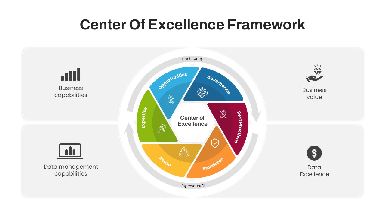
Center of Excellence Framework PowerPoint Template
Circular
Data Center PowerPoint Template
Information Technology
ML Center of Excellence Template
Machine Learning
KPI Dashboard template for PowerPoint & Google Slides
Business Report
KPI Dashboard Infographics Template
Finance
KPI Dashboard Data Visualization Template
Bar/Column
KPI Dashboard Presentation Template
Bar/Column
Free KPI Dashboard Template for PowerPoint & Google Slides
Charts
Free
DevOps KPI Dashboard PowerPoint Template
Software Development
Digital Marketing KPI Dashboard Template
Business Report
Patient Satisfaction KPI Dashboard
Business
Sales Call Strategy Tips Template
Business Strategy
Call to Action PowerPoint Template
Marketing
Call to Action Framework for PowerPoint & Google Slides
Customer Journey
Circular Image Gallery & KPI Metrics Template for PowerPoint & Google Slides
Pie/Donut
Purchasing KPI Analysis PowerPoint Template
Business Report
Procurement KPI PowerPoint Template
Business Report
KPI for Release and Deployment Template
Software Development
KPI Tree Template
Infographics