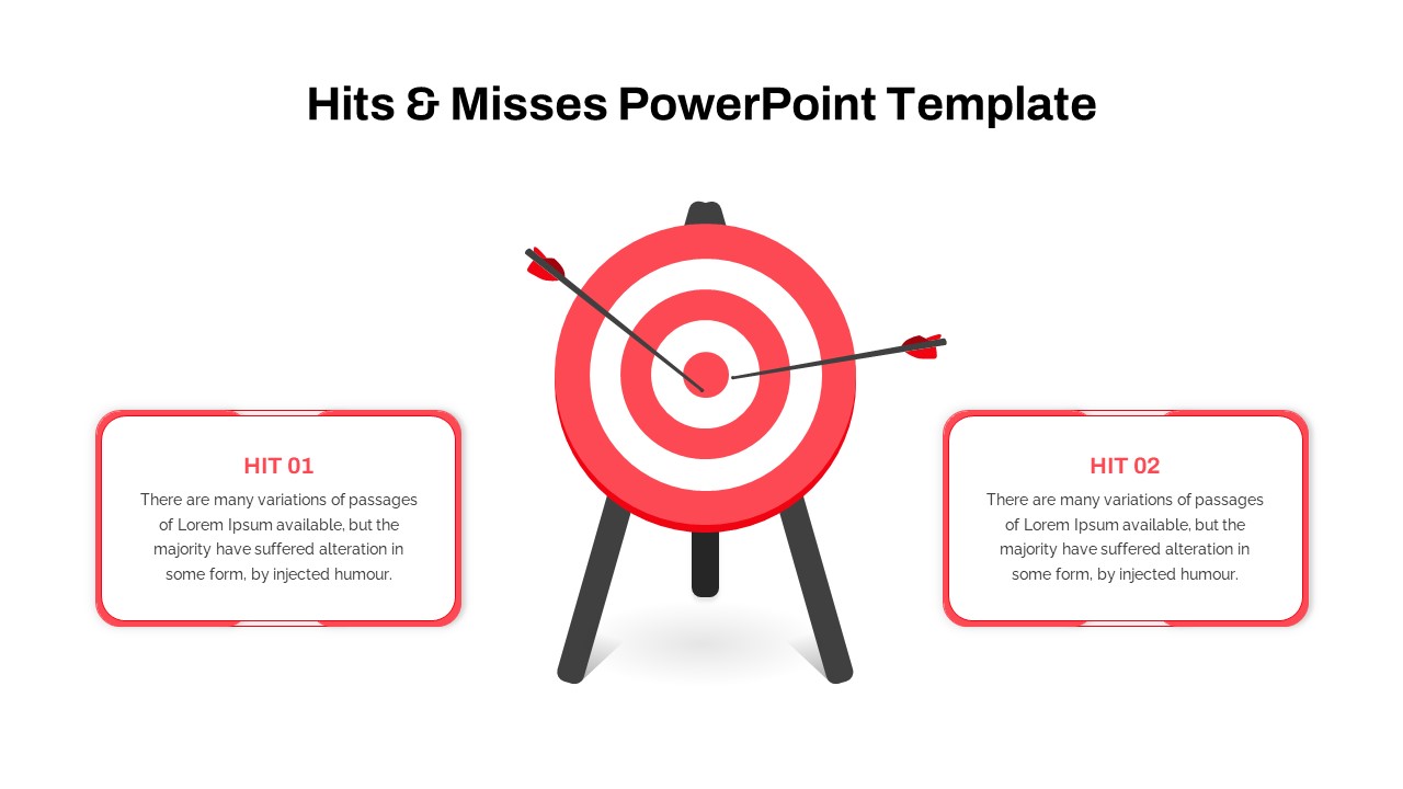
Hits and Misses Performance Comparison Template for PowerPoint & Google Slides


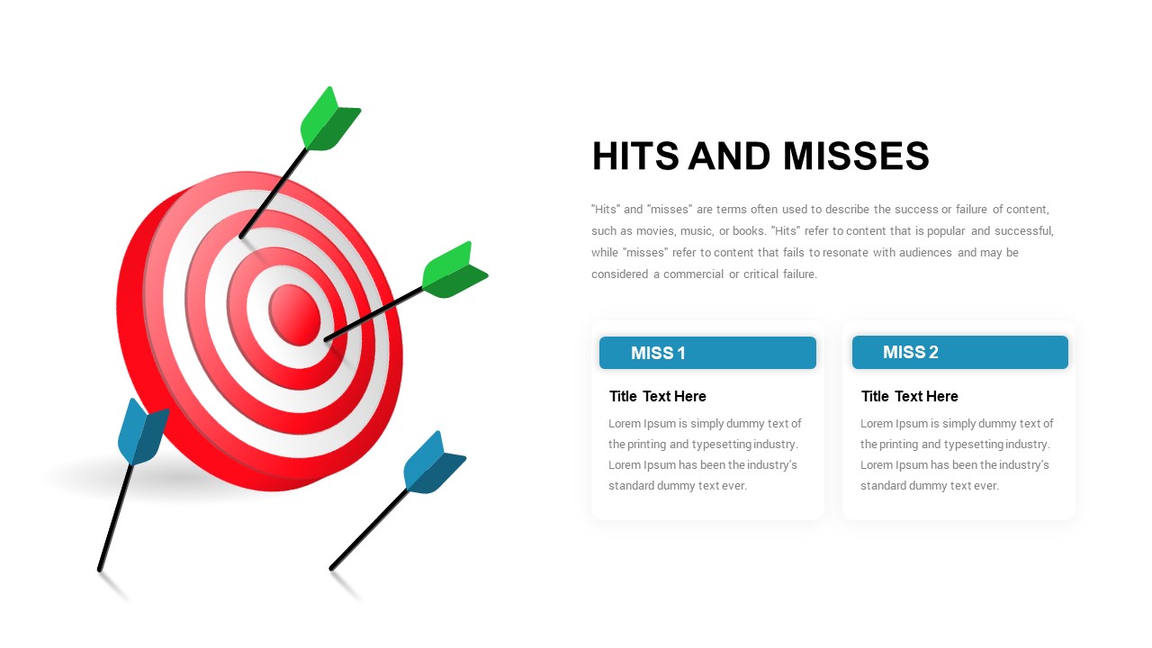


A 3D red and white bullseye target takes up the left half of the slide, with two green arrows sticking out of the center (the hits) and two blue arrows lying on the ground (the misses). The right side has the title, a short paragraph explaining the hits-and-misses concept, and two content cards side by side.
The pack has four variations of the same layout. Two with green “Hit 1” and “Hit 2” cards, two with blue “Miss 1” and “Miss 2” cards. Each pair comes in white and dark backgrounds. Same bullseye graphic across all four, just different card colors and labels to match what you’re presenting.
When to Use Which Variant
Use the Hit version when you’re highlighting wins. Use the Miss version when you’re calling out failures or learnings. For a full post-mortem presentation, put both side by side across two slides. That way the green hits slide covers what worked and the blue misses slide covers what didn’t, with the same visual anchor on both.
The hits variant works for quarterly review slides showing top campaign wins. The miss variant fits retrospective meetings where you’re breaking down why a launch underperformed. Using both back to back is common in agency debriefs and product retrospectives where teams want to show the full picture without mixing positives and negatives in one crowded slide.
Customization
The content cards hold a title and two to three lines of body text. Swap the lorem ipsum for your actual wins or misses. The target graphic and arrows are vector shapes, so you can change the arrow colors if green/blue doesn’t match your brand, or rotate the arrows to adjust how many are hitting versus missing.
Duplicate the card block if you have more than two hits or misses to cover. Delete one card if you only have one. The layout stays balanced because the target illustration holds the left half of the slide regardless of how many cards you put on the right.
Login to download this file

Item ID
SB03493
Related Templates

Hits & Misses Comparison Infographic Template for PowerPoint & Google Slides
Pitch Deck
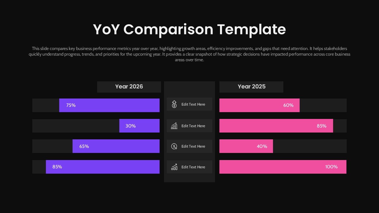
Year-over-Year Performance Comparison Template for PowerPoint & Google Slides
Comparison Chart
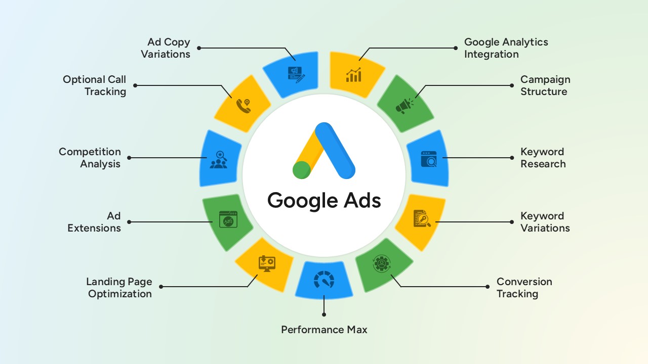
Google Ads Optimization & Performance Infographic Template for PowerPoint & Google Slides
Digital Marketing
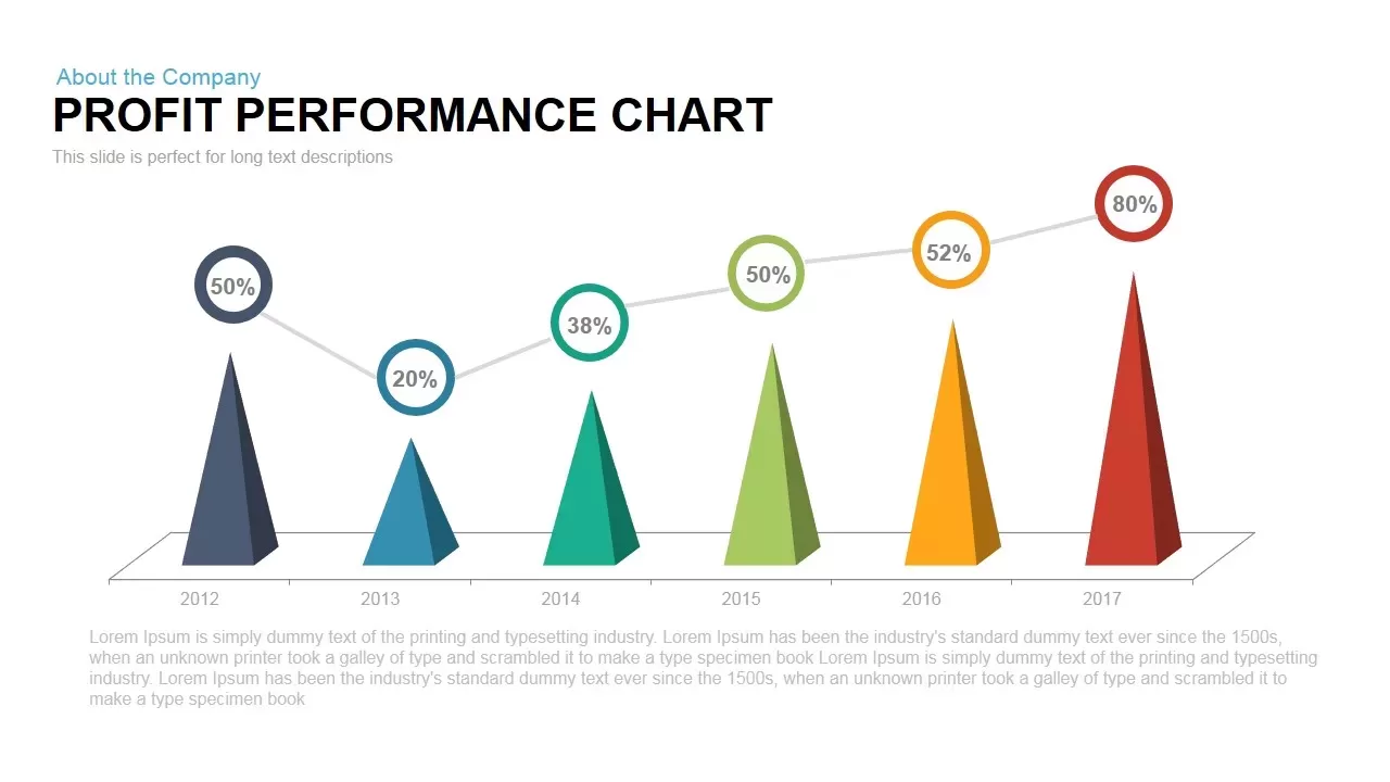
Profit Performance Trend Chart Template for PowerPoint & Google Slides
Finance
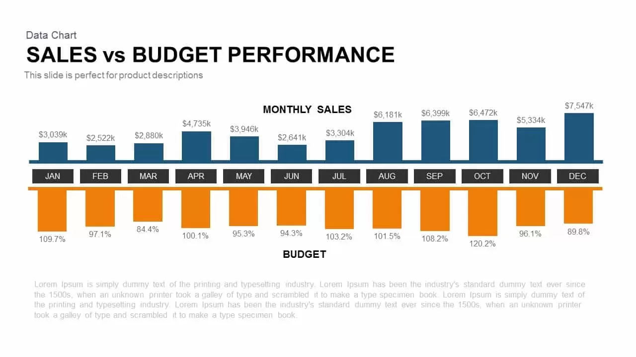
Sales vs Budget Performance Chart Template for PowerPoint & Google Slides
Bar/Column

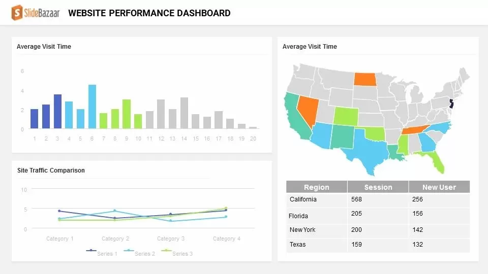
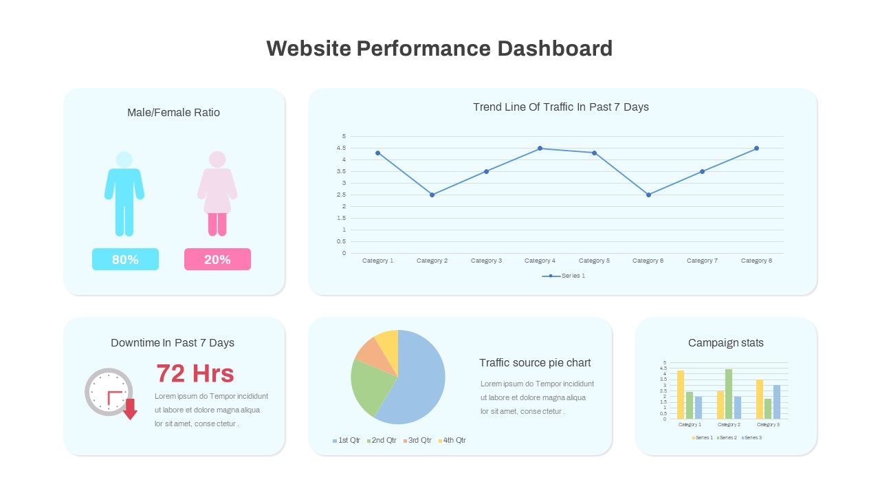
Website Performance Dashboard template for PowerPoint & Google Slides
Charts
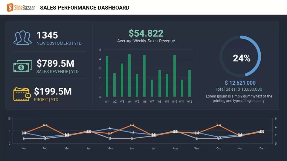
Sales Performance Dashboard template for PowerPoint & Google Slides
Business Report
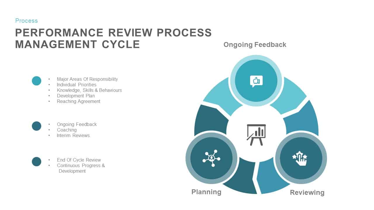
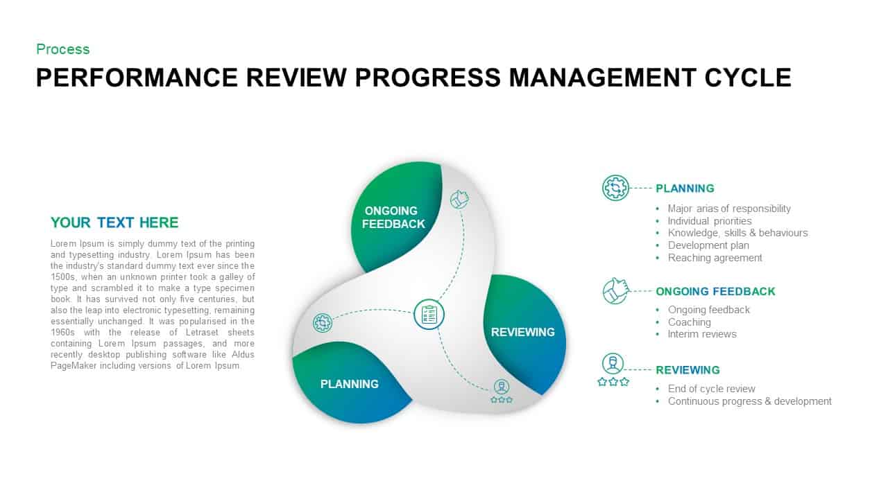
Performance Review Process Management Cycle template for PowerPoint & Google Slides
Employee Performance
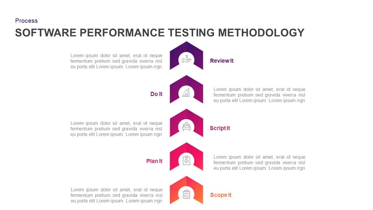
Software Performance Testing Methodology Template for PowerPoint & Google Slides
Process
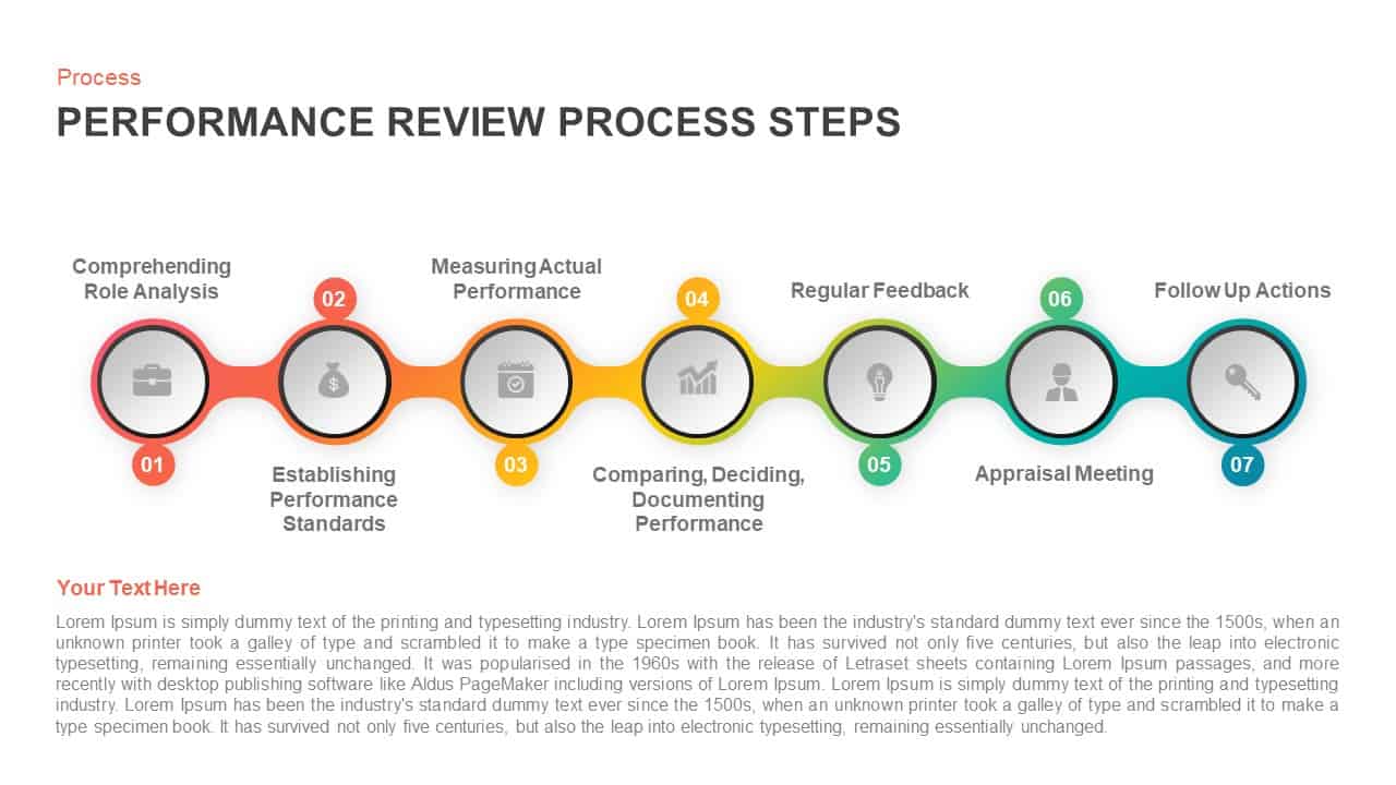
Performance Review Process Steps Template for PowerPoint & Google Slides
Employee Performance
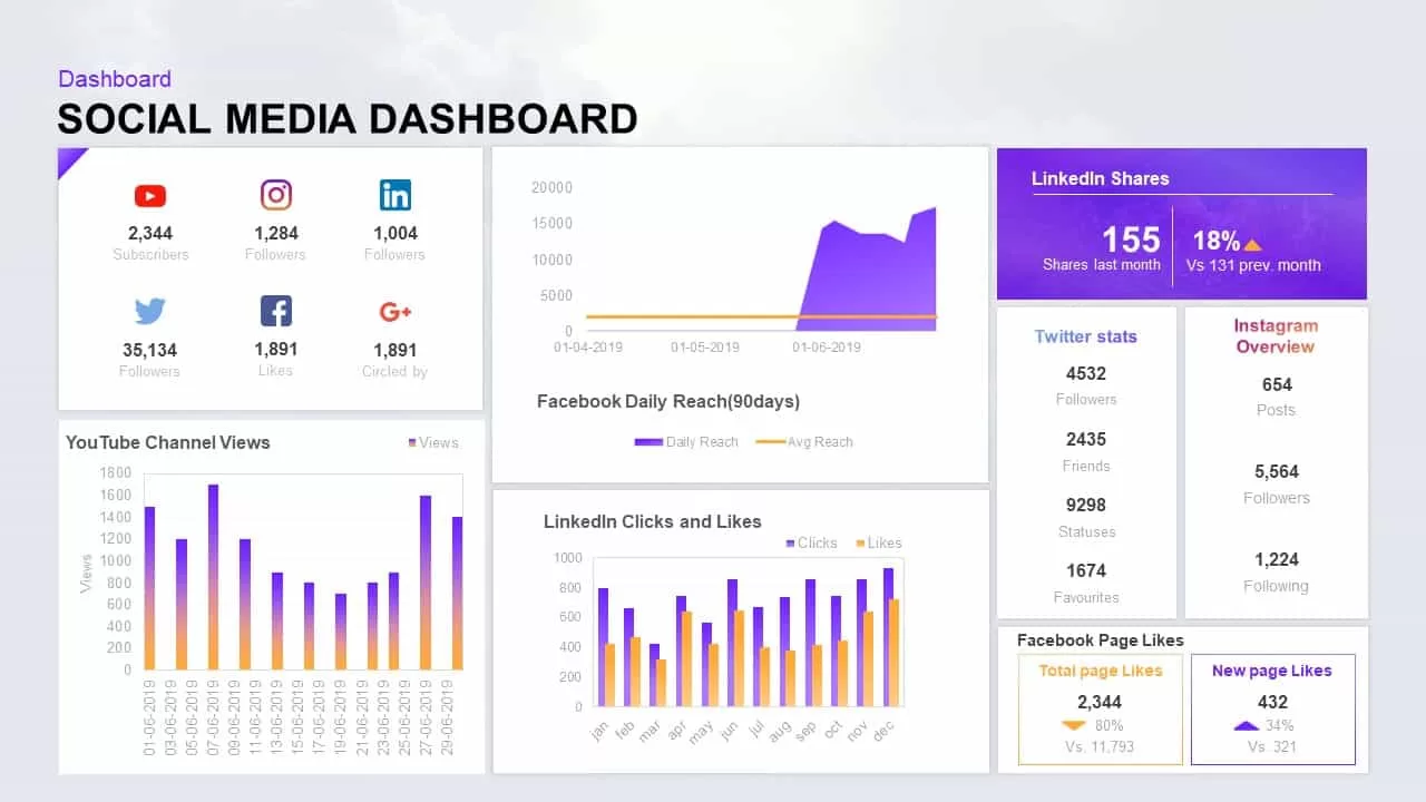
Social Media Performance Dashboard Template for PowerPoint & Google Slides
Bar/Column
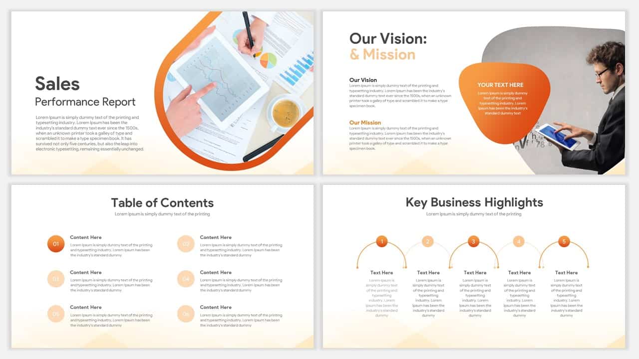
Professional Sales Performance Report Template for PowerPoint & Google Slides
Business Report
Performance Review Progress Management Template for PowerPoint & Google Slides
Process
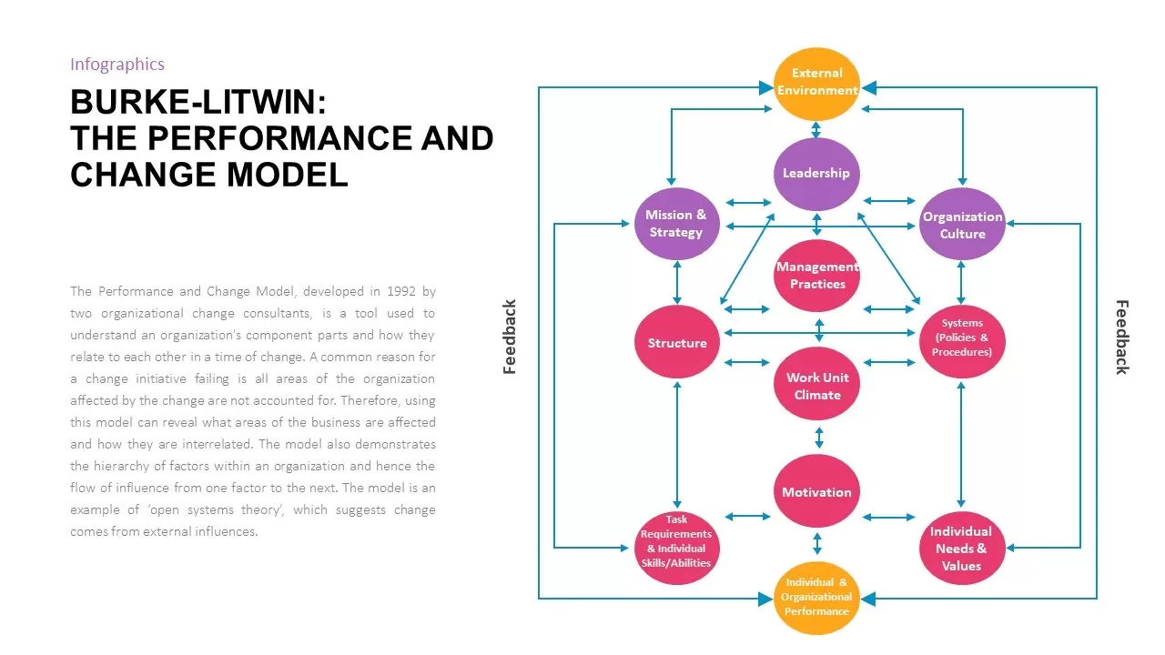
Burke-Litwin Performance and Change Model template for PowerPoint & Google Slides
Infographics
Corporate Performance Management Template for PowerPoint & Google Slides
Pitch Deck
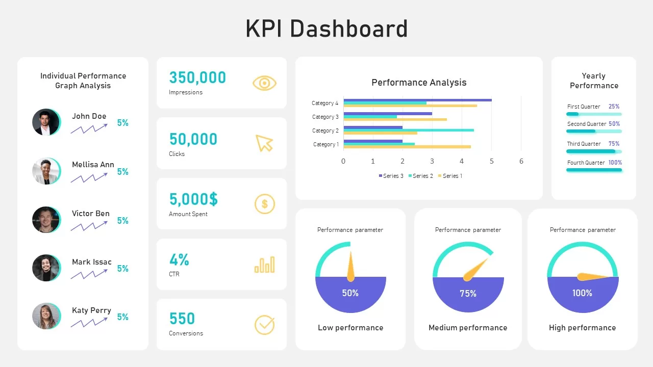
Performance KPI Dashboard Slide Template for PowerPoint & Google Slides
Business Report
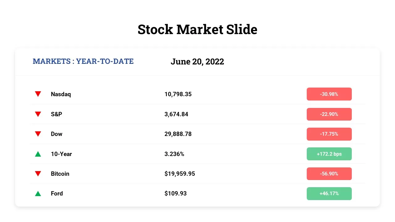
Free Stock Market Performance Overview template for PowerPoint & Google Slides
Finance
Free
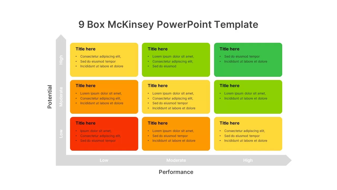
9-Box Matrix for Performance & Potential Template for PowerPoint & Google Slides
Employee Performance
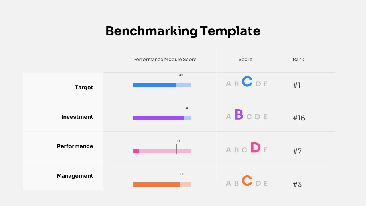
Benchmarking Performance Score Template for PowerPoint & Google Slides
Comparison Chart
Website Performance Monitoring Dashboard Template for PowerPoint & Google Slides
Business Report
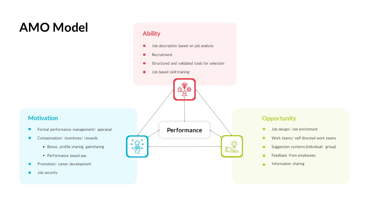
AMO Performance Model Feedback Diagram Template for PowerPoint & Google Slides
Employee Performance
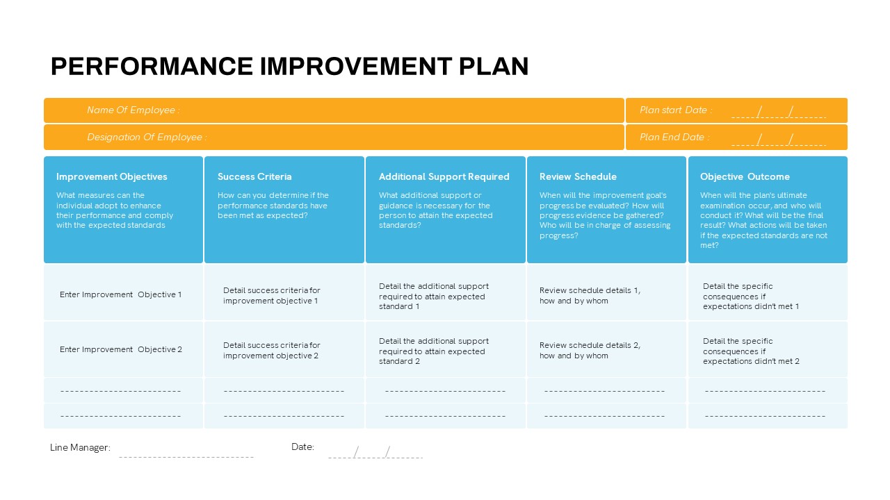
Detailed Performance Improvement Plan Template for PowerPoint & Google Slides
Employee Performance
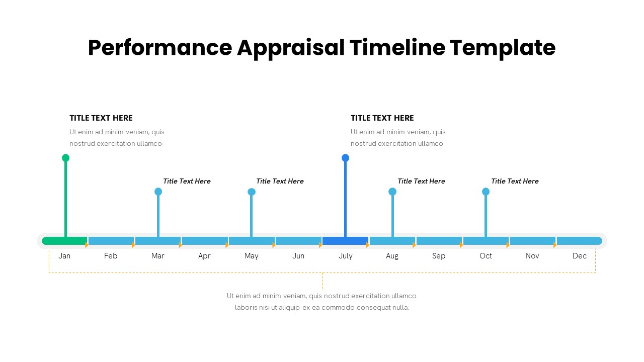
Performance Appraisal Timeline Diagram Template for PowerPoint & Google Slides
Timeline
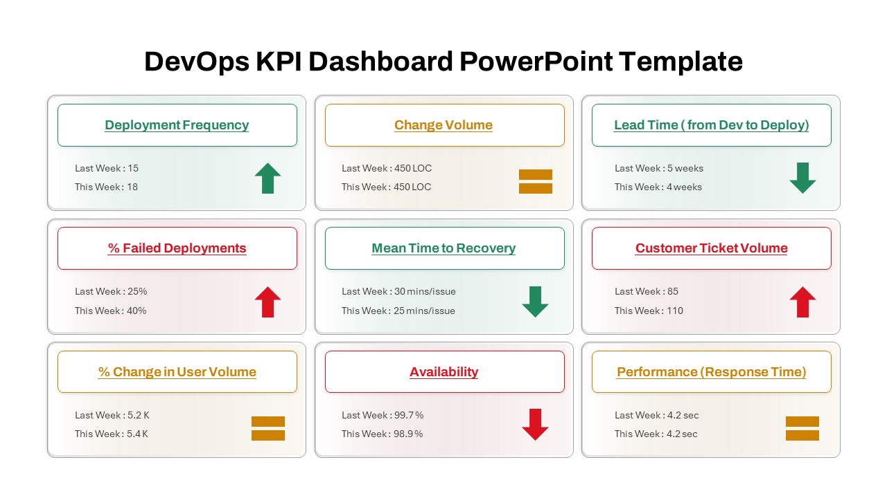
DevOps KPI Dashboard Performance Metrics Template for PowerPoint & Google Slides
Software Development
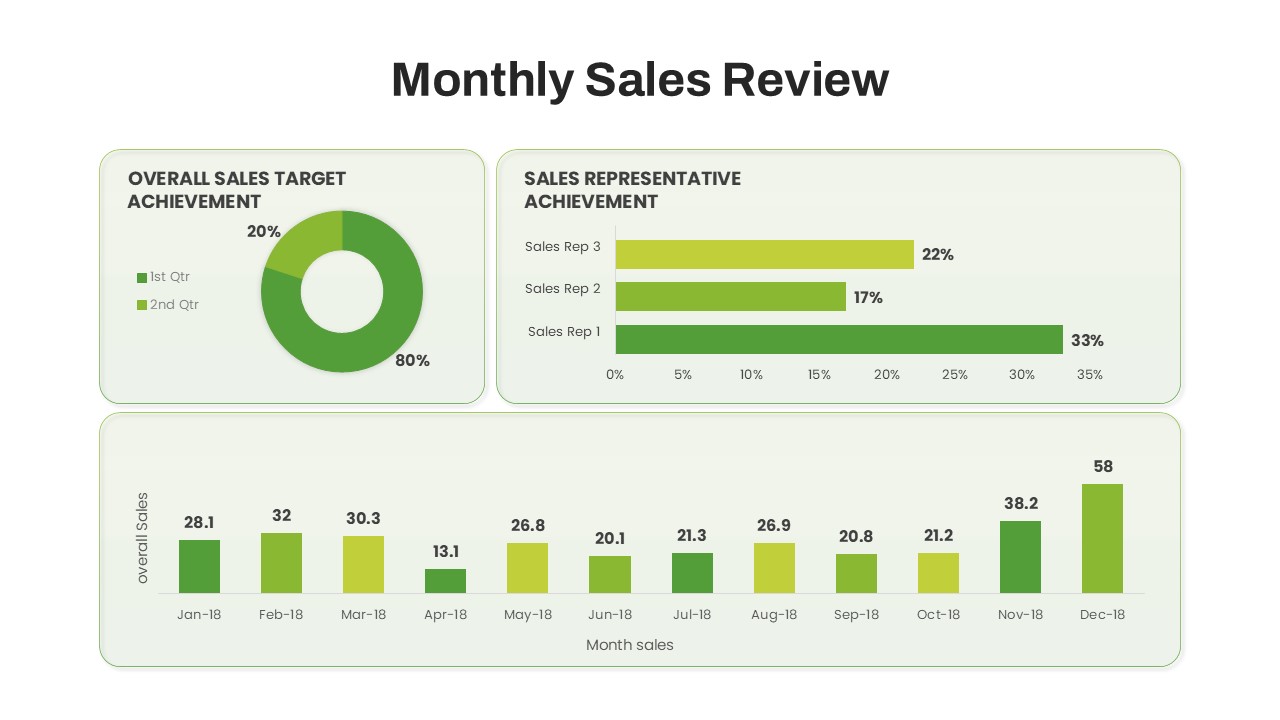
Monthly Sales Performance Dashboard Template for PowerPoint & Google Slides
Charts
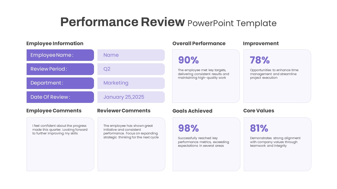
Performance Review template for PowerPoint & Google Slides
Employee Performance
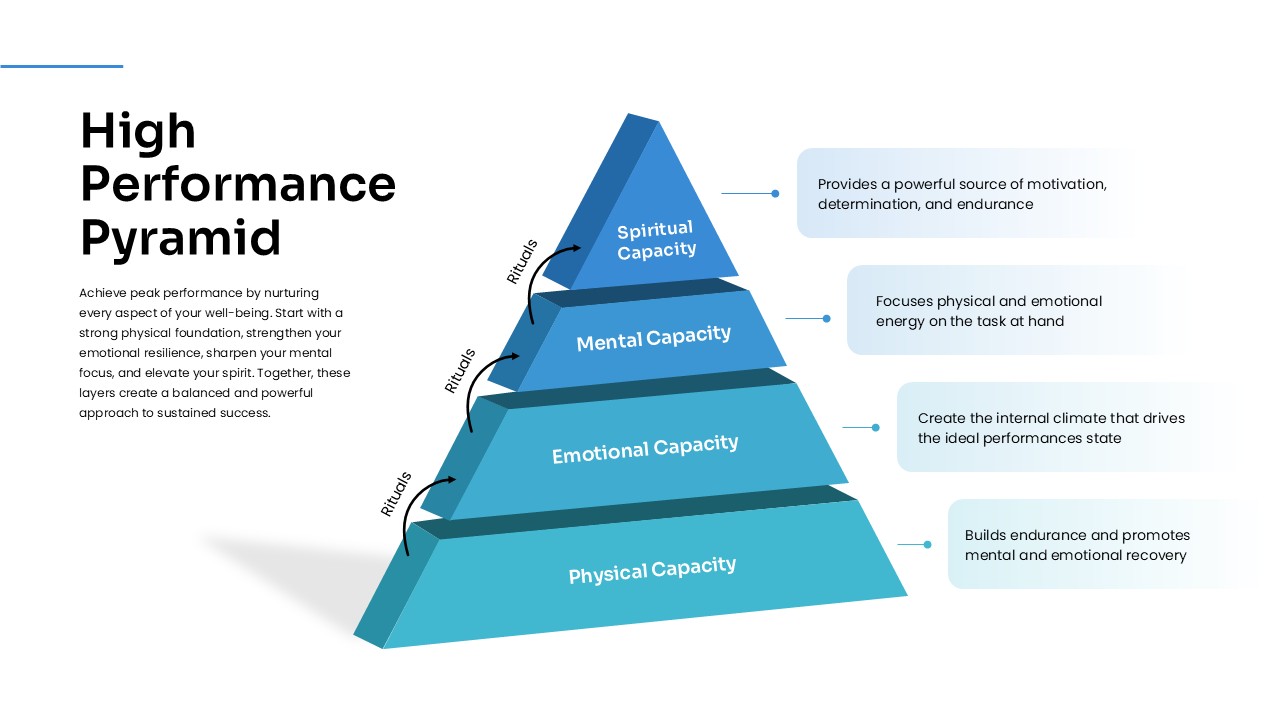
High Performance Pyramid Diagram Template for PowerPoint & Google Slides
Pyramid
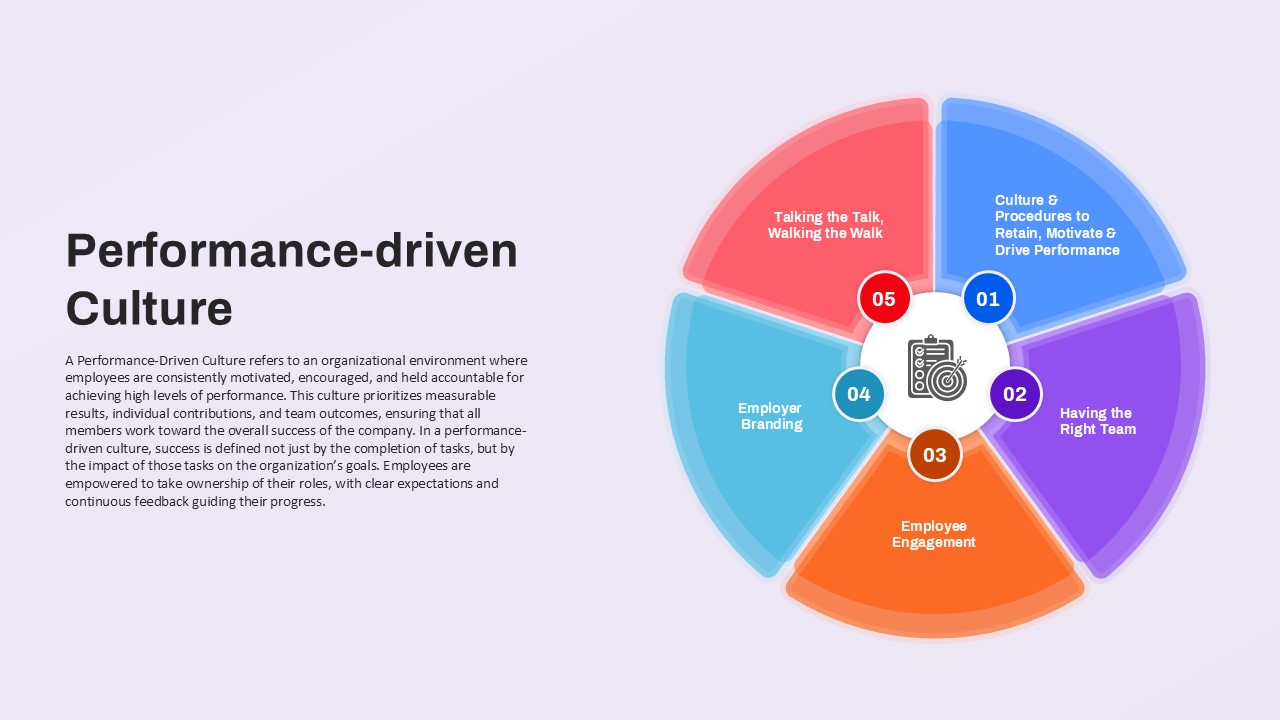
Performance-driven Culture framework template for PowerPoint & Google Slides
Leadership
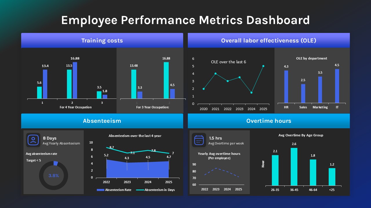
Employee Performance Metrics Dashboard Template for PowerPoint & Google Slides
Employee Performance
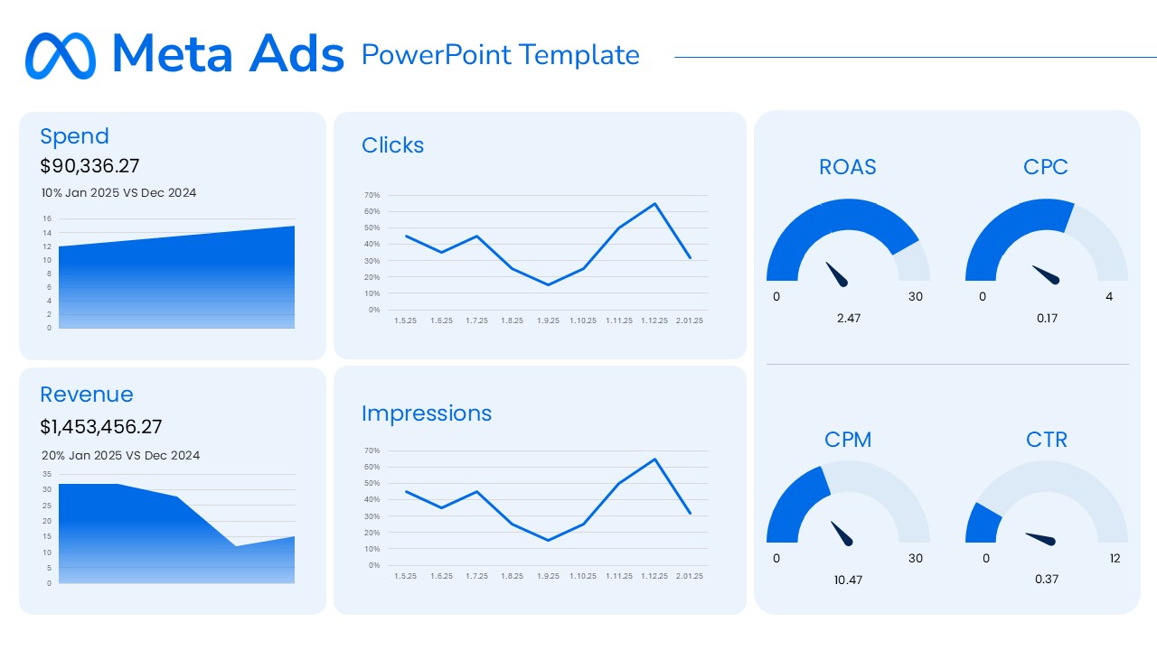
Meta Ads Performance Overview template for PowerPoint & Google Slides
Advertising
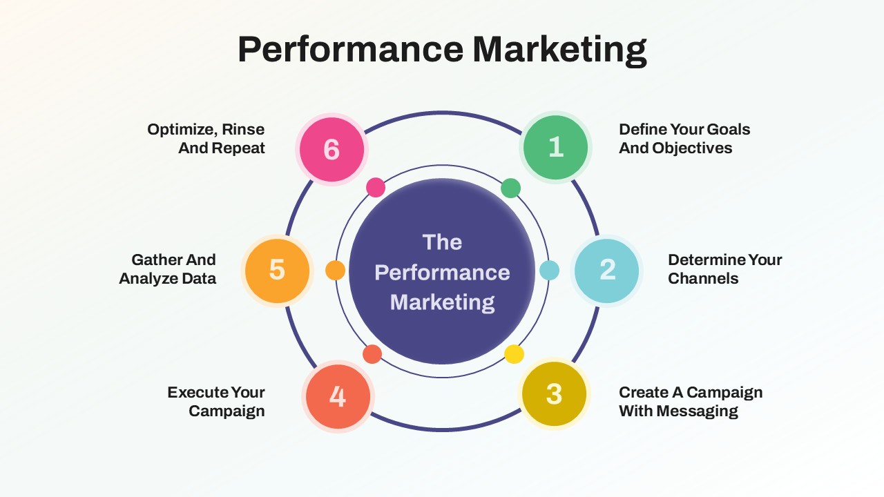
Performance Marketing Strategy template for PowerPoint & Google Slides
Digital Marketing
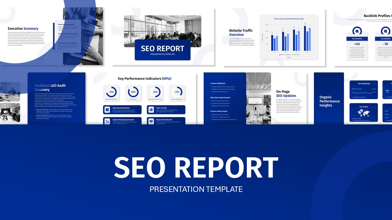
SEO Performance Report Overview template for PowerPoint & Google Slides
Digital Marketing
Performance Dashboards Overview Template for PowerPoint & Google Slides
Business Report
LinkedIn Performance Reporting Dashboard Template for PowerPoint & Google Slides
Digital Marketing
Learning Curve Performance Growth Chart Template for PowerPoint & Google Slides
Employee Performance
Drexler-Sibbet Team Performance Model Template for PowerPoint & Google Slides
Business Strategy
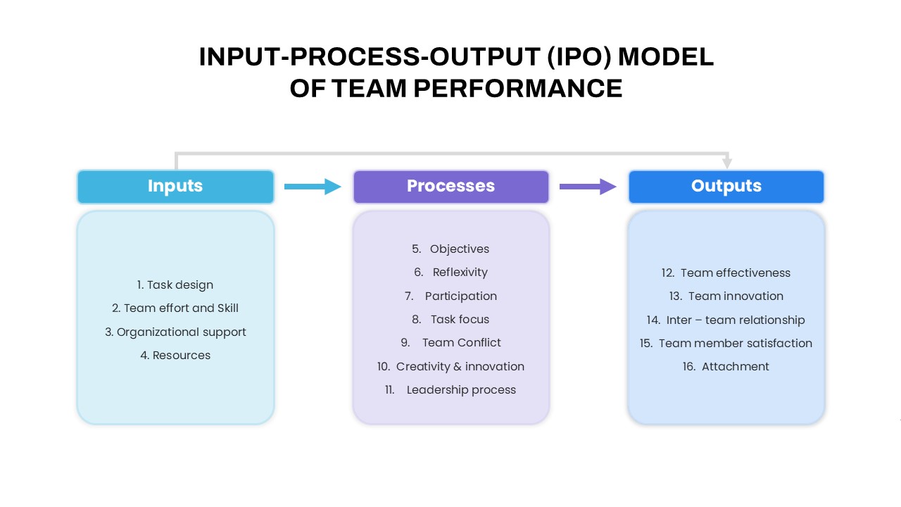
IPO Model of Team Performance for PowerPoint & Google Slides
Process
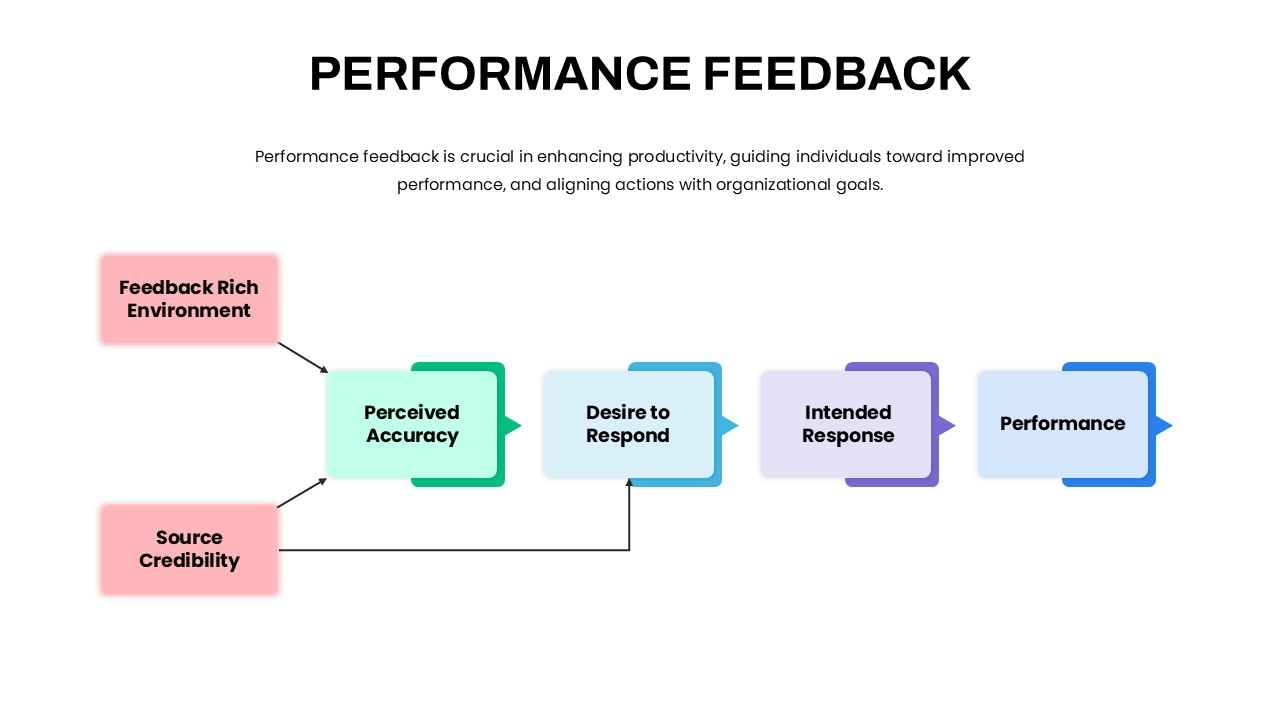
Performance Feedback Model for PowerPoint & Google Slides
Employee Performance
Webinar Campaign Steps and Performance for PowerPoint & Google Slides
Advertising
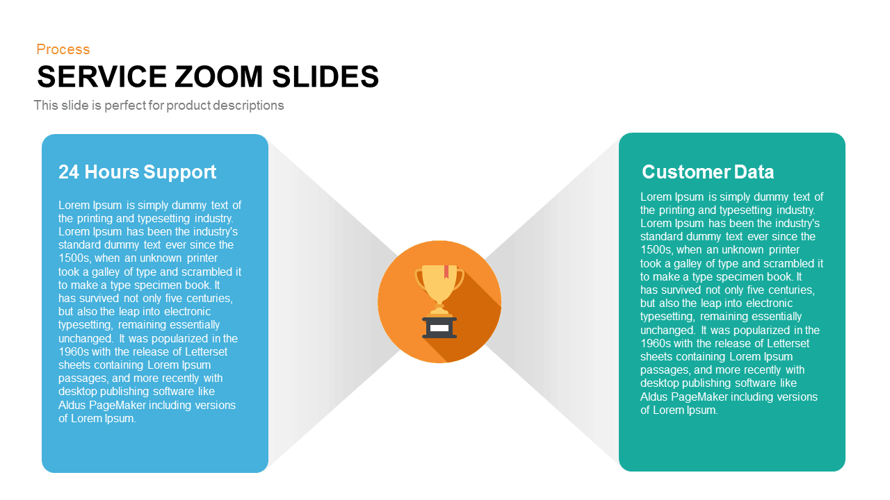
Service Zoom Feature Slides Comparison template for PowerPoint & Google Slides
Process
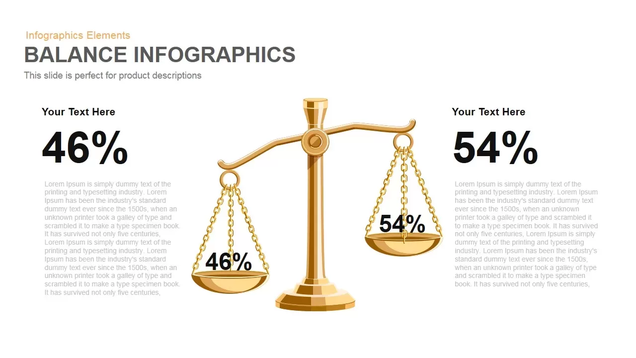
Gold Scales Balance Comparison Template for PowerPoint & Google Slides
Comparison
3-Column Comparison template for PowerPoint & Google Slides
Comparison
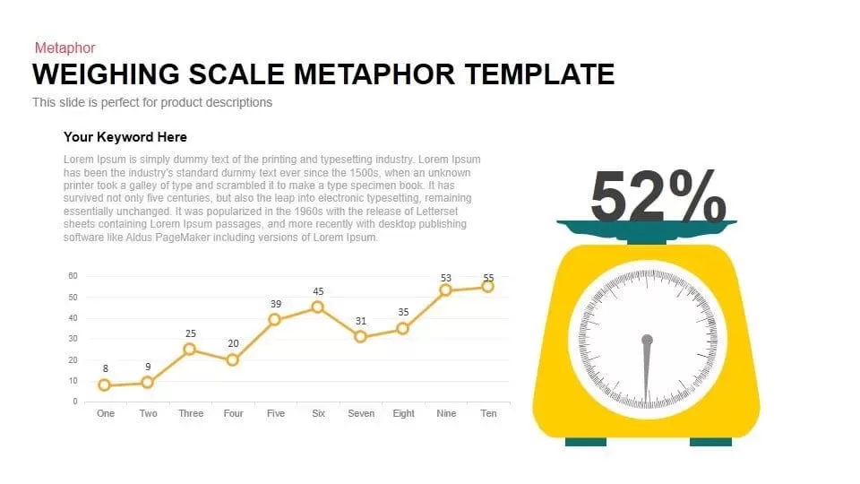
Scale Metaphor Metrics Comparison Template for PowerPoint & Google Slides
Charts
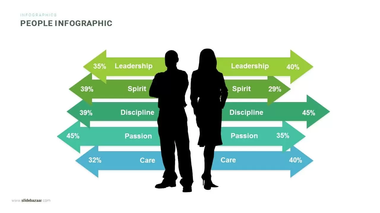
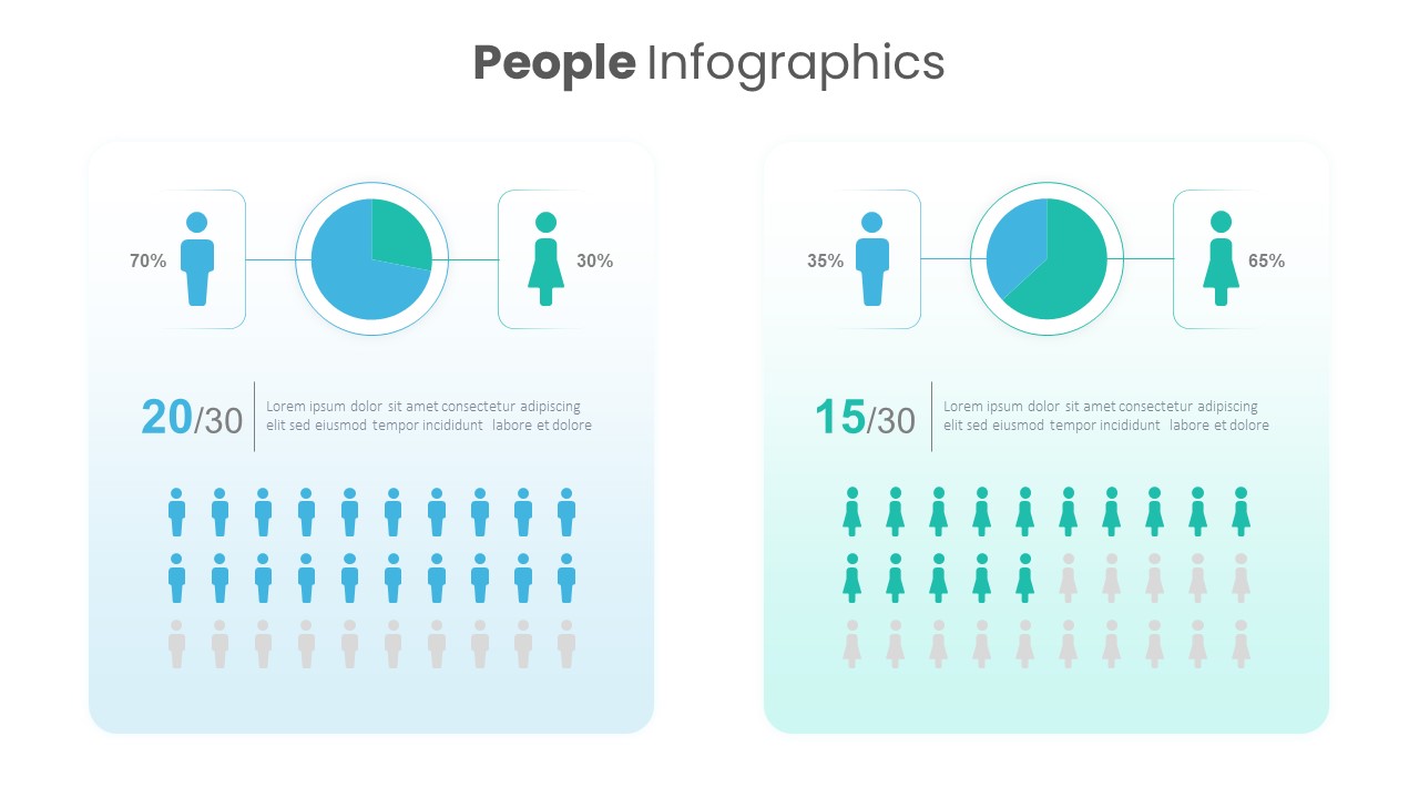
Gender Comparison People Infographic Template for PowerPoint & Google Slides
Comparison
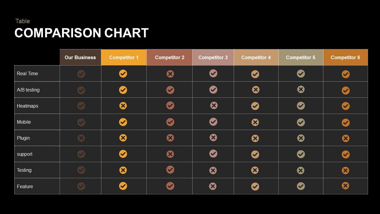
Comparison Chart Overview template for PowerPoint & Google Slides
Comparison Chart
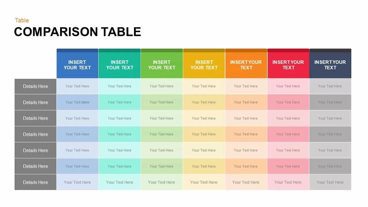
Dynamic Multicolor Comparison Table Template for PowerPoint & Google Slides
Comparison
Tornado Chart Data Comparison Slide Template for PowerPoint & Google Slides
Bar/Column
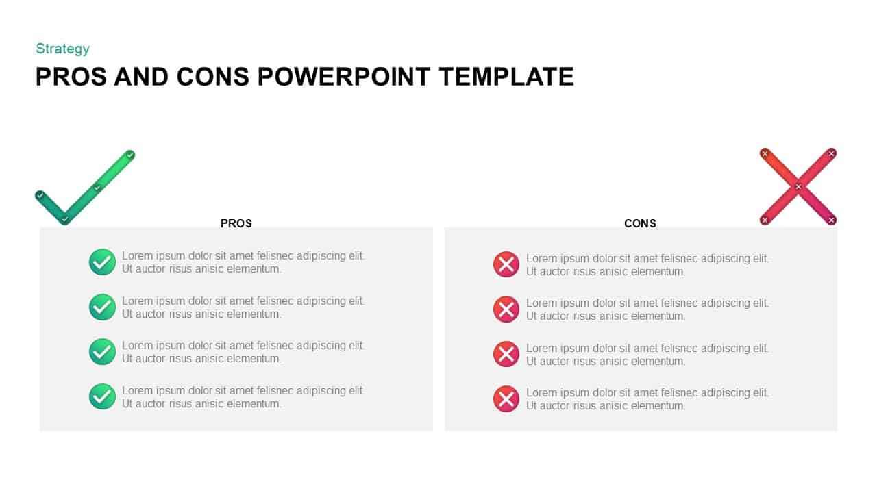
Pros and Cons Comparison Slide Template for PowerPoint & Google Slides
Comparison
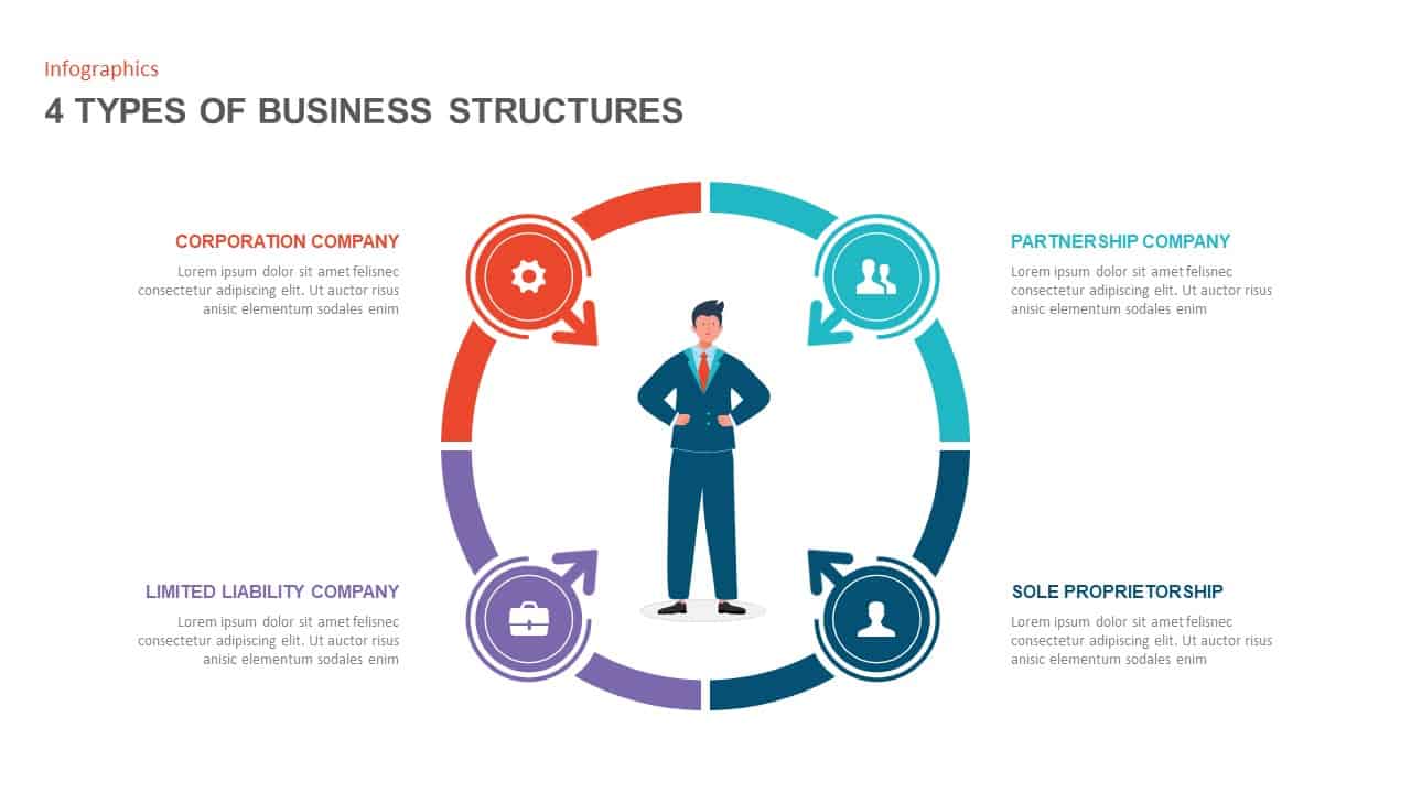
Four Business Structure Types Comparison Diagram Template for PowerPoint & Google Slides
Business Strategy

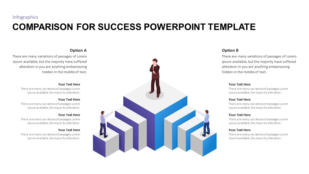
Isometric 3D Block Comparison Diagram Template for PowerPoint & Google Slides
Comparison
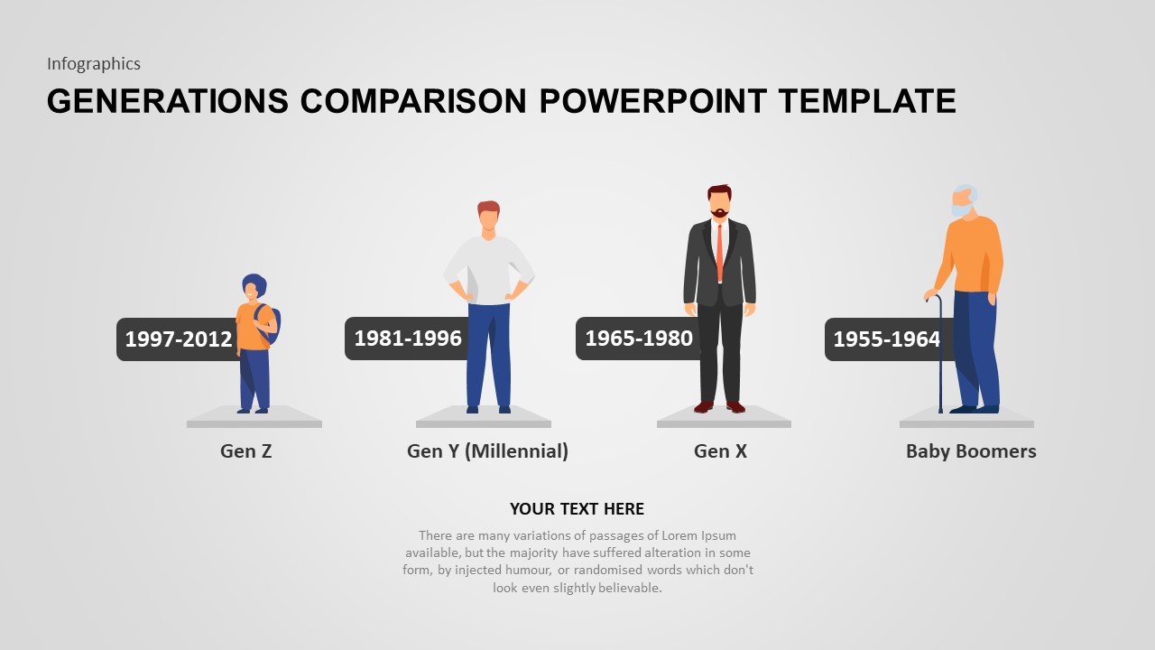
Generations Comparison Infographic Template for PowerPoint & Google Slides
Timeline
Theory X and Theory Y Comparison Template for PowerPoint & Google Slides
Comparison
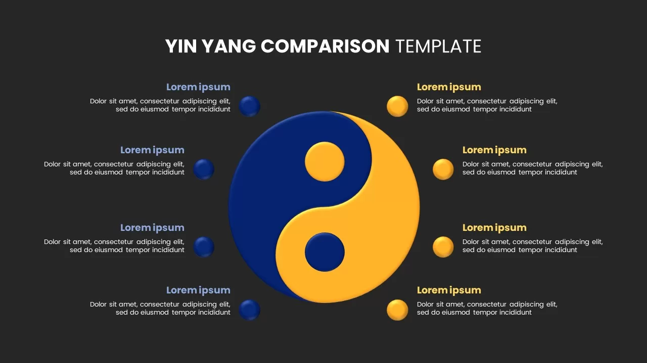
Yin Yang Comparison template for PowerPoint & Google Slides
Business
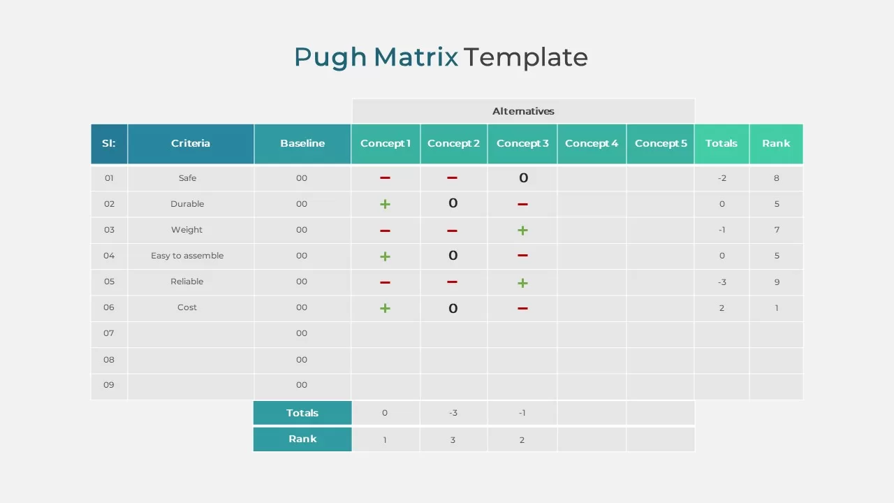
Pugh Matrix Decision Comparison Chart Template for PowerPoint & Google Slides
Comparison Chart
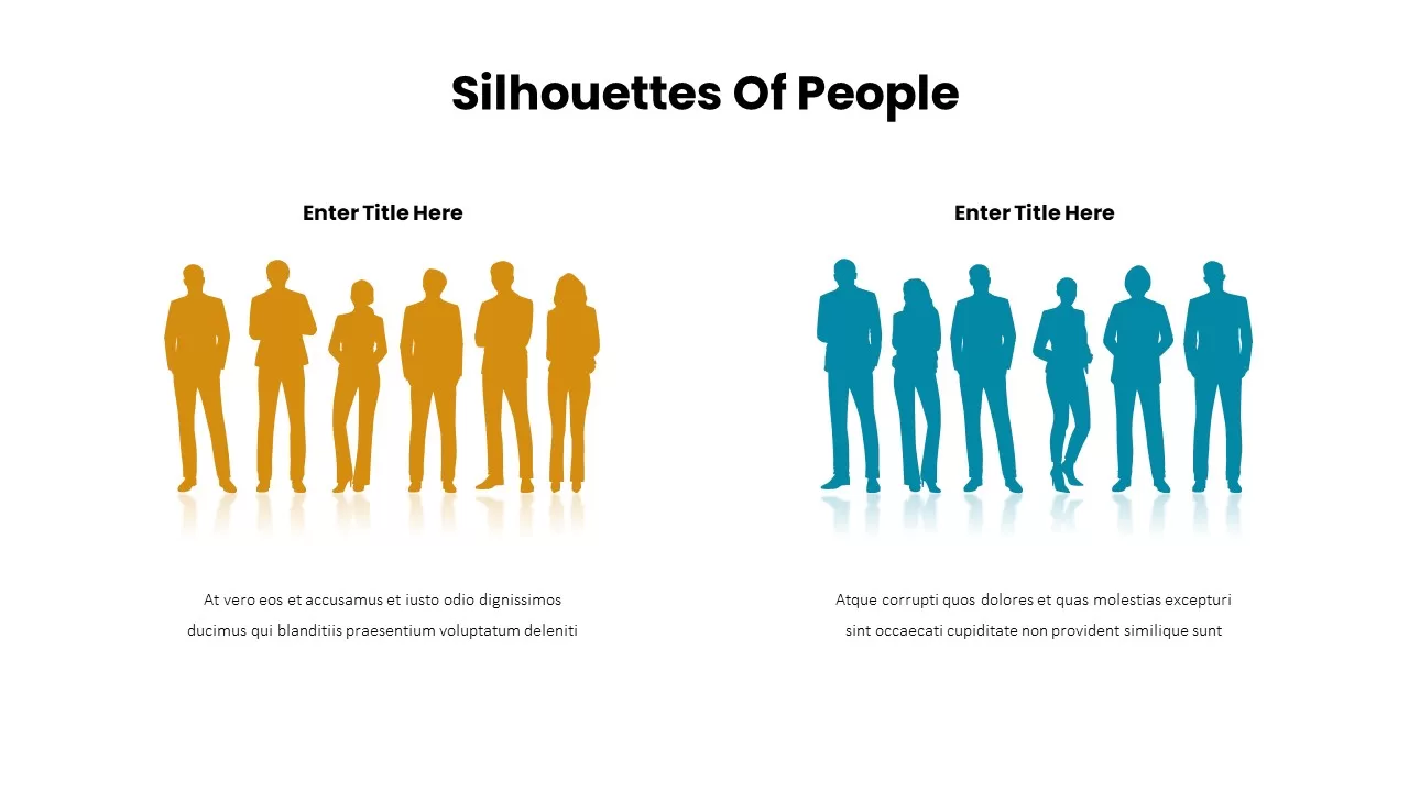
Business Silhouettes Comparison Slide Template for PowerPoint & Google Slides
HR
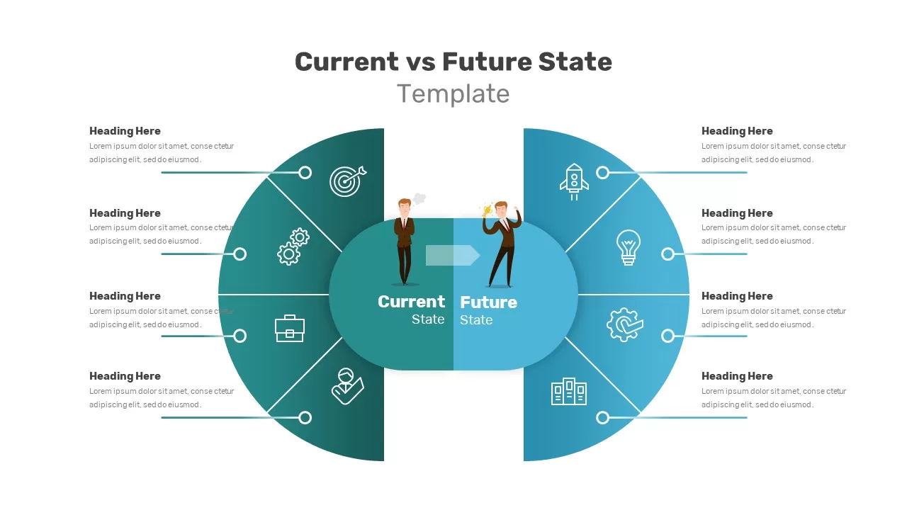
Current vs Future State Comparison Slide Template for PowerPoint & Google Slides
Comparison Chart
Before and After Comparison Slide Template for PowerPoint & Google Slides
Comparison
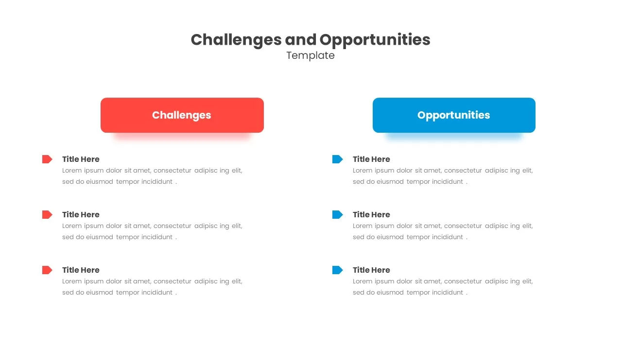
Challenges & Opportunities Comparison Template for PowerPoint & Google Slides
Opportunities Challenges
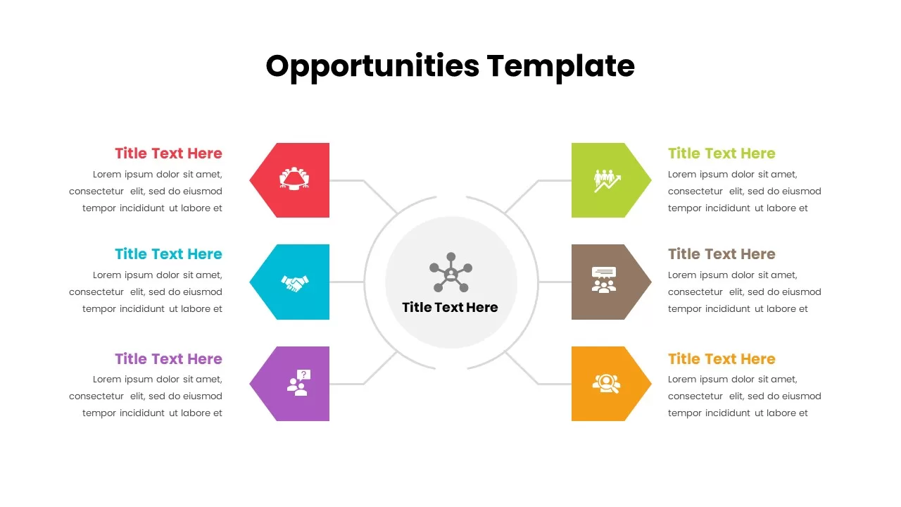
Opportunities Hub-and-Spoke Comparison Diagram Template for PowerPoint & Google Slides
Opportunities Challenges
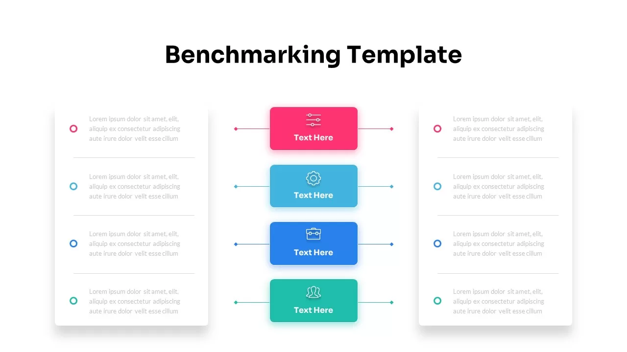
Dynamic Benchmarking Comparison Chart Template for PowerPoint & Google Slides
Comparison Chart
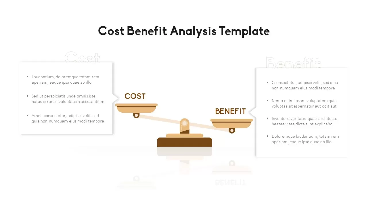
Cost Benefit Analysis Comparison Template for PowerPoint & Google Slides
Comparison
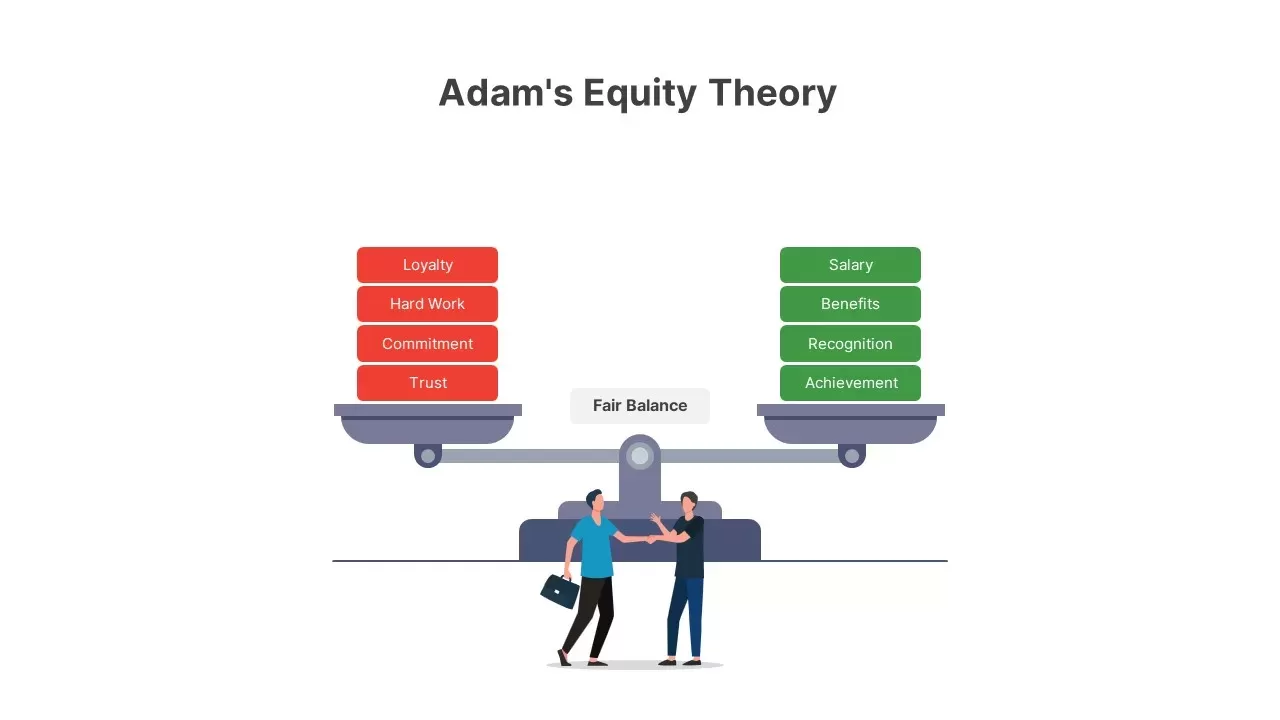
Adam’s Equity Theory Scale Comparison Template for PowerPoint & Google Slides
Comparison
Casino Poker Chips Comparison Slide Template for PowerPoint & Google Slides
Comparison
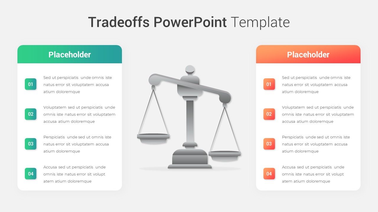
Modern Tradeoffs Comparison Slide Template for PowerPoint & Google Slides
Comparison
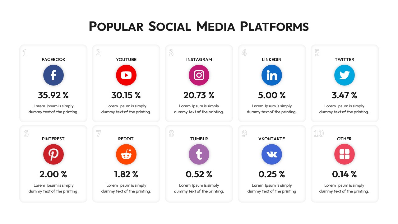
Popular Social Media Comparison Grid Template for PowerPoint & Google Slides
Digital Marketing
People Demographic Comparison Chart Template for PowerPoint & Google Slides
Comparison
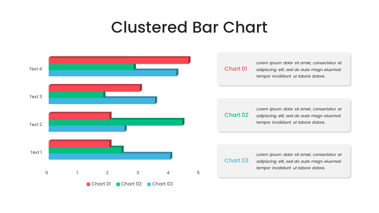
Clustered Bar Chart Comparison Template for PowerPoint & Google Slides
Bar/Column
Multiple Line Chart Comparison Template for PowerPoint & Google Slides
Comparison Chart
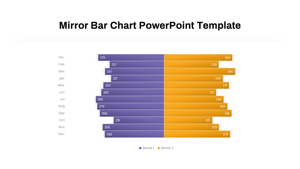
Mirror Bar Chart Comparison Template for PowerPoint & Google Slides
Bar/Column
Interactive Multi-Use Cost Comparison Template for PowerPoint & Google Slides
Comparison
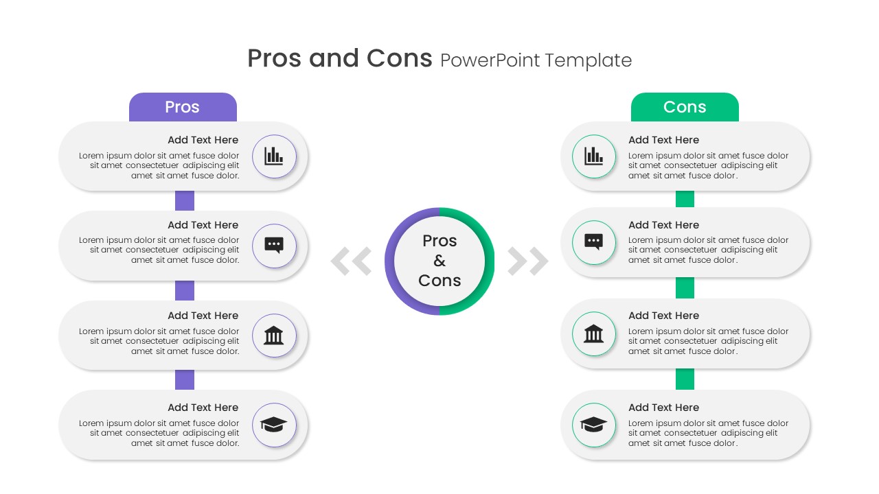
Free Pros and Cons Comparison Template for PowerPoint & Google Slides
Comparison
Free
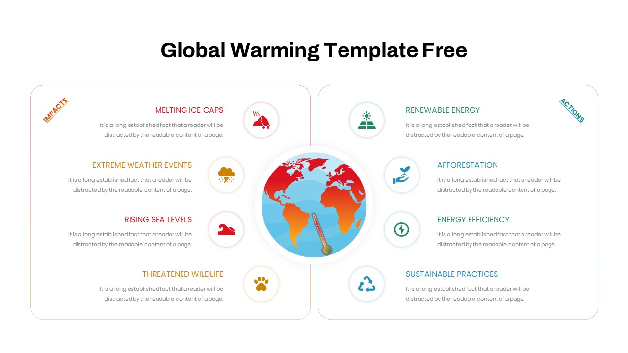
Free Global Warming Infographic Comparison Template for PowerPoint & Google Slides
Comparison Chart
Free
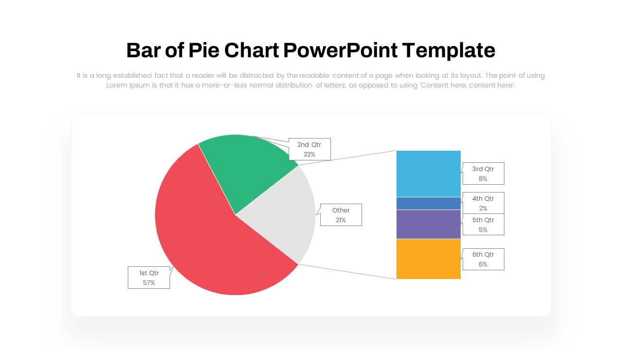
Dynamic Bar-of-Pie Chart Comparison Template for PowerPoint & Google Slides
Pie/Donut
Types of AI Comparison Infographic Template for PowerPoint & Google Slides
AI
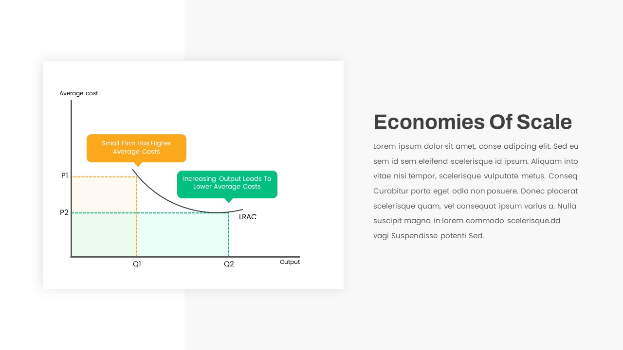
Economies of Scale Cost Curve Comparison Template for PowerPoint & Google Slides
Comparison Chart
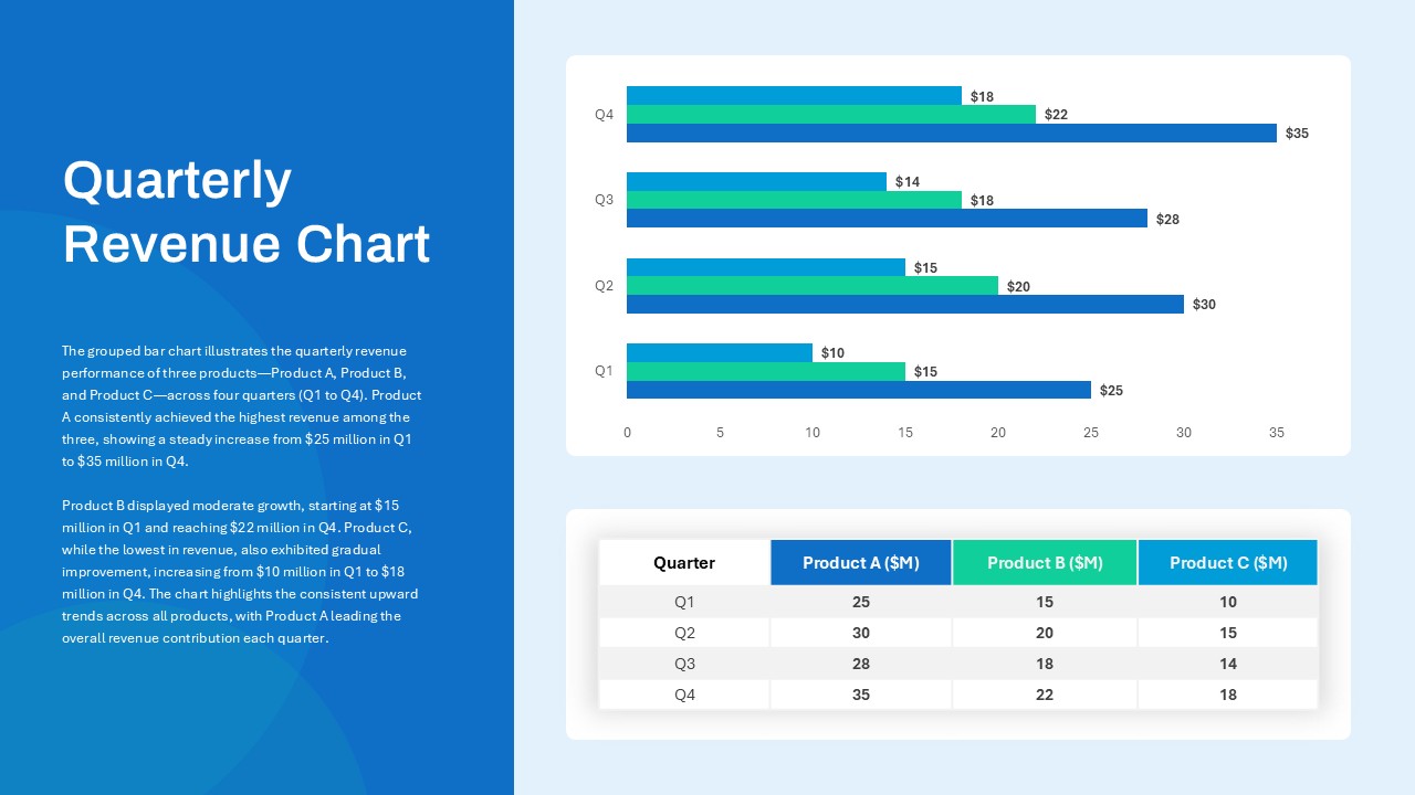
Quarterly Revenue Comparison Bar Chart Template for PowerPoint & Google Slides
Bar/Column
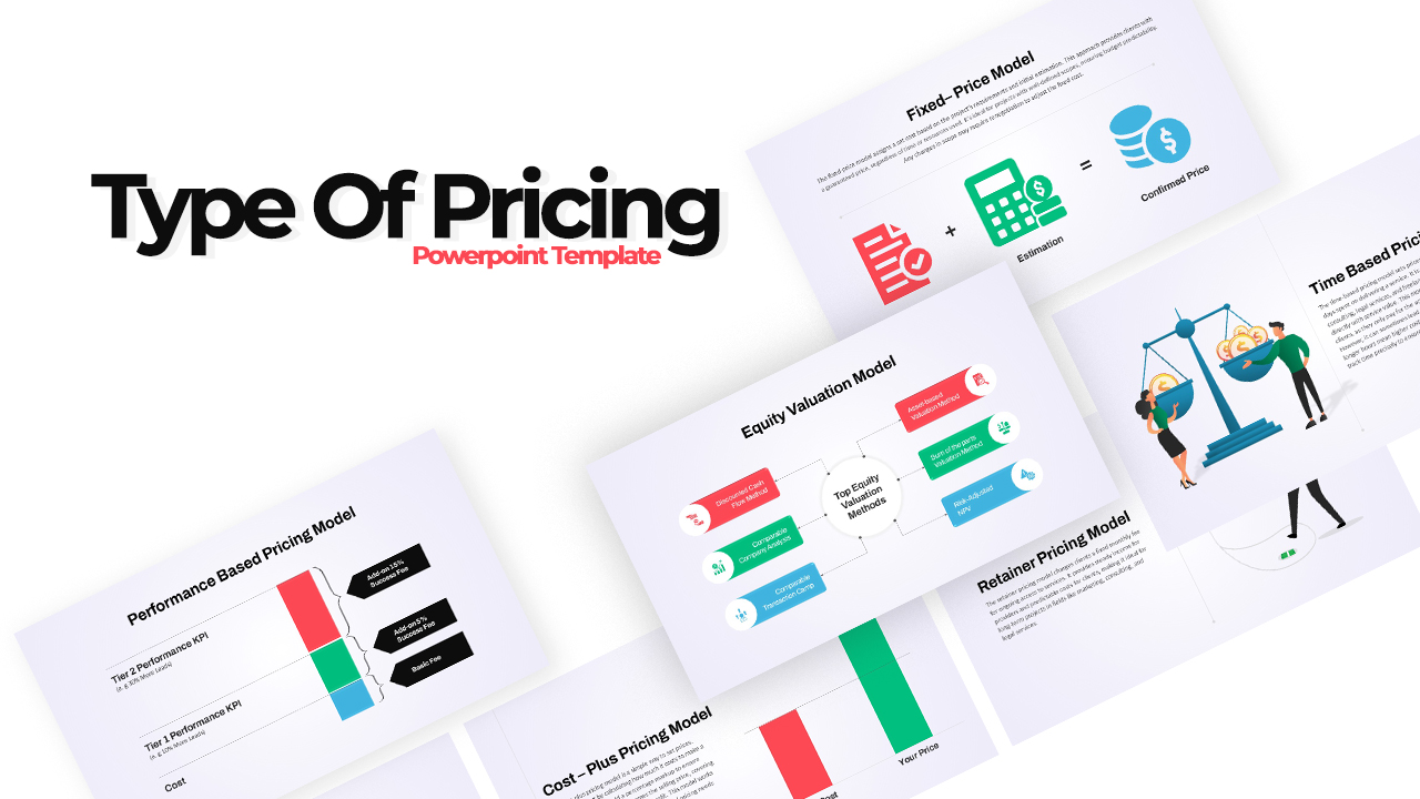
Pricing Model Types Comparison Infographic Template for PowerPoint & Google Slides
Pitch Deck
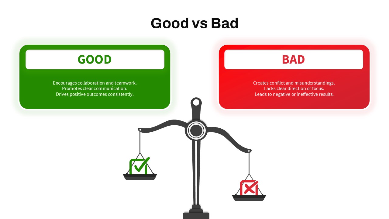
Good vs Bad Comparison with Scale Template for PowerPoint & Google Slides
Comparison
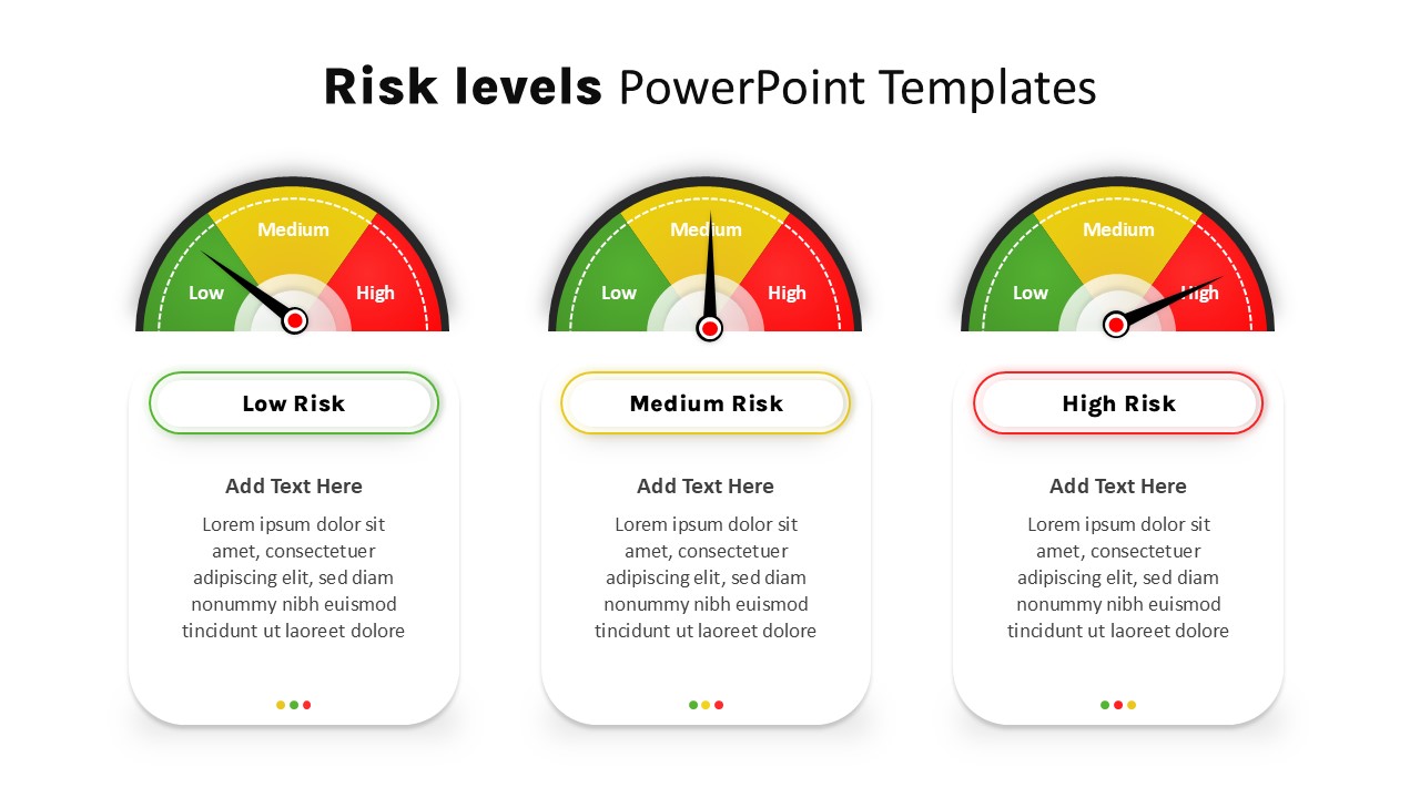
Risk Level Gauge Comparison Dashboard Template for PowerPoint & Google Slides
Comparison
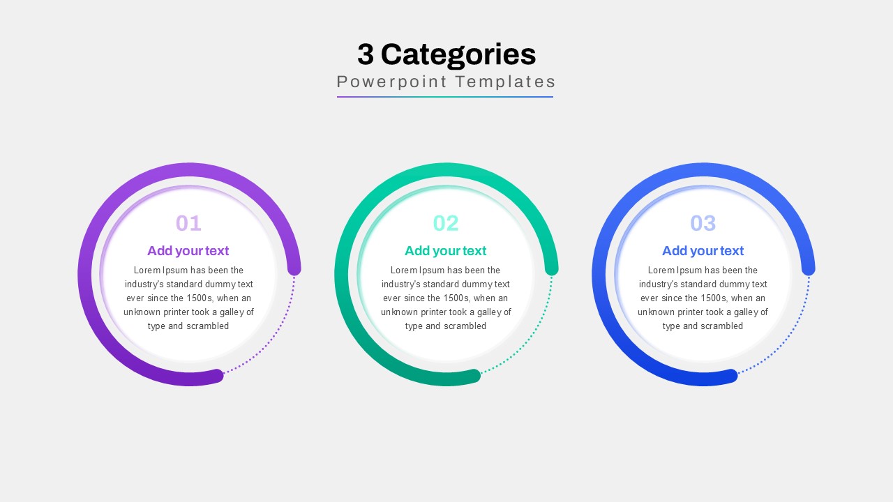
Three-Category Comparison Template for PowerPoint & Google Slides
Comparison
Cross Sell & Up Sell Strategy Comparison template for PowerPoint & Google Slides
Comparison
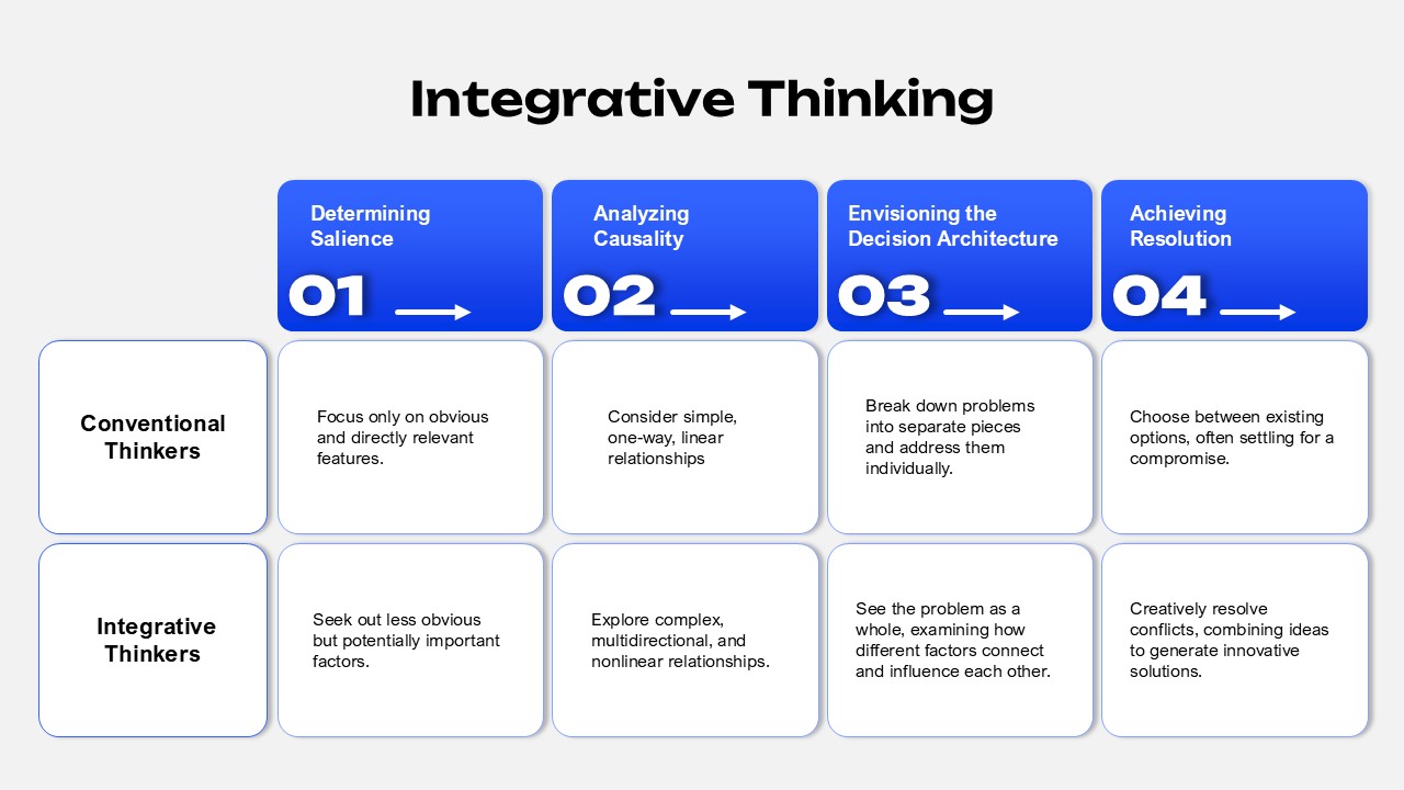
Integrative Thinking Comparison Diagram Template for PowerPoint & Google Slides
Comparison
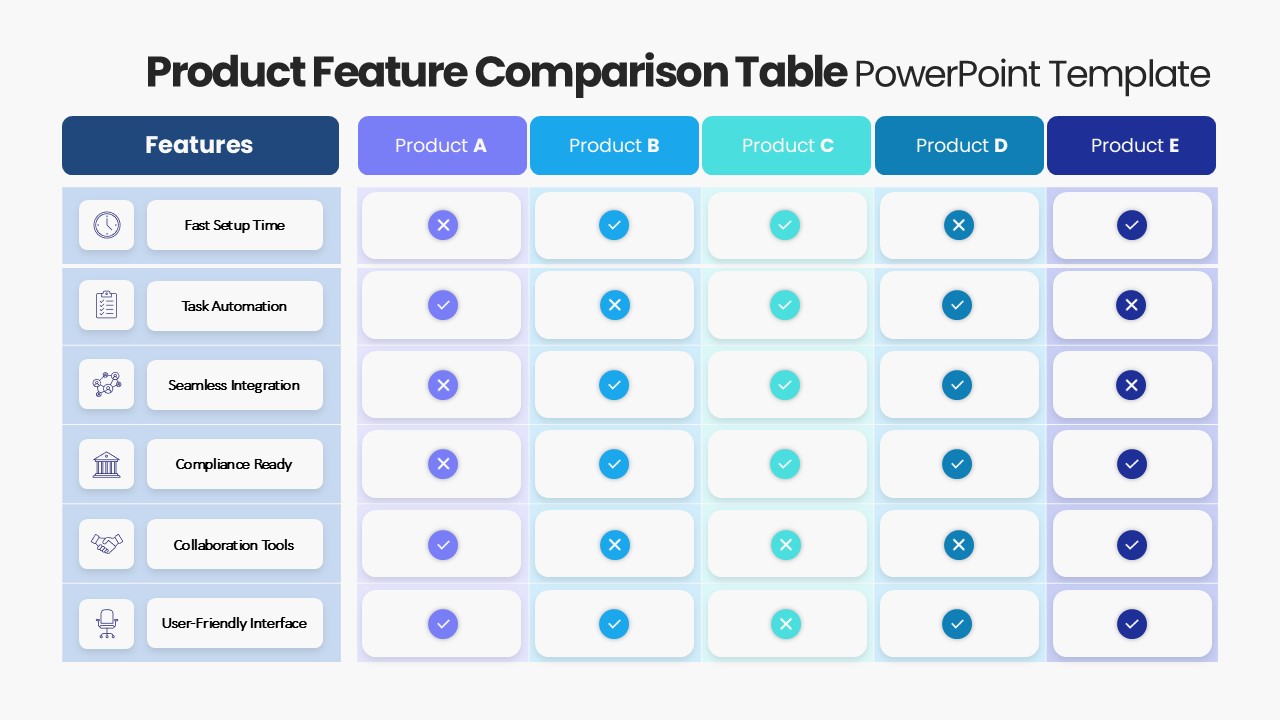
Product Feature Comparison Table Template for PowerPoint & Google Slides
Comparison Chart
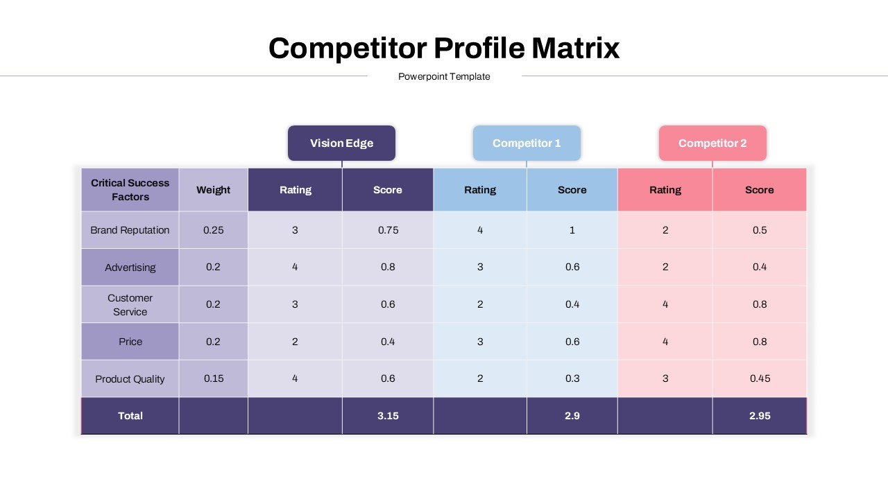
Competitor Profile Matrix Comparison Template for PowerPoint & Google Slides
Comparison Chart
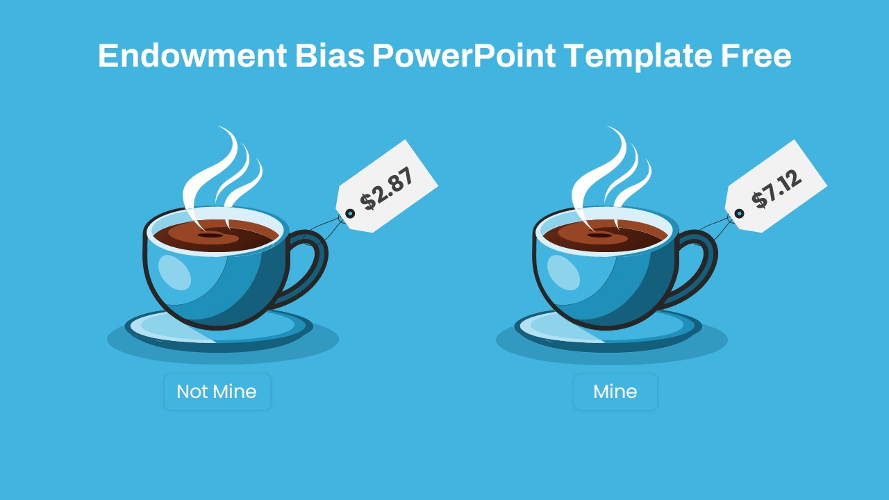
Endowment Bias Coffee Price Comparison Template for PowerPoint & Google Slides
Comparison
Free
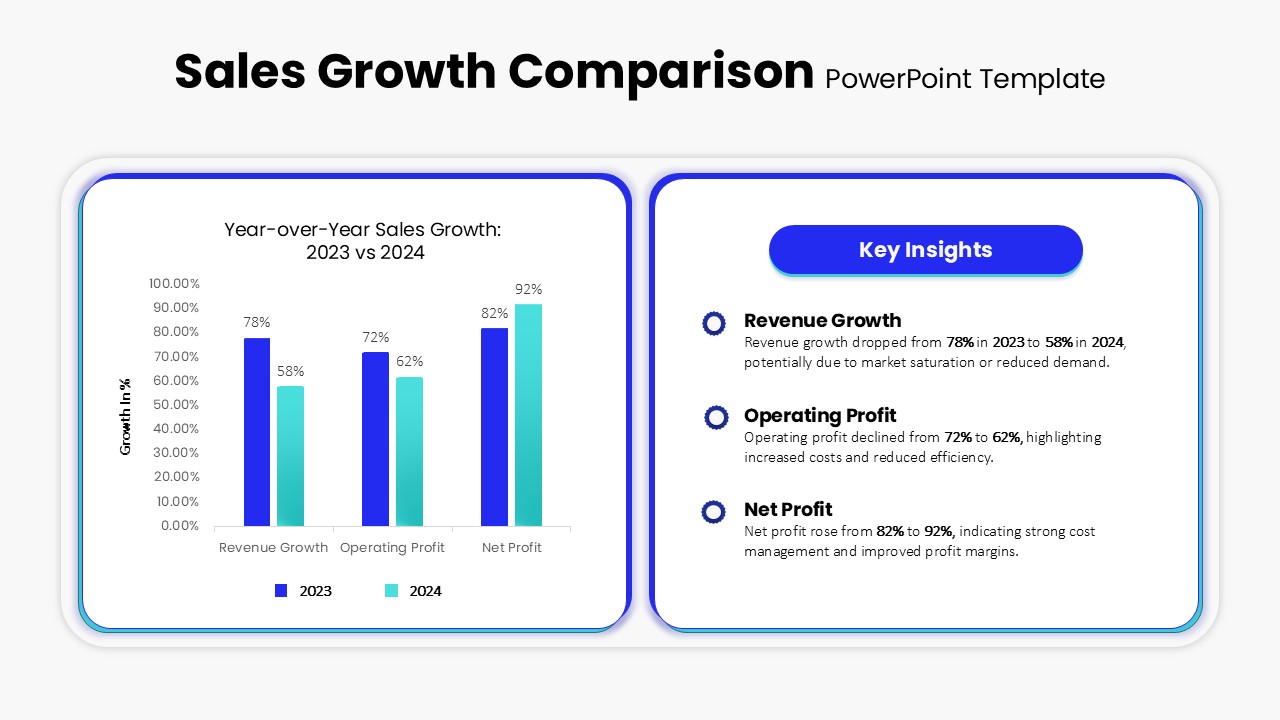
Sales Growth Comparison Chart & Table Template for PowerPoint & Google Slides
Bar/Column
Two Section Comparison template for PowerPoint & Google Slides
Business Proposal
Skills Gap Analysis Comparison Chart Template for PowerPoint & Google Slides
Gap
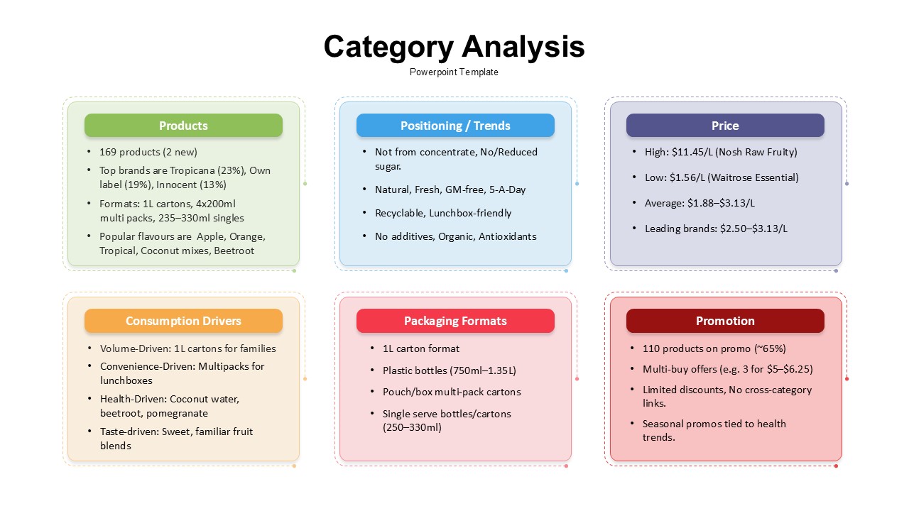
Category Analysis Comparison Infographic Template for PowerPoint & Google Slides
Comparison
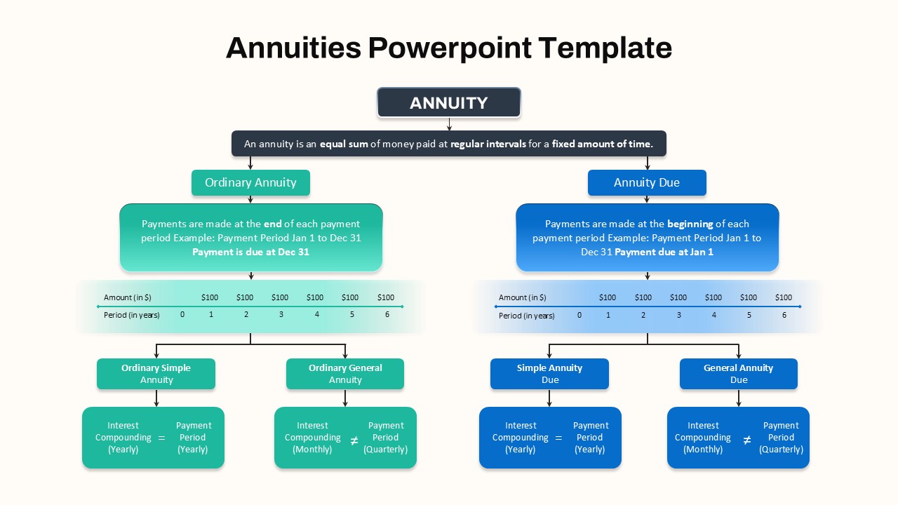
Hierarchical Annuity Comparison Flowchart Template for PowerPoint & Google Slides
Business Report
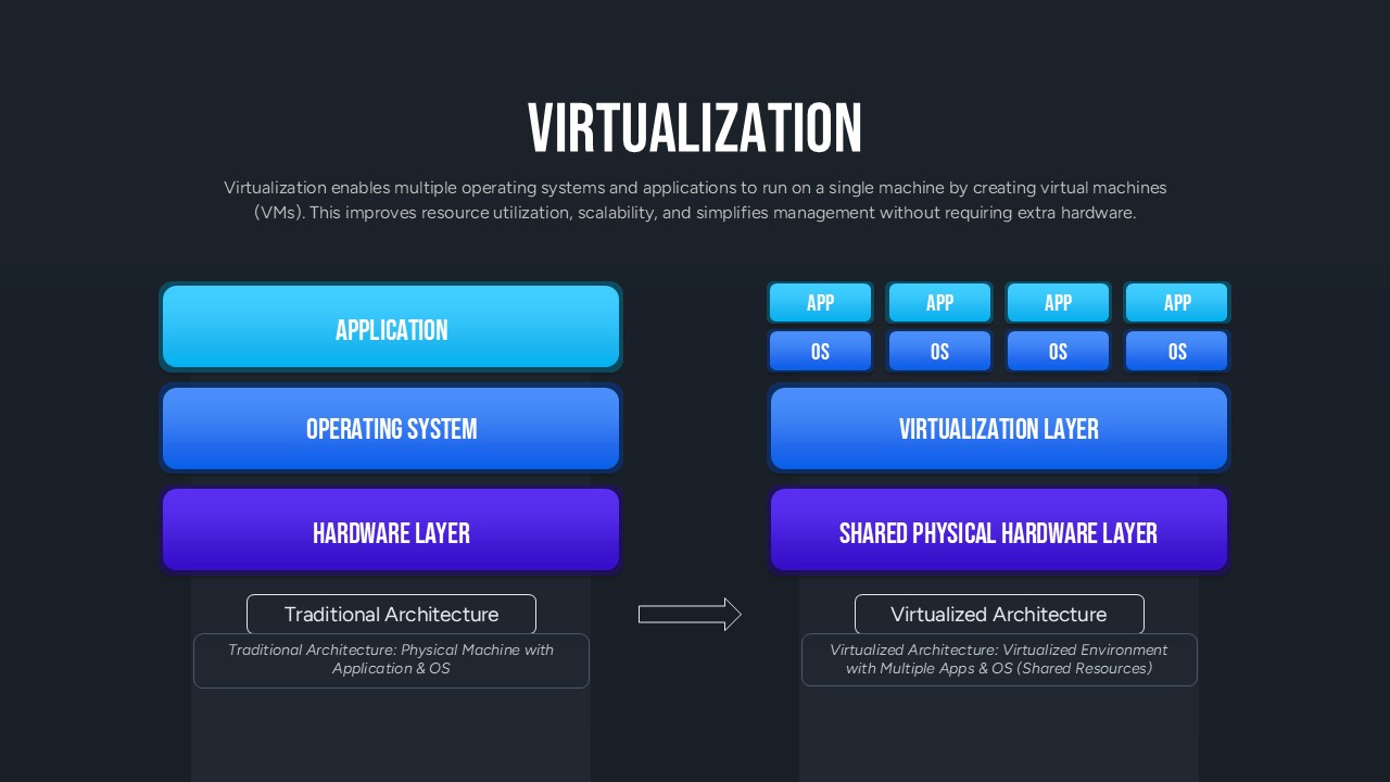
Virtualization Architecture Comparison Template for PowerPoint & Google Slides
Comparison Chart
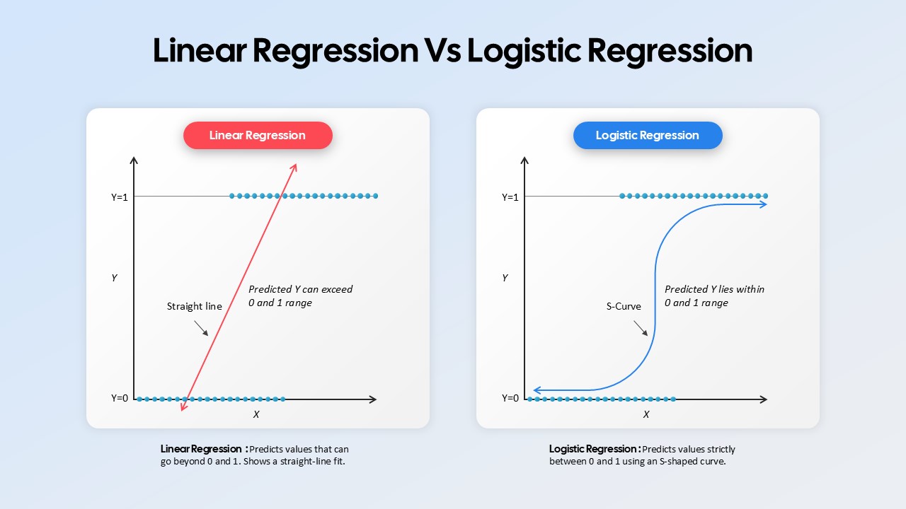
Linear Regression vs Logistic Regression Comparison template for PowerPoint & Google Slides
Comparison
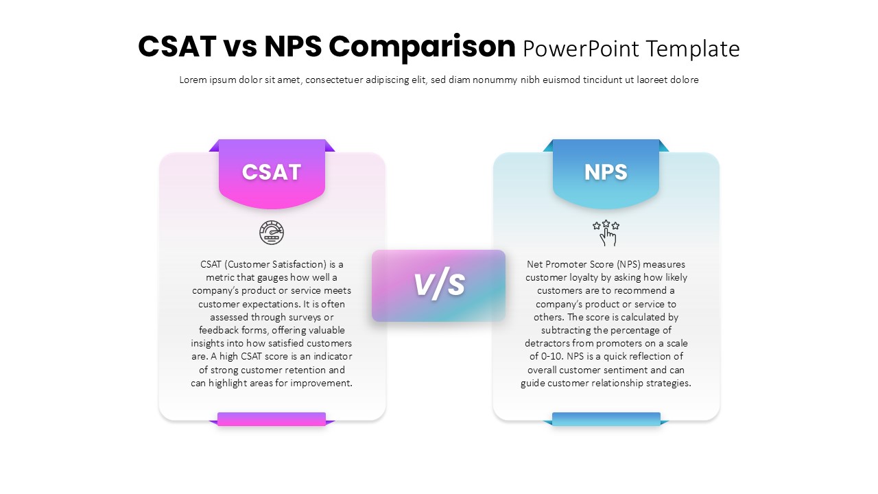
CSAT vs NPS Comparison template for PowerPoint & Google Slides
Business Strategy
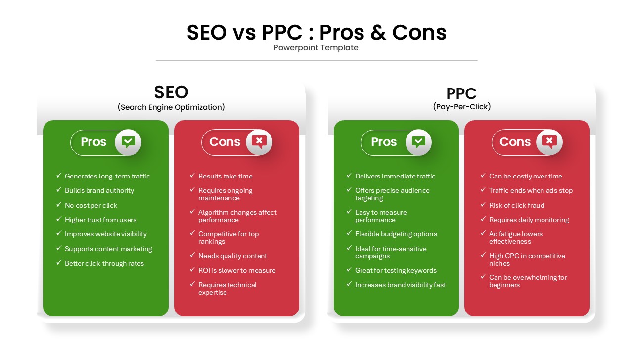
SEO vs PPC: Pros & Cons Comparison Template for PowerPoint & Google Slides
Comparison
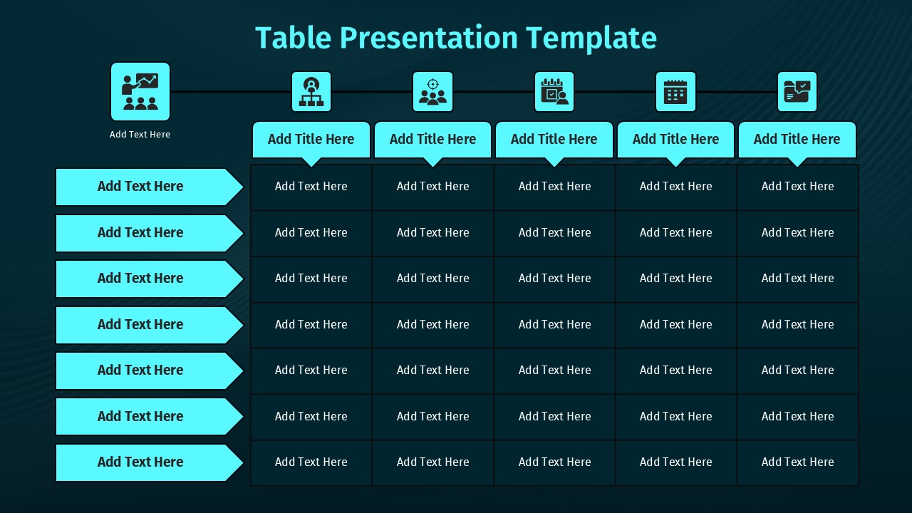
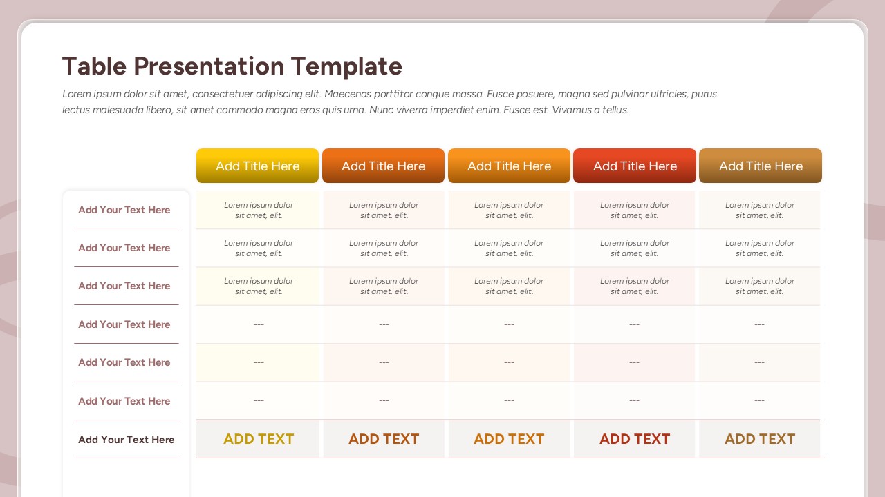
Comparison Table Presentation Template for PowerPoint & Google Slides
Table
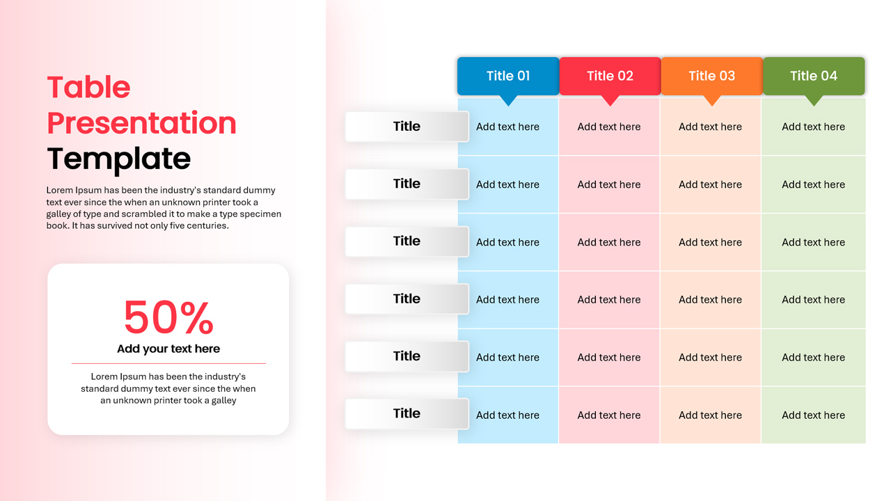
Colorful Comparison Table Presentation Template for PowerPoint & Google Slides
Table
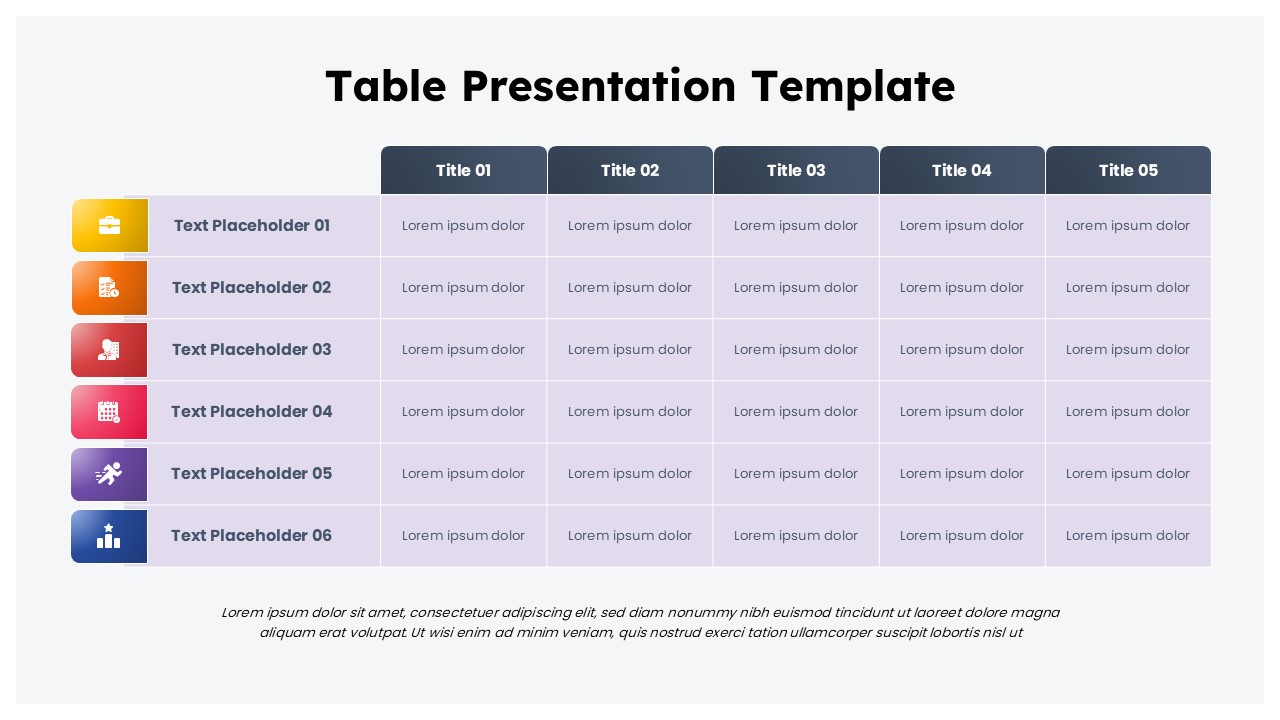
Colorful Business Data Comparison Table Template for PowerPoint & Google Slides
Table
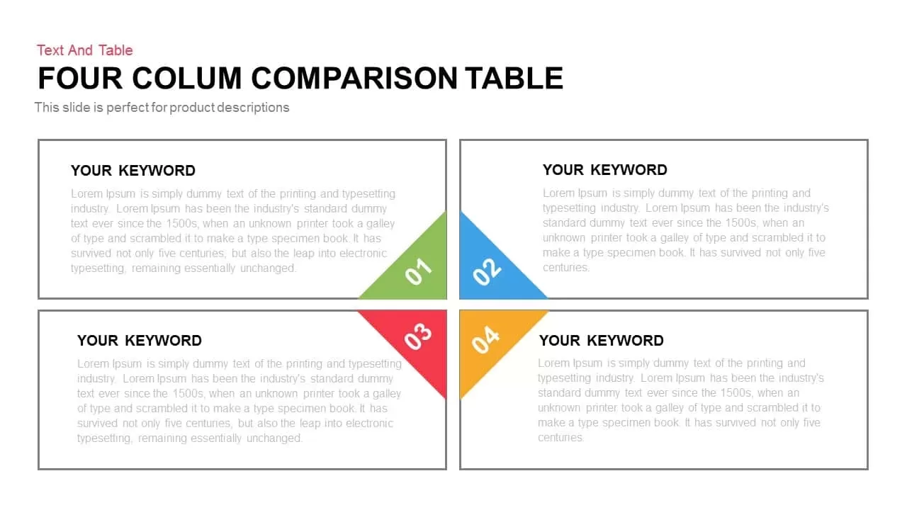
Five Column Comparison Table Layout Template for PowerPoint & Google Slides
Comparison
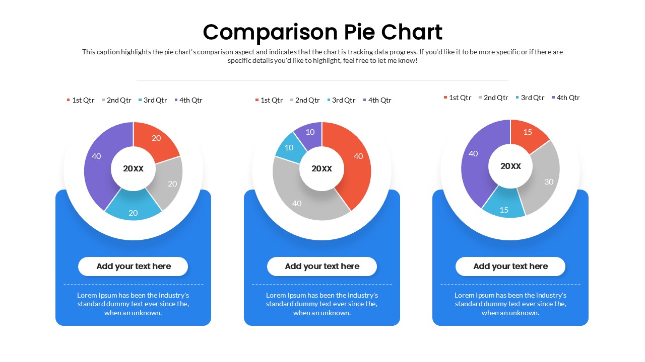
Quarterly Comparison Pie Chart Template for PowerPoint & Google Slides
Pie/Donut
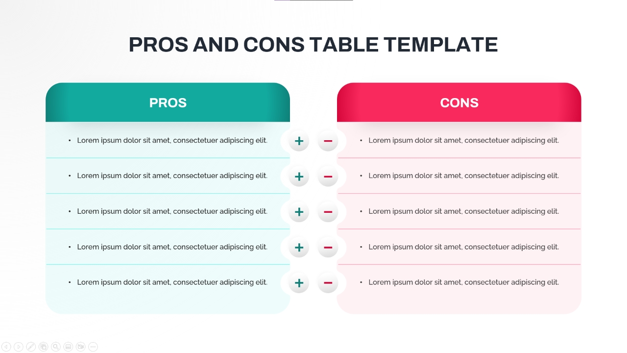
Pros and Cons Comparison Table Template for PowerPoint & Google Slides
Comparison Chart