A guide to presenting financial data: graphs, charts and other visuals

While presenting the financial data of your business, you cannot omit the important figures and conclusions. There exists a general notion that financial presentation is tedious and heavy on jargons. But this often occurs when you don’t know how to present data.
“If we have data, let’s look at data. If all we have are opinions, let’s go with mine.” – Jim Barksdale, former Netscape CEO
Every business grows on the story it tells. But if the story is not backed by logical and tangible claims, no one will buy it. If you are presenting the annual report to a panel or if you are pitching a new business idea to a potential collaborator, you need to have strong evidence for every claim you put forward. But you don’t want to clutter the slides with a lot of spreadsheets or balance sheets. That’s where you need different type of visuals to support your presentation.
In this article we will look at the different aspects of financial data presentation along with the types of charts and graphs to make the financial presentations interesting.
What is financial data?
Any information related to the financial health of a business or organization can be termed as financial data. These include different factors like the key performance indicators (KPIs) of a business tracked and recorded on a regular basis.
Financial data is an umbrella term that includes everything of an organization like
- Balance sheets
- Assets
- Liabilities
- Management reports
- Sales activities
- Income and expenditure
- Production metrics
- Cash flow statements
What are financial graphs?
Financial graphs or charts are the visuals aids to make the financial data more accessible and easier to comprehend. Presenting the data visually helps to analyze the efficiency of the business strategies and tactics used. People remember and respond better to visuals since they offer clear insights with the aid of meaningful data. Financial data presentation is vital for any business since it serves as the backbone to the story you sell.
Financial graphs help businesses set the goals and track them effectively. All the relevant information presented in a scannable manner make more sense than a pile of unorganized data. Following are some of the most common and useful financial graphs you can use to make your presentation interesting and insightful.
Different types of graphs for financial data presentation
Bar graph
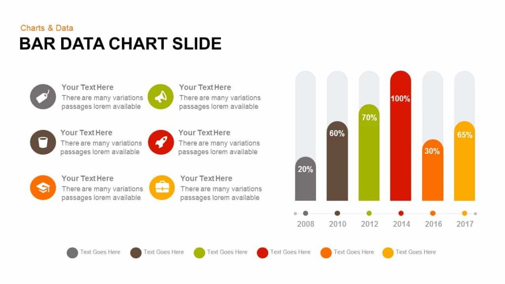
A typical bar graph contains an axis, scales, label and bars representing measurable values in different units. It uses bars whose size visually compares the data among different categories. For example, you can use this to show the conversion rates or sales statistics.
When to use a bar graph:
- If you want to show the change of a component over time
- To compare different parts of a big set of data, highlighting different categories
- When the number of categories is limited to 10.
Line graph
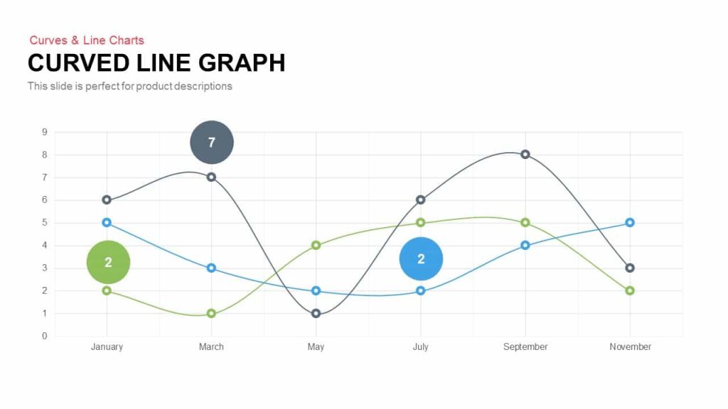
A line graph is the most common type of graph to display the growth of something over time. Multiple lines can be plotted within the same graph by connecting points. For example, you can use this to see the trend of your most recent product releases over the past few months.
When to use a line graph:
- If your dataset is continuous over time
- If you want to focus on the trends of the data, rather than accurate values
- When you want to display multiple datasets in the same timeline
Pie graph
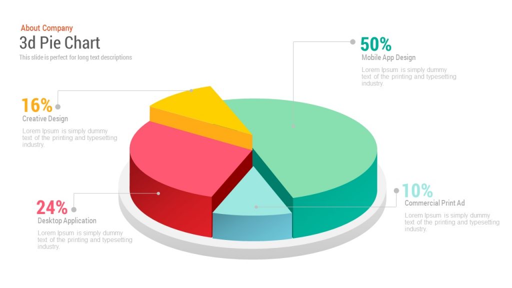
A pie graph is a spherical statistical graph which is used to display the distribution of an item. It illustrates numerical proportion quite well and is useful for the percentage breakdown of a small number of data points. For example, you can use this to show the types of investors in your business.
When to use a pie chart:
- If you want to show relative distributions of a dataset.
- When you have a small dataset.
- If the number of categories is limited to 6.
Scatter plot
Scatter plots are two-dimensional data visualizations used to show the correlation between two variables. For example, you can use this to show the growth of your company across a few years.
When to use a scatter plot:
- When you have a large dataset
- To derive correlations between two variables
- When you want to identify clustering in big datasets
Bubble chart
A bubble chart has points (bubbles) plotted along a cartesian plane where X and Y axis denote separate variables, and the point plotted represent a third variable by the size of the bubble. For example, you can use bubble chart to study the correlation between two growth parameters of your company.
When to use a bubble chart:
- To compare variables based on the size and positioning of bubbles
- If you want to identify relationships and patterns among variables
- If there are three or more numerical variables
Gauge chart
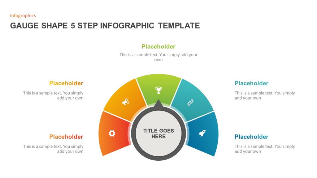
A gauge chart contains colors and needles to track the progress of a set KPI over a range you define. For example, you can use this to track the sales where the maximum range denotes the sales target you want to achieve by the end of the year.
When to use a gauge chart:
- To analyze a single metric.
- If you want to track the targeted parameters for your company’s growth.
- To indicate key performance indicators
Cylinder chart
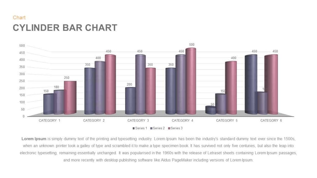
A bar chart represents cylinders instead of bars to represent the data. It can be used to represent two data series with a diverse scale and units. For example, you can use this to show the projected and actual sales through different time periods.
When to use a cylinder chart:
- To give a better visual appearance to your data
- When you want to represent data in three dimensions
- If you want to compare each category or clusters
Spider chart or Radar chart
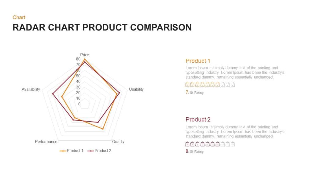
Spider charts are used to present multiple variables with corresponding datapoints with grid lines joining the points to form a polygon. For examples, this can be used to compare different parameters of the company with that of the competitors.
When to use a spider chart:
- If you want to compare large number of variables against each other
- To quickly analyze the visual data
- To compare multiple groups of data by overlapping the polygons
Area chart
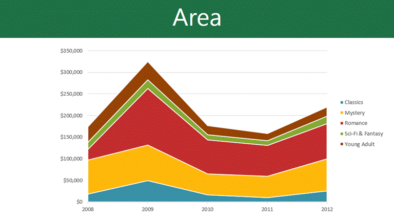
An area chart typically combines line chart and a bar graph to show the numerical value changes with another variable. Each area is given a different shade and is useful or cumulative data. For example, it can be used to show cumulative sales revenue from different products.
When to use area chart:
- When you have a continuous data
- If you want to show the relation of each component to the whole
- If you want to show the magnitude of the data
Histogram
Histograms are the type of graph that shows the supply of a dataset. It is the most common graph to show frequency distribution. For example, you can use it to separate your customers into categories based on their age and study their patterns.
When to use a histogram:
- If the data is numerical
- In order to compare the distribution of two or more datasets
- If you want to see the shape of the data distribution
Bonus: Financial dashboards
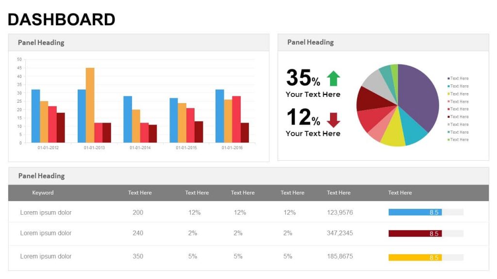
Now you know which chart types to use in different contexts. And here’s how you can use most or all of in a single slide to give an overview of your business.
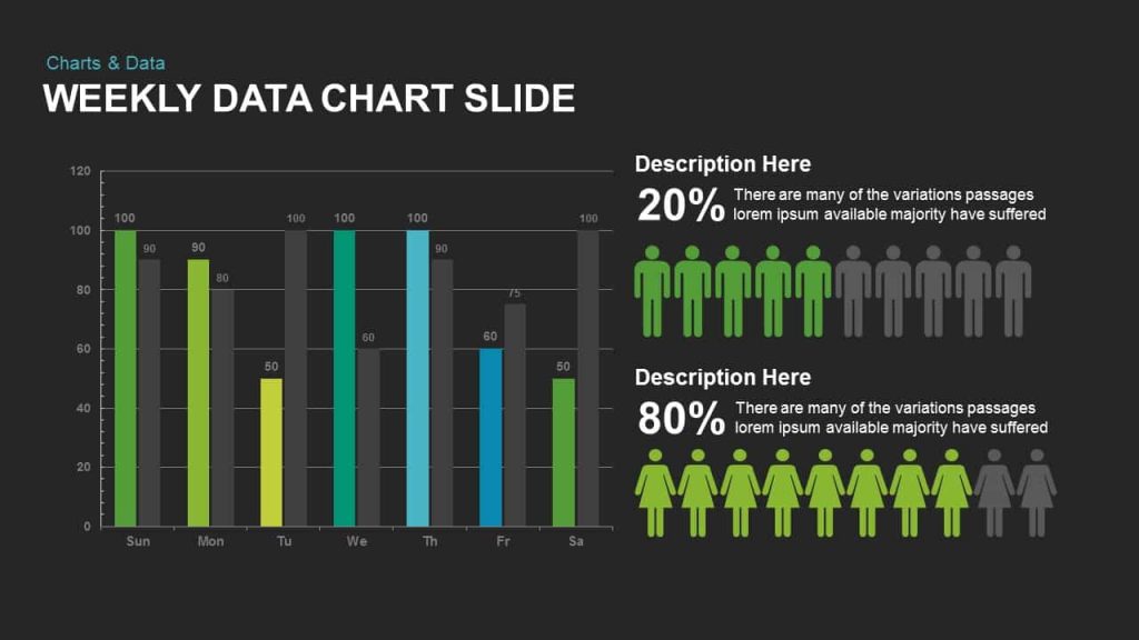
Dashboards offer a quick glimpse to the KPIs significant to a particular business or organization, thus providing a snapshot of the performance. It can be used as a rough progress report for an item. For example, it is used by managers to display contribution of various departments in their organization.
When to use a dashboard:
- If you want to report specific data points from each department
- To show the status of an ongoing project
- To understand how well an organization is performing overall
How to choose the right chart type for data visualization?
- To compare values of one or more dataset, use bar graph, pie graph, line chart, or scatter plot.
- If you want to display the composition of an element, pie graph, area graph or cylinder graph would be the best.
- In order to understand the distribution and trends of the data points, scatter plot, bar graph or line chart would be preferred.
- If you want to analyze the trend of a parameter over time, it would be best to use a line chart or a column chart.
- For a continuous data, use a line chart or an area chart. If it’s discrete, use bar graphs or histograms.
- To understand the correlation between datasets, you can use bubble chart or a scatter plot. A line chart would also be useful.
Common challenges while presenting data
It’s inevitable to have a lot of information in financial presentations. There will be annual reports you have to discuss, sales activities you have to access and business strategies you have to revise. However, presenting tons of financial data can get tedious. Following are some of the common problems faced in a financial data presentation.
Too many numbers!
You cannot have a financial presentation without ample data to support your claim. But that doesn’t mean you should present every number to the last decimal digit with precision. As long as your results are accurate, you don’t have to derive the results in your presentations. But if you overcrowd the presentation slides with a lot of numbers without a thread to take the story forward, audience will lose the interest and may get distracted. The key is to show only the relevant information to derive valuable insights for the audience.
Financially illiterate audience
Like in any other presentation, it’s very important to know the audience to choose the approach of your data presentation. If your audience doesn’t have financial literacy, there’s no point boasting about the profit you made or the milestones you achieved in your business. They care more about the takeaway than the amount of data or how much effort went into generating them. More than the data or the smart conclusions, audience wants to know what it will do to their life, there area of interest.
Presenting data no one asked for
People often think showing a lot of data in the presentation increases their credibility, and they are afraid they will be questioned if all the data is not included in the presentation. But the truth is nobody cares how much data you have unless it makes sense to them. You have to remember it’s not about you. Going overboard with the details and fitting all the data in small fonts overwhelm them. The quality and authenticity of your conclusion matters more than how much data you could generate.
Poor data visualization
There’s nothing like a pile of unorganized data that can disconnect the audience from your presentation. Many people present spreadsheets instead of organizing them well in terms of graphs or charts. A survey showed that people prefer to see visuals instead of a bulk of unorganized data on the screen. There are graphs and charts that are designed to make financial data presentation easier to read and comprehend.
5 tips to delivering a powerful financial presentation
A financial presentation doesn’t always have to be boring and jargon-heavy. It can be insightful, engaging and interesting if you use adequate tools and data to back your story. Here are some tips to help you present financial data effectively.
“The goal is to turn data into information, and information into insight.” – Carly Fiorina, former CEO of Hewlett-Packard Co.
1. Decide the important takeaways and tell a story
Before you present the financial data, decide the important points to focus and form a story along that line. You can use the GPS model of planning where you understand where the audience currently is and deliver the presentation to take them to the desired destination. Focus on the conclusions derived and the relevant call-to-action rather than bombarding the audience with a large amount of data.
2. Use different graphs and charts to present your data
The spreadsheets kill the data, so refrain from using them. Remember that you don’t have to show every bit of your data. You can use different types of graphs and charts to streamline the most important data in an organized way. Use different colors to highlight different sections, label them properly so that the visual can stand alone. Besides presenting interesting plots, tell them what a dip in the graph means or how the linearity of curve determines growth.
3. Don’t leave the audience with figures; tell them what they mean.
Instead of stating that the growth has increased by 10% in the last year, tell them what that means to the company and to them as consumers of the product/service. You can briefly include how you reached the conclusion with the data in hand. This may help them connect with your presentation more effectively.
4. Don’t use acronyms the audience won’t understand.
There must be certain jargons or acronyms that are inevitable for your business. Remember that what may seem trivial to you might not seem so to the audience. So, whenever you’re using an acronym for the first time, spell it out for them and tell them what that means. If you’re presenting to a business leader who has an expert knowledge of the domain, you may dive right in to the technical aspects. Otherwise, go easy on the terminologies and speak in a language the audience understands.
5. Know your audience and speak to them
Audience is the significant part of any presentation and knowing their needs and expectations will help you deliver a better presentation. Every presentation should be tuned for the specific audience. Don’t pull slides from the previous presentation at random. If you’re presenting to your team manager, you should include more data, but other experts in the field need not know the internal matters of your company. So, take care of that. Don’t use fancy visuals or transitions, it will only distract the audience. It will be too much to process especially since you have chunks of data; so, go easy on the formatting of slides.
As important it is to have relevant visual aids in your presentation, it’s even more important to choose the right one for your data. Even though there are no hard rules regarding the choice of graph, it should serve the basic objective of telling the story. A good chart saves you time, is easy to interpret and displays clear numeric connections between the different sections which are separated by different colors. Whereas, a bad chart is hard to comprehend and is crowded with too much data and labels.
Apart from having the numbers written clearly, the graphs must be able to craft a story.
Discover engaging presentations with our PowerPoint templates! Check out finance PowerPoint template, green and black PowerPoint template, and one page report template for a visually impressive touch.
“In God we trust. All others must bring data.” – W. Edwards Deming, author, statistician, professor, and consultant.


