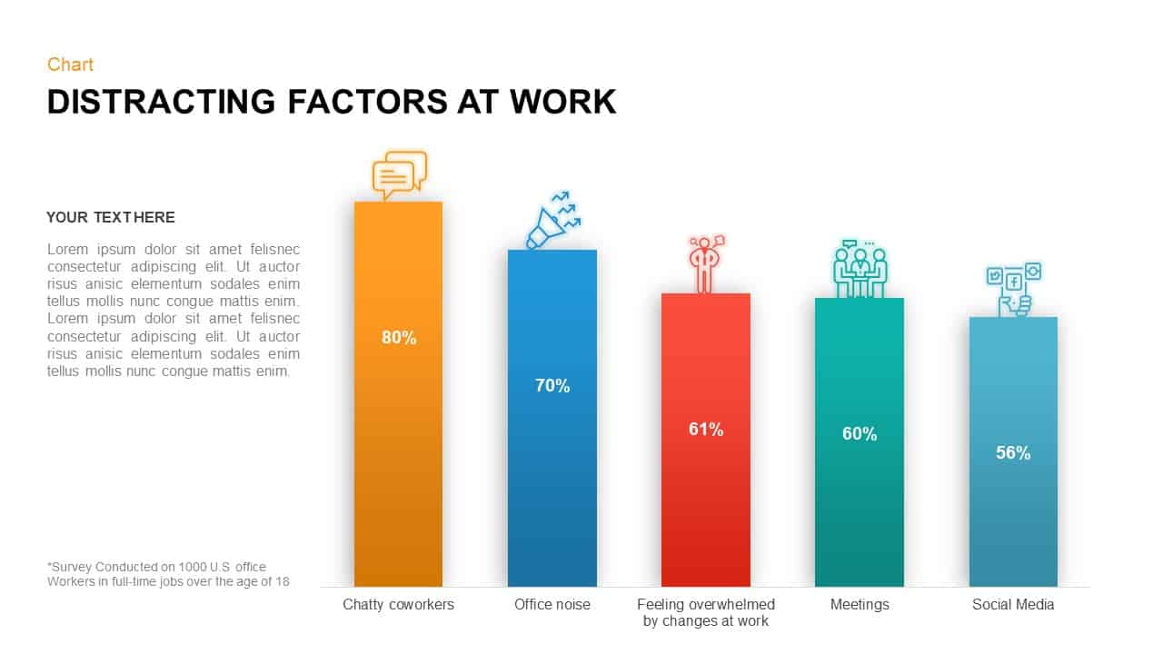
Distracting Factors at Work Bar Chart Template for PowerPoint & Google Slides
Description
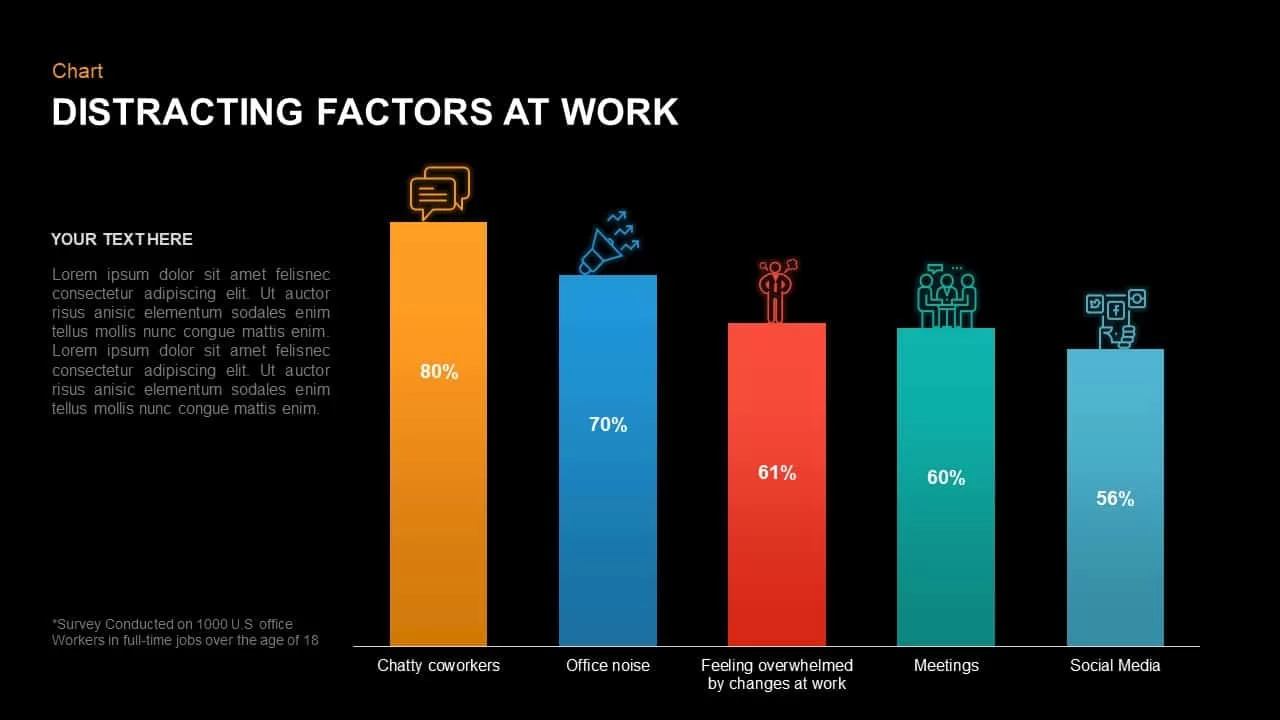
Leverage this versatile horizontal bar chart slide to present comparative data on workplace distractions with exceptional clarity and visual appeal. Featuring five color-coded vertical bars—orange for chatty coworkers, blue for office noise, red for feeling overwhelmed by changes, teal for meetings, and cyan for social media—each segment includes bold percentage labels and descriptive axis text. The clean white background, subtle gridlines, and minimal iconography ensure your audience focuses solely on the insights.
This template is fully editable in PowerPoint and Google Slides, leveraging vector-based shapes and SmartArt elements for pixel-perfect scaling. Customize bar heights, colors, and data values with a few clicks, swap out icons via drag-and-drop, and adjust axis scales or gridline density to suit your dataset’s complexity. Built-in sequential animations allow you to reveal each bar progressively or highlight specific segments to guide audience attention during presentations.
Designed for streamlined collaboration, the slide integrates seamlessly with master slide themes. Update global font styles, color palettes, and legend positions across all charts without manual edits. Accessibility features, including high-contrast text options, large labels, and alt-text placeholders on icons, ensure inclusive communication for diverse audiences. The modular layout supports hiding or emphasizing particular bars, making it effortless to tailor the slide for executive summaries, team workshops, or client reports.
Beyond illustrating workplace distractions, repurpose this chart to compare budget allocations, track project milestone completion rates, measure customer satisfaction scores, or analyze resource utilization. The flexible design accommodates additional categories by duplicating bars or adjusting axis ranges. Whether you’re a market researcher, project manager, or HR leader, this slide empowers you to present critical metrics with confidence and precision.
Who is it for
HR managers, team leaders, project managers, data analysts, and decision-makers will benefit from this bar chart slide when presenting survey insights, performance metrics, or comparative data on workplace factors.
Other Uses
Apart from workplace distraction surveys, use this chart to visualize training completion rates, budget allocations, performance dashboards, project milestone progress, customer satisfaction scores, or resource utilization scenarios by duplicating bars and redefining categories.
Login to download this file

Item ID
SB01324
Related Templates

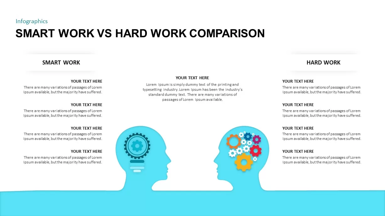
Smart Work vs Hard Work Comparison for PowerPoint & Google Slides
Infographics

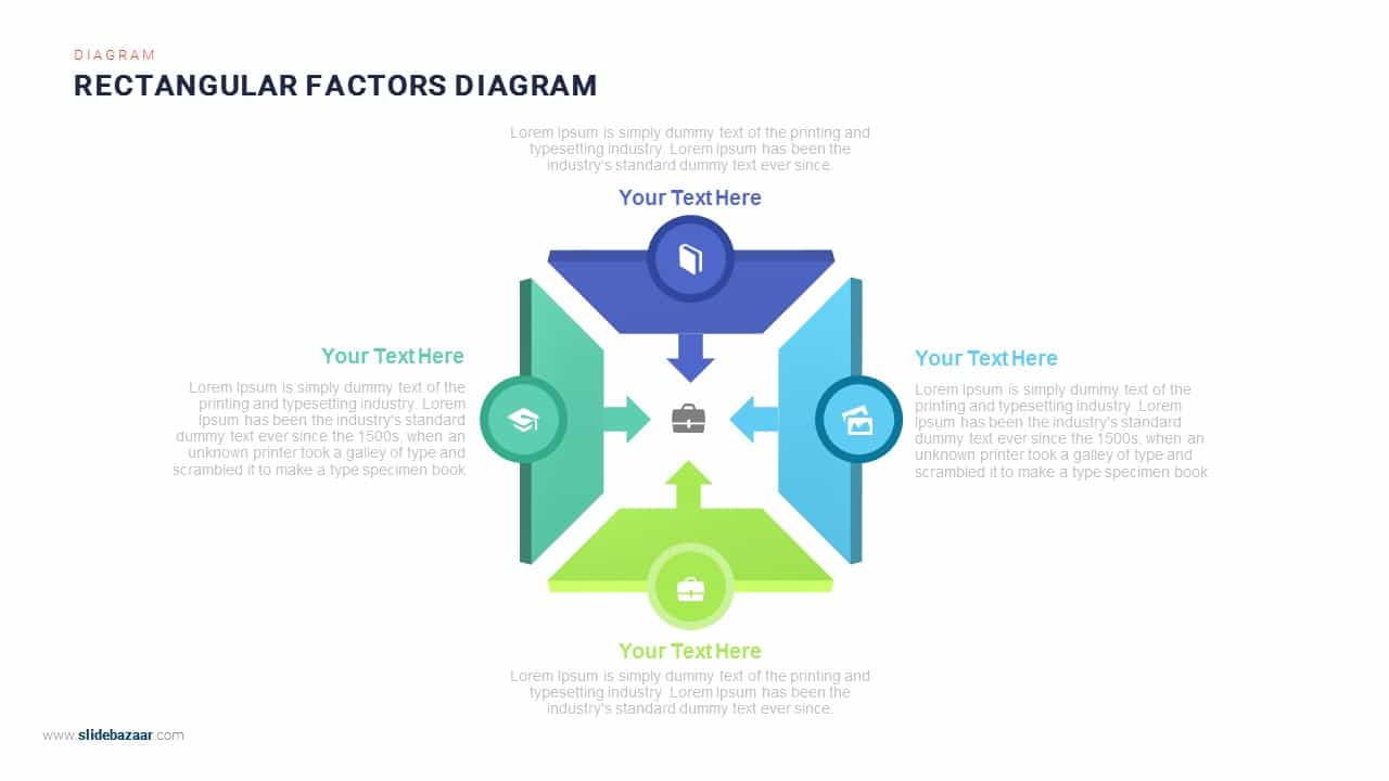
Four-Arrows Rectangular Factors Diagram Template for PowerPoint & Google Slides
Process
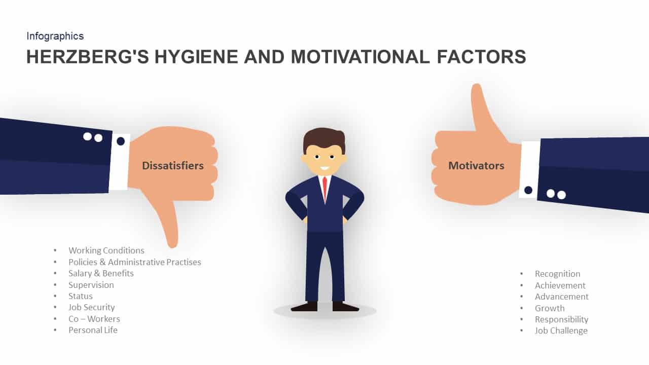
Herzberg’s Hygiene & Motivation Factors Template for PowerPoint & Google Slides
Employee Performance
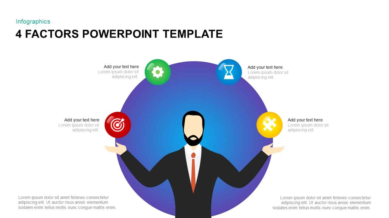
4 Factors Circular Diagram Infographic Template for PowerPoint & Google Slides
Circular
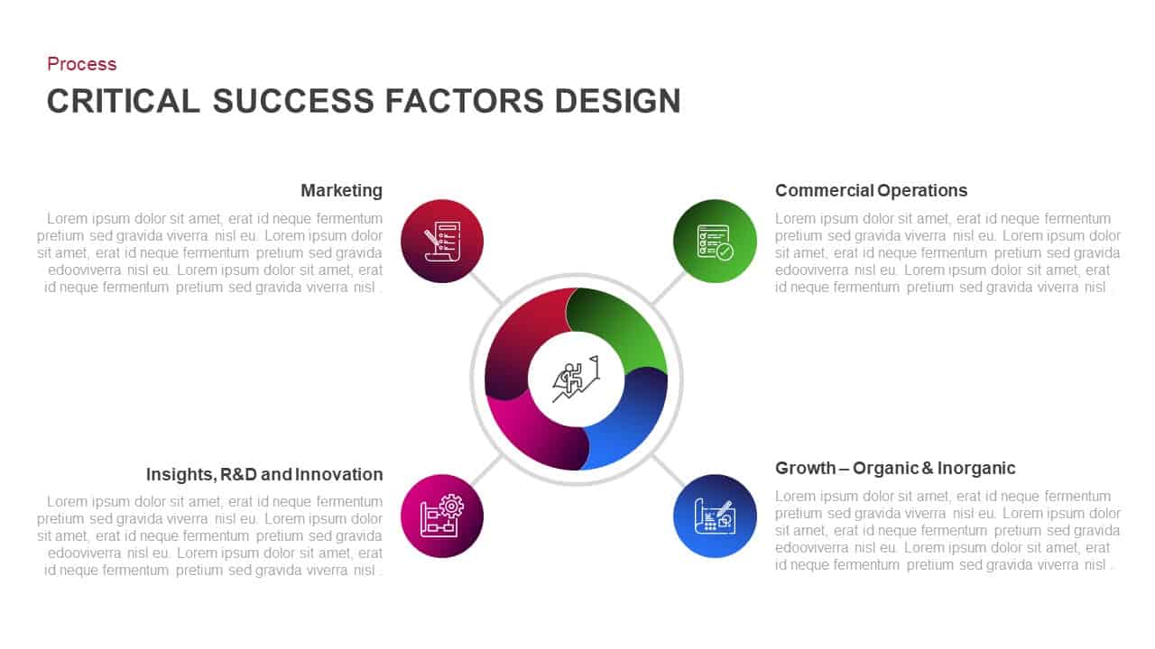
Critical Success Factors Diagram Template for PowerPoint & Google Slides
Infographics
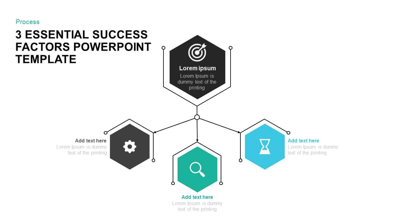
3 Success Factors Hexagon Process Template for PowerPoint & Google Slides
Process
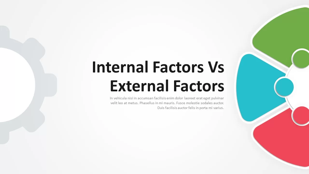
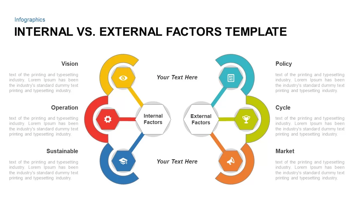
Internal vs External Factors Comparison Template for PowerPoint & Google Slides
Comparison
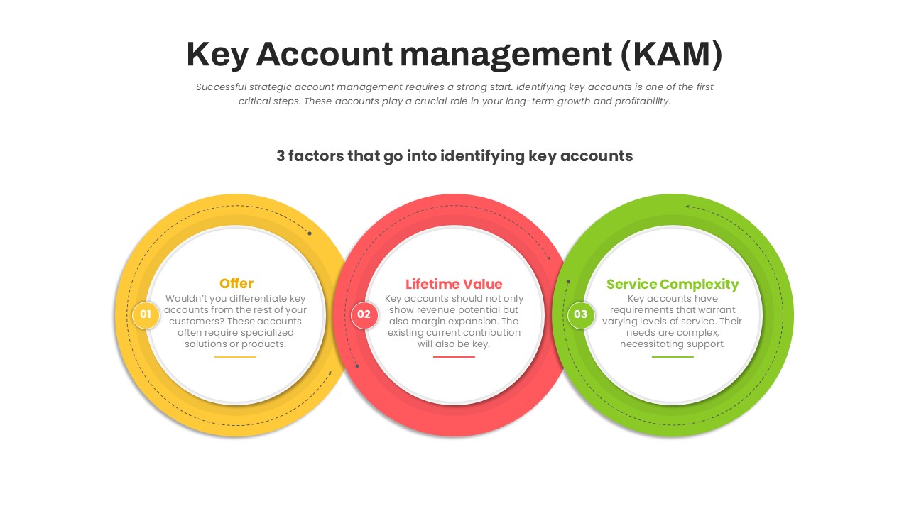
Key Account Management Circular Factors Template for PowerPoint & Google Slides
Circular
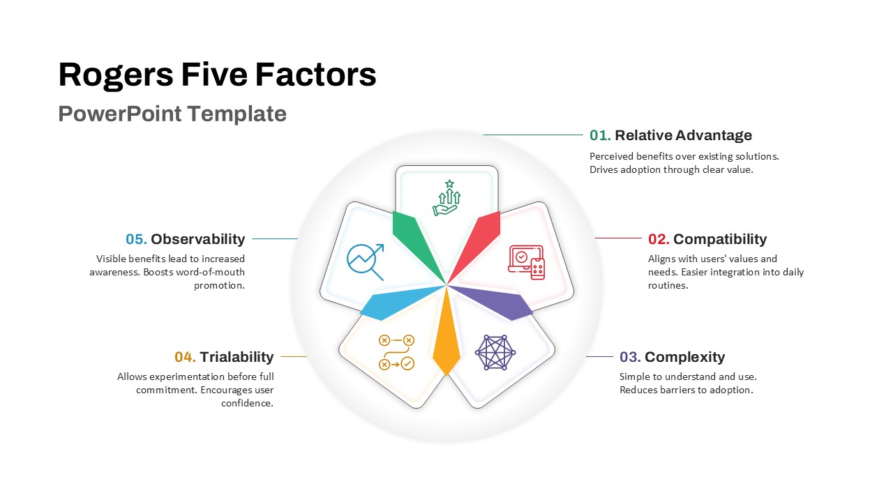
Rogers Five Factors Diffusion Innovation Template for PowerPoint & Google Slides
Process
Internal vs. External Factors for PowerPoint & Google Slides
Infographics
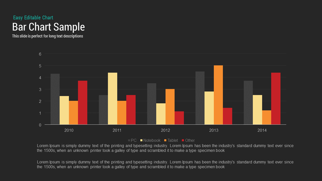
Bar Chart Sample template for PowerPoint & Google Slides
Bar/Column
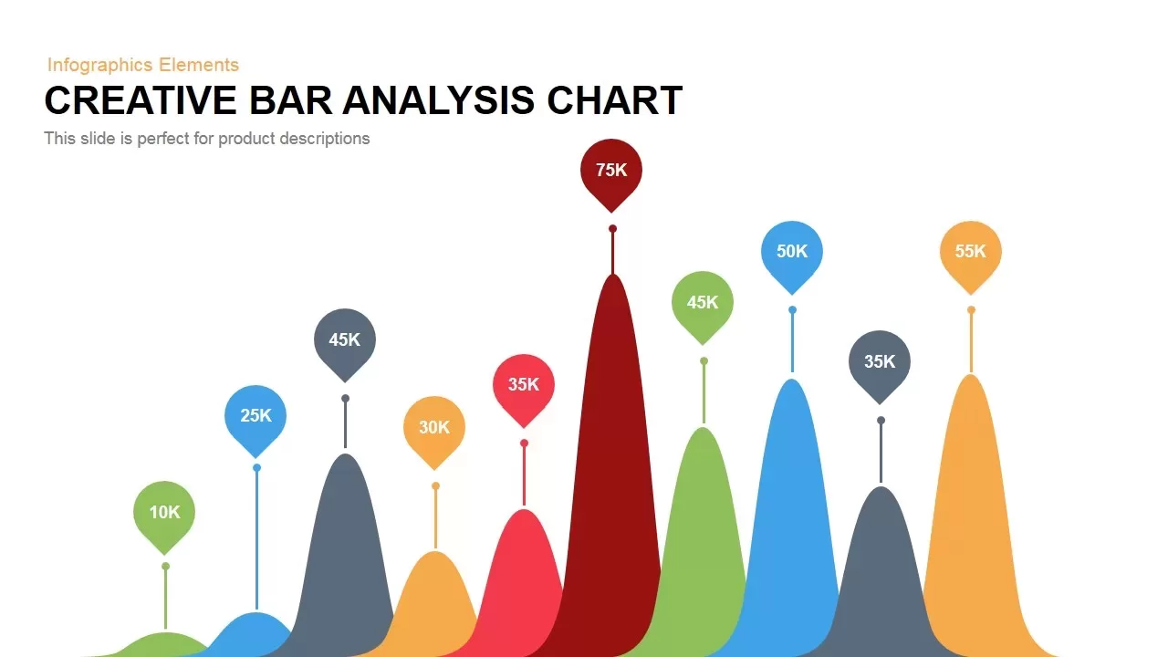
Creative Data Analysis Bar Chart template for PowerPoint & Google Slides
Bar/Column
3D Bar Chart Data Infographics Template for PowerPoint & Google Slides
Bar/Column
Creative Bar Chart template for PowerPoint & Google Slides
Charts
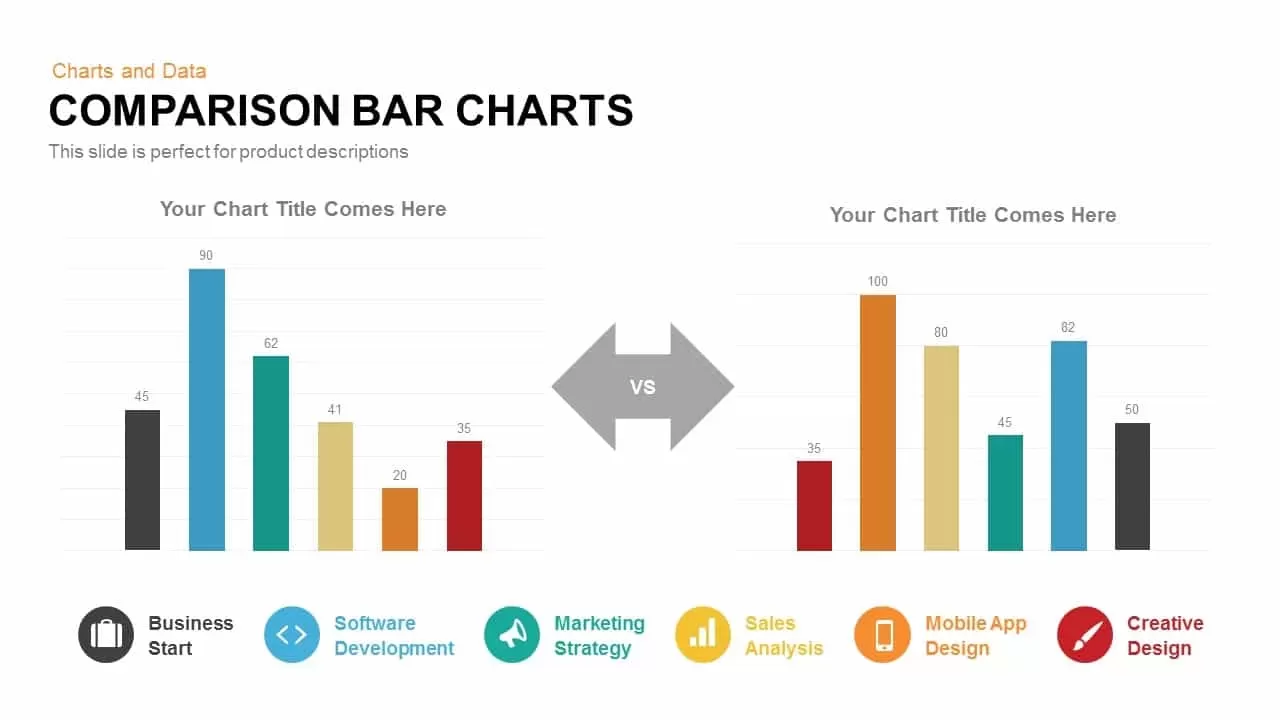
Comparison Bar Chart template for PowerPoint & Google Slides
Comparison Chart
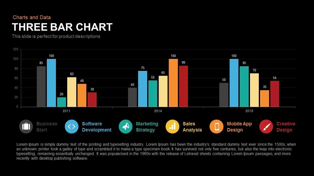
Three-Year Bar Chart template for PowerPoint & Google Slides
Charts
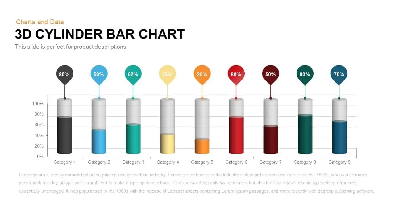
3D Cylinder Bar Chart Template for PowerPoint & Google Slides
Bar/Column
Pencil Bar Chart Data Analysis Template for PowerPoint & Google Slides
Bar/Column

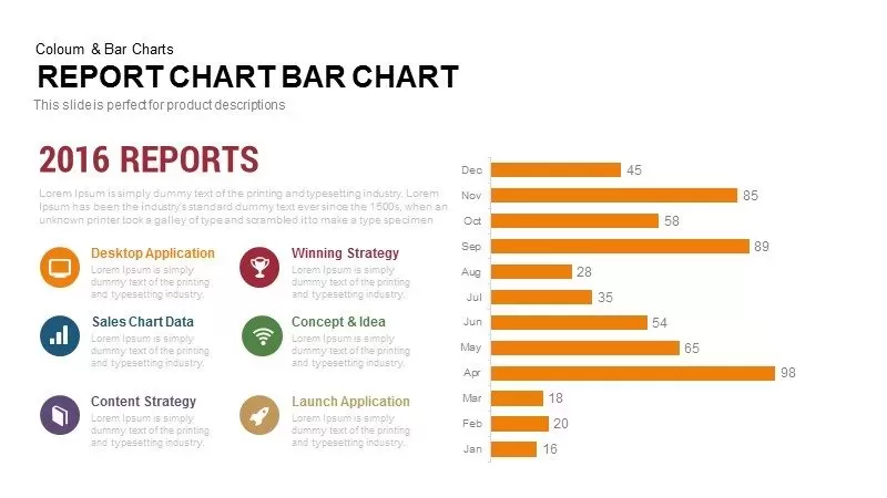
Monthly Reports Bar Chart template for PowerPoint & Google Slides
Bar/Column

Colorful Radial Bar Chart Template for PowerPoint & Google Slides
Bar/Column
Interactive Product Comparison Bar Chart Template for PowerPoint & Google Slides
Bar/Column
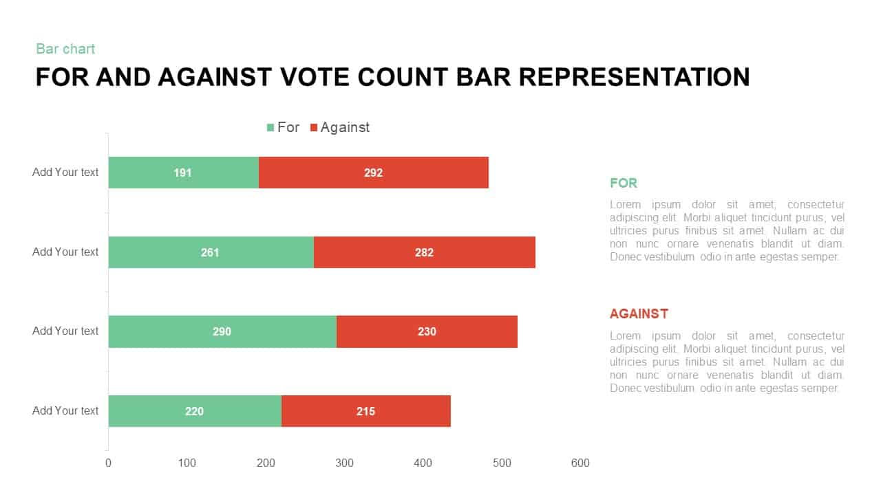
For and Against Vote Count Bar Chart Template for PowerPoint & Google Slides
Bar/Column
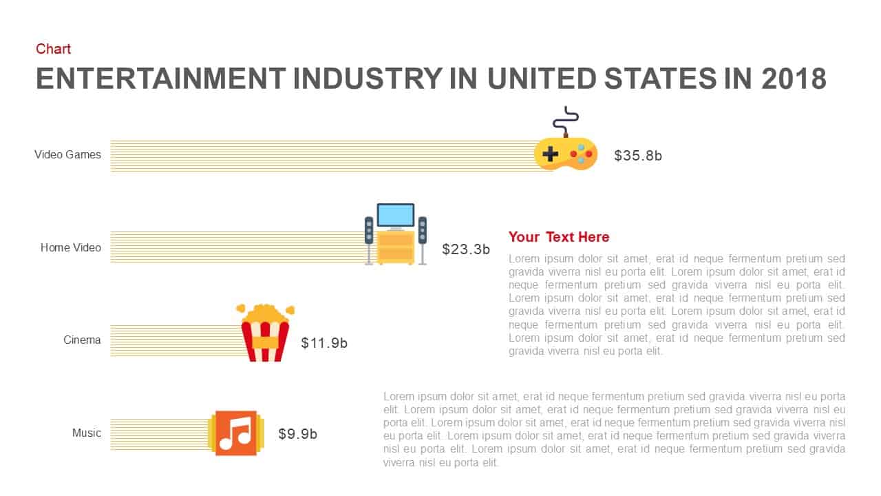
Entertainment Industry Revenue Bar Chart Template for PowerPoint & Google Slides
Bar/Column
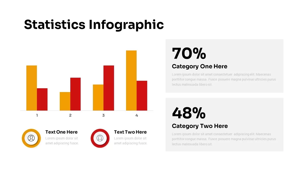
Statistics Infographic & KPI Bar Chart Template for PowerPoint & Google Slides
Bar/Column
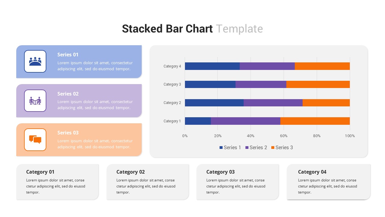
Multi-Series Stacked Bar Chart Template for PowerPoint & Google Slides
Bar/Column
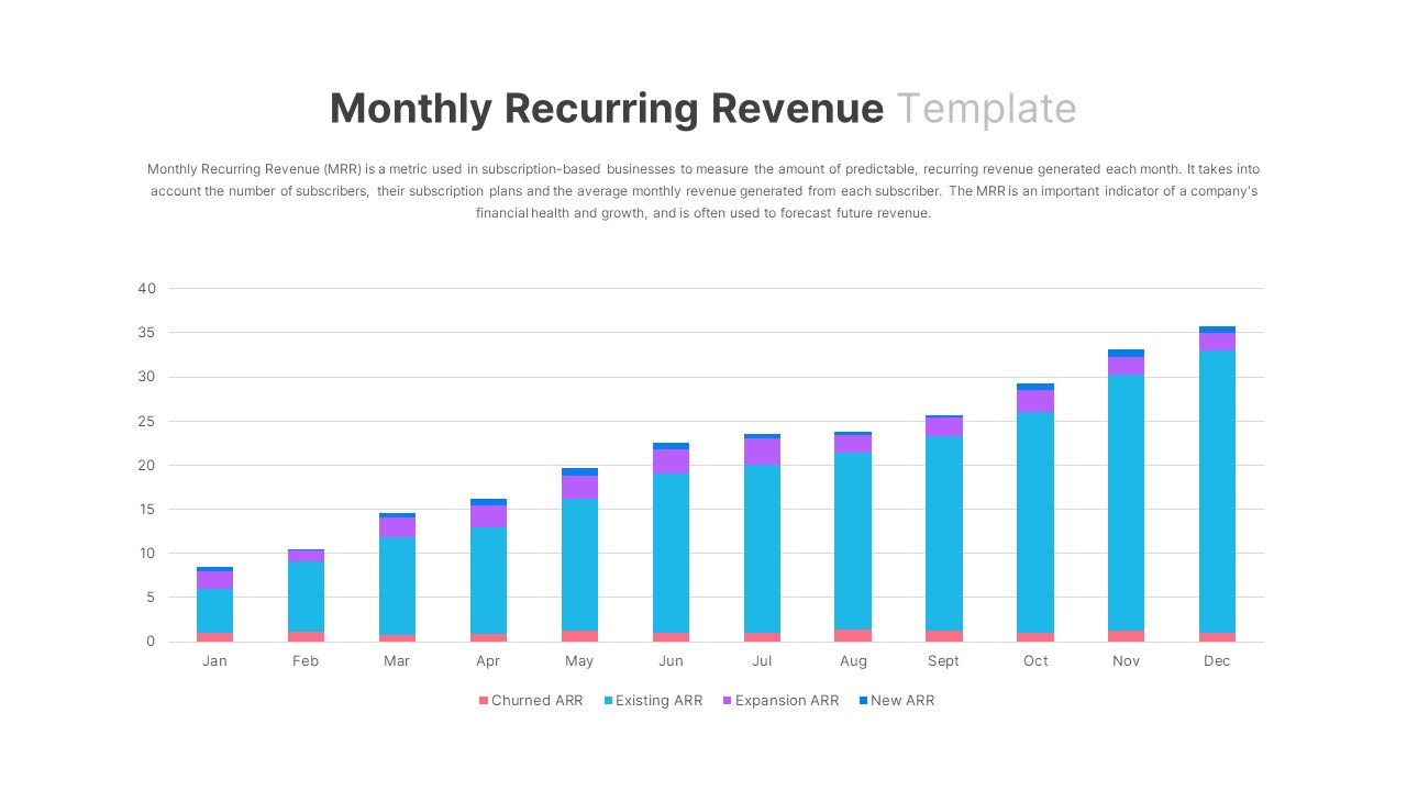
Monthly Recurring Revenue KPI Bar Chart Template for PowerPoint & Google Slides
Bar/Column
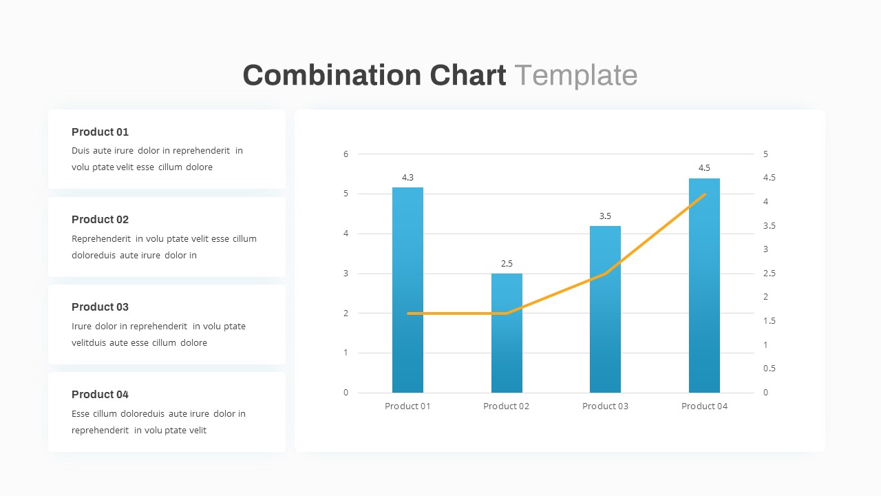
Combination Bar and Line Chart Template for PowerPoint & Google Slides
Bar/Column
Animated Clustered Bar Chart Template for PowerPoint & Google Slides
Bar/Column
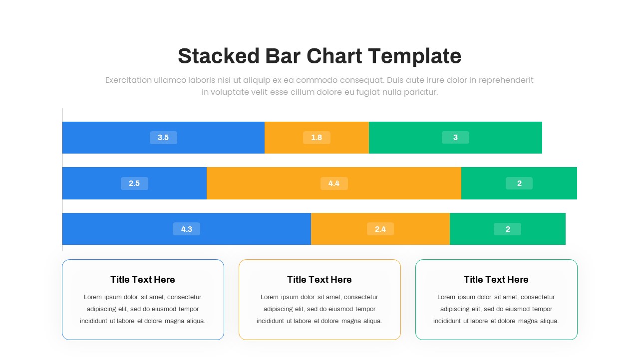
Animated Stacked Bar Chart Template for PowerPoint & Google Slides
Bar/Column
Simple Bar Chart Data Visualization Template for PowerPoint & Google Slides
Bar/Column
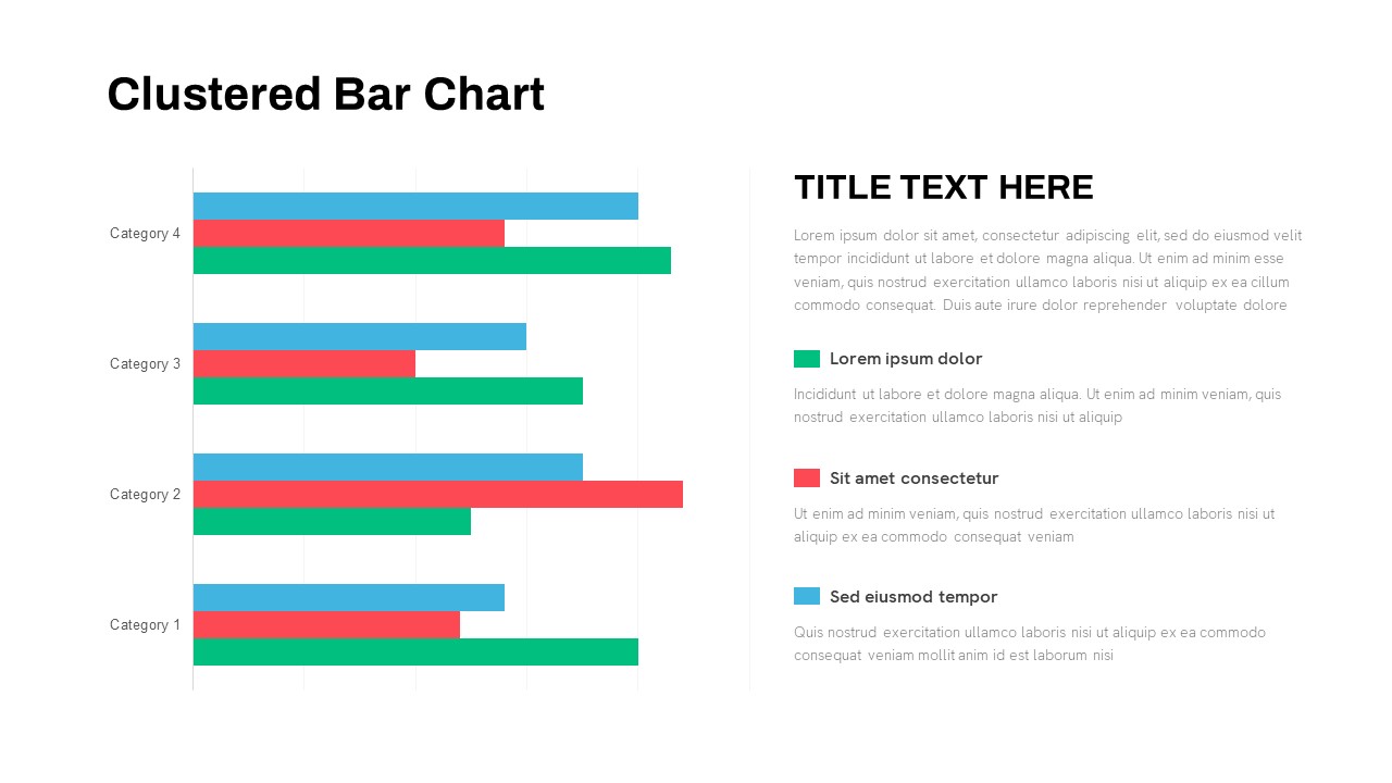
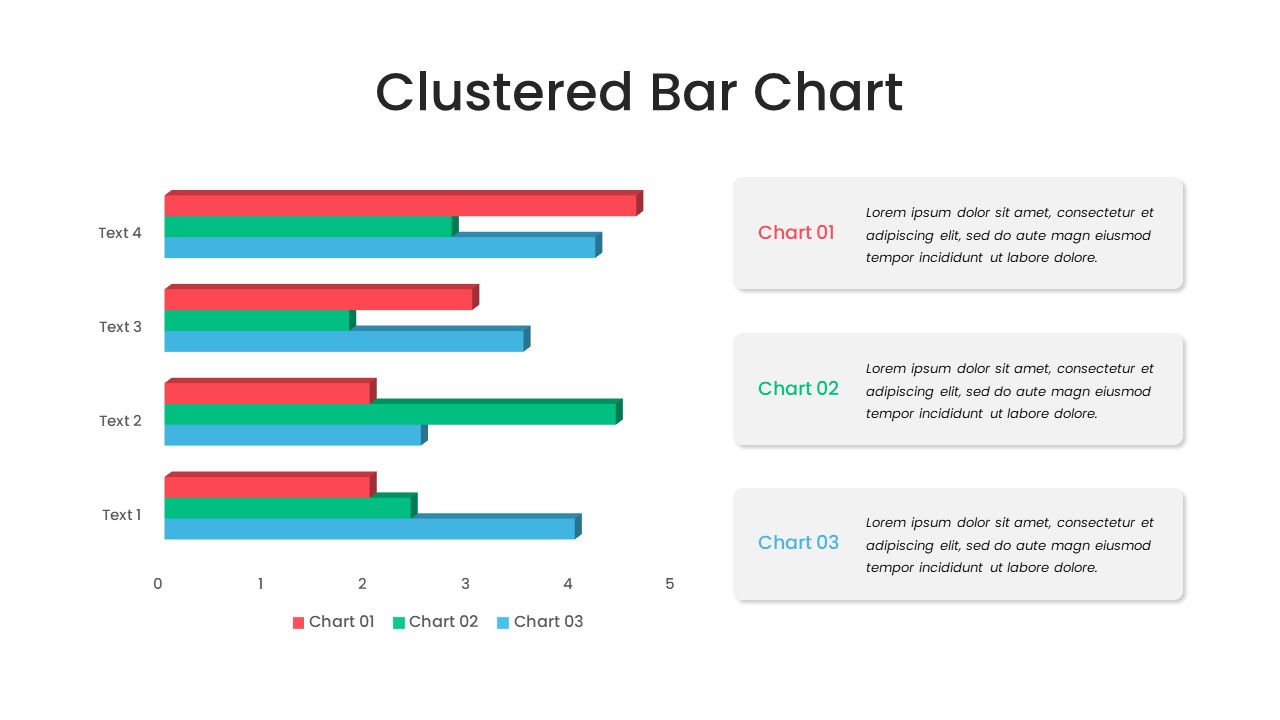
Clustered Bar Chart Comparison Template for PowerPoint & Google Slides
Bar/Column
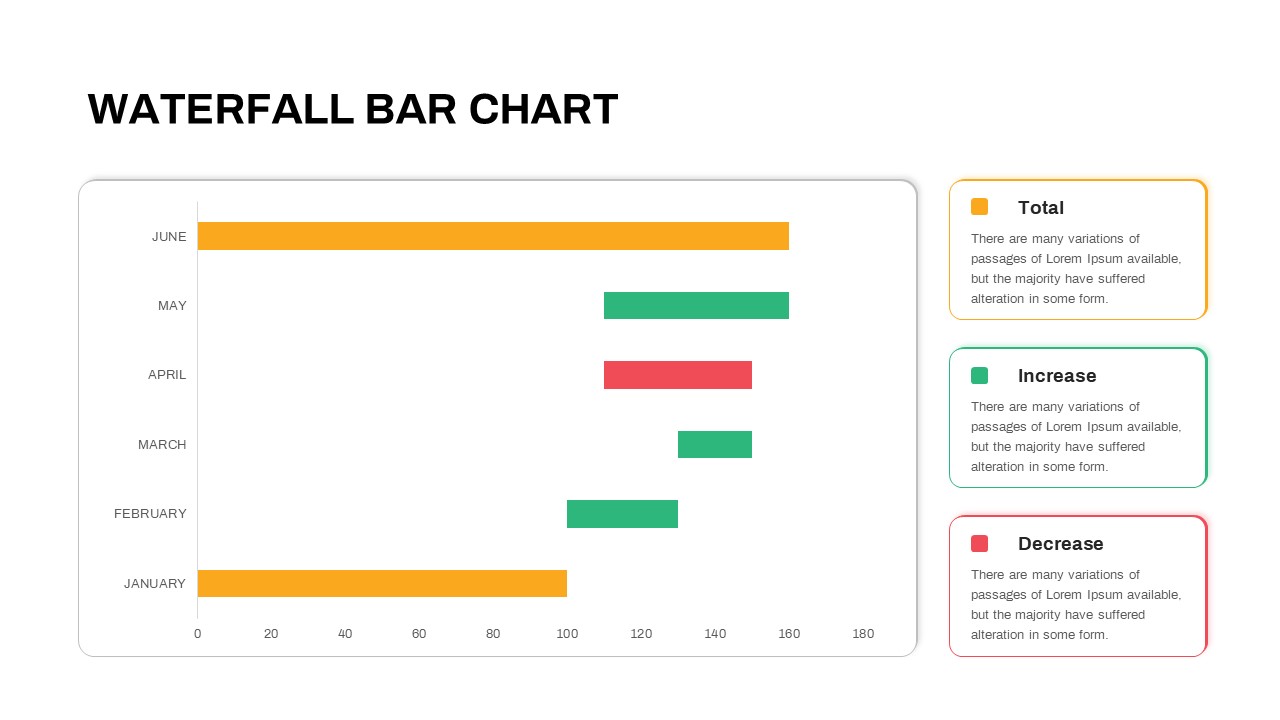
Waterfall Bar Chart Analysis Template for PowerPoint & Google Slides
Bar/Column
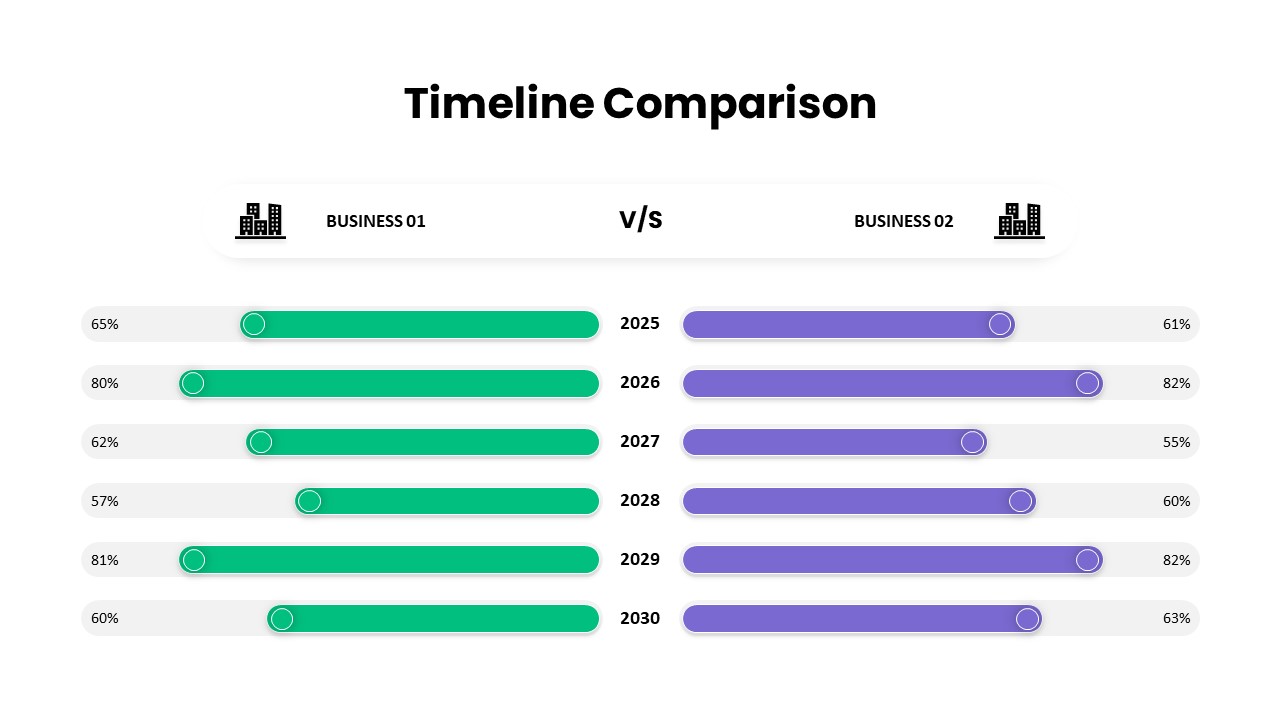
Business Timeline Comparison Bar Chart Template for PowerPoint & Google Slides
Comparison Chart
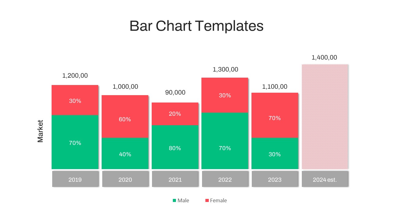
Year-over-Year Stacked Gender Bar Chart Template for PowerPoint & Google Slides
Bar/Column
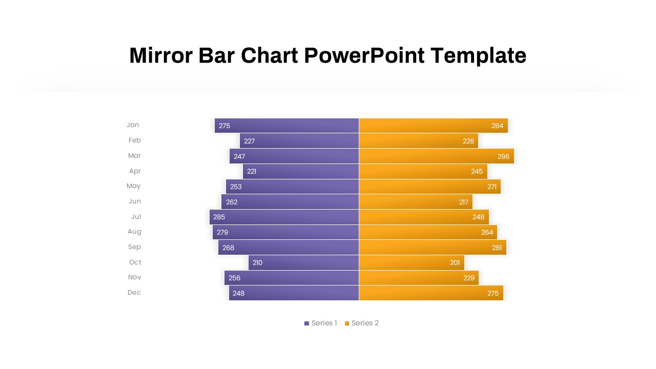
Mirror Bar Chart Comparison Template for PowerPoint & Google Slides
Bar/Column
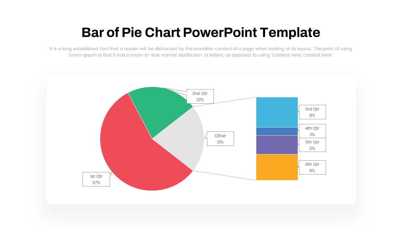
Dynamic Bar-of-Pie Chart Comparison Template for PowerPoint & Google Slides
Pie/Donut
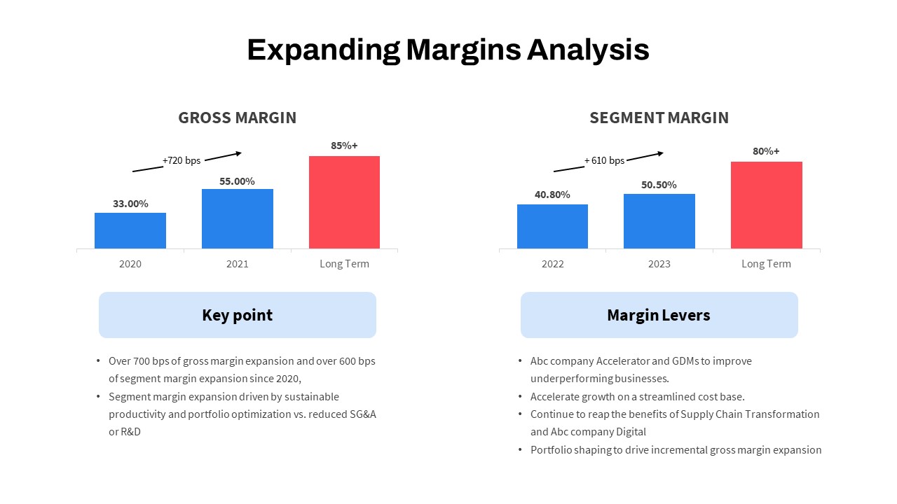
Expanding Margins Analysis Bar Chart Template for PowerPoint & Google Slides
Charts
Quarterly Revenue Comparison Bar Chart Template for PowerPoint & Google Slides
Bar/Column
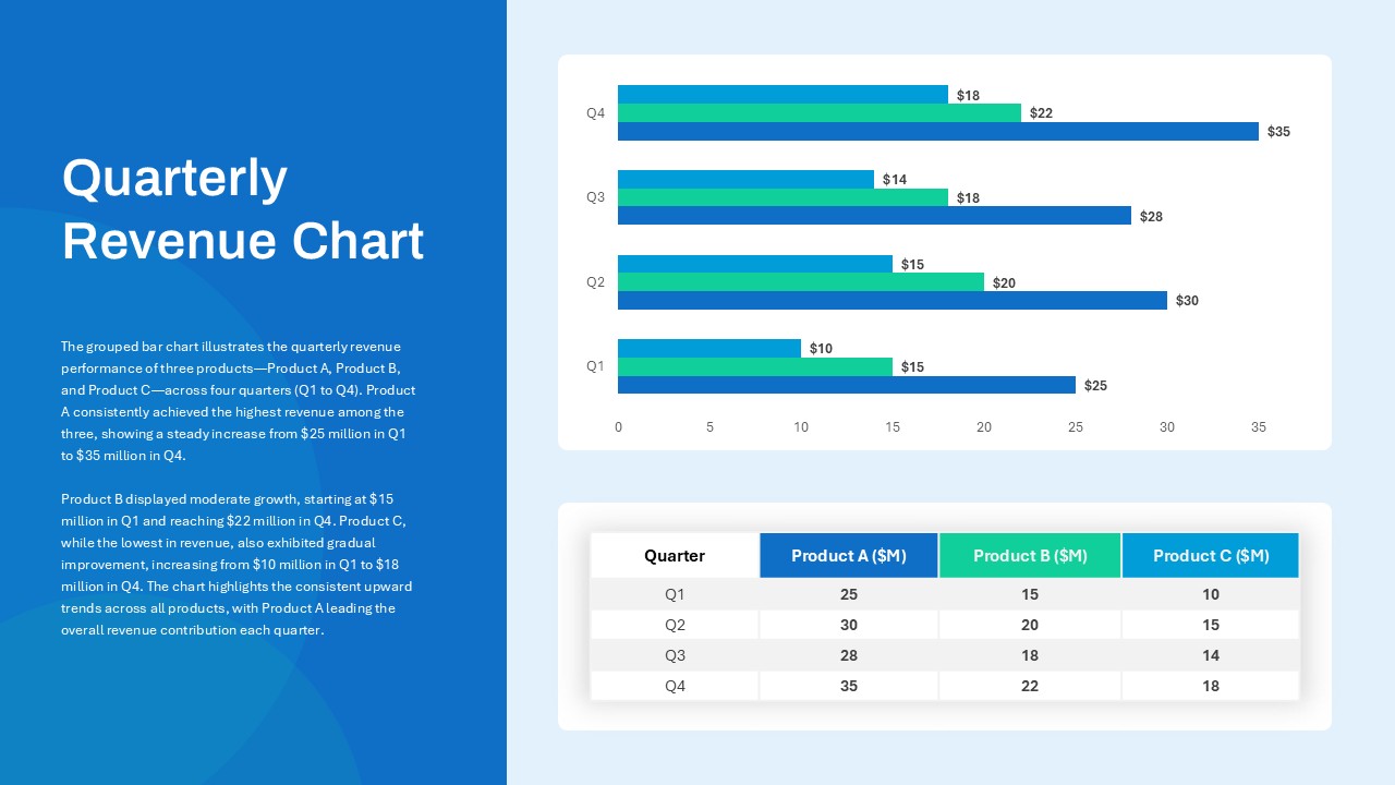
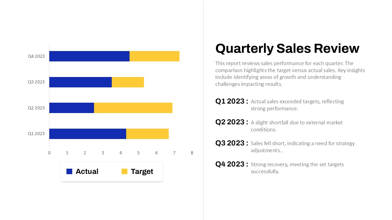
Quarterly Sales Review Bar Chart Template for PowerPoint & Google Slides
Bar/Column
Data Analysis Bar Chart with Insights Template for PowerPoint & Google Slides
Bar/Column
Free
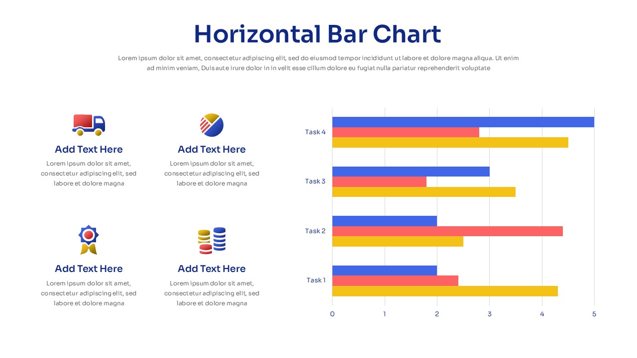
Horizontal Bar Chart Slide with Icons Template for PowerPoint & Google Slides
Bar/Column
Two-Option Bar Chart Comparison Table Template for PowerPoint & Google Slides
Comparison
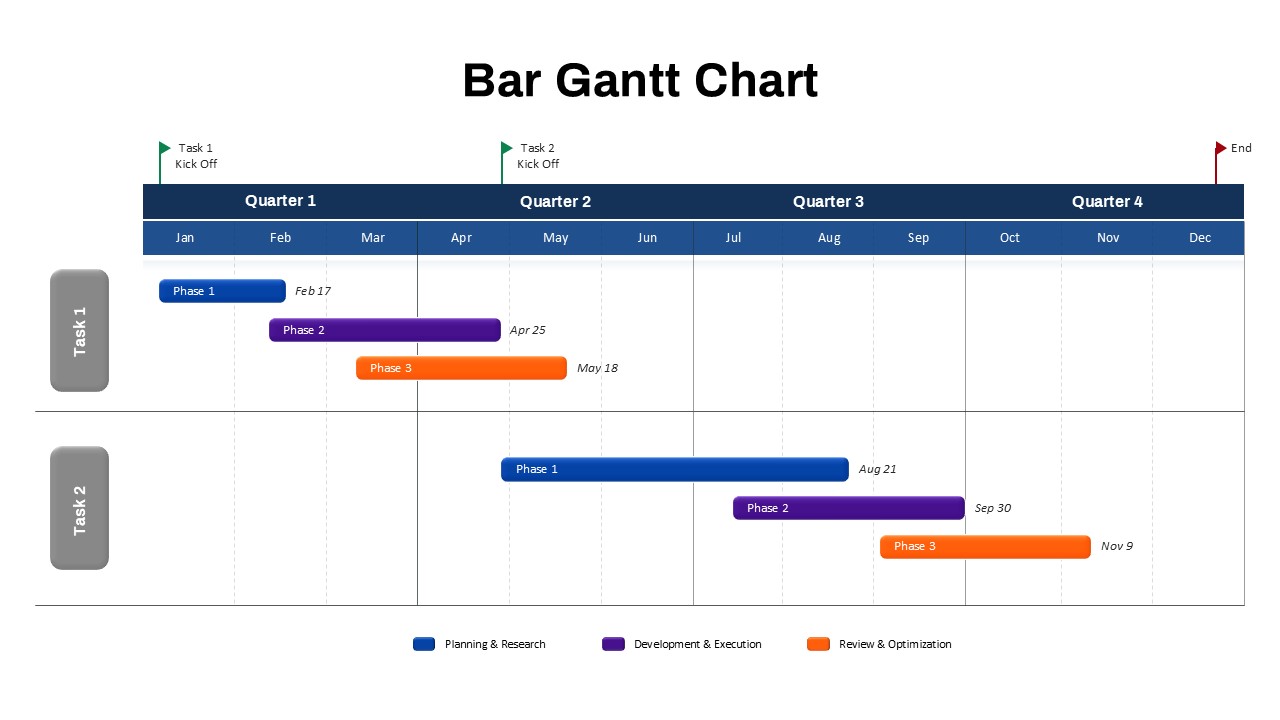
Bar Gantt Chart Template for PowerPoint & Google Slides
Gantt Chart
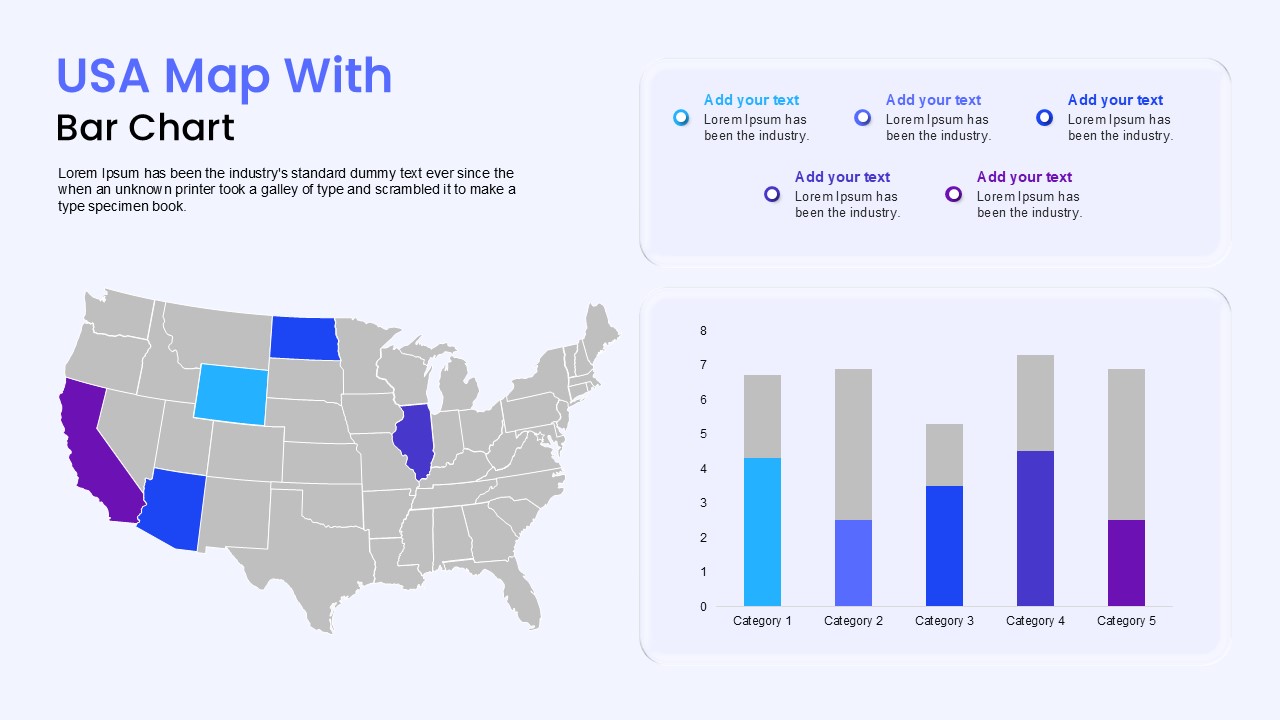
USA Map with Bar Chart Template for PowerPoint & Google Slides
World Maps
Sales Bar Chart for PowerPoint & Google Slides
Bar/Column
Bar Data Chart Slide for PowerPoint & Google Slides
Bar/Column

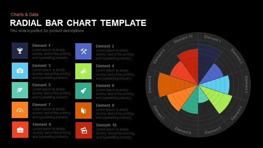
Radial Bar Chart Diagram for PowerPoint & Google Slides
Bar/Column
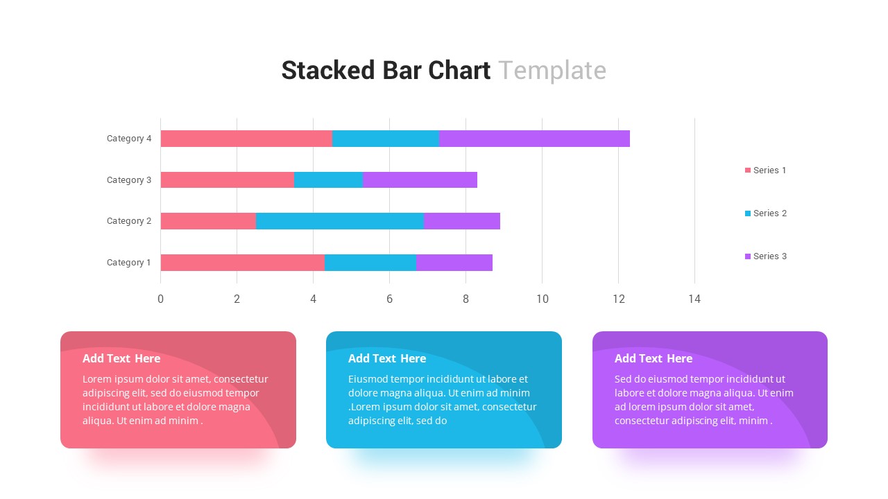
Stacked Bar Chart for PowerPoint & Google Slides
Bar/Column
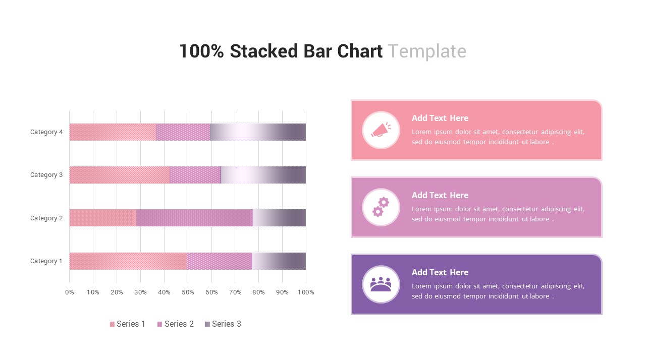
100% Stacked Bar Chart for PowerPoint & Google Slides
Bar/Column
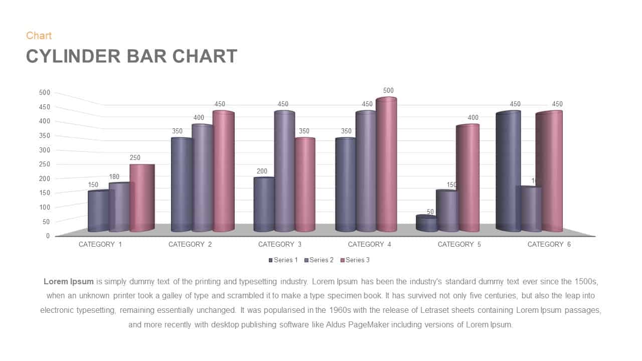
3D Cylinder Bar Chart Visualization Template for PowerPoint
Bar/Column
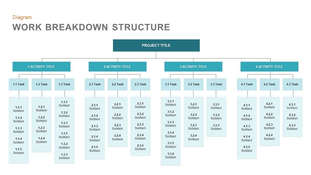
Work Breakdown Structure Diagram Template for PowerPoint & Google Slides
Diagrams
Agile Work Streams Arrow Diagram Template for PowerPoint & Google Slides
Process
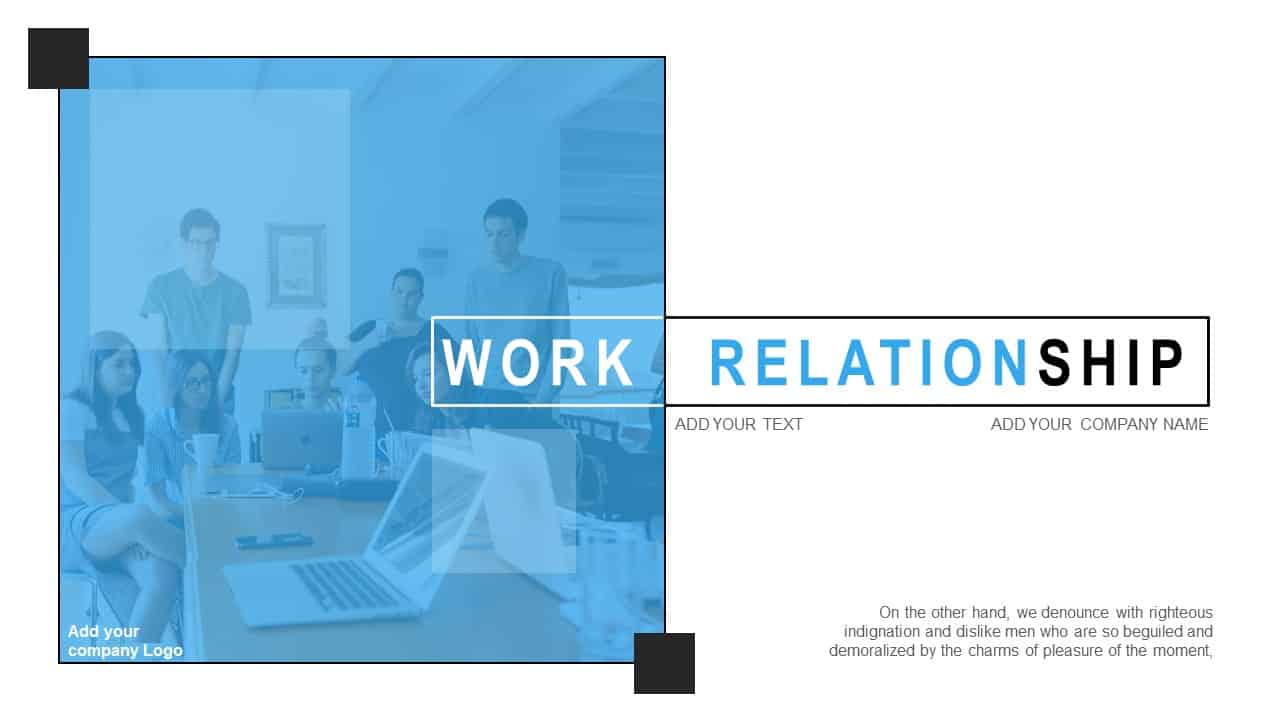
Modern Work Relationship Cover Slide Template for PowerPoint & Google Slides
HR
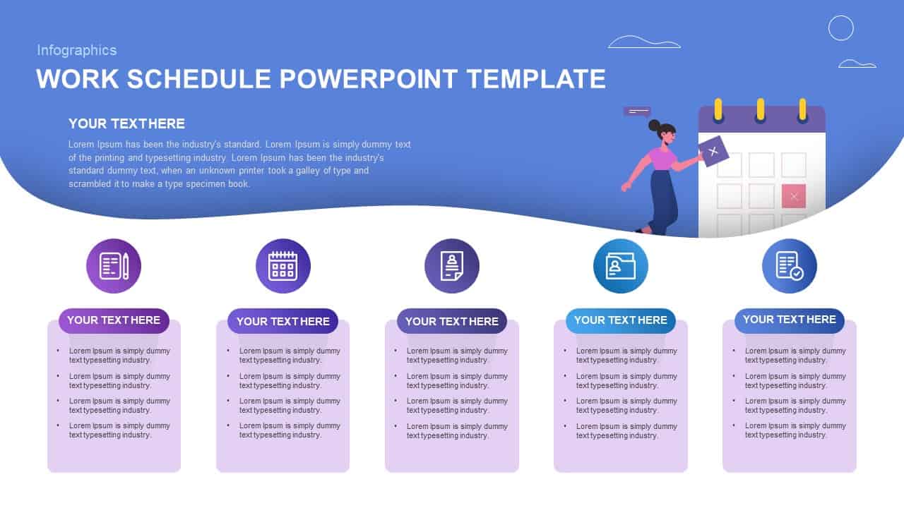
Work Schedule Agenda Infographic Template for PowerPoint & Google Slides
Agenda
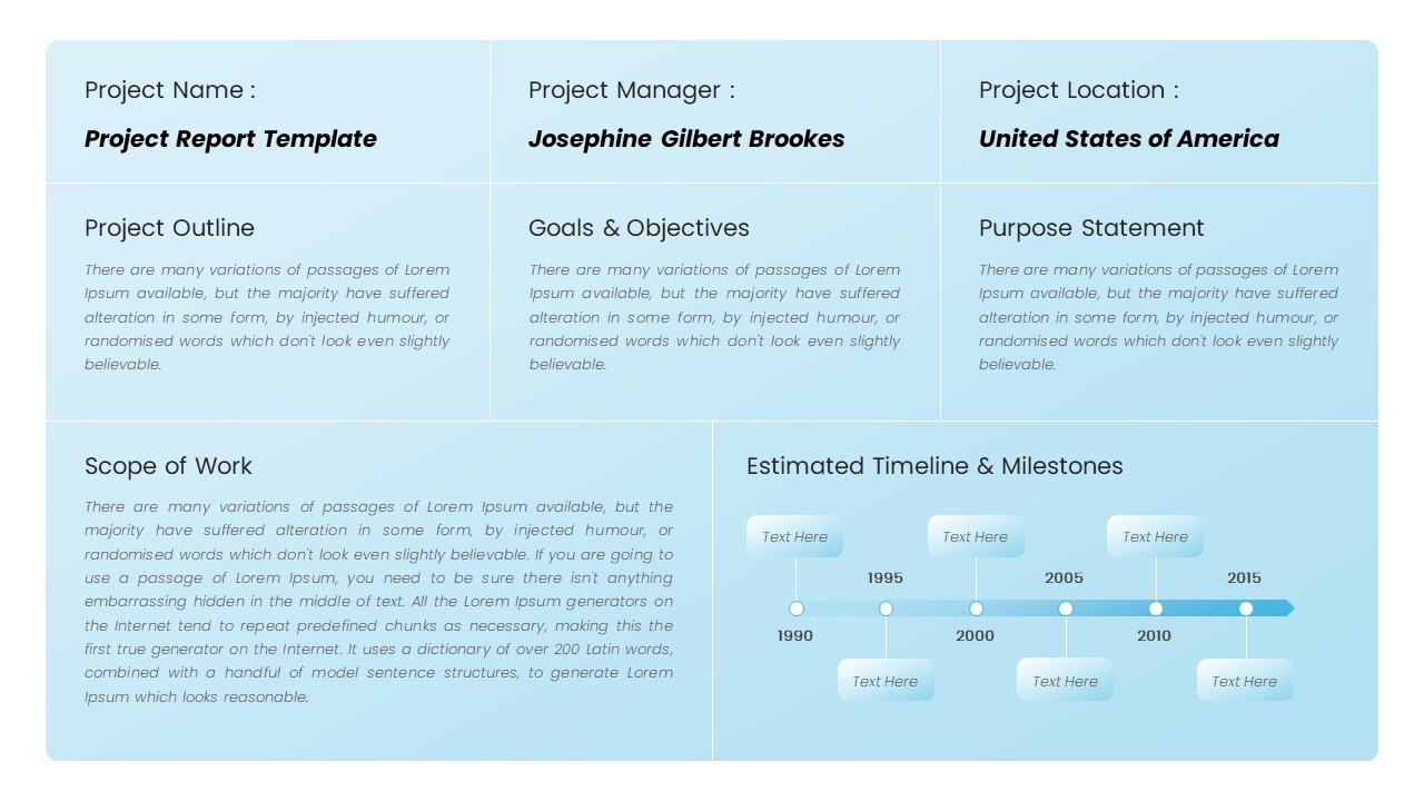
Professional Statement of Work Template for PowerPoint & Google Slides
Project
Work Safety Training & Risk Management Template for PowerPoint & Google Slides
Risk Management

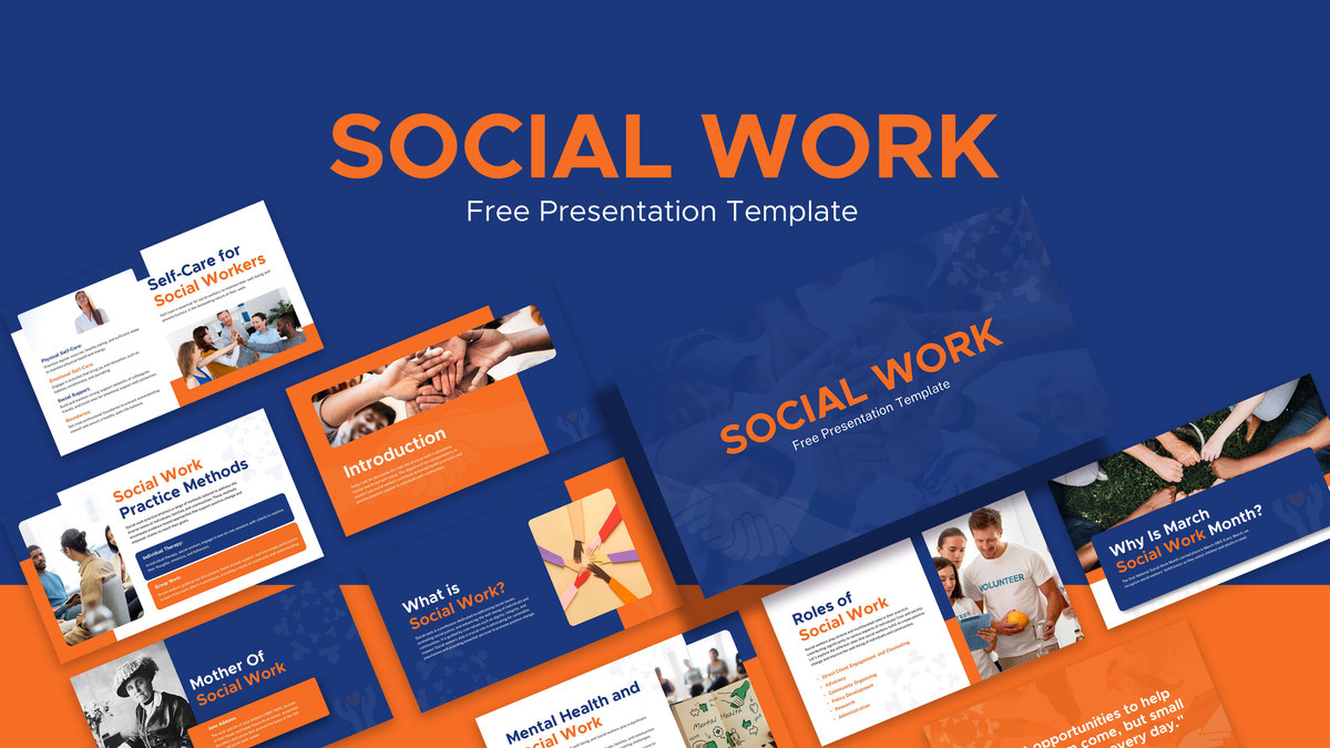
Free Comprehensive Social Work Presentation Template for PowerPoint & Google Slides
Pitch Deck
Free
AI & Future of Work Gradient Cover Slide Template for PowerPoint & Google Slides
AI
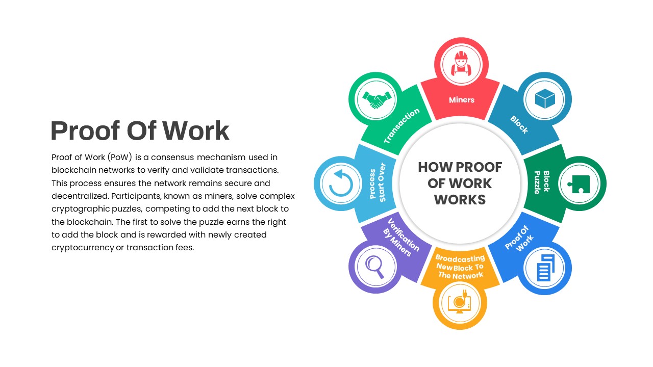
Proof of Work Blockchain Process template for PowerPoint & Google Slides
Process
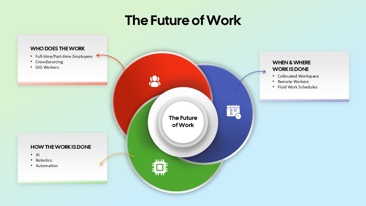
The Future of Work Venn Diagram Template for PowerPoint & Google Slides
Circular
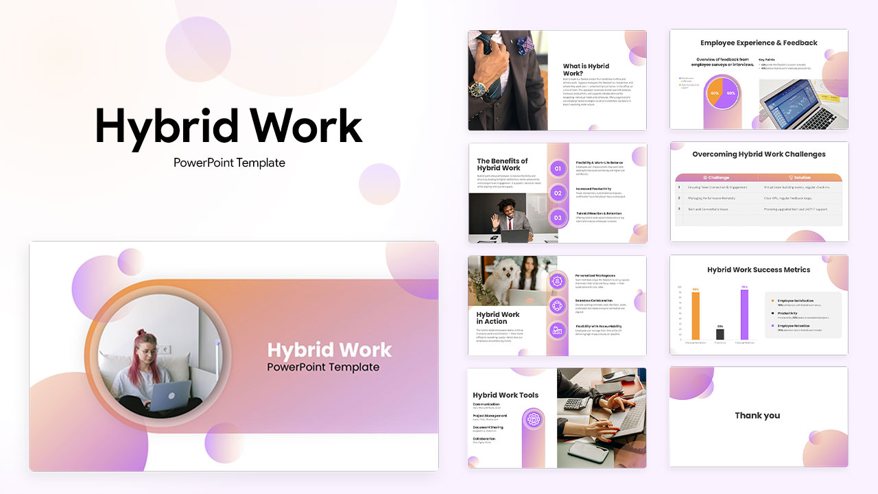
Hybrid Work Presentation Deck Template for PowerPoint & Google Slides
Company Profile
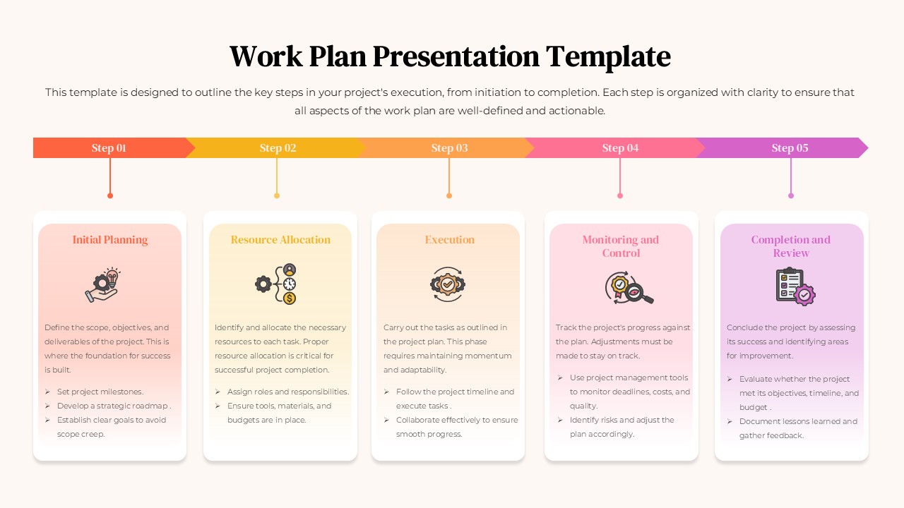
Work Plan Presentation Template for PowerPoint & Google Slides
Business
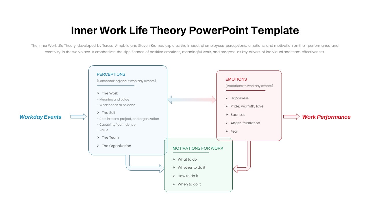
Inner Work Life Theory Diagram Slide for PowerPoint & Google Slides
Employee Performance
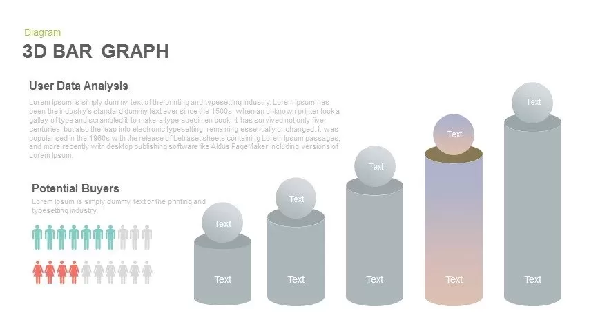
3D Bar Graph Infographic Template for PowerPoint & Google Slides
Bar/Column
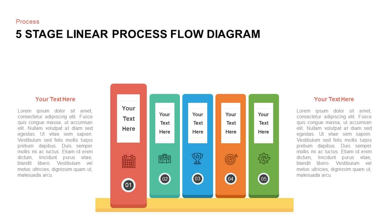
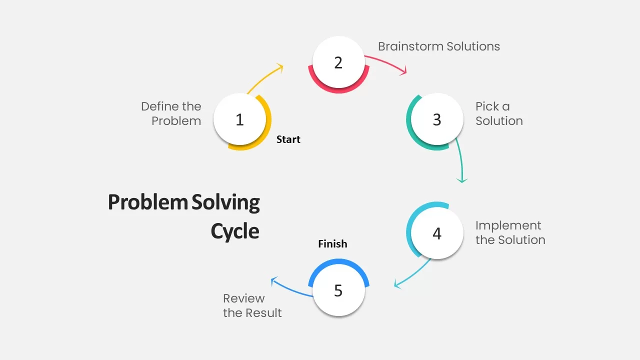
Five-Stage Vertical Bar Process Template for PowerPoint & Google Slides
Process
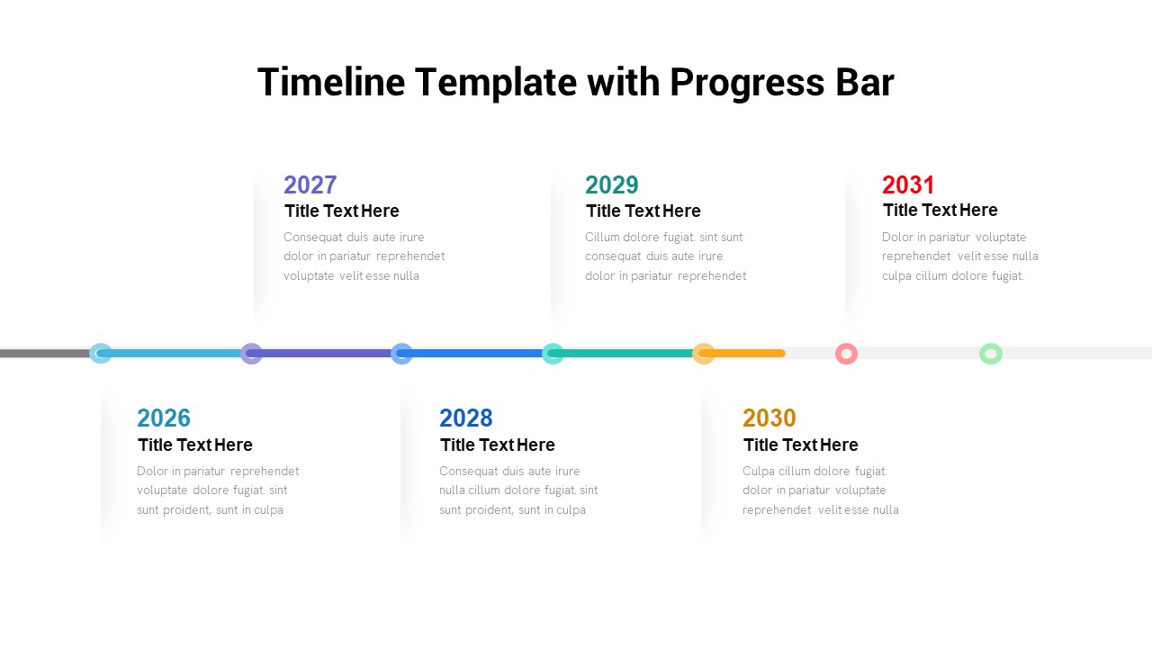
Timeline Roadmap with Progress Bar Template for PowerPoint & Google Slides
Timeline
Progress Bar and Milestone Visualization Template for PowerPoint & Google Slides
Timeline

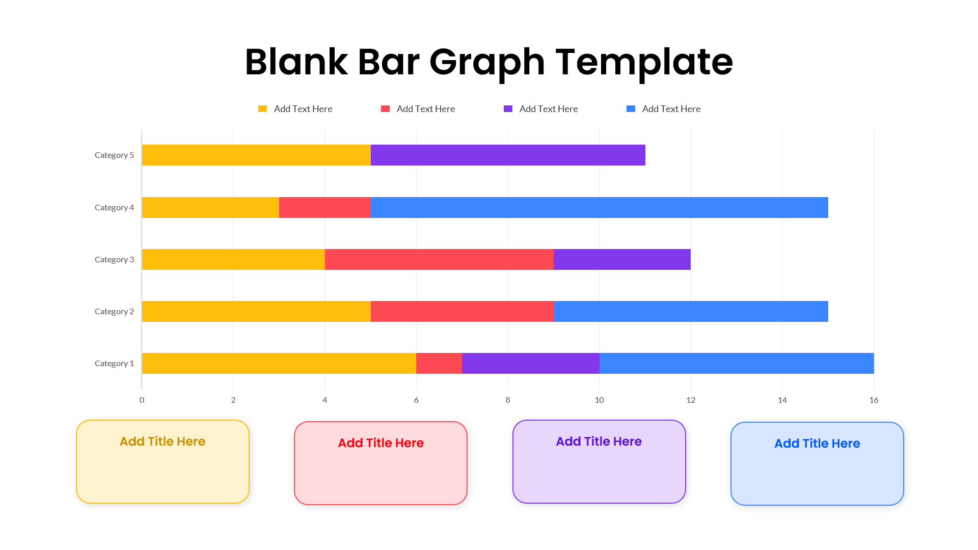
Blank Bar Graph Template for PowerPoint & Google Slides
Bar/Column
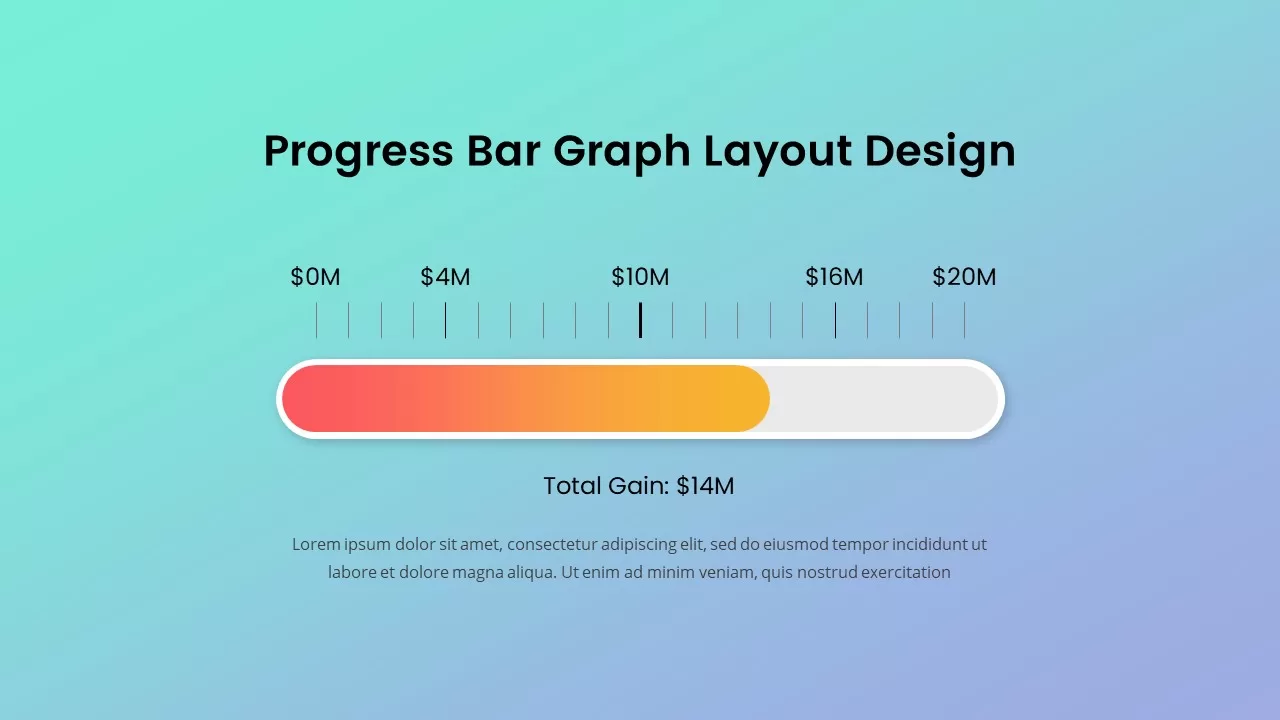
Progress Bar Graph Layout Design for PowerPoint & Google Slides
Charts
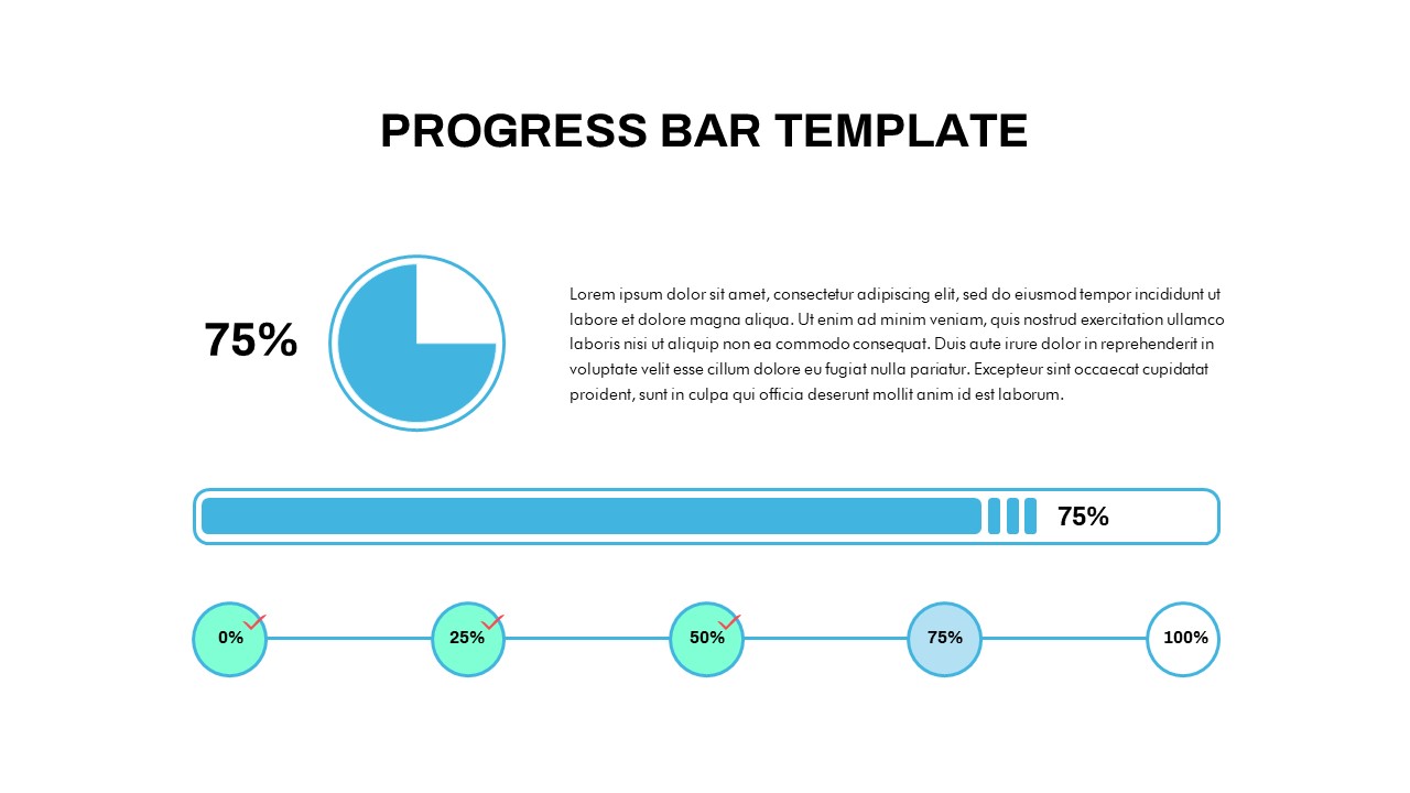
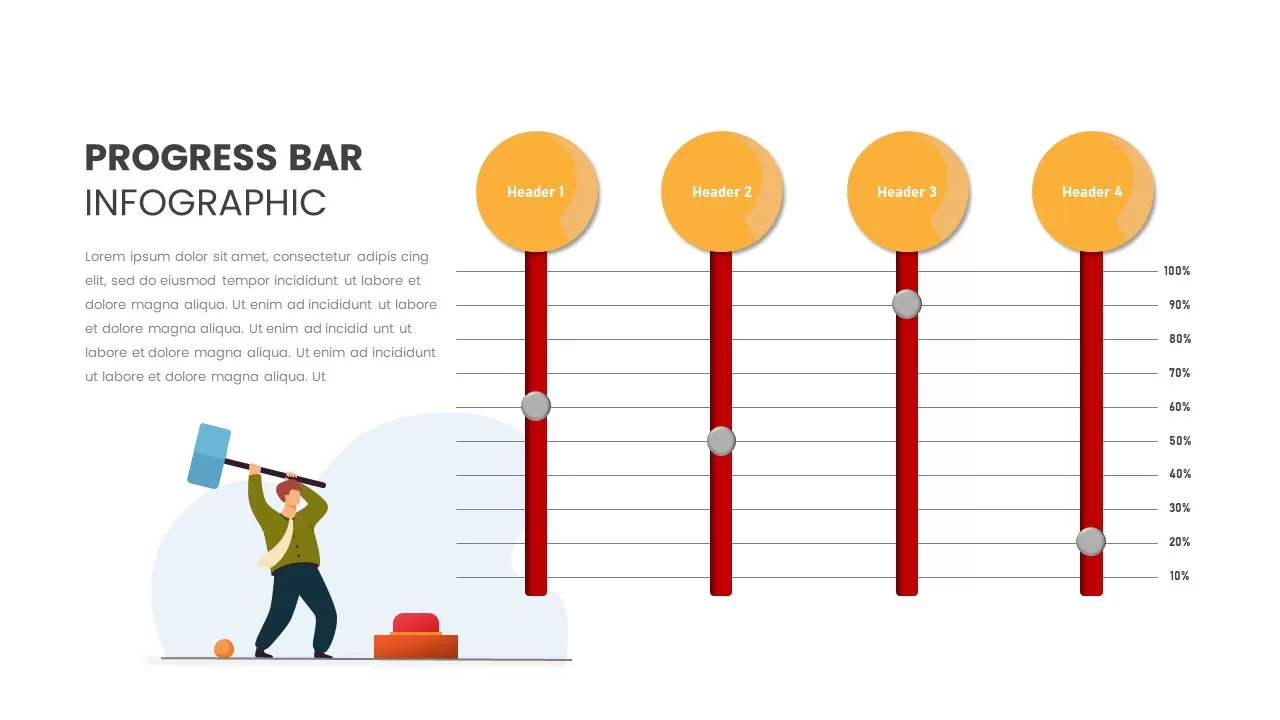
Progress Bar Infographic for PowerPoint & Google Slides
Business
Progress Bar infographic pack for PowerPoint & Google Slides
Business
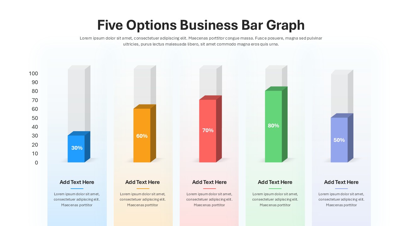
Five Options Business Bar Graph for PowerPoint & Google Slides
Business Report
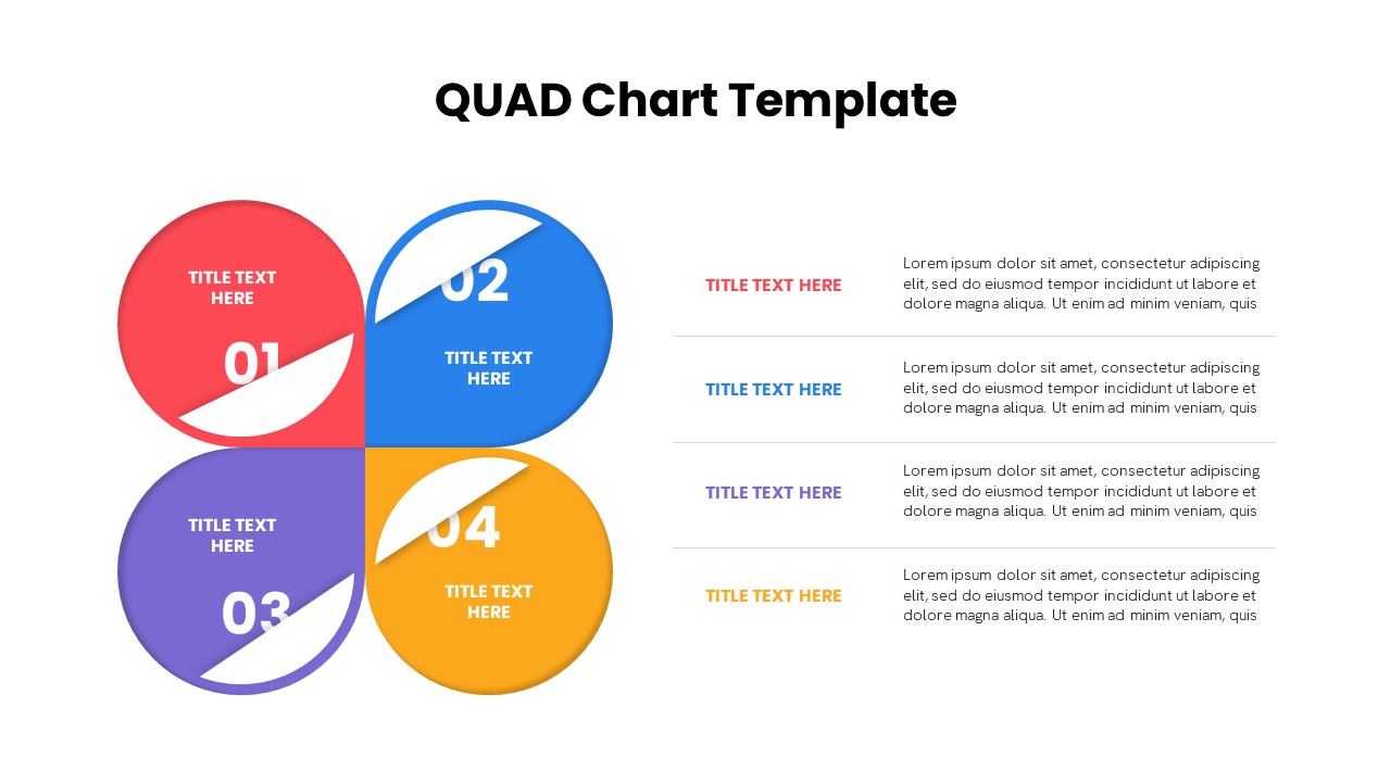
Quad Chart Infographic Pack of 8 Slides Template for PowerPoint & Google Slides
Comparison Chart
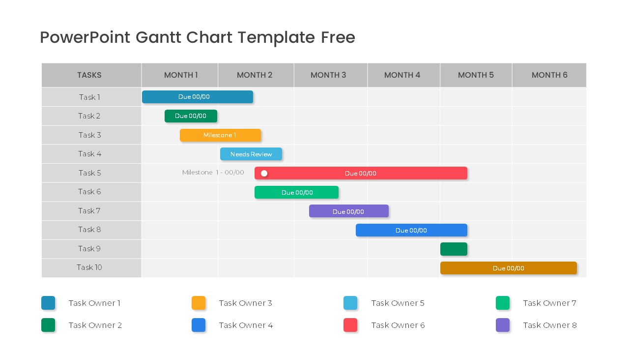
Free Professional Gantt Chart Pack – 4 Slides Template for PowerPoint & Google Slides
Gantt Chart
Free
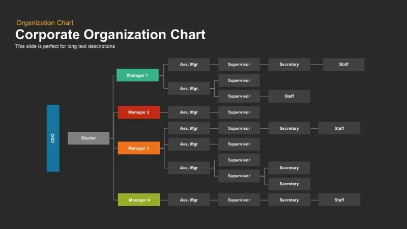
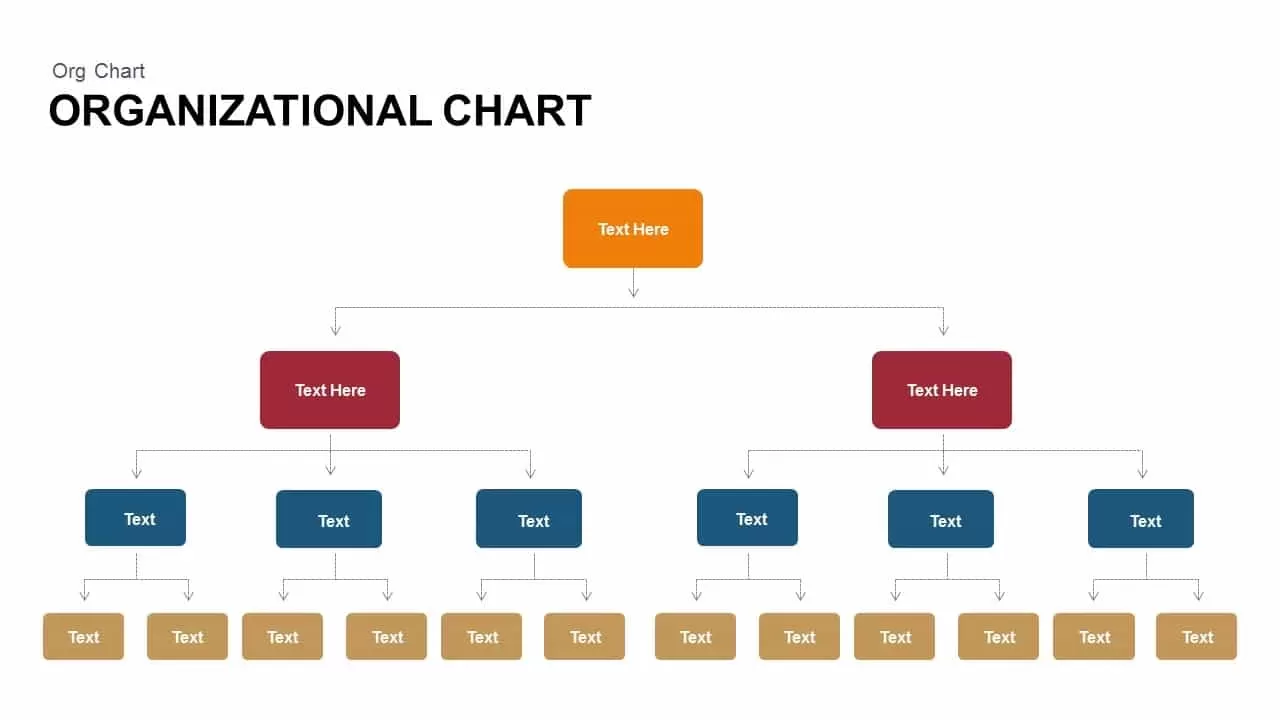
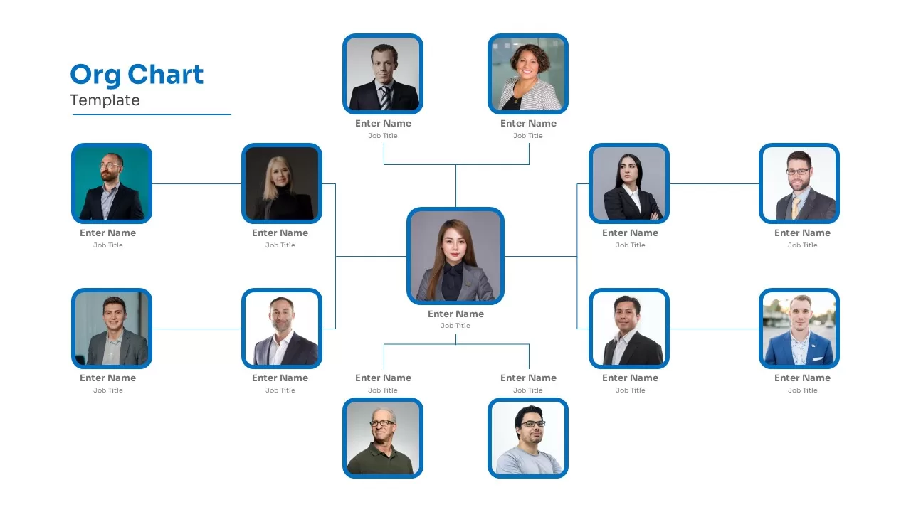
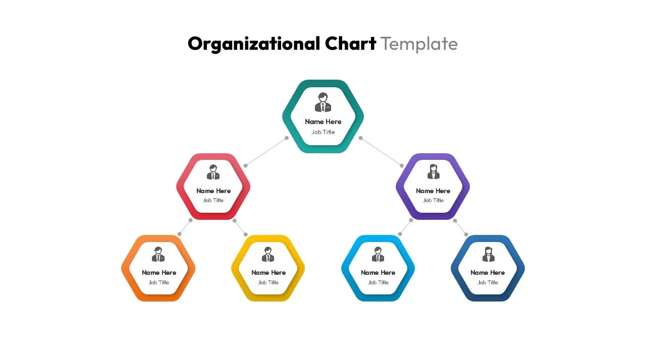
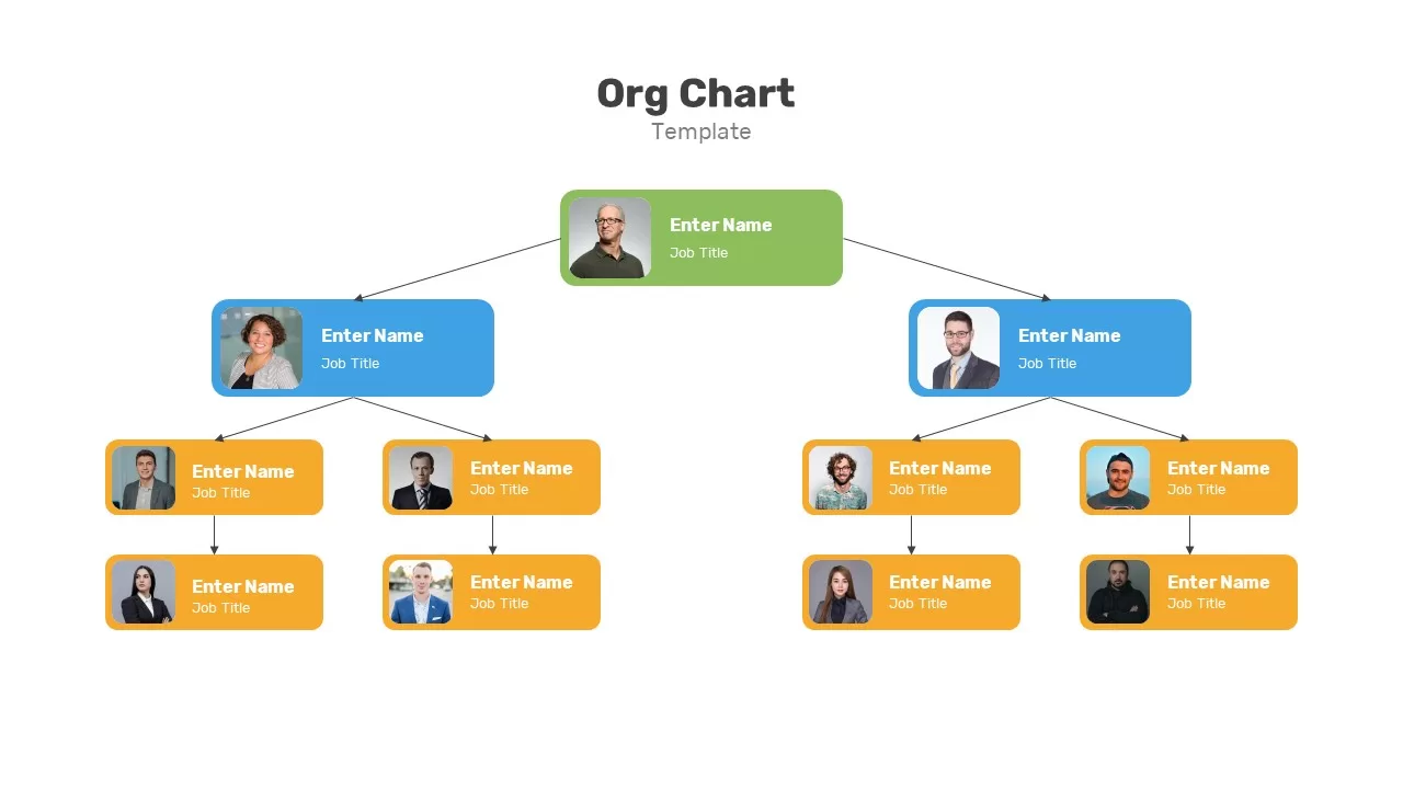
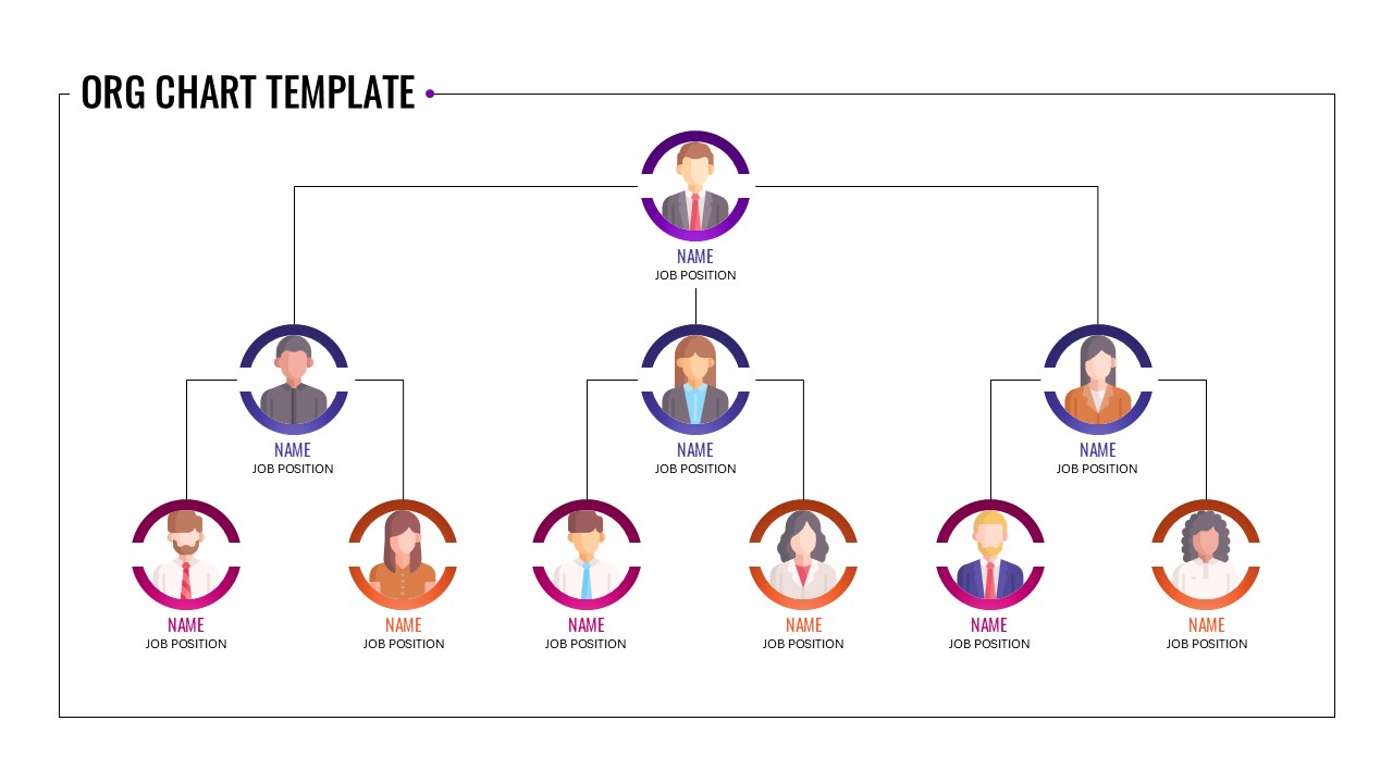
Corporate Organization Chart template for PowerPoint & Google Slides
Org Chart
Business Organization Chart Hierarchy Template for PowerPoint & Google Slides
Org Chart
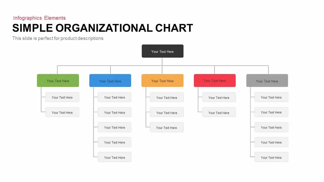
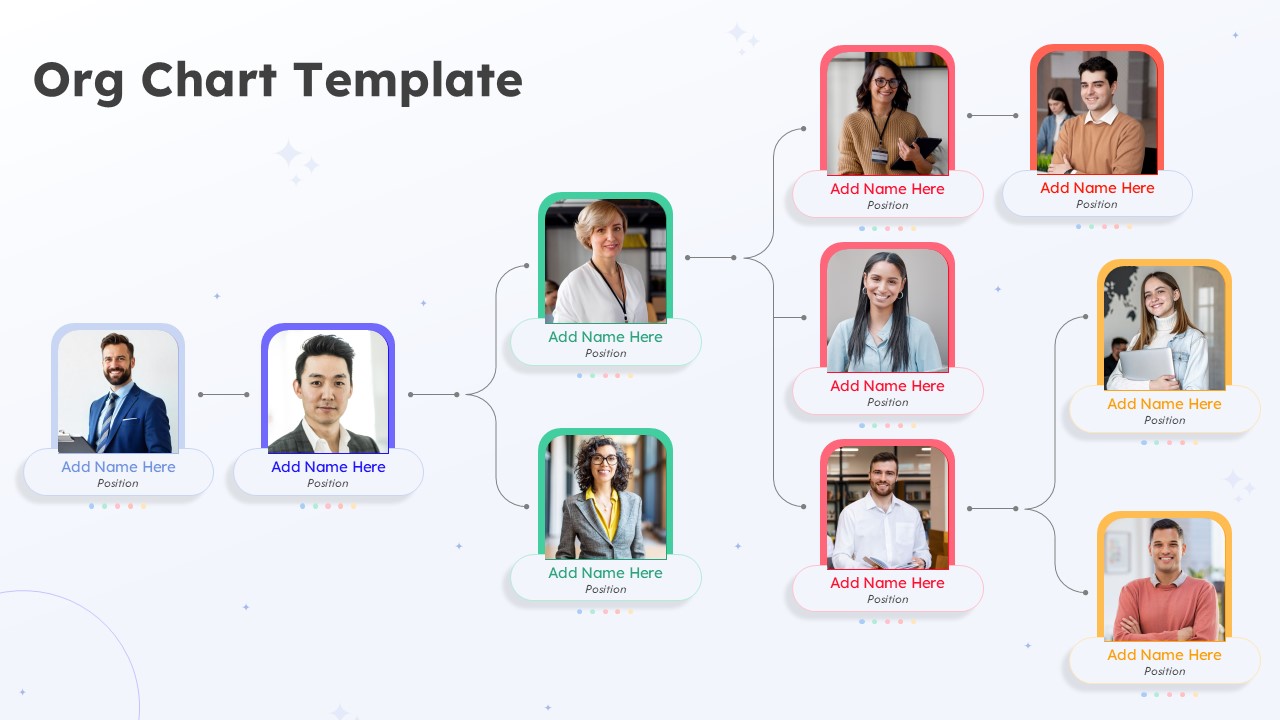
Simple Organizational Chart Infographic Template for PowerPoint & Google Slides
Org Chart
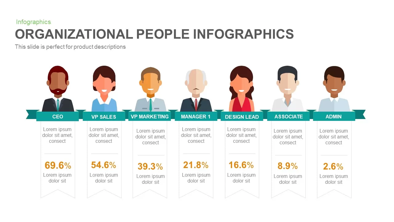
Organizational People Percentage Chart template for PowerPoint & Google Slides
Org Chart
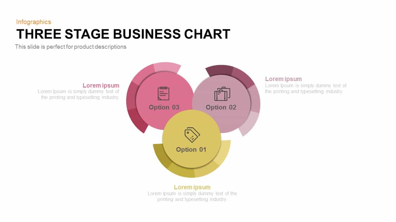
Three-Stage Circular Options Chart Template for PowerPoint & Google Slides
Comparison
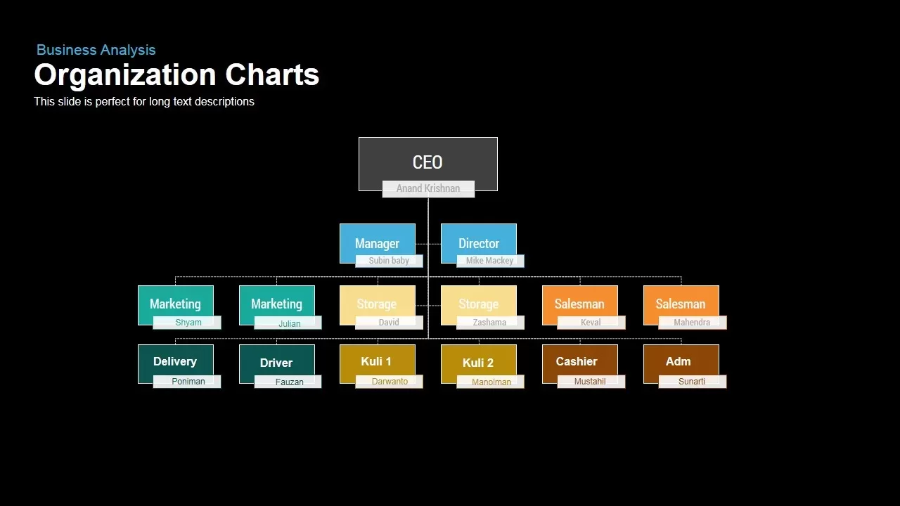
Organizational Chart Structure template for PowerPoint & Google Slides
Org Chart
Tornado Chart Data Comparison Slide Template for PowerPoint & Google Slides
Bar/Column
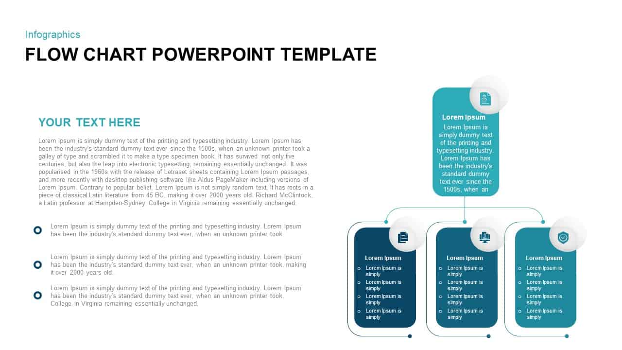
Vertical Split Flow Chart Diagram Template for PowerPoint & Google Slides
Flow Charts
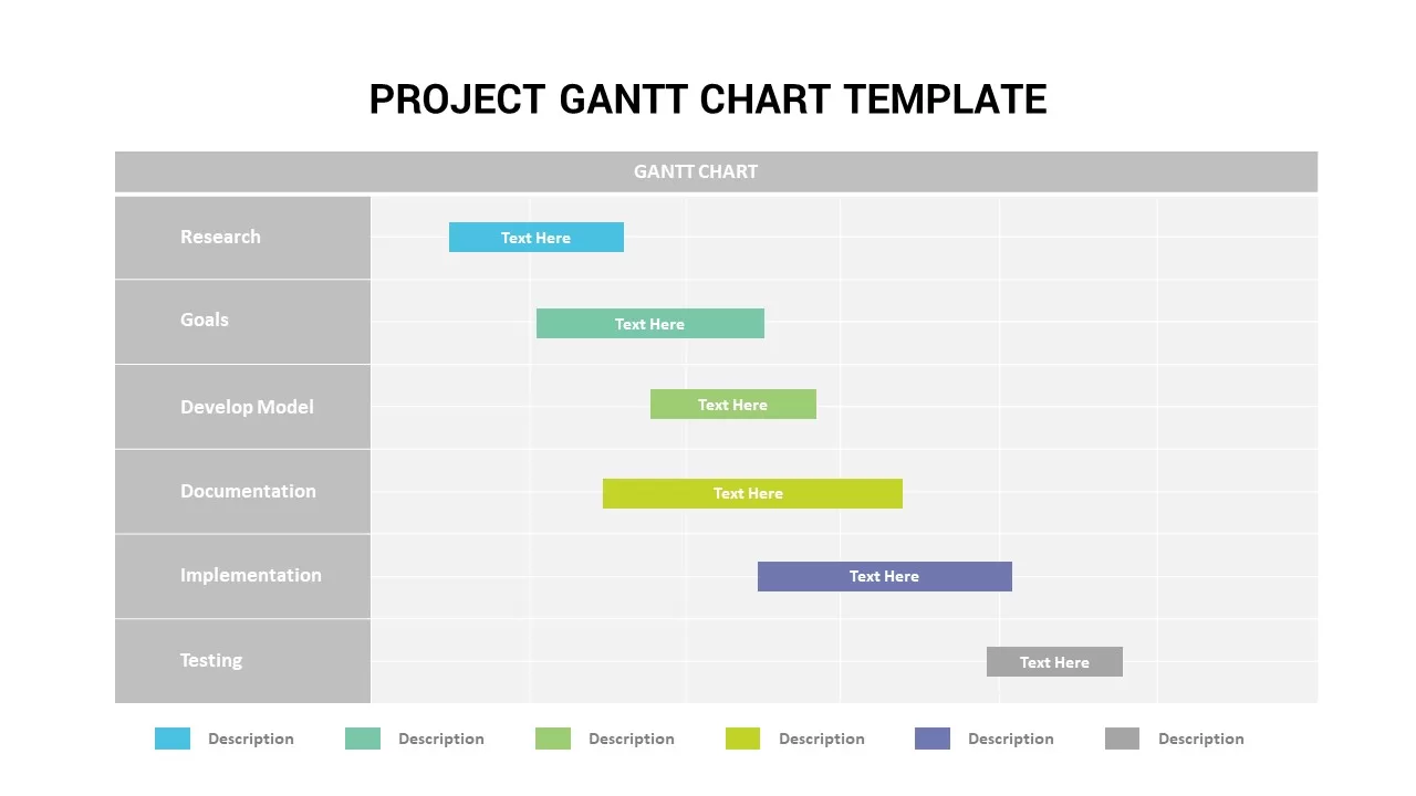
Project Gantt Chart template for PowerPoint & Google Slides
Gantt Chart
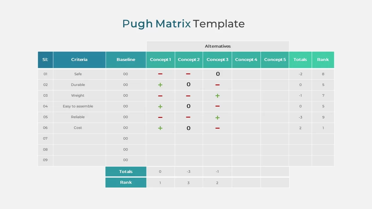
Pugh Matrix Decision Comparison Chart Template for PowerPoint & Google Slides
Comparison Chart
Organizational Chart Structure template for PowerPoint & Google Slides
Business Plan
Organizational Chart Template for PowerPoint & Google Slides
Our Team
Organizational Chart template for PowerPoint & Google Slides
Org Chart
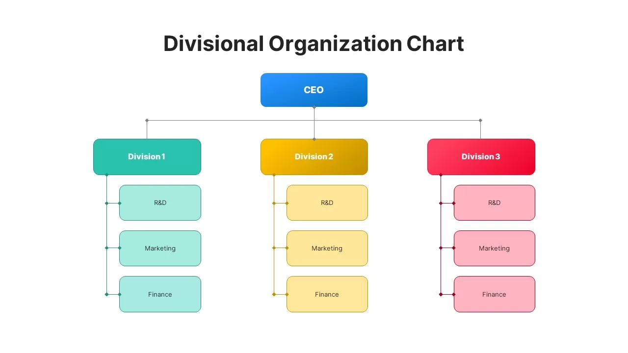
Divisional Organizational Chart Diagram Template for PowerPoint & Google Slides
Org Chart
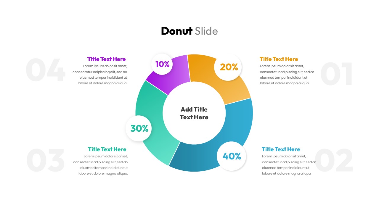
Donut Chart Data Breakdown template for PowerPoint & Google Slides
Pie/Donut
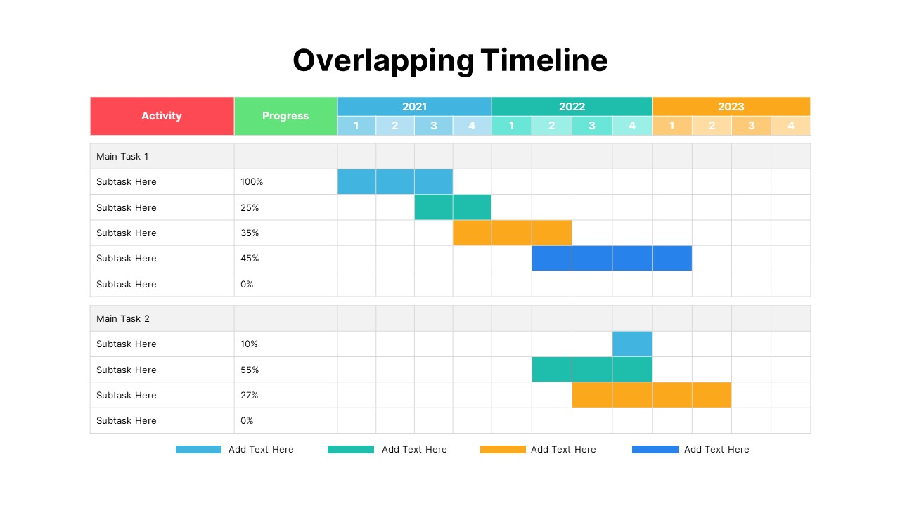
Overlapping Timeline Gantt Chart Diagram Template for PowerPoint & Google Slides
Timeline
Arrow Line Chart Template for PowerPoint & Google Slides
Comparison Chart
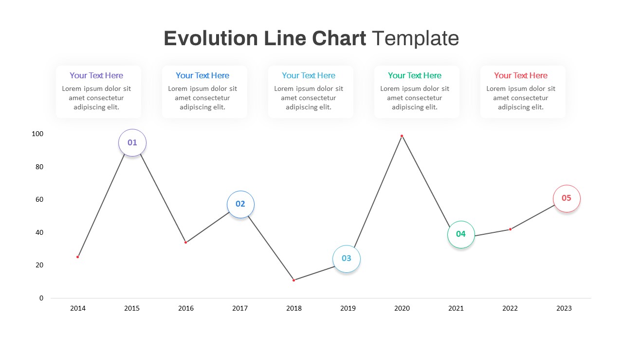
Evolution Line Chart with Milestones Template for PowerPoint & Google Slides
Timeline
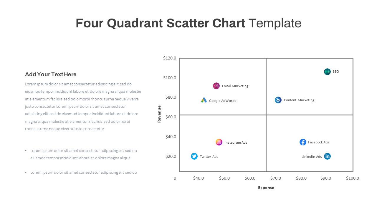
Four Quadrant Scatter Chart Analysis Template for PowerPoint & Google Slides
Comparison Chart
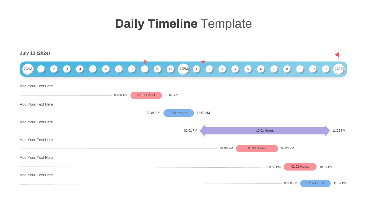
Interactive Daily Timeline Schedule Chart Template for PowerPoint & Google Slides
Timeline
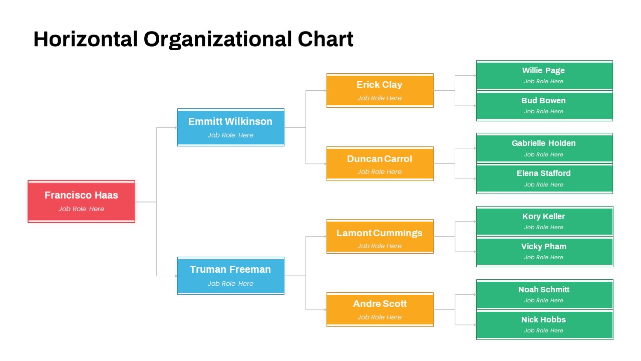
Horizontal Organizational Chart Template for PowerPoint & Google Slides
Org Chart
Project Tracker Timeline Gantt Chart Template for PowerPoint & Google Slides
Project Status
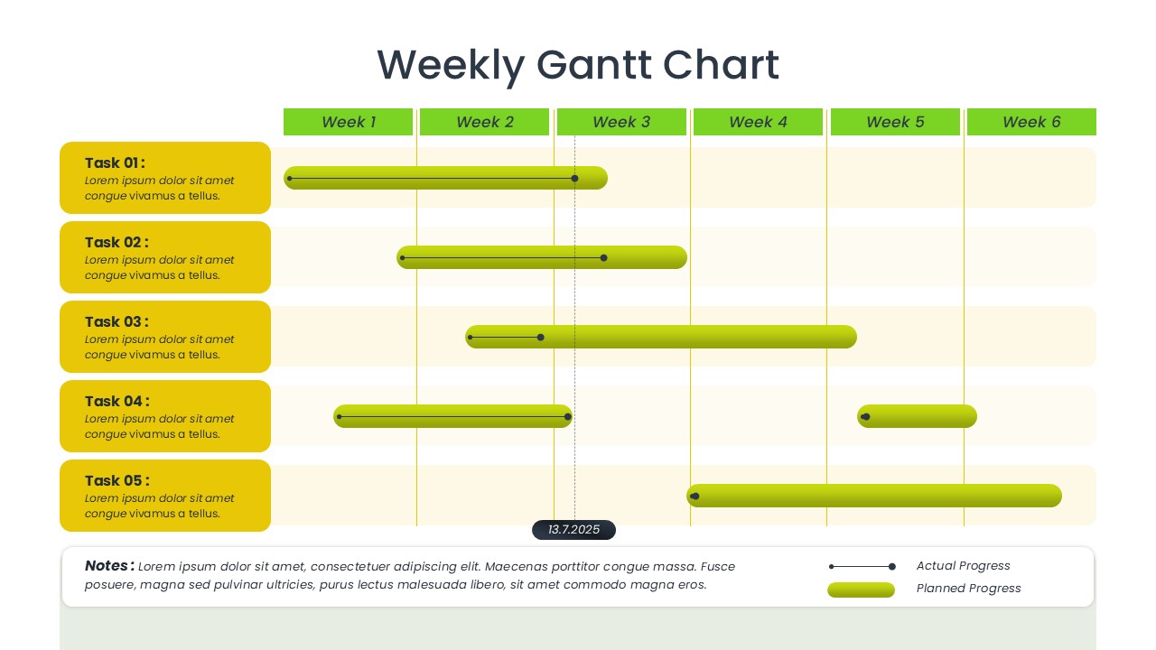
Weekly Gantt Chart Project Timeline Template for PowerPoint & Google Slides
Gantt Chart
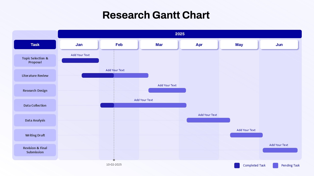
Research Gantt Chart template for PowerPoint & Google Slides
Project
Circular Sample Org Chart Template for PowerPoint & Google Slides
Org Chart
Horizontal Organizational Chart Template for PowerPoint & Google Slides
Org Chart