Success vs Failure Comparison Diagram Template for PowerPoint & Google Slides


Description
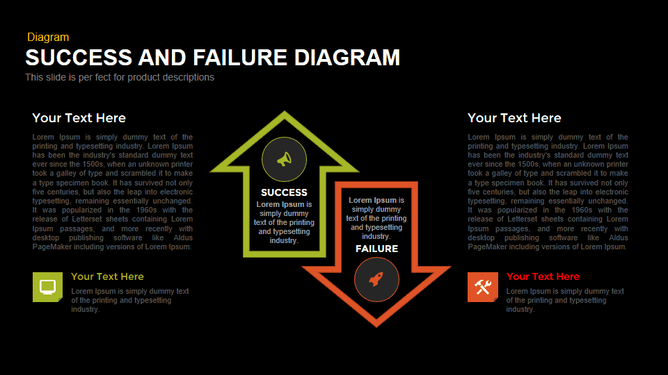
Harness the power of contrast with this comprehensive Success vs Failure Comparison Diagram, designed to deliver clear, impactful visuals for any outcome-based presentation. At its core, the slide features two bold, opposing arrows—one pointing upward in vibrant green to denote “Success,” and a contrasting downward arrow in warm orange labeled “Failure.” Each arrow houses an editable icon placeholder and concise text block, allowing you to illustrate key drivers, metrics, or milestones associated with either outcome. Flanking text fields on the left and right margins offer generous space for detailed narrations, statistics, or contextual commentary, while secondary icon-based callouts at the base of each arrow highlight supplementary points or subcategories.
Built on fully adjustable master slides, this diagram enables seamless theme swaps, typography tweaks, and layout adaptations without disrupting your structural alignment. Intuitive drag-and-drop icons and editable vector shapes let you replace imagery in seconds, while built-in alignment guides ensure pixel-perfect placement across devices. The clean white background and strategic use of negative space direct audience focus to the dual arrows and their associated content, delivering a polished, professional aesthetic.
Compatibility is guaranteed across both PowerPoint and Google Slides, preserving consistent scaling and resolution on any screen. Whether you’re crafting boardroom reviews, stakeholder briefings, or interactive workshops, this slide streamlines your workflow by combining strategic storytelling with visual clarity.
End-to-end customization features—including shape grouping, lock-protect options, and multi-slide duplication—empower busy professionals to build cohesive narratives in record time. Leverage this diagram to foster data-driven discussions, align cross-functional teams around clear success criteria, or spotlight potential pitfalls with equal clarity, driving informed decision-making at every stage.
Who is it for
Project managers, operations directors, and business analysts will find this comparison diagram invaluable for performance reviews and risk evaluations. Marketing leaders, consultants, and educators can repurpose it to illustrate campaign outcomes, teaching modules, or strategic roadmaps.
Other Uses
Beyond outcome comparisons, adapt the dual-arrow layout for KPI dashboards, decision-making flowcharts, or before-and-after case studies. Swap icons, adjust labels, and modify colors to transform it into a status report, competitive analysis, or process-improvement tool.
Login to download this file

Item ID
SB00432
Related Templates

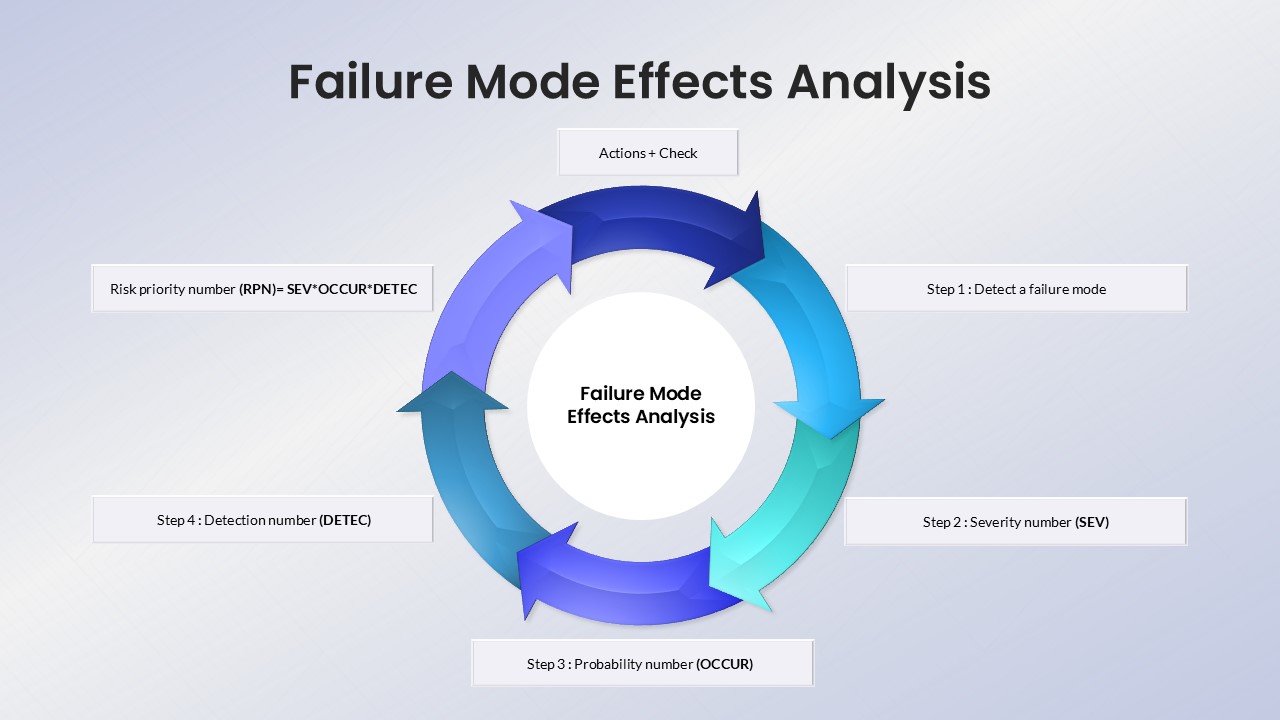
Failure Mode Effects Analysis (FMEA) Slide Template for PowerPoint & Google Slides
Process
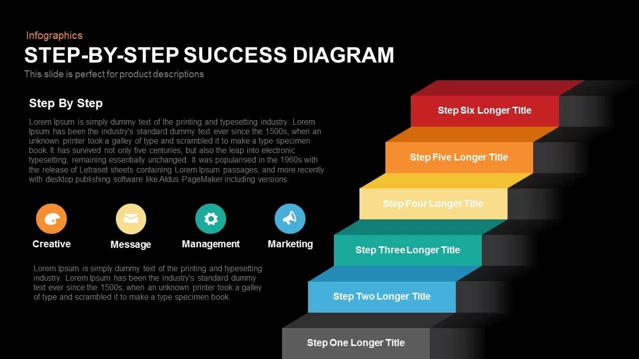
Step-by-Step Success Staircase Diagram template for PowerPoint & Google Slides
Process
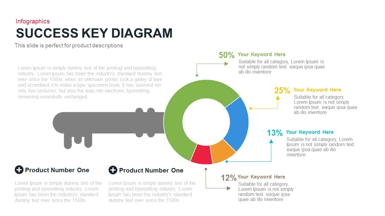
Success Key Diagram with Donut Chart Template for PowerPoint & Google Slides
Pie/Donut
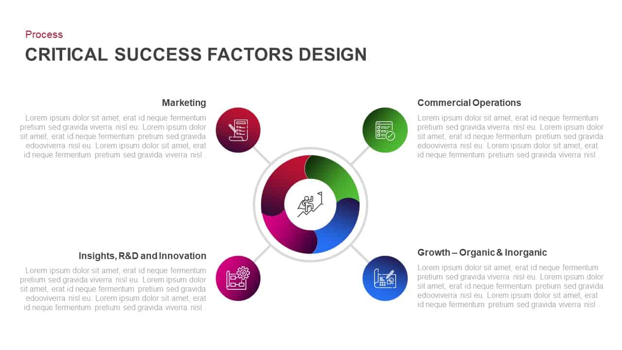
Critical Success Factors Diagram Template for PowerPoint & Google Slides
Infographics

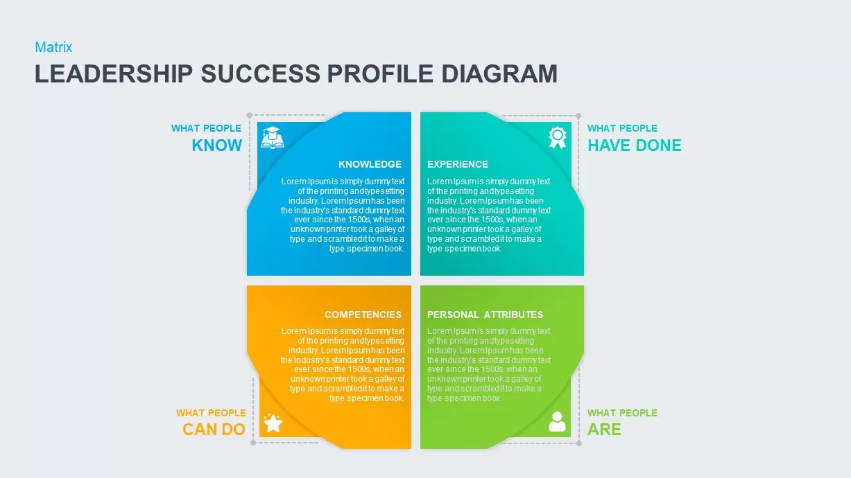
Leadership Success Profile Diagram Template for PowerPoint & Google Slides
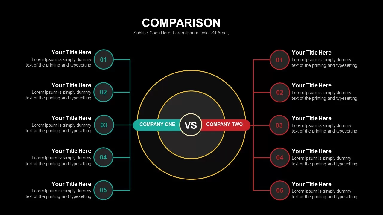
Comparison

Success and Growth Stair Arrow Diagram for PowerPoint & Google Slides
Process
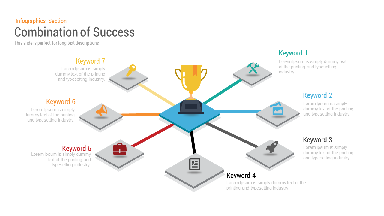
Combination of Success Infographic template for PowerPoint & Google Slides
Business Strategy
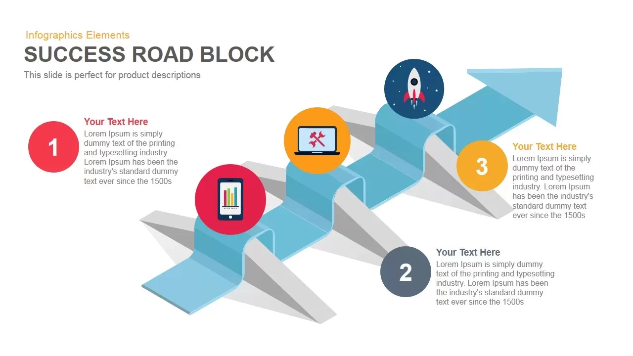
Success Road Block template for PowerPoint & Google Slides
Process
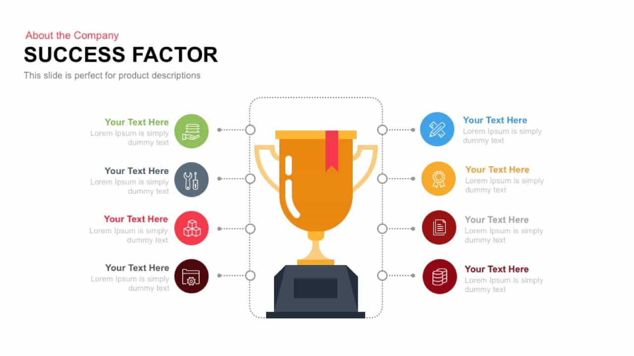
Success Factor template for PowerPoint & Google Slides
Infographics
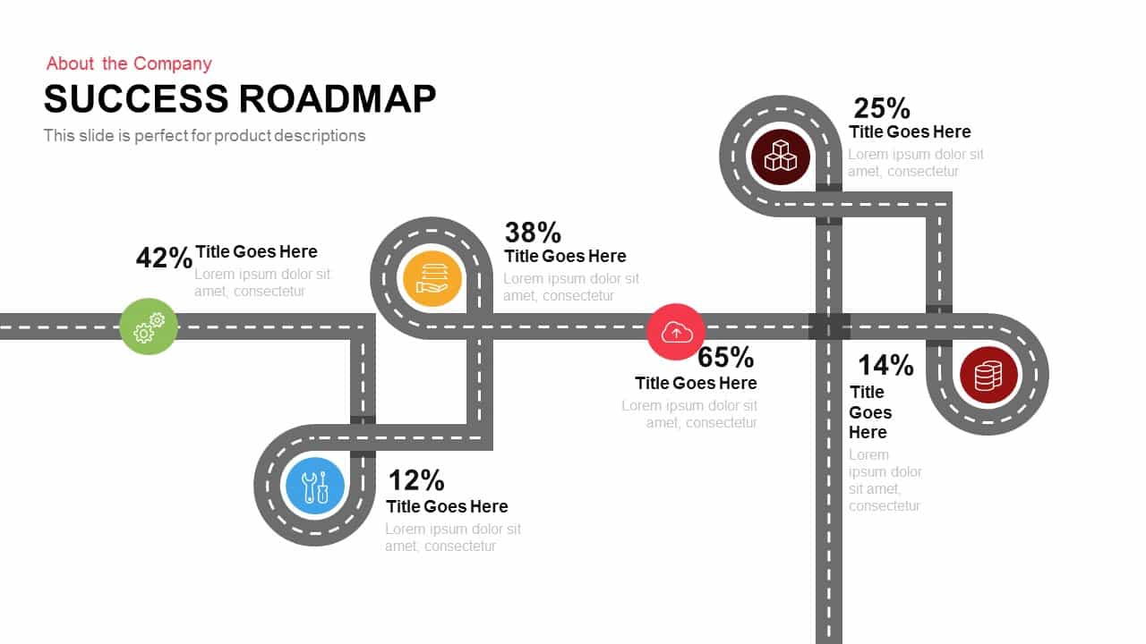
Success Roadmap template for PowerPoint & Google Slides
Roadmap
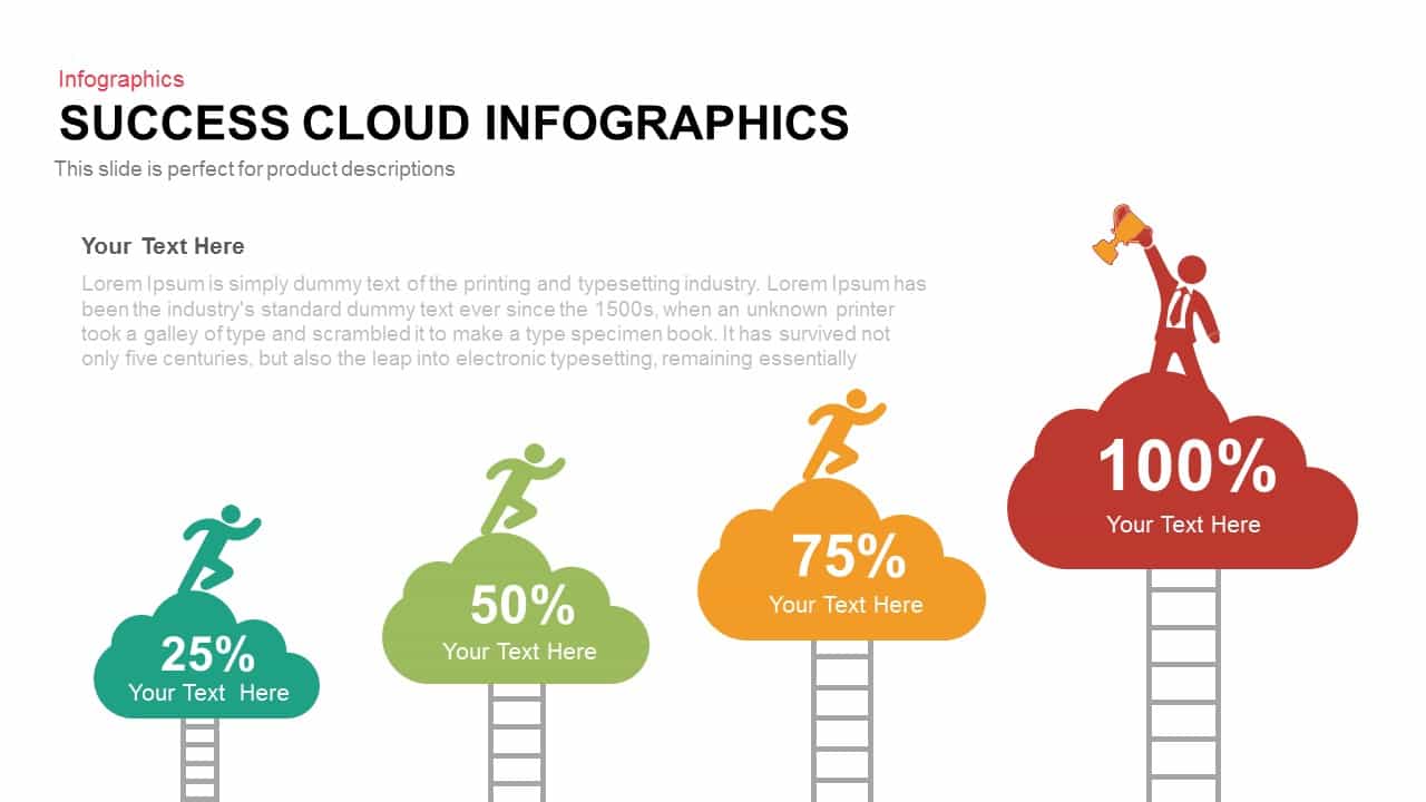
Success Cloud Progress Infographics Template for PowerPoint & Google Slides
Charts
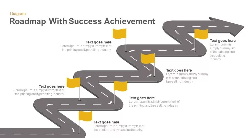
Roadmap with Success Achievement template for PowerPoint & Google Slides
Roadmap

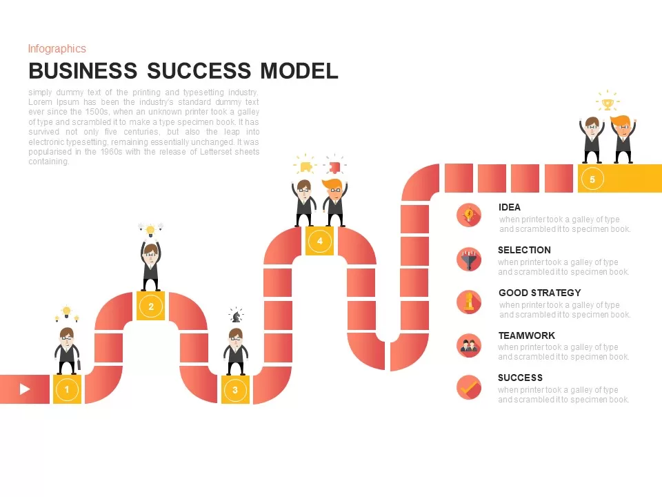
Business Success Model Infographic Template for PowerPoint & Google Slides
Roadmap
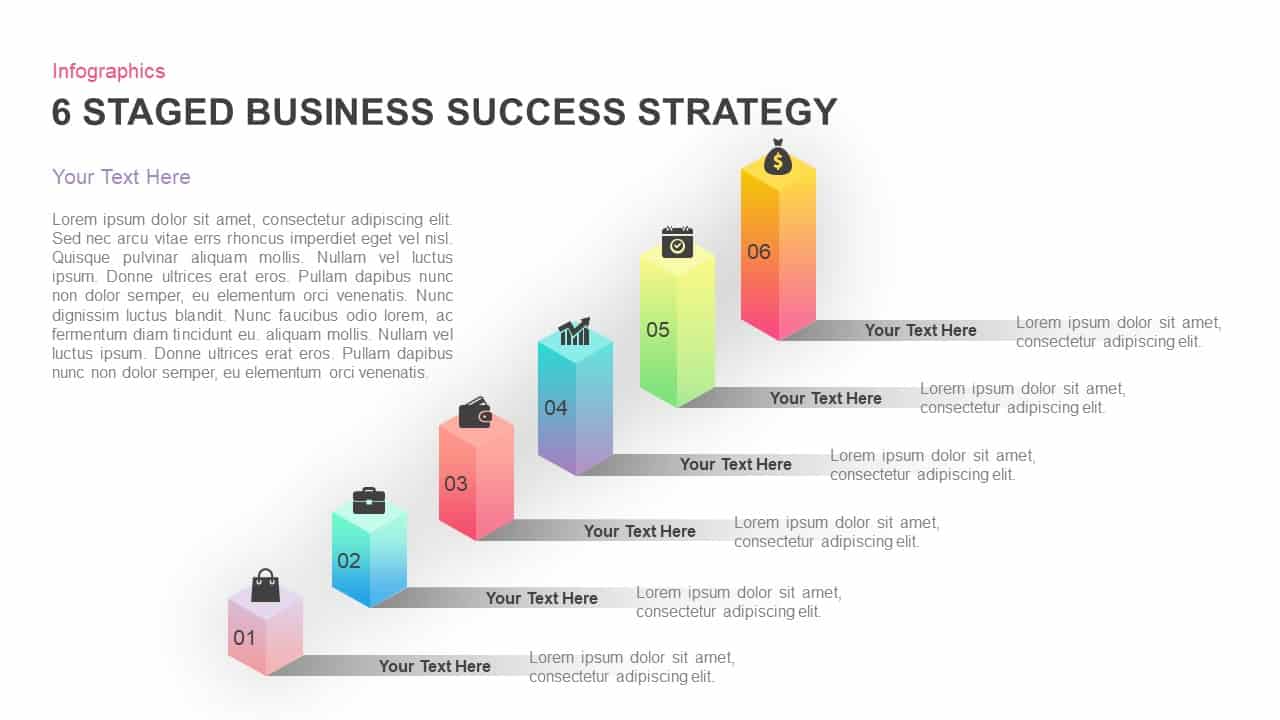
Six-Stage Business Success Strategy Template for PowerPoint & Google Slides
Business Strategy
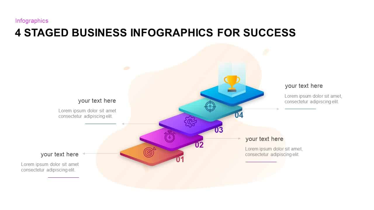
Four-Stage Business Success Infographic Template for PowerPoint & Google Slides
Process
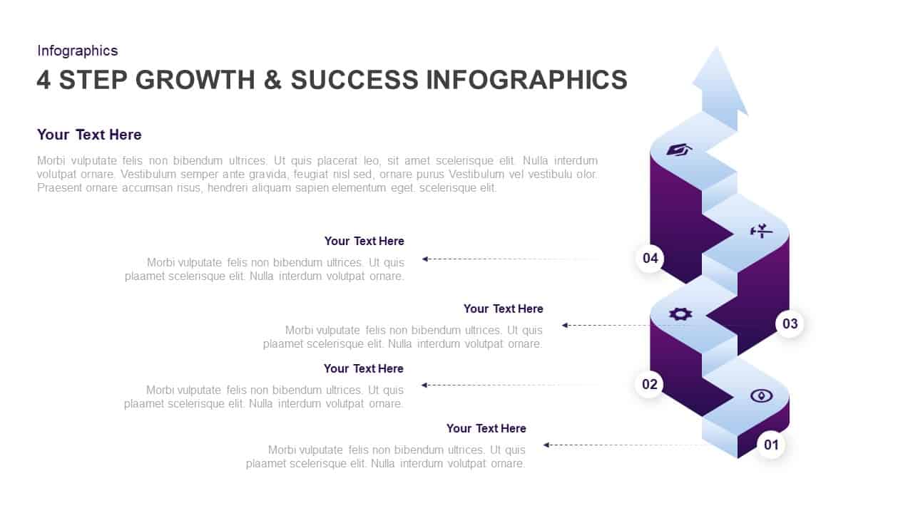
4-Step Growth & Success Infographics Template for PowerPoint & Google Slides
Accomplishment
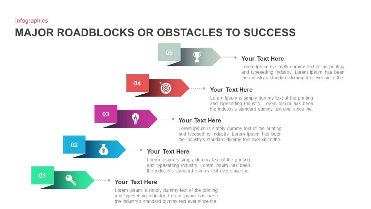
Major Roadblocks to Success Arrow Template for PowerPoint & Google Slides
Arrow
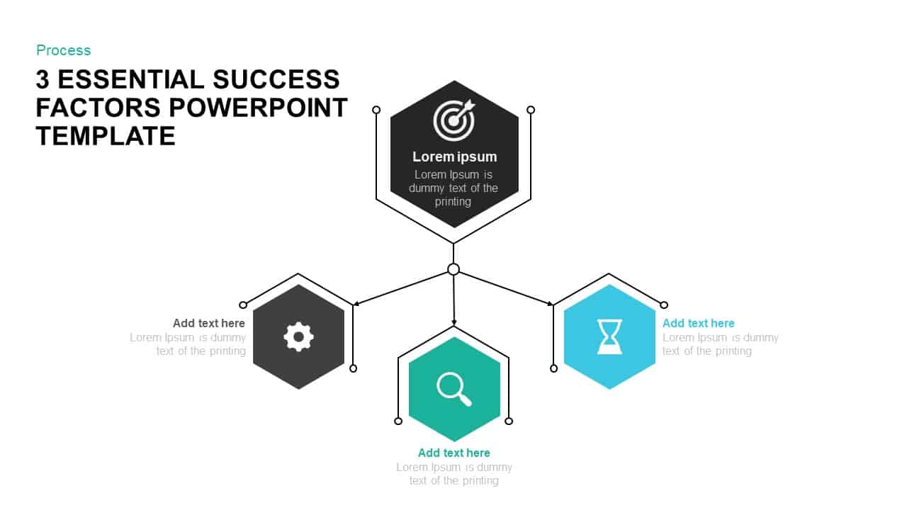
3 Success Factors Hexagon Process Template for PowerPoint & Google Slides
Process
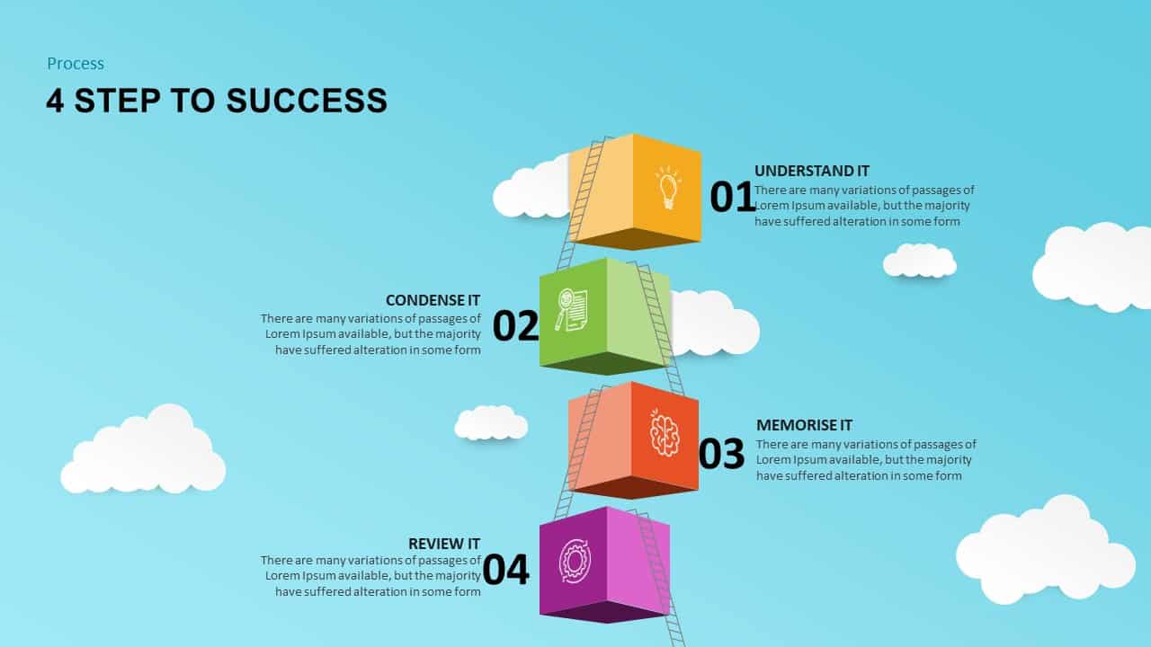
4 Steps to Success Process template for PowerPoint & Google Slides
Process
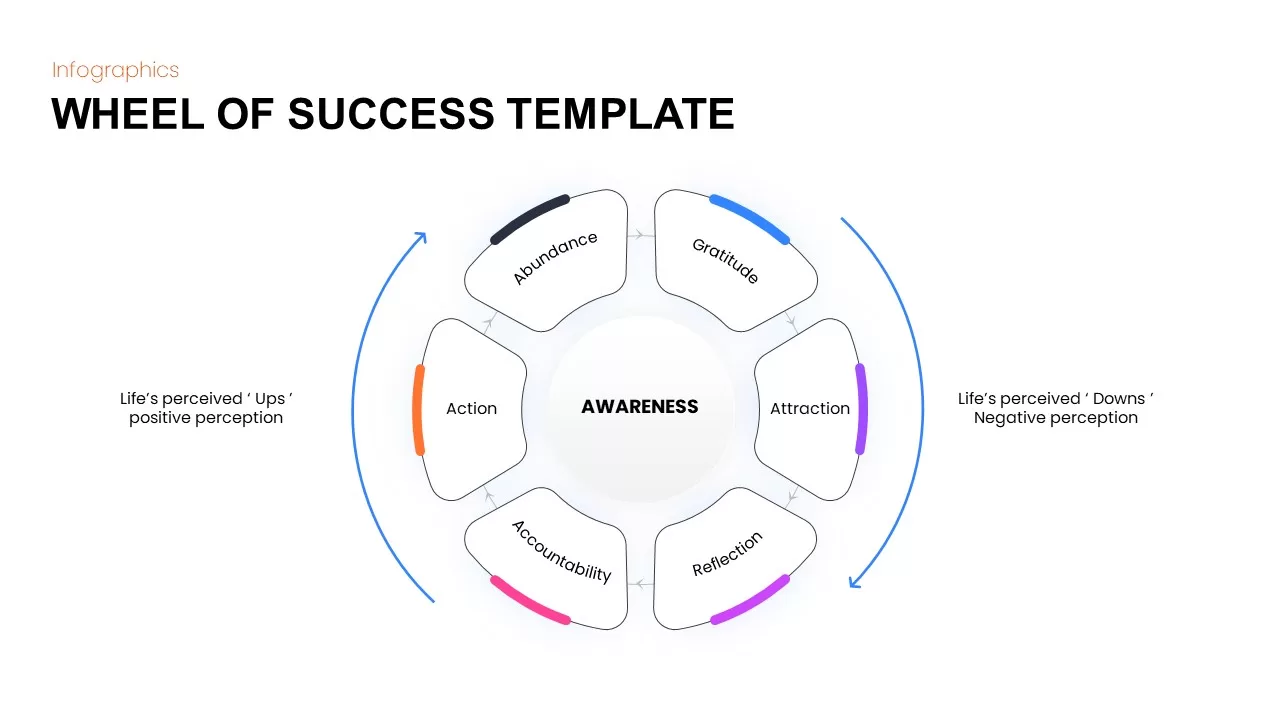
Wheel of Success Infographic template for PowerPoint & Google Slides
Circular
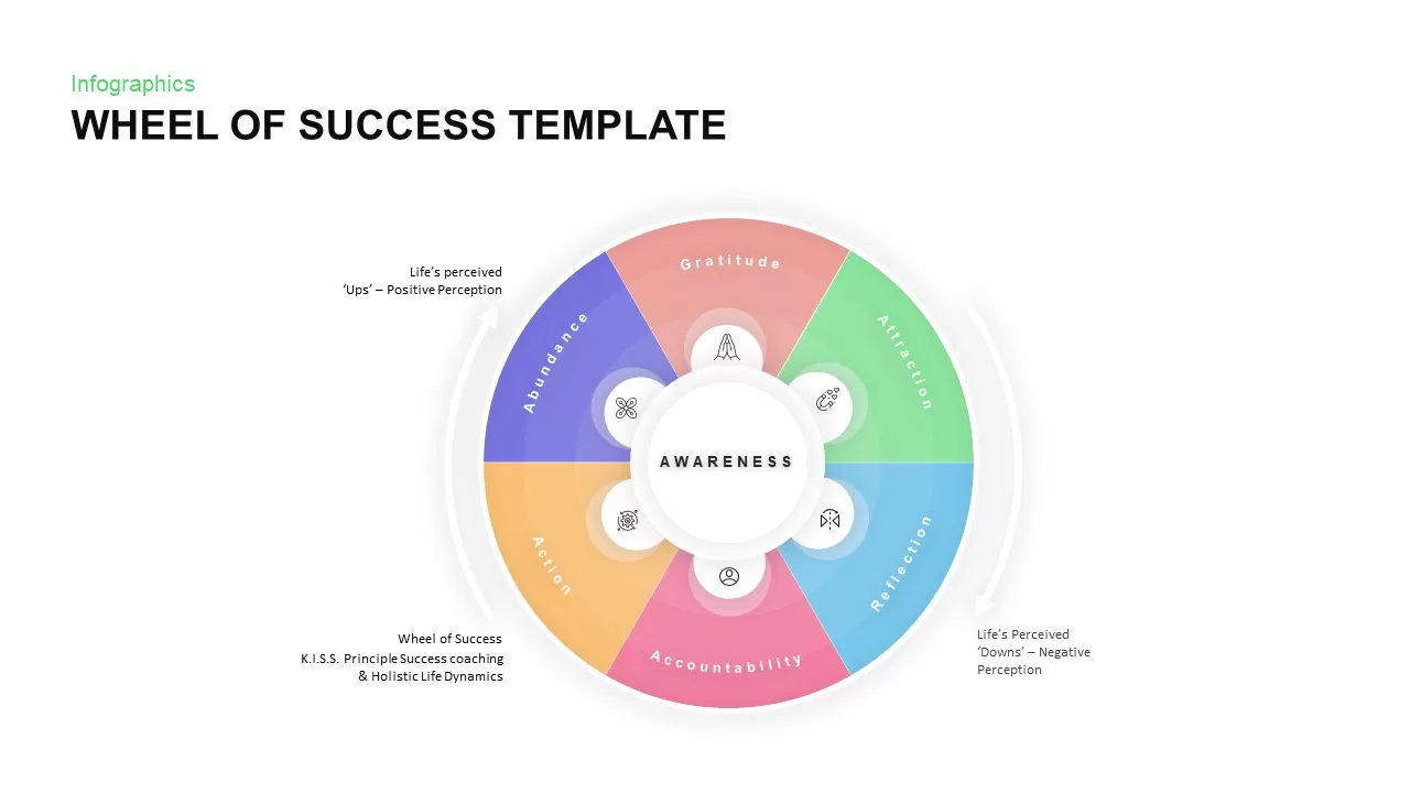
Wheel of Success Overview template for PowerPoint & Google Slides
Business Strategy
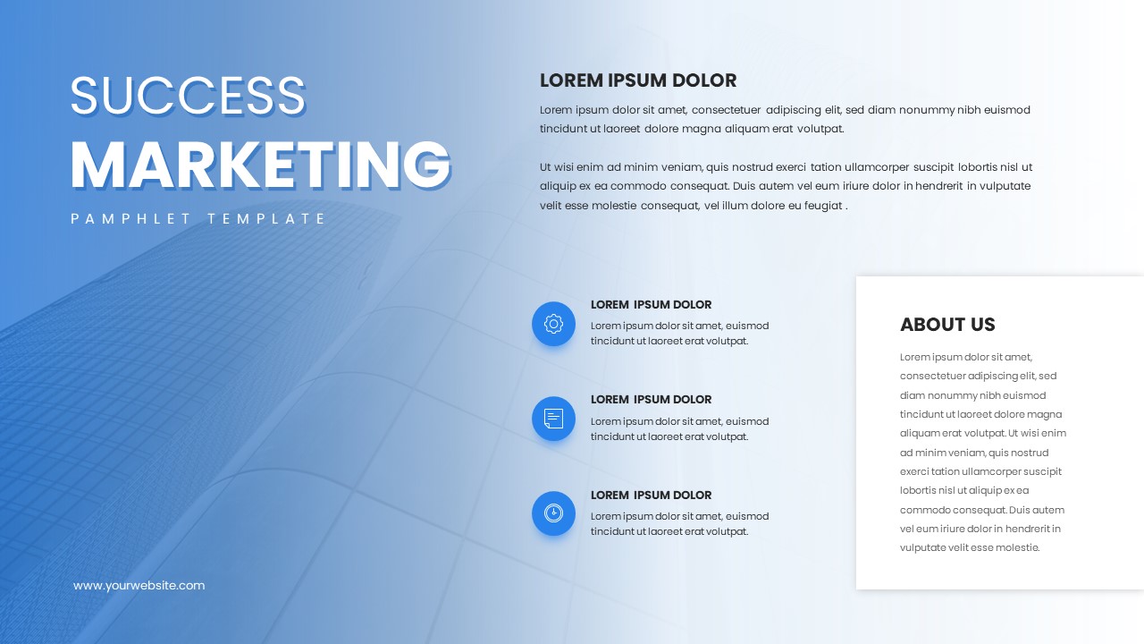
Success Marketing Gradient Pamphlet Template for PowerPoint & Google Slides
Marketing
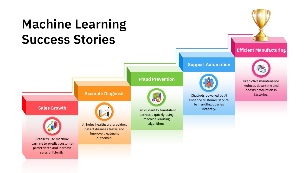
Machine Learning Success Stories Infographic Template for PowerPoint & Google Slides
Process
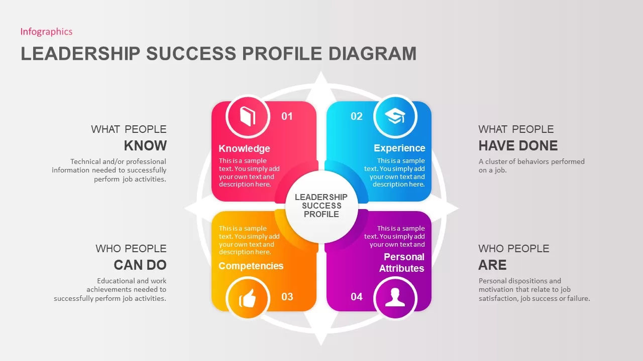
Leadership Success Profile for PowerPoint & Google Slides
Leadership
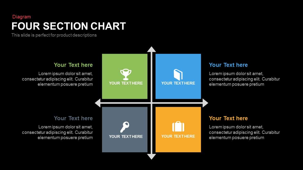
Four Section Comparison Chart Diagram Template for PowerPoint & Google Slides
Infographics
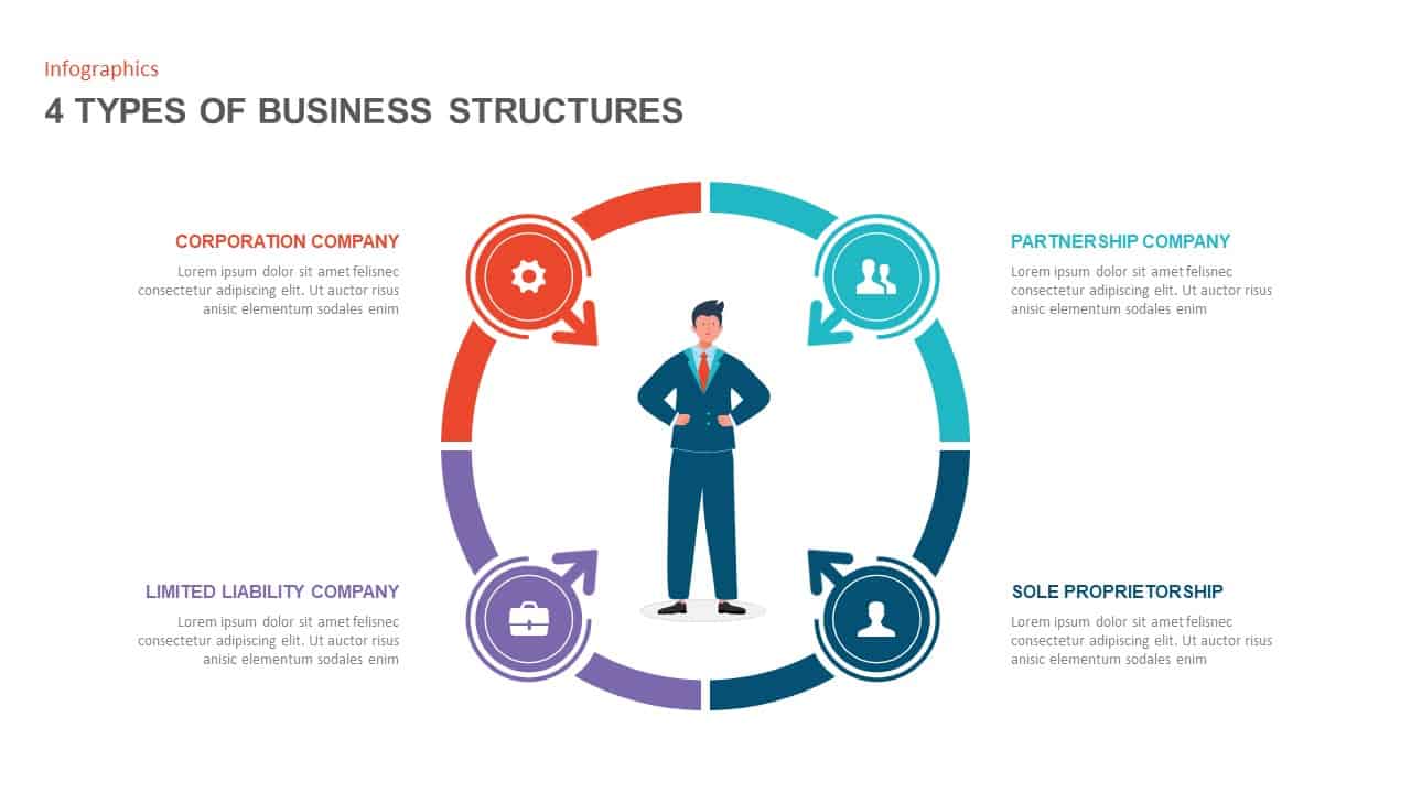
Four Business Structure Types Comparison Diagram Template for PowerPoint & Google Slides
Business Strategy
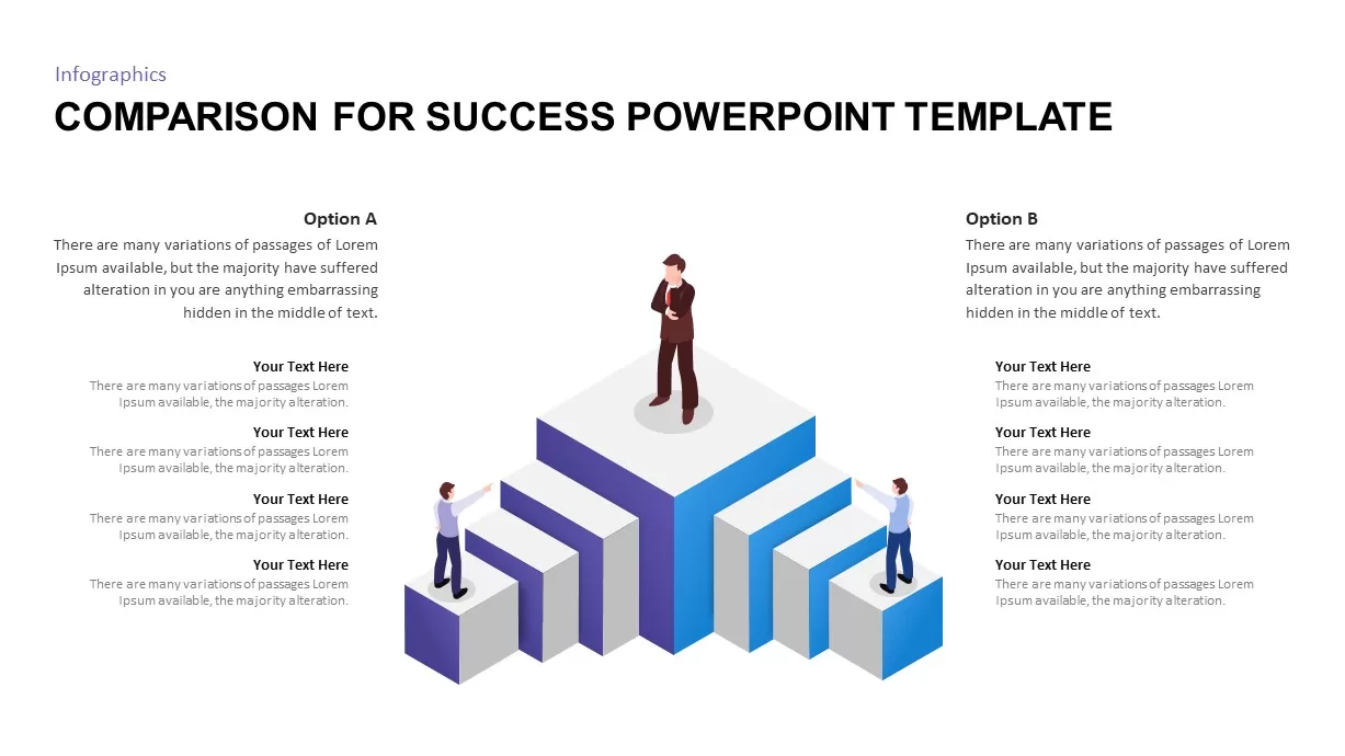
Isometric 3D Block Comparison Diagram Template for PowerPoint & Google Slides
Comparison
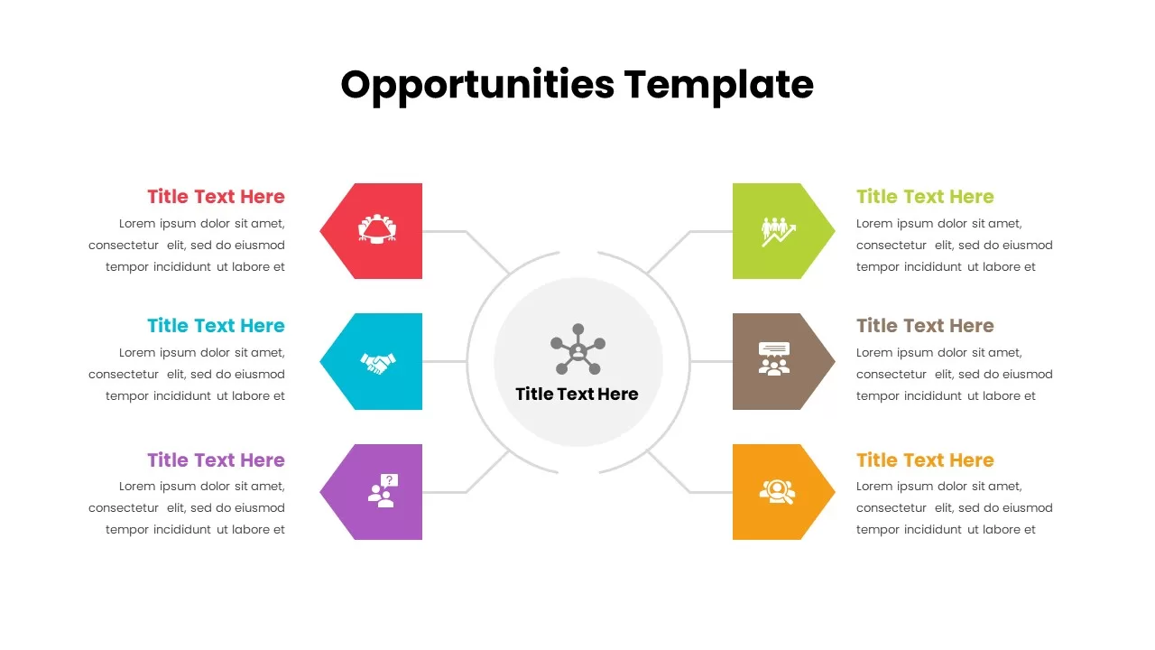
Opportunities Hub-and-Spoke Comparison Diagram Template for PowerPoint & Google Slides
Opportunities Challenges
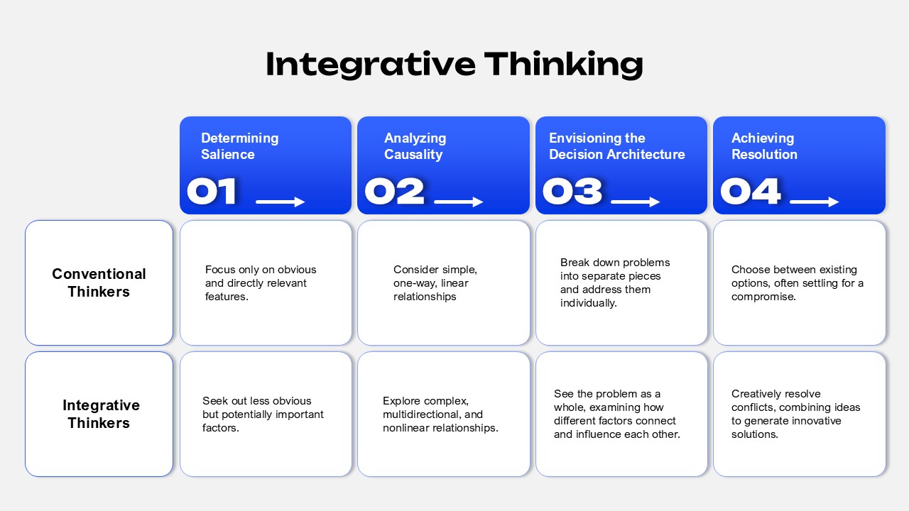
Integrative Thinking Comparison Diagram Template for PowerPoint & Google Slides
Comparison
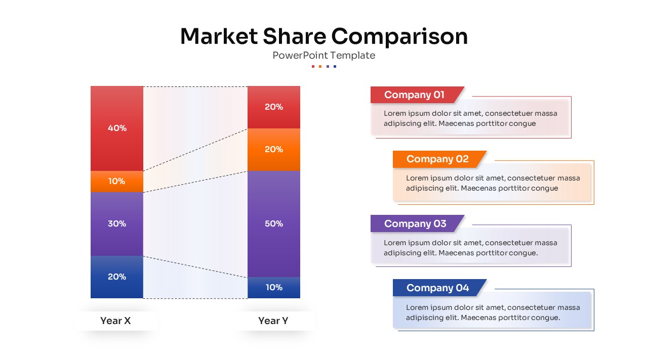
Market Share Comparison Diagram Template for PowerPoint & Google Slides
Comparison Chart
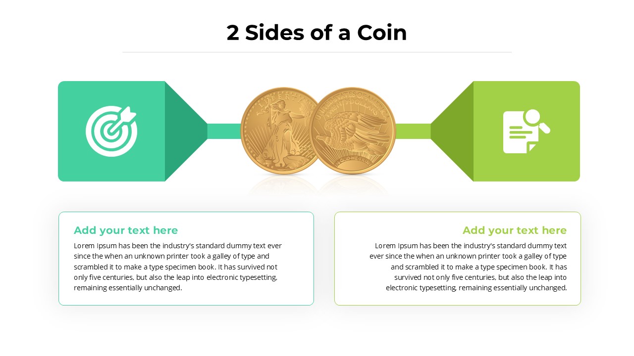
Two-Sided Coin Comparison Diagram Template for PowerPoint & Google Slides
Comparison
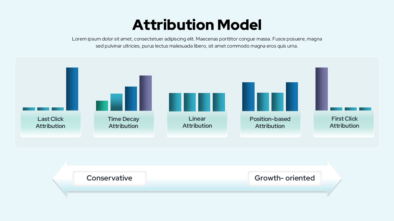
Attribution Models Comparison Diagram Template for PowerPoint & Google Slides
Comparison
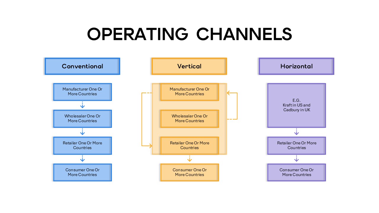
Operating Channels Comparison Diagram Template for PowerPoint & Google Slides
Business Models
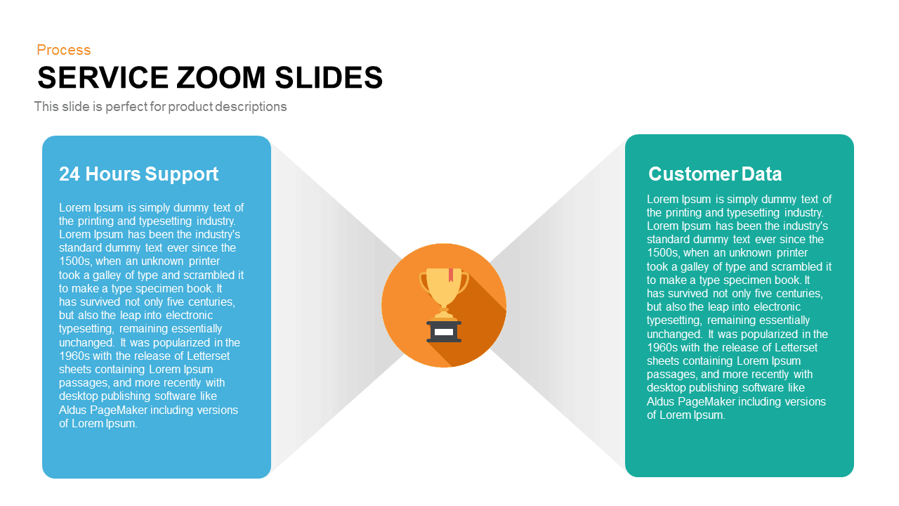
Service Zoom Feature Slides Comparison template for PowerPoint & Google Slides
Process
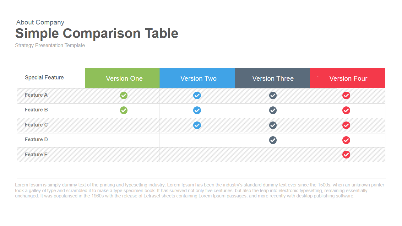
Simple Comparison Table Template for PowerPoint & Google Slides
Comparison
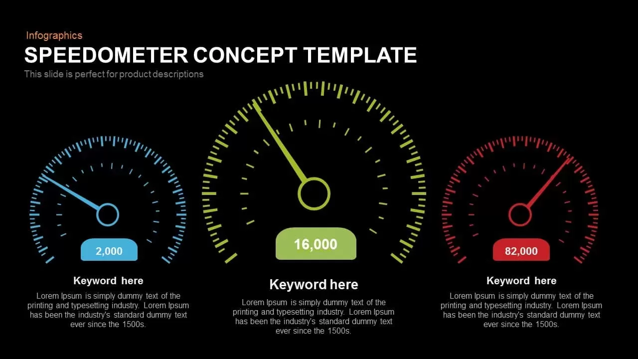
Speedometer Infographic Gauge Comparison Template for PowerPoint & Google Slides
Comparison
3-Column Comparison template for PowerPoint & Google Slides
Comparison

Clean Mobile Service Comparison Slide Template for PowerPoint & Google Slides
Comparison
Scale Metaphor Metrics Comparison Template for PowerPoint & Google Slides
Charts
Dual Percentage Comparison Metaphor Template for PowerPoint & Google Slides
Comparison
Tornado Chart Data Comparison Slide Template for PowerPoint & Google Slides
Bar/Column
Five-Option Text Boxes Table Comparison Template for PowerPoint & Google Slides
Business Report
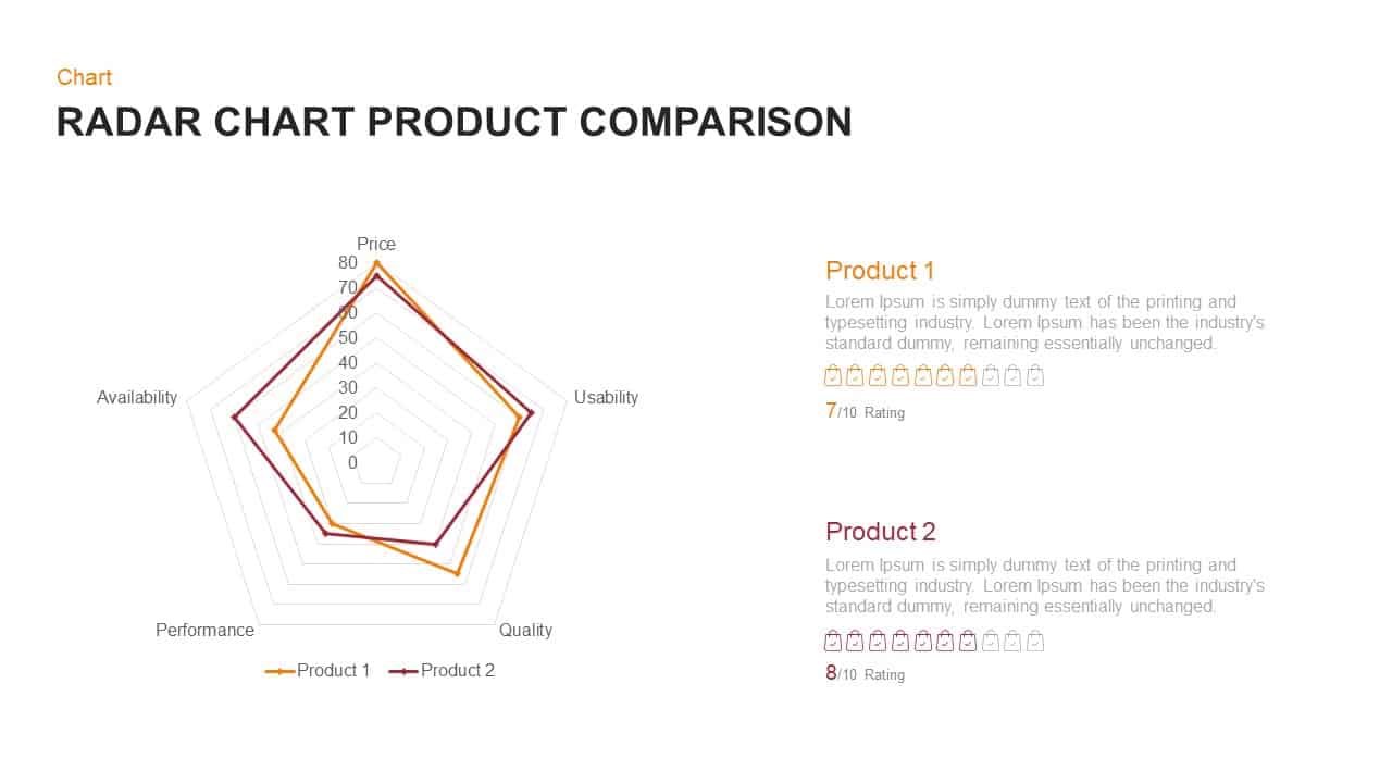
Radar Chart Product Comparison Template for PowerPoint & Google Slides
Comparison Chart
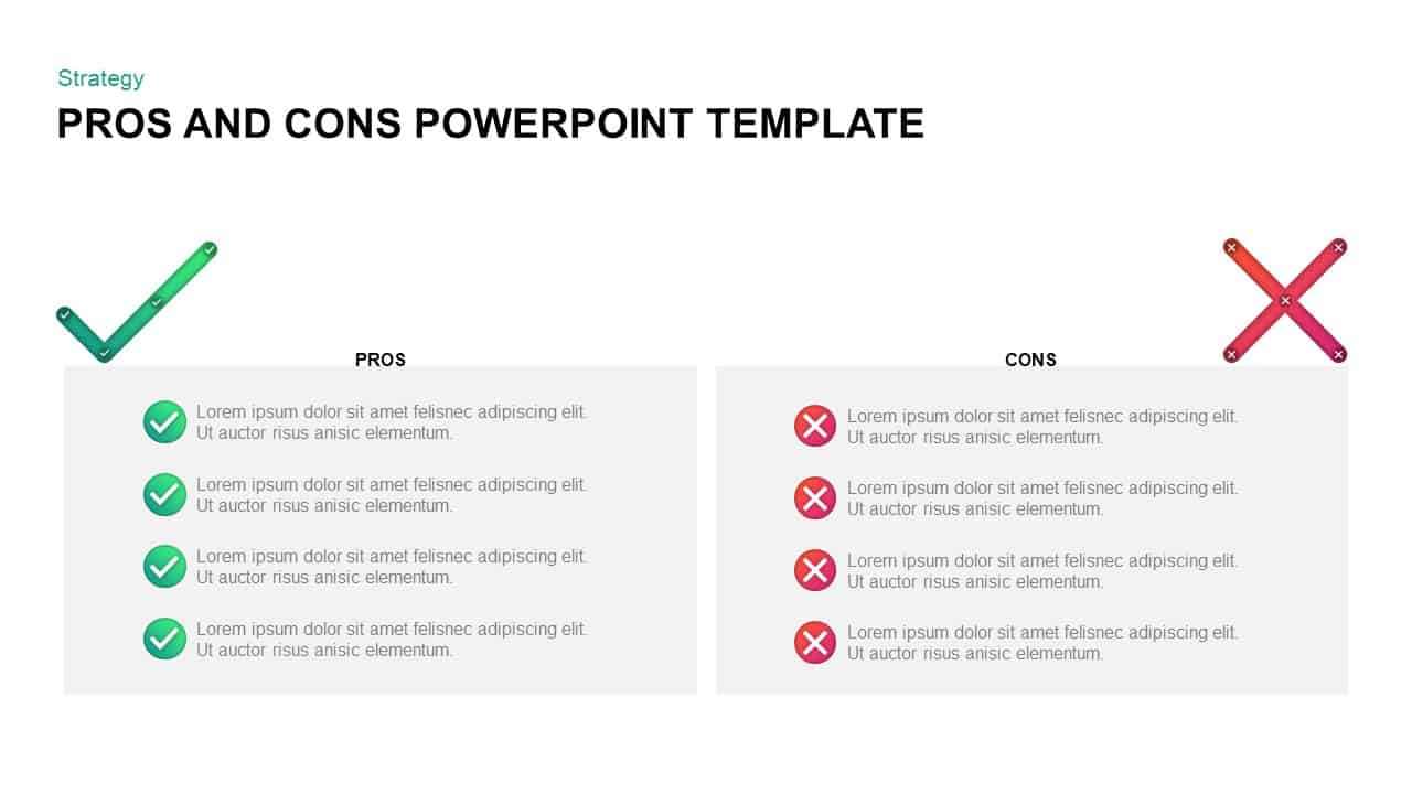
Pros and Cons Comparison Slide Template for PowerPoint & Google Slides
Comparison
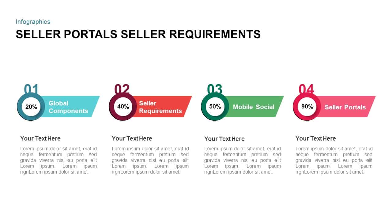
Seller Portals Comparison Infographic Template for PowerPoint & Google Slides
Process
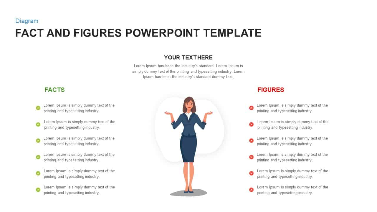
Fact and Figures Comparison Slide Template for PowerPoint & Google Slides
Business Report
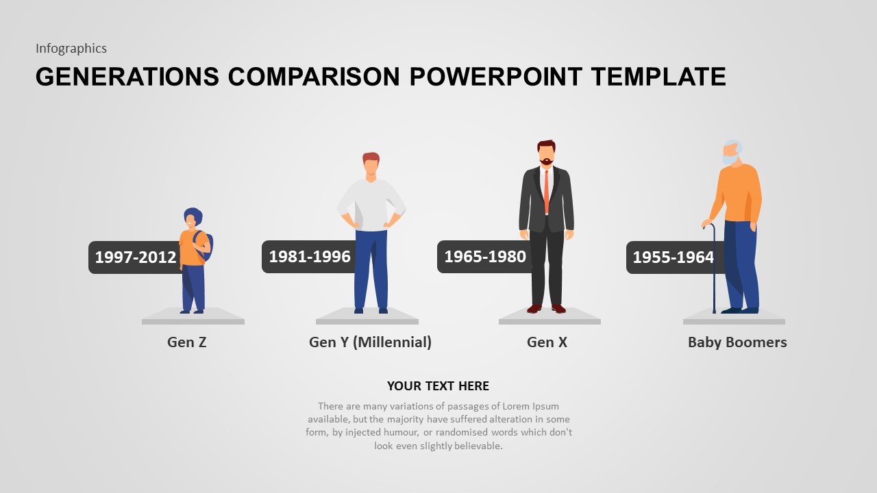
Generations Comparison Infographic Template for PowerPoint & Google Slides
Timeline
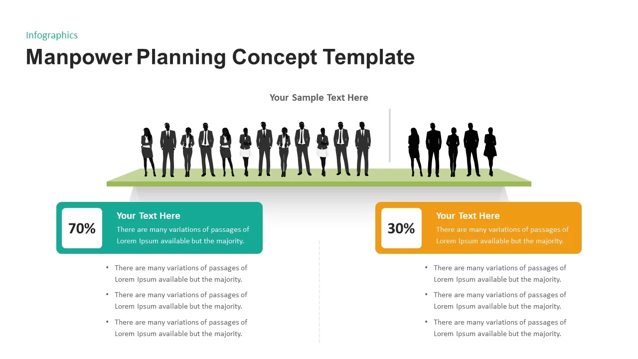
Manpower Planning Concept Comparison Template for PowerPoint & Google Slides
Comparison Chart
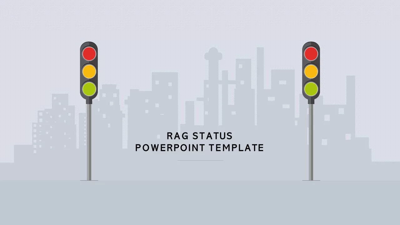
RAG Status Infographic Comparison Template for PowerPoint & Google Slides
Project
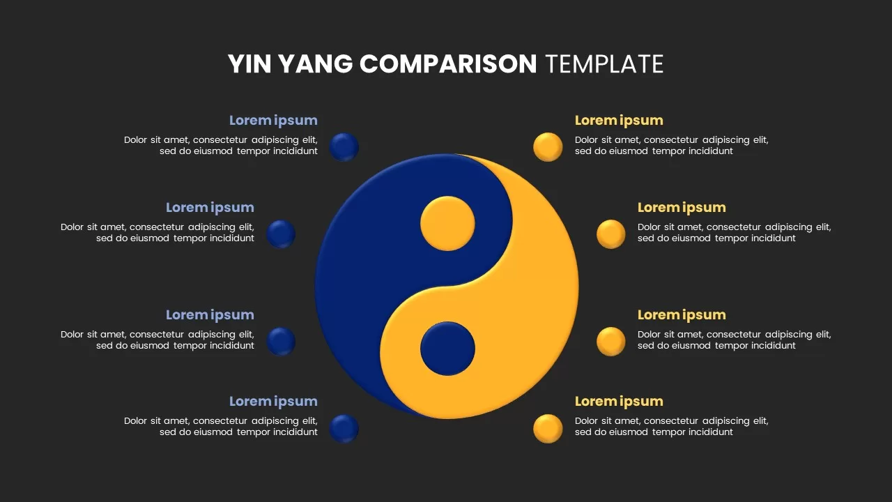
Yin Yang Comparison template for PowerPoint & Google Slides
Business
Comparison Infographic Overview template for PowerPoint & Google Slides
Business
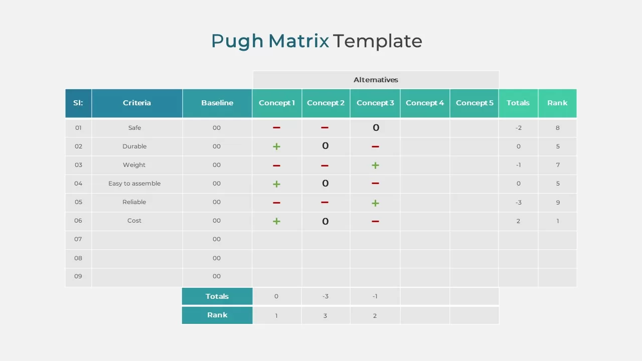
Pugh Matrix Decision Comparison Chart Template for PowerPoint & Google Slides
Comparison Chart
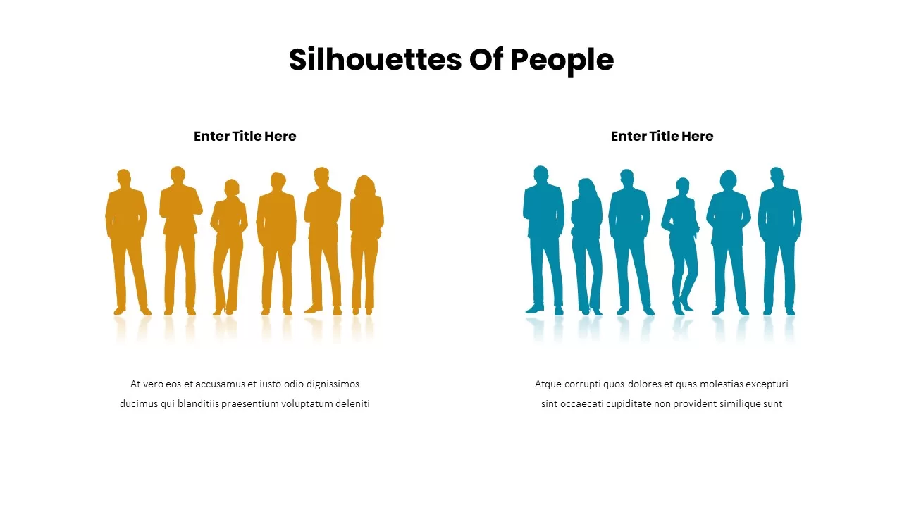
Business Silhouettes Comparison Slide Template for PowerPoint & Google Slides
HR
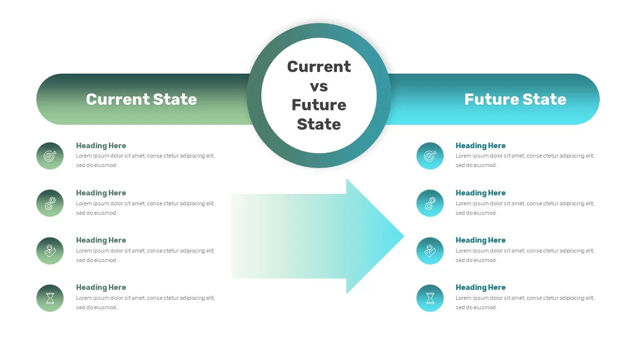
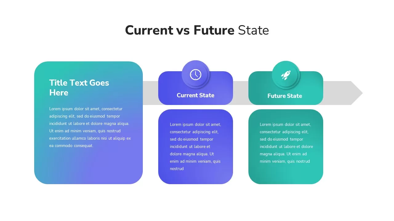
Current vs Future State Comparison Slide Template for PowerPoint & Google Slides
Comparison Chart
Current vs Future State Comparison Template for PowerPoint & Google Slides
Comparison Chart
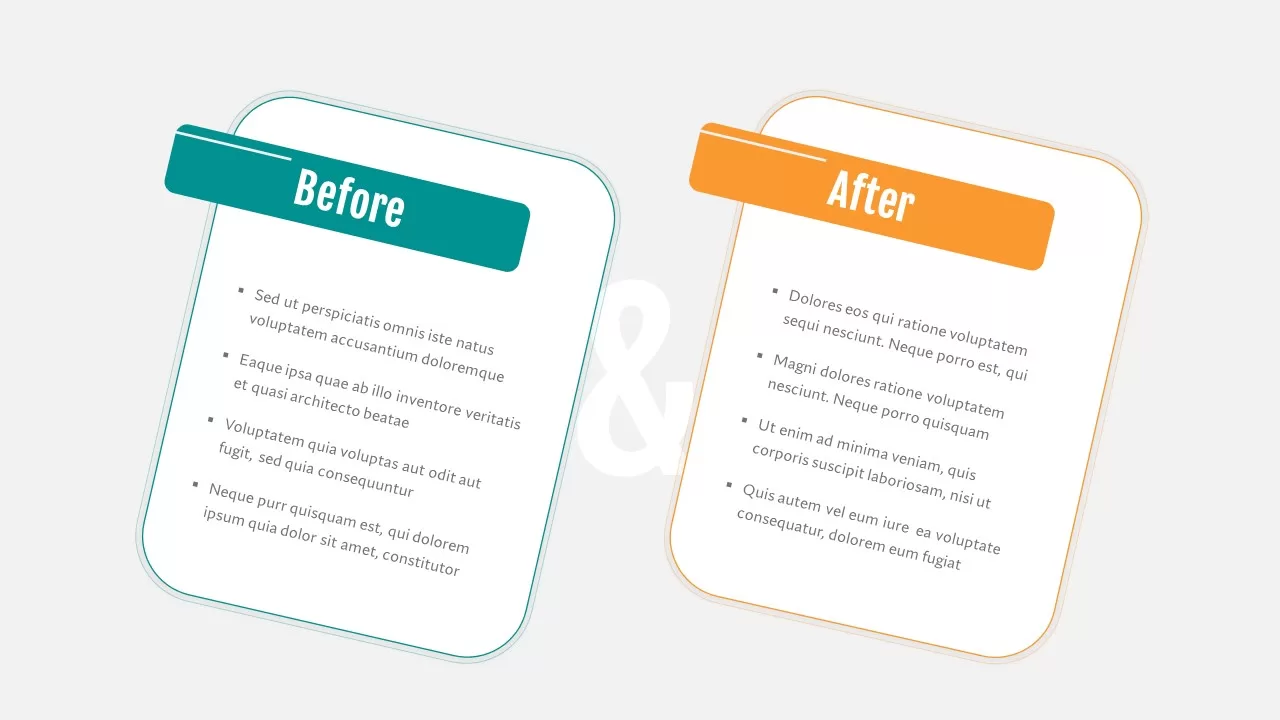
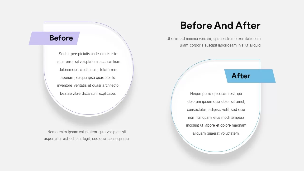
Before and After Comparison Slide Template for PowerPoint & Google Slides
Comparison
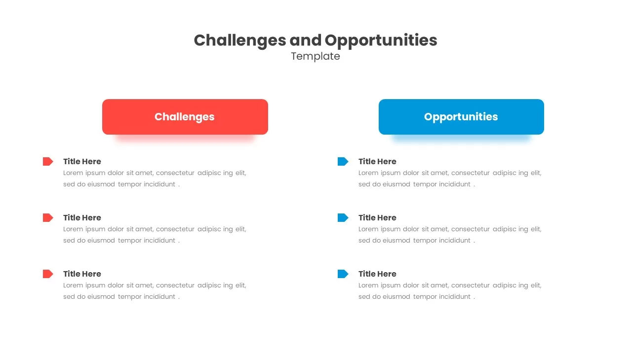
Challenges & Opportunities Comparison Template for PowerPoint & Google Slides
Opportunities Challenges
Modern Before and After Comparison Template for PowerPoint & Google Slides
Infographics
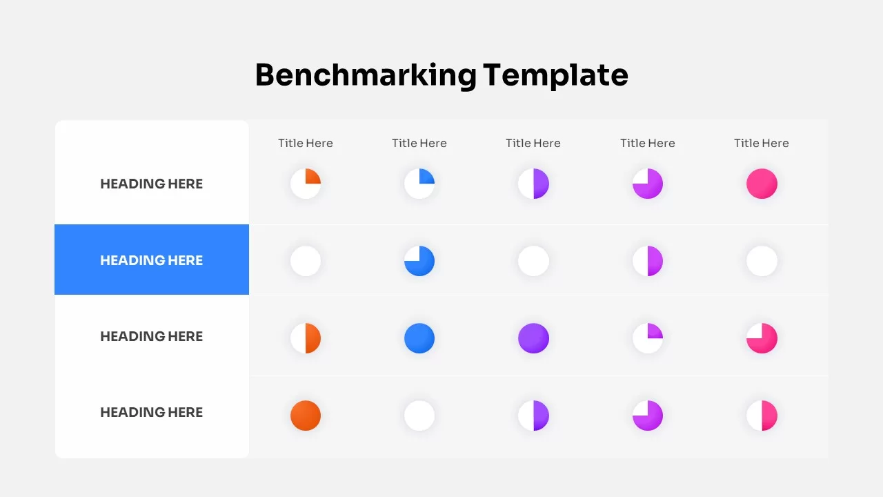
Benchmarking Metrics Comparison Slide Template for PowerPoint & Google Slides
Pie/Donut
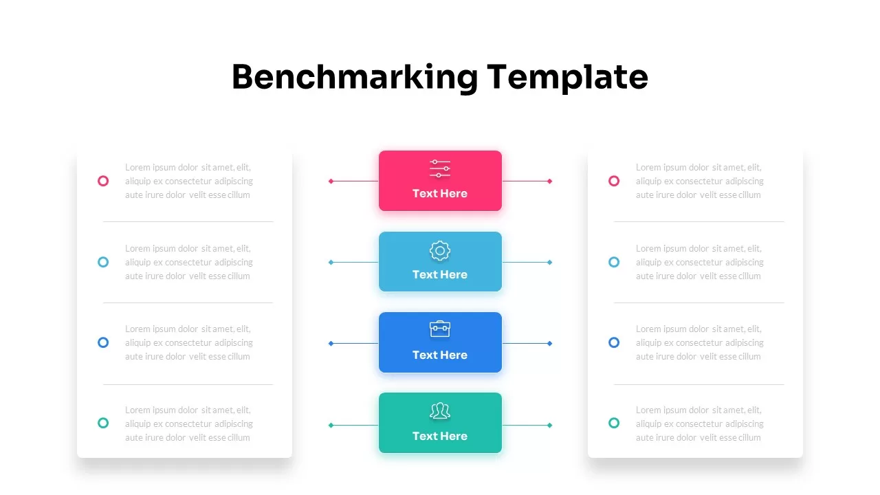
Dynamic Benchmarking Comparison Chart Template for PowerPoint & Google Slides
Comparison Chart
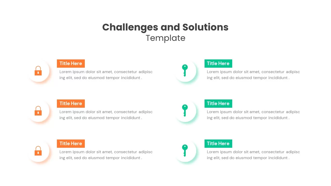
Challenges & Solutions Comparison Template for PowerPoint & Google Slides
Opportunities Challenges
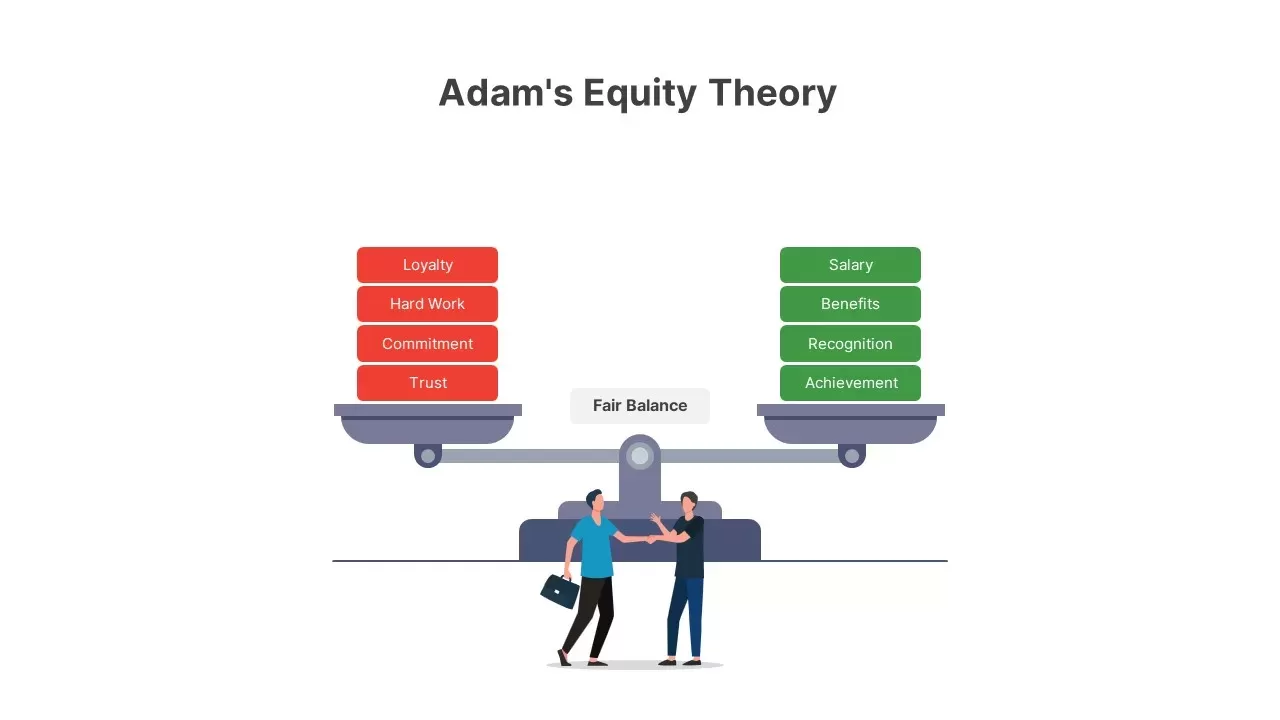
Adam’s Equity Theory Scale Comparison Template for PowerPoint & Google Slides
Comparison
Casino Poker Chips Comparison Slide Template for PowerPoint & Google Slides
Comparison
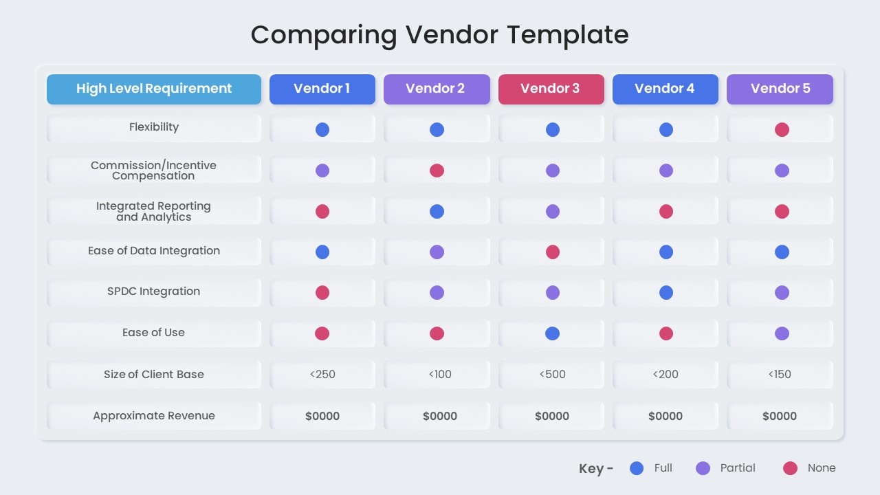
Vendor Comparison Matrix with High-Level Requirements template for PowerPoint & Google Slides
Comparison Chart
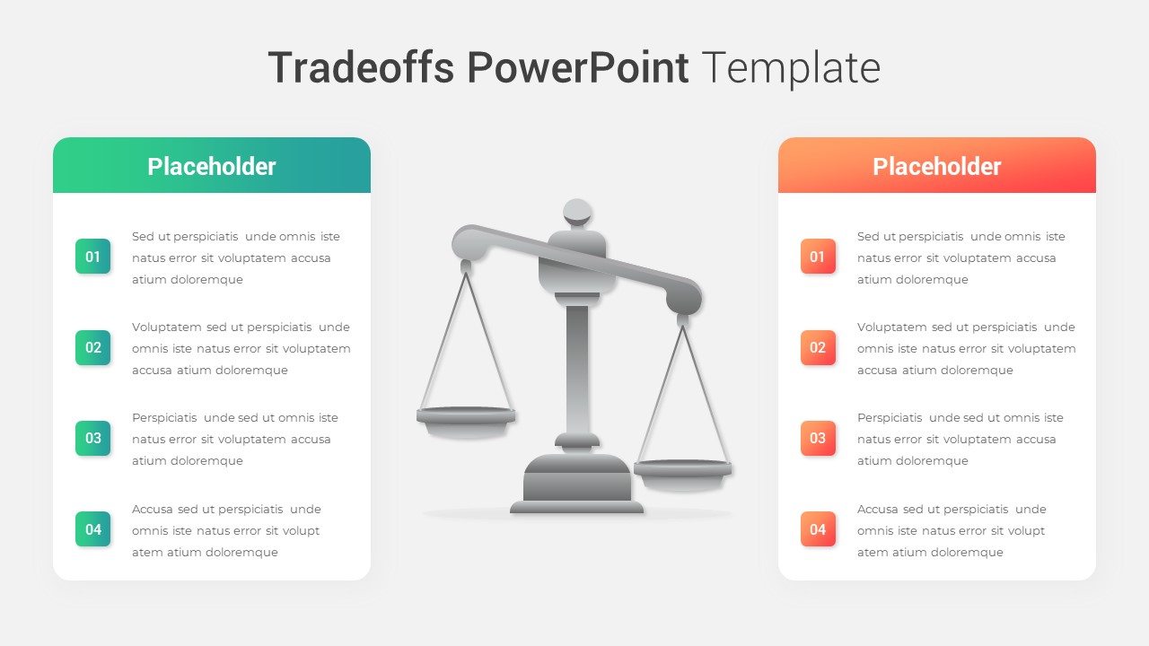
Modern Tradeoffs Comparison Slide Template for PowerPoint & Google Slides
Comparison
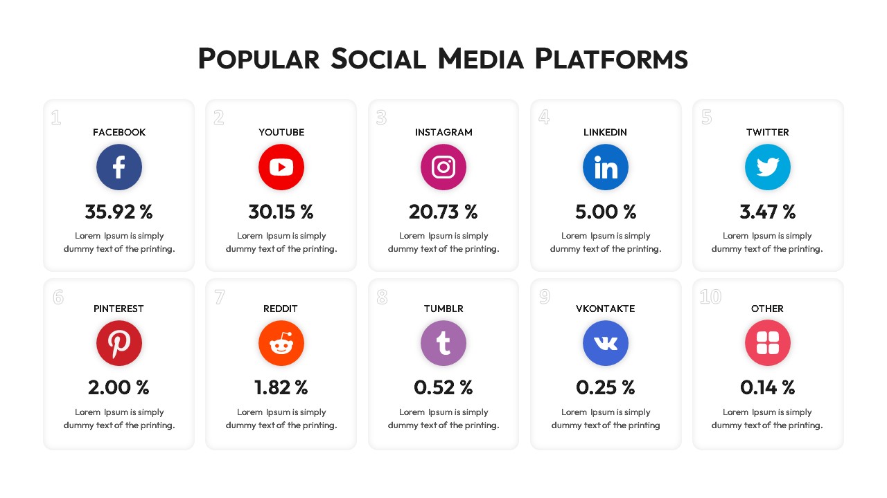
Popular Social Media Comparison Grid Template for PowerPoint & Google Slides
Digital Marketing
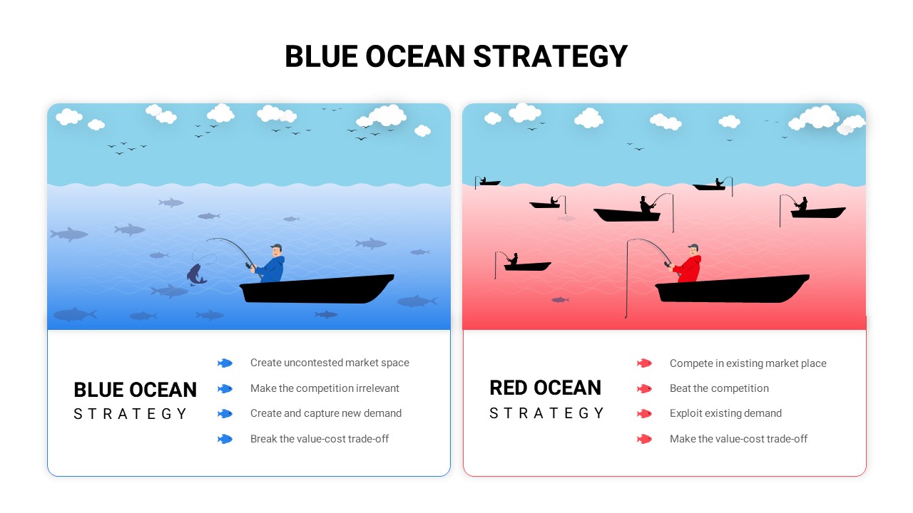
Blue vs Red Ocean Strategy Comparison Template for PowerPoint & Google Slides
Business Strategy
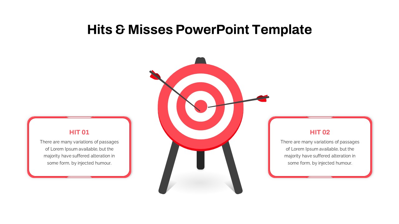
Hits and Misses Performance Comparison Template for PowerPoint & Google Slides
Comparison
Surgery Infographics Comparison Template for PowerPoint & Google Slides
Health
Business Timeline Comparison Bar Chart Template for PowerPoint & Google Slides
Comparison Chart
Grouped Column Chart Comparison Template for PowerPoint & Google Slides
Bar/Column
Mirror Bar Chart Comparison Template for PowerPoint & Google Slides
Bar/Column
Free Pros and Cons Comparison Template for PowerPoint & Google Slides
Comparison
Free
Free Versatile Product Comparison Chart Template for PowerPoint & Google Slides
Charts
Free
AI vs. Human Intelligence Comparison Template for PowerPoint & Google Slides
Comparison
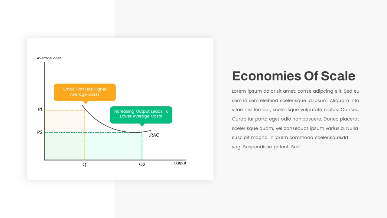
Economies of Scale Cost Curve Comparison Template for PowerPoint & Google Slides
Comparison Chart
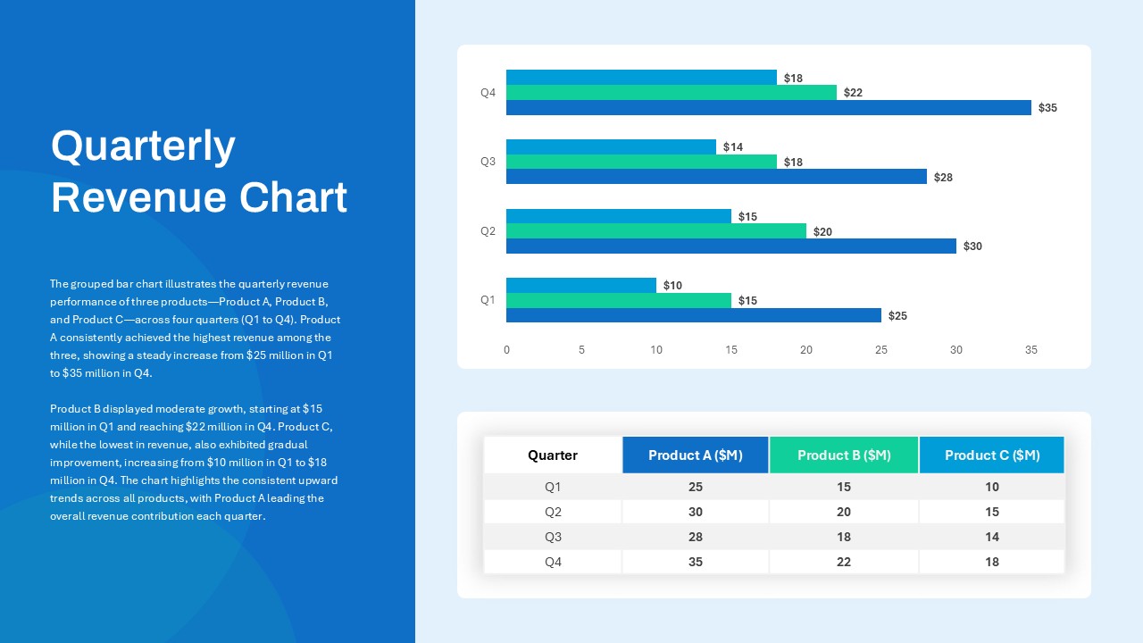
Quarterly Revenue Comparison Bar Chart Template for PowerPoint & Google Slides
Bar/Column
Hits & Misses Comparison Infographic Template for PowerPoint & Google Slides
Pitch Deck
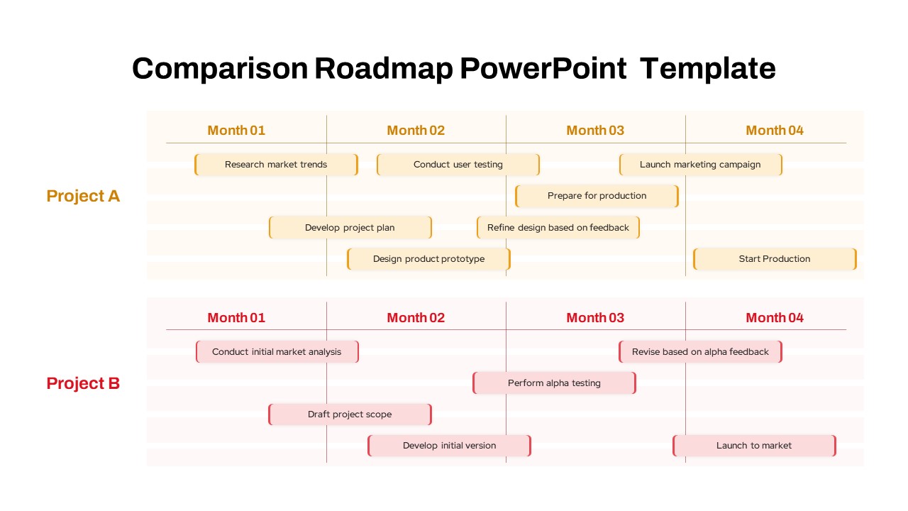
Project Comparison Timeline Roadmap Template for PowerPoint & Google Slides
Comparison
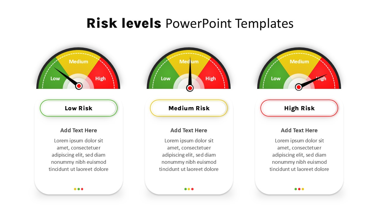
Risk Level Gauge Comparison Dashboard Template for PowerPoint & Google Slides
Comparison
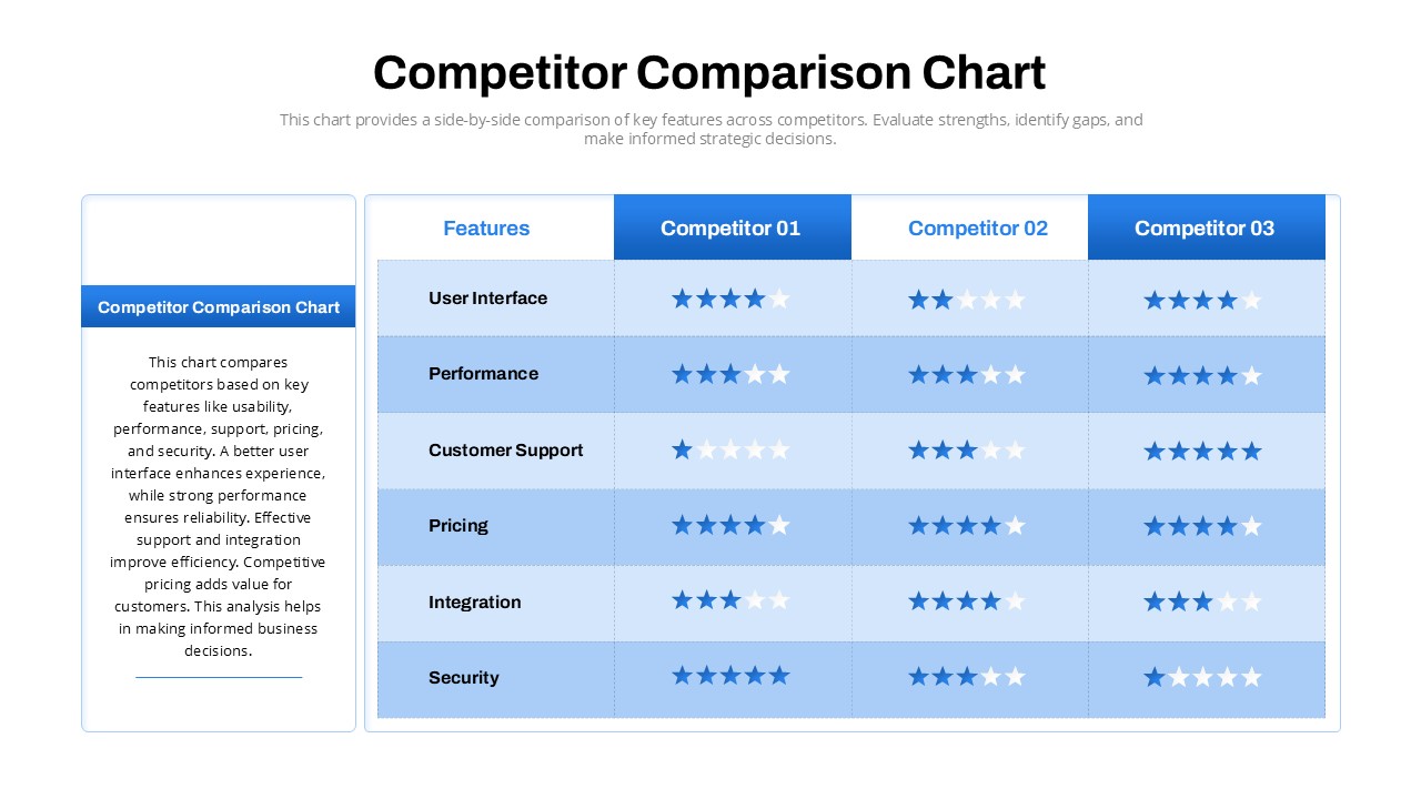
Competitor Comparison Chart Design Template for PowerPoint & Google Slides
Comparison
Two-Option Bar Chart Comparison Table Template for PowerPoint & Google Slides
Comparison
Cross Sell & Up Sell Strategy Comparison template for PowerPoint & Google Slides
Comparison
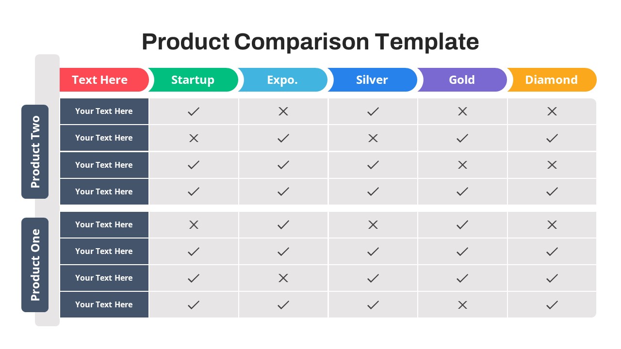
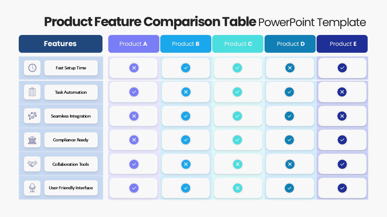
Product Feature Comparison Table Template for PowerPoint & Google Slides
Comparison Chart
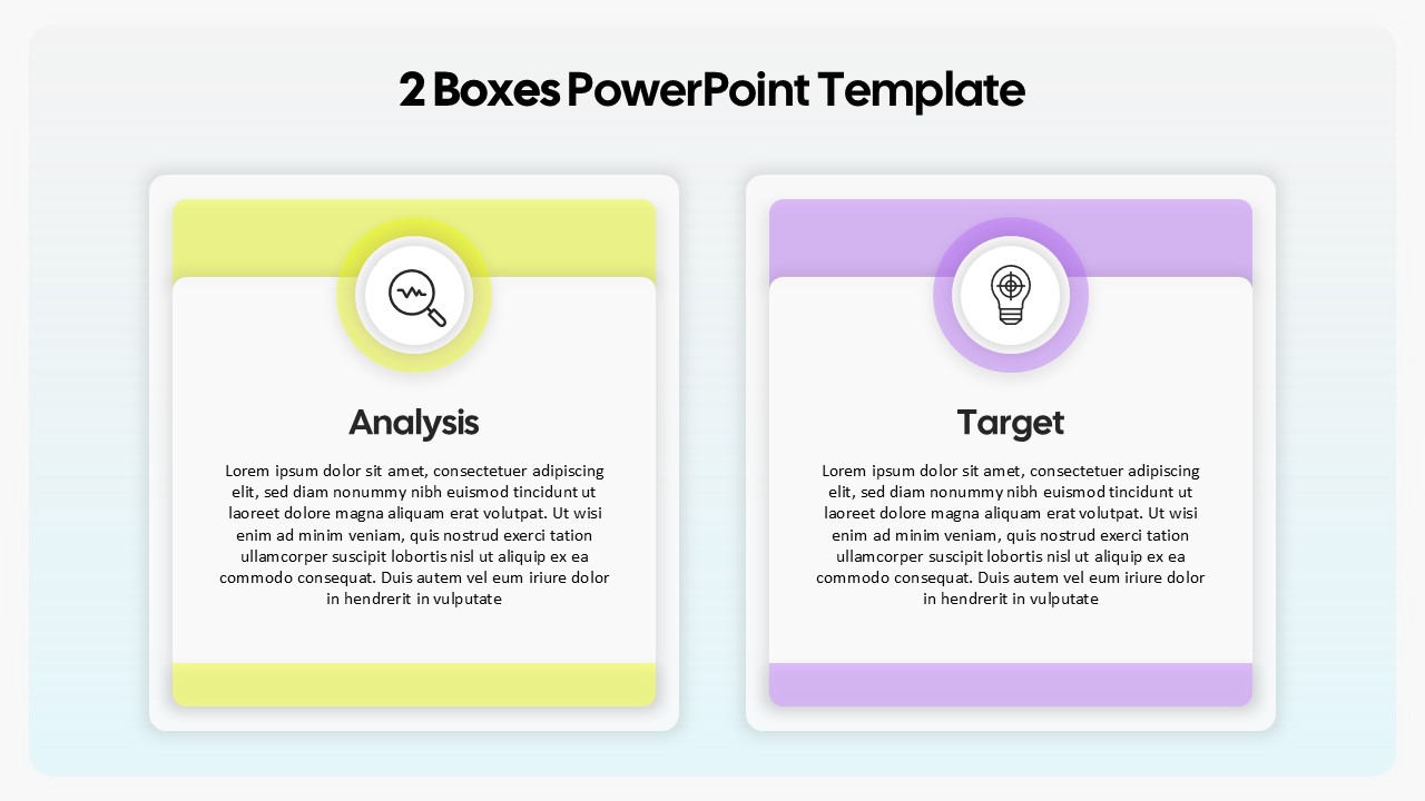
Two-Box Analysis & Target Comparison Template for PowerPoint & Google Slides
Comparison
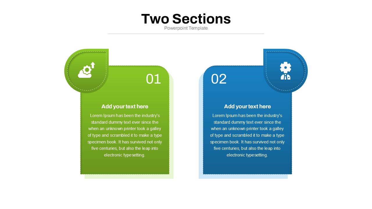
Two Section Comparison template for PowerPoint & Google Slides
Business Proposal
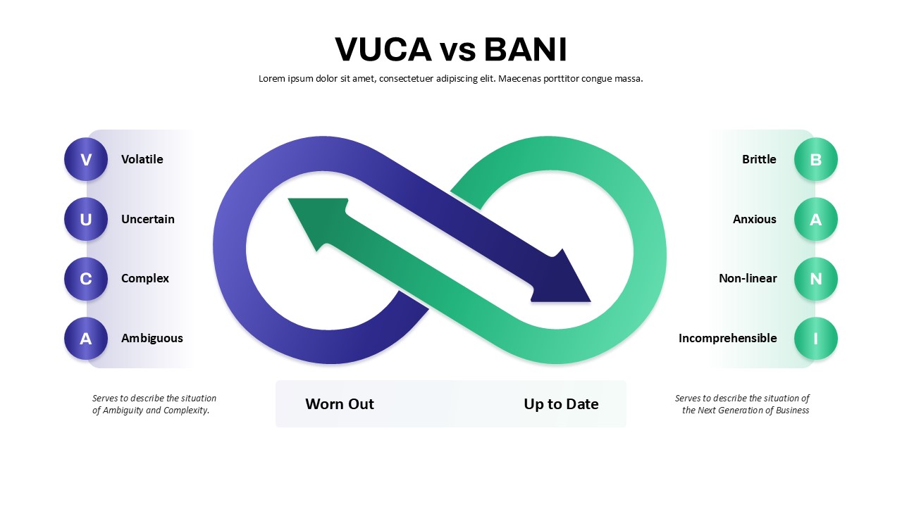
VUCA vs BANI Comparison Infographic Template for PowerPoint & Google Slides
Comparison
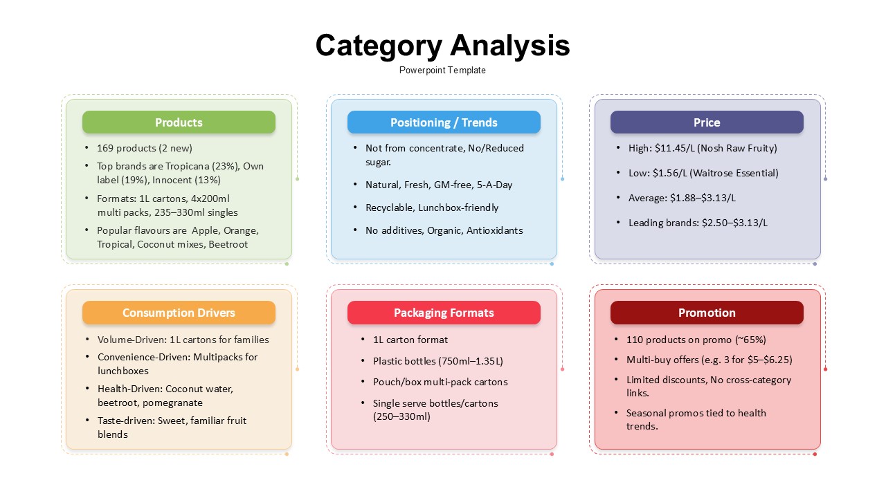
Category Analysis Comparison Infographic Template for PowerPoint & Google Slides
Comparison
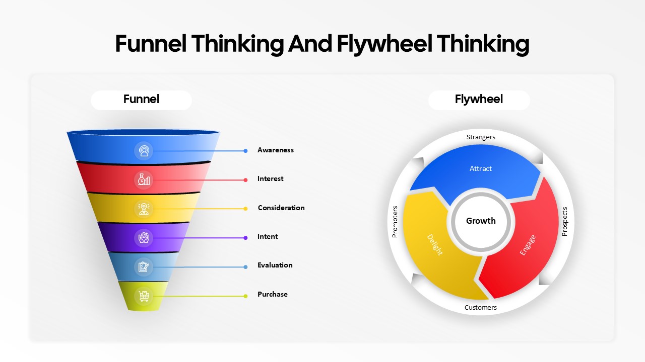
Funnel and Flywheel Thinking Comparison template for PowerPoint & Google Slides
Infographics
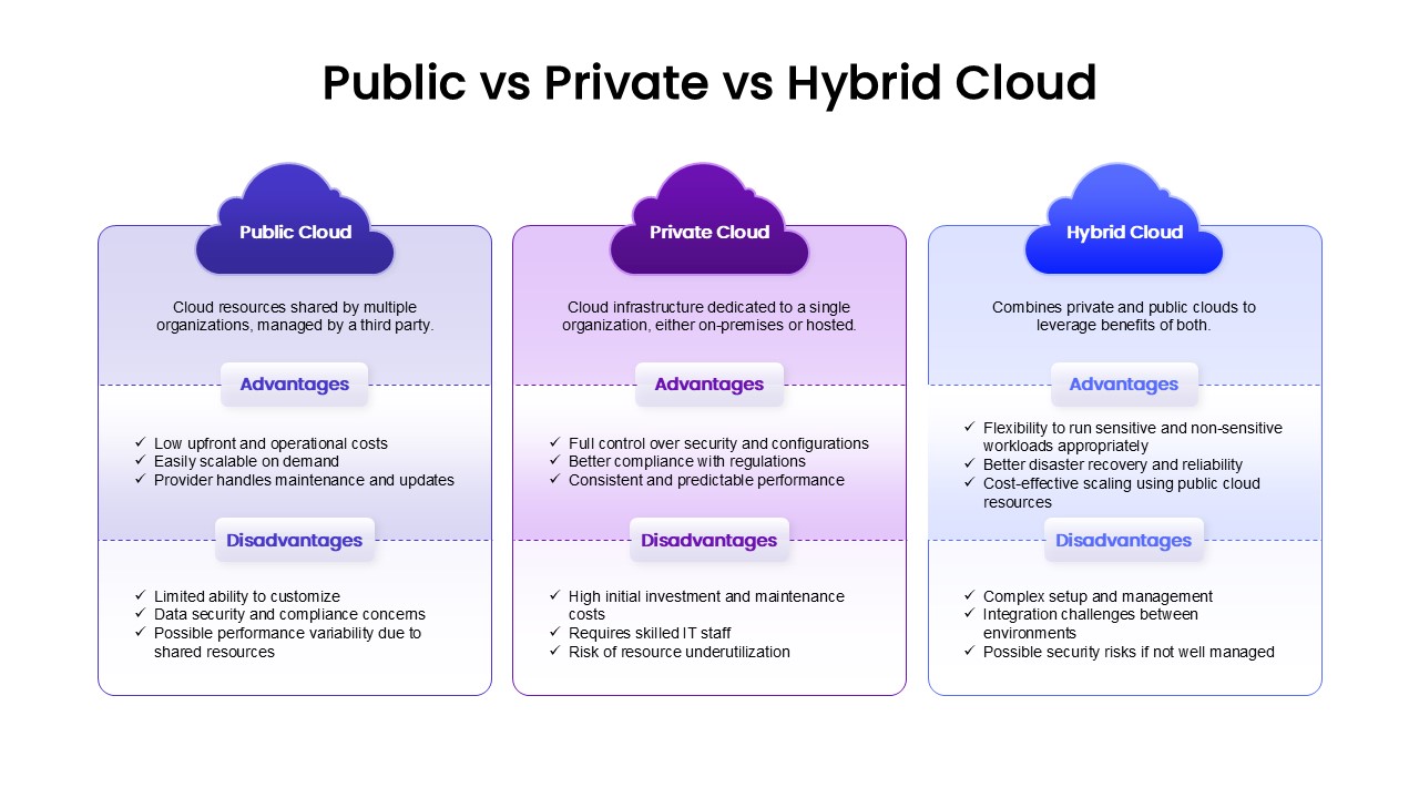
Public, Private & Hybrid Cloud Comparison Template for PowerPoint & Google Slides
Cloud Computing
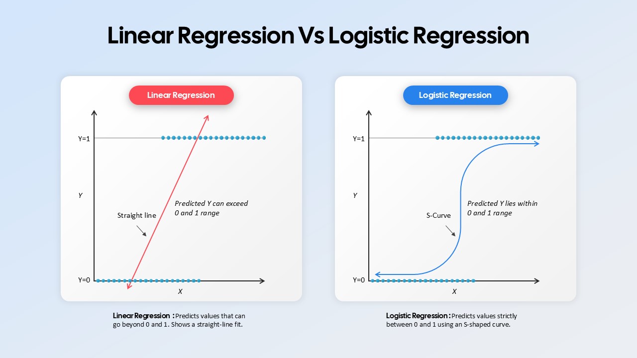
Linear Regression vs Logistic Regression Comparison template for PowerPoint & Google Slides
Comparison
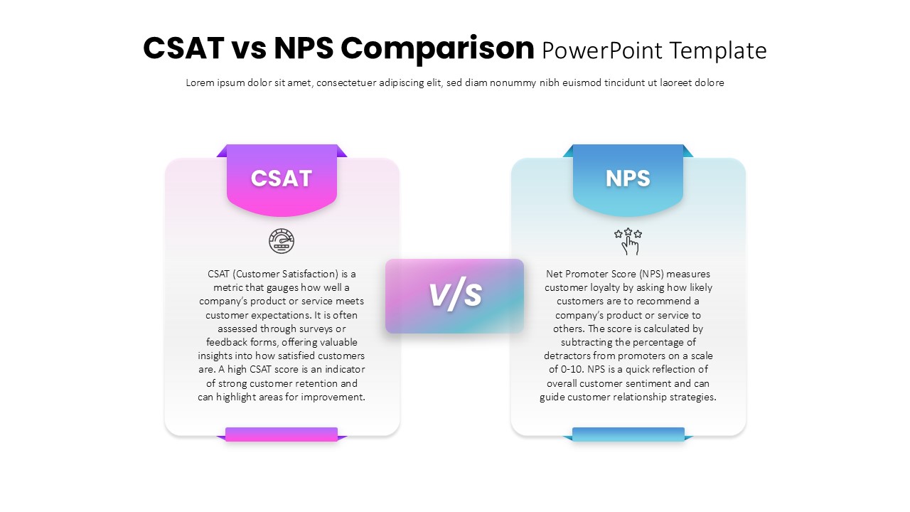
CSAT vs NPS Comparison template for PowerPoint & Google Slides
Business Strategy
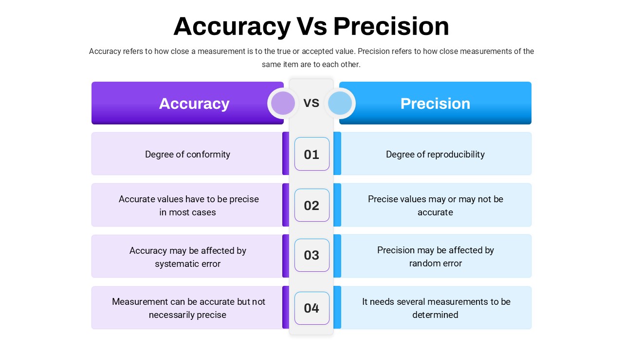
Accuracy Vs Precision Comparison Template for PowerPoint & Google Slides
Comparison Chart
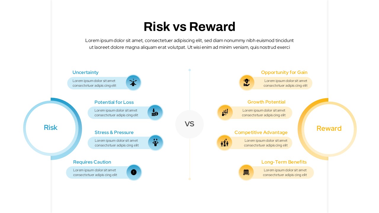
Risk vs Reward Comparison Template for PowerPoint & Google Slides
Opportunities Challenges
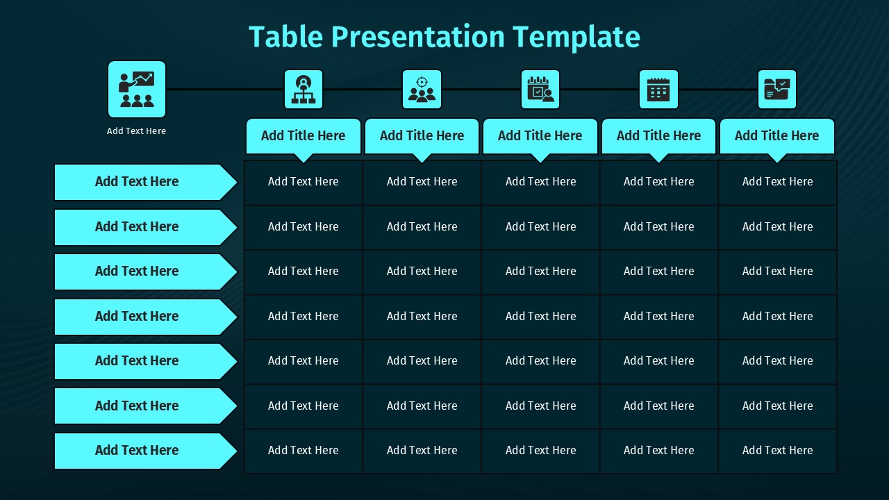
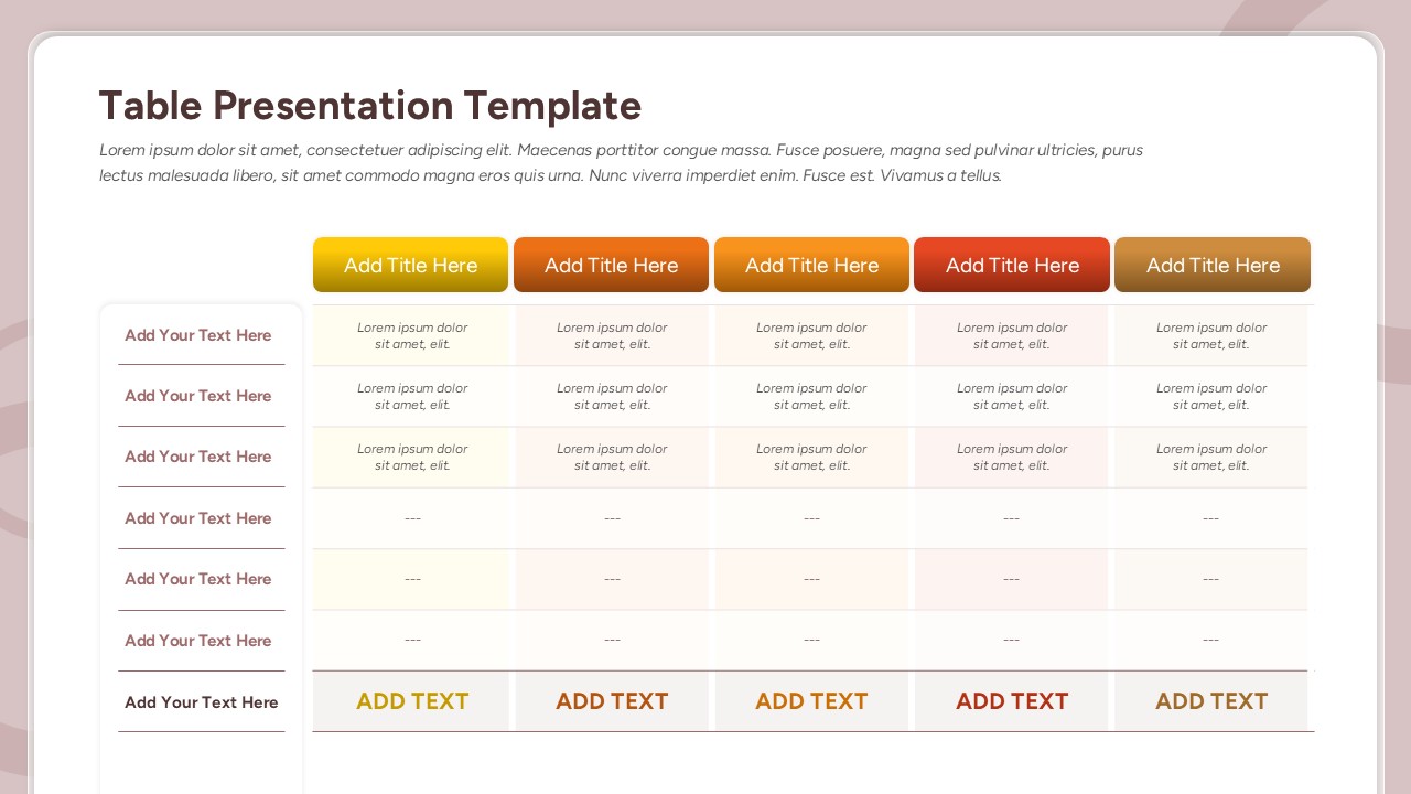
Comparison Table Presentation Template for PowerPoint & Google Slides
Table
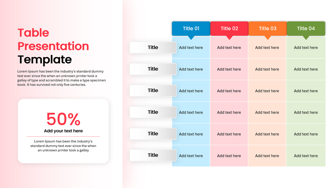
Colorful Comparison Table Presentation Template for PowerPoint & Google Slides
Table
Five Column Comparison Table Layout Template for PowerPoint & Google Slides
Comparison
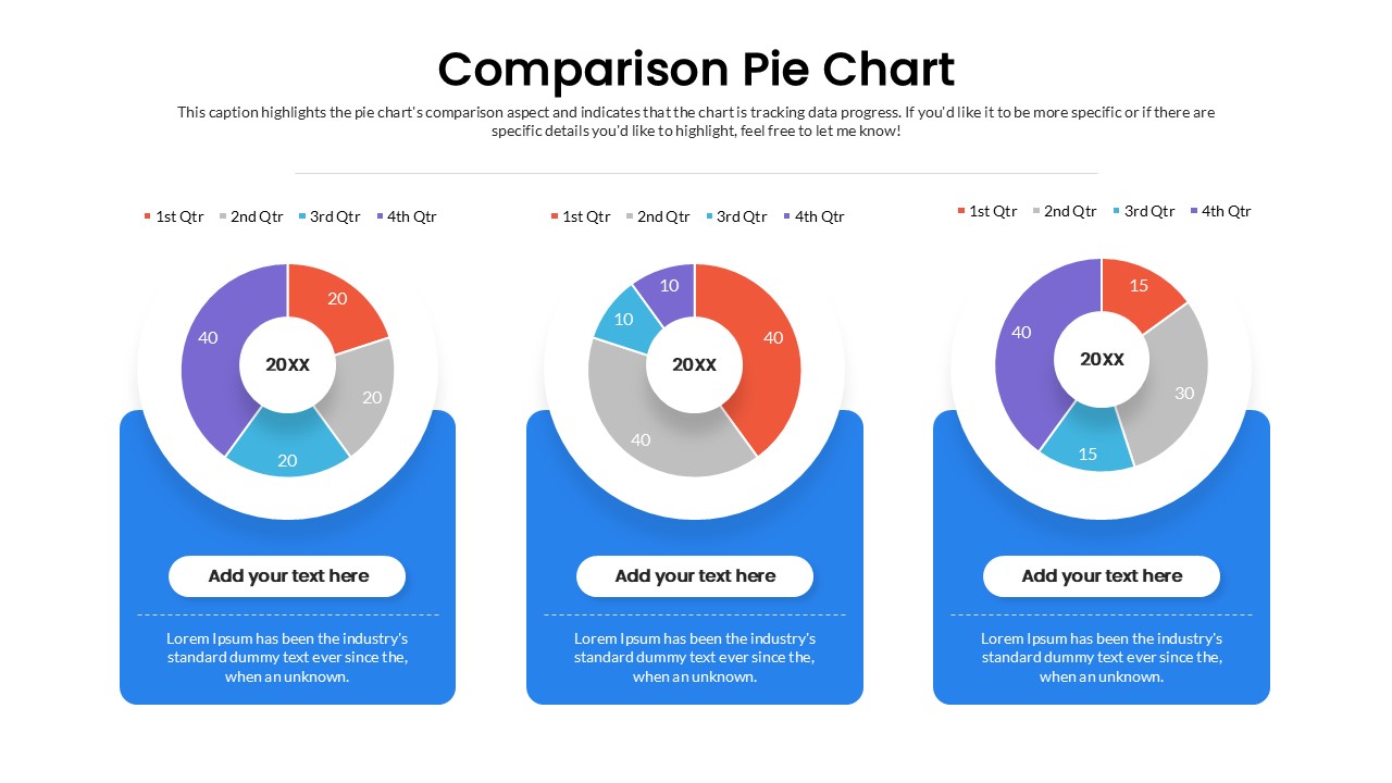
Quarterly Comparison Pie Chart Template for PowerPoint & Google Slides
Pie/Donut
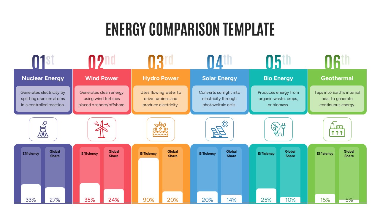
Energy Comparison Template for PowerPoint & Google Slides
Comparison
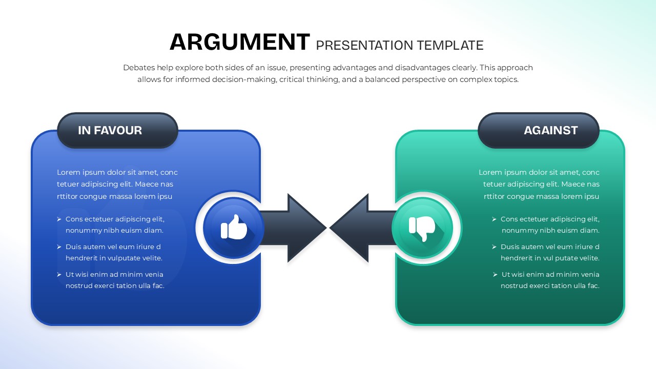
Argument Comparison Template for PowerPoint & Google Slides
Comparison