Modern Project Status Report Dashboard Template for PowerPoint & Google Slides


Description
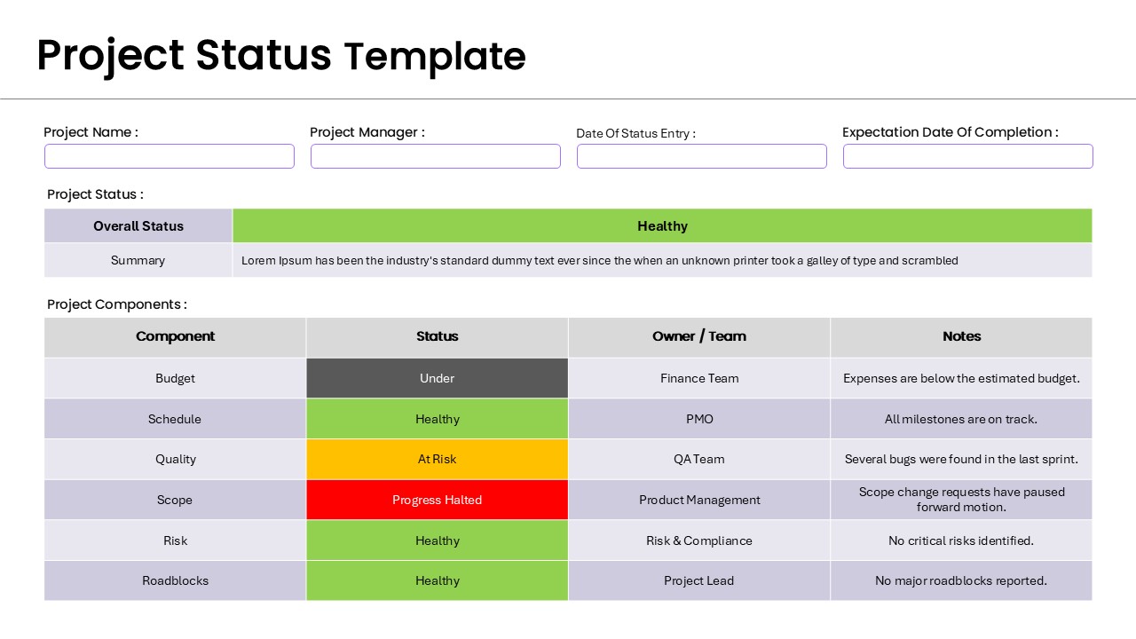
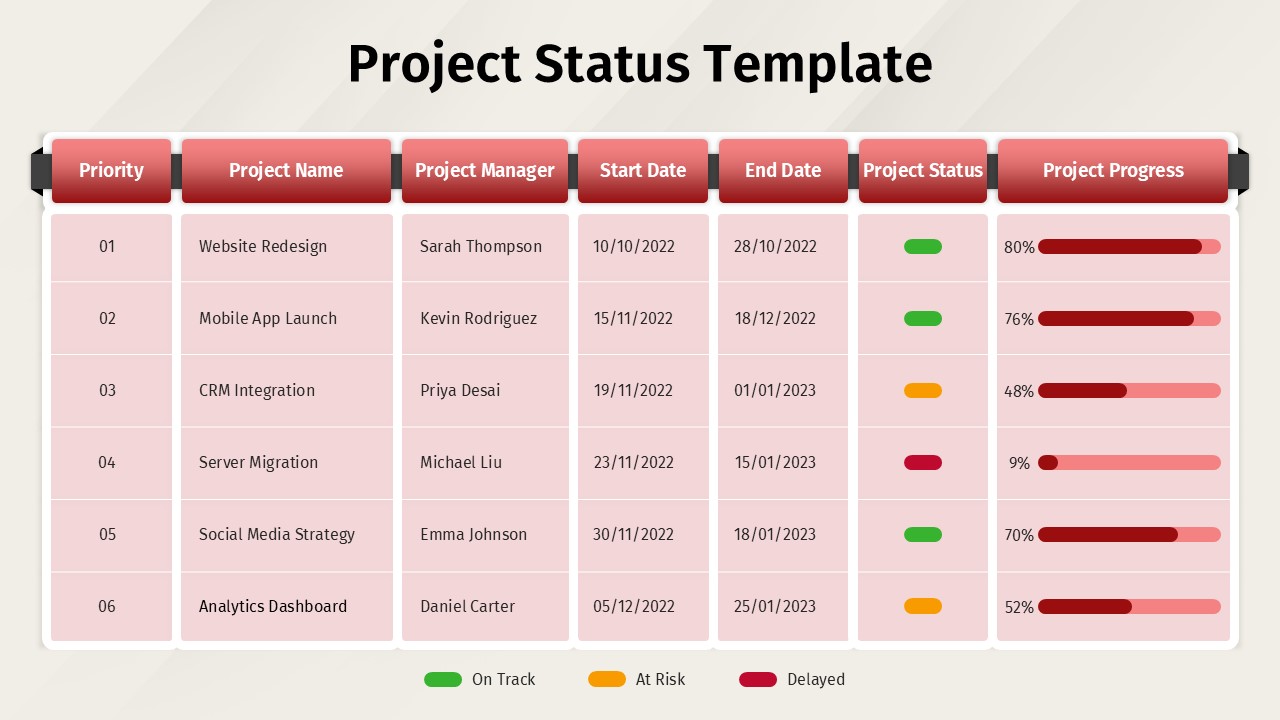
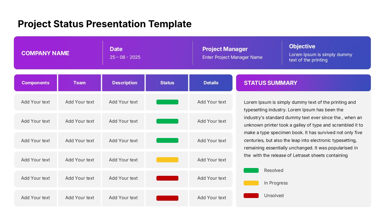
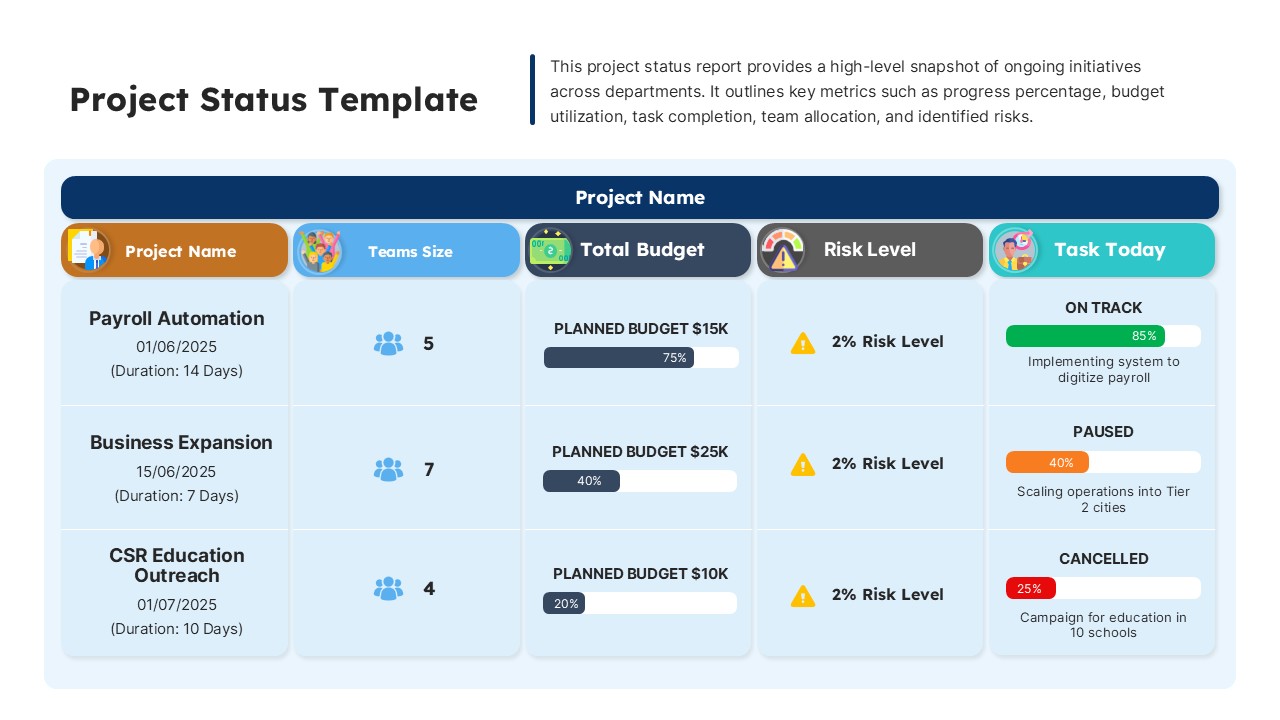
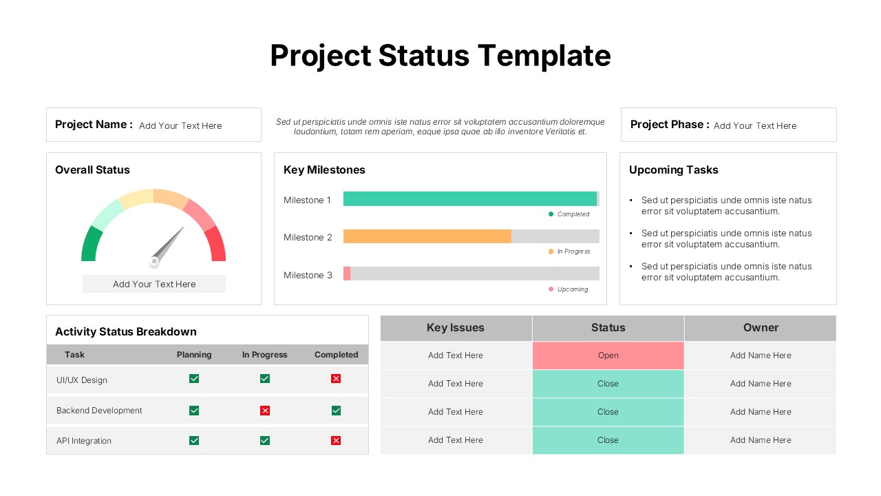
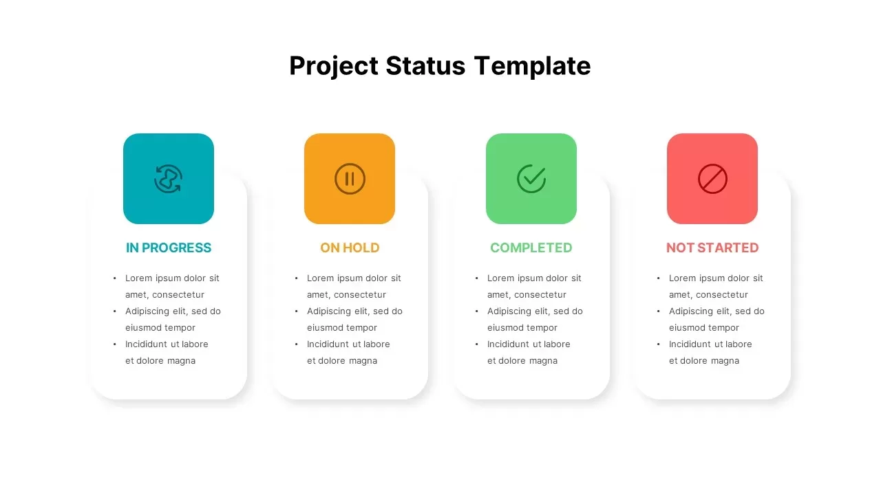
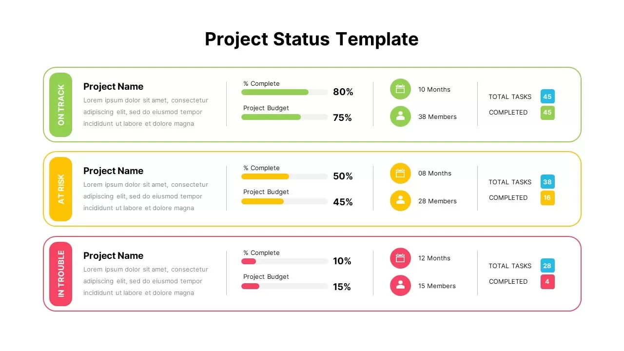
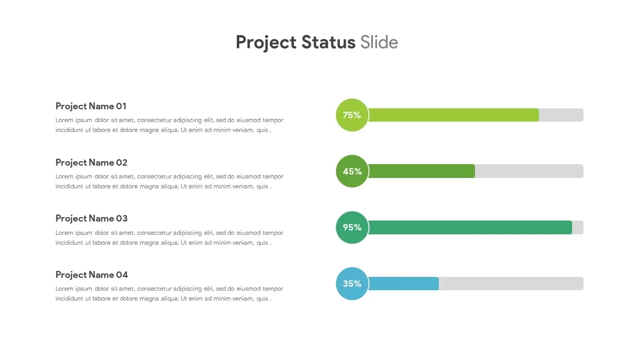
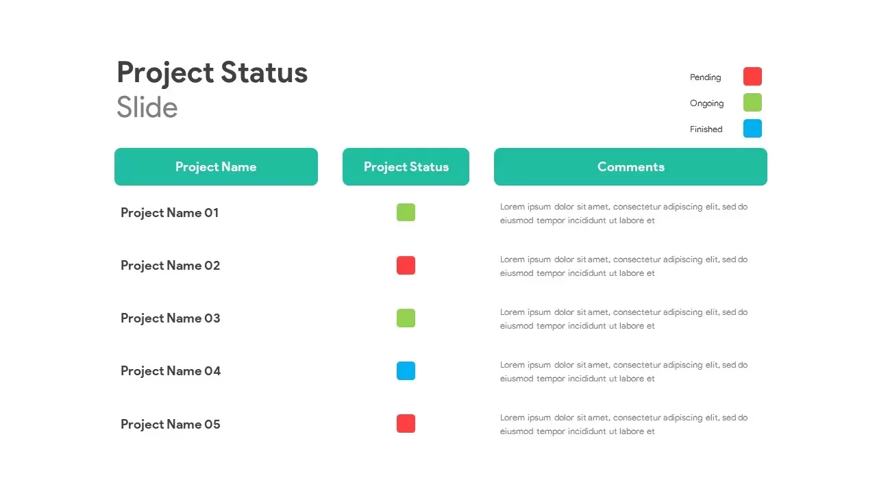
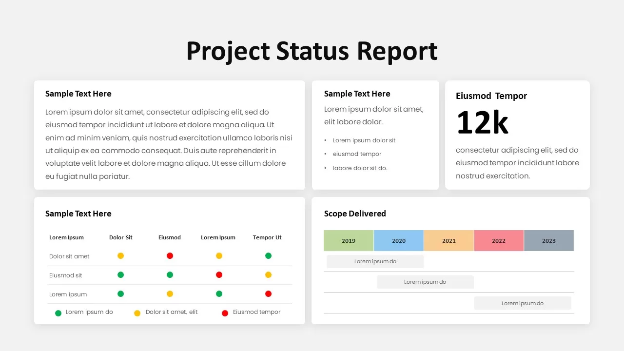
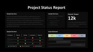
Keep stakeholders informed with this modern project status report dashboard slide that combines key updates, metrics, and timelines into a single, easy-to-read layout. The top row features three summary cards—a large text block for project highlights, a bullet-list card for progress notes, and a bold KPI card displaying headline figures—each rendered on crisp white rounded rectangles with subtle drop shadows. Beneath, a traffic-light matrix uses green, yellow, and red dot indicators to track task statuses across categories, accompanied by a clear legend. Adjacent, a horizontal scope-delivered chart maps deliverables from 2019 to 2023 in color-coded bars that align with your timeline, making it effortless to visualize past accomplishments and upcoming milestones.
Fully editable in both PowerPoint and Google Slides, every element—from text placeholders, bullet styles, and dot indicators to bar-chart colors and date labels—can be tailored in seconds. Swap out the KPI number, adjust the matrix columns, or extend the scope chart with extra bars using built-in alignment guides and lockable layers that preserve spacing and consistency. The clean sans-serif typography hierarchy—bold black headings paired with medium-gray body text—ensures readability on screens and projectors, while high-resolution vector shapes maintain crisp fidelity across devices.
Leverage optional animation presets to reveal each section sequentially, guiding audiences through highlights, detailed notes, and data visualizations step by step. The slide’s neutral palette adapts seamlessly to light or dark themes, and its intuitive master-slide structure eliminates version-control headaches, accelerating your presentation prep.
Whether you’re delivering weekly standups, executive briefings, or client updates, this project status report dashboard streamlines communication, highlights critical insights, and keeps every stakeholder aligned on progress and next steps.
Who is it for
Project managers, program leads, and PMO teams will benefit from this status dashboard slide when presenting progress updates, risk assessments, and KPI overviews. Consultants, executives, and client-facing teams can leverage its clear visuals to drive data-informed decisions and foster transparency.
Other Uses
Beyond status reporting, repurpose this slide as an executive summary, performance review dashboard, or risk-heat-map overview. Use the traffic-light matrix to flag issues in operations, customer support, or quality metrics, and adapt the scope chart for budget tracking or resource allocation timelines.
Login to download this file

Item ID
SB02273
Related Templates

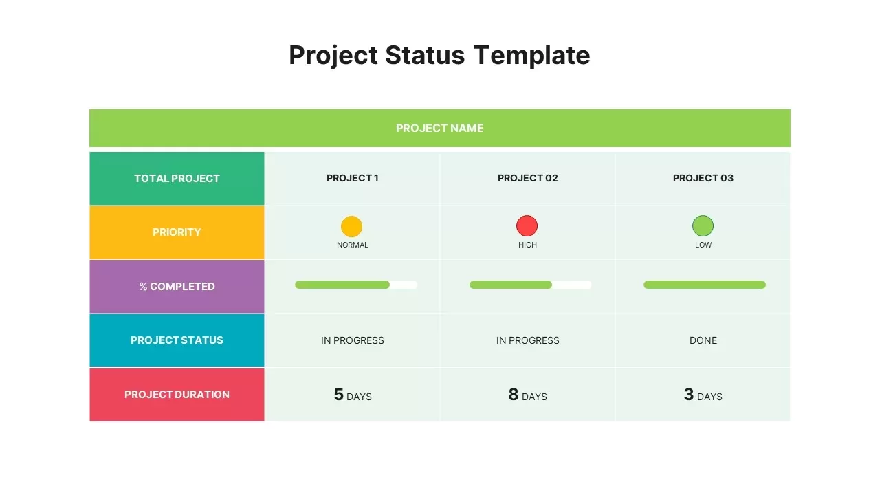
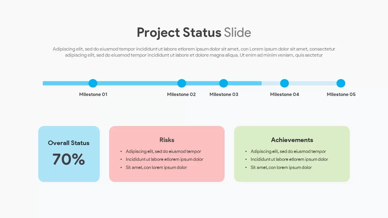
Project Status Dashboard Report Template for PowerPoint & Google Slides
Project Status
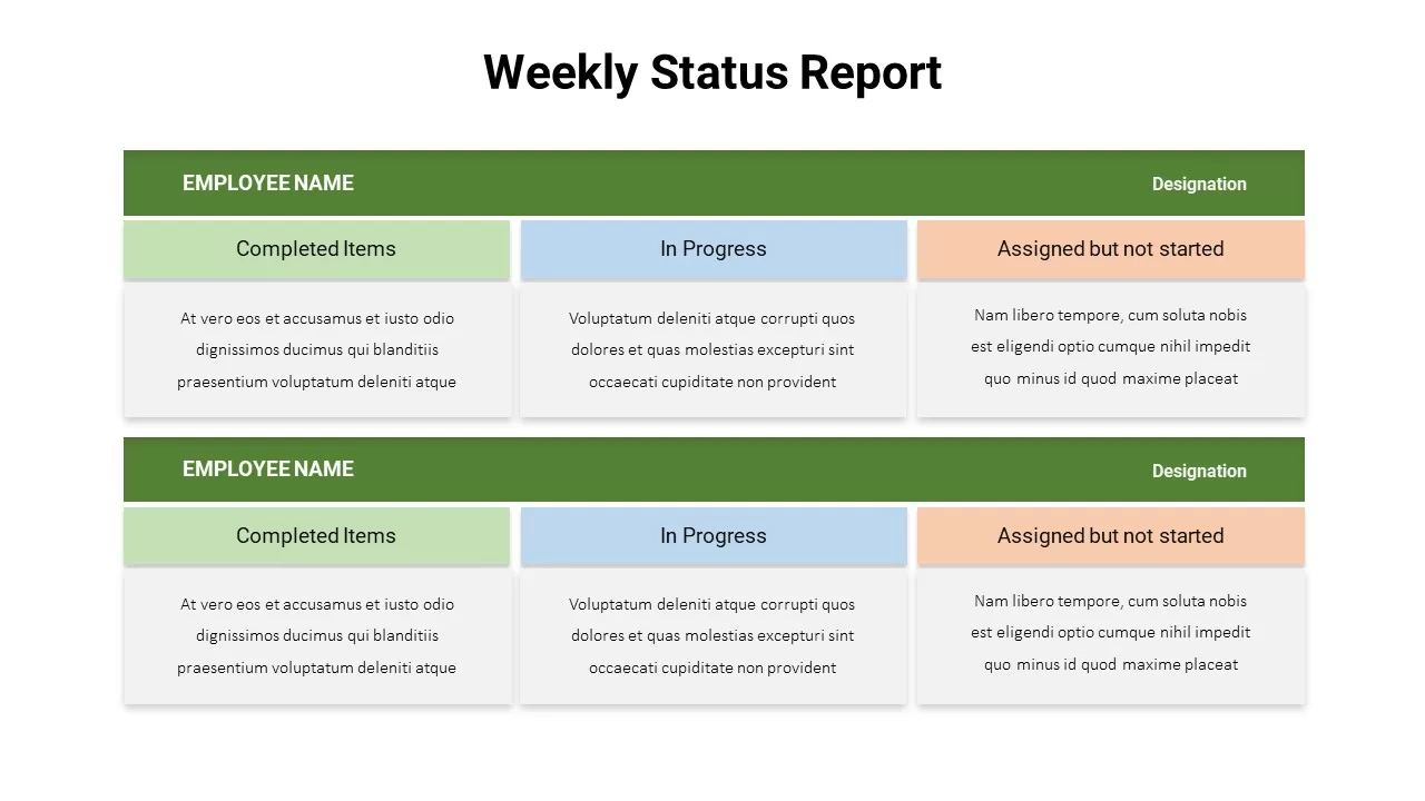
Weekly Status Report Dashboard Template for PowerPoint & Google Slides
HR
Project Status Dashboard Table Template for PowerPoint & Google Slides
Project Status
Project Status Dashboard with Metrics Template for PowerPoint & Google Slides
Project Status
Colorful Project Status Dashboard Template for PowerPoint & Google Slides
Project Status
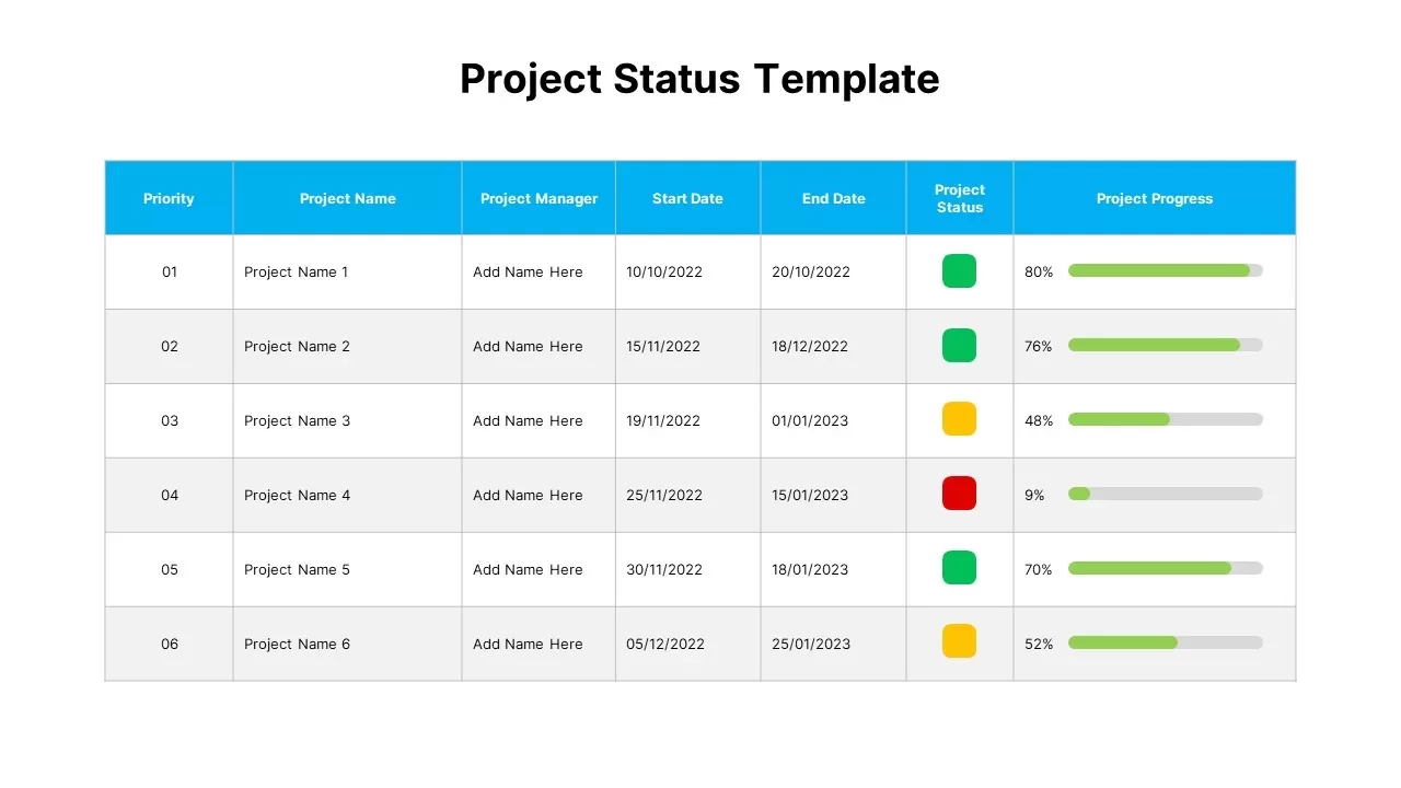
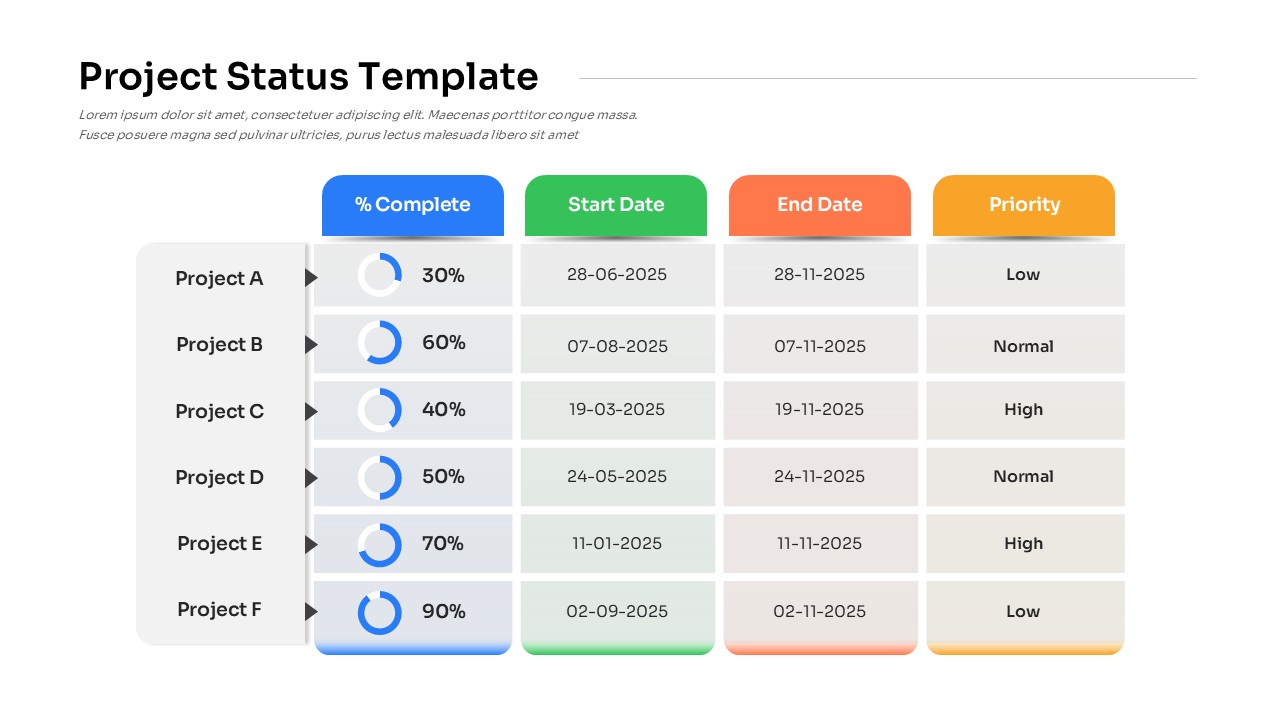
Project Status Dashboard Template for PowerPoint & Google Slides
Project Status
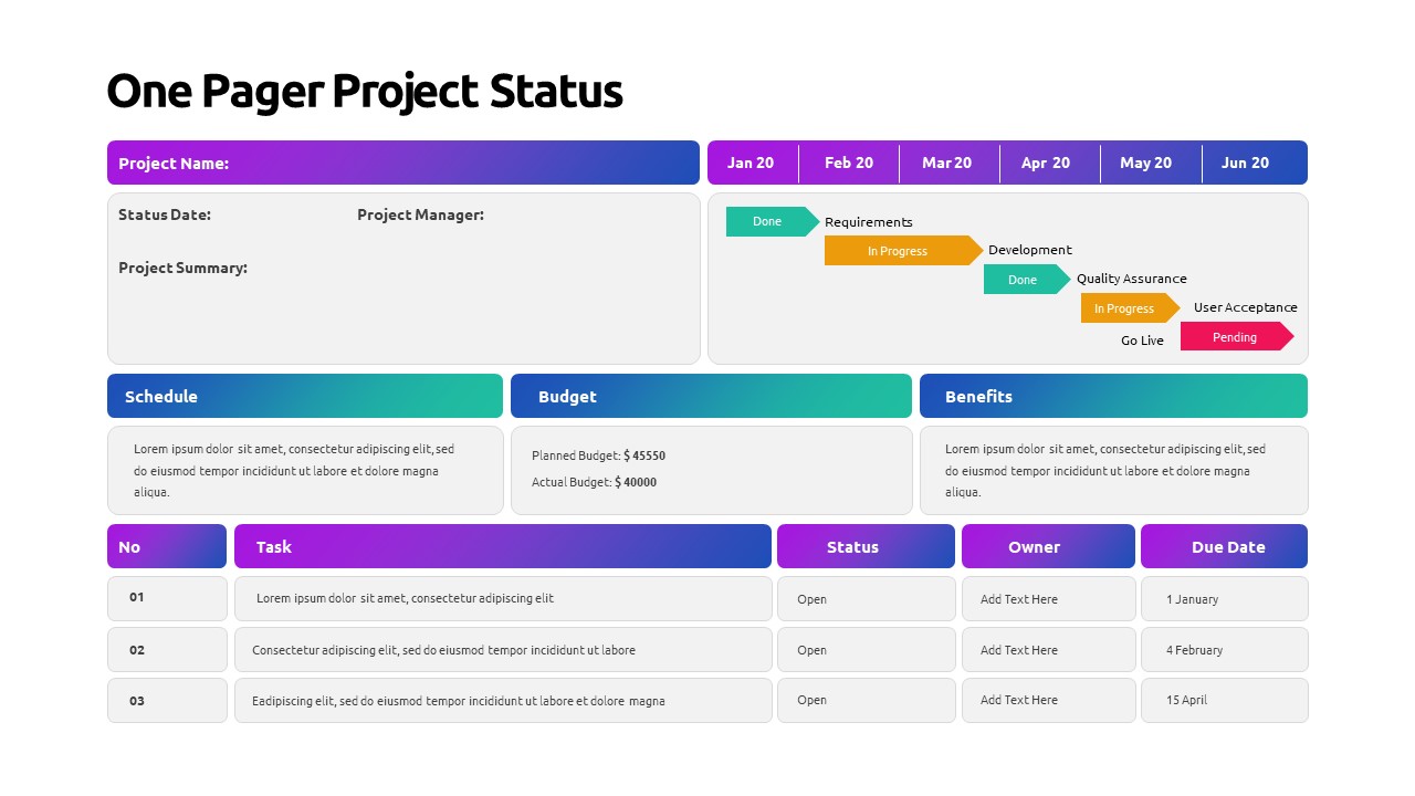
One Pager Project Status Dashboard Template for PowerPoint & Google Slides
Project Status
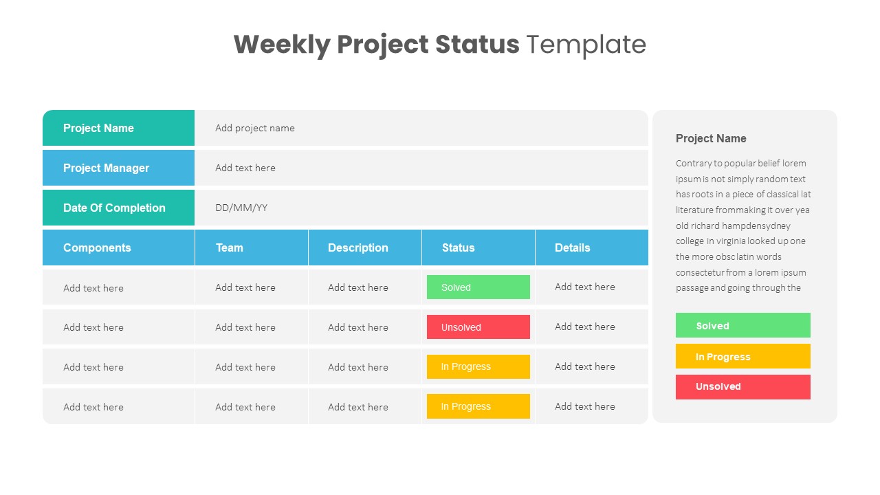
Weekly Project Status Dashboard Template for PowerPoint & Google Slides
Project Status
Project Status Update Dashboard Table Template for PowerPoint & Google Slides
Project Status
Project Status Dashboard Template for PowerPoint & Google Slides
Project Status
Dashboard Project Status Template for PowerPoint & Google Slides
Project Status
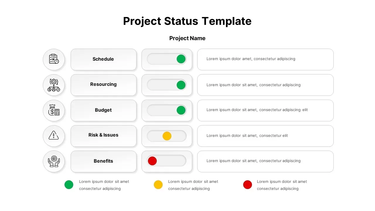
Project Status Template Dashboard with Gauge for PowerPoint & Google Slides
Project Status
Project Status Dashboard with RAG Legend Template for PowerPoint & Google Slides
Project Status
Free Simple Weekly Project Status Report Template for PowerPoint & Google Slides
Project Status
Free
Comprehensive Project Status Report Template for PowerPoint & Google Slides
Project Status
Project Status Report Tracker Slide for PowerPoint & Google Slides
Project Status
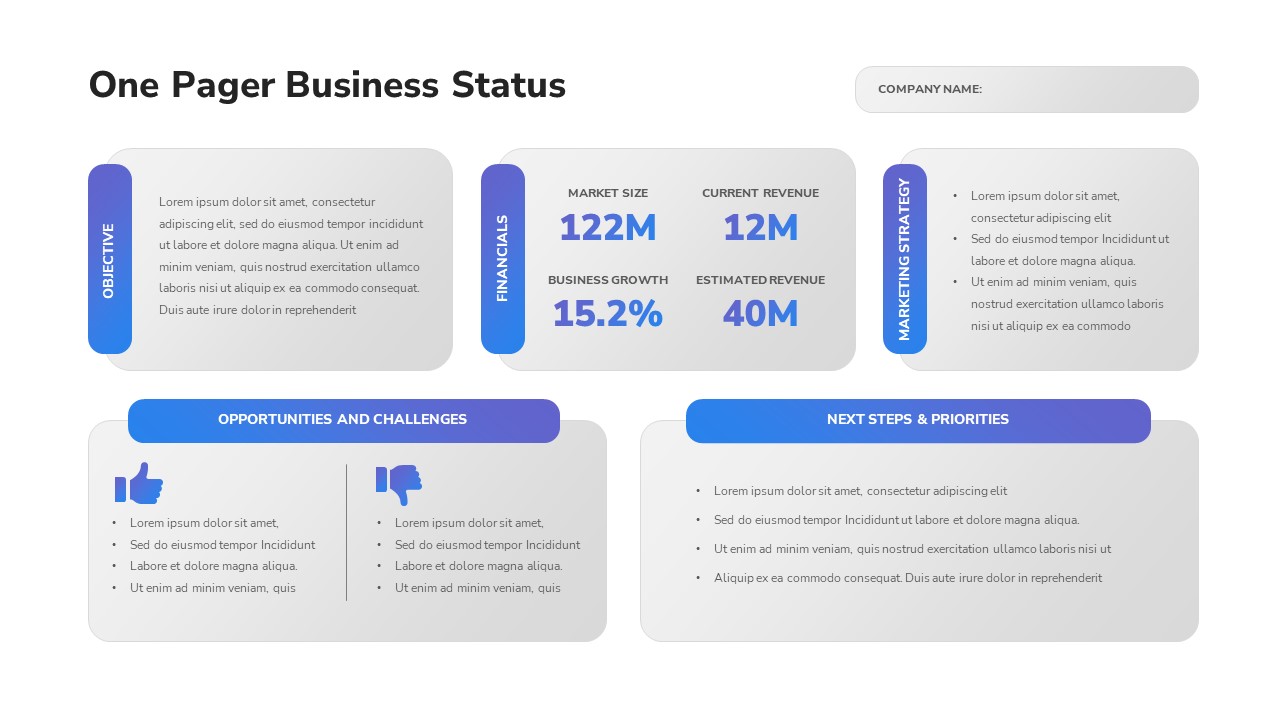
One-Pager Business Status Report Slide Template for PowerPoint & Google Slides
Business Report
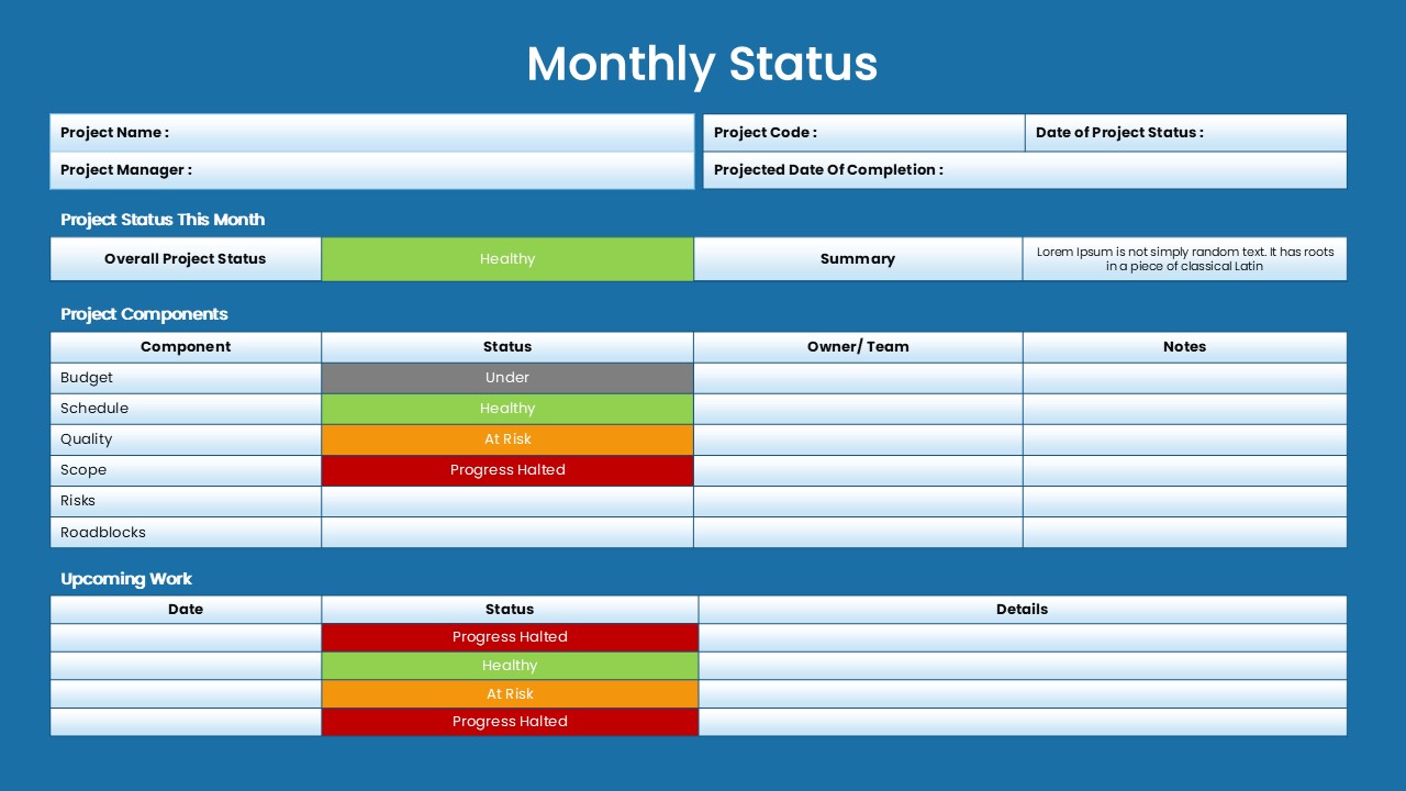
Monthly Status Report Template for PowerPoint & Google Slides
Project Status
One Pager Annual Report Dashboard Template for PowerPoint & Google Slides
Business Report
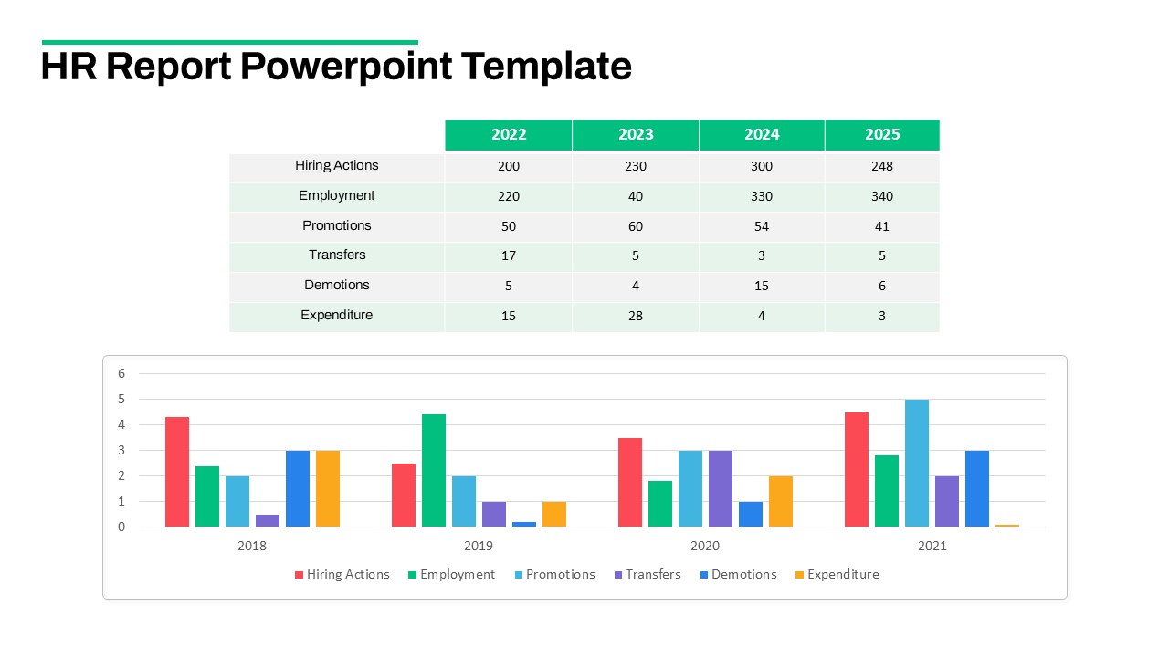
HR Report Dashboard Template for PowerPoint & Google Slides
Employee Performance

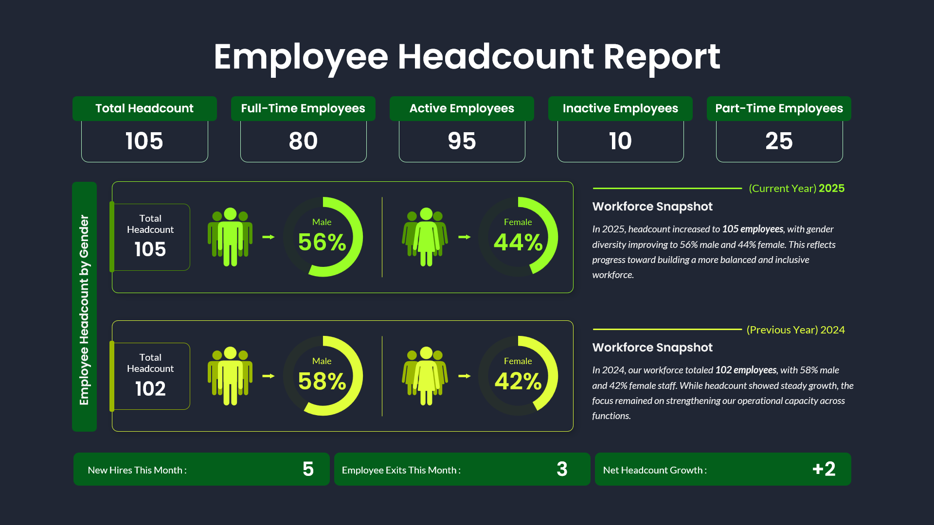
Employee Headcount Dashboard Report Template for PowerPoint & Google Slides
Employee Performance
Clean Minimal Project Status Update Template for PowerPoint & Google Slides
Project
Color-Coded Project Status Template for PowerPoint & Google Slides
Project Status
Color-Coded Project Status Slide Template for PowerPoint & Google Slides
Project Status
Project Status Table Template for PowerPoint & Google Slides
Project Status
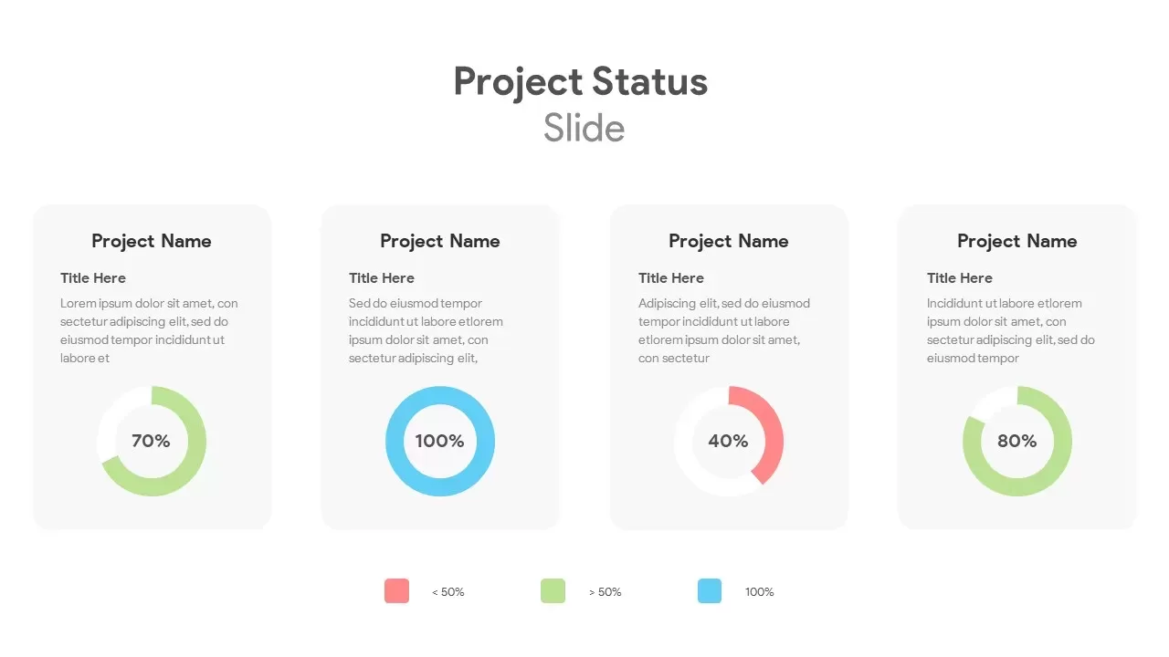
Circular Project Status Template for PowerPoint & Google Slides
Project Status
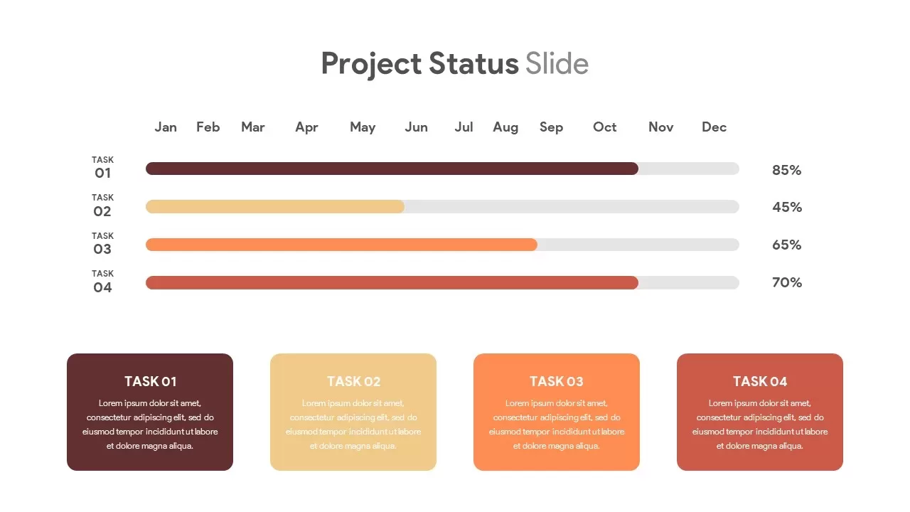
Horizontal Timeline Project Status Template for PowerPoint & Google Slides
Project Status
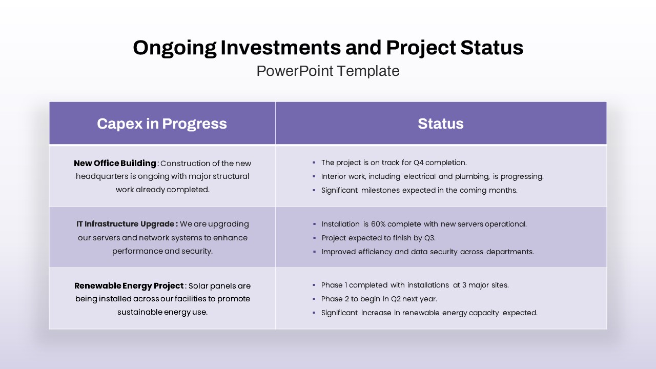
Ongoing Investments and Project Status Template for PowerPoint & Google Slides
Project Status
Dynamic Project Status Tracking Table Template for PowerPoint & Google Slides
Project Status
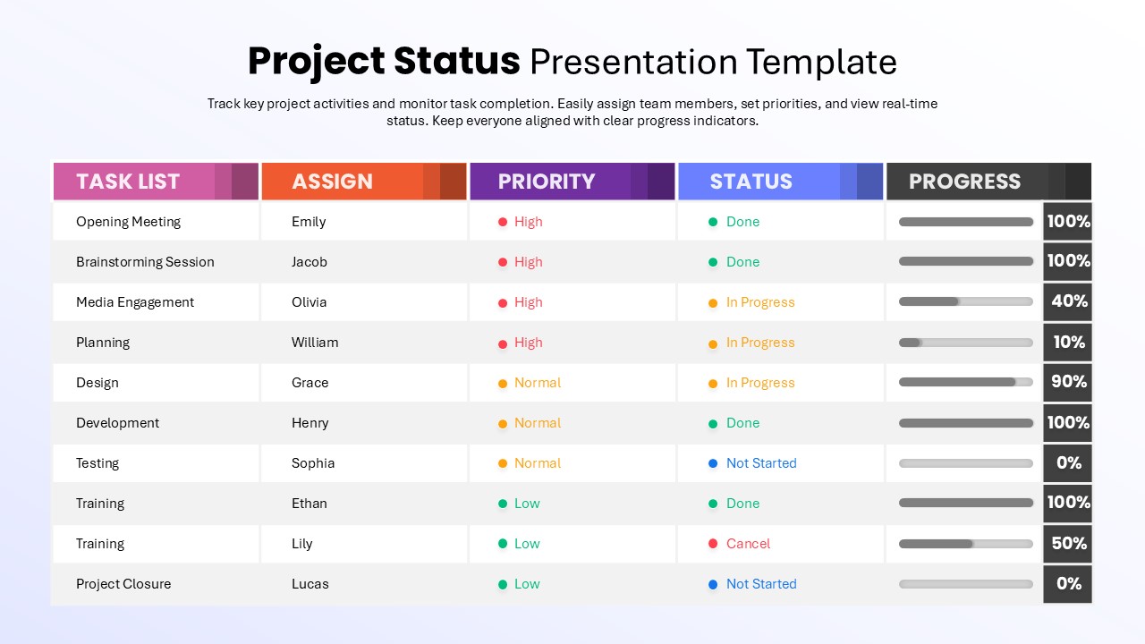
Project Status with Progress & Priority Template for PowerPoint & Google Slides
Table

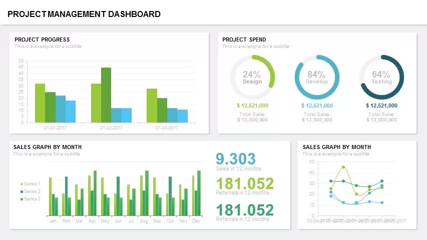
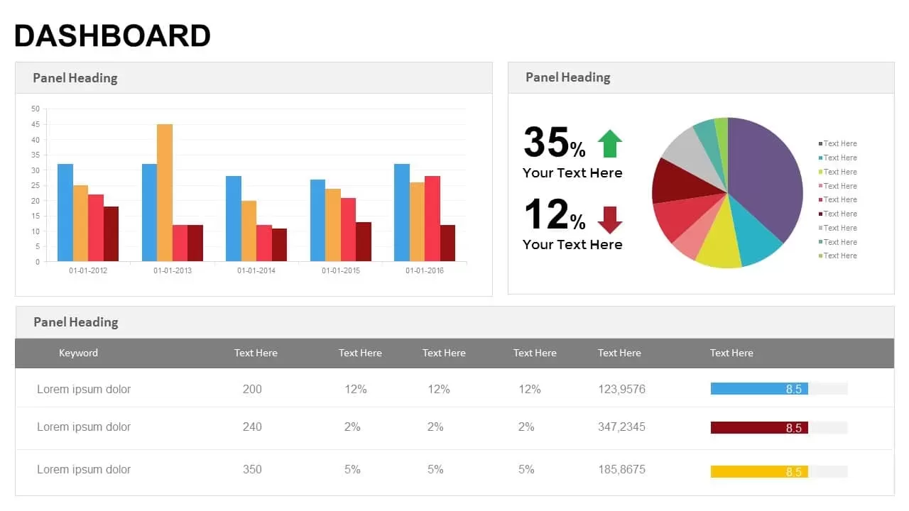
Project Management Dashboard Template for PowerPoint & Google Slides
Project
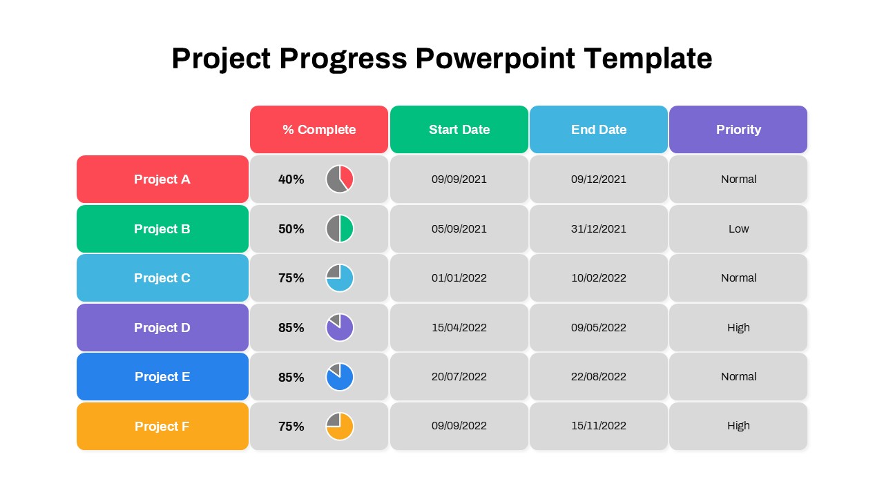
Project Progress Dashboard Pie Charts Template for PowerPoint & Google Slides
Project
Project Tracking Dashboard Table Template for PowerPoint & Google Slides
Project Status
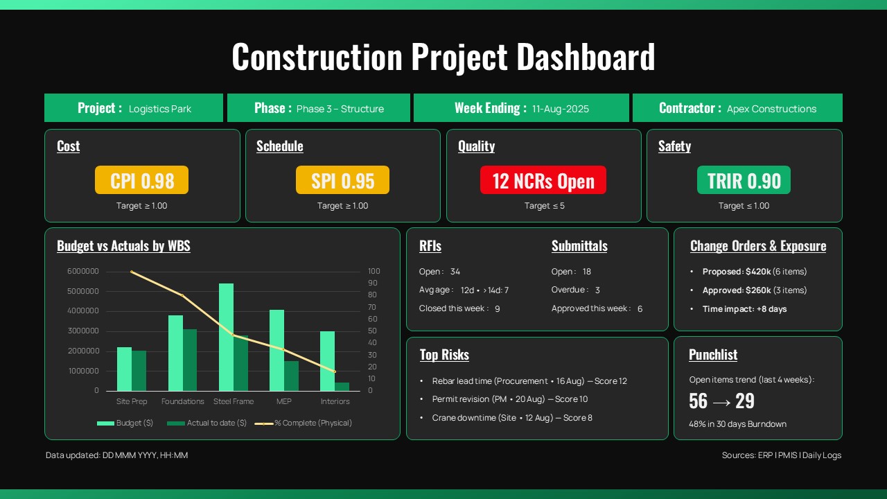
Construction Project Dashboard Template for PowerPoint & Google Slides
Project
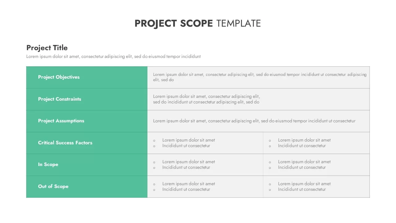
Modern Project Scope Template for PowerPoint & Google Slides
Project

Modern Construction Project Overview Template for PowerPoint & Google Slides
Pitch Deck
RAG Status Infographic Comparison Template for PowerPoint & Google Slides
Project
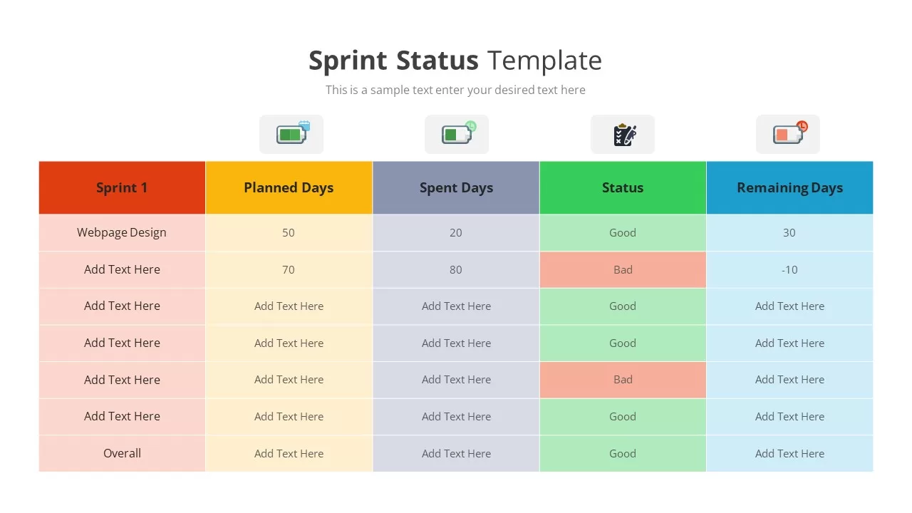
Sprint Status Tracking Template for PowerPoint & Google Slides
Infographics
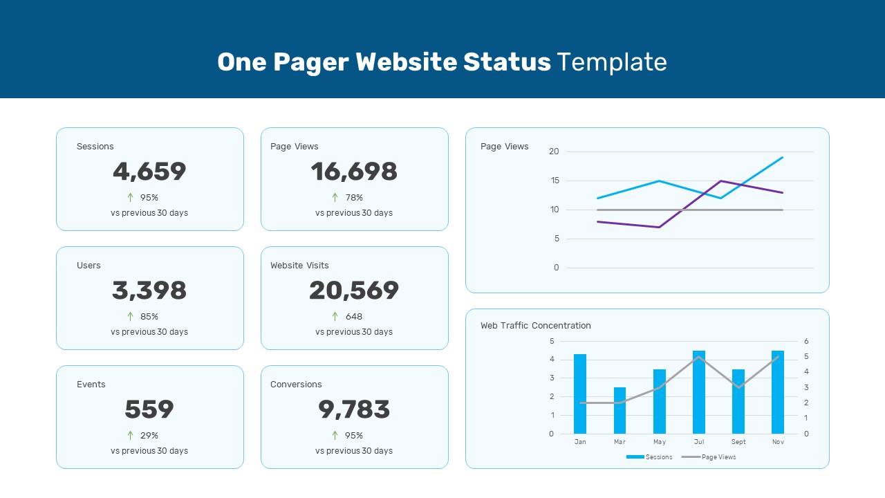
One Pager Website Status Template for PowerPoint & Google Slides
Digital Marketing
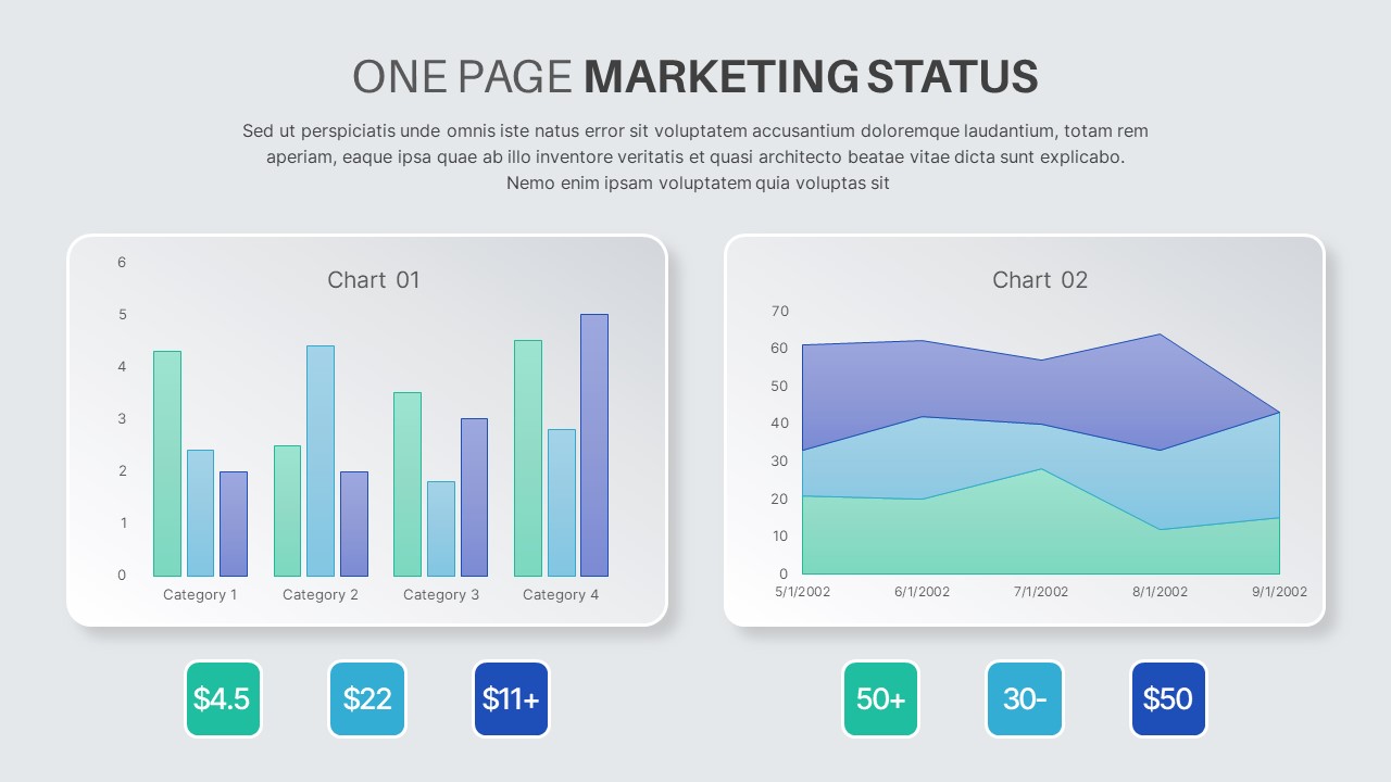
One Page Marketing Status Template for PowerPoint & Google Slides
Marketing
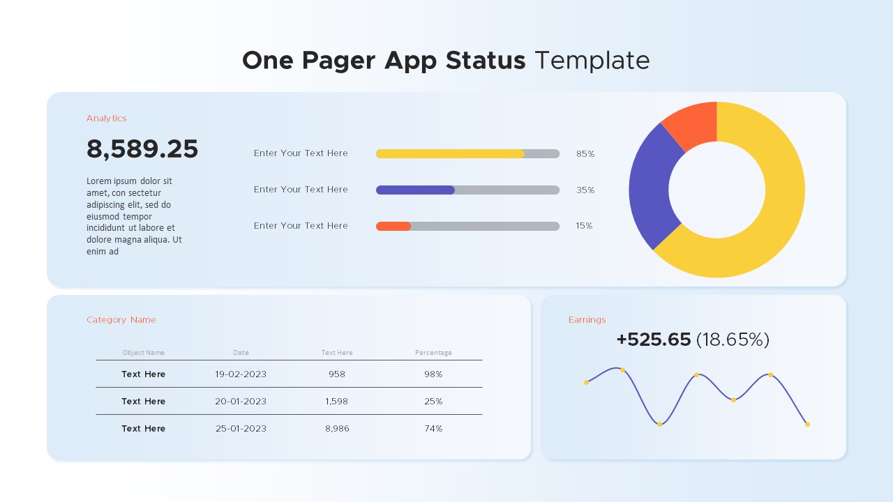
One Pager App Status template for PowerPoint & Google Slides
Business Report
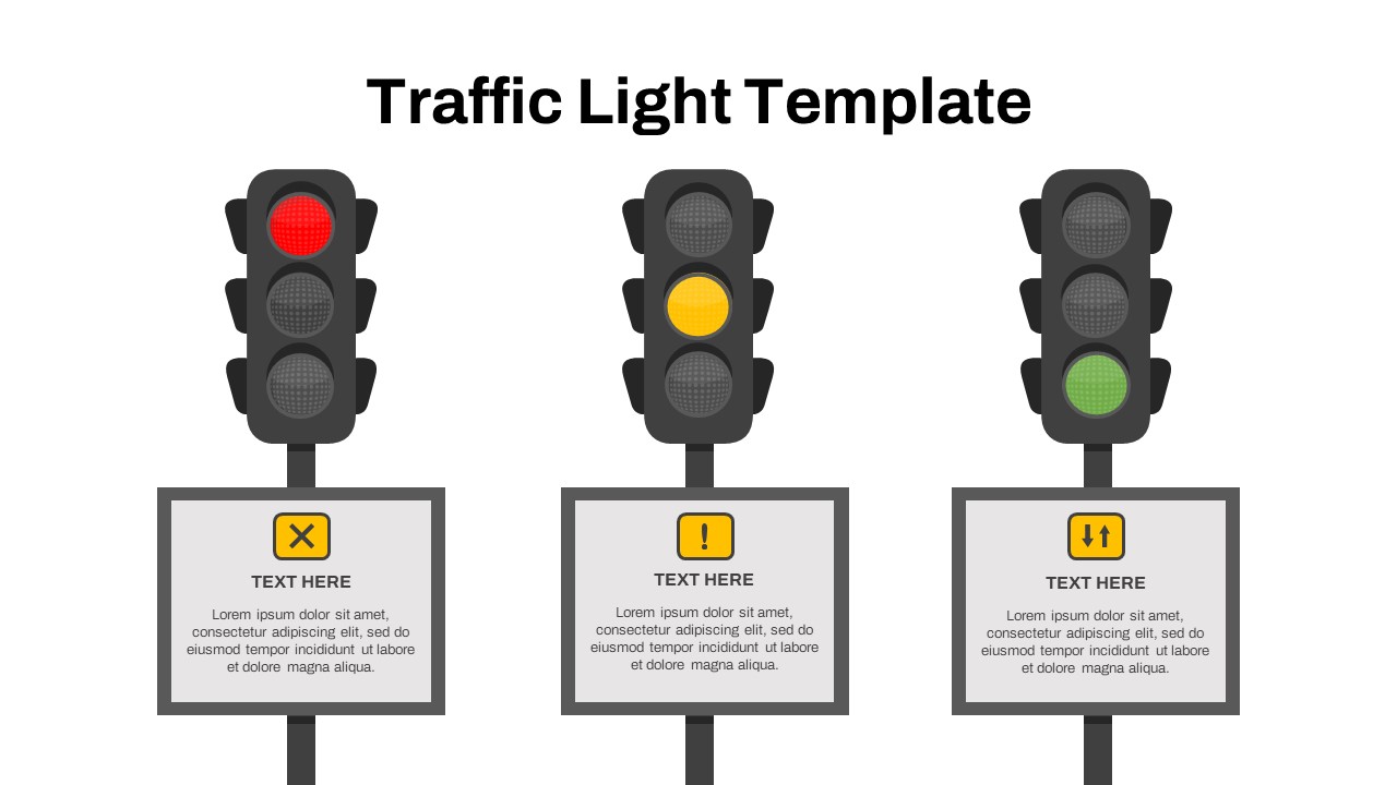
Free Traffic Light Status Indicator Slide Template for PowerPoint & Google Slides
Project Status
Free
Free Modern Gradient Wave Welcome Slides Template for PowerPoint & Google Slides
Free
Free
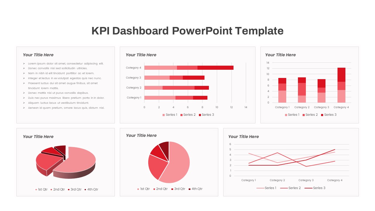
Free KPI Dashboard PowerPoint Template for PowerPoint & Google Slides
Charts
Free
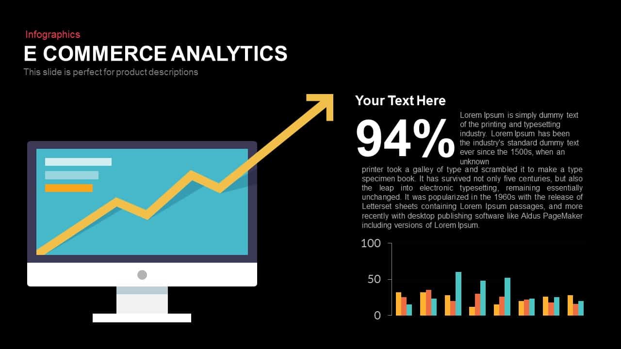
E-commerce Analytics Dashboard Template for PowerPoint & Google Slides
Bar/Column
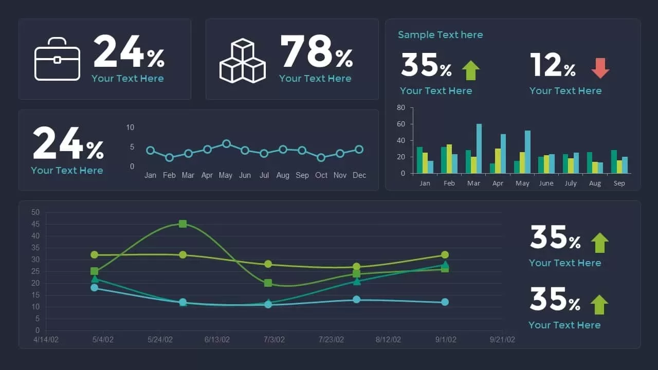
Dynamic Data Dashboard Infographic Template for PowerPoint & Google Slides
Bar/Column
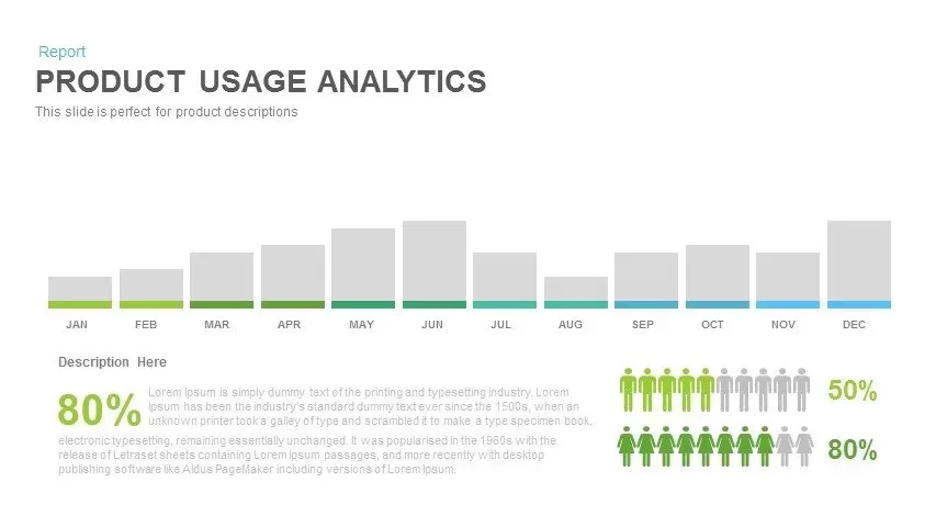
Product Usage Analytics Dashboard Chart Template for PowerPoint & Google Slides
Bar/Column
Data Analytics Dashboard Design template for PowerPoint & Google Slides
Bar/Column
Business Dashboard Analytics & KPIs Template for PowerPoint & Google Slides
Bar/Column

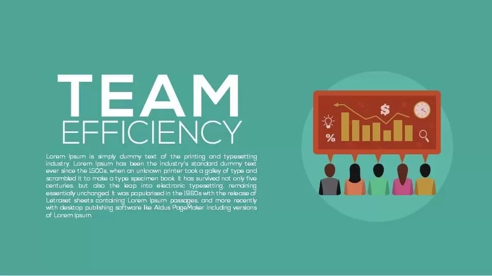
Professional Team Efficiency Dashboard Template for PowerPoint & Google Slides
Business Report
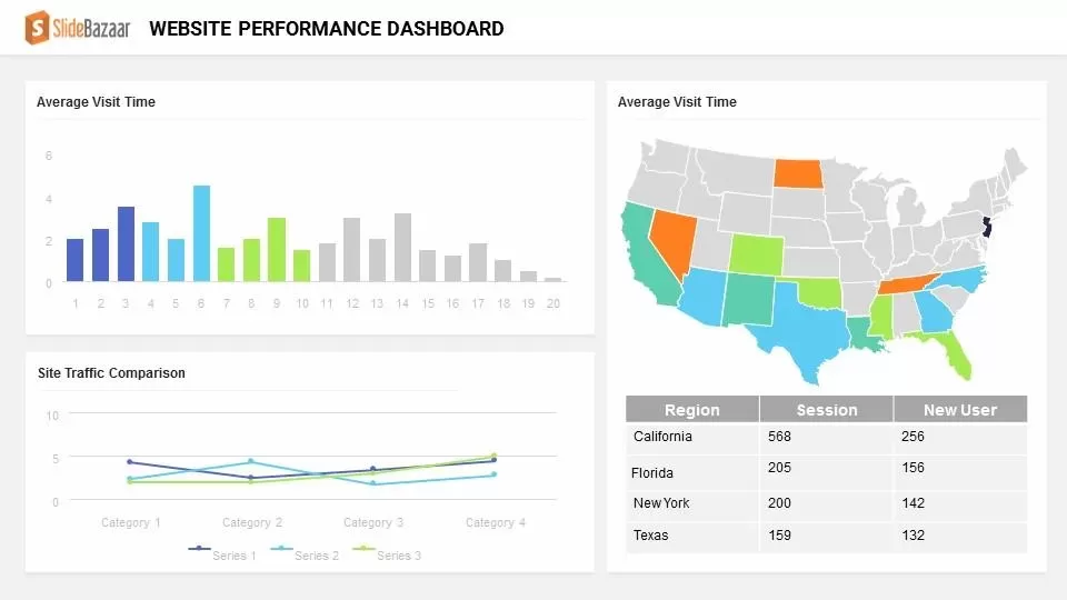
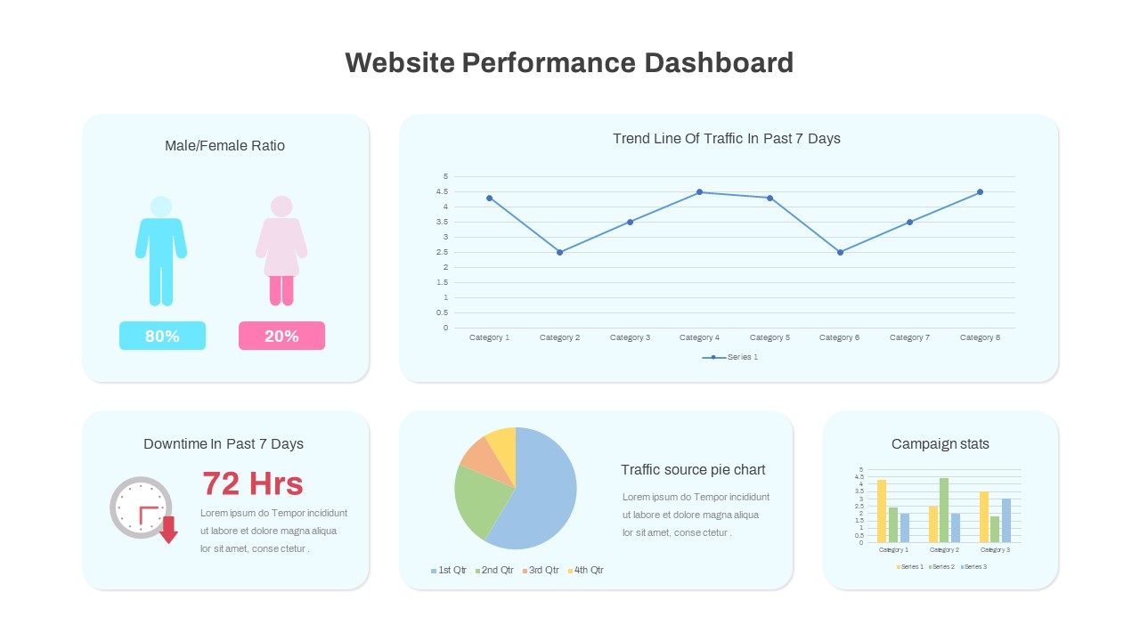
Website Performance Dashboard template for PowerPoint & Google Slides
Charts
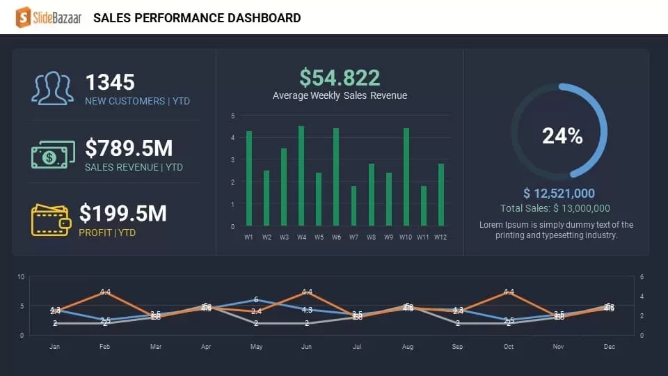
Sales Performance Dashboard template for PowerPoint & Google Slides
Business Report
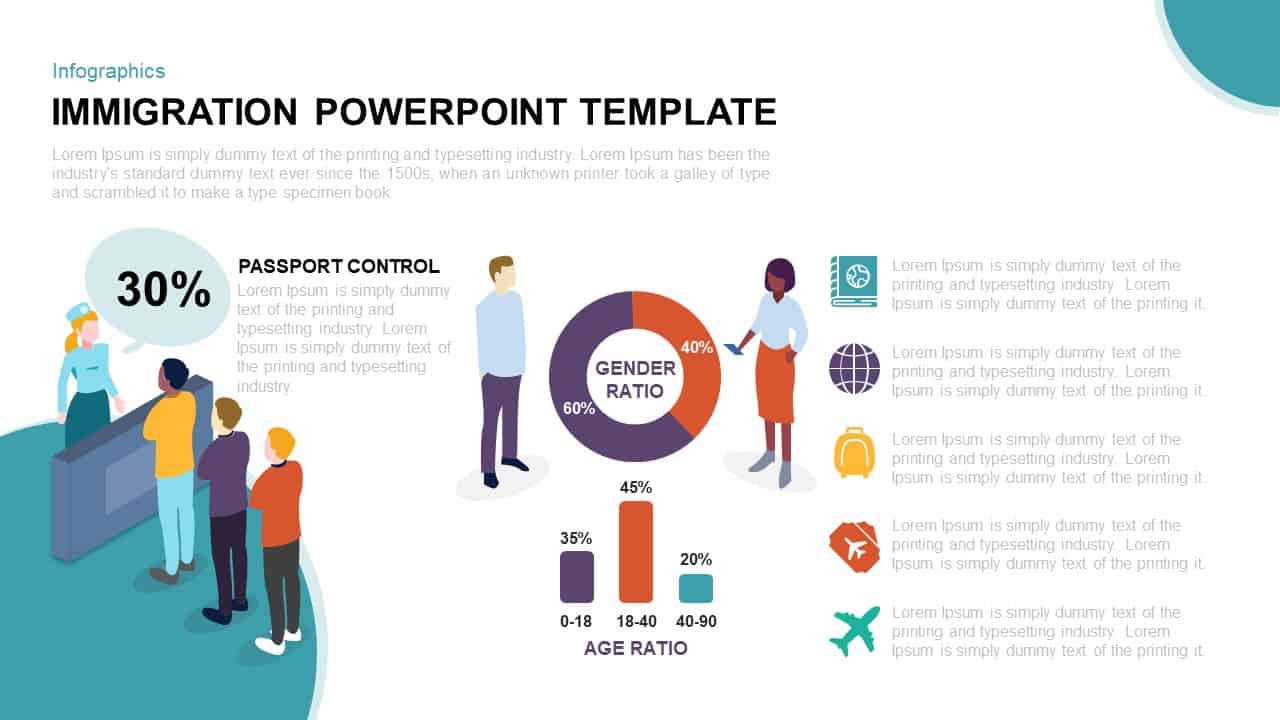
Immigration Data Dashboard Template for PowerPoint & Google Slides
Bar/Column
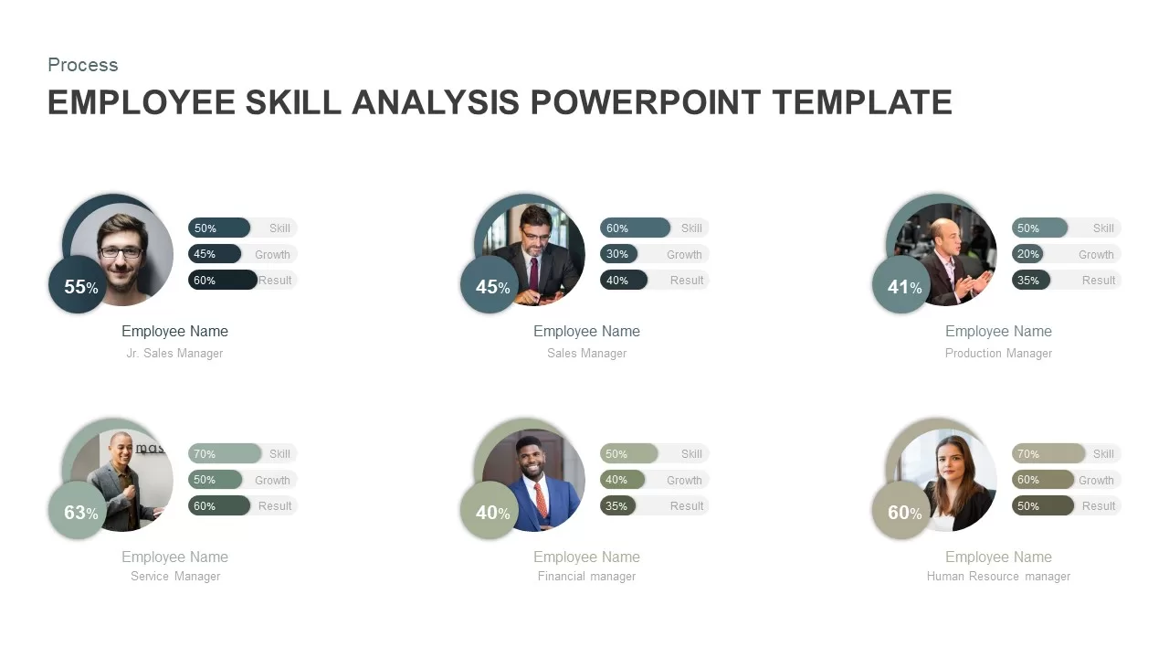
Employee Skill Analysis Dashboard Template for PowerPoint & Google Slides
Employee Performance
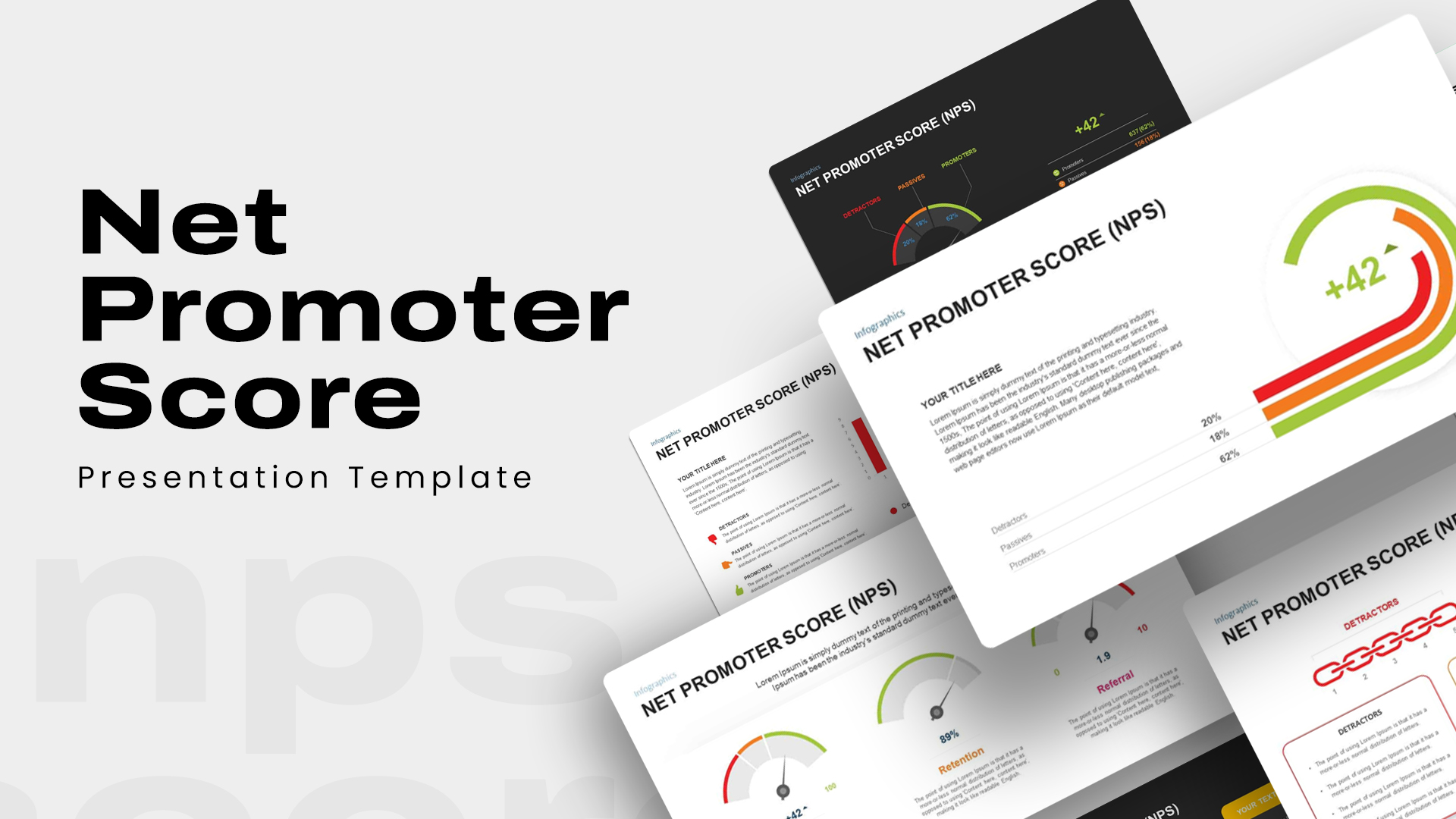
Net Promoter Score Dashboard Template for PowerPoint & Google Slides
Customer Experience
Performance KPI Dashboard Slide Template for PowerPoint & Google Slides
Business Report
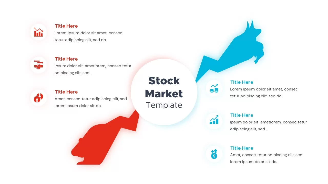
Bull and Bear Stock Market Dashboard Template for PowerPoint & Google Slides
Infographics
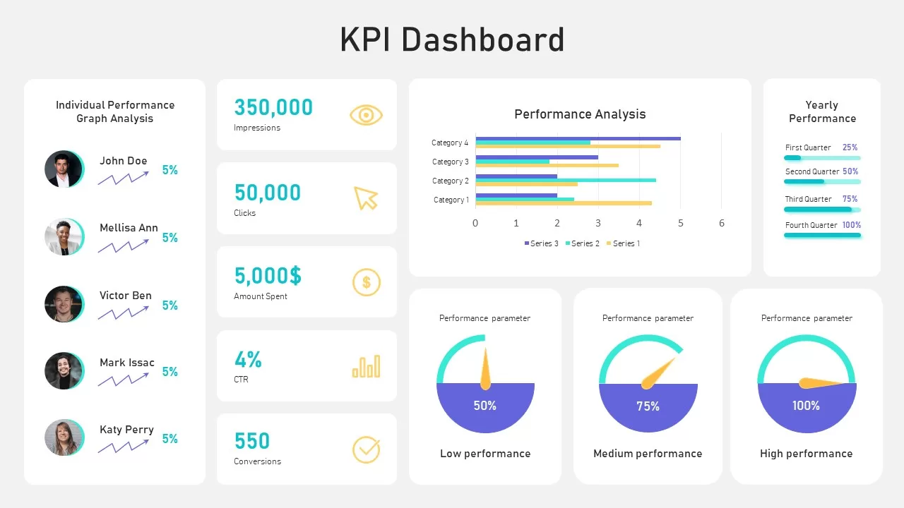
KPI Dashboard template for PowerPoint & Google Slides
Business Report
KPI Dashboard Overview template for PowerPoint & Google Slides
Finance
KPI Dashboard Data Visualization Template for PowerPoint & Google Slides
Bar/Column
KPI Dashboard Data Overview Slide Template for PowerPoint & Google Slides
Bar/Column
Professional Nurse Infographic Dashboard Template for PowerPoint & Google Slides
Nursing
Interactive Benchmarking Gauge Dashboard Template for PowerPoint & Google Slides
Pie/Donut
Heat Map Risk Matrix Dashboard Template for PowerPoint & Google Slides
Comparison Chart
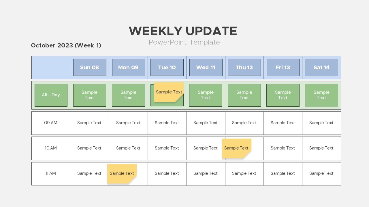
Weekly Update Schedule Dashboard Template for PowerPoint & Google Slides
Agenda
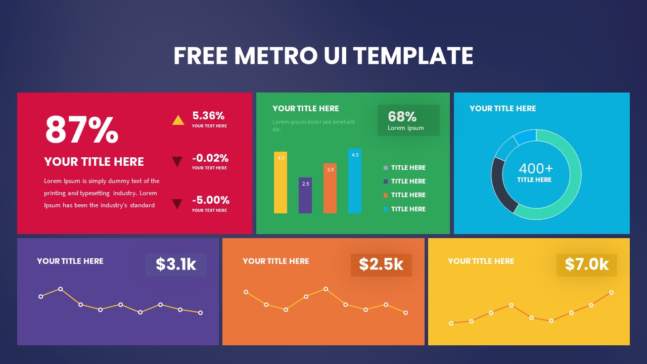
Free Metro UI Dashboard Infographic Template for PowerPoint & Google Slides
Business Report
Free
Website Performance Monitoring Dashboard Template for PowerPoint & Google Slides
Business Report
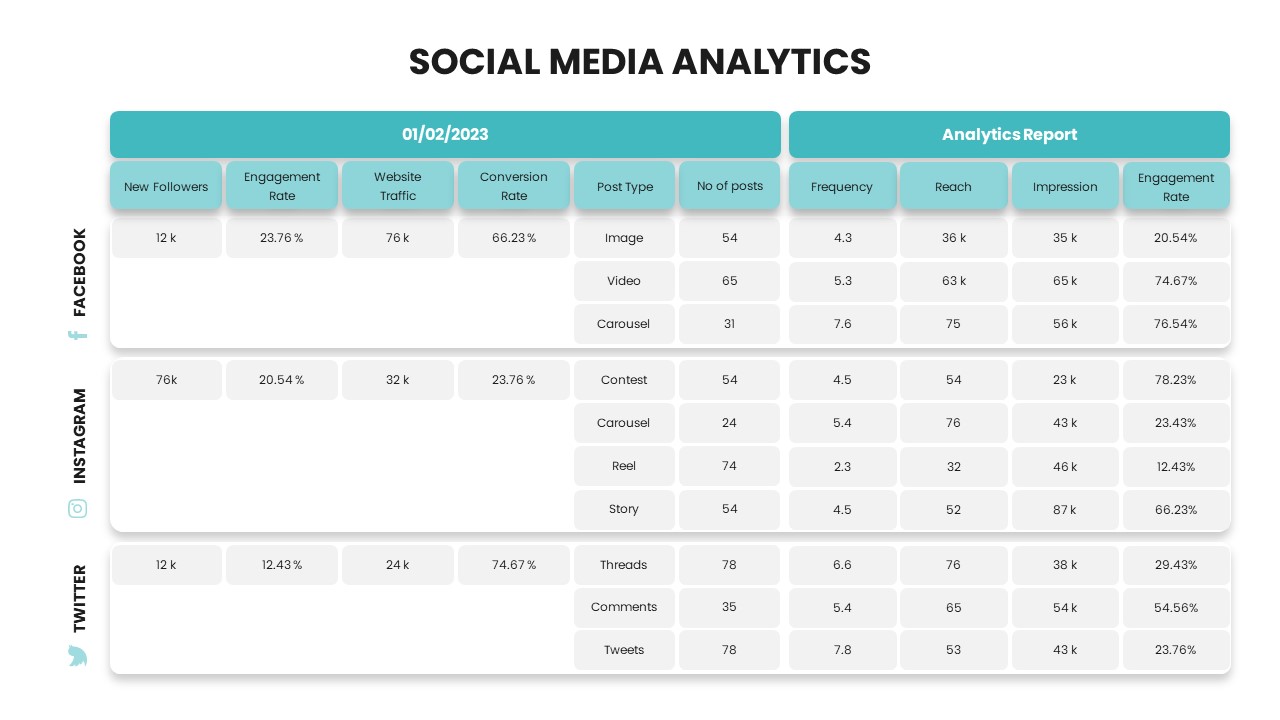
Social Media Analytics Dashboard Template for PowerPoint & Google Slides
Digital Marketing
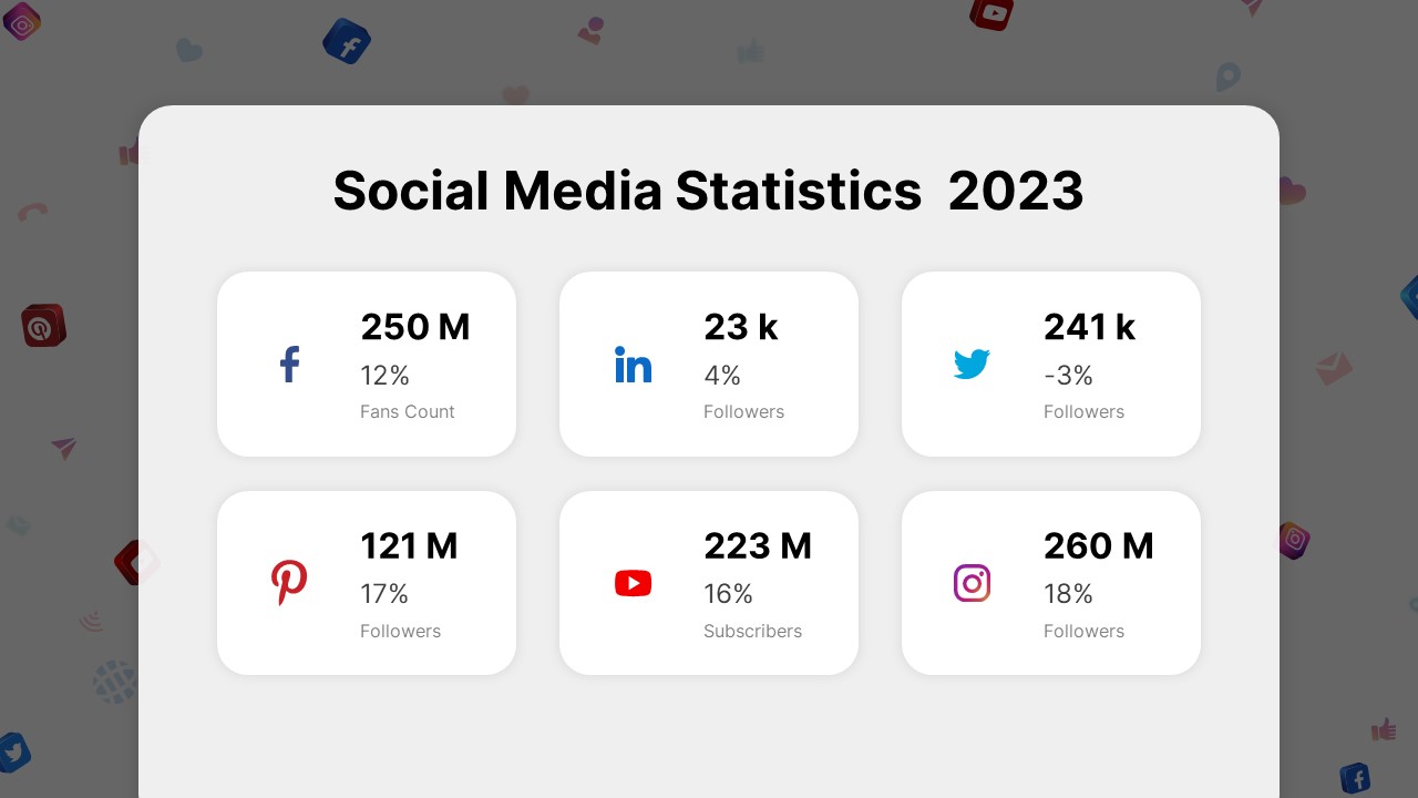
Social Media Statistics 2023 Dashboard Template for PowerPoint & Google Slides
Comparison
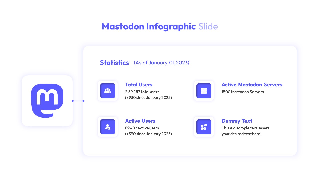
Mastodon Metrics Infographic Dashboard Template for PowerPoint & Google Slides
Business Report
Soccer Match Stats Dashboard Slide Template for PowerPoint & Google Slides
Graphics
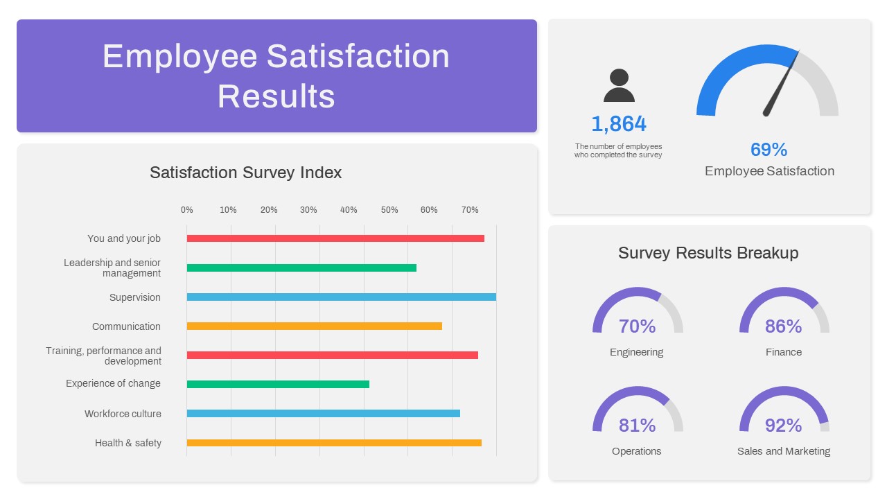
Employee Satisfaction Survey Dashboard Template for PowerPoint & Google Slides
Employee Performance
Customer Satisfaction KPI Dashboard Template for PowerPoint & Google Slides
Customer Experience
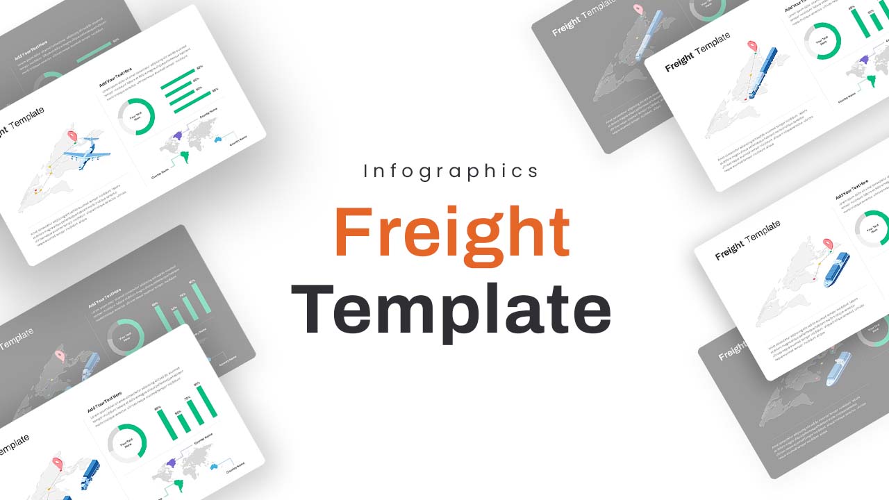
Freight Logistics Dashboard Infographic Template for PowerPoint & Google Slides
Comparison Chart
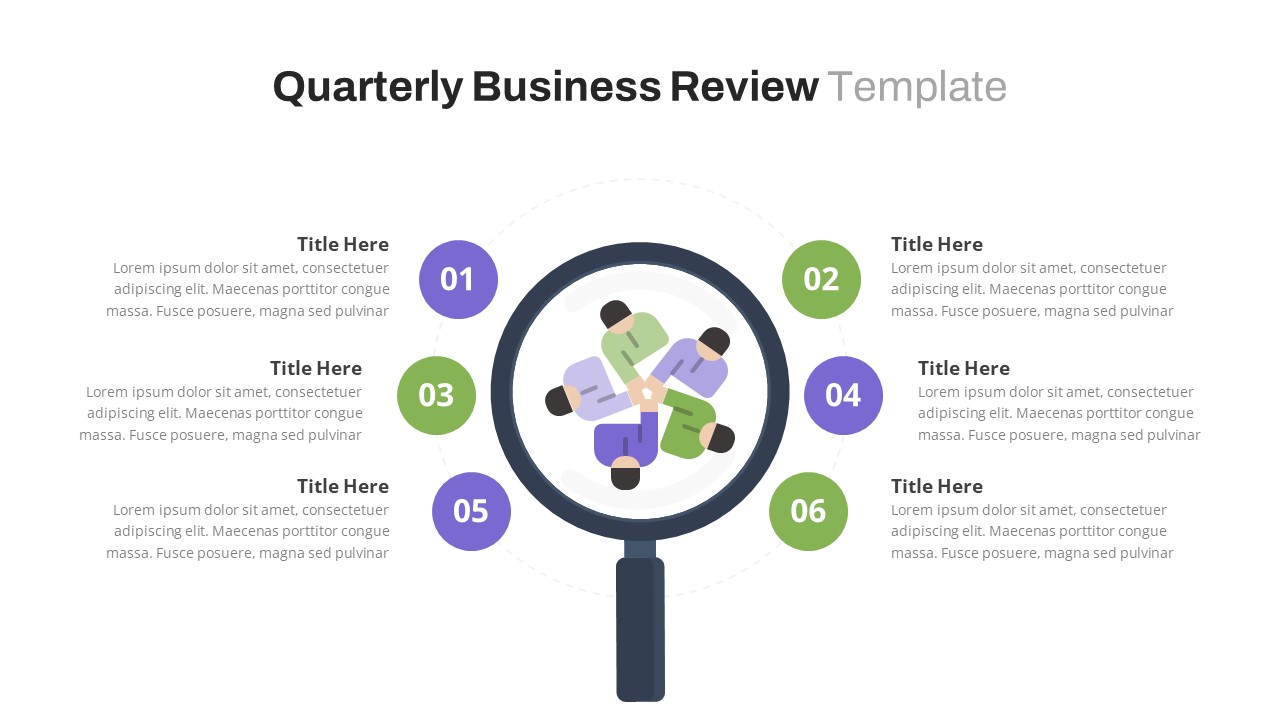
Free Quarterly Business Review Dashboard Template for PowerPoint & Google Slides
Business
Free
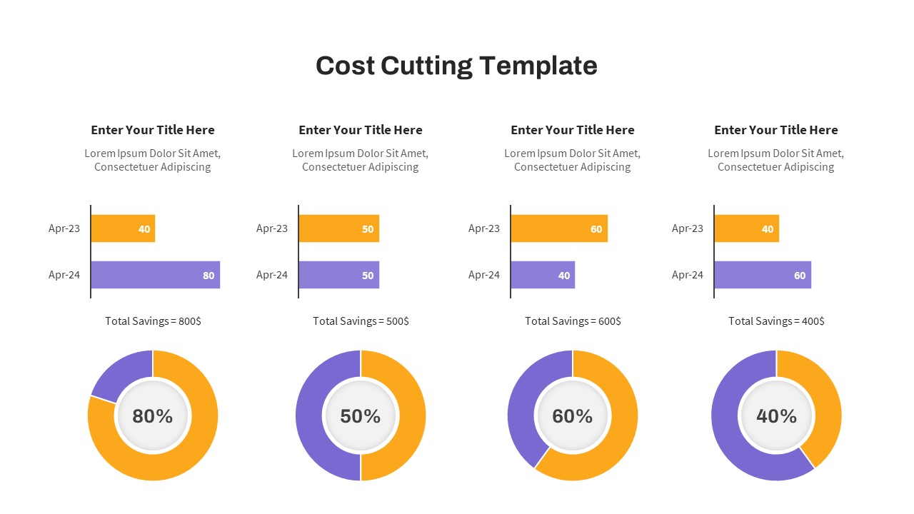
Cost Cutting Savings Dashboard Template for PowerPoint & Google Slides
Pie/Donut
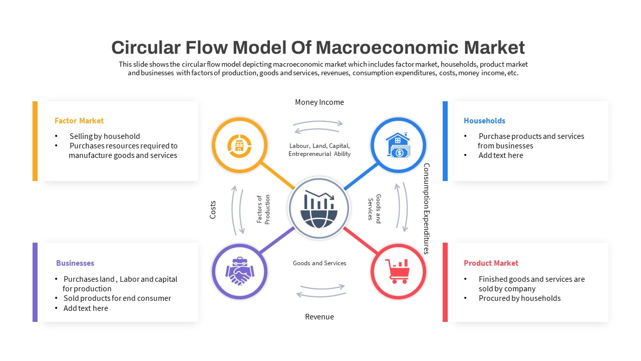
Macroeconomic Indicators Dashboard Template for PowerPoint & Google Slides
PEST
Free Monthly Report PowerPoint Template for PowerPoint & Google Slides
Business Report
Free
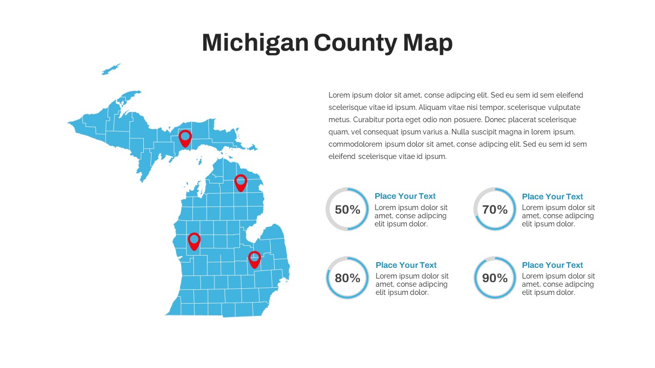
Michigan County Map with KPI Dashboard Template for PowerPoint & Google Slides
World Maps
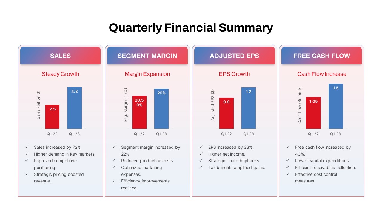
Quarterly Financial Summary Dashboard Template for PowerPoint & Google Slides
Business Report
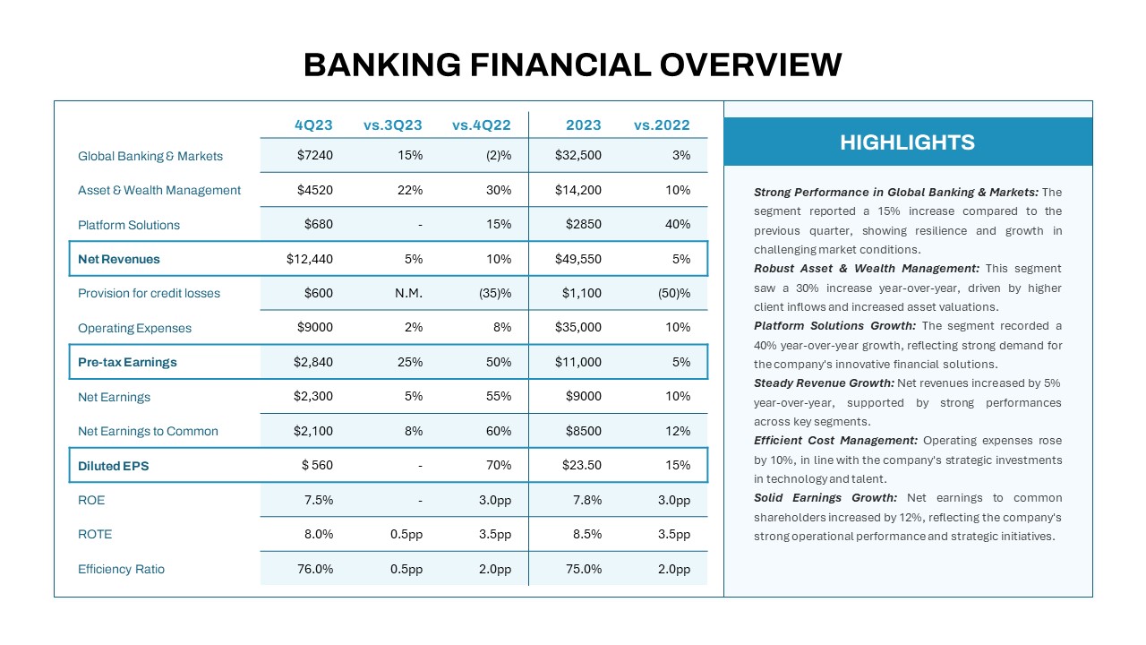
Banking Financial Overview Dashboard Template for PowerPoint & Google Slides
Finance
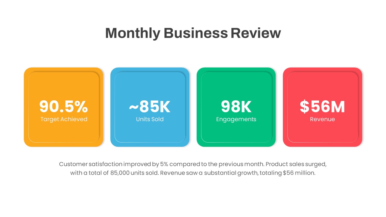
Monthly Business Review Dashboard Deck Template for PowerPoint & Google Slides
Business Report
DevOps KPI Dashboard Performance Metrics Template for PowerPoint & Google Slides
Software Development
Purchasing KPI Metrics Dashboard Template for PowerPoint & Google Slides
Business Report
Procurement KPI Dashboard & Metrics Template for PowerPoint & Google Slides
Business Report
Monthly Sales Performance Dashboard Template for PowerPoint & Google Slides
Charts
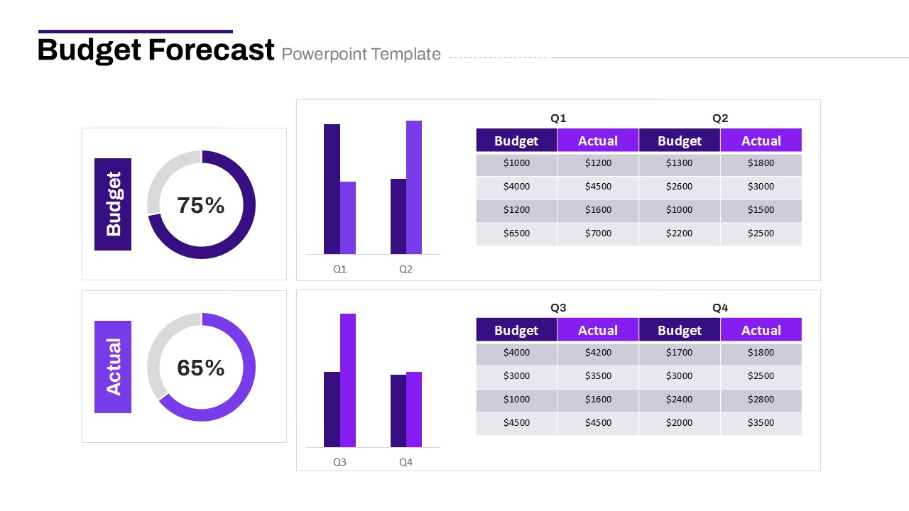
Budget Forecast Dashboard & Donut Charts Template for PowerPoint & Google Slides
Pie/Donut
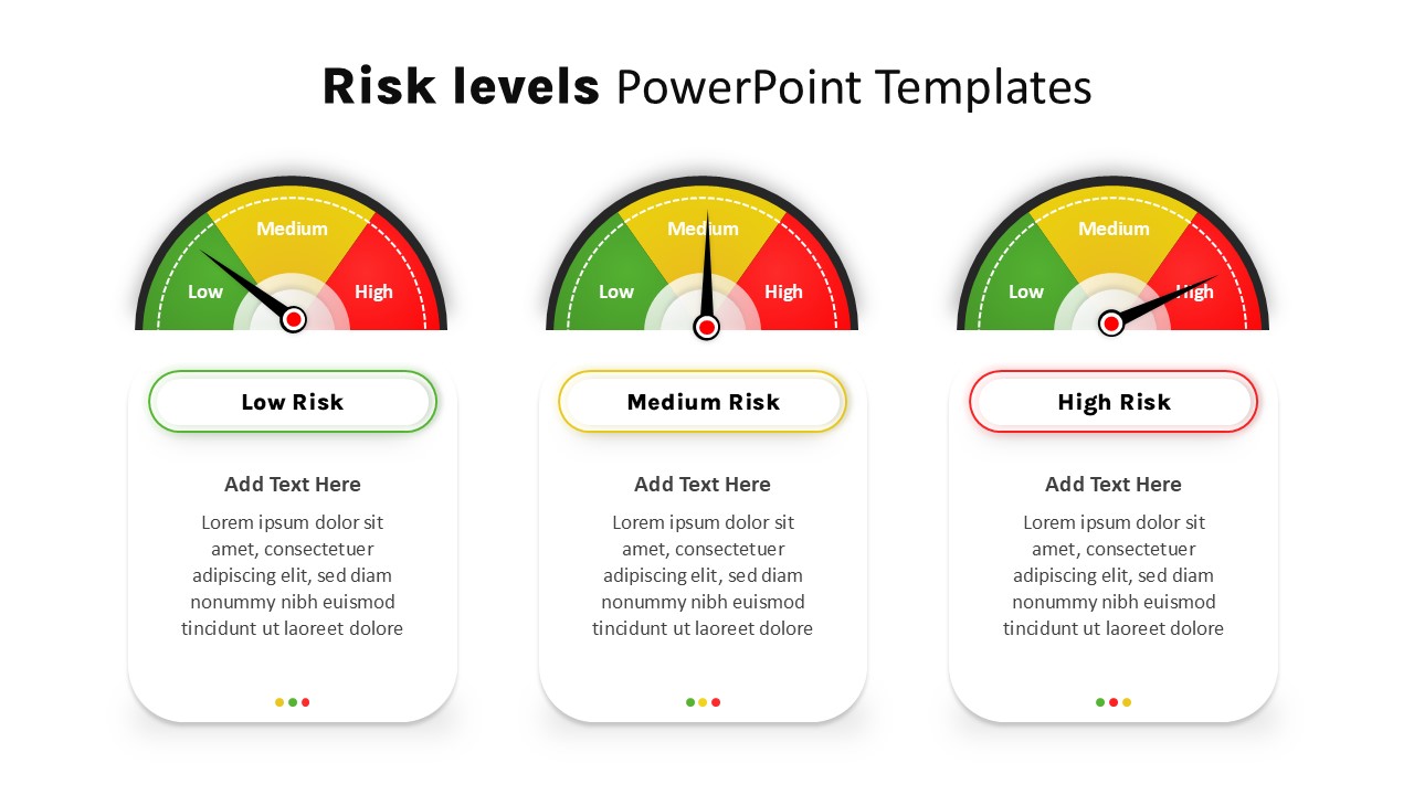
Risk Level Gauge Comparison Dashboard Template for PowerPoint & Google Slides
Comparison
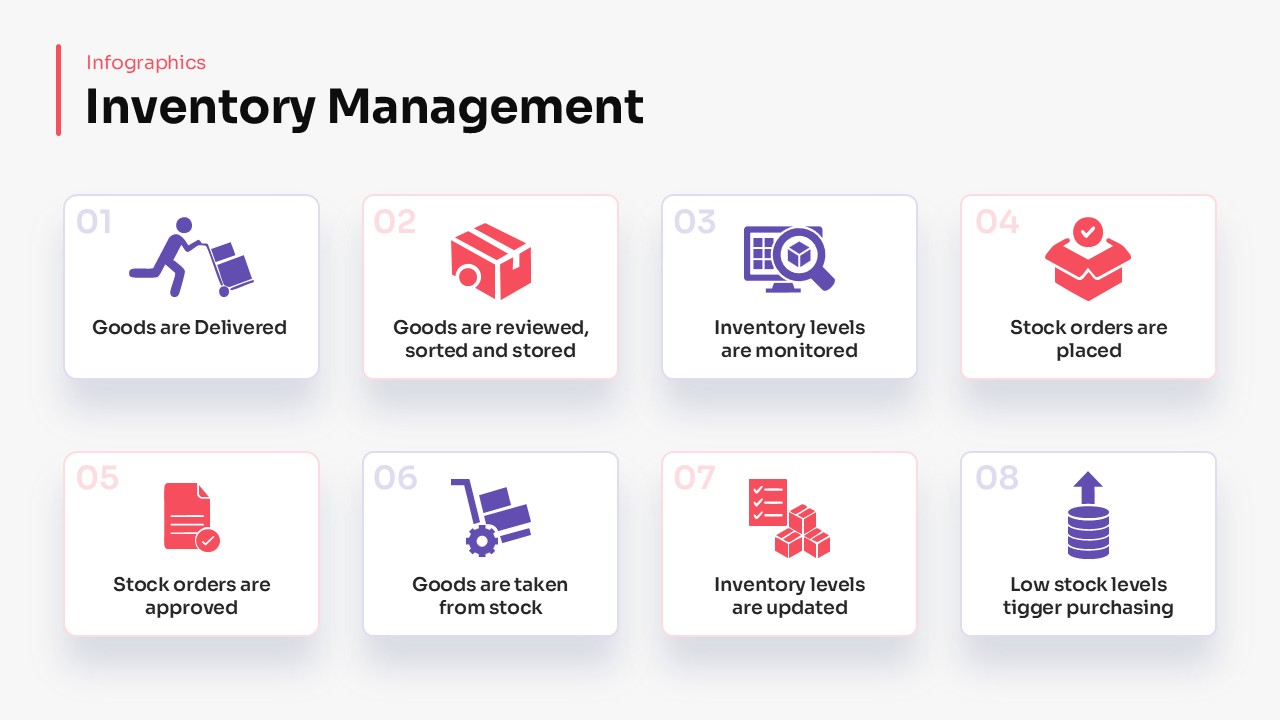
Inventory Management Dashboard Template for PowerPoint & Google Slides
Process
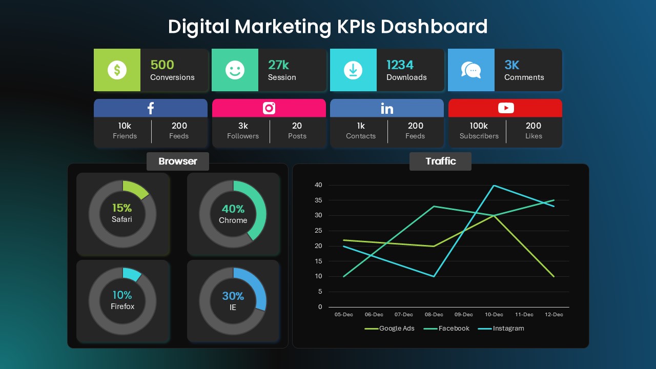
Digital Marketing KPIs Dashboard Dark Template for PowerPoint & Google Slides
Business Report
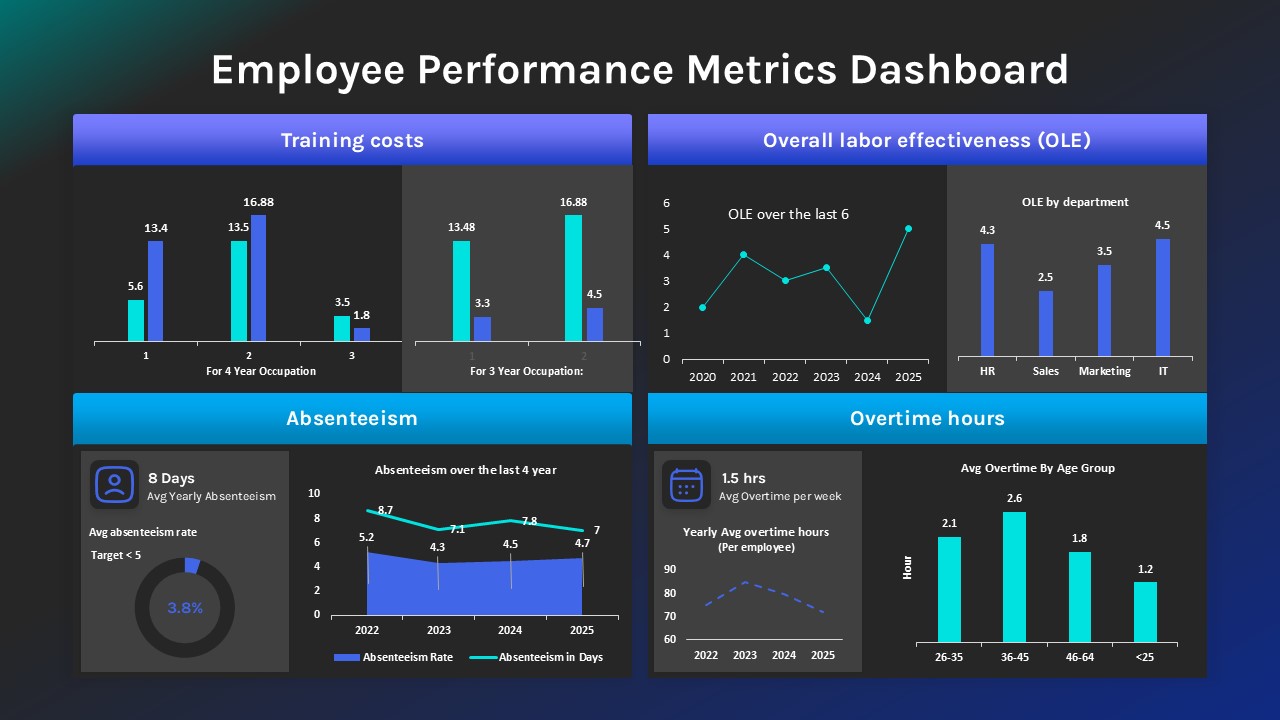
Employee Performance Metrics Dashboard Template for PowerPoint & Google Slides
Employee Performance
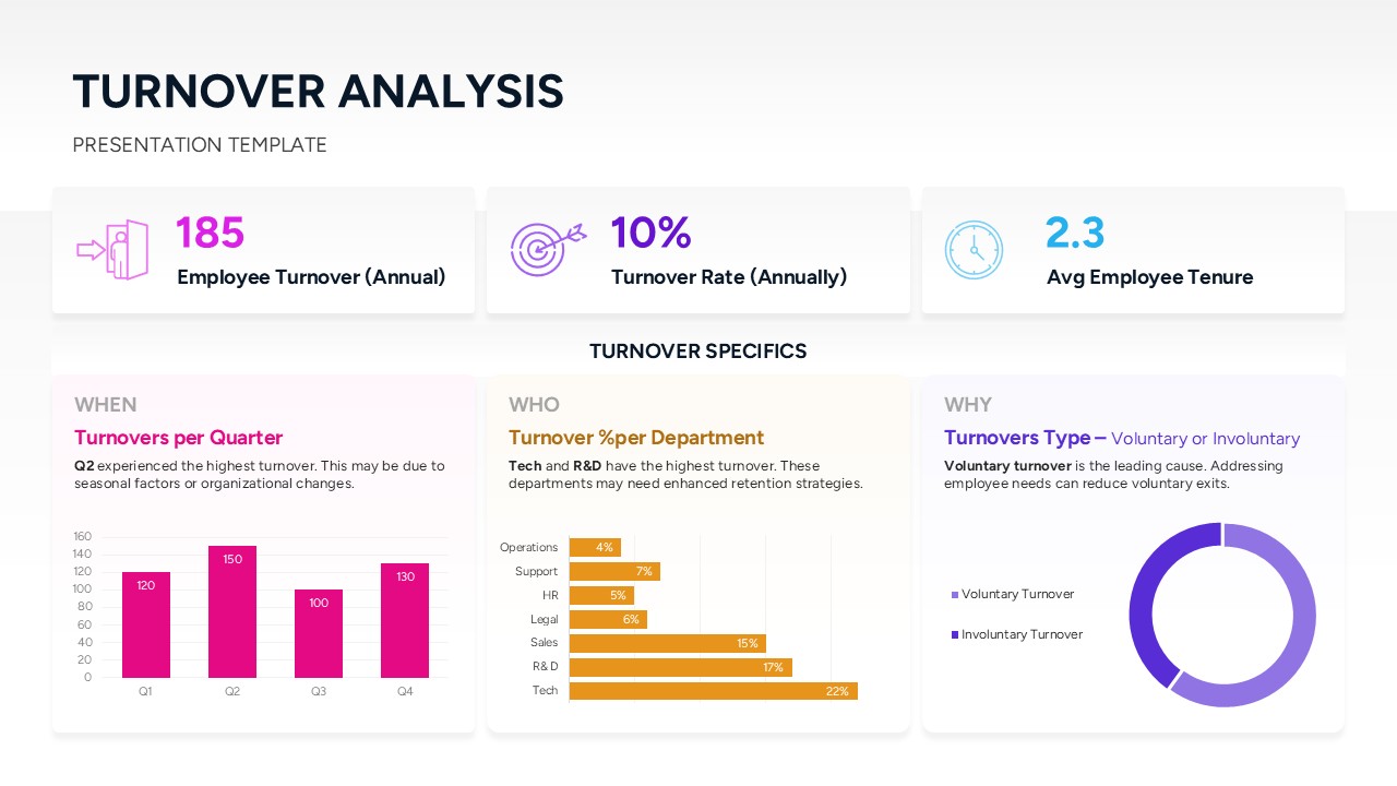
Turnover Analysis Dashboard Template for PowerPoint & Google Slides
Employee Performance
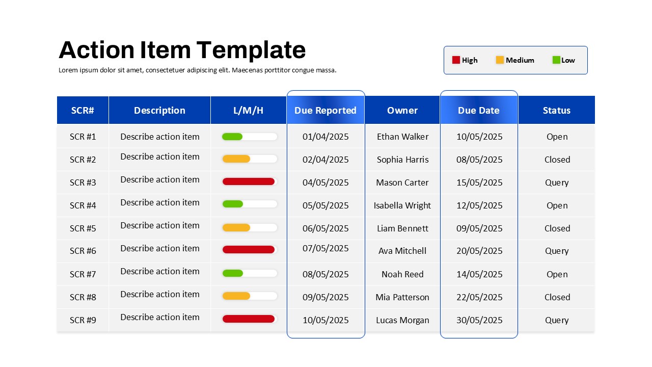
Action Items Management Dashboard Table Template for PowerPoint & Google Slides
Project Status
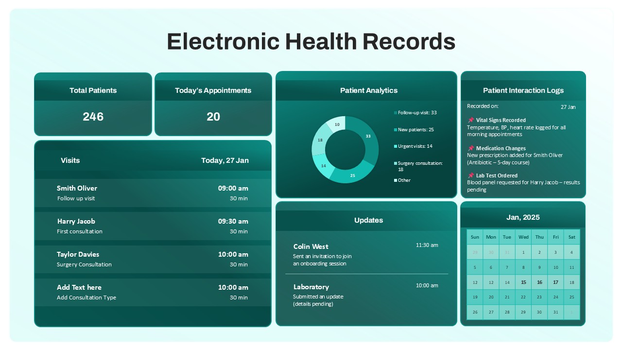
Electronic Health Records Dashboard template for PowerPoint & Google Slides
Health
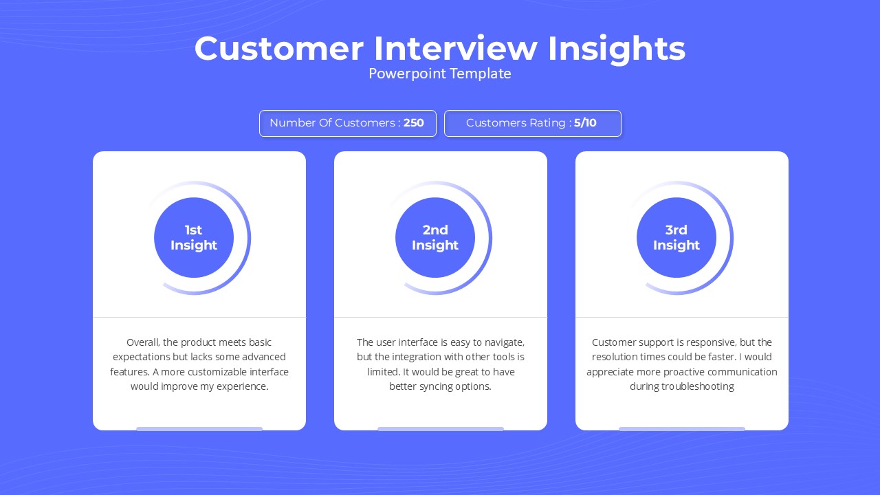
Customer Interview Insights Dashboard Template for PowerPoint & Google Slides
Customer Experience
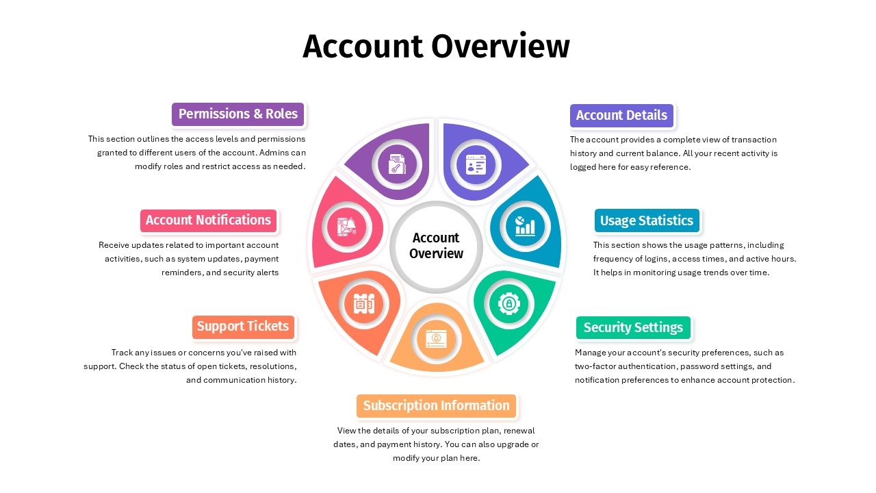
Account Overview Dashboard template for PowerPoint & Google Slides
Business
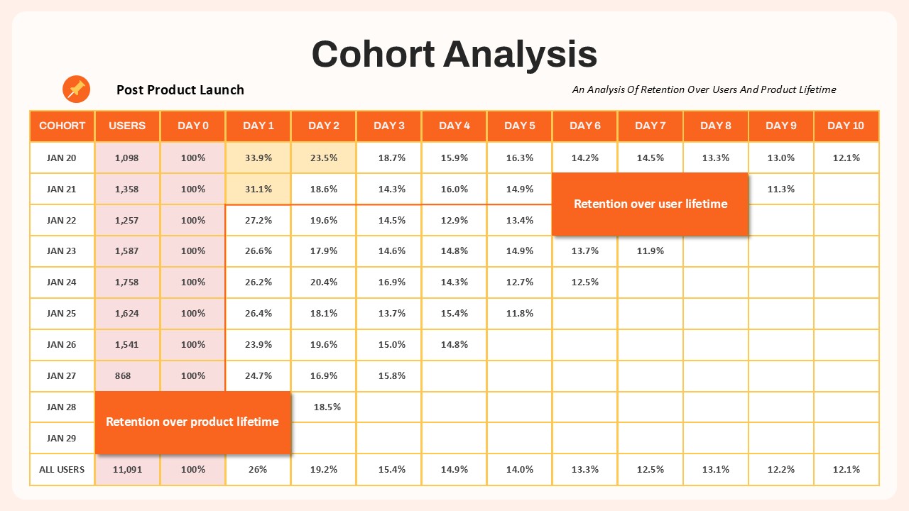
Cohort Analysis Retention Dashboard Template for PowerPoint & Google Slides
Comparison Chart
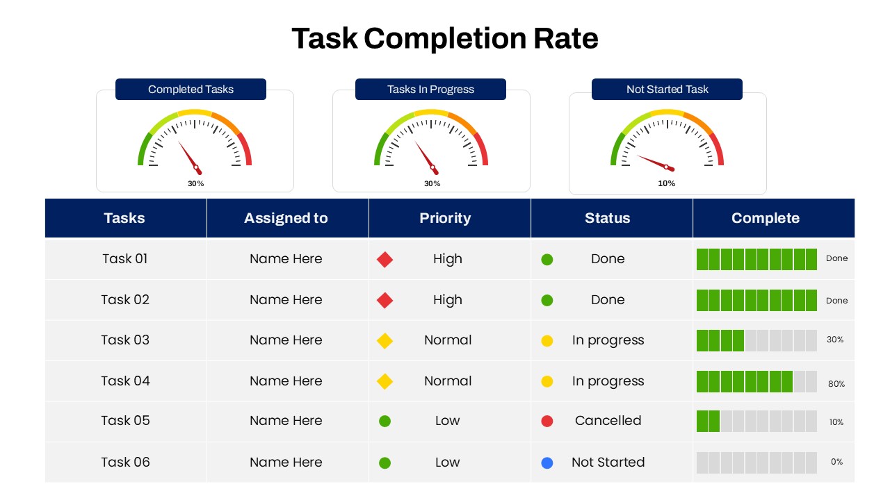
Task Completion Rate Dashboard Template for PowerPoint & Google Slides
Business
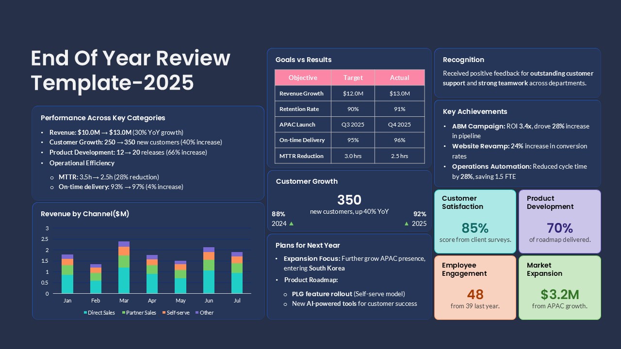
End of Year Review Dashboard Template for PowerPoint & Google Slides
Business Report
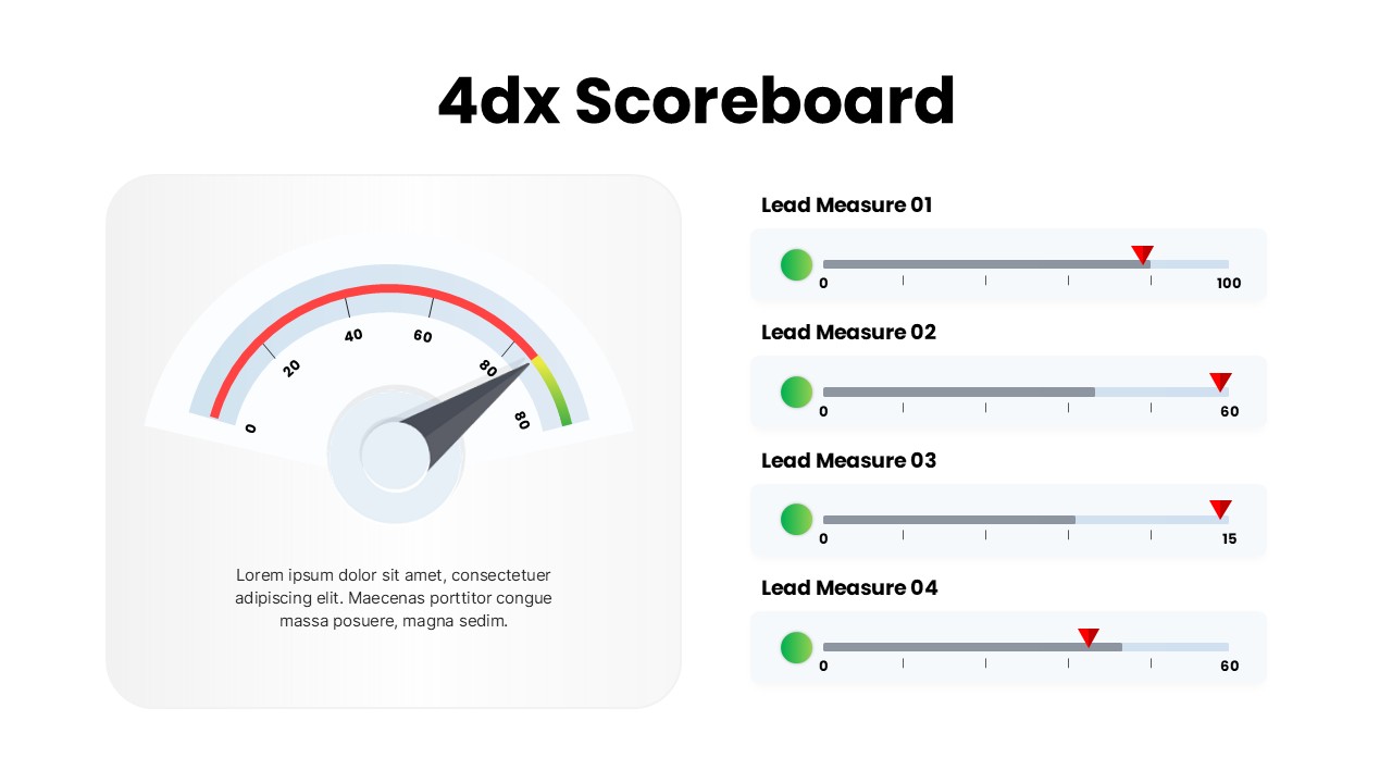
4DX Scoreboard KPI Gauge Dashboard Template for PowerPoint & Google Slides
Business Strategy