Heat Map Risk Assessment Presentation Template for PowerPoint & Google Slides

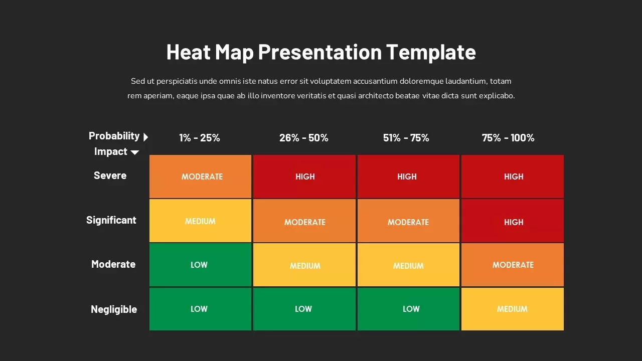
Description
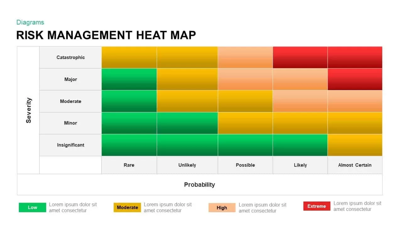
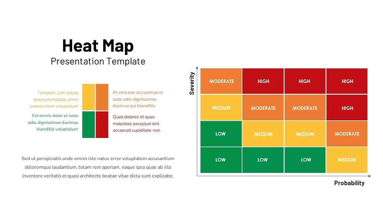
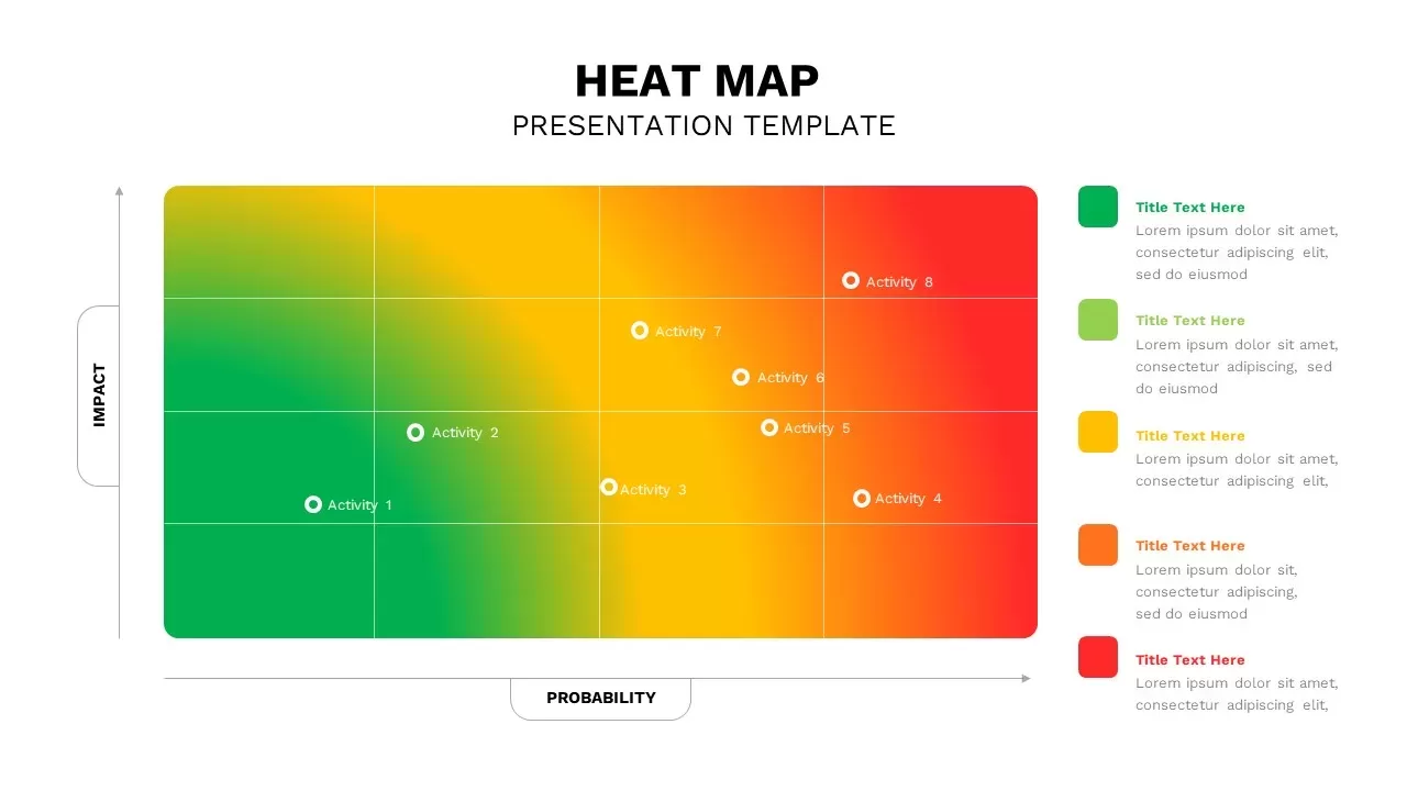
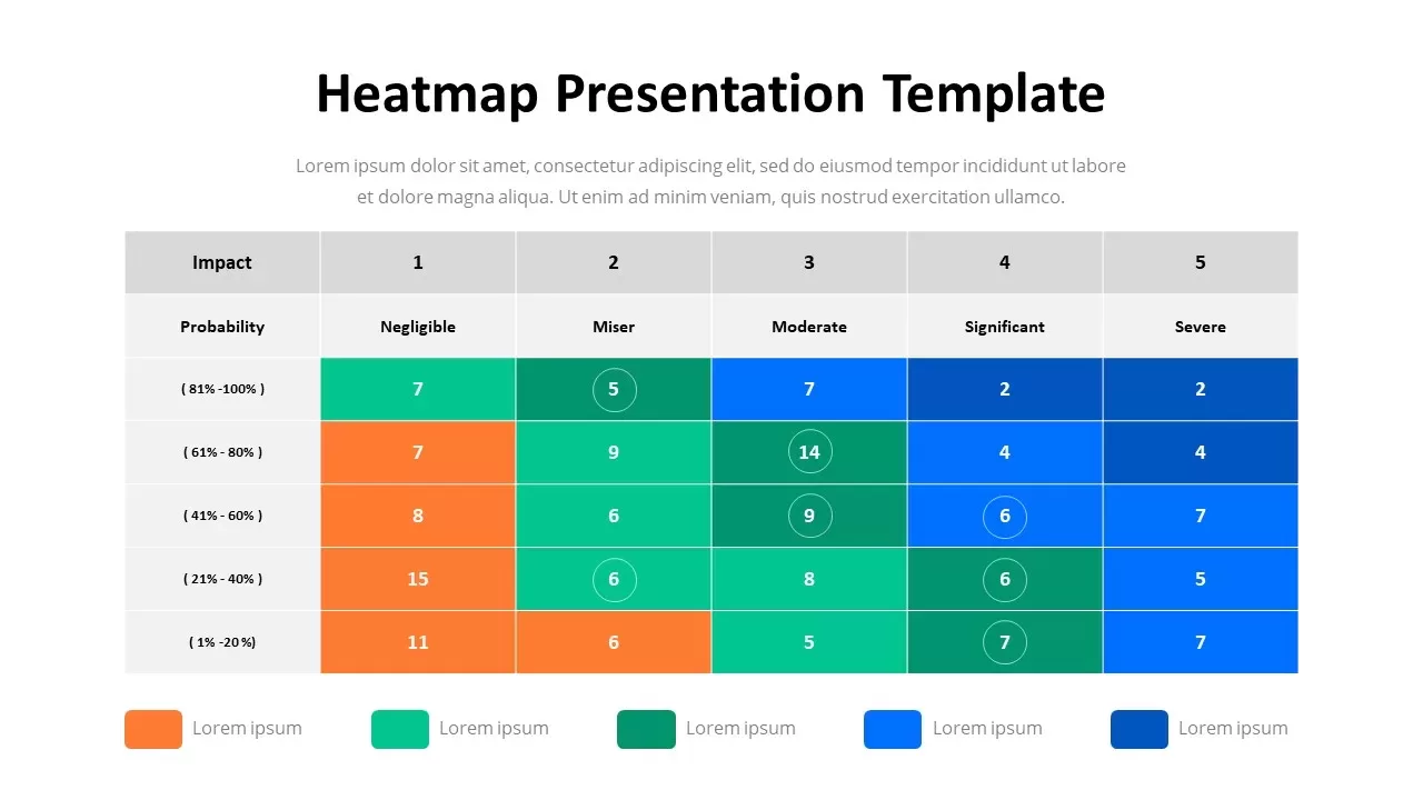
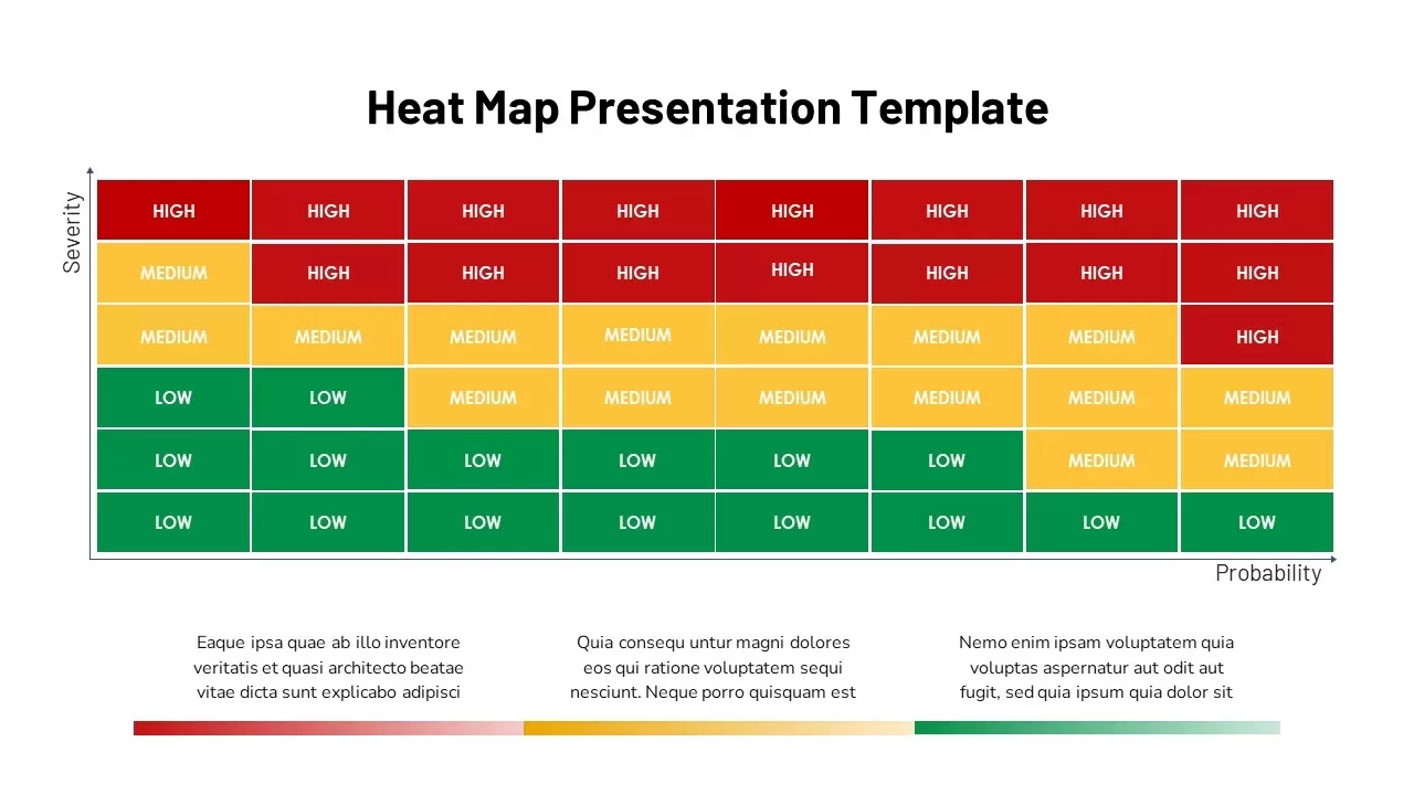
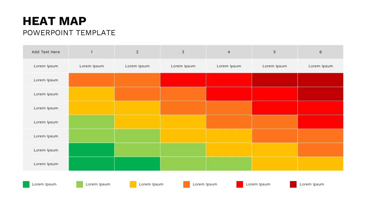
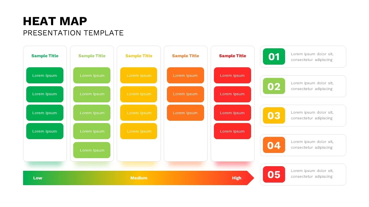
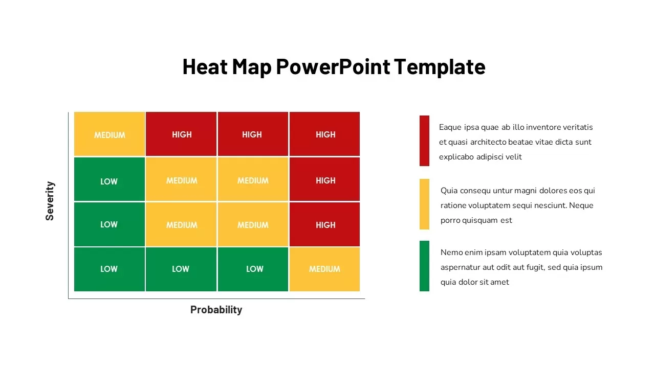
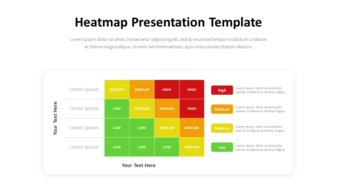
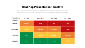
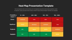
Utilize this Risk Heat Map slide to visualize severity versus probability with a color-coded matrix that highlights high, moderate, medium, and low-risk zones. The layout features a 4×4 grid on a pristine white background, with “Severity” labeled on the vertical axis and probability ranges (1–25%, 26–50%, 51–75%, 76–100%) across the top. High-risk cells appear in vivid red, moderate in orange, medium in yellow, and low in green, enabling audiences to instantly pinpoint critical threat areas.
Above the chart, a bold black header placeholder accommodates a custom title, followed by a full-width subtitle for context or summary. Beneath the grid, three evenly spaced text columns align with a gradient scale bar that transitions from red through yellow to green—ideal for calling out key insights, defining thresholds, or recommending actions. Clean sans-serif typography, crisp grid lines, and minimal axis arrows maintain a professional, uncluttered aesthetic.
Built on master slides in PowerPoint and fully compatible with Google Slides, this template streamlines customization: adjust cell colors or gradient stops, edit axis labels, and replace placeholder text in seconds. Vector-based elements ensure crisp widescreen rendering, while alignment guides prevent formatting issues during collaborative cloud editing. Use the slide standalone or duplicate it to create segmented risk profiles—by region, department, or time period.
Ideal for executive briefings, compliance reviews, and strategic planning workshops, this heat map fosters data-driven discussions around risk mitigation, resource allocation, and safety protocols. Integrate with Gantt charts, KPI dashboards, or risk registers to build a comprehensive risk management presentation.
Who is it for
Risk managers, compliance officers, project leaders, safety engineers, and finance executives will benefit from this slide when conducting risk assessments, audit reviews, or strategic decision-making sessions.
Other Uses
Repurpose this design for hazard analyses, incident tracking dashboards, performance monitoring, or portfolio risk comparisons. Adapt the grid to visualize market opportunity matrices, decision-support frameworks, or any scenario requiring clear risk prioritization.
Login to download this file

Item ID
SB02906
Related Templates

Risk Management Heat Map Diagram Template for PowerPoint & Google Slides
Comparison Chart
Professional Risk Heat Map Visualization Template for PowerPoint & Google Slides
Risk Management
Heat Map Risk Matrix Dashboard Template for PowerPoint & Google Slides
Comparison Chart
Bow-Tie Risk Assessment Diagram Template for PowerPoint & Google Slides
Risk Management
Risk Assessment Heatmap Matrix Slide Template for PowerPoint & Google Slides
Comparison Chart
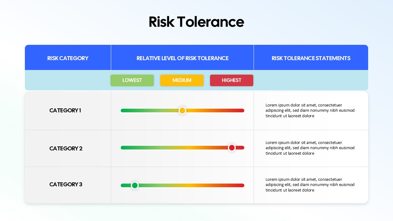
Risk Tolerance Assessment Sliders Template for PowerPoint & Google Slides
Finance
Heat Map Analysis Template for PowerPoint & Google Slides
Risk Management
Professional Interactive Heat Map Matrix Template for PowerPoint & Google Slides
Comparison Chart
Interactive Heat Map Template for PowerPoint & Google Slides
Bar/Column
Heat Map Slide for PowerPoint & Google Slides
Maps
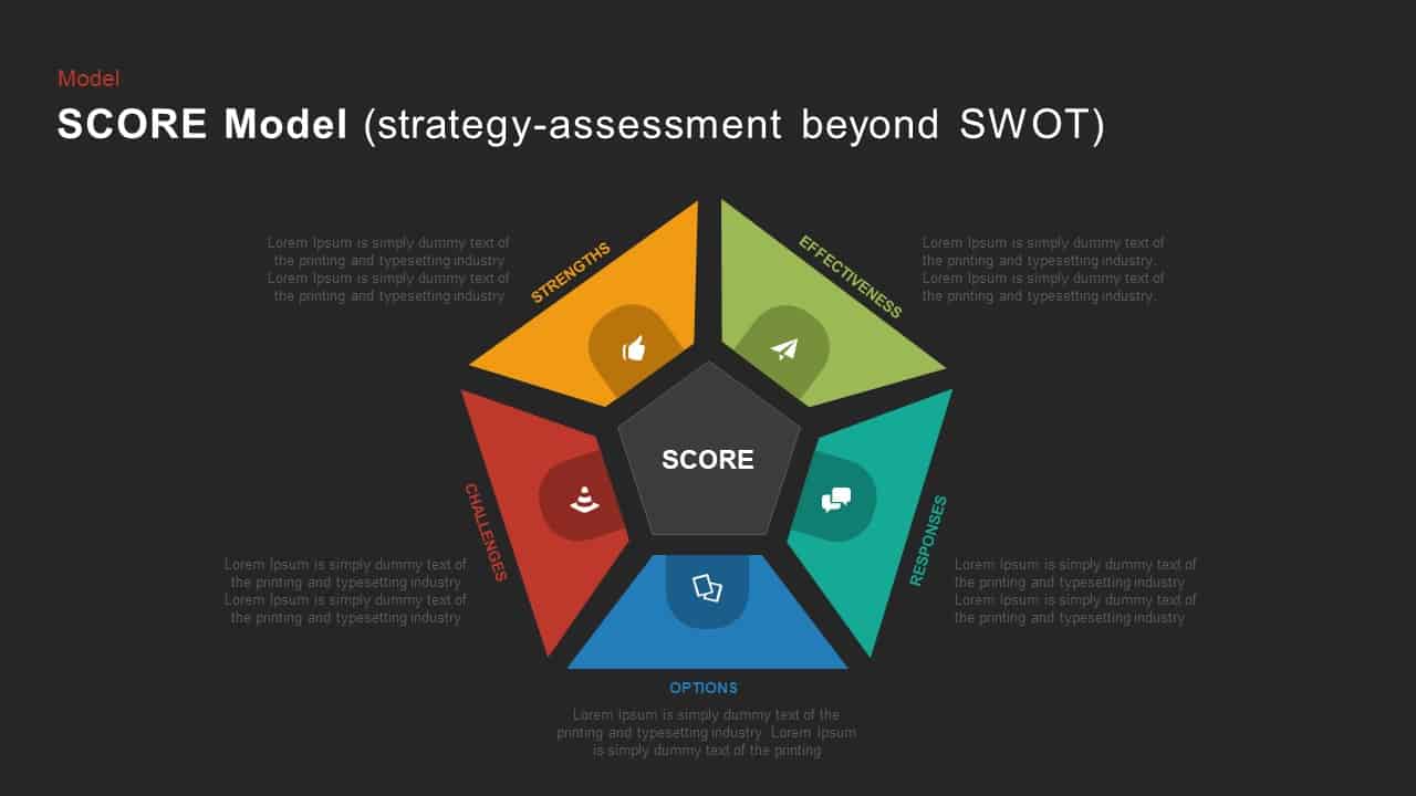
SCORE Model Pentagon Assessment Diagram Template for PowerPoint & Google Slides
Circular
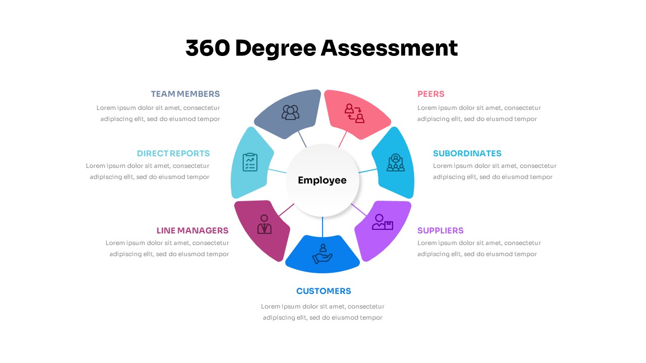
360 Degree Assessment Template for PowerPoint & Google Slides
Employee Performance
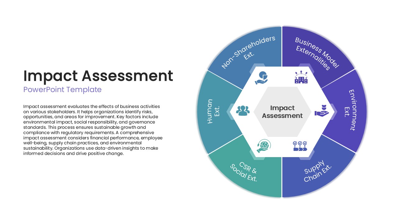
Impact Assessment Circular Diagram Template for PowerPoint & Google Slides
Circular
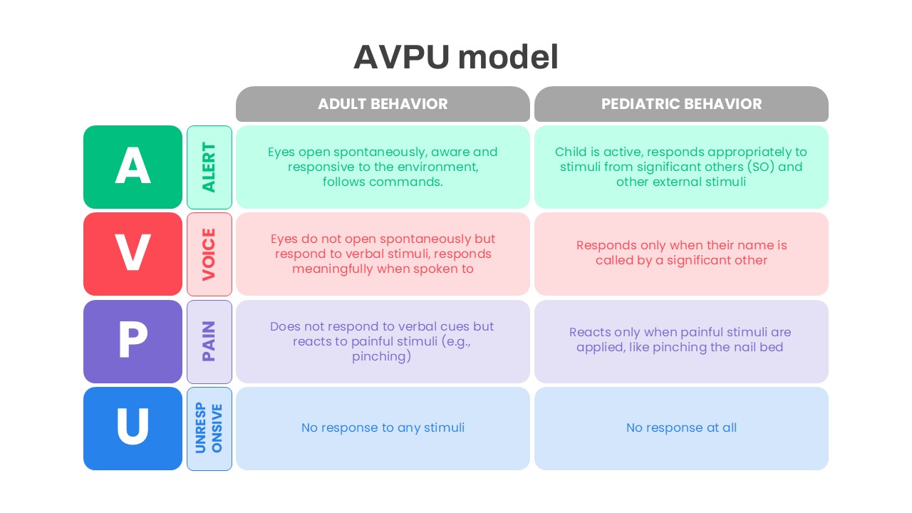
AVPU Model Behavior Assessment Template for PowerPoint & Google Slides
Health
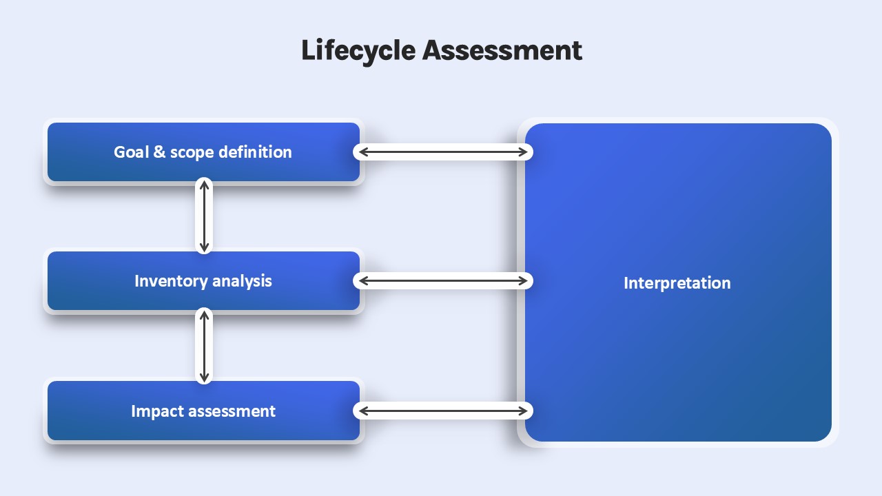
Lifecycle Assessment template for PowerPoint & Google Slides
Process
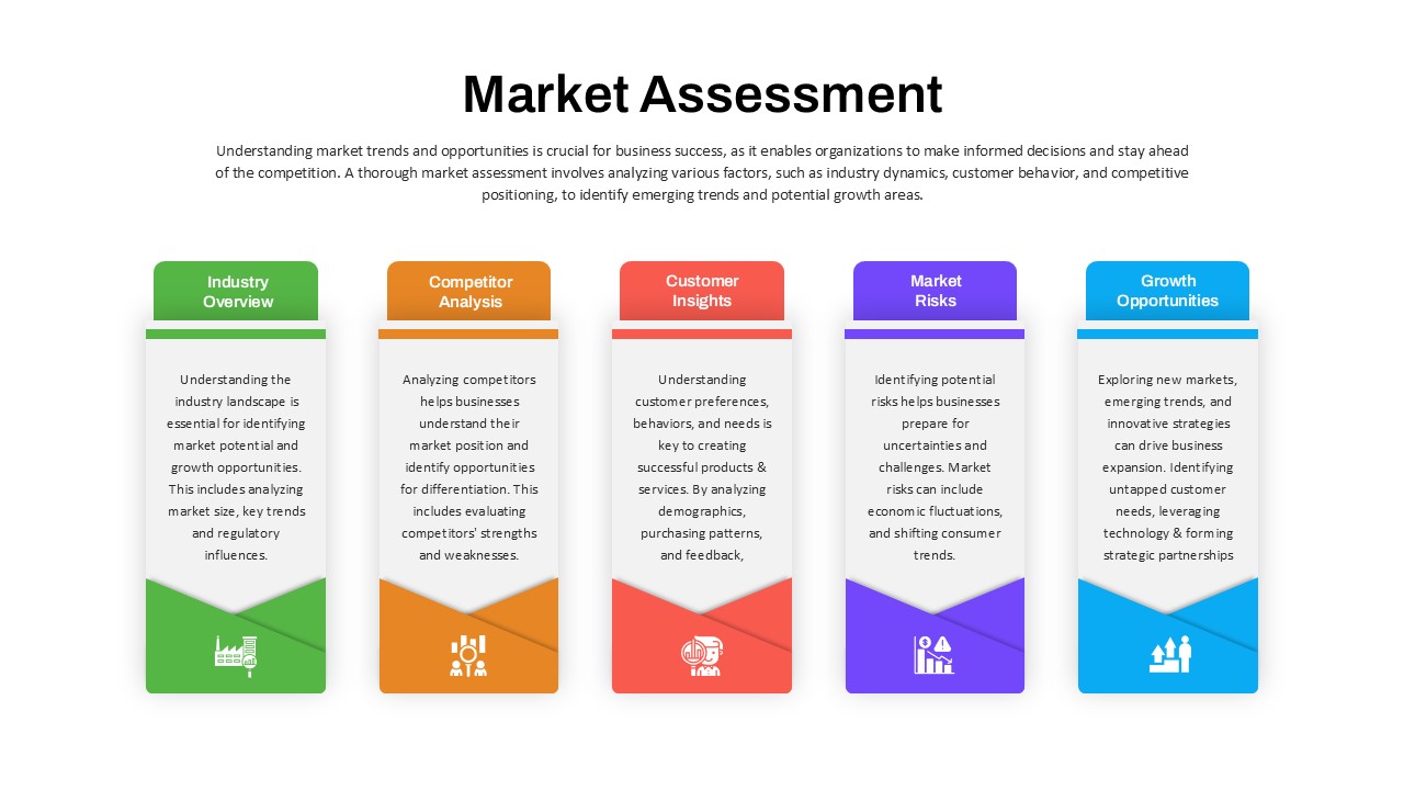
Market Assessment Infographic Slide Template for PowerPoint & Google Slides
Process
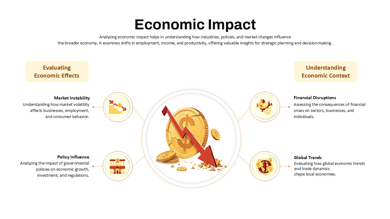
Economic Impact Assessment template for PowerPoint & Google Slides
Business Report
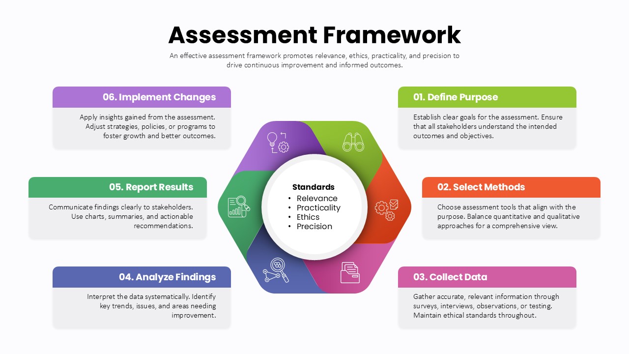
Assessment Framework Circular Diagram Template for PowerPoint & Google Slides
Circular
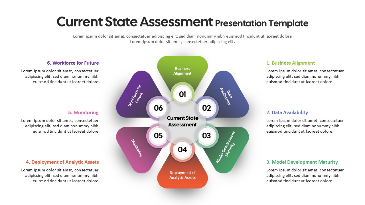
Current State Assessment Template for PowerPoint & Google Slides
Gap
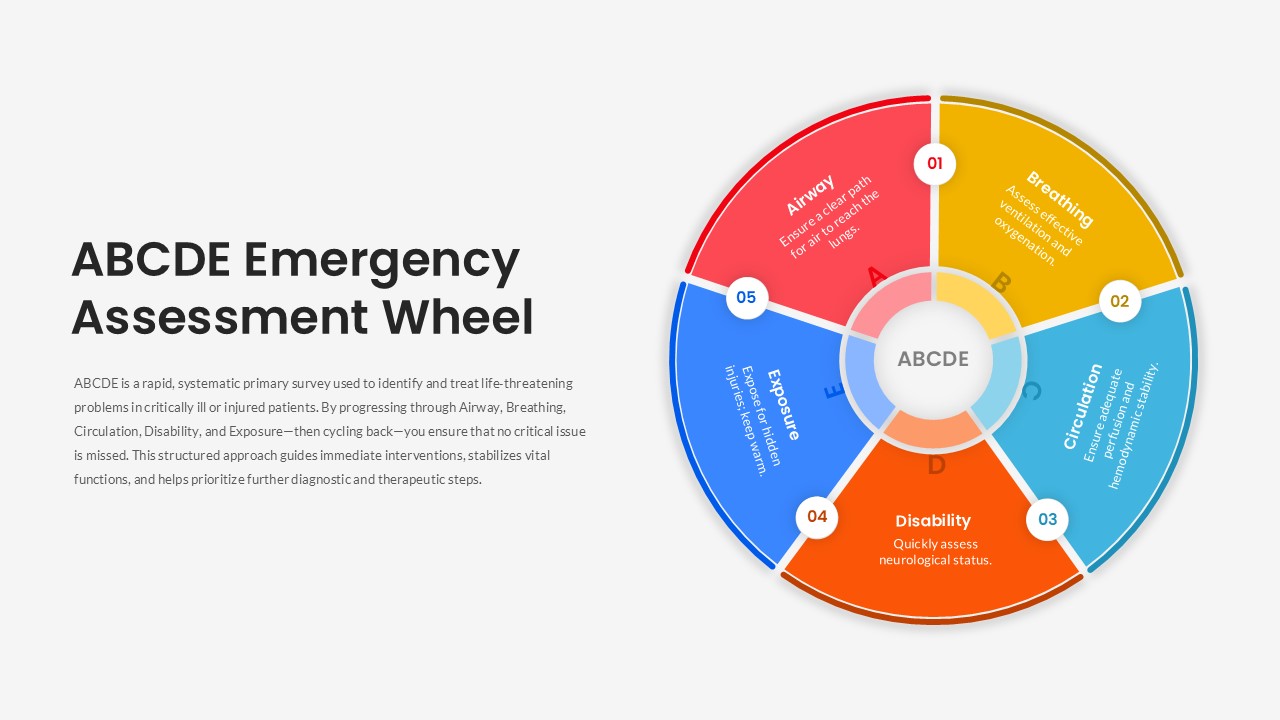
ABCDE Emergency Assessment Wheel Template for PowerPoint & Google Slides
Circular
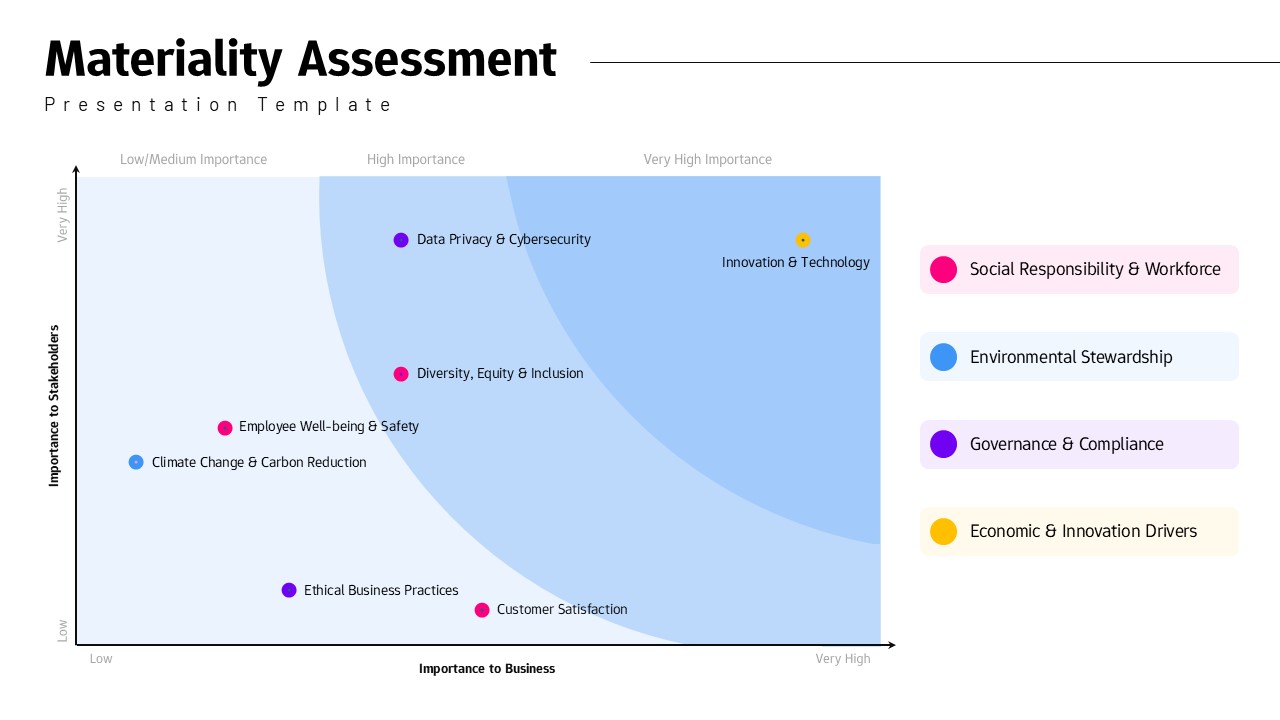
Materiality Assessment Matrix Diagram Template for PowerPoint & Google Slides
Risk Management
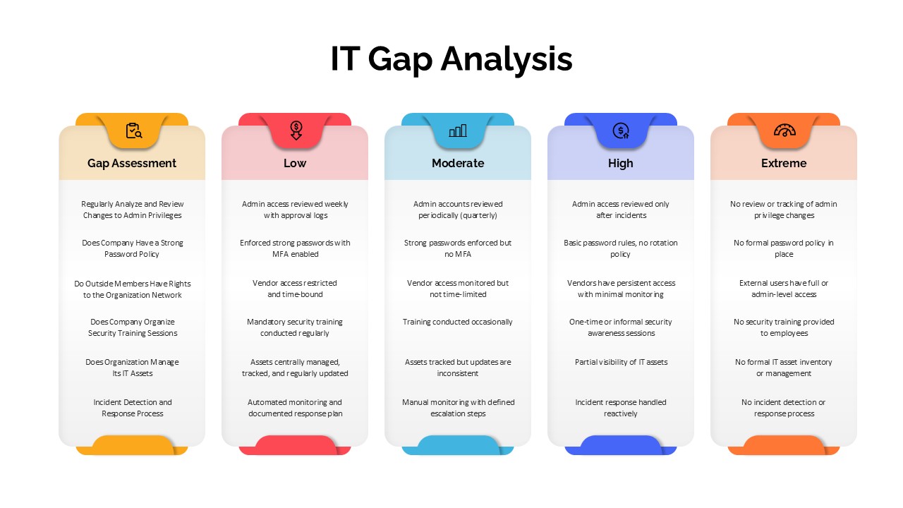
IT Gap Analysis Assessment Matrix Template for PowerPoint & Google Slides
Information Technology
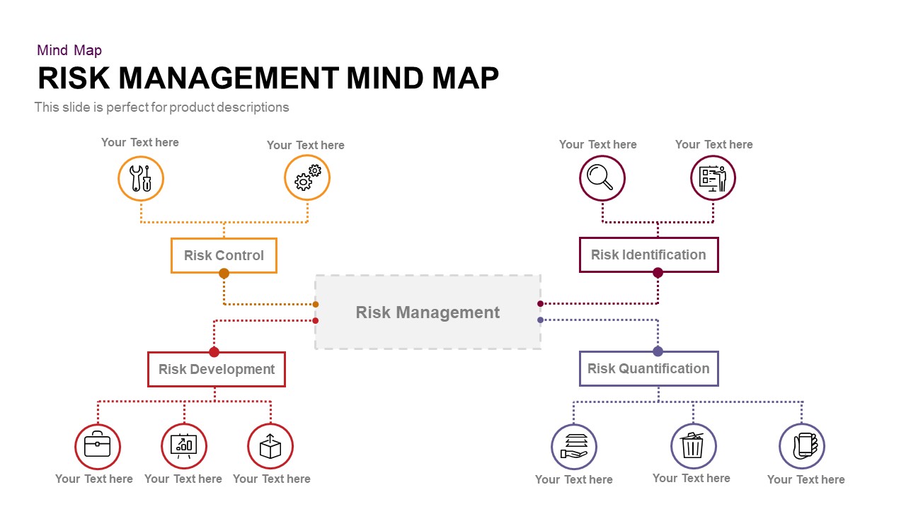
Risk Management Mind Map Radial Diagram template for PowerPoint & Google Slides
Mind Maps
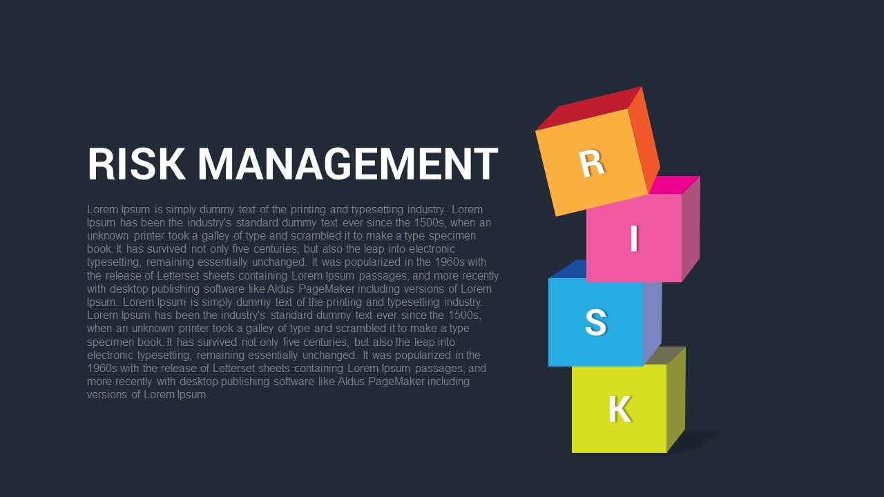
Risk Management Presentation Template for PowerPoint and Google Slides
Decks

Bold Diamond Risk Alert Visualization Template for PowerPoint & Google Slides
Risk Management
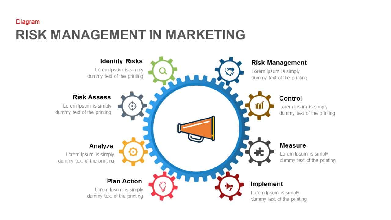
Marketing Risk Management Gear Diagram Template for PowerPoint & Google Slides
Risk Management
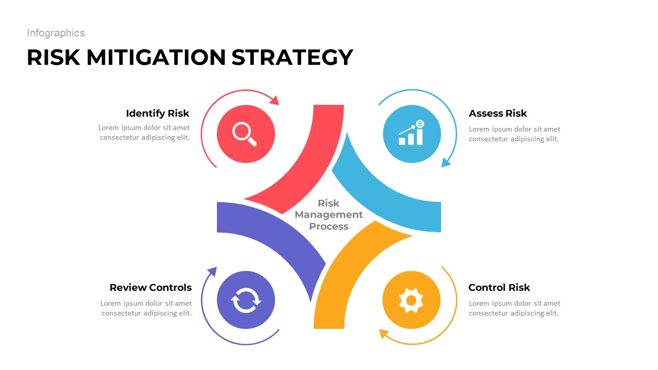
Risk Mitigation Strategy template for PowerPoint & Google Slides
Risk Management
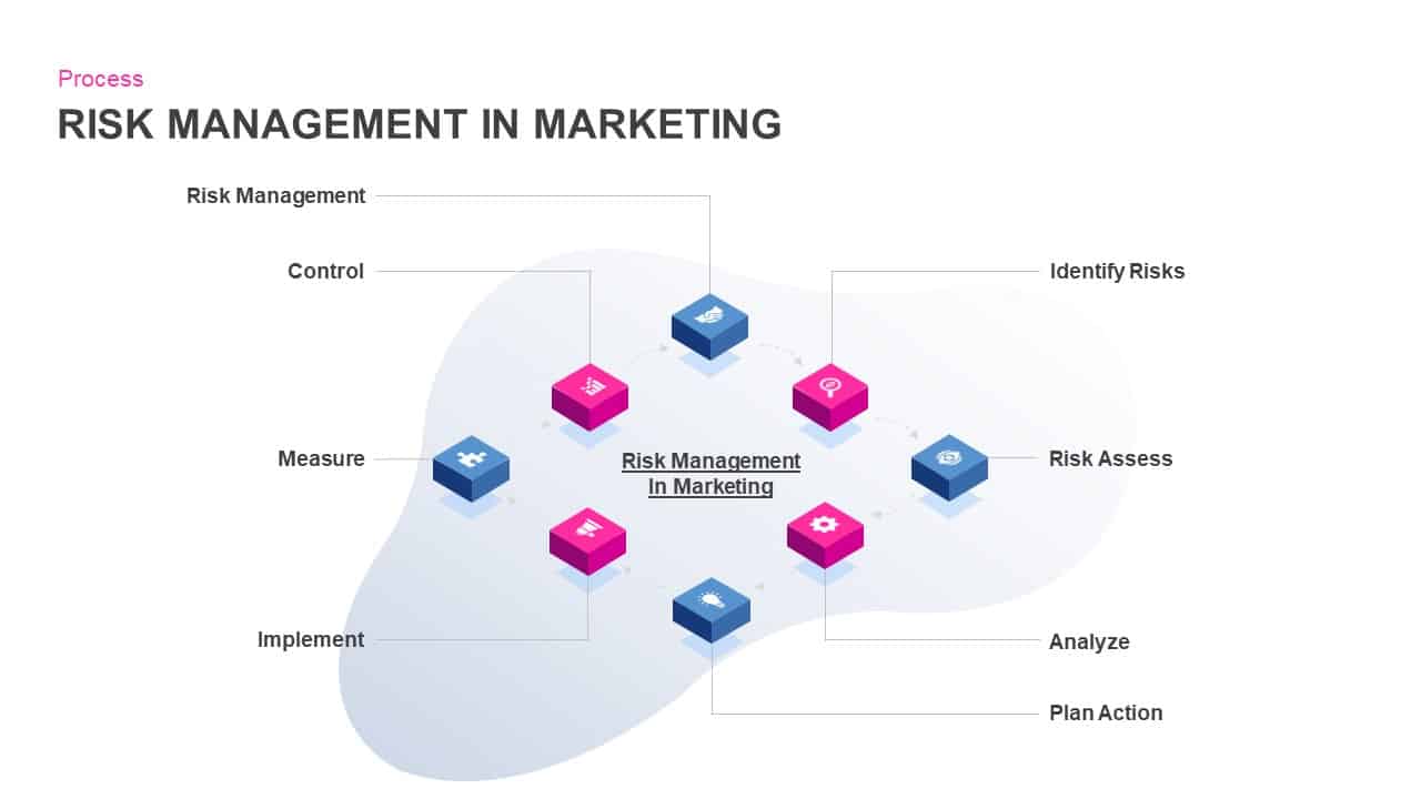
Risk Management in Marketing Process Template for PowerPoint & Google Slides
Risk Management
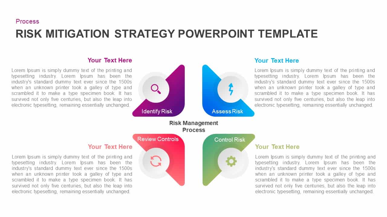
Four-Step Risk Mitigation Strategy Template for PowerPoint & Google Slides
Process
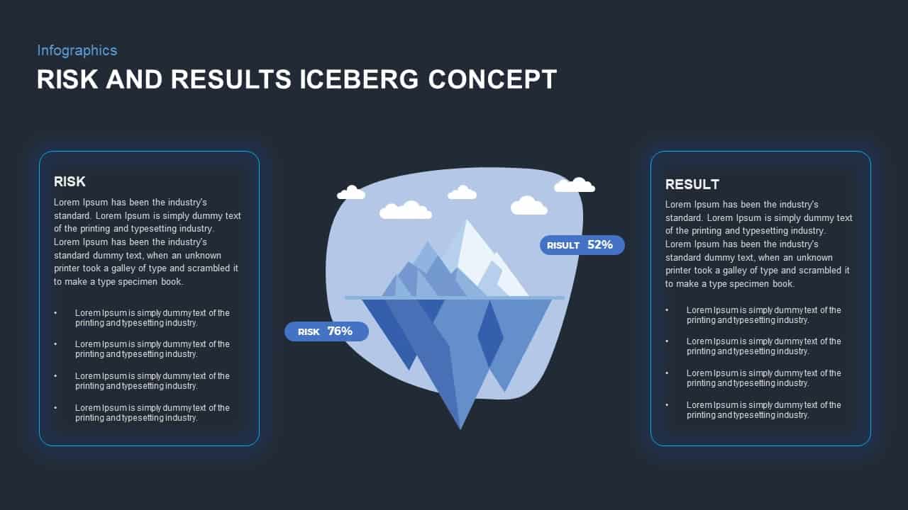
Risk and Results Iceberg Infographic Template for PowerPoint & Google Slides
Comparison

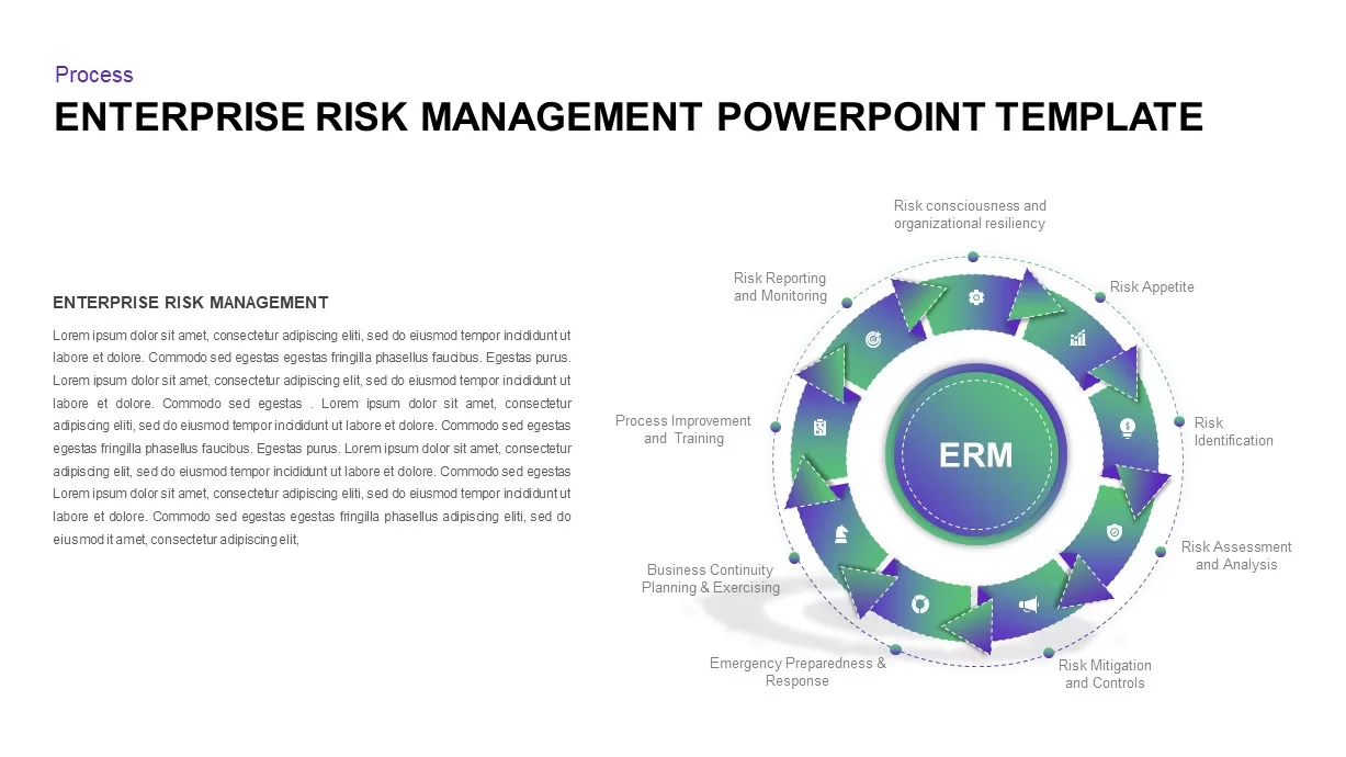
Enterprise Risk Management Cycle Diagram Template for PowerPoint & Google Slides
Process
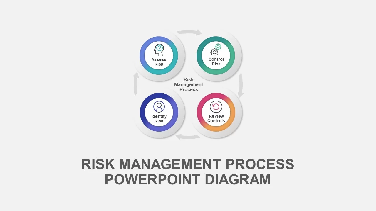
Risk Management Process Diagram Template for PowerPoint & Google Slides
Risk Management
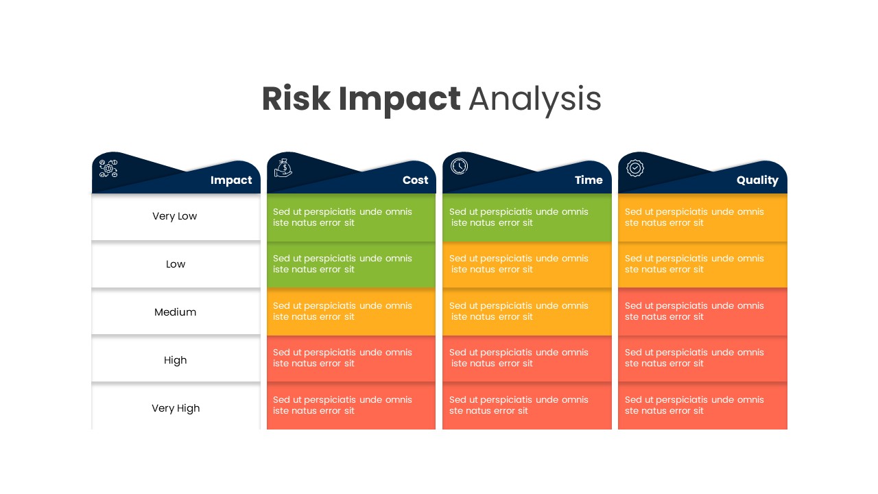
Comprehensive Risk Impact Analysis Template for PowerPoint & Google Slides
Risk Management
Risk Heatmap Comparison Template for PowerPoint & Google Slides
Maps
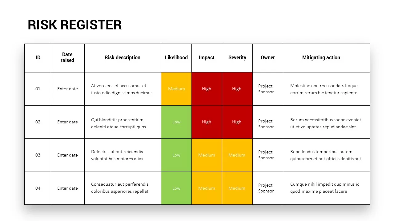
Comprehensive Risk Register Table Template for PowerPoint & Google Slides
Risk Management
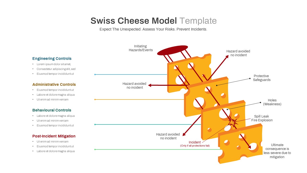
Swiss Cheese Risk Management Model Template for PowerPoint & Google Slides
Risk Management
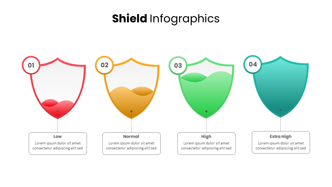
Shield Infographics Risk Indicators Template for PowerPoint & Google Slides
Infographics
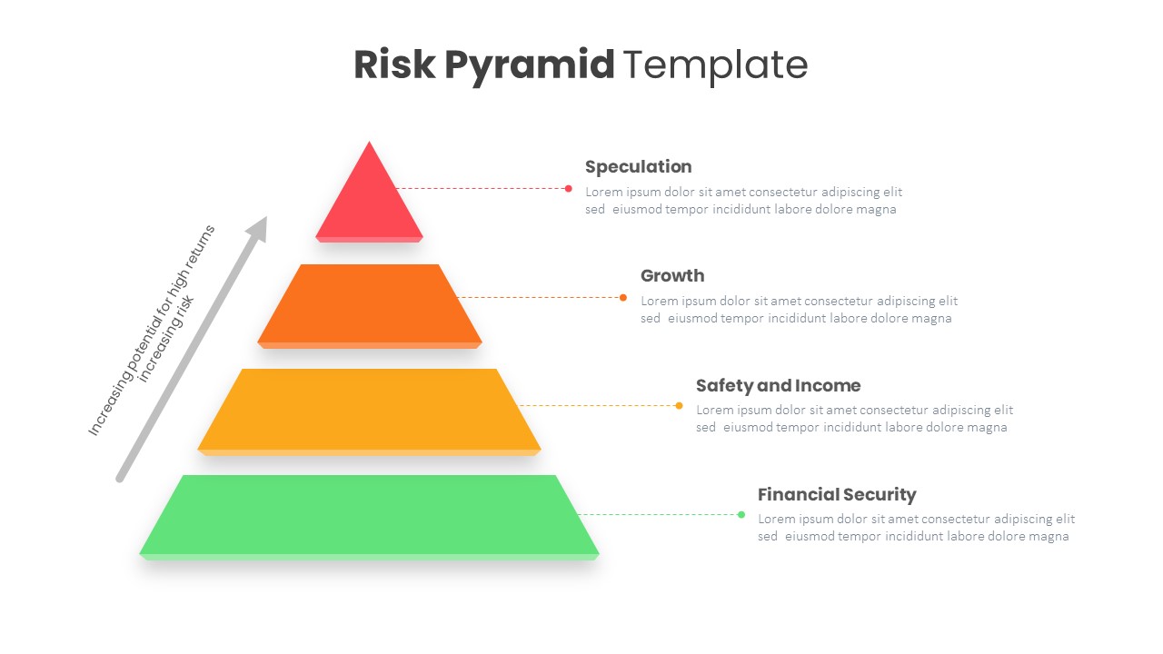
Risk Pyramid Hierarchy Analysis Template for PowerPoint & Google Slides
Pyramid
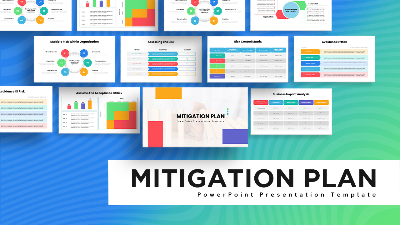
Risk Mitigation Plan Deck Template for PowerPoint & Google Slides
Risk Management
Work Safety Training & Risk Management Template for PowerPoint & Google Slides
Risk Management
Risk Management Consulting Deck Template for PowerPoint & Google Slides
Risk Management
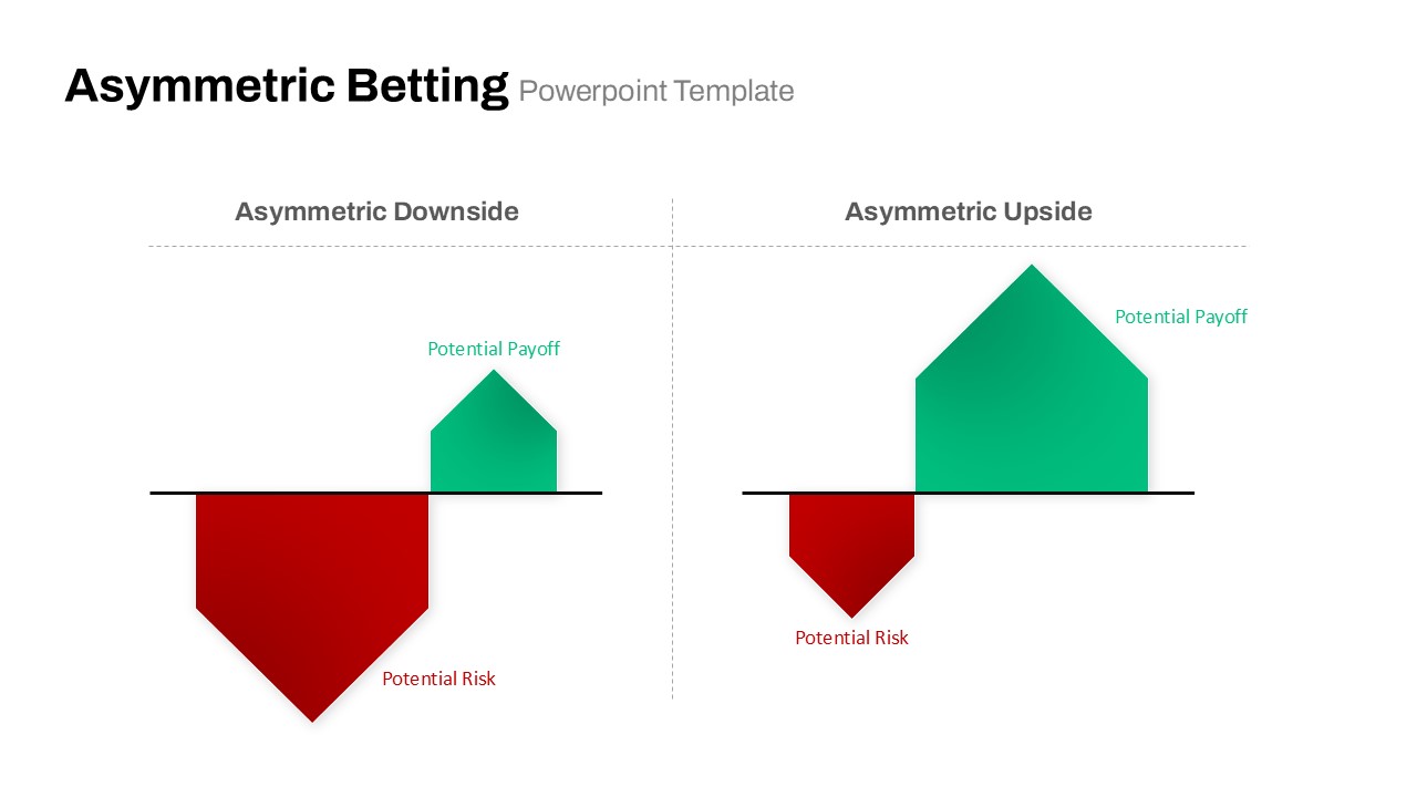
Asymmetric Betting Payoff Risk Diagram Template for PowerPoint & Google Slides
Comparison
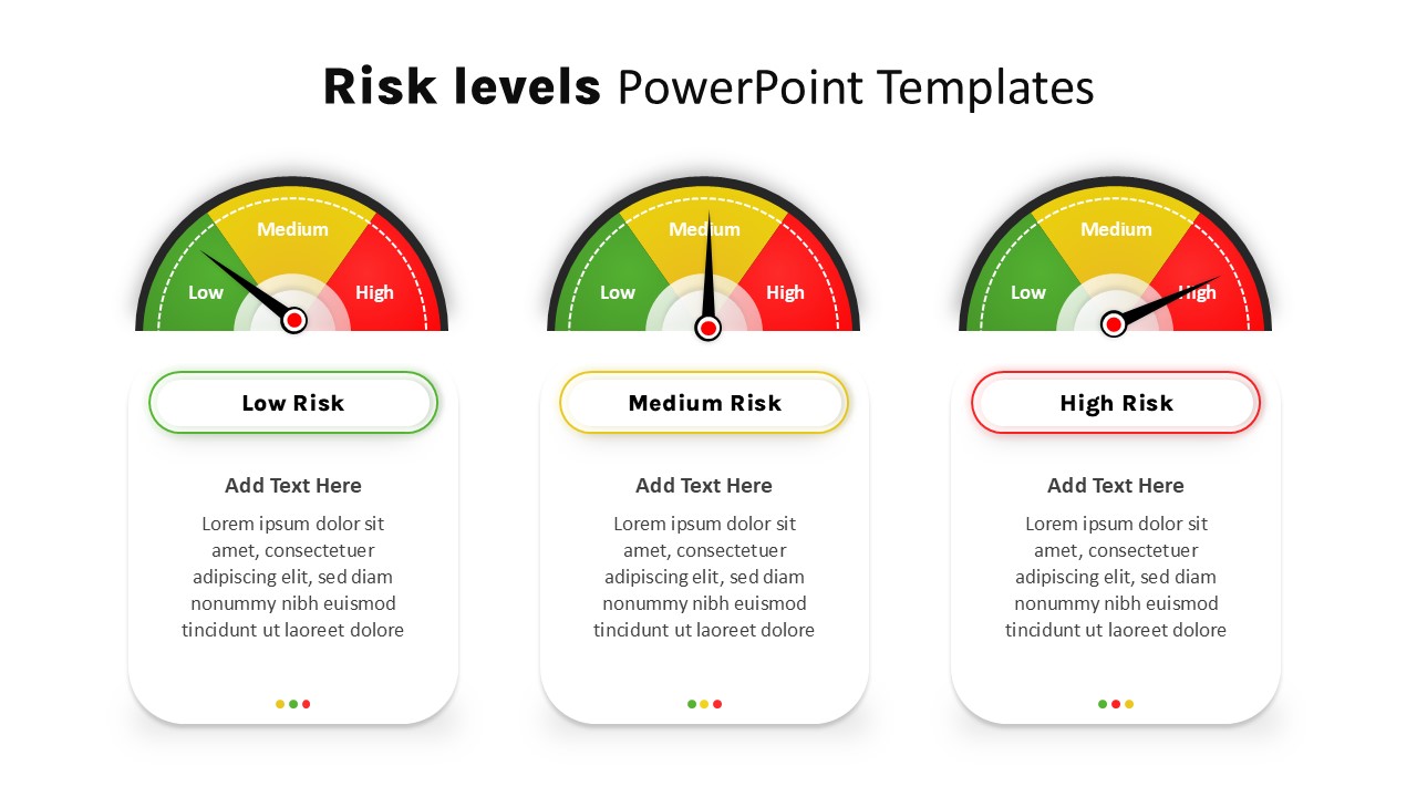
Risk Level Gauge Comparison Dashboard Template for PowerPoint & Google Slides
Comparison
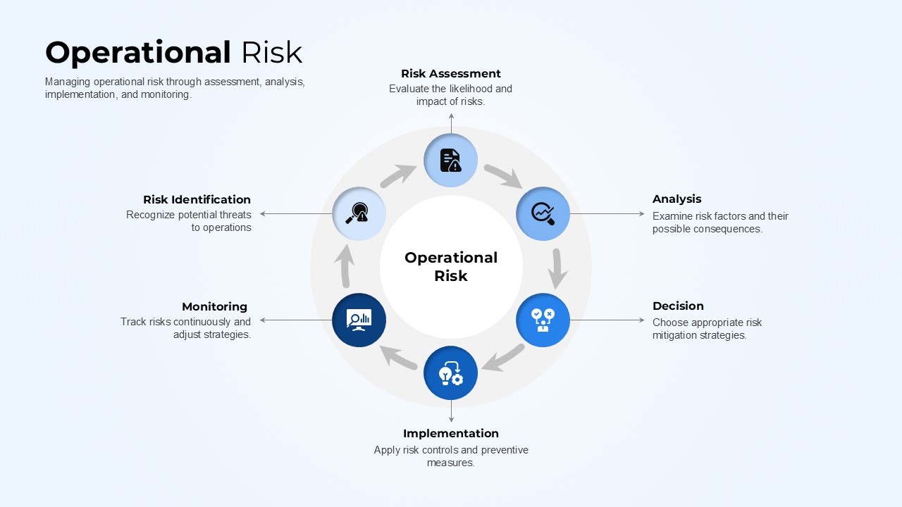
Operational Risk Template for PowerPoint & Google Slides
Risk Management
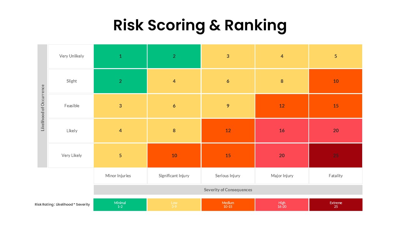
Risk Scoring & Ranking Heatmap Matrix Template for PowerPoint & Google Slides
Risk Management
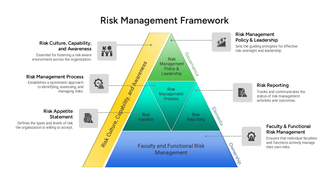
Risk Management Framework Pyramid Template for PowerPoint & Google Slides
Risk Management
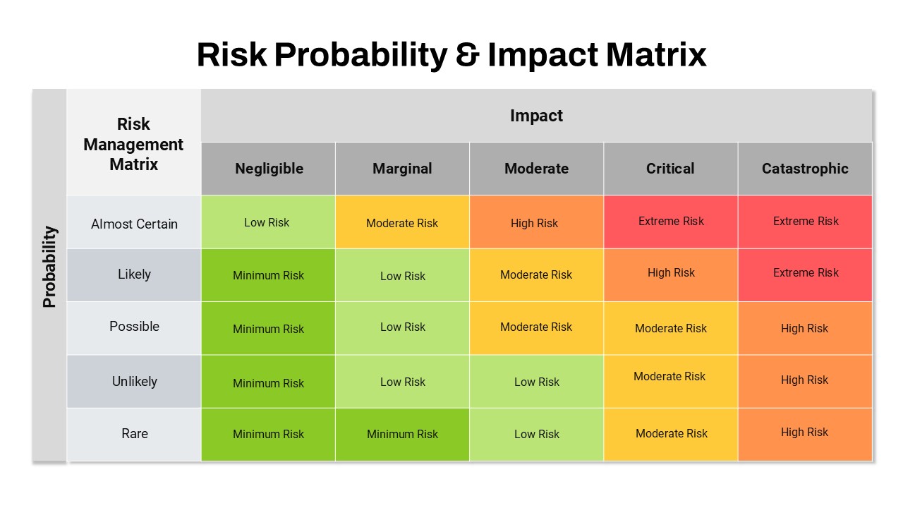
Risk Probability and Impact Matrix Template for PowerPoint & Google Slides
Risk Management
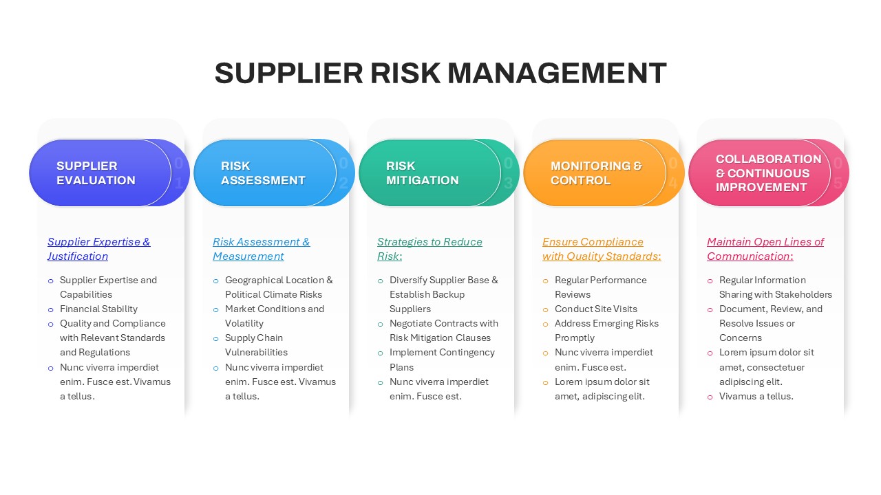
Supplier Risk Management template for PowerPoint & Google Slides
Opportunities Challenges
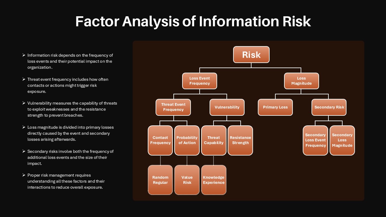
Factor Analysis of Information Risk Template for PowerPoint & Google Slides
Risk Management
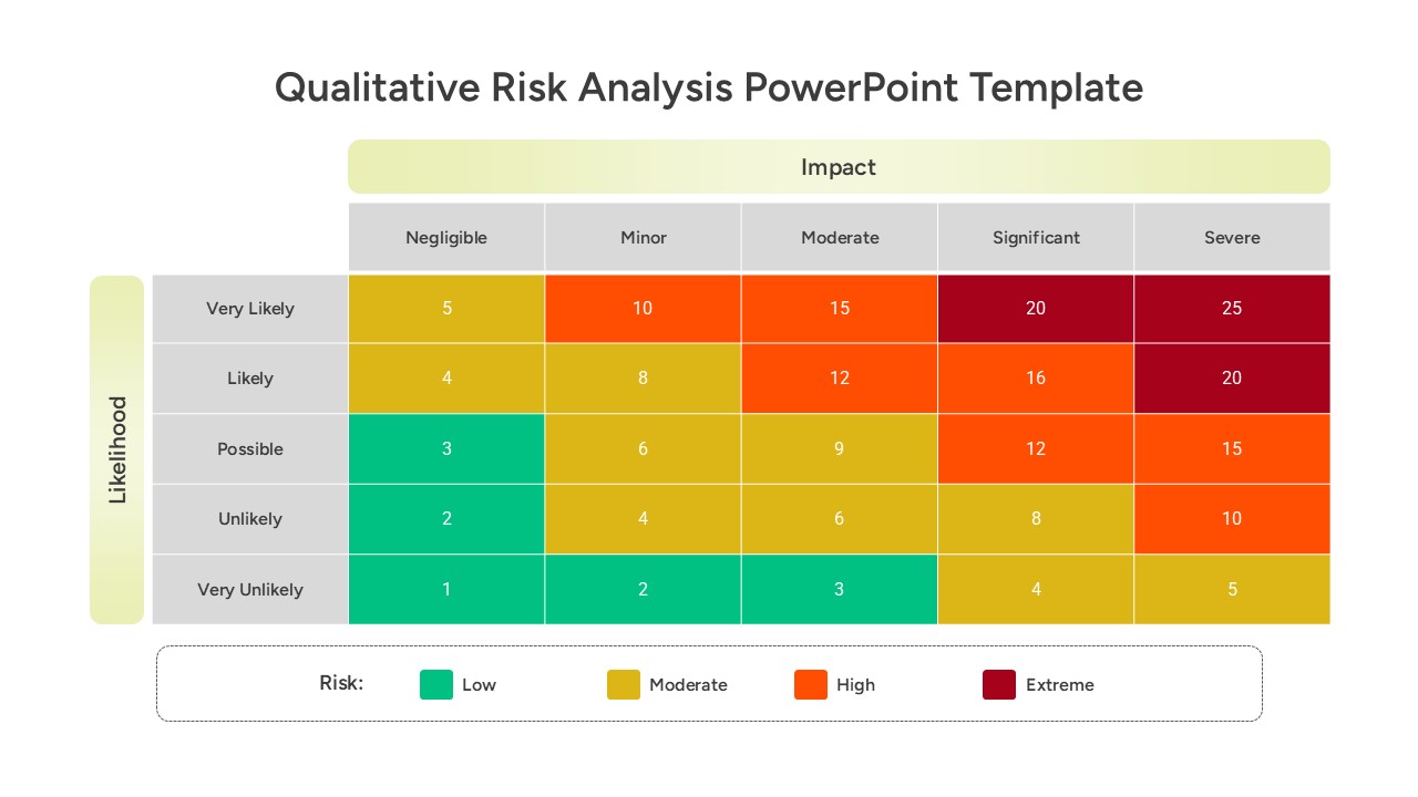
Qualitative Risk Analysis template for PowerPoint & Google Slides
Business
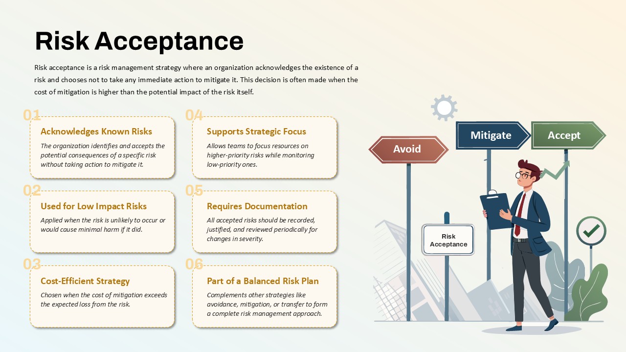
Risk Acceptance Workflow Template for PowerPoint & Google Slides
Risk Management
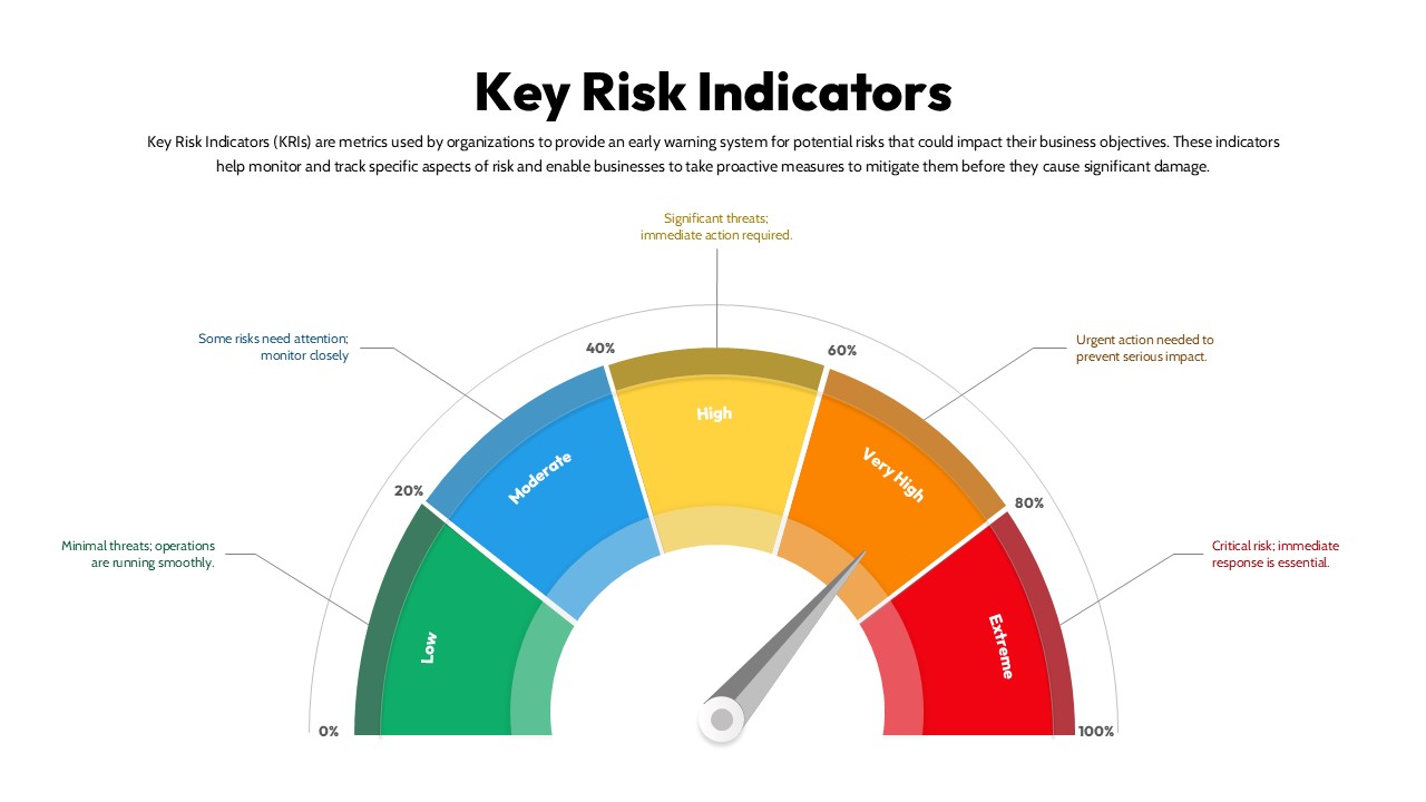
Key Risk Indicators (KRI) Gauge Template for PowerPoint & Google Slides
Risk Management
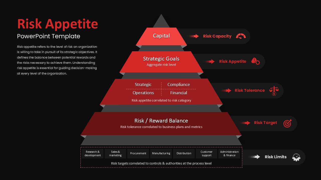
Risk Appetite Pyramid Framework Template for PowerPoint & Google Slides
Pyramid
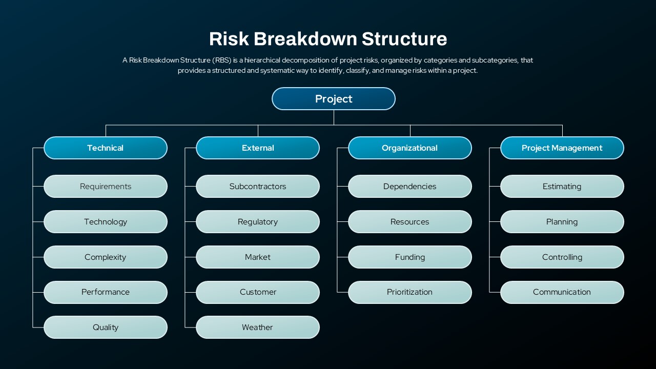
Risk Breakdown Structure Diagram Template for PowerPoint & Google Slides
Org Chart
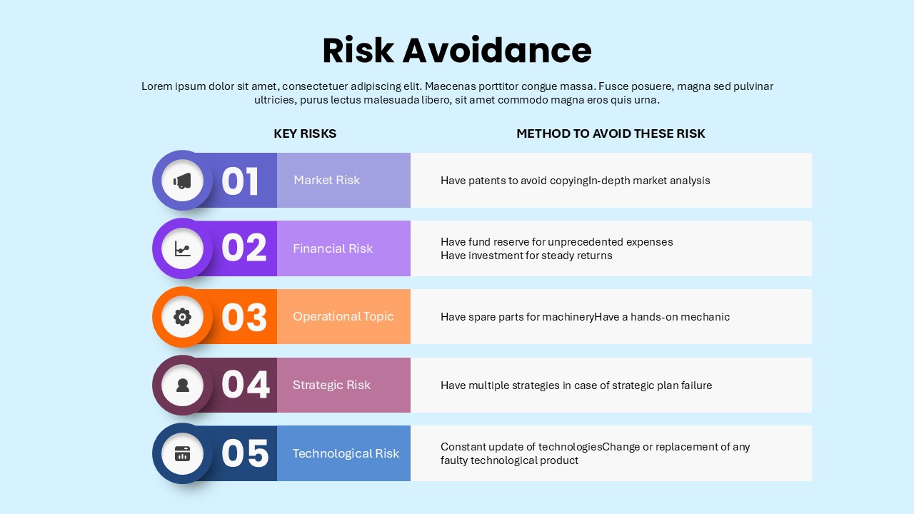
Risk Avoidance: Five Risks & Mitigation Template for PowerPoint & Google Slides
Risk Management
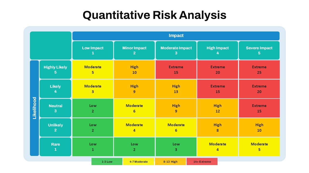
Quantitative Risk Analysis Matrix template for PowerPoint & Google Slides
Risk Management
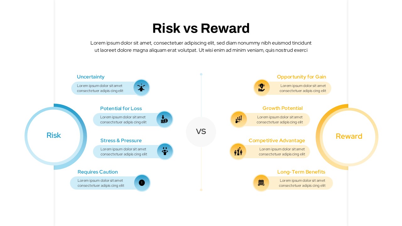
Risk vs Reward Comparison Template for PowerPoint & Google Slides
Opportunities Challenges
Credit Risk Modeling Template for PowerPoint & Google Slides
Risk Management
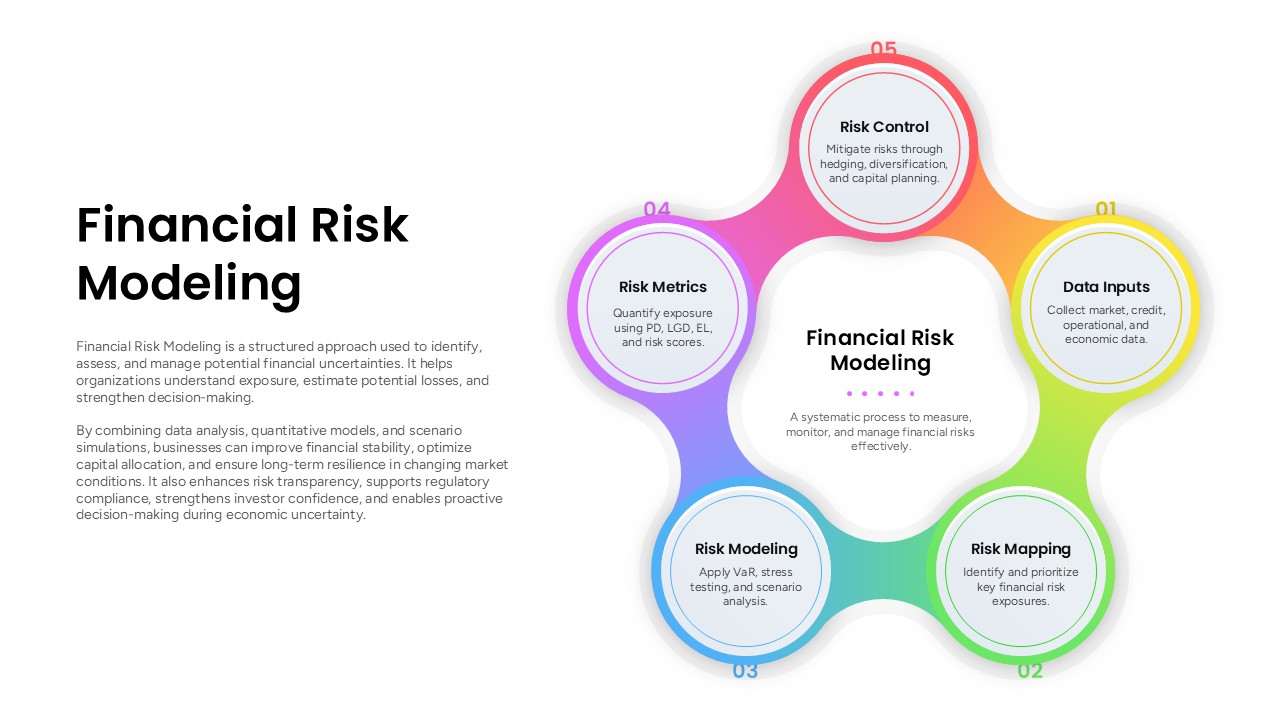
Financial Risk Modeling Template for PowerPoint & Google Slides
Risk Management
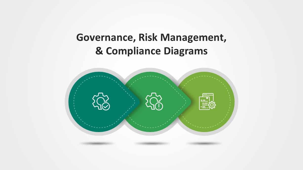
Governance, Risk & Compliance Overview Diagrams for PowerPoint & Google Slides
Risk Management
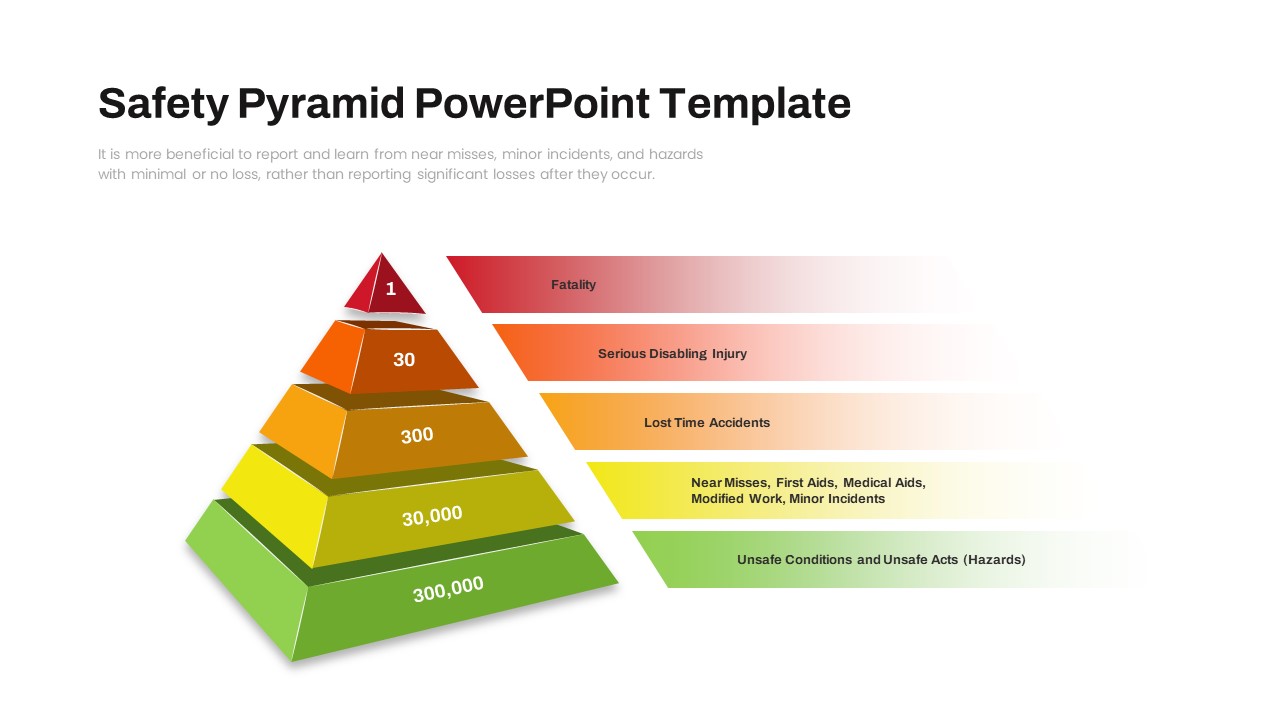
Safety Incident Pyramid Risk Hierarchy Slide for PowerPoint & Google Slides
Risk Management
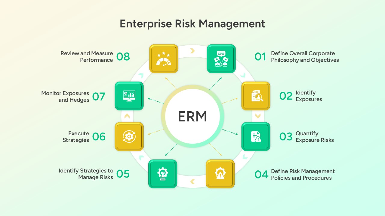
Enterprise Risk Management (ERM) Framework for PowerPoint & Google Slides
Business Plan
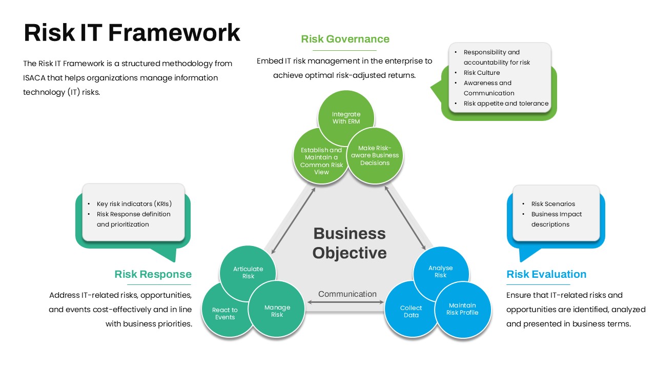
Risk IT Framework Overview for PowerPoint & Google Slides
Business Strategy

Road Map Timeline Presentation template for PowerPoint & Google Slides
Roadmap
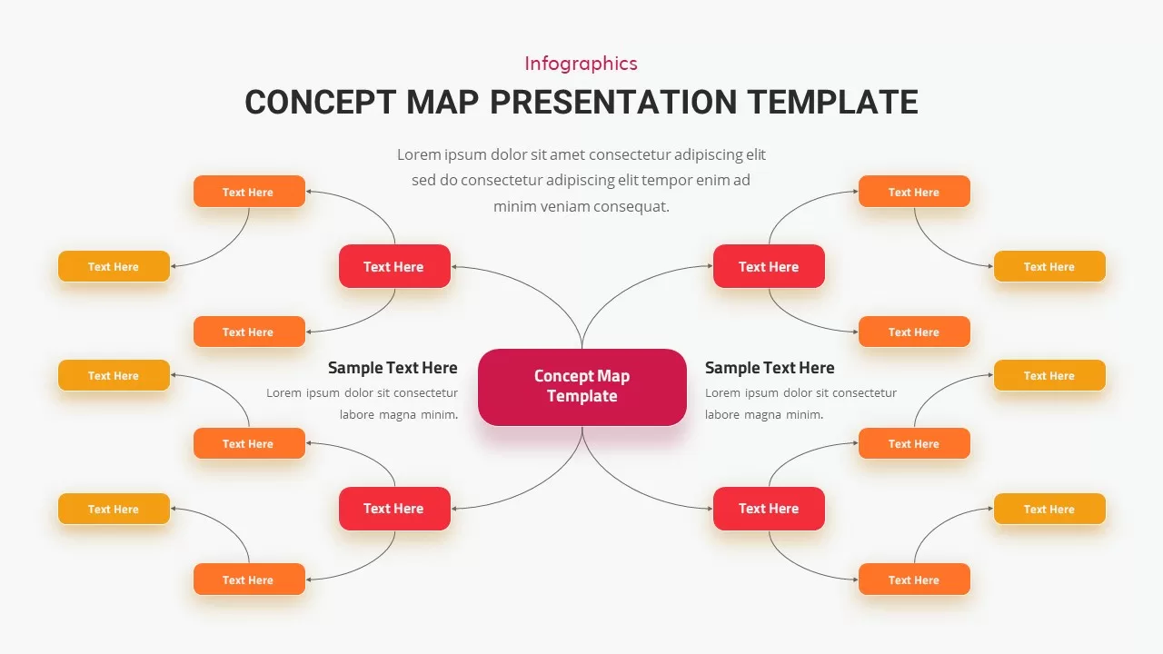
Concept Map Presentation Template for PowerPoint & Google Slides
Mind Maps
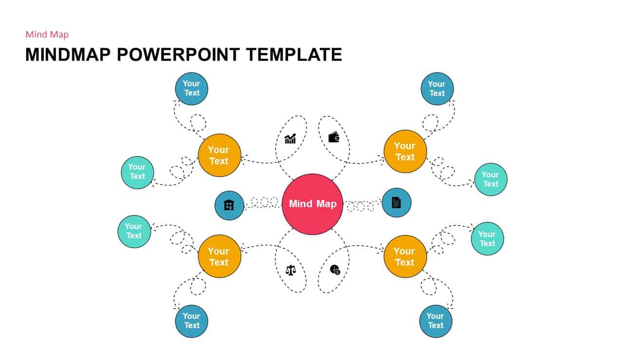
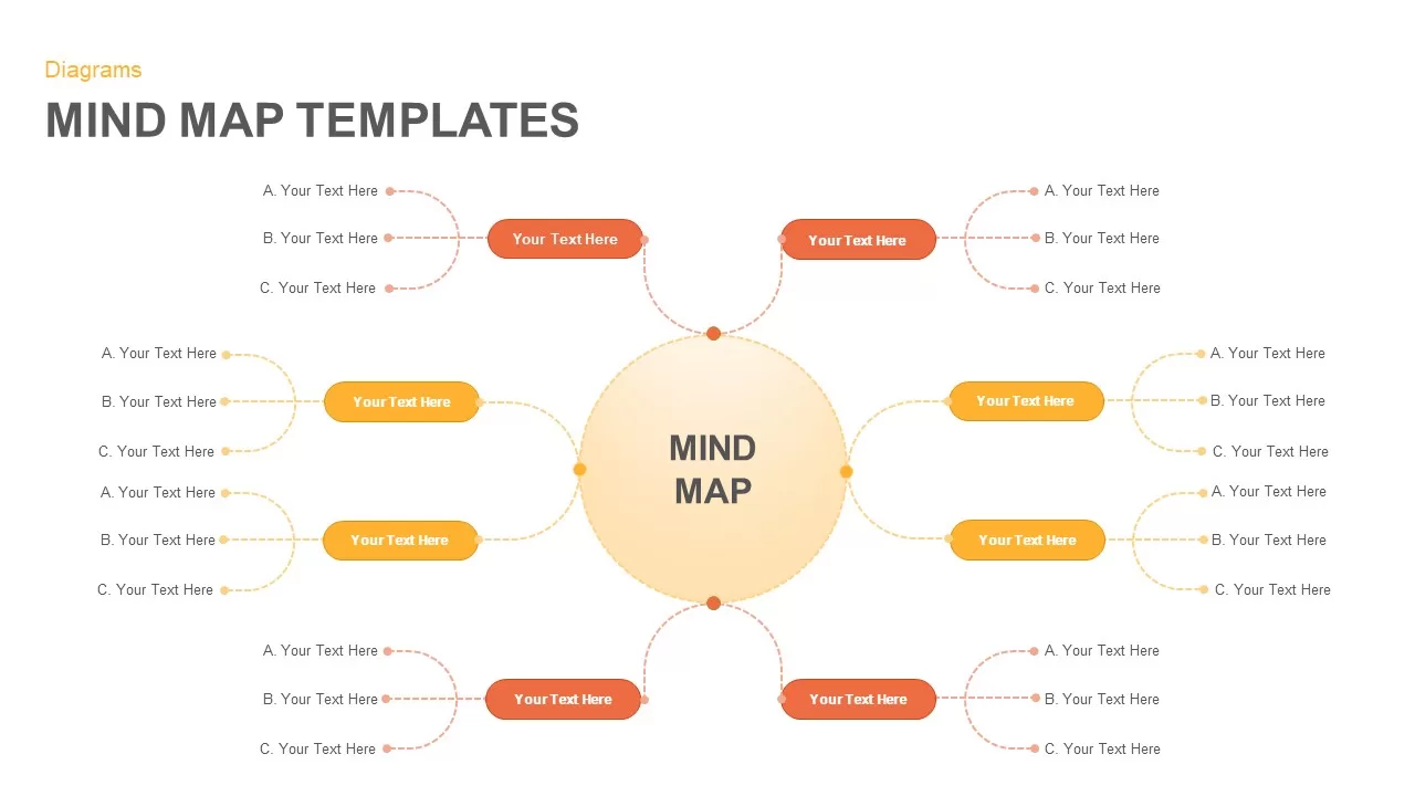
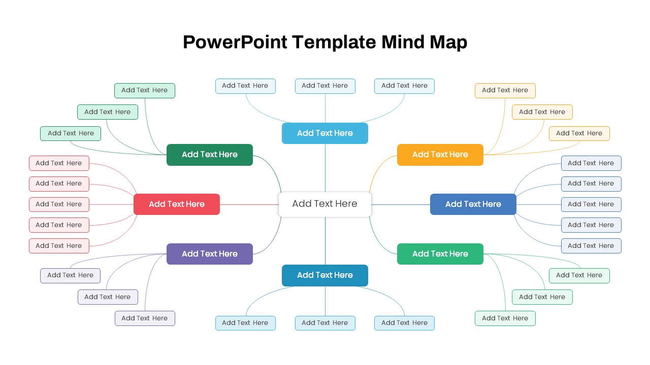
Mind Map PowerPoint template for PowerPoint & Google Slides
Mind Maps
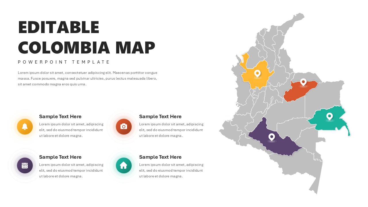
Editable Colombia Map PowerPoint Template for PowerPoint & Google Slides
Business Models
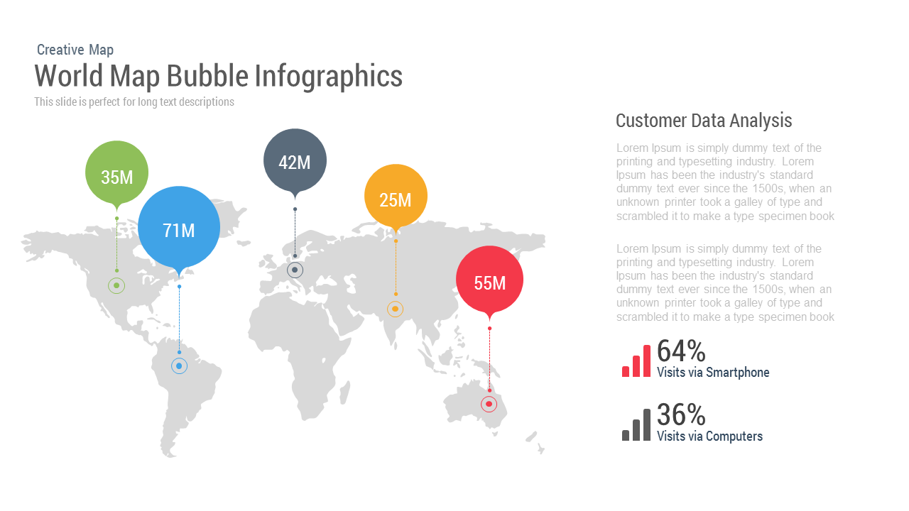
World Map Bubble template for PowerPoint & Google Slides
World Maps

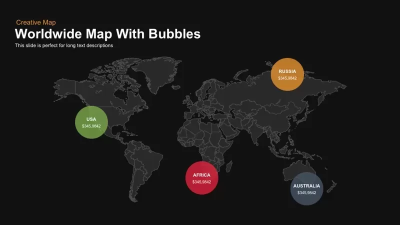
Worldwide Map with Bubbles template for PowerPoint & Google Slides
World Maps
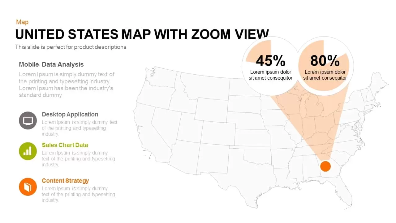
United States Map with Zoom View template for PowerPoint & Google Slides
World Maps
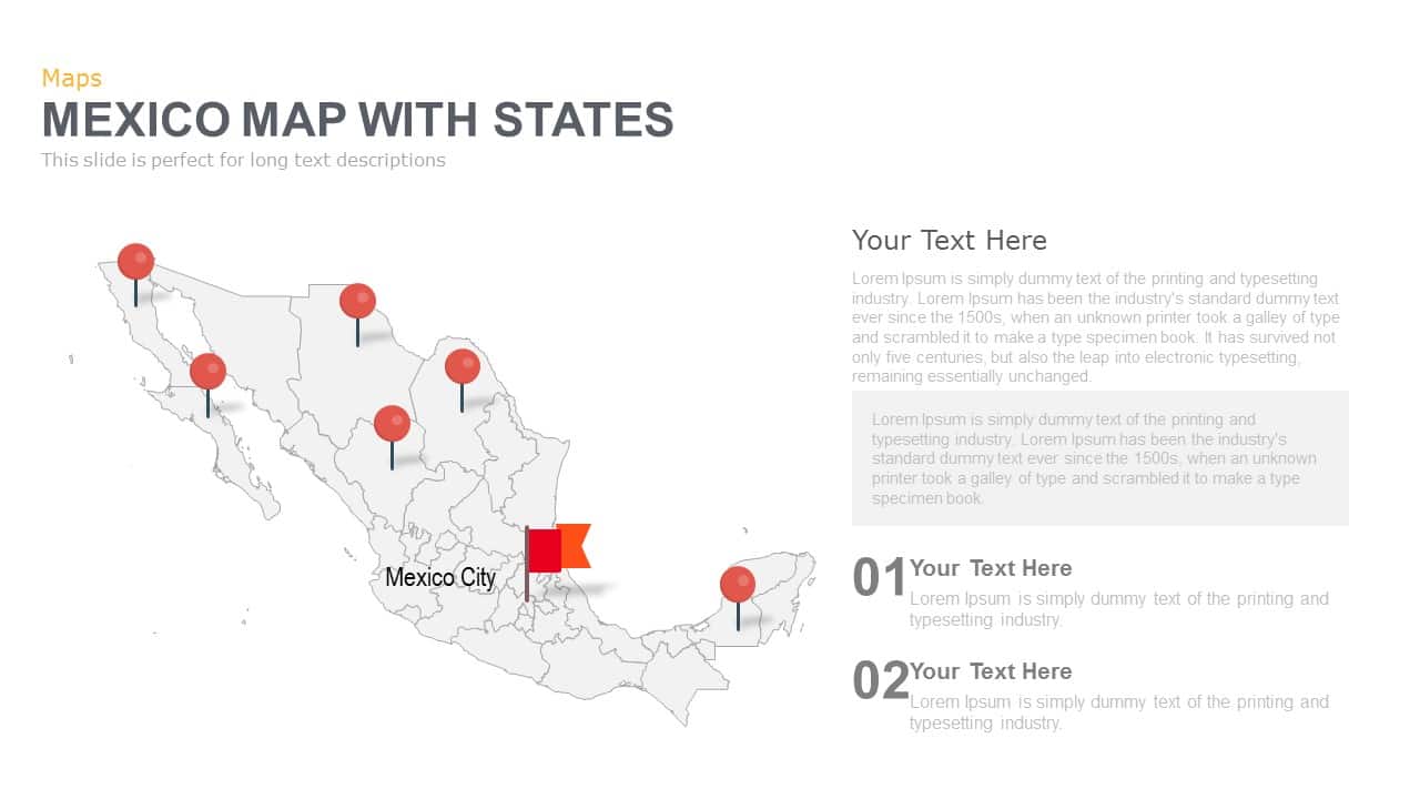
Mexico Map With States Template for PowerPoint & Google Slides
World Maps

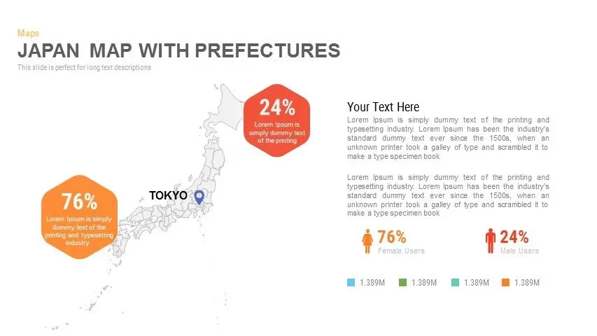
Japan Province Map Infographic Template for PowerPoint & Google Slides
Maps
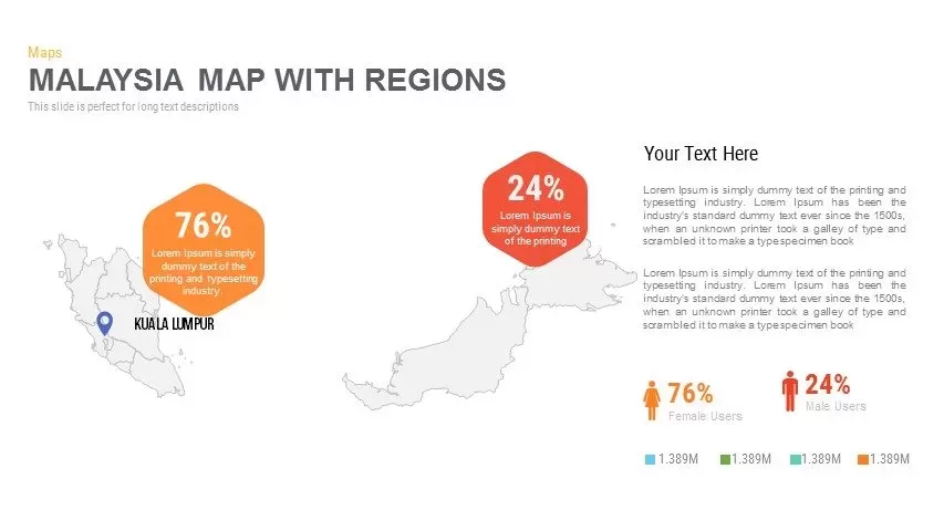
Malaysia Regional Map Infographic Template for PowerPoint & Google Slides
Maps
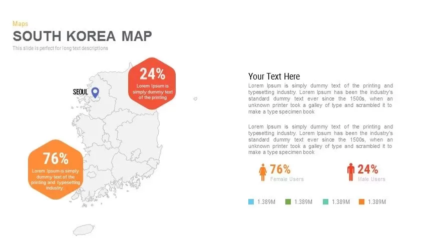
Infographic South Korea Map Template for PowerPoint & Google Slides
Maps
Sri Lanka Map Infographic Pack Template for PowerPoint & Google Slides
Maps
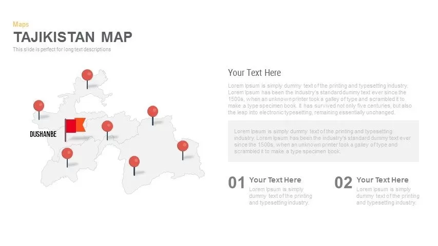
Editable Tajikistan Provinces Map Pack Template for PowerPoint & Google Slides
Maps
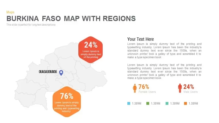
Burkina Faso Map with Regions Slide Pack Template for PowerPoint & Google Slides
World Maps
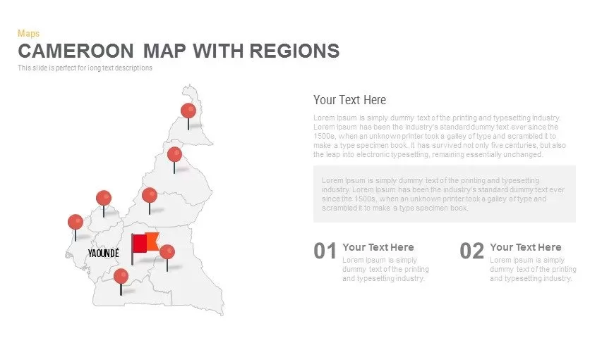
Cameroon Map with Regions Slide Pack Template for PowerPoint & Google Slides
World Maps
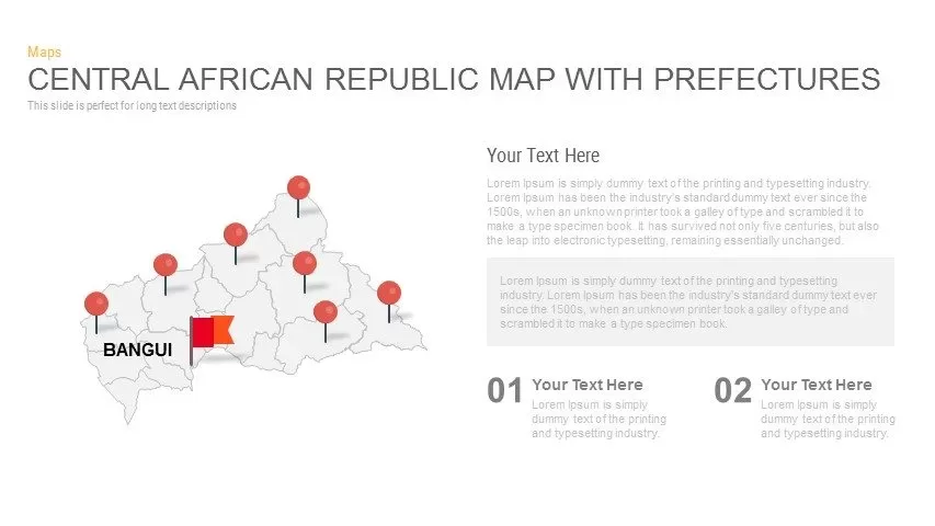
Central African Republic Prefectures Map Template for PowerPoint & Google Slides
World Maps
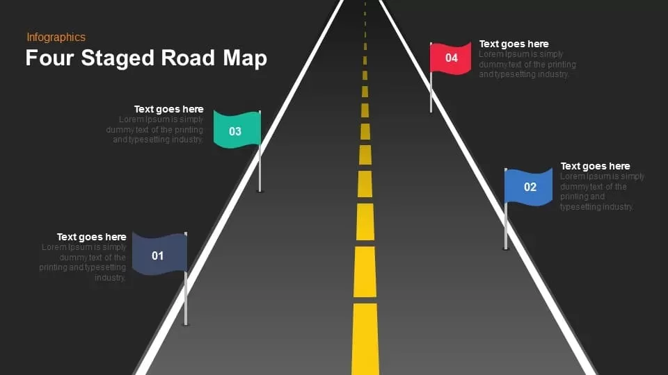
Four Staged Road Map template for PowerPoint & Google Slides
Roadmap

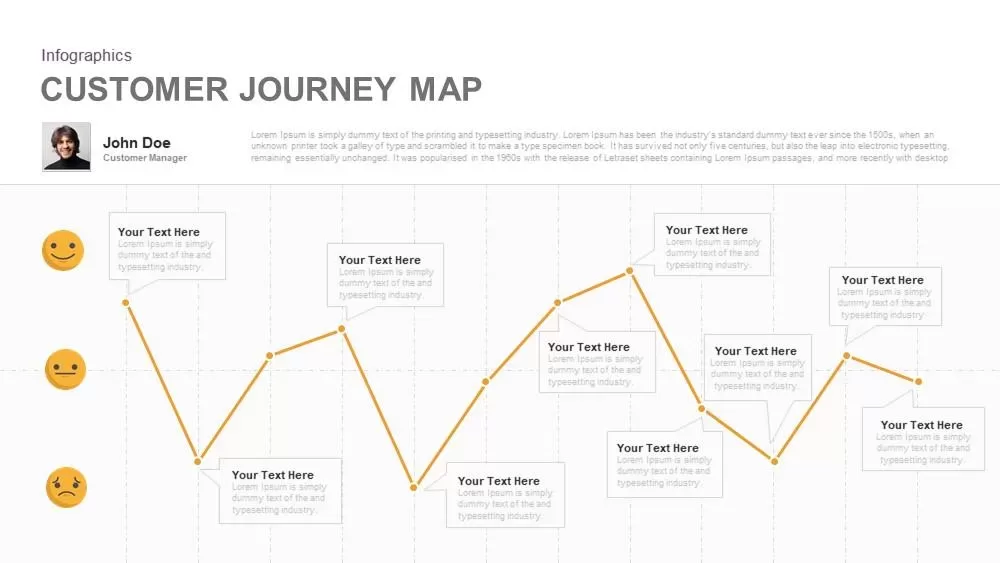
Emotional Customer Journey Map Template for PowerPoint & Google Slides
Customer Journey
Mind Map Diagram Template for PowerPoint & Google Slides
Mind Maps
Versatile Mind Map Infographic Template for PowerPoint & Google Slides
Mind Maps
Structured Mind Map Infographic Diagram Template for PowerPoint & Google Slides
Mind Maps
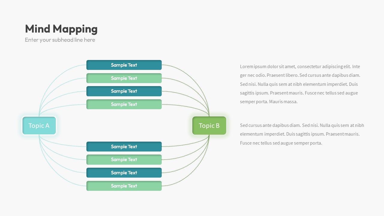
Dual Topic Mind Map Infographic Template for PowerPoint & Google Slides
Mind Maps
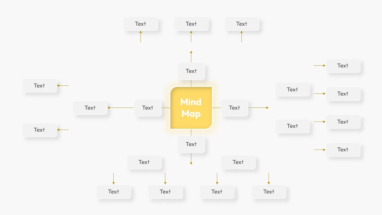
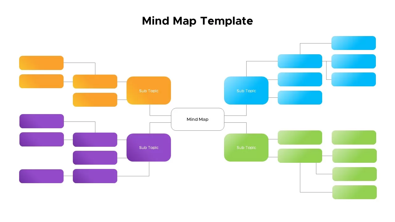
Mind Map Template for PowerPoint & Google Slides
Mind Maps
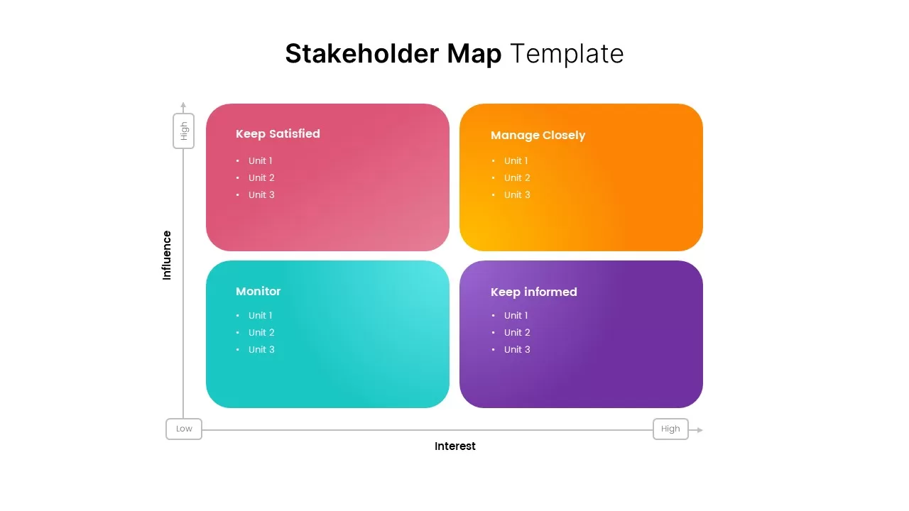
Stakeholder Map Template for PowerPoint & Google Slides
Business
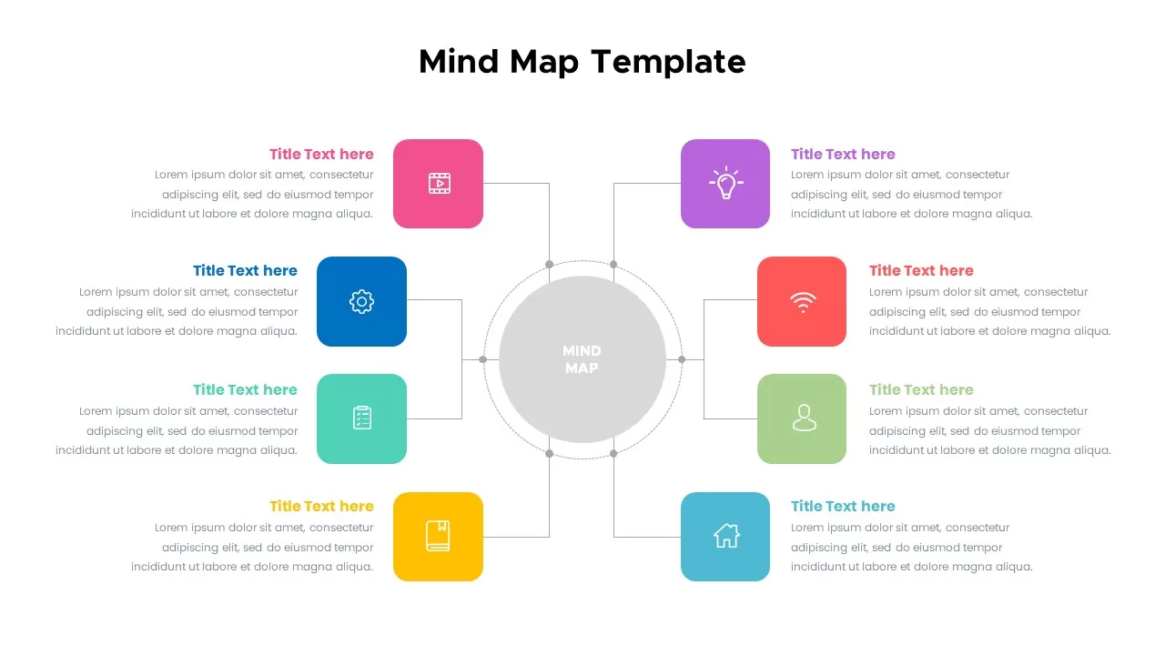
Colorful Mind Map with Icons Template for PowerPoint & Google Slides
Mind Maps
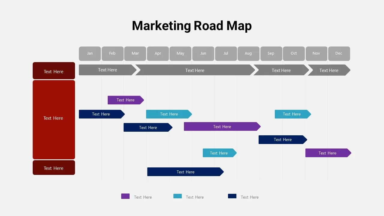
Detailed Marketing Road Map Timeline Template for PowerPoint & Google Slides
Timeline
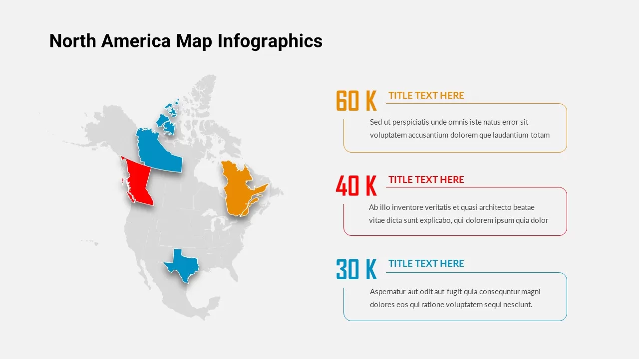
North America Map Infographic Slide Template for PowerPoint & Google Slides
World Maps
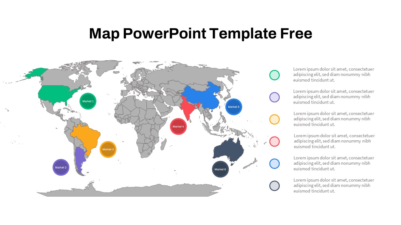
Free Global Market Distribution Map Template for PowerPoint & Google Slides
World Maps
Free
Modern Custom Eight-Branch Mind Map Template for PowerPoint & Google Slides
Mind Maps
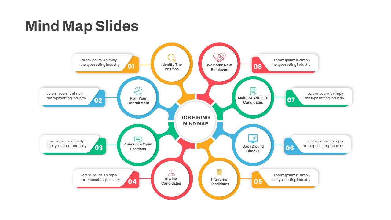
Eight-Step Job Hiring Mind Map Template for PowerPoint & Google Slides
Mind Maps
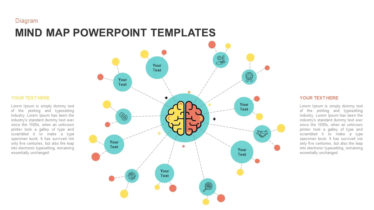
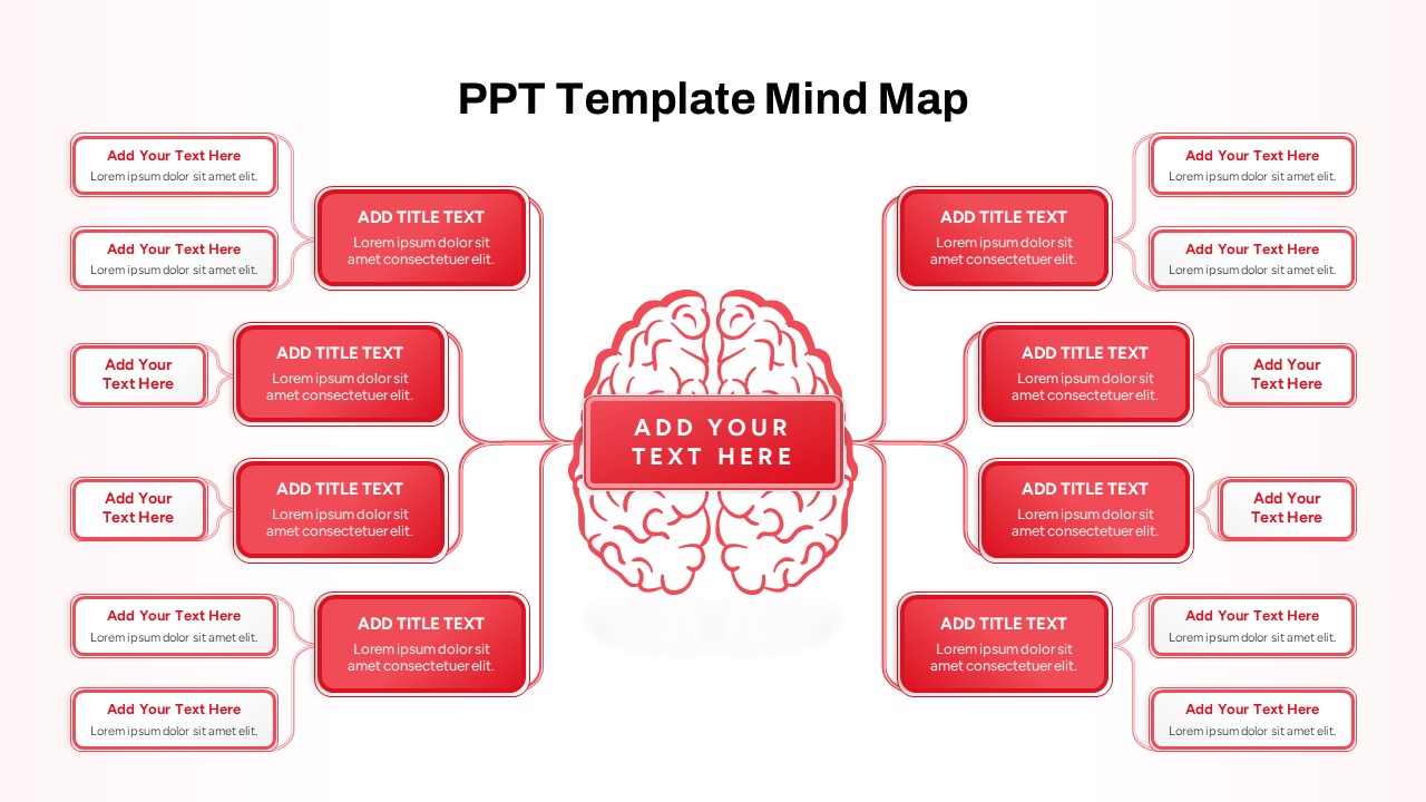
Red Brain Mind Map Diagram Template for PowerPoint & Google Slides
Mind Maps
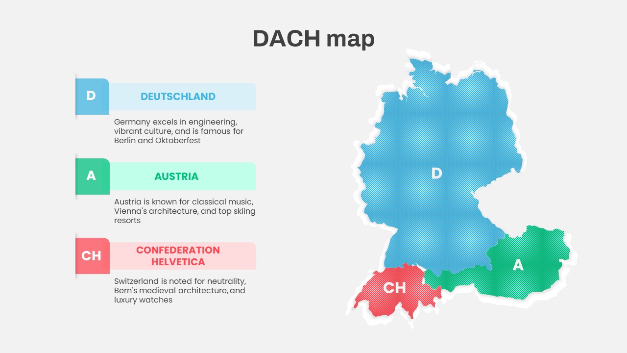
DACH Region Map with Country Highlights Template for PowerPoint & Google Slides
Maps
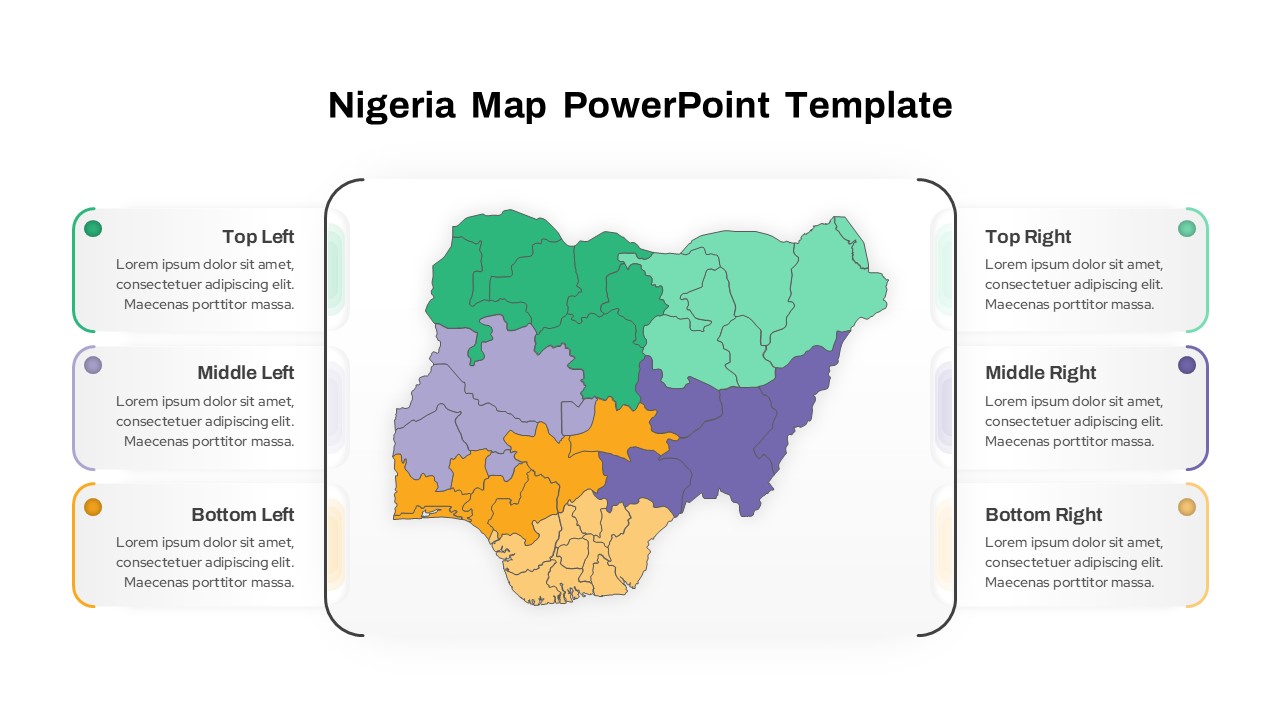
Nigeria Regional Callout Map Diagram Template for PowerPoint & Google Slides
Maps
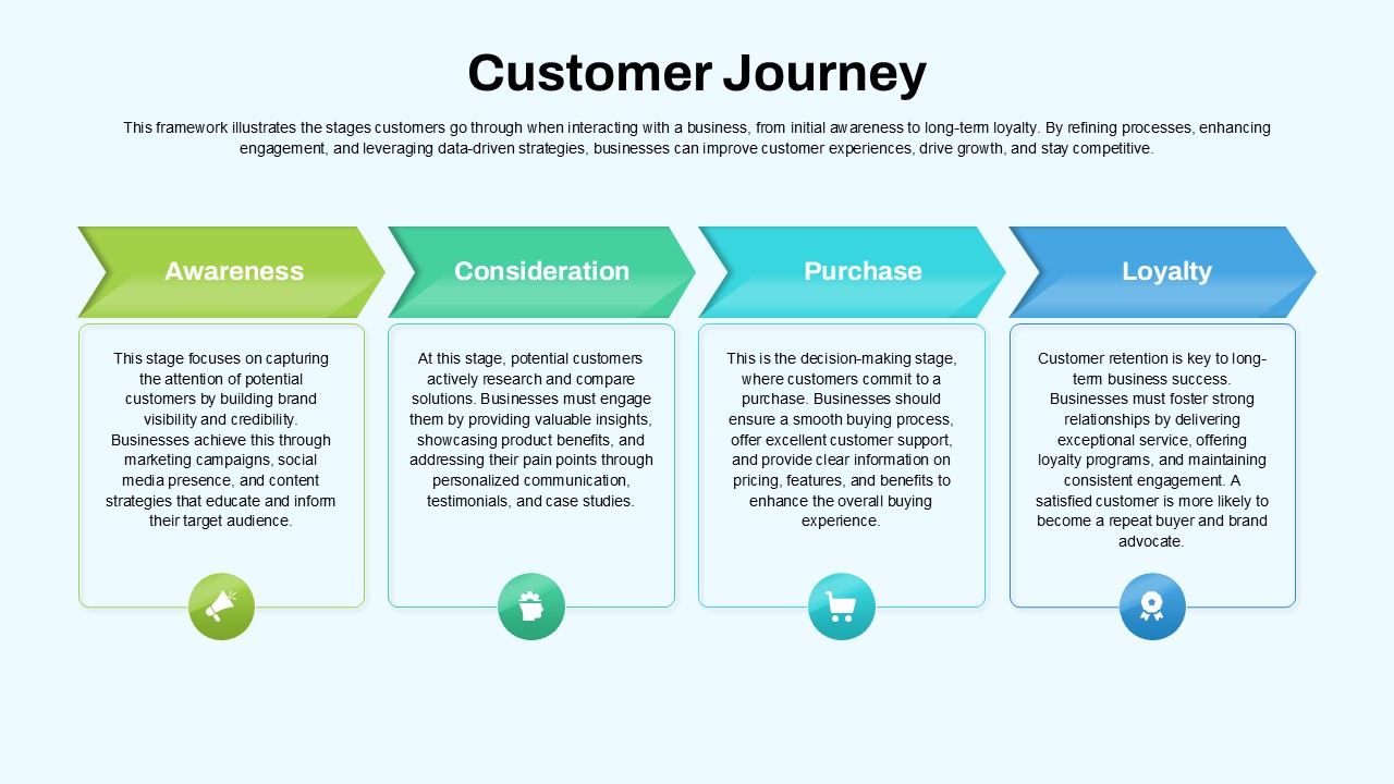
Customer Journey Process Map Infographic Template for PowerPoint & Google Slides
Customer Journey
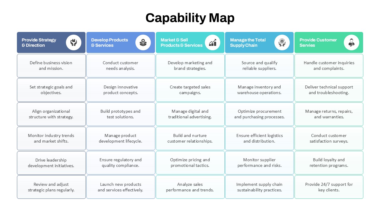
Capability Map Overview Template for PowerPoint & Google Slides
Business Strategy
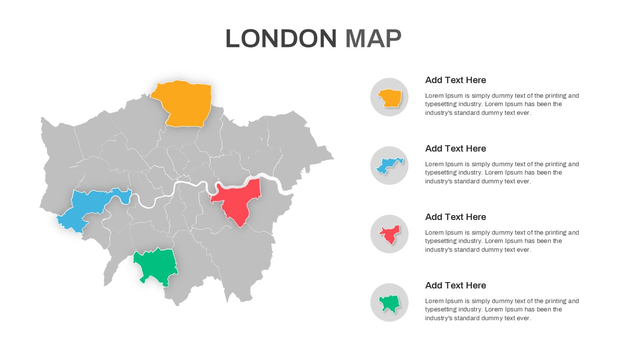
London Map with Highlighted Boroughs Template for PowerPoint & Google Slides
World Maps
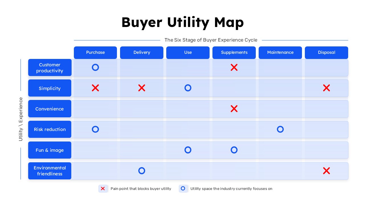
Buyer Utility Map Strategy Matrix Template for PowerPoint & Google Slides
Customer Journey