Connected Bubble Network Infographic Template for PowerPoint & Google Slides

Description
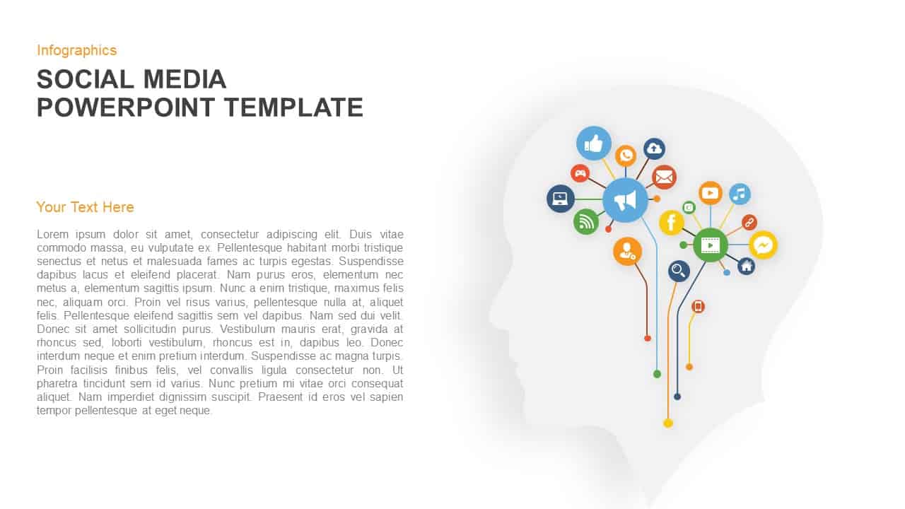
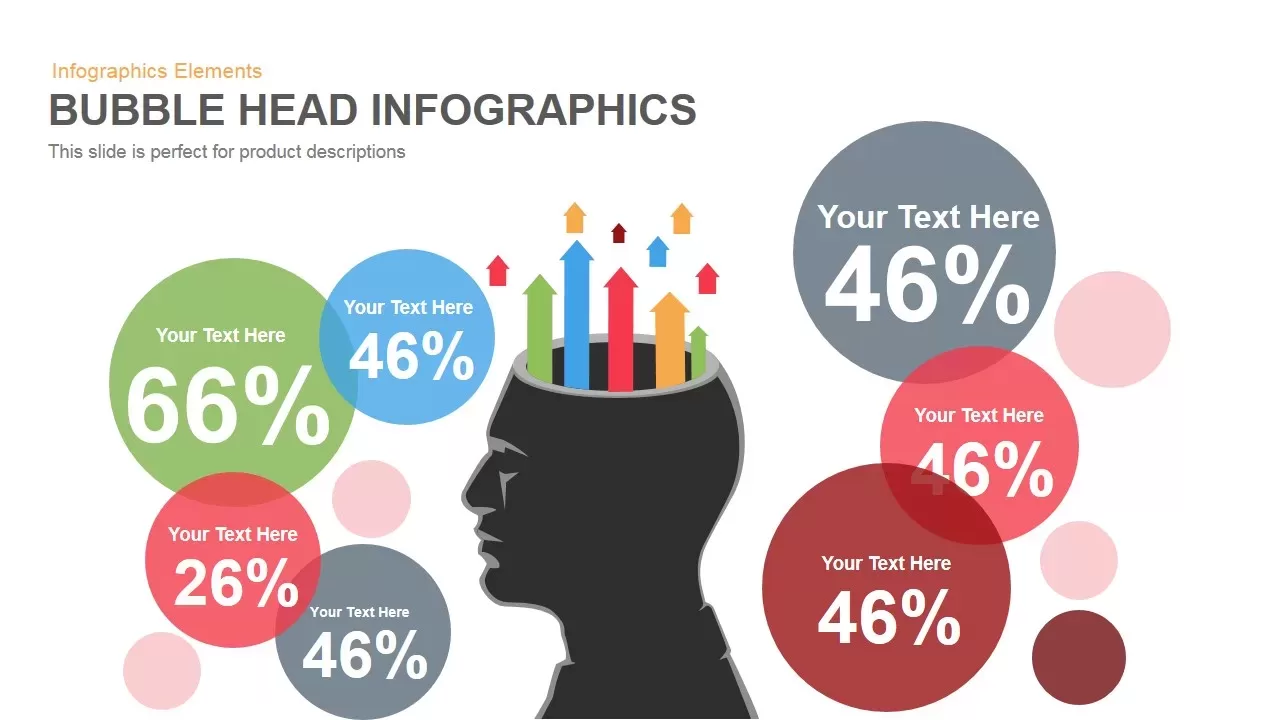
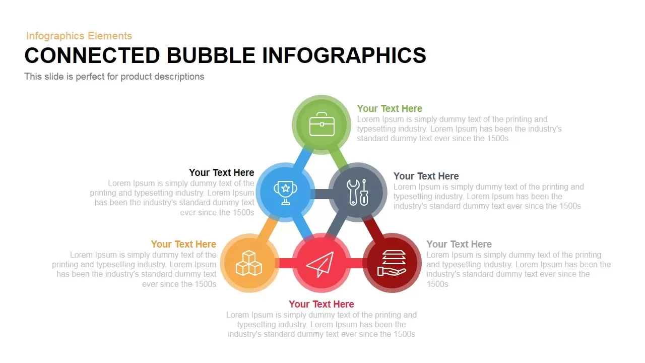
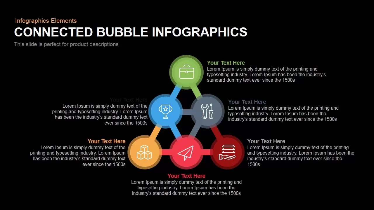
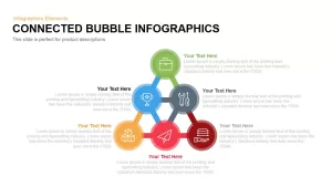
Leverage this striking connected bubble infographic slide to illustrate interrelated concepts, metrics, or workflows around a central idea. At its core, a bold silhouette head graphic serves as the focal point, topped by multicolored arrows symbolizing emerging insights. Six surrounding bubbles, each with distinct accent hues—green, blue, gray, yellow, and red—connect to the central node via crisp, vector-based connectors. Customizable icons within each bubble allow you to represent categories such as strategy, performance, tools, and resources. Placeholder headings and descriptive text blocks ensure clear annotation of each segment.
Built on master slide layouts and fully editable in both PowerPoint and Google Slides, this template enables rapid customization. Adjust bubble colors, swap icons, resize shapes, or update connector paths in seconds. The high-resolution vector assets maintain fidelity at any scale, and the neutral white background paired with minimalist typography ensures readability across screens. Semi-transparent navigation arrows flank the sides, hinting at carousel-style walkthroughs or multi-slide storytelling. Use built-in placeholders to add detailed notes, statistics, or callouts directly within the slide.
This infographic excels at visualizing complex relationships, such as team hierarchies, process steps, or survey responses. The radial layout naturally guides audience attention from the center outward, reinforcing the core concept while highlighting peripheral elements. Color-coded bubbles and icons offer immediate visual cues for category differentiation, making data interpretation faster and more engaging. Whether you’re presenting stakeholder feedback, user research outcomes, or brainstorming results, this slide transforms static information into dynamic, interactive narratives.
Beyond product and marketing presentations, repurpose this connected bubble model for organizational structures, risk assessment frameworks, or feature comparison charts. Duplicate bubbles or connectors to expand segments, or replace the central silhouette with custom graphics to match your branding. Ideal for workshops, training modules, or executive briefings, this design fosters collaboration and clarity by visually mapping dependencies and relationships. Streamline your workflow with consistent formatting, scalable graphics, and error-free rendering across platforms, ensuring polished, professional presentations every time.
Who is it for
Marketing managers, UX designers, product developers, and data analysts will find this connected bubble infographic ideal for presenting survey data, process workflows, or stakeholder feedback in training sessions, brainstorming workshops, or pitch decks.
Other Uses
Use this slide to map organizational hierarchies, risk-reward analyses, feature comparisons, or resource allocation models. Replace or expand bubbles to depict market segments, user personas, or project phases, adapting the layout for strategic planning, academic lectures, or team retrospectives.
Login to download this file

Item ID
SB00118
Related Templates

Interactive Connected Network Diagram Template for PowerPoint & Google Slides
Process

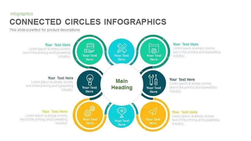
Radial Connected Circles Infographic Template for PowerPoint & Google Slides
Circular
Social Media Mind Network Infographic Template for PowerPoint & Google Slides
Digital Marketing
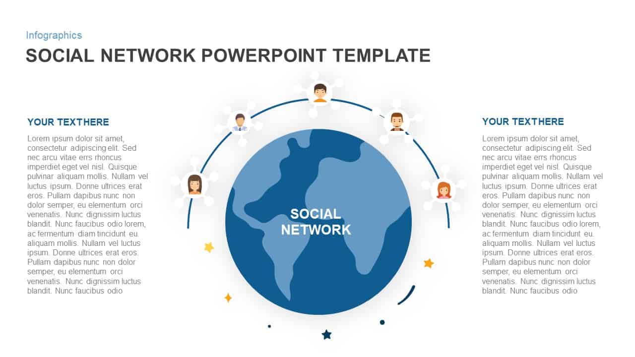
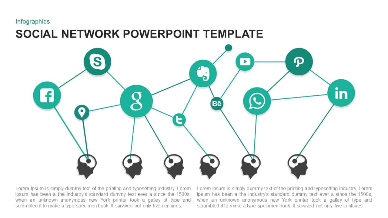
Social Network Connectivity Infographic Template for PowerPoint & Google Slides
Infographics
Social Network Infographic Diagram Template for PowerPoint & Google Slides
Digital Marketing
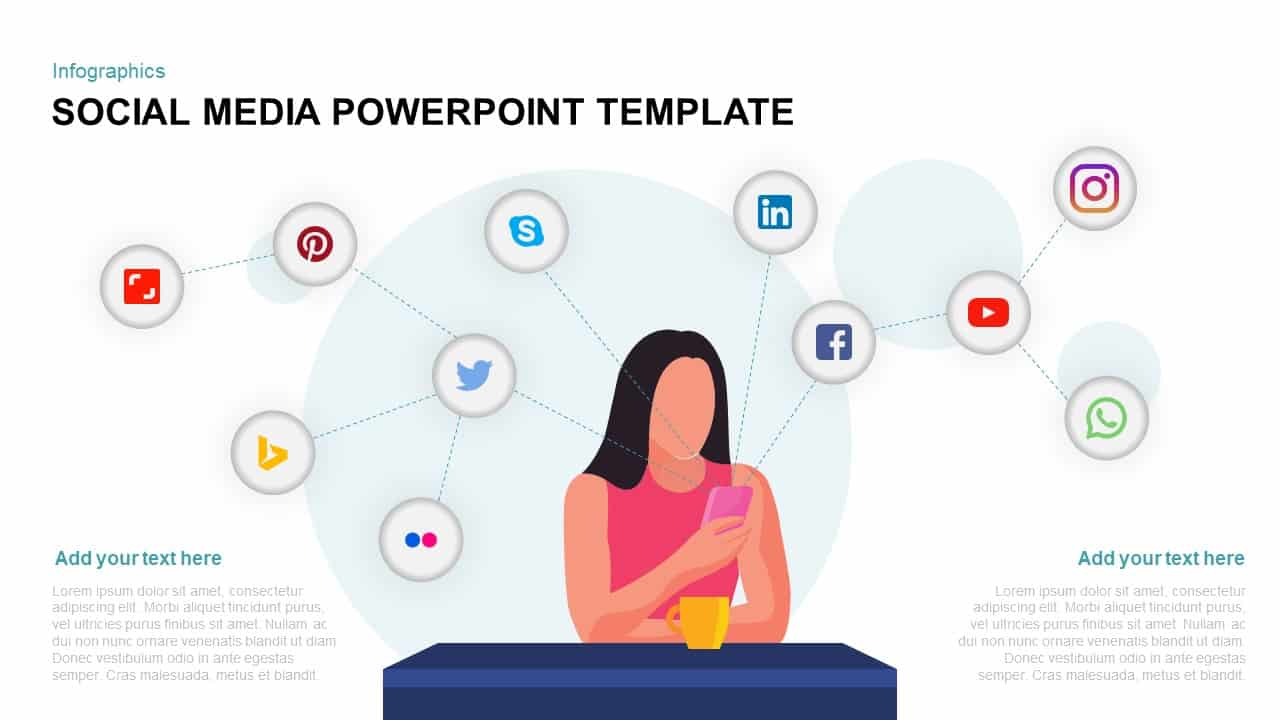
Social Media Network Infographic Template for PowerPoint & Google Slides
Circular
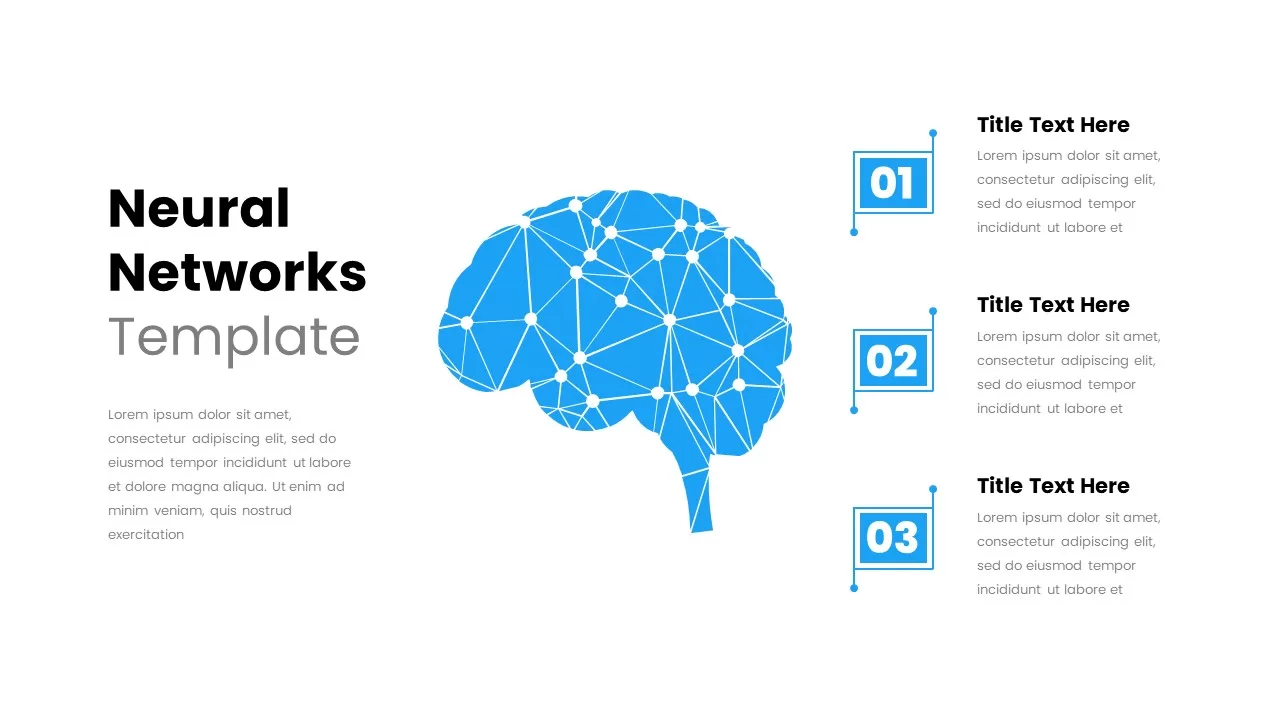
Neural Network Brain Infographic Template for PowerPoint & Google Slides
Process
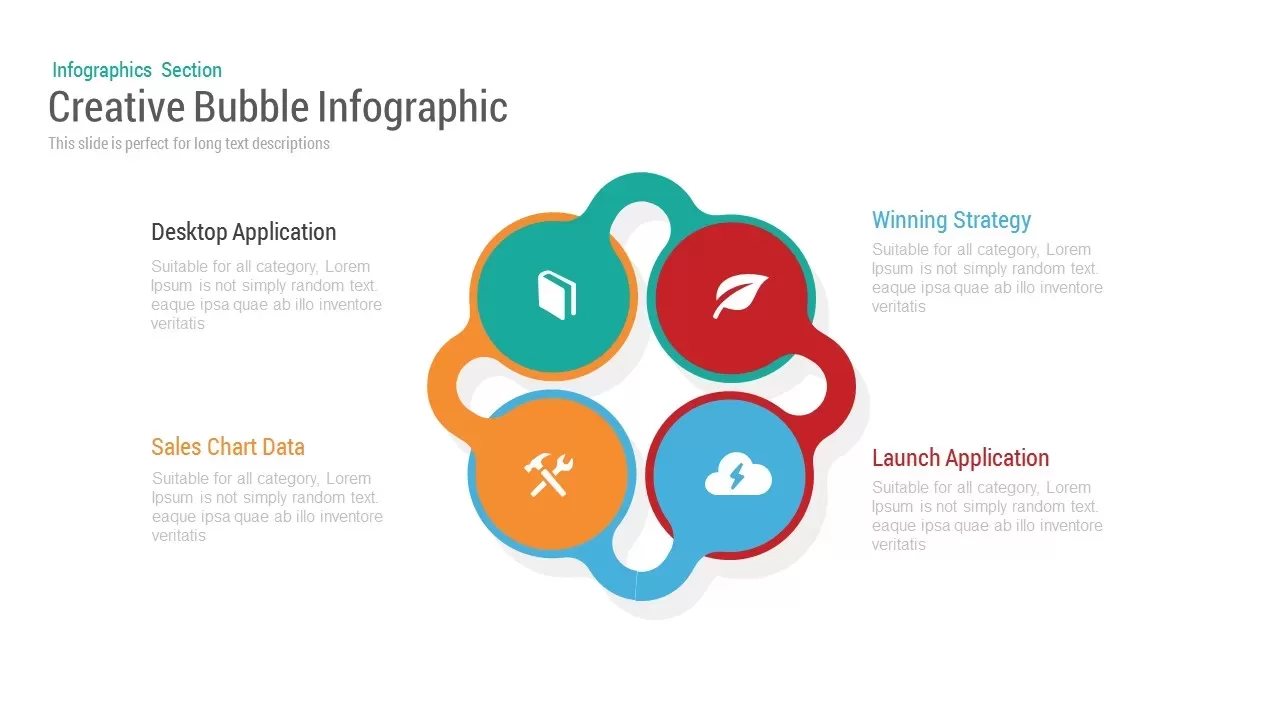
Bubble Infographic template for PowerPoint & Google Slides
Circular
Bubble Head Metrics Infographic Template for PowerPoint & Google Slides
Circular
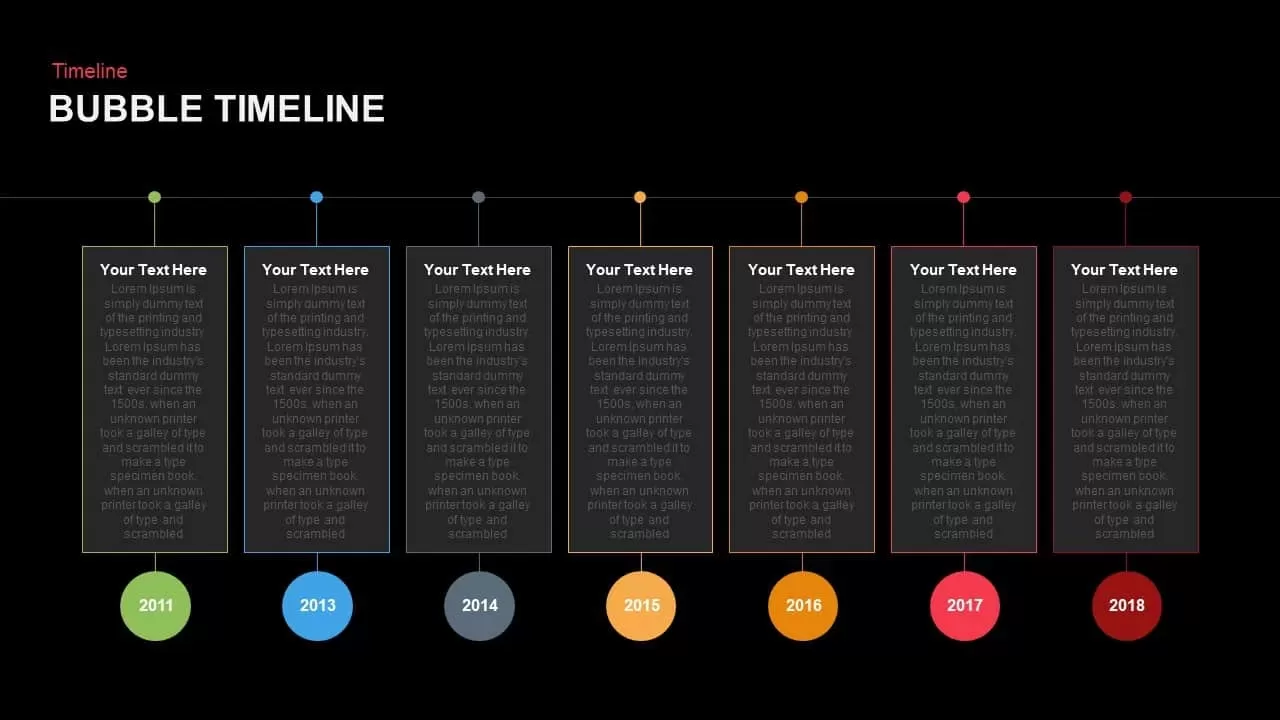
Modern Bubble Timeline Infographic Template for PowerPoint & Google Slides
Timeline
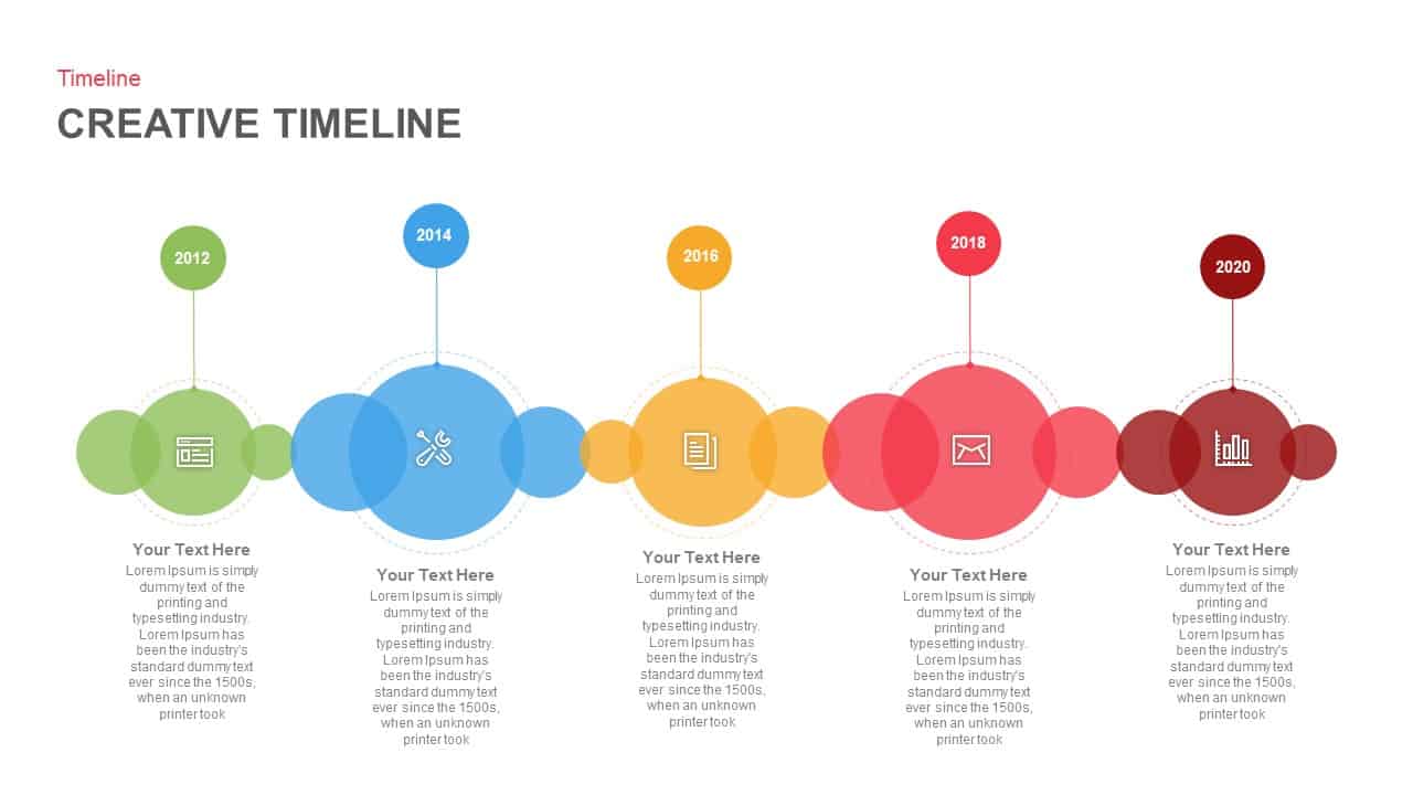
Creative Bubble Timeline Infographic Template for PowerPoint & Google Slides
Timeline
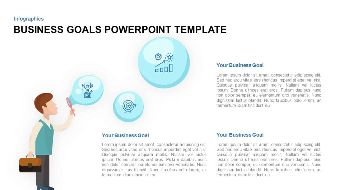
Business Goals Bubble Infographic Template for PowerPoint & Google Slides
Infographics
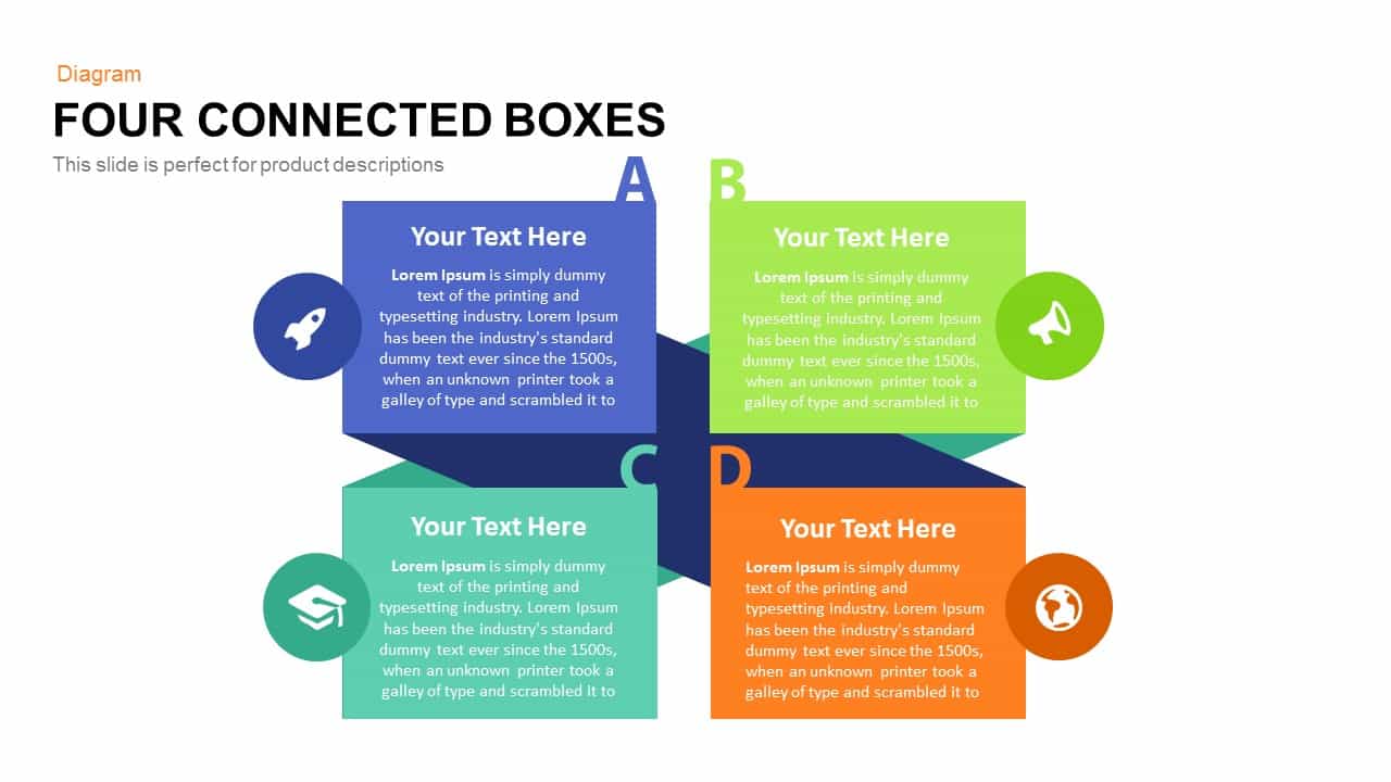
Simple Four Connected Boxes Diagram Template for PowerPoint & Google Slides
Business Models
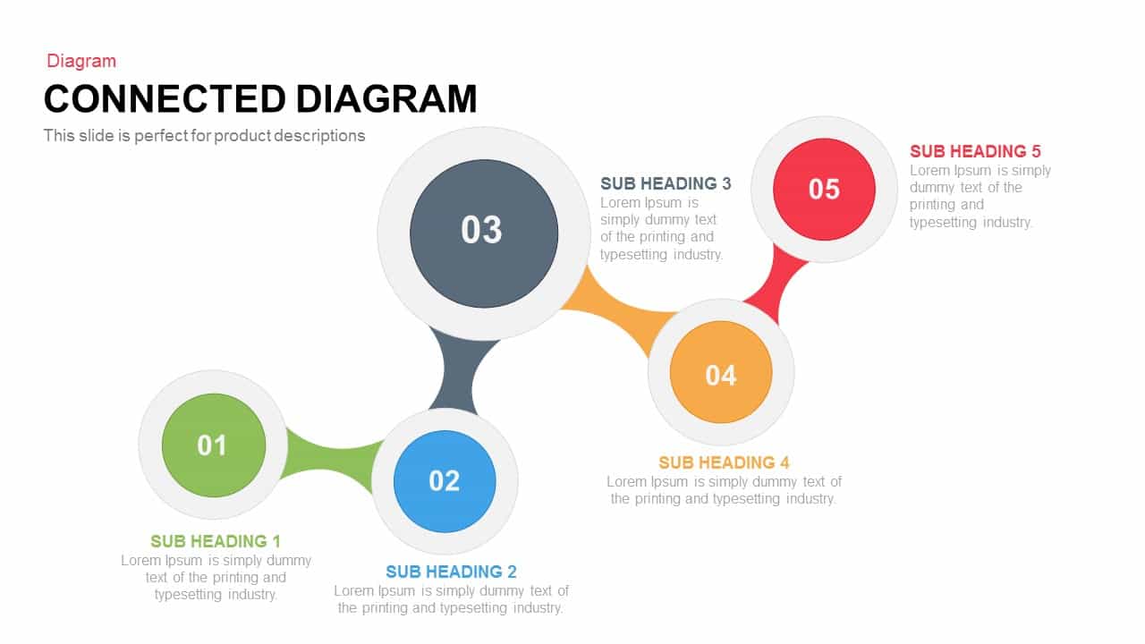
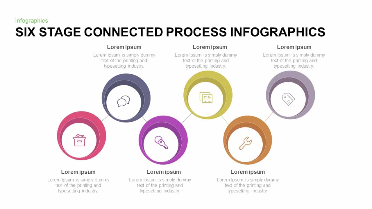
Six-Stage Connected Process Infographics Template for PowerPoint & Google Slides
Process
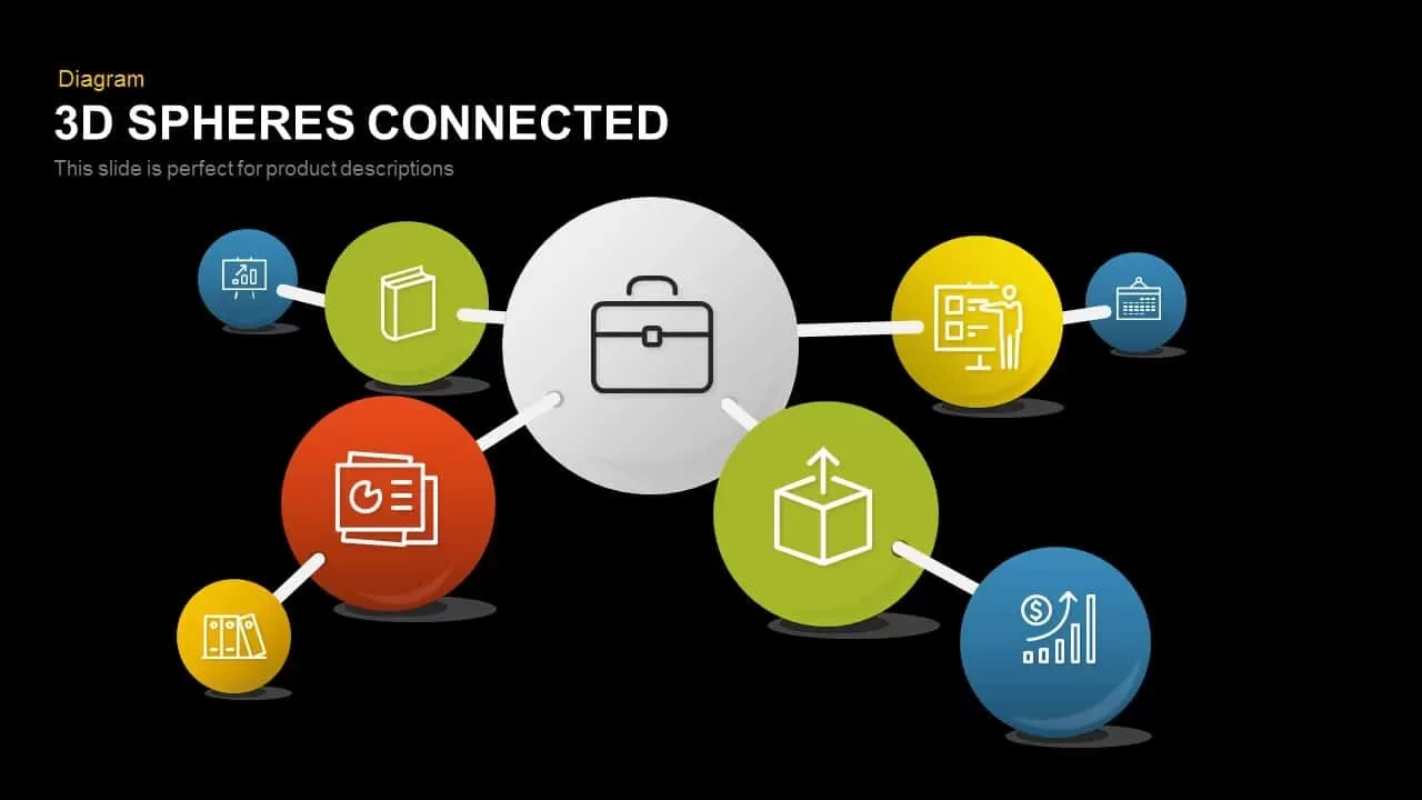
3D Spheres Connected Diagram for PowerPoint & Google Slides
Process
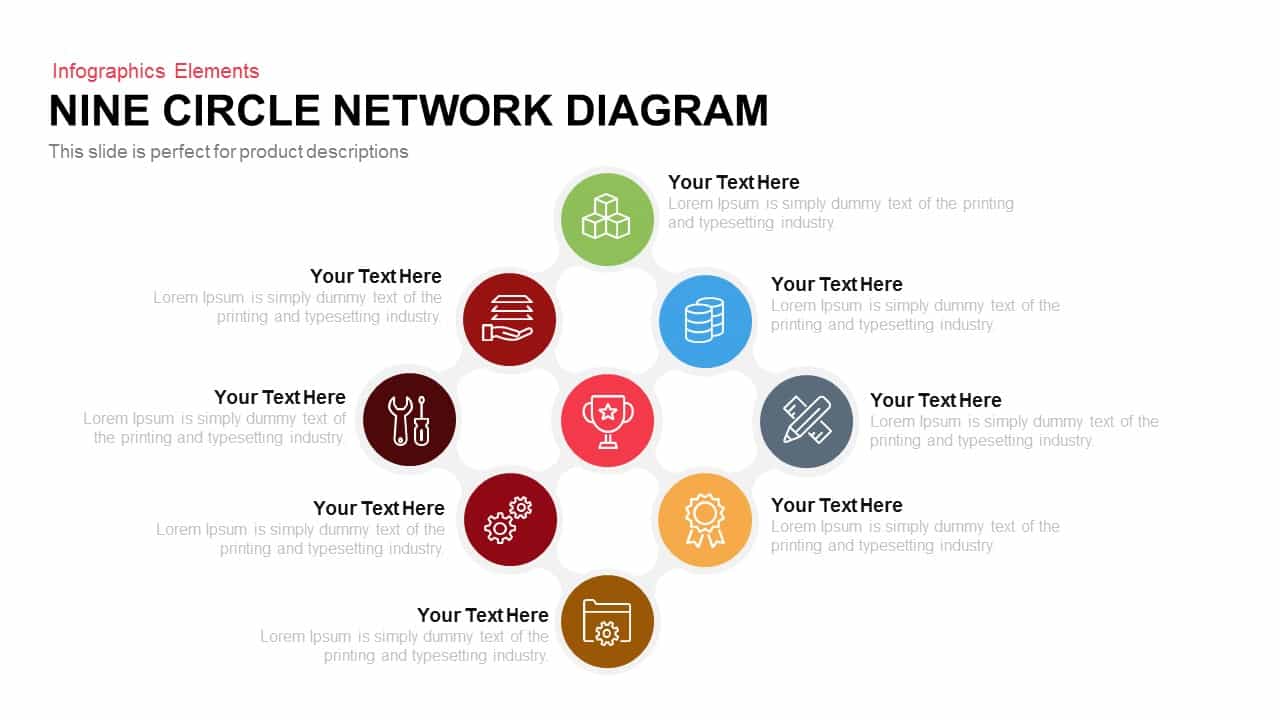
Modern Nine Circle Network Diagram Template for PowerPoint & Google Slides
Circular
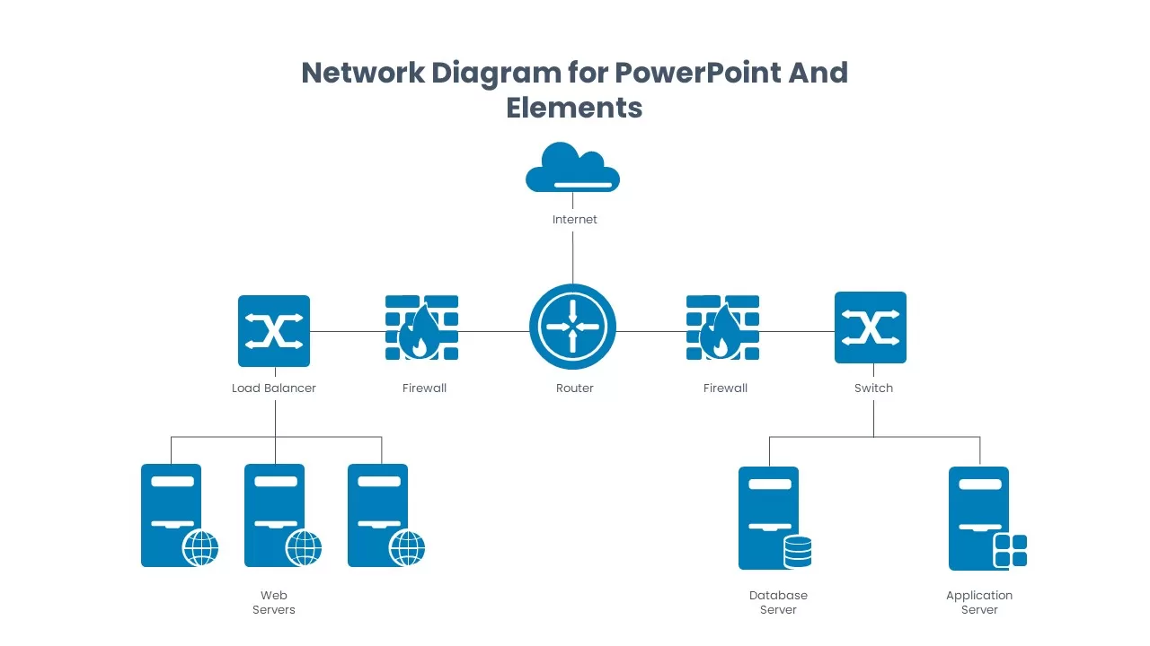
Network Diagram Elements and Icons Pack Template for PowerPoint & Google Slides
Information Technology
Social Media Community Network Slide Template for PowerPoint & Google Slides
Circular
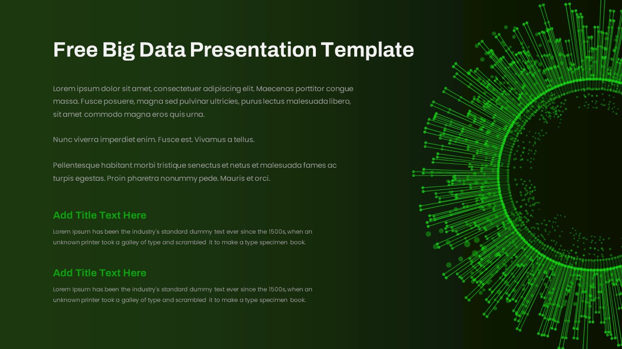
Free Big Data Network Visualization Template for PowerPoint & Google Slides
Circular
Free
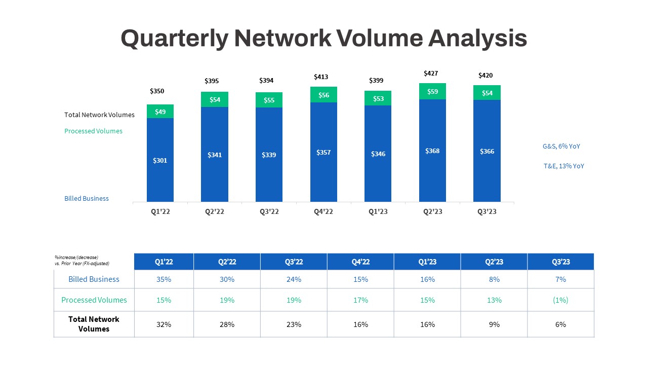
Quarterly Network Volume Analysis Template for PowerPoint & Google Slides
Business Report
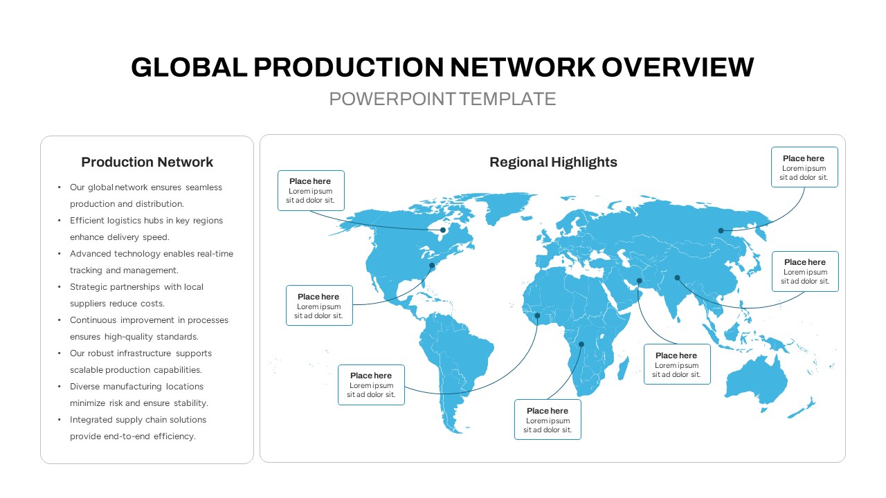
Global Production Network Overview Map Template for PowerPoint & Google Slides
World Maps
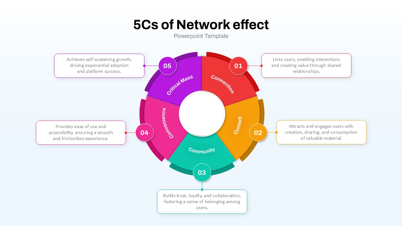
5Cs of Network Effect Circular Diagram Template for PowerPoint & Google Slides
Circular
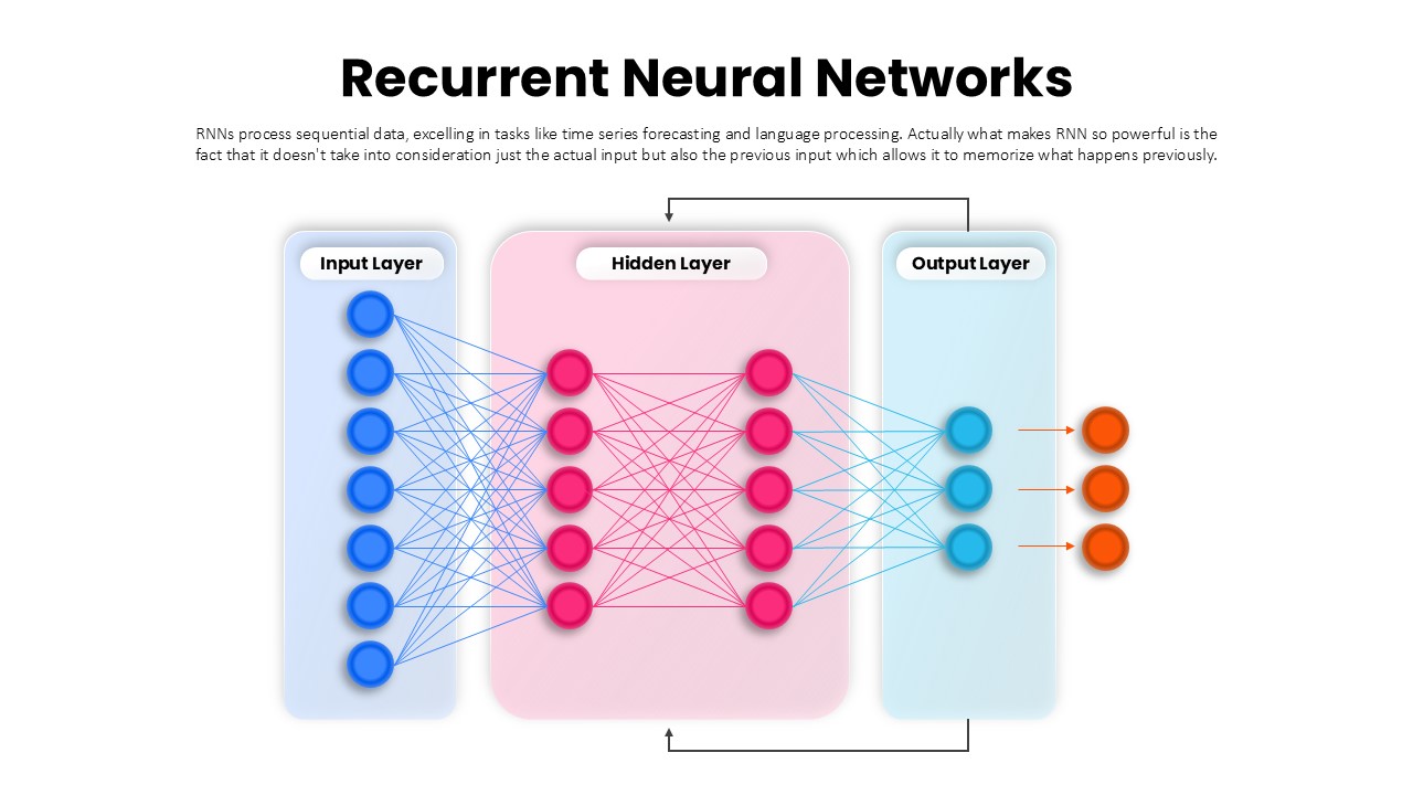
Recurrent Neural Network Architecture Template for PowerPoint & Google Slides
AI
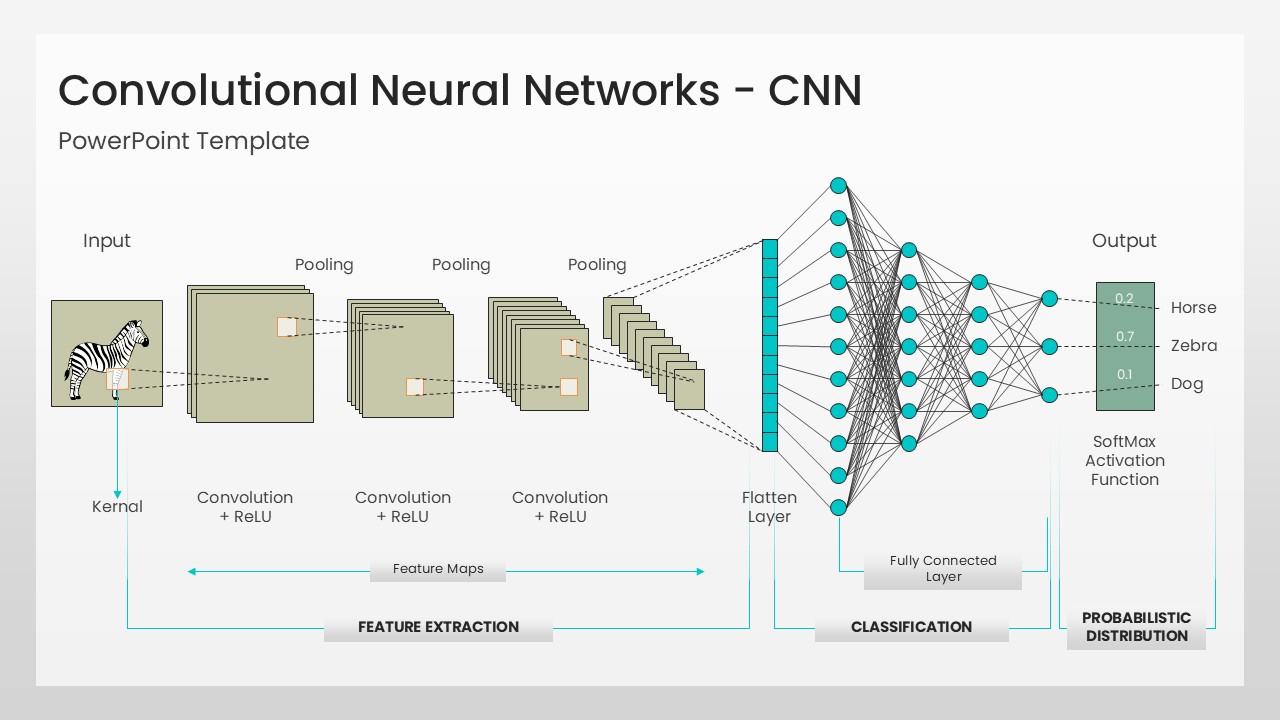
Convolutional Neural Network Architecture Template for PowerPoint & Google Slides
Machine Learning
Network Effects Template for PowerPoint & Google Slides
Software Development
Social Media Network Hub Diagram Slide for PowerPoint & Google Slides
Process
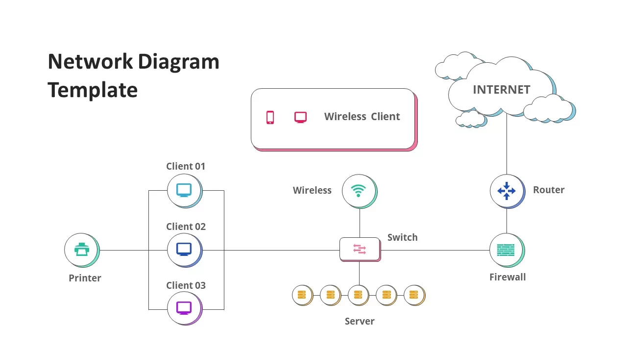
Network Diagram Infographics for PowerPoint & Google Slides
Technology
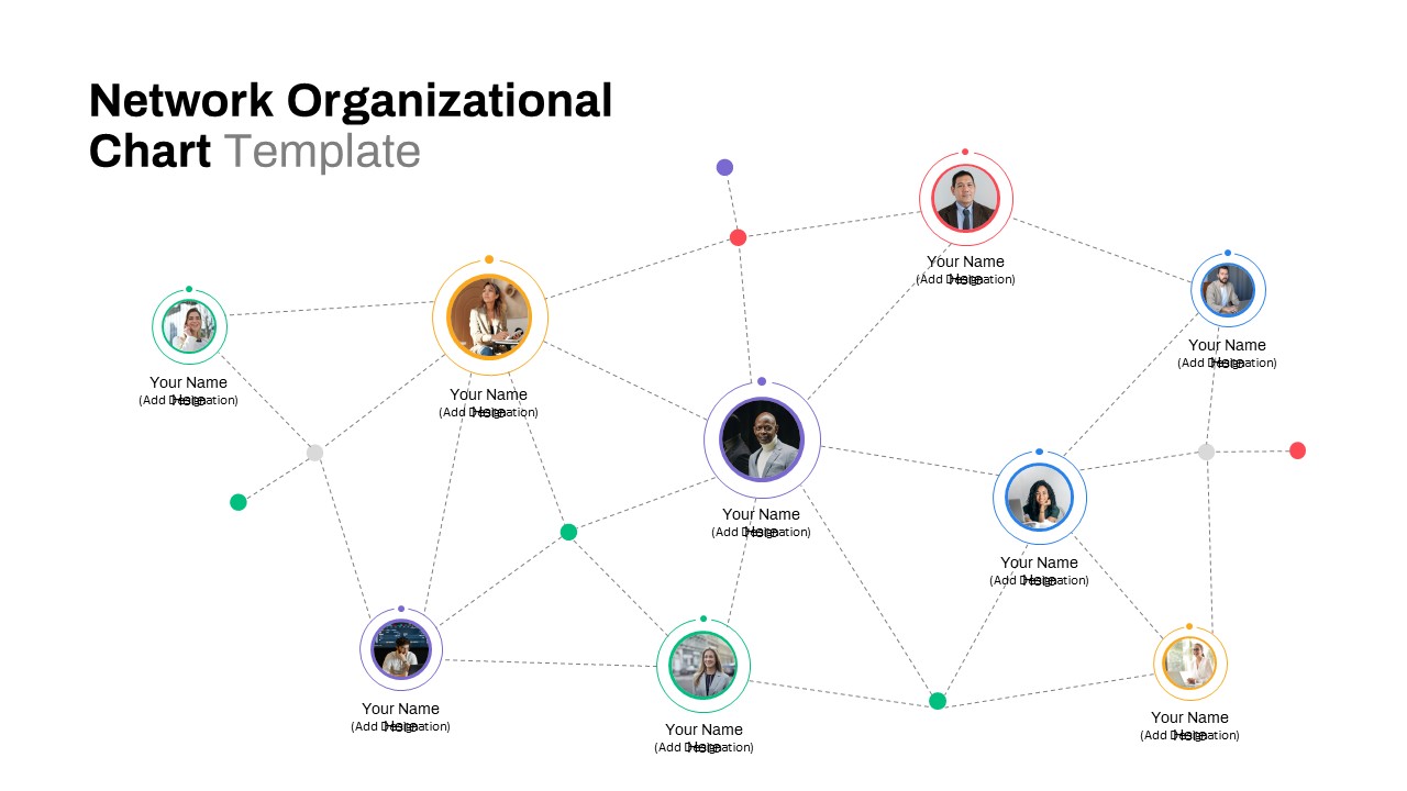
Network Organizational Chart for PowerPoint & Google Slides
Business
Cybersecurity Network Theme for PowerPoint & Google Slides
Information Technology
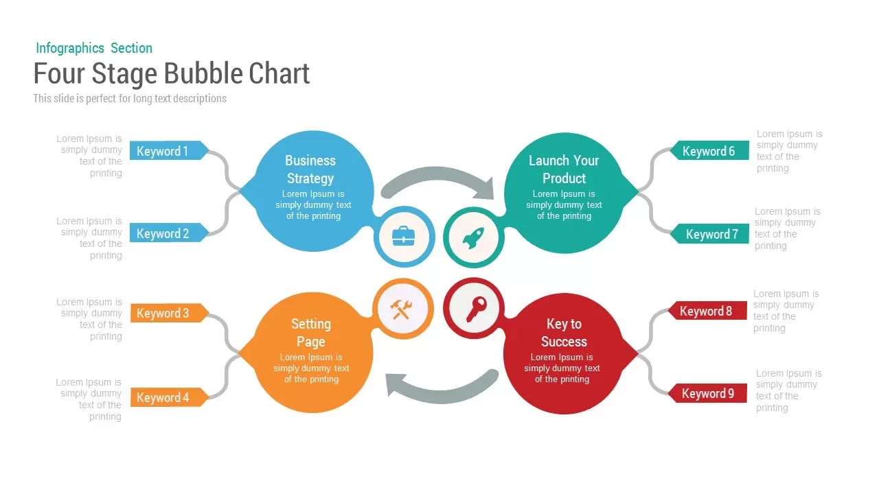
Bubble Chart template for PowerPoint & Google Slides
Charts
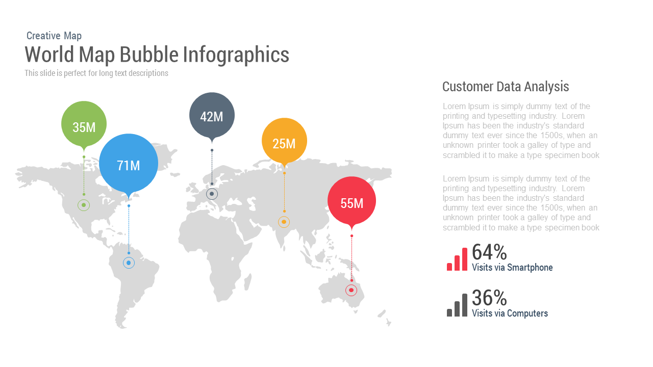
World Map Bubble template for PowerPoint & Google Slides
World Maps
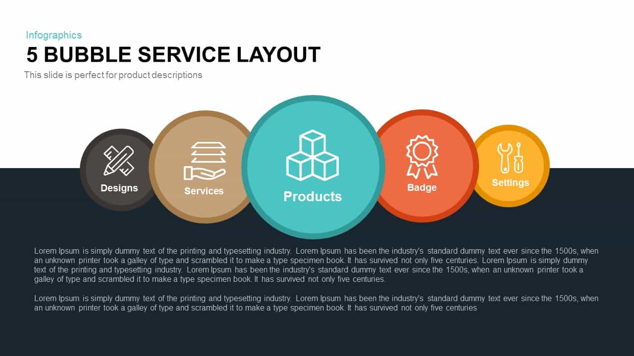
5 Bubble Service Layout Diagram Template for PowerPoint & Google Slides
Process
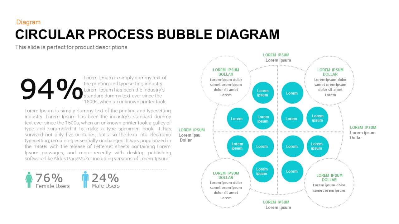
Bubble Circular Process Diagram Template for PowerPoint & Google Slides
Process
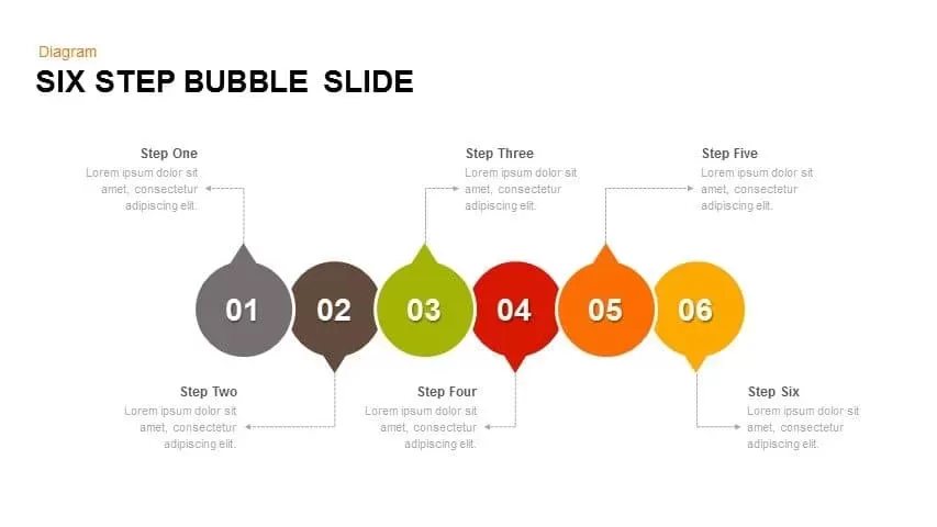
Editable Six-Step Bubble Process Diagram Template for PowerPoint & Google Slides
Process
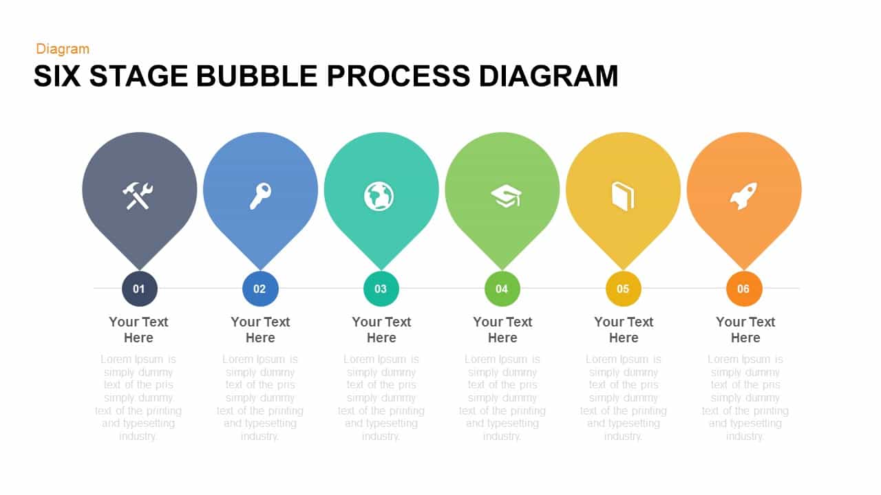
Free Six Stage Bubble Process Diagram template for PowerPoint & Google Slides
Process
Free
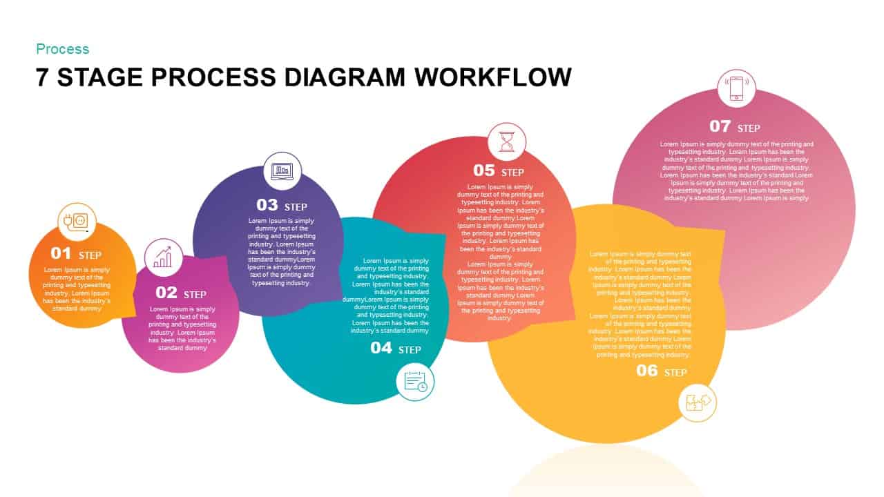
Gradient Seven-Stage Bubble Workflow Template for PowerPoint & Google Slides
Process
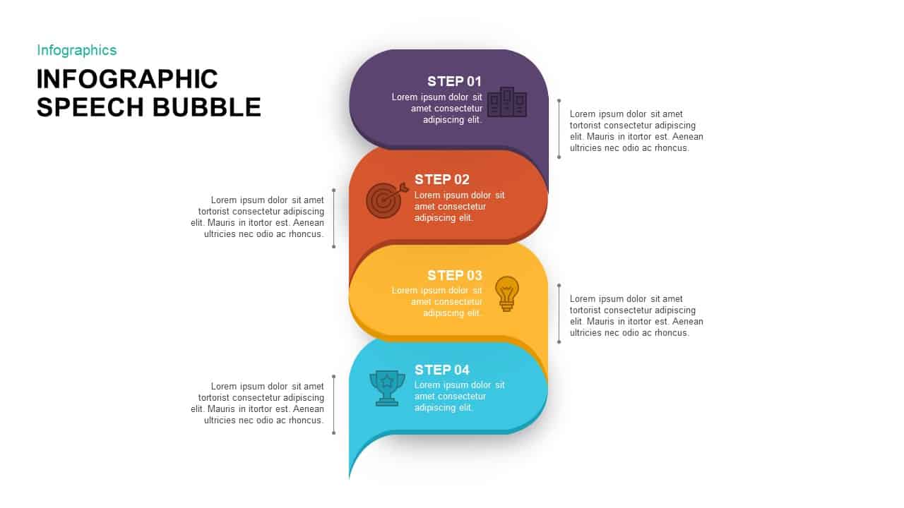
Four-Step Speech Bubble Diagram Template for PowerPoint & Google Slides
Process

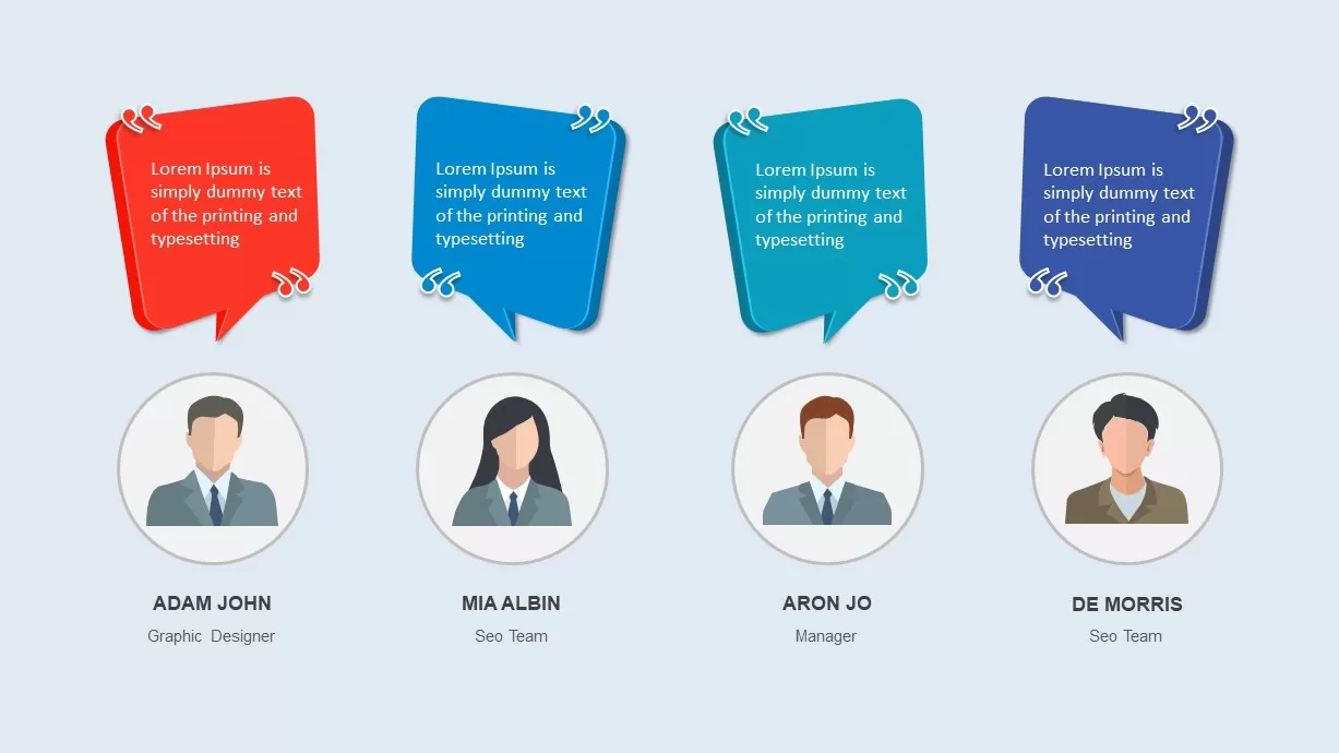
Team Testimonial Speech Bubble Slide Template for PowerPoint & Google Slides
Our Team
Bubble Photo Collage Template for PowerPoint & Google Slides
Graphics
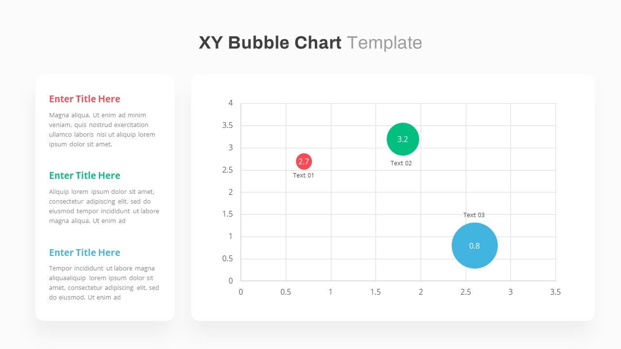
XY Bubble Chart Data Visualization Template for PowerPoint & Google Slides
Comparison Chart
Bubble Chart Scatter, Diagram & Matrix Template for PowerPoint & Google Slides
Comparison Chart
Graphic Organizer & Double Bubble Map Template for PowerPoint & Google Slides
Maps
Creative Bubble Mind Map Template for PowerPoint & Google Slides
Mind Maps
Bubble Timeline Infographics PowerPoint Template and Keynote
Business
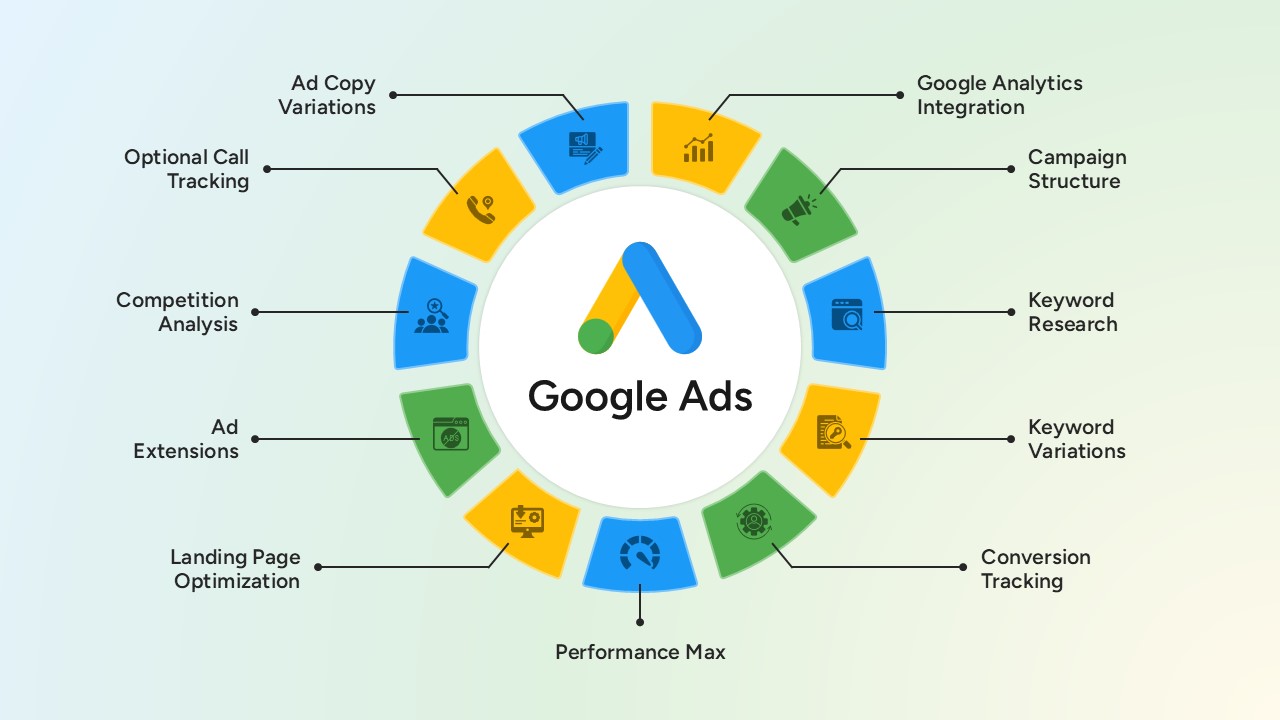
Google Ads Optimization & Performance Infographic Template for PowerPoint & Google Slides
Digital Marketing
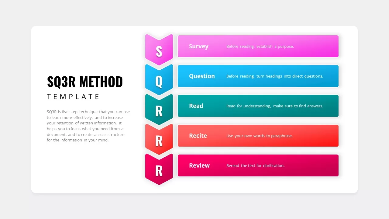
SQ3R Study Strategy Infographic Slides Template for PowerPoint & Google Slides
Business Strategy
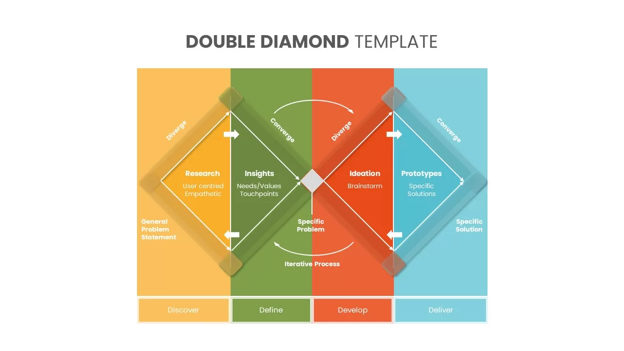
Six Double Diamond Infographic Slides Template for PowerPoint & Google Slides
Process

Sales Process Infographic Slides Pack Template for PowerPoint & Google Slides
Process
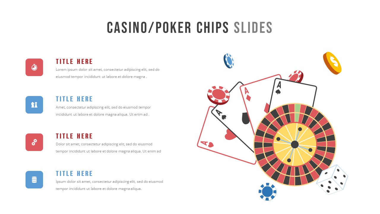
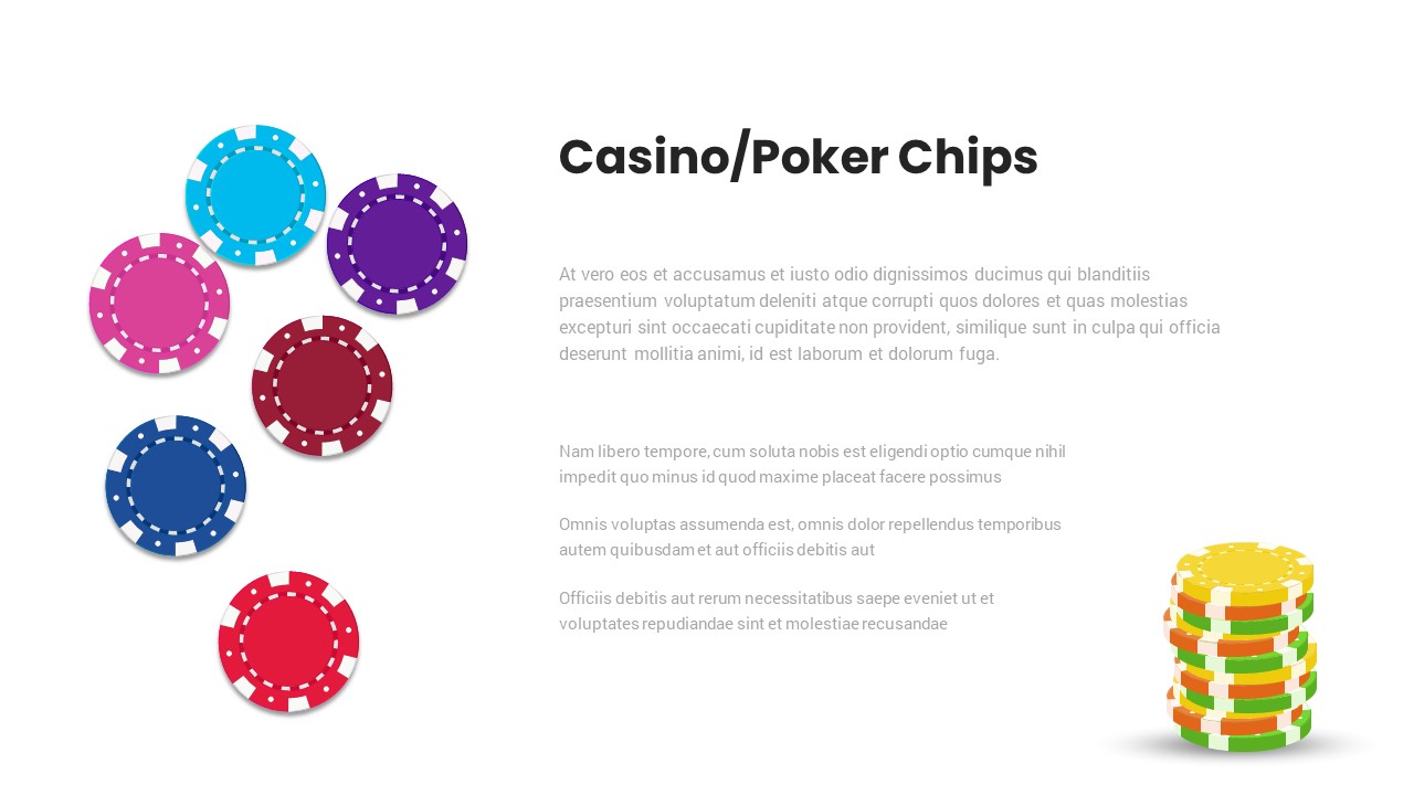
Casino/Poker Chips Infographic Slides template for PowerPoint & Google Slides
Business Strategy
Agenda Infographic Pack of 2 Slides Template for PowerPoint & Google Slides
Agenda
Quad Chart Infographic Pack of 8 Slides Template for PowerPoint & Google Slides
Comparison Chart
Four Options Infographic Slides Template for PowerPoint & Google Slides
Comparison
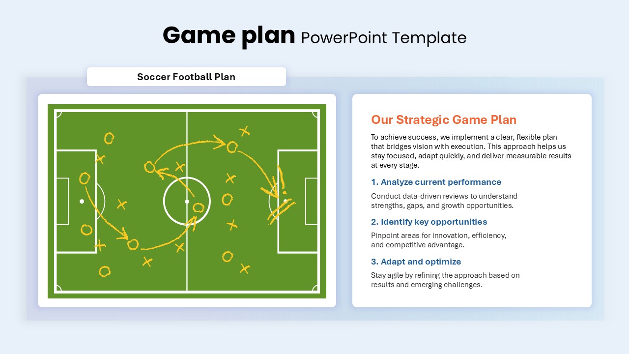
Game Plan Infographic Slides Pack Template for PowerPoint & Google Slides
Infographics
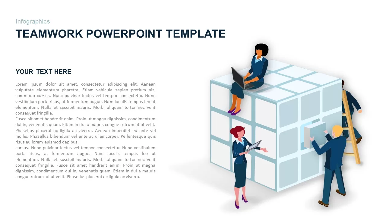
Teamwork PowerPoint Infographic Template for PowerPoint & Google Slides
Leadership
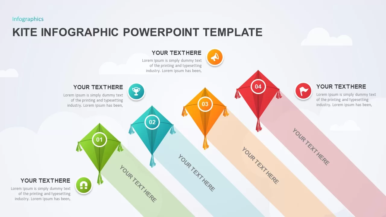
Kite Infographic PowerPoint Template for PowerPoint & Google Slides
Process
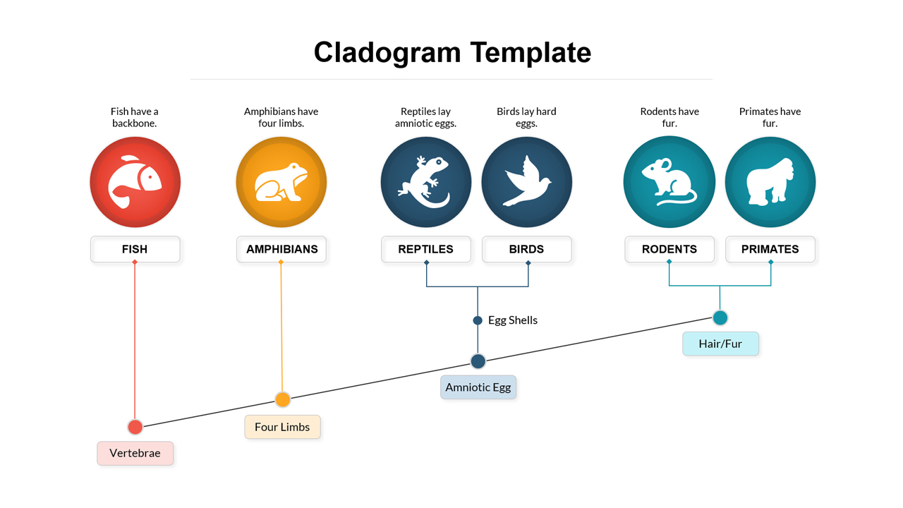
Cladogram Infographic Di Template for PowerPoint & Google Slides Template
Decision Tree
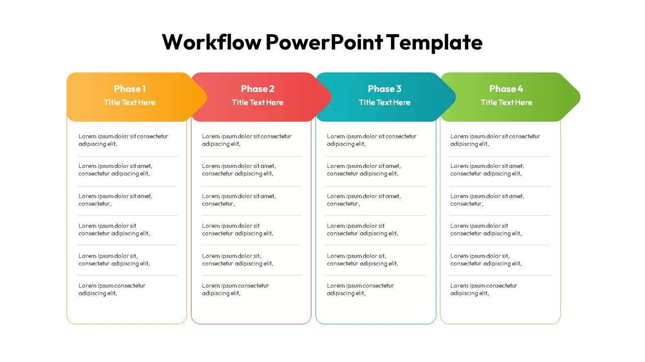
Workflow PowerPoint Process infographic for PowerPoint & Google Slides
Process
Free Infographic Deck PowerPoint Pack for PowerPoint & Google Slides
Infographics
Free
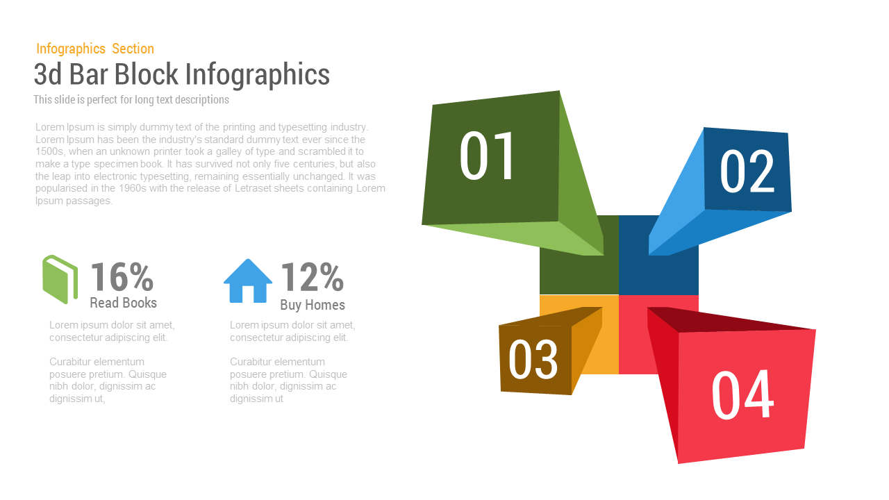
3D Block Infographic template for PowerPoint & Google Slides
Infographics
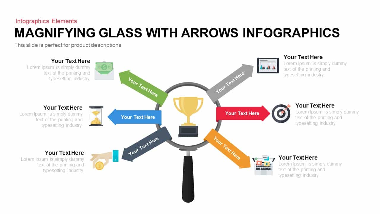
Magnifying Glass Arrows Infographic Template for PowerPoint & Google Slides
Arrow
Three Four Five Stage Timeline Infographic Template for PowerPoint & Google Slides
Timeline
Creative Lab Beakers Data Infographic template for PowerPoint & Google Slides
Infographics
Dynamic Data Dashboard Infographic Template for PowerPoint & Google Slides
Bar/Column
Five-Stage People Infographic Chart template for PowerPoint & Google Slides
Process
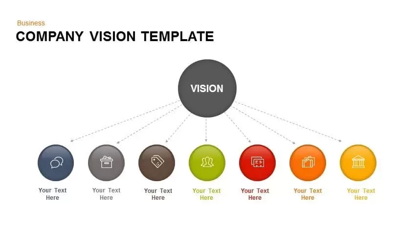
Company Vision Hub and Spoke Infographic Template for PowerPoint & Google Slides
Vision and Mission
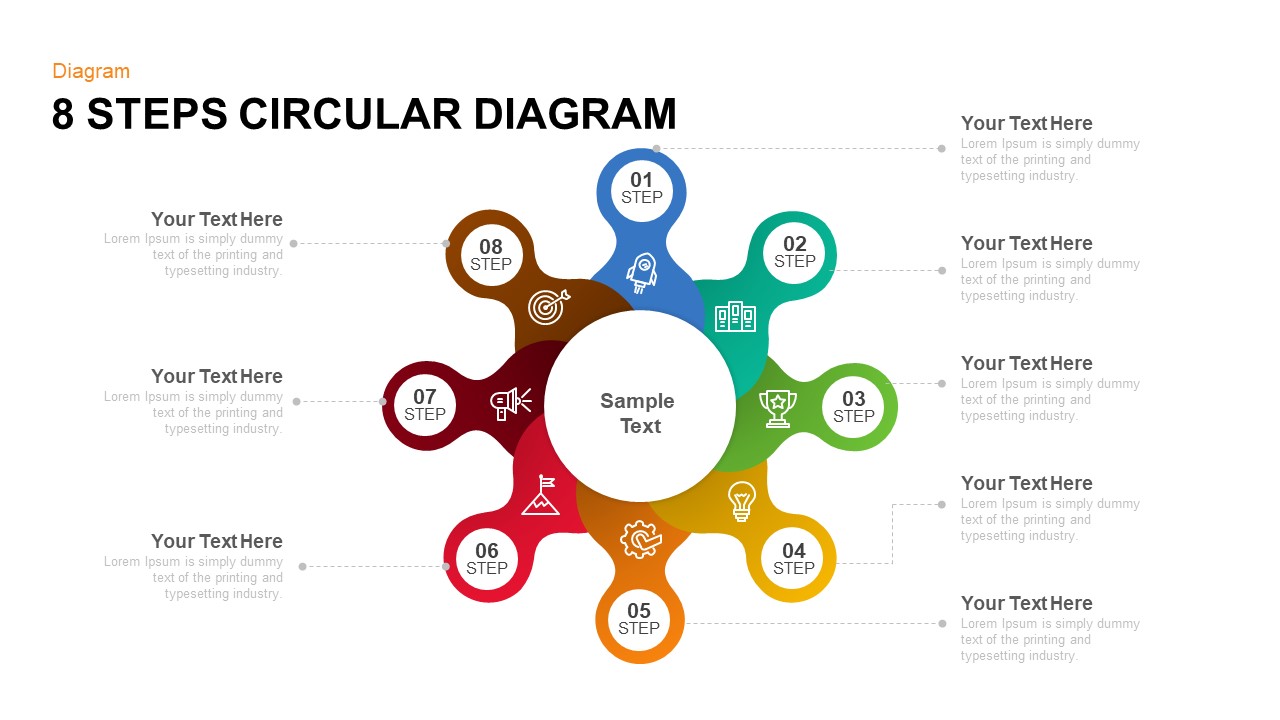
Eight-Step Circular Diagram Infographic Template for PowerPoint & Google Slides
Circular
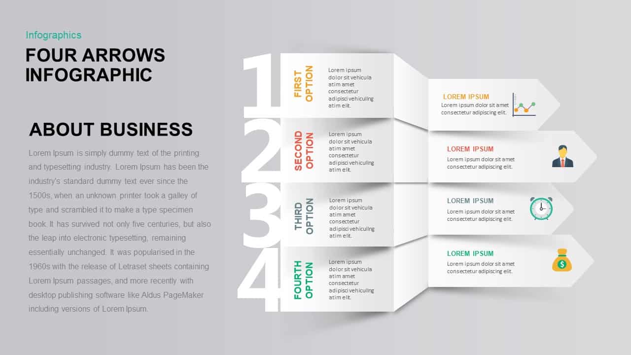
Four-Option 4-Step Arrow Infographic Template for PowerPoint & Google Slides
Arrow
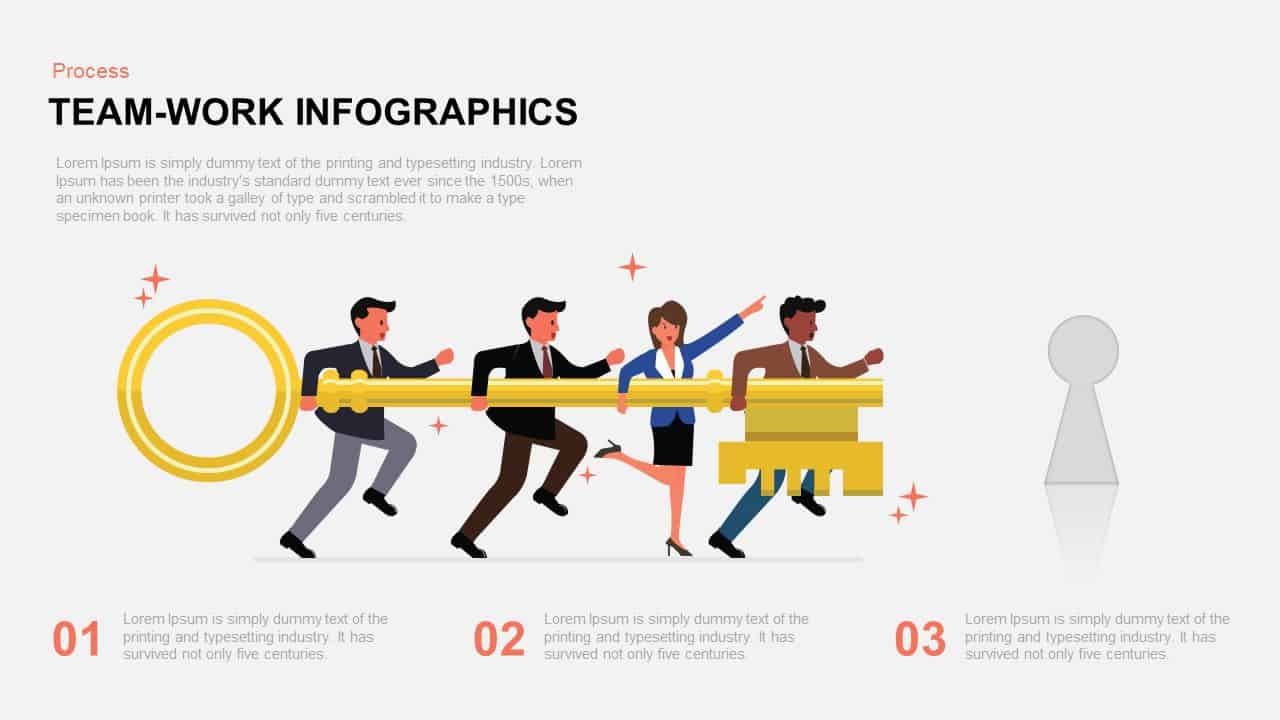
Teamwork Key Infographic Slide Template for PowerPoint & Google Slides
Process
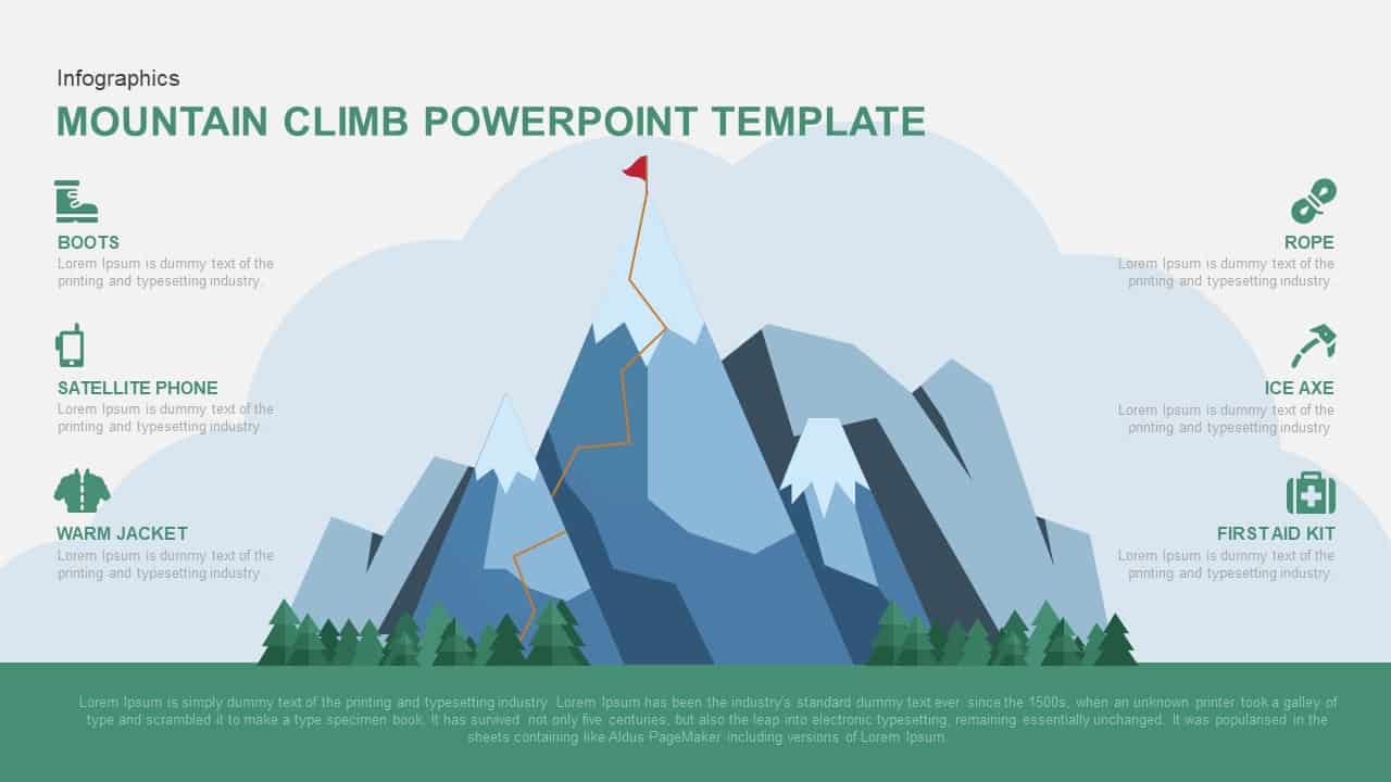
Mountain Climb Adventure Infographic Template for PowerPoint & Google Slides
Accomplishment
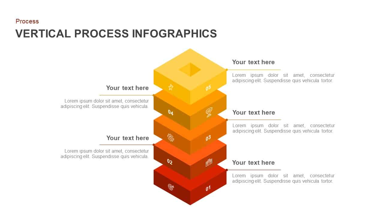
Vertical Stacked Process Infographic Template for PowerPoint & Google Slides
Process
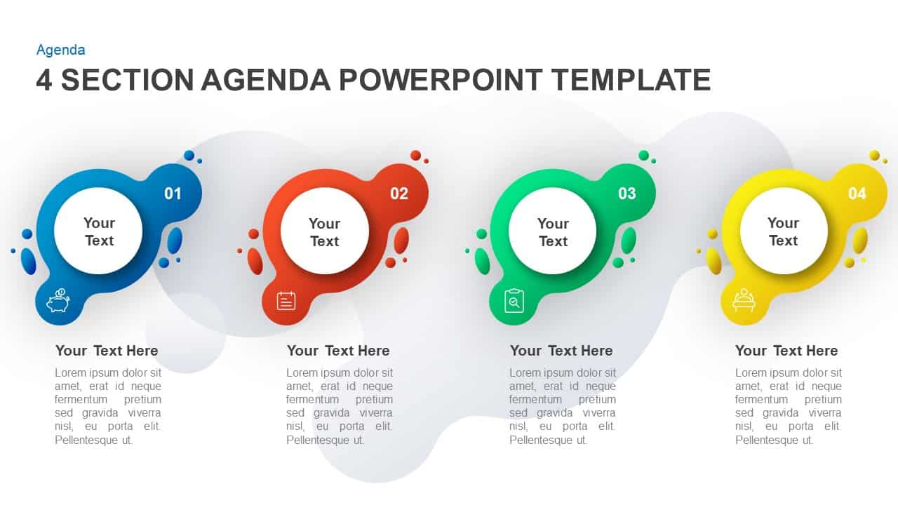
4-Section Agenda Blobs Infographic Template for PowerPoint & Google Slides
Agenda
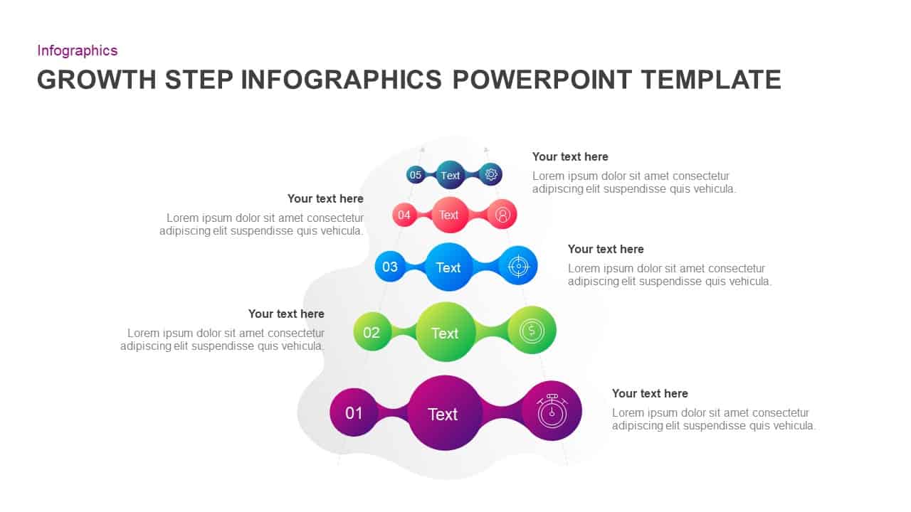
Five-Step Growth Infographic Slide Template for PowerPoint & Google Slides
Process
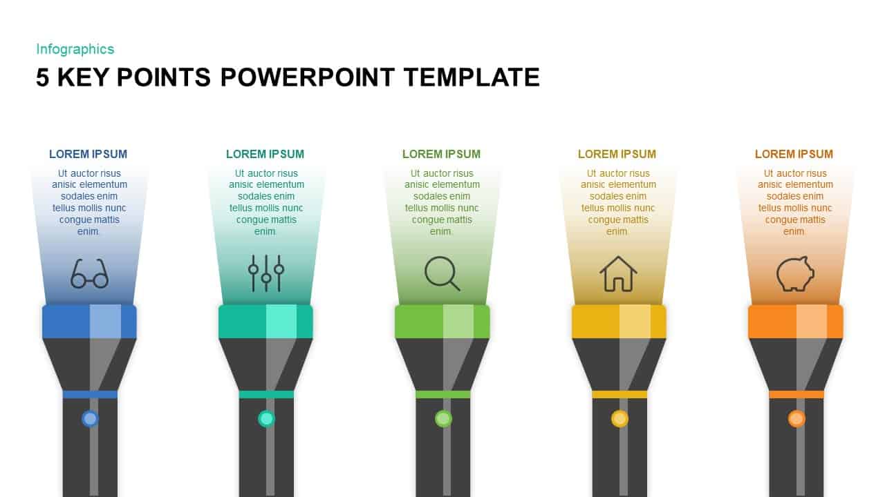
Five Key Flashlight Infographic Points Template for PowerPoint & Google Slides
Agenda
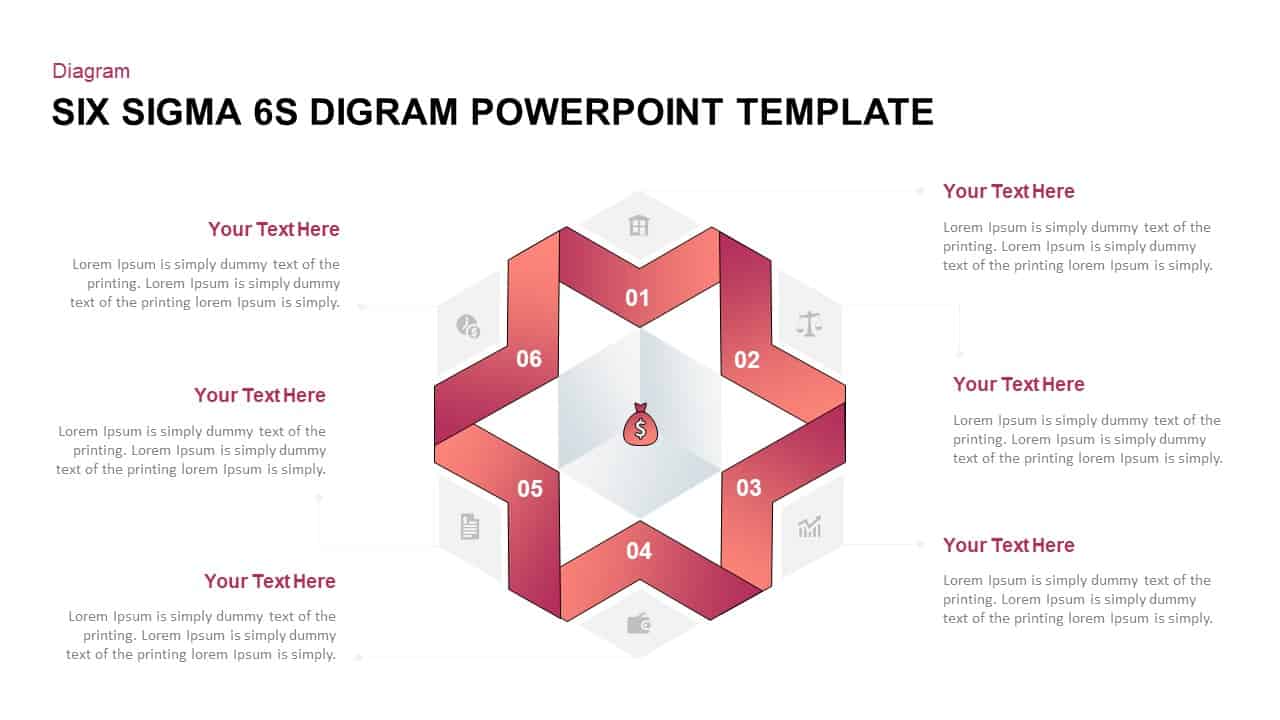
Six Sigma 6S Process Infographic Diagram Template for PowerPoint & Google Slides
Process
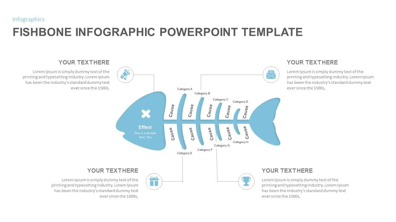
Fishbone Cause and Effect Infographic Template for PowerPoint & Google Slides
Infographics
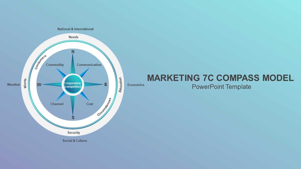
Marketing 7C Compass Model Infographic Template for PowerPoint & Google Slides
Circular
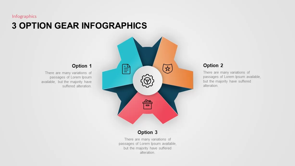
Three-Option Gear Infographic Pro Template for PowerPoint & Google Slides
Process
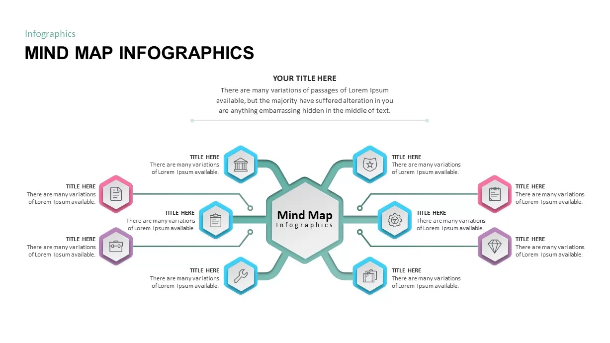
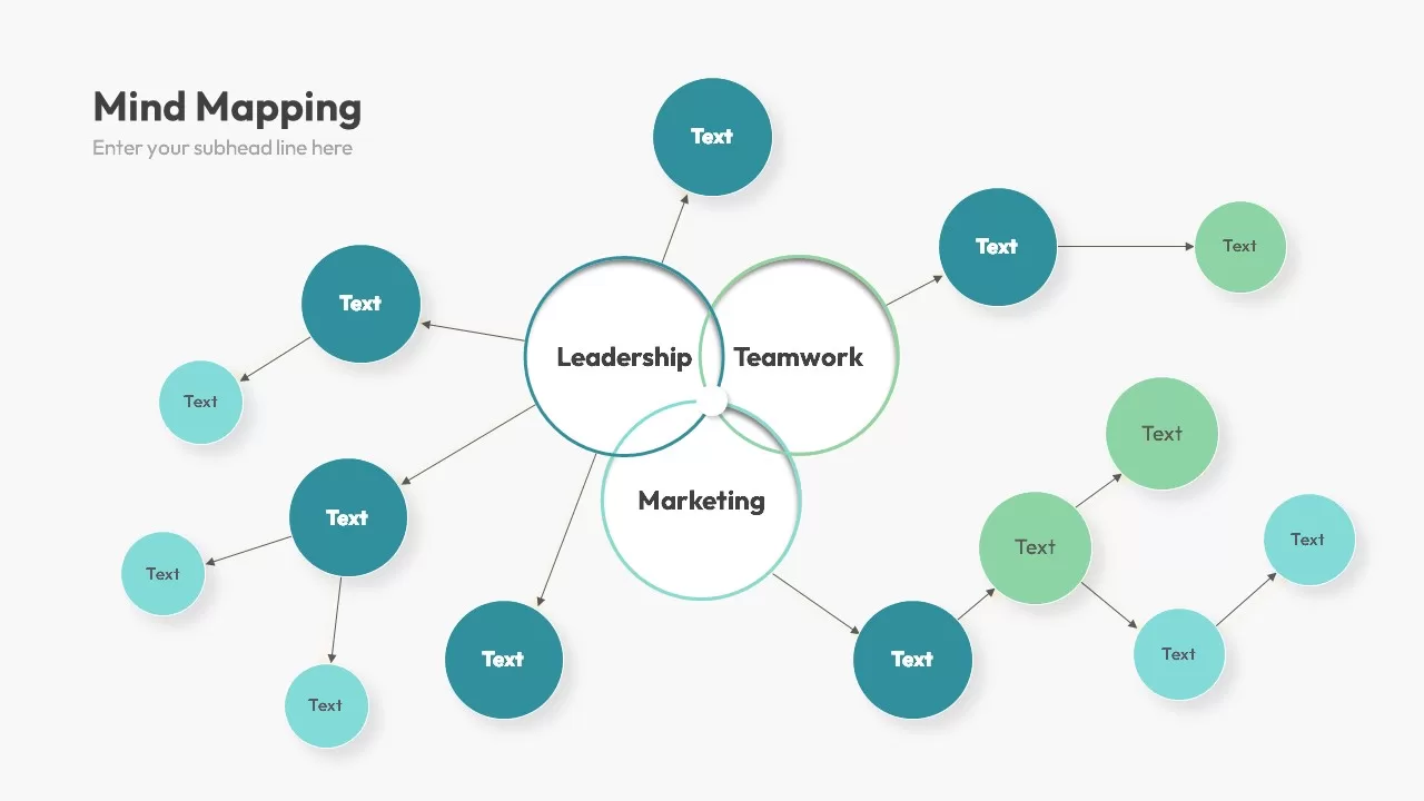
Eight-Node Mind Map Infographic Diagram Template for PowerPoint & Google Slides
Mind Maps
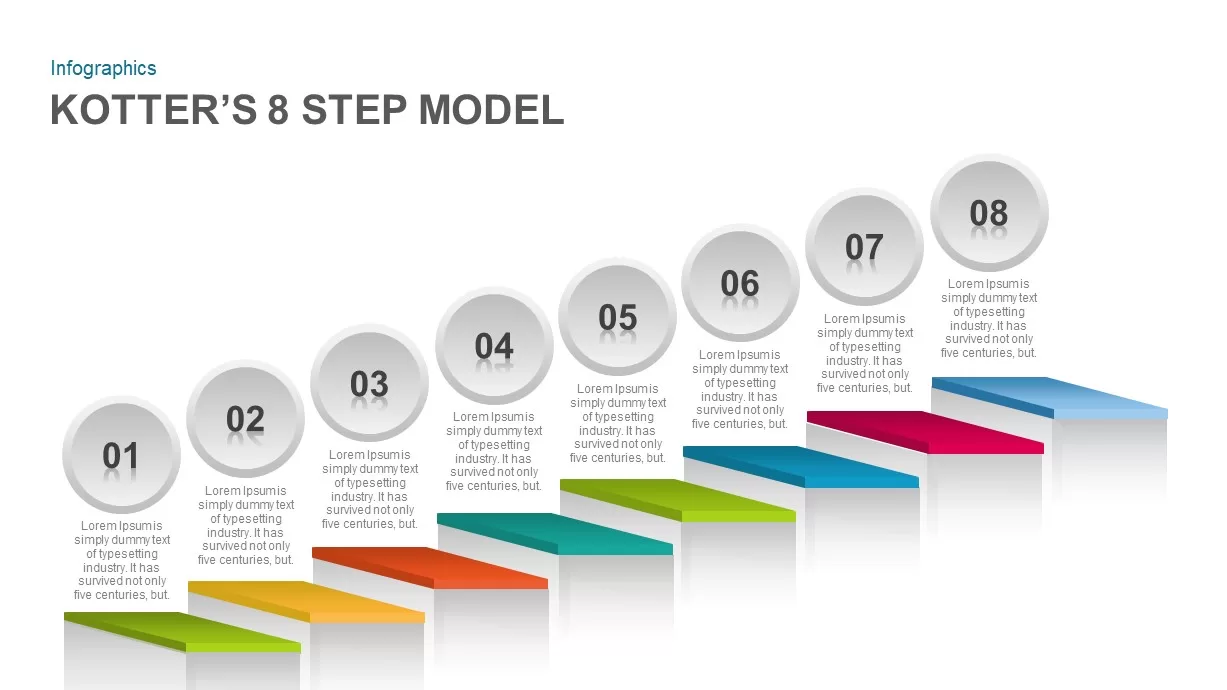
Kotter’s 8-Step Model Infographic Template for PowerPoint & Google Slides
Process
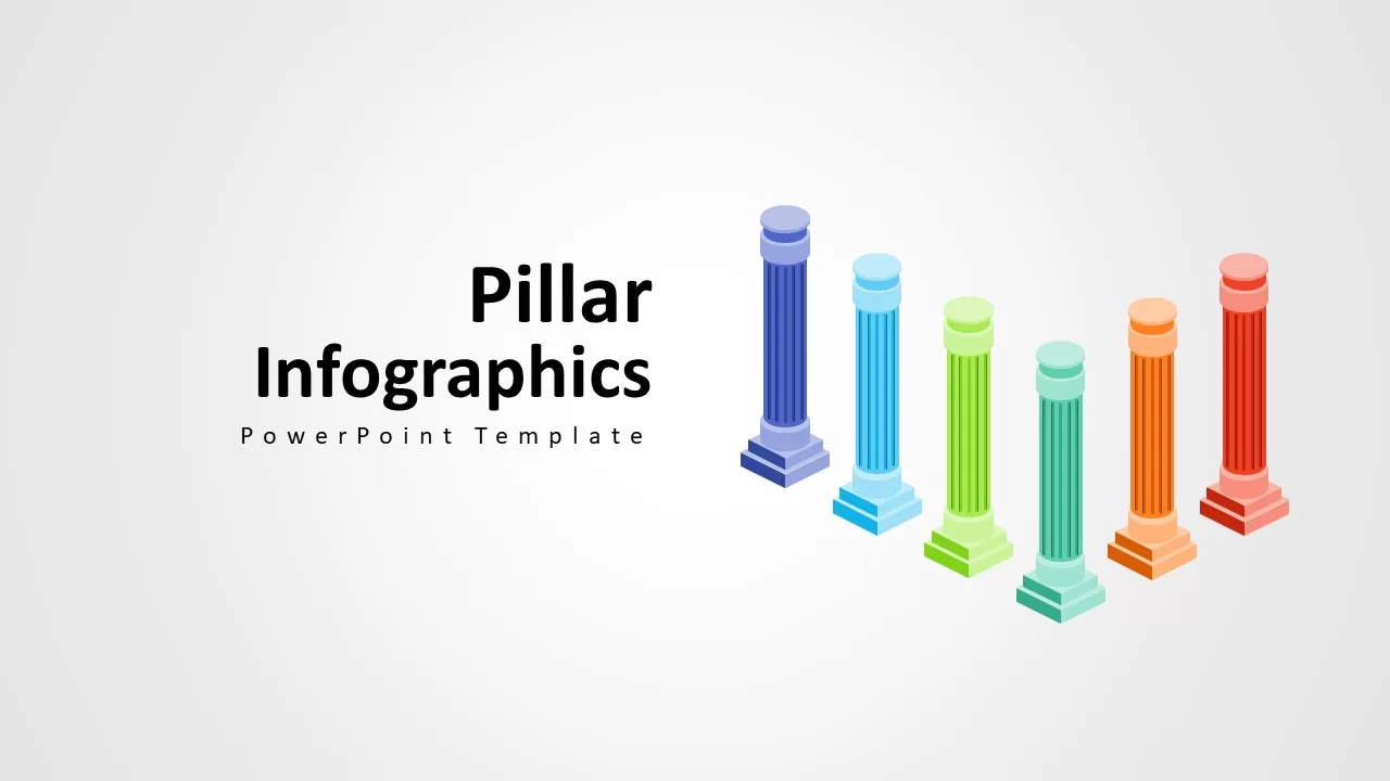
Pillars Infographic Template for PowerPoint & Google Slides
Infographics
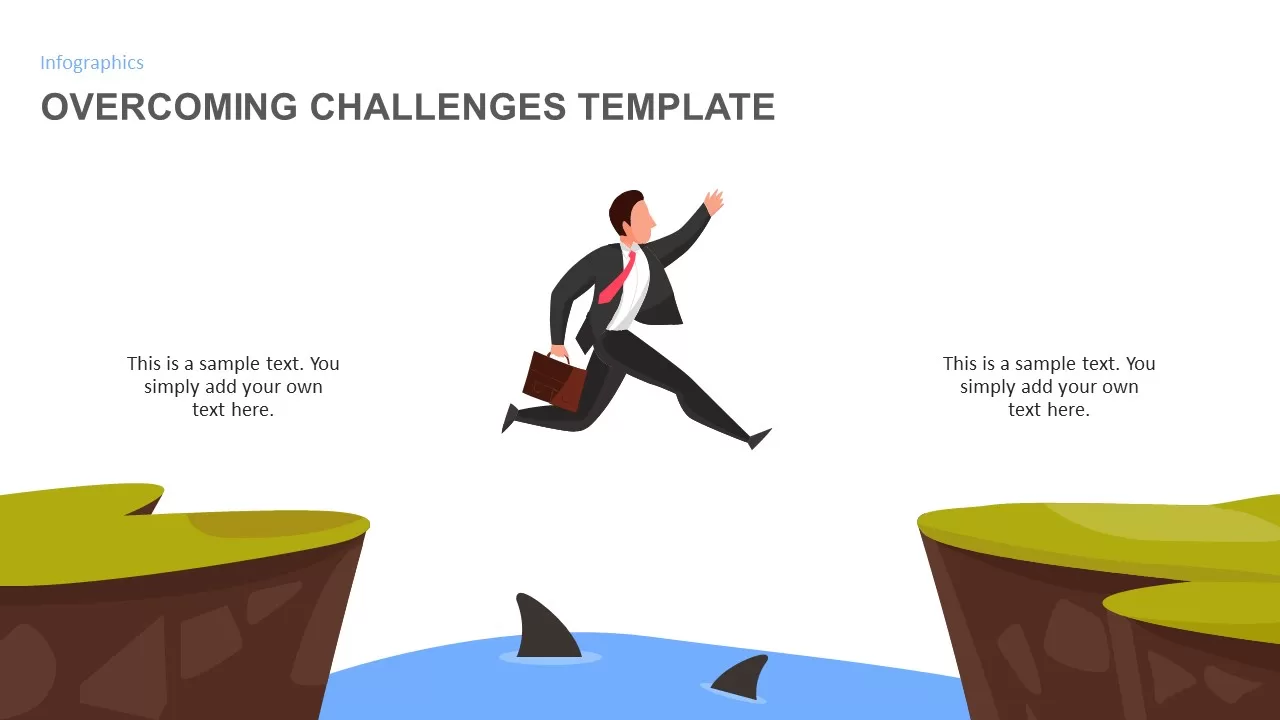
Overcoming Challenges Infographic Pack Template for PowerPoint & Google Slides
Opportunities Challenges
Affinity Diagram Infographic Template for PowerPoint & Google Slides
Business
Checklist infographic template for PowerPoint & Google Slides
Infographics
Tri-Cluster Mind Map Infographic Template for PowerPoint & Google Slides
Mind Maps
5-Day Calendar Event Infographic Template for PowerPoint & Google Slides
Agenda
Head, Heart & Hand Infographic Template for PowerPoint & Google Slides
Process
Four-Stage Circle Arrow Infographic Template for PowerPoint & Google Slides
Circular
Vroom’s Expectancy Theory Infographic Template for PowerPoint & Google Slides
Process
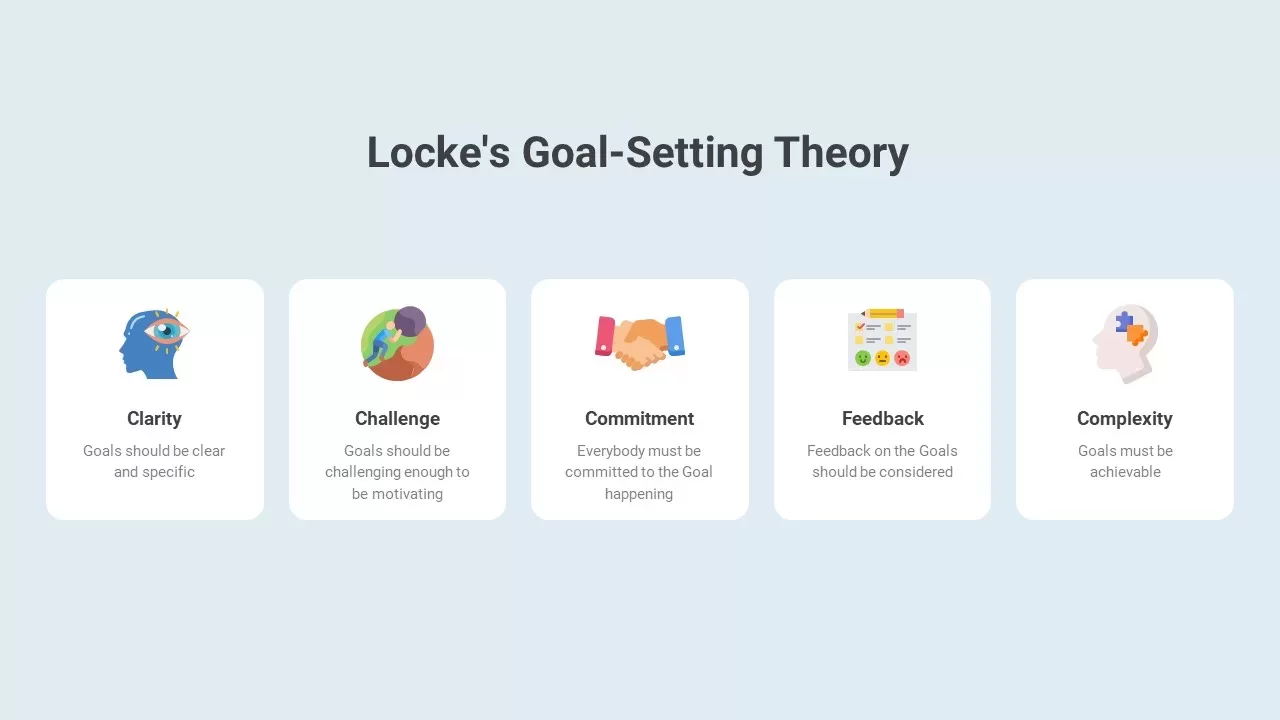
Locke’s Goal-Setting Theory Infographic Template for PowerPoint & Google Slides
Goals
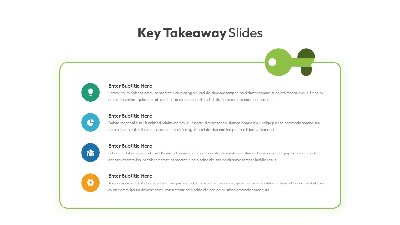
Key Takeaway Keyhole Infographic Slide Template for PowerPoint & Google Slides
Process
Casino/Poker Chips Infographic template for PowerPoint & Google Slides
Business Proposal
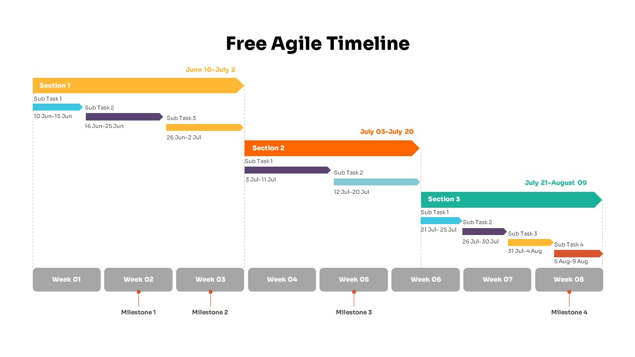
Colorful Agile Timeline Infographic Template for PowerPoint & Google Slides
Timeline
Free
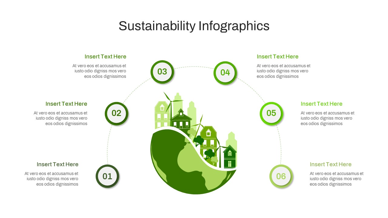
Circular Sustainability Infographic Template for PowerPoint & Google Slides
Process
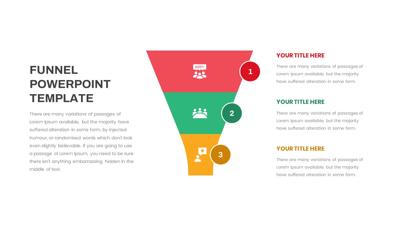
Free Multi-Step Funnel Infographic Slide Pack Template for PowerPoint & Google Slides
Funnel
Free
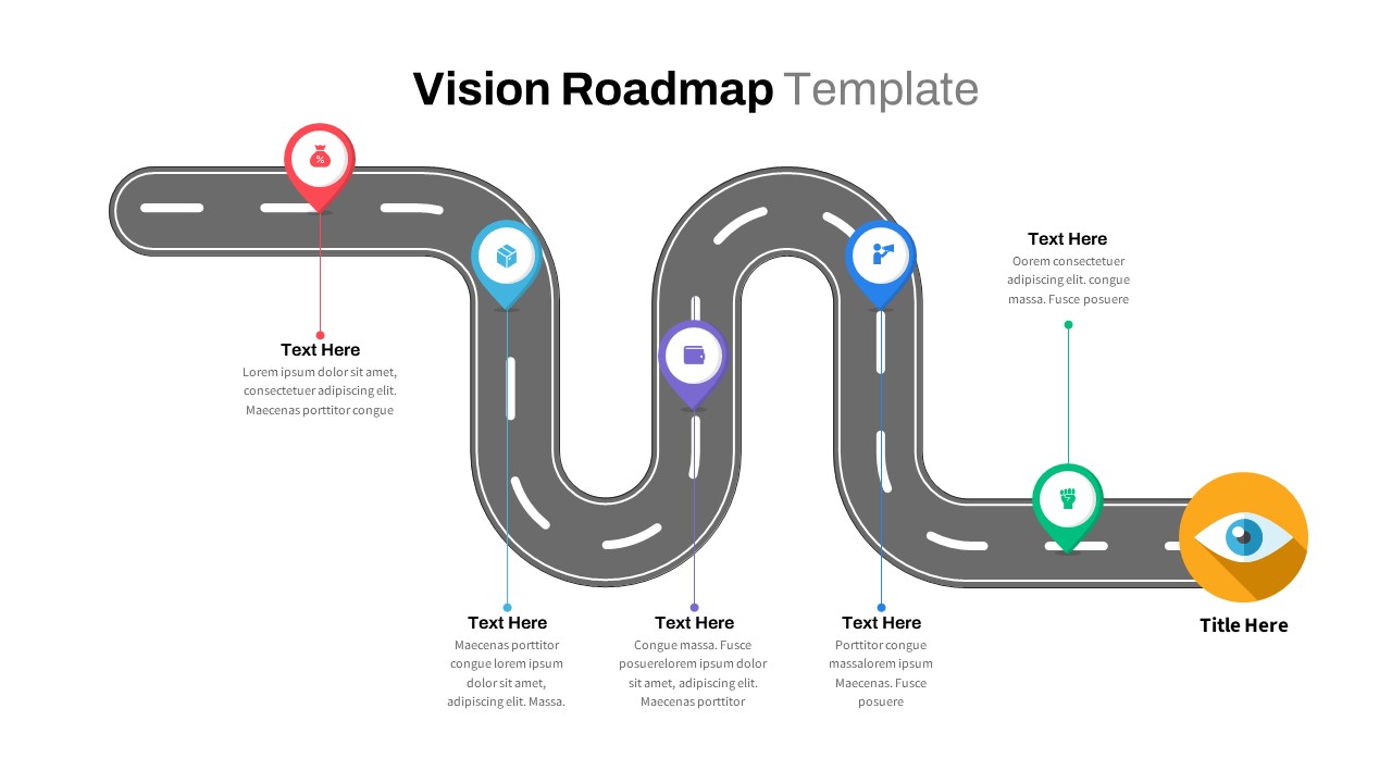
Curved Roadmap Infographic Vision Journey Template for PowerPoint & Google Slides
Business Strategy
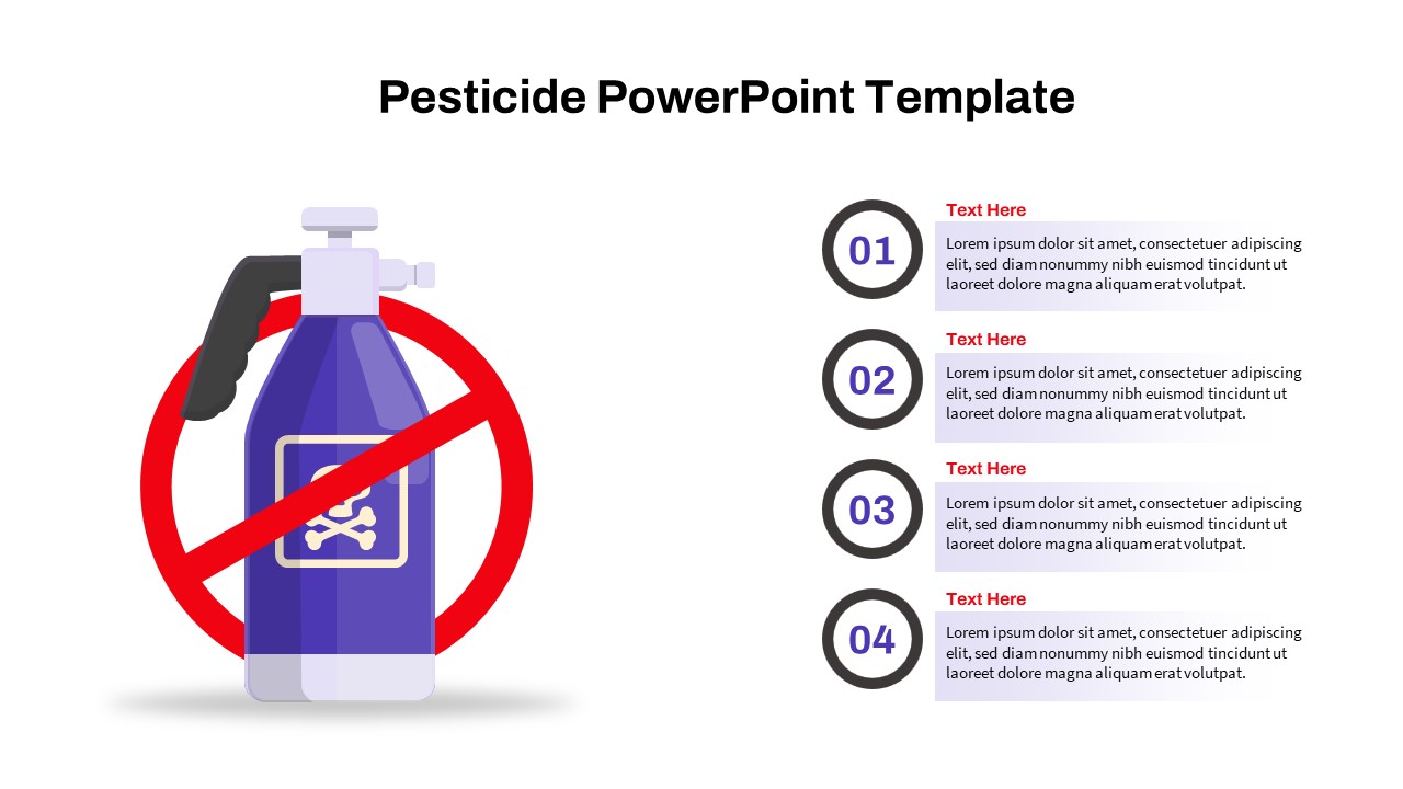
Pesticide Four-Step Process Infographic Template for PowerPoint & Google Slides
Process
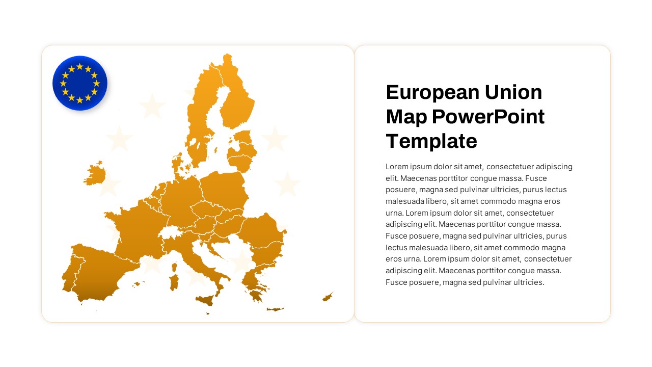
European Union Map Infographic Template for PowerPoint & Google Slides
World Maps
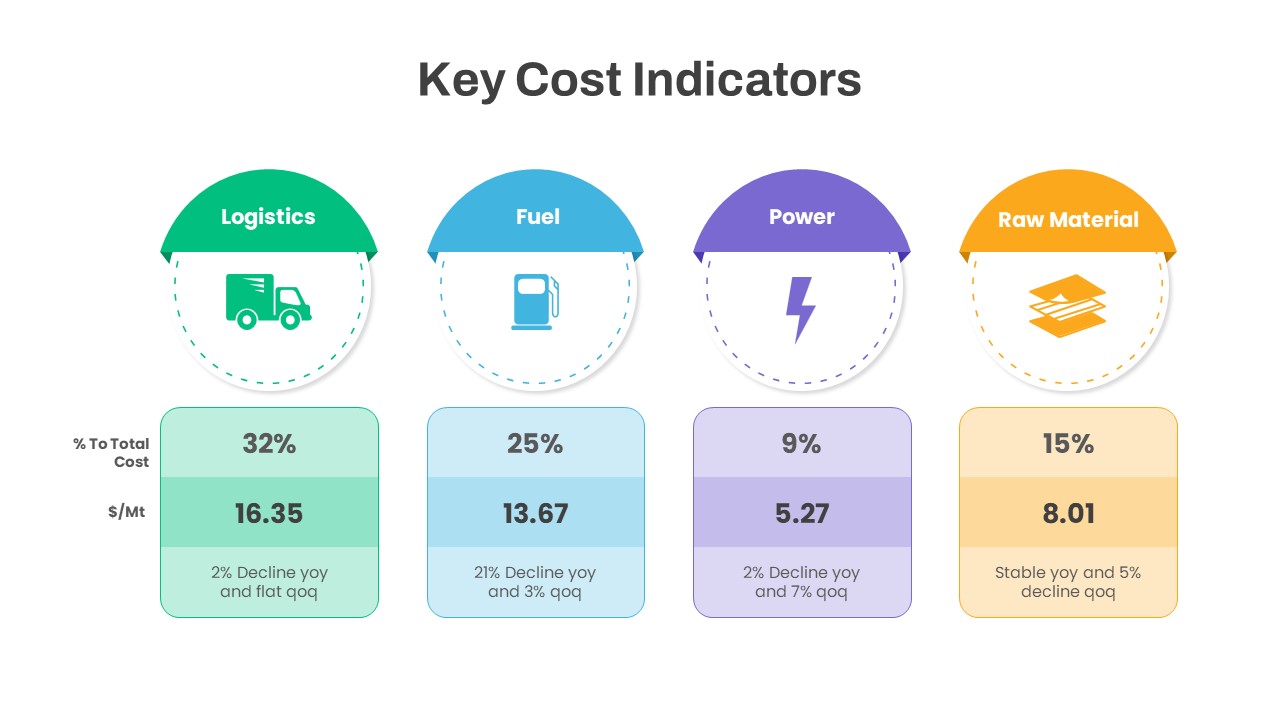
Key Cost Indicators Infographic Template for PowerPoint & Google Slides
Finance
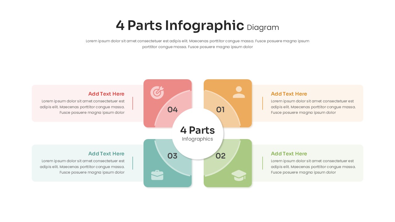
4 Parts Infographic Diagram Template for PowerPoint & Google Slides
Process
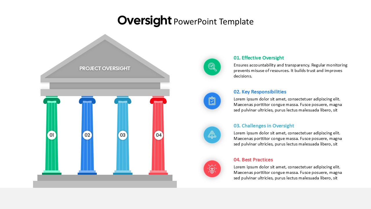
Project Oversight Pillars Infographic Template for PowerPoint & Google Slides
Process